I Have A 5-Room HDB With Columns That Can’t Be Removed And Are An Eyesore. Are There Any Better Layout Ideas?
September 10, 2022
Dear StackedHomes,
I plan to renovate my 5-room HDB apartment but have no clue how to make the house spacious and functional.
It’s a combination of two 3-room to one 5-room apartment.
It’s a mirror image and HDB has converted the kitchen to master bedroom.
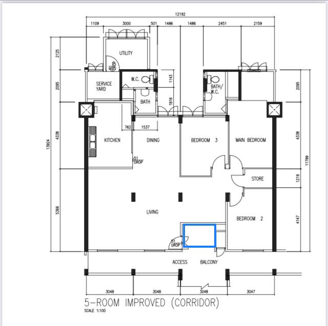
I purchased the access area highlighted in blue and re-position the entrance to my house at the blue box.
I find it challenging to design the master bedroom because it’s rectangular in shape and the bathroom eats into the bedroom space.
The columns cannot be removed and they are an eyesore.
The kitchen is too small for an island and I plan to hack the wall to include an island.
I wish to retain all 3 bedrooms because they are all occupied.
I would appreciate it if you can give me ideas how to better utilise the apartment.
Thank you.🙏🏻
Hello,
That’s quite a good sized unit you have there, and great that you managed to purchase the access area as that does help in giving you a little more flexibility about the space.
We are assuming here that you’ve already purchased and repositioned the entrance (as you’ve shown). From what we know, this is a case-by-case basis with HDB and is by no means a guaranteed thing.
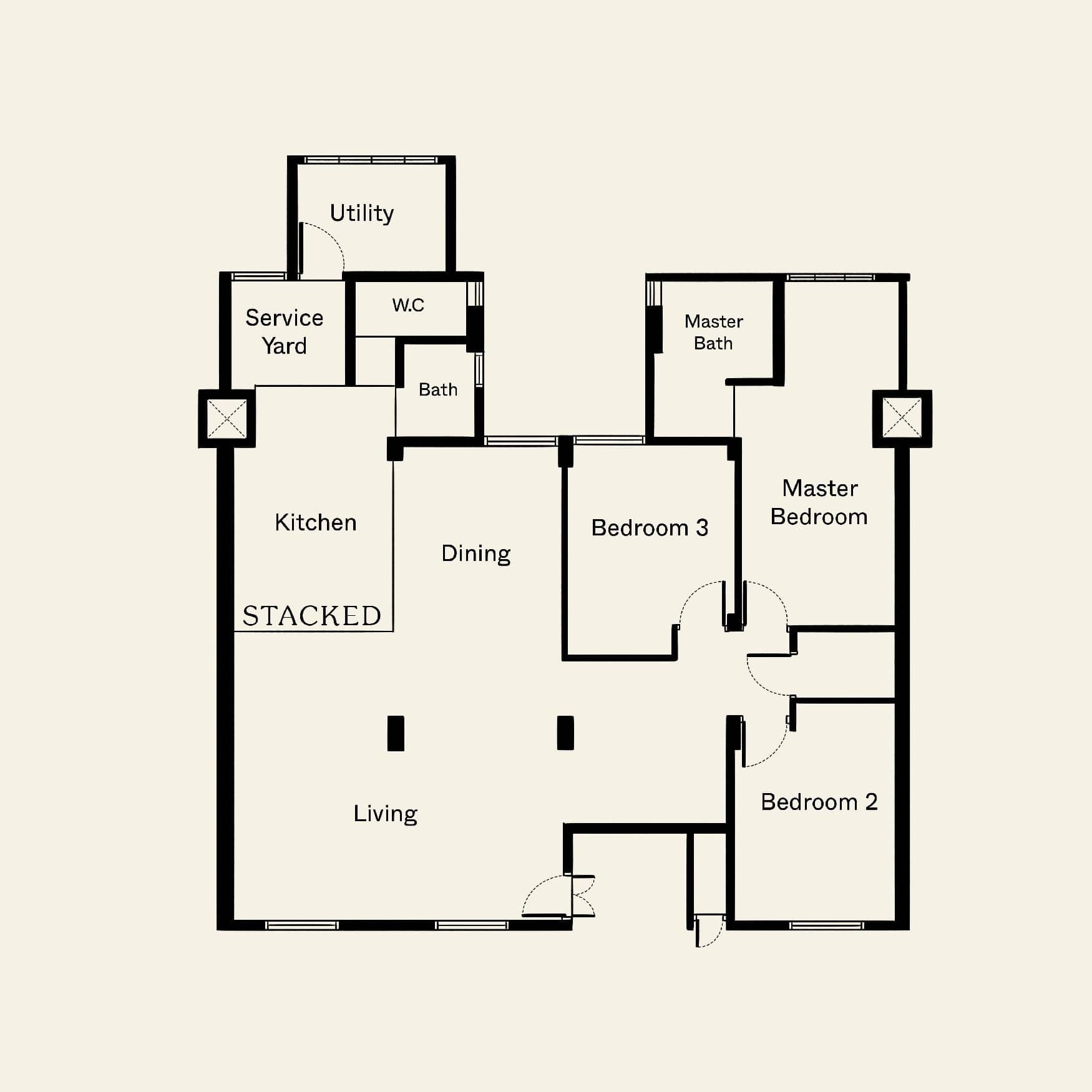
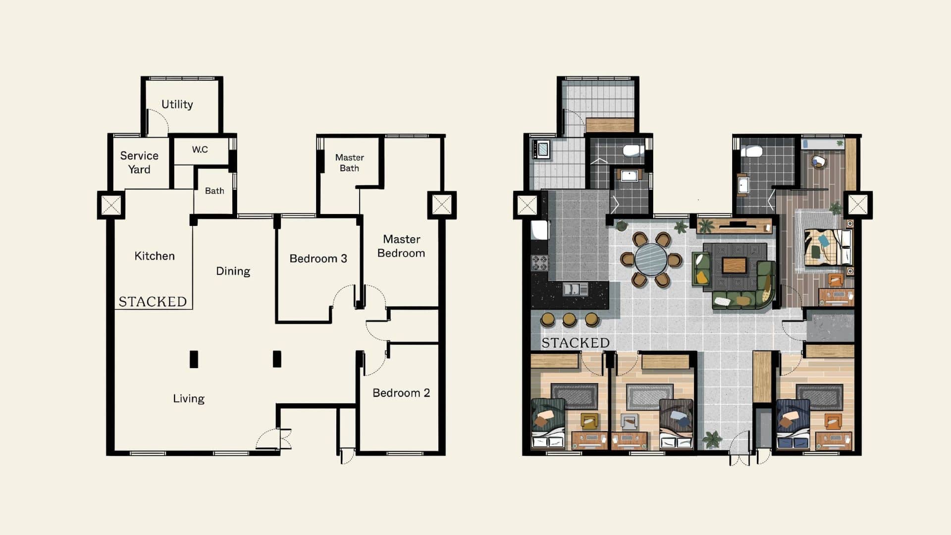
Here’s a few different layouts you can consider if you wish to retain all 3 bedrooms:
So many readers write in because they're unsure what to do next, and don't know who to trust.
If this sounds familiar, we offer structured 1-to-1 consultations where we walk through your finances, goals, and market options objectively.
No obligation. Just clarity.
Learn more here.
1. Making use of the pillars
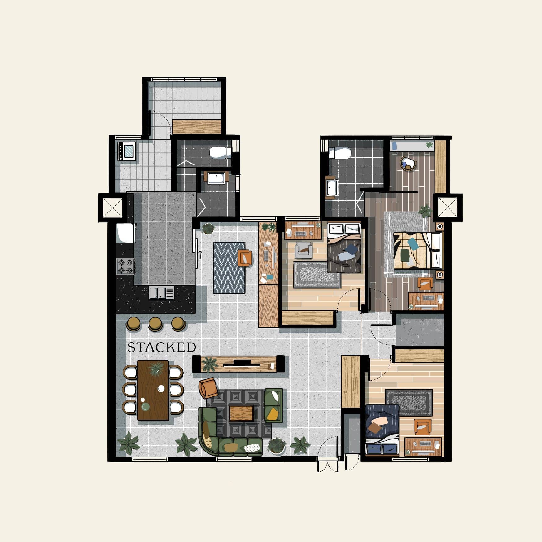
Assuming you were able to repurpose the main door as such, we’ve reconfigured the space so that you can make use of the space between the pillars as an in-built TV console. This will make the pillars less of an eye-sore, and working that in as part of the TV console will make it feel more inclusive and seamless. If you couple that with a really nice and slim TV, decorative items on the console, and well positioned lights, this can actually form the highlight of the space instead. Modern televisions today are typically quite minimalist looking at the back too, so I wouldn’t worry too much about how it would look like from the study area.
Alternatively, you could do with a projector screen here, which you can stowaway when not in use.
We’ve also moved the dining set next to the living and as you’ve asked for an open kitchen layout, the L-shaped kitchen counter can also double up as a breakfast counter/alternative dining space as well.
2. More communal living space
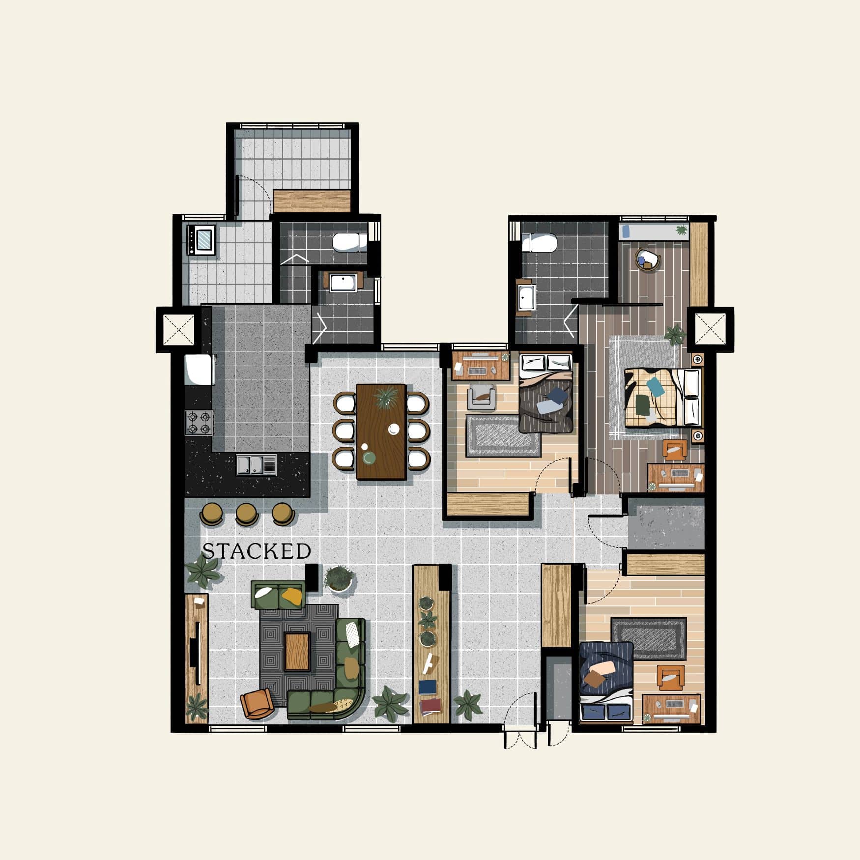
If you prefer a more conventional layout with more storage spaces, and to allow the space to feel bigger. You could look at using the first pillar to form part of the long console that greets you as you come in. By doing this, it allows you to incorporate more built-in storage, as well as segregates the different spaces and provides for a walk-in area of sorts.
3. Reconfigured bedroom
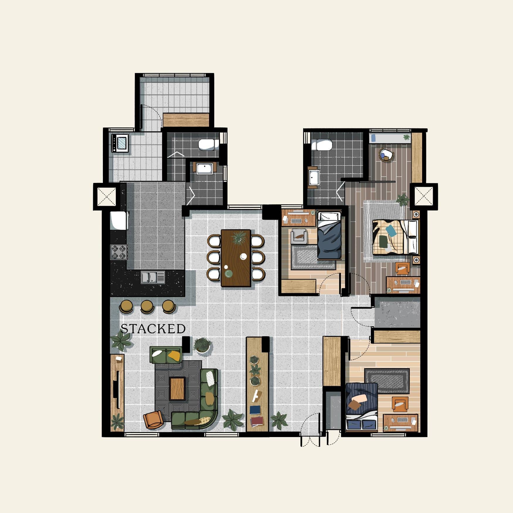
Another alternative to do is to reduce the space of one of the common bedrooms. By doing so you’d probably only be able to squeeze in a single bed comfortably, but this allows for a much wider dining area and walkways. It’s a small move, but it really lets you widen up the space available quite significantly. If you and your family spend a lot of time in the communal spaces, this could be a sensible layout.
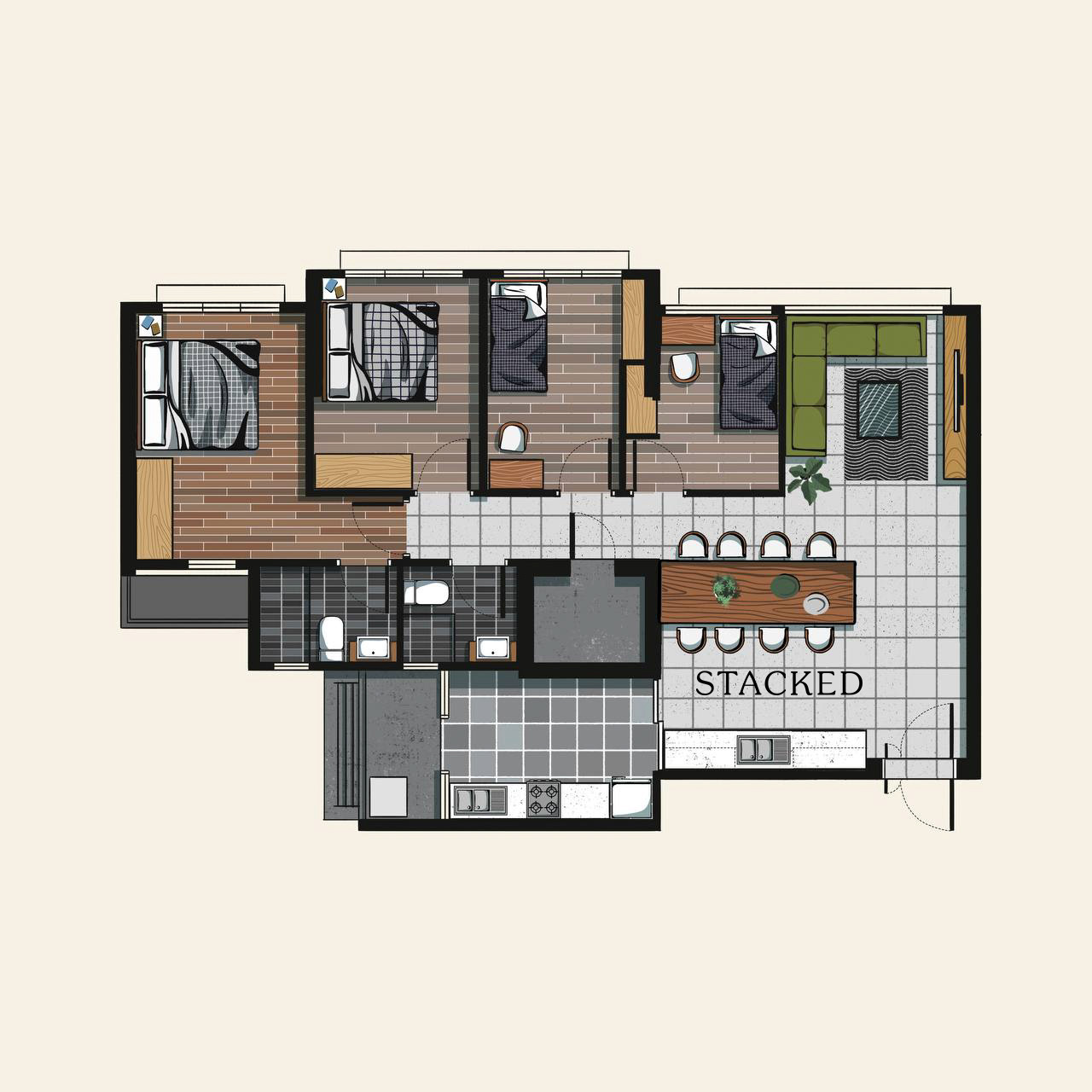
Property Advice8 Different 5-Room HDB Layout Ideas To Make The Most Use Of Space
by Adriano Tawin4. Relocate bedrooms
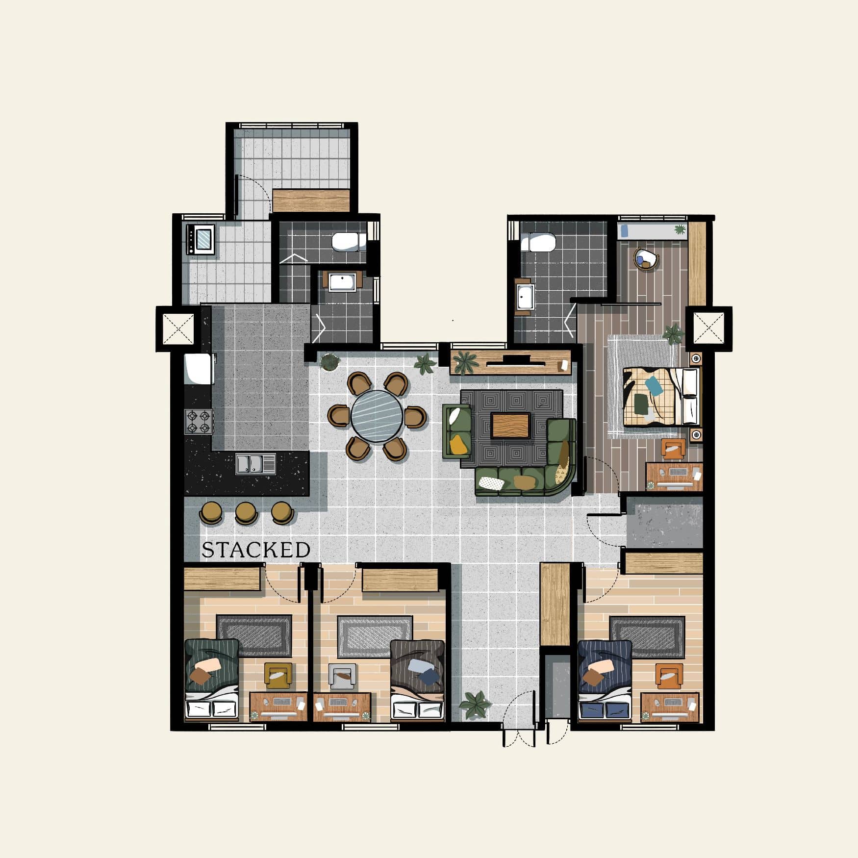
The last and the most drastic move of all, you could look to relocating the bedrooms and living and dining spaces. There are several advantages to this. First, this allows you to completely eliminate the load-bearing columns that you feel are unsightly. By keeping both rooms next to each other, it gives you a longer entranceway which can also still be used to build more storage spaces here.
The living communal spaces are now smaller, but if you’ve noticed you now have 4 separate bedrooms. If you’ve no need for that, one bedroom can definitely be configured to be a private study/office area as well. The one closest to the entrance can be redone with glass walls instead, if you’d like the space to feel more open and brighter.
You may not feel the space difference as much too, because the living and dining are now set out in a parallel format.
Do you have any more different HDB layout areas? Feel free to let us know at stories@stackedhomes.com and we can add more to this piece to incorporate even more ideas!
At Stacked, we like to look beyond the headlines and surface-level numbers, and focus on how things play out in the real world.
If you’d like to discuss how this applies to your own circumstances, you can reach out for a one-to-one consultation here.
And if you simply have a question or want to share a thought, feel free to write to us at stories@stackedhomes.com — we read every message.
Adriano Tawin
Adriano is an old school real estate guy. Prior to establishing his own architectural/engineering design firm in New York City, he’s worked for a Brooklyn-based developer developing multifamily residential projects across the 5-Boroughs. In Singapore, he has experience with managing hospitality projects and rehabilitation of conservation shophouses. In his free time, he enjoys photography.Need help with a property decision?
Speak to our team →Read next from Property Advice

Property Advice Should I Buy A Freehold Condo In A Landed Enclave — Or Look Elsewhere For Better Growth?
Property Advice We Own A 2-Bedder Condo In Our Early 30s: Should We Upgrade To A New Launch Or Resale With $2.2M?

Property Advice What A Family Of 5 Can Really Buy With $2 Million In Newton And Redhill

Property Advice Should I Pay $500K More For A New Launch — Or Buy A Resale Condo Instead?
Latest Posts

Singapore Property News HDB Resale Prices Just Fell For The First Time Since 2019 — Is This The Start Of A Bigger Shift?
Overseas Property Investing Here’s Why I Paid Cash To Buy My Home In France

Singapore Property News This London Landmark Is On Sale For £450M – It Might Be The Largest West End Deal Since 2022












7 Comments
Love it that the bedrooms can accommodate a study desk and still have space to roll the chair!
Hi, this is totally random but as the saying goes, ‘Never ask, never know.’
I really like your 2D floor plan illustration. Are you able to share what’s the software used? Thanks so much!
Adriano, do you do Youtube videos too?
Thanks for sharing. I read many of your blog posts, cool, your blog is very good.