Living In A Shophouse: Figment Alexandra House Review
December 27, 2020
Did you know that lobsters were once prison food?
What we now see as a delectable, decadent treat was actually once termed as the “cockroaches of the sea” because it was just over abundant.
And it wasn’t just prison food, it was even used as fertiliser, or fish bait.
Sounds totally crazy to think about, but look how times have changed – lobsters are now one of the most expensive items on the menu.
So you may be wondering why I’m even talking about lobsters in my review of a shophouse.
Well, I can’t help but draw parallels to the history of shophouses.
They were once over abundant in Singapore.
Even after many were torn down to make room for modern buildings, many still didn’t see the value in shophouses.
While some are located in central areas, many were located in the “rougher” districts.
But just look at where prices are at now.
So why are people paying such eye popping prices for them?
Well, for one, scarcity. There are only an estimated 6,500 of them left in Singapore.
But for me, personally, they’ve always represented a really intriguing notion.
As someone that sees many developments on a regular basis, a well-designed shophouse is always something that captures my attention immediately.
So I think it’s safe to say when I first heard about Figment, I was instantly drawn to the concept.
Combining renowned interior designers (think: Studio Juju/HYLA Architects) with shophouses, each with its own concept and style.
You could say that it is as far from cookie cutter as descriptively possible.
It’s pretty cool because Fang (the founder of Figment) actually grew up in a shophouse as a kid. So if anything, he is probably the best person to be able to marry the two.
Not many people can say that they’ve lived in a shophouse, so this was definitely something I was looking forward to.
My Alexandra House Figment Review
(Note: You’re about to read a personal recount on my night at the Alexandra House, courtesy of Figment. This is not a paid review, and all opinions expressed in the following journal are based solely on my experience during the stay. Enjoy the read!)
Finding an ideal space on Figment was actually a very enjoyable process for me, I almost felt as if I was booking my accommodation for an overseas holiday.
Every single shophouse they have here is designed by a different local architect. And because they are given free rein to design, it’s pretty clear that every option is completely unique.
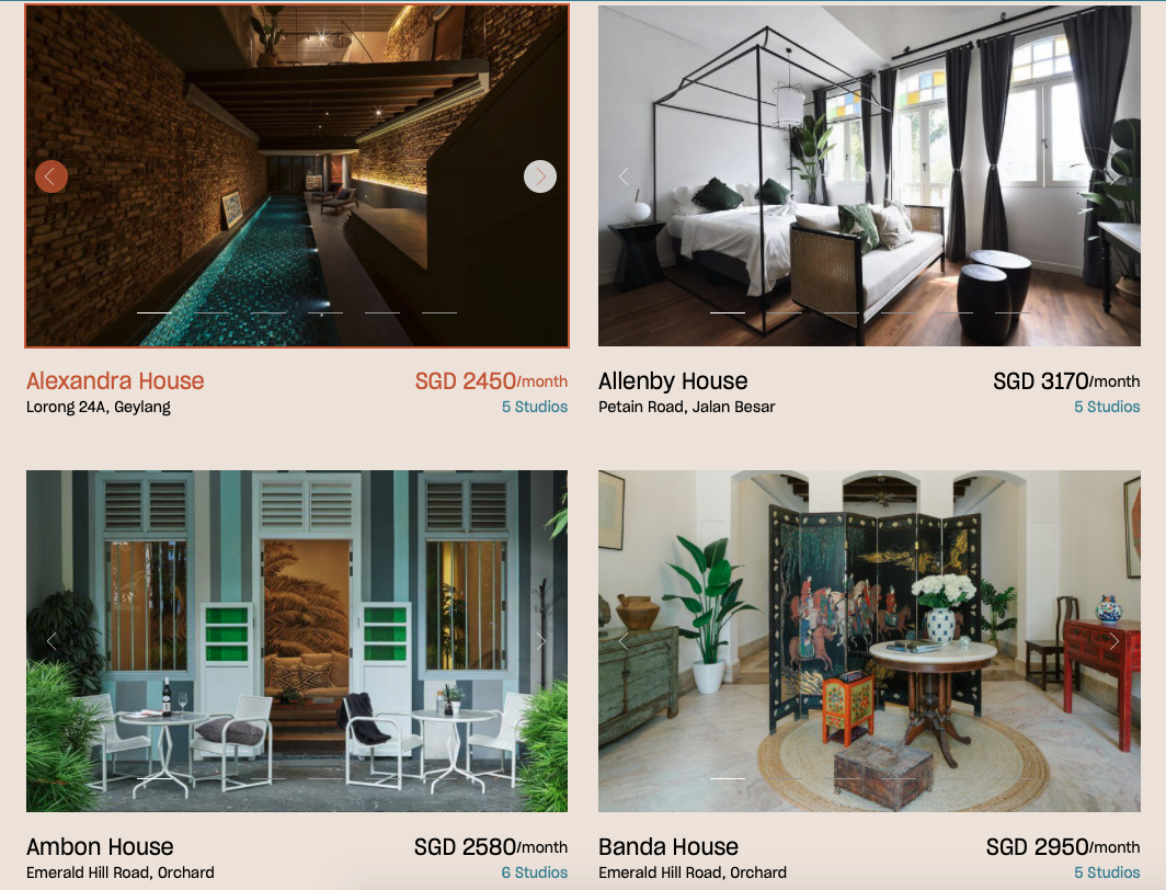
The downside is that it took me a significant amount of time to choose my favourite.
After much deliberation, I “settled” on the Alexandra House – mainly because of that rather stunning indoor pool.
Checking-in
For the sake of those unaware, Alexandra House is located in Geylang – a place that doesn’t enjoy the best of reputations in Singapore.

While it is culturally significant, I wouldn’t say I am the biggest fan of the vibes of the place – seedy reputations aside.
The entrance to the unit is quite nondescript.
If anything, it is probably one of the best ways to describe the saying “don’t judge a book by its cover”.
Unlike some of the other units down the road which are decked in a myriad of colours and the occasional Chinese caricature, the frontage is coated in simple shades of brown and white.
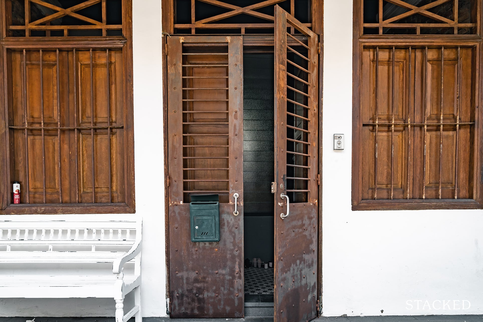
It certainly preserves the unit’s historical background visually – and I’m glad that it hasn’t been overhauled into something more modern.
The process of getting in is relatively straight forward. All you have to do is place your palm on a little digital numpad and key in the entrance code and you are good to go.
The moment I stepped in, I distinctly felt the difference in temperatures.
While the exterior had been scorching-hot and sunny, the interior was now inversely cool and shaded.
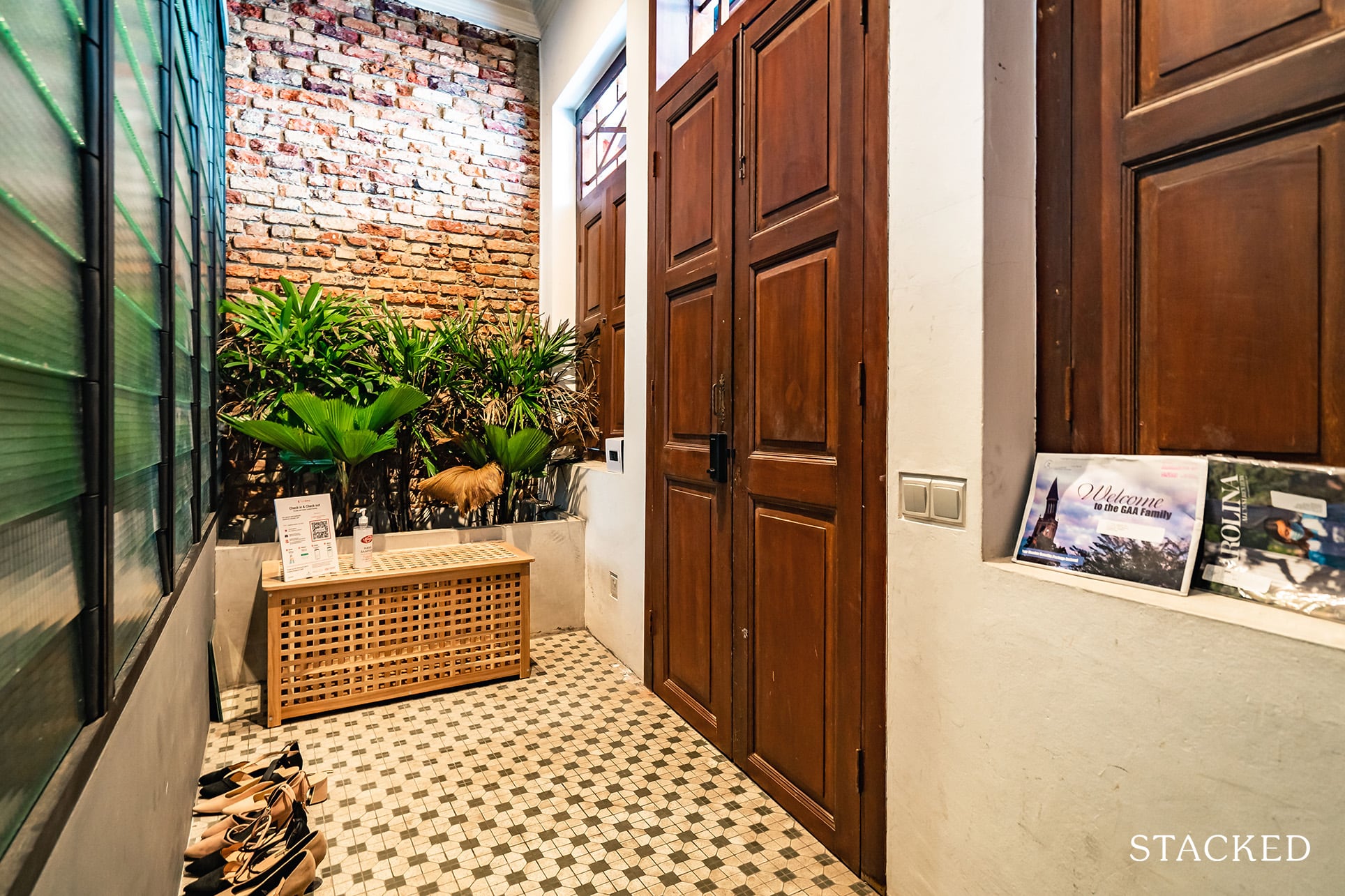
It’s quite fascinating really, I’ve always read about how shophouses were designed to be a cooling respite (no air-con back in the day), and it was truly so.
Still, that wasn’t the coolest (forgive my pun) part of the house.
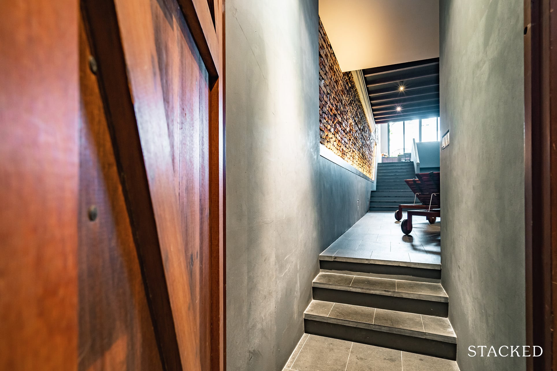
You’ll have to ascend a tiny flight of stairs past the entranceway and then into the actual living space.
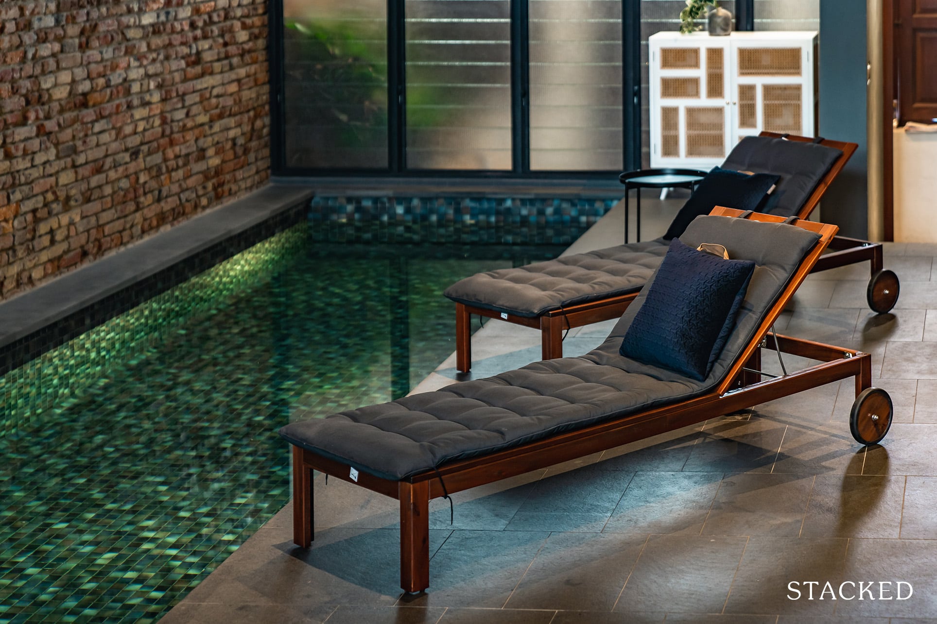
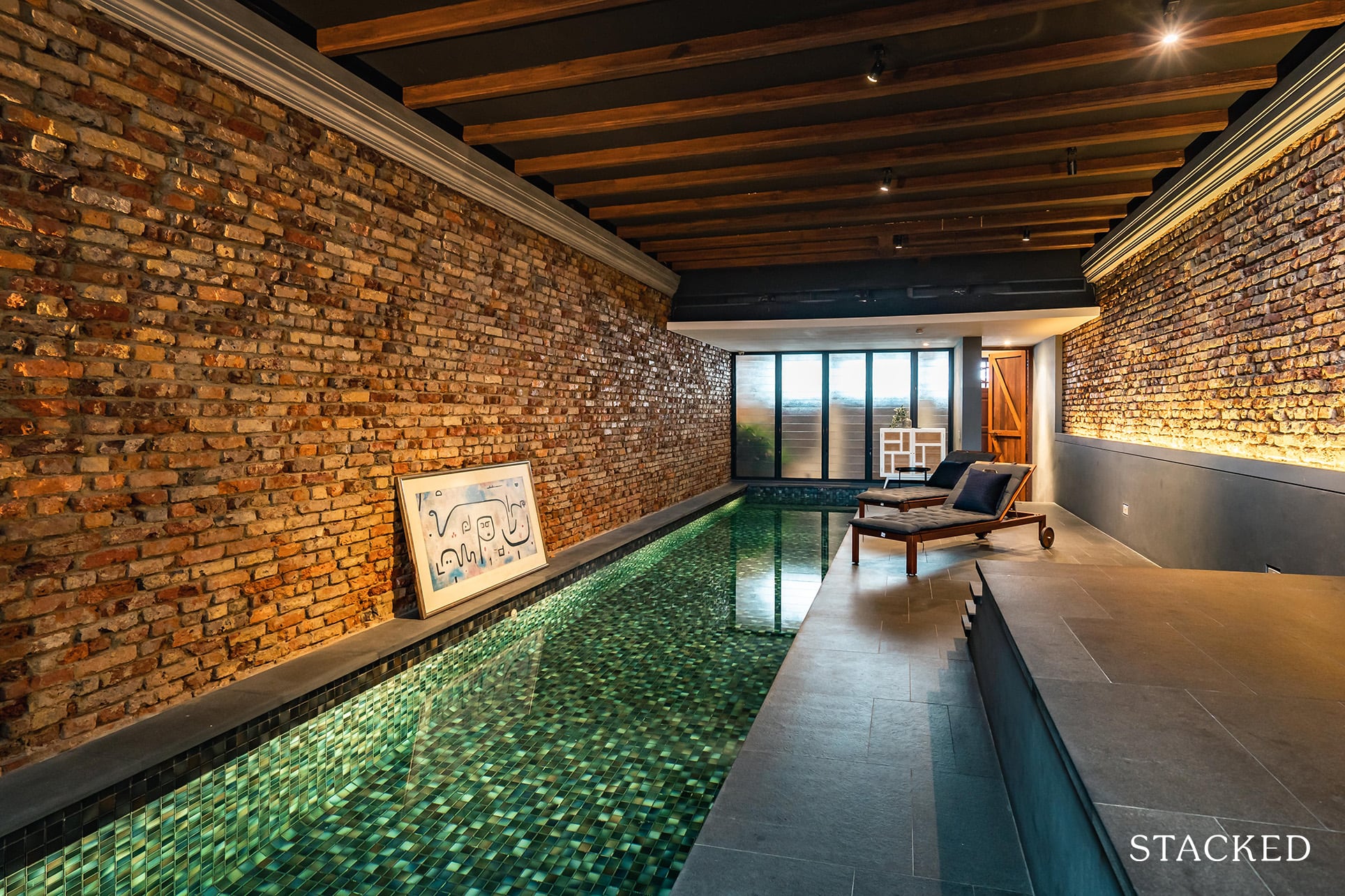
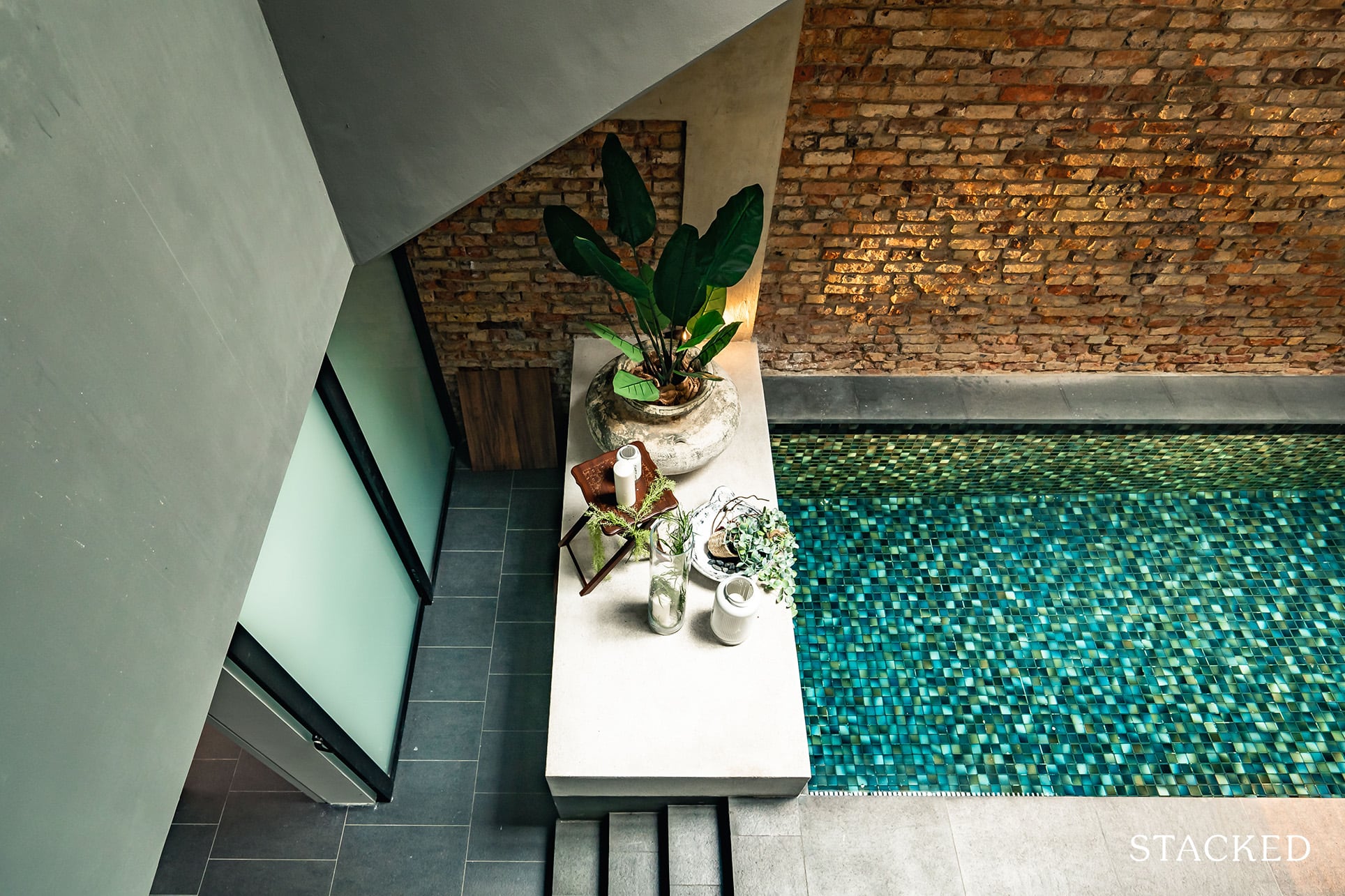
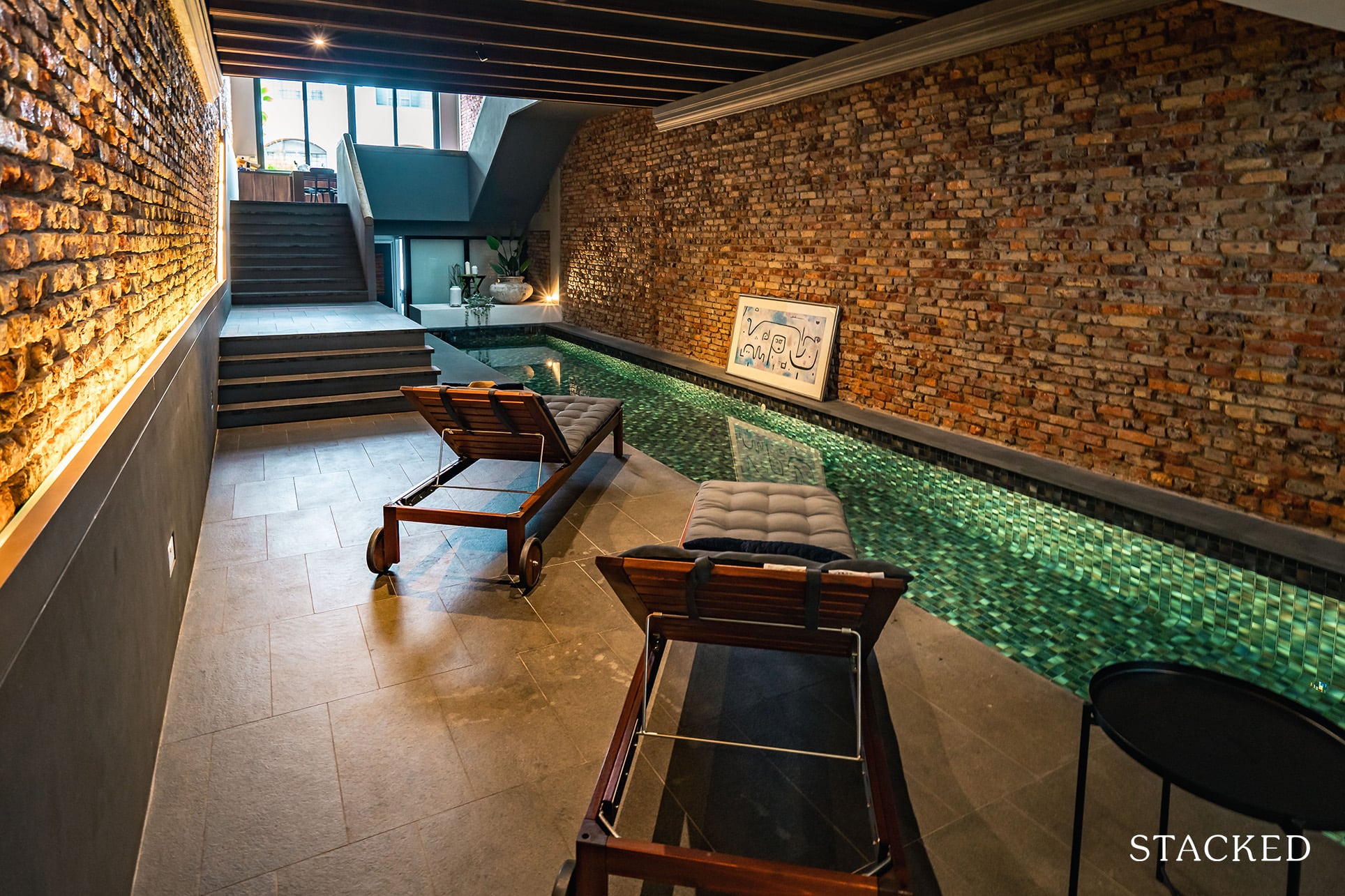
Set in front of me were two deck chairs, adequately spaced and tilted to face what was, at the very least a 14-metre swimming pool.
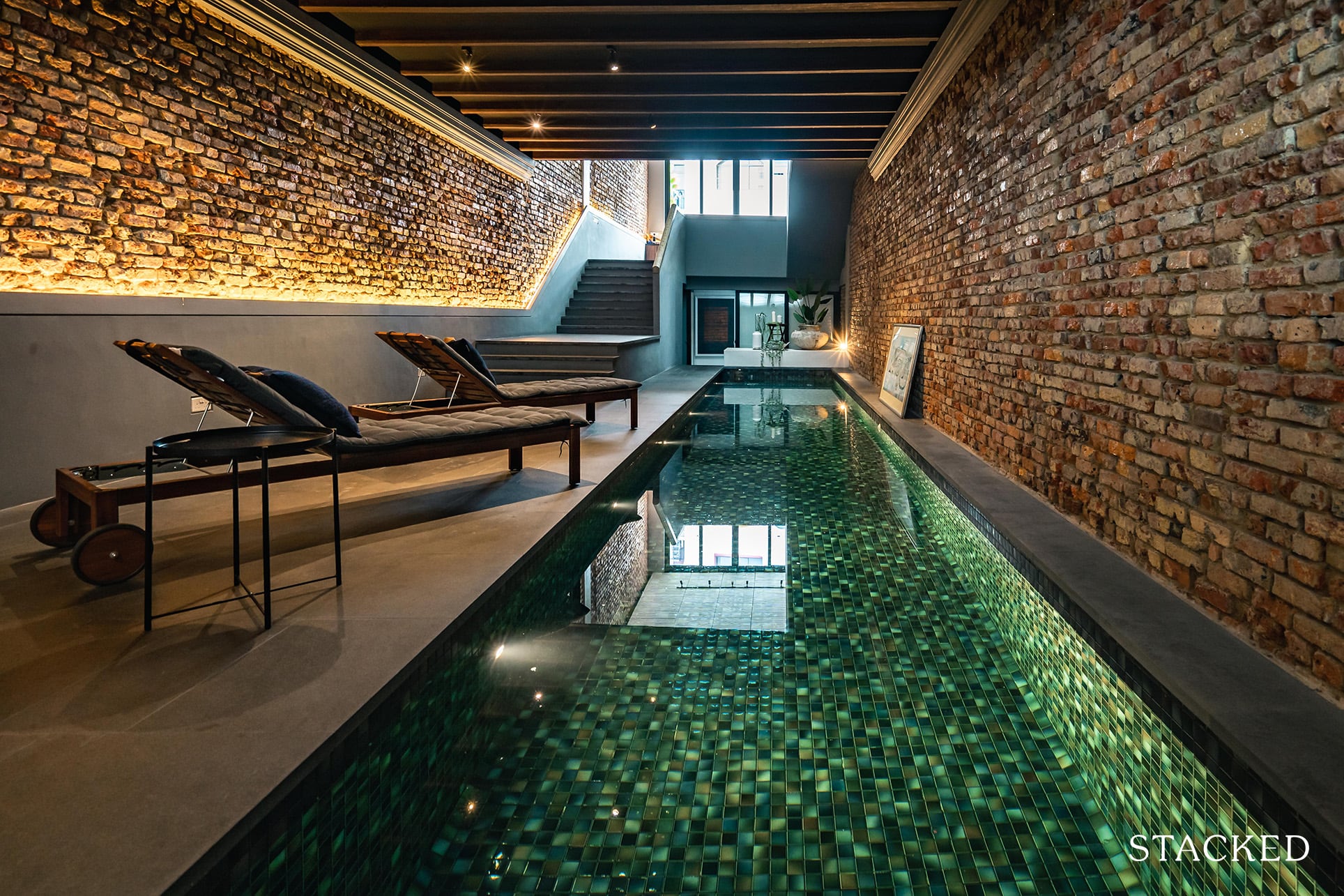
It had clearly undertaken a lot of work with the underwater lighting and paletted tiles, but it was no doubt a pretty place to be lounging about in.
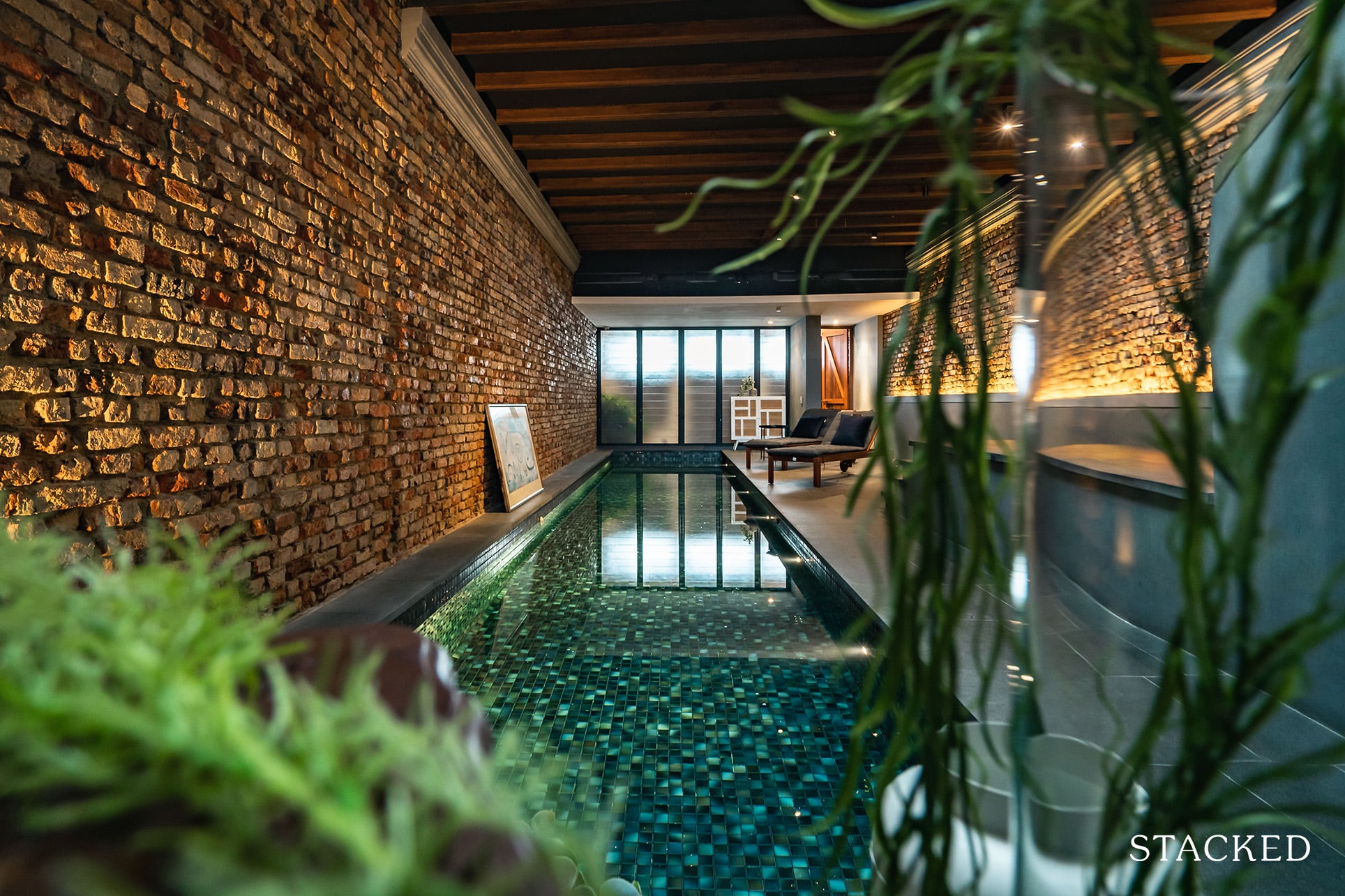
But let’s be real, this pool certainly isn’t going to rival those that you get in your condo developments. And in my opinion, it shouldn’t even be judged that way. Sure, if you do want proper exercise, you are going to have to swim many laps just to fulfil your daily goals – but that’s missing the point here.
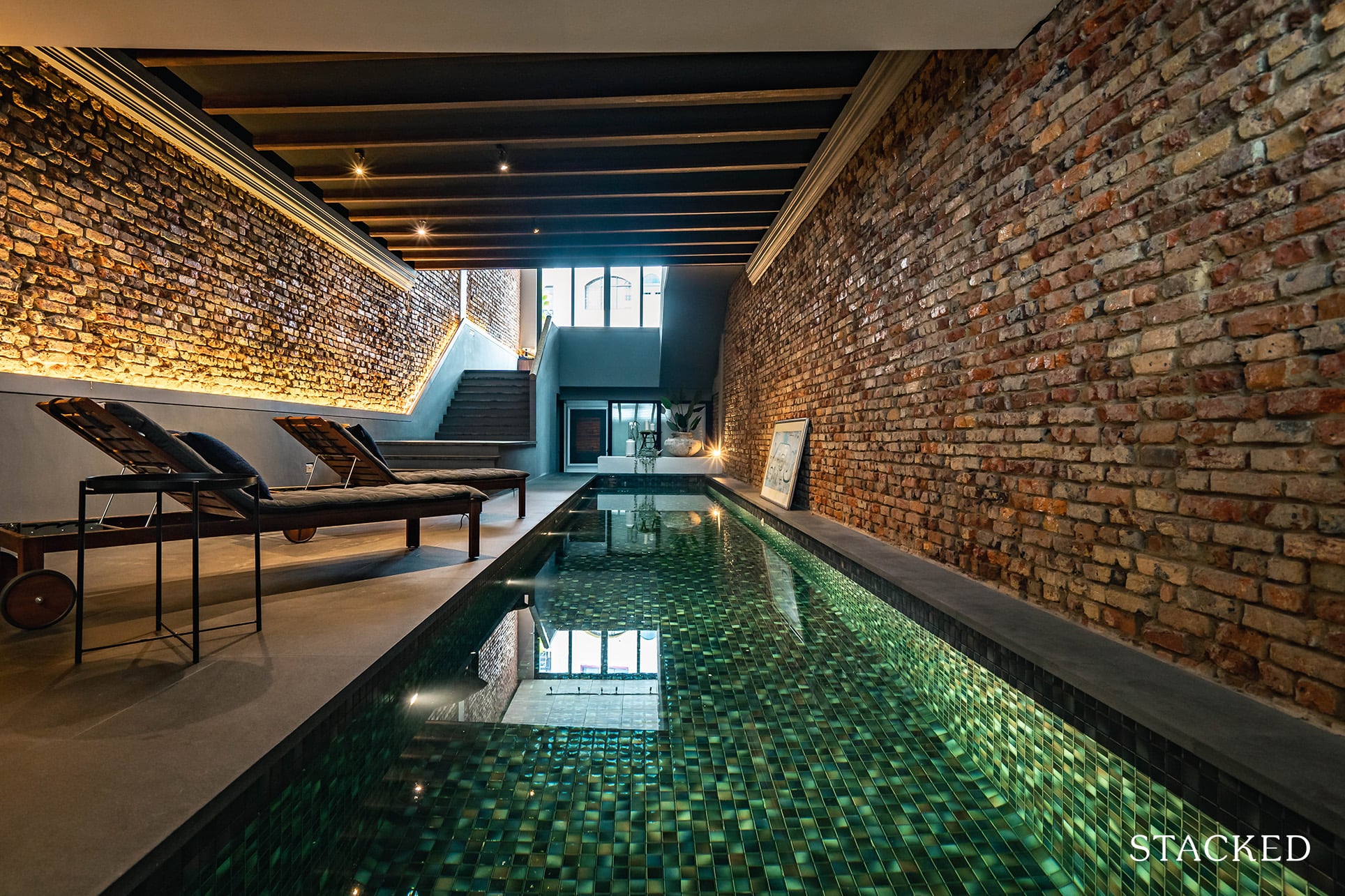
To me, it’s really more of a lounging pool. After work (or even during, since everyone is WFH), it works as a very casual form of relaxation. While you don’t get any Vitamin D here the chill vibe here is quite intoxicating.
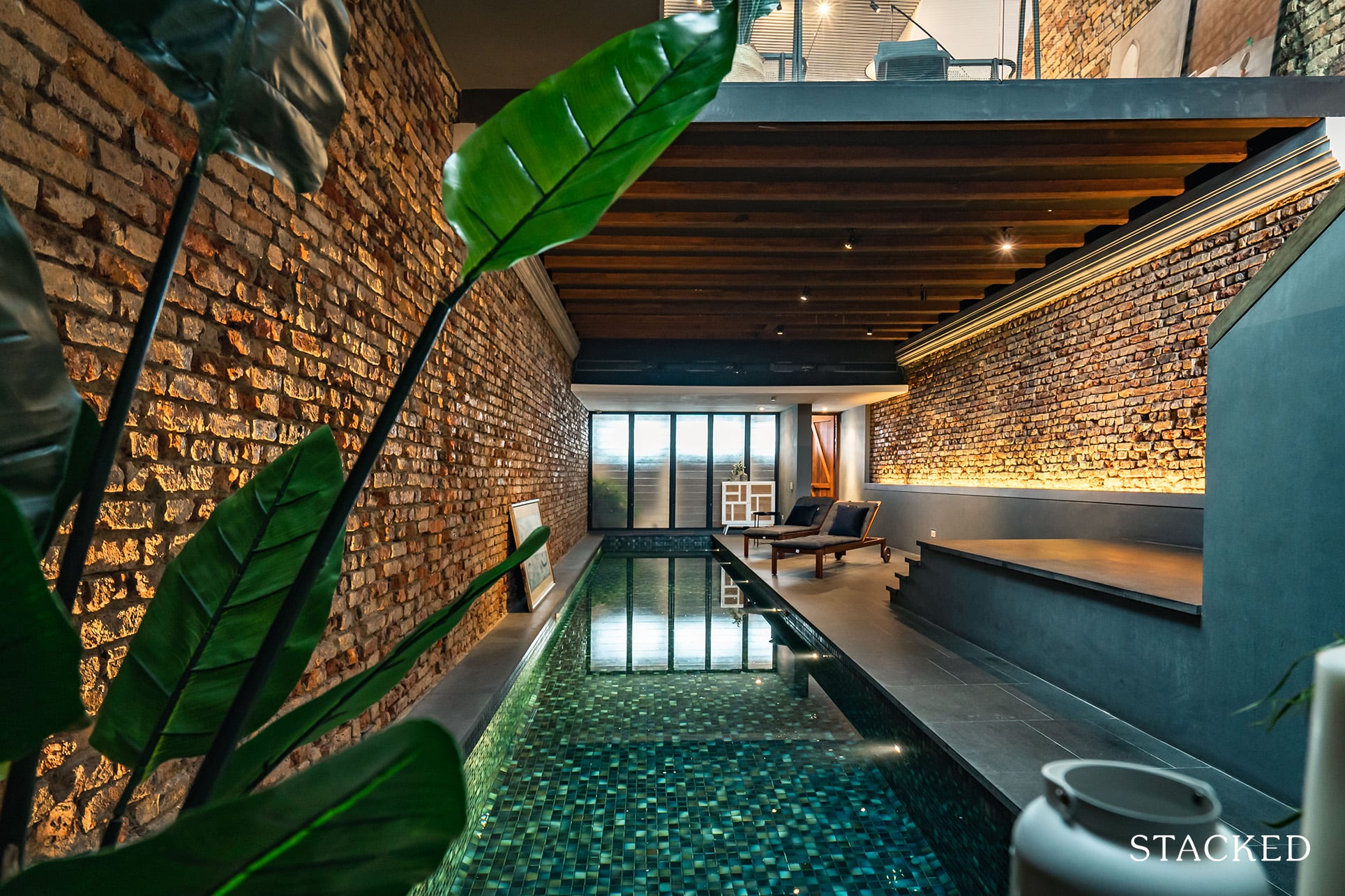
Newly installed brickwork make up a bulk of the interior facade here as the (artfully-positioned) ambient lights help light up the water’s edge, casting warm tones on the stylish interior – that also includes a series of well-preserved timber panels overhead.

Perhaps that’s enough posturing about the pool, it’s time to show you the rooms.
Entering my Room for the First Time
There are a total of 5 rooms here for rent (4 of which have now been taken up by new residents since my initial visit).
4 en-suite rooms located on various floors and a single common room that comes with a shared guest toilet at the ground floor (my room for the night).
Just 2 of the 5 rooms were occupied when I arrived so I naturally assumed that the other 2 rooms were in the midst of being prepared for new tenants.
As I was led down the poolside and into the ‘Ash room’, I couldn’t help but notice how lengthy the walkway was. For tenants living in the upper rooms, I can imagine that it must be quite a distance for them to travel from their rooms down to the entranceway (imagine having to go back for your keys!).
The entrance to the Ash room is by manual lock and key.
I do get the notion, nostalgia and all, but for me, there’s a reason why many places have moved on to keycards and even fingerprint scanners – it’s just that much more convenient.
Security-wise, it’s best to lock your rooms when you’re heading out as you don’t get any CCTV cameras overlooking the rooms here (save for the living room area that we will get to later on in this review).
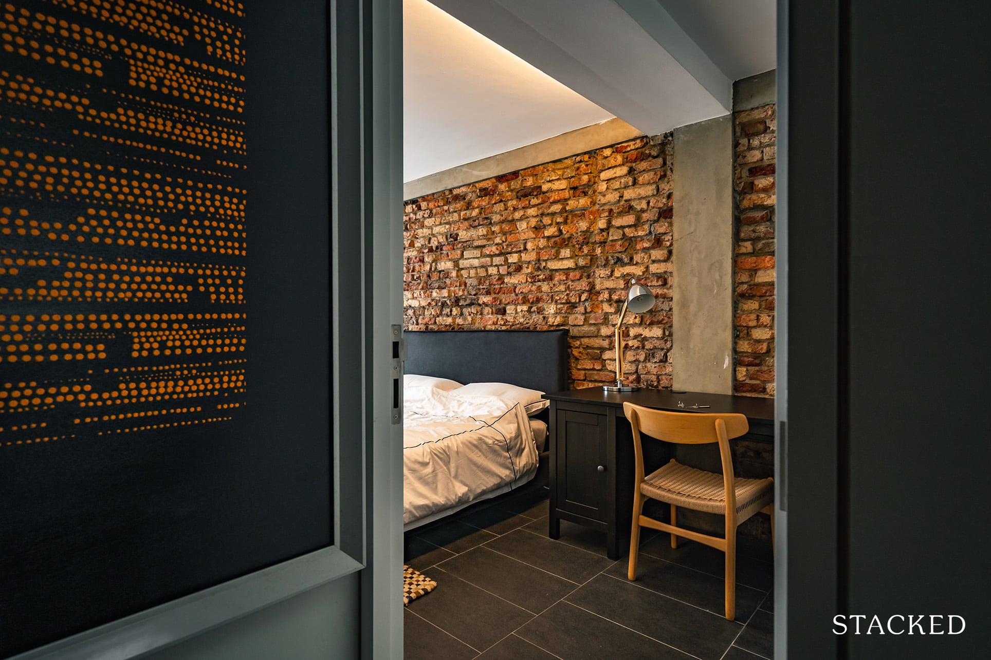
The room itself is a cozy space with a relatively low ceiling, bricks walls, minimalistic but essential materials, and foldable glass-paneled casement doors that lead to the backstreet.
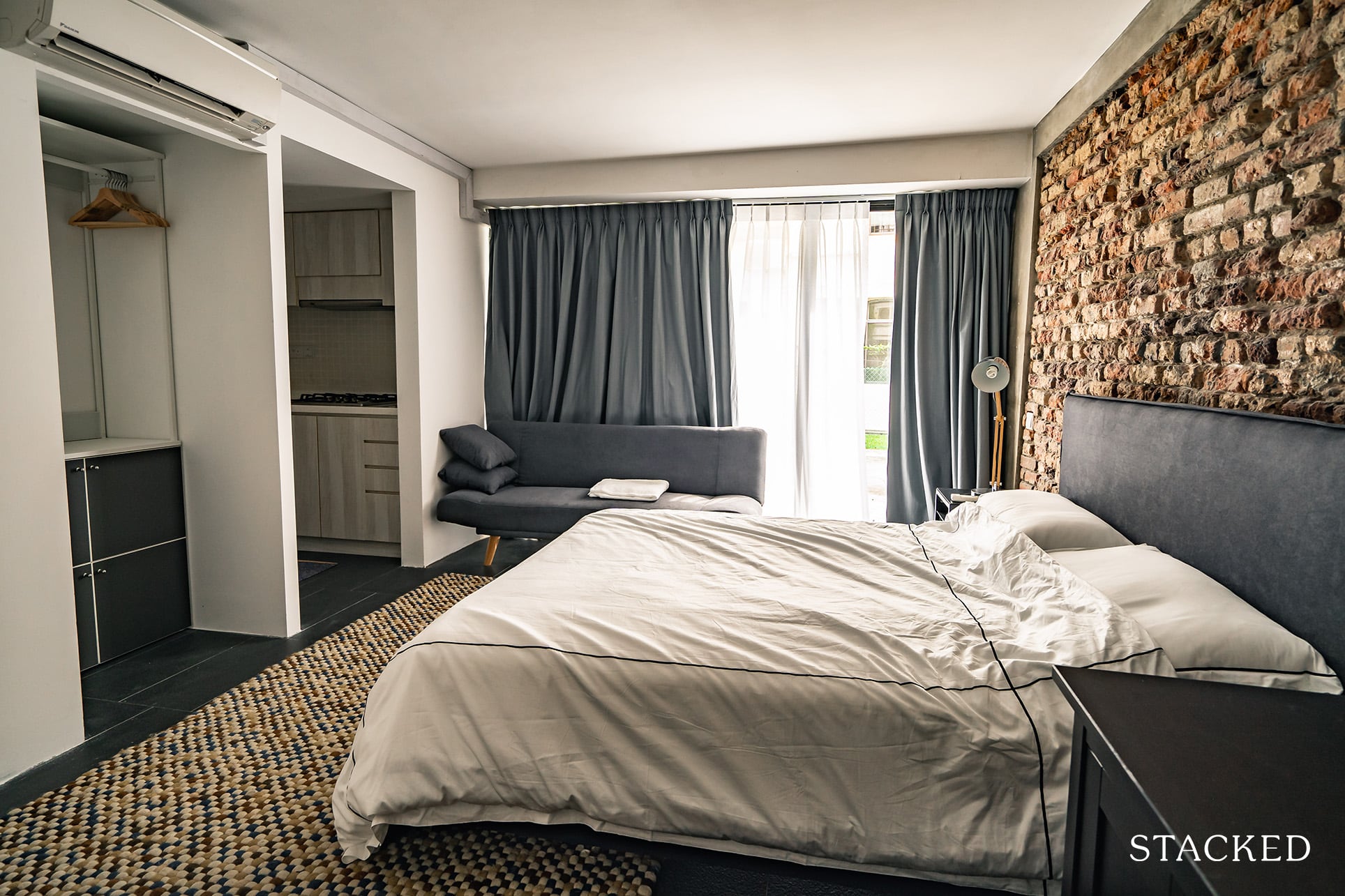
In that sense, it isn’t the best when it comes to sound-proofing as you do get the occasional muted noise from the outside drifting in when the room is completely silent.
You are also able to efficiently block out lights in the room at night thanks to the opaque night curtains here (even if you do get the little bit of light seeping in from the sides).
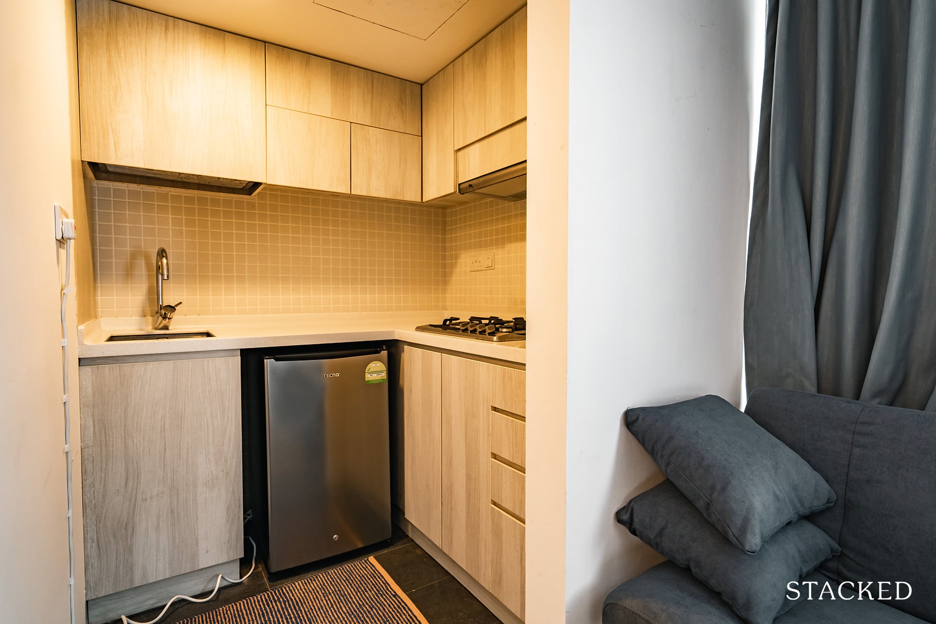
The Ash room is the only room that features both brick walls and a built-in gas stove courtesy of the mini kitchenette. The gas cylinders aren’t installed as yet, but I’m sure that the entire installation process is just a call away.
The ‘wardrobe’ is open-concept and comes with your usual Ikea hangers. I’m not a big fan of this as guests are in full view of your hanging clothes – besides the obvious point that it allows for dust to collect here.
There are also 4 little cabinets below for additional storage space – which again, I feel will not be enough for tenants looking to stay 3-6 months down the road.
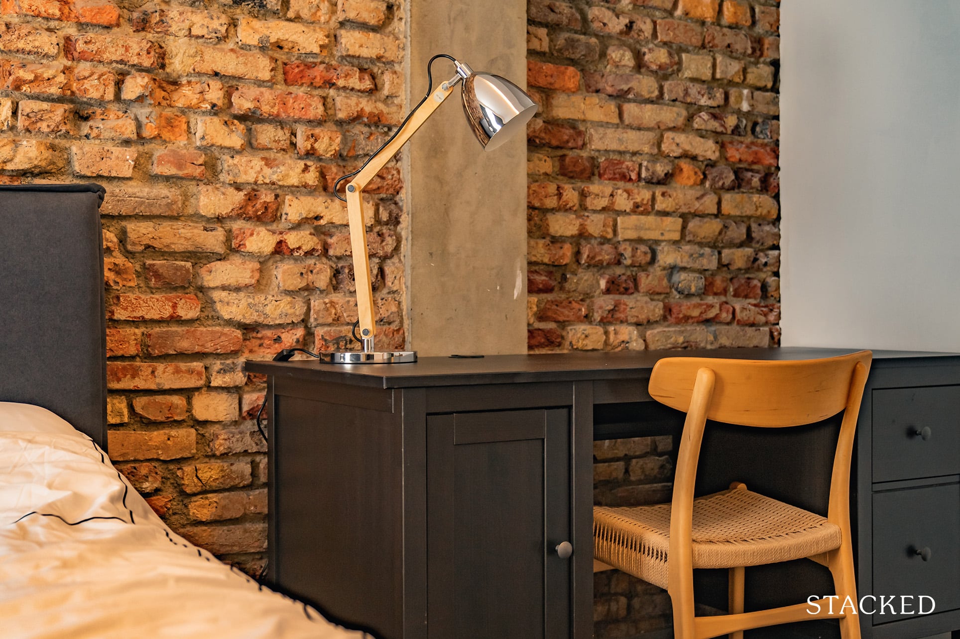
For those wondering about working spaces, you do get a study table/chair combo – which definitely comes in handy during work-from-home periods. The powerpoint extension is also right by the table (on the left) for easy access.
Regarding wifi, you get a number of wifi-extenders through the entire house and I’m happy to report that the signal strength here is both powerful and fast. Mobile signals are also unaffected in the room.
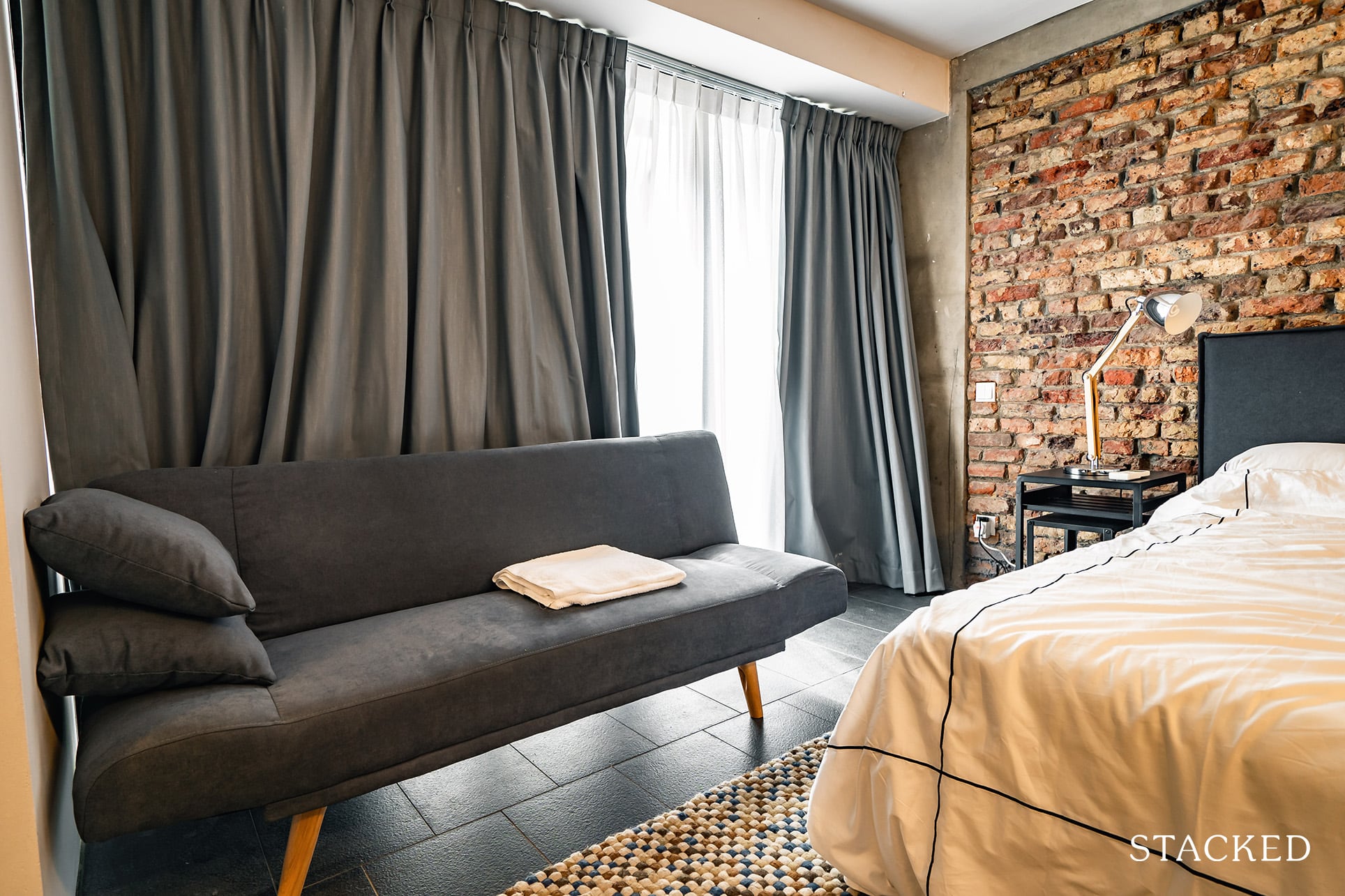
Now the sofa in the corner actually doubles up as a sofa-bed – which would come in handy for guests looking to stay the night.
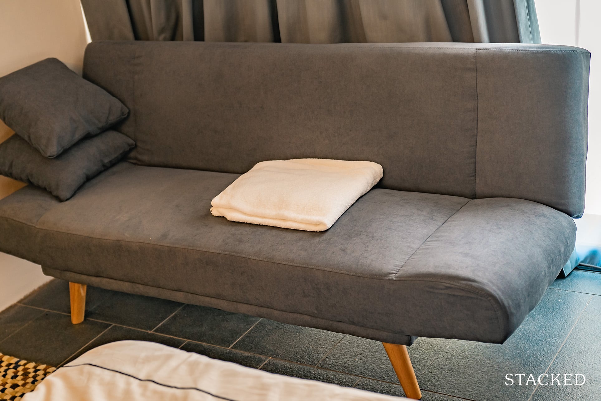
In my opinion, I do feel that extending the sofa-bed will ultimately make the space a little too cramped, but again, it’s always great to have extra sitting spaces with multi functionalities.
Finally, the general decor has been sourced from a mix-match of local companies such as Second Charm and Originals.
Let me now just quickly touch on one of my nitpicks of the room (YMMV).
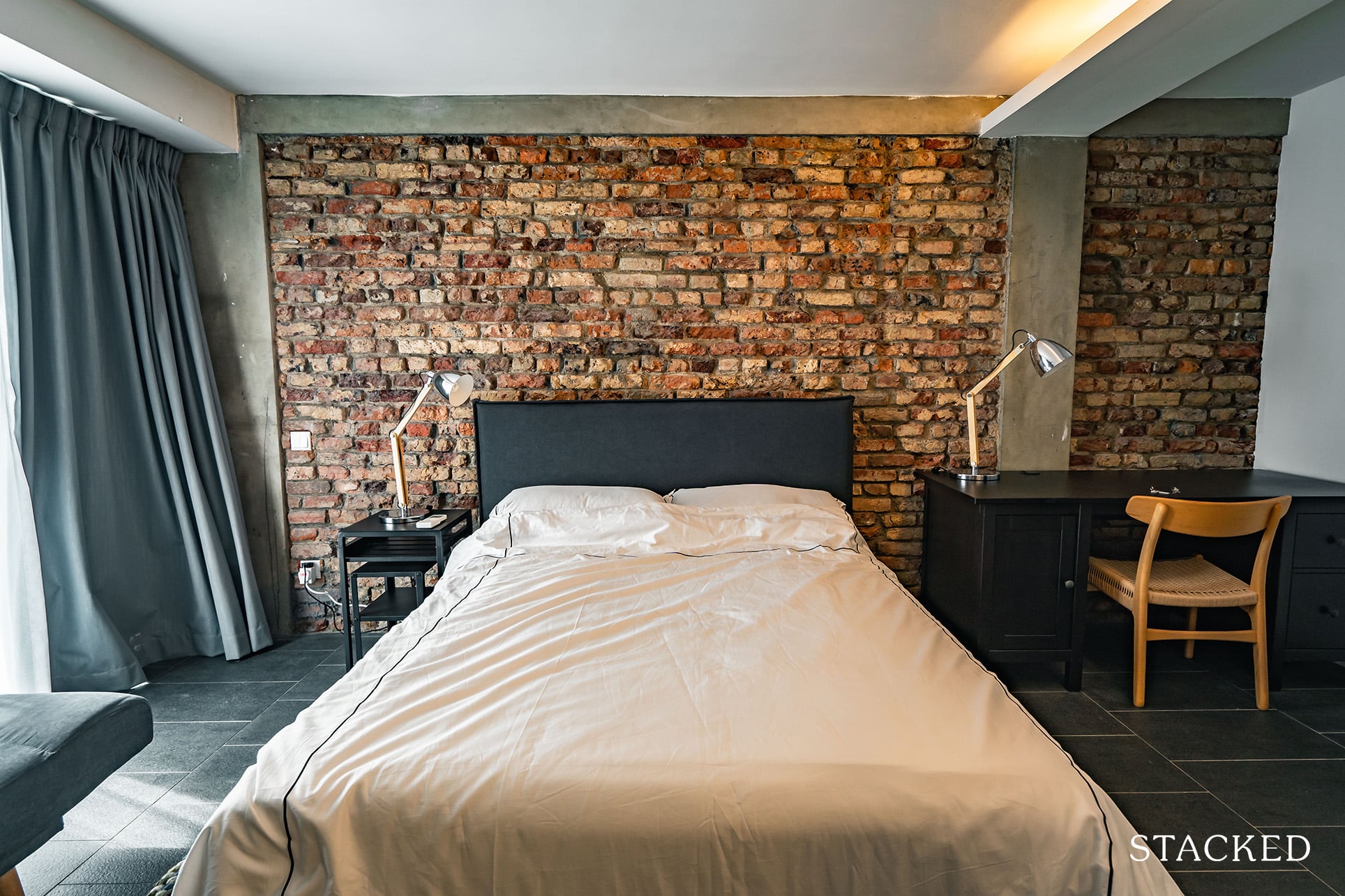
While there was no denying that the bed-kit was of distinct quality, I found the pillows to be too hard for my liking.
Most of the people I’ve met don’t really bother about these nuances, but I’ve always been a very sensitive sleeper so this was a little hard for me to get by.
For those wondering about the price of this room, it is currently going for $2,400 per month for a minimum 3-month rental. You are also able to opt-in for room cleaning during the complementary (weekly) house maintenance for an additional $100 per month.
Shared Toilet + Laundry Area
Before heading into the upper recesses, let’s explore the rest of the amenities on the ground floor.
Right opposite the Ash room is your laundry space set behind closed doors.
Sadly I didn’t get a picture of the area, but you do get a separate washer and dryer here. At full tenant capacity, I’d imagine the need for a laundry schedule to ensure that everyone stays happy (any emergency evening laundry could prove tedious).
More from Stacked
So many readers write in because they're unsure what to do next, and don't know who to trust.
If this sounds familiar, we offer structured 1-to-1 consultations where we walk through your finances, goals, and market options objectively.
No obligation. Just clarity.
Learn more here.
This $55M Corner Site Near An MRT Is For Sale — Despite Being Nearly Fully Tenanted
GB Point, a 99-year leasehold commercial building at 535 Kallang Bahru, is on sale for $55 million. The entire three-storey…
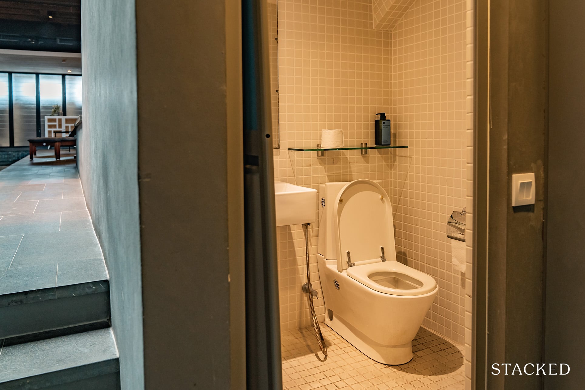
The shared toilet (also used by guests) is right next to it – and it does feel a little underwhelming space-wise when compared to the rest of the house.
The biggest downside for me is that there isn’t a shower screen to separate the shower area from the toilet bowl here. In other words, every shower would involve closing the toilet bowls and relocating your toilet paper to a ‘safe space’.
It does feel like a utility WC in a sense (the ones you find in 3-bedroom condo units and above). The water pressure here is great, although it does take some time to heat up.
It didn’t matter to me personally as I spent a single night here (I also really enjoy my cold showers), but I can see it being a chore down the road if you’re living here for the minimum 3-month period.
There aren’t any storage spaces here, but it does come with a sizable sink and mirror as well as a bidet spray for your toiletry needs. You also get your shaver point and a few hanging-points for your towels and clothing – which again, you would have to be extra careful to not get wet during your shower.
Finally, no windows in the toilet, but you do get your air vent here to combat mould build-up.
Heading into the Dining/Kitchen Area
Next, let me show you the stairs and the dining/kitchen area.
The flooring throughout these areas are made up of simple granite tiling (at least till you get to the living area) – so it isn’t as luxurious as it is contrasting.
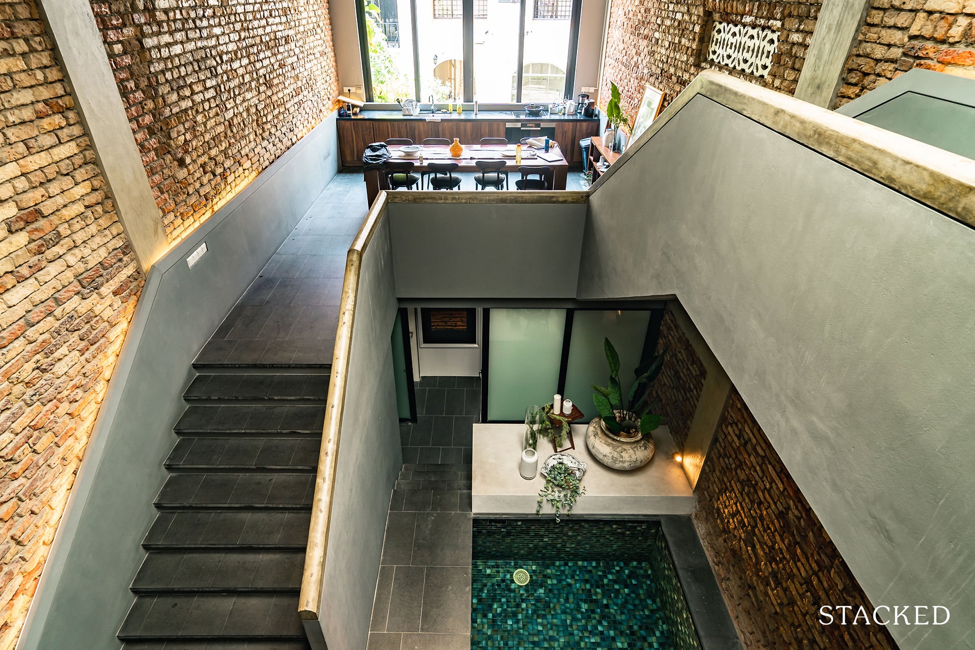
Having taken a rough look at the kitchen space from the initial entranceway, I had an idea of things to come – but staring up at the expansive full-height windows, you do get a sense of grandeur.
Even though the view and privacy here isn’t necessarily the best (you’ll find a low-rise project directly opposite without any curtains to spare), the sheer presence of these windows, in addition to the radiant sunlight that you get streaming into the dining area easily makes up for it.
Besides.. I don’t think I’ve ever craved much privacy in the kitchen/dining area of my home.
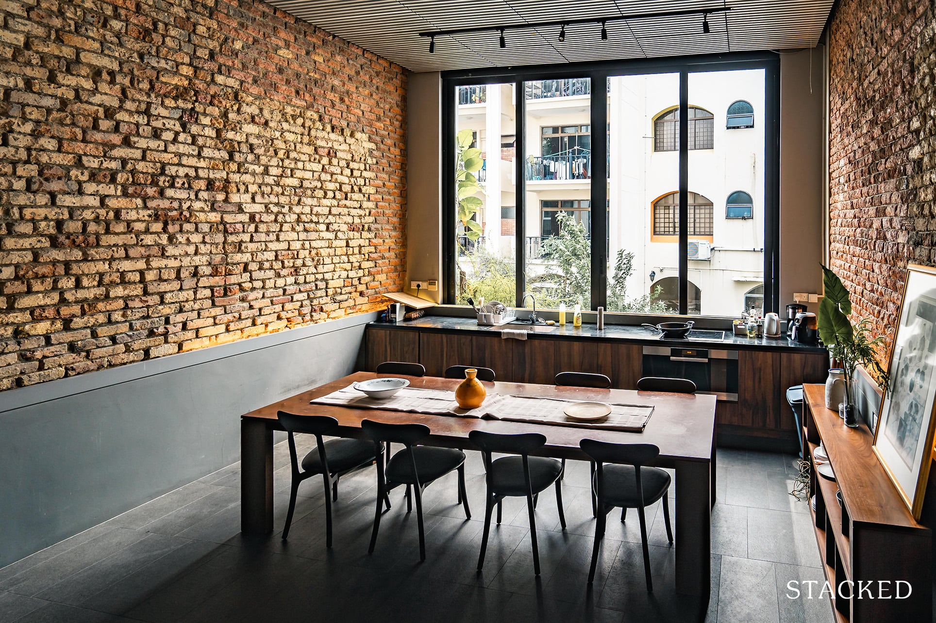
You get a very lengthy kitchen-top here, equipped with a singular sink and your usual hob, fridge (hidden in the bottom left), oven and coffee machine (almost everything short of a microwave oven).
In my opinion, the layout doesn’t exactly facilitate efficient cooking with multiple tenants at once – especially since the oven is located right below the hob. Heavy cooking here is probably ill-advised too as you don’t have a ventilation system in the immediate area that draws out the smoke/smells.
That said, the space is definitely great for a single chef (and guests at the table), with the added bonus of the massive glass windows when you whip up something here.
Accompanying the massive windows is a 3-metre long dining table that can sit up to 10.
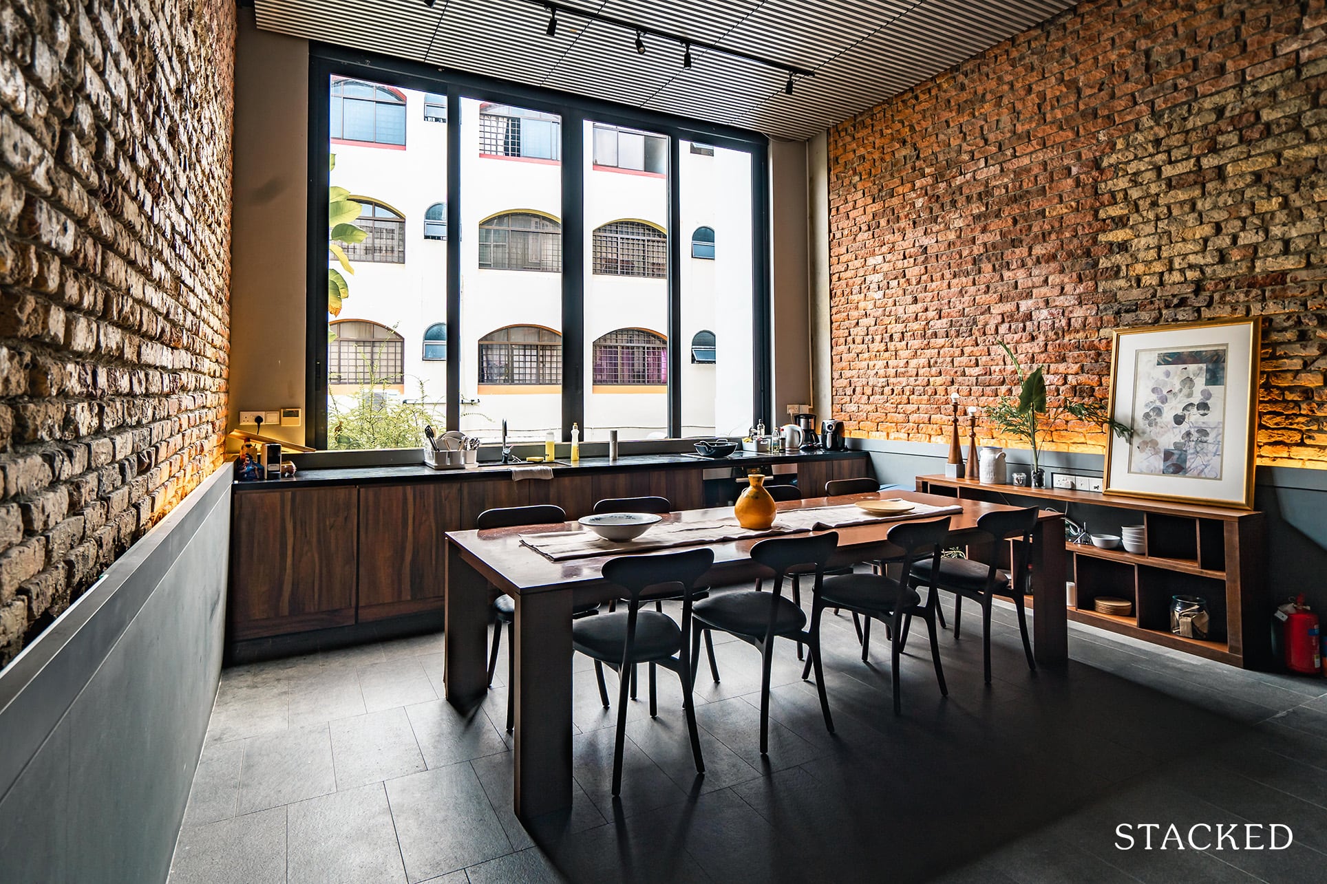
It does look intimidating at first, but in reality it allows for individual personal space when you need it (especially in the mornings).
You also get some simple decor here that adds to the vibrancy of the space.
Cutlery and utensils are of good quality, and in place of the bin is now a freezer – which was probably the only thing lacking here apart from the microwave oven.
Exploring the Living Room
There is another flight of stairs from the kitchen heading up toward the living area.
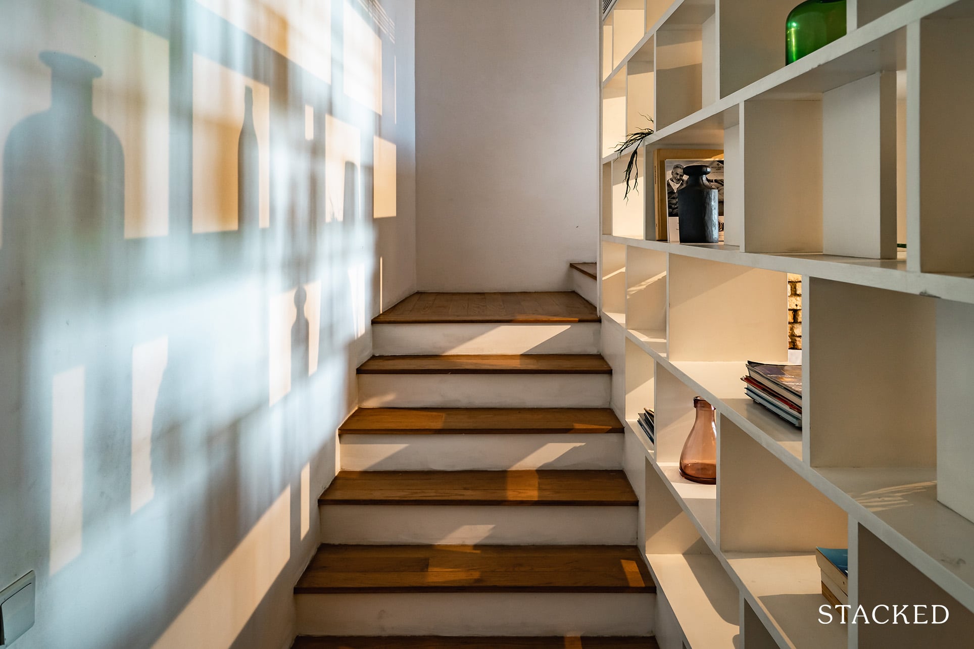
Before getting to the living room, allow me to talk about the way the ceiling is architected here.
In place of your usual flat ceilings are grey slats which act as louvres for strings of natural light to pass through, courtesy of the skylights above.
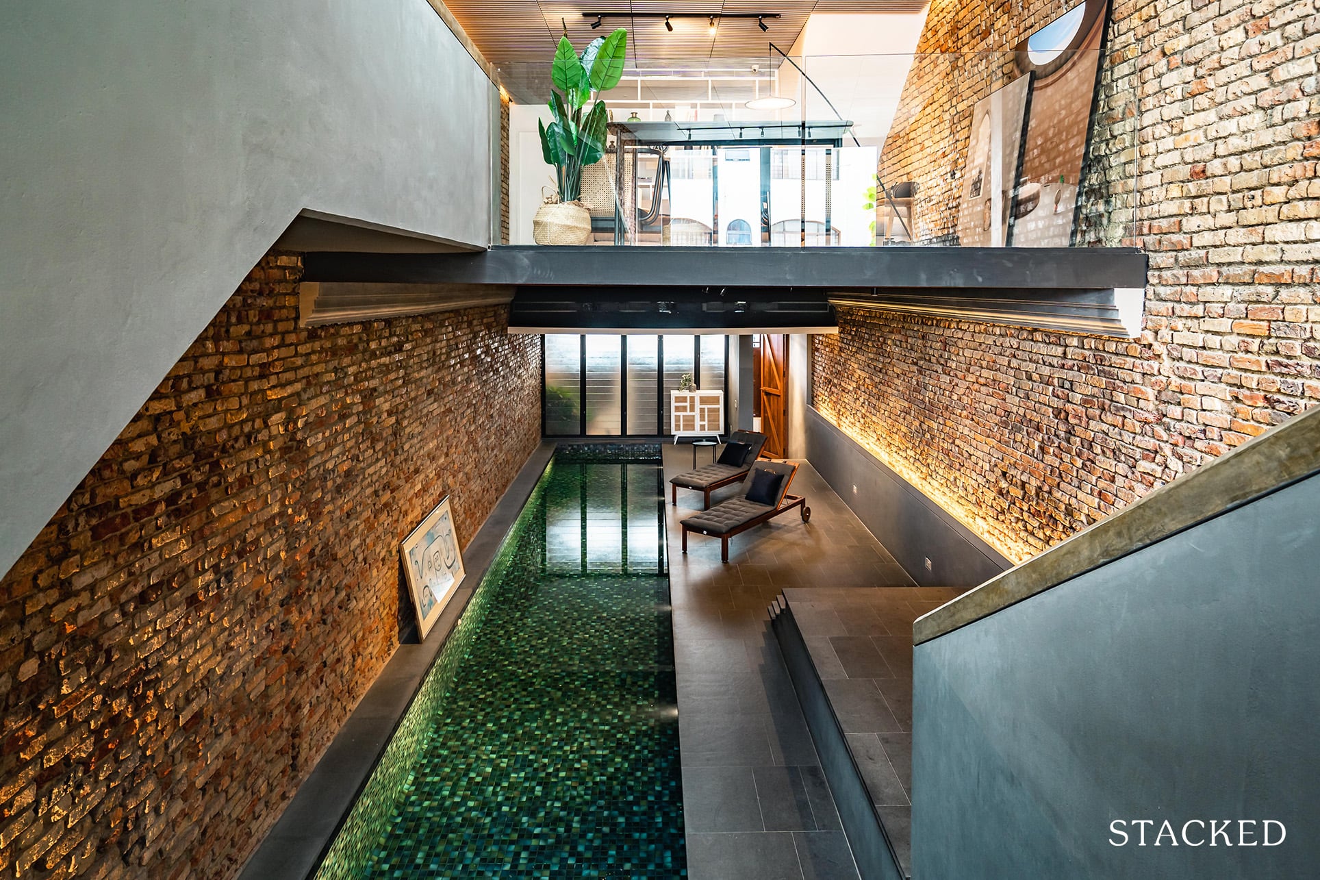
Given the lack of windowed varieties in the general area, I think that this is a brilliant move to discreetly increase the amount of light in the area without necessarily over-exposing the entire space.
It also helps to cast some really beautiful linear shadows on the floor at midday, which I feel many of my fellow art enthusiasts will enjoy.
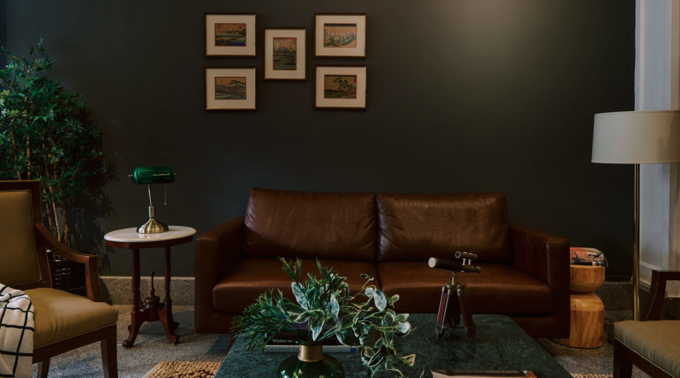
Moving into the living area, I immediately realised how cozy a number of rugs, sofas, lamps and bookshelves can make a place seem.
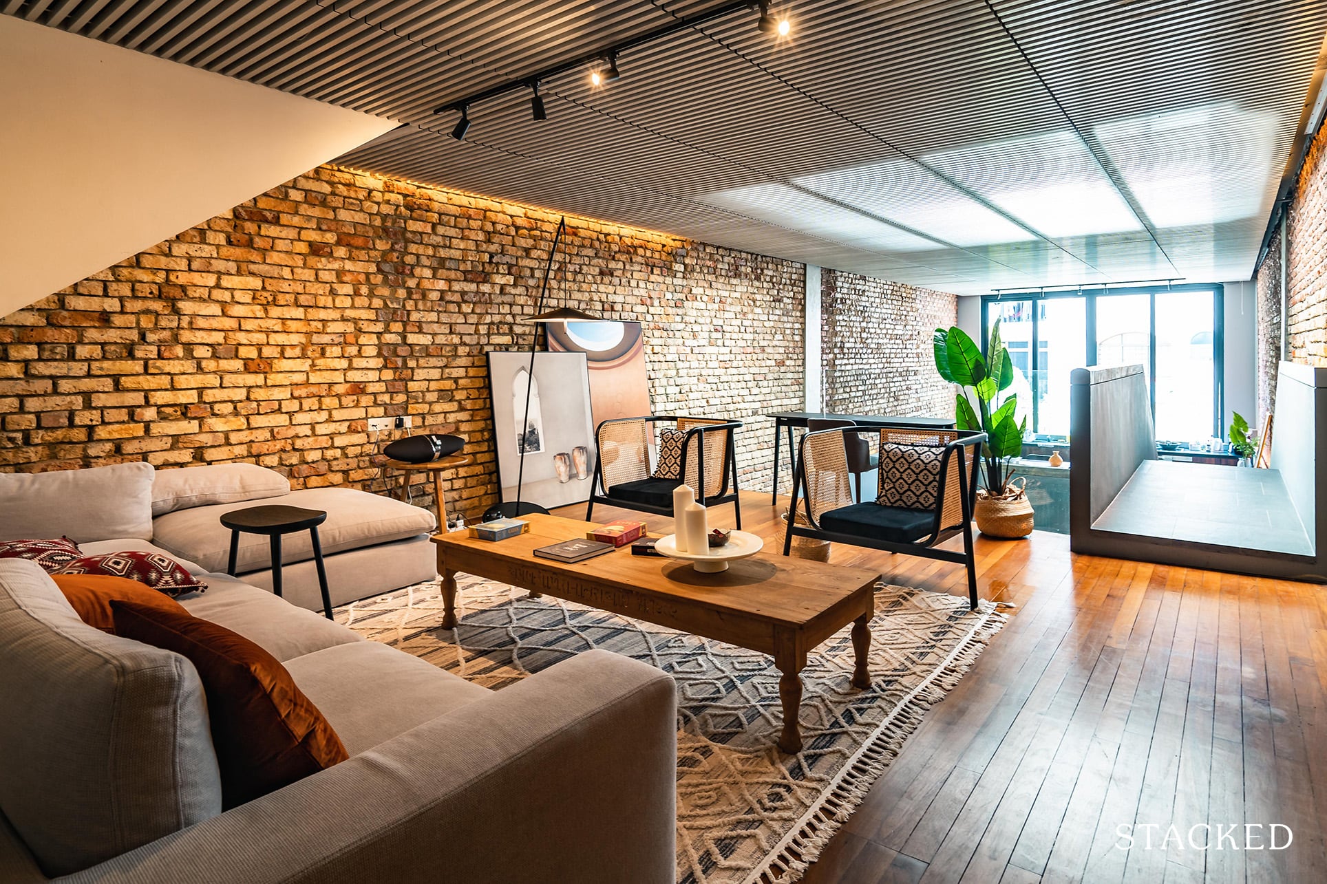
It was also the one thing that had been lacking through the previous areas.
While they had been grand and awe-inspiring, they didn’t necessarily have that added level of comfort that you’d come to expect in a home.
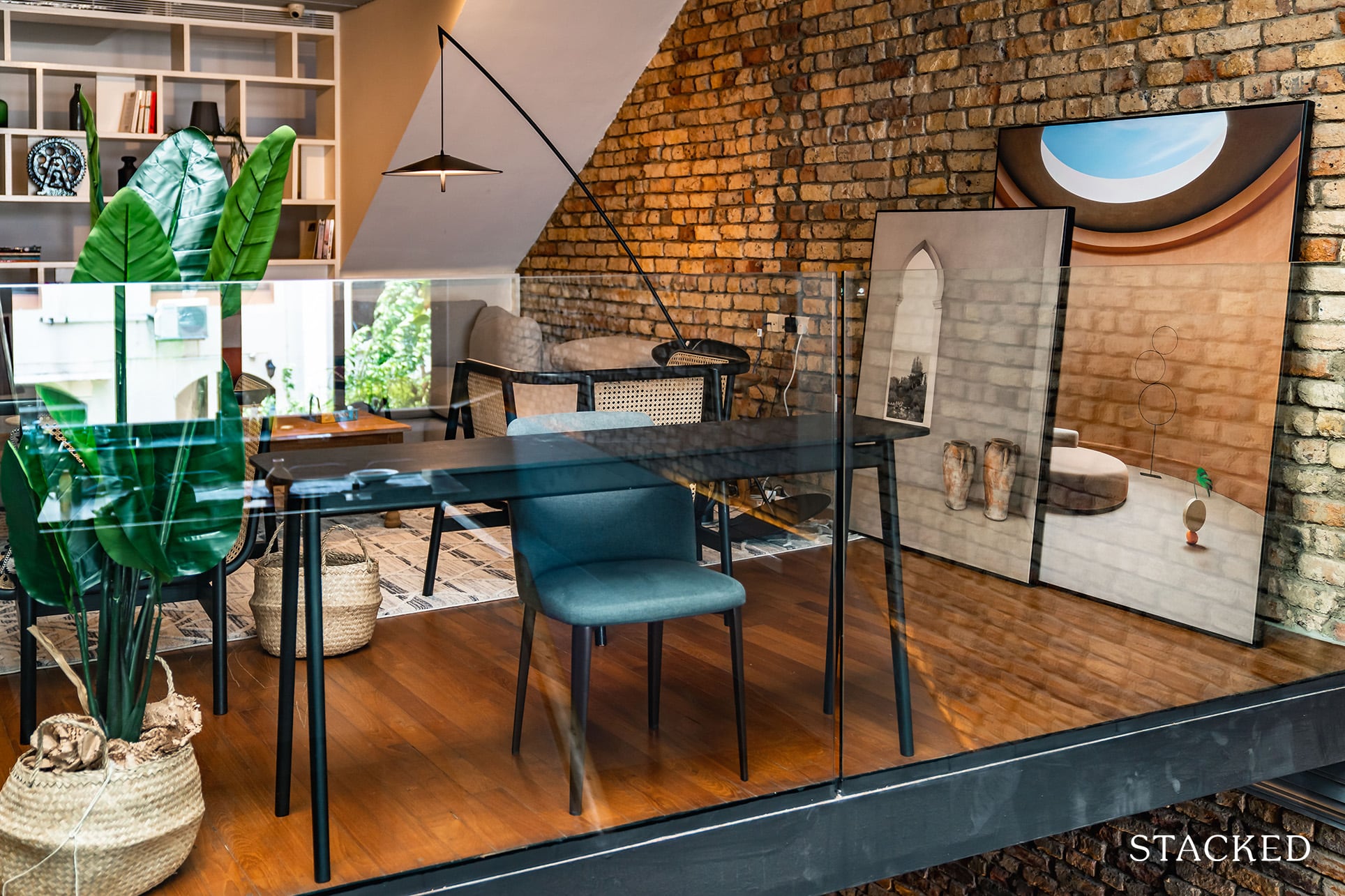
Great for the occasional night-in, this well-lit/seated area comes fully equipped with a speaker, board/card games, books and even a nice study table/chair combo that overlooks the grand dining area – perfect for those looking to work from the comforts of home.
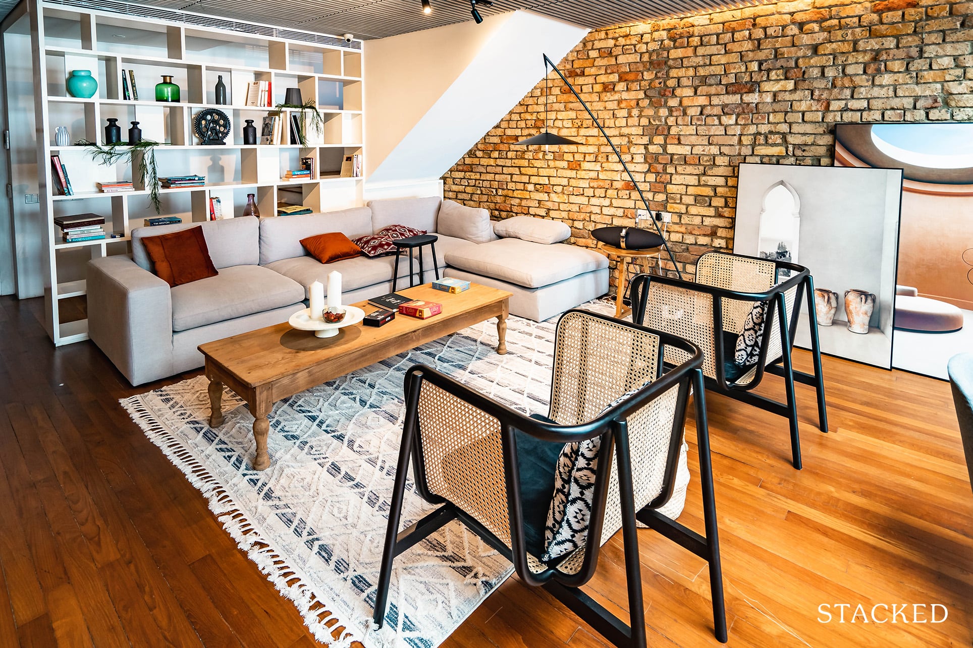
Unlike the dining area, the common table here isn’t the biggest and the way the area is furnished means that it’s a little hard to observe individual privacy here in the evenings (assuming there’s another group sharing the space).
Regarding charging points, you find that there is a singular socket point by the hanging lamp. In reality, you might be able to stretch your laptop charging wires to the workspace, though I can’t imagine doing the same for your phone.
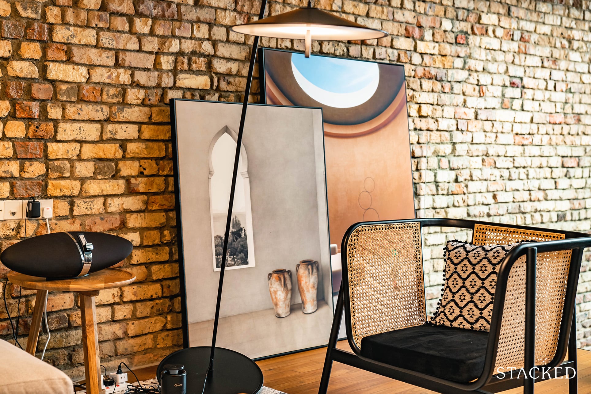
It’s also here that you notice a number of art pieces that really just help to complement the recreational space with a stylish edge.
Rooftop Anyone?
Honestly, I would have been contented if this was it.
But it wasn’t.
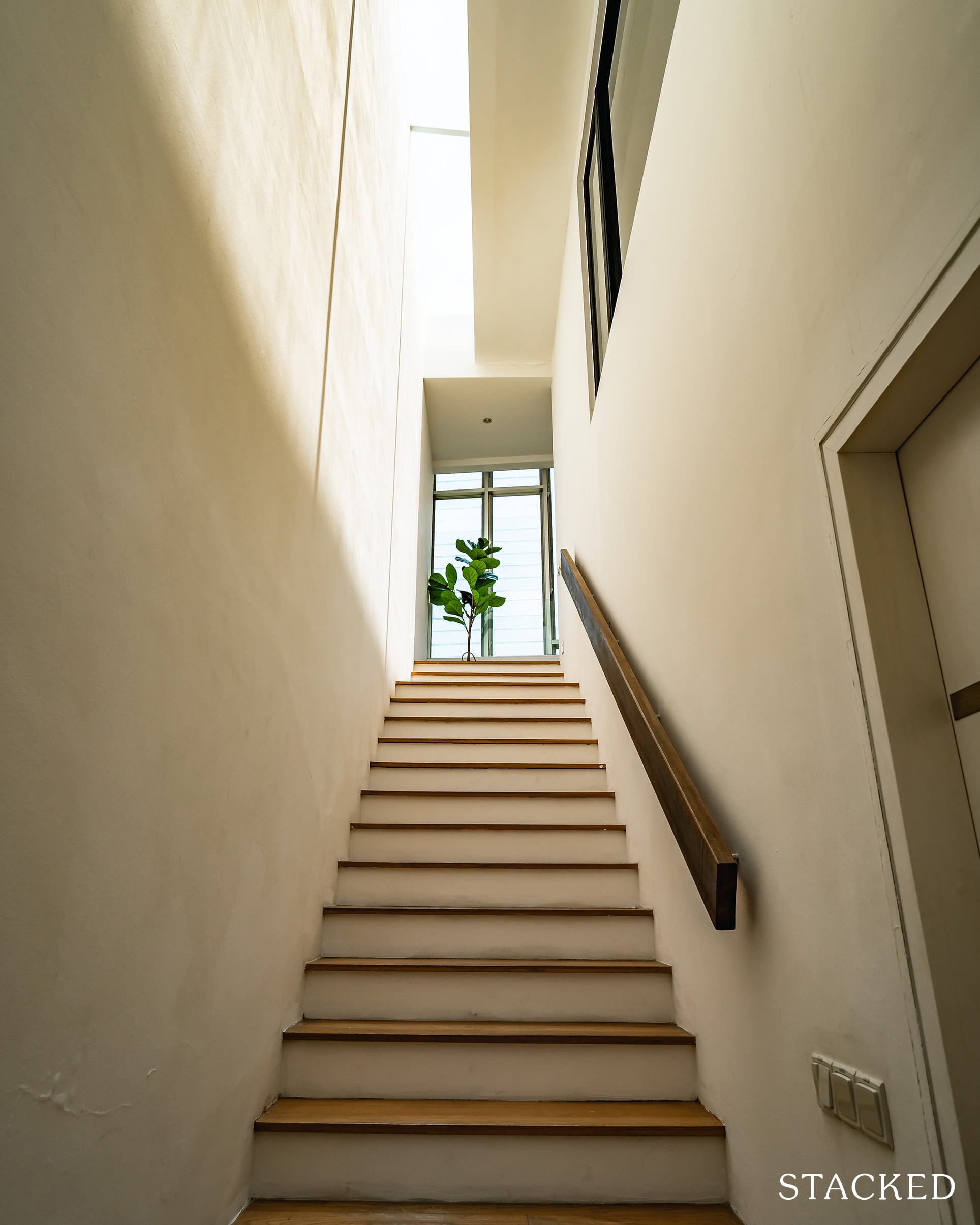
The corridor heading up to the rooftop is definitely well-lit in the day as you get light from the sky windows flooding in.
Getting to the top, the view isn’t necessarily outstanding (again, Geylang isn’t really my thing), but it does give you a sense of spaciousness.
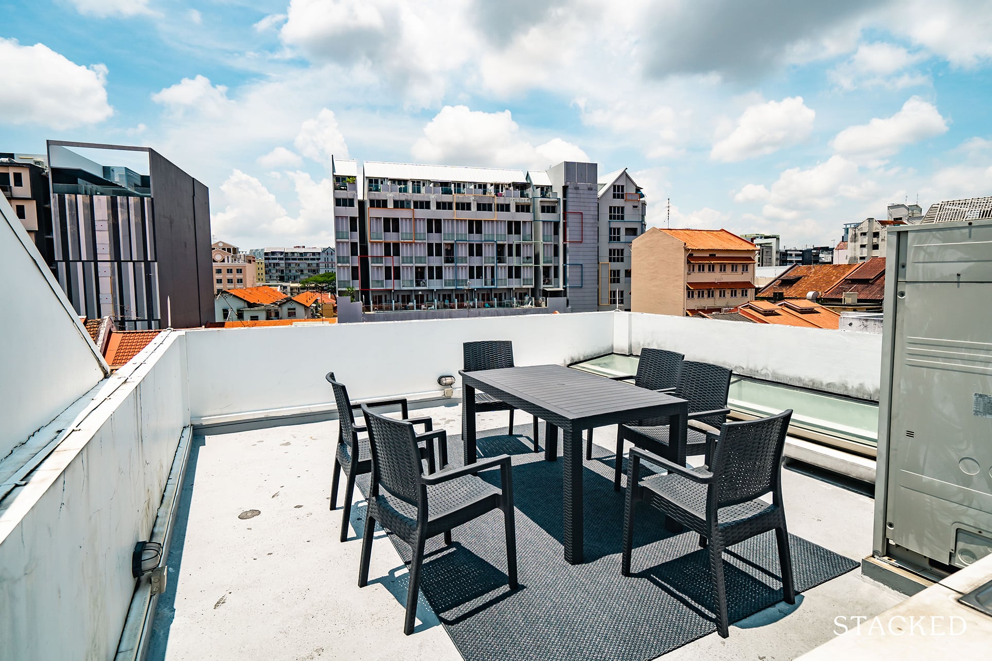
Here, you’ll find a dining table complete with a number of chairs – nothing luxurious, but certainly functional and very useful for the occasional evening al fresco.
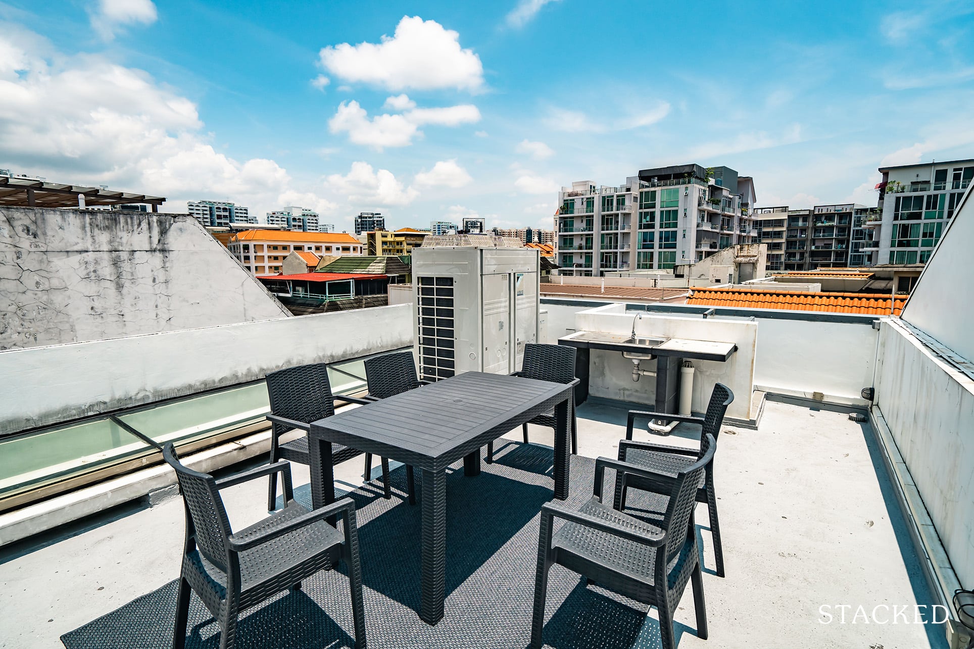
What caught my attention was the fact that this area (and the adjacent shophouses) had actually had roof extensions made to them just a few years back.
In other words, what I was standing on now wasn’t actually part of the initial shophouse. The space is also very customisable should anyone decide to take the initiative in the near future (I’m thinking rooftop glasshouse with fairy lights and some potted plants).
The Location of Alexandra House – Things To Do

From what I saw, there are tons of incredible affordable (and tasty) eateries that line the main road (just a 3-minute walk from the shophouse).
You’d also find your closest Fairprice an 8-minute walk away along Geylang Road with the Tanjong Katong string of malls (City Plaza, Kinex etc.) a further 7-minute walk down (15 in total).
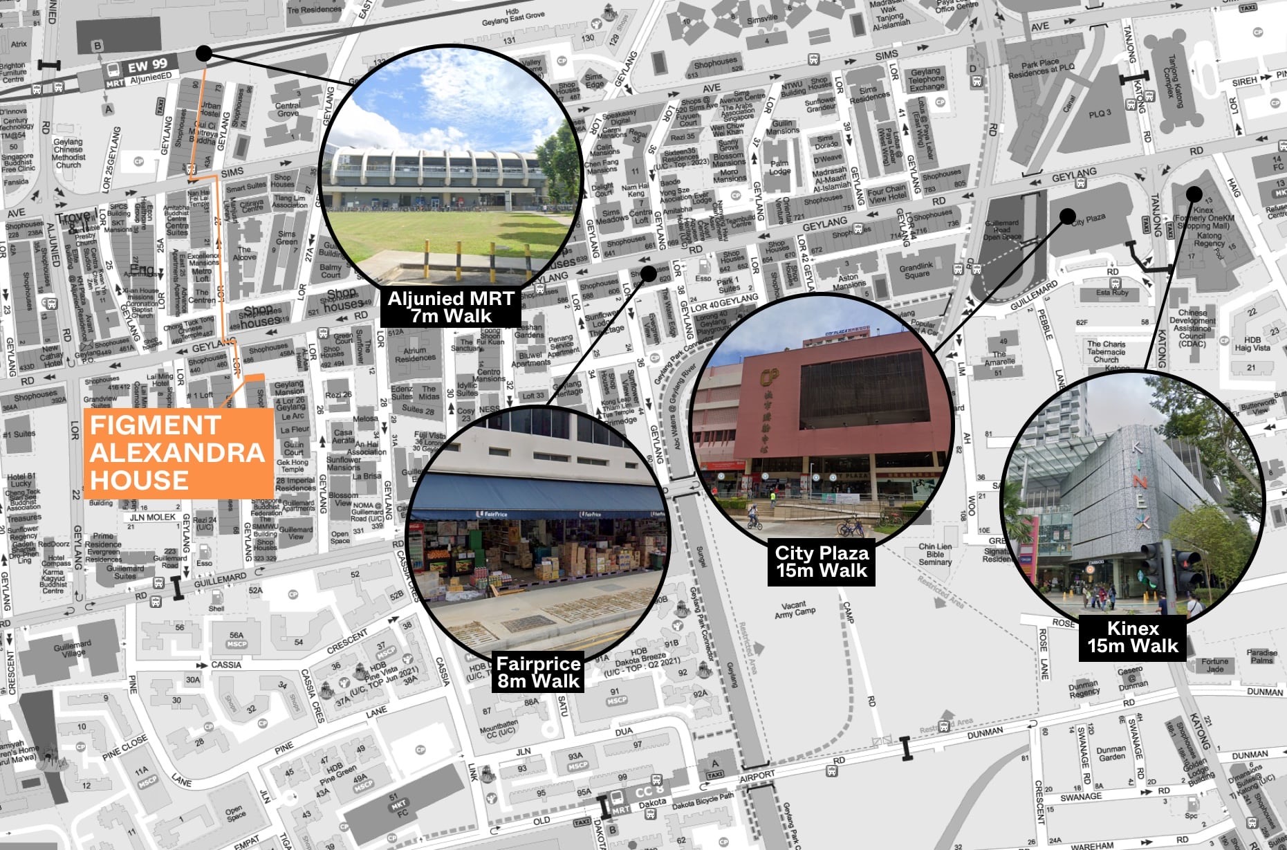
The Aljunied MRT station is also a 7-minute walk away from the shophouse, though sadly the path throughout isn’t completely sheltered.
It’s a 10-minute ride across 5 direct stops to the CBD (Raffles Place MRT), and a slightly lengthier 13-minute ride across 8 indirect stops to Town (4 stops to City Hall MRT and 3 stops to Orchard MRT).
For an ‘east-side’ location, it’s certainly very convenient timings.
A quick google search also shows that the CBD is just a 10-minute drive away – and in that same time, one can easily reach East Coast Park for recreational purposes if you so wished.
I later learnt that one of the tenants even preferred to cycle to the CBD (where he worked), as opposed to taking the bus – because it was just that much faster for him!
My Opinion of Alexandra House & the Experience
2.4k rental per month for a single room is expensive by most people’s standards.
You could also easily get a full 1 or 2-bedroom condo unit in the area coupled with full facilities at this rental price range (or less).
Based on current pricings, a single room at the nearby TRE Residences is averaging $1,000 monthly – so in terms of affordability, room rents at Figment are definitely not the cheapest in the market.
What’s more, the room that I was living in came without a toilet of its own, was adjacent to the laundry area, and wasn’t completely sound-proofed from the outside (not to mention that the toilet wasn’t the most spacious/comfortable in that regard).
So many people do wonder where co-living really fits into the picture in the rental scene in Singapore.
Here’s the way I see it.
Co-living represents a very easy way for people to rent in Singapore.
Many people are unaware of this, but finding a rental space to live in through traditional methods can be a very troublesome process.
From finding a place, negotiating, making sure the defects and inventory list is checked thoroughly before moving in, getting the electricity up, and installing the internet – the list goes on.
So because co-living settles all that hassle for you, it makes it really convenient to move in right away – nearly everything is settled for you.
And yes because of that, there are many other competing co-living operators currently in the market.
But that’s where Figment really stands out.
It caters to a niche crowd, for those who breathe and live design.
To some it may seem incredulous, but there are people out there that are willing to pay a pretty penny for a nicely designed space to live in.
To summarise the Alexandra House, if you are a massive fan of well put-together living spaces – and have a penchant for meeting others (note that your roommates are bound to bring friends over too), then this is definitely an experience you don’t want to miss – provided you have the pockets for it.
At Stacked, we like to look beyond the headlines and surface-level numbers, and focus on how things play out in the real world.
If you’d like to discuss how this applies to your own circumstances, you can reach out for a one-to-one consultation here.
And if you simply have a question or want to share a thought, feel free to write to us at stories@stackedhomes.com — we read every message.
Frequently asked questions
What is the history behind shophouses in Singapore and why are they valuable now?
What makes Figment Alexandra House shophouse unique compared to other accommodations?
What are the main features of the Alexandra House shophouse stay?
How is the check-in process at Figment Alexandra House?
What are the pros and cons of the room and shared facilities at Alexandra House?
How much does it cost to stay at the Alexandra House shophouse for a few months?
Reuben Dhanaraj
Reuben is a digital nomad gone rogue. An avid traveler, photographer and public speaker, he now resides in Singapore where he has since found a new passion in generating creative and enriching content for Stacked. Outside of work, you’ll find him either relaxing in nature or retreated to his cozy man-cave in quiet contemplation.Need help with a property decision?
Speak to our team →Read next from Landed Home Tours
Landed Home Tours Why Singaporean Families Are Looking At This Landed Enclave From Around $4M

Landed Home Tours We Toured A Quiet Freehold Landed Area Near Reputable Schools — Where Owners Rarely Sell
Landed Home Tours We Toured a Freehold Landed Area Buyers Overlook — It’s Cheaper (and Surprisingly Convenient) From $3.2M
Landed Home Tours Inside One of Orchard’s Rarest Freehold Enclaves: Conserved Homes You Can Still Buy From $6.8M
Latest Posts
Property Market Commentary 18 Upcoming New Launch Condos In 2026 — Where They Are And The Ones To Watch
Property Advice Should We Sell Our Freehold Condo For A $2.2M Leasehold Landed Instead?

Singapore Property News Kallang Close GLS Site Sold For $610.8 Million: New Waterfront Condo Could Launch From $2,900 PSF
















0 Comments