We Spent $45k Renovating Our Second Home: How We Saved On Costs By Using Our Existing Furniture
May 22, 2023
Are you someone who would rather start entirely fresh if you are moving into your second home? Or would you prefer to save on costs as much as possible (and maybe for sentimental reasons), by bringing over as much of your existing stuff as possible?
If you are in the latter camp, today’s renovation journey will serve as good inspiration for you on how to fit existing pieces into your new home.
Before Denise (not her real name for privacy reasons) and her husband (@stayhomeforcattos) started their renovation proper for their 3-bedroom resale condo unit in Pasir Ris, they already had an idea about the design they were aiming for.
The couple viewed a number of properties in the East, made comparisons, and arrived at the conclusion that this one was the superior choice. “The floor plan had good bones,” Denise said. “It was a decently-sized 3BR, over 1,000 square feet, where each space in the unit was functional and liveable.”
She continued that the estate has well-maintained facilities, a good view of the sea, and proximity to parks and beaches, which are a bonus.
Whether it’s their methodical approach to house hunting or an influence of the laidback atmosphere in Pasir Ris, one thing’s for sure – they achieved a somewhat smooth course in renovating by taking into consideration their existing furniture and decor.
Presently, their condo unit conveniently houses their family of four – husband, wife, and two cats. Let’s go ahead and check the outcome of their reno journey.

So many readers write in because they're unsure what to do next, and don't know who to trust.
If this sounds familiar, we offer structured 1-to-1 consultations where we walk through your finances, goals, and market options objectively.
No obligation. Just clarity.
Learn more here.
How The Renovation Journey Turned Out
“Budgeted $30K, renovation worked out to be $45K,” was Denise’s response when we asked her how much they initially allocated for their home project.
“We had to factor in additional costs from design-specific details,” she continued, “like opting for shaker-style kitchen cabinets rather than plain cabinetry.” Other things that raised the cost include overlaying bathroom tiles that were longer than the standard 30×30, sourcing vinyl floor tiles from other providers, and installation of additional lighting and electrical points.
For the style of their home, the couple decided to keep the feel of their new place similar to their first home. “As we had brought over items from our previous place, the design and style of this home was planned around the furniture and decor we already had, with a few updates on art and decor pieces.”
Apart from the necessary kitchen cabinetry and bedroom wardrobes, they also prefer individual furniture pieces rather than built-ins so they could have the freedom of moving decor and furniture as needed.
She said they gathered inspiration from a variety of sources. Youtube channels such as “Your life is good” and “Roommy” provided minimalist perspectives on design, furniture, and decor. There are also Pinterest and IG accounts of homes in Finland, Poland, Germany, and Japan, which are largely Scandi and Japandi – designs that they were leaning towards. They even watched design shows such as Get Organised with The Home Edit and Dream Home Makeover.
Let’s have a visual tour of the outcome of their home renovation.
Living Room
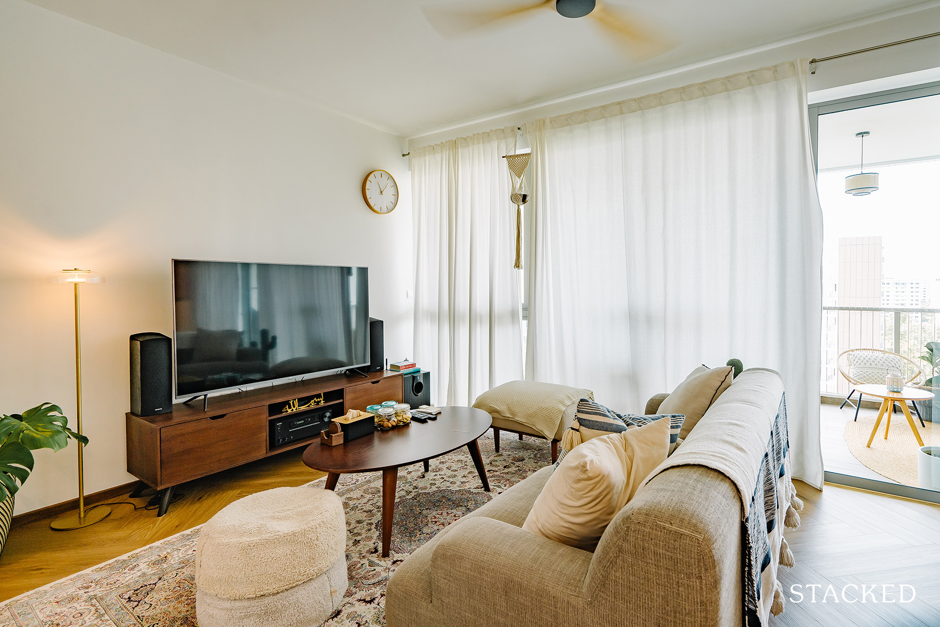
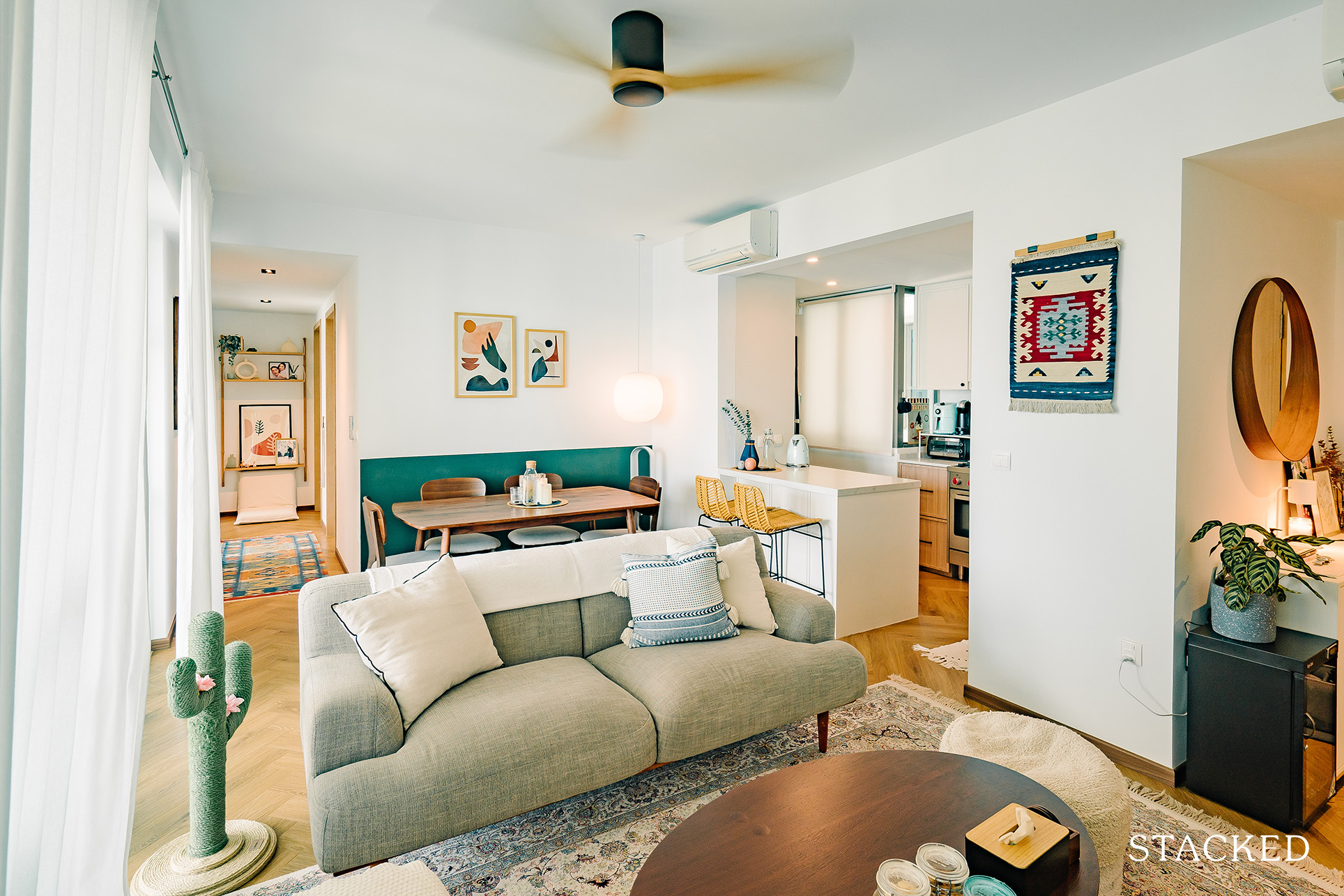
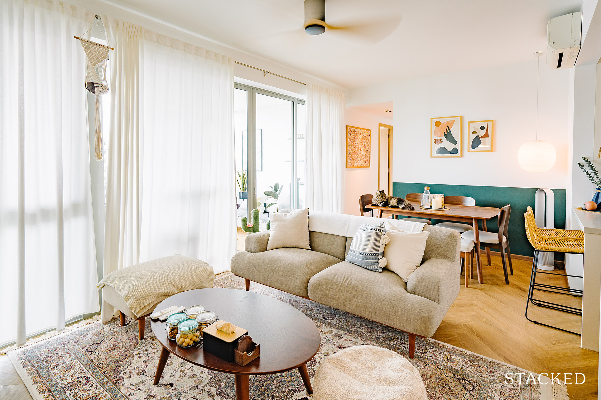
There were no layout changes for the living room, which retained its open-concept design together with the dining area. While they added a large area to create a subtle separation between the living and dining, you can clearly see the herringbone vinyl overlaid on the floor.
Dining Area
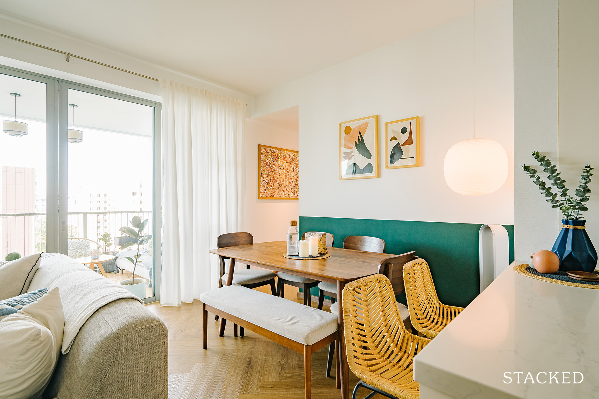
The herringbone vinyl extends to the dining area, with the separation kept via the large rug for the living. In fact, this floor design can be seen almost throughout the common areas.
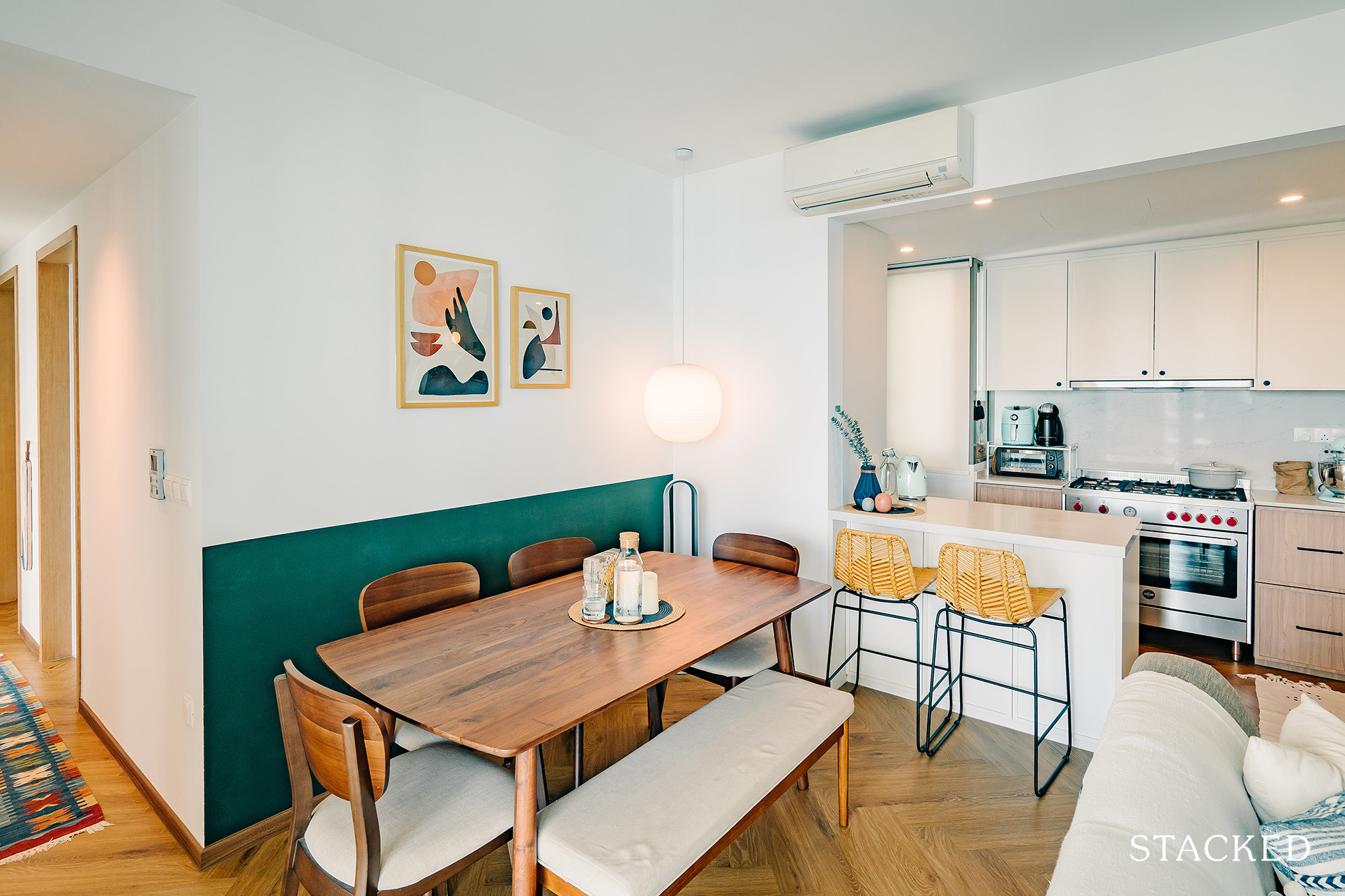
The dining area is framed by the gallery wall, with the half-coloured green providing an interesting backdrop.
Kitchen
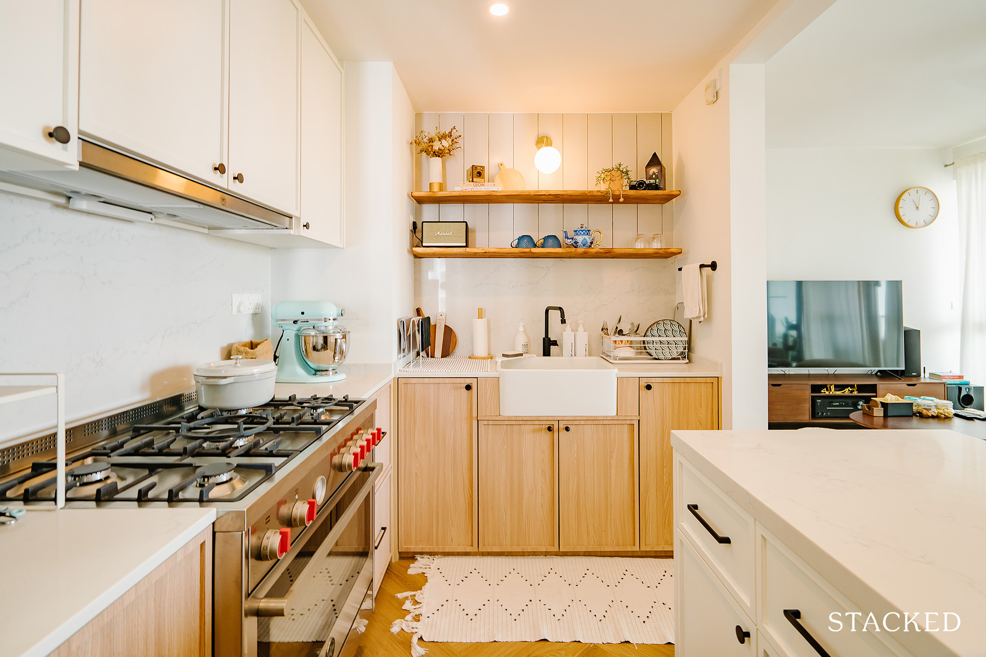
Most of the major layout changes took place in the kitchen. The original wall intended for the fridge/washer placement and the sliding door to the kitchen were hacked away.
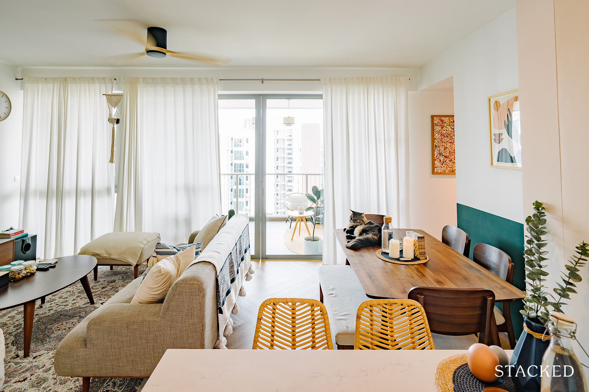
A connecting island was placed instead so the kitchen would be open to the dining and living area. As you can see from the photo above, it offers quite a stunning view, both inside and outside the home.
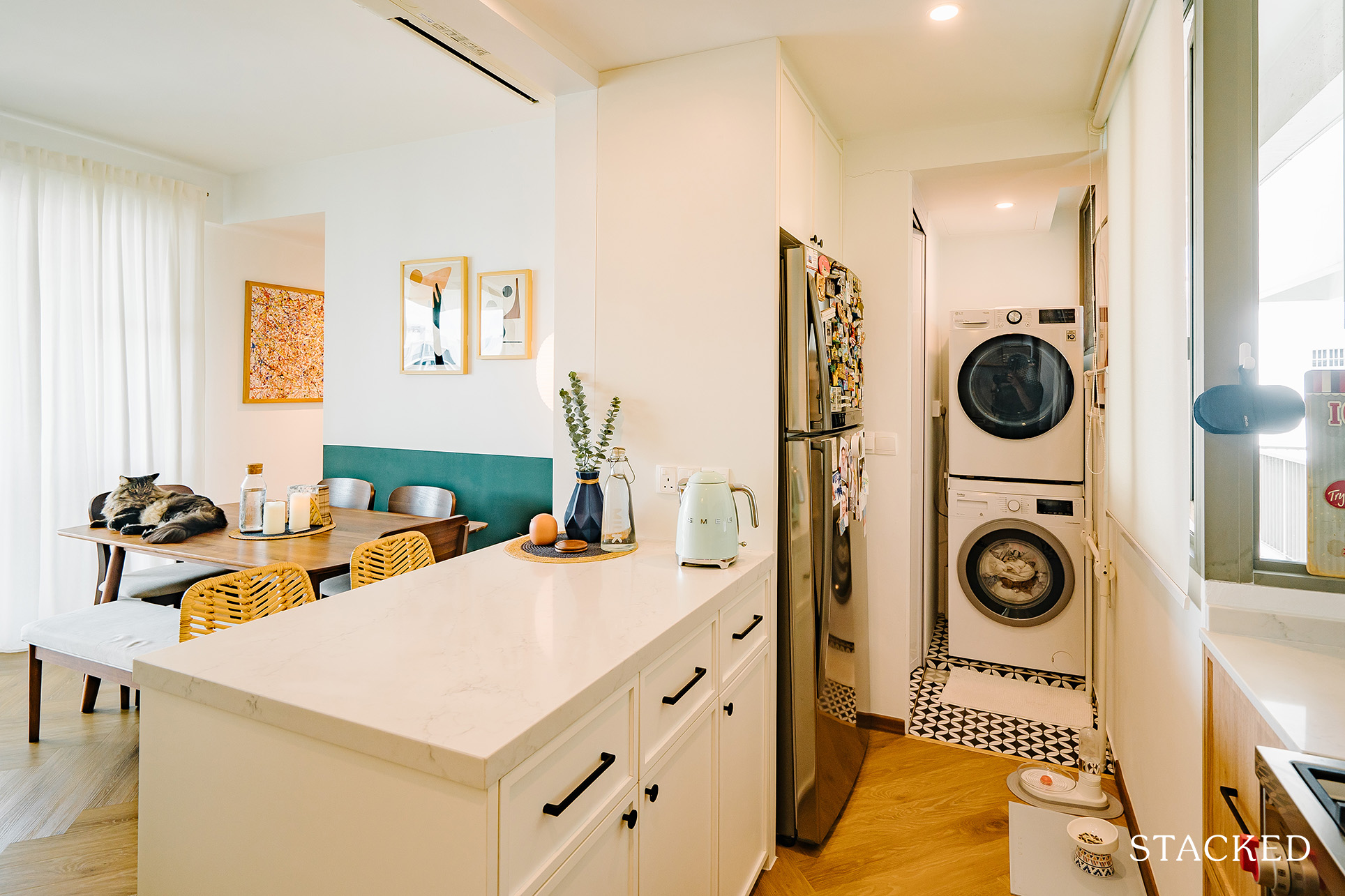
They also converted the WC in the kitchen into a yard where the washer and dryer would be placed instead. The original utility door was relocated to face the ‘new’ yard, and its previous location was sealed with a wall.
Bedroom/s
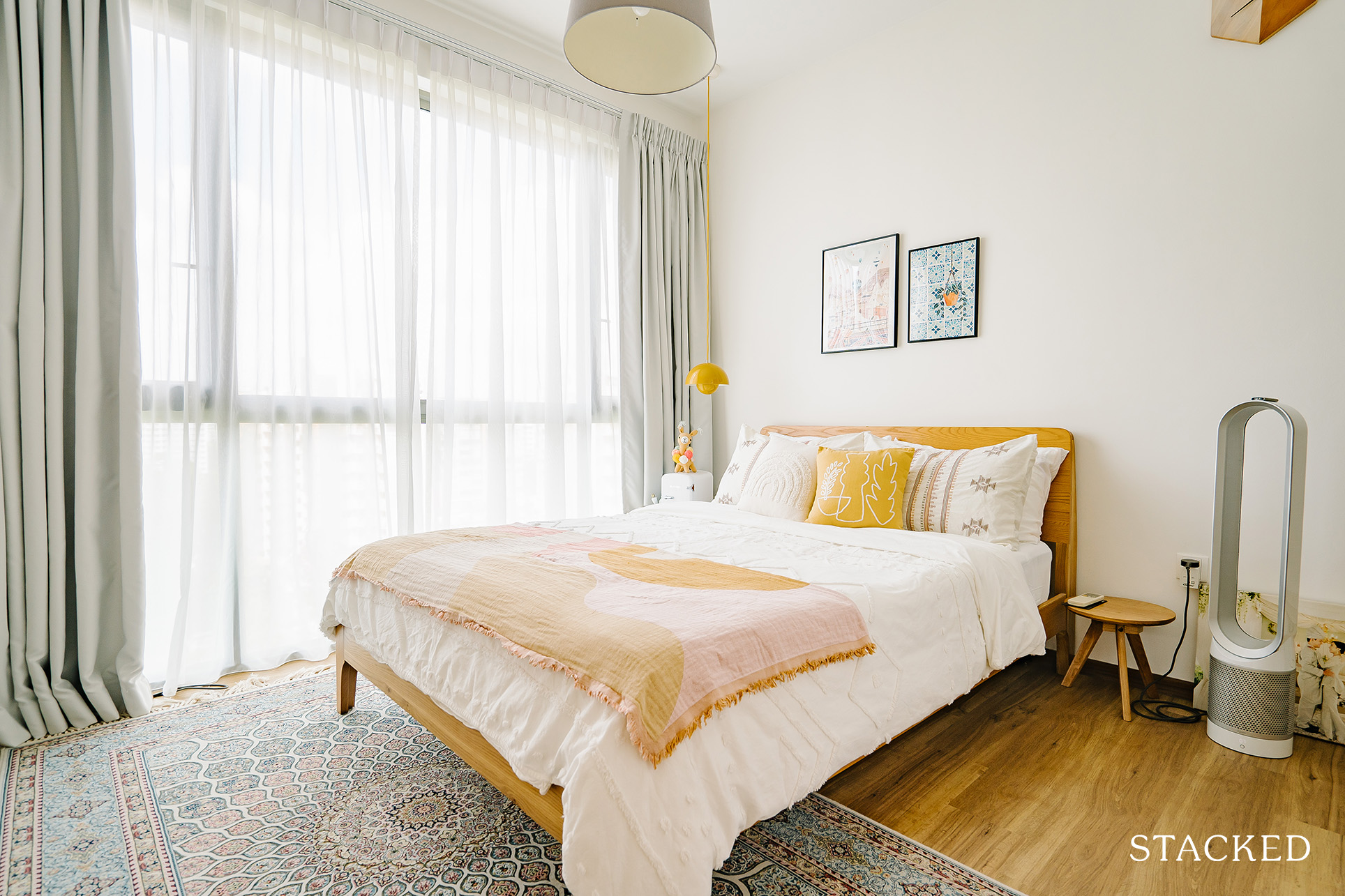
The vinyl flooring continues in the bedroom, but this time, they chose to use a straight wood plank design instead of herringbone. They also removed the existing ‘pole-system’ wardrobes from the developer and installed built-in wardrobes instead.
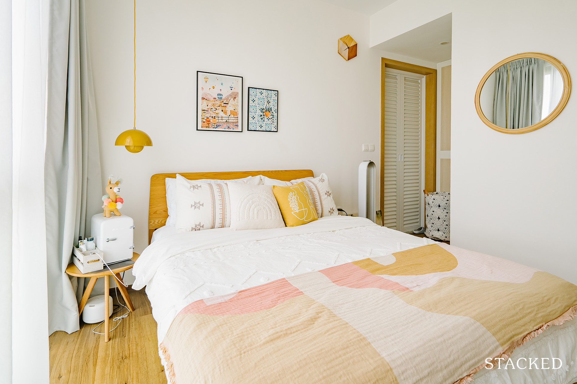
Here you also find the &Tradition flowerpot pendant lamp making an appearance with its cheery yellow hue.
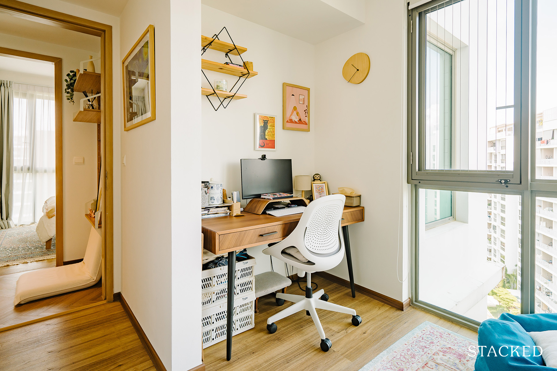
For this particular bedroom, they purchased a study table that fits snuggly in the ‘nook’ between the walls, converting it into an office/library/music room.
Bathroom/s
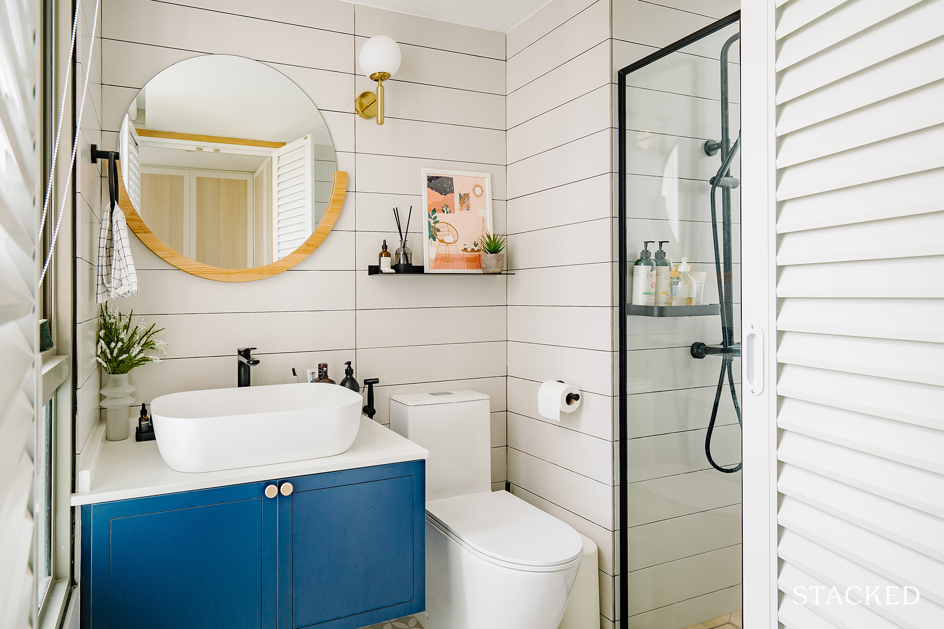
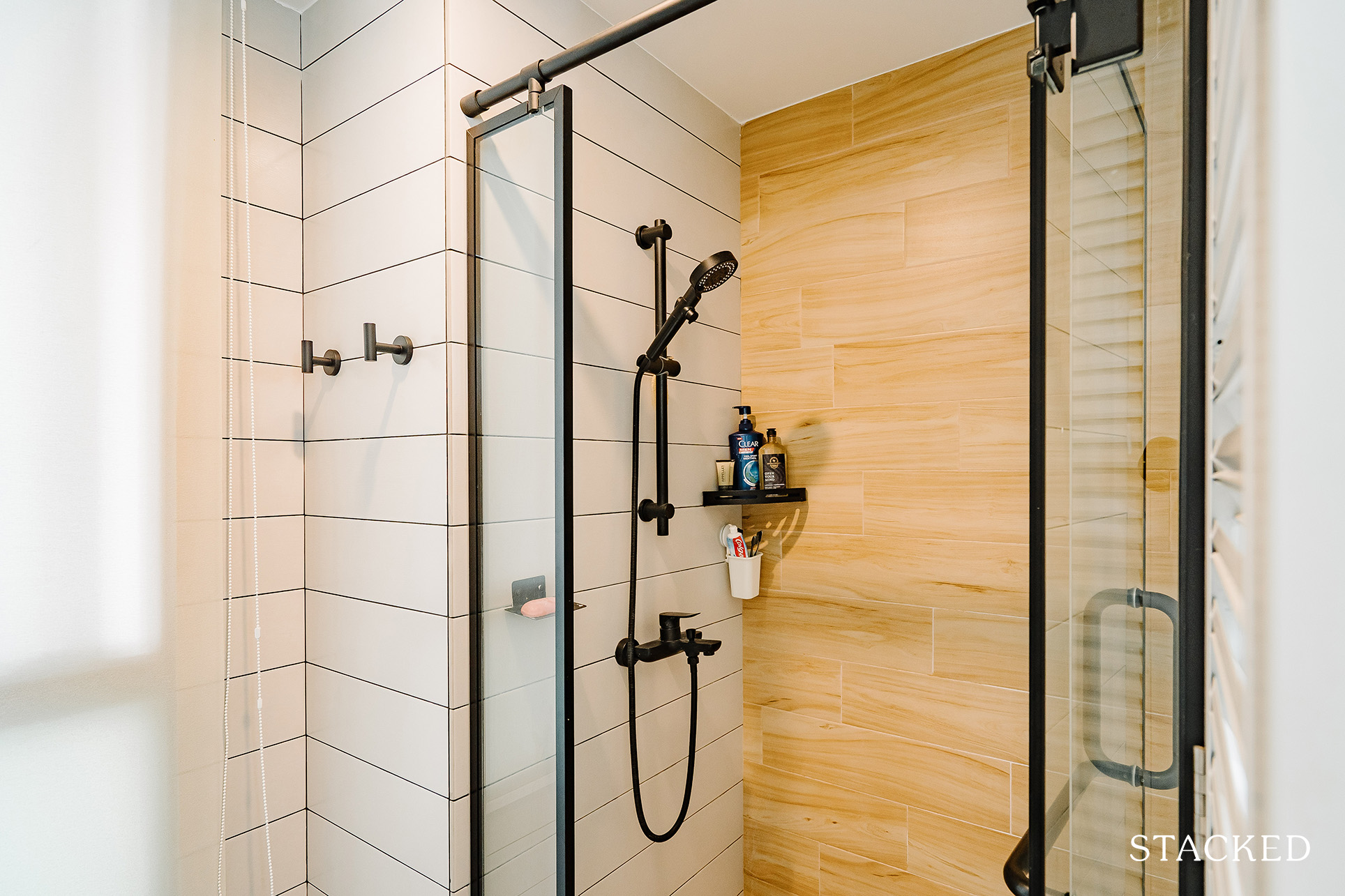
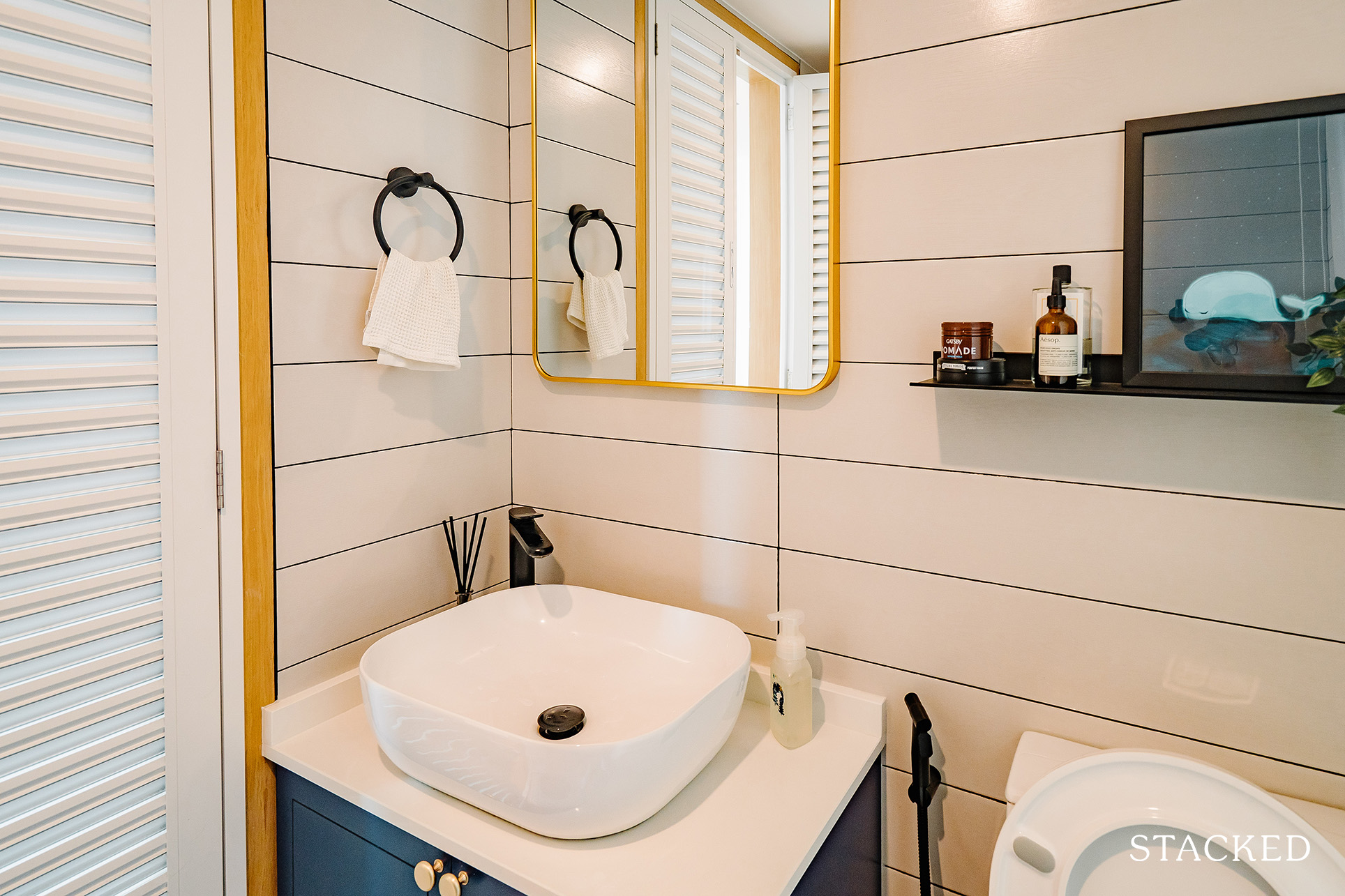
The couple decided to overlay the floor and wall tiles of both bathrooms. They also changed the bathroom doors and had built-ins for the vanity, sink, and WC. Black sanitary fittings were also installed.
The result is a very clean overall look, with a pop of colour from the blue cabinets and gold hardware handles.
More from Stacked
5 Upcoming Executive Condo Sites in 2026: Which Holds the Most Promise for Buyers?
Executive Condominiums (ECs) are more important than ever to buyers in 2025. With private homes now reaching $1.8 million or…
Bringing The Vision To Reality
Spacemakers Pte Ltd. was their partner in this reno journey. “We had put together a mood board with details and ideas of how our home would ideally be. Spacemakers were accommodating to our design-specificities and put our ideas into reality.”
She said they also completed the bulk of the renovation within a comfortable timeline.
Even if they decided to bring most of their existing furniture pieces from their previous place, they also complemented it by investing mostly in wood furnishings because of their timeless design and longevity for wear. “As trends evolve, we felt wood pieces would remain classy and bring warmth to our space,” she added.
Their sofa, ottoman, high chairs, and study table were from Castlery, while the dining table and TV console were from Commune Living. Star Living was where they got their dining chairs and coffee table, and their bed frame, which was quite a steal at $600, was from Ezbuy.
And since a big part of their home was through their extensive furnishings, Denise was happy to share the places she source them from.
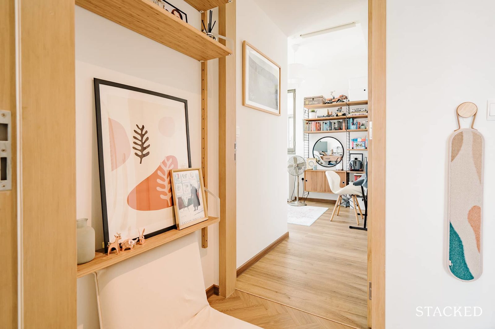
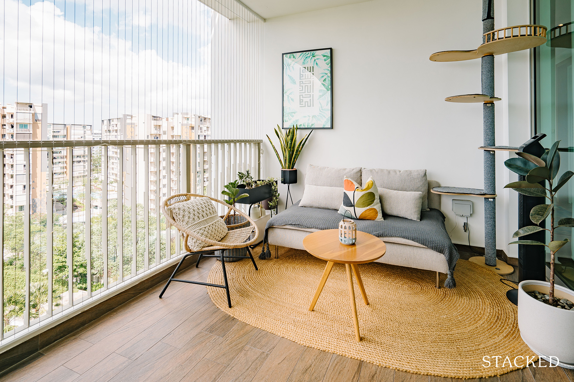
The modular bookshelves by String Furniture were purchased from Design Danish Co. Their pendant lighting and lamps by New Works, &Tradition, Menu, and Opjet were bought from Finnishdesignshop, Smallable, and also from IKEA. Other stuff they got from IKEA includes some mirrors, their balcony sofa, and outdoor rattan chairs.
“Our rugs were bought from various stores such as the living room rug from Tabrizcarpets, the hallway rug from our Turkey trip, the master bedroom rug from a store in Arab Street, the office/study rug from Overstock, and the balcony jute rug from Castlery. Decor and art pieces around the house were from our travels, independent artists, as well as Muji, Amazon Home, Hooga, and Ezbuy.”
When it comes to picking what she believes is the best area of their home, Denise admitted that it was tough to pin it down to just one.
“But it would be a cross between the kitchen and the office/library/music room,” she said. “The kitchen teardown and revamp was a major portion of the renovation and is the zone with the highest traffic – highly popular with our cats especially.”
On the other hand, their office/library/music room is a space for work as they spend most of their working hours from home. “At the same time, outside of work, this is the same space we unwind in, workout in, and where we enjoy just a little bit of quiet,” she added.
Lessons Learned From A Successful Reno Journey
We asked about the obstacles they encountered, and they all boiled down to everyone’s “favourite” challenger, the pandemic. “With COVID delaying supplies, the skirting for the floors was not ready in time for our move. We had moved in for a month or so before skirting was ready to be installed.”
They had to shift furniture to the middle of each room to provide the installer ample space to move and work around a fully-furnished house. She said that their contractor did an amazing, but the mess from the sawing could not be avoided.
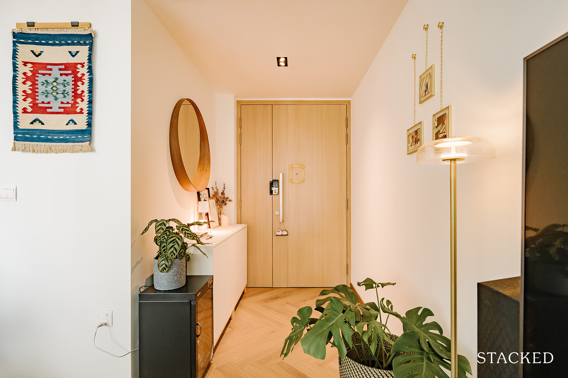
Being homeowners the second time around meant they had a better grasp on what they use often and what they do not, which helped a lot in their project.
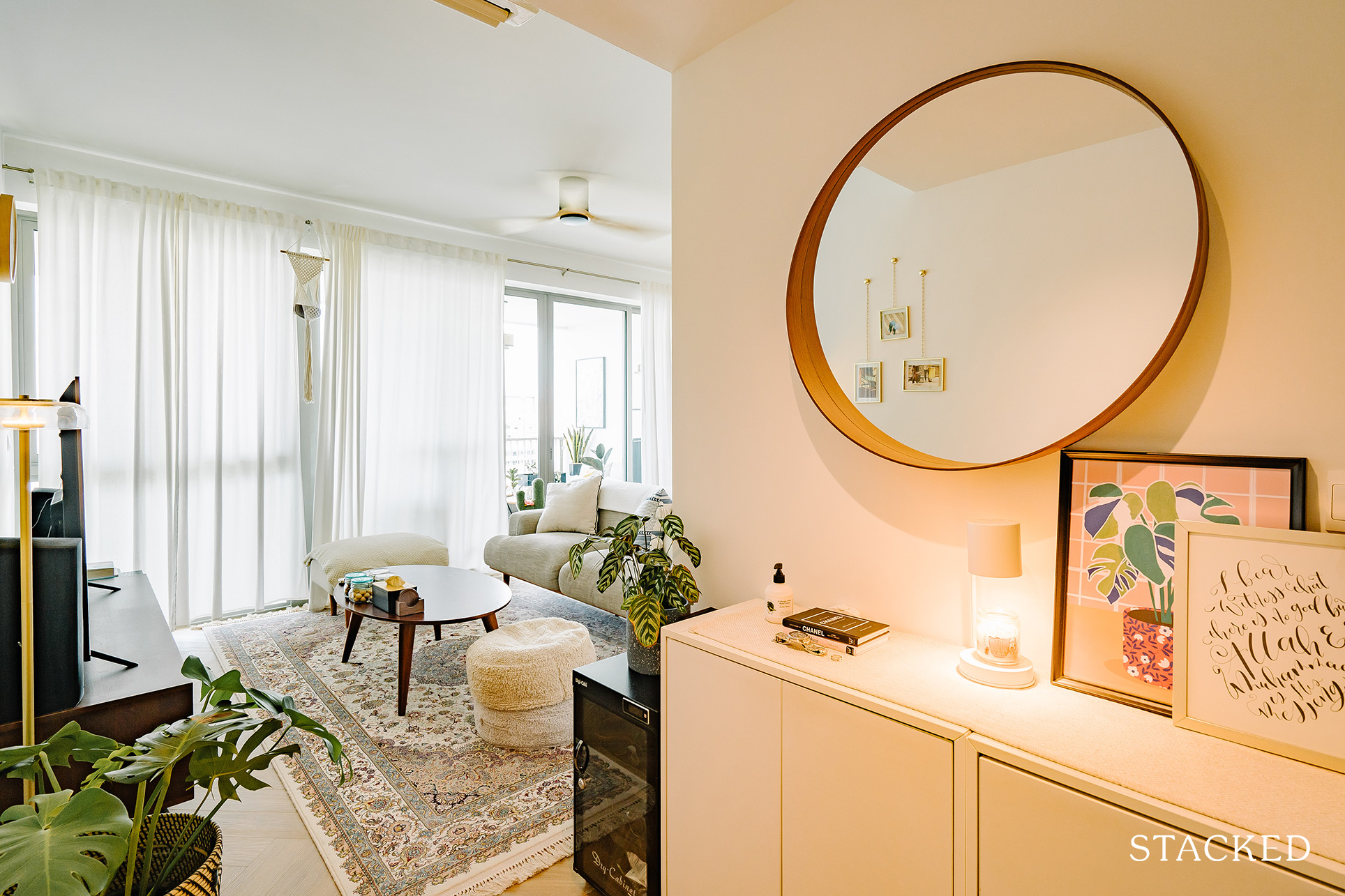
“There are no ceiling lights in the living room as we prefer ambient and diffused lighting to keep the mood cosy. We had a number of downlights in our previous living room and realised we rarely used them, so omitted them this time around.”
The couple was also more confident in openly conveying their design ideas to the renovation contractor as they knew better what their needs were.
We asked Denise if they have pieces of advice for new homeowners who are planning to spruce up their place, and she provided these great tips based on their experience.
“Online channels are the best forms of design inspiration. Pinterest and IG are useful for pinning down visuals. Once you start pinning down images and ideas you like, the algorithm works its magic and presents more content that gravitates towards your tastes and styles.”
“Spend time on local home and design sites like Stackedhomes, Squarerooms, and Lookboxliving, as they offer useful and expert information on Singapore’s home and renovation specificities.”
She also advises having patience with furnishing and decorating the home because, in her own words, “a home is only one-half design, while the other half a place of belonging and a collection of what you love.”
All in all, if something makes you happy and keeps your pockets intact, Denise said to go for it.
At Stacked, we like to look beyond the headlines and surface-level numbers, and focus on how things play out in the real world.
If you’d like to discuss how this applies to your own circumstances, you can reach out for a one-to-one consultation here.
And if you simply have a question or want to share a thought, feel free to write to us at stories@stackedhomes.com — we read every message.
Need help with a property decision?
Speak to our team →Read next from Homeowner Stories

Homeowner Stories We Could Walk Away With $460,000 In Cash From Our EC. Here’s Why We Didn’t Upgrade.

Homeowner Stories What I Only Learned After My First Year Of Homeownership In Singapore

Homeowner Stories I Gave My Parents My Condo and Moved Into Their HDB — Here’s Why It Made Sense.

Homeowner Stories “I Thought I Could Wait for a Better New Launch Condo” How One Buyer’s Fear Ended Up Costing Him $358K
Latest Posts

Singapore Property News HDB Resale Prices Fell — But A Third Of Buyers Still Paid $800K+ Last Quarter. Here’s Why

Singapore Property News Three Strata Office Floors In Suntec Priced From $135M

Singapore Property News This Freehold Desker Road Shophouse Is Going For $10.5M








0 Comments