Tour This Dawson BTO Transformation: How A Couple Achieved A Cosy Korean Aesthetic Look With A $50k Reno Budget
November 21, 2022
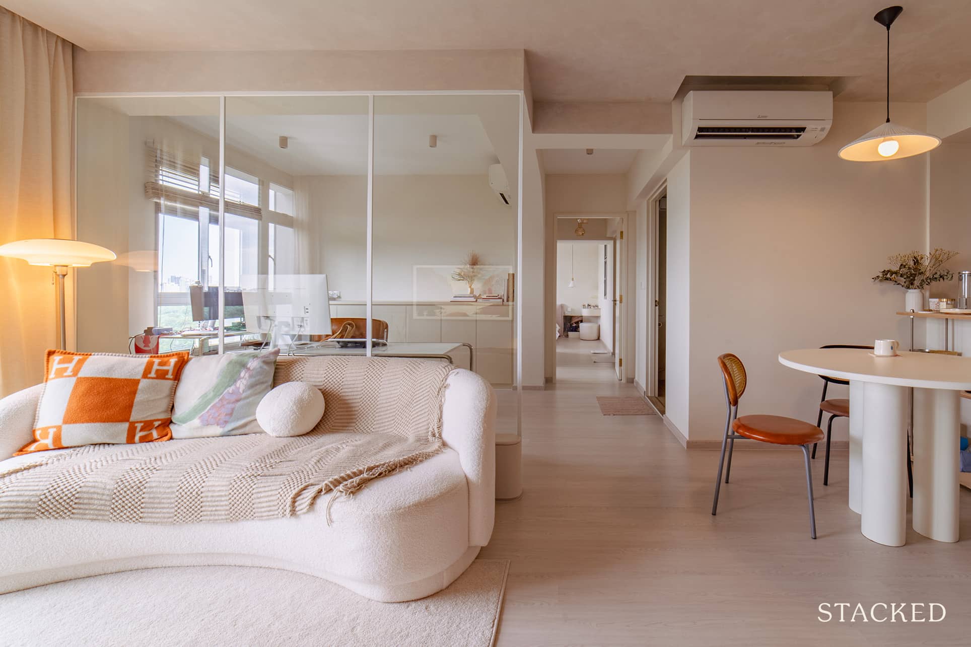
Who doesn’t like to work from home?
Other than the advantage of not having to spend money or time travelling, you get to enjoy working in a more comfortable environment. And what could be more comfortable than home, right?
While the answer to that is obvious, the challenge for anyone working from home is – how do you have a home that is comfortable and cosy to you, but yet still conducive enough for work?
Lisa and Tom of @aulait.home (*not their real names for privacy reasons), knew they were going to spend a lot of time indoors because of their Work From Home situation. As such, their new home at SkyResidences@Dawson needed to be one that suited that need.
They had a chance to ballot for the place during the first SBF exercise. That was the time when these units were released to the public after the SERS folks exercised their options.
Right now, it’s just she and her husband who are presently residing there since it’s their matrimonial home.
Let’s join Lisa as she shares the reno journey of their neutral and calming home.
So many readers write in because they're unsure what to do next, and don't know who to trust.
If this sounds familiar, we offer structured 1-to-1 consultations where we walk through your finances, goals, and market options objectively.
No obligation. Just clarity.
Learn more here.
How The Renovation Journey Turned Out
Lisa said they allocated $50K for the reno and $20K for furnishing. They felt it would be a reasonable budget, especially considering the size of their unit.
“To be honest, we stopped keeping track towards the end of the reno. But if I were to estimate costs, I think we didn’t exceed our budget,” she said.
When it comes to their specific home design and style, she said they wanted to go for something neutral, calming, and open. They knew they would be spending a lot of time at home, so she said those adjectives were important to them when envisioning their home.
“Most of our design inspo came from Chinese, Korean, and Taiwanese homes,” she said. This is why there are a lot of beige, white, and cream tones all around their house.
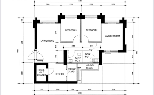
And everyone knows that first impressions are important, so the couple wanted to ensure that from the get-go. As such, they hacked three walls down to open up the entire living, kitchen, and study areas. Below is a photo of their original floor plan.
The following image was from the initial proposed changes. However, after the site assessment, the island kitchen island was scrapped (you’d see why further down below).
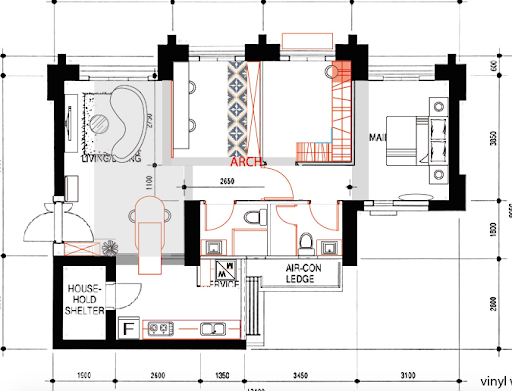
And instead of hacking more walls to combine into one master bedroom, they smartly decided to save more by just moving the bedroom’s door out (which at first glance, made their home seem like a 3BR unit since it lacked a corridor).
Also, pushing the door halfway through the hallway allowed them to have private access to one of the bathrooms.
Let’s have a quick tour around their home and visually experience the results of their reno.
Living Room
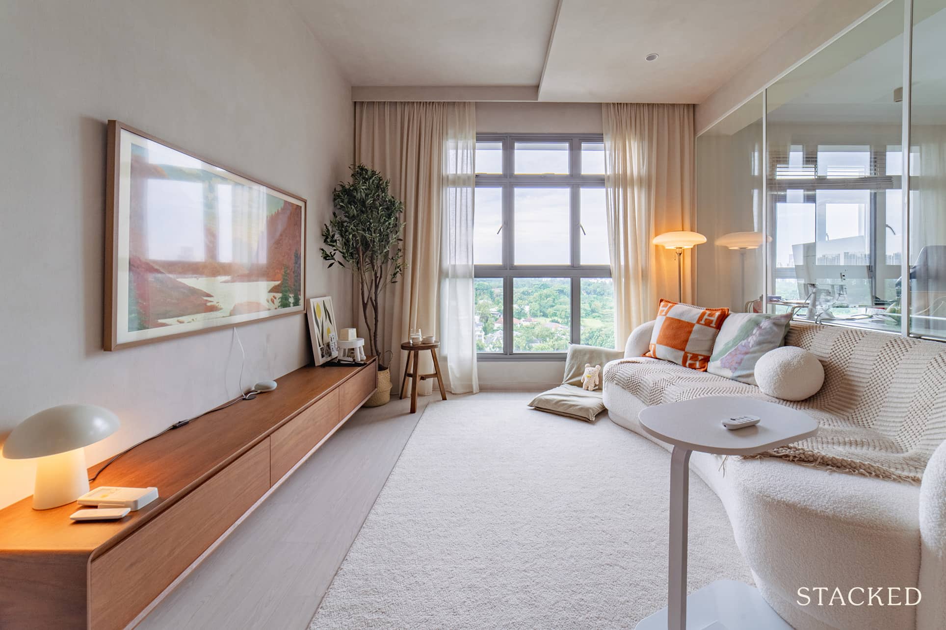
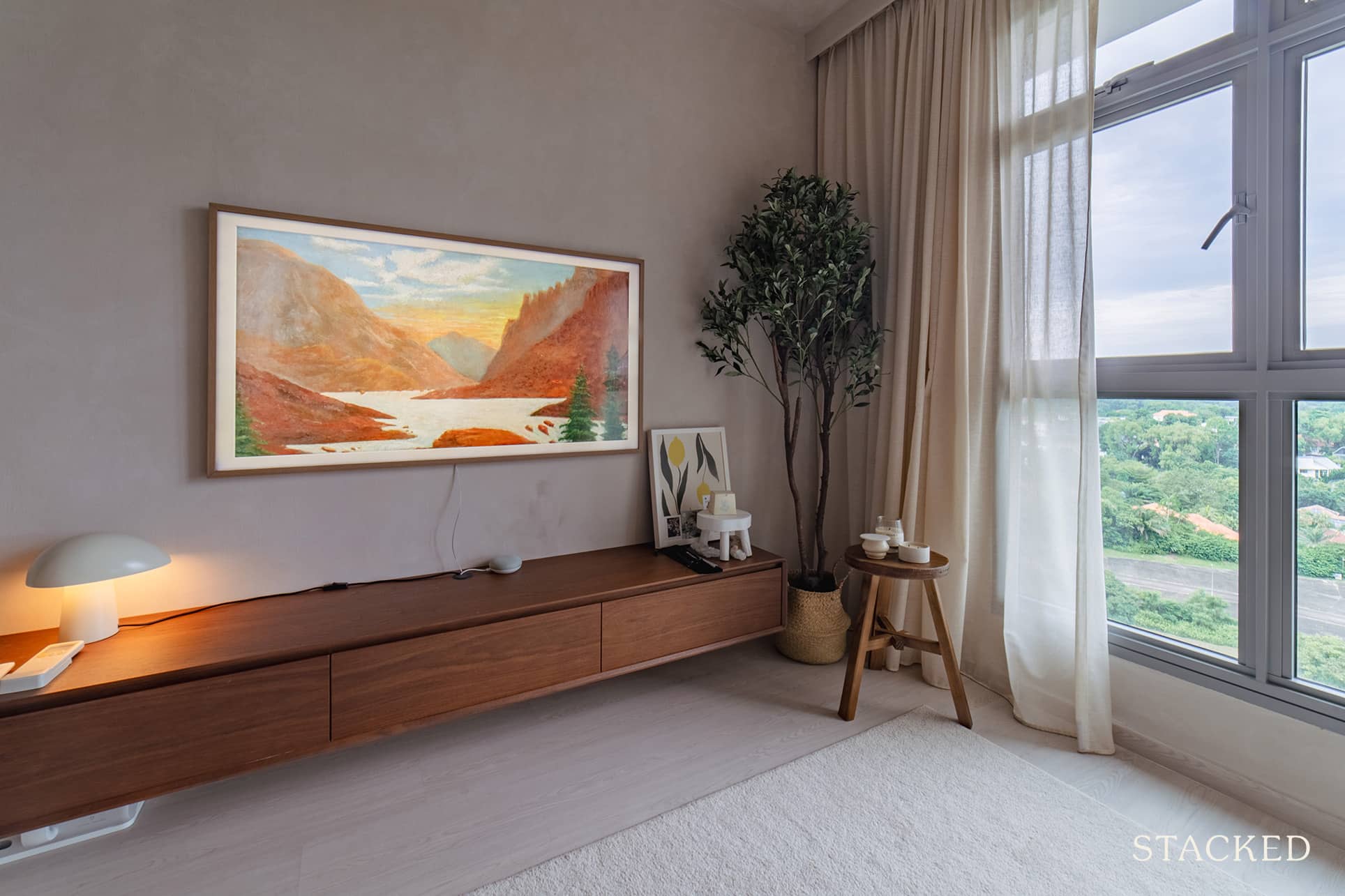
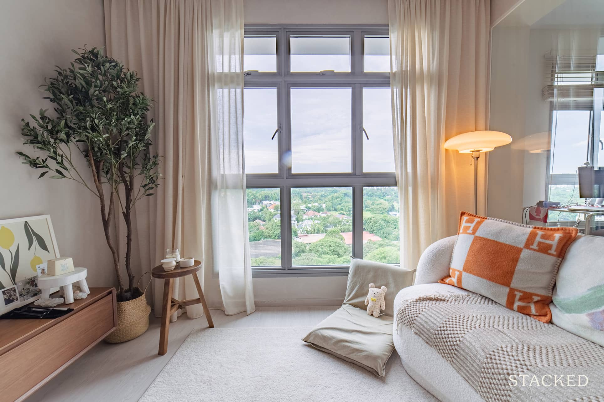
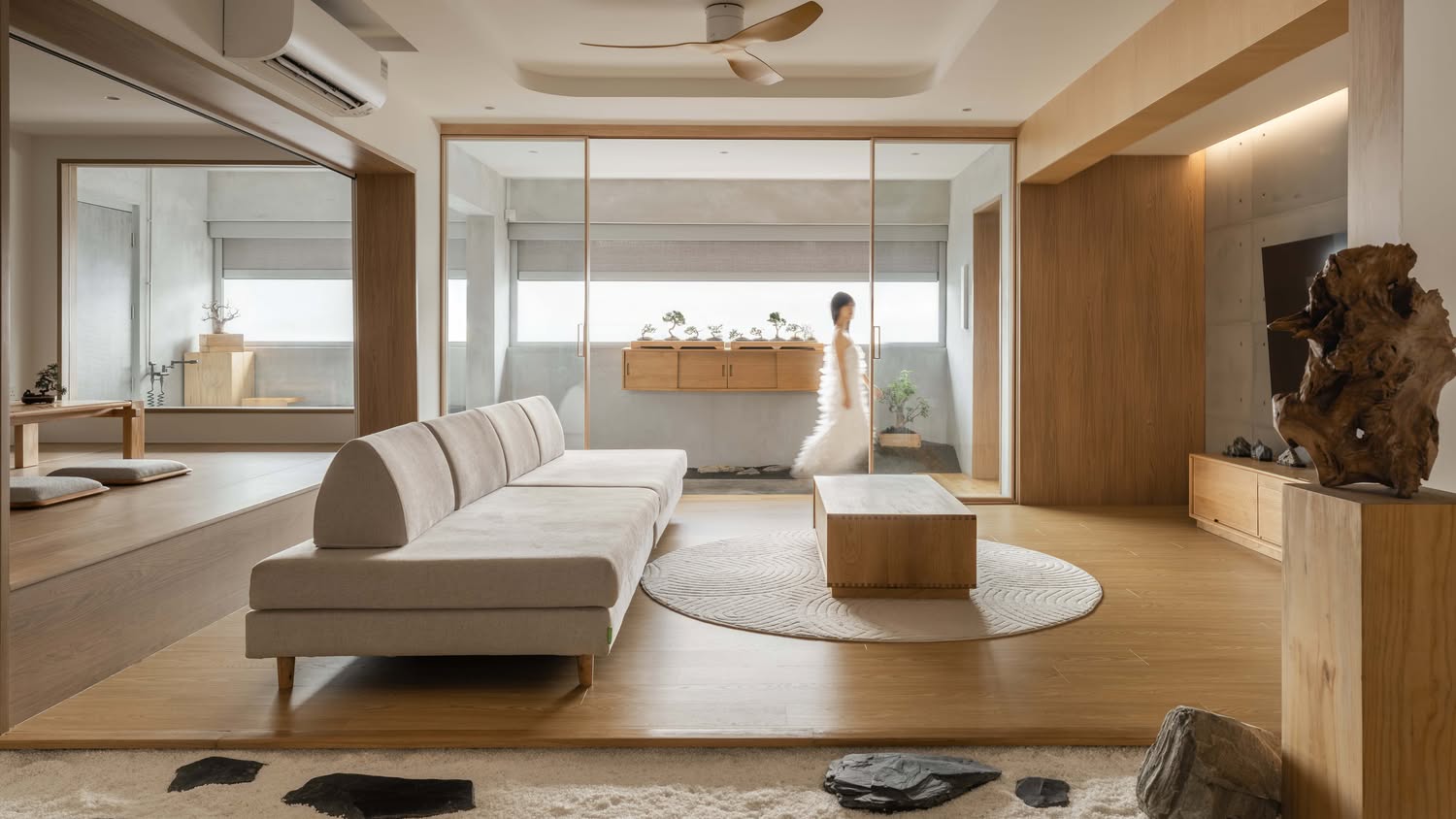
The first thing that most people would probably notice is the panelled glass partition behind their sofa. This would be common bedroom #3, which previously sat beside the living room. The couple decided to hack the walls of this bedroom and turn it into a study area – their WFH nook.

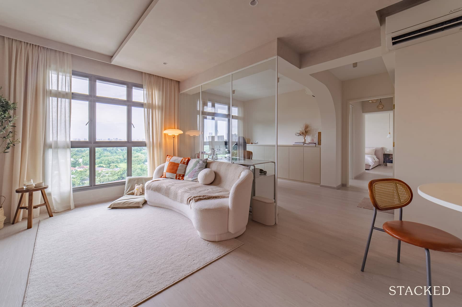
Aside from offering them a good view of the entrance to their home, together with the living and dining rooms, it also helped allow more natural light to flow in. It truly opened up the space both visually and physically.
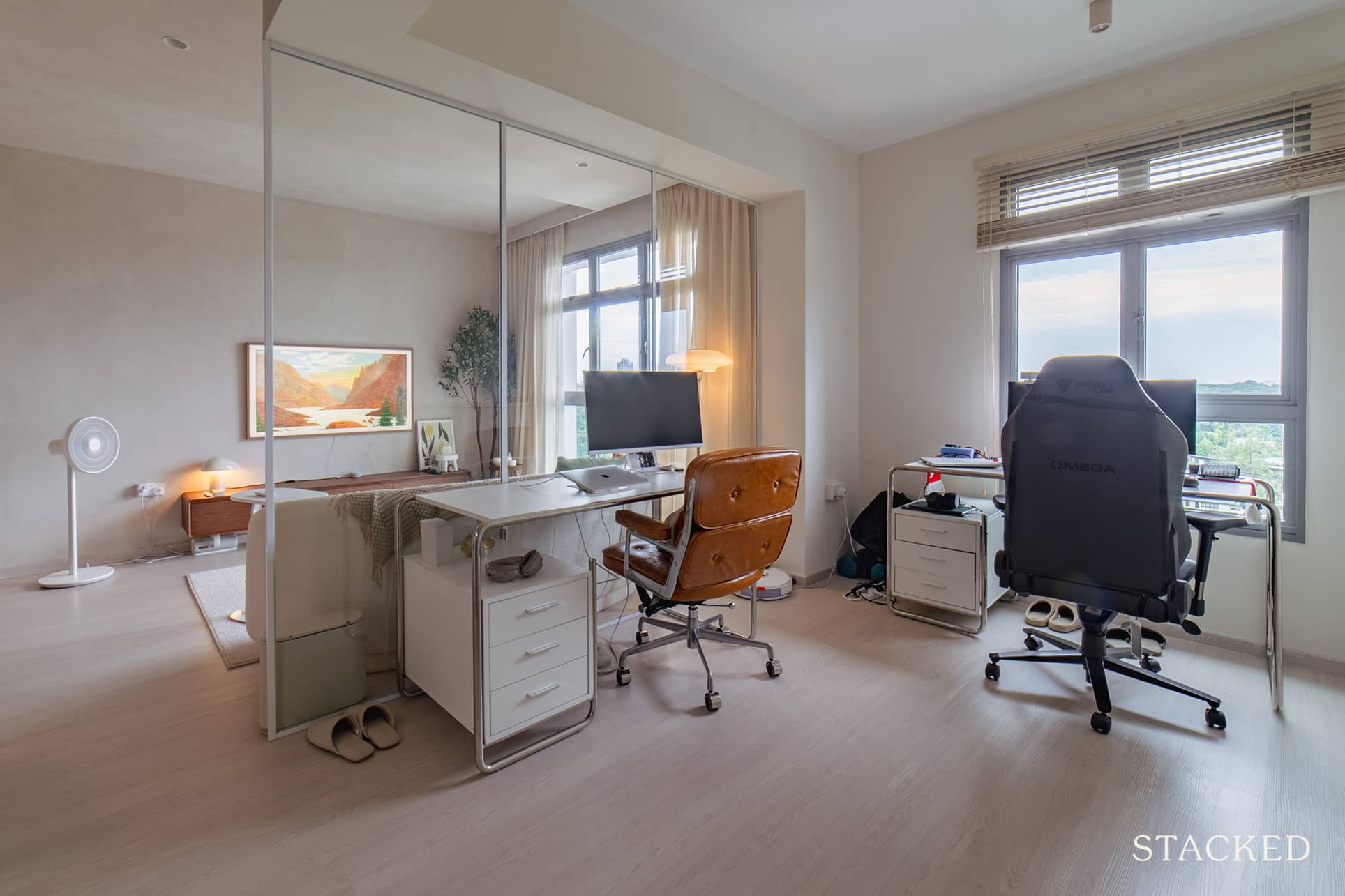
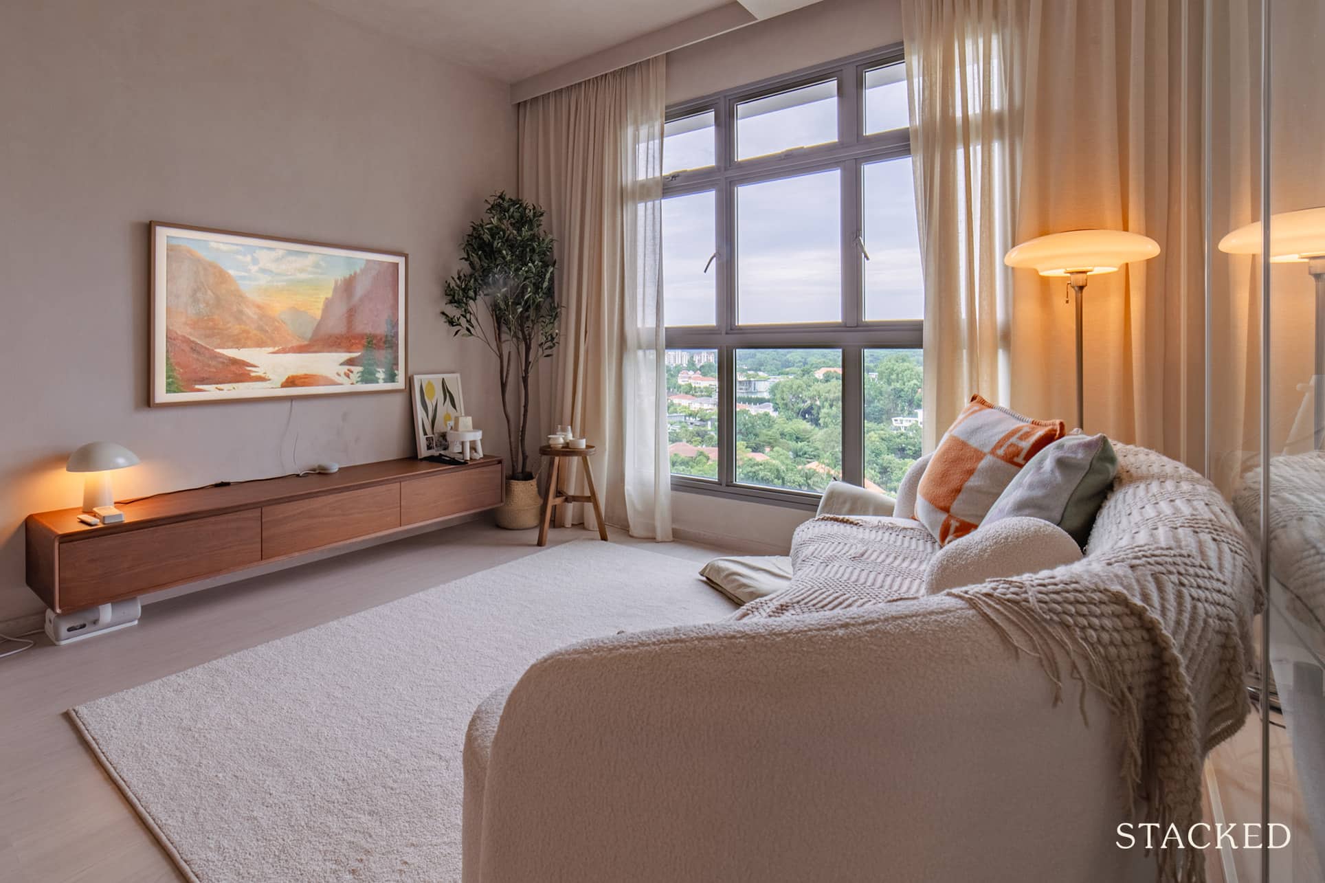
Lisa said they also went without a ceiling fan to avoid clunkiness and to prevent the ceiling from looking even lower. As you’ll notice, their combination of a false ceiling and limewash would make it seem visually lower if they were to place a fan.
Dining Room
True to what they wanted to achieve, their dining area actually looks like a posh pantry. The dining table, together with its chairs and pendant light, all create a cosy modern vibe.
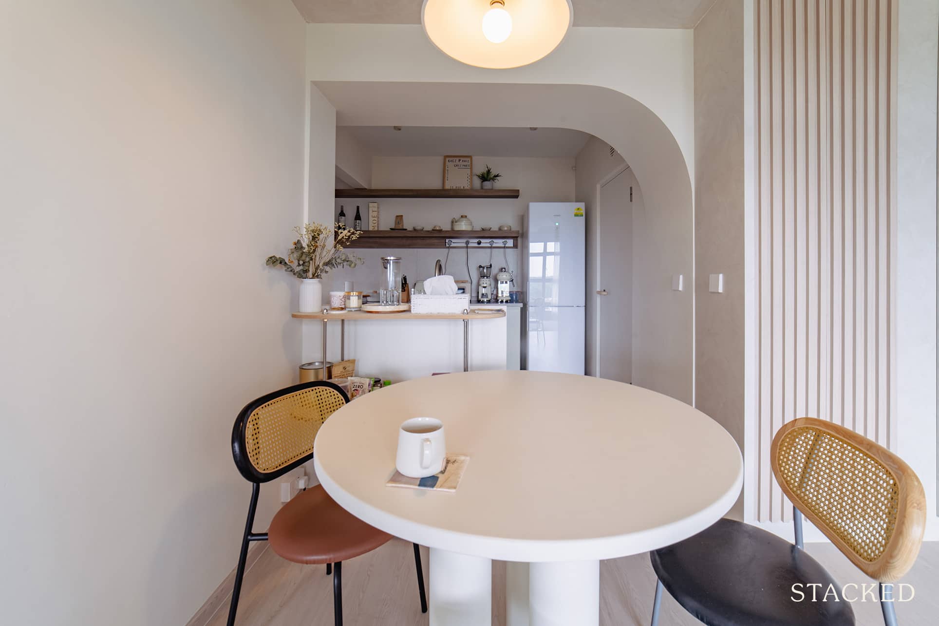
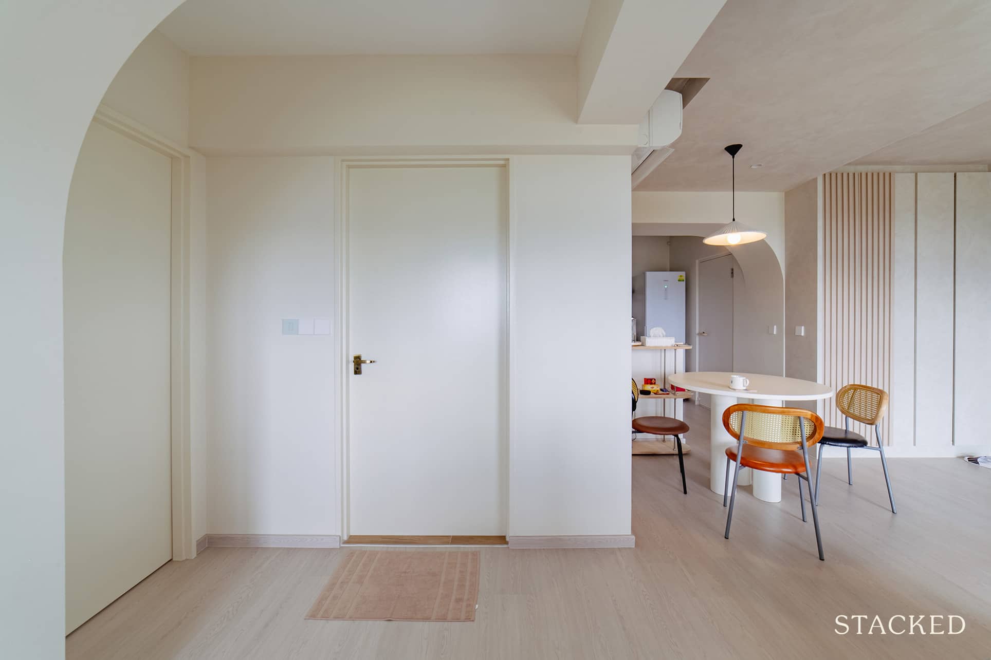
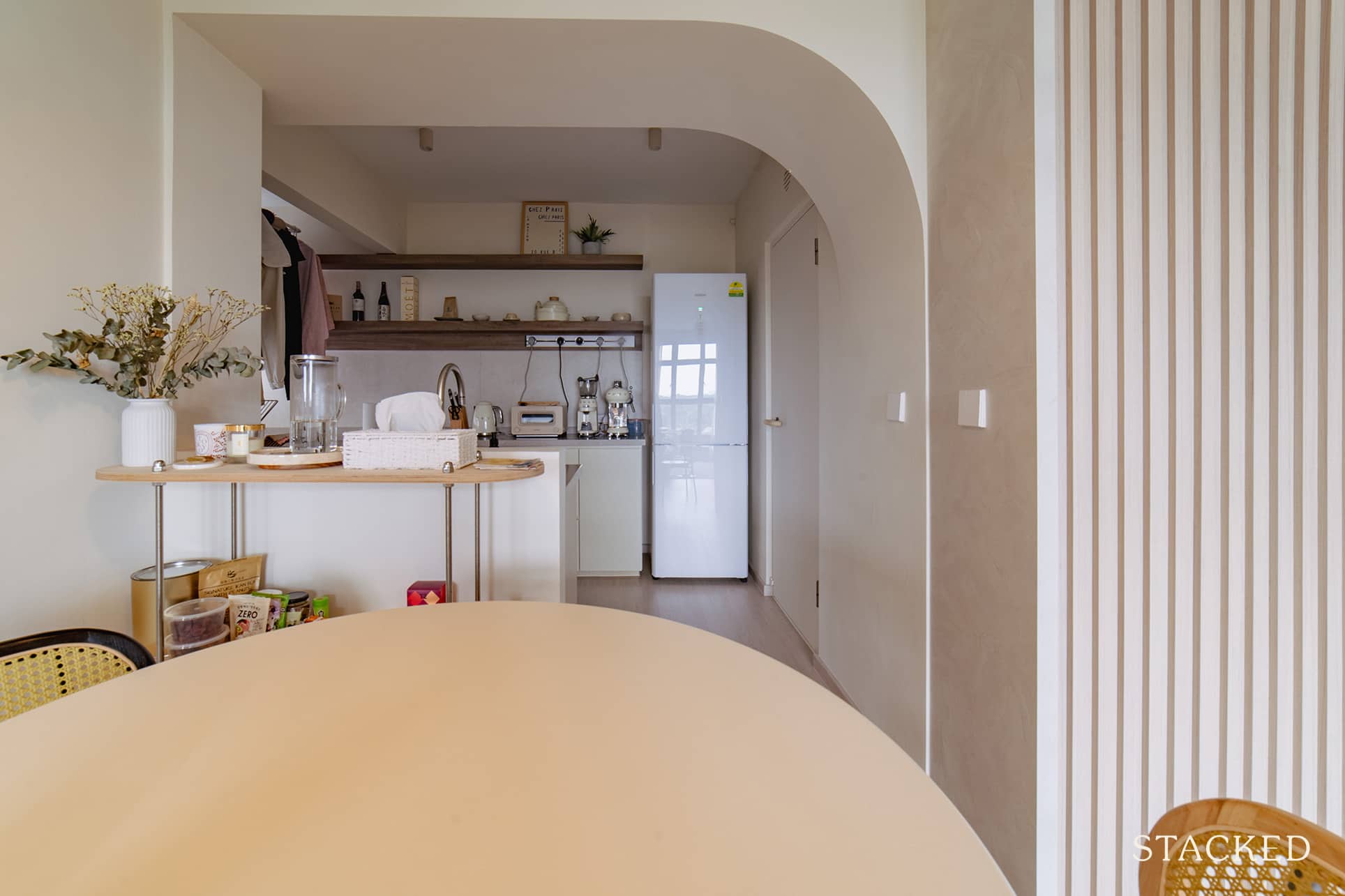
The dining area also has a good view of their compact yet charming kitchen.
Kitchen
The couple hacked half a wall to open up the entrance to the kitchen, allowing natural light to flow in and giving them a way to entertain guests even when prepping up. They also extended the kitchen towards the service yard to really open up the space and make good use of the area.
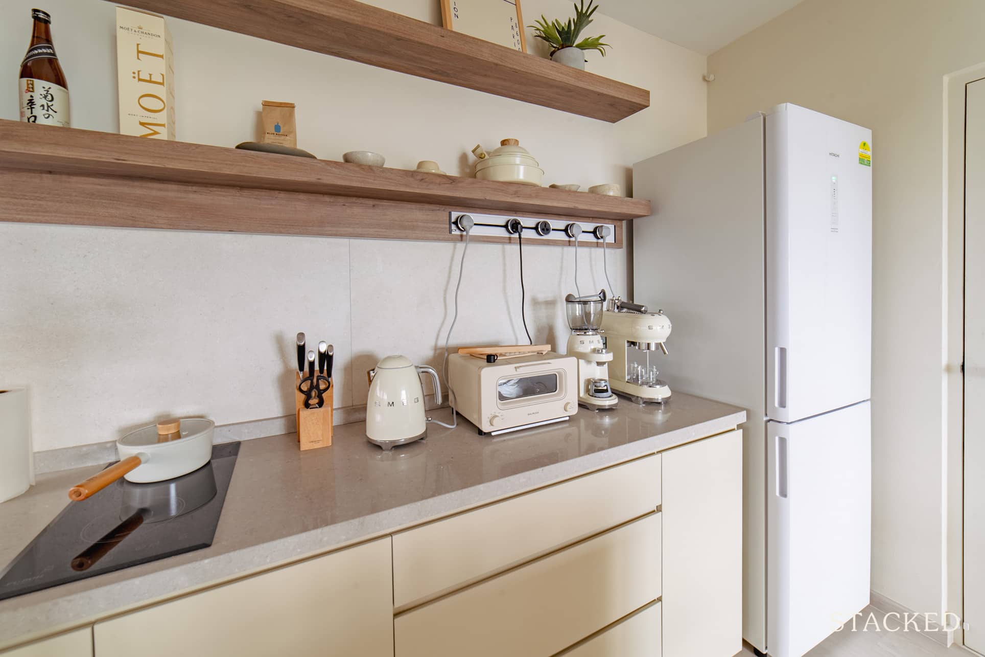
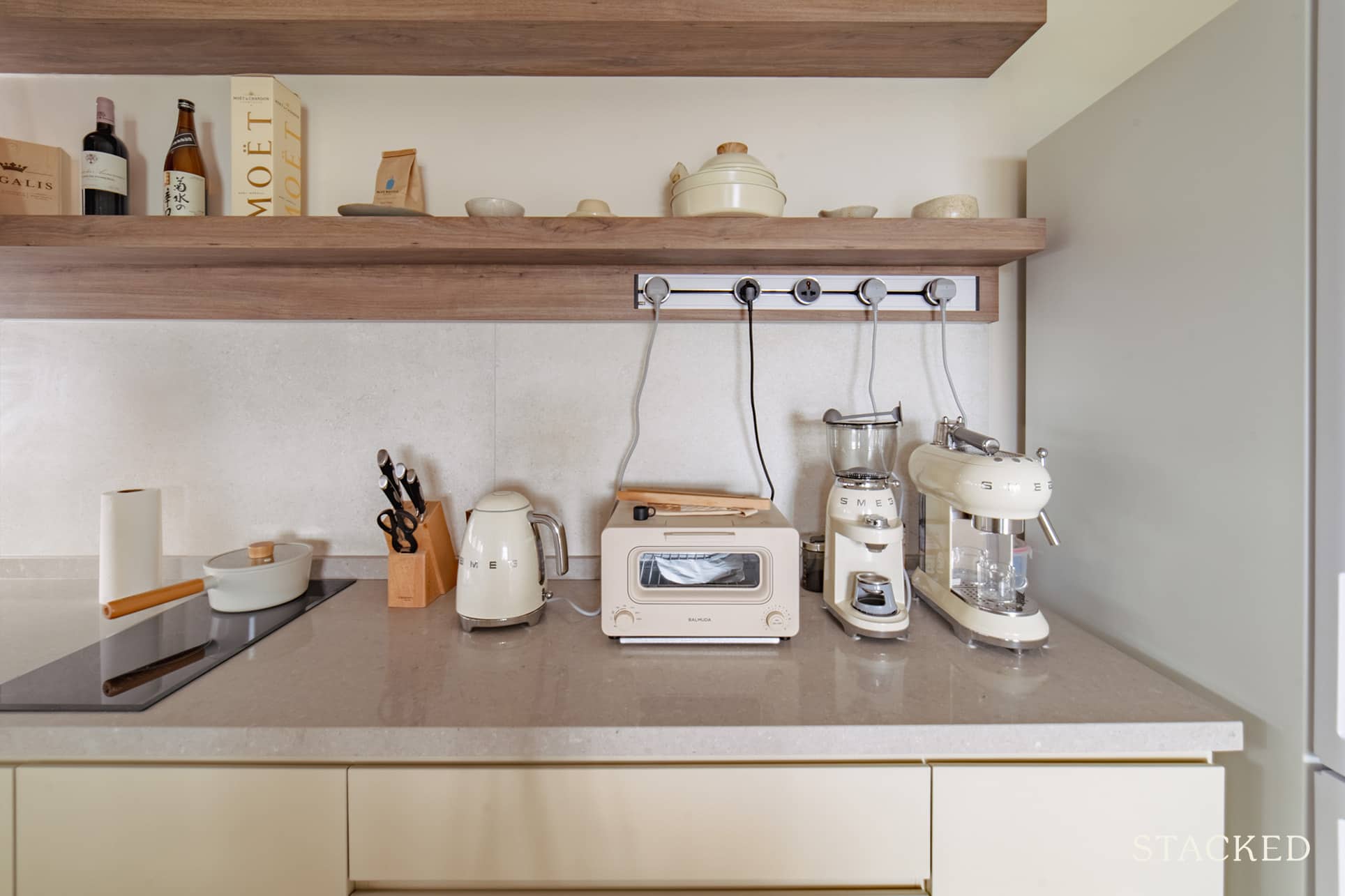
Even in the kitchen area – whether it’s the appliances or drawers, the couple made sure to stick to their colour theme. As you’ll see, they have an abundance of creams and whites.
Bedrooms
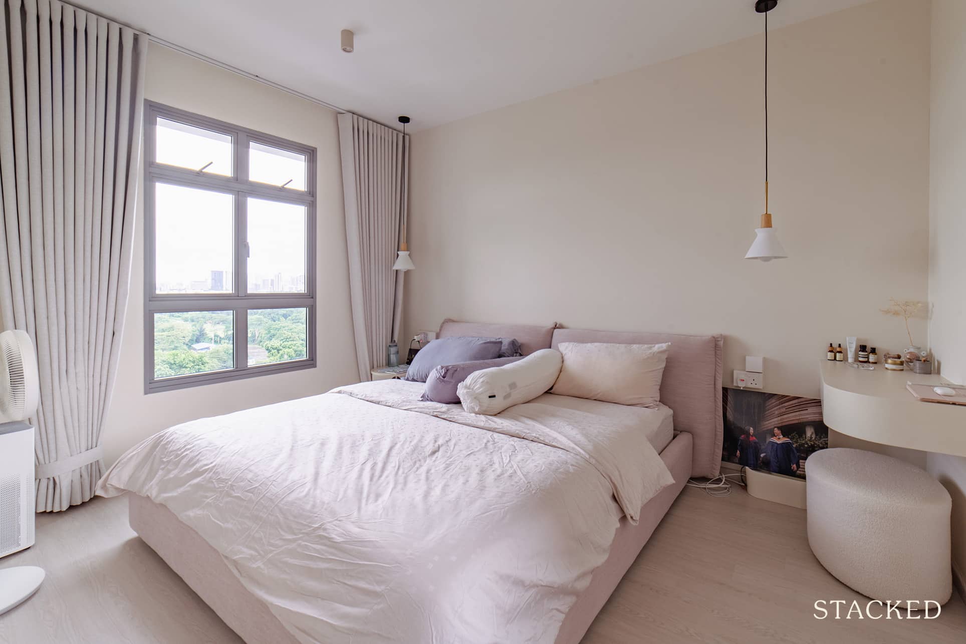
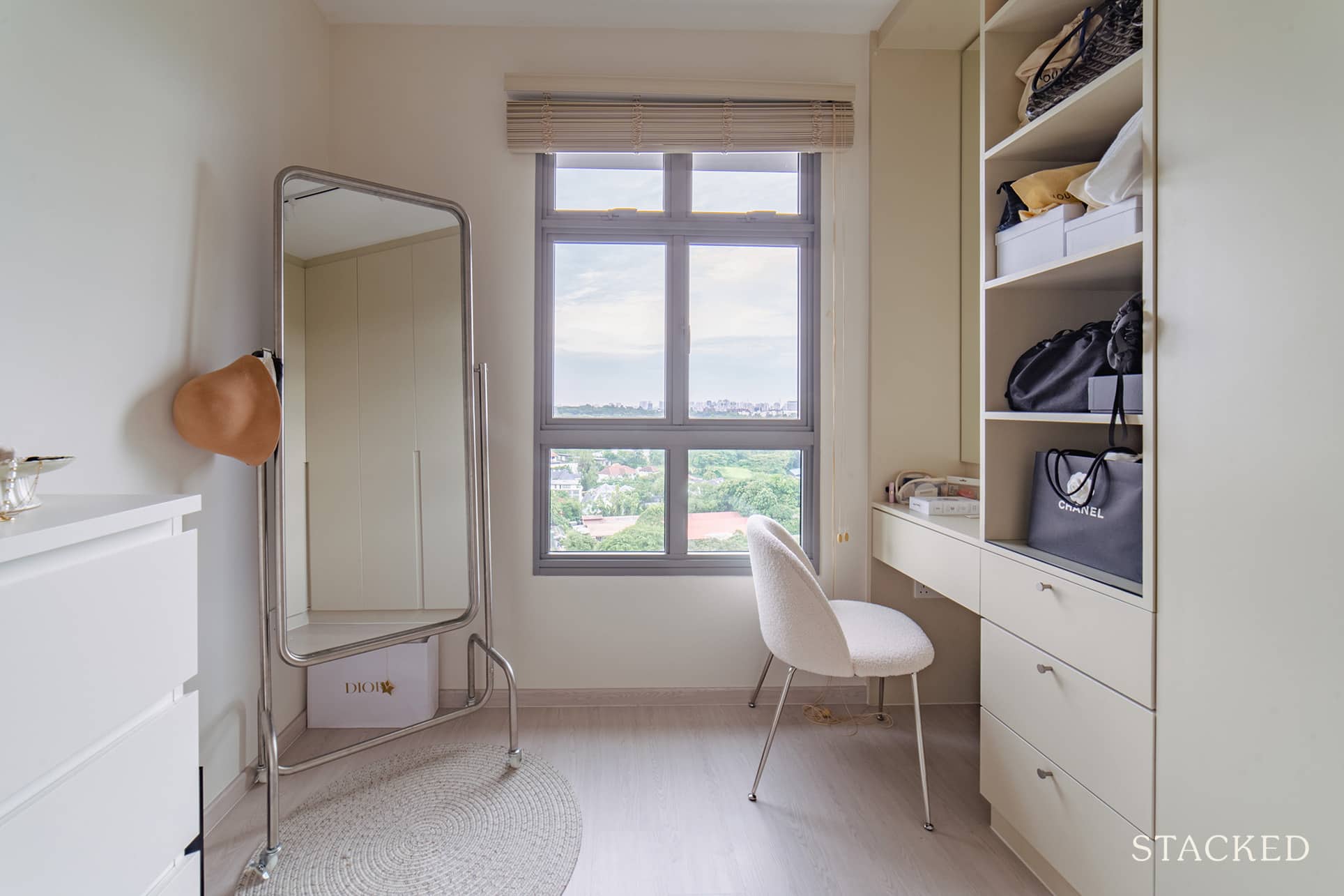
For the master bedroom, the couple combined both master and bedroom #2 without hacking the walls between them. By moving the door outward, they’ve eliminated the hallway and were able to incorporate a dresser with the master bedroom.
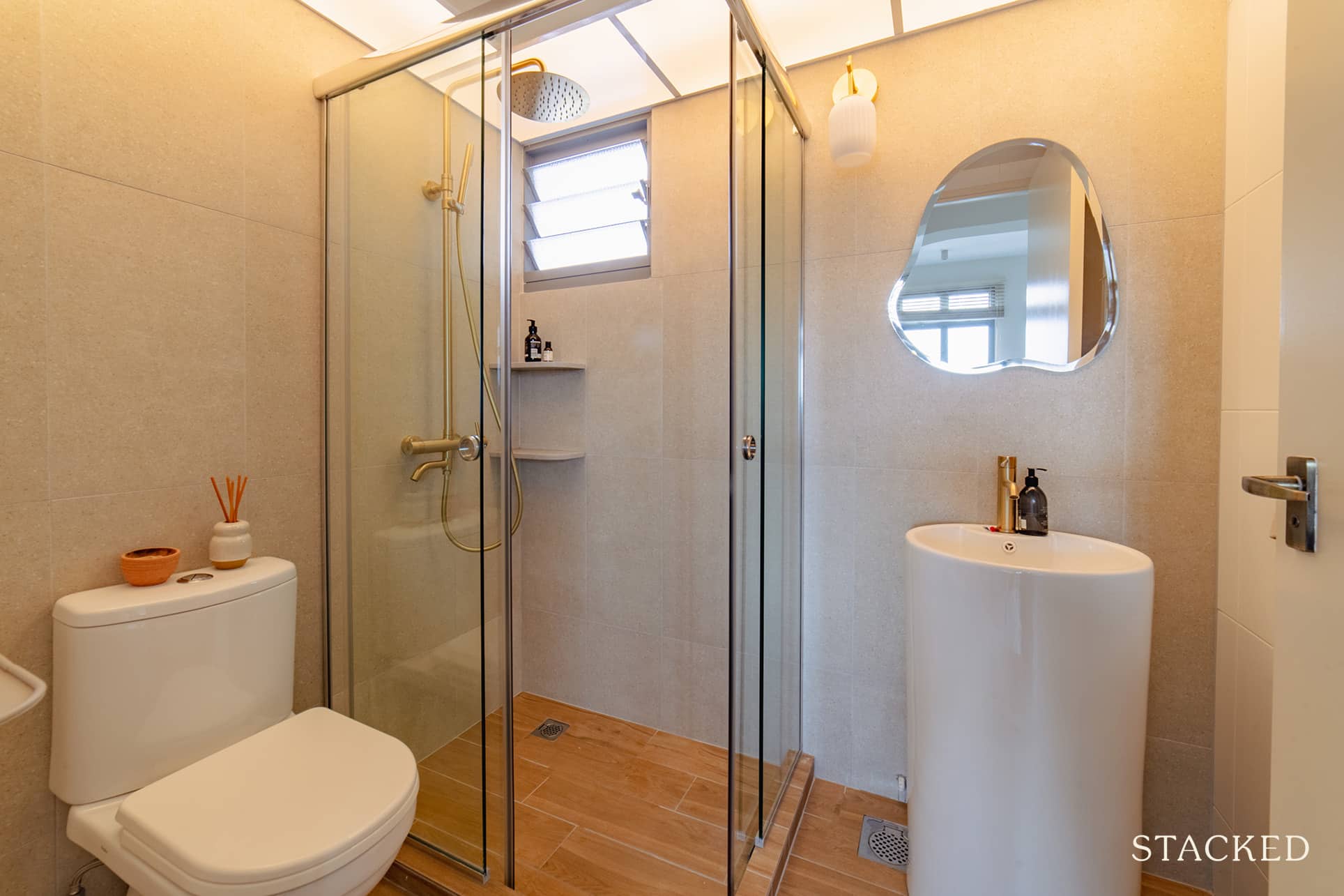
Bathrooms
Aside from combining both rooms by shifting the door, they were also able to gain private access to one of the bedrooms, which became their master bathroom.
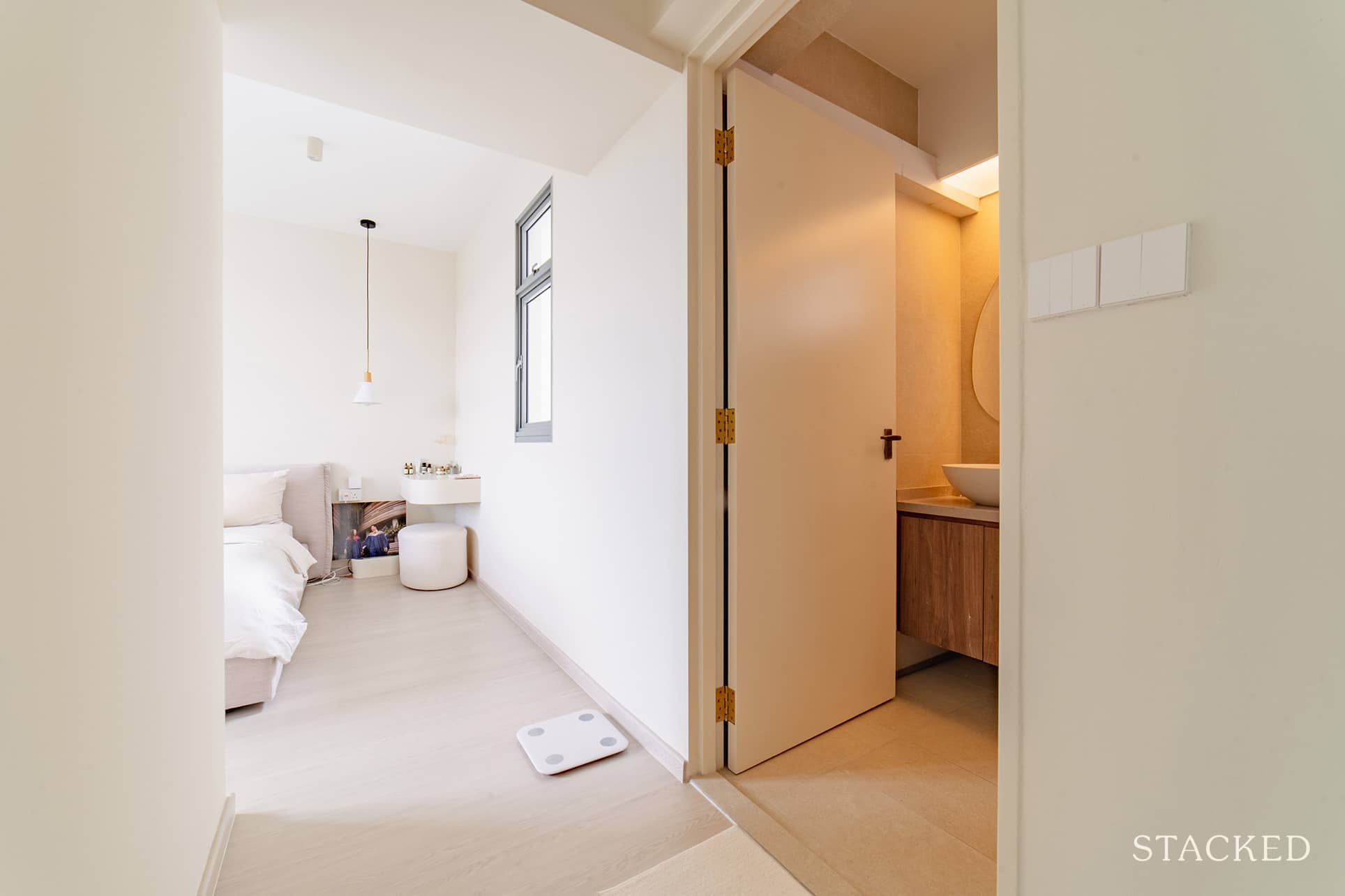
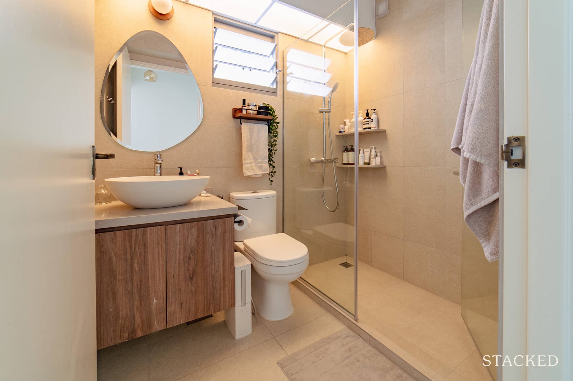
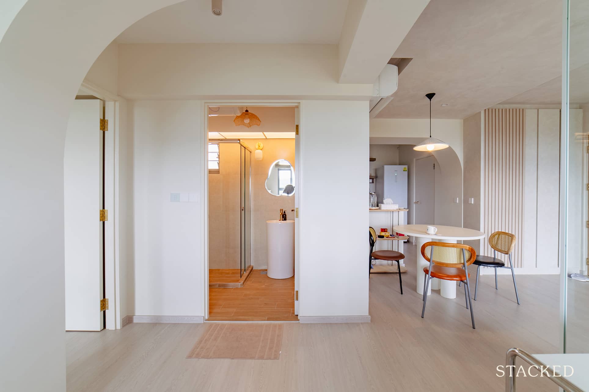
While they had to overlay the entire master bathroom, they saved money by doing this only on half of the common bathroom.
Bringing The Vision To Reality
The final outcome is pretty much what the couple was expecting. Lisa said the renders they got were quite realistic, so it gave them a very good idea of what they would end up with.
Even if they already knew what they wanted in terms of design, the couple still decided to hire an ID. Besides, the ID could also help to bounce more ideas and more importantly, with project management.
More from Stacked
Under $1 Million for a Landed Home? These Singapore Estates Make It Possible — But There’s a Catch
Most people assume landed homes are far beyond reach, the kind of property that only the ultra-rich can afford. And…
“We went with Sufen from Third Paragraph Interior,” she said, “that is, after speaking with 16 IDs and meeting with 8.”
Lisa said they had two main criteria when they were looking for an ID. One of which is ensuring the ID is on the same page as them. To judge that, they used their moodboard to help them gauge how much the ID liked their design ideas and how it’s envisioned.
“We thought that was super important. The ID has to understand what what we are looking for or else we might end up colliding down the line.”
Their second criterion is how value for money it was. They wanted to avoid those ID’s that would just throw in random ideas here and there just to inflate the quote.
Fortunately, the pair’s experience with their ID was good right from the start.
Sufen proposed certain ideas that didn’t always involve more money. For instance, if she felt an area could do without, she’d be the first to take out what is unnecessary. At the same time, she would also suggest something that’s more pocket friendly and nice.
As for their furniture sourcing process, Lisa shared that, “we’re straight up a Taobao furniture showcase!”
Most people don’t expect much from Taobao’s quality. However, since the couple focused on aesthetics, they were willing to get their furniture there. She said that they deemed the reno and appliances more important than furniture. As such, they were okay with taking the risk of buying from Taobao.
“But truth be told… our choices turned out to be pretty solid. People can’t believe our console, table, and other built-ins were from Taobao because they look like carpentry.”
With Taobao, they were able to envision their area by putting product photos together into a mood board.
When it comes to what they consider the best area of their home, the pair both agree that it’s their living room. Lisa said they love to spend their time there since it’s very cosy and loungey, especially at night. Their choice of furniture, floor-to-ceiling limewash, and lighting all add up to elevating the cosiness of the living room.
Lessons Learned From A Successful Reno Journey
The couple knew that, for some context, BTOs in the area are probably the smallest of the lot. At 83 square metres, it was very tiny for a 4-room flat. “But we’ll take what we can get,” Lisa shared, “So we accepted the challenge!”
Their plan was to open up the space without a massive overhaul. Aside from hacking some walls, they were able to overcome the space constraints with a few more details. The open shelves in the kitchen and standing basin in the toilet helped significantly – or at least gave the illusion that the area was bigger.
They also had to give up some ideas, such as the extendable dining island area. After site measurement, they realised that it was not recommended to proceed because of the kitchen’s tight opening. Plus, the bomb shelter door is also in the way. And so, they ended up elongating their small kitchen to make it look visually spacious.
Another experience that Lisa shared was the risk of implementing a design element that was new to the ID or contractor.
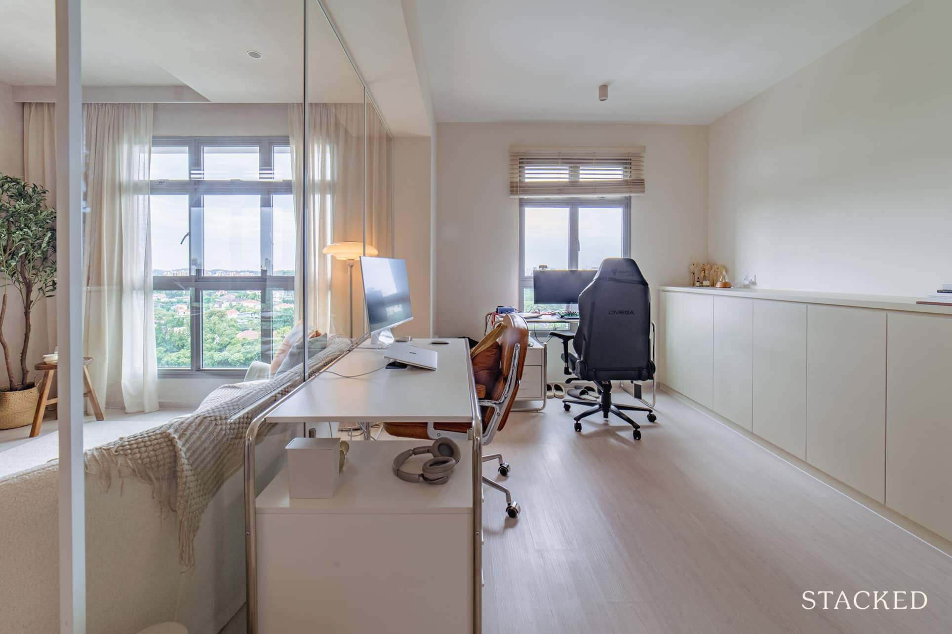
“We wanted to have a shelving element in the study with natural timbre wood shelves.” This was a 3m long shelf, and naturally, the length, as well as the weight, posed an issue. They checked with HDB, their contractors, and their ID and everything seemed good to go. However, they had to abandon this idea when their contractors backed out during installation, as they ultimately weren’t confident as the walls weren’t reinforced.
“To this day, that wall is still empty so that’s a bummer.”
As such, she also recommends following a lot of home IG accounts, not just for inspiration sources, as there’s a lot to learn from the experiences of other homeowners.
She shared,” I got a lot of tips and learnings from fellow homeowners. P.s. for example, if your ID says xx can’t be done, you might just be able to find another homeowner who says otherwise based on experience.”

And if you want to save some money, Lisa advises outsourcing certain elements. For minor items, such as doors or paint jobs, you can always look for a more affordable alternative. However, it’s best to stick with your ID’s sub-cons for the major works. “This is important to ensure you don’t end up being the project manager due to outsourcing of multiple items.”
Finally, Lisa shared that this may be more common advice, but still one that is always worth heeding. With a fewer amount of carpentry (other than saving money), there is a great amount of flexibility. “Eg. go for a neutral canvas as a base and if you like pops of colour, that can be done via loose furnishing or installations that can be reversed easily.”
At Stacked, we like to look beyond the headlines and surface-level numbers, and focus on how things play out in the real world.
If you’d like to discuss how this applies to your own circumstances, you can reach out for a one-to-one consultation here.
And if you simply have a question or want to share a thought, feel free to write to us at stories@stackedhomes.com — we read every message.
Need help with a property decision?
Speak to our team →Read next from Homeowner Stories

Homeowner Stories We Could Walk Away With $460,000 In Cash From Our EC. Here’s Why We Didn’t Upgrade.

Homeowner Stories What I Only Learned After My First Year Of Homeownership In Singapore

Homeowner Stories I Gave My Parents My Condo and Moved Into Their HDB — Here’s Why It Made Sense.

Homeowner Stories “I Thought I Could Wait for a Better New Launch Condo” How One Buyer’s Fear Ended Up Costing Him $358K
Latest Posts

Property Market Commentary 18 Upcoming New Launch Condos In 2026 — Where They Are And The Ones To Watch

Property Advice Should We Sell Our Freehold Condo For A $2.2M Leasehold Landed Instead?

Singapore Property News Kallang Close GLS Site Sold For $610.8 Million: New Waterfront Condo Could Launch From $2,900 PSF


















0 Comments