Inside A Calming Japanese-Inspired Home Filled With Thoughtful Details
September 24, 2023
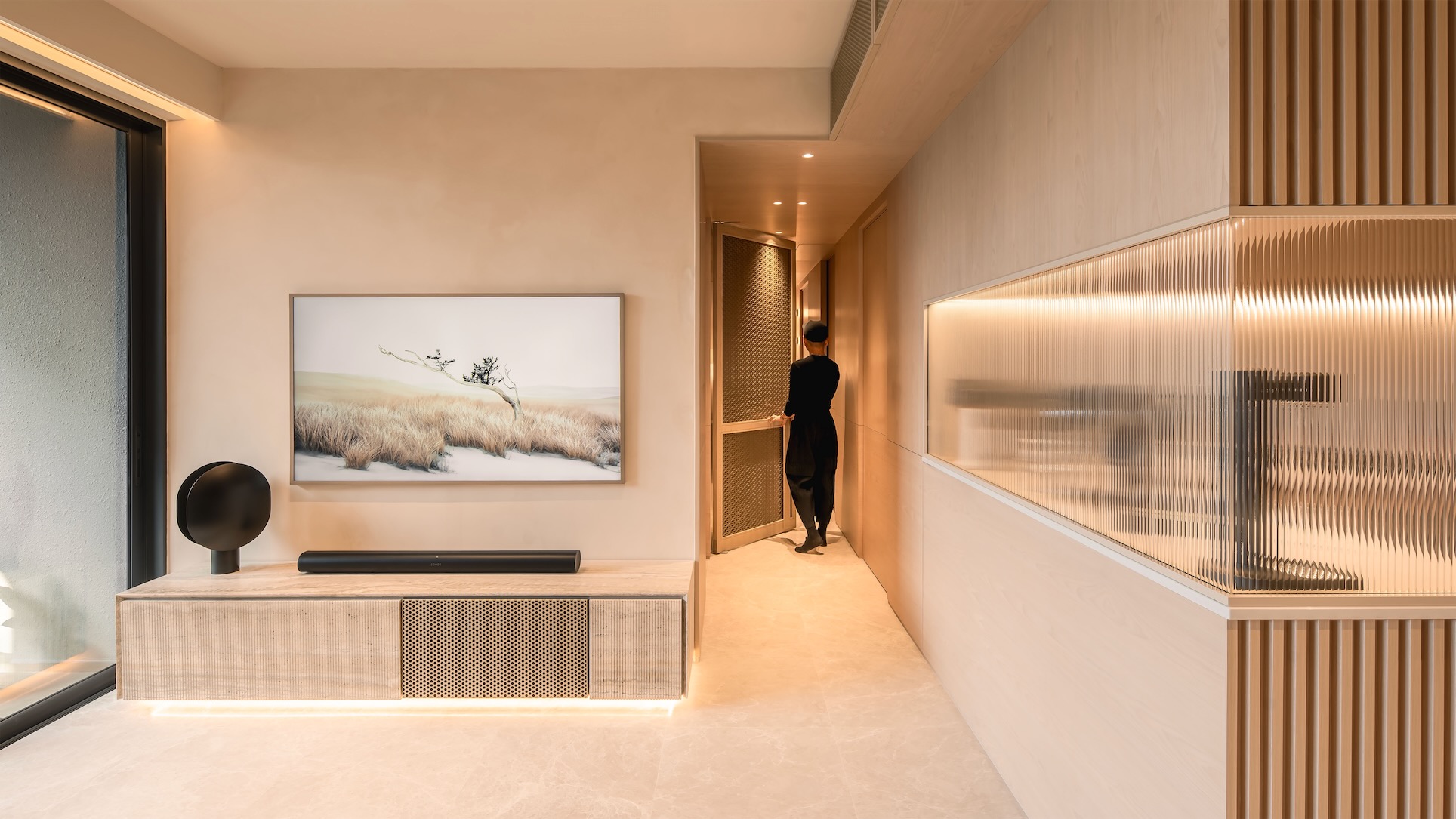
In this week’s episode, we explore the Serif Apartment, a design marvel brought to life by the creative minds at UPSTRS_. This apartment is a testament to pragmatic planning and clean lines, offering a unique take on modern living.
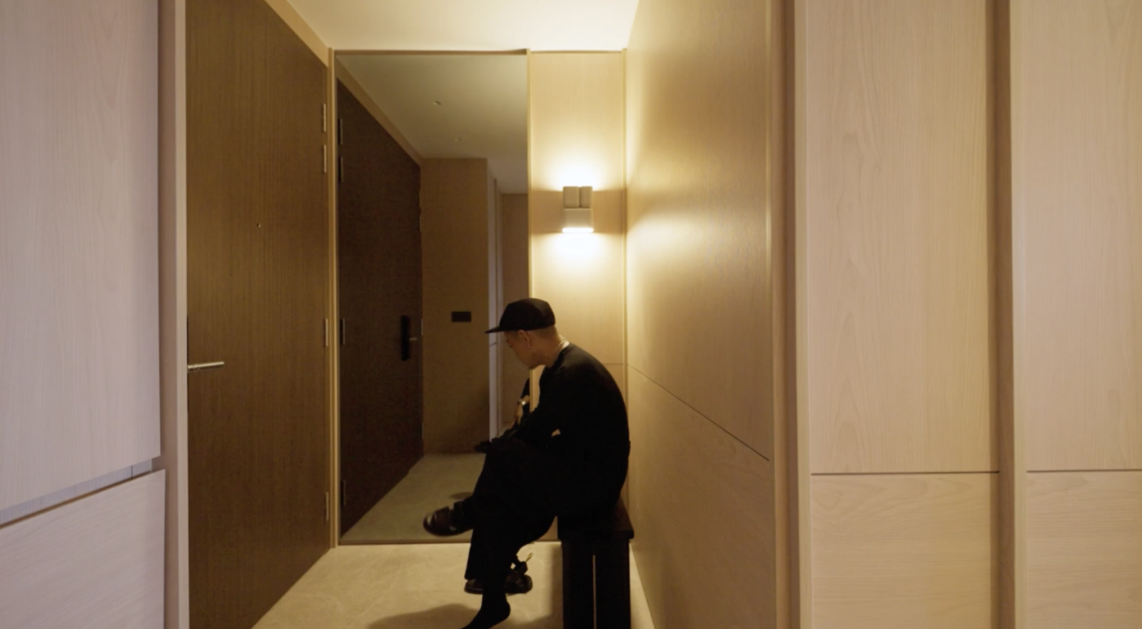
The journey begins in the vestibule, where the walls are elegantly clad in timber. A custom charred wood bench anchors the first impression, setting the tone for the entire space.
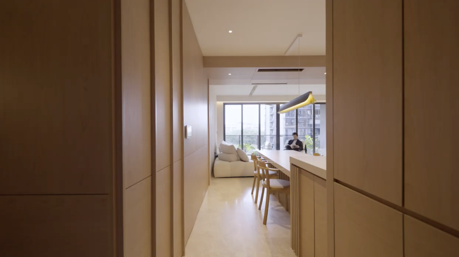
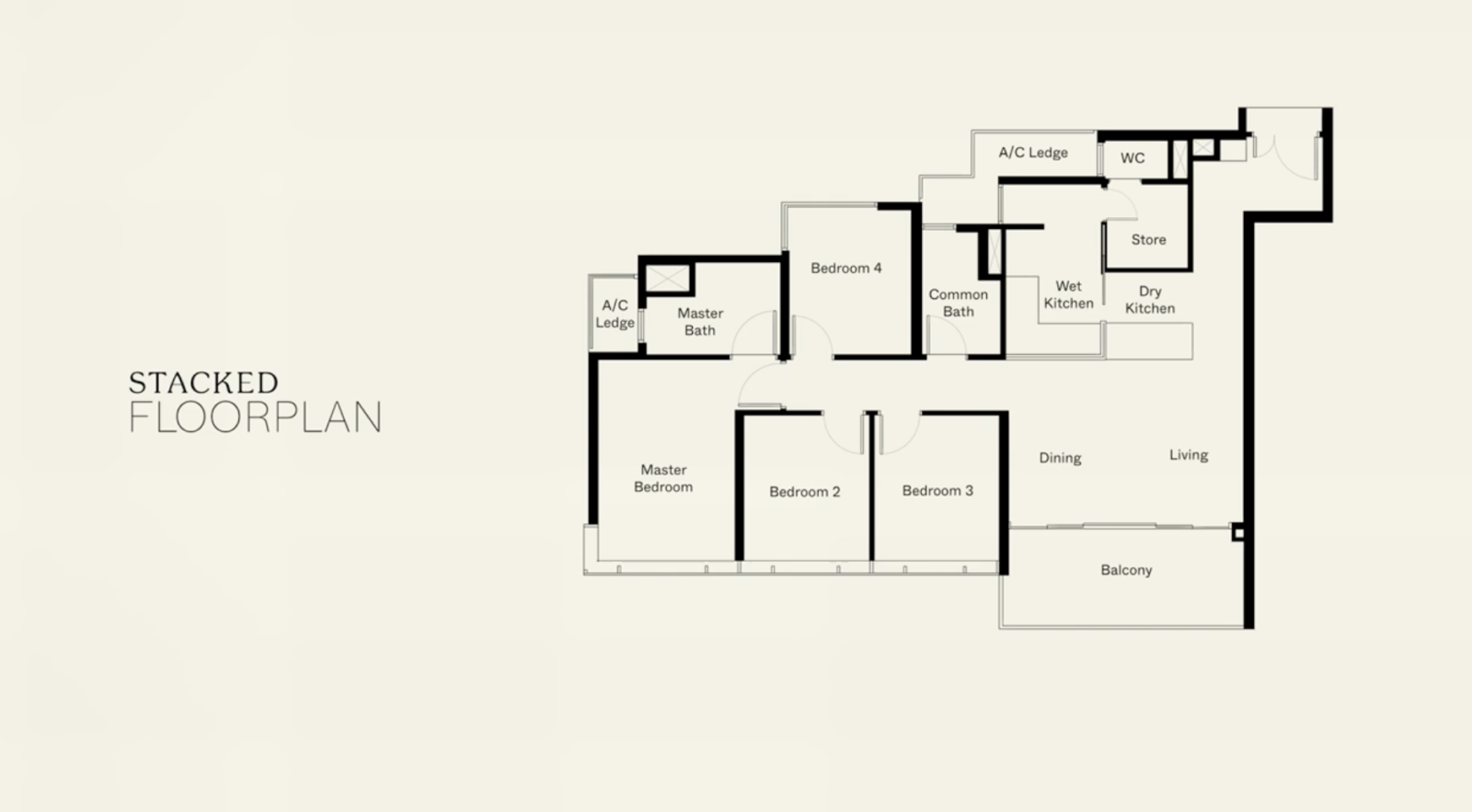
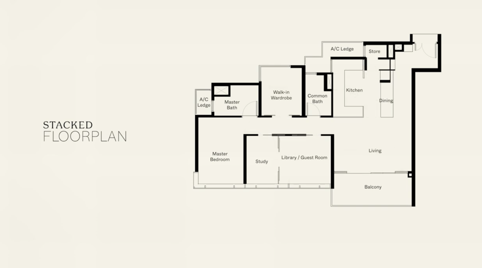
The apartment seamlessly combines the dining and living areas, with a kitchen that can be opened up or enclosed through sliding doors. The kitchen, often considered the heart of the home, is designed like a lantern, illuminating the dining space.
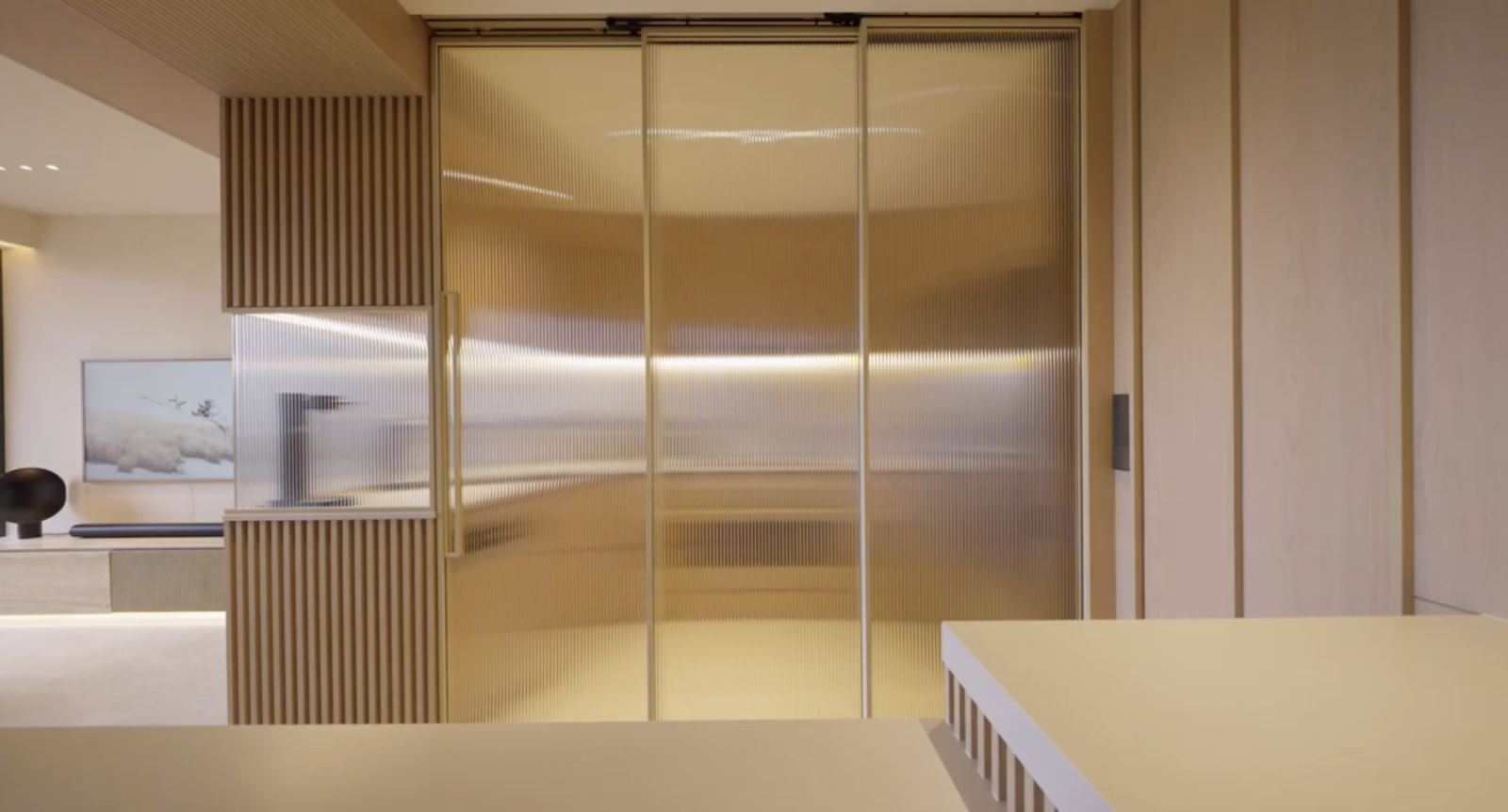
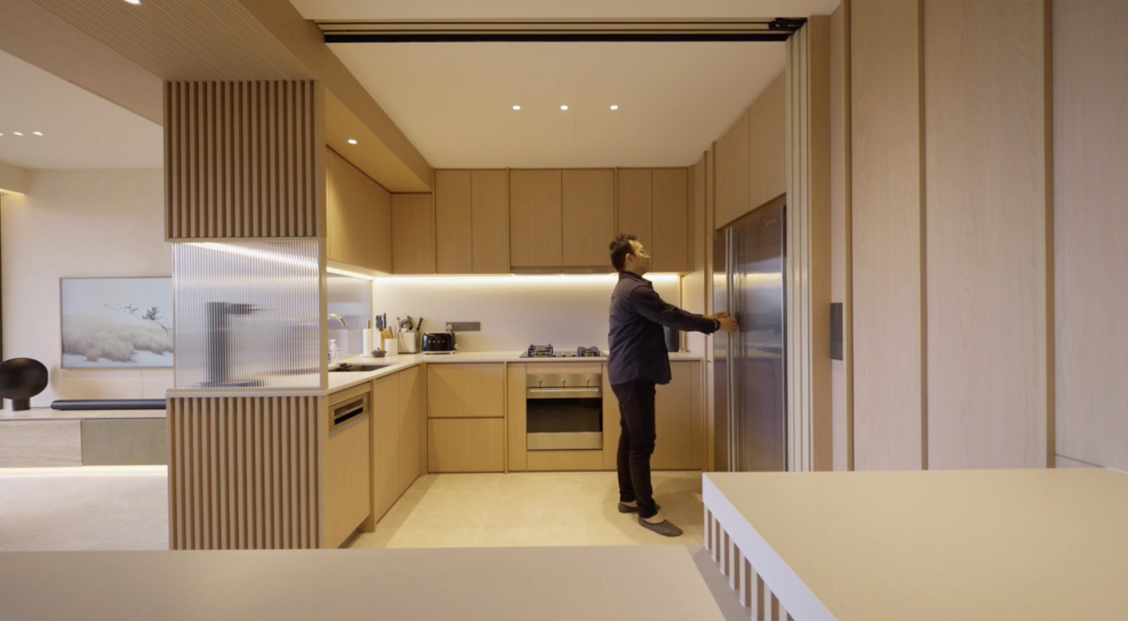
One of the standout features of this apartment is the controlled use of materials. Singular material choices create a seamless look, making the space appear less cluttered. The kitchen’s glass panels refract light beautifully, adding a touch of elegance.
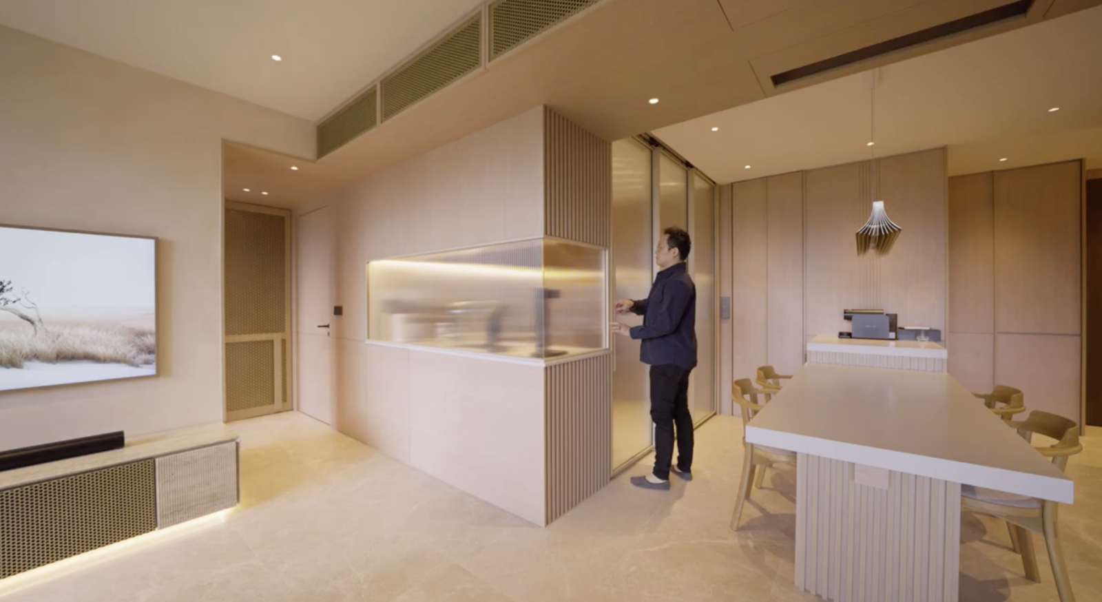
The dining area features a custom-designed 3-meter dining table, a true centerpiece that combines functionality with aesthetics. It serves as a wine cellar, complete with electrical points, making it an ideal spot for gatherings.
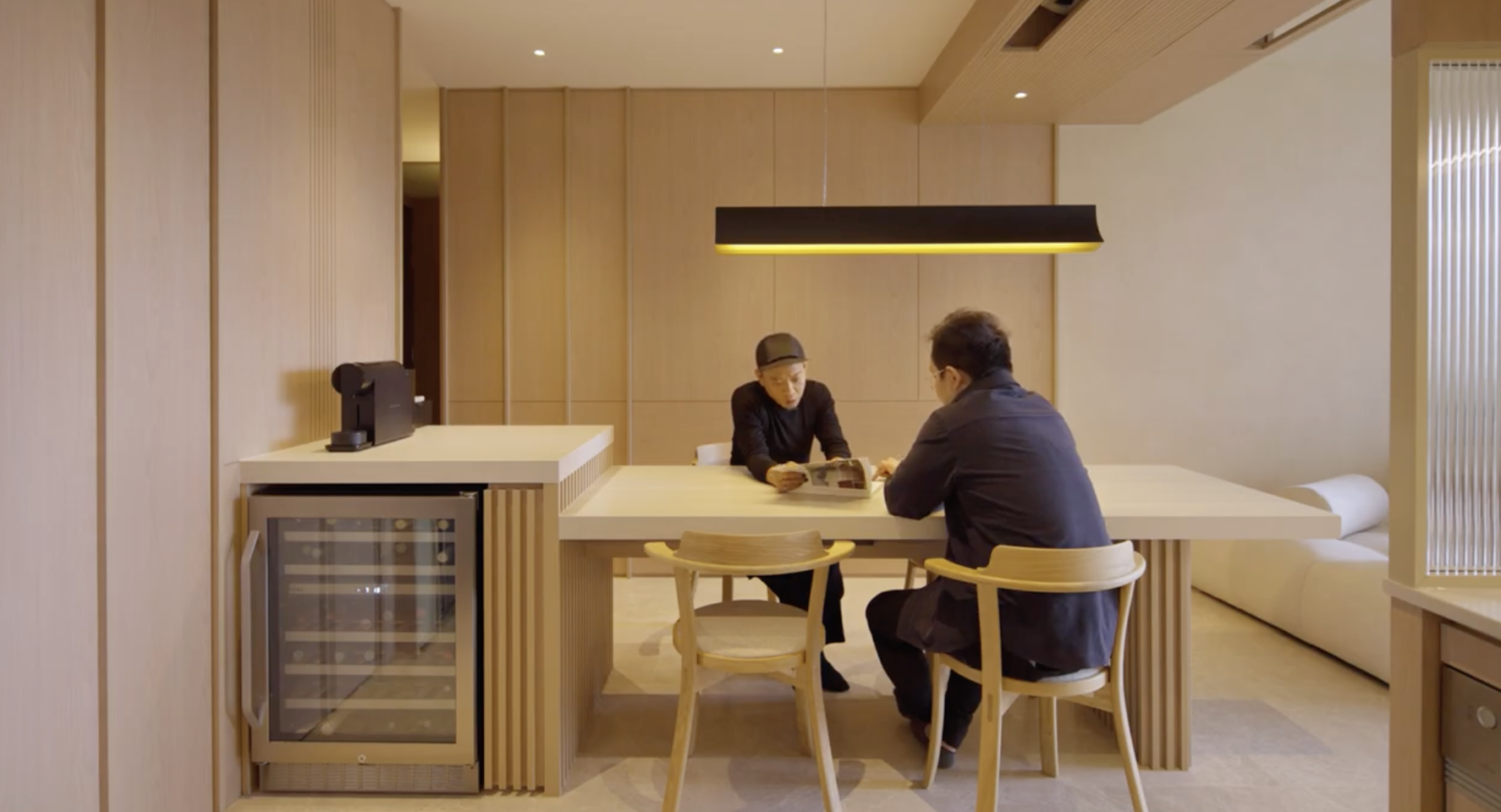
Moving into the living room, the atmosphere becomes open and airy, resembling a blank canvas textured with stucco finishes. Furniture selection was a careful curation, with each piece chosen for its sculptural quality and form.
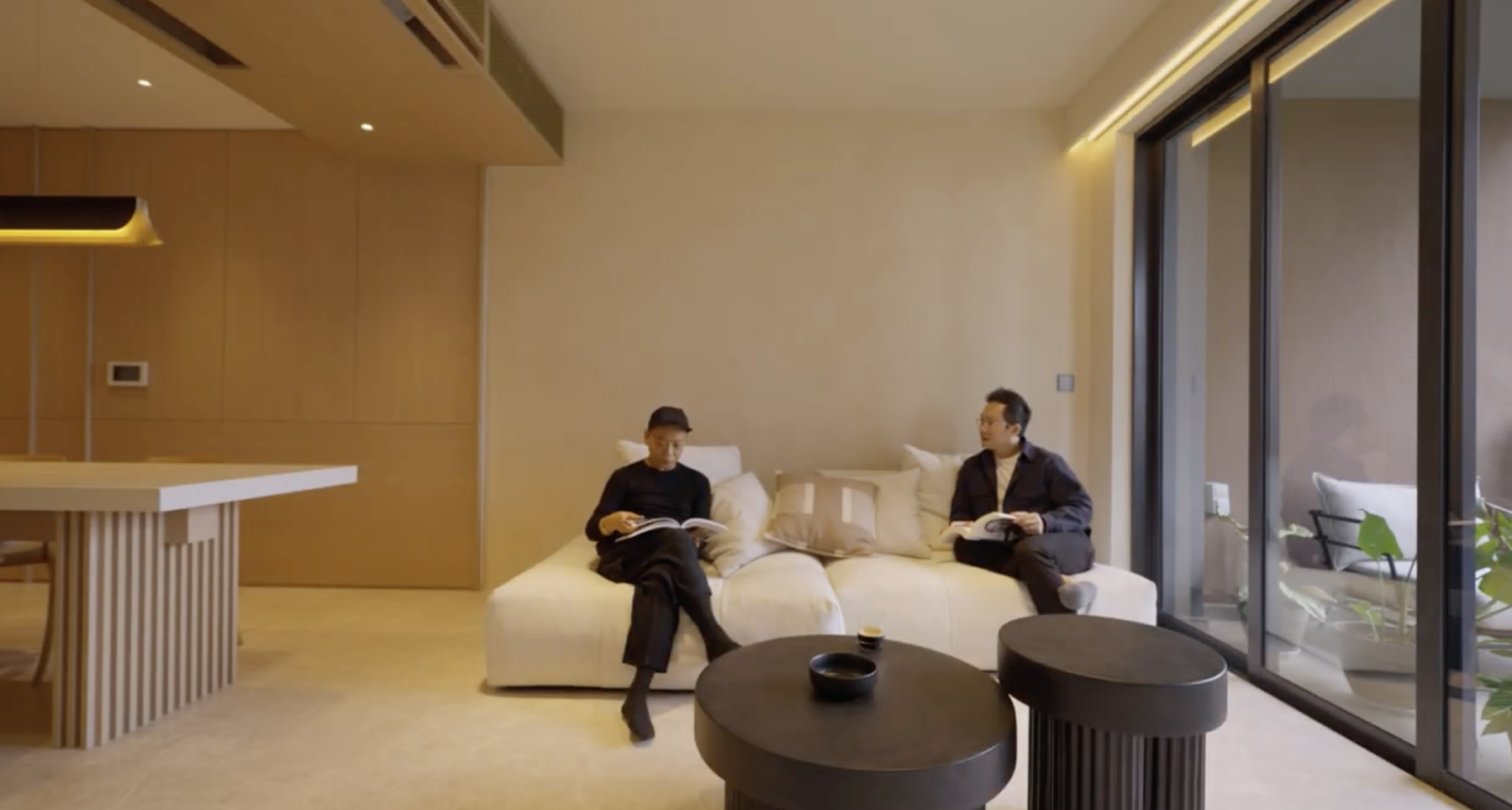
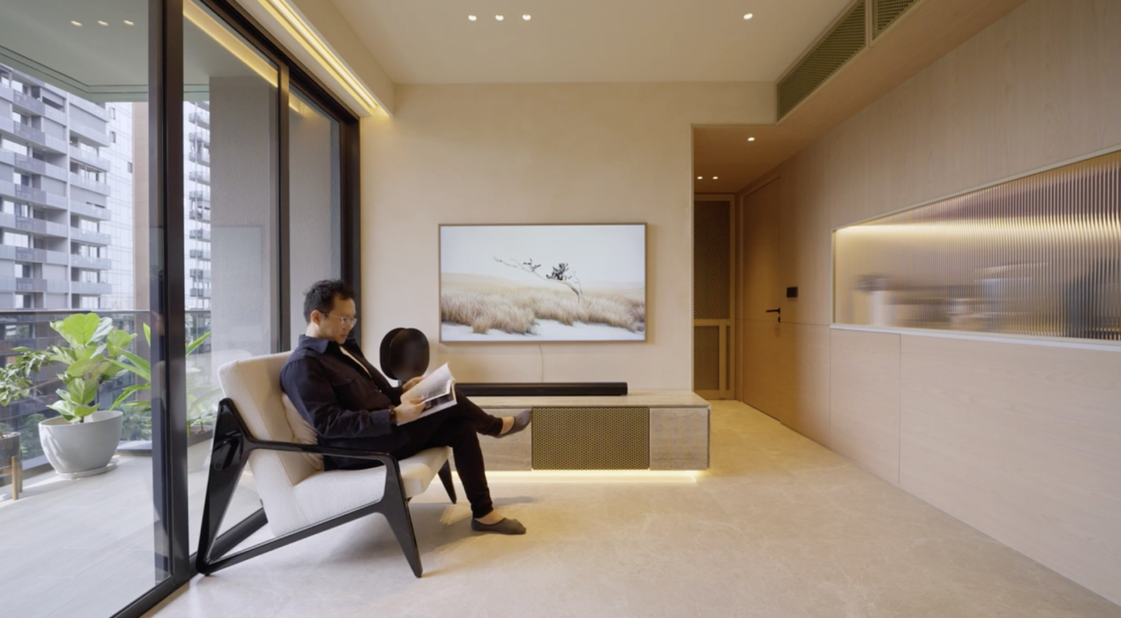
Even practical elements like air conditioning have been turned into design features, with custom brass screens adding a touch of sophistication.
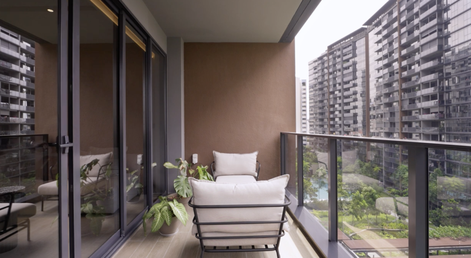
The balcony, with its ample space and lush plants, provides a refreshing escape with great views and natural light.
The private spaces of the apartment are highly flexible, thanks to sliding partitions. The walk-in wardrobe, converted from a spare bedroom, showcases efficiency and organization with a galley layout.
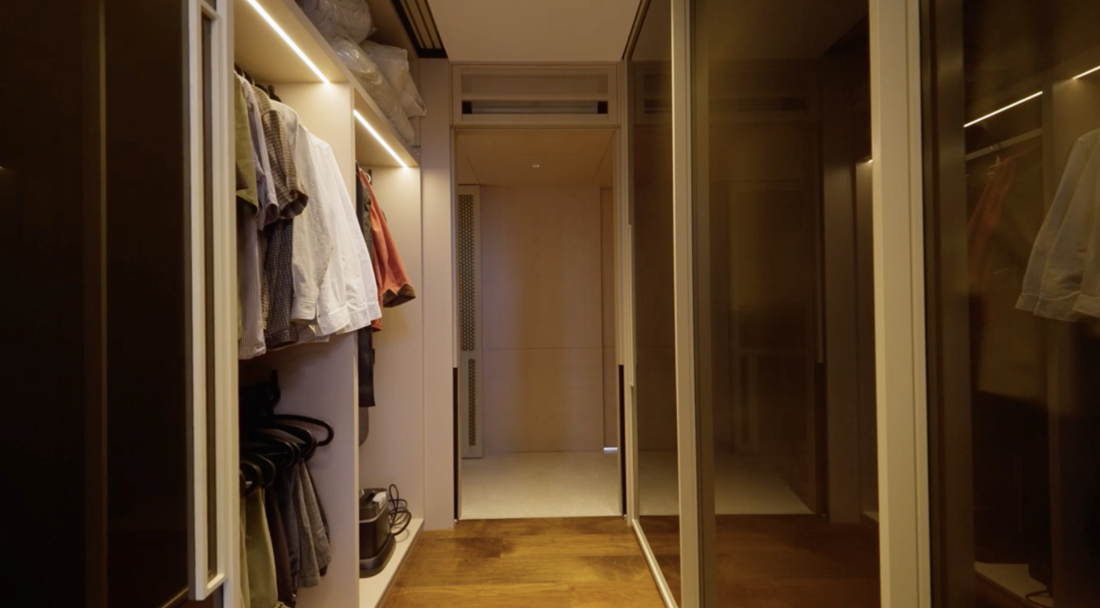
The master bedroom, designed for rest, features timber textures and half dowels on the walls, creating a rhythmic feel. The bathroom, while minimalistic, aligns perfectly with the homeowner’s vision.
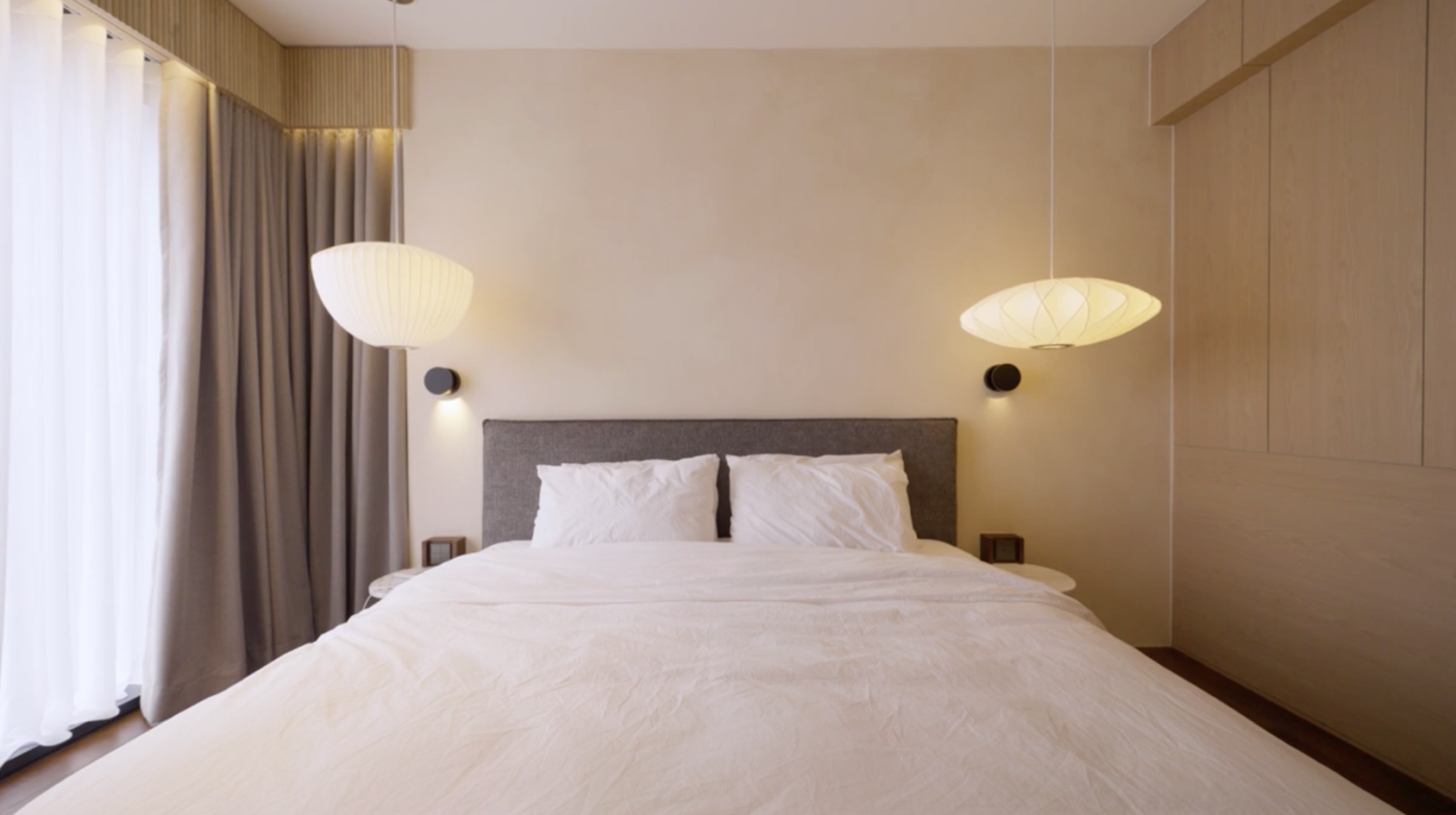
The Serif Apartment is a departure from the bold and strong designs often seen in projects, embracing a more nuanced and seamless approach. It’s the result of a collaborative effort between the designers and homeowners, resulting in a space that truly feels like home.
Special thanks to the homeowners (@apartmentserif) for opening up their home to us. If you’d like to get connected to their designer for the design of your own home, you can reach out to them via this link. Receive a $500 Stacked Store credit upon successful sign-up and completion of the project.
At Stacked, we like to look beyond the headlines and surface-level numbers, and focus on how things play out in the real world.
If you’d like to discuss how this applies to your own circumstances, you can reach out for a one-to-one consultation here.
And if you simply have a question or want to share a thought, feel free to write to us at stories@stackedhomes.com — we read every message.
Need help with a property decision?
Speak to our team →Read next from Home Tours
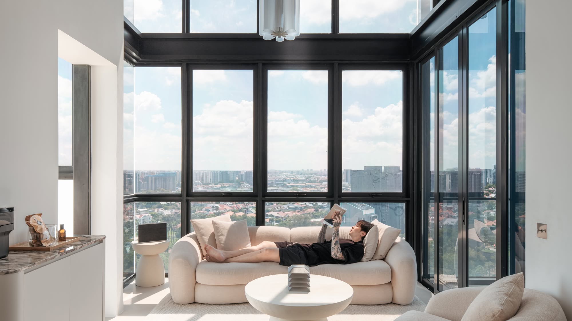
Home Tours Inside A Minimalist’s Tiny Loft With A Stunning City View
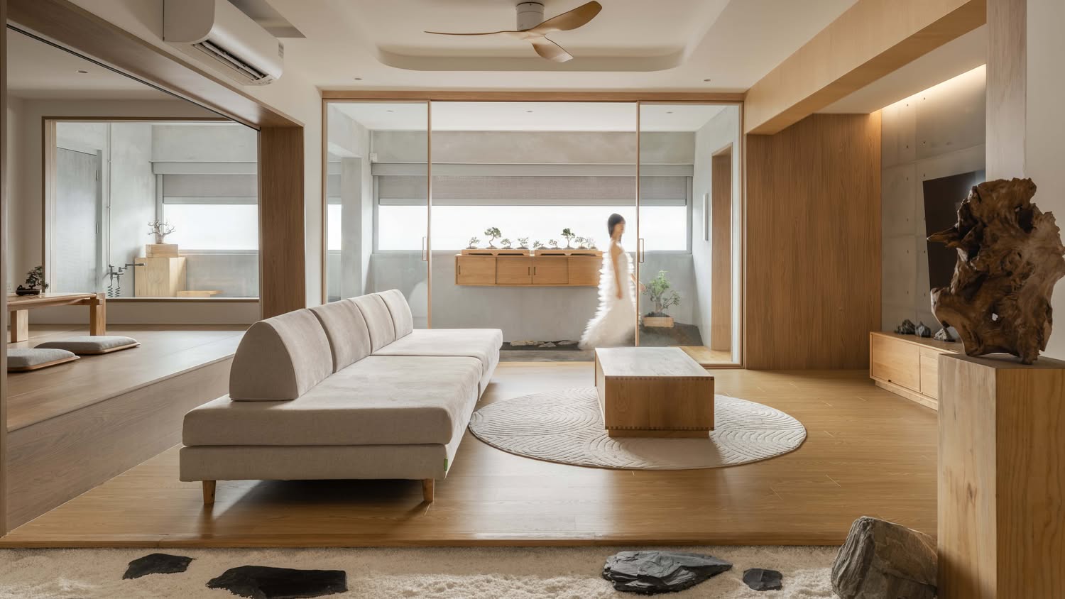
Editor's Pick This Beautiful Japanese-Inspired 5-Room HDB Home Features an Indoor Gravel Garden
Home Tours A Family’s Monochrome Open-Concept Home with Colour Accents
Home Tours A Bright Minimalist Condo Apartment With A Loft
Latest Posts
Singapore Property News 4-Room Flat at Bedok South Horizon Sets New Bedok Record at $1.17M

PRO Pro Where To Buy A Condo In Serangoon: Prices, Best Areas And Growth Trends In 2026

Property Advice Hundred Palms, Riverfront Residences Or Tampines Trilliant — Which Is The Better Buy For A Young Family Today?

















0 Comments