How To Identify A Good 1 Bedroom Layout: We Review 8 Different Condo Layouts To Show You
June 21, 2022
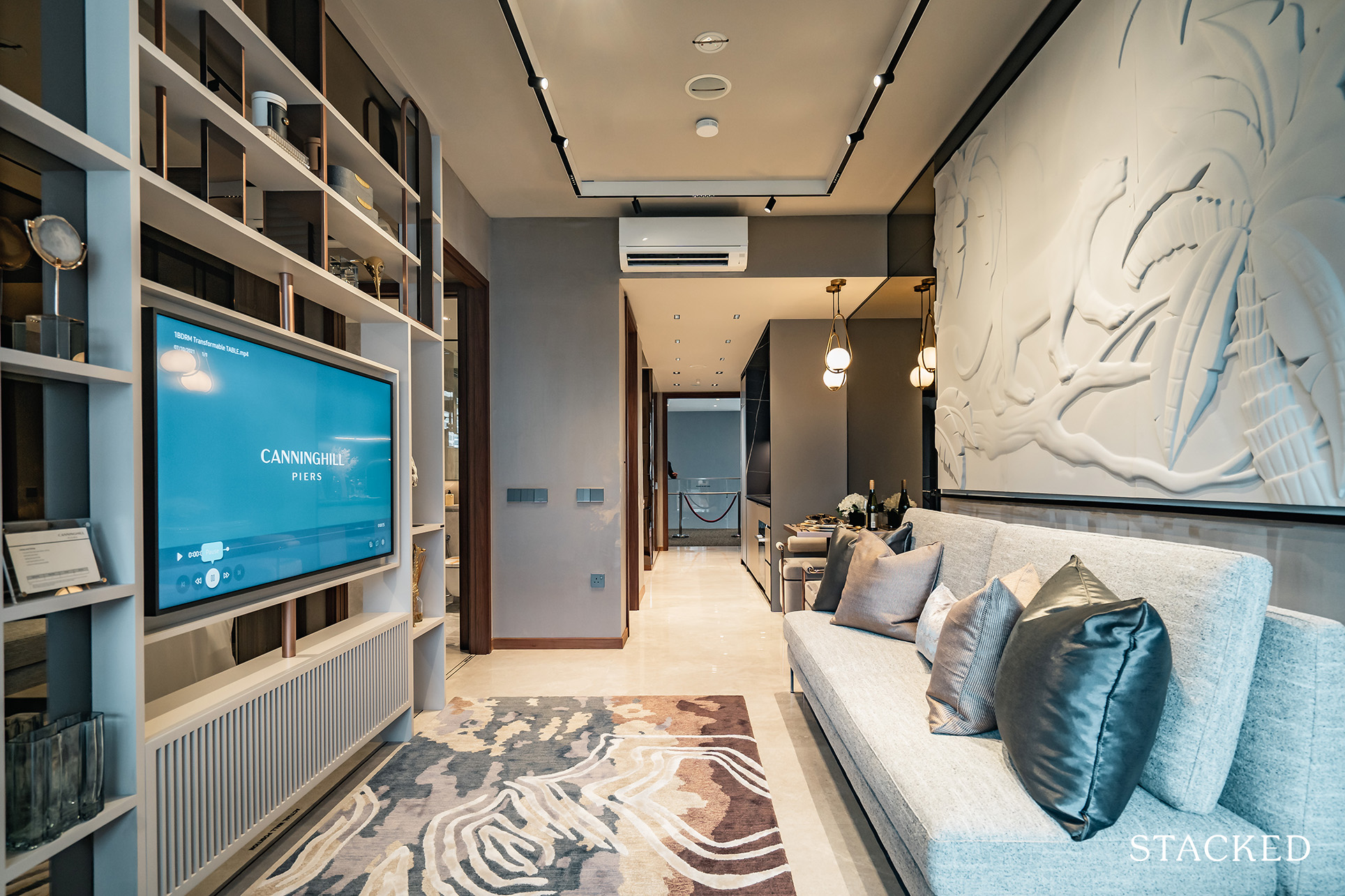
Whether you are looking at a 1 bedroom unit for an investment or to stay, there’s no question that having an efficient layout is one of, if not the most important aspect to consider. Especially in the case of a new launch condo – at such small sizes already, it is even more crucial that every inch is utilised properly.
And while 1 bedroom units have been getting more efficient over the years, there are still many different points that you should look out for.
Take these two floor plans below for example, which do you think is a better use of space?
A 1 bedroom unit at Lincoln Suites at 463 square feet, or a 1 bedroom at Pullman Residences at the same 463 square feet?
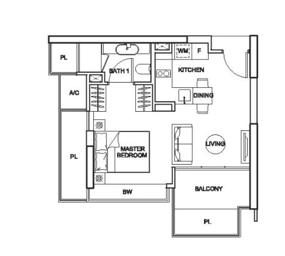
A 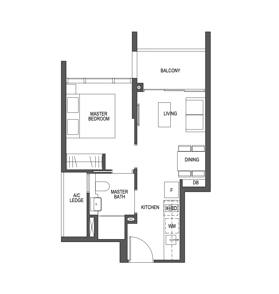
B
For those of you who answered B, great job. If you’ve answered A, well, I’d advise you to read on.
Despite being the same size on paper, the unit at Lincoln Suites will undoubtedly feel smaller in person. That’s because of the excessive bay window and planters used (in addition to the balcony). As such even though it is the same size, you’d realise that the living and dining areas are smaller in size. The worse part? When guests come over you’d need to enter and walk through the bedroom to get to the bathroom!
Contrast this to the unit at Pullman Residences. High maintenance fees aside, it is just a much better laid out unit. You have a dedicated space for dining which can just about cater to 4 people, and a Jack & Jill bathroom layout just makes things much simpler for everyone.
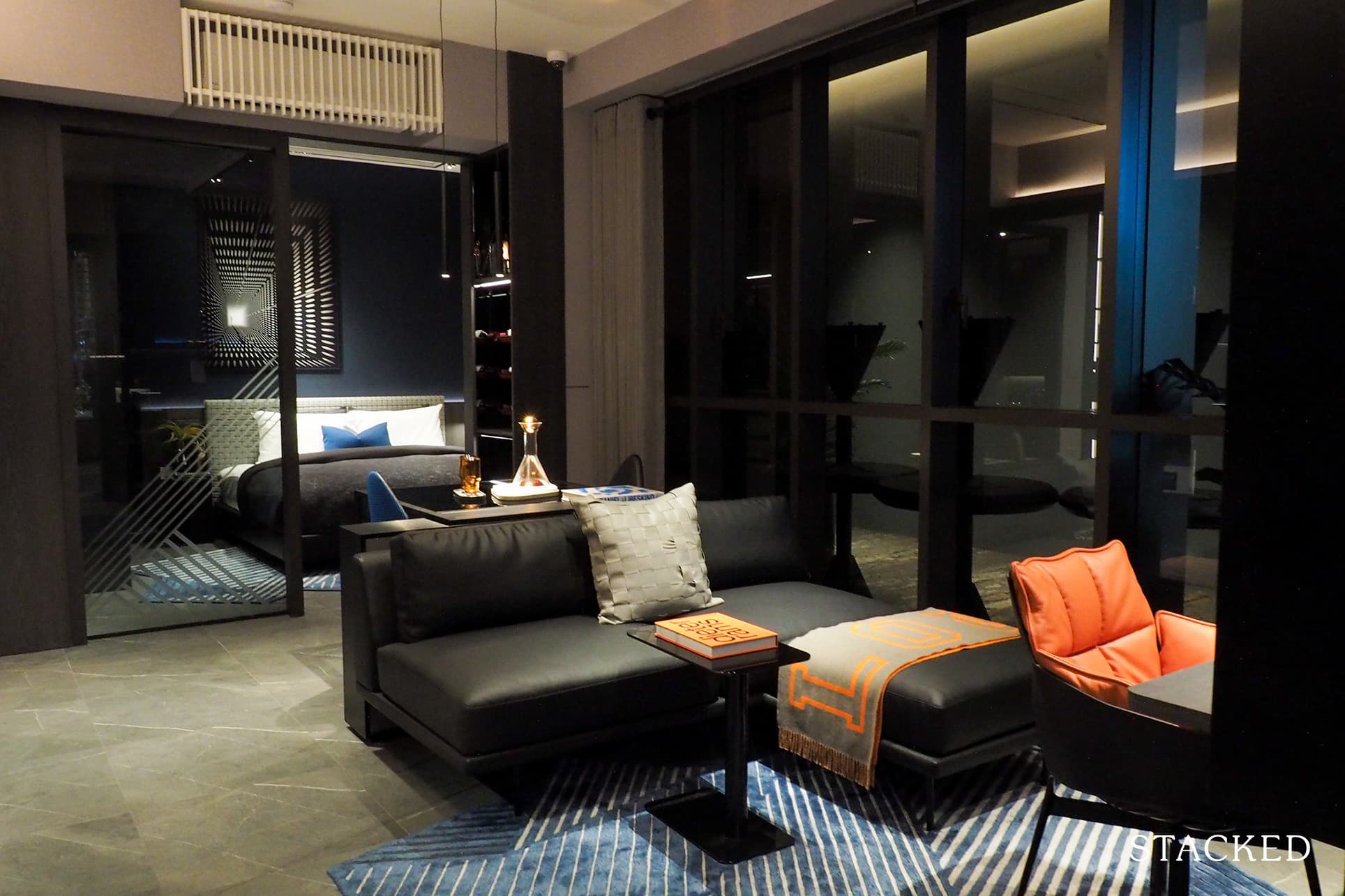
So to me, a good 1 bedroom unit should tick some or rather most of these boxes:
- A proper bedroom, that separates the living and sleeping area. (ideally with walls and doors instead of an open plan; as it provides privacy especially when you have guests over).
- A decent kitchen area with countertop space for storage, kitchen appliances, and meal prep.
- As we all know, most one bedders layouts are open kitchen layouts, so it is a plus point if it comes with enclosed or ventilation windows.
- A detached or Jack & Jill bathroom access over an attached bathroom via the bedroom. In this way, guests will not need to pass through the bedroom to access the bathroom.
- Love it or hate it; In-unit household shelter does take up space, especially in an area that is already so small. While it can be used as storage space, it is very inflexible if you rather just have the extra space. As a compromise, storage cabinets provided by developers or space where storage cabinets could be added is a great bonus.
- Balcony space over planters or bay windows. For obvious reasons, the balcony area has greater flexibility when it comes to space usage. Especially since the pandemic, more owners start to value the balcony area as it provides an outdoor escape. More often than not, this will double up as a yard space to dry clothes.
- A bonus area that could be used as a work office/guest room is a huge plus.
Post-2012, we are seeing more efficient unit layouts with fewer bay windows and planter boxes which were common design traits prior. Here are some examples of what I consider to be good one bedroom unit layouts that you can find in the market today.
So many readers write in because they're unsure what to do next, and don't know who to trust.
If this sounds familiar, we offer structured 1-to-1 consultations where we walk through your finances, goals, and market options objectively.
No obligation. Just clarity.
Learn more here.
Good modern 1 bedroom unit types
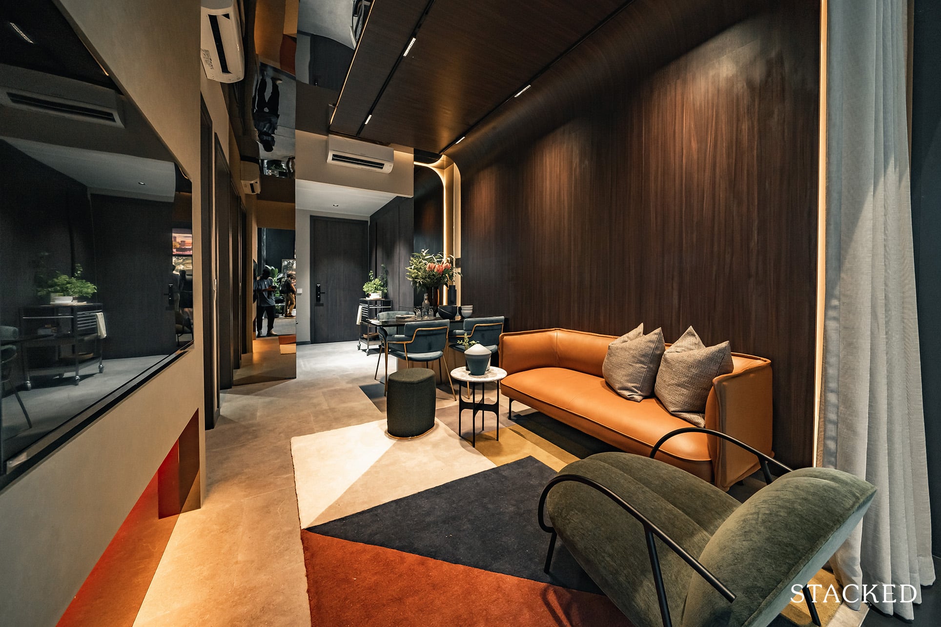
452 sq ft found in High Park Residences
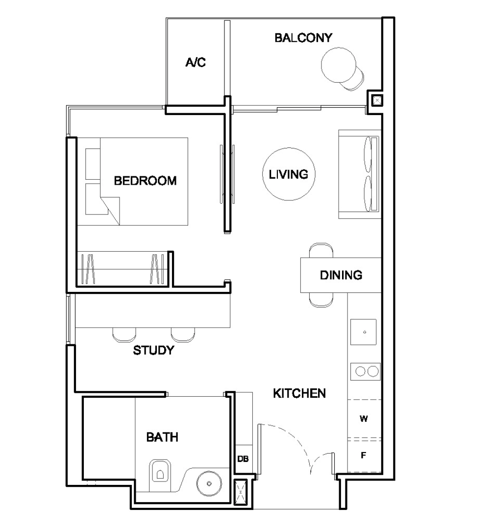
| Plus Points | Less Ideal |
| Squarish and efficient unit layout. | Tight dining area, alternatively, one could opt for al-fresco dining in the balcony area |
| Storage cabinets provided by the entrance | Lack of a bathroom window for natural ventilation |
| Good kitchen countertop length but it comes with a compromise of the tight dining area | |
| Decent sized bedroom with dedicated living and sleeping area | |
| Comes with a decent-sized study area with ventilation windows; great for WFH/HBL setting | |
| The study could be converted into a guest room as it is able to accommodate a single-size bed or even a fold away sofa bed | |
| Small AC ledge tucked neatly next to the balcony. This allows for full-length bedroom windows |
463 sq ft found in Millage
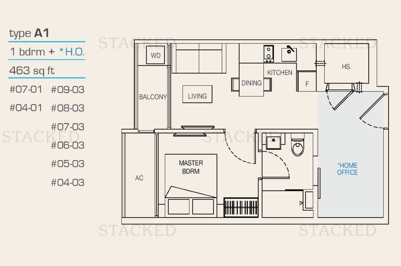
| Plus Points | Less Ideal |
| Squarish and efficient unit layout | Narrow balcony – dedicated washer area in the balcony makes the area smaller |
| Storage cabinets provided by the entrance | Tight living and dining area |
| The in-unit household shelter could be used as storage space | AC ledge limits the view of the bedroom, leaving it with half-length windows |
| The study could be converted into a guest room as it is able to accommodate a single-size bed/sofa bed | The kitchen is on the small side |
Not so good 1 bedroom unit types
In the late through the early 2010s, we have also seen compact shoebox units with bay windows/planter boxes as one of the common design traits during the era – which has resulted in less than desirable layouts.
452 sq ft in Leicester Suites
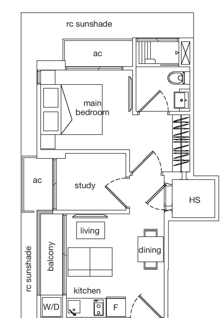
| Plus Points | Less Ideal |
| Dedicated study area with ventilation windows and door | Tight living, dining, and kitchen areas |
| Neatly flushed wardrobe, which is a good size | Narrow balcony area |
| In-unit household shelter; great for storage | Double AC Ledges take up space |
| The bathroom comes with ventilation windows; great for natural ventilation | Location of the bathroom is not as ideal |
258 sq ft in Suites @ Guillemard
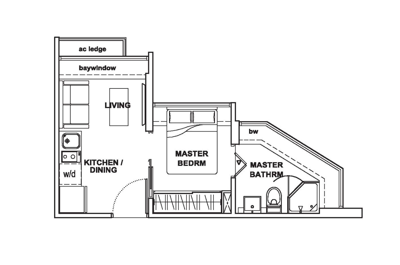
| Plus Points | Less Ideal |
| Separate living and sleeping areas with sliding doors separating the two areas. | Very small unit area |
| Great wardrobe space | Bay windows take up space and hinder space planning |
| A good number of window panels surrounding the unit; allows for more natural light and ventilation in the unit. | The platform bed has to be built over bay windows to be able to fit in a bed |
| Narrow living area | |
| Small kitchen space with a lack of countertop space |
614 sq ft in The Minton
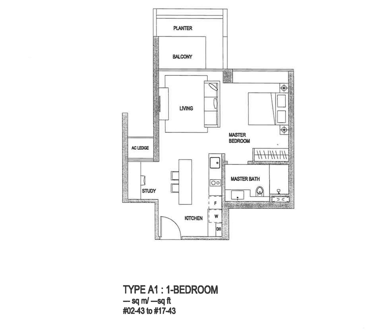
| Plus Points | Less Ideal |
| Good sized kitchen with countertop space | A completely open-plan layout, may not be ideal for everyone |
| Spacious bedroom area | Overly large planter and bay window which takes up space |
| A small AC ledge tucked by the study area | |
| May not be the largest study area but at least it is a useable area. |
Property Investment InsightsAre 1 Bedroom Units A Good Investment? Analysing 3,834 Transactions From 2011
by Ryan J. Ong452 sq ft in Imperial Heights
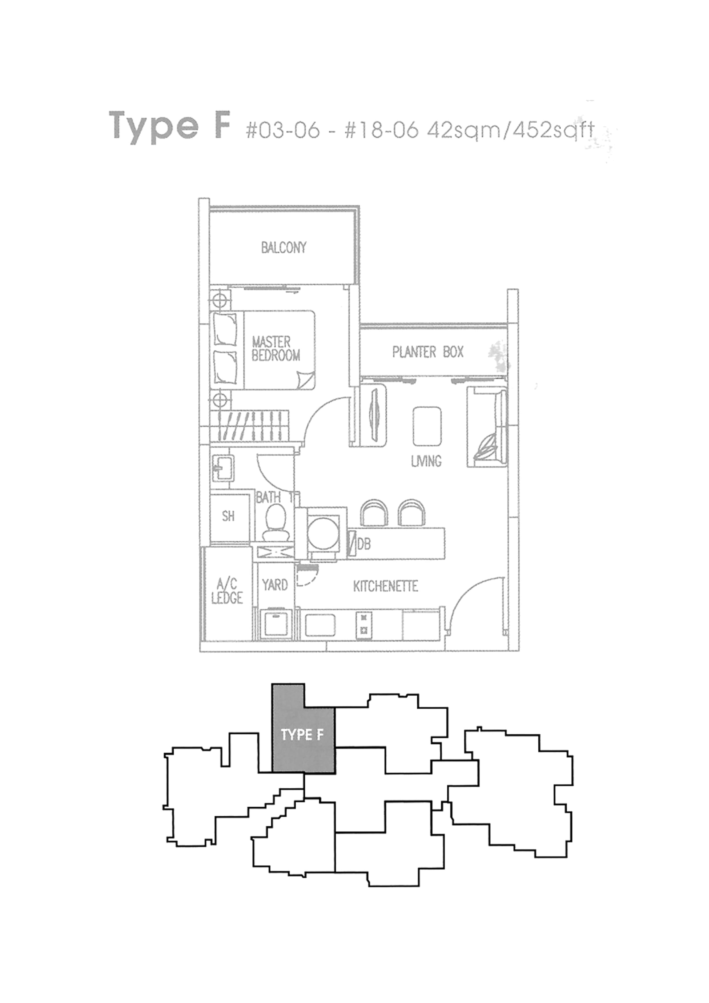
| Plus Points | Less Ideal |
| Proper yard area for laundry – a rarity in one bedder units | Planter boxes and balcony area takes up space |
| Decent length of kitchen countertop space which doubles as a dining area too. | Tight living and dining area |
| The bathroom comes with ventilation windows; great for natural ventilation |
In early 2000-2010, One bedder is spacious in terms of square footage. However, layouts are less efficient with bay windows, planter boxes, and odd layouts. All in all, less efficient. Here are some examples:
592 sq ft in Southbank
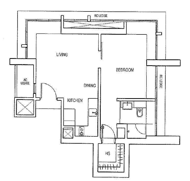
| Plus Points | Less Ideal |
| Spacious unit size for a one bedder unit. | Wasted bay window space surrounding the perimeter of the unit |
| Squarish unit layout | The unit opens straight to the living/dining area; lacks privacy |
| The in-unit household shelter which doubles as storage space and wardrobe | Protruding structural columns by the window bay hinders the view and takes up space |
| Neatly tucked A/c ledge hidden by the entrance area with window panel for access | With the bathroom located in the bedroom, guests have to pass through the bedroom for access to the bathroom |
| Great size kitchen with ample countertop space | The kitchen area lacks a ventilation window |
| The bathroom comes with proper window panels; great for natural ventilation | Lack of balcony area, a downside for those that value some outdoor space |
667 sq ft in The Parc Condo
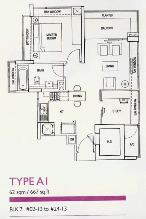
| Plus Points | Less Ideal |
| Squarish unit layout | Tight dining area |
| Dedicated study area which is a good size | Bay windows and planter box takes up space |
| Ventilation window for the kitchen | |
| Window panels in the bathroom which are great for natural ventilation | |
| Small AC ledge neatly tucked by the study area. |
When all is said and done, you really do have to go beyond just looking at the floor plan. As much as floor plans are useful to compare between units, going down to see the unit can often result in a different experience. This is because floor plans don’t disclose features like ceiling heights, the size of the windows, the views and light that comes in, as well as the design and colours of the space – which can all play a part in making the space feel bigger or smaller.
Seen any 1 bedroom floor plans that you’ve felt are really good, or even bad? Do let us know in the comment section below or you can reach out to us at stories@stackedhomes.com.
For more property picks and in-depth reviews, visit Stacked. We provide the latest details on the Singapore private property market, so you can make a better-informed decision.
At Stacked, we like to look beyond the headlines and surface-level numbers, and focus on how things play out in the real world.
If you’d like to discuss how this applies to your own circumstances, you can reach out for a one-to-one consultation here.
And if you simply have a question or want to share a thought, feel free to write to us at stories@stackedhomes.com — we read every message.
Sean Goh
Sean has a writing experience of 3 years and is currently with Stacked Homes focused on general property research, helping to pen articles focused on condos. In his free time, he enjoys photography and coffee tasting.Need help with a property decision?
Speak to our team →Read next from Editor's Pick

Property Advice Hundred Palms, Riverfront Residences Or Tampines Trilliant — Which Is The Better Buy For A Young Family Today?

Property Advice Selling Our Holland Village HDB To Buy A Freehold Marine Parade Condo – Should We Wait?
Property Advice Should We Sell Our Freehold Condo For A $2.2M Leasehold Landed Instead?

Property Advice Should I Buy A Freehold Condo In A Landed Enclave — Or Look Elsewhere For Better Growth?
Latest Posts
Singapore Property News 4-Room Flat at Bedok South Horizon Sets New Bedok Record at $1.17M

PRO Pro Where To Buy A Condo In Serangoon: Prices, Best Areas And Growth Trends In 2026
New Launch Condo Reviews Vela Bay Review: 515-Unit Bayshore Condo Launch Next To Bayshore MRT That Starts From $1.2M















5 Comments
Can consider Skies Miltonia – good efficient layout – no planters. Kitchen/Living in L shape so that Kitchen is isolated from Living room Point block layout so don’t have long dark corridor outside etc.
Botanique at Bartley 1BR (495 sqft) layout is very good. Efficient layout, with sensible dimensions. Balcony can be considered large than other developments, but it allows for a proper balcony dining set / growing plants / storage of expensive bicycle etc. Position of balcony and AC ledge mean that there is screening from direct sun, helps to keep the unit cool. Developer was also generous with built-in cabinets for kitchen and full-height cabinet for washer-dryer, so there is abundant storage space.
This is really useful, are you planning to do one for the 2 bed 2 bath layouts soon?