5 Unique But Practical HDB Layouts And Where To Find Them
August 26, 2024
You may think all HDB flats are broadly similar, and they kind of are from the outside (although that’s not true of HDB’s older, cooler, experimental phase). What affects us isn’t the exterior of our block though – it’s literally what’s inside that counts when it comes to a residential property. In light of that, here are some HDB interiors that have a better layout than others. Look out for these in resale flats, or if you see something similar in upcoming designs:
So many readers write in because they're unsure what to do next, and don't know who to trust.
If this sounds familiar, we offer structured 1-to-1 consultations where we walk through your finances, goals, and market options objectively.
No obligation. Just clarity.
Learn more here.
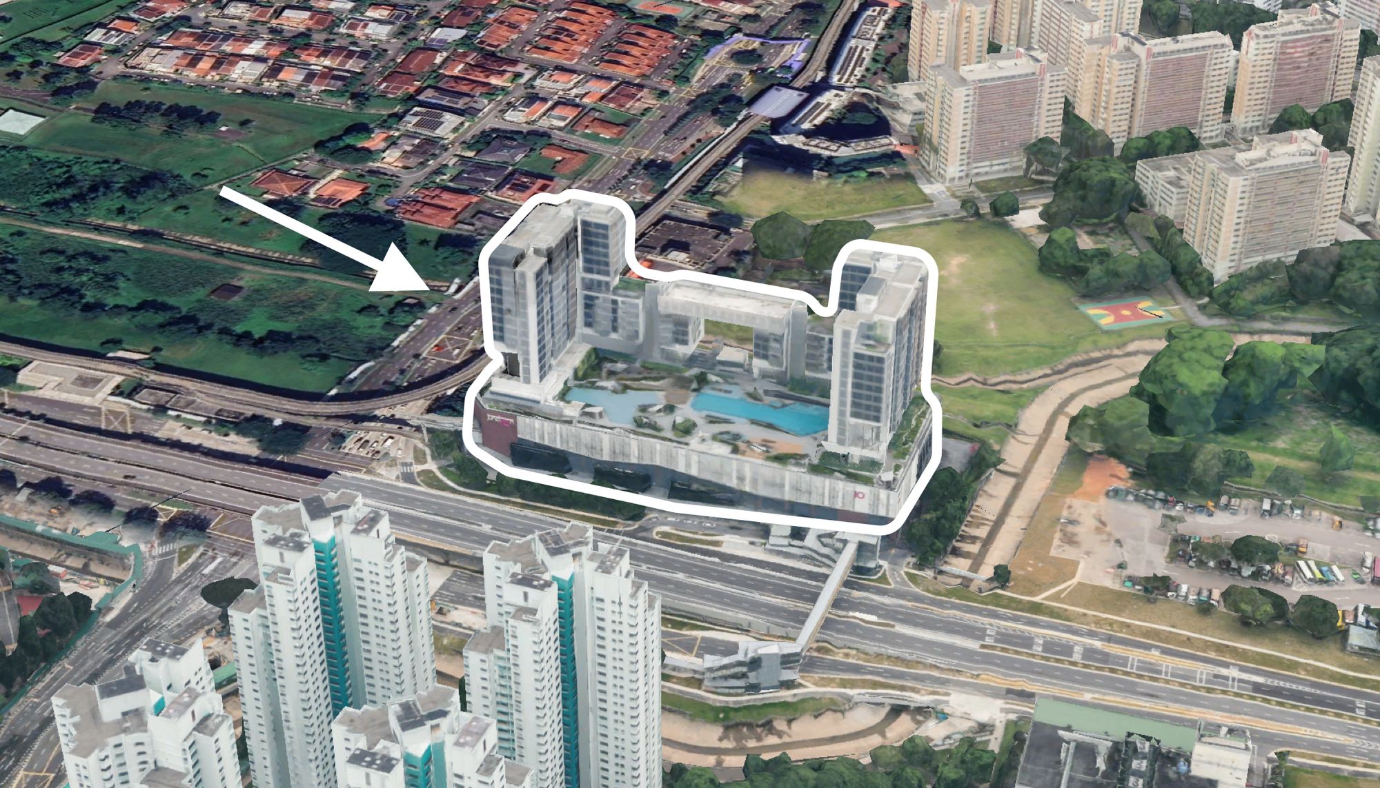
1. Waterfront II @ Northshore
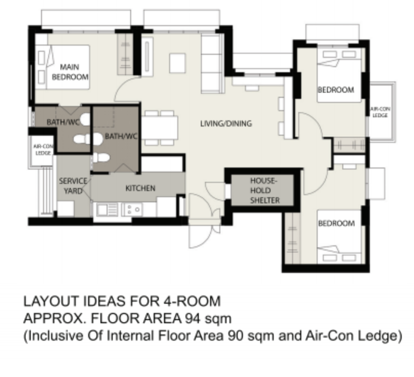
It’s hard to express how well this works just from the floorplan, as most of the advantages from this project are right outside the flat: Waterfront I and II have some of the best sea views of any HDB project, as the name implies. While the floor plans don’t directly mention it, the units are angled to have a long, uninterrupted view of the waterfront, and it’s naturally well-lit and airy all along the length of the unit.
That said, this is also an efficient dumbbell layout, where the living/dining area connects the bedrooms and kitchen on either end. This removes the need for a connecting corridor. This layout also works well if you have extended family who sometimes stay over, live with tenants, etc., as the master bedroom is neatly on one side with the other bedrooms tucked on the other.
As a nice bonus to all this, the kitchen comes with a proper service yard and is enclosed for the serious home cook. This is a plus if you dislike the newer HDB layouts, where open-concept kitchens (and hence escaping smells) are a default.
In general, the spacious and squarish nature of the layout makes it a very versatile space.
2. 5-Room Loft (Treelodge @ Punggol)
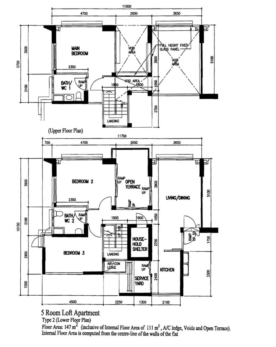
There are only 37 loft units in Punggol, of which 14 can be found in Treelodge @ Punggol. Note that this project is a bit special, as it was a pioneering project for sustainability and garden living. Built in 2010, we can see how the newer developments are now conscious of age issues: two bedrooms are on the ground floor, and only the main bedroom requires you to climb the stairs.
The high-ceiling living space is one of the most impressive we’ve seen. Besides being fantastic for ventilation (both light and airflow), it’s safer: the space that overlooks the living room is enclosed by a window, so you won’t have children or curious pets clambering over a loft balcony. As always though, cleaning light fixtures and the high ceiling are inevitable challenges of loft units.
The open terrace is basically a balcony, which provides a nice alfresco space; it’s sizeable enough to set up a small table or to use for gardening.
Lastly, the kitchen is neatly tucked into a corner and has a proper-sized service yard, and it’s easy to make it enclosed or open as you wish.
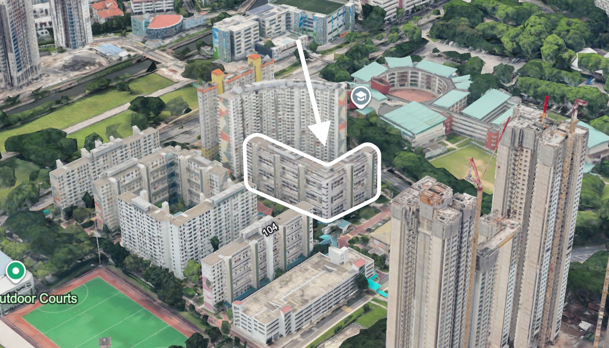
3. 5-room improved point block (102 Bishan Street 12)
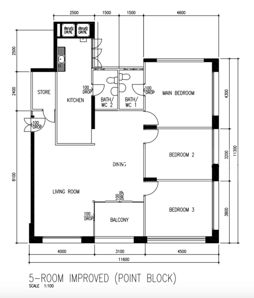
This 5-room flat has an entrance space, which allows for racks before turning into the living room proper. The balcony is also well-positioned, providing natural ventilation to the living and dining areas without taking up too much square footage. The separation between living and dining spaces is also better differentiated, and this could be made into a more old-school, enclosed dining room for traditionalists (note that due to the placement of the balcony, there would still be a lot of natural light).
More from Stacked
5 Spacious Freehold Penthouse Listings Above 2,400 Sq Ft On The Market This Week
Two property luxuries many Singaporean buyers often miss out on are land ownership and super spacious units. So when we…
The kitchen is quite interesting in this layout: it’s almost corridor-like, but that also means more options for cabinetry/countertops along both walls. While the service yard isn’t demarcated, the windows across the sink make for a well-ventilated space; and overhead racks could work here, if you don’t use a dryer.
The overall layout is highly efficient, with three side-by-side bedrooms that remove the need for corridor space.
4. Executive Apartment (830 Jurong West Street 81)
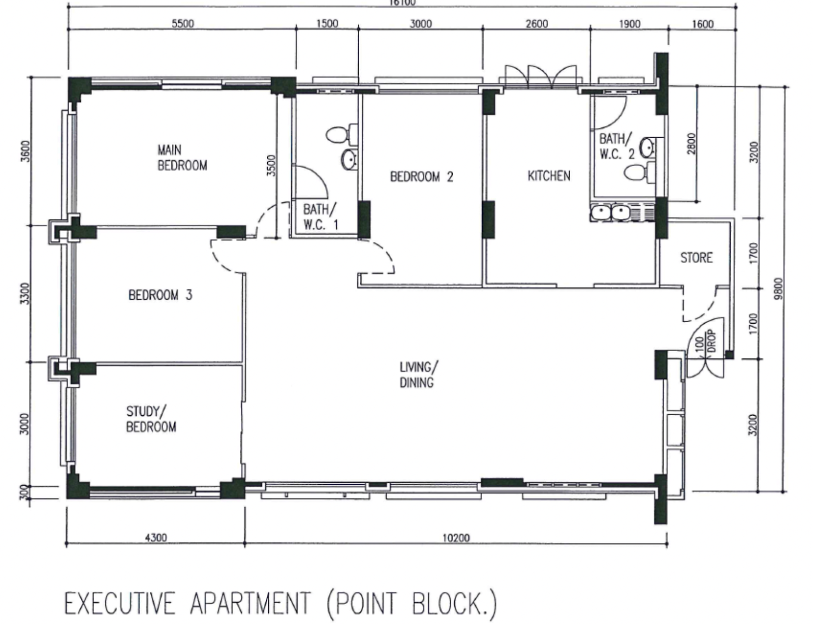
This is a spacious, highly efficient layout that obviates the need for connecting corridors. There are zero odd nooks and crannies, and the square footage is maximised. The living/dining area is the interconnecting point between every single bedroom and the kitchen – and because it’s a large rectangular space, it’s highly versatile. And unlike many dumbbell layouts that seek to emulate this design, the main entrance doesn’t open up directly into the living area.
Another advantage to having bedrooms neatly adjacent, in this sort of configuration, is that it’s easy to merge or divide them. So you could easily merge the study with Bedroom 3, into a single larger bedroom.
The kitchen layout is a bit different, as the main washing and food prep area (near the sinks) isn’t directly facing the windows. This could be helpful for those who use the kitchen for other purposes (e.g., a place for tuition and homework, or a makeshift dining room): if you’re prepping food at the sink, you won’t need to intrude on the open space facing the windows.
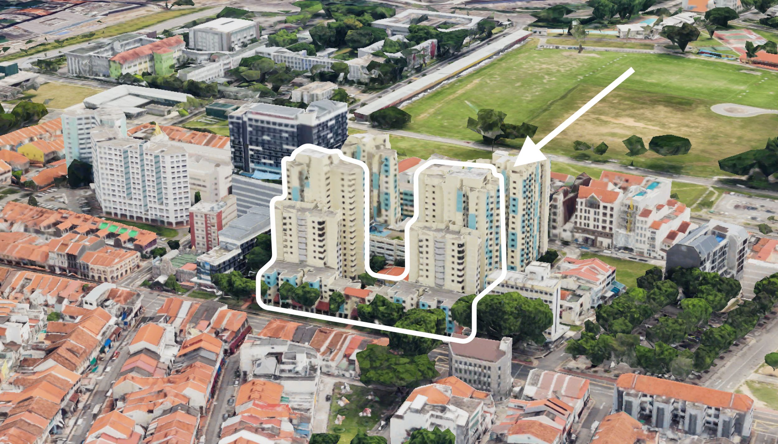
5. Executive Maisonette 5-room maisonette model A (Potong Pasir Avenue 1)
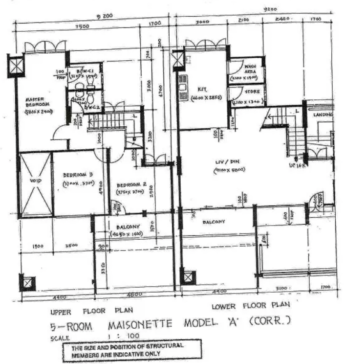
The entrance for this flat is something many owners of new condos would prefer. Rather than opening directly into the living/dining area, it opens to a small area to the side, which provides (1) some privacy, and (2) a good space for shoe racks, coat stands, etc. Some homebuyers will also appreciate that the stairs aren’t directly visible from the main entrance, due to Feng Shui or aesthetic reasons.
Also, note the void space above the living/dining area. Admittedly high ceilings aren’t for everyone (they’re a bit hard to clean) but it does make for a loft-style, apartment feel in the maisonette.
The kitchen is enclosed and has a spacious, square shape that’s easy to configure. If you wanted, it would be quite easy to make this an open-concept kitchen, which opens up into the living area. A nice bonus is that the balcony directly faces the kitchen, so it would be well-lit and ventilated if you choose to open up the space.
Like most older design concepts though, there was a desire to separate the more “public” living/dining spaces from the more private bedroom spaces – so the bedrooms are all upstairs. This doesn’t work for everyone though, as older residents may prefer to have their bedroom on the ground floor. In this instance though, there may be sufficient room for a small study or bedroom on the ground floor.
At Stacked, we like to look beyond the headlines and surface-level numbers, and focus on how things play out in the real world.
If you’d like to discuss how this applies to your own circumstances, you can reach out for a one-to-one consultation here.
And if you simply have a question or want to share a thought, feel free to write to us at stories@stackedhomes.com — we read every message.
Frequently asked questions
What makes Waterfront II @ Northshore's layout practical for families?
What are the benefits of the high-ceiling loft units at Treelodge @ Punggol?
How does the layout of 102 Bishan Street 12 improve space efficiency?
Why is the layout of 830 Jurong West Street 81 considered highly efficient?
What are the advantages of the design of the Potong Pasir Avenue 1 maisonette?
Ryan J. Ong
A seasoned content strategist with over 17 years in the real estate and financial journalism sectors, Ryan has built a reputation for transforming complex industry jargon into accessible knowledge. With a track record of writing and editing for leading financial platforms and publications, Ryan's expertise has been recognised across various media outlets. His role as a former content editor for 99.co and a co-host for CNA 938's Open House programme underscores his commitment to providing valuable insights into the property market.Need help with a property decision?
Speak to our team →Read next from Property Picks
Property Picks Where to Find Singapore’s Oldest HDB Flats (And What They Cost In 2025)
Property Picks Where To Find The Cheapest 2 Bedroom Resale Units In Central Singapore (From $1.2m)
Property Picks 19 Cheaper New Launch Condos Priced At $1.5m Or Less. Here’s Where To Look
Property Picks Here’s Where You Can Find The Biggest Two-Bedder Condos Under $1.8 Million In 2025
Latest Posts
Singapore Property News HDB Resale Prices Fell — But A Third Of Buyers Still Paid $800K+ Last Quarter. Here’s Why
Singapore Property News Three Strata Office Floors In Suntec Priced From $135M
Singapore Property News This Freehold Desker Road Shophouse Is Going For $10.5M









0 Comments