4 Creative Space-Saving Ideas For A 1-Bedroom Condo Layout
August 1, 2023
If you haven’t already noticed, homes in Singapore are getting smaller. This trend is not unique to Singapore. In Hong Kong, one of the most densely populated cities in the world, a unique form of artistry has emerged in response to the city’s limited living spaces. Here, every square inch is precious, and every corner holds potential. So as our living spaces shrink, it’s time we really started to think creatively.
Picture this: You walk into a home no larger than a few hundred square feet. Yet, the space doesn’t feel constrained. A dining table folds out from the wall for meals and folds back in when not needed, freeing up space for other activities. The bed isn’t just a bed but transforms into a fully-equipped workspace, a necessary innovation in today’s era of remote work.
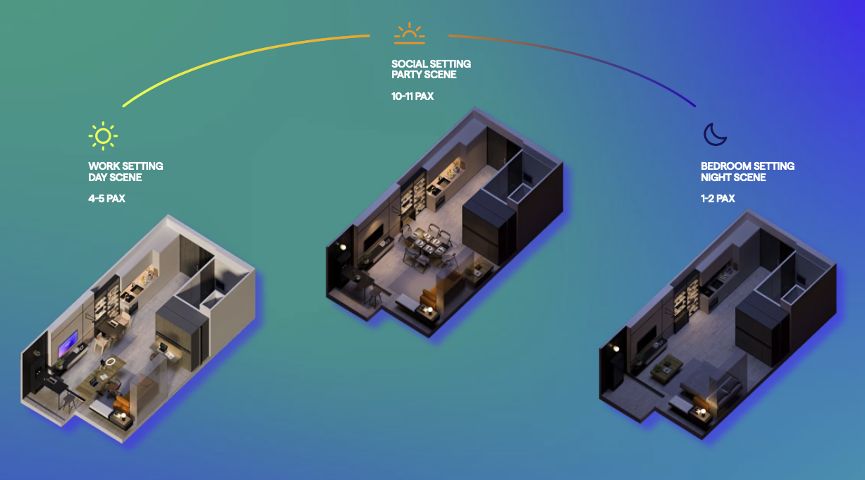
Despite the spatial constraints, there is a sense of openness, achieved by the clever use of modular furniture that appears and disappears as needed. The kitchen, though compact, is well-equipped, supporting culinary adventures without compromising the rest of the home.
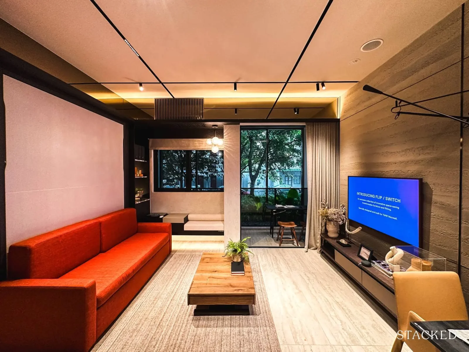
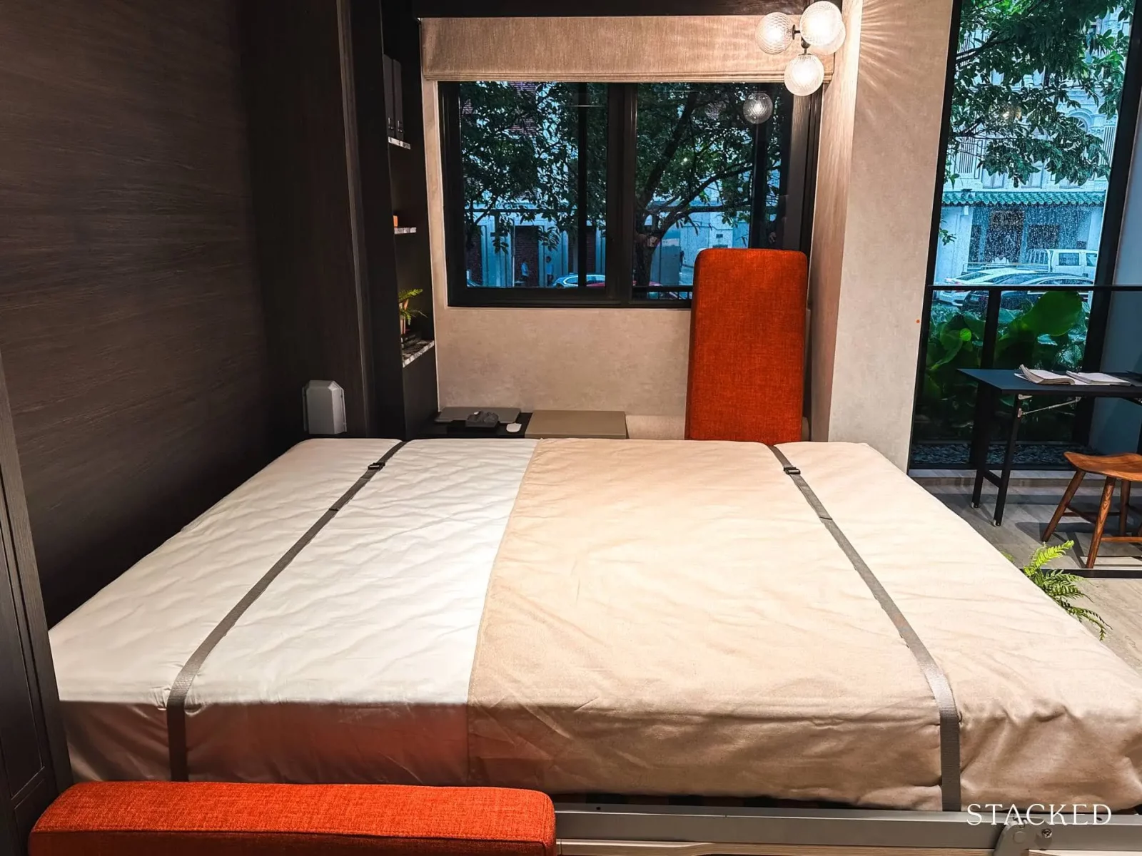
In response to these shrinking living spaces, designers in Singapore have started to adopt these innovative design philosophies. TMW Maxwell, for instance, has launched innovative ‘flip/switch’ units that seamlessly incorporate space-saving furniture pieces, echoing the functionality of Hong Kong’s compact living spaces.

Editor's PickTMW Maxwell Review: Unique Space-Saving Furniture & Vertical Landscaped Gardens In The CBD
by Matthew KwanSo for those looking at small 500+ sq. ft. shoebox units, here are some ideas that you can take away for optimising such a layout:
So many readers write in because they're unsure what to do next, and don't know who to trust.
If this sounds familiar, we offer structured 1-to-1 consultations where we walk through your finances, goals, and market options objectively.
No obligation. Just clarity.
Learn more here.
Our General Template
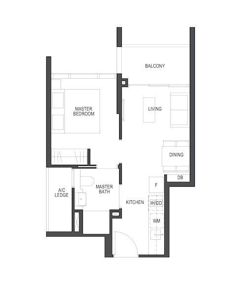
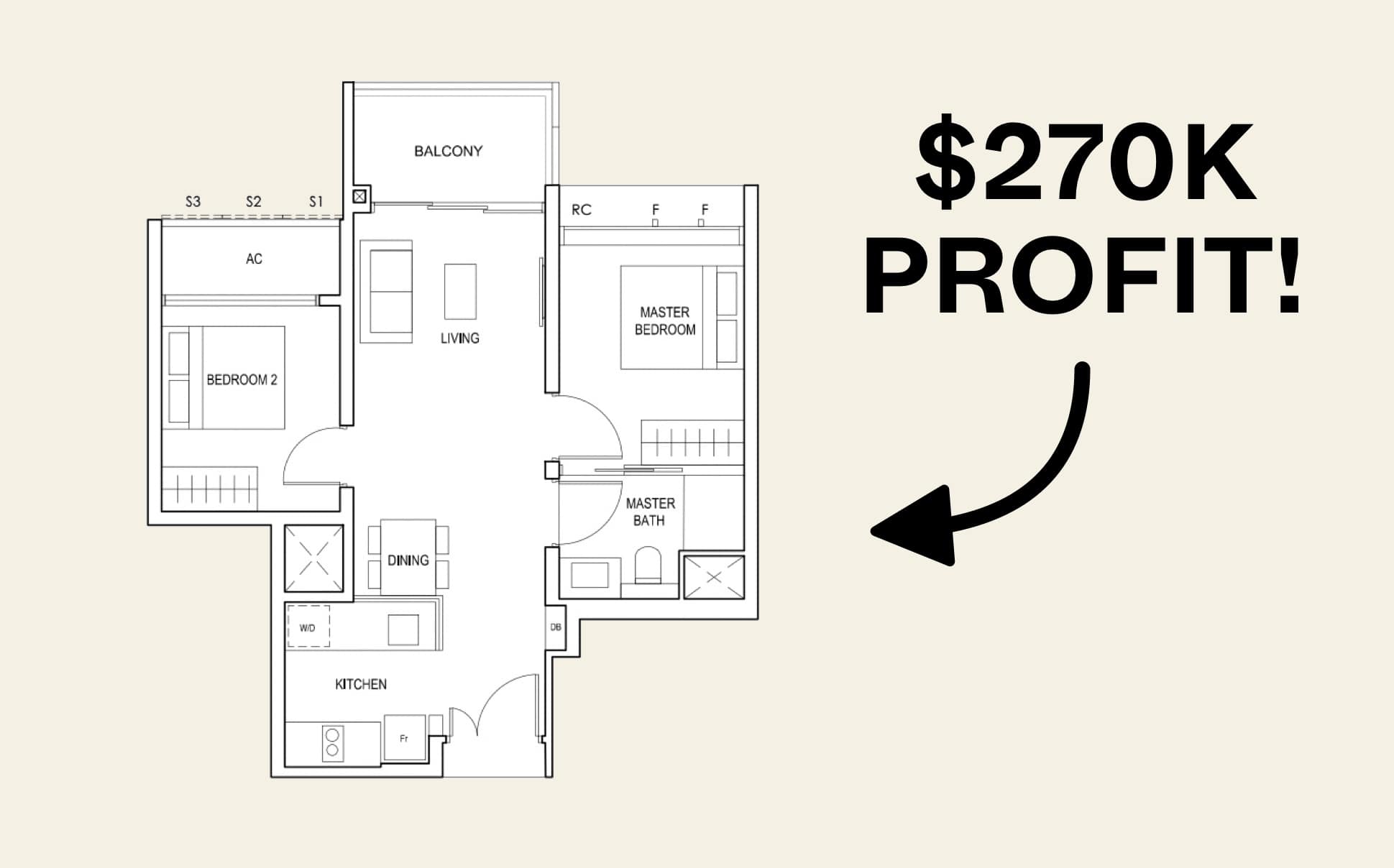
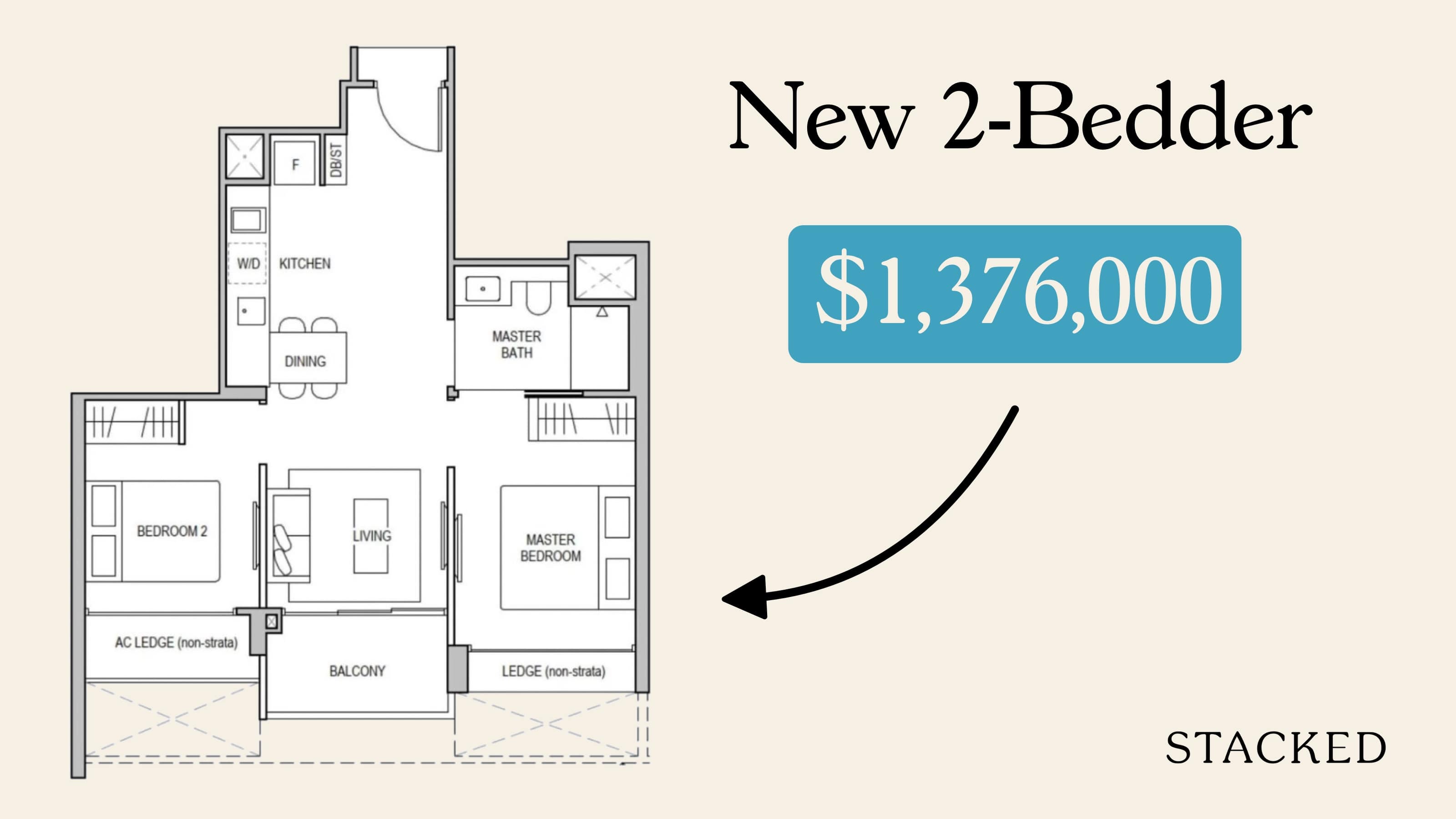
This will be the template that we’ll work with. This is rather typical of many one-bedders you may see today (although not all of them have balconies).
Idea 1:
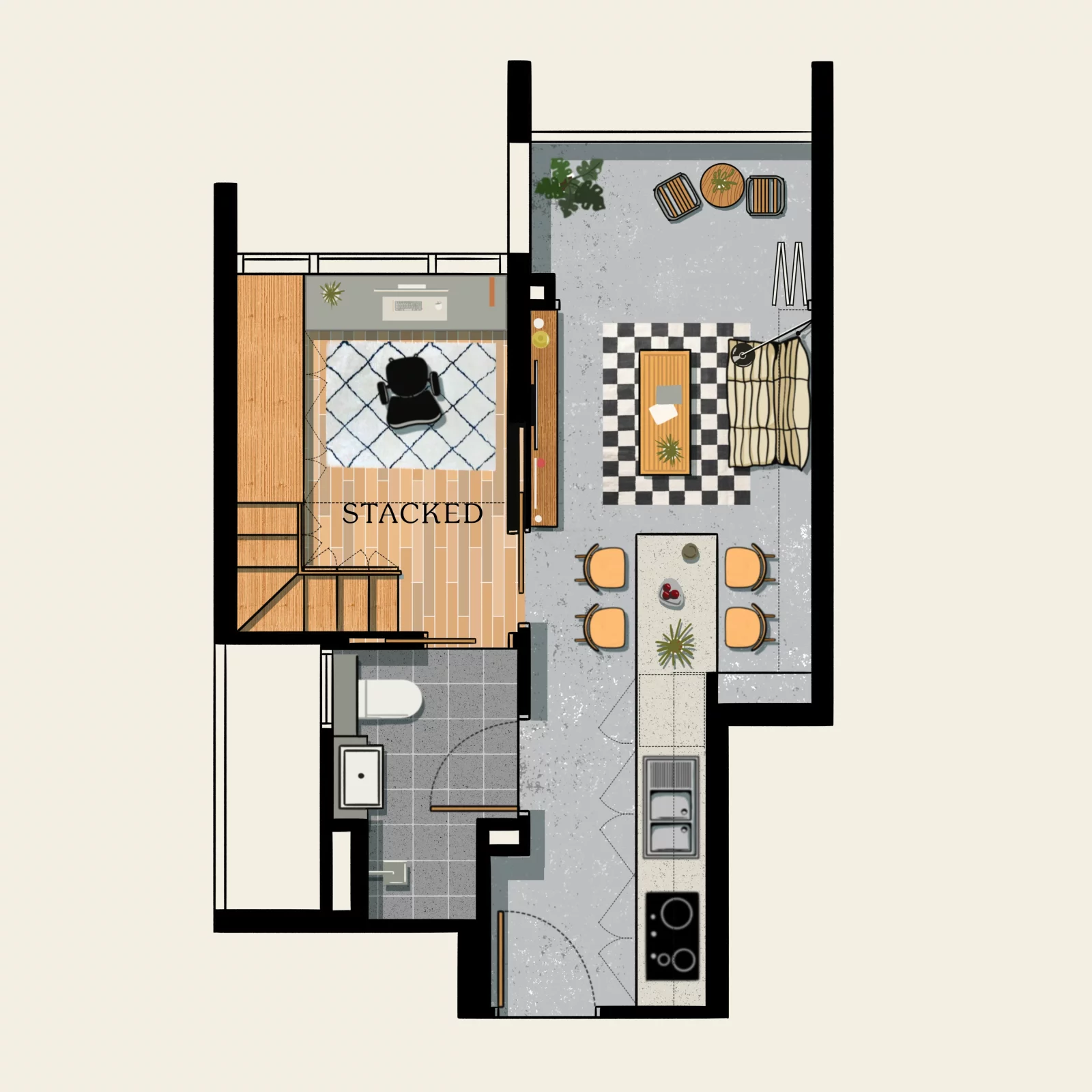
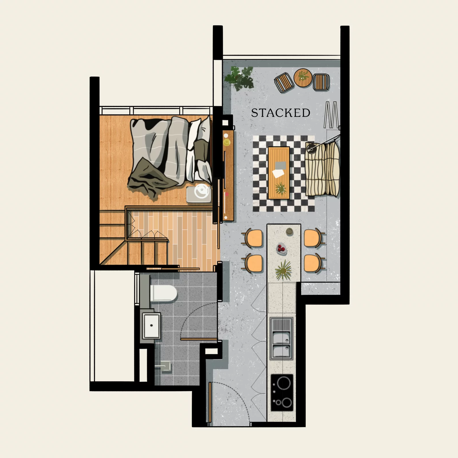
In this layout, we’ve extended the kitchen counter to join up with the dining table, creating a linked dining space. This makes the dining area feel more inclusive, rather than being sequestered to a corner. You get more countertop space here when needed as an extension from the kitchen, and this will be the main dining area when family/friends are over.
Ideally, you’d want to custom-build the table here to incorporate more storage space below the table.
The biggest change is in the bedroom. Here, we conceptualise a loft bedroom, where the bed is on a raised deck. This allows for storage spaces under the stairs, and provides room for a study or home office below.
Of course, this is dependent on the height of your ceiling. Unless you have exceptionally high ceilings here, don’t be expecting to be able to stand fully on both the lower and upper levels.
Idea 2:
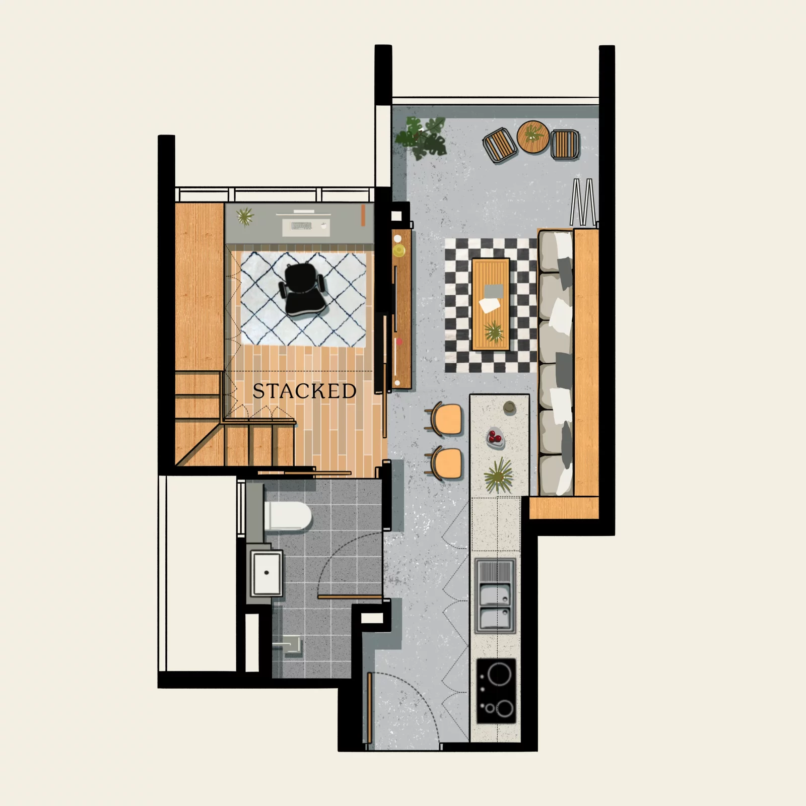
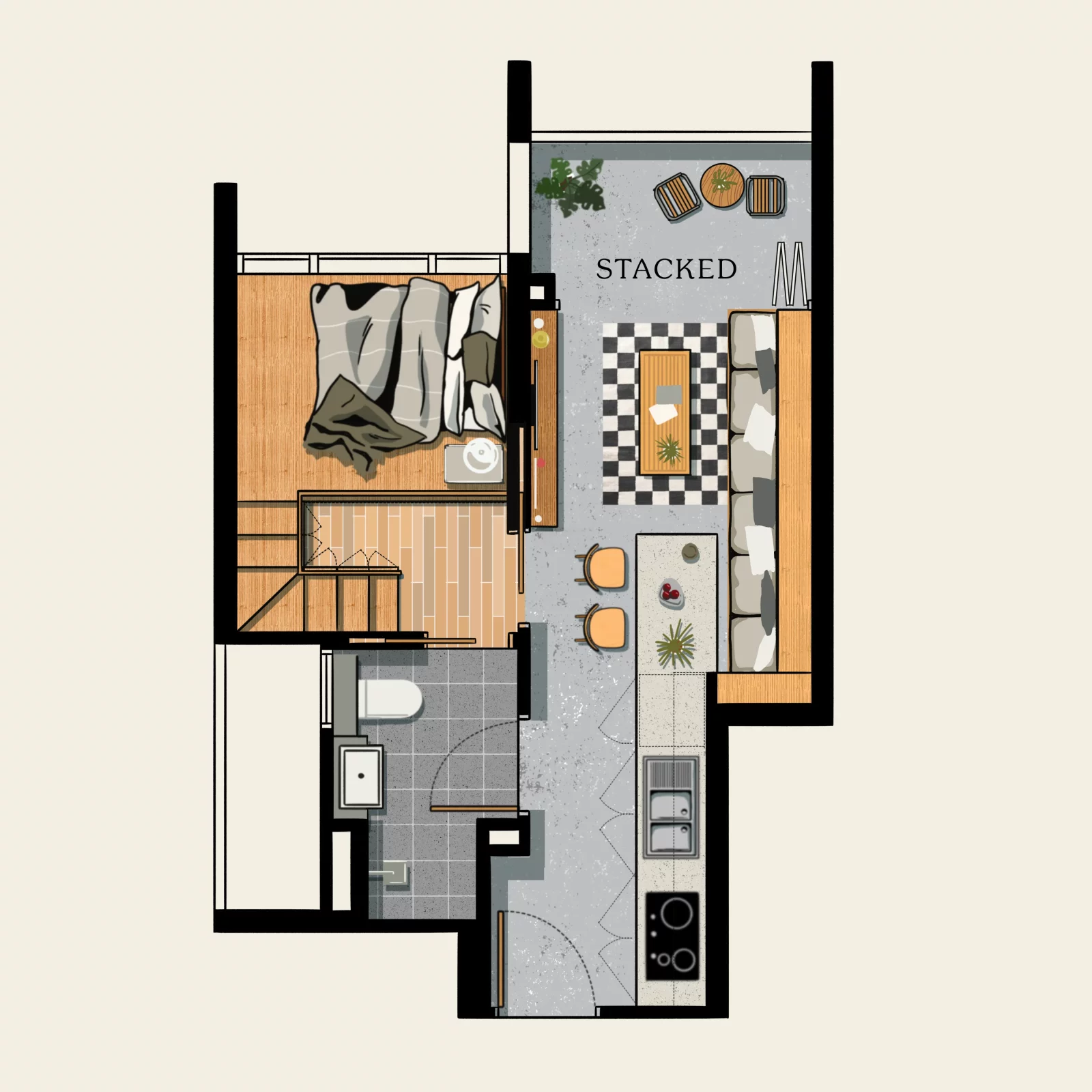
This is a variant of idea 1 above. The bedroom concept is the same, with the sleeping area on a deck and the study below. The difference here is in the living room.
Rather than use the typical sofa set-up, we replace it with a long continuous bench. This extends to include the dining area, and can provide more seating than the traditional arrangement.
Another benefit to doing this is storage: the extended seat can have storage spaces beneath it, which are easily accessible.
As you may have seen in various show flats, this arrangement is the most efficient in terms of space, but you do have less flexibility in moving things around should you want to rearrange the layout.
Idea 3:
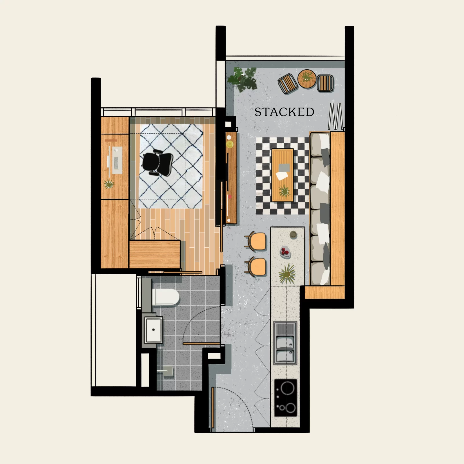
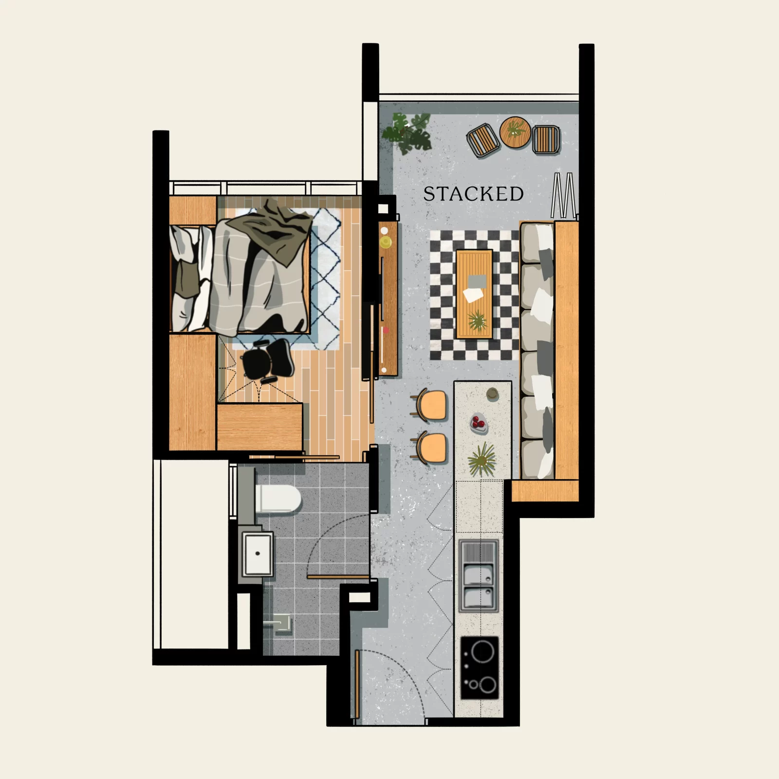
This is an outgrowth of the second idea; but we use a Murphy Bed (aka. Pull-down bed) instead. This is a bed that can be folded up against a wall when not in use, thus saving space.
Higher-end Murphy Beds can be disguised to look like wall installations, closets, or other faux features when folded up (Useful if you think the metal frame is ugly, when up against the wall).
This choice is very subjective though. We know some people dislike these beds because it’s problematic if the folding mechanism gets jammed; and you may find the bed sheets get a bit messy with these. Still, they’re a good way to get more living space.
Other common one-bedroom layouts with a study to consider
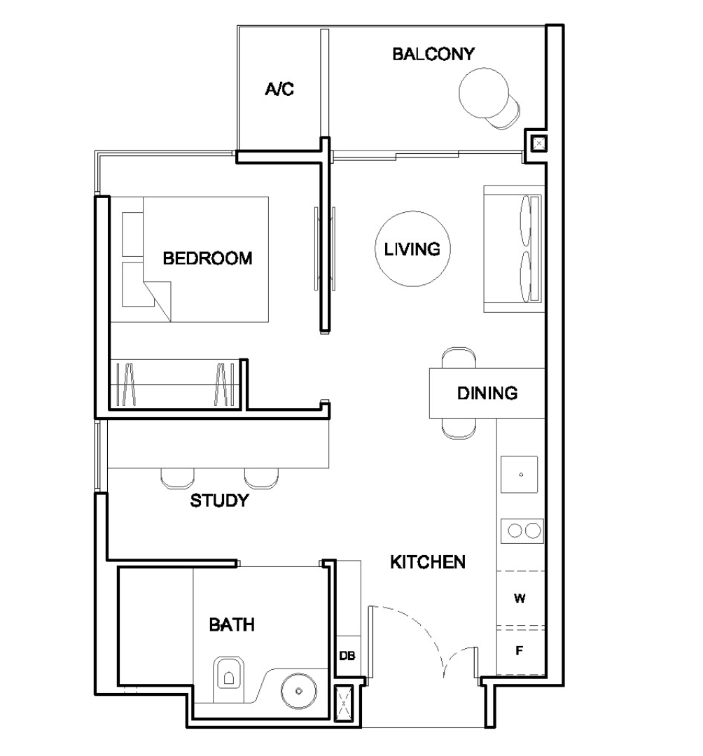
Here’s the type of versatile layout we like to see. There are a number of possibilities here, and the following were inspired by designs seen here.
Idea 4:
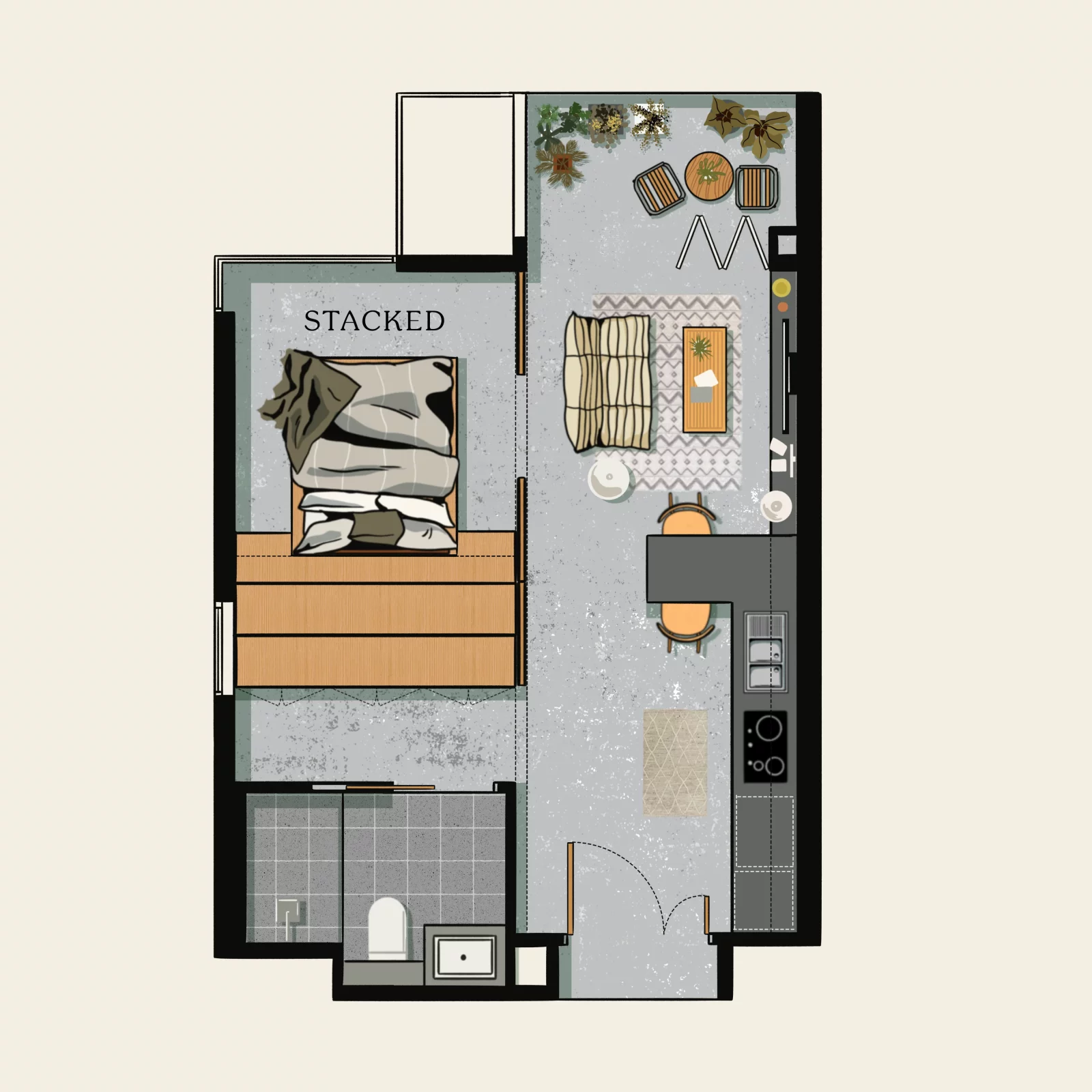
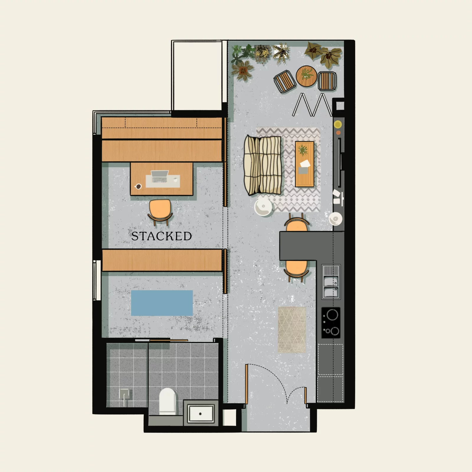
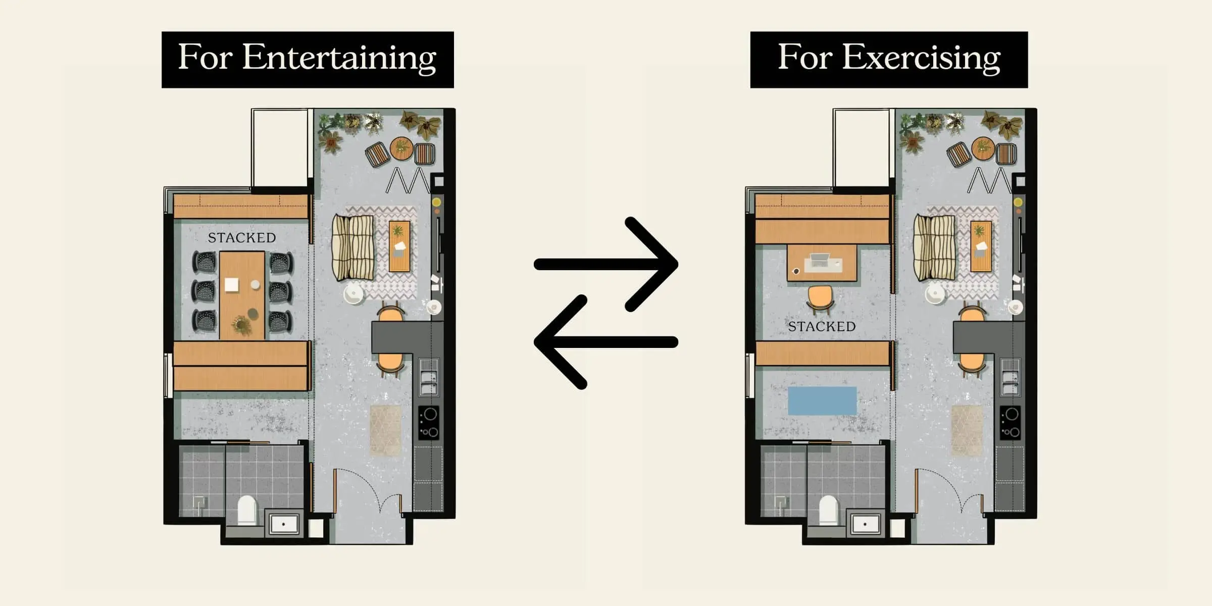
Here’s one way to completely maximise the space of your bedroom/study area. Taking a leaf out of the book of the above link and TMW Maxwell, you can look to install movable cabinetry that allows you to configure the space to your needs.
For example, this particular version has space for a study if you prefer; but it can also be a home office if you have a team, a dining room, etc.
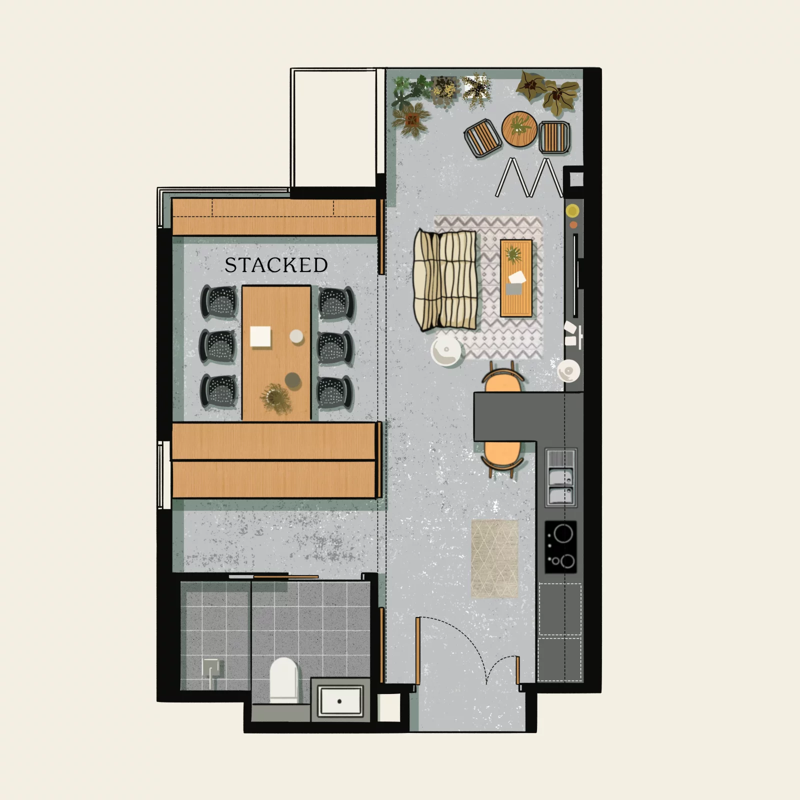
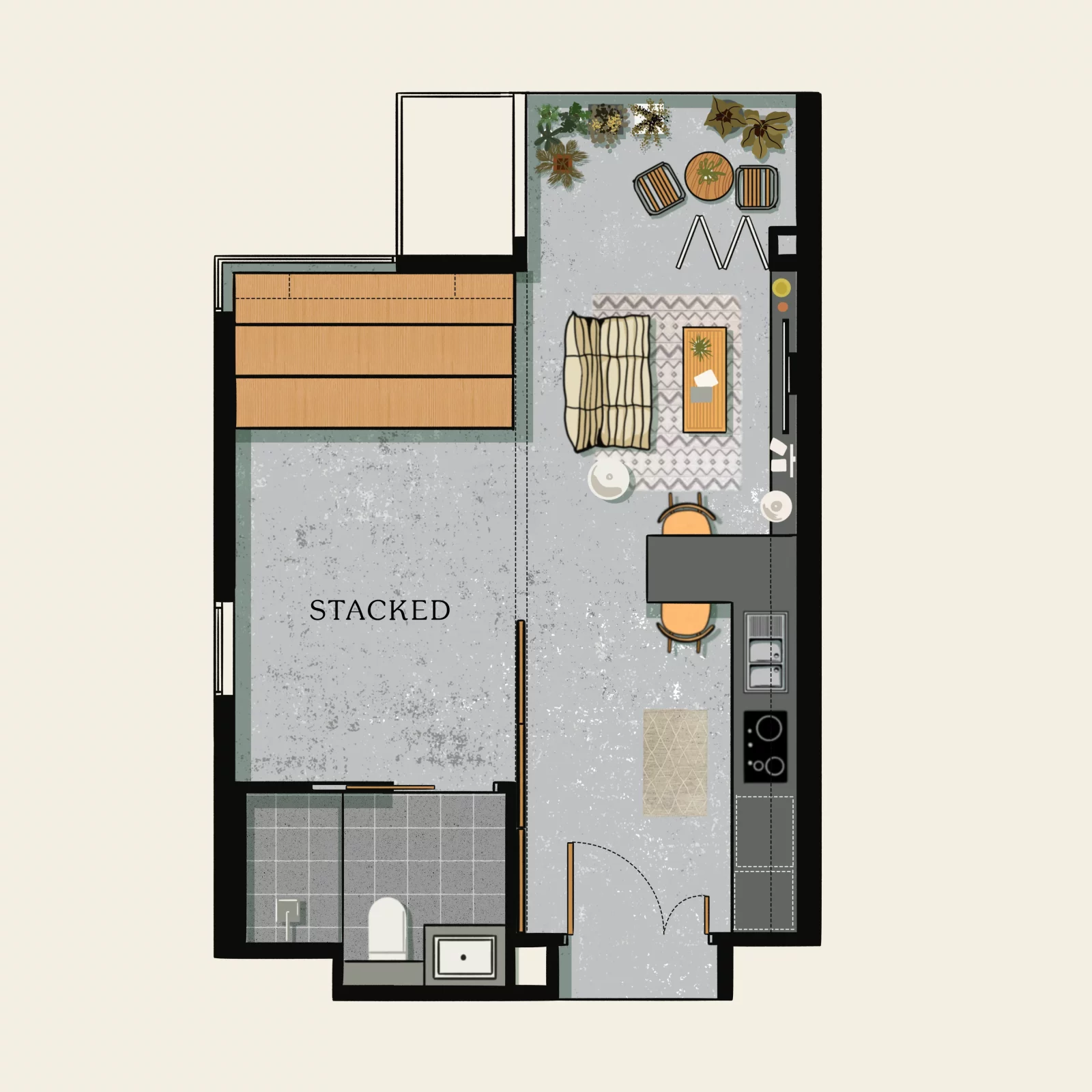
You can also set aside the cabinetry completely to have an open space, which can be used for exercise (yoga, etc). Stackable stools and a foldable table can also be used to create an open entertainment area.
Within the cabinetry is where you can keep pockets of storage. But the downside here is probably the storage areas, which you might have to use the living areas to build more (instead of just a TV console, it can be full-height cabinetry).
The key is flexibility
As you can see from above, the general trait to watch for in one-bedders is flexibility. If it turns out that all the walls are load-bearing (i.e., impossible to move), then the last few ideas would be impossible. Likewise, the possibility of having the bed on a raised deck makes the bedroom more functional and adds more storage space.
These days, developers take the initiative to point it out themselves. If you have a layout with a “+1” (like 1+1 bedder), the sales team can show you the intended way the extra study will be added. For older resale condos, however, you may need to ask a designer for help.
(Also note that in older condos, there may be more hallways or irregular shapes, which limits the flexibility of the unit. This is one area where new launches often have an advantage, when it comes to small one or two-bedder units).
In any case, whenever you see layouts in a brochure or old floor plan, consider running it by an Interior Designer first. They can usually discuss the possibilities for each layout, and make recommendations. You can also reach out to Stacked for help here, and check out our reviews of each layout type in new launch projects.
At Stacked, we like to look beyond the headlines and surface-level numbers, and focus on how things play out in the real world.
If you’d like to discuss how this applies to your own circumstances, you can reach out for a one-to-one consultation here.
And if you simply have a question or want to share a thought, feel free to write to us at stories@stackedhomes.com — we read every message.
Ryan J. Ong
A seasoned content strategist with over 17 years in the real estate and financial journalism sectors, Ryan has built a reputation for transforming complex industry jargon into accessible knowledge. With a track record of writing and editing for leading financial platforms and publications, Ryan's expertise has been recognised across various media outlets. His role as a former content editor for 99.co and a co-host for CNA 938's Open House programme underscores his commitment to providing valuable insights into the property market.Need help with a property decision?
Speak to our team →Read next from Property Advice

Property Advice We Own A 2-Bedder Condo In Our Early 30s: Should We Upgrade To A New Launch Or Resale With $2.2M?

Property Advice What A Family Of 5 Can Really Buy With $2 Million In Newton And Redhill

Property Advice Should I Pay $500K More For A New Launch — Or Buy A Resale Condo Instead?
Property Advice These Freehold Condos Near Orchard Haven’t Seen Much Price Growth — Here’s Why
Latest Posts

Singapore Property News Bayshore Road Mixed-Use GLS Site Launched: 1,280 Homes Near Bedok South MRT Could Draw $2 Billion Bid
Singapore Property News Two-Bedders at Pinery Residences Sold Out as the Project Sells Over 92% of Its Units at $2,546 PSF

Singapore Property News Over 1,000 Condos In Singapore Are Now Over 30 Years Old — And It Could Change How Buyers Think



















1 Comments
Actually… it can be further simplified… Japanese Style…