A Couple’s $60k Renovation Transformation: From A 17-Year-Old HDB To A Bohemian-Scandi Home
July 17, 2023
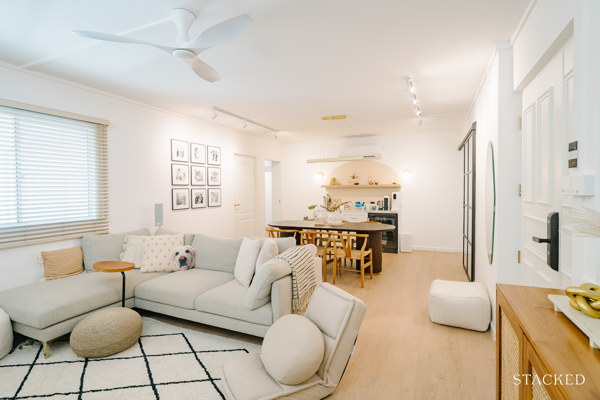
Like many other couples during the pandemic, Alex and Cheryl’s (@tiongbahru.crib) search for a BTO flat proved to be an elusive one. However, the initial disappointment of not securing a BTO soon gave way to the thrill of revamping an older property when they came across their current 4-room HDB home in Tiong Bahru.
“It’s a 1,076 sqft resale flat, and it’s about 17 years old as of now,” Cheryl said. “We received the keys on the 10th of September 2021.”
She confessed that they just couldn’t say no to the spacious unit nestled in a charming and convenient neighbourhood, so they ended up purchasing it.
“It was the last flat we viewed, and right from the first viewing, we had pretty much made up our minds,” she added.
Currently, only the two of them are staying at their place, with occasional sleepovers with their dog from time to time. Here’s how their home turned out.
So many readers write in because they're unsure what to do next, and don't know who to trust.
If this sounds familiar, we offer structured 1-to-1 consultations where we walk through your finances, goals, and market options objectively.
No obligation. Just clarity.
Learn more here.
How The Renovation Journey Turned Out
The initial budget they allocated for the renovation was $50k. However, they ended up incurring an additional $10K along the way, bringing the total to $60K.
The extra cost was mostly due to added carpentry and some other works, along with top-ups for certain materials or designs. There were also some hiccups along the way, such as having to re-tile both their bathrooms due to the unexpected tile colours.
“We only realised this after the tiling was already halfway done, requiring us to shell out an additional cost for hacking and re-tiling,” she said.
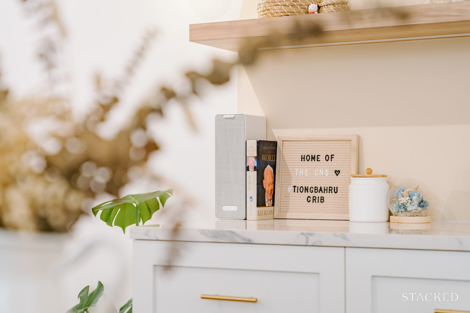
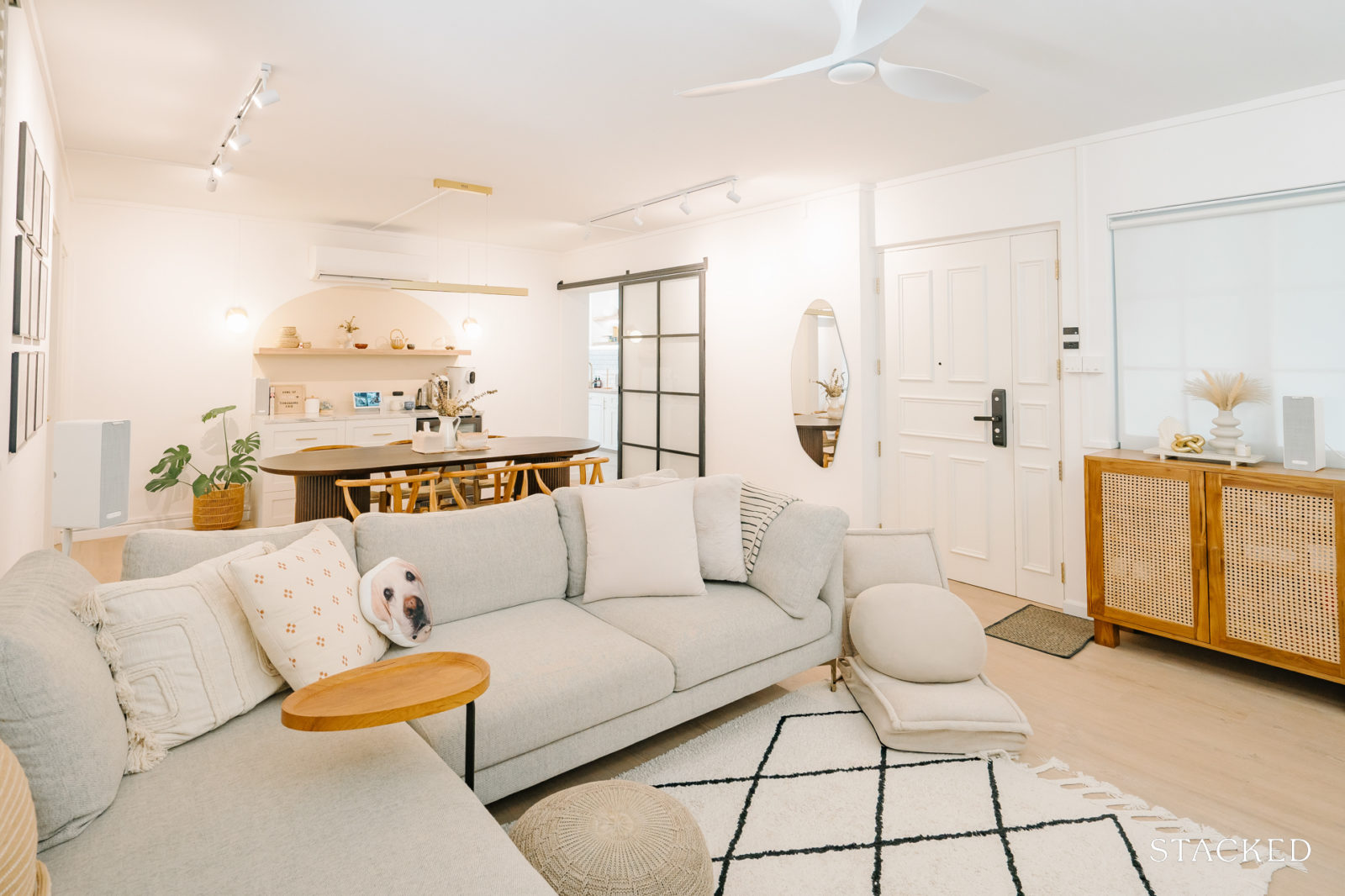
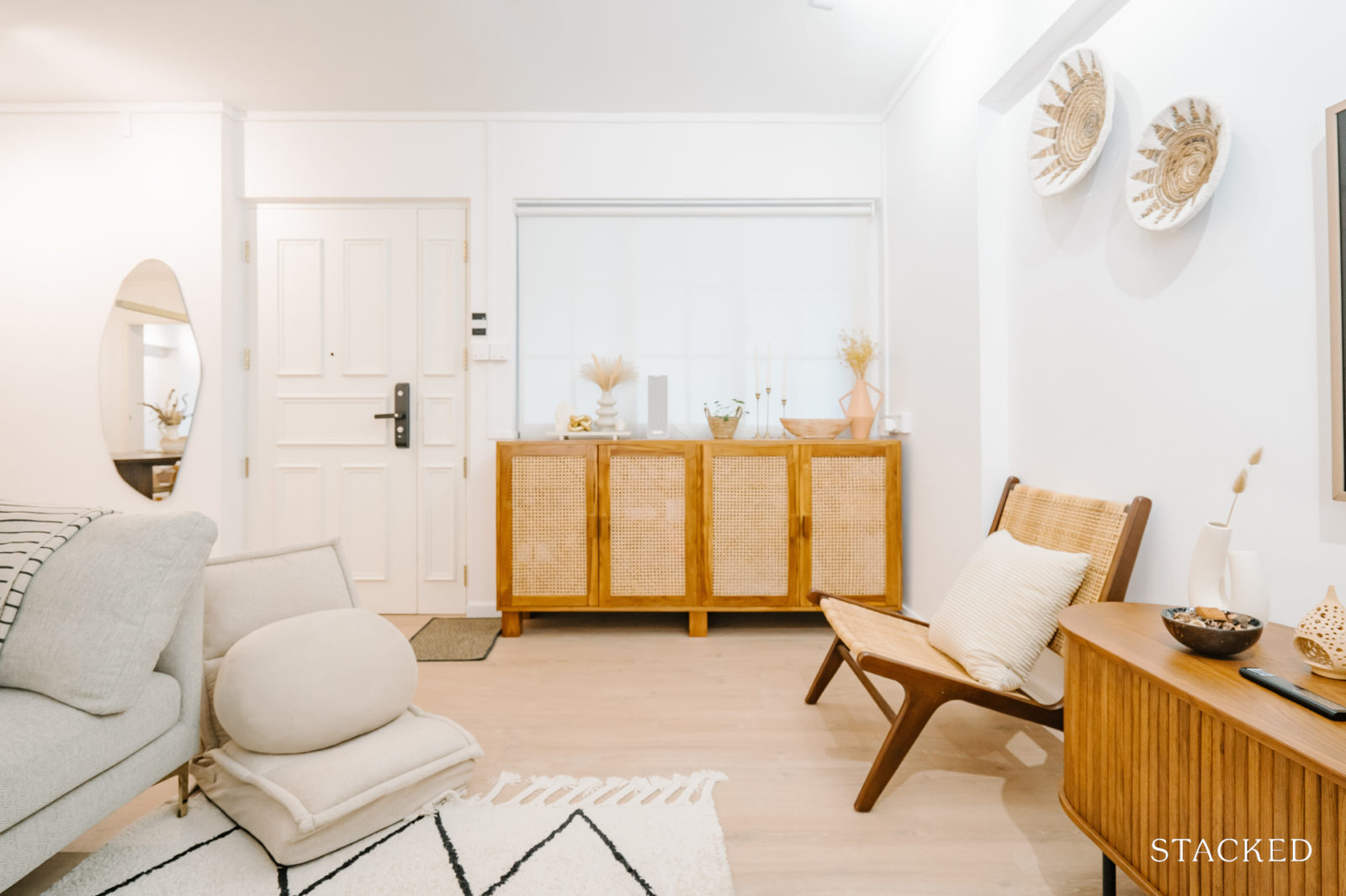
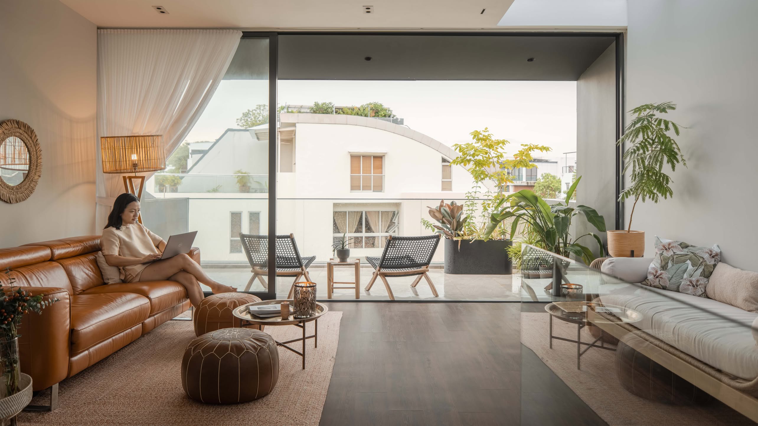
For the design and aesthetic of the renovation, it was Cheryl who primarily took the lead. “In general, we wanted a Bohemian and Scandi look with muted neutrals, warm wood accents, and beige palettes to bring warm and cosy vibes to the space.” She also included some rattan statement pieces to help create a timeless appeal.
On top of these elements, one of her specific requirements was a light-filled, airy farmhouse kitchen featuring shaker-style cabinets. To their delight, this space quickly turned into a favourite spot within the house.
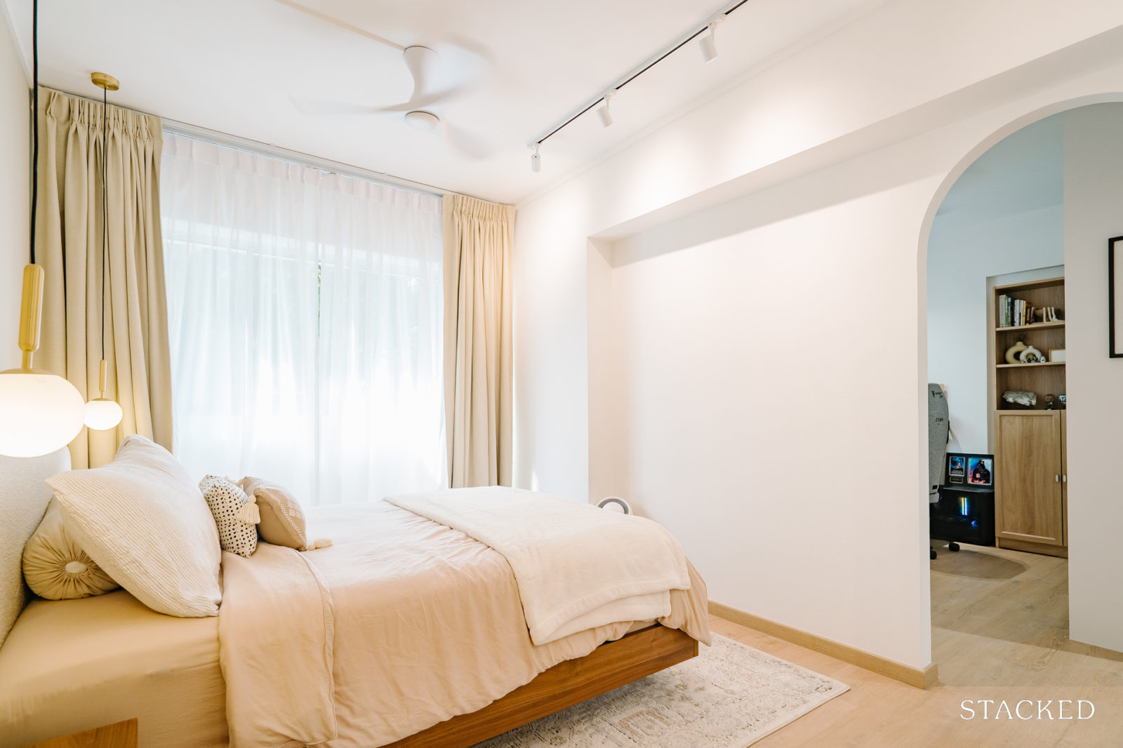
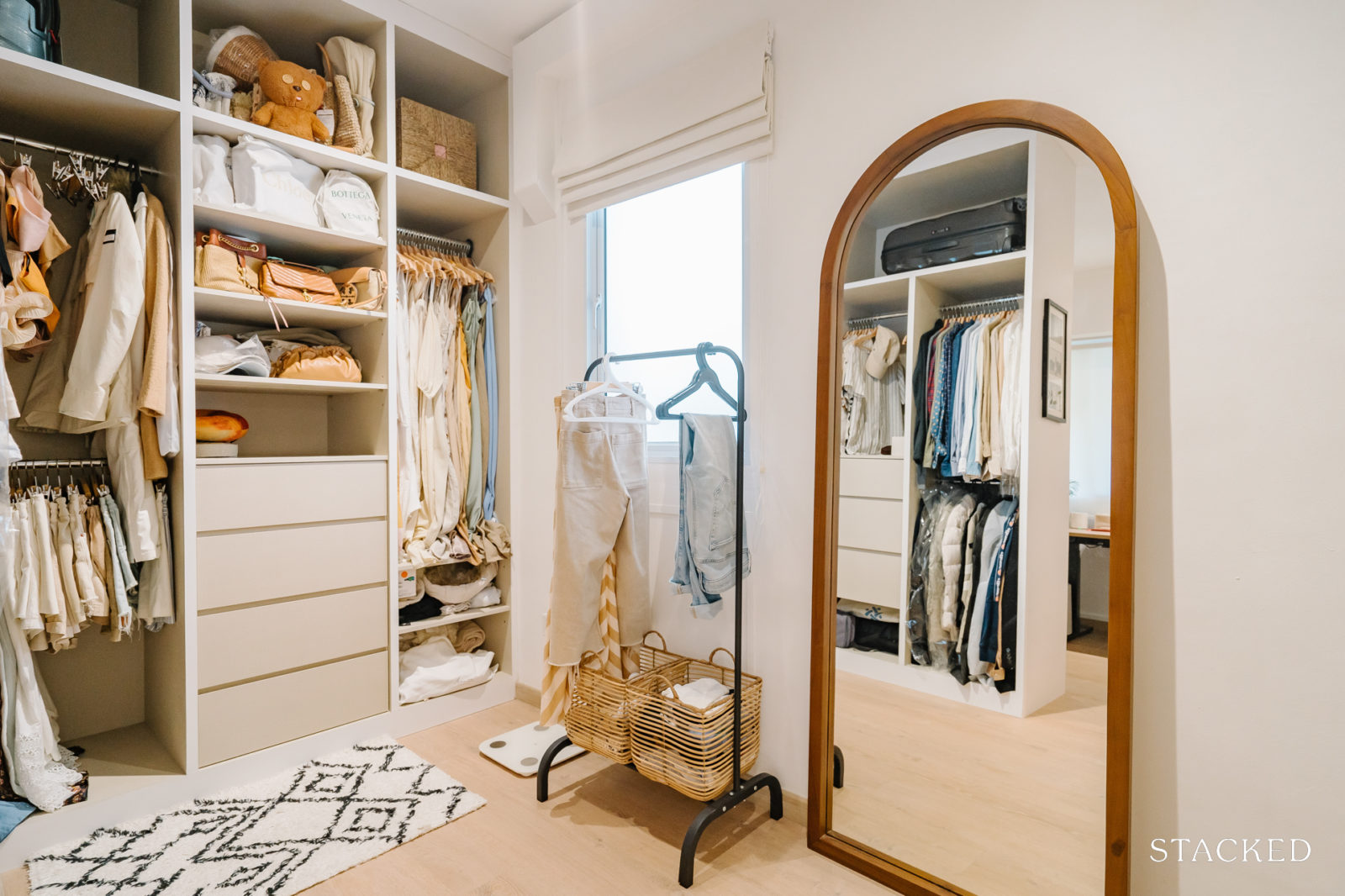
But despite these transformations, the couple did not have to make any drastic alterations to the home layout. The only major adjustment was the creation of an archway to connect the third bedroom and the main bedroom. “We sealed the doorway of the main bedroom and utilised that cosy corner as the dressing area,” she added.
Here’s a tour of how each room turned out.
Living Room
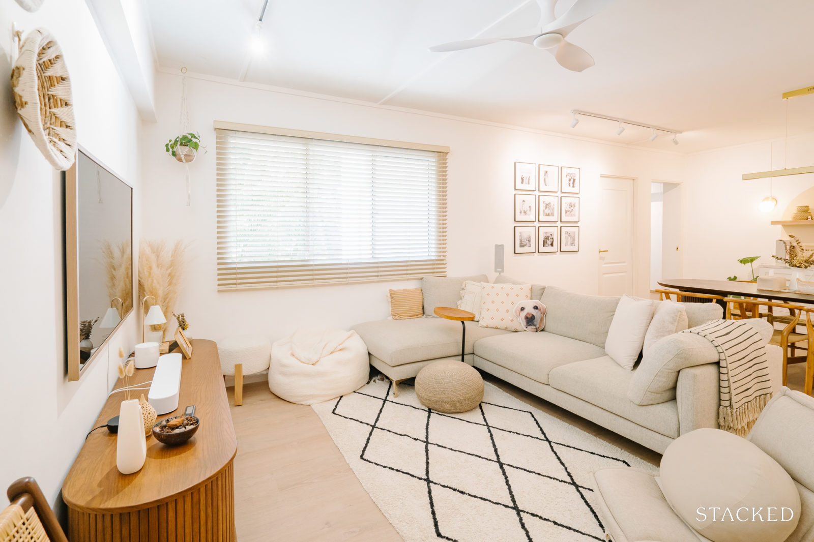
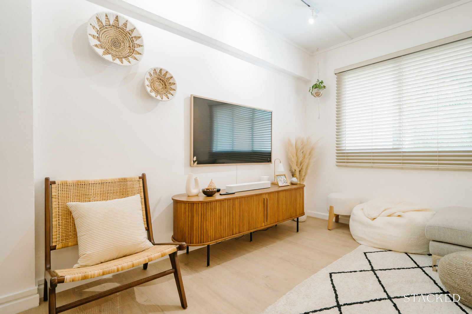
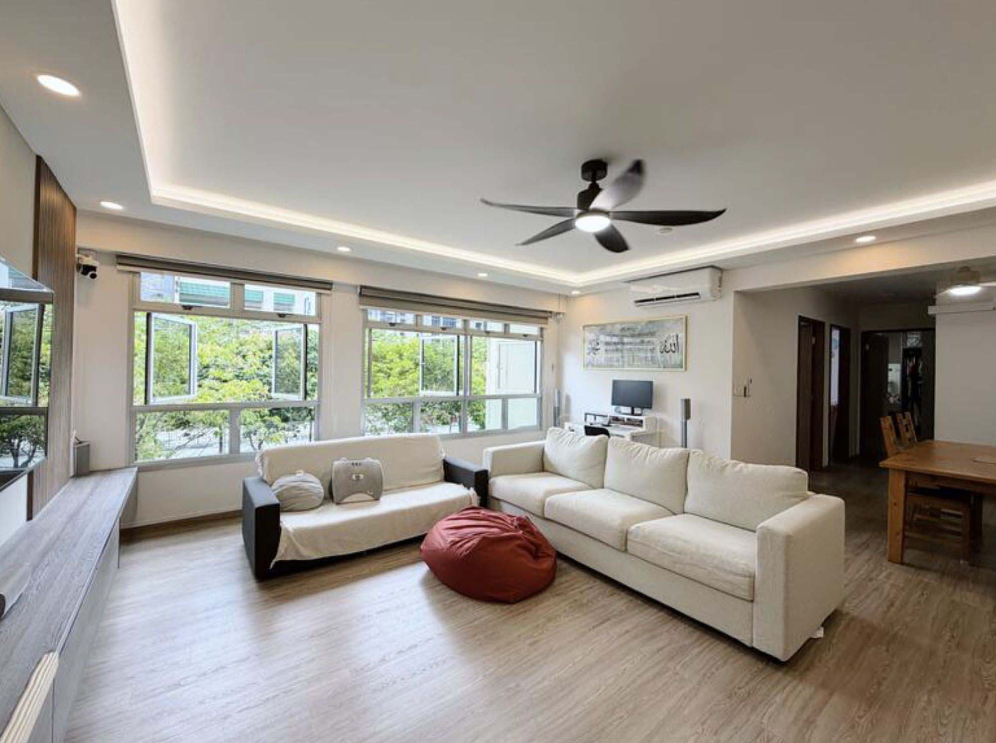
The living room saw a fresh coat of paint and the installation of vinyl flooring. A significant change was the replacement of all the windows, a move that considerably enhanced natural light flow, contrasting starkly with the previously tinted windows.
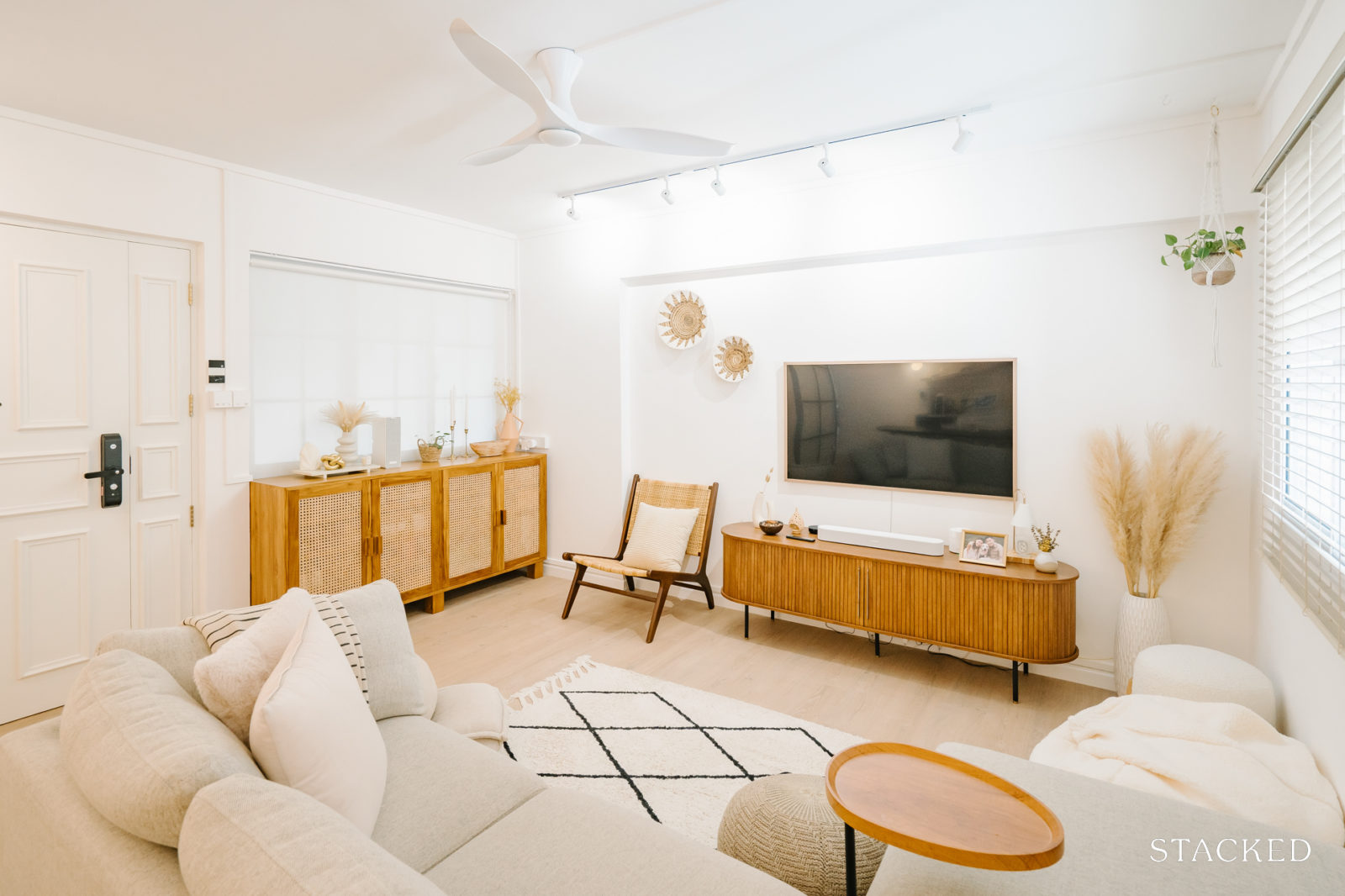
Cheryl recalled that the previous owner had a large built-in cabinet in the living room, which they felt was clunky, so they removed it and furnished the space with mostly moveable furniture.
Dining Room
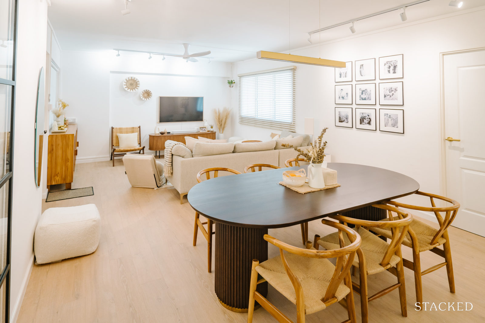
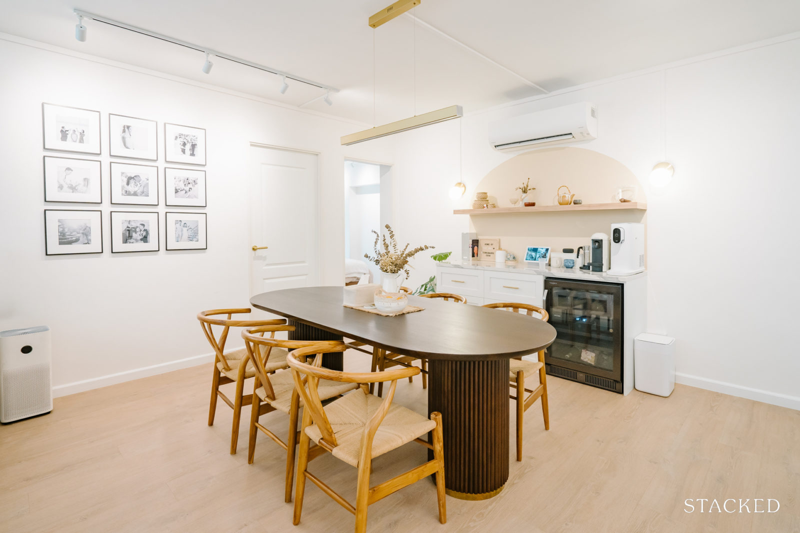
The couple created a statement bar counter and painted an arch backdrop in beige while also adding a floating shelf that sits across the bar.
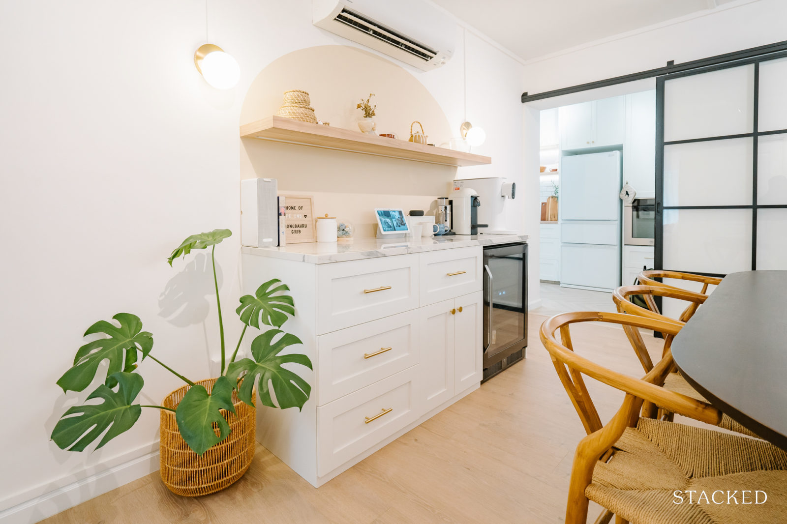
“It’s a designated area for drinks & snacks,” she said, “which includes a built-in wine chiller positioned right behind our dining table for easy access to drinks from the dining area.
Kitchen
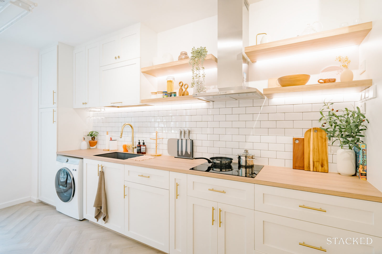
The kitchen was completely overhauled with shaker-style cabinets and subway backsplash tiles. They also cement-screed the walls and painted them white for a clean look.
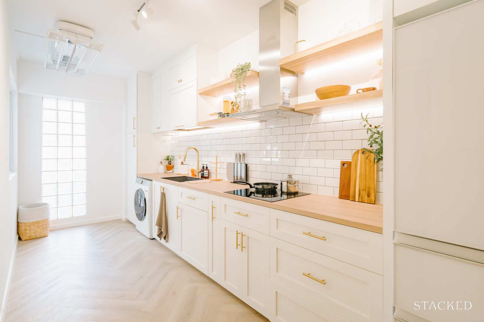
For the flooring, they used vinyl in a herringbone design. They also installed floating shelves instead of top-hung cabinets for a more open and spacious look that expands the space.
Bedroom/s
The original main bedroom underwent a transformation into a dual-purpose study and walk-in dressing area, cleverly partitioned using an L-shaped wardrobe. Meanwhile, they repurposed bedroom 3 to serve as their new master bedroom.
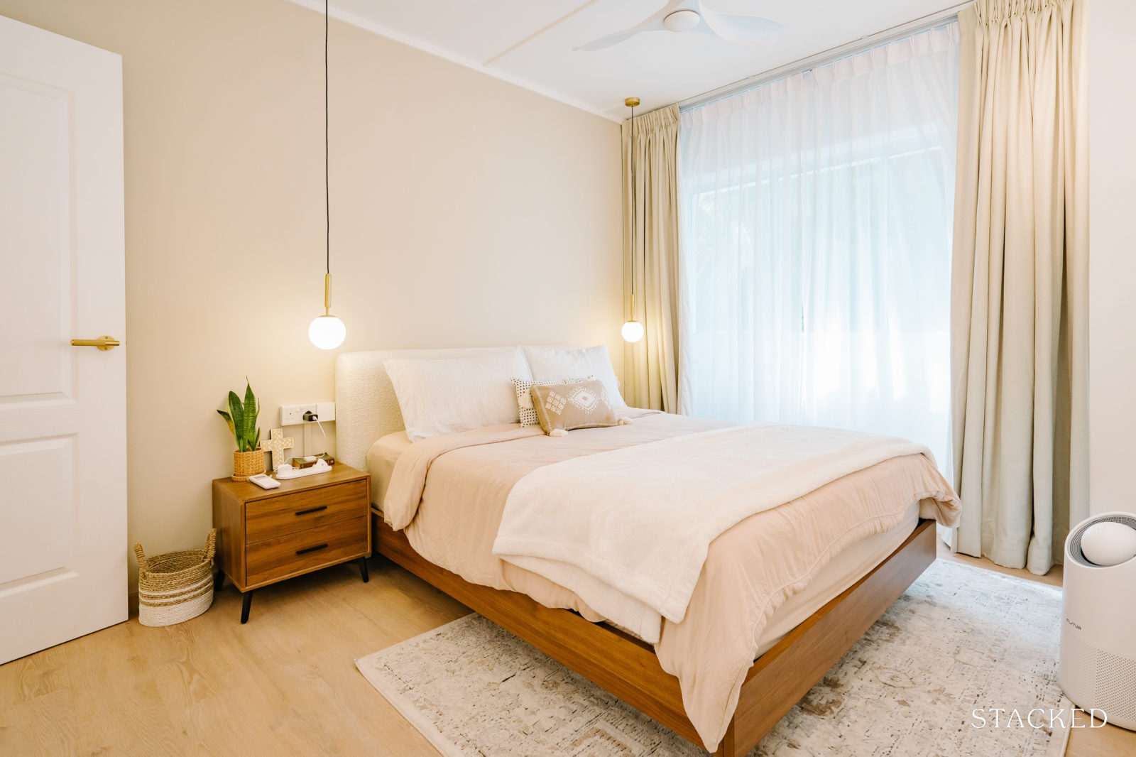
To seamlessly connect the study room with their MBR, they created an arch entrance between both rooms. They also repainted the walls white and added a feature wall painted in natural cane, aside from overlaying the bedroom with vinyl and adding movable furnishing.
For their guestroom, they kept the room as bare as possible with minimal renovation in order to keep their options open. “Only the flooring, wall paint, and window blinds were changed to keep the look consistent with the rest of the home,” she added.
Bathroom/s
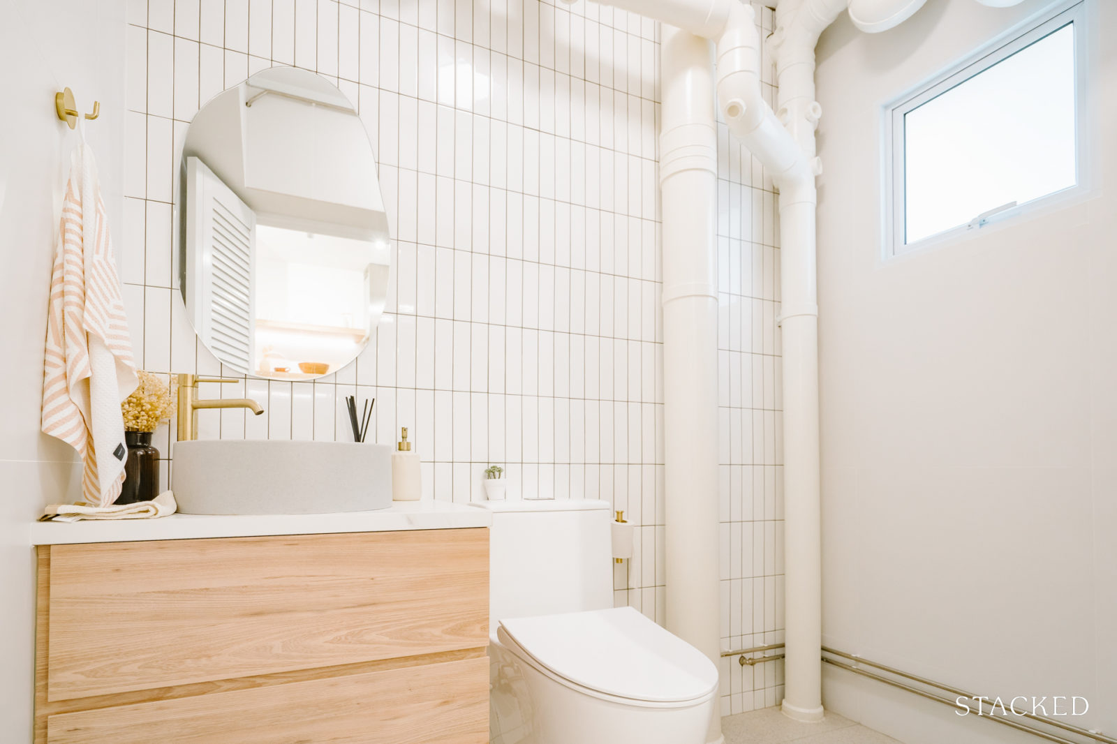
For the common bathroom, the couple opted for a feature wall with classic white kit-kat tiles and paired it with minimalist terrazzo for the floor tiles. They chose to leave the shower area open to make it more accessible when they needed to handwash laundry or shower their dog. There’s also a built-in toilet vanity for additional storage space.
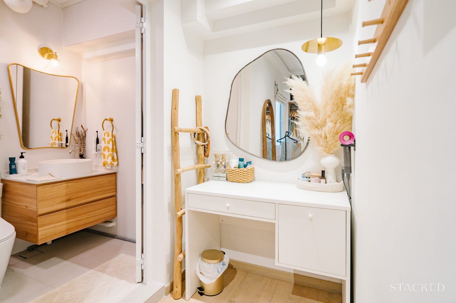
The master bathroom underwent a similar renovation process as the common bathroom, with all original tiles being replaced. The couple chose white herringbone tiles for the shower area, providing a beautiful contrast with the plain white tiles used in the rest of the bathroom. This arrangement harmonised well with the black lattice framed glass shower panel.
To optimise the available space, they incorporated a built-in toilet vanity for extra storage, along with two floating shelves that serve a dual purpose of storage and decoration.
Bringing The Vision To Reality
Most parts of the house turned out similar to the 3D rendering they had, except for the master bathroom. Although, Cheryl said, “I guessed it turned out for the better.”
She continued to explain that they swapped out the tiles for the master bathroom last minute. They also did the same for the bathroom fittings, including the odd-shaped mirror, floating shelves, and lattice shower screen. “They were decided randomly, without any initial planning or reference from renderings, and we were relieved that the end result turned out pretty well,” she said.
In their search for the right interior designer, Alex and Cheryl decided on Mr. Designer Studio. Their decision was influenced by the company’s ability to deliver most of their wishlist items within their predetermined budget.
“I went through quite a number of ID firms before making my decision. Reviewing their portfolio to get a sense of their eye for detail and workmanship.”
More from Stacked
We Analyse “Safer” Resale Condos in Singapore to See If They’re Actually Worth Buying: A New Series
When the Stacked editorial team were brainstorming ideas for the first new PRO series of 2026, I can truthfully say…
As the saying goes, “You get what you pay for.” Thus, they had to strike a balance between their desired outcomes, their budget, and how much they were willing to compromise on quality, workmanship, and level of service.
“Also, our ID Celeste convinced me of her passion and knowledge in our interactions, and it did not feel at all like a sales pitch which happens quite often. She was easy to communicate with and very accommodating.”
Cheryl expressed that having a compatible designer was just as important as choosing the right ID firm. As the individuals directly involved in managing their home renovation, their performance could significantly impact the project’s success.
Regarding furniture, the couple already had a few brands in mind, with their choices influenced primarily by design and budget. They prioritised essential, high-usage pieces of furniture due to their significant role in the space. “We had to balance both design and functionality. As such, we were more particular about those and also willing to spend more,” Cheryl concluded.
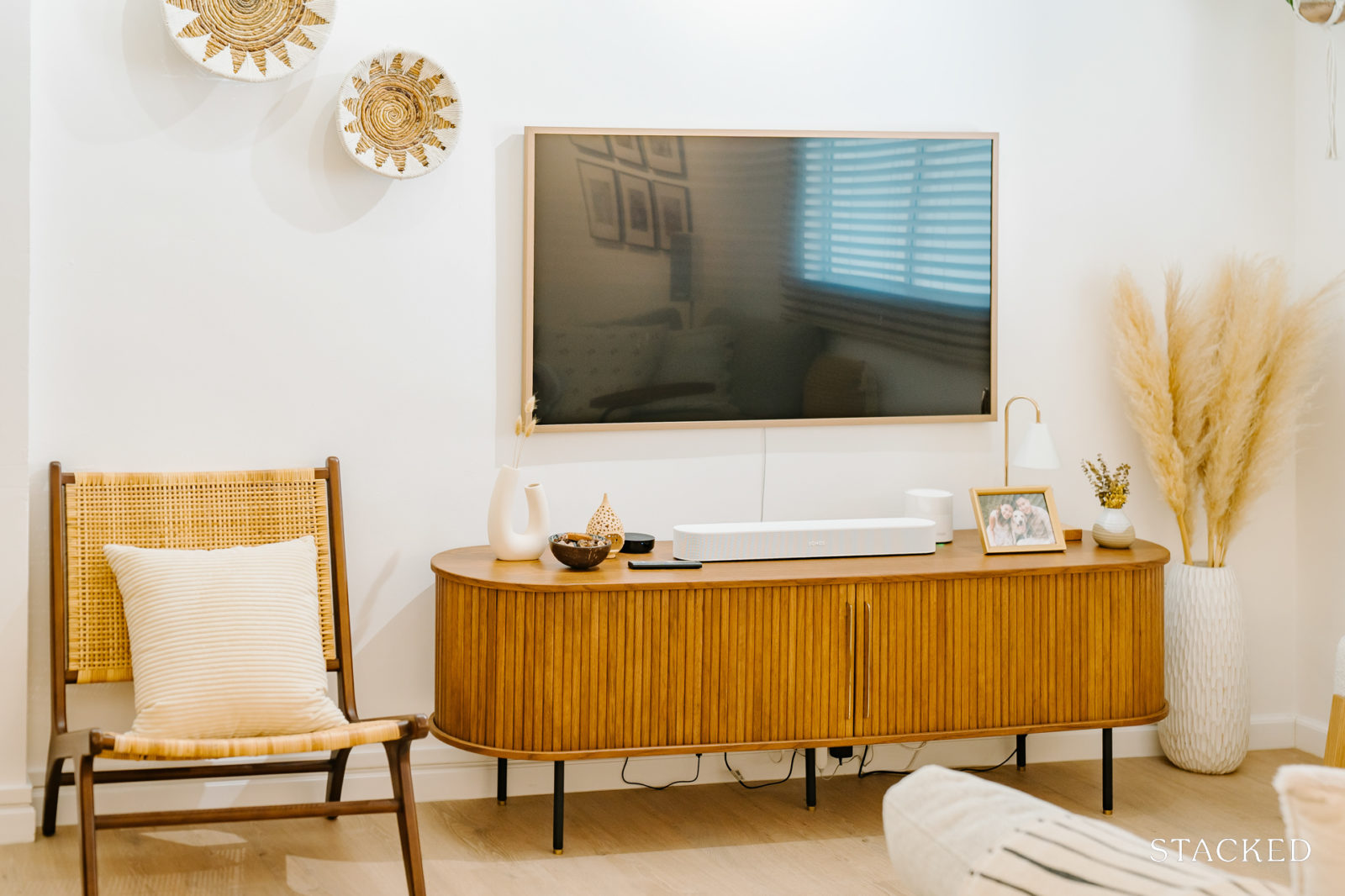
The couple sourced their core furniture pieces such as the sofa, TV console, poufs, and bedframe from Castlery, and opted for Gamar Furniture to custom their dining table.
“Which is currently a statement piece in the house,” she said. “And it was during one of their sales when we purchased our rattan armchair, which is currently placed in our living area.”
For their wishbone dining chairs and the customised rattan shoe cabinet, they turned to Wihardja.
In terms of smaller items like pendant lights, mirrors, and bedside tables, Cheryl and Alex were more budget-conscious, sourcing these from affordable platforms like Taobao or other value brands. “Of course, we’re trying to stick to our desired designs as much as possible,” she added.
The kitchen turned out to be the best part of their home after the reno, as the transformation surpassed what they had anticipated.
“The beautiful glass blocks are such a unique and timeless feature, not just aesthetically but also for practical reasons, as they allow sunlight to stream through, adding a warm glow to the kitchen. And then there’s also the shaker style cabinets, which run along the full length of the galley style kitchen.”
Lessons Learned From A Successful Reno Journey
The toughest challenge Alex and Cheryl experienced was quite common among couples – coming to a mutual agreement on the designs for various areas of the home.
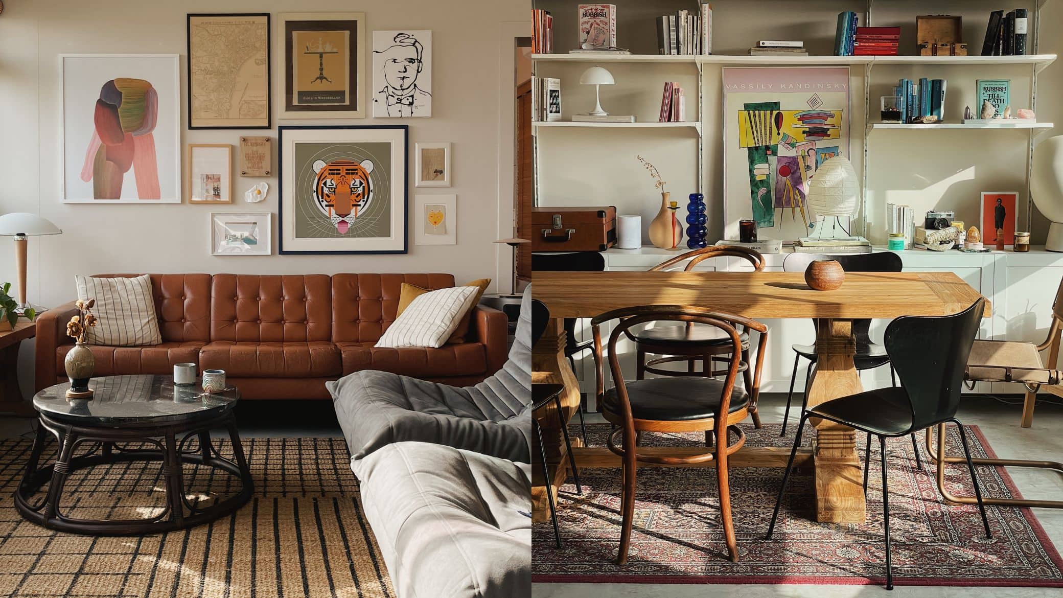
Property Advice10 Interesting Apartment Decor Ideas For A One-Of-A-Kind Space
by Adriano TawinFor instance, Cheryl confessed that it took them some time to finally settle on a master bathroom design they really liked. “I originally wanted a pop of colour for the master bathroom with blue kit-kat tiles for the shower, but later on decided to swap tiles to a more neutral colour instead for a cleaner look, which is something Alex preferred.”
As a result, their bathroom turned out really different from the original rendering. They had to exert extra effort in visualising the different bathroom fittings and elements that best suit their bathroom.
Another one was the designing and customisation of the built-in cabinetry. She said it took them forever to finalise the layout and dimensions of all the shelves, cabinets, and drawers as there were just so many considerations, both aesthetic and functional.
A reno journey is a learning experience, and Cheryl shared some of the things they’ve come to know in the process.
“We did not know there was so much planning for electrical works. Especially so for places where you have built-in items as you will need to accommodate for your plugs, switches, and lighting points.” As such, she advised to definitely sound out to your ID or contractor beforehand if you have any such things in mind.
As for the initial tiling work, she recommends personally being on-site or having someone trusted to oversee how it looks before a significant portion of the tiles is laid. Based on their experience, the look and colour of the tiles can be quite different from what was initially envisioned due to factors such as lighting, surrounding colours, and arrangement of tiles.
“If you don’t like the look of it on the first day, you can immediately request it be removed or changed. It will be much more difficult to change and may incur additional hacking and retiling costs in the midst of tiling till completion.”
Having gone through a tedious yet rewarding reno process themselves, Cheryl leaves budding homeowners with a few practical pieces of advice to help make things easier.
“Don’t be too hung up on little mistakes as it is all part of your personal home journey, which makes it unique.” She said that as first-time homeowners, they had learned so much through their first renovation process.
When the renovation for the second home comes, things will only get better, and there will be more past experiences to rely on. “In fact, we already have certain features/elements in mind when it comes to renovating our second home in the near future,” she added.
Home Instagram accounts turned out to be a trove of valuable insights for the couple, offering not only design inspiration but also practical advice on navigating the renovation process.
“We started following home IG accounts and watching lots of StackedHome videos in the midst of our renovation process while feeding us with lots of renovation tips & designs, and we had only wished we had picked this up earlier before the renovation process for more holistic ideas,” Cheryl shared.
Indeed, it’s never too early to prepare for a renovation journey.
At Stacked, we like to look beyond the headlines and surface-level numbers, and focus on how things play out in the real world.
If you’d like to discuss how this applies to your own circumstances, you can reach out for a one-to-one consultation here.
And if you simply have a question or want to share a thought, feel free to write to us at stories@stackedhomes.com — we read every message.
Need help with a property decision?
Speak to our team →Read next from Homeowner Stories

Homeowner Stories We Could Walk Away With $460,000 In Cash From Our EC. Here’s Why We Didn’t Upgrade.

Homeowner Stories What I Only Learned After My First Year Of Homeownership In Singapore

Homeowner Stories I Gave My Parents My Condo and Moved Into Their HDB — Here’s Why It Made Sense.

Homeowner Stories “I Thought I Could Wait for a Better New Launch Condo” How One Buyer’s Fear Ended Up Costing Him $358K
Latest Posts

Singapore Property News These Colonial-era Bungalows In Tanglin Will House A New Lifestyle Hub – But The Awarded Bid Price Is Shocking

Investor Case Studies How A Clementi HDB Owner Upgraded To A $2.29M 3-Bedroom Condo At One-North Eden: Buyer Case Study

Property Market Commentary Singapore Retail Rental Market Outlook 2026: Prime Retail Rents May Rise Up To 4%




















0 Comments