All reviews on Stacked are editorially independent. Developers can advertise with us, but
cannot
pay
for,
edit, or preview our reviews.
New Launch Condo Reviews
The Reef At King’s Dock Review: Singapore’s First Condo With A Floating Deck
January 28, 2021 35 min read
Unique waterfront living
With its floating dock and waterfront views, The Reef at King’s Dock presents buyers with an opportunity to own a home that promises a unique waterfront living lifestyle.
| Project: | The Reef at King’s Dock |
|---|---|
| District: | 04 |
| Address: | 2-22 Harbourfront Avenue S(097992-098001) |
| Tenure: | 99 years commencing from January 2021 |
| No. of Units: | 429 |
| Site Area: | 284,264 sqft |
| Developer: | Harbourfront Three Pte Ltd (JV between Mapletree and Keppel Land) |
| TOP: | December 2025 |
Since the announcement of its launch, The Reef at King’s Dock has generated a healthy amount of attention among mainstream media and chatter from the public. It is after all, the fourth residential plot in the 32-ha Harbourfront redevelopment project first approved in Keppel Land’s 1999 Annual Report.
What was originally meant to be a 10-year plan has morphed into a 22-year one instead and if you needed a little reminder on how much has changed since… Keppel Land states that its first project (presumably Caribbean at Keppel Bay) would feature “smart home” features such as a ‘personal computer with internet broadband access’ and residents would be given ‘its own distinctive internet domain email address’. How simple life must have been back then! It is also perhaps a timely nudge on just how far we’ve come – technology wise at least.
Singapore’s economic prosperity has been closely tied to our surrounding waters since the very beginning of time. Even before Sir Stamford Raffles recognised our island as a natural choice for a new port for the British in 1819, Singapore was already a trading port as early as the 14th century.
Now, what’s the point of this mini history lesson? Well, this development is situated where some of Singapore’s fortunes were made. King’s Dock, where The Reef is situated and from where it derives its name, was the 2nd largest dock in the world after Liverpool’s Gladstone Dock when it opened in 1913. Together with 3 other docks situated in the same precinct, Singapore saw a boom in trading activities. I find that understanding the location’s history is important to gain a greater appreciation of what you are buying into.
Lest I bore you further, let’s move on to our customary insider tour!
So many readers write in because they're unsure what to do next, and don't know who to trust.
If this sounds familiar, we offer structured 1-to-1 consultations where we walk through your finances, goals, and market options objectively.
No obligation. Just clarity.
Learn more here.
The Reef at King’s Dock Insider Tour

It’s hard not to feel excited whenever you hear about a waterfront condo launch. The allure of sea views, the rush of the breeze, and a differentiated lifestyle are always what would usually be promised on the marketing brochures.
Naturally, these projects would usually be priced at a premium, and rightfully so. There are only so many plots of land located by the water – even on an island country like Singapore. Which is why there has been great interest so far in The Reef at King’s Dock because the indicative prices are looking to start from $960,000 (don’t expect sea view facing units at this price). That magical under $1 million quantum is no doubt why it has been attracting so many eyeballs.
That said, it is known that many buyers of Reflections and Corals have suffered paper and realised losses on their property due to their high purchase price so the heat is on for The Reef at King’s Dock to prove that it can buck the trend of its more vintage neighbours.

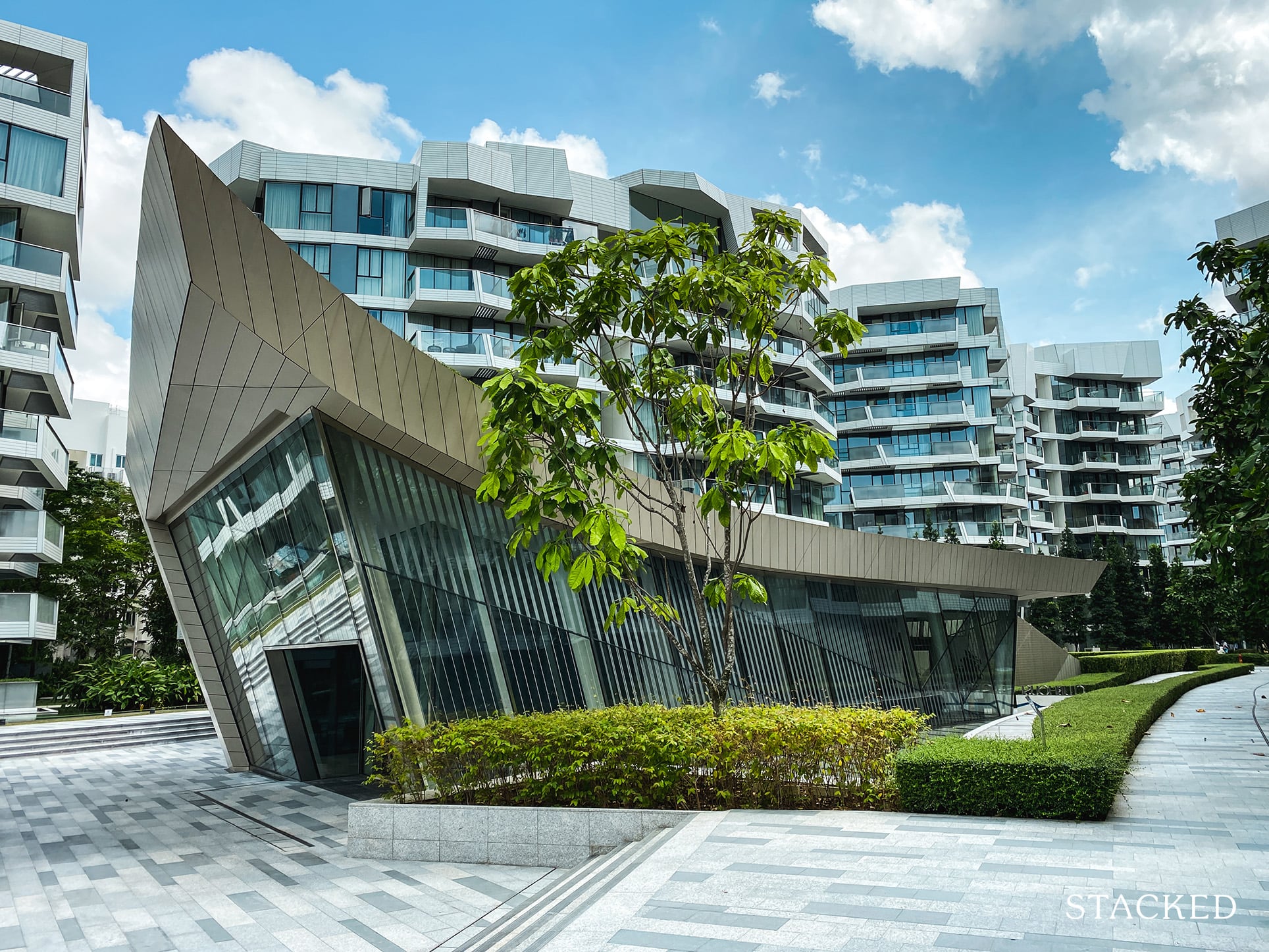
So The Reef at King’s Dock is the fourth of the residential plots after Carribean at Keppel Bay, Reflections at Keppel Bay and Corals at Keppel Bay. Like it or not, The Reef at King’s Dock will be the only development without a “Keppel Bay” address.
I know many people will be concerned at the lease start date – given that Corals at Keppel Bay starts from 2007 even though it was only completed in 2016. So I’m sure you’ll be glad to know that The Reef at King’s Dock’s lease has been topped up to begin from January 2021.
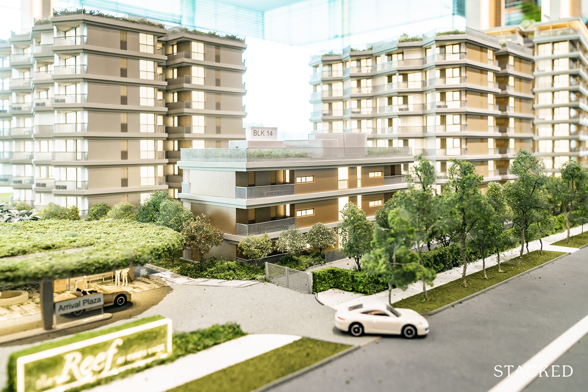
As for that Keppel Bay address, well, that’s both a boon and a bane. Boon because its location along a much better utilised road like Harbourfront Avenue allows drivers left and right turns towards either Mapletree Business City or the CBD while drivers in the aforementioned condos will have to drive further before making a u-turn to get to the CBD. (It may not sound like much, but if you had to get to work everyday in morning rush traffic, it can be a big deal).
Bane because you do not get exclusive access to the road and plenty of cars will be turning in for work at Keppel Bay Tower and Harbourfront Centre.
To my mind, that road accessibility is well worth it though.
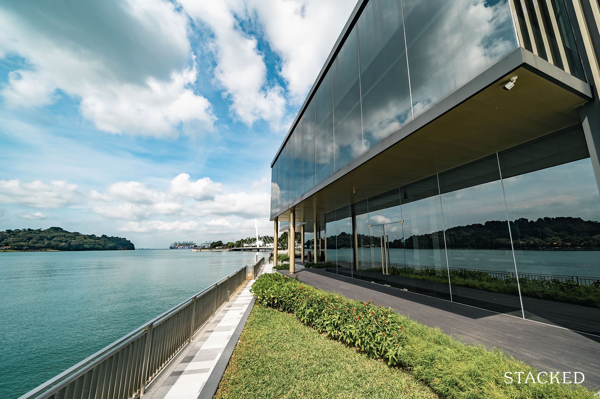
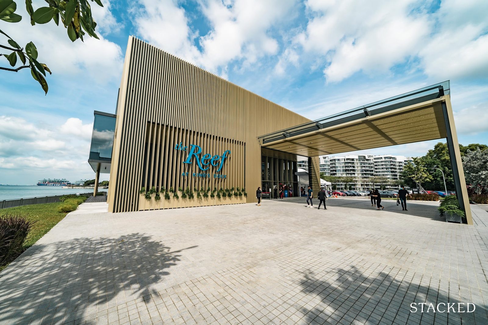
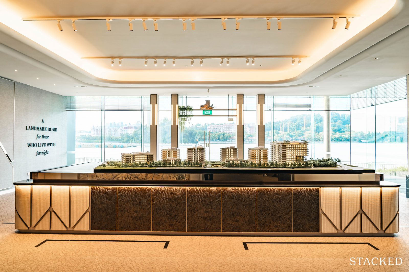
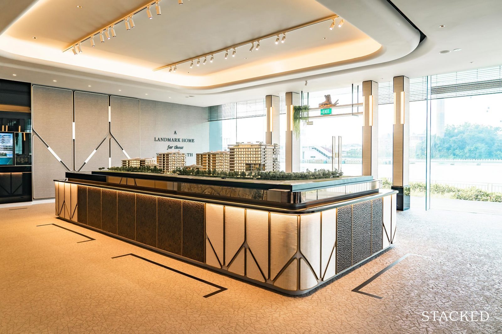
The showflat is located just beside the actual site itself and its location will be home to a public park that will be developed in due course. Being right at the site itself allows would-be buyers to picture the views they could potentially wake up to every single day of their lives.
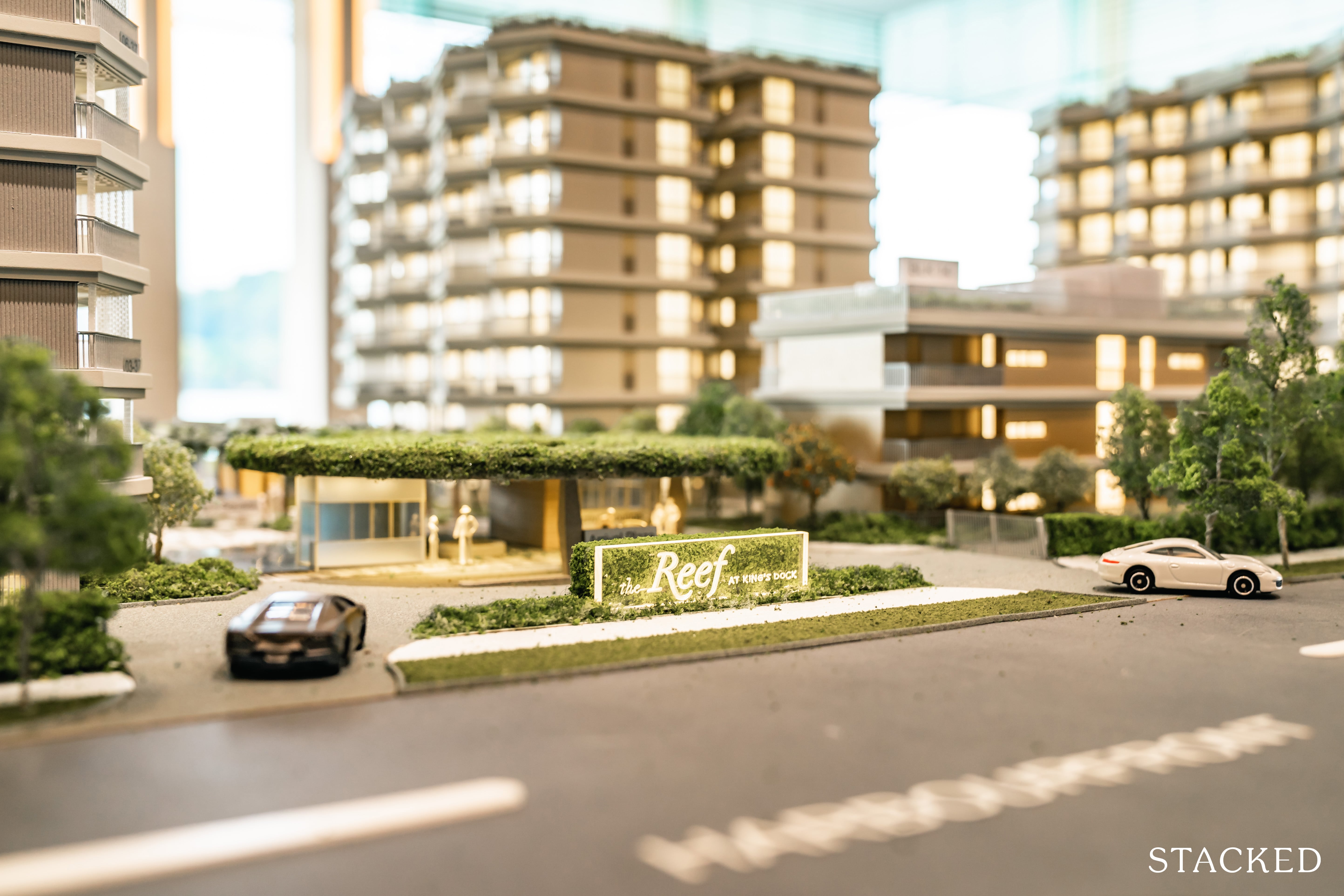
As mentioned above, The Reef at King’s Dock is situated along Harbourfront Avenue, which gives it a significant positional advantage for drivers. Plus it is the closest of the Keppel Bay condos towards Harbourfront MRT.
So despite its fantastic public transport connectivity, The Reef at King’s Dock actually caters for a 1-to-1 parking lot ratio. Moreover, with 81% of units being of 1 and 2 bedroom layouts, I would expect many of those to be tenanted to residents who would rather rely on more eco-friendly transport means such as the MRT or bus. Either ways, carpark space most definitely would not be an issue here.
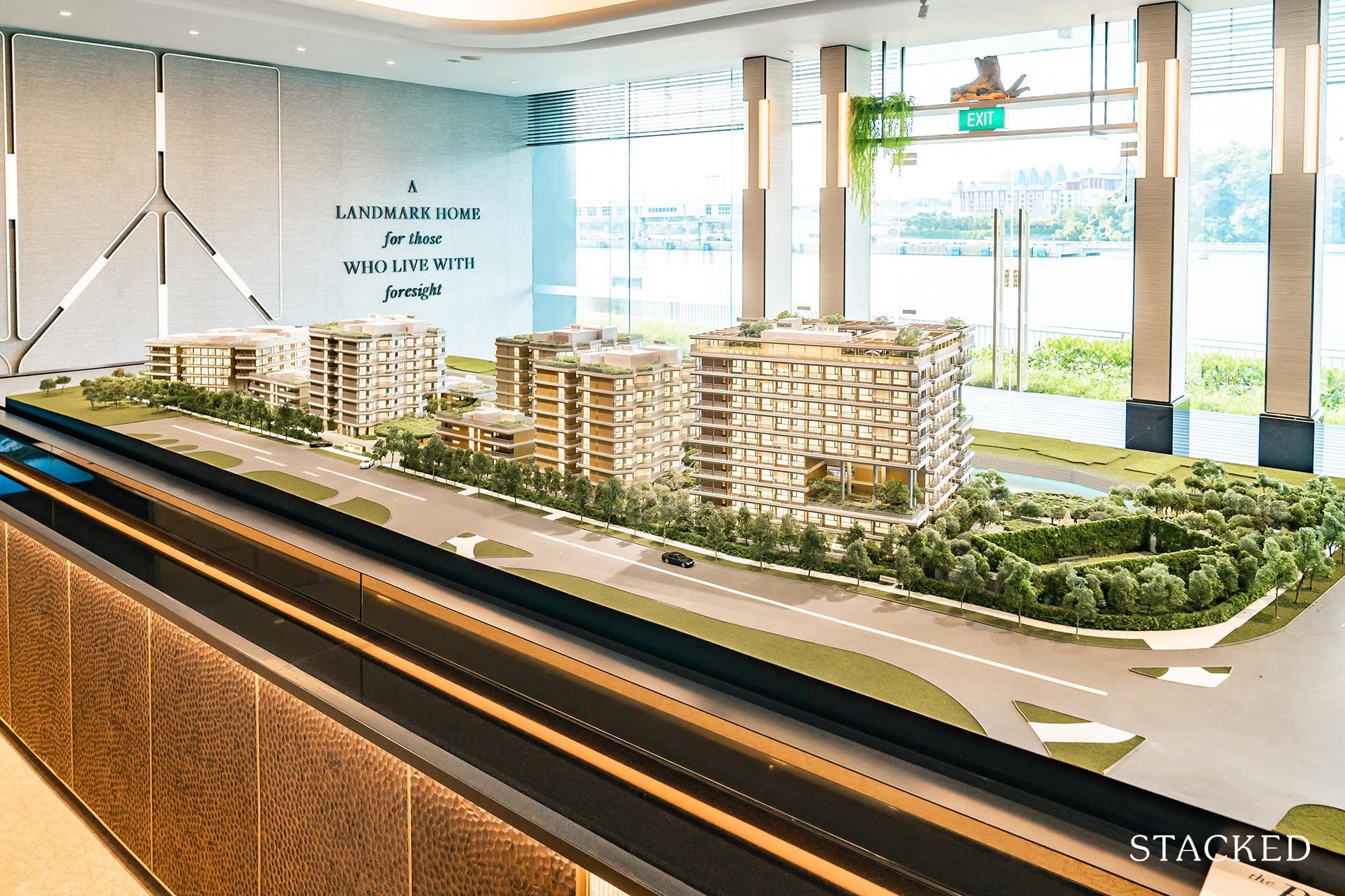
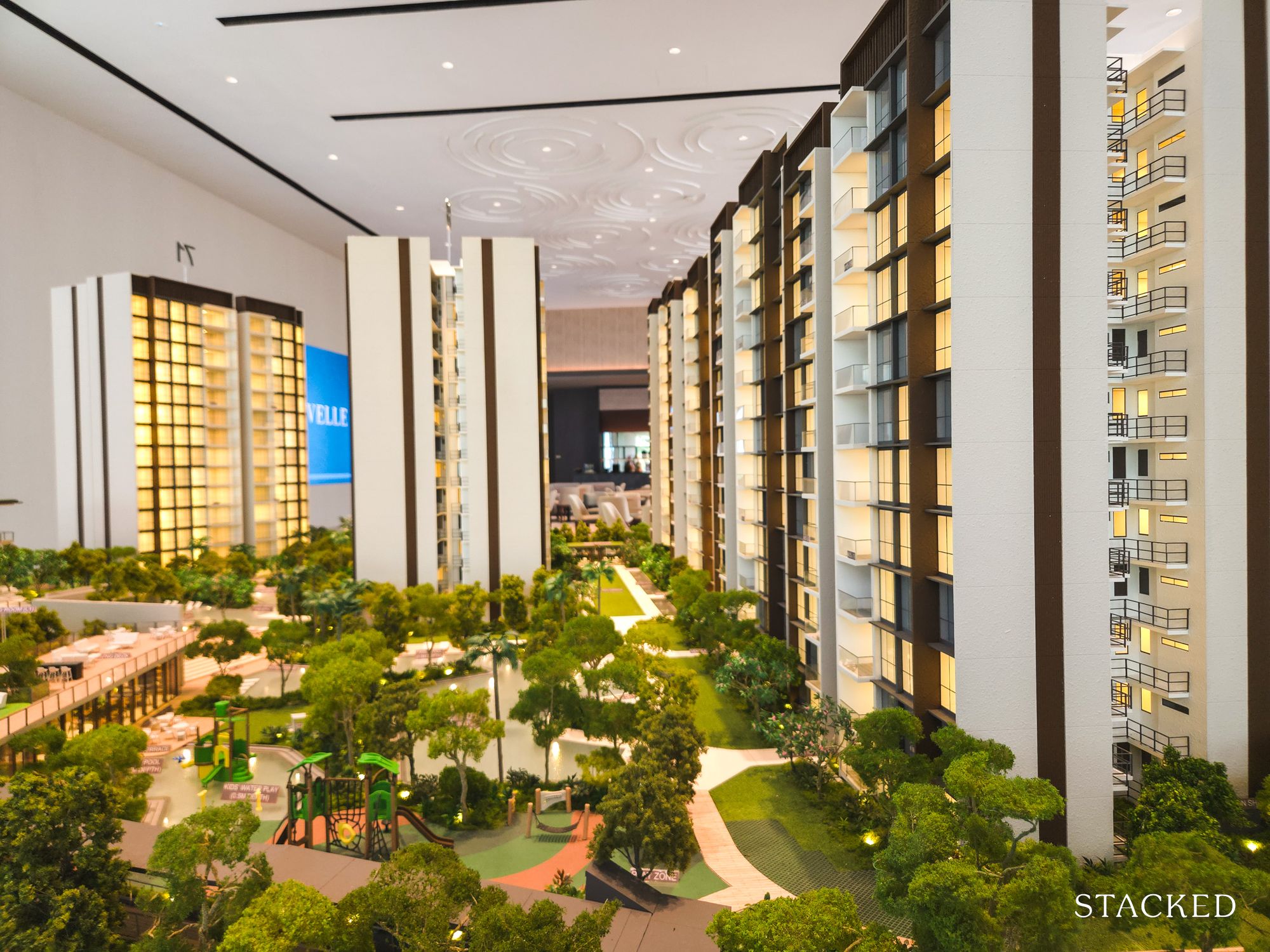
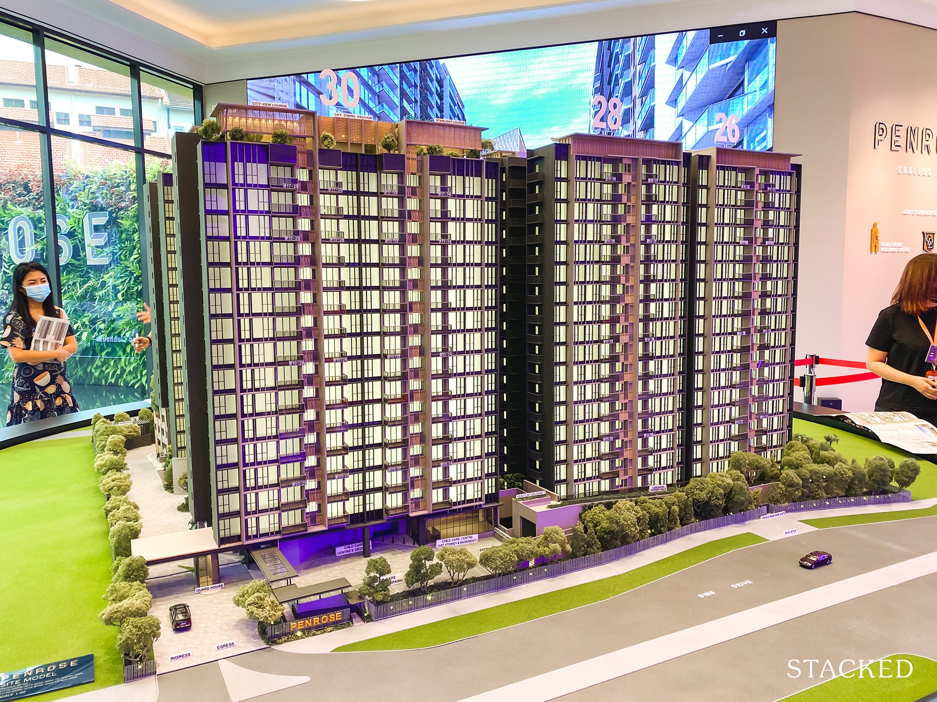
The site plan model will show you that the architects have gone with 10 residential blocks of varying heights and there’s definitely a point to this. It is to maximise the number of units that will gain from views fronting the waterfront. So units that don’t have the luxury of a sea view would at least enjoy a garden view, and others will have views of Mount Faber.
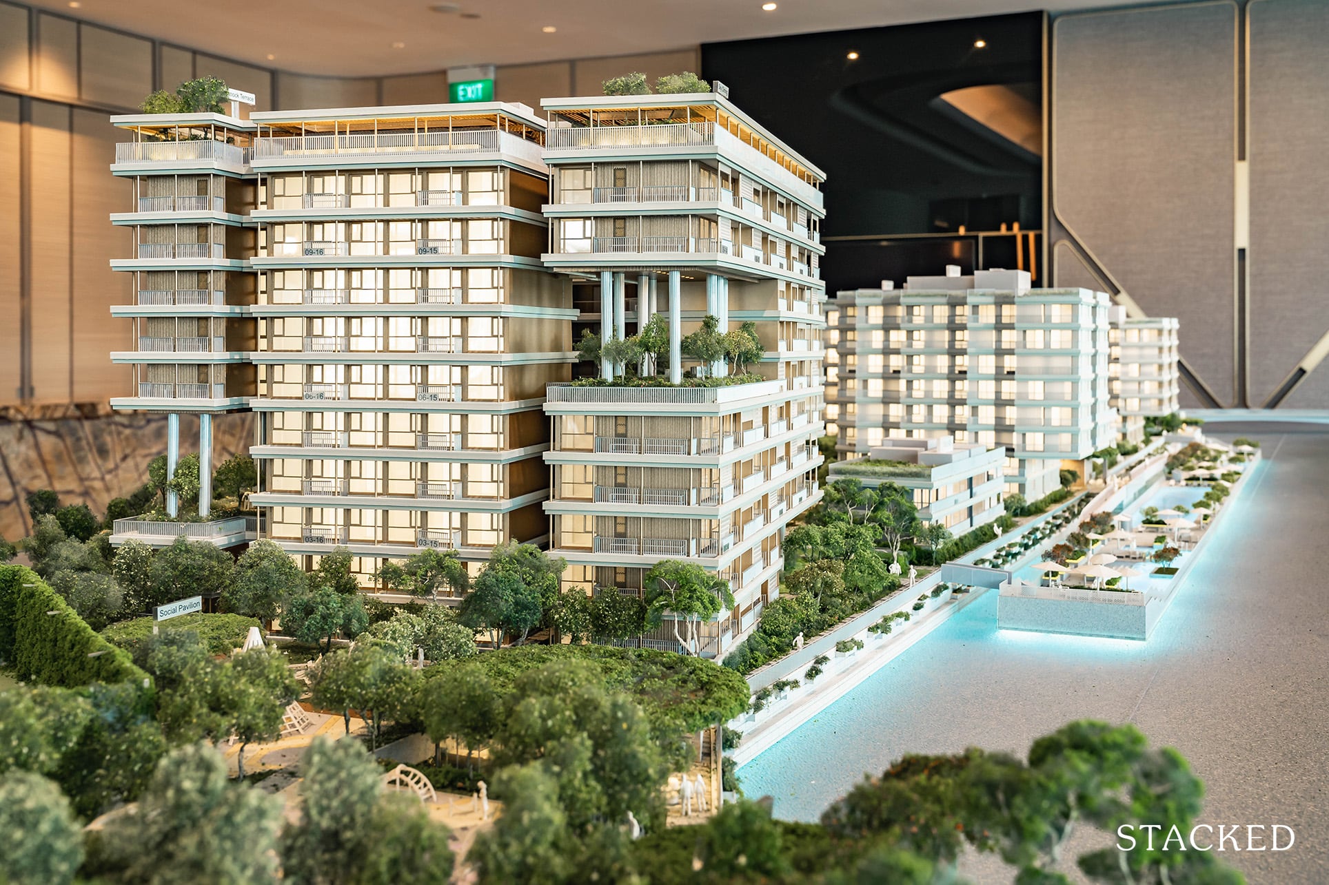
The “Courtyard Blocks” (10 and 20) feature (no surprises here) a courtyard in the centre, which personally is a relatively novel concept here in Singapore. You do lose a bit of privacy with the common corridor space but you do gain a sense of community with your neighbours (if they are nice of course). Of course, if saying hi to your neighbours isn’t quite your cup of tea, there are the shorter “Urban Villas” and “Garden Villas” to choose from, with the Urban Villas featuring more modern design elements (read: odd shaped balconies).
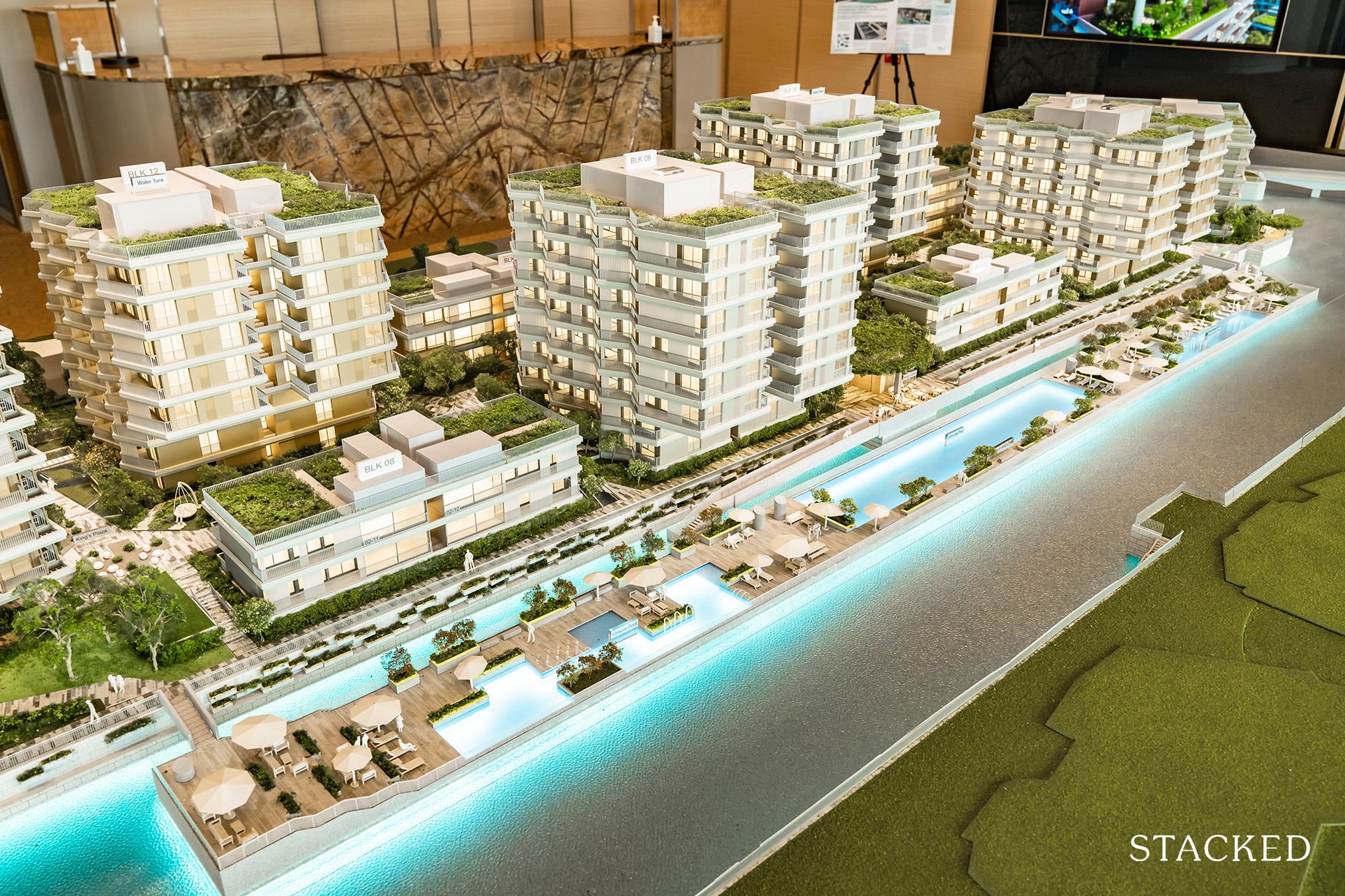
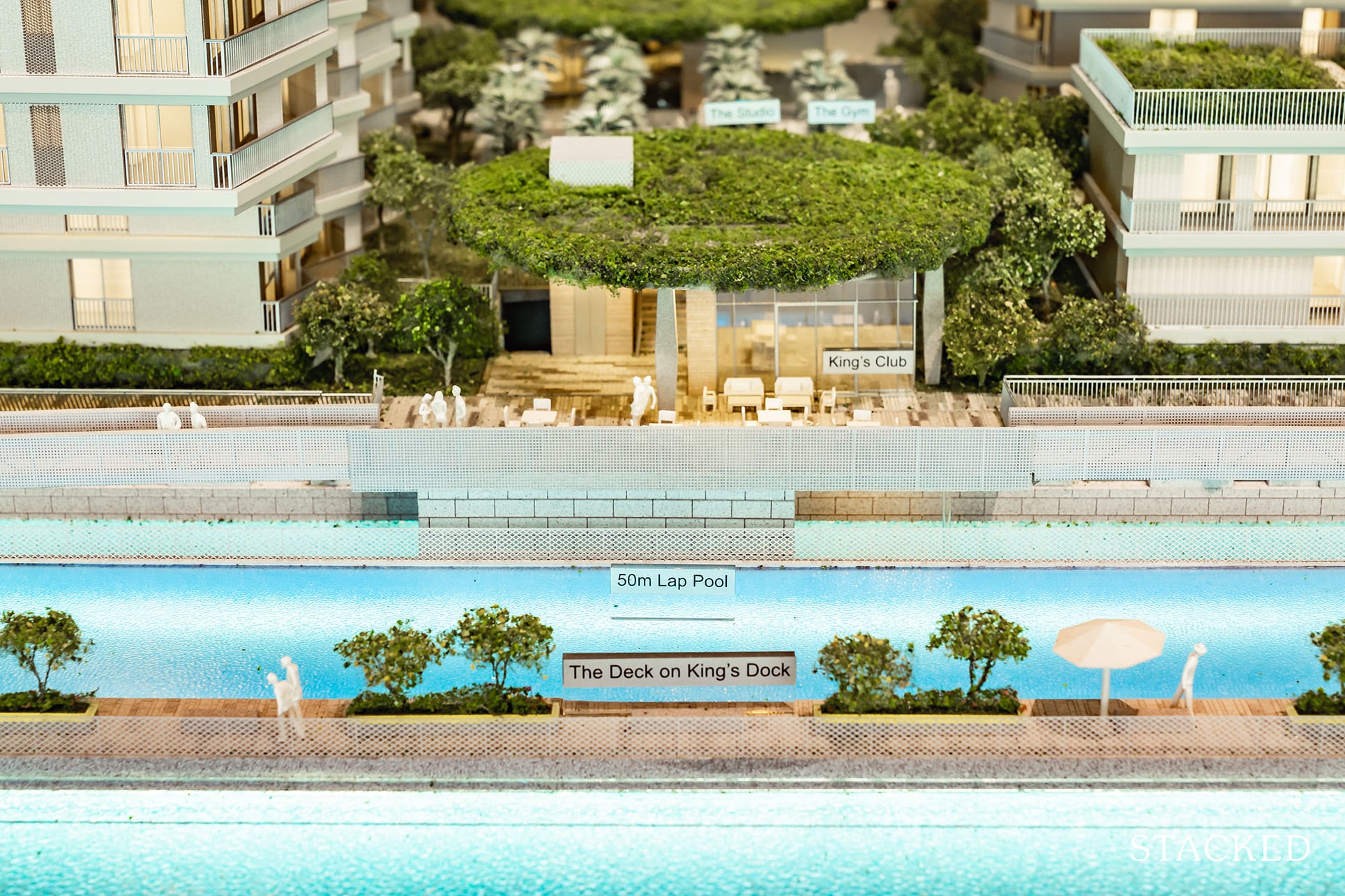
The highlight of The Reef is undoubtedly the 180-m floating deck, which effectively integrates its pools seamlessly with the King’s Dock itself. On the floating deck, you will find a 50m lap pool and 2 other smaller pools flanking it on either side. Perhaps nowhere as stunning but my first impression of this floating deck was that it was reminiscent of Sydney’s Bondi Beach Iceberg Club. What also ticks the boxes for millennials (or anyone passionate about conservation) is its emphasis on the environment, with dedicated environmental consulting firm and marine ecology specialist, DHI, engaged to design the submerged surface of the concrete floating deck to follow ecologically based design principles that will encourage the settlement of marine flora and fauna and enhance marine biodiversity at King’s Dock
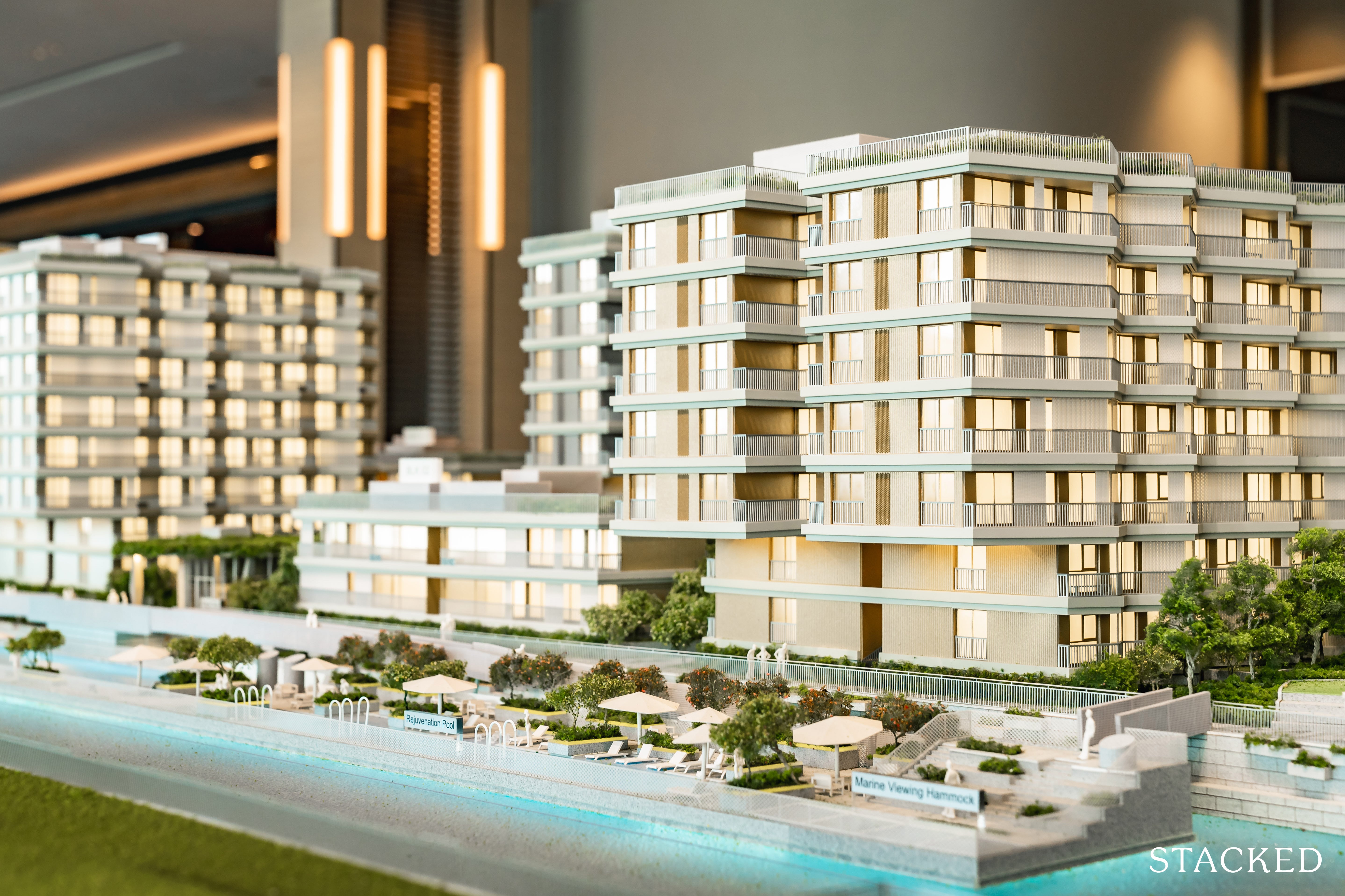
I really like the fact that it isn’t a feature that is born purely out of making media headlines too. It’s really a smart conception – it gives more space on land for the residential units, plus it makes total sense that all aquatic features are located atop the water as well (it brings you that much closer to the sea).
And as you might imagine, the dock would float up or down – depending on the tide.
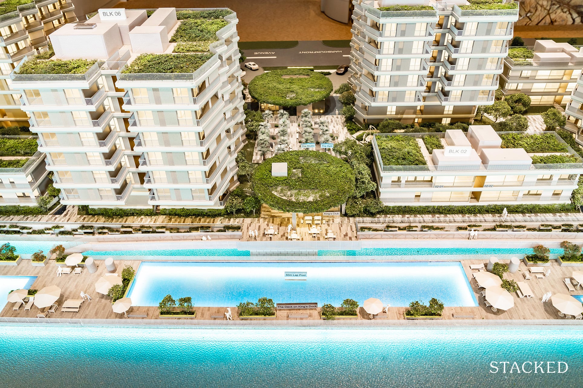
That said, not too many would be fond of it being located quite closely to Corals at Keppel Bay (residents there can look right in). I can’t imagine residents there would be too pleased about this development too as it does take up a significant space over the water views they used to enjoy.
If only the dock could be placed at the seafront (facing Sentosa), one can only dream…

So for 429 units, the 50m lap pool and 2 smaller pools is relatively decent.
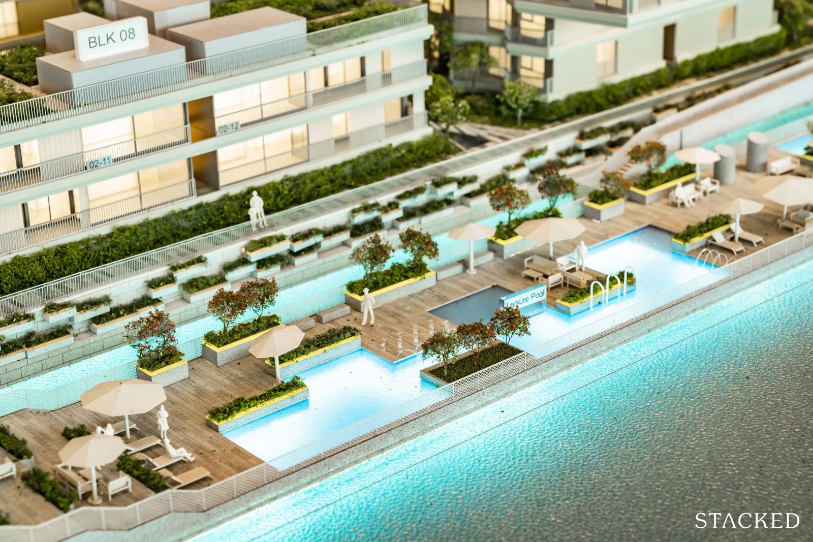
The 50m lap pool for those who want to get their daily swimming exercise, and leisure pools for relaxing in. These are conveniently placed at the side of the deck to bring you closer to the sea so I can imagine it to almost feel like you are floating in a pool over another body of water.
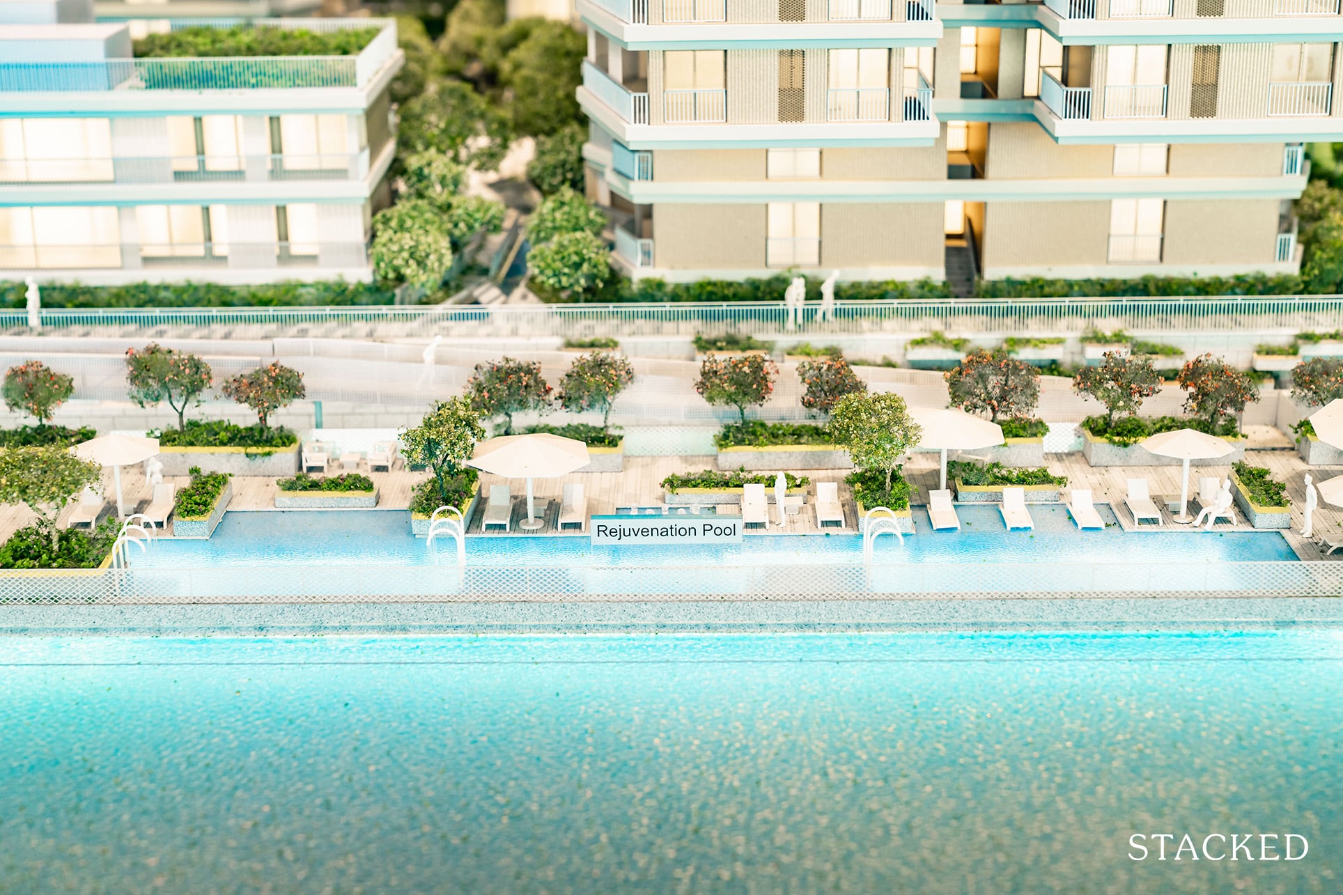
At the further end is the rejuvenation pool, where you find your usually jacuzzi spot as well.
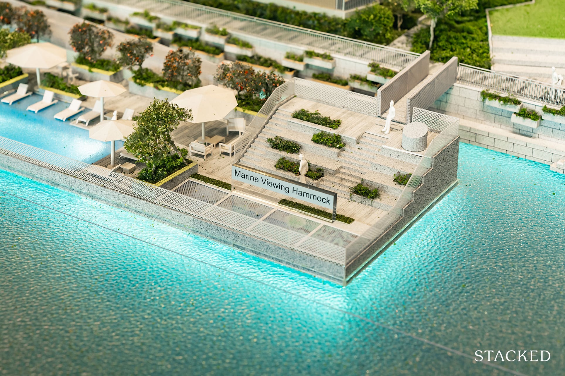
There will also be a Marine Viewing Hammock on the end of the 180m floating deck to allow residents to enjoy those views. The Straits Times journalists spotted fish such as the monocle bream, orange-spotted rabbitfish, pipefish and copperband butterfly fish when they covered this project in an earlier article so perhaps there will be some views after all. I really like this concept of a hammock because it brings you so close to nature itself and these are points which I would really credit the architects for their attention to detail and daring to reinvent the wheel.
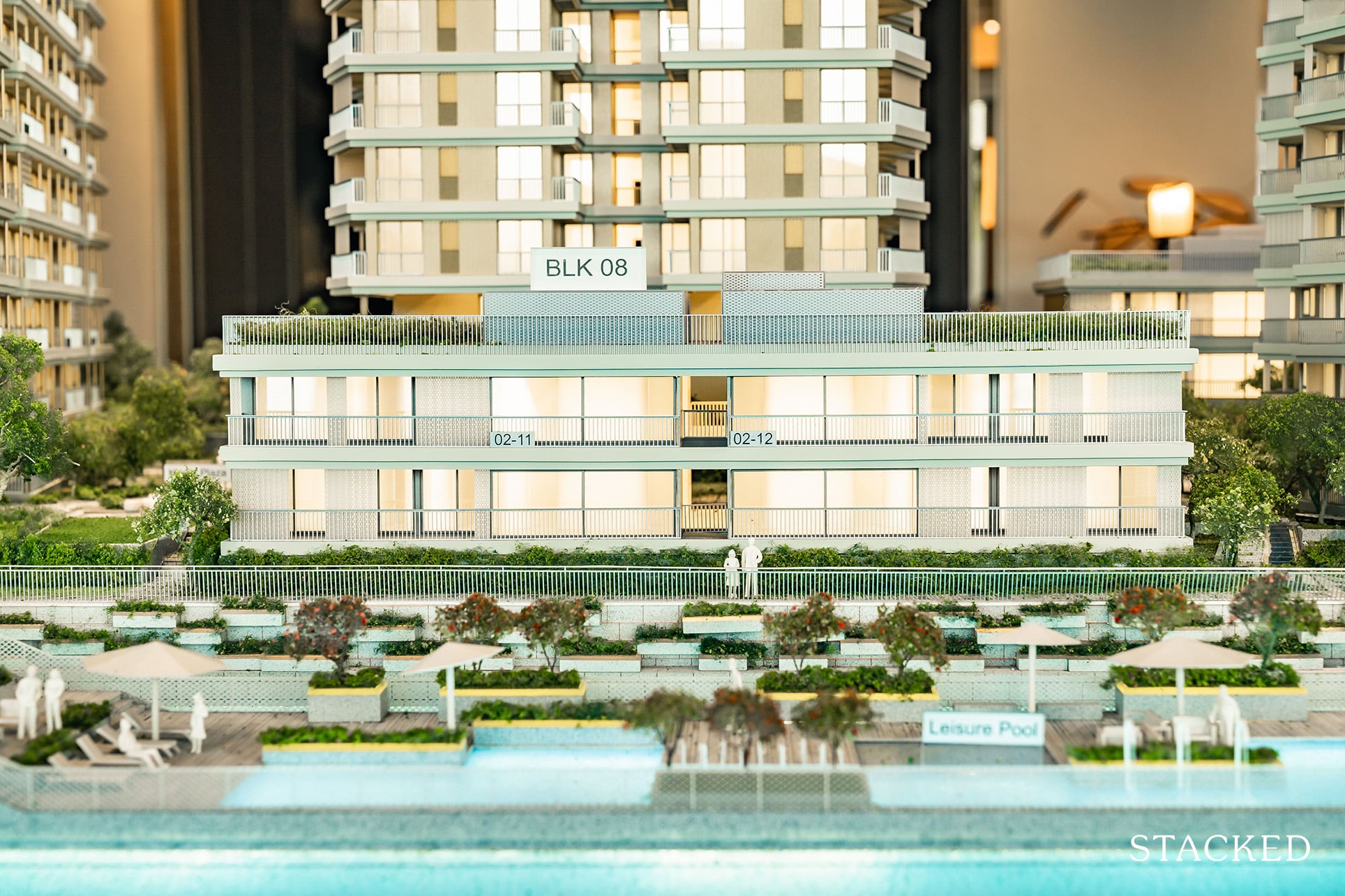
One of the other things I would like to point out here are the additions of the 3 bedroom villas. There are only 8 such units, and are split into 2 blocks containing 4 units each. These could be alternative options for those looking for a multi-generational home but aren’t keen on landed property.
If you have deep pockets, purchasing all 4 would naturally mean you own the entire block. You could also buy the top and bottom floor, and the developer is open to creating an internal staircase to link the two units.
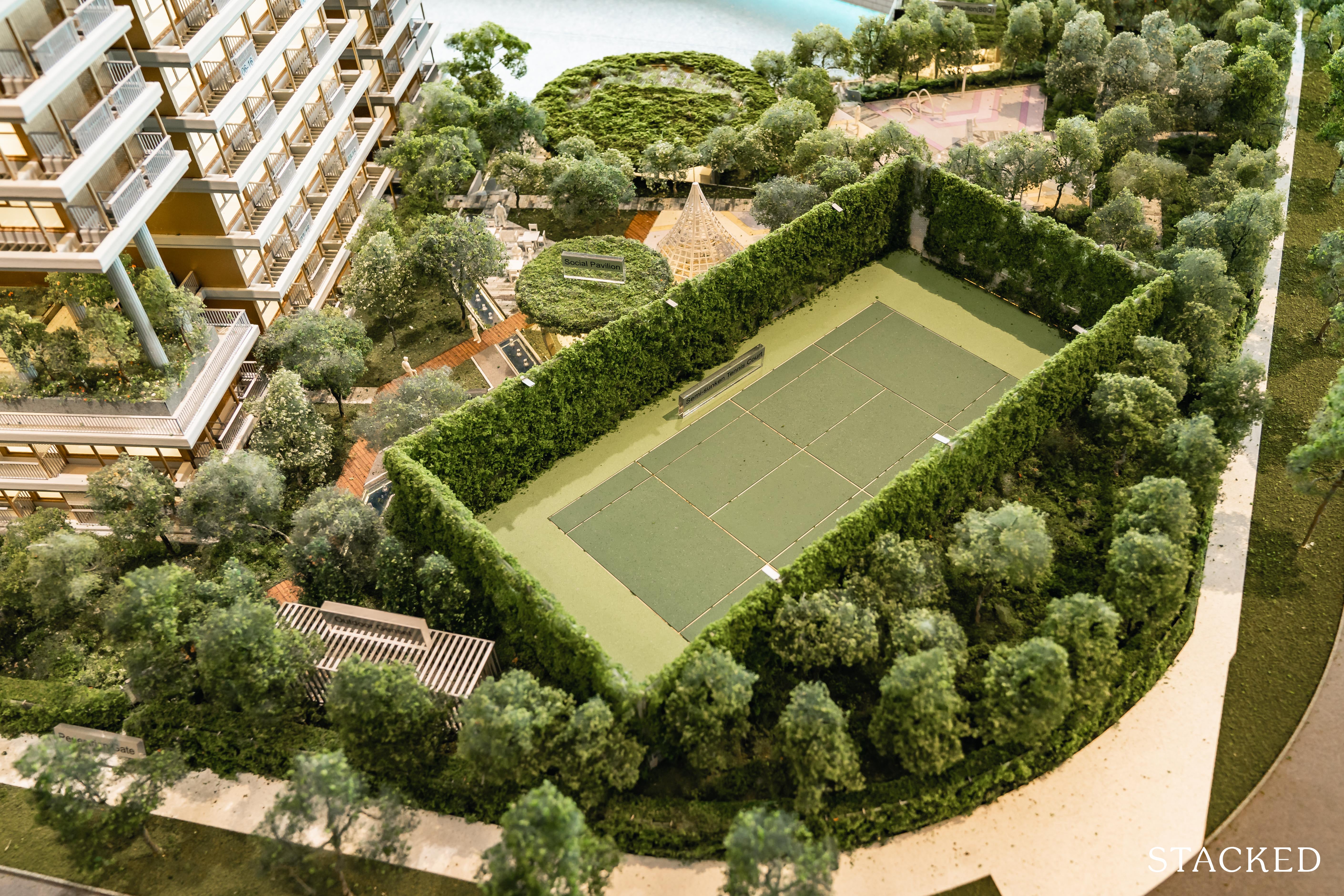
Besides the novel floating deck, the other facilities available at The Reef at King’s Dock are all pretty standard fare – 1 tennis court, which I’d say is the bare minimum for a ‘lifestyle’ focused project. Although the brochure states 35 facilities on Level 1 / Basement, most are pure marketing speak – many different social pavilions and lawns are all termed differently.
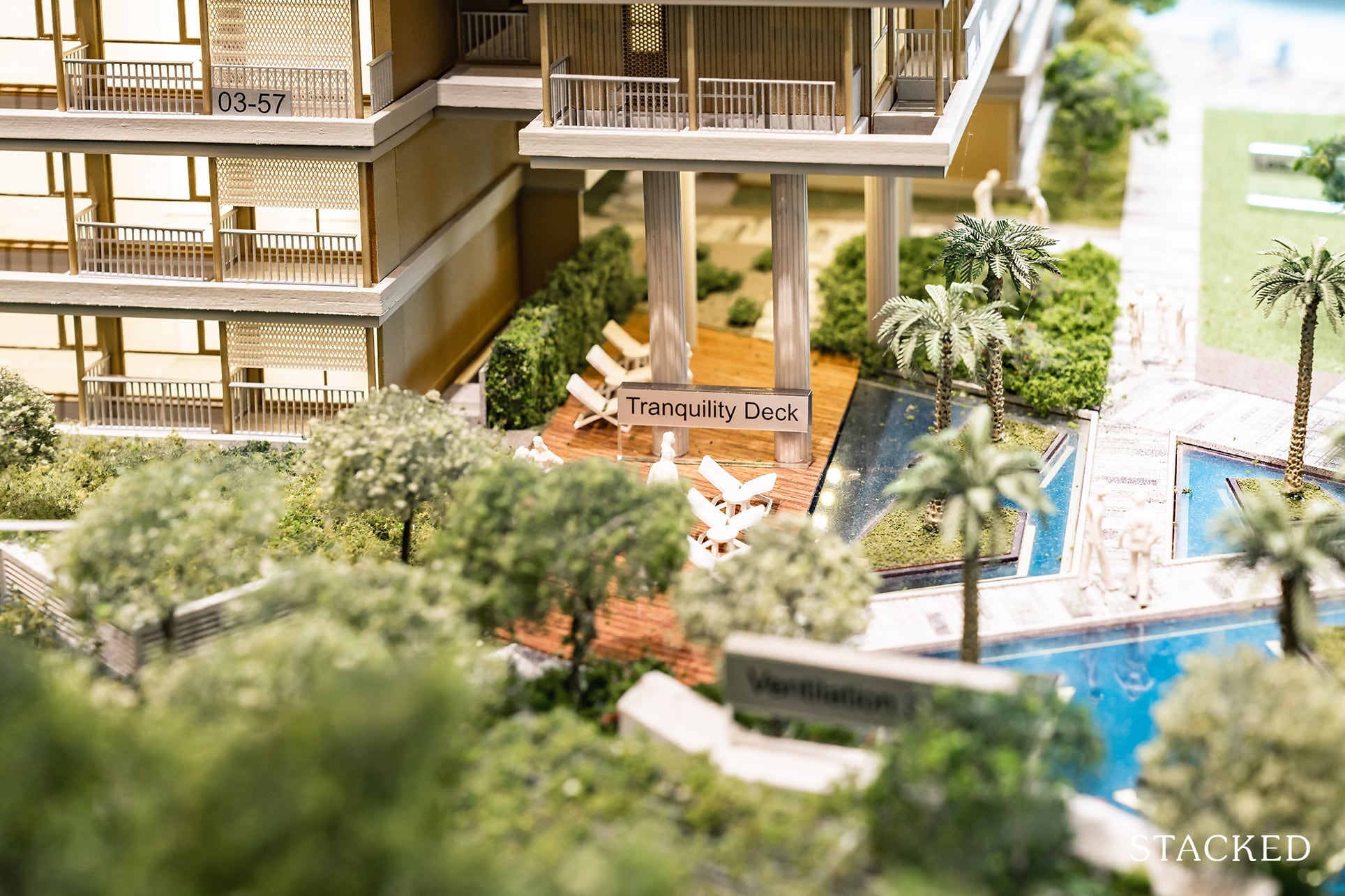
Like the tranquility deck.
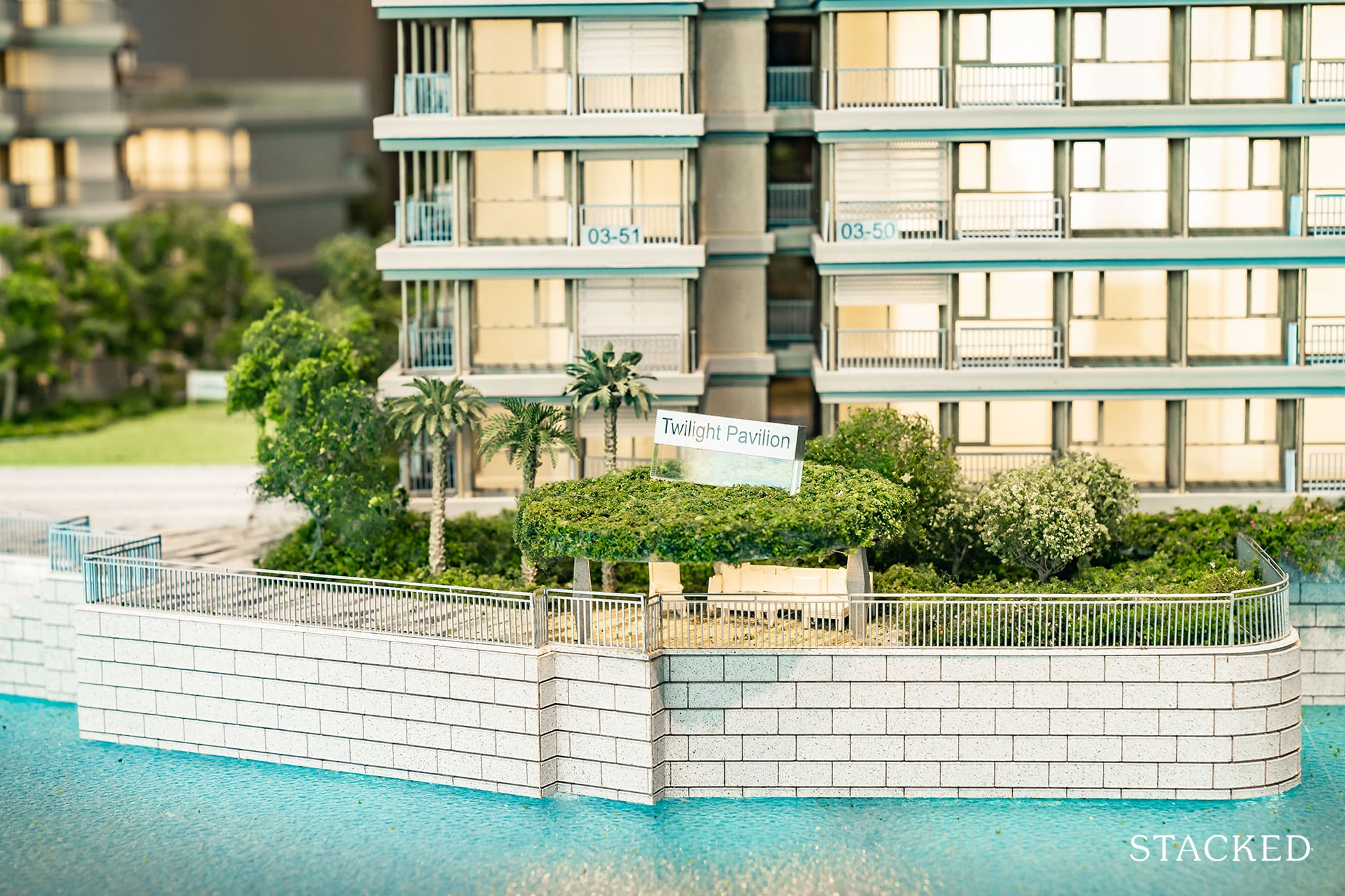
Or the Twilight Pavilion (of which there are 3). This one is probably the best for views though.
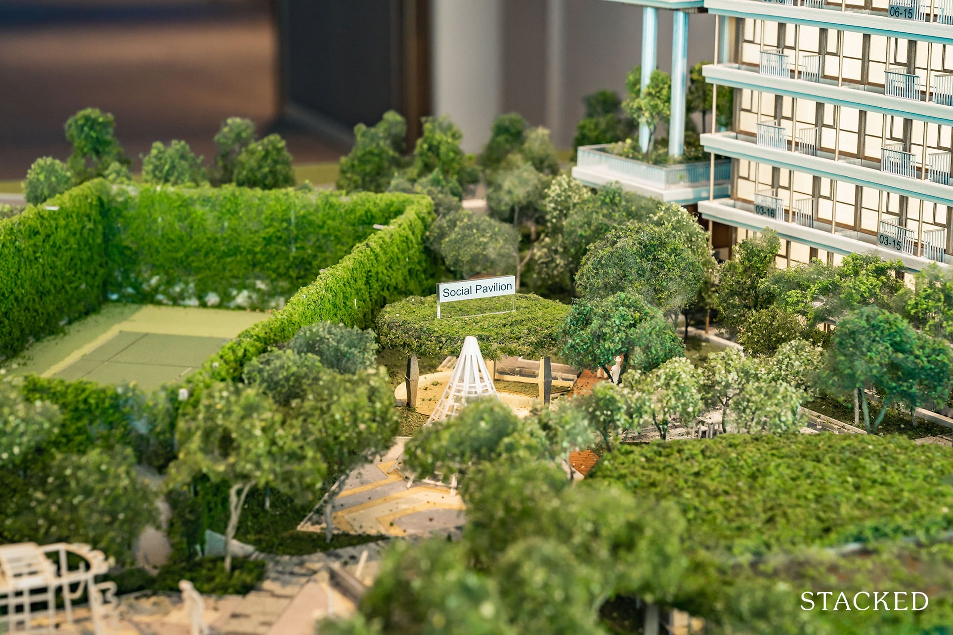
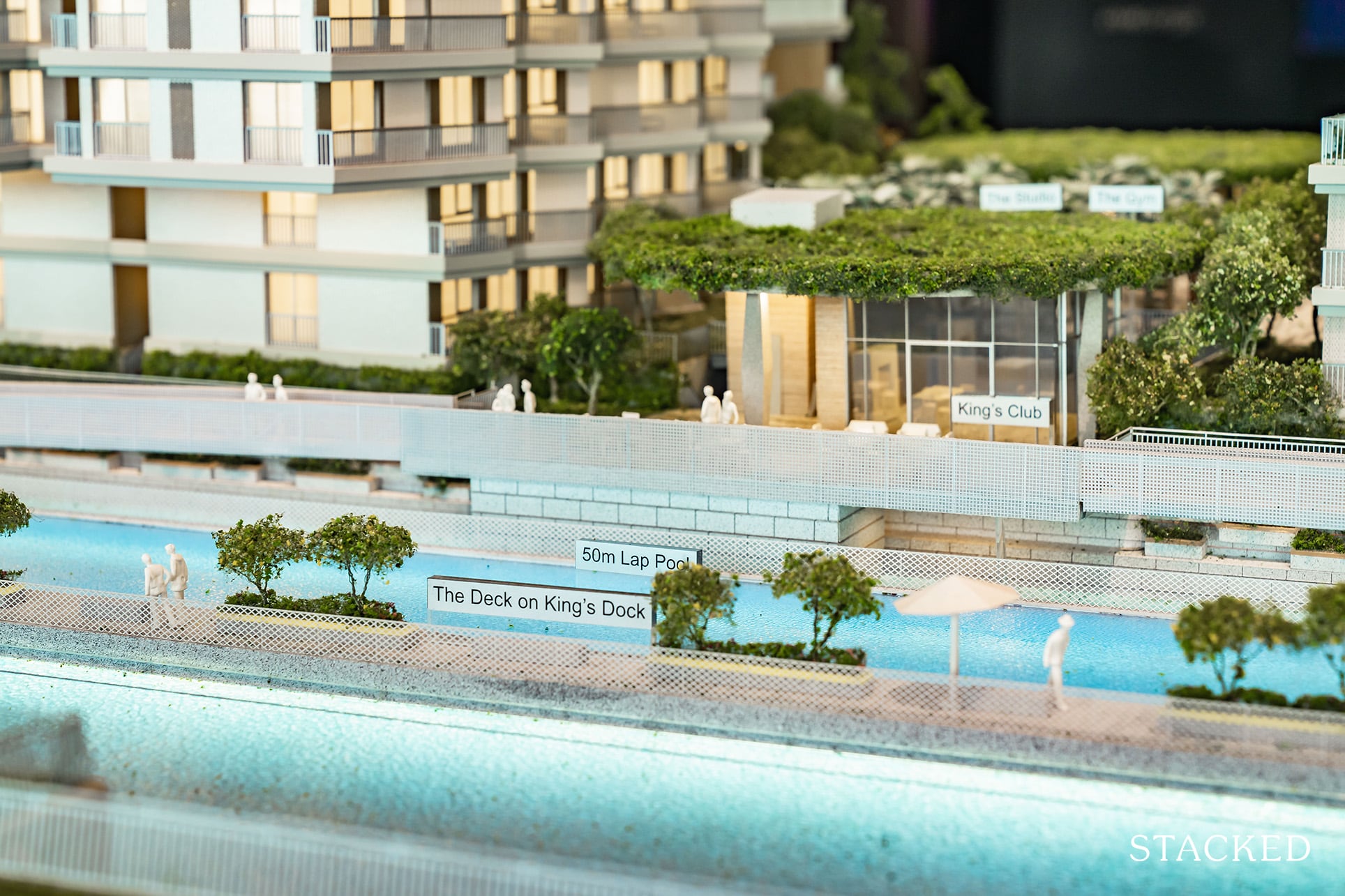
The fully equipped main clubhouse (King’s Club) fronts the 180m floating platform and I am sure it would be quite the show piece for your privileged friends and family who will come over to wine and dine. If King’s Club gets too full, you will also have King’s Lounge or the other pavilions that will be able to entertain your guests.
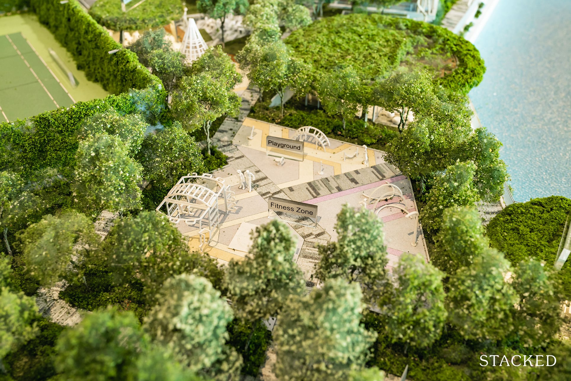
Of course, you’ll have your usual gym and outdoor exercise areas too. Let’s not forget the entire boardwalk is at your disposal (you can walk all the way to Labrador Park).
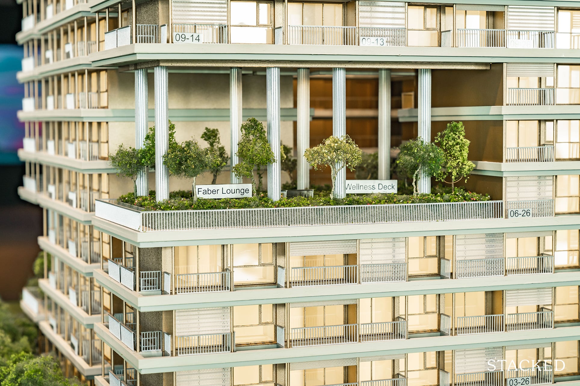
Other than the aforementioned facilities, Block 10 will also feature another 3 levels of facilities! It’s interesting how they chose a single block instead of spreading them across 2 or 3 different blocks. The rationale behind this is apparently so that residents will not just be able to enjoy views of the sea, but also the Mount Faber peak as well.
Still, it is quite peculiar that the rooftops of the other blocks aren’t able to be accessed by residents – rather, it’s used for rainwater harvesting and irrigation. Love the green features, but surely there could have been a little space carved out for some rooftop seats!
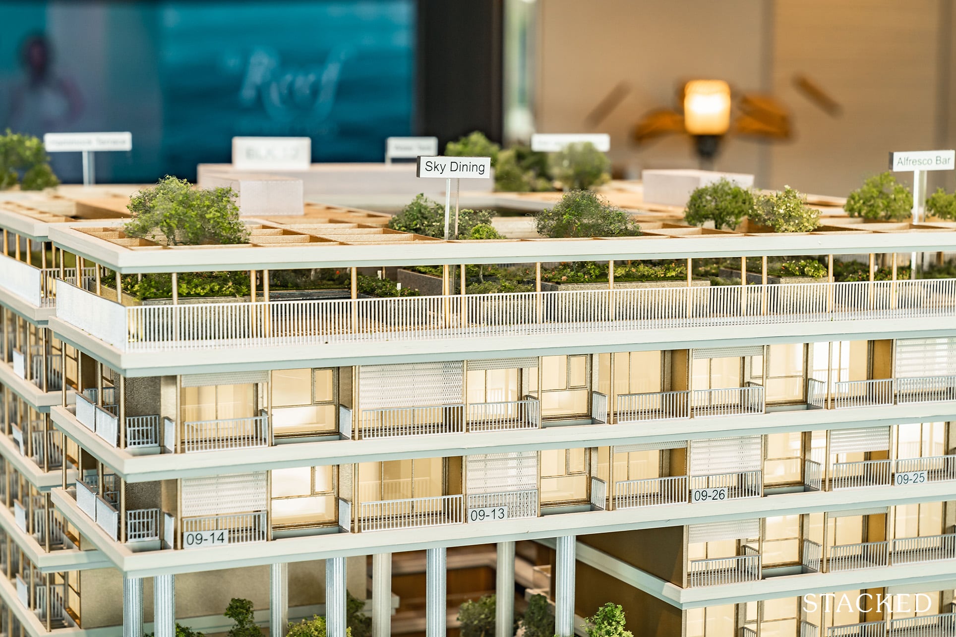
There’s a tiny Meditation Deck on Level 3, an equally small Wellness Deck and Faber Lounge on Level 6 and a full floor worth of social and dining pavilions on the Roof Garden.
The Roof Garden is definitely a great feature to have in such a development, giving how close The Reef is to the calming water elements although the areas on Level 3 and Level 6 do not seem to provide much tangible purpose besides adding more to the landscaping of the project.
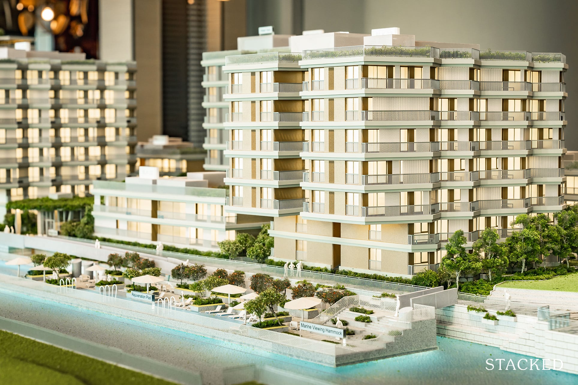
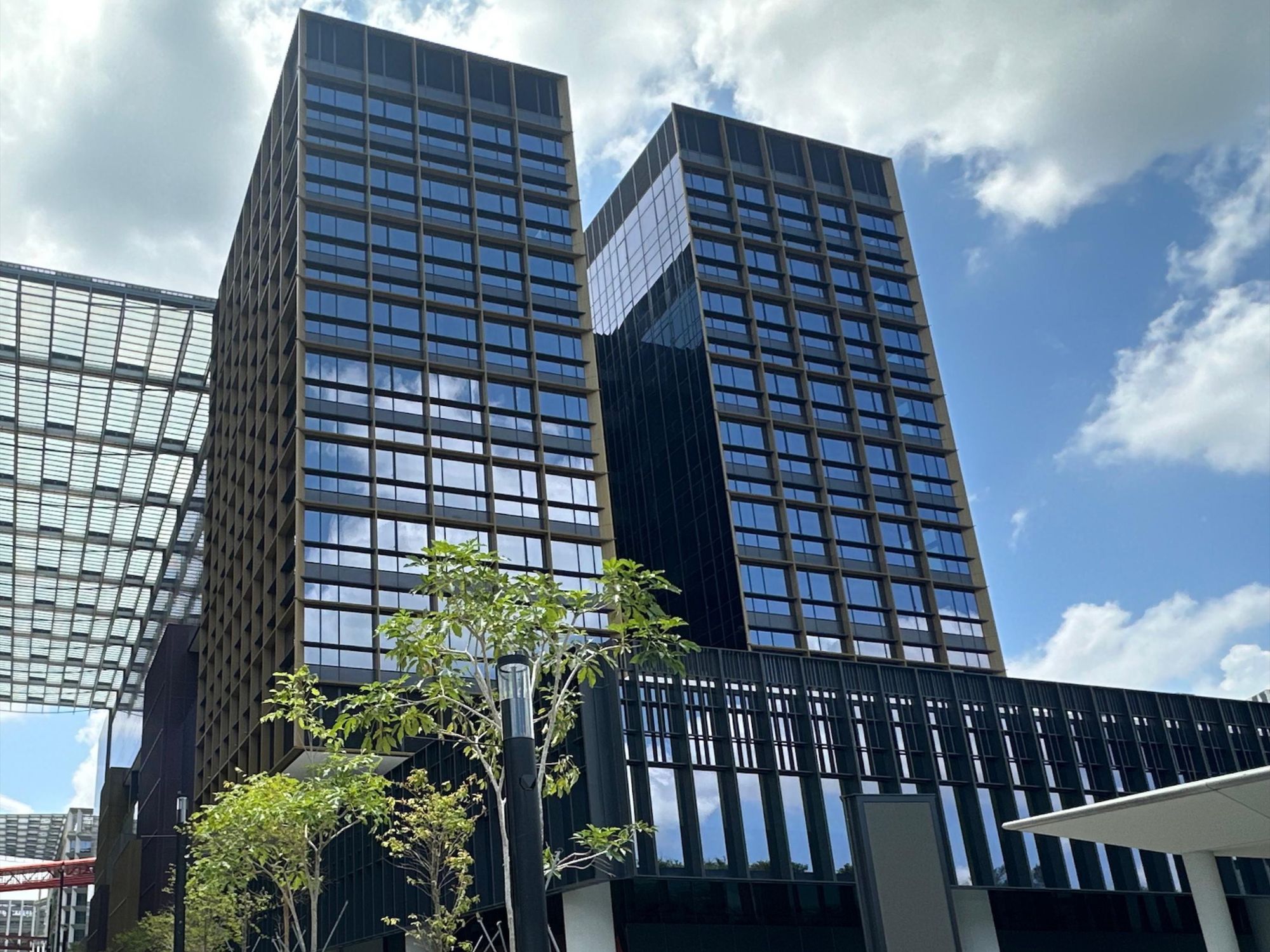
Finally, I would just like to touch a little bit on the design. In short, I like it. It doesn’t quite look like anything else on the market with the light gold touches and the varying heights of each block.
As always design is a subjective matter, but I would think you wouldn’t find too many people that aren’t charmed by its exterior package.
The Reef at King’s Dock 1 Bedroom Review
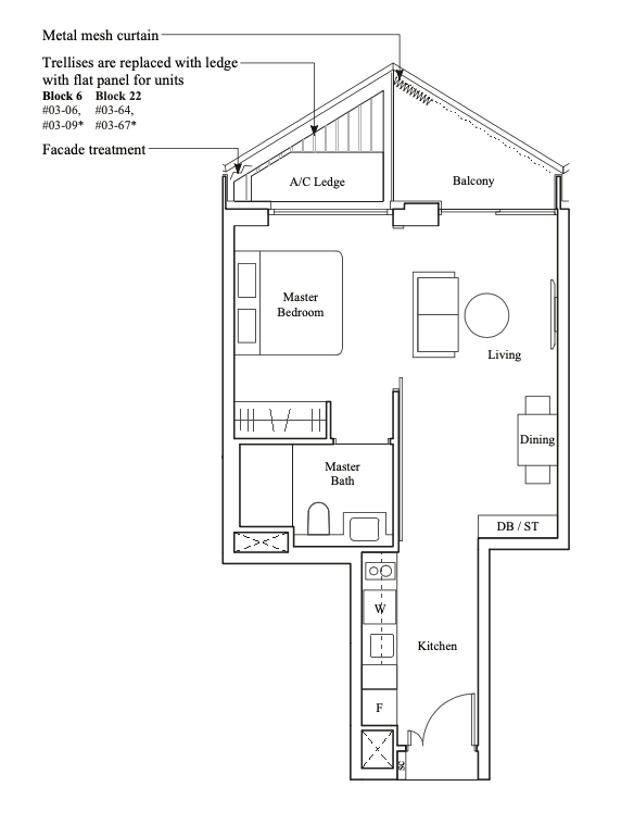
At 538 square feet, this 1 bedroom unit is considered to be a relative decent size in today’s context. There are a total of 116 1 bedroom unit variants, which means it takes up slightly more than a quarter, or 27% of the 429 units.
So the smallest 1 bedroom unit comes in at 431 square feet (with no balcony), all the way till 657 square feet for the largest as it comes with a study.
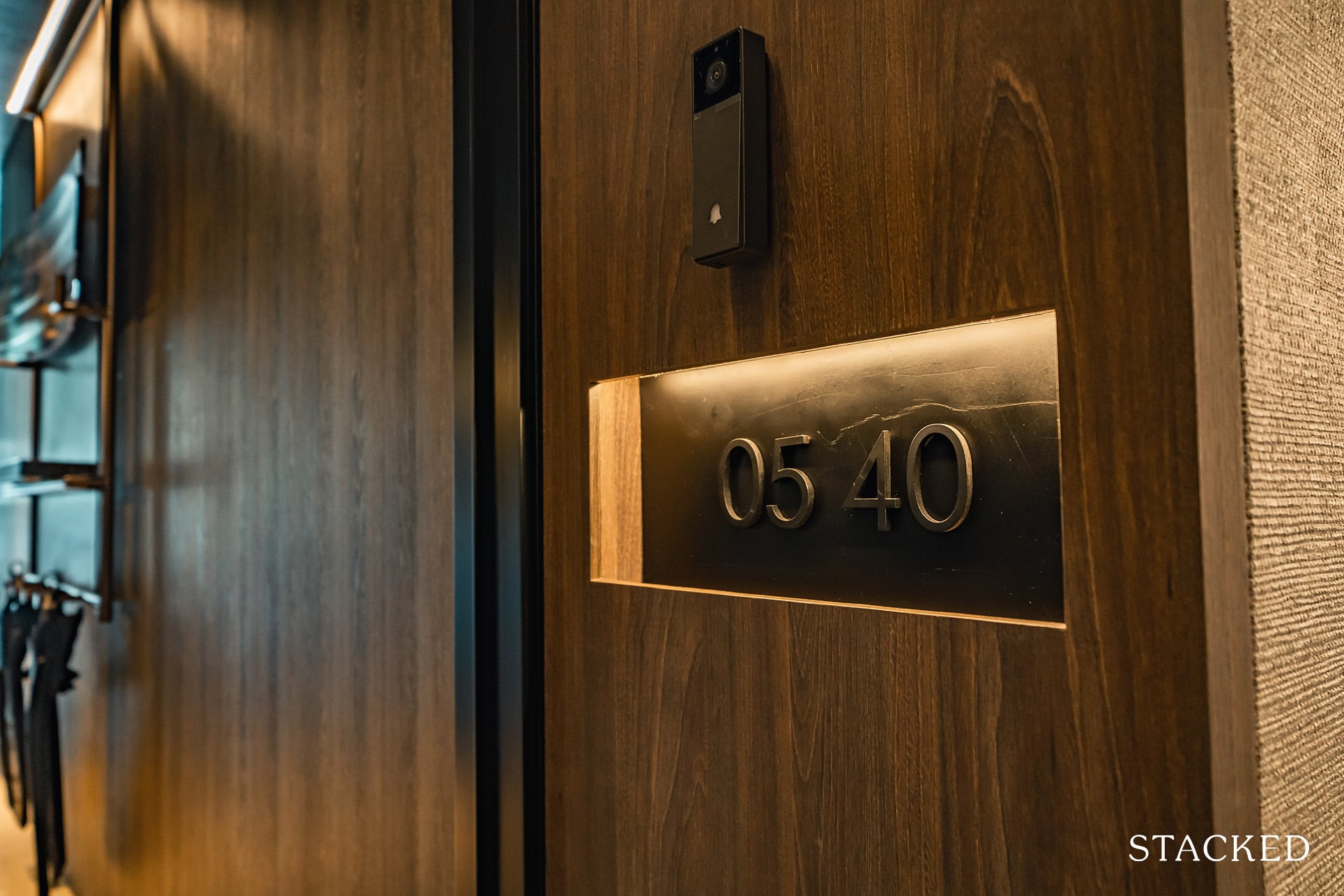
This isn’t normally something I would pick up on, but I really like how they’ve decided to display the unit numbers at The Reef at King’s Dock. Clad in this sleek matt black finishing, it is minimalist yet, for the lack of a better word – polished.
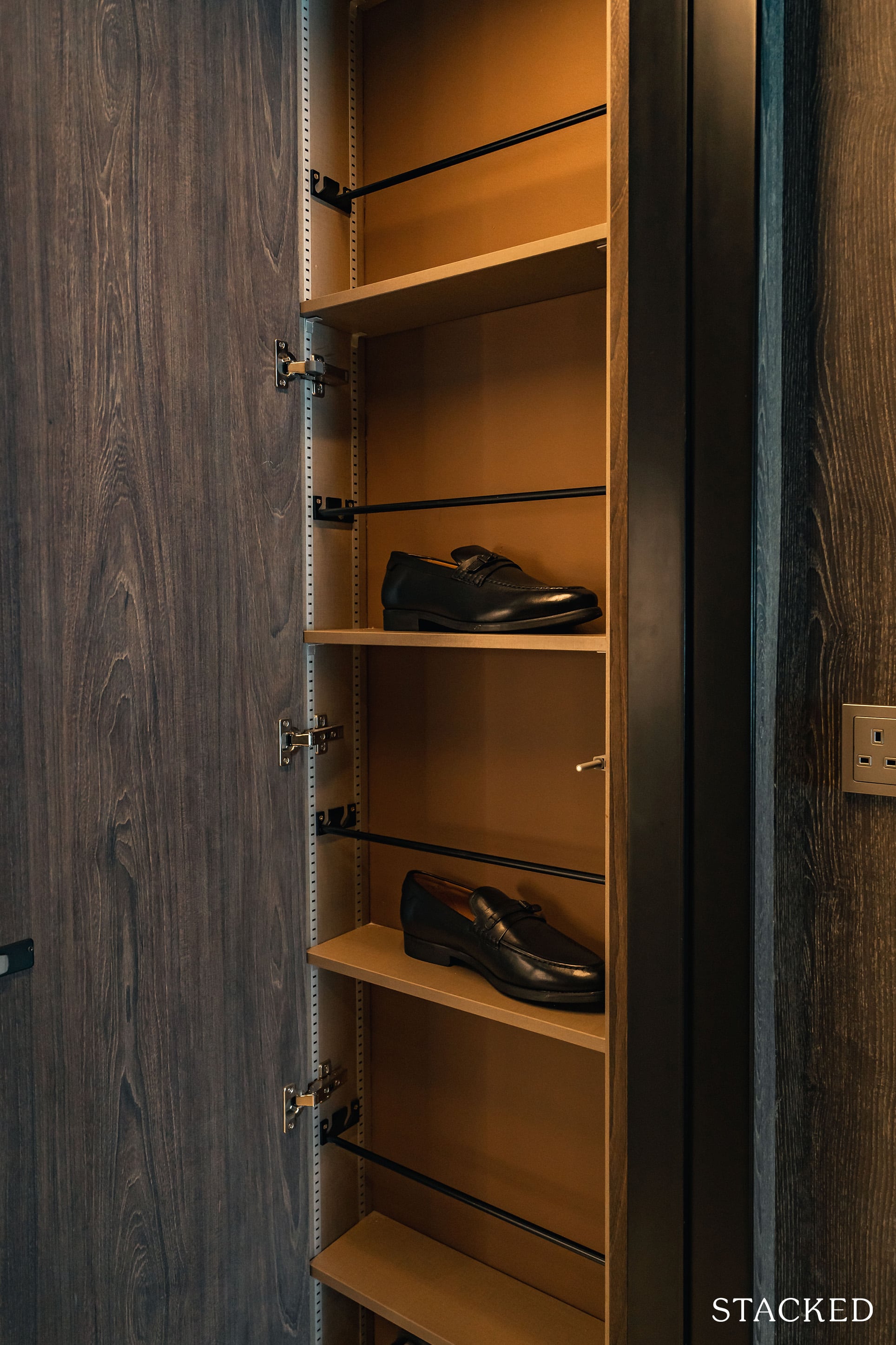
And that’s not all, each unit will come with a lockable shoe cabinet. While I can’t say shoe cabinets on the outside is a new concept, you don’t get too many with a lock included (which is strange, given how easy it is to include). As far as first impressions go, we are off to a very positive start.
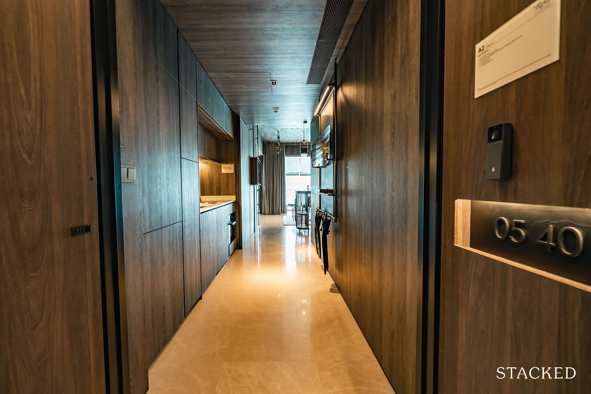
Walking into the unit, the first thing that really hits you is how dark it is. I’d attribute it to the dark wood and minimal lighting. Perhaps the ID was going for a dark sultry feel, or mimicking a ship cabin. Taken positively, the space looks cosy, but at the same time it does make it feel smaller than it actually is.
The good news is that you can actually choose between two different finishes. One, which is the one you are currently seeing, and two, a light beige frosted glass finish. Personally, I prefer the lighter finish, but it is fantastic that you are even offered a choice. Funnily enough, this is an option only for 1 bedroom units. So those looking for a 1 bedroom unit, you’re in luck as customisation options are usually reserved for the premium units.
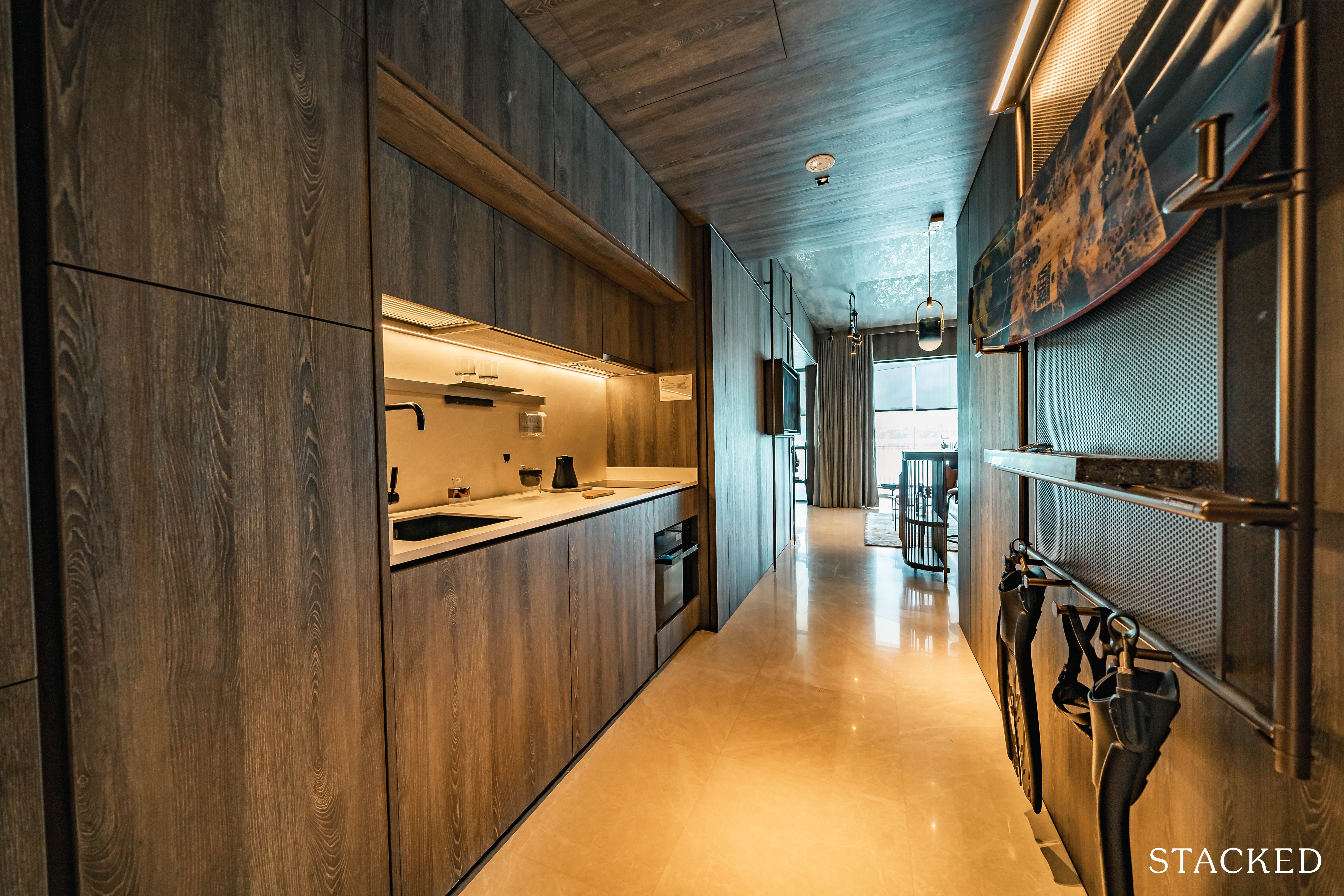
No wasted foyer area here, so the entranceway is really combined together with the kitchen space. As always with small units this is an open concept, so any heavy cooking will probably have to involve you opening both the main door and balcony to let the air pass through.
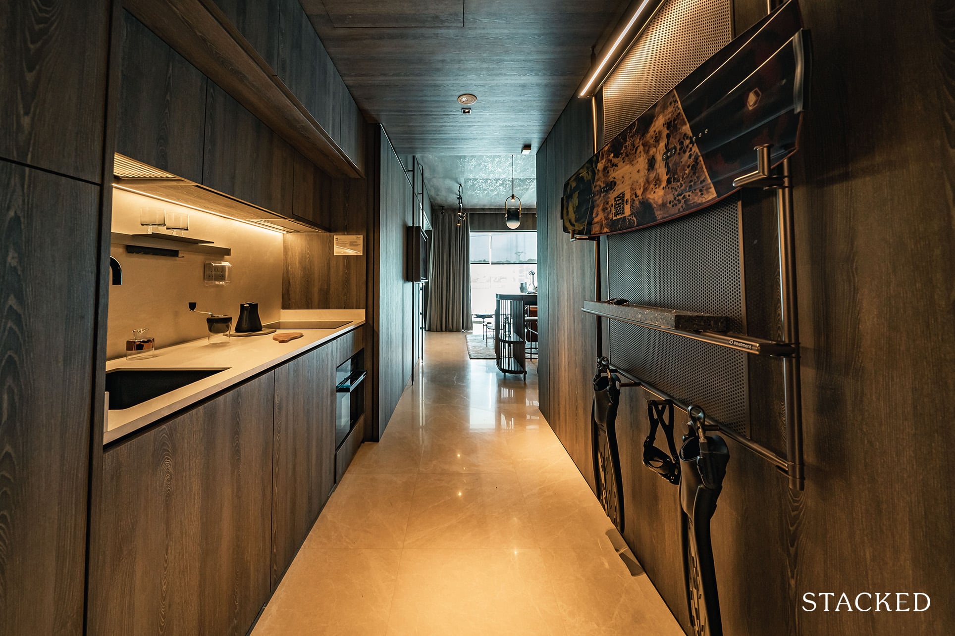
Kitchen appliances like the fridge and oven are supplied by the high-end Miele, while the washer/dryer is from Whirlpool – a brand you don’t hear of too often. Another cool touch is the matt black sink, it looks premium and feels very solidly built indeed.
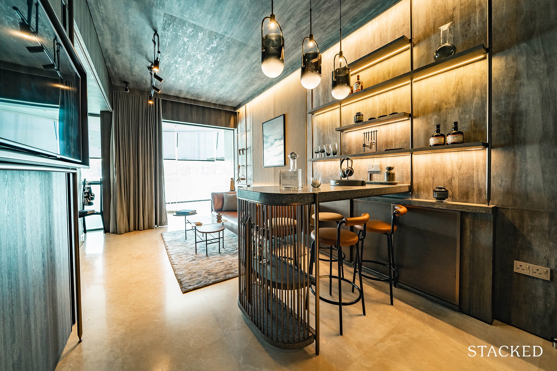
Moving further into the unit, you would be better able to appreciate the 2.9 metre ceiling height (which is higher than the average). What’s great is that this is constant across the board, and not just for the ground or highest floor.
And as you might expect as well for a more premium development, the floors in all unit types are made from marble.
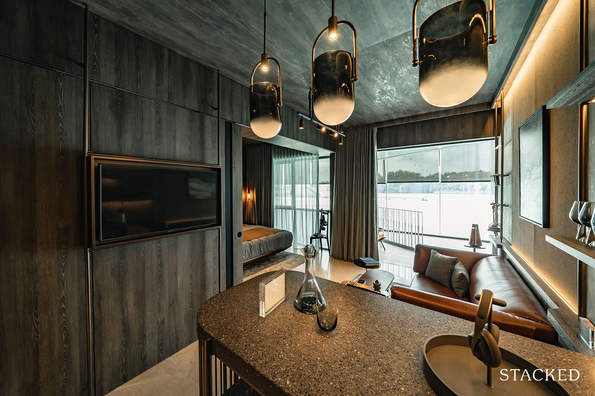
In terms of space, I have to say that the dining area is rather decent as you probably can seat 4 people without too much trouble. Of course, you can’t have too long a dining table here as it would eat into the walkway space.
Note from here that the sliding door behind the TV can be moved to cover the bedroom completely for privacy. The fixture holding the TV is an ID fitting however, so that would not be included.
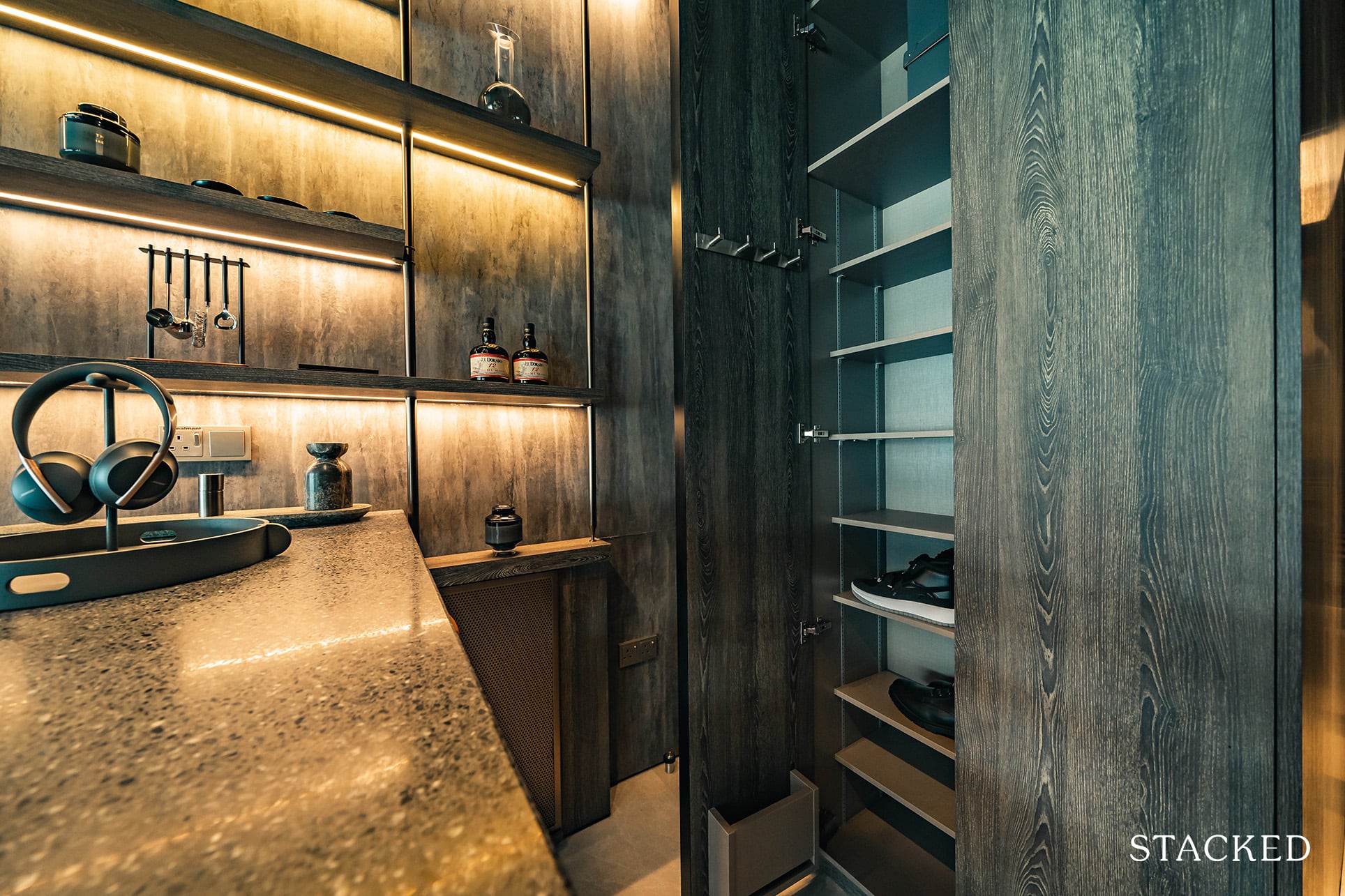
Behind the dining table is the DB box and additional storage. It isn’t very deep so don’t be expecting too much here.
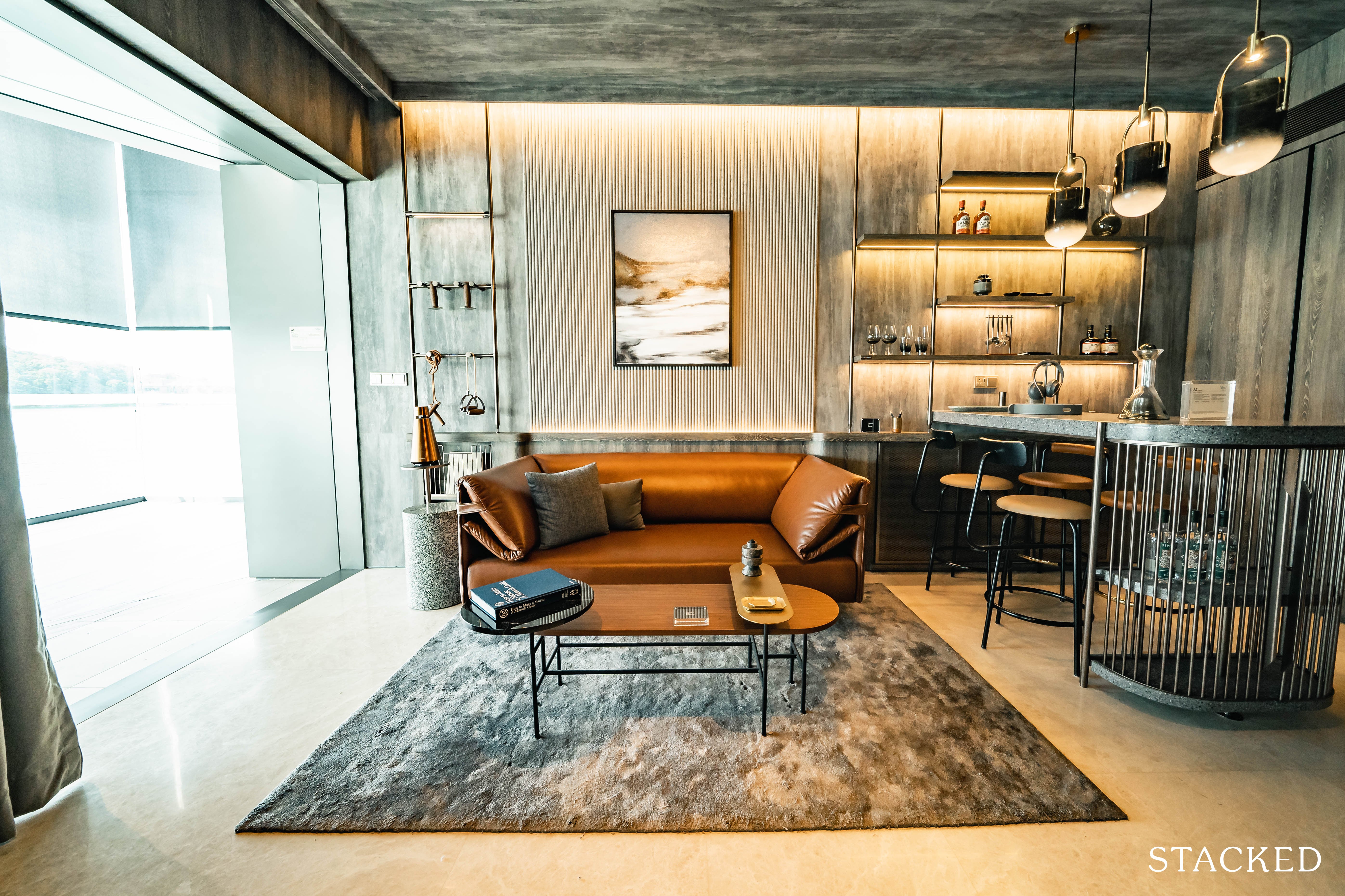
The living area is pretty good too. You can fit in a 2/3 seater couch along with a small coffee table.
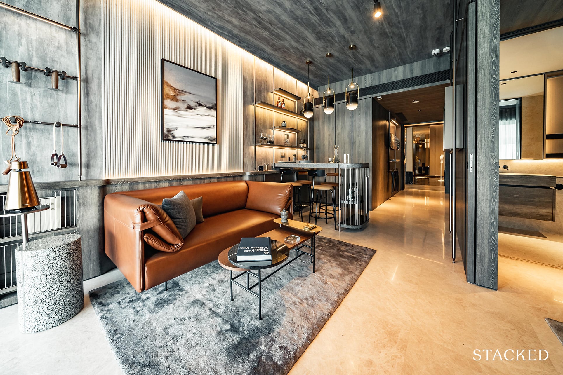
That additional bit of ceiling height really does make a difference in the overall size and feel of the space.
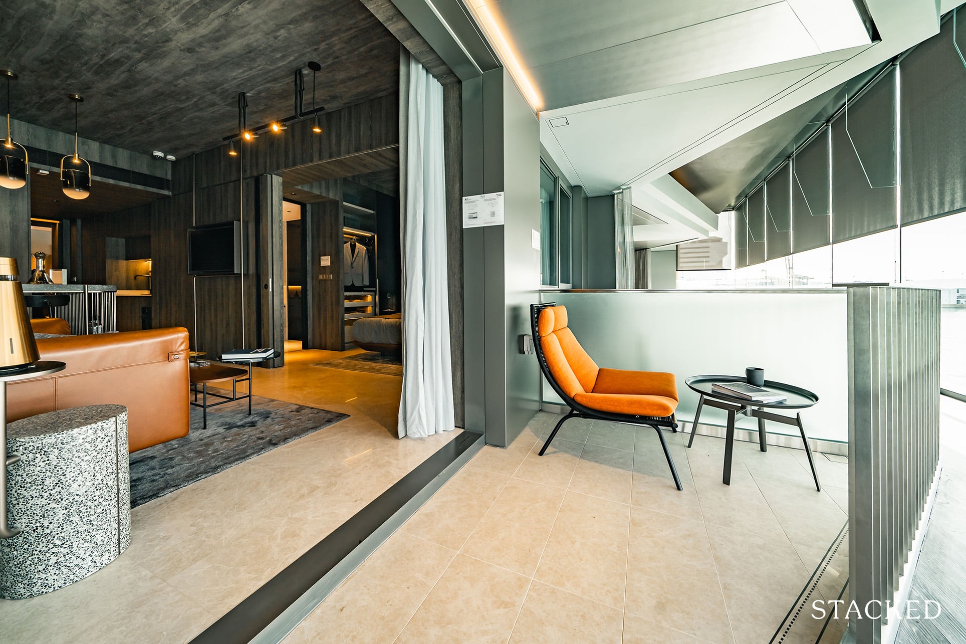
As you might have probably already seen from the floor plan, the balcony is the weakest point of the unit. It’s triangular in shape, so it is a bit awkward for anything other than a simple chair and small table setup. Those who prefer indoor space anyway would probably be happy, as you do have a reasonable space still to sit outdoors to enjoy the view should you wish to.
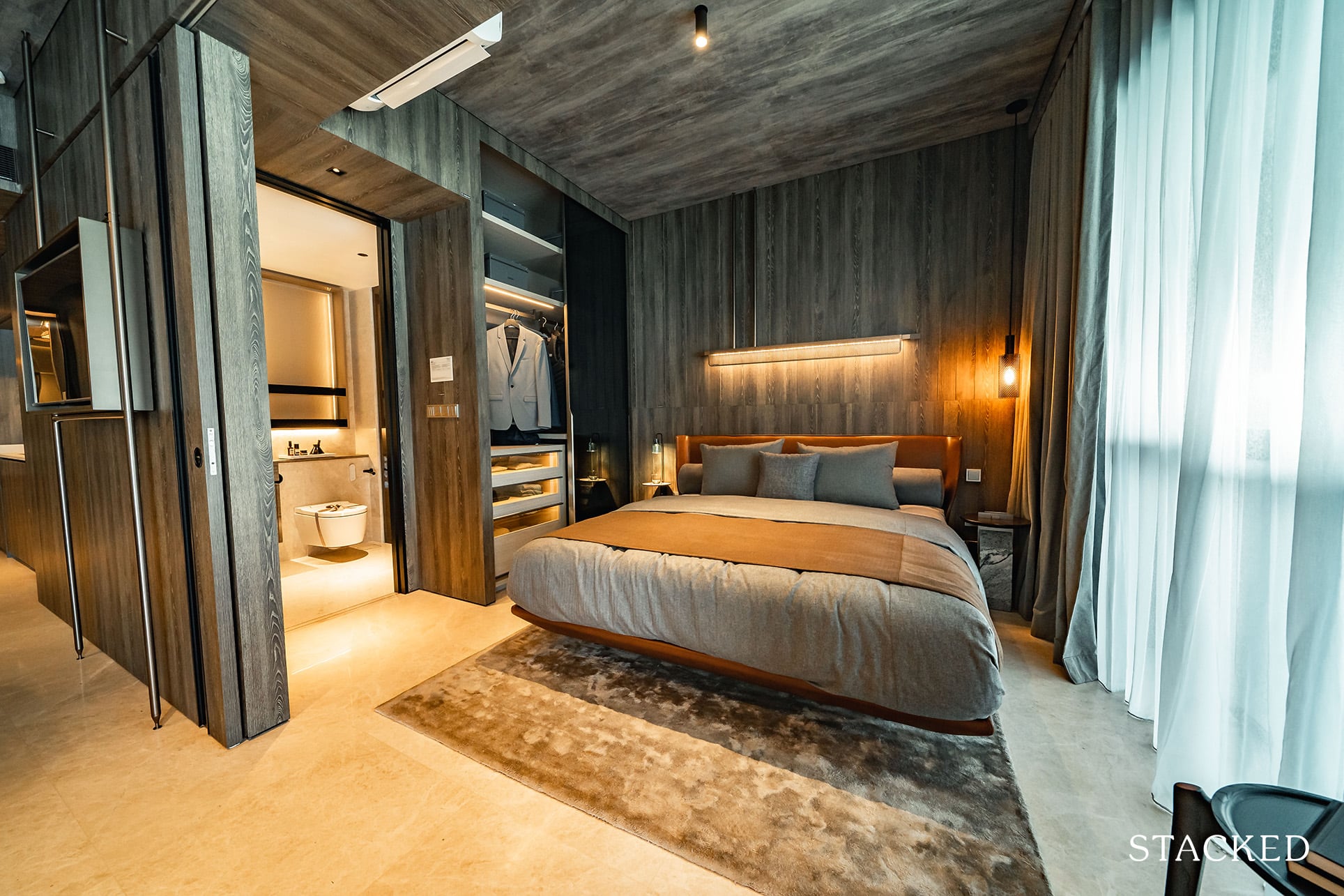
As you can see, the bedroom space allocated is more than decent as well. In this example, a king size bed is fitted and yet still has adequate room both sides to walk. So if you want to save even more space, a queen size bed would definitely do the job.
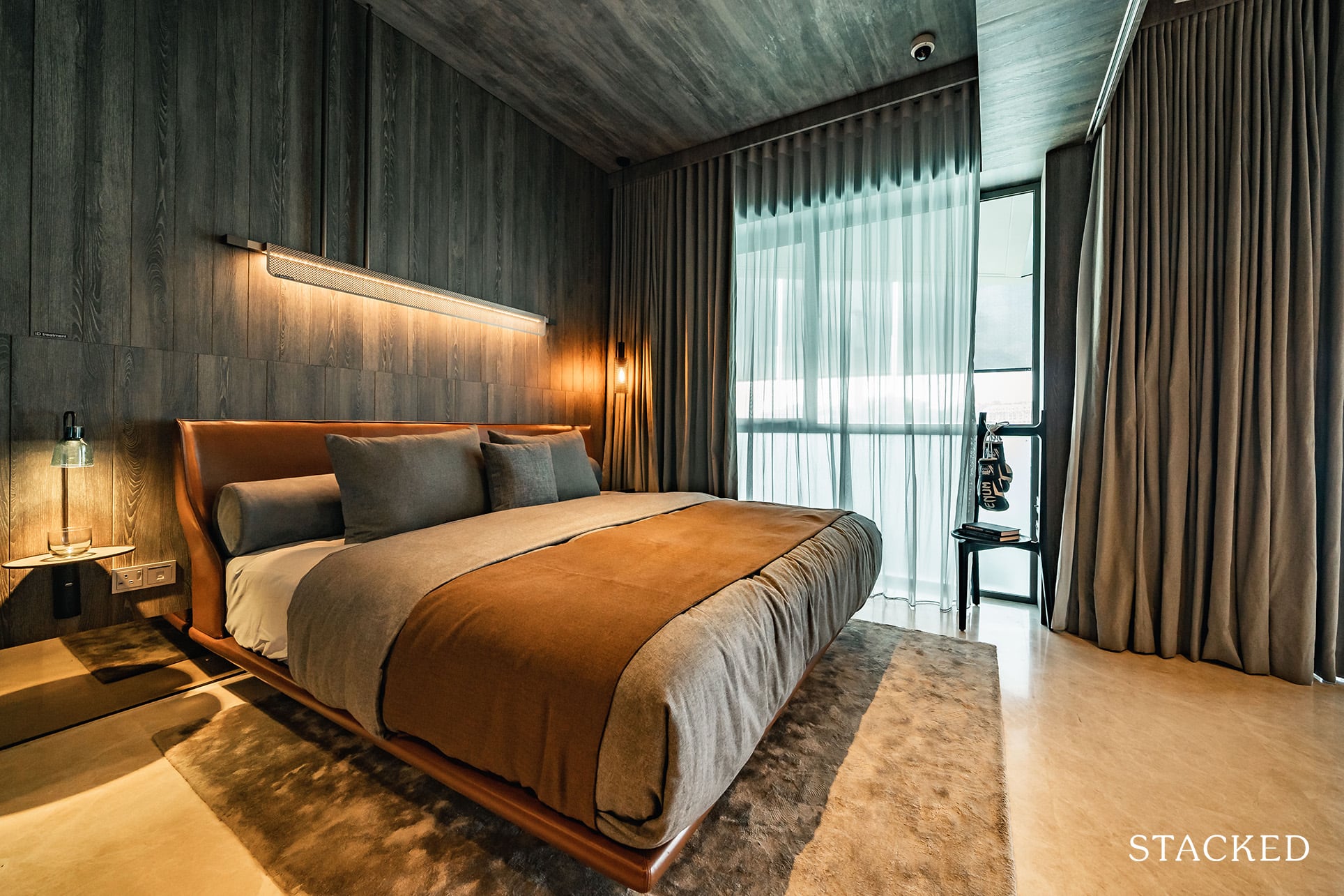
Sadly, the AC ledge here is located outside the bedroom, so you don’t get a full length window which is a bit of a bummer.
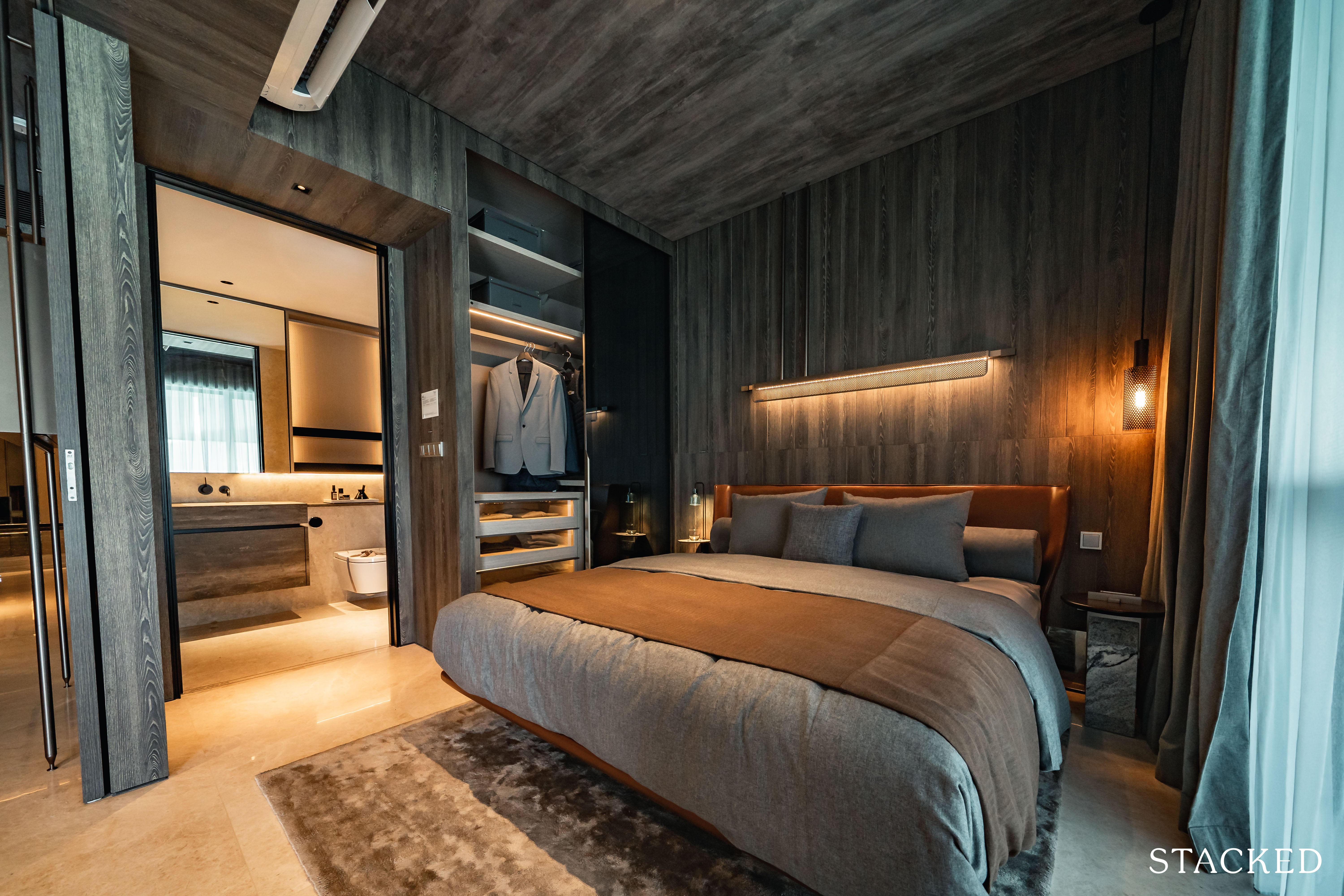
The wardrobe may be your typically sized one, but there’s a few nifty touches included here. The main deal would be the dark glass sliding door, which gives off a premium feel. For those wondering, the lighting is included too, even the ones in the drawer.
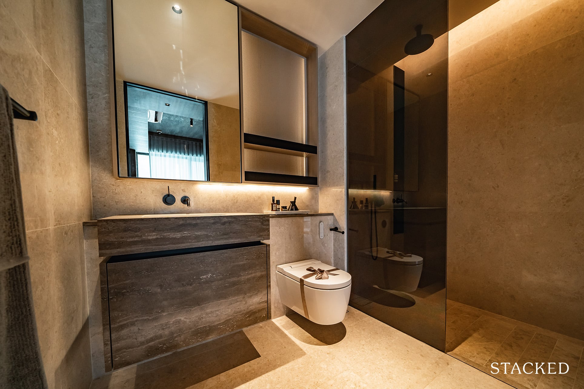
With regards to size, the master bathroom is definitely a sizeable one. It comes with premium fittings from Dornbracht (those lovely black taps) and Geberit.
You also get a wall-hung toilet plus automated bidet – which is definitely an impressive touch.
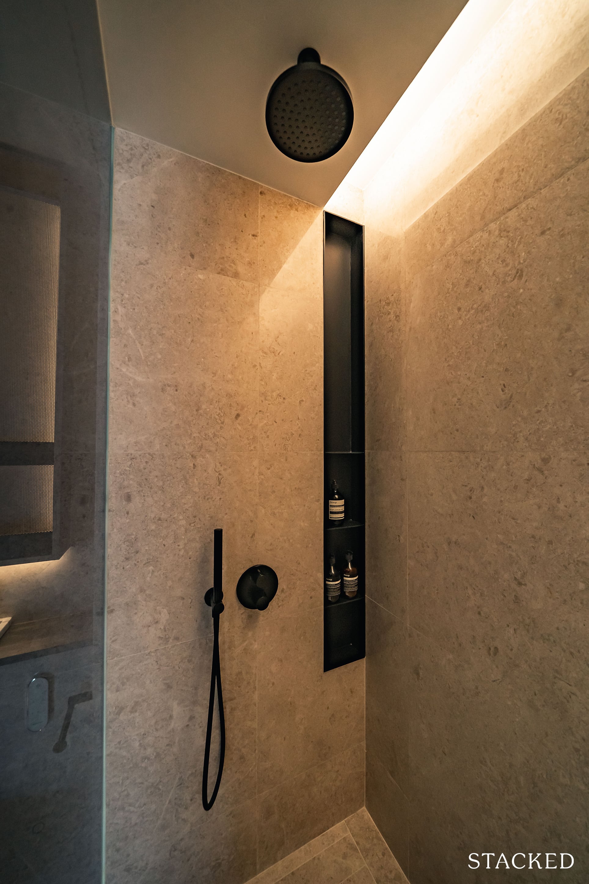
You do have a rain shower included as well, although I would have liked to see a regular shower head option for the sake of flexibility.
Positives aside, do note that there isn’t a window for natural ventilation and what is probably the biggest downside here: the lack of a jack and jill entrance/exit. So for those who prefer keeping their bedrooms a private space will have no choice when guests are over. Of course it you have no plans on entertaining at home anyway this will just be a moot point.
The Reef at King’s Dock 2 Bedroom Type B4 (764 sqft) Review
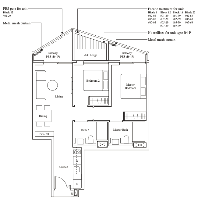
At 764 square feet, this 2 bedroom unit is considered to be on the bigger side as compared to most 2 bedroom units as far as today’s new launches are concerned. 2 bedroom units are actually the most populous unit type at The Reef at King’s Dock, with 233 units out of the total of 429 units – making up 54% of the unit mix.
There is quite a good variety too, with the smallest 2 bedder coming in at 678 square feet to the biggest 2 bedroom villa at 1,163 square feet. For those looking for the more efficient dumbbell layout will have to look further up the list, with only the 2 bedder + study offering such an option.
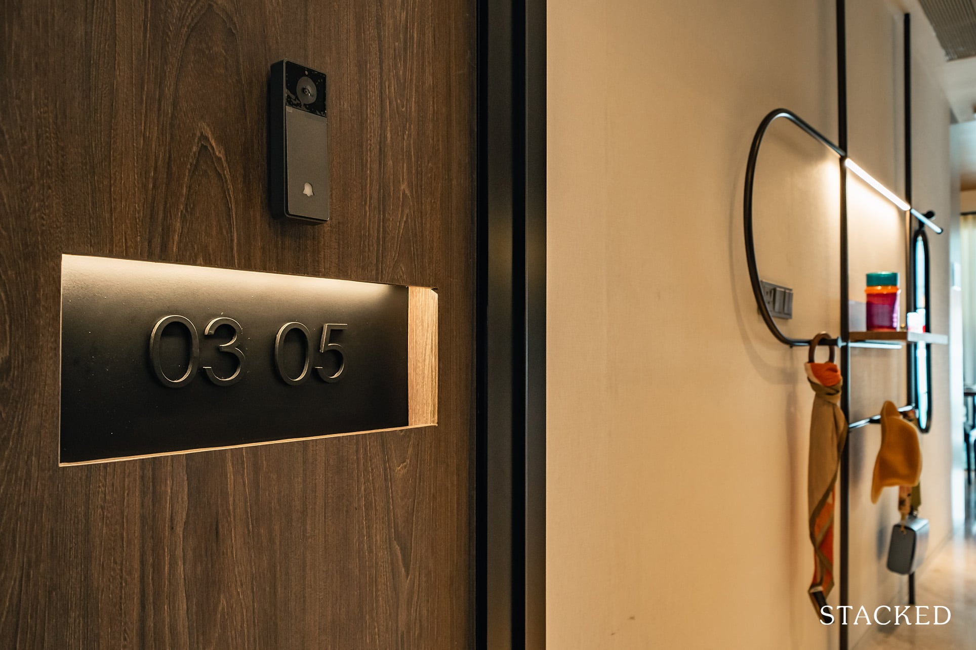
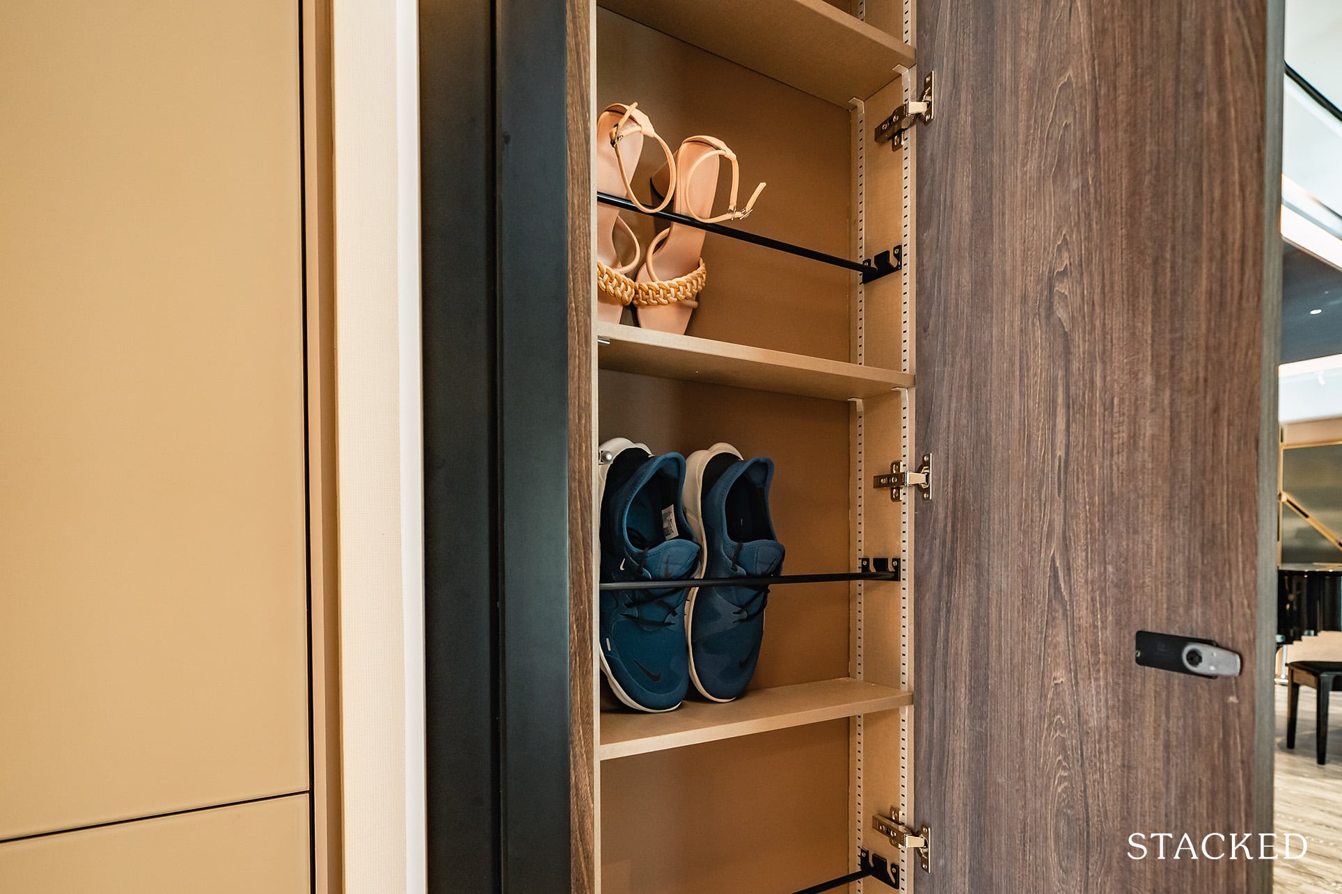
In the same order, this 2 bedroom unit will come with that polished unit number along with the lockable shoe rack.
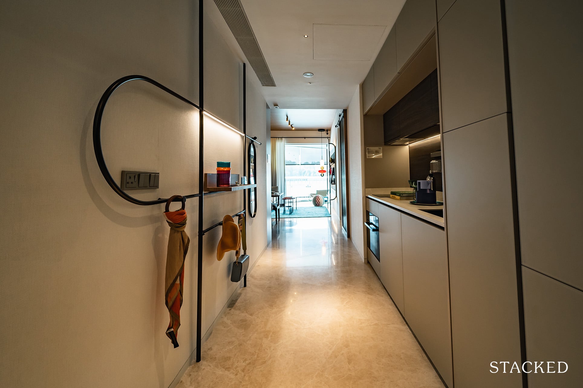
It’s the same story here too, with the entrance doubling up as the kitchen space as well. So while there is no wasted foyer space, this means that it will remain as an open kitchen layout.
That said, because the kitchen space doesn’t actually eat into the dining room, you could actually install a sliding door at the intersection to turn it into an enclosed space if you wanted to.
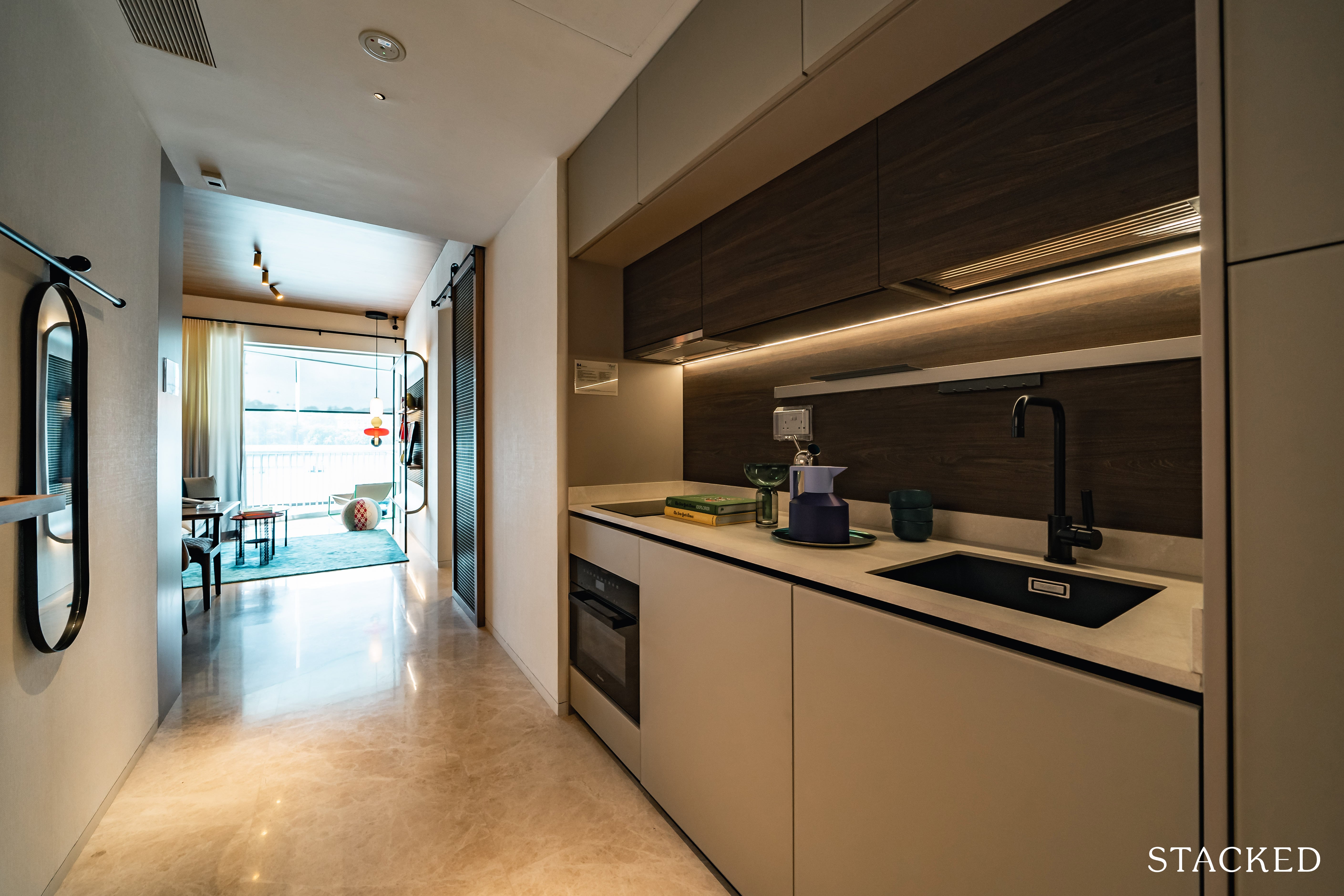
The walkway is quite wide so you do have a decent amount of space even if 2 people were to be working at the same time. Like the 1 bedroom unit, kitchen appliances are from Miele, but the washer/dryer is from Whirlpool.
And before I forget, the material used for the kitchen cabinets here are the option 2 that I mentioned above in the 1 bedroom review. Again, unfortunately this choice is only for the 1 bedders, for the bigger units you are unable to choose.
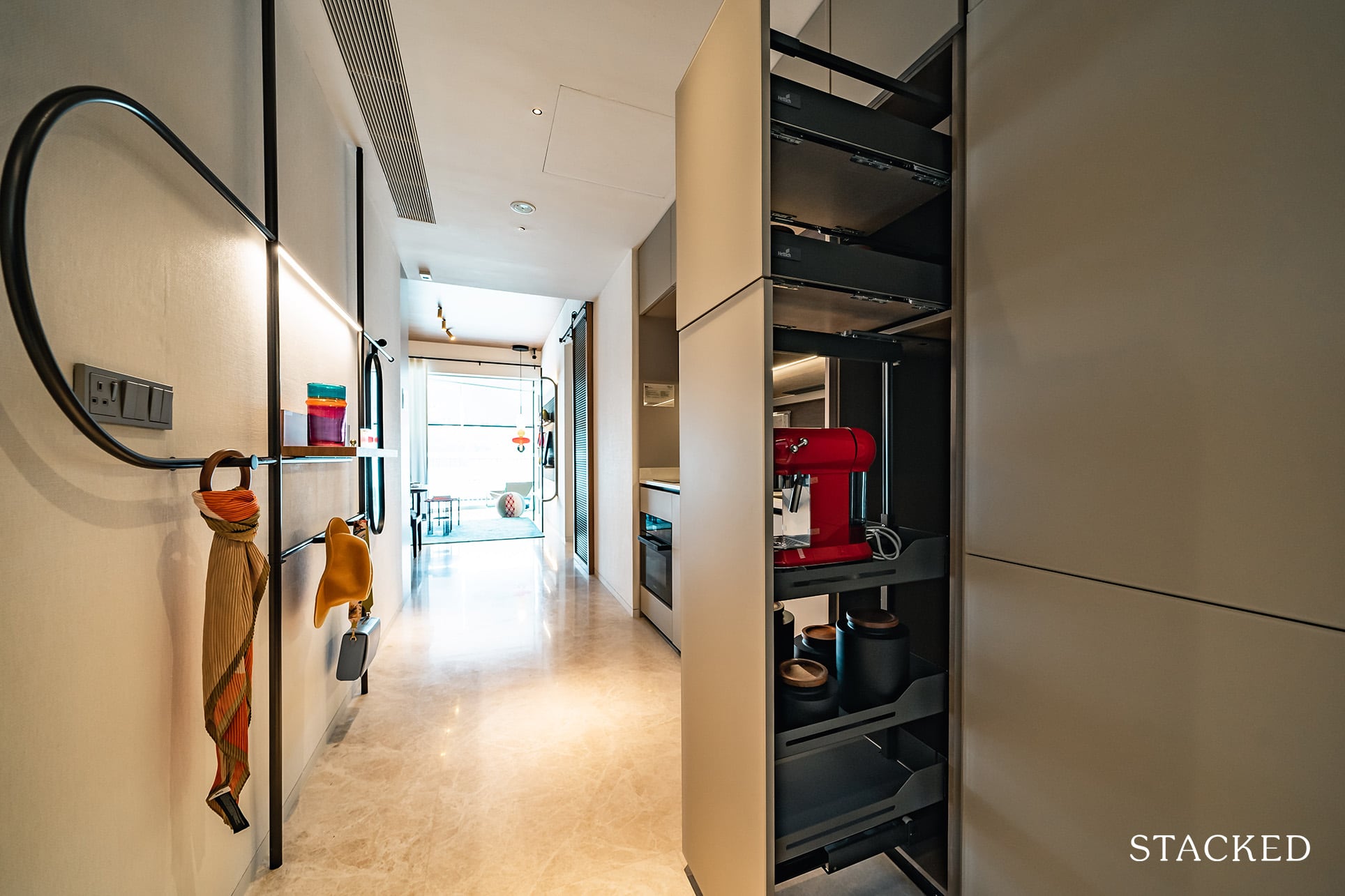
There is a good amount of storage but I think some could find the countertop space to be a little lacking. In order to mitigate that, they have actually installed power points inside the storage, so you can just pull out the cabinet and use your kitchen appliances immediately – rather than storing it on the counter.
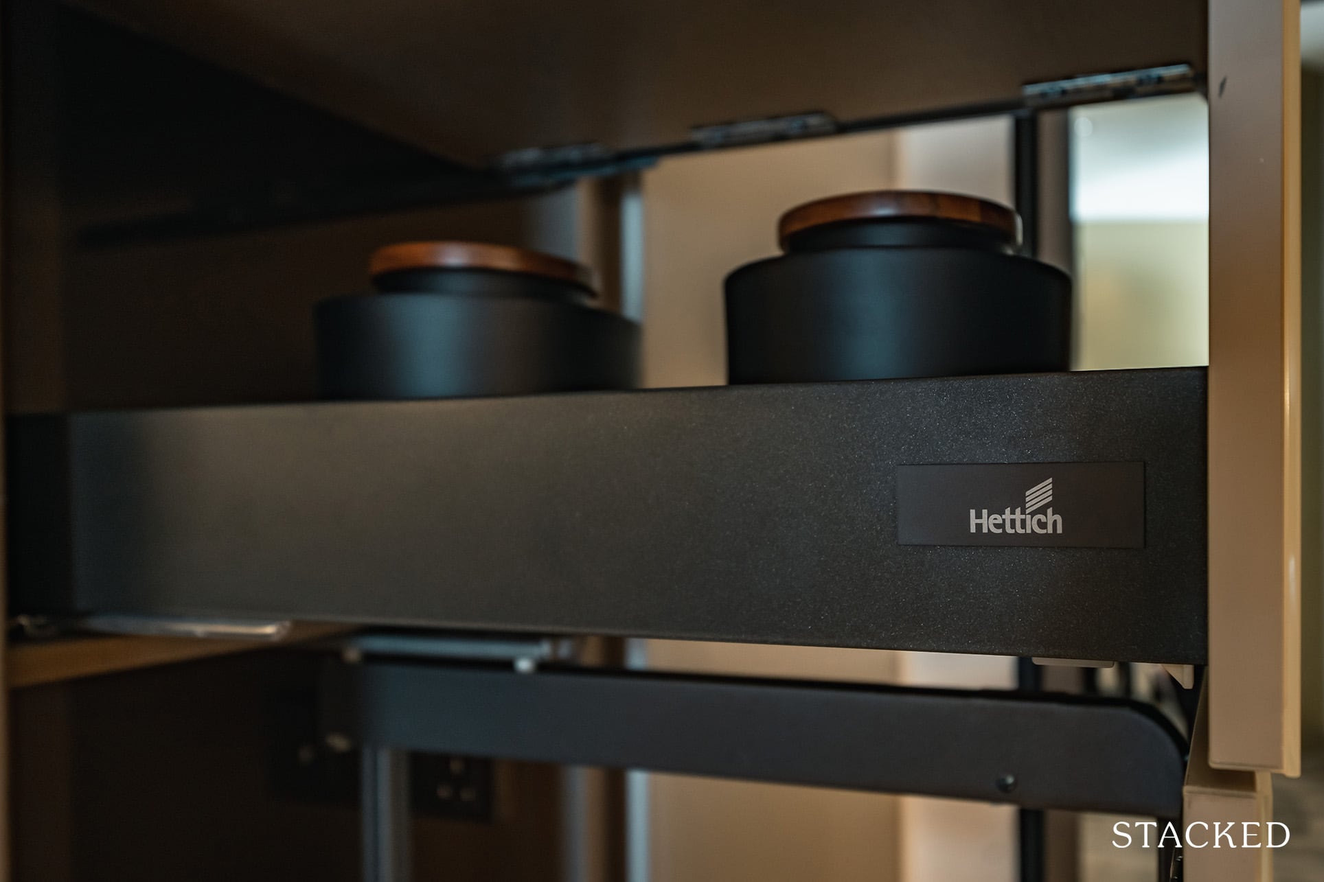
The hinges are provided by Hettich, which while is less well known as compared to Blum – general market sentiments are that it is a quality product. And yes, of course they feature a soft close.
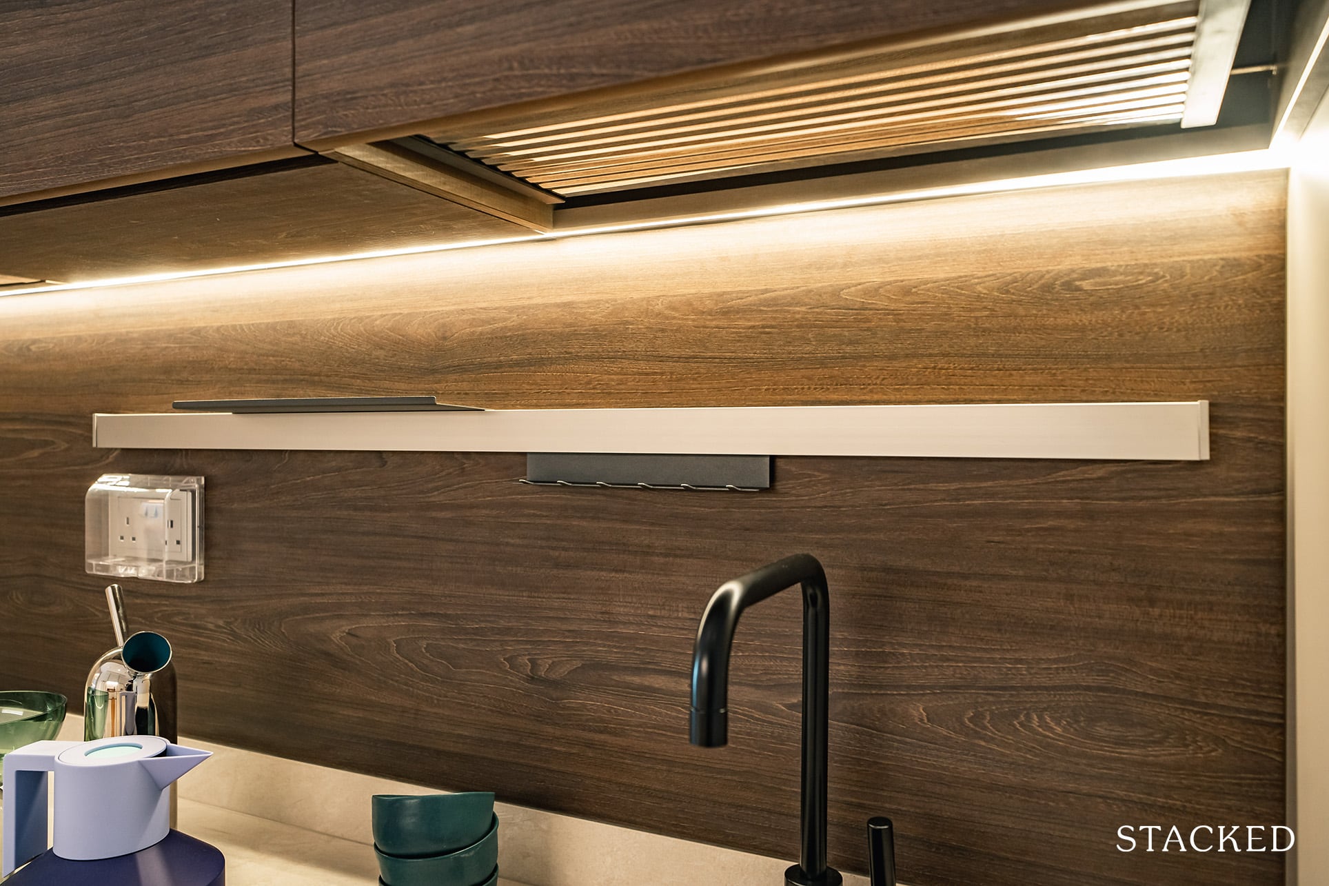
You do also have an attached hanger here (same as the 1 bedder previously).
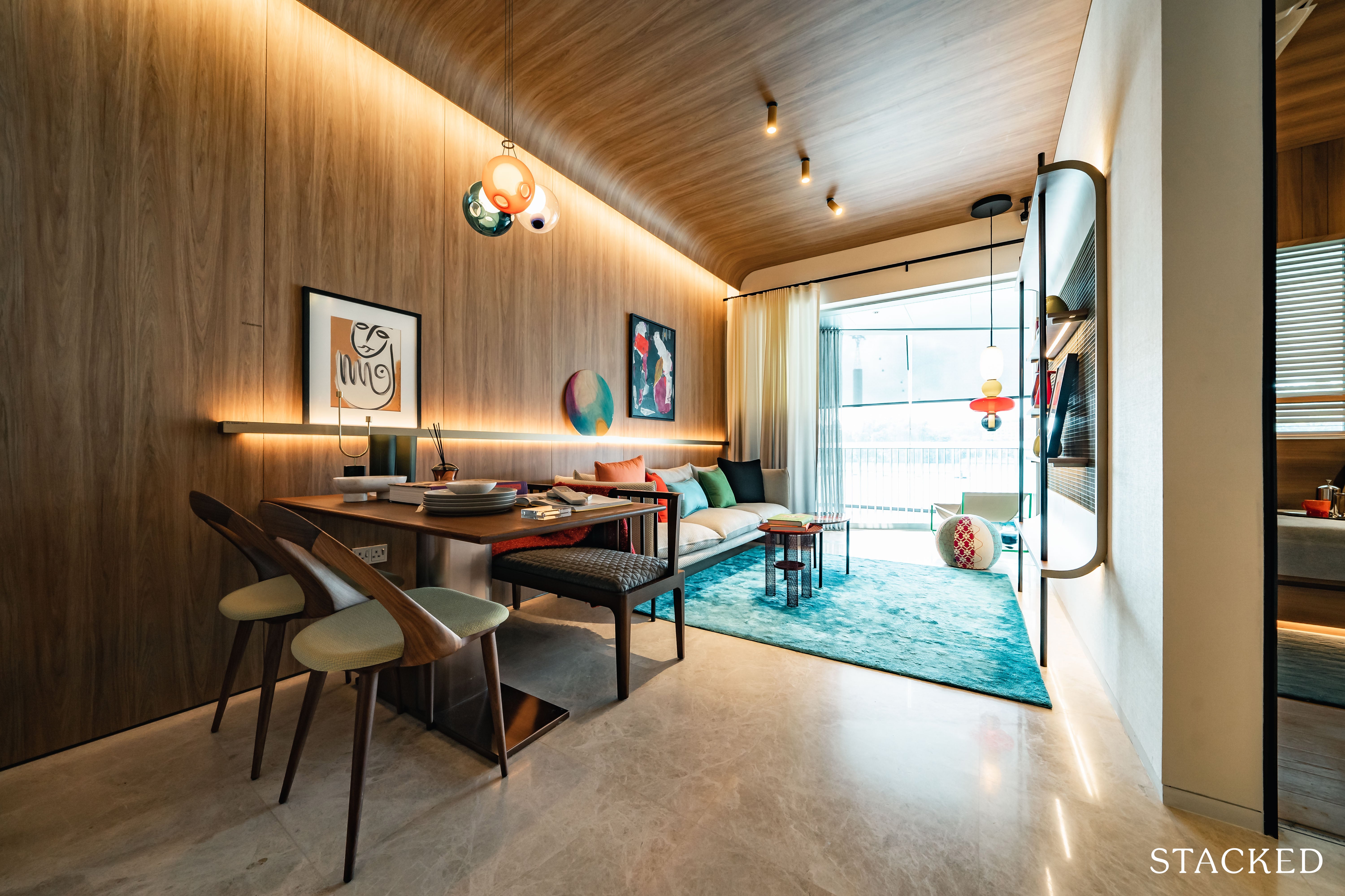
Now moving on to the living and dining area, it’s pretty standard fare. That 2.9 metre ceiling height applies here well, as does the premium marble flooring.
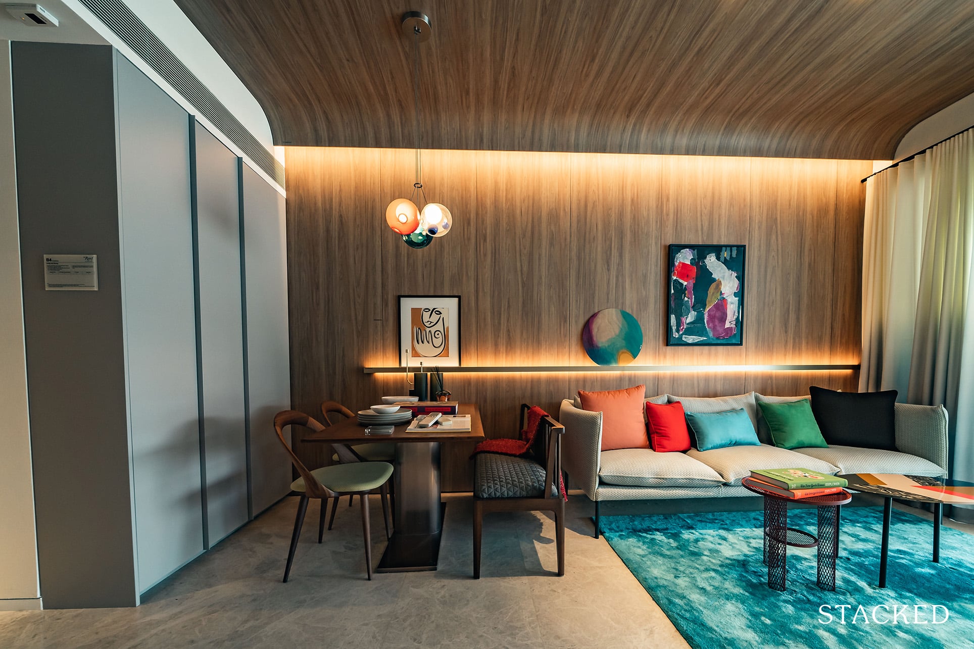
The dining area is just okay, as you do have to be aware of the DB box and storage cabinet on the left. So if you want to be able to open the cabinet even if someone is seated at the dining table, you’d likely have to shift the dining set further towards the living area.
Of course, you could always choose to move the chair away if you don’t open those cabinets much – so that could eke out a little more space for your furniture.
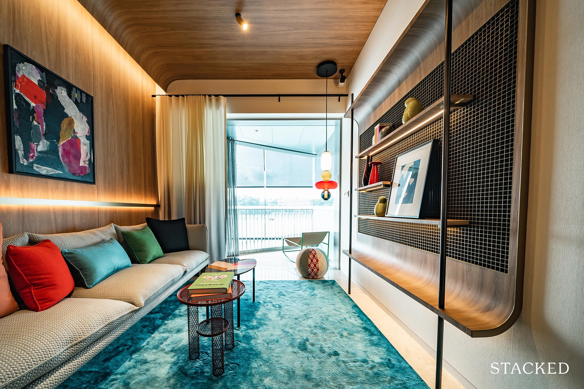
All things considered, the living room is actually quite good as you can fit in a sizeable 3 seater sofa along with the usual coffee table and TV console combination.
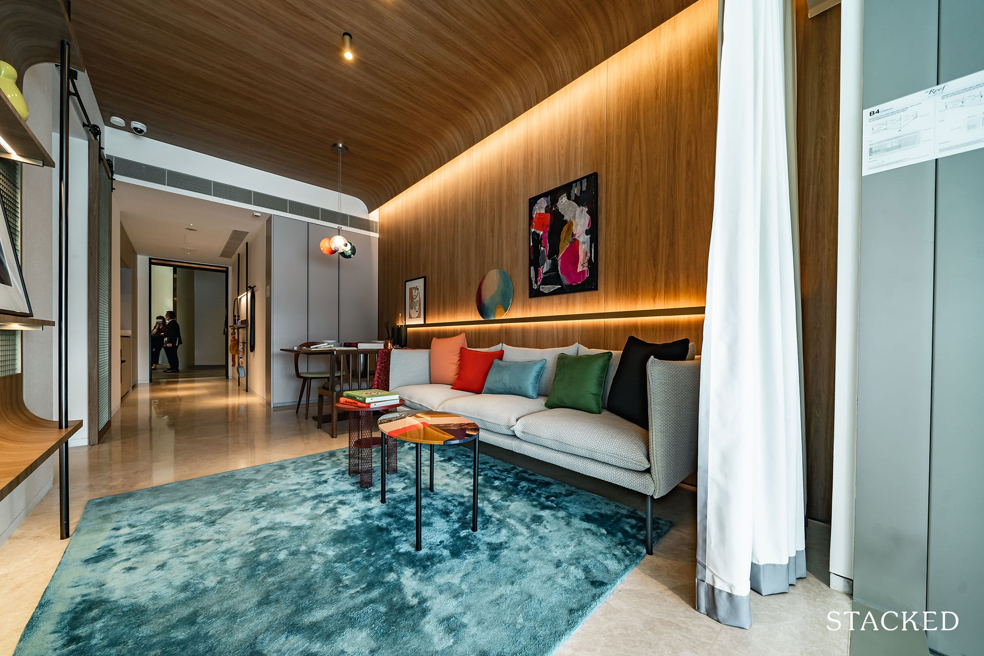
Naturally that is dependent on how big your TV console is, but a wall mounted solution will definitely give you more than adequate space to move around.
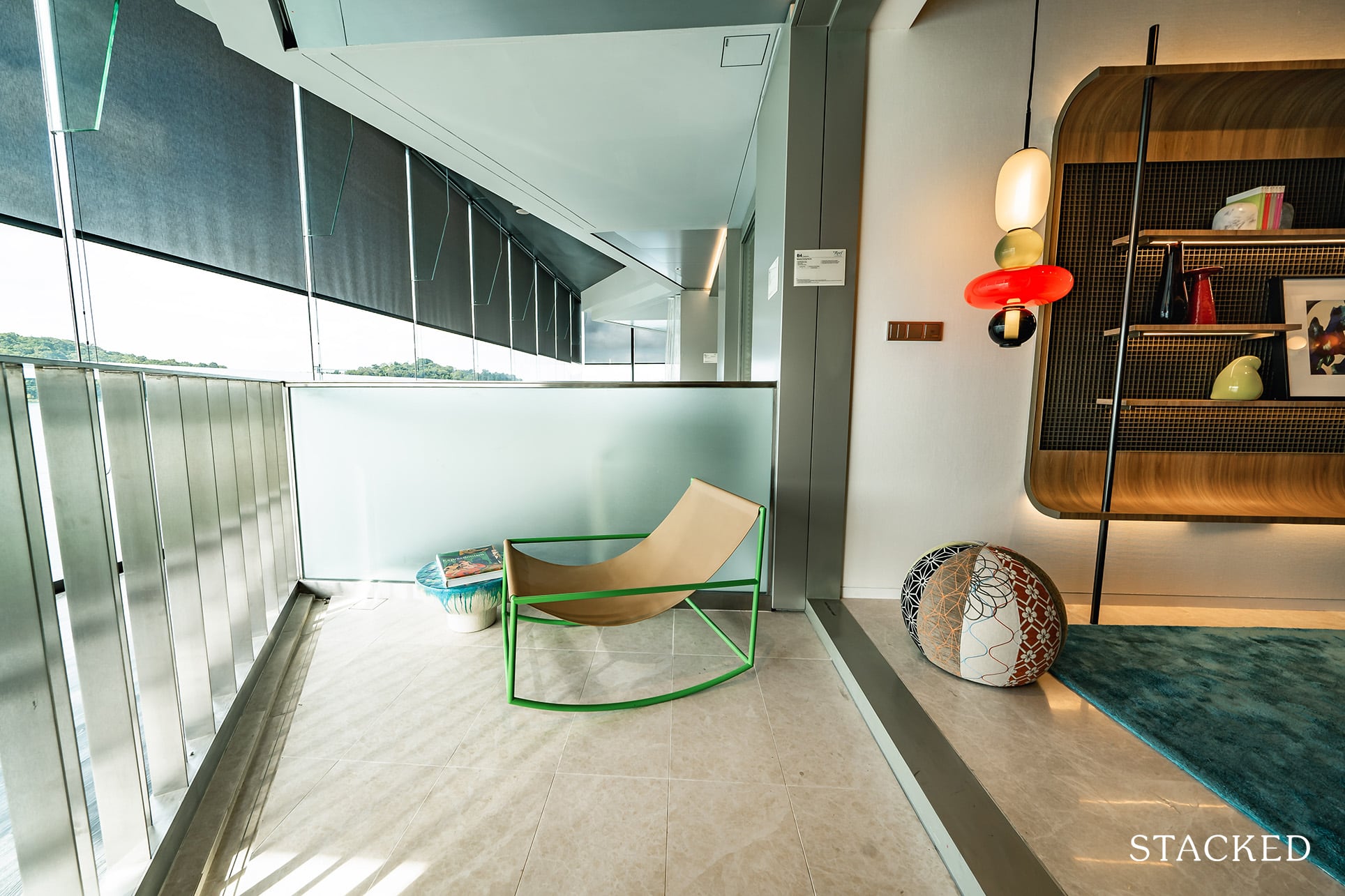
Again, the balcony shape isn’t the most ideal but you do have a fair amount of space for a comfy seating set up to enjoy the view.
What’s worth noting here is the aluminium mesh curtain for the balcony (this would be a curtain or screen – depending on your view). The benefit here is that it will let the light and wind through, but supposedly keep the heat at bay. Oh and yes, it is motorised as well.
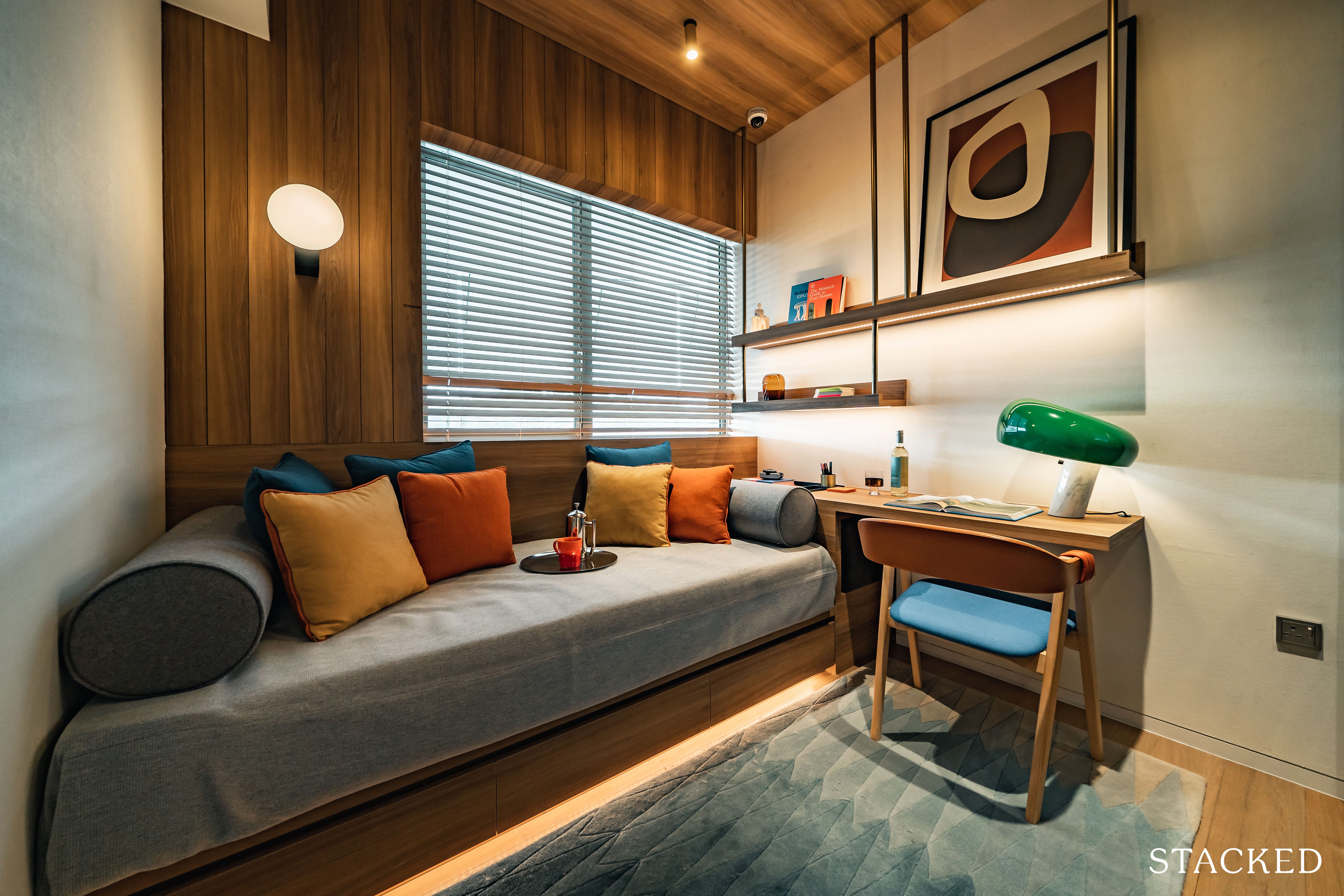
The common bedroom is an average size, but unfortunately you don’t get full length (or width) windows as there is a wall to the left plus the AC ledge is on the outside.
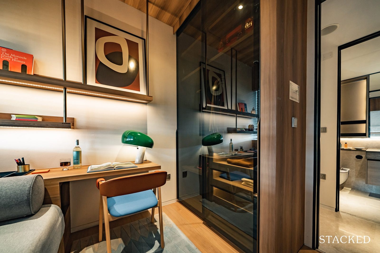
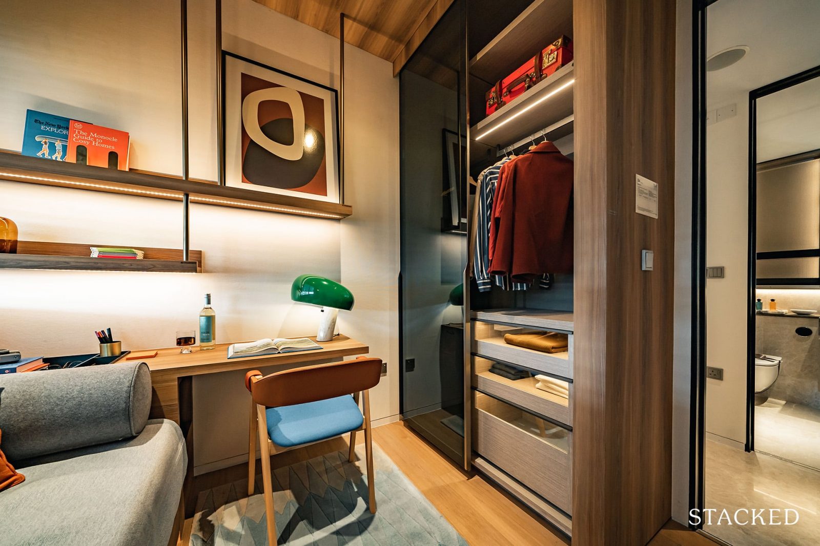
It’s the typical 2-panel wardrobe here but I definitely am a fan of the glass panels instead. It looks that much sleeker and more upmarket.
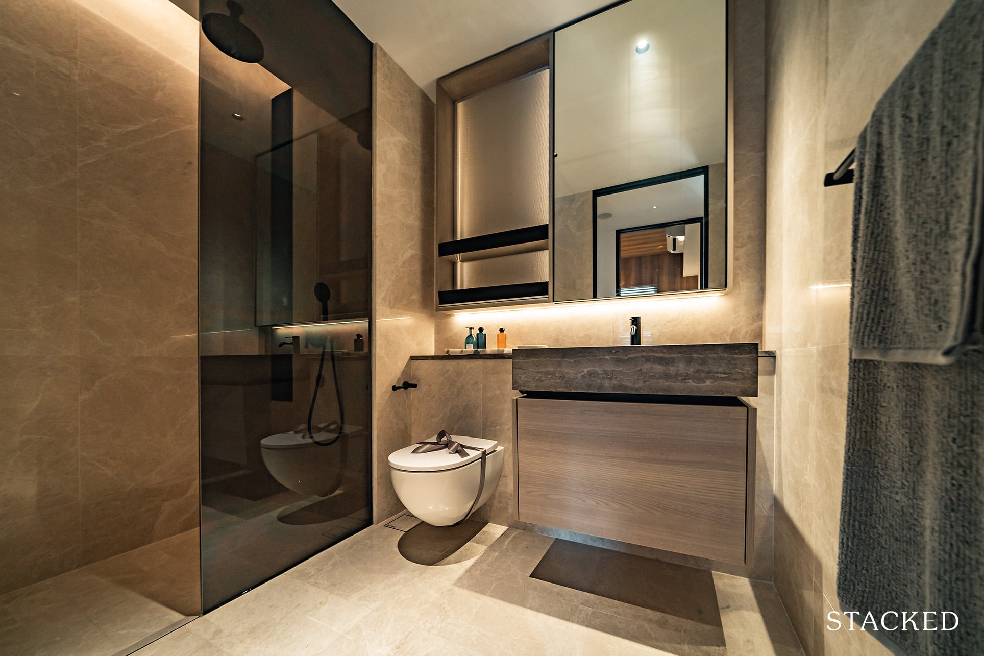
The common bathroom is actually a great size, and comes with the same top-end fittings from Dornbracht and Geberit. You do get a rain shower in the common bathroom, but the automated bidet is reserved for the master bathrooms only.
This unit isn’t a corner stack so you won’t be getting a window here for ventilation purposes.
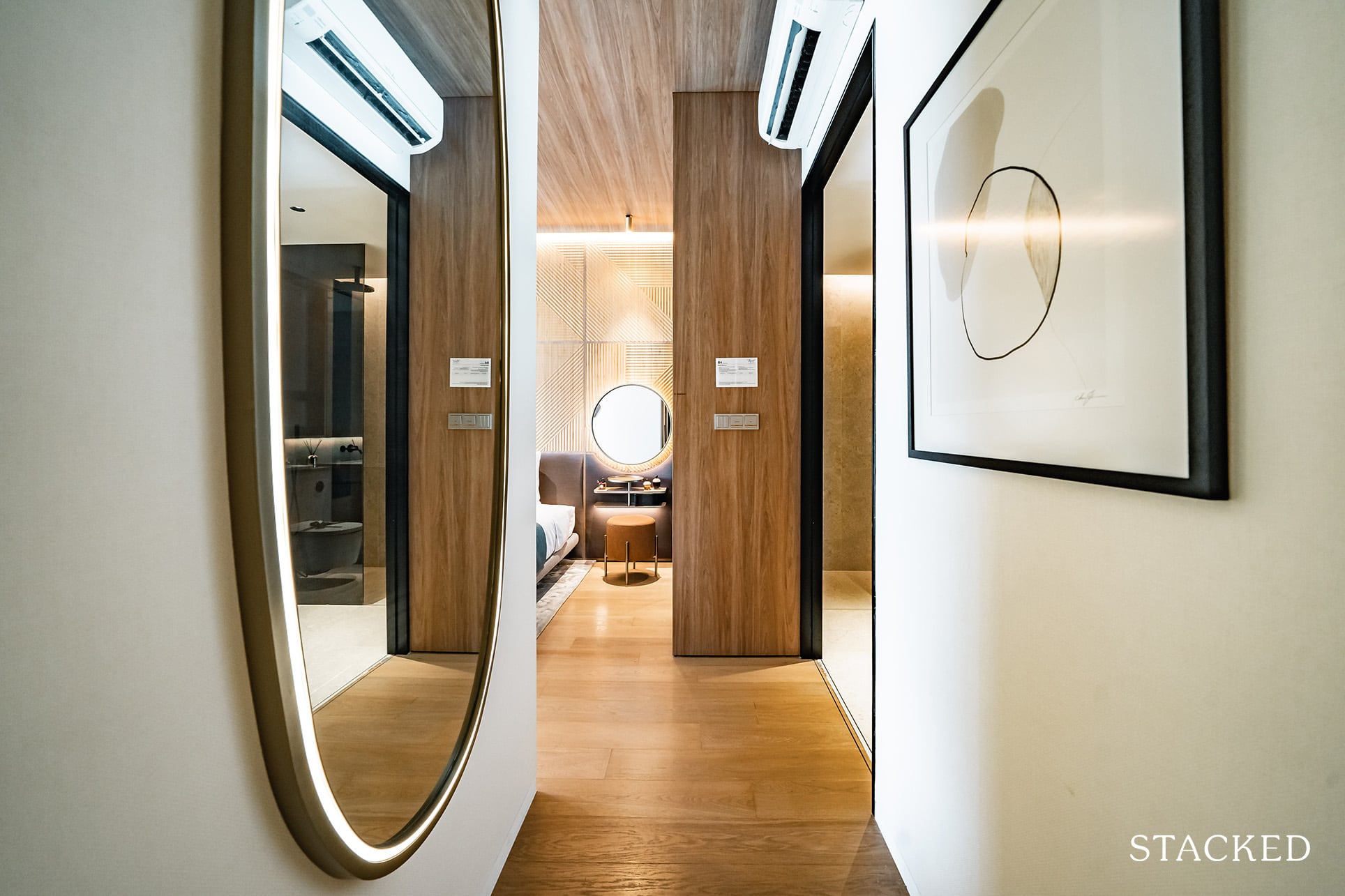
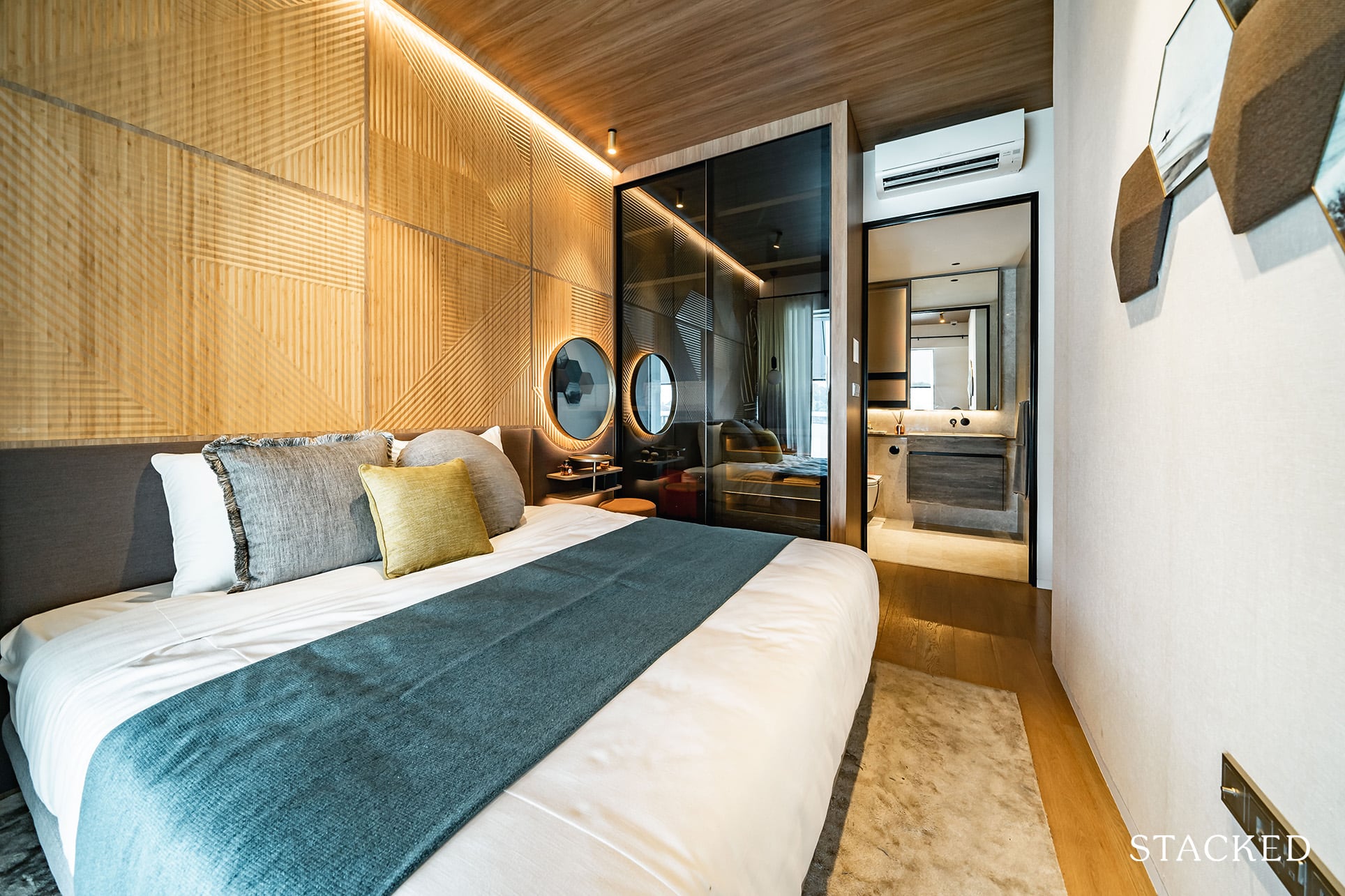
Finally, the master bedroom features a small entranceway which is good for that little bit of privacy.
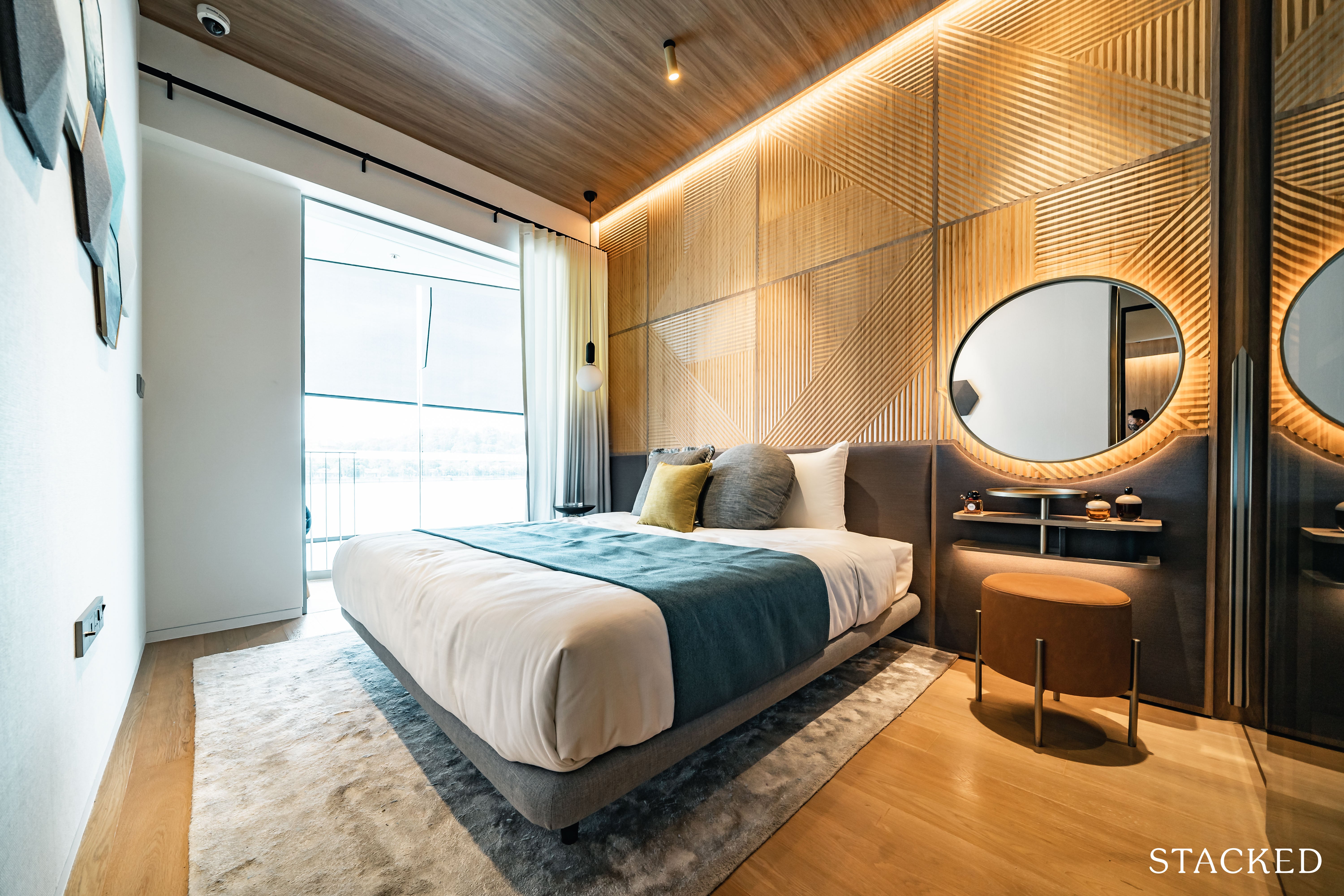
Size wise you really can’t complain much. Even with a king sized bed you do have a little space afforded for a small dresser.
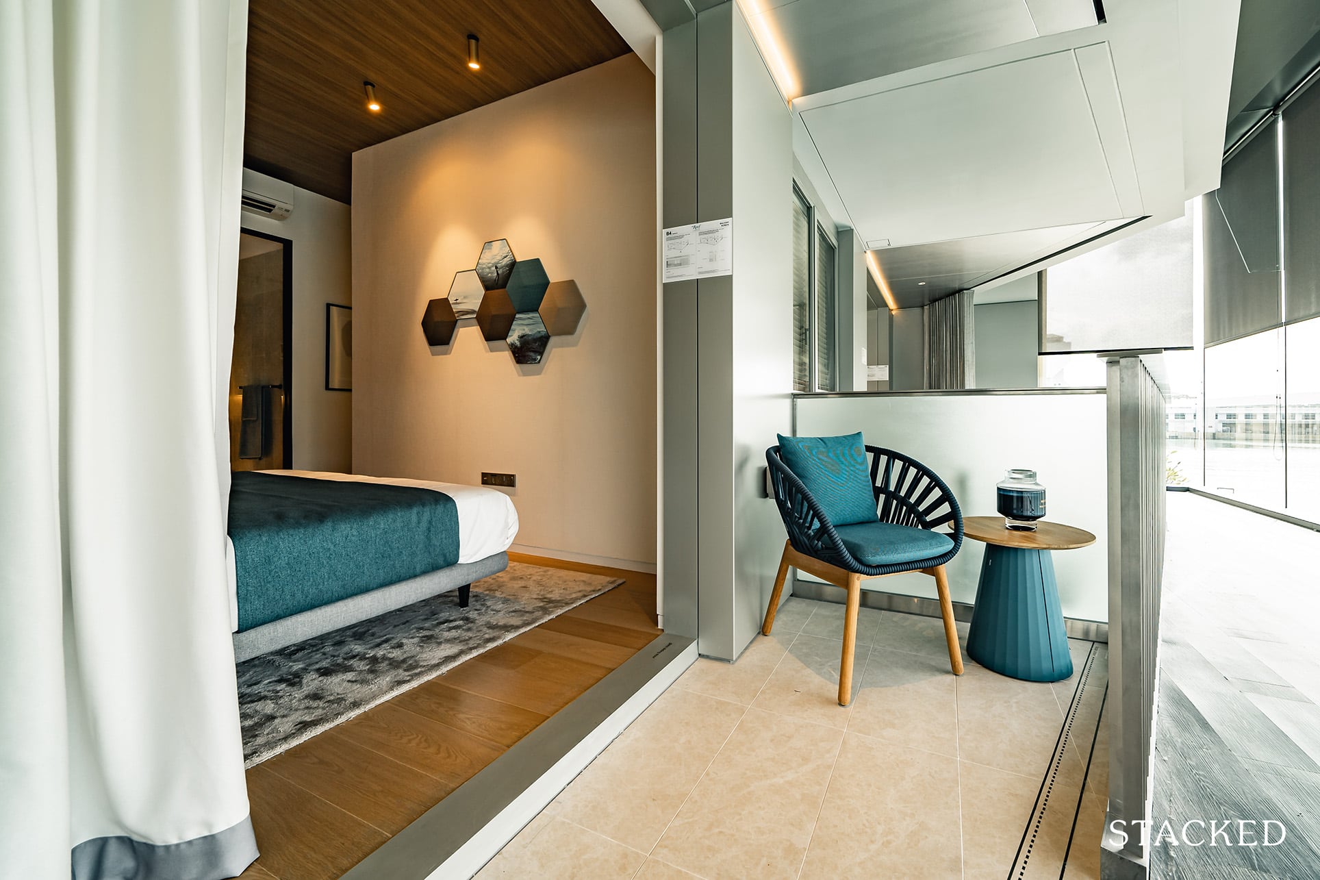
You even have a balcony here too. While it is small no doubt it does provide an option for you to enjoy that sea breeze or enjoy the view. Especially if you are paying the premium for a sea-facing unit as this is really a lifestyle oriented development after all.
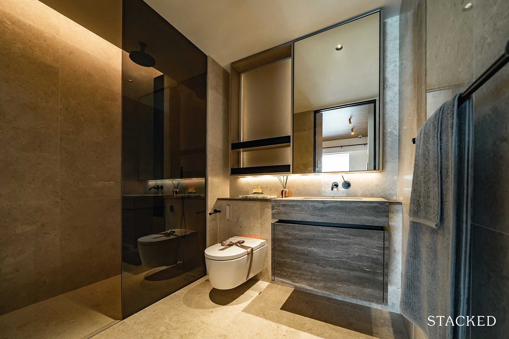
The master bathroom is actually comparable in size to the common bathroom (which speaks more of the good size of the common bathroom than it does the master).
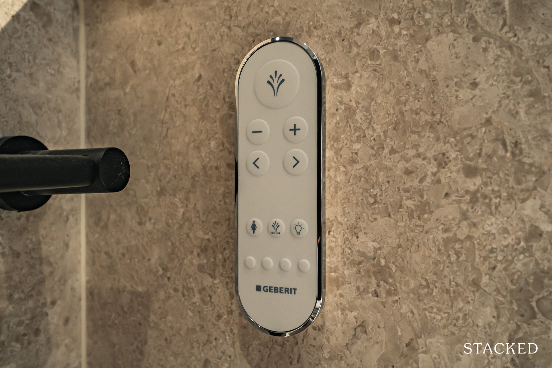
Along with the same features, this one comes with the automated bidet for Geberit. Which if you’ve been to new luxury hotels today, is an increasingly customary feature.
The Reef at King’s Dock 3 Bedroom Premium Review
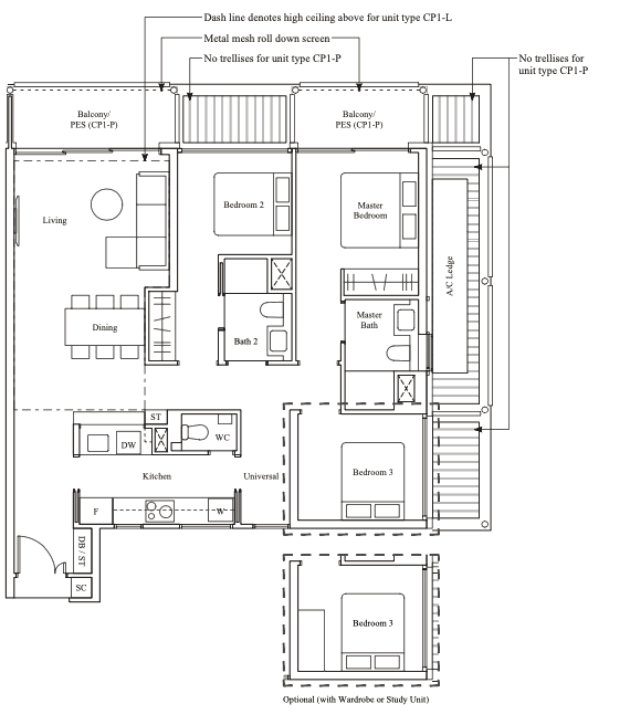
Coming in at 1,216 square feet in size, you can say that this 3 bedroom unit is bigger than an average 3 bedroom unit on the new launch market as there are compact units that can come in under 1,000 square feet.
There are only 80 units in the development, making up a total of 18.6% of the 429 units. The smallest 3 bedroom unit starts from 1,076 square feet to 1,572 square feet for the 3 bedroom villa.
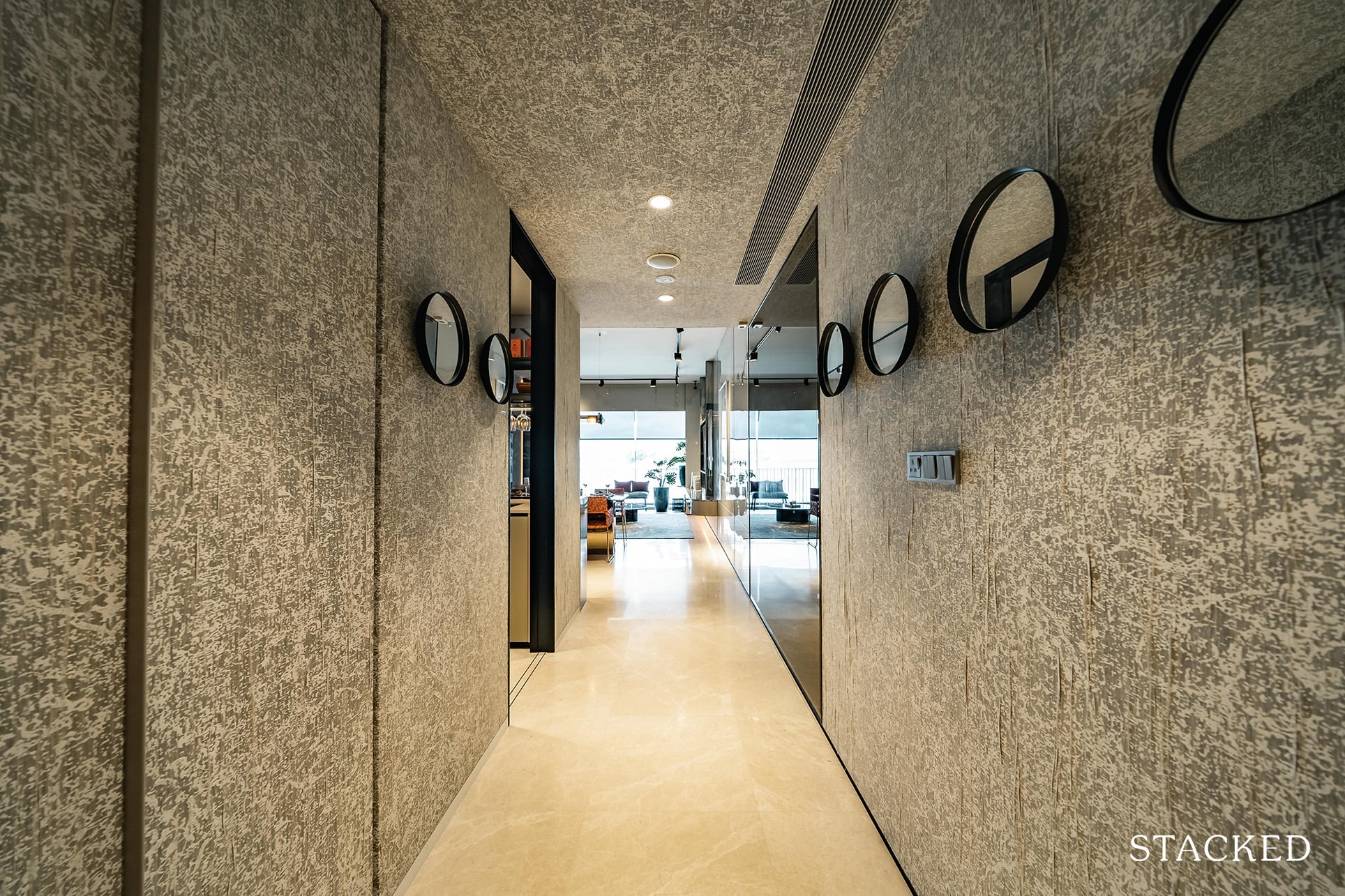
As you might expect for the bigger units, having an entranceway is the usual practice as it allows for privacy for its residents. And in case you were wondering, there aren’t any units here that have a private lift included (so maintenance fees are relatively lower than you might expect).
You do have that same black etched unit number and lockable shoe rack so no surprises there.
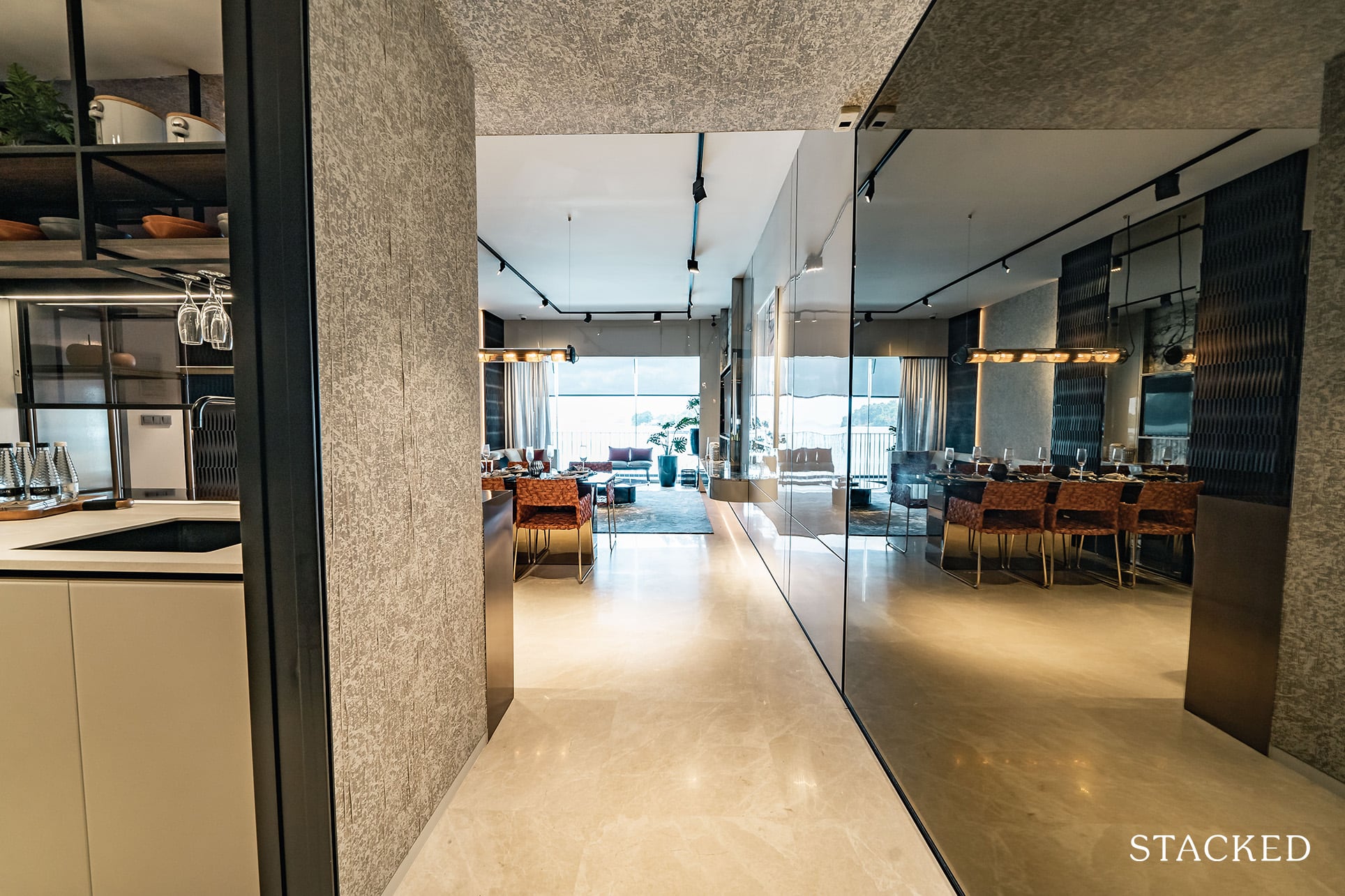
So once you step further in, the kitchen will be located on your left.
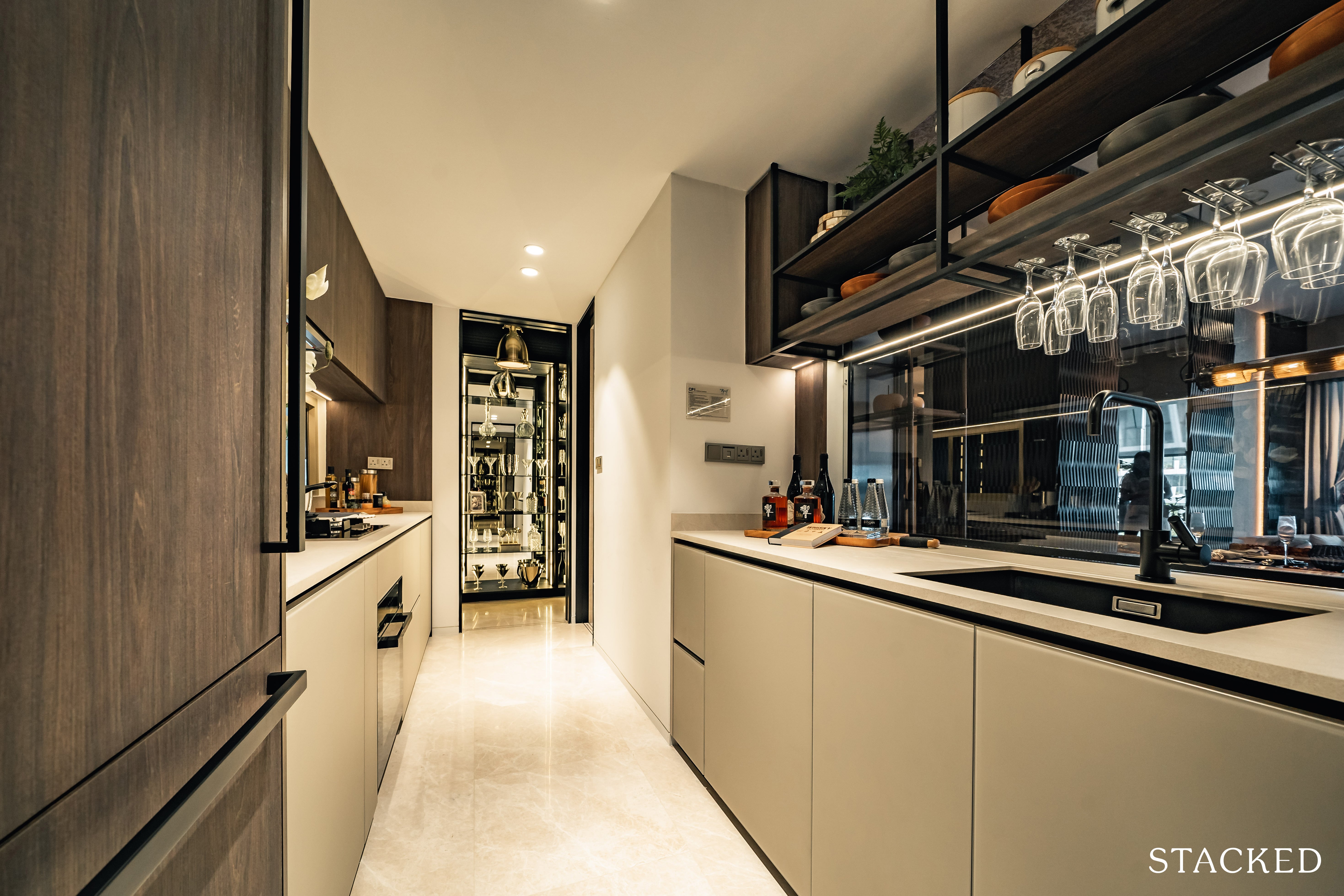
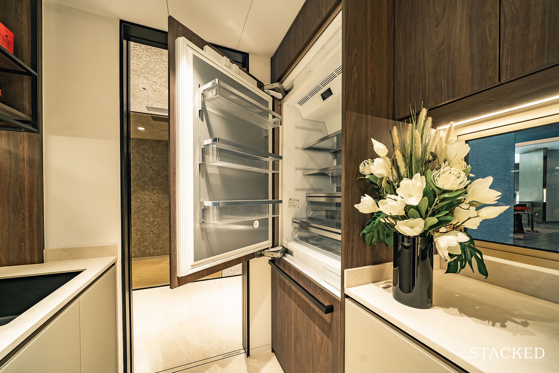
It’s a good size, with decent countertop space and storage. You do have quite a massive Miele smart fridge (bigger than the 1 and 2 bedroom units) which is definitely very welcome. If you noticed, the kitchen is a mix of colours from what you’ve seen in the 1 and 2 bedroom unit reviews, and again, this is fixed and not an option that you can choose from.
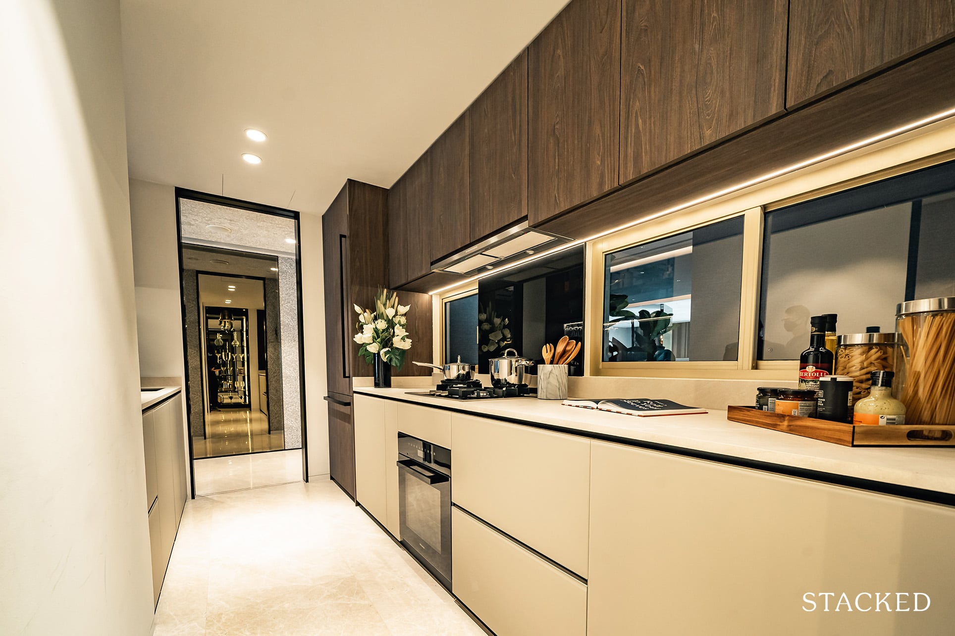
What’s great here is also the windows that you can open for better ventilation for the kitchen.
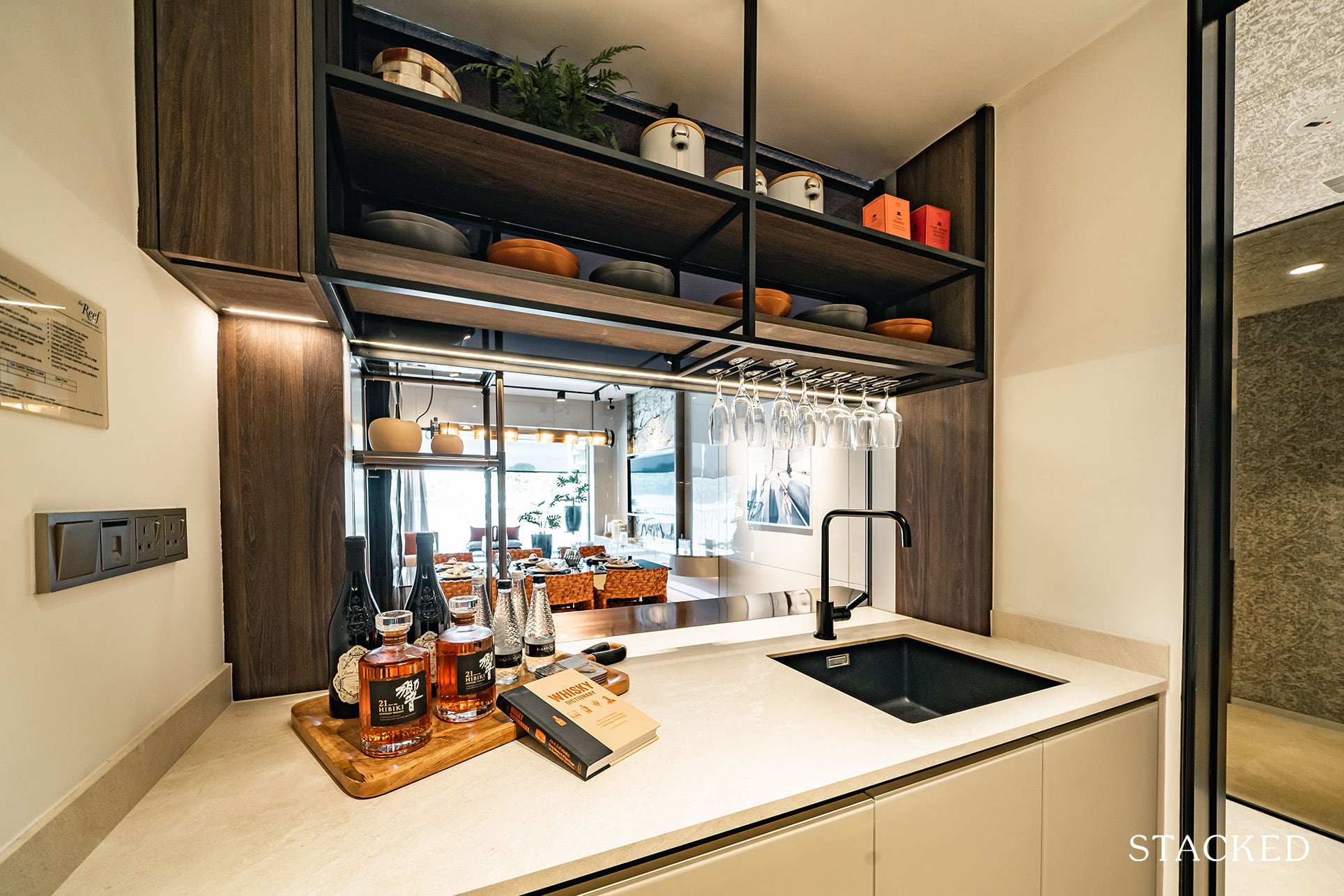
However, the best feature for me is the sliding glass panel above the sink.
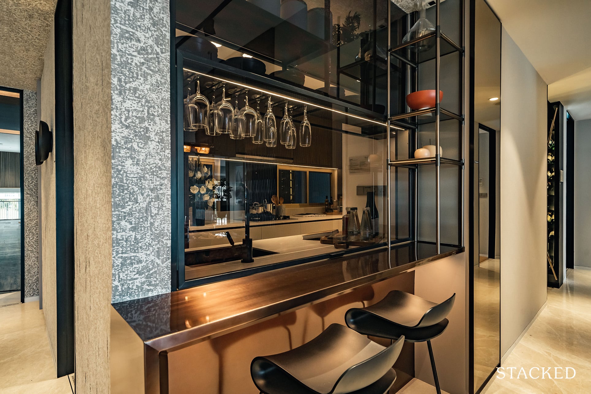
If you are no stranger to new launch showflats, you might be accustomed to the usual glass panel here – where the function is really to allow the kitchen to feel bigger. But they’ve gone one step further to create a movable glass panel. So you have the flexibility of keeping it enclosed or open if you want to air the kitchen completely.
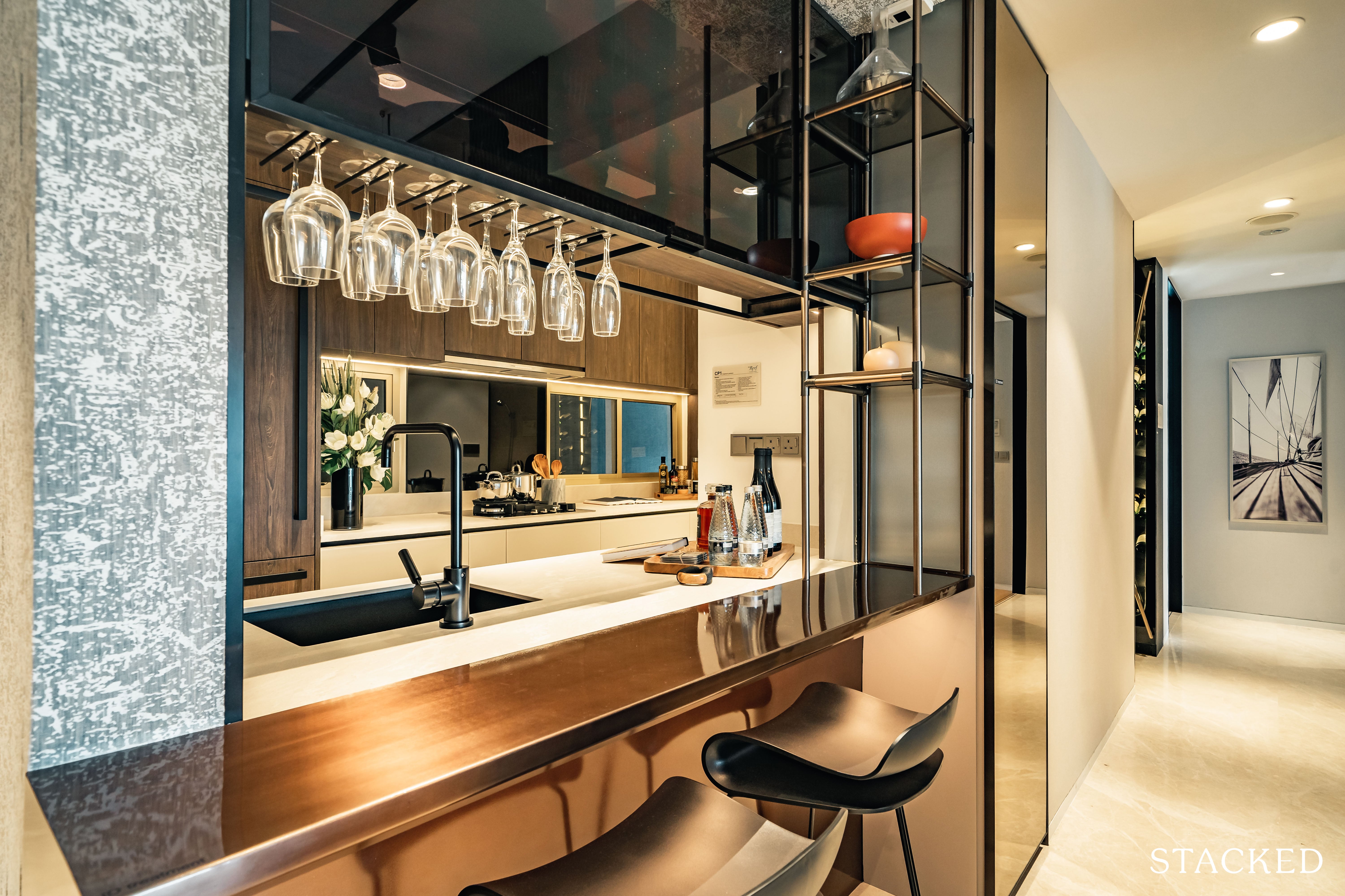
Couple that with the small counter on the outside and you can use it as a dine-and-go breakfast counter!
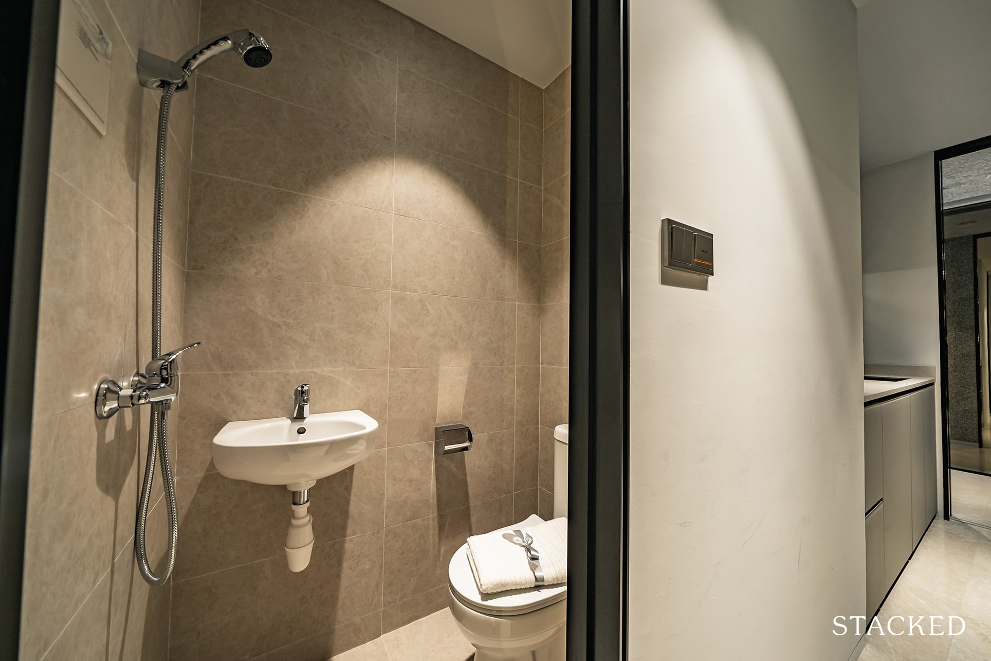
Moving further into the kitchen, you get a small WC on the right, which complements the termed “Universal” room should you use it as a helper’s room. One major downside is the lack of a proper yard area so if you want to dry your clothes you might have to resort to using the balcony space instead.
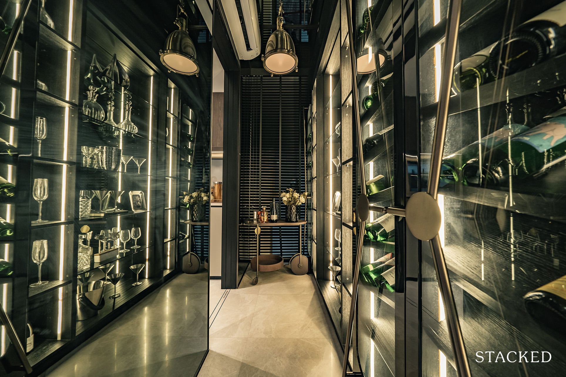
The utility space is connected to the kitchen as well as to the hallway for flexibility. It’s hard to really judge the size of the space given how reflective the mirrors and lights from the cabinetry are, but it comes with a window too which is great for natural ventilation should you choose to use it as a helper’s room.
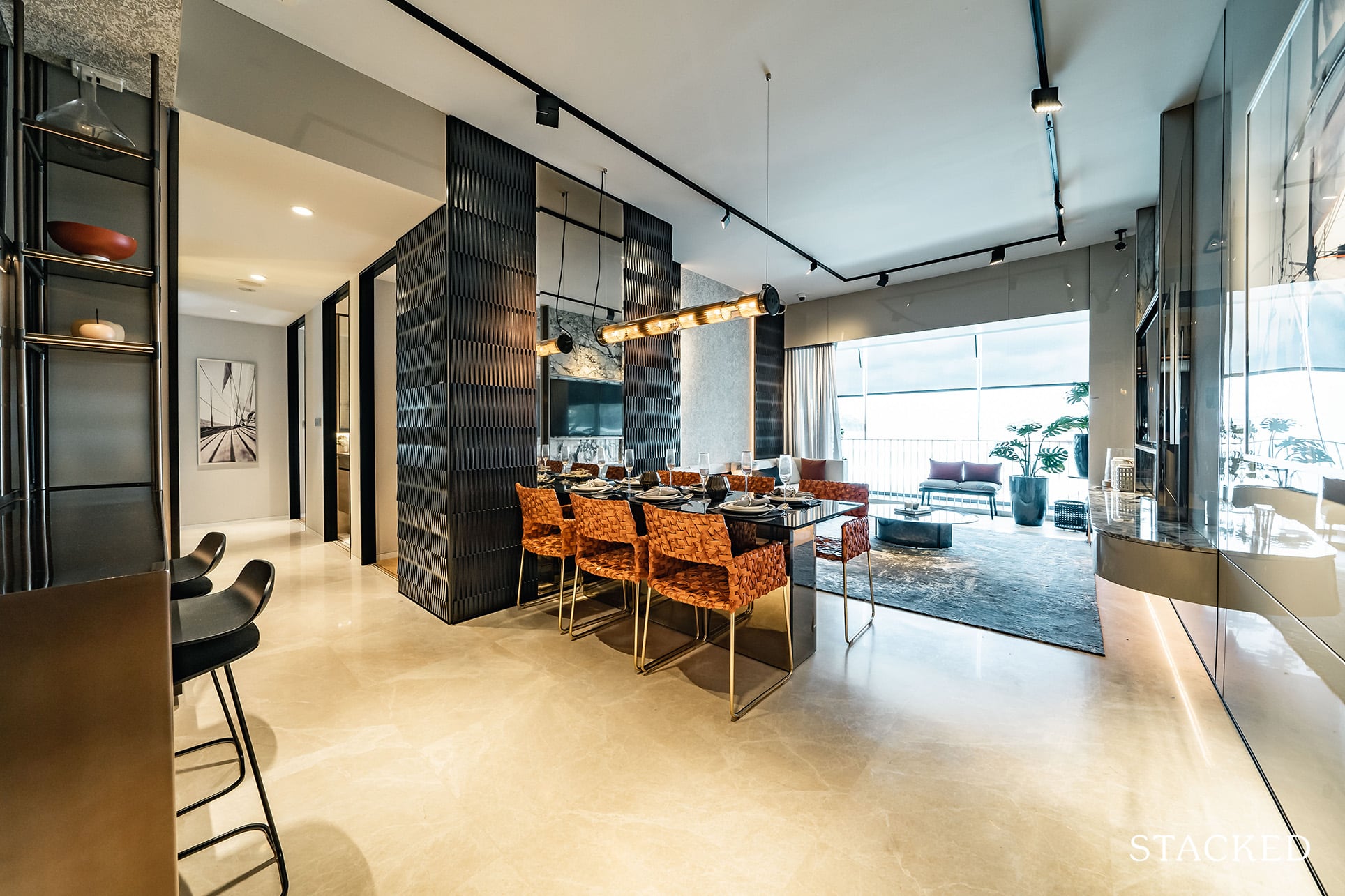
The dining space is actually okay save for a funny quirk – mainly because of how the wall has to jut out to accommodate the wardrobe for the common bedroom. So because the dining space has to give an allowance for the walkway to the living too, you can see where you will have constraints.
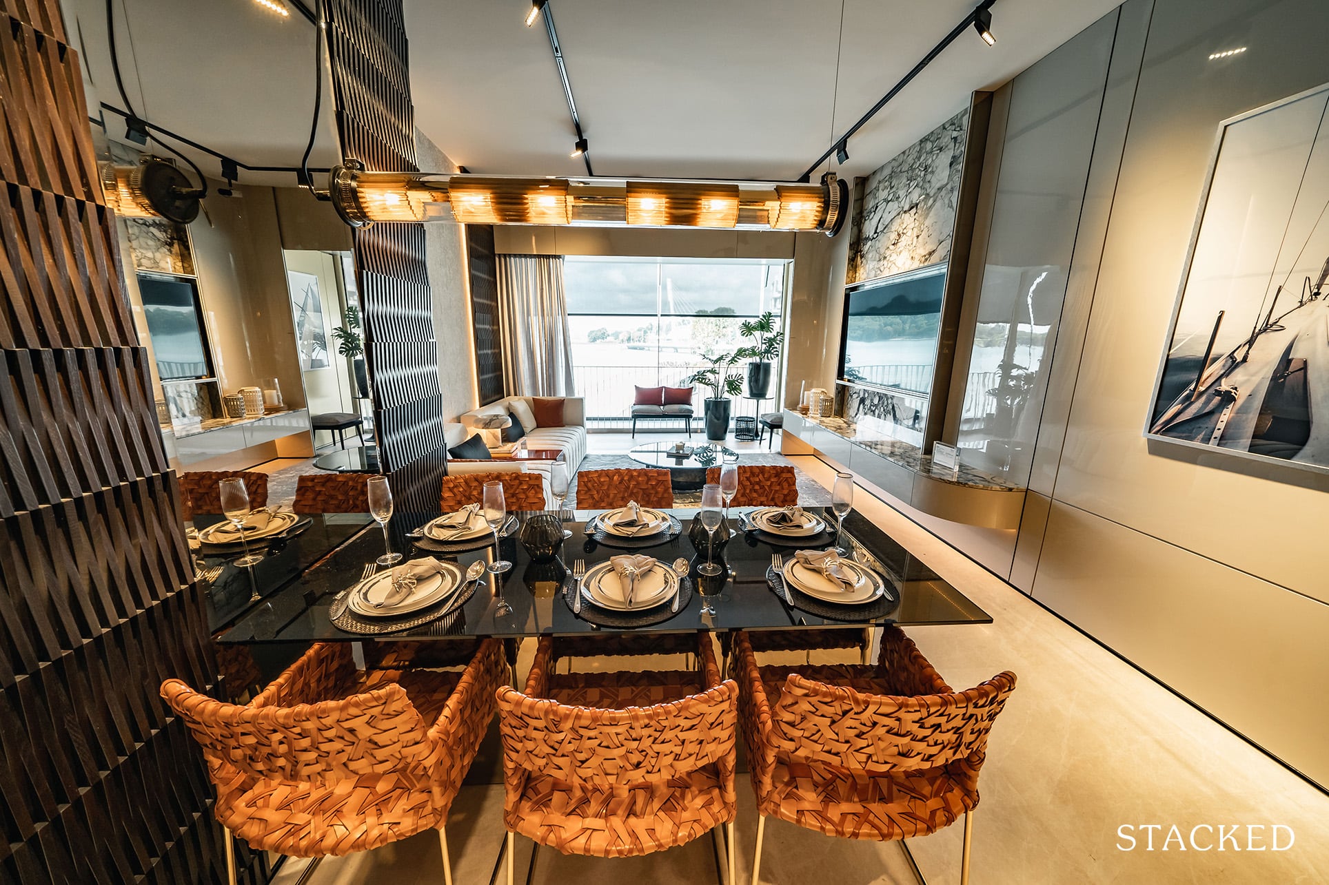
It’s probably best to have an extendable dining table, so you can expand to fit more guests if necessary.
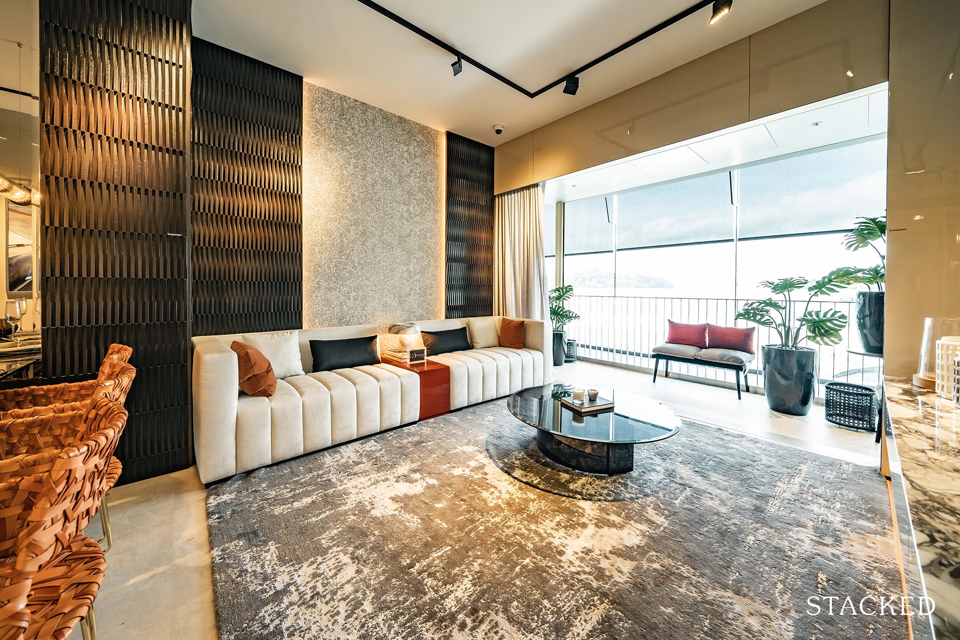
As for the living space, it fares better in terms of size. Although you would have to contend with the irregular wall again – so there will be a physical limit to the length of your sofa.
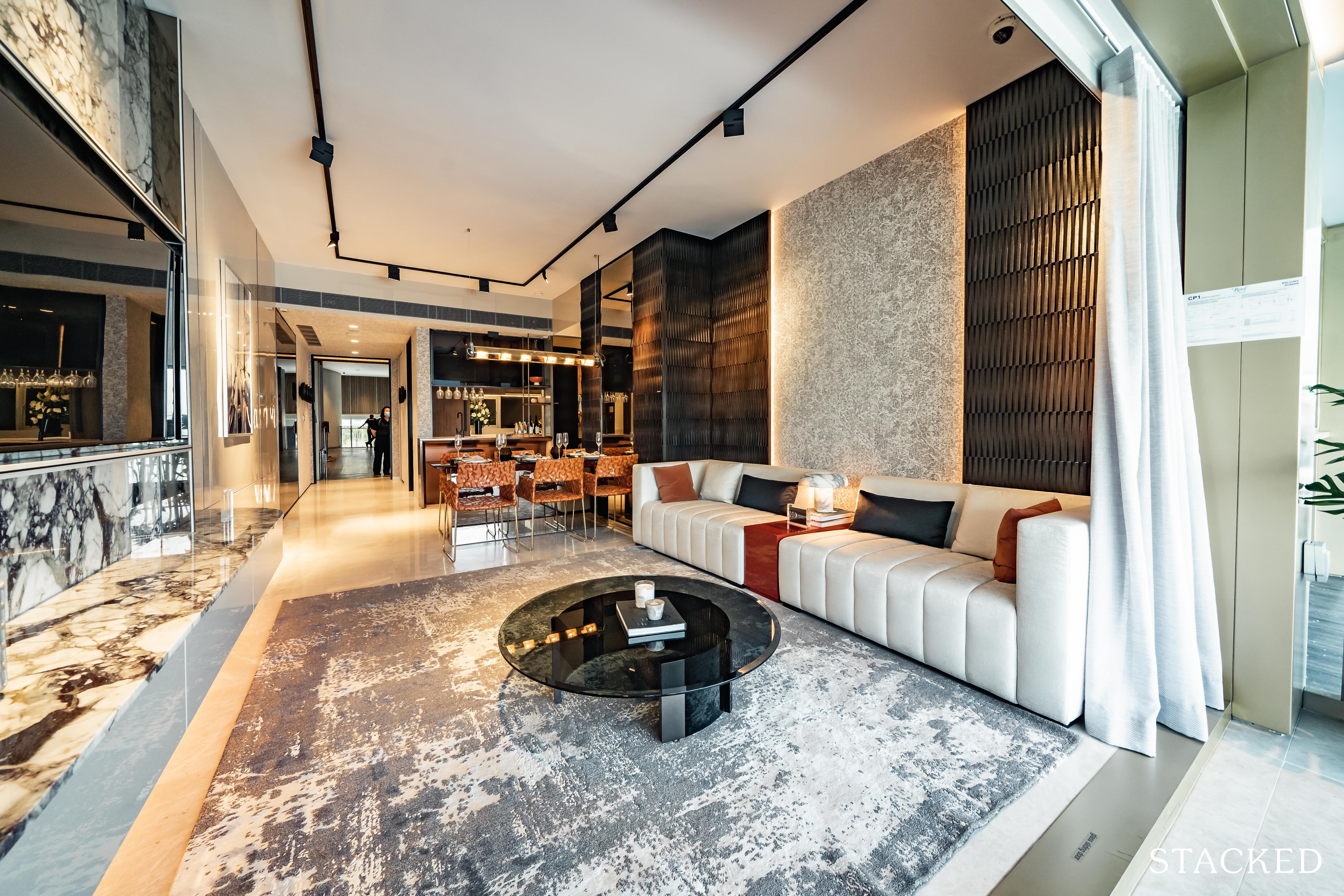
Even with the TV console and quite sizeable coffee table you can see that there is more than adequate space to move around easily. Although it must be cautioned that the depth of the sofa here is quite short.
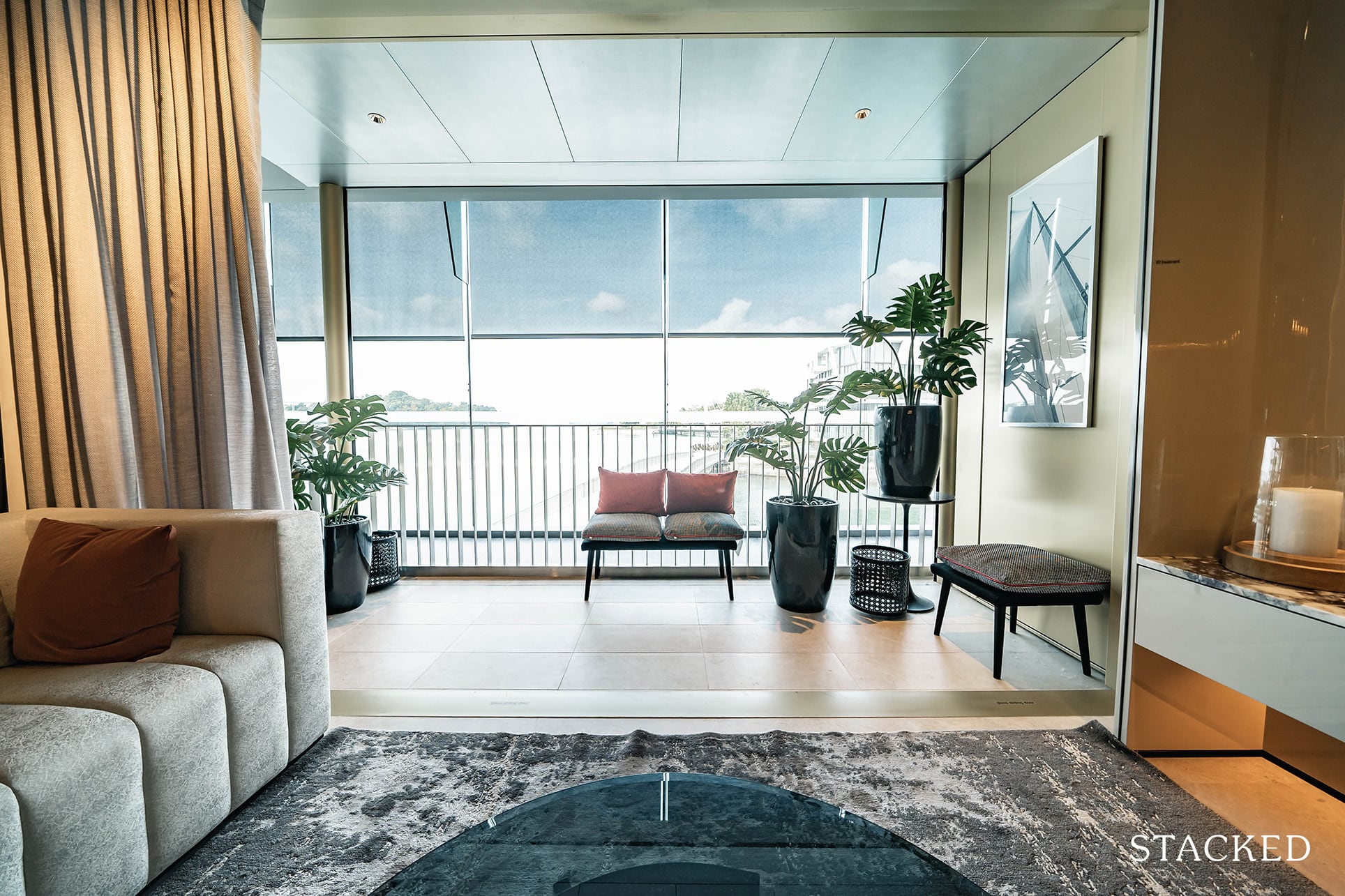
The balcony here is finally a regular shape and is quite big too so you could even have a small dining setup here should you want to have an alternative dining space. It is also from here that you can see the aluminium mesh screen (which is motorised).
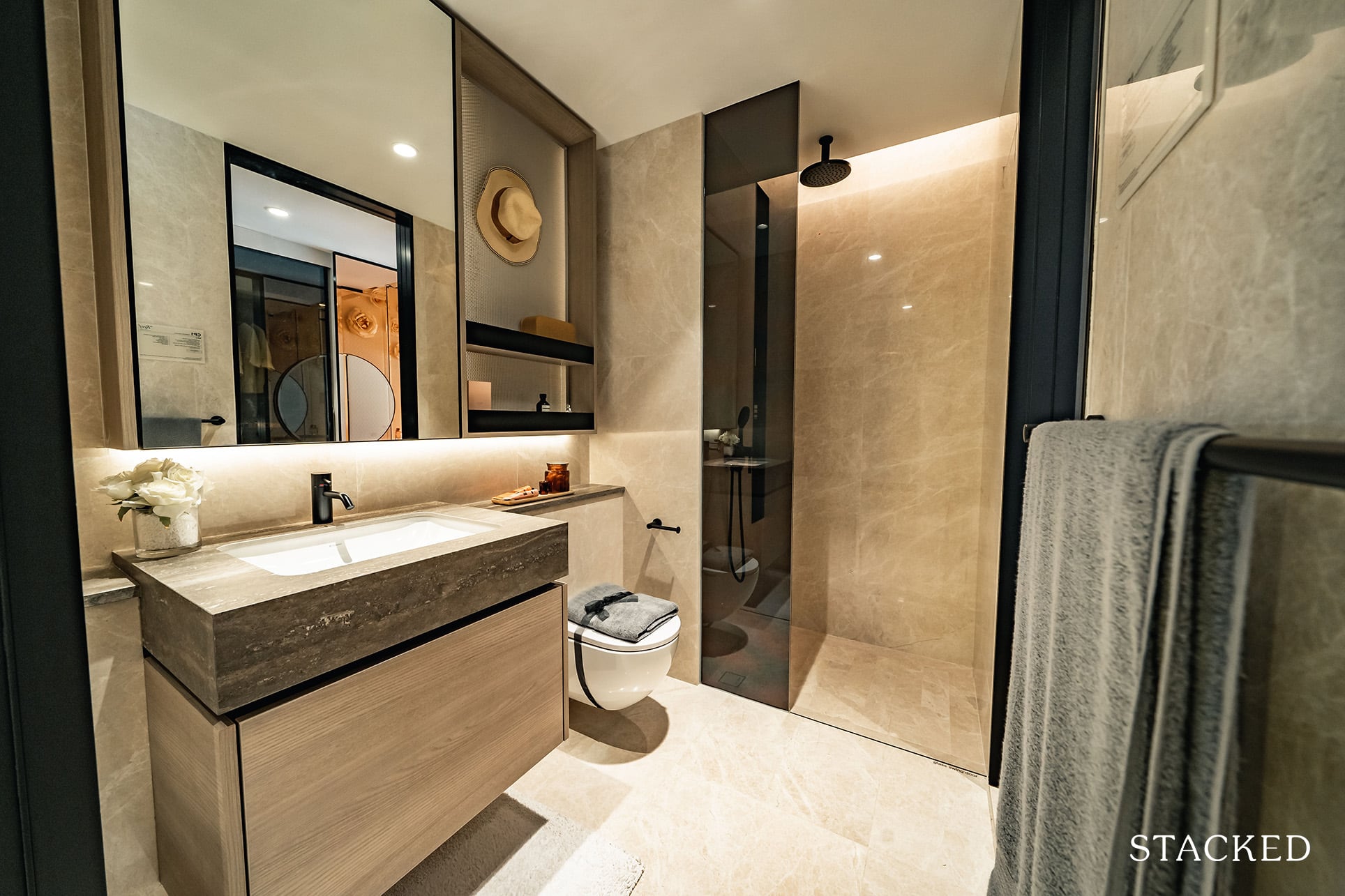
Next up is the common bathroom, which is conveniently of a jack and jill variety. This means that you can access the bathroom from the hallway as well as the bedroom – making it an ensuite one in the process.
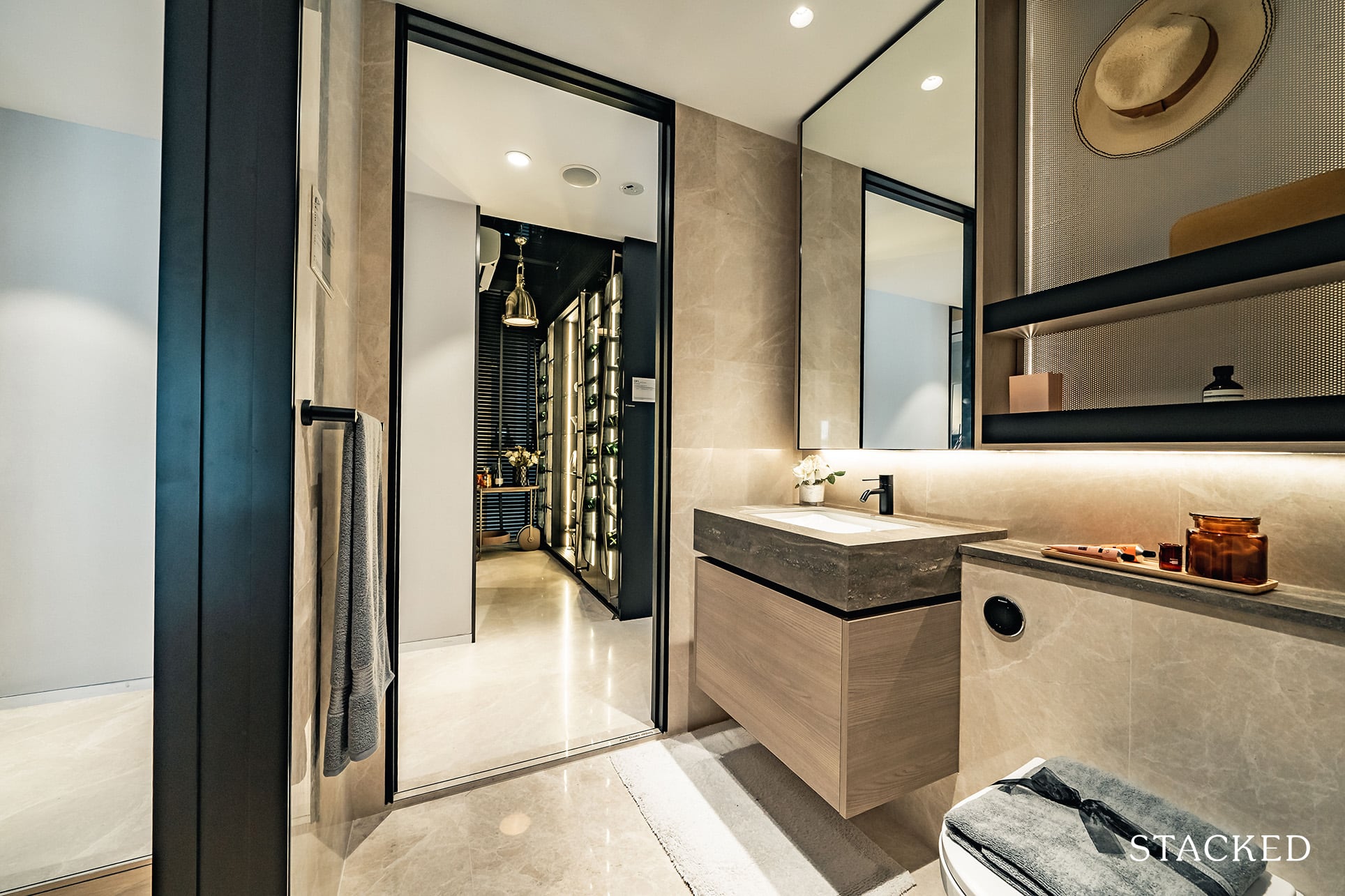
Consequently this means that there will be no window for this bathroom for natural ventilation (as it is located in the middle of the apartment). You do have the usual bells and whistles that you’ve seen so far with the bathroom fittings from Dornbracht and Geberit.
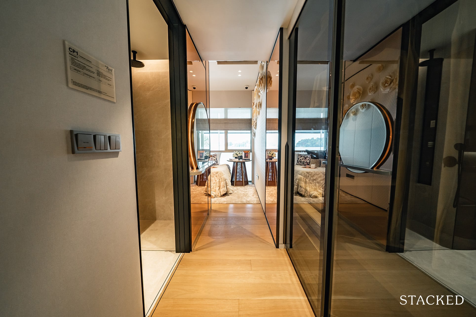
The common bedroom features quite a long walk way in, which is good for those concerned about privacy but it definitely is not the most efficient use of space. As you’ve seen from the wall jutting out in the dining room, that space has been carved out for the seamless looking wardrobe that you see on the right.
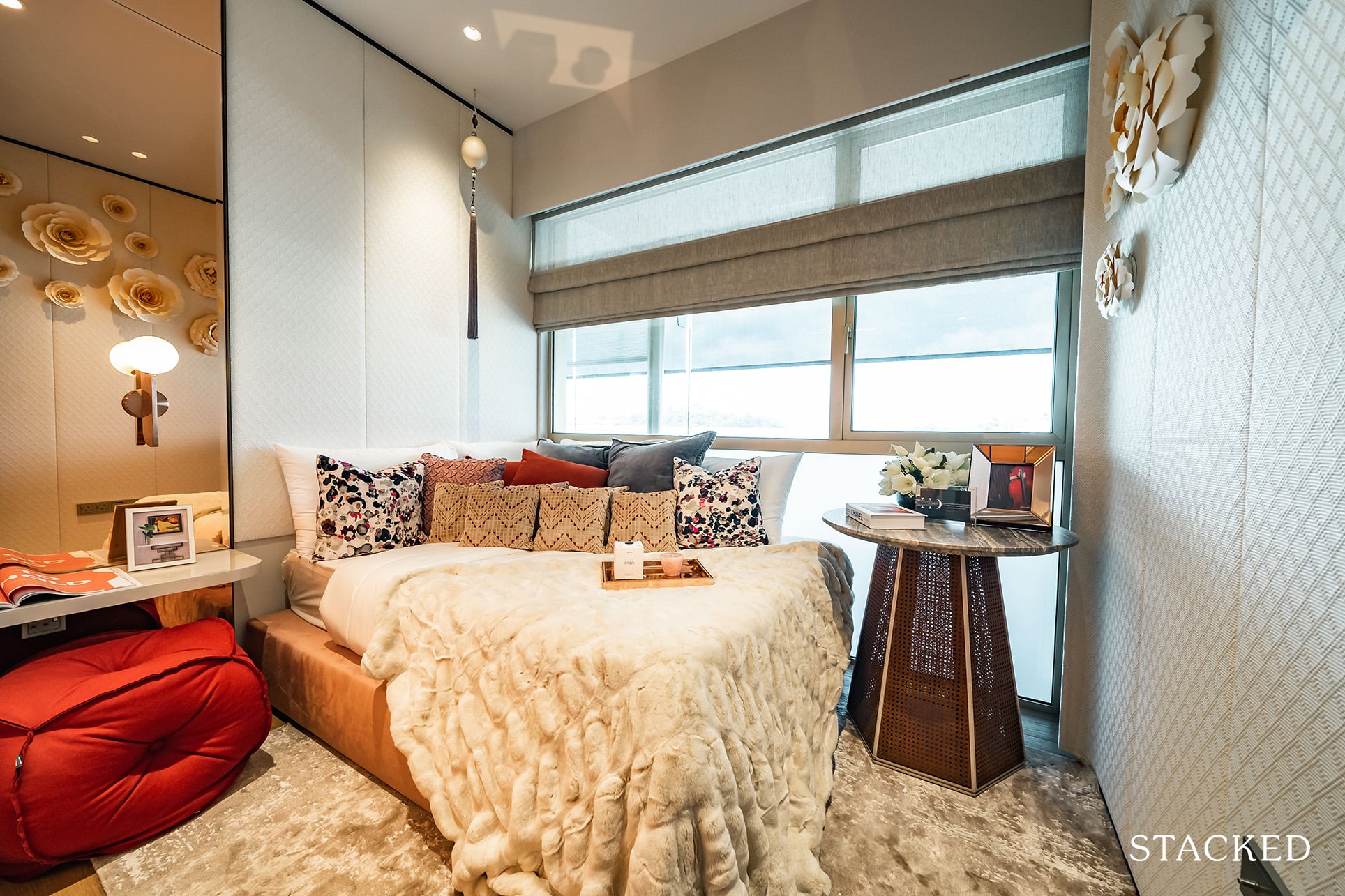
The bedroom is an okay size, but it looks small here as the ID design inexplicably added a thick shelving unit – which has the obvious consequence of making the area feel more constrained. It doesn’t show full length windows here as the frosted glass is an ID treatment, so not to worry.
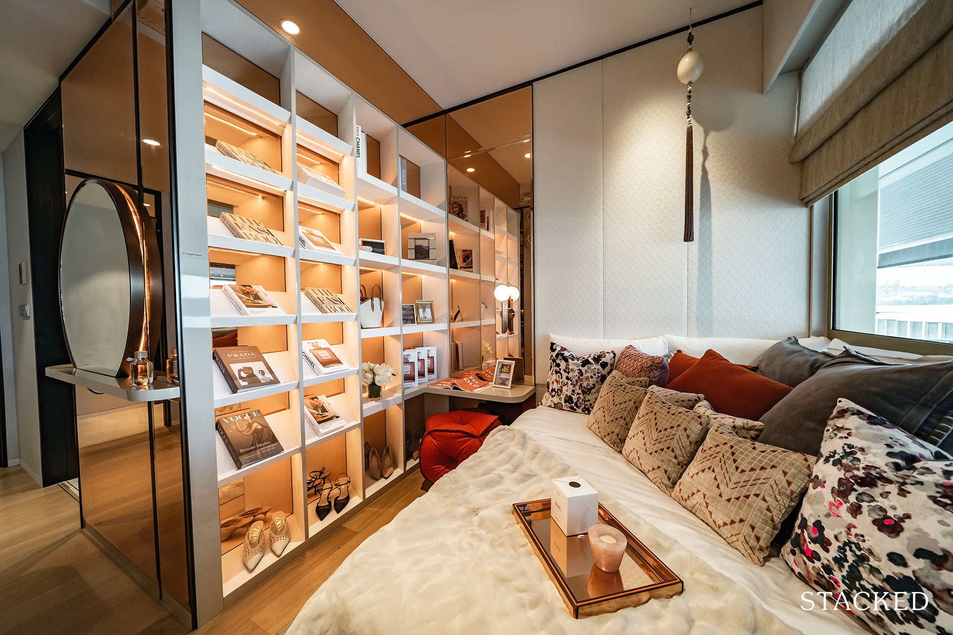
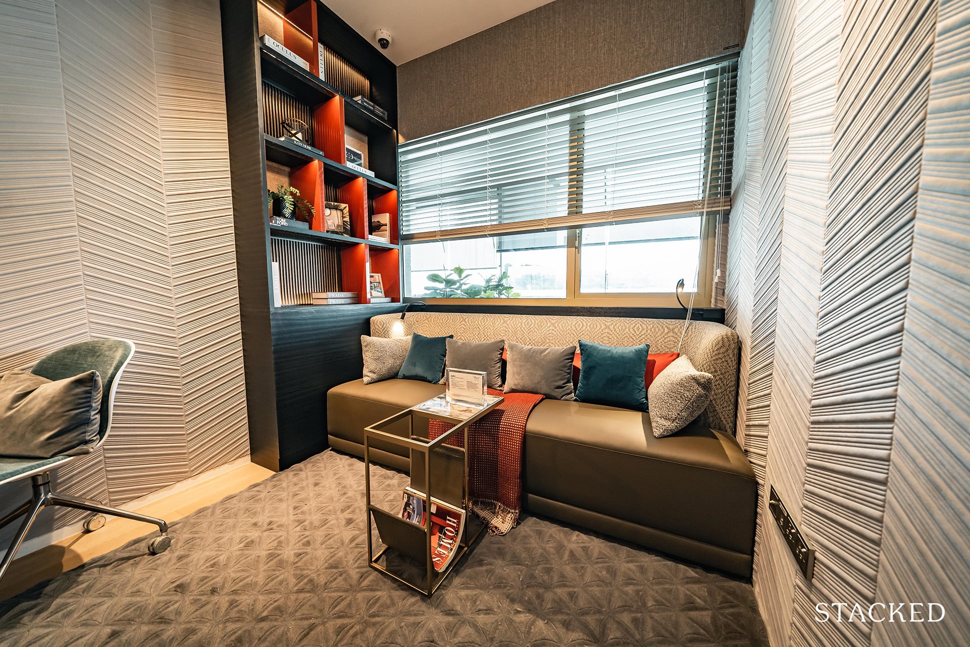
Next up is the second common bedroom.
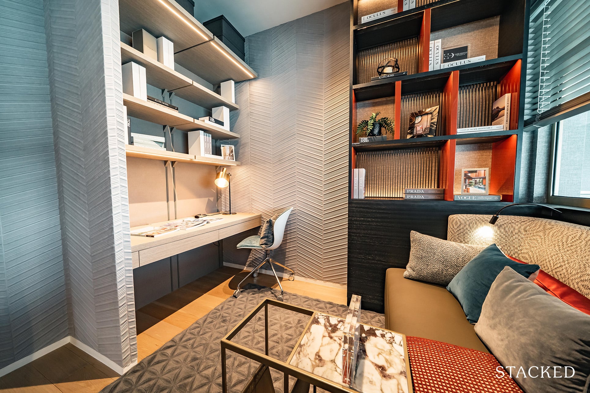
Frankly, it isn’t a big space but what’s cool is the flexible arrangement depending on what you want to use the room for. In the example from the showflat, it is shown with the study design, where it comes with the table and shelving above.
If you still intend to use it as a regular bedroom, you can opt for the usual wardrobe space instead – so I do appreciate that they’ve provided that flexibility for buyers.
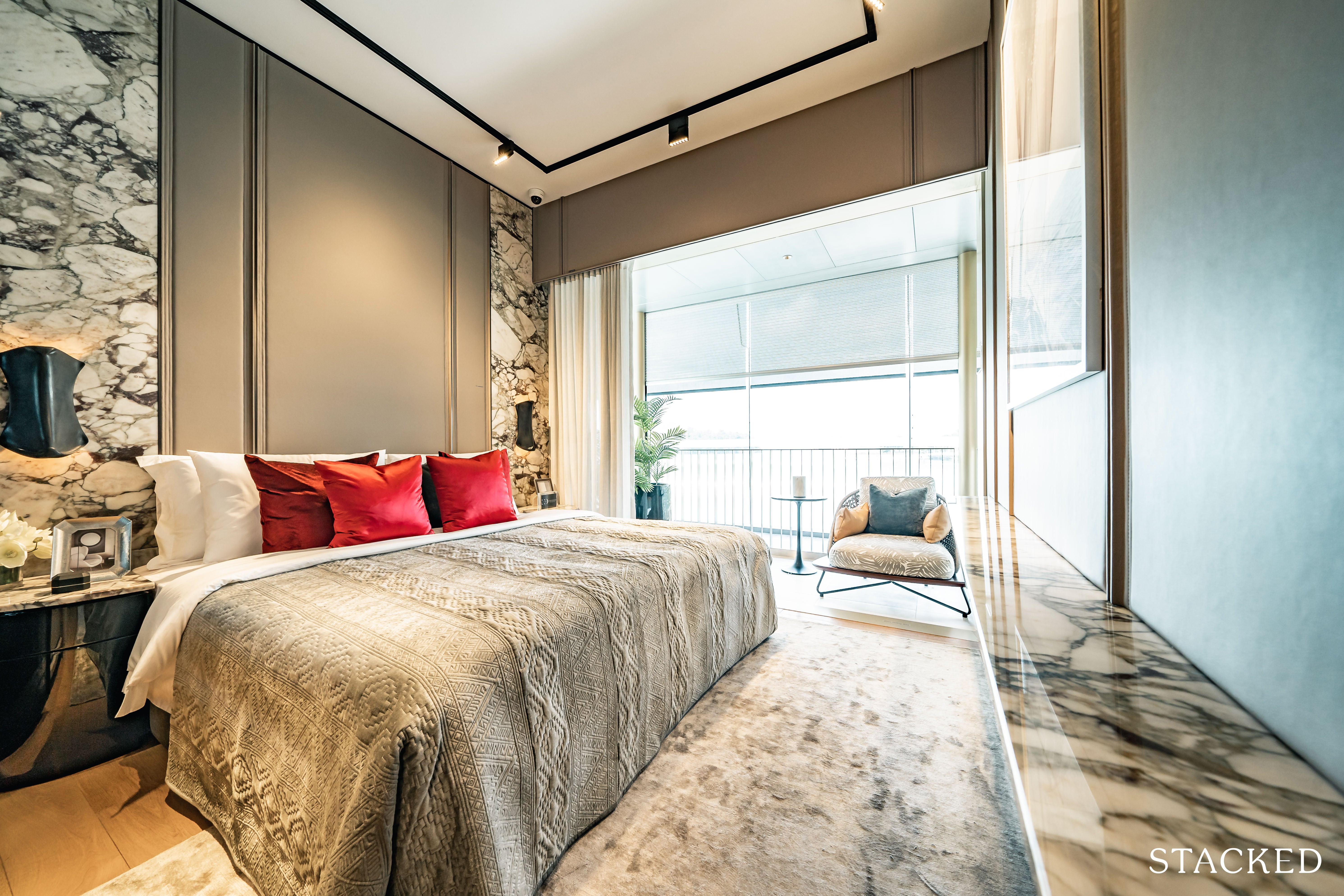
Finally the master bedroom is as what you’d reasonably expect in a unit of this size. You can accommodate a king sized bed along with small side tables by both sides of the bed.
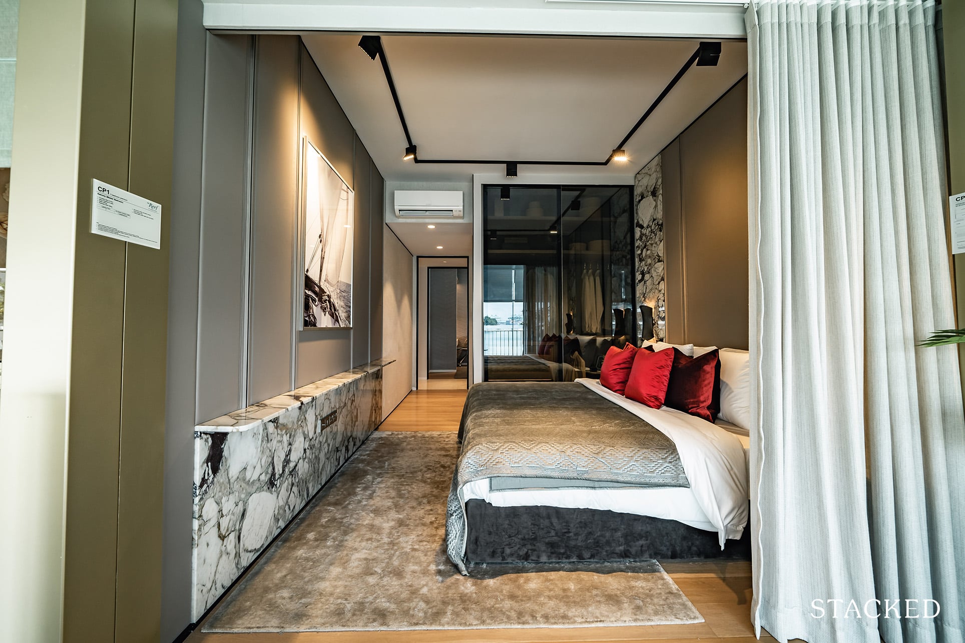
You do have the same sleek wardrobe design that you’ve seen in the other bedrooms, but the standard size remains the same (which isn’t enough, basically).
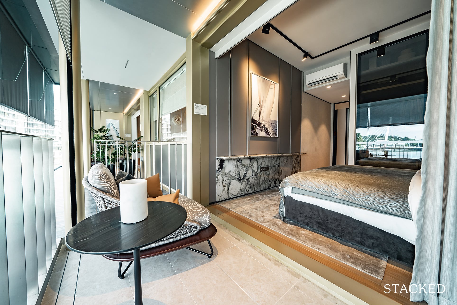
For those excited about the lifestyle benefits of living by the sea would probably be happy to see that there is a balcony area here. It isn’t big, but it is good enough to be a cosy space to enjoy the outdoors. As with the other balcony, you get the motorised meshed aluminium screen (again, it is dependent on the type of unit).
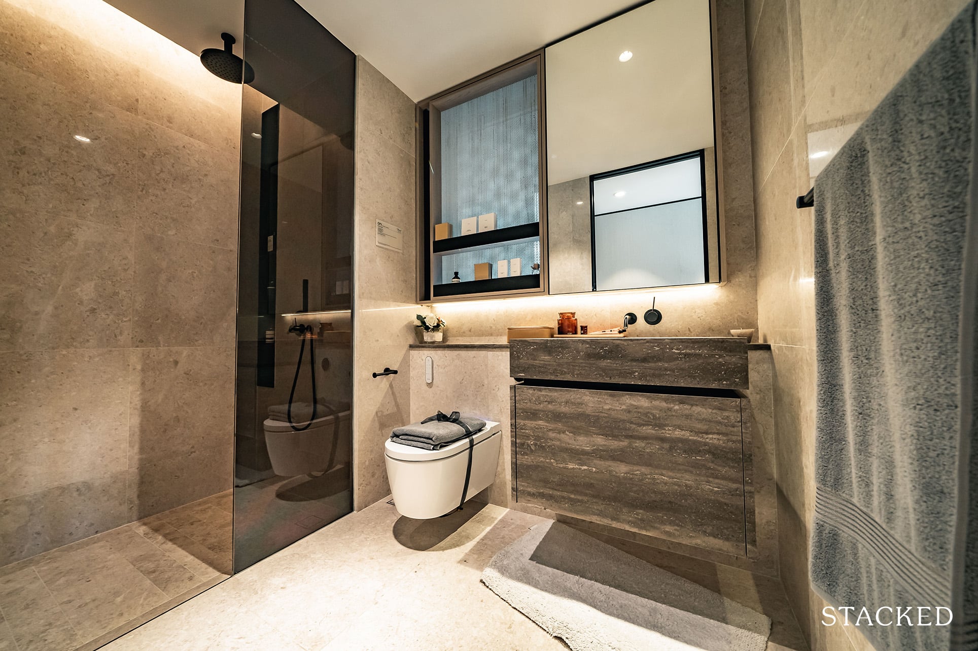
The master bathroom is not a bad size at all, but for those hoping for a bathtub to soak in, well, I’m sure the rejuvenation pools on the floating dock would be a fair consolation.
Here you have your standard wall-hung toilet plus automated bidet from Geberit.
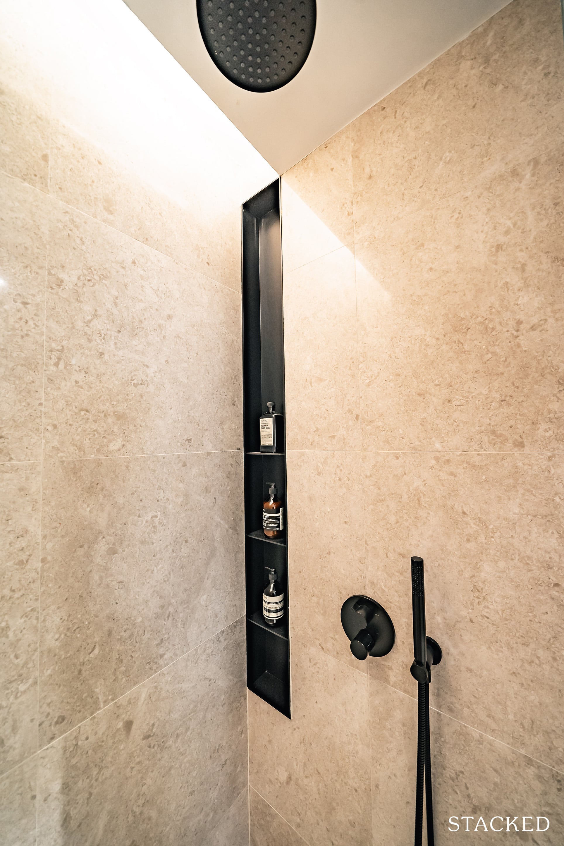
As with the other bedrooms, the matt black fittings are on trend. And while it’s great to have a rain shower it that lowly positioned shower head isn’t the best placed should you choose to use the conventional method.
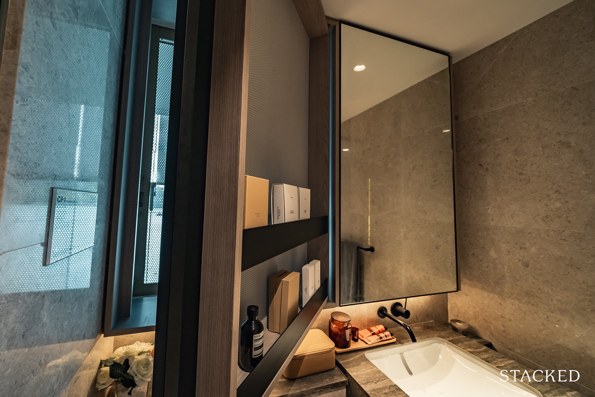
The last unique feature here is this meshed swinging “window”. That breathable material allows light and any wind to pass through (similar to the aluminium mesh on the outside) but still gives you some semblance of privacy.
The Reef At King’s Dock Location Review
If you are familiar with the Harbourfront area, you should be well aware that the location of The Reef at King’s Dock is the best out of all the Keppel Bay condos – especially if you take into account driving accessibility and public transport connectivity.
It is really just a short walk over to Harbourfront MRT station and let’s not forget it is probably one of the more scenic walks you’ll find in Singapore.
Seah Im Food Centre is also just a short jaunt away if you want your daily hawker centre fix, while there is a ton more food options at Harbourfront Centre, and of course, VivoCity.
But really, most people looking into this area are all about the lifestyle benefits. So you could walk to Keppel Bay for its waterfront cafes – and if you feel like taking a longer journey – Sentosa is a really short drive away.
Amenities
Groceries
| Name of Grocery Shop | Distance From Condo (& Est. Walk Time) |
| Cold Storage – HarbourFront Centre | 400m, 6-min walk |
| FairPrice Xtra – VivoCity | 650m, 8-min walk |
| Shine Korea Supermarket – VivoCity | 650m, 8-min walk |
Schools
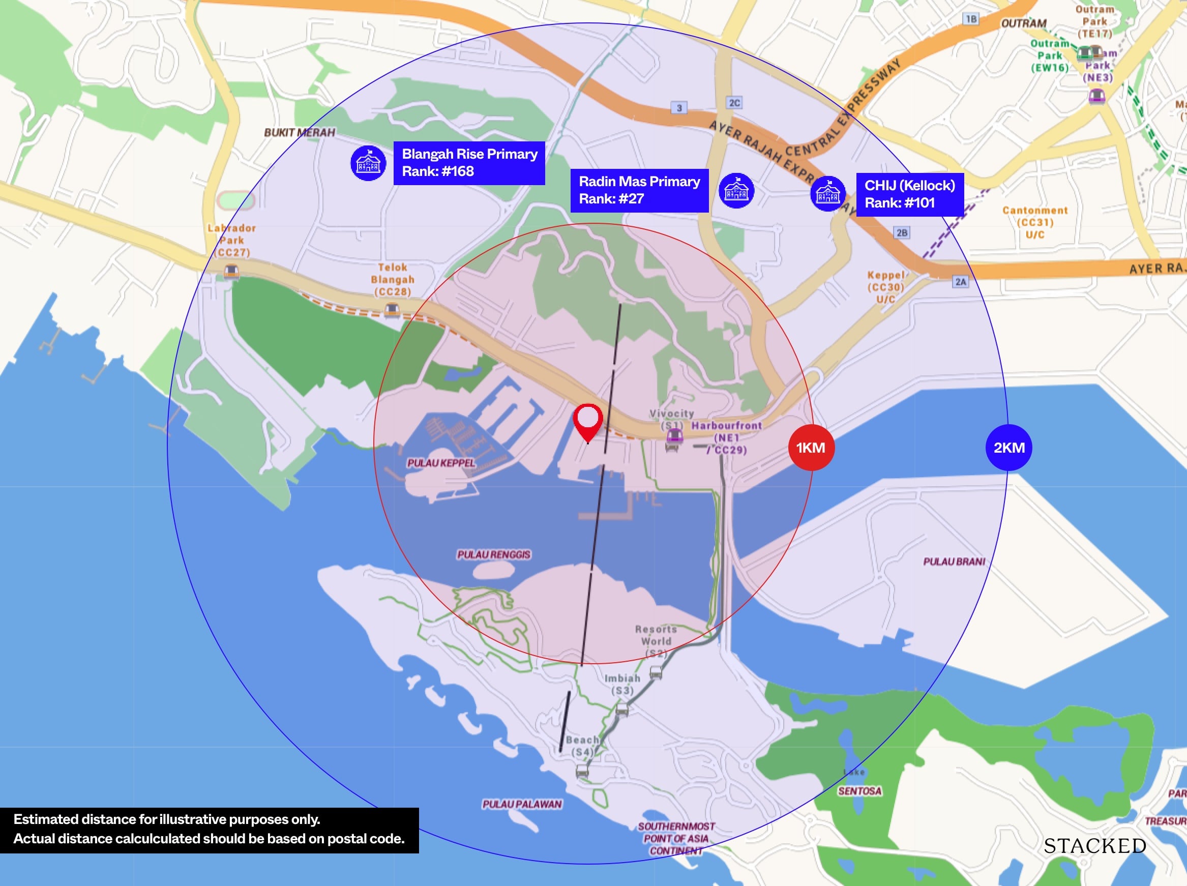
| Educational Tier | Number of Institutes |
| Preschool (within 1km walk) | 2 |
| Primary (3km-drive) | 2 |
| Secondary (3km-drive) | 2 |
| International School (3km-drive) | 0 |
| Junior College (5km-drive) | 0 |
| University (5km-drive) | 1 |
| Polytechnic (10km-drive) | 1 |
Public Transport
| Bus Station | Buses Serviced | Distance From Condo (& Est. Walking Time) |
| ‘Aft HarbourFront Stn’ | 10, 30, 30e, 57, 61, 97, 97e, 100, 131, 143, 145, 166, 188R, 963R, RWS8 | 180m, 2-min walk |
| ‘Harbourfront Stn Exit A’ | 10, 30, 30e, 57, 61, 65, 80, 97, 97e, 100, 123M, 131, 143, 145, 166, 188R, 855, 963R, NR1, NR6 | 450m, 5-min walk |
Nearest MRT: Harbourfront – 4 mins walk, 350m
One of the biggest draws of living in the Keppel precinct is that you are superbly connected while enjoying mesmerising views of the sea. My gripe about living at older Keppel developments such as Caribbean or Reflections was the walk to the MRT – not the shortest by any measure. However, The Reef at King’s Dock definitely addresses this as it is the closest plot to Harbourfront MRT, which should take you less than 5 minutes. Harbourfront MRT has both the Circle Line and North-East Line, which will conveniently take you to the rest of Singapore within minutes.
If taking the train isn’t your cup of tea (yes, that’s a thing – some lament the lack of ‘scenery’), the bus services are very extensive and will also take you to practically anywhere around the island.
Private Transport
| Key Destinations | Distance From Condo (& Est. Peak Hour [0830] Drive Time) |
| CBD (Raffles Place) | 5.6km, 20-min drive |
| Orchard Road | 6.2km, 26-min drive |
| Suntec City | 6.4km, 24-min drive |
| Changi Airport | 23.5km, 27-min drive |
| Tuas Port (By 2040) | 35.0km, 50-min drive |
| Paya Lebar Quarters/Airbase (By 2030) | 17.7km, 27-min drive |
| Mediapolis (and surroundings) | 5.8km, 16-min drive |
| Mapletree Business City | 3.2km, 11-min drive |
| Tuas Checkpoint | 24.8m, 32-min drive |
| Woodlands Checkpoint | 24.8km, 38-min drive |
| Jurong Cluster (JCube) | 12.9km, 25-min drive |
| Woodlands Cluster (Causeway Point) | 25.3km, 41-min drive |
| HarbourFront Cluster (Vivo City) | 1.4km, 7-min drive |
| Punggol Cluster (Waterway Point) | 25.4km, 32-min drive |
Immediate Road Exits: 1 exit – Telok Blangah Road in both directions. The Reef provides good connectivity to the various highways and with Singapore’s CBD concentrated down South, this development is situated close to most key locations in the table above. The average time taken to get to those places do seem longer as they were based on the average 8:30 am rush hour traffic.
The Developer Team
Developer – Mapletree (61%) and Keppel Group (39%)
This project is developed by a JV between Mapletree and Keppel Land, 2 of Singapore’s finest developers. While both have not been the most active in developing Singapore condos in recent years, the Keppel / Harbourfront precinct homeground for Mapletree and Keppel, whom we have to thank for what the area is today.
Mapletree Investments was originally founded in 2000 to hold non-port related properties transferred from PSA Corporation to Temasek Holdings. In the process, they developed the 24ha. Harbourfront precinct, including VivoCity, BofA Merill Lynch Harbourfront, St James Power Station and Harbourfront Centre. Today, they manage S$60.5Bn worth of properties across all segments across the world and have 4 REITs and 6 private equity funds under their management.
Keppel Land is the property arm of Keppel Corporation, a multi sector conglomerate founded in 1968 to focus on offshore and marine activities. Its foray into the property market started in 1983 after acquiring the Straits Steamship Company, a shipping company with huge land banks in Singapore. They have transformed the Keppel precinct from a shipyard to a multitude of luxury projects, starting with Caribbean at Keppel Bay (2004), Reflections at Keppel Bay (2011) and Corals at Keppel Bay (2016). Besides these, they are also currently marketing units for 19 Nassim and The Garden Residences. Their property expertise also crosses borders and they have completed numerous projects in Vietnam, China, Indonesia and the USA among others.
Architect – KCAP Architects & Planners
KCAP Architects & Planners is a Rotterdam-based firm founded by Kees Christiaanse in 1989. KCAP is known for the development of sustainable urban living environments, with buildings and public spaces that enliven and renew the city.
Characteristic of their design approach is their ambition to add quality to the living environment in the city, which we can see evidently in this project. They had previously worked on the URA Master Plan for the Jurong Lake District.
Stack Analysis
Development Site Plan
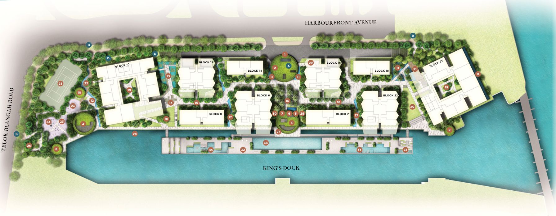
| Function Rooms | Lounge Room | Gym |
| Studio | Changing Room & Steam Bath | BBQ Area |
| Garden | Lawn | Courtyard |
| Playground | Outdoor Fitness | Tennis Court |
| Petscape | Bicycle Park | 50M Lap Pool |
| Lesure Pool | Jacuzzi |
The plot of land the development sits on is a long and narrow one, hence limiting the size and grandeur of some of its features, such as the Arrival Plaza. But at 284,264 square feet plot size, it is actually pretty sizeable for its 429 units. The facilities in this condo are nothing out of the ordinary if you were to just glance at it – sky terrace, tennis court, 50m lap pool – all of which can be commonly found in larger projects. Nevertheless, for a project of 429 units, having these are definitely plus points and it definitely goes a step further by executing some of these facilities brilliantly.
I am sold by the 180m long floating deck, a real novelty in the sea of cookie cutter Singapore condo projects and it will definitely be a talking point about your guests. Couple that with some history about King’s Dock and I am sure they will be impressed enough to consider purchasing a unit themselves too.
There are plenty of social and dining pavilions spread across the development, many of which enjoy good views of some form of water elements so I don’t think there will be too much competition to book one when required.
Afternoon west sun analysis
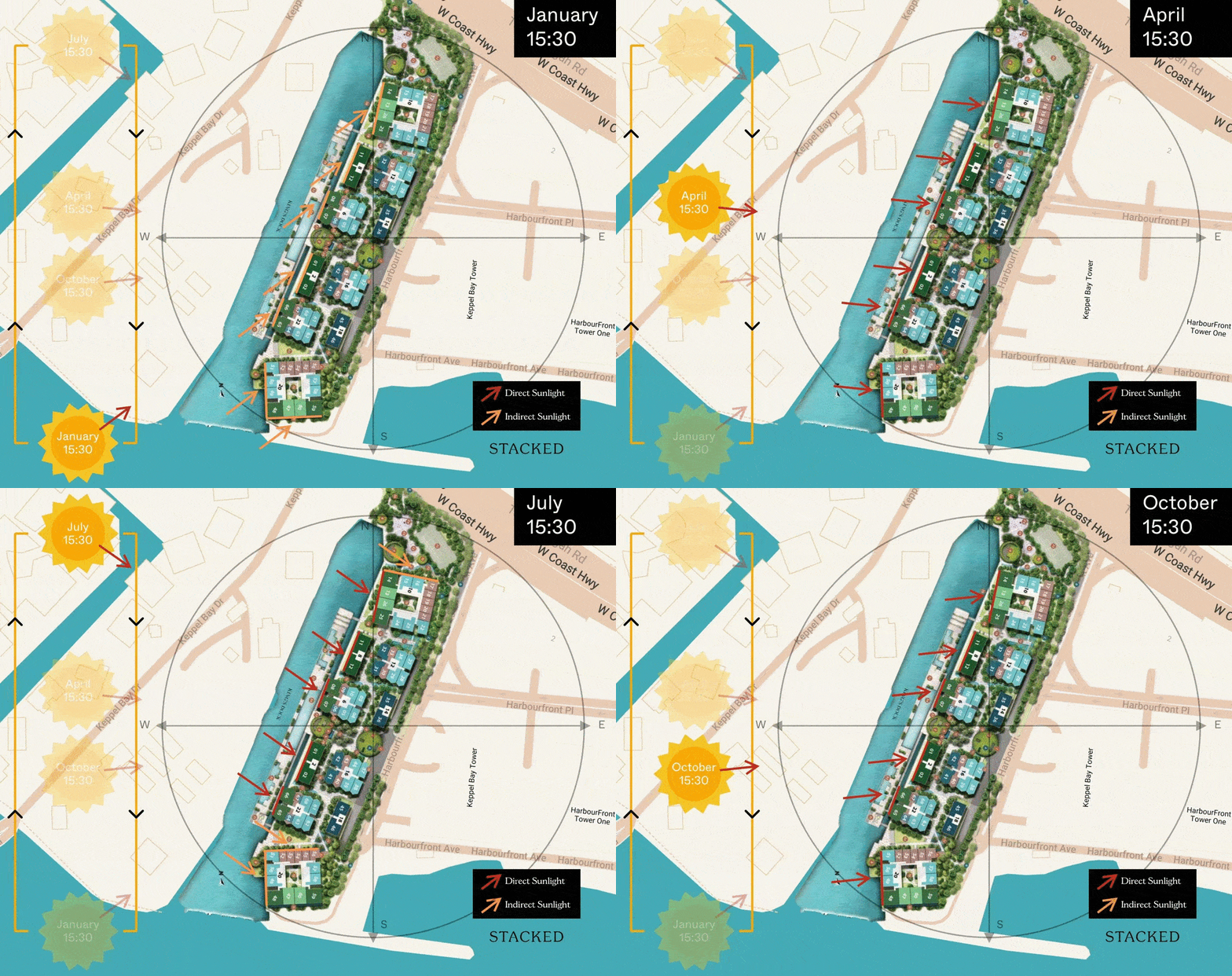
It goes without saying that all the west-facing units with majestic sea views would also bear the wrath of the afternoon sun here. Given the linear layout of the development that takes advantage of the views, that really equates to all of the stacks with sea views.
The stack with the most afternoon would have to be stack 48 given it receives the south-west afternoon sun towards the end/start of the year too.
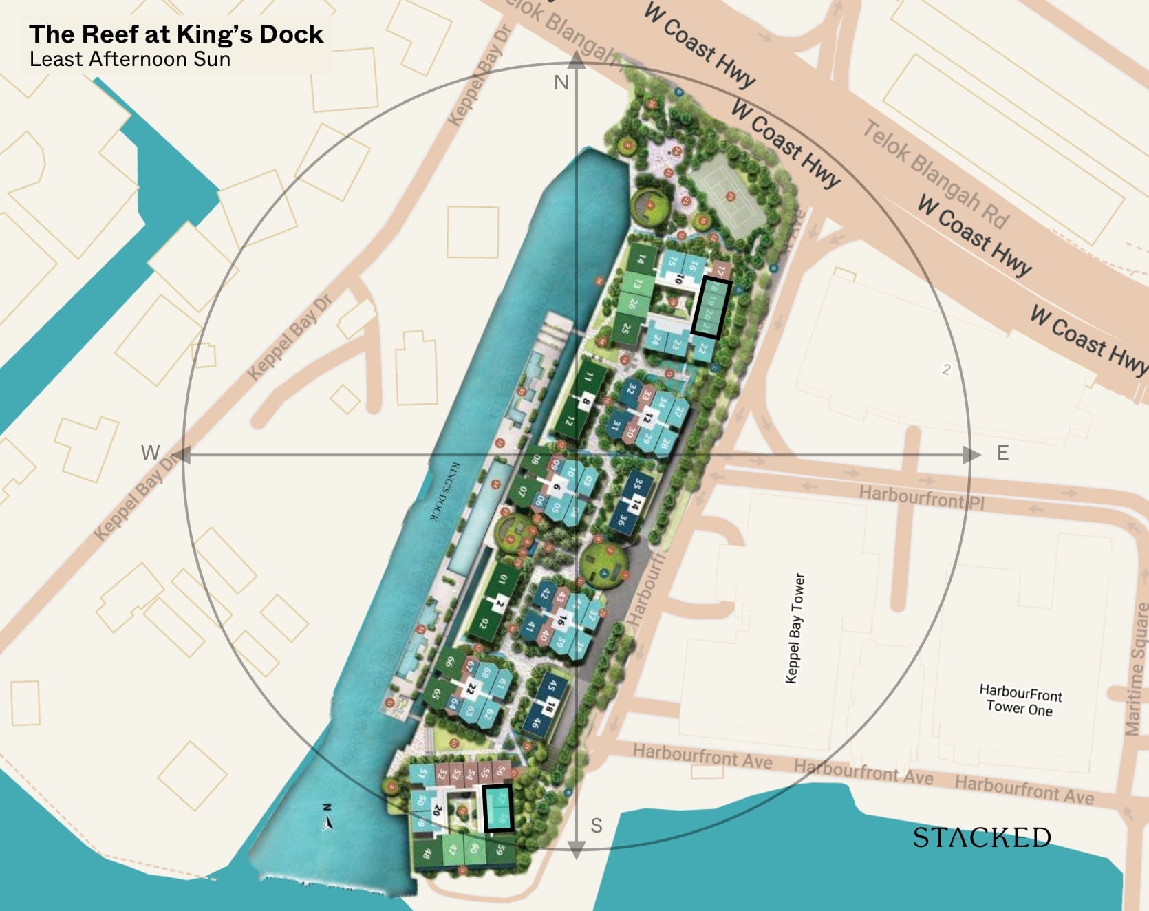
Stacks with the least afternoon sun are stacks 57, 58 and 18-21 as they face the east and are also blocked from any indirect sunlight coming from the south and north by neighbouring units.
Unit Mix
Unit Type | Size | No. of Units | Maintenance Fees |
| 1BR | 431 – 592 | 114 | $375 / $450 |
| 1BR + Study PES | 657 | 2 | $450 |
| 2BR | 678 – 764 | 195 | $450 |
| 2BR + Study | 893 | 6 | $450 |
| 2BR Premium | 883 | 20 | $450 |
| 2BR Villa | 980 & 1,163 | 12 | $450 |
| 3BR + Study | 1,076 & 1,464 | 25 | $450 |
| 3BR Premium | 1,216 – 1,464 | 47 | $525 |
| 3BR Villa | 1,345 & 1,572 | 8 | $525 |
| 429 |
Spread across 10 residential blocks, the units at The Reef range from 1 to 3 Bedroom units. Unsurprisingly, given the large tenant pool nearby, the majority of the units (81%) will be 1 and 2 Bedrooms units. Those looking for 4 or 5 Bedroom units at The Reef would need to consider its neighbouring developments instead.
As you can tell from the table, there are several variations of each unit type, with the Villa units typically on ground floor with PES.
Maintenance wise is also pleasantly palatable for the Keppel precinct – $450 and $525 is low for a luxury project, especially when you compare it to its peers such as Reflections at Keppel Bay and Corals at Keppel Bay or new launches in Newton such as Pullman Residences.
That said, I understand many younger buyers were drawn in by the attractive indicative for the one bedder along with the lifestyle benefits so do note that the maintenance fee is significantly higher than a mass market project.
Best Stacks
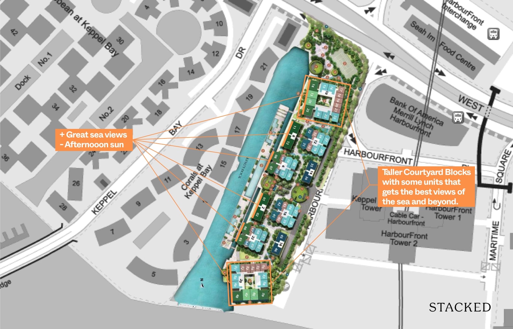
It was a real struggle for me to argue what would be a best stack here at The Reef at King’s Dock.
Allow me to explain, Blocks 10 and 20 are the taller Courtyard Blocks with some units that get best views of the sea and beyond. That’s a really mesmerising sight to behold frankly and if you had any doubts about the view you could get, just head down to the showflat for a taste of it.
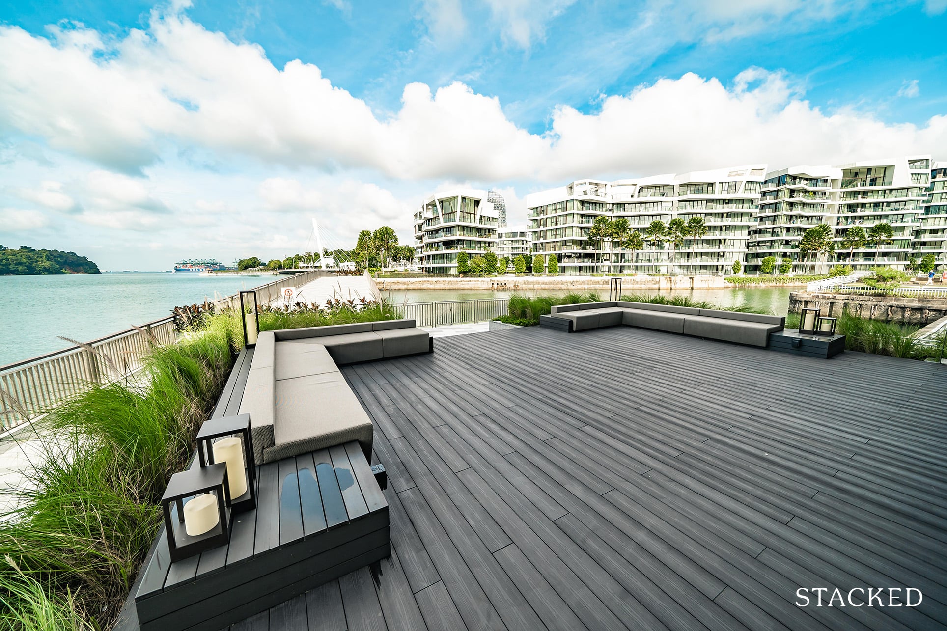
However, to enjoy such panoramic views, the blocks were also tilted in such a way that it gets the full on west sun. That’s the biggest downside in my opinion. It is more of an Asian thing to dread the afternoon sun, while many others around the world often embrace the picturesque sunset. If your intention is for rental, this would perhaps be less of an issue.
As for those who would still like to peek into those majestic sea views, you have the low rise Block 2 and 8 as well as some units of Blocks 6 and 22. You will be slightly towards the North West instead so it’s kind of the lesser of 2 evils. Blocks 2 and 8 also get direct views of the King’s Dock and the floating platform.
The Reef at King’s Dock vs Corals at Keppel Bay 1 Bedroom

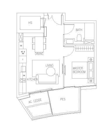
Between The Reef at King’s Dock and Corals at Keppel Bay, the overall unit sizes at The Reef are smaller, and hence have a lower overall quantum.
I personally prefer the efficient squarish layout but not too many people would be pleased with the triangle-shaped balcony units. As you can see from Corals, the units are mainly irregular in layout due to the external facade design. For some, the kitchen and TV wall will face each other, so your sofa will be placed in an awkward position.
Also do take note that the Reef at King’s Dock smallest 1 bedroom unit (without a balcony) will have a facing of the next office building versus Corals at Keppel Bay with the smallest unit facing inwards or towards the slip road.
Price Review
If you are considering The Reef at King’s Dock, you will undoubtedly compare it against its neighbouring developments. So here is how it stacks up!
| Development | Units | Psf | TOP | Lease From | New 99 Yrs |
| The Reef at King’s Dock | 429 | ~$2,400 | 2025 | 2021 | – |
| Caribbean at Keppel Bay | 969 | $1,480 | 2004 | 1999 | $1,902 |
| Reflections at Keppel Bay | 1,129 | $1,595 | 2011 | 2006 | $1,879 |
| Corals at Keppel Bay | 366 | $2,023 | 2016 | 2007 | $2,356 |
The Reef at King’s Dock is in direct competition with its 3 other major neighbouring developments. While there are other condos in the Harbourfront District 4 precinct, I have gone with these 3 for ease of comparison.
Caribbean and Reflections can pretty much be considered ‘mega’ projects and hence do not boast of the same kind of exclusivity that The Reef at King’s Dock or Corals at Keppel Bay can speak of. Granted, Reflections is and will remain a real icon in this area because of its 6 distinctive curved glass towers while Caribbean can only be said to be the dullest looking of the 4.
Running a very simplistic calculation of dividing the current psf by the number of years left before multiplying by 99 to get an idea of what a ‘fresh lease’ might cost, you will notice that the 2 older projects will be around $1,900 psf. If we assume the average psf of The Reef to be around $2,400, it will represent a ~27% premium over these projects, which I think can be attributed to both the large number of units that need to be sold and its further distance from the MRT.
As for Corals at Keppel Bay, it starts on a back-foot because its lease starts almost 10 years before the project actually TOP-ed. This is unusual as the number should usually be around 4-5 years. If my memory does not fail me, there was simply a glut of units along this stretch with insufficient demand for it. The announcement of the Greater Southern Waterfront along with the Sentosa-Brani Masterplan has undoubtedly spurred renewed interest in the area.
As such, you will notice that its psf prices are relatively similar to that of The Reef’s and with the latter standing out through more unique features such as the 180m floating deck, I would personally be going with The Reef if I had to choose between it and Corals. Its fresh 99 years lease from 2021 will definitely help it better capitalise on the future GSW masterplan.
Generally my opinion on reef for investment is extended only to the 1 bedroom unit. And that is mainly because of the lack of affordable 1 bedroom units in the area. As you can see, both Reflections at Caribbean do not offer such a unit type.
So the only existing competition for 1 bedroom units is in Corals at Keppel Bay which has only 46 units and most of them have entered at a price point of around $2,500 psf. Even at the smallest size, the most recent transaction of $1.55 million still represents quite a significant gap even if you were to compare it to a similar sized (indicative) price of between $1.2 – $1.3 million at The Reef at King’s Dock.
For those looking at the smallest 1 bedroom unit for investment, that $95x,xxx price looks attractive as number one, it is below that magical $1 million mark. In an area such as this to attain such a quantum, you can see why there has been much interest in the project thus far. I seriously believe that if not for the current pandemic, the smallest 1 bedroom unit would have probably been launched at a price point of $1.1 – $1.2 million instead.
As usual we observe new projects unit mix introduction into an existing area to justify the demand/supply and given the large pool of offices beside, I would expect the rental demand to be healthy which in turn should provide decent price protection. Of course the maintenance fees here will have an impact on the rental yield, but rentability is still a draw. For those looking at potential rental income, it is an easy decision as well, given that Corals at Keppel Bay commands quite exorbitant monthly maintenance fees as compared to The Reef.
For the 2 and 3 bedroom units you can see that it starts to get quite similar in price points where the quantum is concerned. So from an investment standpoint, I think that it requires more consideration at the current indicative prices. That’s not to say that there is no potential for capital gain (especially when you consider the significant lease dates difference), but the 1 bedroom represents a much less risky proposition.
Appreciation Analysis
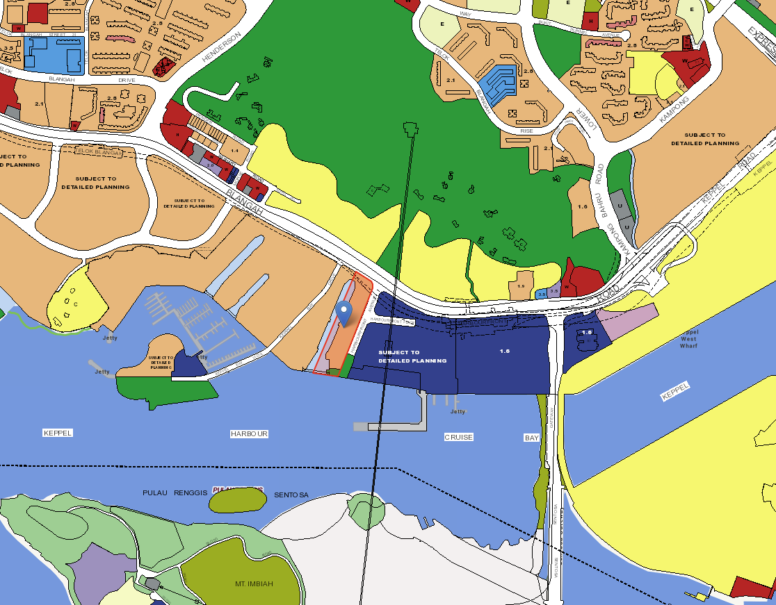
Probably the biggest question mark against The Reef at King’s Dock is the performance of the newer Keppel Bay condos so far. In short, performance on the resale market has been pretty dismal. Plus the fact that both Corals at Keppel Bay and Reflections at Keppel Bay have not fully sold out yet and you can understand why some people might harbour feelings of trepidation.
To expand more, Corals at Keppel Bay has only had 1 profitable transaction so far at a gross profit of $115,200. Frankly after taking away costs you aren’t really looking at much gains, and even possibly a loss. There have been 5 unprofitable transactions so far ranging from an $80,100 loss to a high of $238,400.
Reflections at Keppel Bay hasn’t done too well on the resale front either, but at least it can boast a total of 108 profitable transactions so far, with the highest profit coming in at quite a stunning $738,658. (There was a profitable one at $2.4m gross profit, but it’s likely a fluke with a purchase price of just $329 psf so I’m ignoring that).
That said, there have been more unprofitable than profitable transactions so far, with 159 unprofitable ones. The biggest loss is an eye popping $4.8 million that was actually transacted in July 2020. The average loss has been $475,919 from the 159 transactions, which is pretty significant.
So yes, the performances of the Keppel Bay condos don’t exactly inspire confidence. That said, you will have to also bear in mind that both developments were unfortunately launched at different peaks of the market. For Corals, in 2013, and The Reflections in 2007 so you can point to those factors as possible reasons for its not great performance. Now, does that mean the same thing could happen to The Reef at King’s Dock? Well, that really depends on which entry point you think we are at. Does buying during the Covid period mean you are entering at a low? Or does buying now because prices have increased mean you are buying at a high?
As for long term potential, the biggest one most agents will be flogging will be the GSW transformation. With over 9,000 public and private housing units set to fill the space on which Keppel Club currently is, you can easily expect a funnel of key commercial, transport, educational and even work opportunities popping up in the area to suit future residents’ needs. As mentioned in an earlier article, the St James Power Station is already being transformed into Dyson’s global headquarters.
But what you really need to know here is that the Greater Southern Waterfront is really a long-term plan. Remember, this is something that is only slated to be completed post-2040 so for those banging on this as a means of exit – this would be a really long-term hold.
Our Take
What we like
- Sentosa lifestyle with brilliant connectivity
- One & only floating deck in a condo
What we don’t like
- –Odd shaped balconies for some units
- –Units with the best views face West
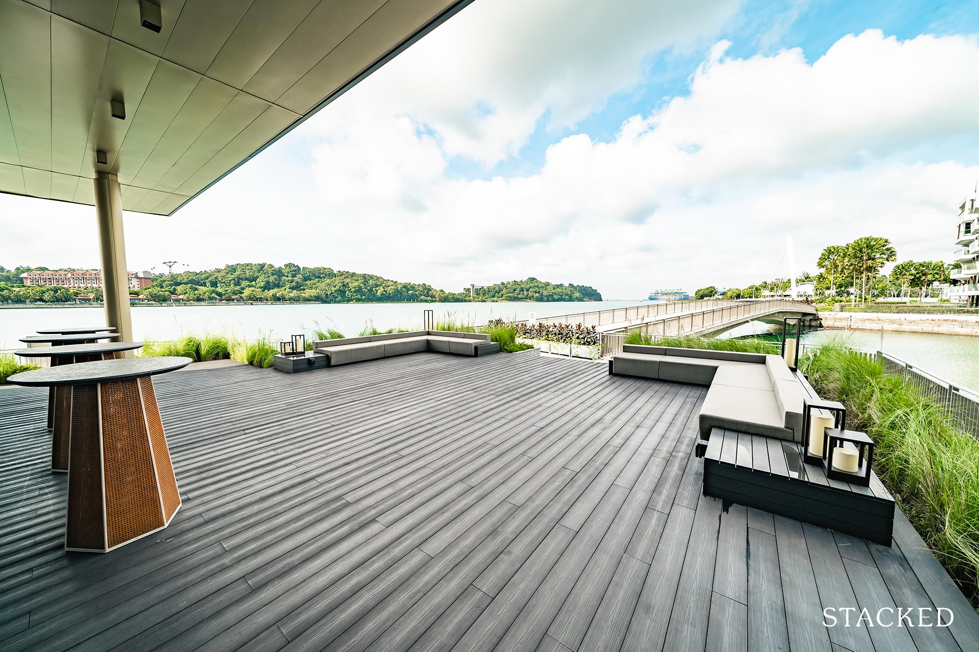
The Reef at The King’s Dock is a very interesting project for me. It does stand out in many ways, and I even like it’s name which is a welcome departure from the usual “residences” or “parc” that you might often see today.
That floating dock is really quite something too, and the whole development does look to be something that offers a great own stay option should the allure of a waterfront lifestyle be something you’ve always dreamed of experiencing.
Plus, having maximum lifestyle benefits usually comes at the price of convenience (just ask Sentosa residents), but you really don’t face that same issue here. If anything, it is quite fantastically located – close to the MRT with two lines, and a multitude of eating and shopping options as well.
To conclude, I’m impressed by the hard product. While it remains to be seen if the indicative prices do play out, but if so you can see why the 1 bedroom units would sell well.
What this means for you
You might like The Reef At King’s Dock if you:
-
• Like something unique:
With Singapore’s first floating dock and waterfront views, there aren’t too many developments in Singapore that would offer such differentiated facility offerings.
-
• Enjoy Waterfront Living:
Yes, there is undoubtedly a premium for it, but the lifestyle benefits that you get living in this area is definitely a huge selling point.
You might not like The Reef At King’s Dock if you:
-
• Are Looking for Affordable Waterfront Living:
If you are looking for an affordable option, this probably would not be for you as maintenance fees here are definitely higher than average mass market condos.
-
• Have a young family:
While there are kid friendly facilities at the condo, the lack of primary schools in a 1km radius could be a sticky point.
End of Review
At Stacked, we like to look beyond the headlines and surface-level numbers, and focus on how things play out in the real world.
If you’d like to discuss how this applies to your own circumstances, you can reach out for a one-to-one consultation here.
And if you simply have a question or want to share a thought, feel free to write to us at stories@stackedhomes.com — we read every message.
Frequently asked questions
What makes The Reef at King's Dock unique among Singapore's waterfront condos?
It features Singapore's first floating deck with pools integrated into the dock, offering a distinctive waterfront living experience with sea views and ecological design principles.
How accessible is The Reef at King's Dock for drivers and public transport?
Located along Harbourfront Avenue, it has a 1-to-1 parking ratio and is close to Harbourfront MRT, providing excellent road and public transport connectivity.
What are the main facilities available at The Reef at King's Dock?
Facilities include a 180m floating deck with pools, a tennis court, clubhouse, fitness zone, playground, social pavilions, and a roof garden with dining and wellness areas.
What types of units are available at The Reef at King's Dock and what is their size range?
The development offers various units including 1-bedroom apartments ranging from 431 to 657 sqft, with some units featuring studies, and 3-bedroom villas.
What is the significance of the location's history at King’s Dock?
King’s Dock was once the second largest dock in the world and a hub of trading activity, reflecting Singapore’s maritime history and economic prosperity.
Our Verdict
83%
Overall Rating
Join our Telegram group for instant notifications
Join Now








0 Comments