When you first step into Laura’s home (*not her real name for privacy reasons), you may be surprised to find that it is actually a rental unit given how nicely she has dressed it up.
As seasoned renters may know, there’s a fine line between wanting to create as nice a home as possible and wanting to save on expenses that you would never be able to recoup.
It all starts with the bones of the place, and this particular 20-year-old unit was an interesting one.
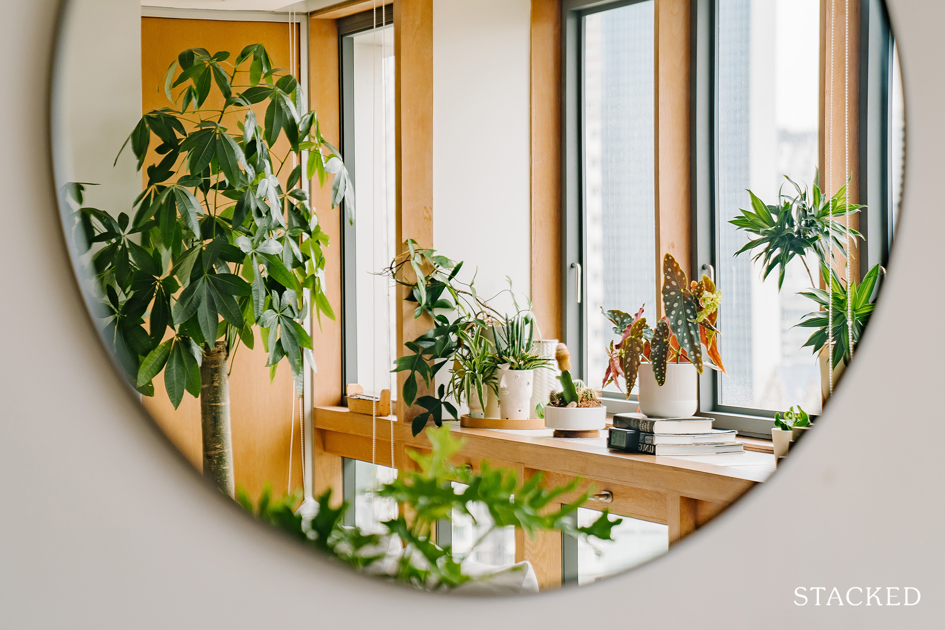
“The house has wooden parquet in all the rooms, including the main hall, which encompasses both living and dining,” she shared. “Plus, the window frames are clad in wood too. It is nice and unusual for a condo, but it can feel a bit too warm and oldish.”
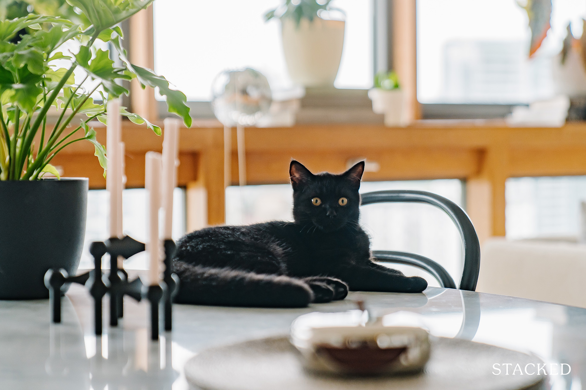
Presently, Laura and her husband, their son, and their helper are staying at their place together with their cat, Miun. Here’s how they transformed their bare rental unit into one that’s homely and unique to them.
So many readers write in because they're unsure what to do next, and don't know who to trust.
If this sounds familiar, we offer structured 1-to-1 consultations where we walk through your finances, goals, and market options objectively.
No obligation. Just clarity.
Learn more here.
How They Designed Their Home
While space is undeniably one of the strongest pulls of an older home, the couple took advantage of another positive quality inherent in this type of home – an old-school charm.
“Although initially, we wanted to find newer development, we decided that this place has its own merit that outweighs the age,” Laura said, adding that their place is even older than the condo they previously stayed at.
But because this was a rental unit, they definitely couldn’t do any major changes to the current layout.
Fortunately, they weren’t really planning to do any hacking anyway. “To be honest, the apartment is already great as it is and was well maintained for the age. The landlady also only did a very minimal change to the original space.”
Their landlady, however, removed an existing wall mirror decor and left it as a painted black wall, which both Laura and her husband are actually happy about. “She gave us blank canvases to decorate as we wish.”
The couple has been living in 2 other rental places for eight years, so they have some furniture that they just brought over. Then, over time, they slowly bought new items to complement their existing ones or to replace those that didn’t really fit their new space.
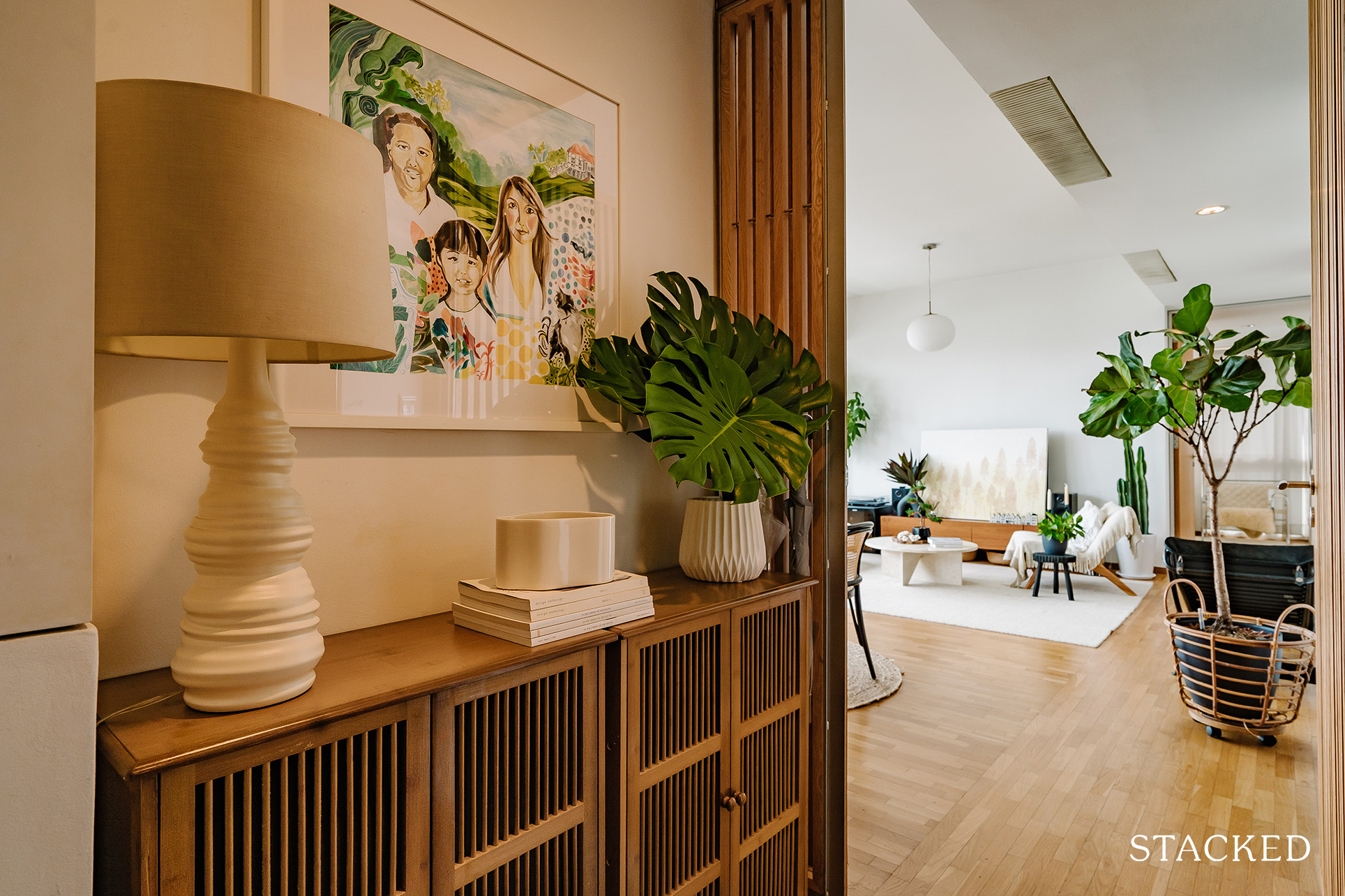
She wanted to have the furniture and rugs in lighter colours to help brighten up the room and also complement the warm wood nicely. In terms of tastes, Laura said they prefer something modern and classic that will last for a long time so they don’t have to update their home every so often just because it’s already out of style.
Let’s take a look at how they styled each part of the house.
Living Room
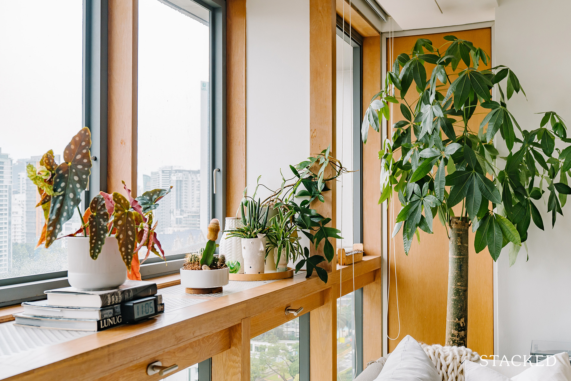
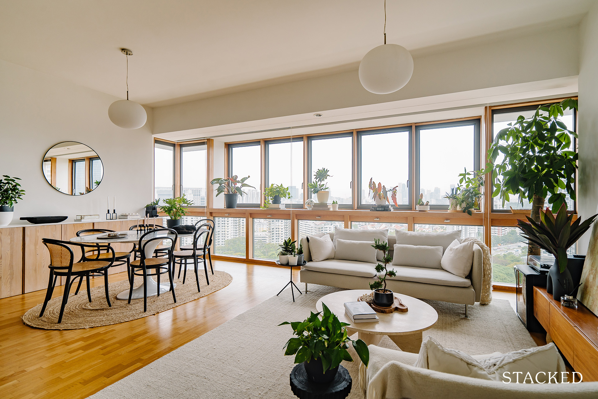
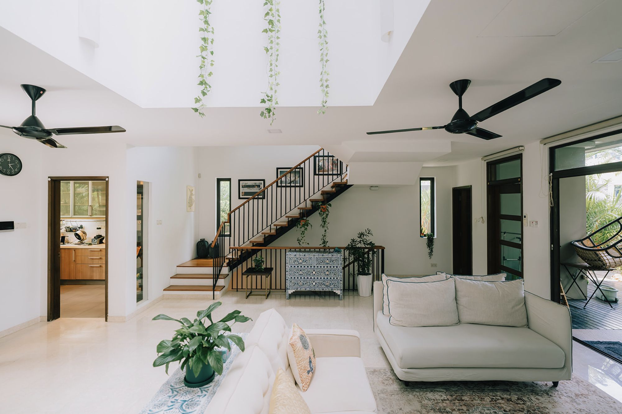
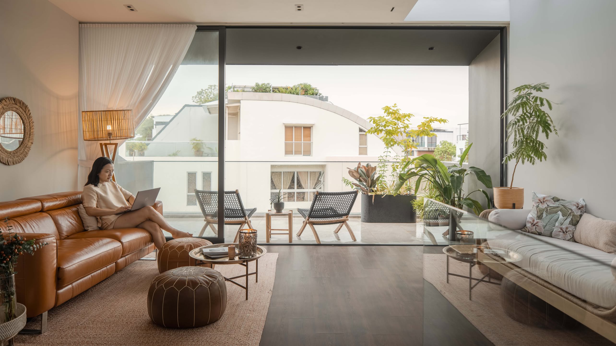
The first thing you’ll immediately notice in their place is how bright and calming it feels – far from being a 20-year-old unit. The open-concept layout helps bring the entire place together, with natural light streaming from both the living and dining room unimpeded.
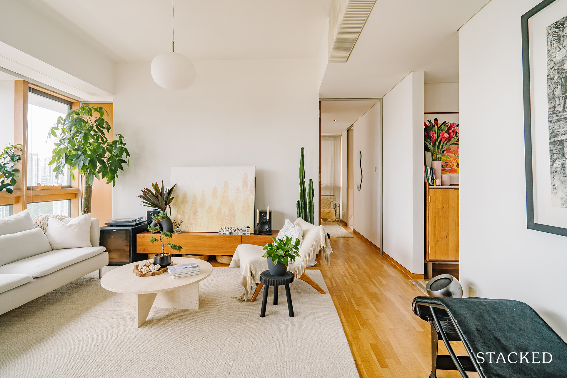
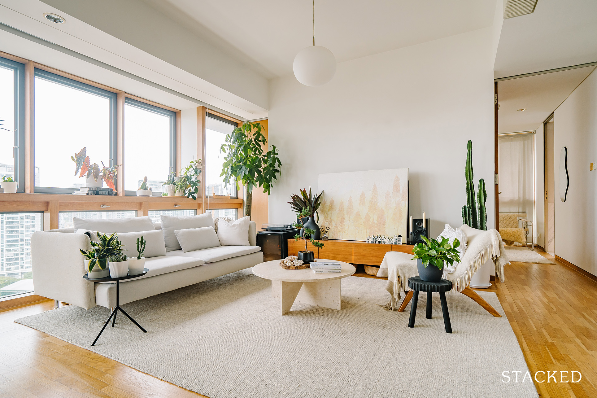
You’ll notice a good amount of indoor plants, which adds colour and helps to soften up sharp corners. Overall, it creates a balancing effect which is why the place feels so calming to the senses.
Dining Room
The dining room shares the same effect as the living room thanks to the long length of framed windows. You can just imagine how conversations flow nicely from the living to the dining area.
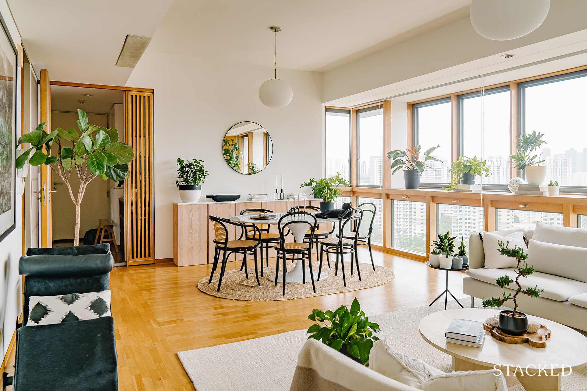
If you haven’t noticed it yet, the use of pendant lighting helps draw the eye upwards, emphasising the good amount of vertical space the home has. The soft light also creates a cosier ambience at night, which goes well with the vibe of the home.
And of course, the addition of the LC4 Le Corbusier lounger is a classic piece that would never go out of style.
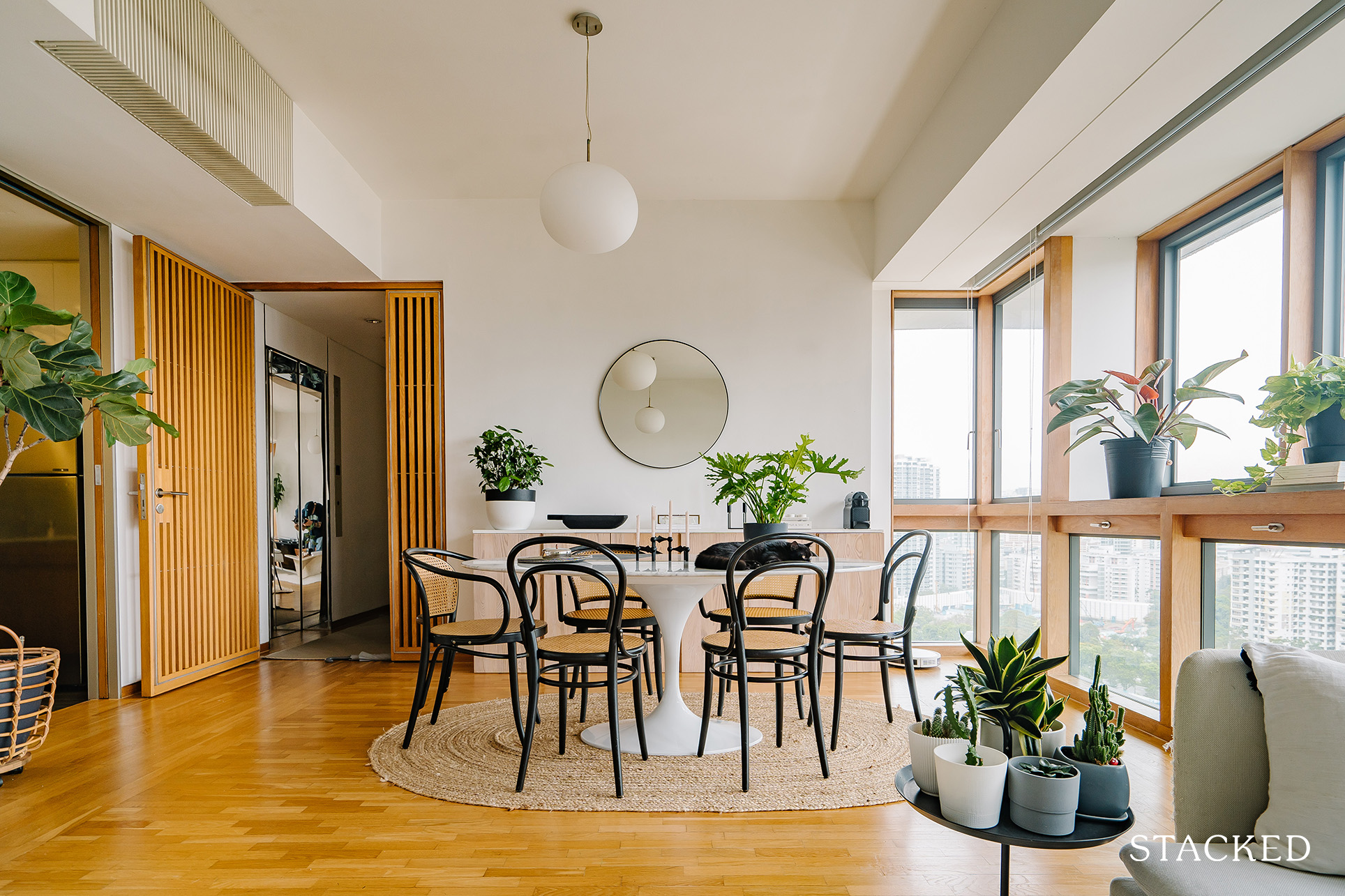
An oval-shaped rug was also chosen to pair up the circular table and demarcate the dining space.
Kitchen
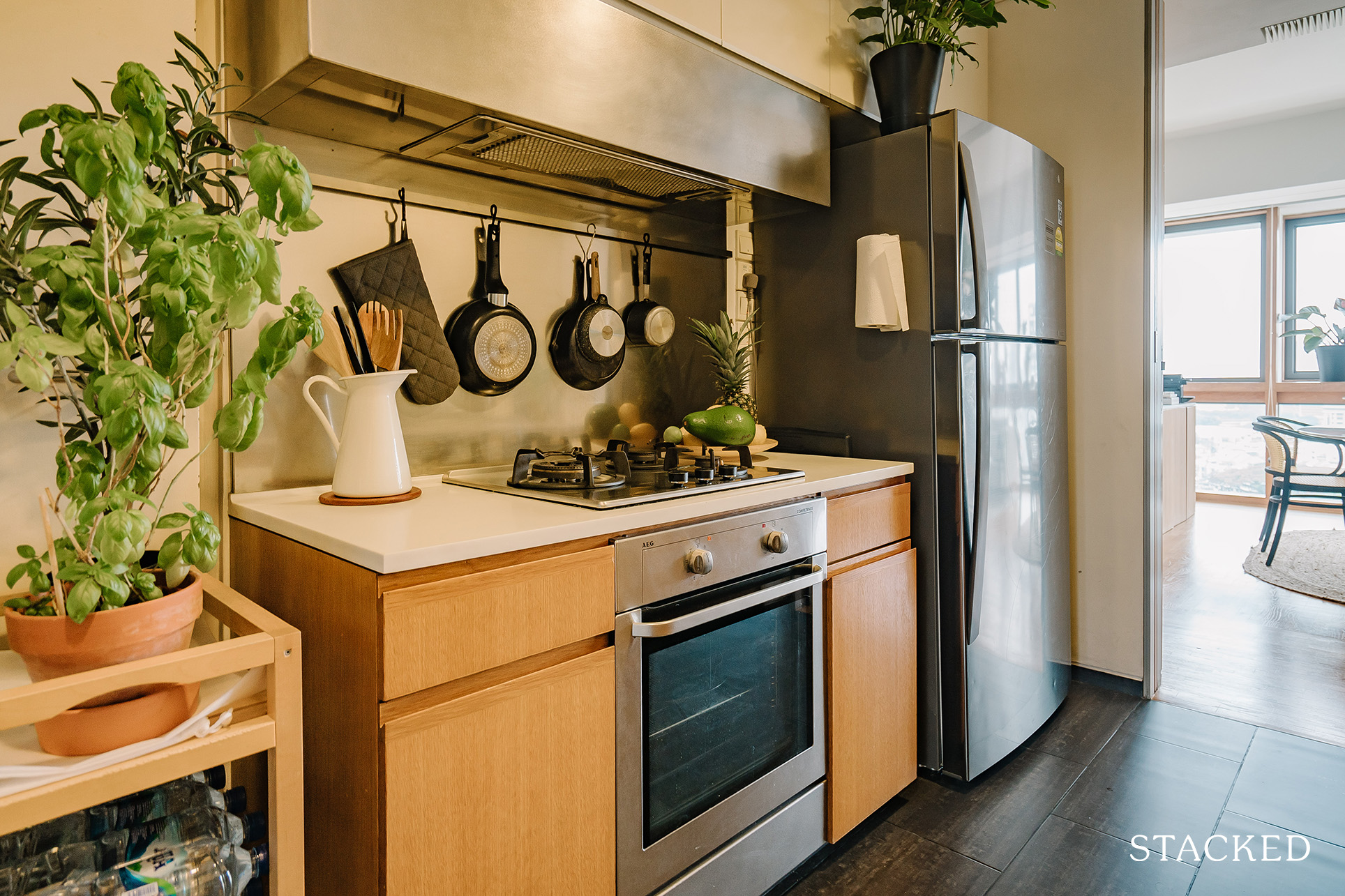
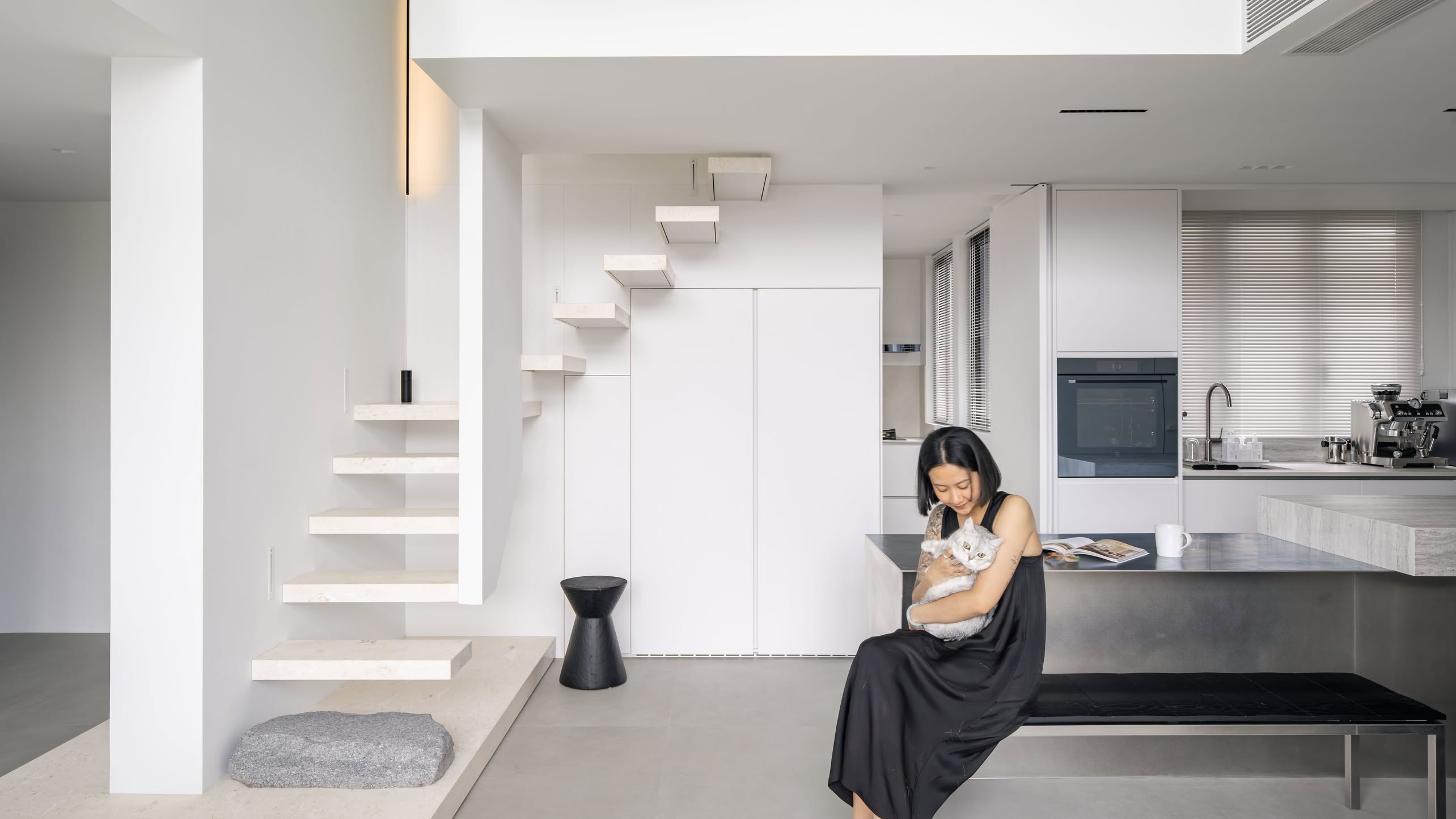
The kitchen has a clean and modern design – you would think the couple just had it custom-built during the renovation. The clever use of steel backsplash not only adds to the contemporary look but also helps to ensure that the kitchen is easy to maintain.
Bedroom/s
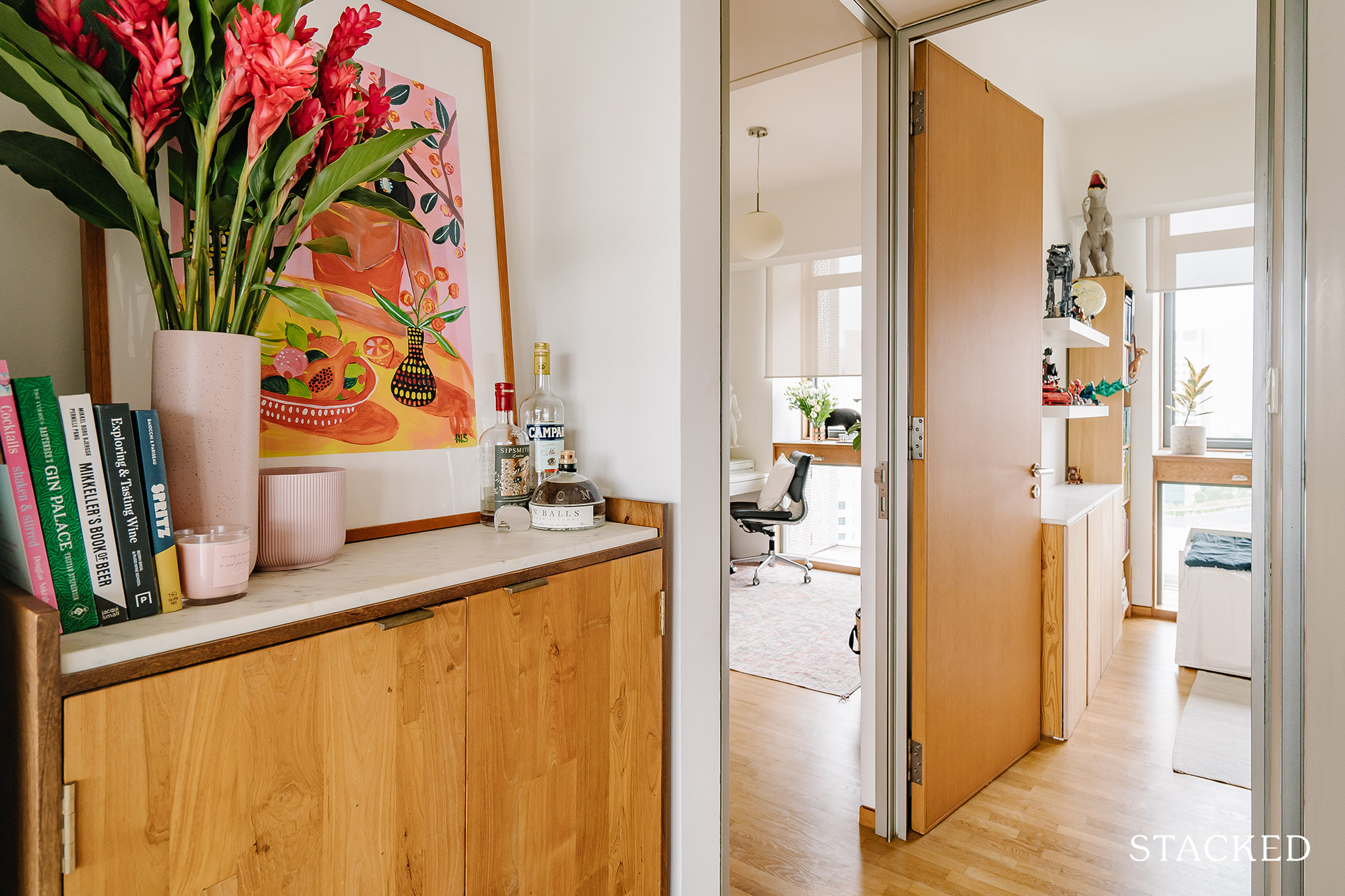
To help make each room distinct, she sourced different light-coloured rugs in each room.
Besides the rug, the iconic Wassily Chair makes an appearance here, along with the Kartell Componibili as a side table, and the &Tradition Flowerpot table lamp.
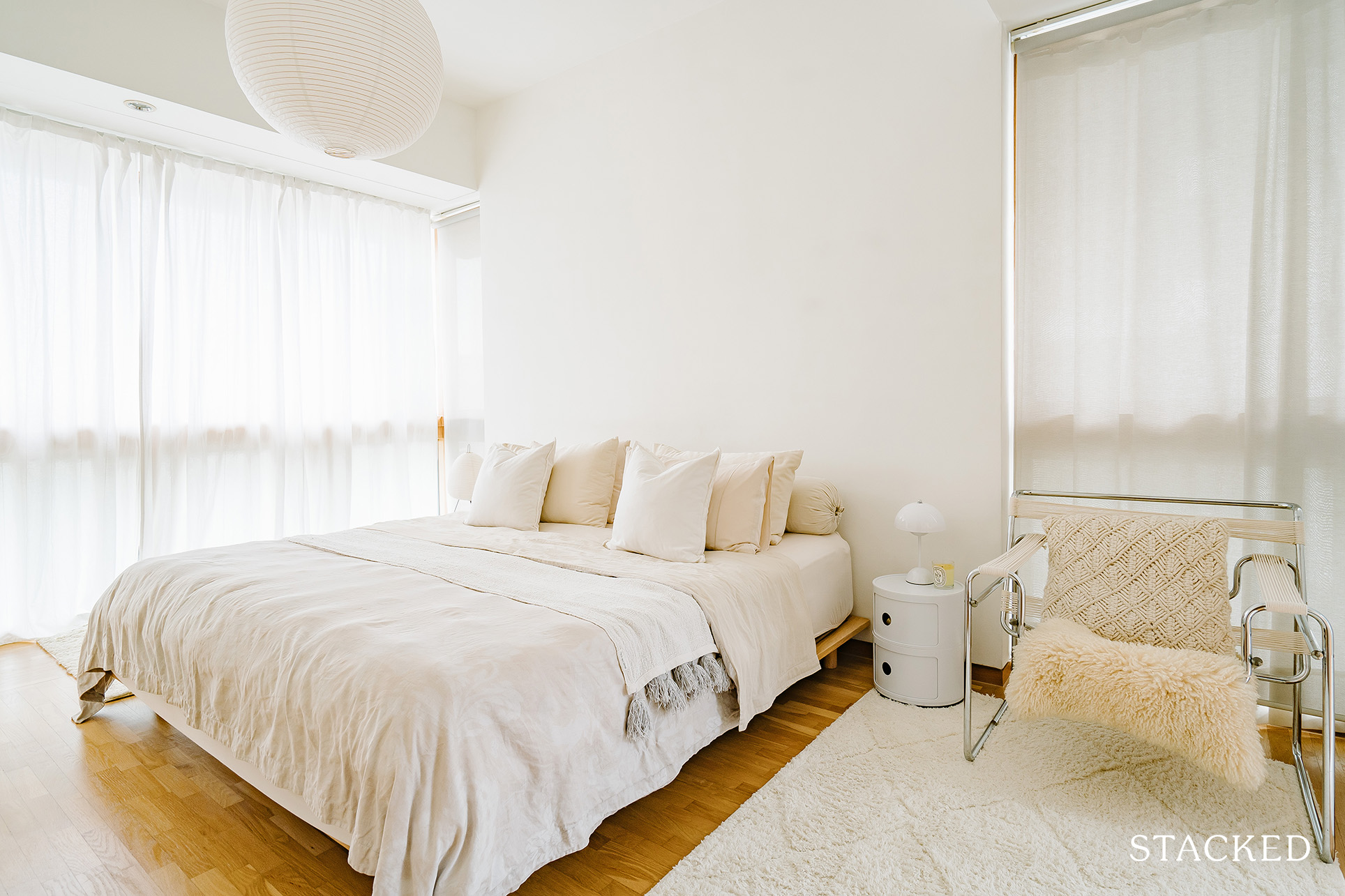
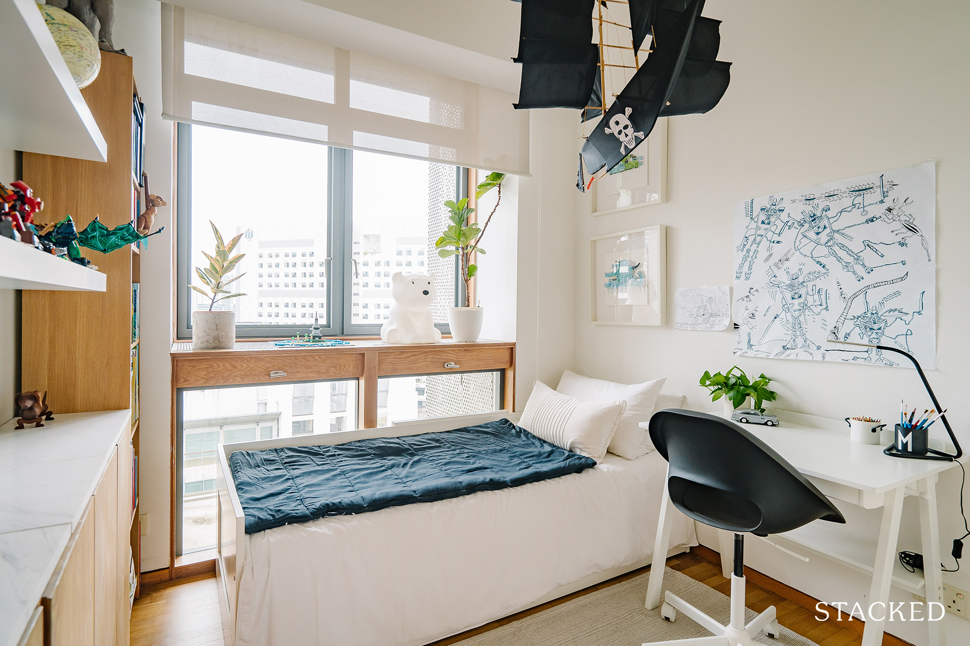
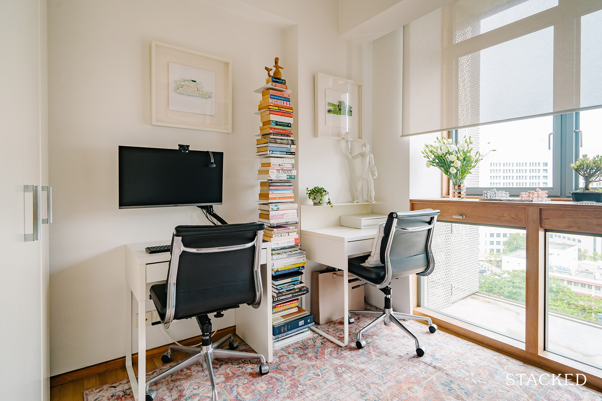
As Laura pointed out earlier, the floor in all the bedrooms also shares the same wood parquet as the one in the living and dining room.
Bathroom/s
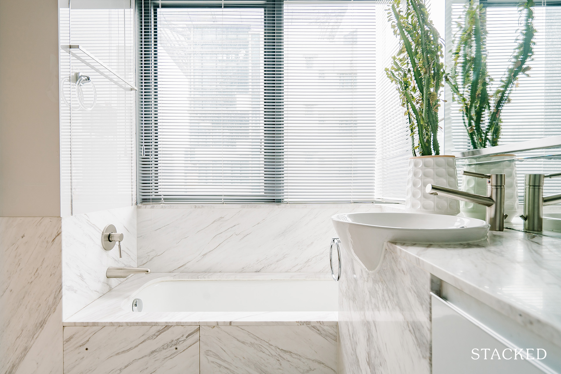
It’s not so often that one finds a bathroom with a healthy flow of natural light, so this was a great bathroom setup that really didn’t need much sprucing up. Adding a fresh indoor plant to the design makes the bathroom even more relaxing.
More from Stacked
6 Final Upcoming GLS Sites In 2025: Which Sites Hold The Most Promise For Buyers?
With the government furiously churning out GLS sites, there may be some hope for at least moderating property prices, and…
Bringing The Vision To Reality
We asked them about their furniture sourcing process, and Laura answered they had to do it one at a time. “When we viewed the place, we knew that some of our existing furniture wouldn’t fit in this new space, so we sold or gave them away. Then only after we moved in did we see what we missed and started to buy new items one at a time. So it’s not a one-time fitting out process.”
Aside from helping them not to get overwhelmed, doing it this way also help ensure they pick the right one. “We took it slow and only bought things that we both really liked and agreed on. Like the bedframe, which was only bought a few months ago, so we slept on a mattress on the floor for the whole year.”
Laura said that their process is still ongoing as they just bought their dining table and are still looking to buy more items, such as desks and artwork. Unless you’re pressed for time, this is actually an easy and enjoyable way to renovate the home because, in truth, you can never really get it done – especially when sprucing up your place.
For a must-have home decor item, Laura suggests an armchair or an accent chair. “For now, I like the Wassily chair and our LC4 lounger. Recently, I also just acquired a 50 yrs old Thonet chair at a bargain. I love that as well.”
Lessons Learned From A Their Rental Home
The greatest challenge they encountered in fitting out their home revolves around furniture arrangement. “Our challenge mainly is to rearrange our existing furniture to fit new space, especially the big ones like cabinets and beds.”
While their place is a little bigger than the previous one, with space being somewhat more flexible, Laura said that doesn’t mean they can place specific furniture exactly in the same room as before.
“For example, a pair of cabinets that used to be in our son’s room has to be split into two,” she said. “So one piece goes to study and the other to the bomb shelter. Another cabinet that used to be in our bedroom goes to his room instead.”
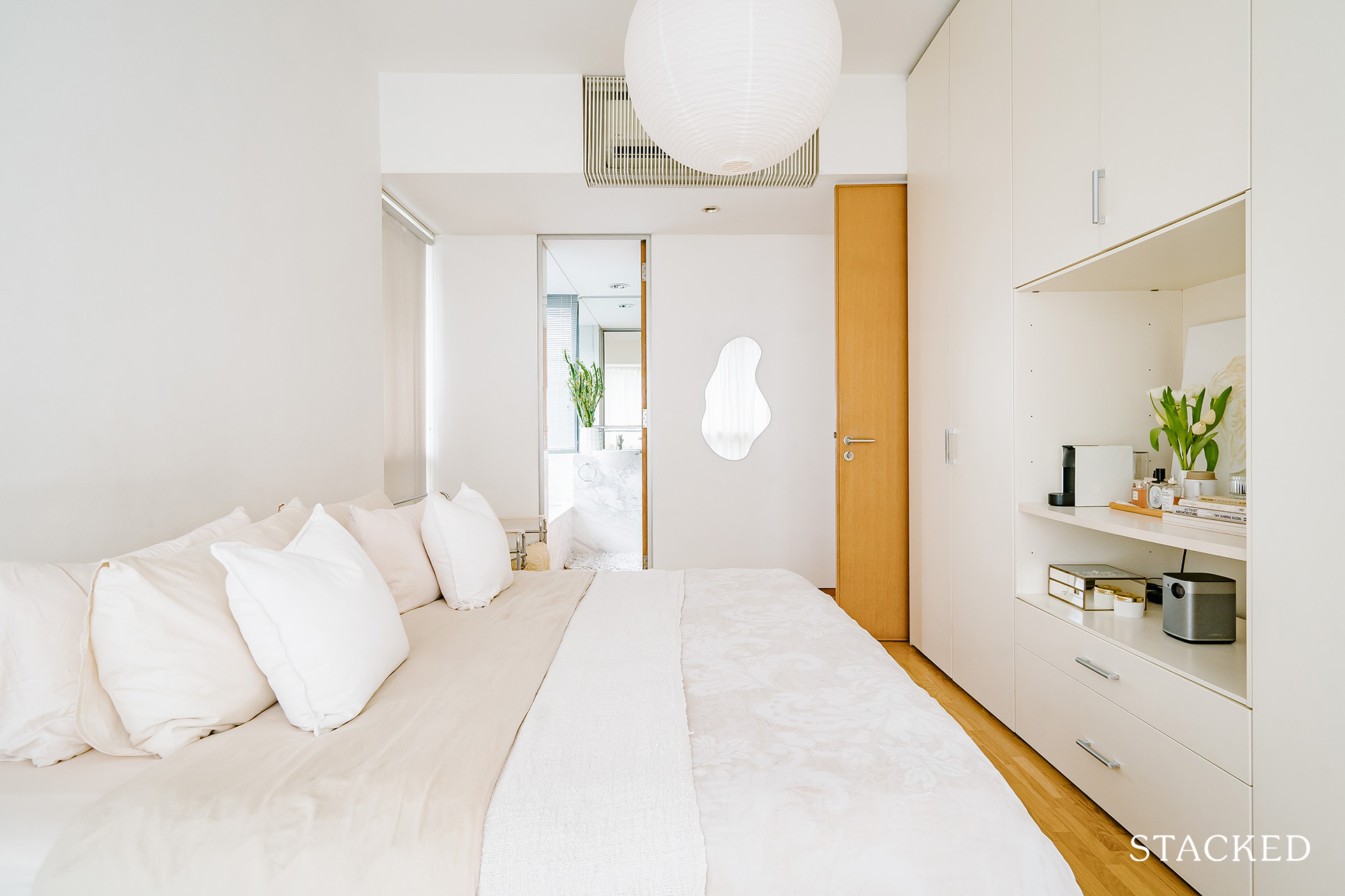
The master bedroom layout in their new home is rather elongated compared to their previous place, which means their existing US king bed frame would be too long for the room depth. So to get around this, the couple needed to search for a bedframe that was short in depth but wide enough to fit their US king mattress.
However, they found out the only way to achieve this is to have it custom-built. Their solution, in the end, was to buy two single-bed bases and put them together.
The couple had already learned a lot from their previous two places, so they made sure to apply these things in their third home as well.
“As we live in a rental, in the back of our mind, we always think that our furniture pieces are just temporary. Previously we buy mostly utilitarian, anything that’s cheap and good, knowing that we may have to give them away at the end of the lease.”
As time went on, they came to realise that they wanted to have something more meaningful – something better in quality – that would make the place they were staying at truly “their home.” And so, Laura said they started to become more selective and try to go for those things that are perhaps more investment worthy.
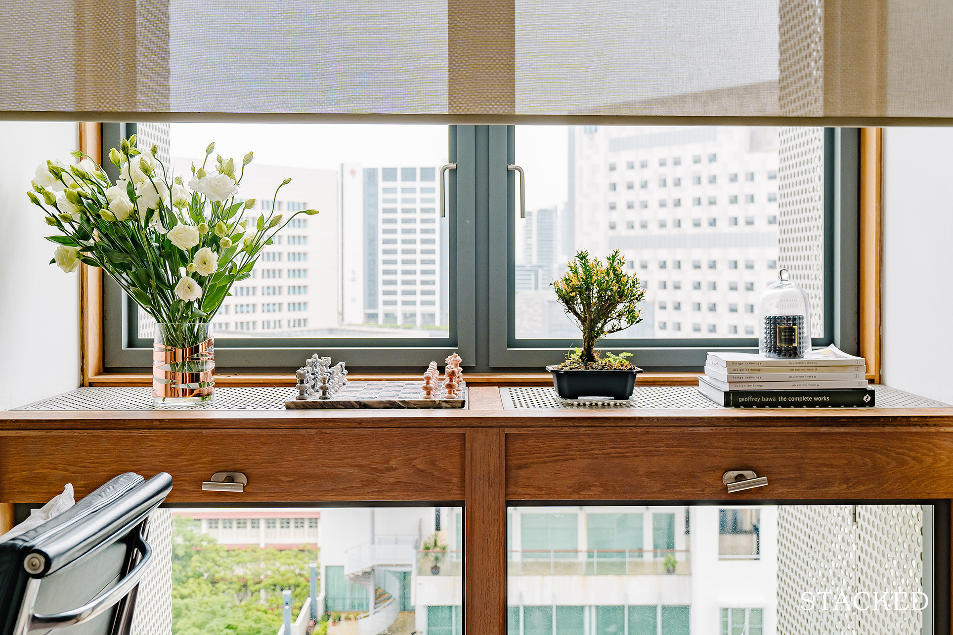
Still, she said they definitely didn’t rule out affordable furniture completely, considering they have a young child and pet.
Even if their home is a rental, the couple shared two great pieces of advice that apply to both homeowners and renters.
First is for loose furniture: “Spend on classic designer pieces that are proven last for generations, in terms of design and style, that in my opinion may well be worth the money in the long run.” The second one is to go for minimum built-in furniture. “They can be out of style pretty fast, or you may get bored of them,” Laura said. “I also personally think it will be easier to sell or rent out your unit should you plan to do that in the future.”
At Stacked, we like to look beyond the headlines and surface-level numbers, and focus on how things play out in the real world.
If you’d like to discuss how this applies to your own circumstances, you can reach out for a one-to-one consultation here.
And if you simply have a question or want to share a thought, feel free to write to us at stories@stackedhomes.com — we read every message.
Need help with a property decision?
Speak to our team →Read next from Homeowner Stories

Homeowner Stories We Could Walk Away With $460,000 In Cash From Our EC. Here’s Why We Didn’t Upgrade.

Homeowner Stories What I Only Learned After My First Year Of Homeownership In Singapore

Homeowner Stories I Gave My Parents My Condo and Moved Into Their HDB — Here’s Why It Made Sense.

Homeowner Stories “I Thought I Could Wait for a Better New Launch Condo” How One Buyer’s Fear Ended Up Costing Him $358K
Latest Posts

Property Market Commentary Yishun 10 Could Be Redeveloped Into Mixed-Use Housing Near Yishun MRT

Singapore Property News 30-Year-Old Singapore Investor Buys Ang Mo Kio HDB Coffeeshop After Owning 13 Properties

Singapore Property News Tropicana Metropark’s 80% Take-Up Signals Strong Demand for Integrated Living






















0 Comments