All reviews on Stacked are editorially independent. Developers can advertise with us, but
cannot
pay
for,
edit, or preview our reviews.

Editor's Pick
Mori Condo Review: Good Layouts, Freehold, Convenient Location If You Like Geylang
November 27, 2021 41 min read
| Project: | Mori |
|---|---|
| District: | 14 |
| Address: | 223 Guillemard Road |
| Tenure: | Freehold |
| No. of Units: | 137 |
| Site Area: | 37,135 sqft |
| Developer: | Roxy-Pacific Holdings |
| TOP: | 2026 |
Mori at Guillemard Road belongs to the ‘newest’ generation of enbloc sales, with Roxy-Pacific having only acquired the plot of 15 terrace houses back in November 2020 for $93m. No prizes for guessing the inspiration for its name – given that Japan is probably a Singaporean’s favourite holiday destination.
To me, Roxy-Pacific’s strength lies in a strong execution of smaller developments with an emphasis on efficient layouts and small unit sizes, while keeping the overall quantum affordable.
If you need any point of reference, look no further than their developments in recent years. Their 2 Bedroom units at RV Altitude starts from 441 sqft, Fyve Derbyshire from 560 sqft and even its nearby Arena Residences from 549 sqft. In some ways, you get a lot of bang for the buck as you get the practicality of the 2 Bedroom without having to break the bank for it.
That said, Covid-19 has upended our lifestyles altogether so there has been a greater desire for slightly larger sized units while keeping the units efficient and affordable. If that is also something you are looking for, I think Mori might have a decent product that is worth considering.
The gentrification of Geylang bodes well for Mori, with its traditional stigma as a red light district evaporating gradually as Singapore continues its push towards prosperity. The numbers do speak for themselves and we have seen the recent new launches in Geylang do well, including good solid figures in NoMA and Rezi 24, both of which are said to be completely sold out.
With Mori being inspired by the Japanese concept of wabi-sabi and offering a differentiated facade from its competitors, it will be an interesting project to watch out for.
Without further ado, let’s dive straight into what Mori has to offer!
So many readers write in because they're unsure what to do next, and don't know who to trust.
If this sounds familiar, we offer structured 1-to-1 consultations where we walk through your finances, goals, and market options objectively.
No obligation. Just clarity.
Learn more here.
Mori Condo Insider Tour
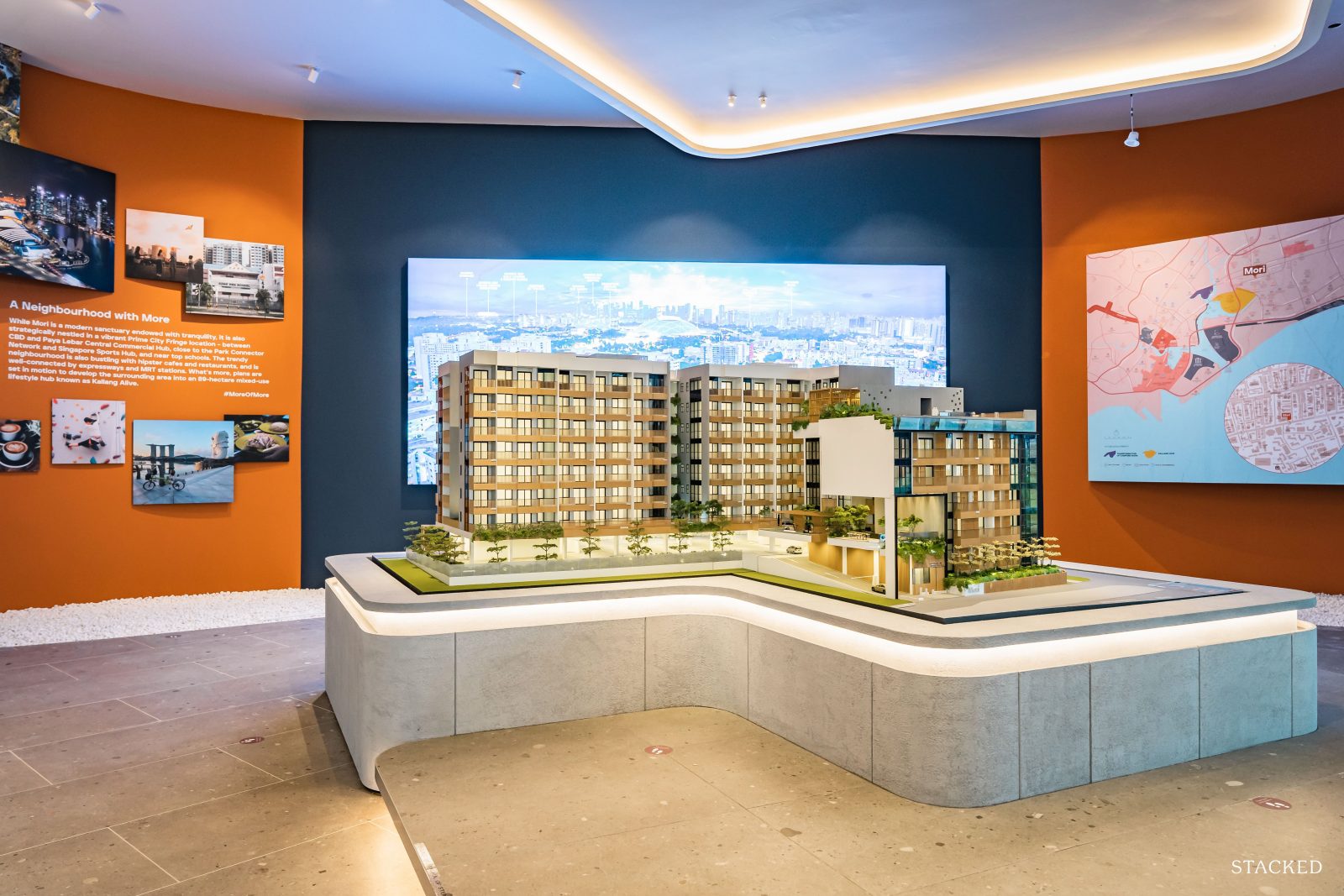
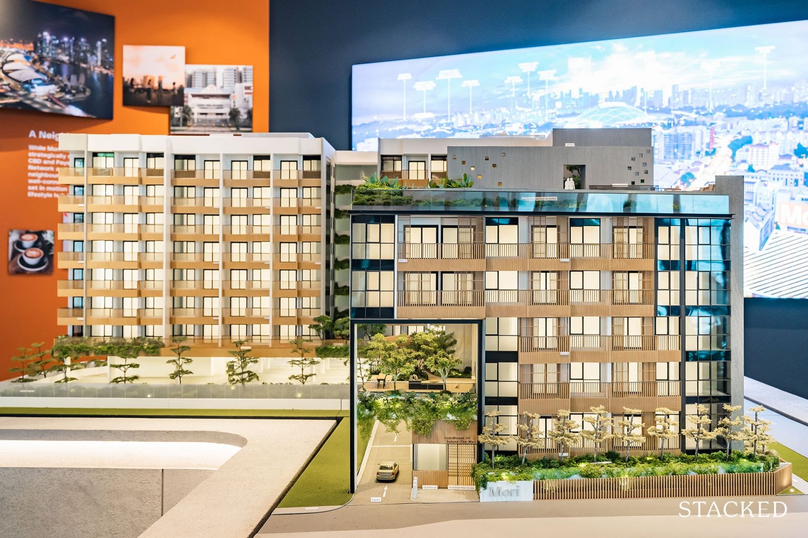
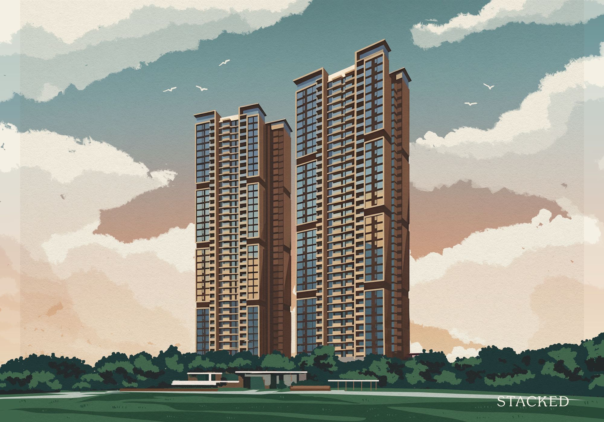
Mori is a Japanese-inspired project based on the concept of wabi-sabi. It translates into wisdom in natural simplicity and finding beauty in imperfections. All the materials chosen for this project have been carefully curated to ensure that residents grow into an appreciation of them as the project matures in age. This includes off-form concrete, timber-look aluminium, and greenstone mosaic tiles for the common areas.
It’s a similar theme for the units too, with a light (1 and 2 bedroom) and dark scheme (3 and 4 bedroom) offered for a pleasant differentiating mix. Without giving too much away at this point (read on for the unit tours), I do like the light scheme – but sadly you don’t get a choice should you opt for the bigger units!

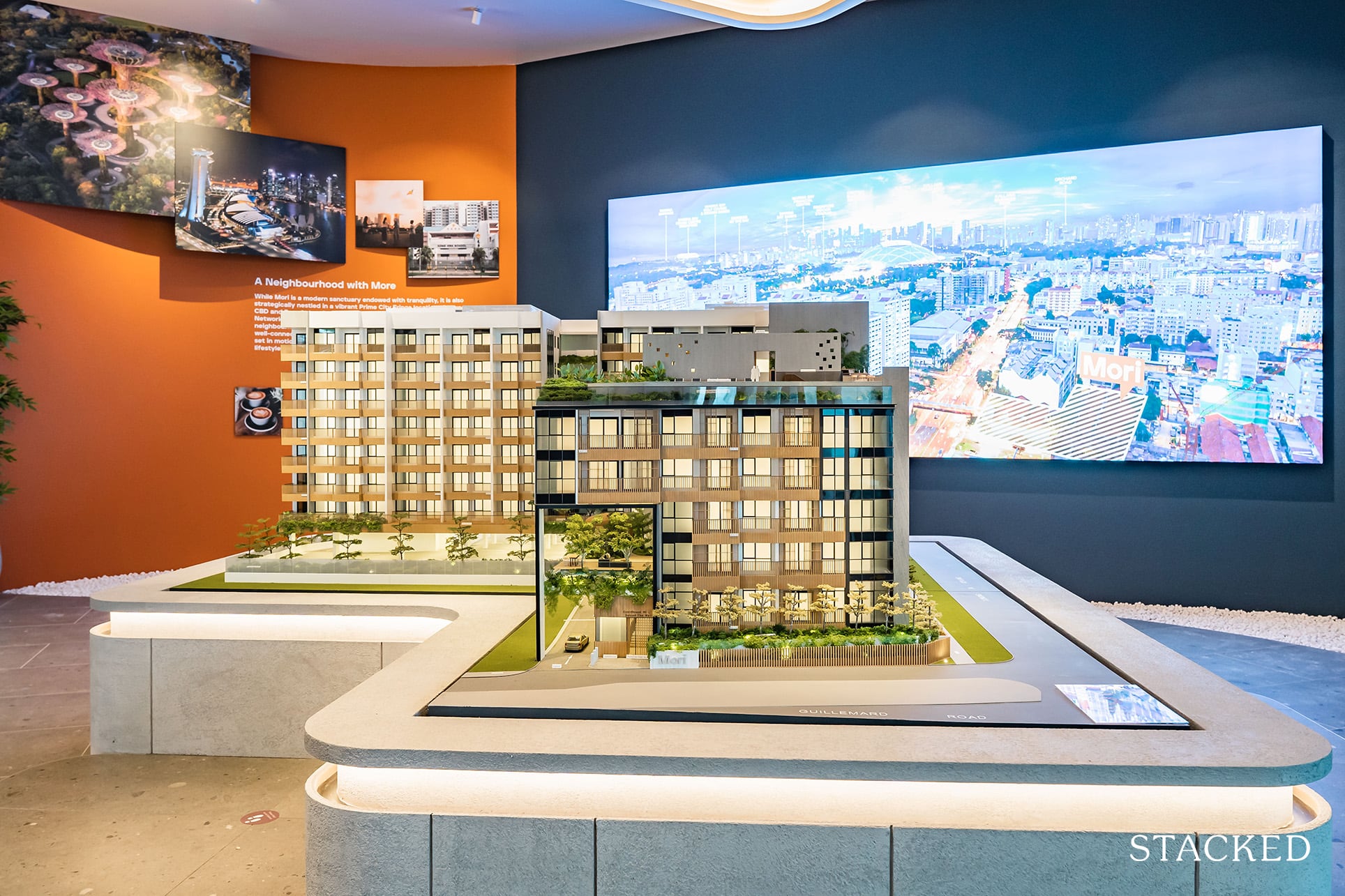
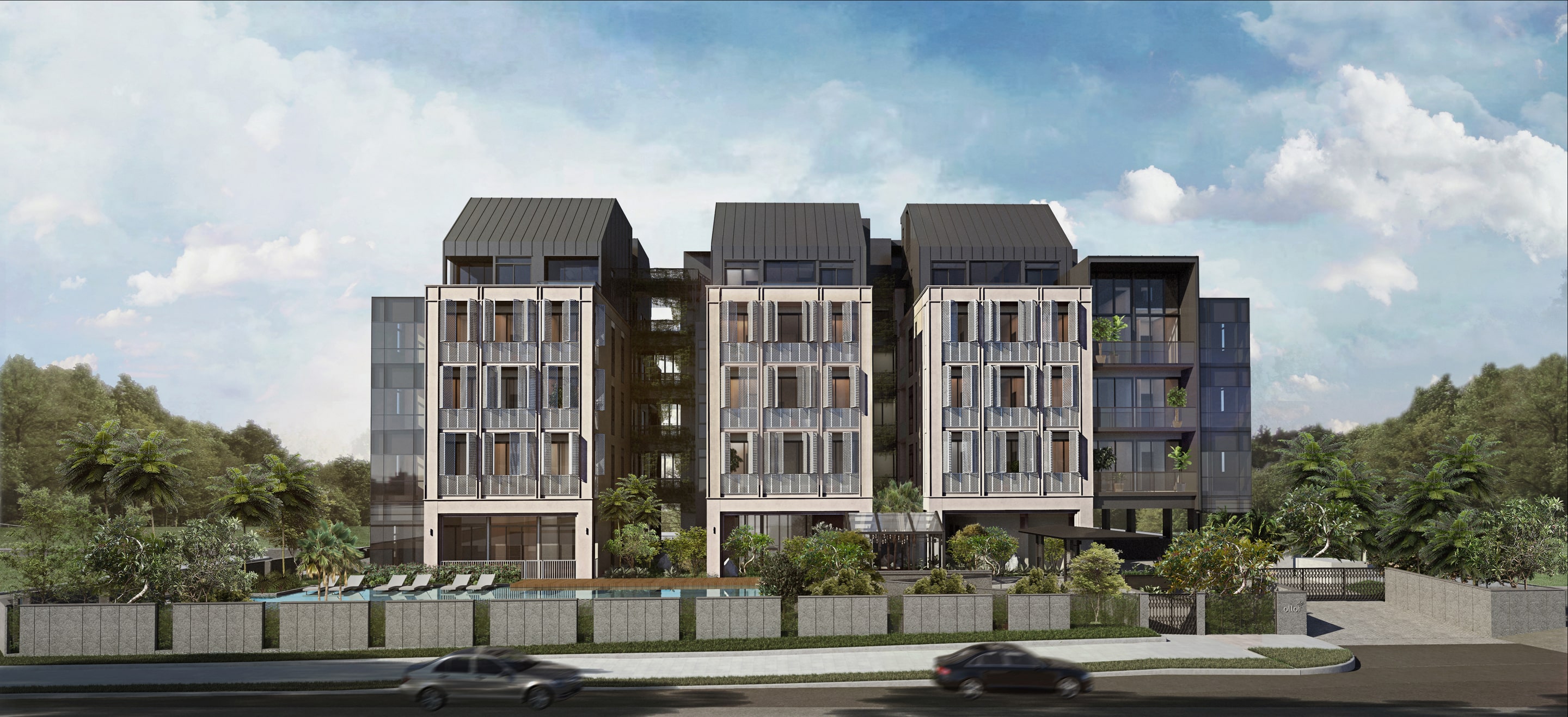
I must say from the get-go that Mori’s overall facade does offer it a differentiated vibe from the rest of the apartments in its vicinity. For the unacquainted, Mori sits within the wider Geylang region that has an abundance of small apartments with often little to differentiate between them. Thus, I do think that Mori is off to a good start here.
As for the development’s name, Mori, it translates into “forest” in Japanese and plays on the location’s address at Jalan Molek as well. The development continues its wordplay by seeking to achieve More Serene, More Active, and More Social through its different zones as stated in their marketing materials.
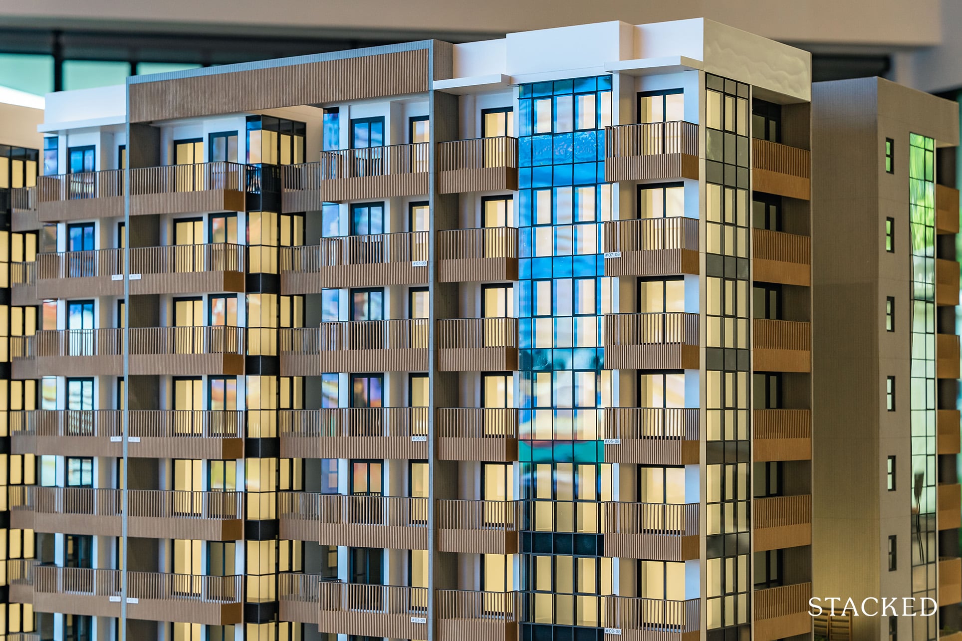
It is overall a minimalist and quite a soothing look. It half-reminds me of Ki Residences, another project that has been very well-received by the own stay crowd.
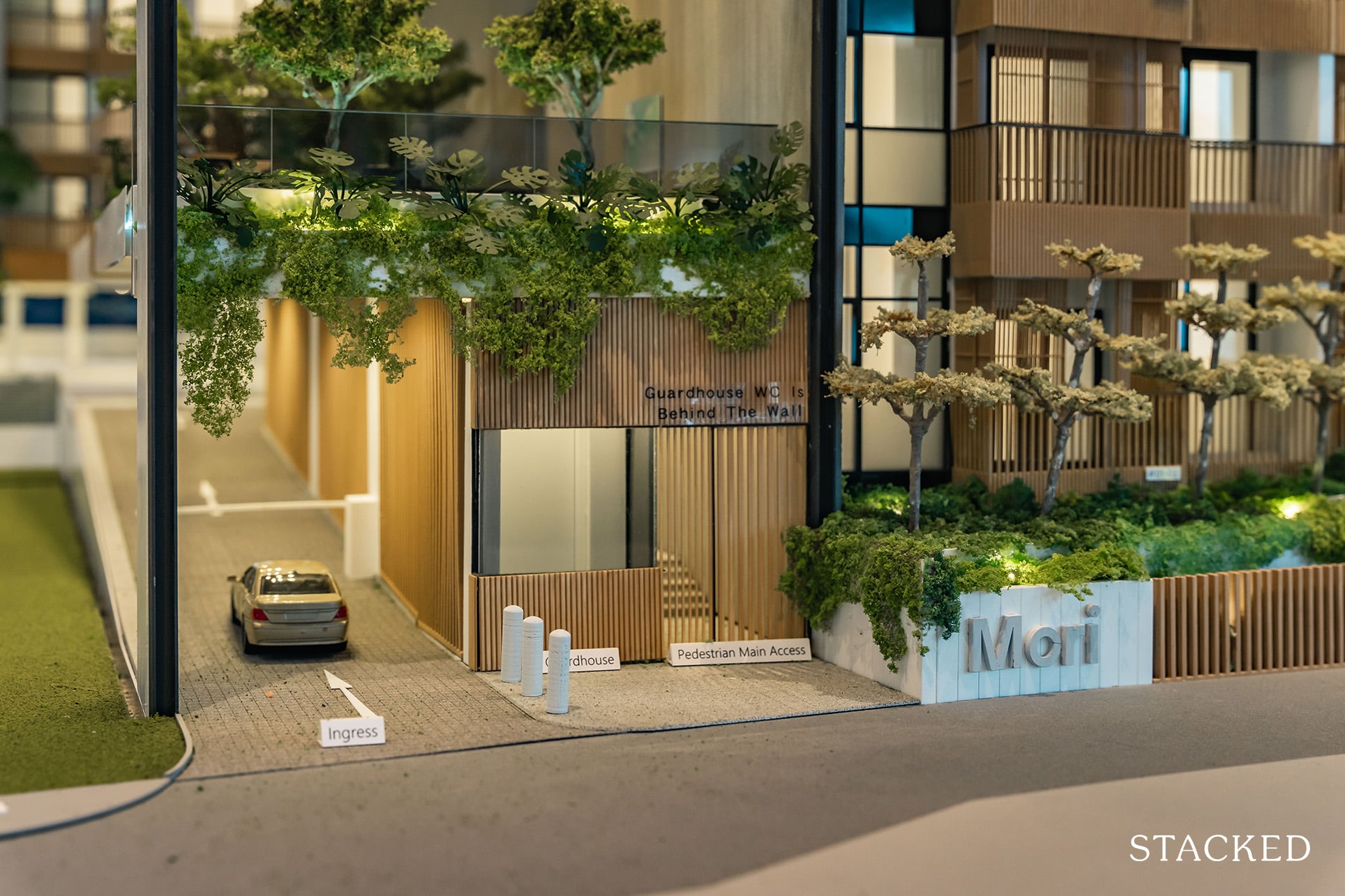
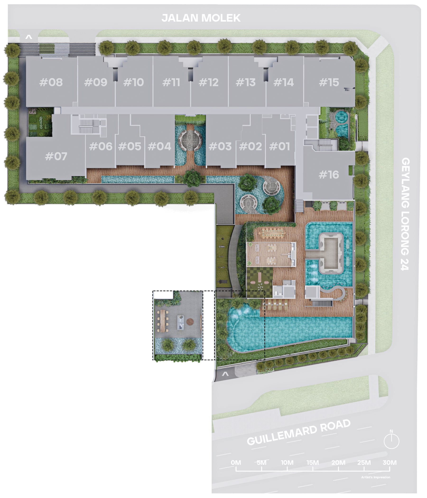
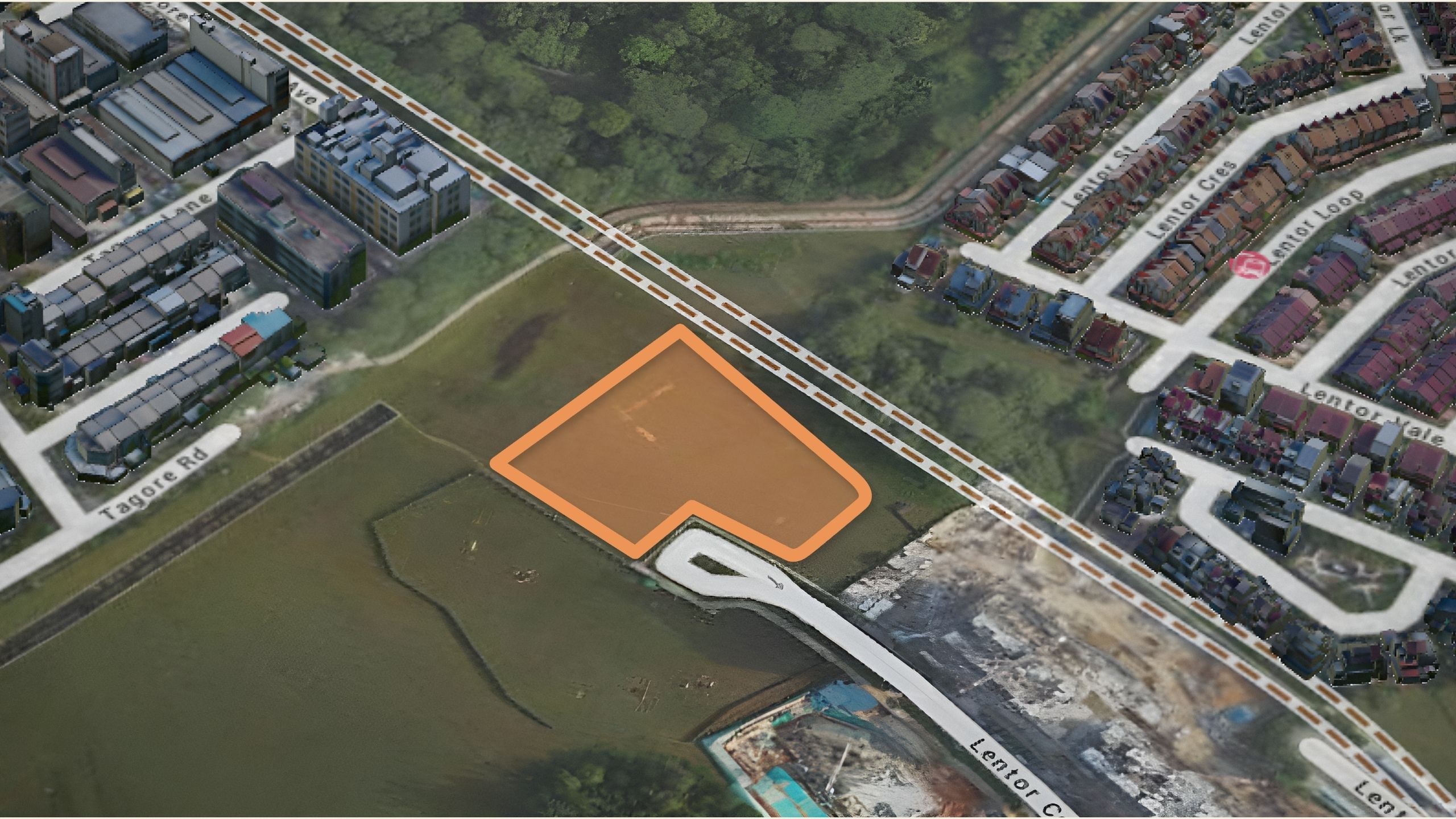
Starting first with the entrance, it offers a single-lane ingress off Guillemard Road with a guardhouse present. The single-lane serves both Mori and residents of Guillemard Suites so it may get a little congested during peak hours. If you were wondering where the egress would be, you are probably not alone.
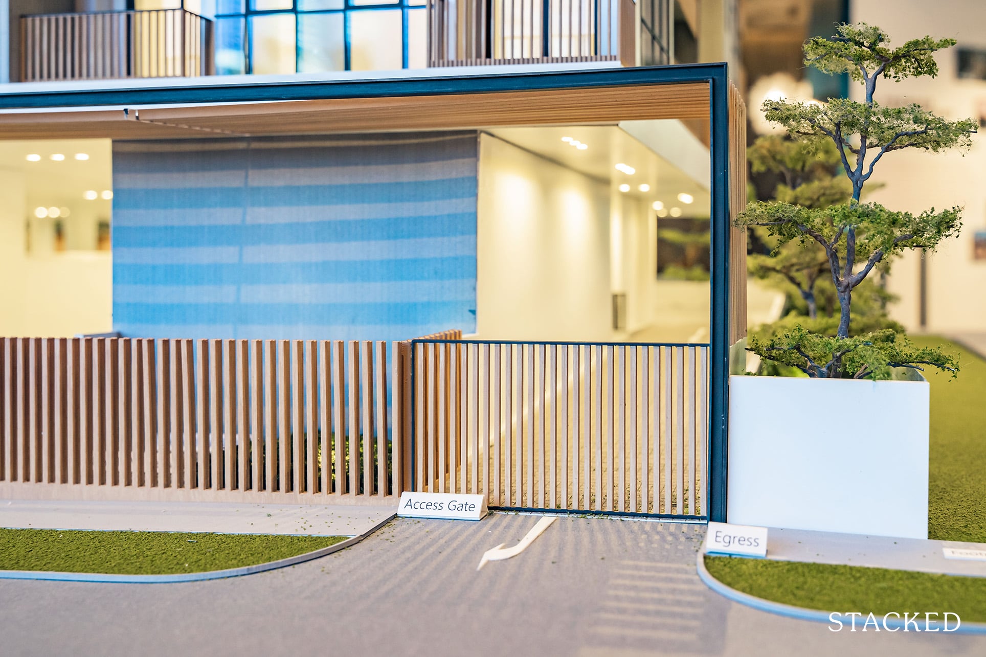
Vehicles would be exiting via Jalan Molek, and this is likely due to the land constraints of the project.
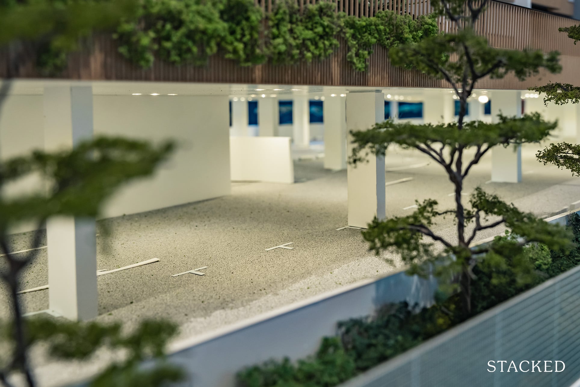
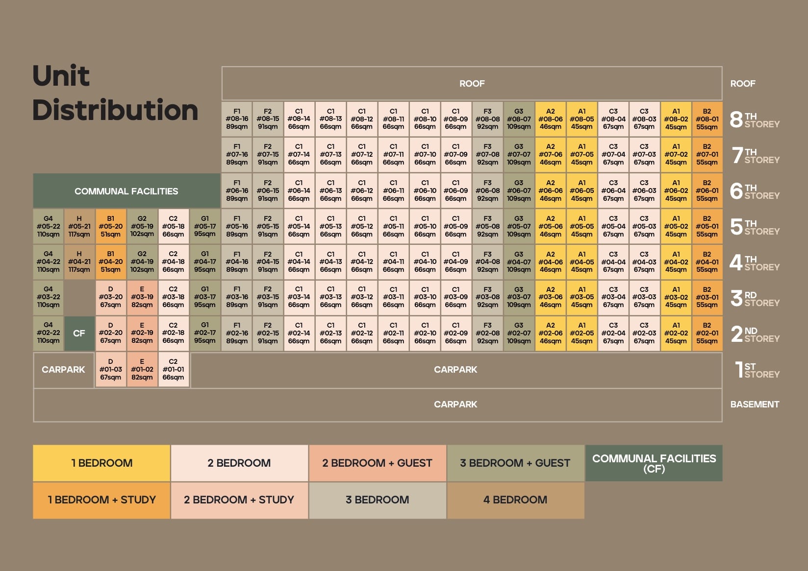
As for car park lots, there are 110 lots on Level 1 and Basement 1, sufficient for 80% of all units.
Mori does consist of mainly 1 and 2 Bedroom units, so this ratio will likely be enough for residents. What I find peculiar is the lack of provision for electric car charging. Given the Government’s push towards electric cars by 2030, it is a strange omission. Of course, this is something that can easily be changed, which I do think should be done seeing how popular the adoption of Tesla cars has been in Singapore so far!
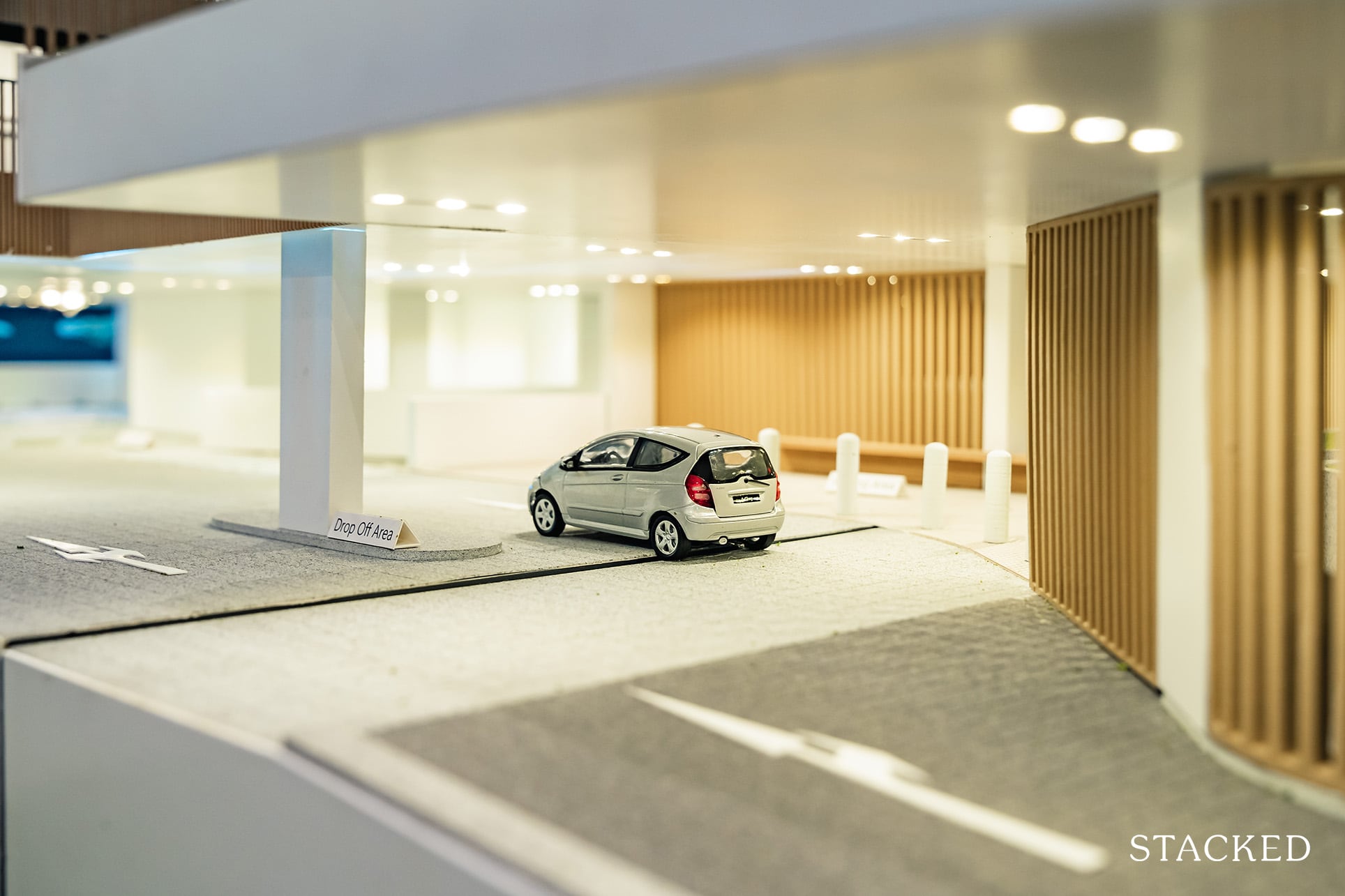
The drop-off area is located further in. It’s not a grand drop-off point to speak of, and not unexpected either given the small land size of sub-40,000 sqft.
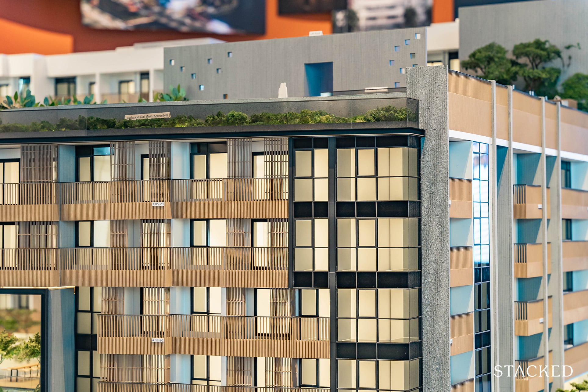
Facilities are spread across levels 2 and 6 and for a development of this size, I think that Roxy-Pacific has done a good job in packing in as many facilities as they could. Starting first with Level 6, and you will notice that all the facilities are found on the side fronting towards Guillemard Road. That should come as no surprise as this offers views of the Singapore Sports Hub in the South-West direction.
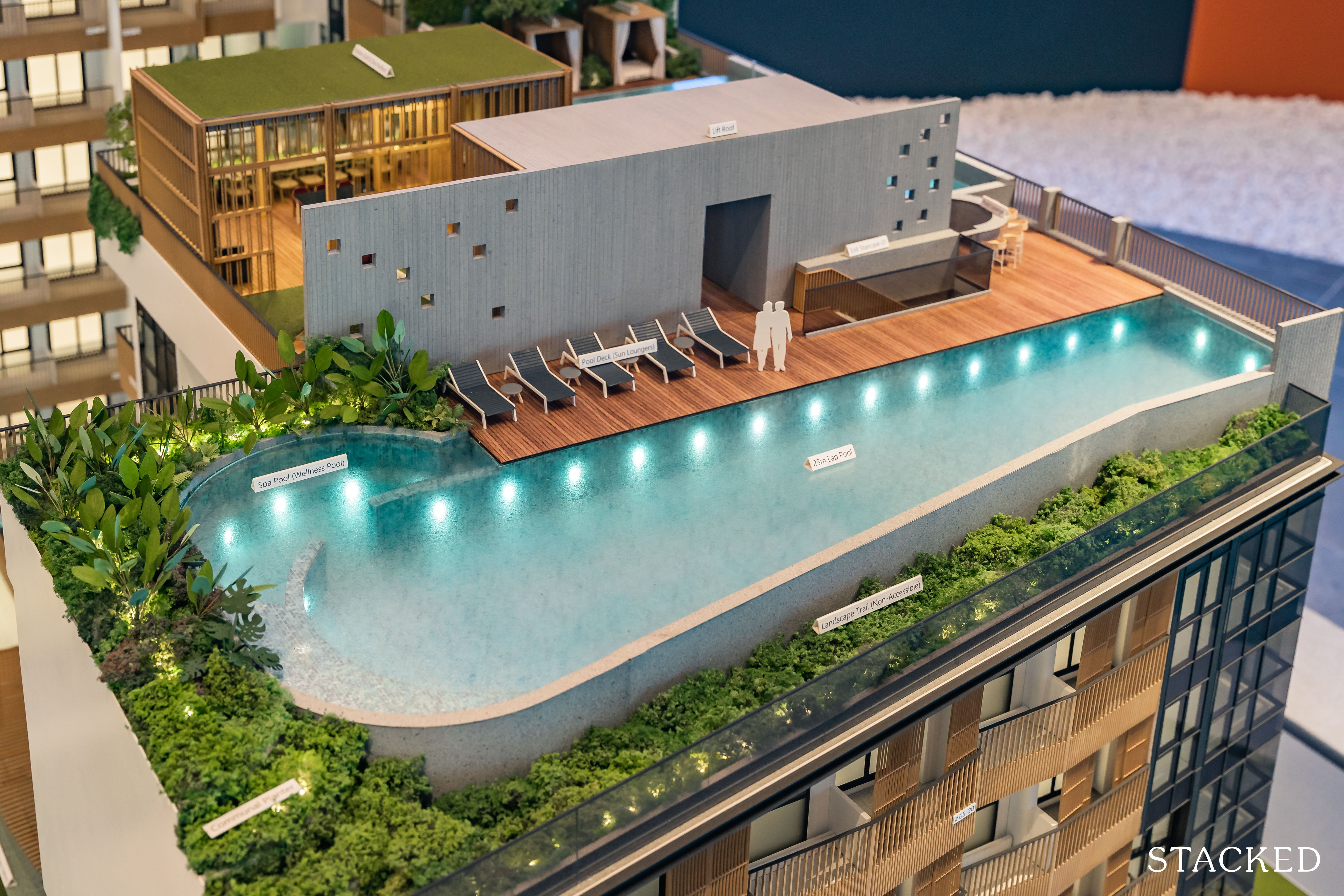
Taking full advantage of these views is the lap pool that spans 23m in length and 4m in width (about 2 people). It’s not quite the 50m standard that we see in many developments these days, but likely sufficient for a boutique apartment with just 137 units and less than 40,000 square feet of land.
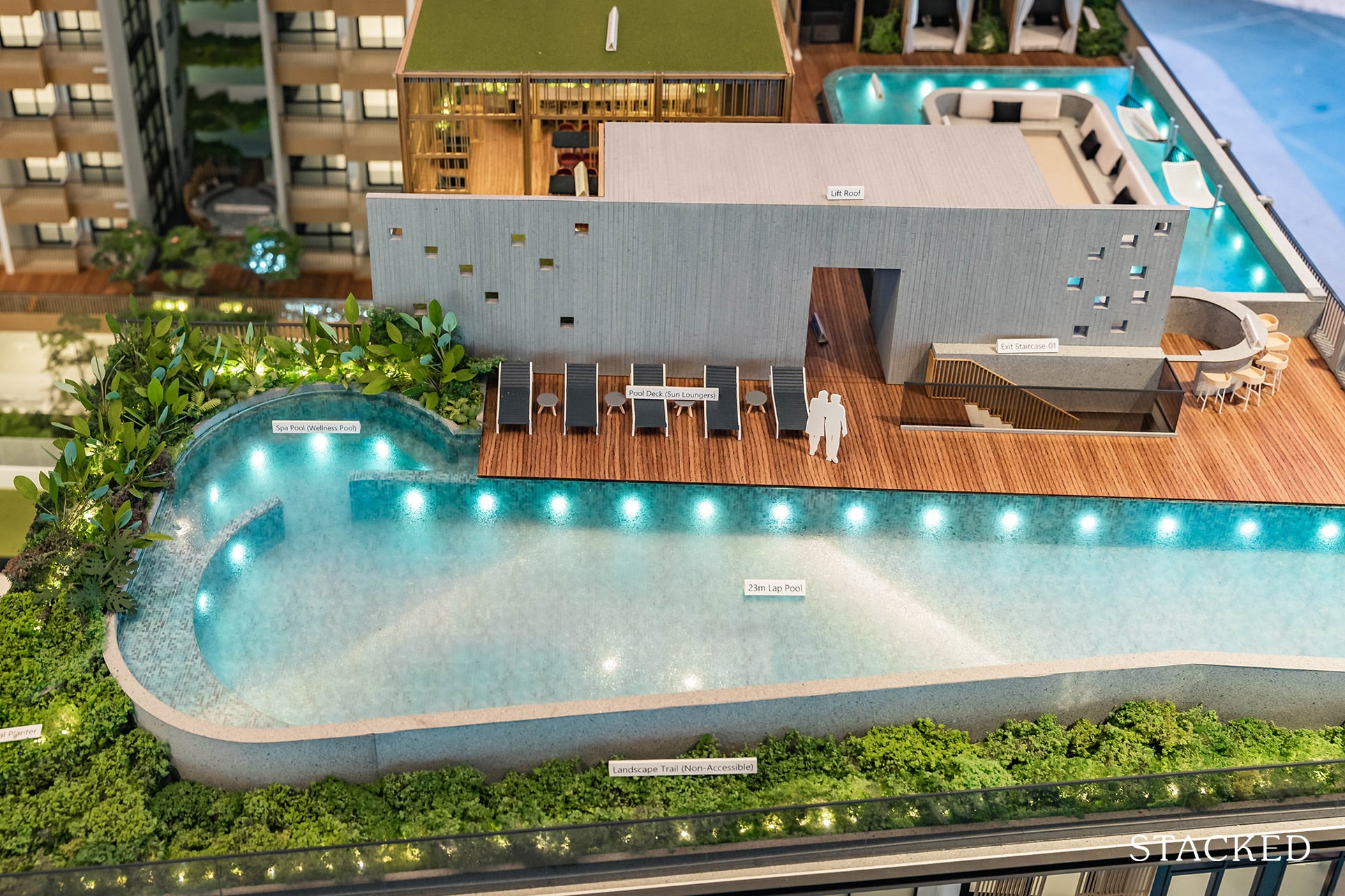
Sukabumi stone mosaic tiles will form the base of the pool and green landscaping will be done around the pool, making it a rather pleasant sight on your rooftop. There will also be some deck chairs available for residents’ enjoyment. It’s not a lot though if I had to nitpick.
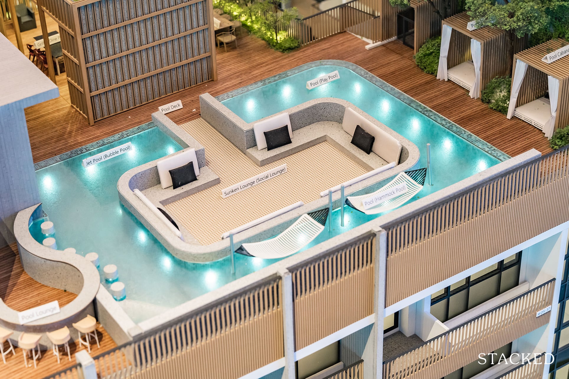
Close by is the Social Lounge, which is a comfortable seated area surrounded by the Bubble Pool, Play Pool, and Hammock Pool. I’ve always liked sunken pods as they have always given me the ‘floaty’ feeling and it’s not a feature commonly seen, especially so in a small project.
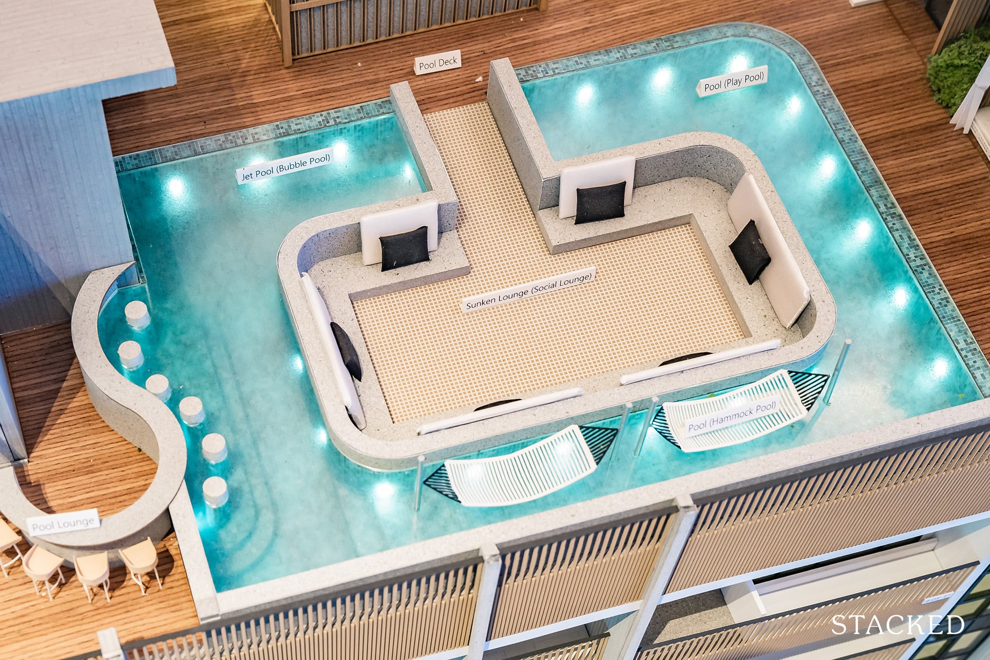
I do like that there’s more than one pool for some variety, and that one is clearly for proper swimming, while the other is for you to just relax in.
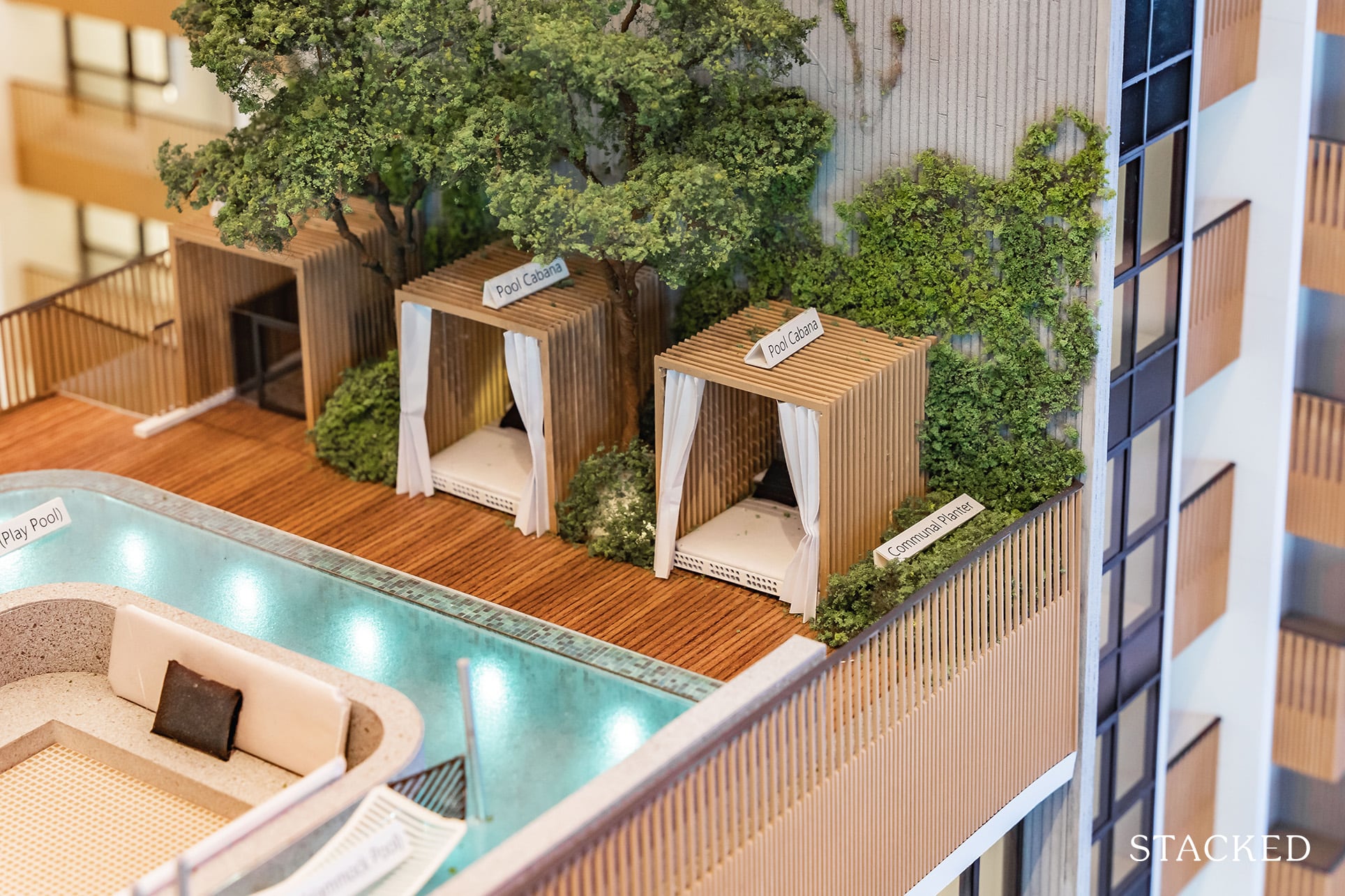
Following on with the theme of relaxation, there are also a couple of cabanas around for you to laze around.
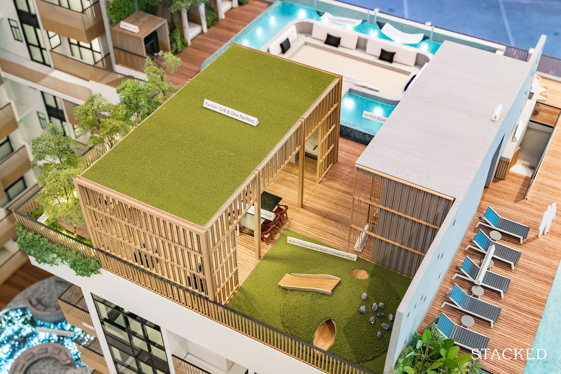
Kids here might be pretty disappointed as there seems to be only 1 lonely slide here to entertain them at the Kids’ Creative Play area. The kids have to quite literally, be creative when thinking about how to keep themselves entertained in such a plain-looking space. I don’t blame them, however, as the area it’s in isn’t usually a top of mind for parents with young children anyway.
There isn’t an air-conditioned clubhouse at Mori, but there are 2 separate dining pavilions that are adjacent to each other. The Grill & Dine Pavilion looks to be completely sheltered while the Social Dining one opens up to the sky. Frankly, based on the renderings, the entire rooftop looks very cosy and aesthetically pleasing so I would be keen to find out if it really turns out this impressive when Mori TOPs!
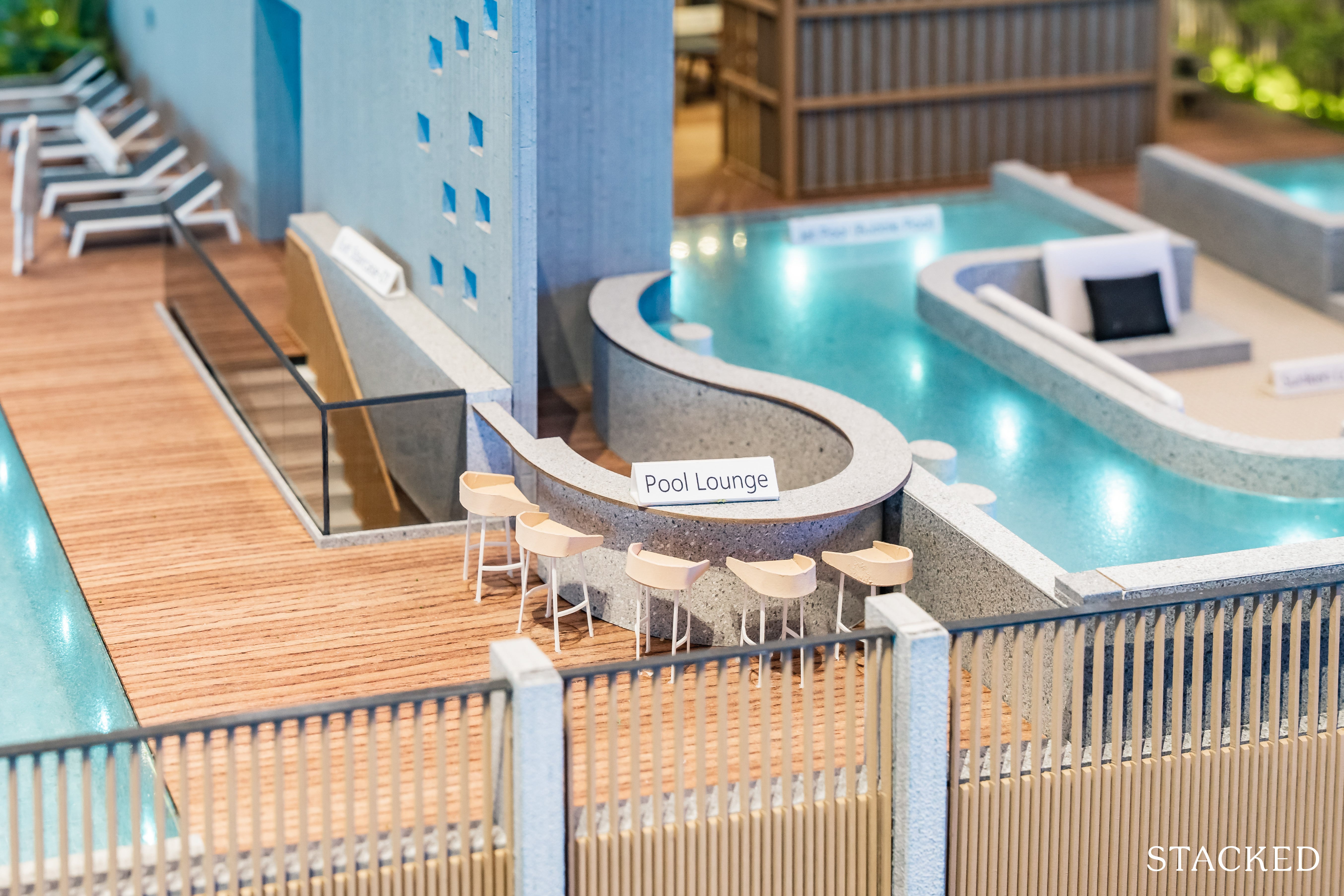
Surrounding the sunken lounge is also the Pool Lounge, which provides chairs in the pool and a bar counter that can serve both those on land and in the pool. Once again, it’s quite a unique feature to have here, so really kudos to the developers for ensuring that there is a personal touch when developing Mori. There won’t be a bartender stationed to serve you drinks, but on days where you throw a party, I assume you would be free to engage one to do so.
Frankly, though, I find these facilities usually become a bit of a white elephant if there isn’t pool service available. That may just be me though, so I’ll be interested to know what you think in the comments below!
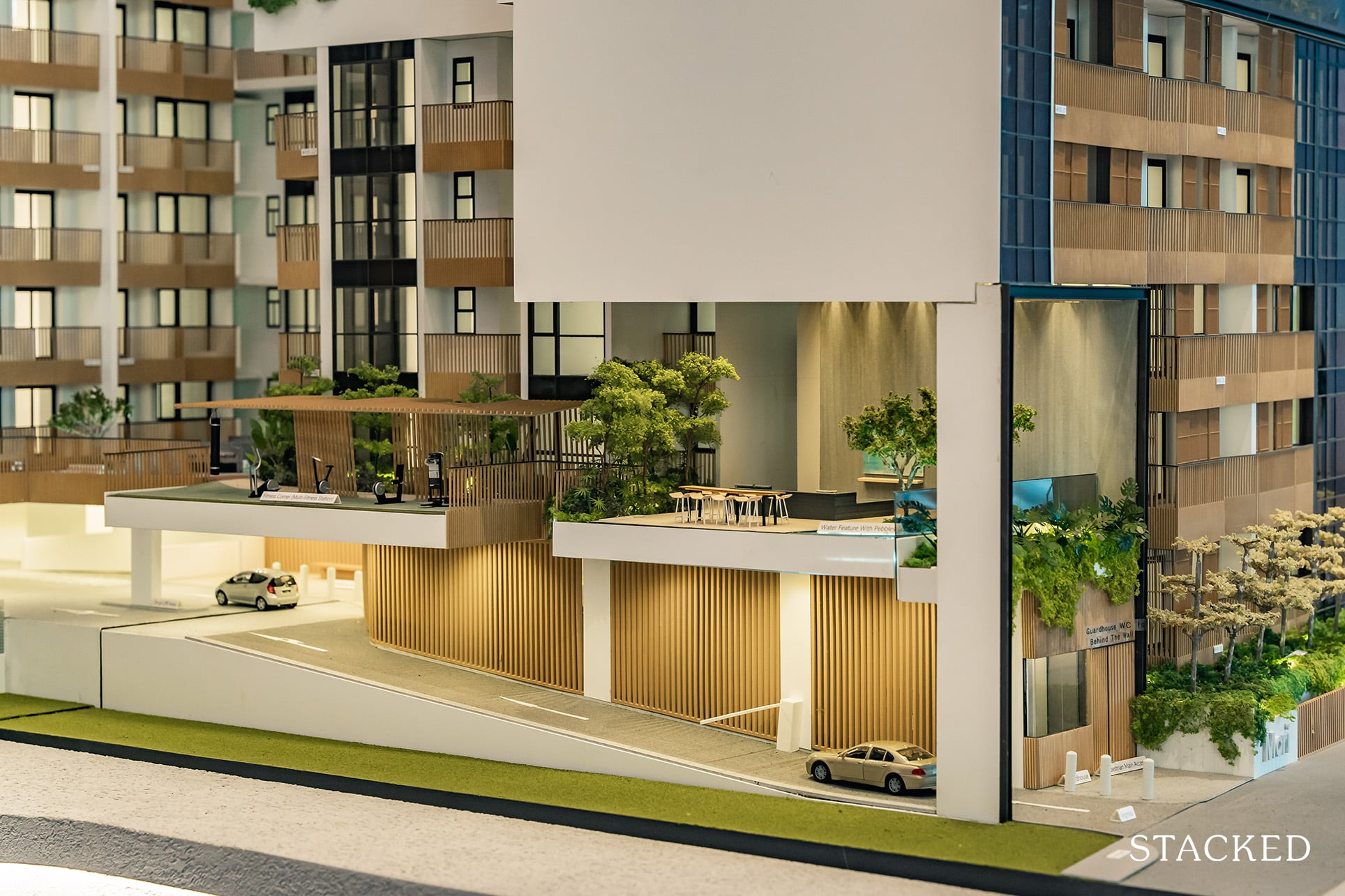
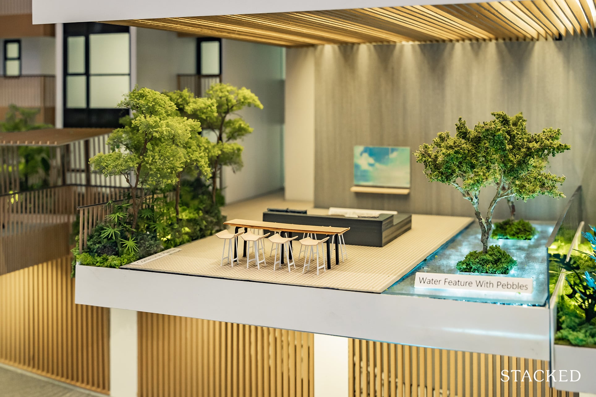
Moving now to Level 2, and I’ll start with the Projector Lounge which is just above the apartment’s entrance. The couch and long table suggest that you could easily have a nice movie/football night party here complete with some booze and pizza. The rich foliage in the nature-inspired backdrop also makes this space look rather cosy and welcoming.
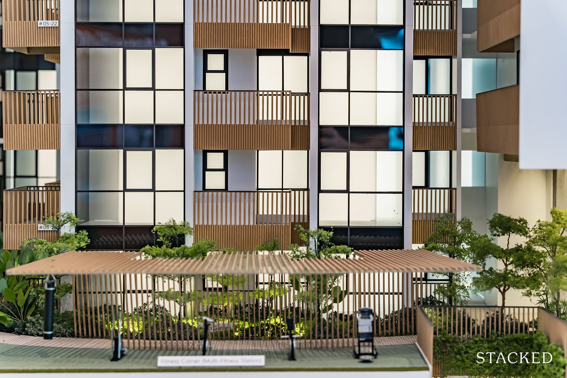
Otherwise, the other facilities on Level 2 include a multi-fitness station, which is essentially an outdoor gym. The developers have said that due to Covid-19 this was a surprising request, so while I’m happy to hear that they’ve listened to feedback, I personally would rather an indoor gym. This could just be a new trend moving forward though, so it could just be me.
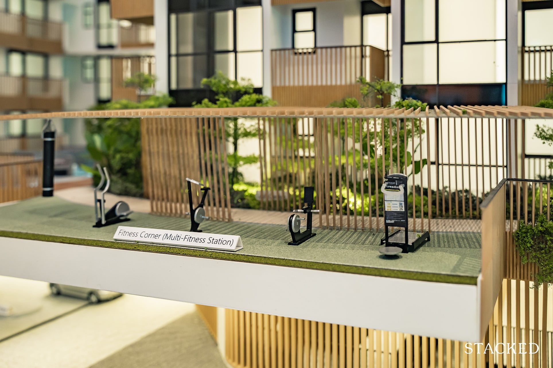
As you might imagine given the packed nature of the area, this cutaway is actually facing Guillemard Suites – hardly the most inspiring of work-out views.
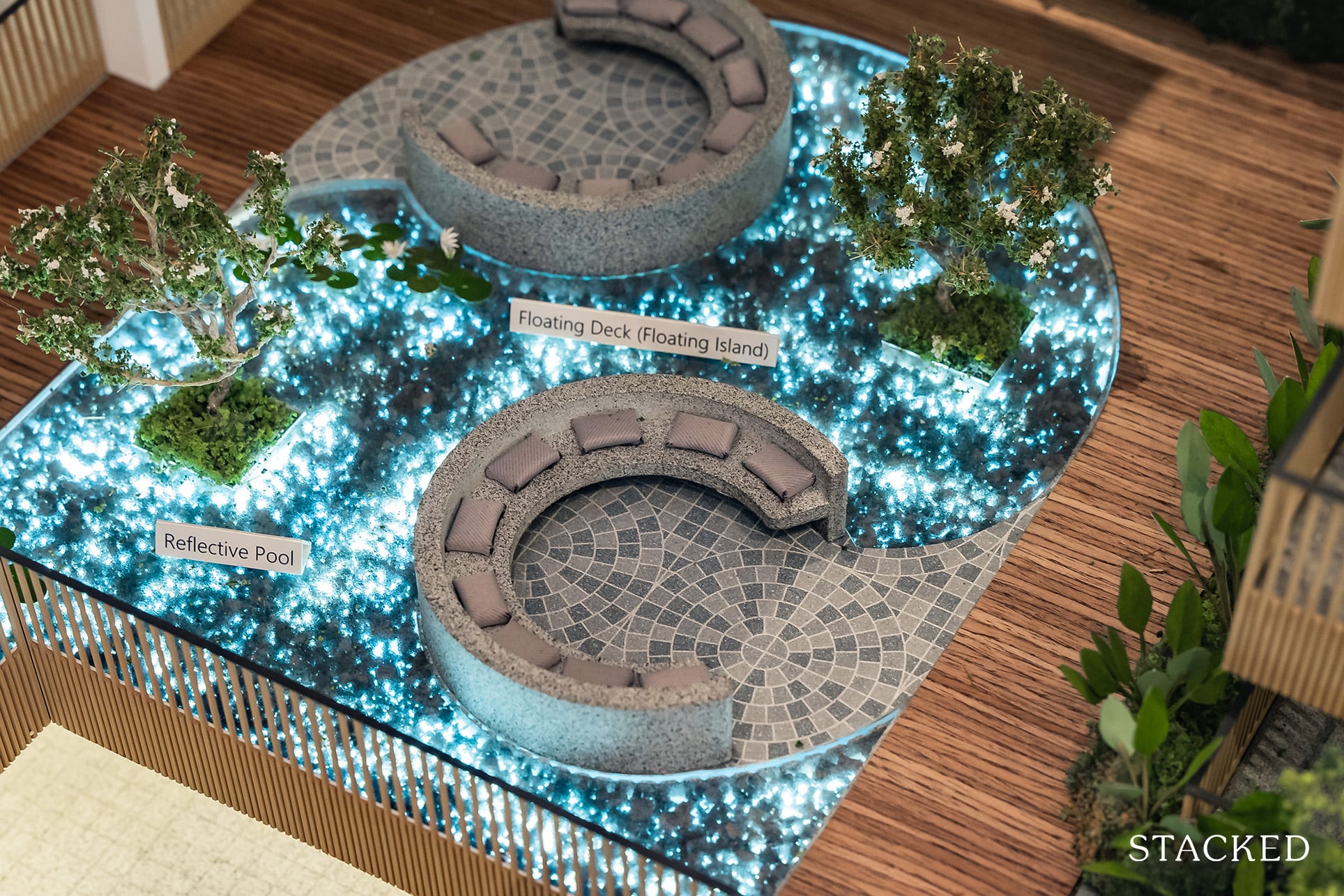
There are also a few seating areas for residents who might just want some time away from their homes, including the Floating Island where you will be surrounded by water and lotus plants that create an intimate courtyard (more so because of the residential blocks around).
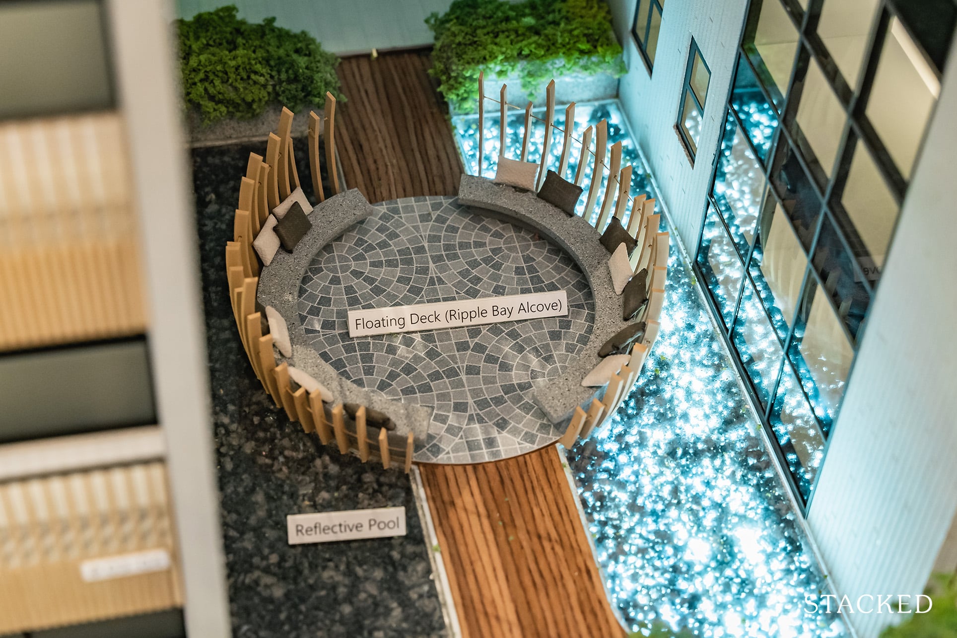
It isn’t the only spot too, if you’d like to find some more space to ponder about life. While it may seem quite private in nature, I can’t quite say that as it is right next to the residential blocks – so you will have the units facing the seats.
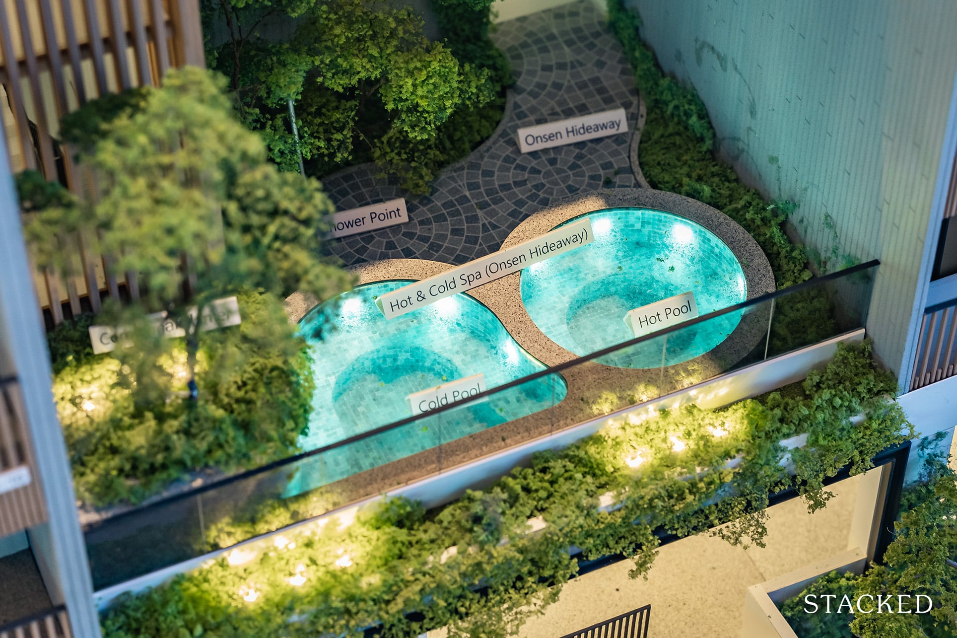
For more privacy, I would instead head to the Onsen Hideaway by the corner with both a hot and cold spa pool for a casual dip whenever you feel like it. Keeping with the trend, Mori also has a small Herb Garden for residents to presumably farm some veggies of their own.
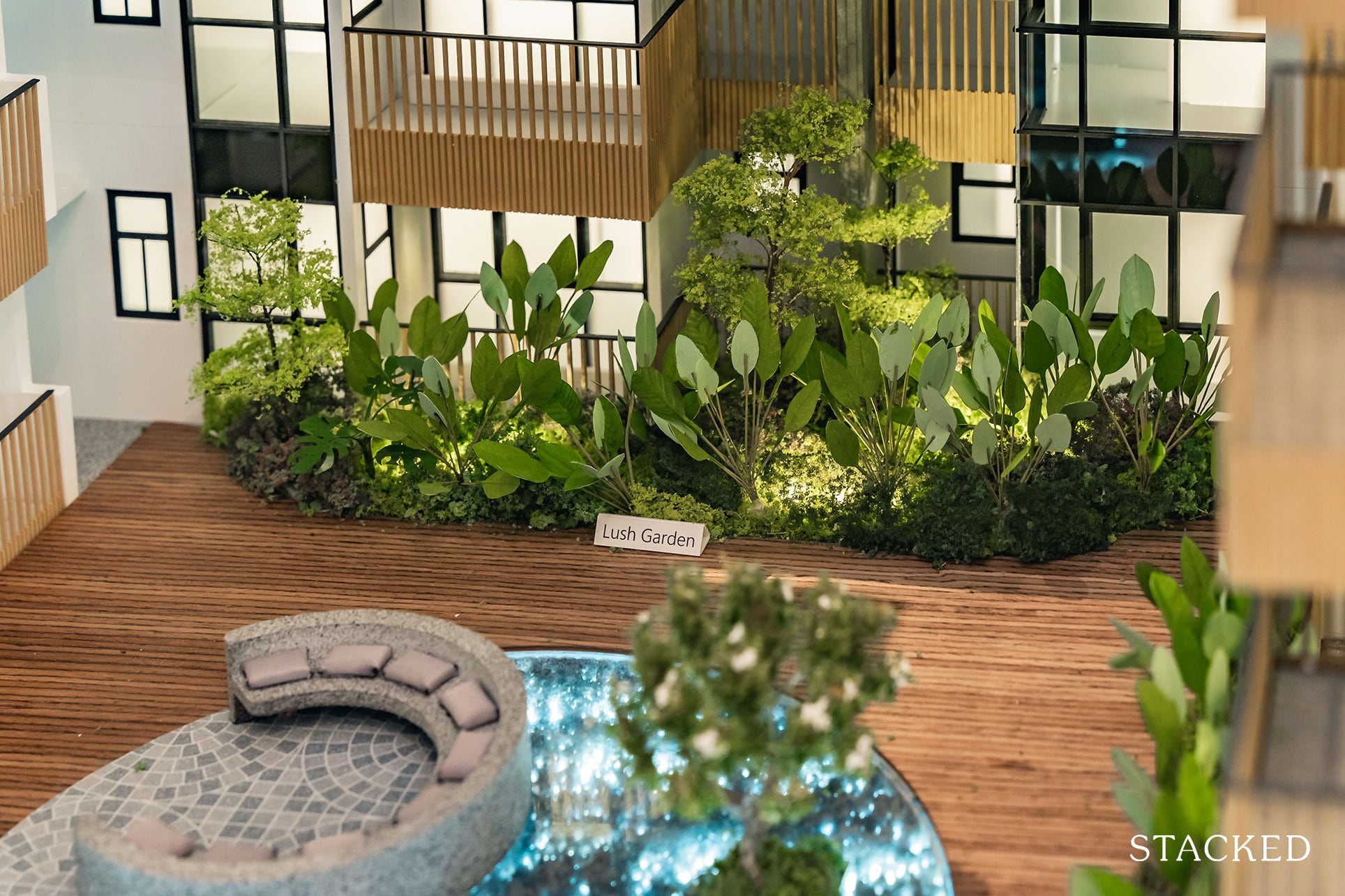
There are also points of greenery scattered throughout the development, which does provide a respite and soothing points for the eye to rest on. I do wish there could be more though, as certain parts can feel a little bare.
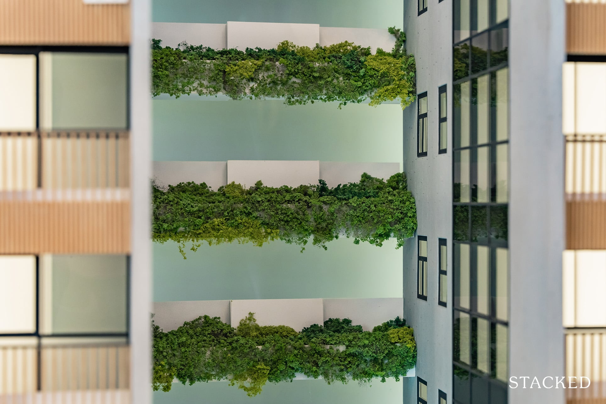
Although I do really like that the walkway between blocks has been nearly covered in thick greenery!
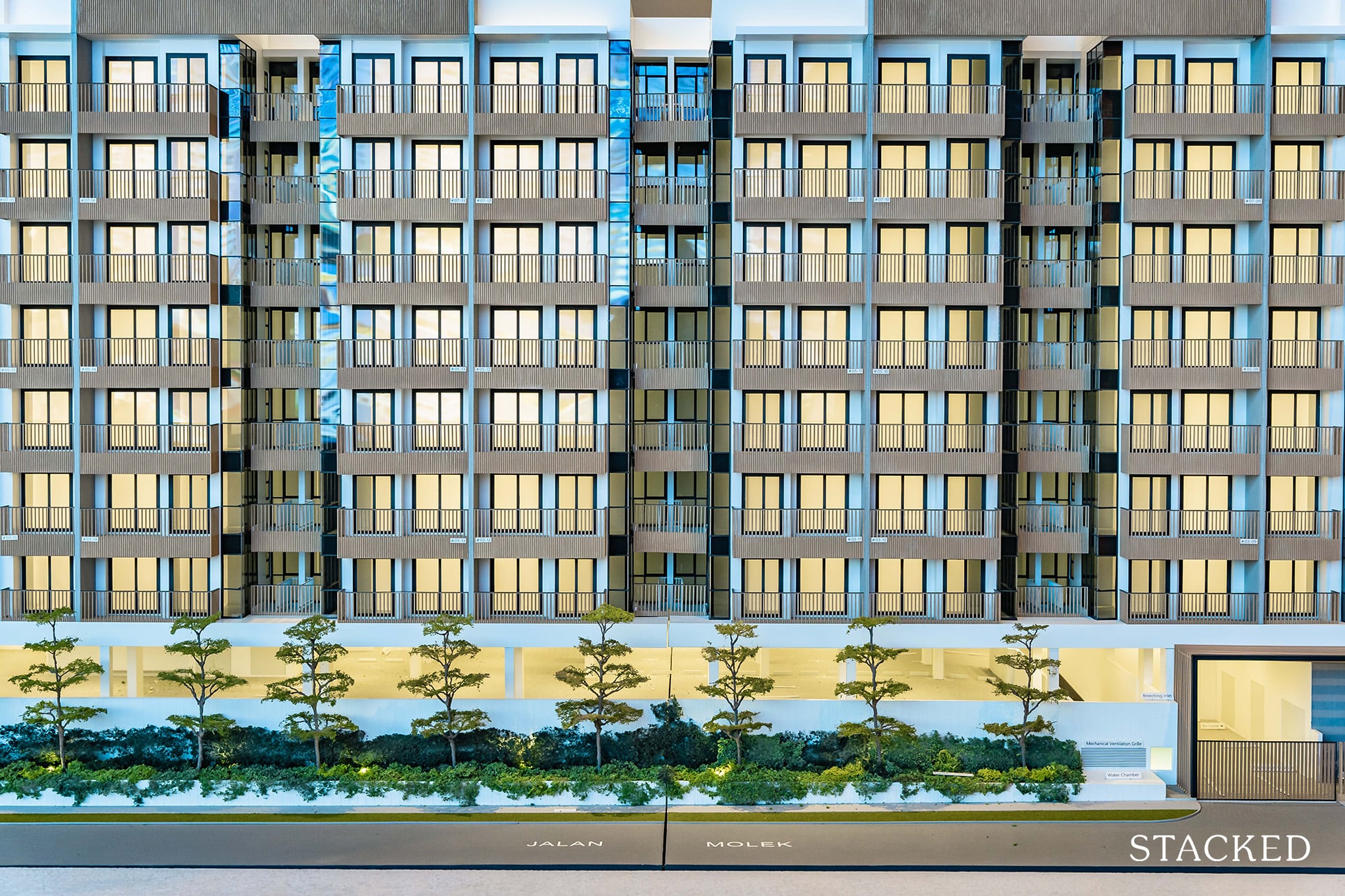
Overall, when assessing the facilities at Mori, we must first acknowledge that this is a boutique development. With less than 40,000 square feet of land, I think that Mori has done a good job in packing practical facilities including some unique ones such as the sunken pod and pool lounge. More than that, I think that each of them has a great aesthetic design that will appeal to the millennial group that the project is targeted at.
It doesn’t have the best surroundings (which is the nature of the Geylang precinct), but even with that vicinity limitation it definitely has made the best of it.
Enough about the facilities, let’s check out the show flat!
Mori – 2 Bedroom Type C1 (710 sqft) Review
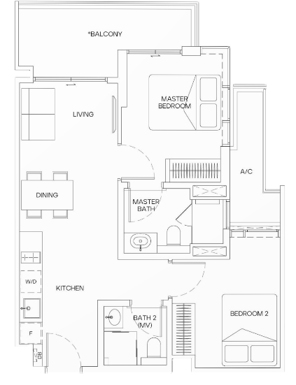
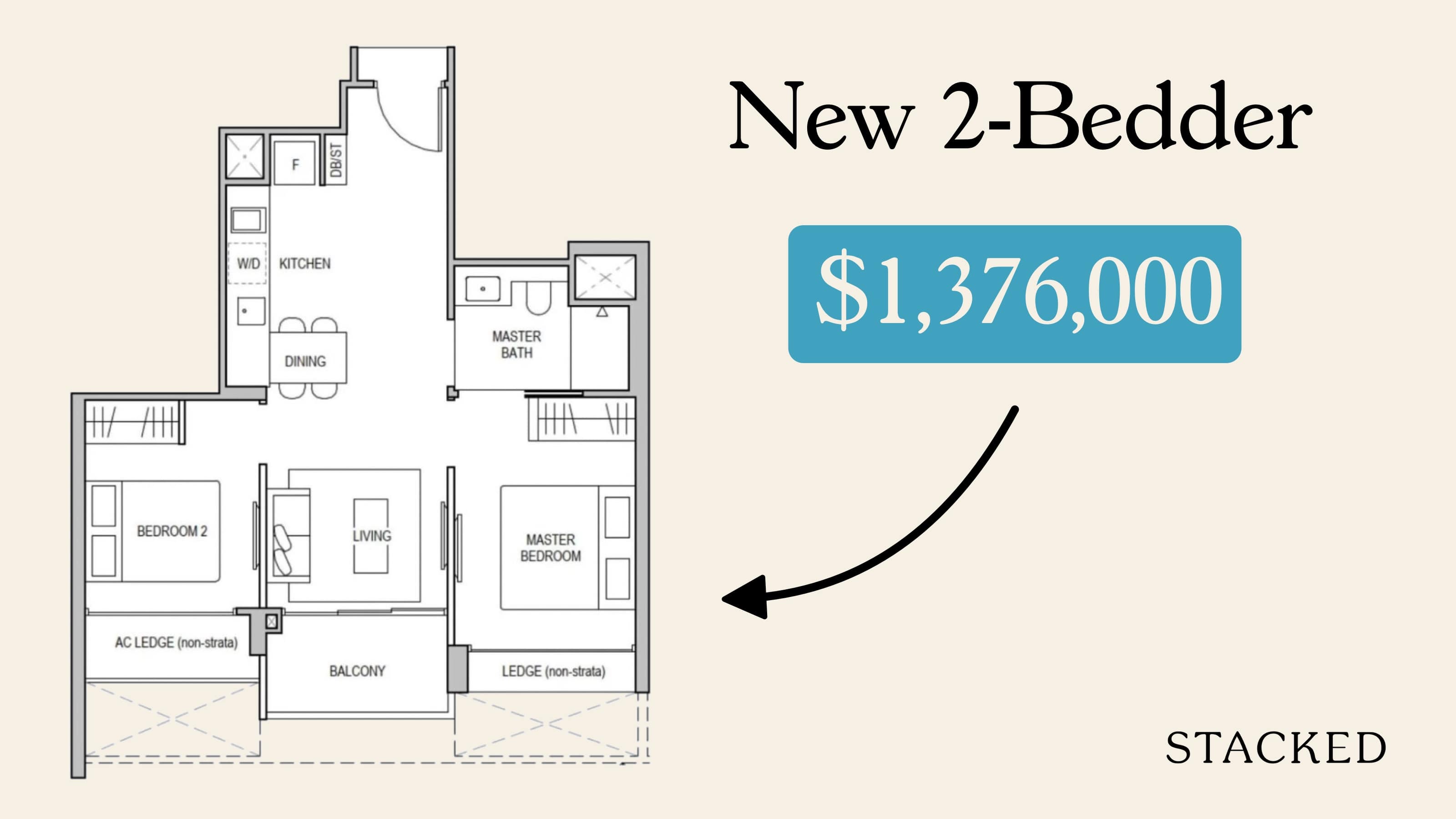
2 Bedroom units make up almost 50% of all units at Mori and are the most predominant unit here. More specifically, this exact show unit makes up 30% of the entire project, which makes it all the more important that you pay attention to its details.
So right off the bat, I do like the layout of this unit. At 710 sqft, it is on par with other new launches in terms of size but excels in my opinion because of the versatility that this layout offers. For those not so familiar with Roxy-Pacific, it’s always been a strength of theirs – making the best use of small spaces.
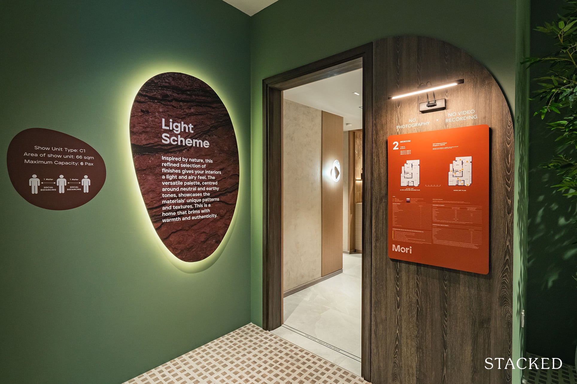
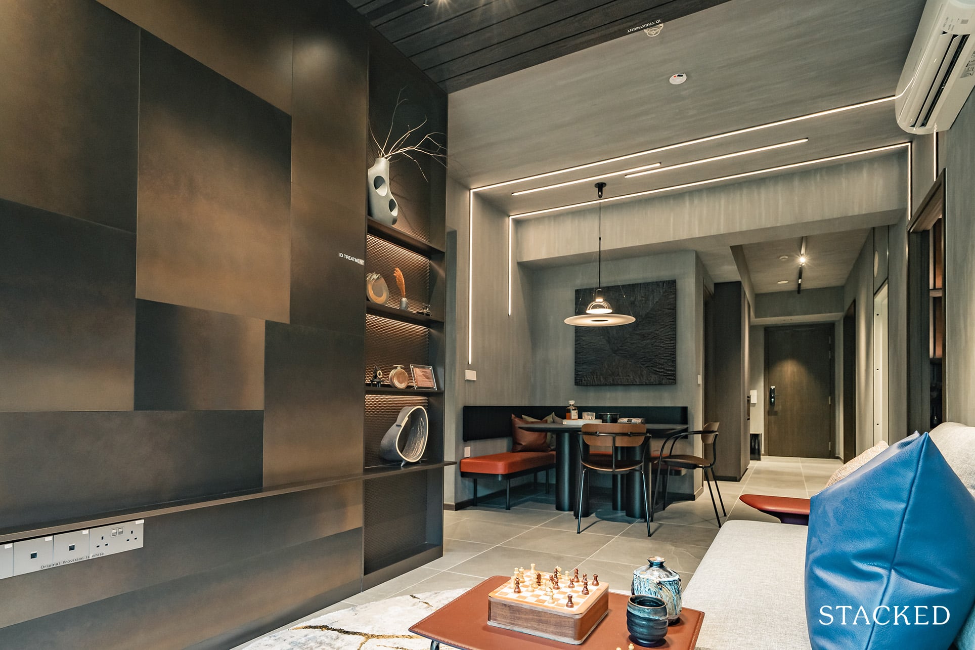
Ceiling height is average at 2.83m and with 1 and 2 Bedrooms being designed in a light theme with neutral and earthy tones, evoking warmth and homeliness to the unit. It’s designed to showcase a love for baking and pottery (which many millennials can probably identify with). The flooring provided will be porcelain tiles for the common areas and vinyl for the bedrooms, which are in line with projects at this price point.
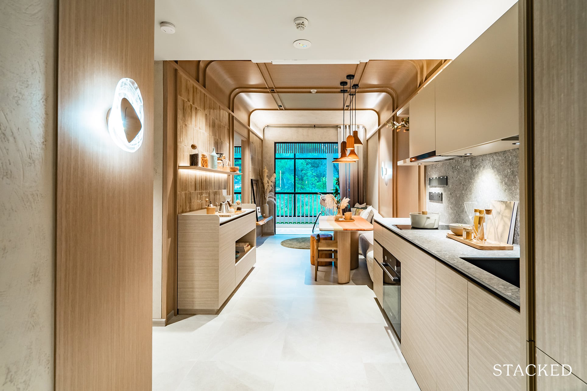
As you enter the unit, there is no wasted space at all as you will find the DB cabinet and the open concept kitchen on your right immediately upon your entry.
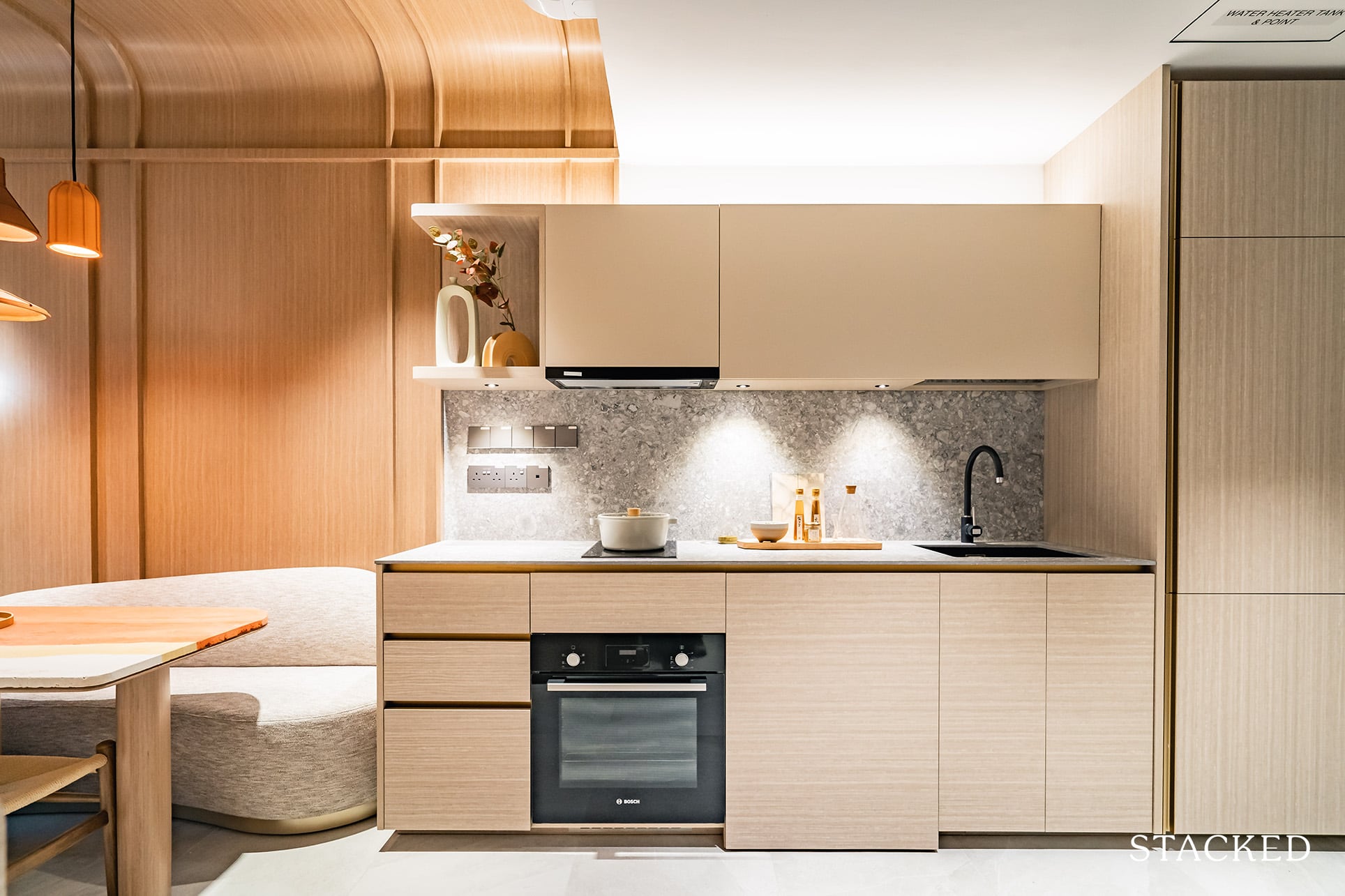
Kitchen appliances include an integrated fridge, washer, and dryer (De Dietrich), oven, induction hob, and hood from Bosch. The built-in cabinets will also include a flip-up cabinet with internal dish racks for practical purposes. The sink and mixer will be from Blanco. It’s all pretty top-notch stuff for the price point.
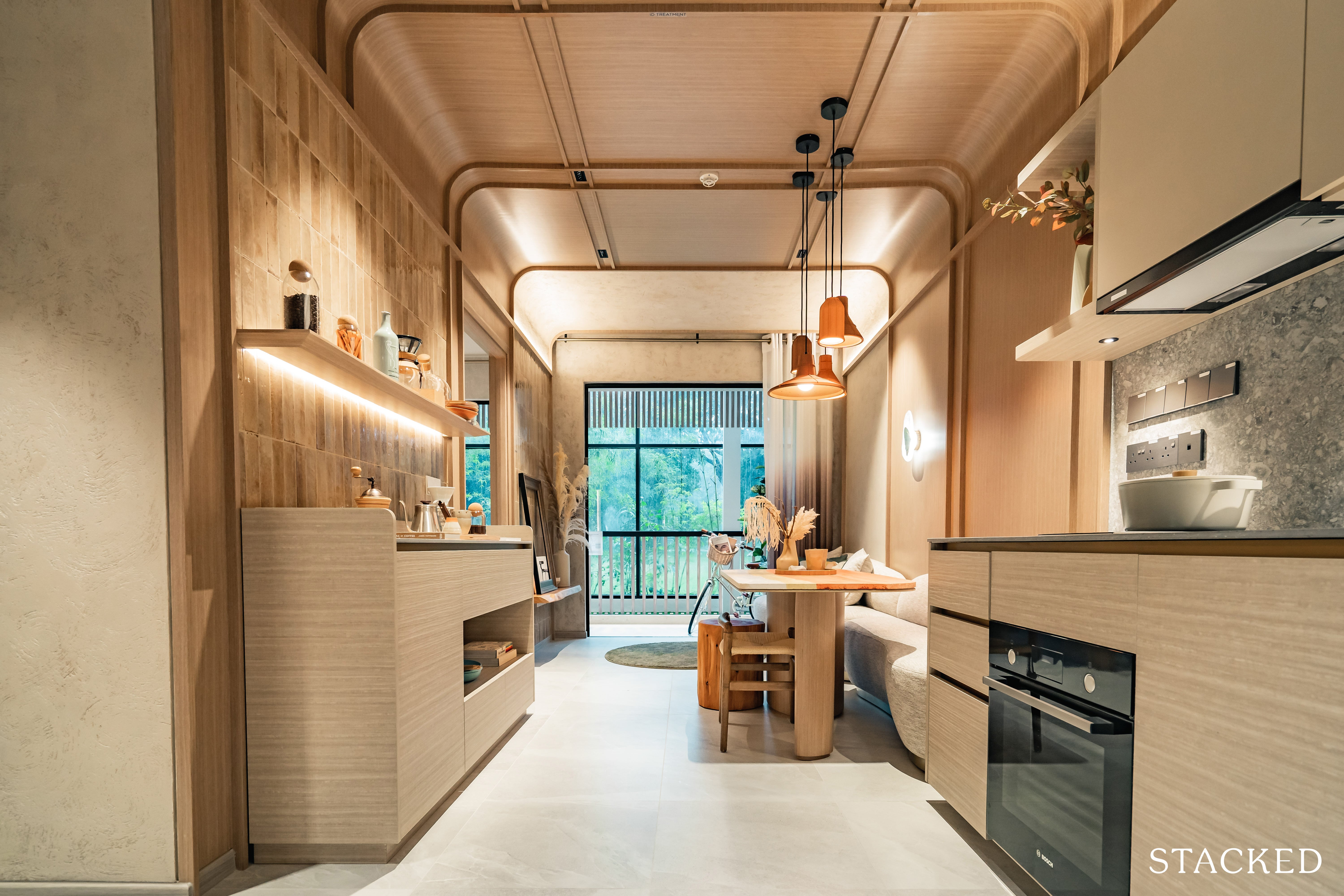
Now, much of what you see in the photo above will be down to ID treatment, but I have to say they’ve nailed down the aesthetic for the target market that they seek to attract. The colour tones and the overall vibe is very much in trend, and I can imagine that a fair few will be looking at this for some inspiration.
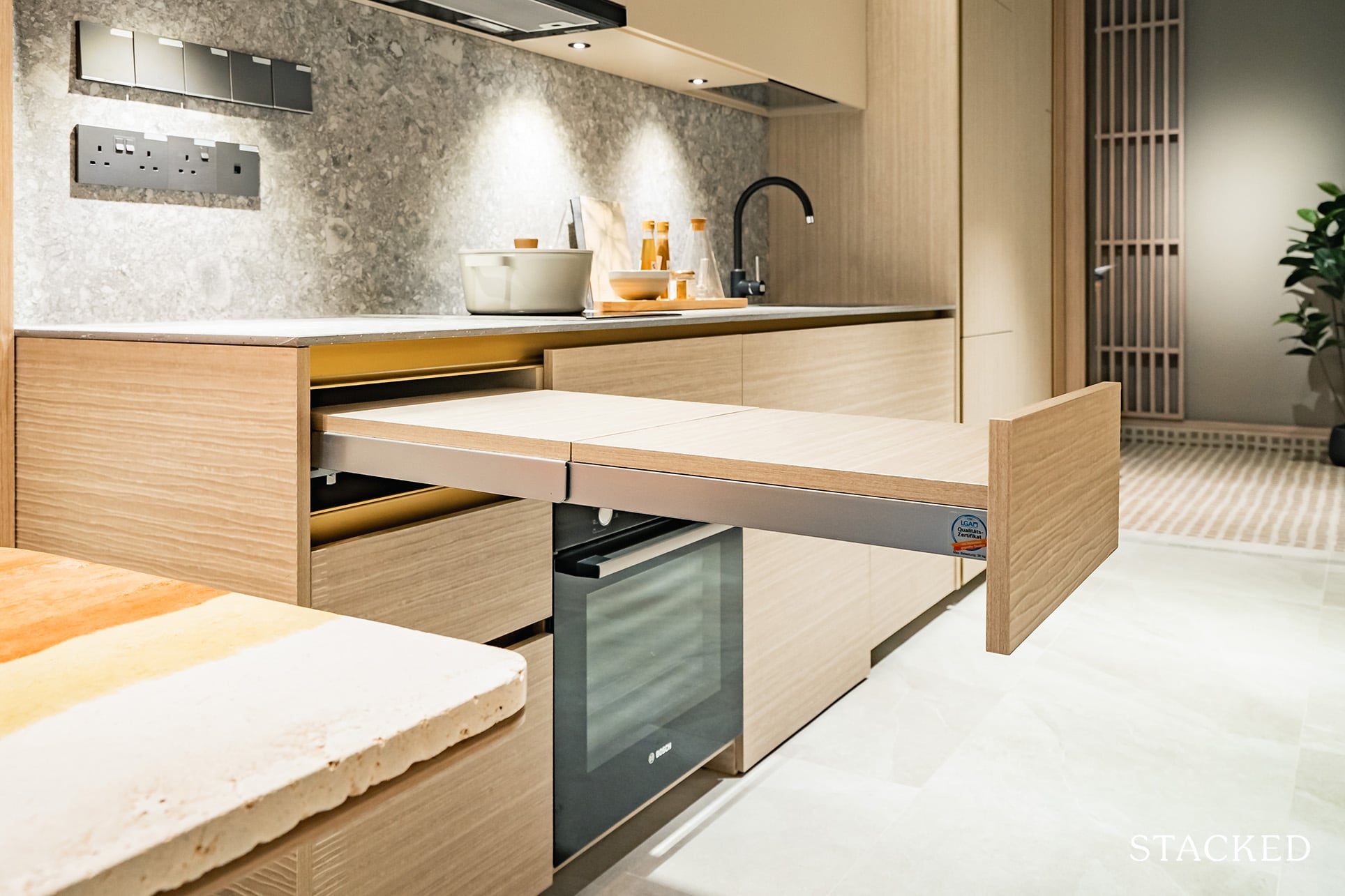
Similar to what I have seen in projects such as CanningHill Piers and Irwell Hill Residences, the kitchen here at Mori also includes a pull-out table that will double up as an extension to your countertop space for food preparation or a very compact dining table. Operating this pull-out table was done with ease (in fact, the smoothest implementation so far for me), so no fretting when you are required to use it.
Do note that it can only hold up to 30 kg in weight, especially without any additional support this will be the limitation of it. Nevertheless, this is definitely the trend moving forward, and I expect to see this at most 1 bedroom launches from here on.
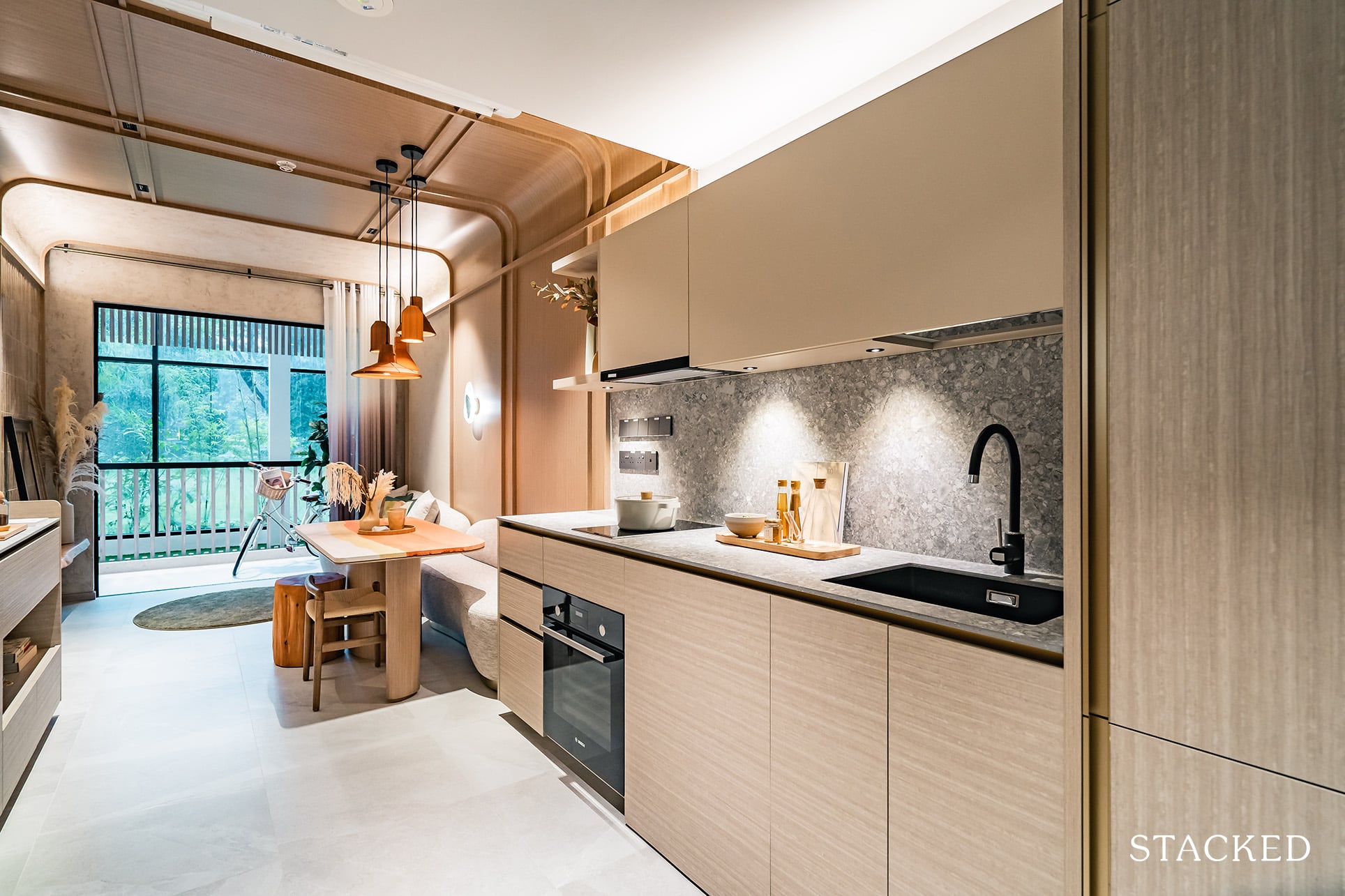
While I have seen new launches that manage to pack in an enclosed kitchen with a similar size (Forrett at Bukit Timah comes to mind), and as much as I prefer it – I must say an open kitchen sure helps to free up some much-needed space in a compact unit. Of course, it comes down to whether you engage in heavy cooking, but living in the heart of Geylang means good food all day (and night) long, so residents here may not actually need their kitchen that much.
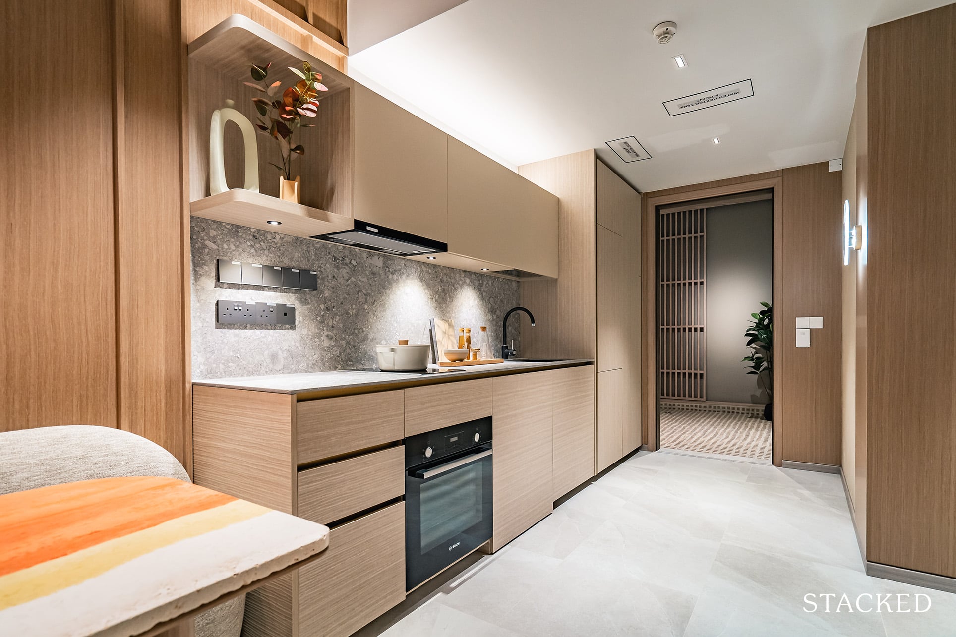
That frees up a decent amount of space for the rest of the unit, so you do notice that the entrance is wide enough for you to build in shoe cabinets and a bench to the left if required.
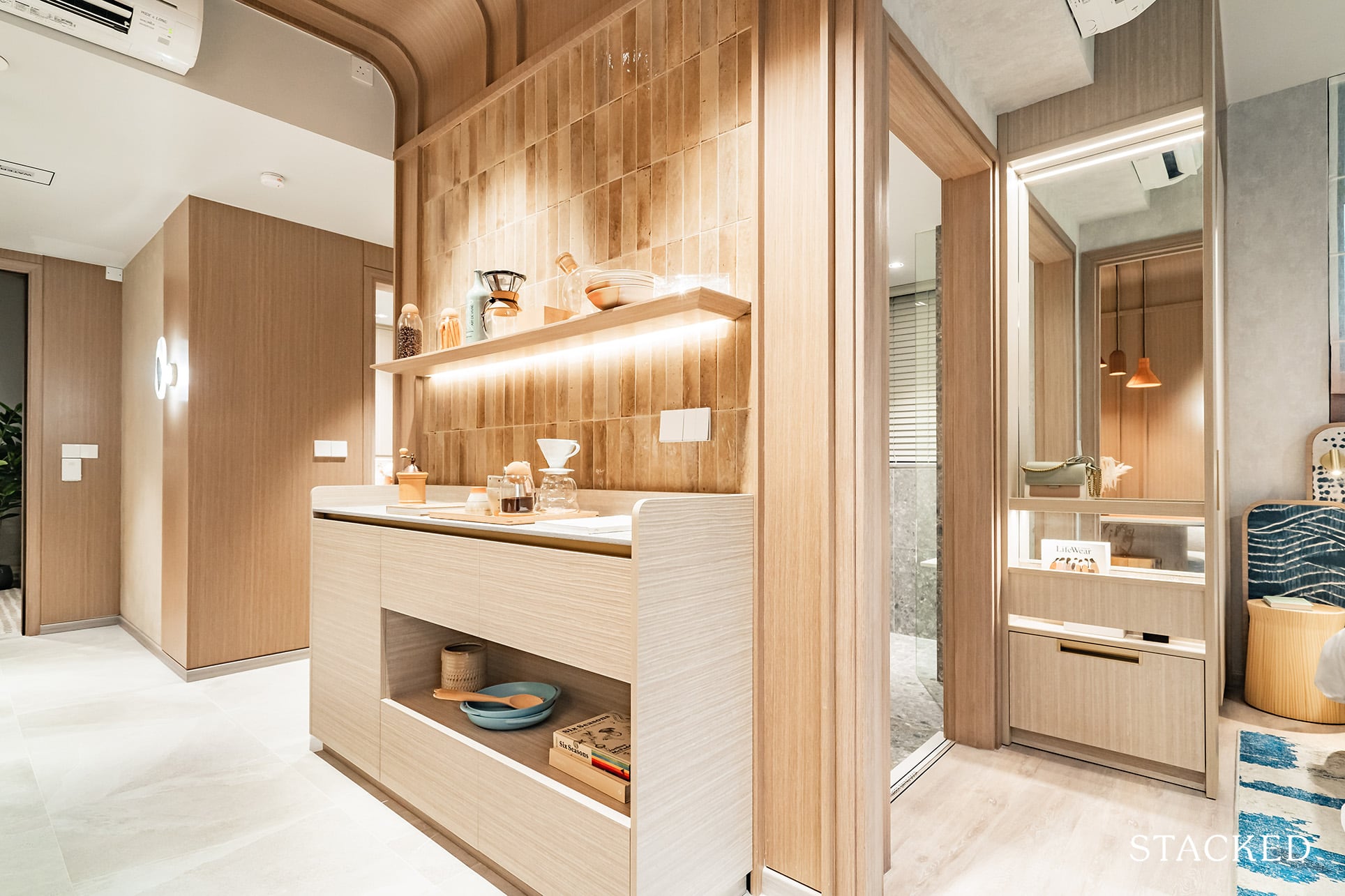
Directly opposite the kitchen is where the Common Bedroom and Common Bath are located. This is definitely one of my favourite parts of this layout. It’s situated away from the Master Bedroom, giving the respective occupants way more privacy. More importantly, should you purchase this unit for investment purposes, I am certain your tenants will appreciate the added exclusivity here too. In fact, for this Common Bedroom, you could easily install a door to make this room ensuite, which can enhance its rental attractiveness optically.
(To the right is the entrance to the Master Bedroom, and to the left, to the Common Bedroom). Do note the above console is not actually included as part of the unit – it illustrates how additional storage may look in this apartment, which is important as the unit does not have a utility room.
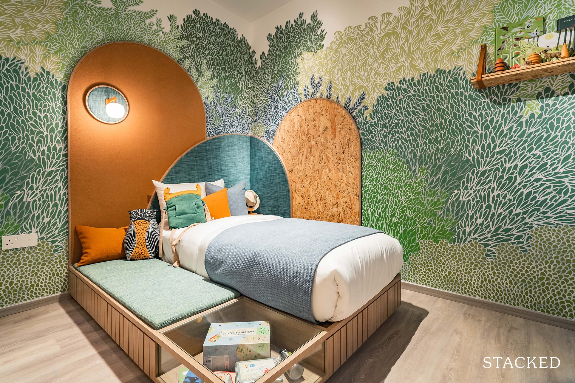
I’ll start with the Common Bedroom, which, at 10.6 sqm, is actually very impressive for a 710 sqft unit. It’s of a squarish shape with a little nook by the side.
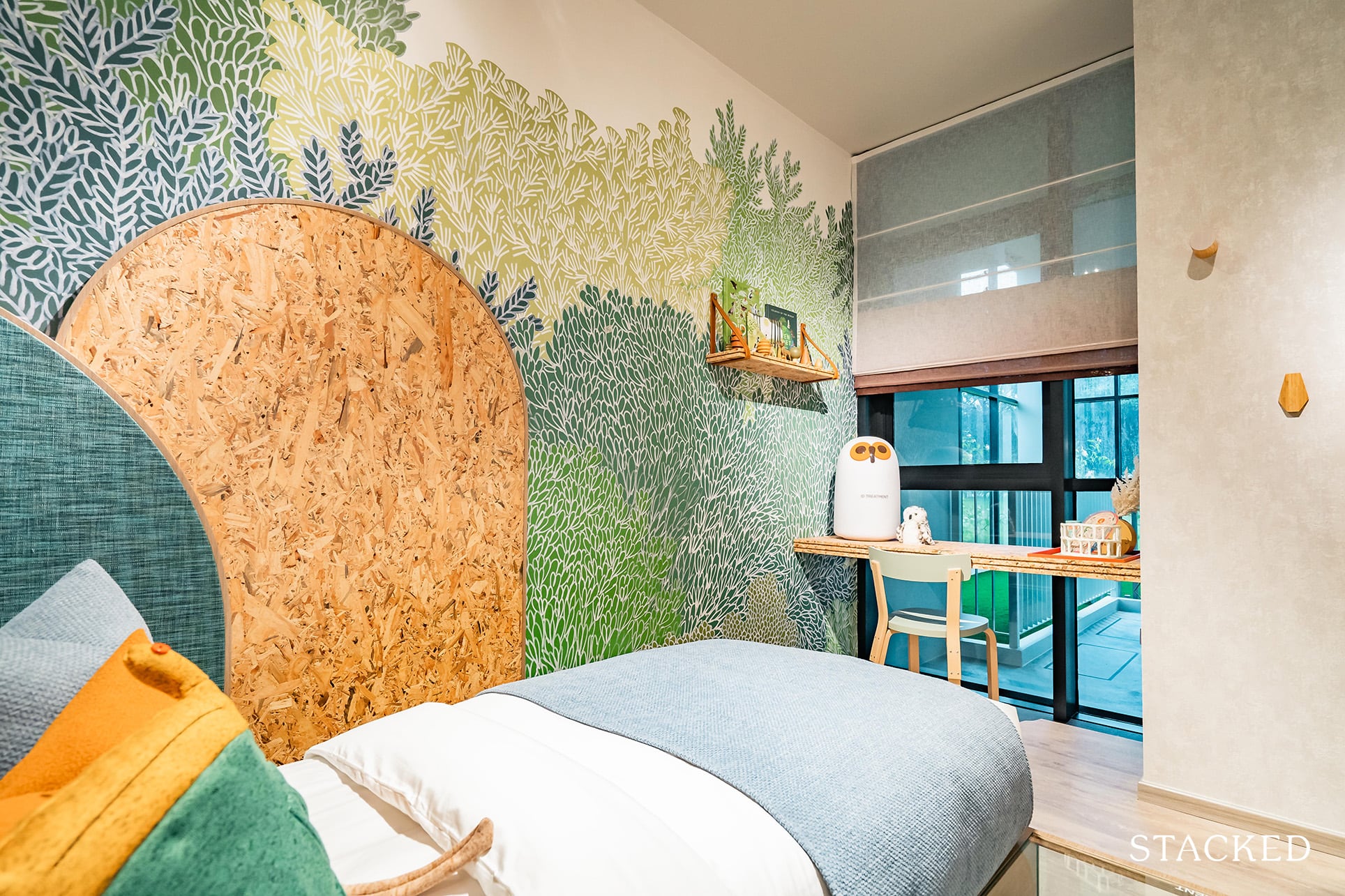
If you noticed, the nook is actually a very helpful space as the interior designers have cleverly made it into a little study. It adds an element of practicality without compromising on the actual bedroom space. While the facing of the AC ledge is hardly the most exciting inspiration while you study, it’s still miles better than facing a blank wall.
Additionally, while you do not get windows that extend the length of the unit, you do interestingly, get full-length ones despite having the aircon ledge just outside. Just to recap, for almost every other (probably every other actually) new launch, rooms with aircon ledges outside usually have their bottom half frosted for aesthetic purposes. In this case, however, the developers have chosen instead to embrace it which I am agreeable to as it does help to brighten the unit.
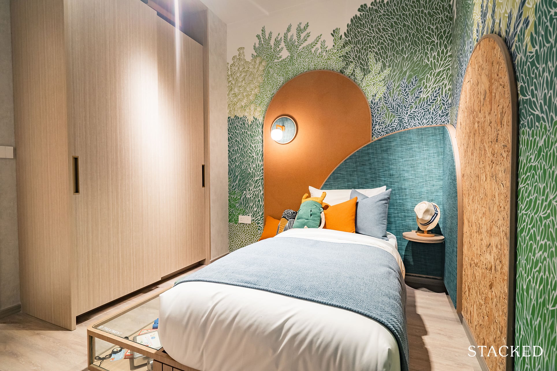
As this room is big for a common bedroom, especially for a 710 sqft unit, there is a good amount of room for a Single or Queen sized bed. The one shown here is a Single, with the side cushions showing how big a Queen would look in this space as well. It’s definitely comfortable, and with your study area settled by the corner, having a Queen would certainly be no issue and is one of the rare occasions I’m actually saying this for a Common Bedroom. The built-in wardrobe here features an open shelf right on top for storage, a built-in LED light, a trouser hanger, and a clear glass top for the easy look out of your accessories tray.
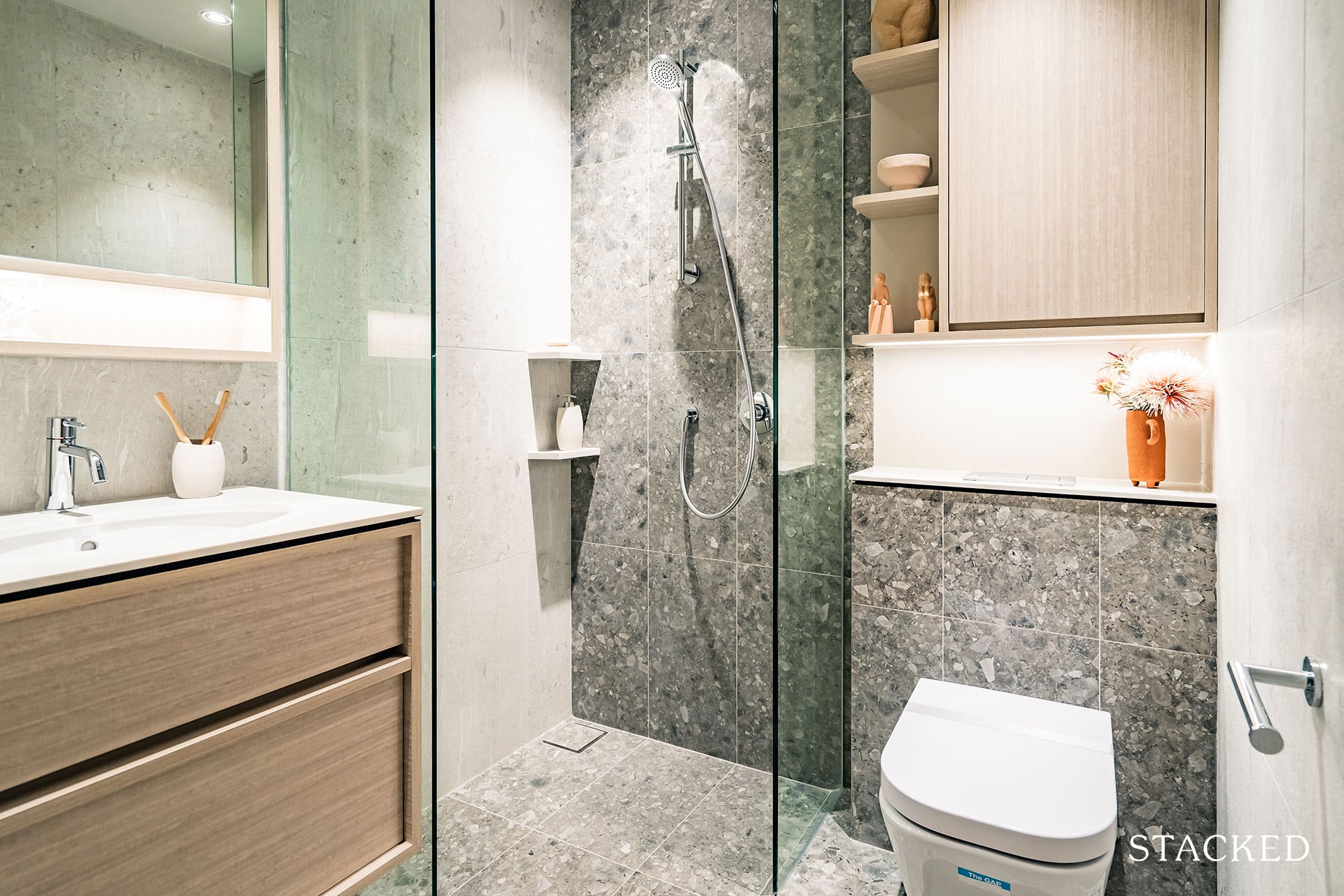
Moving to the Common Bath, which at 3.3 sqm, is smaller than average. I think the developers did a good job by ensuring that it felt bigger than its actual size. Something I like about the bathrooms here at Mori is the practical aspect, as this small bathroom includes not only the mirror cabinet but an additional one with an open shelf corner above the w/c as well.
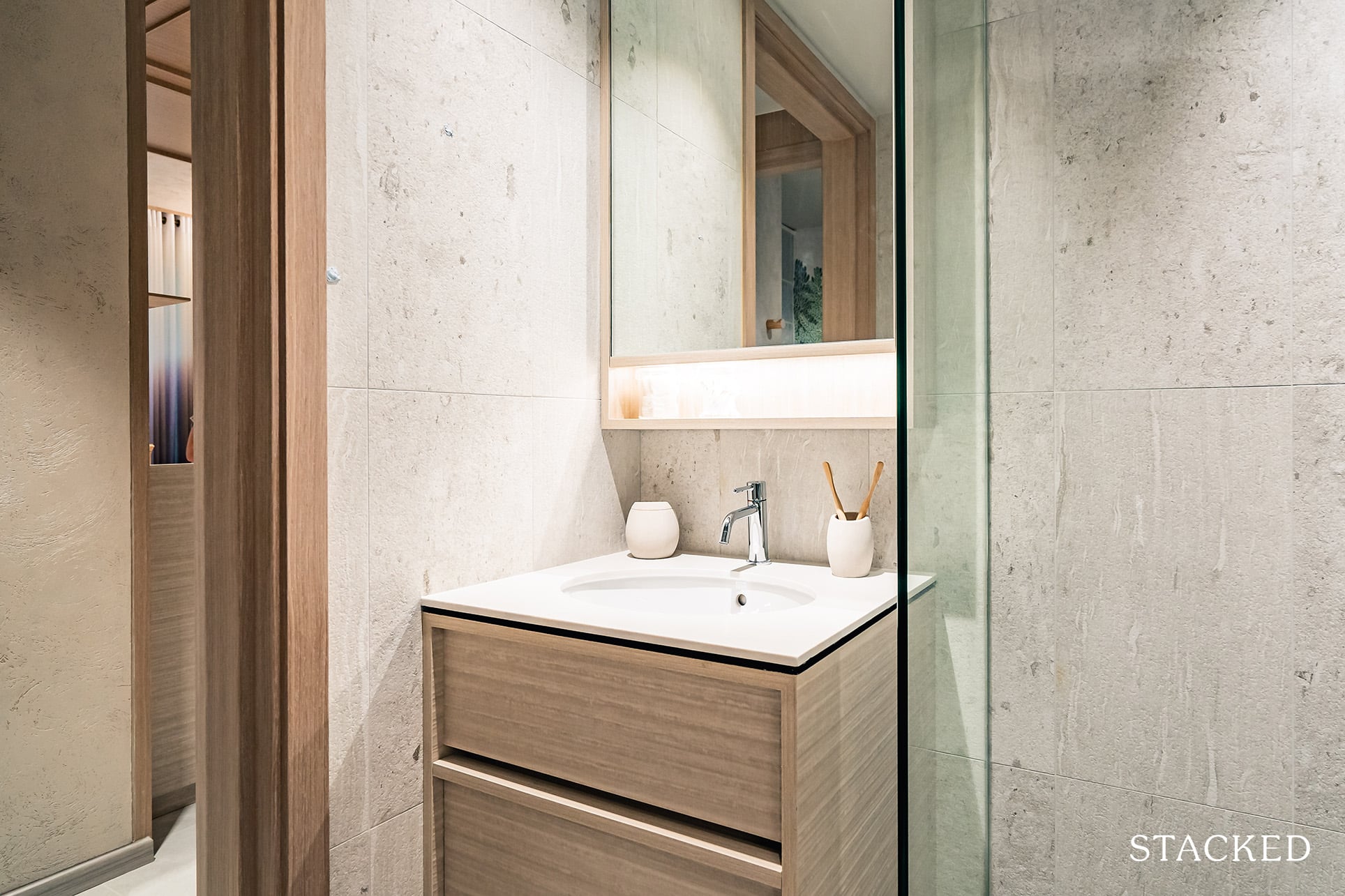
Bathroom appliances also come from recognised European brands, including Gessi mixer and hand shower, Roca wash basin and wall-hung w/c, and Tece flush plate and cistern. Gessi, for example, was also used in Canninghill Piers, a CCR project which costs almost double that of Mori. However, do note that this bathroom does not come with windows, so mechanical ventilation will be the way to go.
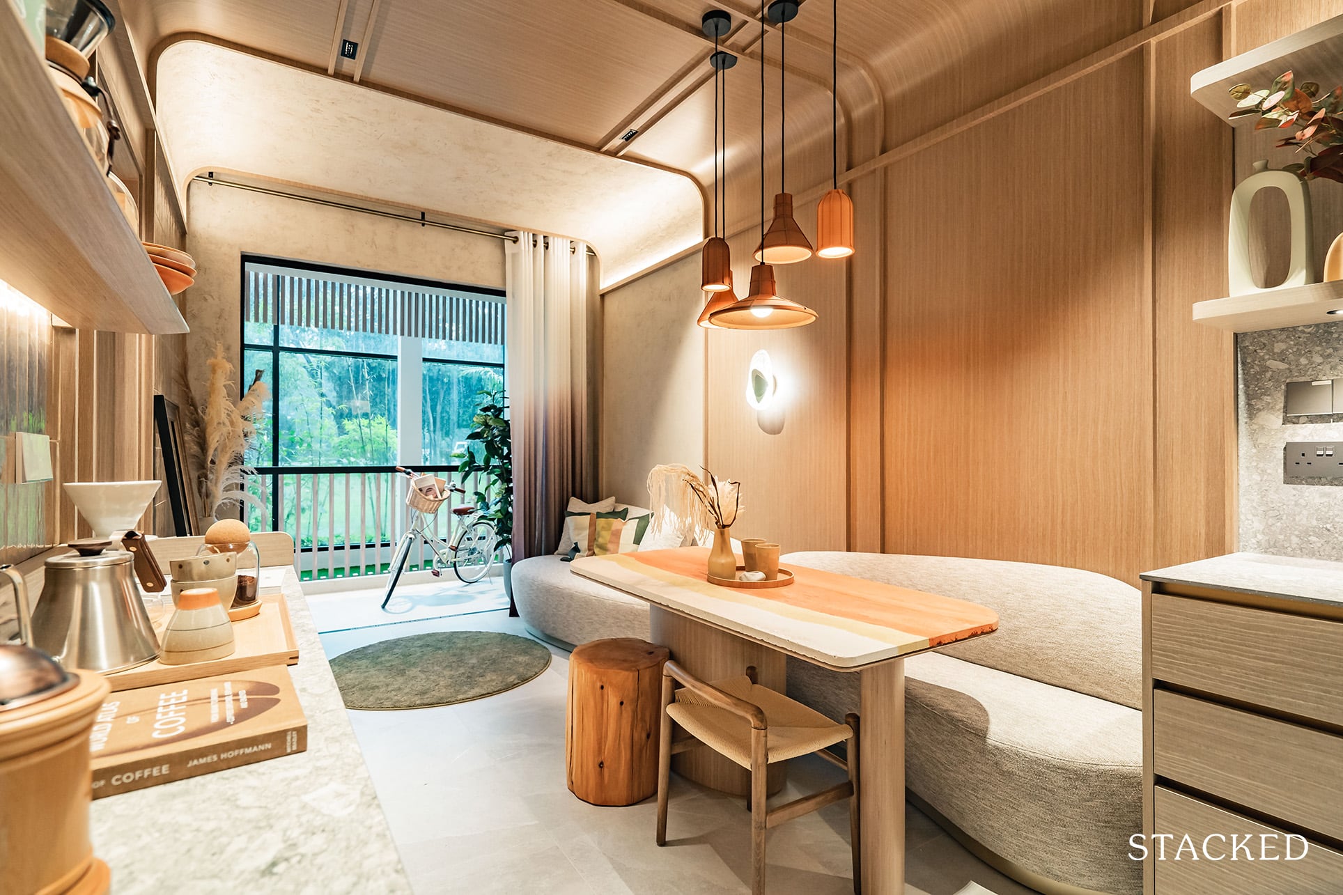
Moving back to the dining and living area, which are continuous from the open concept kitchen. It’s a space in line with the market, with just enough room for a dining table for 4. At 710 sqft, this is the standard, as anything more would be a bonus.
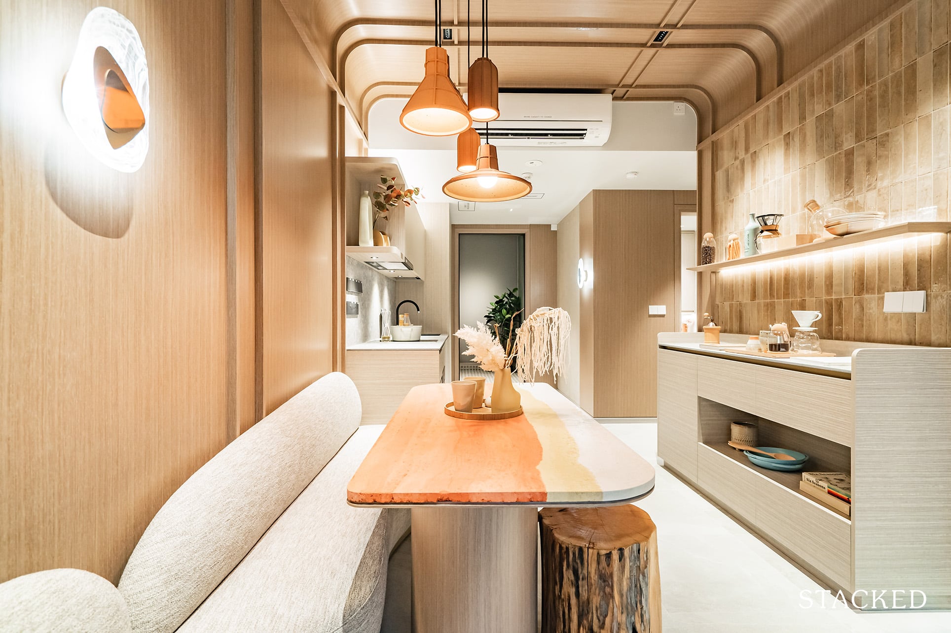
And if you’re gonna go for the storage console, you’ll have to be doubly conscious of the size of the dining table in order not to crowd the walkway.
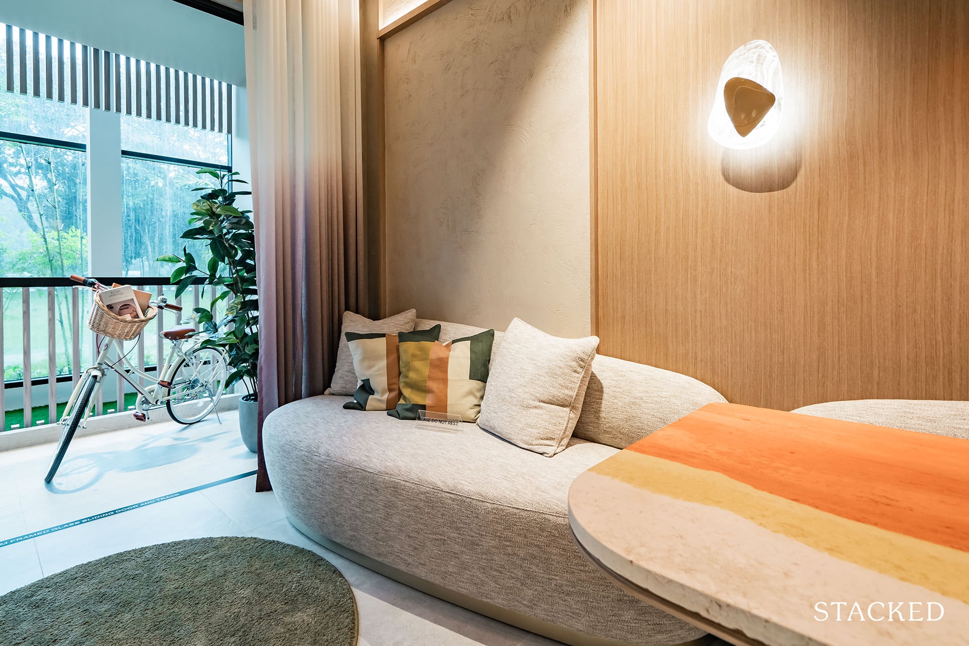
As for the living room, the width between the sofa and TV is average and not a standout by any means. The usual show flat optics of doing without a coffee table are also at play here (and that small circular rug), which helps to make this space seem larger. Nevertheless, a 3-seater couch would fit here, in line with the new launches of a similar size.
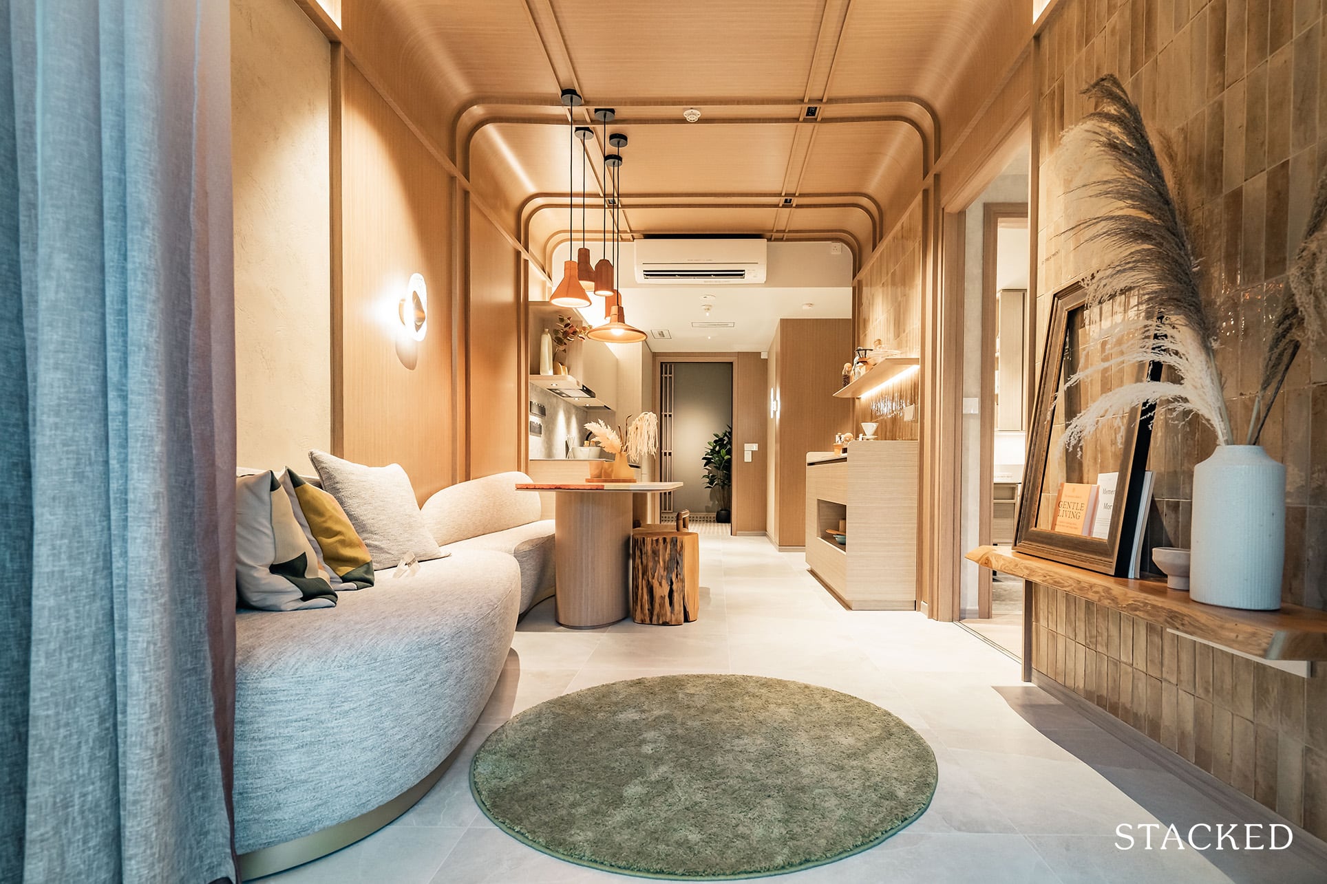
Overall, the living, dining, and kitchen areas make up 22.9 sqm of space.
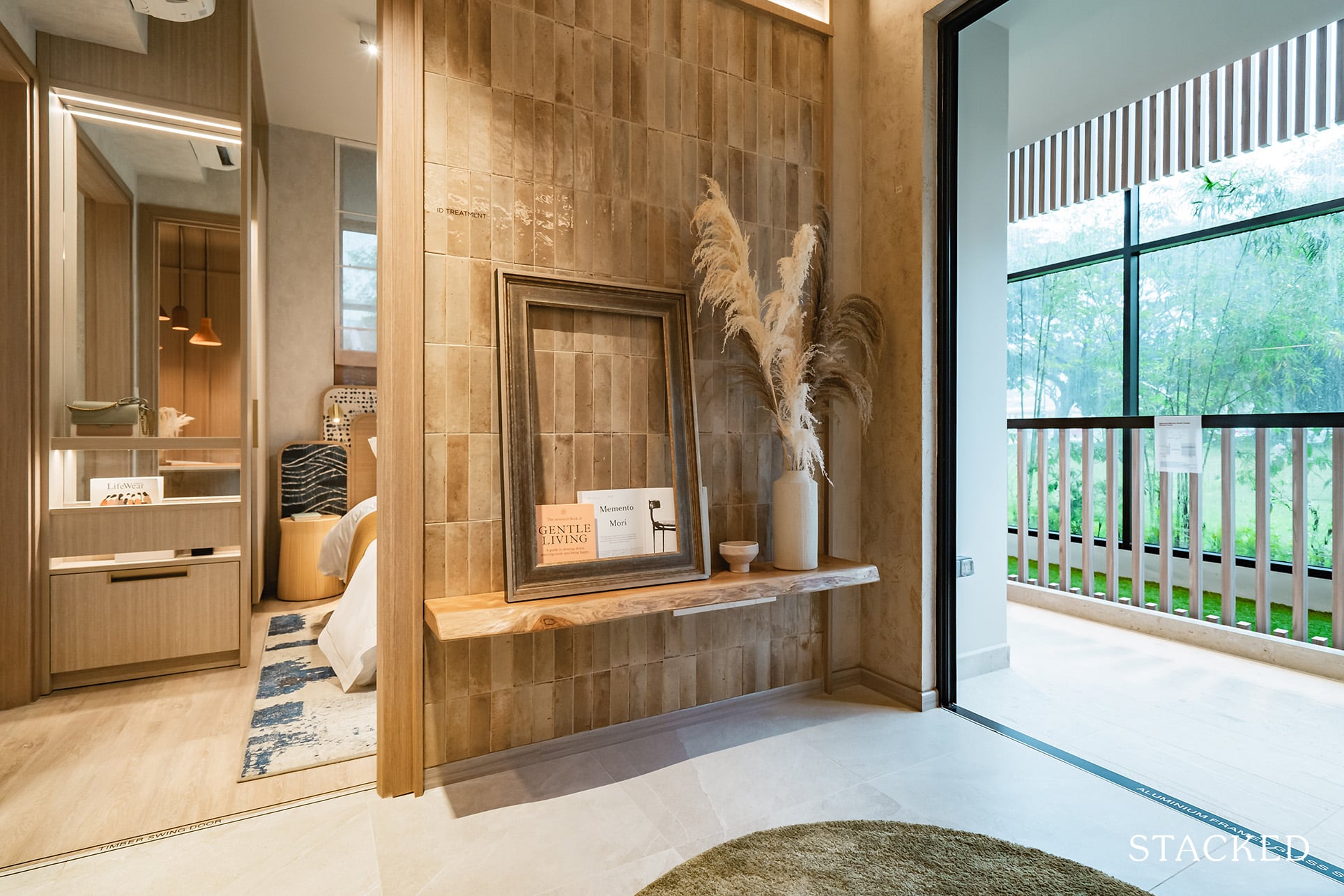
I would highlight though, that the wall facing the sofa isn’t the widest so if you are harbouring thoughts of an extra-large TV you’d have to be cautious.
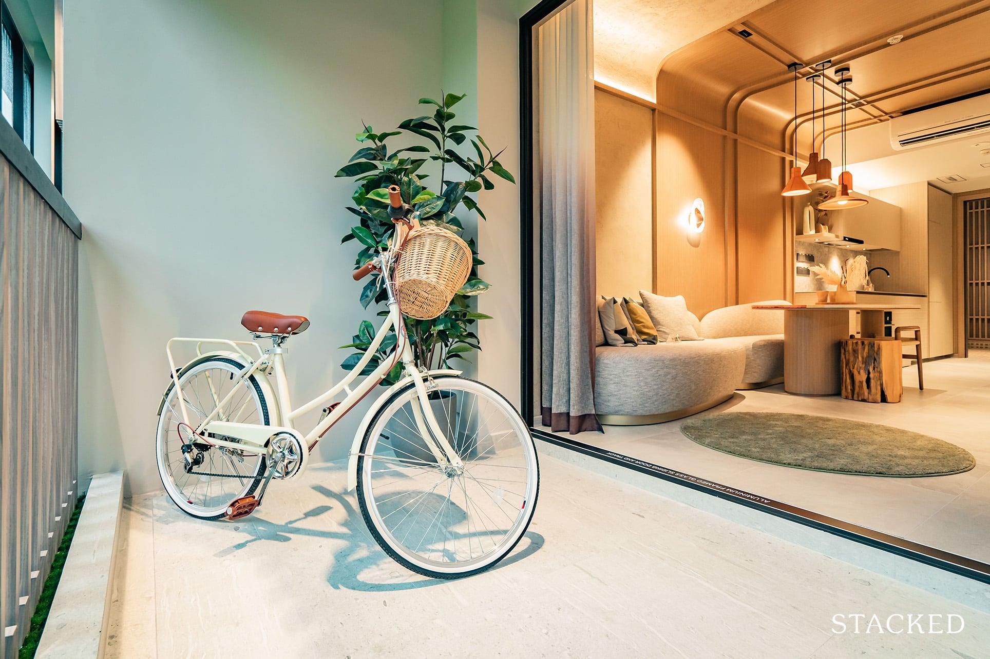
Moving on to the Balcony, which stands at 8.7 sqm. For a unit of this size, I’d say that this size is above average. The additional space comes from its extension to the Master Bedroom (although the balcony space is narrower there). Overall though, it is quite squarish in shape and large enough for you to place a dining set for an alfresco meal if you enjoy it. Even if it’s not a proper dining set, having a small coffee table here would fit easily for you to catch some fresh air after a long day at work.
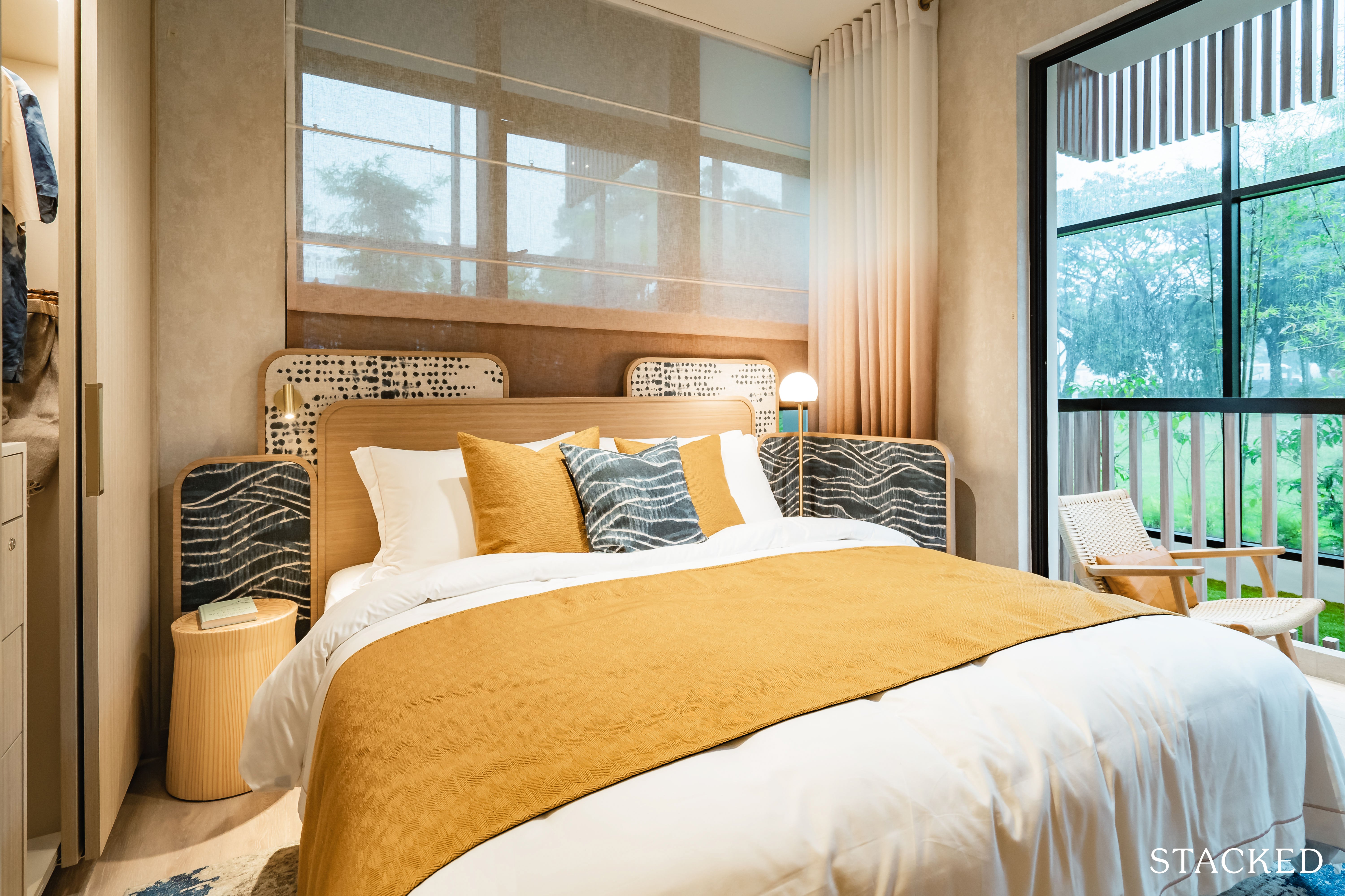
Now to the Master Bedroom, which is averagely sized at 10.7 sqm. Interestingly, this means that it is a mere 0.1 sqm larger than the Common Bedroom. Not a bad thing in my opinion, and especially so if you intend on renting your units out. The room feels a tad more spacious, although I think it’s because of its direct access to the balcony.
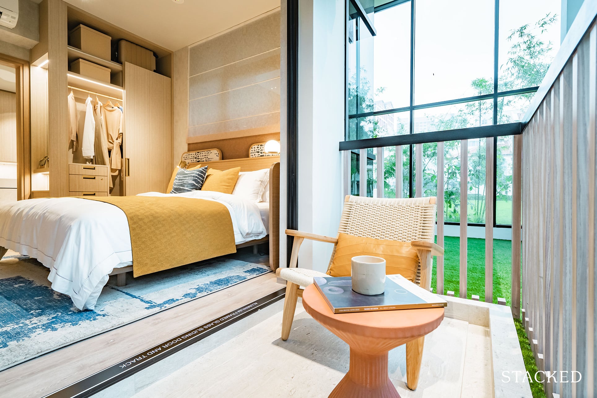
Although the balcony portion is rather narrow here, you can still place a chair as they have done here. I do always like to have a blend of indoor and outdoor spaces in a home, especially if there is a view to look out to – although I will state here and now that there is practically no view to speak of here at Mori.
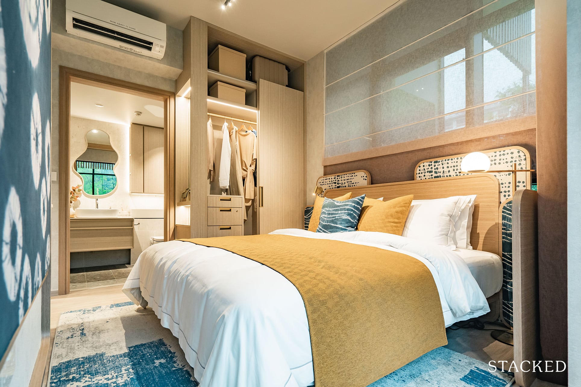
From a practical perspective, you will be able to accommodate a King bed comfortably, just as they have done here. You might also notice that you not only have window panels opening up to the balcony, but also those opening up to the aircon ledge, which brings you ventilation from both sides.
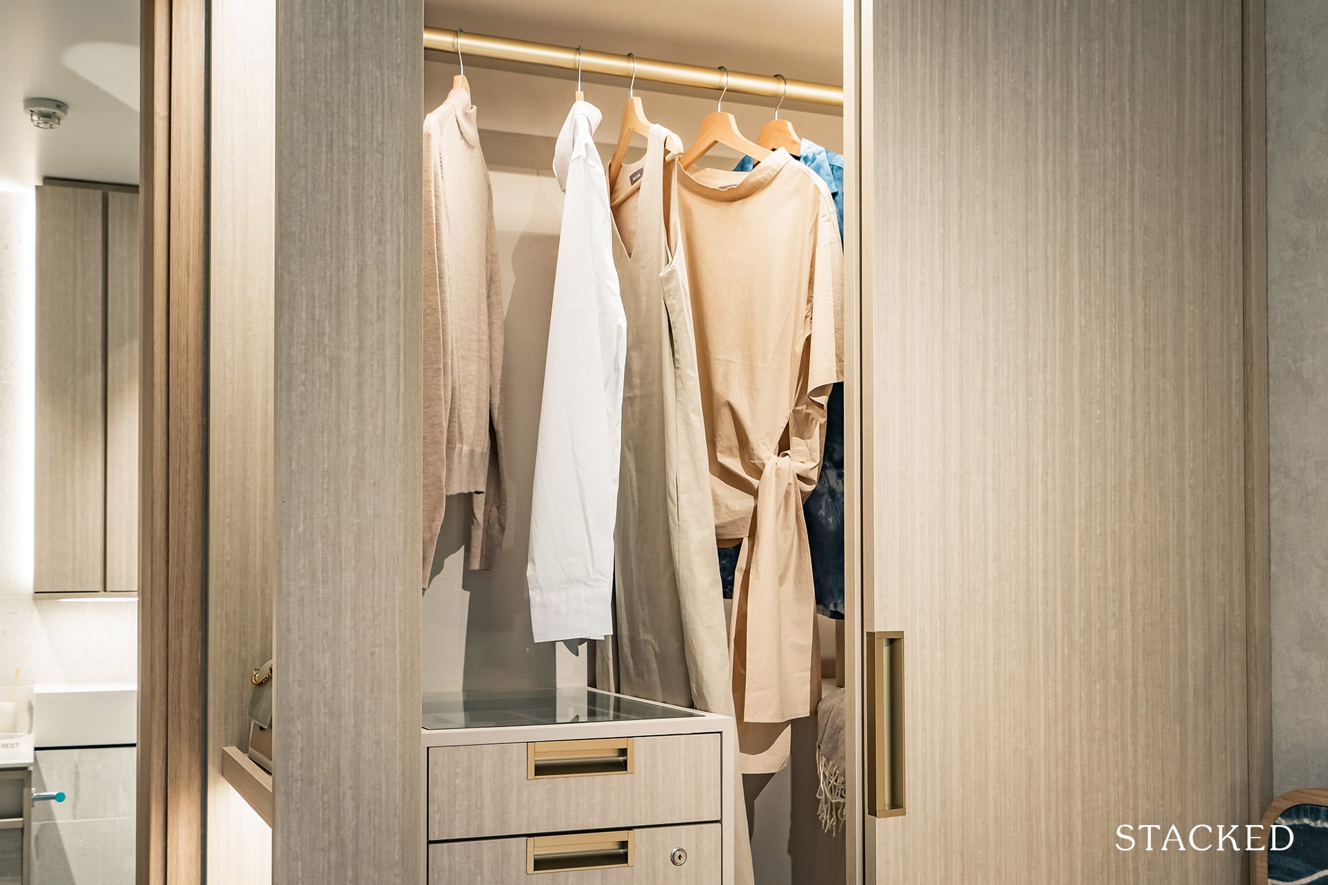
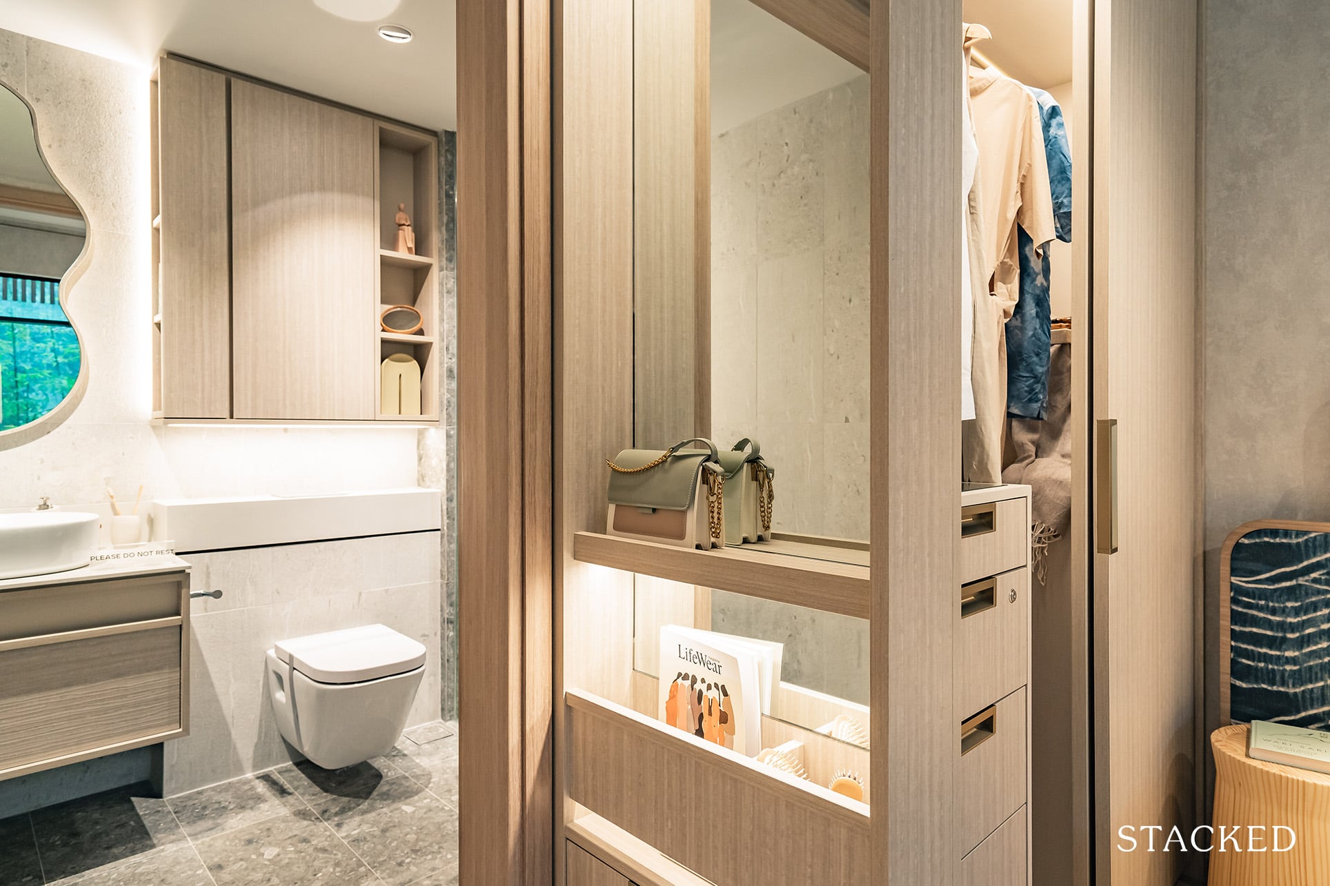
The built-in wardrobe in the Master Bedroom will also feature a novel open accessories portion by the corner, which is actually the first I have come across. You get a mirror with LED light and even a drawer, which is rarely seen.
And while the storage space is catered here all the way to the top, they’ve decided to opt for an open concept instead of the usual cabinet. I’m caught in two minds about this. On the positive side, you are able to store awkwardly shaped items (as it can now stick out), but unless you are Marie Kondo levels of neat, you can’t afford to be untidy here as it will be unsightly. Note this applies to all the bedrooms here, and not just the Master Bedroom.
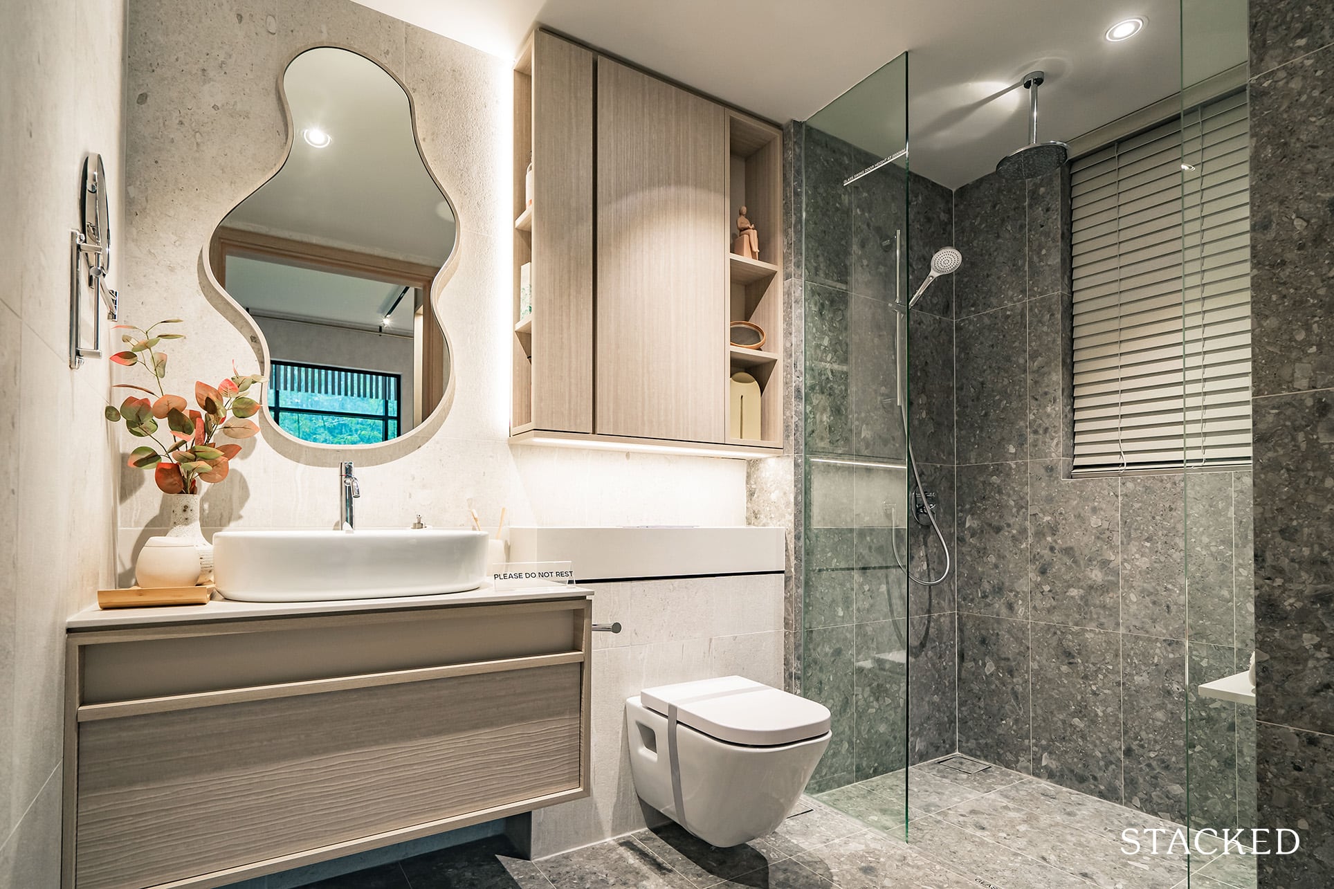
Finally on to the Master Bath, which is averagely sized at 4.9 sqm. To begin on a positive note, there are windows in this bathroom, which allows for natural ventilation.
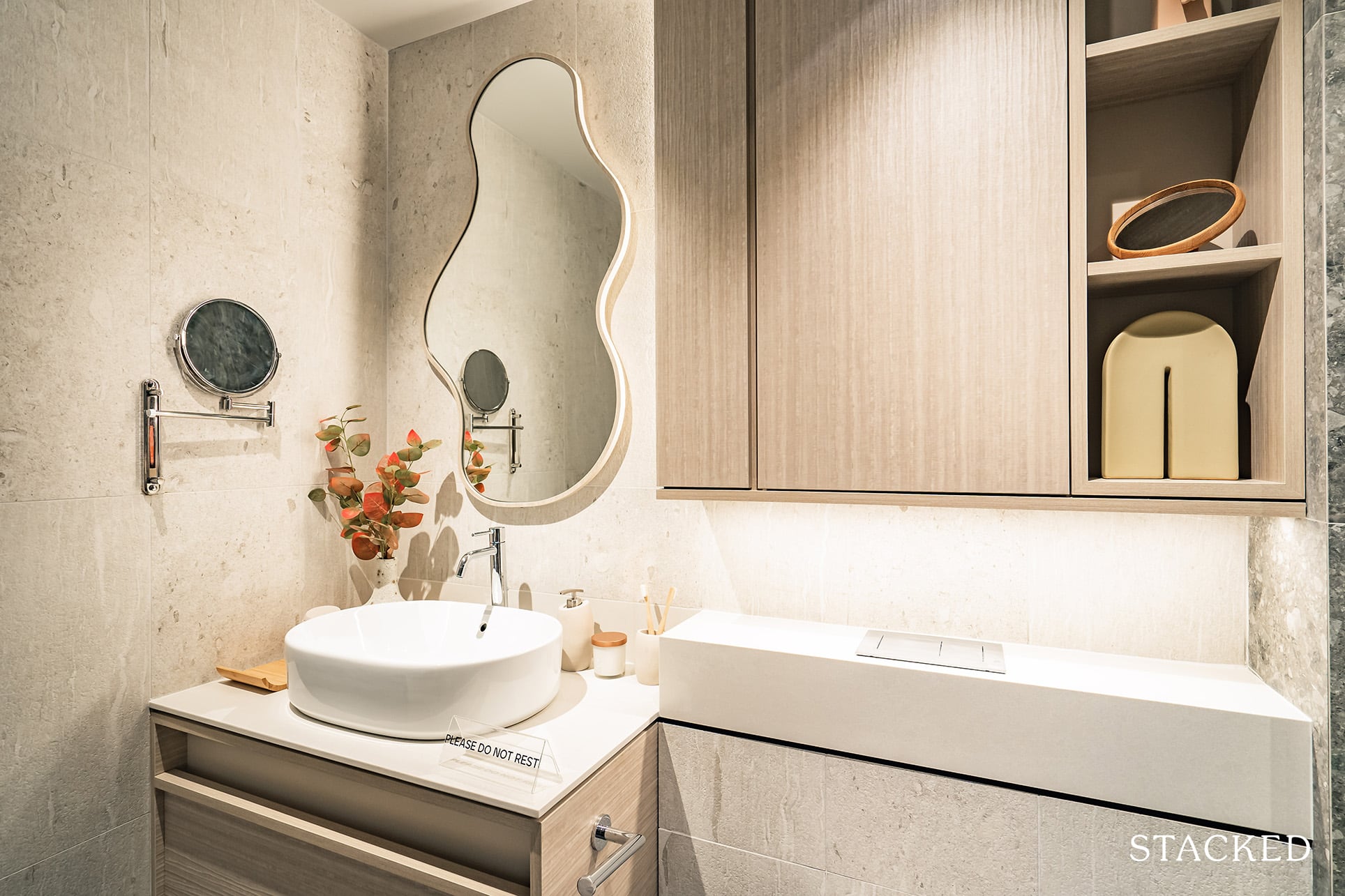
Otherwise, you get your standard built-in cabinets with a uniquely shaped mirror provided by the developer too. Bathroom fittings are also of good quality, including Italian brand Gessi for the mixer and rain shower, Spanish brand Roca for the wall-hung w/c and basin, and German brand Tece for the flush plate and cistern.
Mori – 3 Bedroom + Guest – Type G3 (1,173 sqft) Review
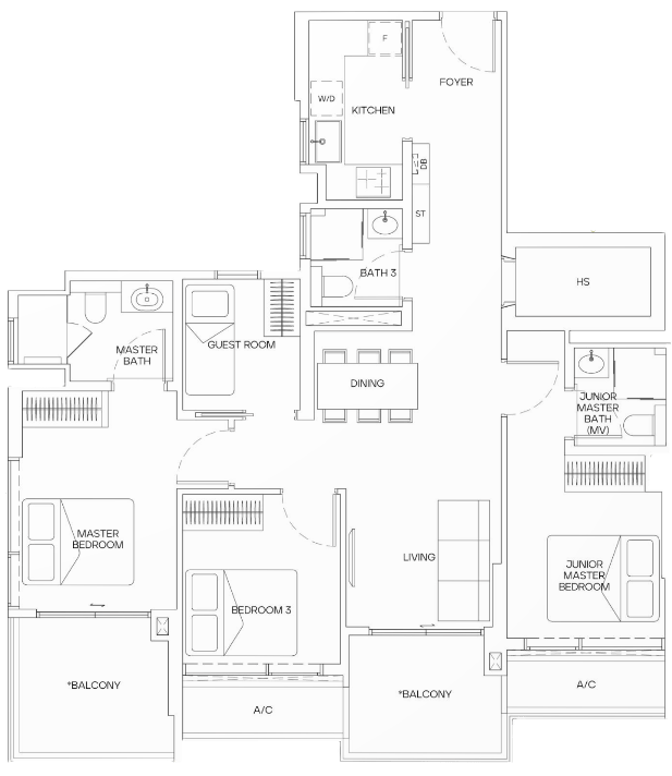
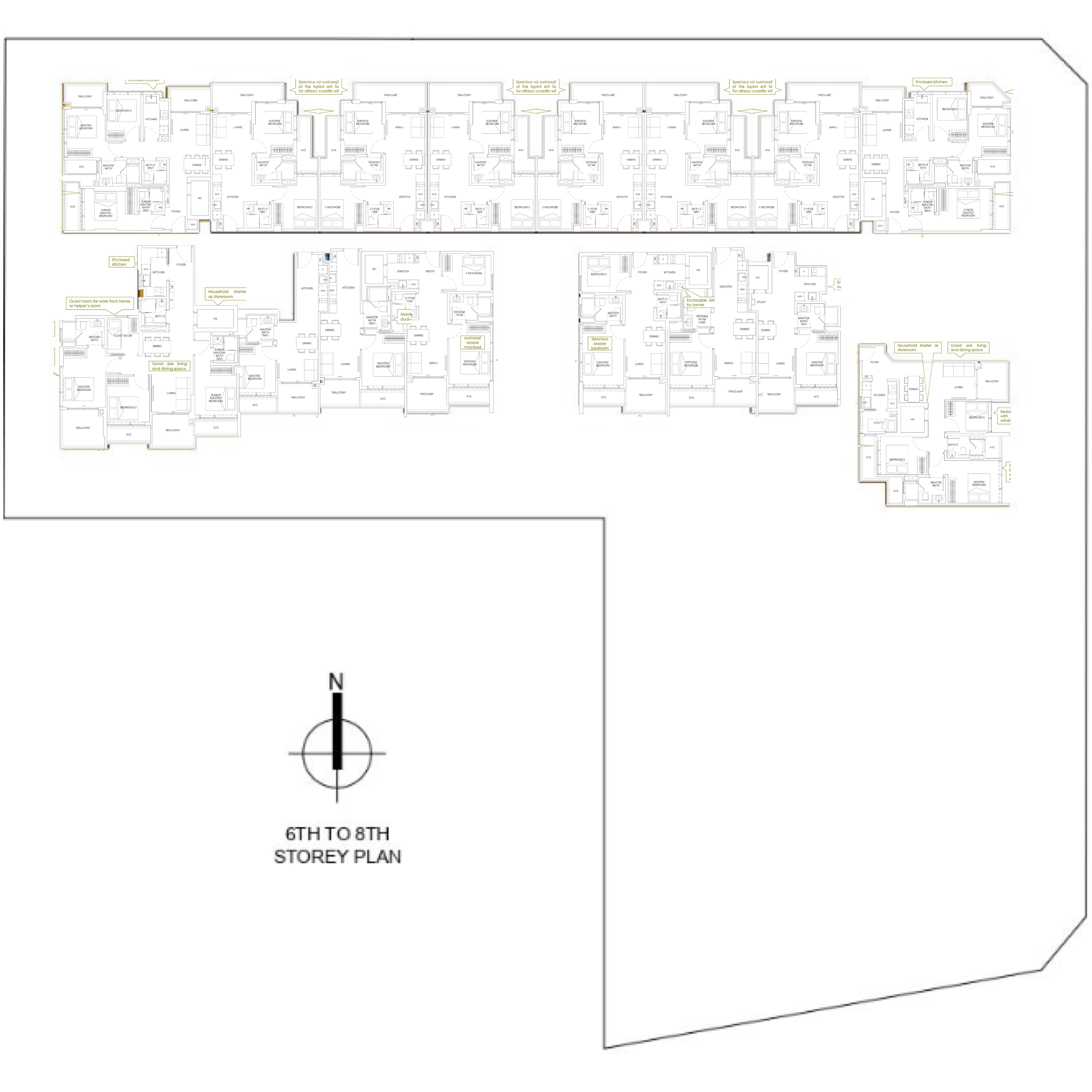
There are 38 3-Bedroom units at Mori, making up about a third of the development. Units range from 958 sqft to 1,184 sqft with the difference being the inclusion of a Study and/or a home shelter. At 1,173 sqft, this unit is spacious for a 3 Bedroom and comes with helpful features such as a home shelter, a study, and 3 bathrooms (instead of the usual 2).
Overall I do like the dumbbell layout here, as it does give more flexibility and privacy for the occupants.
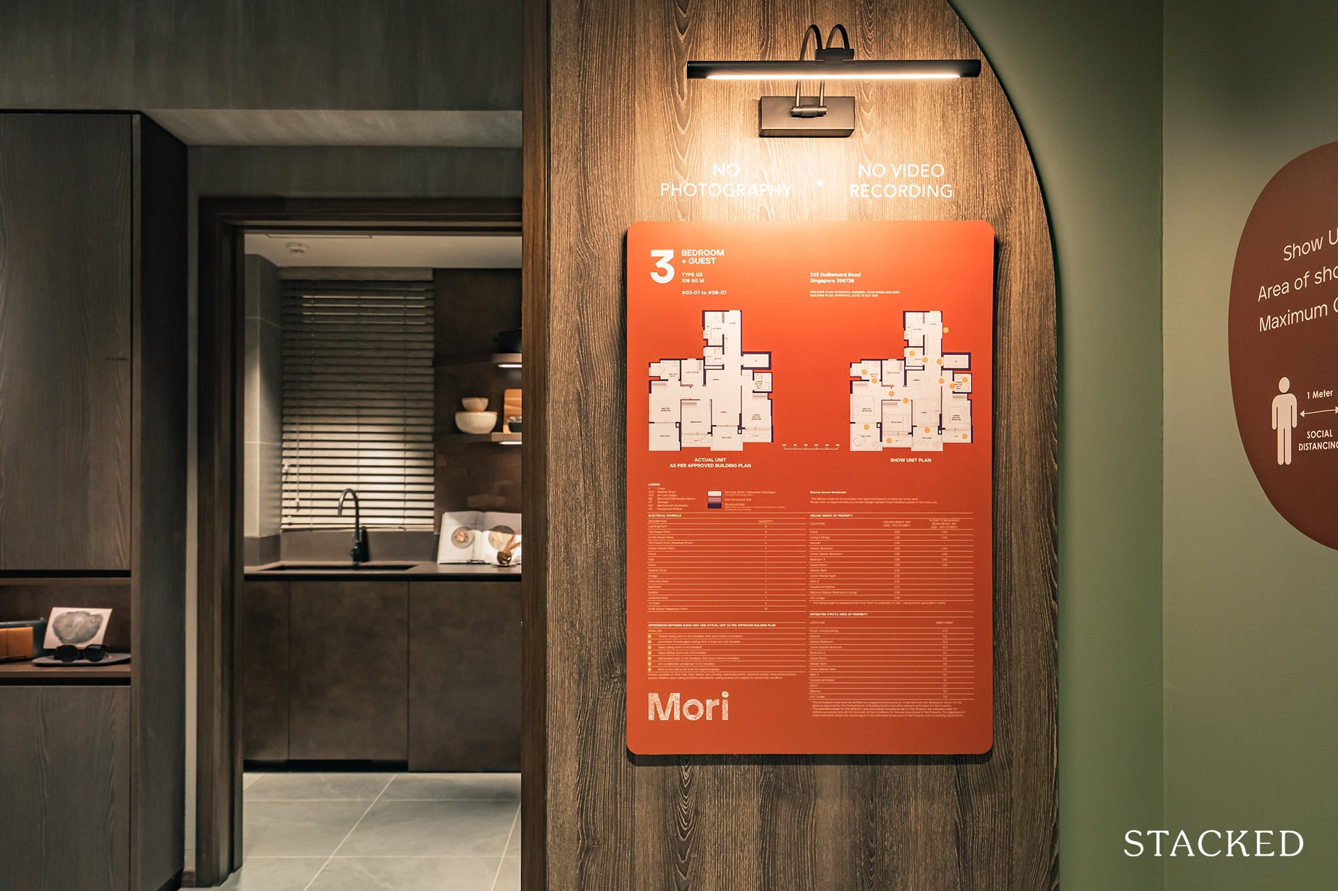
The ceiling height is average at 2.83m and the flooring provided will be porcelain tiles for the common areas and vinyl for the bedrooms. You will note that even though the materials are the same, the designs vary quite a bit from the 2 Bedroom show unit earlier. This is because 3 and 4 Bedrooms have a dark scheme instead, with a more rugged and textured finish. The overall look will be more modern and industrial, with selections of burnt wood and tarnished metal to represent the timelessness and fortitude of these materials. As mentioned earlier, you do not have the option to choose between the light or dark theme, which is unfortunate as it would be fantastic to be able to choose.
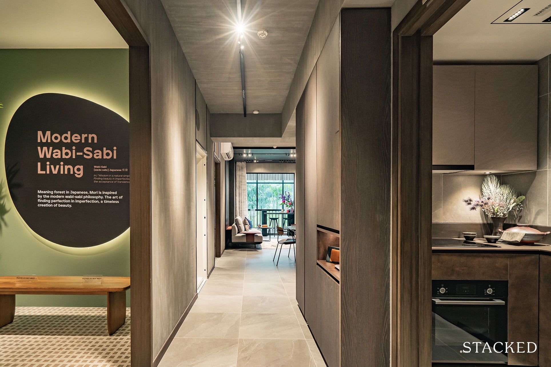
As you enter the unit, you are immediately greeted by the enclosed kitchen (to your right in the actual unit). It’s a U-shaped kitchen and the dark theme is evident the moment you step in.
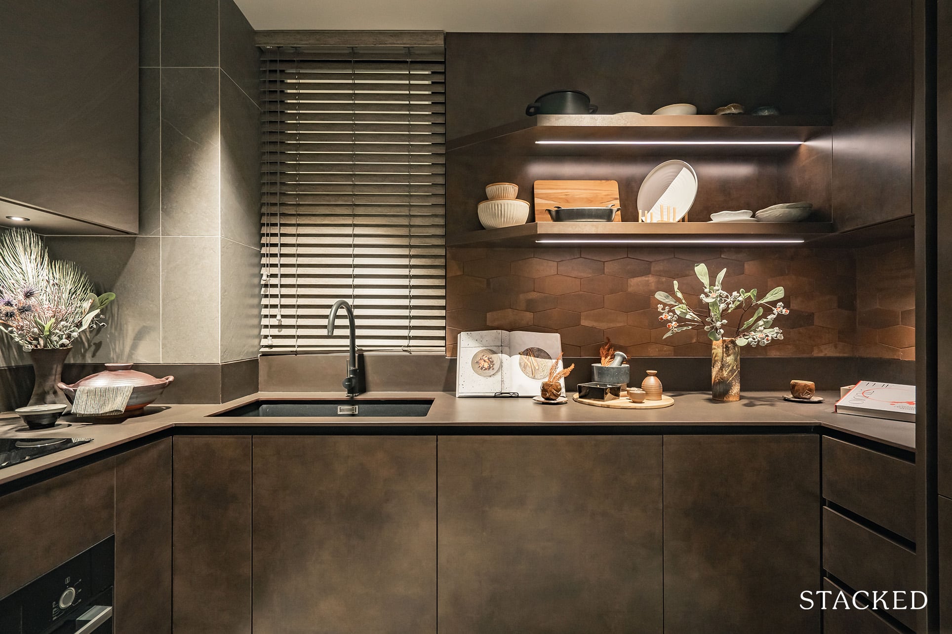
While it is compact in size at 5.8 sqm (and the dark tones certainly do not help), it does try to maximise the area with plenty of storage spaces, with some open shelving that is increasingly trendy these days.
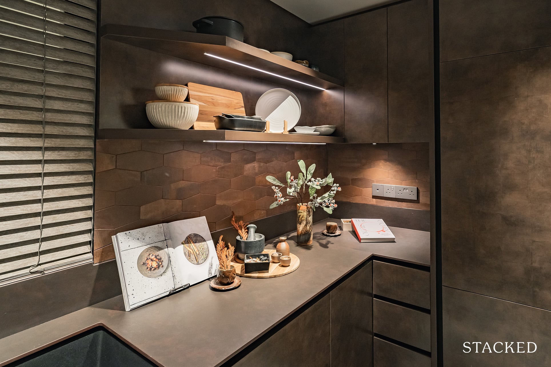
The storage spaces also include saucer racks and the Bosch fridge is also integrated behind the cabinetry here. I like the fact that despite being an affordable development, Mori embraces nice touches of details throughout.
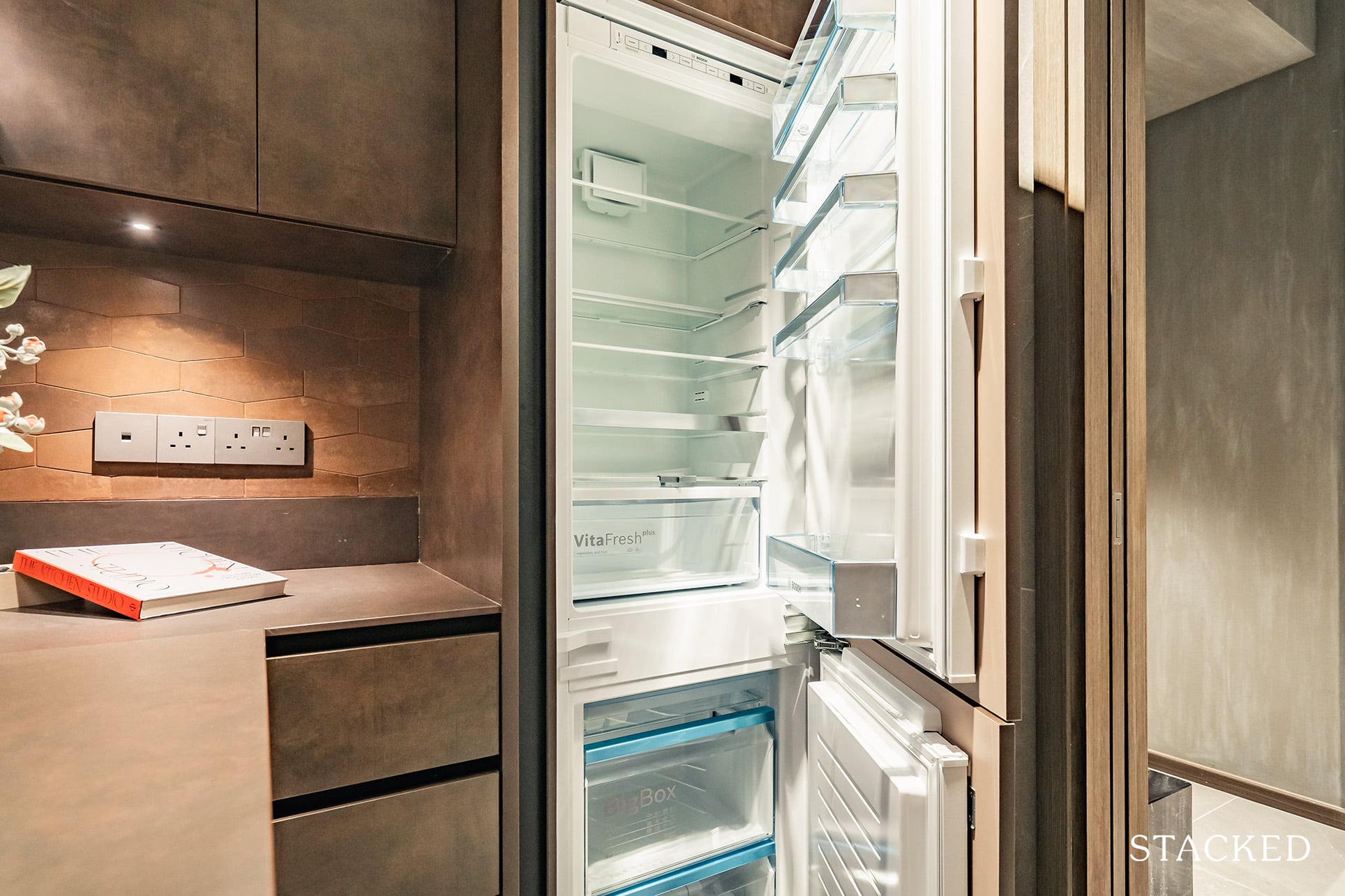
The washer/dryer is by De Dietrich. The other appliances are also from Bosch, which include the oven, hood, and induction hob.
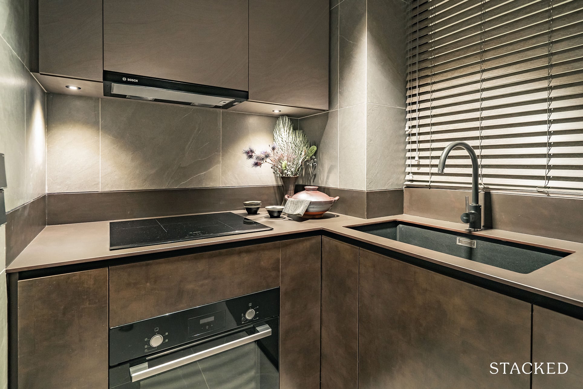
Do note that all units, regardless of size, come with an induction hob, which could be a downside for those looking forward to some open flame cooking. Regardless, there is a window here that will be helpful in emitting any remnant smells.
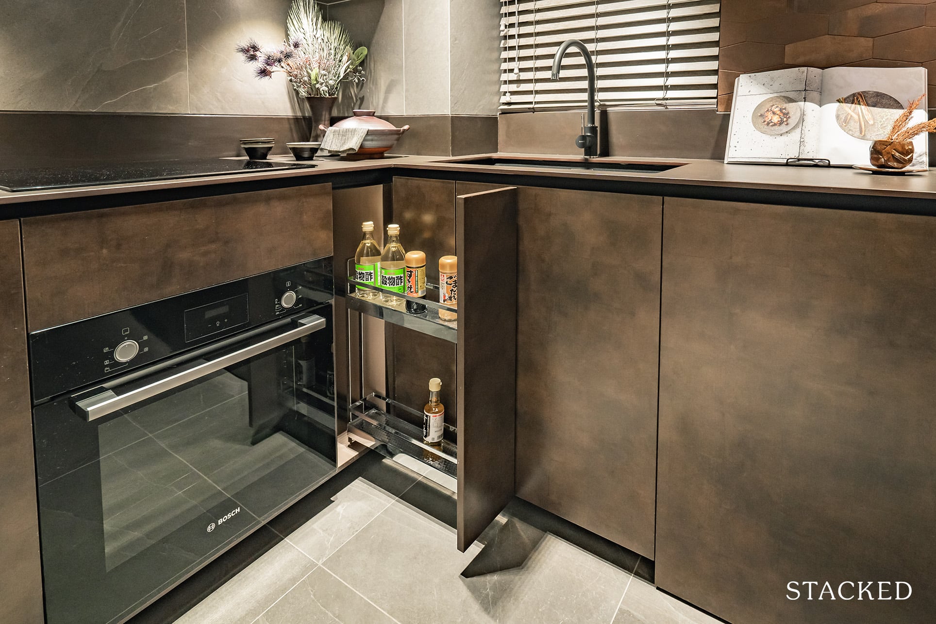
Because of the L-shaped corners, you do get handy pull-out drawers with racks installed to really make the storage space as efficient as possible.
Overall, I do like the look of the kitchen. The dark sultry look is something quite different and sleek looking, and I think that it would be something up the alley of most people.
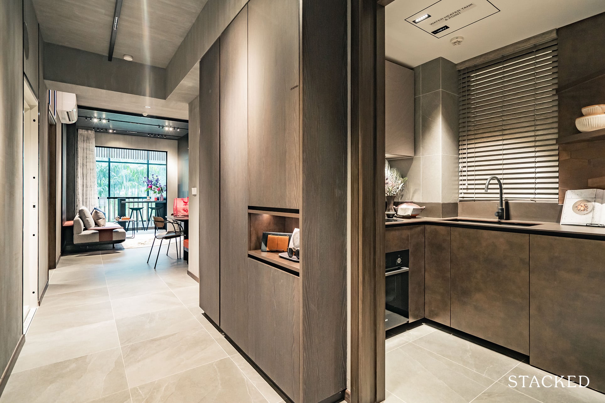
There is some walkway before you get to the living and dining room, although they have packed in more helpful storage cabinets for you as well. There is a multi-purpose storage cabinet where they have placed the iron board and broom and an open shelf with LED light for you to place the important necessities such as your car key and access card. The common bath and home shelter are located to the left and right en route to the living and dining room.
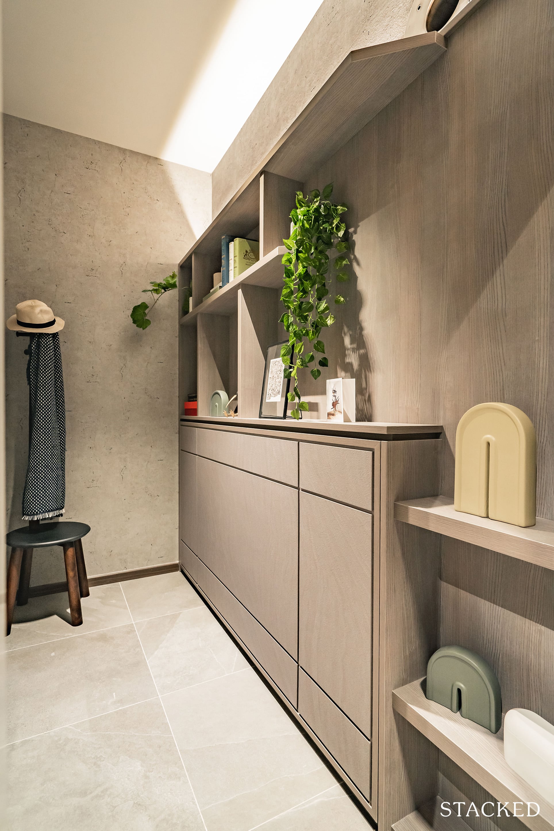
Starting first with the home shelter, which is important for every larger apartment. It’s rectangular in shape at 4.1 sqm and will be very helpful in allowing you to store away your excess items or household necessities. It’s a real struggle for new launches to balance both practicality and the overall quantum of the unit so much so that having a utility room is nearly almost seen as a luxury these days. Of course, this could also double up as a helper’s room, which is very often the case in Singapore.
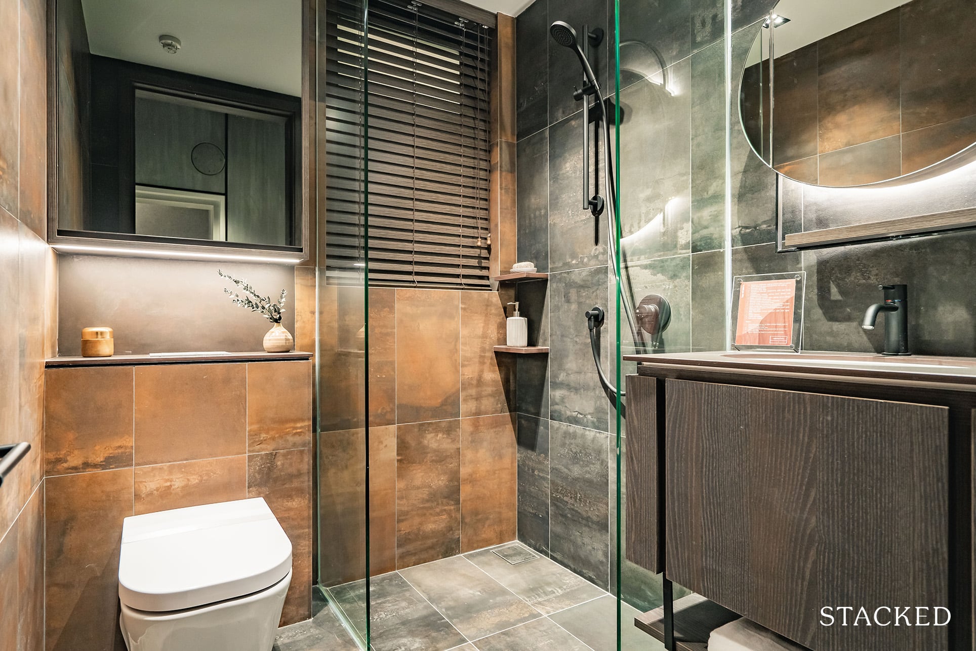
As for Bath 3, which is located just opposite the household shelter, it serves the needs of both your guests and the occupant of the Common Bedroom, which is the only bedroom without an ensuite bathroom. This bathroom’s location makes it more accessible to guests and grants occupants of the Common Bedroom and the Master Bedroom more privacy when guests are over. That said, the Common Bedroom occupant is inconvenienced as he/she will have to go some distance to access the bathroom.
It’s not typical to have a bathroom per bedroom anyway, so I don’t think too many people are going to be complaining in that regard.
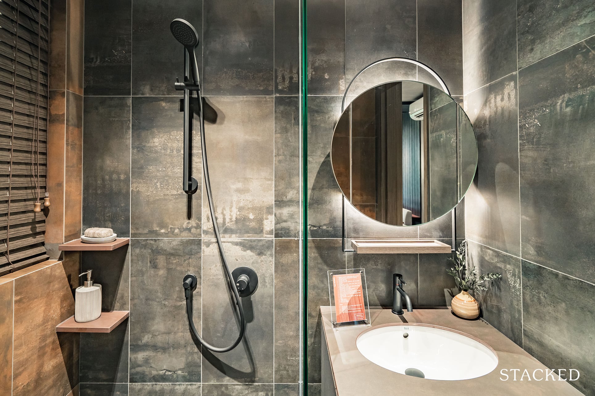
In any case, this bathroom is more compact than usual at 3.2 sqm. This is a common theme across Mori but it’s not a bad thing if the space is better utilised elsewhere in the unit. Once again, you see the raw, darker tones used in this bathroom, evoking more of an industrial theme right here. The 2 mirrors on 2 sides will both be provided by the developer, so no matter how you turn, you will be able to check yourself out.
Bathroom fittings come from top European brands including Gessi for the mixer and handheld shower, Roca for the wall-hung w/c and basin, and Tece for the flush plate and cistern. I do like how they’ve used the matt black series for the bathroom fittings to really nail home the different theme. As per the location, there are no windows in this bathroom so no natural ventilation here I’m afraid.
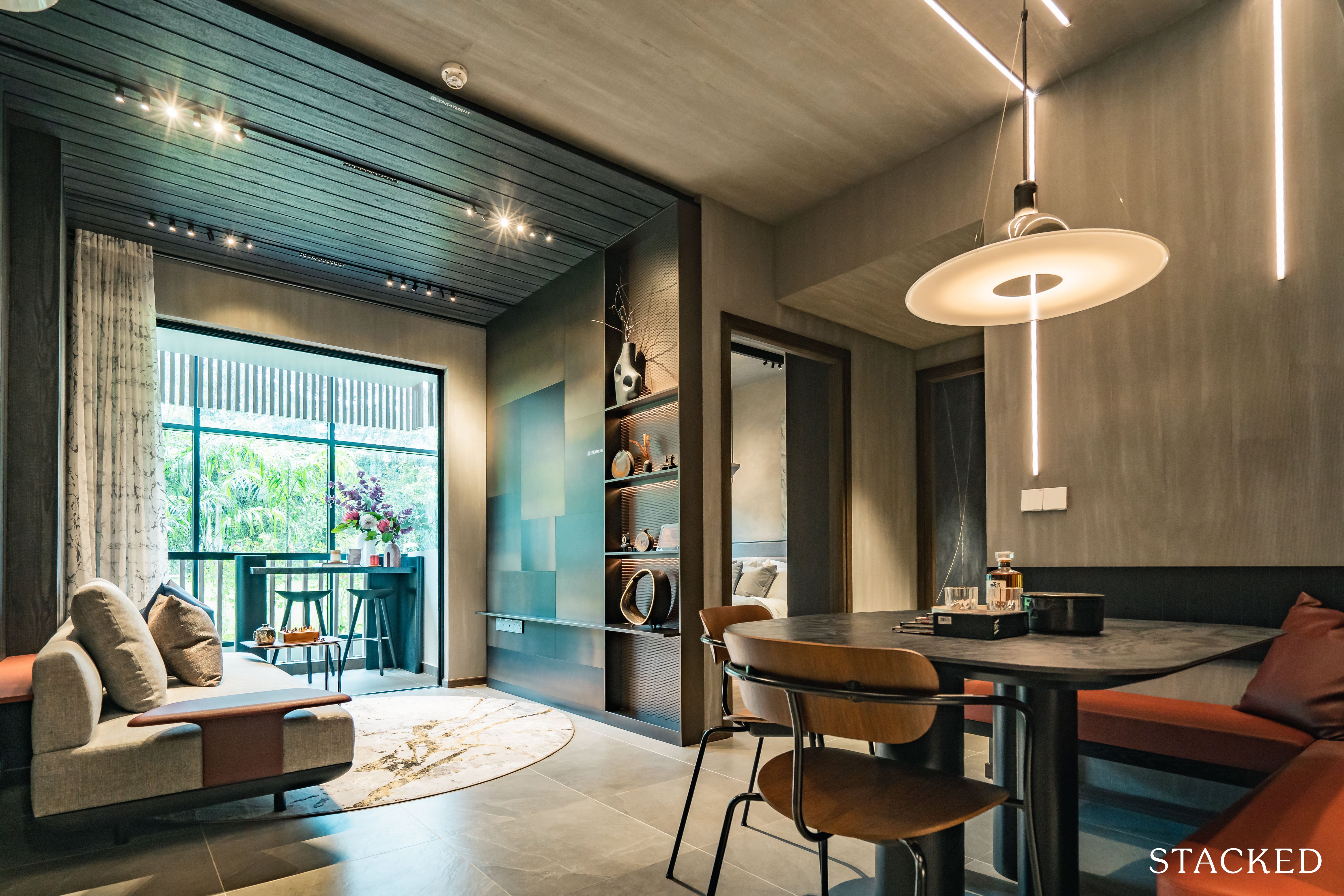
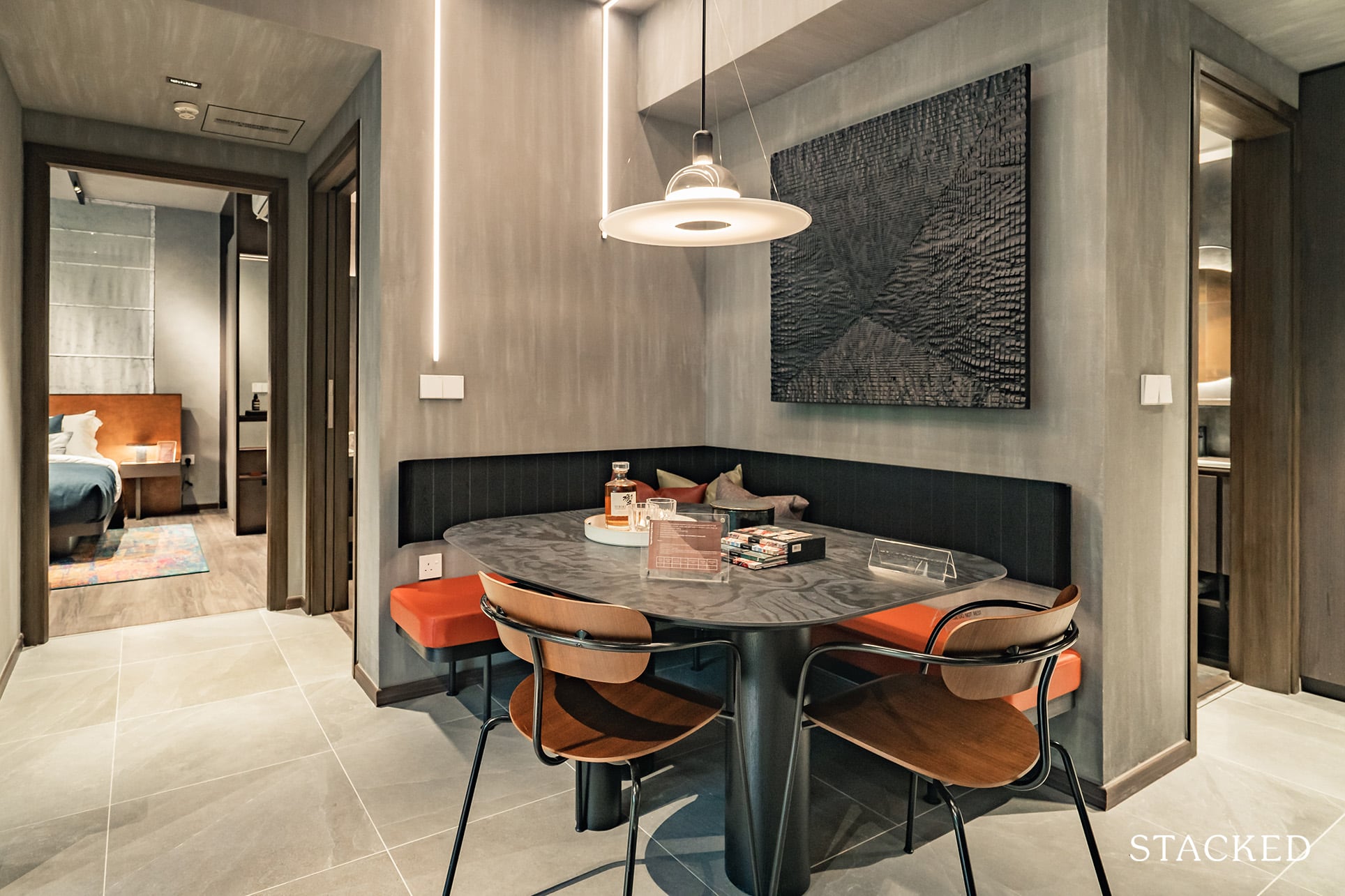
Moving on to the dining room proper, and they have a squarish set up for about 6 pax. The space is rather ordinary for me, bearing in mind that bench seating (which is space-saving) was used for 2 of the 4 sides. Should the table be any larger, the seats will infringe on the walkway, so you are quite limited here.
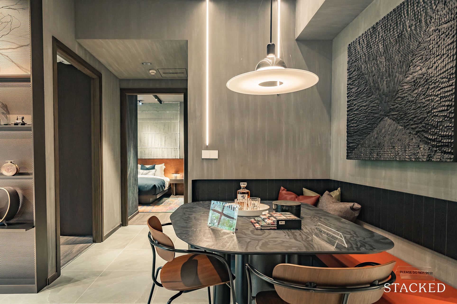
I do suppose a circular table can work here too, but doing so will definitely mean you have less space to move around so it would be more form over function here.
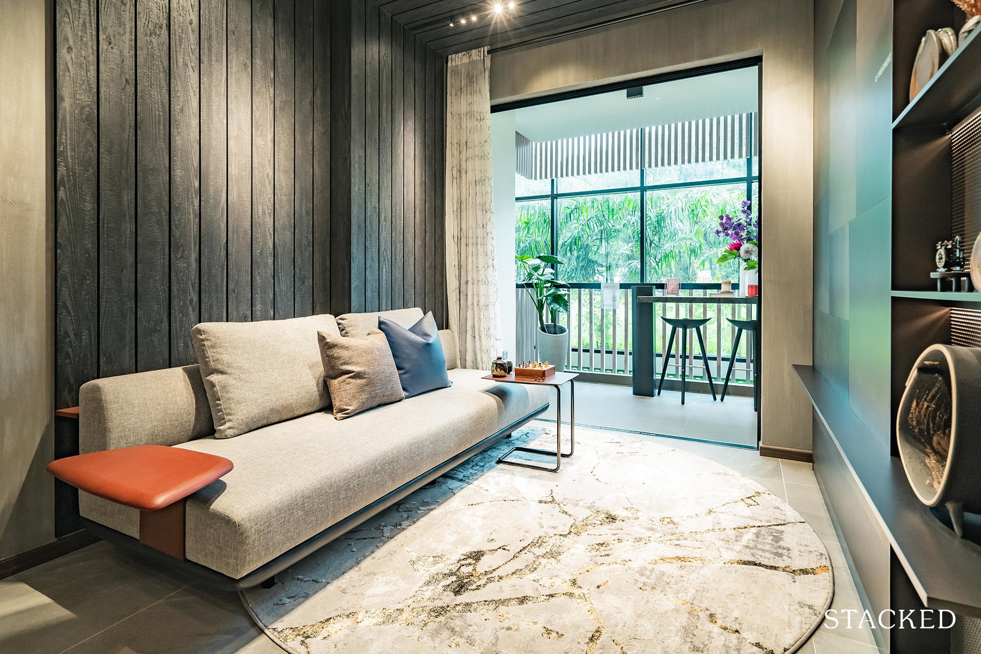
As for the living room, you have quite a long space that will allow you to place a longer sofa set. However, for those who have visited the show flat, the eagle-eyed among you will notice that the walls are not actually seamlessly aligned (a part of it is thicker). Thus, the interior designers have concealed it by placing a mini rack of sorts at the back of the couch to fill the gap.
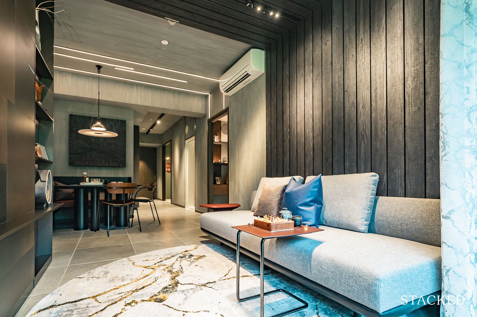
Of course, this wall structure is not ideal and will be inconvenient for your interior designer in the future. That said, if I were to put on my creative hat to think about it, you could adopt a modular (or customised) sofa set – with one pushed slightly out to account for the wall. Thankfully, this quirk is just for this unit type, and not for all the 3 bedrooms at Mori.
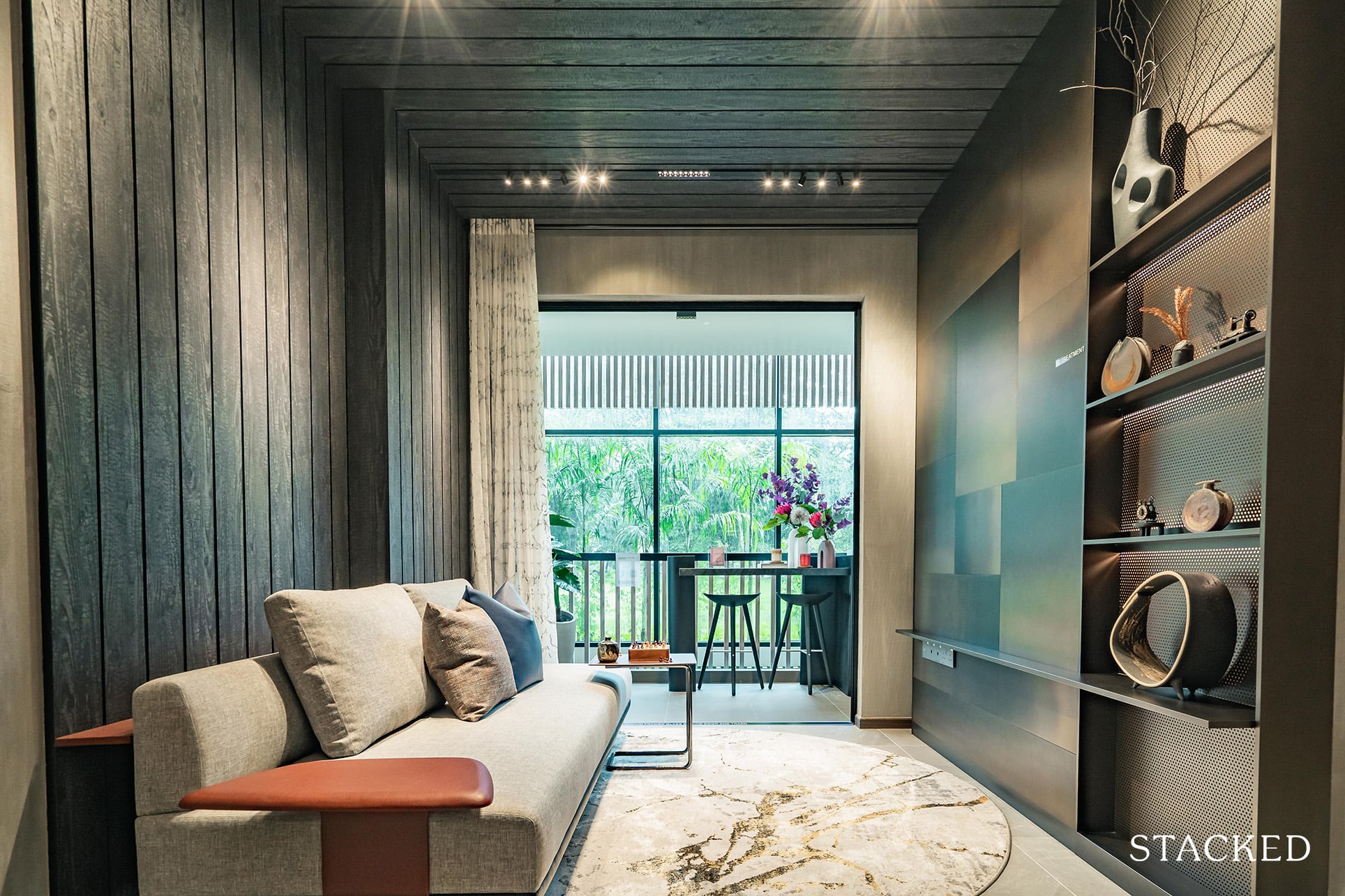
Wall-to-wall distance is slightly better than the one in the 2 Bedroom show flat and expected to be so since this unit is significantly larger than the other. It’s difficult to picture how a full-on TV console and a coffee table would look in this space as it has been rather sparsely furnished here. In any case, there would be sufficient space for both although you would also want to avoid any clunky pieces of furniture too.
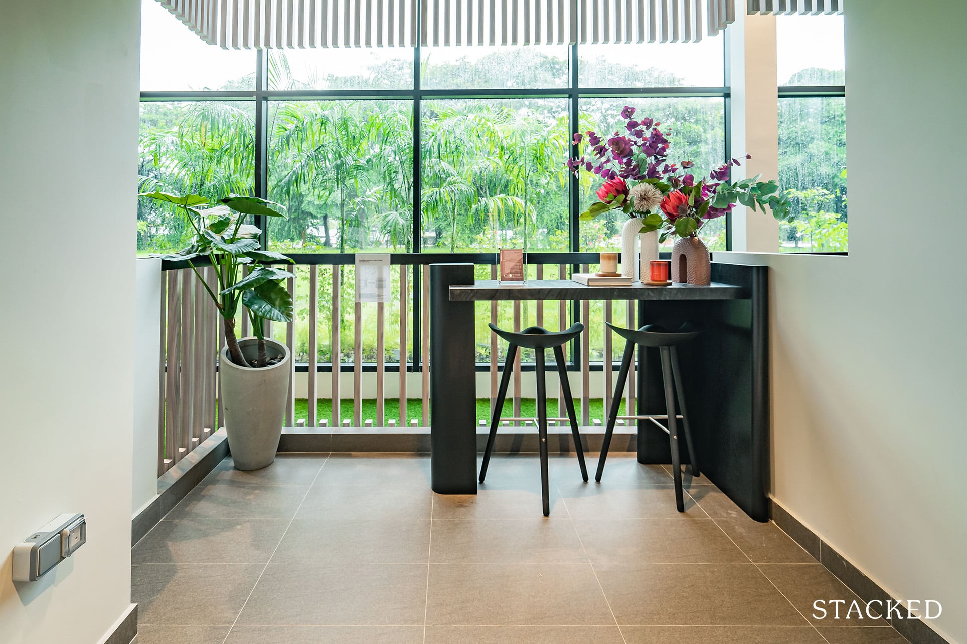
There are 2 balconies in this unit, with 1 in the living room and the other in the Master Bedroom. There isn’t an exact breakdown for both, but they will collectively make up 13.7 sqm of space, with the one in the Master Bedroom being slightly larger.
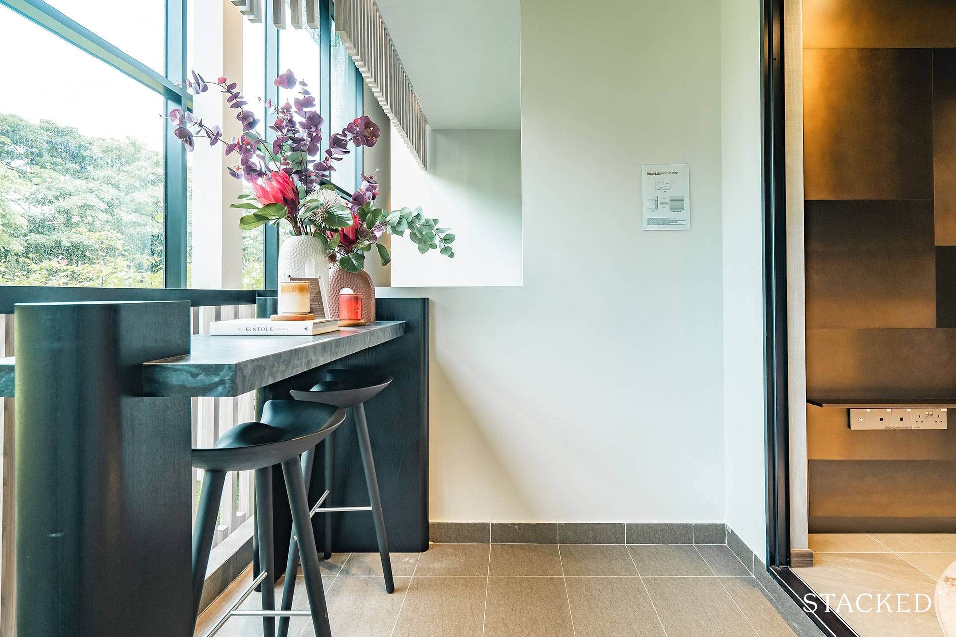
Nevertheless, let me start with the balcony in the living room. It’s a squarish area, and the developers have kept it simple with only a simple bar counter with 2 stools. There’s enough space to have a second dining area (but you definitely won’t be able to fit 6!) To think that the balcony in the Master Bedroom is even larger speaks volumes about the outdoor space in this unit. As always, if you are an outdoor lover, fantastic. But for those who dislike having outdoor space, this would be a minor point.
I’d say that the views out aren’t exactly stellar (depending on the stack), so I’m not too enamoured here to have more outdoor space.
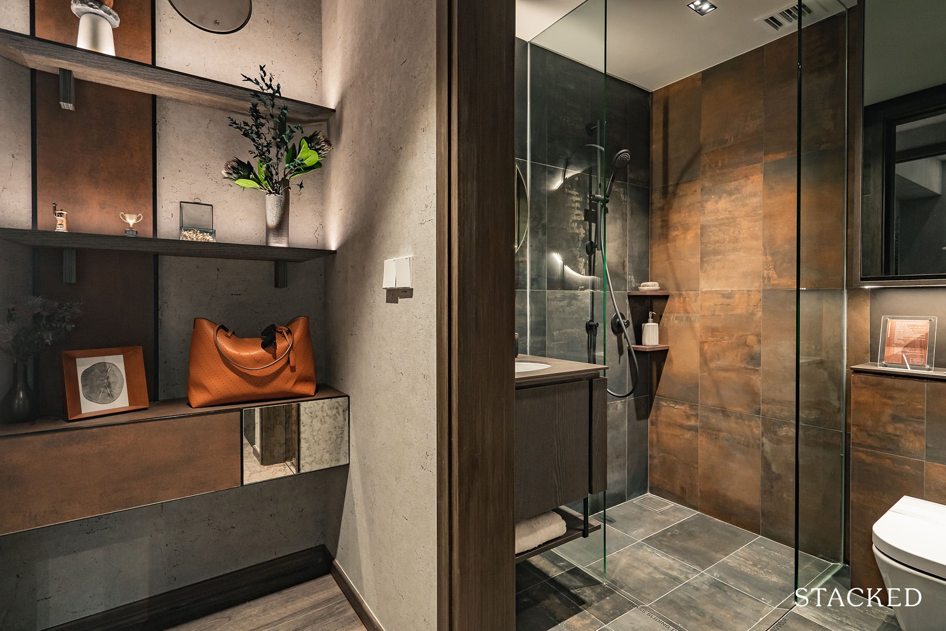
Now let’s move on to the bedrooms in this unit, starting with the Junior Master. This room is located away from the other bedrooms in a dumbbell layout so it does help from a privacy standpoint. As the name suggests, it will also come with an ensuite bathroom. It’s exceptionally rare to have 3 Bedroom units have 2 ensuite bedrooms and 3 bathrooms in total so this is certainly a plus point here.
At 12.3 sqm, this Junior Master is certainly larger than all other common bedrooms around. Because of this amount of space, you even have an area by the left of the room to build some shelving (or even another wardrobe) as they have done here to showcase your bags or accessories.
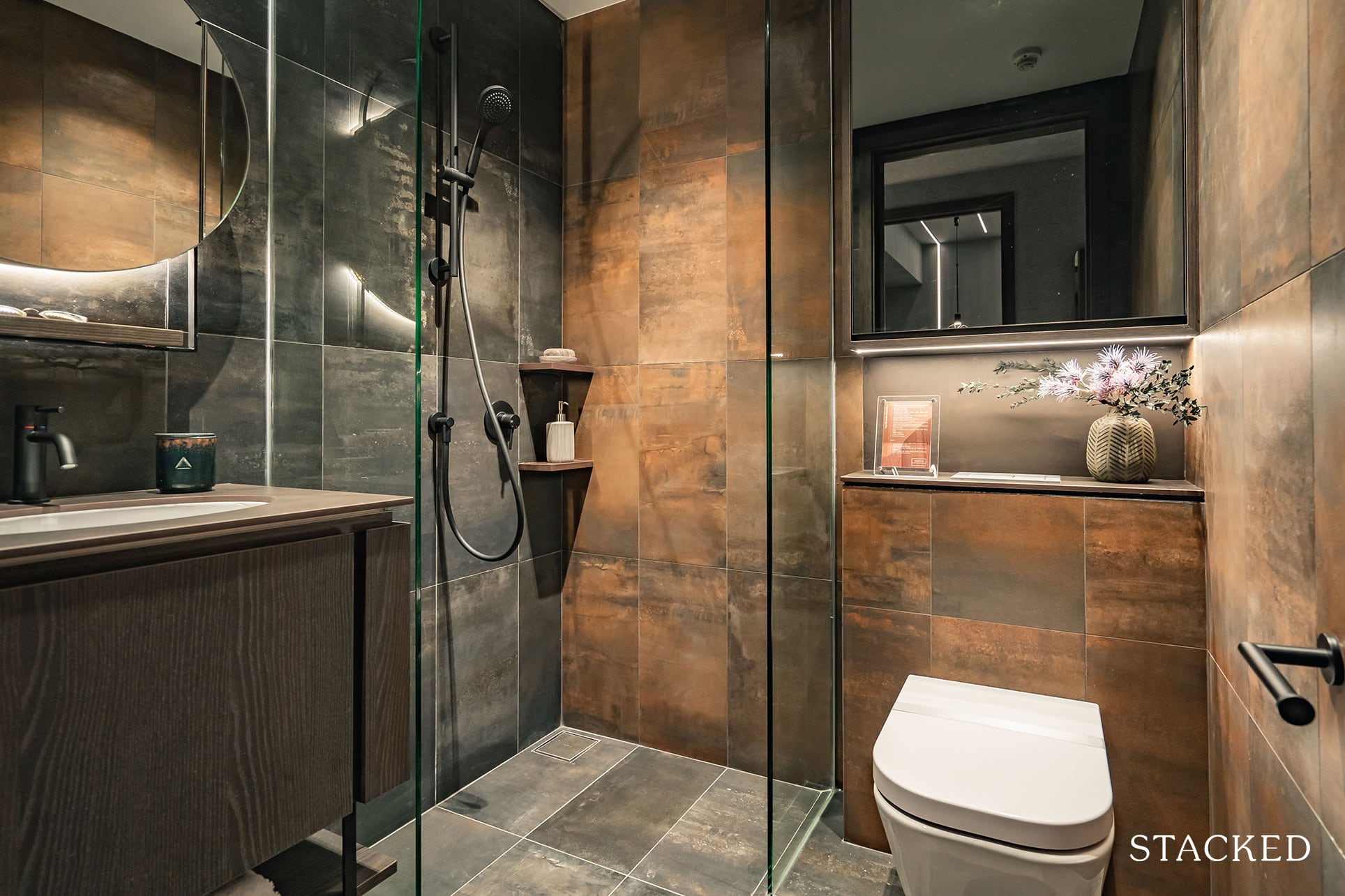
For the Junior Bathroom (which stands a below-average size of 3.2 sqm) it’s not big, but it really doesn’t matter as having an ensuite is a luxury in itself. Similar to the common bathroom, the overall theme brings forth a more industrial, tarnished metal vibe.
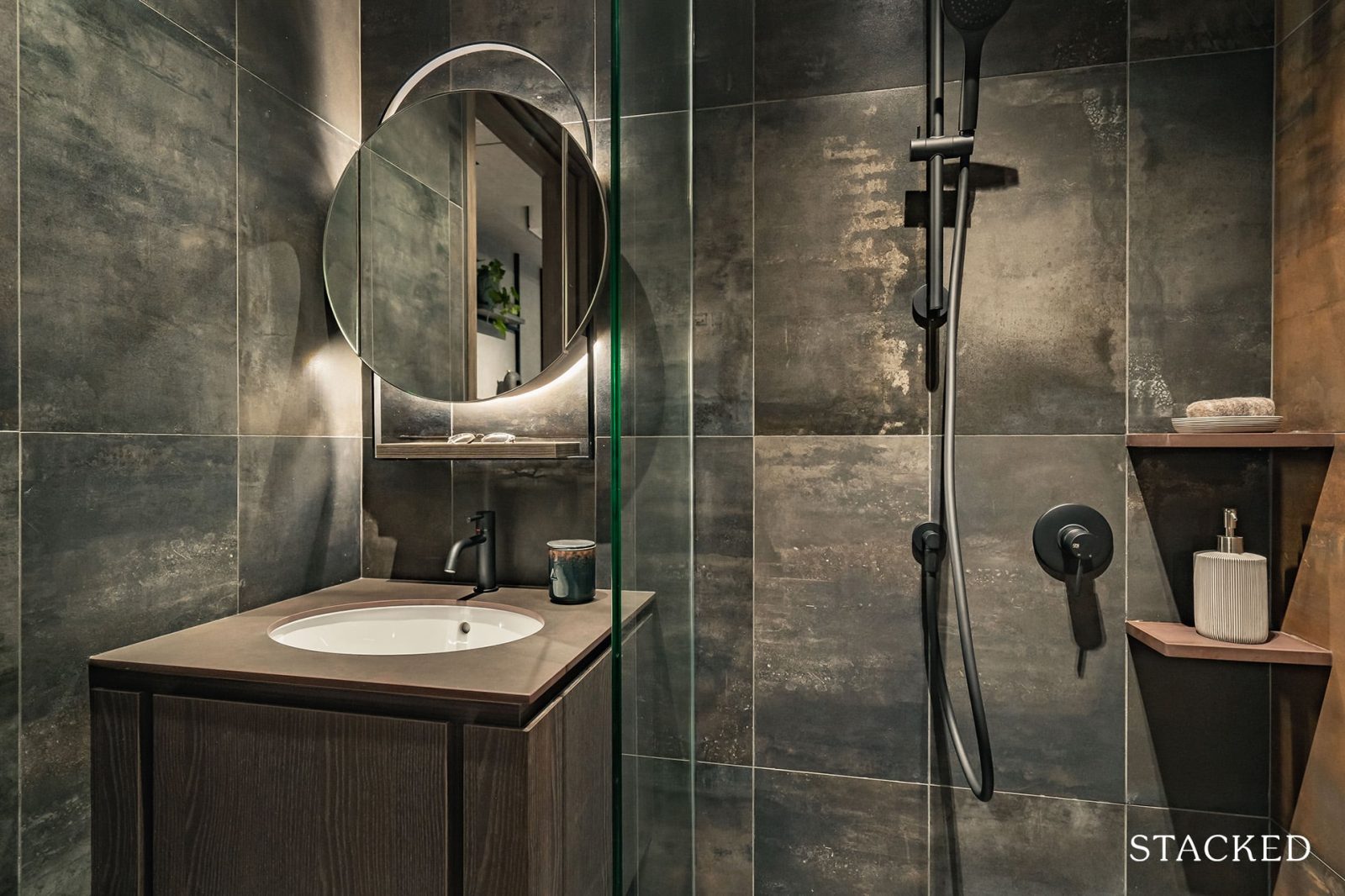
Once again, you get mirrors with cabinets behind on 2 sides, which helps to make the bathroom look larger (and it incorporates a unique design indeed). A host of branded European sanitaryware is also used here including Gessi for the mixer and handheld shower, Roca for the wall-hung w/c and basin, and Tece for the flush plate and cistern. I’ve always liked the matt black look for the bathroom fittings, as it just looks sleeker and more modern, so I’m glad to report that this is present throughout.
Although it must be said there are no windows in this bathroom, so there’s no natural ventilation to speak of.
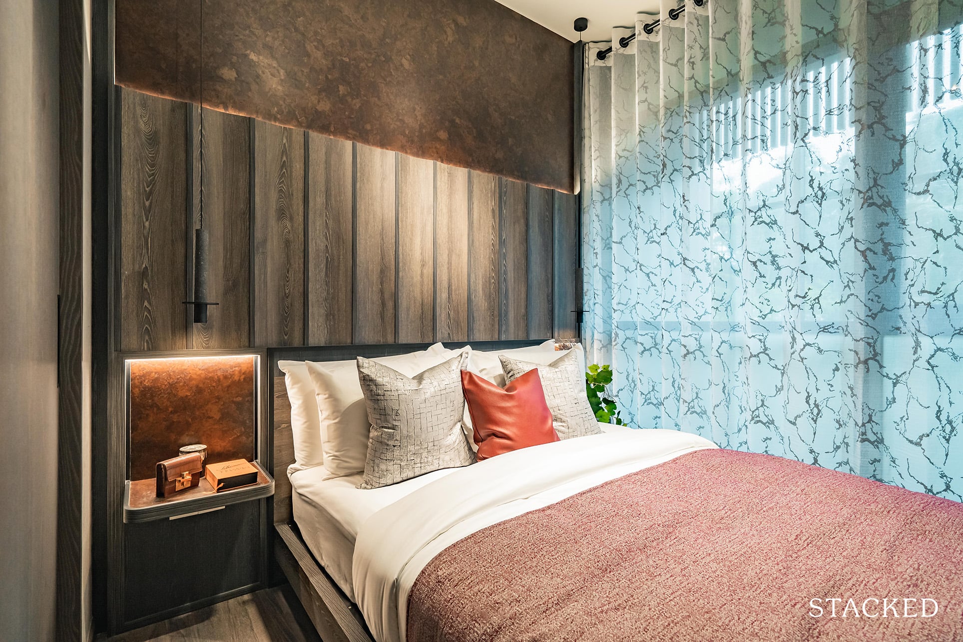
The actual area for the bed is actually rather similar to the other common bedroom, and they have placed a Queen size bed with 2 small side tables.
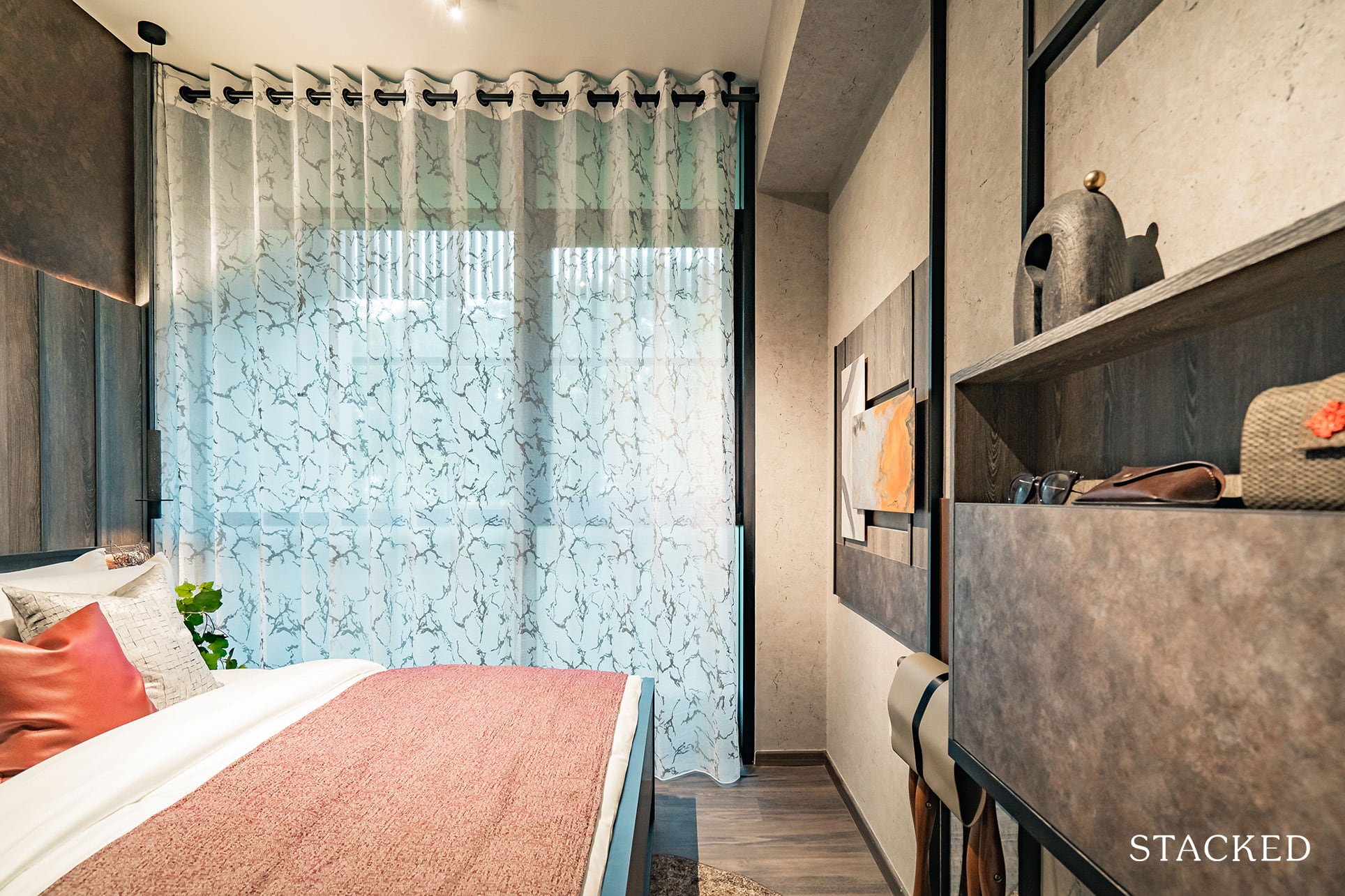
As the aircon ledge is just beside the room (there’s also one beside Bedroom 3), the windows will only be half-length.
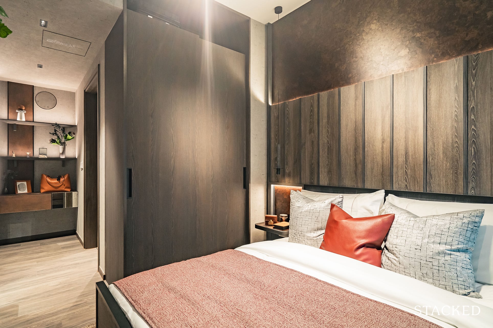
Built-in wardrobes are also of a darker theme compared to the 2 Bedroom show flat, although the actual design remains largely the same. It is a typical size, although as mentioned above the space to the left of the entrance will come in very handy here.
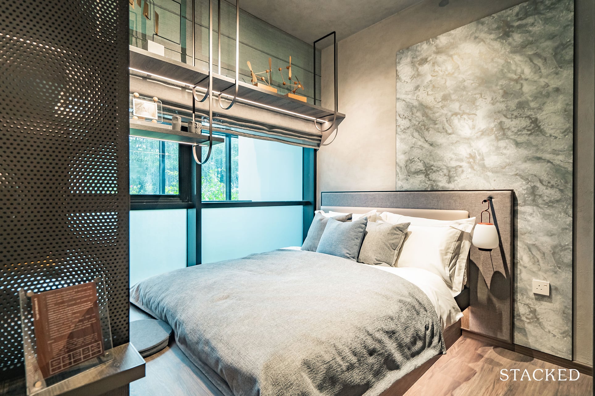
Next, let’s explore Bedroom 3, which is the only bedroom in this unit to not have an ensuite bathroom. At 9.2 sqm, it is of average size compared to other new launch projects. As mentioned earlier, there is also an aircon ledge right beside, so the windows will only be half-length, with the bottom half frosted out.
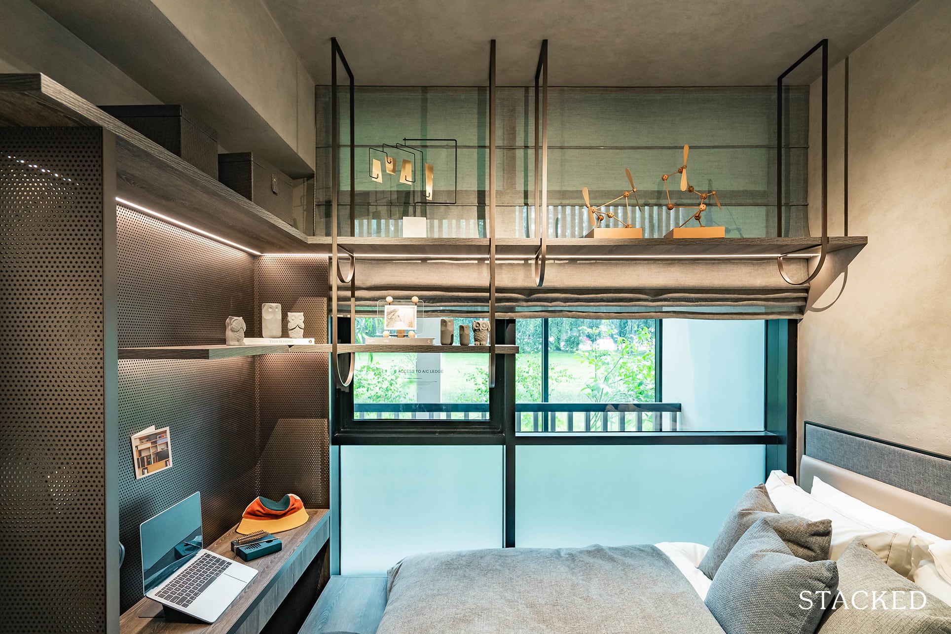
The overall dark theme continues for the built-in wardrobes, and the size of the room allows for a Queen sized bed, with a compact study being included as part of the platform bed setup.
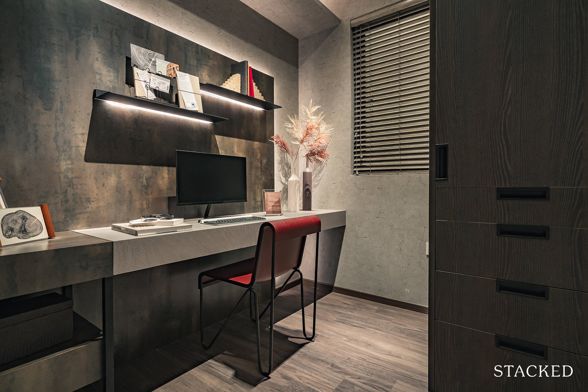
Even though this unit is officially only a 3 Bedroom unit, one of Roxy-Pacific’s strengths lie in its ability to maximise your bang for the buck. This is a “+Guest” unit, which means you get an additional Guest room that stands at 5.5 sqm. It has multiple uses, including for your helper, the occasional friend sleeping over or even a proper bedroom if absolutely necessary.
Probably the most common use case here though will be as a home office, which is very much in line with today’s work from home environment.
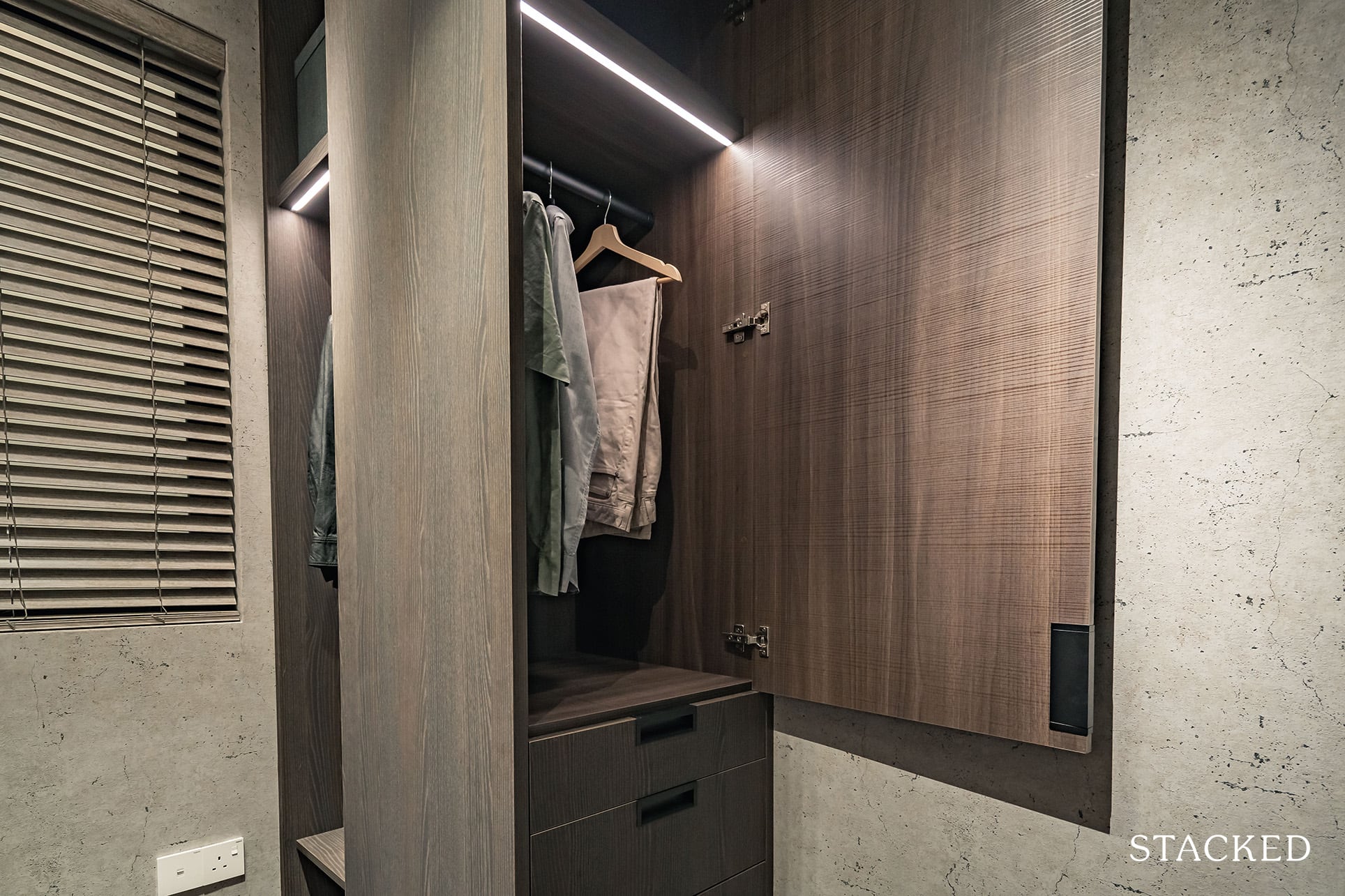
Either way, you have your practical aspects covered as there is a window that allows natural ventilation. Additionally, you also have a built-in wardrobe, albeit smaller than usual, that allows you to hang even your long dresses (I should mention this goes all the way to the top too).
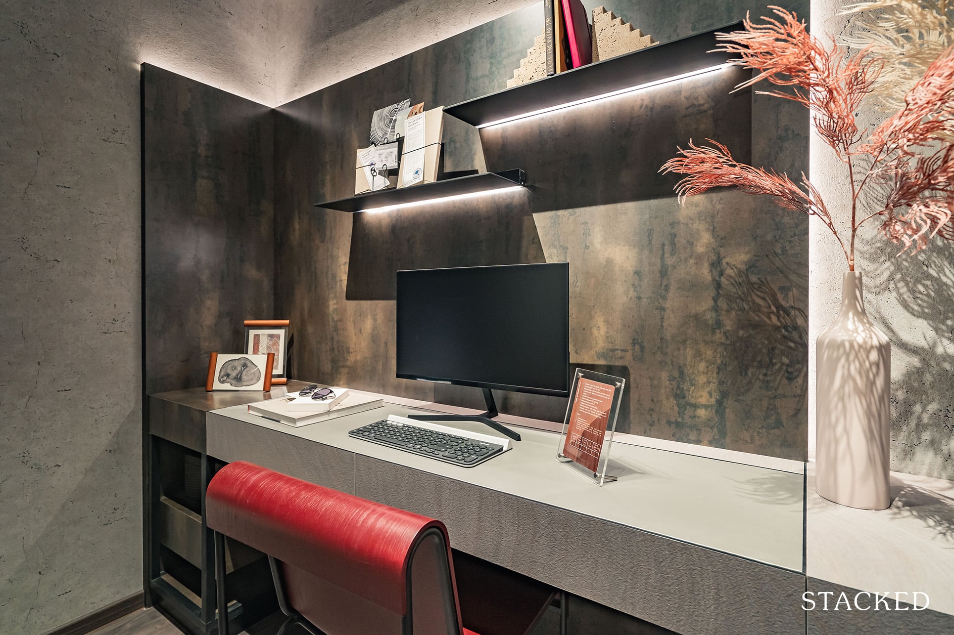
Bed wise, you can probably just about fit a Single bed. In any case, I am impressed with this additional room that you get as a ‘bonus’ simply because Roxy-Pacific has been good with its space management techniques.
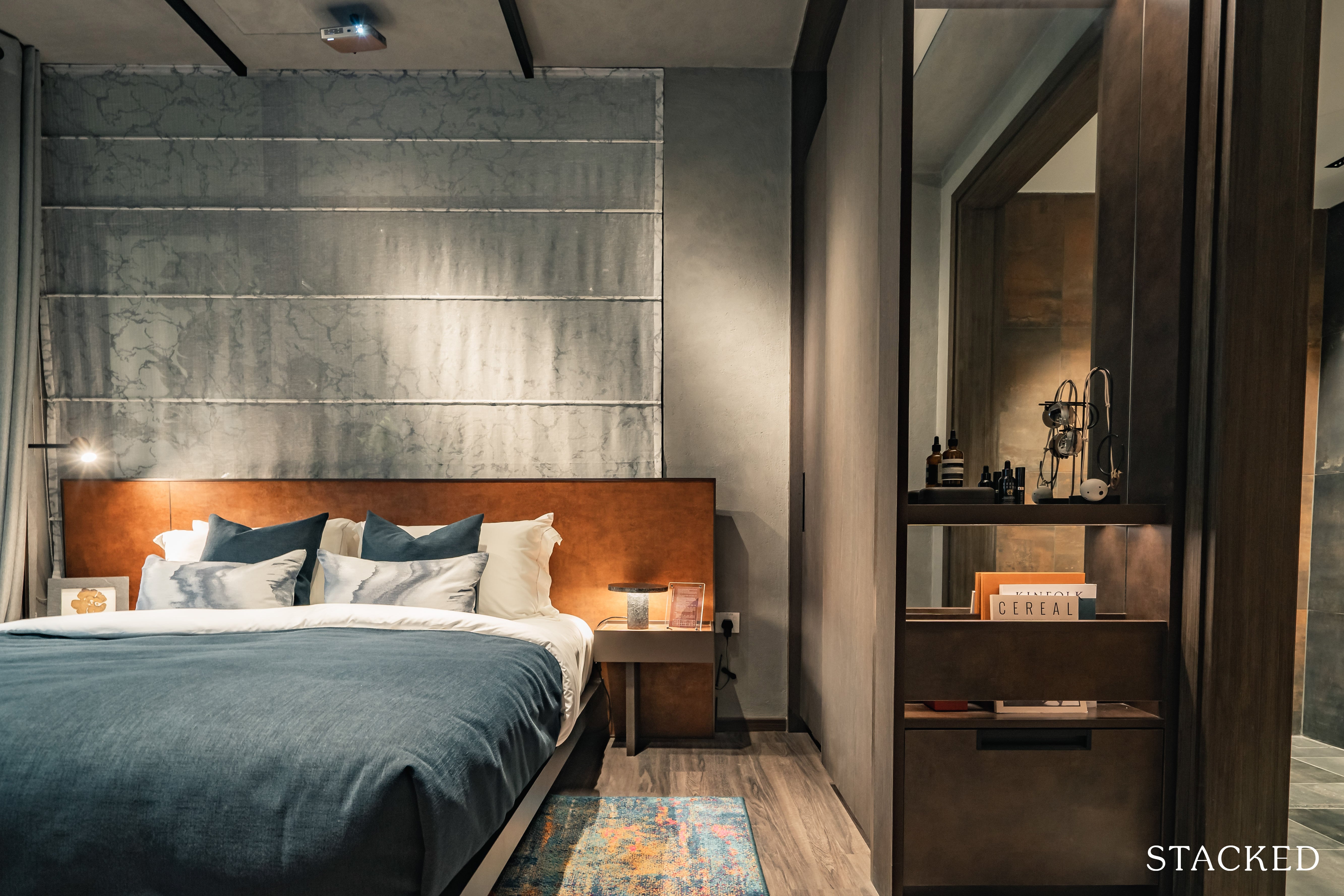
Finally, let’s explore the Master Bedroom and its ensuite bathroom. At 12.9 sqm, it is only a tad larger than the Junior Master Bedroom so you can say that the developers have been rather equal in their treatment of the occupants here. The area here is laid out more efficiently though, so placing a King size bed as they have done here still leaves room for bedside tables.
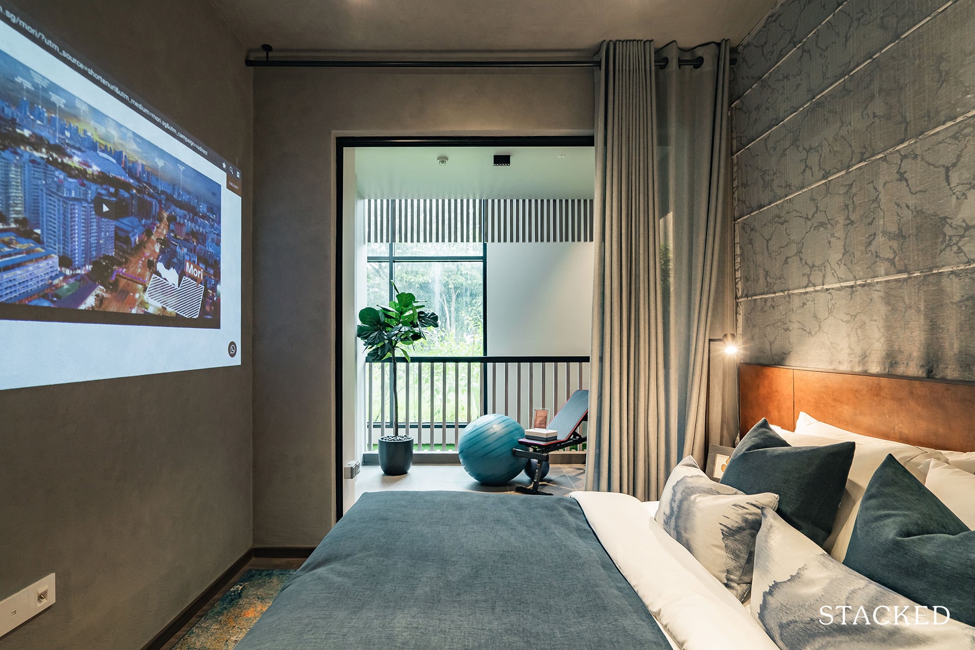
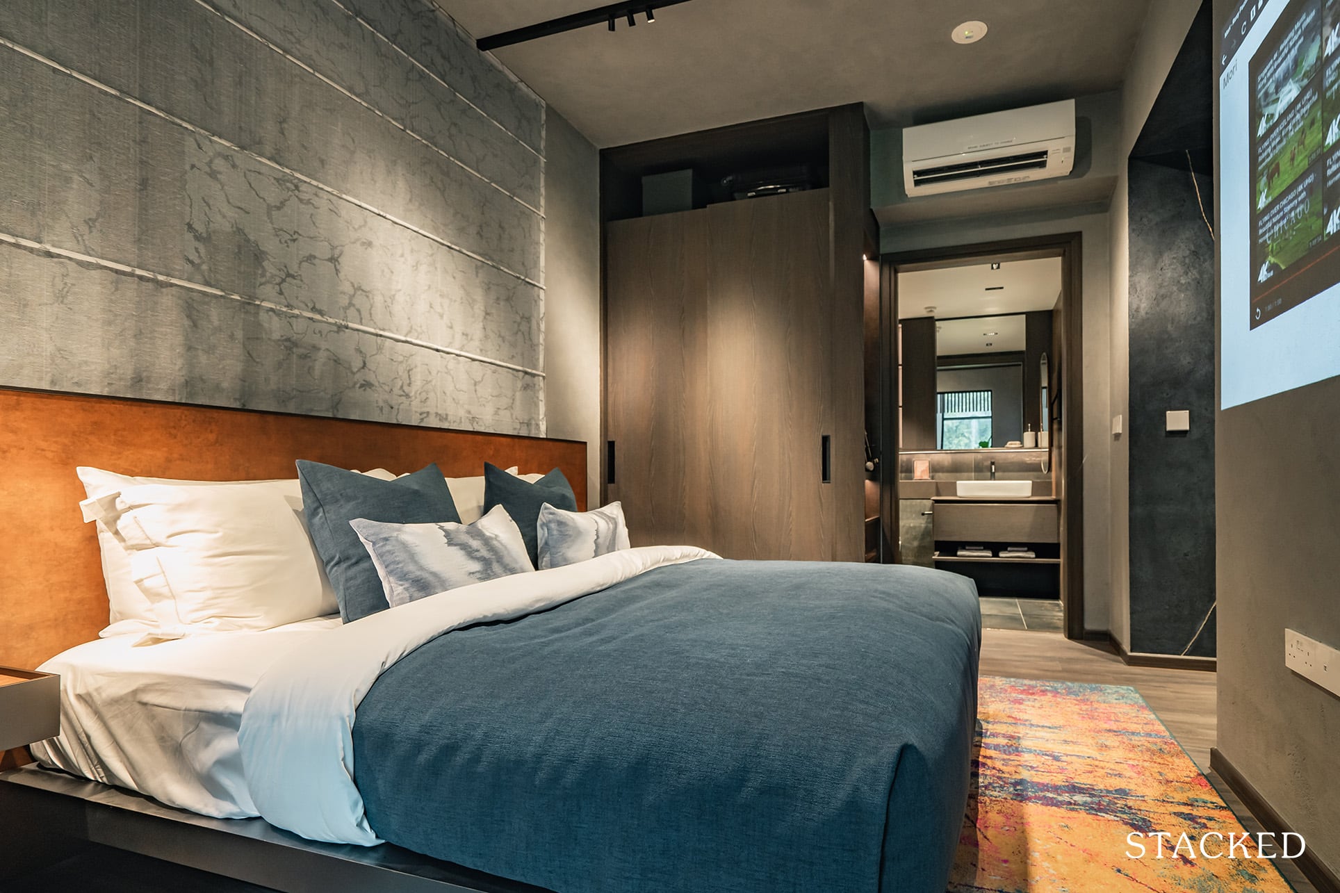
Storage-wise comes in the form of the typical 2-panel wardrobe. There’s nothing to differentiate the Master Bedroom from the rest, except for the open accessories storage by the side. In fact, the Junior Master Bedroom is better off here as there is that smaller nook for more storage.
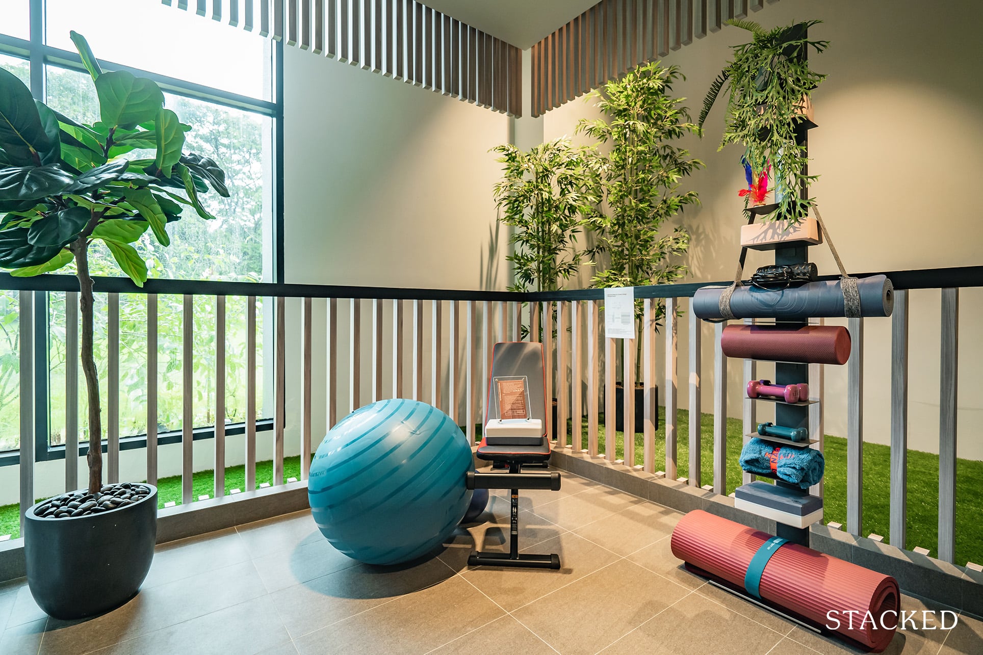
The most impressive part of the room has got to be the presence of the balcony. This supplements the balcony you already have in the living room and as mentioned, this one here is even larger!
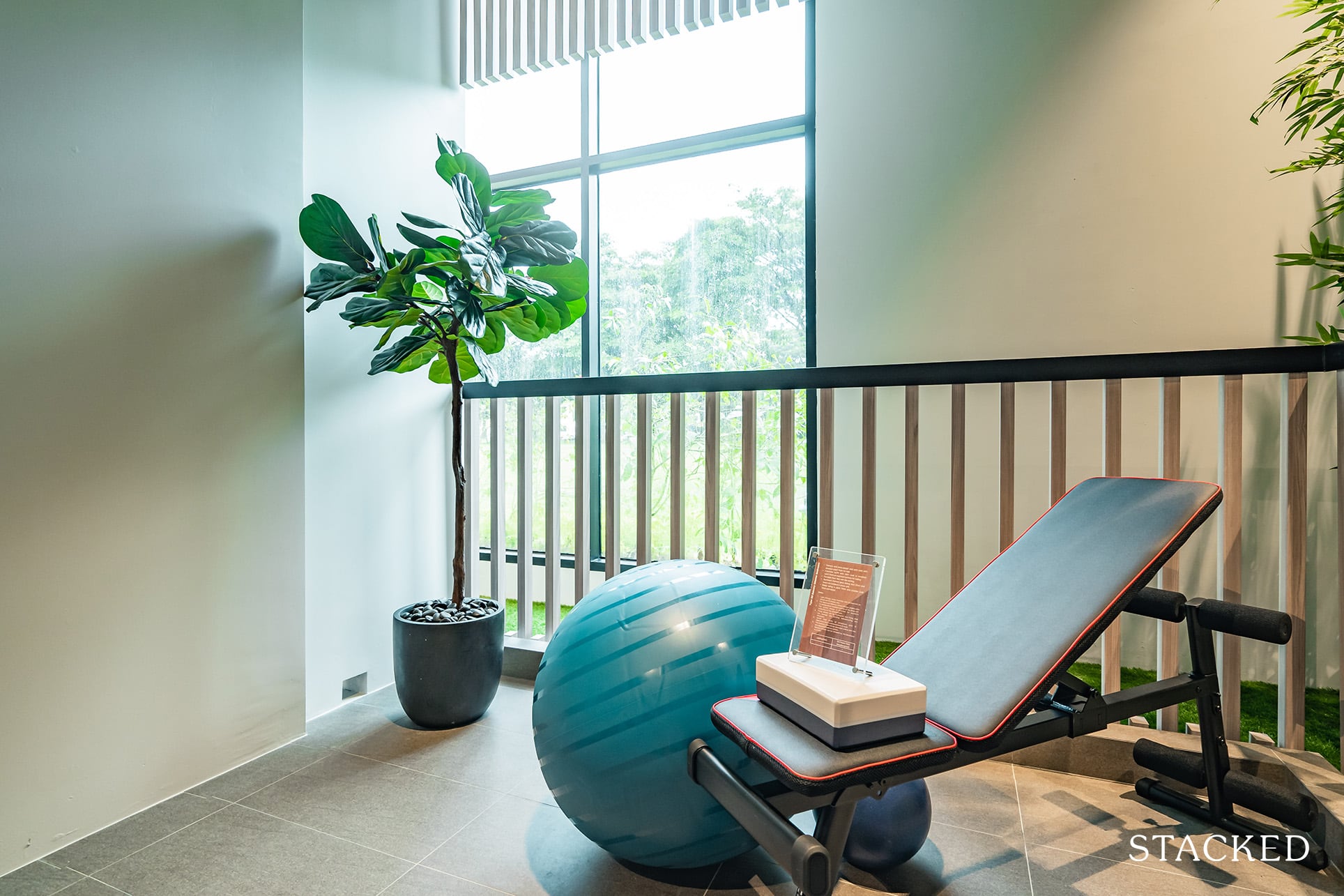
Because of the sheer size of this space, you really have multiple options, including having a home gym as they have done here. Otherwise, having a couple of swing chairs or a dining table for coffee would not be a bad idea either. I do like having a private balcony for the Master Bedroom as it’s always nice having additional space to relax in for some peace and quiet (relative, depending on your facing).
That said, I want to avoid playing this up too much as balconies are also about the views – of which there is none right here. In fact, the closeness between blocks and the neighbouring developments (Guillemard Suites) could be a real privacy issue, especially for the lower floors.
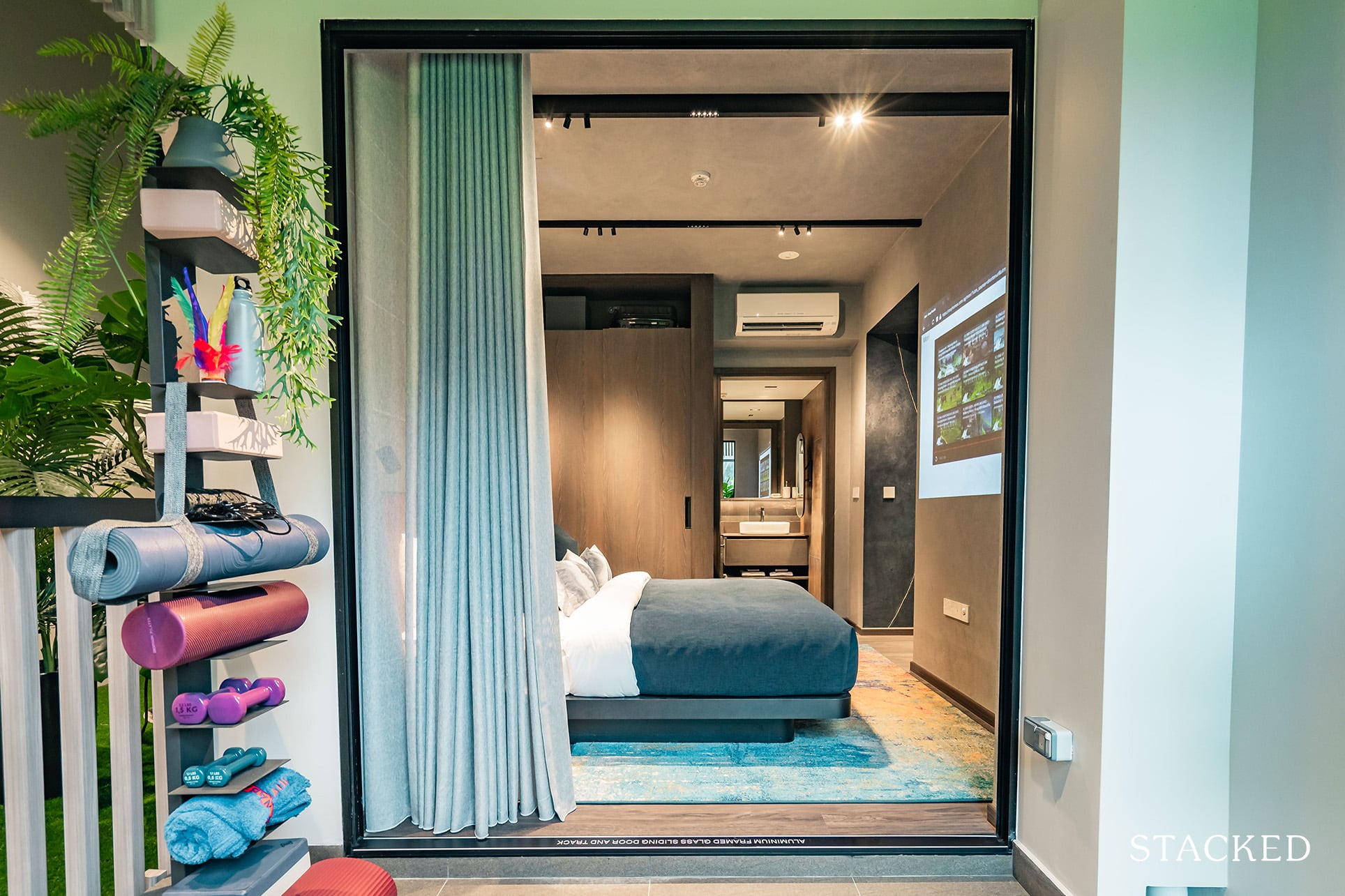
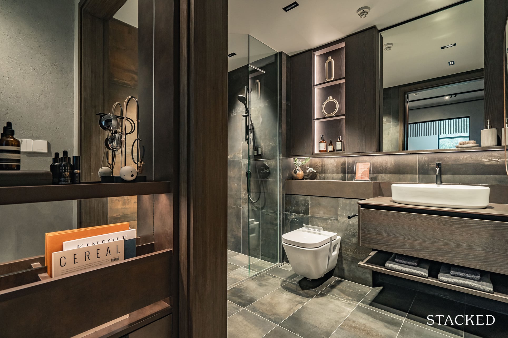
Last but not least, the Master Bathroom. At 4.9 sqm, the space is average at best but remains very practical in terms of its provisions.
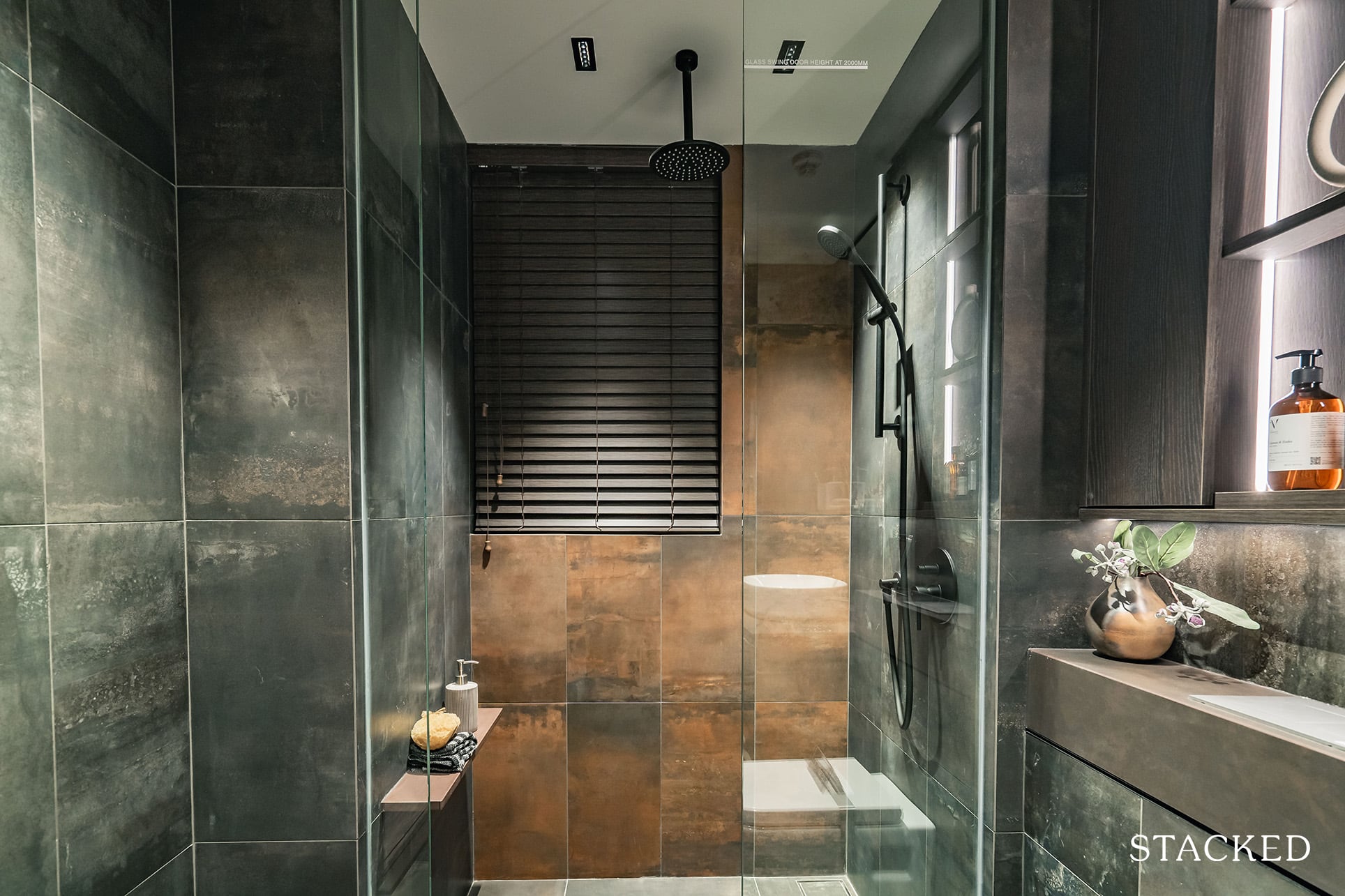
First off, there’s a window for natural ventilation and a rain shower in a matte black finish by Gessi. There’s a cabinet with open shelving and LED light to make it look suitably upscale.
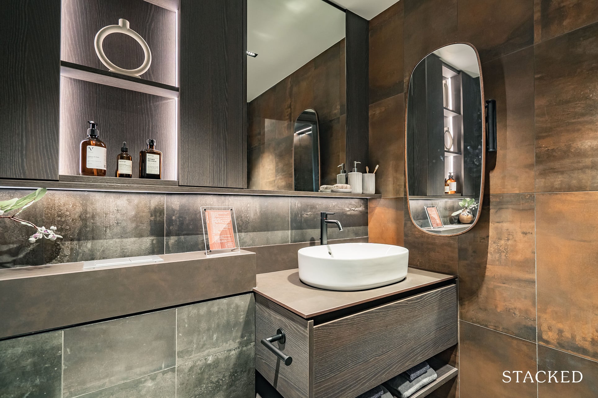
Additionally, in a 5-star hotel like provision, there’s a swivel mirror provided by the side on top of the main mirror. It allows you to literally check yourself out from any angle and highlights the small details that Roxy-Pacific has put into their planning process. As you’d probably know by now, all the mirrors installed here so far are pretty unique, and those who have exhibitionist-like ambitions will probably be happy with the equipment so far!
Mori Location Review
Mori has a good location from an objective point of view. Being in the RCR, it is close to the CBD whether you drive or rely on public transport. Whilst not the closest to the MRT, you do have both the Circle Line (Mountbatten) and East-West Line (Aljunied) within a 10-minute walk away. Not unbearable especially if you still consider yourself youthful.
To refresh your memory on the MRT map, Mountbatten is just 4 stops (8 minutes) from Bayfront MRT (Marina Bay Sands) and 5 stops (10 minutes) to Downtown MRT, where you can access your Grade A offices such as MBFC, Asia Square and Marina One among others. On the other hand, it takes you just 3 stops (6 minutes) to Bugis, 4 stops (8 minutes) to City Hall, and 5 stops (10 minutes) to Raffles Place from Aljunied MRT. You get my point – Mori’s RCR location means those working in the CBD have great accessibility at a reasonable price point.
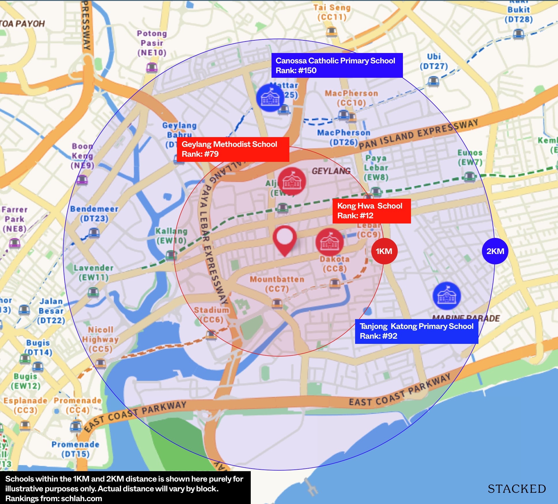
For parents with school-going children, Kong Hwa and Geylang Methodist Primary are both within the desired 1km radius. Yet if you consider how the unit types are organised here at Mori, you will notice that the majority of them are the smaller unit types (1 and 2 Bedrooms), which may work best for small families at most.
The lack of focus on family-friendly units is certainly not due to the lack of amenities in the area. The Paya Lebar precinct is close by with 3 major shopping malls and Kong Hwa is considered one of the top primary schools. For the foodies among us, you will also be pleased to know that Geylang is a true foodie haven (JB Ah Meng, Swee Guan Hokkien Mee, Koung’s Wanton Mee, 126 Dim Sum, and the list goes on). Old Airport Road Food Centre is also less than a 10-minute walk away.
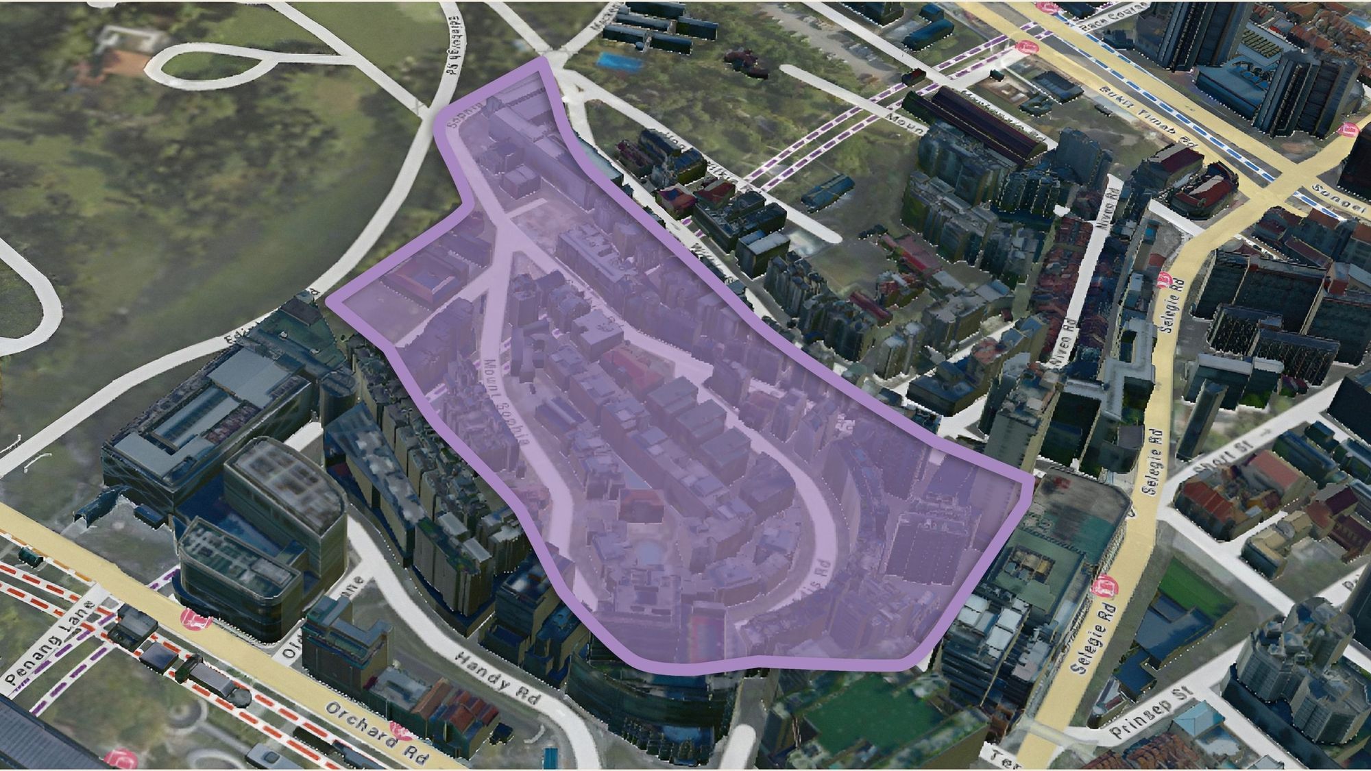
Given the government’s push to further gentrify Geylang and its surrounding areas, it would be interesting to see how this area and dynamic transforms once that is complete. Yes, you may argue that Mori carries the Guillemard Road address but it is still within the Geylang precinct, sandwiched between Lorong 22 and 24.
Till the gentrification is complete, Mori’s location will be objectively convenient but may take some convincing, especially for the older generation to overcome the traditional view about the area.
Nearest MRT: Mountbatten MRT (650m, 8 mins), Aljunied (800m, 10 mins)
Public Transport
| Bus Station | Buses Serviced | Distance From Condo (& Est. Walking Time) |
| Opp Blk 56 Stop ID: 81169 | 7, 70, 70M, 197 | 10m, 1 mins |
| Blk 56 Stop ID: 81161 | 7, 7A, 70, 70A, 70M, 197 | 150m, 2 mins |
Amenities
Schools
| School | Distance From Condo (& Est. Walking Time) |
| Geylang Methodist Primary | < 1km (1.2km, 16 mins) |
| Kong Hwa School | <1km (0.5km, 8 mins) |
| Canossian Catholic School | <2km (2km, 27 mins) |
| Tanjong Katong Primary School | <2km (2.5km, 32 mins) |
| Geylang Methodist Secondary | 1.2km, 16 mins |
| Broadrick Secondary School | 1.1km, 15 mins |
| Chung Cheng High School (Main) | 1.6km, 21 mins |
| Dunman High School | 1.7km, 22 mins |
Retail Outlets
| Mall | Distance From Condo (& Est. Walking Time) |
| Kinex | 1.6km, 21 mins |
| PLQ Mall | 1.5km, 20 mins |
| Paya Lebar Square | 1.6km, 21 mins |
| Kallang Wave Mall | 1.6km, 21 mins |
Private Transport
| Key Destinations | Distance From Condo (Average Time at Peak Hour [0830] Drive Time) |
| CBD (Raffles Place) | 6.7km, 16 mins |
| Orchard Road | 8.2km, 17 mins |
| Suntec City | 4.0km, 8 mins |
| Changi Airport | 13.3km, 19 mins |
| Tuas Port (By 2040) | 47.0km, 60 mins |
| Paya Lebar Quarters/Airbase (By 2030) | 1.6km, 6 mins |
| Mediapolis (and surroundings) | 16.4km, 26 mins |
| Mapletree Business City | 15.2km, 26 mins |
| Tuas Checkpoint | 35.4km, 42 mins |
| Woodlands Checkpoint | 26.0km, 32 mins |
| Jurong Cluster (JCube) | 22.2km 36 mins |
| Woodlands Cluster (Causeway Point) | 25.3km, 34 mins |
| HarbourFront Cluster (Vivo City) | 12.1km, 21 mins |
| Punggol Cluster (Waterway Point) | 16.0km, 25 mins |
Immediate Road Exits: 1 – Guillemard Road, which can take you to PLQ Mall or PIE and Nicoll Highway in less than 6 minutes.
The Developer Team
Developer
Roxy-Pacific Holdings is an established Singapore real estate company with a history that dates back to 1967. Their development portfolio consists mainly of boutique developments such as Mori, most recently Neu at Novena, Fyve Derbyshire, Dunearn 386, and Wilshere Residences. Roxy-Pacific is very familiar in District 15 / East Coast areas, with its long-time hospitality and commercial properties in Grand Mercure Roxy and Roxy Square. They have also a significant number of residential developments here, including Arena Residences, Straits Mansion, Sunnyvale Residences among others.
Architect Notes
Ronny Chin Architects (RCA) is a Singapore-based architectural practice established in 1992. While not exactly a household name locally, RCA actually has an extensive portfolio of condo developments under its belt. Unsurprisingly, its strength seems to be in the boutique development segment including many in the District 14 Geylang/Sims neighbourhood, namely Guillemard Suites, Mori’s immediate neighbour, Guillemard Edge, Centra Studio, Water Edge, and Suites @ Sims. Some of its other projects include CCR projects such as RV Altitude, Newton Edge, Espada, Spottiswoode 18, and Robin Suites.
Unit Mix
| Unit Type | Size | No. of Units |
| 1 Bedroom / 1 + Study | 484 -592 sqft | 30 |
| 2 Bedroom / 2 + Study / 2 + Guest | 710 – 883 sqft | 67 |
| 3 Bedroom / 3 + Guest | 958 – 1,184 sqft | 38 |
| 4 Bedroom | 1,259 sqft | 2 |
Mori is situated in the densely populated Geylang region with many boutique developments, most of which offer smaller-sized units. Here at Mori, about 70% of units are 2 Bedrooms or smaller. On the one hand, it’s no surprise Mori has gone down the same path as its neighbours, given the location’s accessible transport links and proximity to the city.
On the other hand, the lack of differentiation (perhaps a focus on more family-friendly units) in terms of unit sizes may mean more competition for tenants in the future. That said, if you have viewed Roxy-Pacific’s developments before, you will know that they have already been very generous in their unit sizes here. This is important considering how Covid-19 has made WFH the norm for many, so having more breathing space would always be a positive.
Stack Analysis
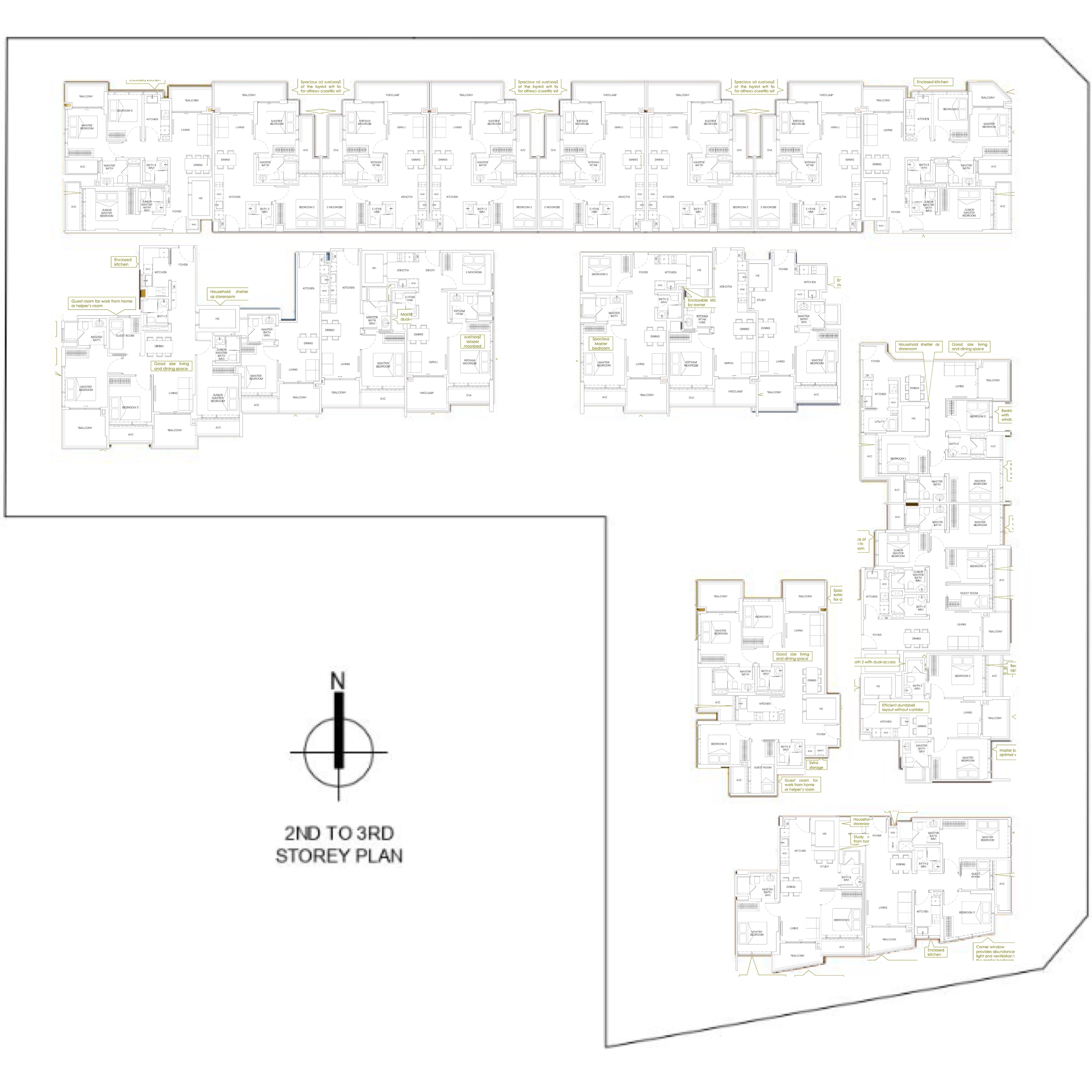
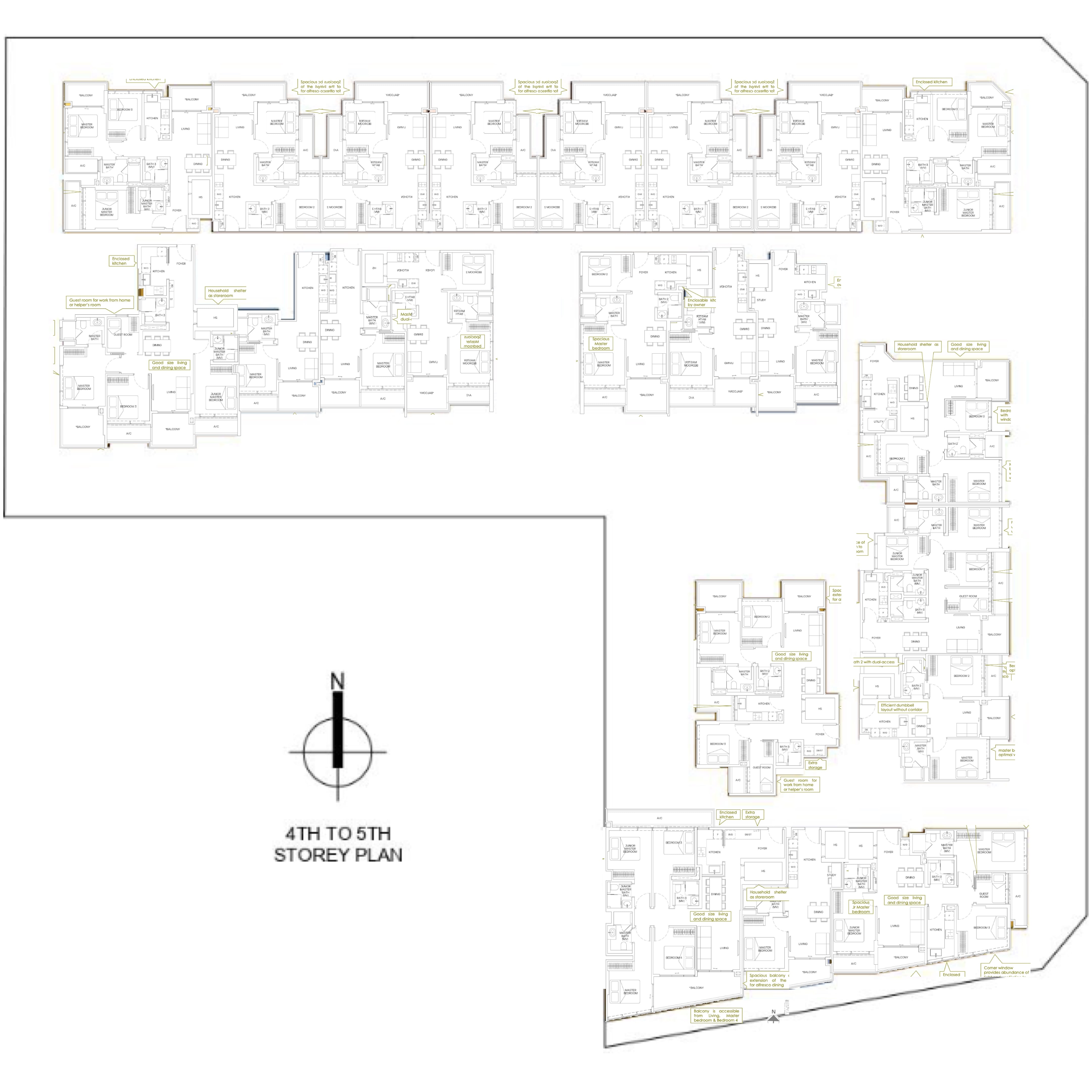
Mori Site Plan
Mori Best Stacks
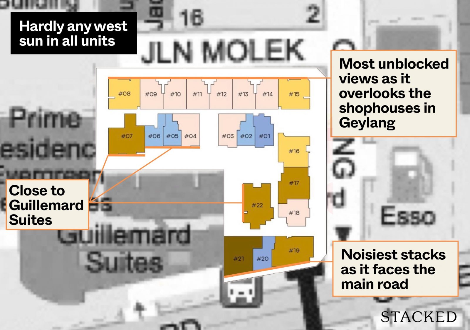
Mori has a major directional advantage, with all units either facing North or South. This means that whichever unit you choose, you will not have to bear with the unforgiving afternoon sun in Singapore. Direction aside, there are other considerations as to which stack is best here at Mori.
For starters, stacks 19 to 21 will face Guillemard Road, which means that these units will likely face the most road noise although I wouldn’t say that Guillemard Road is a particularly busy road. These units will have balcony screens provided by the developers for additional privacy. The views that units get here will be that of the flats at Pine Lane / Cassia Crescent at 58m distance and perhaps some pocket views of the Sports Hub in the South-West direction.
Personally, the most unblocked views will be from stacks 8 to 15. These stacks have units up to the 8th floor, overlooking the shophouses in the Geylang precinct on the higher floors so you will expect to get plenty of wind from these stacks.
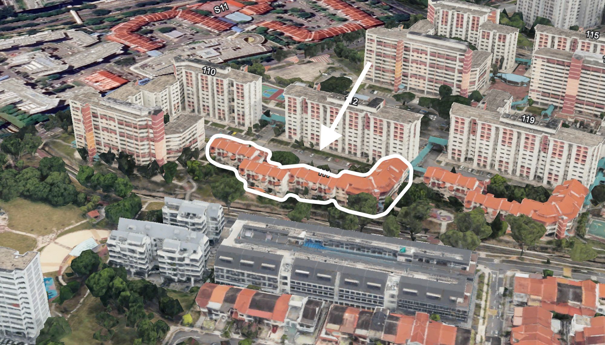
The stacks with not-so-ideal views, especially on the lower floors would be stacks 4 to 7 and 22 as they are extremely close to Guillemard Suites. At a distance of between 6.2m (stack 22) and 7m (stacks 4 to 7), your unit will literally be side by side with those at Guillemard Suites. For context, the usual block to block distance in a larger condo would be around 25m so to have your next block, especially from a different development, at just 7m apart, might be a little too close for comfort.
Mori Afternoon Sun
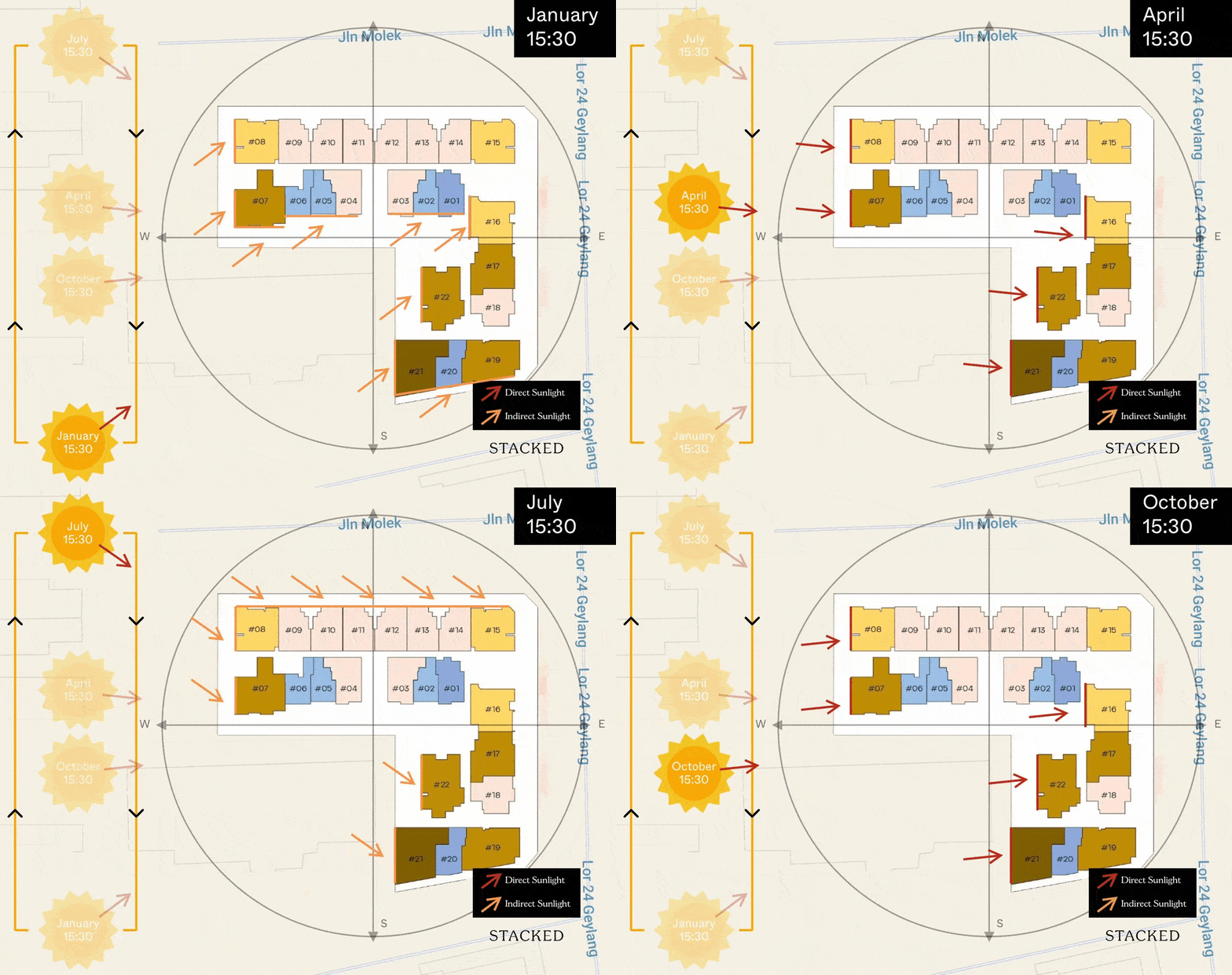
As mentioned earlier, Mori’s north-south orientation means that no stacks here would face the afternoon sun directly.
Mori Pricing Analysis Review
If you are considering Mori, you will undoubtedly compare it against its neighbouring developments. So here is an overview for you to look at:
| Development | Units | Psf | TOP | Tenure | Price Gap |
| Mori | 137 | $1,800 | 2026 | Freehold | |
| NoMa | 50 | $1,598 | 2024 | Freehold | +13% |
| Rezi 24 | 110 | $1,538 | 2025 | Freehold | +17% |
| Guillemard Suites | 146 | $1,340 | 2017 | Freehold | +34% |
| The Sunny Spring | 338 | $1,175 | 1998 | Freehold | +53% |
| The Waterina | 398 | $1,384 | 2005 | Freehold | +30% |
While Mori starts from $1,619 psf for its 3 Bedroom unit, I expect the average psf to be around $1,800 on launch day before inching up towards Roxy-Pacific’s target of $1,900 psf. At that price, it stands at a 13% and 17% premium over its recent new launch peers, NoMa and Rezi 24. NoMa was a unique project on many fronts, but it is an even smaller project than Mori, with less than half the number of units there. Meanwhile, Rezi 24 would be slightly more similar in terms of size and facilities but was arguably launched at a time when the property market was less hot. That said, even if these 2 new launches are considerably cheaper, they are mere reference points as units there have been sold out. Mori is, therefore, seemingly without competition from a supply perspective in the Geylang new launch market.
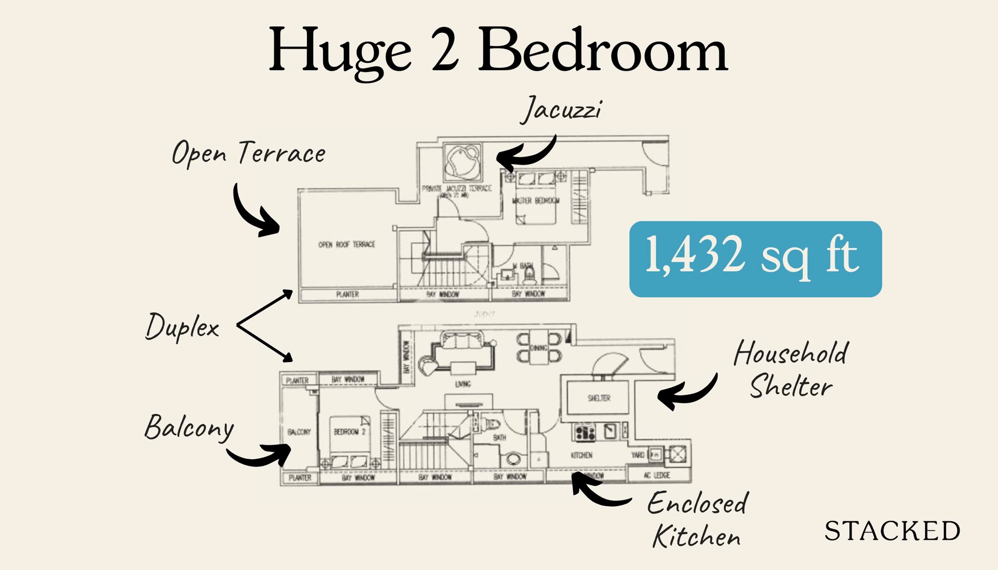
As for resale properties, its nearest rival is Guillemard Suites, which has a 34% discount over Mori. However, do not take its numbers by their face value, as most units there are duplex units, which typically sell at a discount. Therefore, the actual price for the usable space would actually be higher. Mori, being a new launch project with an arguably better-executed product, should be well deserving of at least a 20% premium over its closest rival.
Finally, I have also included The Sunny Spring and The Waterina, which in my mind, are the bellwether of the Geylang precinct. They are located in the ‘higher’ lorongs, which have always been viewed as less sleazy and closer to Paya Lebar. Many families considering Geylang would inevitably consider The Waterina is one of their top choices. It trades at a 30% discount from Mori, but do take note that units there are also larger as a result of its vintage.
Now, let me go deeper into a pricing comparison.
Indicative pricing of Mori:
| Unit Type | Size (sqm) | Indicative Quantum | Indicative $PSF |
| 1 Bedroom | 45 – 46 | $859,000 | $1,775 |
| 1 Bedroom + Study | 51 – 55 | $1,003,000 | $1,827 |
| 2 Bedroom | 66 – 67 | $1,175,000 | $1,655 |
| 2 Bedroom + Study | 67 | $1,263,000 | $1,752 |
| 2 Bedroom + Guest | 82 | $1,549,000 | $1,754 |
| 3 Bedroom | 89 – 92 | $1,603,000 | $1,619 |
| 3 Bedroom + Guest | 95 – 110 | $1,682,000 | $1,644 |
| 4 Bedroom | 117 | $2,117,000 | $1,681 |
If you are looking to purchase a unit at Mori, you may very well be aware of the abundance of boutique developments in the area.
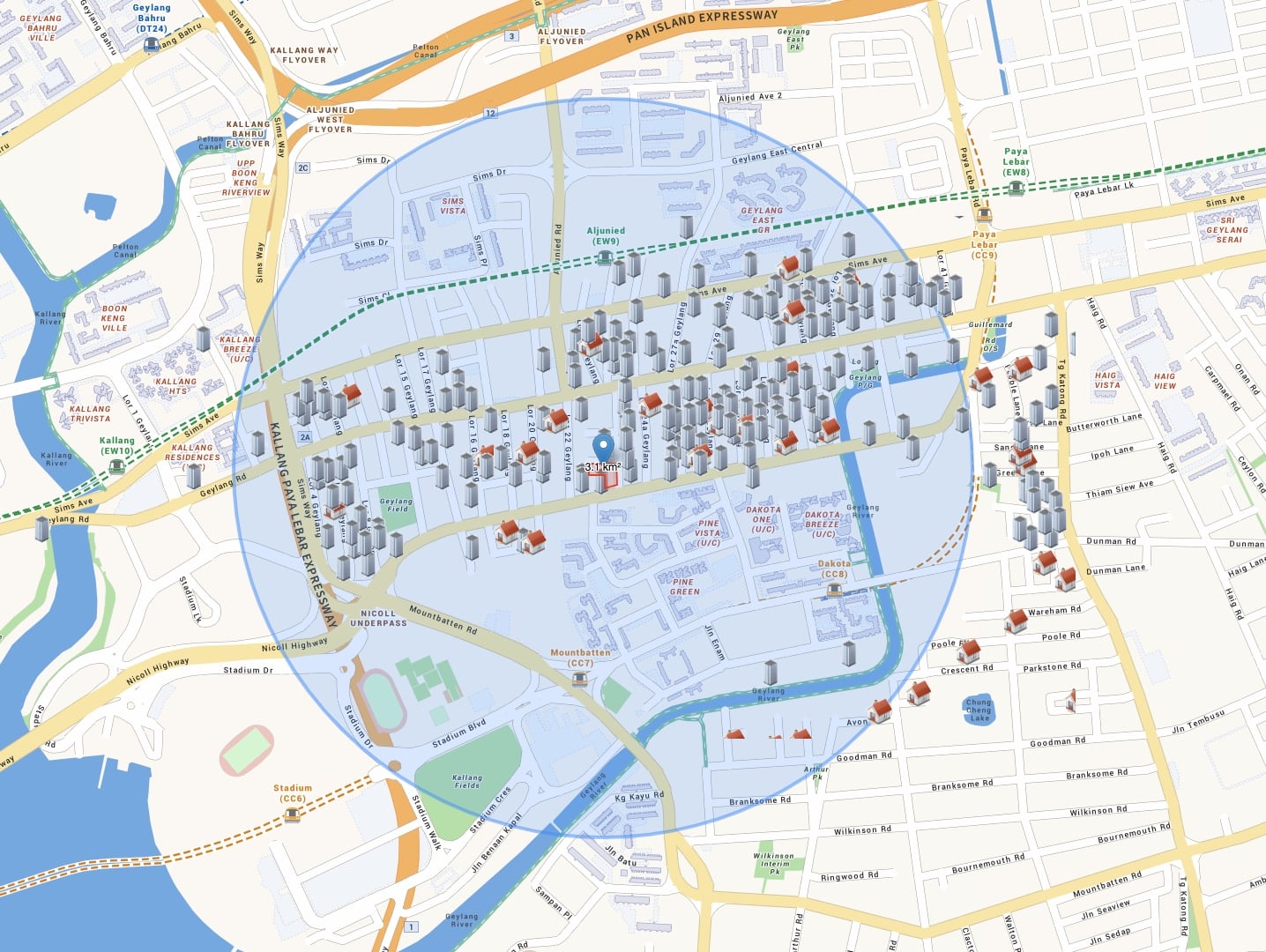
In total, there are about 160 condominiums/apartments around. Due to the constraints of the area (height restrictions and land size), many of the developments are of a boutique nature with less than 50 units. Having many boutiques around is not necessarily a bad thing. While there is increased competition in choices of developments, the supply of each development is limited. On the resale market, buyers looking to stay in a certain area may only have a handful of developments to pick from at any one time despite the over 150 developments here.
The pricing review is structured by answering these questions:
- Where does it stand among the sea of freehold condos in terms of the overall price and what is its premium gap?
- Where does Mori’s indicative 1-bedroom price stand in today’s market?
- What was the premium gap back then for a resale comparable nearby?
- Where does Mori’s 2-bedroom pricing stand?
- How does Mori’s indicative 1-bedroom price compare to other new launches?
- How does Mori’s indicative 1 and 2-bedroom price compare to new launches nearby?
Where does it stand among the sea of freehold condos in terms of the overall price and what is its premium gap?
If we look at the 1-bedroom transactions in this area (assumed to be <=500 sqft), 37 developments show up in the transaction records. Here’s what their prices look like:
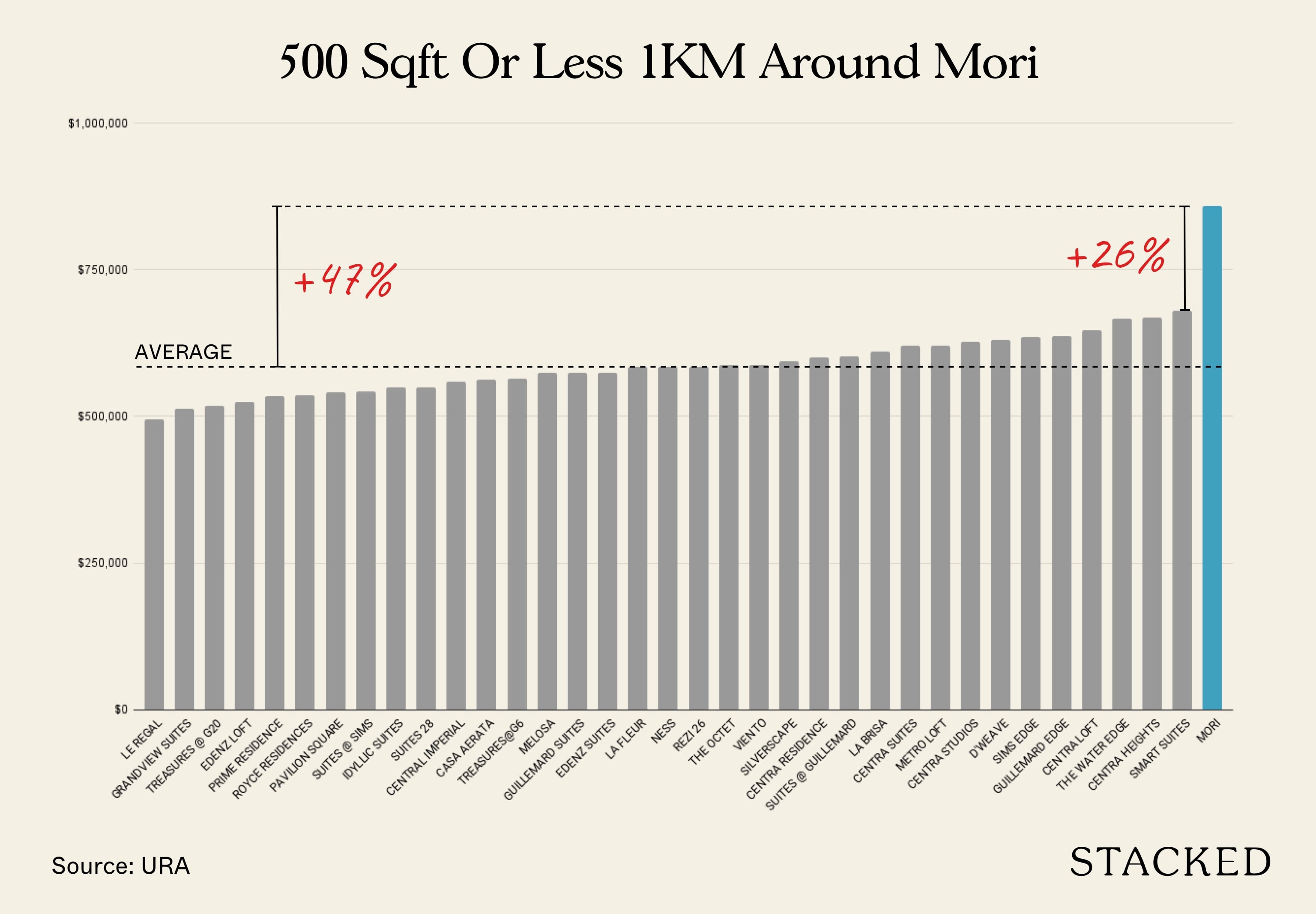
Source: URA. Data from November 2020 – October 2021.
In total, there were 36 developments that had at least 1 transaction for this size range. At Mori’s indicative price, it is 26% more than the next most expensive resale (Smart Suites), and 47% more expensive than the average price in the area.
Here’s how the price of Mori compares to resale projects within 300m:
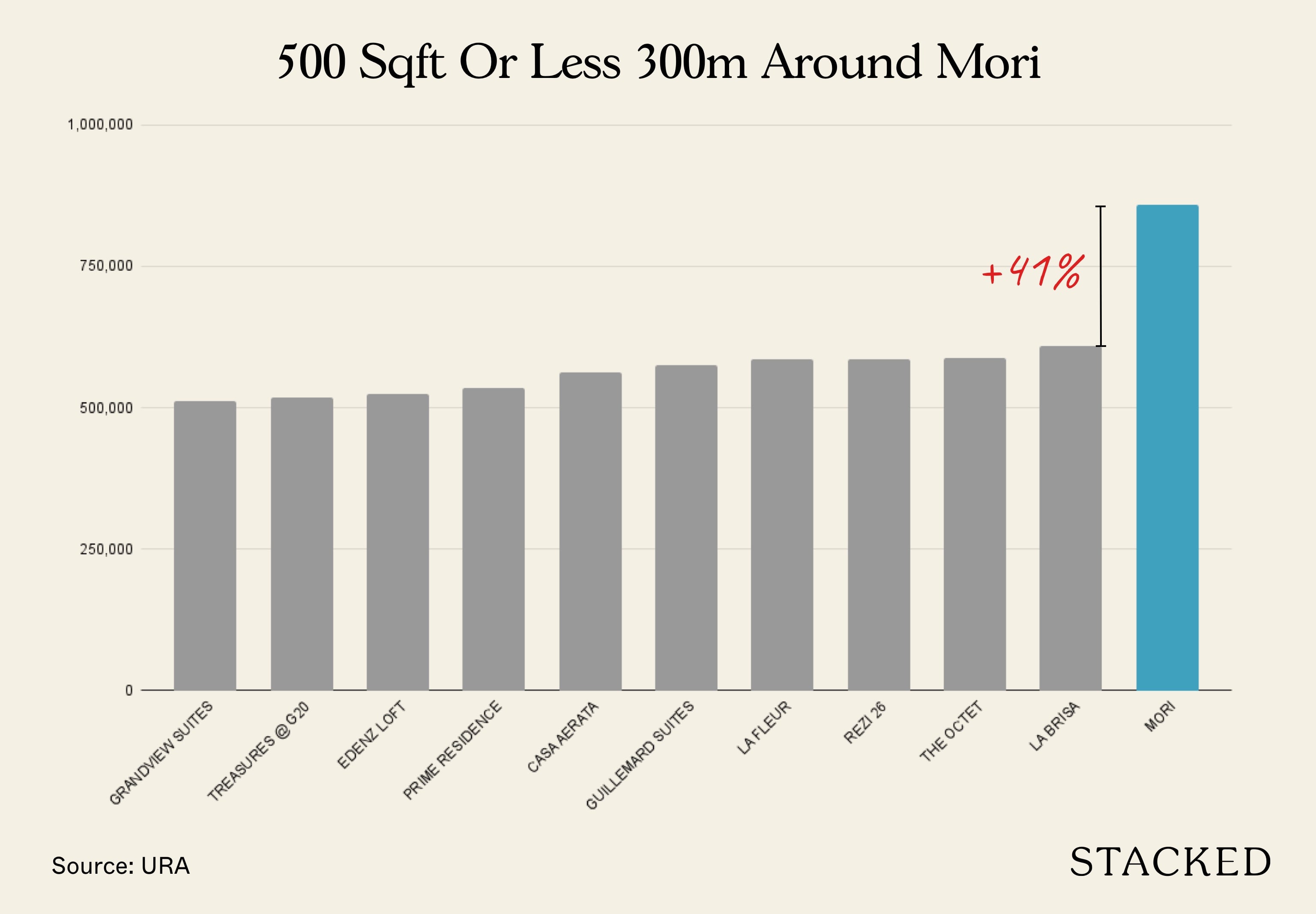
Within 300m, Mori is priced at 41% more than the next most expensive resale condo in the area. Of course, price is not just everything, let’s now compare Mori with Rezi 26. The reason why it is chosen is that Rezi 26 is priced very close to the average of condos <= 500 sqft within 1KM of Mori.
Here are some of the differences between Rezi 26 and Mori:
| Detail | Mori | Rezi 26 |
| Built Year | 2026* | 2015 |
| Tenure | Freehold | Freehold |
| Units | 137 | 106 |
| Size | 37,131 sqft | 26,625 sqft |
| Unit Types | 1 – 4 bedders | 1 – 3 bedders |
Typical of a boutique development, it has a small gym, lap pool and barbeque pit area. In this aspect, Mori’s facilities look much better, considering it has more than 1 pool.
So what do the 1-bedders at Rezi 26 look like?
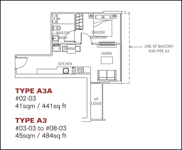
Despite the small size, the 1-bedroom at Rezi 26 has a very long entranceway. This is useful for wheelchair accessibility considering the space between the kitchen and dining is pretty tight. However, many buyers would see this entranceway as an expensive walkway. There’s no natural ventilation in the bathroom, though both the living and master bedroom can enjoy full-height windows since the air-con ledge is situated behind the living room.
Here’s what Mori’s 1-bedroom looks like:
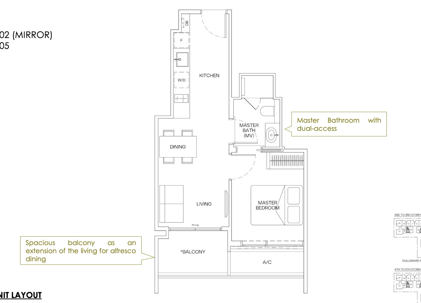
Right off you’ll see that there’s no entranceway – it just opens up into the kitchen area which is fairly spacious for a 1-bedroom unit. The dining area isn’t so narrow, so there’s even allowance for up to 4 with the option of using the balcony for dining too. The bathroom is a jack-and-jill one, so it’s convenient for guests to use it without having to enter the master bedroom. Unfortunately, the AC ledge is just outside, so there’s no full-height window for the bedroom. But the optimist in me would see this as a plus point for privacy.
It’s obvious that the layout is much better at Mori. But is it worth the extra 47% in quantum? Such a premium may leave potential buyers with doubts, which leads me to my next question:
Where does Mori’s indicative 1-bedroom price stand in today’s market?
Let’s see where does $859,000 for a unit less than 500 sqft stand in comparison to all transactions:
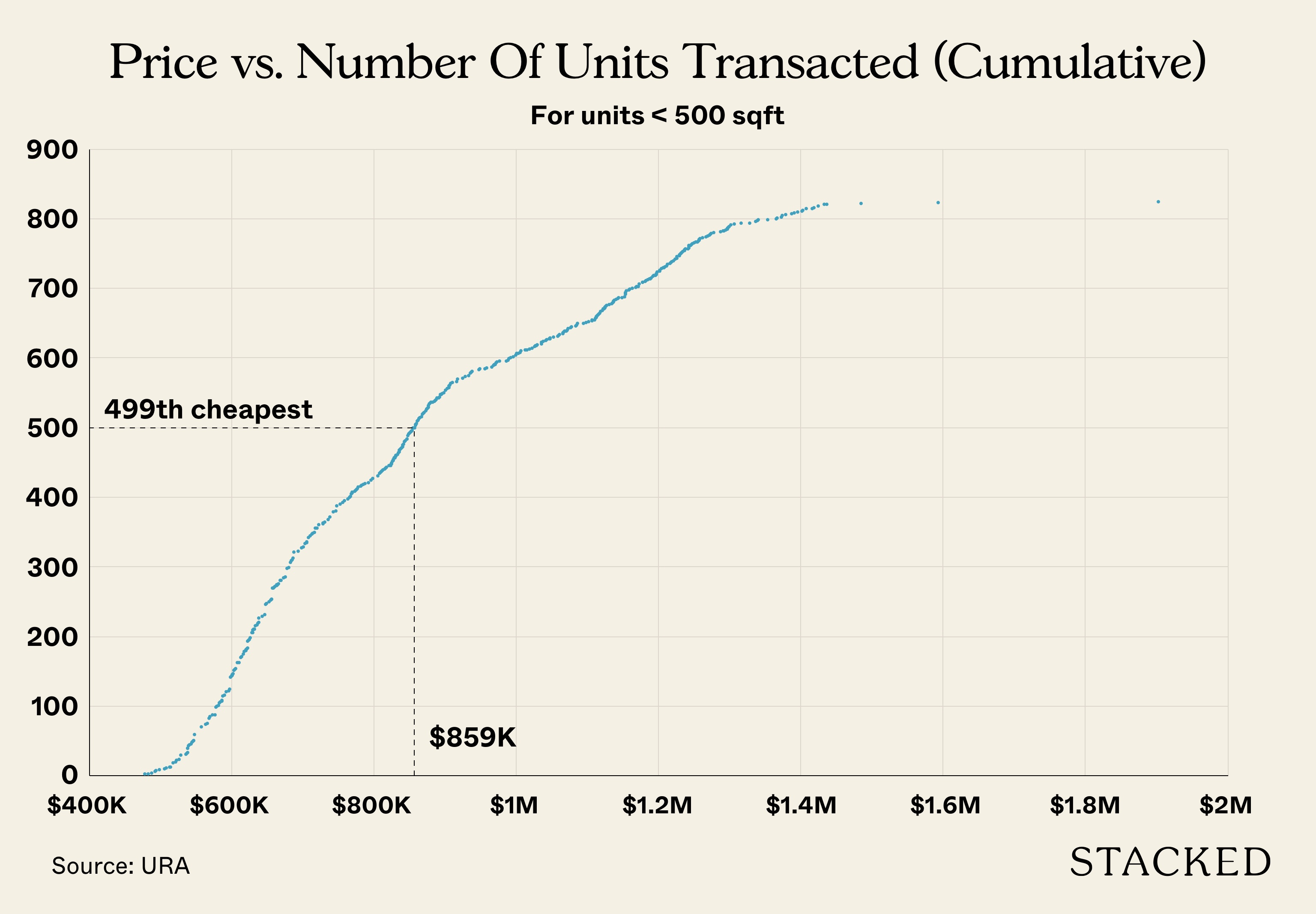
Source: URA. Based on transactions from May 2021 – October 2021.
There were 823 transactions below 500 sqft between these 6 months, and at $859,000, Mori would rank 499th out of 823 which puts it at the 60th percentile. This is pretty good for a freehold new launch condo in today’s market condition.
Of course, it’s not too fair to compare it with non-central area projects, so here’s where it stands among Central Region developments:
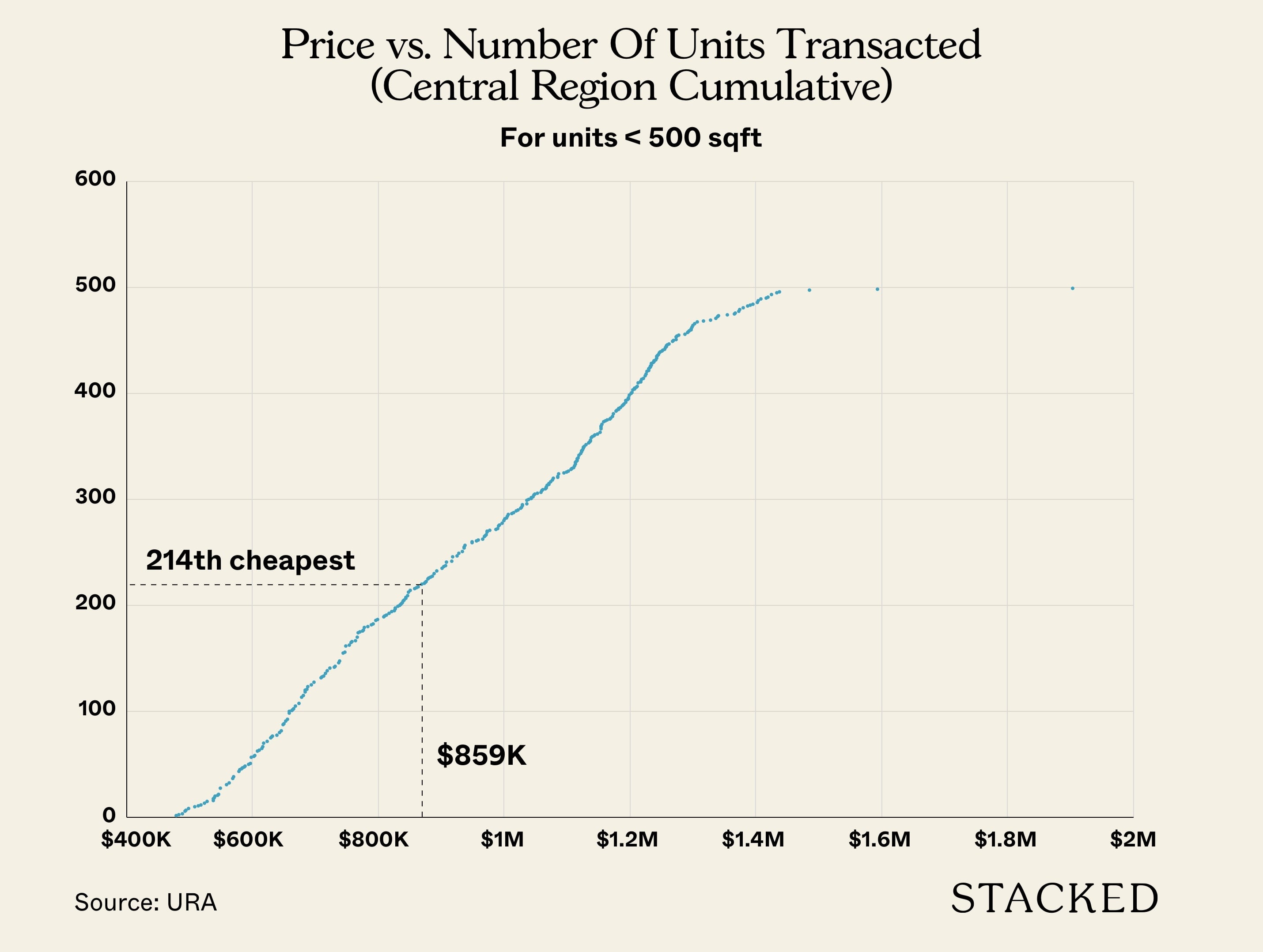
When compared to other Central Region (RCR + CCR) transactions, Mori would rank 214 out of 498 transactions, putting it at the 43rd percentile. This is really good if we consider Mori as a freehold new launch compared to other transactions here that include a mix of leasehold properties, many of which are in the resale market.
But of course, the premium gap is still scary if we make a comparison to its surrounding competitors, so this leads me to ask:
What was the premium gap back then for a resale comparable nearby?
For this, I’ll be looking at Rezi 26’s launch back in October 2011 and comparing its 1-bedroom $PSF to surrounding resale developments at that time.
Back when Rezi 26 was launched, there weren’t a lot of transactions in the area. The Geylang district at that time did not have many residential projects (this is changing, evidently). These are the only 6 resale transactions recorded a year prior to Rezi 26’s first sale in October 2011:
| Project | Amount | Size (sqft) | $PSF | Sale Date | Tenure | Built Year | Planning Area |
| THE AMARELLE | $665,000 | 474 | $1,404 | 20 Dec 2010 | Freehold | 2009 | Geylang |
| THE AMARELLE | $698,000 | 474 | $1,474 | 03 Jan 2011 | Freehold | 2009 | Geylang |
| THE AMARELLE | $668,000 | 474 | $1,410 | 07 Feb 2011 | Freehold | 2009 | Geylang |
| COSMO | $620,000 | 420 | $1,477 | 06 Jul 2011 | Freehold | 2010 | Geylang |
| COSMO | $630,000 | 420 | $1,501 | 13 Jul 2011 | Freehold | 2010 | Geylang |
| COSMO | $645,000 | 398 | $1,620 | 01 Aug 2011 | Freehold | 2010 | Geylang |
As you can see, most of the resale prices had a $600K range.
At this time, Rezi 26 launched and sold all of its units within 7 months. It had an average quantum of $548,296 and an average $PSF of $1,205:

As such, Rezi 26 actually traded at an overall discount comped to its resale peers. This is pretty much unheard of today, where new launches are mostly priced higher than their resale peers.
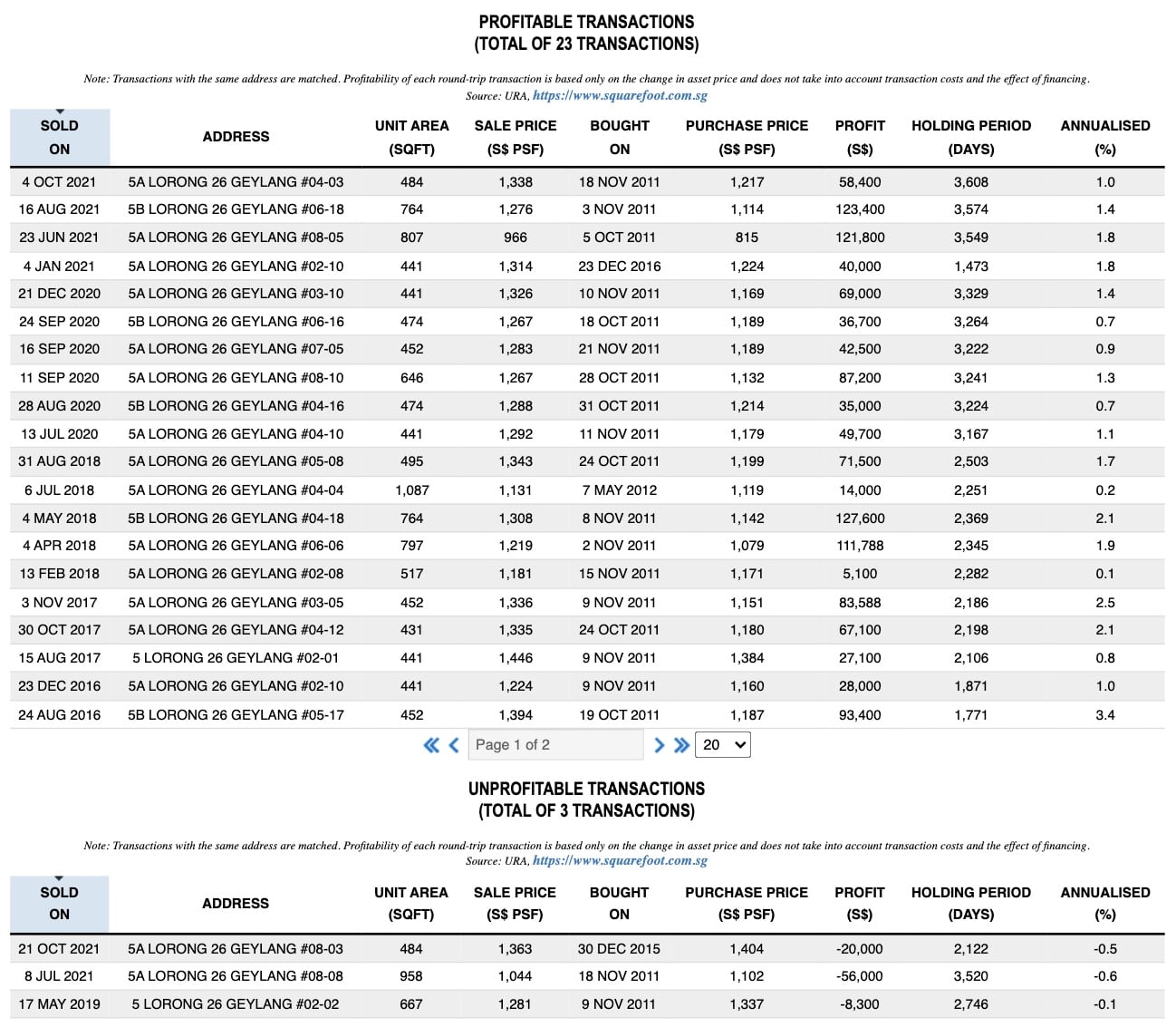
Rezi 26 has since gone on to be overall profitable, with 26 profitable transactions versus just 3 unprofitable ones:
Bring forward the situation today, and you have to wonder if the premium can hold its ground in the resale market later on. To be honest, this is a very hard question to answer.
The optimist in me would again look at a resale project like Martin Modern. When it launched, it certainly wasn’t considered cheap by anyone, yet prices have moved on well into 2021 when it obtained is TOP, rewarding buyers who took a chance despite the premium paid for it.
The pessimist in me would say that when Martin Modern was launched, it was just coming out of the market bottom (different market conditions). It is also located in a completely different area (River Valley) with a different set of competitors and has a different tenure and price point. Surrounding resale projects have also appreciated a lot, unlike in the Geylang planning area.
However, I must point out that the new launch NoMa did completely sell out most of its units since August 2020, and it also carried a premium showing how strong the market demand is in this area. In some sense, the growth of residential projects in Geylang can be seen as a sort of gentrification of the area with a lesser reputation of it being a seedy place. Developments like Mori are even catering unit mixes to families. As overall prices in the CCR remains relatively unaffordable, the once overlooked “red light district” area may soon see a transformation that could very well sustain prices of newer, more modern developments like Mori and NoMa.
Where does Mori’s 2-bedroom pricing stand?
| Project | Built | Average Price | Average $PSF | Mori Premium |
| PRIME RESIDENCE | 2014 | $670,000 | $1,153 | 43.54% |
| REZI 26 | 2015 | $877,500 | $1,121 | 47.64% |
| COSMO | 2010 | $999,000 | $1,450 | 14.14% |
| MORI | 2026 | $1,175,000 | $1,655 | – |
Source: URA. Transactions from November 2020 – October 2021.
These are the projects with 2 bedroom transactions within 300m of Mori. As you can see, Mori is still priced at quite a hefty premium to Rezi 26 here. However, it is just 14% more than Cosmo. Strangely, Cosmo is the oldest development here. When Mori is built, it would be 16 years newer than Cosmo. Yet, it commands a price pretty close to what the new launch is asking for!
In fact, listings on PropertyGuru show that 2 bedroom asking prices are even much closer to the indicative prices of Mori:
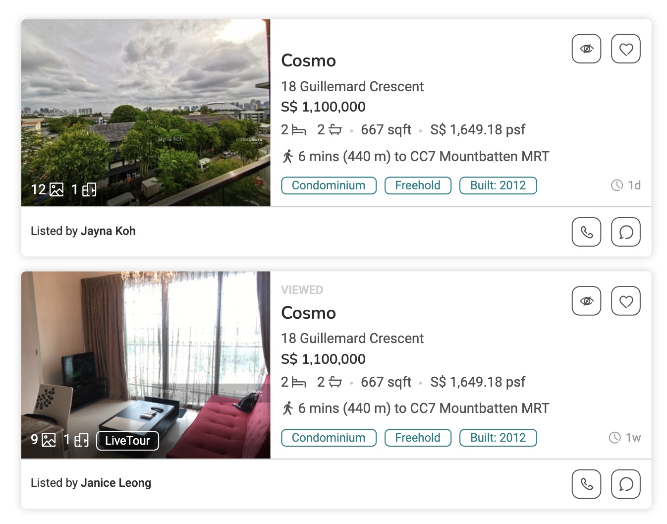
This does bode well for Mori, as the presence of resale developments in the area with prices close to the new launch does support the notion that the resale market can swallow such a quantum.
How does Mori’s indicative 1-bedroom price compare to other new launches?
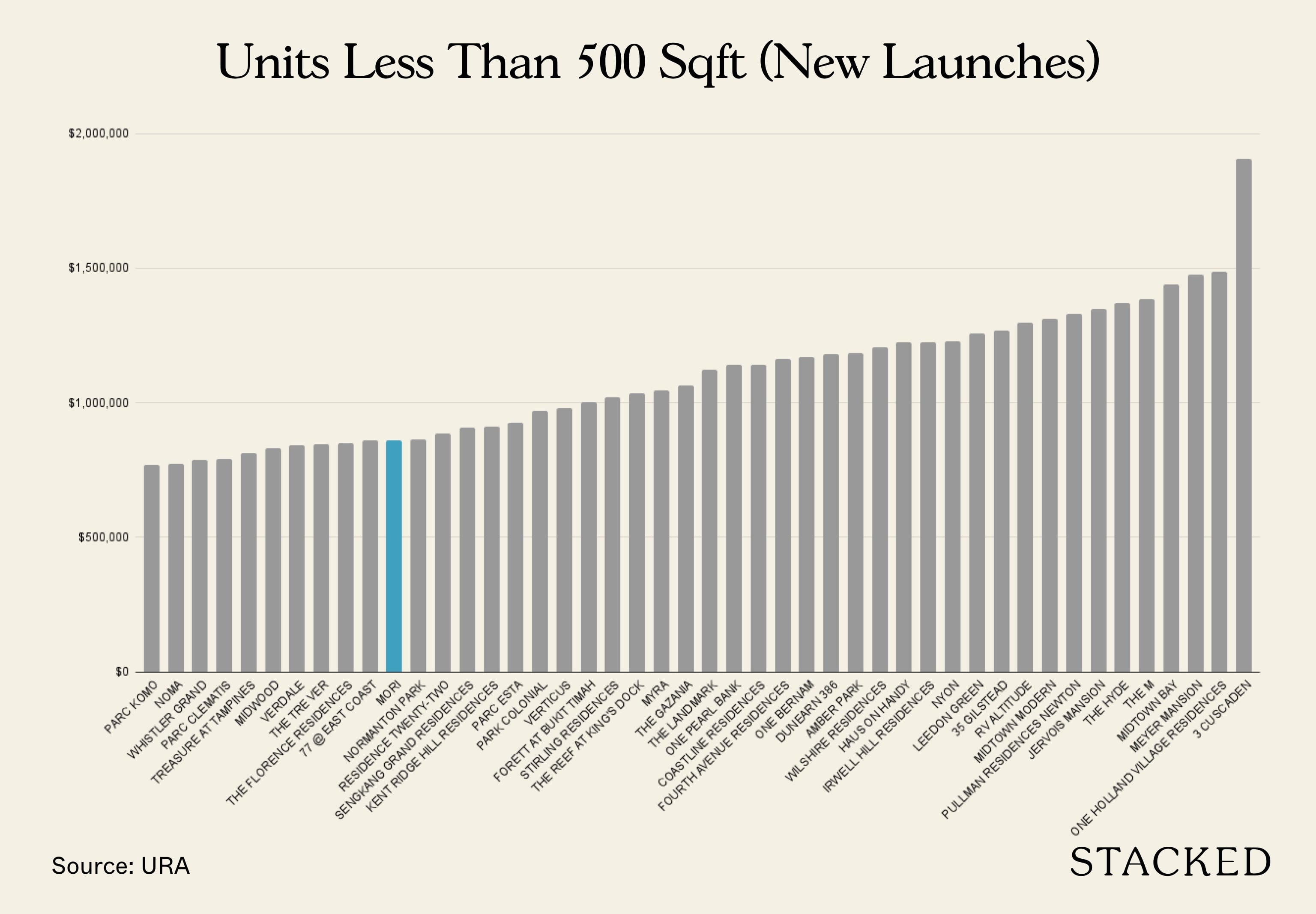
Source: URA. Transactions from November 2020 – October 2021.
It’s only when you start looking at other new launches do you begin to appreciate the price point of Mori. Compared to 45 other new launches, Mori ranks 11th cheapest in terms of price for the 1-bedroom unit. Here’s how its $PSF compares:
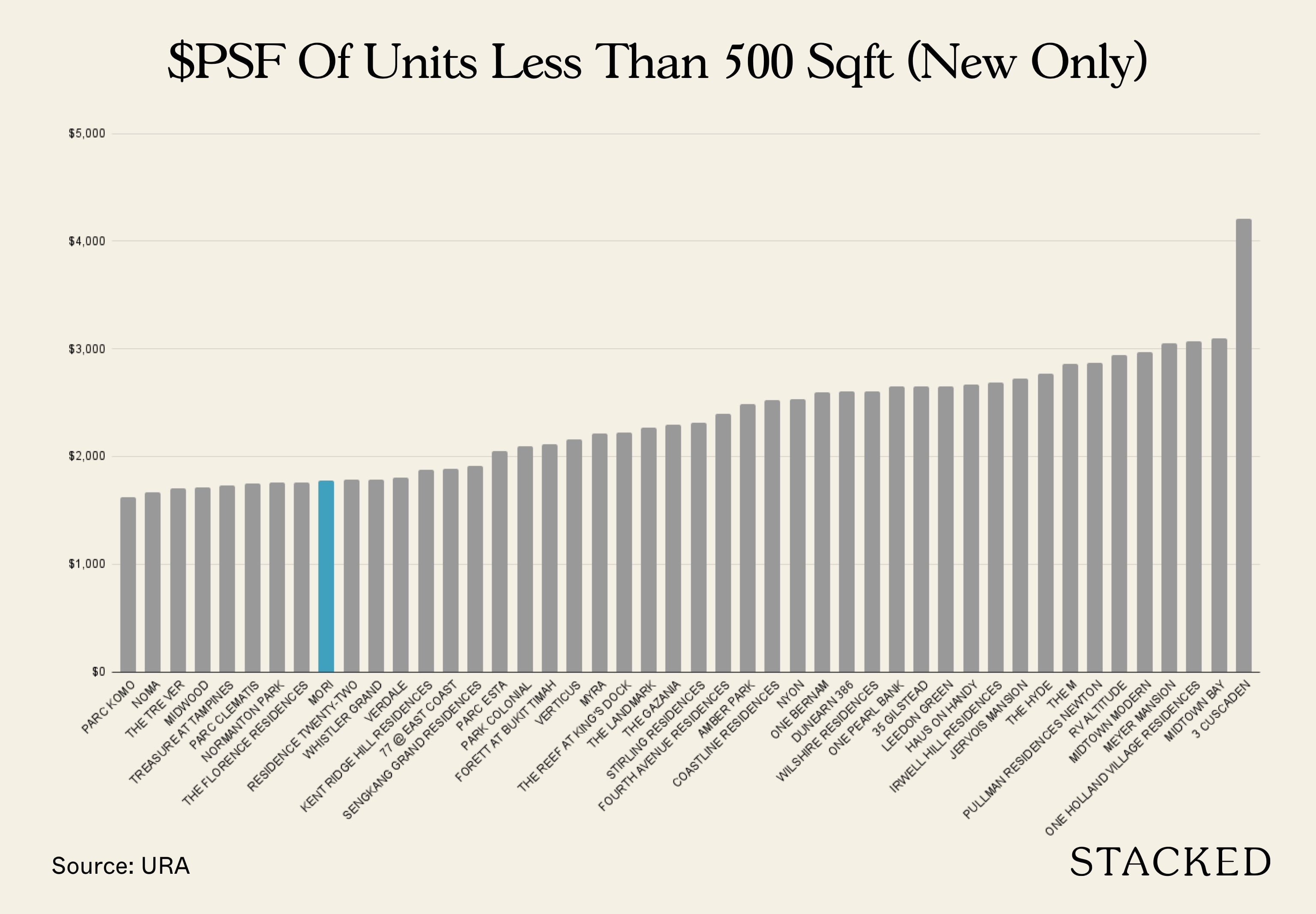
Source: URA. Transactions from November 2020 – October 2021.
If we look at the $PSF, you’ll find that Mori ranks even better – 9th out of 45 other new launches.
And so this is really the advantage of Mori’s offering today. It’s not only one of the more affordable new launches in the market – it’s affordable for a Central project. If we consider how The Commodore’s 1-bedroom price starts from around $700K+, then $800K+ for a 1-bedroom in the central region is certainly not absurd!
How does Mori’s indicative 1 and 2-bedroom price compare to new launches in the area?
Location is everything, so let’s see how new launches nearby look like.
| Project | Bedrooms | Average Price | Average $PSF | Mori’s Price Difference | Mori’s $PSF Difference |
| NoMa | 1 | $763,509 | $1,720 | 12.51% | 3.22% |
| NoMa | 2 | $1,108,949 | $1,613 | 5.96% | 2.61% |
| NoMa | 4 | $1,934,613 | $1,508 | 9.43% | 11.50% |
| Rezi 24 | 1 | $727,829 | $1,622 | 18.02% | 9.44% |
| Rezi 24 | 1+S | $795,803 | $1,633 | 26.04% | 11.87% |
| Rezi 24 | 2 | $904,977 | $1,537 | 29.84% | 7.69% |
| Rezi 24 | 2+S | $1,136,030 | $1,563 | 11.18% | 12.07% |
| Rezi 24 | 3 | $1,550,640 | $1,585 | 3.38% | 2.17% |
| Rezi 24 | 3+S | $1,837,925 | $1,552 | -8.48% | 5.91% |
| Rezi 24 | 4 | $1,881,300 | $1,520 | 12.53% | 10.59% |
| Mori* | 1 | $859,000 | $1,775 | – | – |
| Mori* | 1+S | $1,003,000 | $1,827 | – | – |
| Mori* | 2 | $1,175,000 | $1,655 | – | – |
| Mori* | 2+S | $1,263,000 | $1,752 | – | – |
| Mori* | 2+G | $1,549,000 | $1,754 | – | – |
| Mori* | 3 | $1,603,000 | $1,619 | – | – |
| Mori* | 3+G | $1,682,000 | $1,644 | – | – |
| Mori* | 4 | $2,117,000 | $1,681 | – | – |
Source: URA. Based on all New Sale transactions for the respective new launches.
*Indicative prices
As of this writing, both NoMa and Rezi 24 are sold out. Both are boutique developments that offer the usual condominium facilities. Rezi 24’s pricing is potentially a lot lower as it has been on the market since 2019 when prices were lower.

The developer has managed to stage its prices up over the years, with a lower $PSF this year recorded given these were for larger units in the development.
Overall, Mori has a $PSF premium over NoMa of just 2-3%. However, NoMa’s overall price for the 1 and 2-bedroom units did go for less, with Mori being priced 6-12% more than its new launch competitor.
This premium is generally not that much more, especially given how quickly the supply in this area has absorbed demand from buyers, evident from the quick sale of NoMa. It may even mean that prices for NoMa may not have been priced sufficiently high, especially in today’s context (to be fair, NoMa was selling at a time when the market was just starting to rise). As such, while there is a premium, I do think that based on today’s market context and new launch pricing, Mori’s overall price is very decent in today’s context.
Appreciation Analysis
- Rezoning of Geylang to Commercial
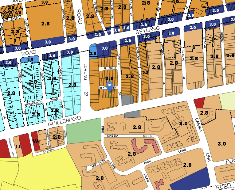
Back in 2015, URA announced that it will not approve any new residential projects from Lorong 4 to Lorong 22 Geylang under a proposed rezoning exercise. The long stretch will consequently be designated as commercial, with the effect of limiting future residential supply and increasing the overall livability of the area. Mori falls just outside this rezoning as it is located along Lorong 24 Geylang instead. Nevertheless, the effect of URA’s decision should be viewed as positive, as it will bring about more commercial opportunities in the area and eventually clear out the vice activities altogether. Taking a long-term view, this move would be accretive to Mori in the future.
- Kampong Bugis Transformation
While I recognise that Mori in Geylang is not exactly in the Lavender condo precinct (think Citylights, Kallang Riverside, and Riverine by the Park) benefiting directly from this transformation, there may be potential spillover effects that will help to raise the values of the Geylang apartments in the future. To recap, Kampong Bugis is set to become the next waterfront residential precinct in Singapore, with grand plans for it to be car-lite, community-centric, and sustainable. You can read more about it on URA’s website.
- Paya Lebar Central Commercial Centre
The Geylang lorongs are split between those that are closer to Aljunied MRT and those closer to Paya Lebar MRT. While Mori belongs to the former, it is not all that far away from the latter either. Paya Lebar has undergone a significant transformation over the last decade. I recall studying in the MacDonald’s at the old SingPost centre while schooling and that was the only mall here back then. Now, there are 3 shopping centres and very significant office space available. Many MNCs have offices at PLQ, including Bayer, JLL, Roche and Great Eastern. The continued demand for office space at Paya Lebar will help to boost demand for housing in close vicinity, which may be helpful from both a rental yield and price support perspective.
What we like
- Good layouts
- Rooftop Pool
- Differentiated design in Geylang
What we don’t like
- –Too close to neighbours
- –Clustered surroundings
- –No electric car charging
Our Take
Your take on Mori depends very much on your perspective. Let me explain. Objectively speaking, Mori’s starting psf of $1619 for a Freehold RCR development offers great value on paper. It is near to amenities at Paya Lebar and Old Airport Road and situated in close proximity to the CBD. Geylang itself is becoming a hip new area with cafes such as Brawn & Brains popping up in the area.
Yet, on the other hand, this very same Geylang, has been long associated as the red light district in Singapore. While the sleaze is more or less gone by now, upended also by Covid-19, you cannot deny that some continue to view the area through tinted glasses. Over and above the stigma, this area is also dotted by numerous small apartments that struggle to differentiate themselves. Even banks are sometimes unwilling to finance the full 75% in view of these factors.
Having noted the downsides, the question is whether Mori has done enough as a product to ensure that these are mitigated. I like the overall wabi-sabi concept of the development and really enjoyed how the developers put in effort into their selection of materials in the units to ensure a consistent theme. I also appreciate the unique facilities such as the rooftop pool, pool lounge, sunken pod, and projector lounge that are often missing from boutique developments. Yet, some units at Mori will also be very close to the neighbouring blocks at Guillemard Suites, which causes privacy issues for some.
Overall, I am of the opinion that the views about Geylang are evolving and with the continued gentrification of the area, moving in to purchase a unit at a reasonable price may mean being a first mover in an underrated area that is undeniably convenient to the key parts of Singapore.
What this means for you
You might like Mori if you:
-
• Appreciate the convenience of the RCR with a budget:
Mori offers you the opportunity to be within close proximity to the CBD while keeping overall quantum low.
-
• Looking for space-efficient layouts:
The 2 Bedroom showflat was a positive example of a desirable layout that can help you meet both your practical objectives and budget.
You may not like Mori if you:
-
• Don’t like the congested nature of the Geylang area:
Mori, while situated along Guillemard Road, is part of a larger cluster of apartments in the wider Geylang precinct. Developments tend to be closely packed together (including Mori’s) and may not be for everyone.
-
• Retain a traditional stigma about the area:
While the gentrification of Geylang is ongoing, there remains a traditional view about the area that is hard to dislodge, especially for the older generation.
End of Review
At Stacked, we like to look beyond the headlines and surface-level numbers, and focus on how things play out in the real world.
If you’d like to discuss how this applies to your own circumstances, you can reach out for a one-to-one consultation here.
And if you simply have a question or want to share a thought, feel free to write to us at stories@stackedhomes.com — we read every message.
Our Verdict
79%
Overall Rating
Mori is a freehold new launch condo in District 14 with an interesting wabi-sabi concept, a rooftop swimming pool and well planned unit layouts.
Documents
Join our Telegram group for instant notifications
Join Now











6 Comments
I owned units in Lorong 6 and near 20 (Cosmo) and stayed in Lorong 4. I cannot emphasize the accessibility and ease of commuting to town from here. I can understand why Cosmo is having such high asking prices due to the Arena Residences effect as well as it being much easier to maintain being one sole block and situated so conveniently within walking distance to Mountbatten MRT (a predominantly laidback residential area vs the hustle and bustle of Geylang).
The maintenance fee is not going to be cheap for Mori – expect upwards of $350 for 1 bedders and perhaps even pushing $500 for 2 bedders and up considering the bells and whistles of various facilities here. Unless of course the owners decided to ‘leave and let live’ once the Management Council is formed…
Jalan Molek has an infamous repute (just google it along with any other suggestive terms) and you will see why. Mori has a daring mission to cleanse this up and reinvent the area. Time will tell.
For own stay, this is quite straight forward; for investment, think hard and long.
Hello, why do you say that duplex units sell at a discount?
Bought a 3 plus guest for own stay mainly with the objective of sending my kids to Kong hwa. We looked at many resale at the area but they were mostly not maintained well as they were tenanted. Decided to go for new launch and the entry price is good. Understand that jalan Molek has the vice activities just behind Mori. Went in with my eyes open but felt this is the best choice. Will probably sell it after my kids graduate from KH if I don’t make a loss.