All reviews on Stacked are editorially independent. Developers can advertise with us, but
cannot
pay
for,
edit, or preview our reviews.

New Launch Condo Reviews
The Landmark Review: CBD Fringe Living With Great Views By The Park
November 14, 2020 33 min read
Great for work, life and play.
The Landmark is positioned well for those who want to live near the CBD for easy commute to their workplace, while being able to enjoy the greenery in the city area.
| Project: | The Landmark |
|---|---|
| District: | 03 |
| Address: | Chin Swee Road |
| Tenure: | 99-year leasehold |
| No. of Units: | 396 |
| Site Area: | 72,118 sqft |
| Developer: | Landmark JV Pte. Ltd. |
| TOP: | 30 March 2025 |
Urban. Nature. Timelessness.
The marketing tagline for every project speaks volumes about the project’s aspirations and it is no different for The Landmark. Now, I can totally understand Urban and Nature given the project’s proximity to the CBD, Pearl’s Hill City Park and the Singapore River but I’ll admit I was a little puzzled with ‘Timelessness’ seeing how this is not a freehold project.
Here’s some background to kick us off. This is the redevelopment of the 139-unit Landmark Towers, which was built in 1985 and sold en-bloc in May 2018 for $286mil ($1,406 psf). You could say that it is about time – residents at the former Landmark Tower have been trying to achieve a collective sale as early as 2007, where the asking price was initially about $300 million. This was dropped to $270 million in 2008, but there were unfortunately still no takers.
But enough with the history lesson, let’s talk today. With a cheaper land cost compared to its nearest competitor One Pearl Bank (which was acquired at $1,515 psf) the launch of The Landmark is set to create excitement and add competition to this vicinity.
I’m just going to put it out here – the indicative prices of $1900+ psf are more than proportionately cheaper than One Pearl Bank’s $2400+ psf, making this a super worthy contender for those looking for a CBD fringe unit. We understand that 1 Bedroom units will start from $900+k, 2 Bedrooms from $1.2m+ and 3 Bedrooms from $2.3m+.
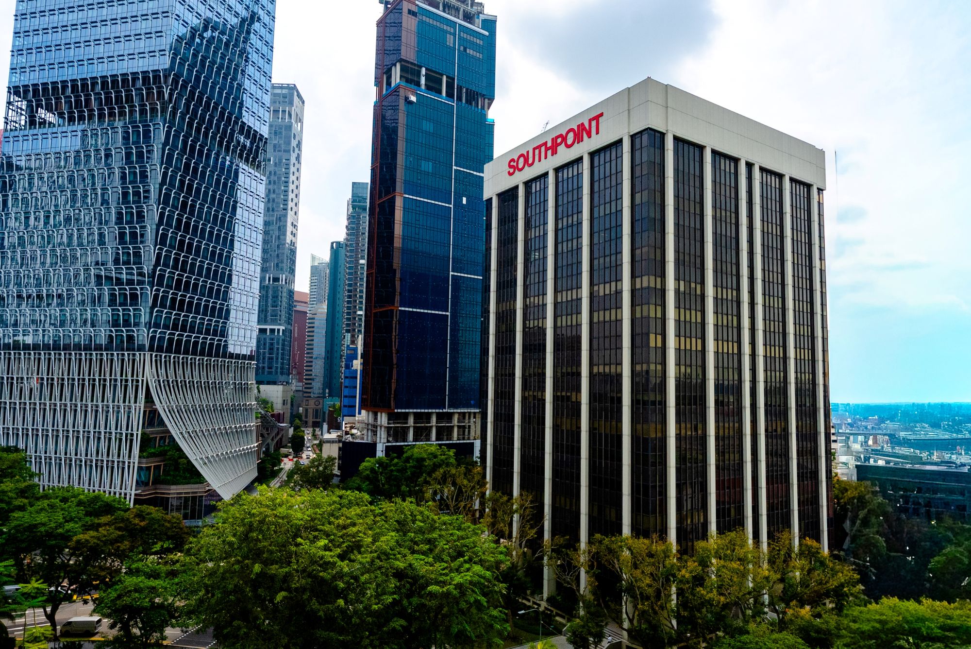
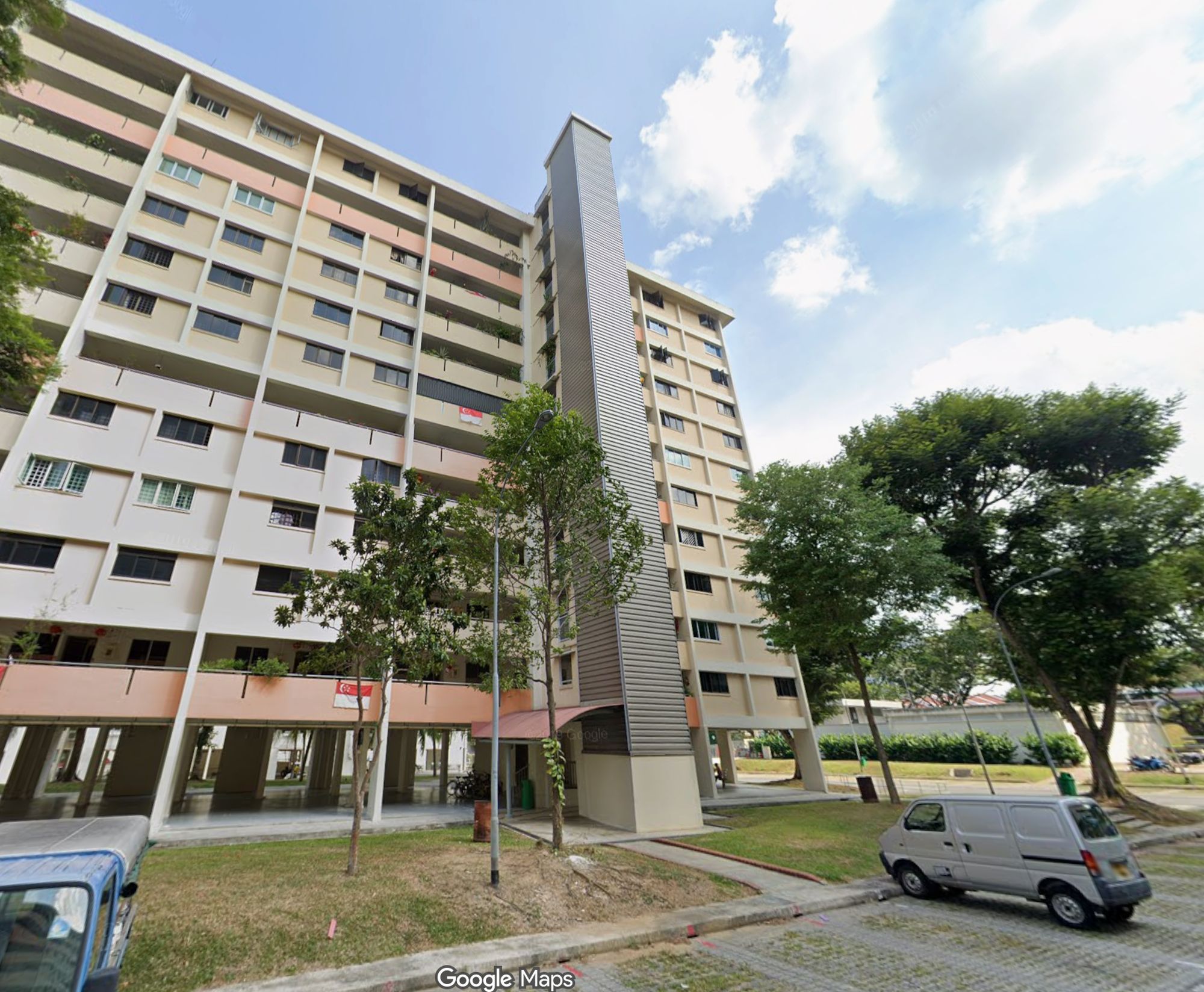
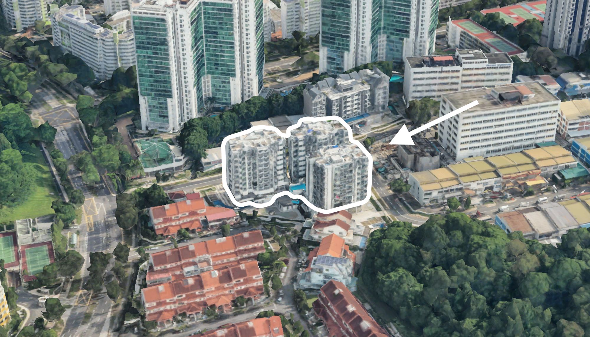
The Landmark is also set to transform the skyline of the sleepy Chin Swee Road. If you are familiar with the area, you will know that the buildings all around look pretty old and tired. No surprises there, since the likes of Hotel Re! (former Pearl’s Hill Primary School), Manhattan House and the HDB flats along Jalan Kukoh / Chin Swee Road were all completed in the 1970s.
As you read further, we will delve deeper into The Landmark – its facilities, location, appreciation analysis and beyond – so do read on to find out more.
Without further ado, let’s dive straight into our customary showflat insider tour!
So many readers write in because they're unsure what to do next, and don't know who to trust.
If this sounds familiar, we offer structured 1-to-1 consultations where we walk through your finances, goals, and market options objectively.
No obligation. Just clarity.
Learn more here.
The Landmark Insider Tour

I’ve always wondered – if developers didn’t invest in a showflat – would there be any effect on sales at all? More so in a strange time like this, where 3D tours are all the rage because of the pandemic.
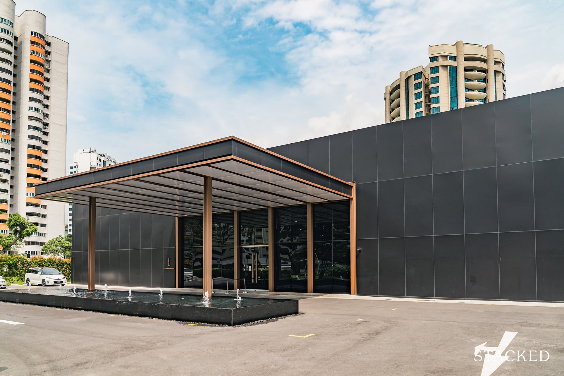
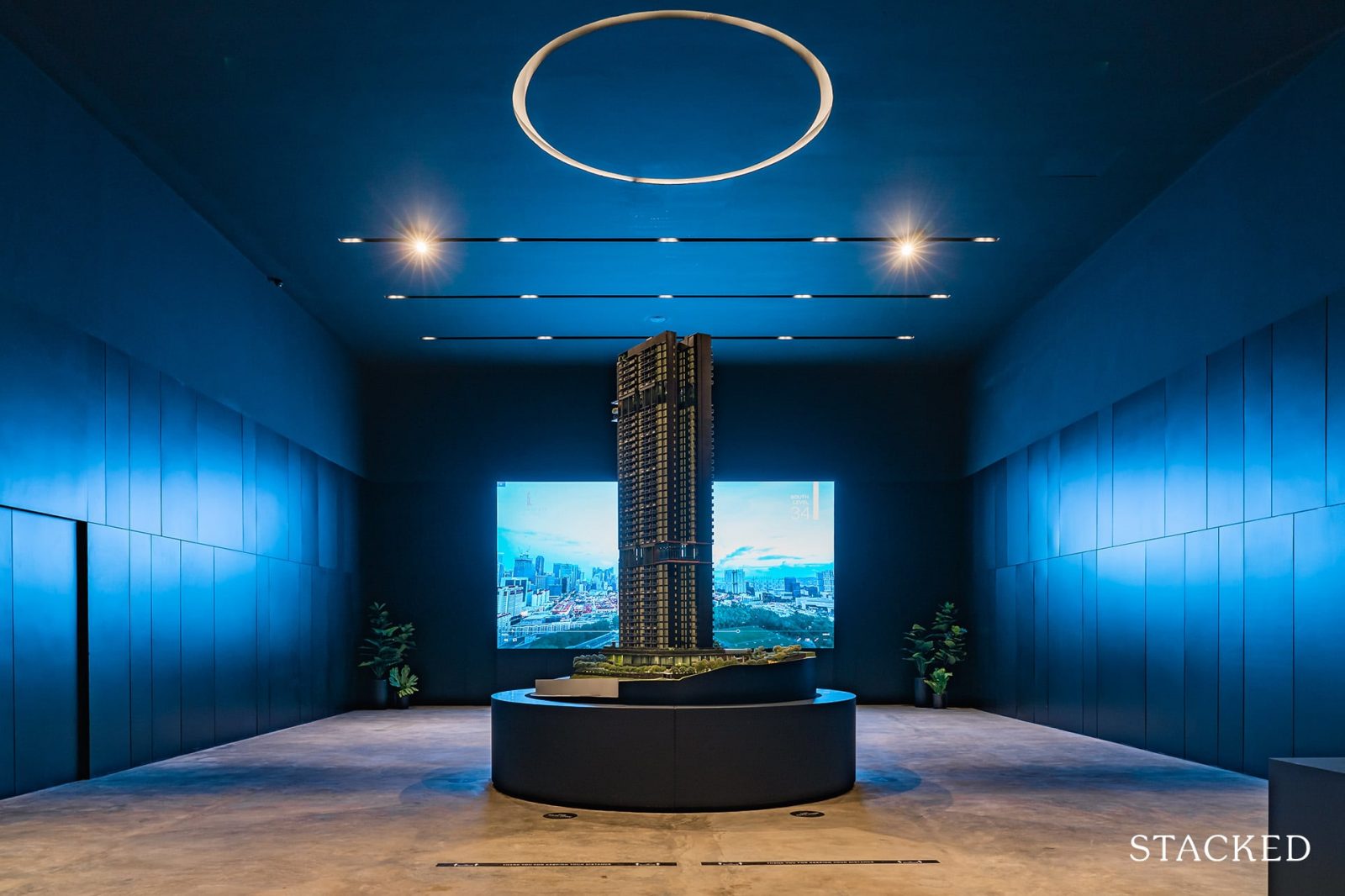
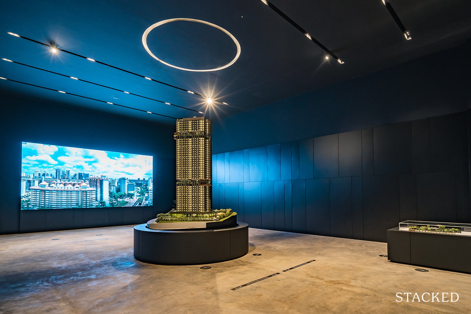
So if anything, The Landmark actually seems to have doubled down on its showflat offering. I’ve been to more than a fair number of showflats – and this one was quite special. Stepping into The Landmark’s showflat at Indus Road, you will find yourself unravelling the project’s intricacies one step at a time. I say this because there are so many parts to this showflat and at each juncture, there is a concealed door that opens up to the next. Pretty mysterious I must say!
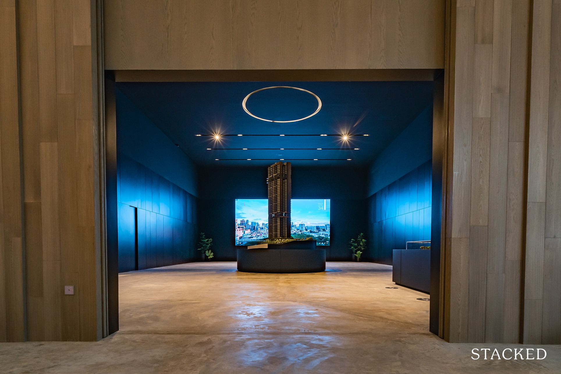
I know this isn’t exactly a reason to buy a condo, but I just have to mention it anyway – the “unveiling” of the showflat model was hugely impressive.
So impressive that I just need to show it to you.

Let’s start with a little history lesson on the architects and interior designers of The Landmark – Swan & Maclaren.
(For the history averse crowd please feel free to skip to the next paragraph)
Swan & Maclaren is actually the oldest architecture firm in Singapore with an extremely distinguished past. They dominated the architectural scene prior to WWII and many of their works continue to be landmarks in Singapore. Chief among them are Raffles Hotel, Goodwood Park Hotel, St Andrew’s Cathedral and Victoria Memorial Hall and many of these are credited to the esteemed R.A.J Bidwell and Frank Brewer. Swan & Maclaren of 2020 may be a less prominent outfit (in relative terms) but the hope is that The Landmark will leave an indelible mark in the hearts of Singaporeans just as they have done a century ago.
One of the things that I like is that the road turning into The Landmark leads only to the condo and Hotel Re!, so besides the holidaymakers who are non-existent at the moment, the road is pretty much an exclusive one for the condo residents.
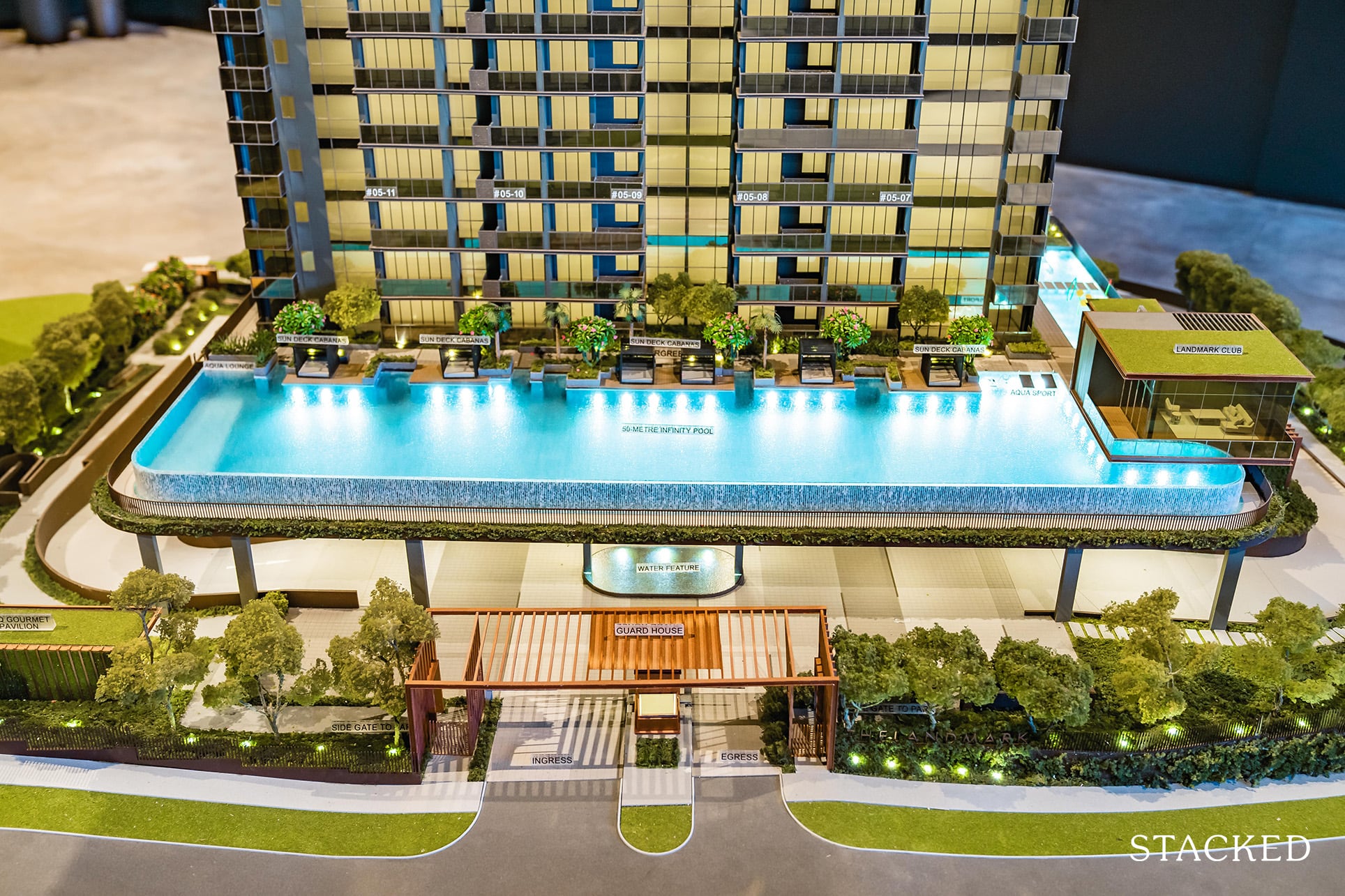
Starting with the Grand Arrival, the developers have clearly tried to play up its proximity to Pearl’s Hill City Park with its emphasis on its green landscaping. Definitely a good thing in my opinion as its closeness to greenery in the CBD is a rarity.
There is only 1 entrance and exit to the development and 340 parking lots spread across 3 levels of basement parking, which will be more than sufficient for 396 units. Moreover, being a CBD fringe property, I do expect that there will be a fair number of tenants who do not drive. However, the drop off point here at The Landmark is not the grandest I have seen although they have clearly tried to make it as expansive as possible.
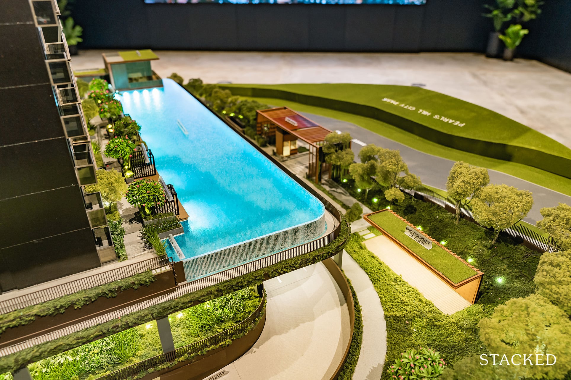
With just 72,118 sqft of land, there really isn’t much room for the developers to exploit their creativity in terms of facilities and their layout but I’m glad that they’ve made use of its vertical advantage to place an emphasis on common areas with good views.
On Level 1, it’s meant to be an extension of the neighbouring Pearl’s Hill City Park hence you will find a side gate leading directly to the park. Besides that, no fancy facilities and no tennis courts as expected from a land plot of this size. On this floor, you will also find a BBQ pavilion, a kids playground and a cycling and jogging track.
It’s a smart location for the BBQ pavilion – away from the traffic noise and close to the serenity of the park.
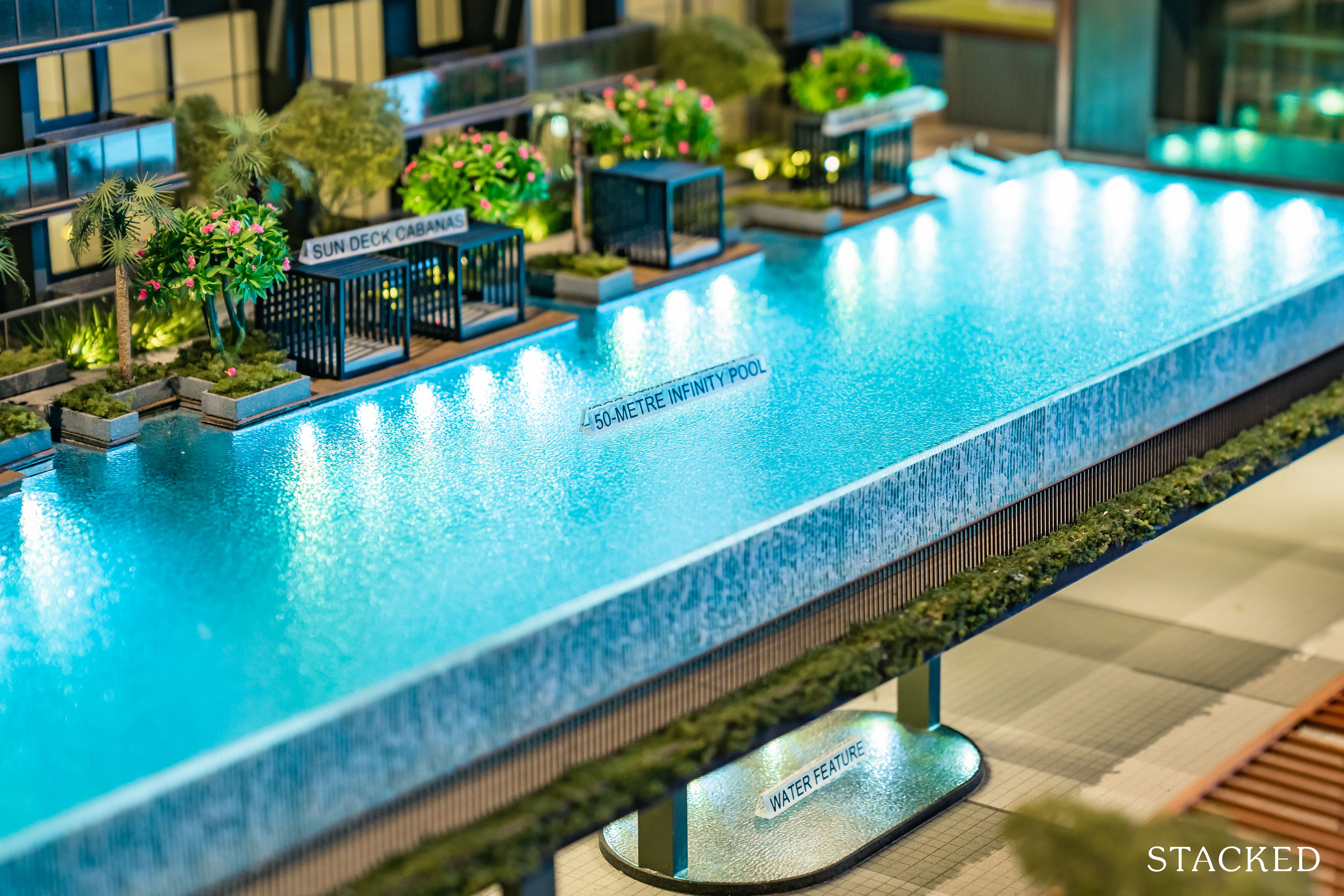
Level 2 is termed as the ‘The Splash Zone’ – no prizes for guessing what this floor entails. You will find a 50m infinity pool here and I really like the infinity concept as it fronts Pearl’s Hill Park, giving swimmers a really tranquil surrounding that is away from the hustle and bustle of CBD fringe living. It’s probably also one of the more private swimming pools that you can enjoy in this part of town.
On this floor you will also find a couple of smaller kid pools, sun deck cabanas and the clubhouse. It’s nice that the developers have ensured that the little ones are not left out of the action despite the project having 80% of units allocated to 1 and 2 Bedroom types.
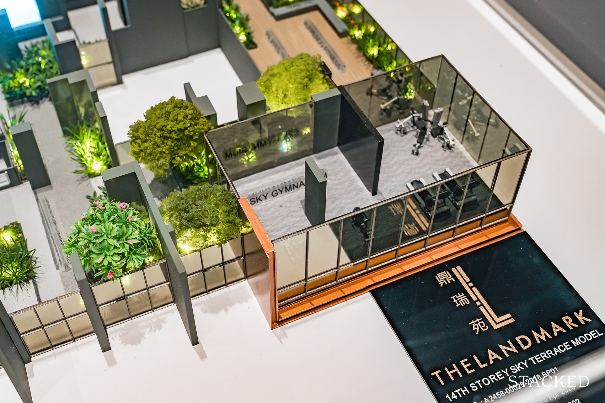
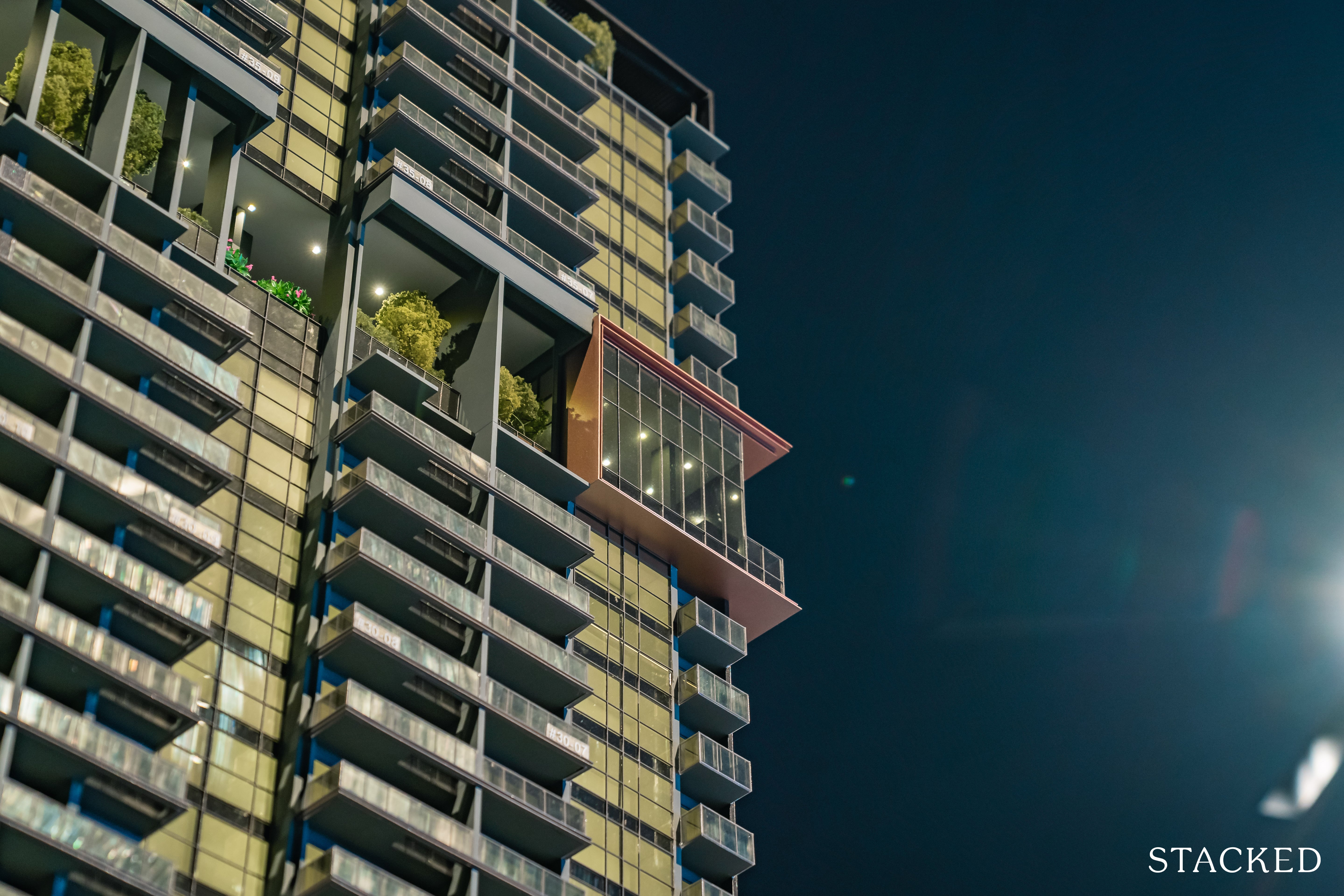
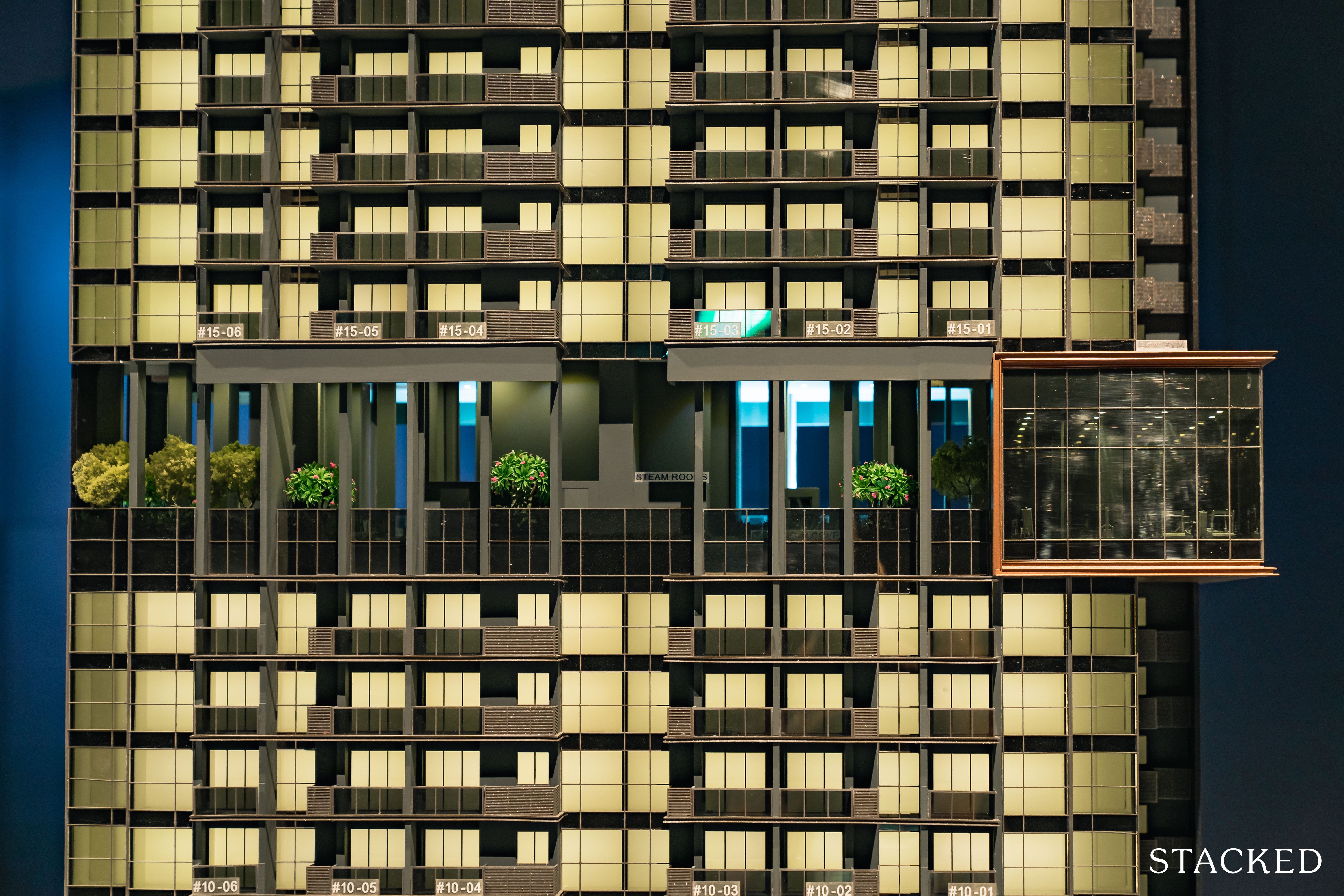
Level 14 is where you will find the Sky Gym, a Jacuzzi Aqua Spa, as well as a variety of decks and gardens. Even though the Sky Gym looks pretty small, the developers have intentionally created spaces on its periphery so that residents can bring the weights and exercise balls out as an extension to their workout.
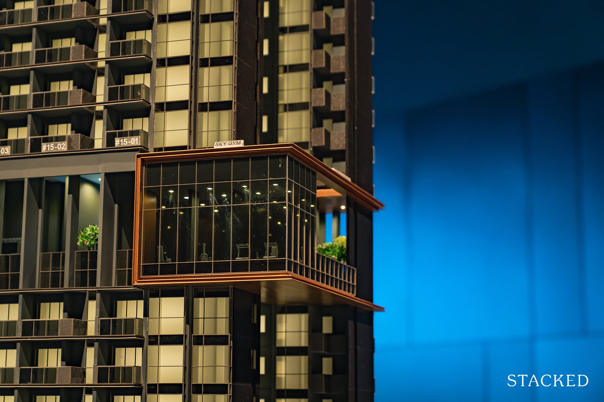
Interestingly, you will also realise that the Sky Gym has deliberately been given that copper finish, giving it the perception that it is slightly cantilevered. You will also find steam rooms and cabanas on this floor.
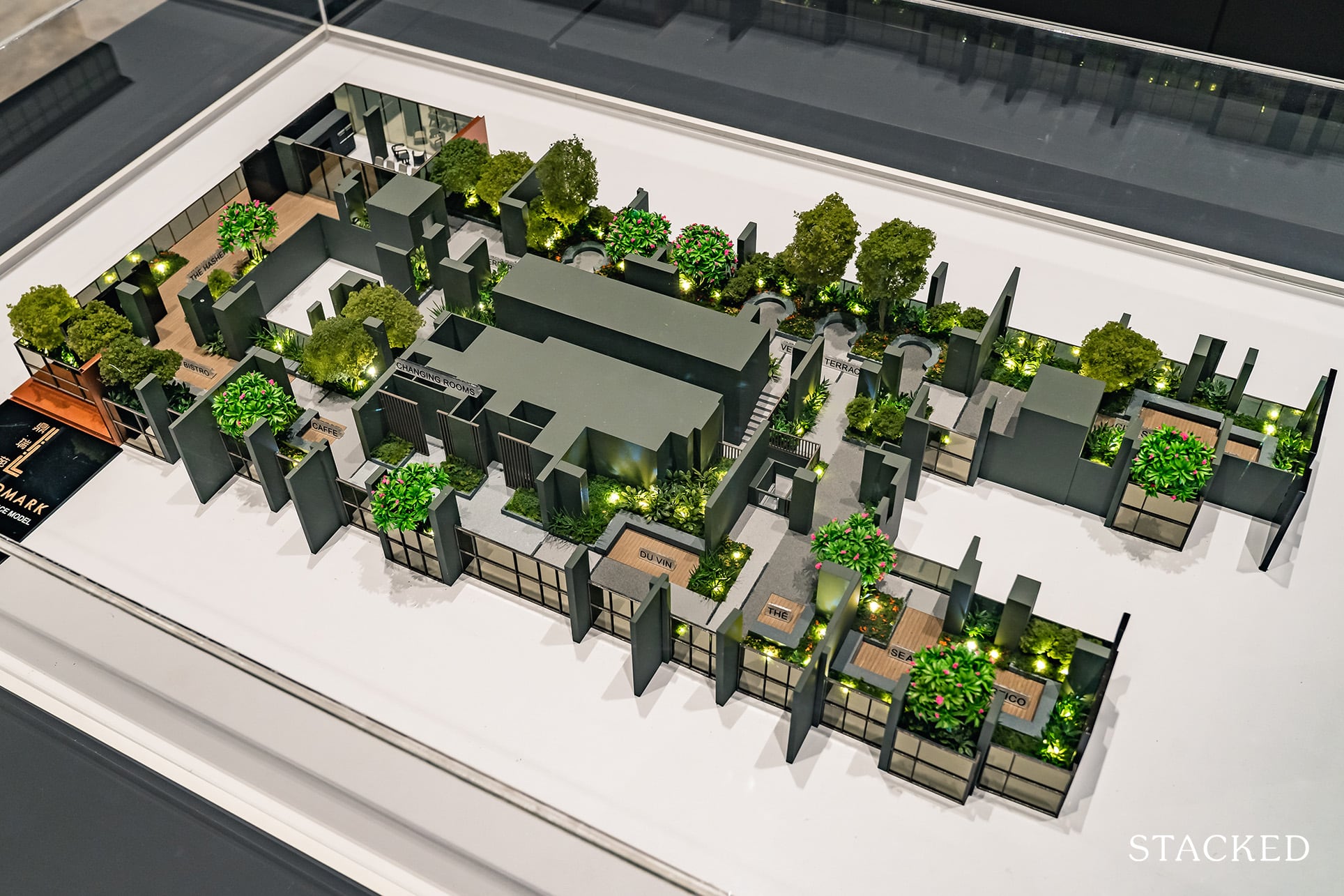
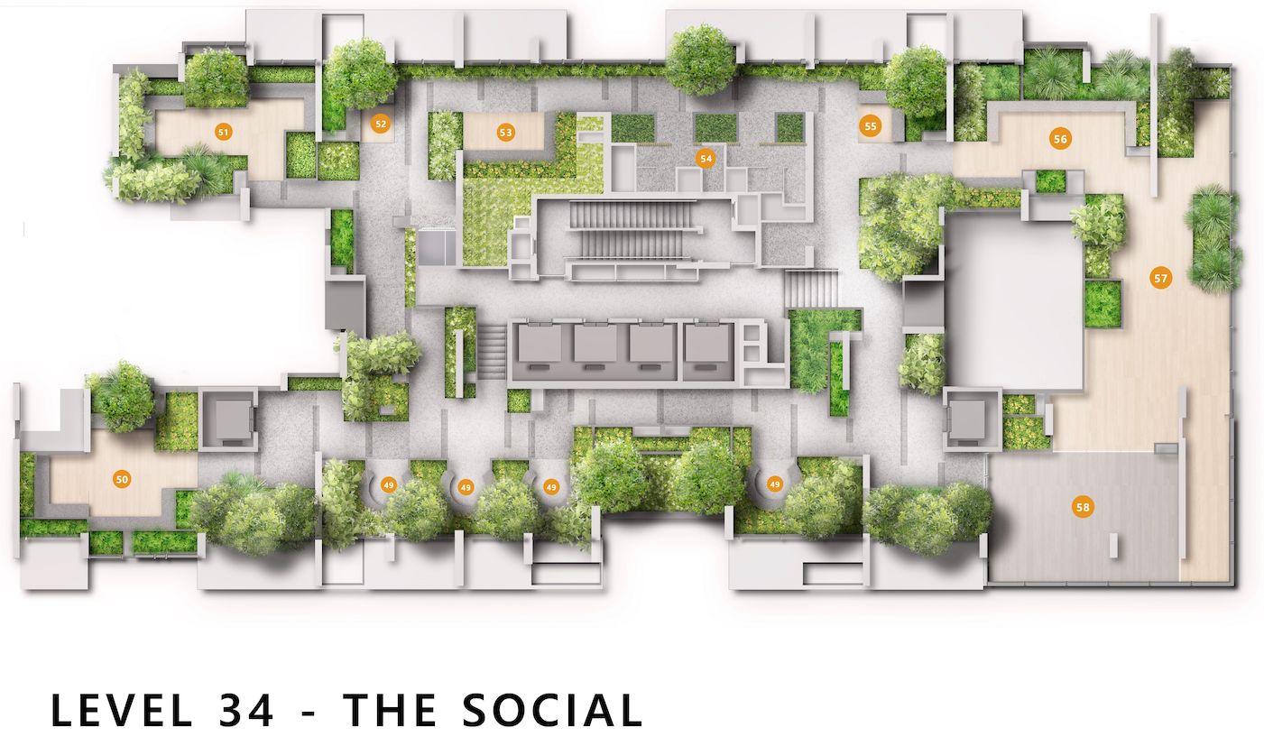
Level 34 is the main social space for residents with a variety of lounge spaces. They are each termed differently such as Bistro, Hashery, Dinette etc but these are really just marketing speak. There is only 1 main area which has cooking equipment available while the others will likely have an assortment of outdoor furniture.
I do like how the developers have made a conscious effort to create enough social spaces for residents, who are likely to invite their colleagues and friends over given how centrally located The Landmark is.
Level R is nicknamed “The Peak” for obvious reasons – it is the highest floor of the development. Now it isn’t a new concept but I think it was great of the developers to have made special effort to ensure that the best views are shared with all residents.
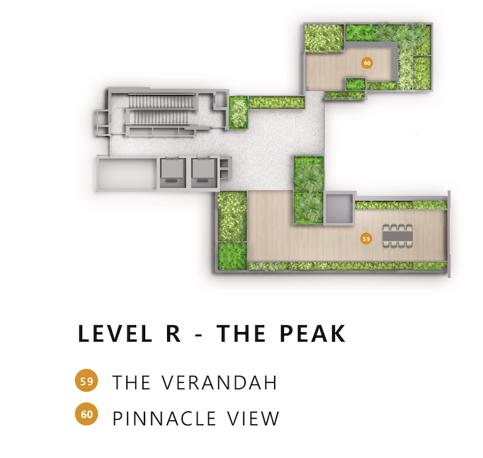
The space isn’t big and consists of just 2 zones – 1 with seats to enjoy the panoramic city and park views and the other which is just a place for residents to perhaps do some yoga or static exercises. It’s really more for residents to show off to their friends how great a view The Landmark offers.
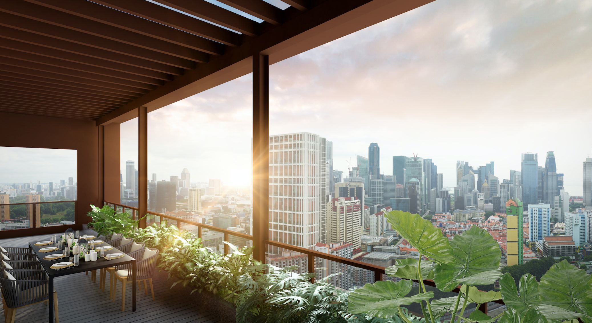
Some things are just better shown – so here’s the proposed view from Level R of The Landmark.
The Landmark 1 Bedroom Review
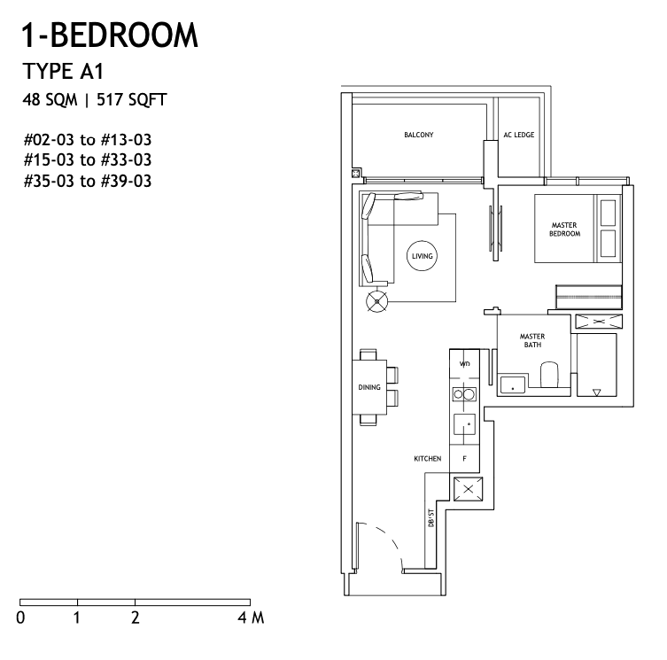
At 517 sq ft, the unit showcased here is the largest 1 Bedroom layout on offer at The Landmark and is larger than the average in the market, where units typically come in at the mid 400+ sq ft range.
The other 1 Bedrooms layouts in this project are 495 sqft, which does come under the typical shoebox classification. Except for the 39th floor (the highest) which will be fitted with marble floors, all other 1 Bedroom units will have porcelain tiles with marble accents.
All bedrooms will also be decked out in engineered timber – which is pretty much standard across the board in new developments these days.
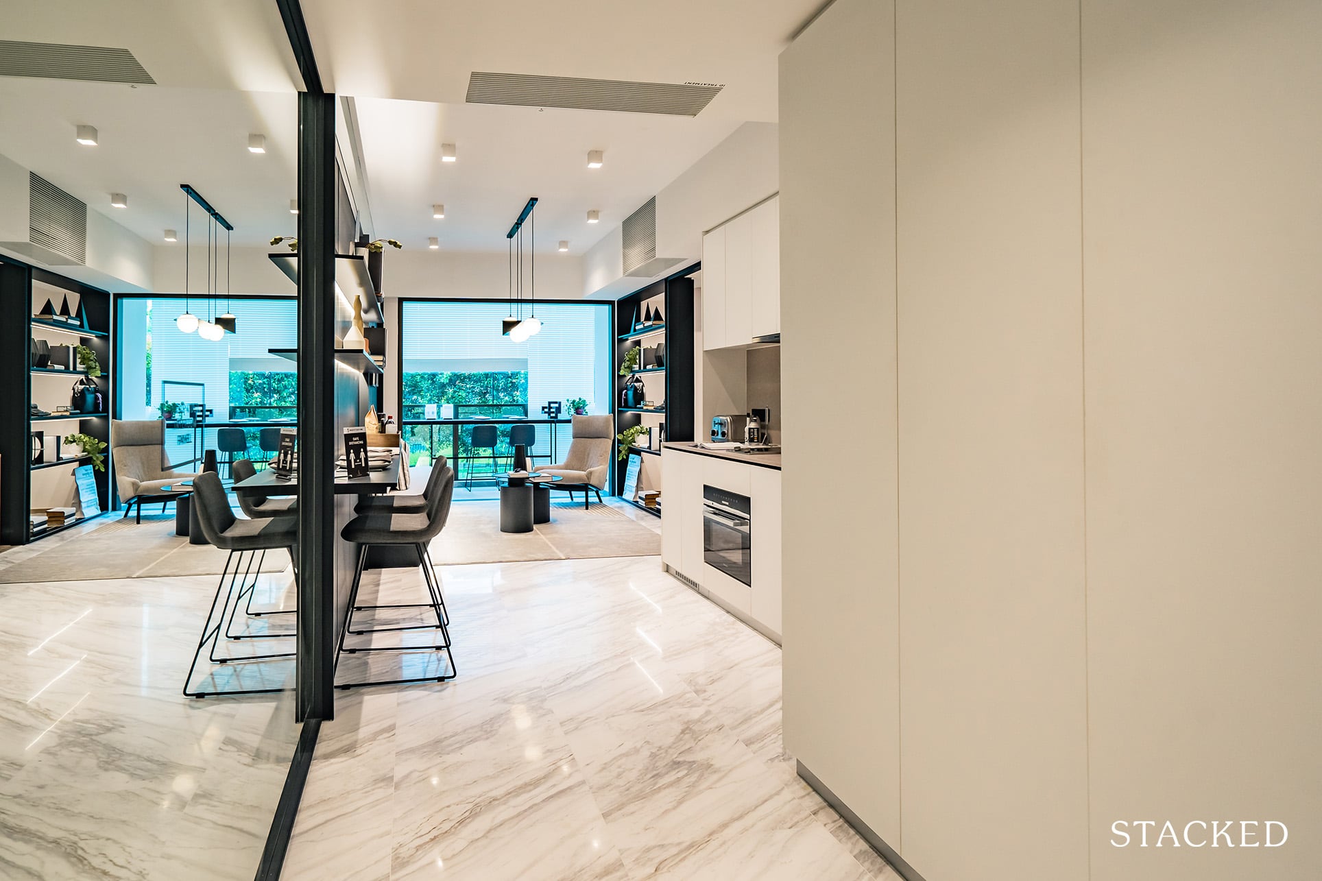
Because of its larger than average size, the unit looks spacious although the layout is otherwise typical of a 1 Bedroom unit. Coming into the unit, you will find our pet-peeve with units of this size – the entrance foyer area. While it is no dealbreaker since most 1 Bedroom units are laid out as such, we have always thought of it as an inefficient use of space.
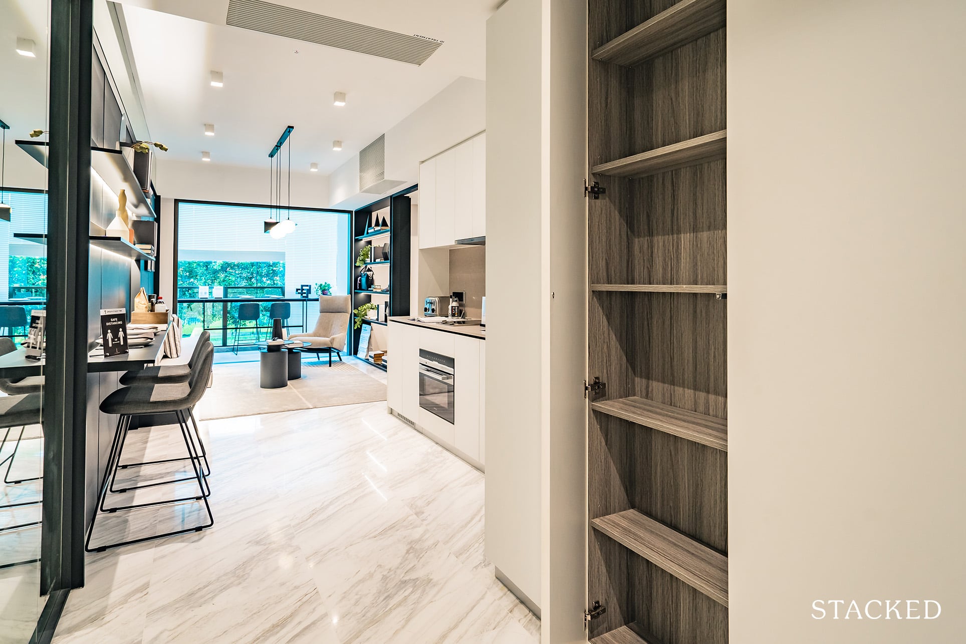
However, I must say that The Landmark has mitigated this effectively by creating storage cabinets for the entire stretch, which is pretty impressive!
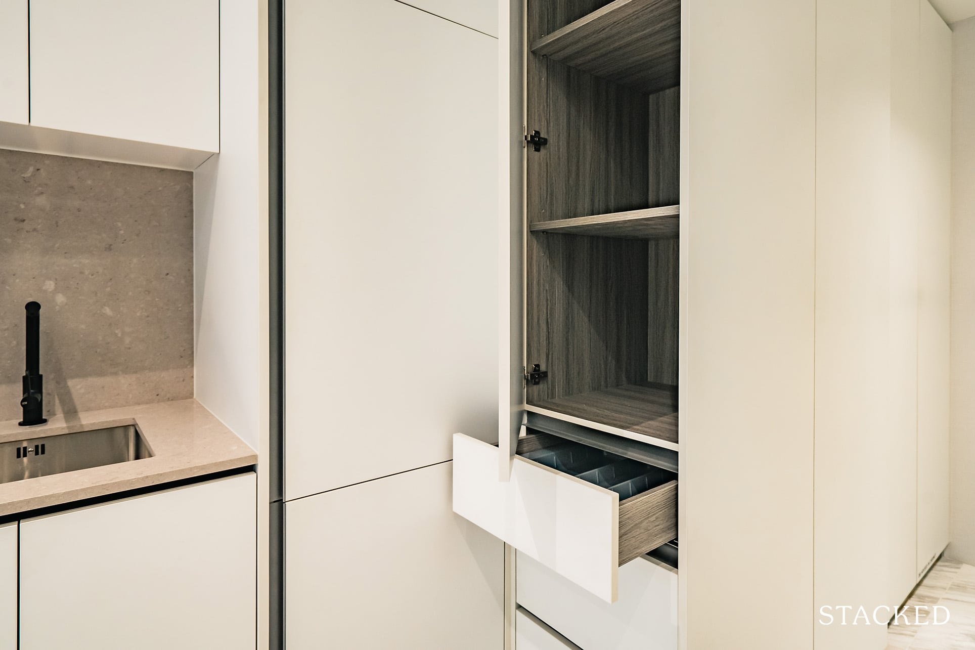
It’s something that many people tend to overlook – so having these extra build-in storage compartments will really come in handy. It’s all well and good to move into a brand new unit, but if your personal items are all overflowing into the common areas – your living space will start to feel cluttered and small very quickly.
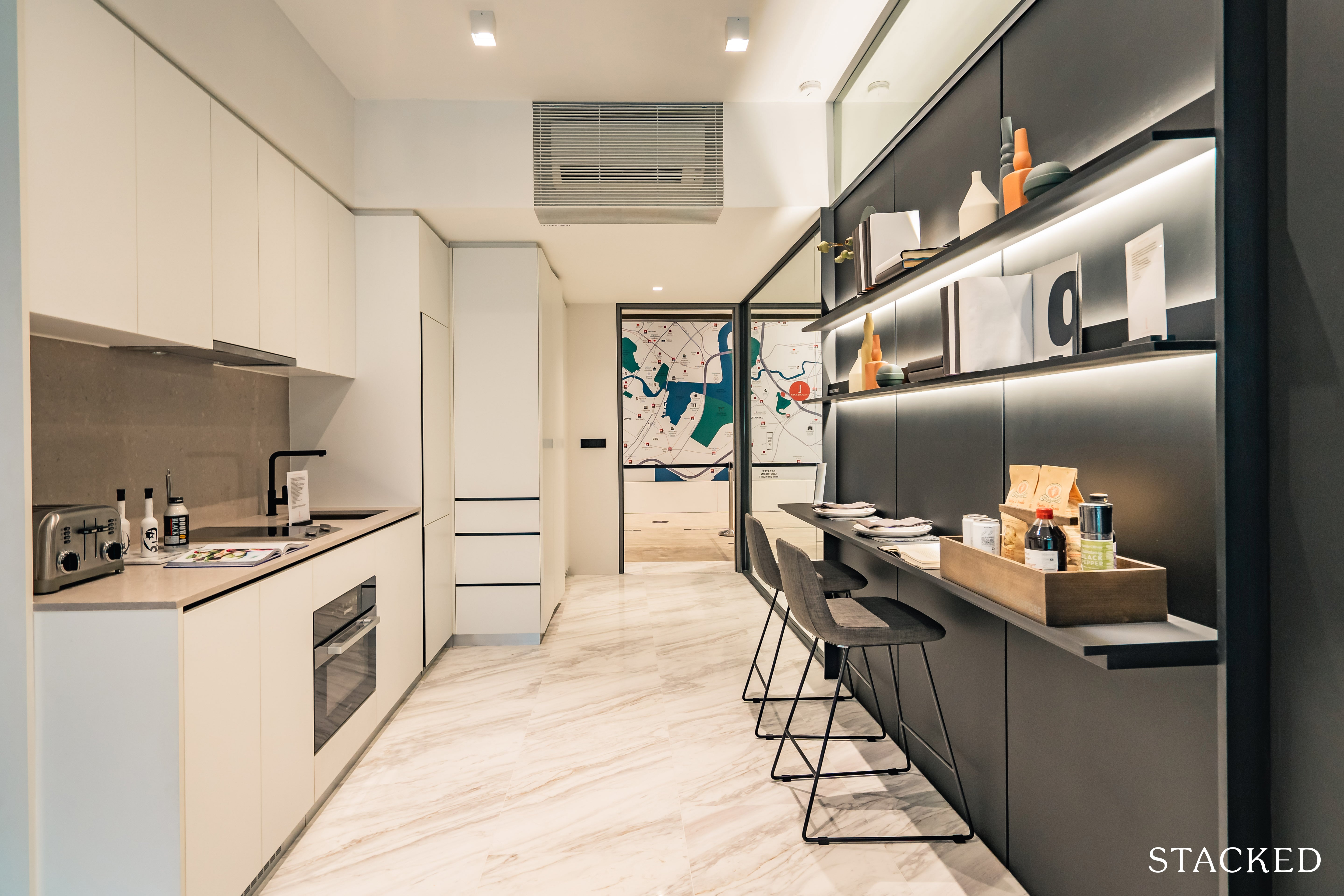
Additionally, you will notice that instead of opening up directly to the open kitchen, the induction hob and other appliances are placed in a slightly recessed L-shaped area, which further eats into the usable space of the unit.
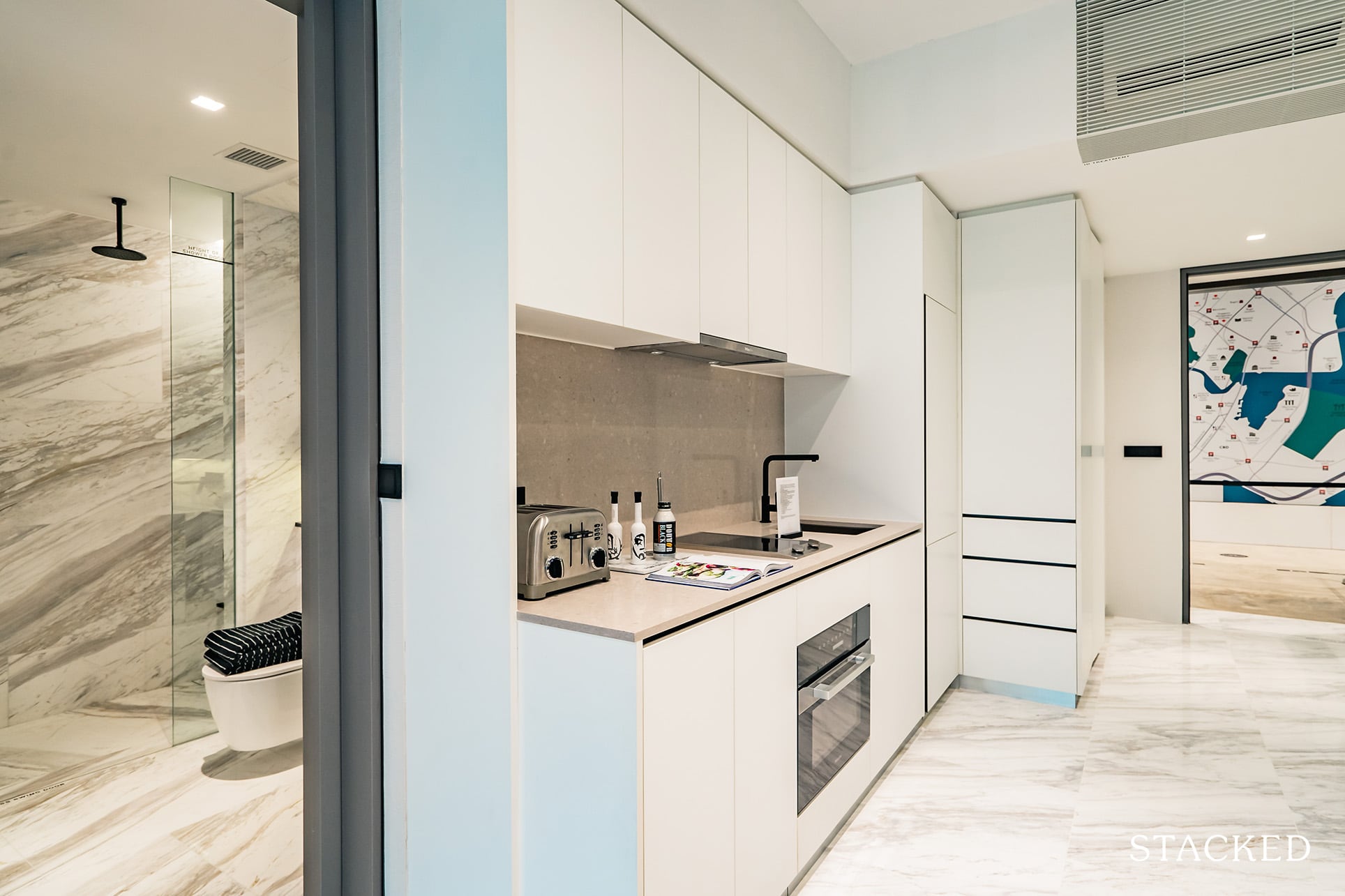
Personally, I’m not a huge fan of the pure white look of the kitchen cabinets – my partner likes to remark that it looks like her hospital pantry – but Swan & Maclaren have clearly gone with that ‘modern’ look. It is sleek, no doubt.
But fret not if you are just like me because the 2 and 3 Bedroom units come in a different, darker shade theme.
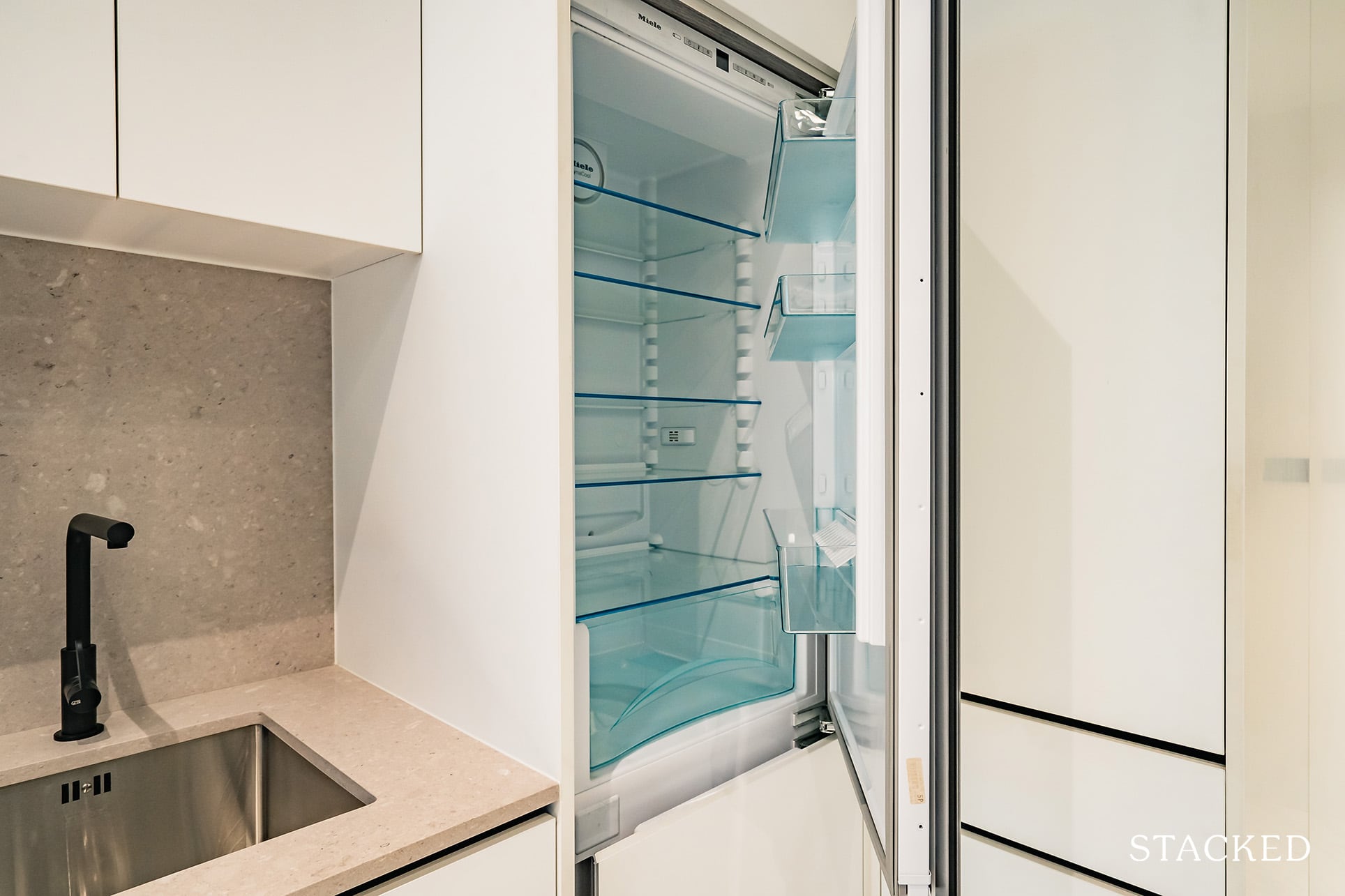
Kitchen appliances for condos of this category are expected to come from quality brands and The Landmark doesn’t disappoint here – Miele appliances, an established German brand, are used here. It will be a 2 zone induction hob used for the 1 Bedroom unit.
The fridge here is also concealed, which contributes greatly to the sleek look – although it could be a bit of a hassle when it requires replacing. I personally won’t mind that bit of inconvenience, looks > practicality here for me.
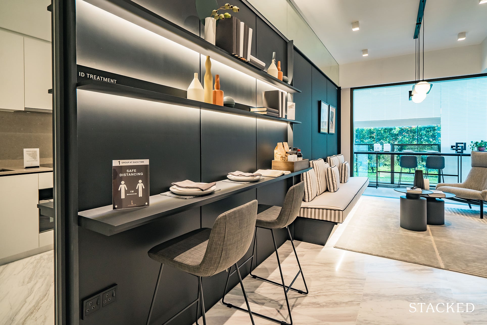
As you can see, the developers have only managed to place 2-seater bar stool style seating to avoid infringing on the walkway, which definitely allows the space to feel more roomy than a typical 1 Bedroom unit.
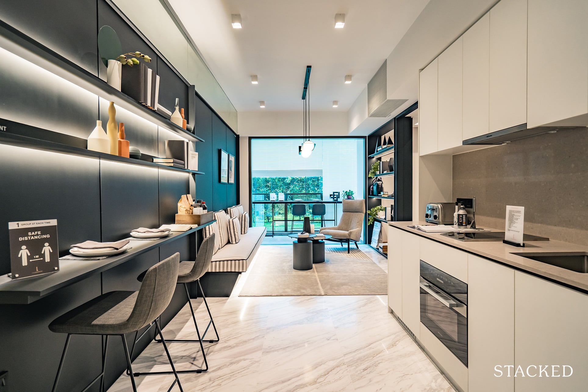
I would say that it isn’t an entirely accurate representation of how most people would like their dining arrangements to be. Facing the wall side by side to have your meals isn’t exactly a very sociable experience. There’s a reason bar counter seats are usually for an eat and go express dining situation.
You will nevertheless be able to fit a normal 2-seater dining set if you wish, just note that it isn’t going to look as spacious as this.
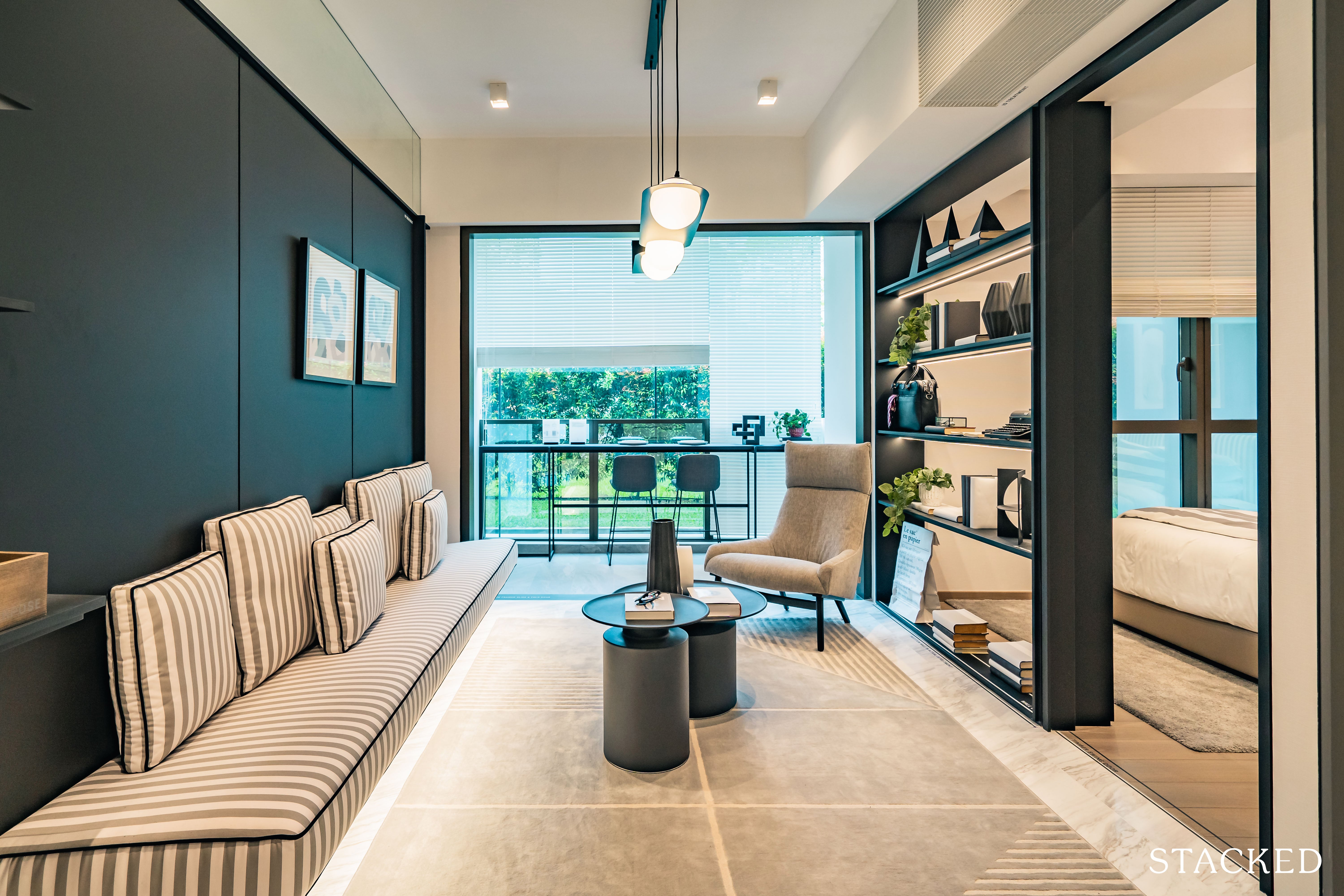
Similar to the dining area, the living room does feel really spacious, width and length wise compared to the usual sub-500 sqft 1 bedroom units in other projects.
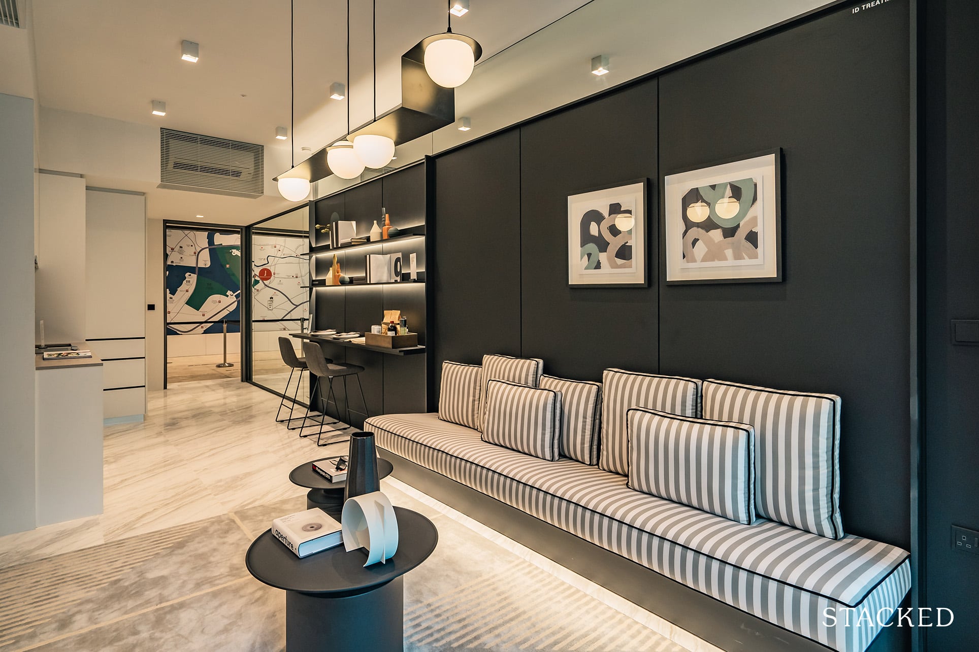
Again, note that this bench-styled sofa has a seat depth that is thinner than most sofa’s that you’ll see in stores. The downside is its rigidity, but it isn’t a bad idea at all to give a better sense of space in the living room.
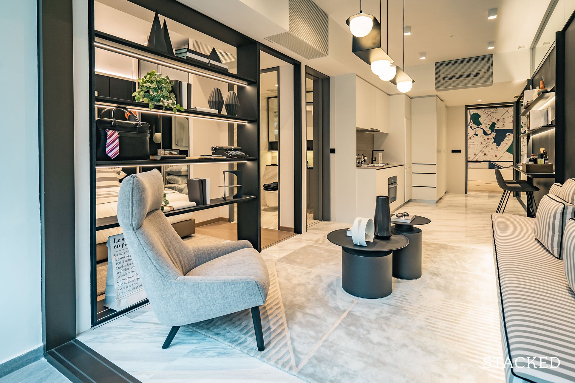
There is also no denying that the open feeling is aided by the fact that the bedroom has been hacked and there is no TV console to speak of.
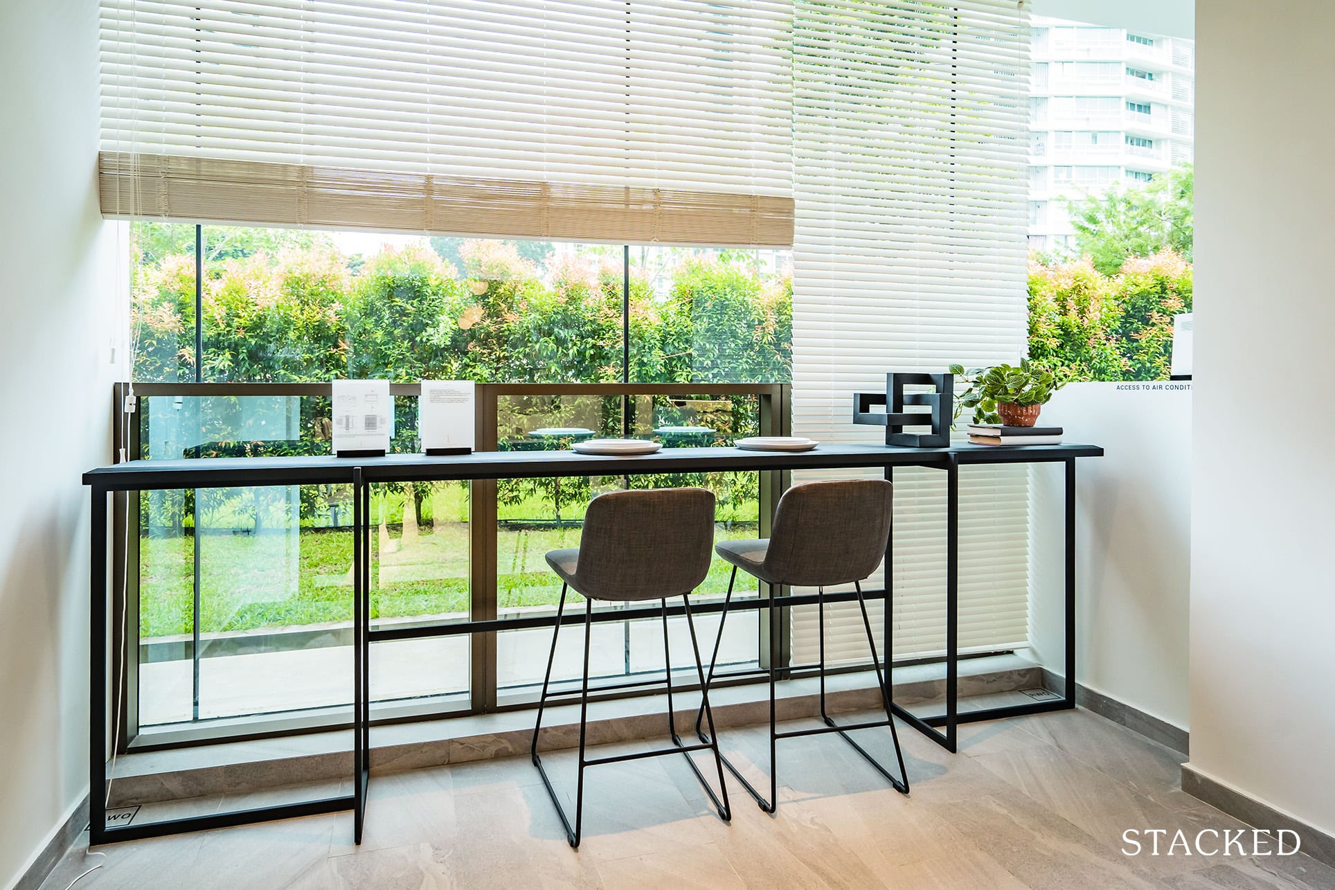
As for the balcony, I think it’s generally a good size for units at The Landmark. Not too small that you can’t place any outdoor seating and not too big that the space would be a white elephant. Just like what the interior designers have done here, you can place a bar countertop with seating for 2 or 3 and this is especially attractive if you have some views to look out to.
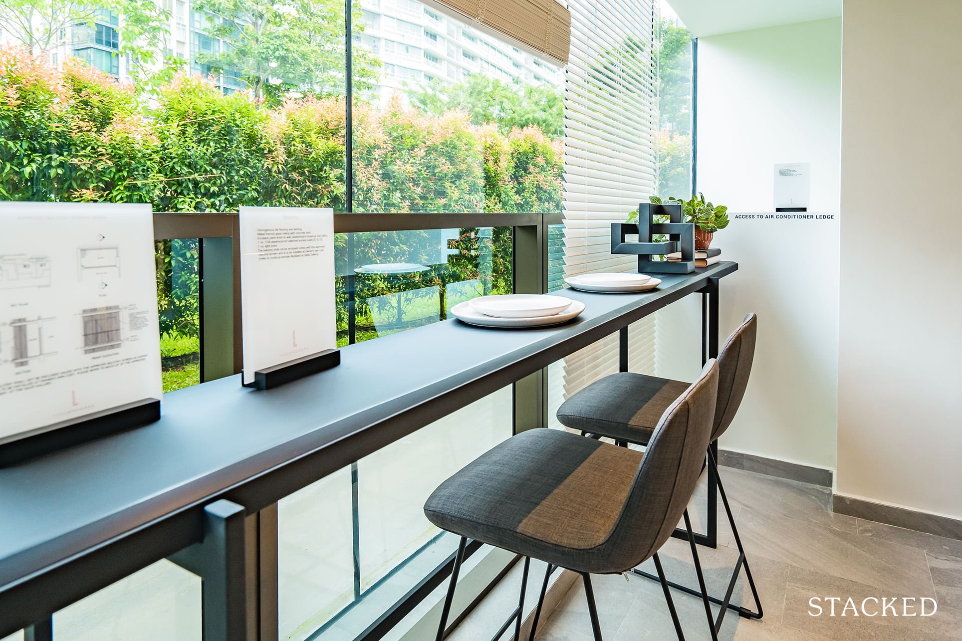
Do note that the aircon ledge for the 1 Bedroom unit is just beside the balcony so it might be slightly noisy at times. It’s a pity, but this is pretty much unavoidable for units of smaller sizes.
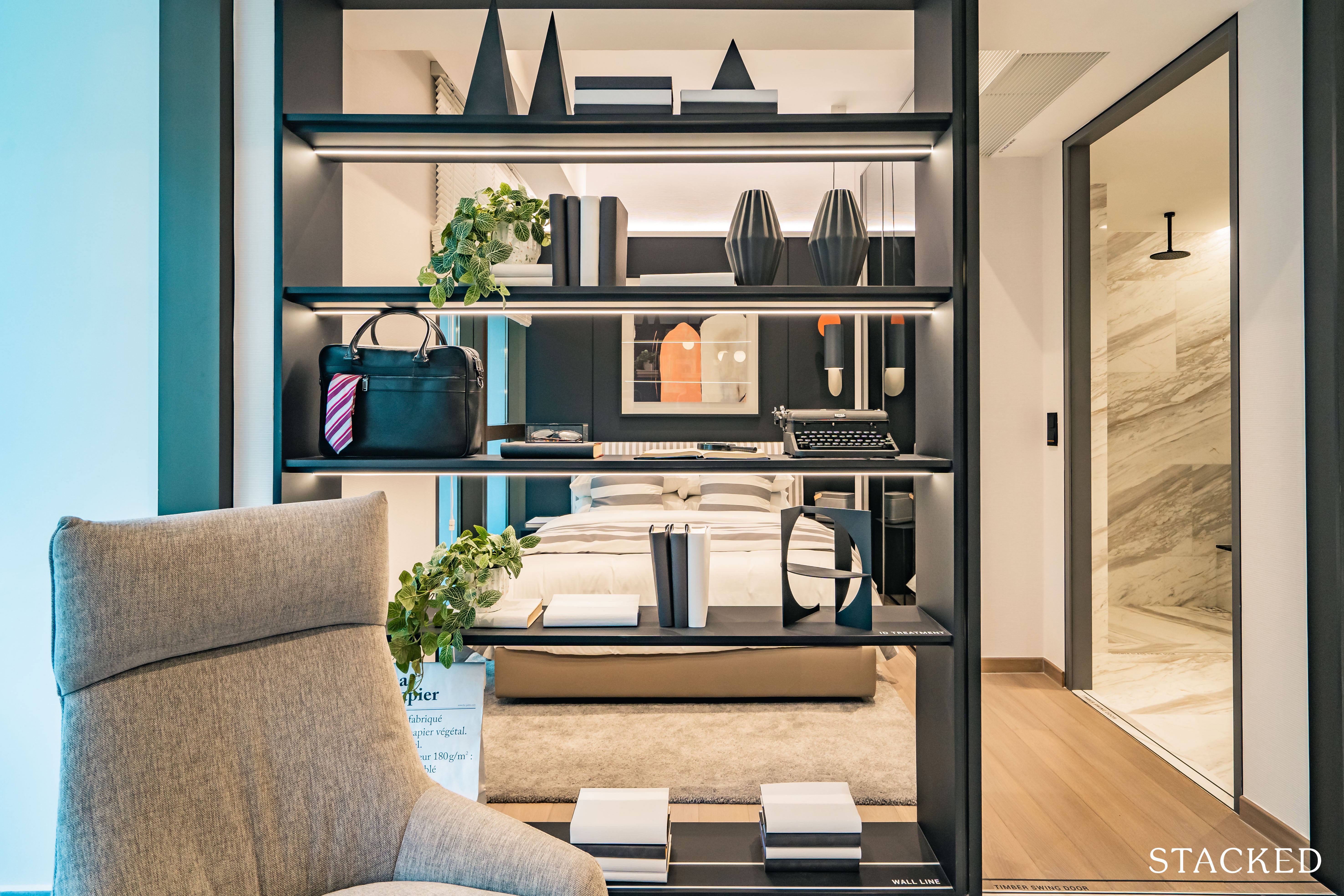
Moving on to the only bedroom, you will notice that the size of 8 sqm is average compared to those in the market.
You will just about fit a Queen sized bed and have (barely) enough space for 2 small side tables.
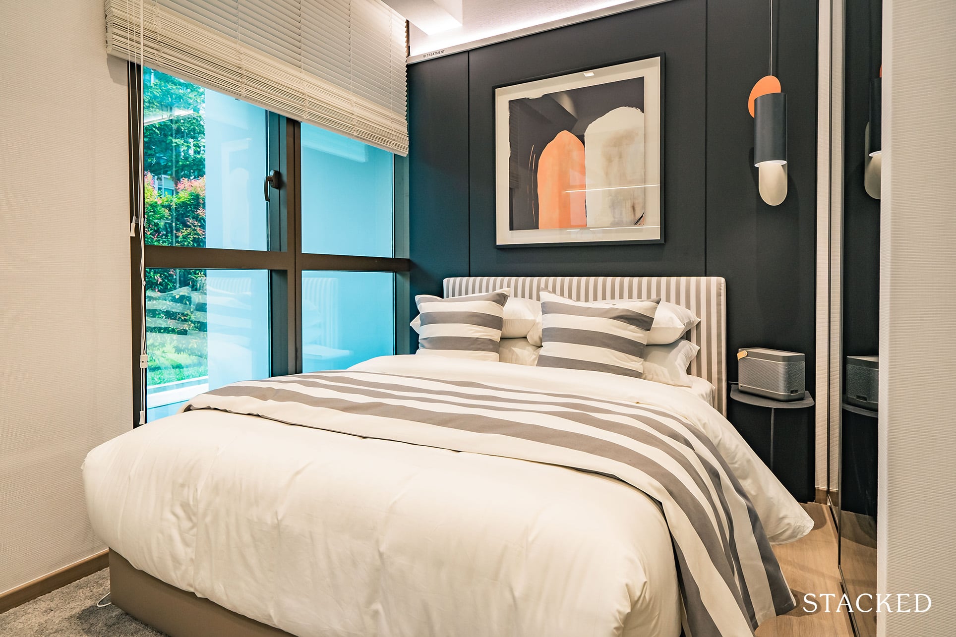
What is interesting however, are 2 subtle differences at The Landmark. Firstly, because of the placement of the aircon ledge, most 1 Bedroom units in other projects typically have half-height windows in the bedroom.
However, at The Landmark, you will notice that they have managed to go with full height windows, albeit at the expense of half the width of the room covered in white wall instead. Especially for units on the higher levels, this move is surely very much more appreciated.
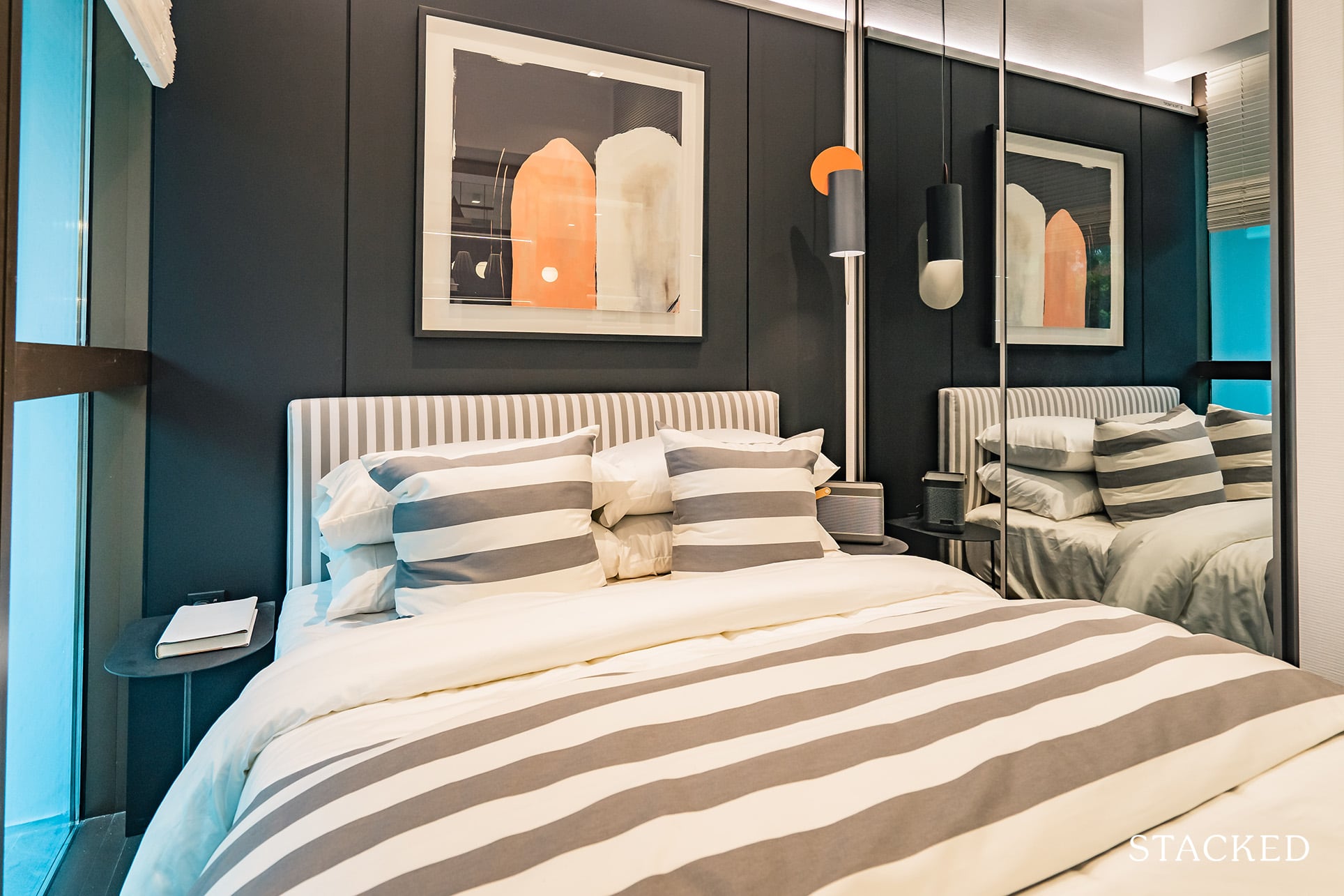
Secondly, you will notice that while other developments typically go with a laminate or wood finish for the surface of the built-in wardrobes, The Landmark has gone with 2 full panels of glass / mirror finish instead.
I think mirror finish makes the room feel bigger and has the benefit of doubling up as an actual mirror. If you are not entirely sure what differences I’m speaking about, you may refer our JadeScape 1 Bedroom review and compare how the windows and built-in wardrobe finish look. (Plus how it looks without an entrance foyer and larger dining area instead).
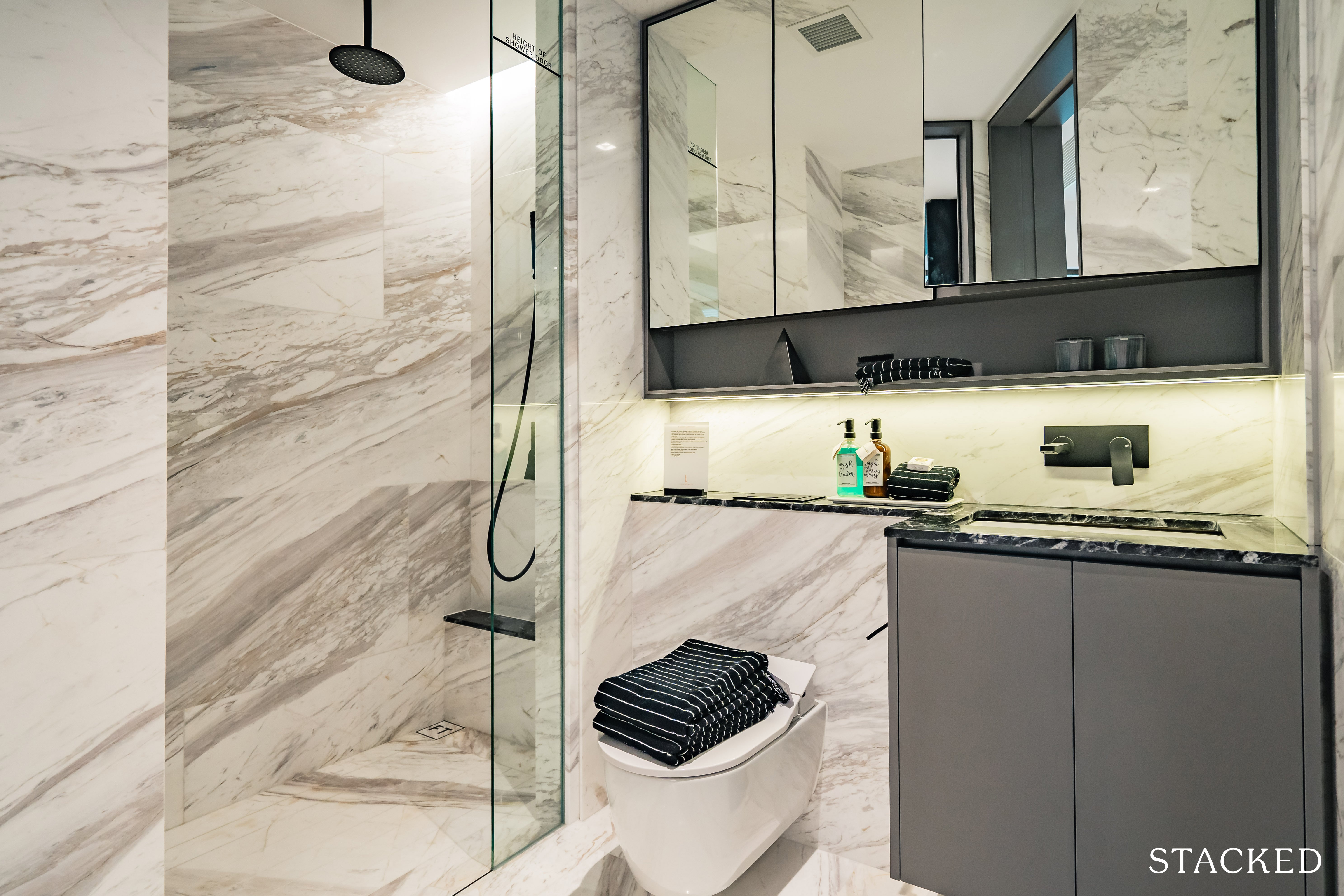
As for the ensuite bathroom, the developers have gone with a jack-and-jill layout, which allows visitors to access the bathroom without having to enter the bedroom. This is the preferred layout for me as I find it to be practical and space saving while not compromising privacy.
The tap and the rain shower are provided by Gessi, which despite its relatively short history of 28 years, has established itself as a premium Italian brand. The wall-hung water closet and basin come from Duravit, a trusted German brand with over 200 years of history and a good track record in Singapore as well.
What I especially like is the addition of the rain shower and wall-hung water closet. These are more premium features not commonly seen in the smaller units of some even more supposedly high-end developments out there.
The Landmark 2 Bedroom Review
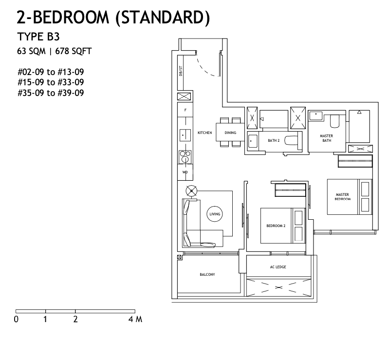
At 678 sq ft, this 2 Bedroom show unit is roundabout what you might expect for a 2 bedroom unit nowadays. As you might already know from reading our reviews, we prefer the dumbbell layout for its space efficiency, especially for smaller sized units. If you are privy to that option too, Stack 8 does offer you that for consideration.
Likewise with the 1 Bedroom units, only the 39th floor will be fitted with marble floors. All other 2 Bedroom units will have porcelain tiles with marble accents, with the bedrooms being decked out in engineered timber.
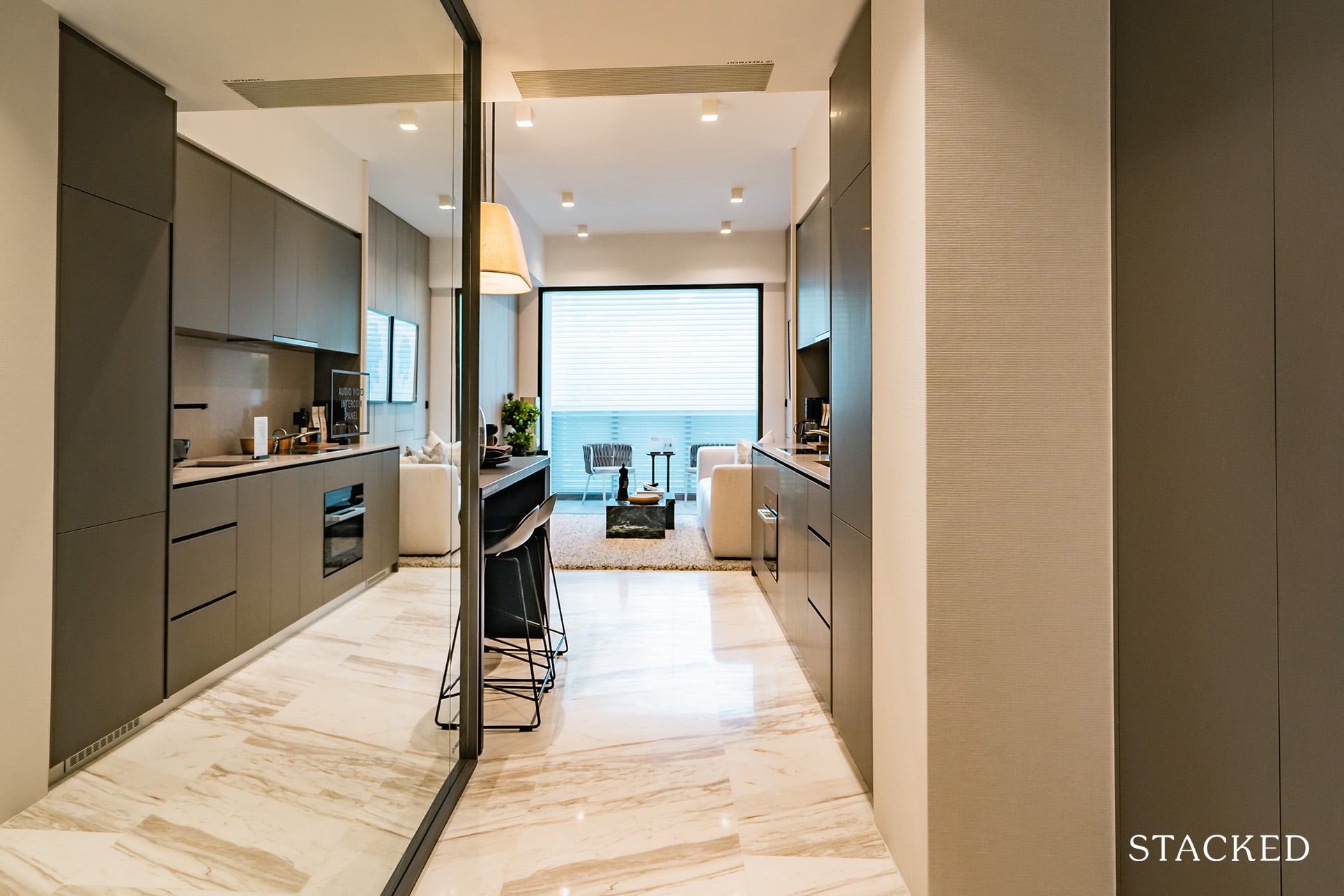
It’s the same story with the 1 Bedroom unit, with the unnecessarily long entranceway. I would try to push out the cabinets on the right more to make more use of the space.
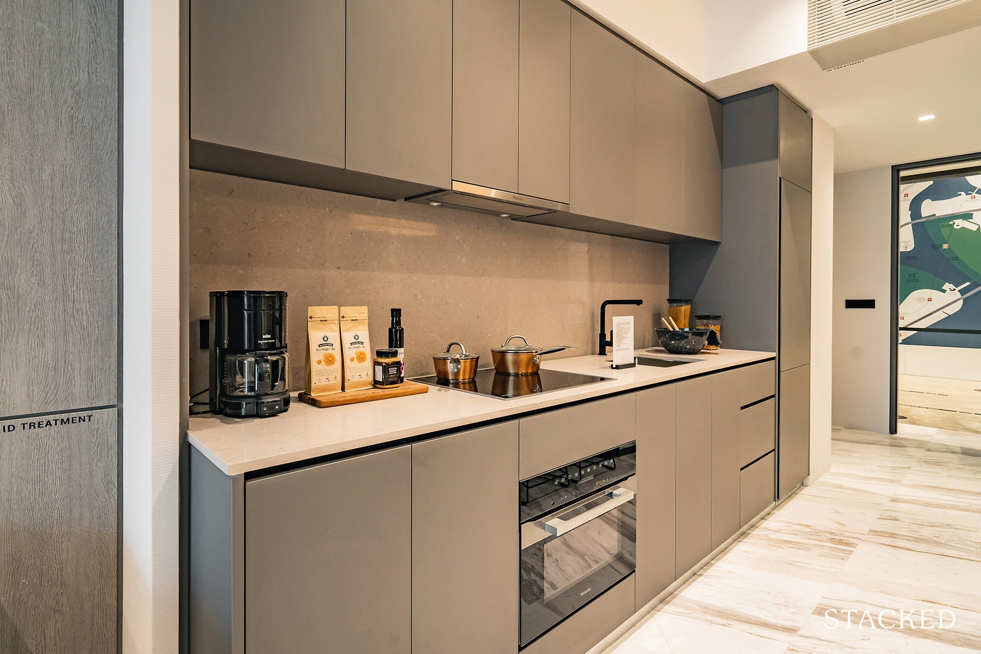
The little nook for the kitchen in the 1 Bedroom show unit is absent here, so the unit does look slightly narrower from the entrance but you do get more useable space as a result. It features the same open concept kitchen although it features a darker theme compared to the 1 Bedroom unit.
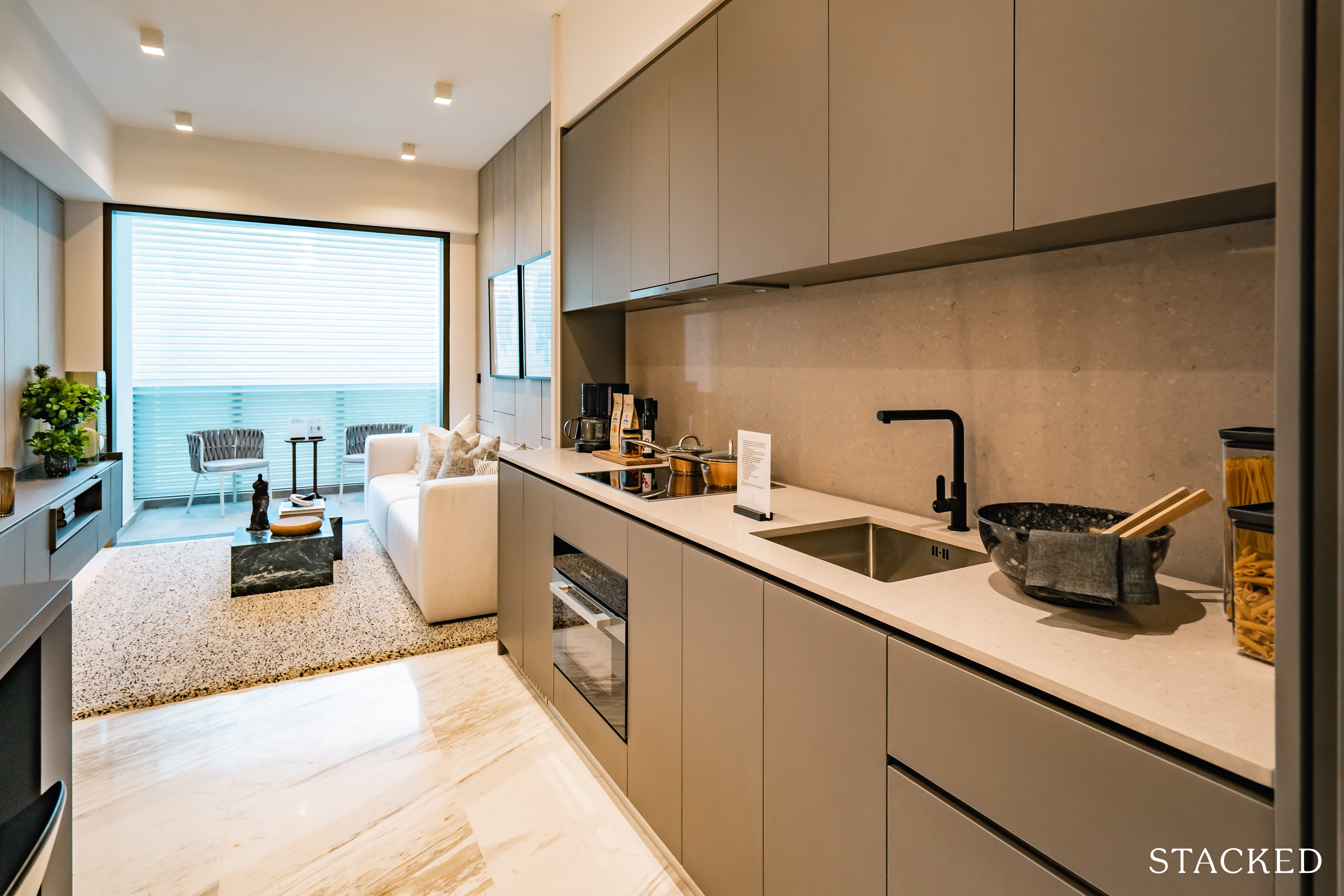
Kitchen appliances are expectedly of quality – Miele appliances, an established German brand, are used here. The cooker here will also be an induction one, although there will be 4 zones here (instead of 2 for the 1 Bedroom unit).
The countertop itself is actually quite long, so you do have decent storage options and space.
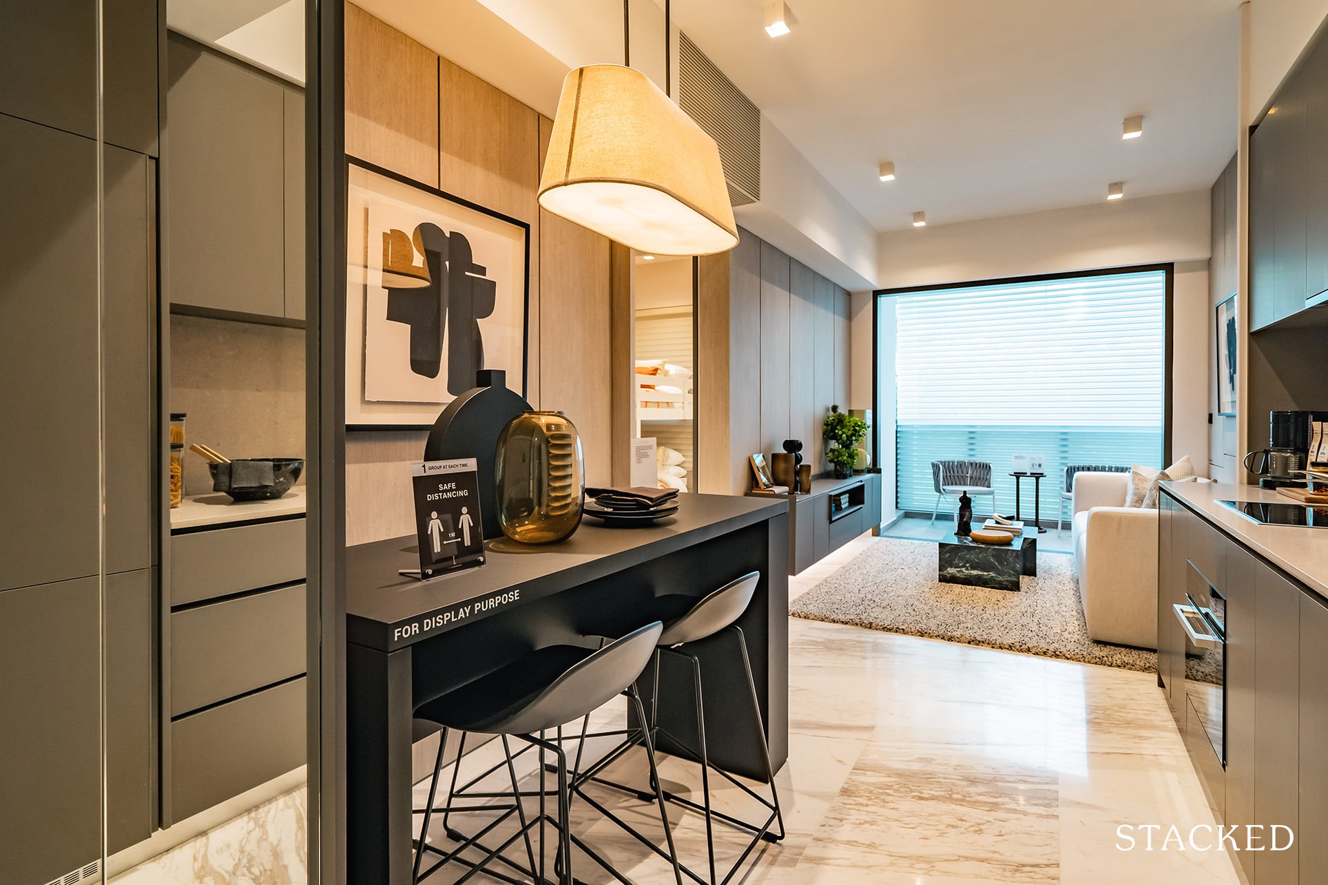
The dining area is unsurprisingly, tight. They have gone with a 4 seater on display here although you will realise that there’s barely enough room for anyone to enter the side flushed against the wall. It’s clearly to avoid any infringement into the walkway space but its not great from a practical standpoint.
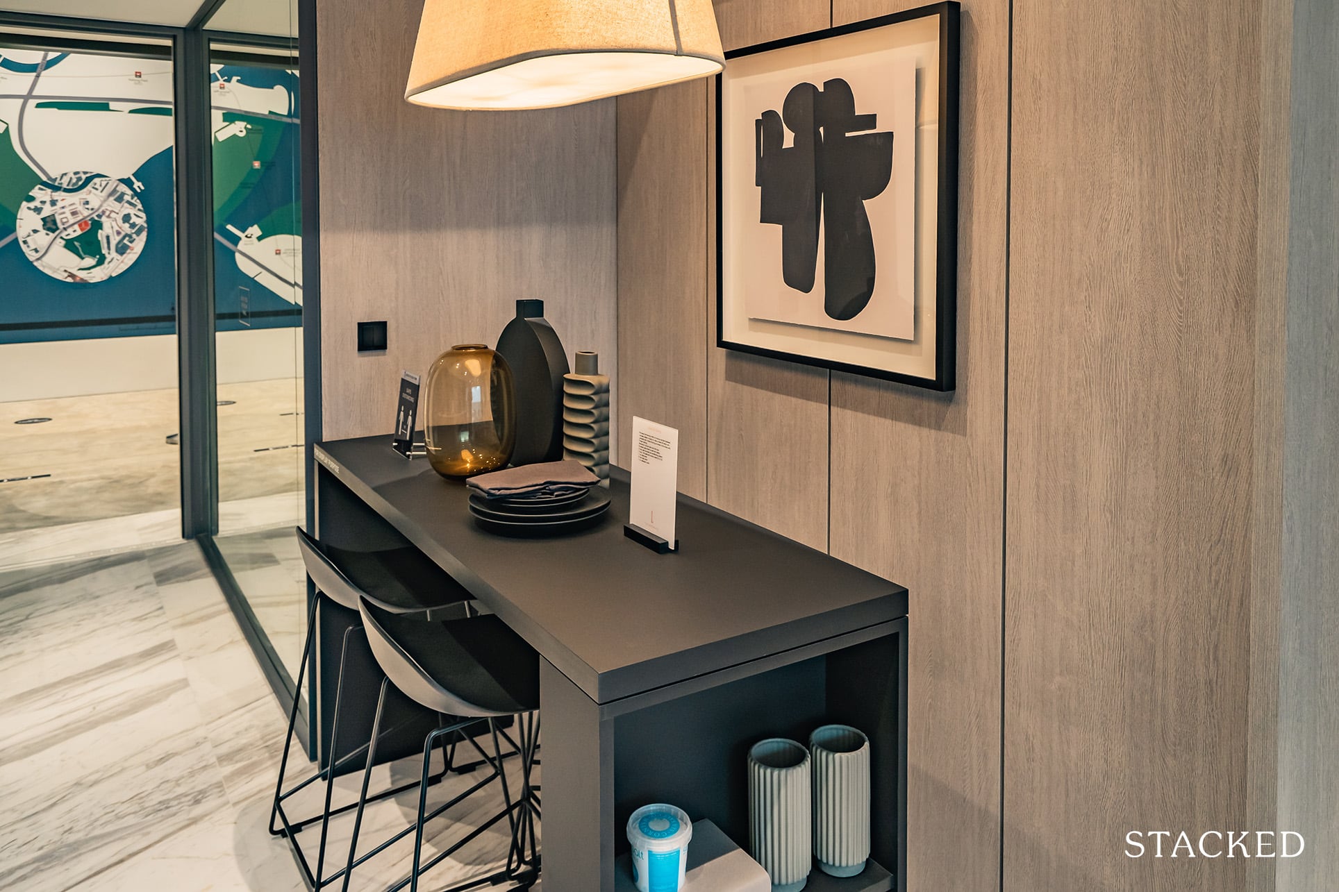
Of course, while a dining area like this is not ideal for hosting, one must acknowledge that space comes at a premium these days, especially for prime properties such as the Landmark. It’s also why more effort has been made for the common facilities, such as the Level 34 dining areas. With a much better view from the top, it just makes more sense to host guests there.
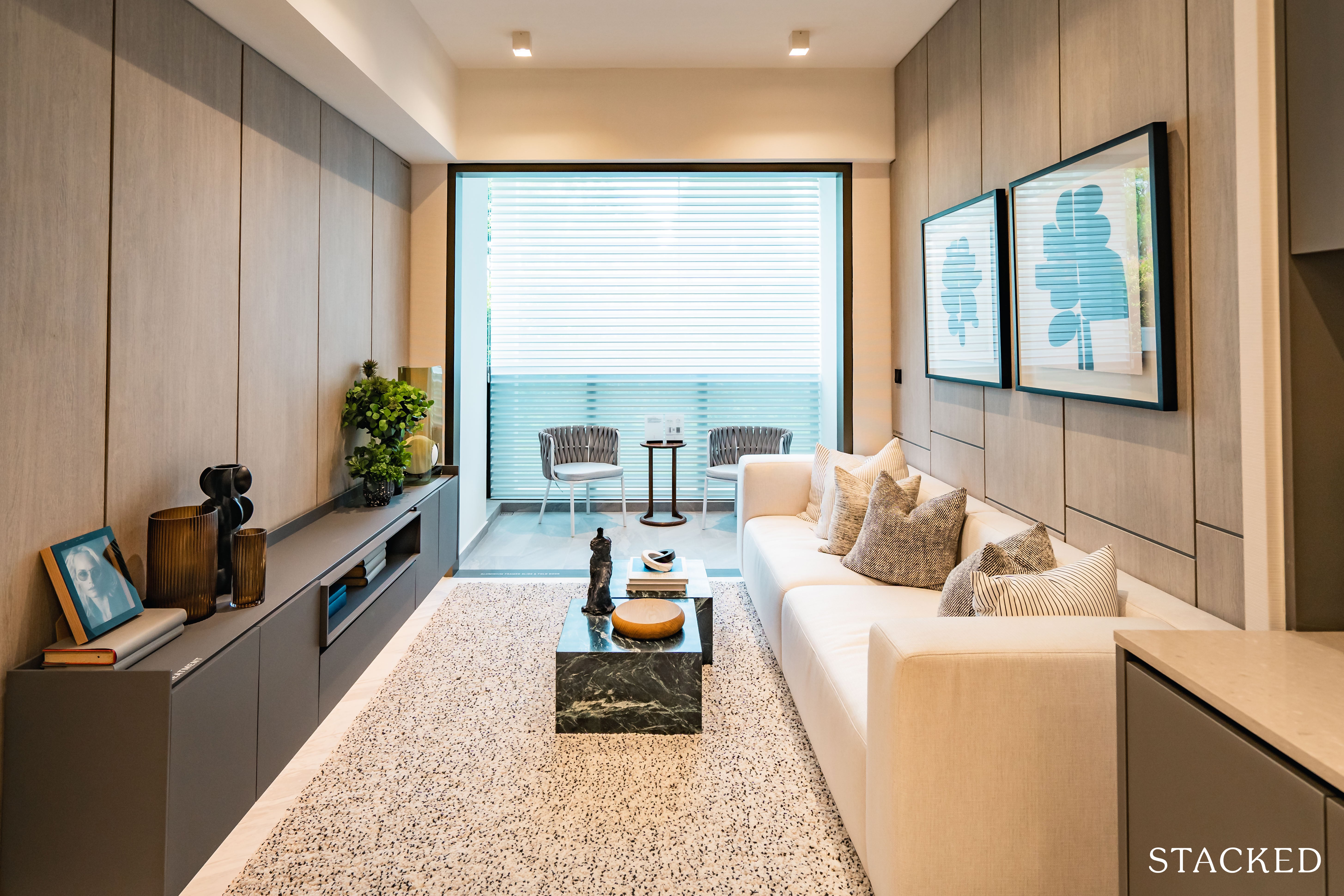
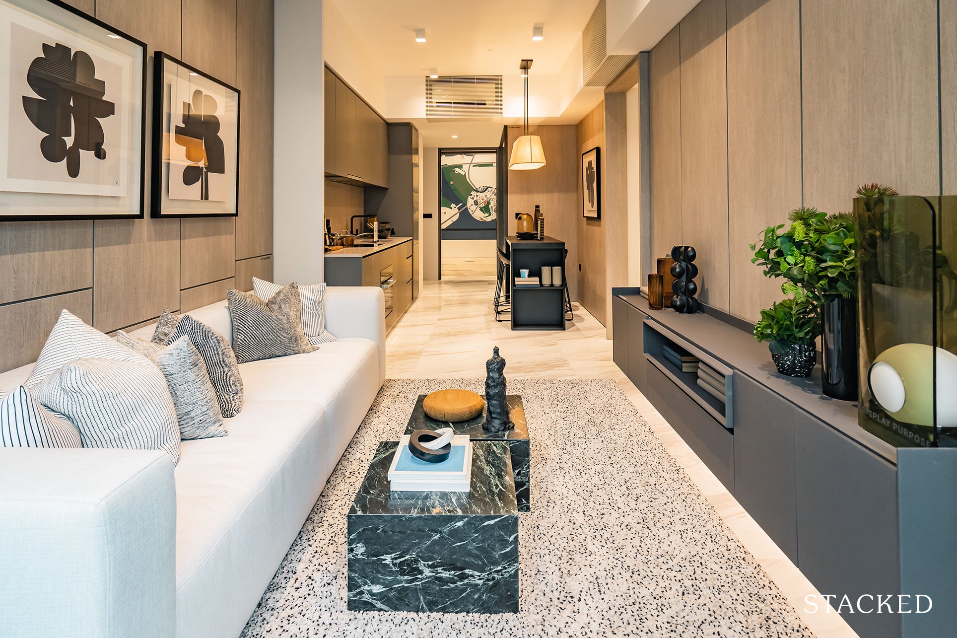
The living room actually feels decently spacious for its 678 sq ft size. Perhaps it’s because of the lighter palate used in the interior design of it but it fits a 4-seater sofa quite easily with acceptable room for the walkway despite the TV console installed.
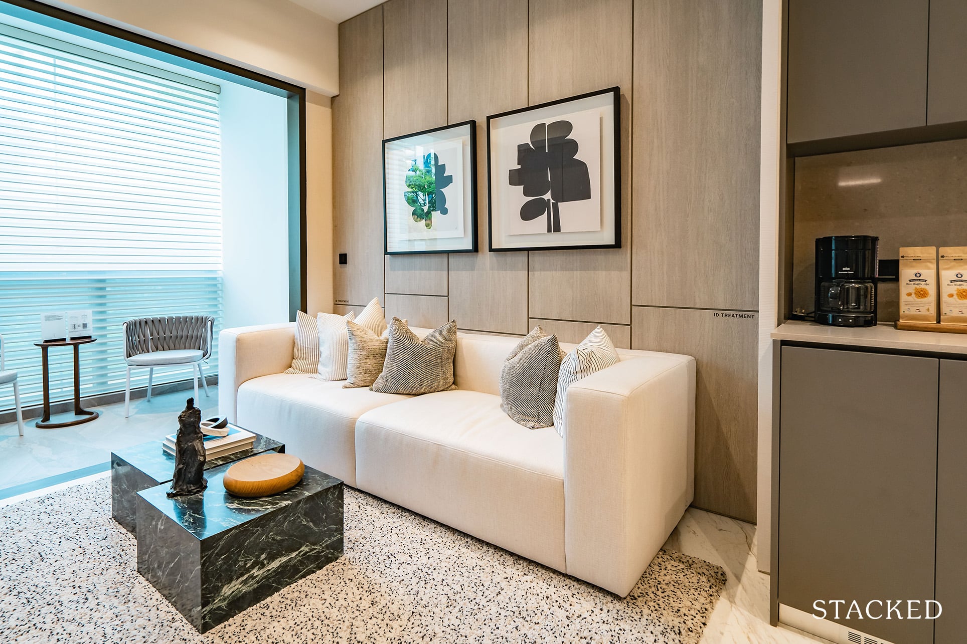
As always, there are limits to the size of furniture you can fit in here. You don’t want something overly big as well as it would make the space look a lot smaller.
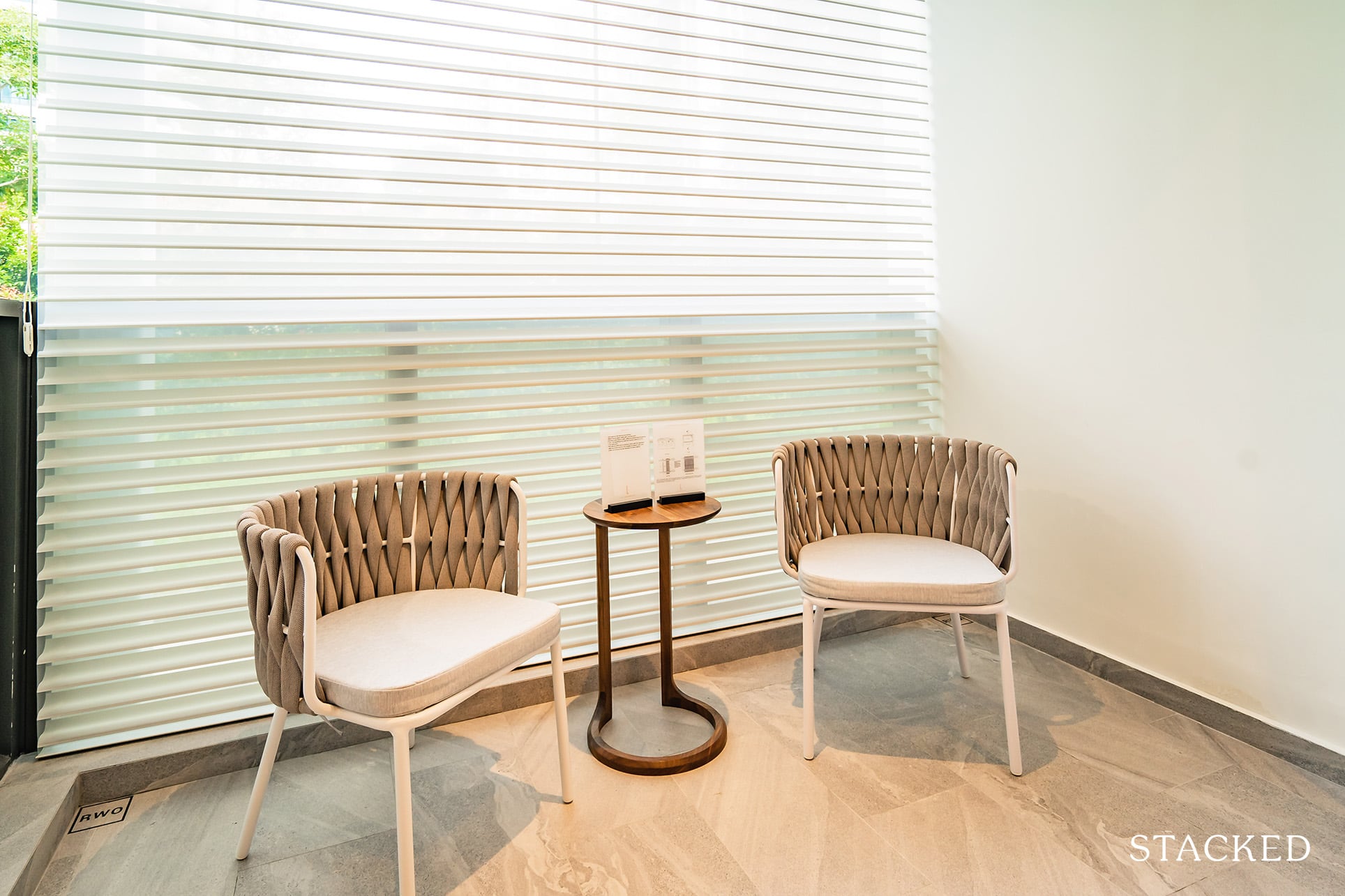
I also like the size of the balcony. I enjoy the al-fresco concept but I don’t see it as being viable all the time so a good sized balcony to me means just enough space to place a coffee table and some chairs.
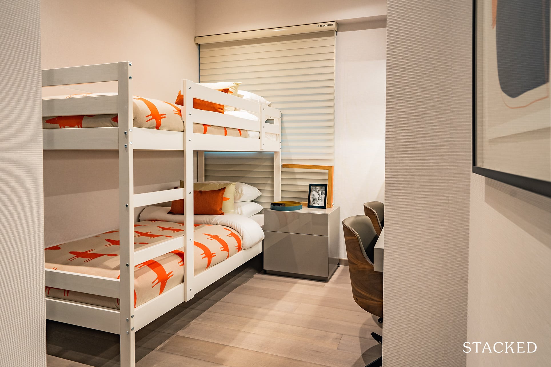
The common bedroom measures 8 sqm, which is the same as those found in the 1 and 3 Bedroom show units as well. This size is just about standard in the new launch market and it will just about fit a Queen bed, a built-in wardrobe with little room for anything else.
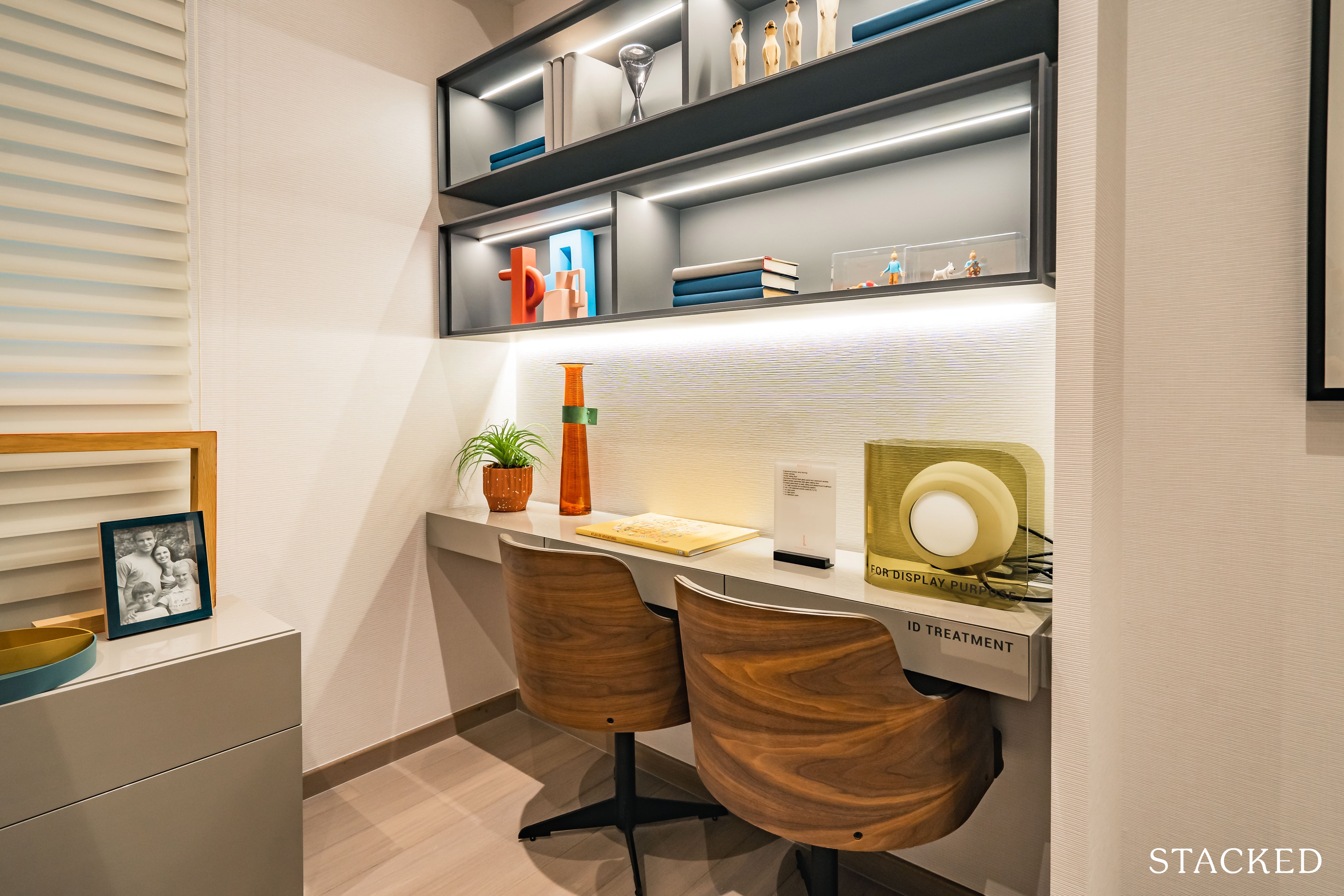
The developers have gone with a kids bunk bed instead so you will have sufficient space for a study with some shelving as well. Definitely a good option to go for if you have kids!
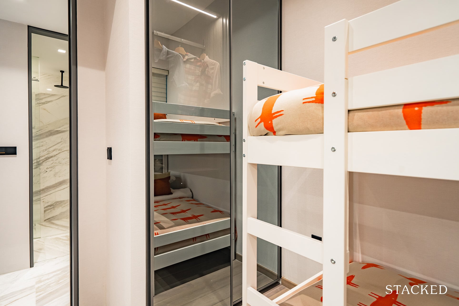
You will notice that while other developments typically go with a laminate or wood finish for the surface of the built-in wardrobes, the built-in wardrobe here has 2 full panels of glass / mirror finish instead. The mirror finish makes the room feel bigger and is quite practical too although being translucent means you should be more motivated to keep the contents neat.

An unavoidable part of smaller units involves the aircon ledge being located just outside the room, although The Landmark is pretty unique in this aspect. Instead of having half-height window panels, 1 section of it actually has floor-to-ceiling windows while the other (presumably where the aircon is placed) is just a plain white wall.
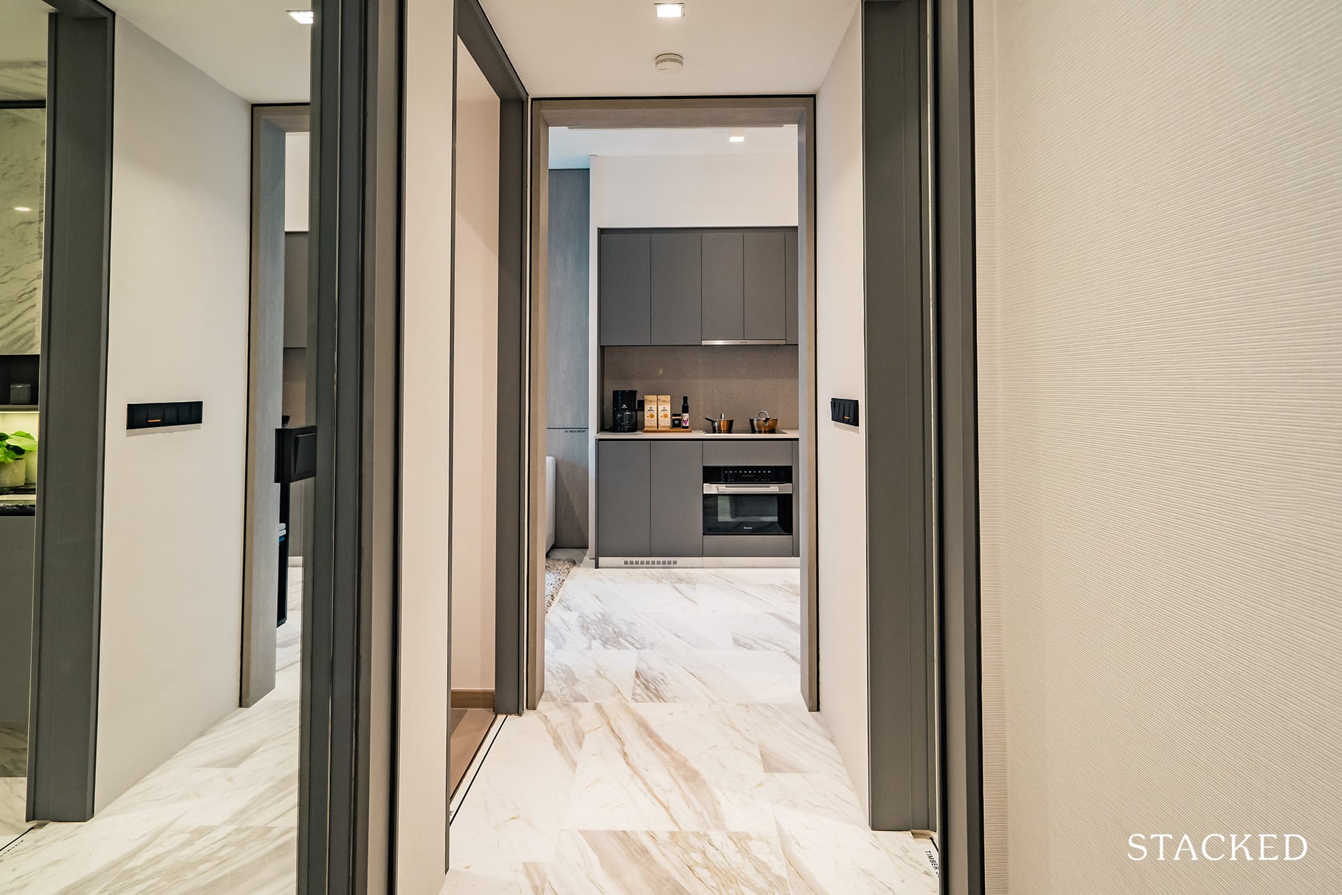
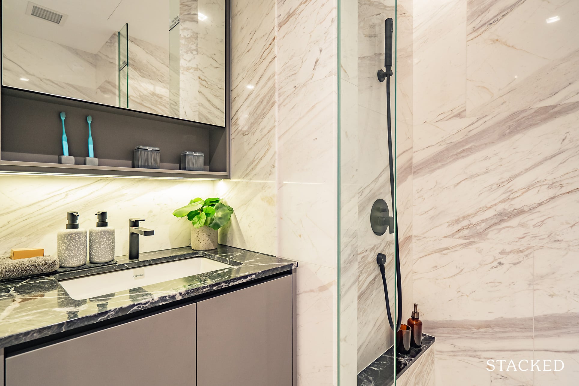
As a result of the smaller overall unit size, the common bathroom does feel a little small but it remains sufficient for your needs. Amazingly, there is a rain shower by Gessi provided by the developers here, which is frankly almost unheard of.
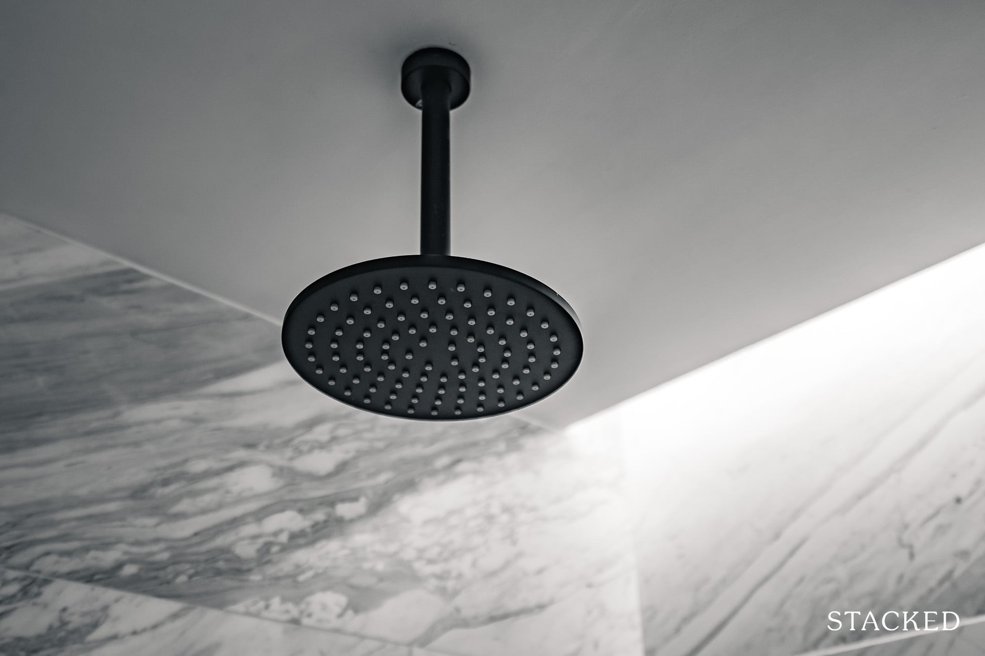
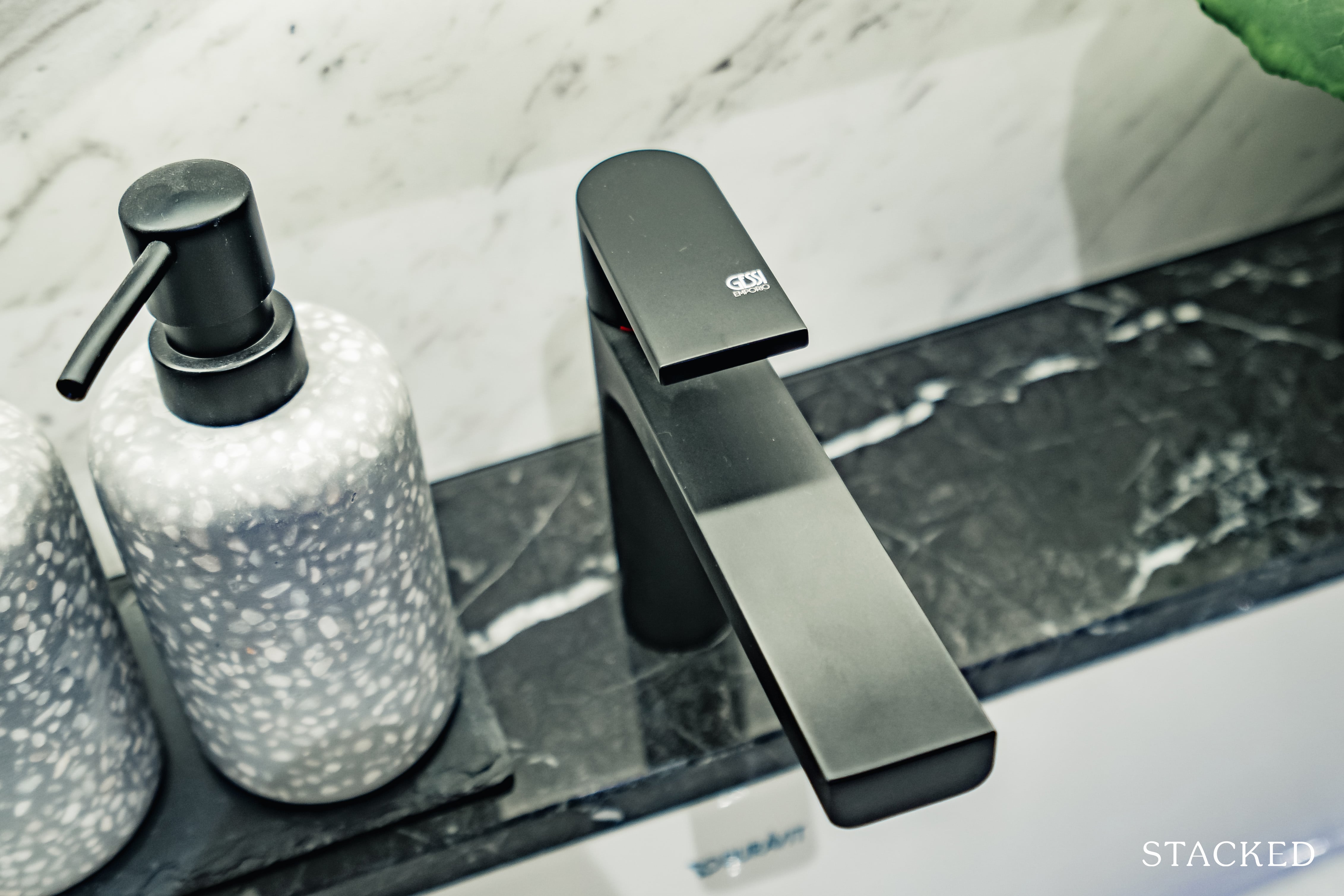
As with the other units, you will get well made fittings such as a wall-hung water closet and wash basin from established brands such as Gessi and Duravit. You will also find some additional storage behind the mirrors and below your basin, which is always helpful.
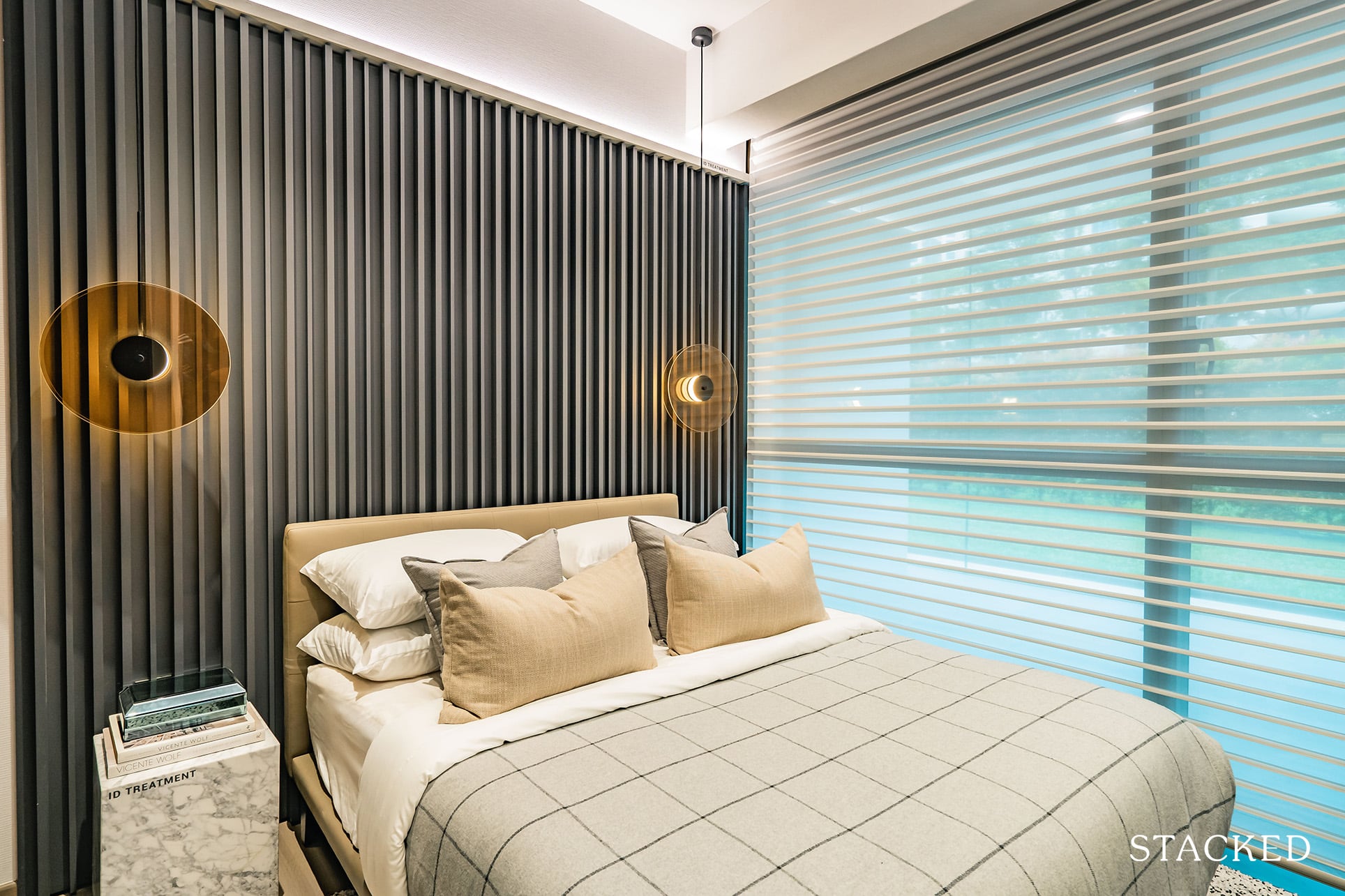
In the Master Bedroom, its 11 sqm size is still pretty average. It comes with the standard 2-panel built-in wardrobe and fits a Queen sized bed comfortably.
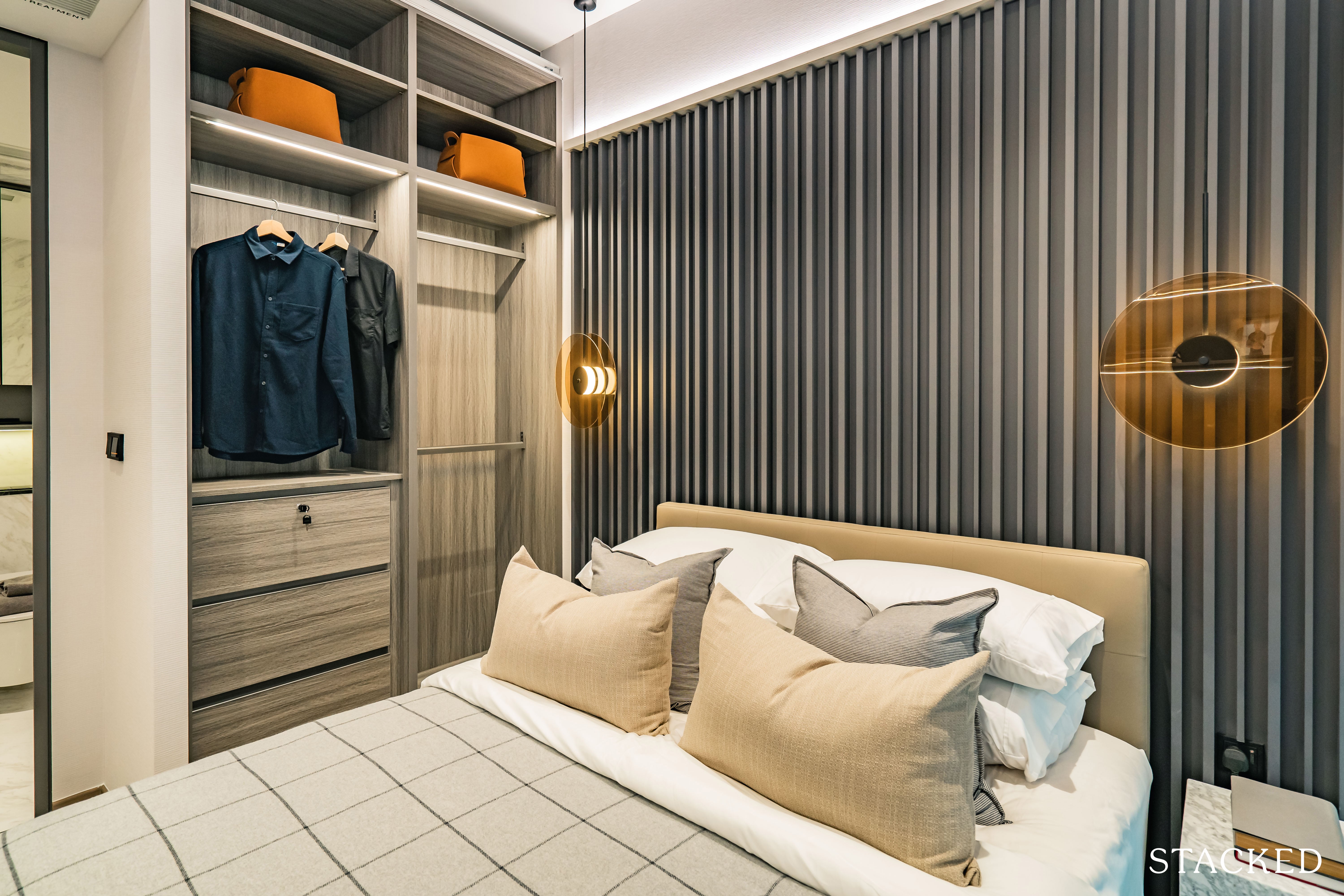
Just like every other unit in this development, I really like the design of the built-in wardrobe. It has a glass / mirror finish, which makes the room look more spacious and is useful when getting ready for work or a night out. Compared to the common bedroom, it can better fit a side table although you will still have to pick one of a suitable size.
(Funny story regarding the lack of a wardrobe panel here, but don’t worry it does come with one).
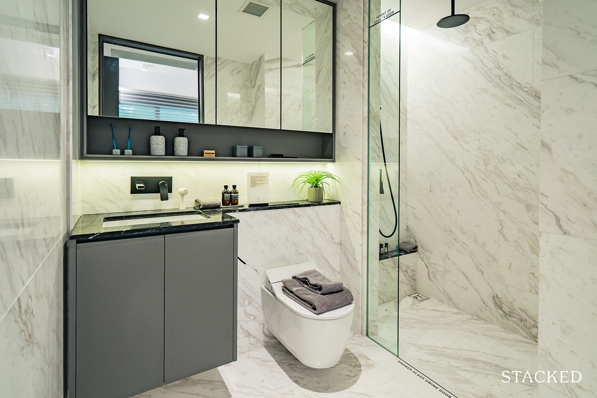
The master bathroom is larger than the common bathroom but is otherwise pretty similar features wise. The rain shower, tap and the rain shower are similarly provided by Gessi, with the rest by Duravit.
The Landmark 3 Bedroom Review
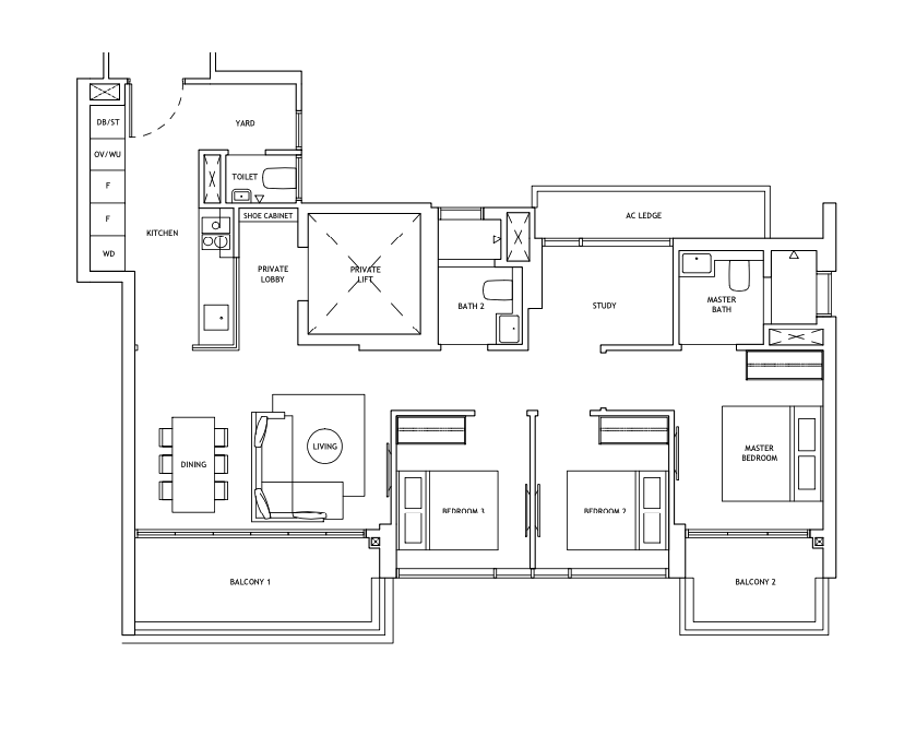
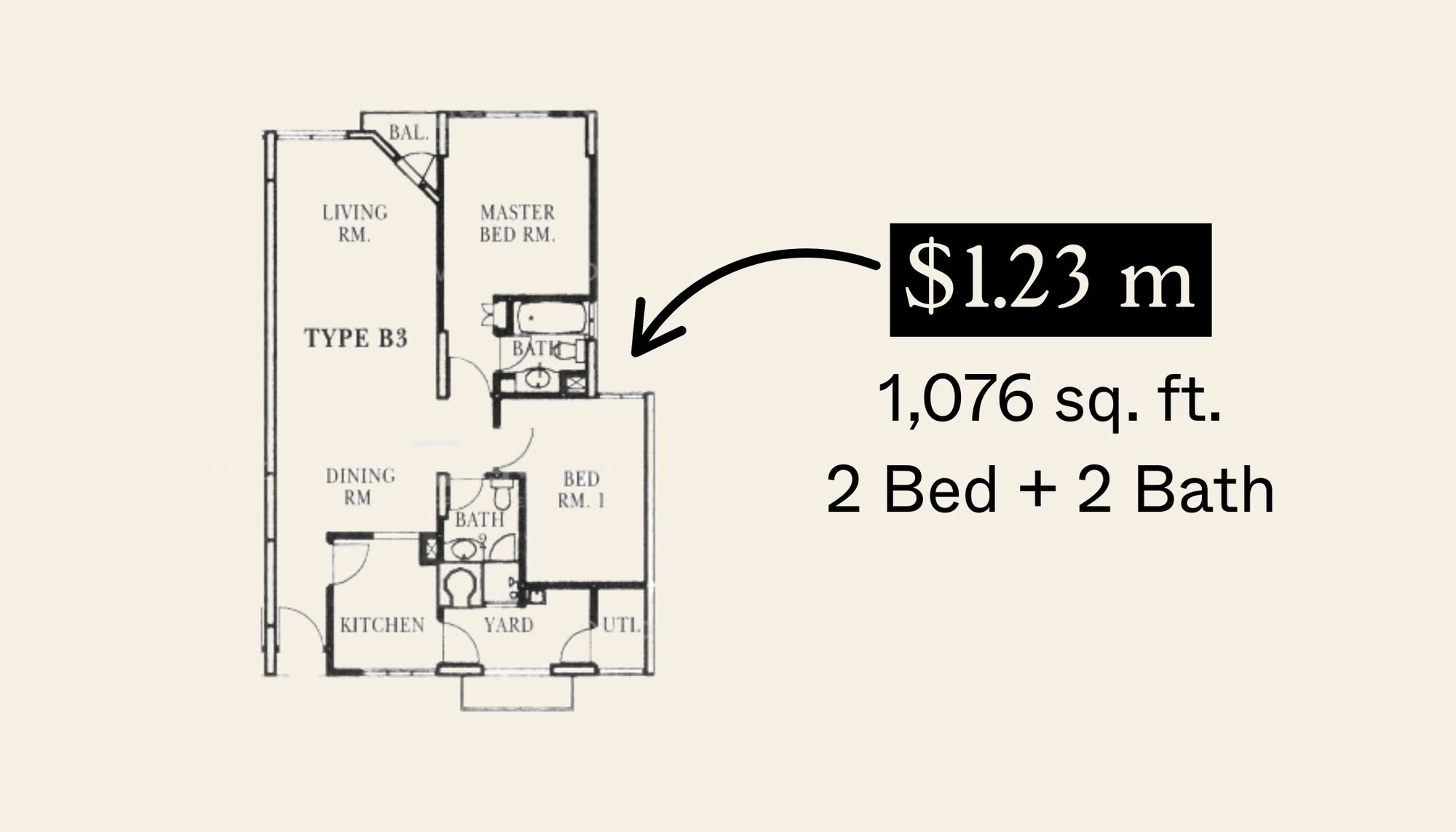
This 3 Bedroom unit I am reviewing here is the largest unit type here at The Landmark. With just 2 out of 11 stacks dedicated to 3 Bedroom units (the other stack being 1,076 sqft), it is fair to say that the 3 Bedroom units are slightly larger than average – but nothing mind boggling as far as the size is concerned.
All 3 Bedroom will be decked out in marble floors in the common areas and engineered timber in the bedrooms. The toilets will be covered in marble as well to further emphasise on that luxe aspect of the unit.
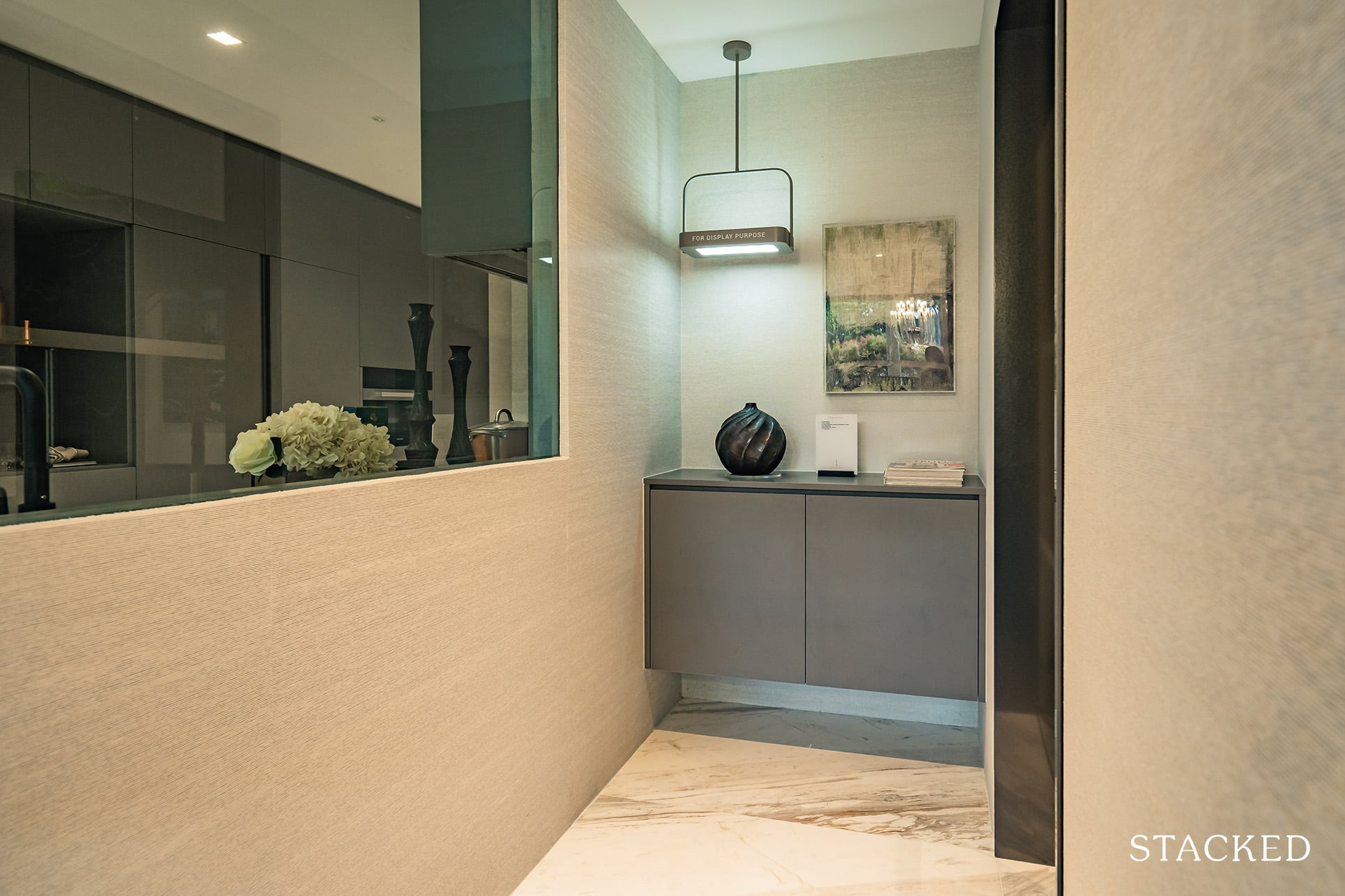
All 3 Bedroom units get private lift access, which is always a nice touch. Additionally, you also get your own private lobby area of 3 sqm once you step out of the lift.
That being said, the lift actually opens up to the glass finish looking into the kitchen. So unfortunately, this view may not be for everyone, unless you intend to board it up and place a nice art piece there instead.
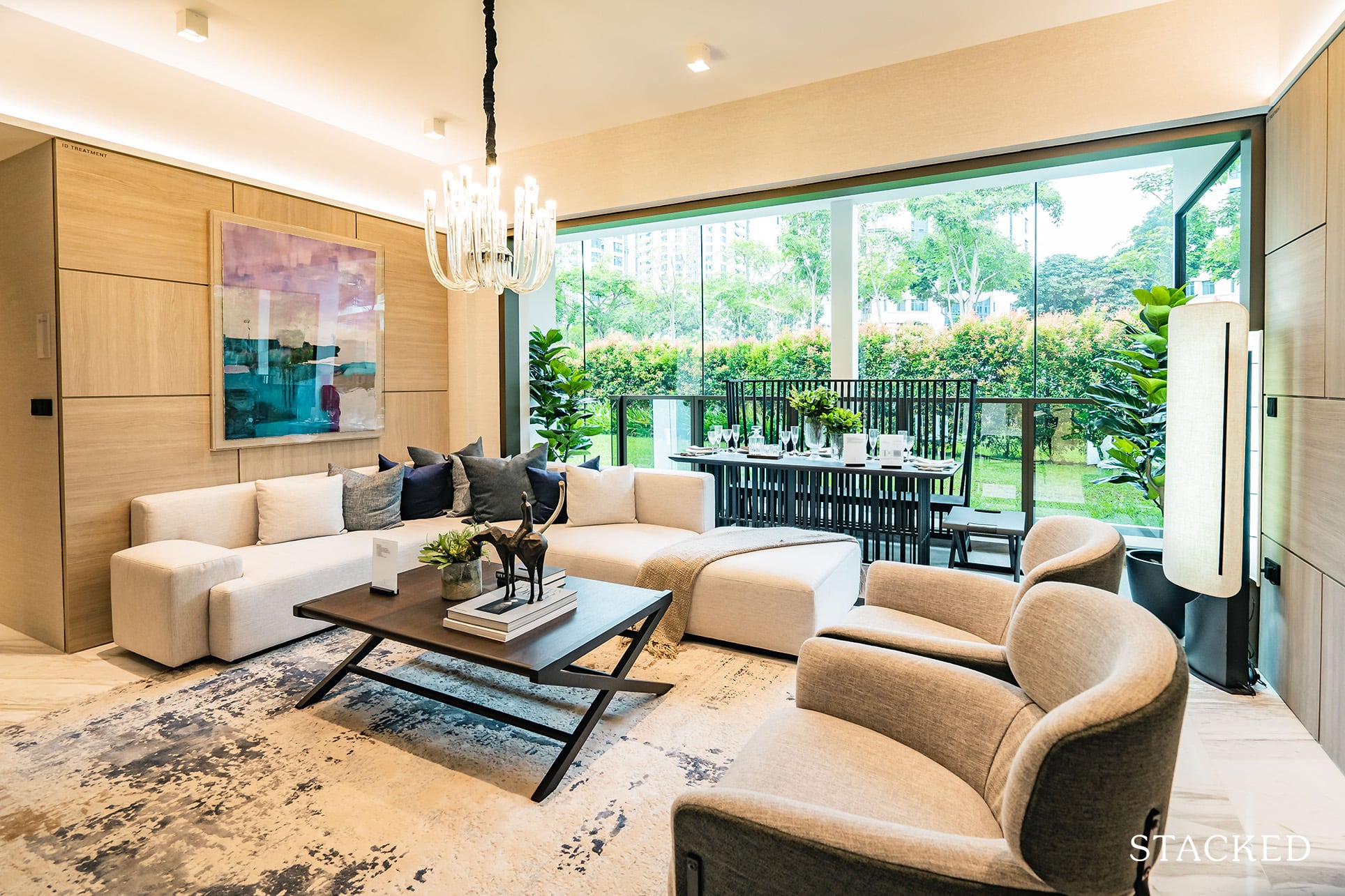
Stepping into the unit, you will find that the living and dining areas are laid out in parallel fashion, with the balcony stretching the entire width as well.
If you’ve been following my reviews, you’d know that I’m a fan of such a layout, especially when there are views to look out to from the balcony. Even if there are no views to speak of, having a wider balcony length allows more light and ventilation into the unit as well.
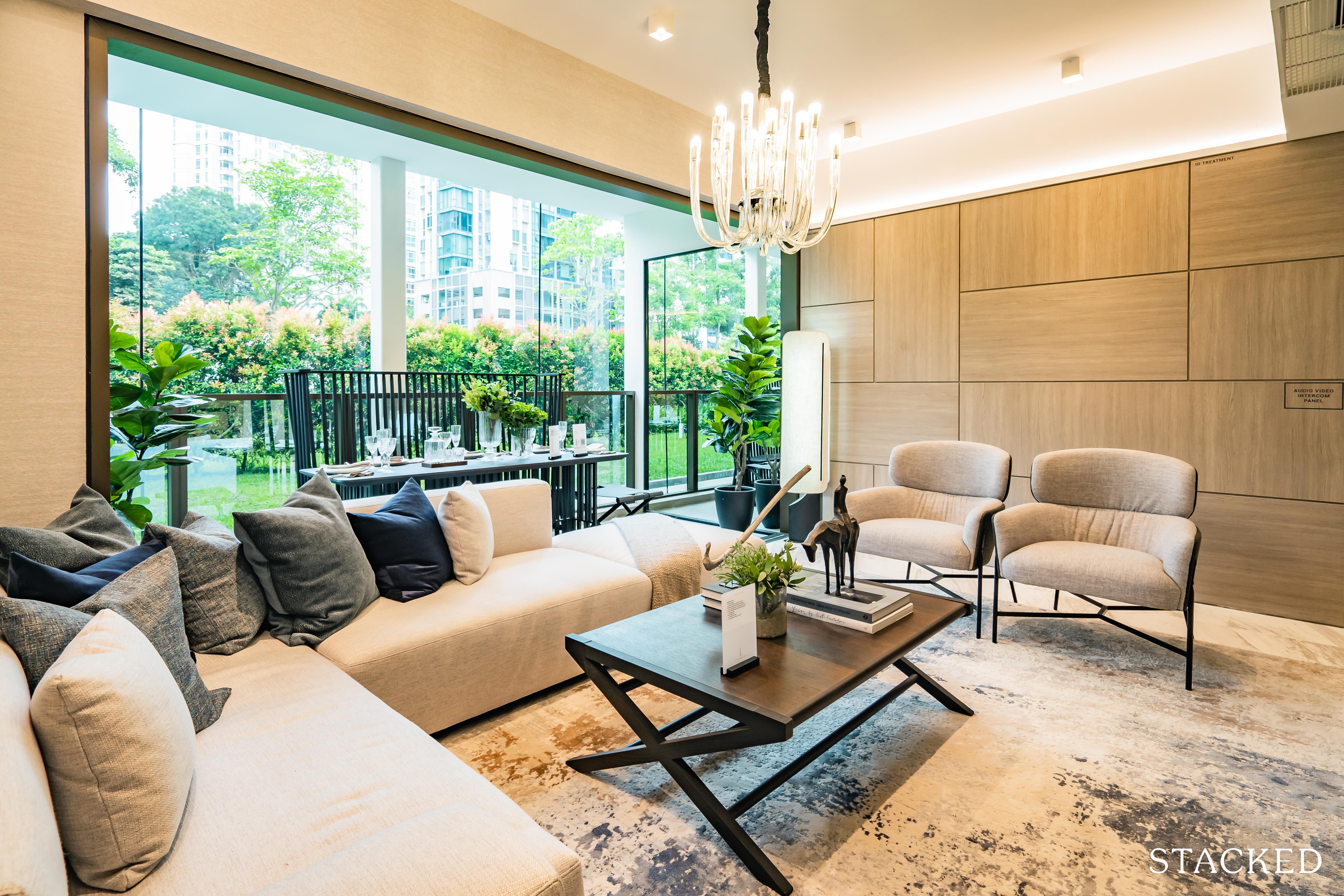
Unfortunately, where the question of space is concerned, the living and dining room appeared to be quite squeezy.
It could be the furniture used as the sofa was frankly quite big. If you do remove the ottoman and the two armchairs there’s definitely room for a dining table – just not a very big one.
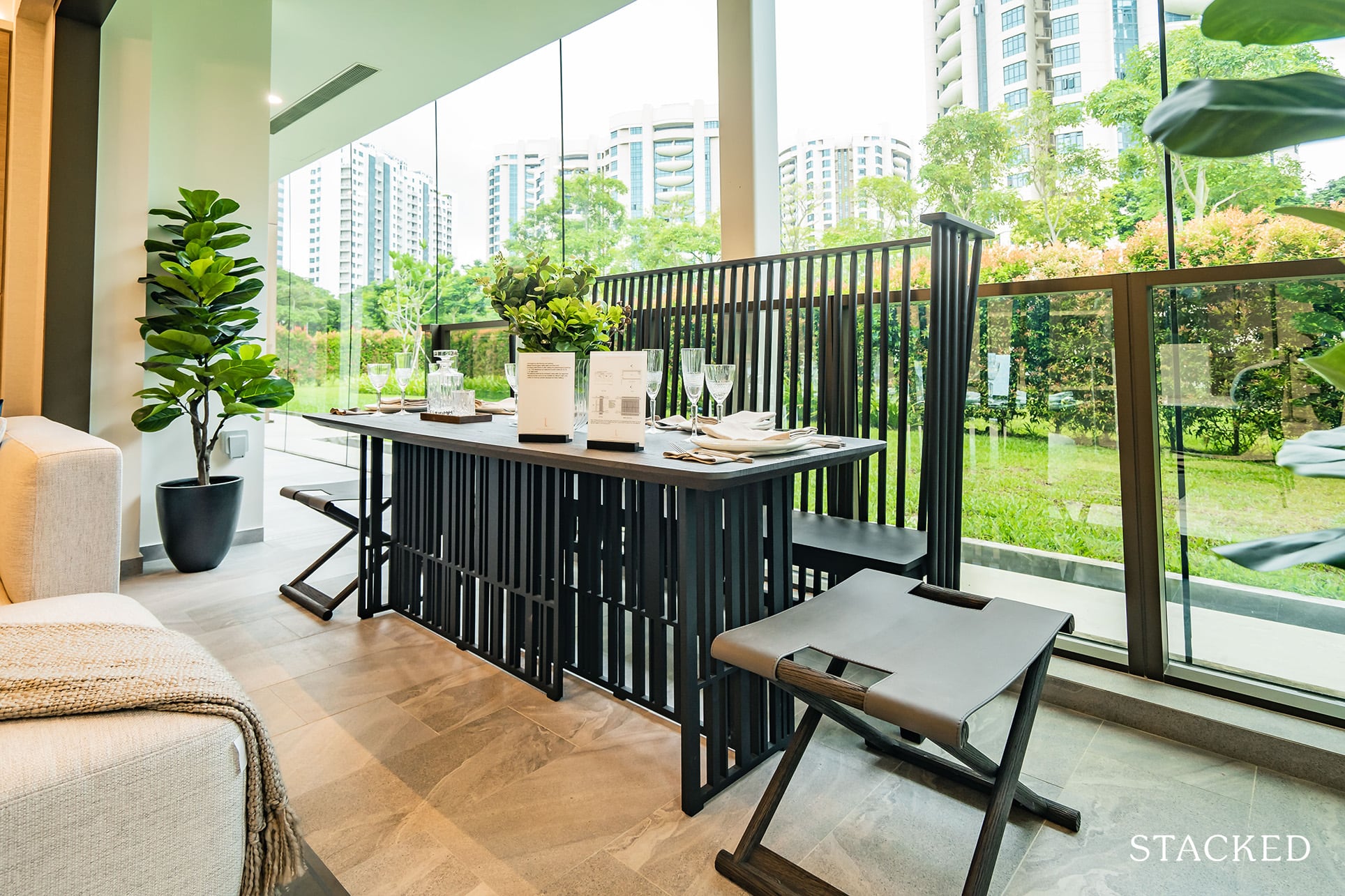
Which is why this layout with the dining table placed in the balcony certainly seems like a better fit.
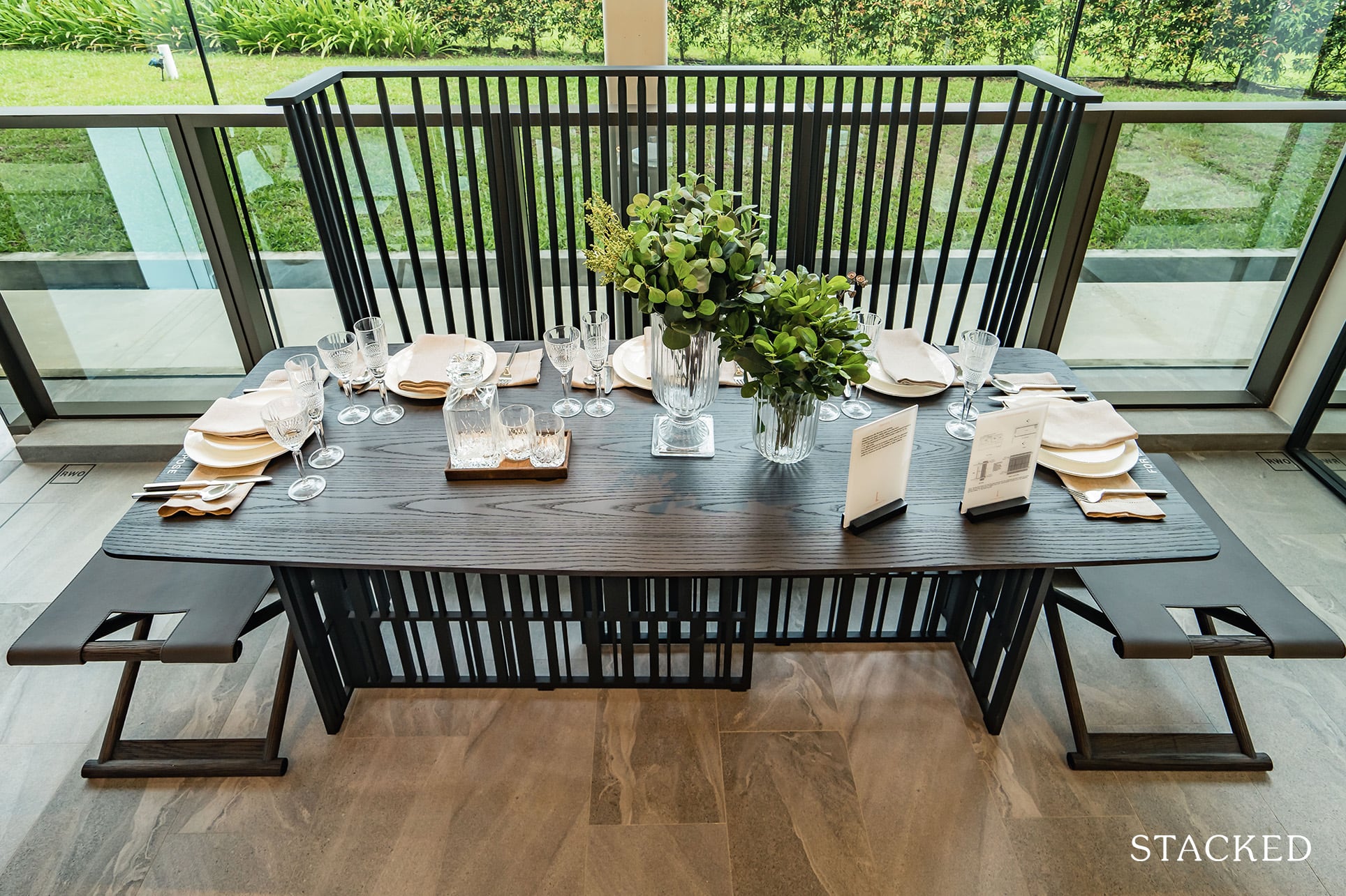
Width wise I would say that it isn’t fantastic, but if you do want to take advantage of the views (from a high enough floor), this is your best bet.
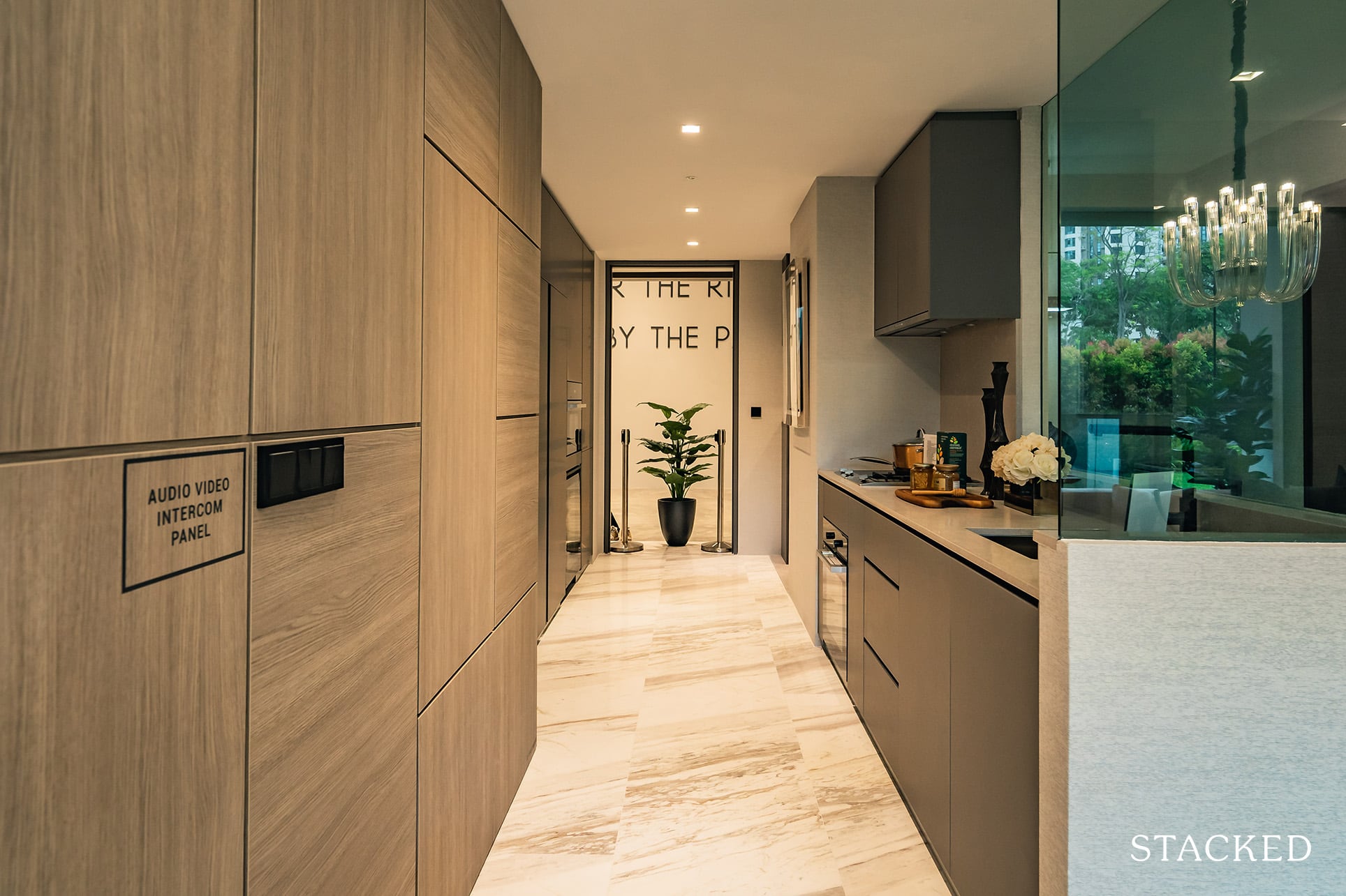
Heading into the kitchen, you will find that this was probably where all the extra living room space went. It is really spacious, length and width wise.
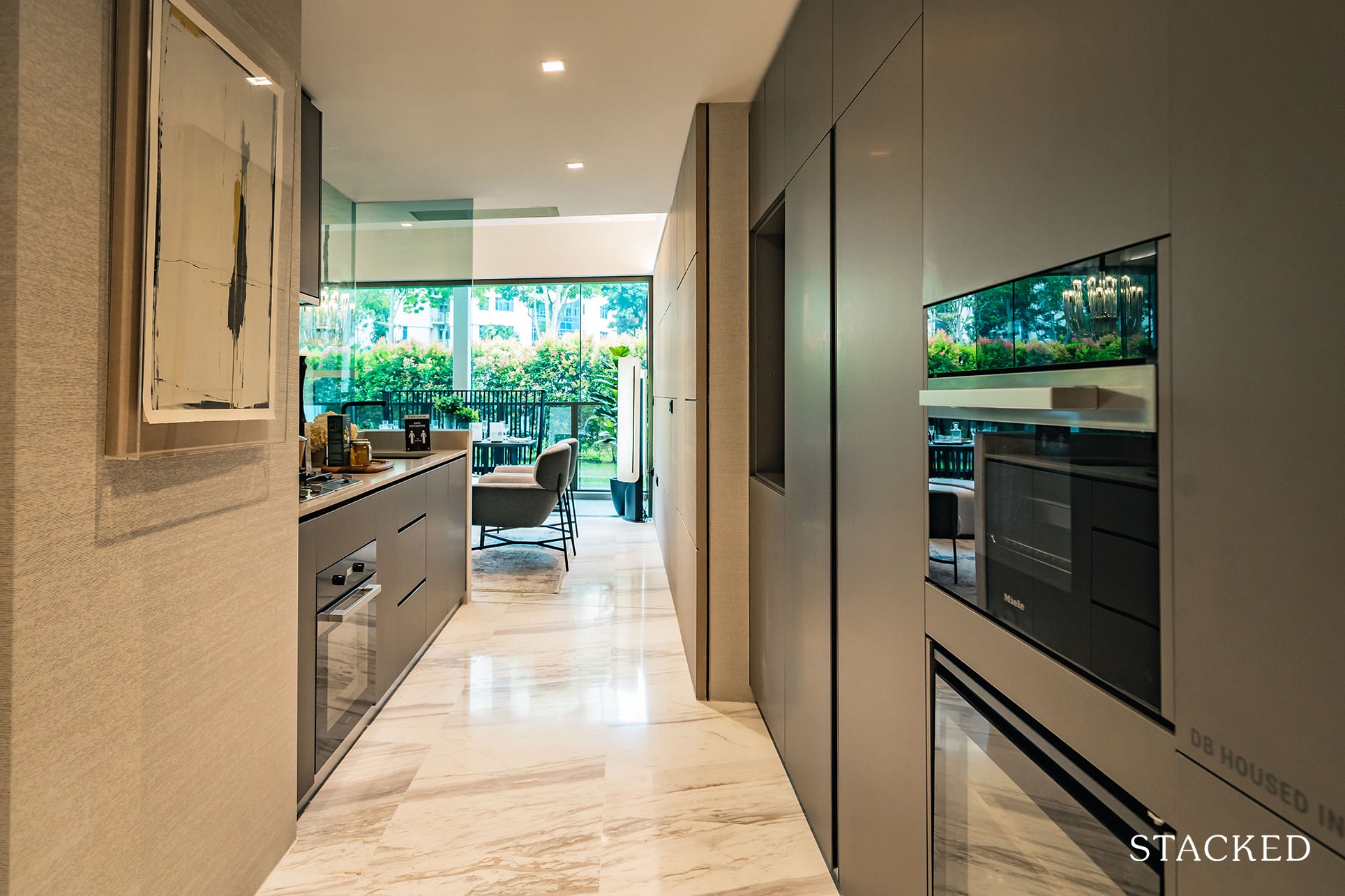
For those who love to cook, this is definitely a good place to be, especially since it comes with more appliances than the other unit types. For 3 Bedroom units only, a gas stove, an induction hob, steam oven and wine chiller will all be provided by Miele – you can whip up a storm while ensuring that your Romanée-Conti wines are kept at optimal temperatures.
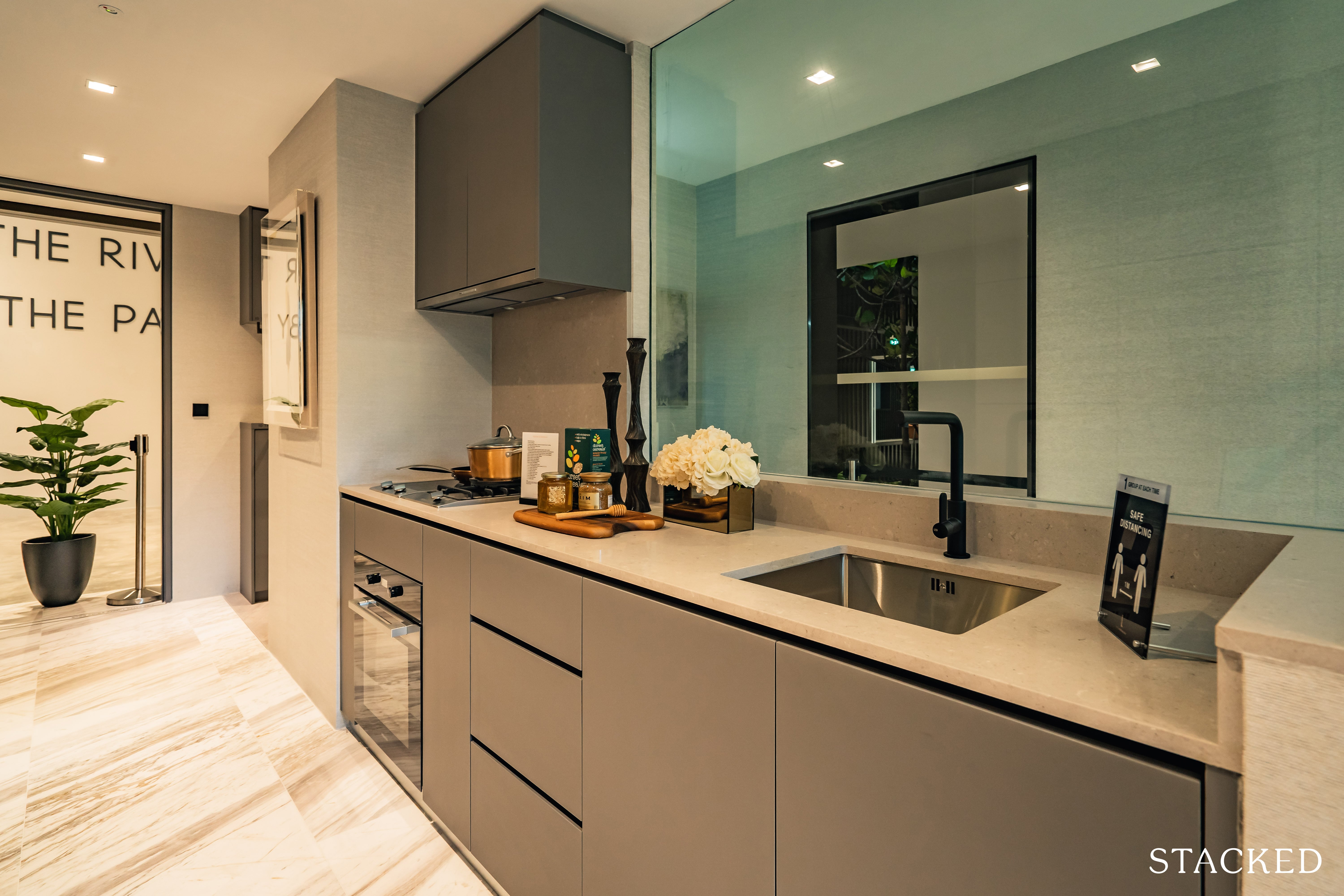
Although I must say that despite the amount of space dedicated to the kitchen, the countertop space for food preparation isn’t actually that great. It’s really the movable space that is exemplary.
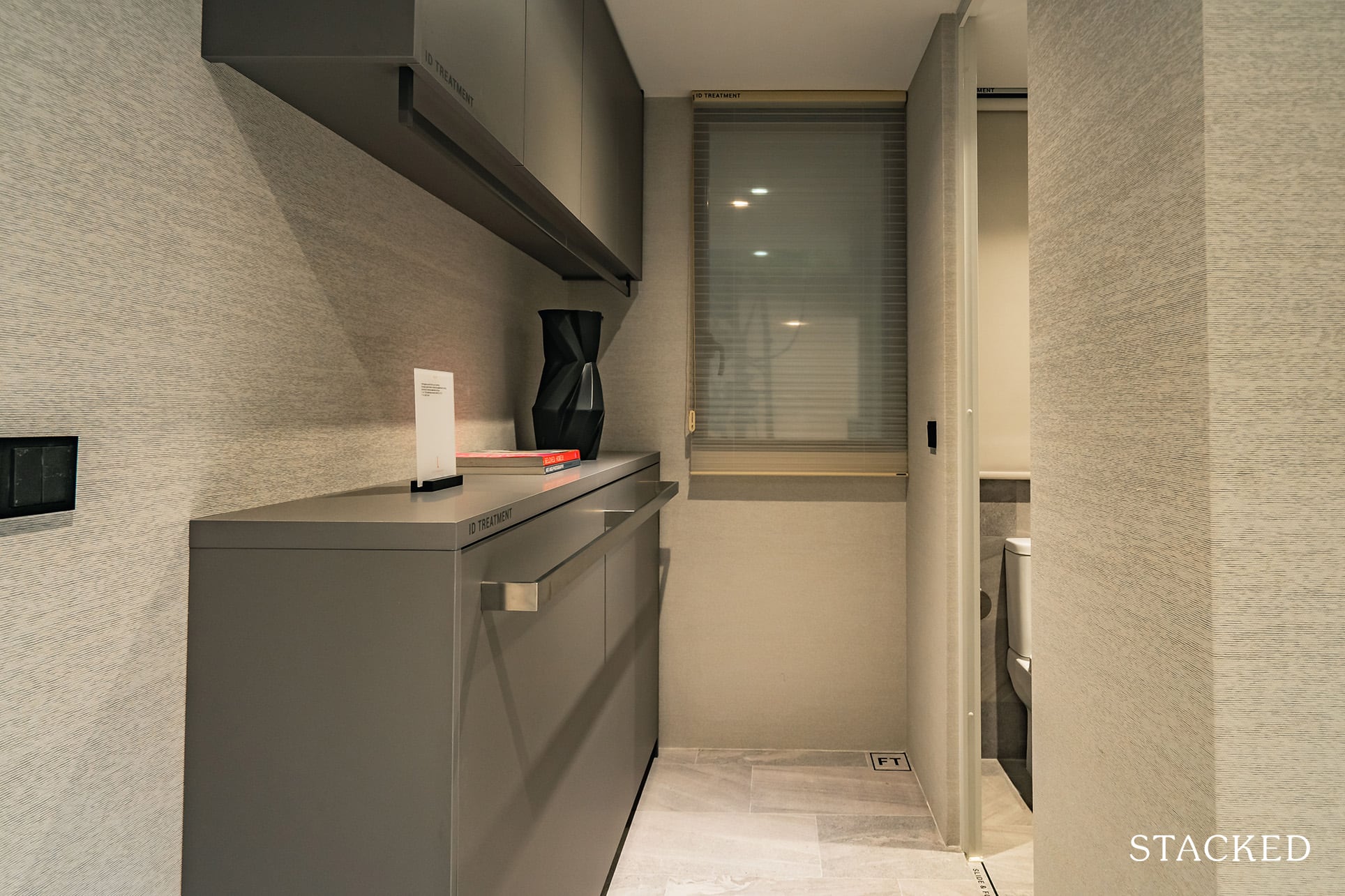
The yard area is actual right by the entrance from the common lift lobby. Alternatively, you could use this as additional storage space or a helpers room along with the W/C.
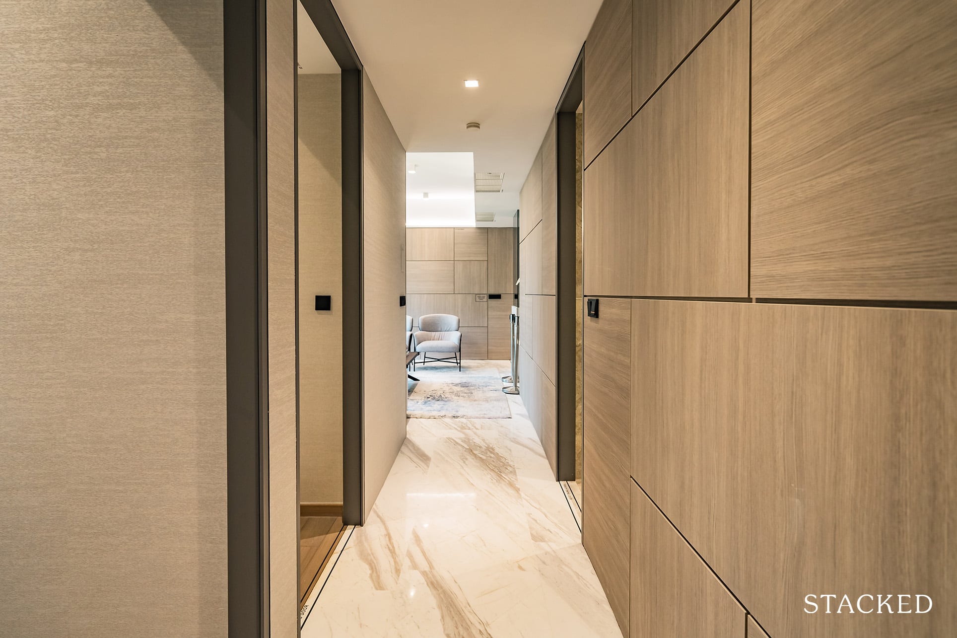
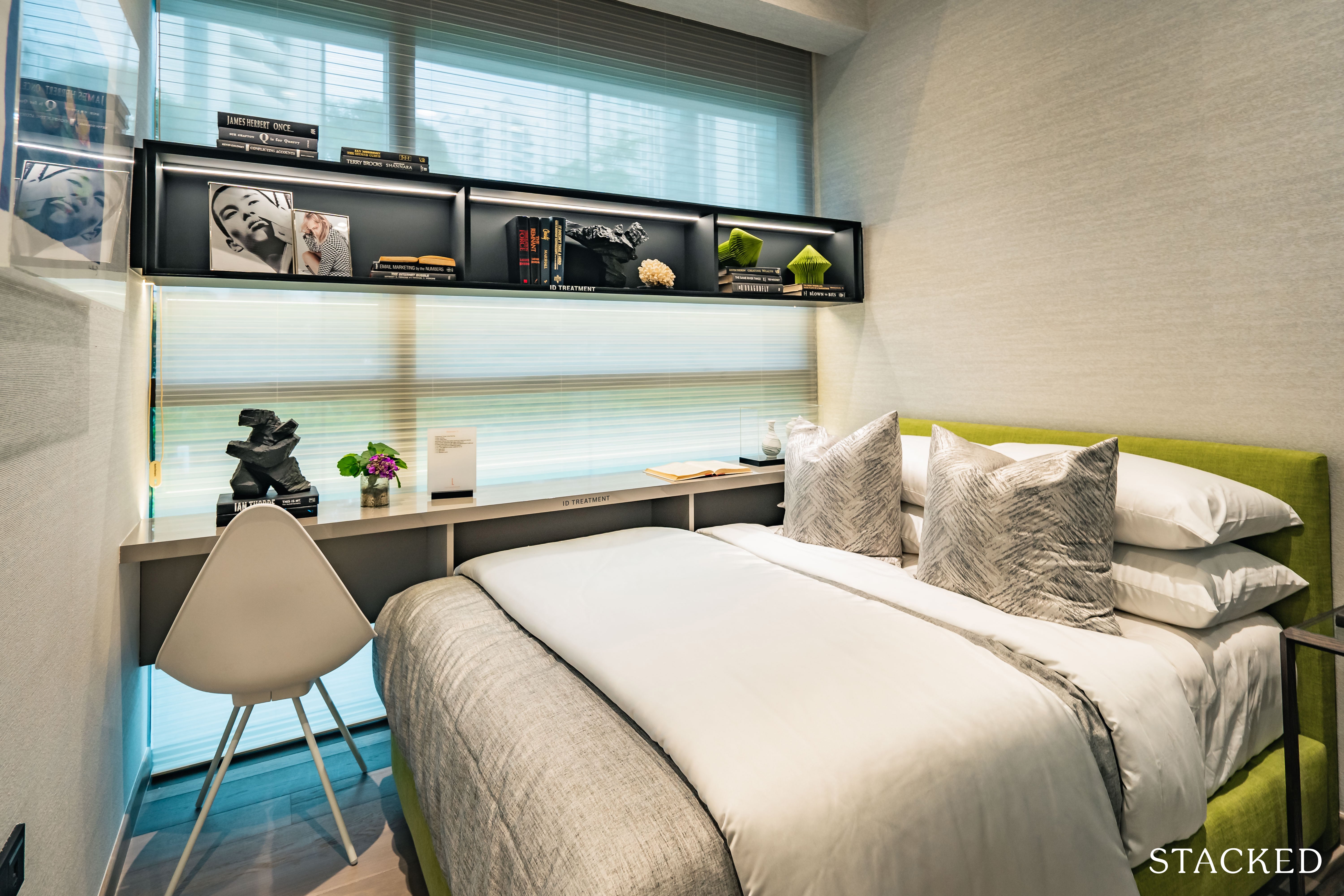
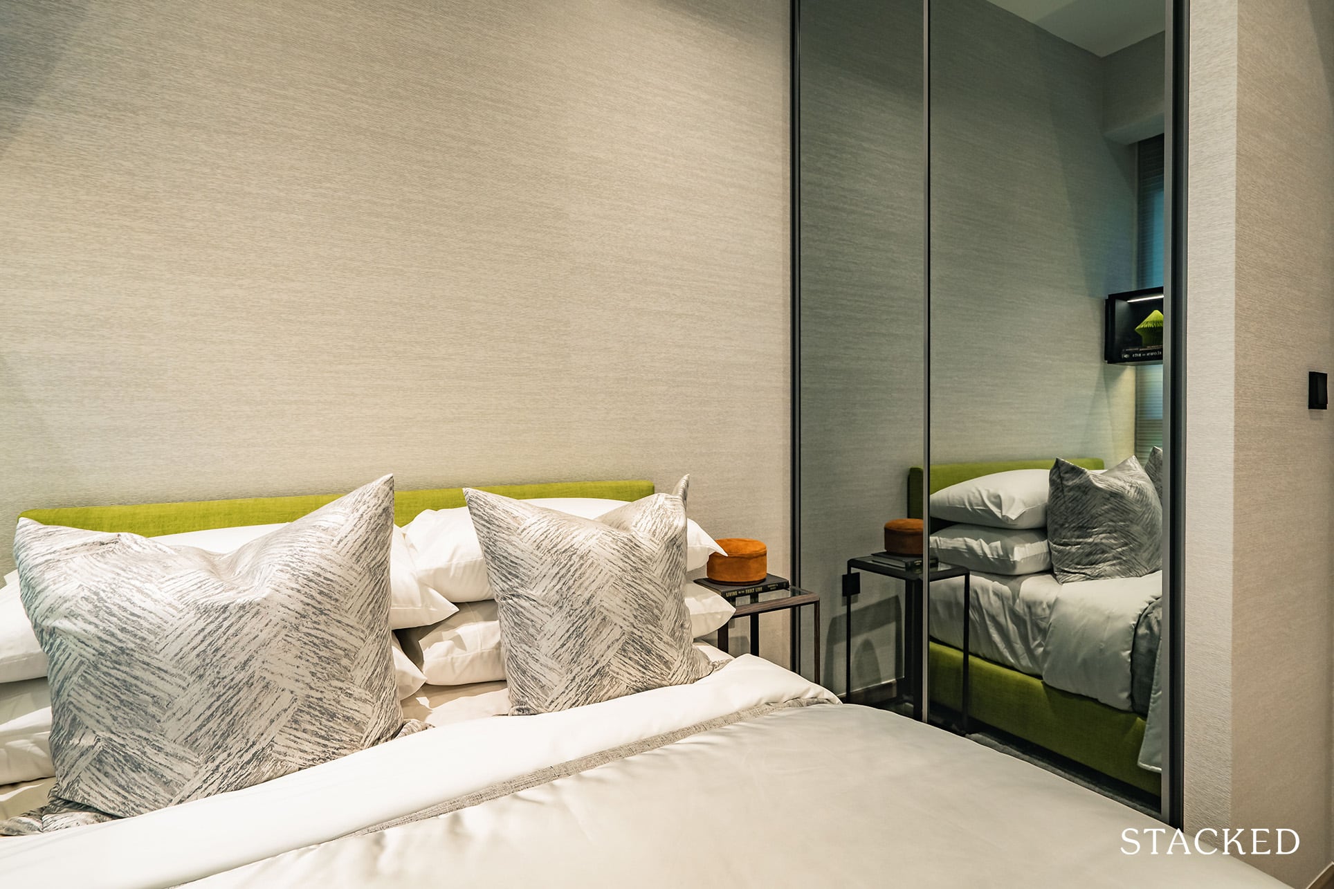
Despite the larger than average unit size compared to other 3 Bedroom units in the market, the 2 Common Bedrooms are just 8 sqm, which is pretty much very average. Similar to the 1 Bedroom unit, it will just about fit a Queen bed, a built-in wardrobe with little room for anything else.
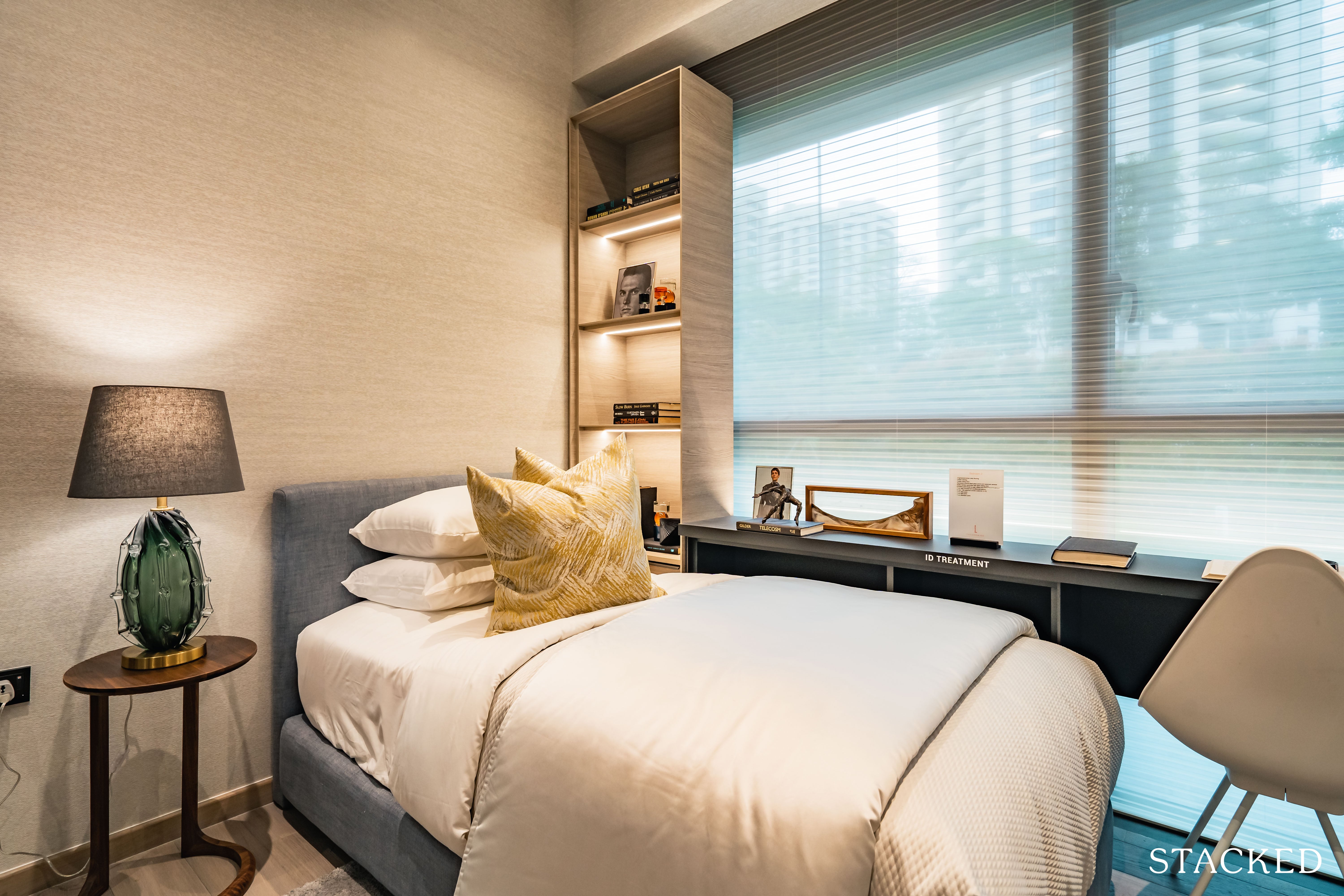
As for the other common bedroom, they have gone with a single bed instead, which will mean additional space for a study table as well. This is probably the more practical option for those with children. There will also be full height windows for both common bedrooms as the aircon ledge will be closer to the kitchen instead.
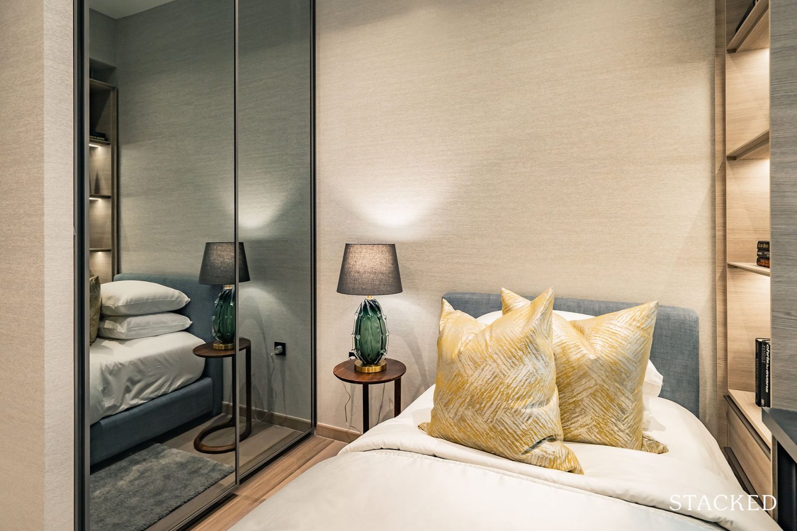
As I have mentioned before, I like the design of the built-in wardrobe. It has a glass / mirror finish, which makes the room look more spacious and is useful when getting ready for work or a night out.
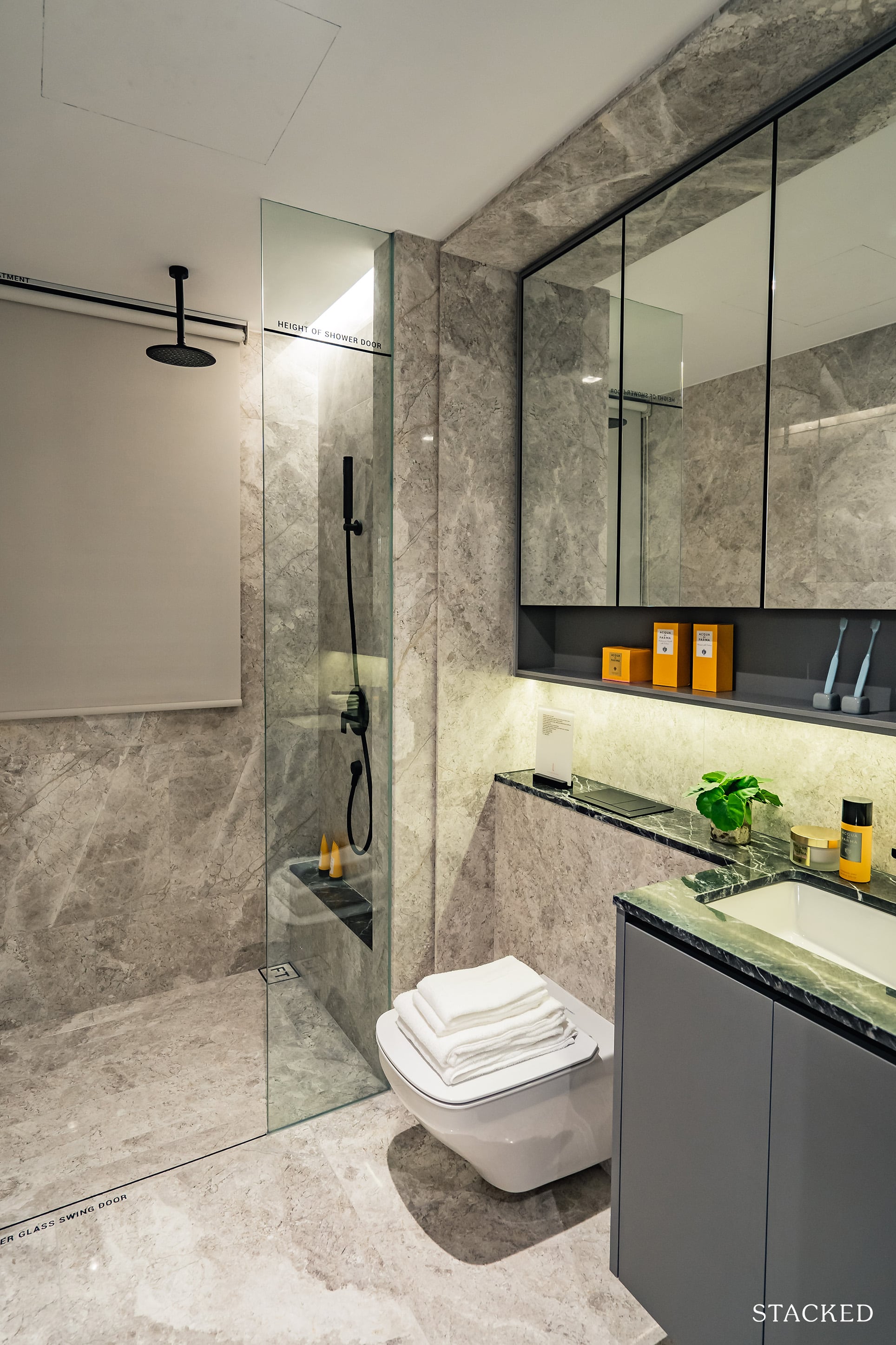
The common bathroom is about the same size as the master bathroom and comes with similar features including the rain shower and wall hung toilet bowl. These features, coupled with the tap and basin will all be provided by premium brands such as Gessi and Duravit.
You will also find some additional storage behind the mirrors and below your basin, which is always helpful. Having a rain shower in the common bathroom is really quite rare in today’s market as it is the costlier option, as with the wall-hung water closet.
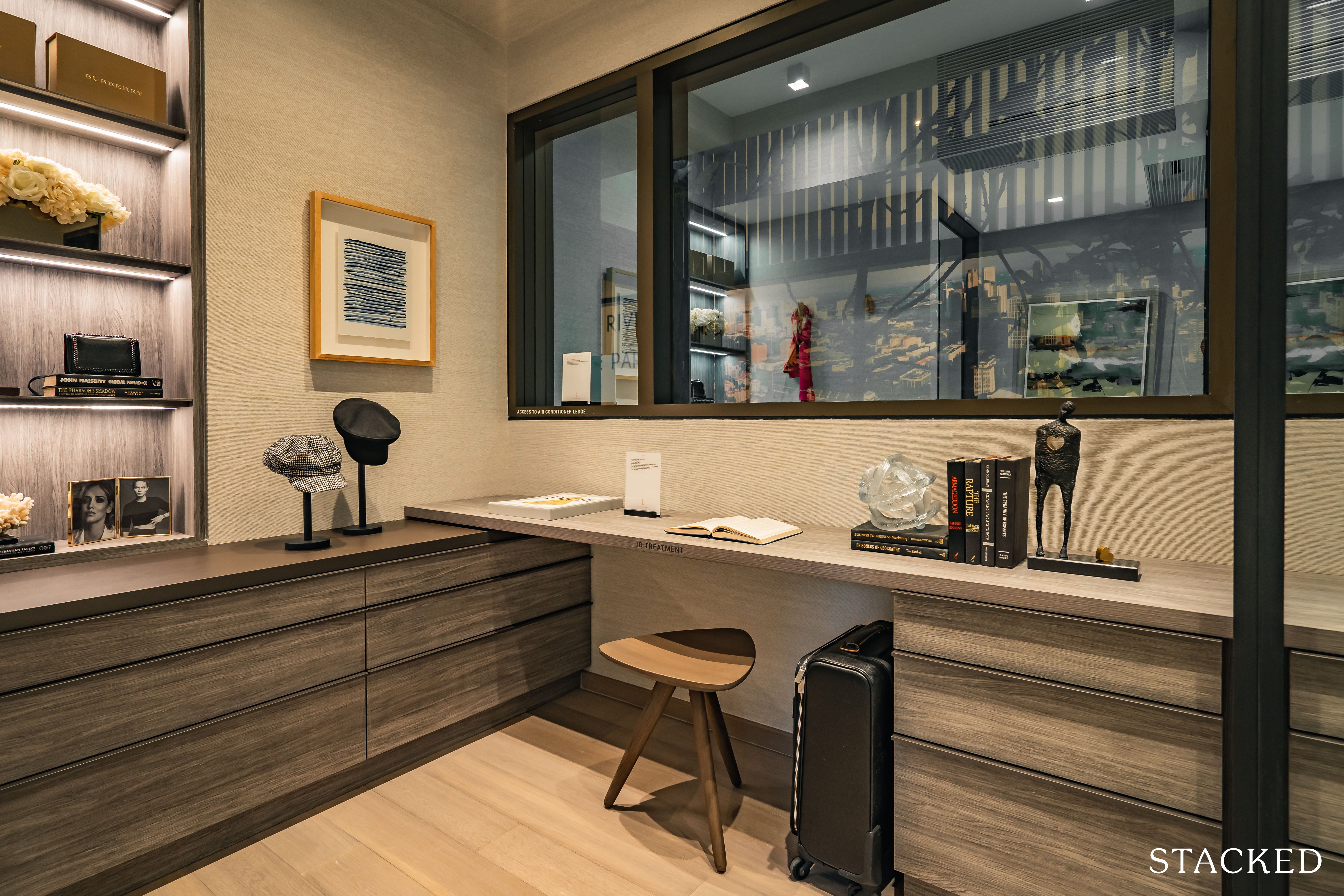
If you were wondering where all the space has gone to given how averagely sized the common bedrooms are – it’s right here, to this spaciously sized 5 sqm study. If you have intentions of using it as a study, it’s a really great space. Other than the good size it has a huge panel window, which is really good for ventilation and a more open feeling.
In today’s strange times having a segregated work space is definitely going to be a trend moving forward, and having that separation is very much welcome.
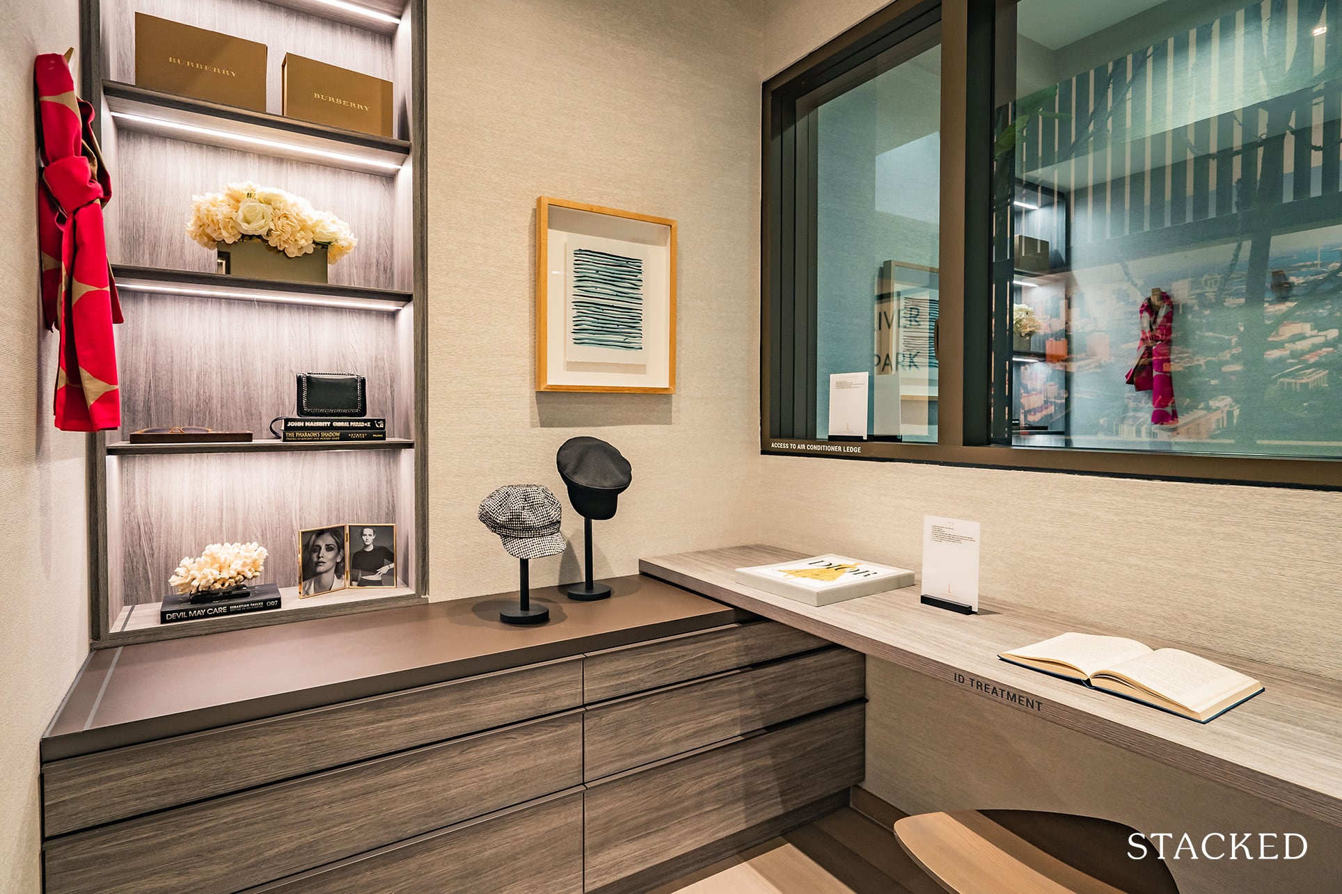
The existence of a Study negates the need to convert any part of your bedroom or living room into a makeshift workplace, a gesture which I appreciate from the developers. Should you not require the study, you can also convert it into a luxuriously sized walk-in wardrobe for your master bedroom with some creative interior design.
It could even be used as a bedroom – albeit a very small one.
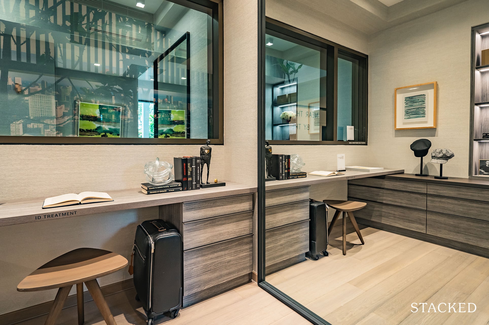
Do note that unlike what was shown in the show unit, the entrance to the study isn’t actually inside the master bedroom – it is on the outside instead.
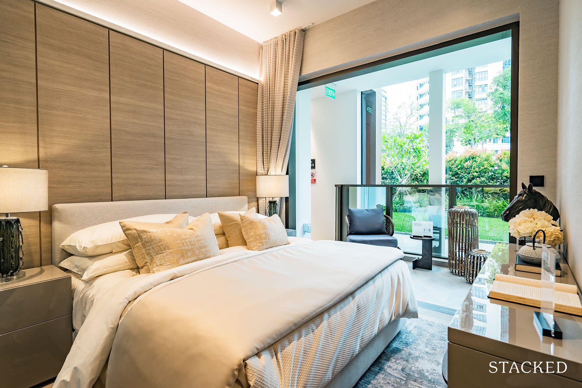
Over to the master bedroom, which stands at 12 sqm. Not the biggest master bedroom out there surely, especially for a unit that is over 1,100 sq ft.
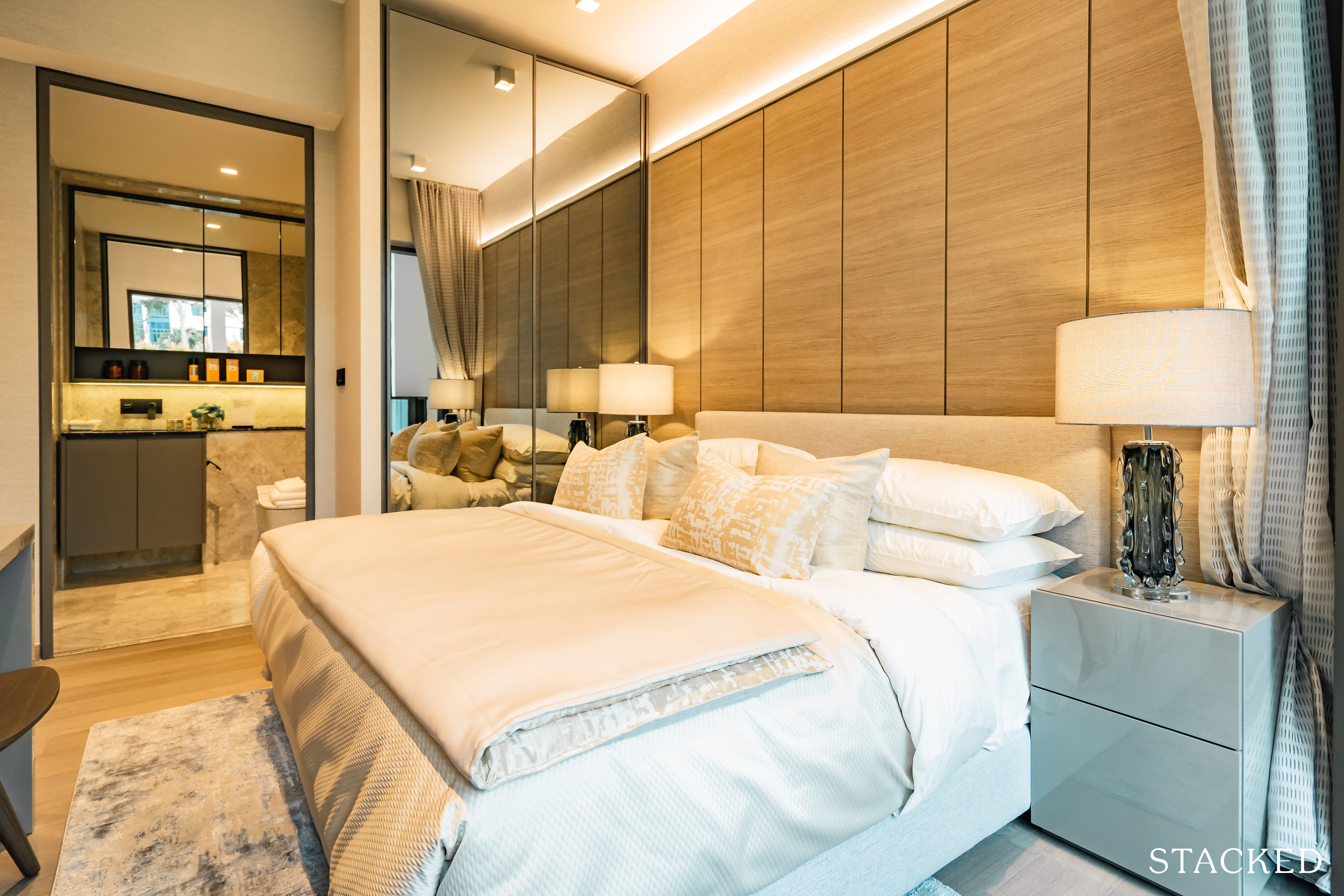
Nevertheless, you will still be able to fit a Queen sized bed comfortably, with some room to move about. As for side tables, you will probably be able to have fit a couple of small ones. Like all the bedrooms that you’ve seen so far, the built-in wardrobe here has the same 2 full panels of glass / mirror finish instead.
It’s nice, but it still doesn’t detract from the fact that storage is hardly enough for most couples.
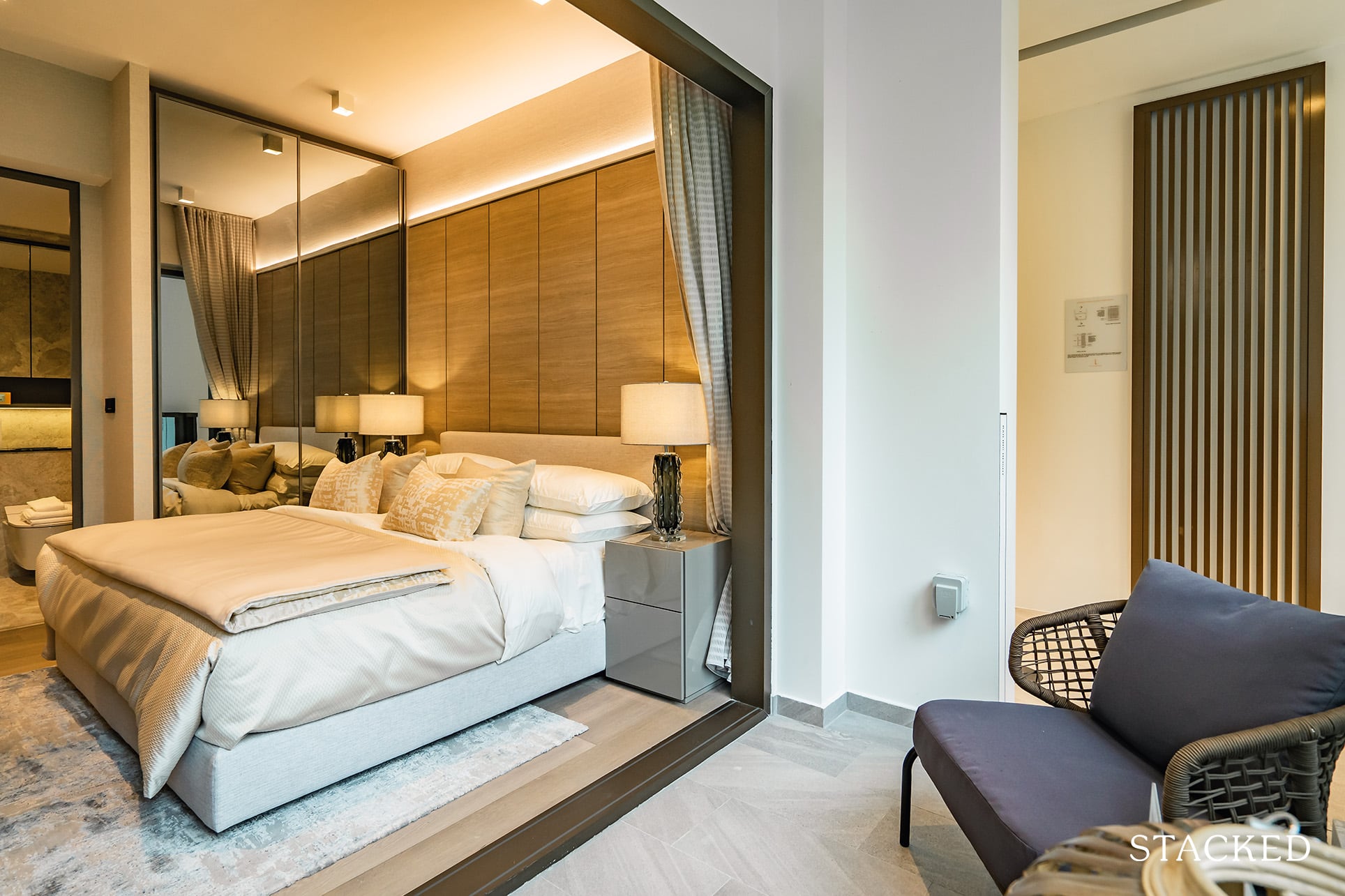
Of course, the smaller overall room size is a consequence of having a study, bigger kitchen, and private lift lobby. Combine that with the balcony here and you can easily see where that “additional” space has gone to.
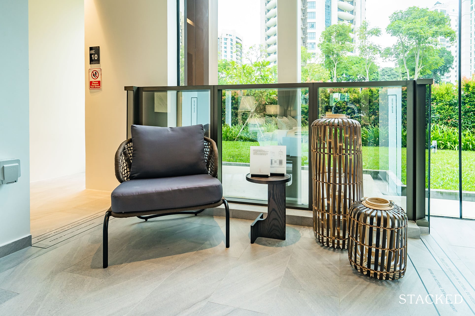
However, this is definitely a plus point for those on the higher floors as both the 3 Bedroom stacks are South-facing and front Pearl’s Hill City Park. It is no wonder that the developers had thoughtfully included a balcony in the Master Bedroom as well – it’s a lifestyle thing really, to be able to draw your curtains and wake up to a sea of green and sip a cup of coffee before you start your day. The balcony here should fit a coffee table and two chairs here quite easily.
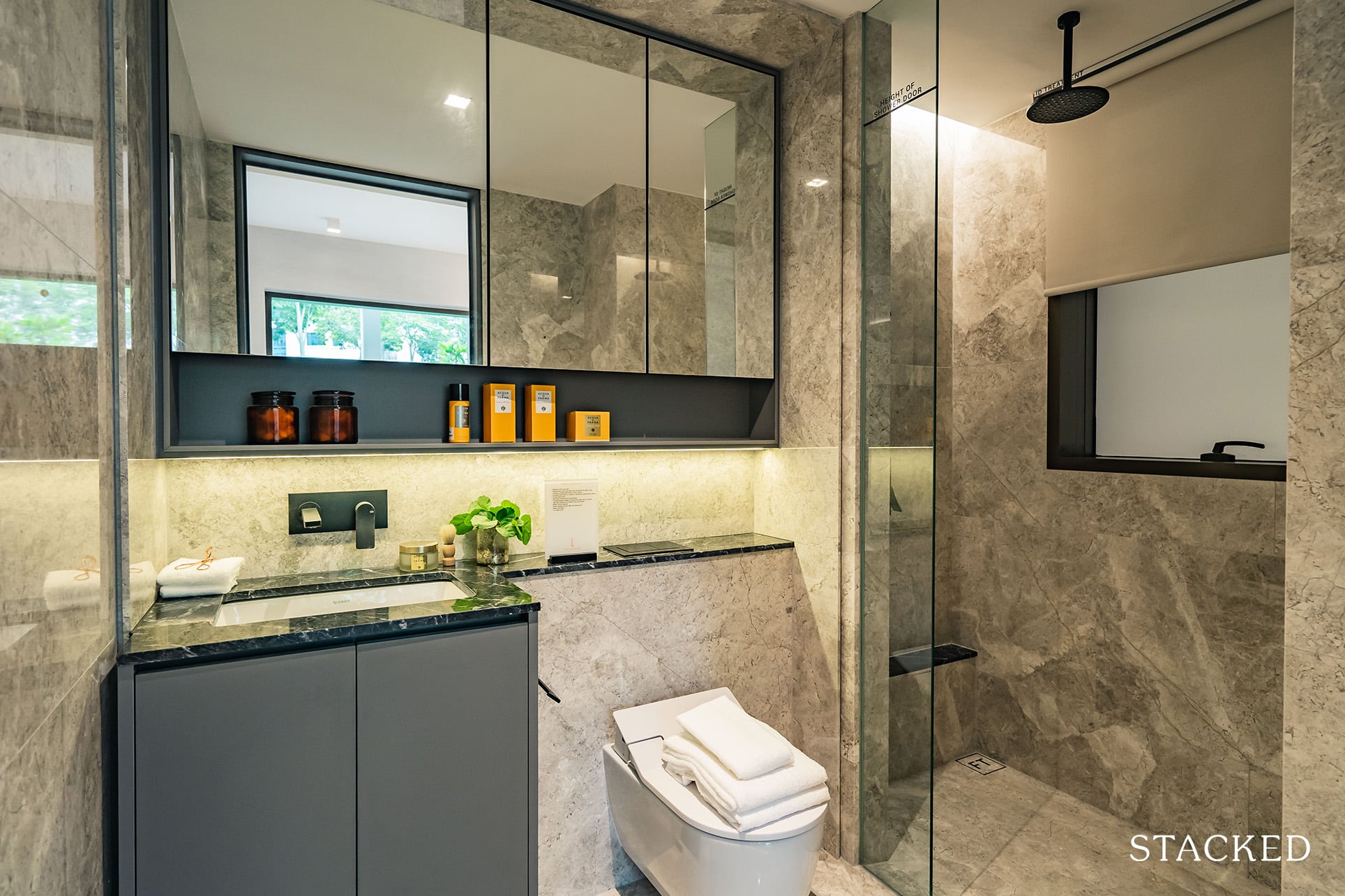
The master bathroom has a similar size and features as the common bathroom. It’s been a huge plus point so far, that every single bathroom here features these higher-end equipment. If you do want to be truly pessimistic, you could say that there isn’t really anything that differentiates the master and common bathroom – but I for one, more than welcome that move.
They’ve also gone with darker coloured marble for the 3 Bedroom unit for that slightly more premium finish.
The Landmark Location Review
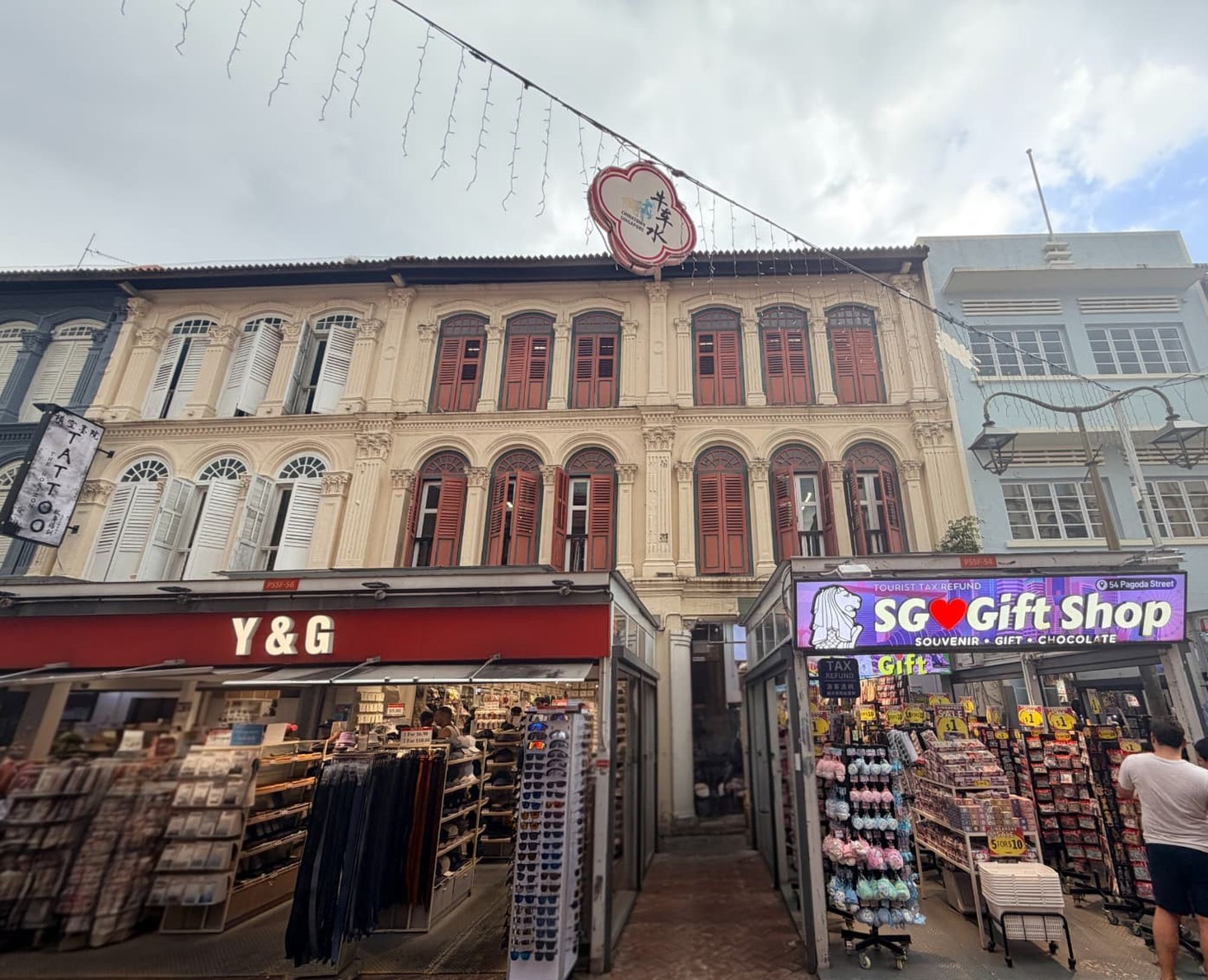
My dad grew up in one of the Pagoda Street shophouses and because of his roots, this area has become my de-facto second home as well – I spent practically every weekend in this vicinity since I was born.
Geographically speaking, there’s no question that The Landmark seems to have the best of many worlds – right smack on the fringes of the CBD and the nightlife at Robertson Quay, with a park right at its doorstep. Food options are also plentiful, with Red Star Restaurant, one of the last remaining bastions of classic pushcart dim sum, just a 4 minute (260m) walk away. (I must concede that Red Star’s standard has dropped considerably over the last 2 decades though). Fret not as Hong Lim, People’s Park, Smith Street and Tiong Bahru hawker centres are also a short distance away.
There’s so much more to The Landmark as well. Being in close proximity to the Singapore River, if you do want to have a nice evening stroll along it is scenic and convenient. Even if you get tired of exploring Pearl’s Hill City Park, you can always head over to Fort Canning Park instead, which is just 1km (13 mins walk) away.
However, for those in the know, The Landmark’s actual location on Chin Swee Road is actually located just across from one of the poorest neighbourhoods in Singapore. The Jalan Kukoh / Chin Swee Road neighbourhood is a cluster of HDB rental flats juxtaposed against the multi-million dollar condos of Robertson Quay, River Valley and The Landmark in time to come. Don’t take my word for it – there have been articles written about the Jalan Kukoh neighbourhood by someone who lives there.
How this affects you as a potential buyer though, is a matter of personal preference. If you view it positively, food in the hawker centres nearby are reasonably priced and also represents some redevelopment potential in the future.
Do also bear in mind The Landmark’s surrounding buildings such as Manhattan House and Hotel Re! were completed in the 1970s and very much due for renewal. Should any en bloc sale happen, or if the Jalan Kukoh residents are shifted out, be prepared for some construction noise in the near future. Of course, this might also make The Landmark an even more attractive proposition. At this juncture, this is pure speculation on my part.
If you can look past the aforementioned points, you can be assured that The Landmark grants you fantastic accessibility to the rest of Singapore, especially for those who drive. When the Thomson East Line (TEL) is completed, Outram Park MRT, which is located close by, will be 1 of only 3 stations in Singapore to have 3 lines – namely, TEL (Brown), EWL (Green) and NEL (Purple). If you drive, Orchard Road, Raffles Place and Suntec City are expected to take you 10 minutes or less, even during peak hours. Otherwise, the walk to Chinatown MRT will be slightly shorter.
Do note that the walk to either Chinatown or Outram Park MRT station will be much shorter if you cut through Pearl’s Hill City Park. However, this route involves many, many steps and will not be elderly or handicap friendly. It can also get really quiet at night.
In any case, you also have the option of taking a 9 minute walk through the HDB blocks to get to Chinatown MRT. Alternatively, you are 1 bus stop / a 13 minute walk away to Outram Park MRT via Chin Swee Road.
Public Transport
| Bus Station | Buses Serviced | Distance From Condo (& Est. Walking Time) |
| ‘Opp Blk 13’ | 174, 174e | 200m, 3-min walk |
| ‘Blk 8’ | 174, 174e | 300m, 4-min walk |
| ‘Blk 2’ | 51, 64, 123, 186 | 450m, 6-min walk |
| ‘Ctrl Sq’ | 51, 143, 174, 174e, 186 | 600m, 7-min walk |
Closest MRT: Chinatown and Outram Park MRT – ~6-9 mins (500-700m) if you cut through Pearl’s Hill City Park and 13 mins (1.1km) by Chin Swee Road.
The closest bus stops to The Landmark only have 1 bus service to speak of, which is not very helpful. Nevertheless, bus 174 takes you directly to Outram Park MRT (NE and EW lines now and TEL in 2021) in 1 stop, which should take less than 5 minutes. On the opposite side, 174 takes you to Dhoby Ghaut, Orchard, Bukit Timah, Bukit Batok before finally terminating at Boon Lay Interchange.
You will be able to get onboard more buses if you take a slightly further walk towards Havelock Road.
Private Transport
| Key Destinations | Distance From Condo (& Est. Peak Hour [0830] Drive Time) |
| CBD (Raffles Place) | 2.0km, 7-min drive |
| Orchard Road | 2.9km, 9-min drive |
| Suntec City | 3.4km, 10-min drive |
| Changi Airport | 22.8km, 22-min drive |
| Tuas Port (By 2040) | 36.1km, 40-min drive |
| Paya Lebar Quarters/Airbase (By 2030) | 14.1km, 21-min drive |
| Mediapolis (and surroundings) | 7.0km, 11-min drive |
| Mapletree Business City | 7.7km, 22-min drive |
| Tuas Checkpoint | 25.9m, 28-min drive |
| Woodlands Checkpoint | 30.0km, 32-min drive |
| Jurong Cluster (JCube) | 14.0km, 20-min drive |
| Woodlands Cluster (Causeway Point) | 26.7km, 29-min drive |
| HarbourFront Cluster (Vivo City) | 4.1km, 12-min drive |
| Punggol Cluster (Waterway Point) | 21.2km, 24-min drive |
Immediate Road Exits: 1 exit – Chin Swee Road, a 1 way road which will take you to CTE (AYE) within 2 minutes. Alternatively, at the same traffic junction, you will be able to make a left turn to Outram Road / SGH or a right turn to Tiong Bahru.
Groceries
| Store | Distance From Condo |
| Sheng Siong – Chin Swee 52 | 0.3km, 4-min walk |
| NTUC – Chinatown Point | 0.8km, 10-min walk |
| Cold Storage – UE Square | 0.8km, 10-min walk |
Schools
| School | Distance From Condo |
| Outram Secondary School | 0.3km, 4-min walk |
| River Valley Primary School | 0.9km, 11-min walk |
Amenities Summary
Being in an old and established estate of Outram Park / Chinatown, you can be assured that you have many grocery and food options a short distance away. There are many hawker centres and coffee shops in close vicinity including the likes of Hong Lim, Tiong Bahru, People’s Park and Smith Street Food Centres which all have really good food. Not to mention all the bars and cafes you can find along Robertson Quay, Tiong Bahru and Clarke Quay as well. Your dining options are limitless!
You will never run out of malls as well – there’s Central, Chinatown Point, UE Square, Robertson Walk and the redeveloped Liang Court all in close distance as well. It’s a definite perk of living in the city.
For young families with kids, River Valley Primary will also be within 1km away.
Additional Points
Pearl’s Hill is a historical landmark in itself, with a past dating back even before the days of Sir Stamford Raffles. Before 1819, it was site of gambier plantations owned by the Chinese before several plots of it were acquired by Captain James Pearl, the commander of the ship Raffles sailed in that led to Singapore’s founding.
In its subsequent years, there were 2 hospitals – Chinese Pauper Hospital (predecessor to Tan Tock Seng Hospital) and Seamen’s Hospital located on Pearl’s Hill. There was also the Outram Prison, which was built In 1847 and held POWs during WWII. This prison has since been demolished.
There were also barracks used for the European and Sikh police and thereafter, used by the CID and different Ministries of Singapore. The 3 buildings were gazetted for conservation in 2008.
The Landmark Development Site Review
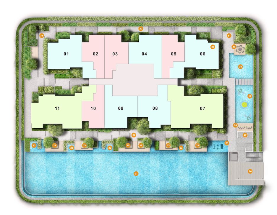
| Guard House | BBQ Pits | Cycling Track |
| Jogging Track | Jacuzzi Spa | Viewing Deck |
| Cabanas | Gym | Steam Room |
| Changing Room | Garden | 50m Infinity Pool |
| Aqua Lounge | Children’s Pool | Dining Room |
| Function Room |
The Landmark has done a great job packing in 5 levels of social spaces for its 396 units. I think they have put in a conscious effort to ensure that the good views of the city, park and even pocket sea views do not go to waste. This is especially appreciated for buyers of lower floor units, who will not get those sweeping views.
Most of the must-have facilities of 2020 are present – a 50m lap pool, kids play areas and generally, common spaces for residents and their visitors to mingle. This is especially important given how small units are these days.
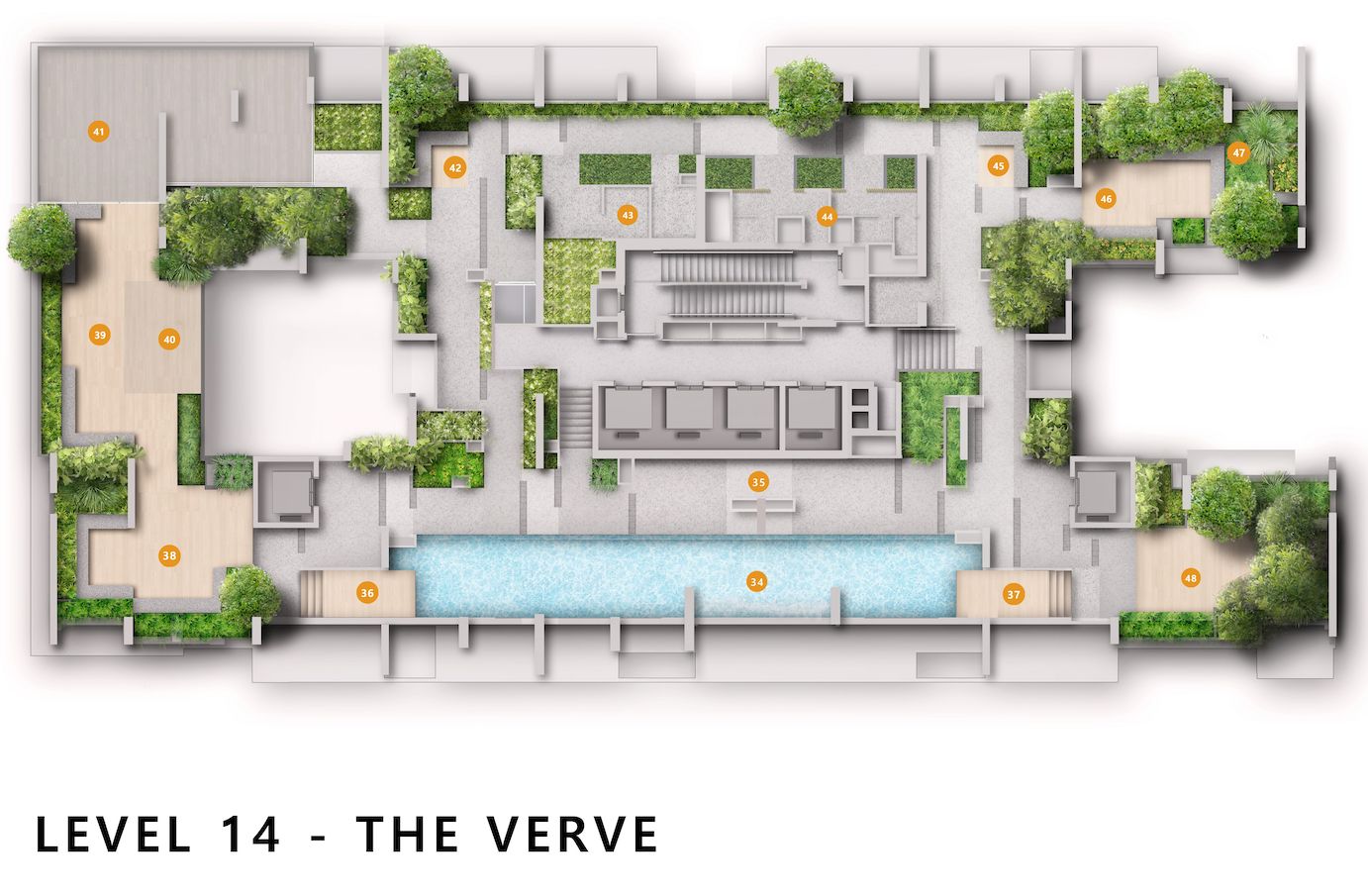
I particularly like the fact that they have chosen the higher floors to place the social spaces and sky gym – 14th, 34th and the Roof – instead of the lower ones, which would have defeated the purpose anyway. You would also have realised that the floors for these facilities have the number “4” in them – I’m guessing that this is a deliberate decision by the developers who understand that in some Asian cultures, “4” is considered an inauspicious number to be avoided.
Unit Mix
| Unit Type | Size | No. of Units |
| 1BR | 495 – 517 sqft | 144 |
| 2BR | 678 – 764 sqft | 180 |
| 3BR | 1,076 – 1,141 sqft | 72 |
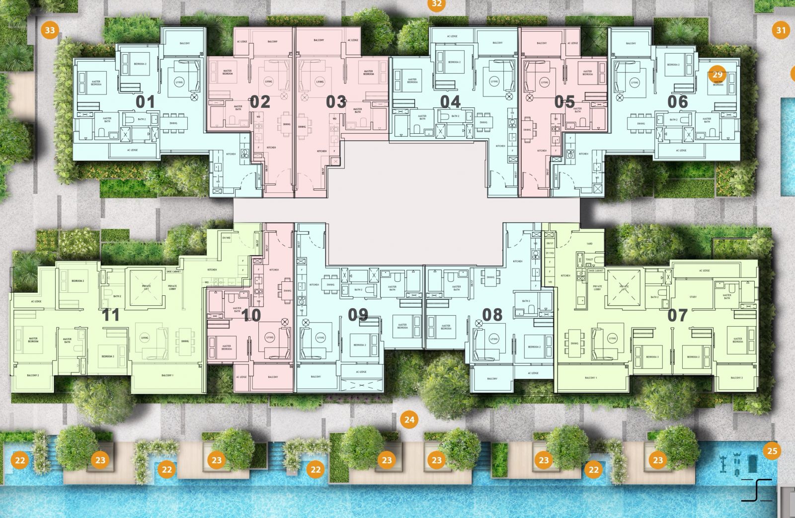
Being a project on a relatively small plot of land, The Landmark has gone with a simple unit mix with no surprises. As you can already tell, the project is made up of mostly 1 and 2 Bedroom units, similar to that of its direct competitor One Pearl Bank. This is unsurprising as many potential buyers might be purchasing these units for investment given its CBD fringe location.
While One Pearl Bank has 4 Bedroom and Penthouse units as large as 2,777 sqft, The Landmark has kept things simple, with the largest unit being a 1,141 sqft 3 Bedroom unit. Therefore, if you are considering a large unit type above 1,200 sqft in this area, you will have to look past The Landmark.
Comparing the unit efficiency of both The Landmark and One Pearl Bank, you could safely say that The Landmark is in general the more squarish and usable of the 2 as it does not have the cylindrical building shape to contend with.
Afternoon Sun Movement Analysis
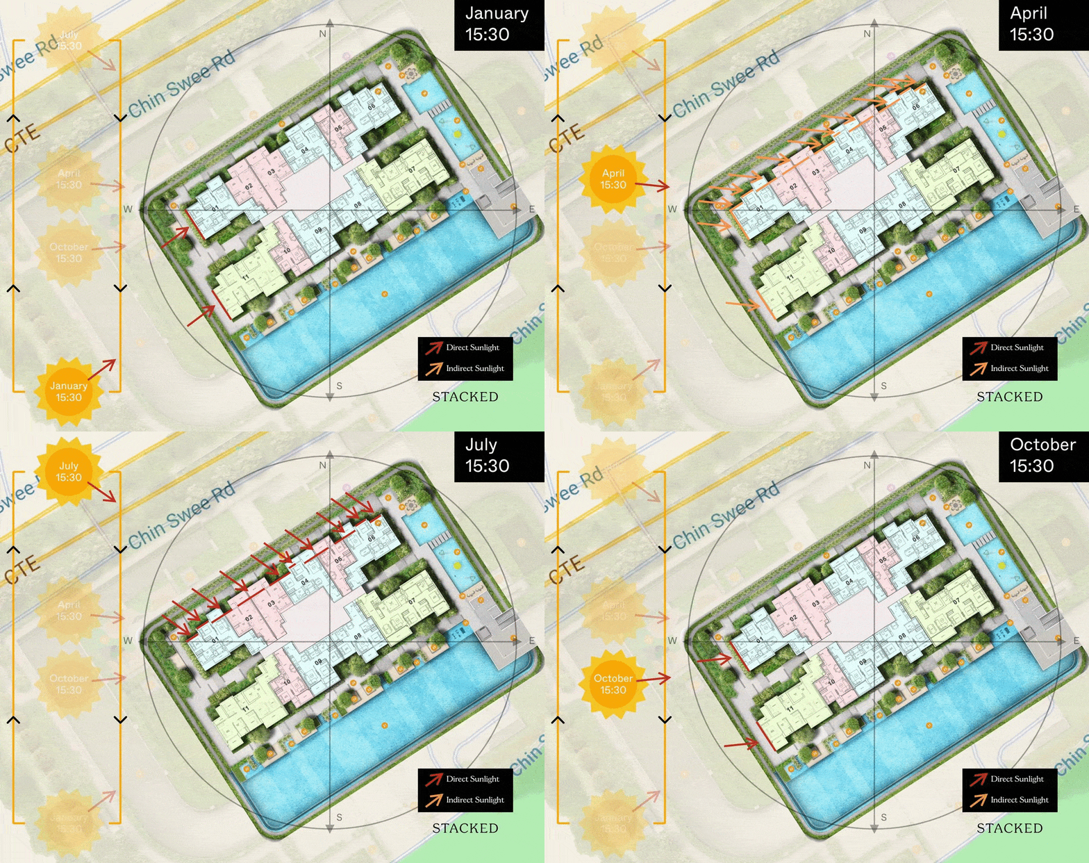
Stacks 1 to 6 are the only stacks that would experience the afternoon sun, however this only occurs for about half the year between April to August, with the hottest being between May to July. While stacks 1 and 11 faces strong afternoon sun for the rest of the year, the sun doesn’t come directly into the unit and instead, hits a concrete wall behind where the master bedroom is.
Note: Illustration here is not drawn to scale.
Stacks with the least afternoon sun
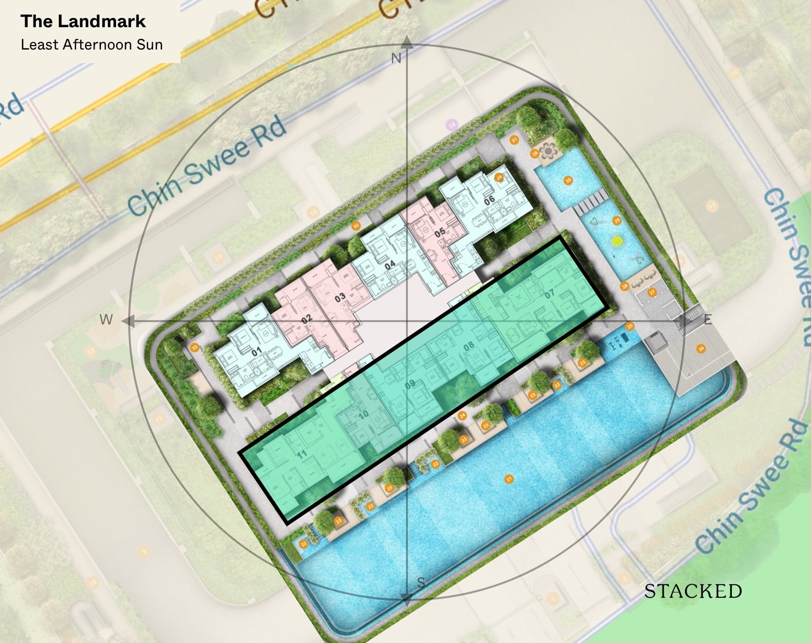
Stacks 7 – 11 have the least afternoon sun as it has a south-east orientation. It would also experience the morning sun between November to February.
Best stacks
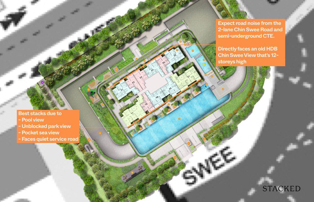
For starters, this site only has a single block and thus, only 2 facings – units which either face mainly North or South. This is a natural disposition that will not change with time. What I am implying is, whichever way you choose, you will avoid the Asian nemesis – the West sun.
Of course, there is still the choice of North or South. Personally, my preference will be the South facing, as you will get unblocked views of the greenery, CBD and even some pockets of sea views from a high floor. On the other hand, the North view will give immediate views of the Jalan Kukoh HDB estates and beyond that, views of Tiong Bahru and River Valley. Do note that to have real unblocked views, regardless of which stack you choose, you will need to pick a really high floor. The drone photos I have seen from the 14th floor seems to barely clear the blocks or trees on either side.
If you are going for a 3 bedroom unit, you will only be able to choose the South facing (which also shows which stack the developers subtly deem more ‘premium’). As for 2 bedroom and 1 bedroom units, you will have the choice of either the North or South facing units. If you were to go for a lower floor, the pool is also located on the South so if you’re into the pool view, this may be a point to note as well.
Price review
| Development | Average Psf | TOP | Tenure |
| The Landmark | *TBC | 2025 | 99 Years |
| One Pearl Bank | $2,494 | 2023 | 99 Years |
| Sky Everton | $2,591 | 2023 | Freehold |
| Avenue South Residences | $2,059 | 2023 | 99 Years |
It’s a bit tough to really compare on price points given that the official prices for The Landmark isn’t released at this point.
But from my understanding, these are the starting prices that it is set to be launched at:
1 bedroom from $9xx
2 bedroom from $1.2xm
3 bedroom from $2.3xm
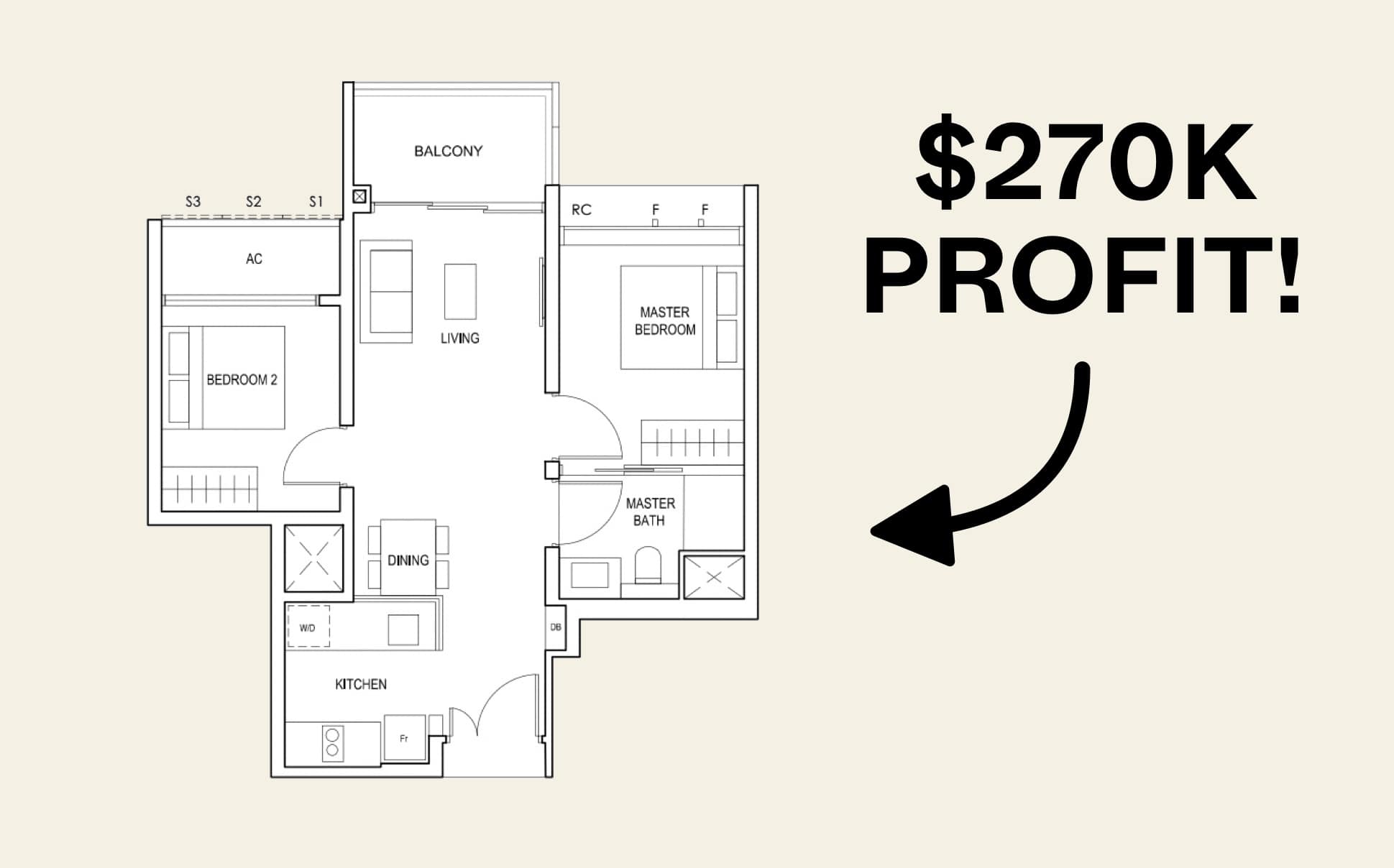
Quite clearly, the sweet spot here is definitely the 2 bedroom unit. From a starting quantum of $1.2xx million, you do get a proper squarish 2 bedroom 2 bathroom. It’s small yes, but the quantum does play a huge role in the success of a new launch (just look at Penrose for an indication).
As compared to its closest competitor, One Pearl Bank, the difference is quite stark.
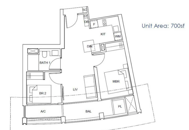
While it is arguably the more iconic project, the 2 bedroom unit there comes in at 700 sq ft. It is a touch bigger, but it does only come with 1 bathroom.
I know not everyone is a fan of the pizza-shaped layout either, so that is another point that you will have to take in consideration.
Last but not least, the price for the One Pearl Bank unit started from $1.5 million during its launch. There’s no question about it, it does enjoy the better, more convenient location. But the question is, is that premium going to be worth that price hike for you?
Of course at this point it remains to be seen if the price per floor jump scales up appropriately and just how many units there would be released at the starting prices.
Let’s not forget that the estimated breakeven for The Landmark was ~$1,900 psf so you would definitely expect that to go up accordingly with the higher floors.
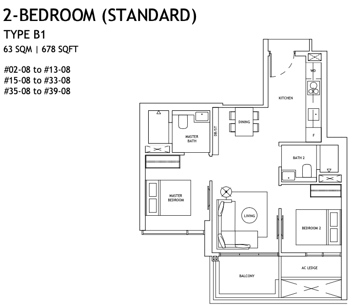
Personally, my pick of the bunch would be the 678 sq ft 2 bedroom dumbbell layout. There isn’t the wasted walkway space as it opens straight up into the kitchen.
It is the most efficient layout, and you could even fit up to a 6 seater dining table if you so wished.
That said, it would have been better if the common bathroom had a jack and jill layout instead – which would effectively make the common bedroom an ensuite as well.
Appreciation Analysis
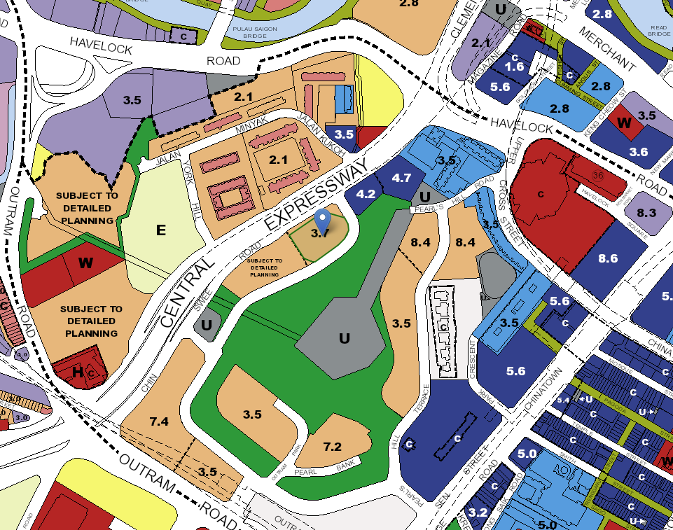
There are 3 development plans in the vicinity of The Landmark that is set to bring greater vibrancy to this area. While it is difficult to quantify the exact investment upside these developments will bring to The Landmark, it would certainly bring about better connectivity and accessibility to the area.
- Greater Southern Waterfront (GSW)
I am sure you have heard this GSW marketing speak many times before, especially if you have visited the showflat at Avenue South Residences which has played it up tremendously. Nevertheless, there is no doubt that the GSW represents huge potential, with plans to stretch the coastline from Gardens by the Bay East to Pasir Panjang to 30km.
With a total of 2,000 hectares of land, it will be 6 times the size of Marina Bay. PM Lee Hsien Loong has said that the mammoth GSW project will involve recreation, residential and commercial properties. The Landmark, being at the fringes of this transformation, is expected to be a beneficiary as more attention and focus will turn on the increased liveability of CBD fringe properties.
- SGH Transformation
In 2016, Prime Minister Lee Hsien Loong revealed a 20-year SGH Campus Masterplan that will “triple the space for patient care and develop stronger capabilities by integrating medical care, research and education” and essentially revamping the current SGH layout which was completed in 1981.
My partner is a medical professional at SGH and when I pick her up (via The Landmark no less), I witness the transformation before my own eyes. Several parts of the project have been completed, including the Academia building in 2013 and Outram Community Hospital in 2019 but many more are still in the works, including the new National Cancer Centre, A&E Block and National Dental Centre among others. The new SGH Complex will be developed in Phase 2, which is expected take place in 2026. The hope is that with the SGH transformation in place, there will be greater demand from healthcare professionals for properties near the hospital.
- Rail Corridor
The 24km Rail Corridor from Woodlands Train Checkpoint to Tanjong Pagar Railway Station is set to bring about greater accessibility for the adventurous living around these areas, including residents of The Landmark. It will cut through the Bukit Timah stretch, where the Bukit Timah Railway Station will be revitalised to provide spaces for the community. With this in place, sporty residents of The Landmark can look forward to a scenic ride or jog around the rest of the island.
Our Take
What we like
- Close to CBD and nature
- Views
- Quality fittings
What we don’t like
- –Traffic noise
- –Not the best immediate surroundings
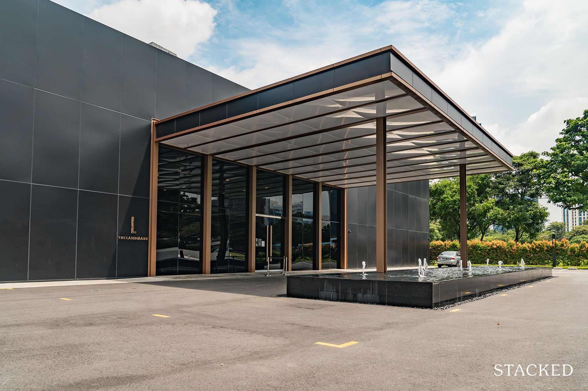
The Landmark’s location is enviable – I really do like the fact that the park is situated just a stone’s throw away. Located on the fringes of the CBD, getting to work will be a breeze if you work in the CBD. Even if you don’t, getting to the rest of Singapore will be convenient as well since Outram Park MRT will have 3 different lines come 2021. That said, not everyone is going to enjoy the hilly walk to the MRT station so it is worth taking a trip there to judge for yourself – this will be completely subjective.
Some other concerns may include The Landmark being right next to the CTE (i.e. road noise), having several dated neighbours in the vicinity such as Manhattan House and the Jalan Kukoh flats. Taken positively, this could mean that The Landmark stands to gain from any further rejuvenation in the area.
Add all of that to the potential appreciation supported by the Greater Southern Waterfront and SGH Campus Masterplan and The Landmark looks like a pretty attractive proposition. However, do bear in mind that it will be years away before these 2 exciting developments are officially completed and its 99-year lease might be weighing down on it by then.
You should also make a comparison with its surrounding new launch competition such as One Pearl Bank and Sky Everton and understand the stand out points which make The Landmark different.
What this means for you
You might like The Landmark if you:
-
• Appreciate nature in the middle of the city
Located just opposite Pearl”s Hill Park, having greenery at your doorstep is quite a rare treat in this part of town
-
• Desire proximity to work (CBD), life (Pearl’s Hill Park) and play (Robertson Quay)
While not directly located in the CBD, it is close enough plus other amenities as well
You may not like The Landmark if you:
-
• Looking for 4 Bedroom and above units
With only 1-3 bedroom sizes, bigger families and those looking for more space in the units should look elsewhere
-
• Find its immediate vicinity a concern
Not everyone would find its immediate vicinity a charming spot, so you should really make a trip down to see what you make of it
End of Review
Developer Notes
The developers behind The Landmark are a JV consisting of ZACD Group, SSLE Development and MCC Land.
ZACD Group describes themselves as an asset manager offering integrated solutions across the real estate value chain. They are listed in Hong Kong and were founded in 2005. This project marks the first time ZACD has taken a majority stake in a development. In the past, they have had small stakes in developments such as Riverparc Residence and Parc Centros in Punggol, iNZ Residence and Jadescape among others.
MCC Land was founded in 2010 and is based in Singapore. It is the real estate development arm of China Metallurgical Group Corporation (MCC Group), a pioneer in China’s iron and steel industry and a state-owned enterprise. It has been pretty active in the Singapore real estate scene right from its outset, having developed The Santorini, The Alps Residences and Sea Horizon in the east and One Canberra, Canberra Residences and Northwave in the north among several others. The very popular Queen’s Peak is also being developed by MCC Land.
SSLE Development is the property development arm of Sin Soon Lee Group. Not much information is available about them except that they were registered in 1970 and based out of Tan Boon Liat Building, which is popular among all you furniture junkies – you know who you are.
At Stacked, we like to look beyond the headlines and surface-level numbers, and focus on how things play out in the real world.
If you’d like to discuss how this applies to your own circumstances, you can reach out for a one-to-one consultation here.
And if you simply have a question or want to share a thought, feel free to write to us at stories@stackedhomes.com — we read every message.
Frequently asked questions
Where is The Landmark located and what is its proximity to the city?
The Landmark is located on Chin Swee Road in District 03, near the CBD, Pearl’s Hill City Park, and the Singapore River, offering easy access to the city and greenery.
What are the main features of The Landmark’s facilities and amenities?
The Landmark has a 50m infinity pool, a sky gym, jacuzzi aqua spa, multiple social lounges, a BBQ pavilion, kids playground, cycling and jogging track, and a rooftop space called 'The Peak' with panoramic views.
How does the pricing of The Landmark compare to nearby developments?
Indicative prices start from over $900,000 for 1-bedroom units, with prices around $1.2 million for 2-bedroom units and over $2.3 million for 3-bedroom units. Its psf prices are more affordable than nearby One Pearl Bank.
What is the size and layout of the 1-bedroom units at The Landmark?
The largest 1-bedroom unit is 517 sqft, larger than typical market units, with a typical layout including a bedroom, open kitchen, living area, and balcony, plus built-in storage cabinets.
What is the expected TOP date for The Landmark?
The project is expected to TOP on 30 March 2025.
Our Verdict
77%
Overall Rating
Join our Telegram group for instant notifications
Join Now










1 Comments
Hi Matt,
Thanks for publishing a good write up article. I would like to seek your expert views on:
1. Reference to Stackhomes article on “4 Possible Locations Of Future Prime BTO Flats Under The PLH Model, possible location #3, Perl’s Hill and York Hill Vicinity”, what would be the likely impact on Landmarks price if the en-blocked is really on the card?
2. With soon to be launched Canninghill Piers project (within walking distance to Landmarks) possible average price of $3100 to $3200 psf and above, what would be the impact on Landmarks value as the current average psf of Landmarks is $2238 psf.
Looking forward to your expert view.
Thank you!