All reviews on Stacked are editorially independent. Developers can advertise with us, but
cannot
pay
for,
edit, or preview our reviews.


New Launch Condo Reviews
Penrose Review: Good Own-Stay Potential But Not The Best (Immediate) Living Environment
September 26, 2020 31 min read
For a family own stay looking at good accessibility, the Penrose is a strong option
As a city-fringe project, Penrose is great for residents who want to have very good access to the CBD and the Paya Lebar precinct. Its location also puts it just a 10-minute drive from East Coast Park and the Kallang Alive section, making it great for families and sports enthusiasts.
| Project: | Penrose |
|---|---|
| District: | 14 |
| Address: | Sims Drive |
| Tenure: | 99-year leasehold |
| No. of Units: | 566 |
| Site Area: | 174,648 sqft |
| Developer: | CDL & Hong Leong Group |
| TOP: | 2025 |
Endless Awe.
That’s the go-to phrase that the developers (CDL + Hong Leong Holdings) of Penrose have decided upon. (Not the greatest tagline, in my humble opinion).
To add to that – the promises of east-side convenience, a rather well catered for project and the charms of city-side living.
Set in the well sought-after D14 (ie. Paya Lebar/Aljunied area), this 174,648 sqft GLS-site is poised to bring 566 new units to the area.
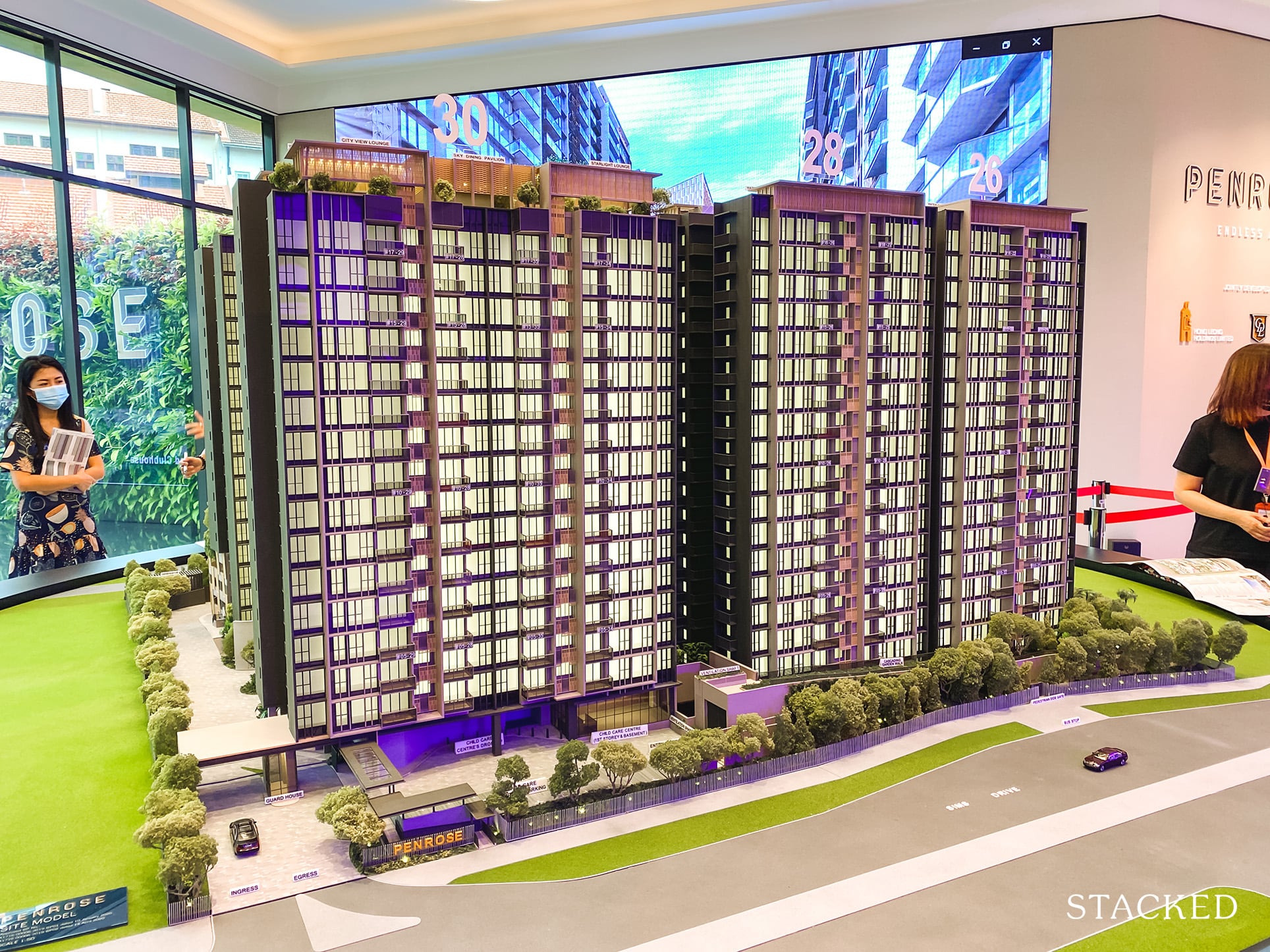
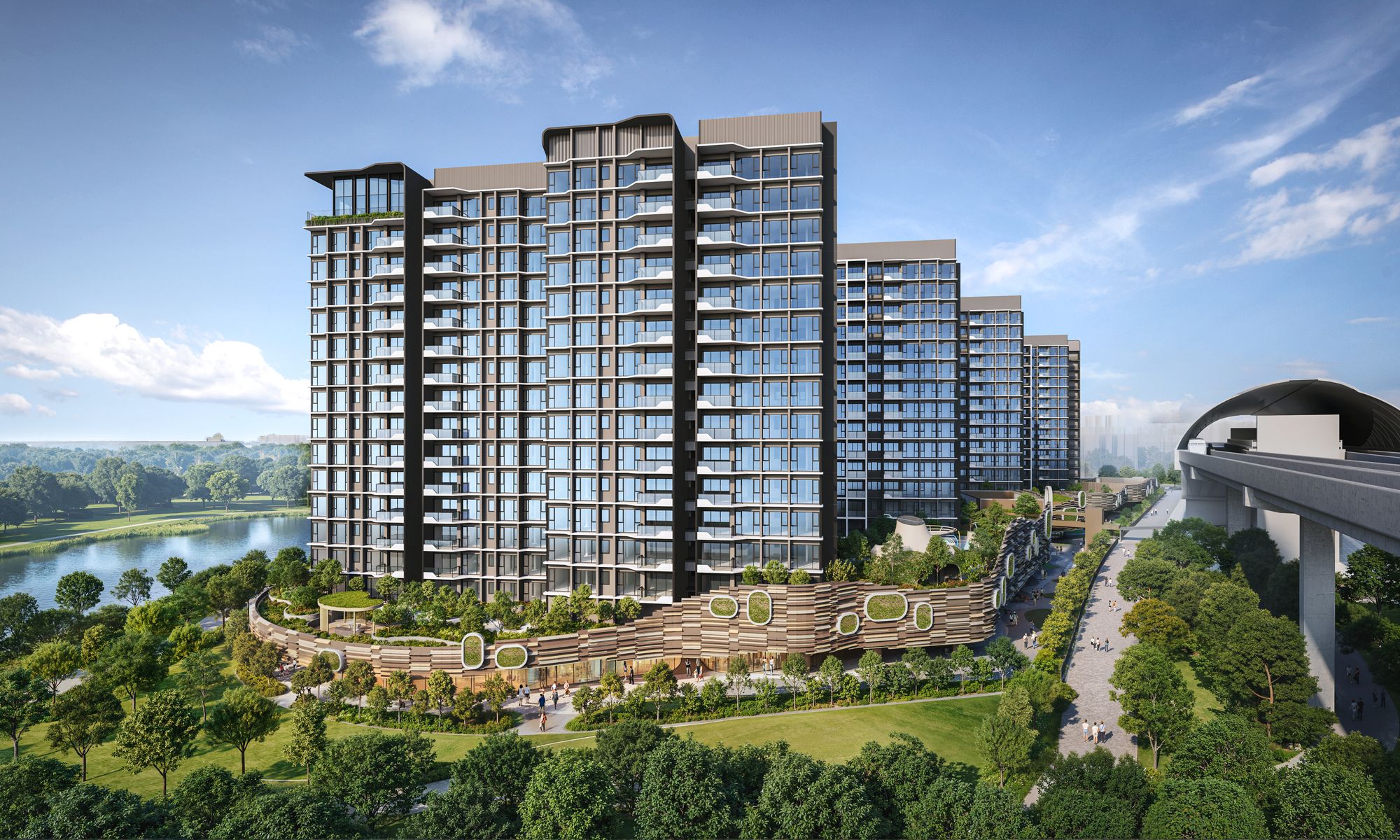
The 5 Blocks that you’ll find here are all mid-rise, spanning up to 18 storeys high.
For those wondering, the initial land bid price here translated to $732 psf ppr. Average prices here should range from $1,600+ psf for 1-bedroom units, $1,400+ psf for 2 & 3-bedroom units, and $1,500+ psf for 4-bedroom units.
Again, due to the halt in construction from Covid-19, we can expect TOP to be sometime in 2025.
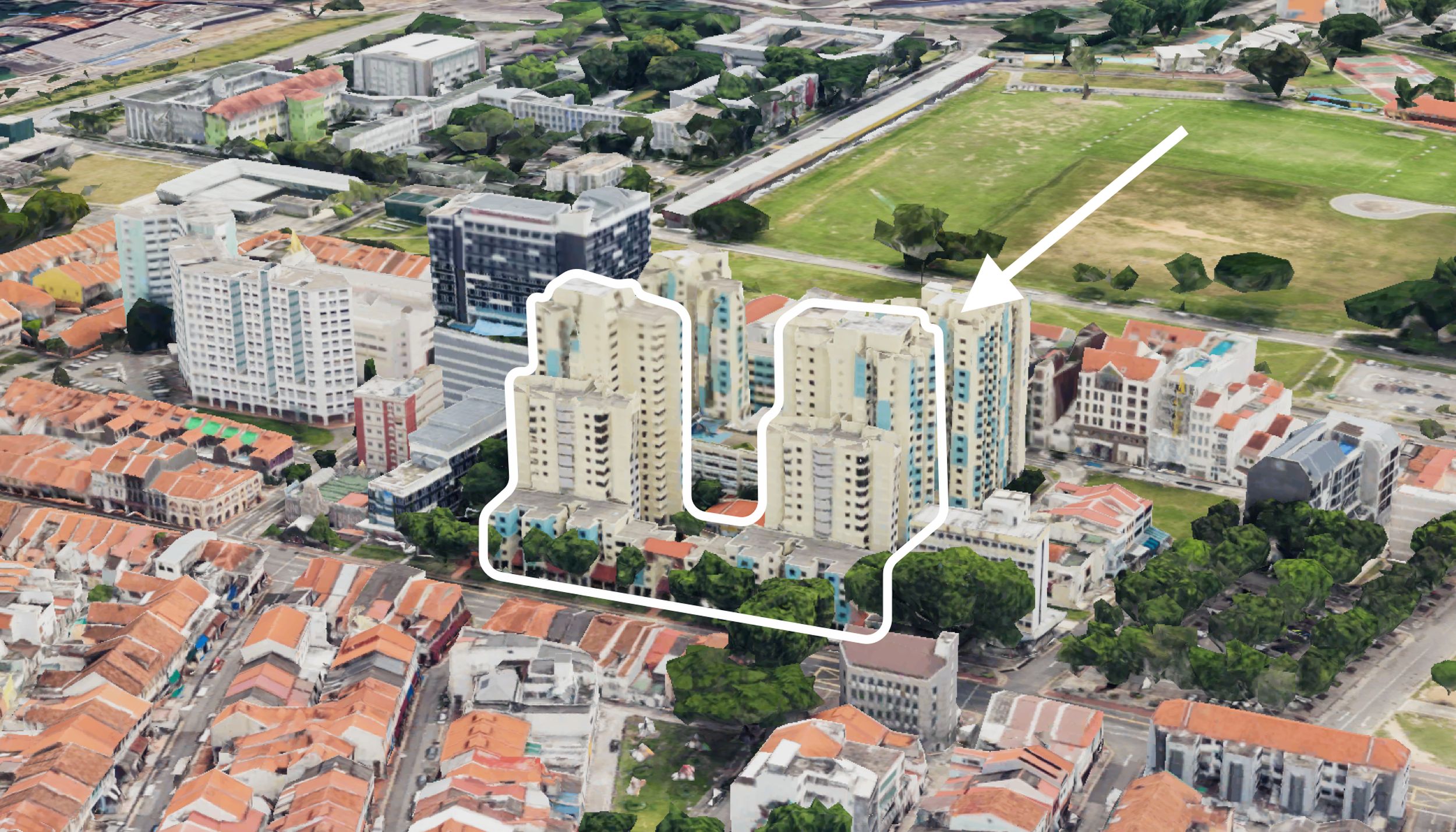
The project is also a 99-year leasehold – as is the other newly launched Antares, and the (often-compared to) Sims Urban Oasis or SUO, which is set just over 200metres away from the Penrose.
(Coincidentally, SUO and Penrose both harbour childcare centers – which is a great sentiment for parents, especially when you consider that Penrose is a more family-oriented project with its unit-tiers and facility layouts).
As we go further in, we’ll delve into some of Penrose’s competitors, as well as what we think are the best stacks and what the appreciation potential could be like for units here.
For now, here’s our customary showflat tour. Enjoy!
So many readers write in because they're unsure what to do next, and don't know who to trust.
If this sounds familiar, we offer structured 1-to-1 consultations where we walk through your finances, goals, and market options objectively.
No obligation. Just clarity.
Learn more here.
Penrose Insider Tour
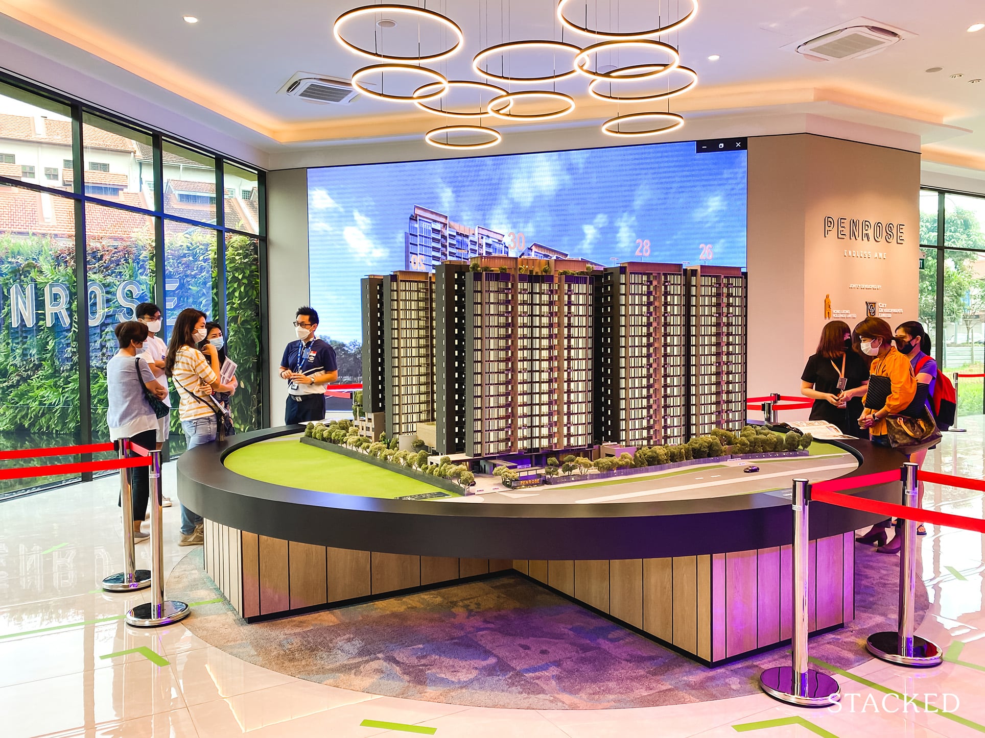
Other than the M condo which I reviewed earlier this (topsy-turvy crazy) year, the Penrose is probably one of the most hyped new launches of 2020. More so due to its low land price, but also because it is after all developed by well-established developers in CDL and Hong Leong.

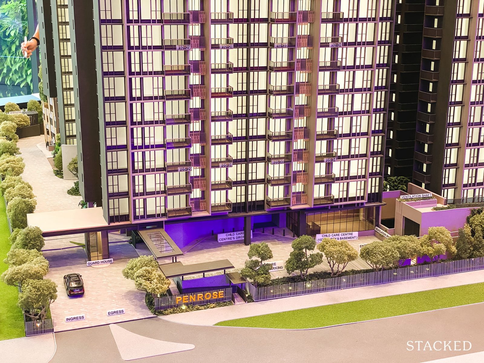
The entrance to the Penrose is about as ordinary as they come (it does get more exciting on the inside). There is only one entrance and exit on Sims Drive itself, with two lanes for the entrance, and one for the exit.
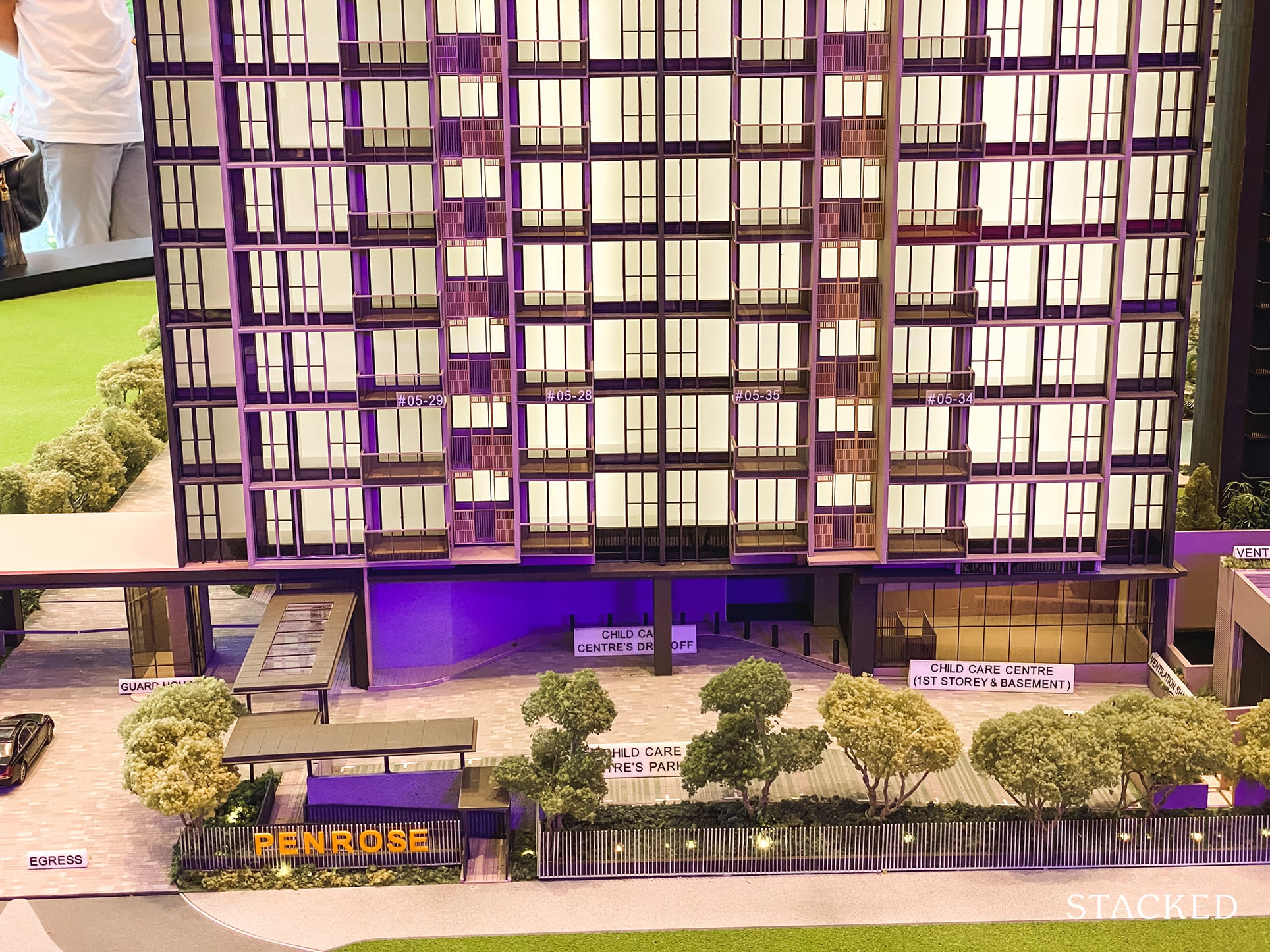
There is a child care centre on the first level (for parents with young kids, or about to have kids this is a godsend). It’s surprising to see it take such a prominent stage at the front entrance, but understandable when you find out that it is open to the public as well. For residents staying here, you do get priority – which is always welcome.
So because of that, separate parking and a drop off space had to be eked out for it. It’s smart to do it this way as it preserves privacy for the Penrose residents and reduces congestion in the main condo areas.

Visually, I can’t say that the Penrose is an architecture’s dream, but that’s not to say it is an ugly looking lump either. While it doesn’t feature any sort of cutting edge design, you could describe it as quite well balanced – it does have an attractive colour palette and is easy on the eye. Basically, why mess with the formula if it’s working out well?
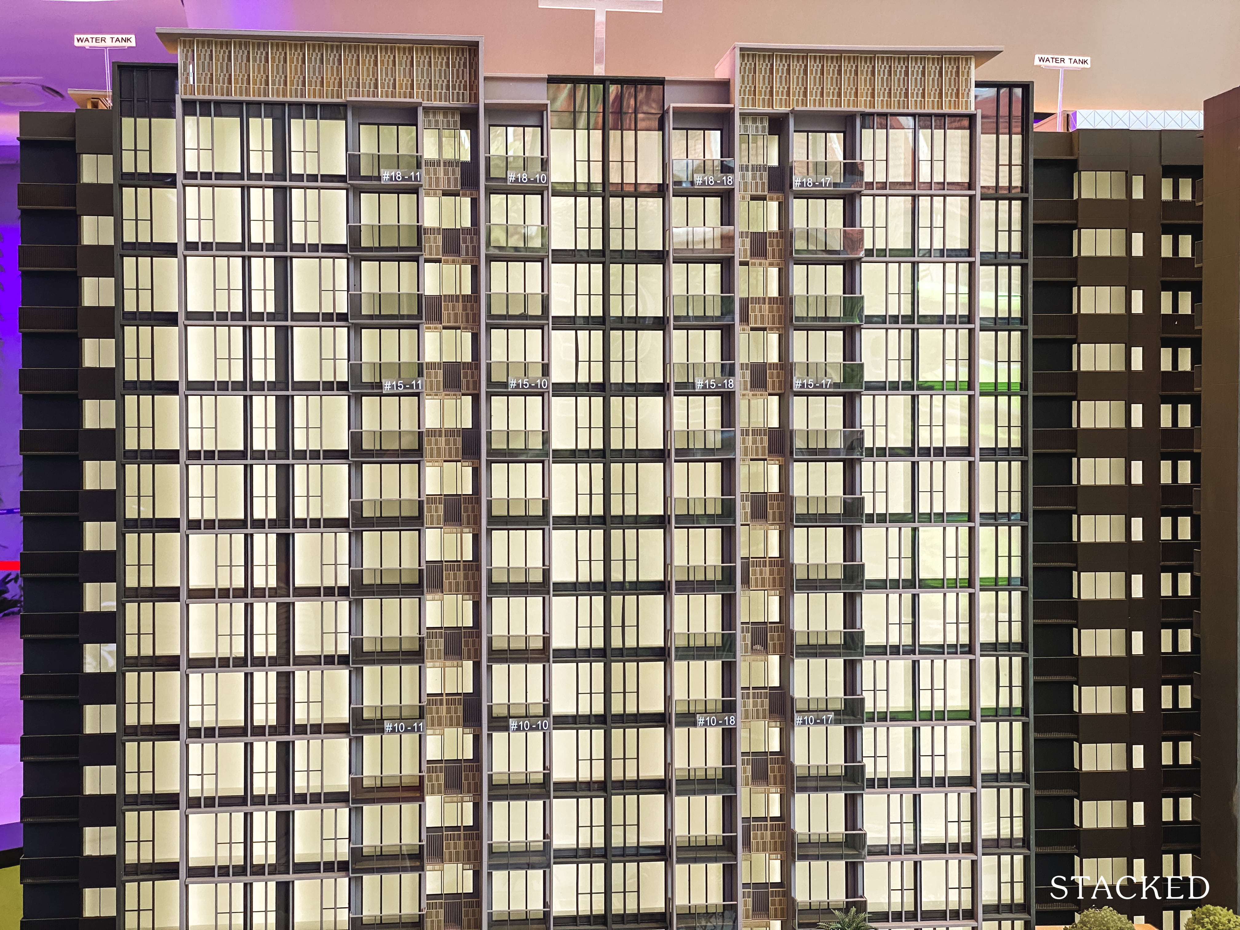
Anyway for the prices and crowd that the Penrose is targeting, I don’t suppose anyone is going to complain too much. The dark colours work well, and overall I do like the look better than its closest neighbour, Sims Urban Oasis.
I have seen the renders of both Sims Urban Oasis and the Penrose side by side, and ultimately, the difference is really just incremental – it’s more of a matter of which colours you prefer.
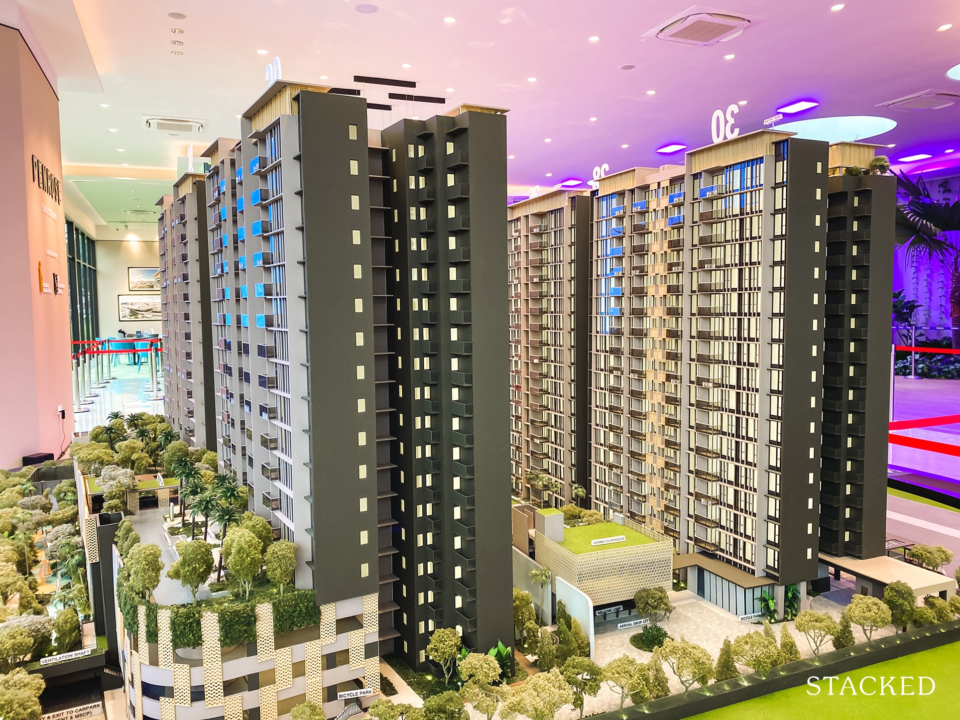
Overall at a total land size of 174,646 square feet, the Penrose is definitely not one to go for if privacy and ample land to move around is a concern to you.
As always, to give you a clearer idea of the space afforded to the development, let’s compare to some of the more “crowded” developments in Singapore.
Treasure at Tampines (648,889/2,206 = 294 sqft per unit)
And with regards to its next door neighbour, Sims Urban Oasis.
Sims Urban Oasis (257,164/1,024 = 251 sqft per unit)
Penrose (174,646/566 = 309 sqft per unit)
On that front, you could say that the Penrose does fare quite well as compared to its closest competitor. While it isn’t super significant, obviously the less dense the better.
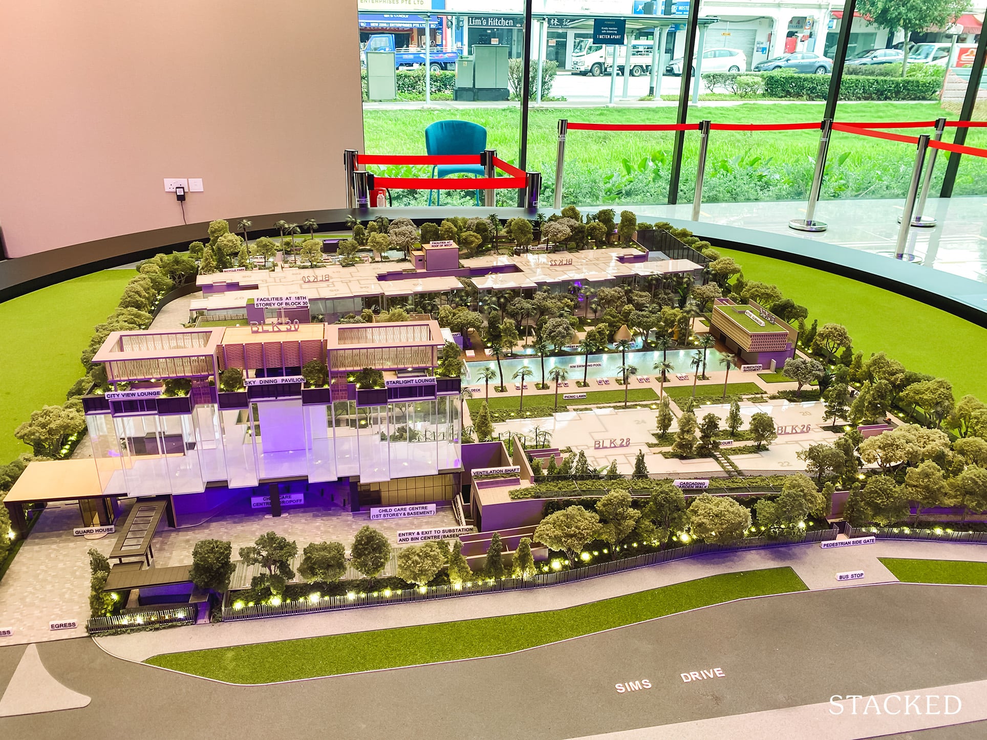
Another aspect worth mentioning is that the Penrose has a total of 583 carpark lots (ever so slightly more than a 1:1 ratio). In today’s context, that is rather impressive – but it also does go some way to show the Penrose’s ambition of more of an own stay project, rather than pure investment.
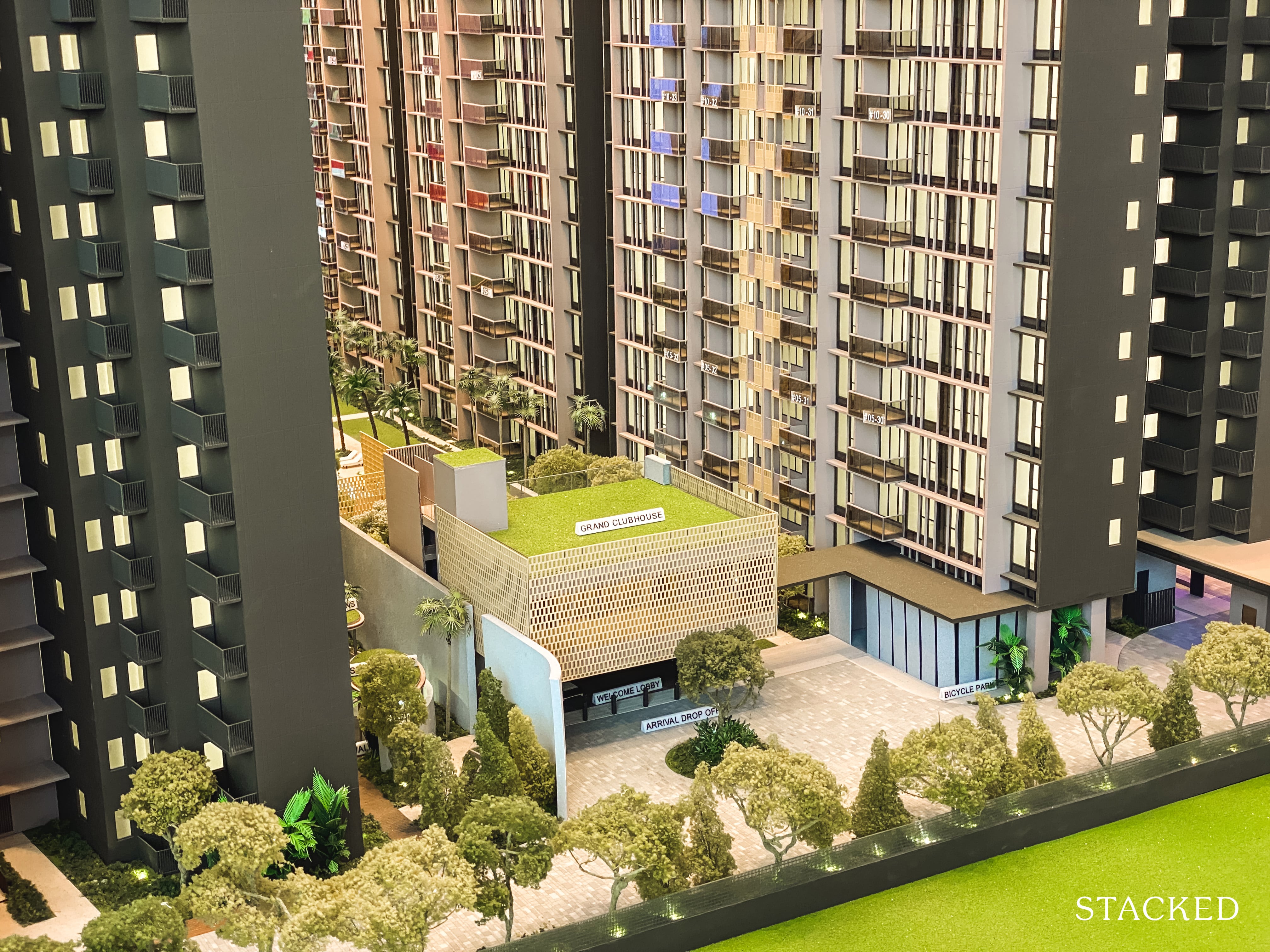
There are two clubhouses at the Penrose, the Grand and Active. This one here features the multi-purpose rooms, library, games, music and multi media room.
The location of the clubhouse doubles up as the arrival area too, with its prominent almost honeycomb like design serving as a welcome backdrop. I’ve always liked developments with a proper arrival area, so this one at Penrose is no exception – it’s set further in and it’s great to see that they’ve reserved a good amount of space for it.
In fact, I really like that they’ve placed the arrival area away from the main road – it does give a much higher sense of privacy.
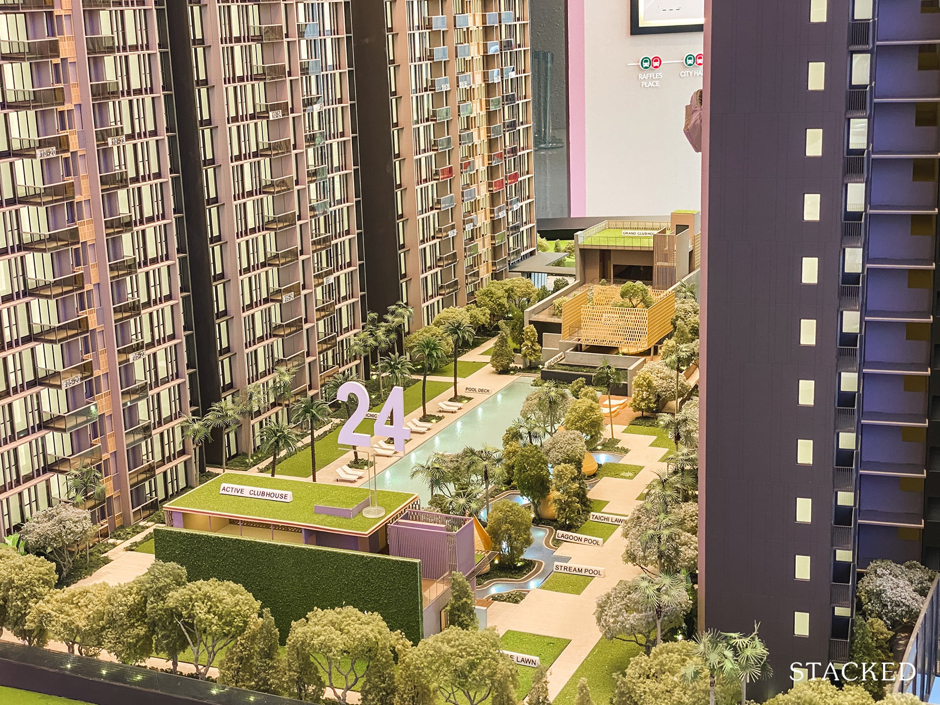
As you can probably tell by its name, the Active Clubhouse is for the exercise goers – you’ll find a gym, yoga and pool deck here. It sits directly opposite the Grand Clubhouse, with the 50m lap pool creating a good distance between both.
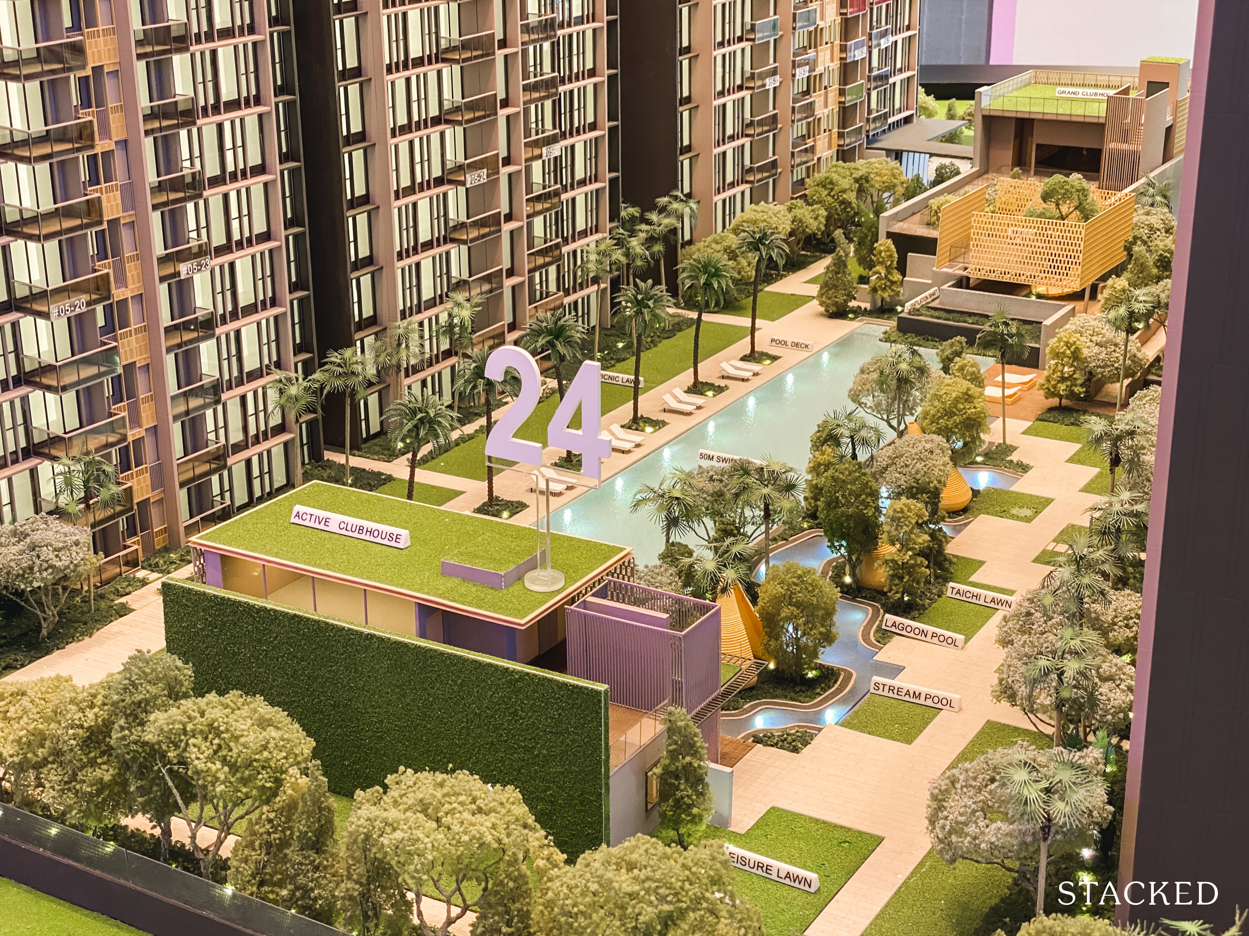
There is a stream pool (think: winding river) which I do like for some variance in landscape and swimming pool options. Surrounding it is a multitude of lawns (picnic, fitness, leisure, tai chi and yoga), but to save you from the marketing speak – it’s basically just rectangular plots of grass.
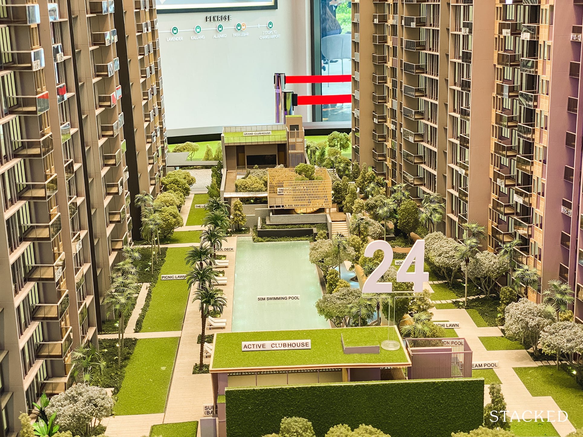
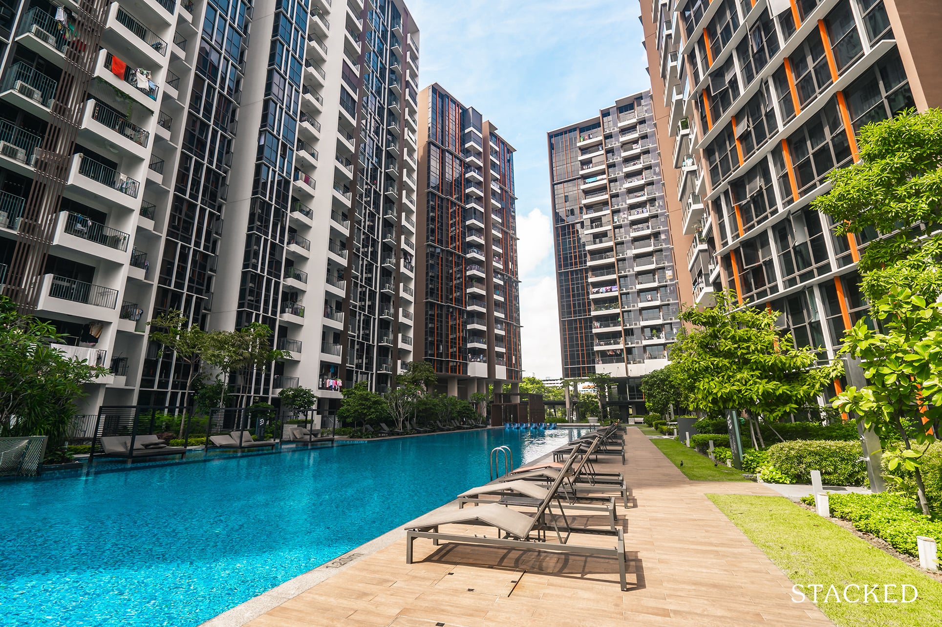
I do quite like the landscaping in general. It’s not overly lush, but what that does is give the illusion of space in the common grounds. This allows the grounds here to feel more open, with wider pathways and swimming pool decks. This is especially so when you compare it to Sims Urban Oasis, where the blocks are set quite close to the pool (29 – 30m distance).
That said, the blocks here aren’t actually completely parallel to each other. Blocks 26, 28, and 30 (closer to Sims Drive) are parallel to the road. While Blocks 20 and 22 are angled slightly. This means that the narrowest point is at the Active Clubhouse (32m) and it tapers out to its widest point at the Grand Clubhouse (43m) – definitely a decent distance away.
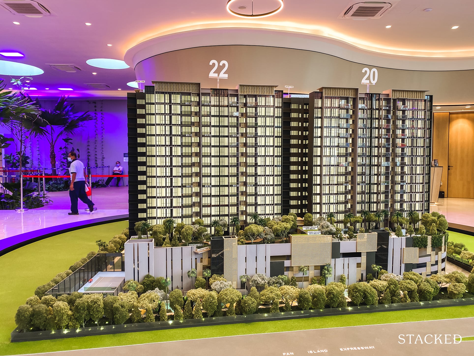
One of the major downsides to the location of the Penrose is definitely because it is right next to the PIE. While the optimist might point out that road connectivity is good, the road noise generated from the highway does outweigh that benefit here (as far as I’m concerned). And it is a valid concern – it’s best if you take a trip down to the area to gauge for yourself if you are considering a unit here.
So although they have tried to mitigate that with the placement of the multi-storey carpark, I think it’s safe to say that the units on this side of the Penrose will form the bulk of the attractive early pricing figures that have garnered its popularity so far.
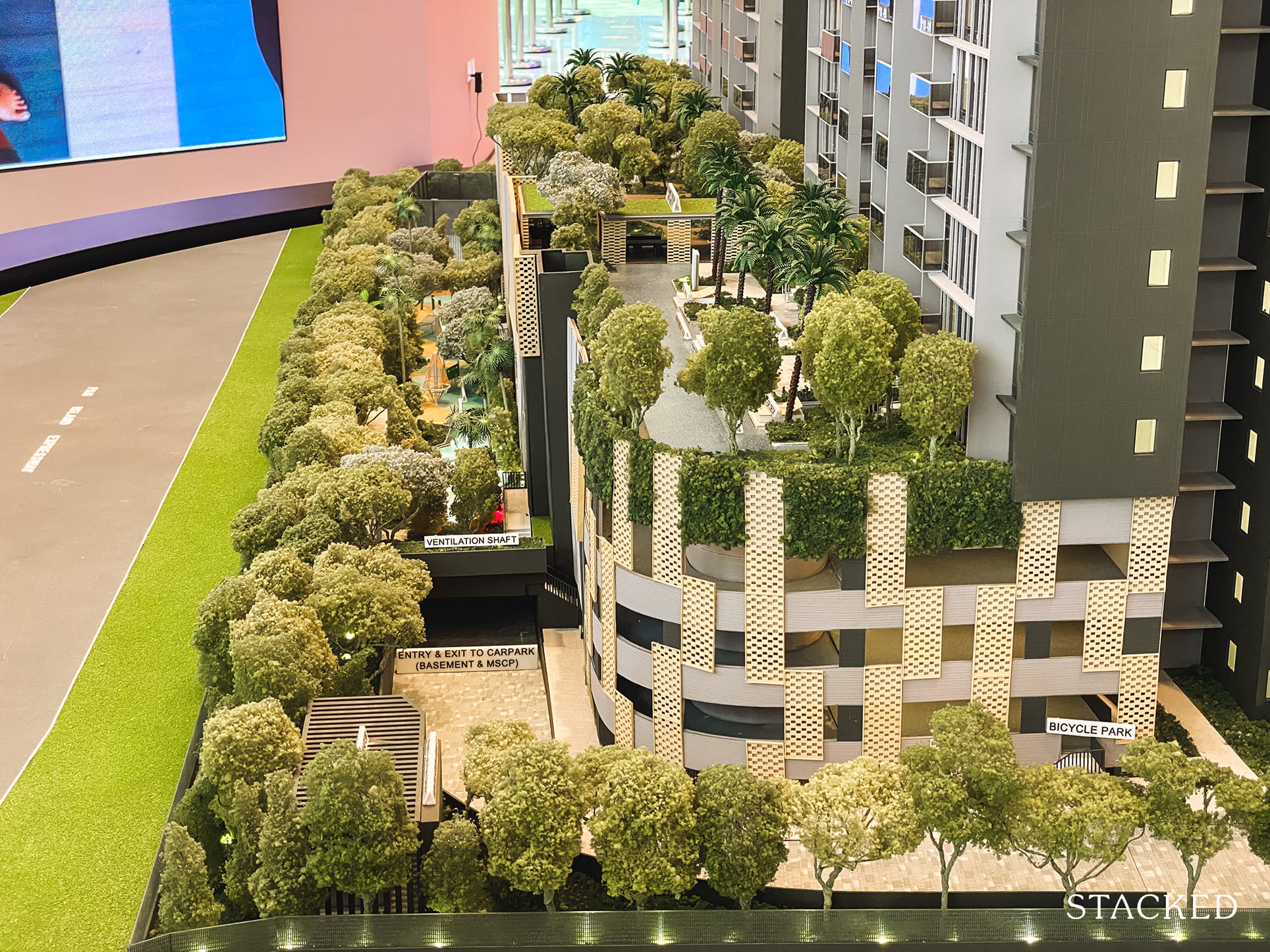
It is quite a smart design, incorporating a multi-storey carpark here saves on construction costs (it’s cheaper than digging a deeper basement). Plus this allows additional space for a facilities deck – which mainly consists of a lap pool and various dining pavilions, and a boardwalk.
They have tried to incorporate a multitude of trees here to act as a sound barrier, but I don’t suspect the dining pavilions here would be very popular because of the traffic noise.
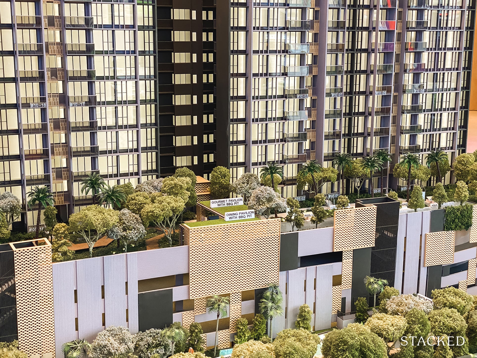
I mean, the landscaping and built up environment does look quite nice, it’s just a pity it would be marred by the traffic from the PIE.
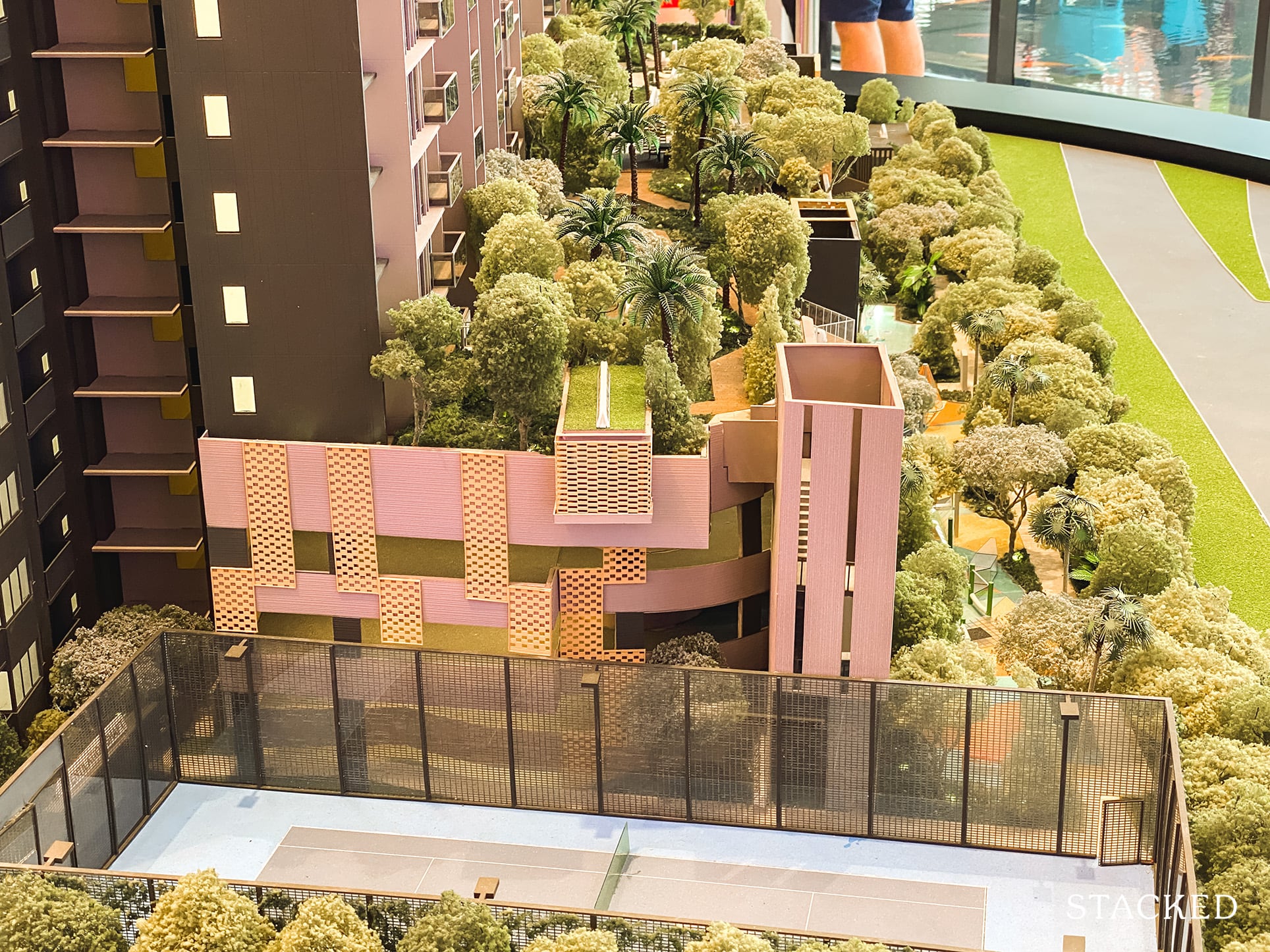
Right at the bottom of the development (which does create a further setback from the expressway) is the kid’s adventure park. There’s an aqua play area, water jets, zipline (definitely a cool attraction), and the ubiquitous playground. All in all, it does sound like a proper dedicated area for kids – again, an attractive plus point for families.
But here’s the potential downside, other than the noise, parents might be concerned about the constant fumes from the expressway as well – it is after all the closest to the constant flow of traffic.
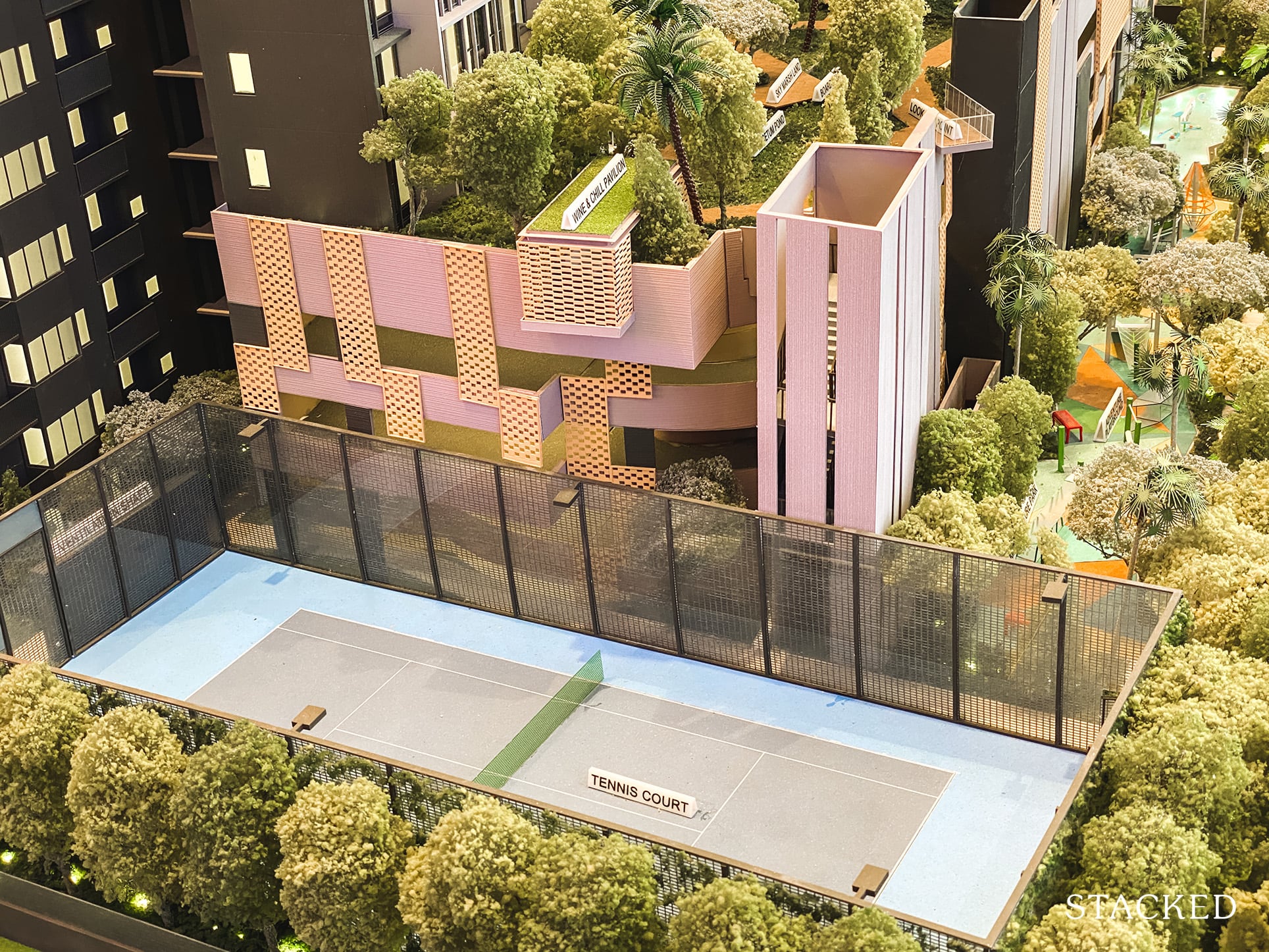
As you might have seen from the photo above, the tennis court is located at the far corner of the estate. For 566 units, it is very acceptable – especially so when you look at its next door neighbour, with almost double the units sharing just the one tennis court.
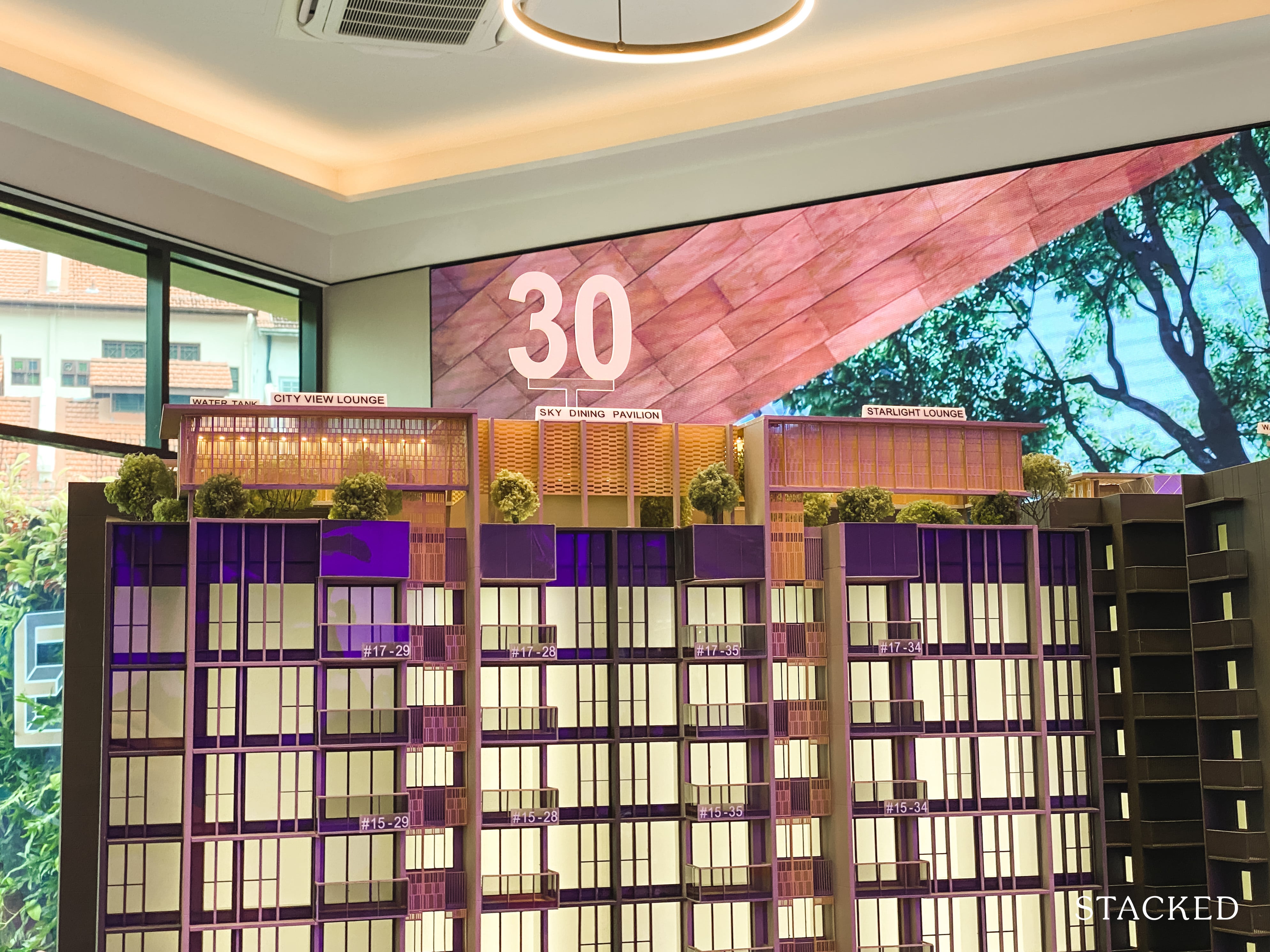
Last but not least, you do get lounges right at the top of Block 30 to admire the view, and a dining pavilion too (this will probably be hotly contested). To tell you the truth, I wouldn’t exactly describe the view as awe-inspiring from here. Nevertheless, views from a high vantage points are always a welcome feature to have – especially for residents who live in the lower floors.
Penrose 4 Bedroom Review
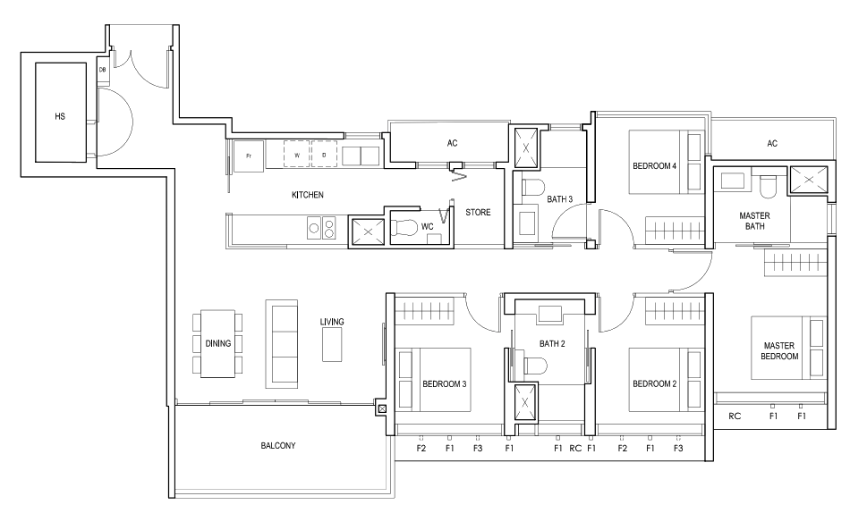
At 1,389 square feet, the 4 bedroom unit at Penrose is a decent size on paper – especially if you compare to the Sims Urban Oasis, where the smallest 4 bedroom comes in at under 1,000 square feet.
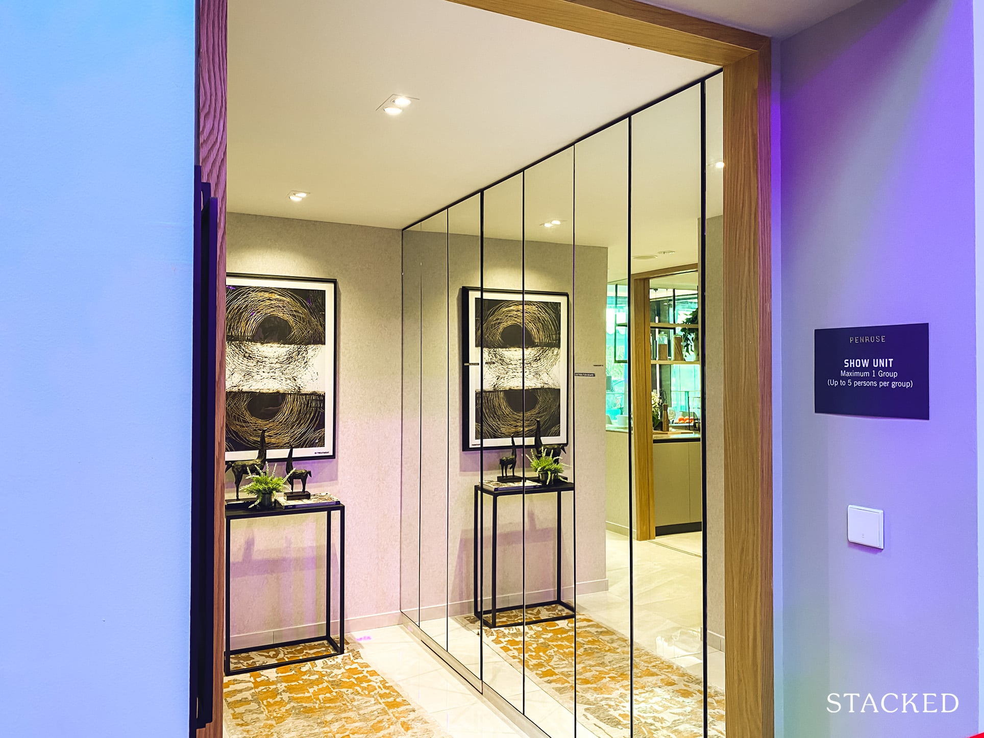
As with most 4 bedroom units out there, there is an entranceway which acts as a privacy barrier. But what’s quite unusual here is the location of the bomb shelter right by the entrance (located behind the mirrors in this instance). I’ve said it many a time, and I’ll say it again – there is a severe lack of storage space in newer condos, so it’s definitely a plus point that this unit has a bomb shelter plus store room.
Note the mirrors here are an ID treatment, so it wouldn’t actually be included.
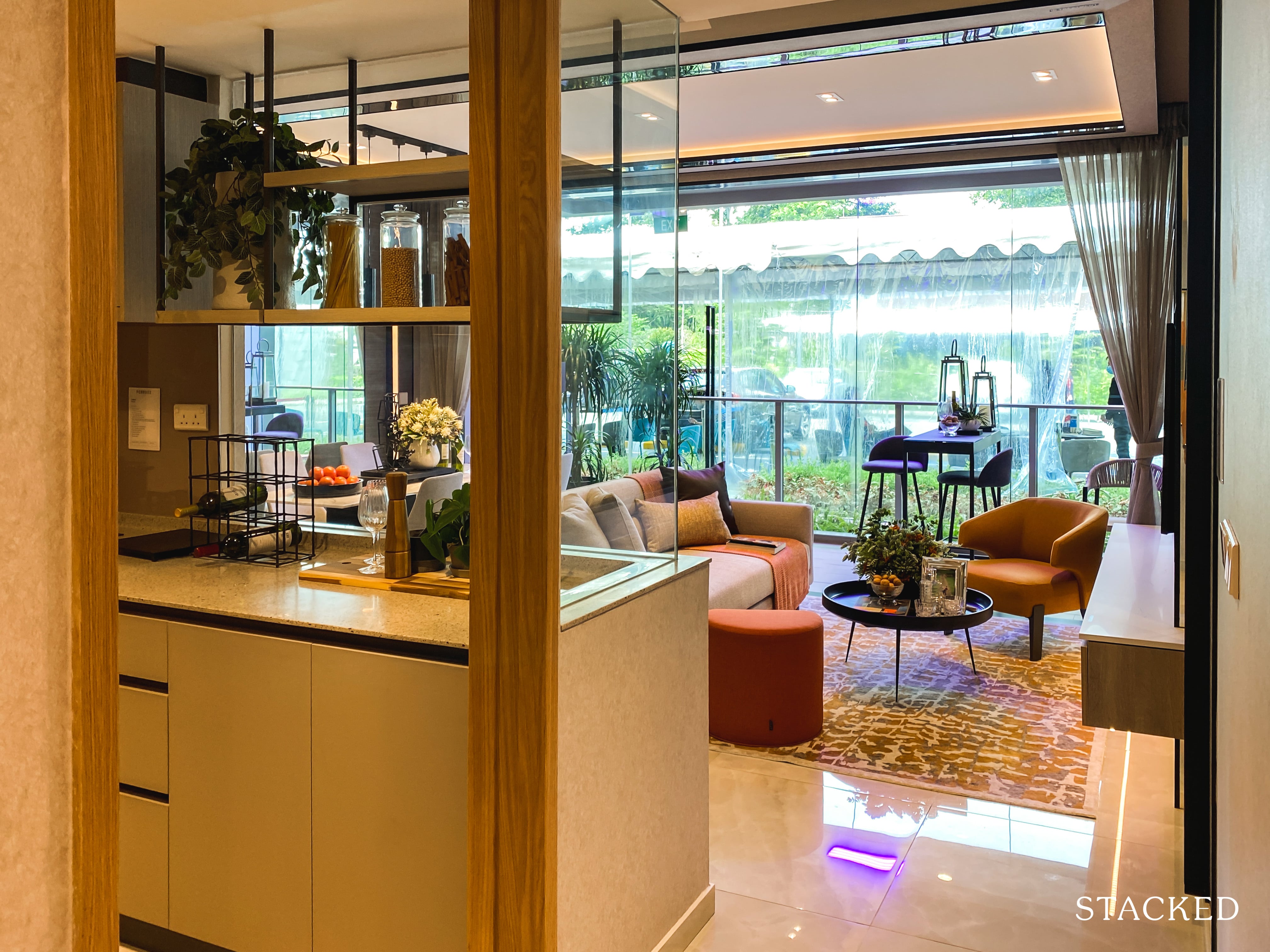
Once you enter from the main door, you will see the kitchen on your left before getting to the living and dining area.
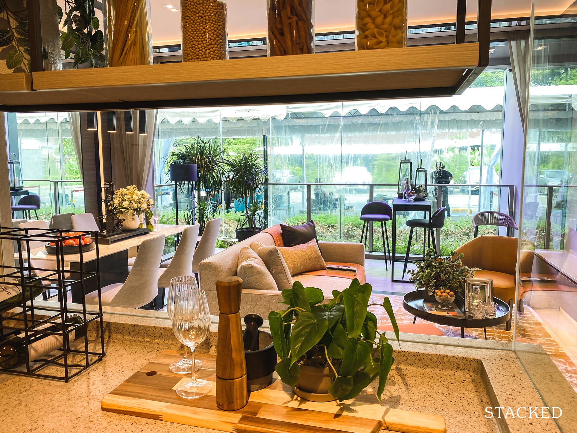
The kitchen features a right-angled cutaway glass, which is getting increasingly common in new launches today. It does make sense to have it as visually it does make the kitchen feel larger and definitely brighter as well (it’s just a bigger pain to clean).
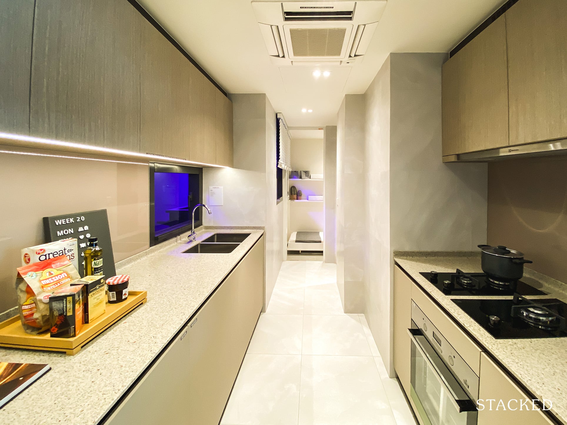
The kitchen here is pretty long, featuring a good length of counter top and storage on one side, with the stove side coming up short because of the location of the WC.
The usual kitchen equipment (hood/hob, fridge and oven) is provided by Electrolux – a well known brand in the local context.
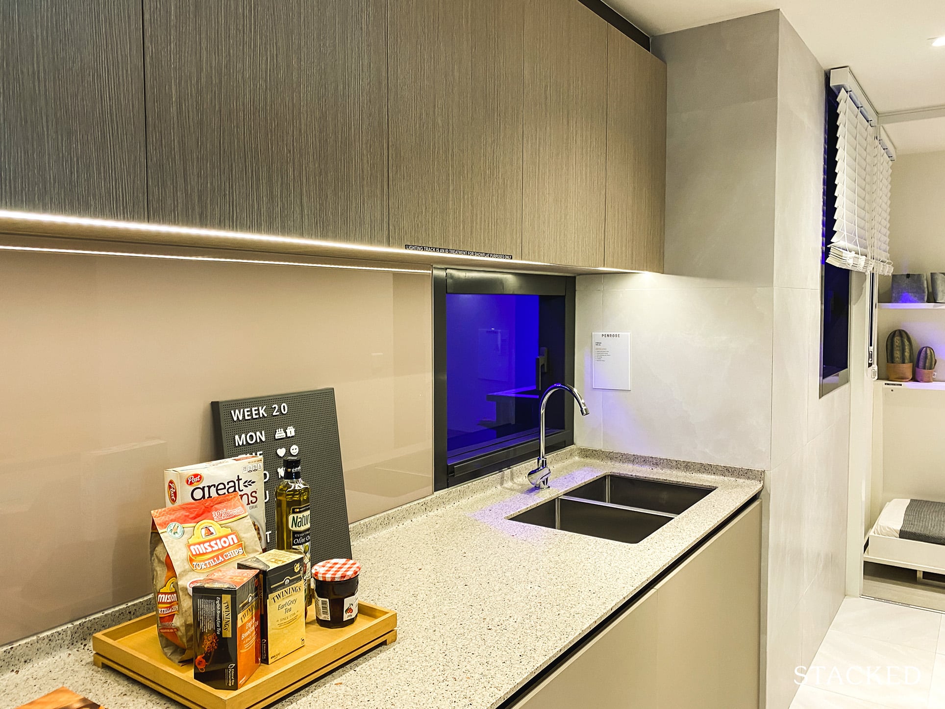
It’s definitely a decent enough space for more than 1 person to work inside here at once, and I do like that they have provided a double sink as well.
On the other hand, the finishings don’t feel and look as quality as you might expect.
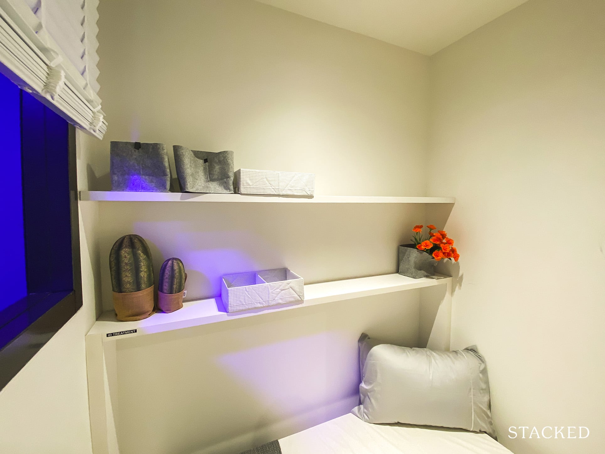
As mentioned earlier, there is a utility room at the back. It’s good that they’ve included a window as well for ventilation, which comes in especially handy if you plan to turn this into a helper’s room instead.
That said, the one glaring omission is the lack of a yard – which is not ideal when it comes to family living. You could always use the balcony to dry clothes, but some people might find it unsightly.
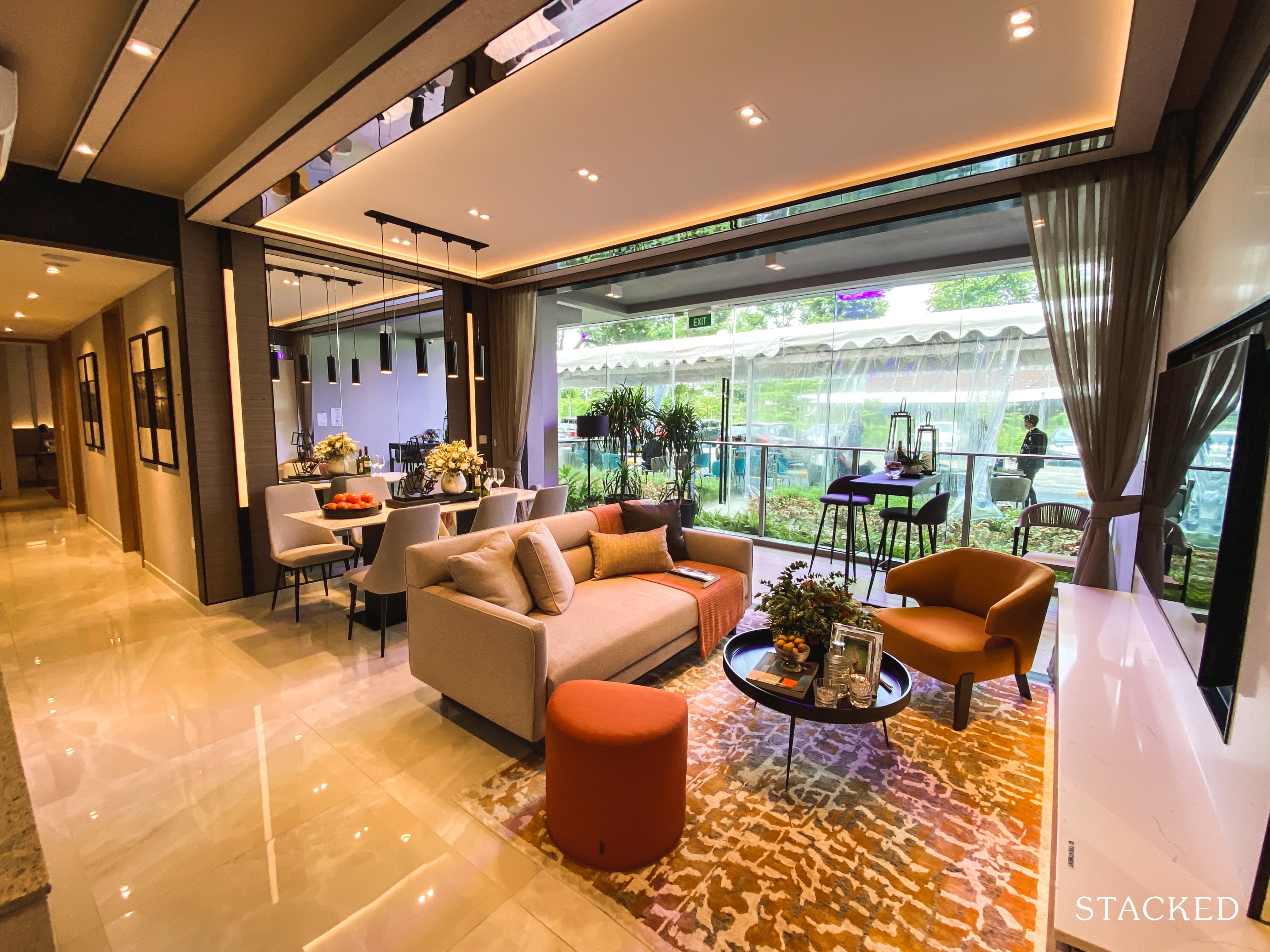
The living and dining is a standard rectangular shape, and on first glance looks fairly acceptable. But you do have to take note to leave an allowance for a walkway to the hallway – so you will be restricted in your choice of furniture.
Another point to note here would be the flooring – it’s homogenous-tiles, not marble. This isn’t meant to be a premium development by any means anyway, especially not at this price point.
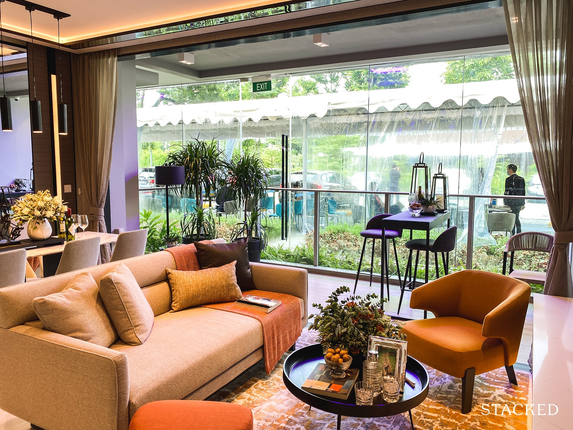
As you can see, with a coffee table, couch and TV console, it does feel a tad squashed in the living area. Frankly for a 4 bedder unit, I would say that a 3-seater couch is hardly adequate, even with the armchair by the side.
That said, I do like that they have tried to fit “normal” sized furniture here. Like a proper coffee table (unlike some of the tiny ones I’ve seen), a TV ledge (to micmic the TV console), and even an ottoman. So you do get a much better idea of the space afforded.
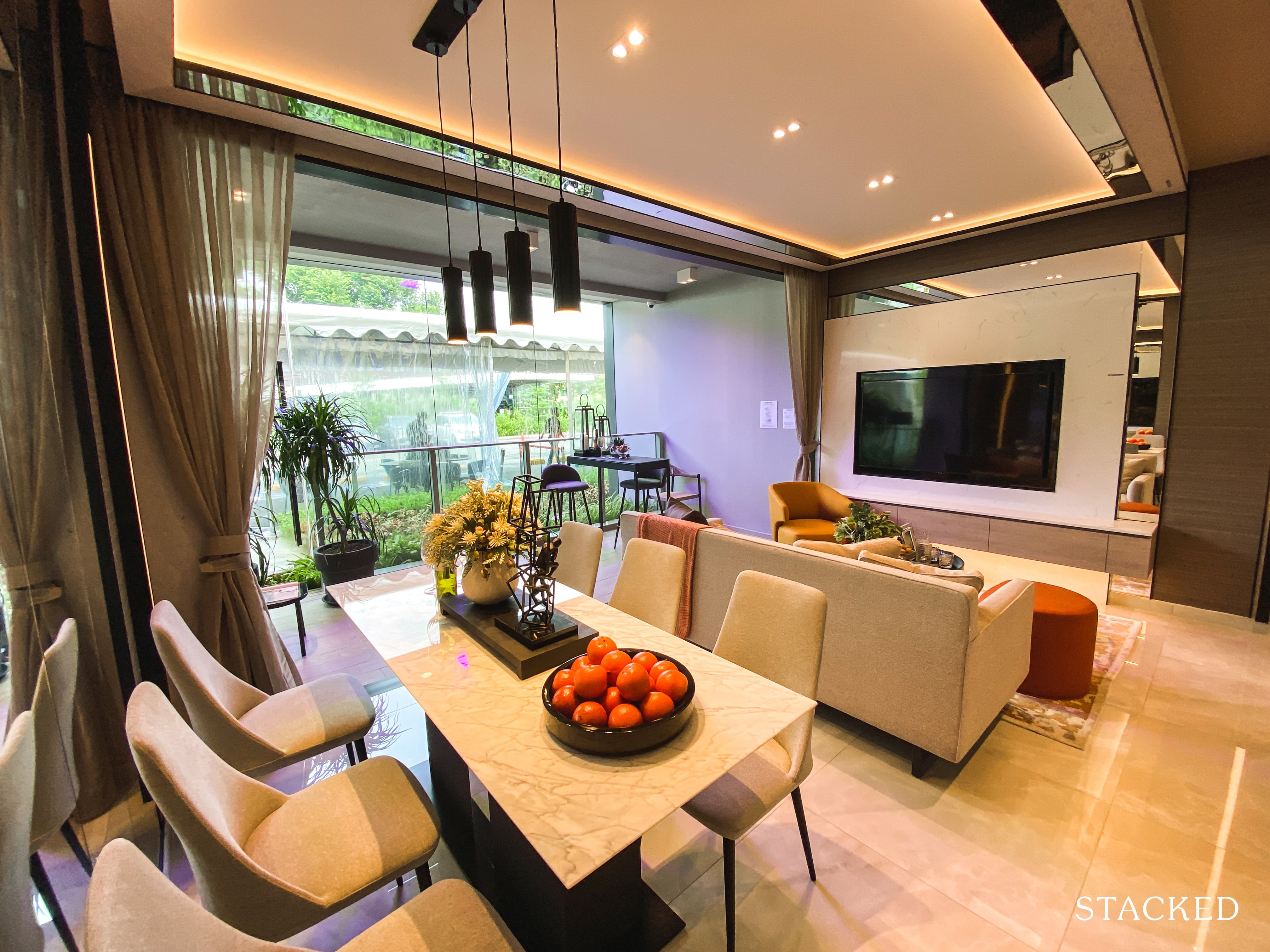
Same goes for the dining, where the chairs have been mostly tucked out (it’s usually all tucked in). You can fit a 6-seater relatively comfortably, but remember if you have seats on this end, it will end up blocking the walkway.
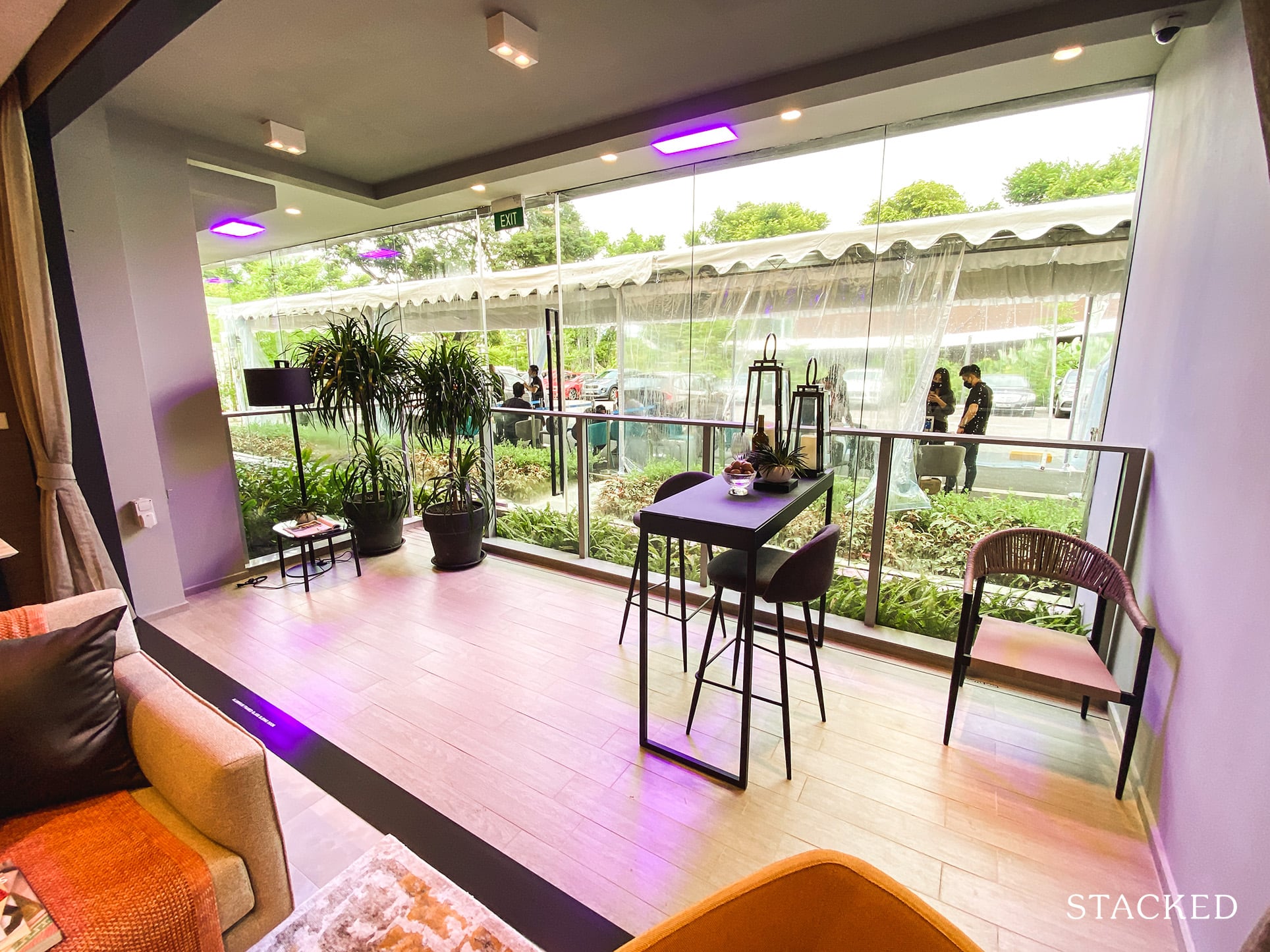
The balcony is rather wide, and it does span the length of the living and dining too so I can imagine some people being displeased at the space allocated to it. That said, this could always double up as the dining area instead so you have a more spacious living room.
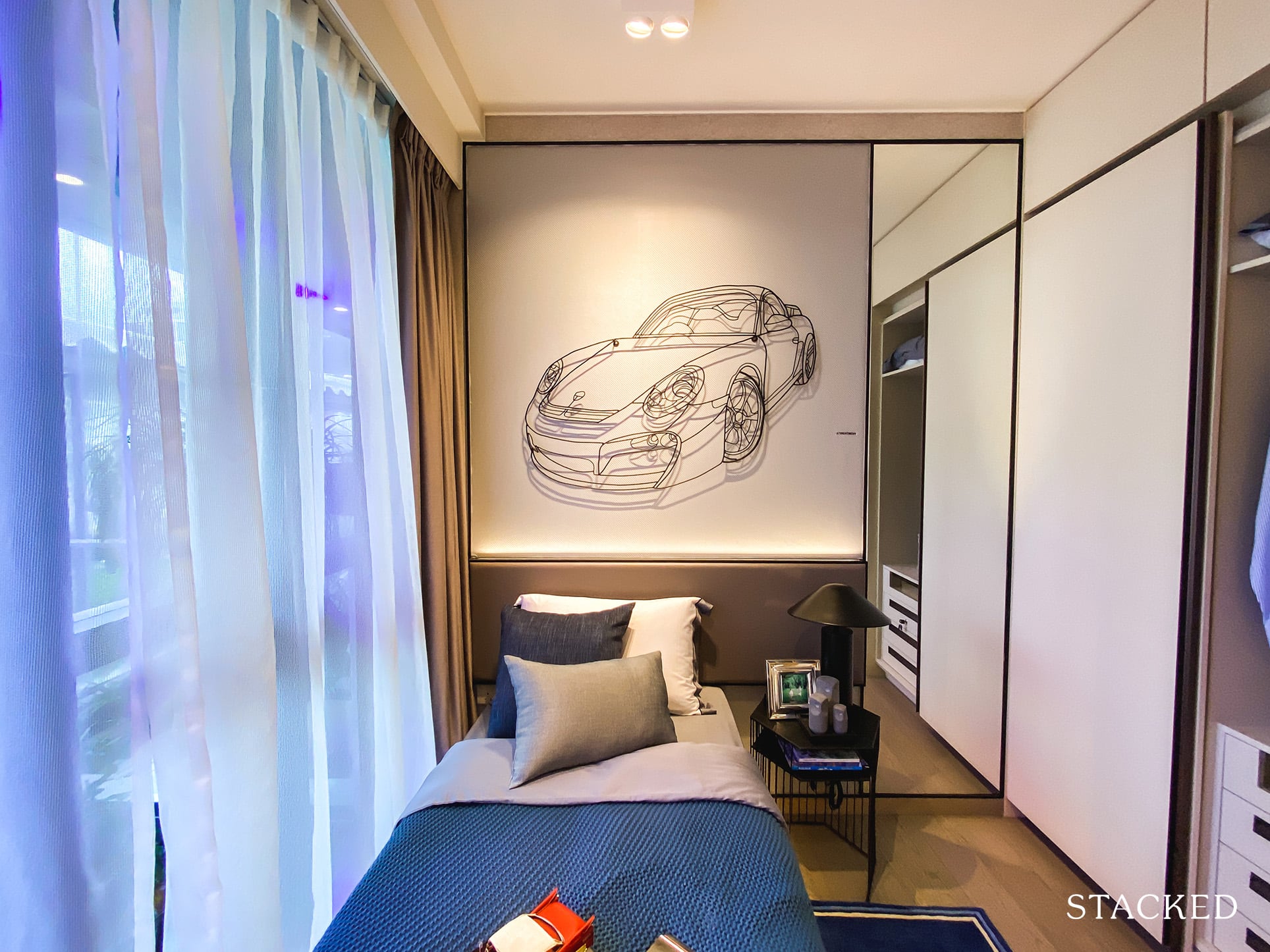
As expected, the common bedrooms are all on the small side. Storage space is the usual 2-panel wardrobe space.
What’s impressive about the layout here is that every bedroom in this unit can almost be considered to be ensuite. While it isn’t a proper exclusive ensuite per se (barring the master bedroom), it still is a laudable feat.
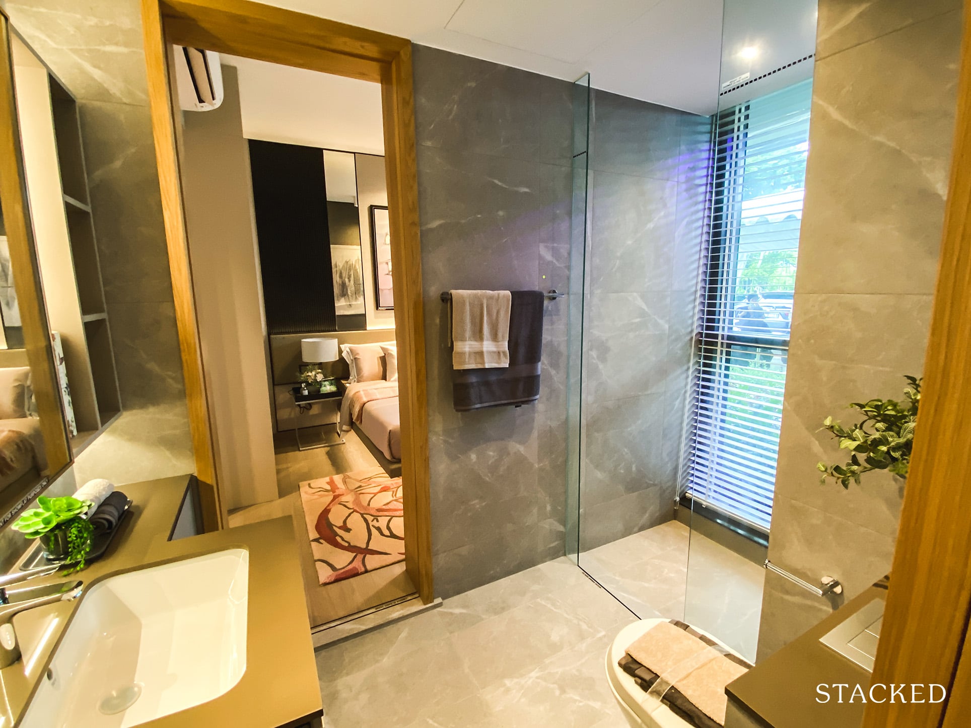
This means that the common bathroom straddling between both bedrooms is quite spacious, plus it features a floor to ceiling window too (although you will have to keep the blinds shut while using the bathroom).
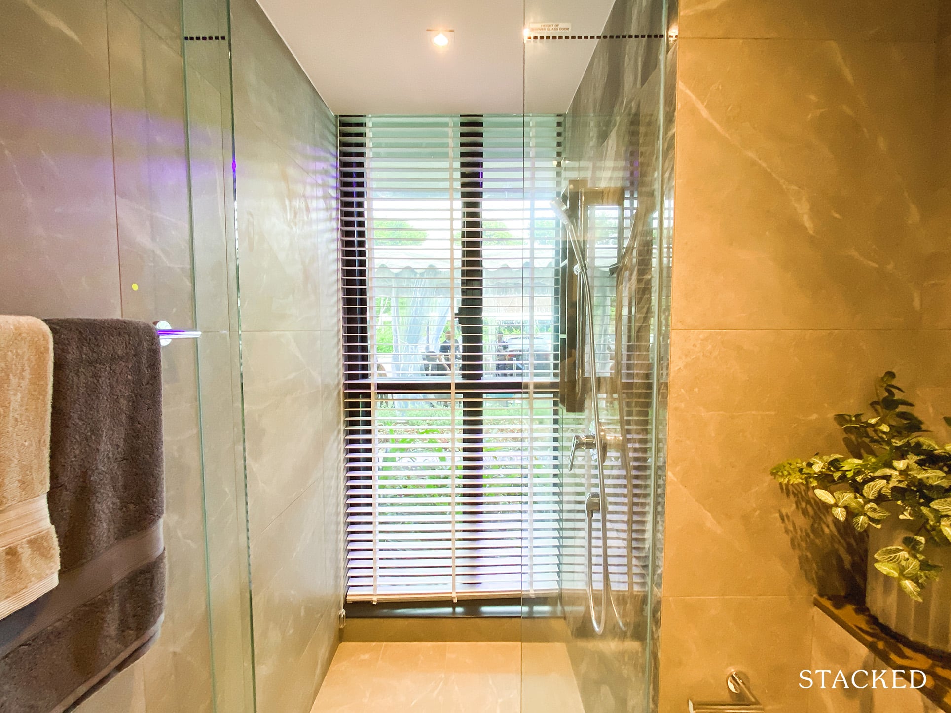
There’s no doubting the increased usability of the jack and jill bathroom – it far outweighs the inconvenience of having to lock both doors while you are in the bathroom.
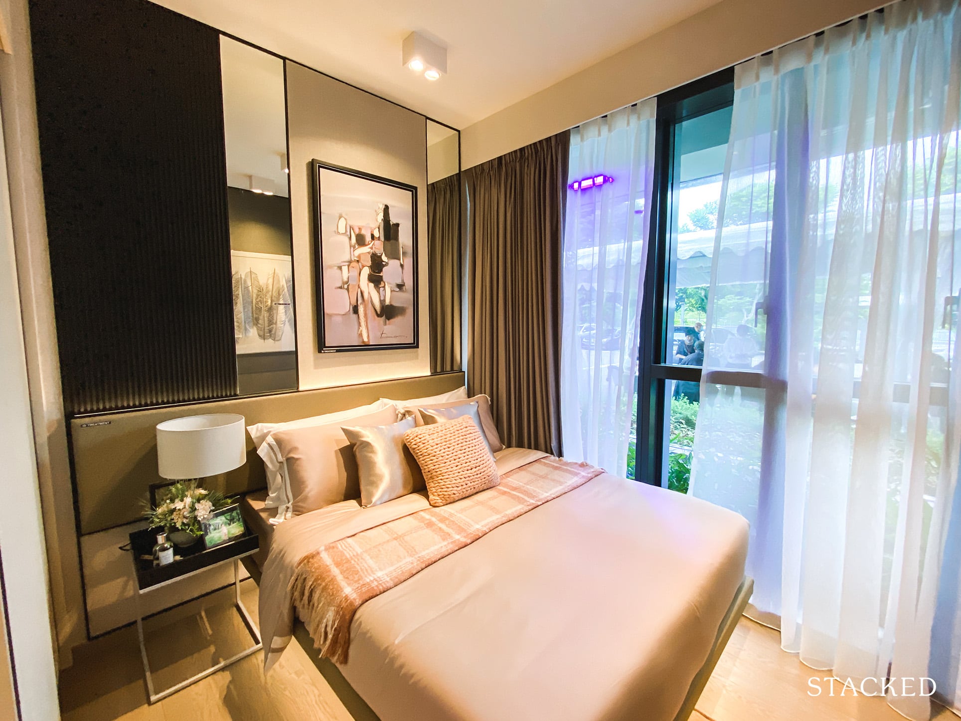
On the other side of the bathroom is the next common bedroom. It is the same size as the first, so you’d get a clearer idea of how much space the room has as they’ve put in a queen size bed in this one.
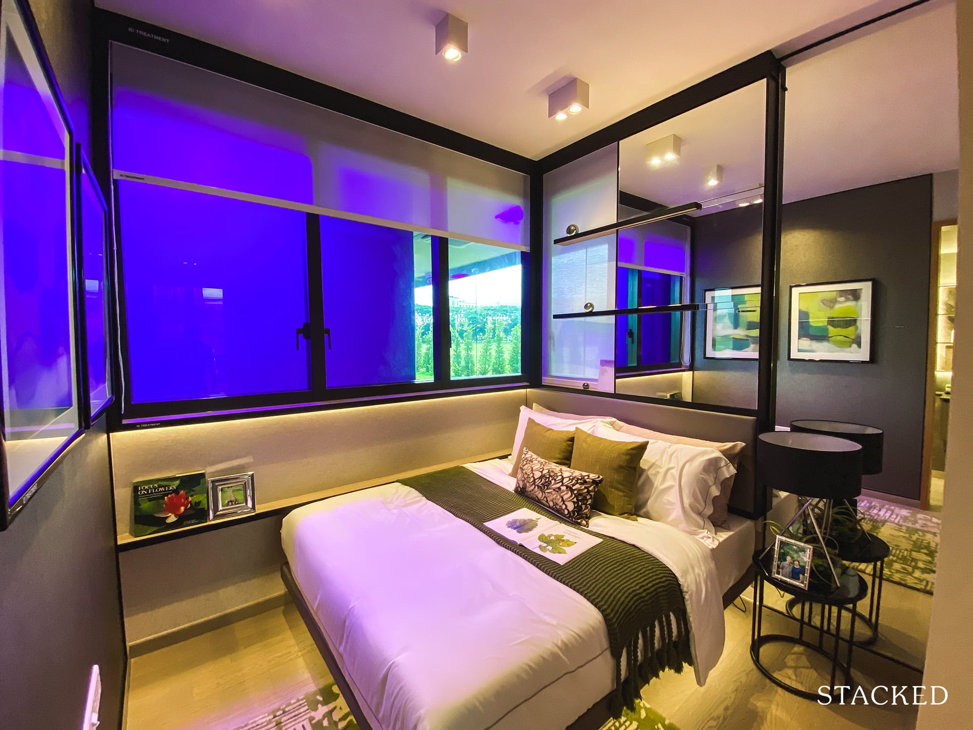
The last common bedroom is probably the least appealing one of all. Given its location, it wouldn’t enjoy a great facing – plus it doesn’t even feature floor to ceiling windows unlike the others. It’s quite strange as the AC ledge (which is the usual suspect) isn’t even located on the outside here.
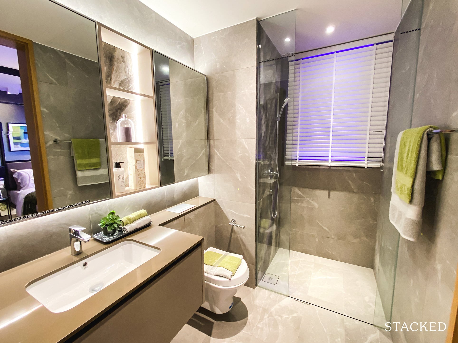
The common bathroom here is definitely smaller than the first, but there isn’t really much to complain about as the usability is spot on. As mentioned earlier, you can access it from the bedroom, as well as from the hallway. This means that this would probably be the bathroom utilised when guests come to visit.
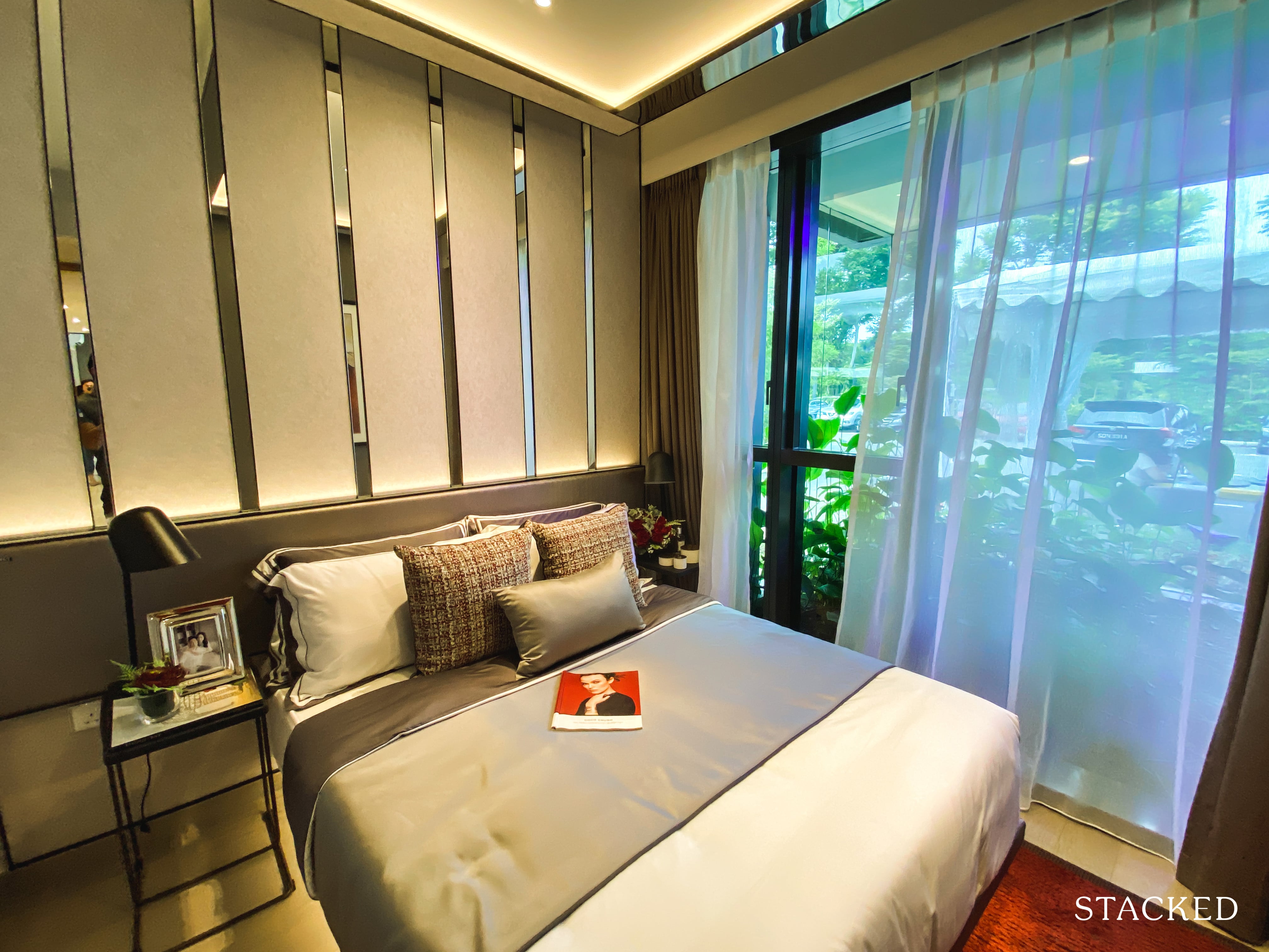
Expectedly, the master bedroom is on the small side. You can fit a queen/king sized bed for sure, but there isn’t space for much else. Again, the 2-panel wardrobe here will hardly be sufficient for most couples.
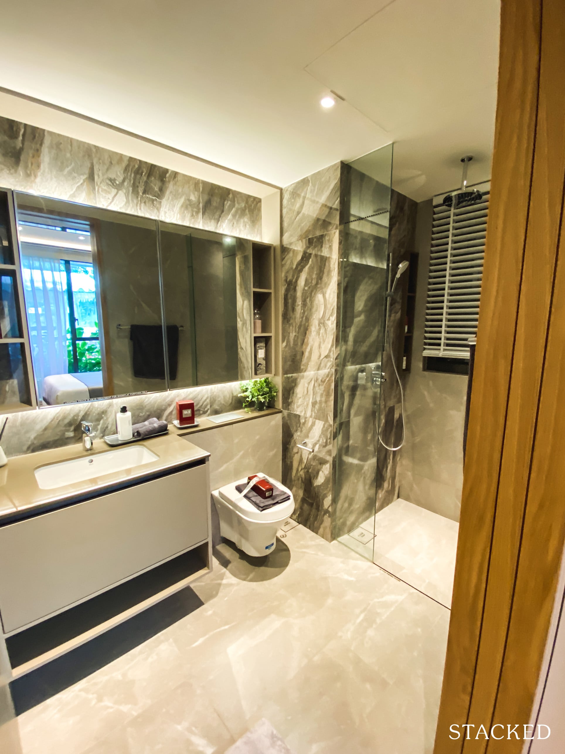
The master bathroom is quite spacious, with the rain shower being the only real feature setting it apart from the other bathrooms.
Penrose 3 Bedroom Premium Review
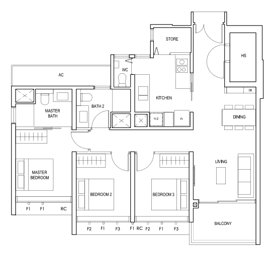
With nearly half of the unit mix (282/566) at the Penrose belonging to the 3 bedroom category, it is again quite clear at the type of buyer that the developer is targeting. There is a good range of 3 bedroom units, with the smallest coming in at 936 square feet.
So at 1,055, this 3 bedroom Premium unit is slightly bigger, with the main difference being the additional store room, bomb shelter, and bigger kitchen.
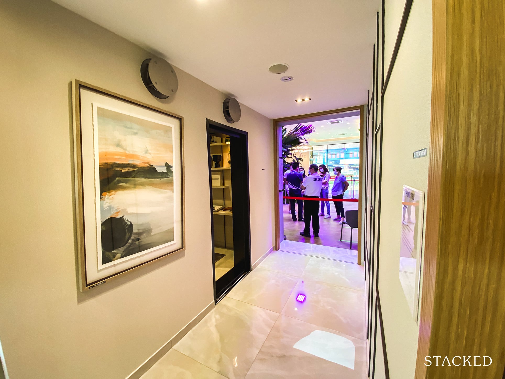
It’s a regular entrance way to the 3 bedroom unit, it’s quite long which isn’t great in terms of efficiency. You do get the bomb shelter on the right when you come in, which is good for additional storage options.
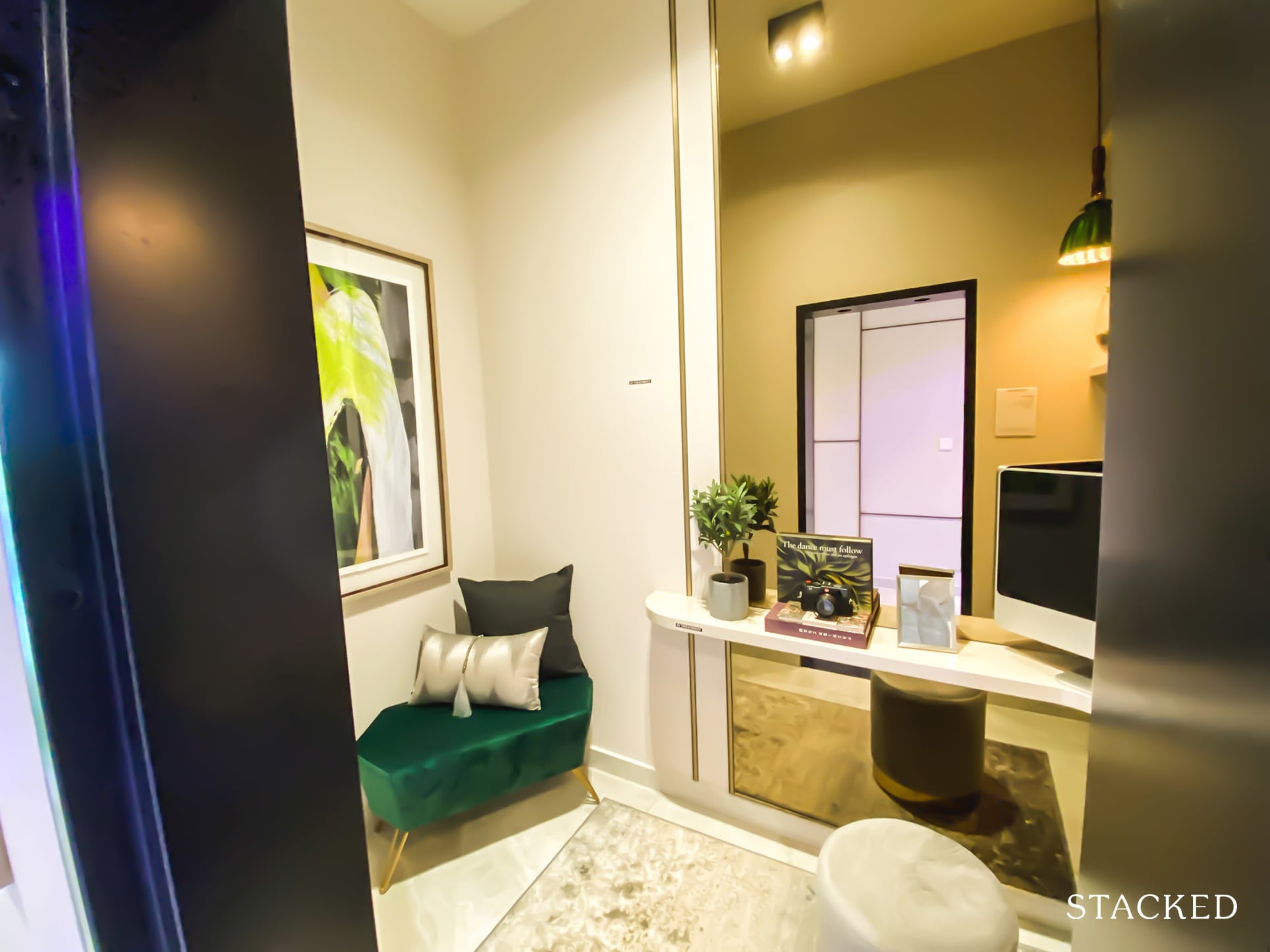
In contrast to the 4 bedroom unit, without the mirror panelling it does look exposed and not as sleek – so I would definitely take inspiration from that. It also does the trick to make the space look bigger.
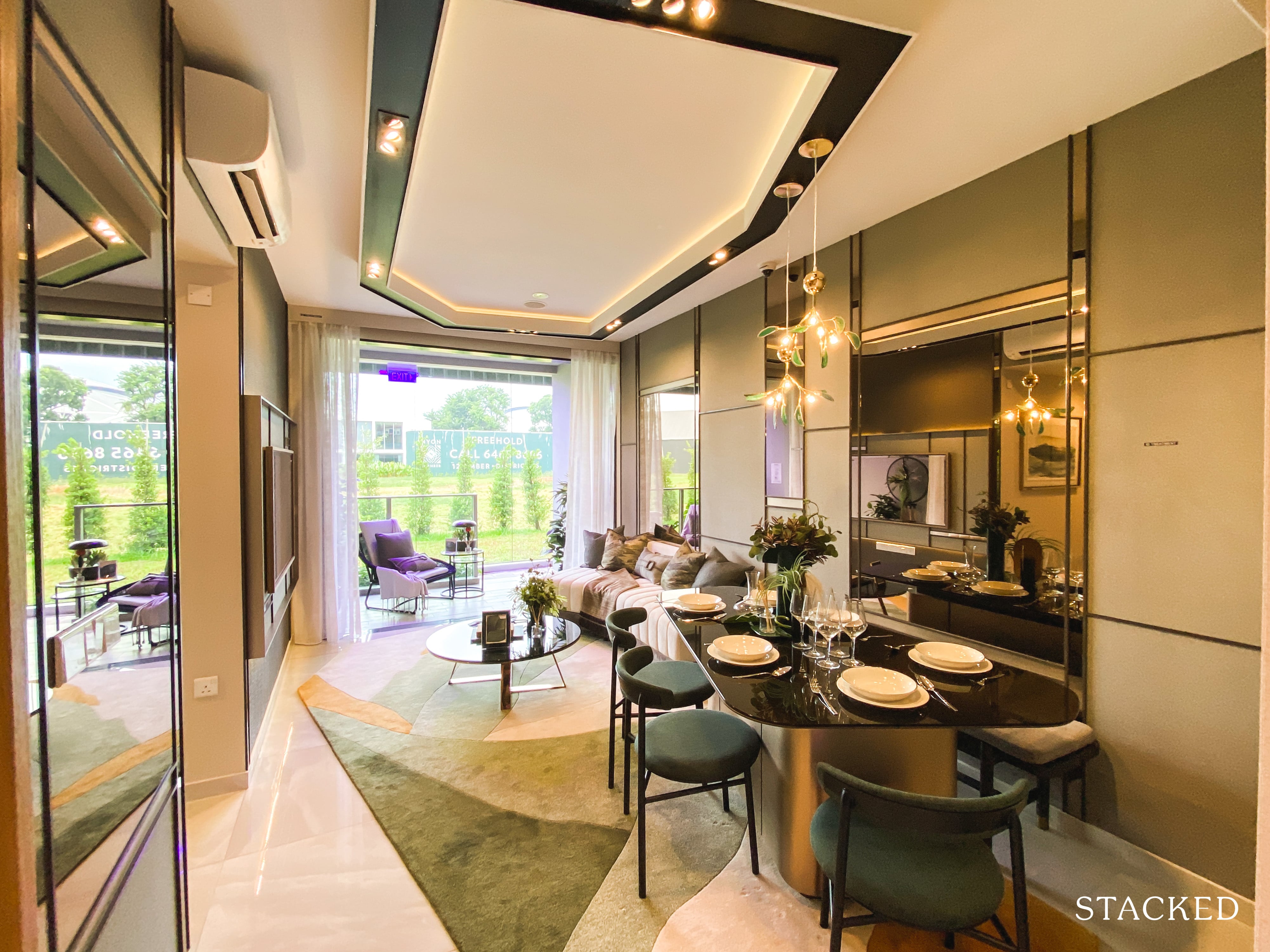
Once you step in, first impressions are quite positive. Its rectangular shaped layout bodes well for renovation plans, and you do notice that it is rather wide.
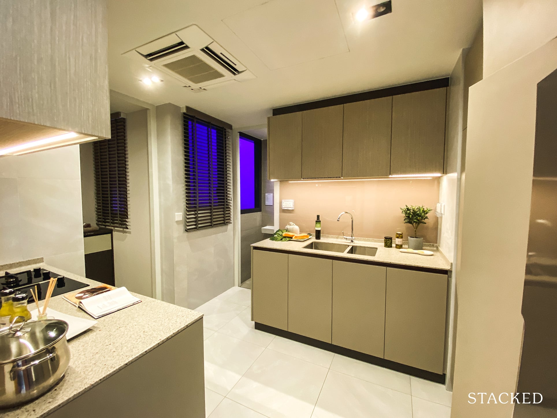
To your left is the kitchen and it is a really surprising to see the size of it. I daresay it might even be a better one over the 4 bedroom kitchen as the sense of space here is impressive.
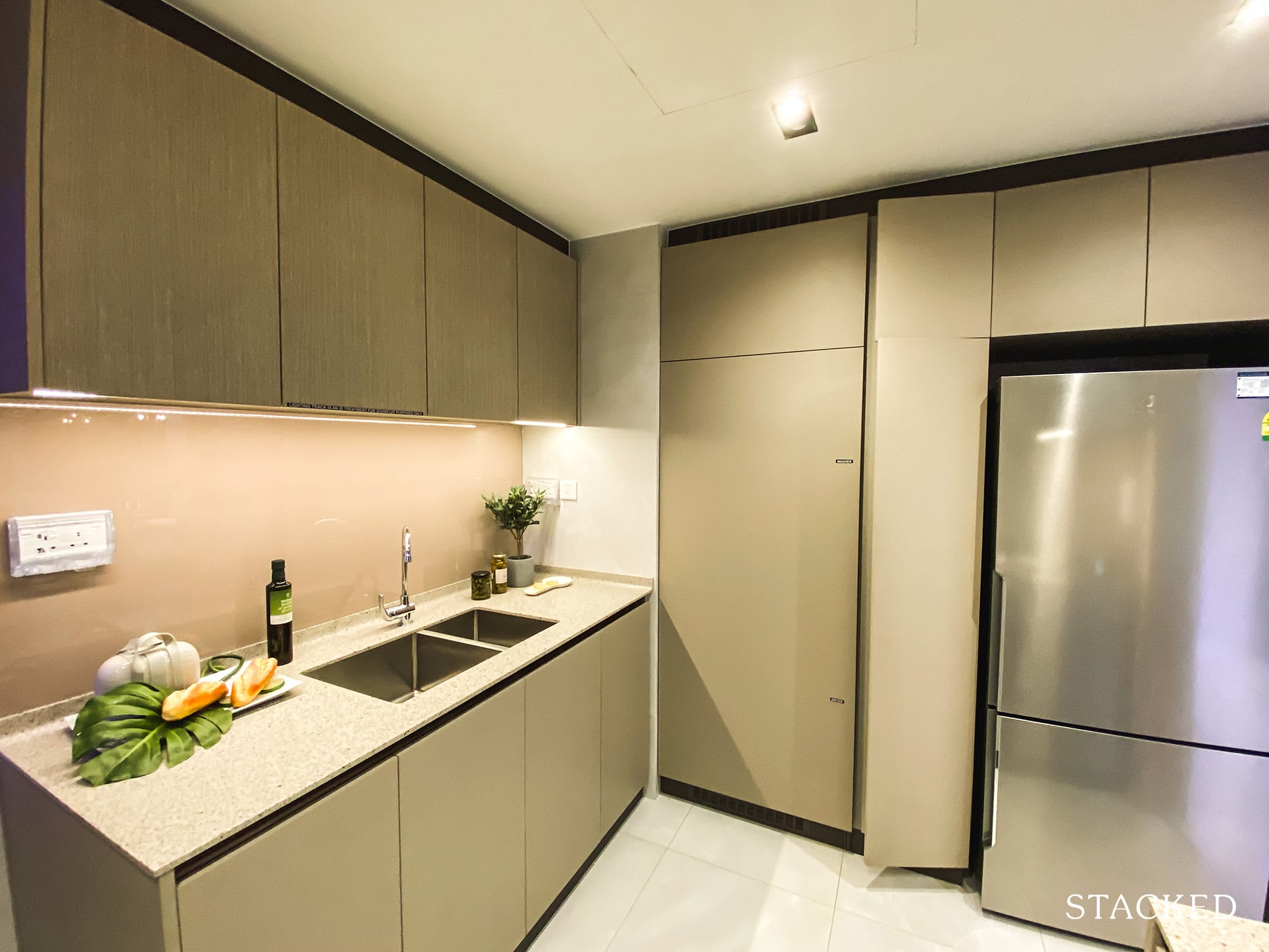
I mean, countertop space definitely isn’t on par with the 4 bedroom, but with the squarish layout here it does take the cake in terms of how open it feels. Even with 2 or 3 people in here at a time would be completely fine.
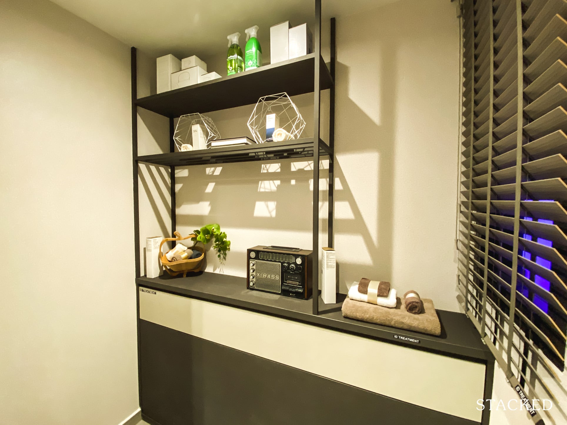
As with the advantage of the 3 bedroom premium unit, you do get a store/helper’s room at the back of the kitchen. In a similar vein to the 4 bedroom unit, there is a window here for ventilation – which for a helper’s room would be extremely beneficial.
Given the clientele, I would think this would most likely be used as a helper’s room anyway, as there is still the bomb shelter for extra storage.
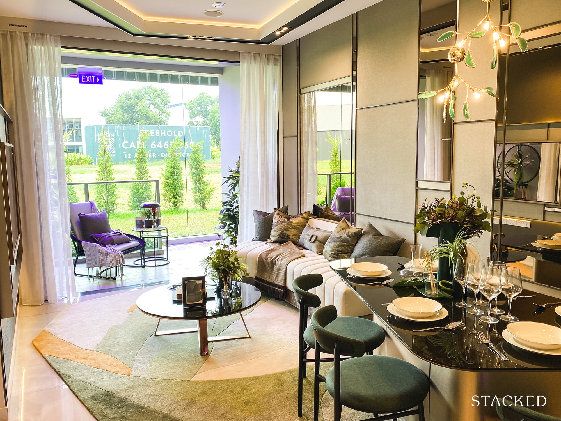
Now, back to the living and dining area. The dining space looks decent enough, with the example showing a 5-seater style table. I doubt many people would spring for this awkward layout though, even though it does seem to be a good fit for the space.
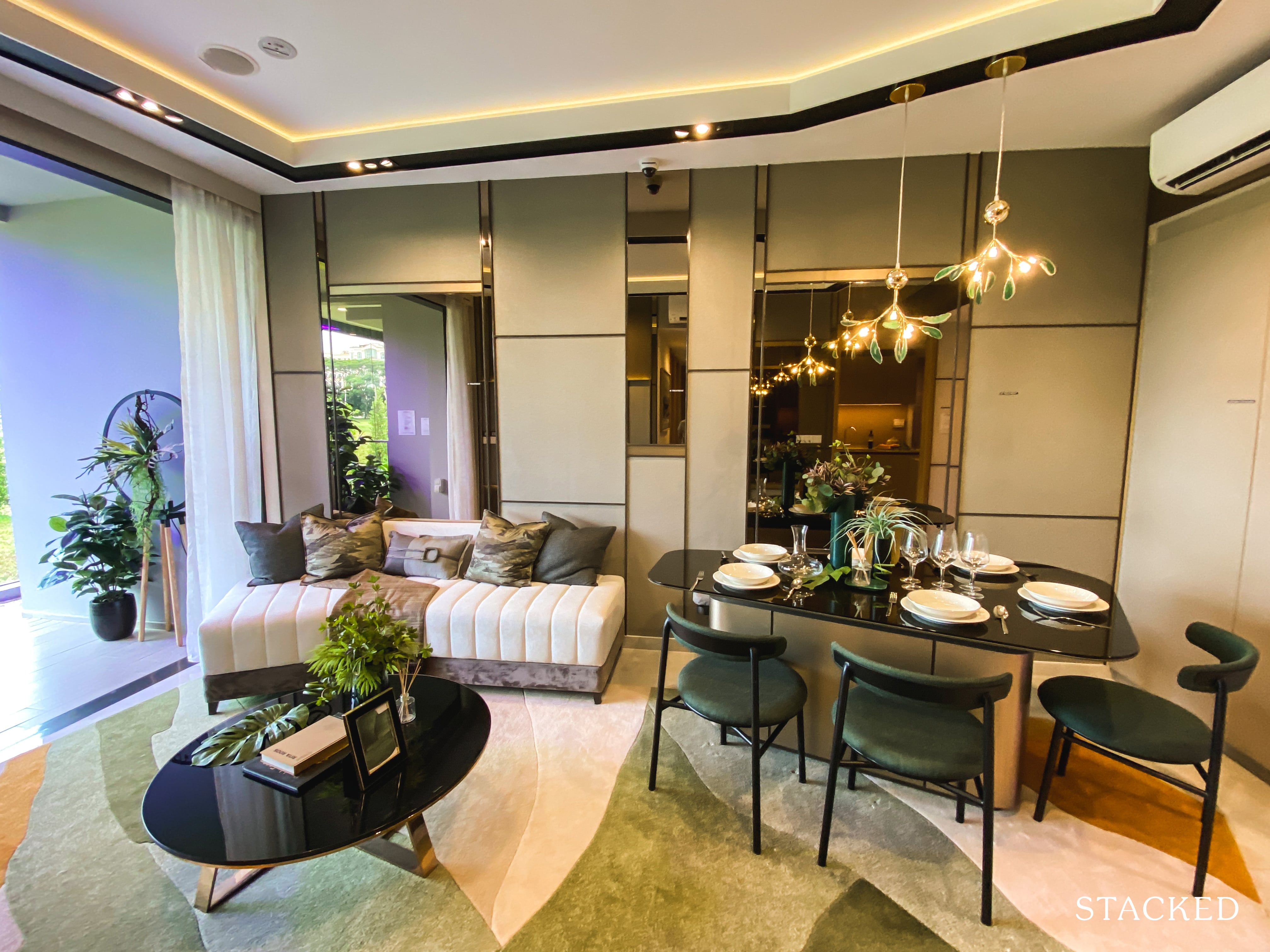
Length wise, however, the living and dining room doesn’t fare quite as well. In this case, fitting a 3-seater sofa does seem to be a tight squeeze. And in most cases, a 3-seater sofa would definitely not be adequate for the needs of a family – so I am struggling to see how it would be possible to fit anything bigger.
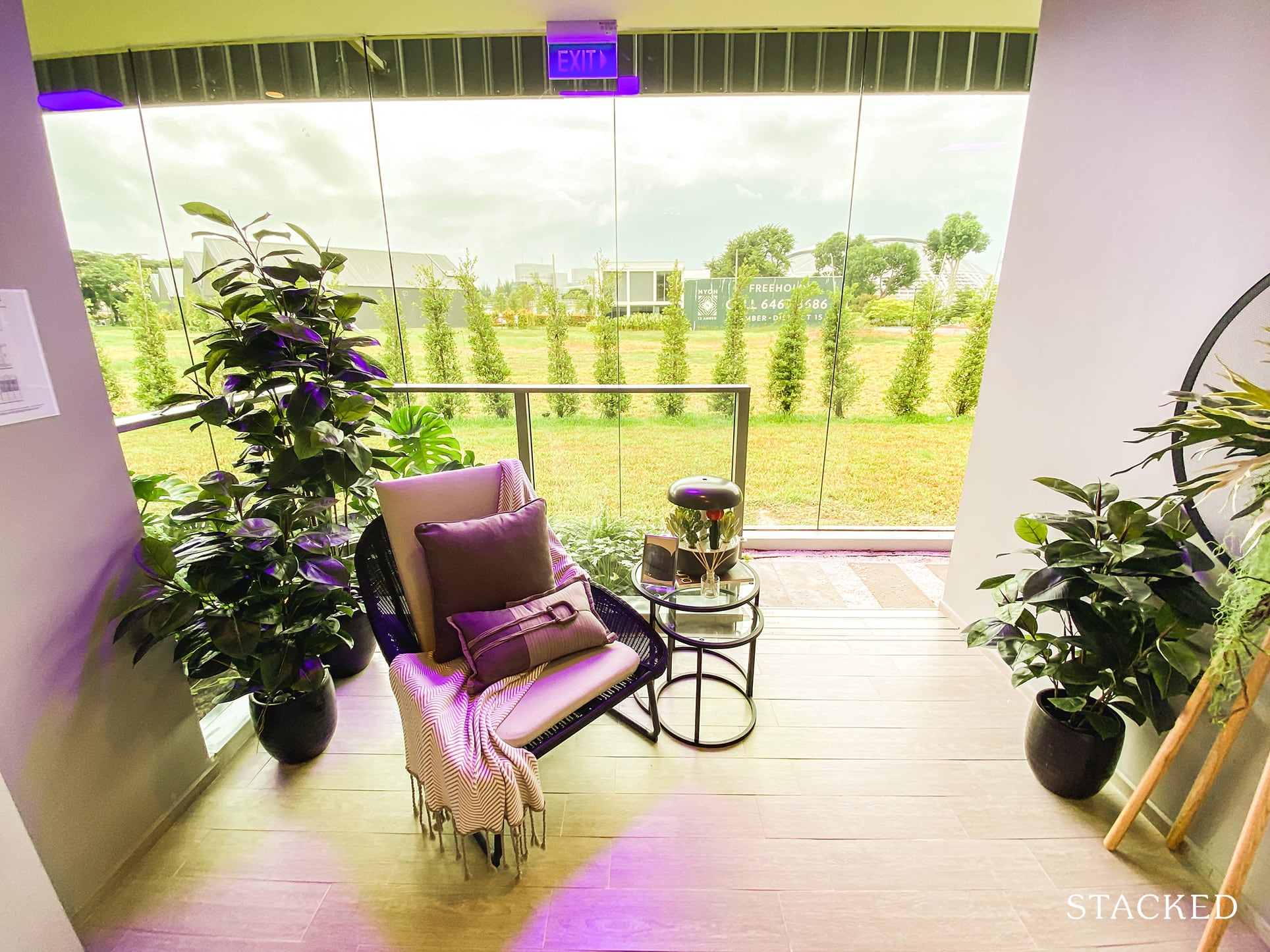
Those with an intense dislike for outdoor spaces should feel happy with the size of the balcony here. While you can’t have the whole family out here to dine on a daily basis, there is enough room for some outdoor chairs and a small table.
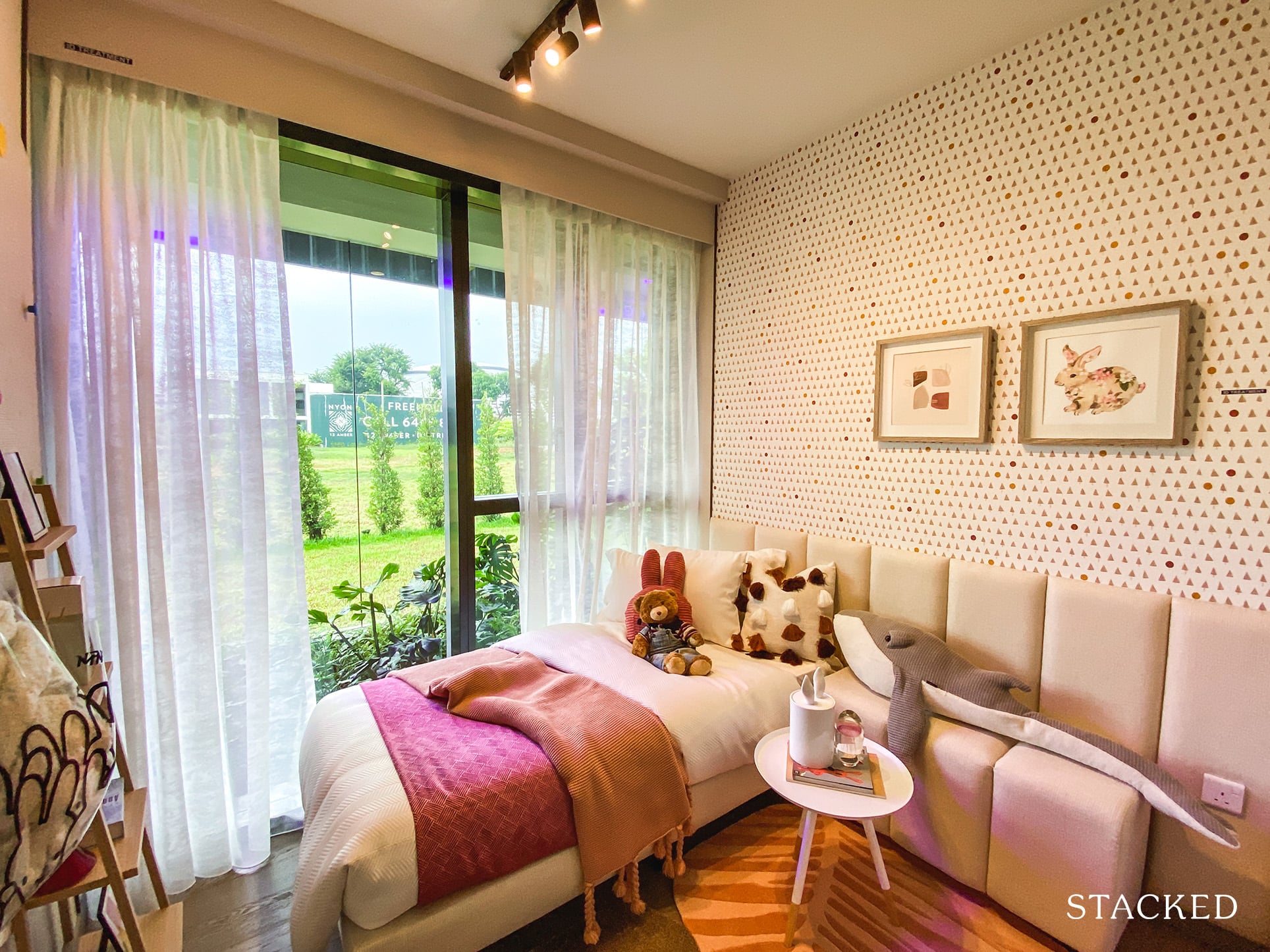
Both common bedrooms here are of equal size, but it’s the usual cookie cutter stuff. A single bed definitely leaves you with a lot more room for a study table.
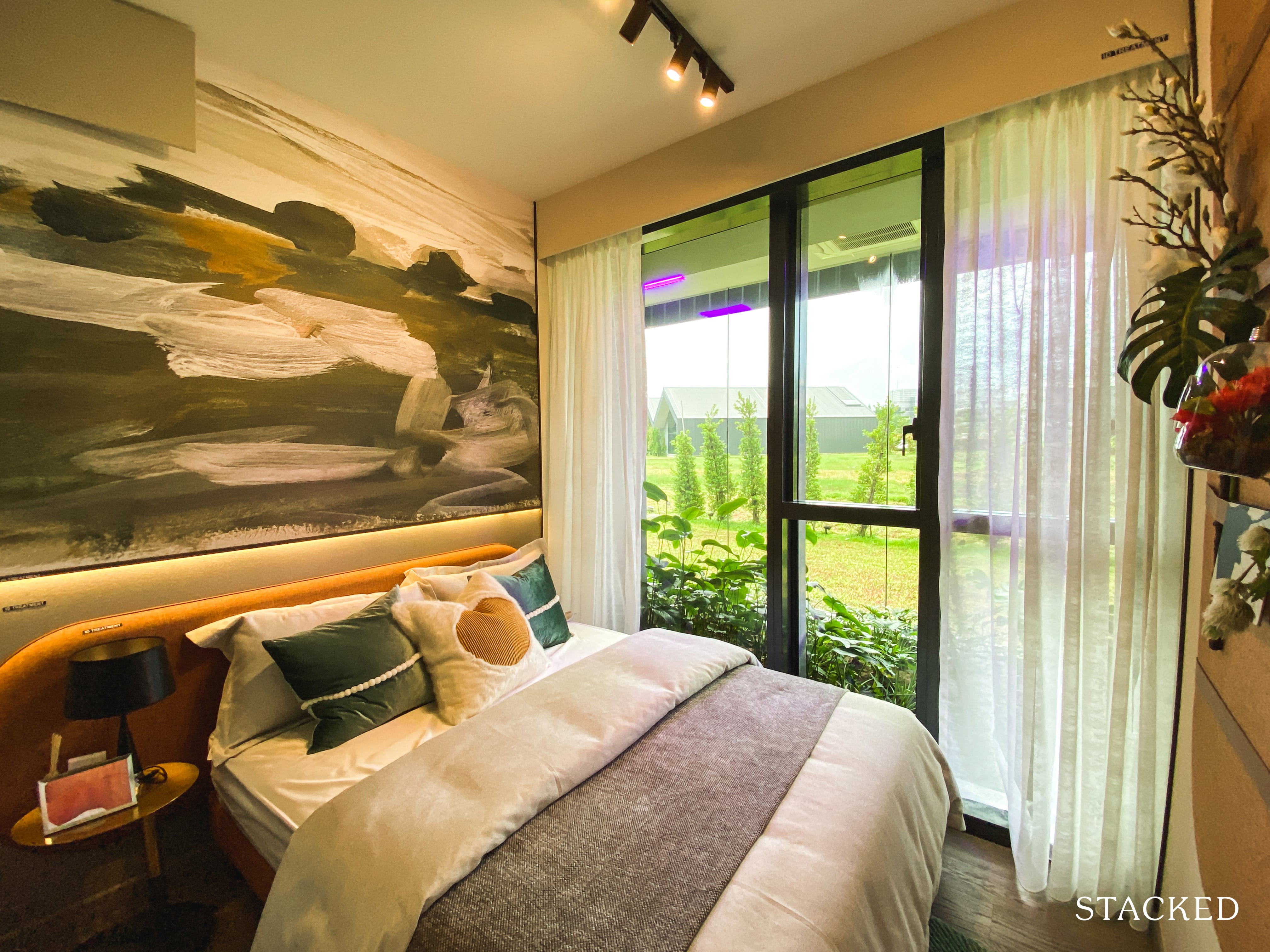
Likewise, they have shown an example of the common bedroom with a queen size bed fitted instead. As you should expect by now, a bed of this size severely limits your walkways. You do get floor to ceiling windows, which is almost the bare minimum nowadays.
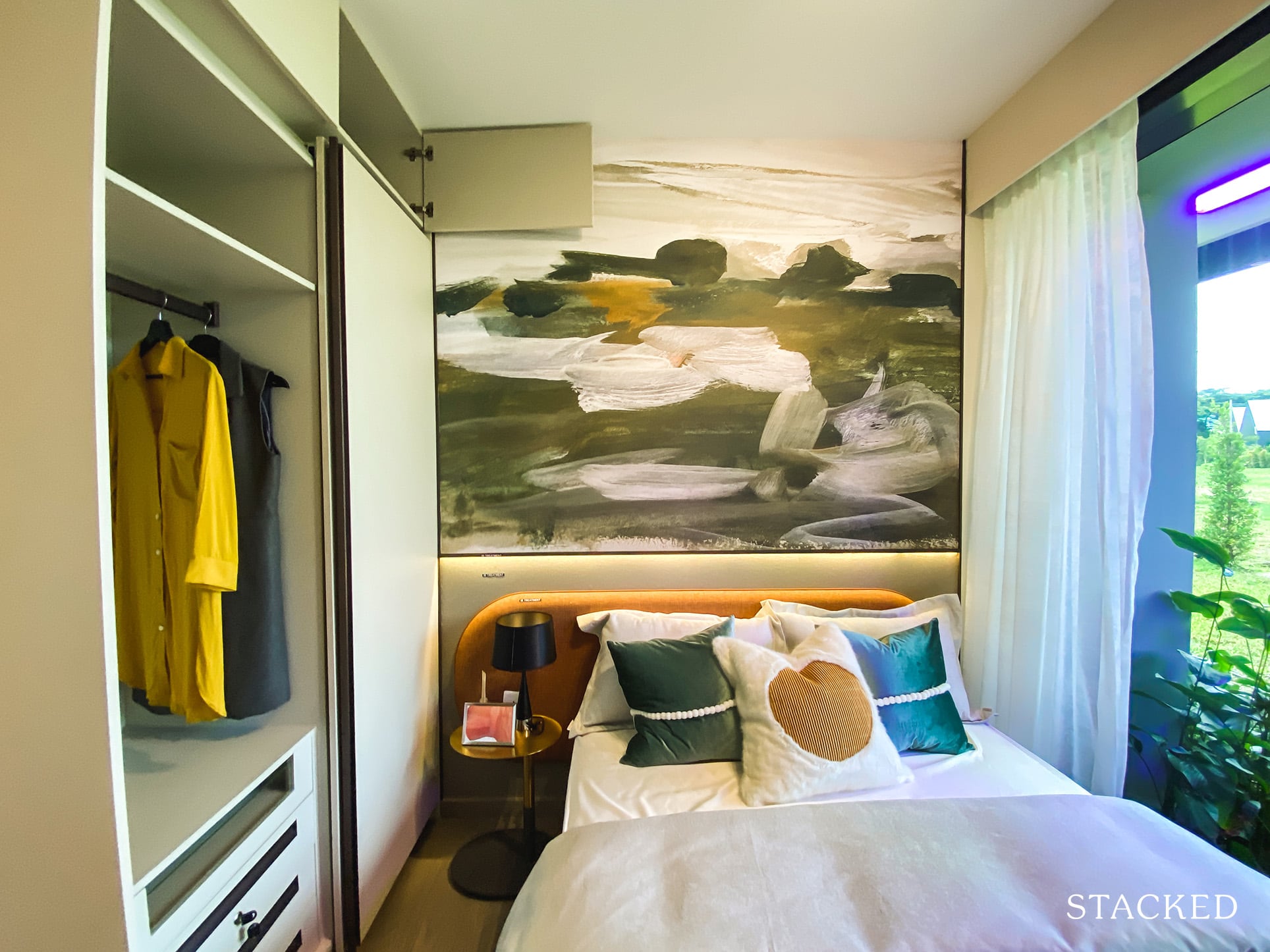
It’s the same story with storage, with the 2-panel wardrobe making its regular entrance.
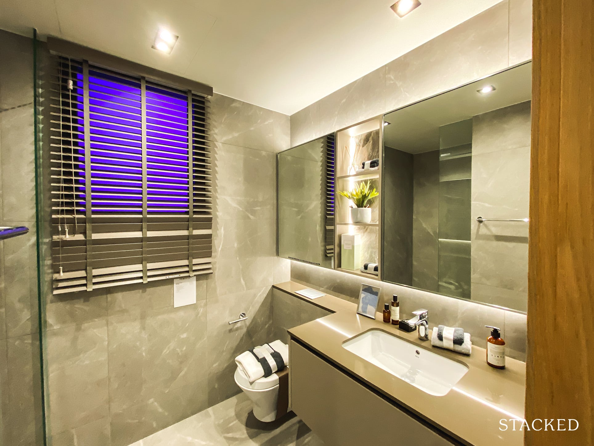
The common bathroom is a decent size. I’m not a fan of the finishings of the sink top, the colours don’t look attractive and can look old quite fast. If you’re wondering why the window looks small, it’s because the AC ledge is located on the outside.
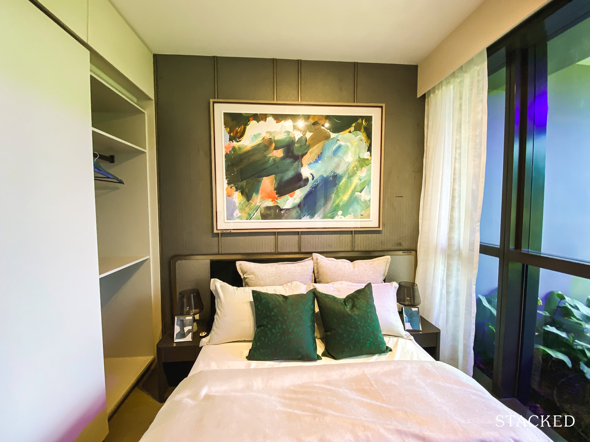
While the master bedroom is no doubt bigger than the common bedrooms, it really isn’t by much. As you can see with the queen size bed in here, there isn’t all that much room to do much else – it isn’t the most impressive showing, as far as a master bedroom is concerned.
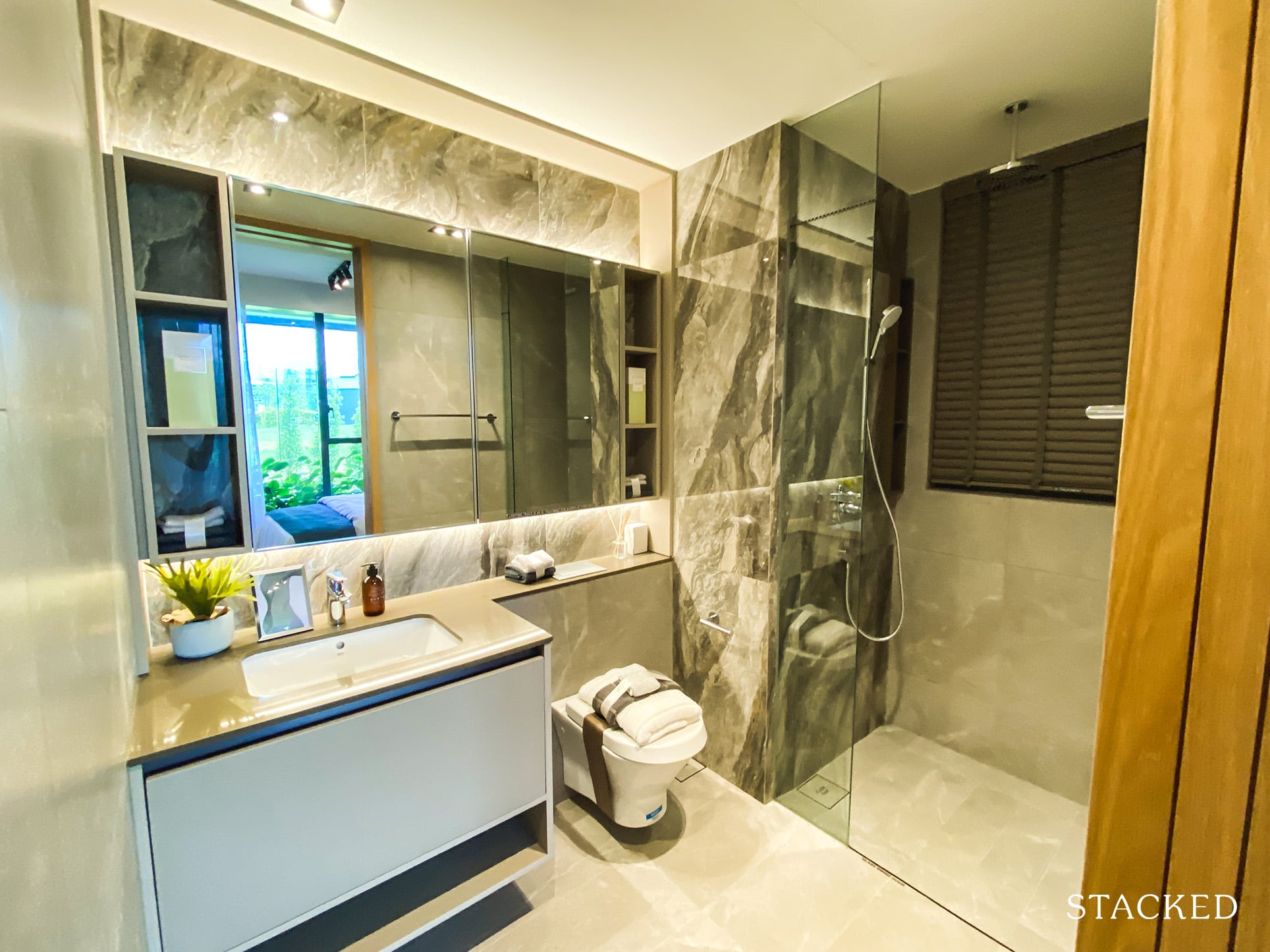
If you’ve seen the master bathroom in the 4 bedroom, you can probably just skip this. It’s no different in size, with the rain shower being the only differentiator to its master bathroom status.
Penrose 2 Bedroom Review
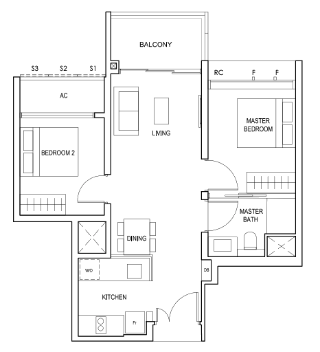
In terms of a 2 bedroom property, this layout is probably the one everyone is looking at given it would be the lowest entry price as the smallest 2 bedder unit (646 square feet).
Overall, I think the layout is good. It is as efficient as it probably can be already, with a minimal entryway and dumbbell layout. Of course, note that this is a 2 bedroom 1 bath, but with the separation of the bedrooms – this is as good as it gets.
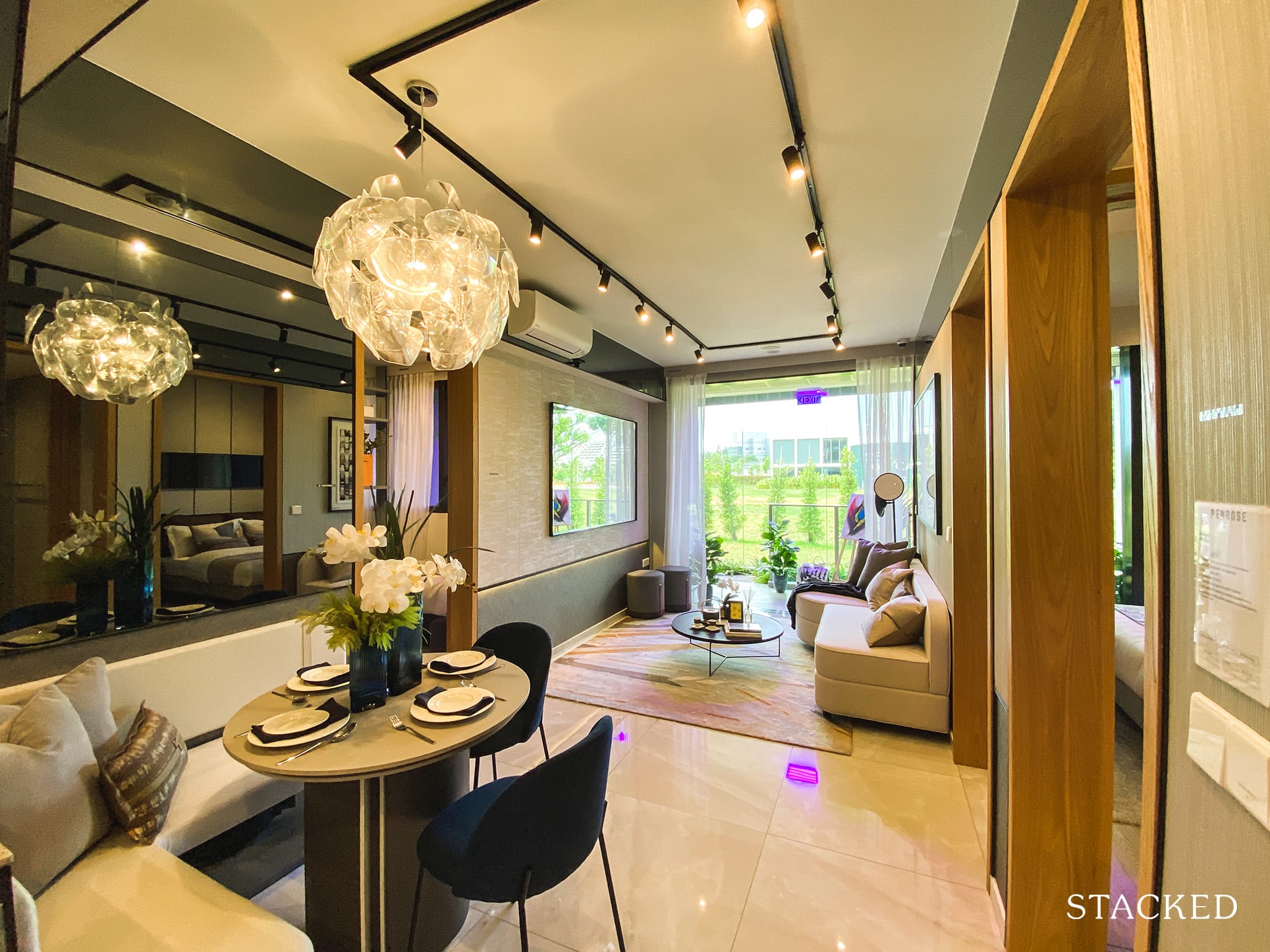
Once you step in, you have an immediate view of the dining and living areas, with the kitchen on your left.
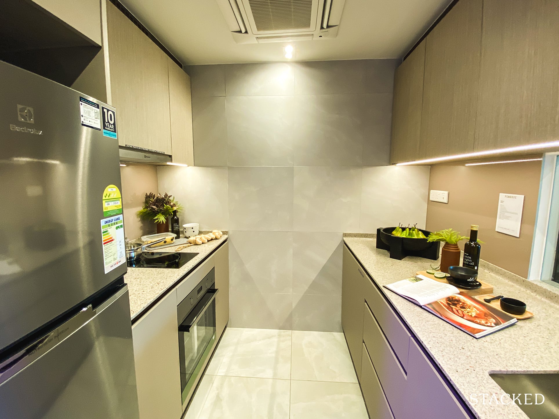
I like the kitchen. It has a sufficient amount of countertop and storage space for a 2 bedroom unit. The best part? It is actually an enclosed one (although you have to be mindful that there is no window for natural ventilation).
Nevertheless, I’d always still prefer an enclosed kitchen over an open one – so it is quite good they have managed to incorporate one here. As per usual with what you’ve seen so far, white goods here are by Electrolux.
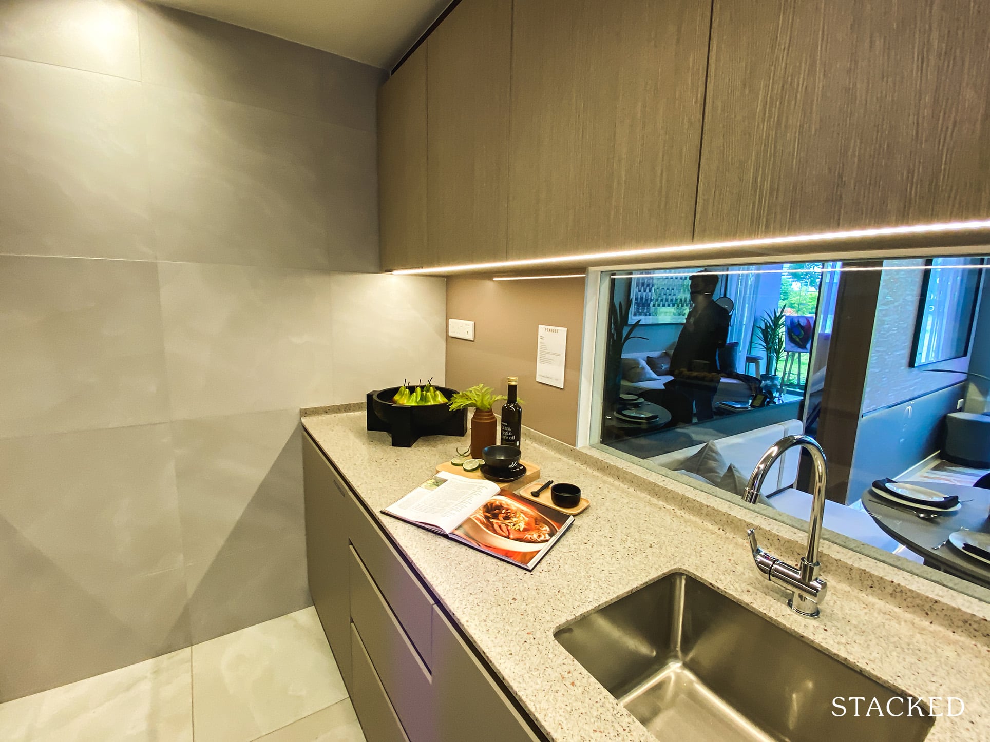
In congruence with the other units so far, there is a glass panel to let more light in the kitchen. Alternatively, you could always change this up to a sliding panel – something that could come in handy if you are doing up a counter top dining table on the outside instead.
The icing on the cake here would have been a double sink, but given the size constraints, it is quite unreasonable to expect that.
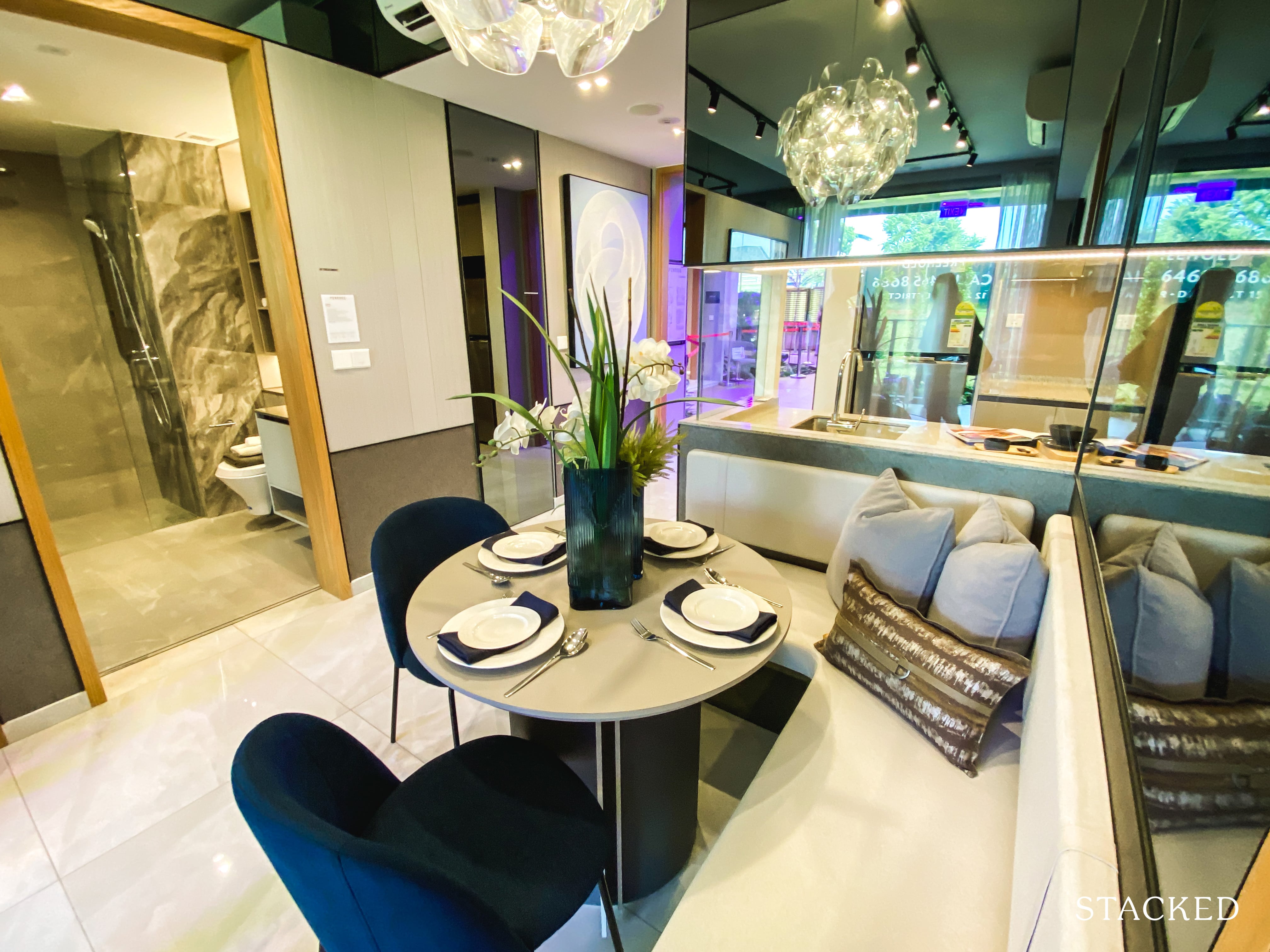
While it does seem that you can seat more than 4 people here, the size of the dining table is definitely not as ideal. You do have to be aware of the entranceway and walkway to the bedrooms, so there will be limitations to the size of furniture here.
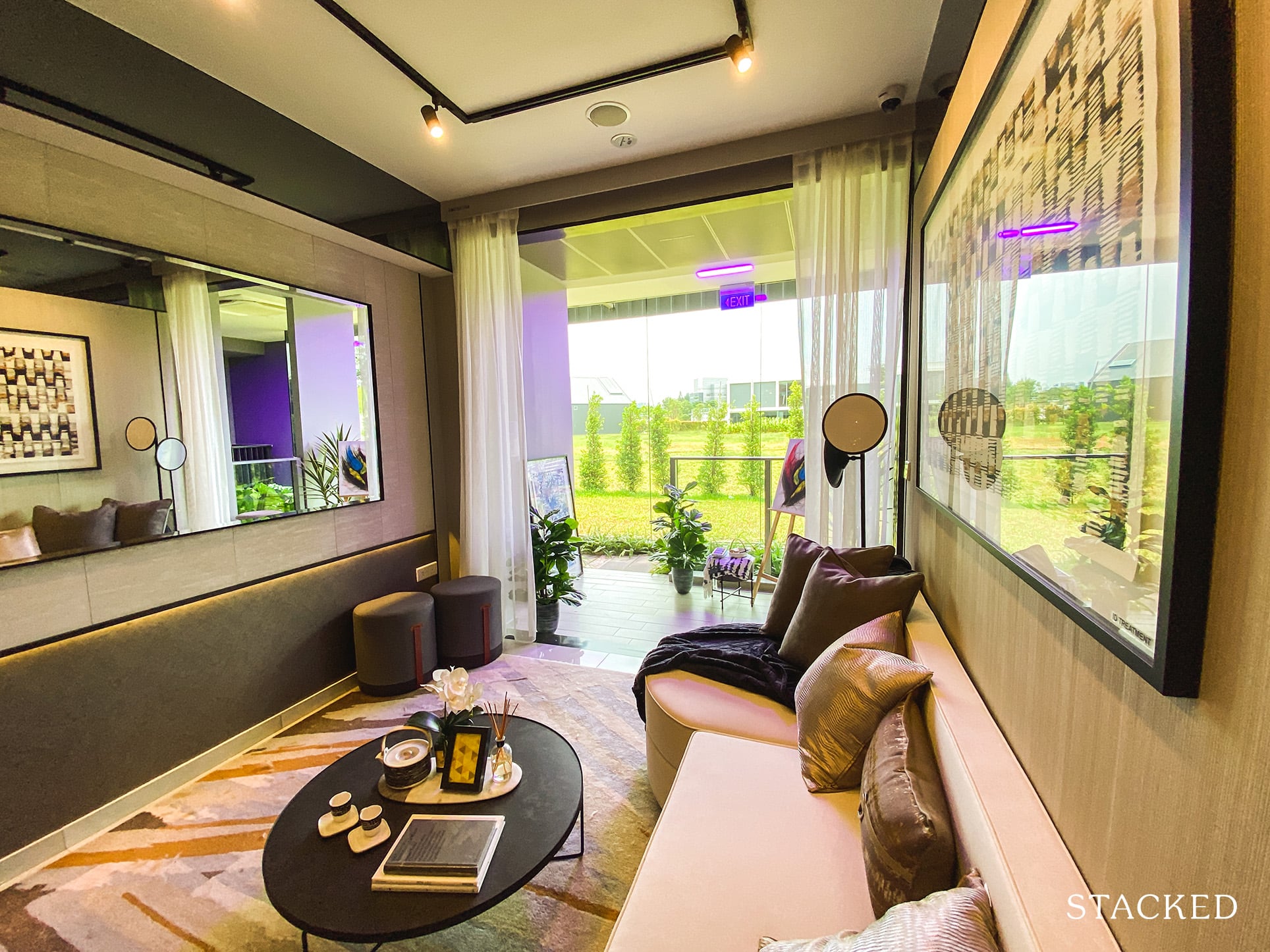
The living area is decent, it isn’t the widest but it is actually quite long.
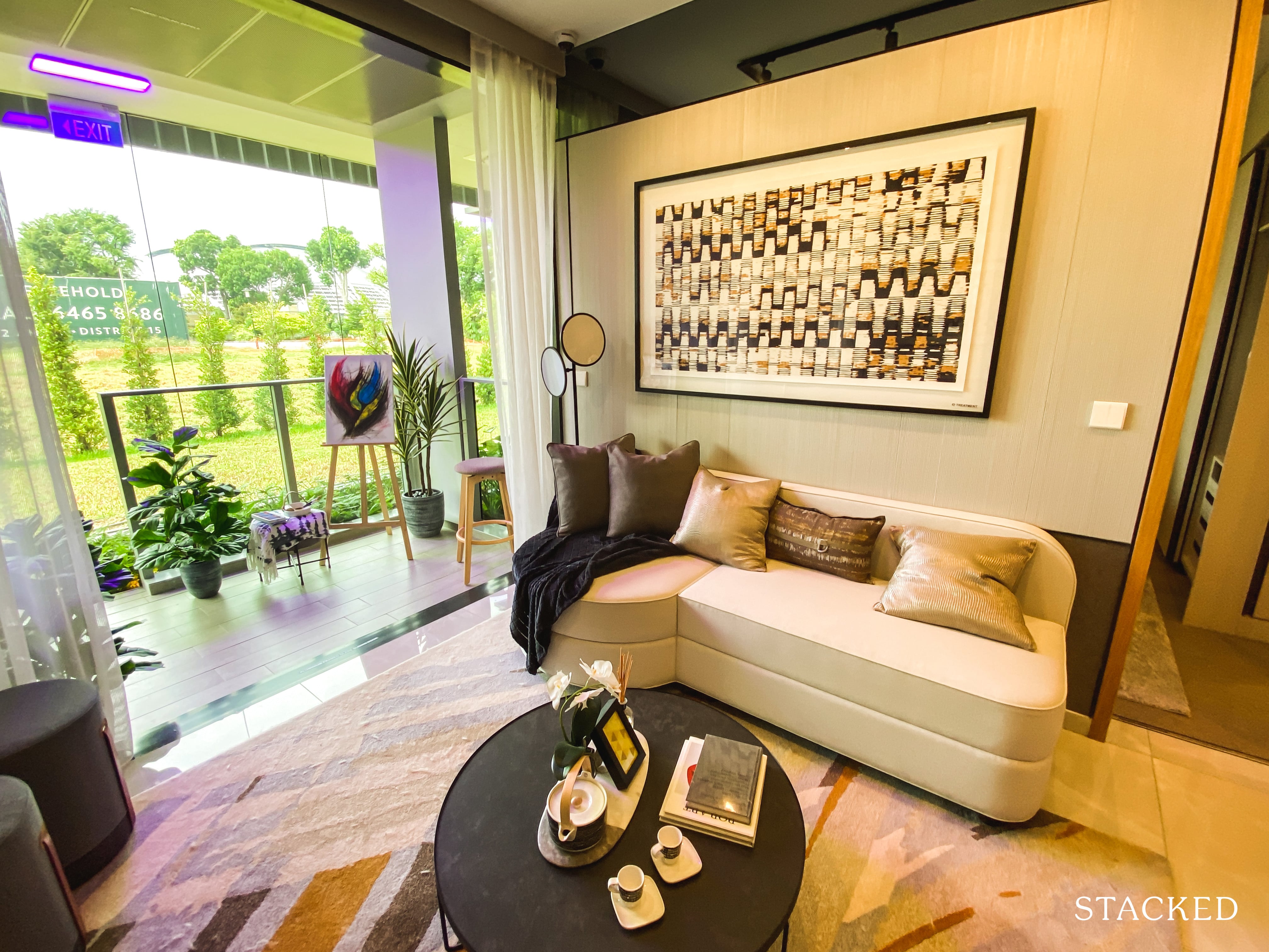
You could probably just about get away with a 3-seater sofa, which is decent all things considered.
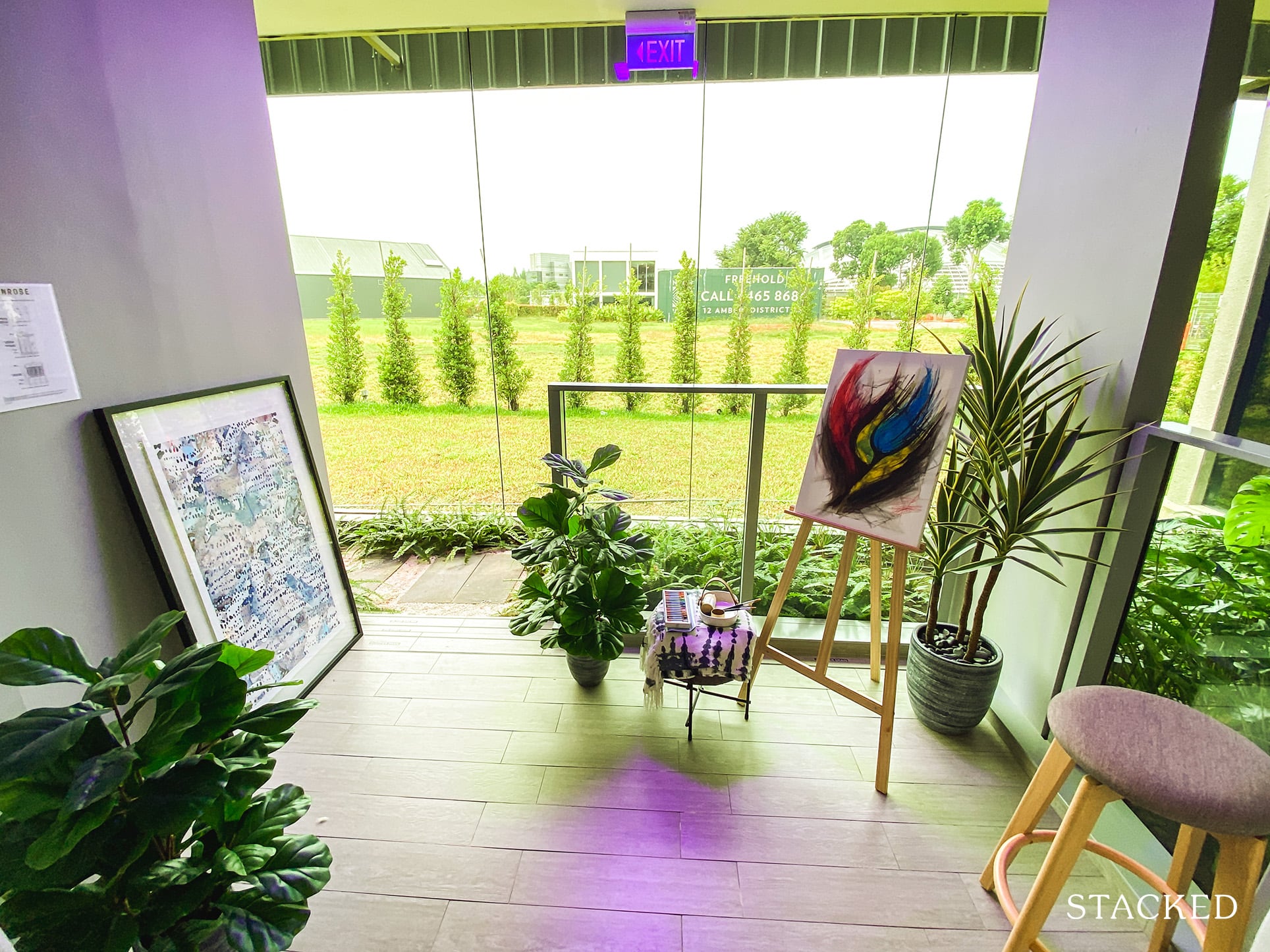
The balcony is just about what you’d expect for a 2 bedroom unit of this size. You could fit a small outdoor dining table with 2/3 seats as well, if you do want to preserve more indoor space.
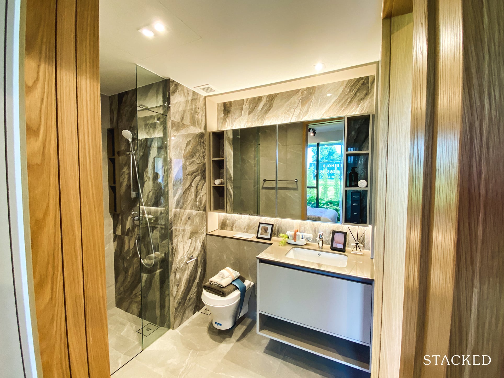
The master bathroom is located on the right (or left, depending on the stack you choose). Because this is a 2 bed 1 bath unit, it is a jack and jill layout, with a direct entry from the master bedroom as well as the living area.
One thing to note here would be the lack of a window, so there isn’t a proper ventilation point.
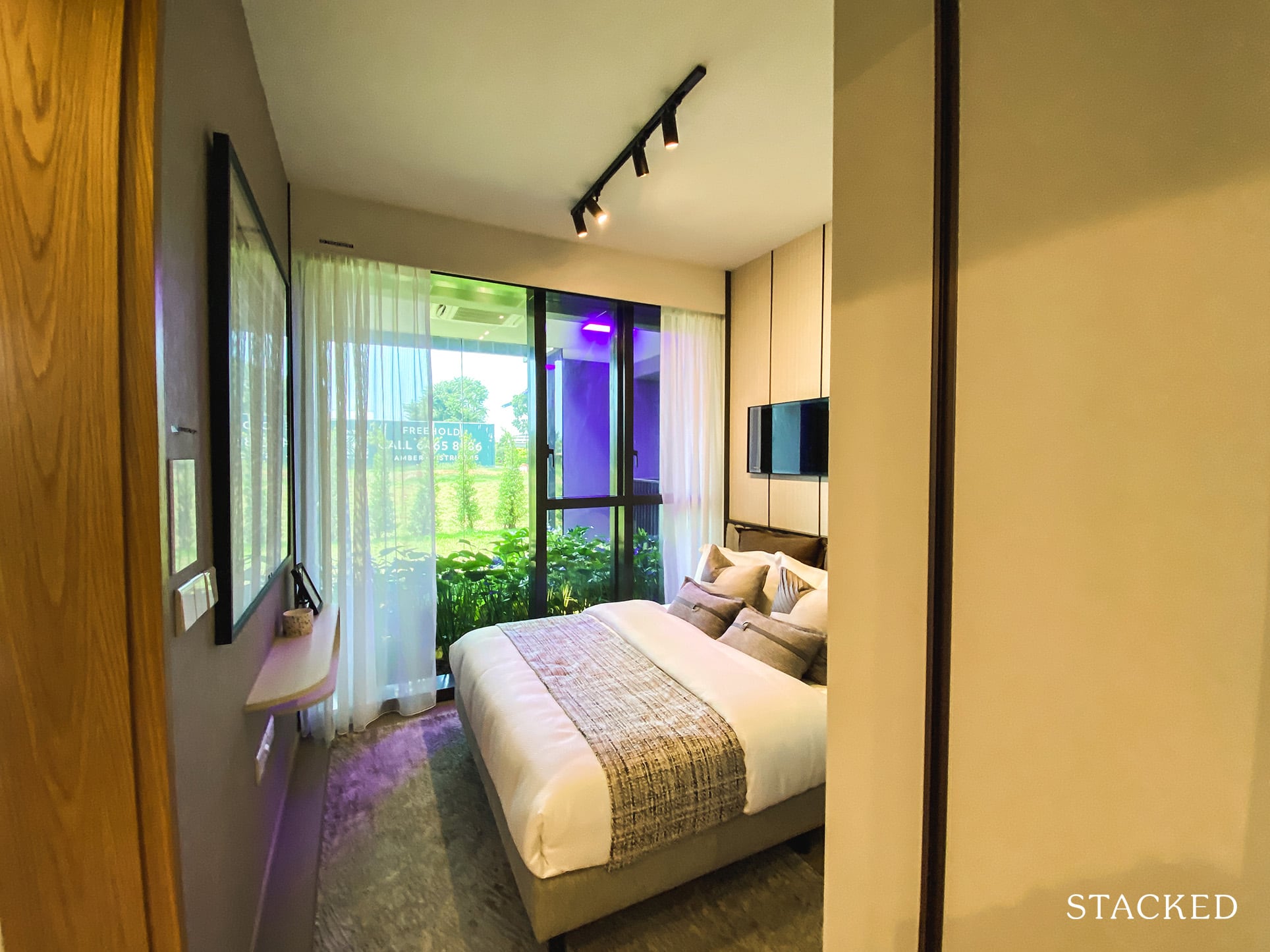
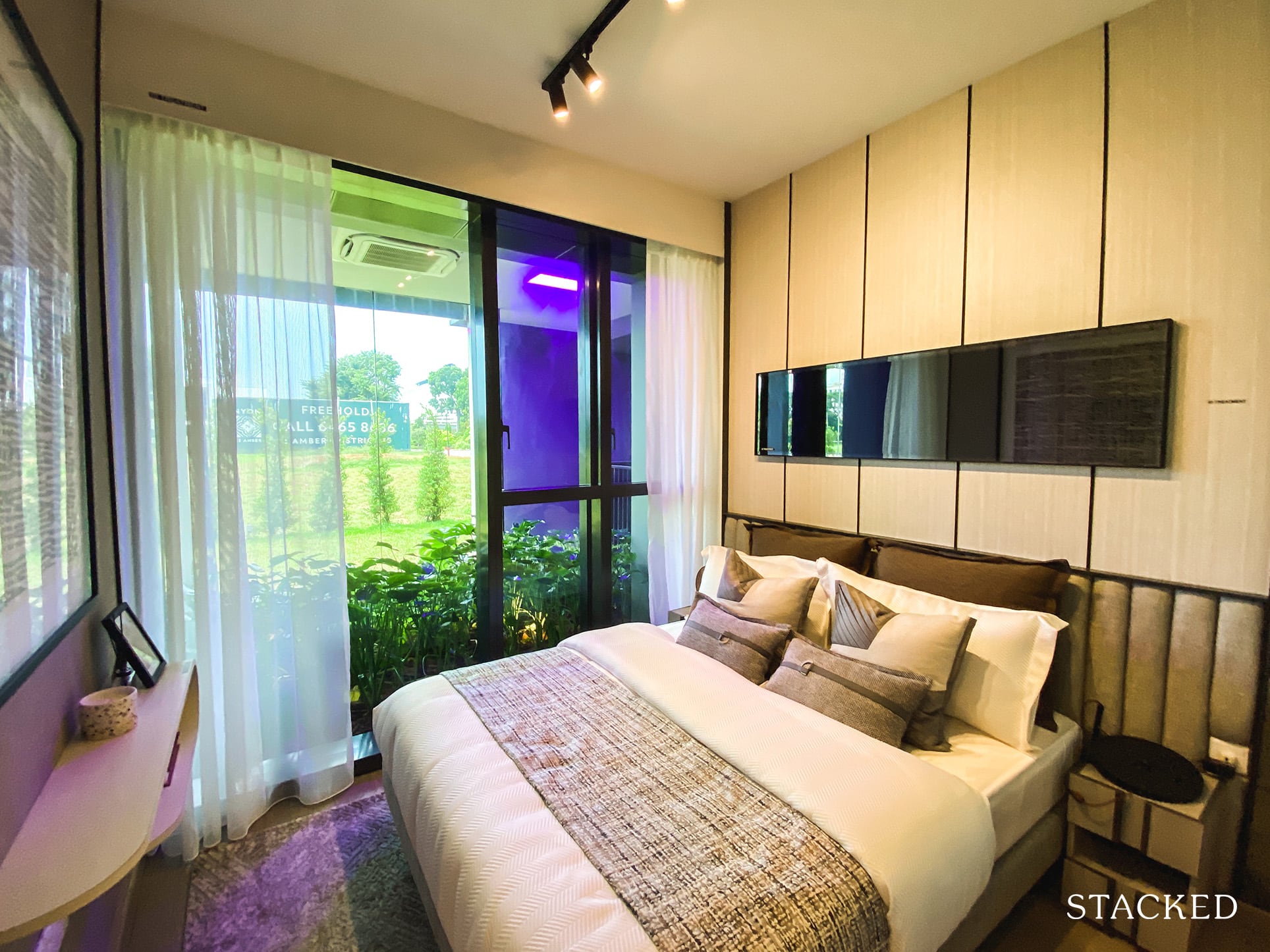
The master bedroom falls on the just-okay side of things when it comes to space. You do get floor to ceiling windows here, which is a bare minimum these days. As usual, the bedroom flooring is engineered timber as well.
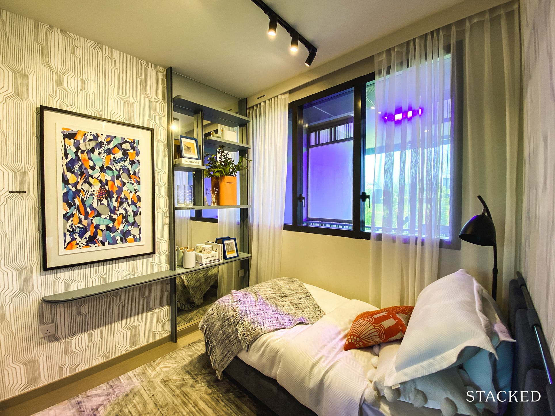
Over on the other side of the unit, the common bedroom has a decent amount of space if you are fine with just a single bed.
Because of the AC ledge on the outside, the size of the window is definitely limited here. But one thing good about the layout is that the AC ledge is pushed further back, so it isn’t located right next to the balcony. While you probably can still hear the whirring of the fans, it does create a more open balcony feel.
Location
Penrose’s location feels to me like a jack-of-all-trades, yet master of none.
On one hand, residents here will have ease-of-accessibility to the CCR, as well as a number of recreational hotspots in the Kallang and East Coast Park area. Liveability-wise, you also find a number of key local eateries and necessary amenities in the general area.
On the other, these locales aren’t actually within immediate proximities.
East Coast Park is a 10-minute drive away, and a journey to the CBD (Raffles MRT) would take just under 20-minute – inclusive of walking/waiting windows.
As for its immediate location, Penrose is adjacent to an ‘old-school’ industrial area, and as many of you would know by now, it will also have units facing the PIE (note, there is a multi-storey car park set between the north-most block and the highway that actually helps to mitigate some noise to lower-floored units – we’ll touch more on this later).
Based on these two points alone, we’d assume that the project doesn’t fare the best in terms of noise pollution levels – especially when you consider units here are relatively low to mid-rise.
Also despite how the units and facilities are geared towards own-stay families, I would say that the immediate area isn’t particularly great for families. While there is Sims Vista Food Centre, it is still predominantly industrial, which will never truly be considered a homely stay type place.
You could say that the amenities at Paya Lebar Quarter is just one stop away, but walking through the area just doesn’t really feel like a homely area, if that makes any sense at all.
As such, I would advise potential (homeowner-centric) buyers of units here to pop down to the site during peak hours/weekends just so that you can have a rough gauge of what noise levels would be like over there during these periods (and a better feel for the area).
Public Transport
| Bus Station | Buses Serviced | Distance From Condo (& Est. Walking Time) |
| ‘Opp Blk 53’ | 64, 134, 137 | 210m, 3-min walk |
| ‘Blk 102’ | 40, 62, 62A, 63, 100, 100A, 155, 158 | 550m, 7-min walk |
Closest MRT: Aljunied MRT – 600m, 7-min walk
Falling short of SUO in this regard (5-min walk to MRT), the distance between Penrose and the MRT station is a tad longer at 7-8 minutes, depending on the unit you’ll be staying in. The route involves intermittent sheltering at time of writing.
Those heading to the CBD (Raffles Place MRT), will have to hop onto the train at Aljunied MRT for a 10-min ride across 5 stops.
The journey toward town (Orchard MRT) takes a tad longer with a single line change. It spans 4 stops (8-min ride) to City Hall MRT, and subsequently 3 stops (5-min ride) to Orchard MRT.
Residents here will also find a plethora of bus stops in the area just under a 10-minute walk from the condo with numerous buses plying their routes here.
Private Transport
| Key Destinations | Distance From Condo (& Est. Peak Hour Drive Time) |
| CBD (Raffles Place) | 7km, 15-min drive |
| Orchard Road | 7.9km, 20-min drive |
| Suntec City | 4.5km, 10-min drive |
| Changi Airport | 12.9km, 18-min drive |
| Tuas Port (By 2040) | 46.6km, 55-min drive |
| Paya Lebar Quarters/Airbase (By 2030) | 5km, 15-min drive |
| Mediapolis (and surroundings) | 17km, 25-min drive |
| Mapletree Business City | 18km, 27-min drive |
| Tuas Checkpoint | 36.4km, 45-min drive |
| Woodlands Checkpoint | 25.8km, 30-min drive |
| Jurong Cluster (JCube) | 21.8km, 30-min drive |
| Woodlands Cluster (Causeway Point) | 7.1km, 20-min drive |
| HarbourFront Cluster (Vivo City) | 14.7km, 20-min drive |
| Punggol Cluster (Waterway Point) | 15.5km, 20-min drive |
*Note that Drive Times are calculated during Peak Hours
Immediate Road Exit(s): 1 Exit onto Sims Drive
Summary: Sims Drive is a 2-laned, bidirectional road. Based on the site map, it seems like those heading into the condo from these roads can do so from either direction. That said, those turning out of the condo and intending to head in the direction of the opposite lane will have to first undertake a U-turn 200m down the road.
Groceries
| Name of Grocery Shop | Distance From Condo (& Est. Walk Time) |
| Provision Shop/Hawker Point along Sims Drive | 150m, 2-min walk (across the road) |
| FairPrice – Aljunied | 1.3km, 16-min walk |
| Sheng Siong – Lor 15 Geylang | 950m, 12-min walk |
Schools
| Educational Tier | Number of Institutes |
| Preschool (within 1km walk) | 2 |
| Primary (3km-drive) | 5 |
| Secondary (3km-drive) | 3 |
| International School (3km-drive) | 3 |
| Junior College (5km-drive) | 1 |
| University (5km-drive) | 6 |
| Polytechnic (10km-drive) | 1 |
Additional Pointers
- Key Educational Institutes
It’s probably been oversold at this point, but there’s no doubting the accessibility of some of the key educational amenities in this area.
For one, we know that Geylang Methodist Secondary is just around the corner (350m, 4-min walk). The Nexus International School is also a 7-min walk in the other direction, and subsequently St. Margaret’s Primary school (1.1km, 14-min walk).
It is also relatively close to Potong Pasir where parents will find the St. Andrews’ Village and Cedar Girls’ schools – and in the south you will find both Dunman and Chung Cheng High.
Given the orientation of the project towards bigger families, these institutes will definitely come in handy at some point or other for a number of owners here.
- Intelligent Multi-Story Carpark Implementation
One concern that most of us had about Penrose, and prior to that, SUO (Sims Urban Oasis), was the impact that the PIE would have on the northern-most units in both these projects.
While the Penrose units facing the highway will admittedly receive quite a bit of traffic noise during peak hours, the developers have done a good job in trying to mitigate this issue.
With the implementation of the multi-story carpark (MSCP) between the northern-most blocks (20 & 22) and the PIE, we might just see residents of lower-rise units here affected less by the highway noise than residents of units higher up.
That said, the consolation for those living on the higher units is of course the beauty of the roof-top facades that come with the MSCP.
As you observed earlier – and will have a closer look at in just a bit, there are a number of facilities that are edged in greenery here. A sight that will no doubt provide welcome contrast to the PIE and its traffic. The flora could also help with the general air cleanliness here!
- Sims Vista Market & Food Centre
Assuming that there will not be major changes to the area 5 years down the road, I foresee most residents heading down to the Sims Vista Food Centre (200m away) for a solid portion of their meals.
According to our local foodies, you will find a solid variety of local foods here ranging from the famous duck rice and ban mian to soya bean and carrot cake. Those with a penchant for bakeries will also find a number of incredibly affordable cake-related delights here.
Do note however that food tends to sell out quite quickly here given the number of industrial sites in the area, as well as the numerous residentials surrounding the food center.
As such, it is best to arrive slightly earlier in the day, and to give late afternoons here a miss as most of the stalls are already closed by then.
Penrose Development Site Review
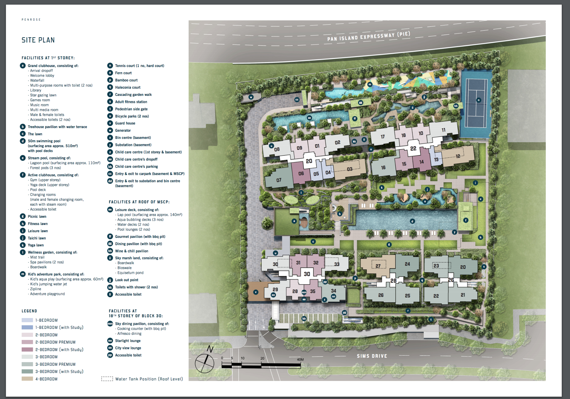
| Adventure park | Aerobic pool | Adult Fitness Stations |
| Aircon Facilities | Amphitheatre | Badminton hall |
| Basketball court | Barbeque Area | Basement car park |
| Billiards room | Bowling alley | Cafes |
| Car Park | Covered car park | Children’s Playground |
| Clubhouse | Covered Linkways | Community Garden |
| Community Plaza | Drop Off Point | Driving range |
| Eateries | Existing Bus Stop | Electrical Sub-Station |
| Elderly Wellness Stations | Fitness corner | Fun pool |
| Function room | Game room | Gymnasium room |
| Jacuzzi | Jogging track | Karaoke |
| Lap pool | Launderette | Library |
| Lift lobby | Lounge | Main entrance |
| Meeting room | Mini golf range | Mini-Mart |
| Multi-Storey Car Park | Multi-purpose hall | Open car park |
| Pavillion | Pool Deck | Playground |
| Pantry | Precinct Pavilion | Putting Green |
| Reflexology Path | Roof Terrace | Sauna |
| 24 hours security | Shelters | Sky Lounge |
| Spa pool | Squash court | Steam bath |
| Swimming pool | Tennis courts | Utilities Center |
| Wading pool |
The first thing that catches my eye is the location of the tennis courts and children’s play area at the northmost end of the project.
Naturally, that has been done to reduce disturbances to residents here, with the subsequent foliage hopefully serving as a solid enough barrier against the noise and air pollution that will come from the adjacent PIE.
Note the number of aqua-related features here as well.
From the ‘leisure deck’ which consists of a lap pool, aqua bubbling decks and pool lounges to the 50m swimming pool by the clubhouse, to the ‘stream pool’ feature adjacent to it which consists of a lagoon pool and forest pods, we see that there are tons of waterplay opportunities in the condo.
What’s also evident is the amount of greenery which has been scattered throughout the project.
For a development this close to the road and relatively far from any immediate nature spots, the nature-themed implementations will no doubt help to clear the air here, while also providing families with a much-needed escape from the hectic urban sprawl.
Let’s also not forget that there are 2 ‘rooftop-like’ facades here for families to alternate/diversify their fun during rest days.
The first comes from the facilities atop the MSCP – also where the aforementioned leisure deck is, and the second comes from the dining pavilions and lounges on the 18th storey of Block 30.
Best Stacks
Unit Mix
| Unit Type | No. Of Units | Size of Units (sqft) |
| 1-Bedroom | 57 | 474 – 517 sqft |
| 1-Bedroom + Study | 2 | 560 – 570 sqft |
| 2-Bedroom | 69 | 646 sqft |
| 2-Bedroom Premium | 68 | 700 – 710 sqft |
| 2-Bedroom + Study | 34 | 797 – 807 sqft |
| 3-Bedroom | 105 | 936 – 980 sqft |
| 3-Bedroom Premium | 123 | 1044 – 1098 sqft |
| 3-Bedroom + Study | 54 | 1173 – 1184 sqft |
| 4-Bedroom | 54 | 1389 – 1399 sqft |
The unit mix for the Penrose does bring up some rather interesting talking points.
If you were to look at all the past transactions for SUO, you’d realise that most of the units that were sold actually came from the 1 to 2-bedder unit tiers. To be accurate, that is 42/46 of the total resale transactions so far have been from these unit types.
(As of time of writing, only 4 units of its 3-bedders have been sold)
Which was clearly predicted by its developers based on the development’s unit tier allocations (scroll down to that review’s unit mix section for a clearer picture).
Based on that trend, you would think that the developers here would leverage on that sentiment – or in other words, continue to cater to the investor demographic with a higher number of 1 and 2-bedder units.
(Aljunied is, afterall within solid proximity to the CBD – and that naturally boosts the rentability aspect of units here)
Instead, they opted to go with more family-friendly units by catering the majority of unit shares to the 3-bedroom tier.
To supplement this sentiment, it is clear that the developers also spent quite a bit of effort into sprucing up the facility spread as we’ve seen earlier.
That said, there is no doubt that the 1-bedroom units here could go like hotcakes on launch day given that all 59 of them are facing the inward pools and not the PIE.
Best Stacks
Coming soon.
Afternoon sun movement analysis
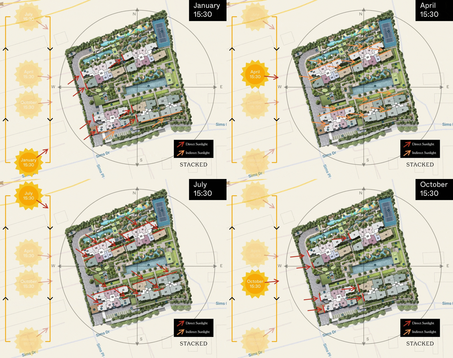
The main stacks to avoid if you do not wish to experience afternoon sun all year round would be stacks 29, 30, 27, 7, 8 and 17.
Stacks with the least afternoon sun
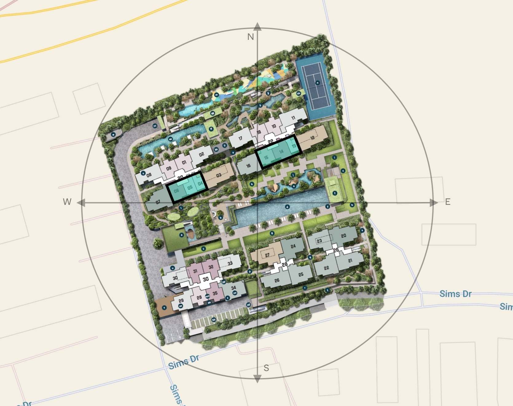
Penrose stacks with the least afternoon would be stacks 4, 5, 6 and 13, 14, 15. This is because the windows would face the south-east direction.
Price Review
| Project Name | Tenure | TOP | Average Price (PSF) |
| Penrose | 99-year leasehold | 2025 | $1,415 – $1,855+ psf |
| Sims Urban Oasis | 99-year leasehold | 2017 | $1,549 psf |
| The Antares | 99-year leasehold | 2023 | $1,747 psf |
Most buyers looking at this vicinity would probably be looking between these 3 condos in the table above.
With regards to Tre Residences and Central Grove, it does seem that most would still favor either SUO or Penrose as the aforementioned projects are located further away from the city and toward the infamous Geylang districts.
Before we go any further, let’s address the elephant in the room.
A big reason for the hype at Penrose is due to the starting prices that the units are being launched at.
Given the initial land bid price of $732 psf ppr for Penrose, it is clear that the developers have had some wiggle room to work with.
In a bid for higher take-up figures, they are pricing their units very competitively – resulting in SUO receiving the shorter end of the stick when buyers compare these two projects.
To give you a clearer picture, let’s look at how the prices stack up from actual transactions so far from Sims Urban Oasis (and actual prices from Penrose).
1 Bedroom Penrose vs SUO
| Penrose | SUO | |
| Price | $794,000 | $720,000 |
| PSF | $1,676 | $1,556 |
| Size | 474 | 463 |
As much as possible, I tried to take the latest transactions (so 2020 transactions) and to mimic the same conditions (facing etc) for a better comparison.
In the case of the 1 bedroom units, there is definitely a difference in PSF and quantum (Penrose is bigger after all), but it isn’t as big a gap as one might think given the age and new launch factor included in.
2 Bedroom Penrose vs SUO
| Penrose | SUO | |
| Price | $1,016,000 | $970,000 |
| PSF | $1,573 | $1,554 |
| Size | 646 | 624 |
For the 2 bedroom unit, the difference gets even less apparent. In this case, while the 2 bedroom at Penrose is slightly above the $1 million barrier, the PSF values here are extremely comparable.
At these price points, you can see why those looking to buy in the area are looking at Penrose. Half the unit size, similar prices for a 7-8 year newer project – it is definitely an attractive price point.
Of course, Penrose will only be completed in 2025 – which does give some buffer time for the possibility of increased demand in the area, and subsequently (though unlikely) price hikes for both projects. That said, I think it’s clear that most investor-owners of SUO will be looking for an exit point in the near future once the economy picks up.
As for The Antares, we can see that the reception hasn’t been all that overwhelming with just 51 out of the 265 units snapped up since launch earlier this year. This probably stems from its locale – which is relatively barren when it comes to amenities (with the exception of the nearby Matar MRT station).
Finally, let’s not forget about Park Place Residences which is also located in D14. Granted, it is an integrated development (and a resale one at that) – but if you look at the quantum for a unit there ($938,000 onward for a one-bedder), the convenience does justify the top-up, naturally pulling more attention away from SUO.
Ultimately, it really depends on the price point you are looking to enter at the Penrose. For those units that are starting at $1,800+ psf (where it starts to creep into Parc Esta/PLQ prices) is where it gets a bit sketchy – so just a word of caution there.
2-Bedroom Unit Comparison
For homeowners/investors still trying to reach a decision between both SUO and Penrose, let’s have a further look at their 2-bedroom unit layouts.
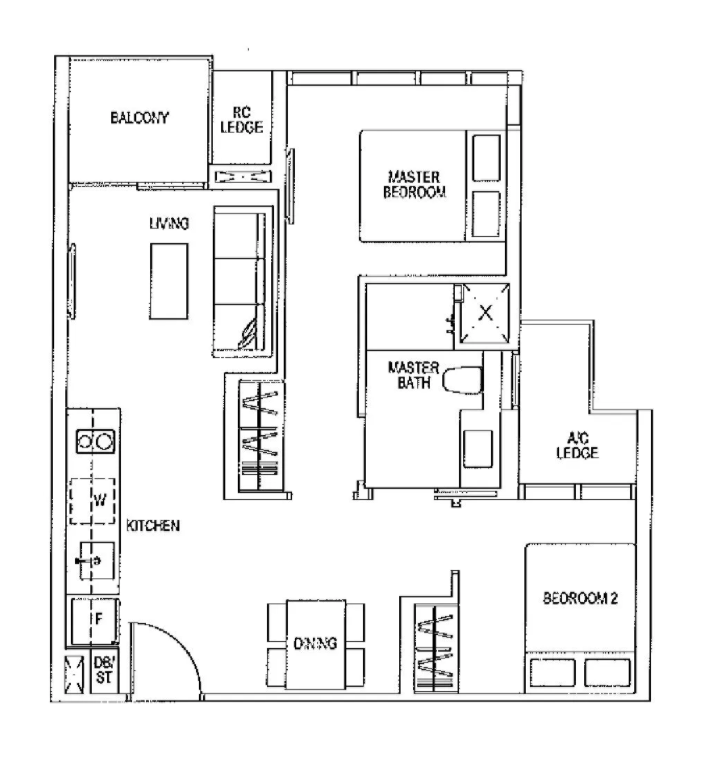
SUO 2-Bedroom (1 Bath) 624 sqft Unit 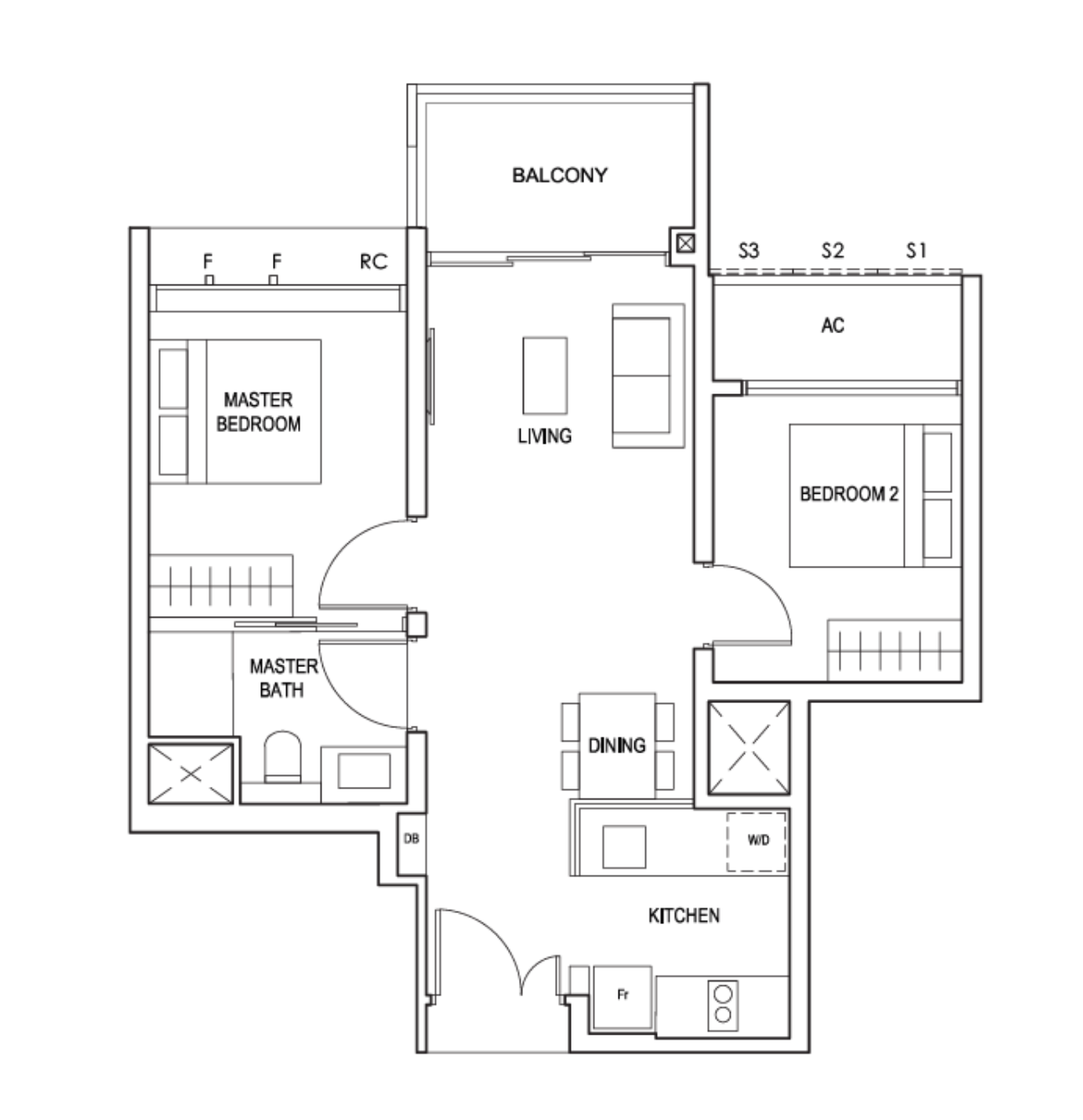
Penrose 2-Bedroom (1 Bath) 646 sqft Unit
Personally, I don’t have too many nitpicks with either layouts, but it’s quite clear that the Penrose unit takes the cake for this comparison.
For one, the SUO unit has these wardrobe areas which ‘eats up’ a bit of the dining and living area. Kitchen is also completely open concept meaning extra sounds and smells to the entire condo, on top of the fact that any high heat oil cooking will have to be followed with some thorough cleaning of the surroundings (also means no carpets in the area for those who cook often).
Balcony and general unit size of the SUO unit is also a tad smaller than that of Penrose.
Looking at the Penrose unit, we realise that the kitchen is semi-open concept, so ‘cooking debris’ is mostly maintained in the space – though there isn’t a ventilation window here.
Perhaps the biggest bugbear here for the SUO unit is the long walkway into the master bedroom, it’s highly inefficient – especially in a unit with only 624 square feet of space.
Maintenance
| Unit Size | Maintenance Charges Per Month |
| 474 sqft – 517 sqft | $276.50 |
| 560 sqft – 1,066 sqft | $331.80 |
| 1,098 sqft – 1,399 sqft | $387.10 |
For those looking at the Penrose as an investment for rental yields might be sorely disappointed at the figures here. For a 1 and 2 bedder unit, the mooted maintenance figures are definitely on the high side, and will eat into your net rental yields at the end of the day.
As for home owners, yes it is high – but it is also just one of the consequences of living in a development that does not have more than 1,000 units nowadays.
Appreciation Analysis
While we have covered 1 to 2 bedroom units above (which your price points should be quite protected by the resale prices of SUO), let’s look further at the 3 bedroom units.
An interesting and important factor that we came across when comparing the likely appreciation potential trends for Penrose and SUO down the road.
Buyer demographics.
In the case of SUO, most of the transactions were probably made by investors looking for rental profits. On the other hand, a majority of Penrose’s units are meant for own-stay purposes given that the majority comes from 3 bedders, as seen when more than 50% of the unit type are 3 and 4 bedders.
By having more home-owners, you eliminate the likelihood of investors which basically lowers the possibility of the PSF hindrance. I prefer having as much homeowners in the project as possible because homeowners are emotionally attached to their homes. During the upcycle, they tend to rely back on the last transaction and are stubborn in selling (they want a higher price than past transacted). During the downcycle, they tend to have the mindset that “if my property is not profitable, i can just continue staying” which protects the prices too as usually this is their only home.
Demand for SUO was very high when launched in 2015, and it remained popular. While we dont see any immediate integration that might directly affect or increase existing demand into the project, I believe the current ongoing demand is sufficient to fuel the prices. That said the demand is derived from the lack of mass-market options in Aljunied as opposed to creating a new demand through future integration. I believe with the introduction of Penrose, it will take away much of the attention from SUO.
Of course, all this is excluding various futuristic economical/property-related factors.
Now, let’s look at some of the possible rejuvenation points of the area.
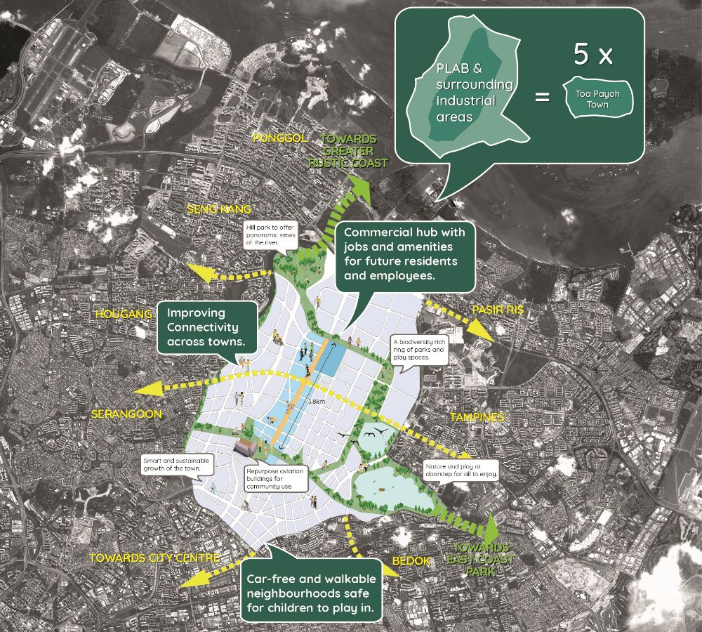
Most of us would know of the Paya Lebar Airbase relocation come 2030, even if that does seem a little far off from our present year.
When that milestone does arrive however, we can anticipate an increase in general plot ratio to buildings here (given the removal of development height restrictions), as well as a general increase in amenities and employment opportunities in the area.
Given that Penrose is about a 10-minute drive away (with the luxury of good CBD accessibility), and will be just 5 years old at that point, we might see a rise in homeowners looking at Penrose as an ownstay option during that point – especially when you consider the educational institutes in the area as well.
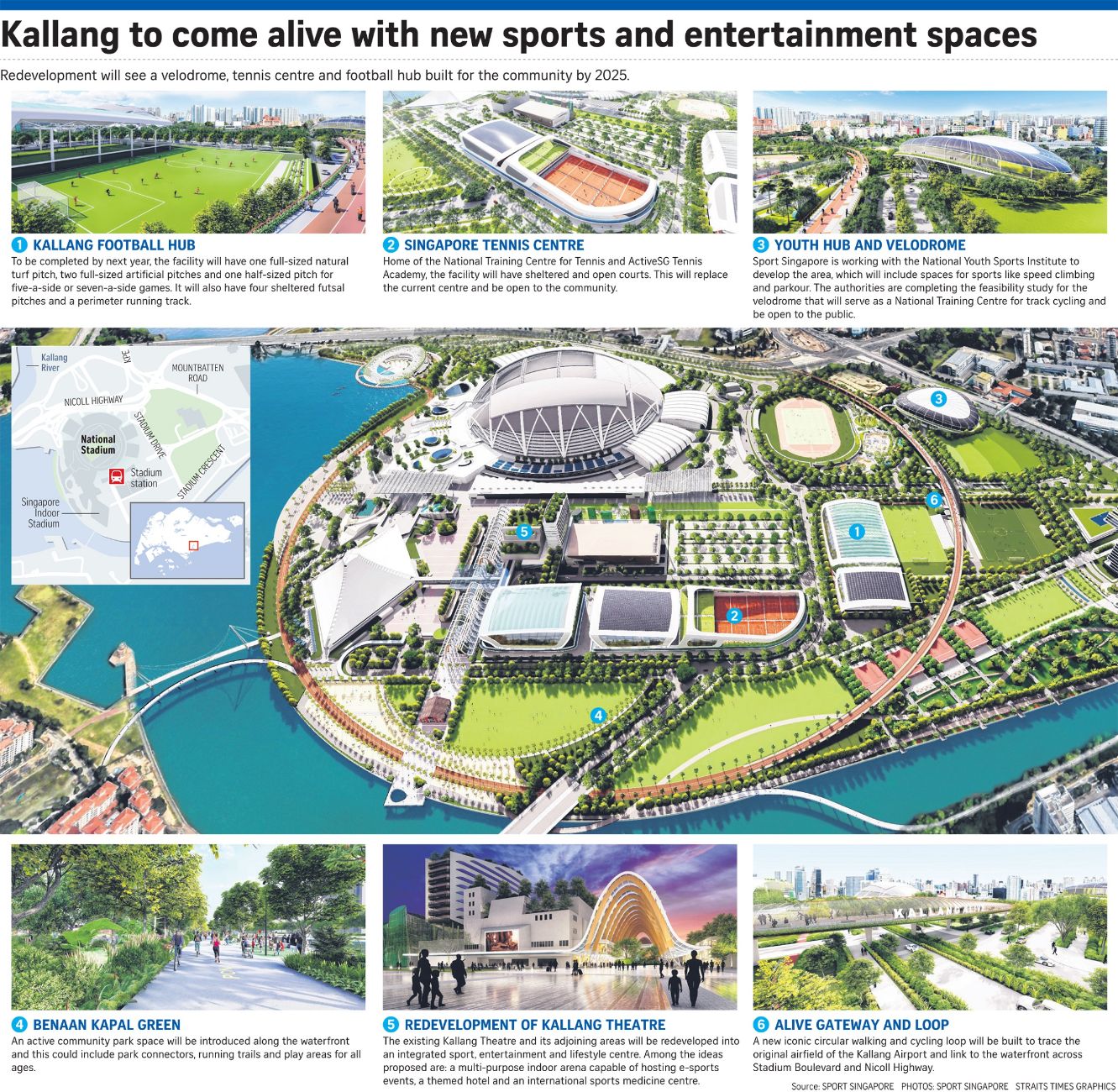
Given Penrose’s immediate location, I do feel that it will be impacted more by the Kallang rejuvenations – which would be completed just as Penrose’s residents move in in 2025.
Set to feature a multitude of recreational facilities ranging from competitive sports to leisure activities, the renovations are set to bring an incredible change to Kallang’s scenery, and subsequently, livability.
Given the family-friendly nature of Penrose, I do feel that this will be quite a hit for potential unit owners of the project in the coming years.
Lastly, it’s worth noting that there is still another residential plot next to Penrose. Again, depending on the land bid price, this could be a boon or bane to Penrose owners – you’ll just have to see what happens to SUO units in the resale market from here on to have a good gauge of what could happen in the future.
Our Take
What we like
- Efficient layouts
- Good facilities for families
What we don’t like
- –Un-homely vicinity
- –Maintenance fees
Personally, I think that Penrose is a good option for those looking for an own stay project with a view as an investment for the future – or a stepping stone if you will.
Granted, its immediate location isn’t the best for families with young children. But it does have the advantage of a relatively close by MRT station and 1:1 carpark lot availability.
So given the rejuvenation of the area, combined with affordable entry prices thanks to its land bid price, not only will residents have liveability, they will also have multiple opportune exit points down the road should they decide to shift.
What’s more, given the overarching unit-tier differences from the neighbouring SUO, you don’t really get massive competition in that regard.
Yes, the unit finishes aren’t the best – and it’s going to be quite a noisy development for the first few years until PLAB moves over to Tengah, but if you’re able to put that behind you (and its immediate location), with the right entry price this is definitely one to take a look at.
What this means for you
You might like Penrose if you:
-
• Would Like Good Accessibility to the CBD (without breaking the bank):
Given that Aljunied MRT is just 5 stops from Raffles Place MRT, it is easy to see why the place boasts high rental demand amongst expats. It’s also a whole ton more affordable when compared to developments 2-3 stations down the line.
-
• Are a Massive Sports/Recreational Activities Fan:
With the implementation of the Kallang Alive section just an 8-minute drive away, as well as the East Coast Park in close proximity (10-min drive), families and sports enthusiasts will resonate with the place.
You might not like Penrose if you:
-
• Prefer Secluded/Quiet Developments:
With the PIE next door, as well as the PLAB that will only relocate in 2030, I do foresee the noise levels here being quite high (especially during the initial unit renovation stages).
-
• Require Extreme Centrality:
Alluding to the previous point, it does take just under 20-minutes to get to the central areas given that the MRT station is a 7-min walk away. For those who crave immediate accessibility, it’s best to look for a project more central.
End of Review
At Stacked, we like to look beyond the headlines and surface-level numbers, and focus on how things play out in the real world.
If you’d like to discuss how this applies to your own circumstances, you can reach out for a one-to-one consultation here.
And if you simply have a question or want to share a thought, feel free to write to us at stories@stackedhomes.com — we read every message.
Frequently asked questions
Is Penrose a good place for families to live?
Yes, Penrose is considered family-oriented, with features like a childcare centre, kids' adventure park, and spacious units suitable for families.
What are the main advantages of living near Penrose?
Penrose offers good access to the CBD, Paya Lebar, East Coast Park, and Kallang, making it convenient for work, recreation, and sports enthusiasts.
How does the noise from the nearby highway affect residents of Penrose?
Units facing the PIE highway may experience road noise, which could be a concern, especially for those sensitive to noise or considering units close to the highway.
What facilities are available at Penrose for residents?
Penrose has two clubhouses, a 50m lap pool, stream pool, tennis court, gym, yoga area, and lounges with views, along with landscaped grounds and a children's playground.
Are the units at Penrose suitable for investment or mainly for own stay?
Penrose is designed more as an own-stay project with features like ample parking and family facilities, though its location and amenities could also appeal to investors.
What is the size and layout of the 4-bedroom units at Penrose?
The 4-bedroom units are about 1,389 sqft, featuring a long kitchen, utility room, wide balcony, and almost all bedrooms with ensuite-like features, suitable for families.
Our Verdict
82%
Overall Rating
Join our Telegram group for instant notifications
Join Now












1 Comments
Fun to see how buyers fare down the road, eh?