All reviews on Stacked are editorially independent. Developers can advertise with us, but
cannot
pay
for,
edit, or preview our reviews.

New Launch Condo Reviews
Midwood Review: Small But Efficient Units Amidst Nature
May 19, 2021 43 min read
| Project: | Midwood |
|---|---|
| District: | 23 |
| Address: | 8, 10 Hillview Rise |
| Tenure: | 99 years commencing 1 Oct 2018 |
| No. of Units: | 564 |
| Site Area: | 153,882 sqft |
| Developer: | Hong Leong Group |
| TOP: | 1Q 2023 |
New launches have seen electrifying first-day sales figures over the past few months – One-North Eden sold 85%, Irwell Hill Residences 50+%, and Reef at King’s Dock at 65% – all over the launch weekend alone.
For those new to the home buying journey, it may seem like new launch projects can do no wrong.
For the Midwood condo, however, things were not so rosy. Those in tune with the property market would know that Midwood is not the latest new launch condo around. In fact, it was launched at the end of October 2019 and sold a paltry 24 units, or 4%, over its first weekend. Thankfully for the developers, sales picked up in tandem with the rest of the property market and is now ~30% sold.
To give you a bit of a background, Midwood is a GLS (Government Land Sale) site and was the second site to adopt a dual-envelope tender process. If that term sounds foreign to you, you are probably not alone.
Let’s try to explain this in simple terms – developers have to first submit concept proposals detailing their proposed design, quality, and development track record. Thereafter, only developers who have satisfied the initial criteria will be invited to the second stage – where the site will be awarded to the highest bidder.
In some sense, this would seem like the end product would be assured of a certain quality and design thinking about it – instead of just a straight up competition over its price.
So without further ado, let’s dive straight into what facilities Midwood has to offer!
So many readers write in because they're unsure what to do next, and don't know who to trust.
If this sounds familiar, we offer structured 1-to-1 consultations where we walk through your finances, goals, and market options objectively.
No obligation. Just clarity.
Learn more here.
Midwood Condo Insider Tour
The Hillview estate of 2021 is a far cry from its original beginnings. Up till the 1980s, it was an industrial zone for many MNCs, including the likes of Cycle & Carriage, Castrol Oil, and the Old Ford Factory, which is the only remaining structure of Hillview’s seemingly distant past.
Midwood marks yet another new entrant into an area populated by large yesteryear condos such as Hillview Green, The Dairy Farm, and Glendale Park. Its location is just beside the newest condos in the area, The Hillier and Kingsford Hillview Peak, which TOP-ed in 2016 and 2017 respectively. Midwood sits on the fringe of land that has yet to be developed and its address at Hillview Rise will require the existing roads to be extended to accommodate the condo.
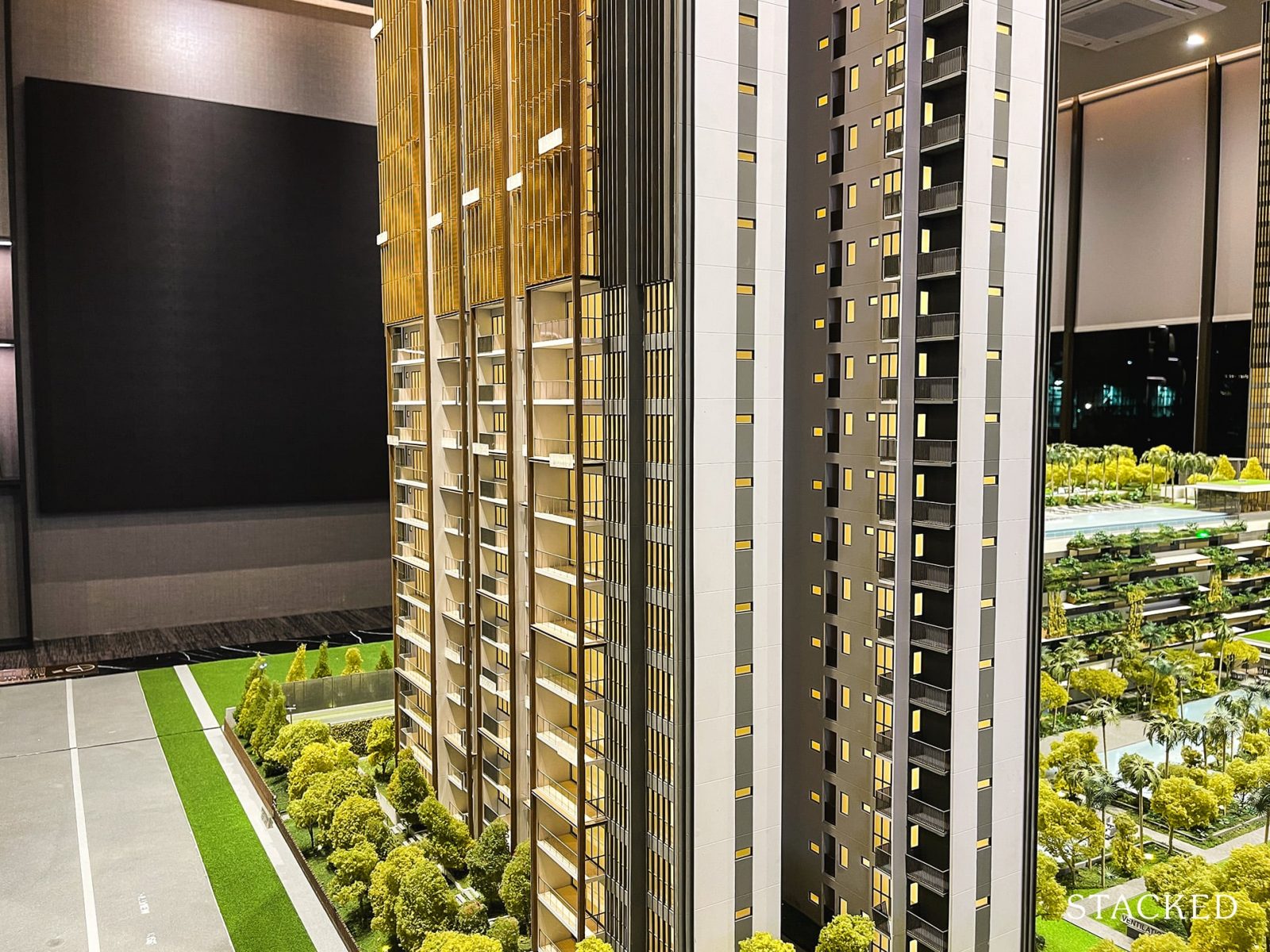
First up, let’s talk design.
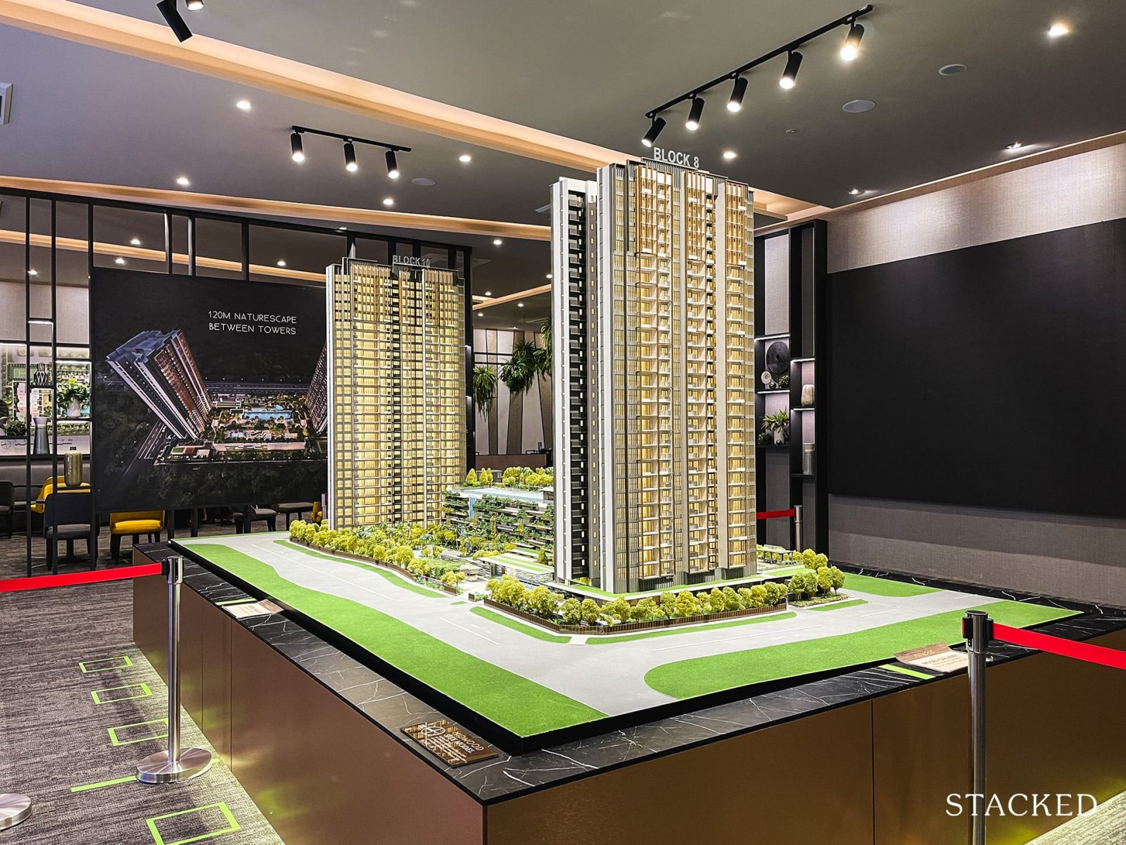
What you will first notice about the design is the extensive use of ‘privacy screens’ that restrict the views of buyers from the 13th and 25th floors, depending on which facing you purchase. This is due to the sensitive nature of the MINDEF HQ at Bukit Gombak and something which buyers should be fully aware of before they commit to a purchase.
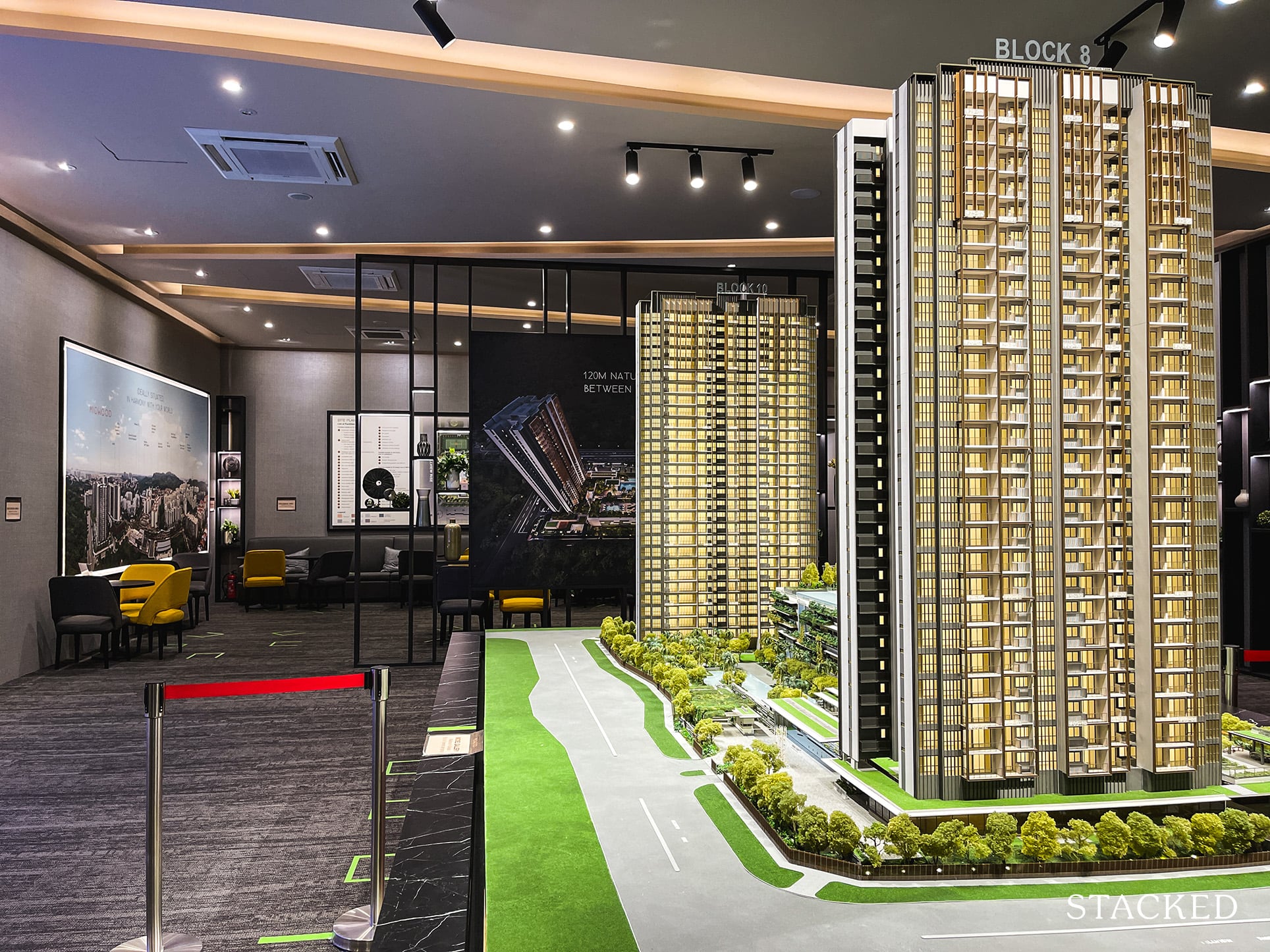
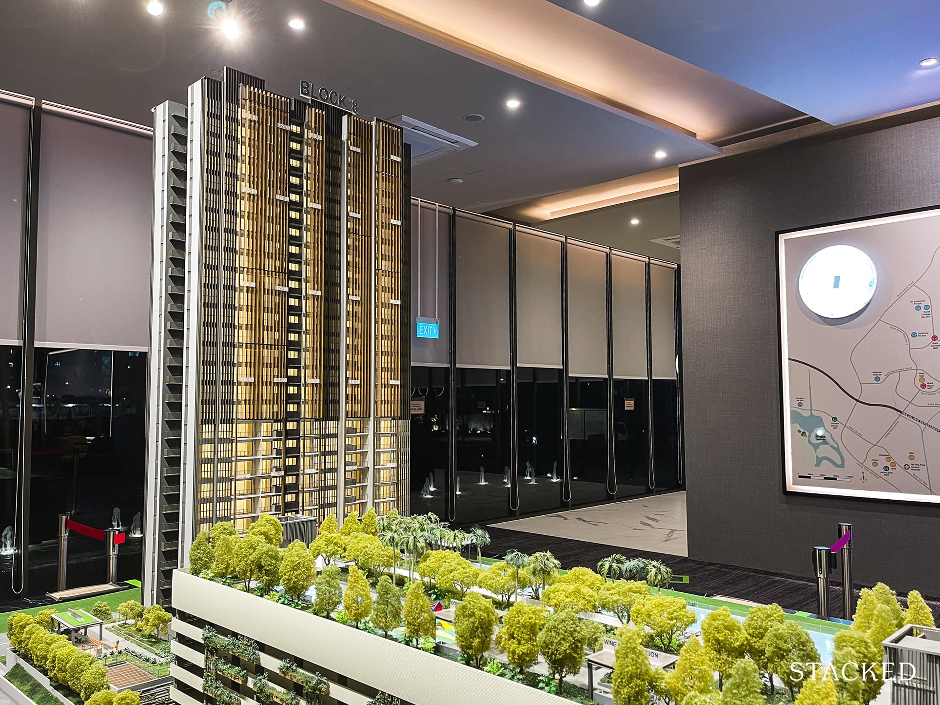
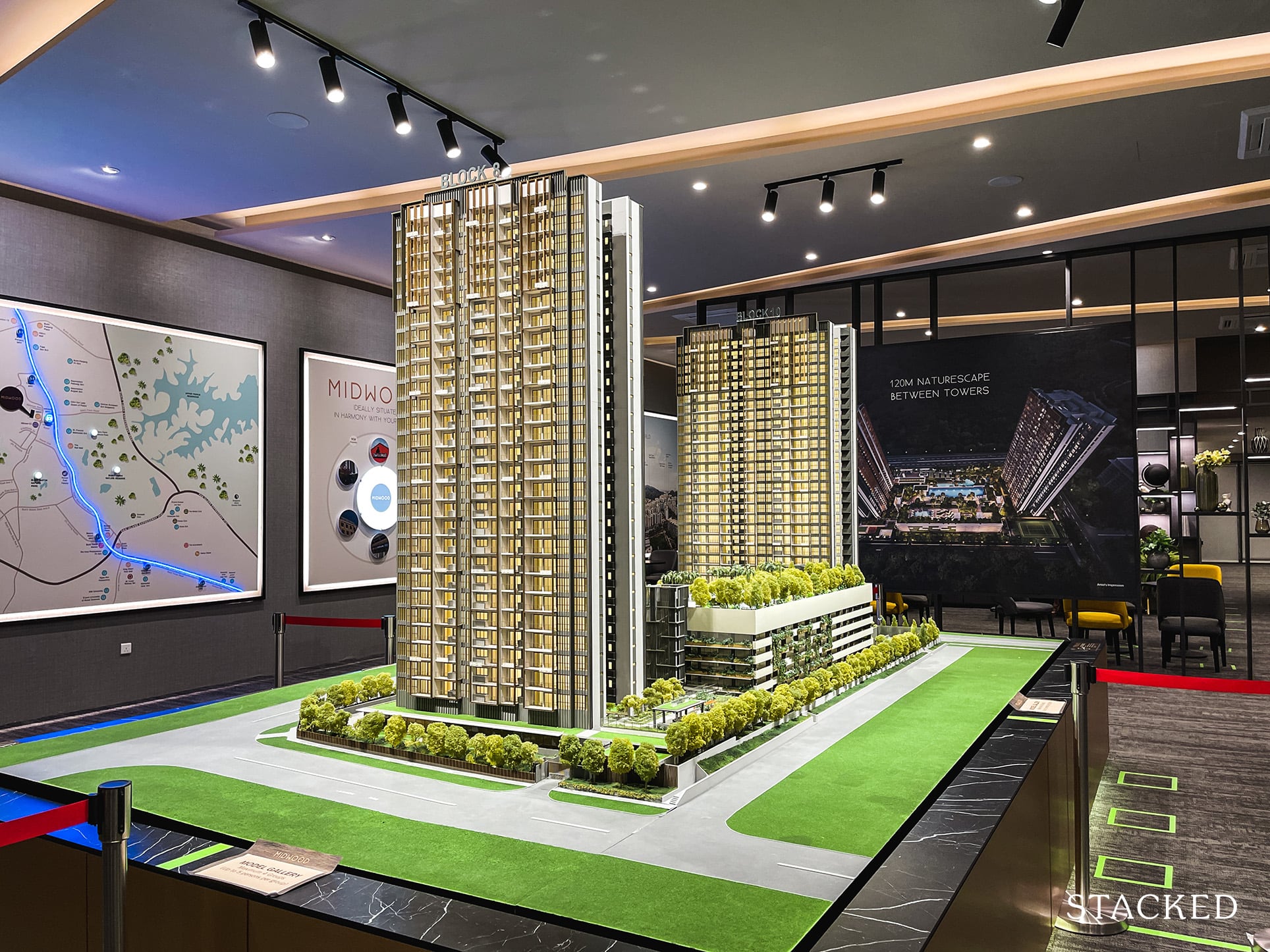
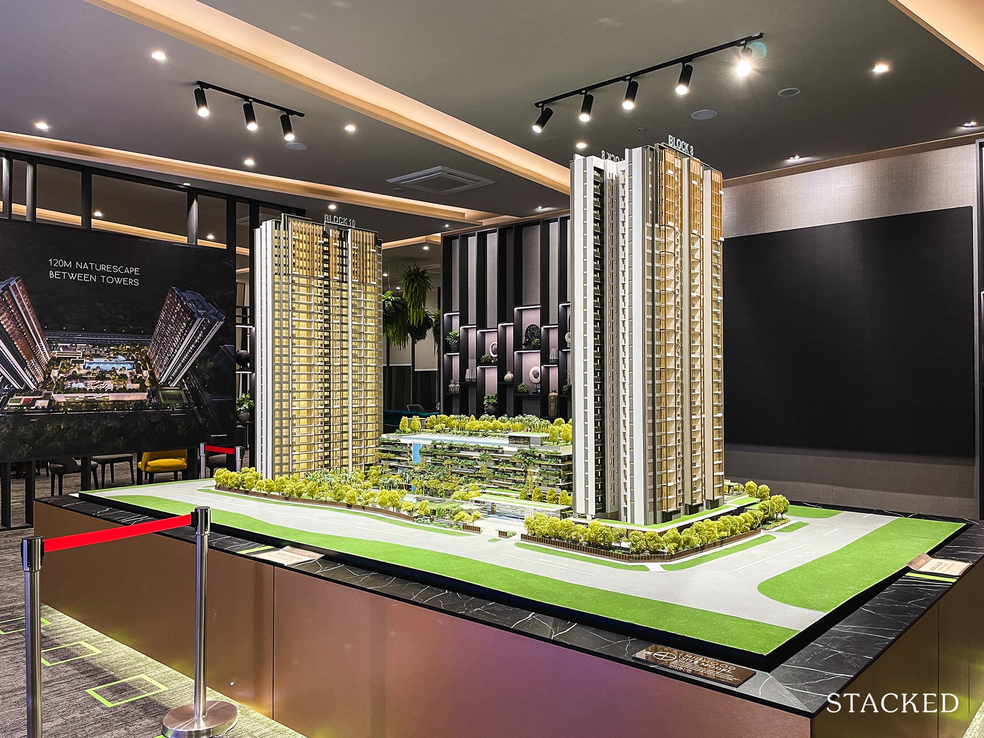
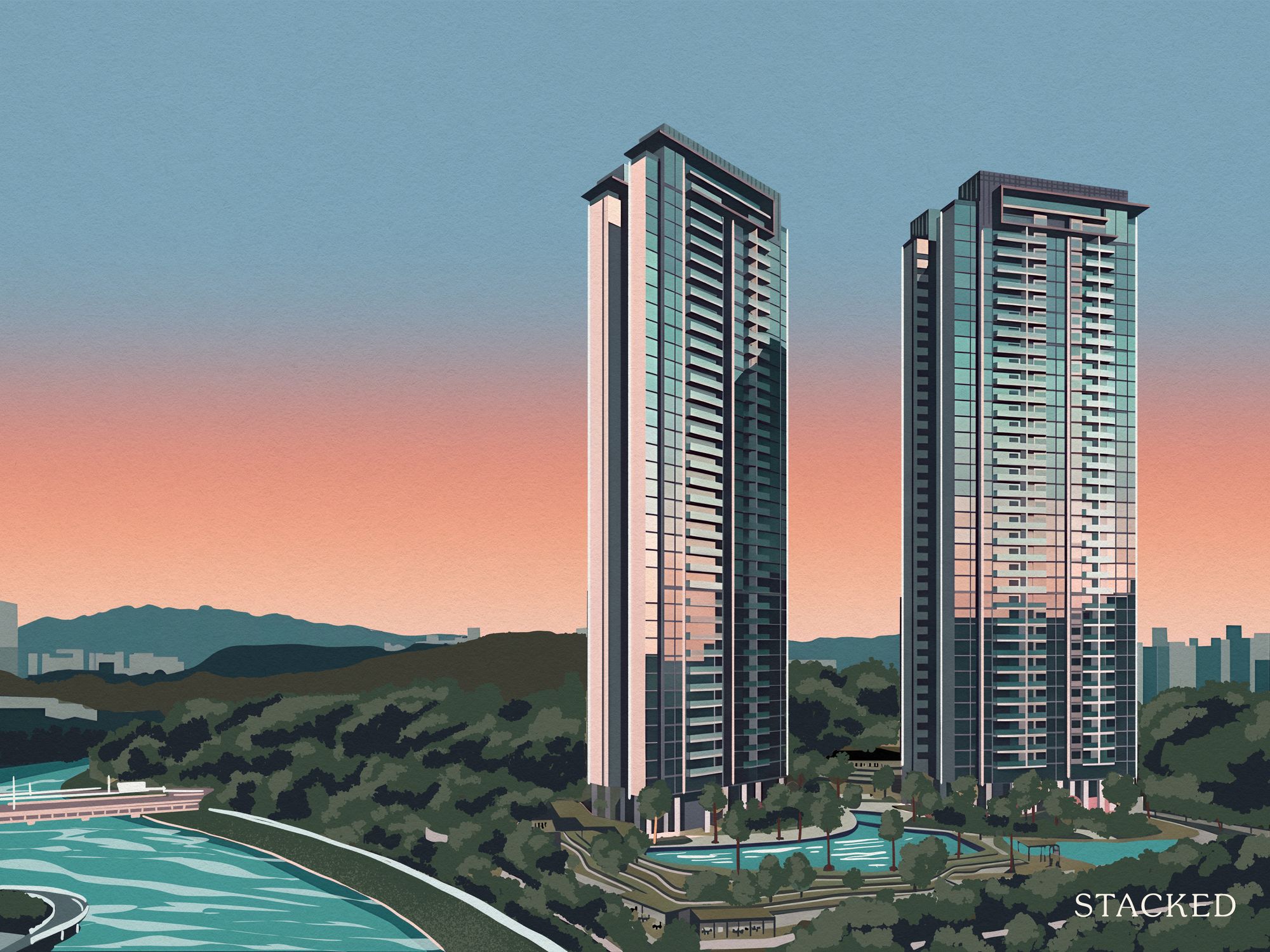
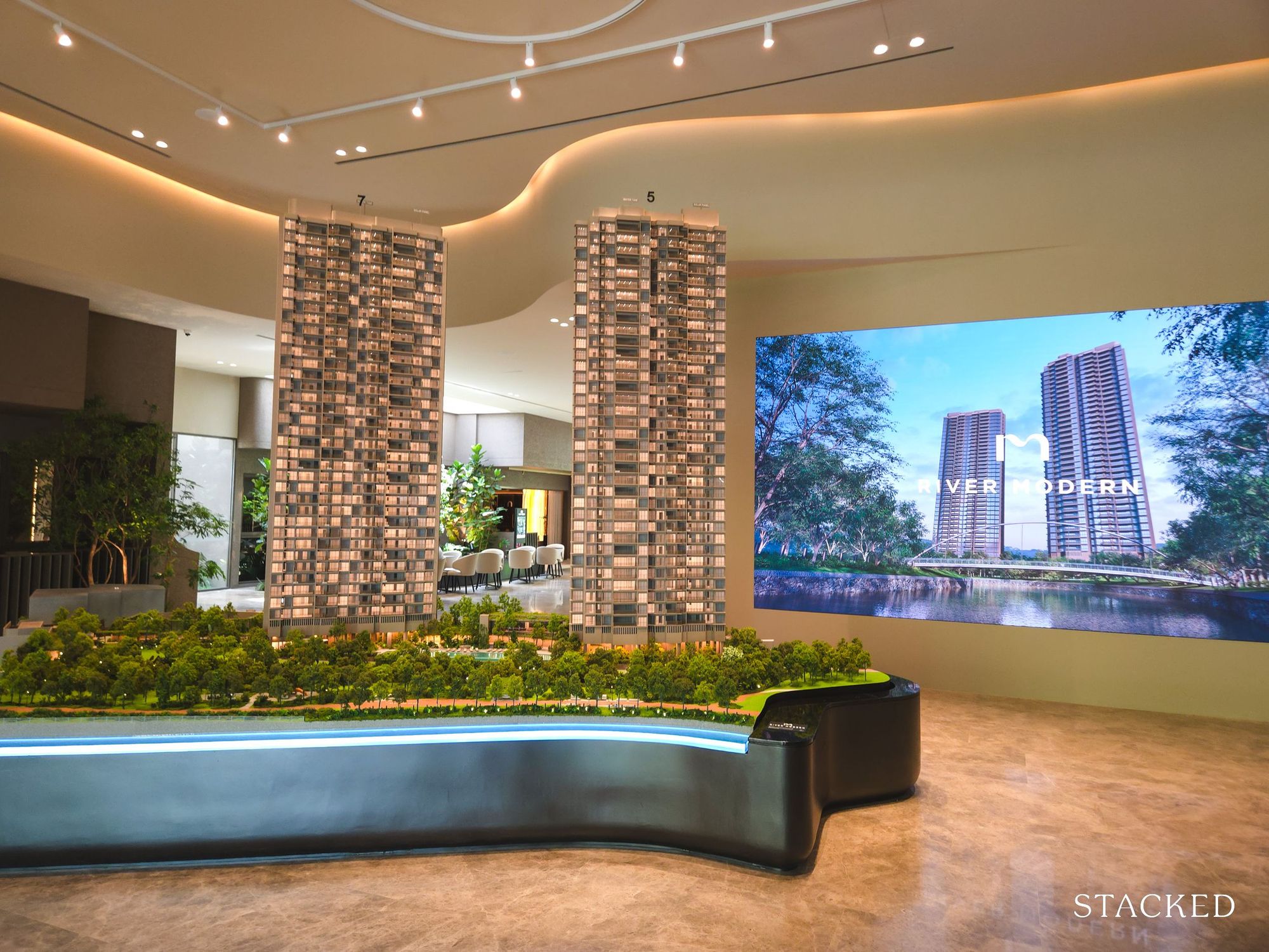
The next thing that struck me was how far apart the 2 towers were from each other. 120m is the distance to be exact, and that is impressive. For context, The Florence Residences had blocks as close as 6m apart and averaged only 17m to 23m for all the other blocks. To be fair, it also has nearly triple the number of units – so perhaps it isn’t the best like-for-like comparison.
Midwood also attained the increasingly rare 80% facilities 20% units split, a ratio typically reserved for upscale developments like Goodwood Residence and Leedon Residence. The large model does give off the impression that it seems to have very open and extensive grounds, but let that not distract you from the fact that this is still quite a high-density development.
Sitting on a land size of 153,883 square feet for 564 units, it does fare slightly better than a comparable project (in size, not price) like Irwell Hill Residences. Either way, it is still the most impressive factor of the development.
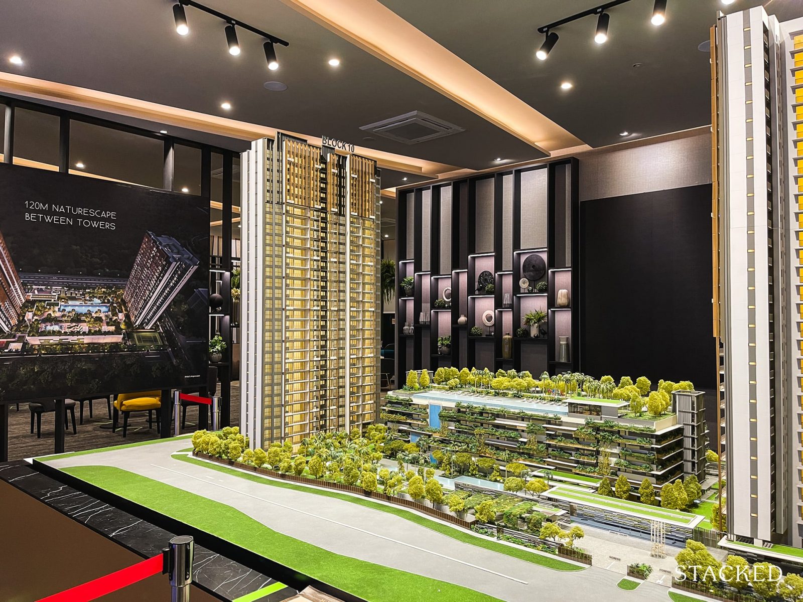
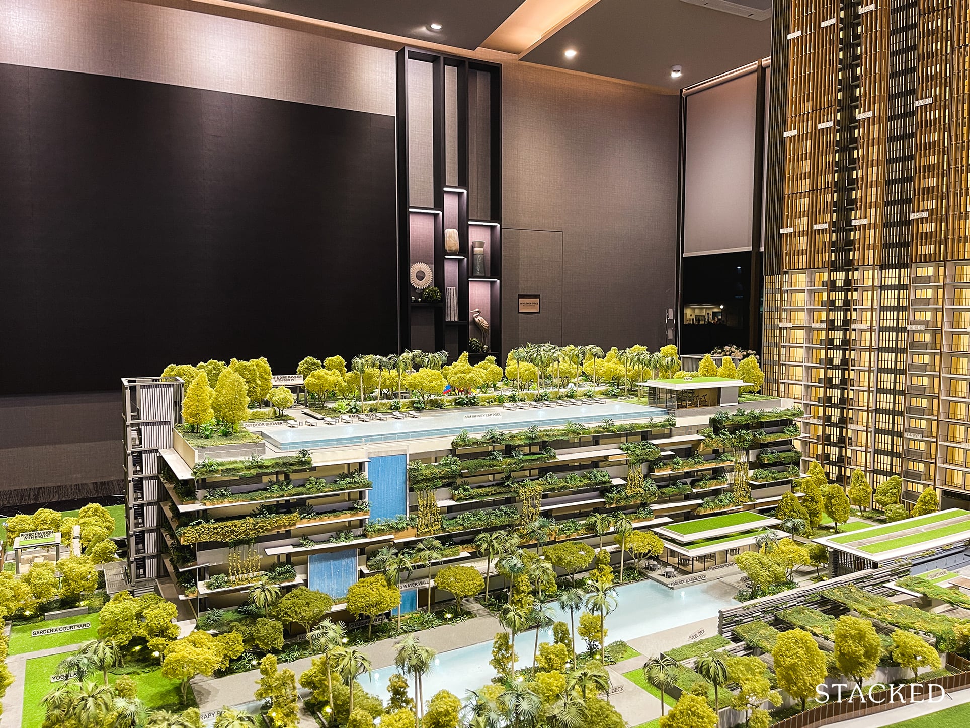
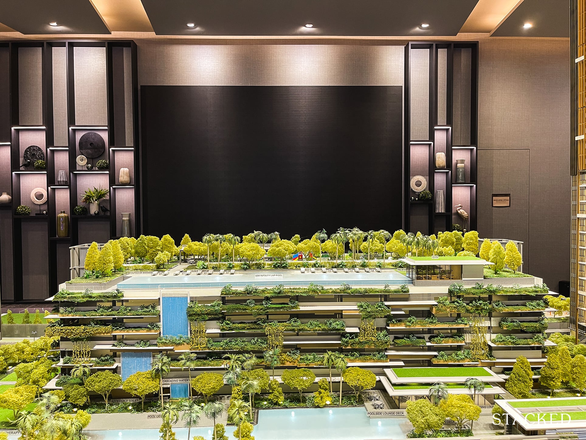
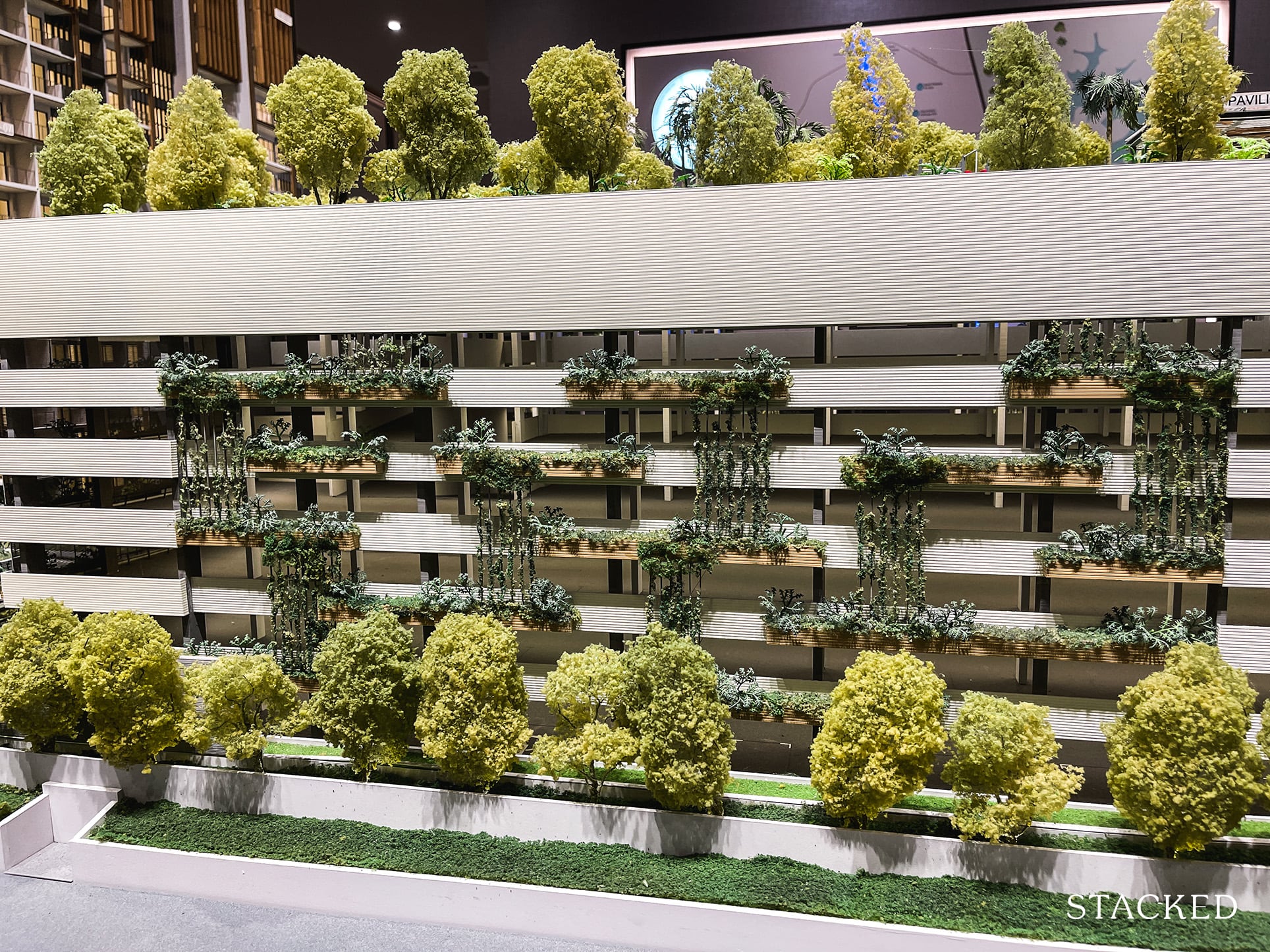
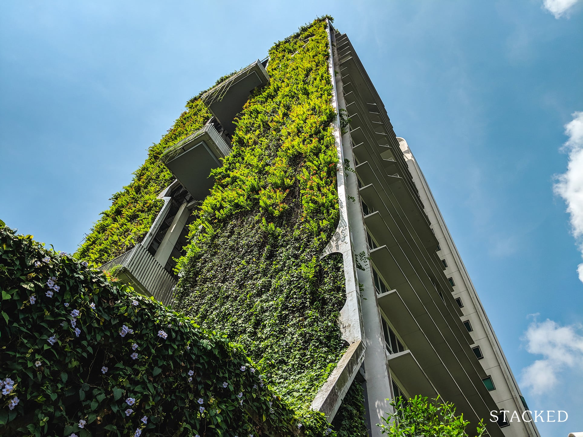
As for the theme of Midwood, the nature/greenery emphasis has definitely been in vogue – among the new launches I have reviewed, I can already think of Midtown Modern and Forett at Bukit Timah off hand. To be fair, I actually do like this theme, especially if it complements the surroundings like in this case at Midwood. Thus, you will find lots of green landscaping done throughout the development and the extensive use of planters that conceal the 6-storey carpark in the middle.
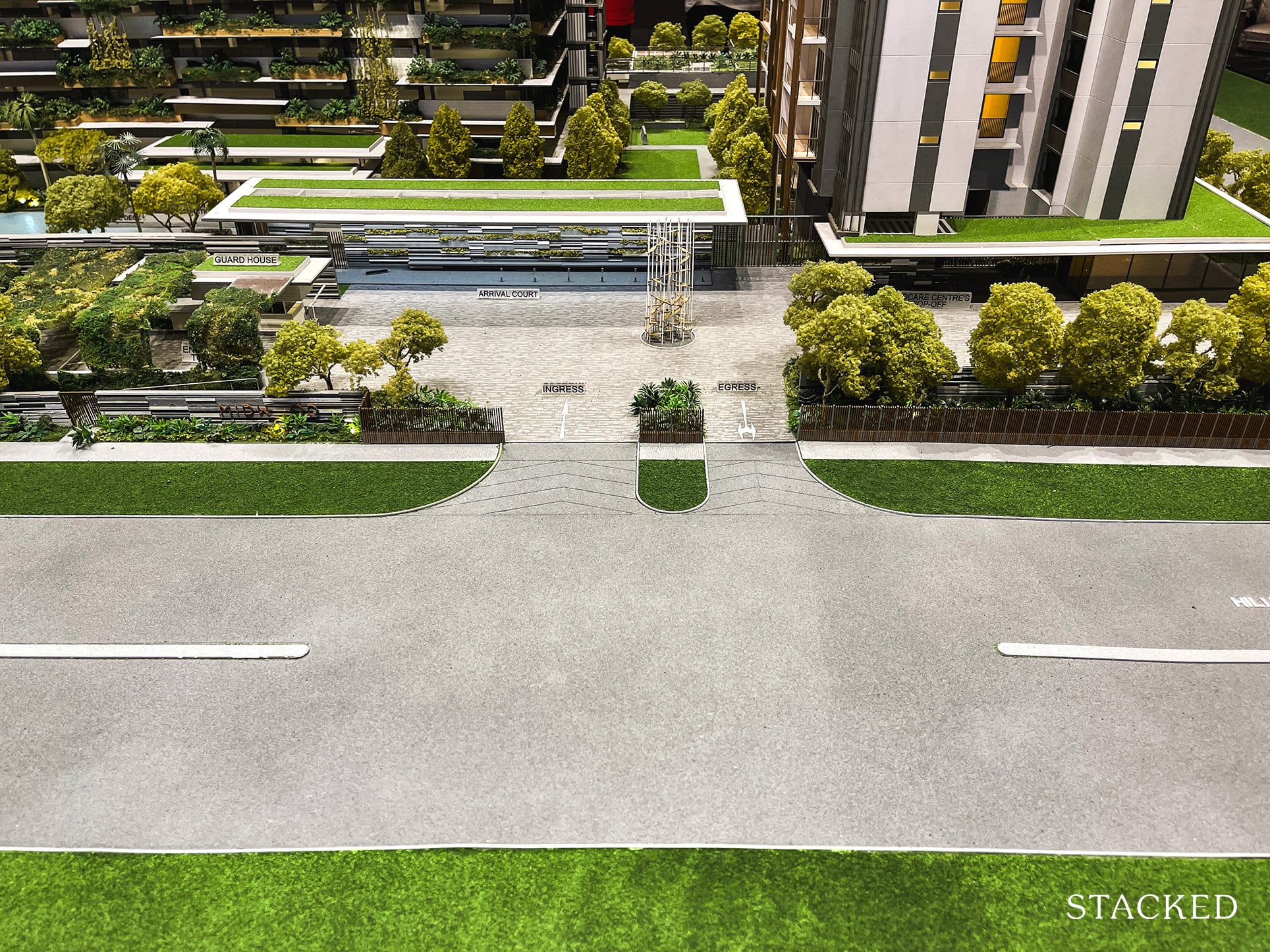
As mentioned earlier, there will be a new road constructed that connects from Hillview Rise. While residents at Midwood will probably be the main users (Kingsford Hillview Peak will have access to), it’s worth remembering that there will be 5 future residential plots surrounding it.
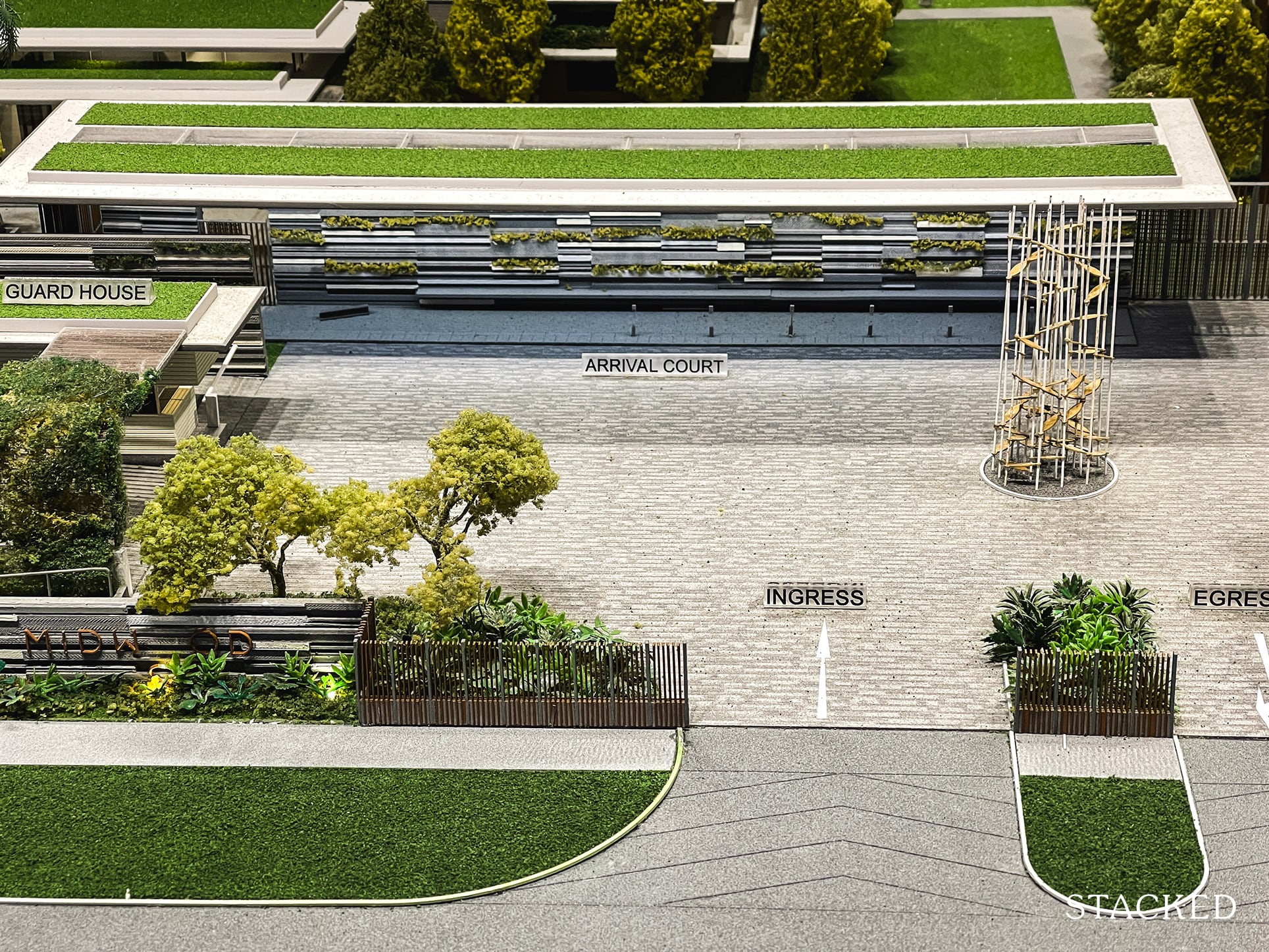
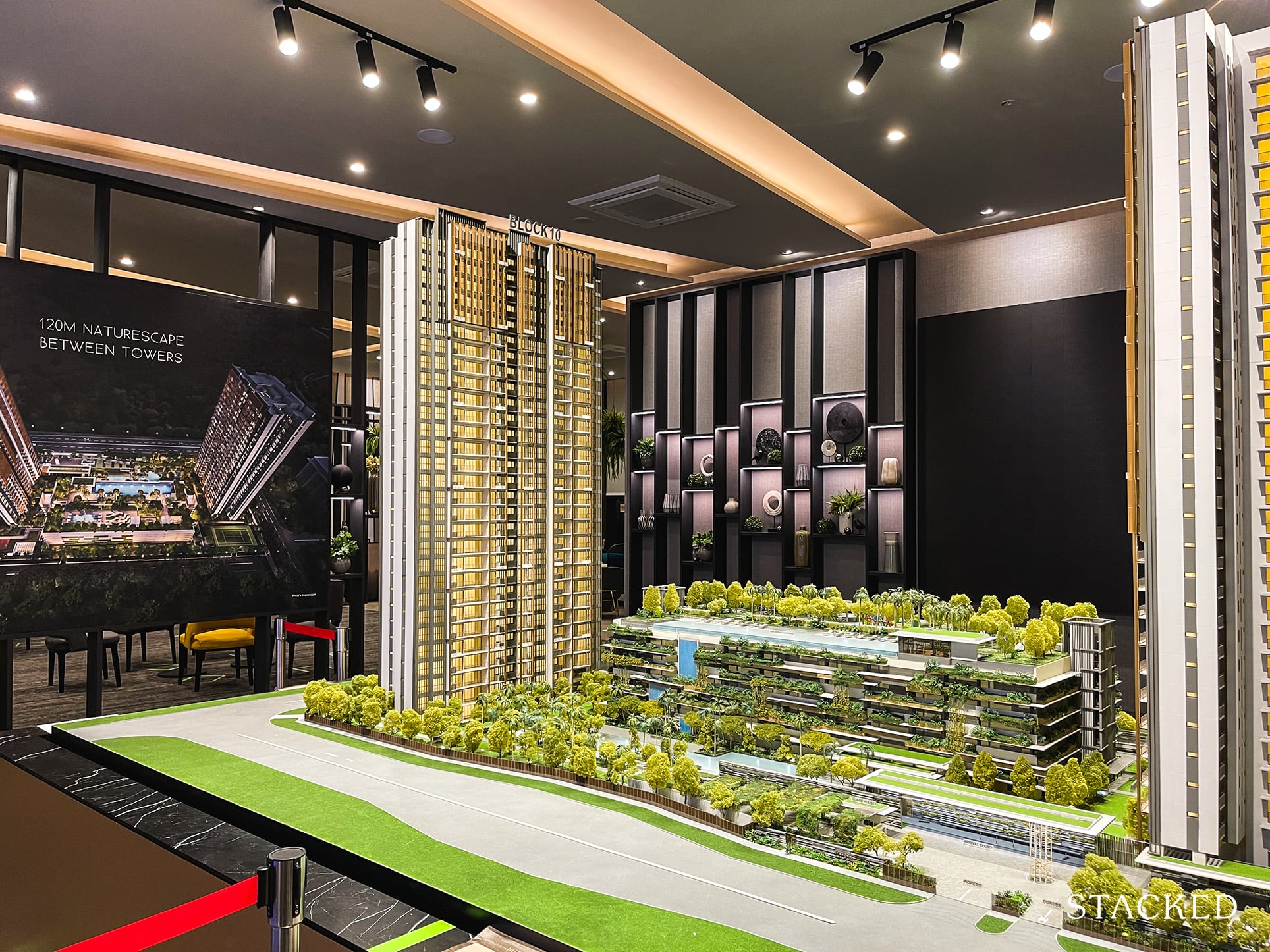
Now, let’s move to the Arrival Court of the development. With only 564 units and many being smaller units, having 1 ingress and egress is perfectly acceptable. The Guard House is located to the left of the entrance and will help to create a buffer to ease any potential congestion. Taxis or GrabCars will pick up/drop off at the sheltered drop-off point instead, which will have plenty of bench seating for residents. The curated plants at the Arrival Court give off a pleasant and calming vibe to me.
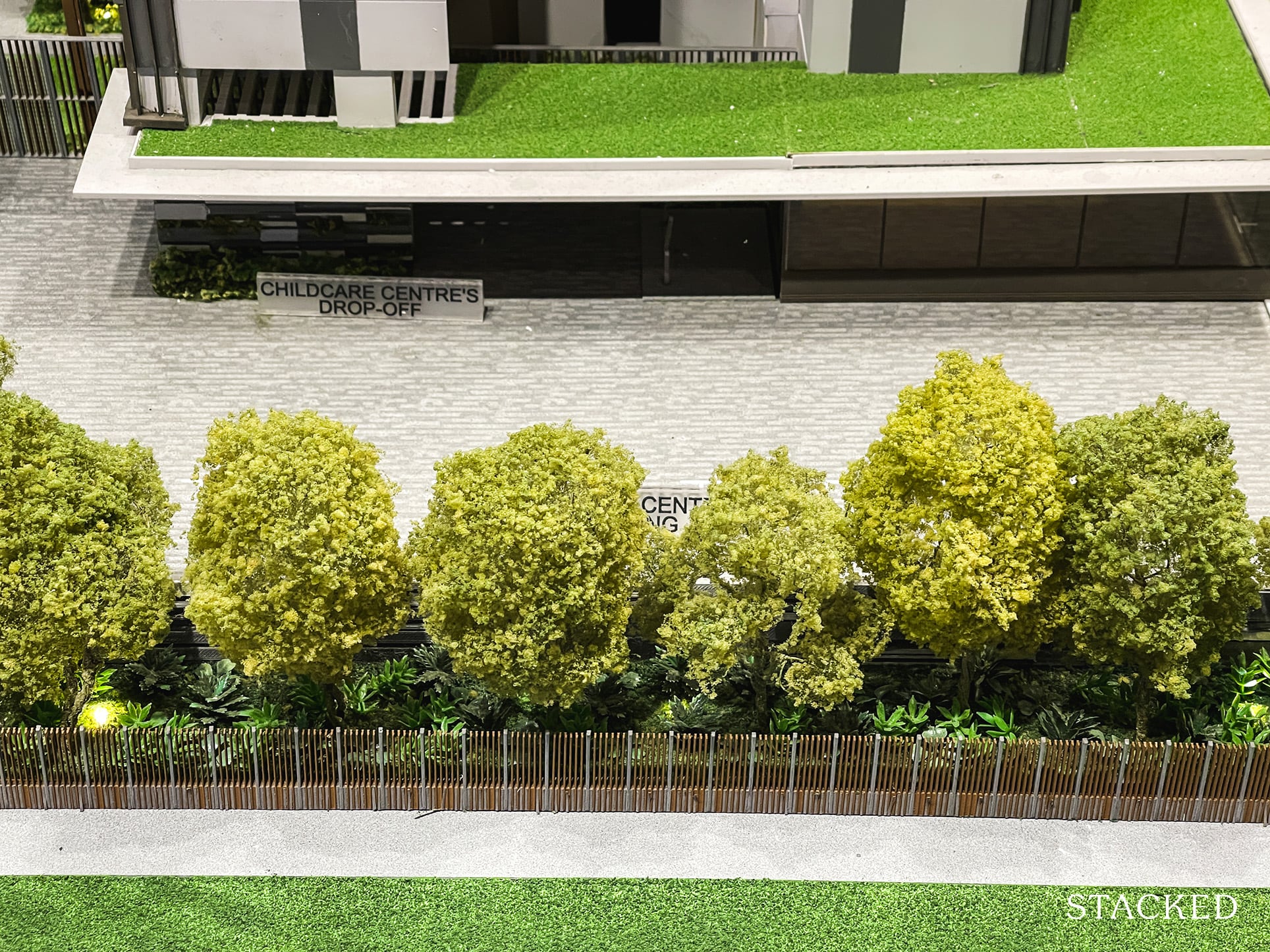
You will also notice a number of surface parking lots which are catered to the parents of children enrolled in the Childcare Centre on the ground floor. The Childcare is also open to public and definitely looks to be quite a sizeable space!
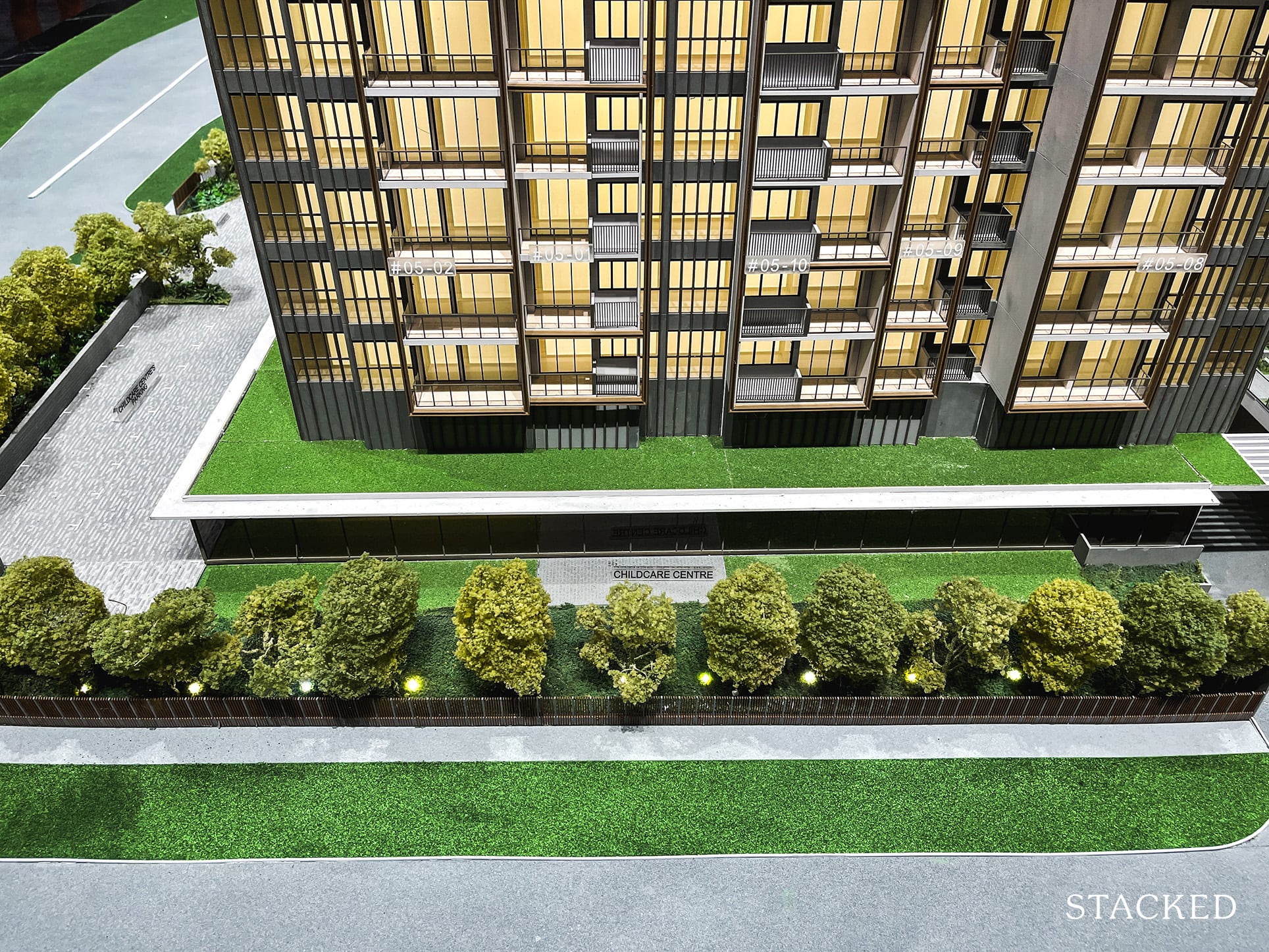
It isn’t the only childcare centre in the area, but this would definitely be a plus point for parents – particularly as the Hillview area is more towards own-stay as well.
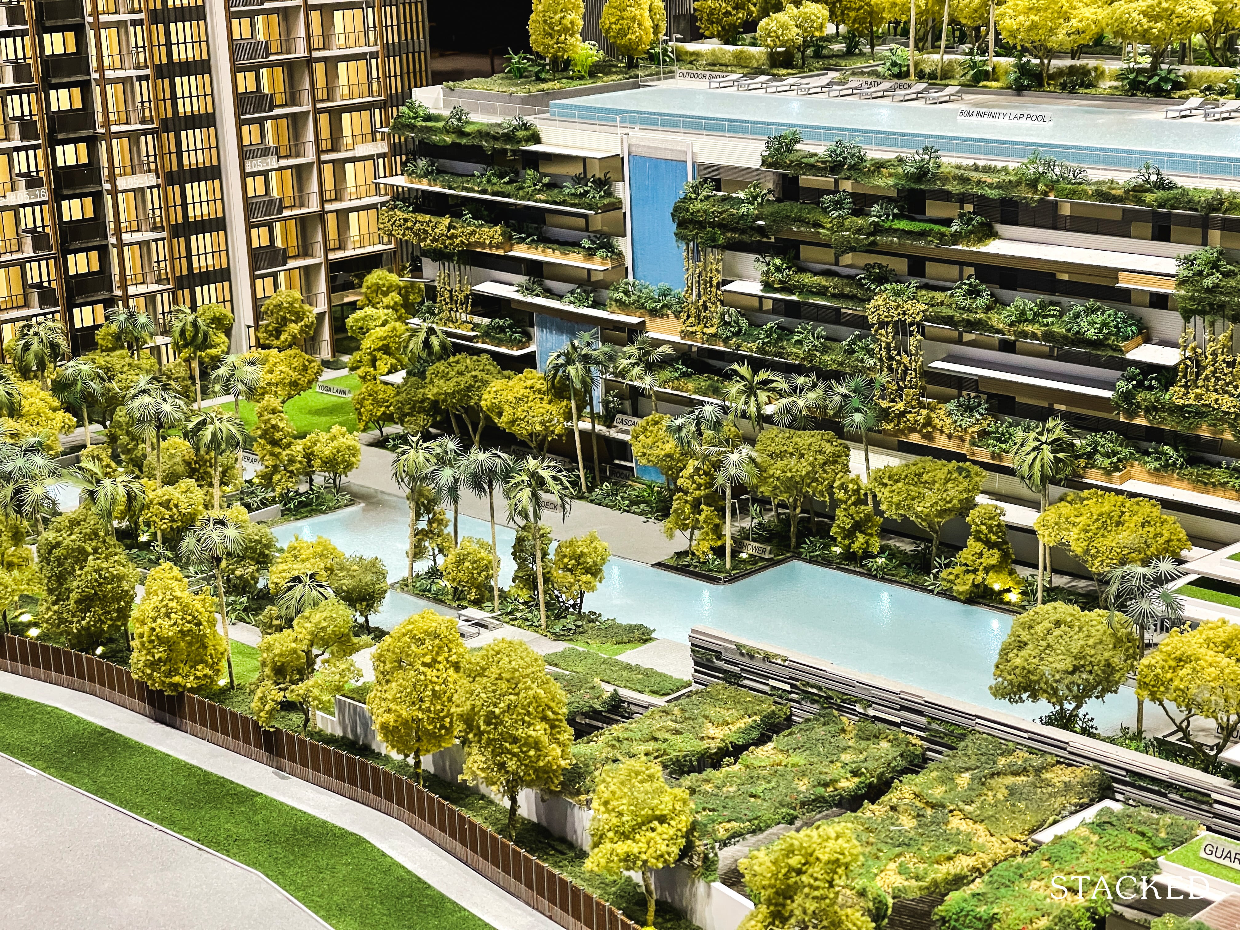
From this angle, you get to see even more of the greenery theme, and I think they have done a good job in masking that usually not very appealing looking multi-storey carpark structure. Again, it’s very in keeping with the lush forested nature of the Hillview area.
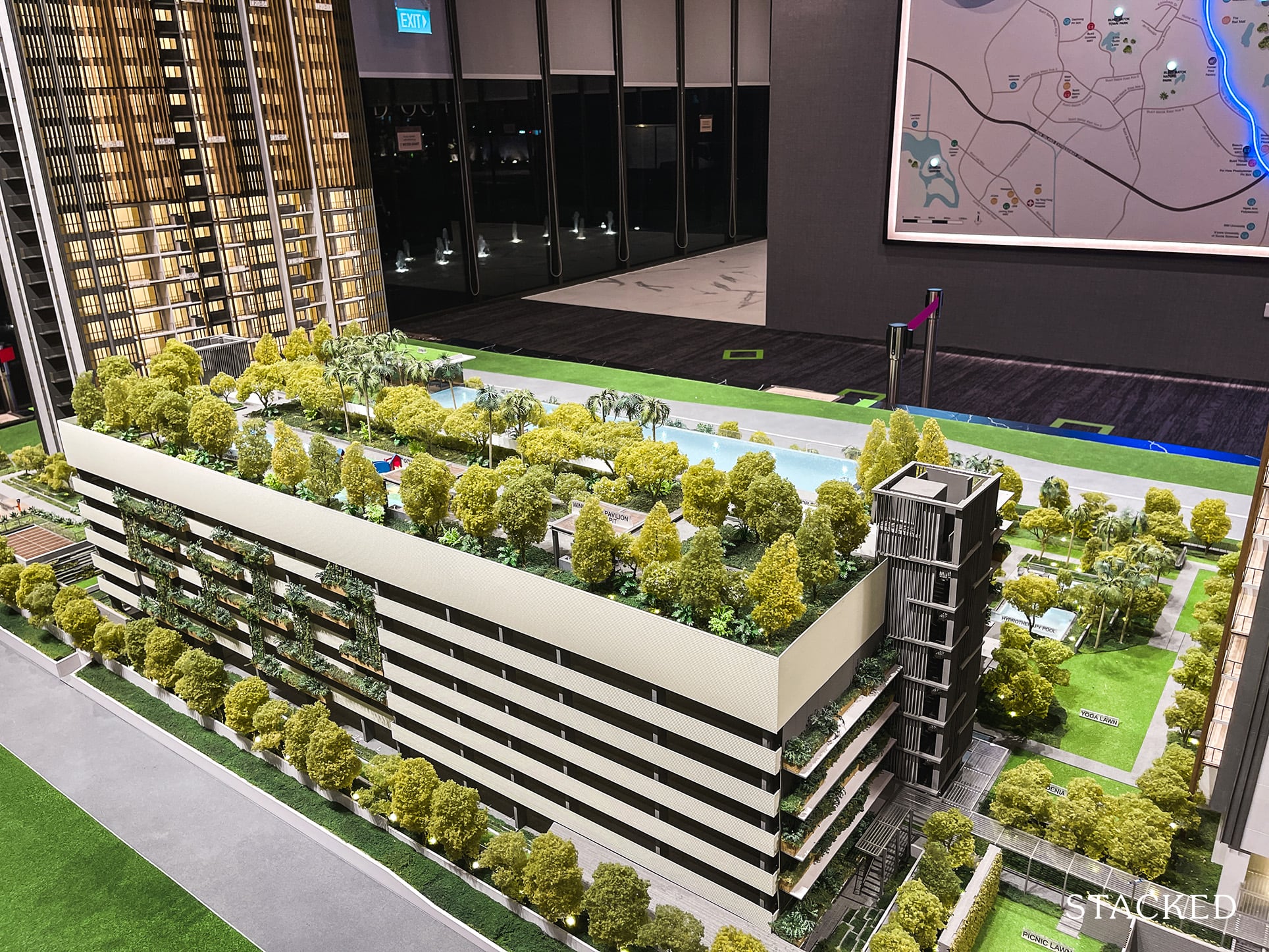
Common facilities for residents are spread across the 1st and 7th floor, with the latter ones above the multi-storey carpark. On the positive side of things, it has a 1-to-1 carpark lot to unit ratio – so even with the high number of small units, carpark space should be more than adequate.
On the other hand, well, here comes one of the more problematic issues about Midwood. While it’s alright to not have basement parking lots, I find it unacceptable for a new condo development to lack a dedicated carpark to unit access. This means that residents will have to take the lift down from the carpark before strolling under the sheltered walkway to their blocks.
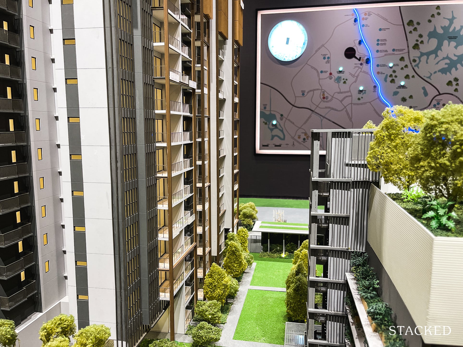
To put it bluntly, HDB upgraders must wonder how this is any different from their present lifestyle. This poses even more of an issue if you have family members who have mobility issues as this entails a longer and more arduous journey back to your unit. Perhaps the extensive use of PPVC was a cause of a layout and unnecessary inconvenience for residents.
Lastly, without meaning to sound like a snob – but multi-storey carparks have traditionally always been viewed as one that is less premium than an underground one. I definitely don’t think this is a dealbreaker by any means, but it may not be as enticing for some.
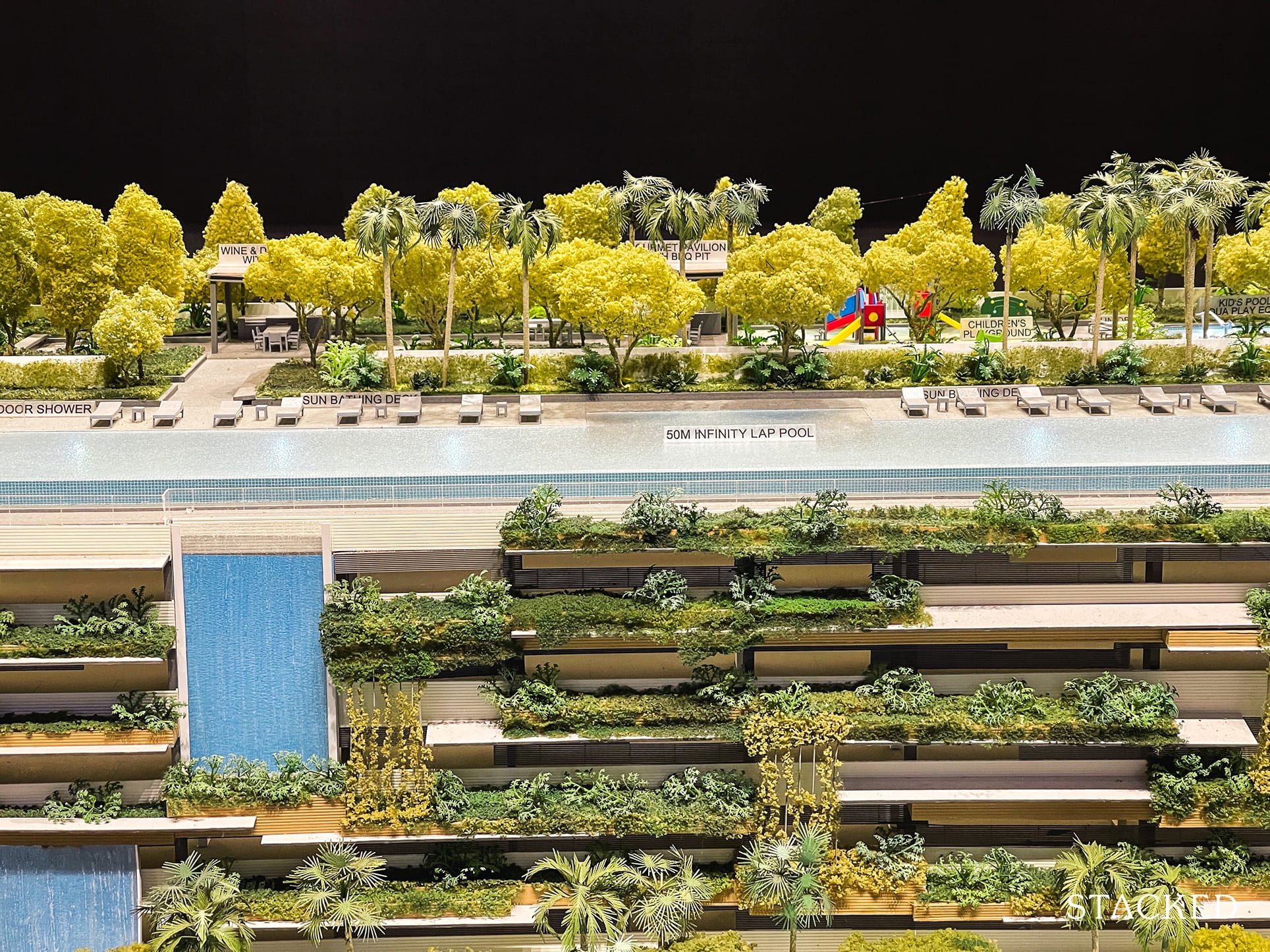
Moving on to facilities on the 7th storey – this is where you will find the impressive 50m infinity lap pool. It fronts large swaths of greenery in the distance and the artist’s impression on the brochure has done a good job in making this pool look really desirable. You will of course find your usual deck chairs lined up here as well.
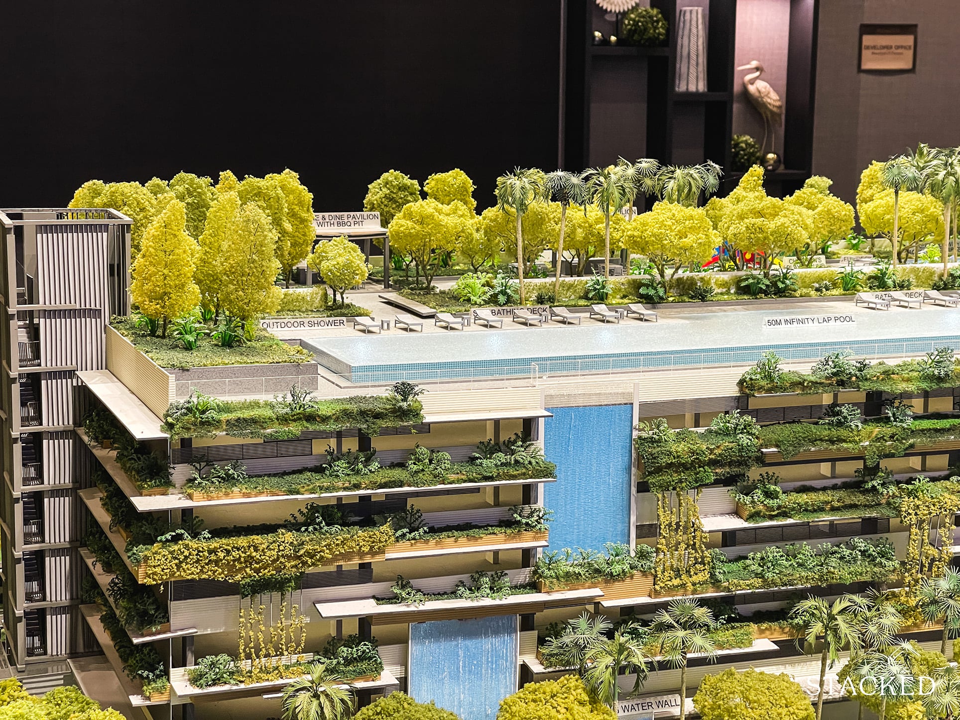
It’s also at this juncture that I would like to point out that while upon completion you are likely to be facing the current blanket of greenery that surrounds Hillview Camp, this could change in the future as the plot of land that is facing the pool is zoned as a residential one.
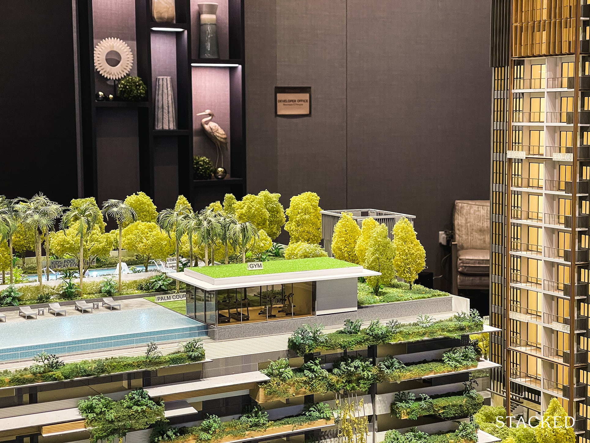
Beside the infinity pool, there is a Gym which will, for now, enjoy both the views of nature in the distance and the 2nd lap pool located on the 1st floor. Talk about the best of all worlds…
It does seem a little small though, but on the flip side you do have Bukit Timah Nature Reserve nearly at your doorstep so I can imagine that would be an outlet for most.
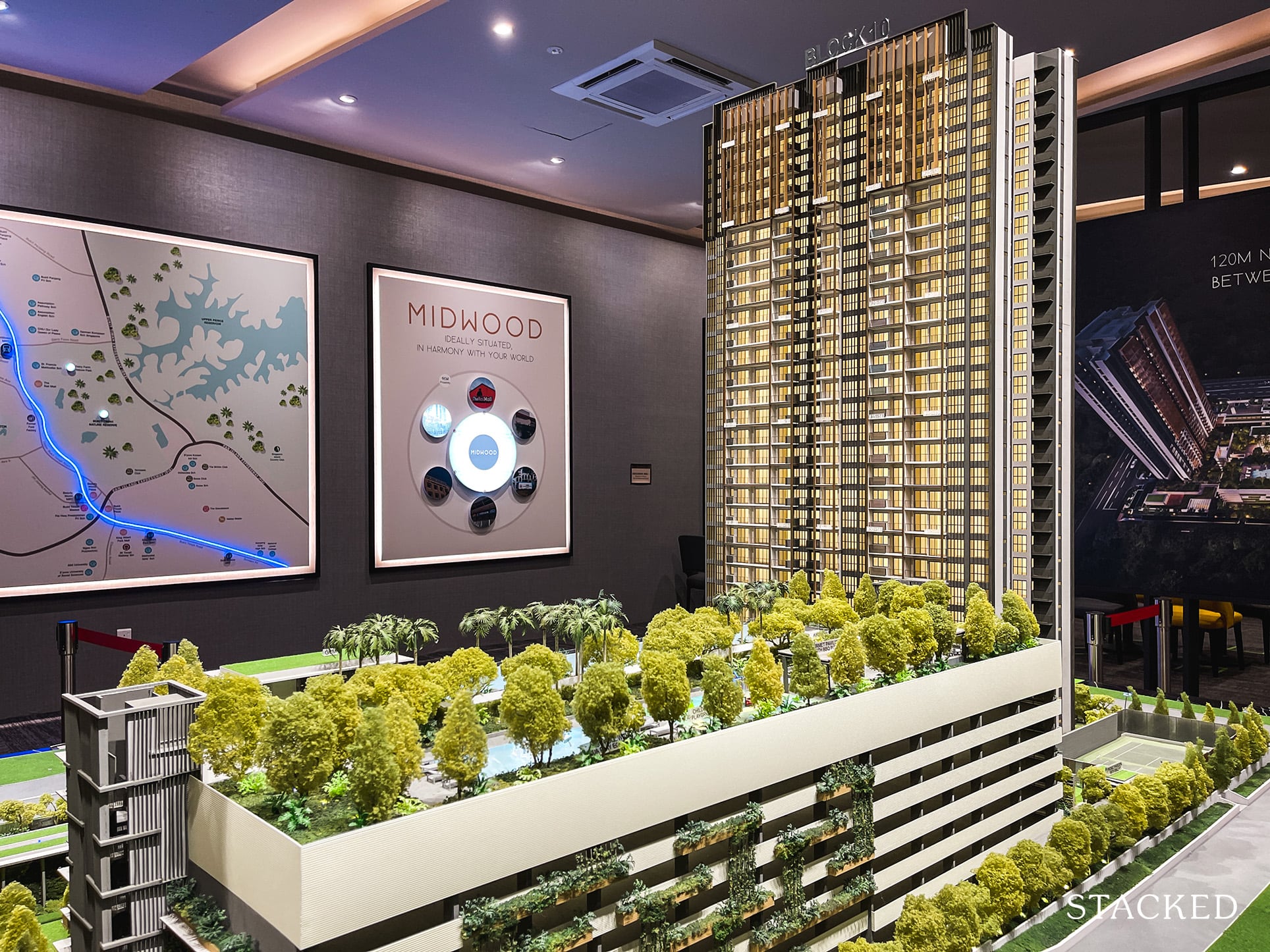
How about facilities for the little ones you may ask… expectedly, there is a children’s pool and playground located on the 7th floor as well.
At this point, you may be wondering why have a ‘sky terrace’ of sorts without some dining spots? To address that, they have catered for 2 separate pavilions with BBQ pits with the kid’s pool and playground located all on the same floor. Parents will thus be able to watch over the little ones while hosting a family gathering.
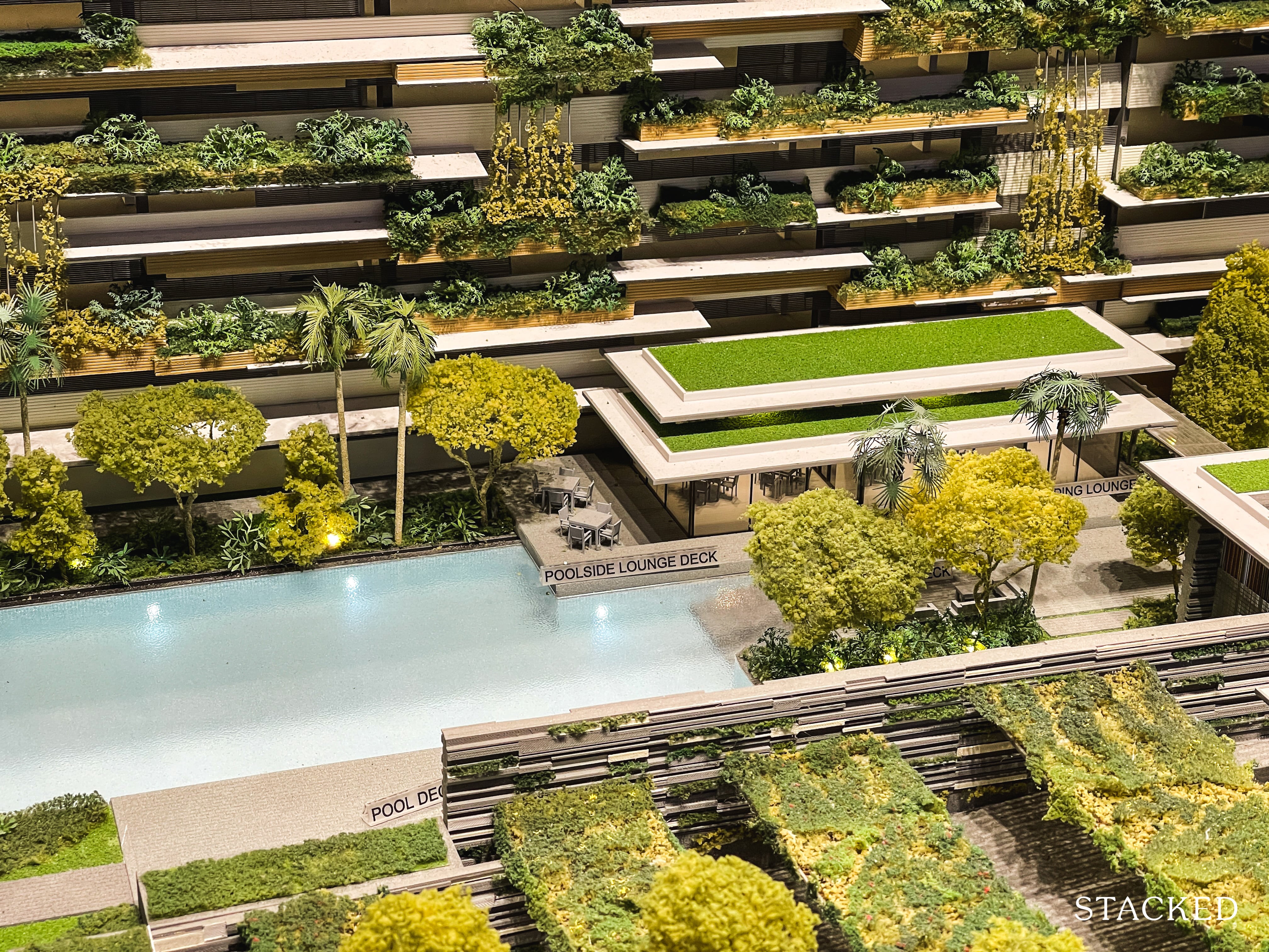
Back to the 1st storey is where you will find yet another lap pool. Having 2 good-sized lap pools for 564 units should be more than sufficient – kudos to the developers for ensuring that this was possible, especially when space is such a premium these days. I’ve always liked developments where there are different variances in height for the pools as it’s nice to have versatility depending on my mood.
Besides the additional lap pool, there is also a hydrotherapy pool and spa suite with a jacuzzi beside, although I sometimes wonder if people actually use these ancillary pool facilities.
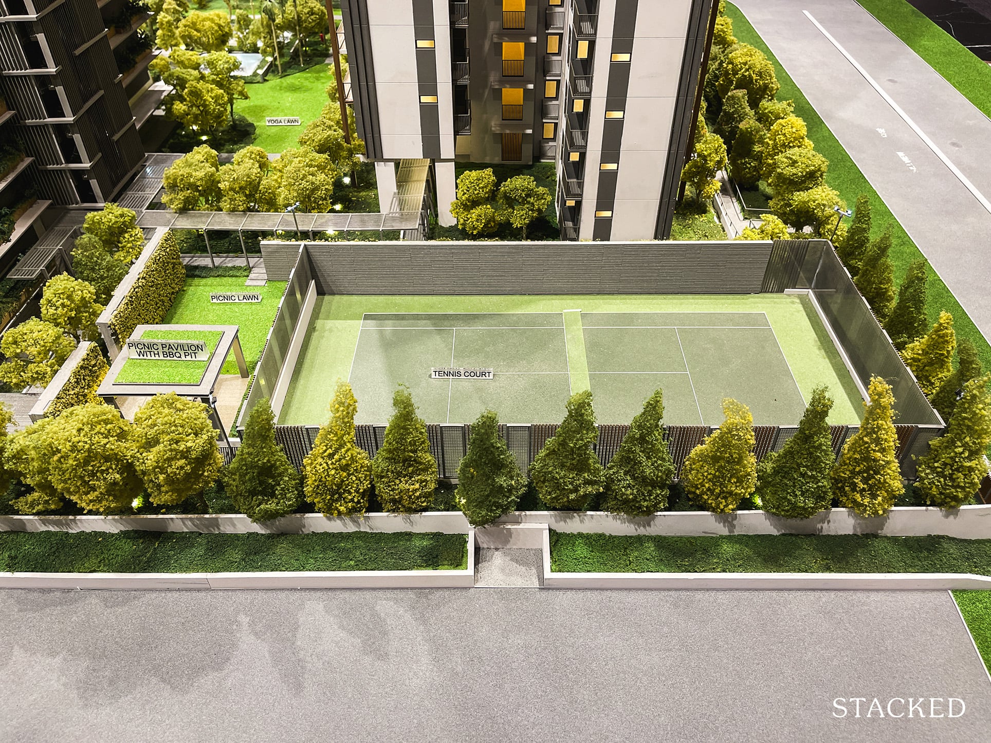
And in an era of increasingly zero tennis courts (or a really bad ratio) for new developments, I was pleased to know the presence of one for Midwood. Interestingly, if you were to take a satellite view of the entire Hillview estate, you will realise that every other condo boasts of 2-3 tennis courts with fewer residential units as well. Just a sign of how times have changed. For 564 units, it isn’t bad at all.
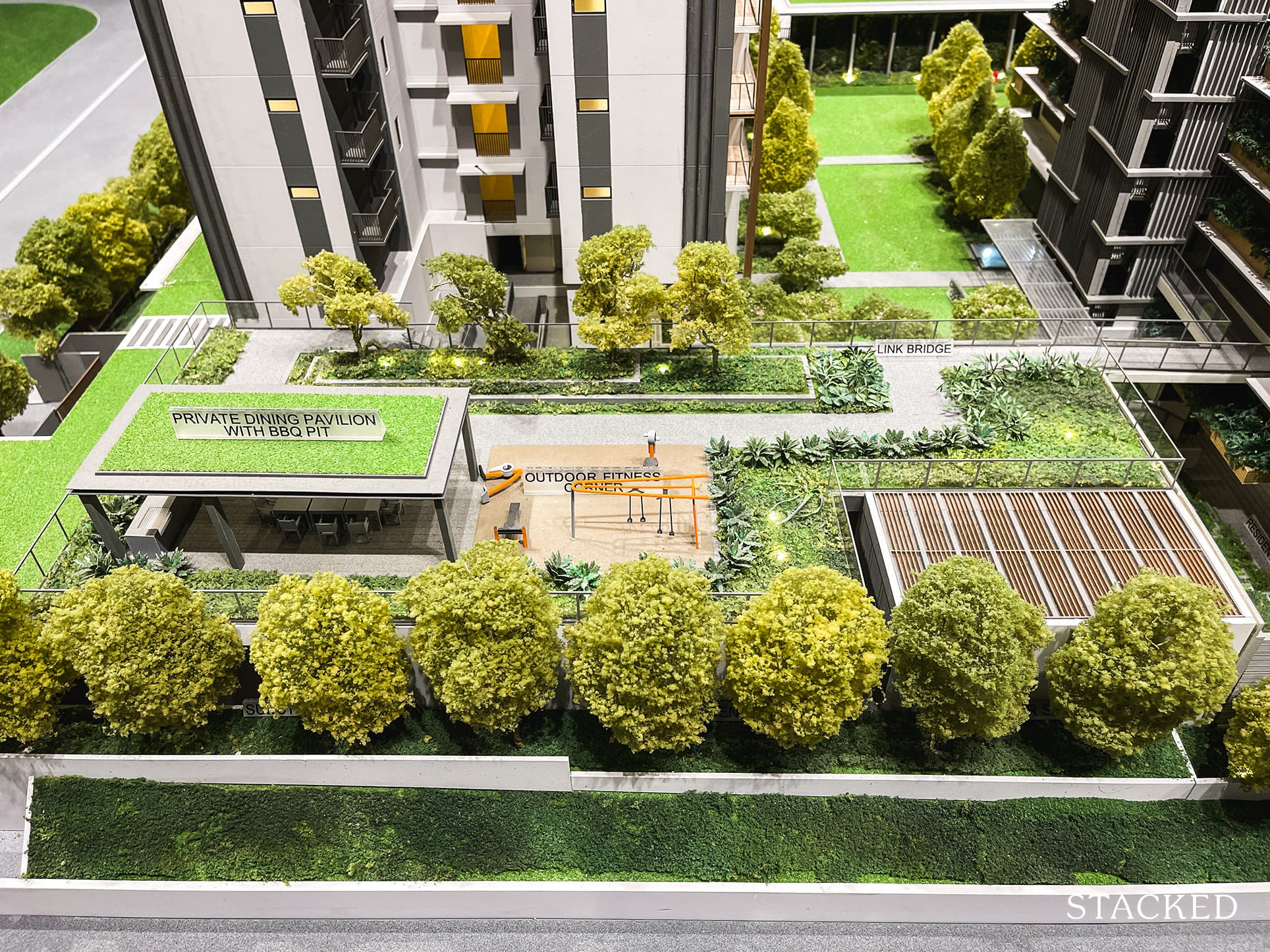
As mentioned earlier, 80% of the land area is dedicated to landscaping and facilities. The facilities zone can be found in the 120m distance between the 2 blocks. Besides the usual facilities for the more sporty among us, there is also the Clubhouse incorporating 2 function rooms and a reading lounge.
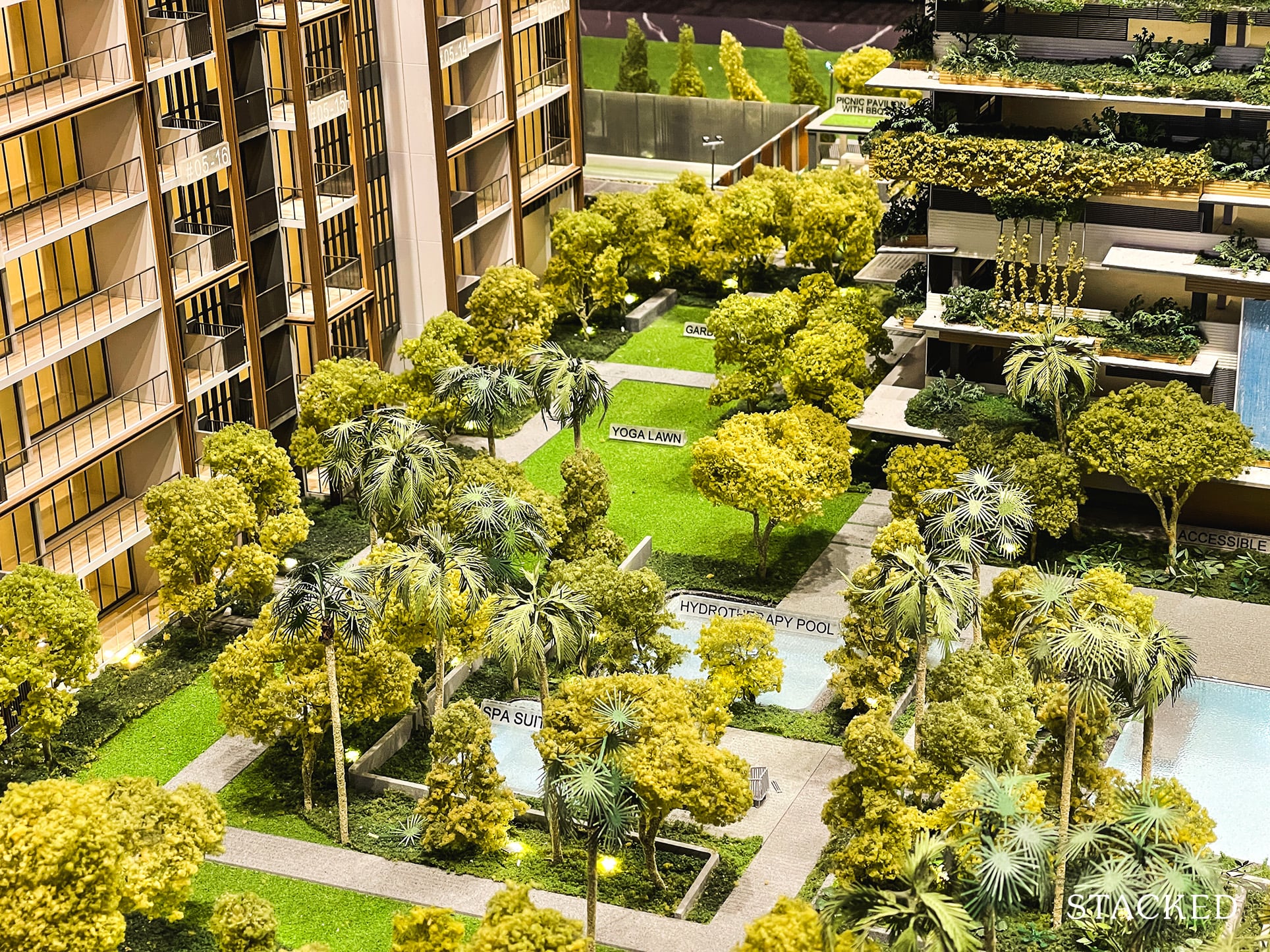
You will also find lawns spread across the development with each having a different name on the facilities sheet – Yoga lawn, Community lawn, Gardenia courtyard, etc. You just have to take these fancy names and long lists of facilities as marketing speak, and really cut down to what would be of actual use to you.
Now that I’ve gone through the facilities, let’s head on to the showflat units!
Midwood 1 Bedroom + Study Type (1+1)a (549 sqft) Review
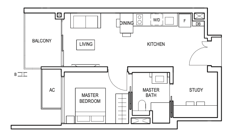
This unit showcased here is the largest 1 Bedroom available at Midwood, with the majority of the other units coming without the Study at 484 sq ft. With all the units coming in below $1mil and an efficient layout, I thought this 1 Bedroom + Study is quite the perfect bachelor’s / bachelorette’s pad.
All units have a 2.8m ceiling height, which is the norm in the market. Materials used for the flooring are porcelain tiles for common areas and engineered timber for the bedrooms, which are in line with what I’d expect for a mass market project like Midwood.
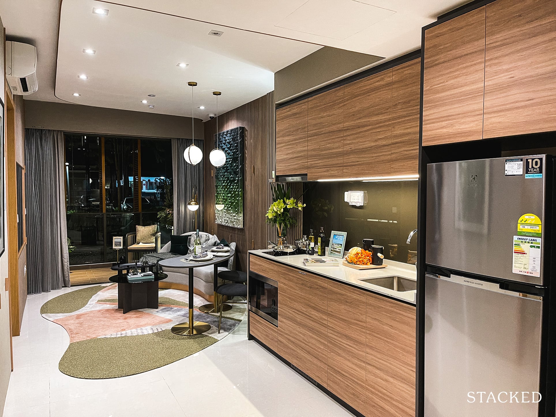
When I stepped into the unit, I was impressed by how spacious the unit felt. Perhaps I’m too used to viewing sub-500sqft shoebox units but the entrance definitely felt wider than usual. There’s no wasted space at all as you find the open concept kitchen right as you enter. In fact, that squarish regular layout is one of the better ones I’ve seen.
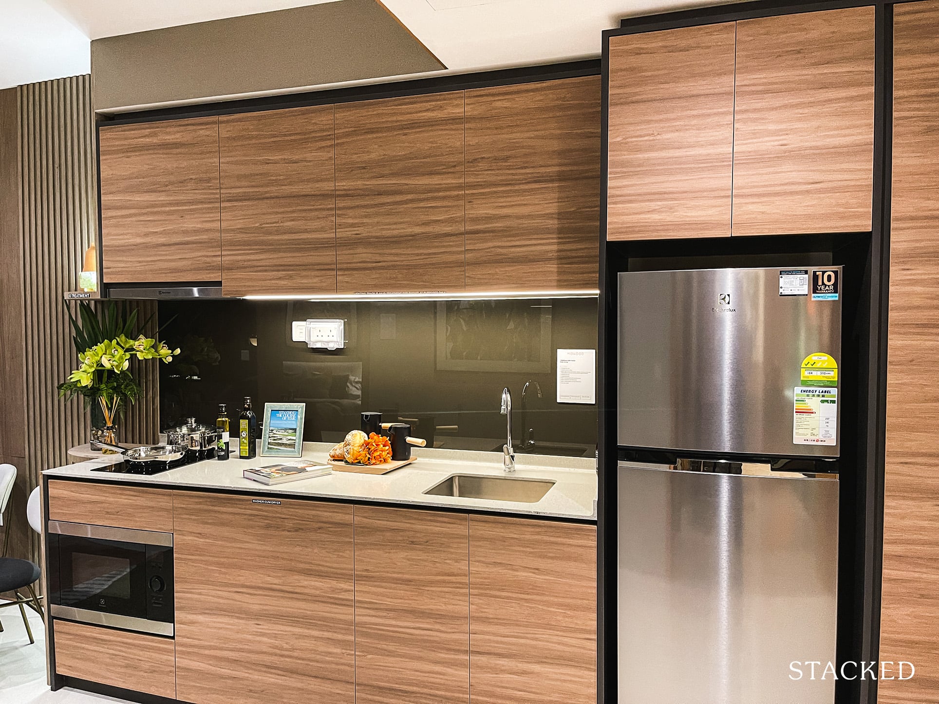
As expected, induction hobs are provided here in the kitchen instead of gas ones, which are typically saved for the larger units. Appliances such as the microwave oven, fridge, washer dryer and the induction hobs are provided by Electrolux. You will also get your standard built-in kitchen cabinets in a light wood-like laminate finish with a solid countertop.
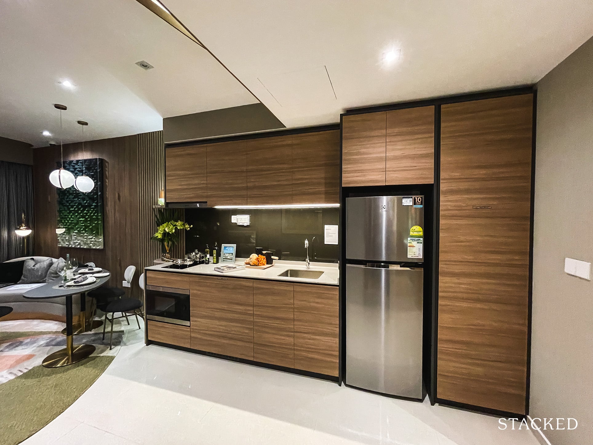
Perhaps its because the dining area is squeezed with the living instead, but the kitchen here is wide and the space afforded is exemplary.
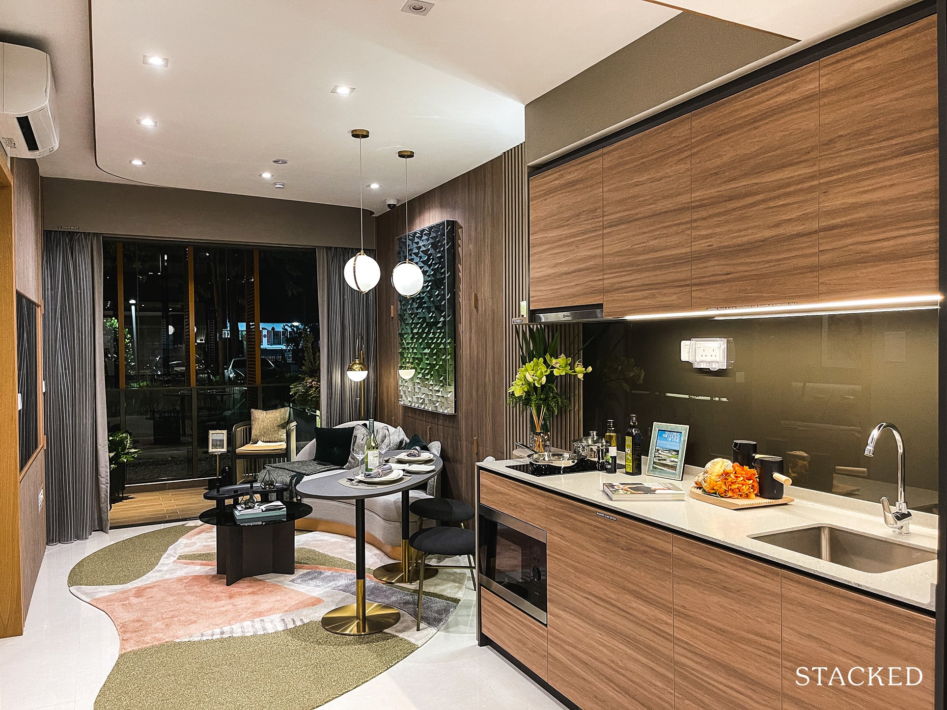
Moving on, they have placed a 2-seater dining set here that tilts towards the living area. It’s obvious that this interior designer enjoys his/her TV shows and imagined the unit this way. It’s a personal choice but if you wanted a more conventional dining set, you could probably fit up to 4 given the relatively wide unit layout.
Personally, I would place the dining set at the kitchen area instead, as this current setup leaves very little space for the living area.
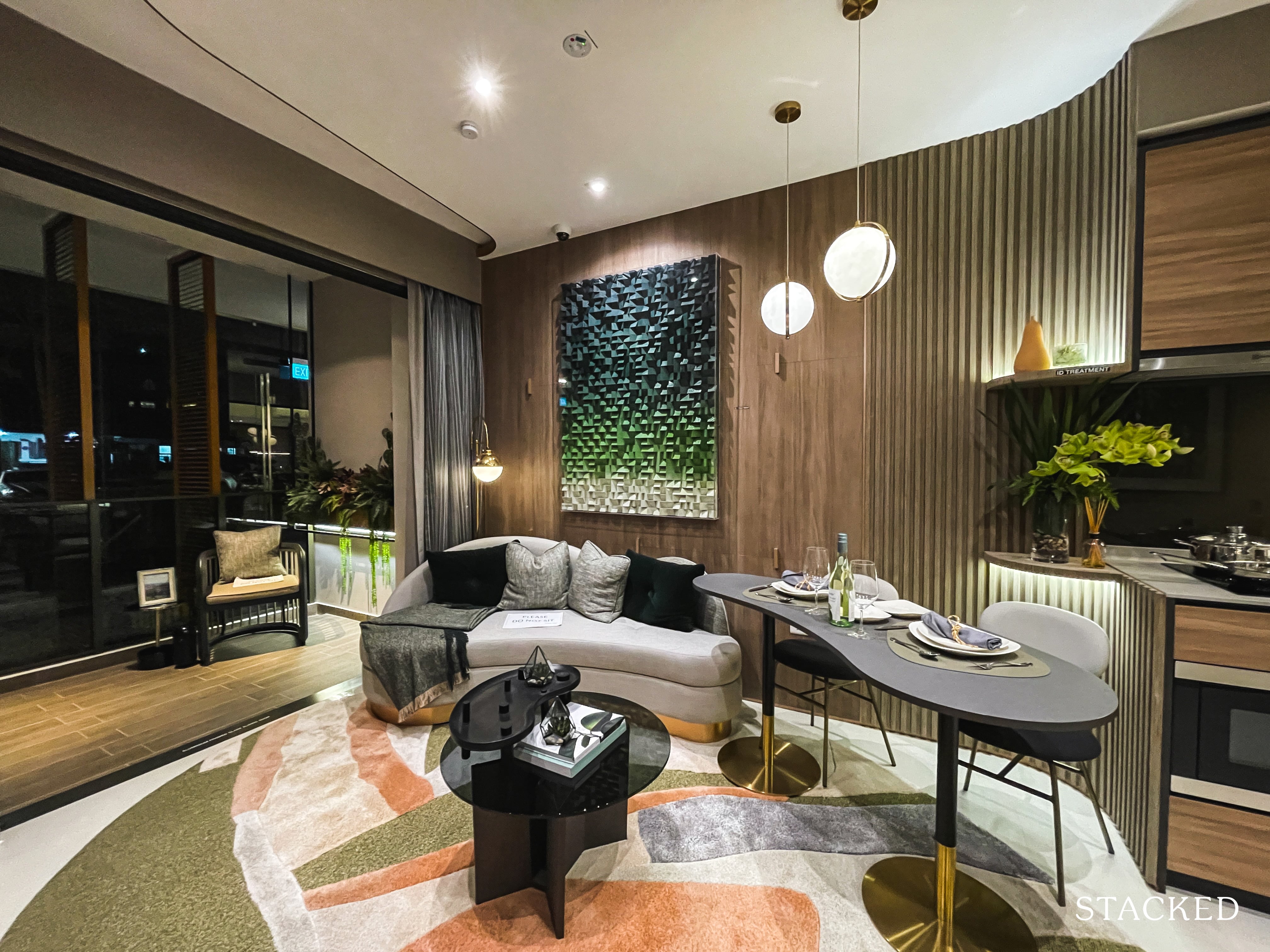
Unsurprisingly, the living room is compact, to say the least. If you are bent on fitting in a dining table here, you can see that you will be very limited in the size of your sofa. While you can seat 2 people in the above situation, it doesn’t look like a very comfortable one to me. That said, this is after all a 1 Bedroom plus study unit – so something had to give somewhere.
Notice also how they have avoided having TV consoles because it will only make the space look smaller than it already is. For those that want some reference of comparison, the combination of the living, dining, and kitchen areas make up 23 sqm of space.
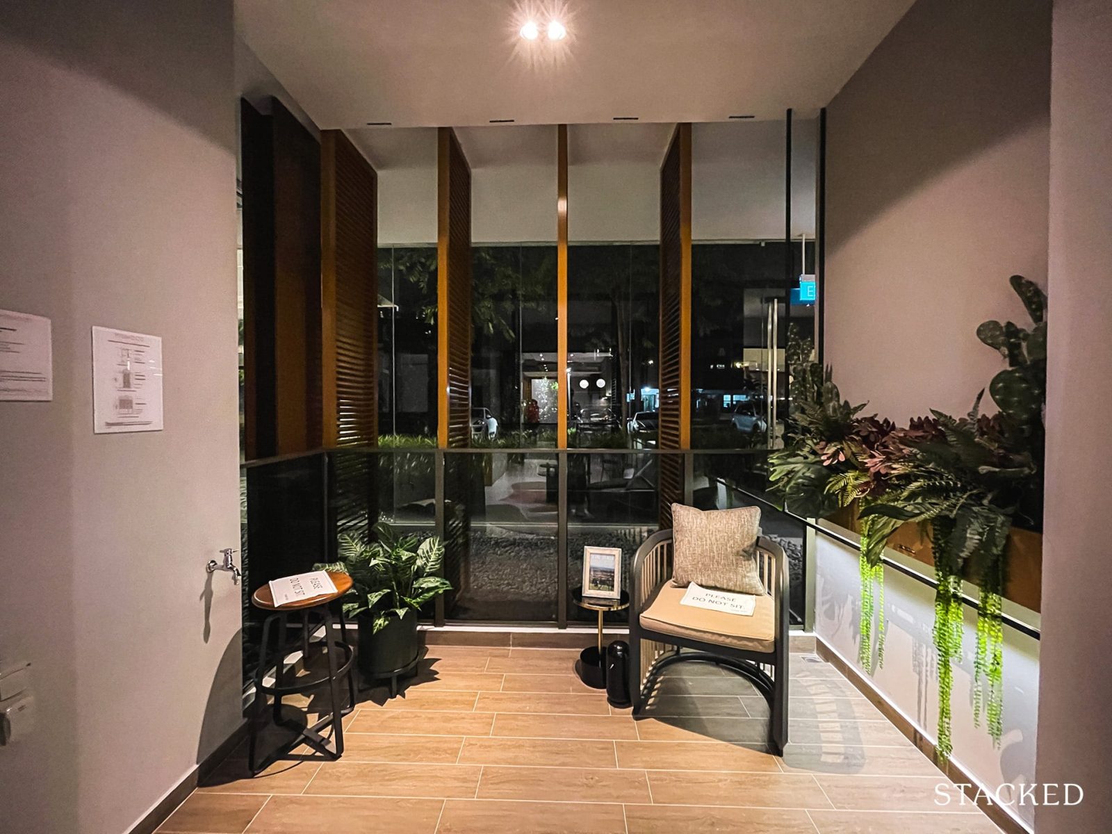
However, the 5 sqm balcony will definitely go some way in helping occupants feel less claustrophobic. It’s a large enough space to throw in a high stool and table or some beanbags just to chill in the evenings. However, you do have to bear in mind that the aircon ledge is located just beside the balcony as well, so there might be some rumbles when it is switched on.
You will also notice that there are screens installed here that allow you to only ‘look straight’. That’s because of the privacy restrictions posed by having the MINDEF HQ close by. This will affect North facing units from the 13th floor and South facing ones from the 25th.
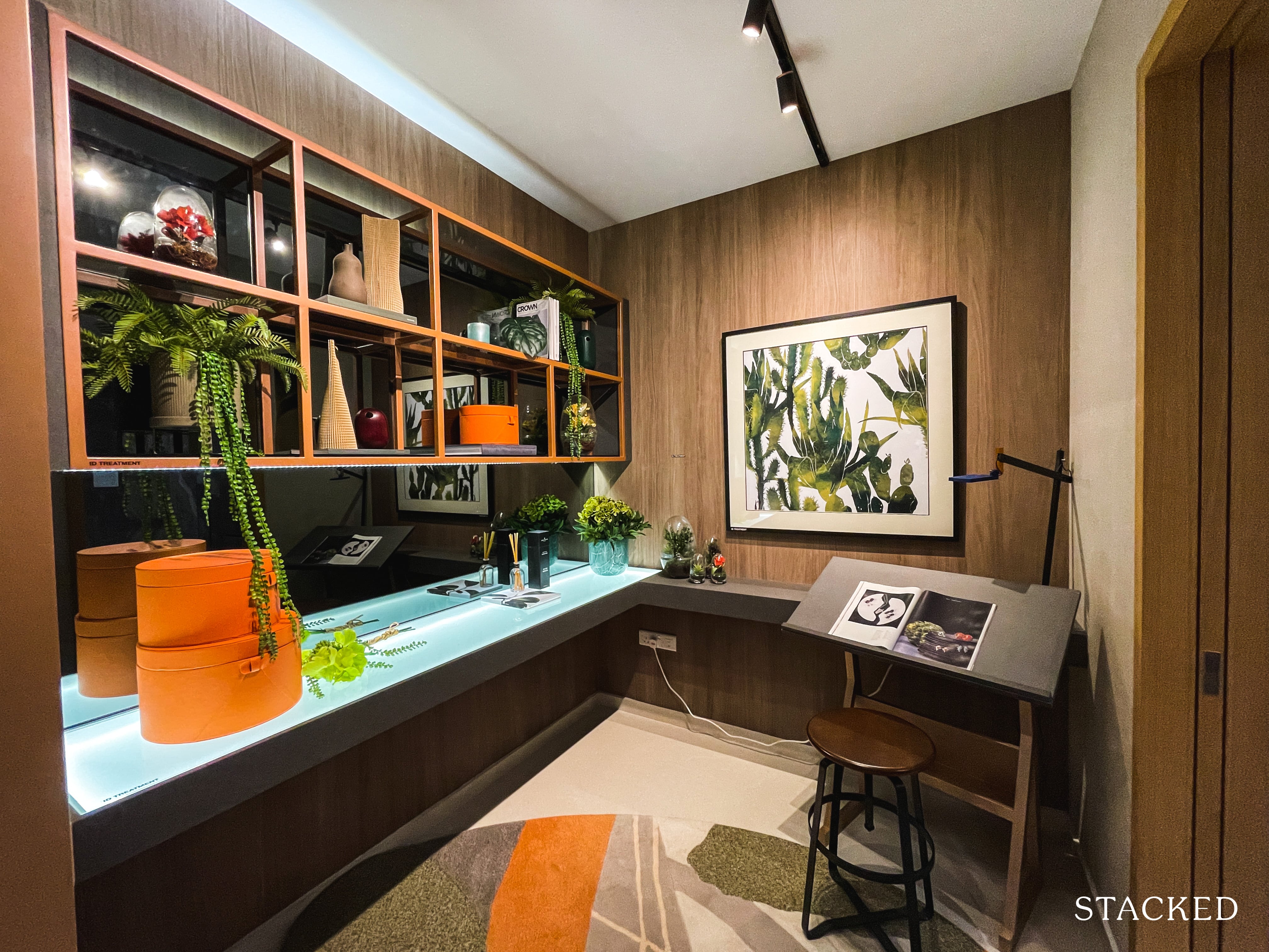
Moving back to the entrance is where you will find the Study. At 6 sqm, it’s not as big as a normal bedroom but definitely a very comfortable space to get your work done! Given how space is such a premium in Singapore, this 6 sqm of space is large enough for a single bed and can thus double up as a 2nd bedroom for guests who sleepover. It can even be rented out as a bedroom if you are particularly yield-hungry!
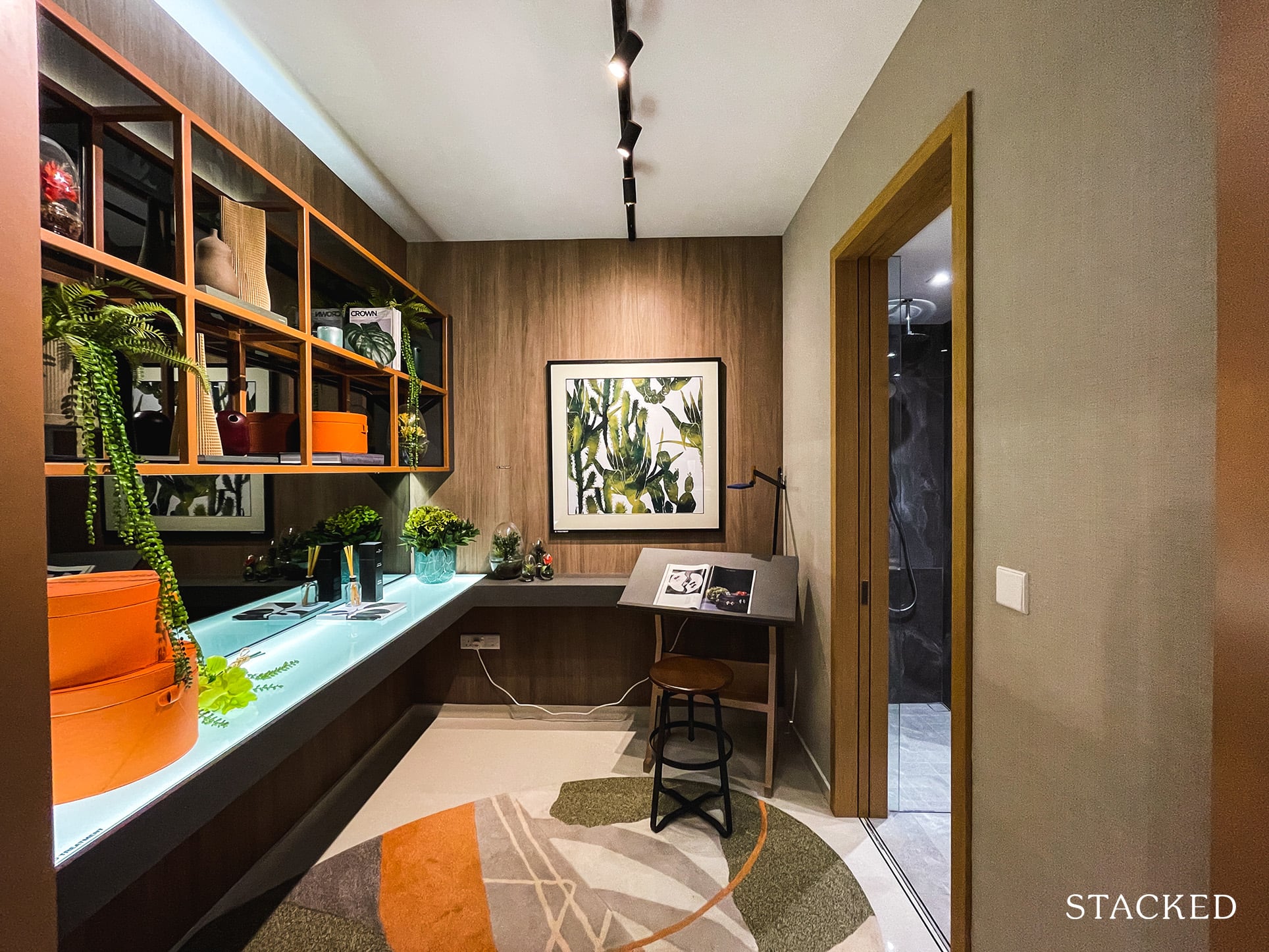
More impressively, it also has a jack-and-jill access to the sole bathroom of the unit, which means that guests do not have to enter your Master Bedroom to access the toilet. (Although the downside is, if you do choose to rent this out as a small bedroom in the future, you will have less privacy from your Master Bedroom). I definitely appreciate jack-and-jill bathrooms as they offer more privacy to the main occupant and really ought to be a default these days.
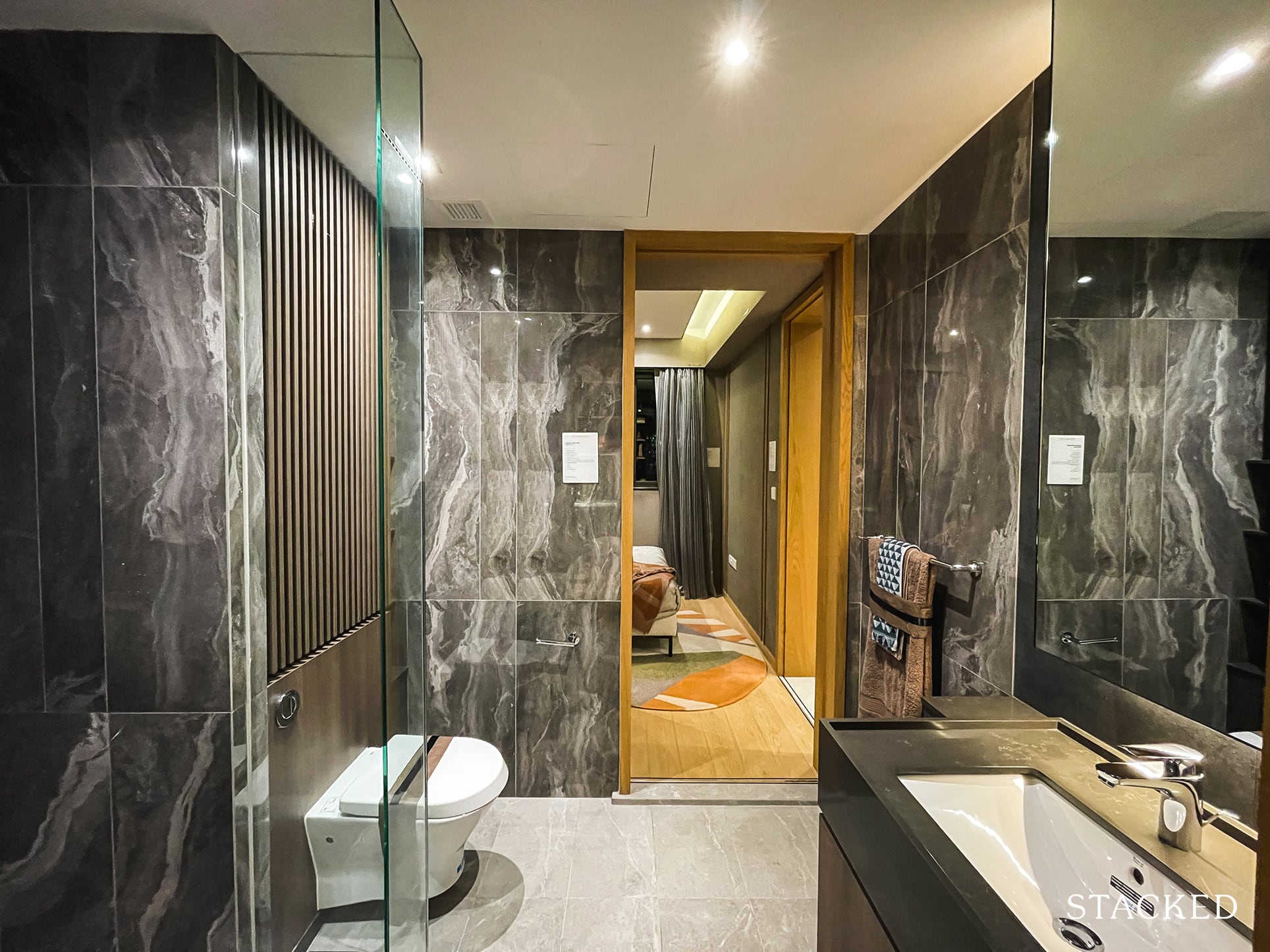
In this Master Bathroom, it’s of an average size and comes laid in darker toned tiles on the walls. As you will notice in the other show units, common bathrooms will come in a lighter shade of tiles. The wall-hung water closet and sink are from Roca with the rain shower by Hansgrohe. These brands are household names in Singapore with many of these brands being used in all housing types.
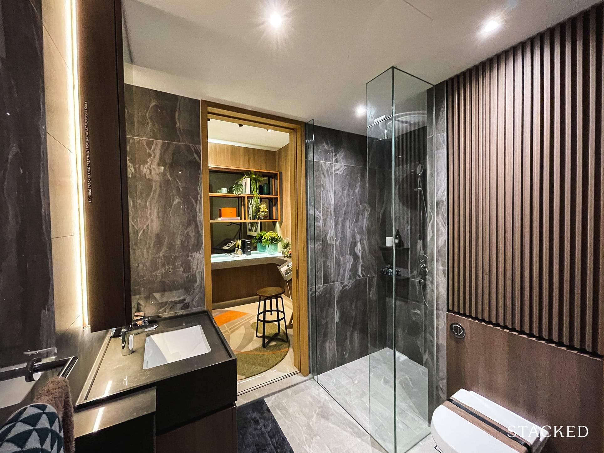
As is typical of 1 Bedroom units, the bathroom does not come with windows for natural ventilation.
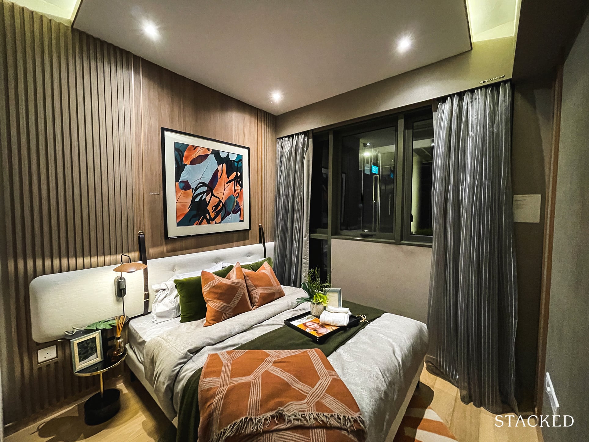
Finally, we move on to the Master Bedroom, which measures up at 10 sqm. That’s smaller than average and in general, you’ll find that units at Midwood feature smaller-than-average bedroom sizes.
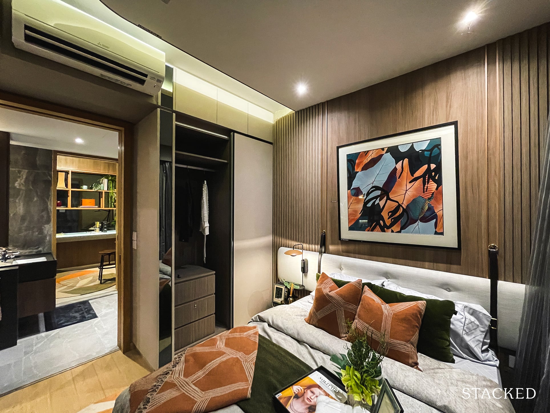
Nevertheless, in this instance, you will still get your standard built-in wardrobe and space to place a Queen sized bed with bedside tables. You will, of course, have to deal with half-length windows to accommodate the aircon ledge just outside.
As a whole, I do like the layout of this 1 Bedroom + Study unit. I think it’s laid out in the most efficient manner possible and I especially like the presence of a good-sized study with an ‘attached’ bathroom to it. If you needed comparisons, I thought this layout was far better than what I saw at Irwell Hill Residences. Of course, this unit at Midwood is also significantly larger (and cheaper) but you should consider it purely from a layout perspective.
Midwood 2 Bedroom Type 2P(b) (689 sqft) Review
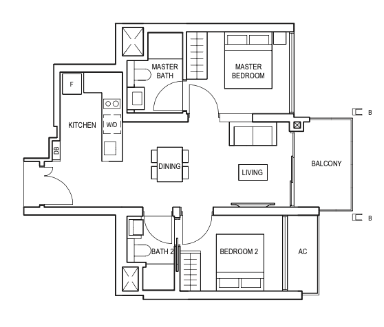
The 2 Bedroom units at Midwood are small for an Outside Central Region (OCR) property, ranging from just 635 to 700 sq ft. This show unit here is one of the larger layouts at 689 sqft and comes in my preferred dumbbell layout, with bedrooms on opposite sides of the unit. You will also have the choice of 2 Bedroom layouts with the common corridor and you have the option of having 1 Bathroom or an additional Study as well. It’s safe to say that 2 Bedrooms at Midwood at compact at best.
All units come with a 2.8m ceiling height with porcelain tile floors for common areas and engineered timber for the bedrooms. Nothing too premium to be expected at this price point and they are in line with market standards.
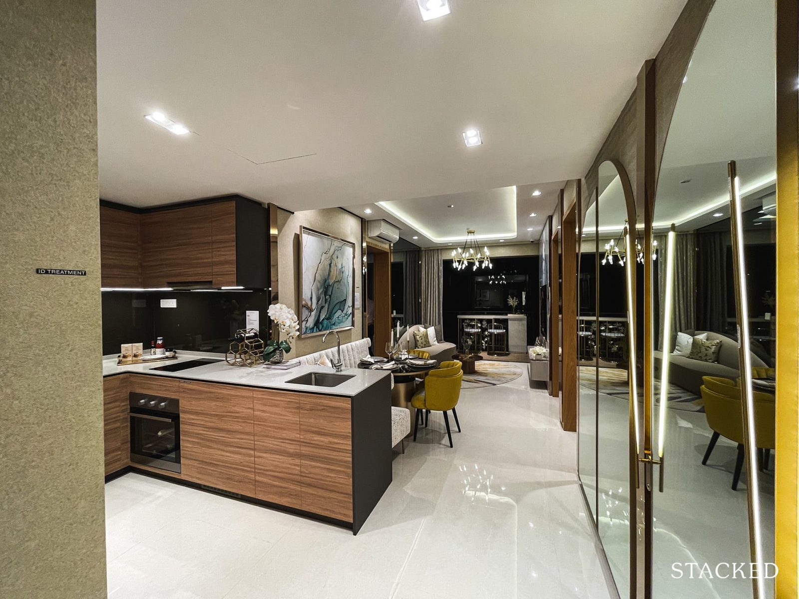
Even though the unit is just 689 sq ft, it does appear larger than its actual size to me (just like the 1 bedroom unit) on first impressions.
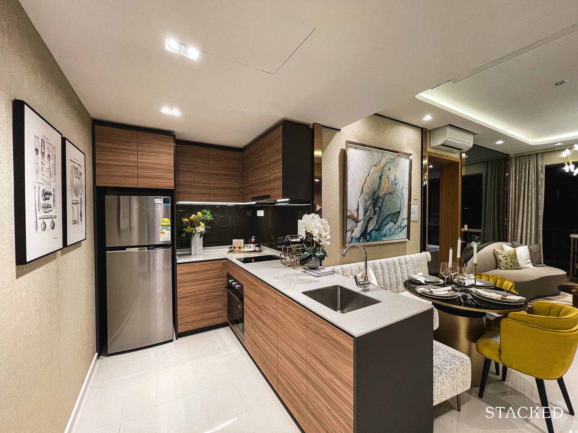
As you enter the unit, there’s no wasted space as you will immediately find an L-shaped open concept kitchen to your left. This kitchen layout offers you an opportunity to potentially install plexi-glass panels to enclose the kitchen but do know that there are no windows for you to ventilate the space.
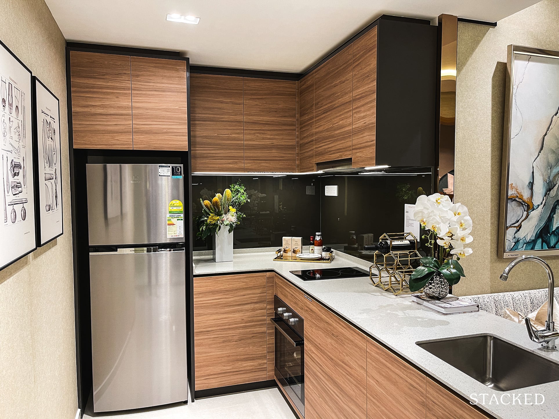
As you might have noticed, the solid countertop space is also quite good for a 2 Bedroom unit and all appliances – convection oven, induction hob and hood, fridge, and washer dryer are provided by Electrolux. Kitchen cabinets are finished light-wood laminate with a white solid countertop provided. As you might expect with units of this size, there is no yard or utility room.
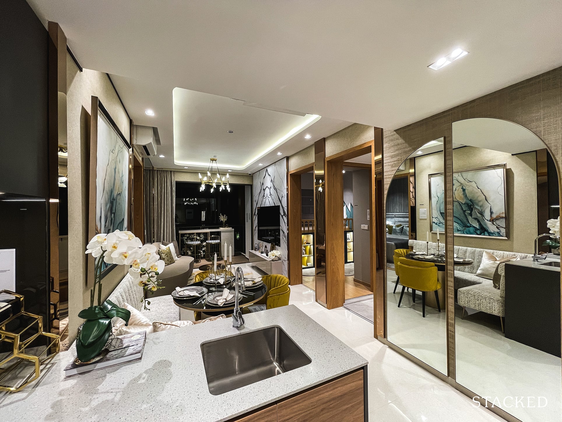
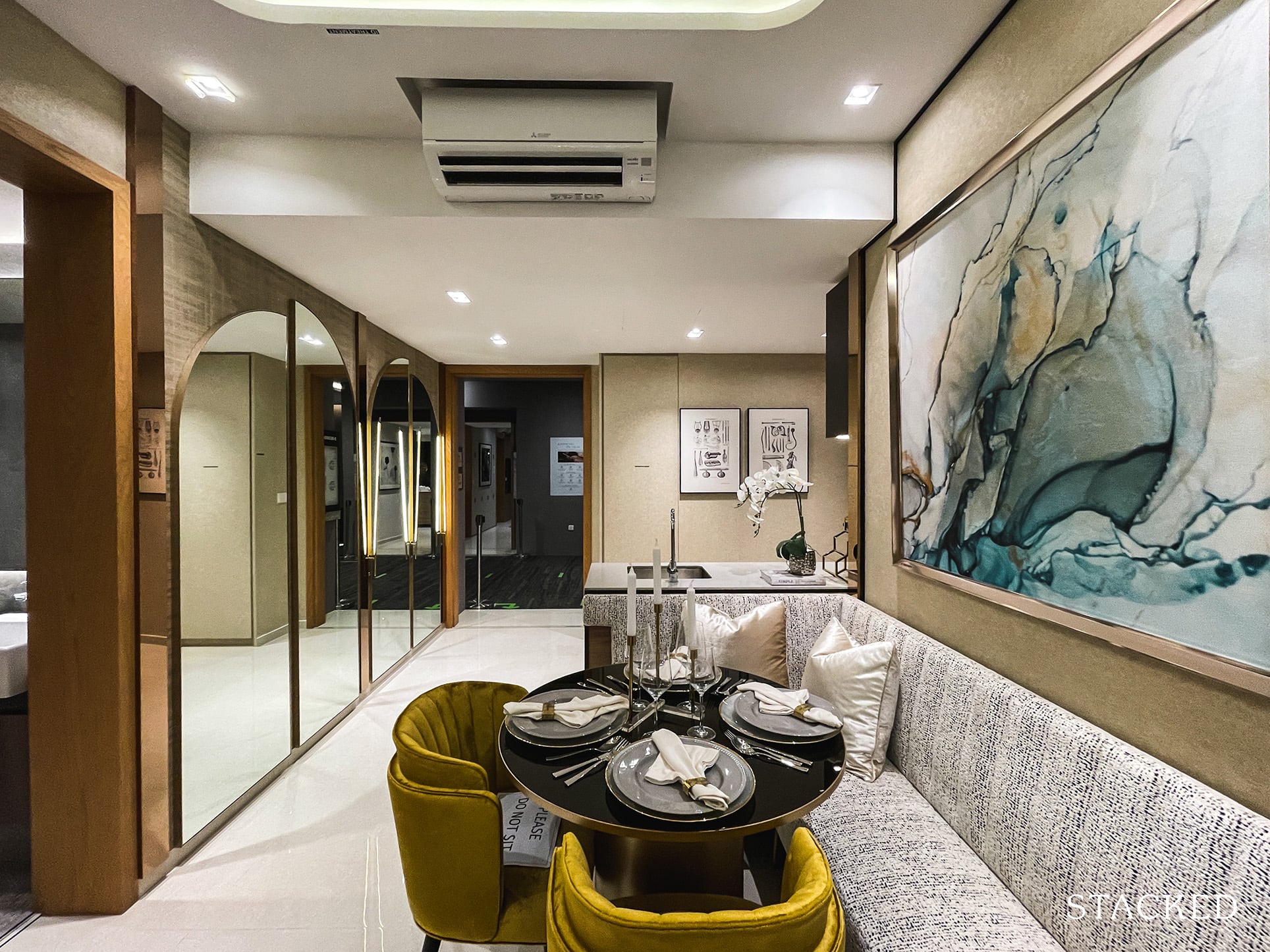
Moving on to the dining room just adjacent to the kitchen, you will find a round table placed that fits 4, with the help of bench seating of course. I’d say the seating capacity is decent for a unit of 689 sq ft. I’m sure owners of this unit are realistic enough to know that this is not the ideal size for hosting a large dinner party. Well, as with most new launches of today – that’s what the facilities zone with the clubhouse and BBQ pits are for!
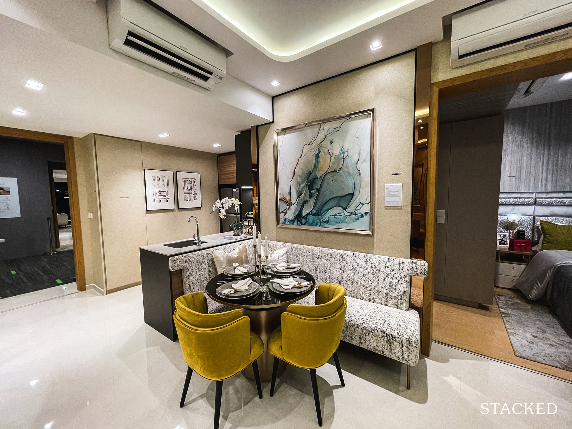
It’s worth noting that while the dining setup can sit 4, dining in comfort will be a different matter altogether. If you are fond of eating one dish meals I suppose you’ll be fine with such a table size – but if you are like me and prefer the traditional communal sharing of different dishes you would definitely need a bigger table.
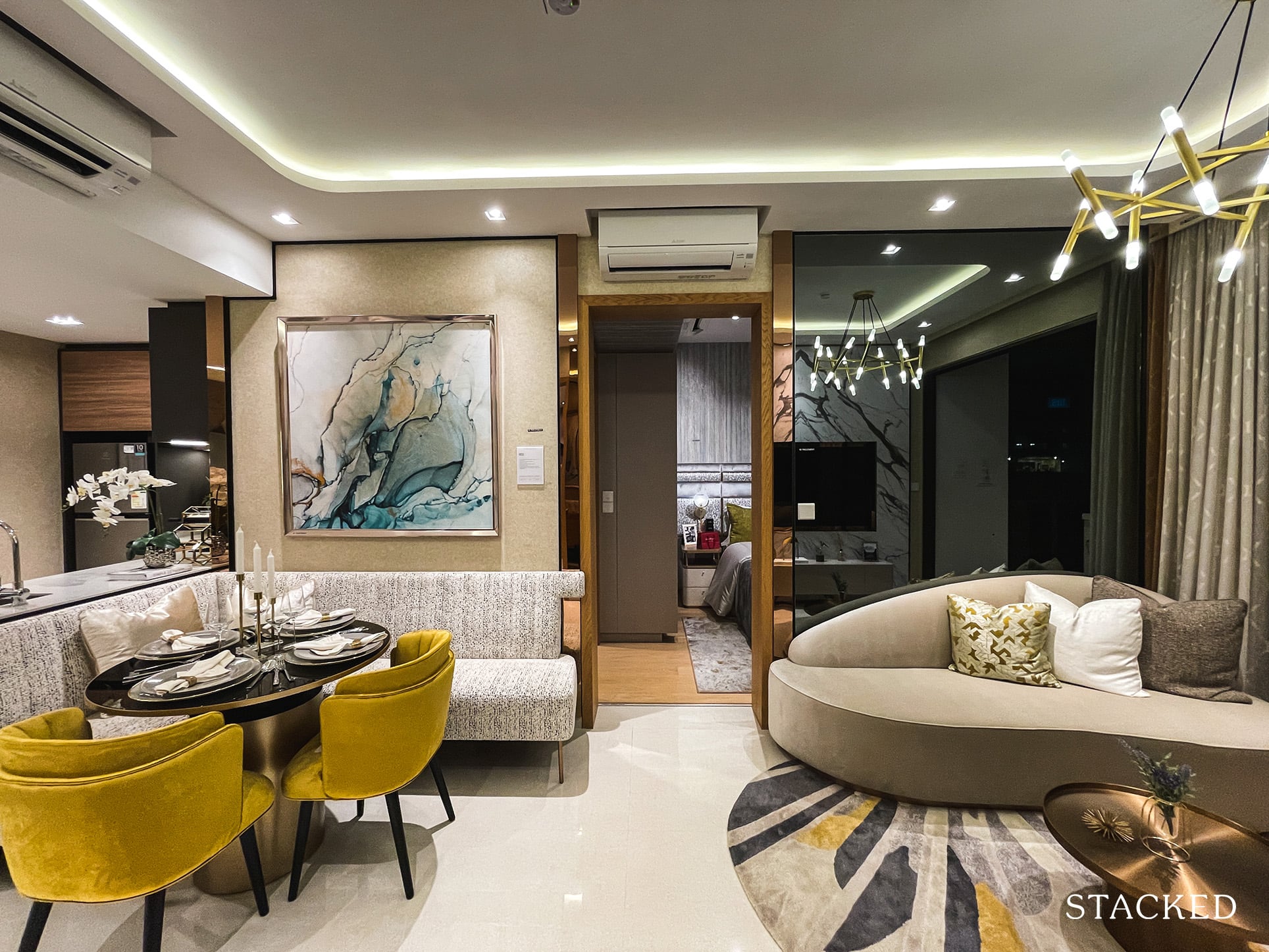
As for the living room, which is continuous from the dining area, there’s a 3 seater sofa set they have placed with a small coffee table. It is definitely not as cramped as I would have imagined.
That said, do note that you will be limited in the length of the sofa because of the doorway to the master bedroom. As with what you will see in the other units, the svelte sofa may not be the best fit if you are one of those that prefer function over form. It may look nice, but sitting 3 here would definitely be a stretch.
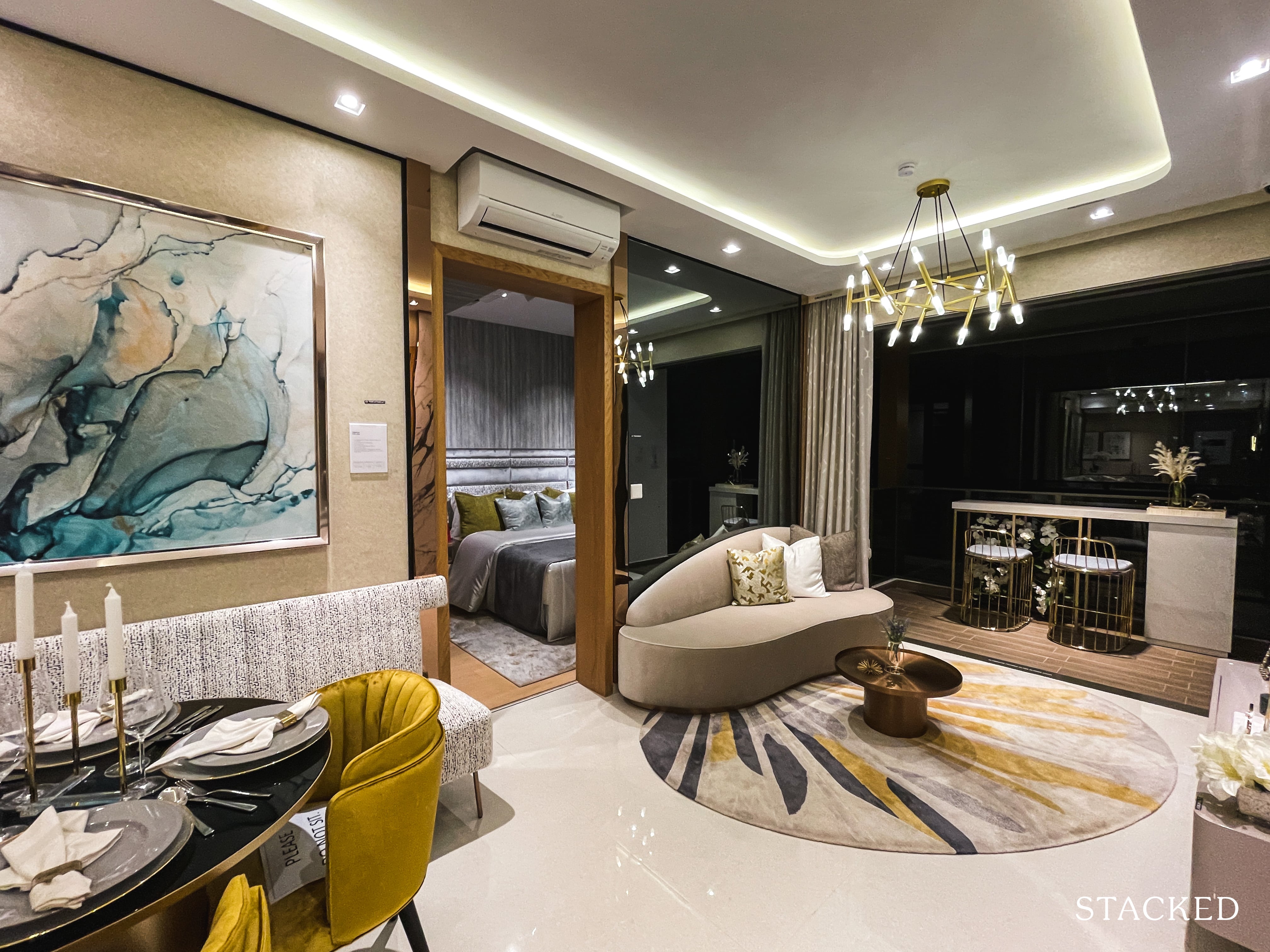
What I think this unit has done well is managing the width of the space, as it does give off the perception that it is larger than its actual size. Ah, the beauty of dumbbell layouts!
In terms of the balcony space at 5 sqm, it is the same size as the one found in the 1 Bedroom + Study unit. It is pretty usable and they have gone with 2 high stools and table here and an example of what you can do for the 1 Bedroom unit as well. Which does sound pretty nice to be sipping your morning coffee while catching up on the latest happenings in Singapore.
While that sounds like a relaxing experience, do also consider the presence of the privacy screens installed for North facing units from the 13th floor and South facing ones from the 25th, which will restrict you from getting ‘panoramic’ views of the entire estate.
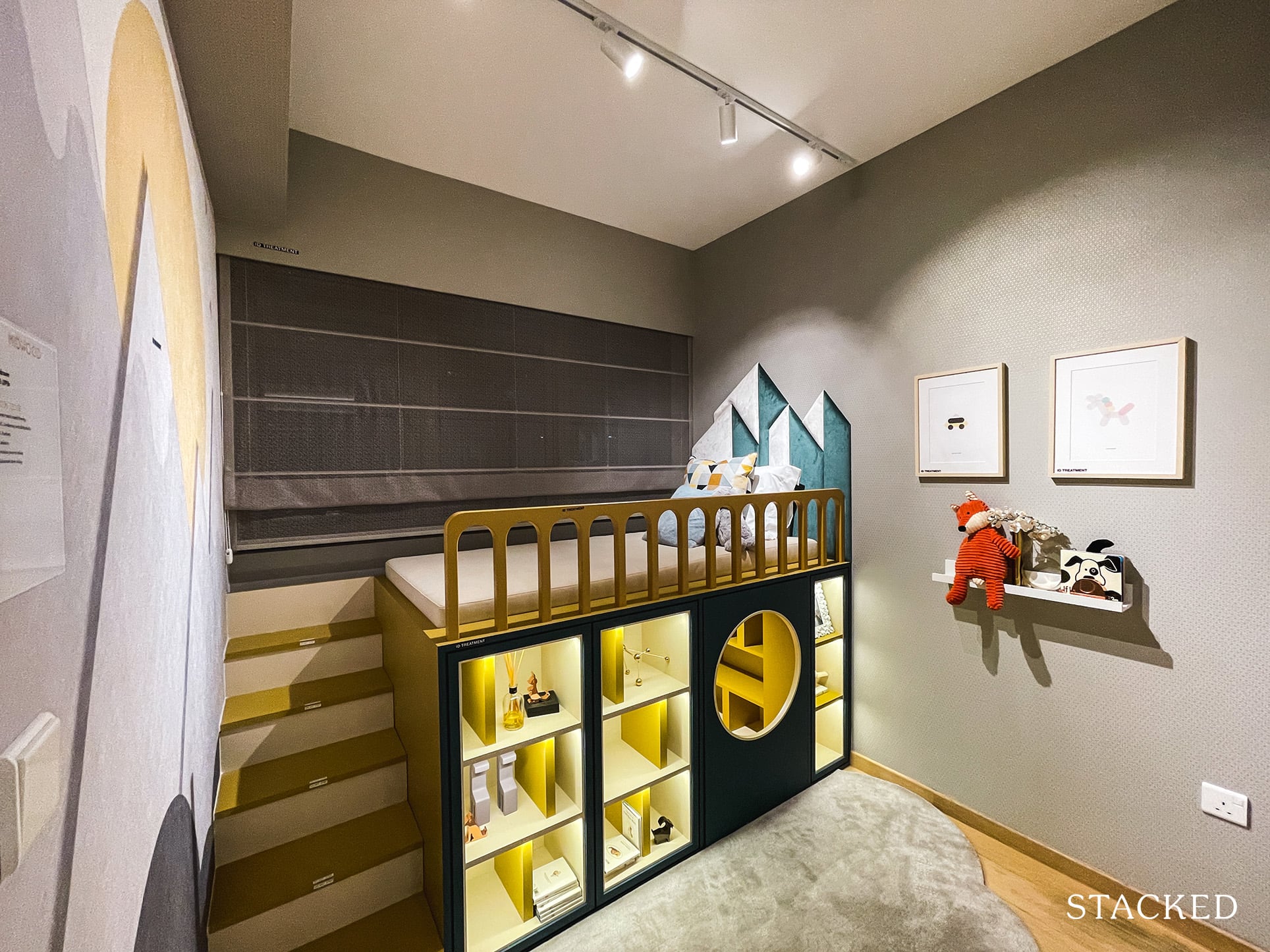
The Common Bedroom comes in at 9 sqm, which is just about average in the market. It is comfortable enough for a Queen sized bed with not much else really. As you can see here, they have gone with a kids room – a double decker Single bed with some shelvings below. As kiasu Singaporeans, you can still place a small study table here to ensure that your children’s scholarly pursuits are on track. As standard, it will come with a 2 panel built-in wardrobe.
Since the AC ledge is located on the outside, you will be left with half-length windows – so this design does quite cleverly cover that up.
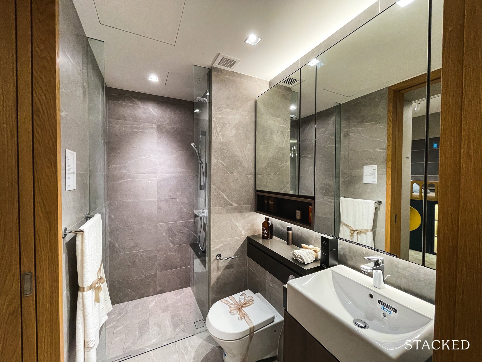
I like that the Common Bedroom has a jack-and-jill access to the Common Bath, effectively making both rooms here ensuite. This makes a lot of sense since visitors and the occupant both get easy access to the bathroom.
There’s a host of decent brands provided here including Roca for wall-hung water closet and basin, Hansgrohe for the tap and shower, and Geberit. This bathroom relies on mechanical ventilation and does not come with a rain shower. You will also observe that the Common Bath has a lighter theme compared to the darker one found in the Master Bath.
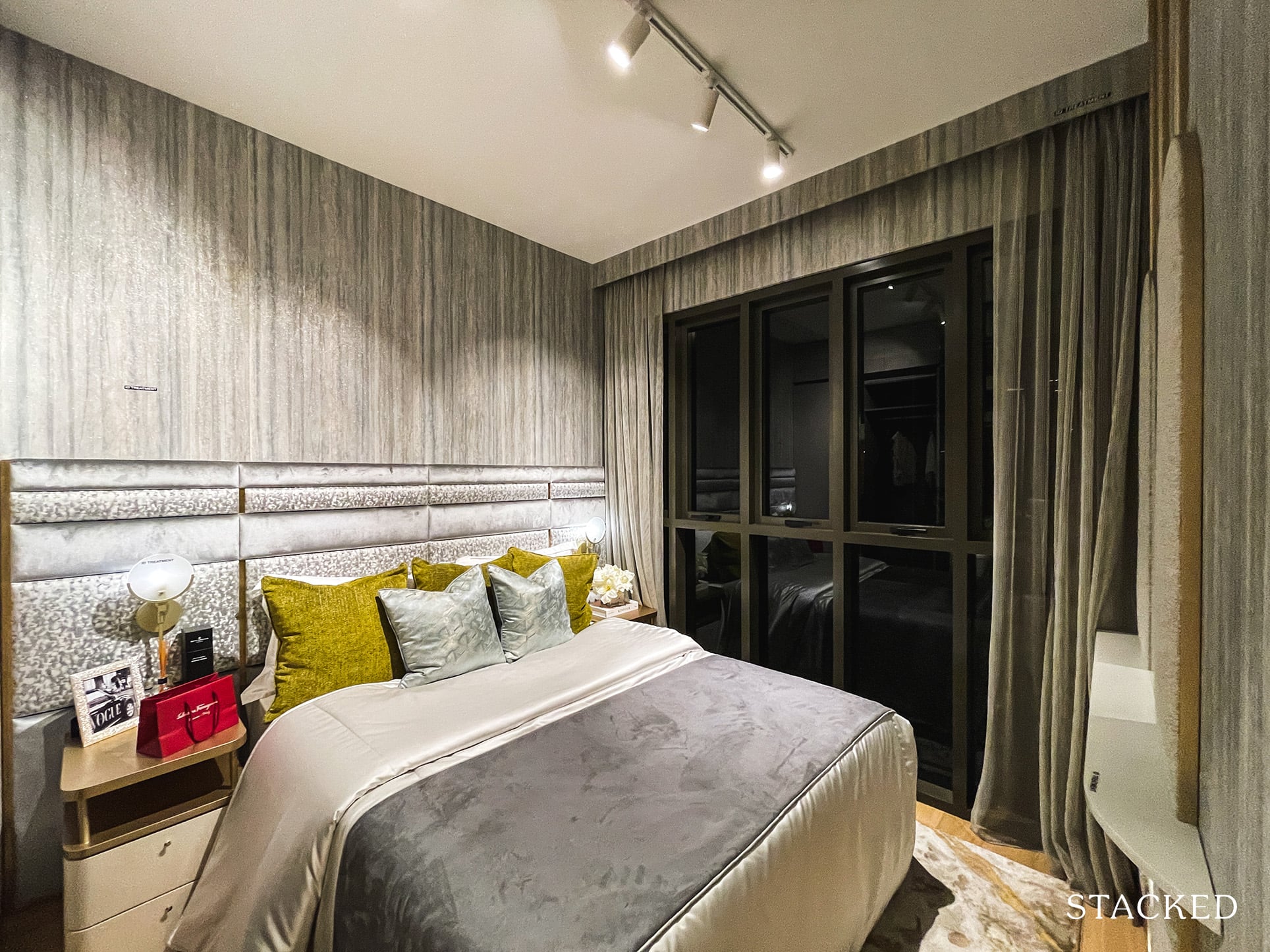
Finally, to the Master Bedroom. The common trend at Midwood so far has been smaller than average bedroom sizes. This is no different here, with the size of this room at 10 sqm, just slightly larger than the Common Bedroom. With a Queen sized bed, you will not have much room to place a bedside table, much less a dresser. Oh, and if you noticed, the windows here at Midwood also have more window panes than usual. I’m not entirely sure what the intention is but it does seem a bit like a cost cutting move to me and it restricts the views you get as well.
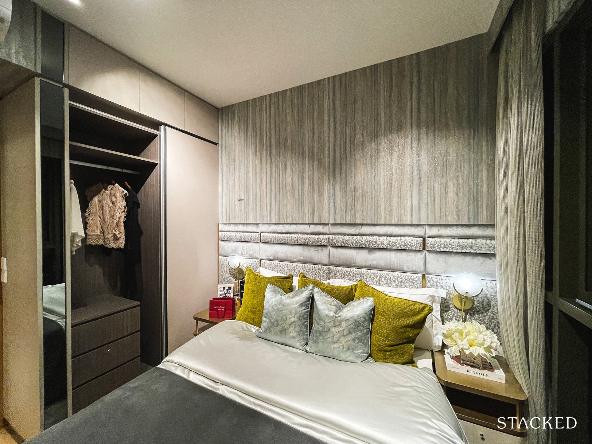
Storage is provided by means of the standard 2-panel wardrobe along with a little more space above.
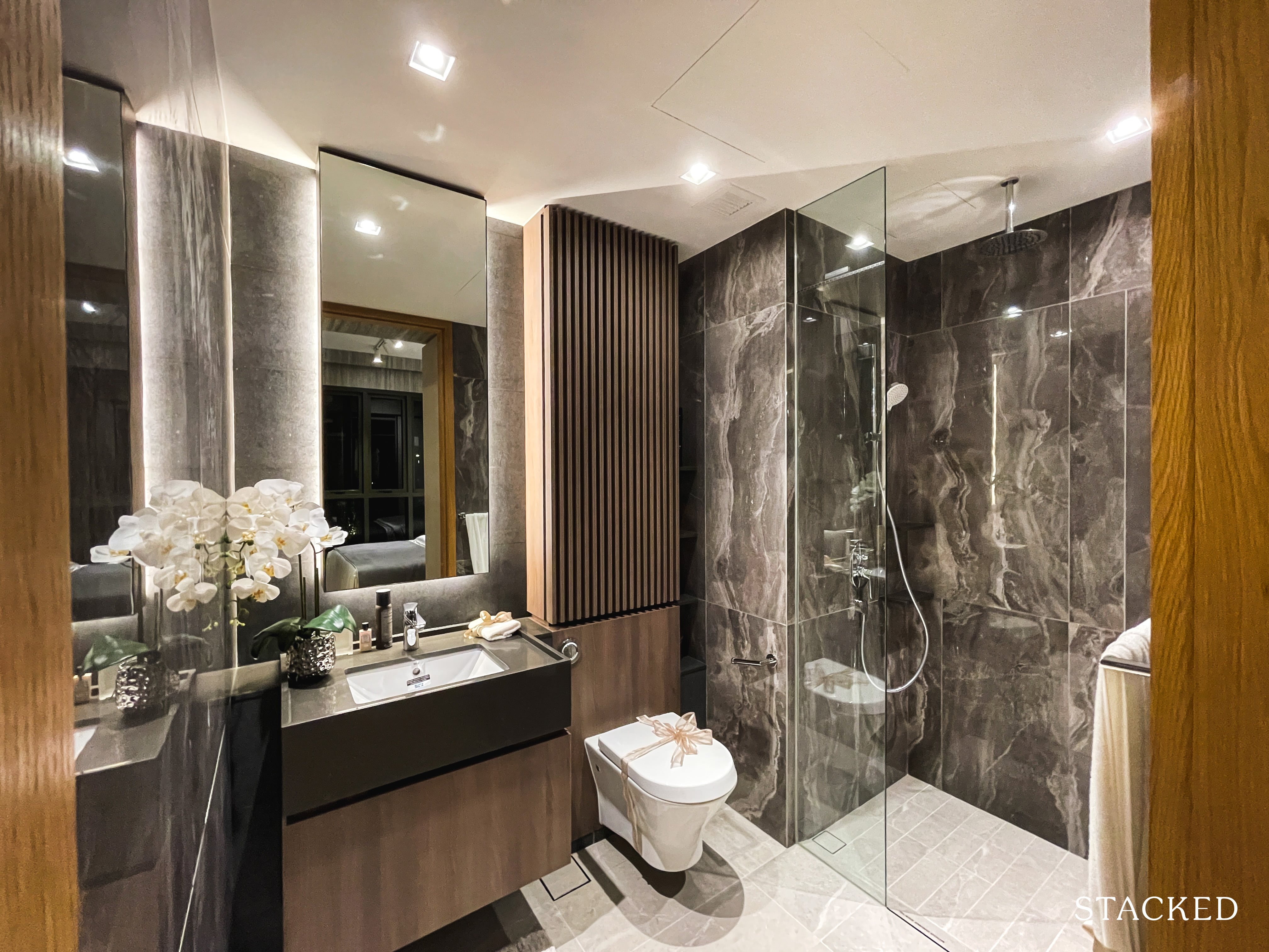
As for the Master Bathroom, you will get the same wares and fittings you see in the Common Bath. This includes Roca for the wall-hung water closet and basin, Hansgrohe for the tap and shower and Geberit cistern. The only difference is the presence of a rain shower but the space still lacks a window for natural ventilation.
In summary, I do like that the 689 sq ft for space is efficiently utilised throughout this unit. For budget-conscious buyers, this represents a lower quantum for 2 Bedroom units given its smaller unit size. However, personally, if I am considering this from an own-stay perspective – I would have preferred the unit to be slightly larger with the option of a utility room.
Midwood 3 Bedroom Type 3Y(a) (990 sqft) Review
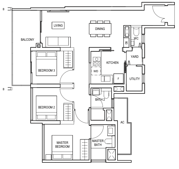
This showflat unit here is the largest 3 Bedroom layout in the development at 990 sqft. The other 3 Bedroom types start from 893 sqft. The main differences are found in the inclusion of the Yard and Utility in this unit, making it more family-friendly.
All units will come with a 2.8m ceiling height with porcelain tile floors for common areas and engineered timber for the bedrooms – which is expected given this is a mass market project after all.
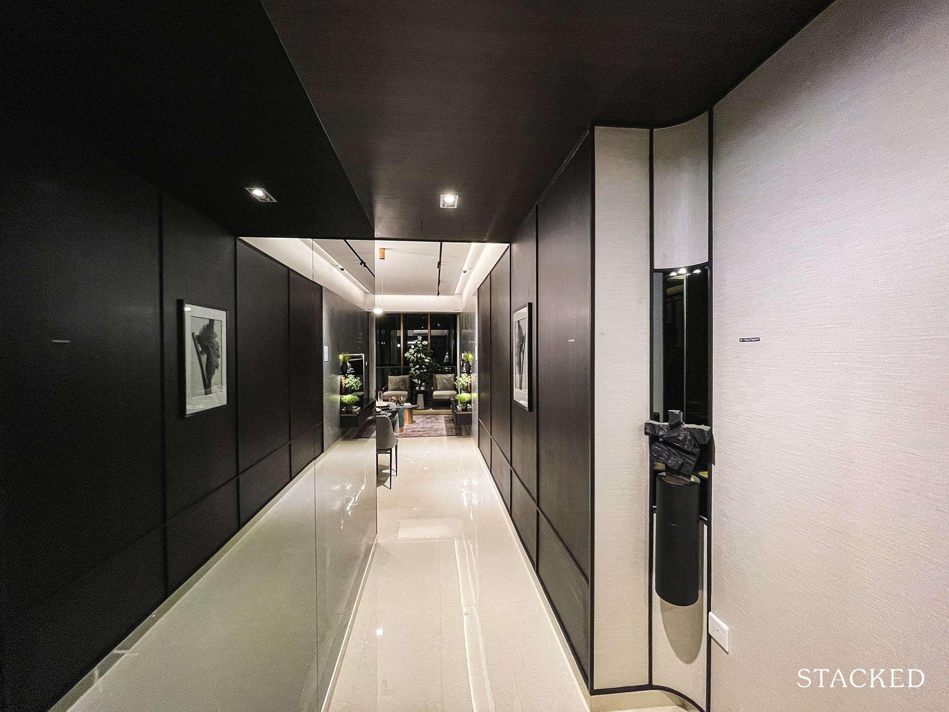
While there wasn’t much of an entrance walkway for the other 2 smaller units we reviewed earlier, you will notice that there is some wasted space here. It’s not necessarily bad for larger units as it will give you room to build additional shelves or shoe cabinets and give some room for privacy. You will still have to ensure that the space is wide enough to do so, or the place could look a bit cramped.
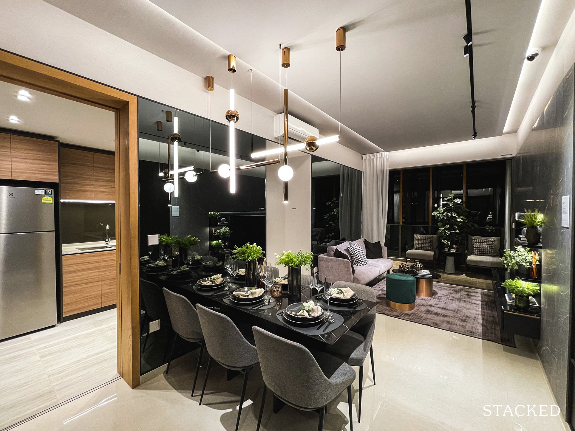
This is especially so if you go with a 6-seater dining set as they have done here. Having additional cabinets by the side will make the walkway pretty narrow.
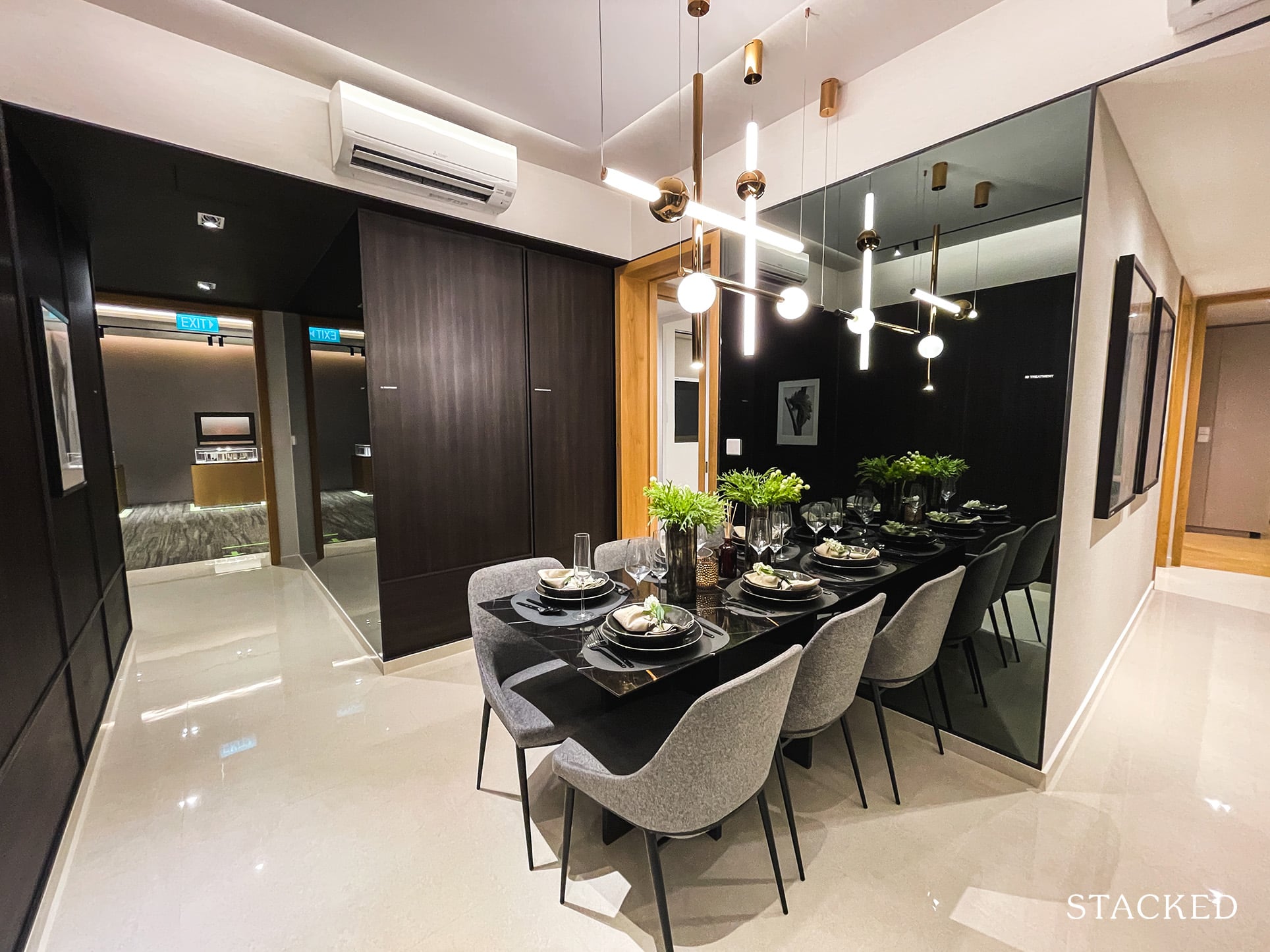
Again, just note that while the dining area shows that it can fit 6 people, real world situations might not allow so. Unless you are a family of slim proportions, sitting 6 people would definitely be a squeeze.
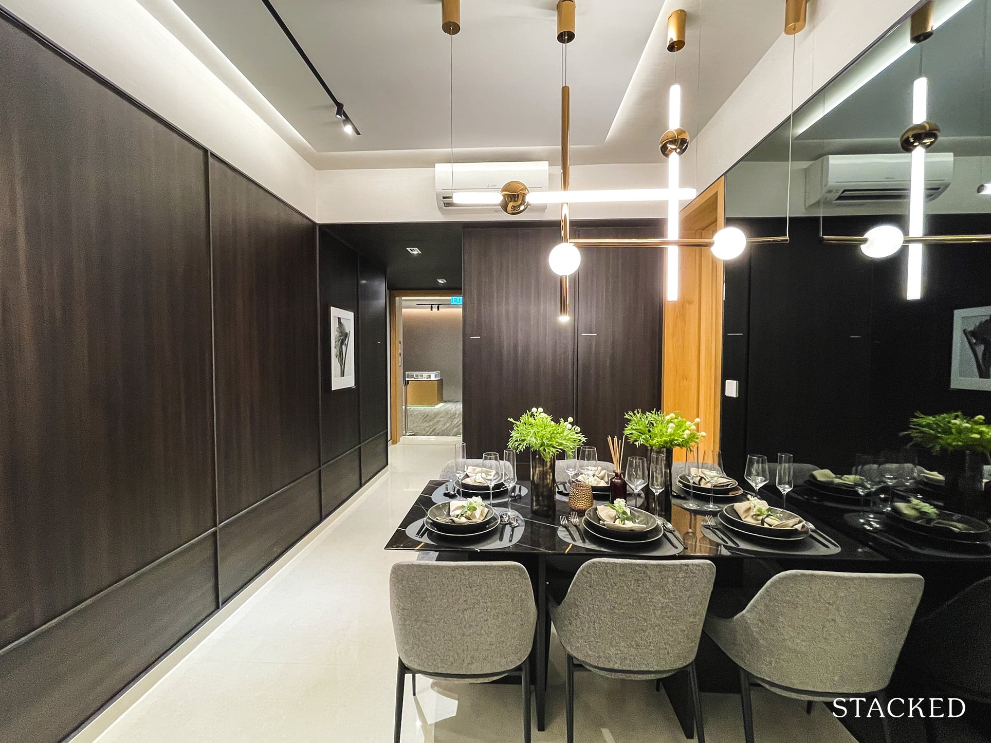
Likewise for the dining table itself – depending on your lifestyle you might not find it necessarily big enough to dine comfortably.
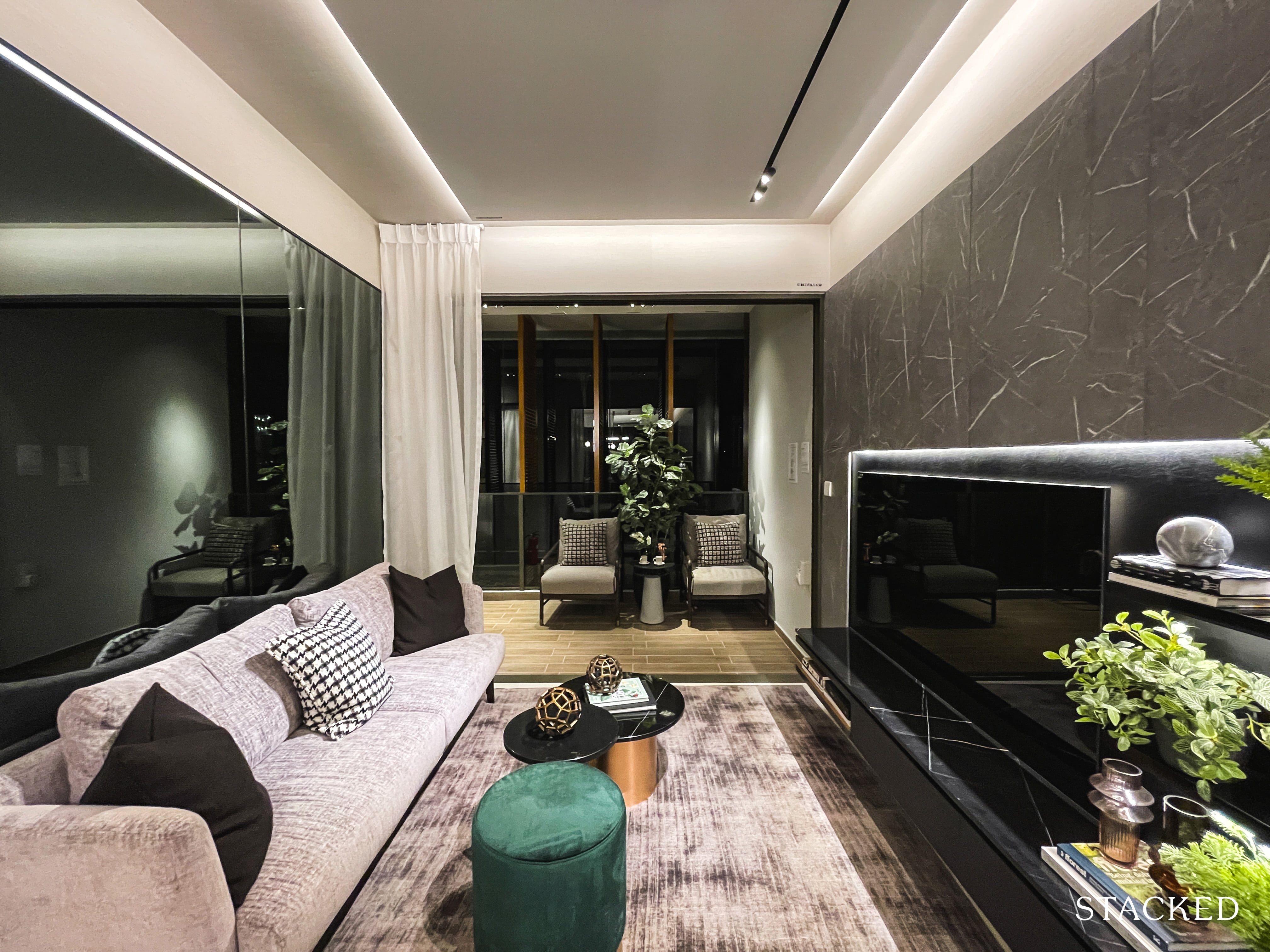
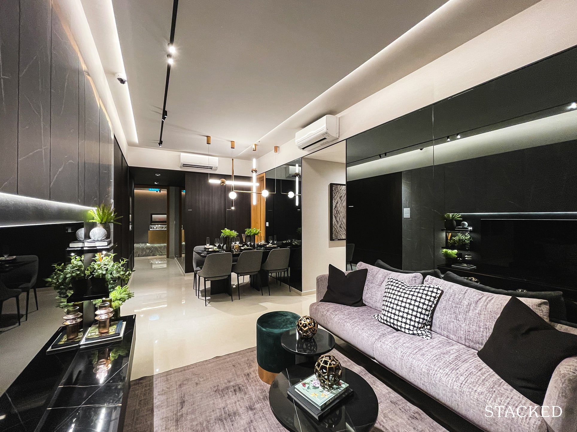
As you continue to the living room area, it feels slightly wider than what you might have seen in the 1 and 2 Bedroom units. However, the seating area remains about the same, with only enough room for a 3-seater couch (to be fair, the couch is quite long). It’s all right for smaller units, but a larger living room would be appreciated for 3 Bedroom units. Having stools that you can store away would probably do the trick here when you have friends coming over.
Alternatively, you can also make use of the balcony space, which is double of what you saw in the smaller units at 10 sqm. It extends from the living room to 1 of the Common Bedrooms so the actual ‘usable’ space for guests may not be that much more as well.
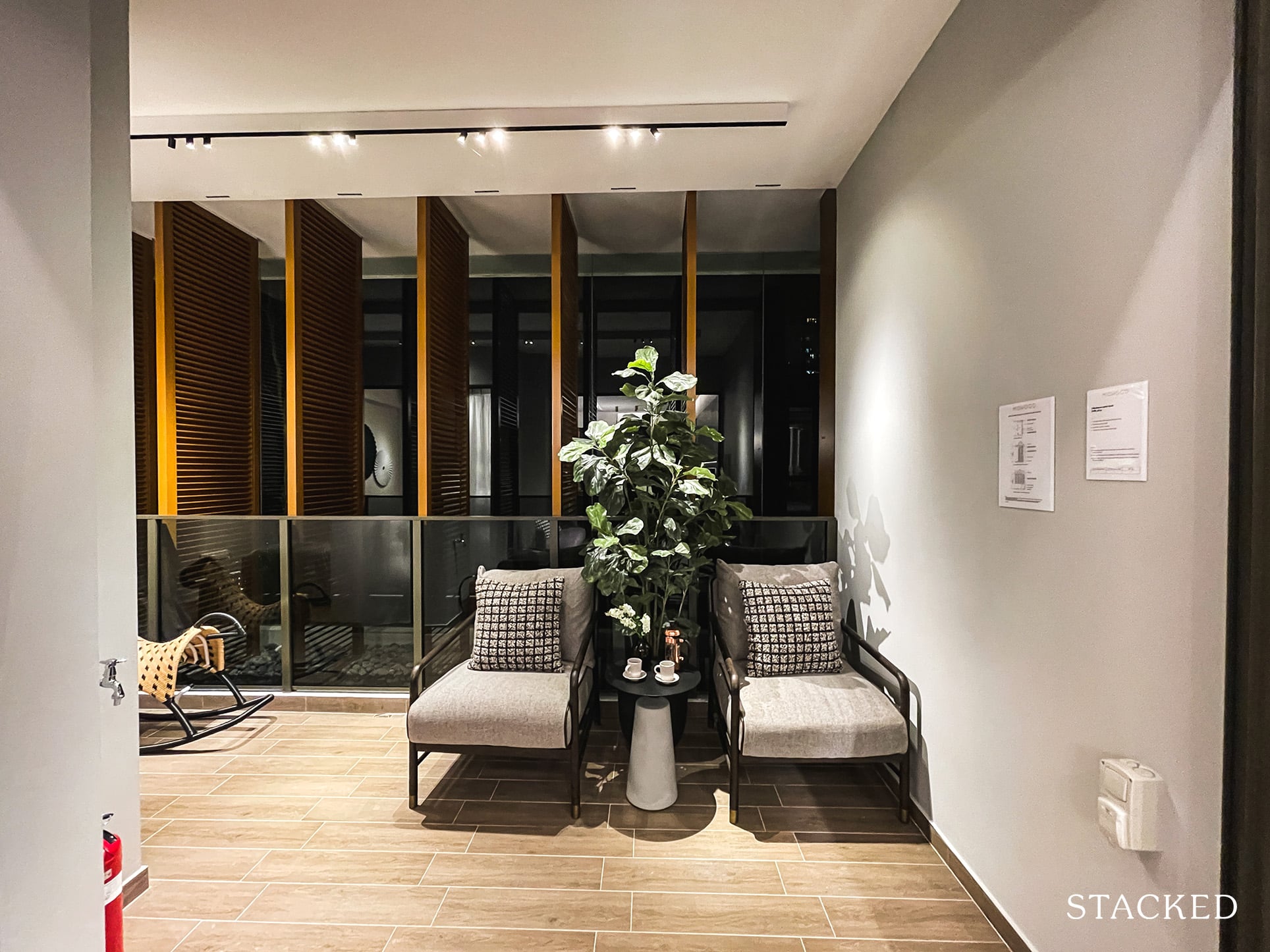
As mentioned above, units on the higher floors would also have to bear with privacy screens that will hinder your views due to the MINDEF facilities at Bukit Gombak. I can’t help but feel that the balcony space extended to the common bedroom might have been better utilised if it were part of the internal space instead.
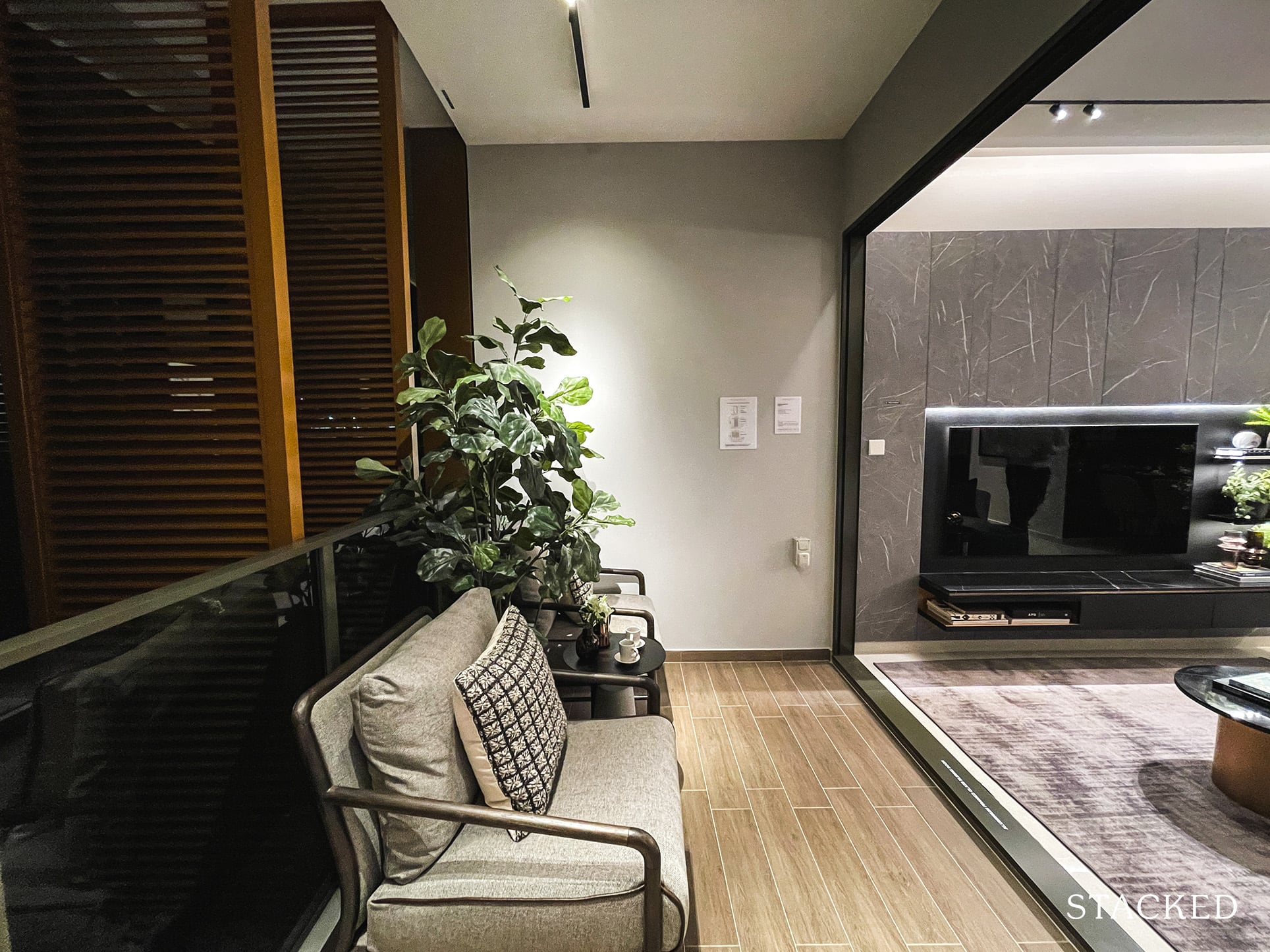
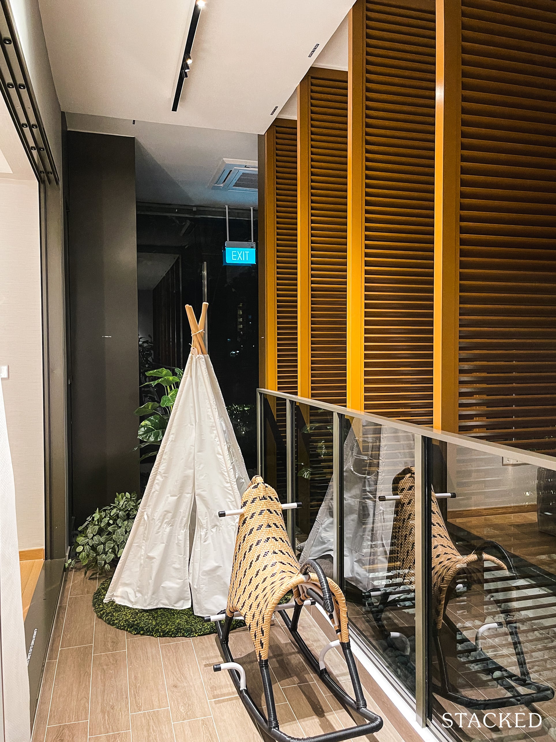
It is an irregular shape after all, but I do understand that some people do like to have a balcony space outside their bedroom. If done up nicely with plants etc it can make for a nice sight right outside the bedroom.
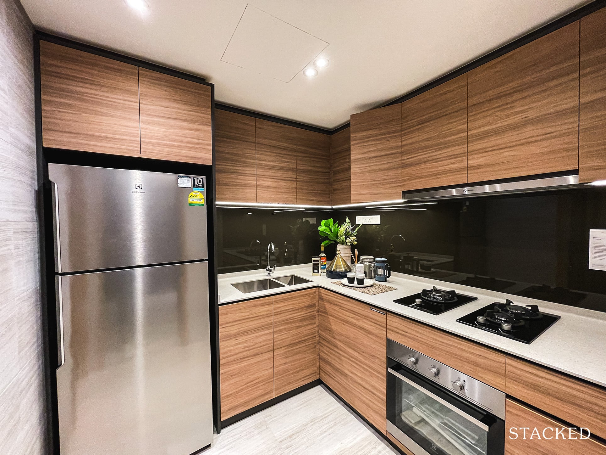
Coming back to the enclosed kitchen, where it’s typically in a long rectangular shape, you get a more squarish shaped one here instead. While this means space for more people to be in the kitchen, the extra pair of hands won’t be able to help out much since there is limited countertop space to work on. In that sense, a squarish shape is actually less efficient if you think about it.
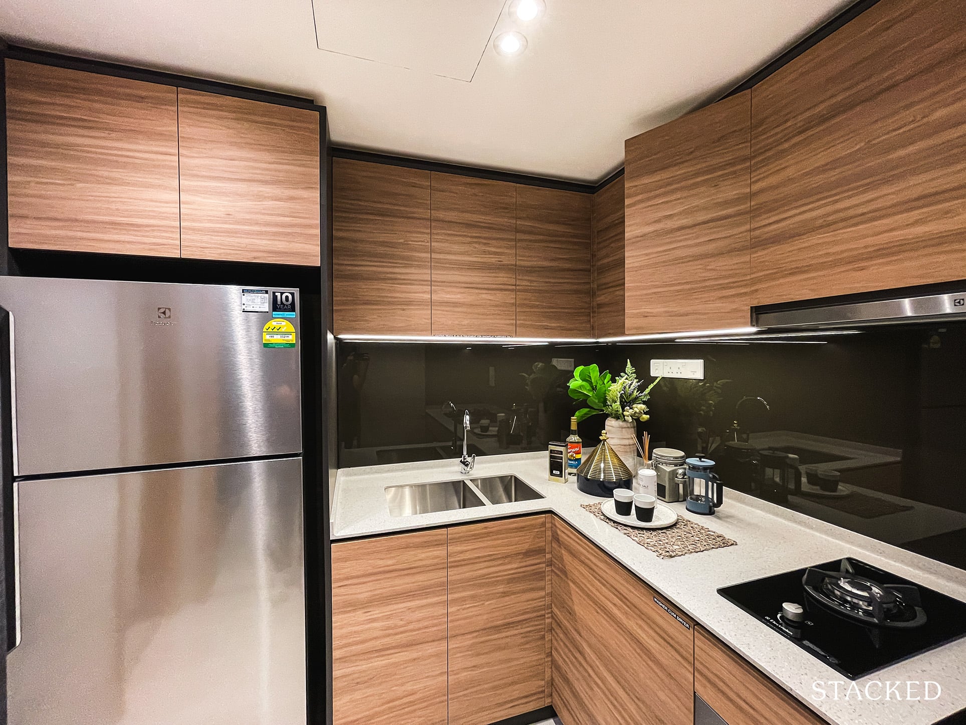
You do get 3 gas hobs which is ideal for more family oriented units like these, where Asian families prefer to cook up a storm. In addition to the gas hob, the oven, fridge and washer dryer are provided by Electrolux. The dual sinks must also be commended here, since some larger units I have seen in other developments don’t even provide for it usually. It’s something that is very useful in real world usage, so I don’t see why it is not a staple included in larger units.
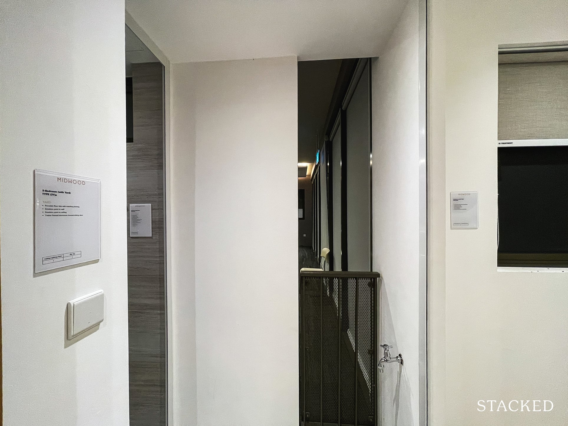
The kitchen also leads on to the yard area, which is actually an open area with a ledge. It’s obviously great for ventilation and the drying of clothes, except that its 2 sqm of space makes it less practical than one would have wanted. Note that despite the presence of the yard, the washer and dryer is still placed in the kitchen – which does reinforce the lack of space here.
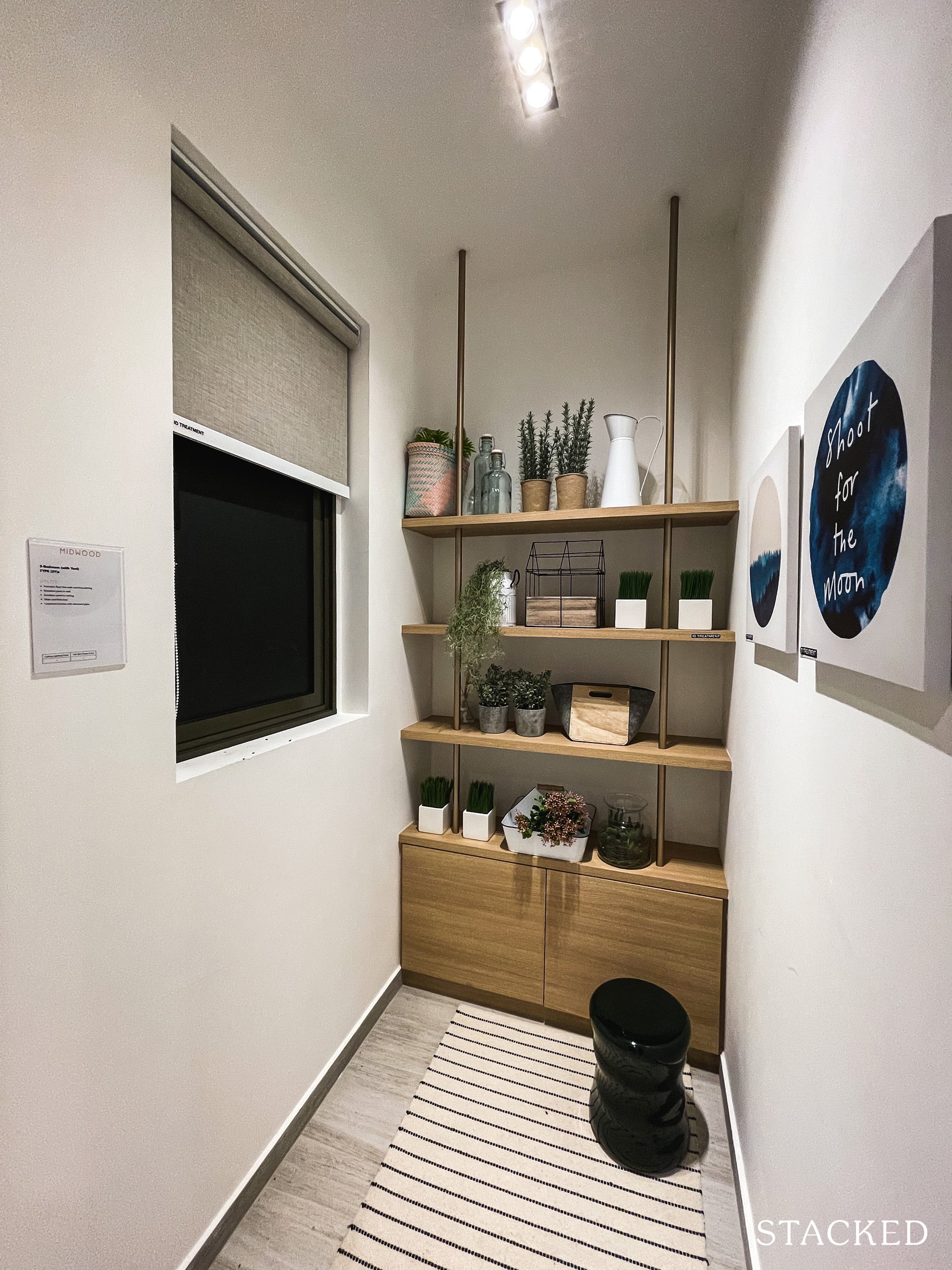
Besides the open yard, you have a utility room and additional w/c on the other side. This is helpful for families with a helper, as it can be a self-contained space for her, especially as the utility room comes with a window. Alternatively, it would serve as additional storage for families.
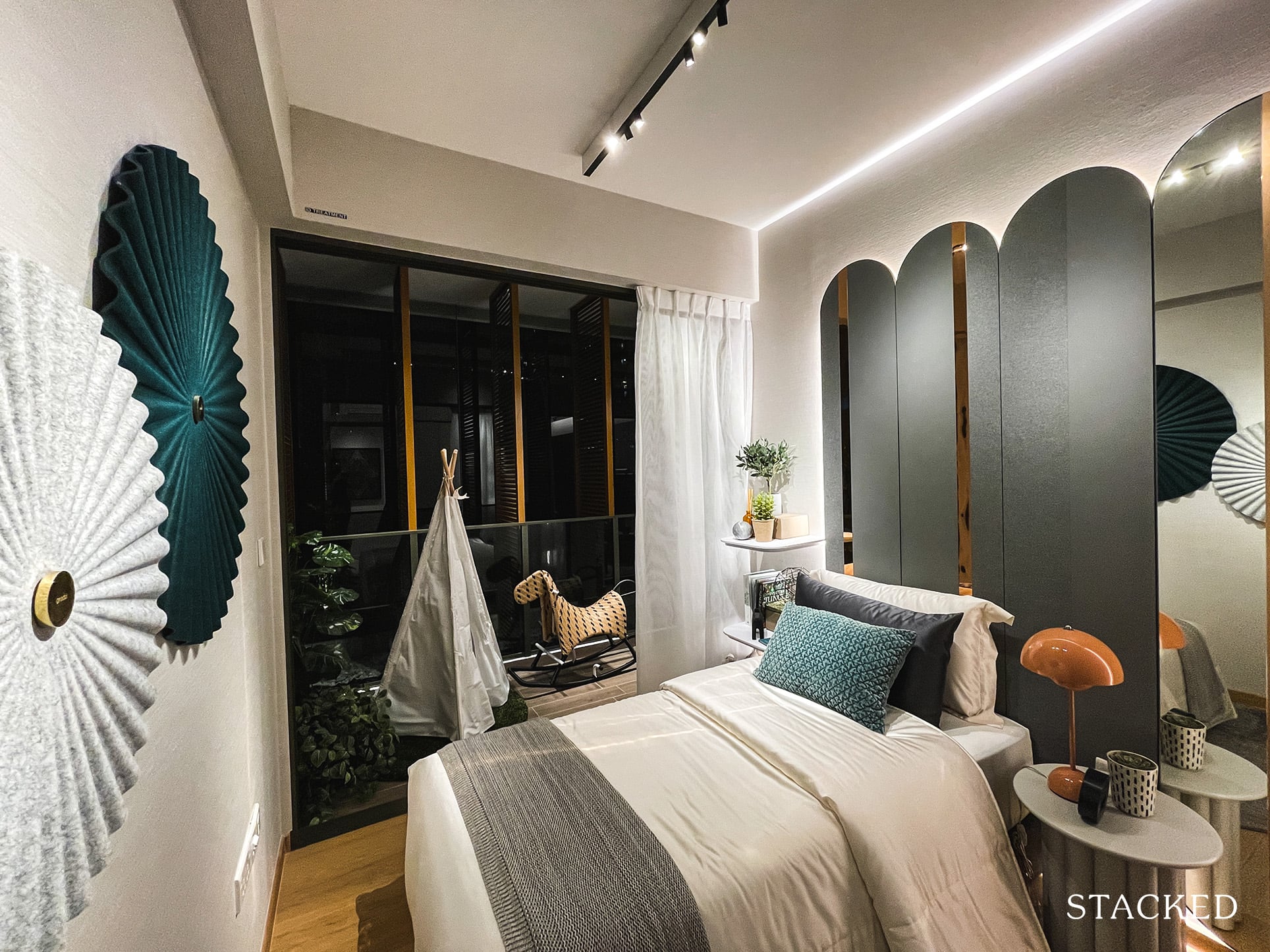
In general, units at Midwood feature smaller-than-average bedroom sizes and it’s no different for the Common Bedroom 2 here, which measures 8 sqm. It also comes with the balcony which extends from the living room, which does go some way to helping make the room feel more airy.
Here, it looks like they have placed a Single bed with a couple of side tables, along with the standard 2-panel built-in wardrobe.
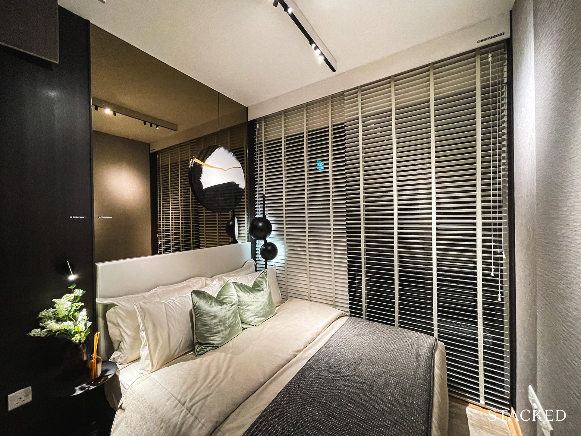
Common Bedroom 3 is a mirror image of Bedroom 2 sans the balcony. At 8 sqm, you can still fit a Queen sized bed as they have done here but just check out how cramped this entire space looks. A more practical room for the kids would be one with a study table at least so you would probably have to make do with a Single bed instead. It’s a sacrifice but one that new launch buyers would have gotten used to by now.
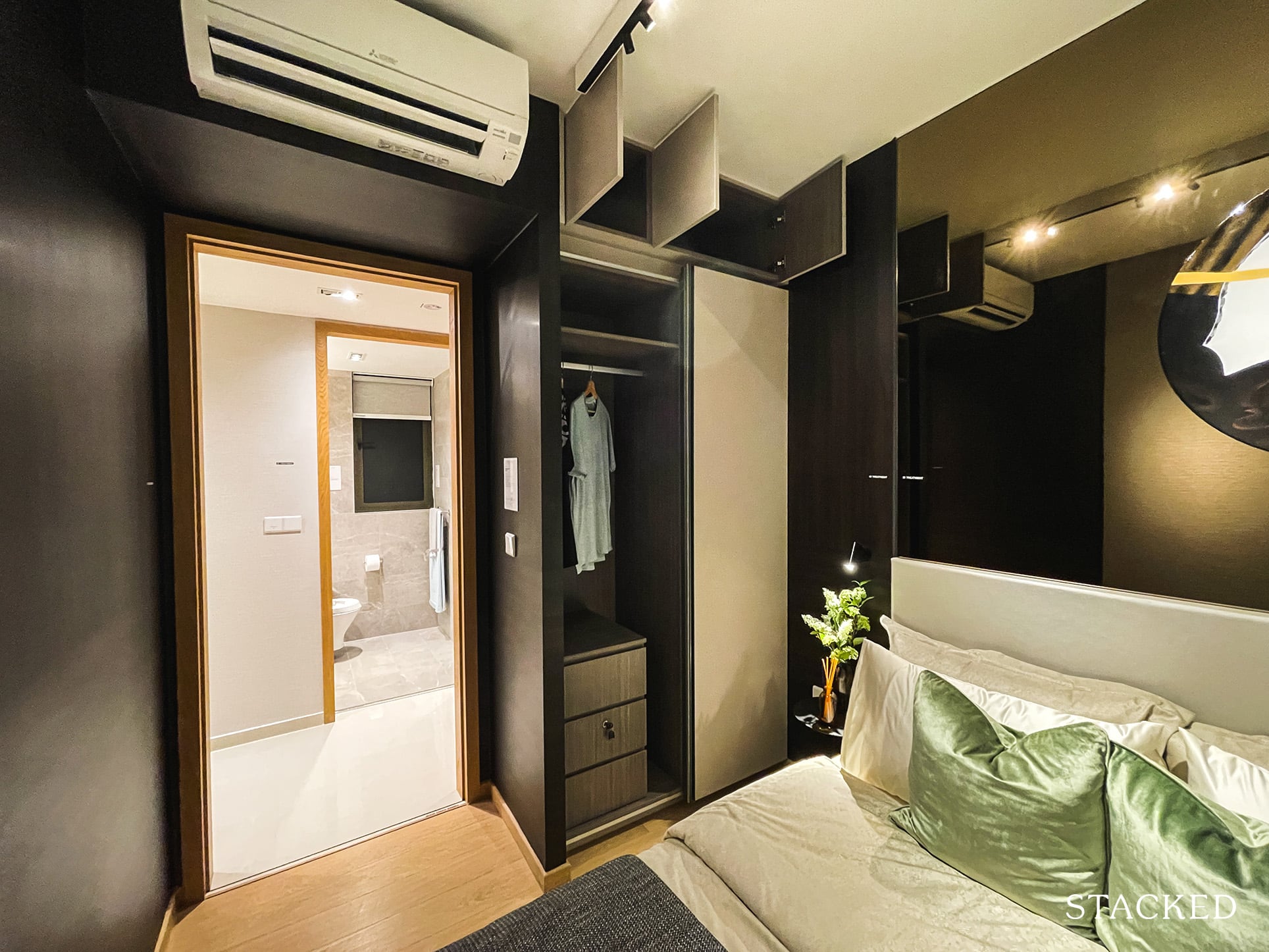
No surprises here when it comes to the storage space, with the typical 2-panel wardrobe. You do get a little more storage up top, which is in line with what you’ve seen so far.
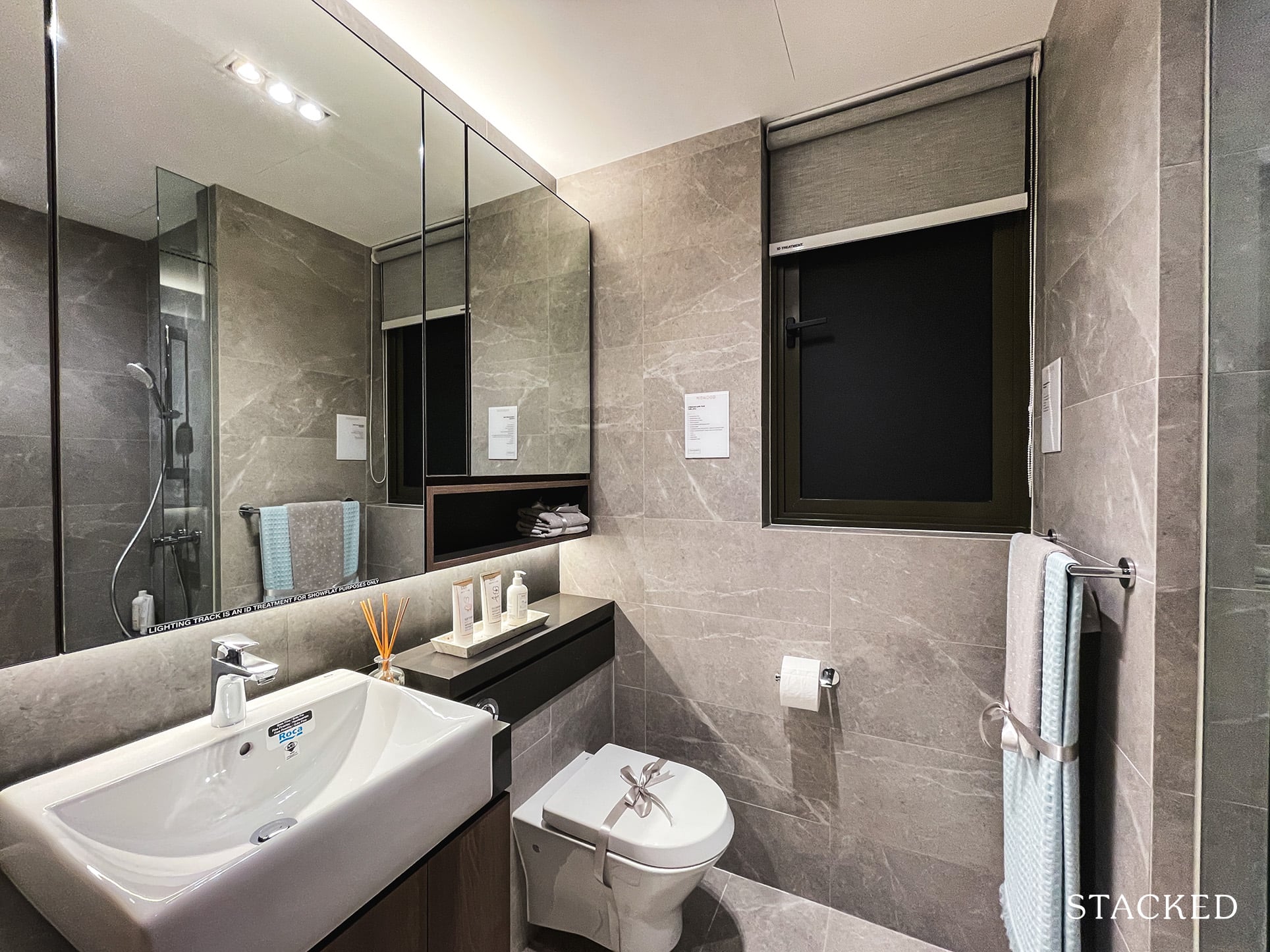
The Common Bath is located just opposite Bedroom 3 and is marginally smaller than average at 4 sqm. As mentioned, brands used here are decent ones used across many condos in Singapore and they include Roca for the wall-hung water closet and basin, Hansgrohe for the tap and shower and Geberit. A plus point for this layout is the presence of a window for natural ventilation (a proper sized one at that).
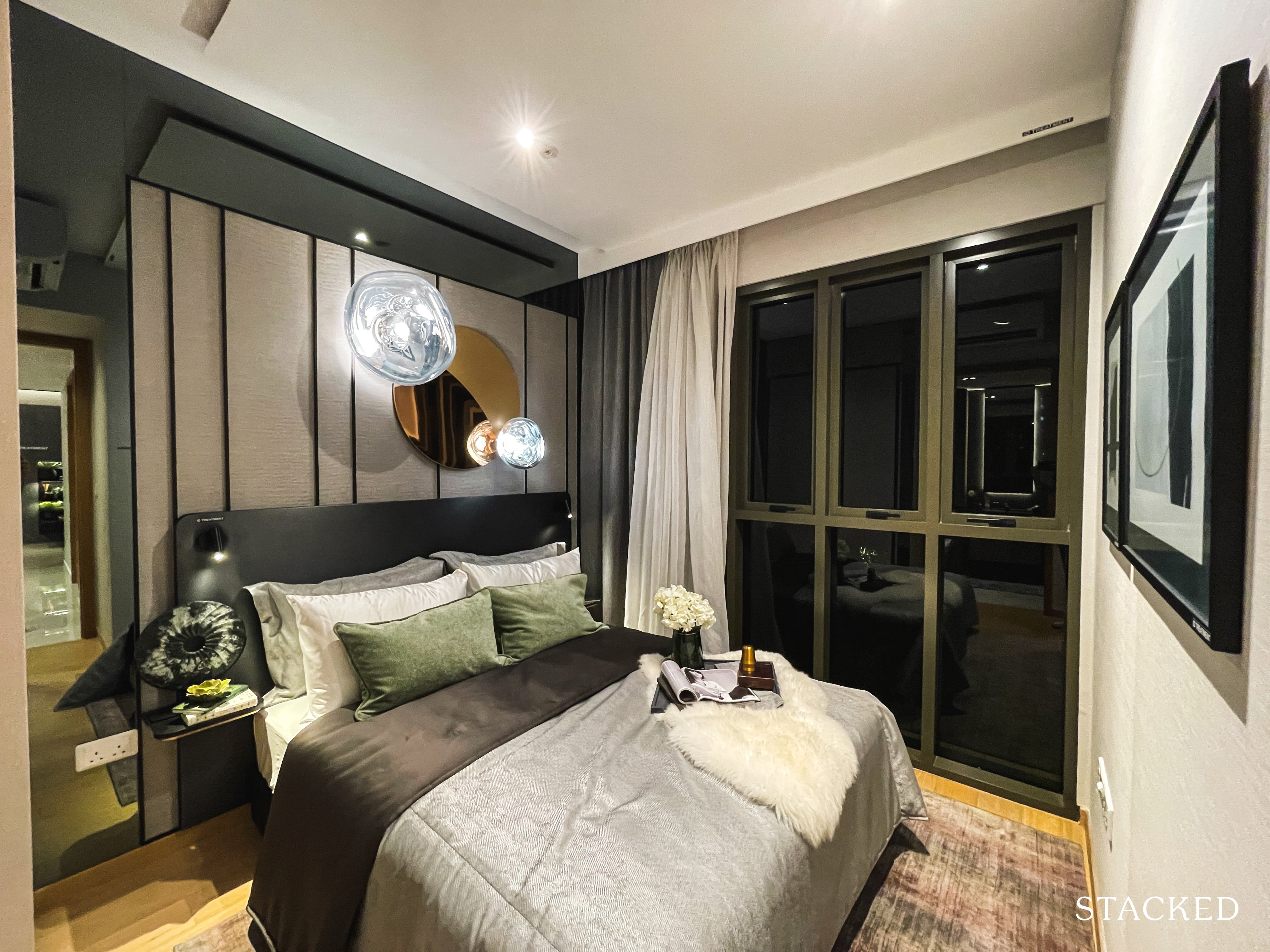
Finally, on to the Master Bedroom, which measures 11 sqm. While not the largest one around, it definitely feels much more comfortable compared to the Common Bedrooms. You will fit a Queen sized bed comfortably with room for a tiny dresser perhaps.
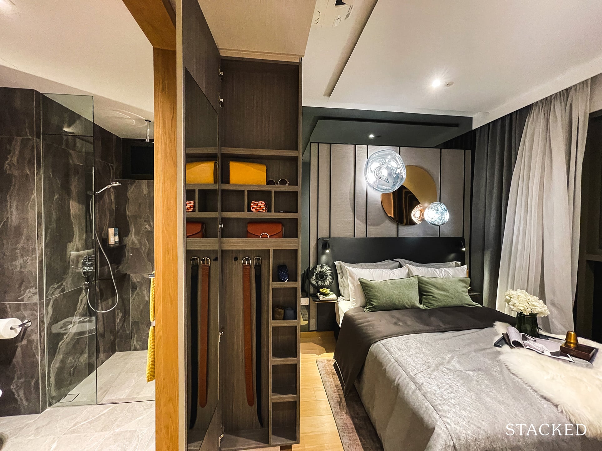
The built-in wardrobe here also comes with additional storage spaces for accessories at the side and is only available for the ones found in Master Bedrooms.
Oh, and while you do have full length windows, similarly to the other units so far – 1 gripe here is the sheer number of window panes they have. Personally, this makes little sense as it just causes your views to be further hindered. If it’s a design direction, it certainly is one of those things that you’d describe as form over function.
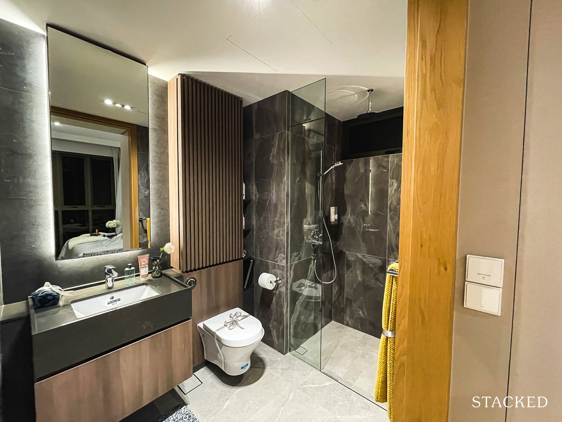
As for the Master Bathroom, it comes in a darker tone compared to the Common Bath room. Regardless of whether you prefer the darker or lighter schemes, do note that you will not be able to change them.
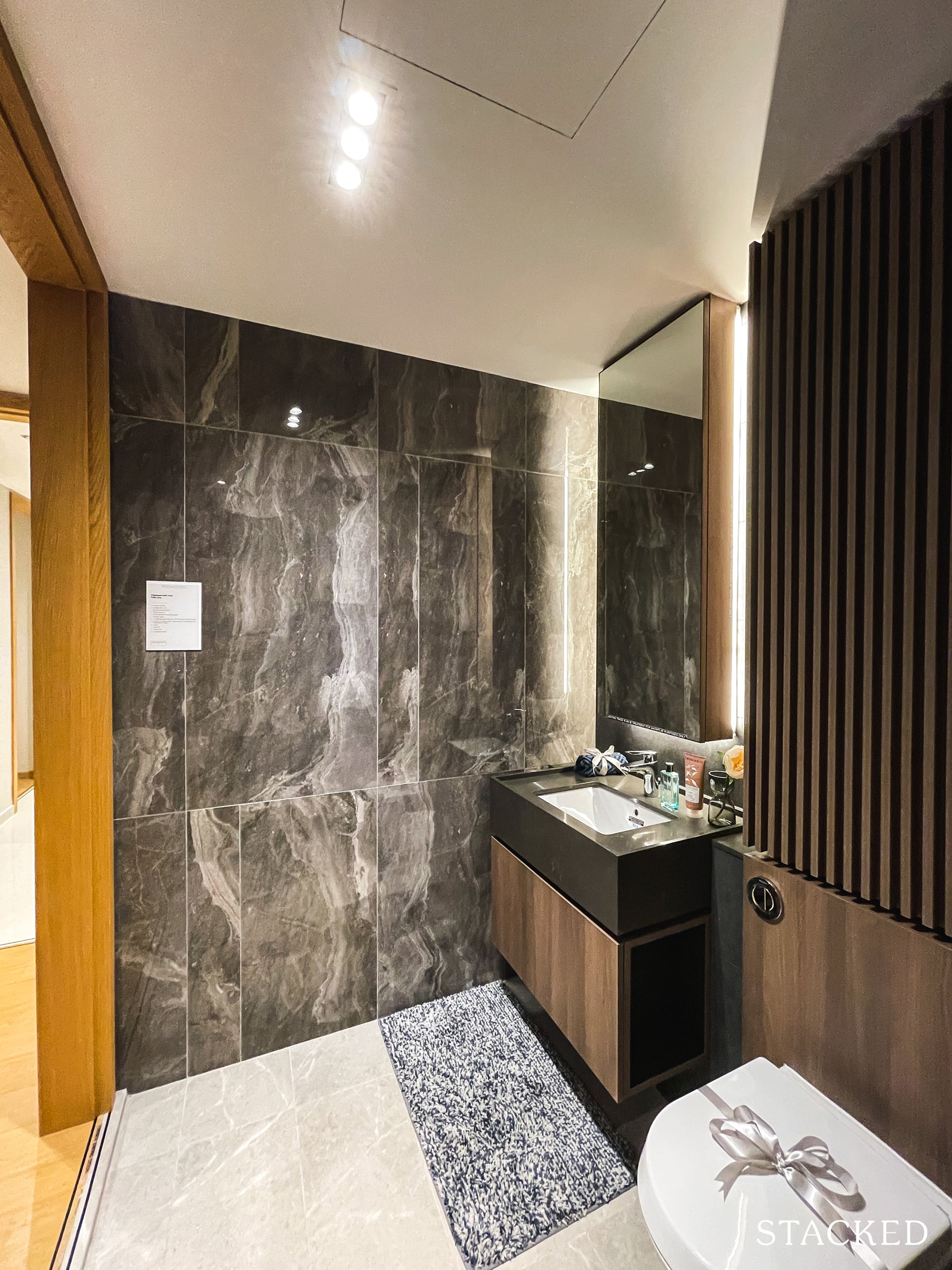
In addition to the standard wares and fittings by Roca, Hansgrohe and Geberit, the Master Bath also comes with a rain shower. There is also a window (although small) for natural ventilation, as with the Common Bedroom. This is an underrated yet important feature to have!
Overall, I do feel that this 3 Bedroom is of a decently comfortable size for families. For context, it is as big as a 4-Room BTO flat with the same number of bedrooms. It is also practical with the presence of a yard (albeit small) and utility room, which will be required as families grow in size and vintage.
Midwood 4 Bedroom Type 4a (1,249 sqft) Review
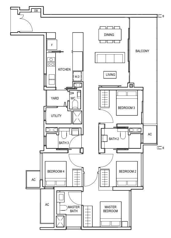
There are only 2 stacks of 4 Bedroom units here at Midwood (so just 58 units available in total). Both have a similar layout and are only 10 sq ft apart, with the one displayed here being the marginally smaller one. Size wise, it’s definitely on the smaller end of the market for 4 Bedroom units – but that will also mean a more affordable quantum for families that require more bedrooms.
None of the units here at Midwood have private lifts, even for the 4 Bedroom unit. I personally don’t think it’s something would-be buyers at Midwood are specifically looking for as Midwood was not meant to be a high end product. Units here come with a 2.8m ceiling height with porcelain tile floors for common areas and engineered timber for the bedrooms.
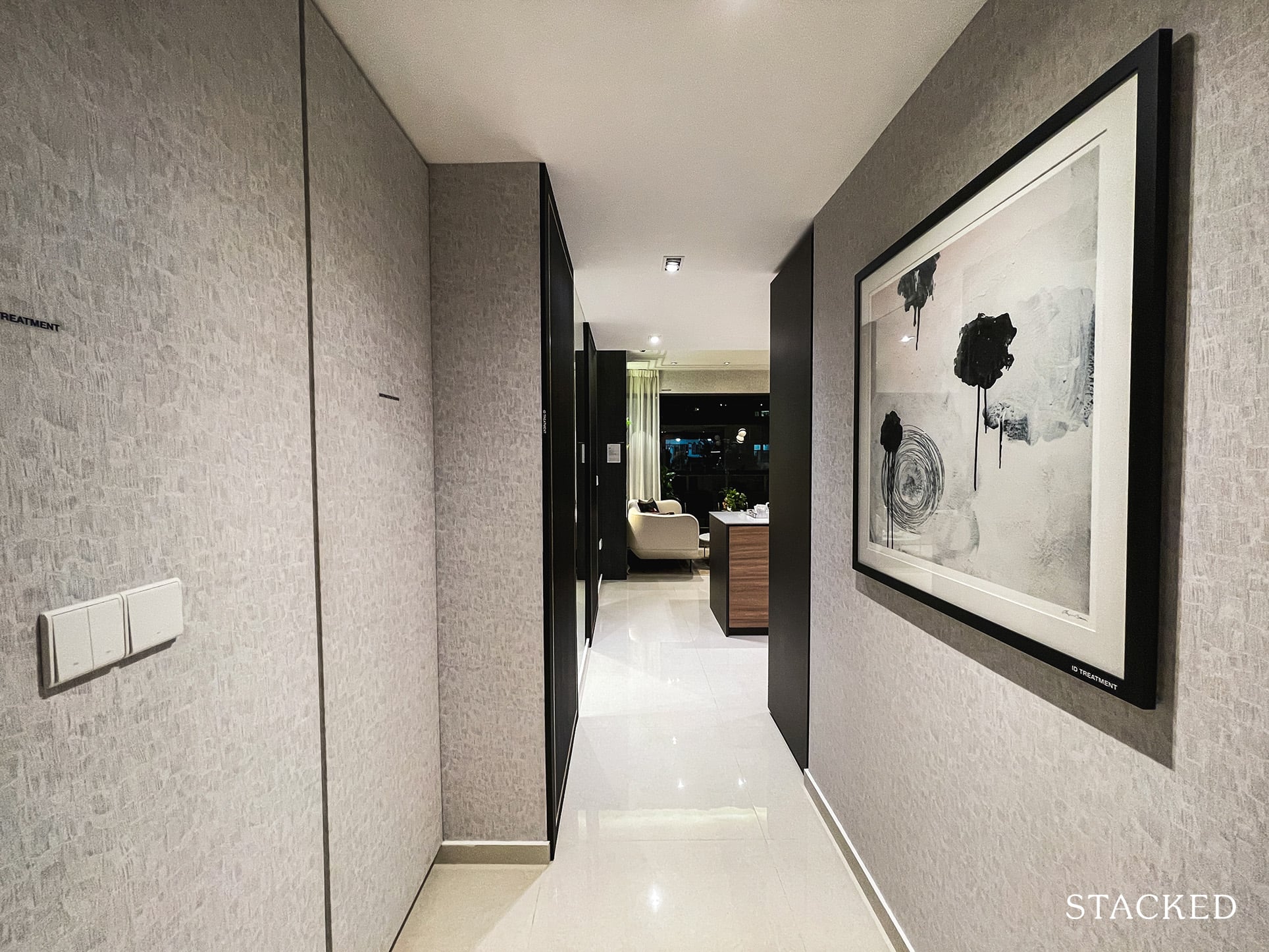
As with the 3 Bedroom unit, there is a pretty long entrance foyer space here. Larger units typically demand more privacy and have more space in general, so they can afford that wastage in some sense. It’s quite a slim area, so there really isn’t much you could place along the sides.
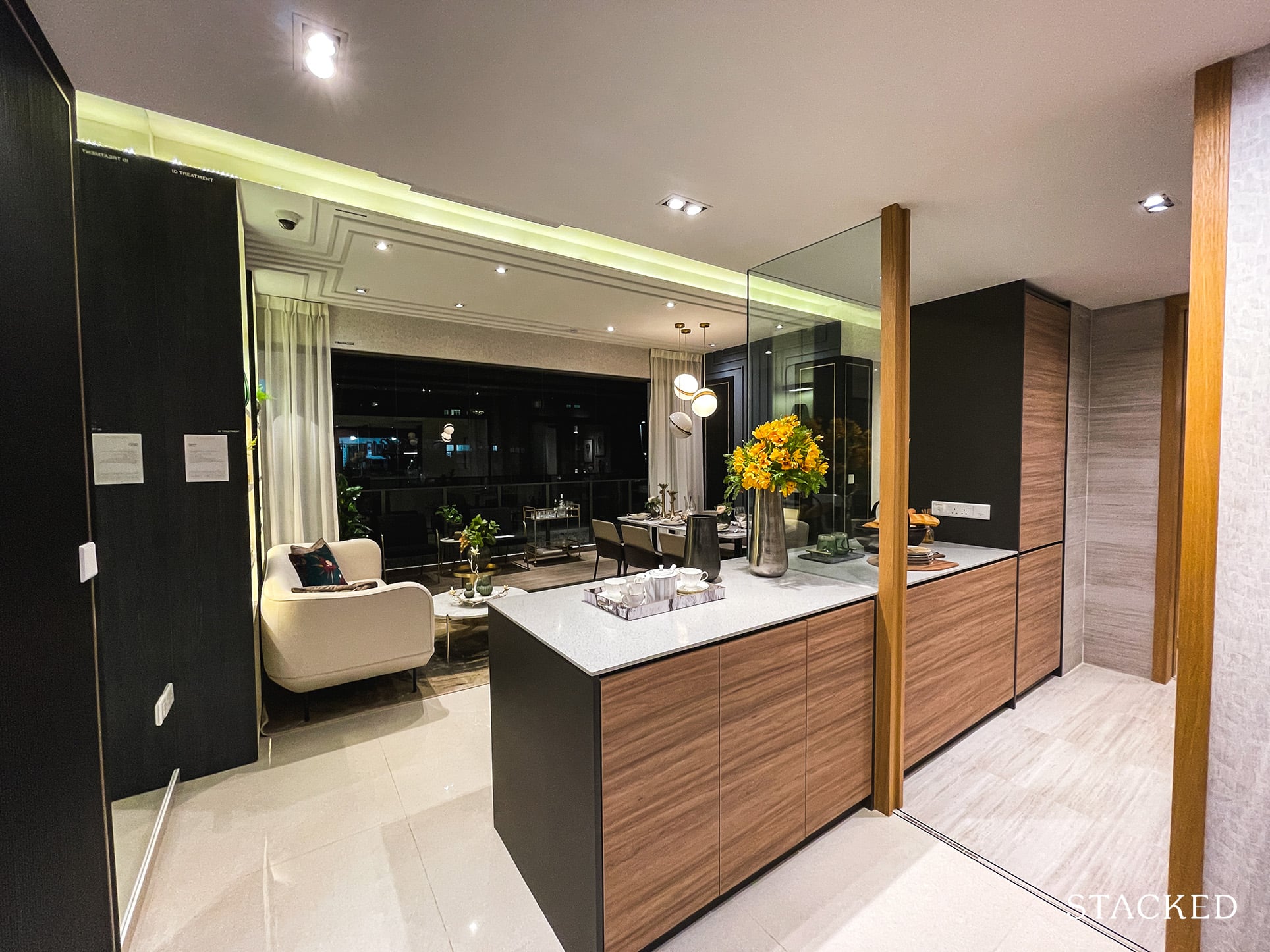
You will get a wet and dry kitchen for the 4 Bedroom unit. For the dry kitchen, you get additional countertop and cabinet storage spaces, which are required for larger units like these. Some 4 Bedroom units in other developments have wine chillers provided but you won’t be finding one here.
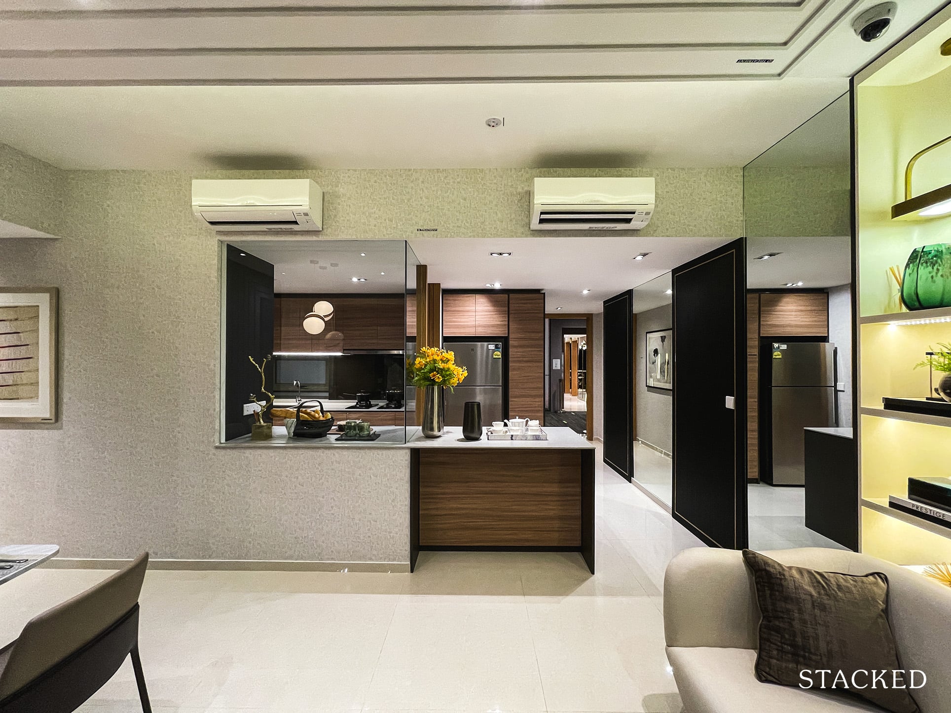
That said, I wouldn’t exactly say that it is a proper dry kitchen as well (not that they’ve made any of such claims, as the floor plan shows). It is really more of an extended outdoor kitchen space than it is a dry kitchen that comes complete with sinks and a convection hob.
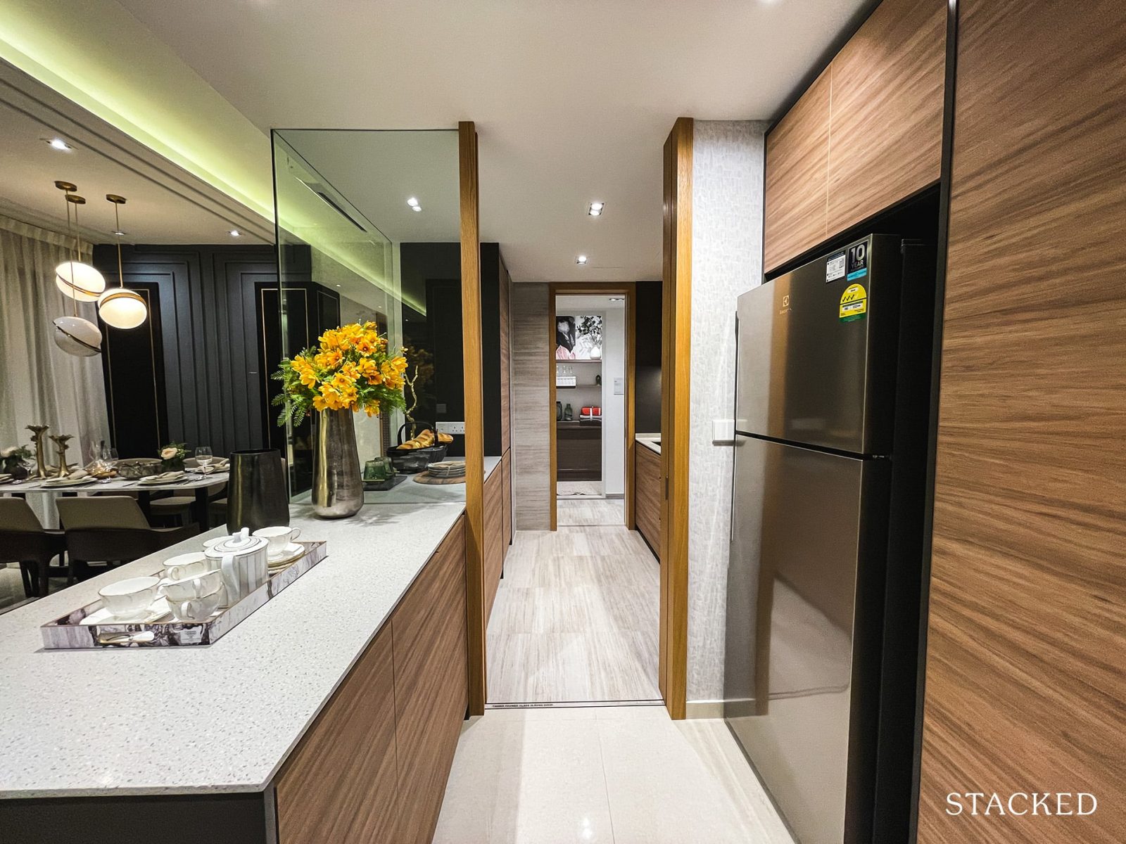
Another gripe I have is how small the fridge actually is. Being the only fridge provided, I certainly had expected a larger one to be provided. Moreover, the limited space allocated to it means you will have to do some hacking to accommodate a larger one even if you were to purchase one yourself.
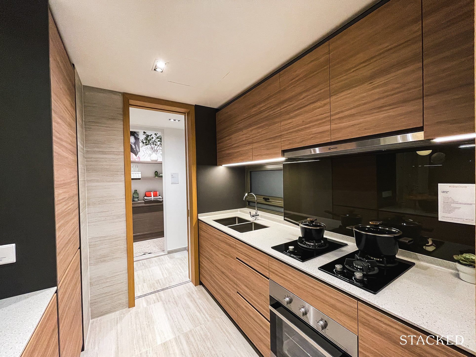
As for the enclosed kitchen, you do get the plexi-glass that helps to make the entire space feel larger and allows you to keep an eye on the happenings in the living room. There’s a decent amount of countertop space on both sides and you are provided with plenty of cabinets to store away your woks and pans as well. As compared to the squarish kitchen layout in the 3 Bedroom showflat, this is the more typical rectangular layout.
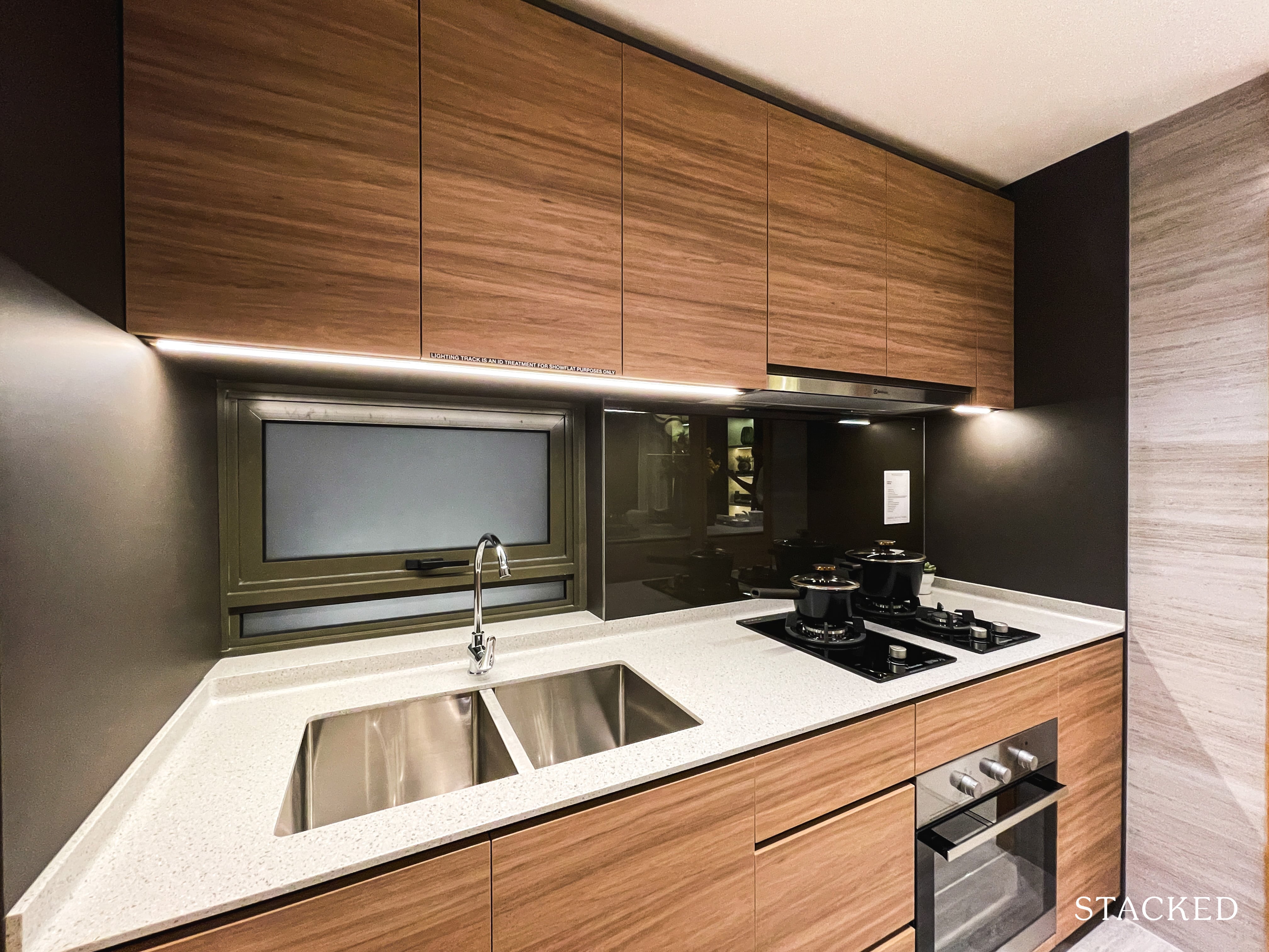
You get the same 3 gas hobs as the 3 Bedroom unit, as with the dual-sided sink – which is very much appreciated. I do like the placement of the window just above the sink as well. And instead of a combined washer and dryer, you will get individual ones here in light of the increased load of larger families. Appliances will be provided by Electrolux, a brand that is in line with those used in many mass market condos.
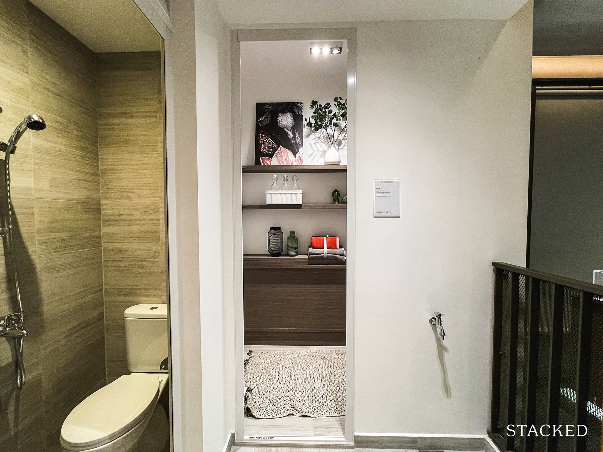
The kitchen is also connected to the yard, w/c and utility room. The yard is an open area with good ventilation for natural drying of clothes, although I can foresee that space will be the main limitation. It isn’t going to be enough space to move your washer/dryer if you were thinking of doing so either. Nevertheless, this is still a good self-contained area for your helper should you have one.
Remember, it is a 1,249 sq ft apartment, so I reckon it’s already a plus point to even have a yard – as small as it is.
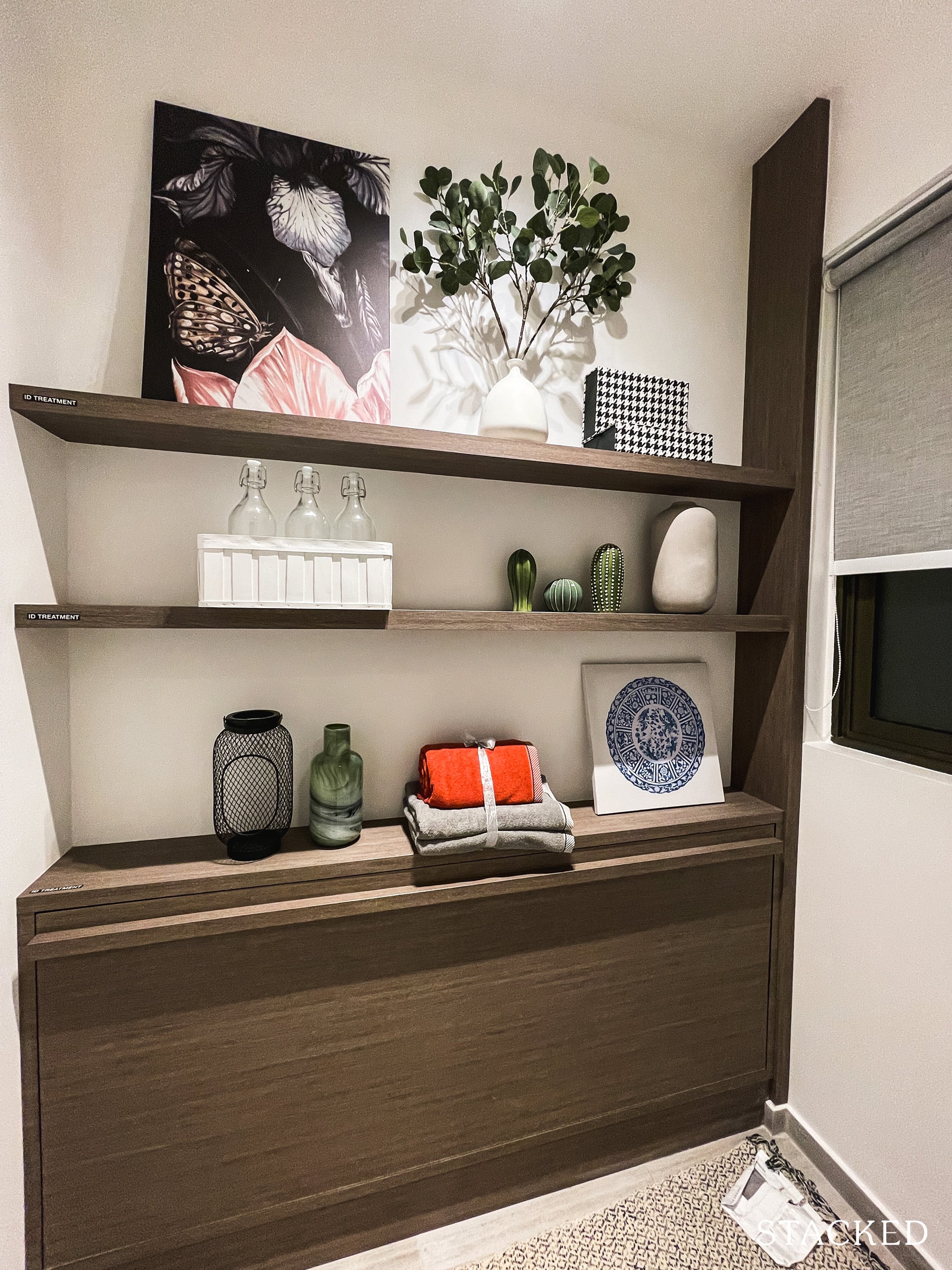
For the type of customer looking at the 4 bedroom units, the utility room would typically be used as a helper’s room – of which you’ll be glad to know that there is a window for some natural ventilation.
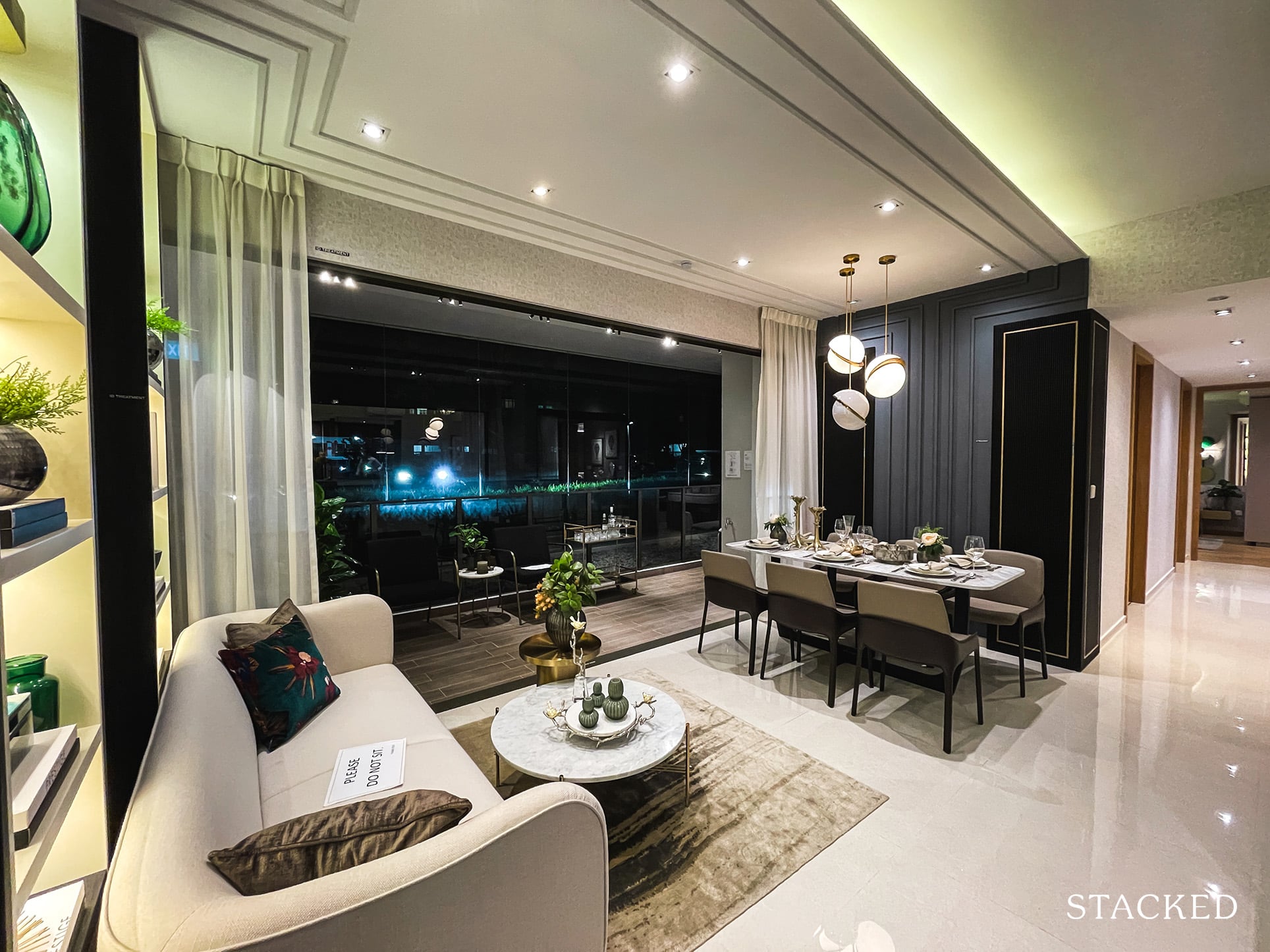
Coming back to the main hall is where you will find the living and dining areas laid out in parallel fashion. This is typically the case only for larger unit types. Let’s talk about the living room first – the space is tight, to say the least. They have only managed to place a 3-seater sofa with no TV console or TV to speak of, which is an unlikely scenario for buyers actually looking at an own stay situation.
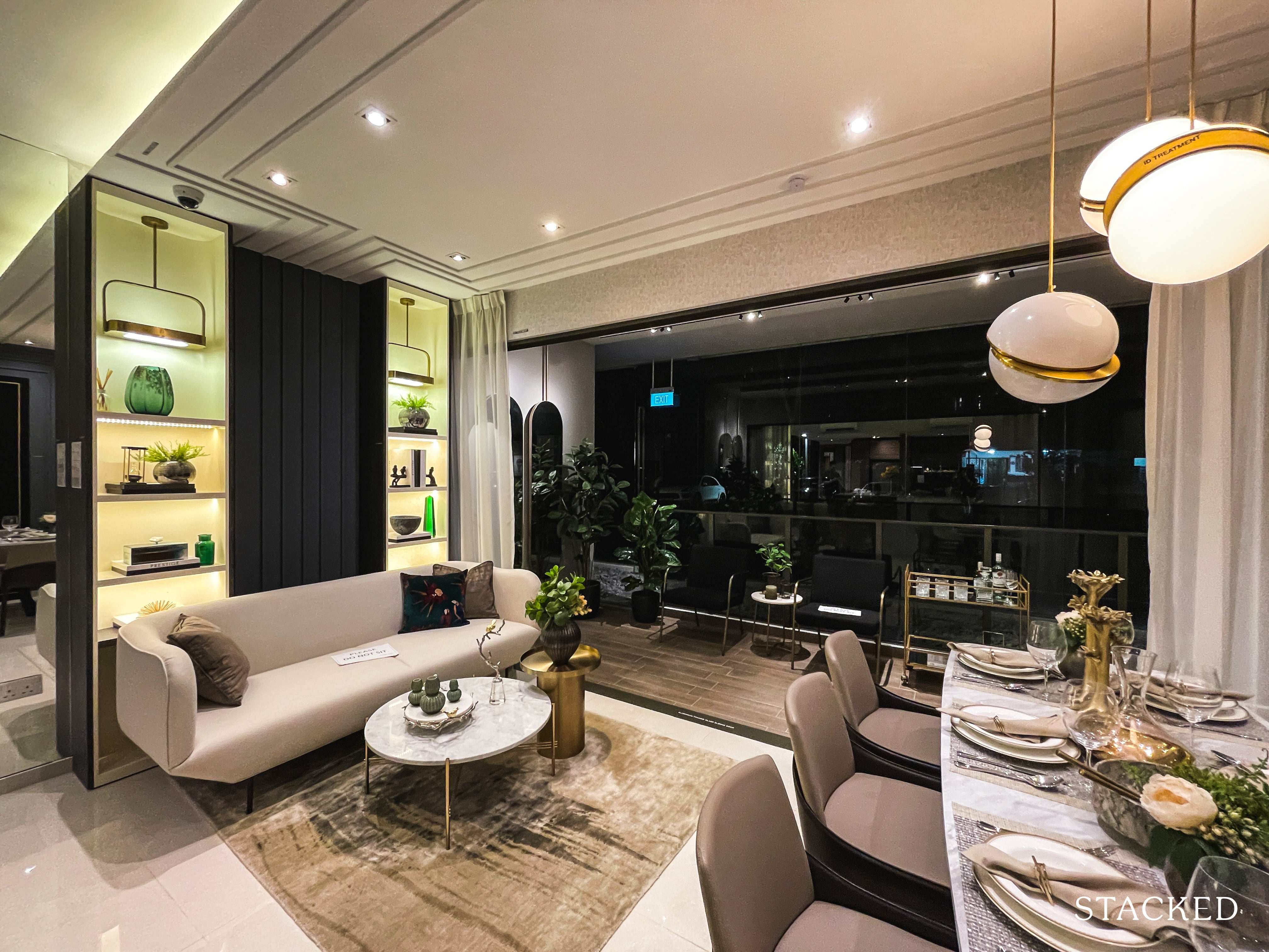
As it stands, it’s hard to envision a proper living room set up with a TV and a big dining set for the number of occupants that a normal 4 bedroom unit would hold. Again, you’d have to be mindful of the total size of the unit and be realistic about the living space and your lifestyle. If your top consideration is the price and you want something new, than something has got to make way – in this case it would be your living/dining areas.
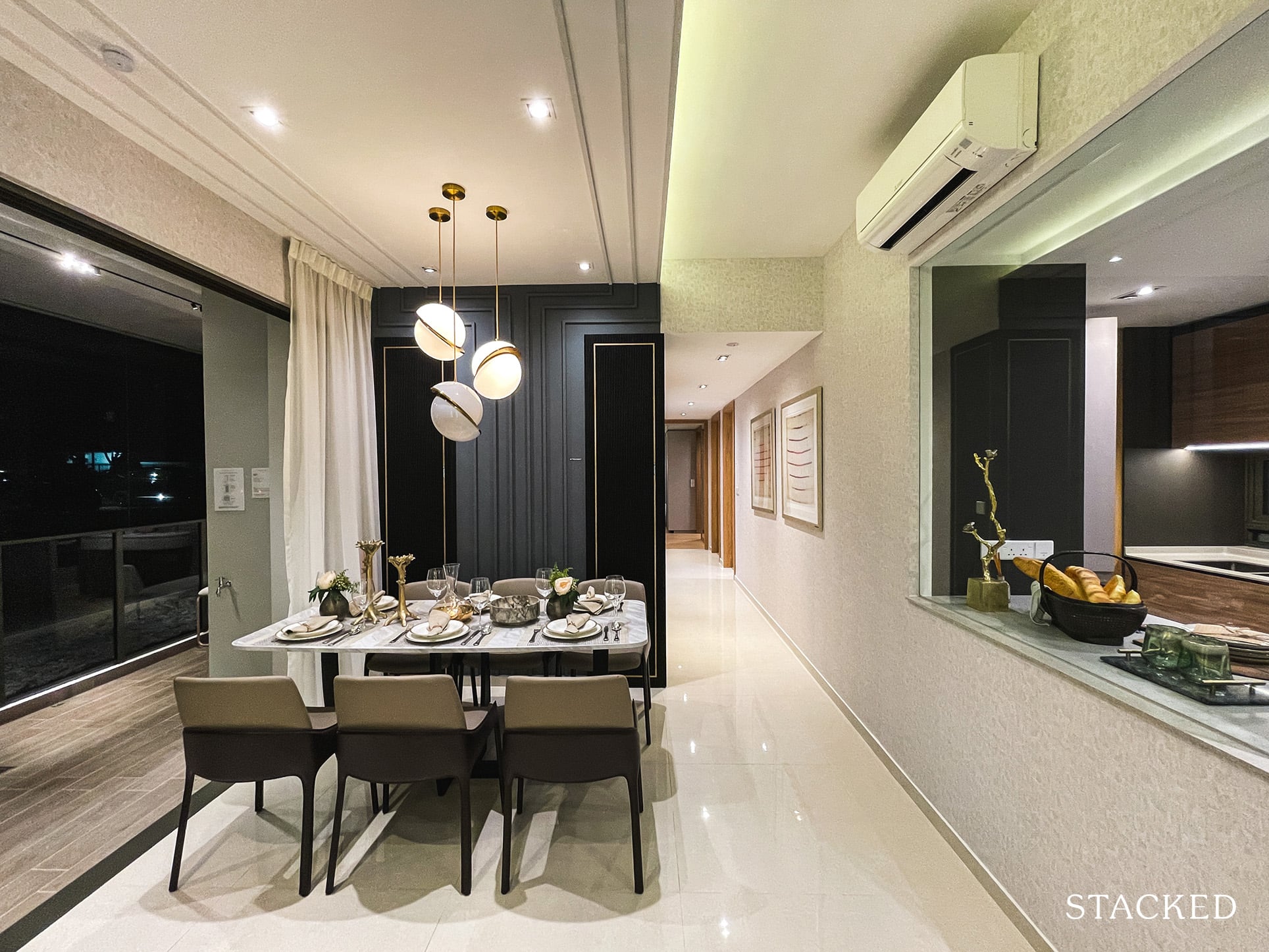
As for the dining area, they have at least been able to fit a decent 6-seater dining set – so it is basically between a bigger living or dining area – you aren’t able to have the best of both worlds here. You’d still have to be conscious of your furniture, as a longer table will surely eat into your walkway into your bedrooms. What I can think of is to possibly have an extendable table so that it can be stretched only when you have more friends coming over.
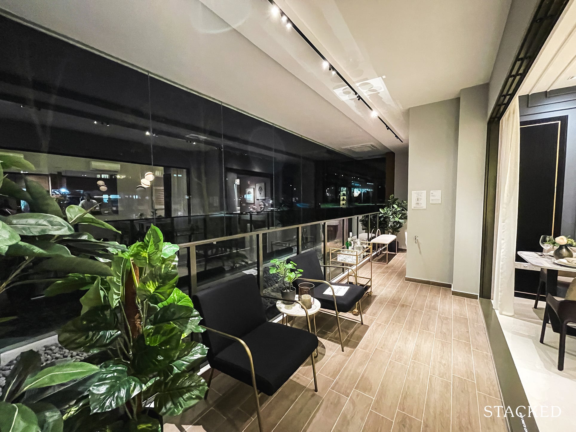
As the living and dining areas are lined up in parallel, the balcony consequently takes its entire length and will help to let in lots of light and ventilation. It measures a good 13 sqm as it also extends to Bedroom 3. Its relatively large size will also allow you to place some outdoor furniture either to accommodate more friends or for your personal enjoyment. A putting green perhaps?
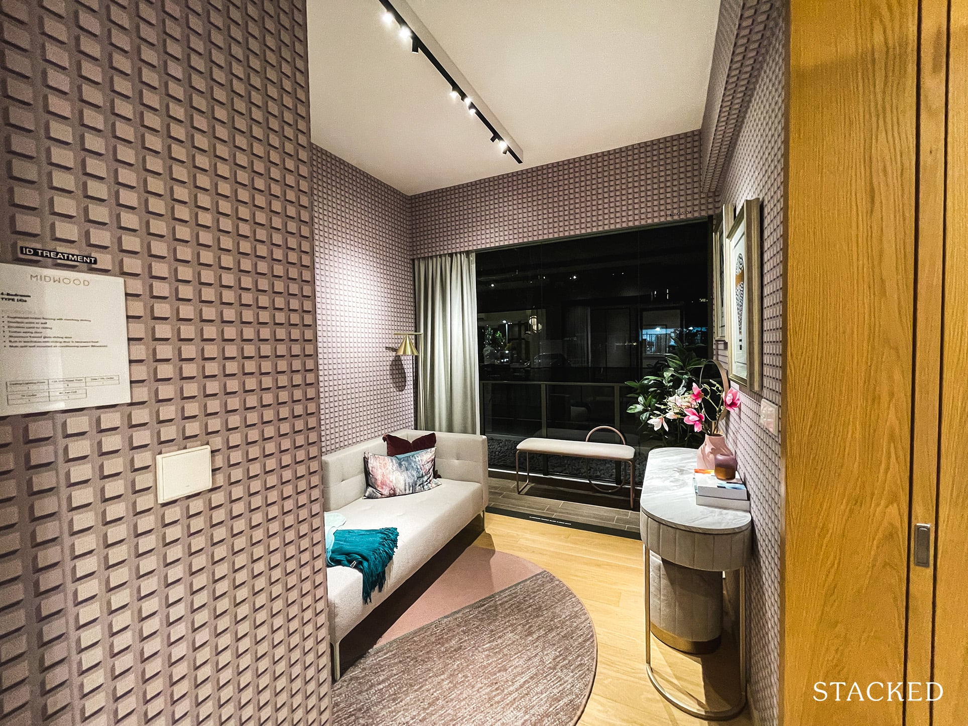
Moving now to Bedroom 3, which shares the balcony with the living room. It measures 8 sqm, which is smaller than the new launch average. It does appear visually larger with the ancillary balcony space helping to create that perception.
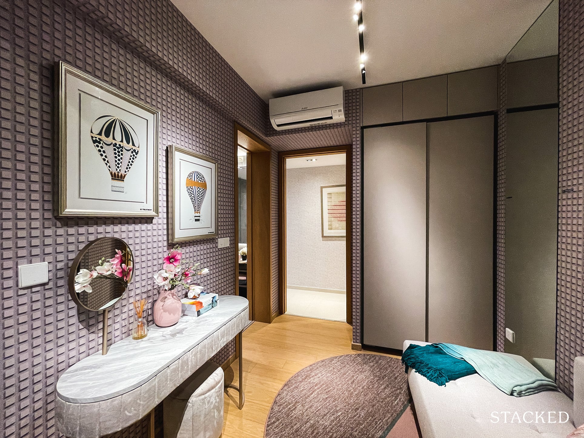
Nevertheless, do know that while it’s possible to fit a Queen sized bed, it is best to go with a Single and a study to increase its practicality. The developers have gone with a somewhat bare space here, only placing a daybed and a dresser so you should definitely put your imagination to work here.
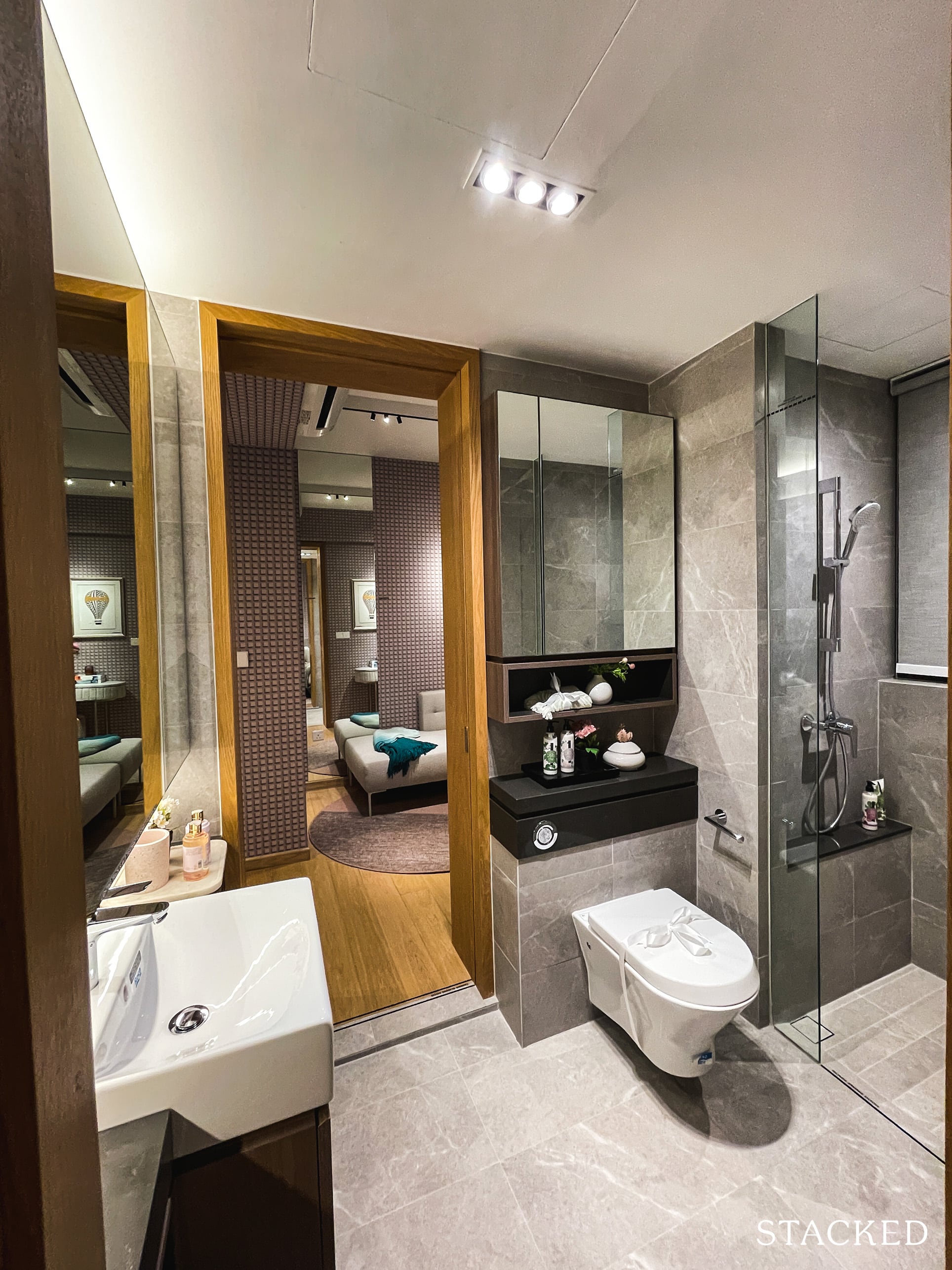
One thing I really like about this particular 4 Bedroom unit is how every room is an “ensuite”. For Bedroom 3, it shares the jack-and-jill entry to Common Bath 2 with Bedroom 2. This Common Bathroom will come with a window, which better helps to keep moisture away.
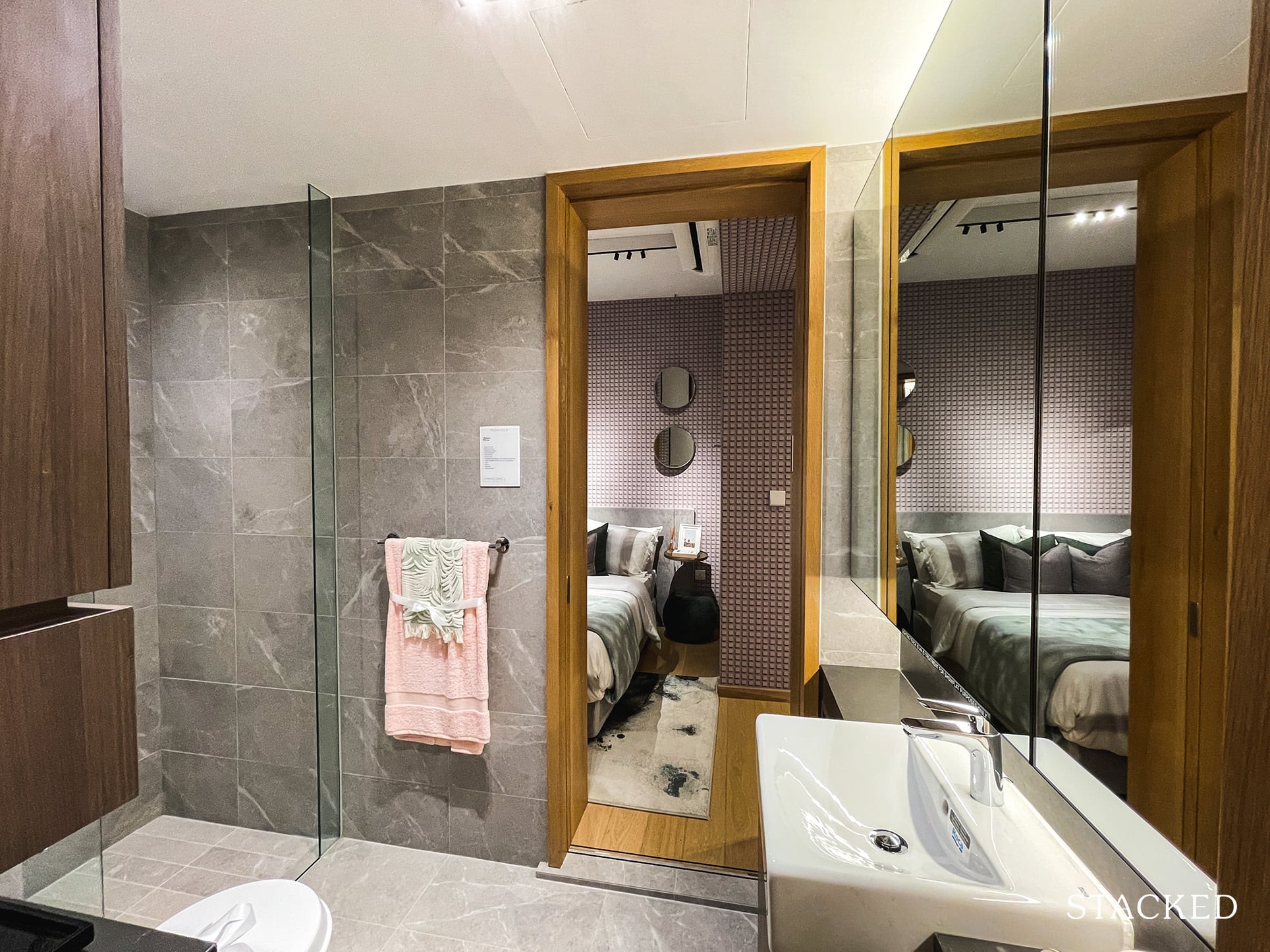
Besides that, it comes with the standard fittings with household brands such as Roca for the wall-hung water closet and basin, Hansgrohe for the tap and shower, and Geberit for the cistern.
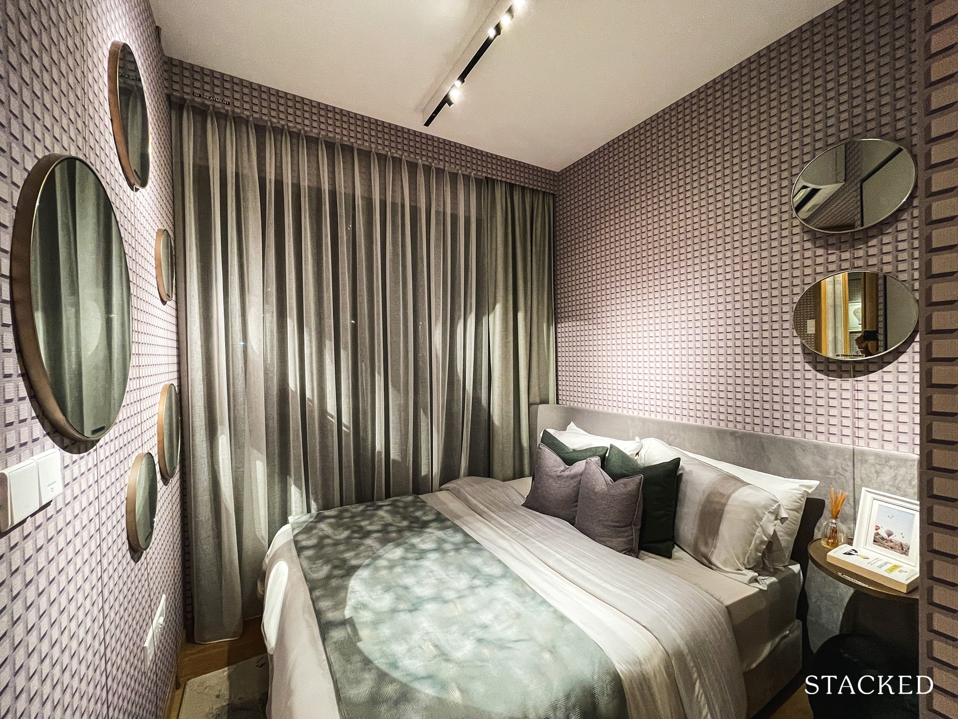
As mentioned, Bedroom 2 is also connected to the Common Bath 2, essentially making this room an ensuite as well. Additionally, you will get full length windows here because the AC ledge on this side of the unit has been placed outside the balcony instead. It is of a similar size at 8 sqm and a common theme I have found in Midwood has been the slightly smaller bedroom and unit sizes. As mentioned, it’s best to go with a Single bed if you would like to include other pieces of furniture such as a dresser or a study.
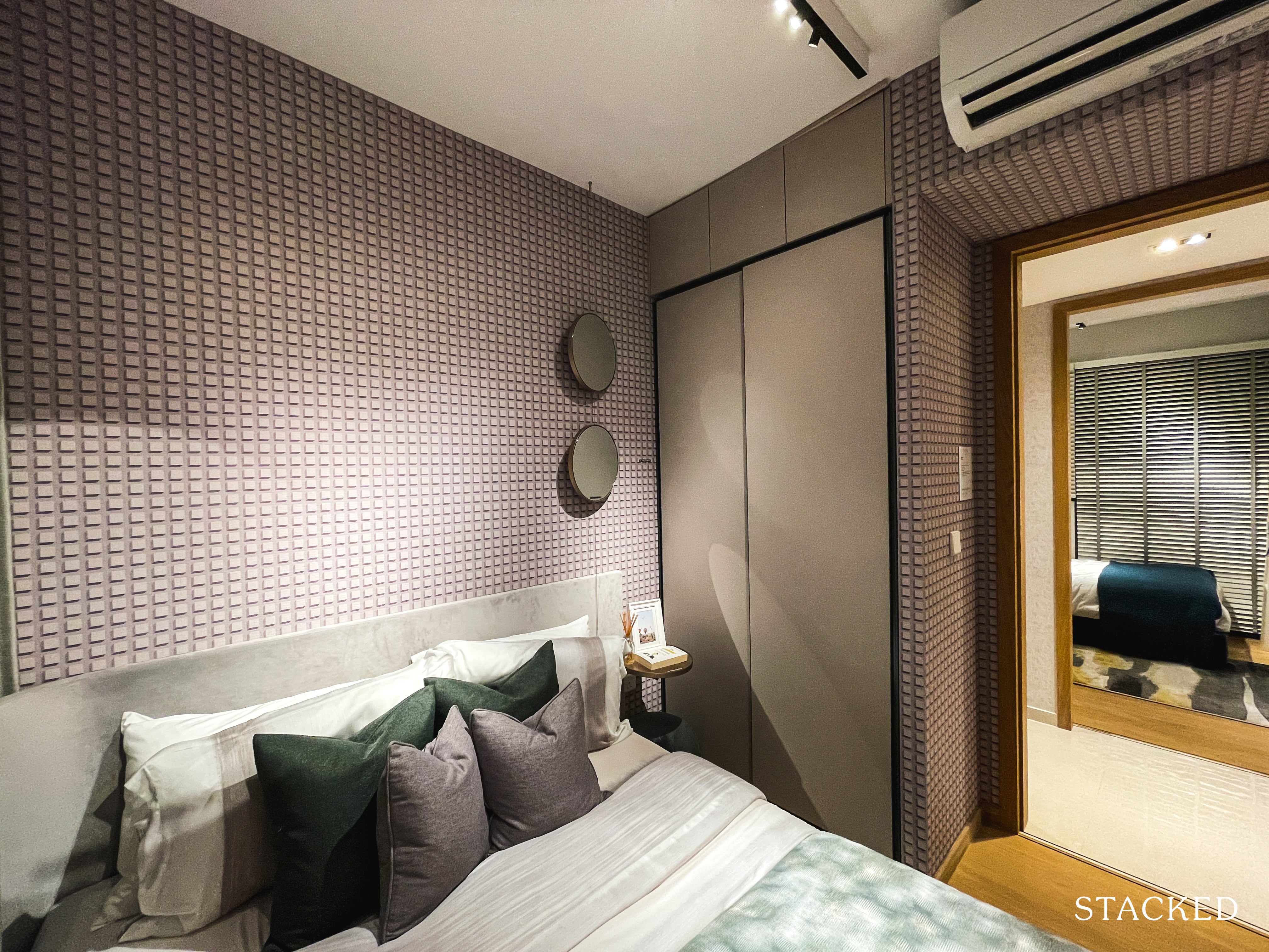
Either way, you can see with a queen bed set up, the space that you have to move around the room is very limited. Storage comes with the usual 2-panel wardrobe, although I do like that they have made full use of the space, with additional spaces above the wardrobe utilised as well.
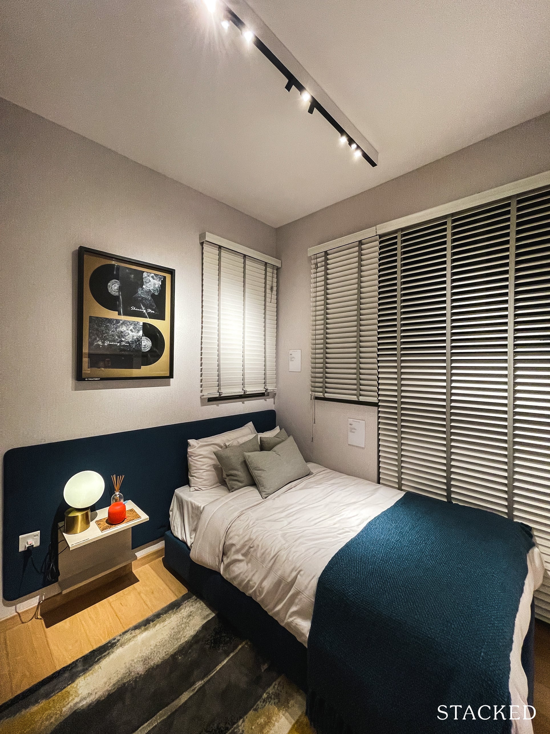
Bedroom 4 is also of the same size as the other common bedrooms, at 8 sqm. While this size permits a Queen sized bed, it will take up most of the room (as seen previously). If you have children, it might be better to go with a Single bed for more flexible use of the room instead.
This bedroom can also be considered an ensuite, as there is a jack-and-jill entry into Bathroom 3, which also opens up to the common walkway i.e. the main bathroom for guests.
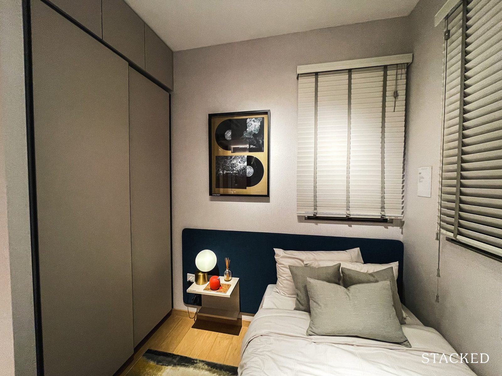
Storage here is a typical size that you’ve seen so far in the other bedrooms. One big difference of this bedroom is the main windows, which will be halved on one end due to the location of the AC ledge. Funnily enough, you do get an “extra” window above the bed – which will face the AC ledge on the outside of the master bathroom.
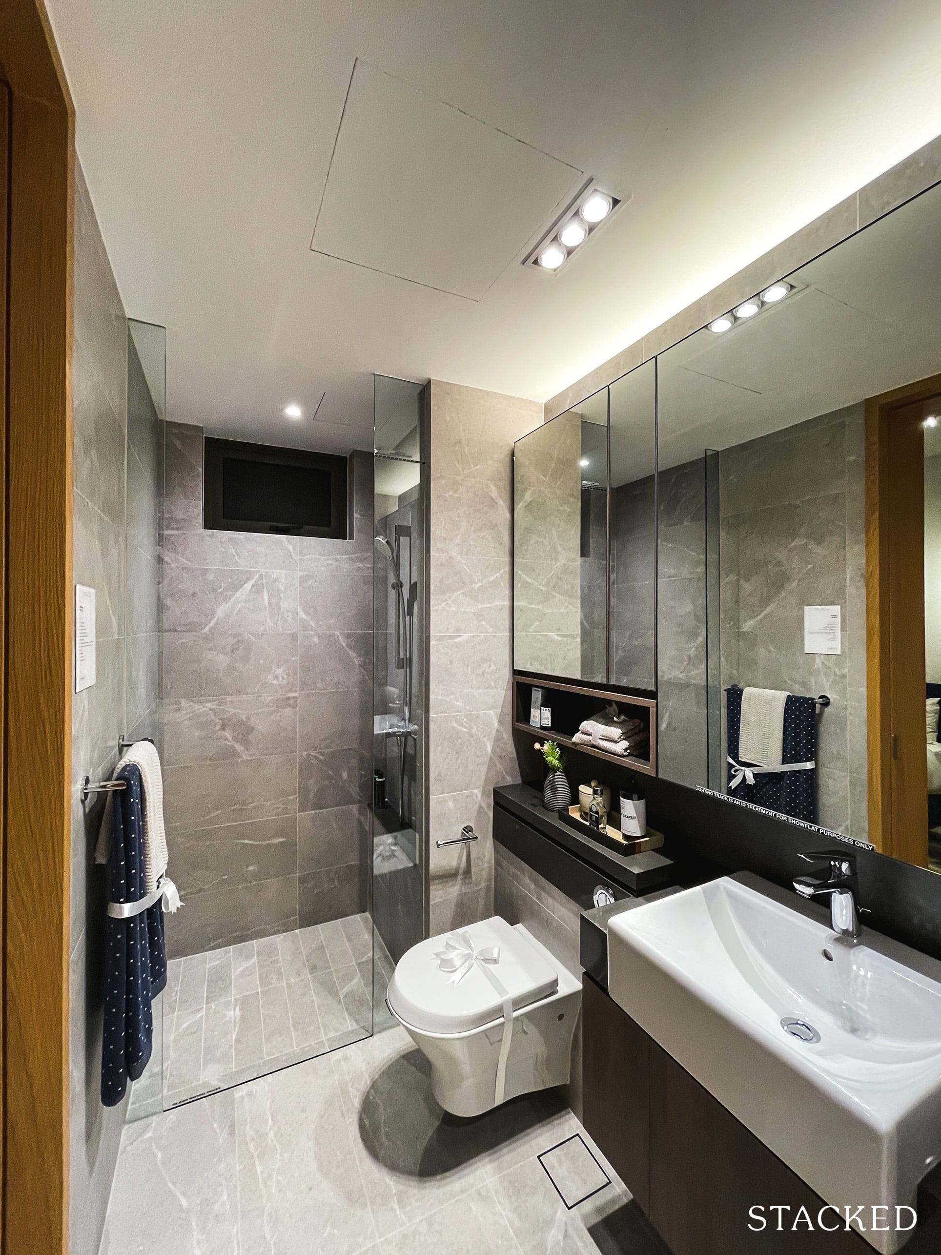
Bathroom 3 comes with the standard wares and fittings you will find in the other Common Bathroom. This includes Roca’s wall-hung water closet and basin, Hansgrohe tap and shower and Geberit cistern. It does not come with a rain shower but has a window for natural ventilation, which always comes in handy (as small as it may be). In fact, having natural ventilation is a very strong suit of this unit – where all the bathrooms and even the utility room has a window included.
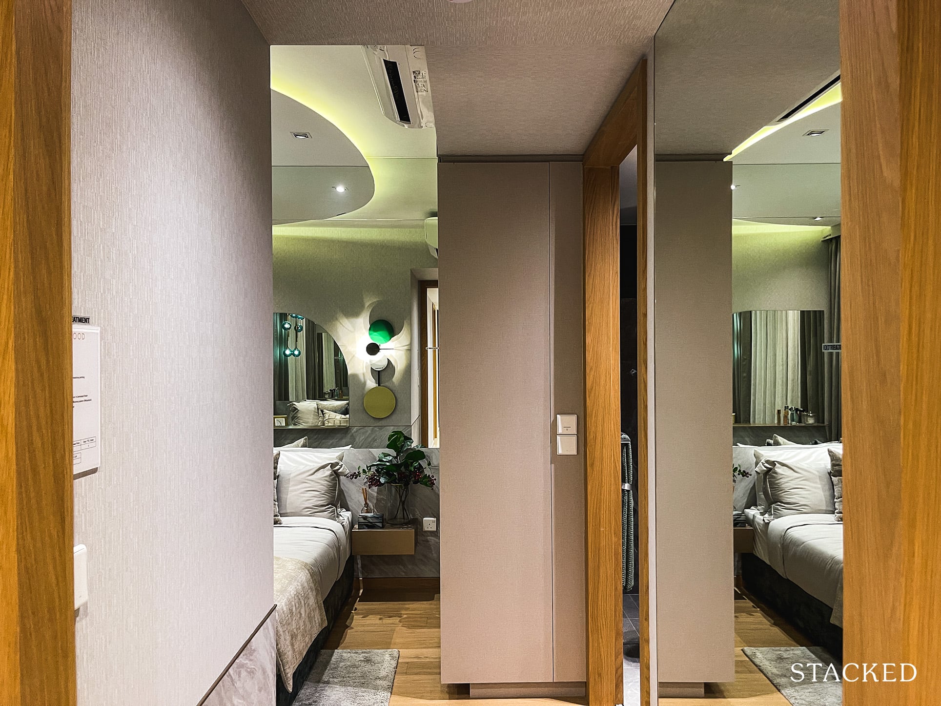
Finally, the Master Bedroom, which measures 11 sqm and similar to the one I had earlier reviewed in the 3 Bedroom unit.
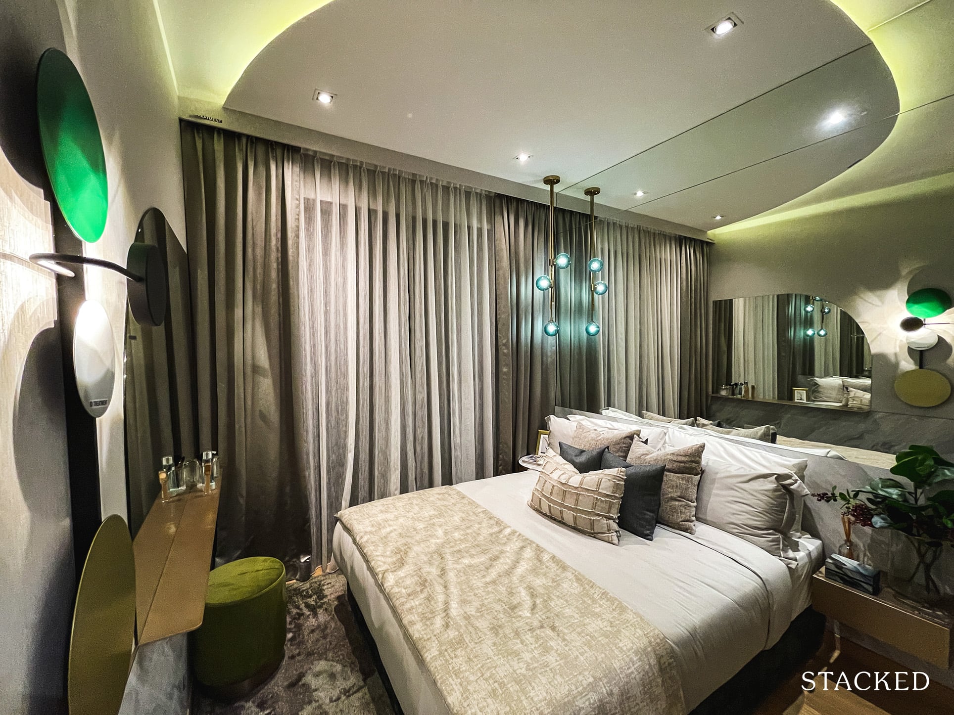
It’s not huge for the Master Bedroom of a 4 Bedroom unit (I have routinely seen 14-15 sqm ones) but it is still decent enough for a Queen bed with some space to walk around.
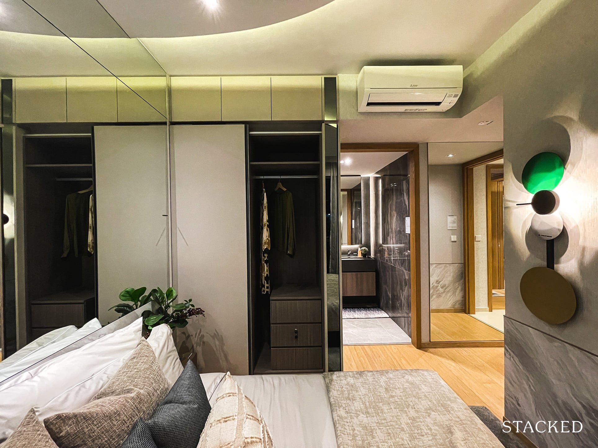
You still do get that 2-panel wardrobe space which is probably insufficient for most owners, although you do get smart storage at the side for your accessories.
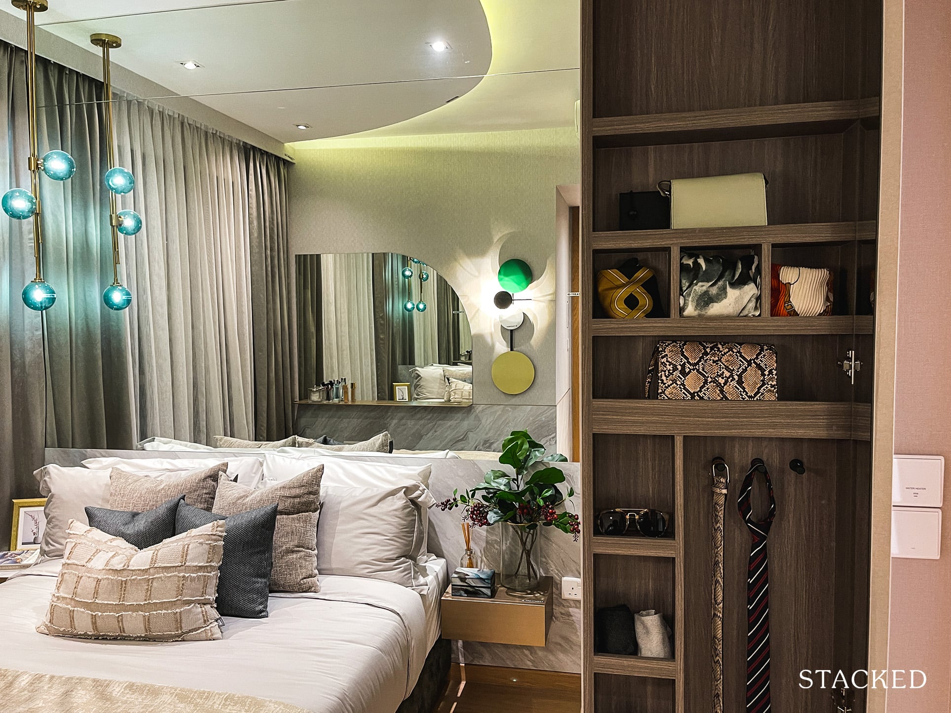
And yes, let’s not forget the absurd number of window panes they have here at Midwood. Usually, you might find about 2 to 3 large window panes but you can find up to 5 here. Personally, this makes little sense as it just causes your views to be hindered further. Although I’m not sure if this is a cost-cutting move or a restriction posed by the MINDEF facility Midwood overlooks.
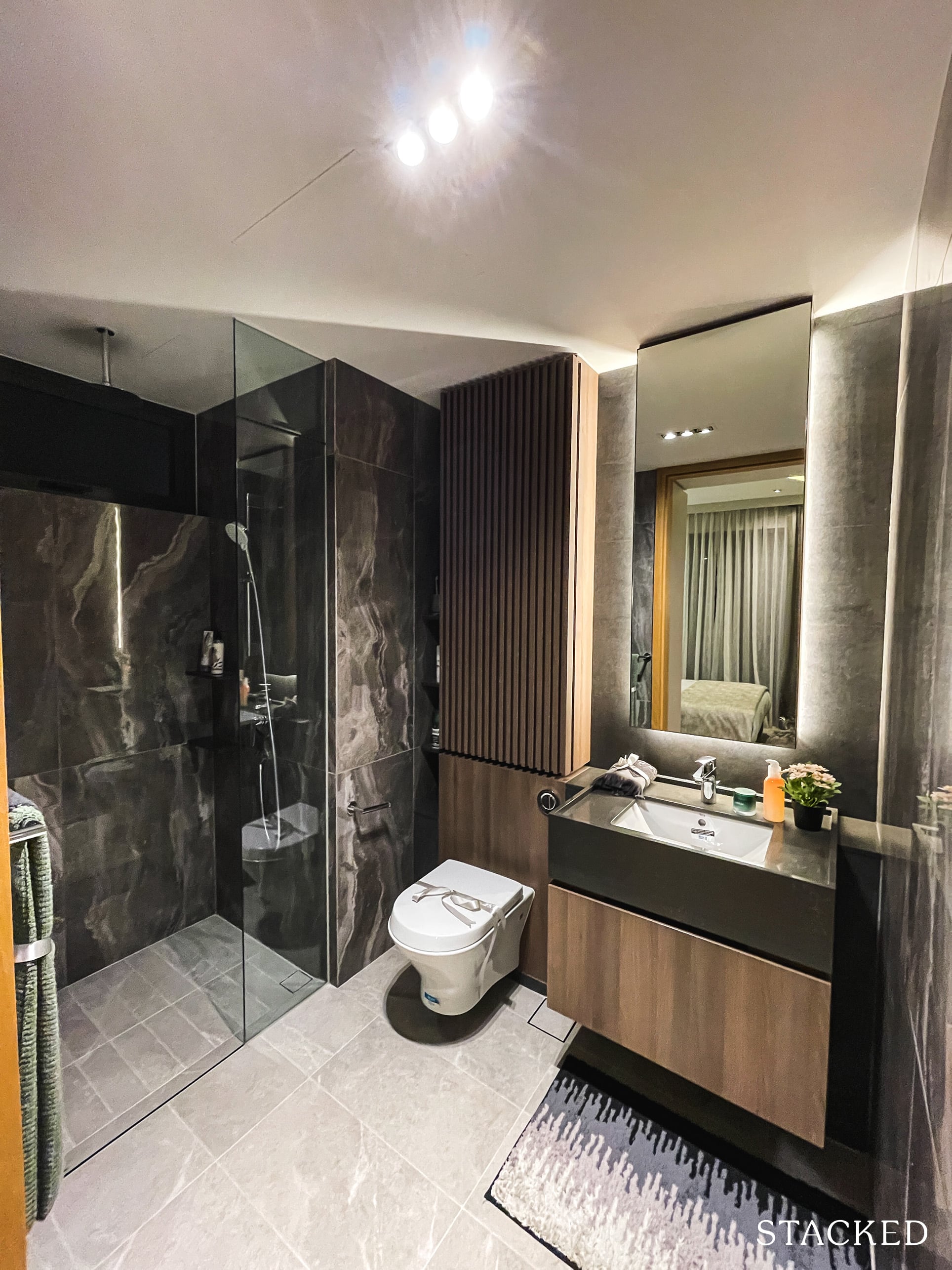
As for the Master Bath, it’s frankly a very average one. You won’t find anything fancy such as a bathtub. In fact, it’s the same size as 1 of the common bathrooms.
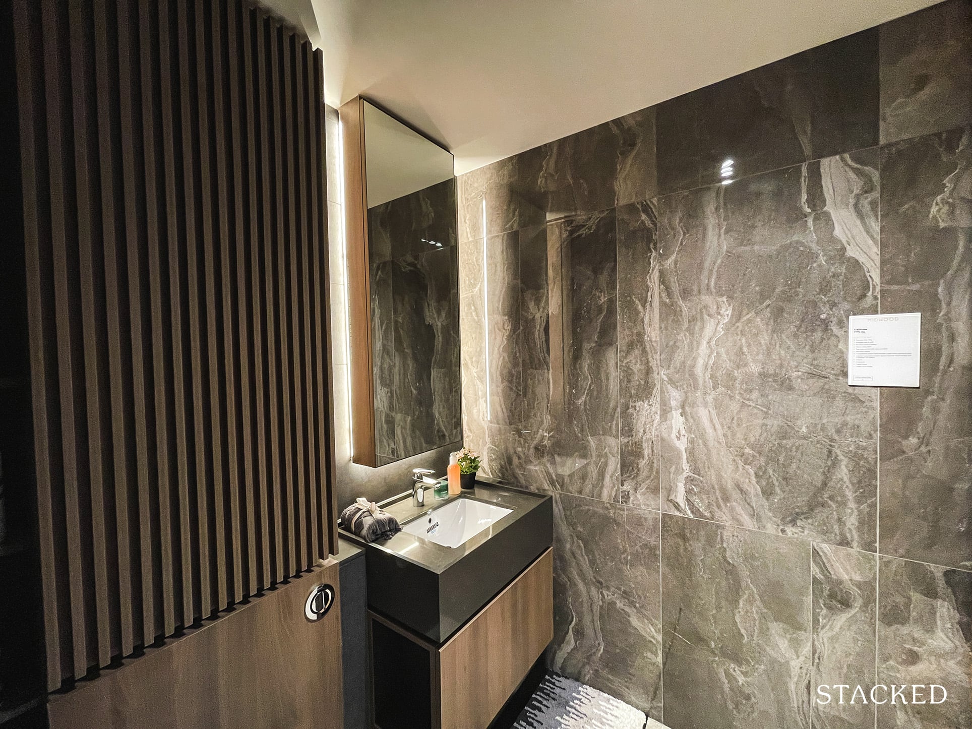
However, it does have a rain shower and wall-hung water closet, but these are standard features in the market anyway – even Executive Condos such as Parc Central Residences have it. Wares include Roca’s wall-hung water closet and basin, Hansgrohe tap and shower and Geberit cistern.
That said, you might have noticed it does incorporate a darker theme as compared to the common bathrooms – which does help somewhat with setting it apart as that sultry look does look slightly more premium.
Overall, my favourite part of this unit is how every room is basically an ensuite, which I felt was a thoughtful touch. I do find that the bedrooms are small in general but the small overall unit size will mean that this will be one of the more affordable 4 Bedroom new launches out there.
Midwood Location Review
It’s pointless to talk about the development’s swanky facilities or efficient unit layouts if the location is not right for you. Simply put, this Hillview location is not for everyone. You must definitely love the West and nature to find yourself considering Midwood to begin with.
MRT connectivity is good, with Hillview MRT connecting you to the Downtown Line within a 5 minute walk. Although this is the 3rd last station on the map, you can get to Botanic Gardens in 10 minutes, Orchard in 16 minutes and Downtown in 26 minutes.
Peak hour drives are a real bugbear though and you will need to factor those long drive times into consideration, especially if you drive to work daily. It seems way faster to get to the Woodlands Checkpoint than to the rest of Singapore.
Amenities
Groceries
| Grocery Shops | Distance From Condo (& Est. Walk Time) |
| Market Place | 100m, 1-min walk |
Market Place may not be the cheapest grocery store around, but the convenience to one is definitely a very good option to have.
Schools
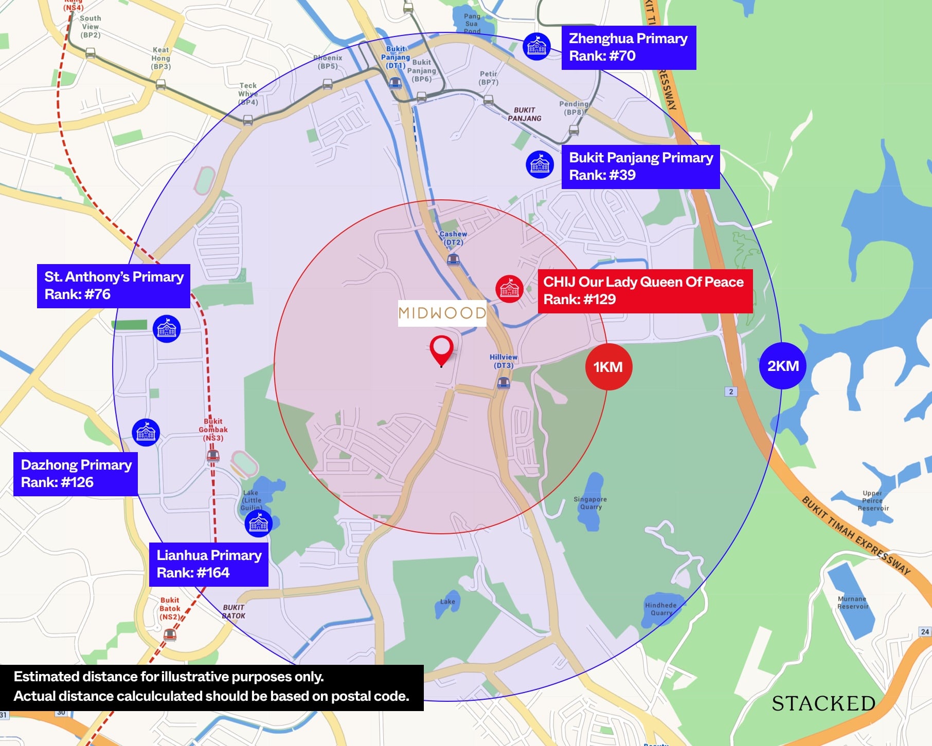
| School | Distance From Condo (& Est. Walking Time) |
| CHIJ Our Lady Queen Of Peace | 950m, 13 mins |
| St Francis Methodist School | 450m, 6 mins |
| Assumption English School | 950m, 12 mins |
| German European International Sch | 1.4km, 19 mins |
Primary school wise it makes for pretty grim reading, with CHIJ Our Lady Queen of Peace the only one that is within the coveted 1km radius. Of course, you do have several other options with 2 km, and if you have older children, the Bukit Timah belt is easily reached with the presence of the Downtown line.
Public Transport
| Bus Station | Buses Serviced | Distance From Condo (& Est. Walking Time) |
| Opp Hillview Hts | 173, 176, 177, 963, 963e, 963R, 970 | 230m, 3 mins |
| Hillview Hts | 173 | 260m, 4 mins |
Nearest MRT: Hillview MRT (400m, 5 mins walk)
Private Transport
| Key Destinations | Distance From Condo (& Est. Peak Hour [0830] Drive Time) |
| CBD (Raffles Place) | 19.1 km, 45 mins |
| Orchard Road | 12.4 km, 29 mins |
| Suntec City | 18.9 km, 34 mins |
| Changi Airport | 27.9 km, 39 mins |
| Tuas Port (By 2040) | 31.5 km, 45 mins |
| Paya Lebar Quarters/Airbase (By 2030) | 17.5 km, 33 mins |
| Mediapolis (and surroundings) | 10.0 km, 31 mins |
| Mapletree Business City | 13.5 km, 34 mins |
| Tuas Checkpoint | 21.4 km, 31 mins |
| Woodlands Checkpoint | 10.8 km, 16 mins |
| Jurong Cluster (JCube) | 5.7 km, 22 mins |
| Woodlands Cluster (Causeway Point) | 11.3 km, 21 mins |
| HarbourFront Cluster (Vivo City) | 16.4 km, 39 mins |
| Punggol Cluster (Waterway Point) | 25.5 km, 35 mins |
Immediate Road Exits: 1 – Hillview Rise, which will then connect you major expressways such as BKE and PIE within a short drive
The Developer Team
Developer
Hong Leong Holdings was established in 1968 as the Group’s privately held property investment and holding vehicle. It is closely related to City Developments Limited, one of Singapore largest property developers. Since its founding, Hong Leong has developed close to 100 residential projects. This dates back to the likes of King’s Mansion and Orchid Apartments to more current developments such as The Avenir, Penrose and The Jovell.
Architect
DP Architects is one of Singapore’s most recognisable practices. Since its founding in 1967, it has had its hand in Singapore’s history with brutalist concepts such as People’s Park Complex and Golden Mile Complex. More recently, they have helped with the design of projects such as 8 St Thomas, Frasers Tower and Woodleigh Residences.
Stack Analysis
Development Site Plan
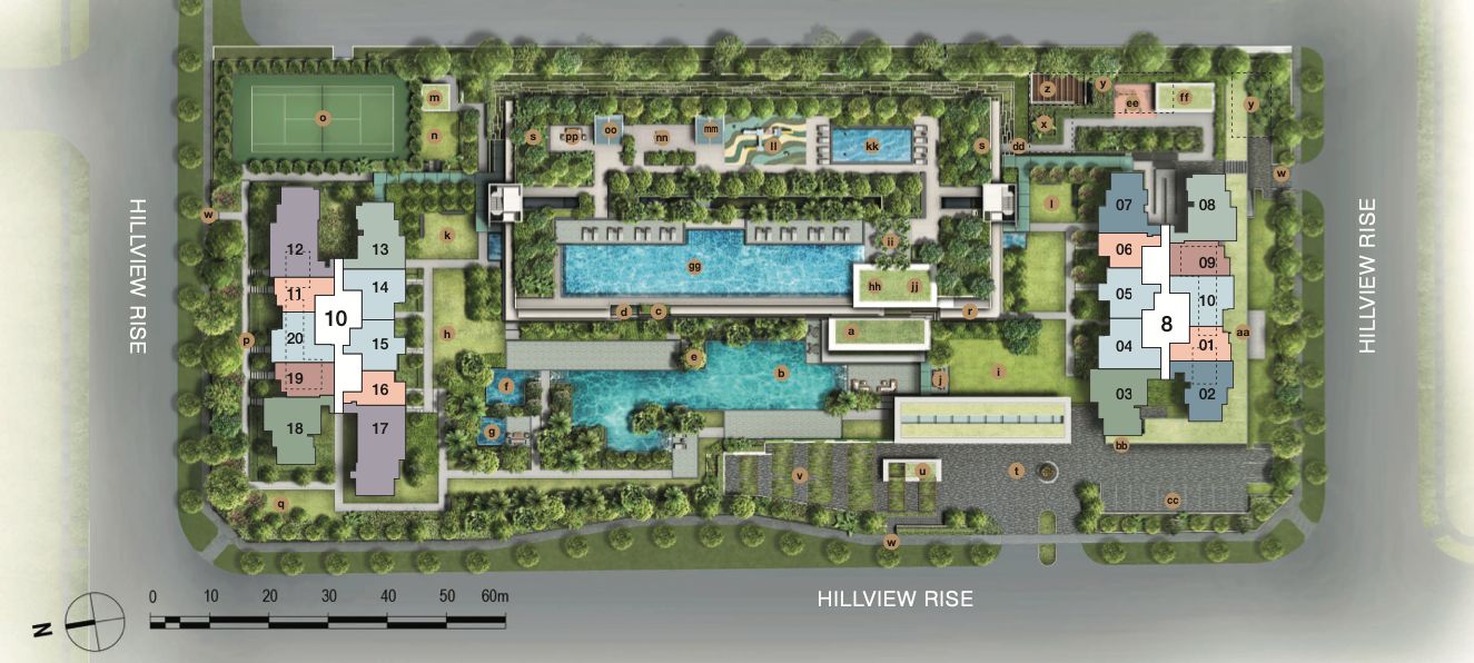
Midwood sits on a regular rectangular plot of size 153,883 square feet. The back of the multi-storey carpark currently faces The Hillier/Hillv2 while the swimming pool views will look towards the greenery when completed. As mentioned, do note that the plot in front of Hillview Rise is currently zoned as a residential plot, so your views may be hampered in the future.
One of the big selling points of Midwood is the 120m distance between the towers, which is definitely a good thing as far as more privacy is concerned.
Unit Mix
| Unit Type | Size | No. of Units | Est Maintenance |
| 1BR | 484 – 495 sqft | 116 | $261.50 |
| 1BR + Study | 549 sqft | 56 | $313.80 |
| 2BR | 635 – 700 sqft | 170 | $313.80 |
| 2BR + Study | 775 – 786 sqft | 54 | $313.80 |
| 3BR | 893 – 990 sqft | 110 | $313.80 |
| 4BR | 1,249 – 1,259 sqft | 58 | $366.10 |
Personally, the Hillview estate feels very much like an own-stay area to me. It’s a private residential estate and a far cry from its industrial beginnings. I was therefore surprised at the large number of 1 Bedroom units in this development and did not quite expect unit sizes to be generally on the smaller end of the spectrum, with 2 Bedroom and 4 Bedroom unit types standing out as being smaller than usual for an OCR property. The impact of this is actually lower quantum for buyers who are able to look past the more compact unit sizes.
Maintenance wise it is about what you might expect, with the exception of the 1 bedroom plus study, which in comparison with the same price for the 2 and 3 bedroom units – it seems less of a “good deal“. That said, the bigger units will feel that maintenance wise it is quite reasonable – especially when 564 units isn’t considered to be a big project in today’s context.
Best Stacks
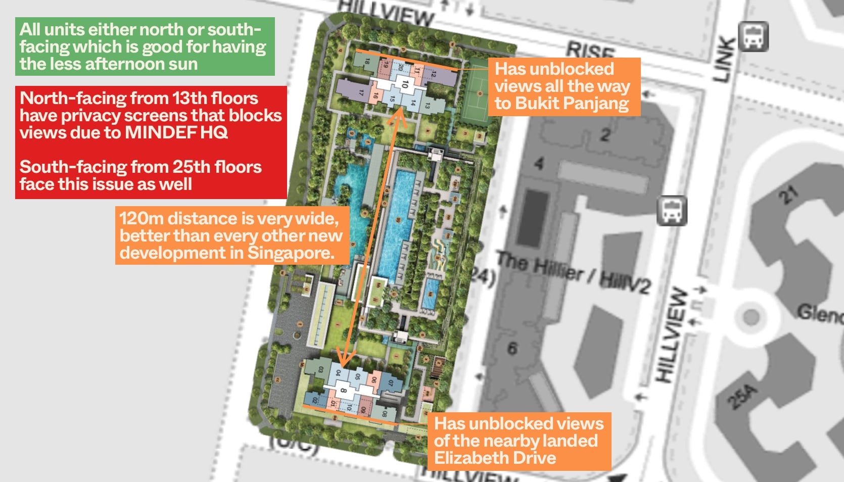
All units here at Midwood are either North or South facing. That’s probably the most desired facing Singaporeans hope for as it avoids both the morning and evening sun. However, Midwood is definitely not one of those perfect facing condos because for high floor units (North facing from 13th, South facing from 25th), you will get privacy screens installed to prevent you from getting an all round greenery view over MINDEF HQ at Bukit Gombak. For internal facing stacks, they fare way better than every other new development in Singapore due to its 120m distance from each other, giving you far more privacy.
North facing units at Block 10 faces towards Kingsford Hillview Peak, which is about 15 storeys high and has a rooftop tennis court. Should you go for a higher floor unit above that, you will get unblocked views all the way to Bukit Panjang.
South facing units at Block 8 would also get unblocked views of the nearby landed Elizabeth Drive estates so that should be a decent pick as well.
Because the directional facing is not an issue, it will come down to the specific unit layout which you prefer. For 1 Bedroom units, I do like the layout of the 1+S units, as I find that the additional Study will provide additional flexibility when friends come over or even to rent it out if absolutely required. As for 2 Bedroom units, you have the choice of 2 Bed + 1 Bath, 2 Bed + 2 Bath or 2 Bed + Study. Ideally, if budget permits, I prefer the 2 Bed + 2 Bath dumbbell layout, as I find it to be the most efficient for its space. The stack that comes with the unit can also be helpful as it can be used as the utility that the unit doesn’t come with.
For 3 Bedroom units, you can either opt for units with a yard or the ones without while 4 Bedroom layouts are similar for both stacks.
Afternoon west sun analysis
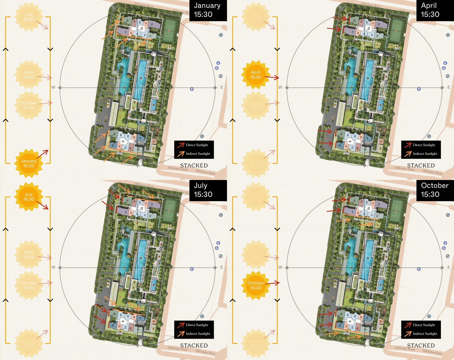
As all units here have a north-south orientation, the afternoon sun isn’t a big concern here. However, there is a slight south-west orientation for the south facing units which does lead to more indirect afternoon sun towards the end/early part of the year.
Stacks with the least afternoon sun
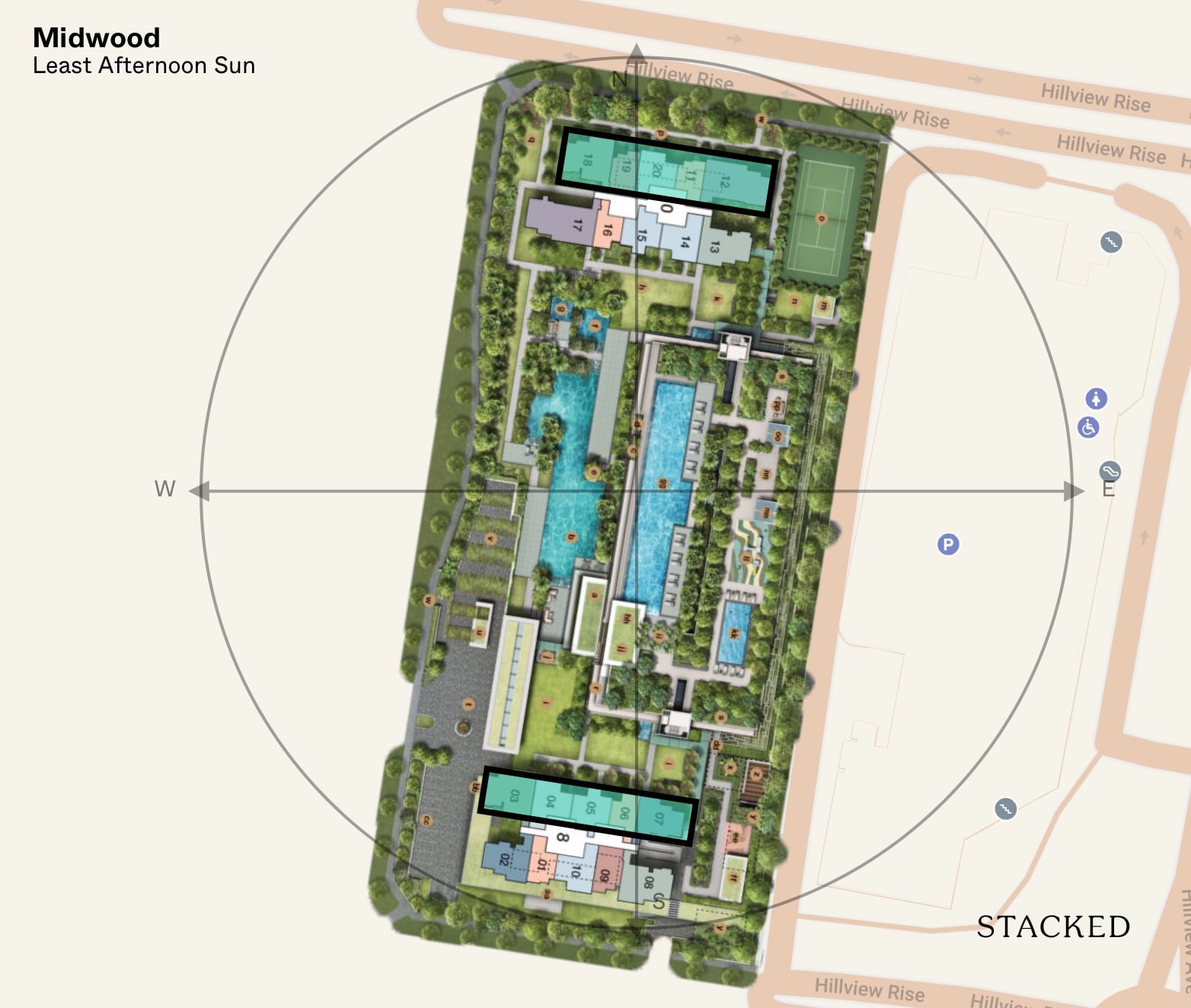
As south-facing units would invariable have a little bit more of the afternoon sun given its orientation, all the north facing units would have the least afternoon sun.
Price Review
Ultimately, this Hillview Rise site was won by the Hong Leong Group at $1,067 psf or $460m in total. Its winning bid was praised for its extensive use of Prefabricated Pre-finished Volumetric Construction (PPVC) which allows many parts of the development to be built off-site.
Based on these numbers, we estimate the breakeven price to be about $1,561 psf.
You could also point out to its PPVC method as a valid draw in today’s context. It’s targeted completion date of end 2022 may be a plus point for buyers in this pandemic era of construction delays.
Now if you are considering Midwood, you will undoubtedly compare it against its neighbouring developments. So here is how it stacks up!
| Development | Units | Psf | TOP | Tenure |
| Midwood | 564 | $1,598 | 4Q 2022 | 99 Years from 2018 |
| The Hillier | 528 | $1,380 | 2016 | 99 Years from 2011 |
| Kingsford Hillview Peak | 512 | $1,316 | 2017 | 99 Years from 2012 |
| Glendale Park | 448 | $1,275 | 2000 | Freehold |
| Hillview Park | 184 | $1,172 | 1995 | Freehold |
| Hillview Heights | 360 | $1,232 | 1996 | Freehold |
Of the many condos at Hillview, there are only several of them within a short walk to the MRT station and these are summarised in the table above. Midwood belongs to the new generation of Hillview condos that are released on a 99-year tenure as opposed to older generation ones which tend to be Freehold.
As I had mentioned in the earlier paragraphs, we have estimated the breakeven price of Midwood to be at $1,561 psf, with some estimates putting it as high as $1,635 psf. Thus, the argument is that even on a land cost basis, Midwood is selling at close to, if not below, breakeven prices. This either makes Midwood a steal or a misstep by the developer, with the latter the less likely option given Hong Leong’s extensive real estate record.
When we compare Midwood to its peers nearby, it is 19% and 27% more expensive than The Hillier and Kingsford Hillview Peak respectively, its 2 nearest competitors. The gap is relatively narrow as these 2 projects are relatively new as well. Therefore, it really depends on your personal take on it. The Hillier commands a slight premium over Kingsford as it is an integrated development, with Hillv2 shopping mall just downstairs and this also sets the development apart from Midwood. I do find that Midwood’s 80/20 unit/facilities split and 120m distance between blocks are good selling points which buyers may appreciate enough to justify the 19% premium.
As for the older projects, it comes down to what you prioritise. Midwood is a 99 year development and will definitely suffer from lease decay if you are planning to stay more than 20 years in it. However, in this generation, 20 years in a single home (or company) is quite unlikely. What you get in turn for Midwood, are newer facilities and prices which will likely be staged up on your behalf by the developers. However, if age is not a factor and you find that Freehold tenure is important to you, the older Freehold projects definitely look more reasonably priced compared to Midwood.
But let’s look into more detail to compare by quantum instead.
| Condo | Tenure | Completion Year | Average of Price | Average of Price $PSF | Size Range (Sqft) | Sub Type |
| Midwood | 99-year from 2018 | 4Q 2022 | $ 1,014,583 | $ 1,598 | 635 | 2B1Ba |
| Hillview Park | Freehold | 1995 | $ 1,060,000 | $ 1,172 | 904 | Regular |
| Kingsford Hillview Peak | 99-years from 2012 | 2017 | $ 1,080,000 | $ 1,316 | 786 – 850 | Regular |
| The Hillier | 99-years from 2011 | 2016 | $ 1,128,286 | $ 1,380 | 807 – 840 | Loft + Study |
| Midwood | 99-year from 2018 | 4Q 2022 | $ 1,157,507 | $ 1,680 | 689 | 2B2Ba |
| Hillvista | Freehold | 2010 | $ 1,195,000 | $ 1,284 | 915 – 947 | Regular |
| Hillview Heights | Freehold | 1996 | $ 1,209,500 | $ 1,232 | 980 – 990 | Regular |
| Hillington Green | 999-years from 1883 | 2002 | $ 1,235,750 | $ 1,248 | 990 | Regular |
| Glendale Park | Freehold | 2000 | $ 1,317,000 | $ 1,275 | 1033 | Study |
| Summerhill | Freehold | 2002 | $ 1,317,500 | $ 1,391 | 947 | Study |
Midwood prices are calculated based on actual transactions so far. Here’s a look at the prices visually:
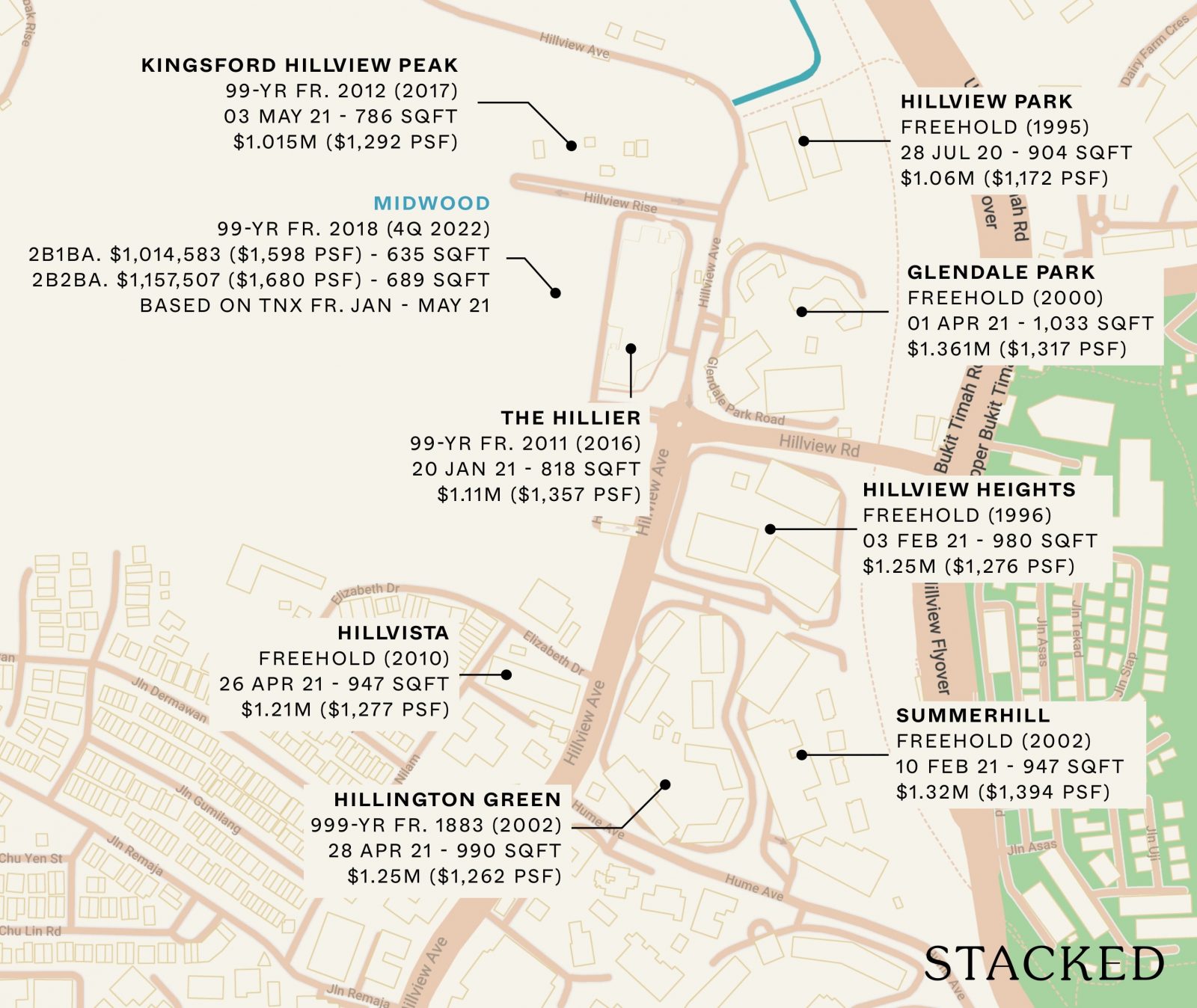
For our pricing overview, I’ll be focused on the 2-bedroom units as these are the most common in Midwood.
One of the main issues that Midwood faces is the stiff competition surrounding it. Midwood not only has 8 close by neighbours – 5 of them are freehold, and 1 is a 999-year leasehold development.
As with new launches of this era, Midwood has the smallest 2-bedroom size in the area, and the 2-bed 1-bath is actually the most affordable 2 bedroom within this vicinity based on average prices in 2021 as of this writing.
But this has also resulted in Midwood achieving the highest $PSF too.
Naturally, buyers of Midwood would need to ask themselves whether or not it’s worth paying a one of the highest $PSF for a 2-bedroom in the area full of freehold properties.
From the table, you’ll see that a freehold unit at Hillview Park managed to go for $1.06M, a lower quantum with a much bigger space than the 2-bedroom 2-bathroom unit at Midwood.
While this is the only transaction of its kind in the last 12 months (Hillview Park has a higher % of bigger units), it does point to a possibility that future potential buyers of Midwood would have a difficult time processing whether or not it’s really worth paying the same price or more when Hillview Park is priced the same (or less).
Of course, Hillview Park’s facilities are dated, but it does have 2 tennis courts and a pool so it’s also considered a full-fledged facility development. Own stay buyers who do not mind these attributes may prefer the bigger space at the same price – while having more assurance of its long-term pricing.
If we make a comparison of the 2-bedroom 2-bathroom at Midwood ($1,157,507) to the newest freehold development in the area, Hillvista ($1,195,000 completed in 2010), you’ll see that it is only a 4% difference.
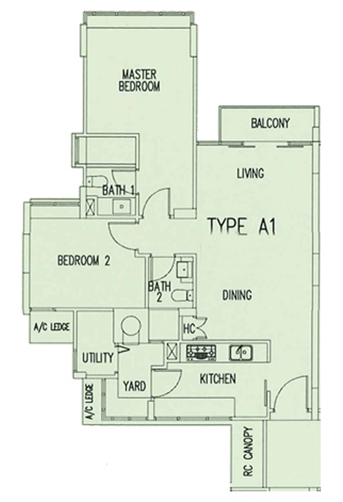
Hillvista is about an 8-minute walk to Hillview MRT which is more than Midwood, but not too far away. At this current price point, I think that future buyers would also be hesitant in paying more than what is transacted today when prices are rather similar. After all, they’d only need to top up 4%. In terms of down payment, this would really just be 25% of that – 1% more.
Now how does it fare against its leasehold competitors, Kingsford Hillview Peak and The Hillier?
If you look at the table, you’ll see that both leasehold competitors have a lower quantum than the 2-bedroom 2-bathroom unit at Midwood.
This is expected considering its older age (if we consider the lease tenure, it’s about 6 and 7 years older).
But in an era when financing rules are getting stiffer, new launches should be making their units ever so more efficient to create a palatable quantum over its competitors.
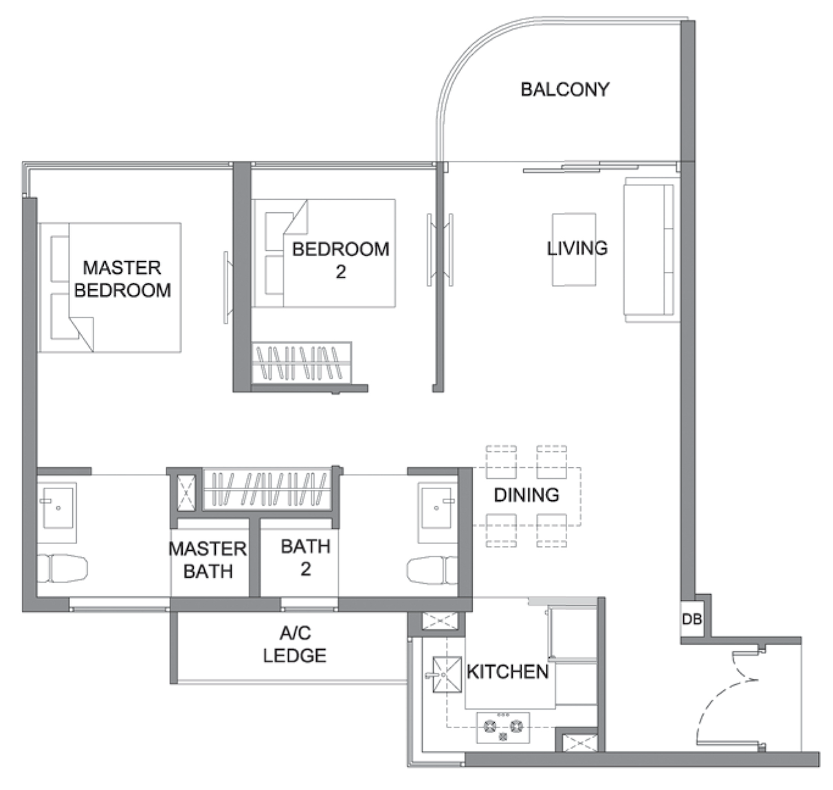
To Midwood’s credit, you’ll see that the 2-bedroom 2-bathroom layout is more efficient than Kingsford Hillview Peak’s 2-bedroom unit. While it does not have an enclosed kitchen like Kingsford Hillview Peak, it has a dumbbell layout which makes it more efficient.
There is also no unnecessary walkway into the master bedroom (though some might prefer that “exclusive” feel, I think it’s not too important for a 2-bedroom unit when space is already so precious).

That being said, Kingsford Hillview Peak quantum is still around 7% less. So even with a smaller size, the 2-bedroom 2-bathroom unit manages to cost more than its leasehold peer which isn’t that much older (in terms of lease), nor does it have a much more inferior facility compared to Midwood (Kingsford Hillview Peak has a rooftop tennis court and a ground level pool).
Kingsford Hillview Peak is a little bit further than Midwood to Hillview MRT, but the difference in distance is not too great to warrant concern in my opinion.
So just from this comparison alone, I would say that Midwood’s pricing is cutting it quite thin here. Buyers looking at Midwood would be forking out an amount that could be hard for future resale buyers to outbid, considering this leasehold alternative.
Next, we have The Hillier.
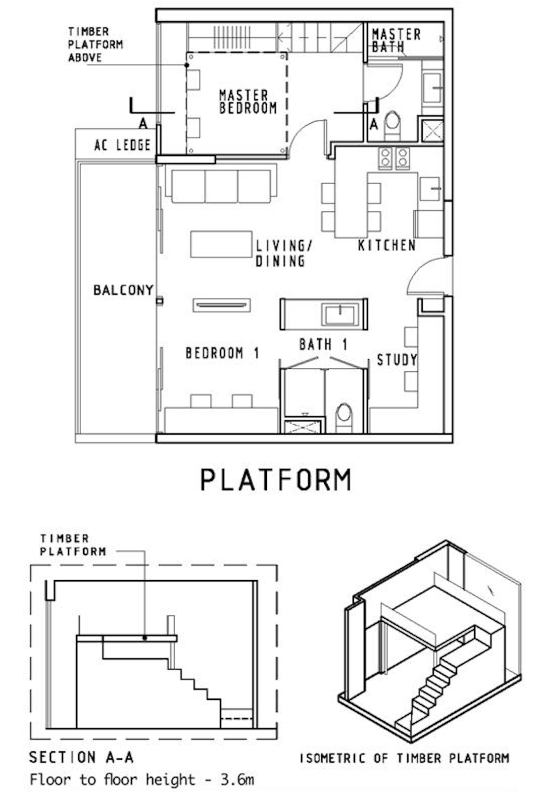
The layout at The Hillier is a little special. It is a loft + study one, so while the size is a lot bigger, it may not feel that much bigger in real life.
Loft-type units are not very popular today, particularly when the ceiling height isn’t high enough to give that lifestyle element that should come with a loft unit
But if we remove the loft component, what you would get is a 2-bedroom + study unit with a higher ceiling – and it’s still priced quite similarly to Midwood’s 2-bedroom 2-bathroom unit. Moreover, The Hillier has commercial elements downstairs, making it more convenient to reach shops and restaurants. It is also closer to Hillview MRT.
This does reinforce the point from before: future buyers may not mind a slightly older leasehold development that is bigger or has a separate study/higher ceiling/more convenient (in the case of The Hillier) if it’s priced cheaper, meaning that capital appreciation for Midwood’s 2-bedroom 2-bathroom units is looking less likely in the short-term.
So where does this leave us?
Midwood’s pricing is cutting it close to freehold alternatives that are bigger, while being priced slightly more than its leasehold competitors.
Judging from this, it’s in my opinion that the resale market may not be rewarding today’s buyer with a higher price next time – at least in the short-term. Freehold resale alternatives are not too far off, and would present itself as a mental barrier for future buyers of Midwood.
Appreciation Analysis
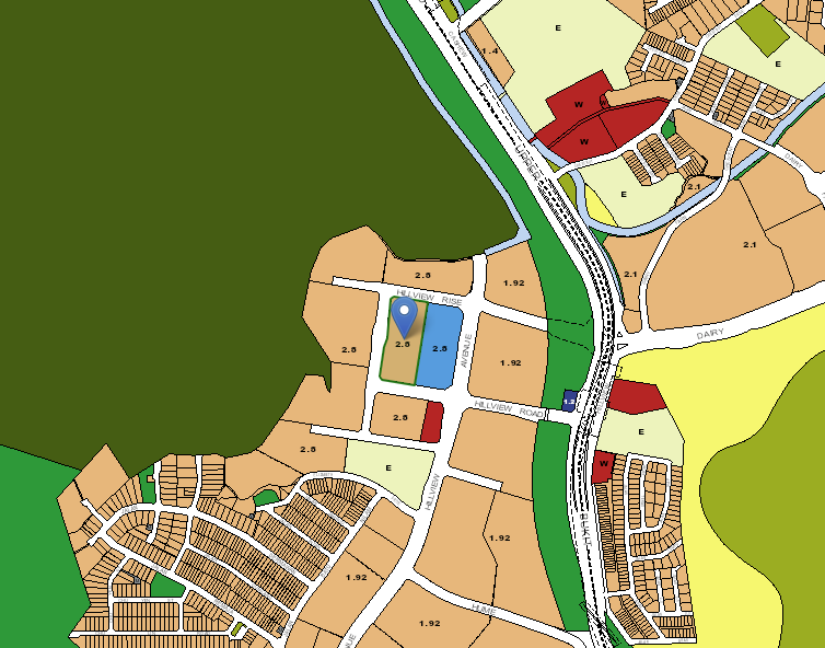
Beauty World Integrated Transport Hub
I can’t count the number of times I have overused this Beauty World Transport Hub transformation as part of my appreciation analysis. Whether or not this ends up being as hyped up as it was made out to be remains to be seen. For Midwood, it is actually 1 stop away from the actual transformation. Essentially, in the 2019 URA Masterplan, Beauty World is slated to become an integrated transport hub. This entails facilities such as a community club, hawker centre, sports hall and a condo which can house more than 800 units. This has led to solid demand in Beauty World projects such as The Linq @ Beauty World. I wouldn’t call Midwood the main beneficiary of this transformation as it is not exactly close to Beauty World when compared to the other D21 projects such as Verdale or Forett at Bukit Timah but it is still expected to generate renewed interest when the transport hub is finally ready.
Tengah Masterplan
The Tengah Masterplan involves an area of 700 hectares, which is almost the size of Bishan and is expected to be fully developed by 2036. The aspiration is for the area to be Singapore’s first car-free town centre with more than 42,000 new homes. Midwood is, of course, some distance away from Tengah and moreover, it will take time before the entire precinct is fully developed. The idea is for the demand for private condos to spill over from the HDB upgraders from the peripheral areas, including Tengah in the future.
Future Residential Plots
A simple count on the Master Plan will reveal 6 residential plots that could come up in the future. Broadly speaking, this could be seen as a good thing for the future prices in the area as these usually will need to be priced higher given the competition for land costs. Some may point out there could be a potential oversupply of residential in the area – and that is a common train of thought in the neck of the woods.
What we like
- Close to nature (Little Guilin and Dairy Farm Nature Park)
- 80% of land dedicated to facilities and landscaping
What we don’t like
- –Restricted views for high floor units
- –No direct unit access from the carpark
- –Distance from the CBD
Our Take
I’ll start with what I like about Midwood. I really appreciate the privacy and space offered by the 120m distance between the 2 towers and having 80% of the land dedicated to facilities and landscaping. Living close to greenery and nature parks are also a big upside for me as it transports you away from the hustle and bustle of city living.
And while it is in an area that has been traditionally seen by some as too far out, the addition of the Downtown line and amenities from the mall next door does go a long way in making the area a lot more liveable.
However, I am conscious that the Hillview area might just have one too many condo developments with little to differentiate between them. While Midwood is close to the MRT, there are additional GLS sites that will be launched in the near future, adding to the worries of an oversupply. Moreover, I find that there is a lack of a concrete growth story for Hillview (for now at least) as the focus in the West seems to be on areas such as Beauty World, Jurong and Tengah.
The market has also not responded too well to the pricing of Midwood, with the response at launch lukewarm at best. It has only picked up in recent weeks, but that could also be attributed to most of the new launches in other areas selling out of the better units – and the demand for affordable pricing has slowly moved out to the further located new launches.
Overall, Midwood is very much an own stay product. For folks who have grown up in the West, Hillview is a quiet and private residential estate close to nature. Its relatively smaller sizes also makes the quantum more palatable to a wider group of buyers. If you are able to look past some of the points mentioned in this review, Midwood could well be worth a look for you.
What this means for you
You might like Midwood if you:
-
• Appreciate being near nature:
Midwood’s location close to Bukit Timah Nature Reserve and Dairy Farm Nature Park will allow nature lovers to soak in the sights and sounds without having to travel too far
-
• Looking for an affordable condo entry:
Midwood’s smaller unit sizes for an OCR development makes its quantum more affordable
You may not like Midwood if you:
-
• Work in the CBD:
Location wise, Midwood is not great for those working in Central Singapore, especially if you are driving in during peak hours
-
• Require carpark-to-unit access:
The lack of direct unit access from the carpark means residents will have to walk from the multi-storey carpark to their respective blocks. Unacceptable and very uncondo-like!
End of Review
At Stacked, we like to look beyond the headlines and surface-level numbers, and focus on how things play out in the real world.
If you’d like to discuss how this applies to your own circumstances, you can reach out for a one-to-one consultation here.
And if you simply have a question or want to share a thought, feel free to write to us at stories@stackedhomes.com — we read every message.
Frequently asked questions
What is the location and address of Midwood condo?
Midwood is located at 8, 10 Hillview Rise in District 23.
When was Midwood completed and what is its tenure?
Midwood was TOP in the first quarter of 2023 and has a 99-year lease starting from October 1, 2018.
How many units does Midwood have and what is its site area?
Midwood has 564 units and sits on a site area of approximately 153,882 square feet.
What are some notable design features of Midwood?
Midwood features extensive privacy screens, large spacing between towers (120m apart), and a nature-themed landscape with green landscaping and planters.
What facilities are available at Midwood for residents?
Facilities include a 50m infinity lap pool, a gym, children’s pool and playground, BBQ pavilions, multiple lap pools, a hydrotherapy pool, a tennis court, clubhouse, lawns, and function rooms.
What are the types of units available and their features?
The development offers units like a 1-bedroom + study (549 sqft), with efficient layouts, high ceilings of 2.8m, and appliances from Electrolux. The units are designed to be compact and functional.
Our Verdict
75%
Overall Rating
A more affordable home that's close to nature
Midwood presents an opportunity for buyers to own a more affordable home in the OCR considering the smaller unit sizes here. However, drivers would be disappointed with the lack of direct carpark-to-unit access.
Join our Telegram group for instant notifications
Join Now








0 Comments