This week, we join homeowners Joel and Felicia as they walk us through their beautifully renovated Hillview resale condo. Spanning 1,313 square feet, this condo has been meticulously reimagined from a dated, unit riddled with mould into a stylish home.
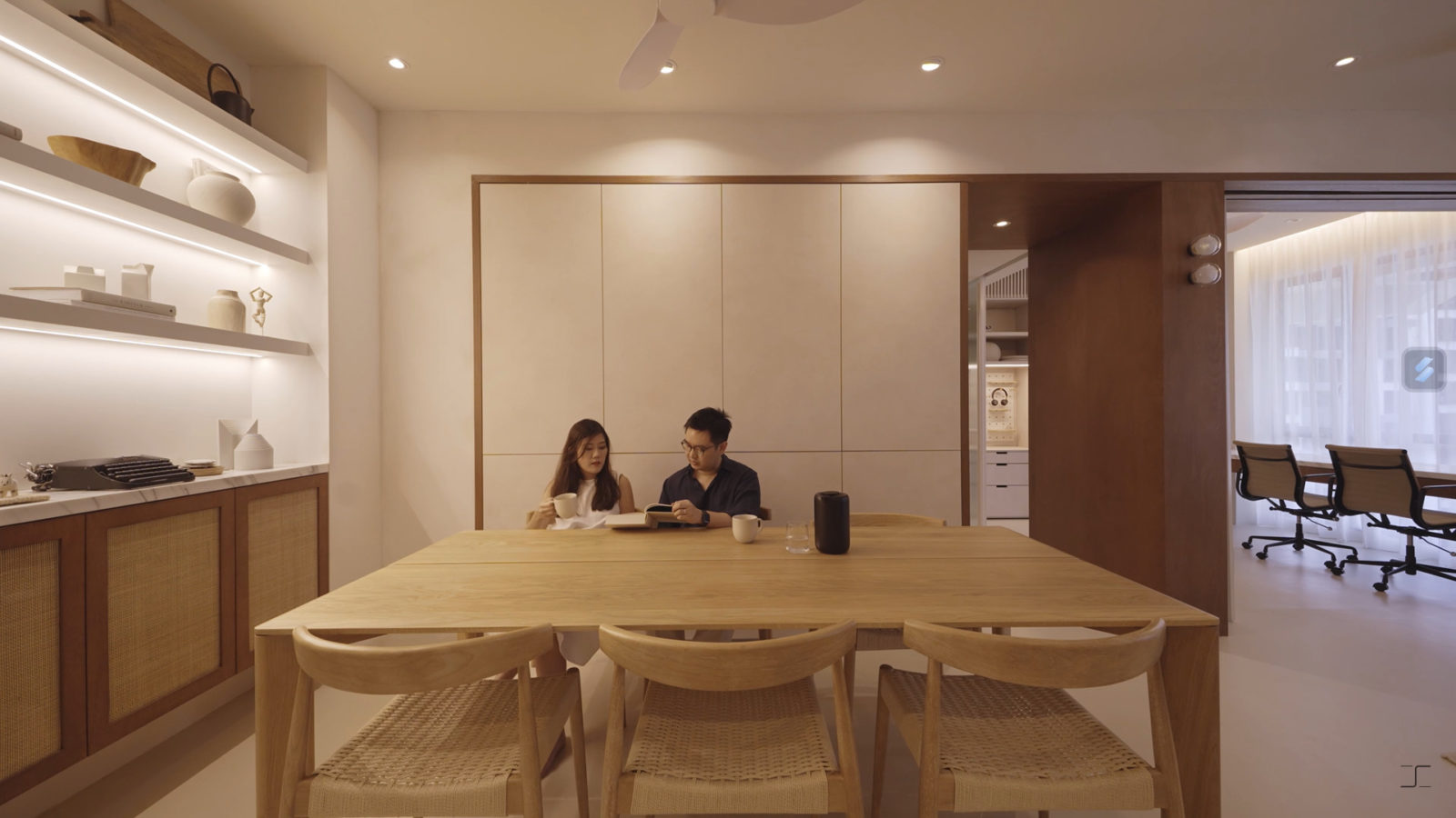
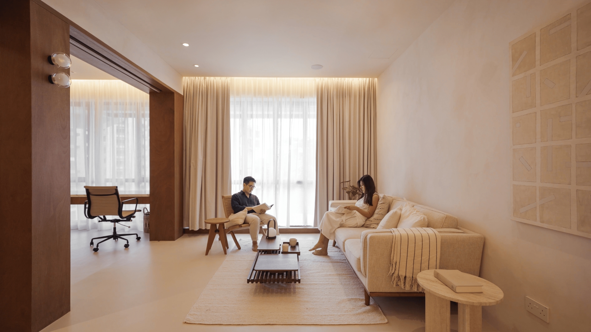
Bathed in a neutral colour palette, the home showcases tastefully chosen materials such as natural stained plywood, microcement floors, and rattan. Fluted glass elements can be found throughout the house, adding a touch of sophistication.
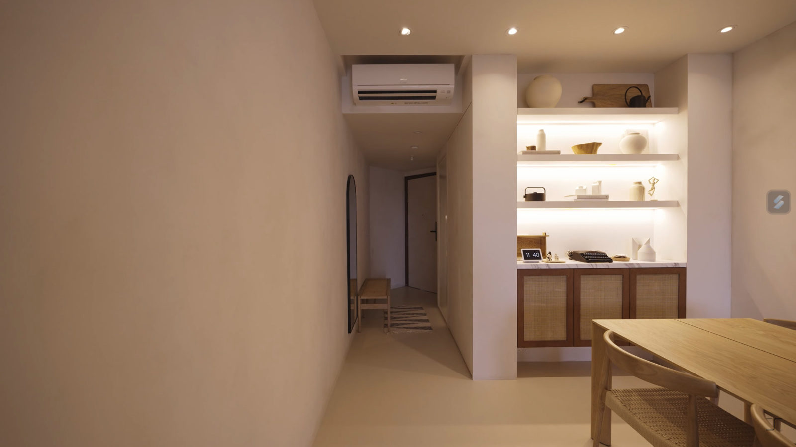
Upon entering, visitors are greeted by a narrow but inviting entranceway. As one progresses further into the living/dining area, the space opens up, accentuated by a dramatic ceiling that reaches a height of 3.8 metres.
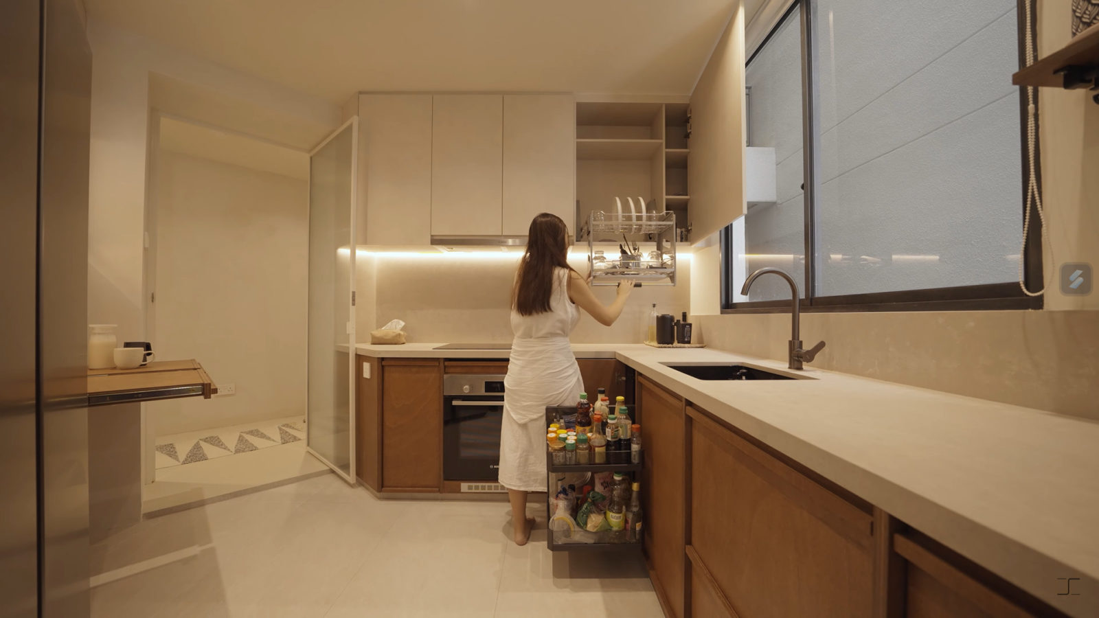
The couple first tackled the awkwardly angled kitchen, reconfiguring it into a functional rectangular space. The remodeled kitchen now boasts pull-out drawers for extra countertop space and smart corner storage, along with a useful pull-down dish dryer rack.
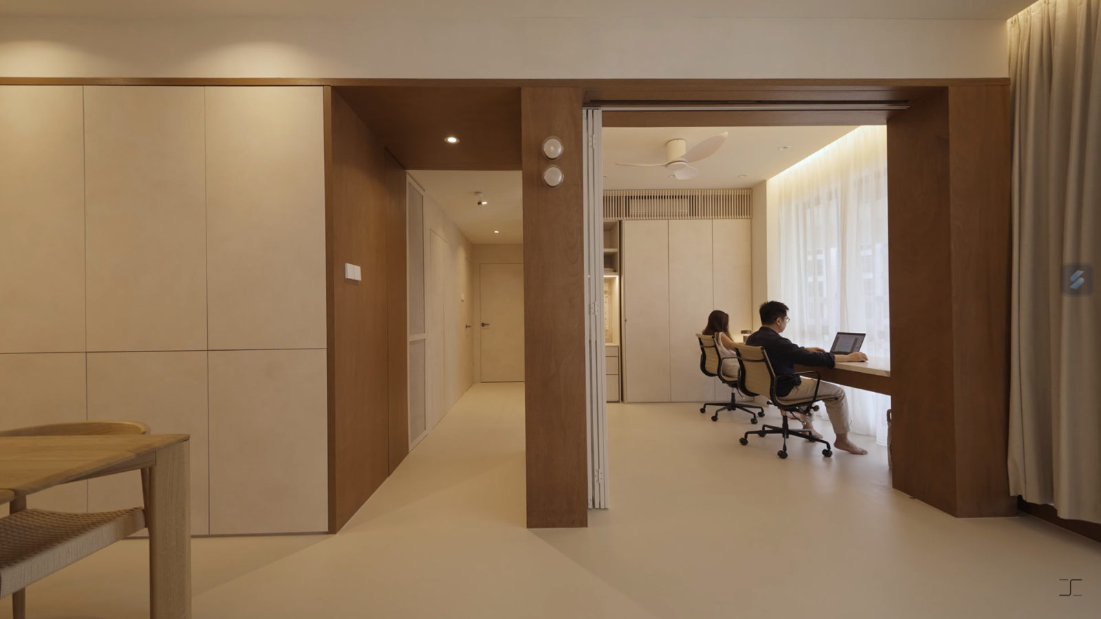
In their quest to create an expansive living room, Joel and Felicia decided to repurpose the first common bedroom into an open study. The removal of walls has facilitated a panoramic view of the windows, flooding the area with natural light. This vibrant space is also home to Joel’s favourite feature – a marble study table suspended between two columns.
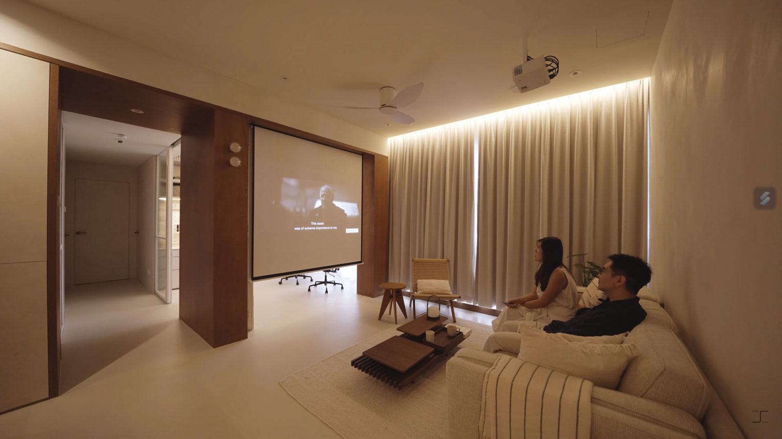
For entertainment, the couple initially decided against a TV. However, they later integrated a projector into the design, complete with a retractable screen situated between the study and living room.
The separate dining area ingeniously incorporates storage units flush with the walls. Similarly, the study area optimises space with a pocket door storing Felicia’s art supplies in movable, roller-set cabinet drawers.
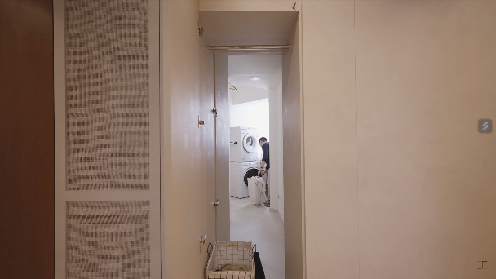
One intriguing feature of this home is the secret laundry compartment nestled within the corridor, offering easy access from both sides – the corridor and the yard area.
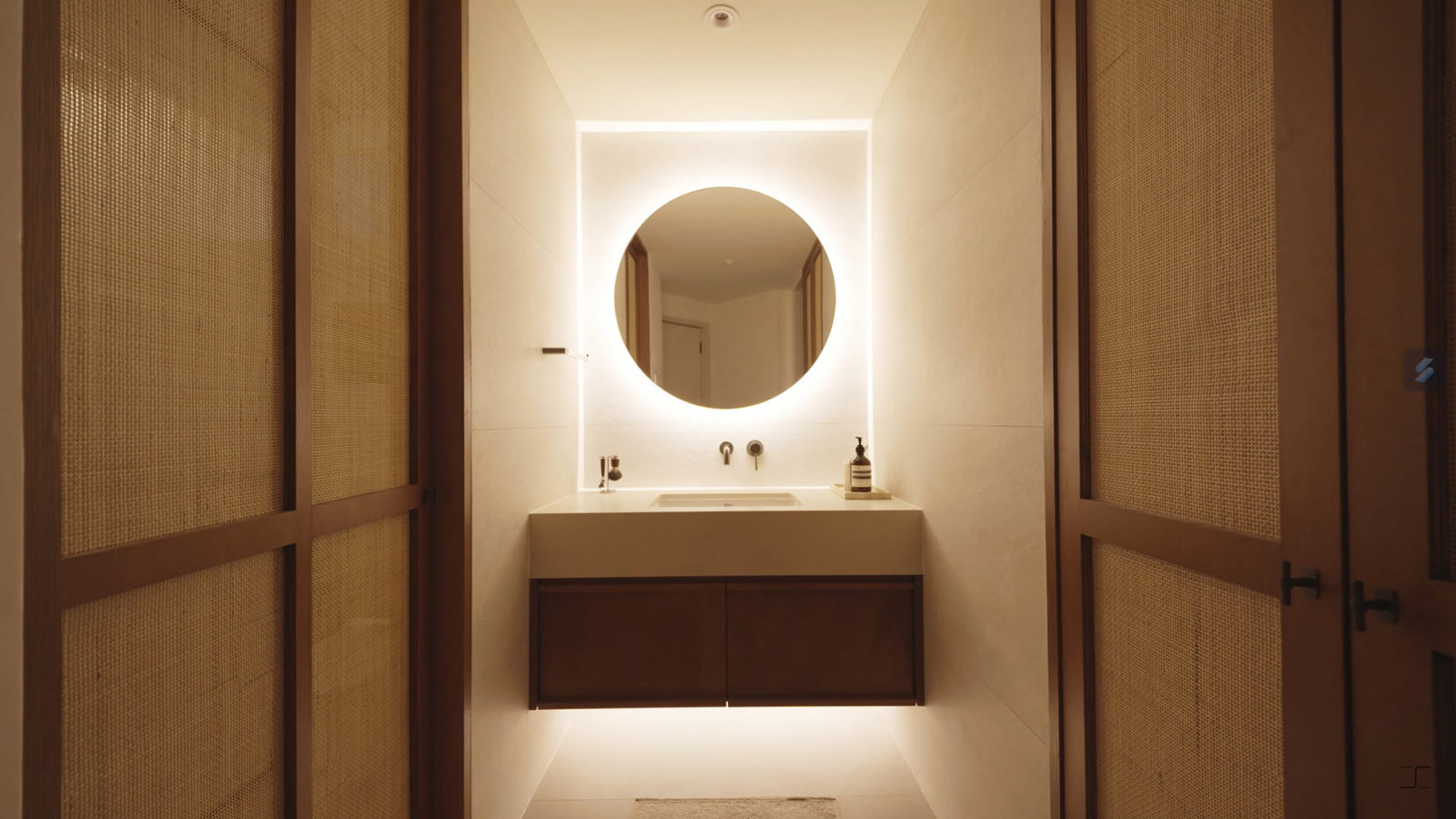
The continuity of design is maintained in the bathroom, which features the same tiles used in the kitchen. Meanwhile, the master bedroom emulates the ambience of a hotel suite. As you step in, a glowing mirror vanity sets the mood. The bedroom includes a practical dresser and a flip-up countertop with a powerpoint for a hairdryer and make-up products.
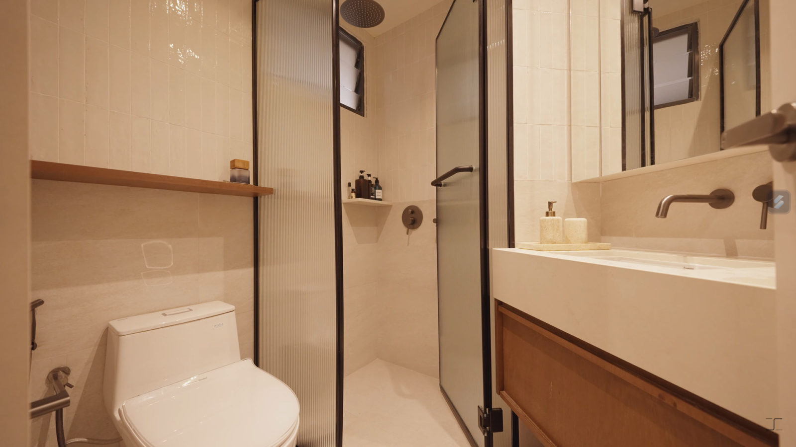
Swapping the original bathtub for a standing shower area, the homeowners achieved their vision of blurring the boundaries between the bedroom and bathroom.
Special thanks to the homeowner for letting us tour their lovely home. If you’d like to get connected to their ID for the design of your own home, you can reach out to them via this link: https://bit.ly/stacked-quarters-architects. Successful projects get a $500 Stacked Store voucher!
At Stacked, we like to look beyond the headlines and surface-level numbers, and focus on how things play out in the real world.
If you’d like to discuss how this applies to your own circumstances, you can reach out for a one-to-one consultation here.
And if you simply have a question or want to share a thought, feel free to write to us at stories@stackedhomes.com — we read every message.
Need help with a property decision?
Speak to our team →Read next from Home Tours
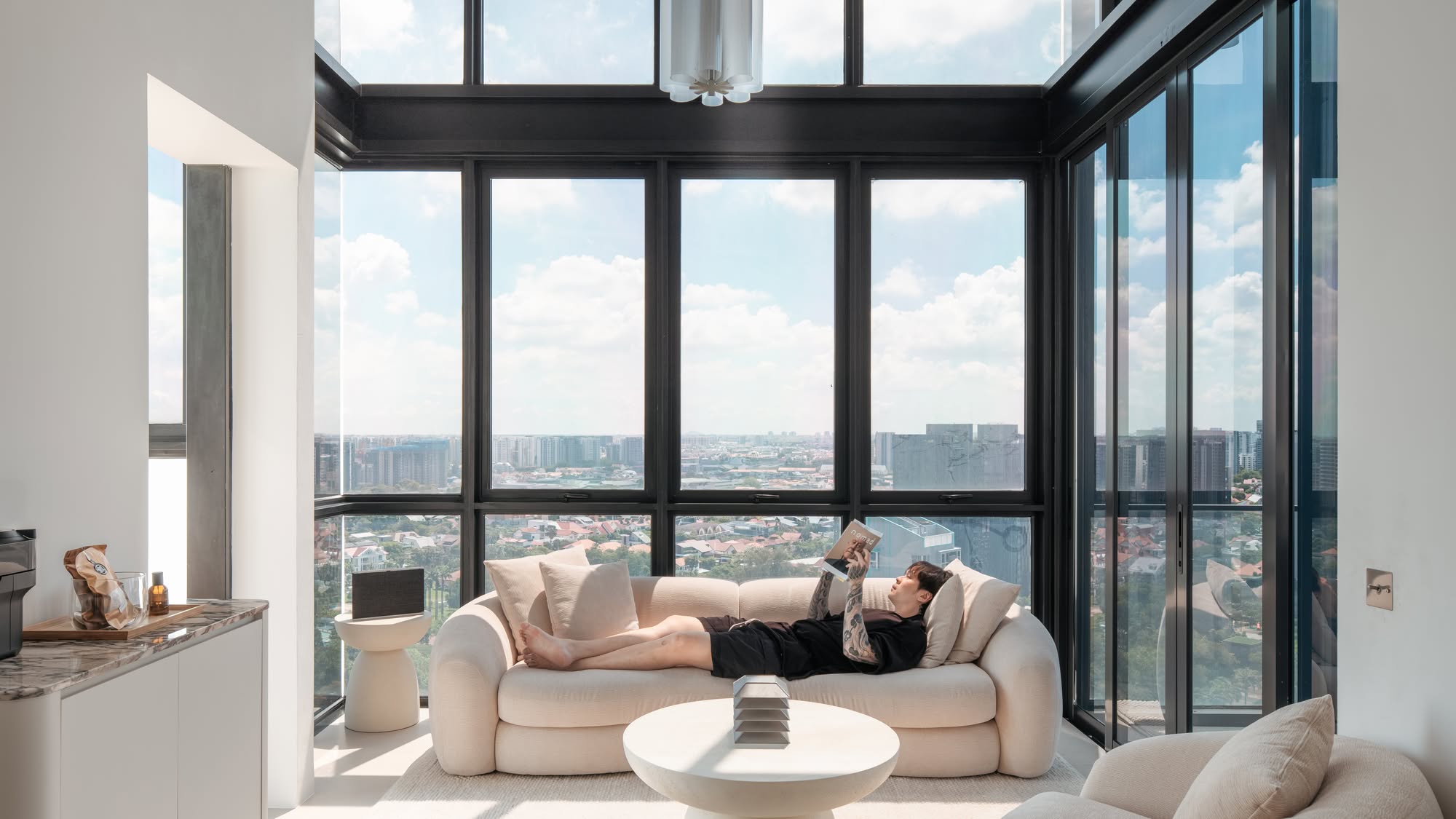
Home Tours Inside A Minimalist’s Tiny Loft With A Stunning City View
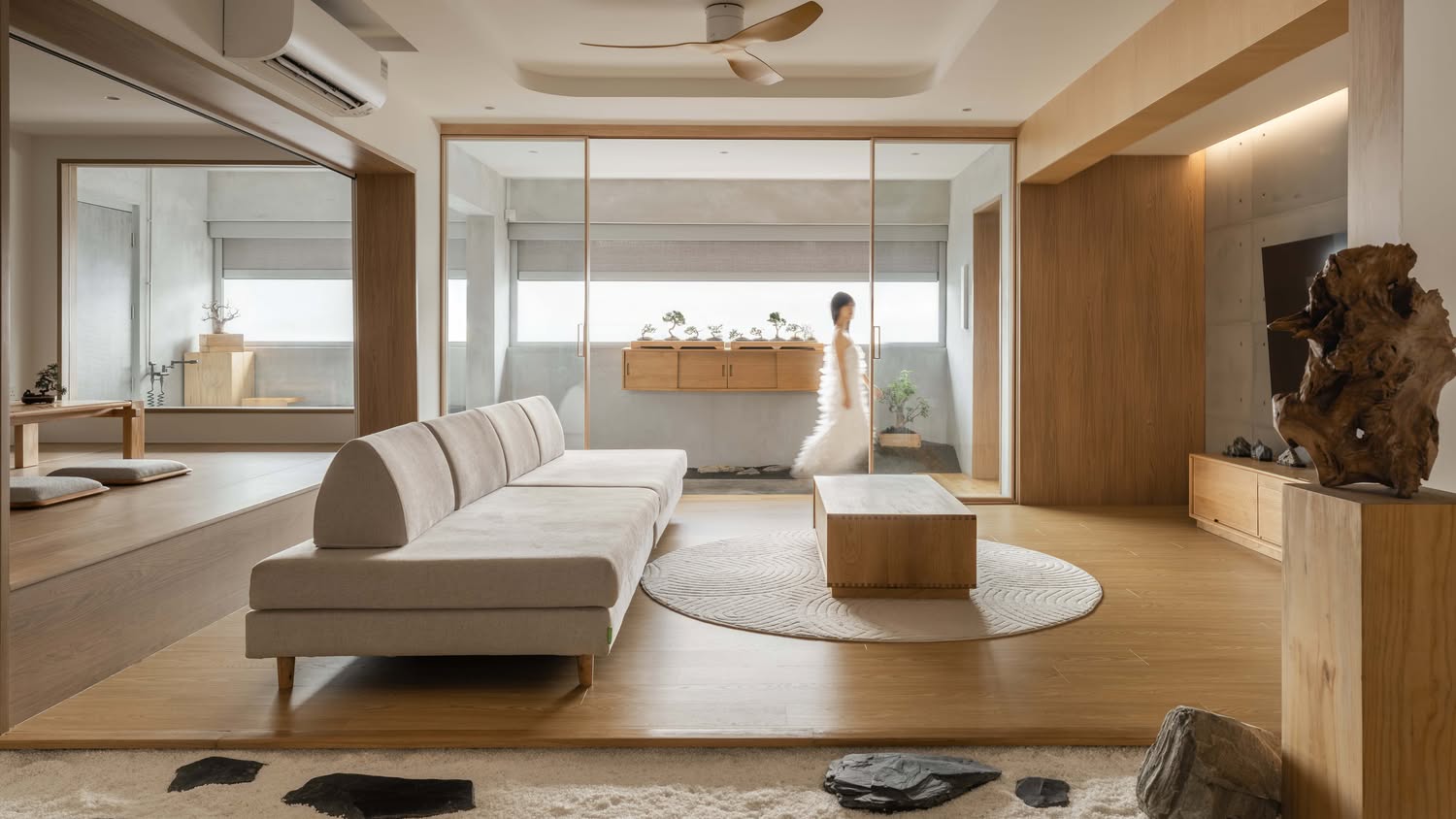
Editor's Pick This Beautiful Japanese-Inspired 5-Room HDB Home Features an Indoor Gravel Garden
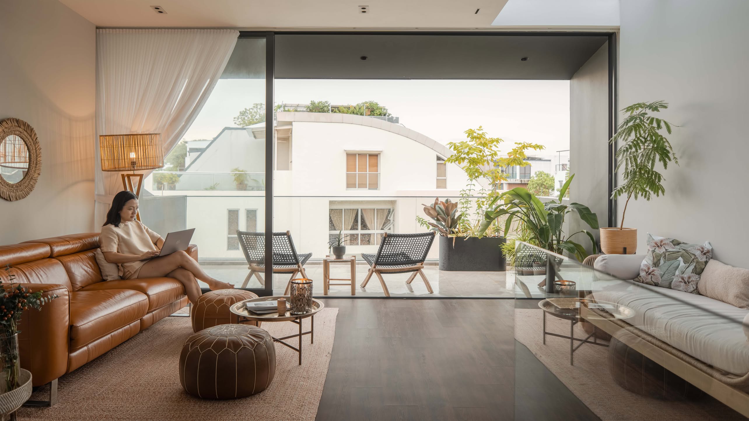
Home Tours A Family’s Monochrome Open-Concept Home with Colour Accents
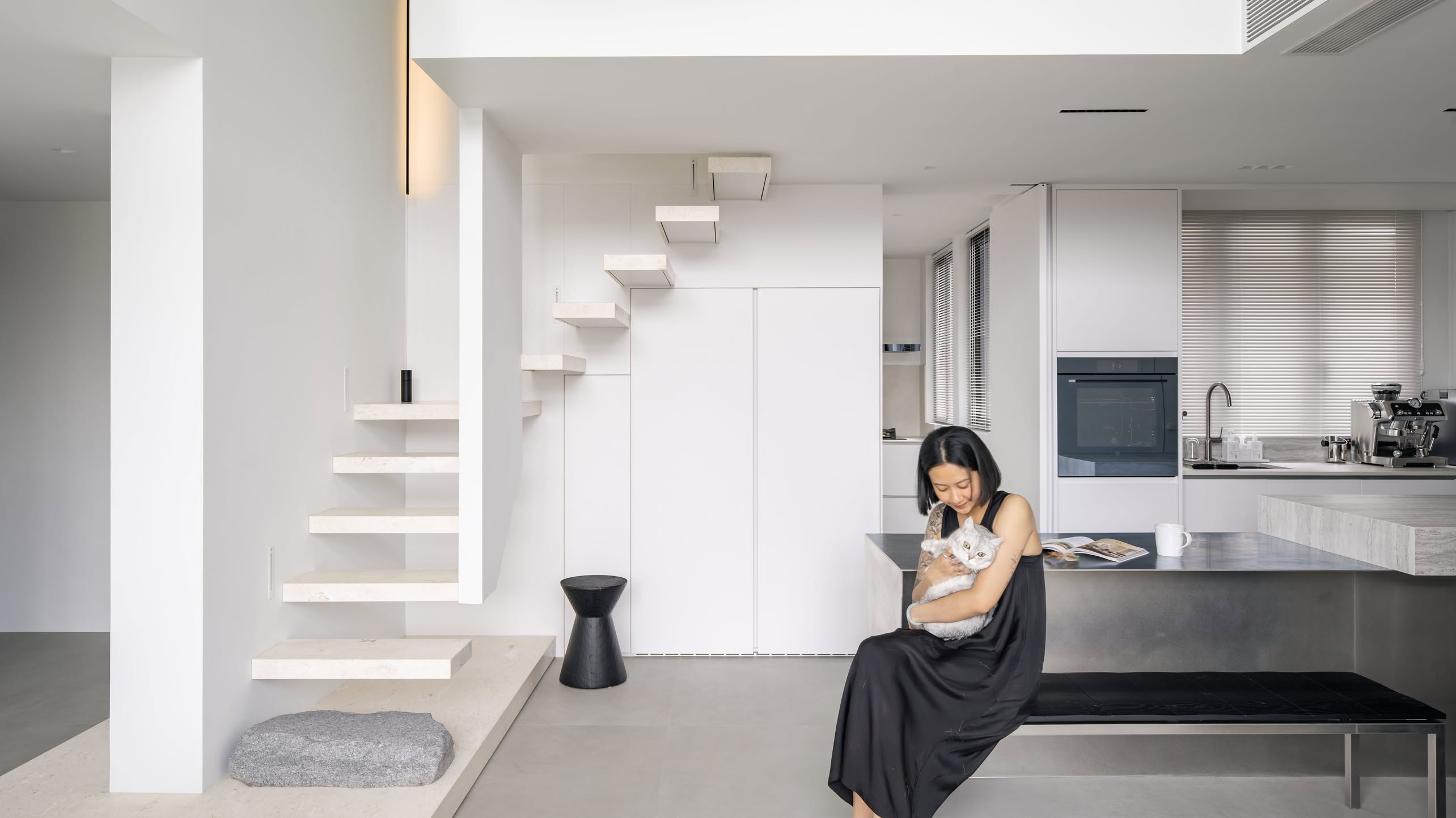
Home Tours A Bright Minimalist Condo Apartment With A Loft
Latest Posts

Singapore Property News HDB Resale Prices Fell — But A Third Of Buyers Still Paid $800K+ Last Quarter. Here’s Why

Singapore Property News Three Strata Office Floors In Suntec Priced From $135M

Singapore Property News This Freehold Desker Road Shophouse Is Going For $10.5M




















0 Comments