All reviews on Stacked are editorially independent. Developers can advertise with us, but
cannot
pay
for,
edit, or preview our reviews.
Editor's Pick
Chuan Park Condo Review: First Lorong Chuan Launch Since 2011 + Very Close MRT Access
November 4, 2024 30 min read
| Project: | Chuan Park |
|---|---|
| District: | 19 |
| Address: | 240 – 250 Lorong Chuan |
| Tenure: | 99 Years |
| No. of Units: | 916 |
| No. of Carpark Lots: | 740 Lots |
| Site Area: | ~400,588 sqft |
| Developer: | Chuan Park Development Pte Ltd (Kingsford Development) |
| TOP: | Est. 2028 |
Chuan Park has been a topic of conversation ever since its en bloc sale started circulating back in 2021. Given its sheer size and prime location between the highly sought-after Serangoon and Bishan areas, it’s no surprise it attracted plenty of attention.

Originally completed in 1984/85, the old Chuan Park consisted of 446 residential units and two commercial ones. It took four attempts, but the en bloc finally came through on July 5, 2022, at $890 million – just 5% shy of the original $938 million asking price. For those keeping track, this puts the estimated breakeven at around $2,229 psf ppr.
As expected with en bloc redevelopments, construction costs are higher due to the need for demolition. Additionally, Chuan Park won’t fall under the new GFA harmonisation guidelines, which is something to keep in mind.
But I suppose what most people are looking forward to about Chuan Park is that it is a mega-development, something that has been very popular among Singaporeans.
The last one that comes to mind is Grand Dunman, a 1,008-unit mega-development.
By the end of its launch weekend, nearly 55% of the units were snapped up, quite a strong take-up for a project of that scale considering it faced competition from nearby projects like Tembusu Grand and The Continuum.

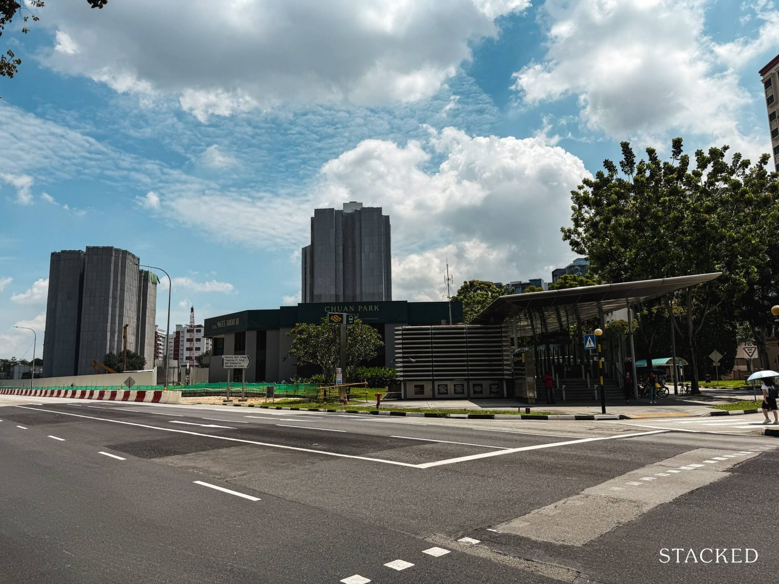
So drawing some parallels to that, Chuan Park checks all the same boxes, including its doorstep access to Lorong Chuan MRT. While it’s not fully integrated, it’s about as close as it gets. That said, nearby resale condos also offer easy access to the MRT, so this isn’t exactly a standout feature in the area.
What sets Chuan Park apart is that it will be the first new launch Lorong Chuan has seen in 13 years.
When we look at the strong sales performances of Norwood Grand, AMO Residences and J’Den – all of which saw impressive launch-day sales of 84%, 98% and 88% respectively, the common thread is obvious. Projects in areas with limited supply, pent-up demand, and close MRT proximity have a winning formula.
With Chuan Park leading the way ahead of more GLS sites expected in Lorong Chuan from 2025, there will be more changes to the area in the near future.
And so with a bumper crop of 6 new condo launches to kick off November, let’s first take a look at what Chuan Park has to offer.
So many readers write in because they're unsure what to do next, and don't know who to trust.
If this sounds familiar, we offer structured 1-to-1 consultations where we walk through your finances, goals, and market options objectively.
No obligation. Just clarity.
Learn more here.
Chuan Park Condo Insider Tour

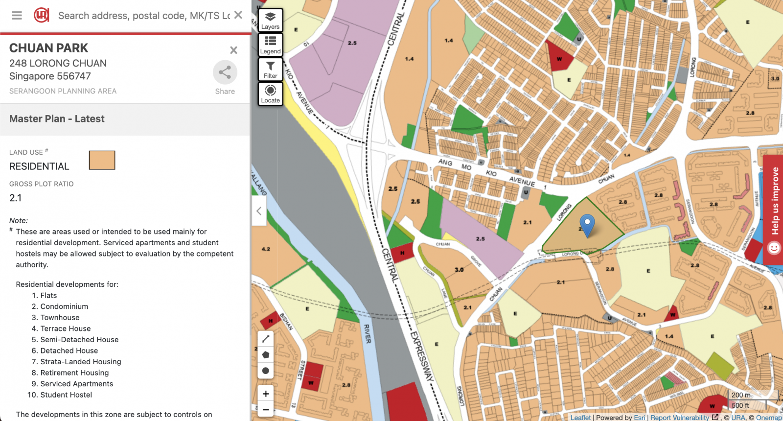
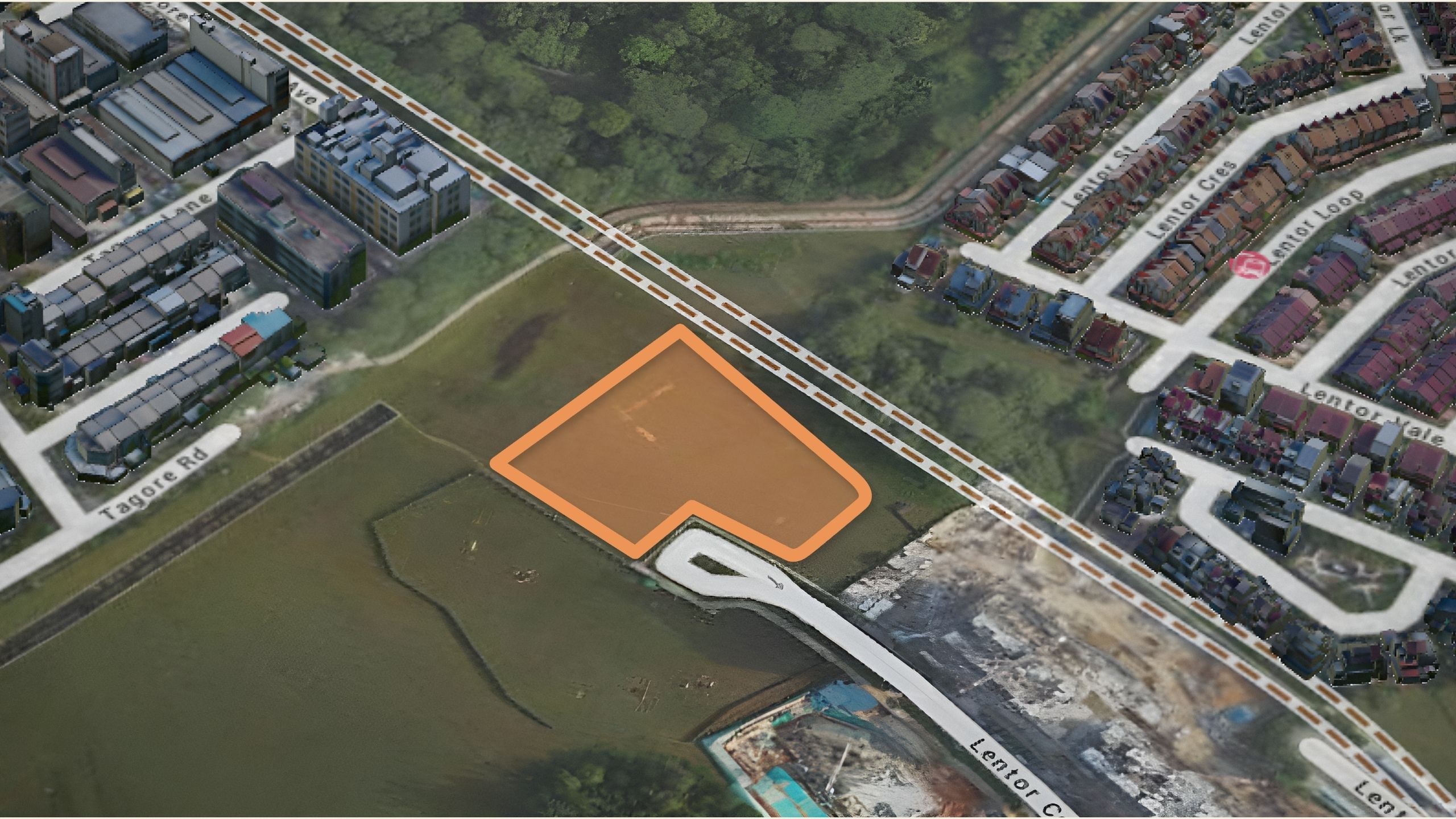
At a sprawling 400,588 square feet, Chuan Park boasts the largest plot in the Lorong Chuan area, with the older Chiltern Park trailing behind at around 376,000 square feet.
Mega projects often come with the assumption of high-density living, and to a certain extent, that’s true.
If we compare with other major launches like Grand Dunman (269 square feet of land per unit), Treasure at Tampines (295 square feet of land per unit), Avenue South Residences (229 square feet of land per unit), Normanton Park (358 square feet of land per unit), and Jadescape (330 square feet of land per unit), it’s clear that spaciousness isn’t the main draw for mega projects.
Chuan Park, however, offers a comparatively generous 437 square feet of land per unit – giving it a little more breathing room than the aforementioned developments.
But if we were to compare it to older developments nearby, Chiltern Park provides around 752 square feet of land per unit, The Springbloom offers 703 square feet, and The Scala has 319 square feet of land per unit.
So while Chuan Park is more spacious than other mega-developments in Singapore, it still pales in comparison to some of its more mature neighbours.
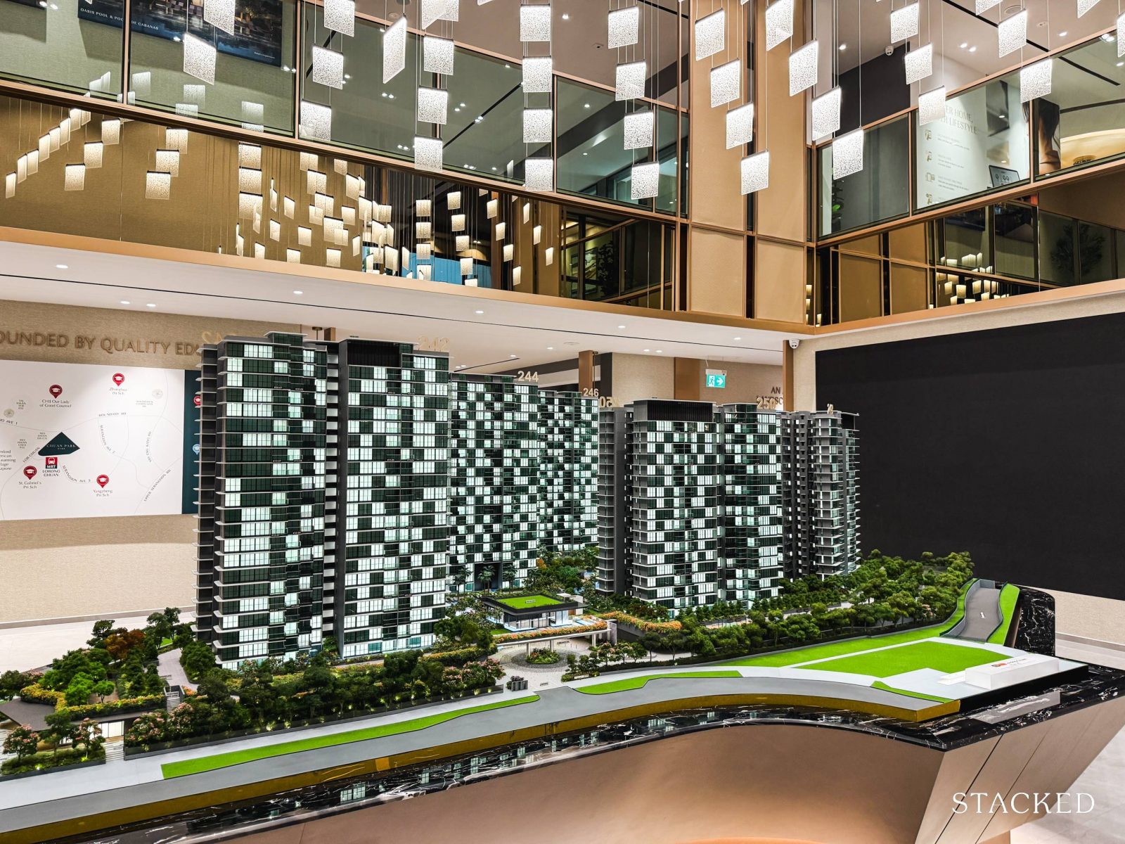
Before we jump into touring the amenities, let’s take a moment to talk about Chuan Park’s facade.
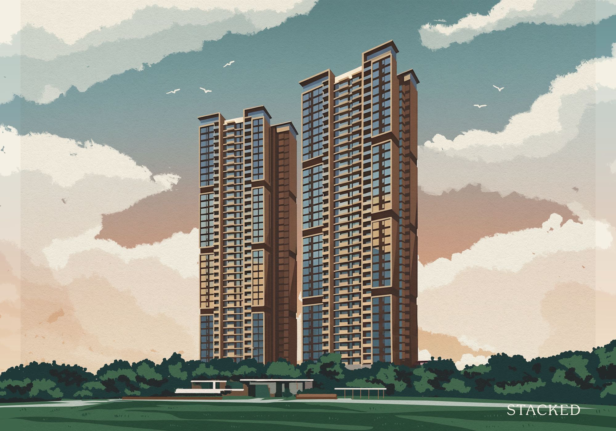
Designed by AGA Architects (the same team behind Ola EC and Queens Peak), the design doesn’t really stand out for me. Sure, it looks modern, especially when you compare it to the older condos around it. But in terms of having a groundbreaking or exciting design, it doesn’t tick those boxes. And to be fair, I don’t expect buyers of this category to care too much. What’s probably more important, is the unit layout, and the design of the grounds and facilities.
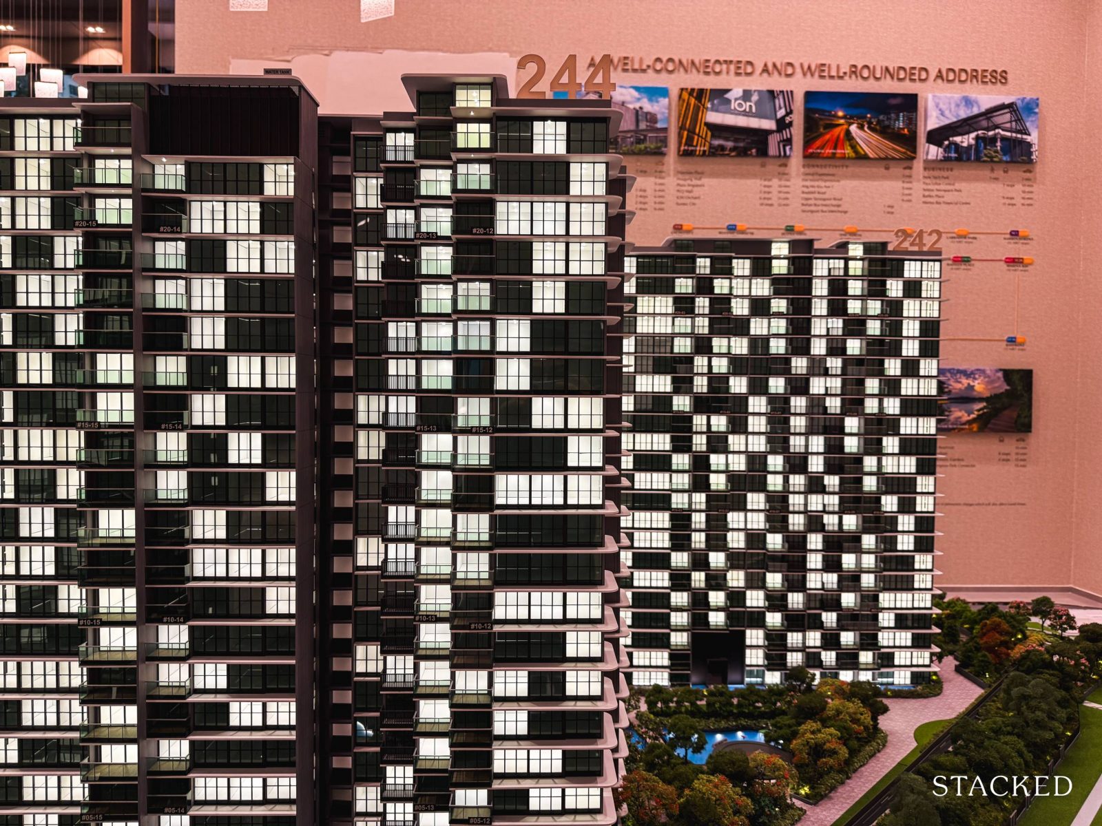
Where it fares better is the overall design of the grounds. Throughout the development (which we’ll dive into later), you’ll find organic elements woven into the design – think trees, winding valleys, streams, waterfalls, and a serene lake.
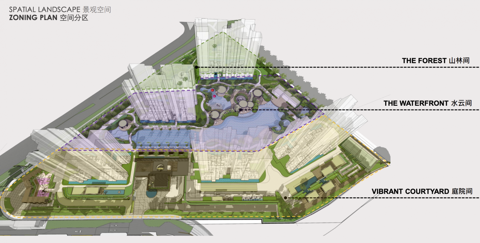
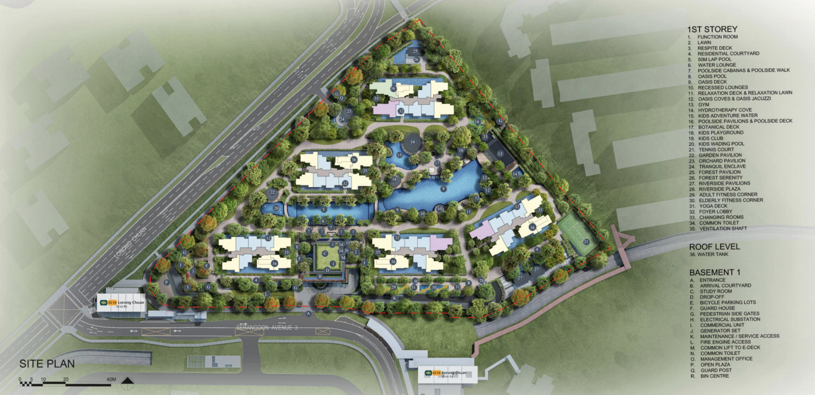
It’s all very big, and so to help orientate you better, the site is divided into three distinct zones: the vibrant courtyard that greets you at the entrance, a central waterfront section, and a calming forest space at the far end for a more tranquil retreat.
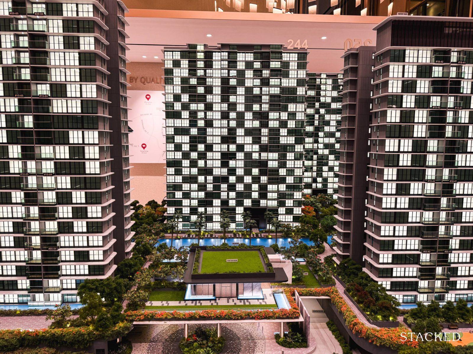
One standout feature is the layout of Blocks 242, 244, and 246, positioned diagonally to maximise those views of the landed enclave.
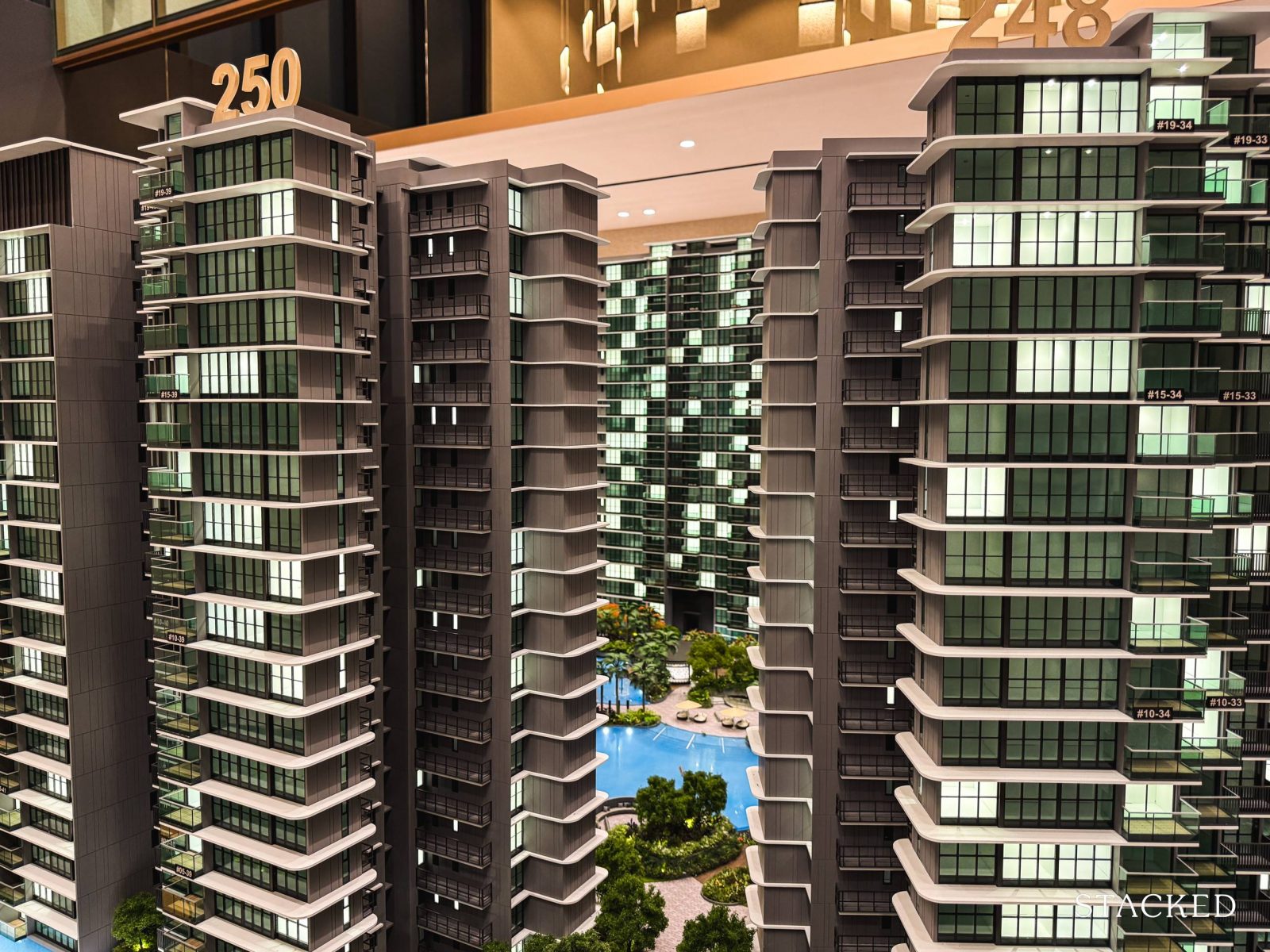
While developers prefer the efficiency of a squarish plot to maximise space usage, Kingsford has tried to make the most out of the triangle-shaped plot of Chuan Park.
As such, even the inward-facing stacks manage to enjoy a certain degree of unblocked views.
And when it comes to the distance between the blocks, it holds up well to modern standards. Most stacks are separated by a solid 29 metres, with the closest distance being about 16 metres between Blocks 248 and 250 – giving residents a decent amount of breathing room (especially for a mega project).
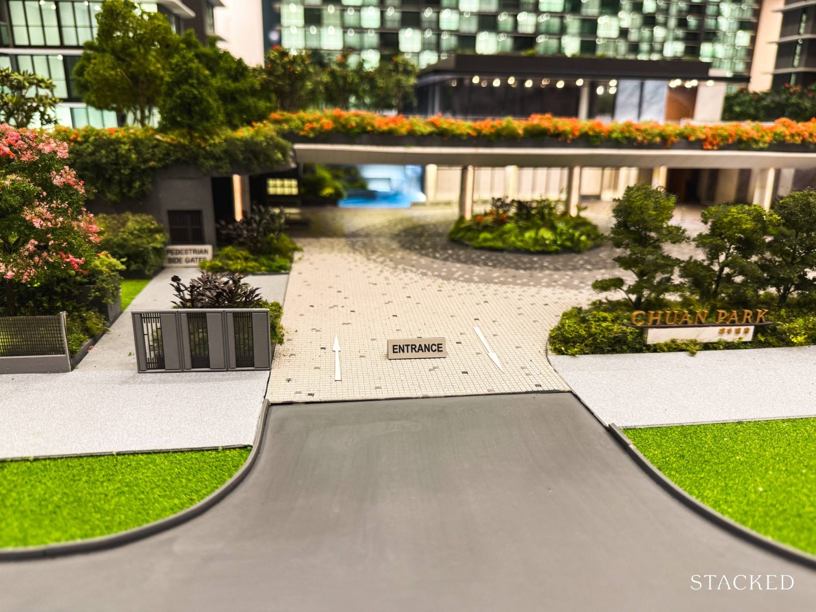
Next let’s look at the entrance of Chuan Park, which is important to consider when it comes to a mega-development as traffic can be heavy as a result of the large number of units.
Residents will enter via Serangoon Avenue 3, where a sheltered arrival courtyard sets a welcoming tone right from the start. For those on foot, the main pedestrian side gate is also situated here.
On that note, some might be concerned that there is only one ingress to such a huge project (with two exits). While it’s not ideal, this seems to be the norm for most of today’s mega launches, as seen from Avenue South Residence and Grand Dunman.
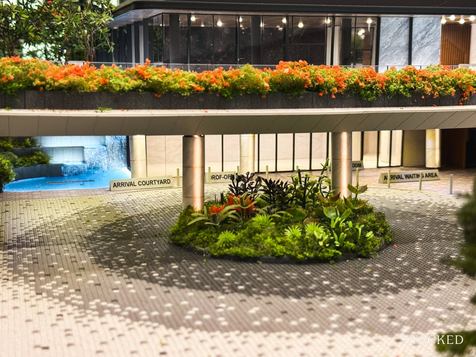
Chuan Park’s arrival doesn’t break new ground – it’s a fairly standard setup, as you’d expect from most new launches today. However, the developers have made a conscious effort to elevate the ambience with lush greenery and a water fountain feature, giving the space a more welcoming feel.
What’s a little odd here is that there’s a study room here too. While that would come in handy for school-going children, that wouldn’t be the first thing I would expect to see generally.
For those wondering about parking, Chuan Park offers a basement carpark with 740 lots, including 7 accessible spaces. While there’s no confirmation yet on dedicated EV charging lots, the electrical wiring has already been installed – meaning the development is future-proofed and ready to accommodate EV. I suppose there should be a couple of lots being installed, as I can’t fathom how this could be missed out given the EV adoption rate in Singapore so far.
The number of car park lots here does fall short of a 1:1 ratio, with 916 units and 740 lots. However given the direct access to Lorong Chuan MRT and that nearly half the development consists of 2 bedders, this seems like a reasonable number.
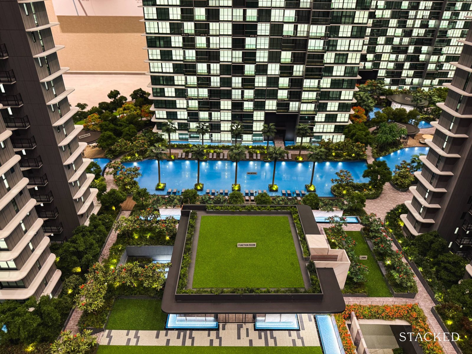
Now, let’s move on to the first (and largest) section of the project, the Vibrant Courtyard.
The Vibrant Courtyard houses most of the sports amenities, with one of the highlights here, the function room. It’s split into two separate spaces for booking, which does feel a bit modest considering the 916 units in the development. If you’re planning to host gatherings or events during festive seasons, early bookings are essential!
Compared to a development like Avenue South Residences, which has 1,074 units and offers eight function rooms despite being on a smaller site, Chuan Park’s two function rooms might feel underwhelming.
Adjacent to these rooms is the open lawn – one of the many green pockets that help the space feel more open.
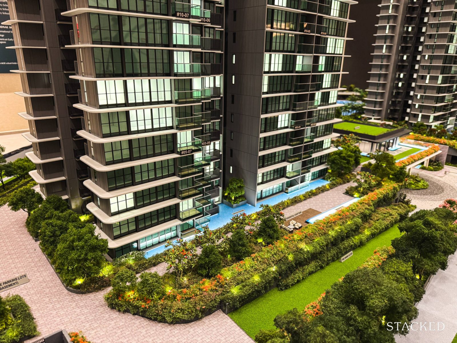
Heading to the left side of the project, there’s a noticeable focus on open courtyards that cleverly double as functional spaces.
You’ll find the resident courtyard here, along with a neatly landscaped fire engine access area that doubles up as a lawn, which makes it pleasing to the eye.
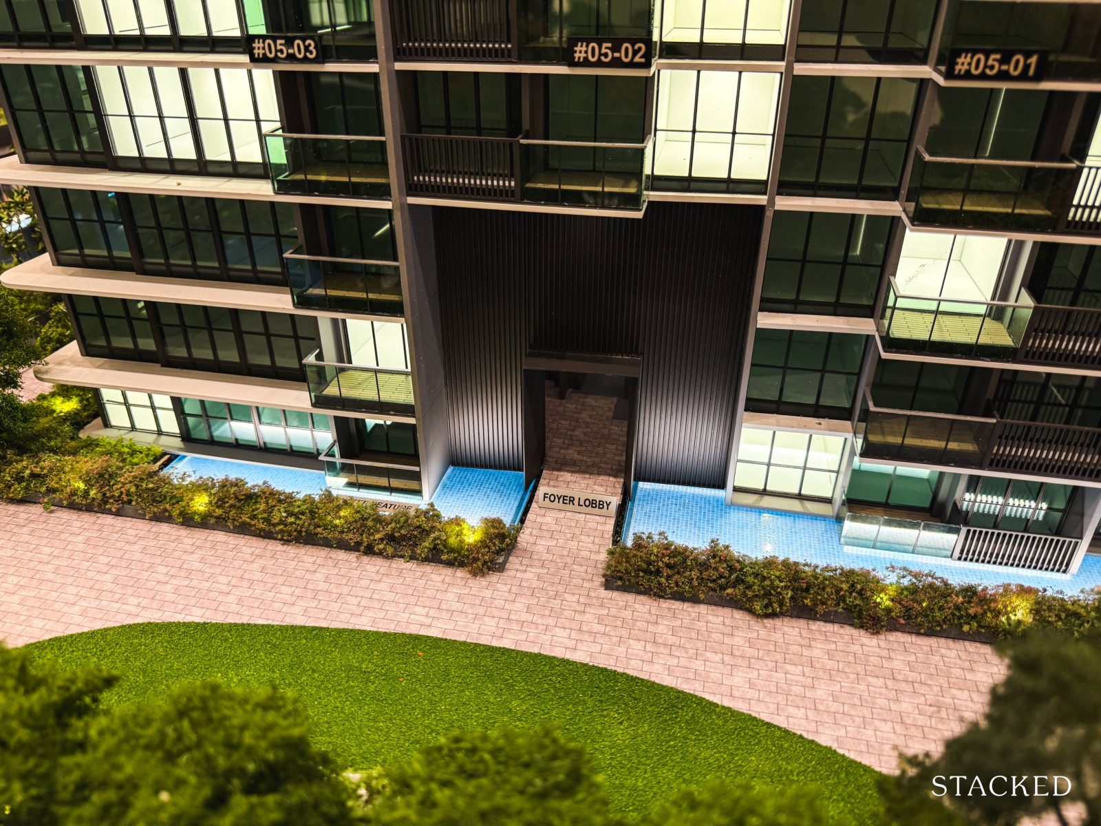
It’s from here that you’ll see that every balcony unit on the ground floor is enveloped with a water feature. While there’s certainly going to be more upkeep in the long run, it does help to create a small privacy barrier around the ground-floor units.
That said, some people may just prefer to have direct access to the grounds instead of such a layout – so this could be subjective.
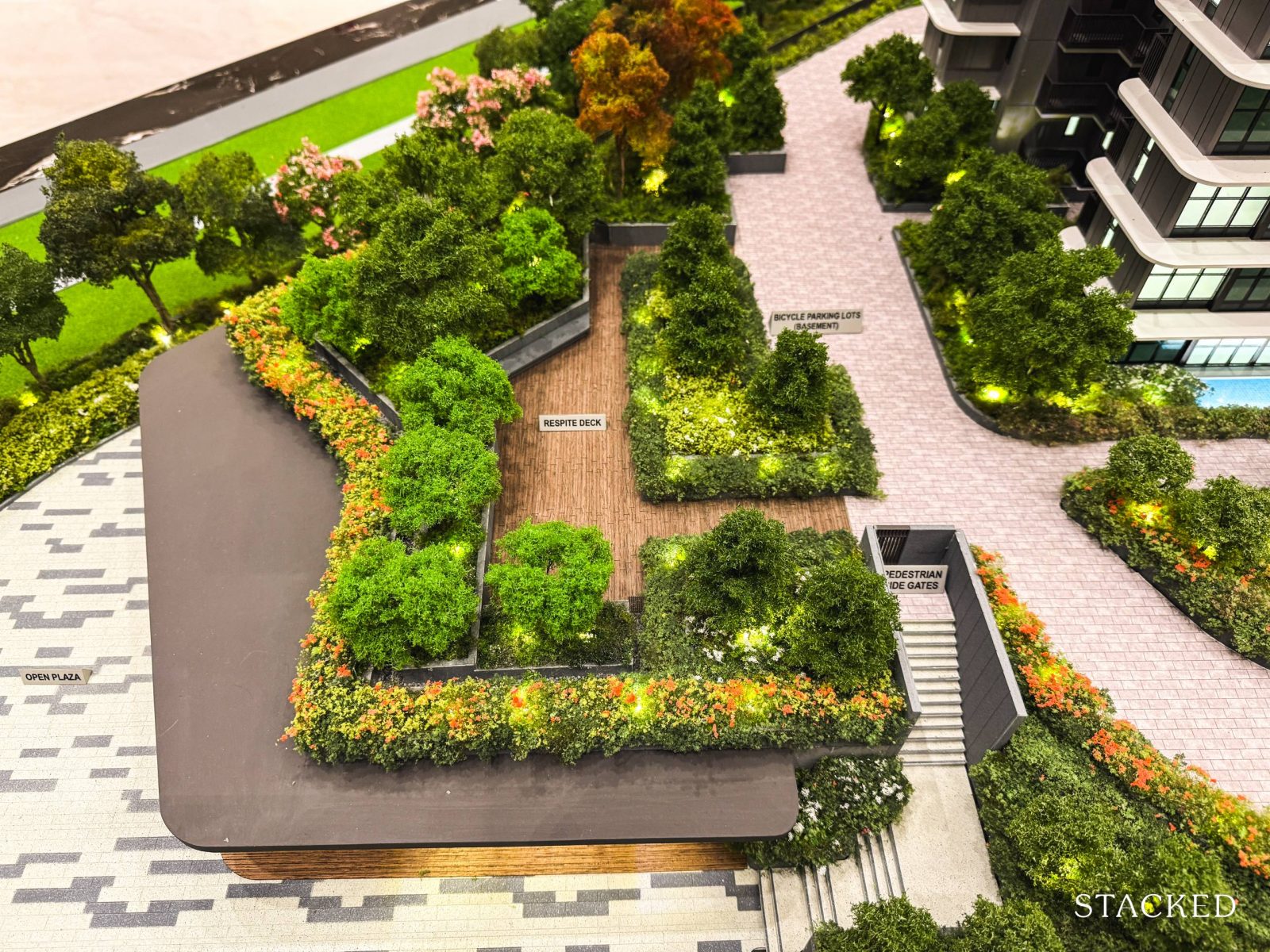
Moving on to the far left of the site, you’ll come across the respite deck and one of Chuan Park’s four side gates.
Just below the respite deck, you’ll find two commercial units, accessible to the public. Although official tenants haven’t been confirmed, there’s talk that one of them could be a supermarket. It may not be the largest, but it’ll certainly bring added convenience for residents.
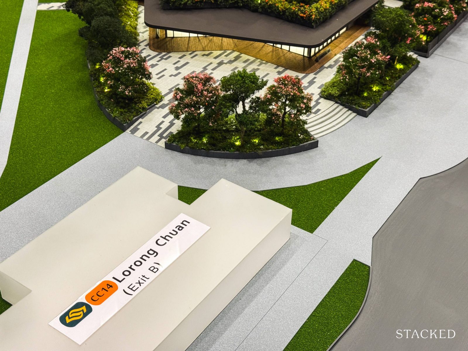
More importantly, it is from here that residents will get direct access to Exit B of Lorong Chuan MRT Station. For those who value proximity to the MRT, Blocks 242 or even 244 would be your top picks.
Now, while Chuan Park isn’t an integrated development, this kind of doorstep convenience is a definite perk. There’s also Exit A of the MRT Station, which offers an alternative that’s closer to the project’s main entrance and exit. The only thing that I’d wish here is for sheltered access to the blocks directly, which would be much more convenient during rainy days.
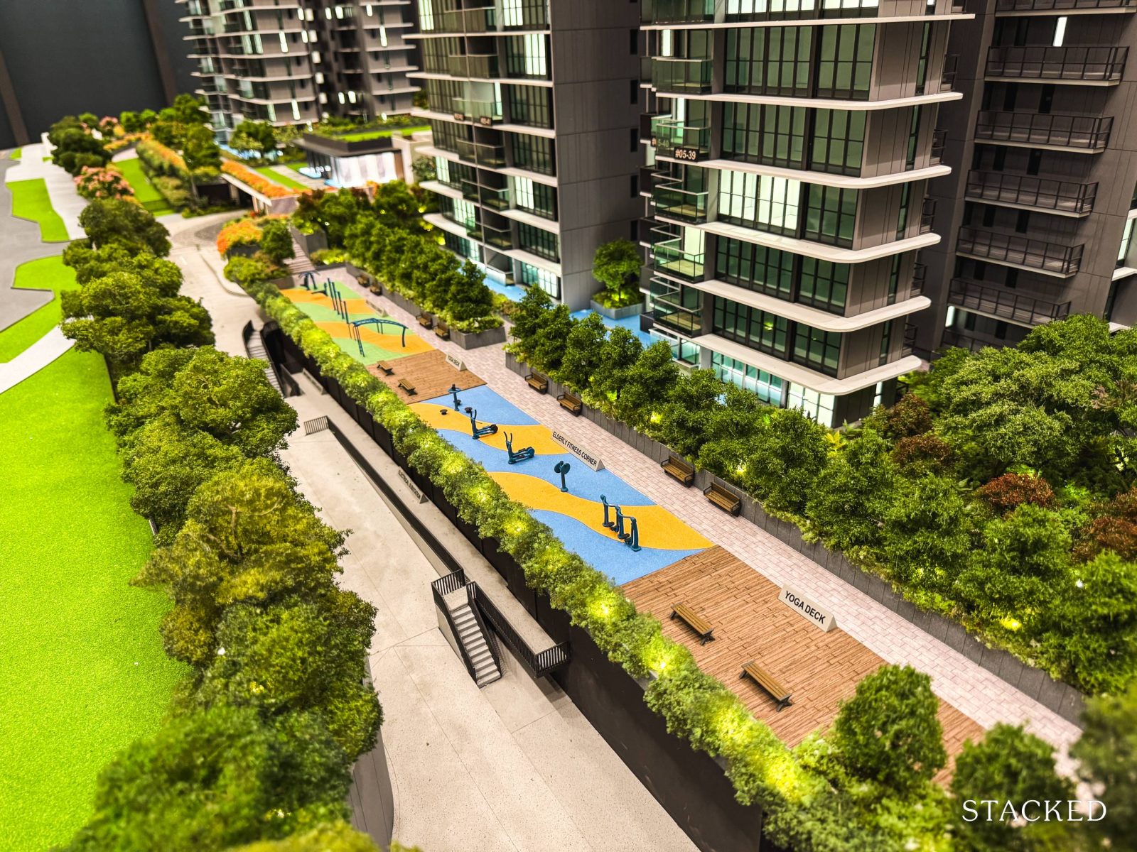
Moving on, the other half of the Vibrant Courtyard at Chuan Park is home to a range of sports-focused amenities, including an adult fitness corner, two yoga decks, and a dedicated space for elderly fitness.
While I don’t think these would be a main attraction, it may be a small plus point for seniors living around the landed areas that may be thinking of downsizing.
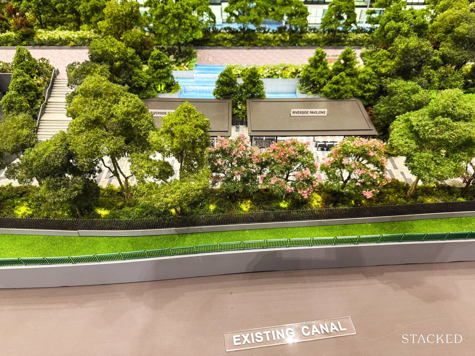
Beyond the open exercise area, you’ll find two sheltered pavilions known as the Riverside Pavilion. These are just a couple of the outdoor pavilions scattered throughout Chuan Park (which you’ll see more of later). The name is spot-on, as this space overlooks the adjacent canal.
There are also several waterfall features here, which adds to the peaceful ambience.
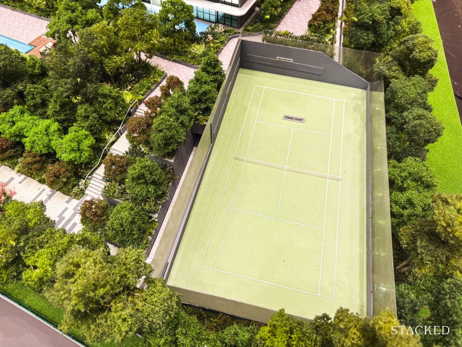
Finally, on the far right of the Vibrant Courtyard, you’ll find a single tennis court.
While two courts would no doubt have been preferable, this is fairly standard for developments of this size today. Even larger projects like Grand Dunman and Parc Esta also feature just one court, so it’s in line with current expectations.
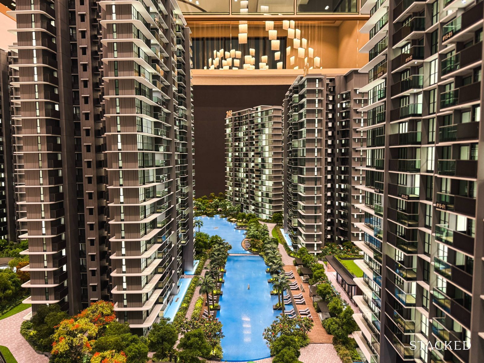
Next, we move on to the second section of Chuan Park called “The Waterfront”, which probably needs no explanation to its origins. The three key features here include a Kid’s Wading Pool, a 50m lap pool, and the Oasis Pool.
This also means that there’s quite a distance between the two rows of residential blocks, which allows even inward-facing units to have pleasant views of the facilities. The distance between Blocks 250 and 244 is around 35m, while Blocks 246 and 250 are separated by a wider 85m. So while this is a big development, you don’t feel as crammed in as you might think.
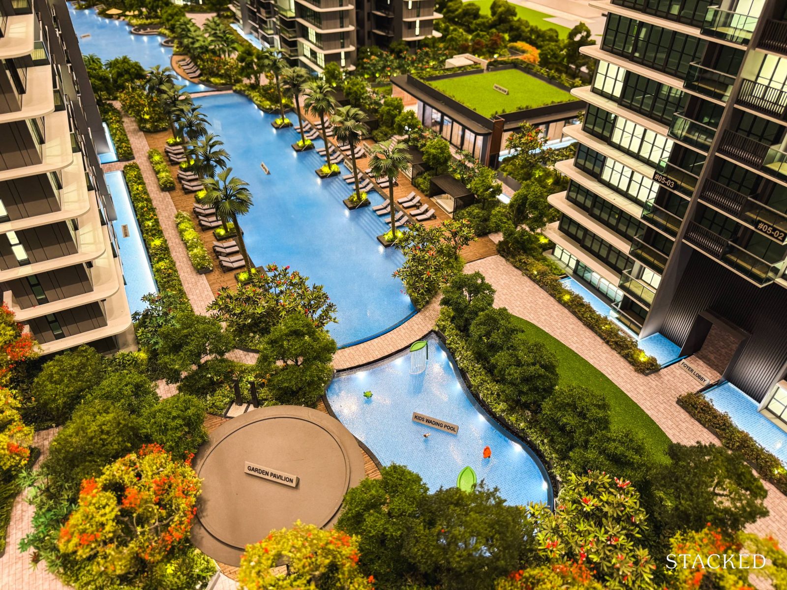
Continuing on the theme of sports, let’s take a look at the 50m lap pool, positioned at the heart of Chuan Park and near the function room. This pool is ideal for serious swimmers, offering a full Olympic-sized space for proper laps.
As expected, there are pool decks on both sides, and it’s good to see that there are quite a number of chair lounges around.
At the other end of the site, you’ll find the kid’s wading pool and garden pavilion, which creates a livelier area where kids can play and residents can host outdoor gatherings by the pool.
A wading pool is fairly standard in mega projects aimed at families, so it’s no surprise here. That said, I would have expected more child-friendly installations (like a slide perhaps), as the simple sprinklers feel a bit underwhelming compared to what’s offered at other developments these days.
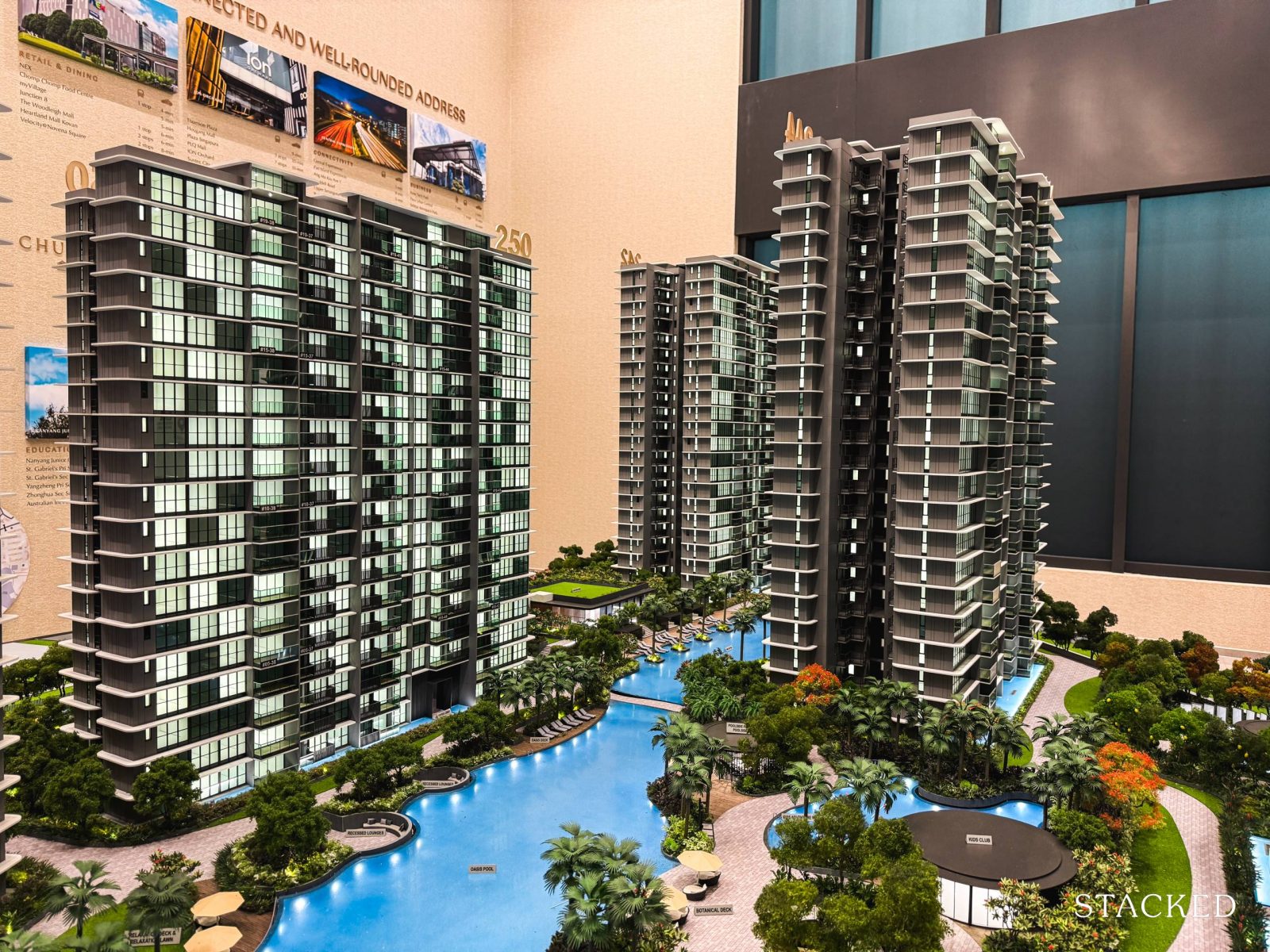
Next to the 50m lap pool is the Oasis Pool, which offers a more organic shape with softer curves and edges. This is certainly one of the advantages of a mega-development, as the large space allows for bigger and more varied facilities.
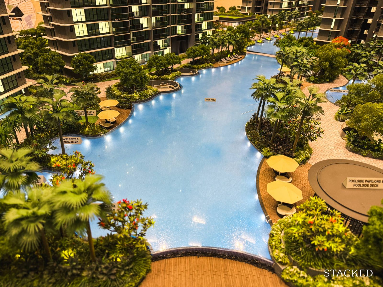
Given that this is the lifestyle pool, the developers have designed a variety of lounge spots that contribute to more relaxing atmosphere. This includes sunken seating areas, referred to as recessed lounges, as well as a relaxation deck and lounge. Additionally, there are two sheltered poolside pavilions, offering shaded spots to sit by the water.
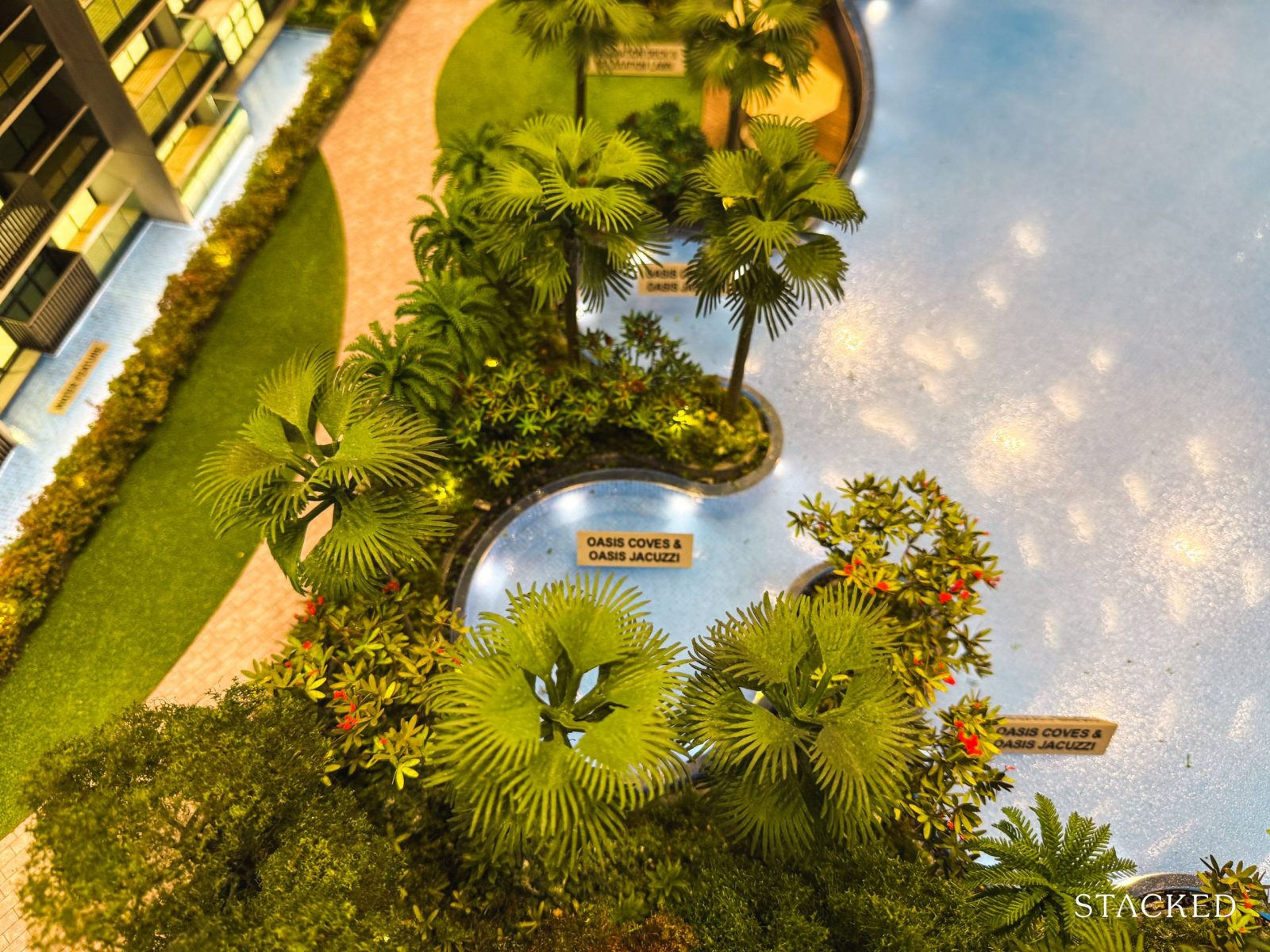
Tucked within the Oasis Pool are a few quiet corners designed for relaxation, including the Oasis Coves and Oasis Jacuzzi. These areas are set in a more secluded part of the pool, providing residents with a peaceful retreat away from the main activity.
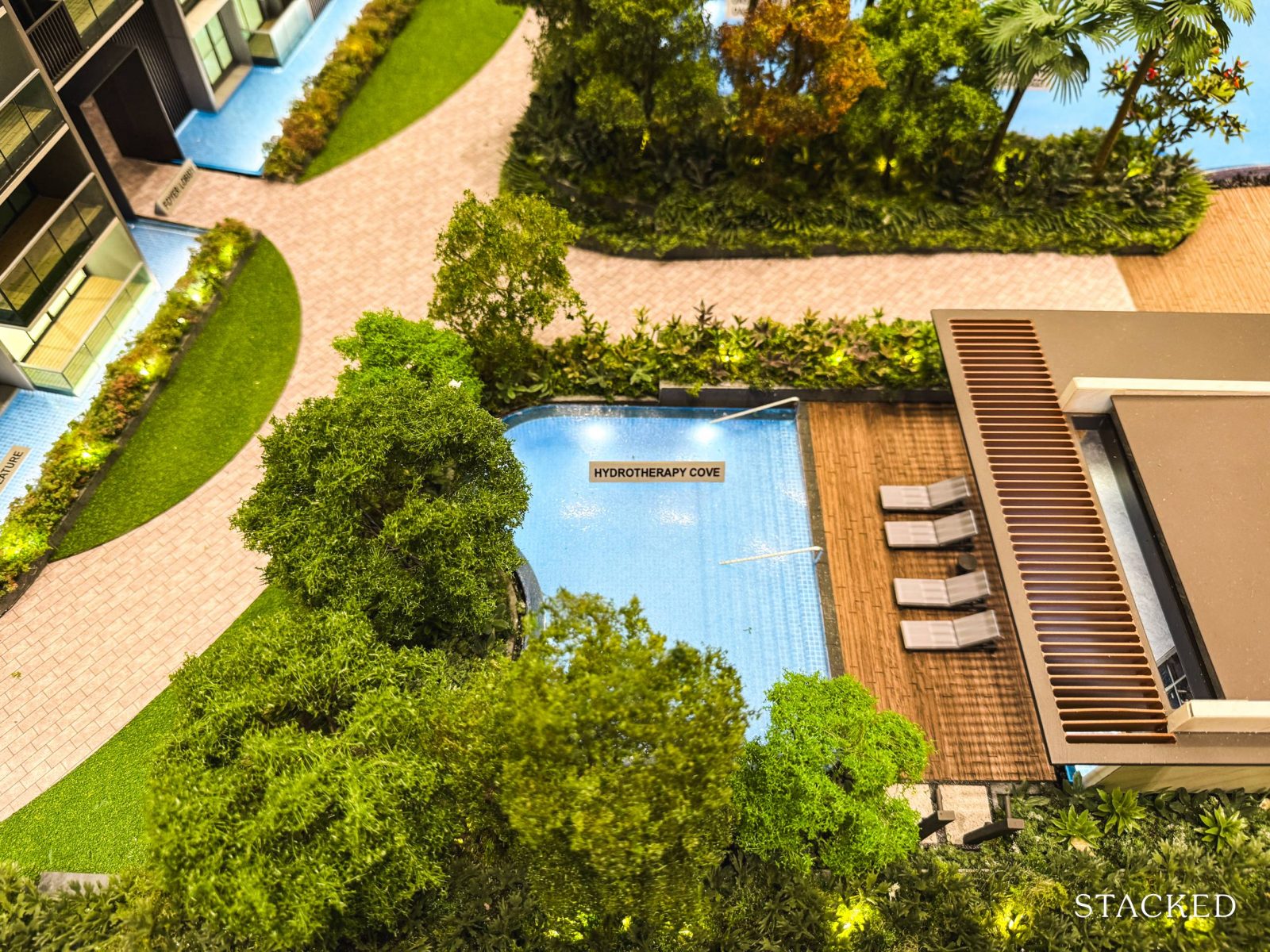
Continuing the focus on lifestyle and wellness, there’s a dedicated hydrotherapy cove near the Oasis Pool, conveniently connected to the gym.
This pool caters to those looking to relax after a workout, making its location by the gym quite practical. Surrounded by landscaping for added privacy, it also has a small pool deck for lounging.
As for the gym, it’s a standalone facility, offering a more exclusive environment for residents. However, some may find it a bit compact, given the development serves over 900 units.
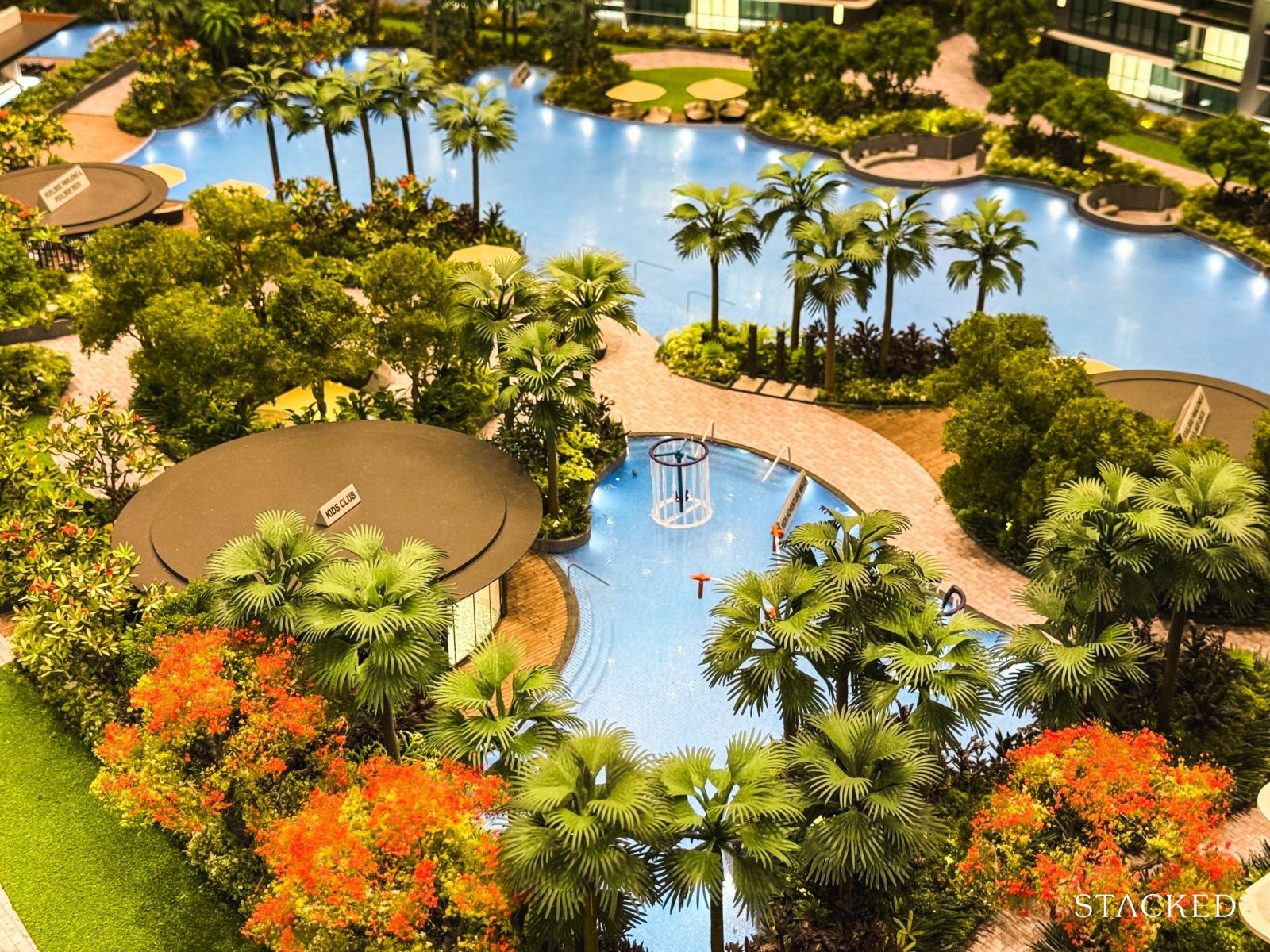
Other family-friendly amenities include the Kid’s Adventure Water, which is conveniently placed next to the air-conditioned Kid’s Club. The water play area seems more suited for older kids, with thoughtful age-appropriate features that add a nice variety to the children’s play options.
I really like that there’s an indoor Kid’s Club that is air-conditioned, which is a great backup for those rainy days or when the weather gets too hot. I think it is definitely a feature that families will appreciate, and again, part of the appeal of living in a bigger project.
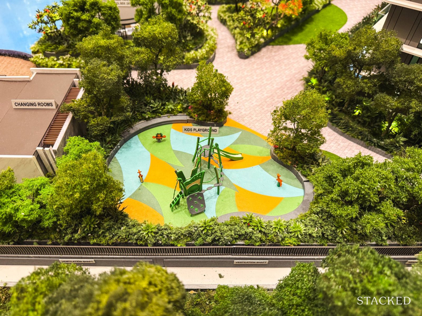
The last of the child-friendly facilities is the kid’s playground, a standard feature in most new condos. While it’s nothing particularly remarkable, I appreciate the range of play options available in Chuan Park to keep kids entertained.
What’s also nice is that the children’s amenities are grouped in one section, which helps keep noise concentrated in one part of the development.
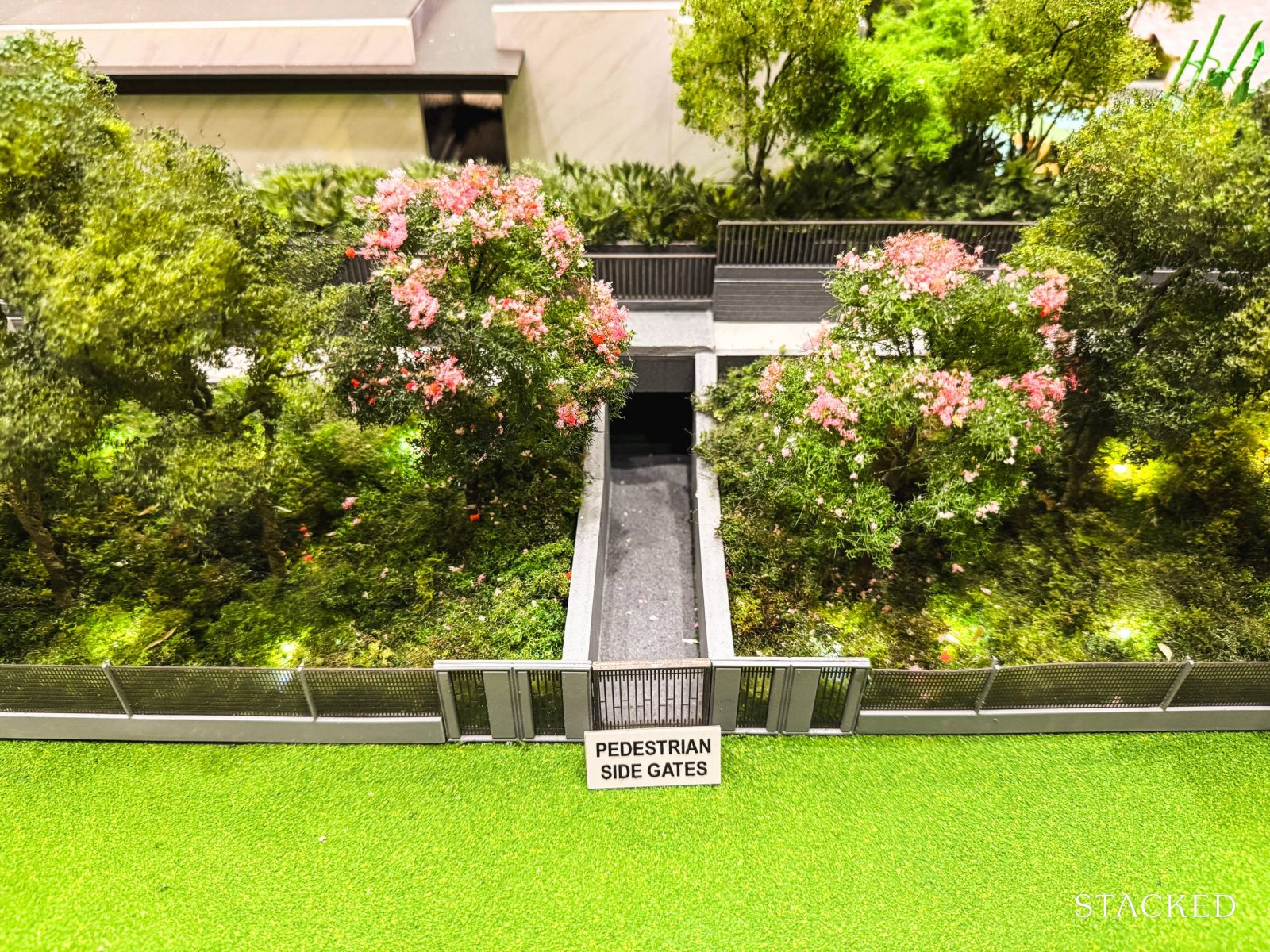
Located near the playground is one of the four pedestrian side gates. It’s worth a reminder here that Chuan Park has multiple access points spread throughout the development – 2 are catered for the MRT, 1 would be by the vehicle exit, and the last is for access to Block 304 at Chuan Village where there is a coffeeshop and food outlets.
Finally, let’s head to have a look at the third (and last) section of the project, which is themed as “The Forest”.
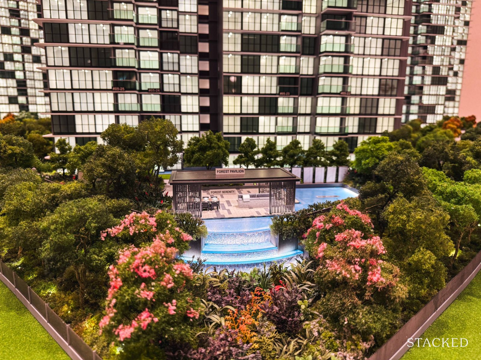
Compared to the previous two sections, “The Forest” is more understated, with just two key facilities—the Tranquil Enclave and the Forest Pavilion (as seen in the photo).
The Forest Pavilion, with its cascading water feature, serves as an option for residents who prefer a quieter, more private spot for outdoor gatherings.
That said, as this area is located near to Lorong Chuan, a relatively busy road, the landscaping would be ideal to block off some of the noise from the outside traffic.
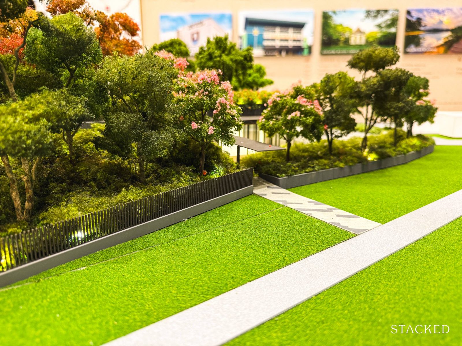
This section also includes an additional pedestrian exit leading to Lorong Chuan, offering an added convenience for residents who commute on foot.
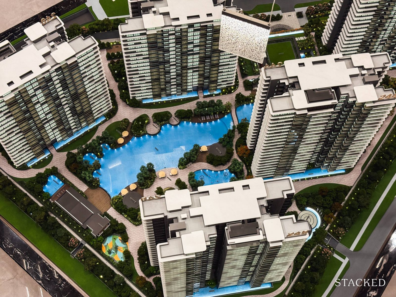
Overall, Chuan Park offers a comprehensive suite of amenities that you’d expect from a mega-development – think multiple pools, a tennis court, and family-oriented facilities. What really sets it apart, however, is the sense of space. Unlike some other high-density mega projects on the resale market, Chuan Park feels more open and less crowded.
With that, let’s dive into the tour of the 2-bedroom unit.
Chuan Park Condo – 2 Bedroom + Study Type B2a-M (69 sqm/742 sq ft) Review
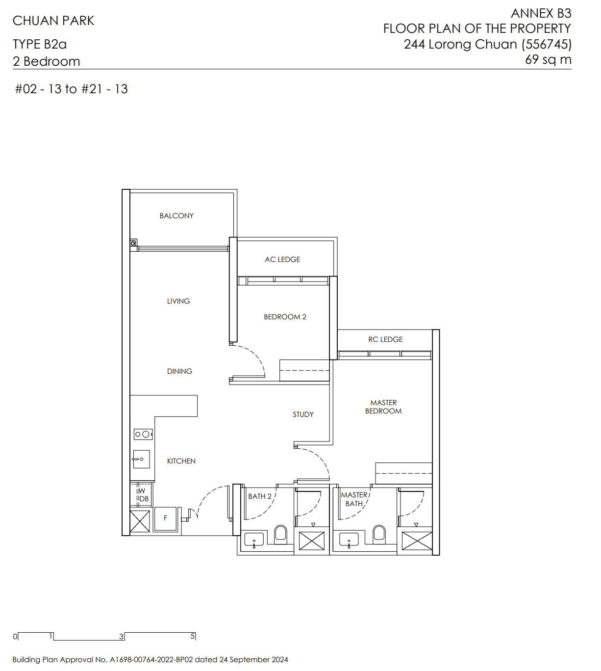
If you are looking for a 2-bedder, well, you are in luck as 44% of the units at Chuan Park (404 in total) fall into this category. Of these, 104 are classic 2-bedroom, 2-bathroom layouts, and the remaining 300 are 2-bedroom + study layouts.
For the classic 2-bedroom units, there’s one layout option: standard units span 670 square feet, while penthouses bump up to 829 square feet (due to the higher ceiling floor).
The 2-bedroom + study units, on the other hand, offer two configurations. One employs a compact dumbbell layout (732 square feet), while the other – available at the show flat and sized at 742 square feet – follows a more traditional arrangement, with common spaces on one side and bedrooms on the other.
If you’ve seen Kingsford’s previous mega-launch, Normanton Park, the 2-bedroom + study layouts here may look familiar. Notably, though, Chuan Park has reduced foyer space (a welcome change for compact units like these) and the study is at the main living area instead.
The ceiling height here is 2.715 metres, slightly below the market average of 2.85 metres. but it’s worth noting that many new launches, including Norwood Grand, are following a similar trend.
In terms of material choices, the common areas are finished in porcelain tiles, while bedrooms feature engineered timber – also a standard choice across many new developments.
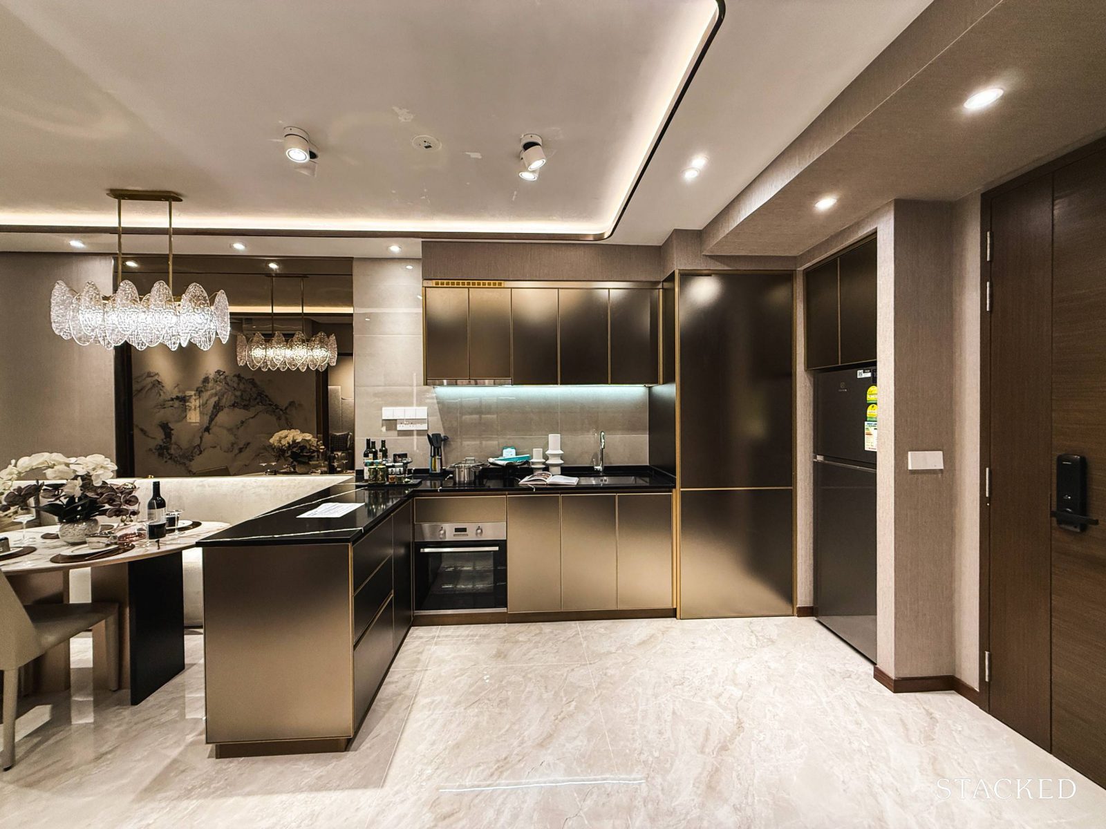
Notably, this 2-bedroom layout omits any foyer. Like all things, there are pros and cons to this design. I appreciate that it maximises space efficiency, which is a benefit for more compact units like this.
The trade-off, however, is a lack of privacy, as anyone passing by can easily glimpse into your home. Especially with an open kitchen, which might require the door to be open to air the home at times. Another potential downside is the limited space for shoe storage, which could be a concern for those who prefer a more organised entryway.
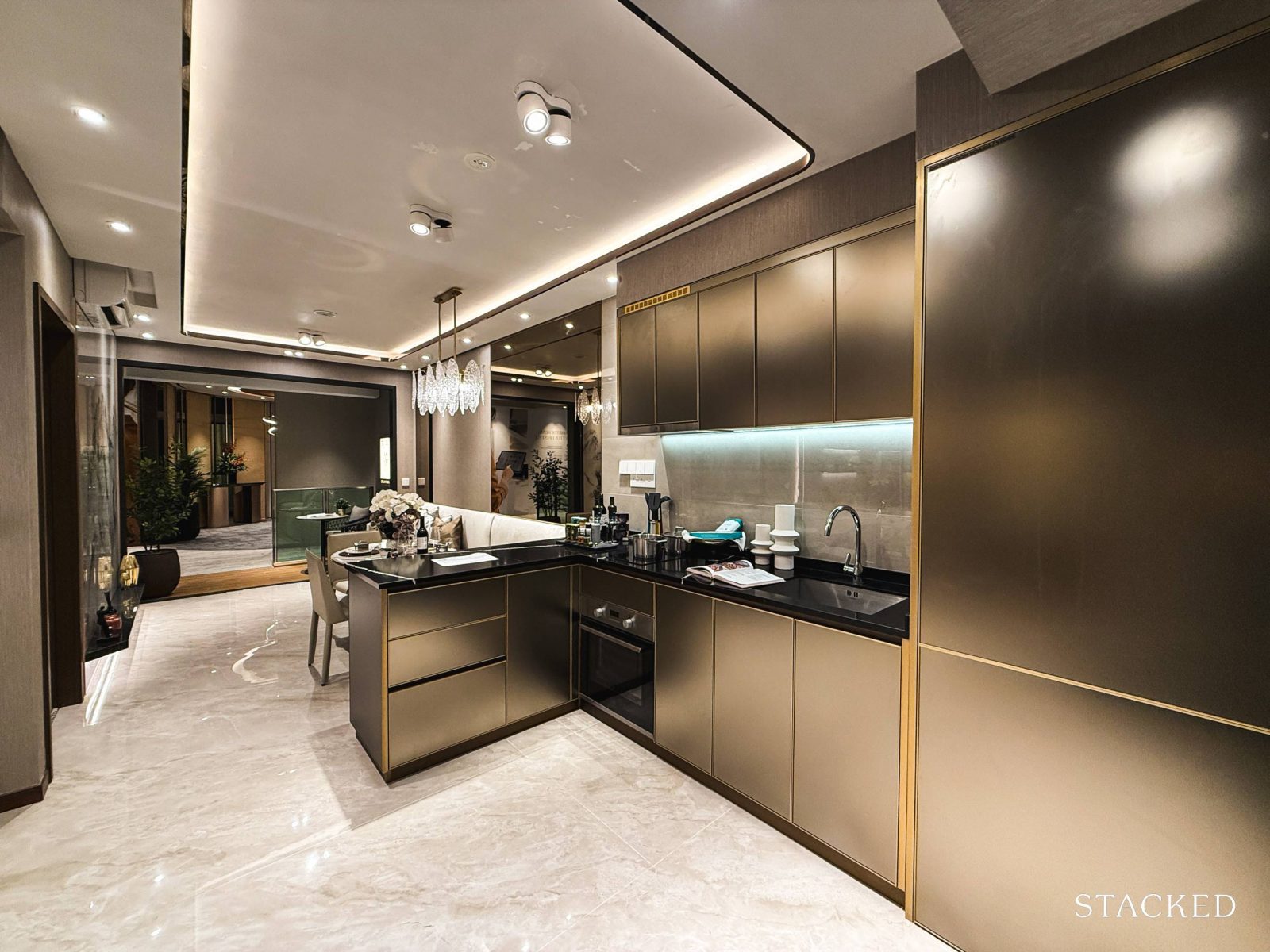
Upon entry, you’re greeted with an open sweep of the kitchen, dining, living areas, and balcony, all of which create a more spacious feel. Adjacent to the open-concept kitchen is the study (not pictured here), which does help the unit feel roomier.
While the layout means a fully enclosed kitchen isn’t an option (rather typical for a 2-bedder), I appreciate the inclusion of a mini island. This addition not only means extra countertop space but also more storage – something that you can never get enough of.
I’m personally not a fan of the porcelain backsplash and built-in cabinetry finishes, but this look could be up the alley of those looking at a more hotel-like luxury home. As for the fittings, you’ll find a sleek stainless steel sink by Englefield paired with Kohler mixers. The cooker hood, oven, refrigerator, and washer-dryer, are all from Electrolux, which is within expectations for mass-market projects like this.
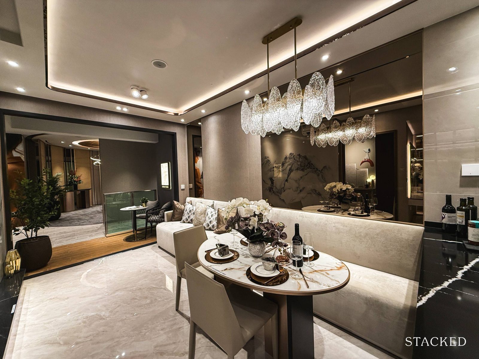
The living and dining areas here follow a familiar layout you’ll find in many 2-bedroom show flats. They’ve used an extended sofa to bridge the two spaces, giving the illusion of a more seamless layout.
Now, while the look makes sense for display purposes, I rarely see it replicated by homeowners who tend to prefer separate furniture to better demarcate each area. For those who might give this approach a go, the booth-style seating does make the area feel more spacious.
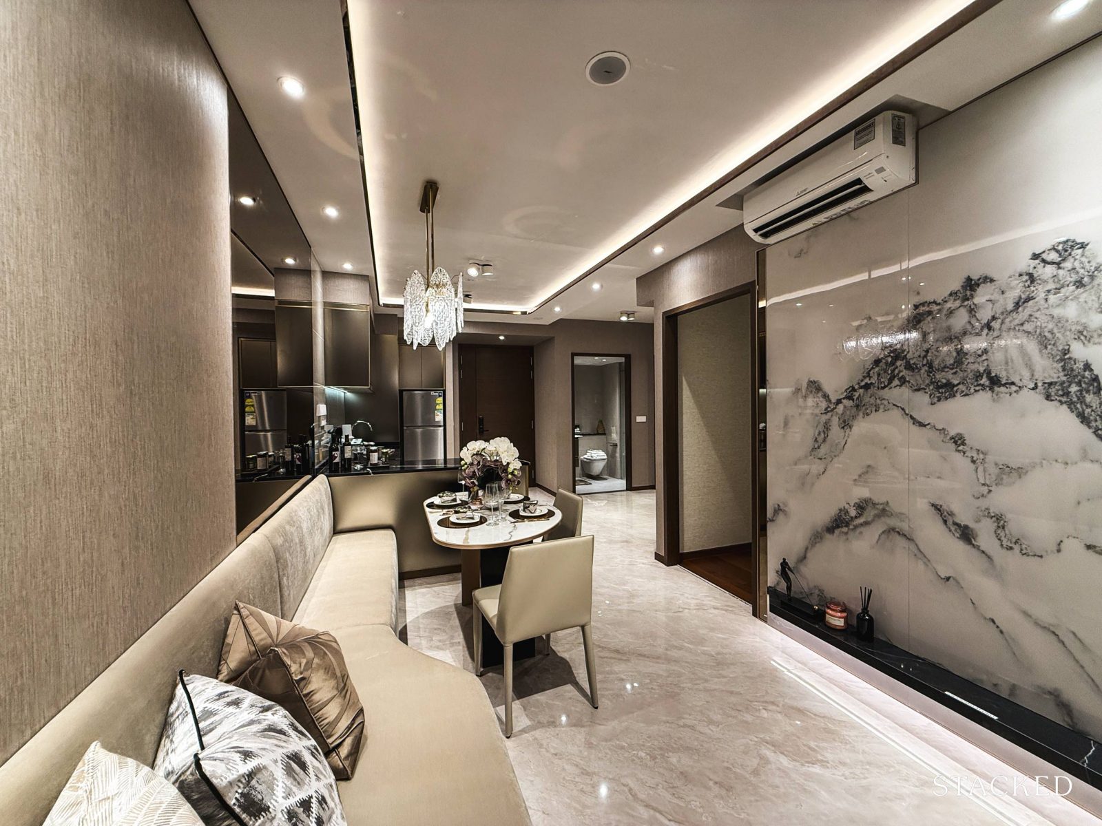
In total, the combined living, dining, kitchen, study, and entrance area spans about 30.7 sqm. While it’s marginally smaller than the other 2-bedders out in the market at the moment, the lack of corners and squarish layout make the space a functional one still.
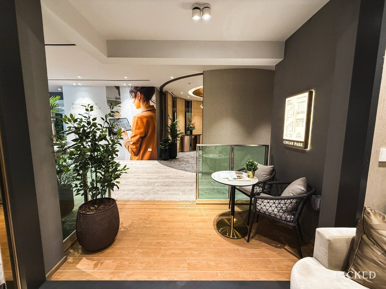
The balcony here offers a compact 5.1 sqm, providing a bit of breathing room without compromising too much on the overall liveable space. For units with unblocked views of the surrounding landed estate, this could be an ideal spot for morning coffee or winding down in the evenings.
In reality, though, these balconies in more compact units often end up serving practical needs, like drying laundry.
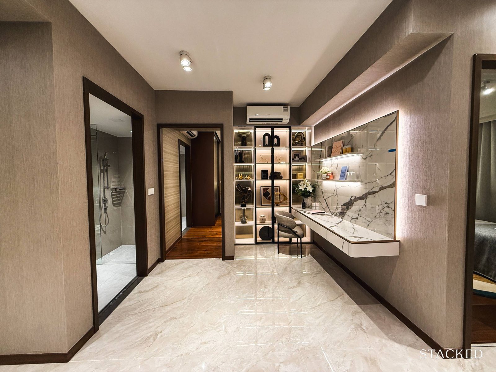
Before we move into the bedrooms, let’s take a closer look at the study alcove. Positioned adjacent to the kitchen and before the dining area, it maintains the same porcelain floor tiling, integrating it visually with the main living spaces.
It is a similar placement to the 2-bedroom unit at Norwood Grand. I’m not sure that this is necessarily the best spot if you want to use it solely as a study/home office, but the position does make it flexible. And with hackable walls, there’s also the potential to open it up to the common bedroom, creating a larger, more versatile bedroom space.
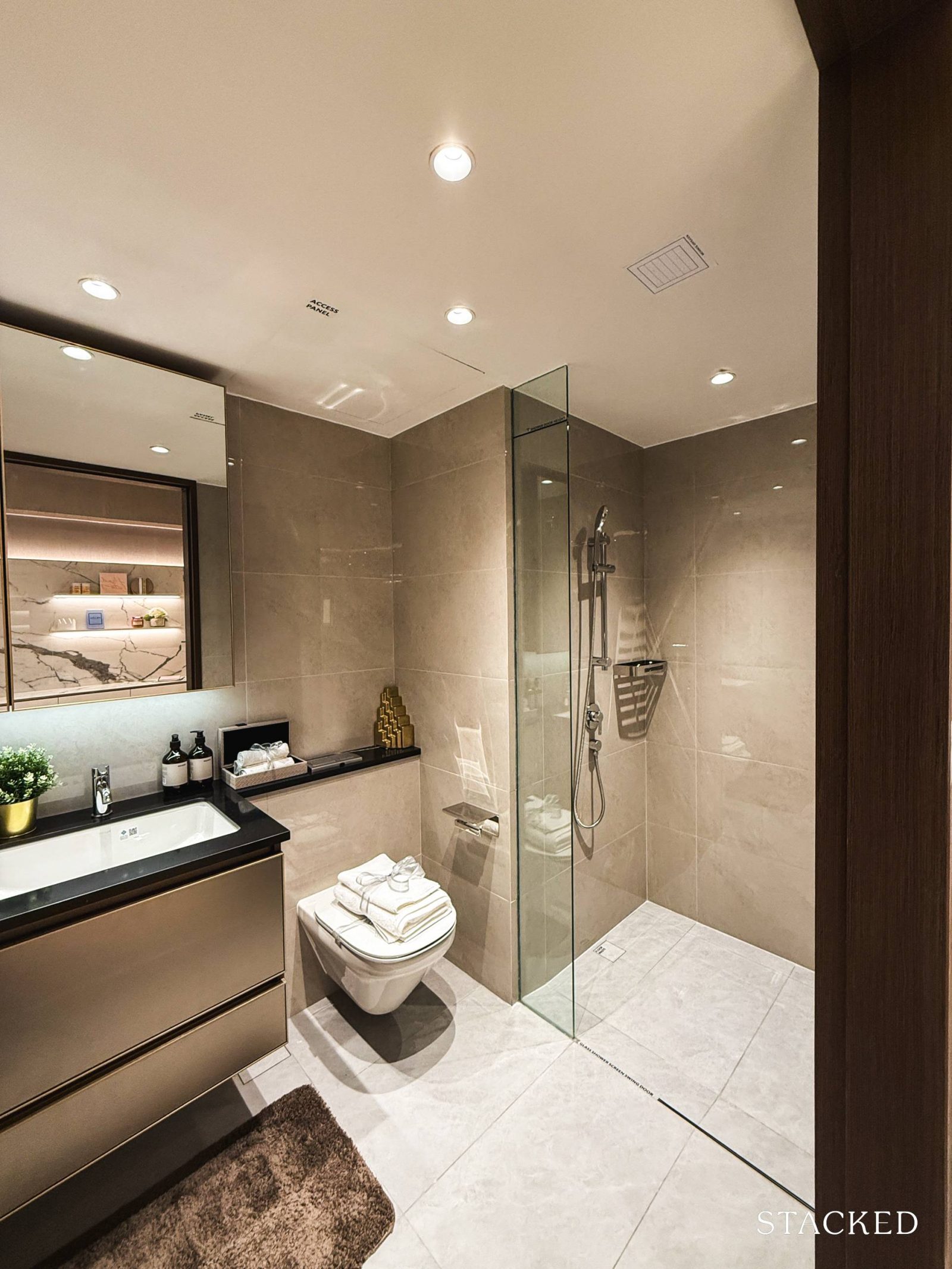
Situated near the study is the common bathroom, and at 4.4 sqm, the common bathroom is fitted with porcelain tiles on both the floor and walls. Fixtures (including the sink, WC, and sink & shower mixers) are from Kohler.
One key detail to note is the lack of windows for natural ventilation in this layout. As such, the bathroom relies entirely on mechanical ventilation.
In a similar vein to Norwood Grand, the bathroom position is good for guests, but not as great for those who reside there as the bathroom isn’t directly next to the bedroom.
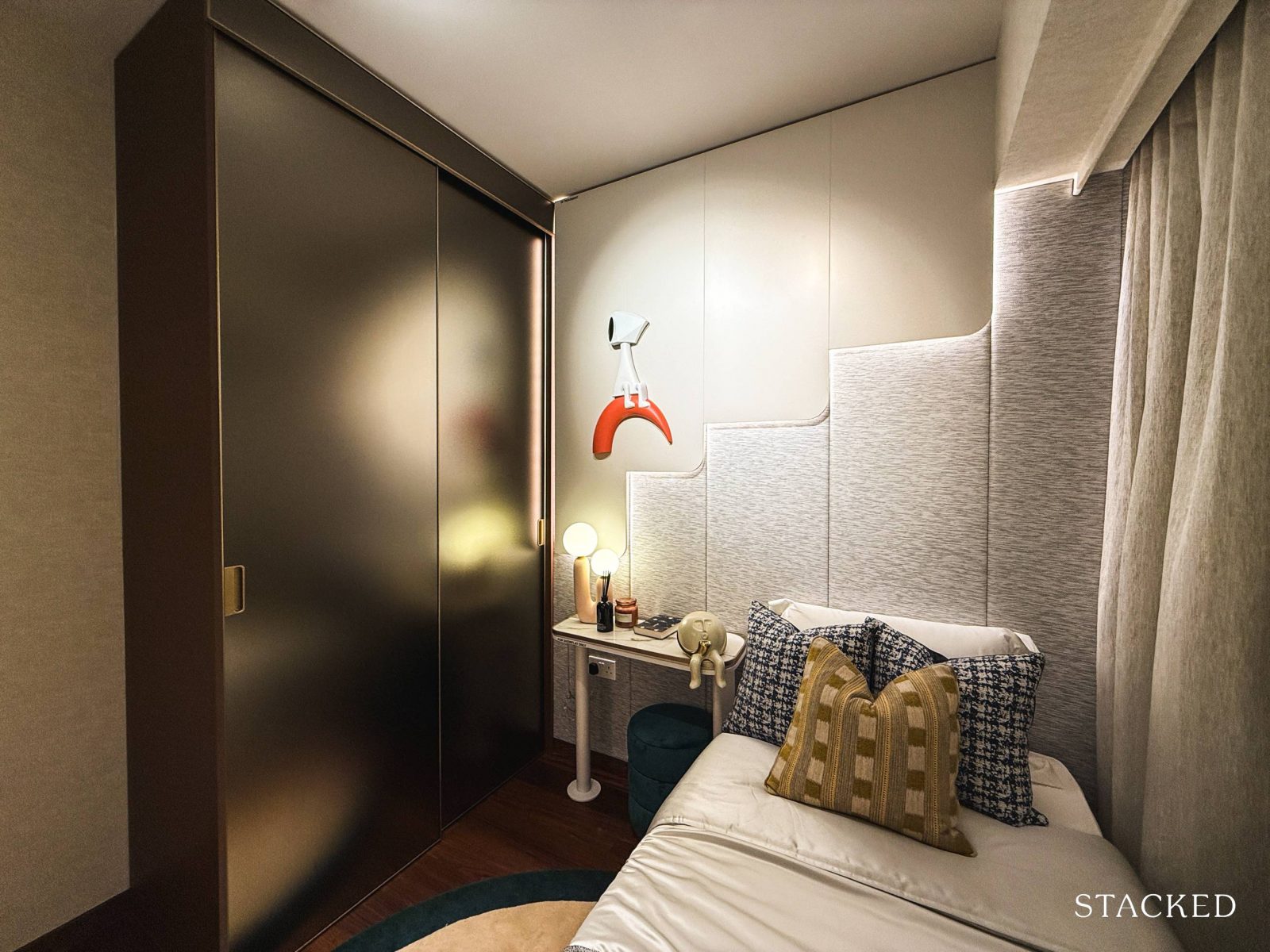
The common bedroom measures 8.3 sqm, which is quite standard for newer developments today. The floor plan indicates enough space for a queen-sized bed, though a single bed is used to give an alternate view of the room’s proportions. The layout accommodates a small bedside table, and it comes with a built-in wardrobe featuring sliding doors.
Also, it’s worth noting that the AC ledge is positioned just outside the window, so you won’t have full-height windows in this room.
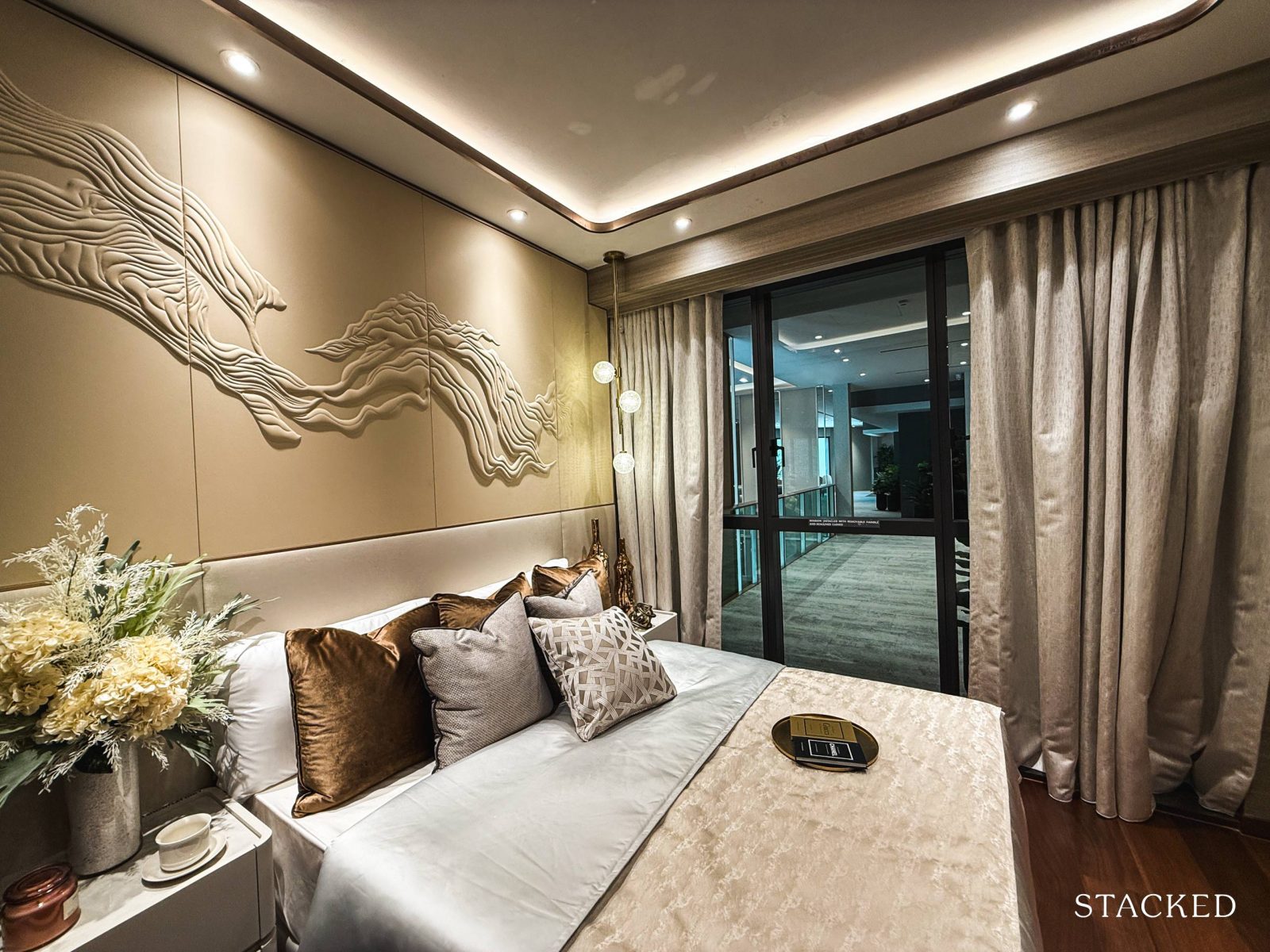
At 12.4 sqm, the master bedroom leans on the more compact side compared to market standards. That said, it can still fit a king-sized bed and two compact bedside tables, without significantly affecting the walkable space.
Unlike the common bedroom, this one has full-height windows which helps to bring in more natural light – an essential factor in making the room feel more spacious.
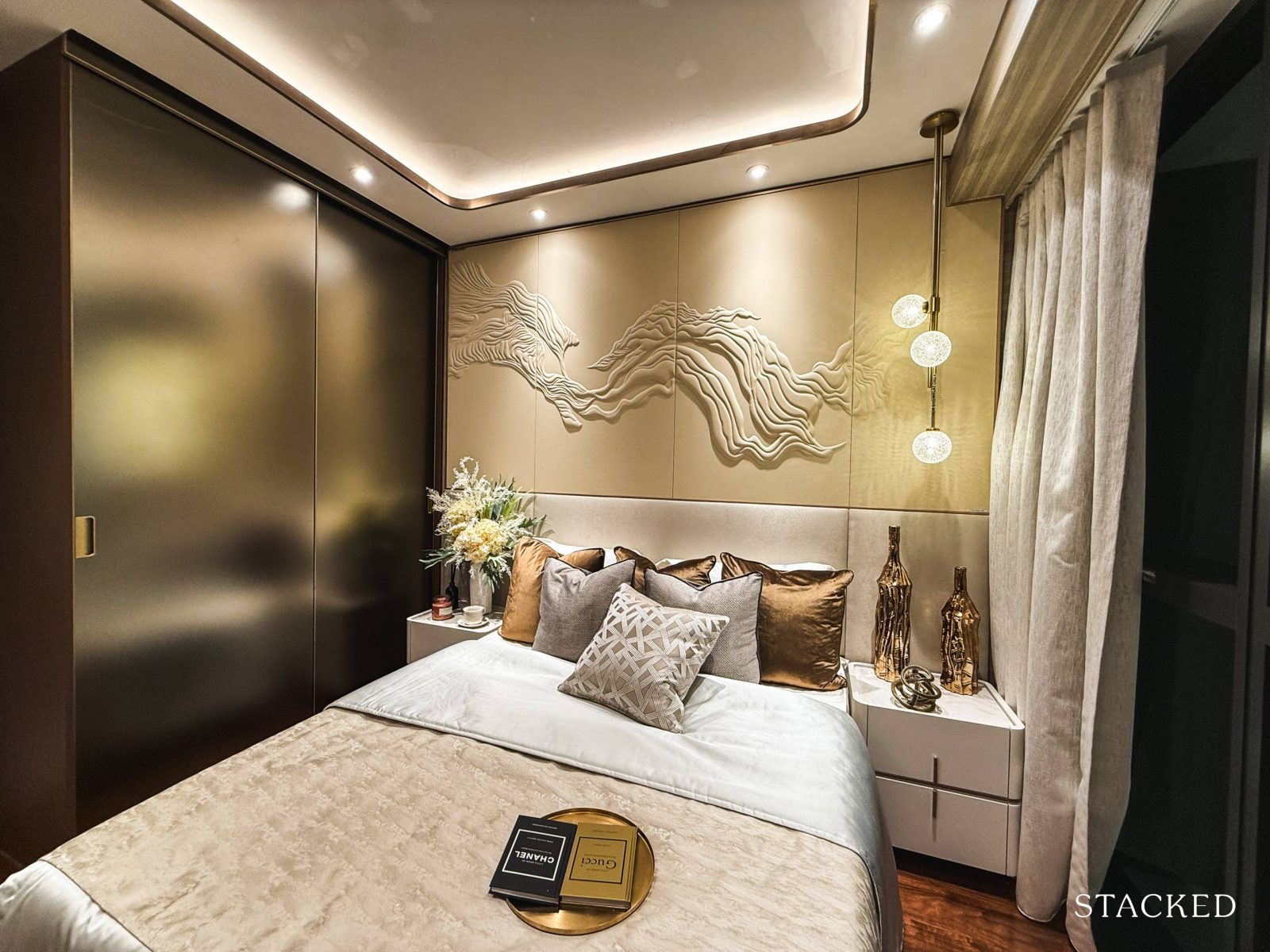
On the opposite side, there’s a full-height, two-panel sliding wardrobe included. From this view, it’s clear why some might find the master bedroom a bit more compact.
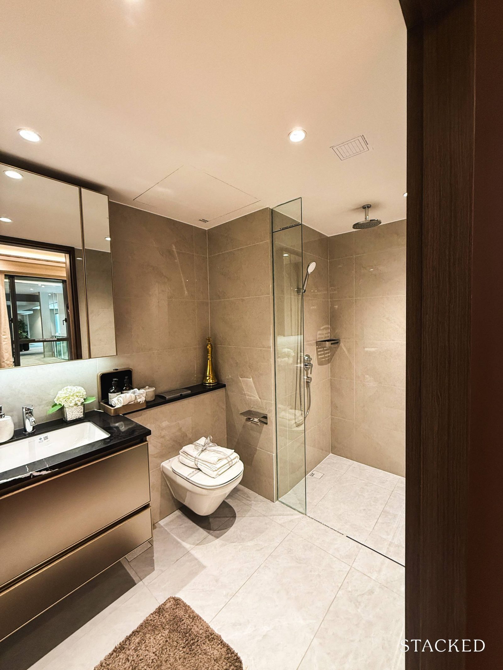
At 4.9 sqm, the master bathroom mirrors the common bathroom, with the main difference being the inclusion of a rain shower, adding a touch of luxury.
As with the common bathroom, the fittings – sink, wall-mounted WC, and mixers are from Kohler. It’s also worth noting that there’s no window for natural ventilation here either, so the space will rely entirely on mechanical ventilation.
Chuan Park Condo – 3 Bedroom Premium Type C3b (114 sqm/1,227 sq ft) Review
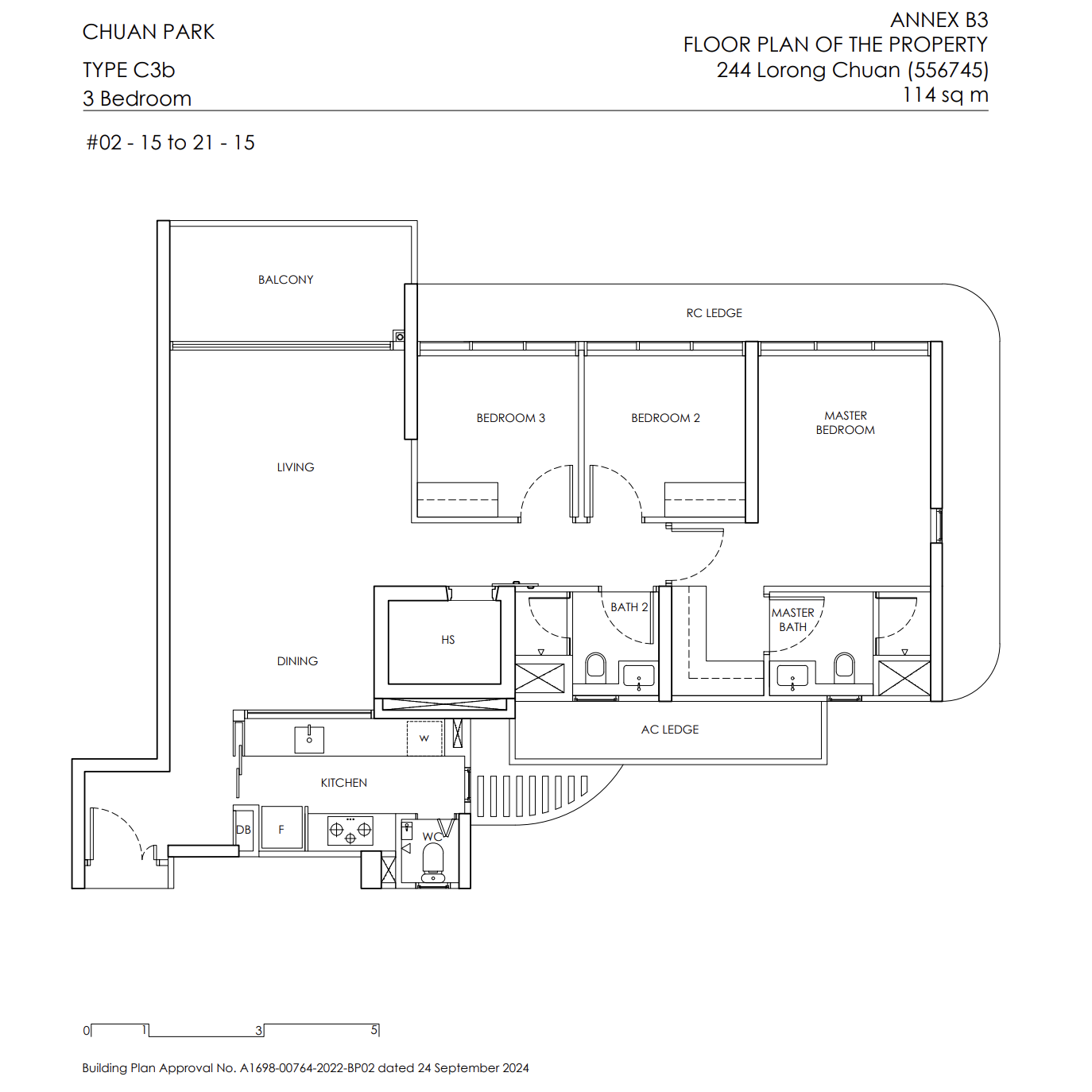
Chuan Park has an even bigger focus on 3-bedroom units, which make up nearly half (47%) of the development, offering a broad mix of layouts for various needs. Buyers can choose from Classic, Deluxe, or Premium types, with eight layout options. These units span from 915 to 1,227 square feet (excluding void area), providing flexibility for different space requirements.
Layouts differ across these options, from the placement of the home shelter (or its absence) to variations in storage rooms, walk-in wardrobes, balcony sizes, and foyer dimensions.
The show flat showcases the 3-bedroom Premium type, which offers a more spacious balcony, a distinct foyer, a home shelter, and a walk-in closet in the master bedroom.
Ceiling heights in this layout are set at 2.715m, slightly under the typical 2.85m. As for the common areas, they feature porcelain floor tiles and bedrooms are finished with engineered timber, both standard in most new projects today.
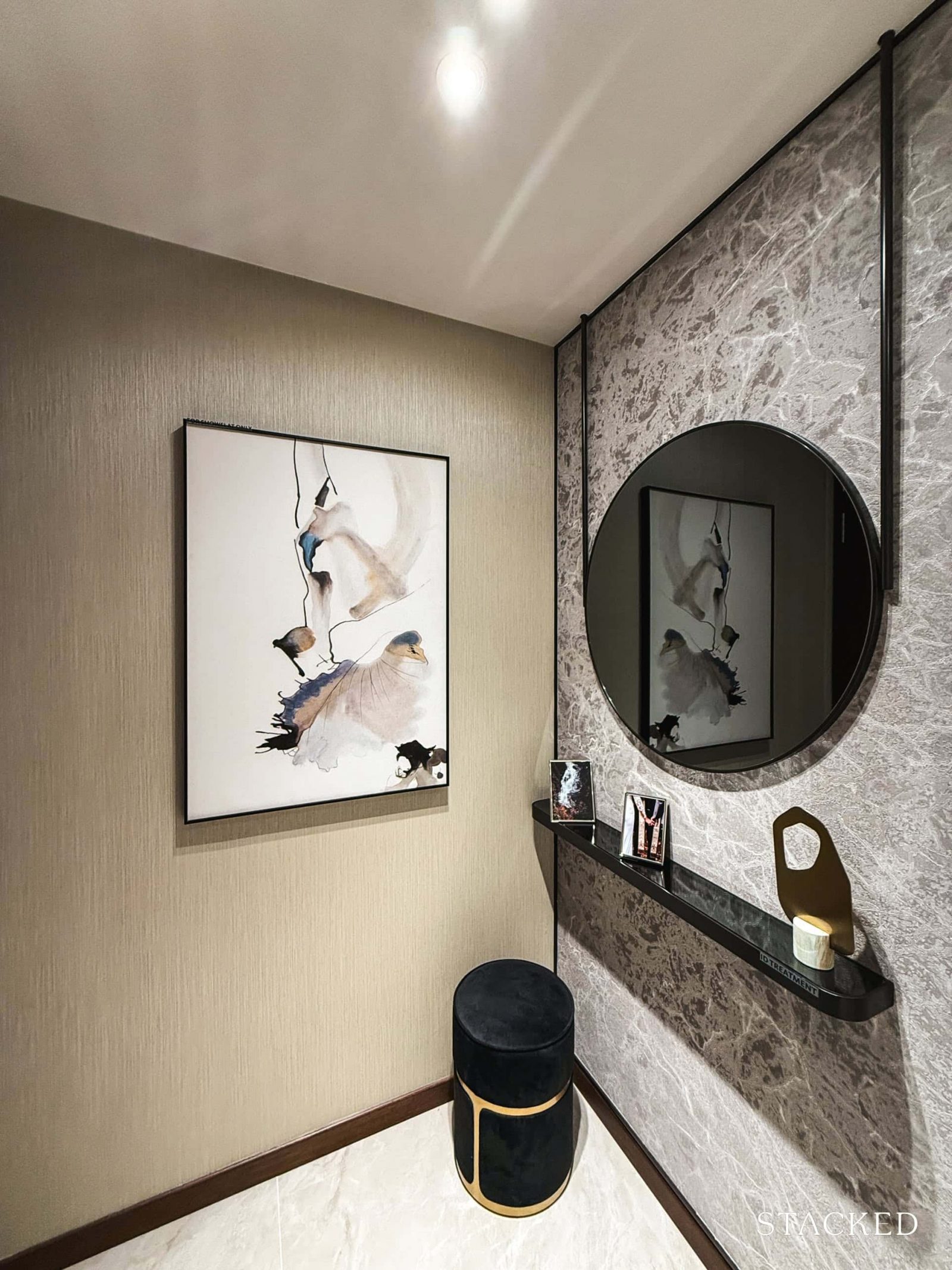
As with most layouts that include a foyer, there are both upsides and trade-offs here. On the plus side, it adds a layer of privacy and provides a handy space to store shoes or place an entryway table – always a welcome touch in larger units.
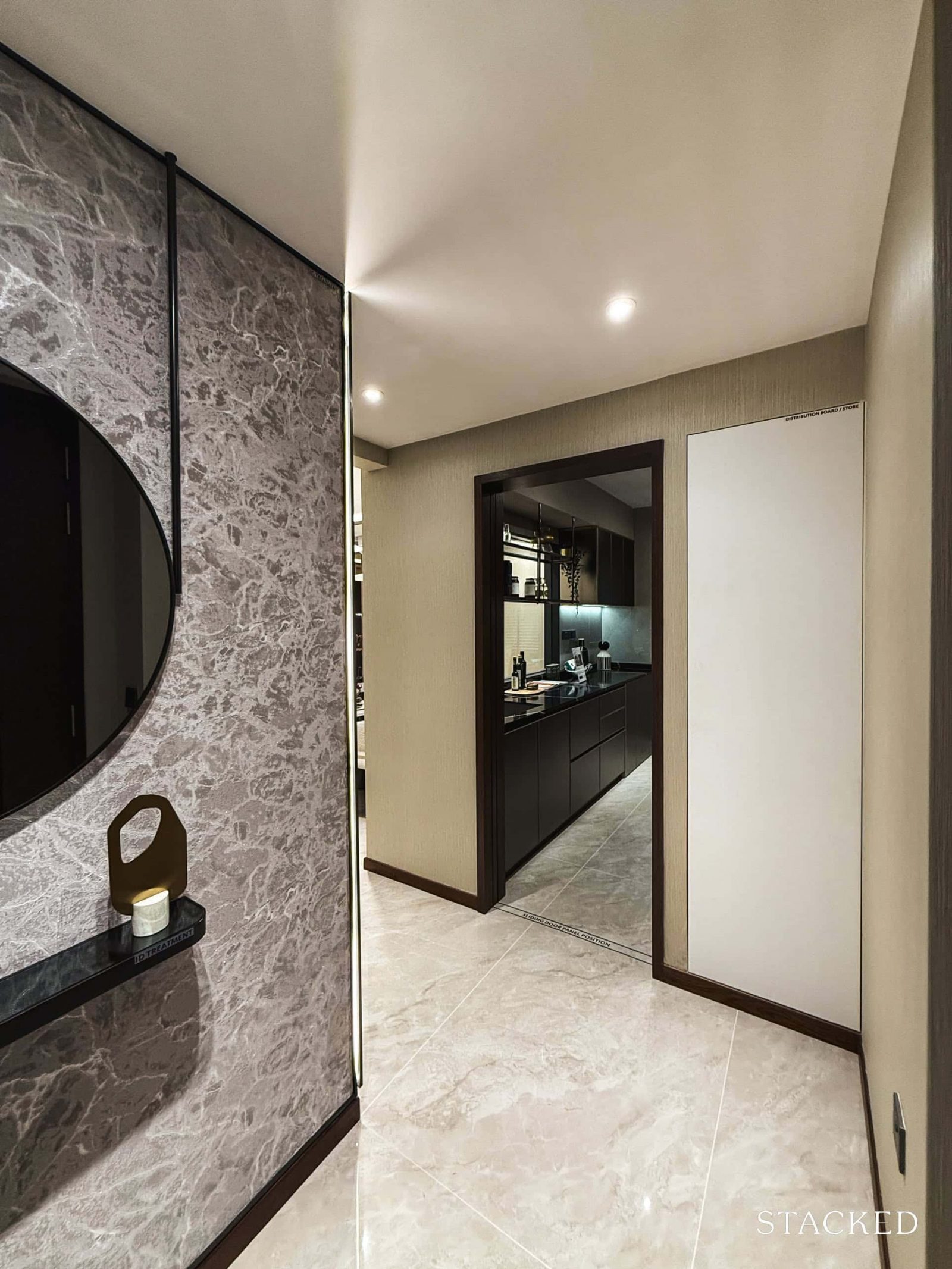
As we enter the unit, the DB box is tucked into the right of the kitchen, offering some extra storage.
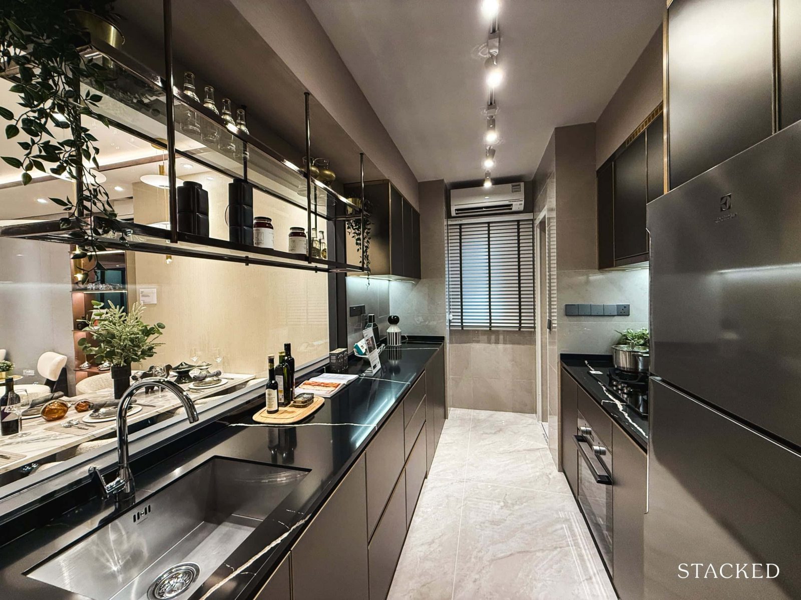
At 8.4 sqm, the kitchen offers a straightforward, hallway-style layout that flows down to the yard – fairly typical for new launches these days. The advantage of this layout is that you get a good amount of countertop space for food prep and appliance display and there are also many drawers and cabinets for storage, which I’m sure buyers would appreciate.
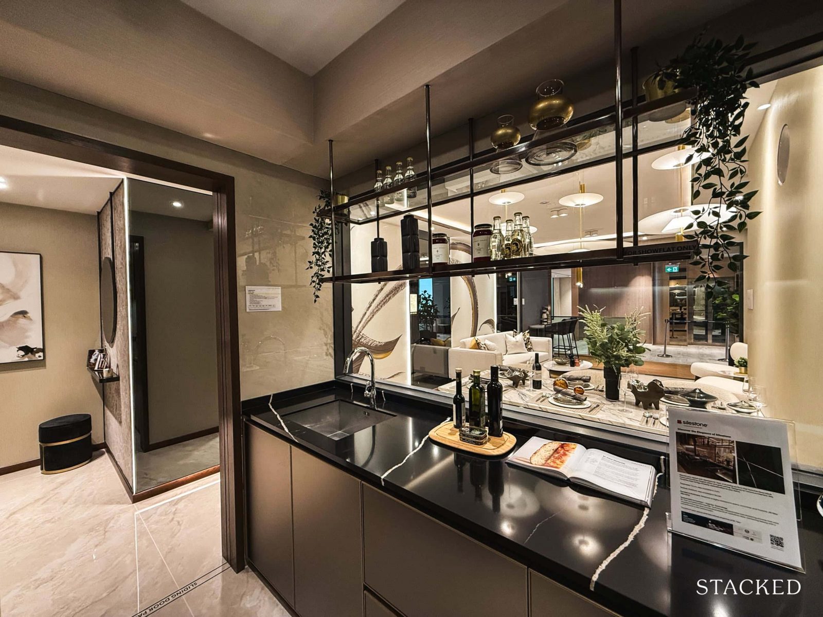
A notable feature here is the glass panel by the sink, which opens up the view toward the common areas. This is a welcome touch as it brightens up what would otherwise be a fairly dim kitchen and encourages interaction between those in the kitchen and the living spaces, all while keeping the kitchen fully enclosed.
As for appliances, you’ll find an Englefield stainless steel sink paired with a Kohler mixer, both standard across all units in Chuan Park. Note that the additional storage shelves above the sink are a show flat addition and not part of the unit offering.
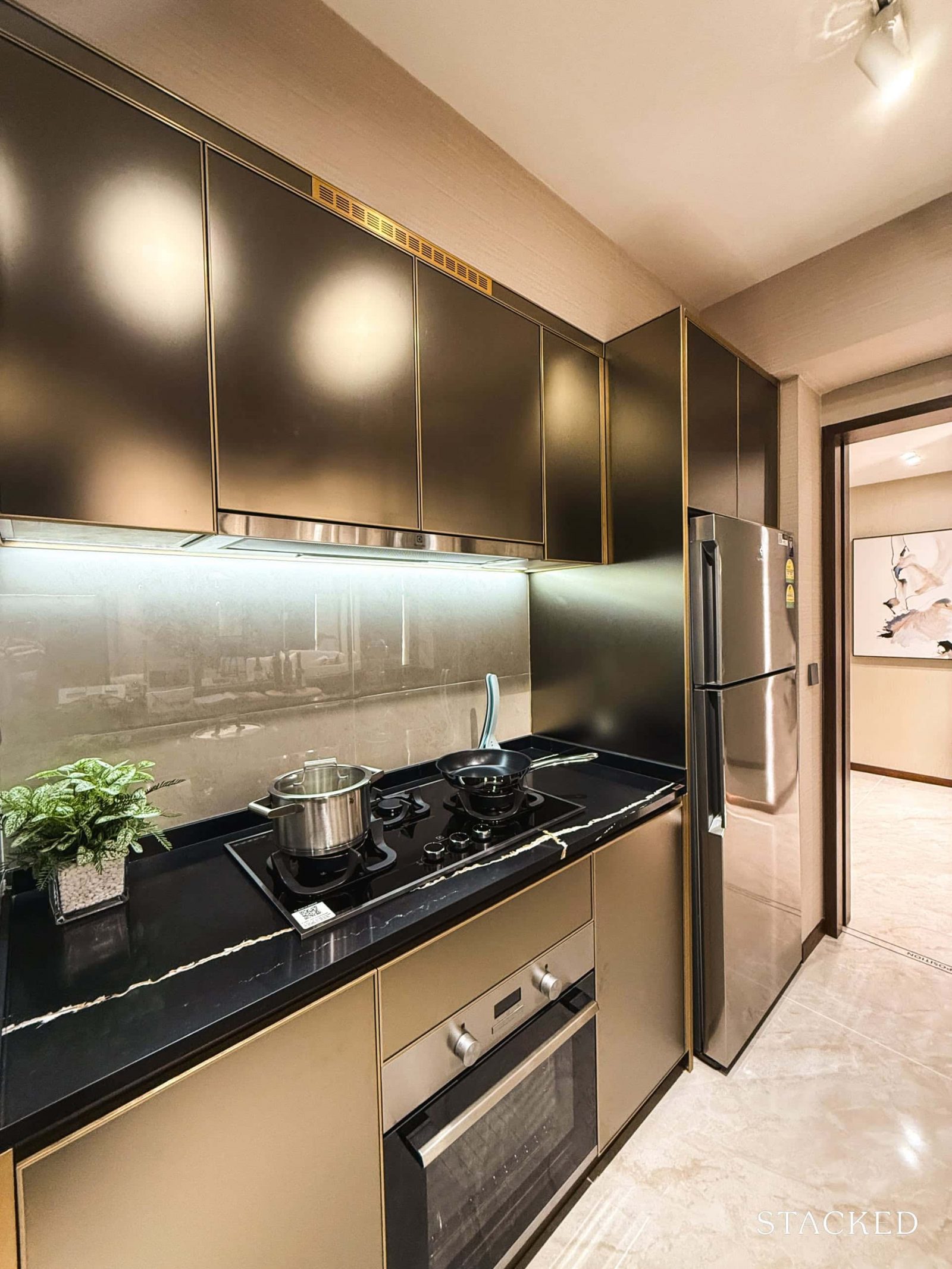
The other side of the kitchen is where the main cooking action happens, featuring a three-hob gas stove, built-in oven, cooker hood, and fridge – all from Electrolux.
At the end of the kitchen (not pictured here), you’ll find space for an Electrolux washer-dryer combo and a WC. There’s also a window here for natural ventilation, which is functional for those who prefer cooking with open flames or anyone who enjoys air-drying their clothes (although there isn’t technically a proper yard area here).
Now, let’s head on out to the common living areas.
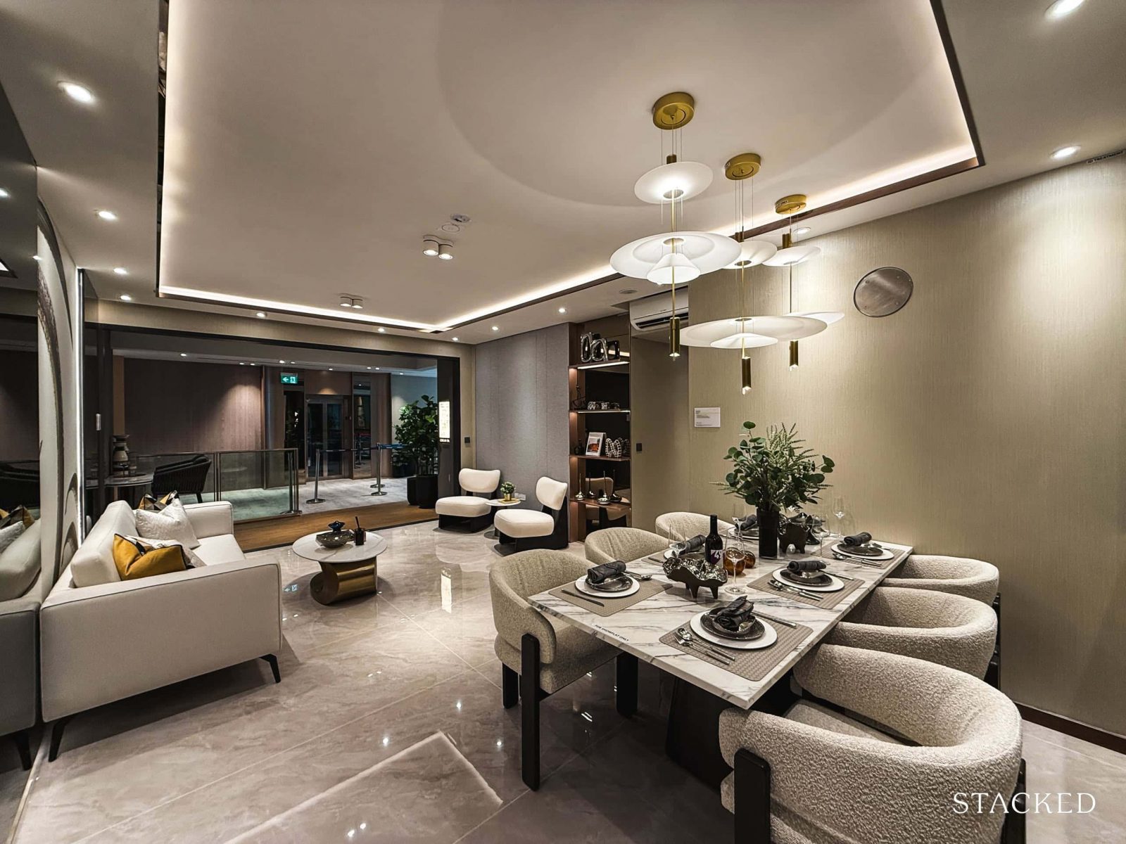
This is where this unit shines as you do have a spacious living and dining area. For context, the combined living, dining, and foyer areas span 38.6 sqm, which is generous for a 3-bedroom.
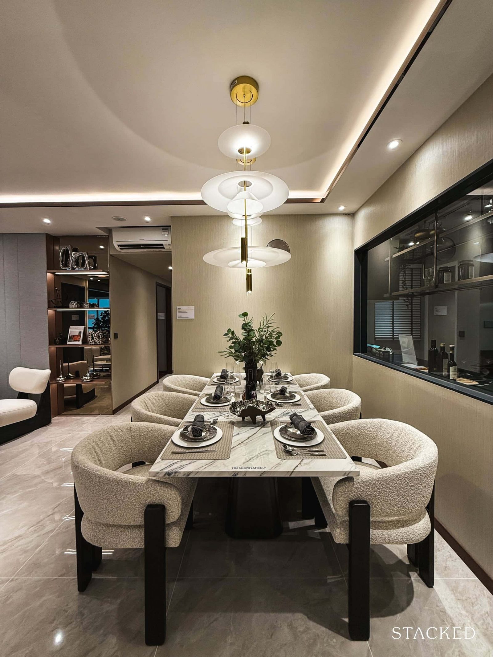
The dining area is naturally positioned next to the kitchen and comfortably fits a large six-seater dining set (as shown here), with room for an eight-seater if you’re open to slightly more compact furniture and a different orientation. Given that they haven’t opted for the usual bench style dining, it shows that you do have more space than the norm.
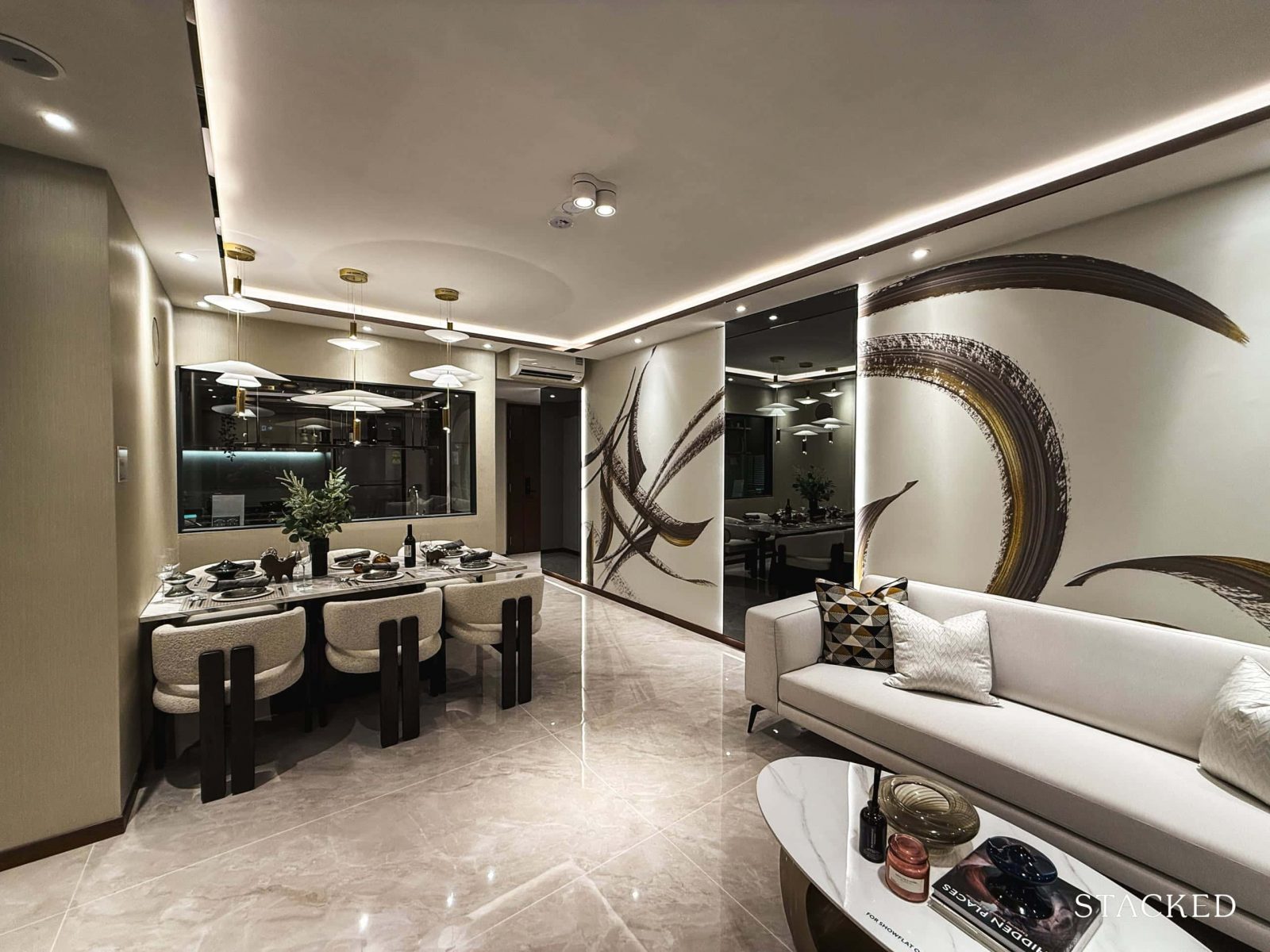
You can see here that there’s a comfortable amount of space separating the dining area from the living room, which emphasises the difference in scale between the typical 3-bedroom classic and deluxe units versus the premium ones.
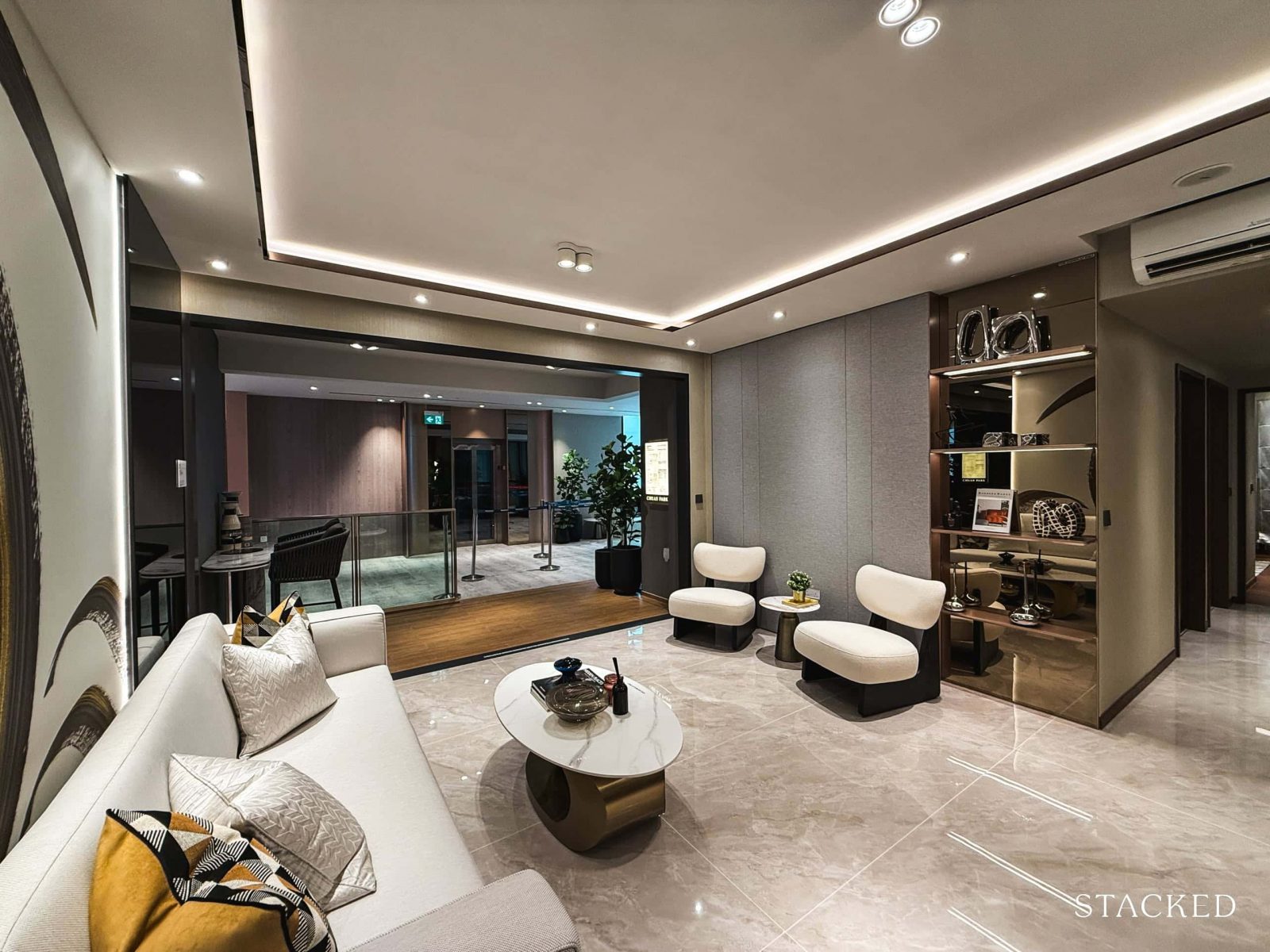
The living room offers a nicely squarish layout, comfortably accommodating a three or even four-seater sofa without the space feeling cramped. There’s a good amount of room for a coffee table as well.
While a TV console might be the obvious choice for one end of the room, the designers have opted for two additional lounge chairs to accentuate the space. Either way, you’ll still have more than decent breathing room.
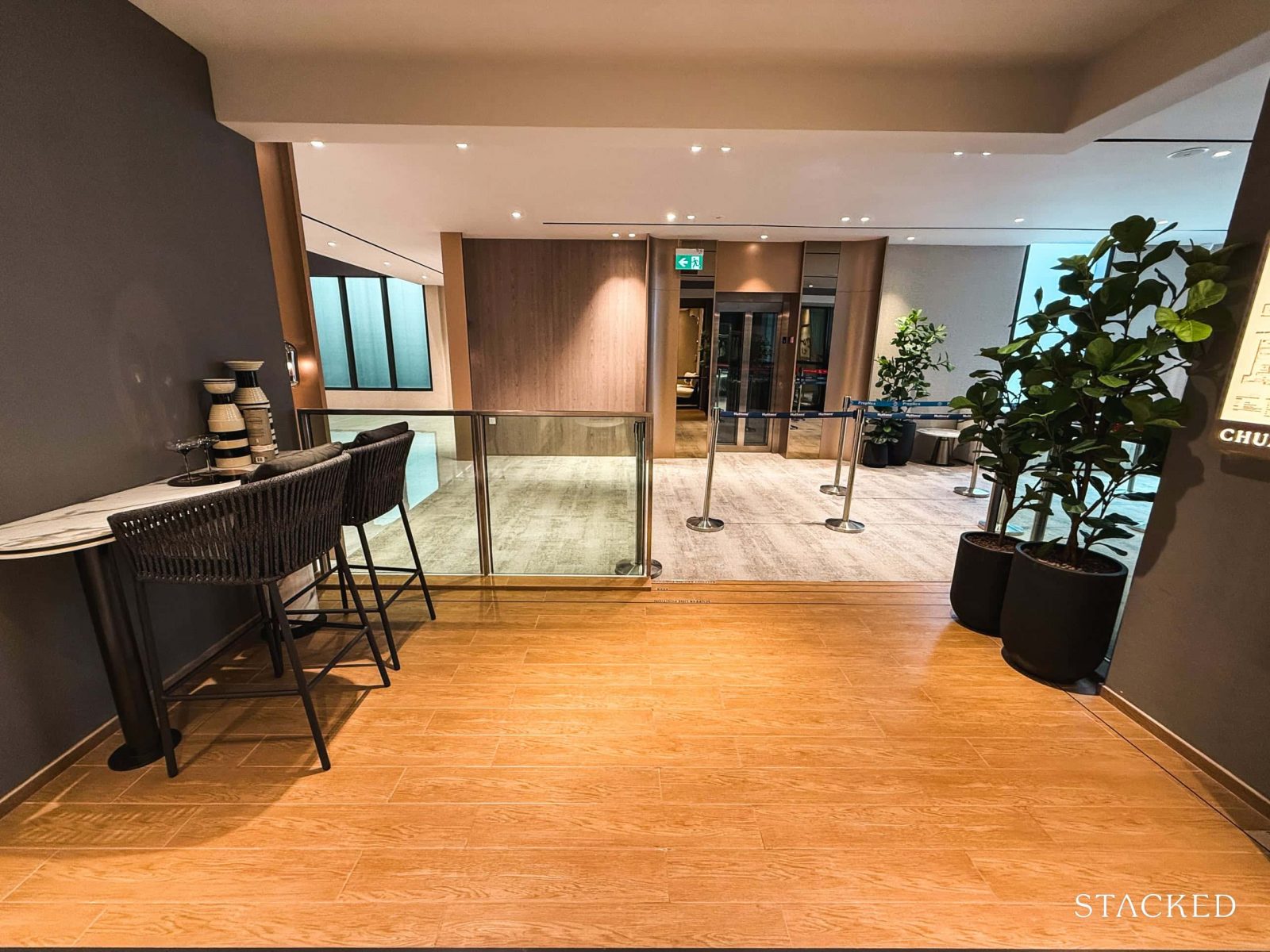
The balcony in the premium units is larger than those in the other 3-bedroom layouts, coming in at a generous 9.5 sqm. Opinions on balconies tend to be split; some appreciate the extra outdoor space, while others might prefer it reallocated to increase indoor living areas.
That said, this balcony is adequately sized to fit a small dining set, ideal for those who might already be envisioning outdoor dining as part of their setup.
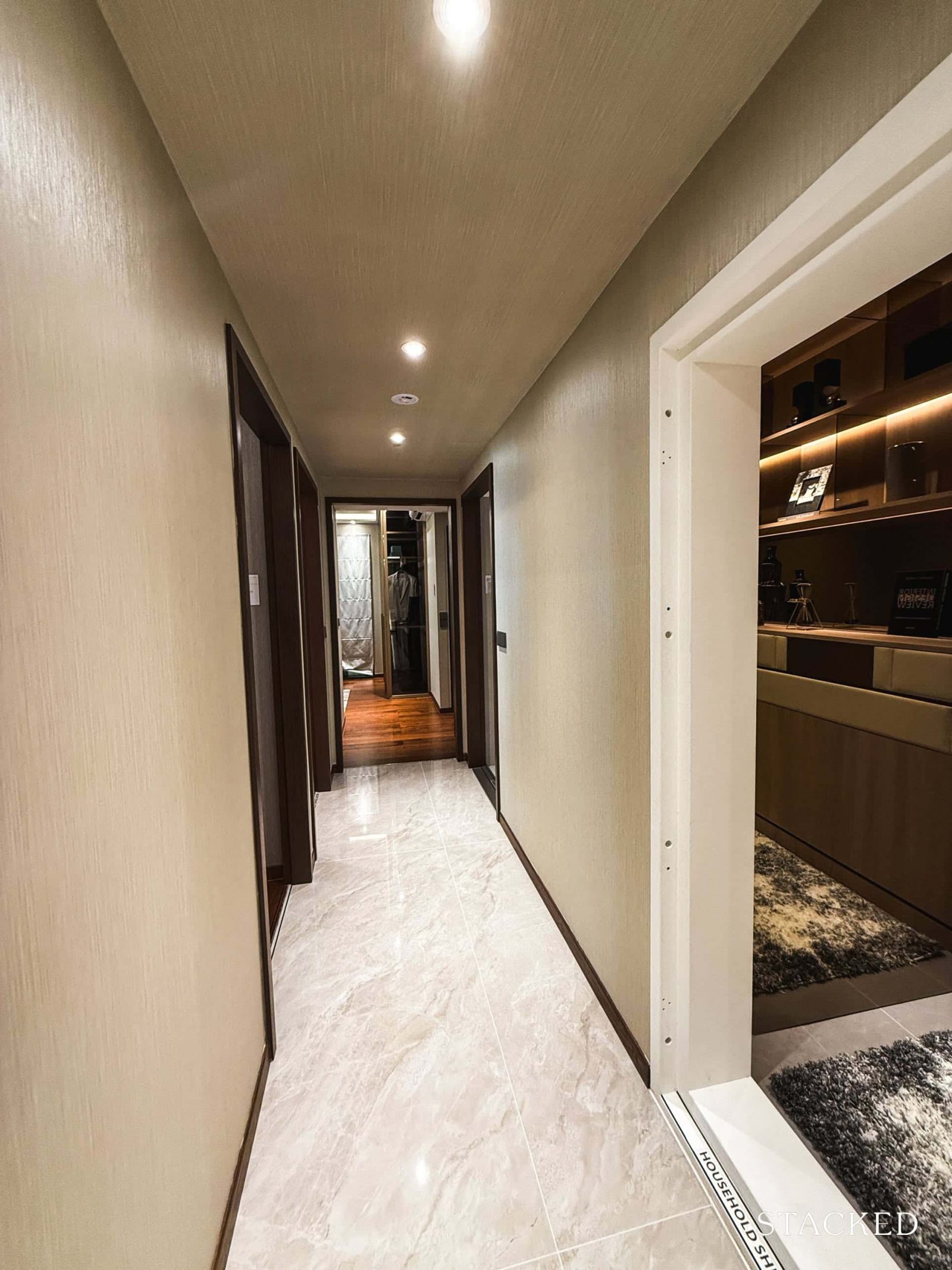
Now, let’s head on to have a look at the rest of the living areas.
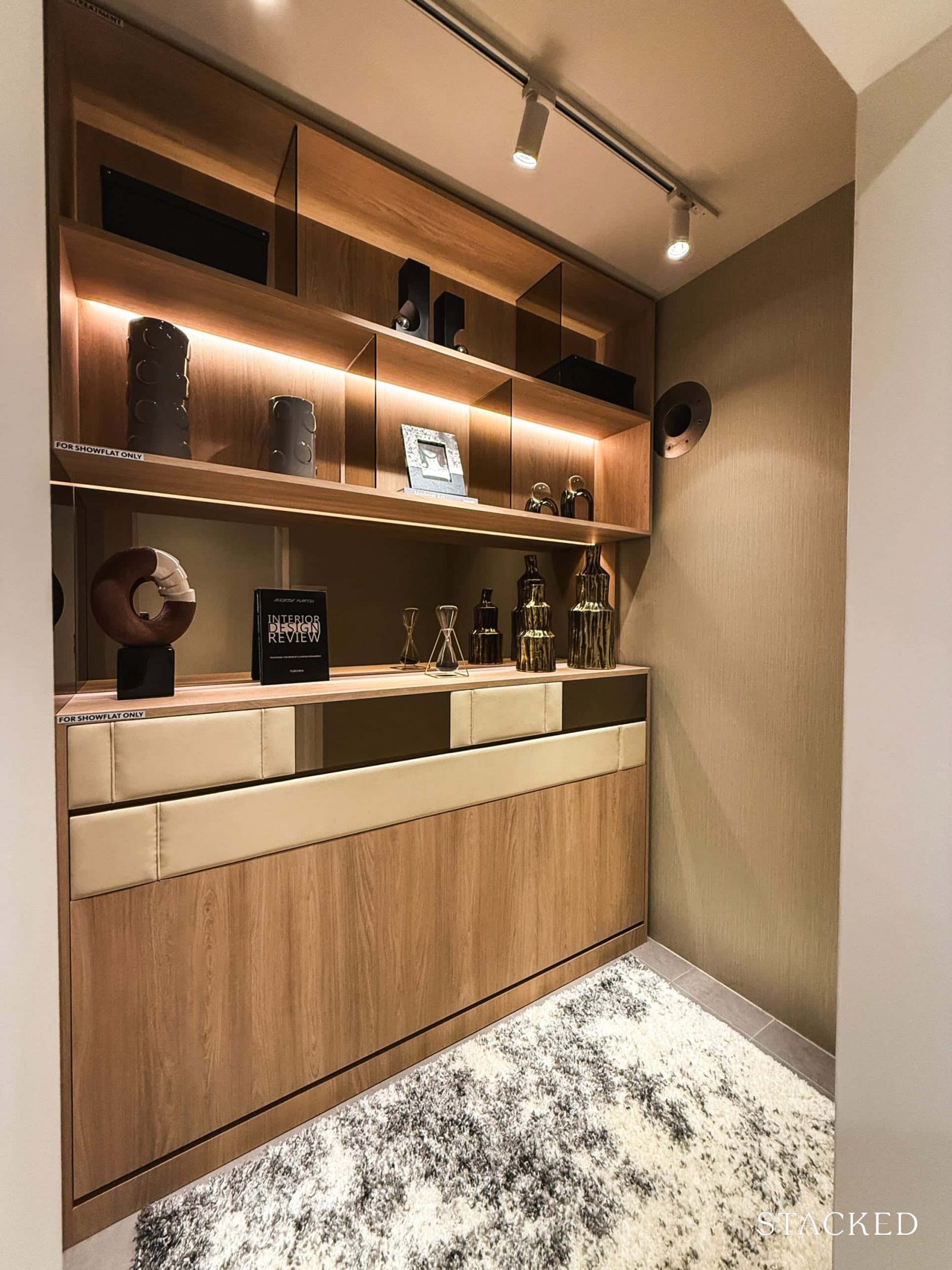
Interestingly, the home shelter (3.8 sqm) is situated right at the front of the hallway. While many developers typically opt to place home shelters closer to the kitchen for convenience as a yard or pantry, this design has its unique advantages and disadvantages.
For one, it may feel more like a small bedroom than a standard home shelter tucked away in the kitchen. Which could be more conducive for those who have a helper.
On the flip side, having the home shelter in such a spot could be an eyesore for some, and those hoping to utilise it as a kitchen pantry will need to consider alternative arrangements.
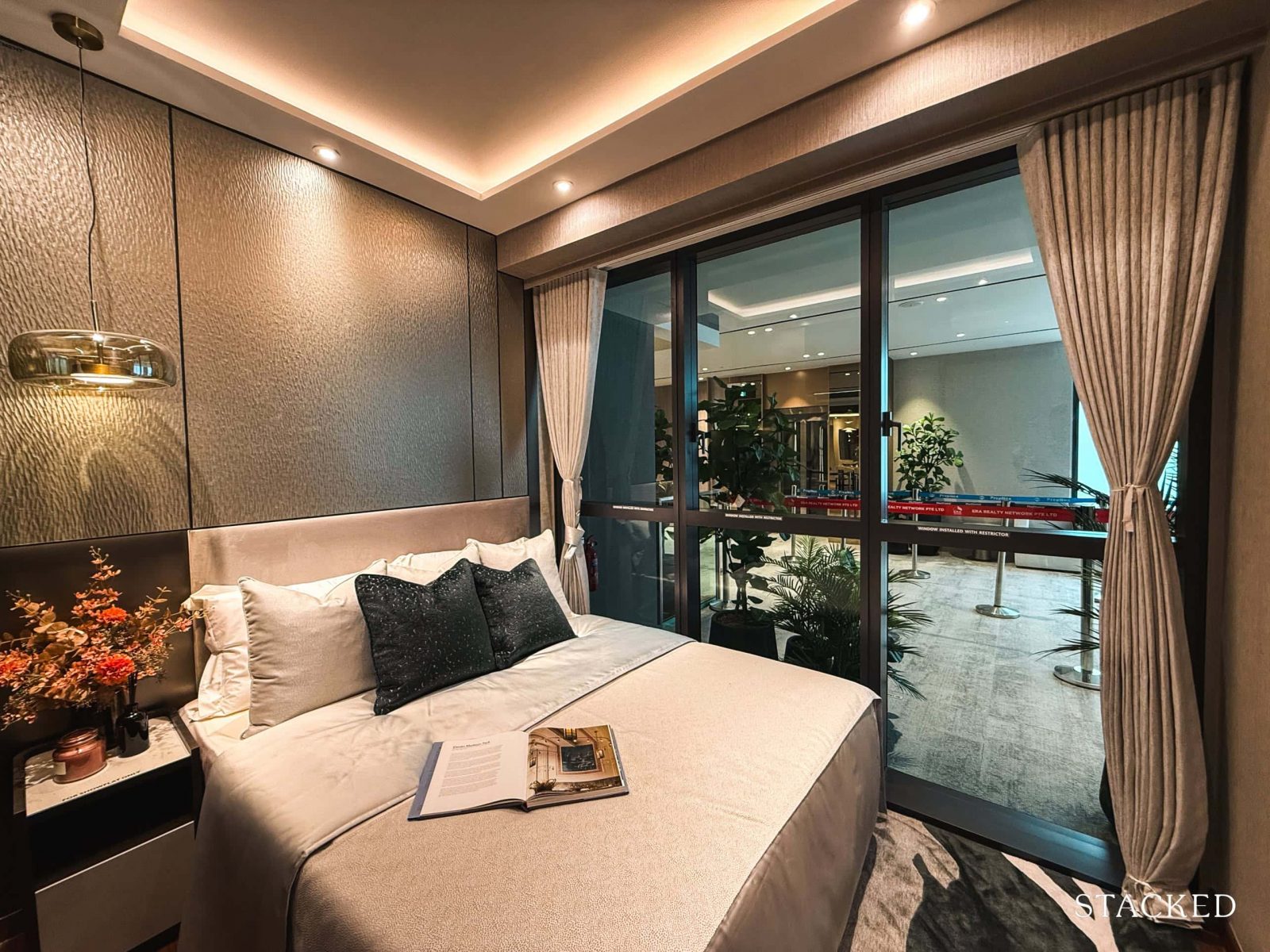
Bedroom 3, sized at 9.1 sqm is located right across from the home shelter. It comes with full-height windows which would be well appreciated if the unit enjoys unblocked views of its surroundings.
Standard of most new launches today, the room is also able to accommodate a queen-sized bed, a small bedside table, as well as the typical 2-panelled sliding wardrobe comfortably.
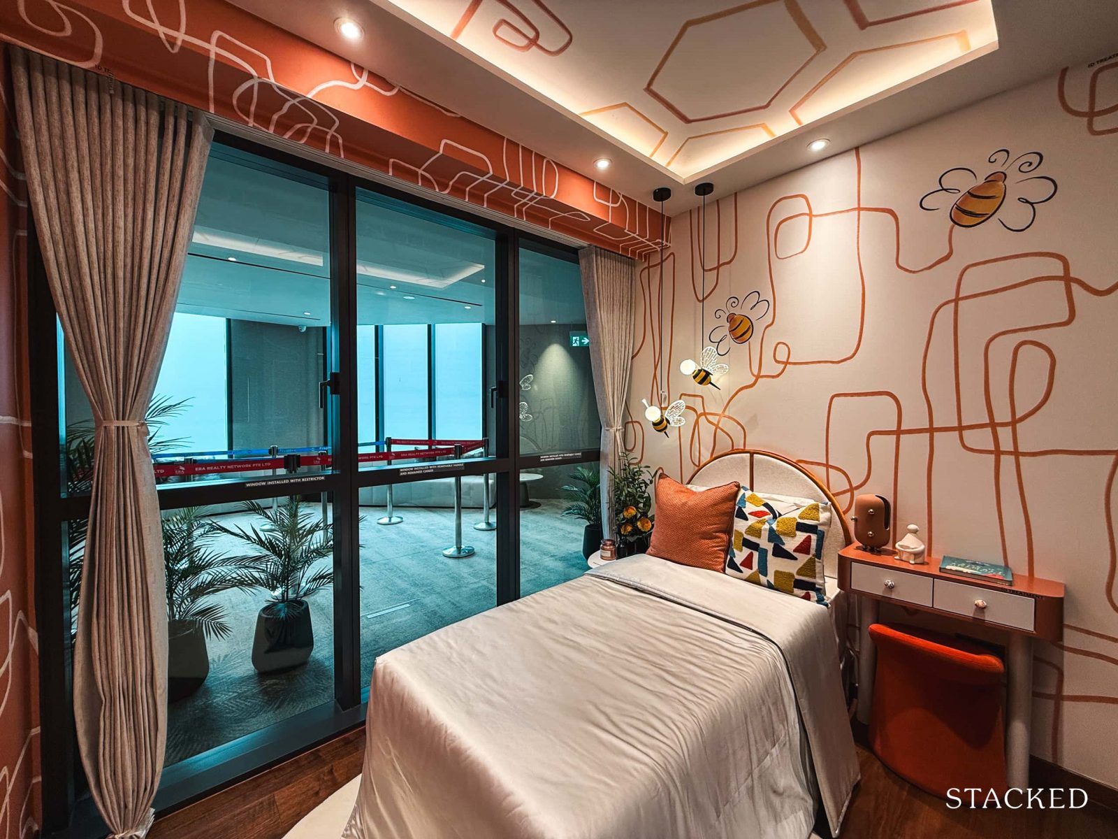
Similarly, Bedroom 2 also spans 9.1 sqm and comes with full-height windows. Unlike Bedroom 3, the designers chose to feature a single bed here to better showcase the sense of space.
This layout allows for a small study table on the side, making it a great setup for children or teens.
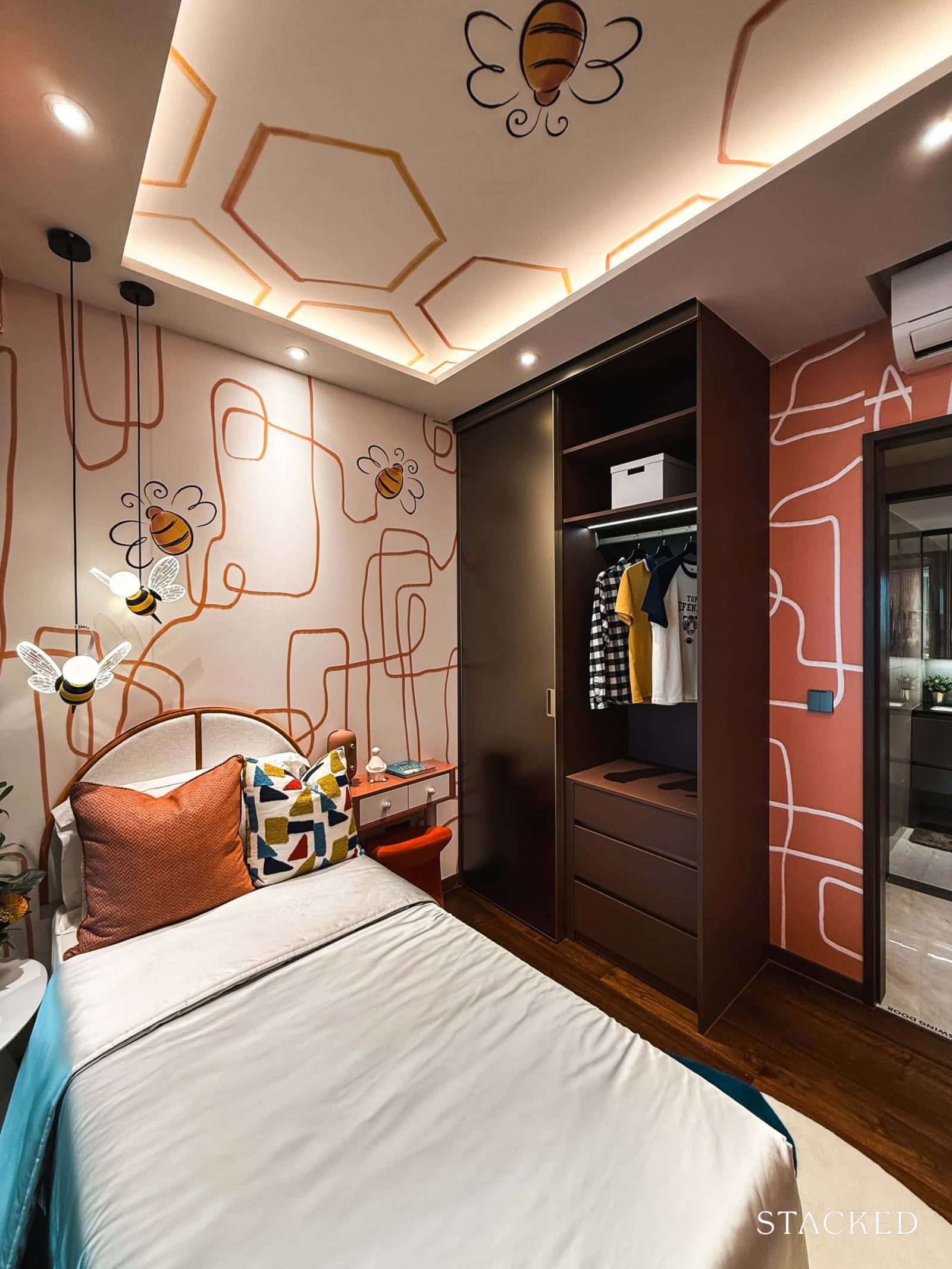
As is standard, this bedroom features a two-panel built-in wardrobe. Visibly, there’s still a decent amount of space left after fitting in all the furniture.
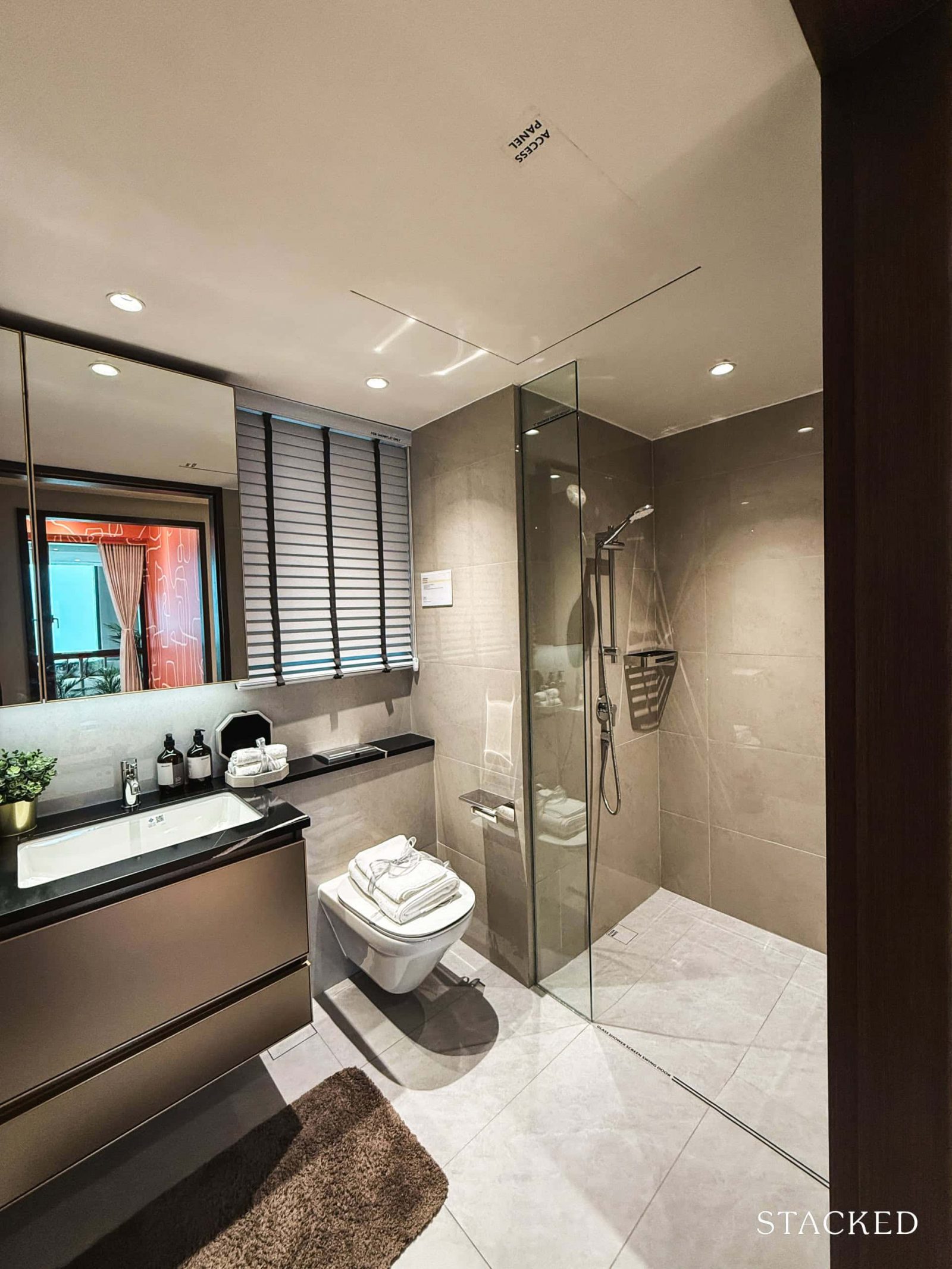
Directly across from Bedroom 2 is the common bathroom which serves Bedrooms 2 and 3 as well as guests.
At a comfortable 4.4 sqm, it comes equipped with all the standard fittings. The fixtures are from Kohler, including the basin, shower mixers, and wall-hung WC. One plus point is that there’s a window for natural ventilation, which is always a welcome feature.
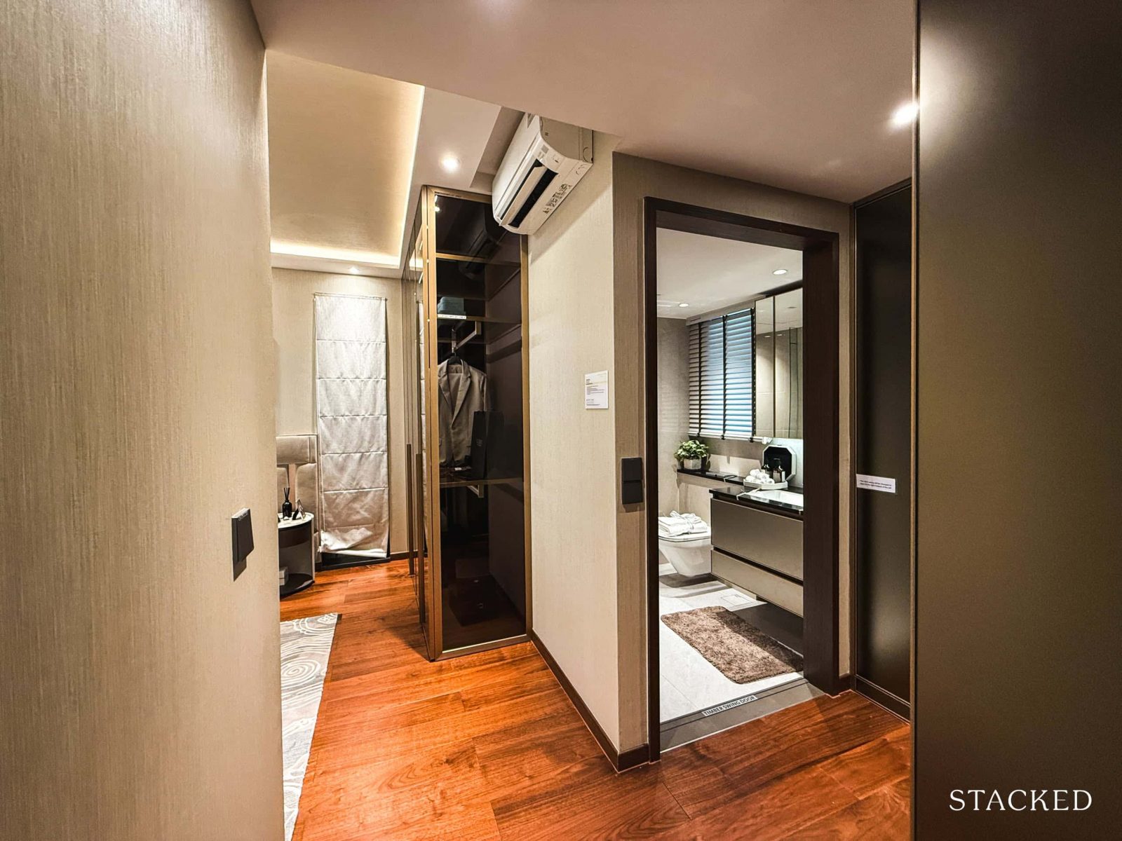
Last but not least, let’s have a look at the master bedroom.
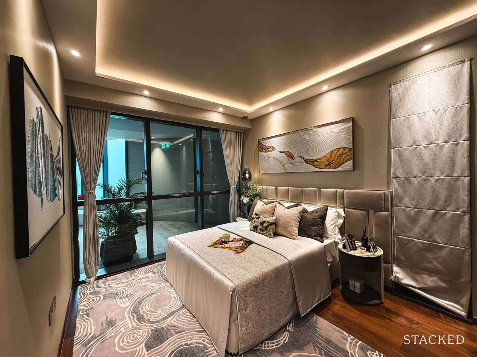
Spanning a generous 18.8 sqm, the master bedroom features a functional layout that many will appreciate.
For the main sleeping area, it comfortably fits a king-sized bed, along with two compact bedside tables, leaving ample space for moving around. The full-height windows here also let in plenty of natural light, enhancing the overall sense of space.
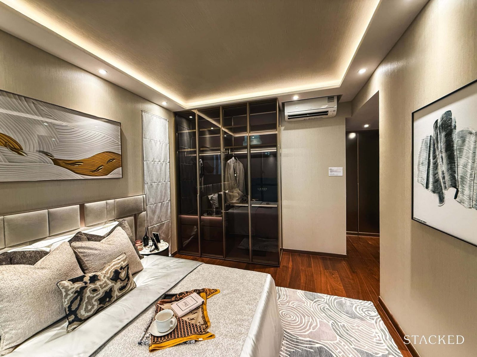
In the opposite corner of the sleeping area is an open space that many may choose to fill with additional shelving or freestanding furniture, as shown here.
This versatile area can serve various purposes, but for me, I’d definitely set up a vanity to streamline my morning routine. Either way, this open area allows more opportunities to customise the master bedroom according to their needs.
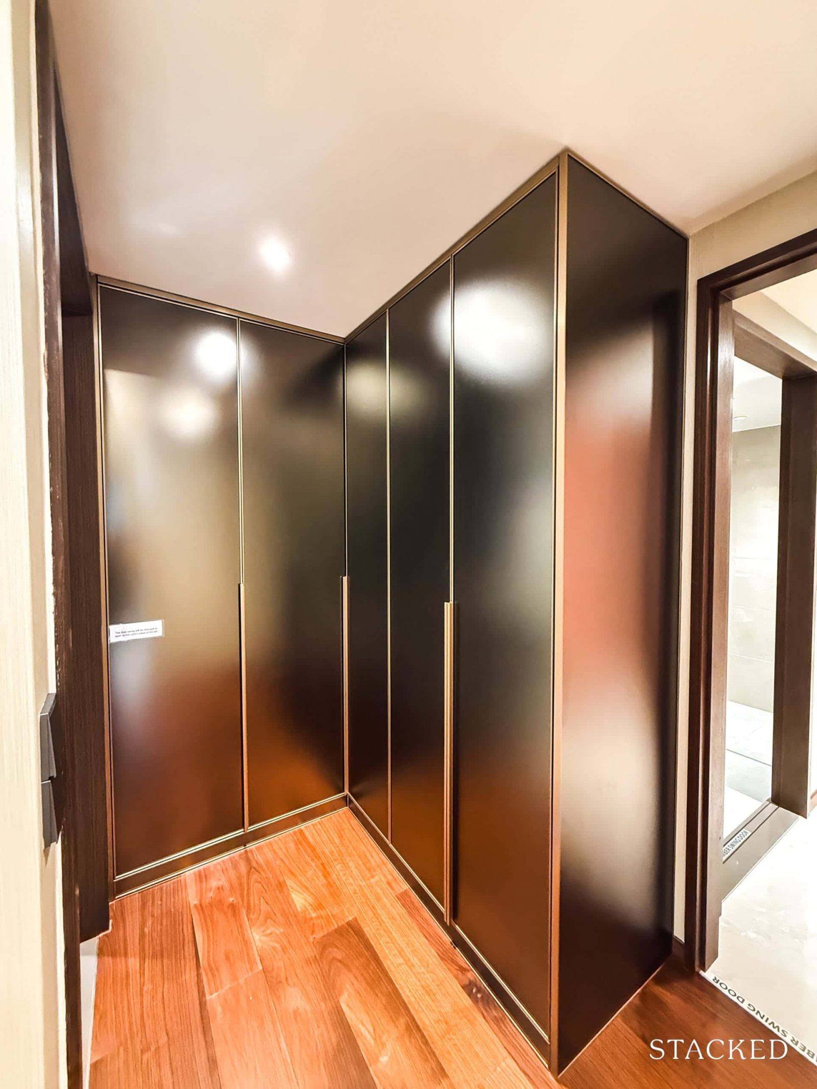
Now for the actual storage, the included built-in cabinetry features an L-shaped design conveniently located next to the master bathroom. This layout not only maximizes storage space but also creates a functional nook for changing clothes.
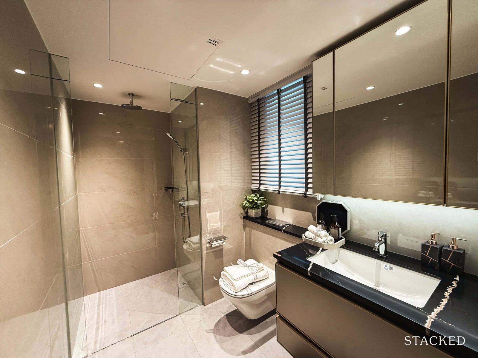
Finally, let’s take a look at the master bathroom. While it shares a similar style with the common bathroom, it offers a more generous size at 4.9 sqm.
The standard provisions are consistent with those in the common bathroom, but here you’ll also find the added luxury of a rain shower. All fixtures, including the basin, wall-hung WC, and shower and basin mixers, are from Kohler. And let’s not forget the window that allows for natural ventilation – a definite bonus!
Chuan Park Condo – 5 Bedroom Type E1 (144 sqm/1,550 sq ft) Review
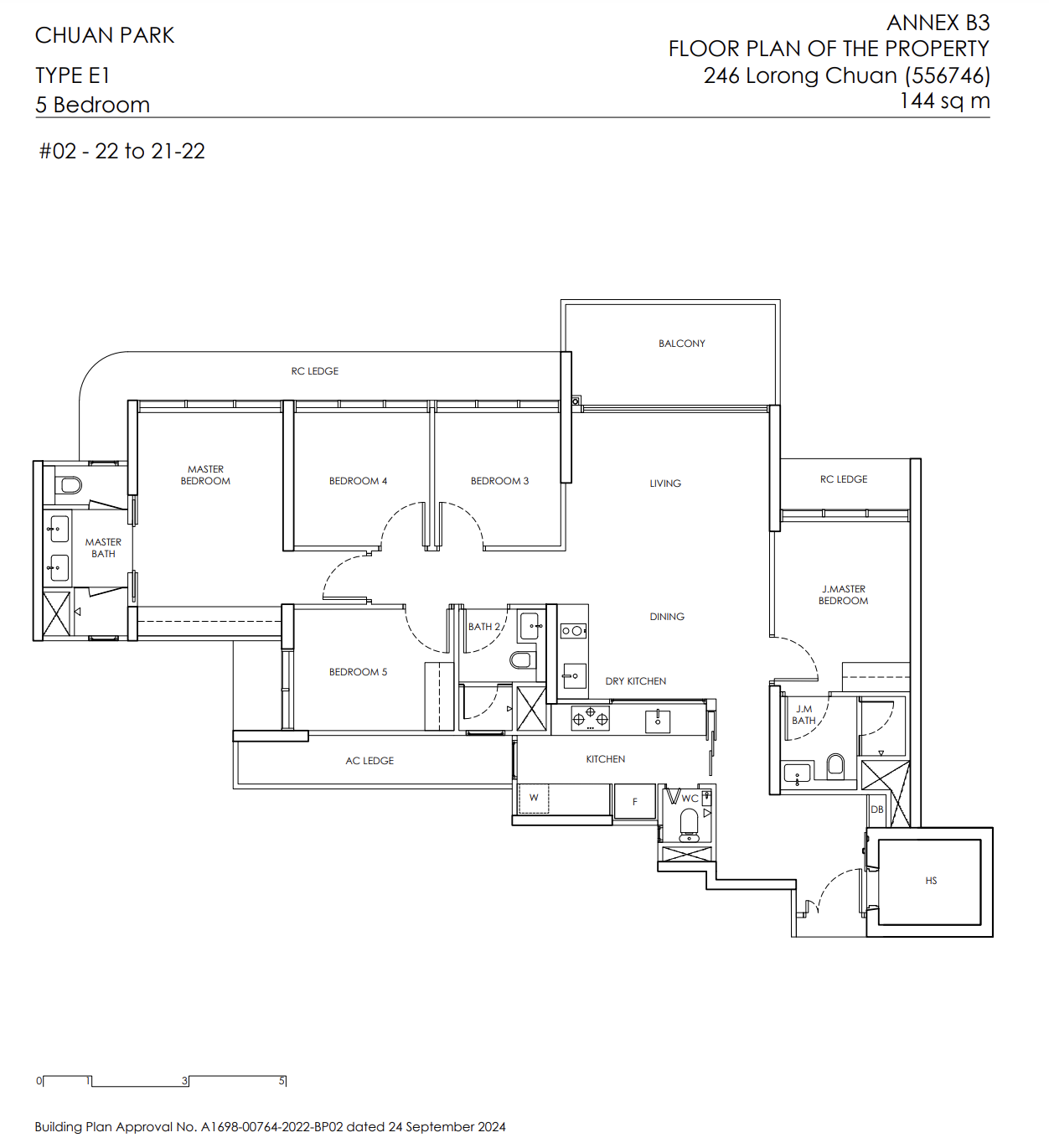
Five-bedroom units are the rarest in the unit mix here, comprising just 2.1% or 22 units. For context, there’s a notable shortage of 5-bedders in the neighbourhood, with nearby developments like The Scala, Chiltern Park, and The Springbloom topping out at four-bedroom options. While unit sizes in those older projects tend to be more spacious, Chuan Park offers an efficient and functional alternative for those specifically seeking a 5-bedroom layout.
Due to the limited number of 5-bedders, there’s just one available layout, which we can see in the show flat. Standard units measure 1,550 square feet, while penthouse versions are sized at 1,840 square feet to accommodate the additional void space.
As expected, the common areas are finished with porcelain tiles, while the bedrooms feature engineered timber flooring. Ceiling height here, however, is slightly lower at 2.715m, compared to the typical 2.8 to 2.9m seen in most condos – something to keep in mind.
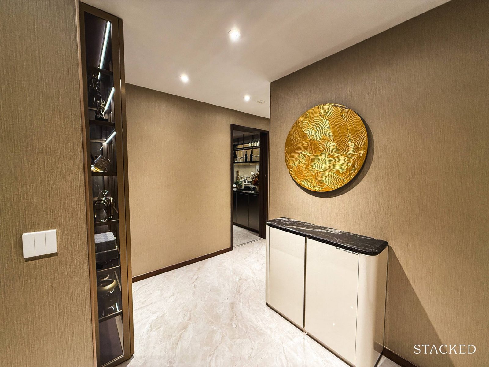
A foyer greets you upon entering the unit – a welcome feature, especially in a larger home like this. Although it’s a short corner, it introduces an added layer of privacy for the occupants.
The space is also ample enough to fit shelving for a shoe rack or even a console for added storage.
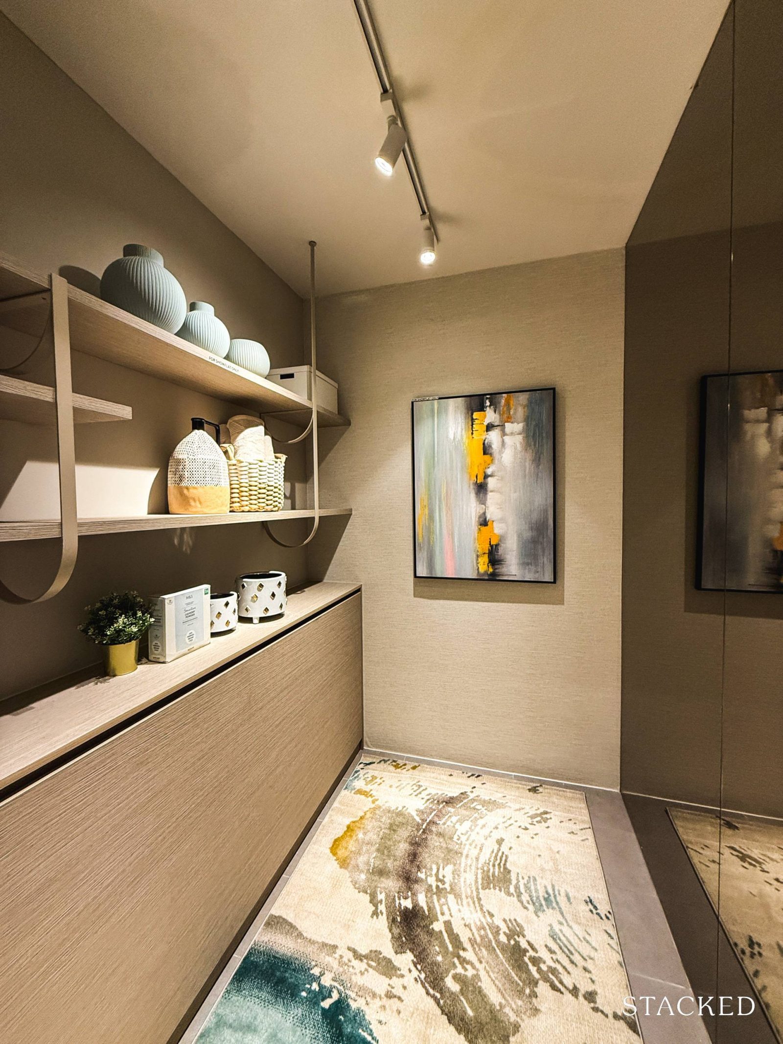
What’s particularly interesting about this layout is the positioning of the home shelter (4.7 sqm) right at the main entryway. Typically, home shelters and WCs are situated at the back of the kitchen, allowing them to serve as pantries or sleeping quarters for those with a helper.
I’m not sure that I prefer the location of this, as most buyers of such a unit would require it for the helper’s room. In any case, I don’t think of this to be an issue.
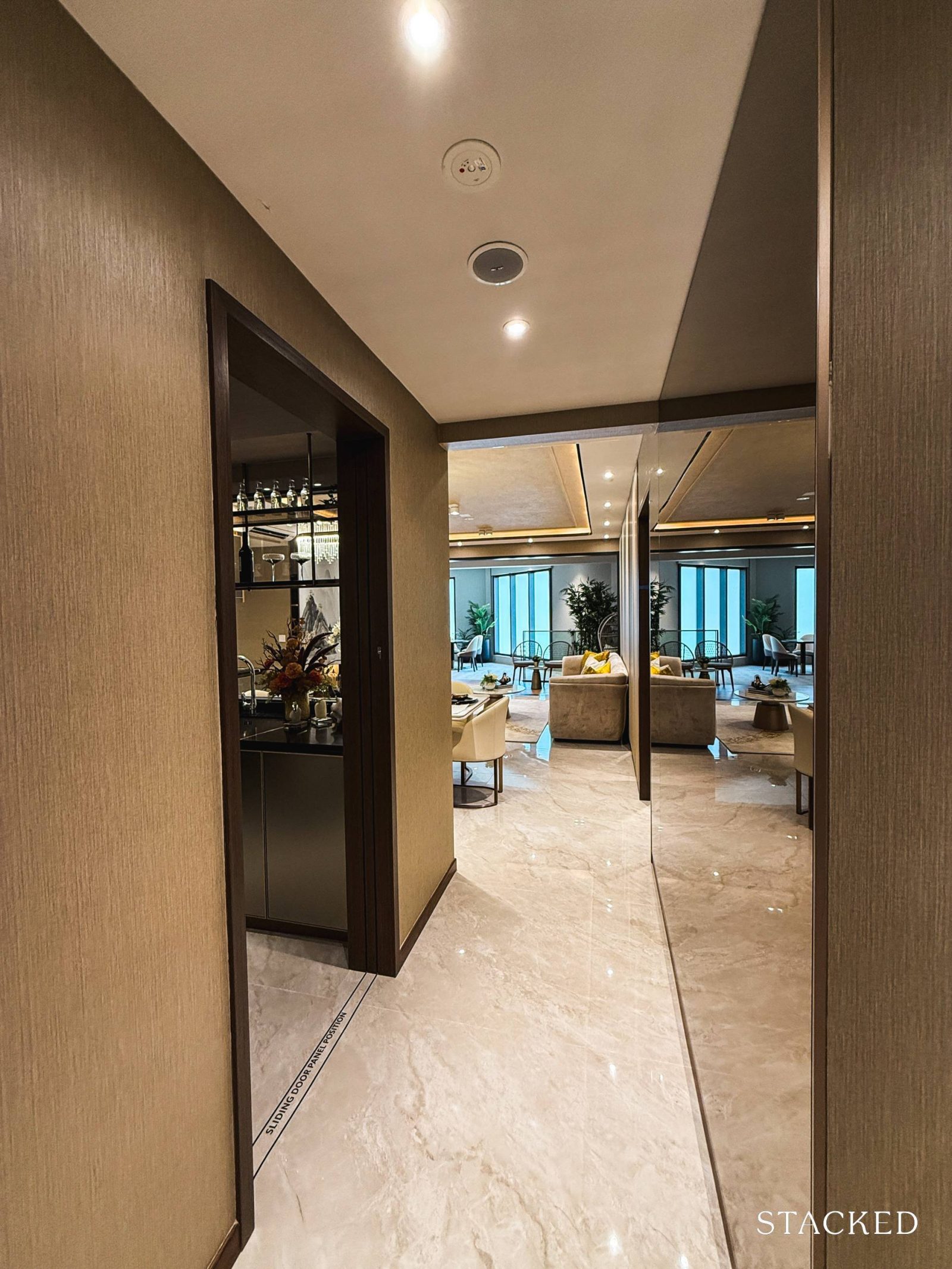
As you step into the unit, you’ll find the wet kitchen tucked neatly to the left, while the dry kitchen is placed just outside by the main dining area – which is good for entertaining or casual family meals.
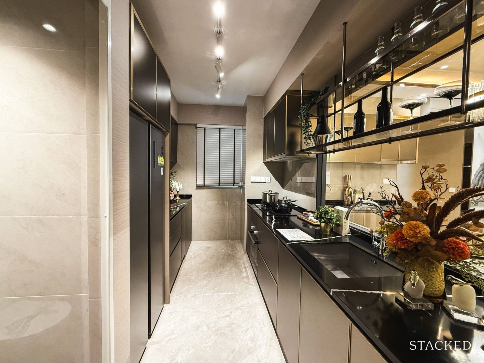
Let’s start with the wet kitchen. Like many newer launches, it’s designed with a long hallway layout leading down to the yard – an 8.8 sqm space that’s fairly standard these days.
One interesting choice here is the placement of the WC. Unlike the usual setup where it’s at the back, the developers have opted to position it right at the front of the wet kitchen.
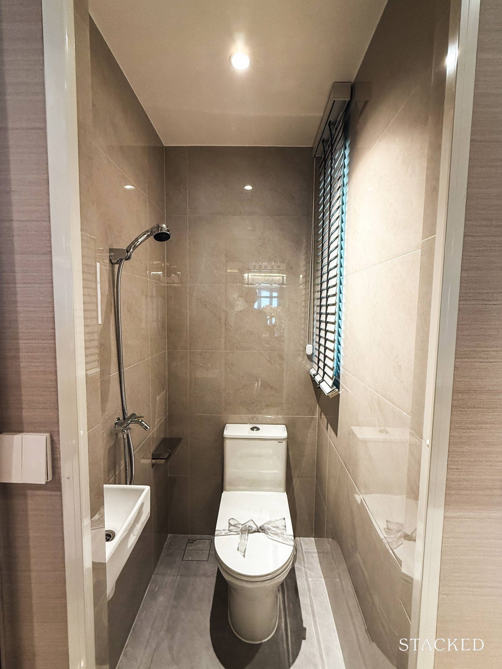
By placing the WC (1.3 sqm) here, it can double as a powder room, but it’s also more convenient for helpers, particularly if the home shelter is used as their sleeping quarters.
What’s nice about this layout is that the WC becomes more accessible, compared to the usual setups where it’s tucked away at the back and often overlooked.
Unlike the common bathrooms, however, the WC is a pedestal WC (instead of a wall-hung one), though the basin is from Kohler and the tap is from Monic. Notably, there is also a window here for natural ventilation.
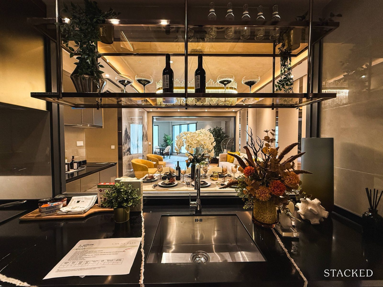
Moving along with the wet kitchen tour, there’s a glass panel installed by the sink that opens up the view toward the common areas.
Not only does it invite more natural light into what could otherwise be a dim space, but it also lets whoever’s in the kitchen stay connected with the living room action, while still keeping the option to enclose the space.
Fixtures-wise, you’ve got a stainless steel sink from Englefield paired with a Kohler mixer. There’s also a good amount of countertop space, which would be helpful for avid cooks, or to facilitate those doing laundry.
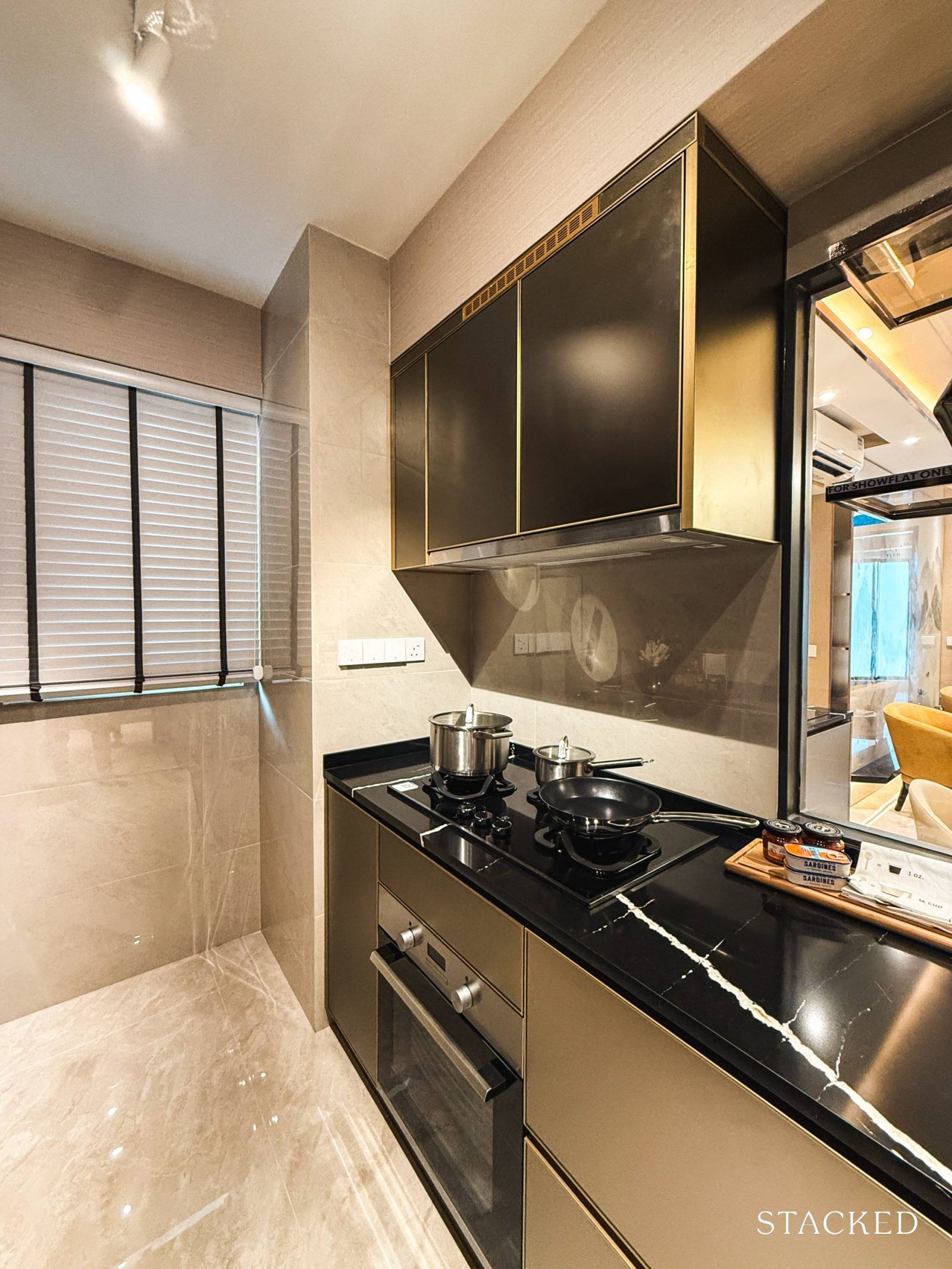
Toward the end of the kitchen is where most of the heavy cooking would take place, which makes sense – it’s close to the window, offering natural ventilation to help manage cooking fumes.
Standard fixtures here include a gas hob, built-in oven, cooker hood, and fridge, all from Electrolux.
Across from the cooking area, you’ll find the washer-dryer combo, though the space here is a bit tight. For a 5-bedder, I would’ve expected at least a small, dedicated yard area, so that’s a bit of a letdown. Still, the window placement here is a plus for anyone who prefers to air-dry their clothes.
The washer-dryer unit is also an Electrolux standard fixture.
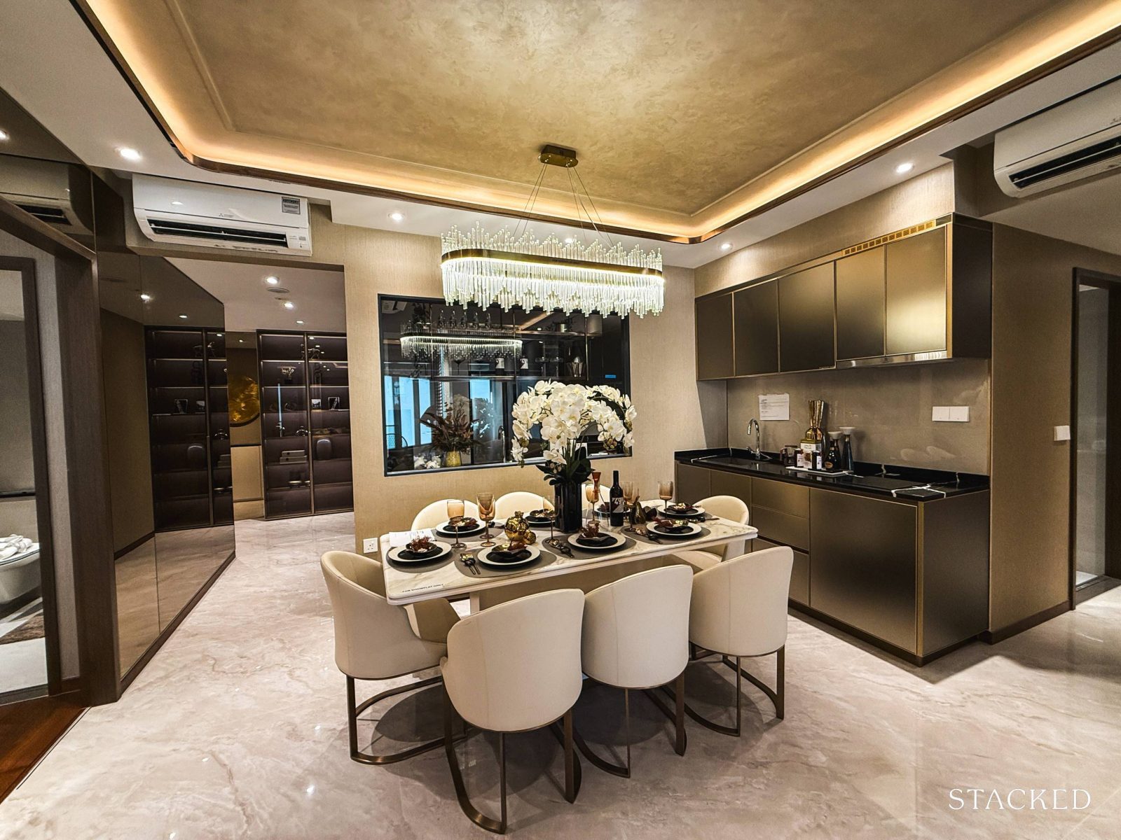
Moving to the dining area, the space is well-sized and can comfortably fit an eight-seater dining set. The only downside of such a dining set is if someone sits at the end of the table nearest the dry kitchen, it obstructs the opening of the drawers.
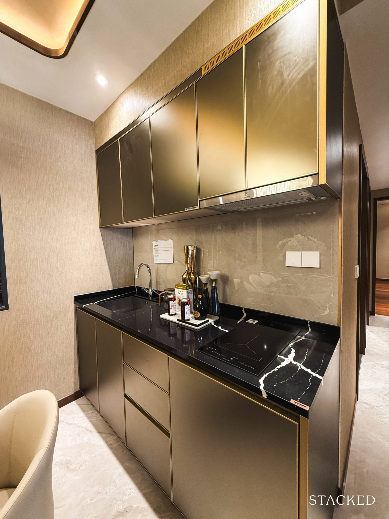
Next to the dining area is the dry kitchen, which feels a bit like the compact kitchen setup you’d usually see in smaller unit types.
Unlike the usual dry kitchens that are limited to storage and counter space, this one’s fully equipped: there’s overhead storage, drawers, a cooker hood, and an induction stove from Electrolux. The stainless steel sink is from Englefield, paired with a Kohler mixer.
It’s a functional space, perfect for light meal prep and storing kitchenware for easy access during dinners and gatherings.
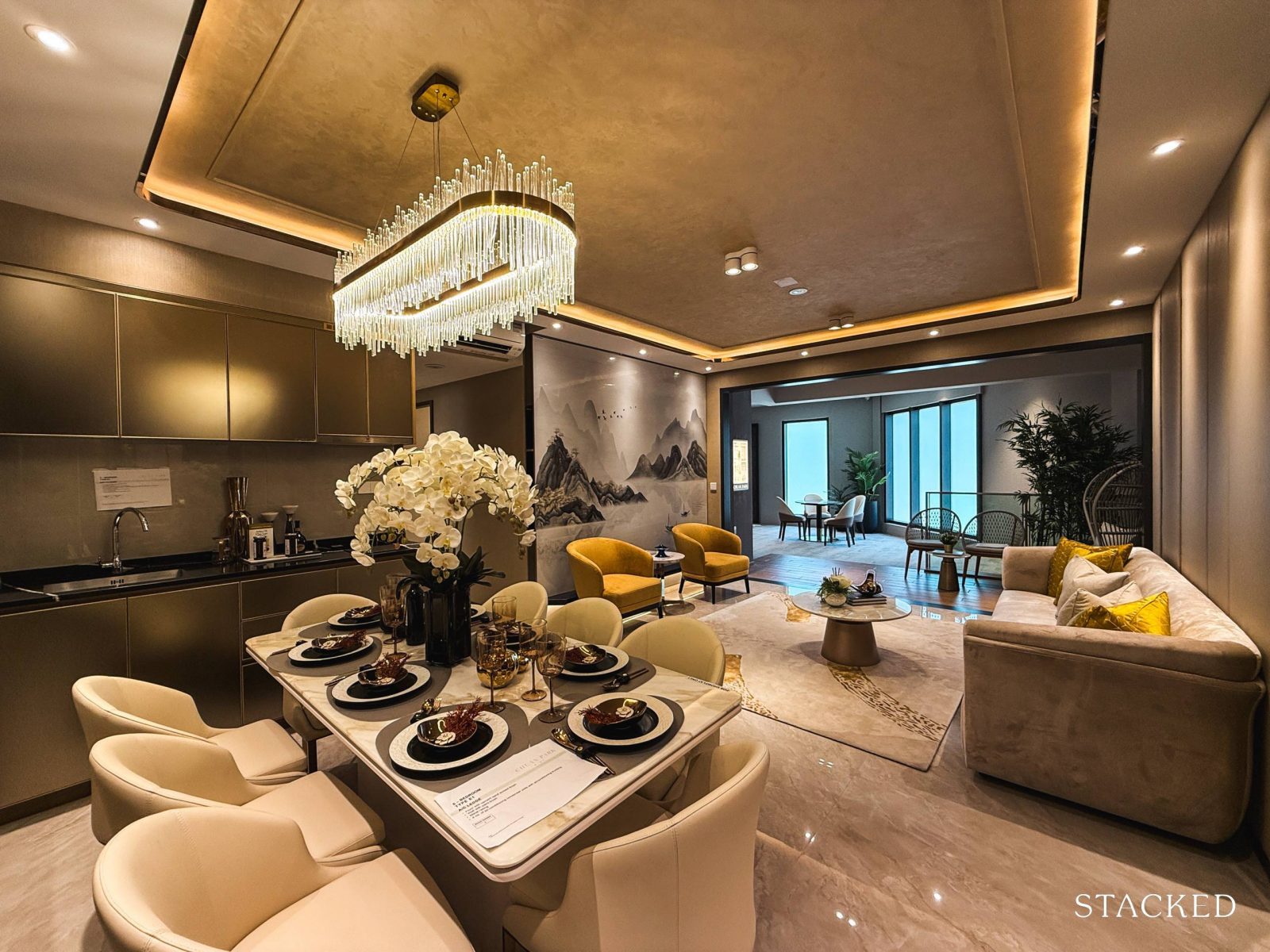
Now, let’s take a look at the rest of the common areas.
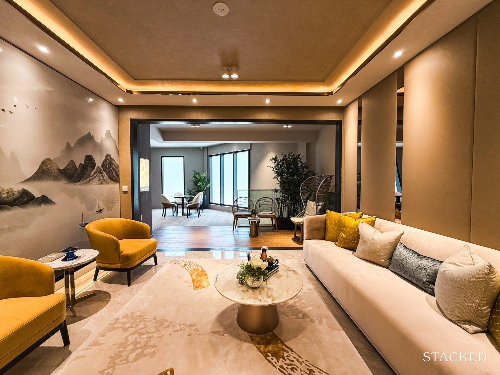
The 5-bedroom layout at Chuan Park offers a wider frontage in the living room. This allows for a three or even four-seater sofa set, coffee table, and TV console, all without the space feeling cramped.
As a reference, the total size of the living room, dining area, entrance foyer and dry kitchen is around 41.9 sqm, which is quite spacious by today’s standards.
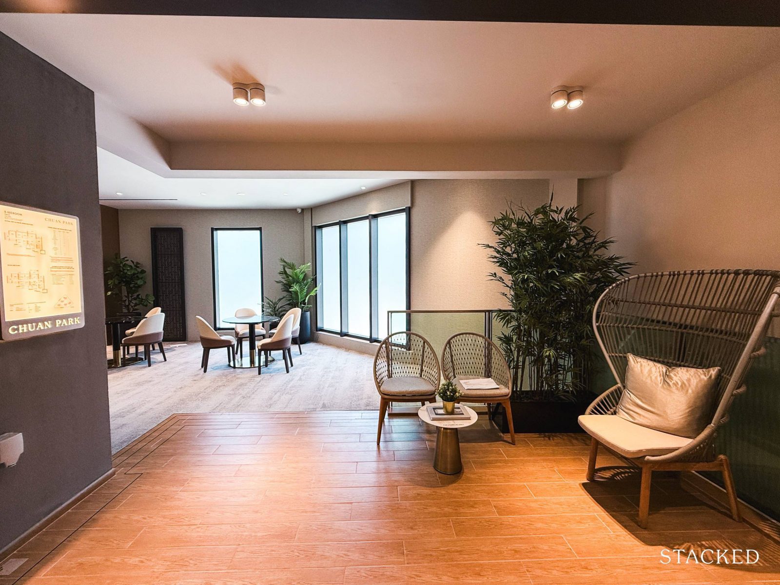
The balcony here spans 9.9 sqm – which is a suitable size for a cosy alfresco dining setup or a small outdoor lounging space.
While a larger balcony might seem fitting for a bigger unit like this, it’s always a bit of a trade-off between outdoor and indoor space. While Chuan Park does offer some pleasant views, I’d imagine most practical homeowners would appreciate having more liveable space within the unit itself.
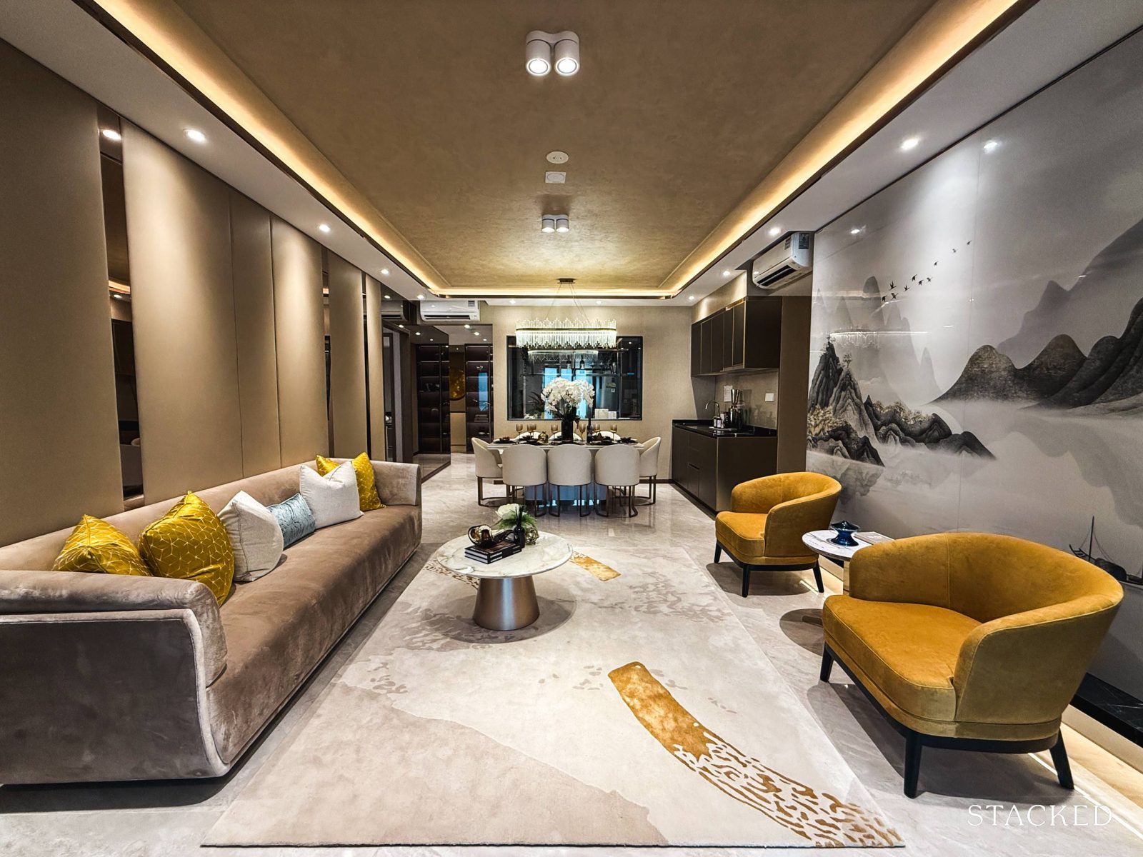
With that, let’s head over to the junior master bedroom, located just beside the dining area.
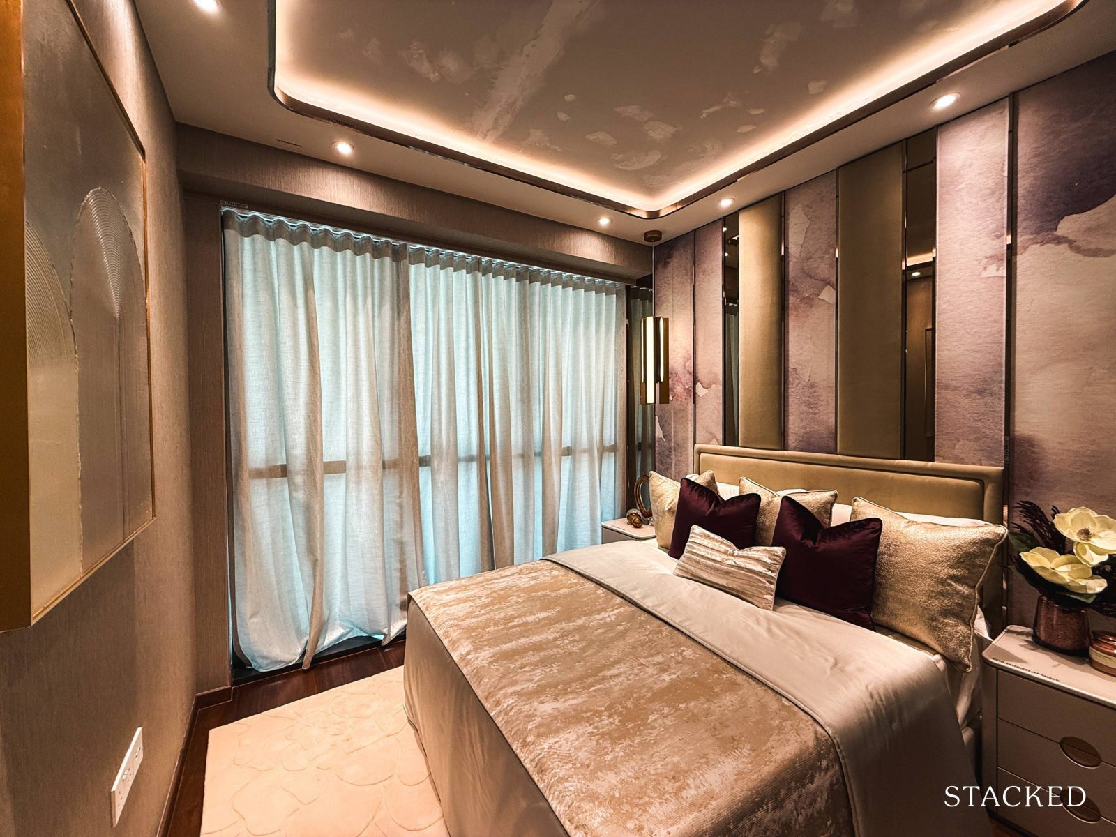
At 11.2 sqm, the junior master bedroom offers enough space for a king-sized bed, though a queen would give you a bit more room to move around comfortably.
There’s also space for two compact bedside tables, and the full-height windows let in plenty of natural light for a more airy feel.
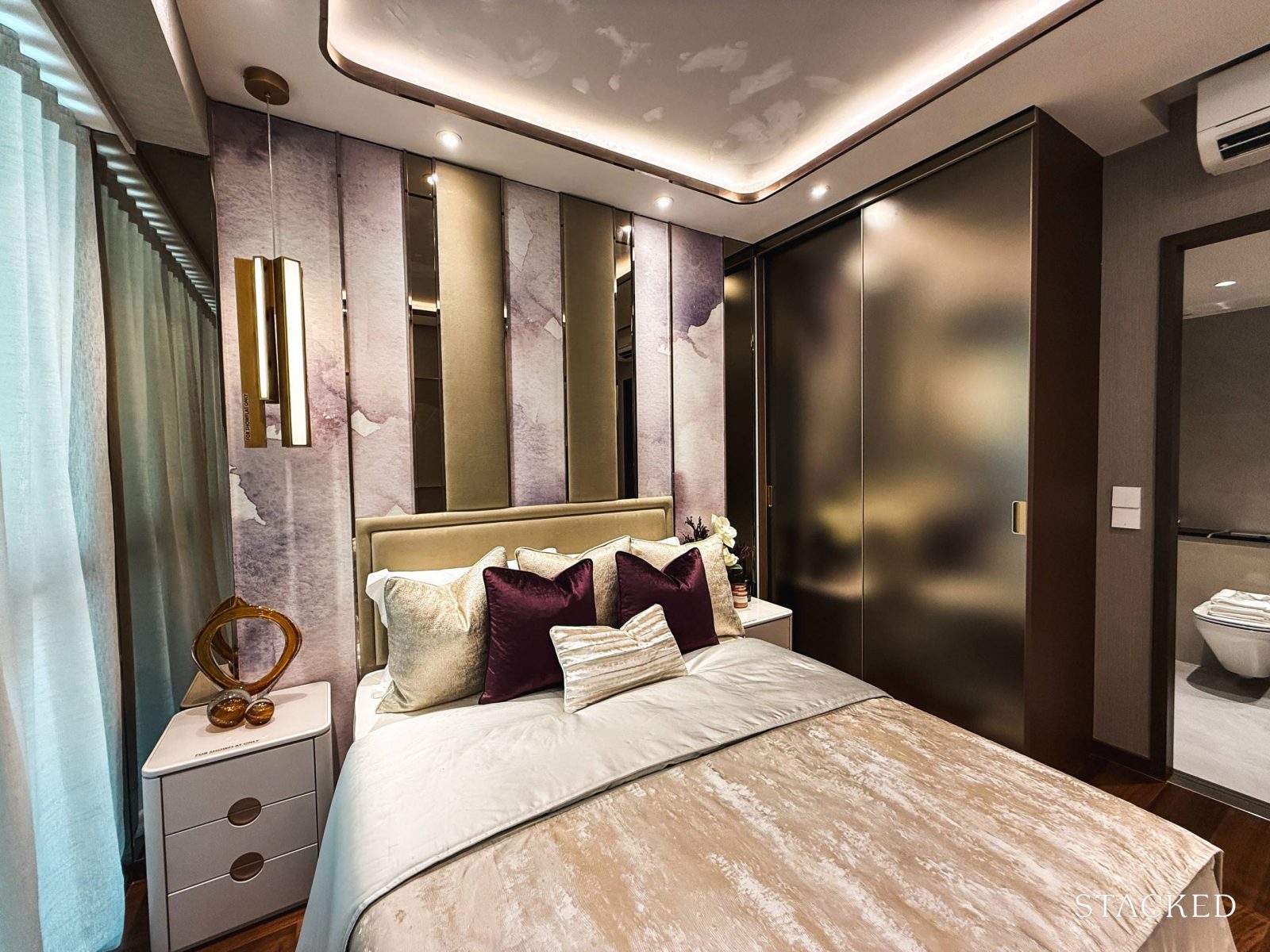
It also comes with the standard two-panelled sliding wardrobe, with a glossy gold-like finish that won’t be my preferred choice, but I can see how some people may like such an option.
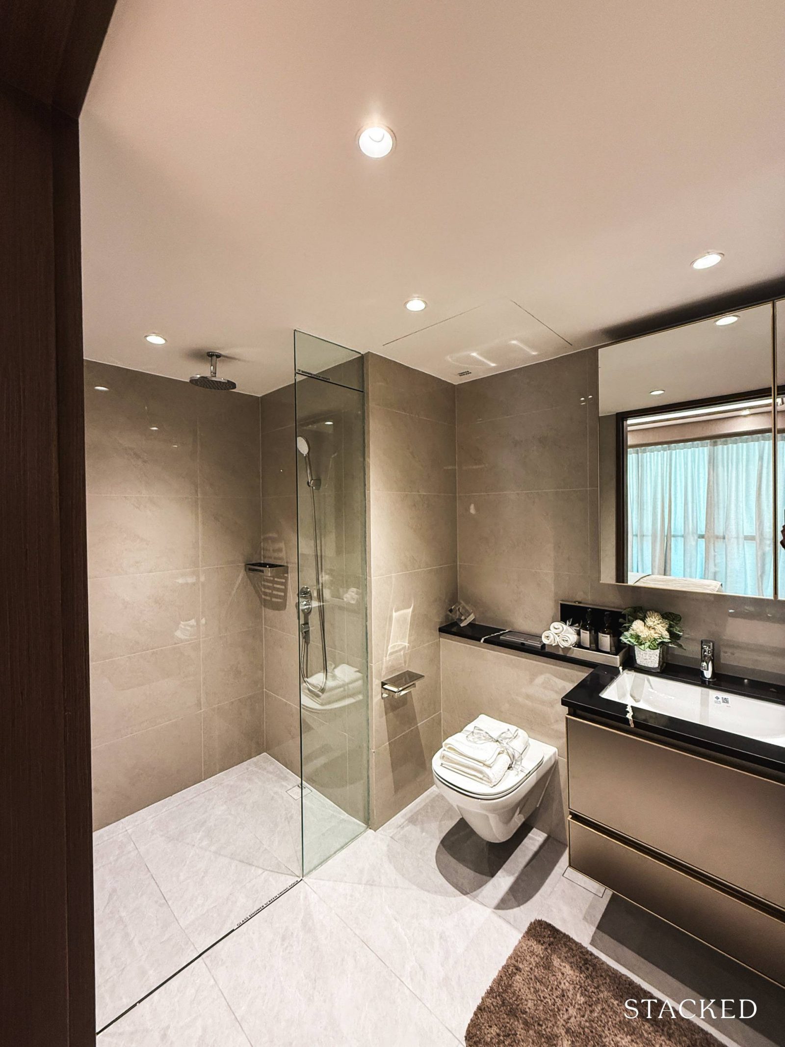
The junior master bathroom, at 4.9 sqm, is slightly larger than the common bathroom, and it includes all the standard fittings, plus a rain shower for a bit of added luxury.
Fixtures are from Kohler, including the basin and shower mixers, wall-hung WC, and basin. The floors and walls are finished in porcelain tiles and it should also be noted that there are no windows here for natural ventilation and a mechanical one would have to be used instead.
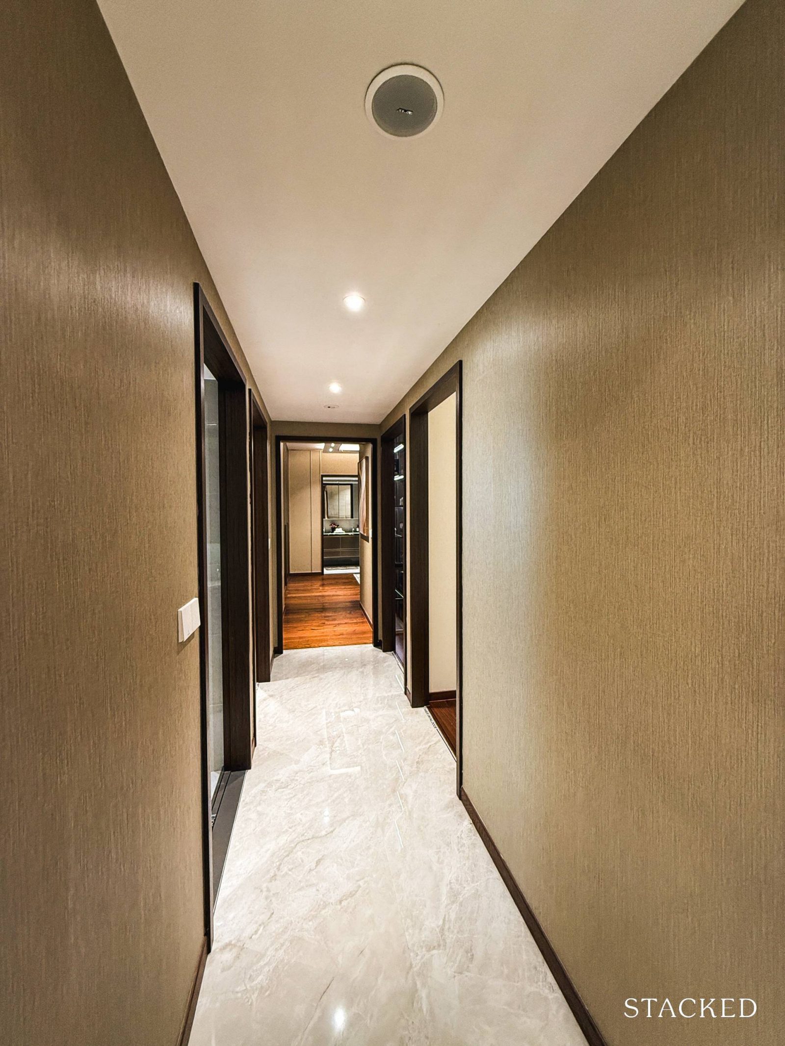
With that, let’s move on to have a look at the rest of the bedrooms and common bathroom, which are located down a long hallway on the other side of the living area.
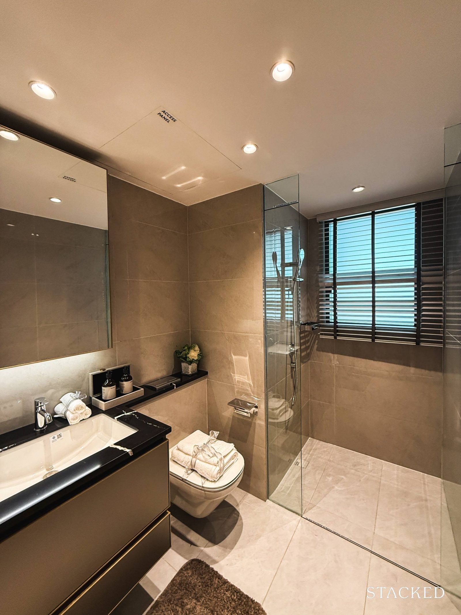
The common bathroom sits conveniently at the start of the hallway, thoughtfully positioned to serve Bedrooms 3, 4, and 5, as well as visiting guests (should they prefer it over the kitchen WC).
At 4.4 sqm, it’s fitted with all the usual provisions: a basin, wall-hung WC, along with a basin and shower mixers, all from the brand Kohler and there is also a window for natural ventilation.
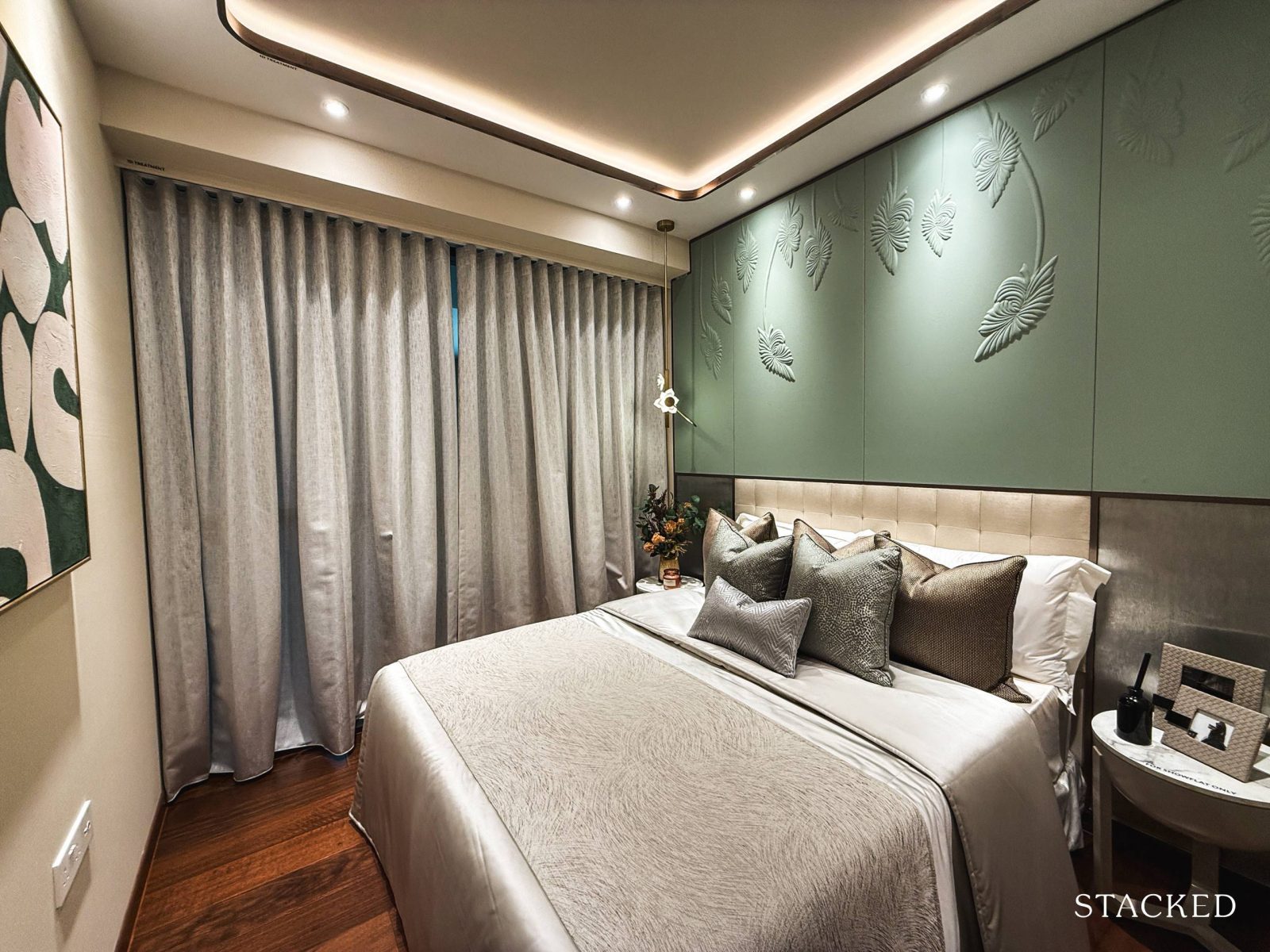
Bedroom 3 is the smallest of the common rooms at 8.3 sqm, and notably, it doesn’t come with a built-in wardrobe – a bit of a letdown, and hopefully not a trend we’ll see in future launches.
If you were to leave the room as it is, it allows for a queen-sized bed and two compact bedside tables. However, if adding a wardrobe is essential, a single or super single bed would be a better fit. You do have full-height windows here too, at the very least.
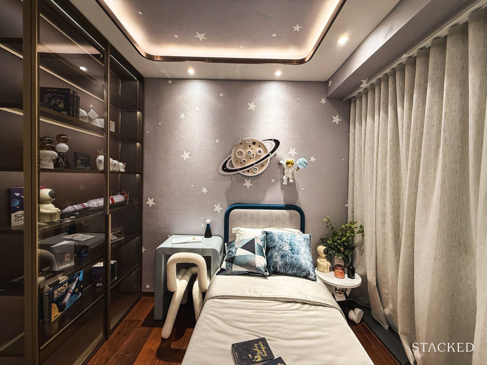
Bedroom 2, slightly larger than Bedroom 3 at 9 sqm, is the second smallest of the common rooms and it shares the same absence of built-in wardrobes. While it’s a minor drawback, one silver lining is that it offers buyers the flexibility to personalise the space with custom carpentry or freestanding furniture.
The room’s current setup gives a good sense of how it can be optimised – a single bed, a small wardrobe, and a compact study desk fit comfortably without feeling cramped. Compact furniture here is key to making the most of the space.
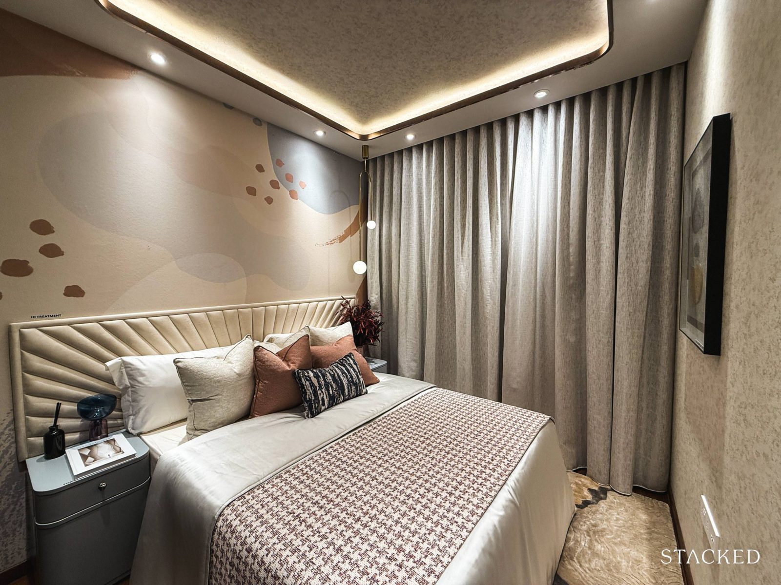
Bedroom 4, the largest of the common bedrooms at 9.3 sqm, is closer in size to what we’d expect in most new launches today.
It comfortably fits a queen-sized bed along with two bedside tables.
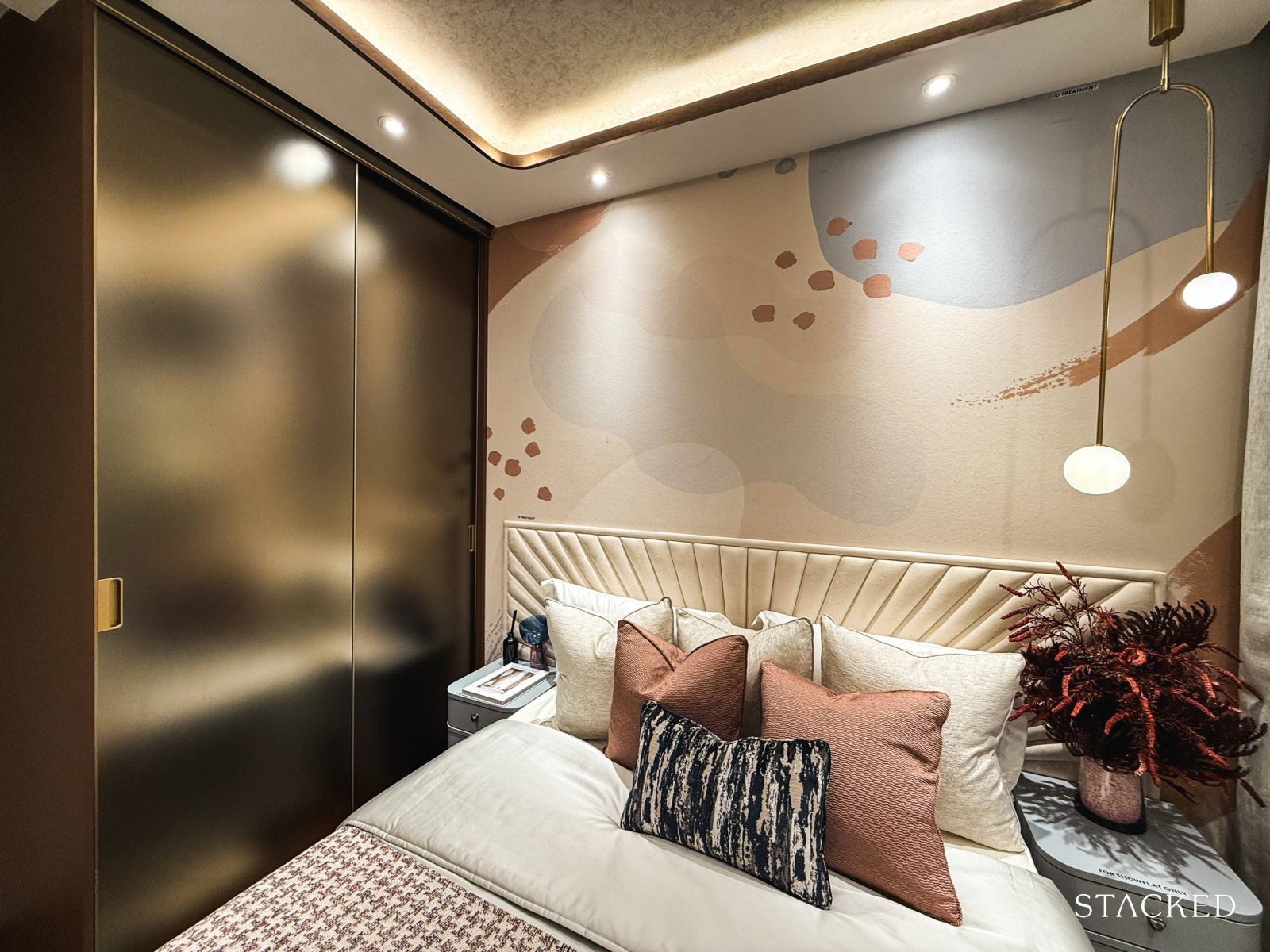
On the opposite side, you’ll find the built-in two-panel sliding wardrobe, included as part of the standard provisions. Notably, this is the only common bedroom in the 5-bedroom layout with a built-in wardrobe.
One trade-off here is the placement of the AC ledge, which means this room lacks full-height windows.
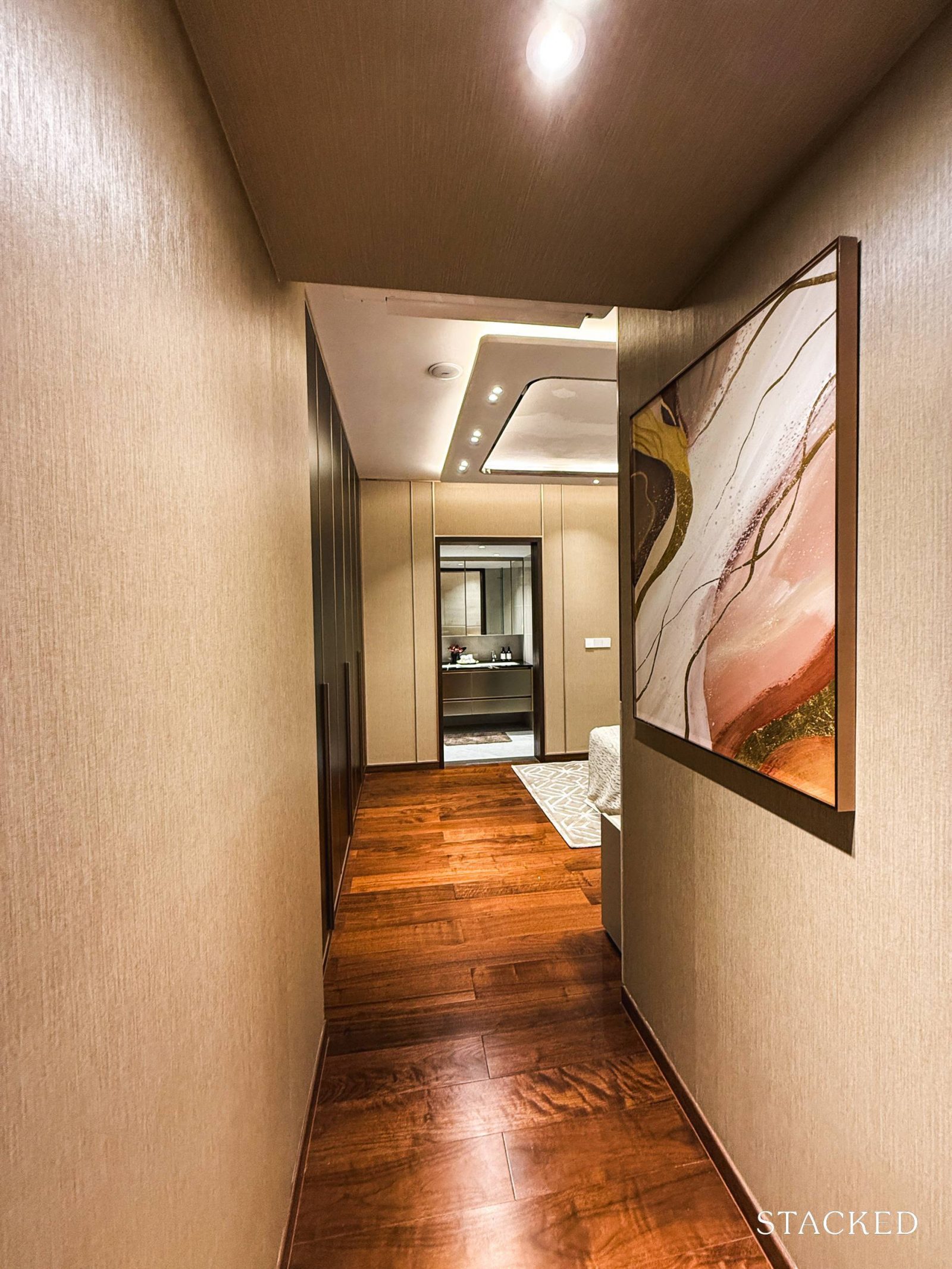
Finally, let’s have a look at the master bedroom.
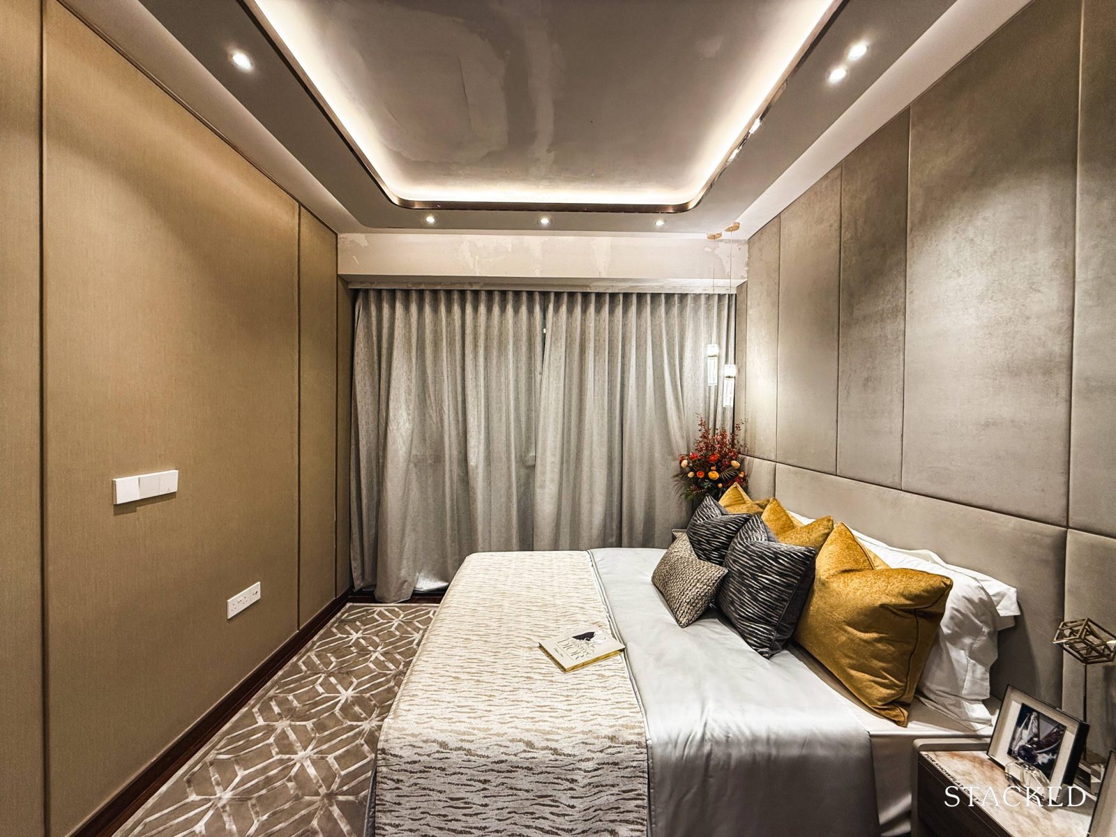
At a generous 17.7 sqm, the master bedroom offers ample space, complete with full-height windows that flood the room with natural light.
It can quite easily accommodate a king-sized bed with two bedside tables with a good amount of walking space left.
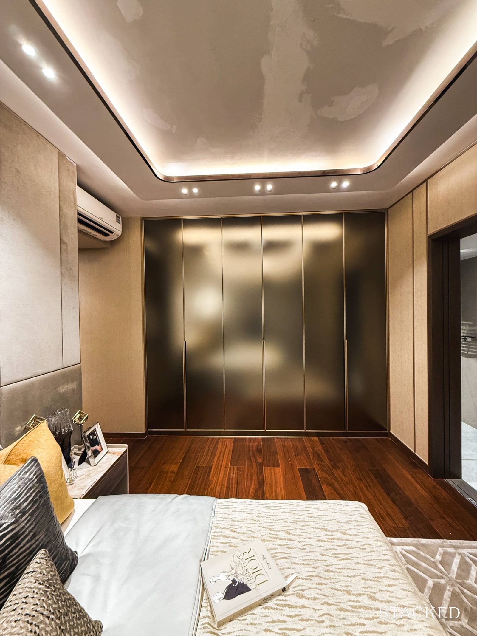
At the opposite corner of the room, there’s a six-panel wardrobe offering more than average closet space for two. While it’s not the his-and-hers walk-in setup we often see in master bedrooms in new launch units today, I do like the flushed design of the wardrobe.
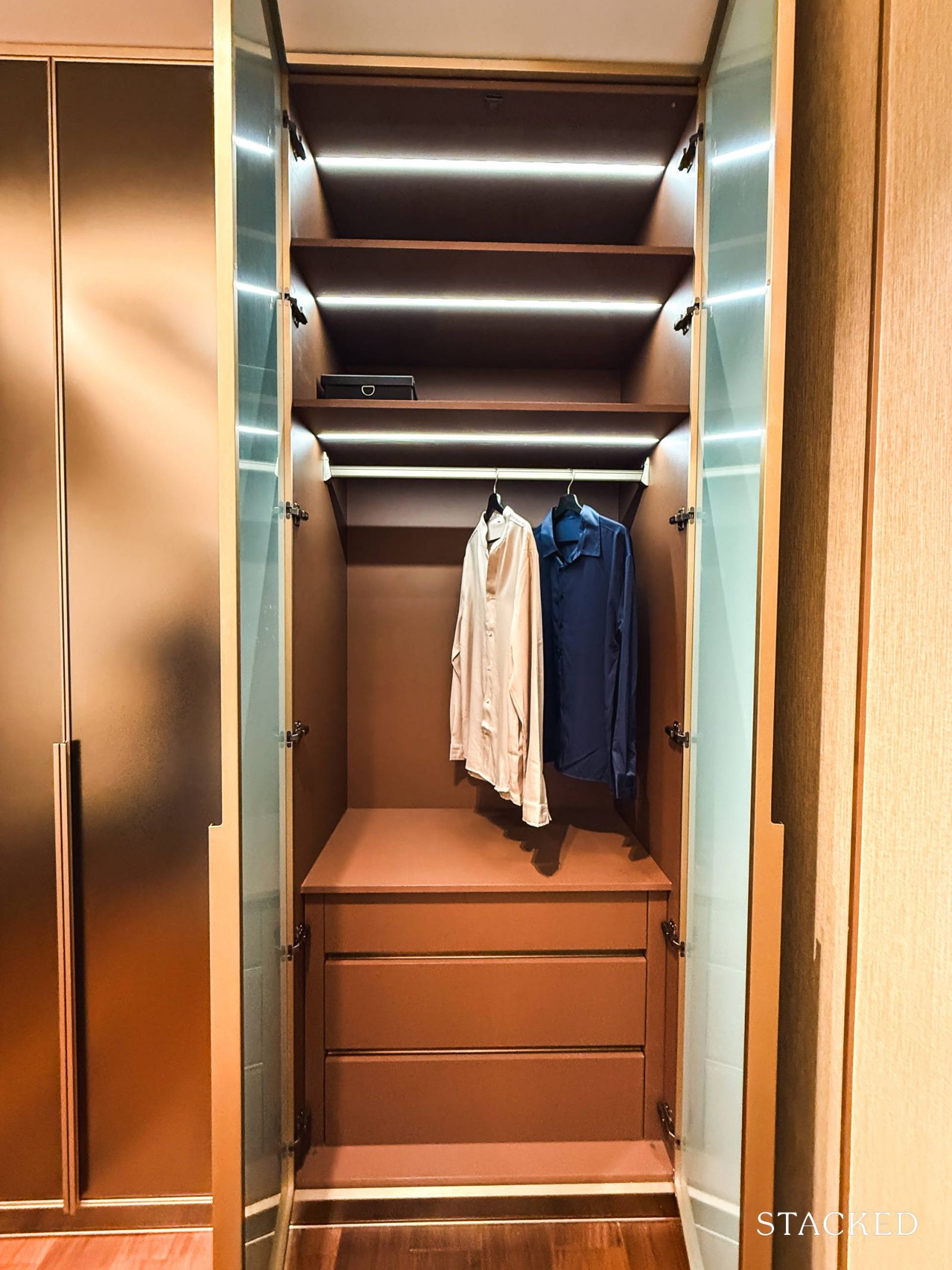
The wardrobes come with pull-out doors and include a thoughtful mix of drawers, hanging space, and shelving to organize your wardrobe essentials.
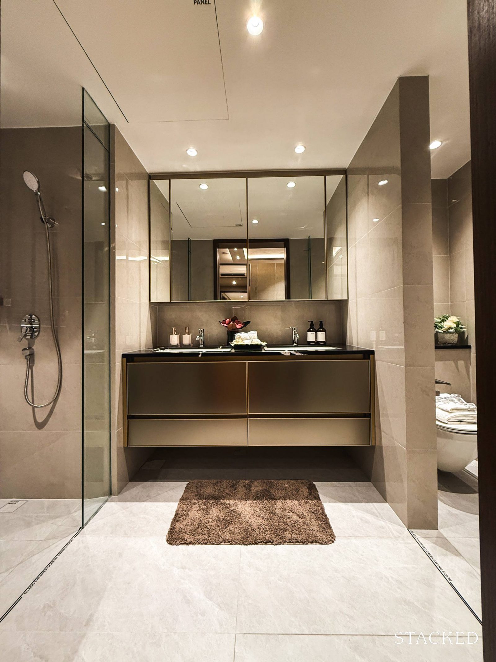
To end off the tour, let’s take a look at the master bathroom, a decent 6.3 sqm, which stands out with its unique layout separating the WC, basin area, and shower.
In the middle, you’ll find his-and-hers sinks with dedicated storage on each side, providing ample space for two. As part of the standard provisions, the sink and sink mixers are from Kohler.
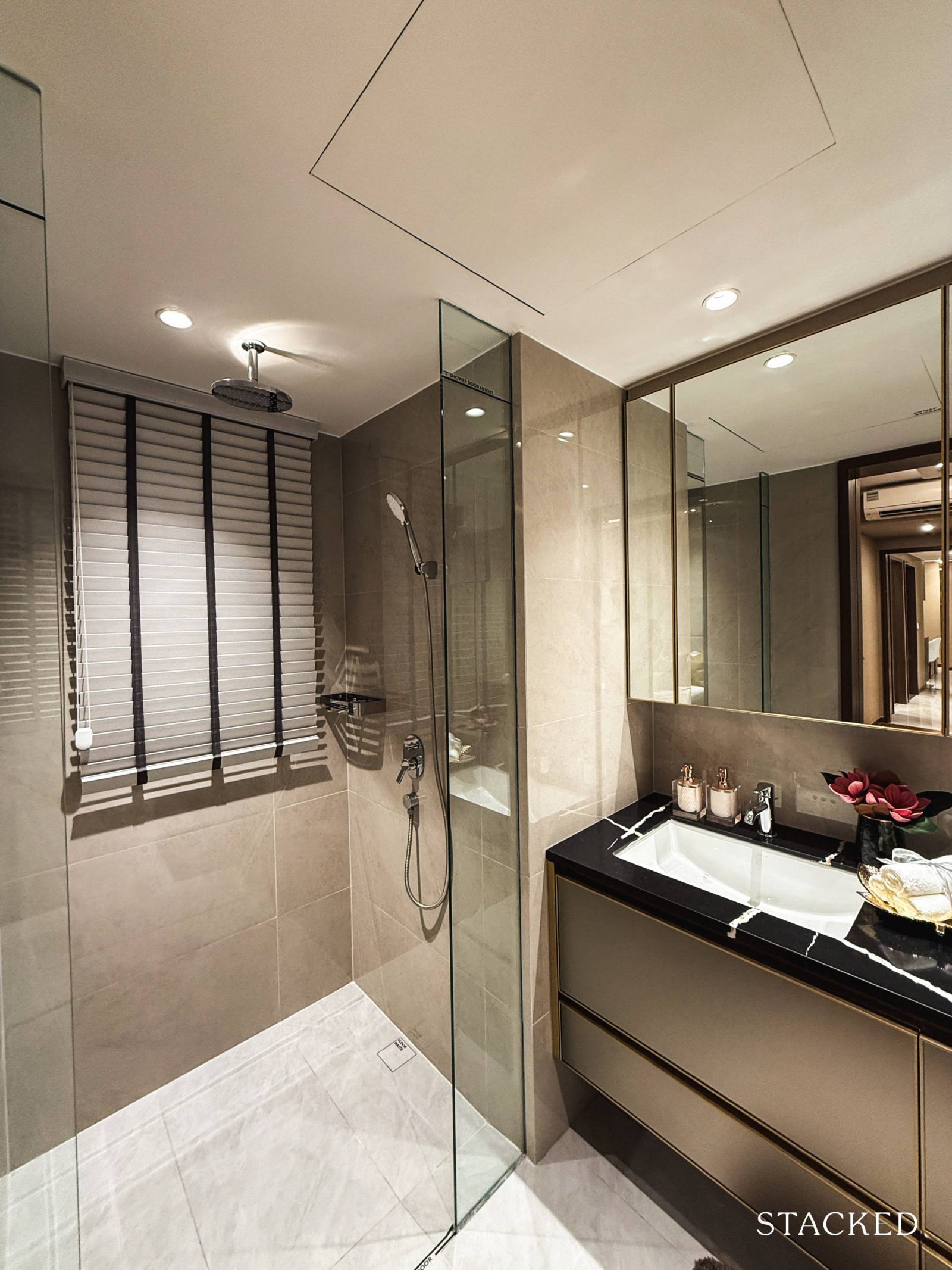
To the left, you’ll find the walk-in shower, mirroring the setup in the junior master suite with a rain shower and Kohler shower mixer set. What’s particularly welcome here is the window tucked into this corner, allowing for natural ventilation.
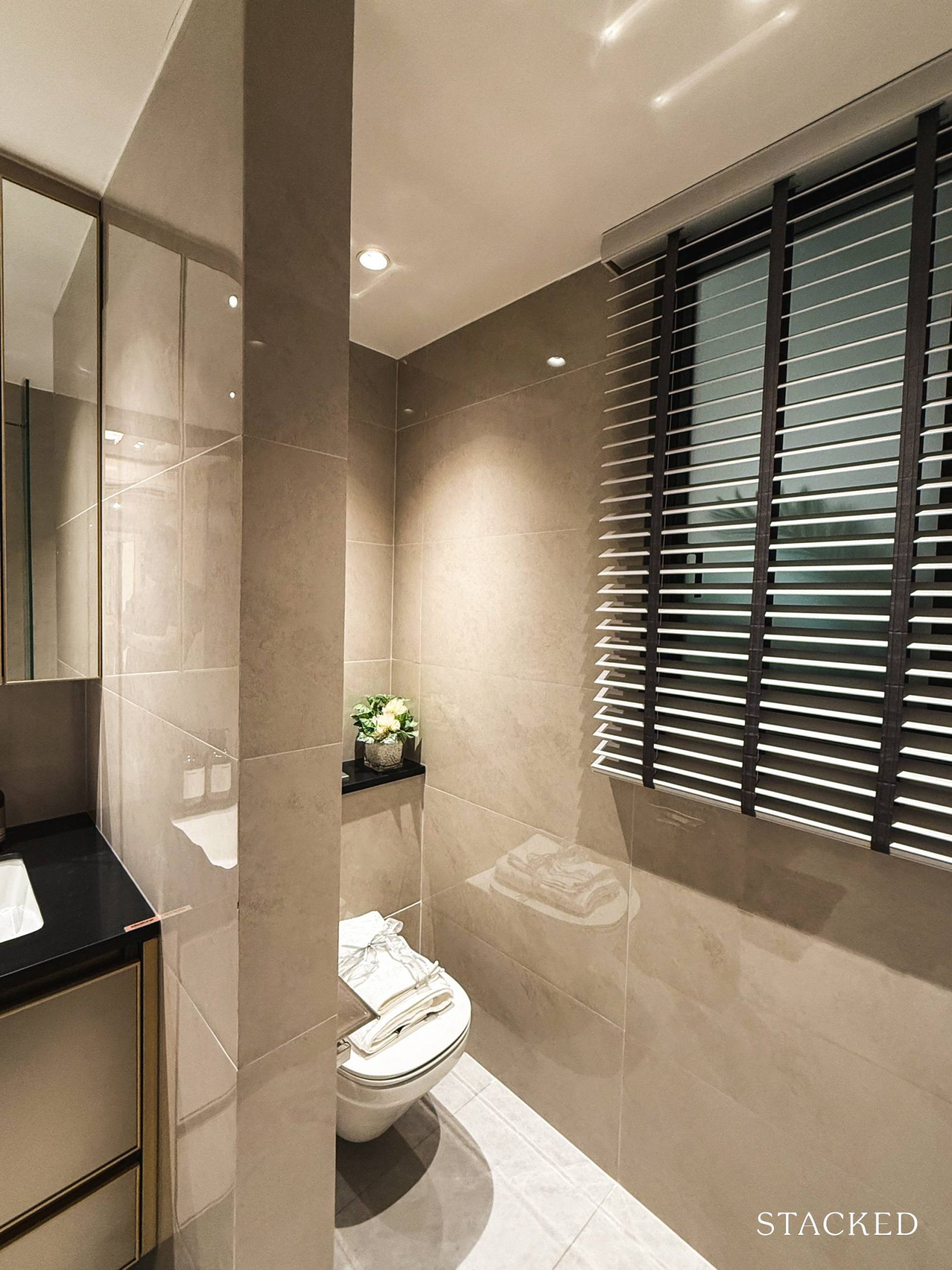
Last but not least, the WC is situated on the right side of the bathroom and also benefits from a window for natural ventilation. It features a wall-hung WC from Kohler as well.
Chuan Park Condo Location Review
<
Beyond the older condos here, the area is largely defined by its vast landed estate stretching towards Serangoon, which naturally affects the views from Chuan Park—something we’ll get into more when we cover the site plan.
Location-wise, Chuan Park is in a convenient spot with doorstep access to Lorong Chuan MRT on the Circle Line, residents are just one stop away from key hubs like Serangoon MRT (which connects to the North-East Line) and NEX shopping mall in one direction, and Bishan MRT (which links to the North-South Line) and Junction 8 in the other. Being on the Circle Line means you’re also well-connected to several other major MRT lines, including the Downtown and Thomson-East Coast Lines.
For drivers, major expressways like the CTE and PIE are within easy reach, though it’s worth noting that traffic can get heavy during peak hours, especially on the roads leading to the CTE.
For daily essentials, NTP+ Mall is just across the road, offering restaurants, cafes, a gym, and an Ace Signature supermarket. If you’re up for a quick drive, Serangoon Gardens with its famous Chomp Chomp Food Centre is another popular option. And of course, you’ve got NEX and Junction 8 just a short distance away.
When it comes to schools, the area is well-served by a range of educational institutions. Nanyang Junior College is right across the street, and within a 1-km radius, you’ll find reputable primary schools like St. Gabriel’s, Yangzheng, and Zhonghua. There’s also no shortage of international schools, with Stamford American Early Learning Village, Brighton College, and the Australian International School nearby.
For those who enjoy a bit of local flavour, the nearby wet markets at 409 Ang Mo Kio Market & Food Centre or Toa Payoh Lorong 8 Market and Hawker Centre offer great options for fresh produce and local fare.
Nearest MRT: Lorong Chuan MRT Station – Direct Access, 1-min walk
Public Transport
| Bus Station | Buses Serviced | Distance From Condo (& Est. Walking Time) |
| Opp Lor Chuan Stn Exit BID: 66399 | 58, 105 | 92m, 2-min walk |
| New Tech Pk ID: 66021 | 73, 105, 159 | 280m, 5-min walk |
| Lor Chuan Stn Exit AID: 66391 | 58, 105 | 300m, 5-min walk |
Schools
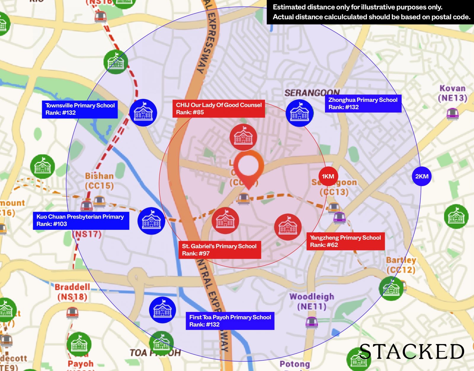
| School | Distance From Condo (& Est. Walking Time) |
| St. Gabriel’s Primary School | 350m, 5-min walk |
| Yangzheng Primary School | 850m, 12-min walk |
| CHIJ Our Lady Of Good Counsel | 1km, 15-min walk |
| Zhonghua Primary School | 1.8km, 4-min drive |
| Townsville Primary School | 2km, 5-min drive |
| Teck Ghee Primary School | 2.8km, 7-min drive |
| Kuo Chuan Presbyterian Primary School | 3.7km, 8-min drive |
| Zhonghua Secondary School | 900m, 12-min walk |
| Peicai Secondary School | 1.5km, 4-min drive |
| Beatty Secondary School | 2.4km, 7-min drive |
| Deyi Secondary School | 2.9km, 8-min drive |
| St. Gabriel’s Secondary School | 3.4km, 6-min drive |
| Kuo Chuan Presbyterian Secondary School | 3.4km, 8-min drive |
| St. Andrew’s Secondary School | 4km, 11-min drive |
| Nanyang Junior College | 450m, 6-min walk |
| St. Andrew’s Junior College | 4.6km, 12-min drive |
| Australian International School | 500m, 7-min walk |
| Brighton College (Singapore) | 800m, 11-min walk |
Shopping Malls
| Destination | Distance From Condo (& Est. Driving Time) |
| NTP+ Mall | 280m, 5-min walk |
| NEX | 1.5km, 5-min drive |
| myVillage Mall | 2km, 5-min drive |
| Junction 8 | 3.1km, 7-min drive |
| The Woodleigh Mall | 3.1km, 9-min drive |
| Bishan North Shopping Mall | 3.4km, 8-min drive |
Private Transport
| Key Destinations | Distance From Condo (Fastest Time at Peak House [0830] Drive Time) |
| Paya Lebar Quarter/Airbase (By 2030) | 8.2km, 10-min drive |
| Orchard Road | 9.3km, 12-min drive |
| Suntec City | 9.8km, 12-min drive |
| CBD (Raffles Place) | 11.2km, 16-min drive |
| Punggol Cluster (Waterway Point) | 12km, 12-min drive |
| Mapletree Business City | 16.3km, 22-min drive |
| Harbourfront Cluster (VivoCity) | 14.6km, 18-min drive |
| Mediapolis (and surroundings) | 17.5km, 20-min drive |
| Changi Airport | 17.9km, 16-min drive |
| Woodlands Cluster (Causeway Point) | 18km, 18-min drive |
| Woodlands Checkpoint | 20.6km, 20-min drive |
| Jurong Cluster | 24.5km, 26-min drive |
| Tuas Checkpoint | 36.1km, 35-min drive |
| Tuas Port (By 2040) | 46.5km, 50-min drive |
Immediate Road Exits: Exit onto Serangoon Avenue 3. Turn left to continue on Serangoon Avenue 3. Alternatively, turn right to Lorong Chuan, where you’ll reach the CTE in 2 – 3 mins. `
Chuan Park Condo Developer Review
Kingsford Development, founded by the China-based Kingsford Group in 2011, made its mark in Singapore with the 512-unit Hillview Peak back in 2012. They followed up with Kingsford Waterbay, a 1,165-unit mixed-use development in Serangoon. However, both projects hit a snag with safety lapses during construction, resulting in fines for the developer.
Fast forward to their next major project: Normanton Park, a sprawling 1,862-unit development which they were hit initially with a no-sale license but finished strongly by selling out despite the handicap. According to BCA, however, Kingsford Development is still under a CONQUAS Band of 5, with the pending assessment of Normanton Park.
Architect Notes
AGA Architects is a familiar name behind many of Singapore’s recent and notable launches. Its portfolio extends beyond local shores to places like Australia, Thailand, China, and Malaysia.
Locally, they’ve worked on developments such as Queens Peak, OLA EC, The Alps Residences, The Santorini and Tre Residences.
Unit Mix
| Unit Types | Unit Area (sq ft) | No. of units | |
| 2 Bedroom | 700/829 sq ft | 104 | 44% |
| 2 Bedroom + Study | 732 – 883 sq ft | 299 | |
| 3 Bedroom Classic | 915 – 1,119 sq ft | 190 | 47% |
| 3 Bedroom Deluxe | 1,023 – 1,206 sq ft | 137 | |
| 3 Bedroom Premium | 1,206 – 1,507 sq ft | 104 | |
| 4 Bedroom Classic | 1,335/1,615 sq ft | 38 | 6.6% |
| 4 Bedroom Premium | 1,389/1,679 sq ft | 22 | |
| 5 Bedroom | 1,550/1,841 sq ft | 22 | 2.4% |
| Total | 916 | ||
With 916 units on offer at Chuan Park, it caters to a wide spectrum of buyers, offering unit types that range from 2 to 5 bedrooms.
A notable 47% of the total count is made up of 3-bedroom apartments. Close behind are the 2-bedroom units, which account for 44% of the unit mix. Buyers familiar with Kingsford’s Normanton Park will notice a similar approach to the unit breakdown and layouts here, albeit with some subtle adjustments.
Both projects lean heavily on smaller-sized units, with Chuan Park concentrating on the 2 and 3 bedders. In terms of layout tweaks, the 3-bedroom premium units and above feature a slightly revised storeroom placement.
Chuan Park Condo Stack Analysis
Chuan Park Site Plan
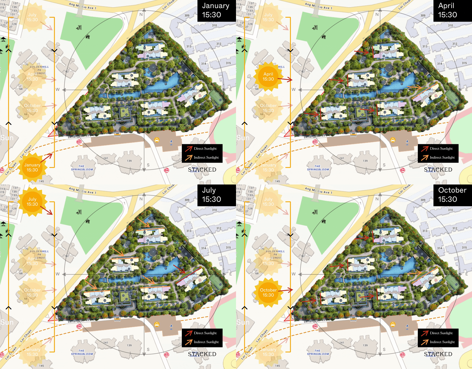
Afternoon Sun
Chuan Park Best Stacks
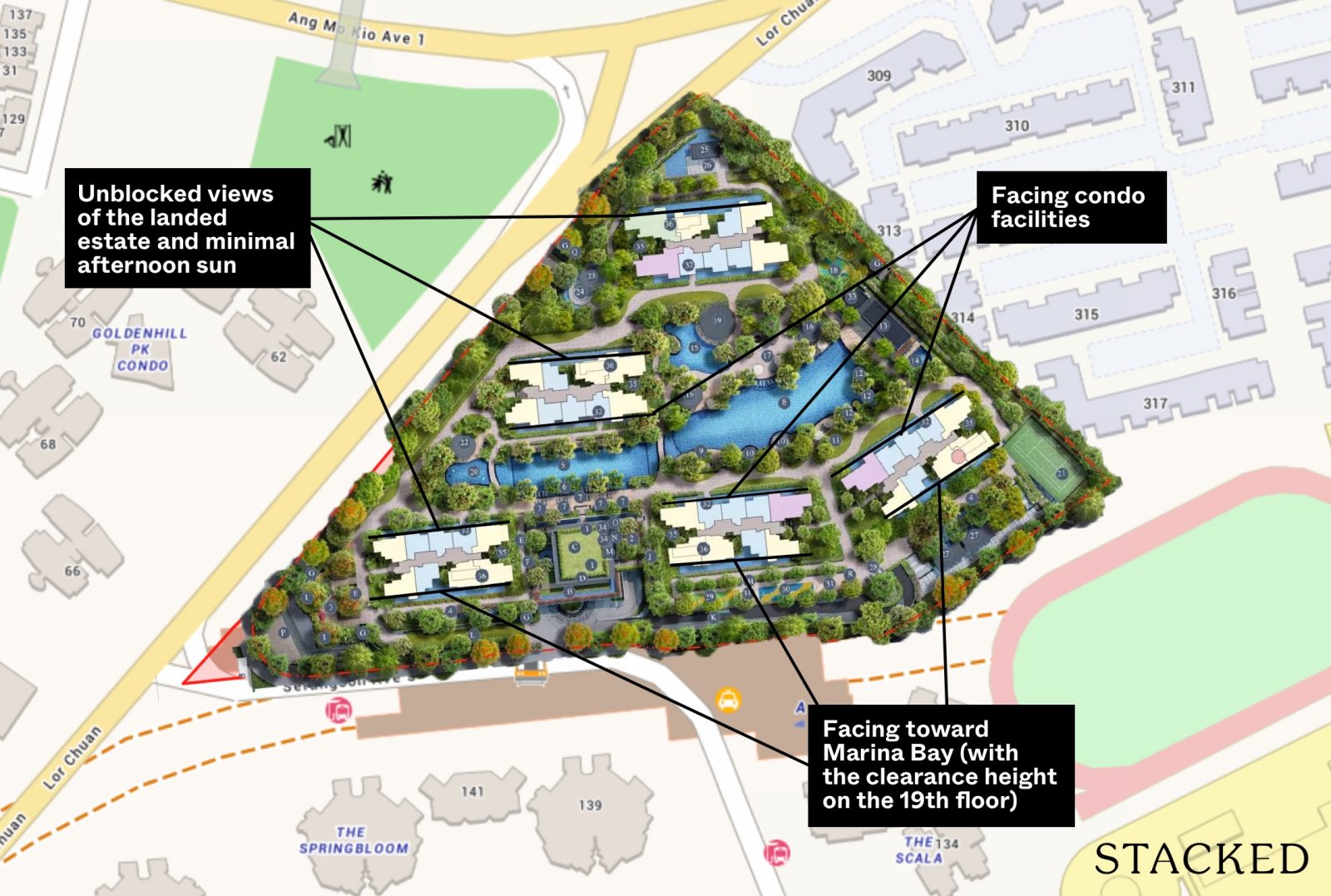
Chuan Park has five residential blocks – two at 19 storeys (Blocks 248 and 250) and three taller ones at 22 storeys (Blocks 242, 244, and 246). The development sits on a massive triangular plot of over 400,000 square feet, with 916 units in total.
This works out to a generous 437 square feet of land per unit, which is quite impressive for a mega project of this size. For context, Grand Dunman, on a smaller 271,622-square-foot site, squeezes in 1,040 units, offering just 261 square feet per unit, while Normanton Park gives 358 square feet per unit.
For a residential-dense area, the views here are a plus. There are several options ranging from unblocked vistas of Serangoon Gardens’ landed estate, to southern views of the estate toward Marina Bay (with the clearance height on the 19th floor), the South-Eastern views of the neighbourhood skyline, or the more serene, facility-facing views.
Blocks 242, 244, and 246 have been arranged in a diagonal to take full advantage of the landed views, resulting in a total of 70% of units facing outward and 30% overlooking the condo facilities.
The prime views of Serangoon Gardens are mostly reserved for the 3-bedroom units (which take up a bulk of the unit mix) and would likely come with a higher price tag. So, it’s a choice between paying a bit more for those better views or going for a more affordable option.
Thanks to the practical orientation of the blocks, most units here are shielded from the harsh afternoon sun – a small detail that makes a big difference.
However, do note that units facing Lorong Chuan would be more susceptible to noise as the road can get quite busy during peak hours.
Chuan Park Condo Pricing Analysis Review
Mega projects often draw buyers with their more affordable units, and Chuan Park is no exception. For those with an eye on value, price is likely a key motivator here.
While we’ll have a deeper dive into pricing soon, here’s a quick snapshot of the $PSF landscape across the Lorong Chuan estate.
Let’s see how Chuan Park holds up against the neighbouring developments.
Resale Projects Nearby Chuan Park
| Development | Units | Psf | TOP | Tenure | Price Gap |
| Chuan Park | 916 | Est. $2,214* | 2028 | 99 years | NIL |
| Goldenhill Park | 390 | $2,200 | 2004 | Freehold | +2.7% |
| Amaranda Garden | 189 | $2,152 | 2004 | Freehold | +0.47% |
| The Chuan | 106 | $2,142 | 2007 | 999 years | – |
| The Scala | 468 | $1,858 | 2013 | 99 years | -13.3% |
| Cardiff Residence | 163 | $1,698 | 2014 | 99 years | -20.7% |
| The Springbloom | 372 | $1,588 | 1999 | 99 years | -25.9% |
| Chiltern Park | 500 | $1,441 | 1995 | 99 years | -32.7% |
| Golden Heights | 53 | $1,201 | 2003 | 99 years | -43.9% |
It’s worth noting an interesting trend: the smaller units here actually come in with a lower $PSF than the larger ones, which is quite a reversal from what you’d expect (we highlighted this trend here). That said, the entry price of $2,214 PSF applies to the 2-bedders, so bear in mind that as the unit size increases, so does the overall price tag.
Mega Projects (above 900 units)
| Development | Units | Psf | TOP | Tenure | Distance to MRT Station | Price Gap |
| Chuan Park | 916 | Est. $2,214* | 2028 | 99 years | <100m | NIL |
| Grand Dunman | 1,008 | $2,618 | 2027 | 99 years | 200m | +22.2% |
| Avenue South Residences | 1,074 | $2,266 | 2023 | 99 years | 1.12km | +5.8% |
| Parc Clementis | 1,468 | $2,057 | 2023 | 99 years | 634m | -4% |
| Normanton Park | 1,862 | $1,813 | 2023 | 99 years | 1.2km | -15.4% |
| The Florence Residences | 1,410 | $1,768 | 2023 | 99 years | 883m | -17.5% |
| Treasure at Tampines | 2,203 | $1,699 | 2023 | 99 years | 670m | -20.7% |
| North Park Residences | 920 | $1,668 | 2018 | 99 years | 200m | -22.1% |
| Affinity At Serangoon | 1,052 | $1,613 | 2023 | 99 years | 1.51km | -24.7% |
| Watertown | 992 | $1,501 | 2017 | 99 years | 220m | -29.9% |
| Riverfront Residences | 1,472 | $1,481 | 2023 | 99 years | 808m | -30.9% |
| Parc Oasis | 950 | $1,022 | 1994 | 99 years | 240m | -52.3% |
While location means $PSF isn’t the whole story, it’s helpful to see how these mega projects are performing. A standout point? Many newer mega projects are quite a trek from the MRT, giving Chuan Park a distinct advantage in terms of connectivity.
If you’d like to find out more, visit our detailed pricing review here.
Chuan Park Condo Appreciation Analysis
- Cross Island Line For Better Connectivity
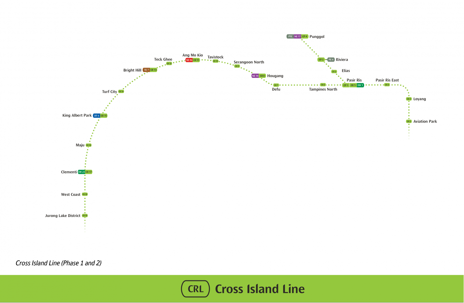
While Chuan Park residents already enjoy doorstep access to Lorong Chuan MRT Station, public transport will become even more convenient with the Cross Island Line opening in 2030.
The nearest stations, Tavistock and Serangoon North, will connect residents to key areas like Turf City and the Jurong Lake District in the West, and Pasir Ris in the East.
2. Singapore’s Largest Polyclinic to Open Across NEX
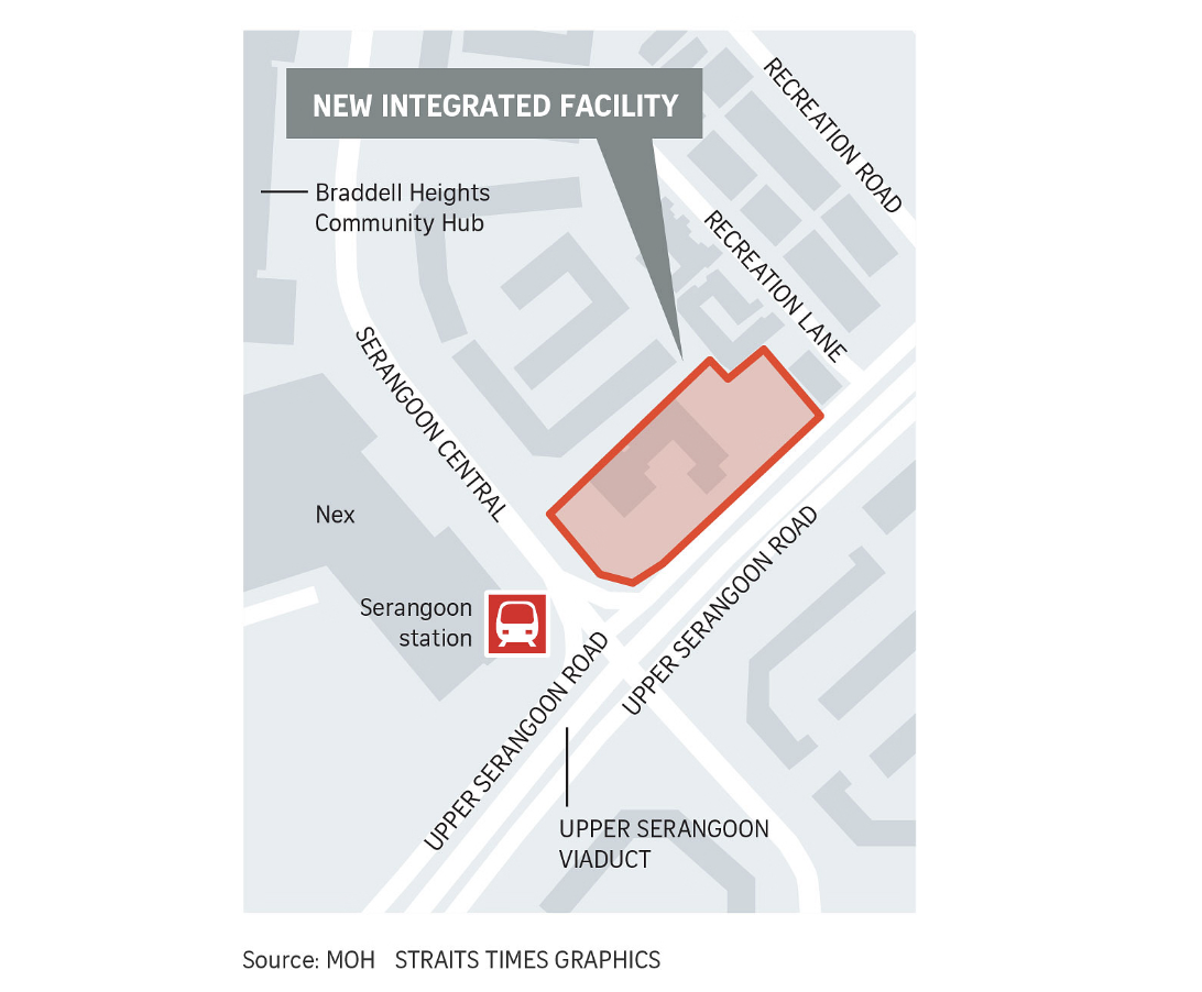
By 2025, Serangoon will be home to Singapore’s largest polyclinic, conveniently located across from NEX Shopping Mall. Chuan Park is just one MRT stop away or a 5-minute drive from the new polyclinic, providing residents with easy access to comprehensive healthcare services.
3. Improved Walkability and New Cycling Paths in Serangoon: Car-Lite Neighbourhoods
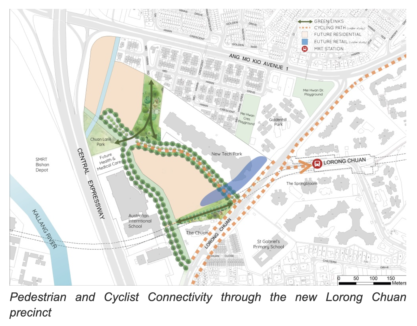
To accommodate the anticipated increase in residential developments, new parks, amenities, and pedestrian linkages are planned to enhance the Lorong Chuan community and improve connectivity.
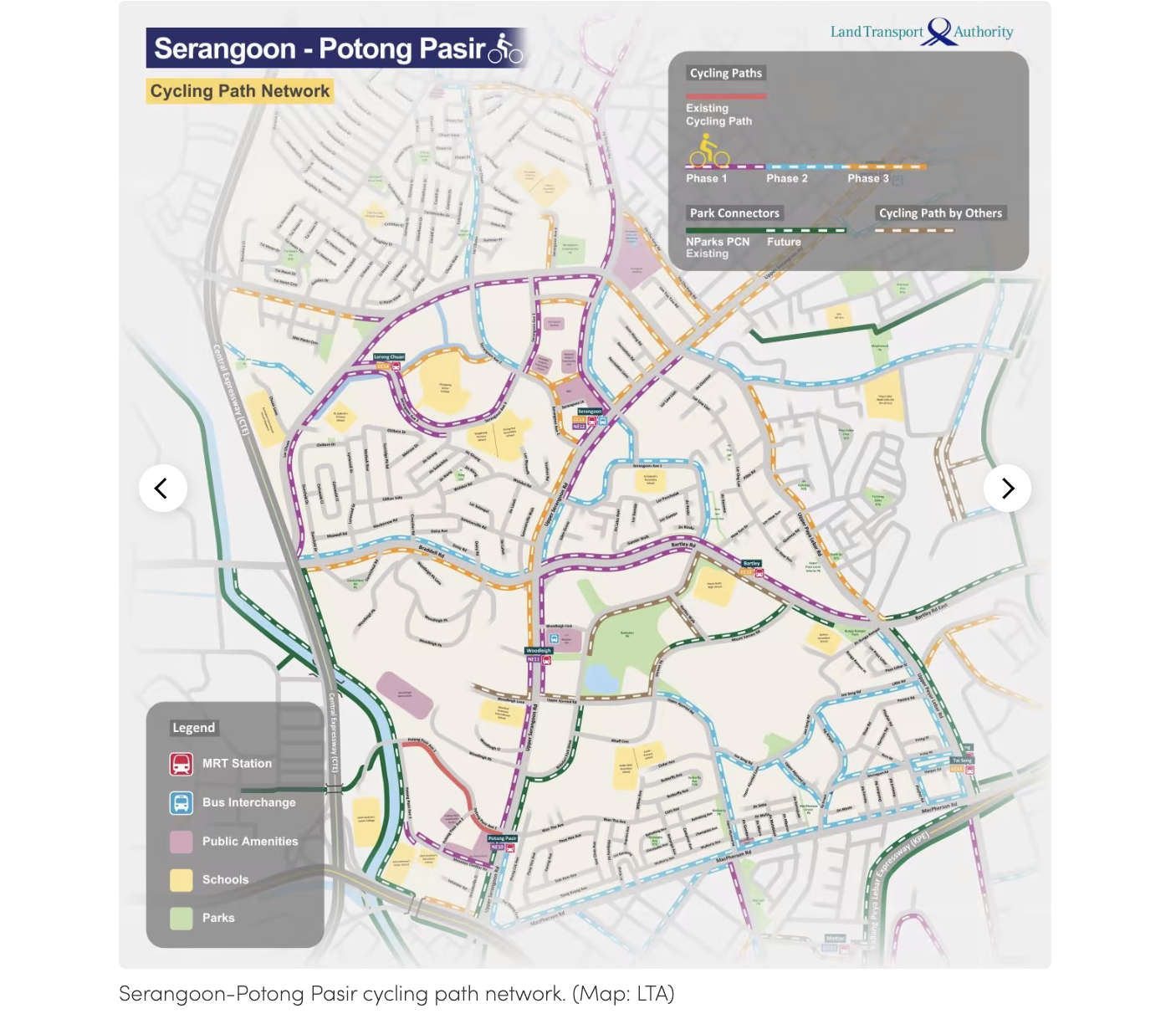
Additionally, the LTA plans to extend the Serangoon-Potong Pasir cycling path network, supporting the vision of a car-lite neighbourhood. Chuan Park residents will benefit from more seamless cycling routes, making it easier to navigate the estate and beyond.
4. Chuan Grove GLS & Other Residential Sites Nearby

With the Chuan Grove GLS Site included in URA’s 2H2024 list, it’s clear there’s growing anticipation for more housing options in the Lorong Chuan area. While not officially confirmed, there are three other nearby sites zoned for residential use, hinting at more developments on the horizon. The Chuan Grove GLS is sized at 170,069 square feet and is expected to house 550 units.
This suggests that the housing supply in Lorong Chuan is set for a boost in the coming years. Even so, Chuan Park seems to be the nearest option to Lorong Chuan MRT Station when compared to the other upcoming sites.
What we like
- Fair pricing
- Full range of facilities
- Door-step accessibility to Lorong Chuan MRT Station
What we don’t like
- –Design furnishing within units are subjective
- –Two of the common bedrooms in the 5 Bedroom units
Our Take
There has been lots of interest in Chuan Park, both from its status as a mega-development, and the lack of new supply in the Lorong Chuan area (it will be the first launch in the Lorong Chuan area since 2011).
Chuan Park has arguably the best-located plot too, as it is just across the road from several amenities at New Tech Park, as well as being located right next to Lorong Chuan MRT Station. It also distinguishes itself in another underrated way – it has a lower living density as compared to other mega-developments on the market.
As a whole, I would say that Chuan Park has fulfilled what most buyers would be looking for in a new launch today. It has an extensive range of facilities, and on that front, that’s what buyers place as a significant difference over buying a boutique project.
But from a hard product standpoint, it just isn’t as exciting as some of the other mega-developments we’ve seen. Even their previous development, Normanton Park, just looked more grand in terms of the scale and execution of its facilities.
So while Chuan Park’s landscaping, estate design, and interiors may not set new standards, it raises an important question for potential buyers: does that really matter in today’s market? After all, the most crucial point is its price. And with its convenient location and spacious grounds, Chuan Park seems well-positioned to meet most buyers’ expectations. Ultimately, it may come down to what you prioritise in a home: is it the aesthetics, or is it the comfort and convenience that truly make the difference?
What this means for you
You might like Chuan Park if you:
-
Appreciate door-step accessibility to the nearest MRT Station
To be fair, most resale projects around Lorong Chuan offer solid connectivity, with the MRT just a quick 5-minute walk away. But if you’re someone who values doorstep access, Chuan Park might just tick that box for you.
Are looking to buy a unit in a mega projectSingaporeans have an obsession with mega projects and it’s easy to see why. These developments typically offer a wider range of facilities, lower maintenance fees, and stronger price stability due to higher transaction volumes. If the above resonates with you, Chuan Park might be a good fit.
Have schooling childrenLorong Chuan offers a variety of schools across different levels, including the nearby Nanyang Junior College and several international schools in the vicinity. Additionally, with a strong emphasis on family-friendly amenities, Chuan Park is well-suited for families with young children.
You may not like Chuan Park if you:
-
Are concerned with high-density living
Granted, Chuan Park’s living density is lower than many of the mega projects in Singapore, but compared to the other resale options within the neighbourhood, Chuan Park is considerably much denser. Additionally, there is only one ingress and egress to the site, which might add to the traffic volume, especially during peak hours.
Are looking for a fully-furnished 5-bedroom unit
It’s standard for new launch projects to come fully furnished with a built-in wardrobe for all of their bedrooms. However, two of the common bedrooms in the 5-bedroom unit have a strange omission of this standard built-in carpentry.
End of Review
At Stacked, we like to look beyond the headlines and surface-level numbers, and focus on how things play out in the real world.
If you’d like to discuss how this applies to your own circumstances, you can reach out for a one-to-one consultation here.
And if you simply have a question or want to share a thought, feel free to write to us at stories@stackedhomes.com — we read every message.
Our Verdict
75%
Overall Rating
With 916 units, this mega development comes fully loaded with amenities like multiple pools and a tennis court. Plus, its doorstep connectivity to Lorong Chuan MRT on the Circle Line adds a level of convenience that’s hard to beat.
Join our Telegram group for instant notifications
Join Now











1 Comments
Chuan Park Condo offers a fantastic combination of space, location, and amenities. The well-established neighborhood and proximity to MRT stations make it an ideal choice for those seeking convenience. I especially appreciate the spacious layouts and the development’s potential for upgrading, which will appeal to both homeowners and investors. Looking forward to seeing how it performs in the market and its impact on nearby property values!