How A Couple With A $60k Reno Budget Created A Mid-Century Modern Home With Iconic Lamps
July 28, 2022
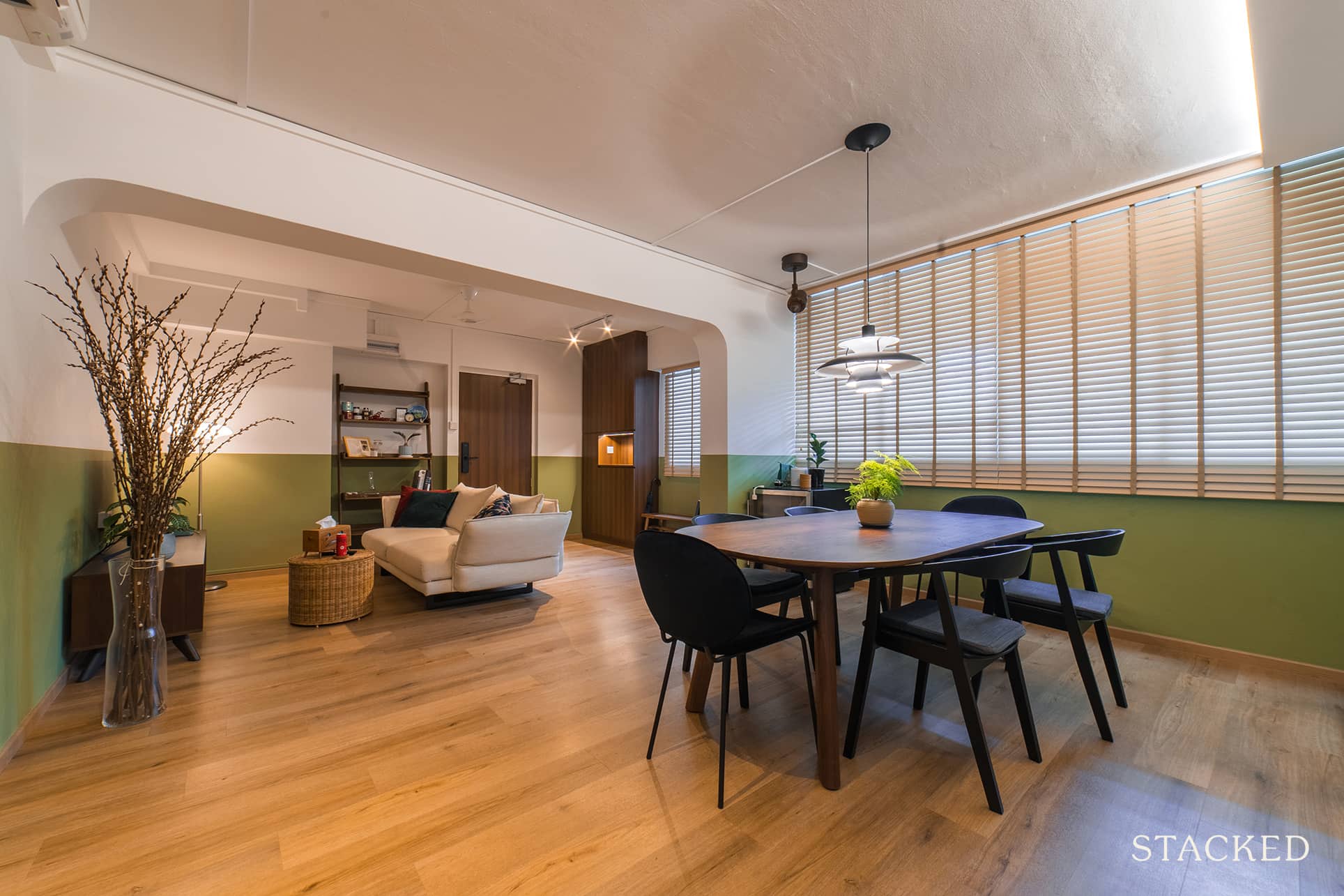
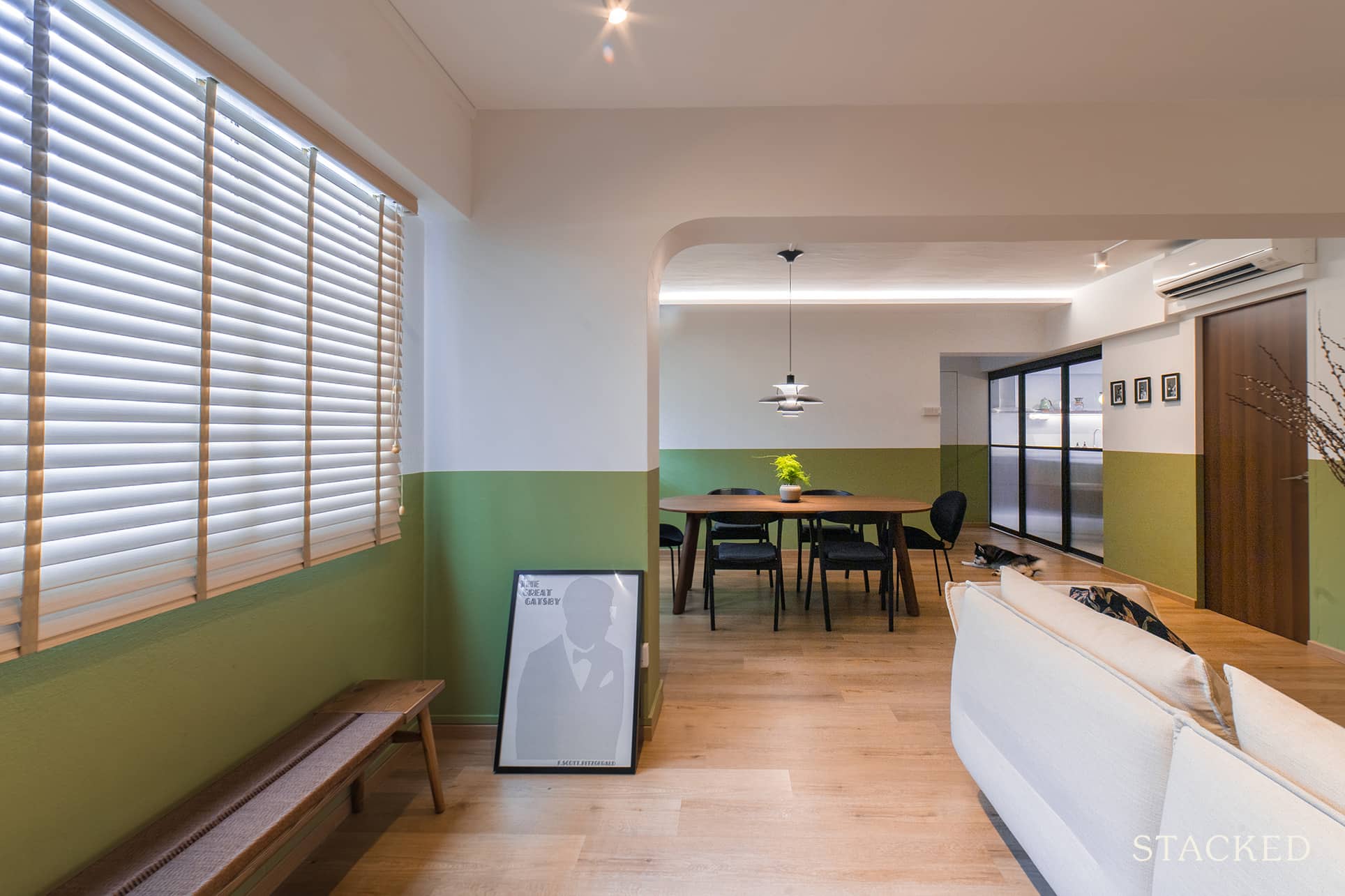
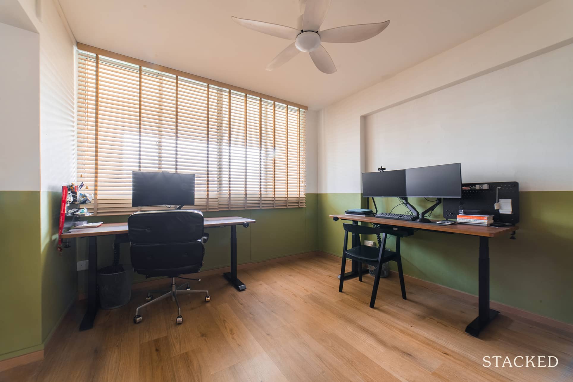
Step into Shannon and Shawn’s (*not their real name for privacy reasons) 4-room HDB home in Sin Ming and the first thing that captures your attention is the half-wall colours of off-white and green that are reflected throughout most of the home. Think of it as a reverse kueh salat (hence the name of their home’s IG account @kuehsalat.home), and you’ll immediately understand the reference here.
It’s not often that you’d find such a combination, but it works wonderfully with their mid-century modern theme.
The couple chose to buy a resale HDB flat, circumventing the often five-year wait to move into their own place. Plus, they admitted that they both like the space and layout of older HDB estates. Additionally, they chose this particular flat in the Sin Ming area because of its proximity to nature, such as Bishan Park and MacRitchie Reservoir.
Let’s join Shannon and Shawn, together with their dog Luna, as they share their renovation journey.
So many readers write in because they're unsure what to do next, and don't know who to trust.
If this sounds familiar, we offer structured 1-to-1 consultations where we walk through your finances, goals, and market options objectively.
No obligation. Just clarity.
Learn more here.
Balancing Comfort And Style In This Old HDB Flat
Shannon shared that their initial budget was $60k. They realised, though, that the range of prices IDs give in their quotes varies significantly. “During the process of obtaining quotations, our stated budget to the interior designers was approximately $50k only.”
This approach allowed them to stick to their initial budget, creating a buffer in case of unexpected costs.
Even before the reno started, the couple already had a definite theme. “Mid-century modern furniture and earthy colour palette with a half wall theme throughout,” Shannon said.
This decisiveness helped them eliminate some of the uncertainties plaguing other homeowners. It also helped that they didn’t change their minds midway through the renovation, which is usually the source of additional costs and delays.
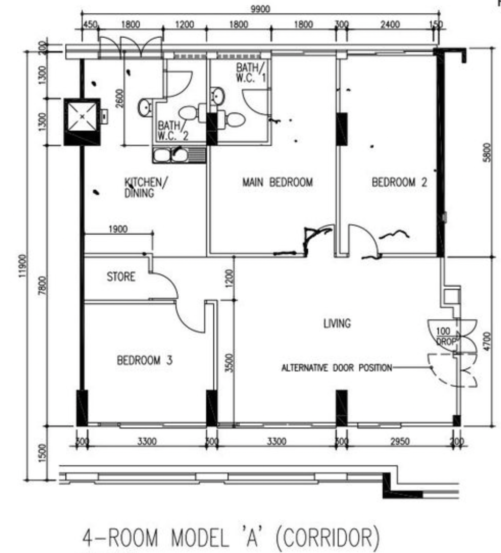
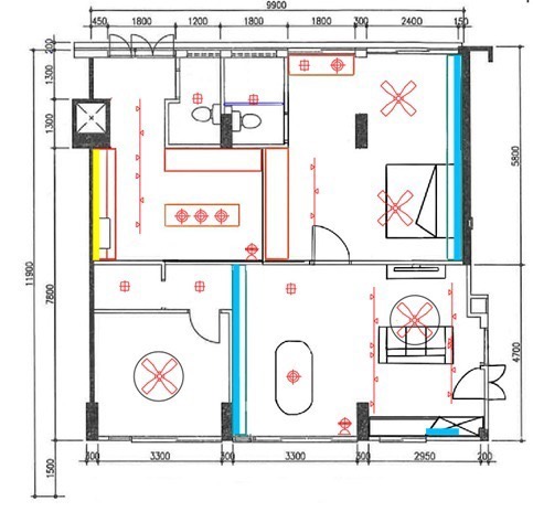
They had to modify their home’s layout to help implement their desired design better and make the home more convenient compared to its original floorplan. Shannon said there were two major structural changes to their house.
One is the relocation of the original master bedroom wall to expand the kitchen. “We wanted a larger kitchen as we enjoy cooking and baking regularly,” she said. In order to accommodate both of them working in the kitchen at the same time, they needed sufficient prep space as well as a full-sized island.
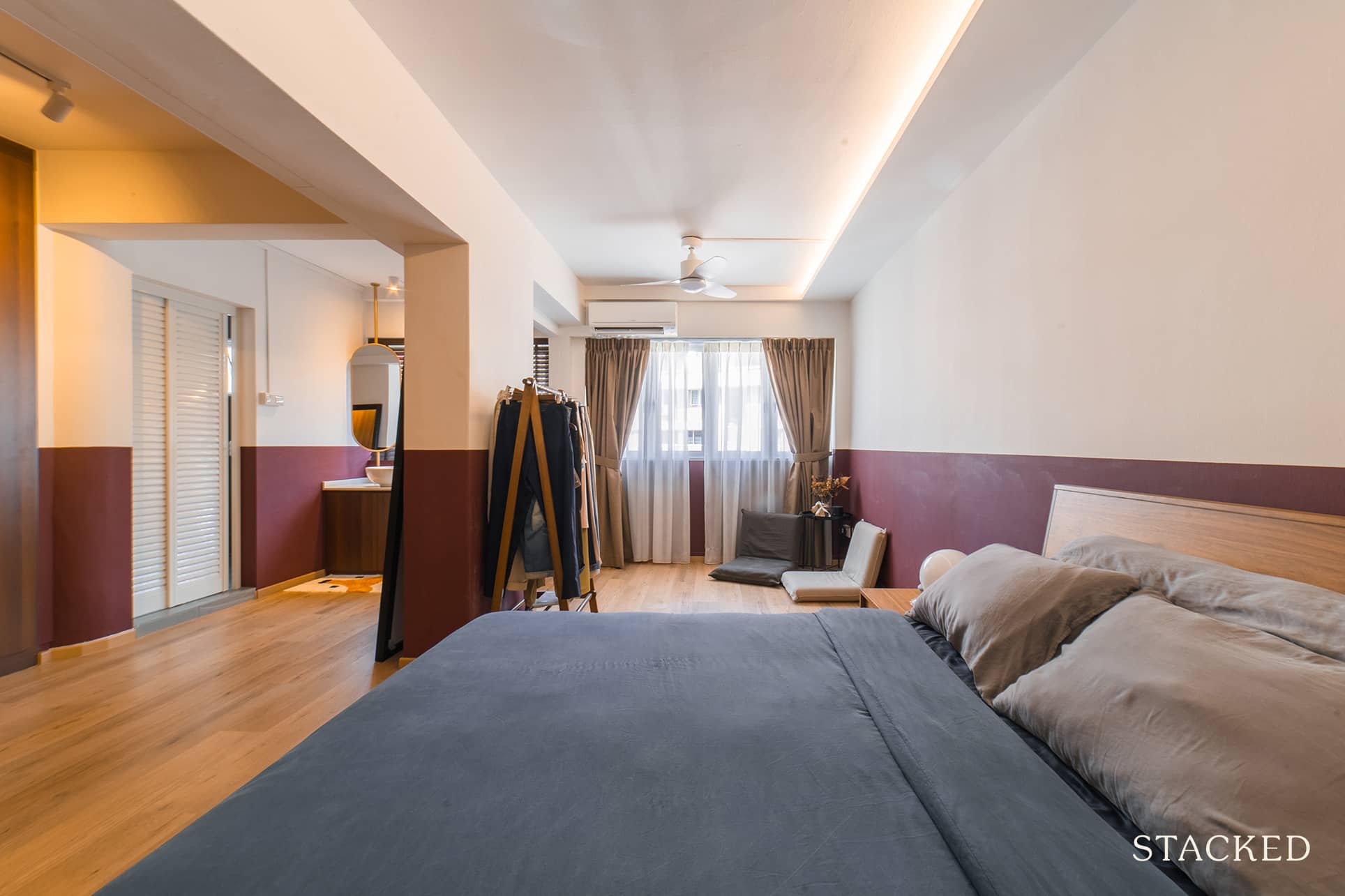
The other structural change is the master bedroom’s expansion which involved joining it with the adjacent bedroom. “The previous owner of the house actually demolished the wall and we liked the large space this created,” Shannon recalled. “However, he built a wardrobe to close off the sleeping area from the windows since he wanted a den-like environment to sleep in.”
It was different for the couple, though. They prefer more light and want more breeze to flow into the room. Thus, they decided to remove the wardrobe and reconfigure the layout.
They also opted to use hard vinyl panels throughout the rooms, seamlessly merging with the living and dining area.
Let’s take a closer look at the outcome of the renovation.
Living Room
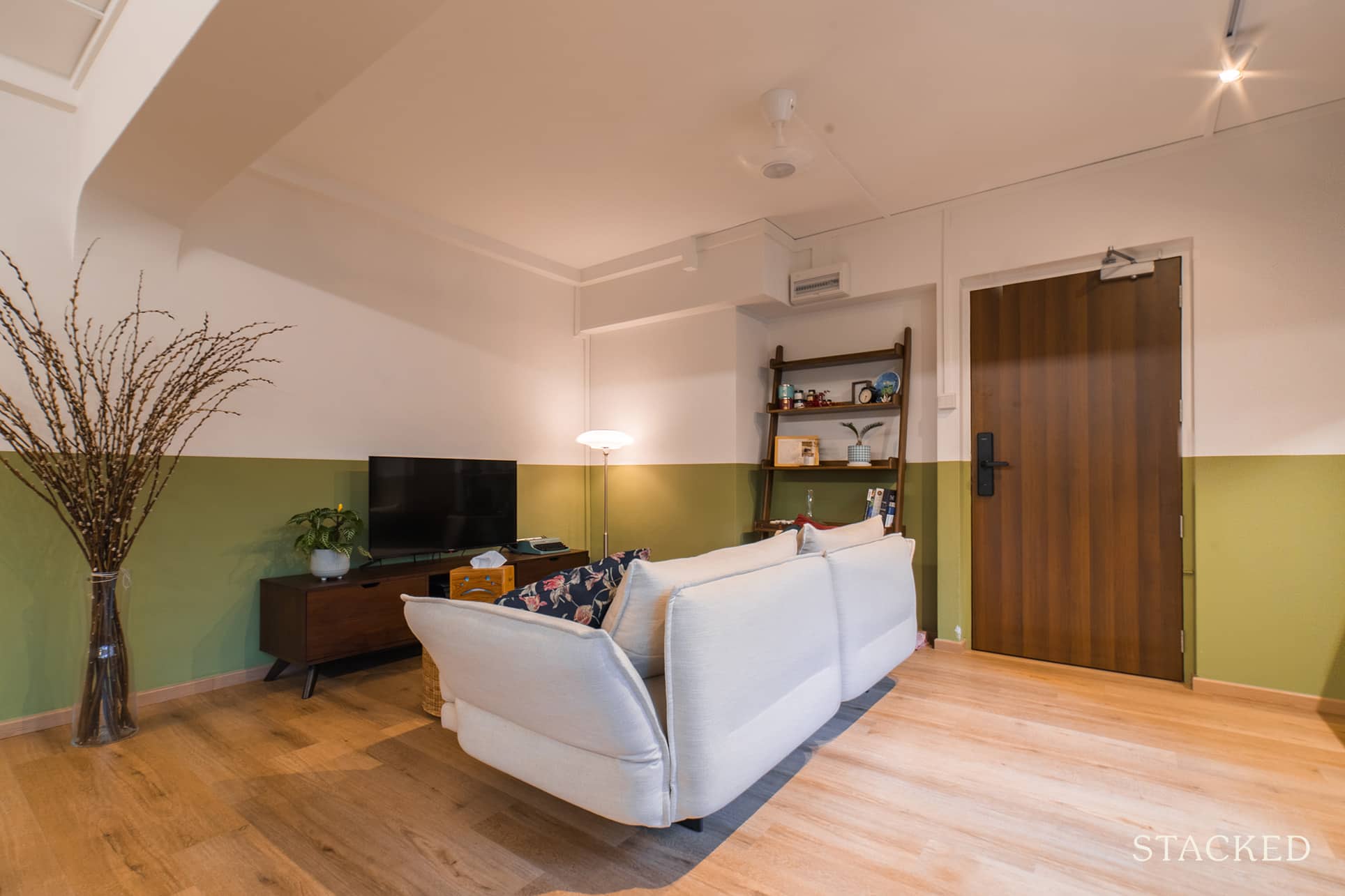
One of the few built-ins you’ll see in the house is the shoe cabinet in the entryway. “We couldn’t find a suitable standalone one that could fit all our shoes,” said Shannon.
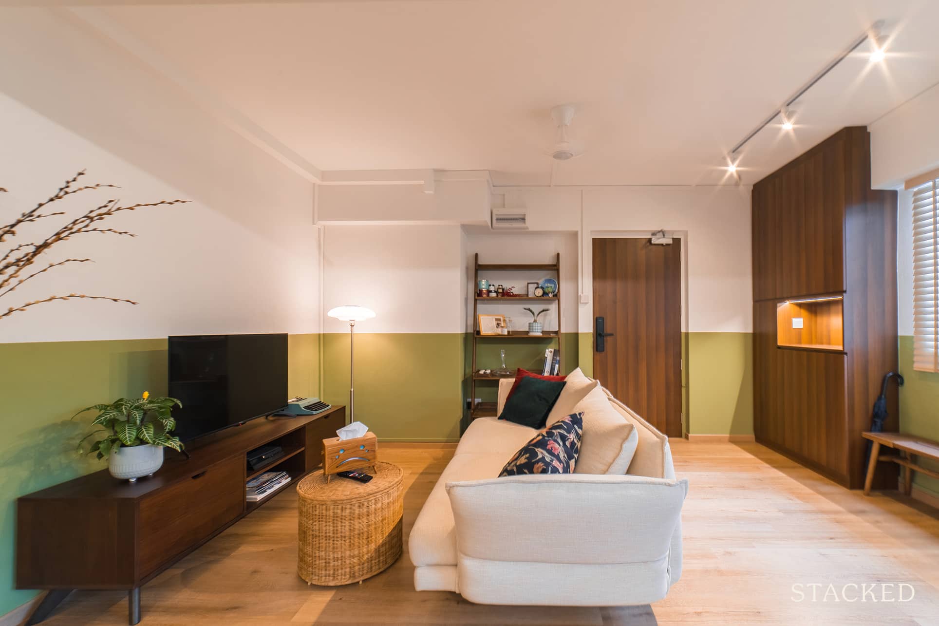
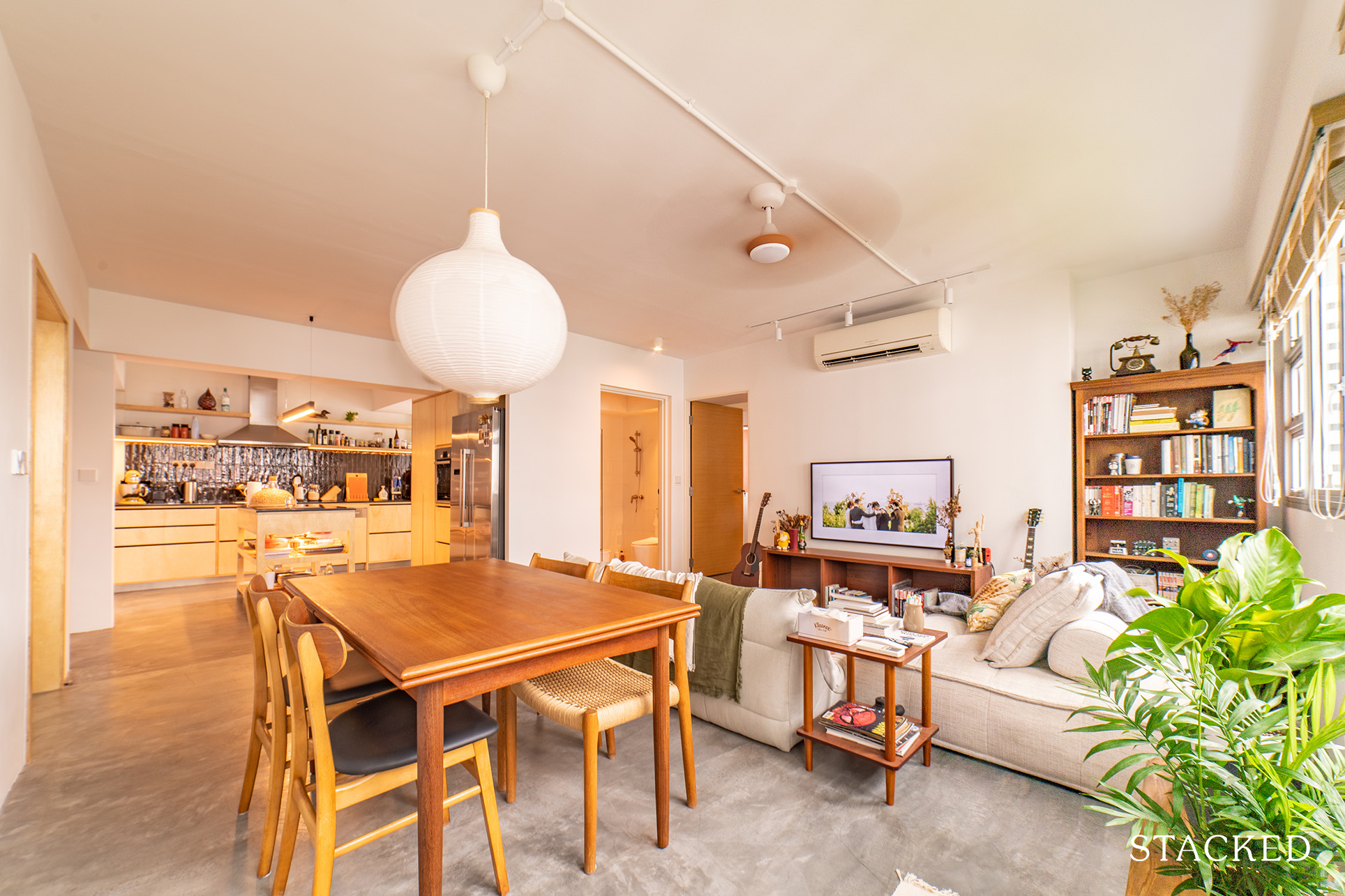
In alignment with mid-century furnishings, the couple chose a sofa with clean lines that is multifunctional as well. Their couch is a 2.5-seater, which has a deep seat so they can tuck their legs while lounging. It also has adjustable armrests that can convert into a pillow for more snuggle times on the couch.
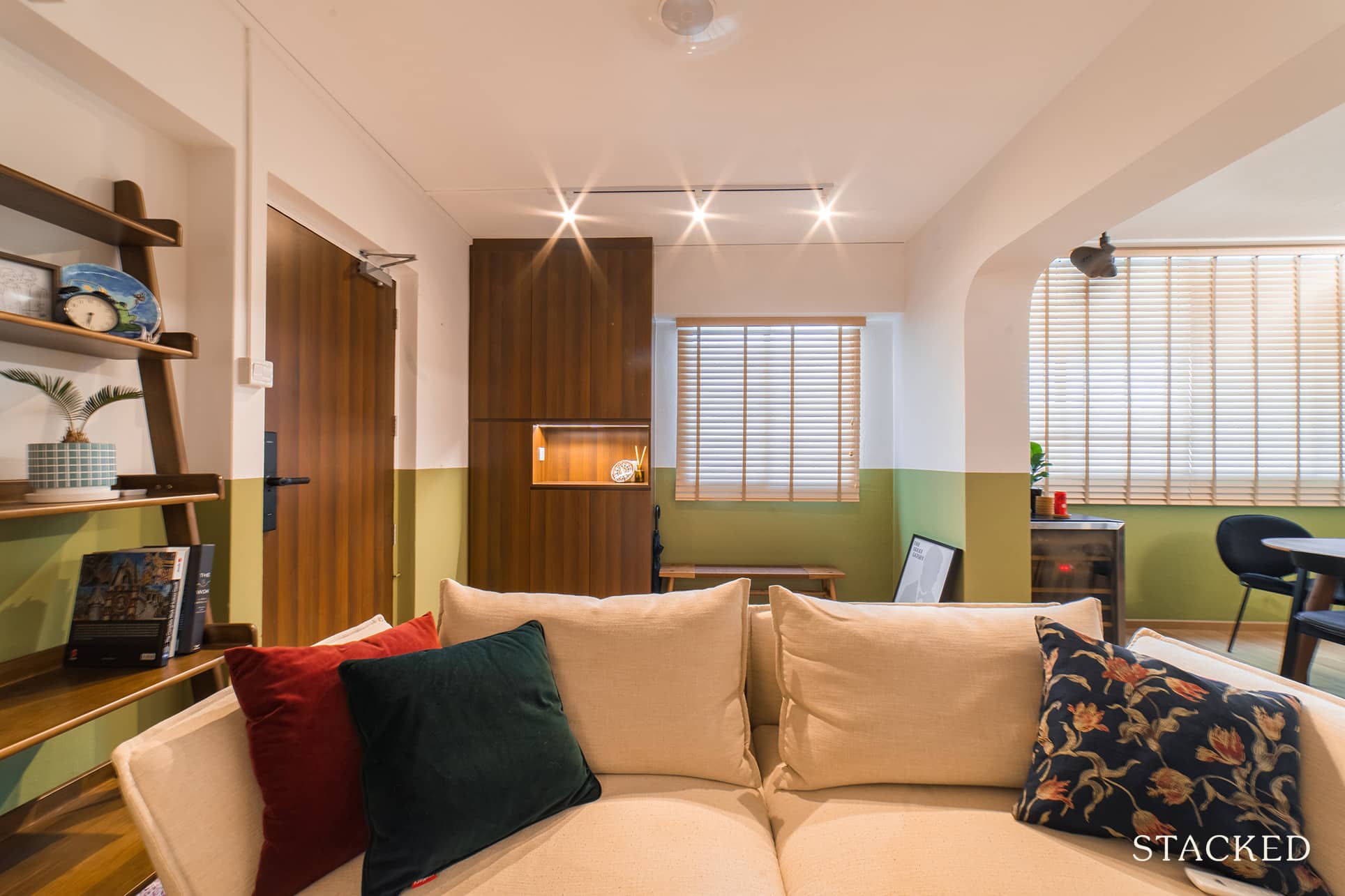
Like the rest of the house, the living room wall is half-wall themed. The lower half’s colour is olive green, which pairs really well with the darker wood that mid-century homes often have.
Dining Room
The centrepiece of the dining room is the dining table, which is the first piece of furniture that the couple bought. Aside from being visually appealing, the curved edges of the table also help to extend the number of seats it can accommodate from 6 to 10.
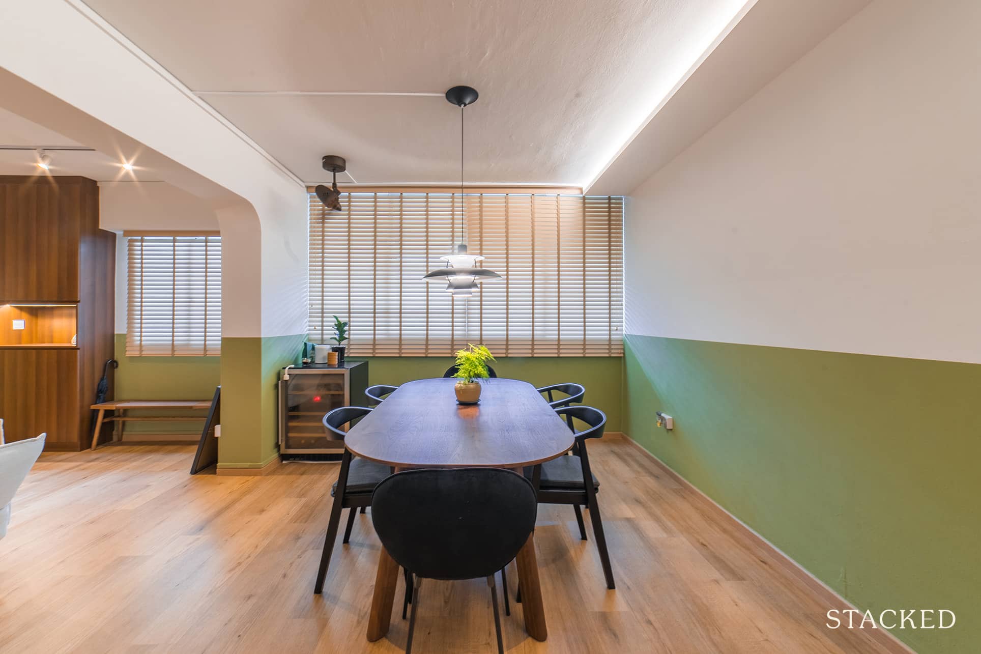
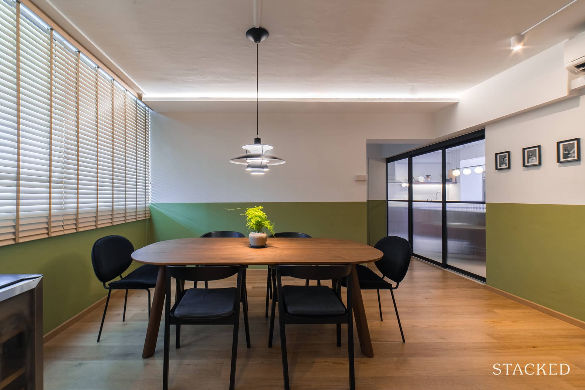
To further add to the timeless effect, they chose an iconic 1960s lighting, the Louis Poulsen PH 5 Pendant Light. The more complex design of the hanging lamp helps to add more visual interest to the otherwise very clean-looking space. They also had a false ceiling created at the side with LED light to give ambiance to the space.
Kitchen
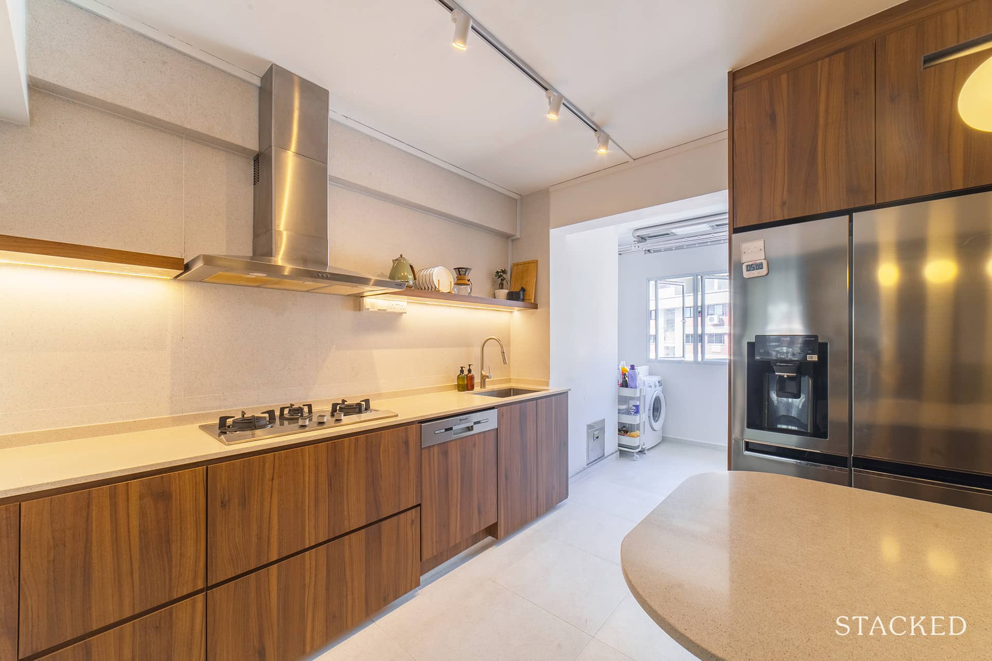
The kitchen is where the couple spent most of their efforts during the planning stage. Since they will be using this space more often, it’s only natural that it needed to be optimised well to ensure that the space is well and smartly utilised.
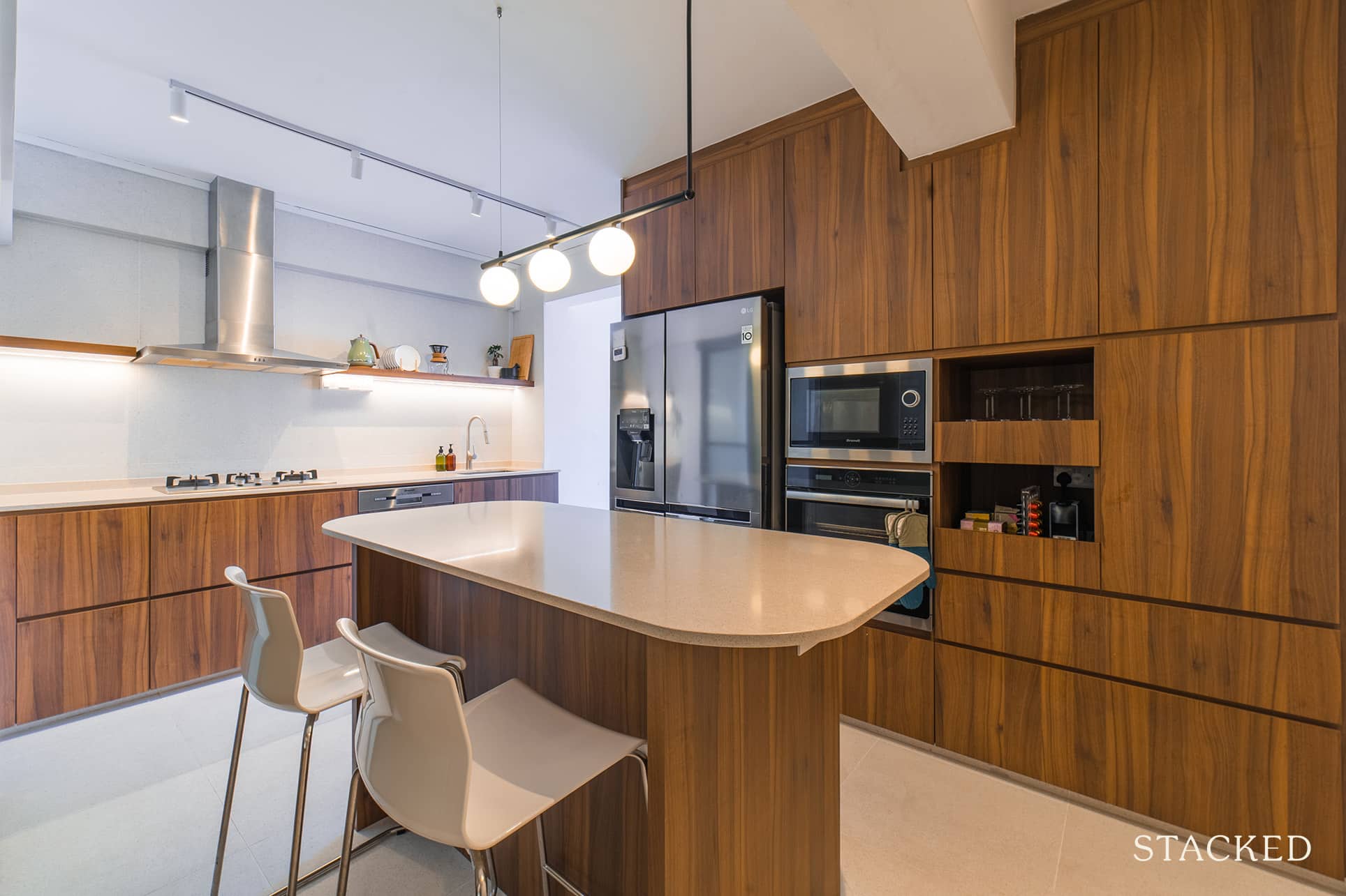
They opted for mixed styles in kitchen cabinetry – some open shelving and the rest as closed cabinets. Shannon said that going full closed cabinets makes the space smaller as it accentuates the low ceiling of an HDB. On the other hand, using open shelves on the hood side helped create an illusion of height and opened the kitchen space more.
More from Stacked
I Lived In Bayshore When It Was ‘Ulu’. Here’s How Much It Has Changed
When I told people I used to live in the Bayshore neighbourhood in East Coast, the usual response used to…
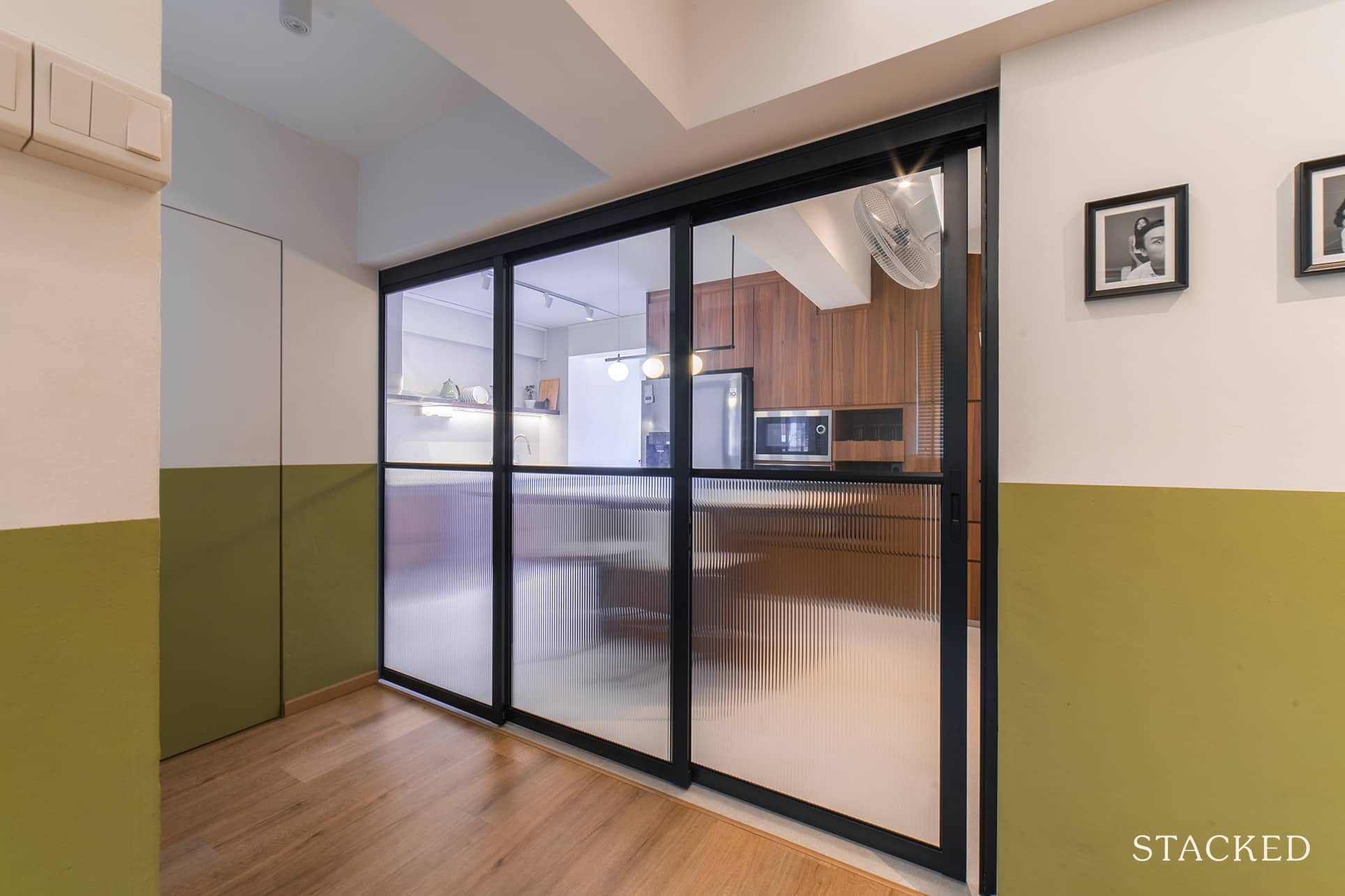
They also installed a powdered aluminium frame sliding door with half-fluted glass panels to demarcate the kitchen area. “Plus, it also keeps the smells away during heavy cooking,” Shannon added.
Master Bedroom
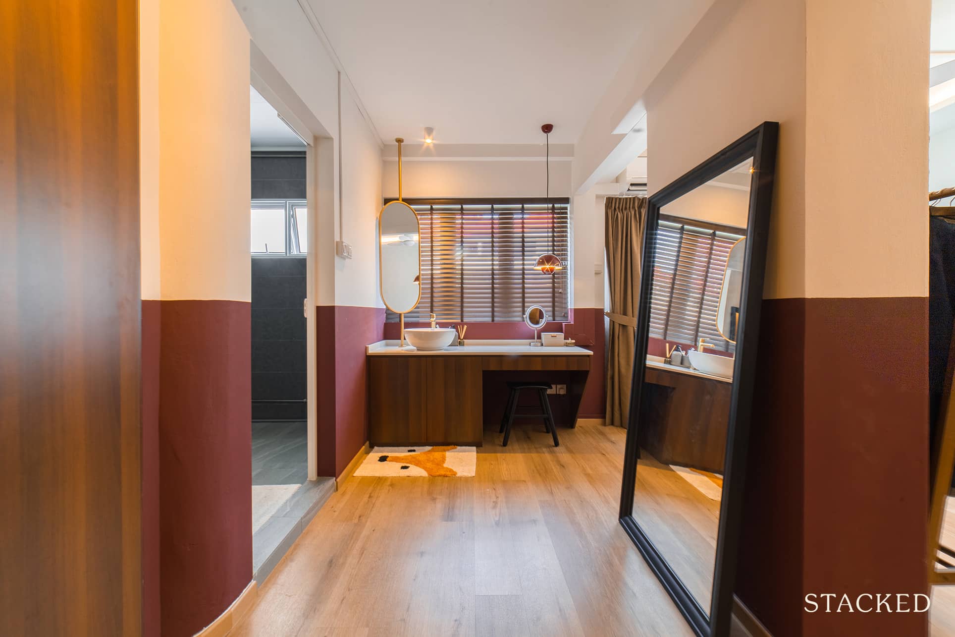
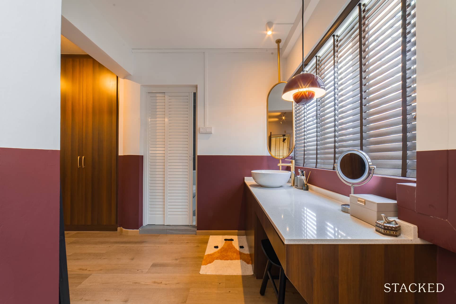
Instead of olive green, the lower half of the wall for their master bedroom is painted with burnt umber. Again, this is an unusual choice, but that vivid hue to it along with the &Tradition Flowerpot pendant lamp gives it a unique yet classy look.
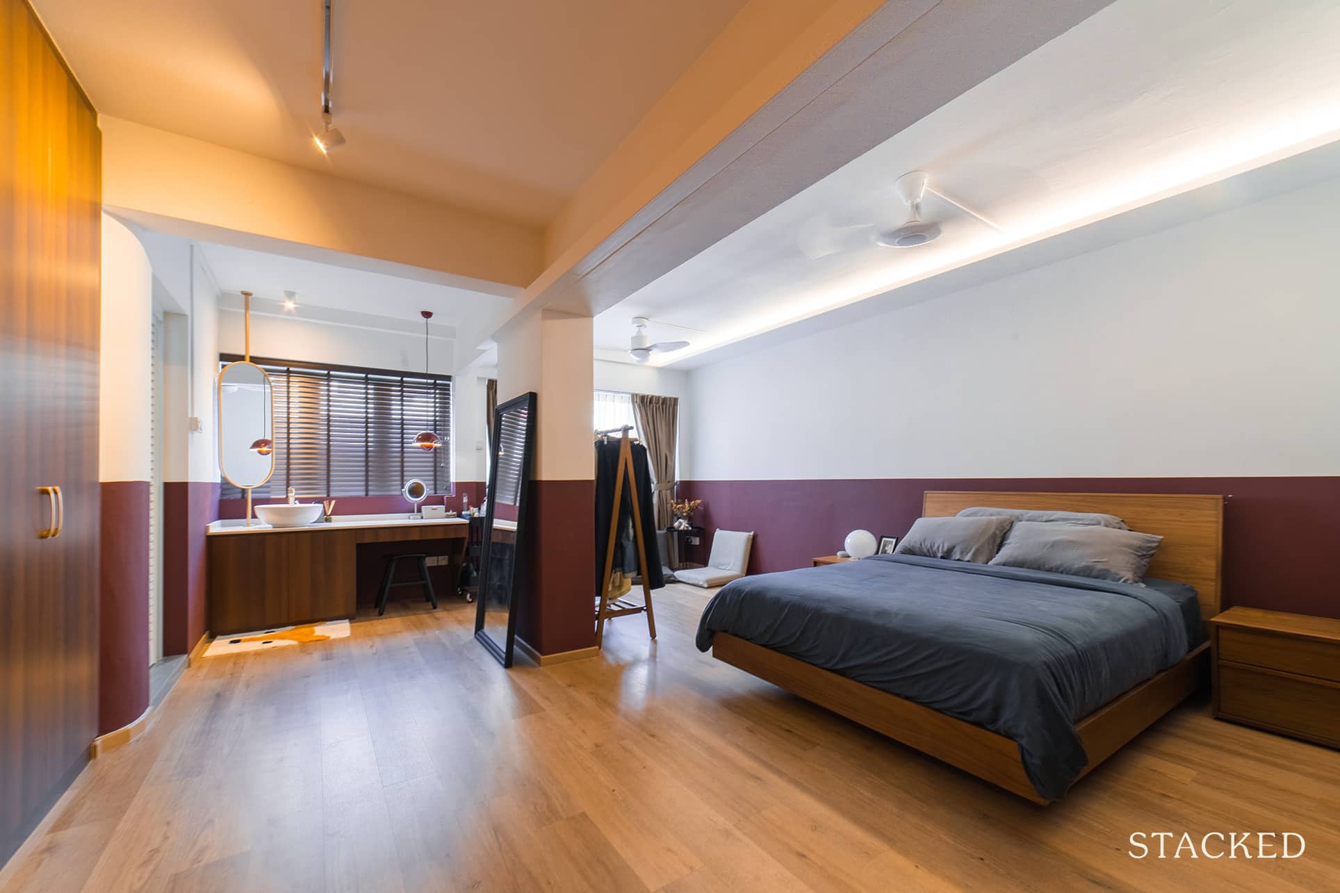
Shannon and Shawn wanted to make the master bedroom space “squarish”, so they had full-height wardrobes constructed to create this effect.
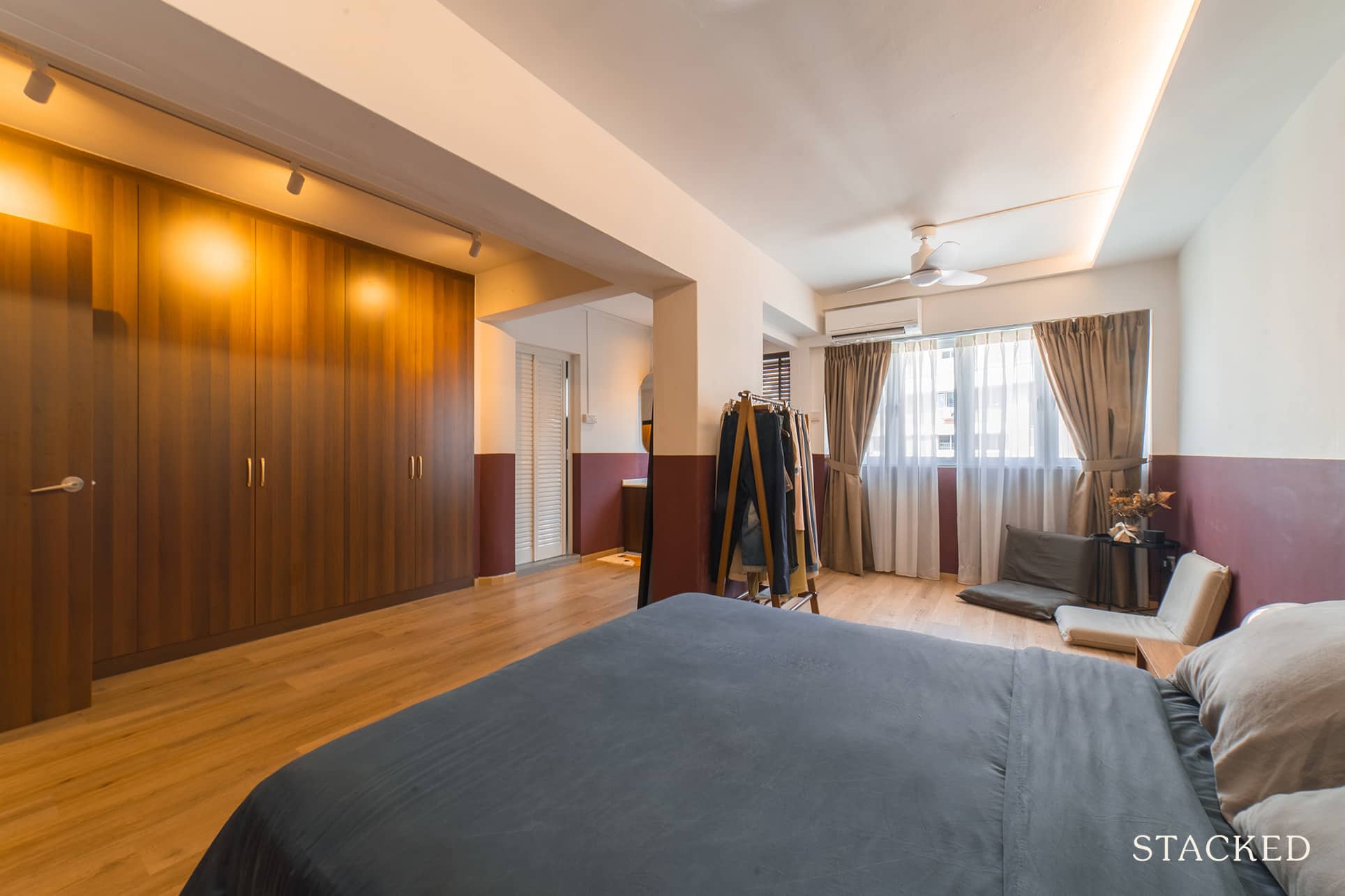
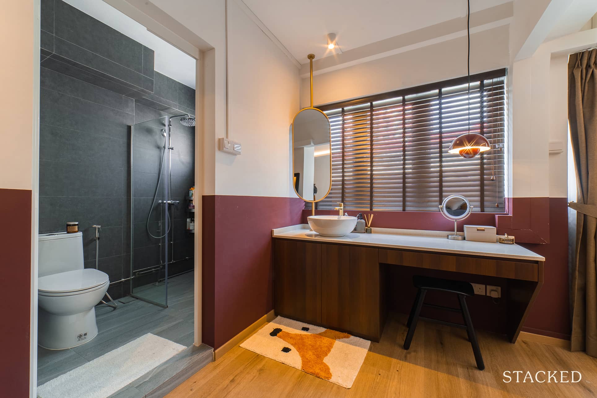
They also decided to move the sink from inside their master bathroom to their bedroom. Doing so allowed them to create a separate area to combine the sink and vanity. The vanity matches the same quartz countertop they have for their kitchen counters.
Bathroom
With the master bathroom sink no longer inside, they were able to expand the wet bathing area by shifting the bathroom door outwards. The dark grey tiles work well with gold highlights from the tap. It’s a simple, yet refined look.
Bringing The Vision To Reality
Fineline Design is the ID company that helped Shannon and Shawn in bringing their vision to reality. Shannon said they chose their contractor based on the following criteria: price, contractors on the ID company’s payroll, and an interior designer that could communicate to them well in English.
Furniture choice is the heart of mid-century modern home decor, so the couple was very particular in their sourcing process. “We started off with a preferred tone of wood, which was more of a dark walnut tone that we like,” Shannon shared, “and we tried to remain consistent throughout the house.”
Homeowner StoriesTour A 1,001 Sqft HDB Home Transformation: How A Couple Broke Down Walls To Create A Bright Open-Plan Layout
by StackedThey also decided beforehand which furniture would be the centrepieces for the house – and these are the dining table and couch. “The other pieces of furniture were then selected to match these two items,” she said. Like many other homeowners, their furniture in the house was a “combination of new and used items from Carousell.”
When asked what’s the best area in their house after renovation, both of them agreed that it’s the kitchen. Shannon added that her favourite part is the master bedroom vanity.
Lessons Learned From A Successful Renovation Journey
Choosing the colour for their half-themed wall proved to be the biggest challenge for them, especially when picking the tone of green they wanted. “We went to purchase small cans of paints at our own cost to determine the most suitable color,” Shannon said.
The couple also learned first-hand that renovation delays are real and should always be expected. She recalled that the constant delays they experienced were a common theme during their whole renovation process. “If you want your renovation to be really ready in three months, then it should be communicated to your ID that you want it to be ready in two months,” she advised.
We asked Shannon and Shawn for some words of wisdom new homeowners should know if they’re planning to spruce up their homes, and we received several bits of advice.
First, they said to allocate more of your budget on furniture items since they are movable – you can bring them along with you if you move out.
In terms of quotation requests, keep in mind that it is quoted as a per square foot price instead of a lumpsum amount. To facilitate easier price comparisons across firms, Shannon said to ask the contractor to combine all the “make-good” works into the quote.
They said to include “optional” items into the contract before signing it. “If there are works that we are not sure of, we would definitely include them into the quotation before sighing it,” she emphasised. The reason behind this is that variation orders are usually expensive and have little room for negotiation.
Lastly, Shannon advised to “compare and discuss your quotations among family and friends.” A very sound counsel, especially since, as we all know, the construction industry is not very transparent.
At Stacked, we like to look beyond the headlines and surface-level numbers, and focus on how things play out in the real world.
If you’d like to discuss how this applies to your own circumstances, you can reach out for a one-to-one consultation here.
And if you simply have a question or want to share a thought, feel free to write to us at stories@stackedhomes.com — we read every message.
Need help with a property decision?
Speak to our team →Read next from Homeowner Stories

Homeowner Stories We Could Walk Away With $460,000 In Cash From Our EC. Here’s Why We Didn’t Upgrade.

Homeowner Stories What I Only Learned After My First Year Of Homeownership In Singapore

Homeowner Stories I Gave My Parents My Condo and Moved Into Their HDB — Here’s Why It Made Sense.

Homeowner Stories “I Thought I Could Wait for a Better New Launch Condo” How One Buyer’s Fear Ended Up Costing Him $358K
Latest Posts

Property Market Commentary Yishun 10 Could Be Redeveloped Into Mixed-Use Housing Near Yishun MRT
Singapore Property News 30-Year-Old Singapore Investor Buys Ang Mo Kio HDB Coffeeshop After Owning 13 Properties

Singapore Property News Tropicana Metropark’s 80% Take-Up Signals Strong Demand for Integrated Living











0 Comments