Tour An Old 1978 HDB Transformation: How A Couple Created A Minimalist Expansive Home
September 7, 2022
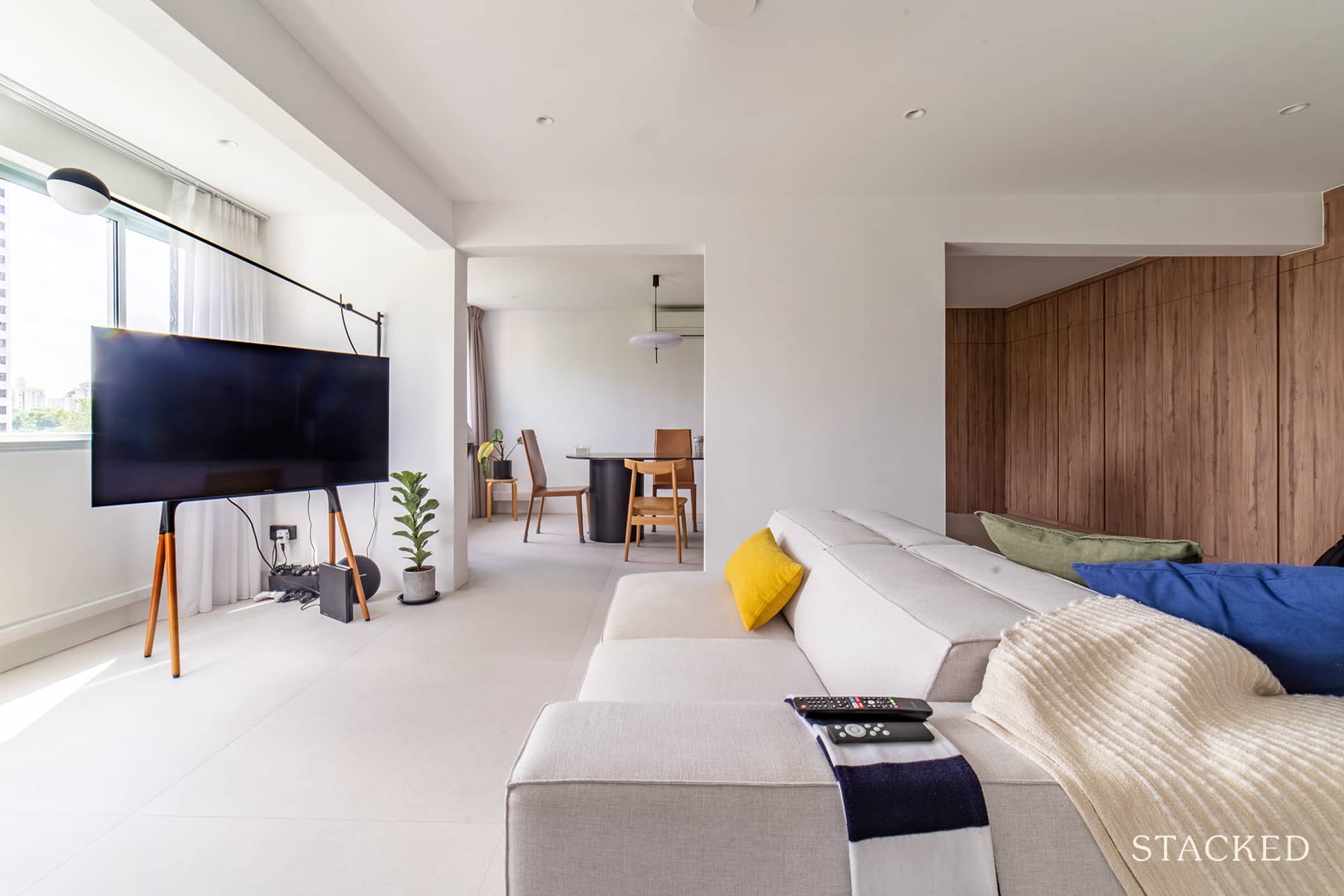
There’s one big question that every homeowner will face after buying a resale HDB flat – how many structural changes do you want to do to the property?
Hack down a wall to have a bigger living? Sure, it’s always nice to have more communal living space.
But what if you have kids in the future?
What would be the sensible move to make?
Shermain and Zhi Hao (@our.commonwealthdreams) faced this exact scenario when it came to renovating their 44-year-old HDB home in Commonwealth Ave West.
The couple made their purchase in October 2020 but only received their keys in April the following year due to delays on the seller’s end. They tried the SBF scheme in the area a number of times, but however, they did not get the desired queue number, so they decided to look for a resale instead.
“Location and convenience were keys for us as we were getting married,” Shermain said. “We were certain to move out of our parents’ place, and we didn’t want to compromise on space.” And thus, they were open to purchasing an older unit.
Currently, only the two of them are residing in their home, but the place is large enough to accommodate any future kids as well.
Let’s tour how they built their minimalist home.
So many readers write in because they're unsure what to do next, and don't know who to trust.
If this sounds familiar, we offer structured 1-to-1 consultations where we walk through your finances, goals, and market options objectively.
No obligation. Just clarity.
Learn more here.
How The Renovation Journey Turned Out
Shermain and Zhi Hao were quite pragmatic when it came to their renovation budget.
“We allocated $80K for the reno works,” Shermain answered. She said the amount included buffers, as they knew there would be unforeseen costs along the way.
Their renovation design and style were not tied to a specific trend. Rather, they’re more focused on what they feel comfortable with.
“We love clean lines, open and bright spaces,” she said. They also prefer coloured details and natural elements such as wood and stone textures.
While they admired how Germans styled their interior with functional aesthetics, they were careful not to select tiles or furnishings based on trends. So no brass furnishings for them, as much as possible.
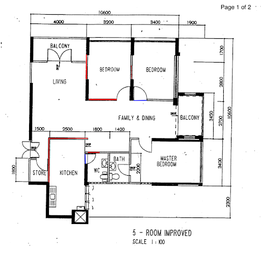
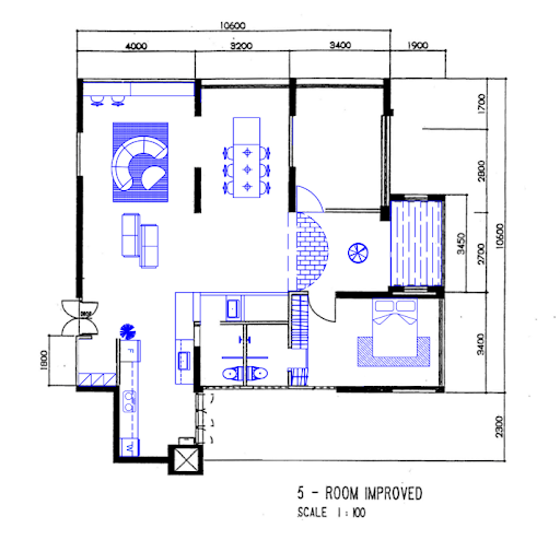
Below is the original layout of the house, followed by their ID’s proposed draft.
Shermain said that after they got the draft, they decided to move the built-in carpentry and table ledge out of the balconies. “It’s the hottest area of the house, especially when the morning sun hits, so relocating them turned out to be a big plus.”
The couple went for a semi-open concept floor plan, encompassing the living, dining, and kitchen area. However, they also created a permanent partition to keep the private spaces separate. “It works really well when we’re hosting guests,” she said.
Let’s go ahead to tour their home after the renovation.
Living Room
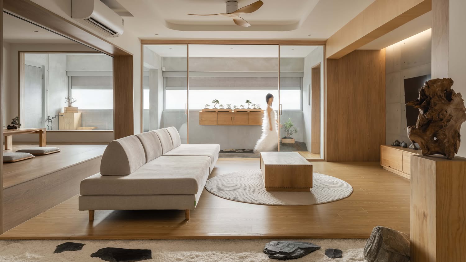
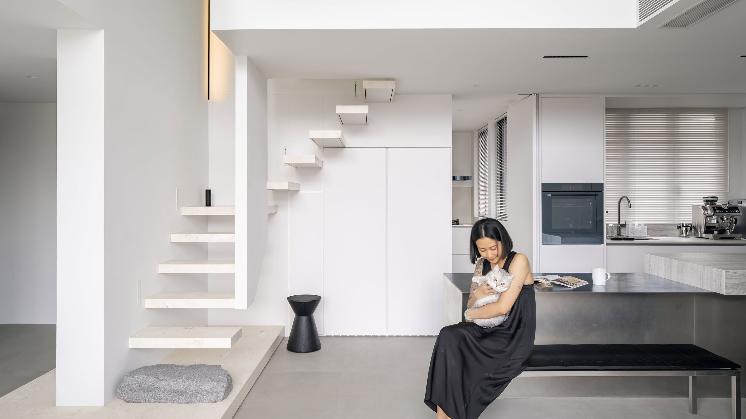
As soon as you enter their home, you are greeted with a bright and airy living room area. As both Shermain and Zhi Hao envisioned, the design is minimalistic, with splashes of colour from different decorative objects placed around.
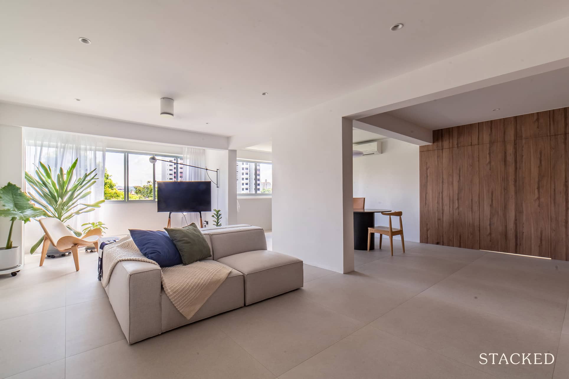
One thing’s really obvious from the get-go too, the space available is significant.
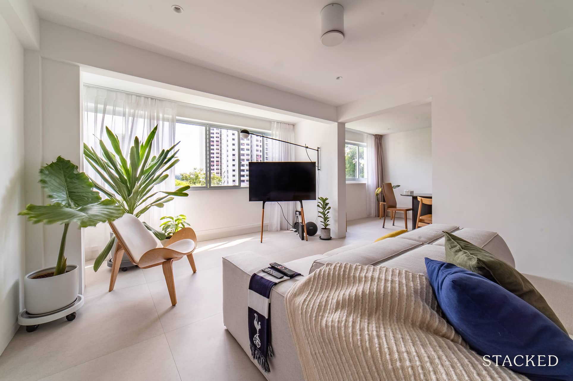
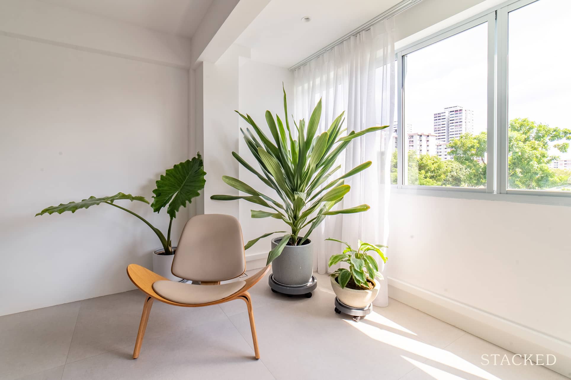
The original layout also had two balconies – one of which is in the living room. To make this area bigger, they decided to extend it to where the balcony was. Now, it’s actually where they had their TV set up, along with a wall-mounted lamp that adds character to the area.
Dining Room
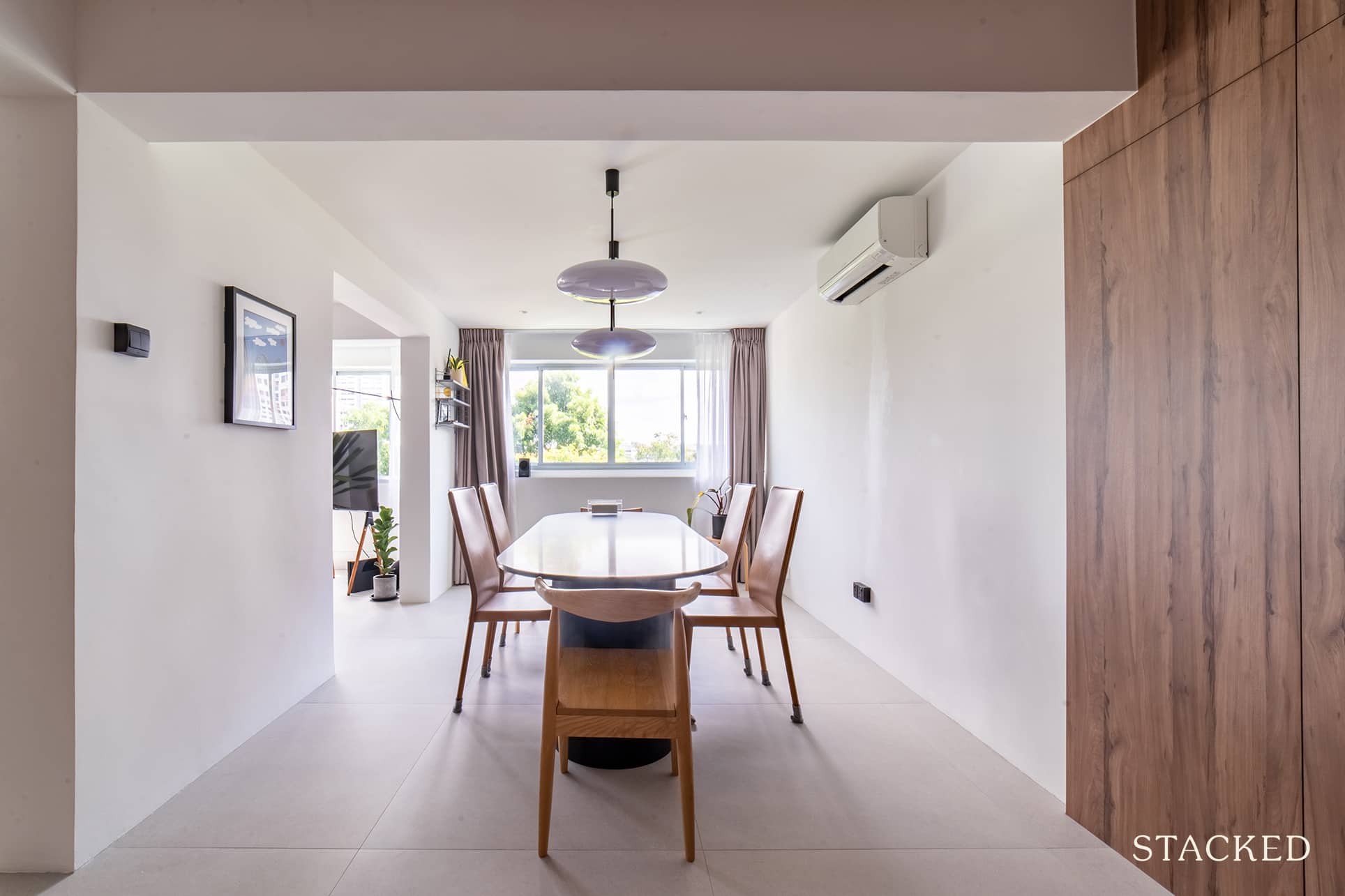
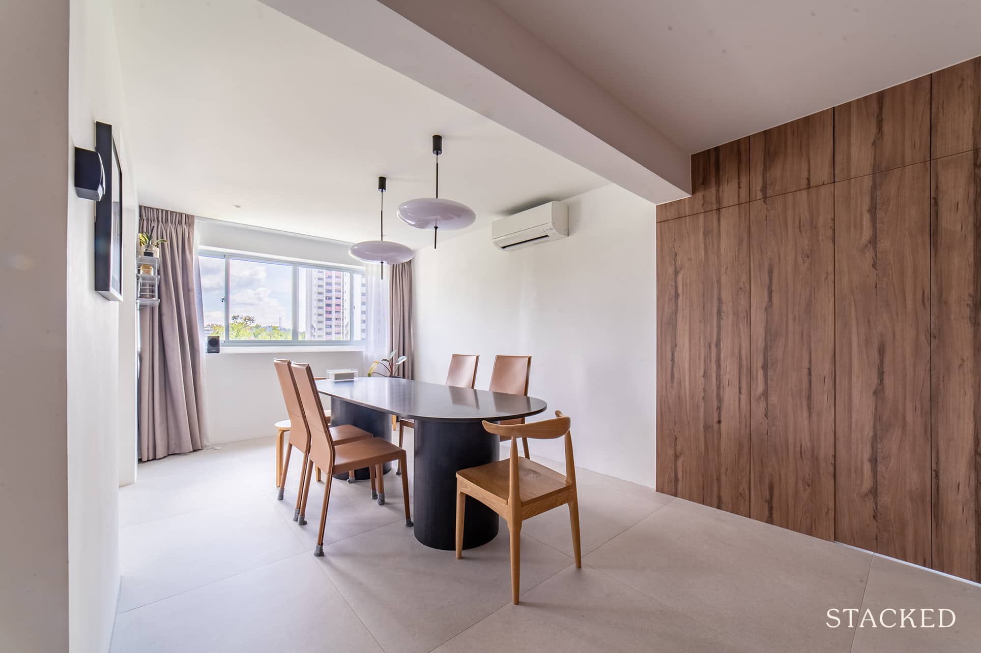
The pair knew right off the bat that they wanted a bigger dining area. Thus, they hacked the walls of one of the bedrooms to achieve this. It’s also here in the dining area where you’ll see more of the mid-century style with the pendant lights and their choice of the dining table.
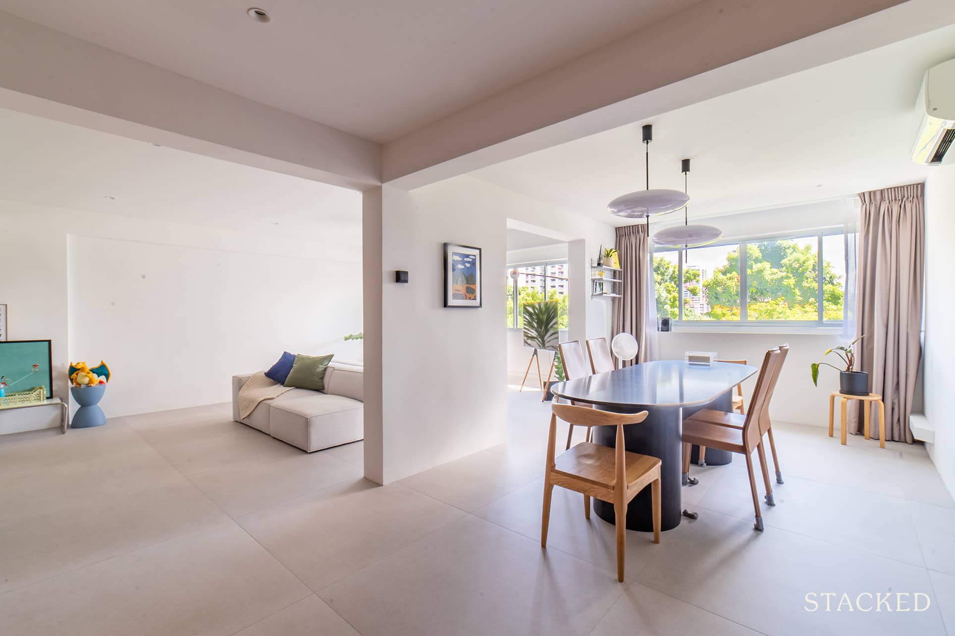
Shermain said that the previous owner had their dining area along the hallway, which was not what they wanted. And so prior to purchasing the flat, they knew that the layout would allow them to open up a room for the dining area instead.
Kitchen
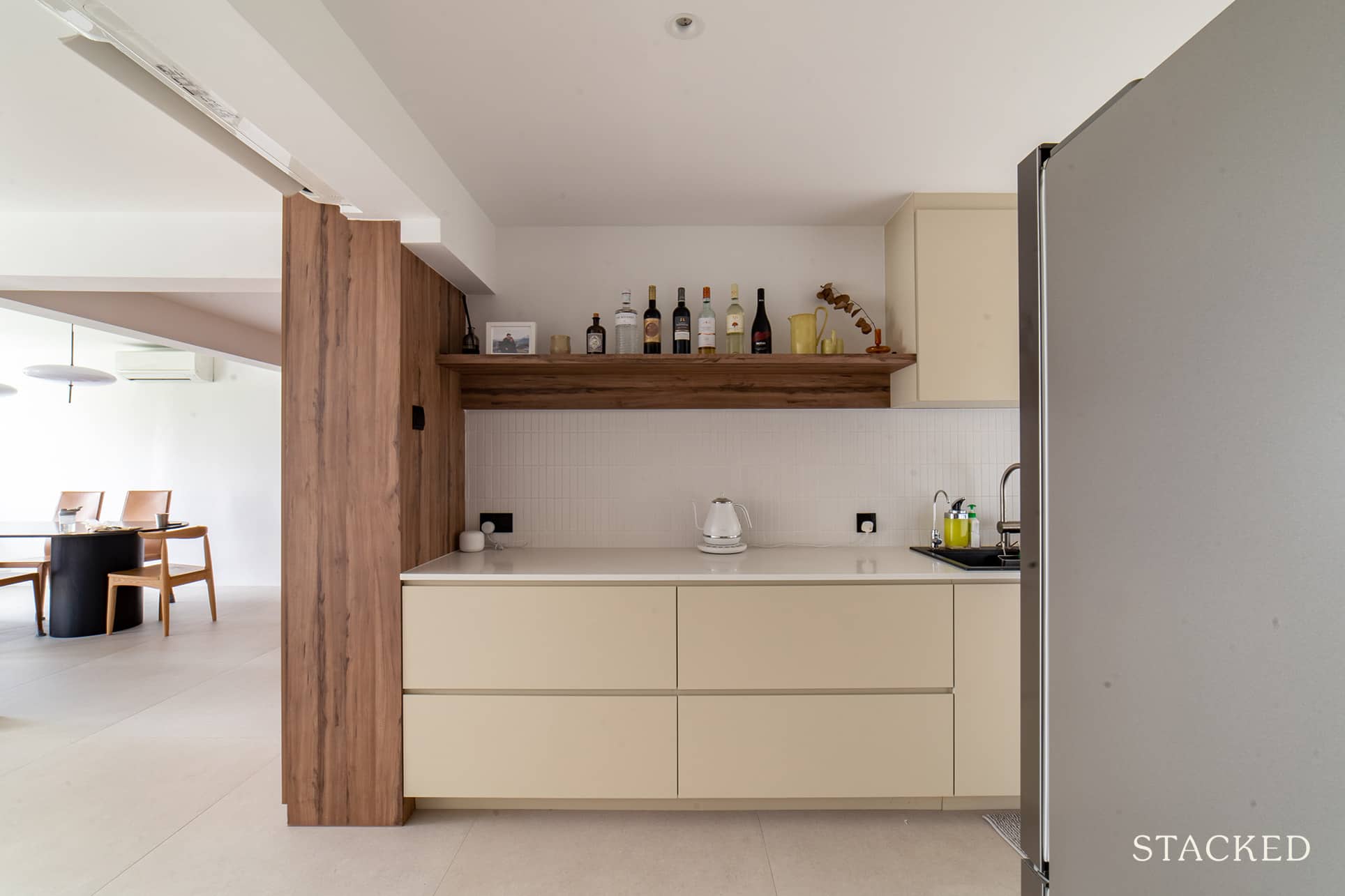
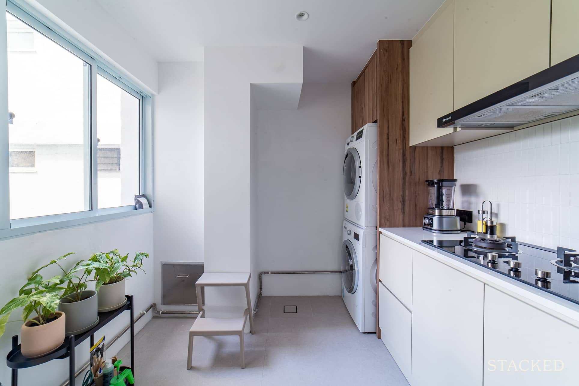
Compared to other units they viewed before, their kitchen is not directly connected to any of the bedrooms. Which ended up being one of the finer points that made them choose this unit. The downside, though, was the kitchen ended up pretty dim. The couple fixed this by opening it up entirely, bringing in a lot more light to the area.
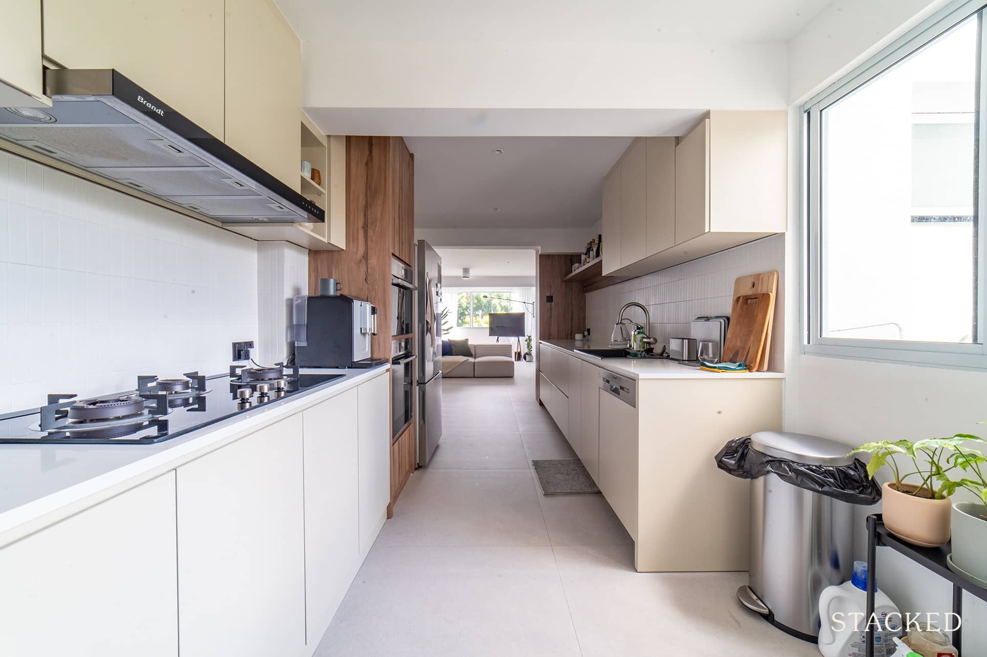
The neutral colours here work really well with the rest of the home, with the kitchen backsplash providing a little texture to the otherwise smooth look.
Bedrooms
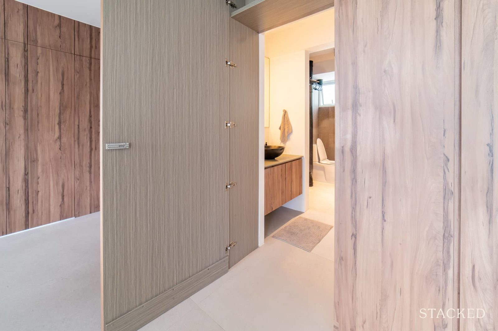
The couple wanted to create a distinction between the private and living areas. So they created a partition right next to their dining area, where the hallway to their bedrooms begins.
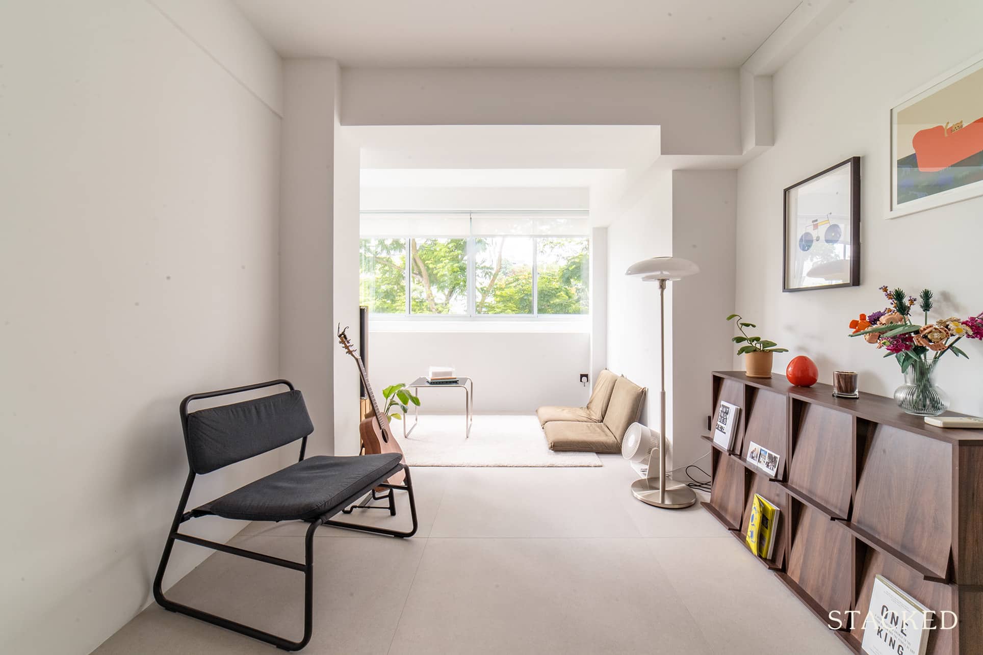
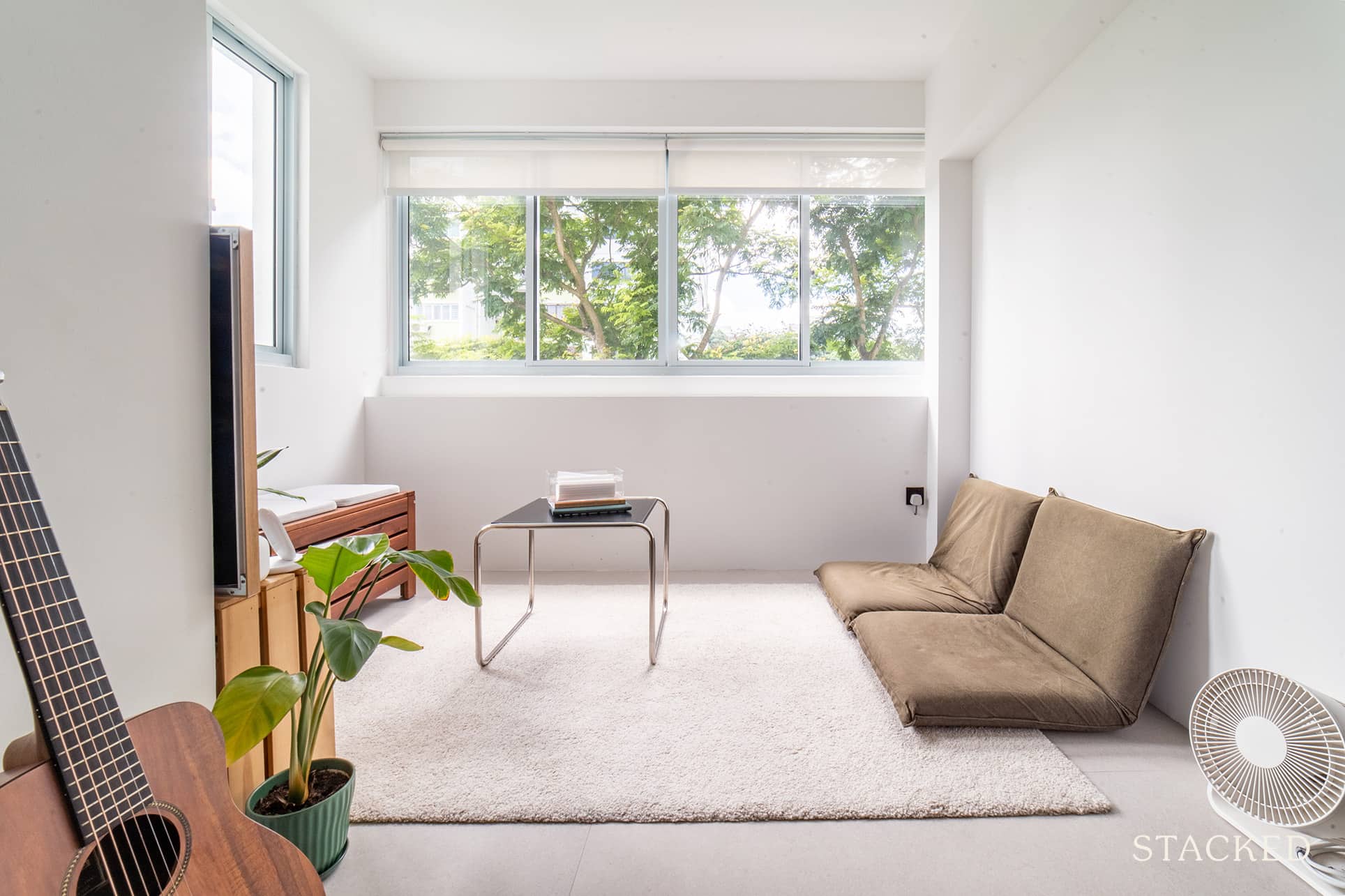
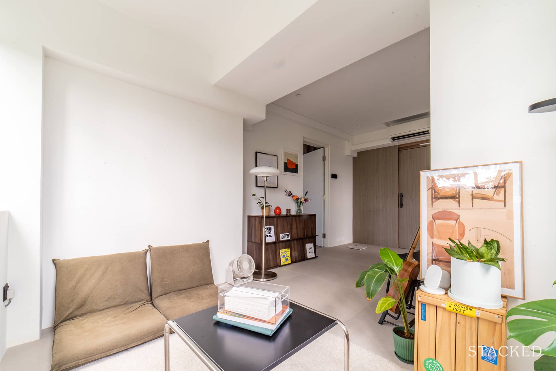
With one of the balconies located at the end of the hallway, they were able to have a family room of sorts. Not many people have the luxury of such added space, and Shermain said that they both love this area.
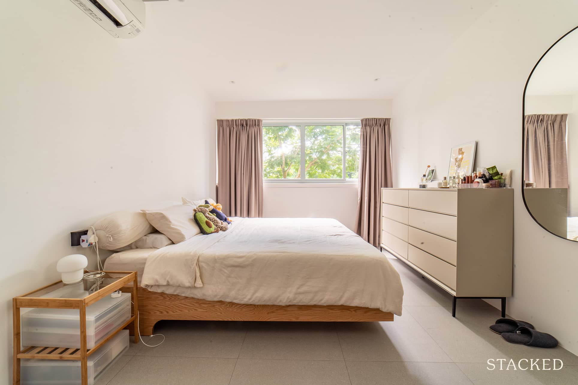
The master bedroom continues to show the couple’s hybrid theme. The colours, as well as the furniture, are simple but they all work well together.
Bathrooms
One of the downsides of buying an older flat is that the bathrooms may be smaller. As such, they had to work through some space constraints. For the master bathroom, they had to choose between bringing out the sink or settling for a small one.
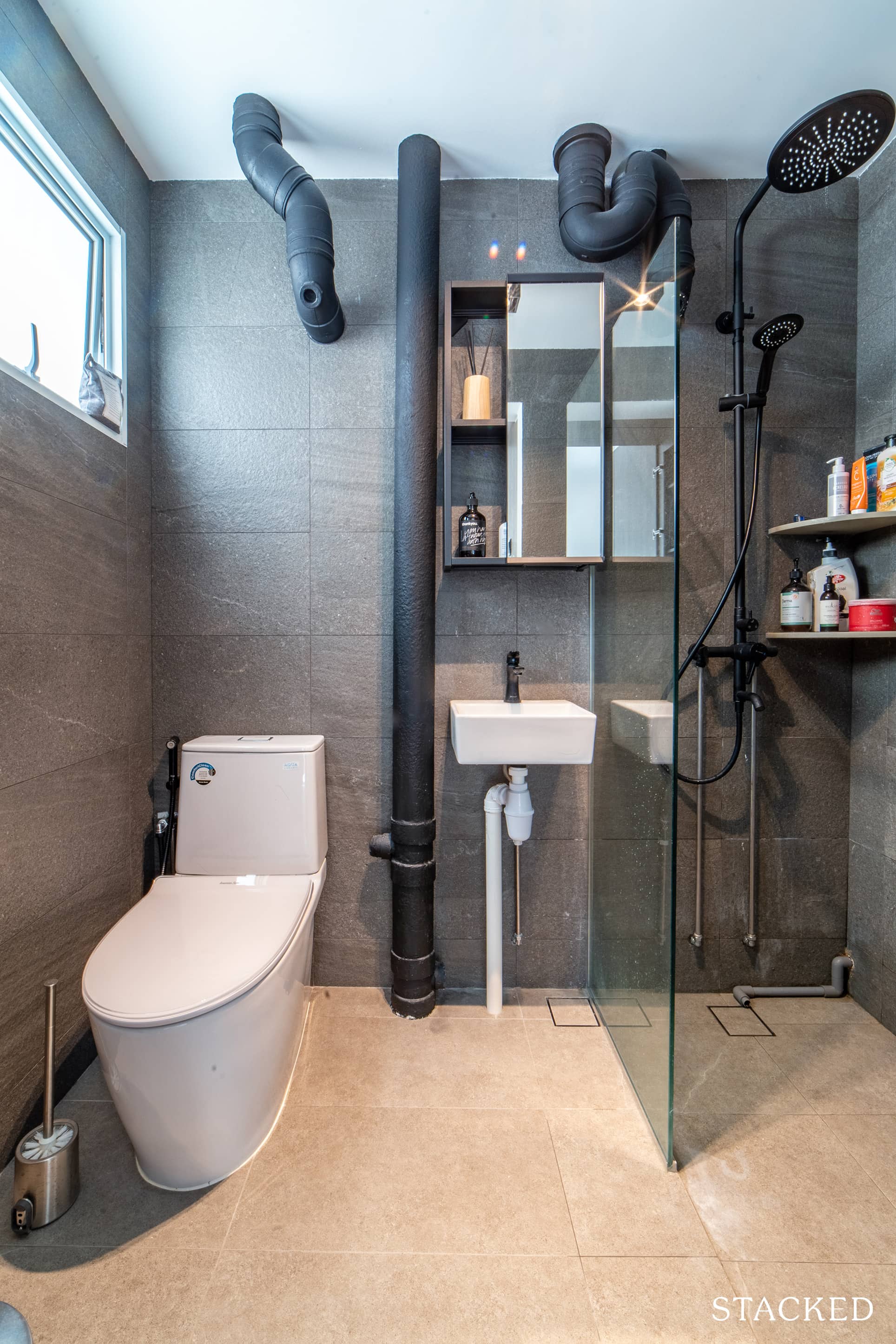
Like other homes you may have seen, the pipes in the bathroom were painted black to match the black shower fittings as well.
More from Stacked
Are New Launch Condos Really Getting Cheaper in 2025? The Truth Isn’t What You Think
On paper, the answer is just a straight yes. But due to confusion involving things like GFA harmonisation and actual…
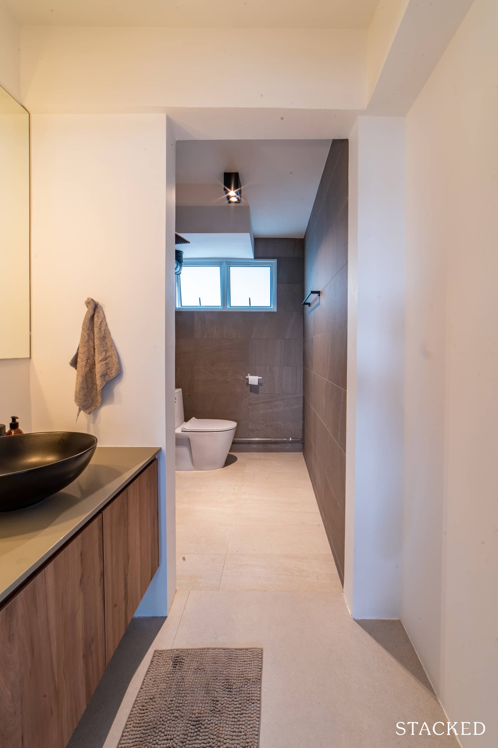
The common bathroom, on the other hand, is slightly bigger. As such, they had the liberty of space to bring the sink out.
Bringing The Vision To Reality
Most homeowners, do end up with a home they have envisioned from the beginning.
Things were different for Shrms and ZH, as the final outcome was not what they had imagined – but not in a bad way though!
She admitted that they started out with the intention of creating a mid-modern, Danish, Scandinavian home. Their ID obliged and went ahead with planning out what they wanted. But somewhere along the design process, the couple realised they’re really not the sort of people to enjoy organised clutter.
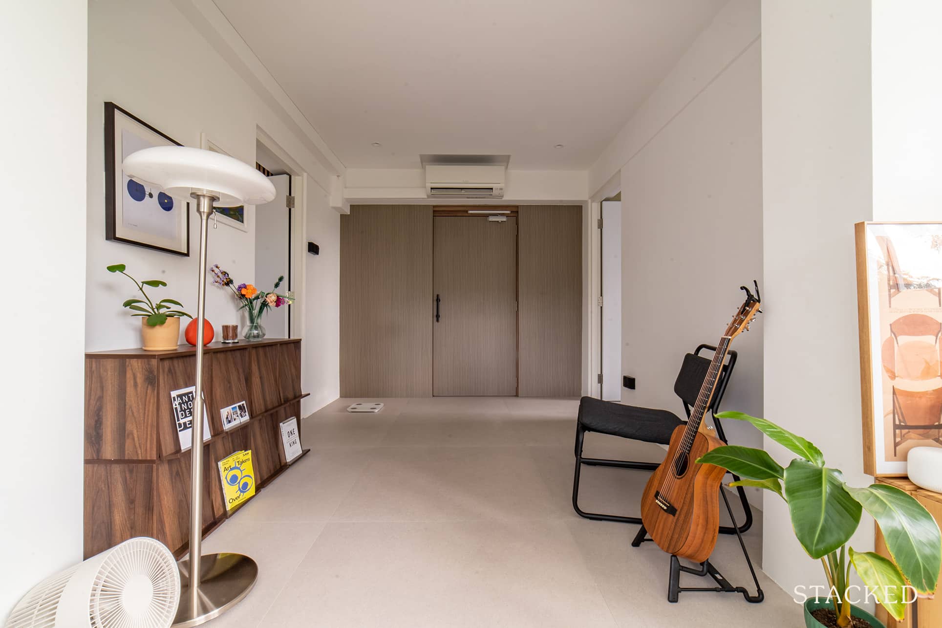
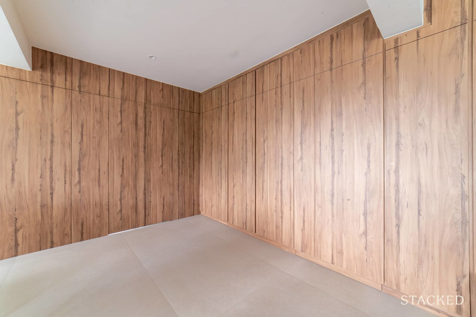
“We requested more carpentry for storage,” she elaborated. “We also asked to conceal our rooms with a partition door as we wanted to separate the private and living space.”
She was thankful that their IDs from Ascend Design, Agnes and Jasper, were gracious enough to change and adapt to their design changes along the way.
So what made them pick their IDs? Shermain said that they found them to be very relatable when it came to the design process. They were also very transparent in their communication – something that is an underrated trait to have in any renovation process.
For the young couple, this is only their first home. While they gave more attention to their budget constraints, they said they were lucky to have experienced Ascend’s reliability in terms of workmanship and quality.
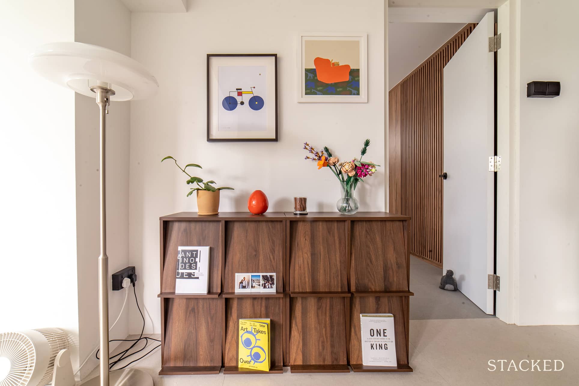
When it came to sourcing their furniture pieces, Shermain said they deliberately took their time. “As a matter of fact, not every area is furnished yet. We wanted to live in the house first to figure out how we’d used the space better.”
As such, their dining table only came about four months after they moved in. She said they had to source the stone themselves and had the legs custom-made.
They already had the sofa they wanted in mind – clean, firm, modular, and right down to the exact piping. She said they even did a fair bit of research and almost had one custom-made with the same design. But it all changed when they saw what they have now online.
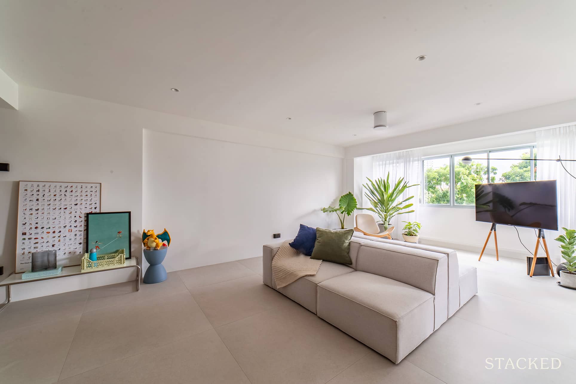
“The sofa was a modular set that we bought individually,” she said, “and we found these to be more cost-effective than other options.”
Shermain added that they were very happy with their decision to lay down bigger tiles for their house’s flooring. “I think this really expanded the space visually, which we love.”
They also like the amount of light that streams to the kitchen and walkways. It’s a far cry from what it used to be – which was a poorly-lit kitchen and dim walkways.
Lessons Learned From A Successful Reno Journey
As mentioned at the beginning, the greatest challenge encountered by the couple in their reno journey was putting a pin on the structural changes.
“We wanted to ensure that all the hacking, concealing, and building are something that we will not regret years down the road.”
For them to arrive at a final decision, Shermain said they had to deliberate over and over again. And as much as they could, they also tried to envision themselves living in the space.
She said that when she was still initially designing their place, she wanted a kitchen island. It was a non-negotiable for her back then. However, given the layout of the house, they ended up prioritising storage and carpentry instead. And to further compensate, they made it up with a bigger dining table.
While she was very thankful that there weren’t many major hiccups in their reno process, there are some things she wished they gave more attention to. “We should have taken more time considering the powerpoints and their location. And, of course, more built-in wardrobe space,” she said regretfully.
The couple learned that things could go wrong with any reno process. However, communication with the contractors is the key which could significantly help to rectify issues early on.
Shermain shares two solid pieces of advice for those who are planning to go on a reno journey.
The first is about catching issues early on.
The couple has heard stories of renovation nightmares and were equally diligent in personally checking on their renovation works. This approach didn’t only benefit them but their contractors as well. “Sometimes the contractors find it easier when the homeowners are around, especially during the installation of fixtures and carpentry,” she said.
Keep in mind that contractors may be equally busy juggling and managing other projects. And so, Shermain recommends that homeowners should also do their own checks rather than completely relying on your contractor’s update.
And lastly, she advises setting a realistic goal. “Before setting aside the budget to spruce up your home, it’s important to consider how long you intend to live in the flat.” It’s all about keeping yourself from over-allocating a renovation budget when you’re just staying at the place for a relatively short time.
At Stacked, we like to look beyond the headlines and surface-level numbers, and focus on how things play out in the real world.
If you’d like to discuss how this applies to your own circumstances, you can reach out for a one-to-one consultation here.
And if you simply have a question or want to share a thought, feel free to write to us at stories@stackedhomes.com — we read every message.
Need help with a property decision?
Speak to our team →Read next from Homeowner Stories

Homeowner Stories We Could Walk Away With $460,000 In Cash From Our EC. Here’s Why We Didn’t Upgrade.

Homeowner Stories What I Only Learned After My First Year Of Homeownership In Singapore

Homeowner Stories I Gave My Parents My Condo and Moved Into Their HDB — Here’s Why It Made Sense.

Homeowner Stories “I Thought I Could Wait for a Better New Launch Condo” How One Buyer’s Fear Ended Up Costing Him $358K
Latest Posts
New Launch Condo Reviews Tengah Garden Residences Review: New 863-Unit Tengah Condo From $980,000 Near Hong Kah MRT

Singapore Property News HDB Resale Prices Fell — But A Third Of Buyers Still Paid $800K+ Last Quarter. Here’s Why

Singapore Property News Three Strata Office Floors In Suntec Priced From $135M



















2 Comments
This house looks so sparse