A New York loft is something like living in a shophouse here in Singapore. Both are prevalent historic building types that are now very much part of the built identity of the cities.
Traditionally, a loft is an apartment within a building once used for industrial or commercial purposes that have been converted into a living space. Back in the 50s and 60s, most aspiring musicians and artists in New York preferred to live in unused warehouses because it was cheaper. Being the creative people that they were, the open space allowed them to freely express their art form in their home – eventually creating the NYC Loft home design.
Some of the usual elements you’ll find in an NYC Loft include high ceilings with exposed piping and beams, black steel window frames, and exposed brick walls.
Inspired by references of New York lofts from movies (who hasn’t?), Benjamin and his wife (@bw.hm.casa) knew that that was the look they wanted to achieve in their 1,369 square foot condo in the north-west of Singapore.
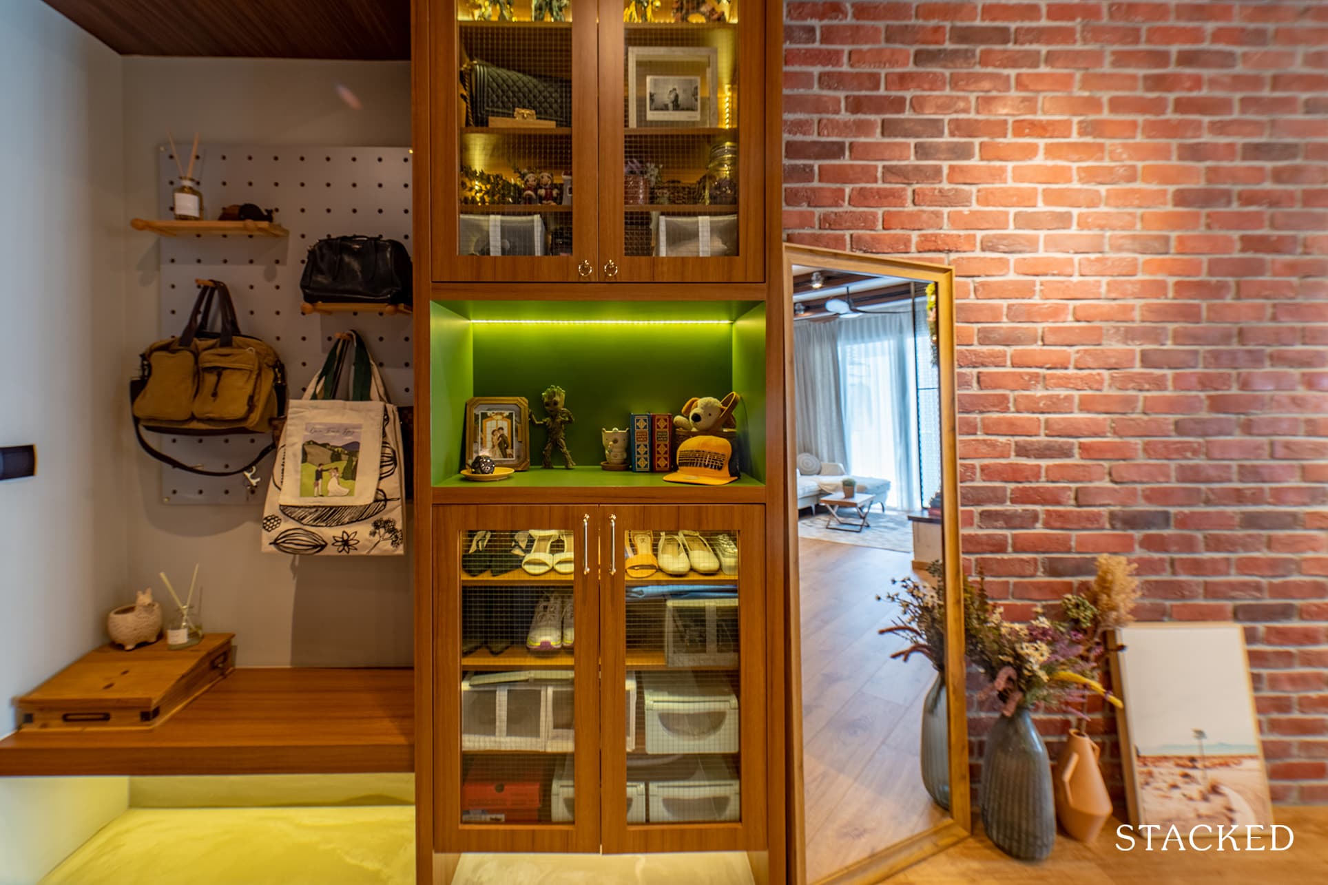
Despite having the reno take place during the start of the pandemic, they managed to achieve their desired look of an NYC loft that looks like an incredibly homely space.
“The whole renovation process took longer than expected as a result. It was daunting but we are quite pleased with the renovation outcome,” Benjamin said.
Let’s join them as they share their reno journey to achieve the Manhattan loft look.
So many readers write in because they're unsure what to do next, and don't know who to trust.
If this sounds familiar, we offer structured 1-to-1 consultations where we walk through your finances, goals, and market options objectively.
No obligation. Just clarity.
Learn more here.
Accommodating The Design Concept By Opening Up The Layout
The couple initially allocated a maximum budget of $80K for the entire renovation. However, Benjamin said the total spending amounted to about $100K, excluding furniture. “These are due to Variation Orders made mid-way through the renovation,” he revealed. “We decided to make some changes that were not originally agreed upon in our quotation.”
In able for them to achieve the home design they desire, they needed to apply some of the common elements seen in a New York loft. The first of which was an open plan space. So in order to open up the space, Benjamin said they had to literally tear down every wall that they could, “with PE safety endorsement of course,” he added.
Fortunately, the floor-to-ceiling windows are not that hard to implement, seeing that their windows were almost the same size. However, they needed to overcome the challenge of making this design prominent since they don’t have a lot of these windows.
For the floors, the couple chose wood vinyl instead of concrete. Plus to add that flourishing finish, they also added the iconic structural beams on the ceiling.
Living Area
While the sizeable, almost-floor-to-ceiling window lets in a lot of natural light, it doesn’t have the look of a typical NYC loft window. To solve this, they used the iconic black framed window as a partition for the room next to the living area.
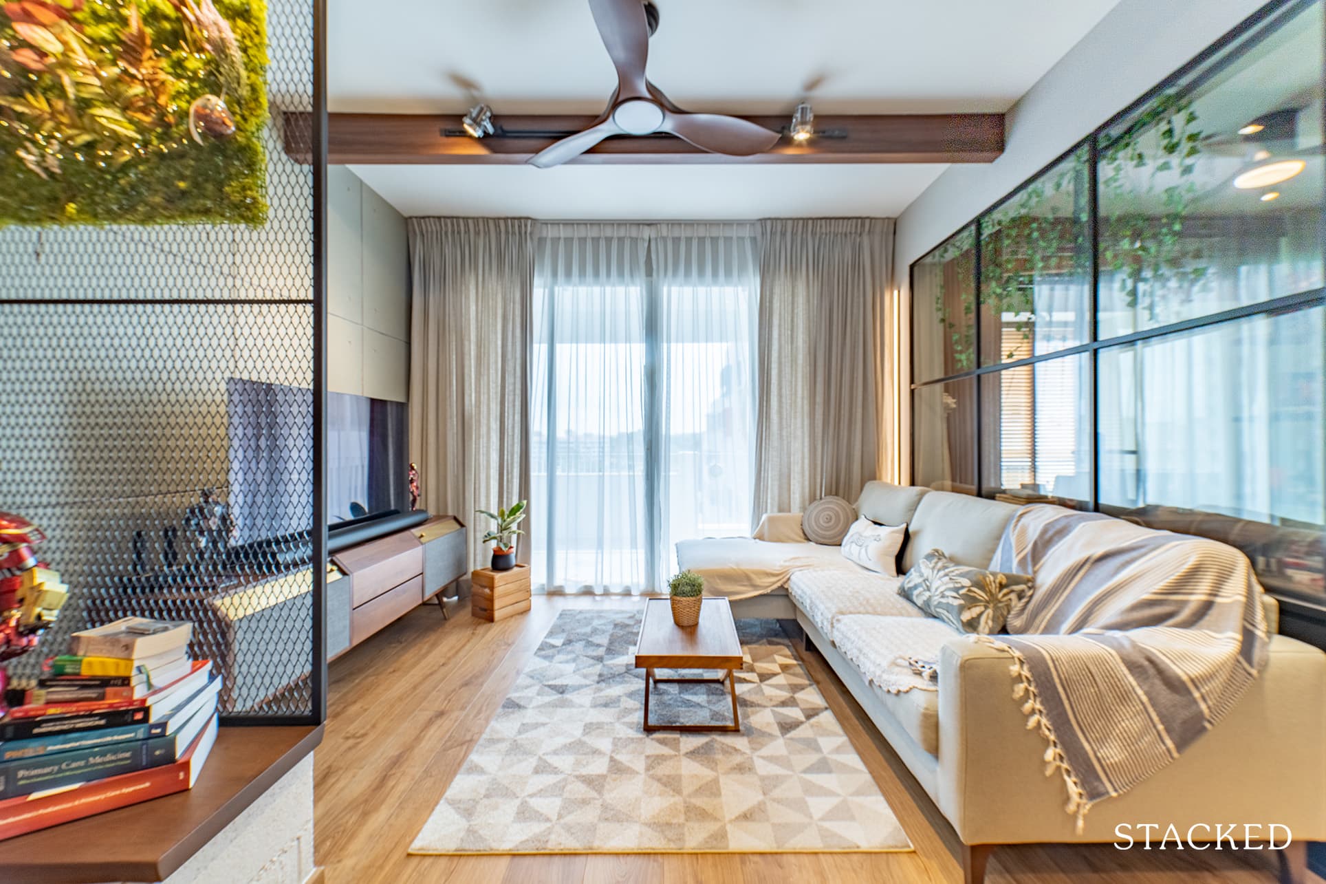
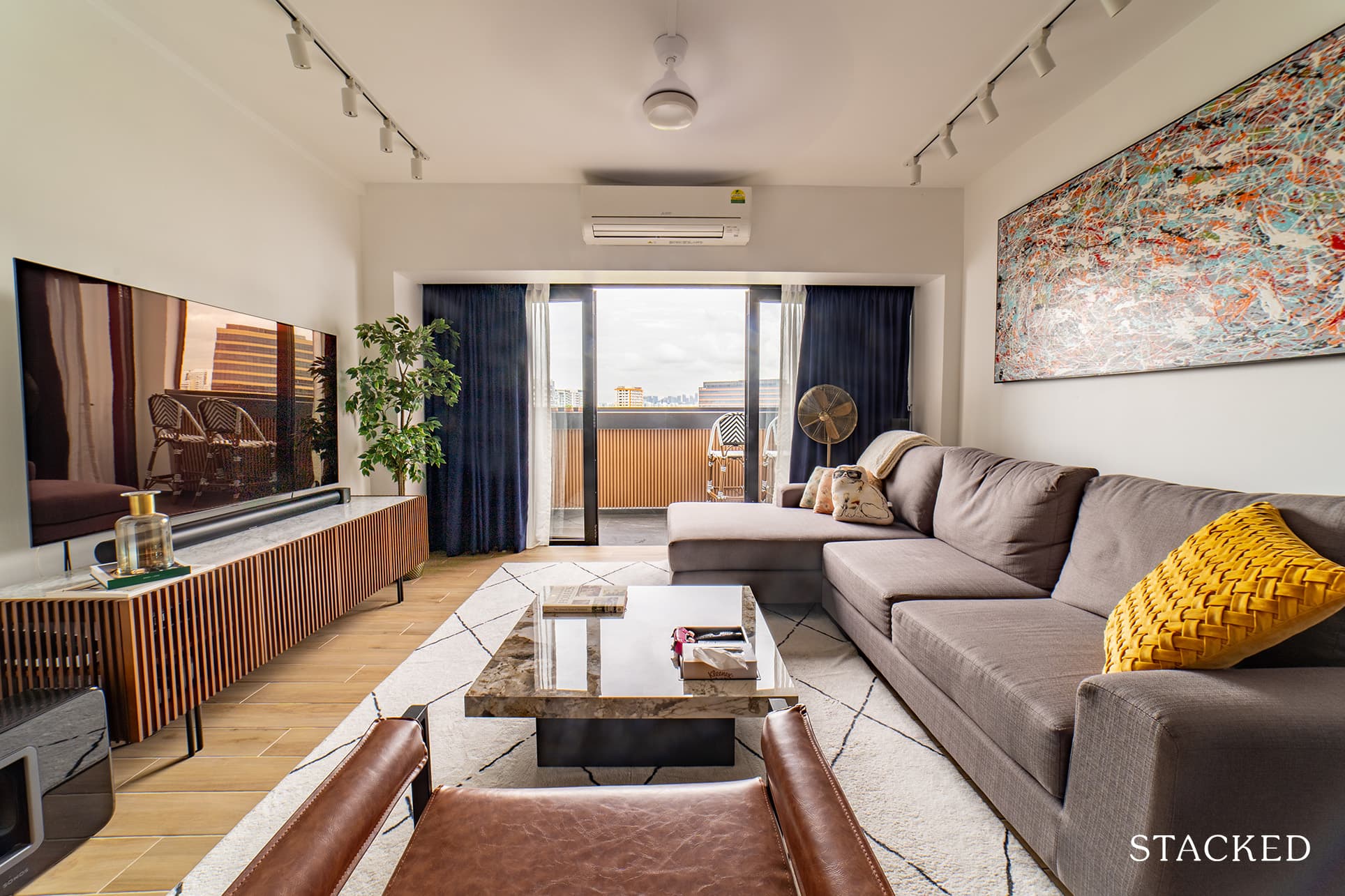
The living room, with its wooden structural beam on the ceiling, light wood floors, and oversized rugs, has all the makings of an authentic New York loft. The concrete panels on the wall behind the TV effectively add an industrial touch.
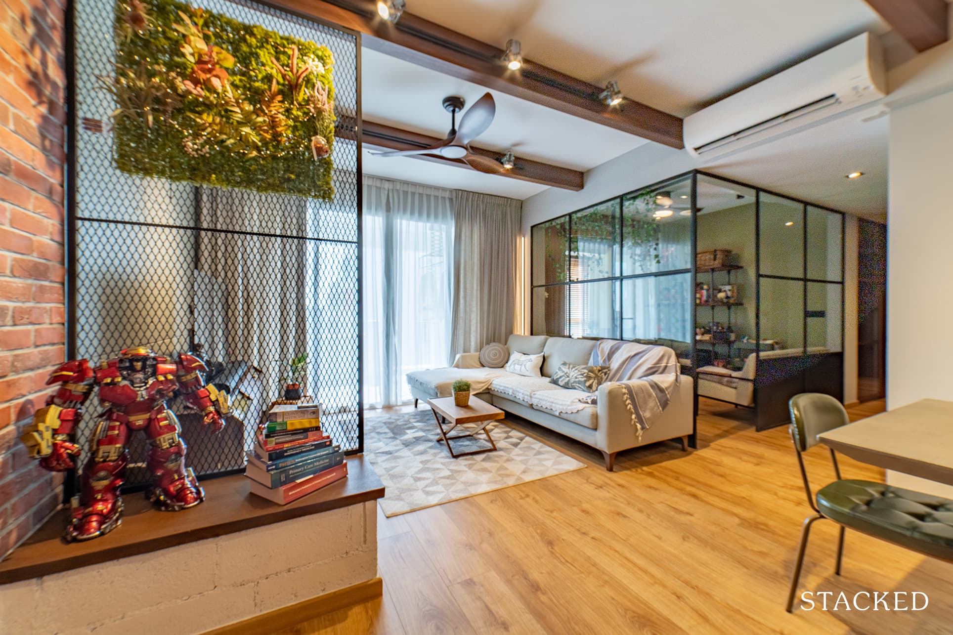
Benjamin said that the walls in the first room were hacked to make way for a mild steel partition with see-through glasses. It actually brightened up the living and dining area with natural light and made the whole area look bigger.
Dining Area
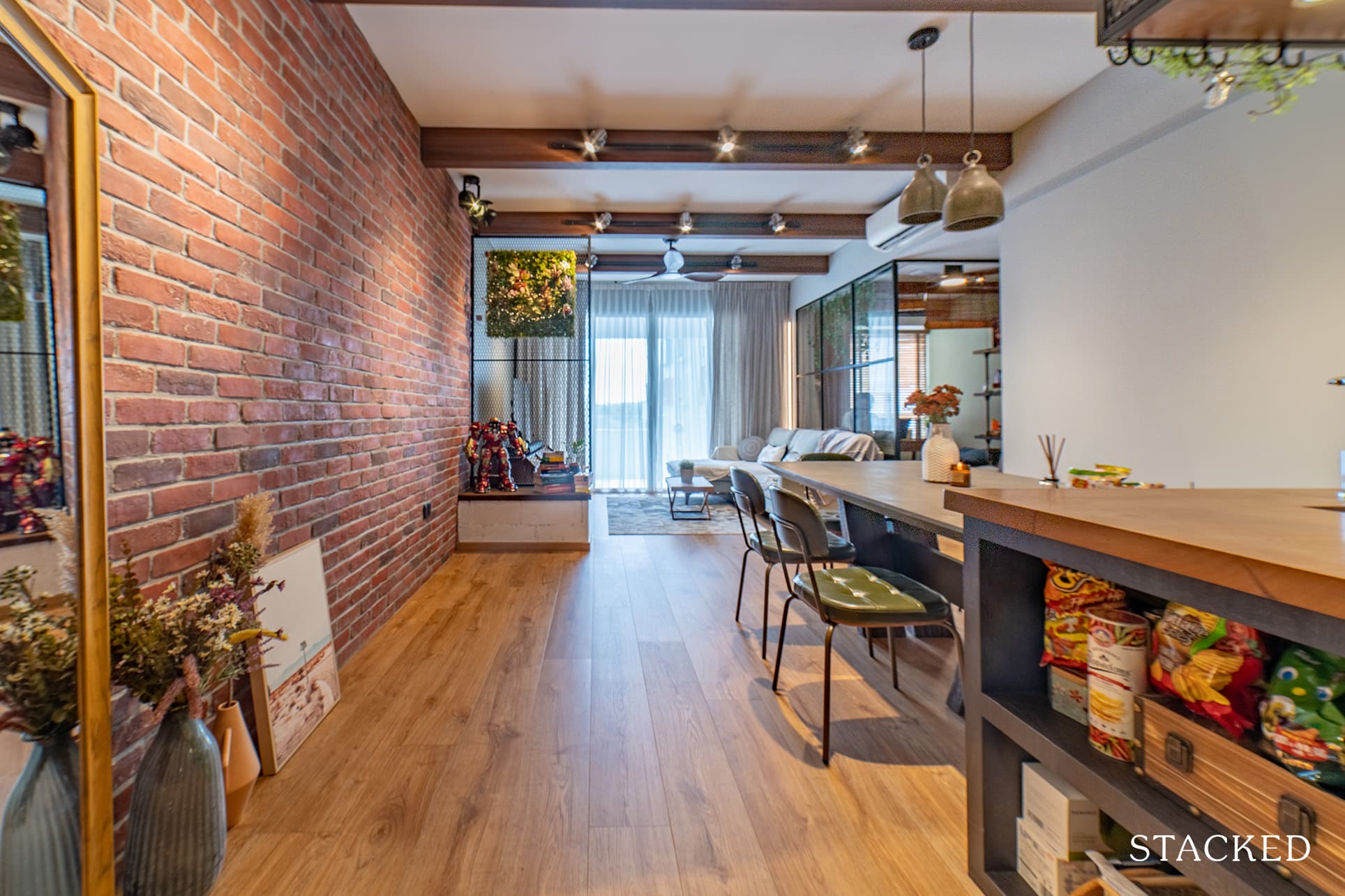
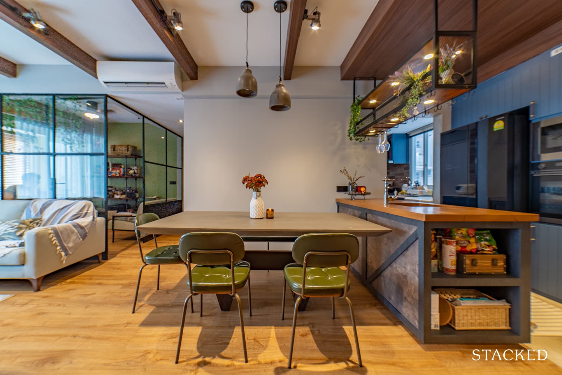
The beams on the ceiling and the wood floor continue to extend up to the dining area seamlessly.
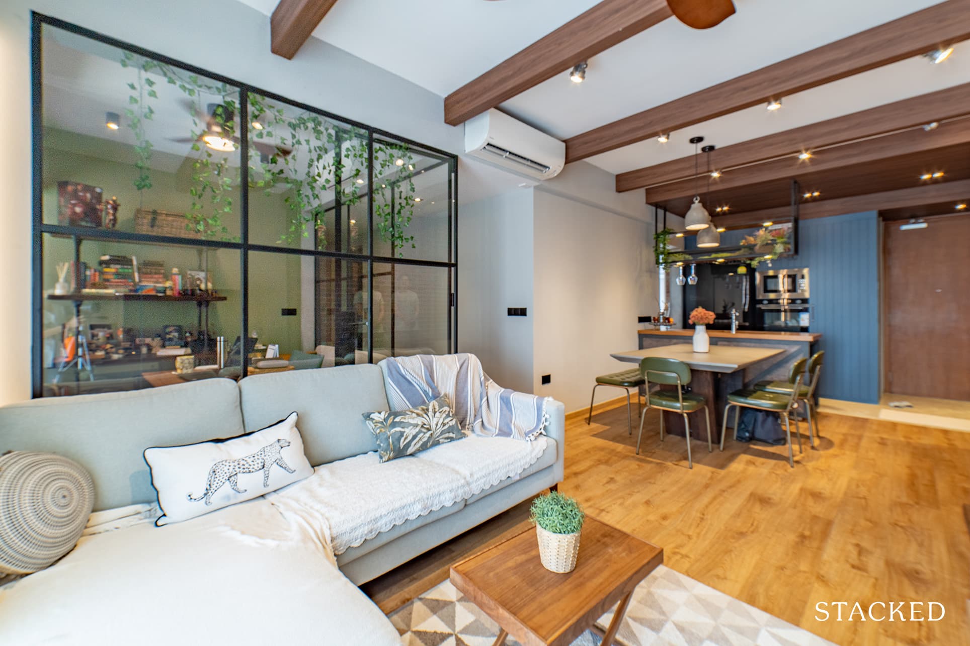
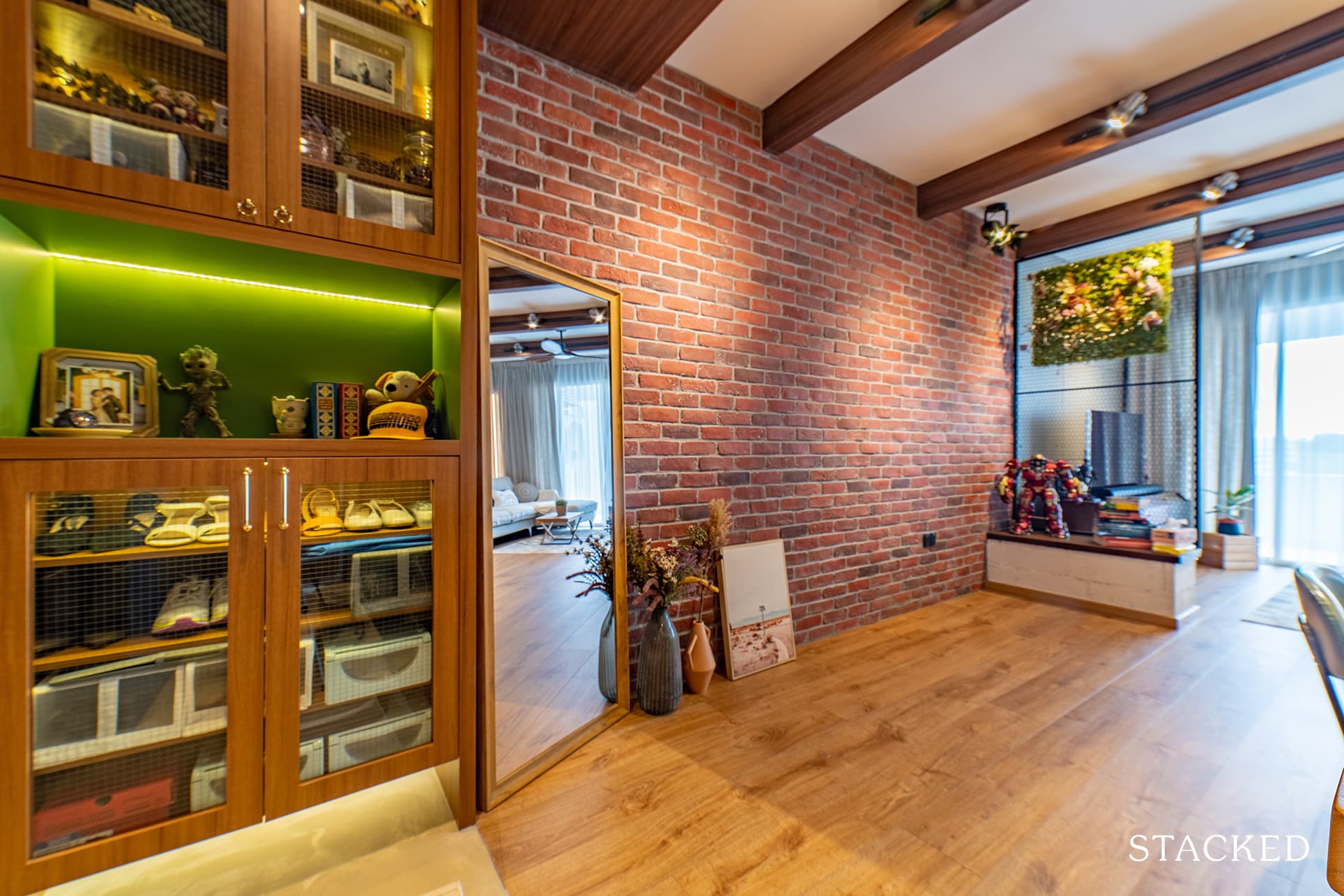
And they were able to add another quintessential design to one of the walls in their dining area, which is the exposed red brick wall.
Kitchen
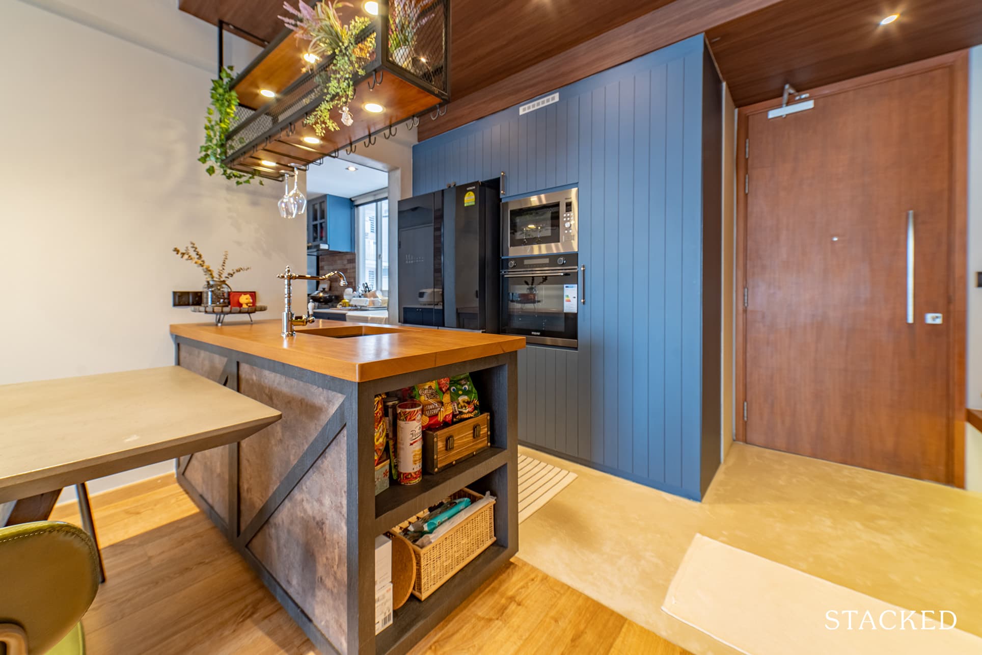
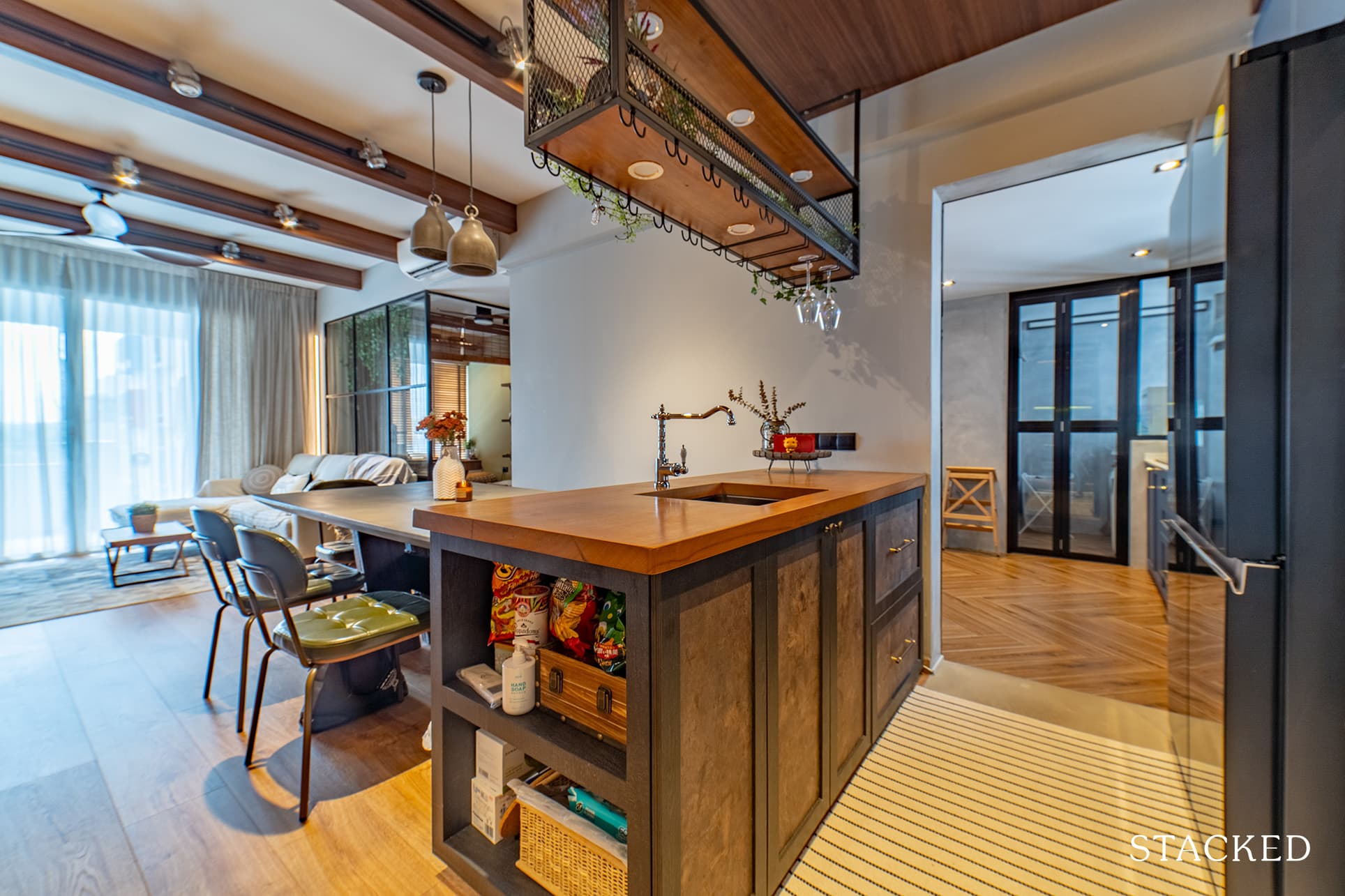
Thanks to its farmhouse design, the quaint bar counter that leads to the kitchen emits a rustic look. But, it’s made contemporary and luxurious with the contrasting blue wooden cabinetry behind it.
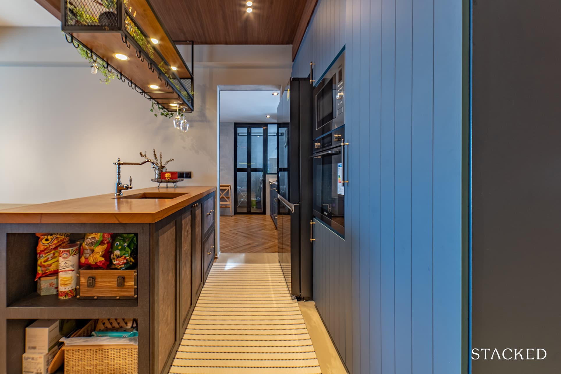
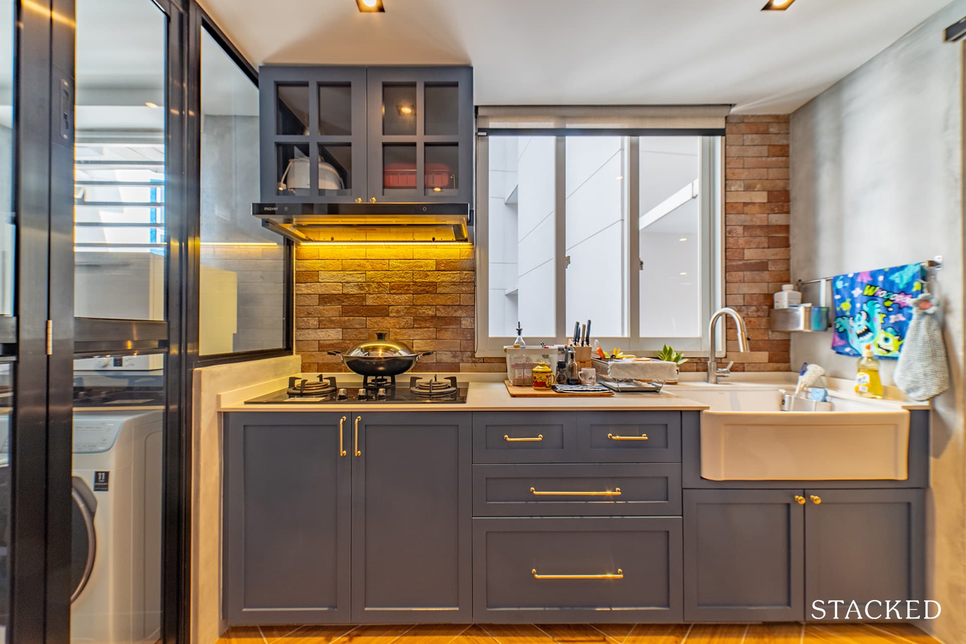
In the kitchen, the floor takes on a darker wood colour with a herringbone pattern. To further continue with the theme, the cabinets are reminiscent of a modern farmhouse kitchen in upstate New York.
Bedrooms
As mentioned, they converted the first bedroom next to the living room into a study, with full glass windows in a black frame mainly comprising the interior walls.
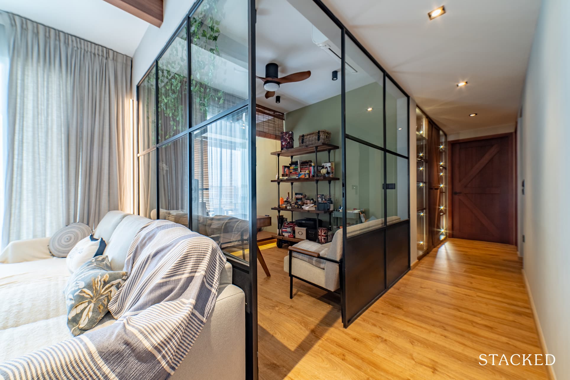
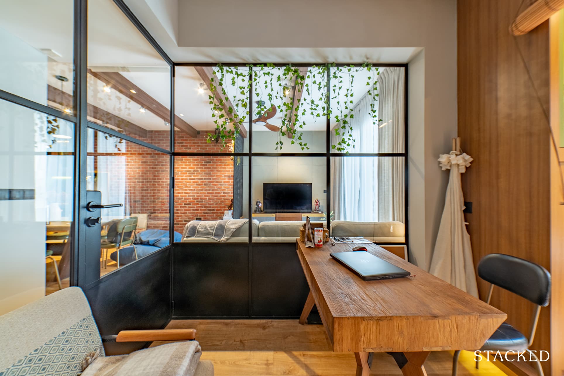
It’s a lovely place to be for a study, as instead of facing 4 walls you get this much brighter and open concept.
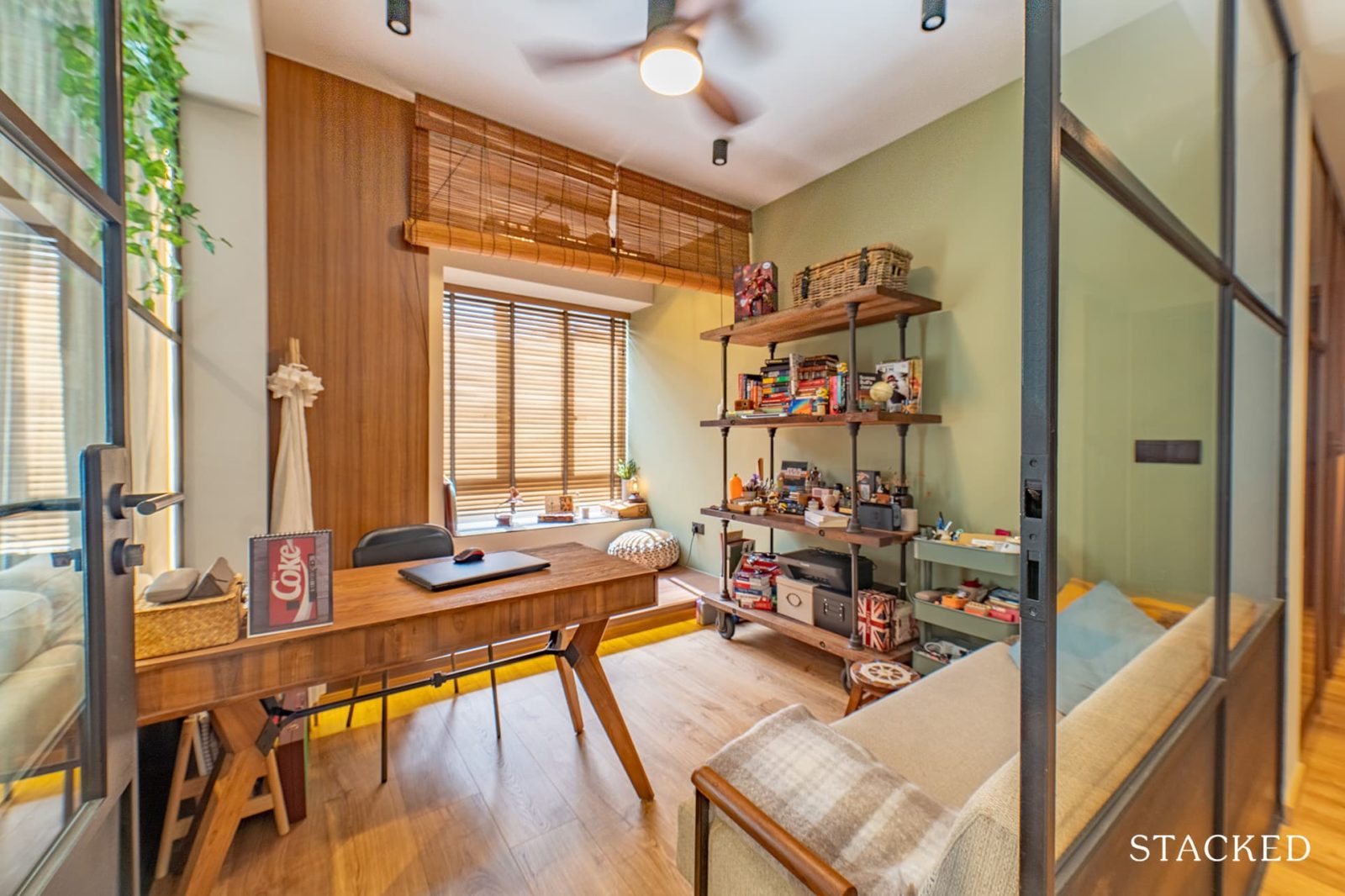
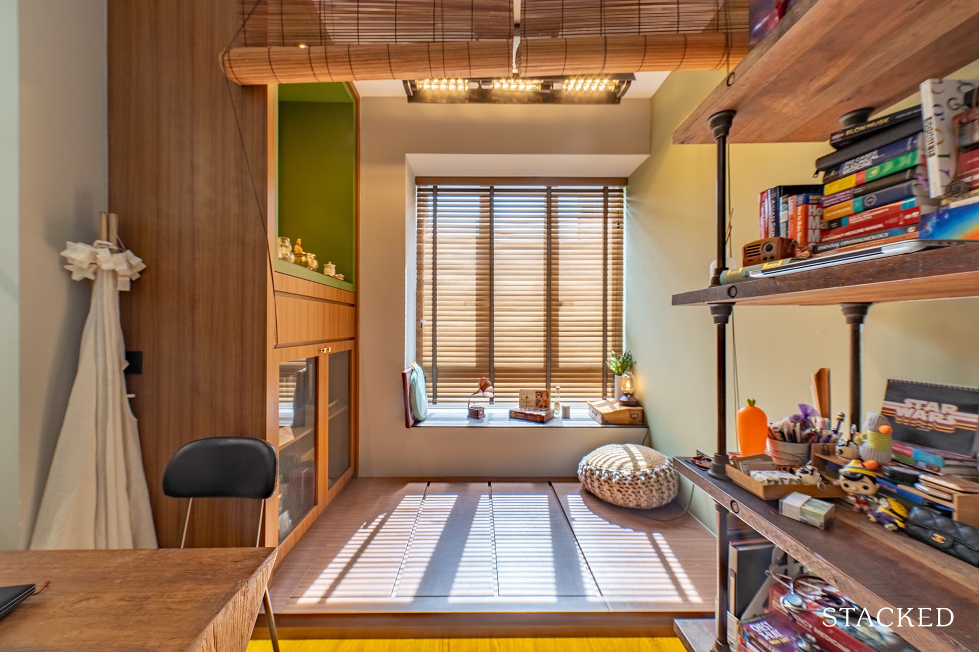
There’s also a platform at the back, couple that with the comfy pouf and you have another relaxing spot in the house to sit and read a book.
Homeowner StoriesHow This Old Maisonette In Paya Lebar Was Transformed With A $110k Renovation Budget
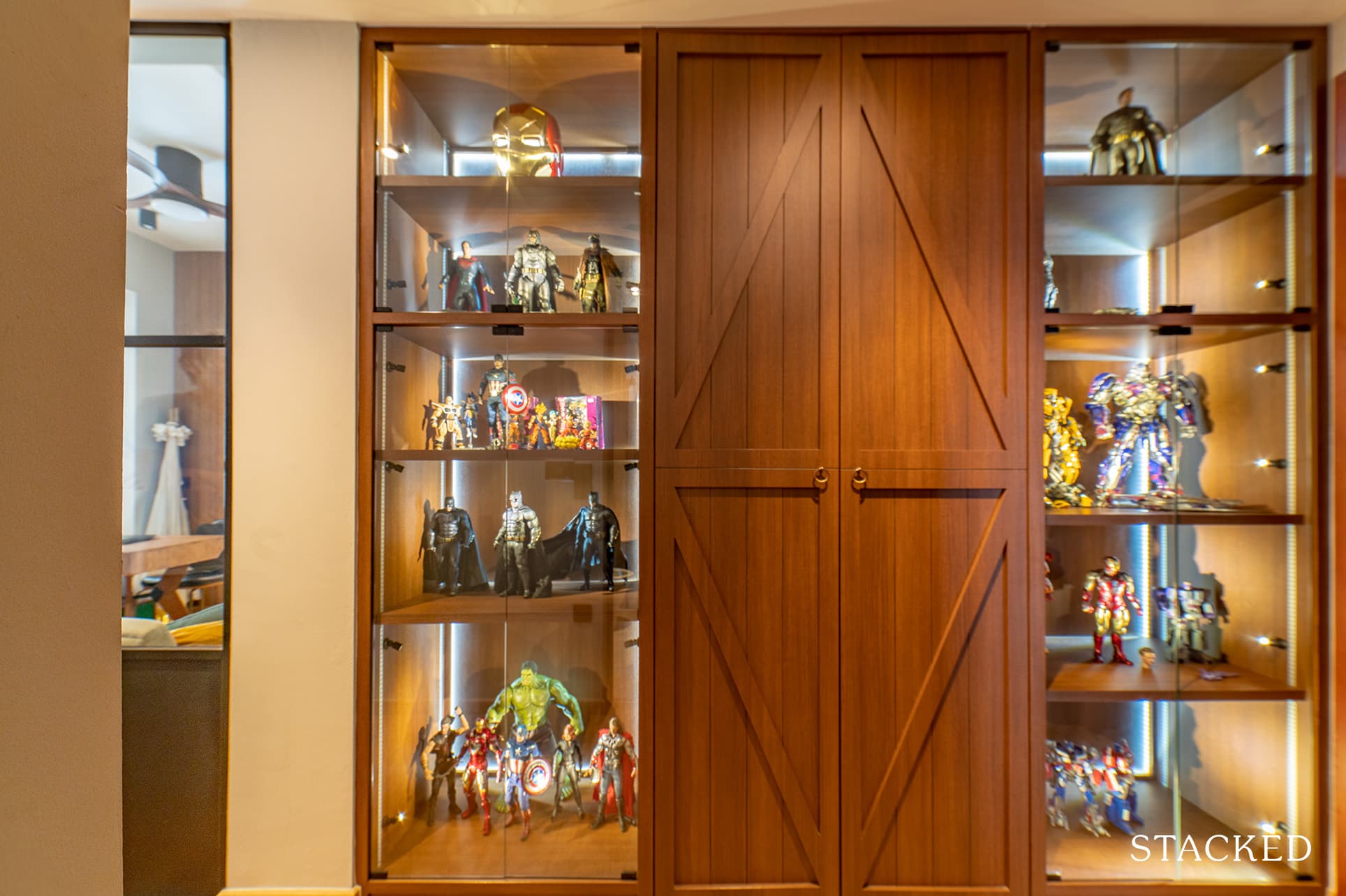
by StackedBenjamin said that they also hacked the walls of the room next to the study – the middle room. They had a custom-made display created which now functions both as a partition and a showcase for his collectibles as well.
More from Stacked
We Review 7 Of The June 2026 BTO Launch Sites – Which Is The Best Option For You?
The June 2026 Build-To-Order (BTO) launch will have one of the largest selection of flats compared to recent mid-year BTO…
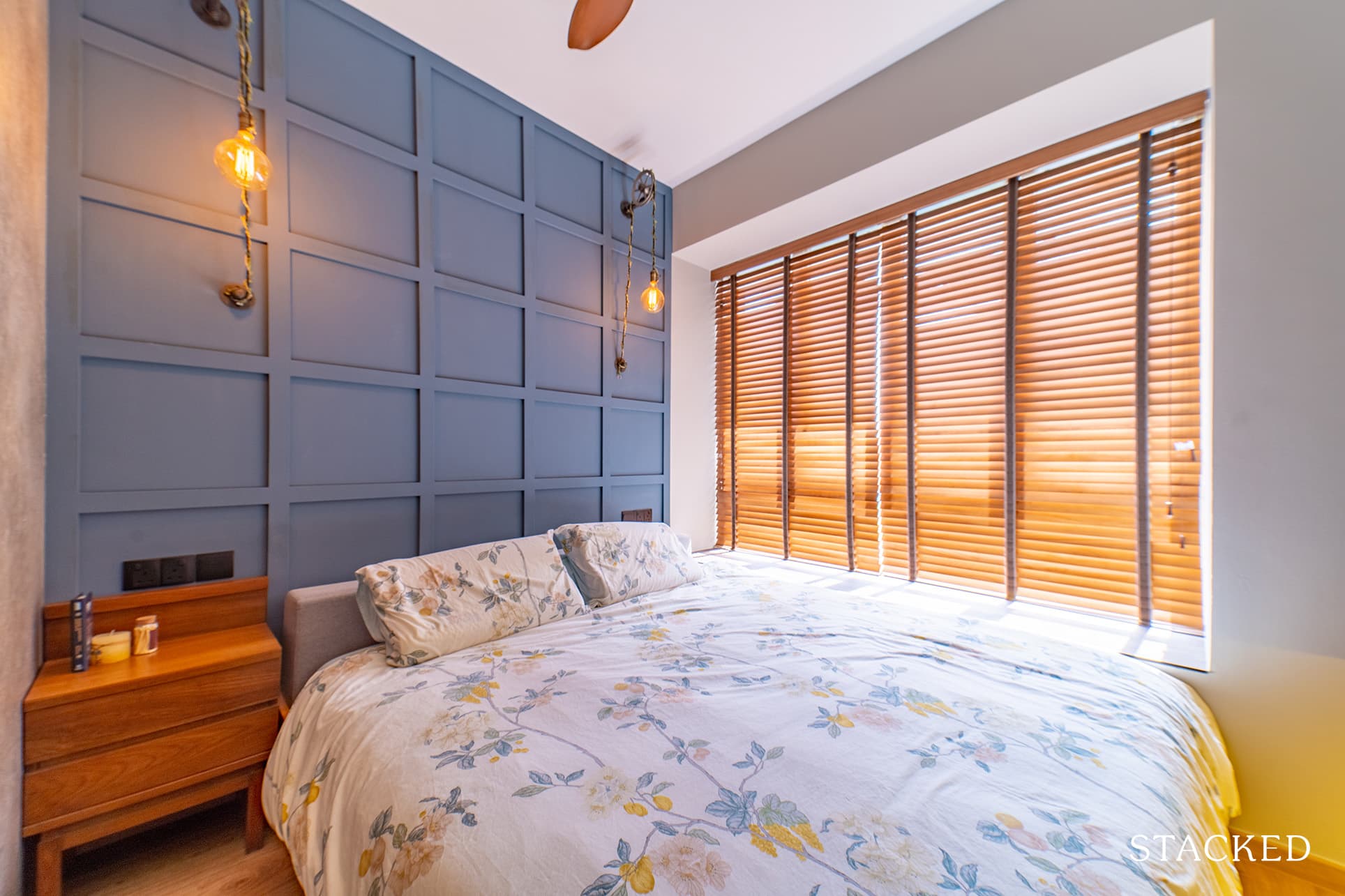
The blues continue into the master bedroom, with the combination of soft greys and blues helping to create a calming effect, suitable for the room’s purpose.
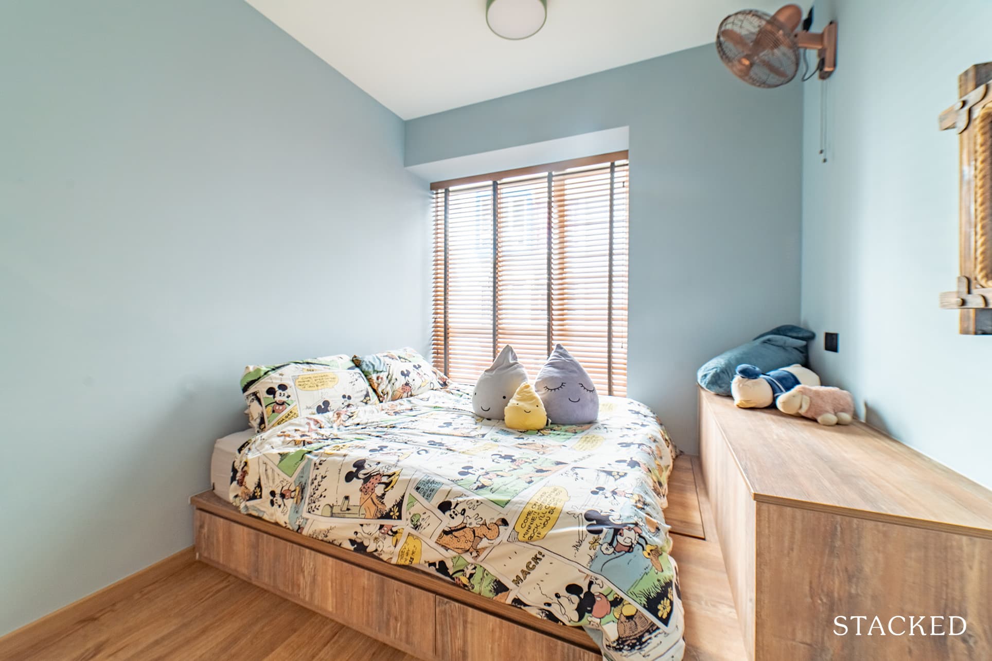
For the common bedroom, the elevated bed set on a wooden platform creates a cosier atmosphere. While the room overall doesn’t have as strong a tie to the NYC loft design, the bronze industrial-looking fan installed on the wall helps it to remain cohesive.
Bathrooms
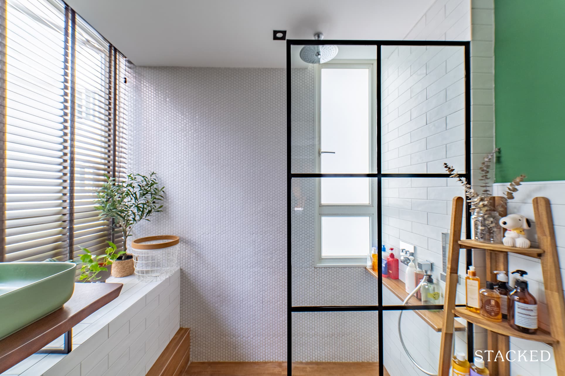
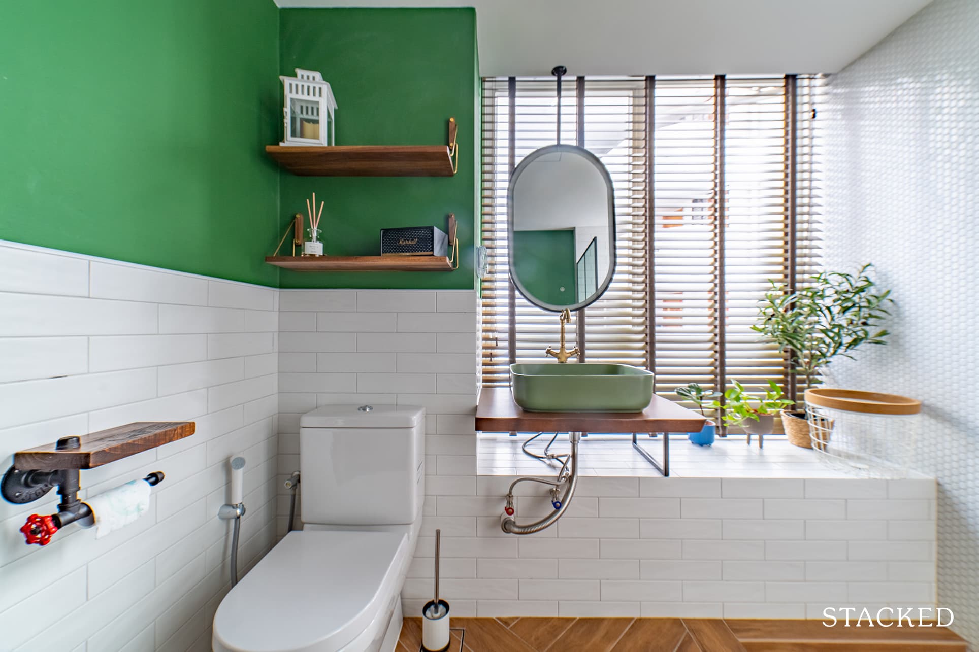
To visually expand the space of the master bathroom, they decided to use white for the tiles and wall paint.
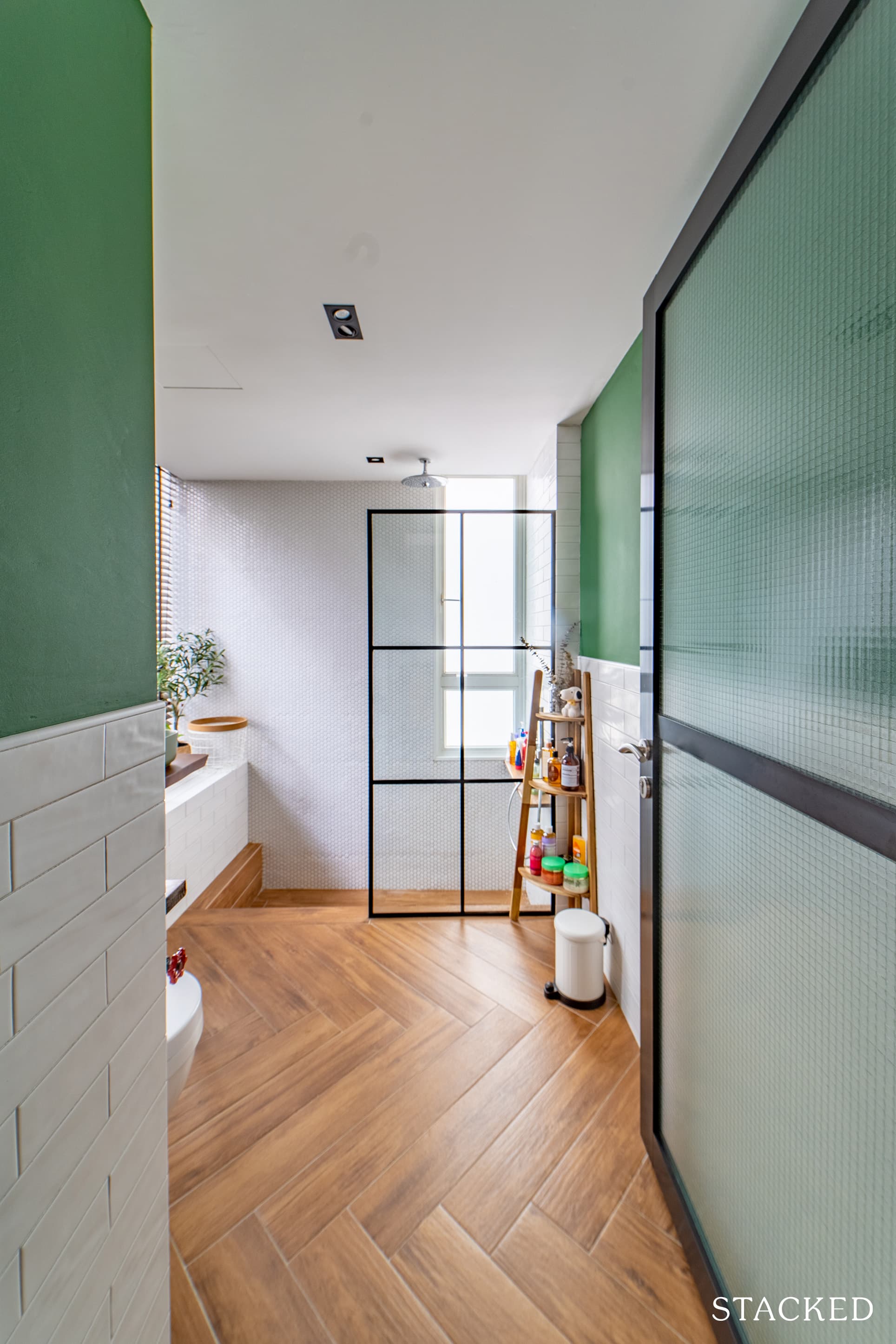
The upper part of the half-themed wall is painted green to create an invigorating effect.
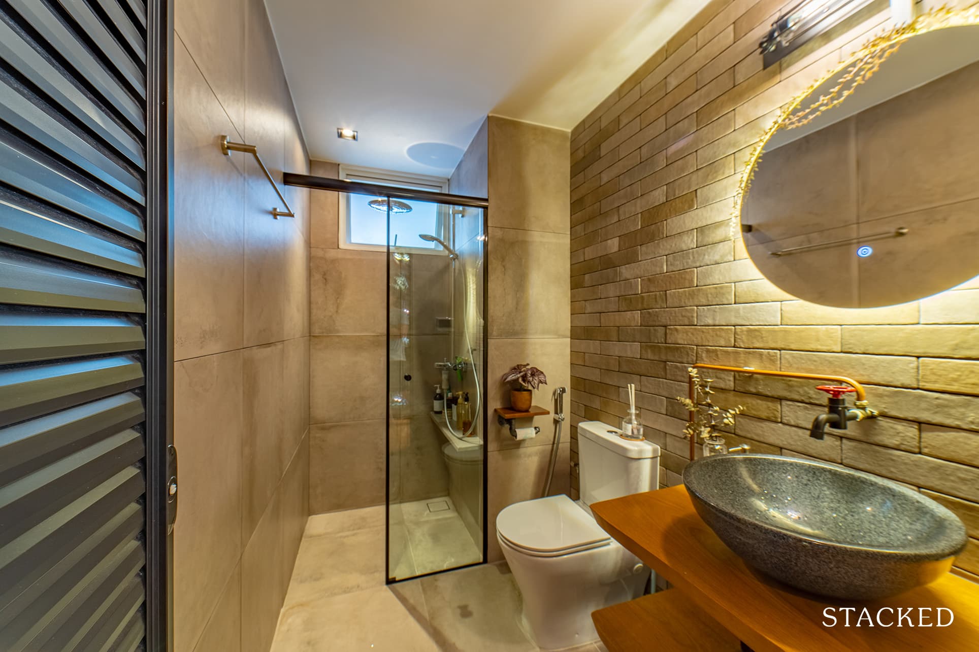
The common bathroom really takes on that industrial vibe with its brick wall, concrete-like tiles, and accent lighting.
Bringing The Vision To Reality
Benjamin admitted that he and his wife are very pleased with the outcome of the renovation. “The final product was 90% accurate to what we have requested,” he said, “and it matches the designer’s impression and sketch up as well.”
They scouted around for a bit when they were looking for an ID. They finally chose the 80’s Studio because, as Benjamin said, they revert promptly and offer refreshing ideas that strike a balance of both form and function. He admitted, though, that it wasn’t easy choosing one because comparing quotations was difficult.
“We also felt that communication plays a really important role and they were honest about things that can or cannot be done,” he added.
When it comes to their furniture sourcing process, Benjamin said the experience worked both ways. “This is my favourite, and at the same time, dreadful part.” He shared that they’ve shortlisted many but had to reconsider and revisit the same furniture stall to envision if it fits their theme and general ensemble.
“My favourite place to go to was Tan Boon Liat,” Benjamin revealed. “And we also handpicked a few from The Beuro, Commune, as well as Journey East in the end.”
Benjamin believes that the best part of their home is the master bathroom with its step-down bath. “There isn’t many projects with a step-down bath these days,” he said, “and we have retiled the whole washroom, changed the head shower into a rain shower, all to add a touch of luxe.”
He said it gives him the impression of bathing in the rain within a personal space. “I find it really relaxing and helps to de-stress after a hectic day at work.”
Lessons Learned From A Successful Reno Journey
The pandemic hit the couple’s reno schedule hard, and this was the greatest challenge they had to face. Benjamin shared that the projected timeline got delayed due to skilled workers needing to undergo routine testing. There’s also the issue of manpower restrictions.
“Our renovation went on a standstill after hacking was done around March 2020,” he recalled. “It only resumed late June after certain laxity was announced for the renovation industry.”
Almost all homeowners going through their reno journey during the same period had to shoulder this predicament. Fortunately, things improved, and most journeys reached their goals, even if not in a timely manner.
Some of the lessons the couple learned during their reno journey include triple checking the measurements of their carpentry with their contractor. Human error can help make things awry, but fortunately for them, they were almost always on-site. “Being more hands-on helps to rectify mistakes much faster to avoid additional renovation delays.”

Communication is at the heart of Benjamin’s advice. “Always discuss and communicate with your partner, with your ID or contractor, and the vendors,” he emphasised. It applies well to almost every aspect of the renovation. For instance, it helps prevents you from buying furniture on impulse.
Since reno involves a lot of big-ticket items, he firmly recommends never to assume, or it could exert a financial toll and cause stress.
Benjamin happily admitted that he felt more knowledgeable by being more hands-on and reading about renovation sites, styles, and designs (just like this one).
He also added that although you may not know how the industry works, it always helps to have a little knowledge that can put things in perspective. And lastly, Benjamin advises to “set a realistic budget because after all, you mostly get what you pay for.”
At Stacked, we like to look beyond the headlines and surface-level numbers, and focus on how things play out in the real world.
If you’d like to discuss how this applies to your own circumstances, you can reach out for a one-to-one consultation here.
And if you simply have a question or want to share a thought, feel free to write to us at stories@stackedhomes.com — we read every message.
Need help with a property decision?
Speak to our team →Read next from Homeowner Stories

Homeowner Stories We Could Walk Away With $460,000 In Cash From Our EC. Here’s Why We Didn’t Upgrade.

Homeowner Stories What I Only Learned After My First Year Of Homeownership In Singapore

Homeowner Stories I Gave My Parents My Condo and Moved Into Their HDB — Here’s Why It Made Sense.

Homeowner Stories “I Thought I Could Wait for a Better New Launch Condo” How One Buyer’s Fear Ended Up Costing Him $358K
Latest Posts

New Launch Condo Reviews Tengah Garden Residences Review: New 863-Unit Tengah Condo From $980,000 Near Hong Kah MRT

Singapore Property News HDB Resale Prices Fell — But A Third Of Buyers Still Paid $800K+ Last Quarter. Here’s Why

Singapore Property News Three Strata Office Floors In Suntec Priced From $135M









0 Comments