Starting a renovation for your BTO flat in Singapore? The process can be as exciting as it is complex. We interviewed a couple who recently transformed their new BTO flat in Bidadari into a space they proudly call home. From grappling with budget changes to making key design decisions, their candid experience offers practical advice for those embarking on a similar journey. Read the full interview below for a deeper dive into what it takes to craft a BTO flat that suits your needs and style.
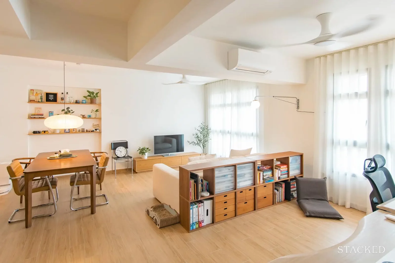
Tell us about your home, such as where is it located. Was it brand new when you received the keys? If not, what made you decide to buy it?
Our home is a new BTO located in Bidadari. We decided to buy it because of its amazing location and (proposed) nearby amenities. It’s a 5-minute walk from Woodleigh MRT and Woodleigh Mall, and also 5-minutes away from the upcoming hawker center, bus interchange, and community center. Being in a central location, we’re around 30 minutes away from town by public transport.
Who is presently staying in your home?
Husband, wife, and cat!
What was the initial budget you allocated for your renovation? Did you have to allocate more sometime later? If so, why?
Our initial budget was around $40k. We raised our budget to $60k when we realised what we wanted would cost way more, though we ended up spending slightly more.
Was the final outcome similar to what you envisioned before the renovation project started?
Yes, surprisingly so! Honestly, we didn’t know exactly what aesthetic we wanted prior to renovation besides many inspo pictures. Our ID helped us to pinpoint several design elements that fit our taste, and though there was much indecision and some changes along the way. Functionality-wise, we had many requirements for how the space should be used, and wanted it to accommodate our lifestyle and habits. We would say the outcome ended up true to the feel we wanted and functionality we visualised.
What were the greatest challenges you encountered, and how did you overcome them?
Our 3D renders weren’t really useful in visualising the design and spatial distribution of our home, and ended up causing more indecision and anxiety as the colours weren’t true to the materials and looked really weird. We ended up using different tools to visualize our selections instead. For tile selection, we used powerpoint to layer photos of the actual materials over the renders to visualize our bathroom tile selections before confirming them. We also used homebyme to create mockups to visualize the space, and were able to select tiles that resembled our selections to get a sense of different material choices. Space-planning-wise, homebyme was really helpful! Because we were also able to customize the layout to the exact measurements of our home, we were able to get a very good sense of what size of furniture would fit, and whether the carpentry we planned for would work.
For laminate selection, because the ones our ID suggested didn’t feel right so we went all over Singapore to different laminate showrooms. Initially, it was still difficult because the lighting in different showrooms could be pretty dark, so it was impossible to visualize. Because of this, we went back to our Pinterest board and only picked out kitchen photos that matched our layout as well as flooring and backsplash selections. We ended up with only one photo, which we brought to our last showroom, and the salesperson was able to pick out a near-perfect match based on this photo. Bingo!
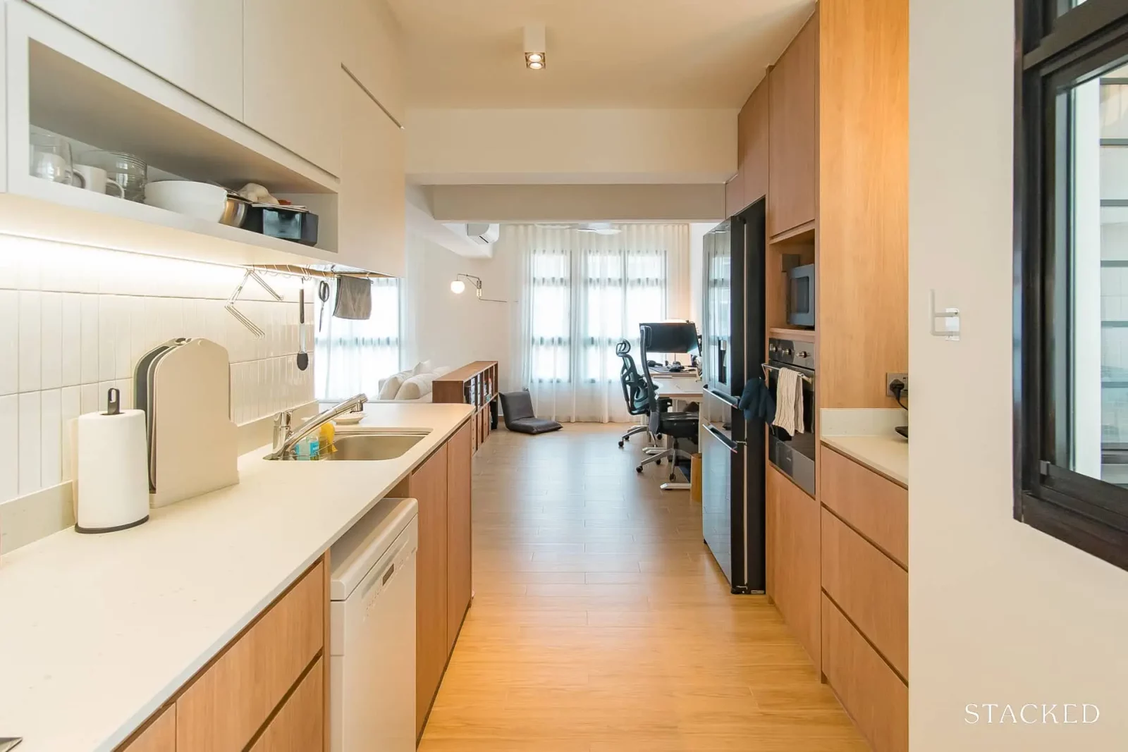
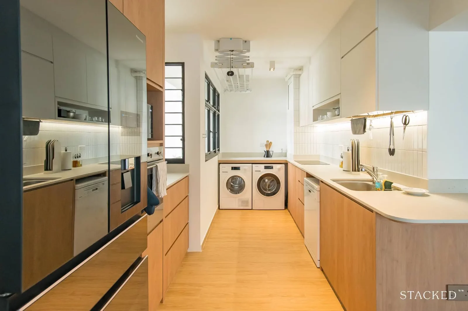
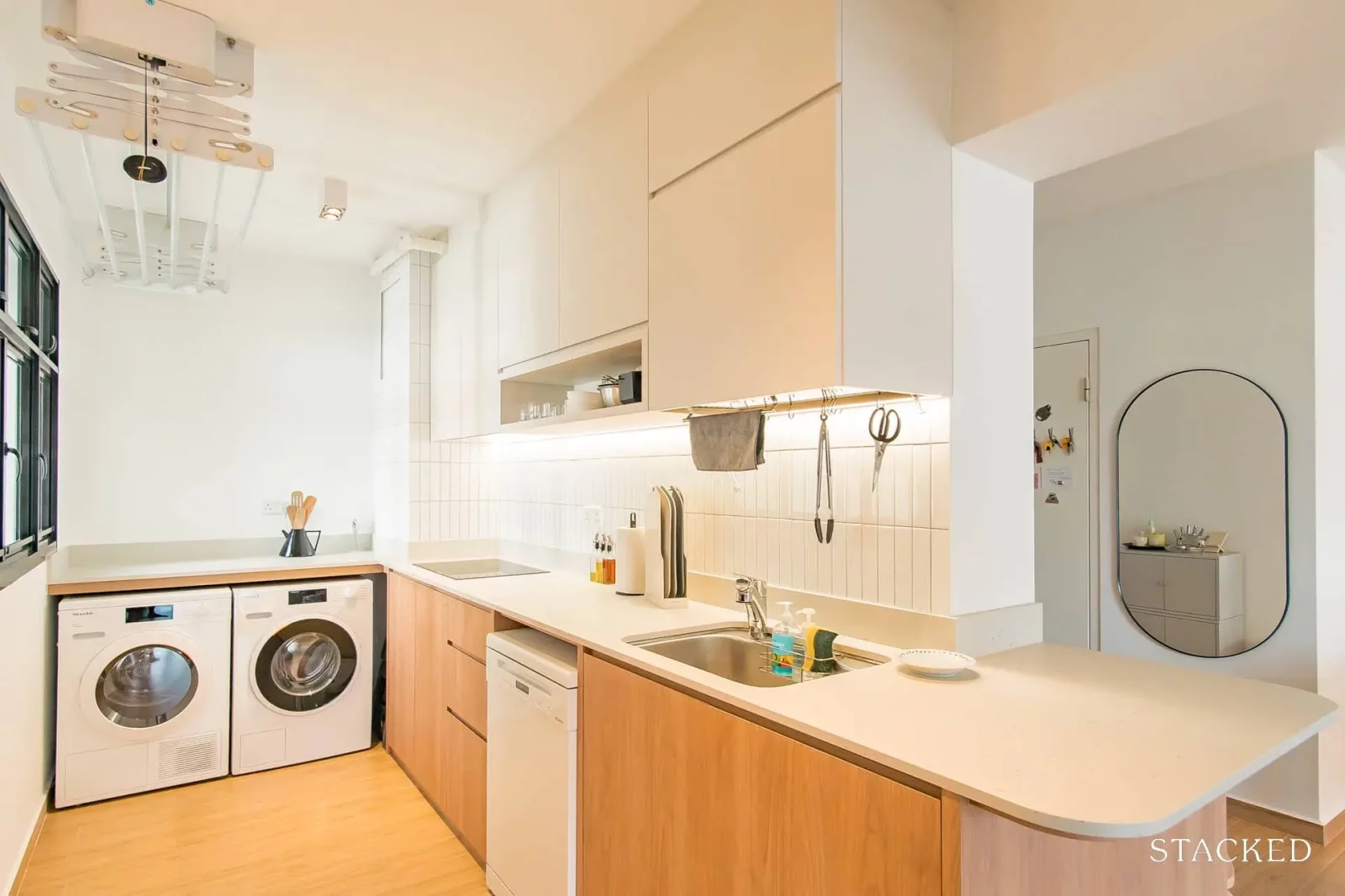
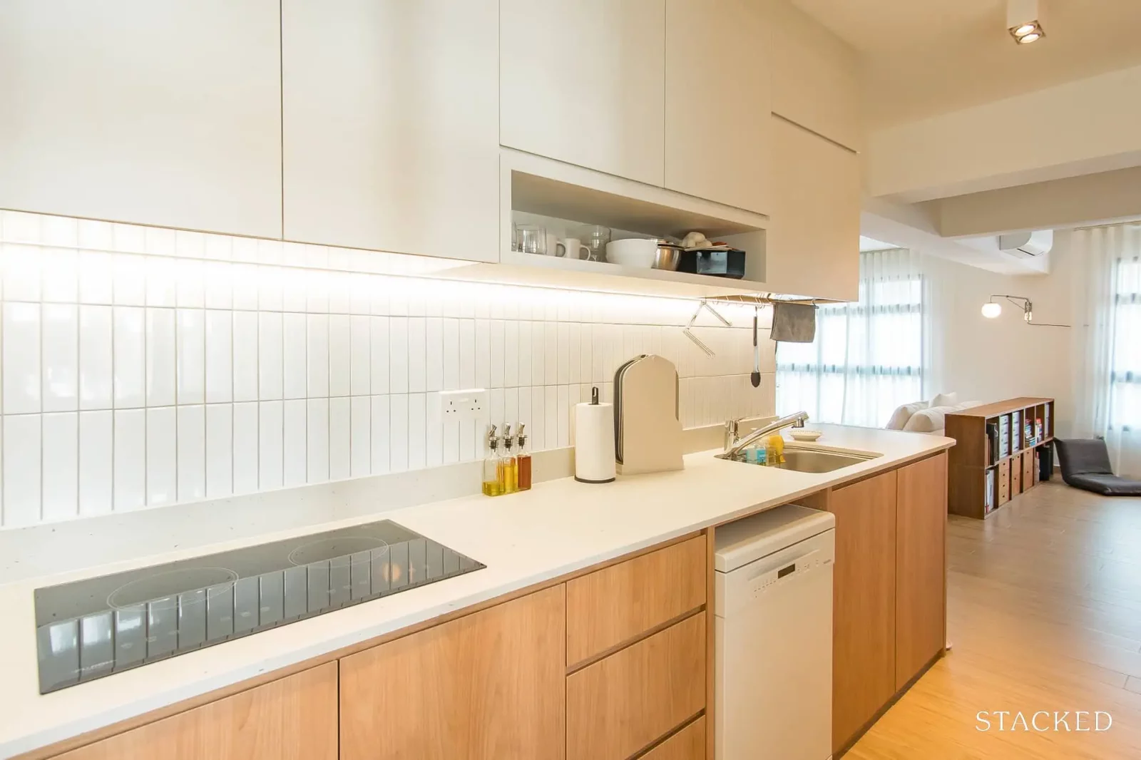
Choosing our kitchen counters was also another challenge – our ID usually designs with a white terrazzo-like quartz which was extremely unlike the stone-like counters in our kitchen inspo pictures. We visited the showroom to look at her recommended option which we still didn’t like, so we searched through the Singapore Renovation telegram chat to look for recommended quartz brands and ended up with Caesarstone. When we saw the sample, we knew it was the one. Though we had to top up for a more expensive material, it was worth every cent.
What inspired the design and style of your renovation?
There were a lot of photos in the style of Norm Architects and nordiskakok on our Pinterest board, and we used to watch a lot of the Local Project, which lean toward a very minimal but luxurious style, but we also really liked eclectic homes, including one of our ID’s past projects. During the renovation, we realised that these styles weren’t practical for an HDB BTO and weren’t budget-friendly, so we ultimately strayed from these designs.
While thrifting for a dining pendant light, we met a collector and were able to visit his BTO home which had very little renovation done, but many beautiful designer lights and furniture pieces. Around this time, we also discovered Vogue’s objects of affection youtube series. Emily Bode’s home was filled with homemade and found treasures, and Rick Owens’ beautiful travertine home that he chose to cover with unsightly army blankets blew our minds. These things completely changed my perspective towards our reno, and we became more focused on choosing things that we liked, that enhanced our home’s origin as a BTO, and that showcased our tastes.
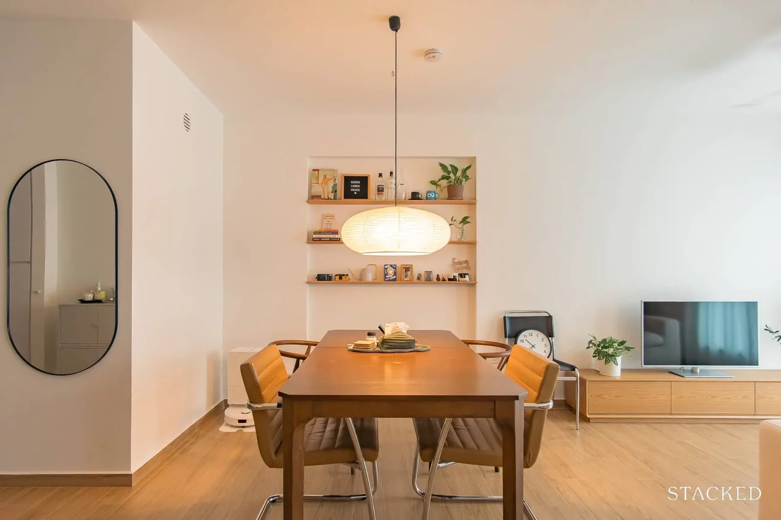
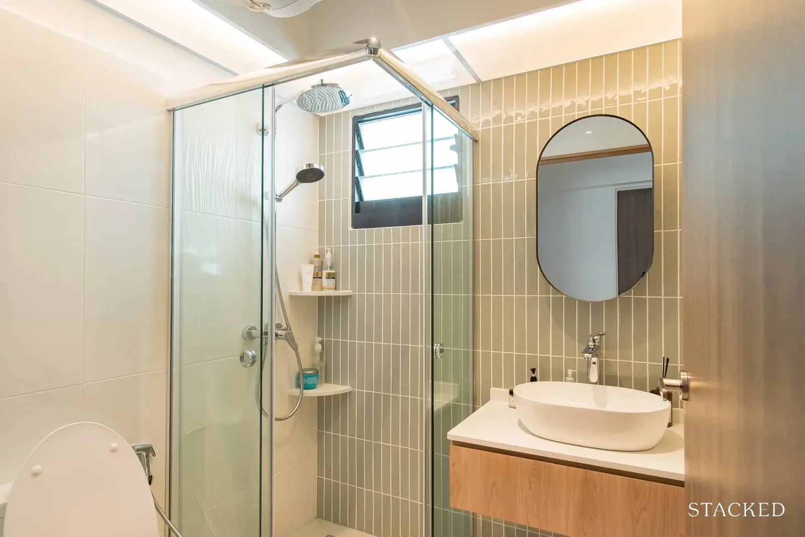
Ultimately, our design style was guided by choosing materials that complemented our BTO’s features, e.g. the handmade sage tiles our ID chose that matched our HDB-given bathroom tiles and the fully-tiled backsplash next to our kitchen window. We kept things minimal and consistent yet warm, but not too neutral that we couldn’t bring home colourful new things we loved from IKEA if we wanted to.
Were there any changes to the home’s layout compared to the original floor plan? Please describe and let us know why you changed it. Can you also provide a picture of the before and after floor plans?
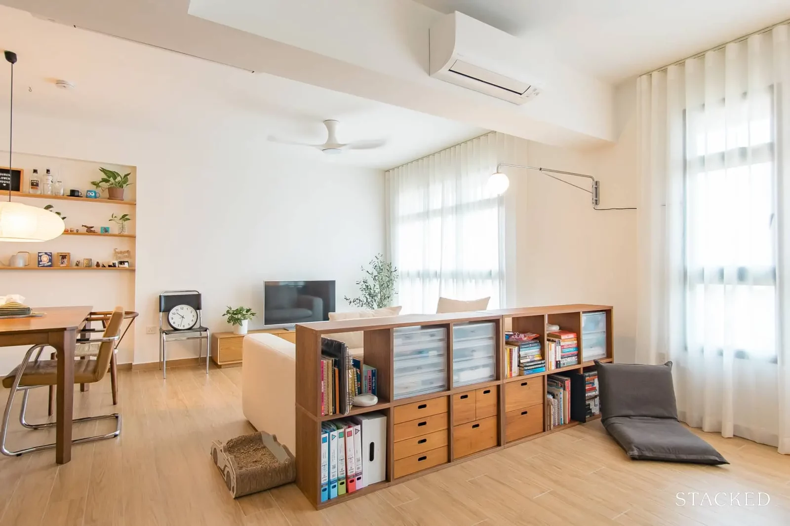
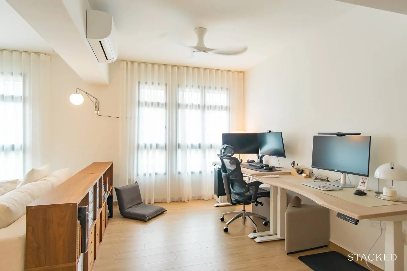
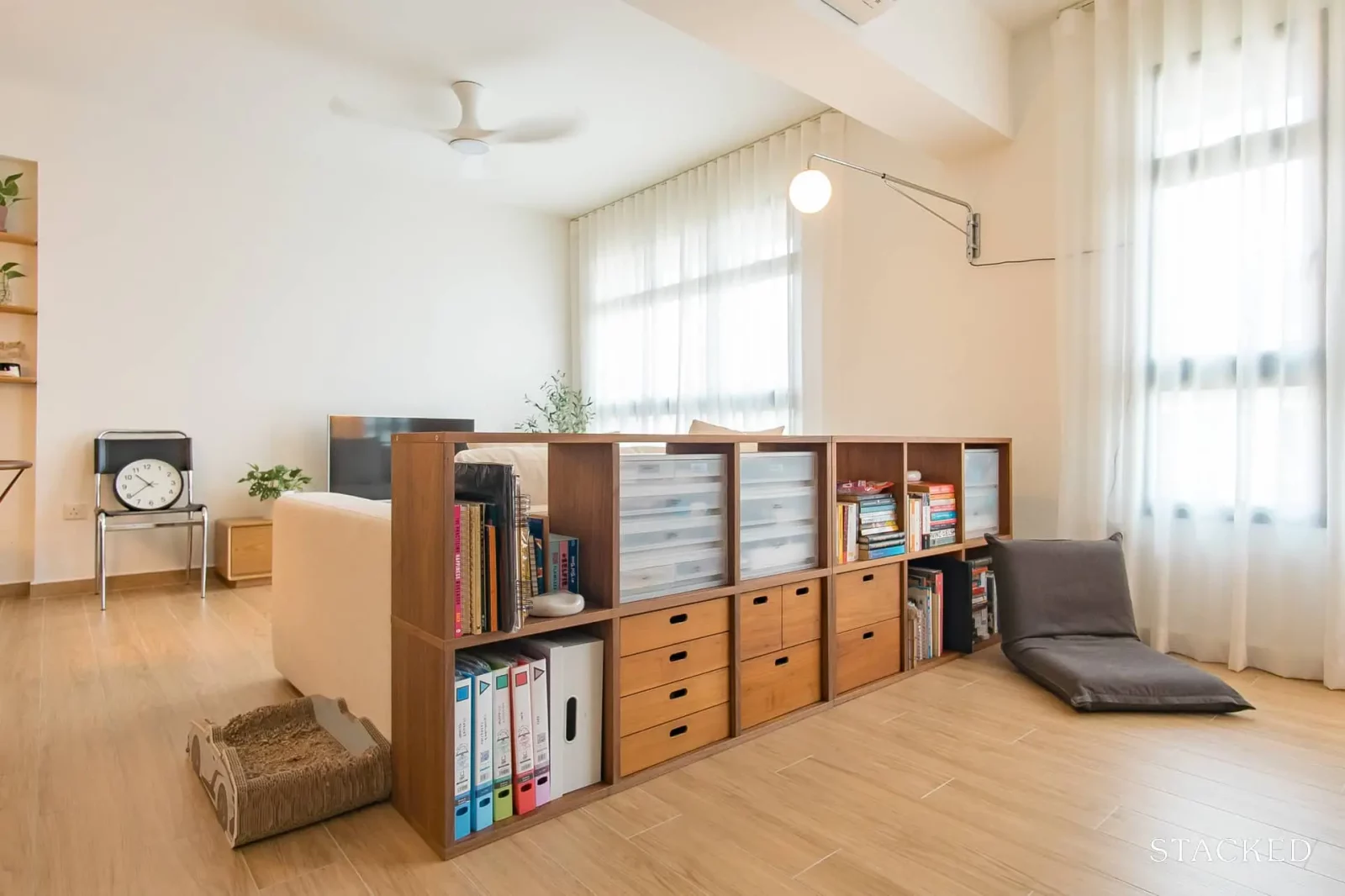
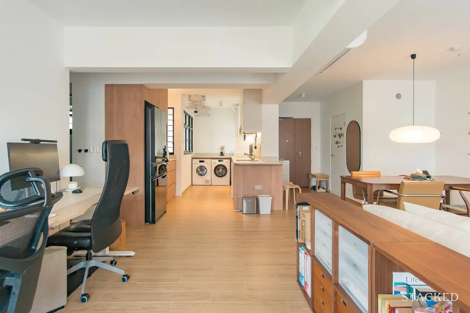
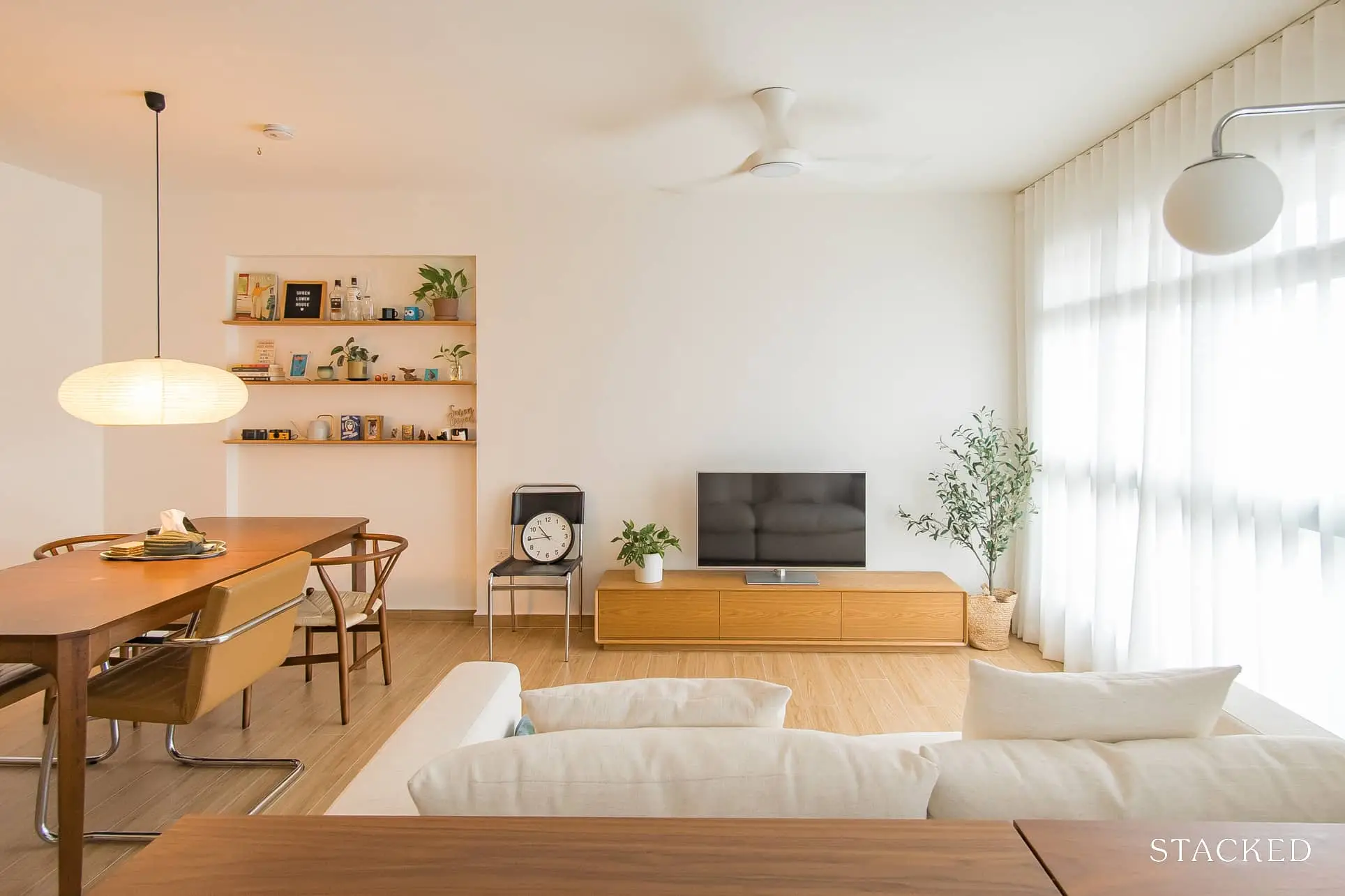
Yes. We knocked down the room adjacent to the living room to make the living room larger. It also allowed us to have an “open office”.
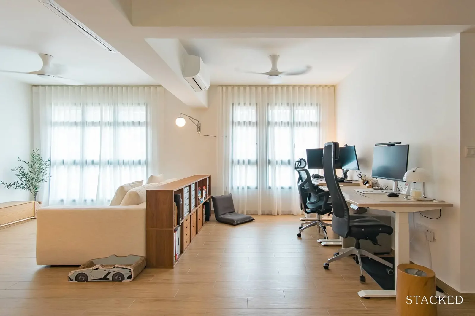
We wanted a larger living room because the initial layout felt a little claustrophobic. Additionally, it also allows us to host more people.
As we mostly work from home, we didn’t want to be cooped up in a separate room of the house the entire day – we wanted to be part of the main living space and have easy access to the kitchen and bathroom. Having our office as part of the living room allowed us to do this.
More from Stacked
So many readers write in because they're unsure what to do next, and don't know who to trust.
If this sounds familiar, we offer structured 1-to-1 consultations where we walk through your finances, goals, and market options objectively.
No obligation. Just clarity.
Learn more here.
Under $1 Million for a Landed Home? These Singapore Estates Make It Possible — But There’s a Catch
Most people assume landed homes are far beyond reach, the kind of property that only the ultra-rich can afford. And…
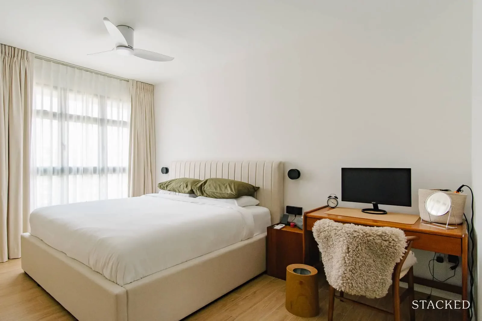
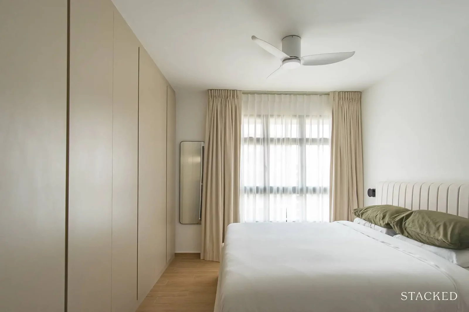
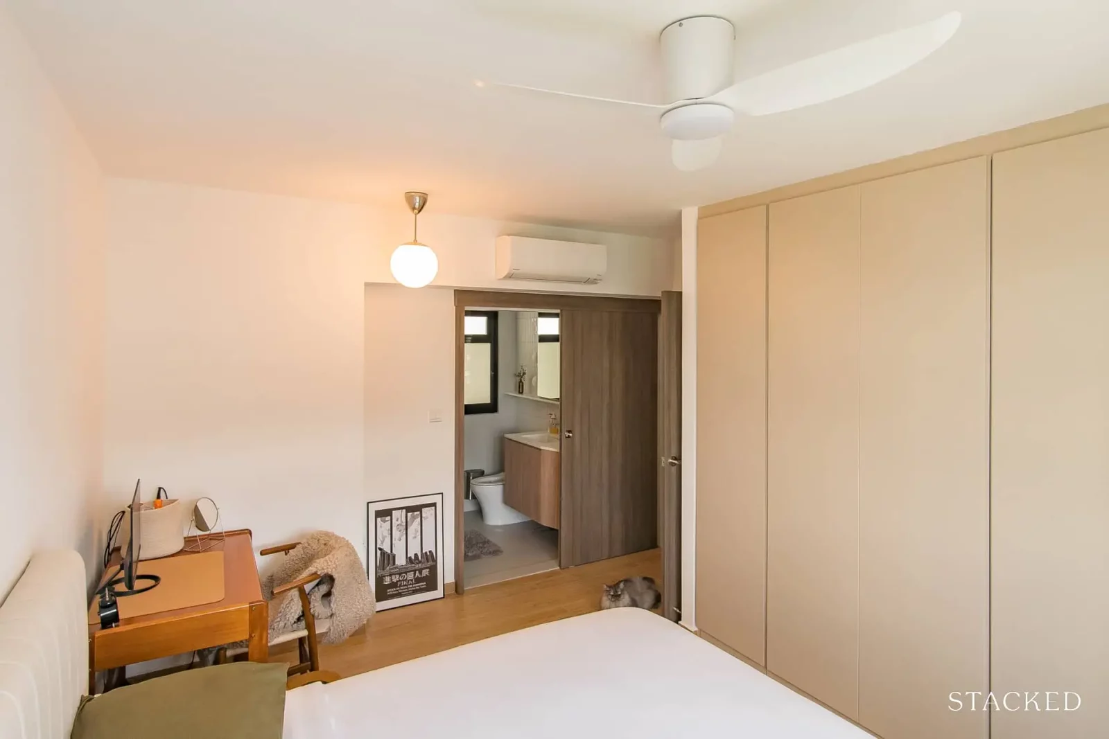
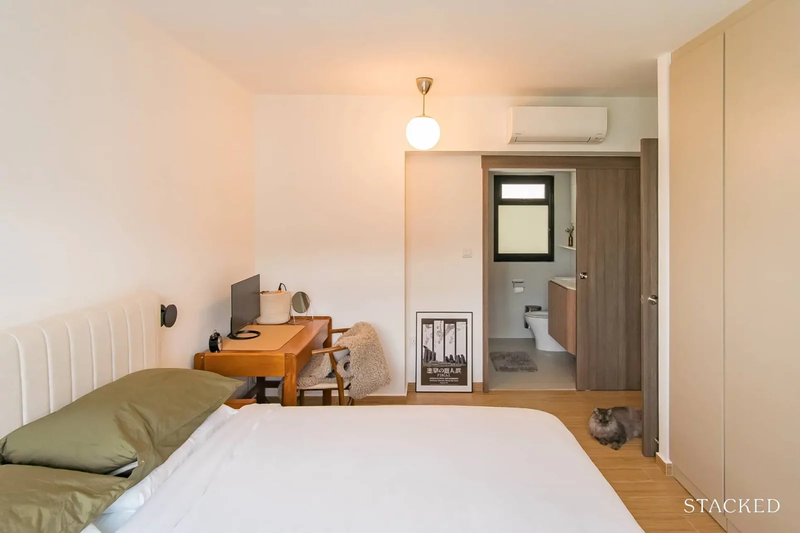
We also knocked down the wall separating bedroom 2 and the master bedroom to add a full-length wardrobe.
This allowed us to get a king-sized bed, have ample wardrobe storage space for the both of us, and also allow us to put an additional desk in the bedroom (for when both of us have meetings at the same time and for the future when we need to move the office to our bedroom when we have kids).
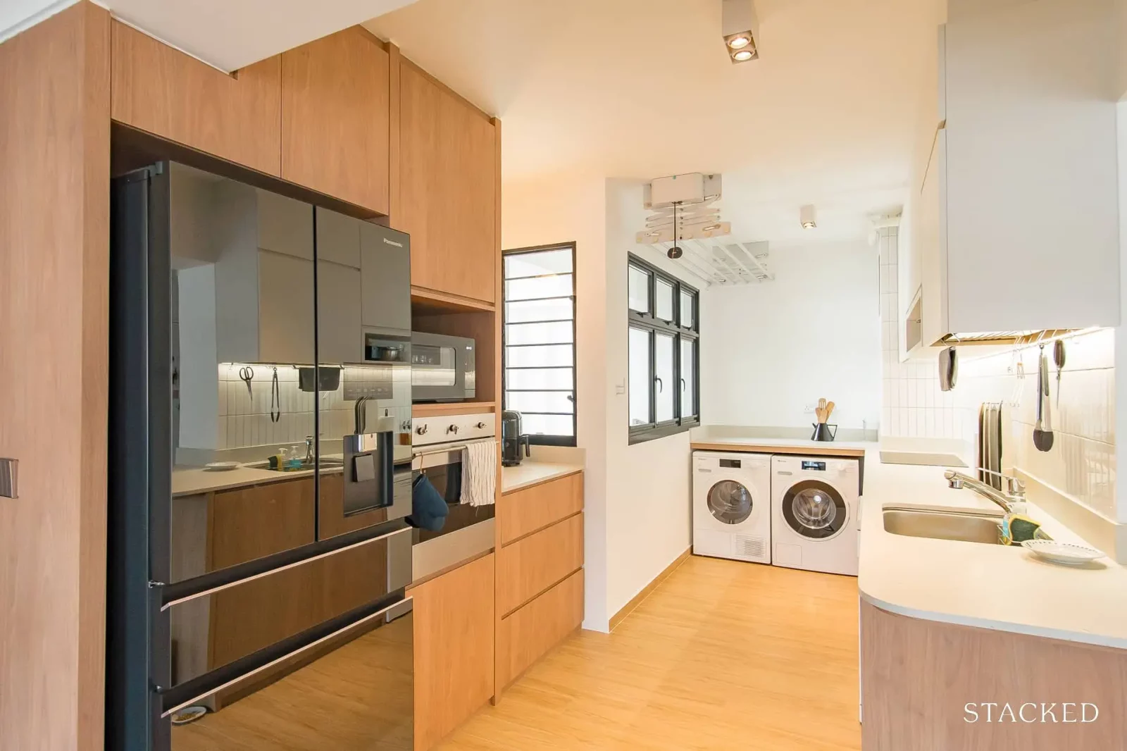
We knocked down the wall next to the fridge so we could have a larger counter space in the niche next to our window.
Overall these made our home more functional and would allow us to stay here a long time.
Can you please tell us what major changes were made to each room?
Living room
Enlarged significantly by hacking the bedroom
Dining room
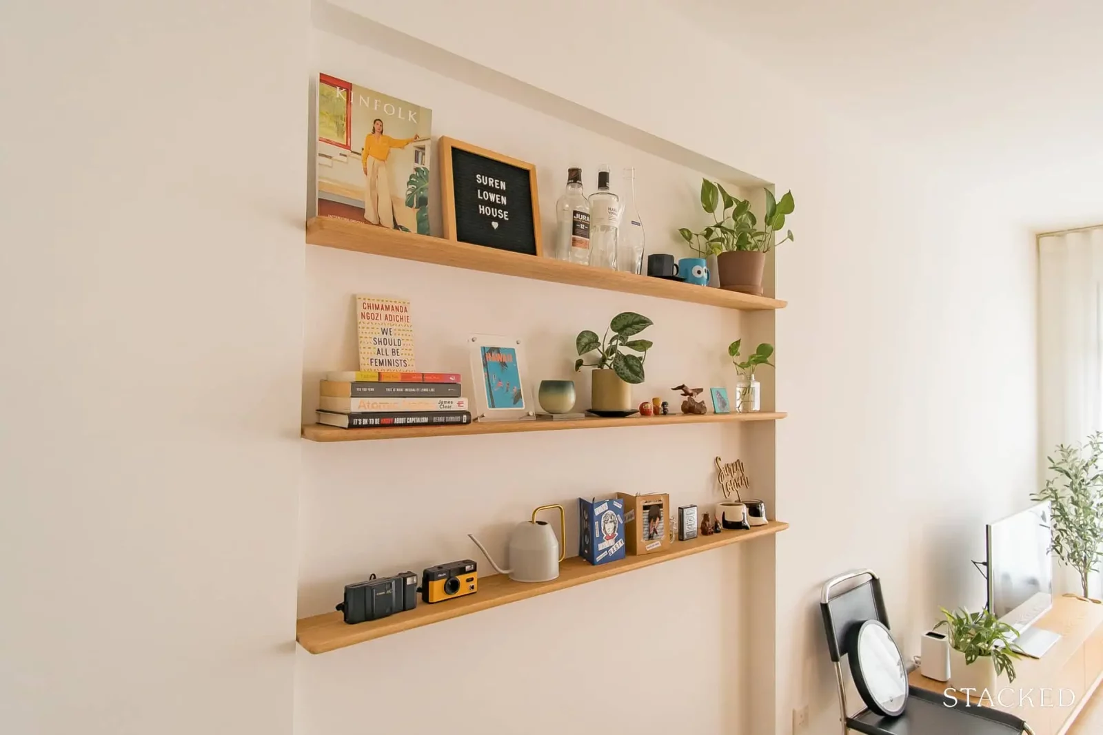
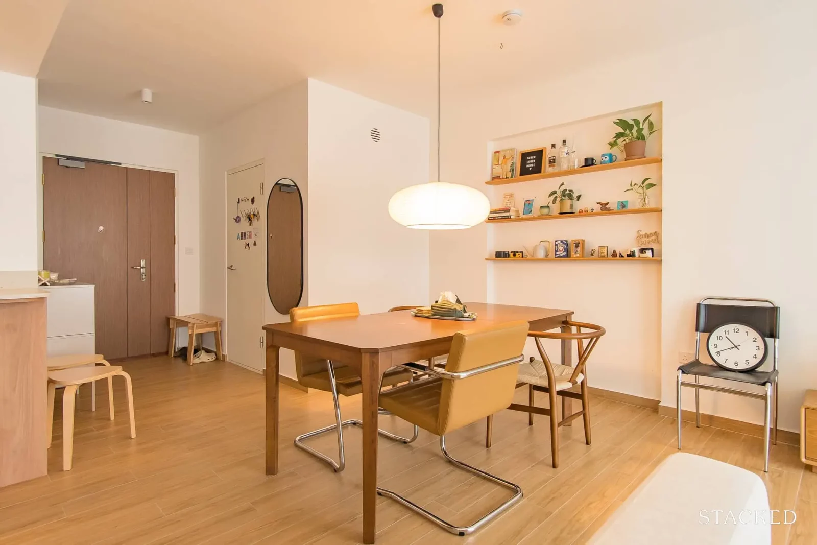
Extended the niche HDB gave us to create a smaller niche with shelving in our dining area
Bedroom/s
Hacking the wall between bedroom 2 and the main bedroom allowed us to fit a full-length wardrobe.
Bathroom/s
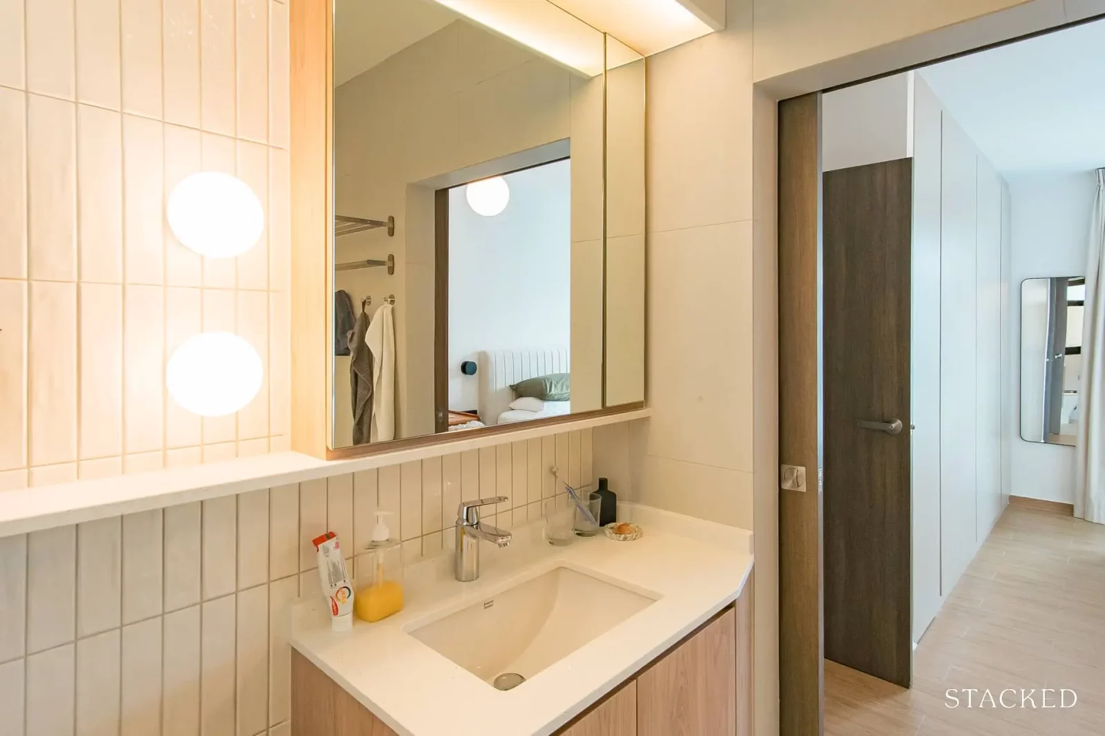
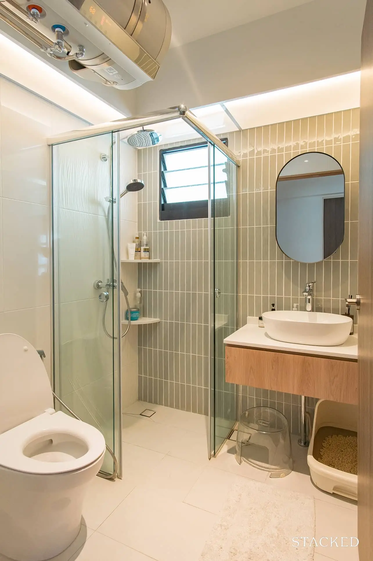
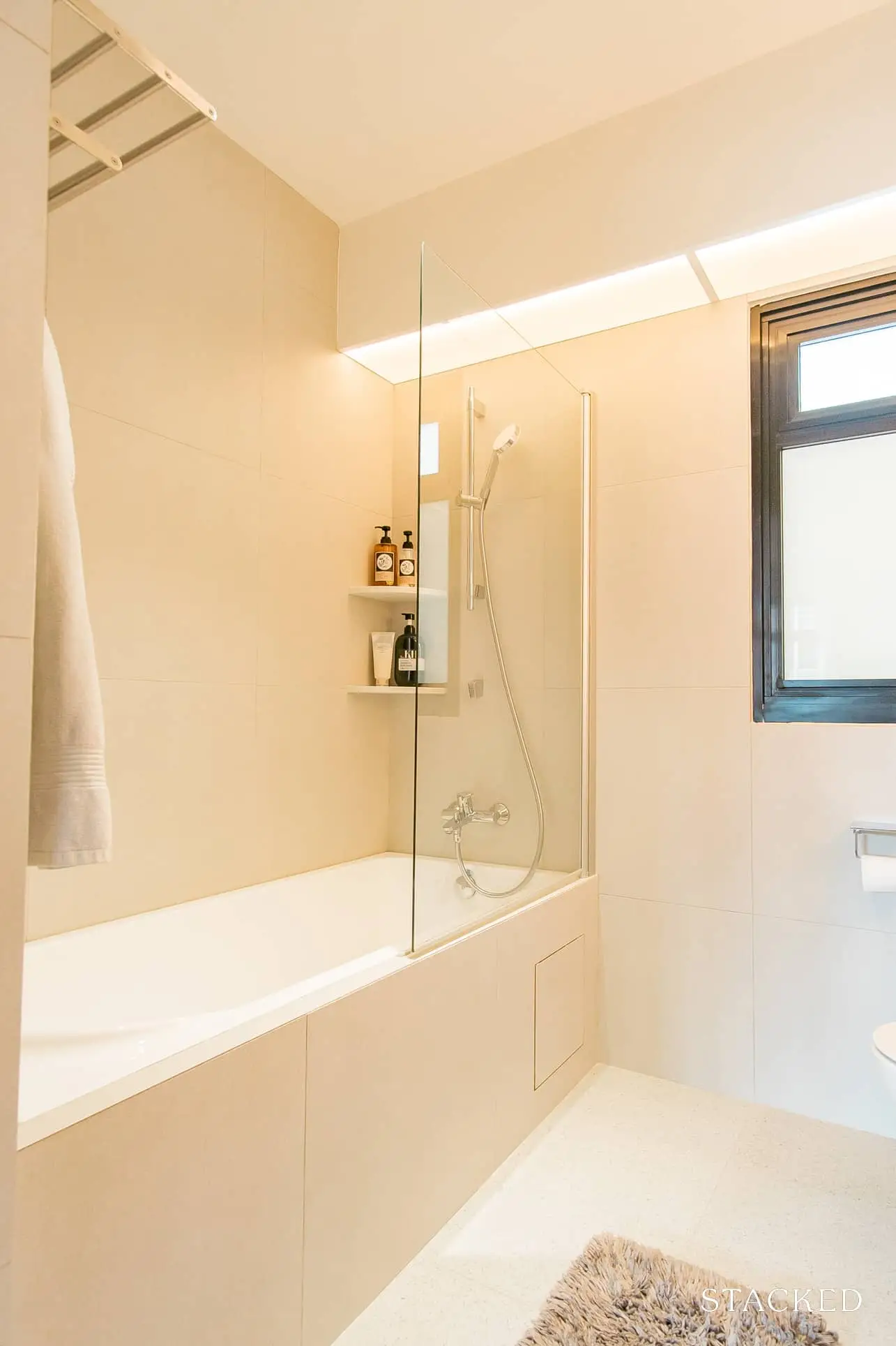
We overlaid tiles on the main wall and the floor of the common bathroom, and all surfaces in the master bathroom.
We also customised cabinets to fit our needs in both – a short cabinet in the common to fit our cat’s litter box underneath, a mirror cabinet, and a vanity cabinet in the master that hides our aircon trunking and maximises storage.
Who was your renovation contractor, and what are your criteria for choosing them?
Valerie Hoon from Fifth Avenue Interior. As we were both extremely busy at the time, both of us required someone who we trusted. Our criteria for determining this included:
- An existing portfolio. We ensured that IDs already had past projects of their own work – meaning they had experience in design and project management, and that we were able to get a sense of their aesthetic. We only shortlisted IDs whose aesthetics we liked because we wanted to have confidence that our home would look good and that we could trust their judgment
- How reputable the firm was. This is to ensure our payments were safe and that workmanship would be good
- How well we vibed/clicked with the ID
- Whether our ID was able to make suggestions that captured what we liked and met our needs – Valerie really did this! She was able to make layout suggestions that fit our layout and needs well, and the design style she picked out from our mood board captured the essence of what we liked
Can you tell us more about your furniture sourcing process?
Initially, we wanted to ensure that all our furniture would be easy to clean, and be cleaned. This meant having high furniture for the robovac to clean under, materials that could easily be wiped down, etc. However, sticking to this was a little hard. Sometimes some designs were just so nice that we didn’t stick to this criteria.

We tried to look for furniture locally because we like to try before buying, but found that it was difficult to find what we wanted, made with good quality materials, and at a reasonable price from local stores. We only shortlisted furniture that fit our dimensions, then considered the materials used and aesthetics. We ended up getting our sofa from Castlery because their beautiful sofas were comfy and the right size, then shopped on Carousell next and found our extendable solid wood table, cantilever chairs, and Muji shelf. Lastly, we went on Taobao to get our remaining items because they really have the best selection of items at unbeatable prices.
What do you think is the best area of your home before and after renovation?
The view of the dining area when we step out from the master bedroom to the dining area. It has the most personality, and is where we host parties.
What did you learn from this experience, and what is the mistake (if any) you won’t repeat again?
Design-wise, we learned to go with our hearts. The parts of our home that we love the most are the ones that we chose ourselves, and that show our personalities and tastes. We also learned to be clear with our communication and not be afraid to say what we think and ask questions because ultimately, we’re the ones living with the design and having to face any potential quality issues.
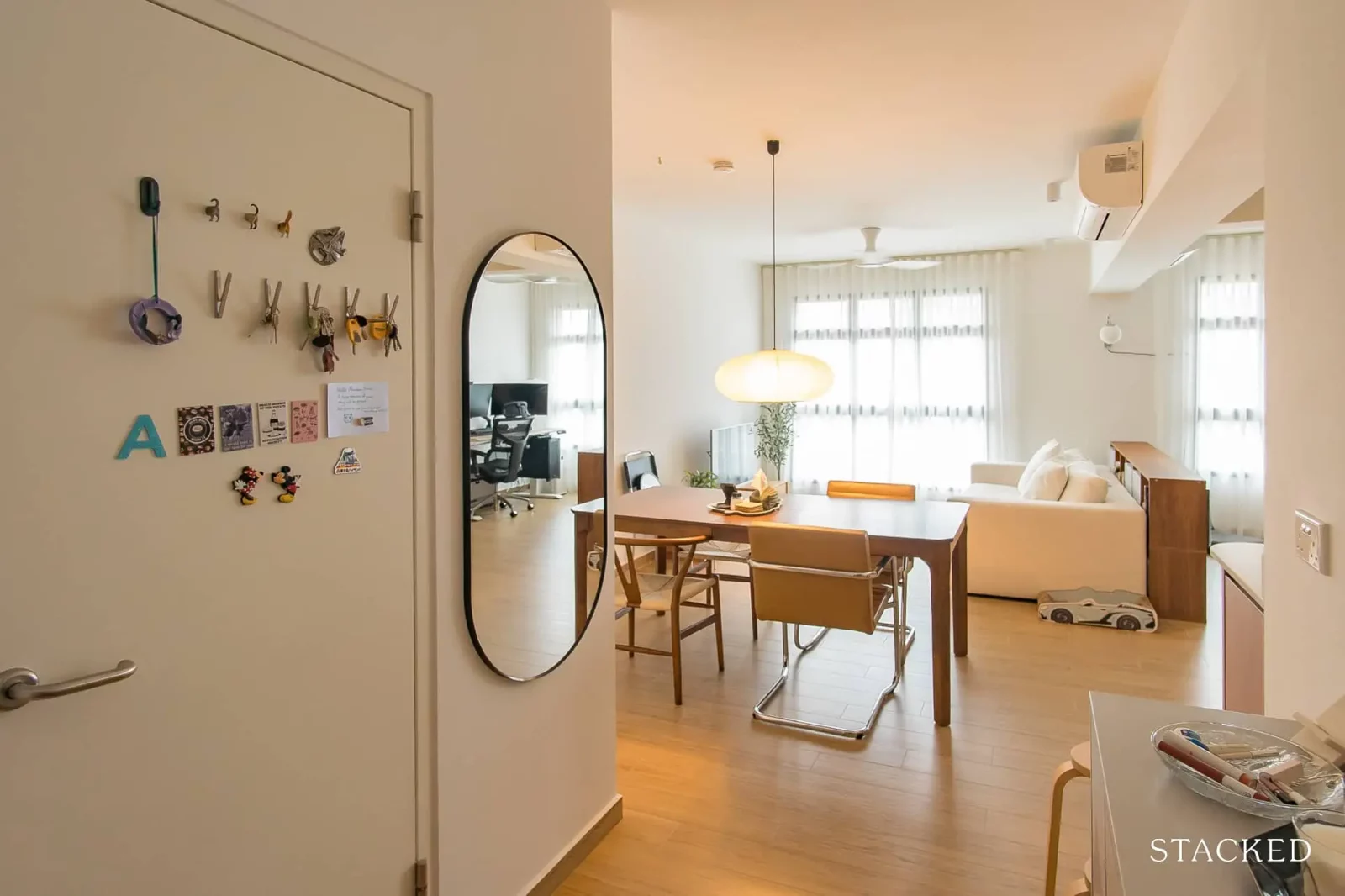
Our floor tiles were very affordable, and they look pretty good as well. However, having stepped on higher-quality tiles elsewhere, we realise you really do get what you paid for. We’d likely bite the bullet in the future and invest in higher-quality tiles.
Any advice for new homeowners out there looking to spruce up their homes?
Take your time to figure out the aesthetic that you want, because you’d be waking up to it every morning. Waking up/coming home to a nice house is extremely uplifting.
Don’t be afraid to go for what you love because it’s what makes your home yours. If you’re afraid to take risks, just buy second-hand so you can always sell it (at a little loss) if it doesn’t work out!
Thinking about how a space would be used is extremely important. It’s not enough just to say that you want to use a space to prepare your breakfast. Actually visualizing yourself filling up your kettle/coffee maker with water, getting your coffee pods, getting your cereal, etc. would help you plan your space better, especially with regards to storage.
Lastly, if something bothers you don’t be afraid to ask questions or just take things into your own hands and figure it out. Renovations and even furniture cannot be easily changed, so it’s better to be confident and happy rather than doubtful and regretful.
At Stacked, we like to look beyond the headlines and surface-level numbers, and focus on how things play out in the real world.
If you’d like to discuss how this applies to your own circumstances, you can reach out for a one-to-one consultation here.
And if you simply have a question or want to share a thought, feel free to write to us at stories@stackedhomes.com — we read every message.
Need help with a property decision?
Speak to our team →Read next from Homeowner Stories

Homeowner Stories We Could Walk Away With $460,000 In Cash From Our EC. Here’s Why We Didn’t Upgrade.
Homeowner Stories What I Only Learned After My First Year Of Homeownership In Singapore

Homeowner Stories I Gave My Parents My Condo and Moved Into Their HDB — Here’s Why It Made Sense.

Homeowner Stories “I Thought I Could Wait for a Better New Launch Condo” How One Buyer’s Fear Ended Up Costing Him $358K
Latest Posts
Singapore Property News 4-Room Flat at Bedok South Horizon Sets New Bedok Record at $1.17M
PRO Pro Where To Buy A Condo In Serangoon: Prices, Best Areas And Growth Trends In 2026
Property Advice Hundred Palms, Riverfront Residences Or Tampines Trilliant — Which Is The Better Buy For A Young Family Today?














0 Comments