Unlike shophouses, walk-up apartments generally don’t have the advantage of a pretty facade. And it’s often a great example of don’t judge a book by its cover as what’s on the inside can often be a whole new world altogether.
However, some of its drawbacks can deter most people these days. For example, having to walk up and down the stairs to and from their unit can be tiring for most. Some may argue that it’s a good exercise, but this could also pose a problem when you are less mobile in your later years.
Enter Xander and Joanne (see their IG account Loftandorder for more). Together with their cats, Boris and Buffy, they went this route not out of circumstances but by choice. “Walk-ups have always appealed to us and our lifestyle,” Xander said. During their house hunt, they also looked at a number of condominiums, but they found that they’re more aligned with a walk-up home.
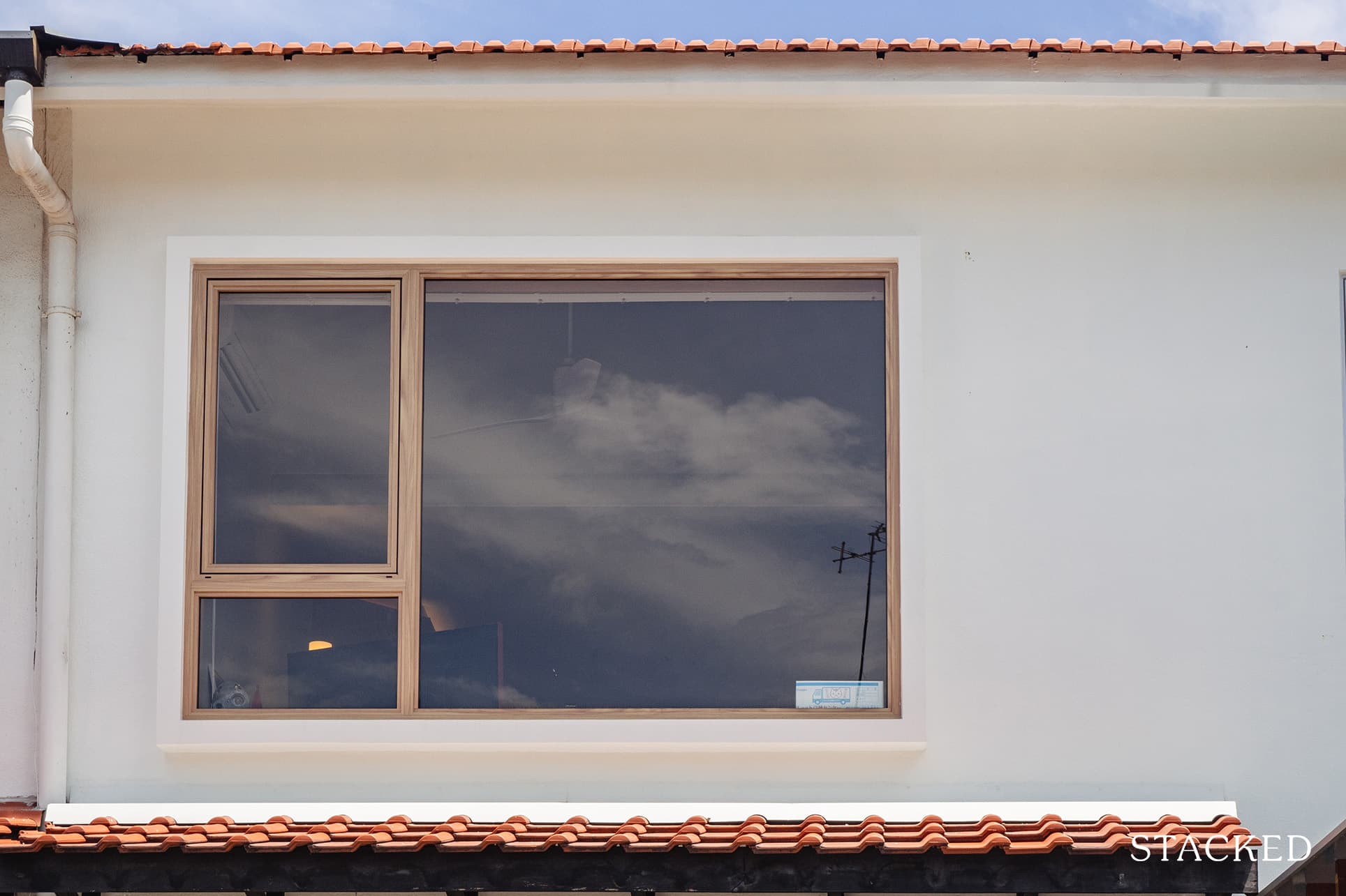
“When this unit was listed we just couldn’t pass it up due to its private, quiet, and central location,” he happily shared.
And what a fine example this home is. With its gorgeous lofty pitched roof and airy-filled interiors, it is really even more of a stark contrast from its plain-looking exterior.
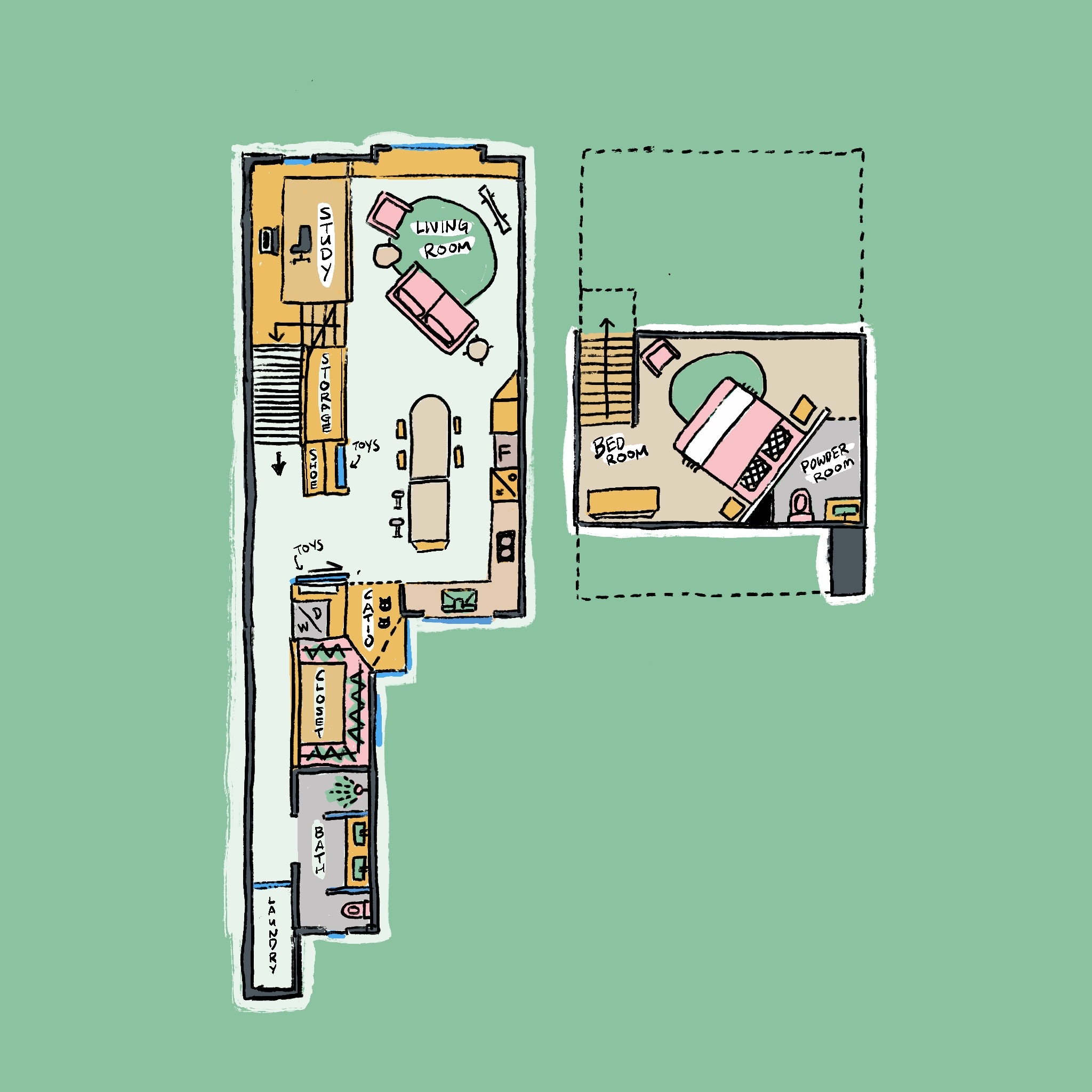
Let’s take a tour of their beautiful walk-up home and how Xander and Joanne were able to add more charm to it.
So many readers write in because they're unsure what to do next, and don't know who to trust.
If this sounds familiar, we offer structured 1-to-1 consultations where we walk through your finances, goals, and market options objectively.
No obligation. Just clarity.
Learn more here.
A home that is full of character and charm
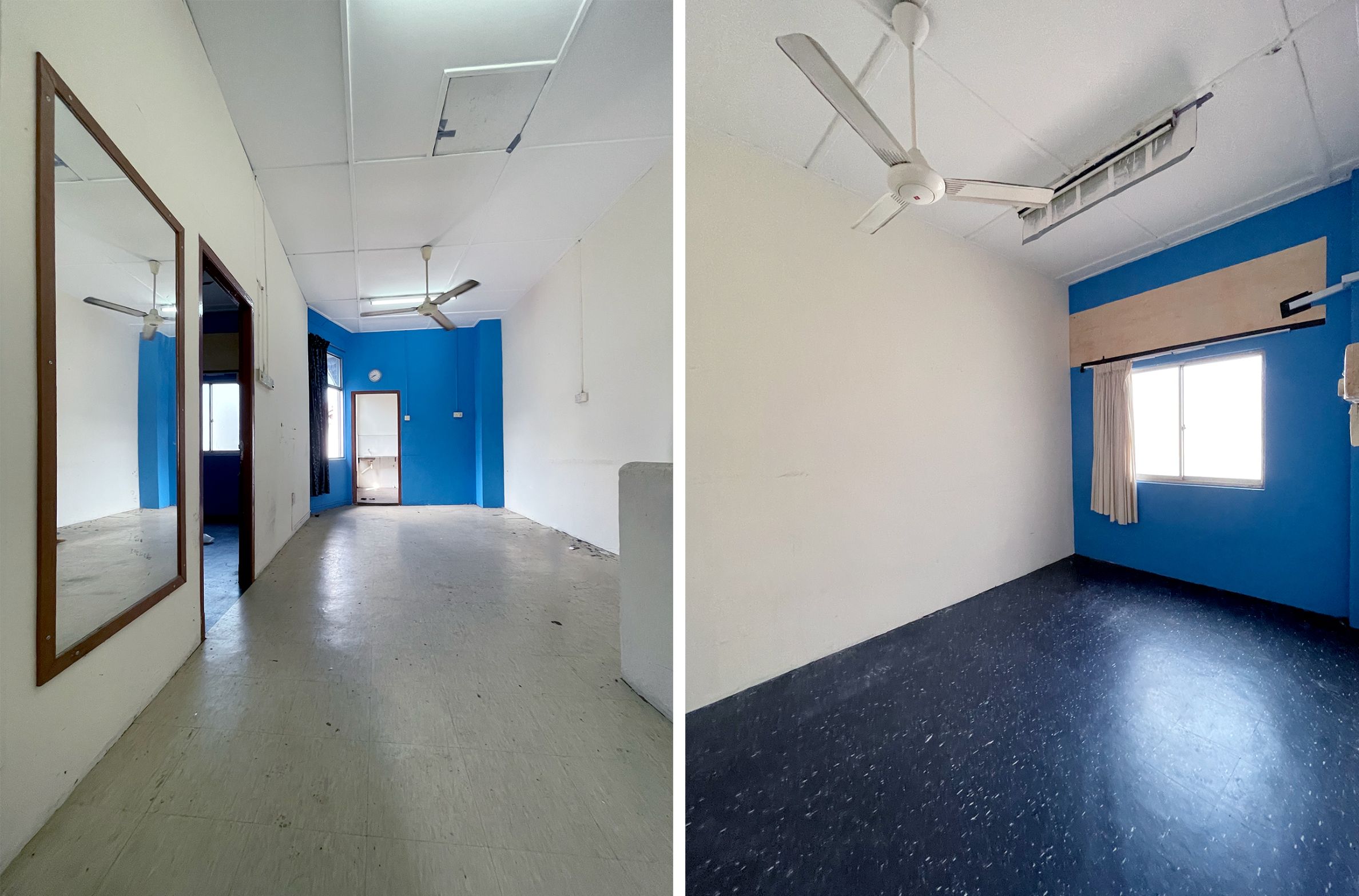
With resources tight and material costs skyrocketing during the time of the pandemic, the couple knew they were going to spend a considerable amount. Joanne said that since they consulted with friends who had already gone through renovations, they were able to work out a close to accurate budget. “The only thing that was not budgeted for was the cost of asbestos removal,” she added.
The couple kept their options open when it came to following a specific design or style for their renovation. They never believed in following a theme and instead focused on having a home that suited their lifestyle – filled with things they love.
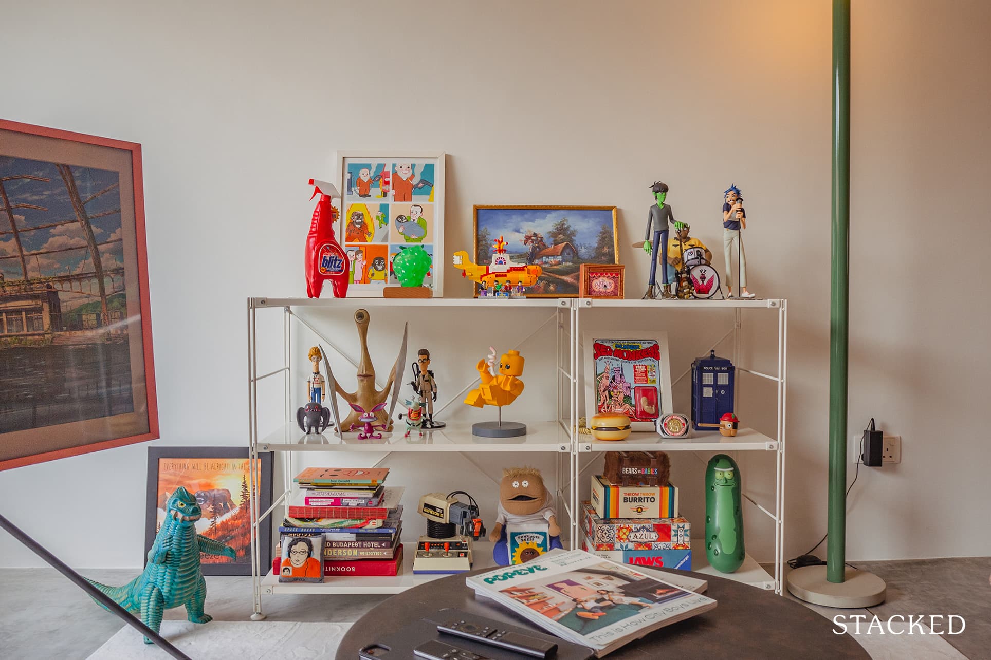
Xander explained that the design and style are influenced mainly by the homes of creatives they love and admire. They also considered the house design of some of their friends.
“We’ve always been into the idea of loft living. Plus, we adore the light and air-filled lofts of Tokyo and New York that we often found in the pages of Popeye, or Casa Brutus magazines.”
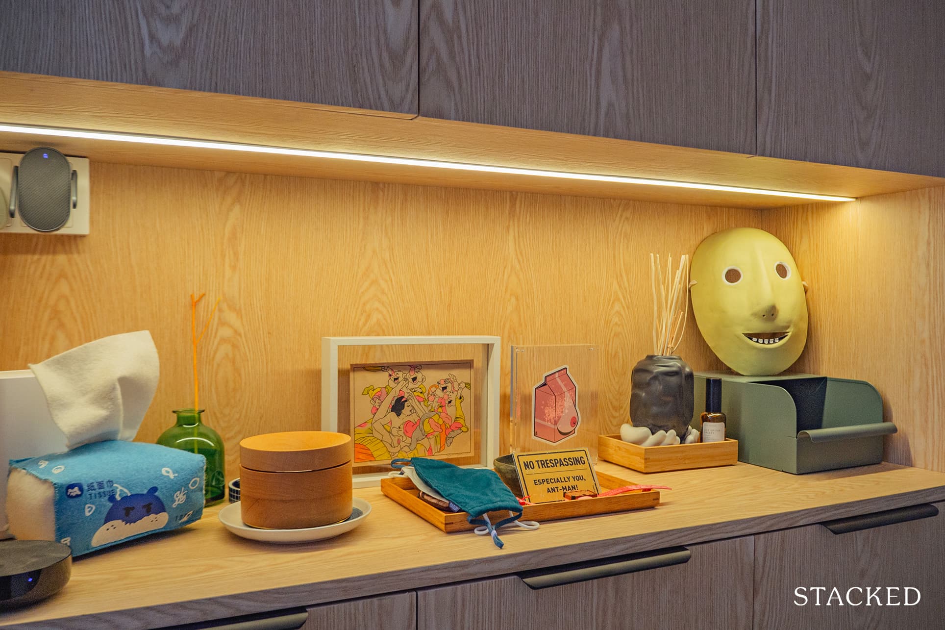
The couple also collects art, toys, oddities, and curiosities. They wanted to showcase their favourites in their home without too much visual clutter. The result is an anti-minimalist decor filled with character and charm. With their creative approach, they were able to bring life to their home.
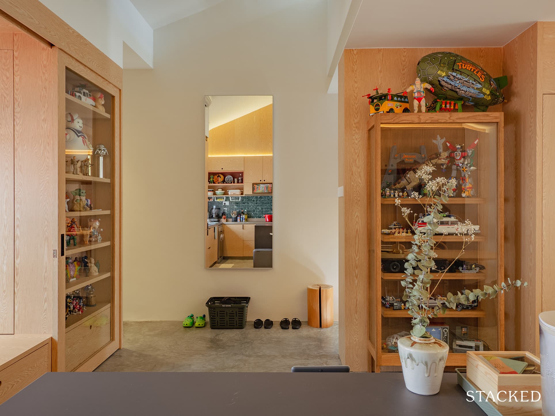
Even if you are the most straight-laced person around, it’s hard to ignore the playful charms that are infectious throughout the home.

Living Room
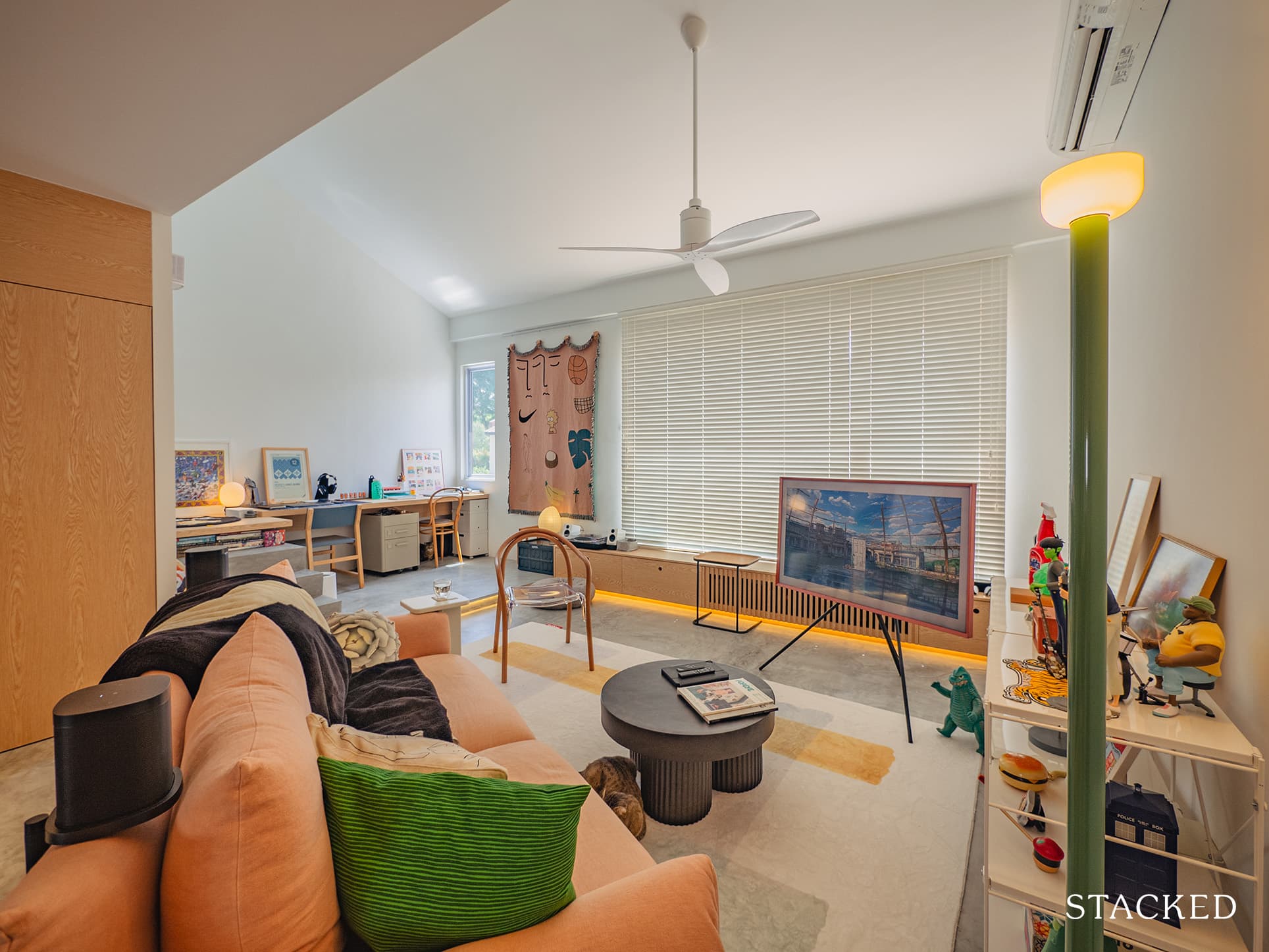
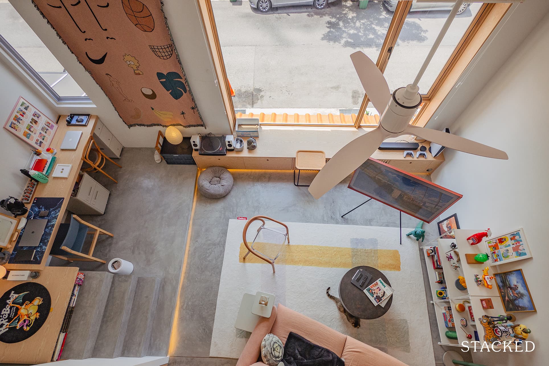
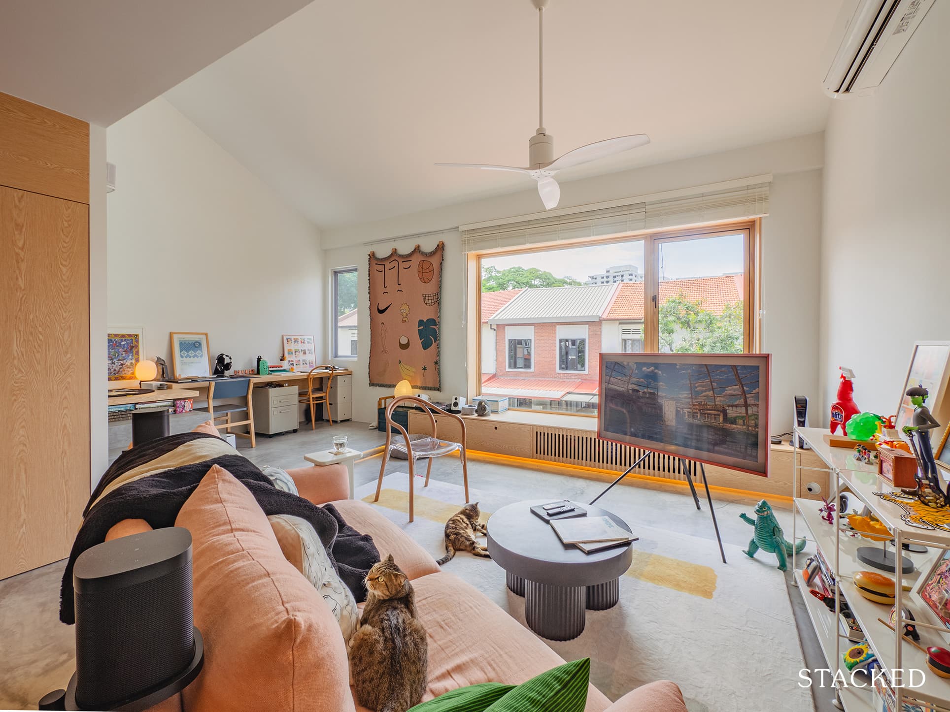
On the main floor, they hacked all walls to open up the floor plan for their kitchen, living room, and study area. The result is an expansive living room, that feels extremely open and looks to be a lovely place to while the time away.
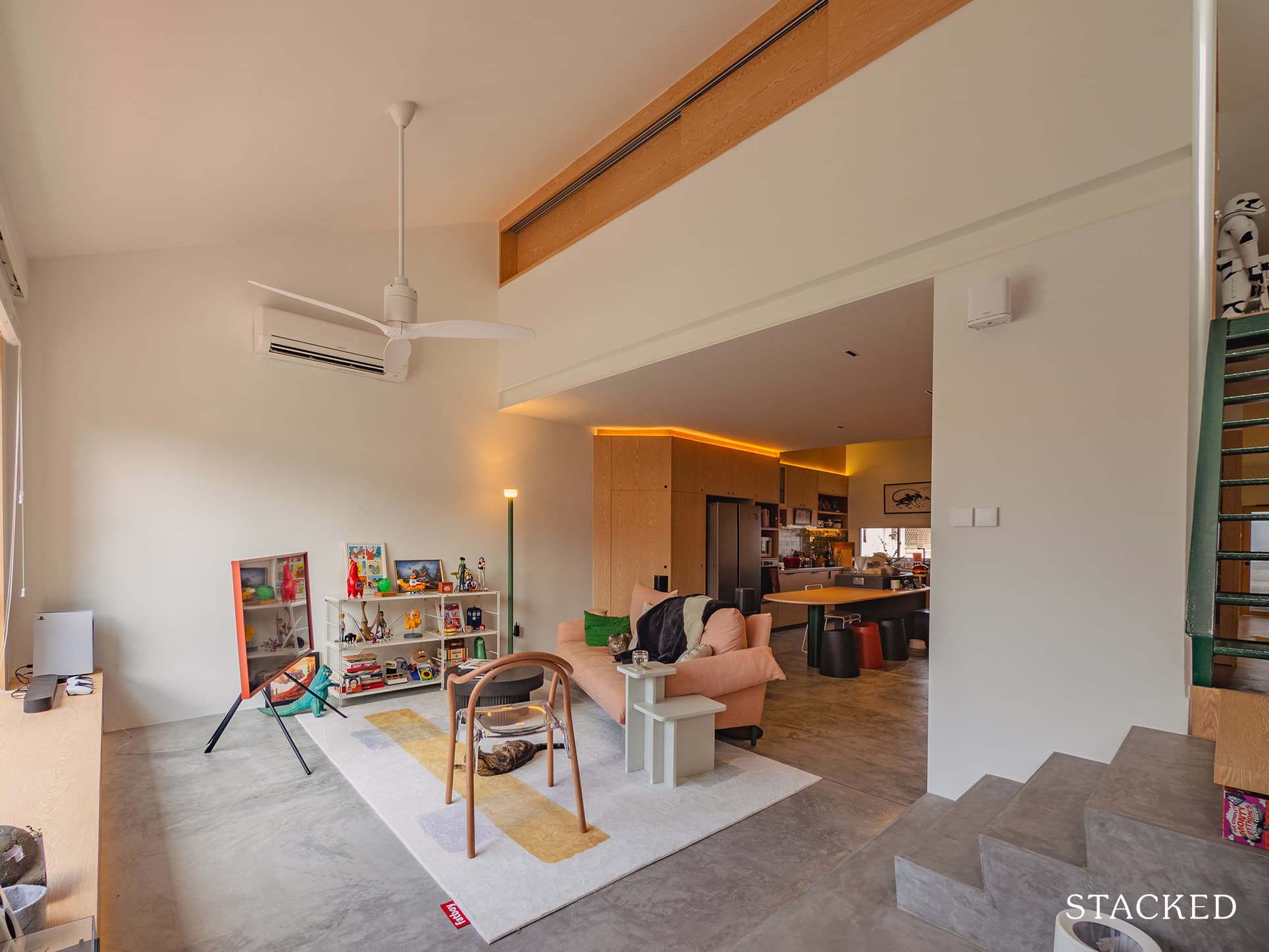
To let in a lot of natural light, they had a large fixed window cut in the facade of the living room. It was a great decision to do so as it helped brighten up the main floor, ensuring that their abundance of trinkets won’t end up looking like clutter when showcased.
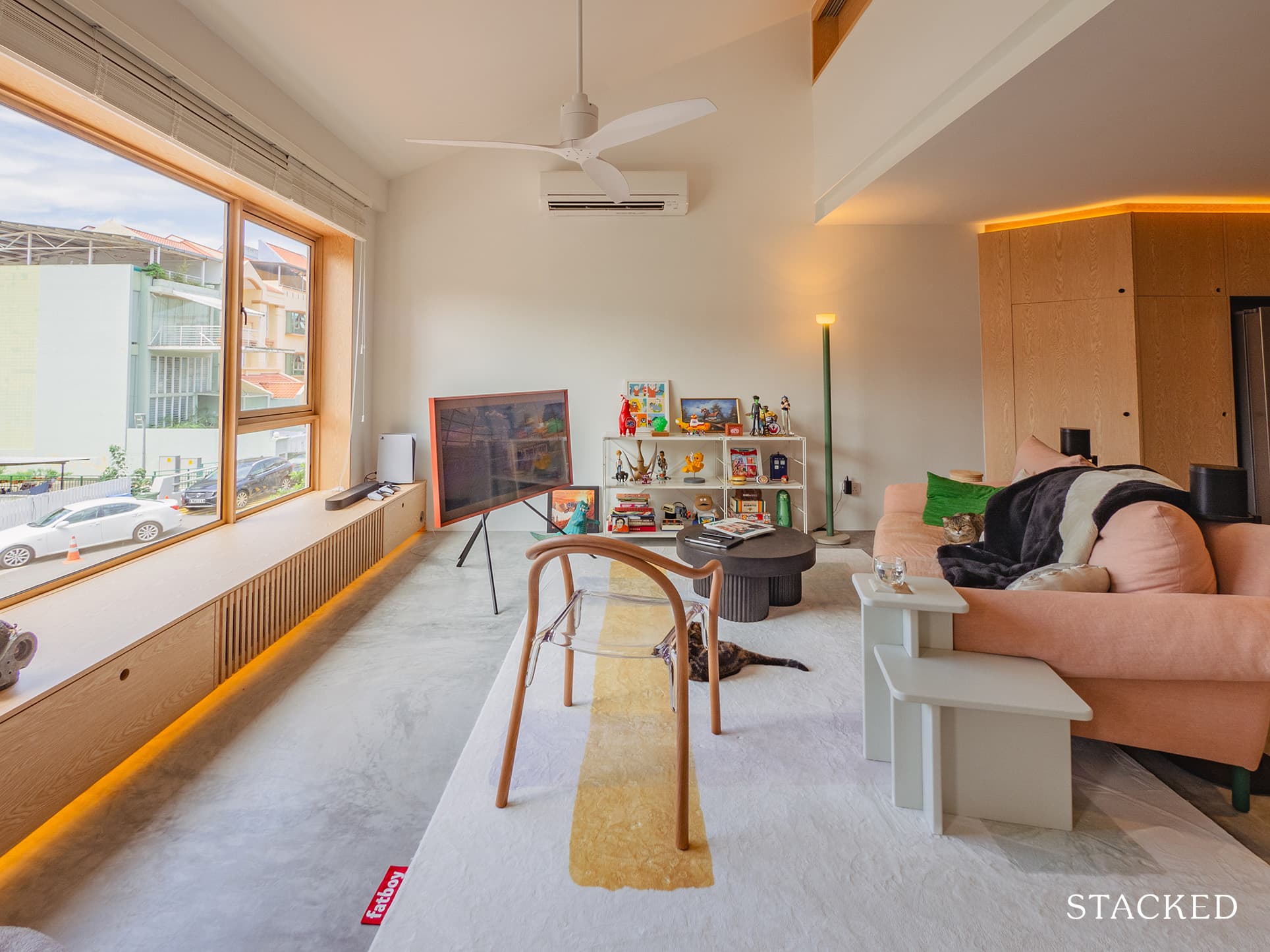
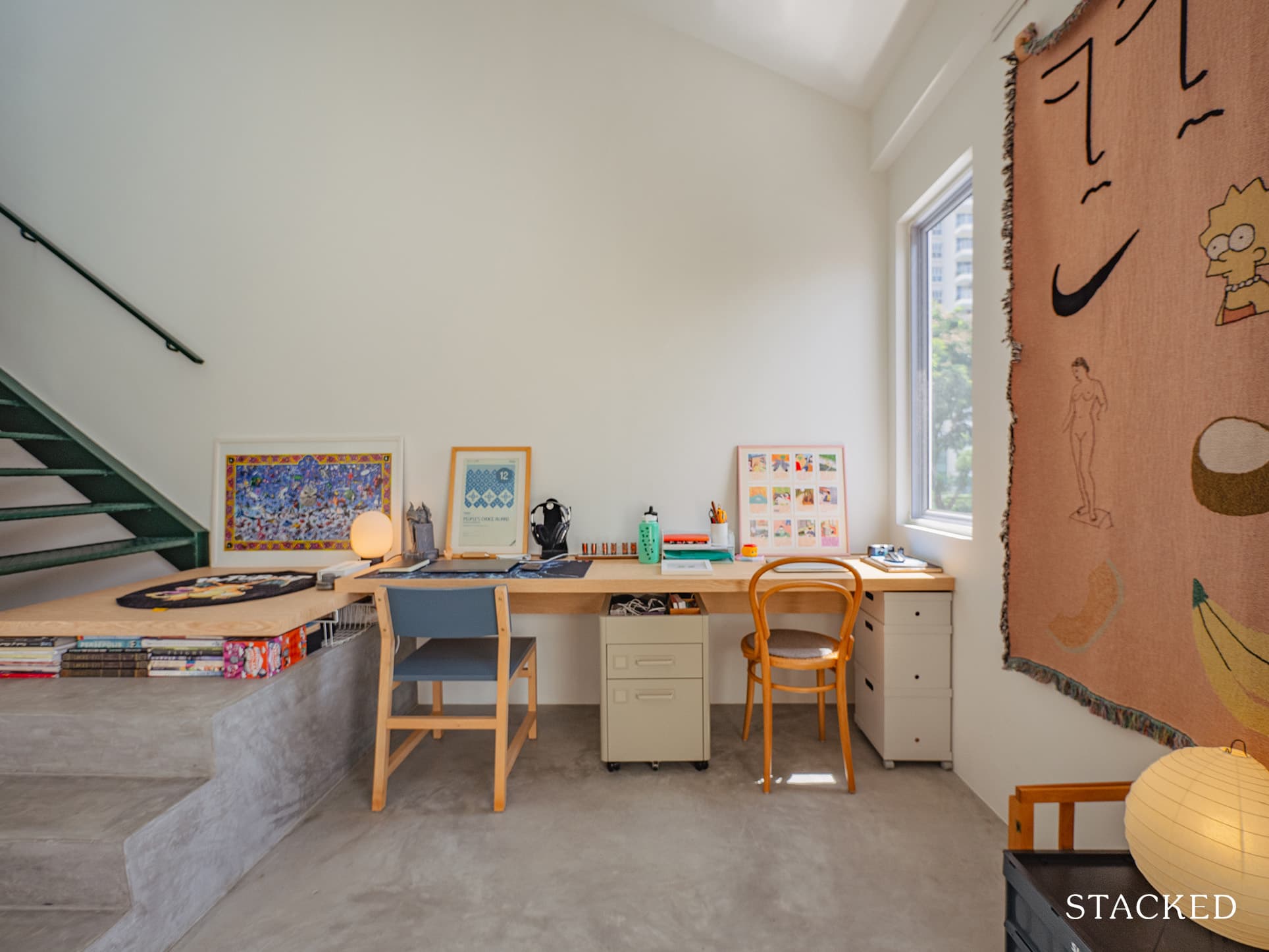
In addition, keeping the living room bright and airy is a must because it’s their home’s focal point. “We spend much of our free time there – watching TV to unwind, playing console games, and enjoying the occasional karaoke session when we have friends over,” shared Joanne.
Dining And Kitchen
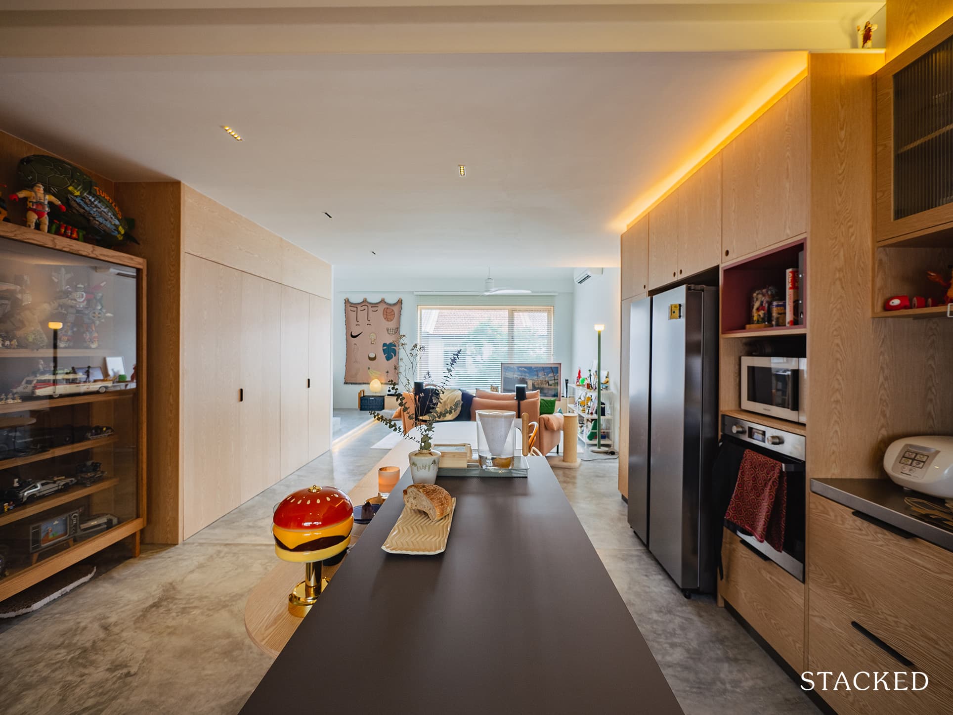
Removing all walls that divided the living room from the dining and kitchen also helped to ensure that home activities were seamless. Whether they’re in the living room or preparing food in the kitchen, conversations continue to flow. “In the last 2 years since the pandemic started we also started to cook a lot more at home and therefore wanted a larger kitchen with ample prep space,” Joanne said.
Homeowner StoriesAn Old 1,560 Sqft Executive Maisonette In The East Gets A Dreamy Refresh Into A Laidback Retreat
by Stacked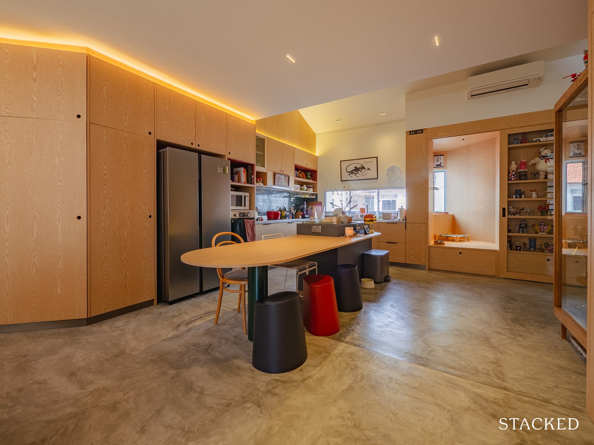
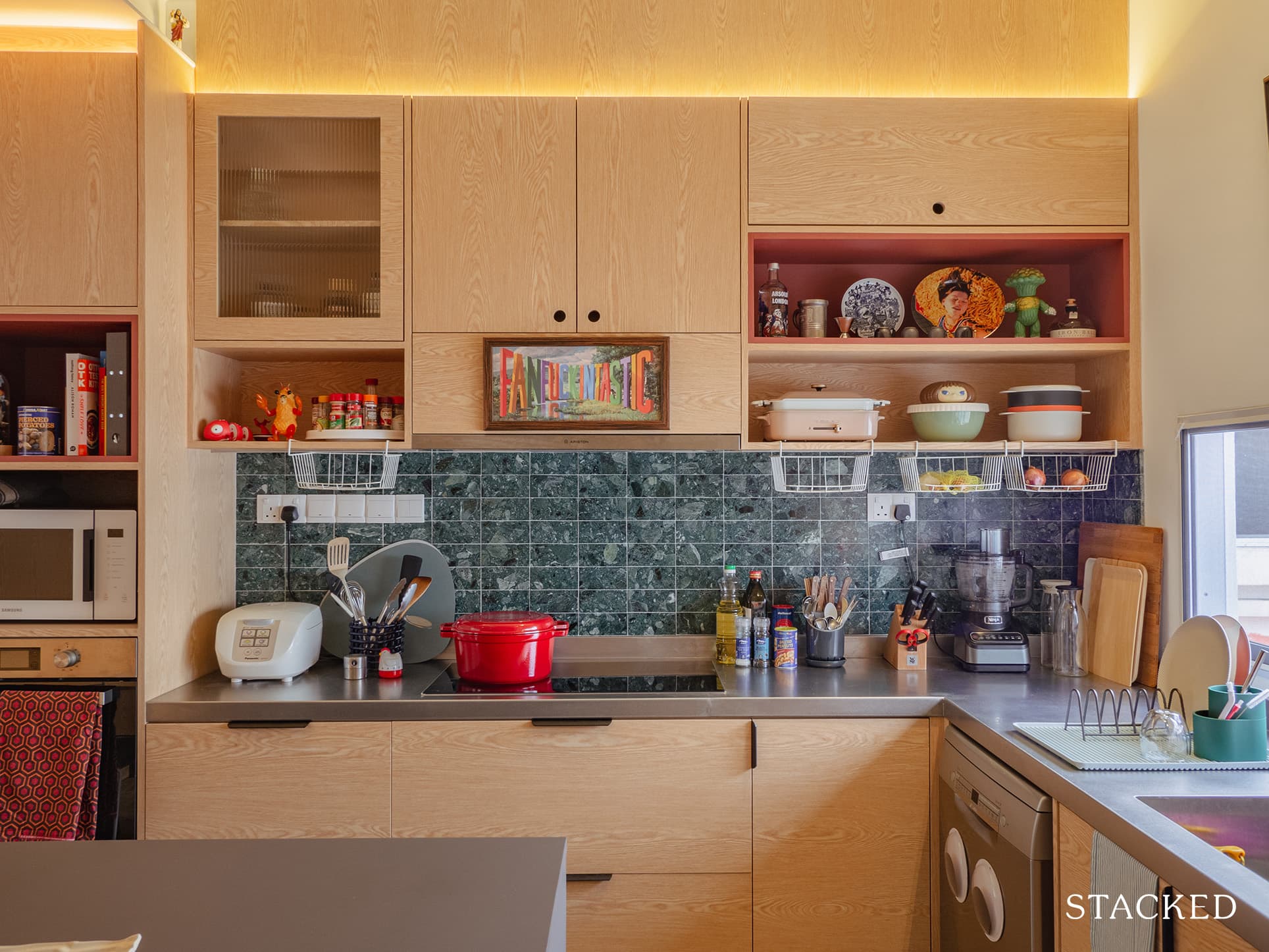
Their choice of kitchen cabinetry made sure that there were open shelves to display their collections, while closed cabinets kept the rest of the kitchen stuff hidden. The light wood panel works well with the dark green tiles they installed, creating a contrasting blend.
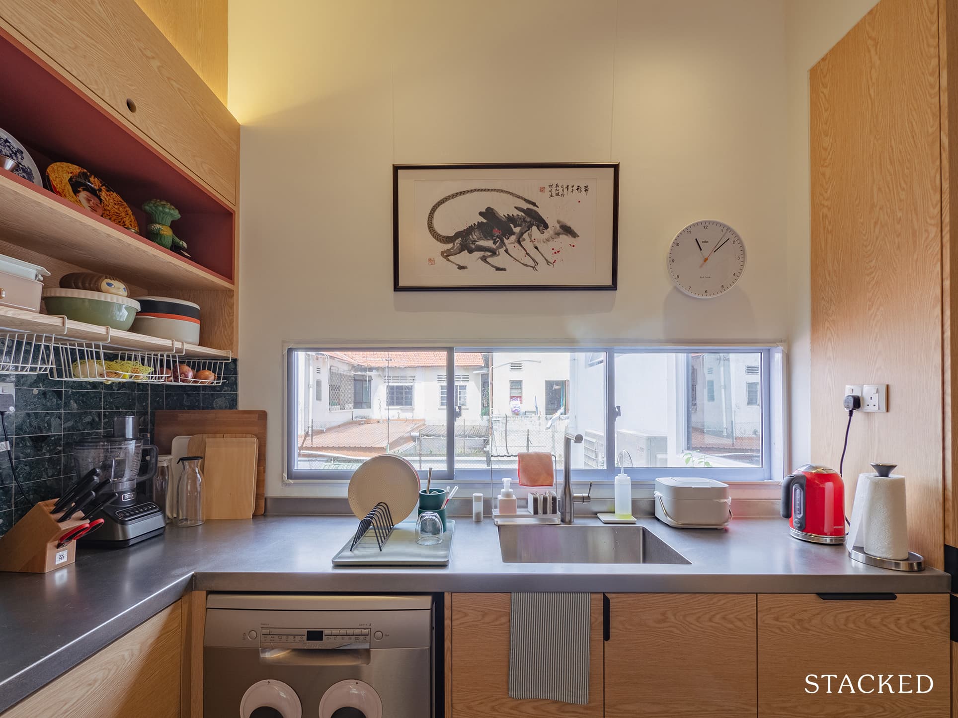
Installing a long window by the sink is also a fantastic design decision as it floods a lot of light and makes the kitchen bright and airy.
Thanks to their ID’s creativity, they were able to convert what was once an unused odd corner by the kitchen into what they dubbed the “catio.”
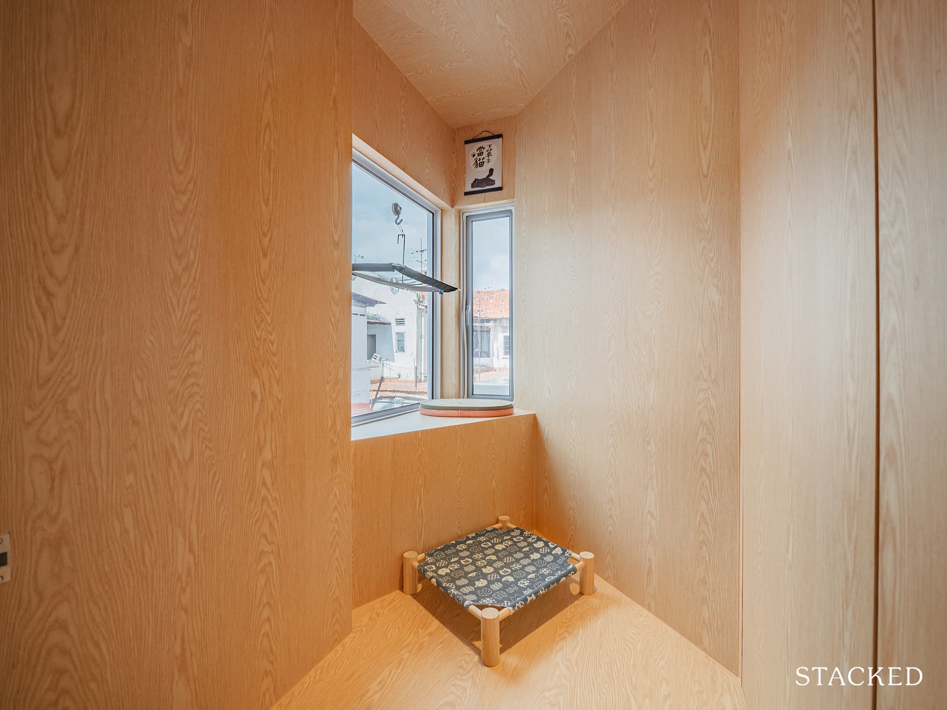
“We knew we wanted them to have room to live their best cat lives but we also didn’t want our home to look like a cat cafe,” Xander said.
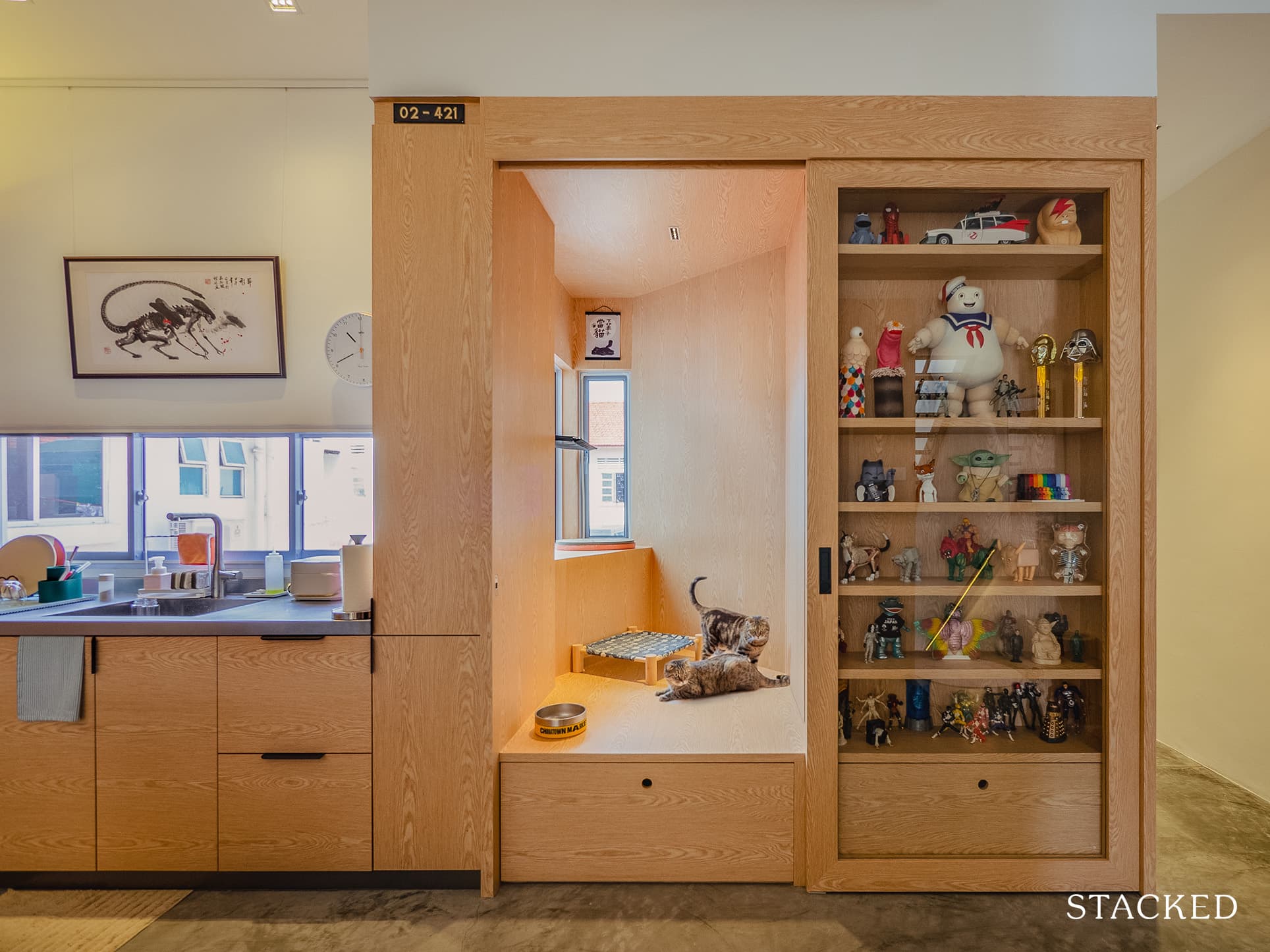
The sliding glass door of their built-in display cabinet allows them to lock their cats in their room should anyone with allergies visit or foster kittens in the future.
“At the end of the day we didn’t want to go all out designing for them, because as all wise cat owners know, nothing you design beats an ol’ cardboard box!” he admittedly said.
Bedroom Loft
Going up to the bedrooms is an experience in itself. The first thing you’d probably notice is the pop of green on the staircase. They wanted it to be painted white at first, but the painter accidentally painted one of the steps green – which turned out to be a blessing in disguise.
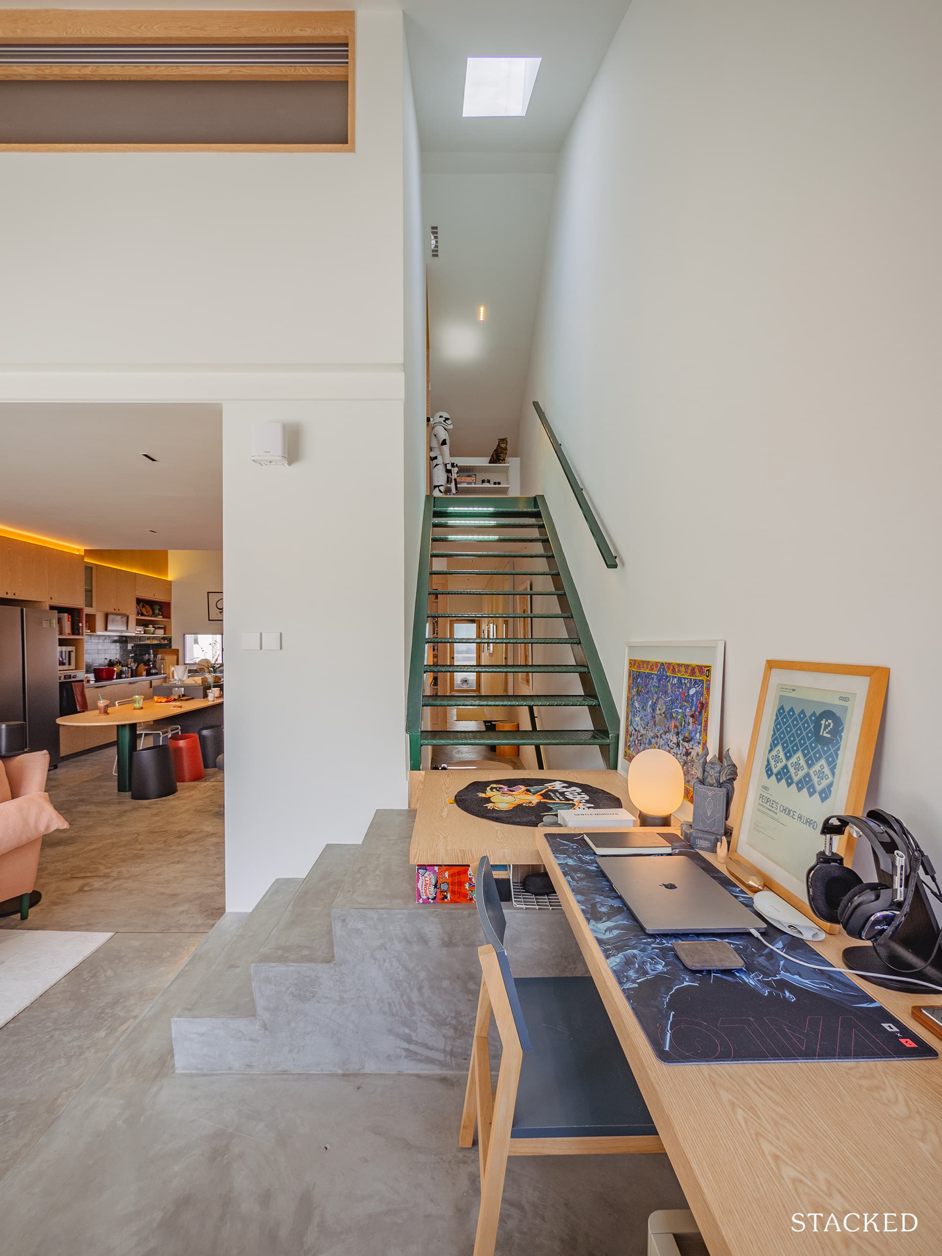
The skylight helps to brighten the space even more, and once you get up, you’d be dutifully greeted by a Stormtrooper that guards the way to the second floor.
More from Stacked
Why This Once-Ulu Town In Singapore Is Going To Change (In A Big Way)
Expect to hear much more about Woodlands in the near future, thanks to the upcoming Johor Bahru - Singapore Rapid…
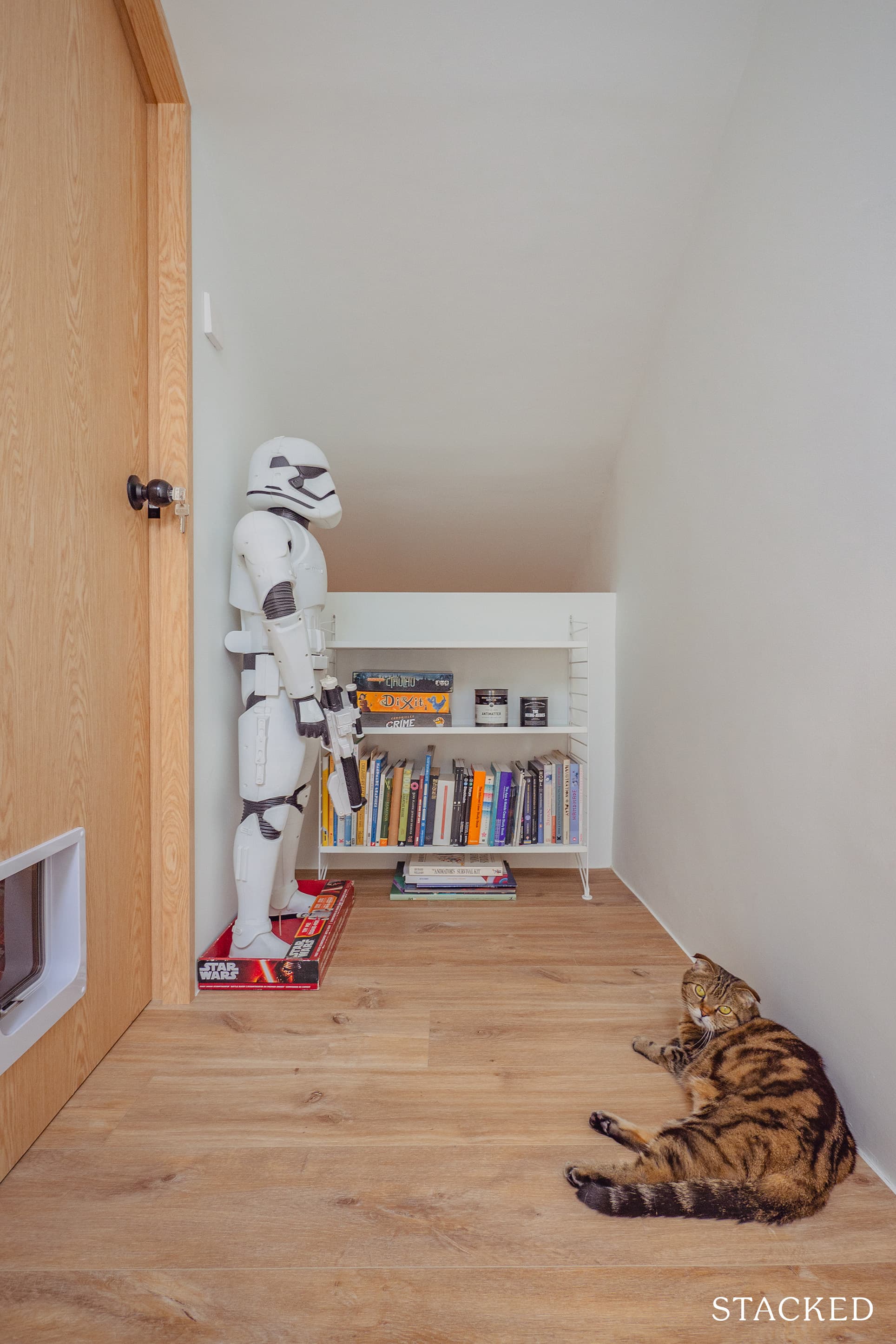
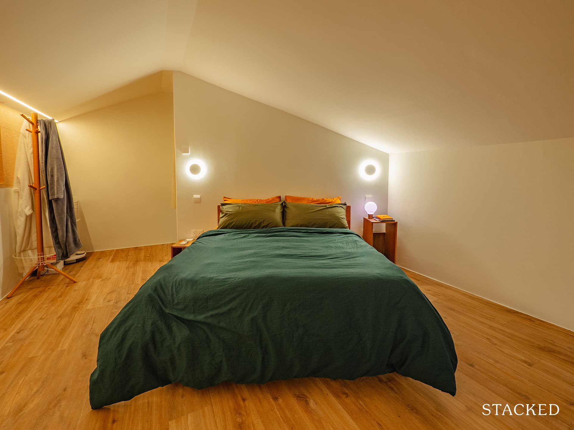
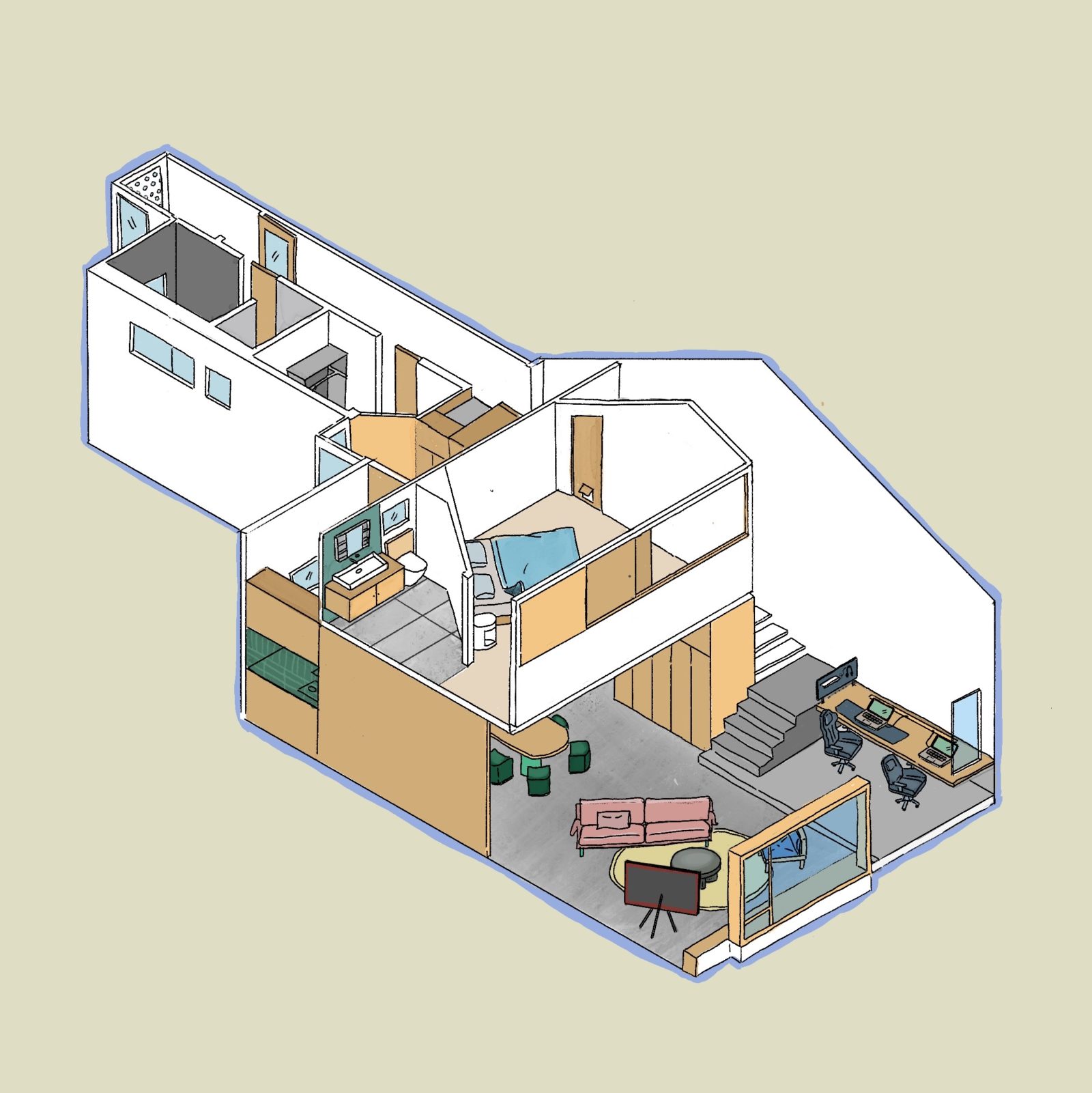
“We opened up the ceiling board to expose the roof and built a loft to house our one and only bedroom,” revealed Joanne. It was nothing fancy since they wanted to keep it bare and clean to ensure a peaceful rest.
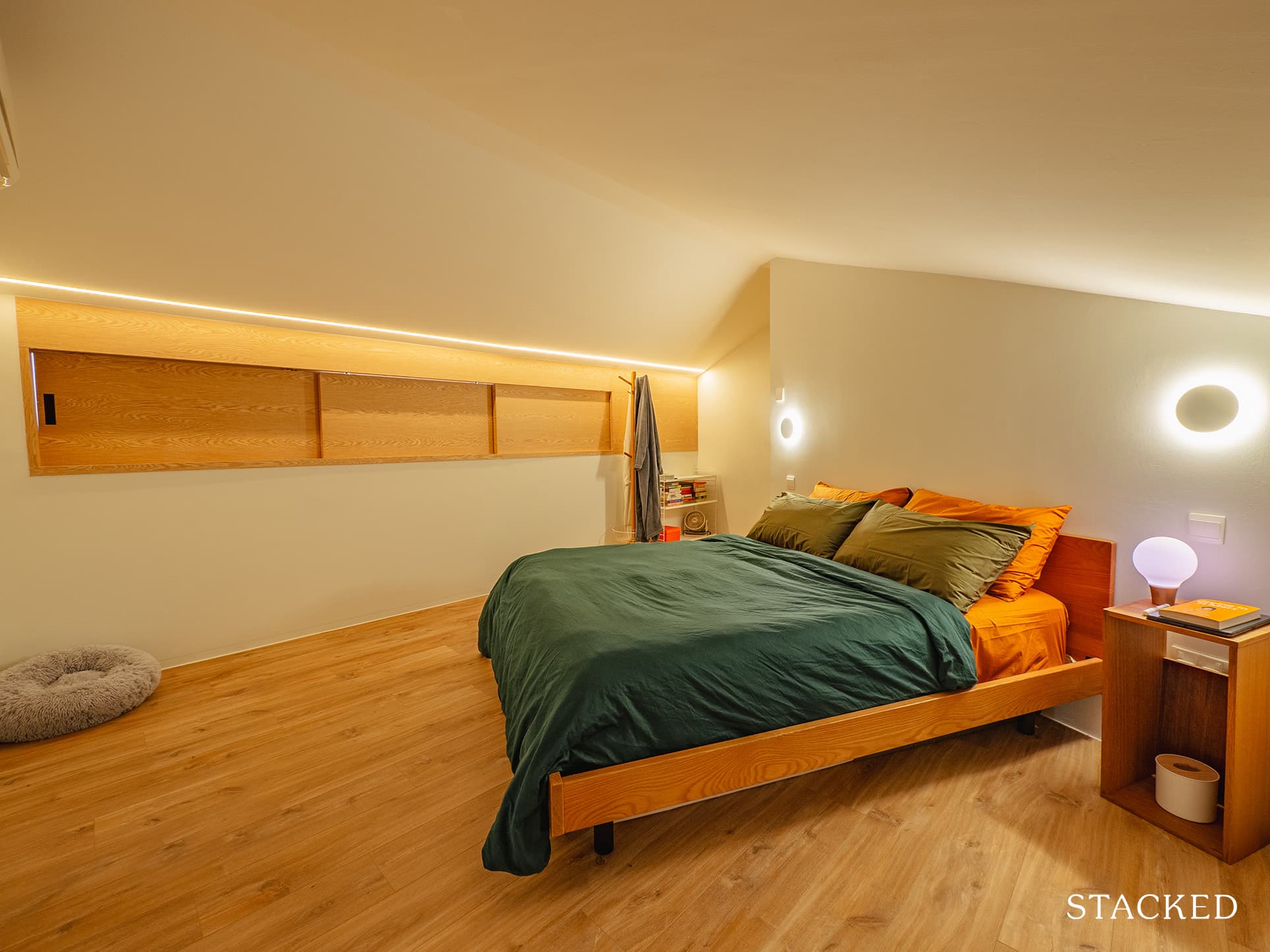
The bedroom has a window overlooking the living room below, which also helps spill abundant natural light into the bedroom. At the same time, this helps prevent the room from becoming stuffy.
They deliberately kept the space simple (no wardrobes or TV) as they wanted to keep the bedroom as bedrooms are intended – to have restful sleep. But here’s the cool part. They actually programmed the lights in their room to mimic a sunrise to simulate a real window!
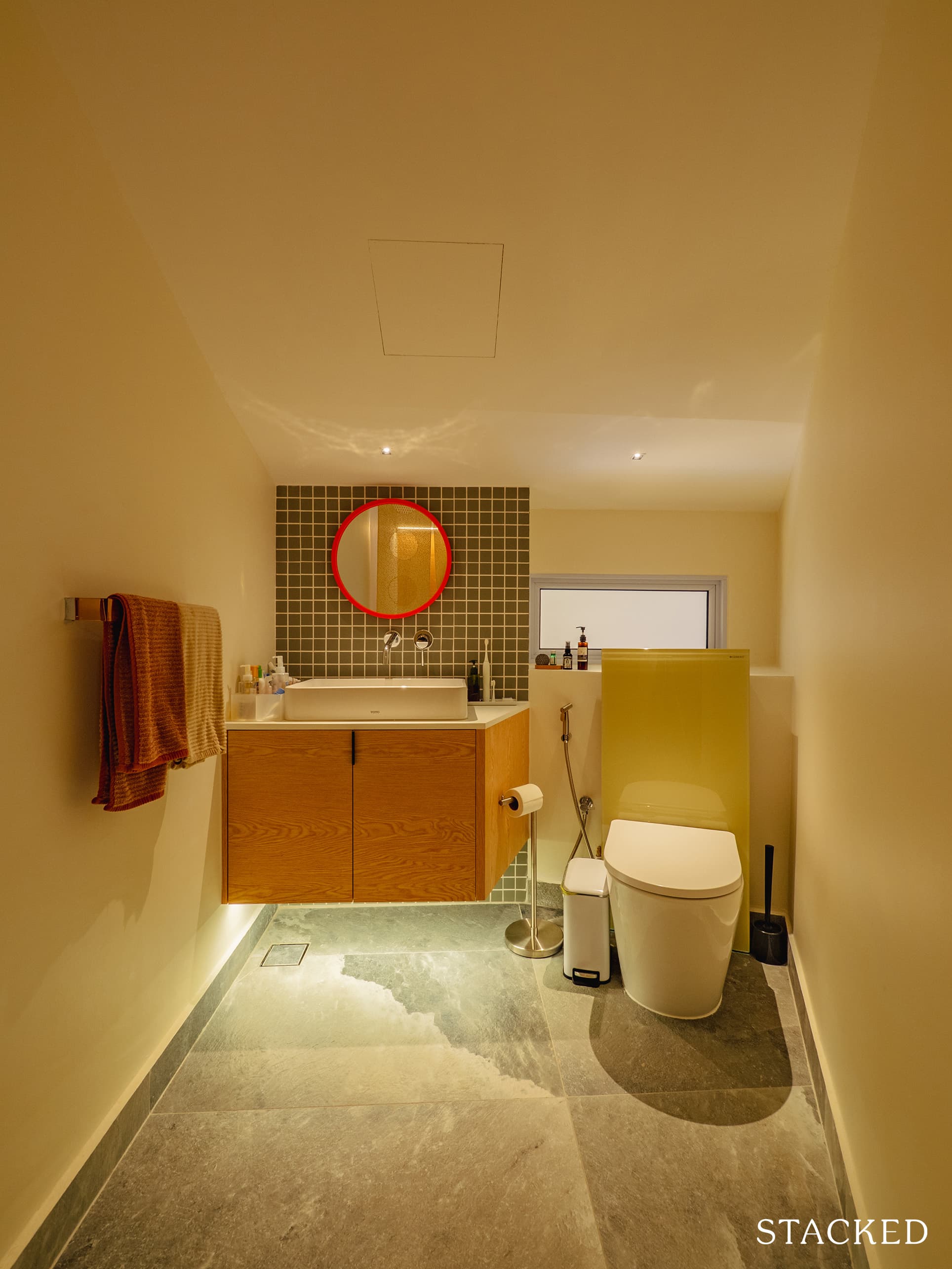
Even if the bedroom is not huge, they managed to squeeze in a powder room. “We built a powder room from scratch in the bedroom, to ensure we wouldn’t have to climb down the stairs in the dead of night to use the bathroom,” she said.
Bathroom, etc.
The original floor plan had a long corridor at the back of their unit, which used to house the kitchen and a separate shower and toilet. Now, the couple converted the space to accommodate the washer and dryer, wardrobe, master bath, and the service yard.
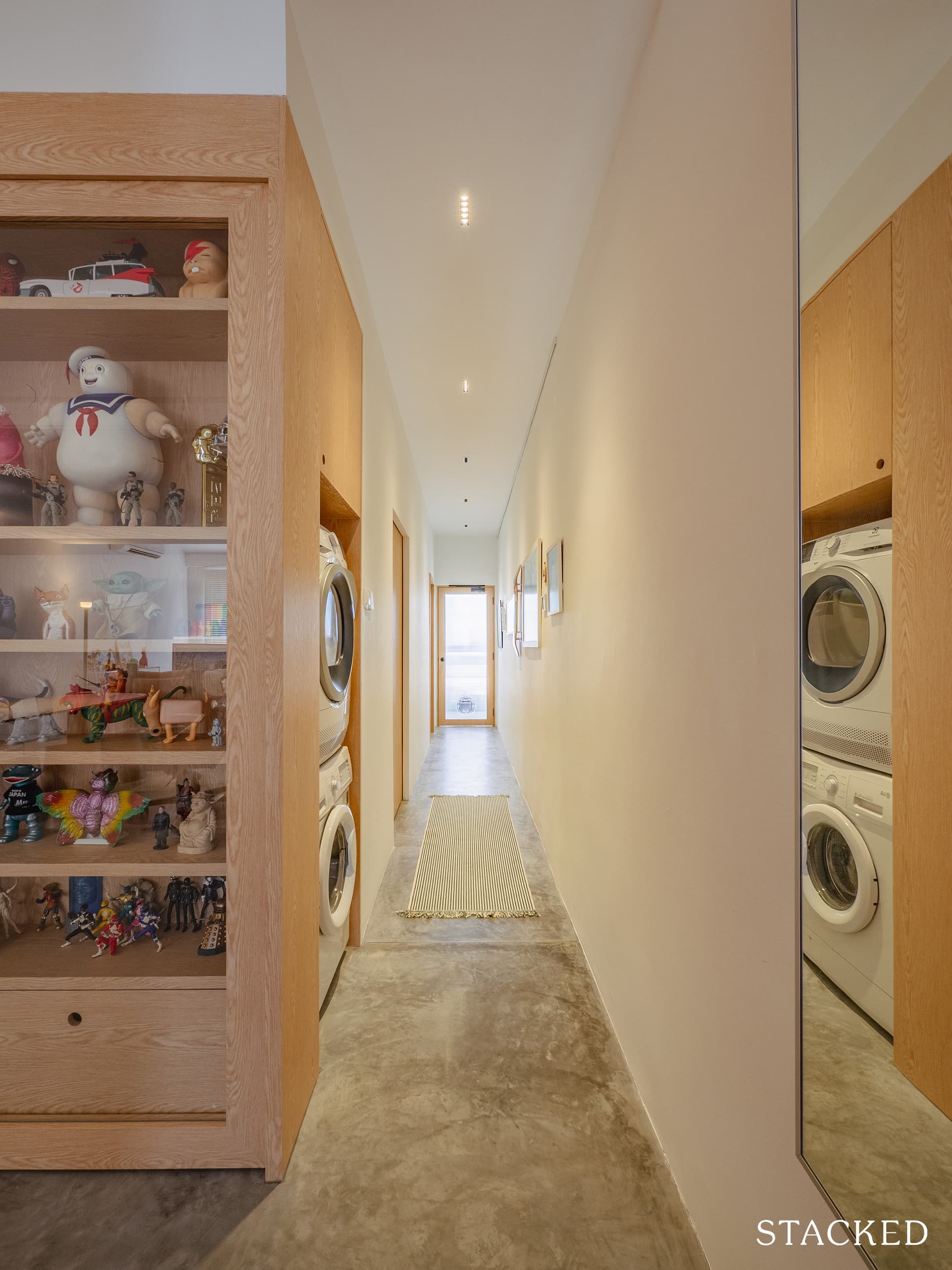
The couple wanted to have these areas in proximity to each other so they could perform utilitarian functions with ease of movement.
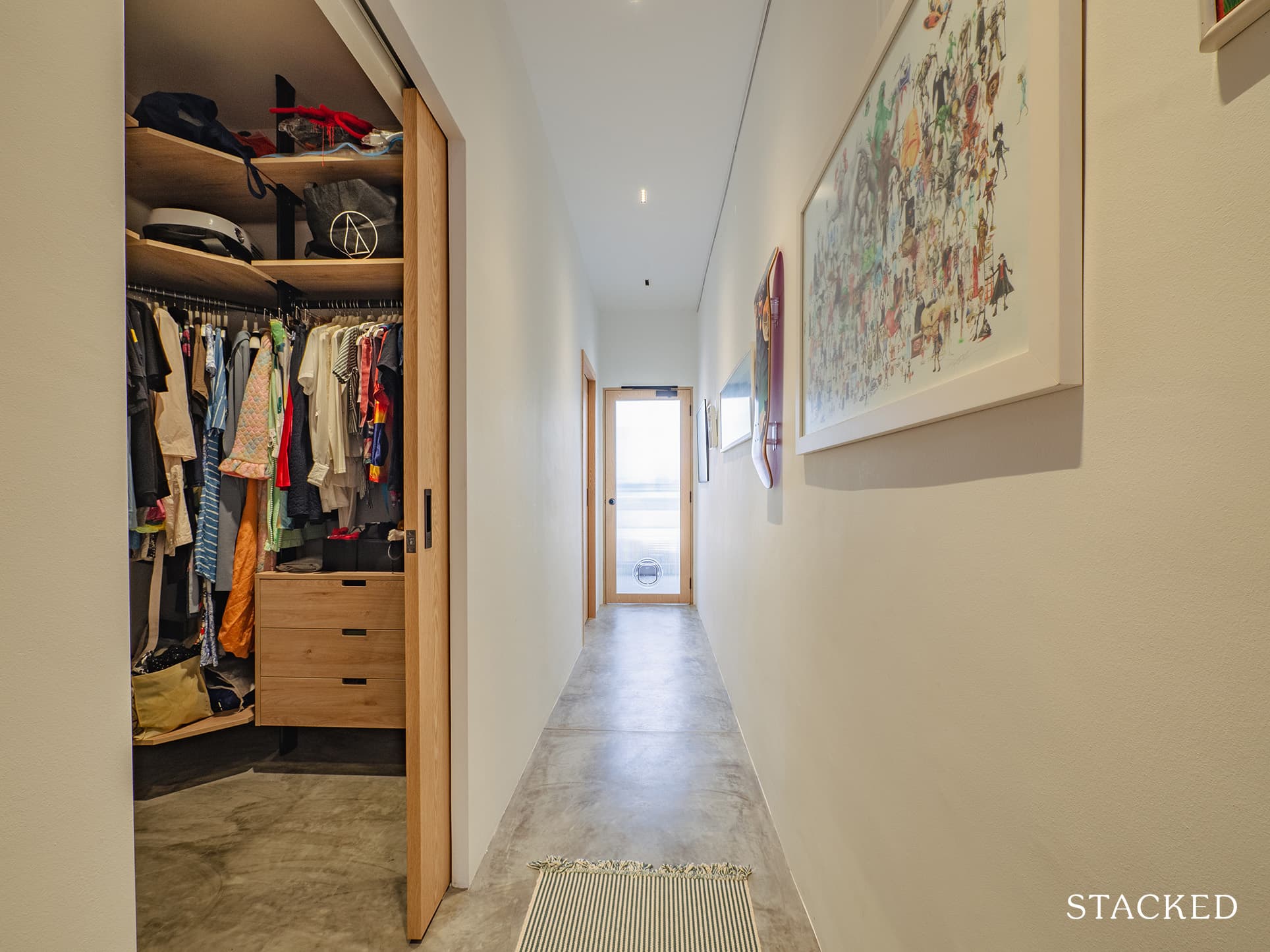
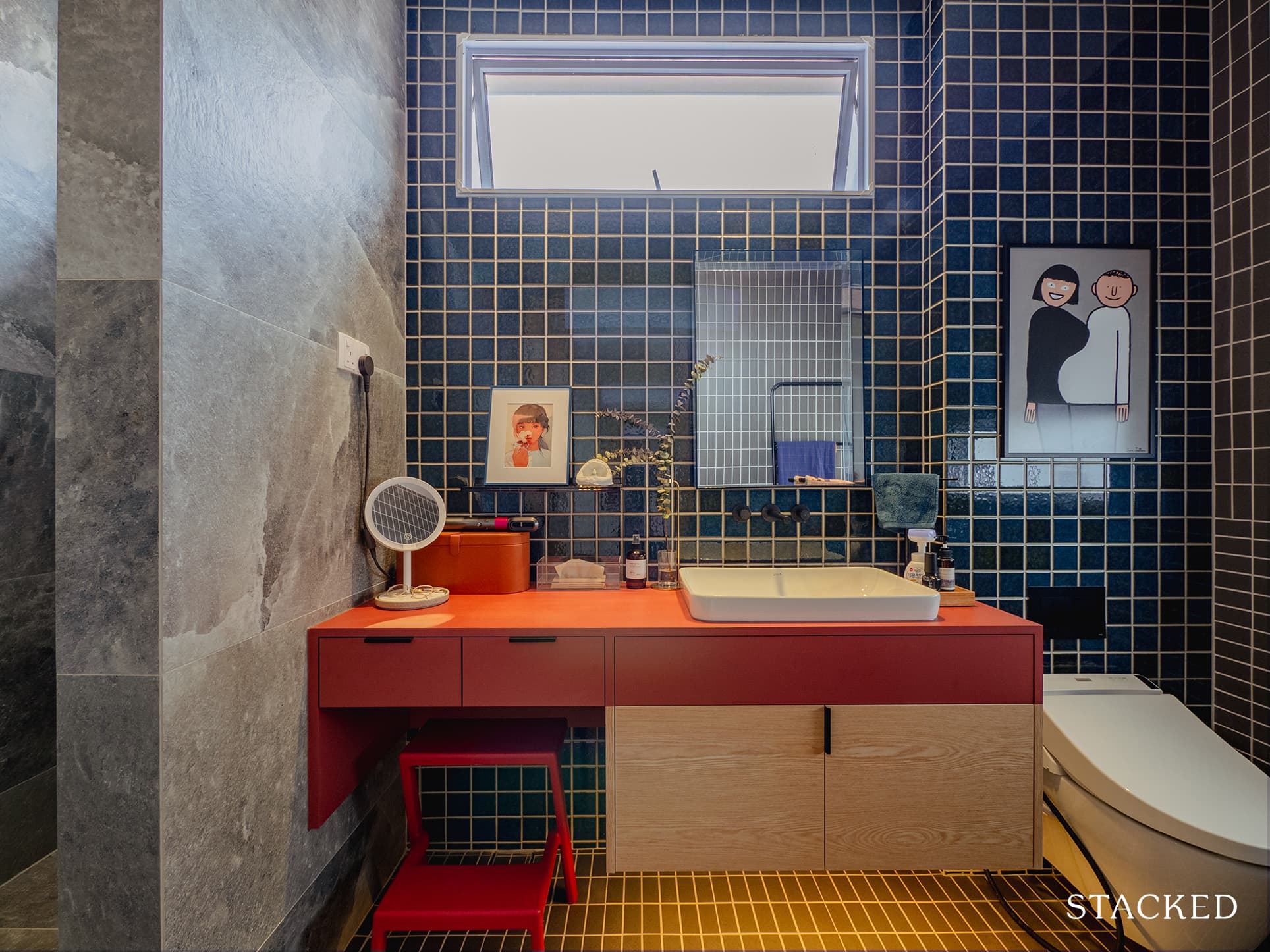
At the end is the common bathroom. In most spaces, the bathrooms are commonly overlooked – but not here. Besides the unusual choice of a red bathroom counter, what really makes the space is the little decorative details that set it apart.
Bringing The Vision To Reality
When we asked the couple if the final outcome was similar to what they originally envisioned, the answer was not a simple yes (a response we usually hear). Both Xander and Joanne agreed that it ended up being even better than they had hoped.
“We were very blessed and fortunate that we did not have to sacrifice much design-wise in order to fit within our budget,” Joanne said.
JQ Ong of the Association was their interior designer. He took care of the design and management of the entire reno project. “He worked on our first home and through that experience, we knew that he understood us and that we value and appreciate many of the same things,” Xander said. Coincidentally, JQ was also looking for a walk-up project at that time, so it worked out great for all of them.
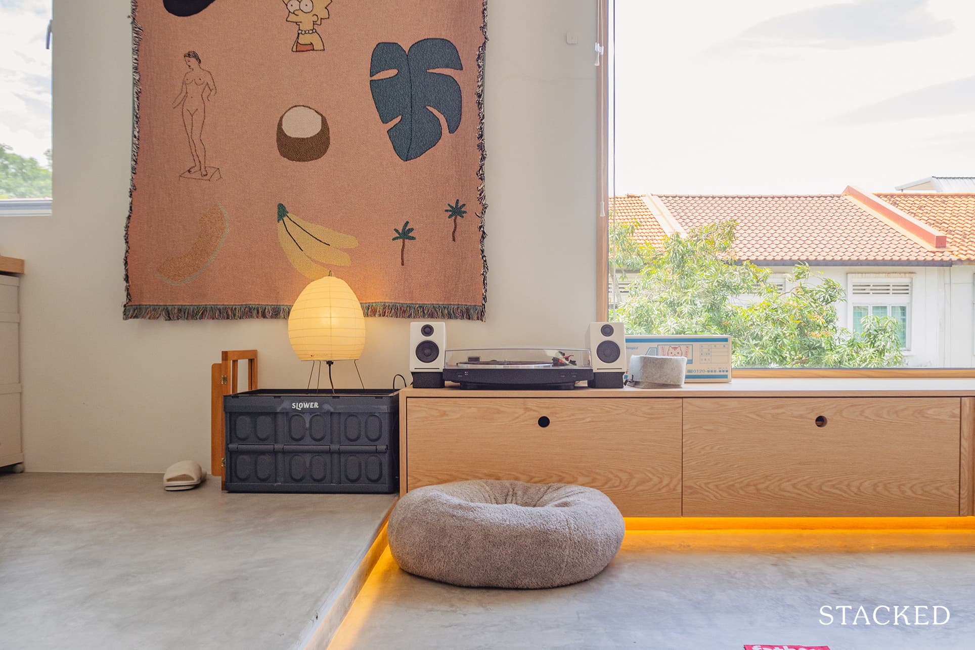
When it comes to the furniture sourcing process, the couple would only buy pieces they believe they would love and cherish for life. “They had to make us go ‘hell yeah!’,” as Xander put it. They spent available weekends going to their favourite stores. They were also constantly on their phones, looking for anything new, on sale, or promo.
In an effort to ensure they don’t go overboard with furniture expenses, the couple had larger items like their bedframe and display cabinet brought in from their first home. Other pieces ended up being built-ins since the height of their ceiling is more than the standard measurement.
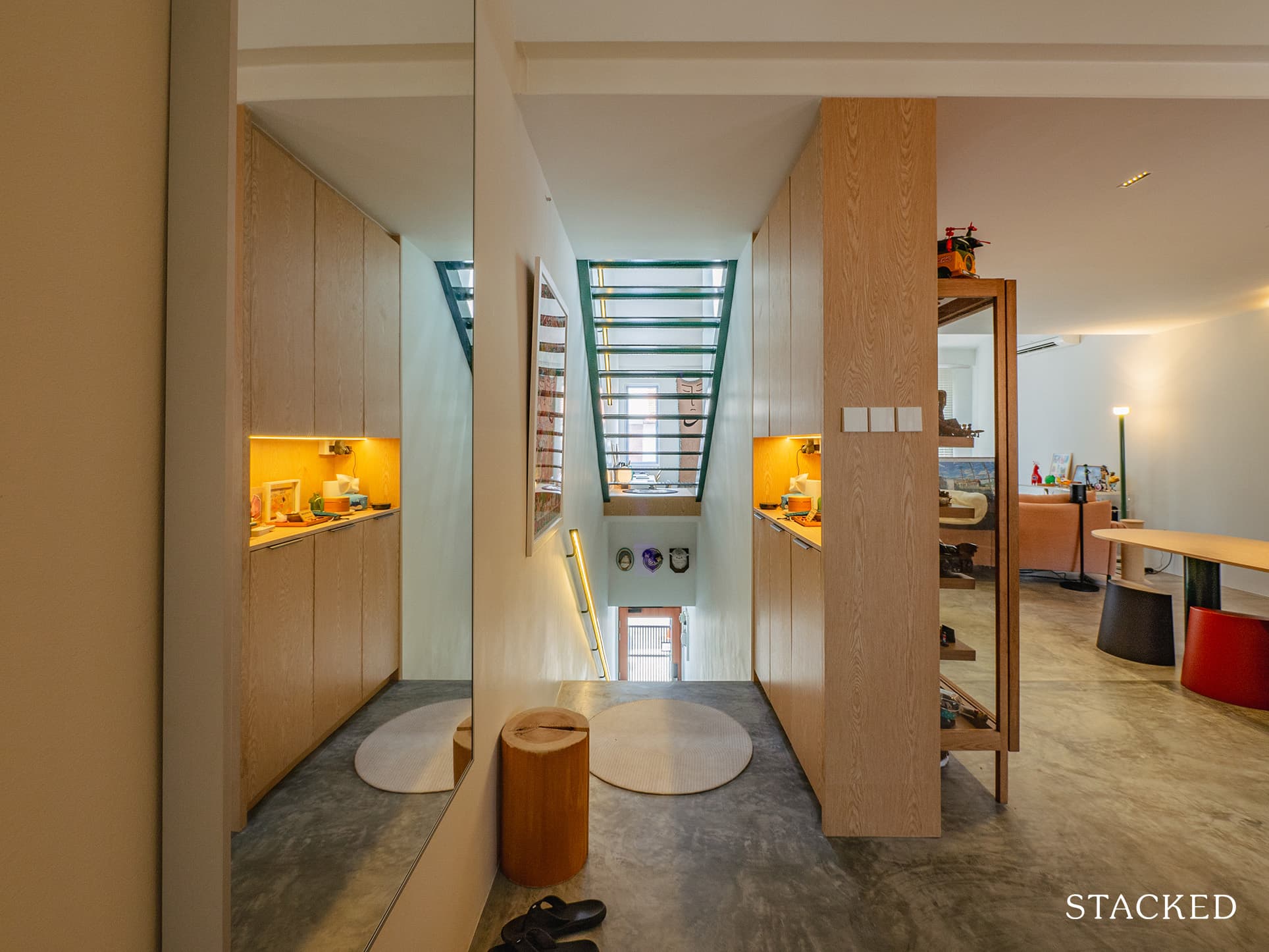
We asked them what the best part of their home was after renovation. They both agreed that the best thing about it is the feeling they get when they come home. During the day, it is flooded with light and is very energising. By night, it is warm and cosy. “It is truly us – in the form of a house,” Joanne quickly added.
Lessons Learned From A Successful Renovation Journey
Just like most renovators in the course of the peak of the pandemic, the greatest challenge the couple encountered was doing the reno during this time. With so many restrictions and precautionary measures in place, the project couldn’t go as smoothly as expected. In fact, when the second wave of the pandemic came, it hit them hard.
“Despite taking precautions, ourselves and members of the team all contracted COVID-19, which greatly affected our schedule,” Xander revealed. As a result, they couldn’t meet their deadline and had to stay at a hotel temporarily. They also ended up moving in while some work was still left to do. “Some things are beyond anyone’s control so we had to roll with the punches,” he added.
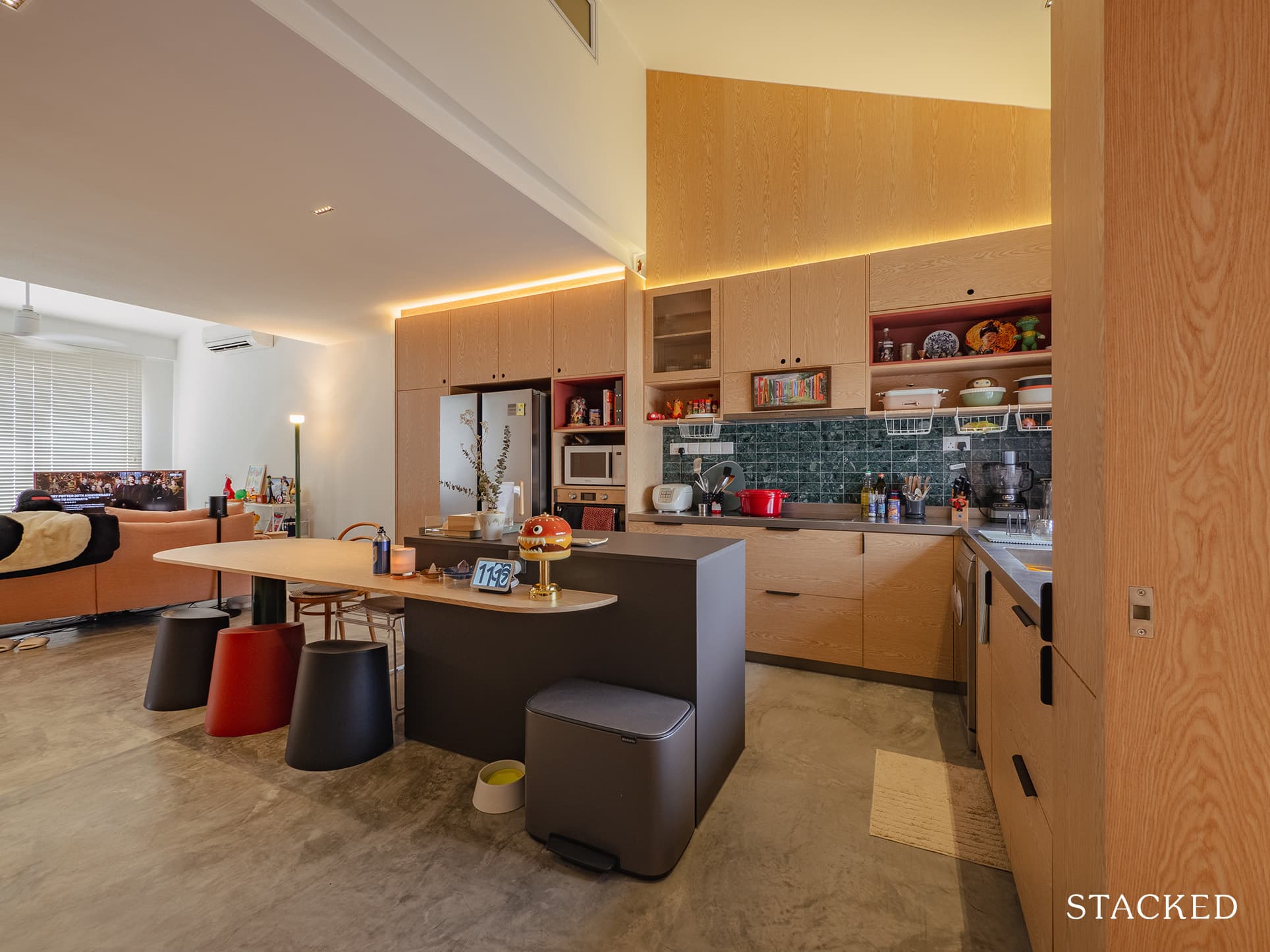
While the couple is nowhere near being a newbie in renovating – having already renovated their first home – they found designing for a walk-up a truly unique experience. They had to consider things like sight lines, airflow, and proportions because of the tall ceilings and the long layout.
“The only thing on the wish list that we couldn’t include was a his and hers vanity in the powder room, mainly due to space constraints,” Joanne said. “Maybe next time!” her husband added.
The couple gave a piece of very sound advice to new homeowners looking to renovate their homes. A very timely one as well, with the internet filled with many reno horror stories giving the industry a bad rep.
They said that treating your designer, contractors, and workers with kindness and respect is the most important thing. “We find that a pleasant and collaborative working experience will pay dividends. Moreover, it is an extraordinarily difficult time to be doing the work they do, so a little compassion goes a long way!”
And we couldn’t agree more.
At Stacked, we like to look beyond the headlines and surface-level numbers, and focus on how things play out in the real world.
If you’d like to discuss how this applies to your own circumstances, you can reach out for a one-to-one consultation here.
And if you simply have a question or want to share a thought, feel free to write to us at stories@stackedhomes.com — we read every message.
Need help with a property decision?
Speak to our team →Read next from Homeowner Stories

Homeowner Stories We Could Walk Away With $460,000 In Cash From Our EC. Here’s Why We Didn’t Upgrade.

Homeowner Stories What I Only Learned After My First Year Of Homeownership In Singapore

Homeowner Stories I Gave My Parents My Condo and Moved Into Their HDB — Here’s Why It Made Sense.

Homeowner Stories “I Thought I Could Wait for a Better New Launch Condo” How One Buyer’s Fear Ended Up Costing Him $358K
Latest Posts

Property Market Commentary 18 Upcoming New Launch Condos In 2026 — Where They Are And The Ones To Watch

Property Advice Should We Sell Our Freehold Condo For A $2.2M Leasehold Landed Instead?

Singapore Property News Kallang Close GLS Site Sold For $610.8 Million: New Waterfront Condo Could Launch From $2,900 PSF

















0 Comments