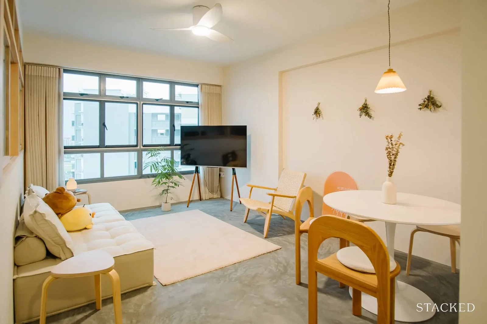
Recently, there’s been an interesting shift with cafes adopting a more homely vibe, inspiring a parallel trend in home design. More and more people are now keen on giving their homes a ‘cafe-like’ feel and look. Reflecting this trend, we visited a unique ‘latte’ home (@thelattehome) in Tampines Greenverge, a BTO flat that stands out with its cafe-inspired aesthetics. This week, join us as we chat with the couple who created this cosy and stylish space, exploring how they blended the comfort of a home with the charm of a cafe.
So many readers write in because they're unsure what to do next, and don't know who to trust.
If this sounds familiar, we offer structured 1-to-1 consultations where we walk through your finances, goals, and market options objectively.
No obligation. Just clarity.
Learn more here.
Budgeting for a BTO renovation
Our homeowner couple, S, got the keys to their BTO flat only in 2021. This was in Tampines Greenverge, and they originally had a tight budget of below $30,000. However, S says that:
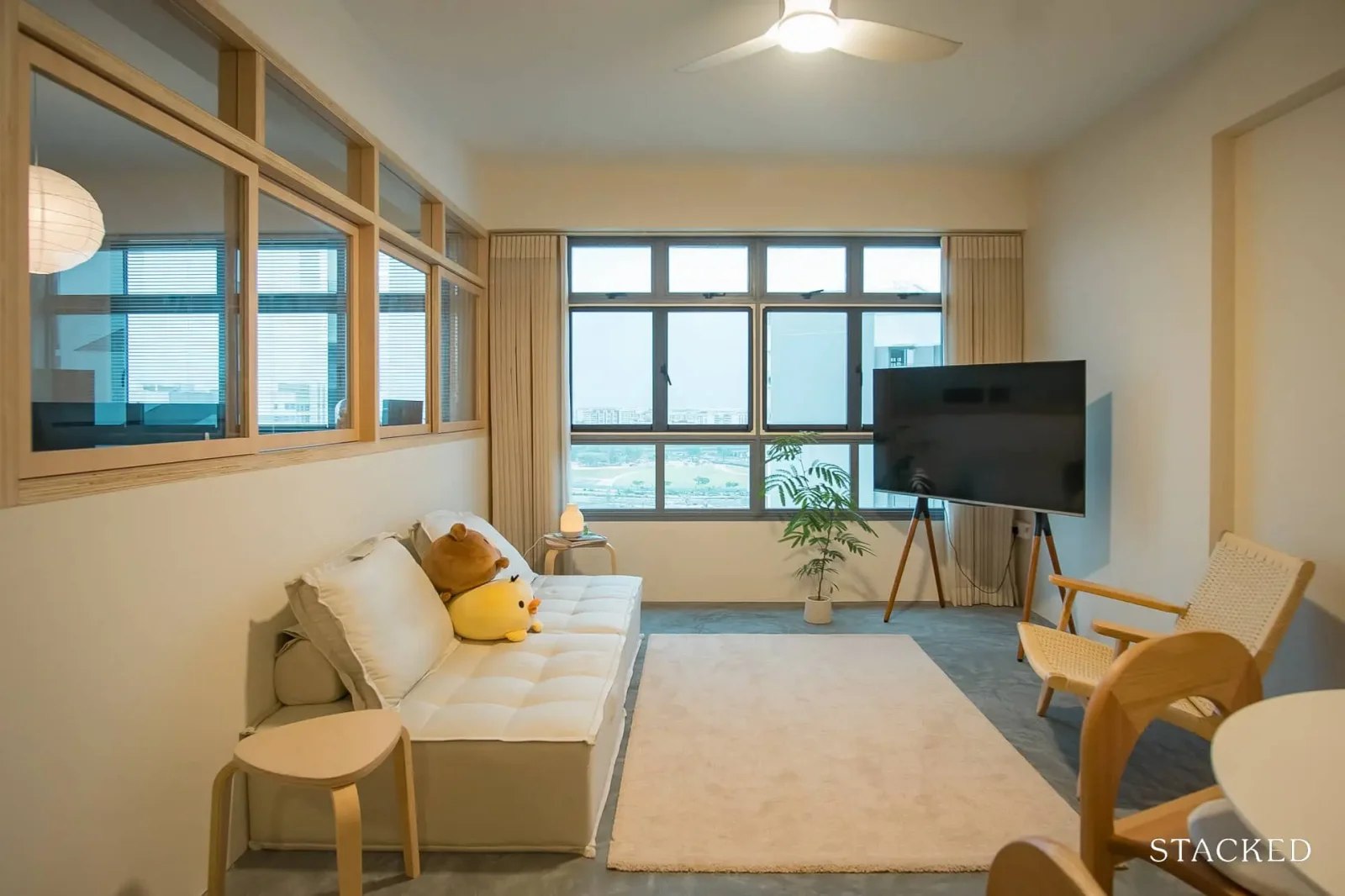
“After meeting with a few Interior Designers and contractors, it didn’t seem possible for what we wanted. We didn’t want to give up certain wants just to keep within a budget. It was below $40,000 in the end.”
They said they were “very much inspired by modern Japanese homes. I watched a lot of Japanese home tour videos on YouTube from channels such as @yourlifeisgood and @Roommy_Roomtour”. The couple also drew some inspiration from images found on Pinterest. The final result was a “cafe vibe,” and despite trimming the budget, the couple felt they did meet the envisioned outcome, and the result is a home that feels cosy.
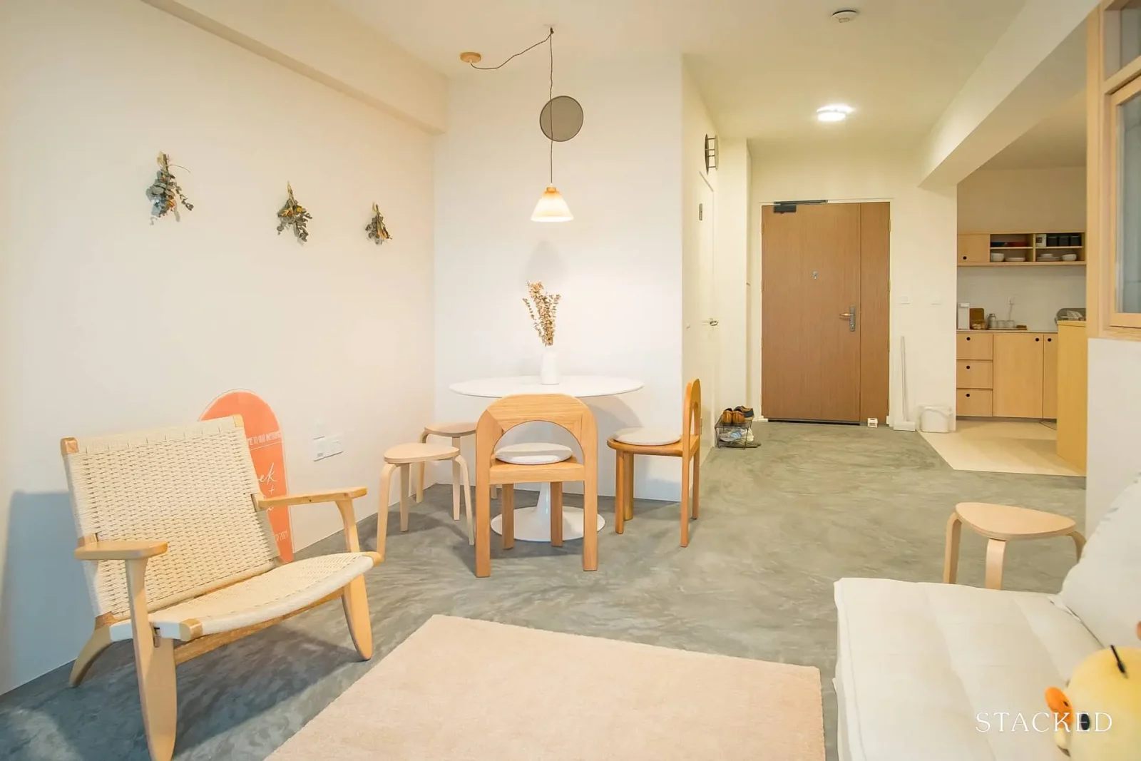
Being hands-on with the renovations
S says one challenge was: “Having to check the details of the drawings and quote provided, down to the measurements. A lot of mistakes were found,” and they had to “be detail oriented, and hands-on in decision making and not simply entrust everything to the contractor.”
Due to the mistakes, the couple weren’t fully satisfied with the outcome of a few things; but they did praise the renovation team for their quick response and communication.
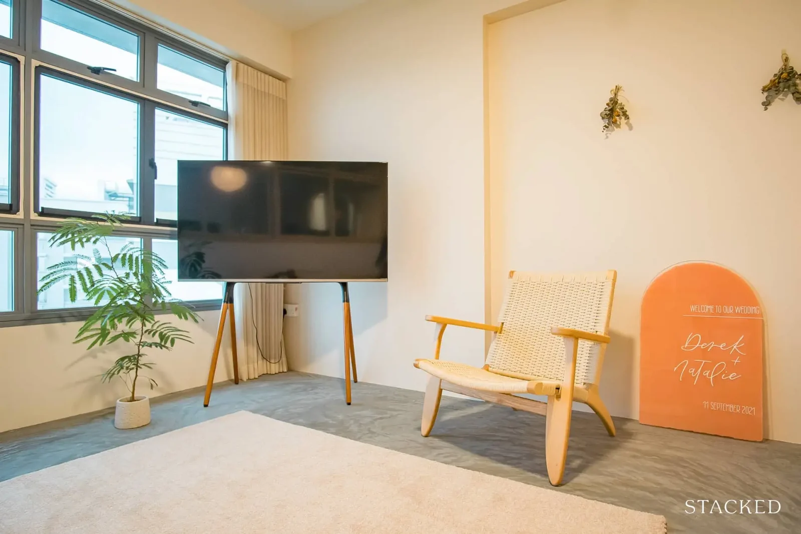
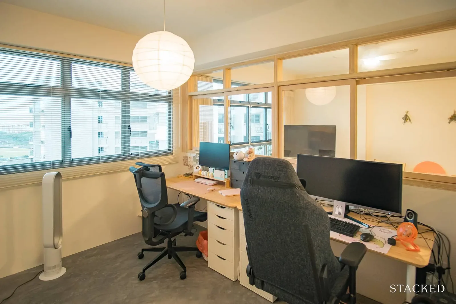
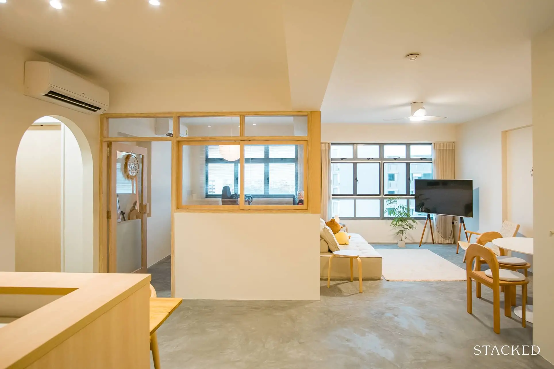
The couple focused on the details, such as the use of wood tones near the windows, and on opening up the space: “We hacked half of the bedroom’s three walls to have sliding windows,” the couple notes, “Having windows also brightens up the whole living and especially kitchen area.”
They also made changes to other parts of the unit:
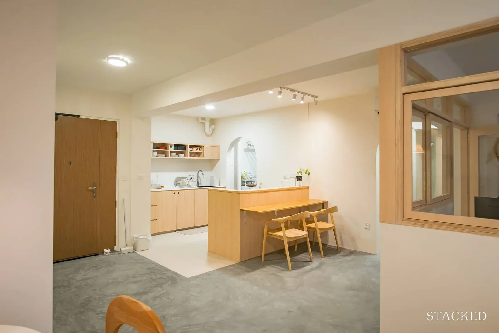
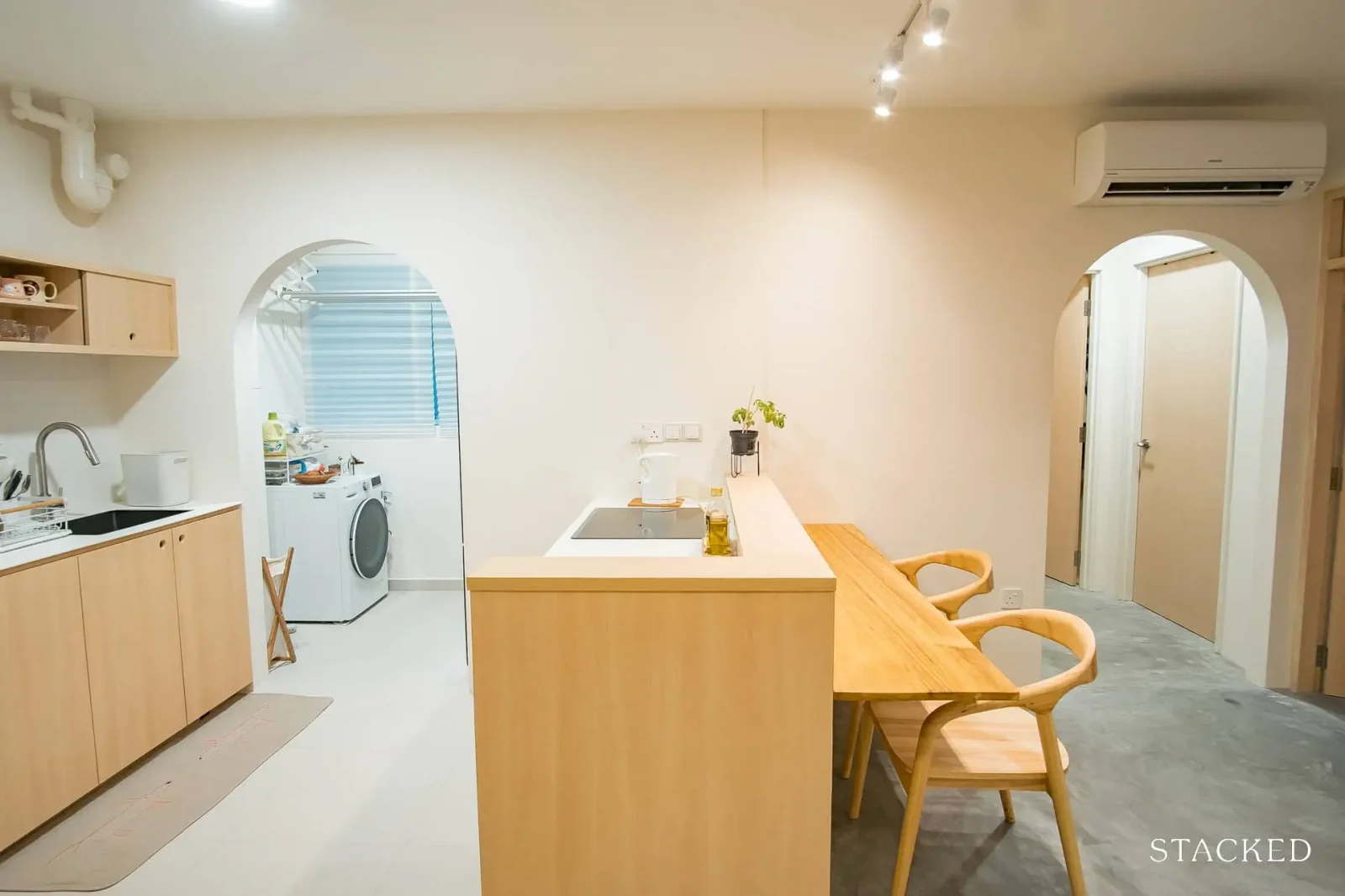
- For the kitchen, the windows and door of the service yard have been replaced with an entrance arch. The fridge was moved into the yard, to maximise room for cabinets and countertops.
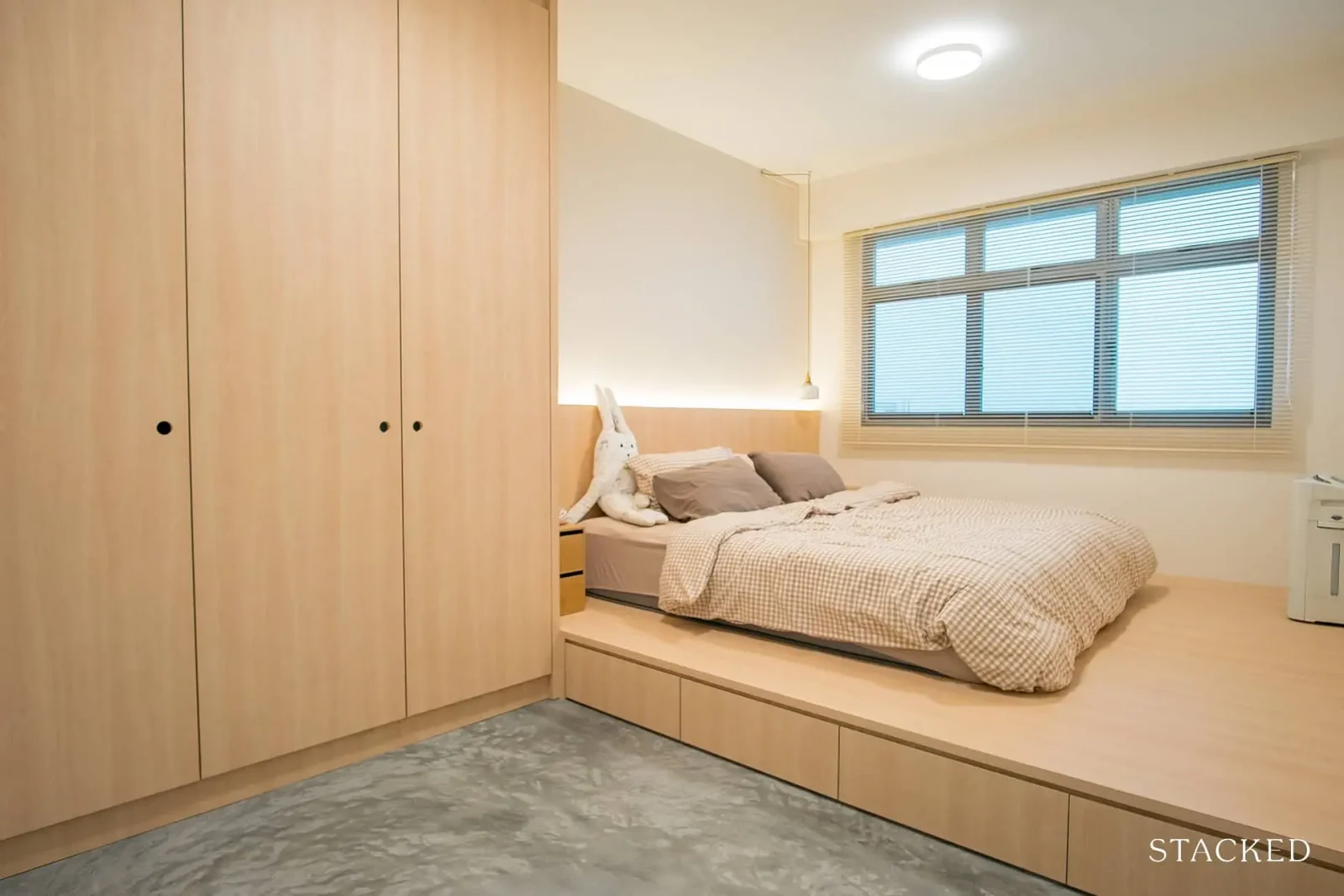
- One of the bedrooms was turned into a study. The second bedroom is currently a storage room, while a platform bed was installed in the master bedroom.
- Both bathrooms have been overlaid, while the master bathroom was tweaked to include a bathtub.
The living room was unchanged, and the couple used loose furniture and kept things minimal to match the vibe. Most of the furniture was sourced online, with some coming from Shopee, EZbuy, and IKEA. While the couple did visit a few brick-and-mortar shops, they didn’t see anything that really caught their eye.
Among all the renovations, S says the highlight for them would be: “Our open kitchen. I think our upper cabinet is unique in a Singaporean context, as most people would go with full height to maximise space. Having the hob on the peninsula, with a suspended counter table in front of it, is also a design that I really wanted as it allows for interaction with guests while cooking.”
Some learning experiences from the renovation
While the renovations worked out well, there are a few areas where the couple would have changed things. They noted that:
“Small tiles and black grouting have a higher chance of looking bad (uneven grout lines), due to lack of skill or tiler wanting to do a fast job. Check with the designer or contractor on the tiler’s skill, and look for pictures of his previous work. We even had to pay more for labour for choosing smaller tiles, so it was disappointing.”
From their experiences, the couple also have advice for new homeowners:
“Head down to the suppliers’ showrooms to see and feel the actual materials you are going to use, don’t just leave it to the designer to recommend or decide based on a small sample piece.
For example, if going for wood design laminates, visit the showroom to see the full sheet, as a small sample piece will not be an accurate representation. I changed my laminate choice after viewing the full sheet as I realised it had too many ‘knots’ in the grain which made it look more rustic.”
The couple suggests looking at different materials early, even before engaging a designer.
“Knowing the materials beforehand also means getting a more accurate quote, when meeting with designers. It will also help avoid any delays as we spent a lot of time choosing our materials.”
For more homeowner experiences with renovations, or home-buying journeys, follow us on Stacked. You can also reach out to us directly, if you need help with picking a home or the right interior.
At Stacked, we like to look beyond the headlines and surface-level numbers, and focus on how things play out in the real world.
If you’d like to discuss how this applies to your own circumstances, you can reach out for a one-to-one consultation here.
And if you simply have a question or want to share a thought, feel free to write to us at stories@stackedhomes.com — we read every message.
Ryan J. Ong
A seasoned content strategist with over 17 years in the real estate and financial journalism sectors, Ryan has built a reputation for transforming complex industry jargon into accessible knowledge. With a track record of writing and editing for leading financial platforms and publications, Ryan's expertise has been recognised across various media outlets. His role as a former content editor for 99.co and a co-host for CNA 938's Open House programme underscores his commitment to providing valuable insights into the property market.Need help with a property decision?
Speak to our team →Read next from Home Tours
Home Tours Inside A Minimalist’s Tiny Loft With A Stunning City View
Editor's Pick This Beautiful Japanese-Inspired 5-Room HDB Home Features an Indoor Gravel Garden
Home Tours A Family’s Monochrome Open-Concept Home with Colour Accents
Home Tours A Bright Minimalist Condo Apartment With A Loft
Latest Posts
Property Market Commentary 18 Upcoming New Launch Condos In 2026 — Where They Are And The Ones To Watch
Property Advice Should We Sell Our Freehold Condo For A $2.2M Leasehold Landed Instead?

Singapore Property News Kallang Close GLS Site Sold For $610.8 Million: New Waterfront Condo Could Launch From $2,900 PSF










0 Comments