All reviews on Stacked are editorially independent. Developers can advertise with us, but
cannot
pay
for,
edit, or preview our reviews.
New Launch Condo Reviews
Clavon Review: Best 2 Bedroom Layout So Far
December 11, 2020 39 min read
An option for those looking for own stay yet with good rentability
For those who believe in the JID/JLD and HSR transformation, Clavon may very well stand to benefit from tenant demand arising from such developments. However, it does come with a lack of exclusivity.
| Project: | Clavon |
|---|---|
| District: | 05 |
| Address: | 4 – 8 Clementi Avenue 1 |
| Tenure: | 99-year leasehold |
| No. of Units: | 640 |
| Site Area: | 178,064 sqft |
| Developer: | United Venture Development (Clementi 1) Pte Ltd |
| TOP: | 2025 |
CLementi AVenue ONe. C-L-A-V-O-N.
Singaporean condo names have been somewhat of a misnomer over the years, so fair play to UOL for choosing to keep it simple this time round.
As we know, District 5 has observed quite the number of New Launches over the past months (Parc Clematis, Whistler Grand and Twin Vew come to mind – as well as the newly TOP-ed Parc Riviera and to a certain extent, Clement Canopy).
For those relatively new to the area, you’ll find some key USPs of the location to include proximity to key mega educational institutes (think Singapore Poly or NUS), as well as the upcoming Jurong Lake/Innovation Districts – which will undoubtedly contribute to rentability of units here.
Of course, it’s not just entirely about its location.
A point that has set Clavon aside from the rest is an indicative pricing-range to its resale neighbour, The Clement Canopy (which we will delve deeper into later on) – courtesy of a well-secured land price of $788 psf ppr back in July 2019.
As always, I understand that the tougher decisions aren’t over once you’ve found the right pricing and location for your condo of choice.
So in that vein, I’ll aim to address a number of other factors today – ranging from the simpler amenity/facility/unit layouts of the project to the finer details like views, best stacks and indicative stack pricings.
With that, let’s kick things off with our usual showflat tour.
So many readers write in because they're unsure what to do next, and don't know who to trust.
If this sounds familiar, we offer structured 1-to-1 consultations where we walk through your finances, goals, and market options objectively.
No obligation. Just clarity.
Learn more here.
Clavon Insider Tour

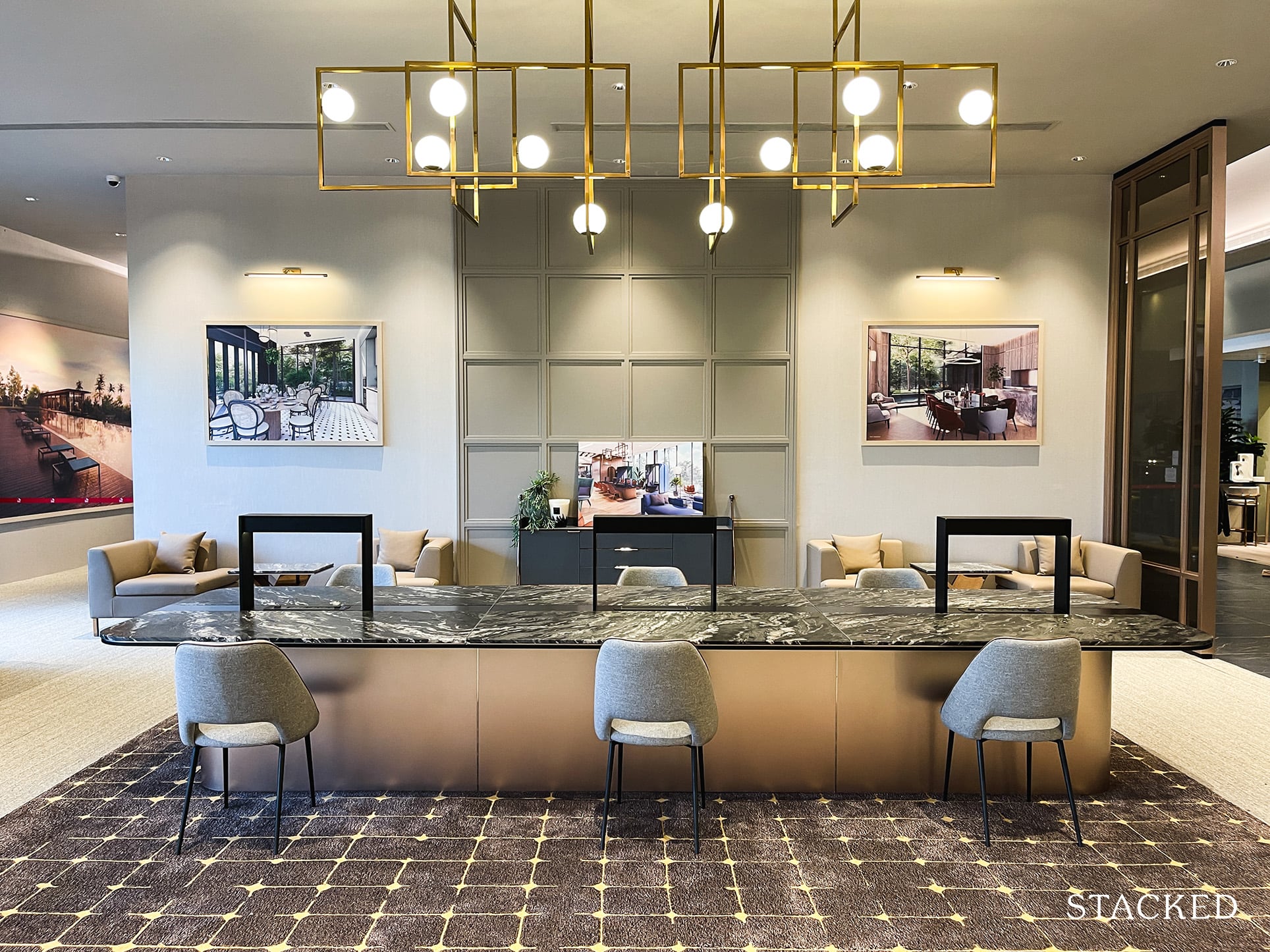
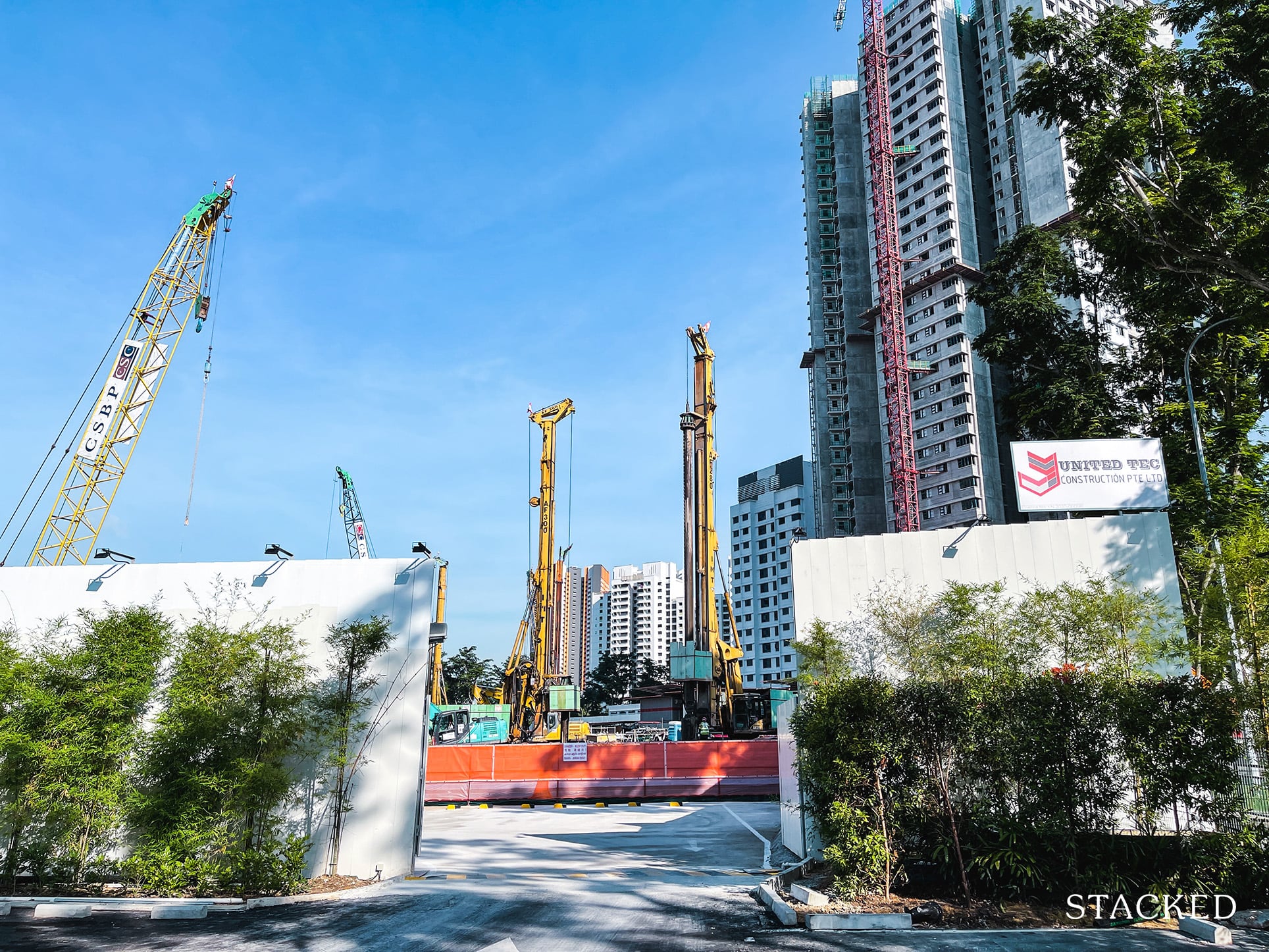
For those wondering, the showflat for Clavon is located at the actual site itself (right beside Clement Canopy). Aside from the fact that they share the same developer, this has got the same characteristics of the Penrose launch written all over it.
Indicative launch pricing similar to resale prices of a rather new condo next to it? Check. Hyped by agents? Check. Next to noisy highway? Check.
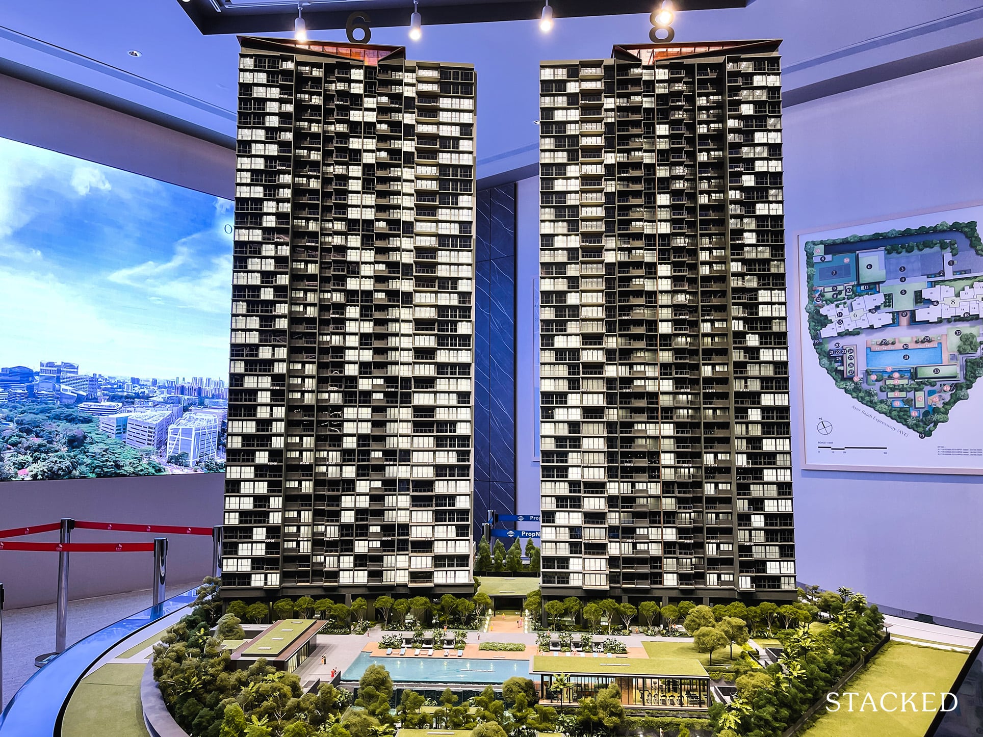
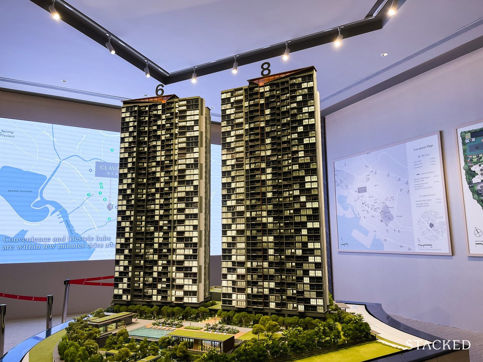
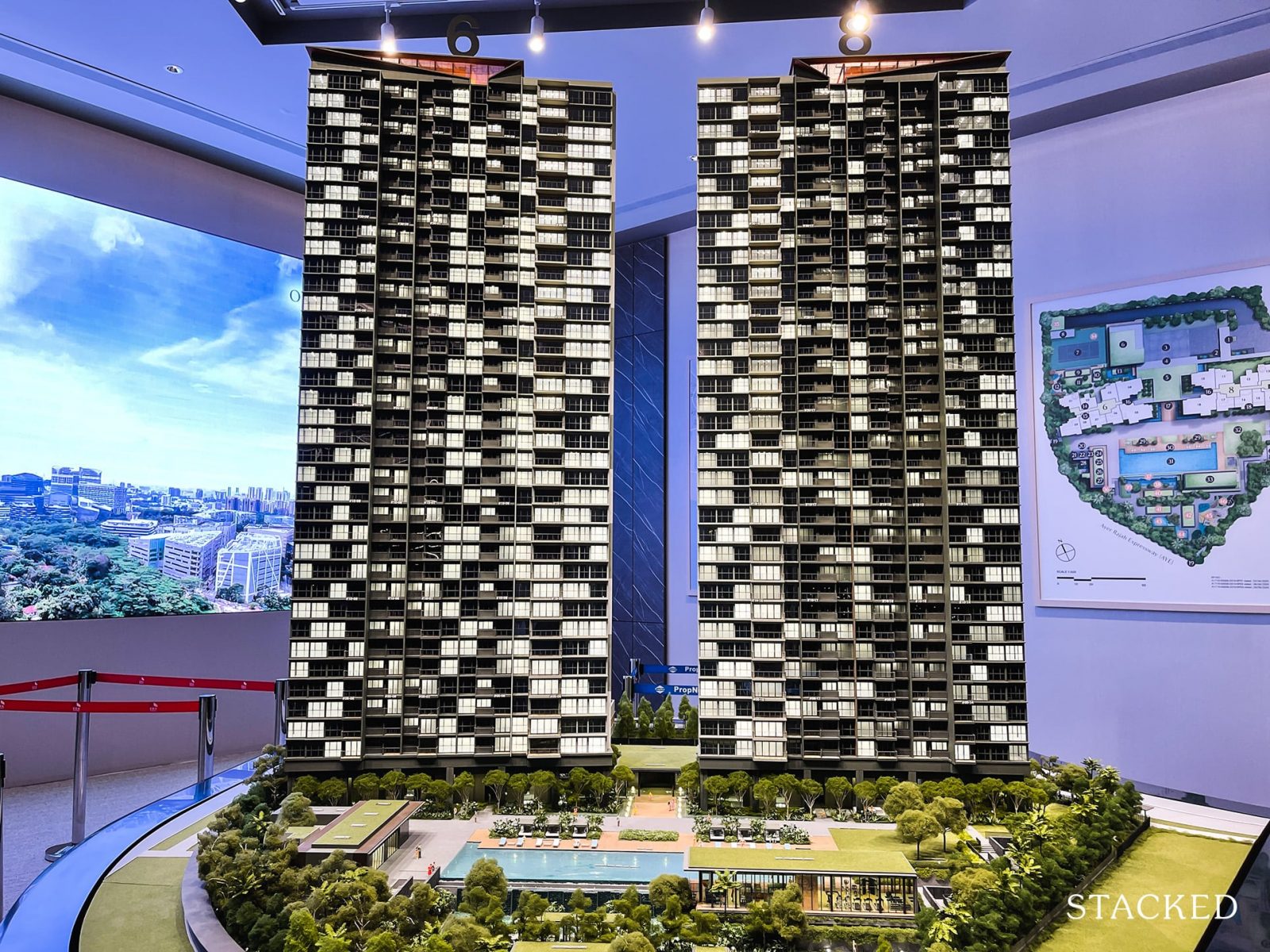
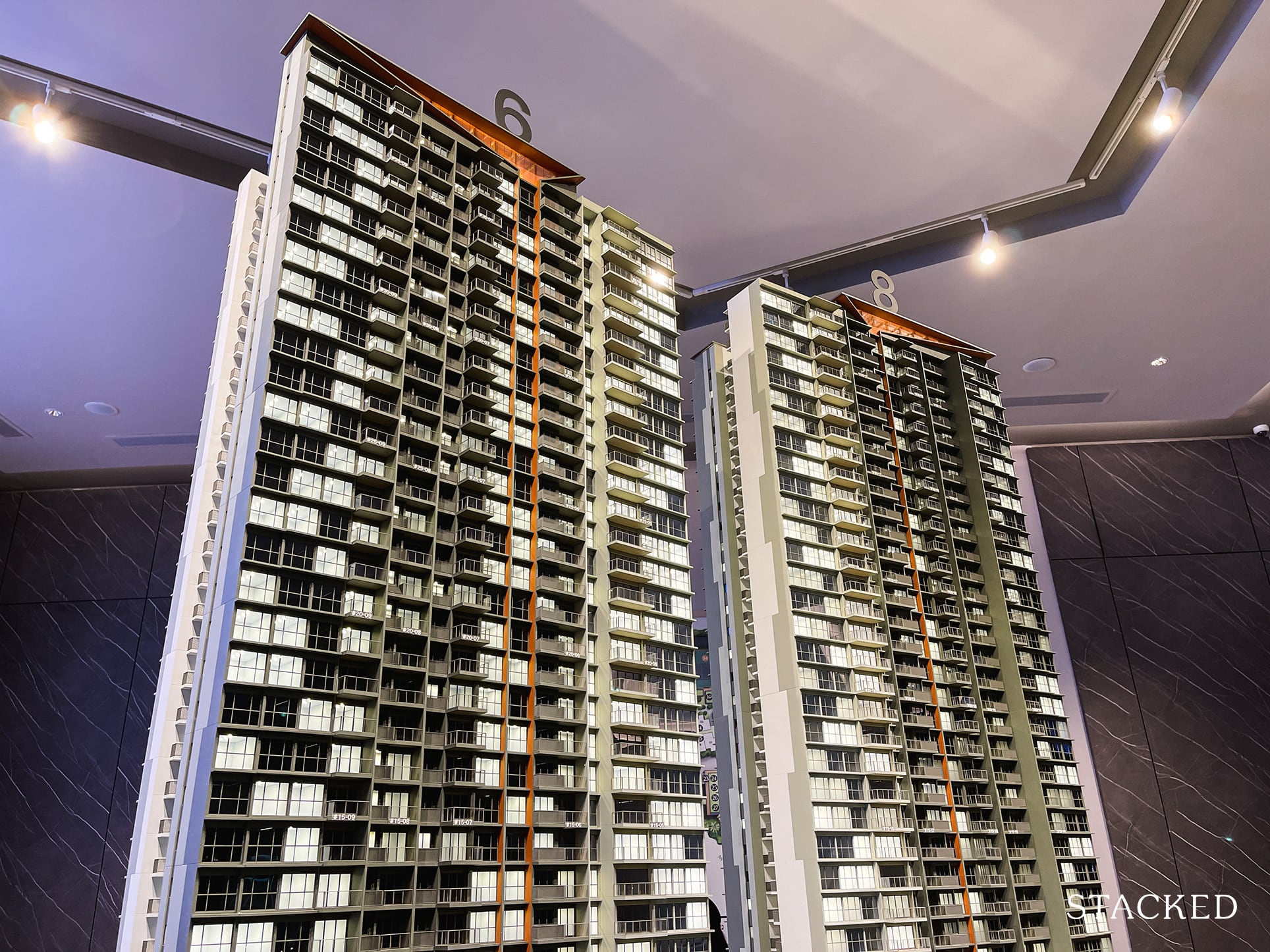
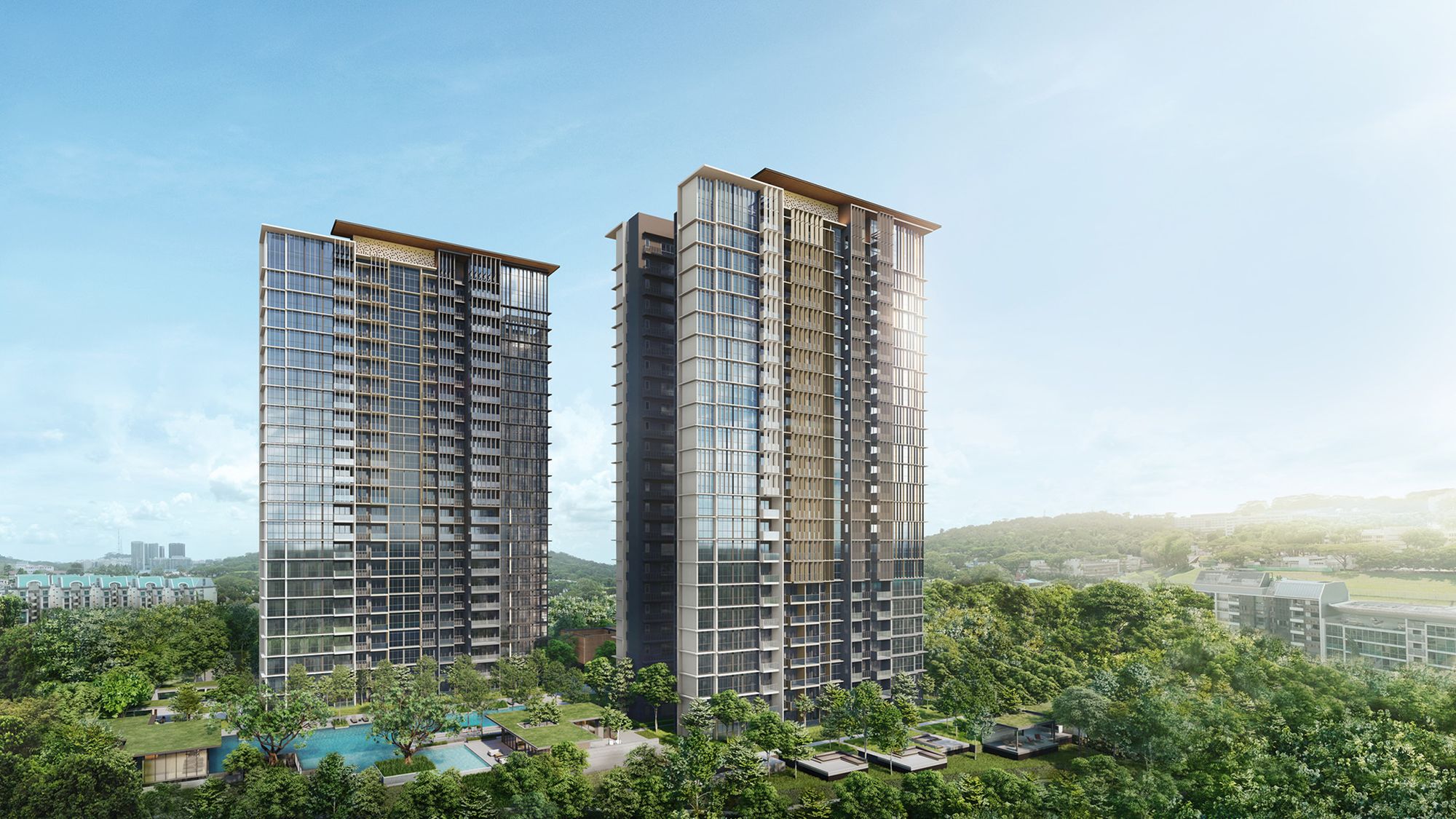
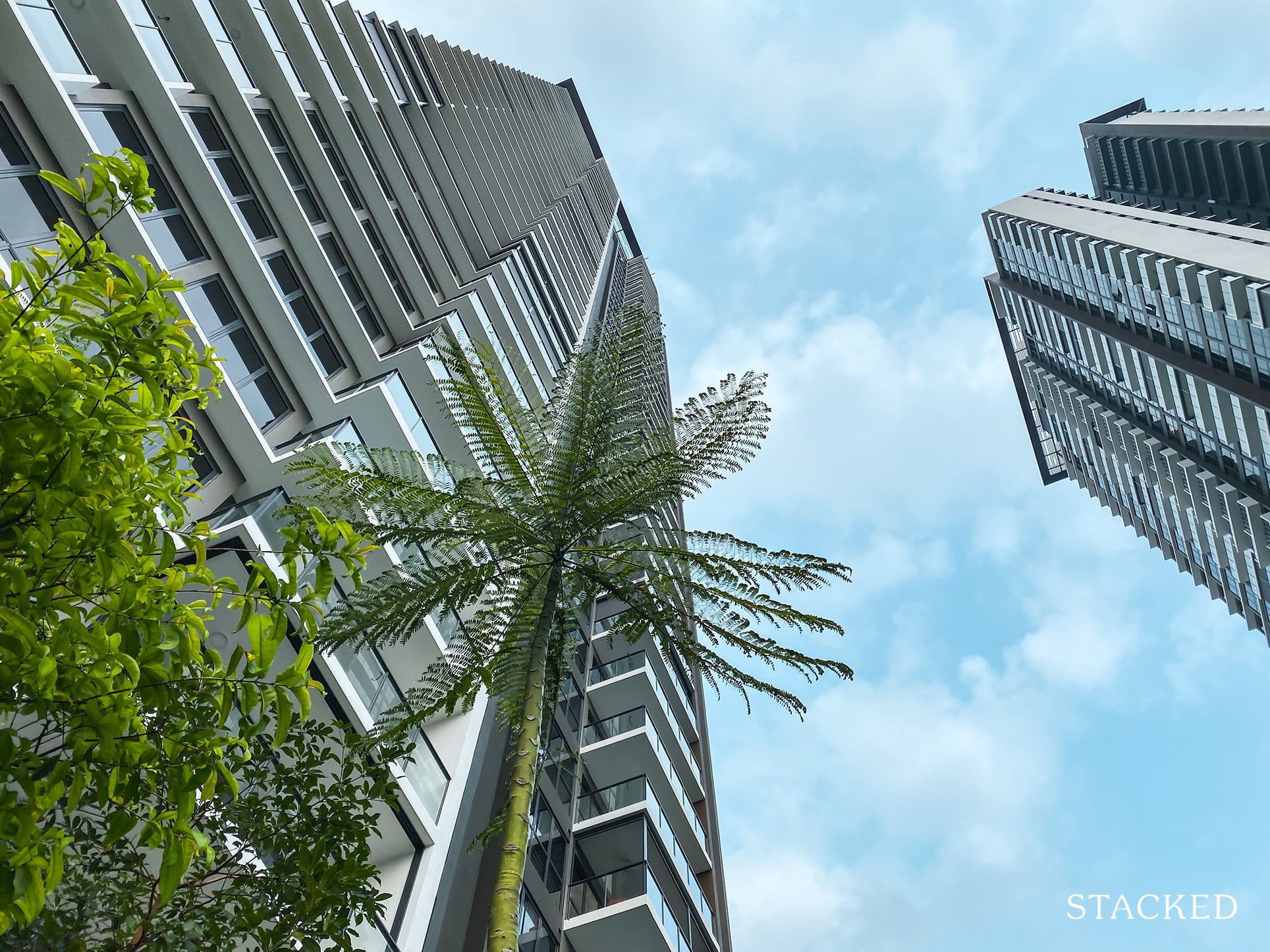
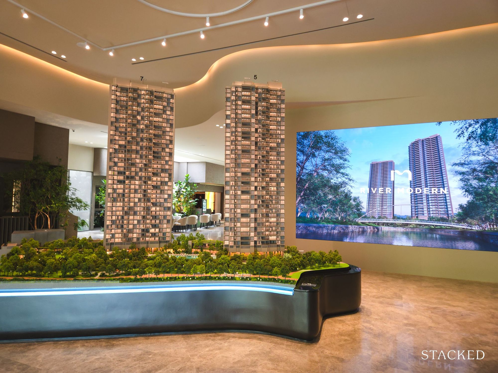
It might look very similar to Clement Canopy with two sky high towers on first glance, but there are some differences between the two. For one, both towers are laid out side by side, rather than facing each other.
You also get the all the facilities on almost level ground, unlike the elevated facility deck due to the multi storey carpark of the Clement Canopy. Speaking of which, I much prefer the underground carpark of Clavon instead. It does have 640 lots, which makes it a 1:1 ratio – something that is definitely a win in my books.
Clement Canopy has had 210 rental contracts since June 2019, so I’d expect there to be a decent number of rentals going on at Clavon as well – so carpark space definitely should not be an issue here.
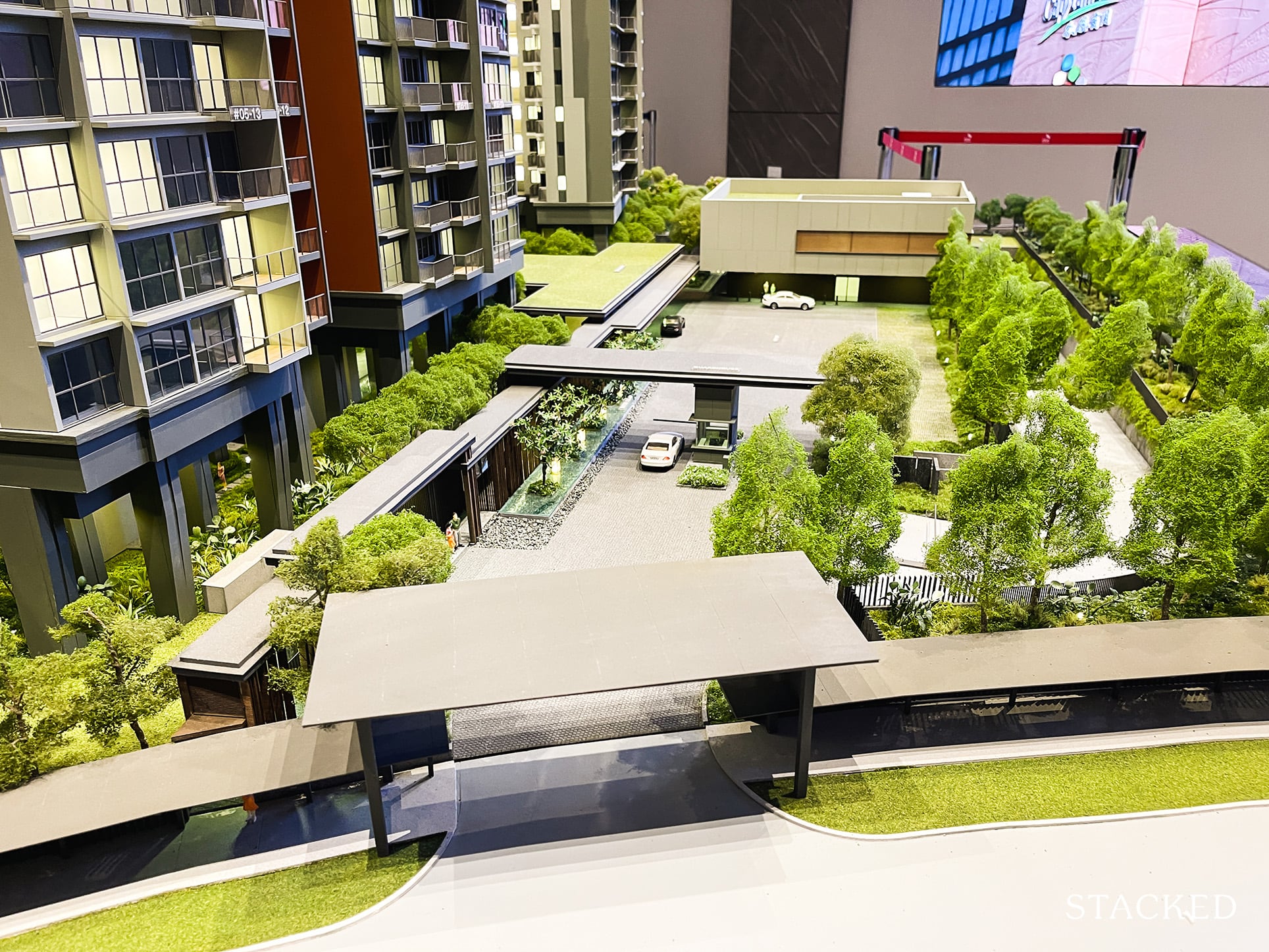
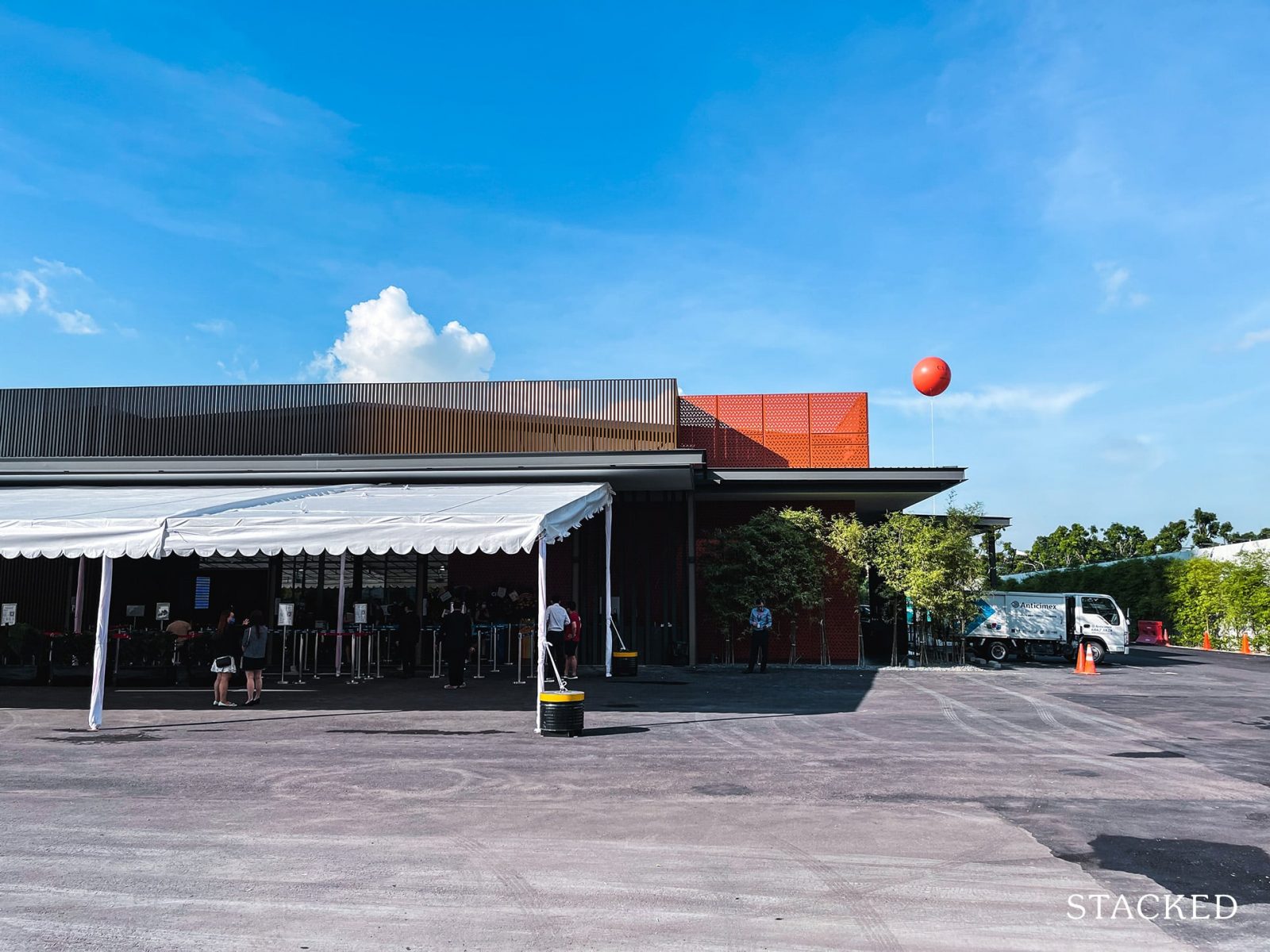
The entrance to Clavon is along the same road as Clement Canopy – which is on Clementi Avenue 1. For those wondering, this isn’t actually the entrance. Rather, it’s the shelter on the outside that links all the way from the bus stop – nifty indeed.
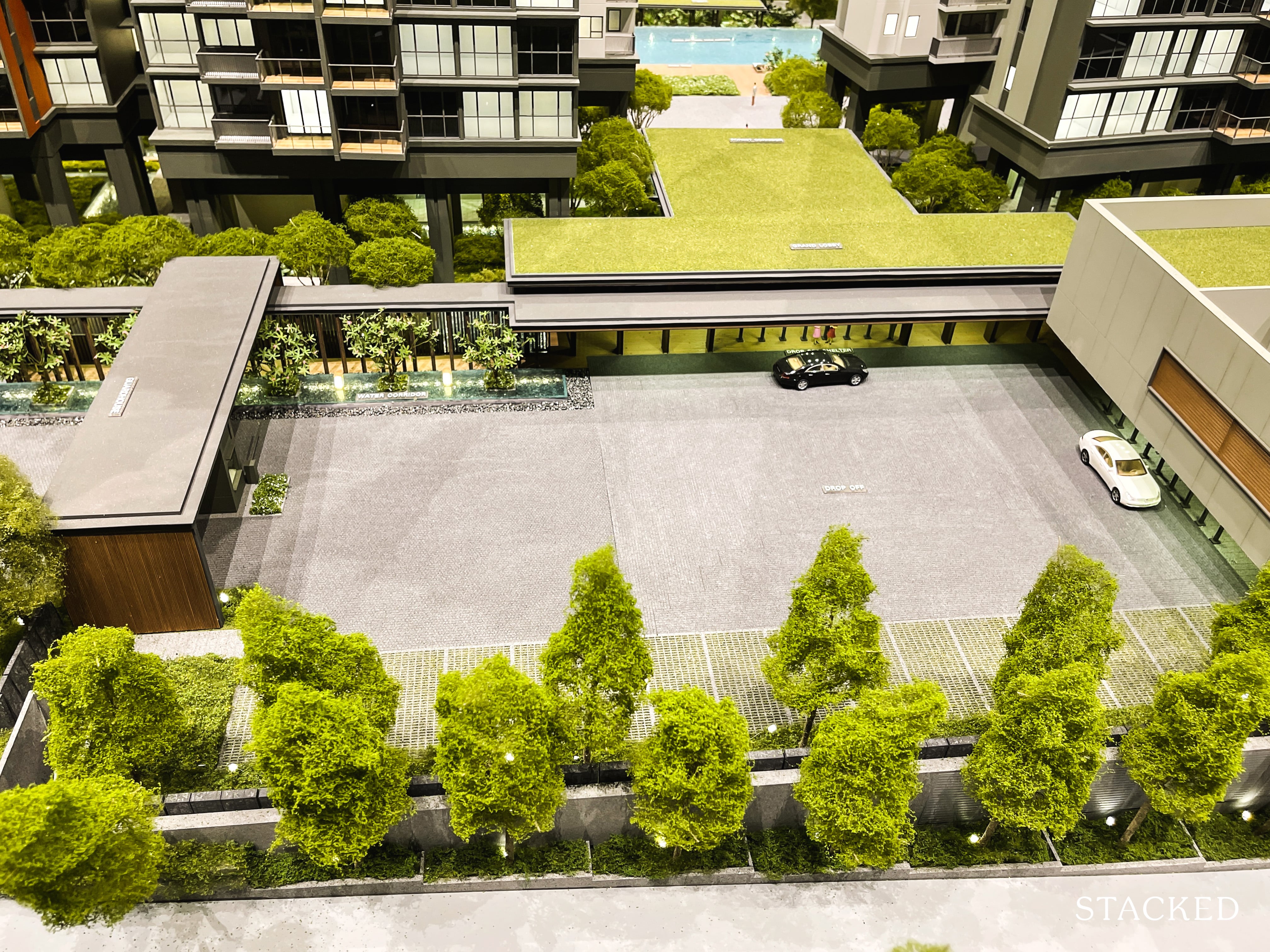
I generally like UOL developments, they do set quite a high standard usually in terms of the landscaping and overall design direction of their projects. Which does leave me a little puzzled with the design of the drop-off. While practical, it doesn’t look as welcoming as I would have expected. On the plus side, there’s no denying the spaciousness of it.
There is a childcare centre located here too, which is always going to be an attractive point for parents. Unlike the Penrose, the childcare centre is located on the inside (past the guardhouse). For obvious security reasons, you can’t actually get into the compound from here, you’ll require the access card to get in. There is open parking spaces for parents, but again, this is kept separate from the underground carpark.
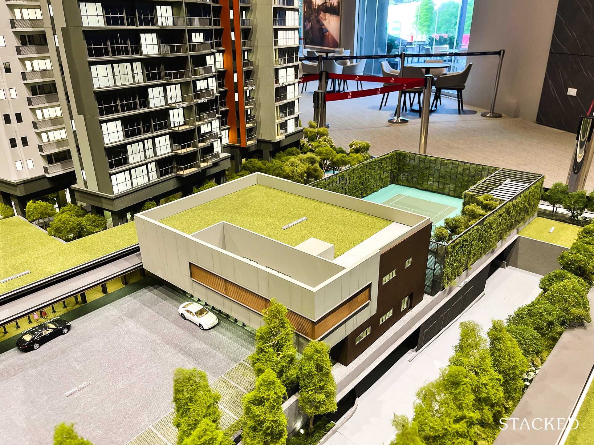
Either ways, it’s great that they’ve included a childcare centre here. Most families have both parents working in today’s context, so having a childcare facility here will definitely come in handy for families looking at Clavon as a potential own stay option.
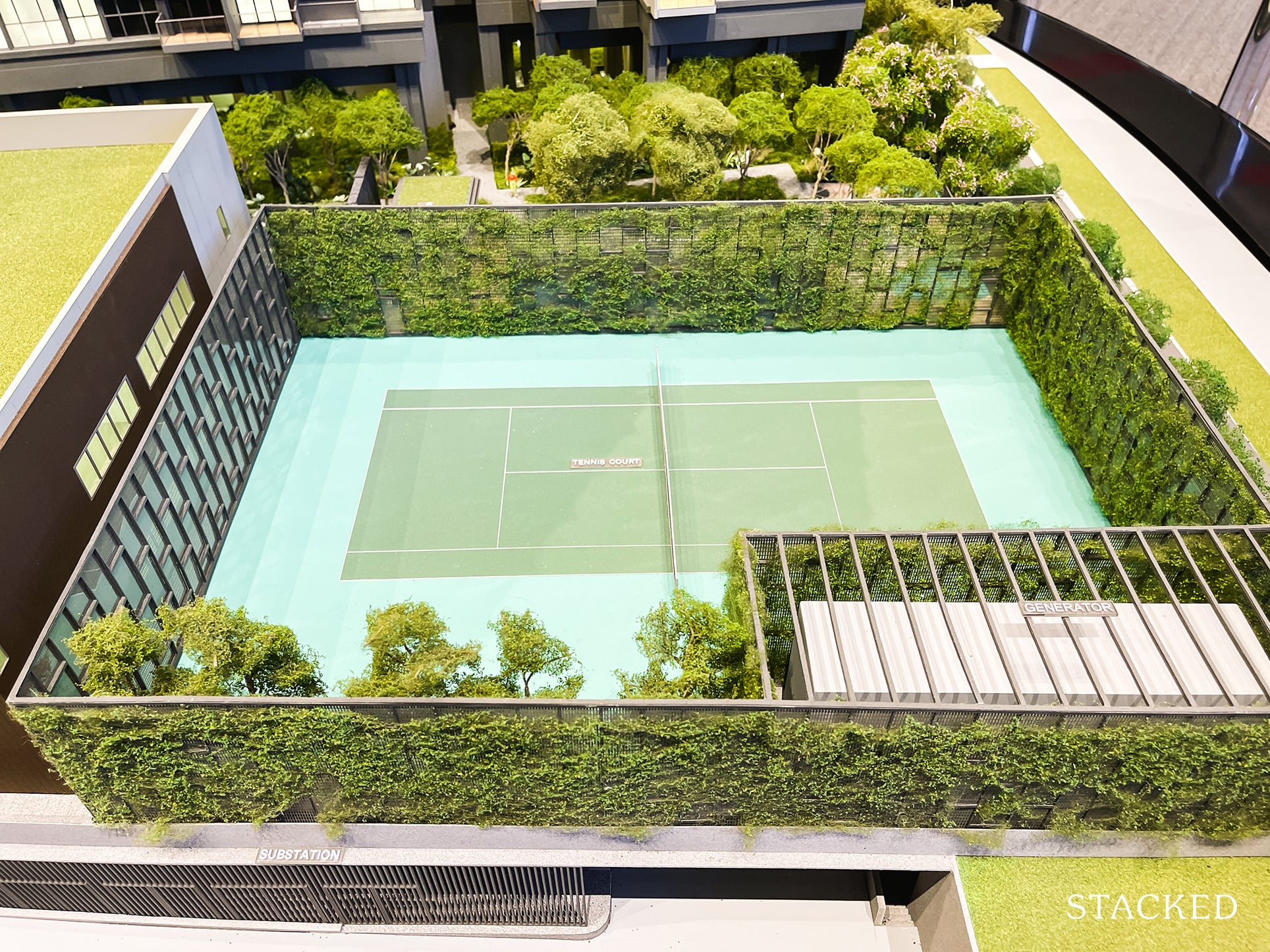
Round the back of the childcare centre is the tennis court. For 640 units, you can’t really complain much as far as new launches of today go.
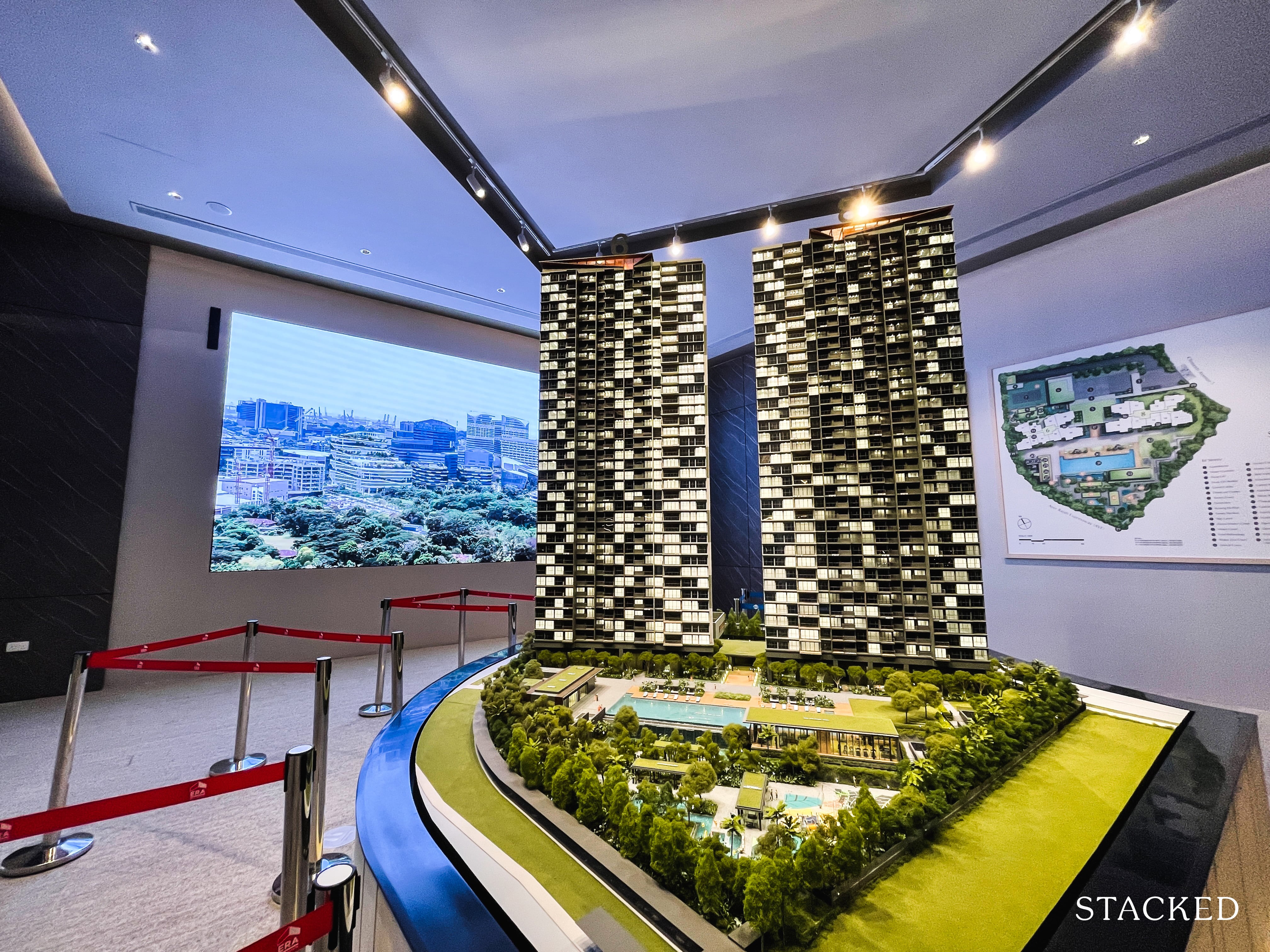
Now let’s talk about the size of the land available at Clavon. At 178,064 square feet, it is bigger than the 140,337 plot at Clement Canopy – and thankfully so because it does contain 640 units (135 units more than Clement Canopy). As far as first impressions go, I do quite like how everything is laid out neatly – it does have an effect of making it feel quite expansive.
That said, for some reason it doesn’t feel quite as big as the one at Twin Vew, even though in reality the land size is actually ever so slightly bigger at Clavon.
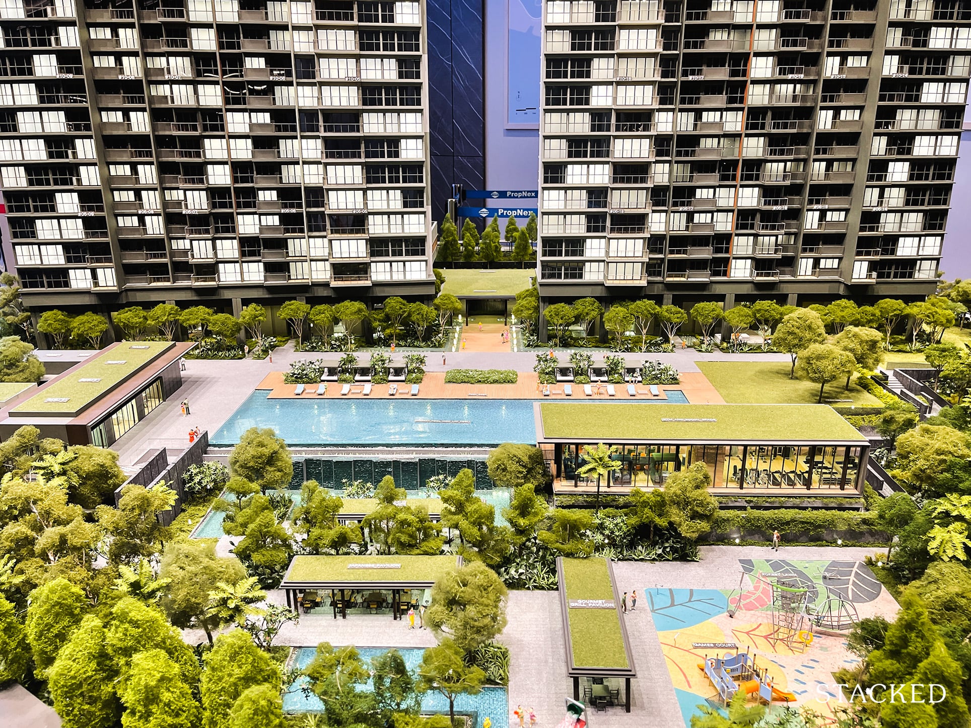
As usual, the simplest way to compare would be to look at the land size per unit. At 178,064 square feet, this means you get 278 square foot per unit.
For those wondering about its next door neighbour, Clement Canopy comes in at a rounded up 278 square foot per unit too!
Either ways, it certainly isn’t anything to shout about in terms of the density of its units.
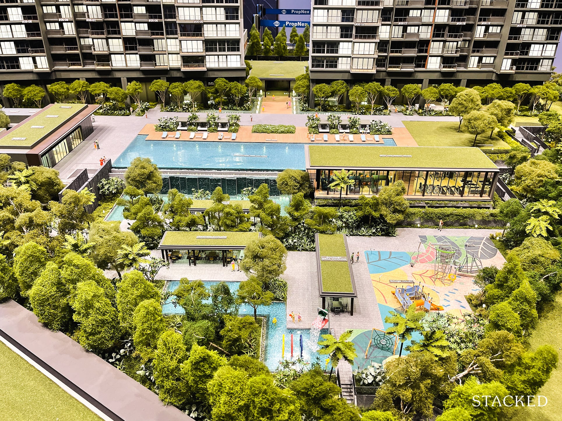
For me, they have gone with the safe approach when it comes to the design of the common facilities at Clavon. Let me be clear, it isn’t a bad thing, it just doesn’t quite have the same wow-factor like the windy lagoon at Clement Canopy or the astounding number of swimming pools at Principal Garden.
Those who like the modern minimalist look, however – this would be very much up their alley.
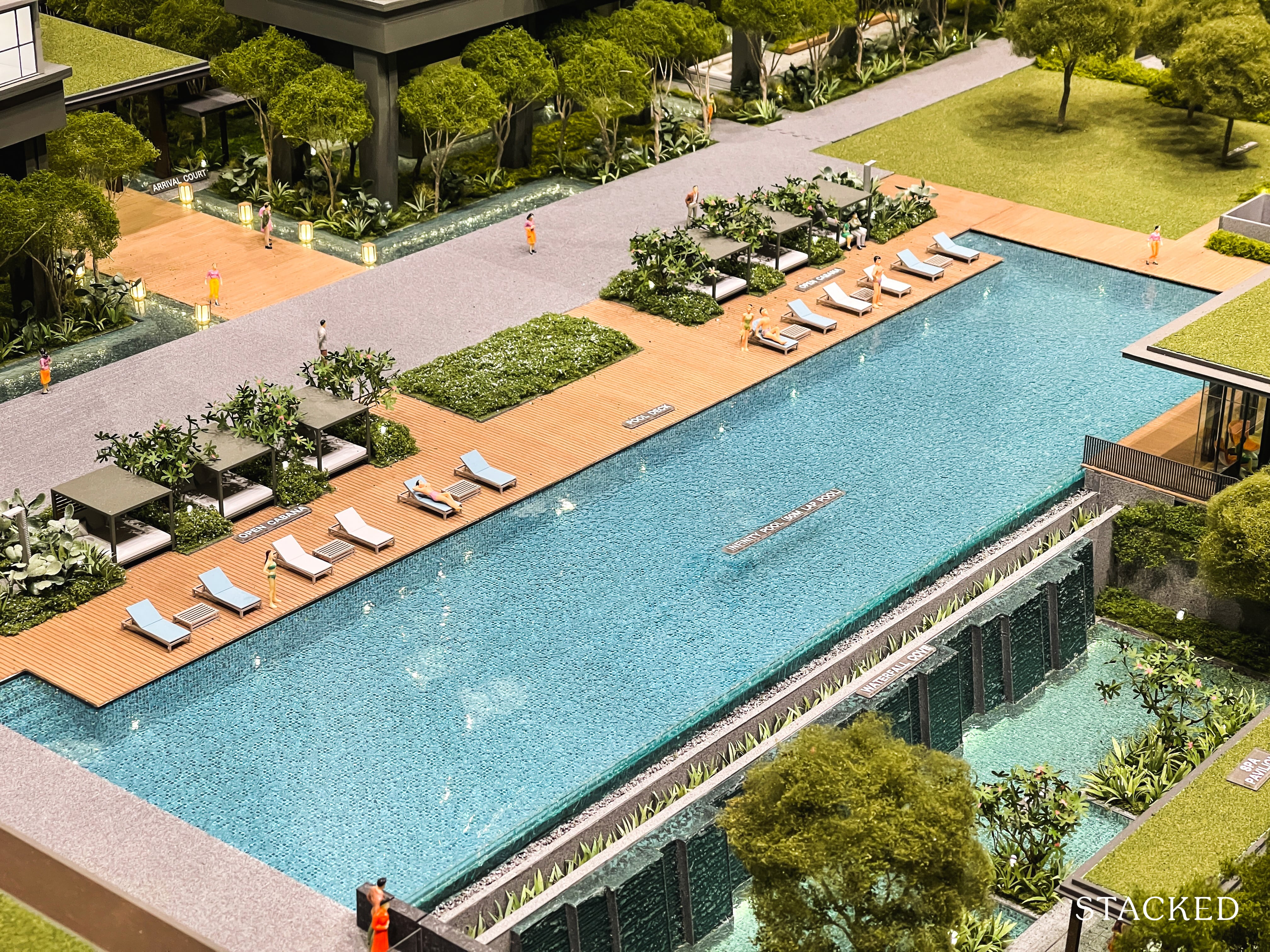
Let’s start with the swimming pool first. You do get the ubiquitous 50m lap pool here, which is pretty much a prerequisite for developments of this size today. I’d say that for 640 units the pool isn’t quite as adequate so you could face crowds here especially on weekends and public holidays.
I do like the inclusion of the cabanas here too. It’s something that you’d usually see in luxury resorts so that definitely would add a touch of class here.
Also, if swimming pools are important to you, then I would much prefer Clement Canopy as there is a variation with its windy lagoon pool as well as a normal rectangular-shaped swimming pool to swim laps in.
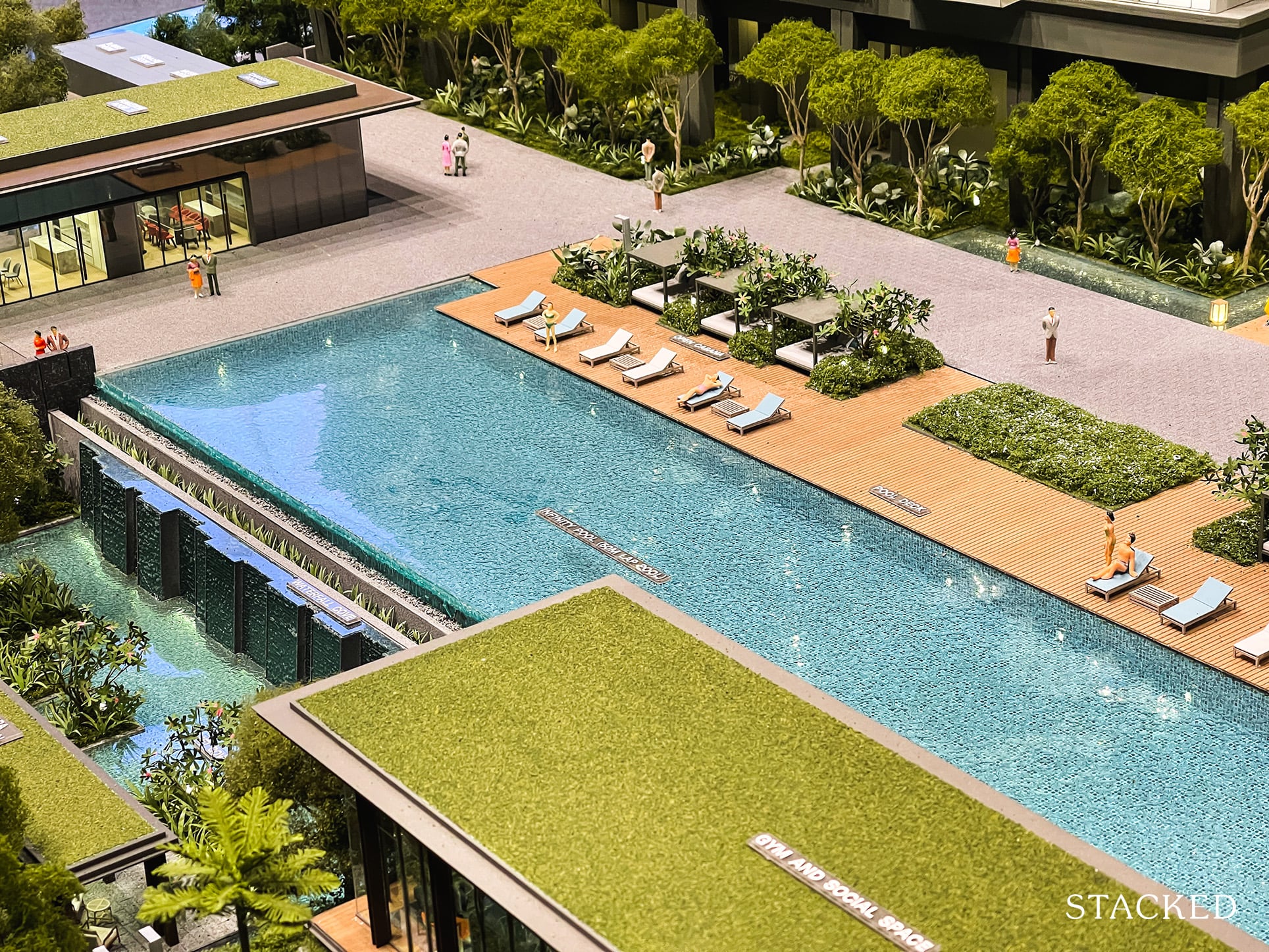
To be fair, the pool deck here is quite a substantial size, and so is the walkway behind it. It’s wide and long and for those who are entering the facilities area for the first time will no doubt feel the development is that much more spacious because of its inclusion.
I’m undecided at this point, is it better to feel the expanse of space? Or to have that space utilised for more swimming pools instead.
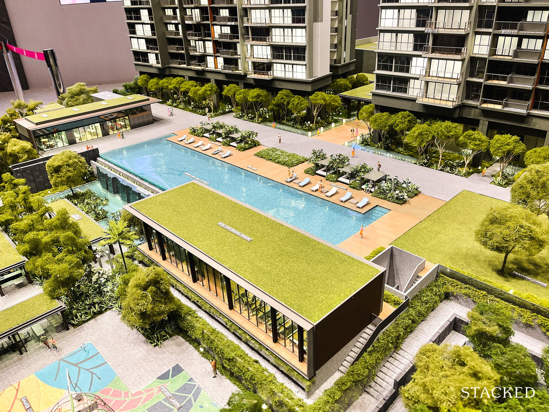
You should also note at this point that the pool actually faces the expressway (AYE) so it wouldn’t exactly be the quiet oasis that you might be thinking. That said, it is understandably the most efficient layout possible – to give the residential blocks the most setback away from the traffic noise from the highway.
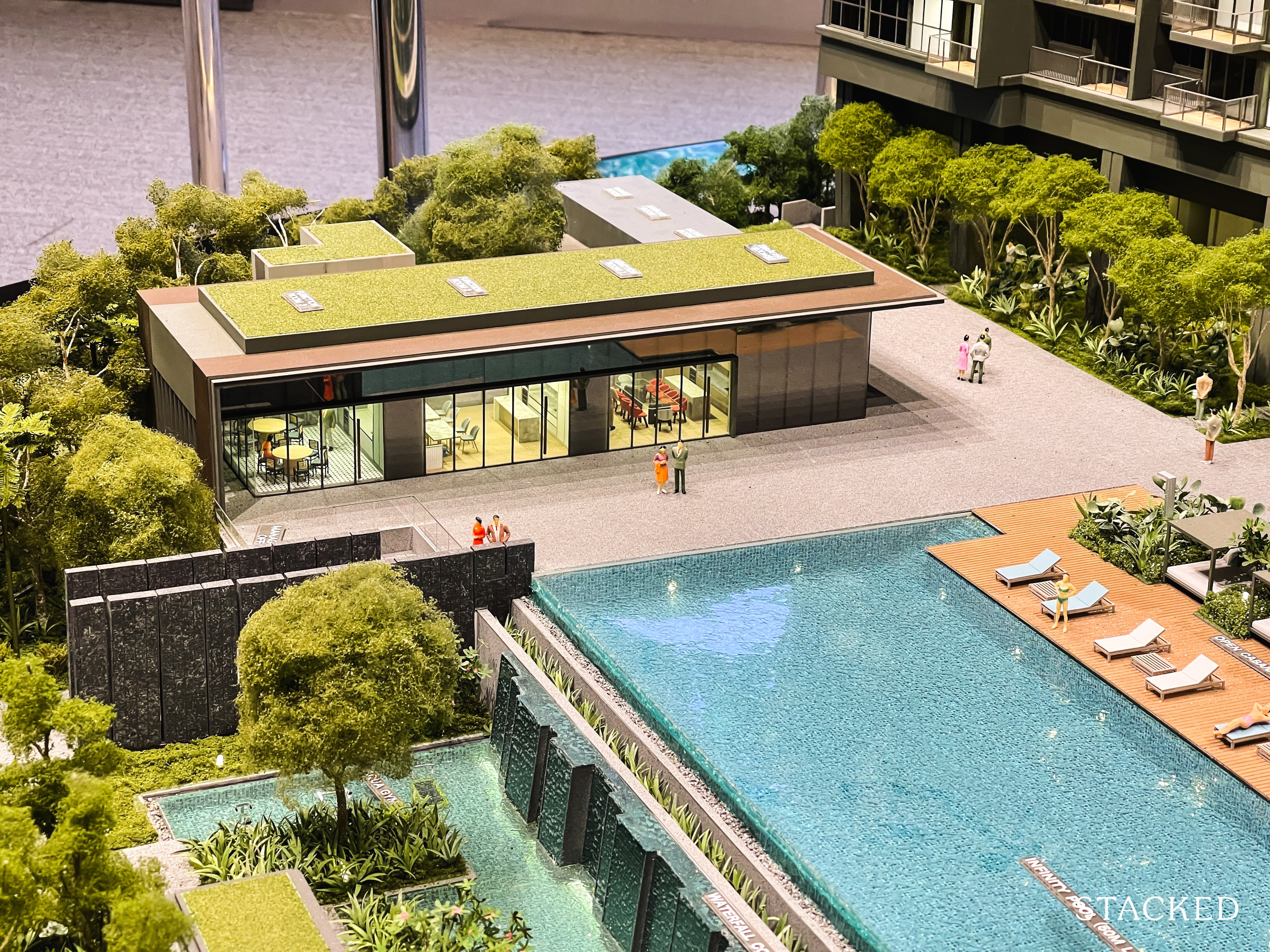
Located next to the pool are the 3 function rooms along with the karaoke, games, and music room at the back.
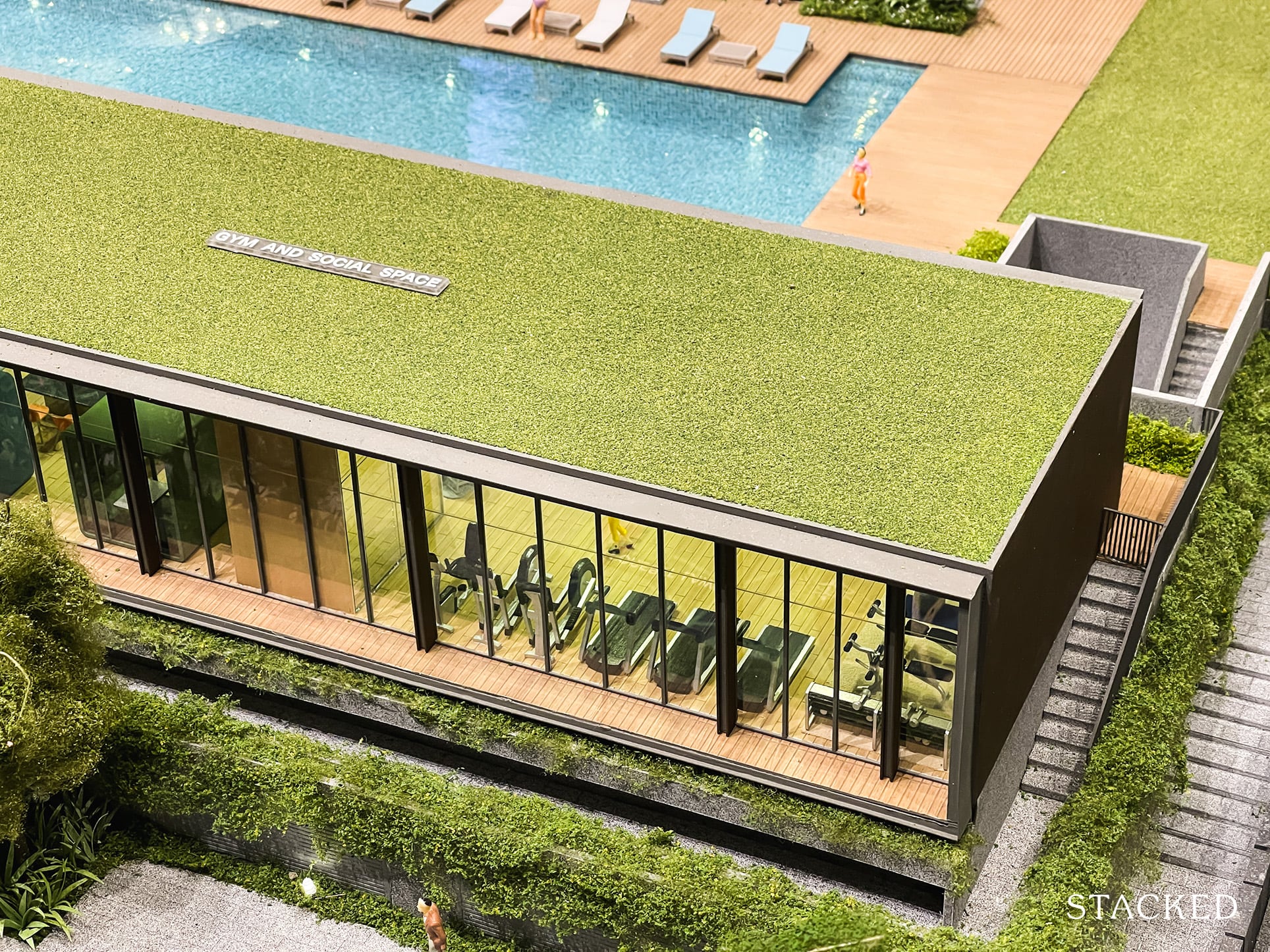
The gym and social space will enjoy a good view of the pool as well as the dining pavilions and playground below it. You could also see the social space as a co-working one – given how it is designed and laid out in the showflat. Seeing as how work from home and people’s working habitats are changing this space could see a lot more use than you’d normally think.
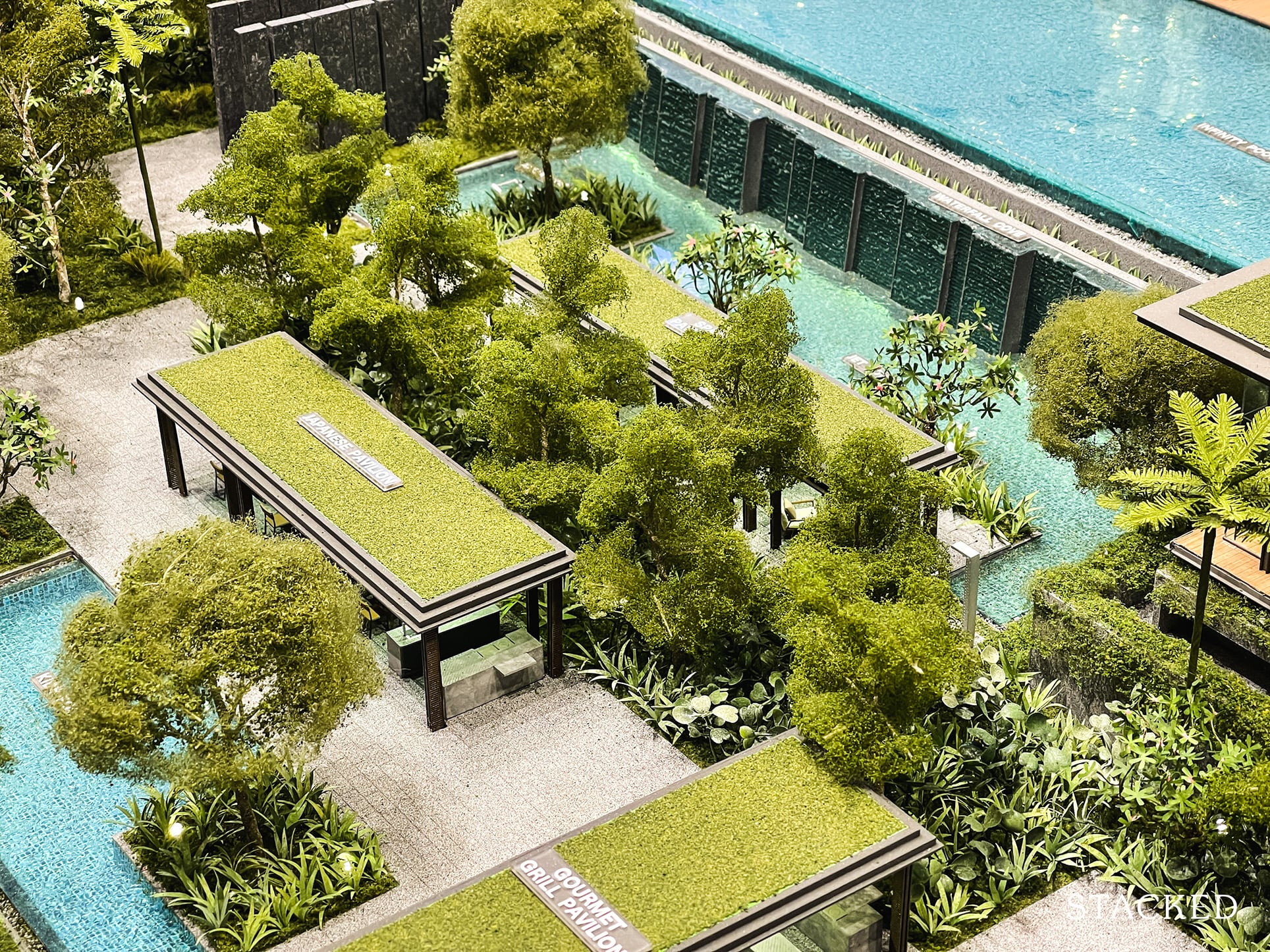
As mentioned above, the basement area of the development (below the main pool) consists of several dining pavilions. You’ll get your usual dining facilities here along with the various landscaped greenery.
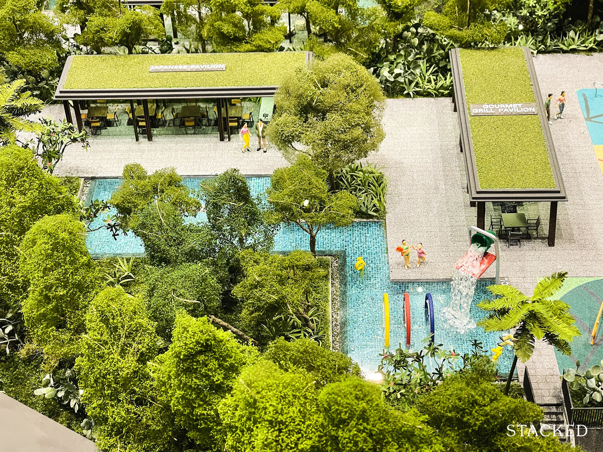
You’ll find the kids play pool here as well.
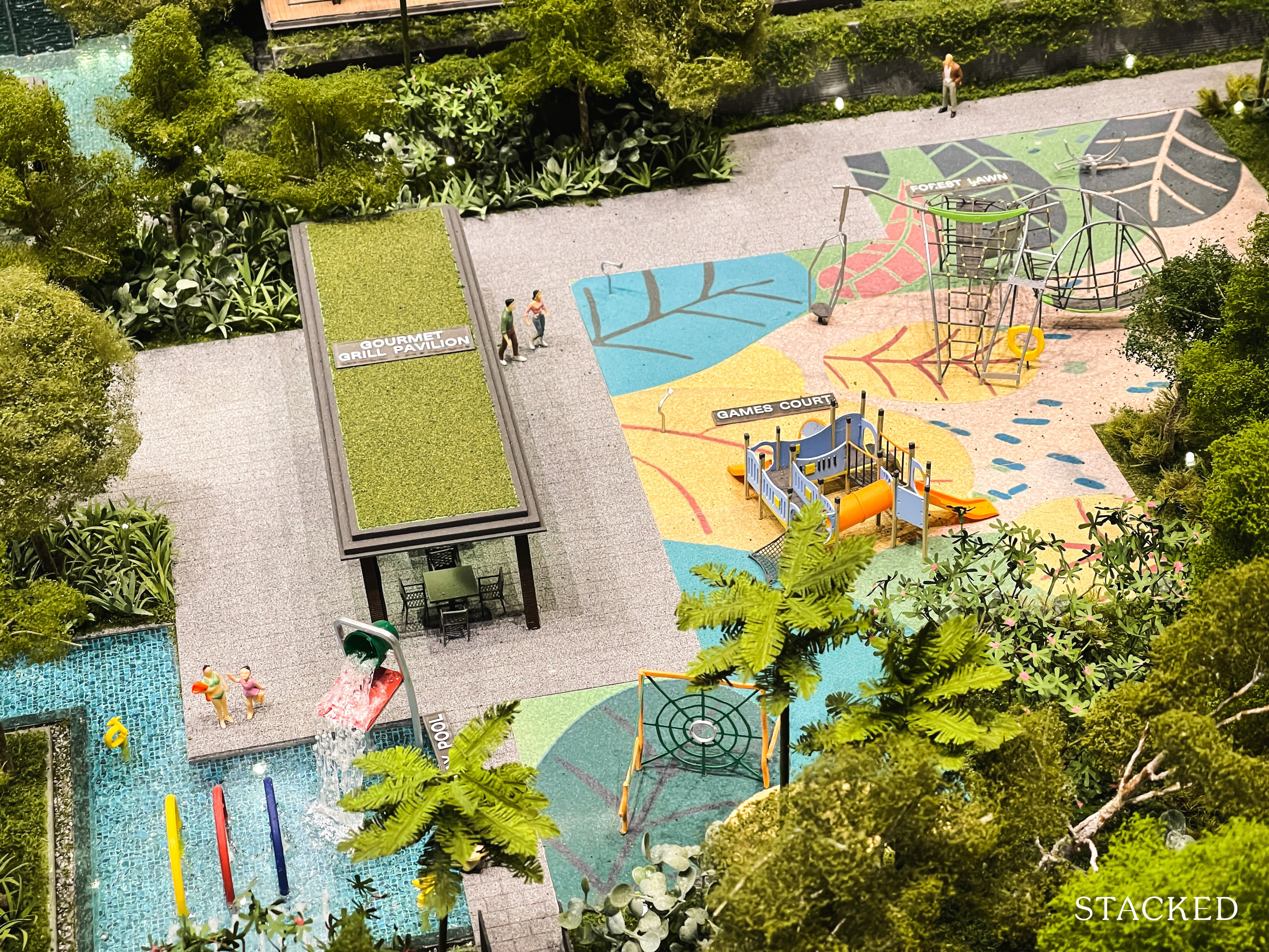
Along with the games court and kids playground – which, all things considered is actually quite a big space. I do like the thought that has gone on here in segregating between the different spaces.
If you think about it, the top is more reserved for adults, while the bottom is clearly aimed at a space for families/kids. For those that want to hold family gatherings, the spaces here would definitely make a ton of sense.
And it also keeps any potential noise disturbances from the kids to the lower level.
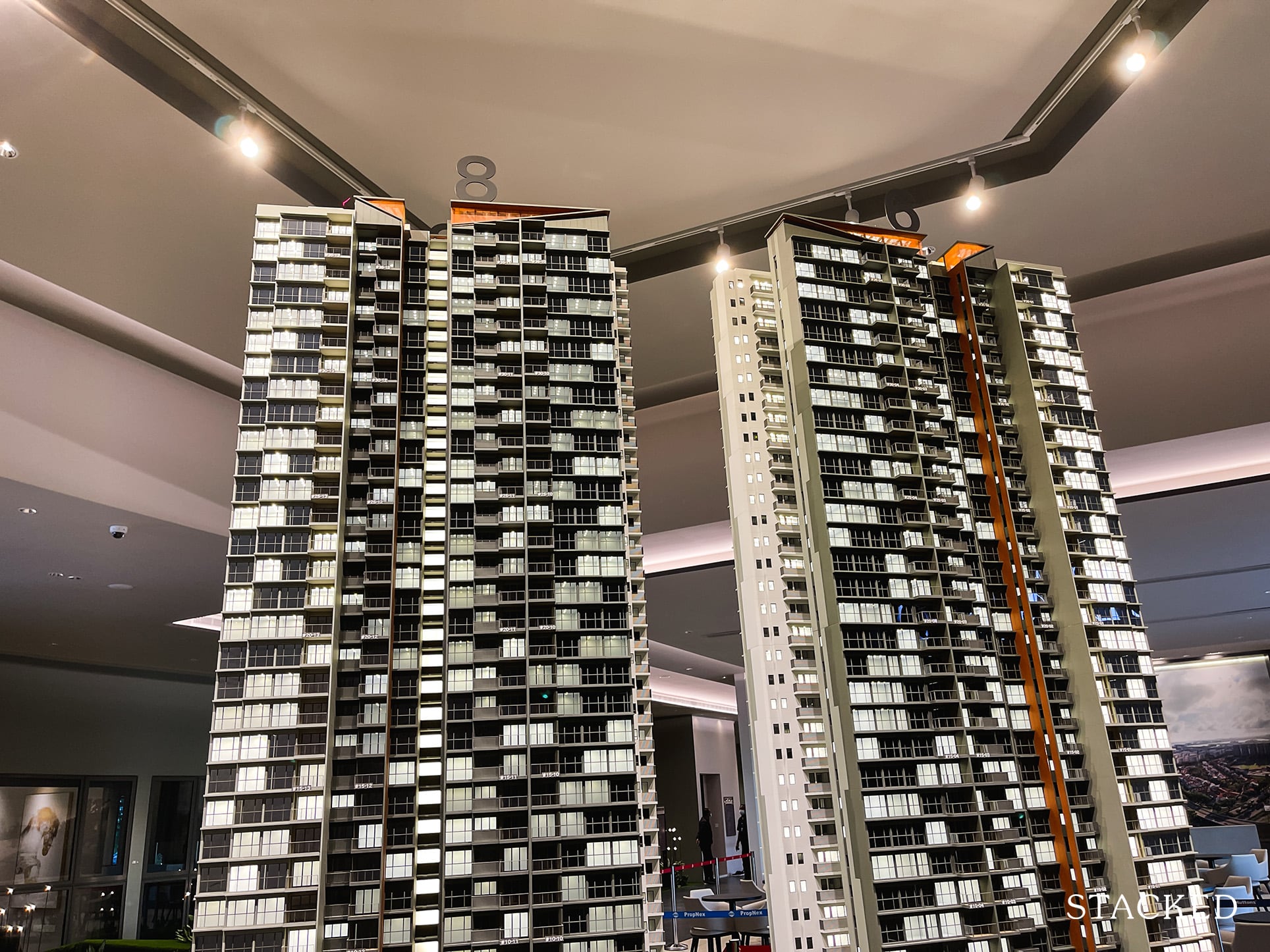
In fact, you aren’t just limited to the bottom floor for dining related activities. For those that want to take advantage of the views from the top can also access the Sky Terrace for the lounges and BBQ/dining areas.
It’s a good thing that they’ve done away with the more traditional route of penthouses here as including facilities on the highest floor will allow residents of even the lower floors to enjoy the views from the top as well.
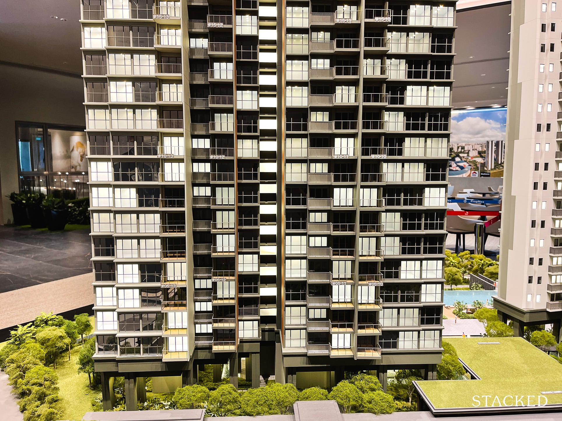
Let’s just touch a bit on the design of Clavon. Just like the rest of the facilities, it’s a safe choice – it certainly isn’t going to win any design awards, but neither would you classify it as something unappealing to look at.
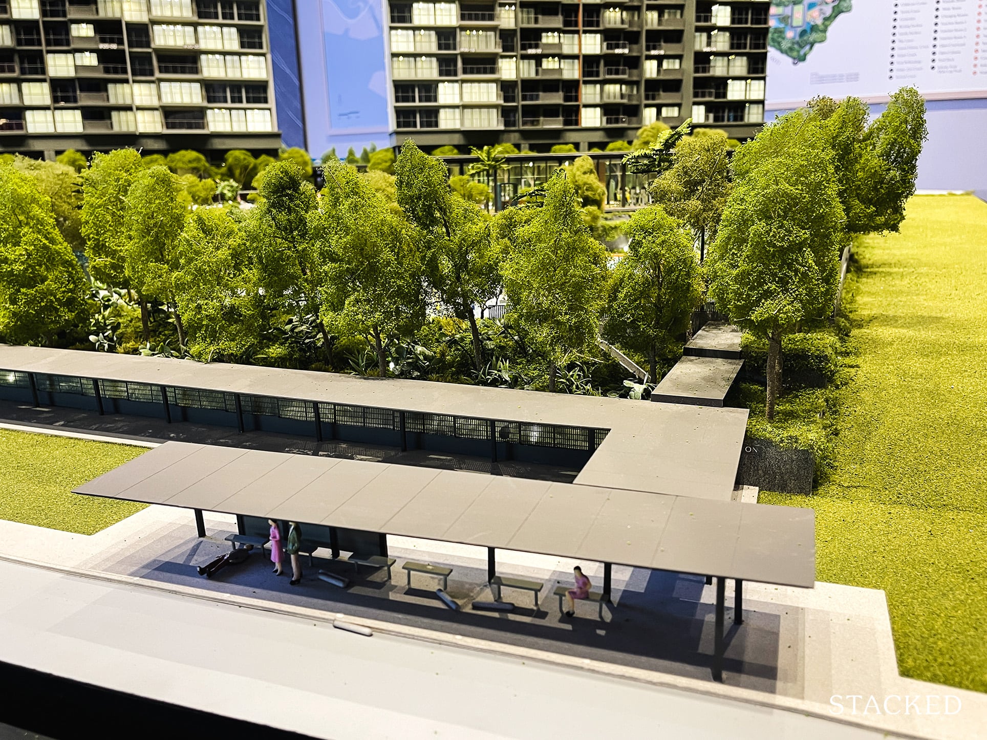
Last but not least (and an important one at that), there is the addition of a sheltered walkway all the way to the bus stop.
Clavon 2 Bedroom Premium Review
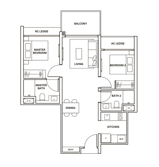
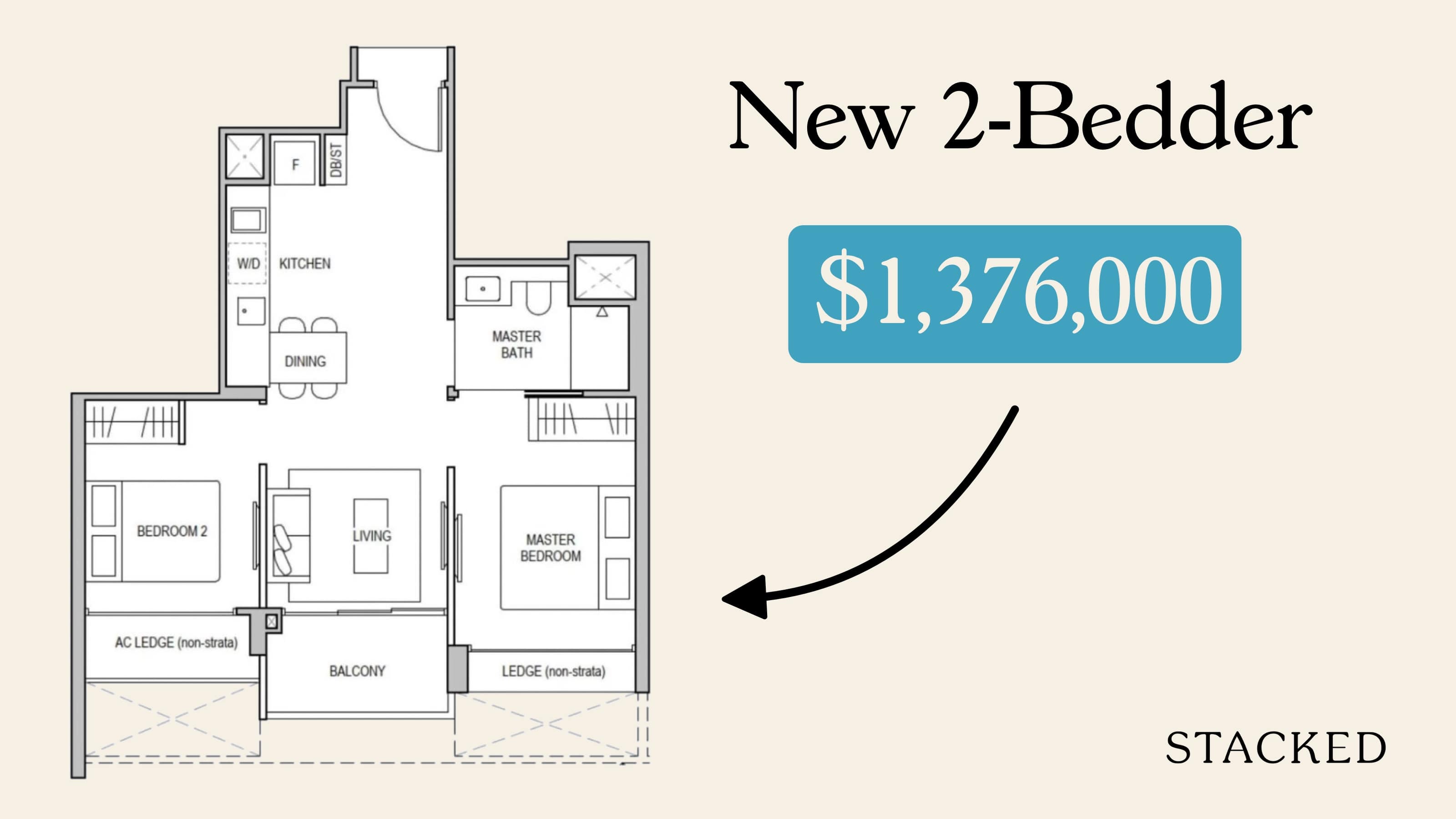
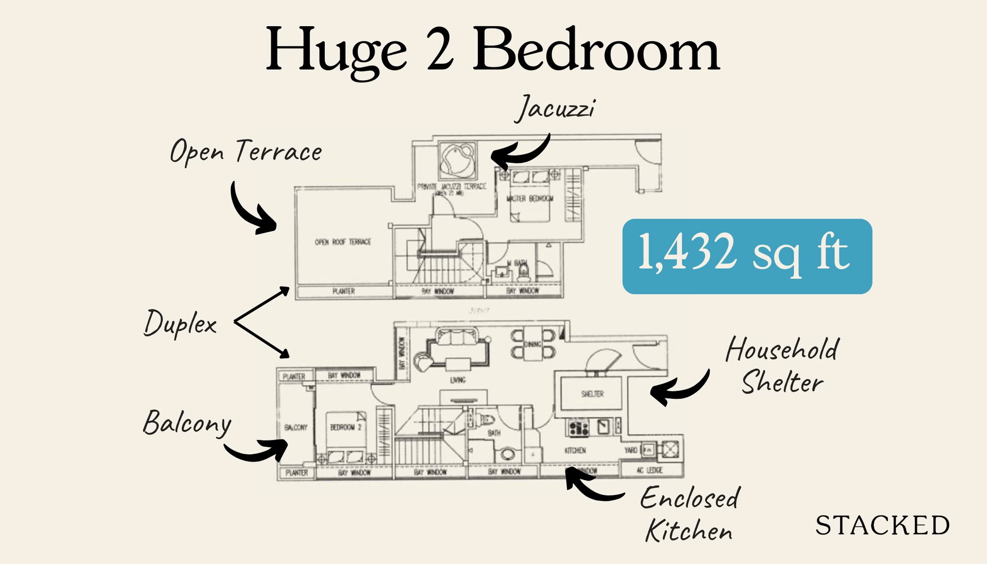
There was a point in time where 2 bedroom units at the 700 plus square feet range was considered average. But in today’s context where 600 ish square feet units have become the norm, this 764 square feet unit is now seen to be very decent (with thanks to the 2018 URA maximum housing unit guidelines).
Size aside, for those wanting maximum efficiency I can quite safely say that this is about as good as it gets for a 2 bedroom unit of similar size. No wasted entranceways, dumbbell layout, plus an AC ledge not right next to the balcony.
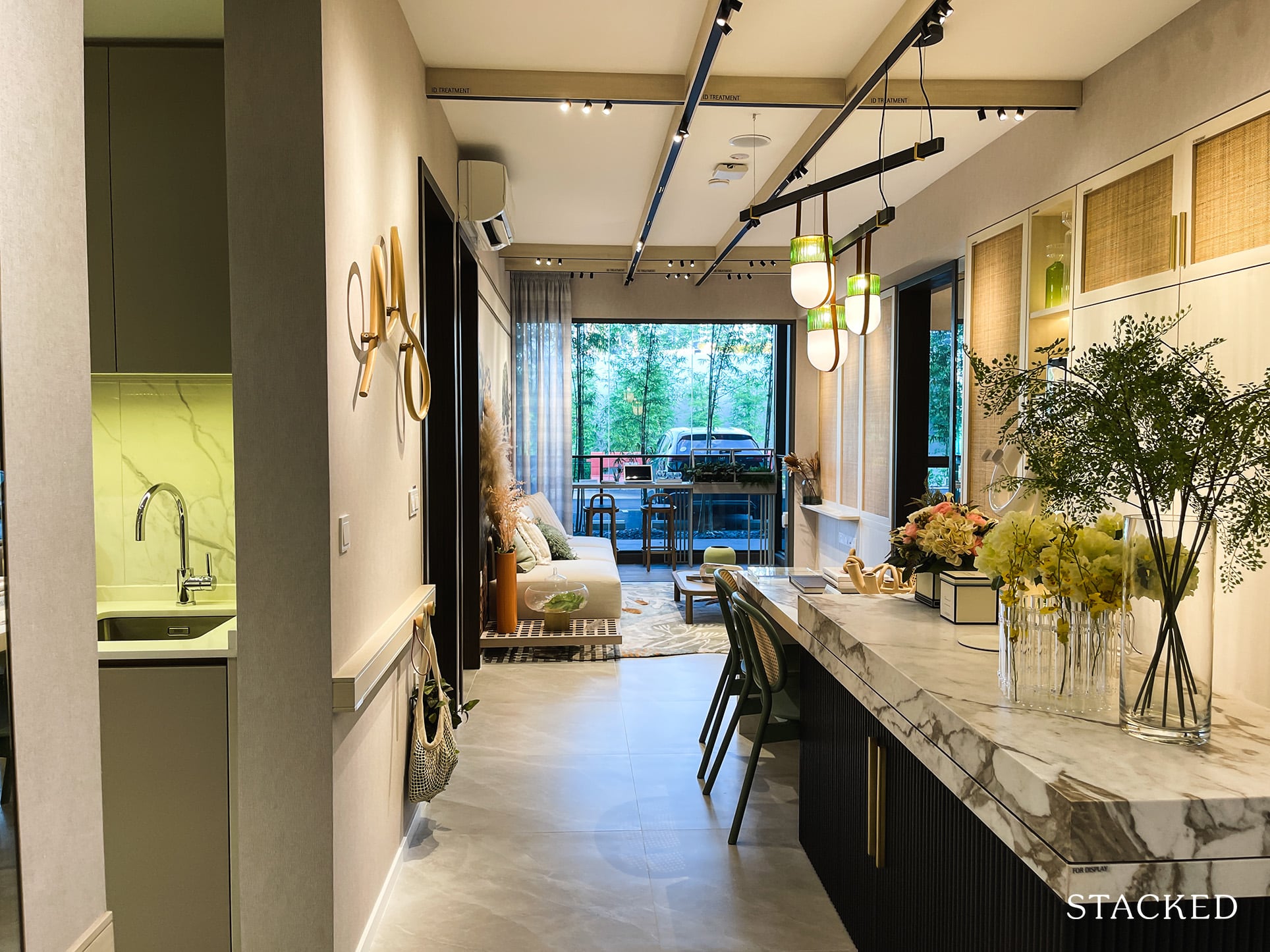
Once you step into the 2 bedroom unit, you will immediately get a sense of how big the living and dining really feels. For fear of overselling the space, but it really is quite a breath of fresh air to see a living/dining area that is this expansive in a mass market development.
As you can see, it opens right up into the dining area. Granted, there’s no privacy at all, but its a tiny sacrifice when you finally get a space that you can be a bit more creative with. So no kitchen jutting out, or weird angles that you have to contend with when placing your dining table.
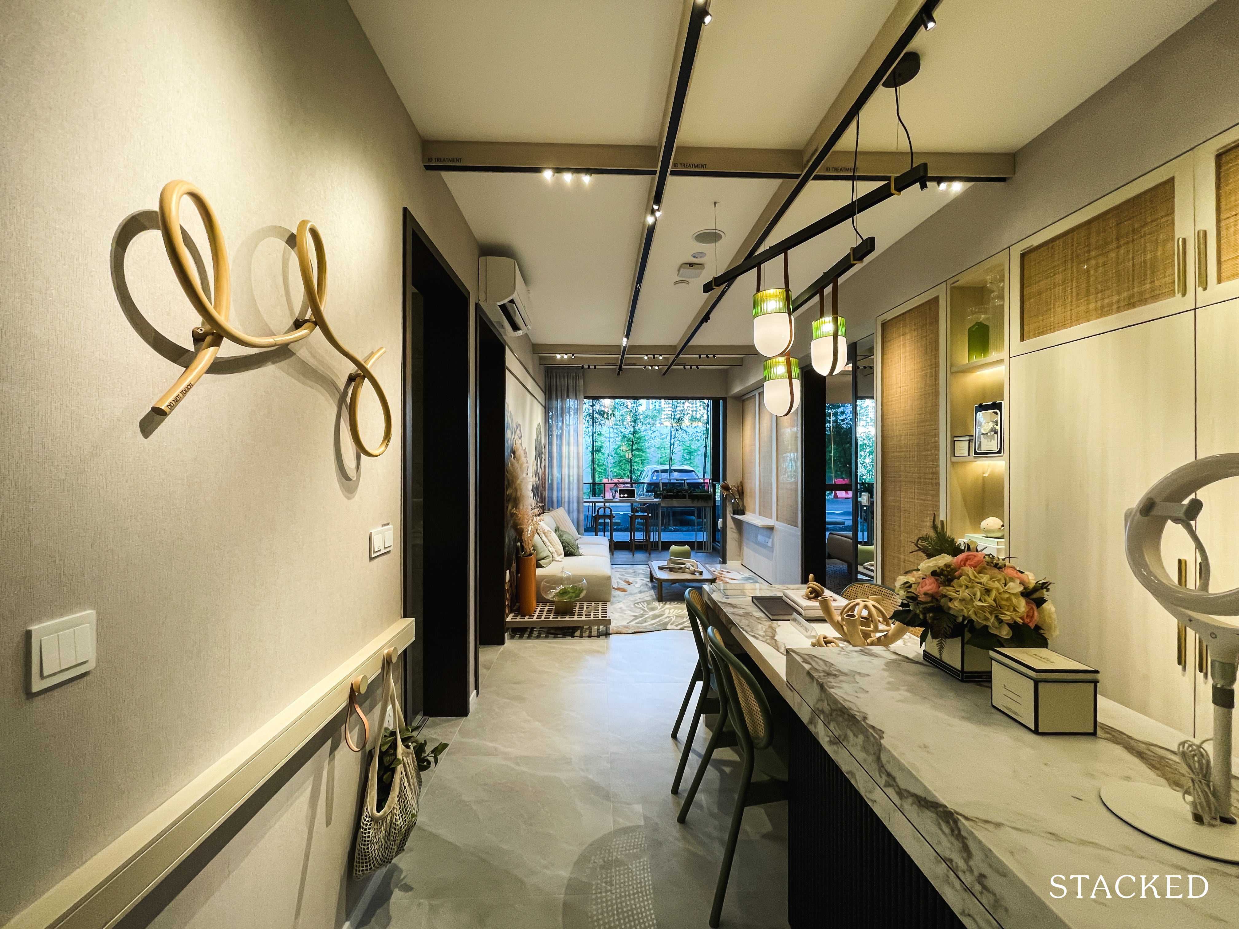
I mean, even with the kitchen island and a proper dining table it still feels very spacious. After seeing some dreary layouts in some other developments, it does beg the question: why isn’t this being done more often?
Clearly, if the communal spaces have always been a priority for you, you have to be absolutely contented with this. As I’ve mentioned in the intro – it really doesn’t get much better than this.
It’s worth noting here that the kitchen island doesn’t actually come with the actual unit, but I think they’ve done it purposefully to just show even with the addition of it just how easily you can still walk around.
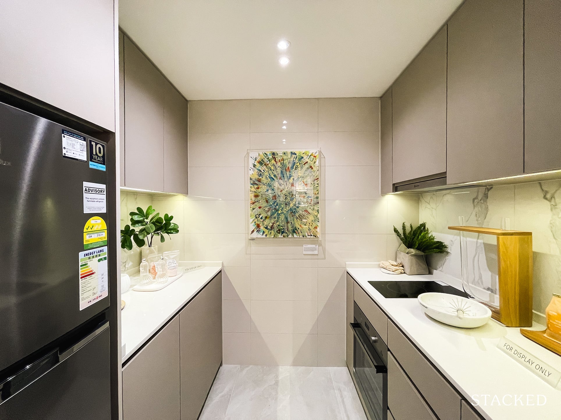
So obviously with no kitchen jutting out, it does mean that you have a kitchen that can be enclosed if you want it to be. It’s relatively decent, two people can work in here back to back with not much complaints at all. All kitchen appliances seen here (the usual) are by Electrolux – which is within expectations.
Of course, the only real nitpick here is the lack of a window – so no natural ventilation. But seeing the space you get out there, while even having the option of an enclosed kitchen is already a winner in my books. Having to complain about this almost feels.. weirdly ungrateful.
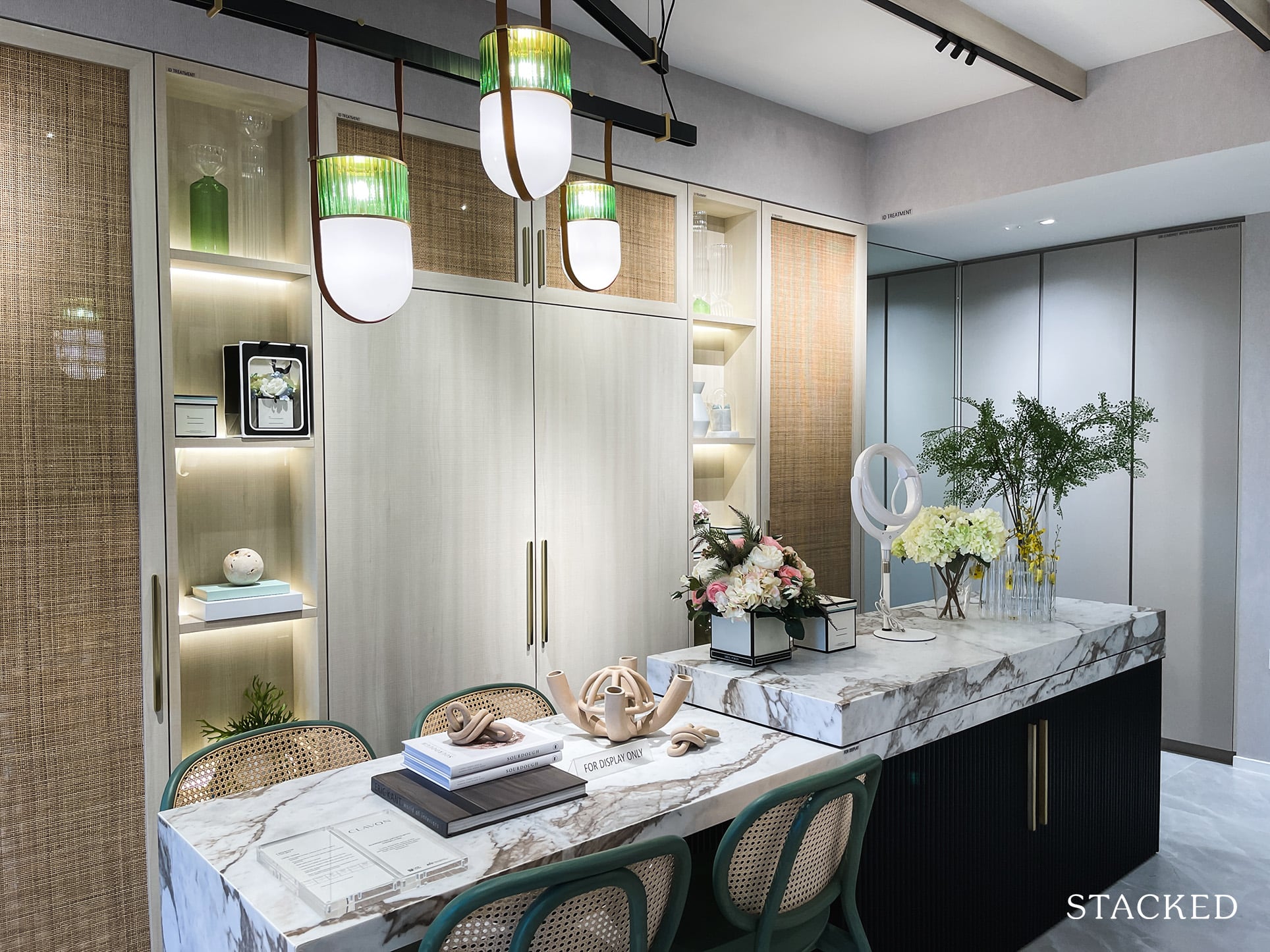
I’m sure not everyone is going to need to have a kitchen island here, but I do see the merits of it. Going by the current setup, you could probably even fit a 6-8 seater in here with not too much difficulty if you have the penchant for entertaining a lot.
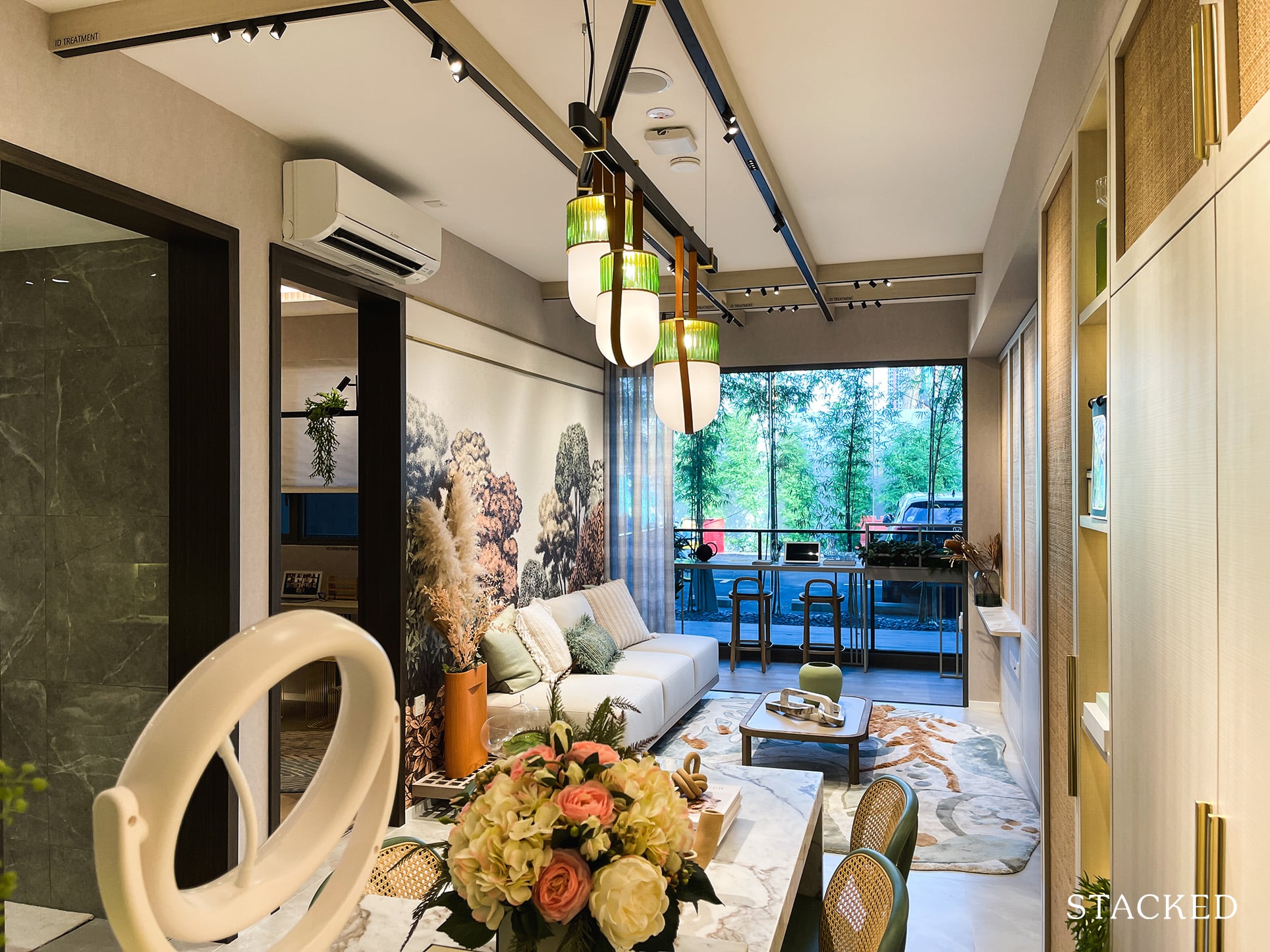
The ceiling heights here are set at 2.79 metres, which is average and is the same across all units with the exception of the 4 and 5 bedroom premium units (2.9 metres).
For those wondering, its the typical porcelain tiles used in the living and dining areas. Yes it isn’t marble, but personally I do quite like the finish of it.
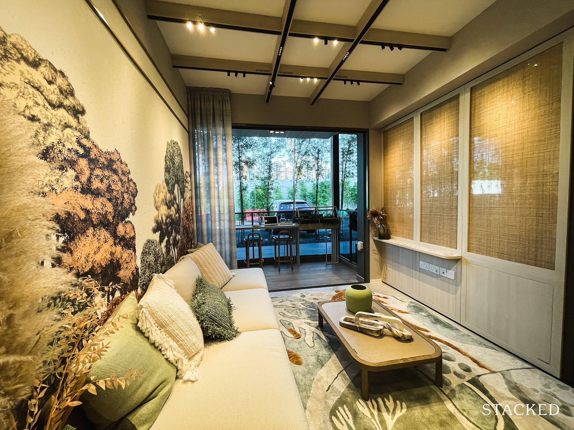
While the living room itself isn’t quite as outstanding as the dining area, it still is a relatively good size.
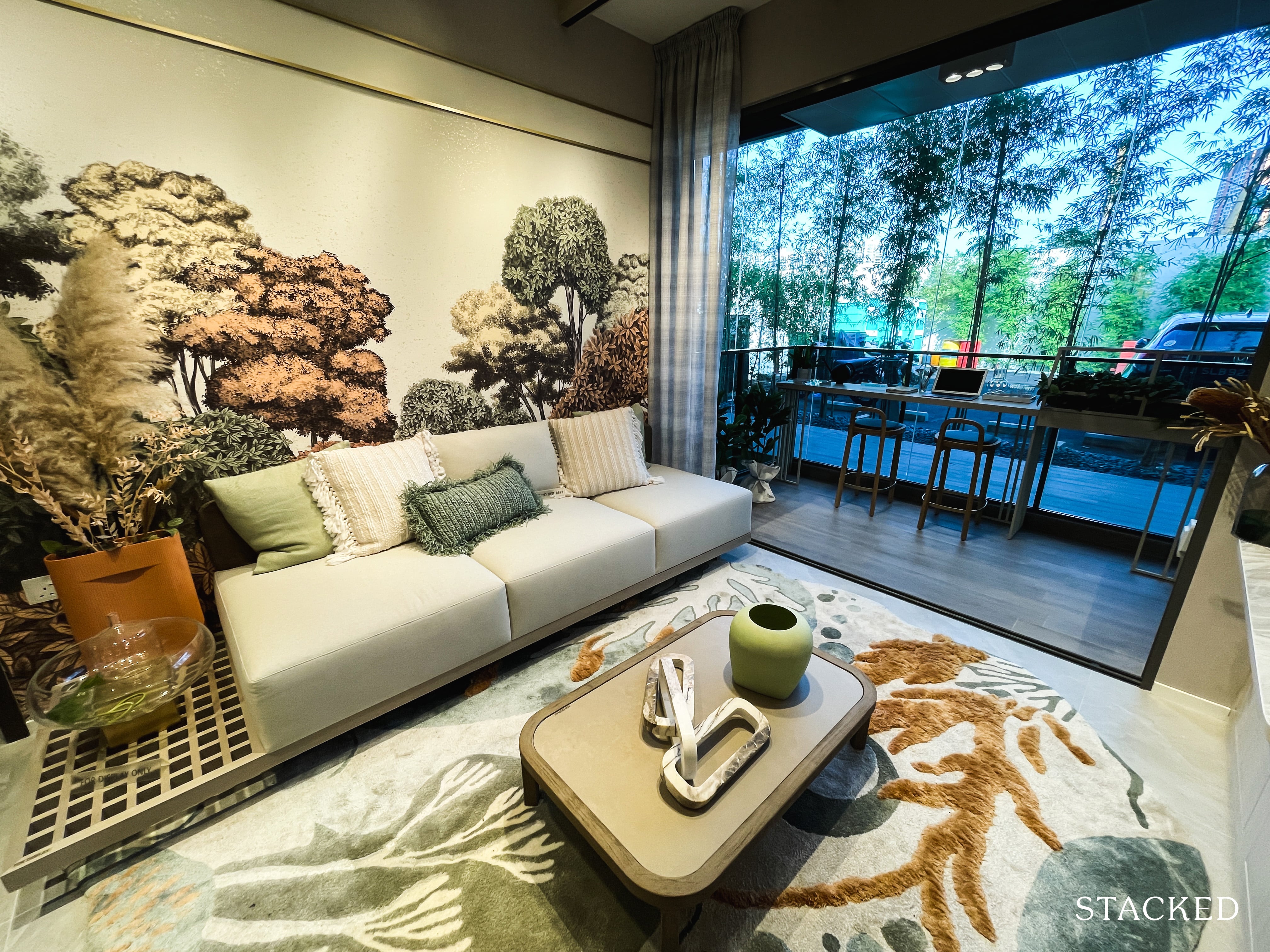
For a 2 bedroom unit, you could fit in a decently sized sofa with a small coffee table as well as a TV console.
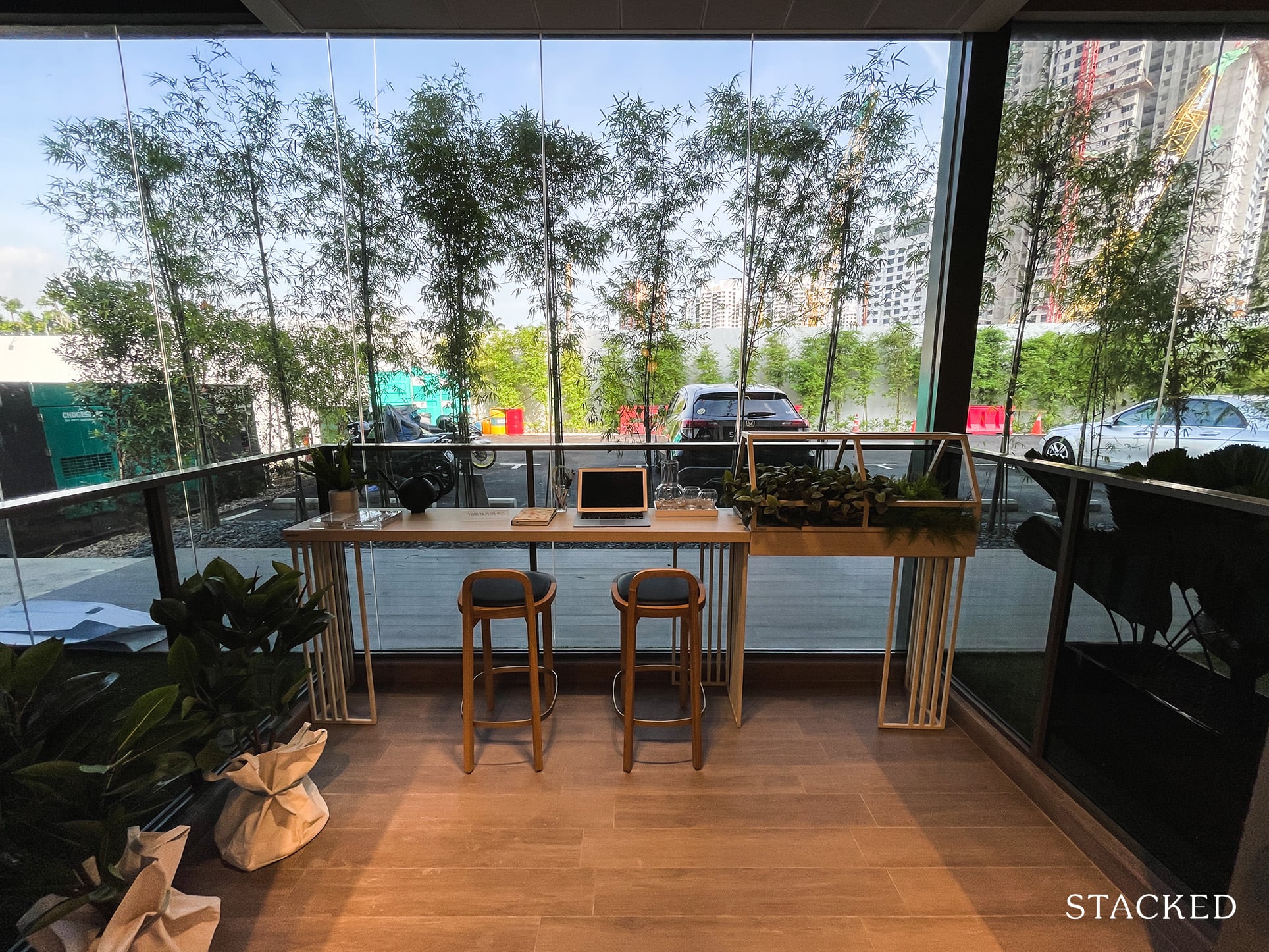
The balcony is a standard size too, roundabout what you’d expect for a unit of this size. It isn’t overly big, but just right such that you can have a small 2-seater dining set here if you’re up for alfresco dining.
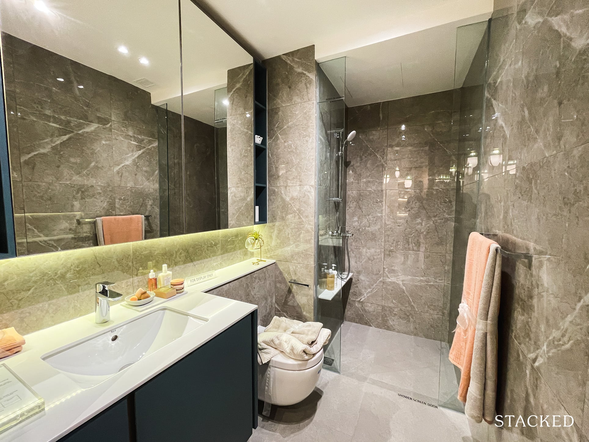
The common bathroom doesn’t contain any surprises. It’s bang average when it comes to size, and there aren’t any special touches such as a rain shower of sorts.
It features porcelain tiles here too, with the bathroom fittings by Grohe and Roca. Do note that there isn’t an open window here so ventilation wise it isn’t the best.
The icing on the cake would have been to feature a jack and jill bathroom entrance/exit so both bedrooms could be considered ensuite. Then again, the common bathroom is situated right next to the common bedroom.
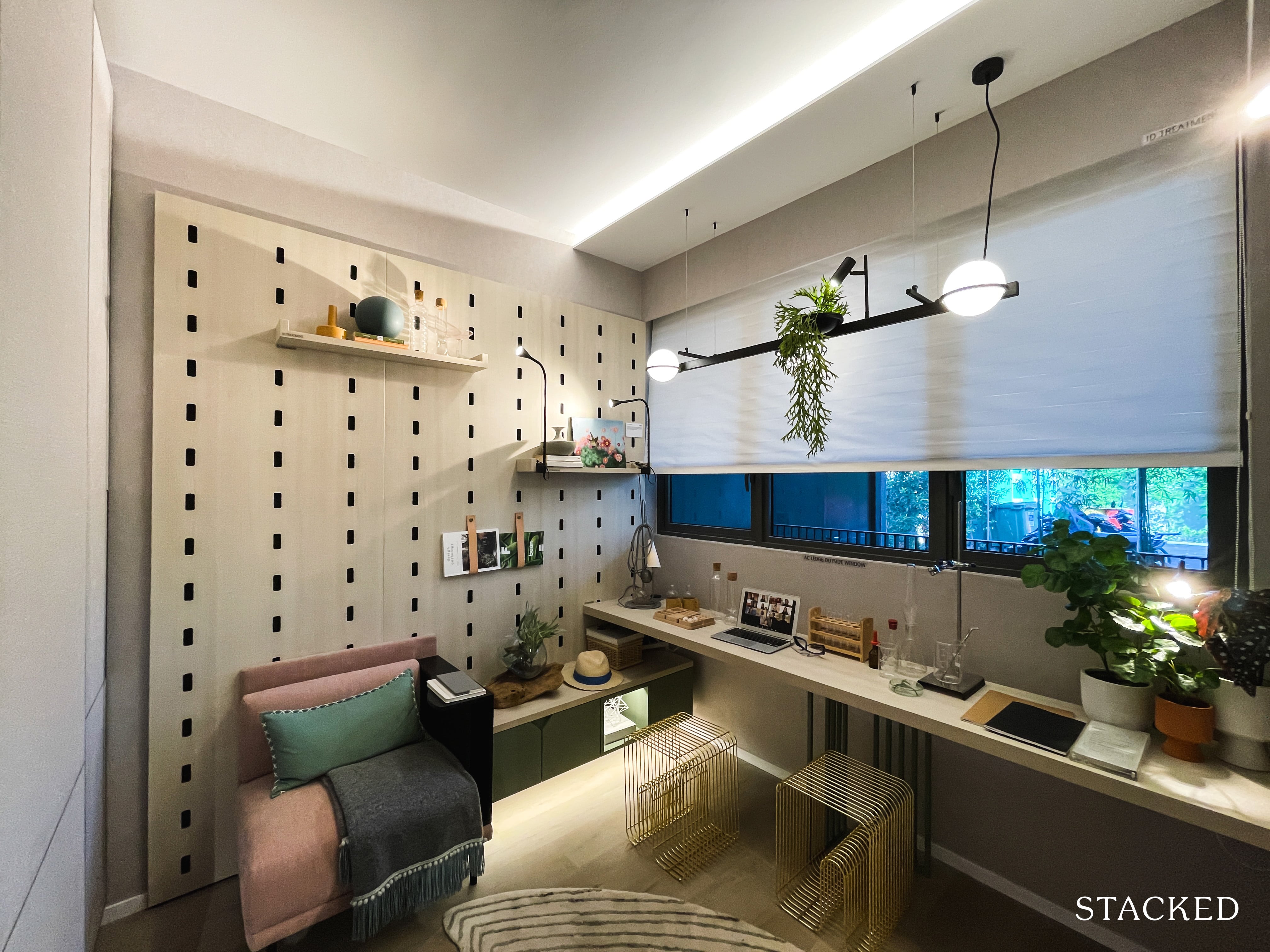
As per usual, the common bedroom is on the small side. But that’s really to be expected given the allowances to the living and dining areas.
Also, you don’t get full length windows here due to the AC ledge being located on the exterior.
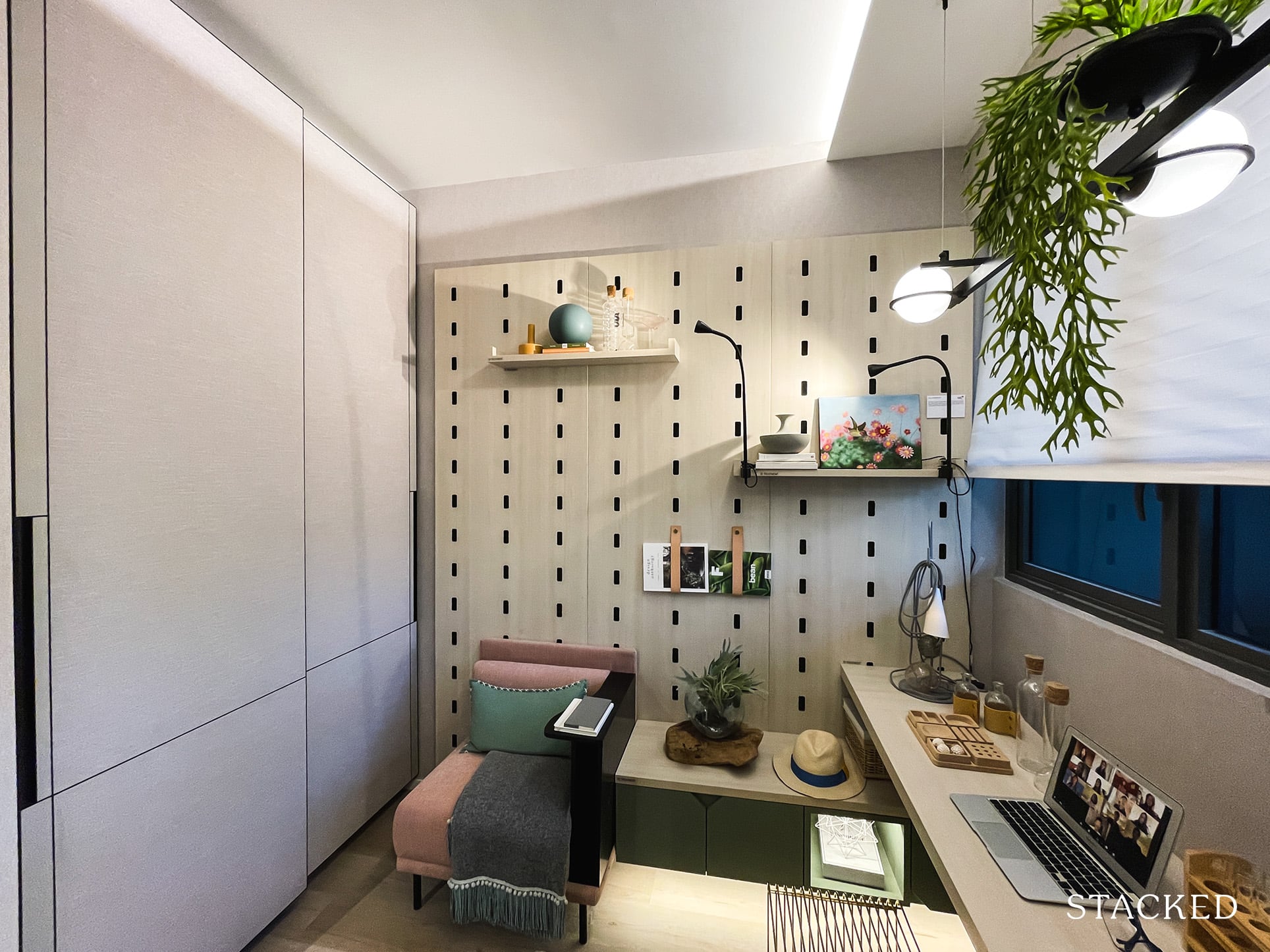
While you could fit a queen sized bed here it will definitely be a real squeeze. It comes with the standard 2-panel wardrobe, so nothing noteworthy to speak about.
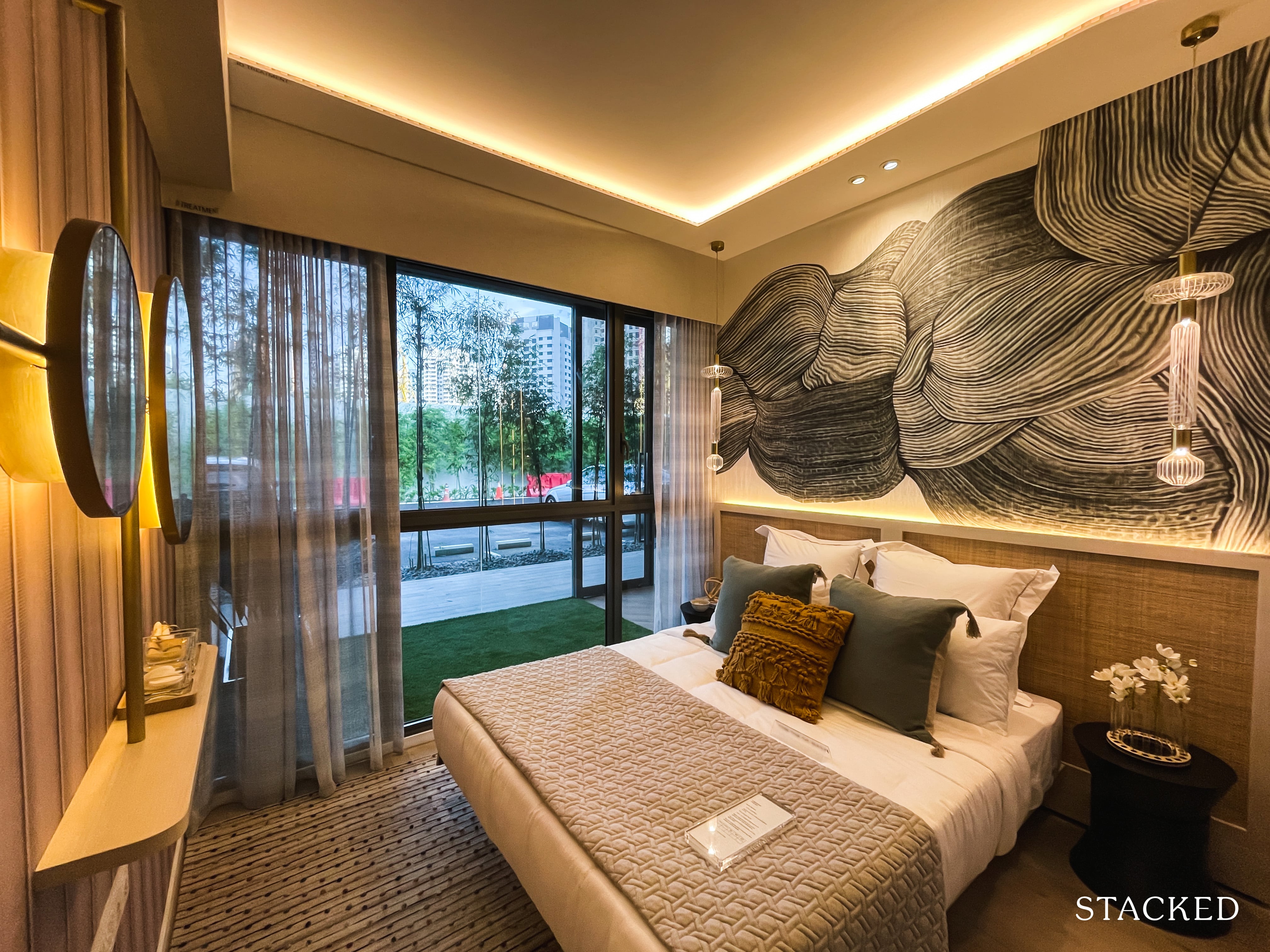
The master bedroom isn’t particularly notable either in terms of size. Of course you can fit in your standard queen sized bed and side tables etc, but I reckon that would probably be it.
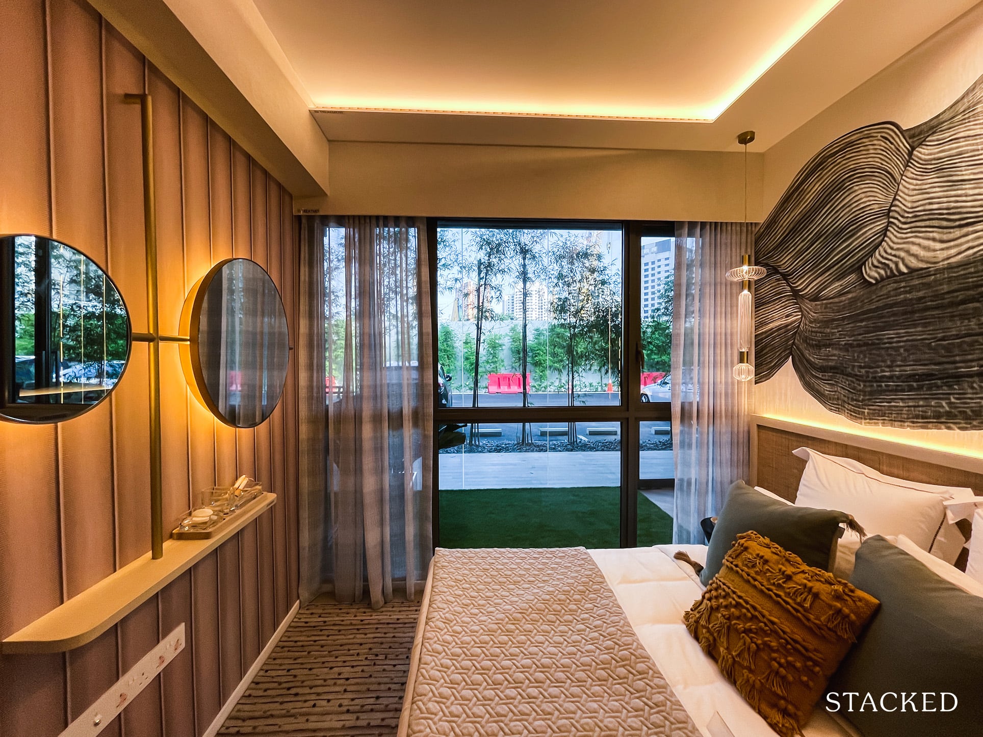
It’s hard to see here because of the carpet, but this unit type will feature vinyl flooring. You also get nearly full length windows, but that’s to be expected nowadays anyway.
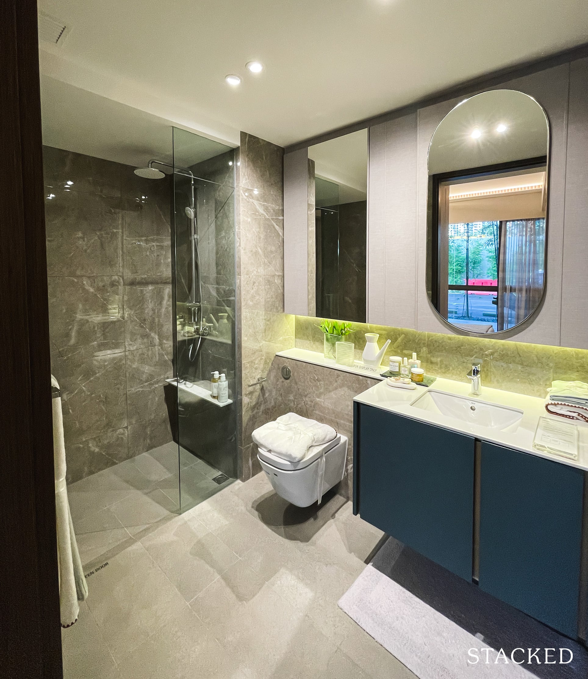
The master bathroom is a decent size with the same fittings from Grohe and Roca. Like the common bathroom, there isn’t a window here so you will have to rely on the fan for ventilation. You do get a rain shower here though, so that’s a plus.
To add on, none of the 2 bedroom units at Clavon are corner stacks either ways so you aren’t going to get ventilation windows in any.
Clavon 1 Bedroom + Study Review
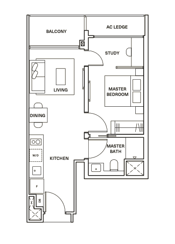
Size wise, this 1 bedroom + study unit at 527 square feet is on the larger side as compared to its peers – which is probably its major plus point.
Aside from that, it’s hard to really like the layout of this 1 bedroom unit. Personally, some decisions are quite odd choices but I’ll get to that later.
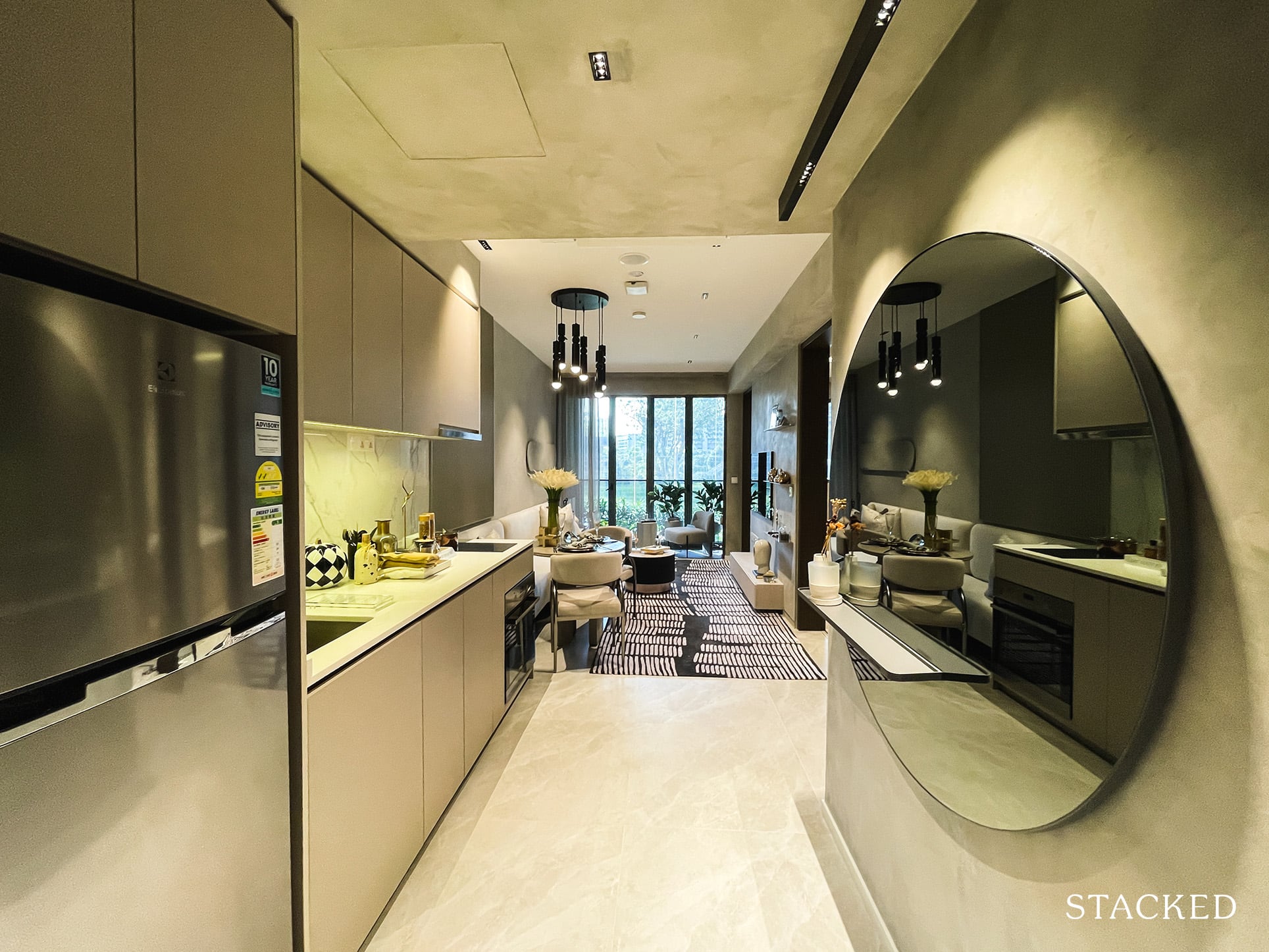
It’s the usual walk way entrance here that is shared with the open kitchen. Because you can see straight into the living and dining areas, you do get quite a good sense of space the moment you step in.
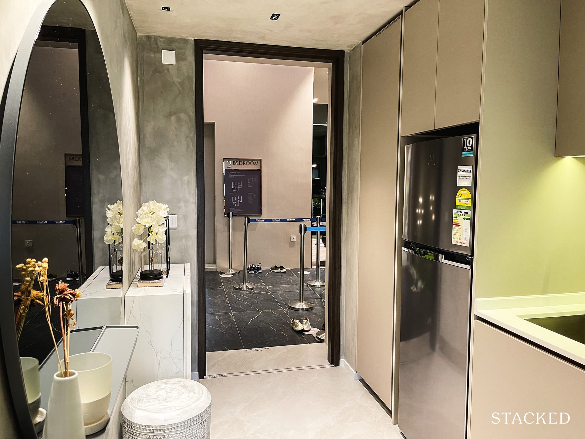
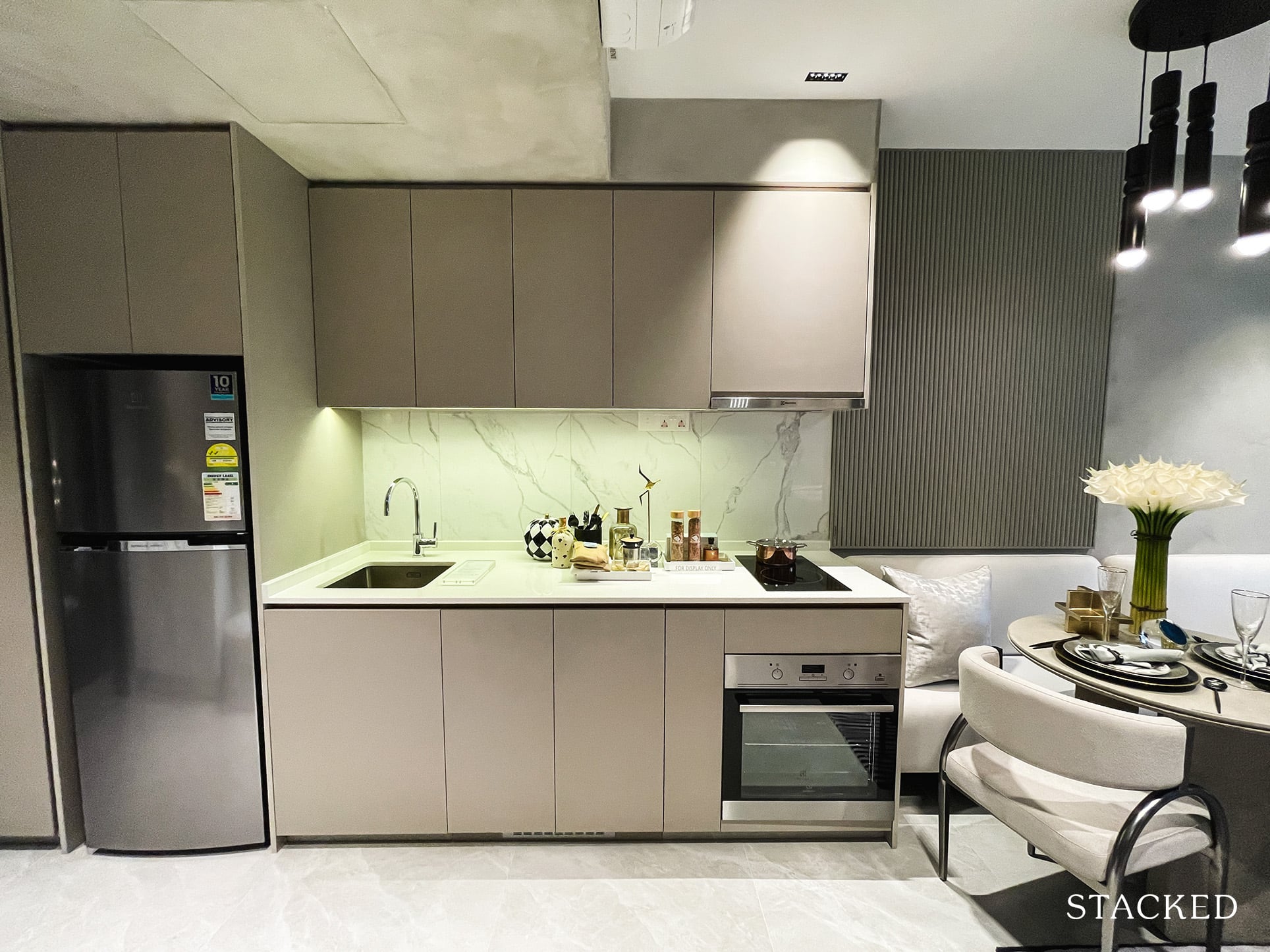
While the kitchen space itself is decent, the countertop space is a little on the short side. As with the rest of the units, the oven, hood, and fridge here are all supplied by Electrolux.
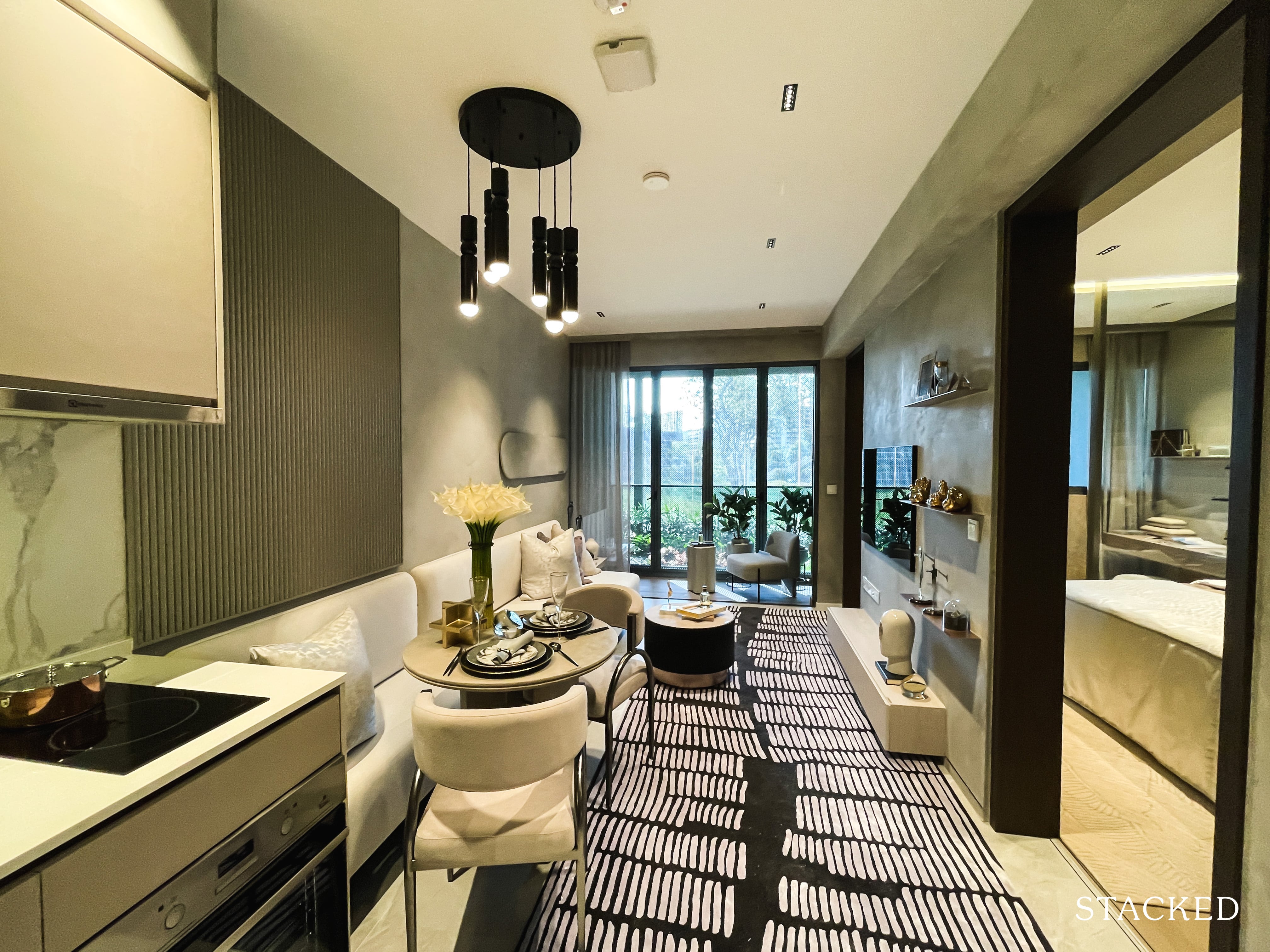
On paper, the dining space is actually not bad at all. The dining table used here is definitely very small, and not the most accurate representation of what a normal couple would want to use for daily dining.
Of course, you can’t get anything too big here to prevent eating into the walkway space.
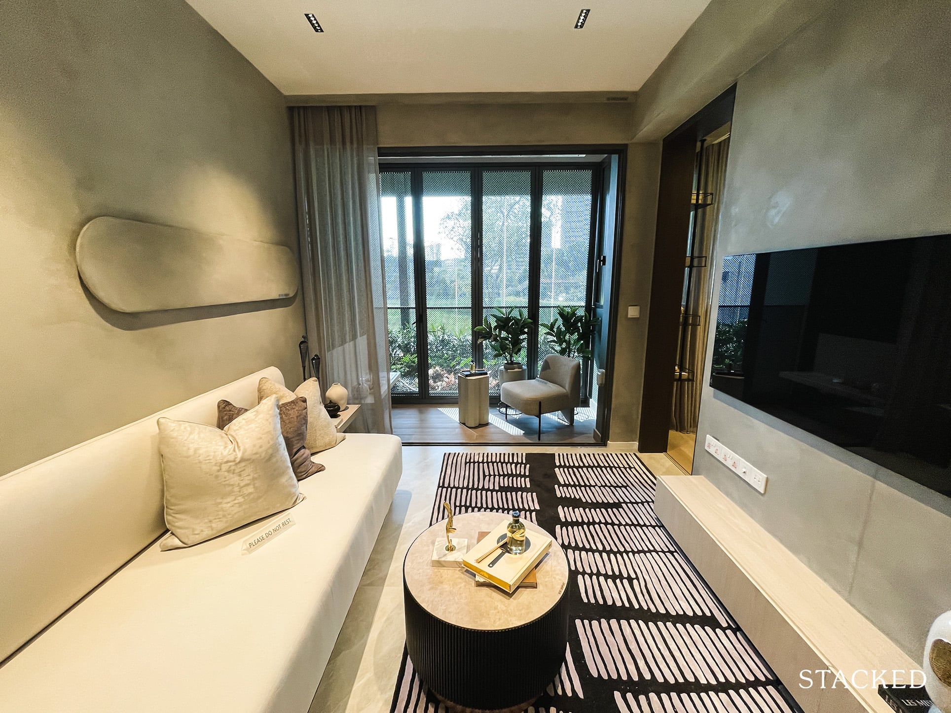
The living area is just passable space wise, but here’s where the oddity of the layout comes in. Because the study is placed at the far end of the unit, it means that the study door has to be located at the end as well. So because the door to the master bedroom has to be accounted for too, it doesn’t leave much space for your TV wall.
No doubt, you can still fit a good sized TV, but it does mean that you have to be careful about the size of your TV console and TV.
The other issue here is because the wall is in the middle of both doors, you would ideally want to place your sofa in the middle too – leaving a gap at the end. Of course, you could place a small side table there and call it a day but it is just awkward placement should you want to utilise the space for a bigger sofa.
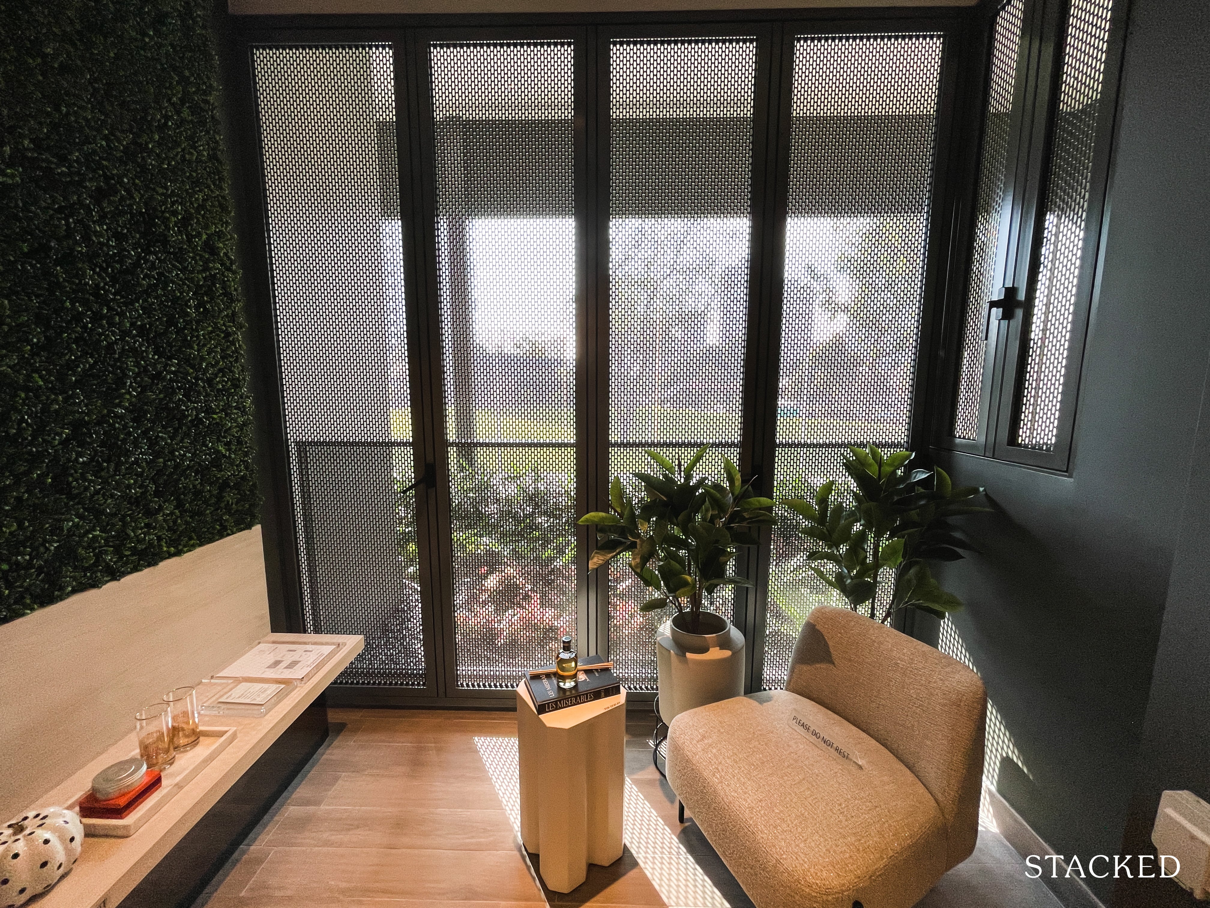
On a more positive note, the balcony space is kept to a minimum in this 1 bedroom unit. In this example here you can see how the balcony screen looks like (it isn’t provided, there will be an additional charge should you want one).
Also, for all units facing the AYE an acoustic ceiling will be provided in the balcony. I can’t say for sure how much that would help mitigate the noise from the highway, but it’s good that there are steps taken to try to reduce it.
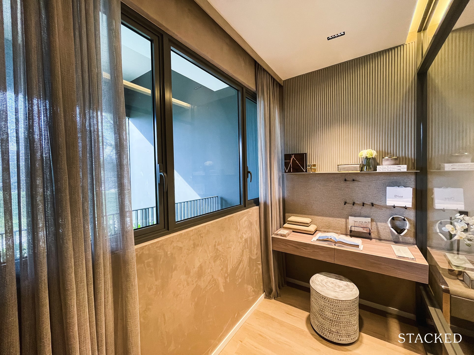
Let’s move on to the study area next. If you were to judge this solely based on a study room, it actually is pretty good. For one, you get proper windows, so having light in plus a view is quite rare for most study rooms that you’ll see in other developments.
Unfortunately the AC ledge is located outside, so you’ll have to contend with the half height windows here.
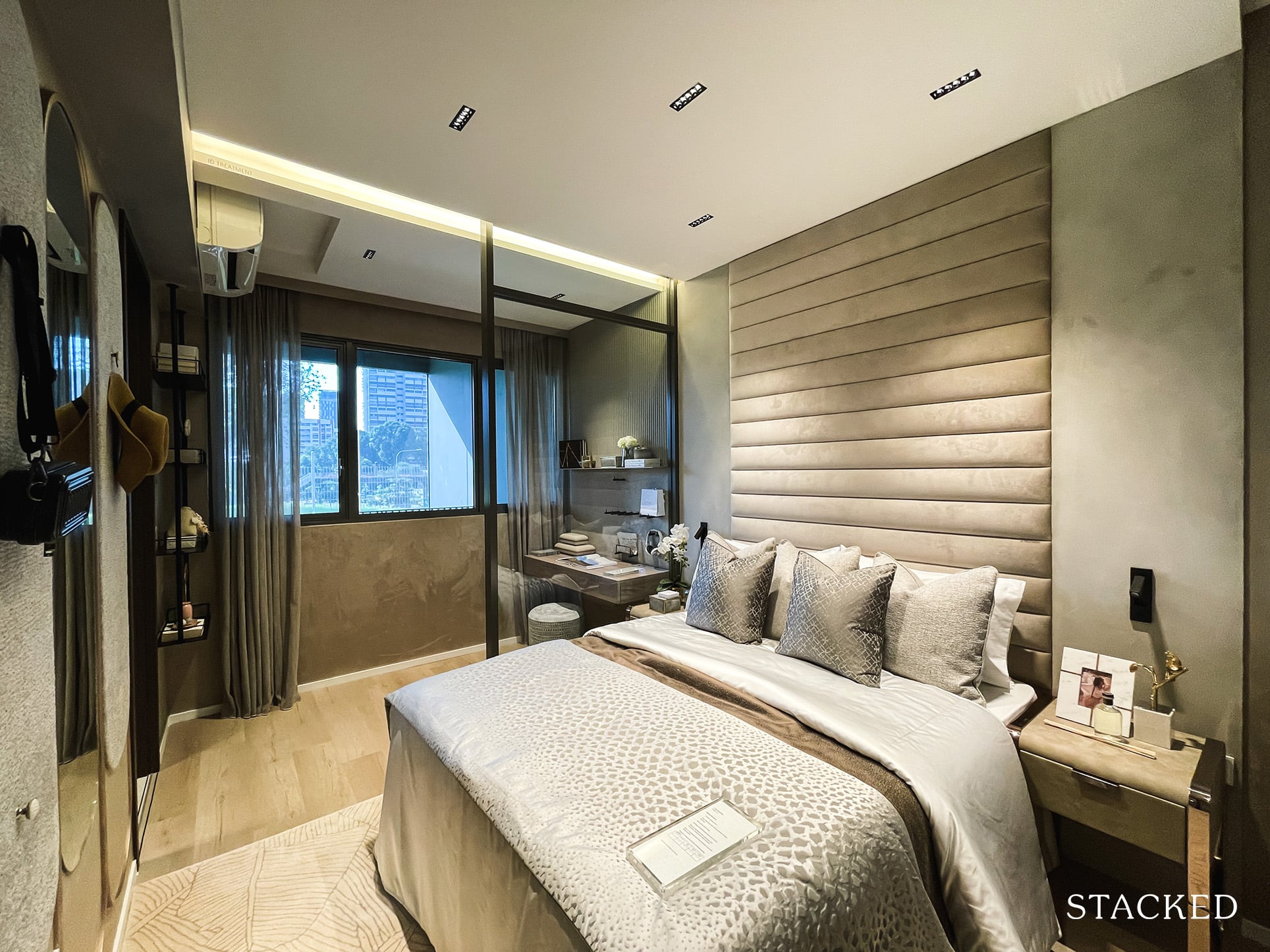
Where it falls short for me is its location. Because it is located at the end, it makes it very inflexible for those who prefer to keep the study area completely segregated from the bedroom.
For example, should you choose to enclose the study area for proper segregation, this would mean that the bedroom will be void of natural light – which is a real downer.
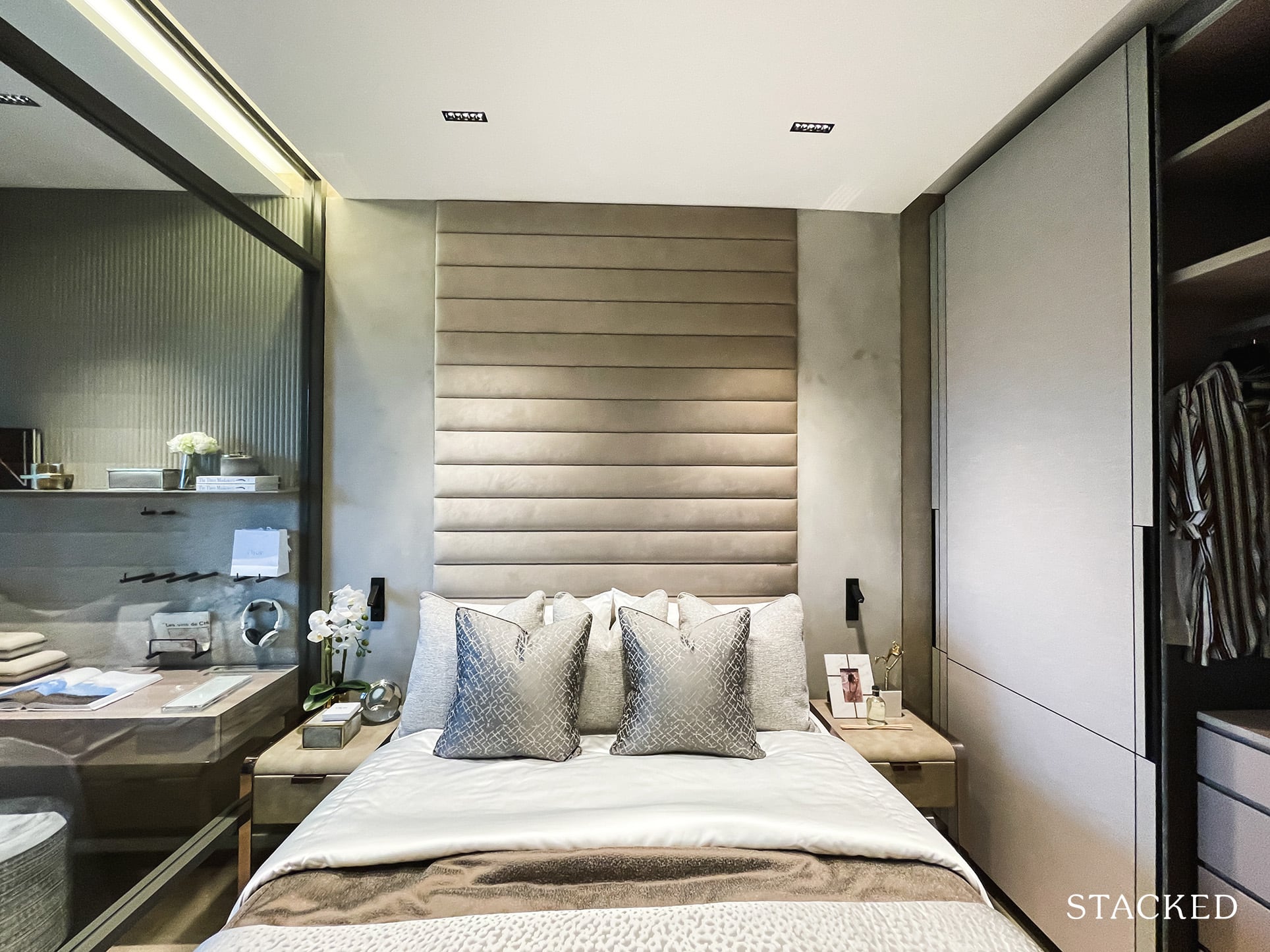
As for the size of the bedroom, it’s a compact one, without too much space at both sides manoeuvrability wise.
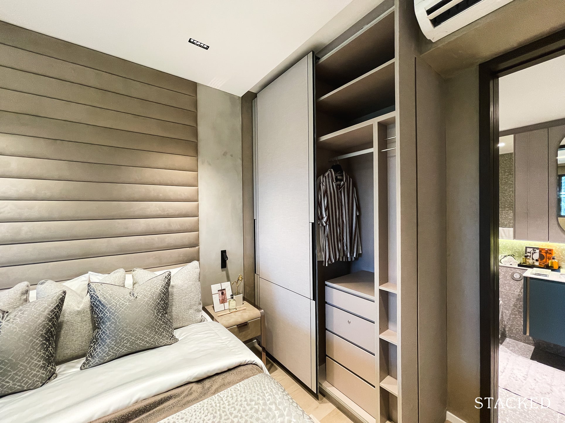
Plus your what is now customary 2-panel wardrobe. Typically, this is never usually enough storage space for 2 people.
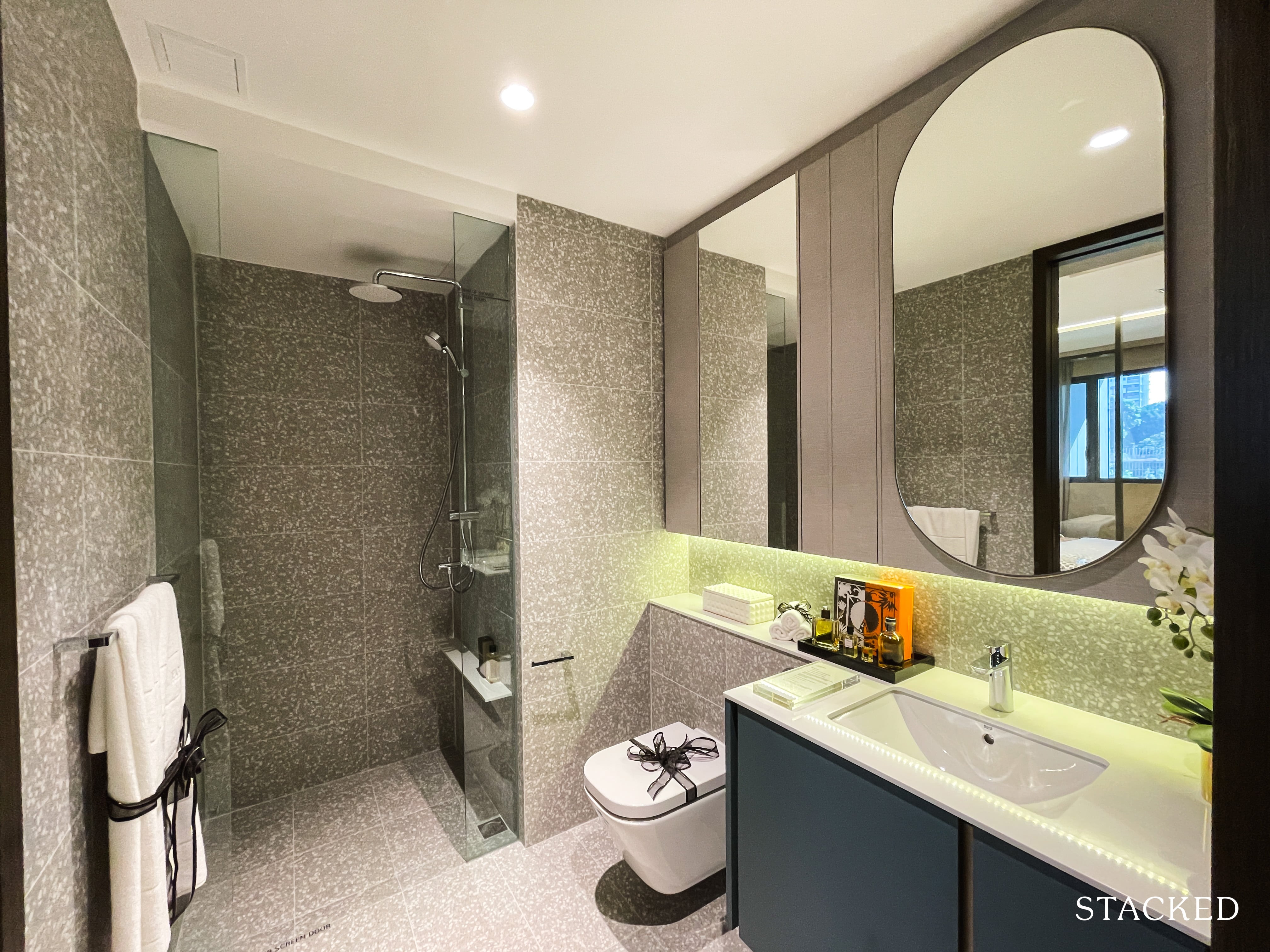
If you ask me, I quite like the colours and finishing of the bathroom – but as always, design is such a subjective thing.
For a 1 bedroom unit, the size of the bathroom is quite standard, with the usual bathroom fittings from Grohe and Roca plus the addition of a rain shower.
It is a jack and jill bathroom, so you can access the bathroom from the bedroom as well as the communal areas.
Clavon 3 Bedroom Premium Review
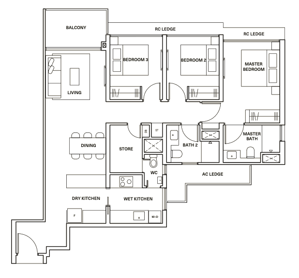
At 1,130 square feet, this 3 bedroom premium unit at Clavon is considered quite an average size.
Notable features are that all 3 bedroom premiums are corner stacks so there is the inclusion of windows for the kitchen and toilets. Plus the AC ledge is hidden at the back of the bathrooms so you do enjoy full length windows for all the bedrooms.
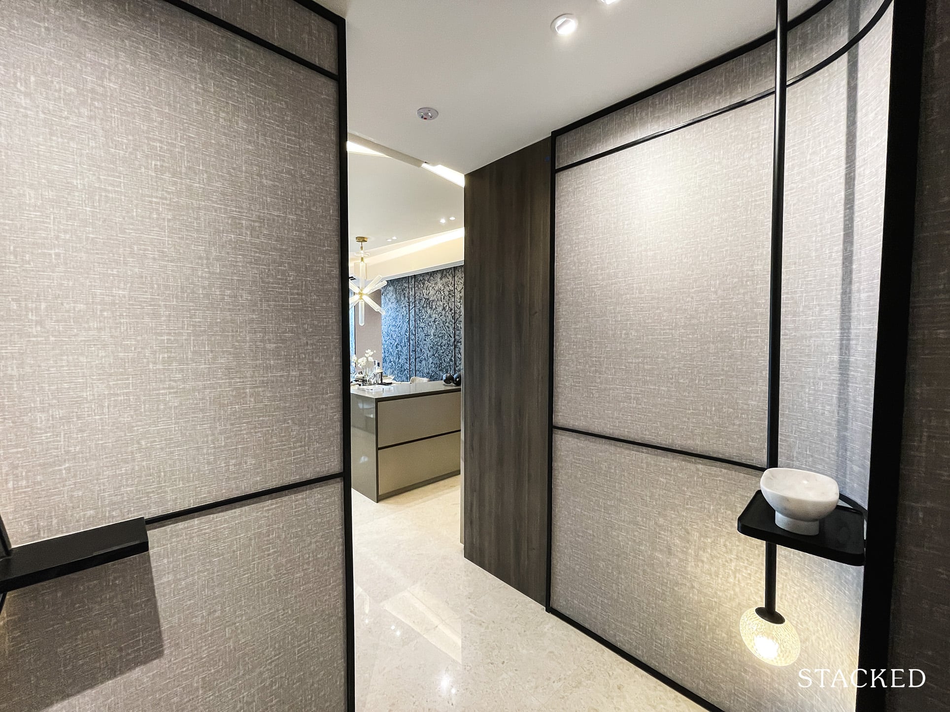
The entrance to this unit features a small foyer, which is understandable given most families would like to have a certain degree of privacy. It doesn’t take up too much space, which is good.
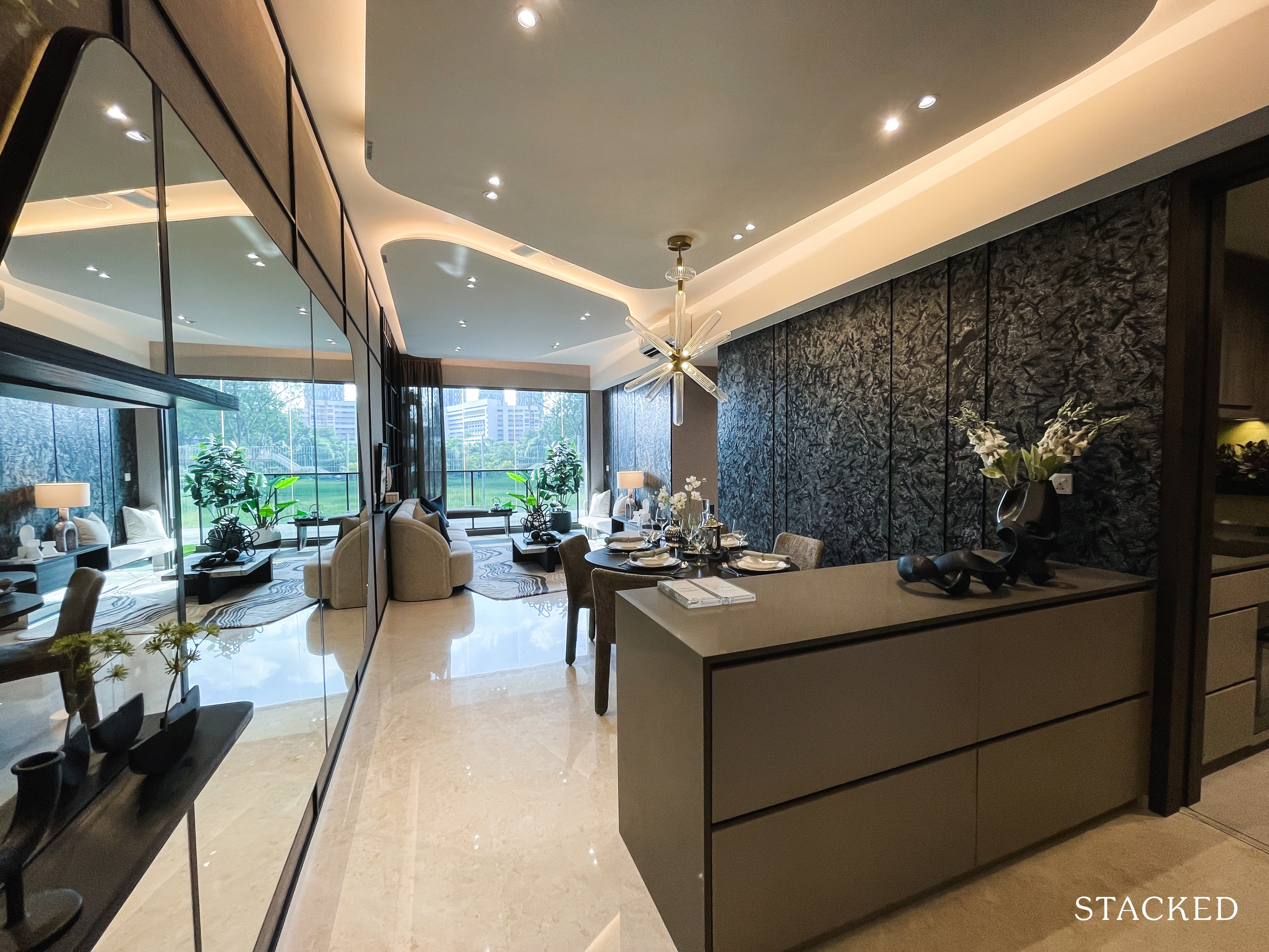
Once you step further into the unit, you are greeted by the island counter for the dry kitchen, as well as the sight of the living and dining areas. As always this is completely a personal opinion but I’m not a fan of the ID for this unit. The dark patterned feature wall makes the space look smaller, and overall it somehow looks a bit old fashioned for my tastes.
As part of its premium tag, living/dining and dry kitchen areas feature marble floorings.
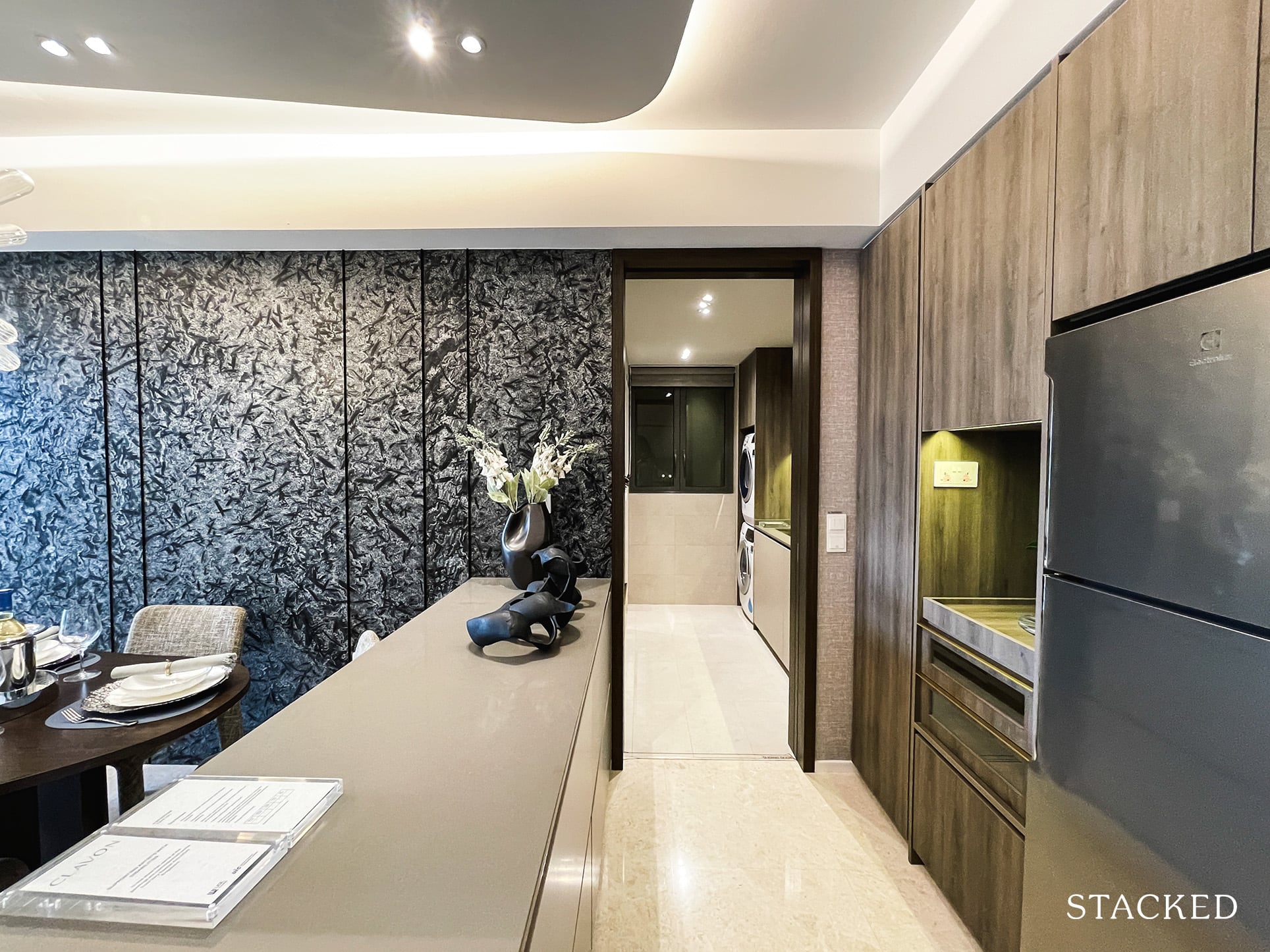
It isn’t all too often that you get a dry kitchen for a 3 bedroom unit, although that’s also because this is the premium unit after all. Nonetheless, the additional countertop space and storage will certainly come in handy.
That said, this island isn’t really the most useful out there. Without a sink, or additional features it effectively is just a countertop space.
If you’ve realised so far, none of the fridges so far are of the in-built variety that has become quite commonplace. On one hand, you do get more flexibility should you need to change the fridge in the future, but I think many now prefer the in-built ones due to how seamless it allows the place to look.
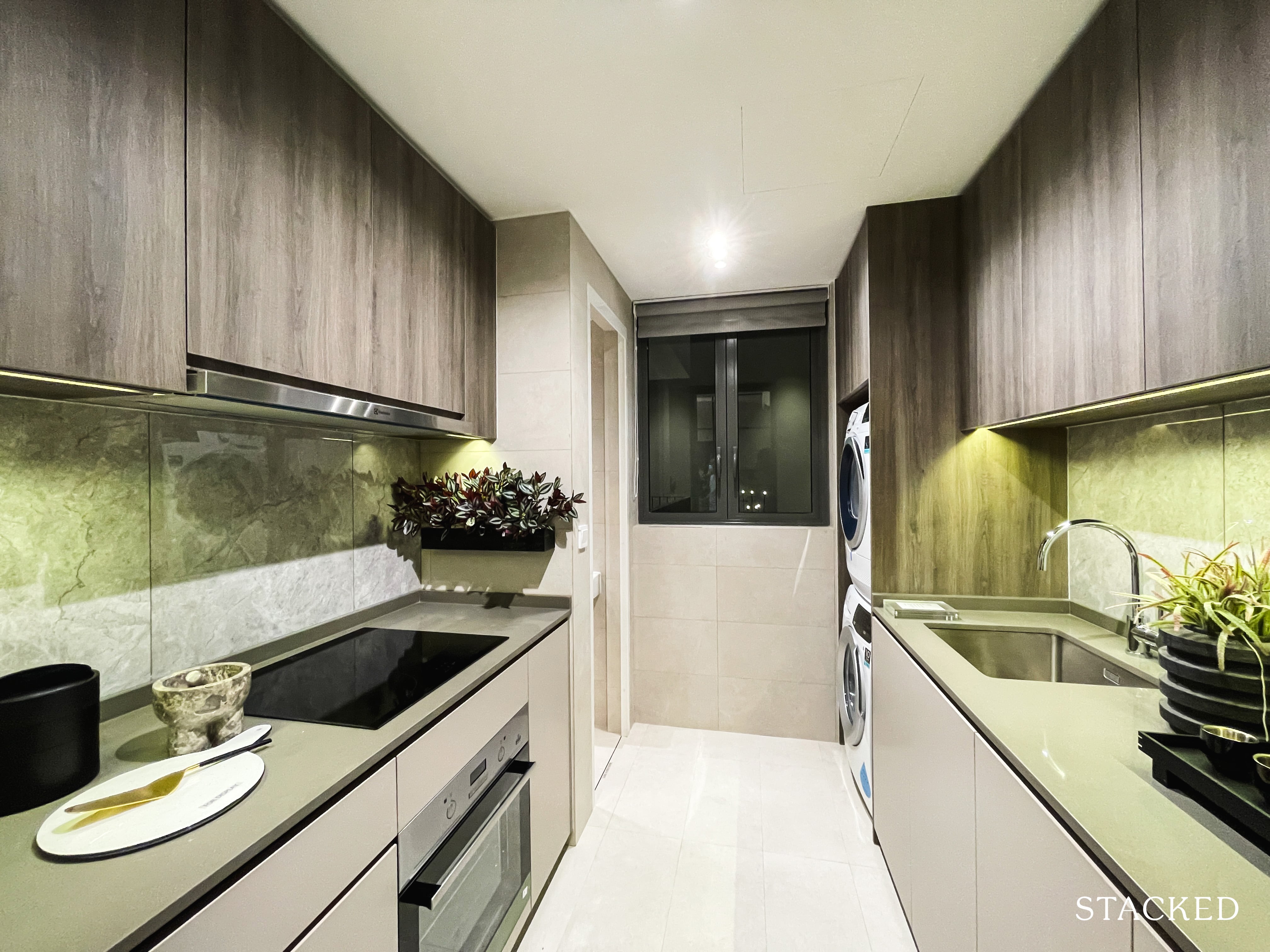
The wet kitchen itself is decently sized, with just about enough space for 2 people to work back to back comfortably. You have induction hobs here, which may be a disappointment to those who prefer the versatility of gas hobs instead. The kitchen appliances are all by Electrolux – which is the chosen brand across the board.
What’s great here also is the windows at the end, which provides much need ventilation for those doing heavy cooking.
The washer/dryer are located at the end too, but there isn’t actually a yard space here, which understandably some may see as a dealbreaker.
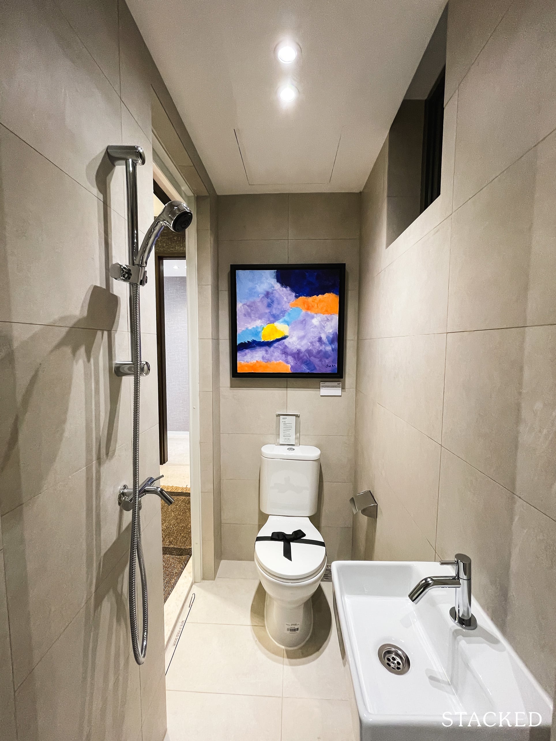
In what is probably a first for me, the WC here is a special one as it is of a jack and jill variety. If you’re wondering why it was designed this way, it’s because this is sort of a passageway linking the utility room to the kitchen.
It’s odd no doubt, but you can’t fault the practical aspects of it too.
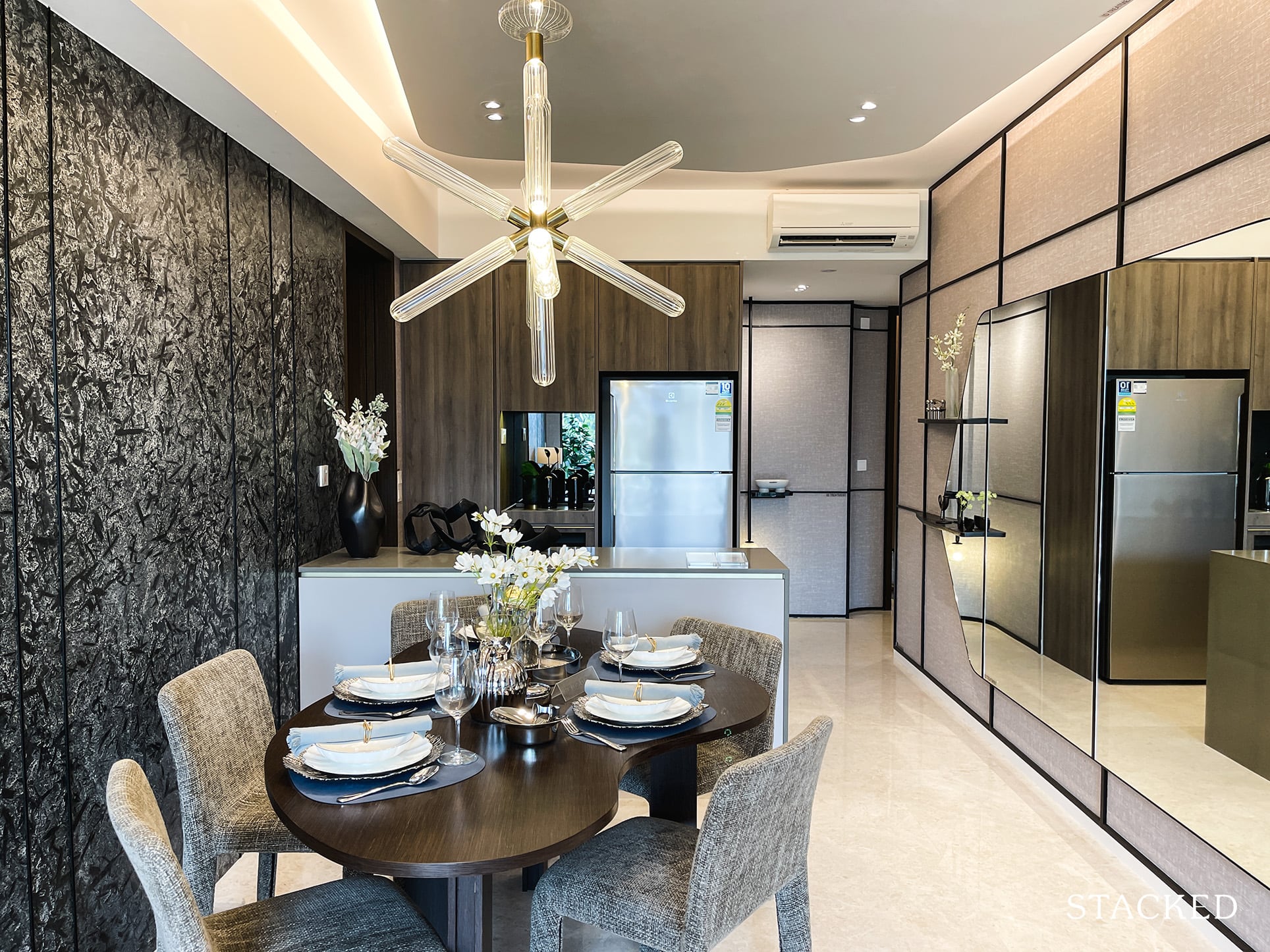
The dining space is quite average, and they have chosen to do away with the usual practice of a dining bench on one end to preserve space.
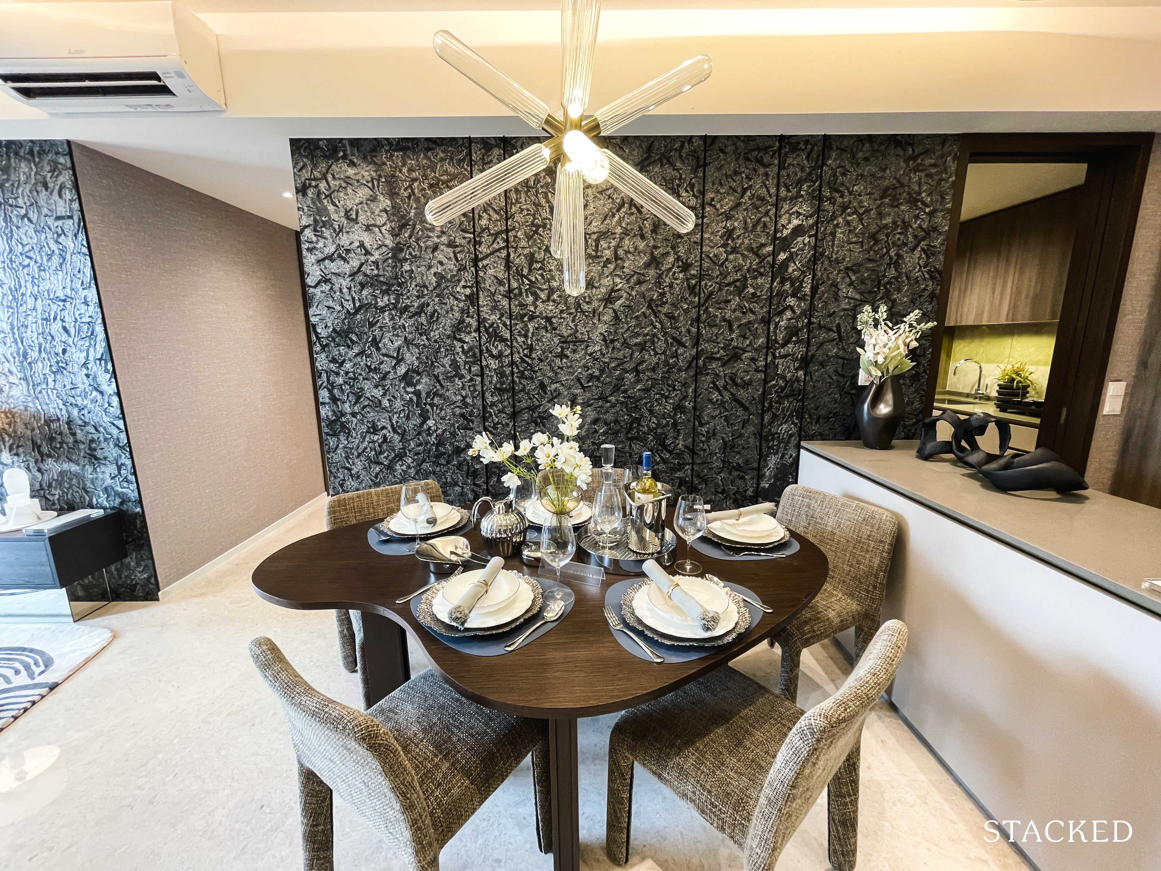
To be frank you can see why that has been the go-to solution for smaller spaces as of recent years, it does provide that extra bit of space. As you can see here, this queer-shaped dining table while shown to sit 5 doesn’t really leave you with much table space.
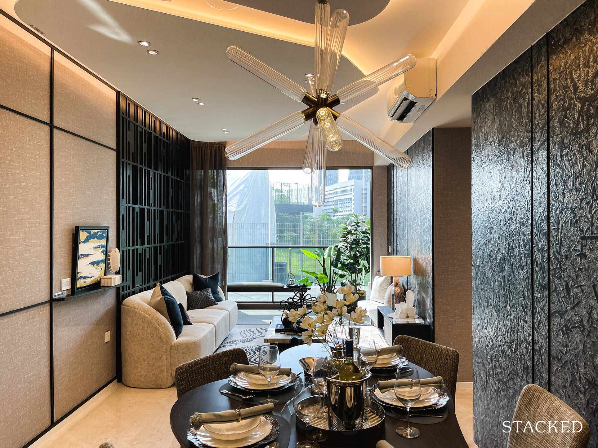
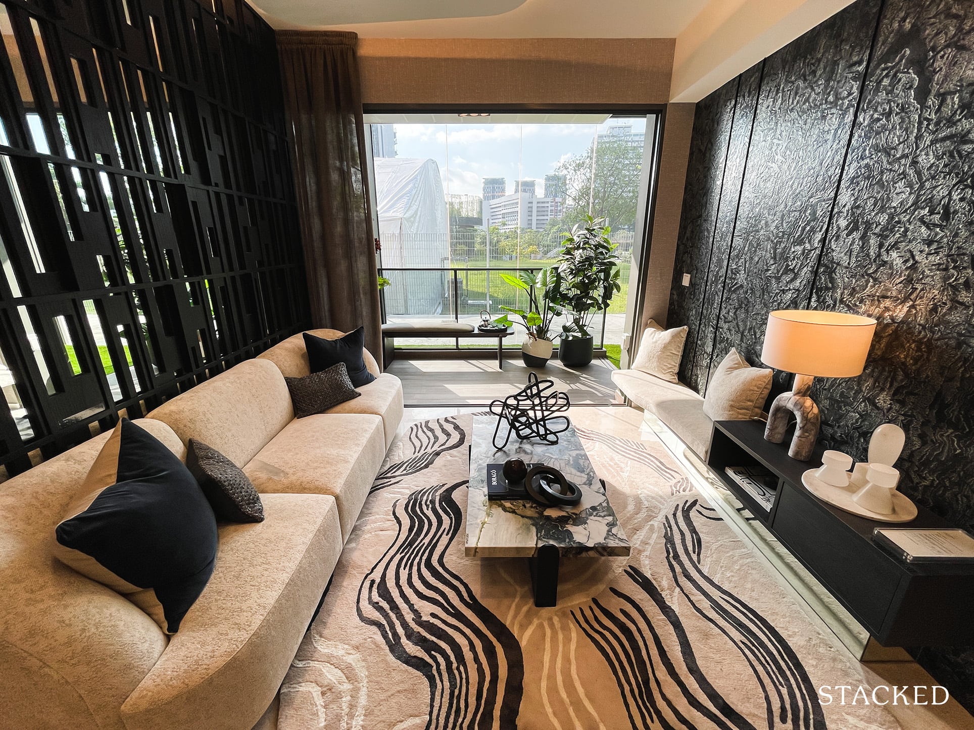
The living room itself is on the small side, so you will have to be well aware of the size of your sofa and TV console.
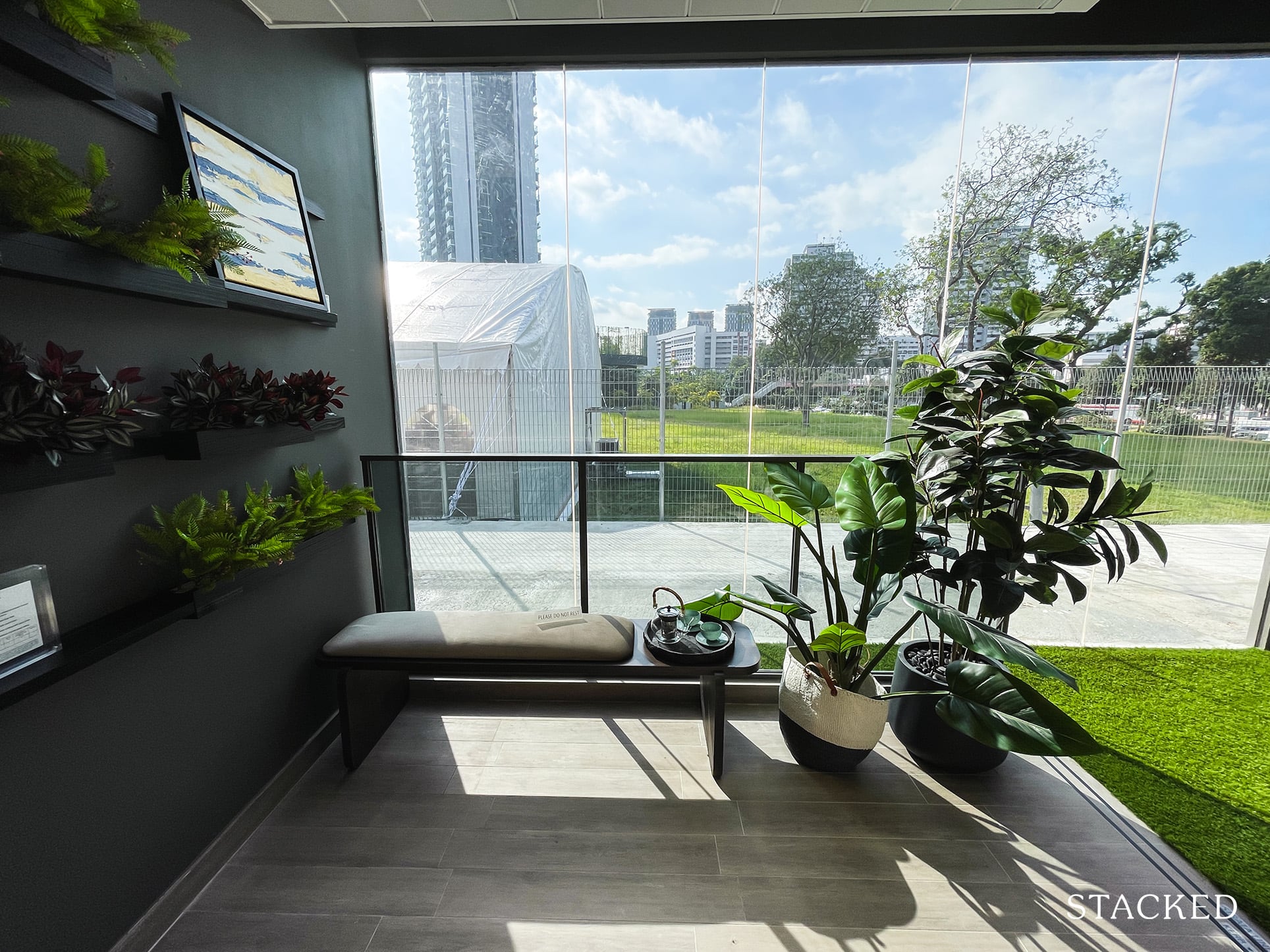
The balcony here is kept to a minimum, which for those who prefer maximising interior space would undoubtedly be a fan of. Like the other units, for those facing the AYE would have an acoustic ceiling installed to mitigate the road noise from the highway.
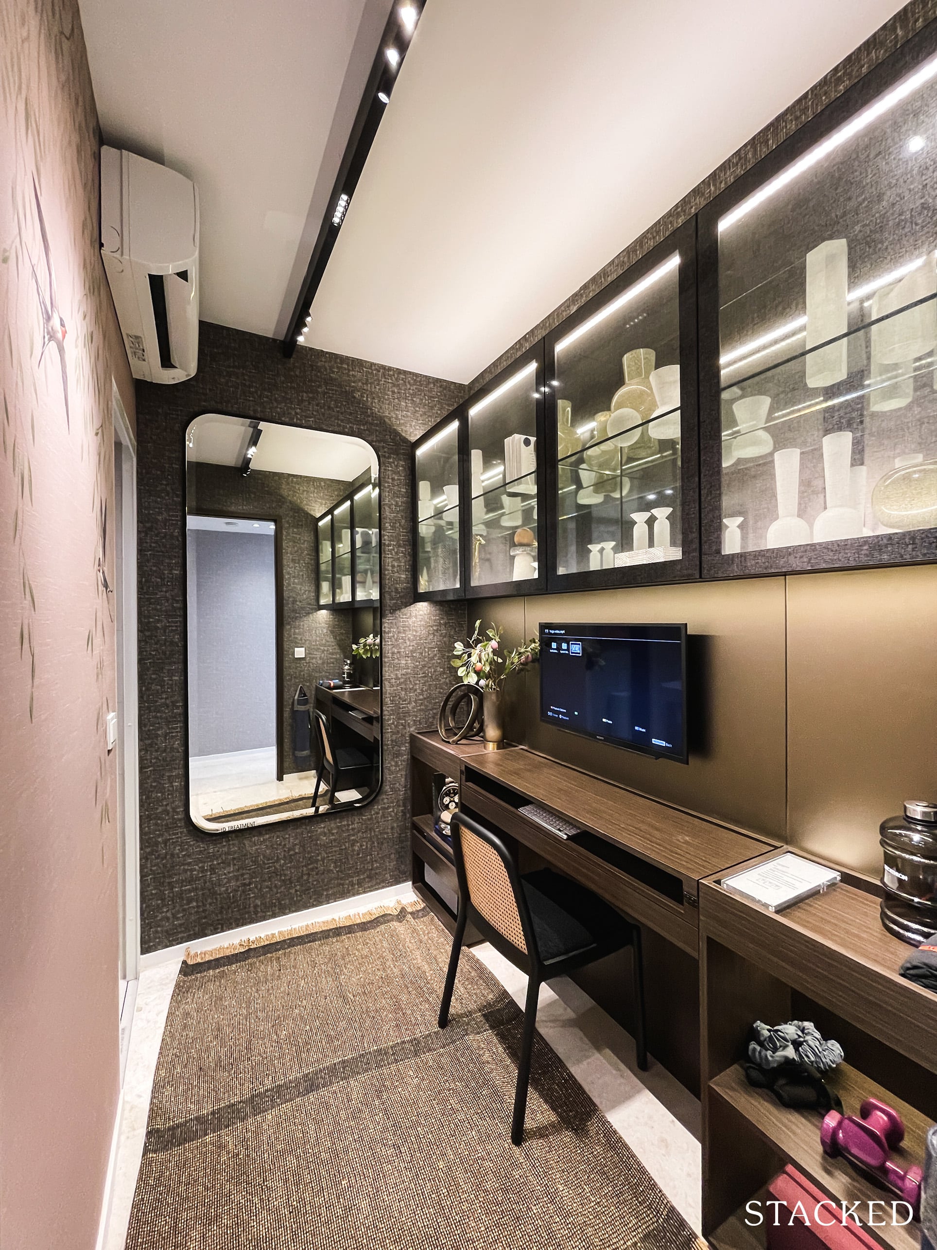
This is the utility room, which you can use as a store (which would be a very big one), helper’s room or even a study as depicted here.
Unlike the 1 bedroom + study unit, you will never really see the light of day should you choose to use this as a study instead. Nevertheless, it will come in handy for those who are looking at working from home as a permanent fixture of their jobs.
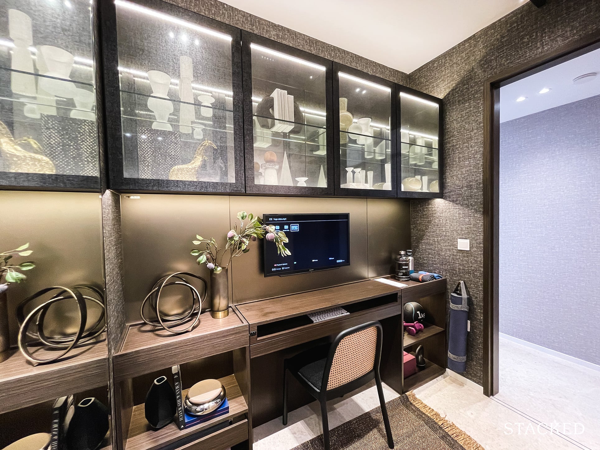
As mentioned earlier, you can access this room through the WC as well.
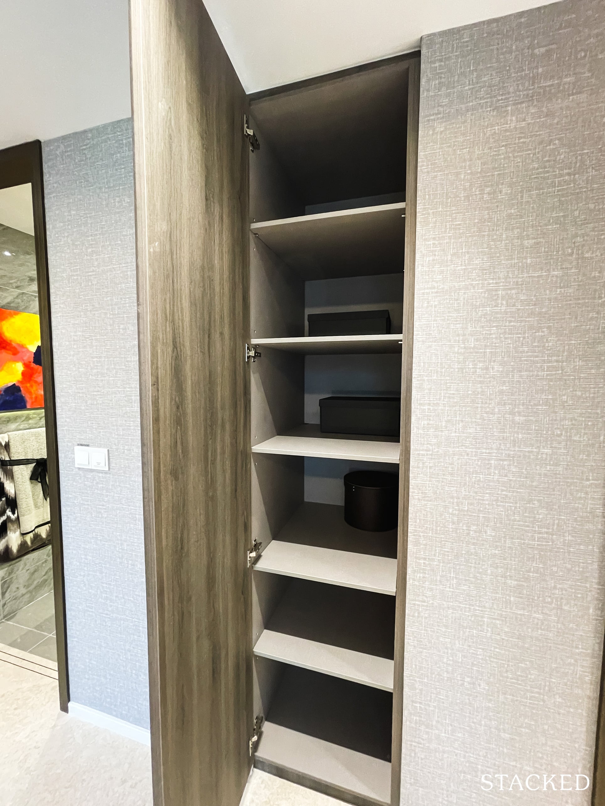
Next to the utility room, a small space has been carved out as an additional storage area.
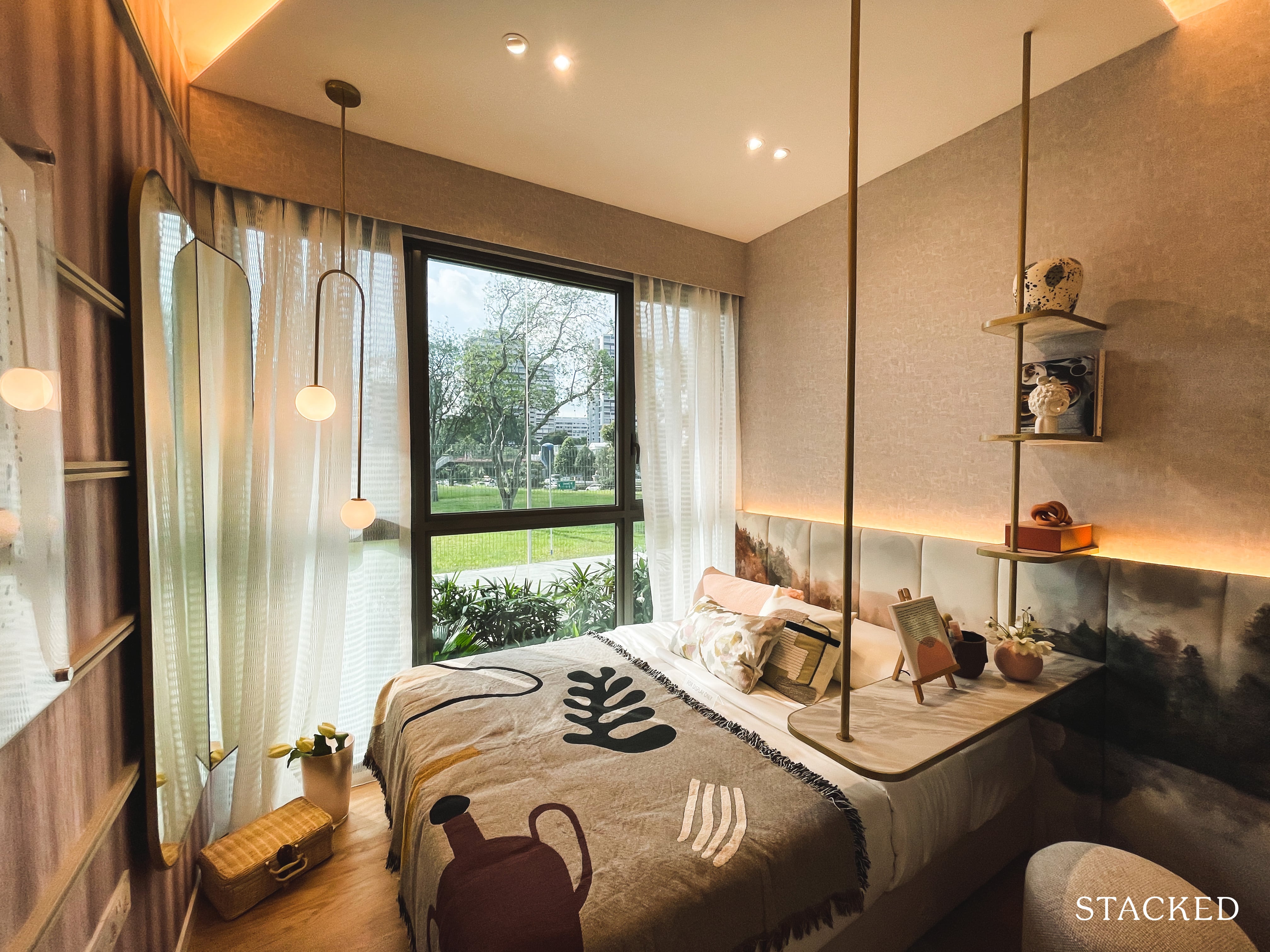
Both common bedrooms are decently sized, and will feature nearly full length windows. And unlike the 2 bedroom unit, this will come with timber flooring instead.
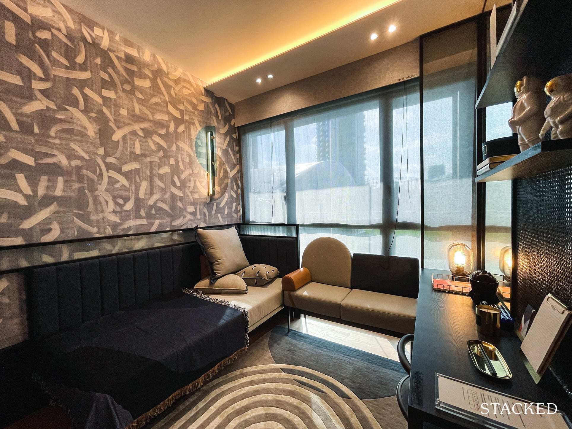
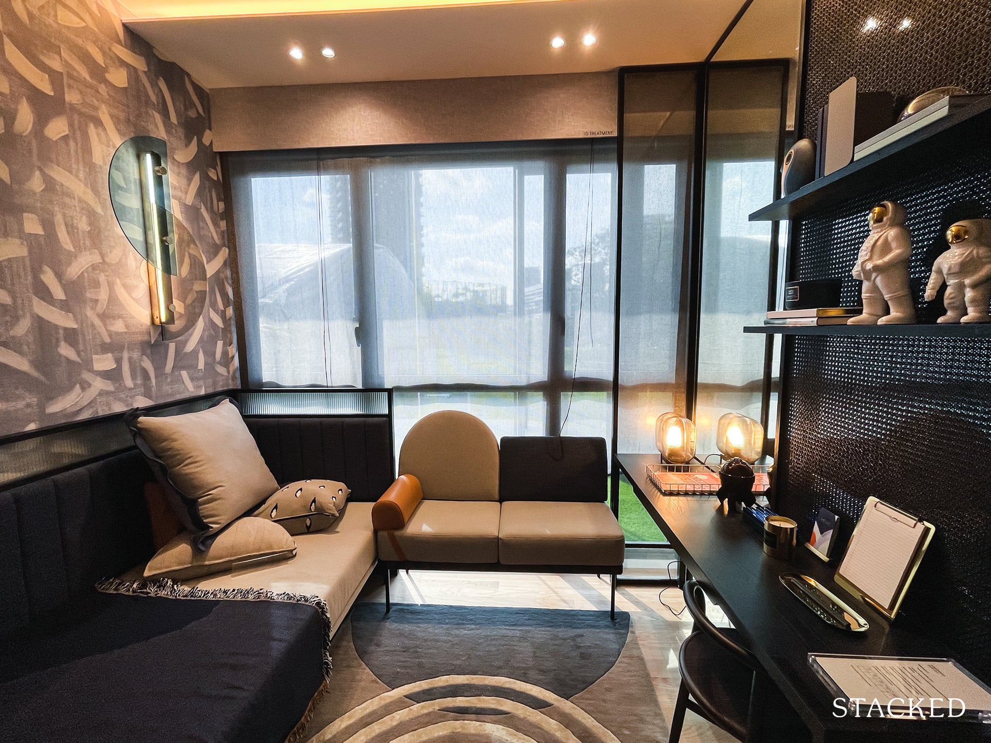
It’s much of the same story for the second common bedroom.
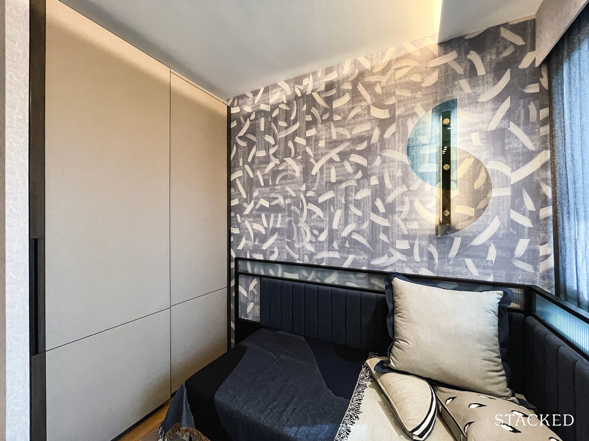
With the standard 2-panel wardrobes being featured in both.
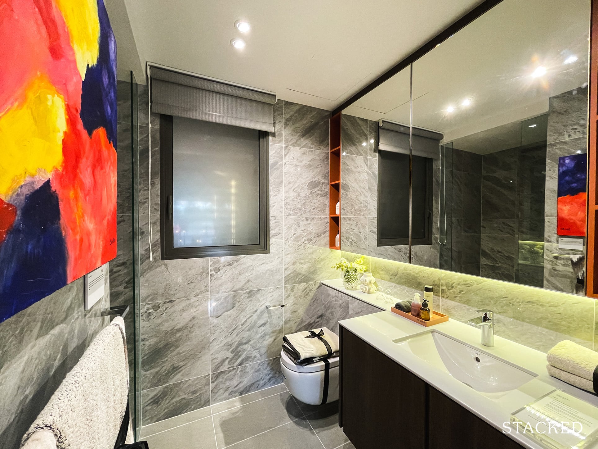
The common bathroom is located on the opposite side of both common bedrooms. It is a comfortable size, and features fittings from Grohe and Roca. The best part? It has a window for proper ventilation. Note neither of the bedrooms are ensuite so this will be shared between both bedrooms.
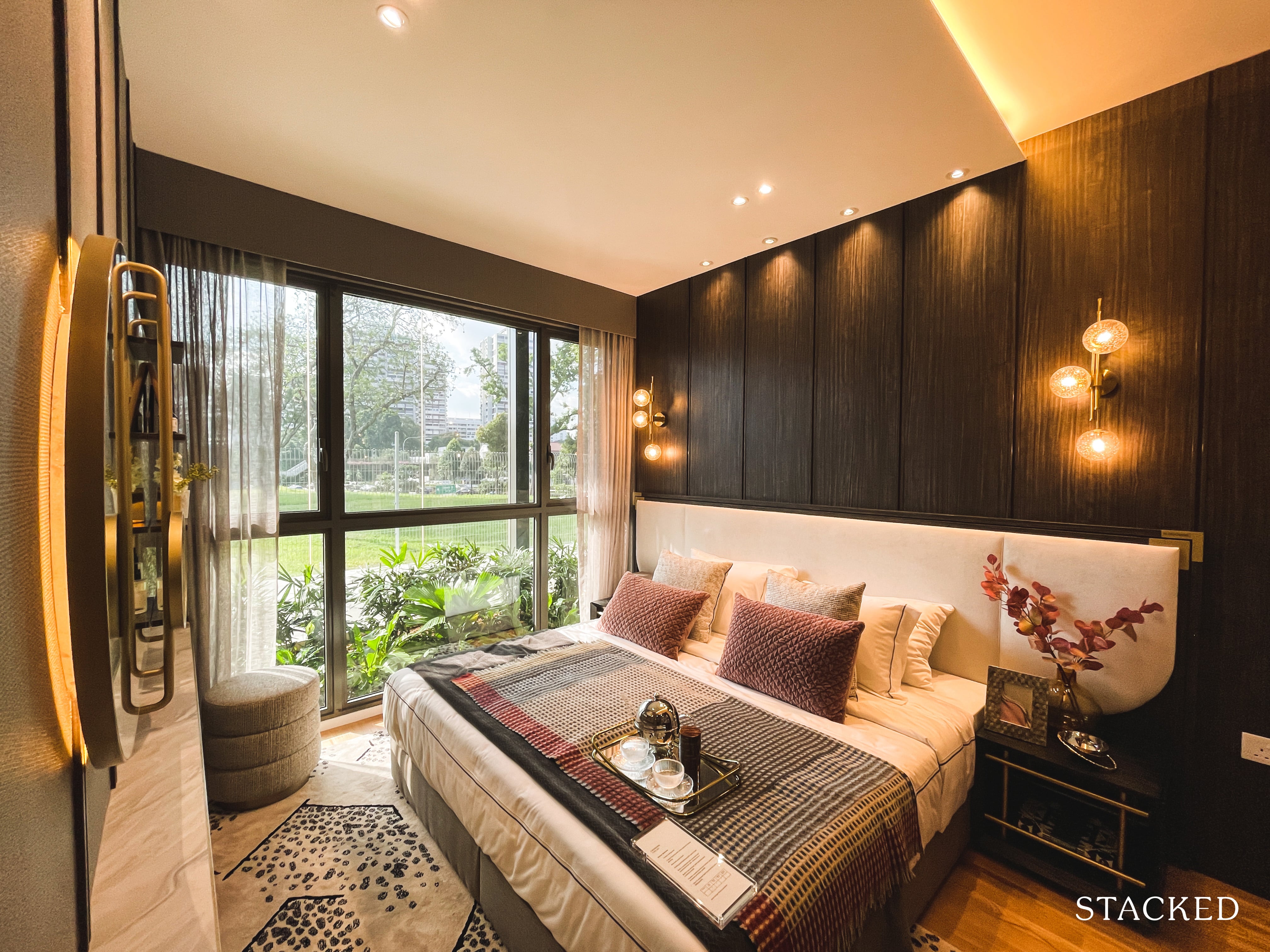
Like everything else you’ve seen thus far, the master bedroom is a very average size too. You can fit in a king sized bed, with room to spare at the side for small side tables.
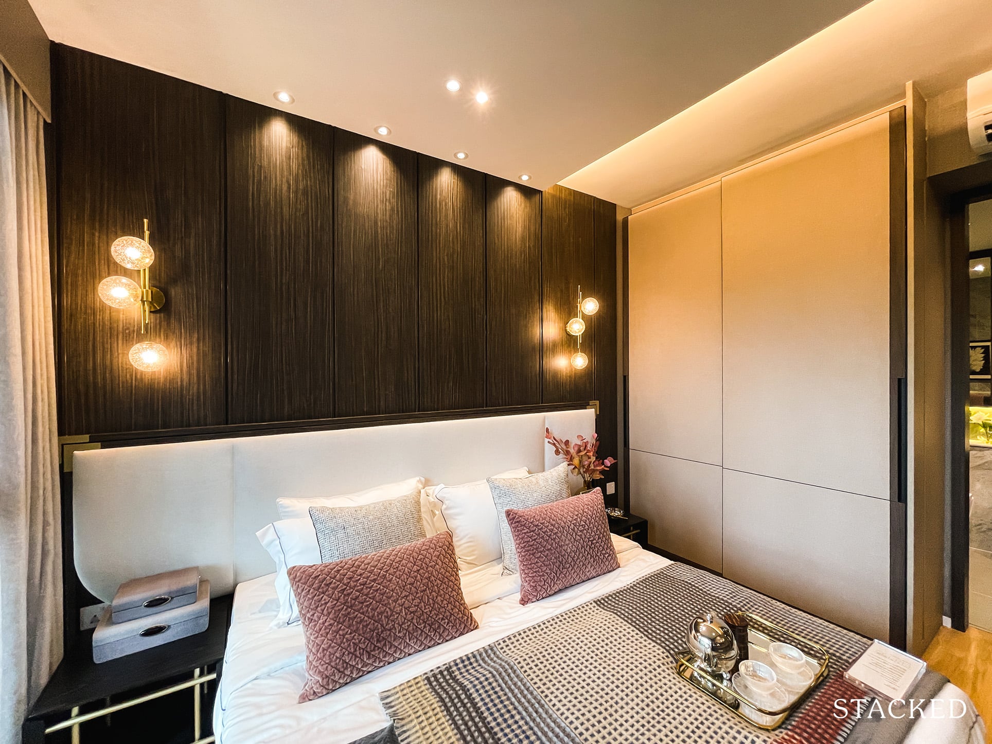
And unless you aren’t intending on having a helper or using the utility as a study, the standard wardrobe space will always be a point of contention to its adequateness.
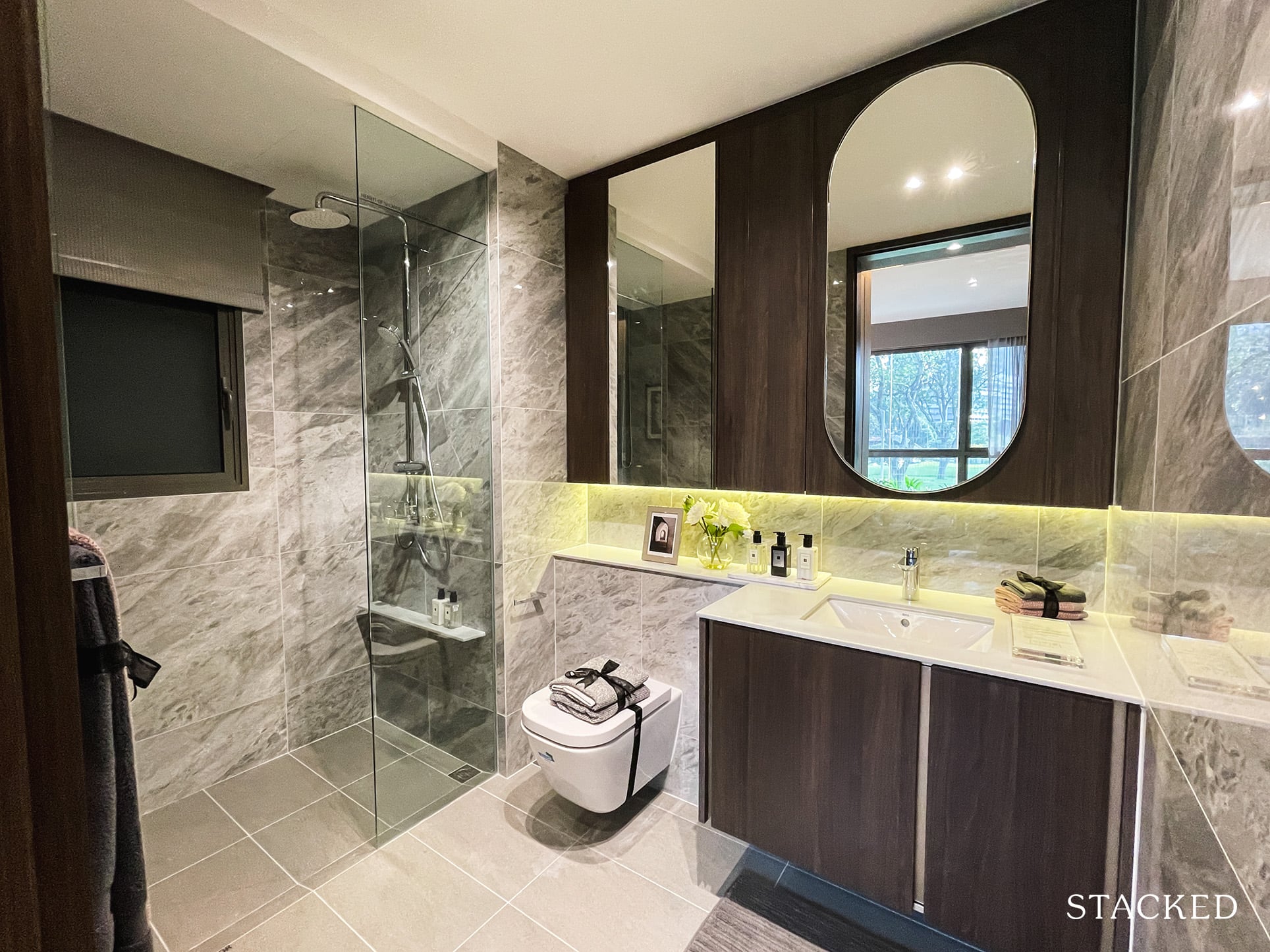
If you ask me, I much prefer the colours of the 2 bedroom master bathroom as compared to this. I personally find the combination of dark wood and the grey porcelain tiles to not work as well together.
Like the common bathroom, the plus point here is the addition of the window for natural ventilation. It does feature the same rain shower, although it must be said that for a premium unit it is a little disappointing to not see a proper one installed instead of this 3-in-1 unit.
Clavon 5 Bedroom Premium Review
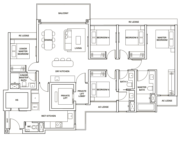
As far as 5 bedroom units go, I’d consider this 5 bedroom premium unit at Clavon to be on the smaller side. At 1,690 square feet, it is comparable in size to the one at Florence Residences, but falls short of those at JadeScape and Treasure at Tampines.
It comes with a private lift, as you might expect for units of this size usually. It’s also a bit of an oddball with regards to where the space is allocated to, with the biggest issue being the size of the dining and living area.
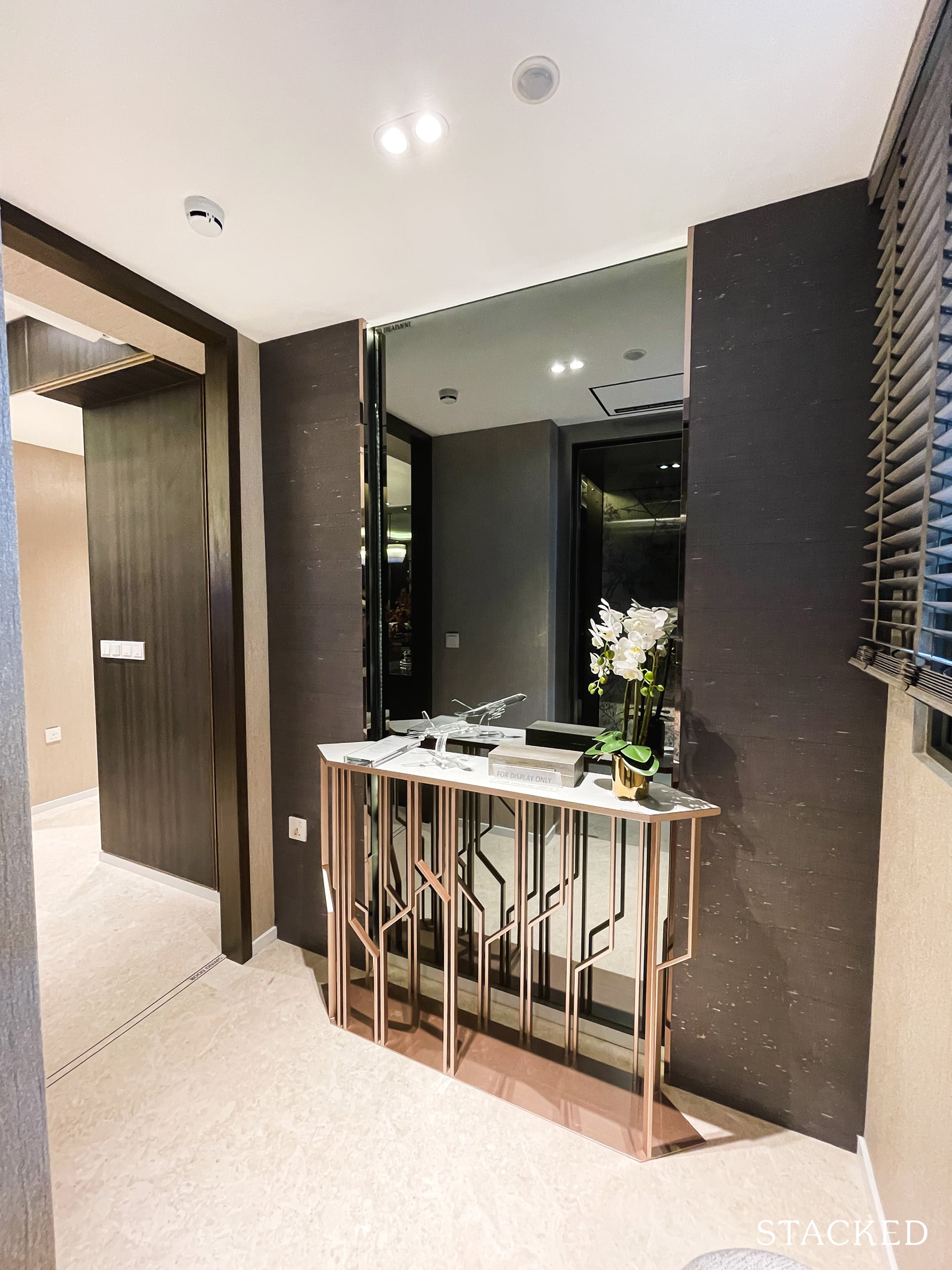
The private lift opens up to a lobby area, which has a window so it’s good for additional natural light.
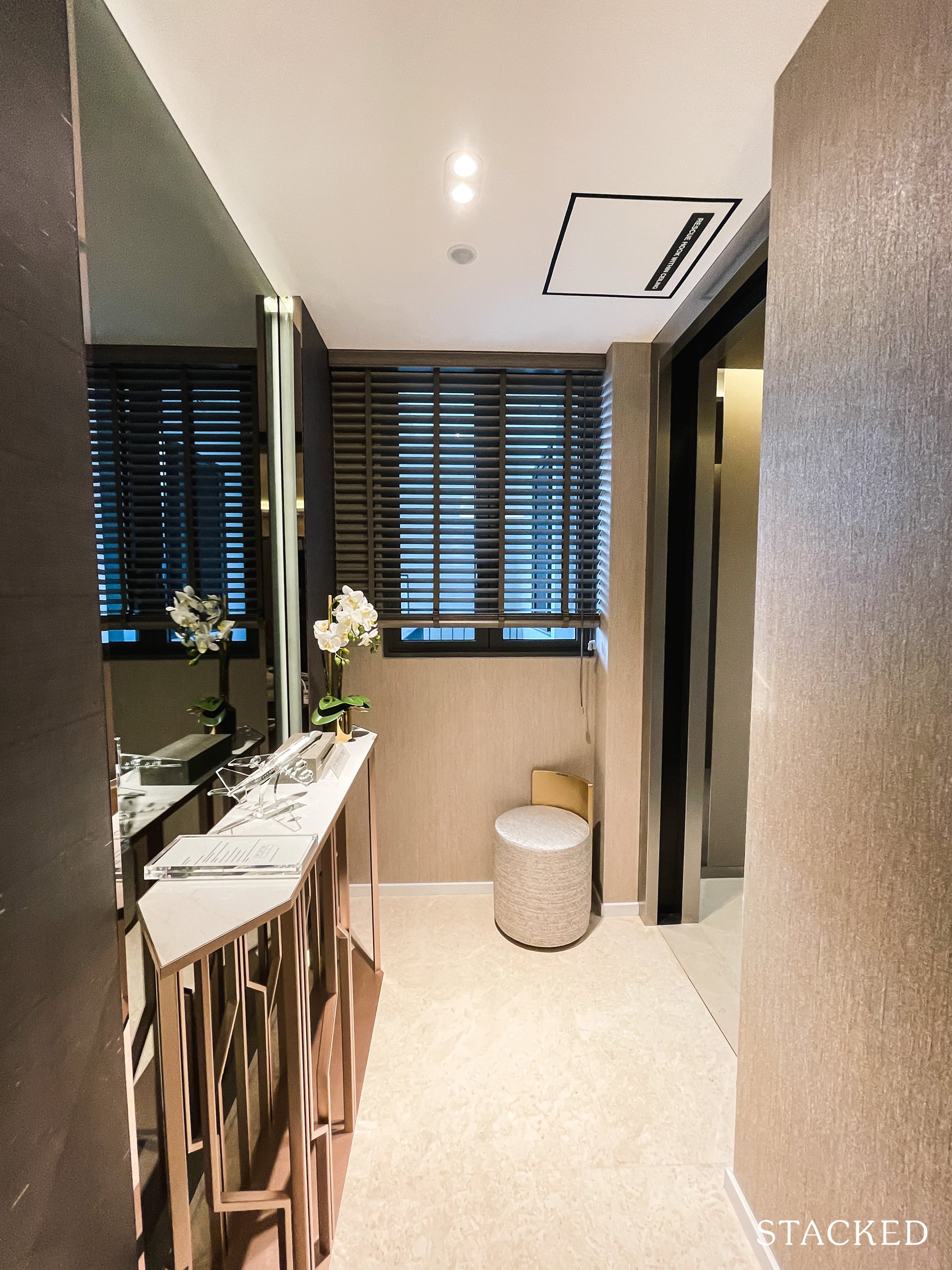
As the biggest and most expensive of all the units at Clavon, it would naturally come with the best finishings and fittings as well. Of course, floorings here are all marble, including this lift lobby area too.
Ceiling height is at 2.9 metres as well, as compared to the 2.79 metres in the regular units.
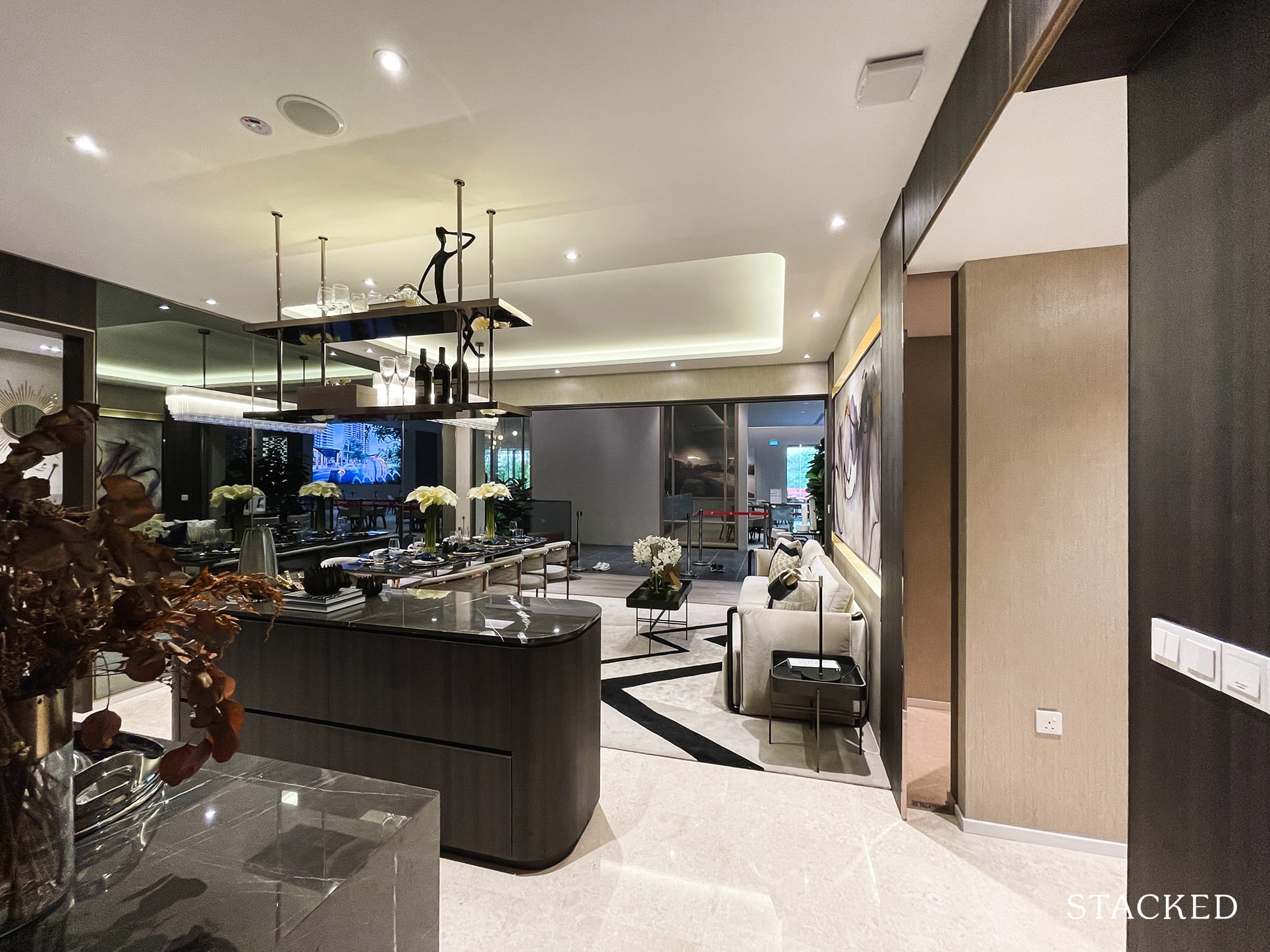
Opening up to the main living and dining area, it is quite immediately apparent what the biggest drawback of this 5 bedroom unit is.
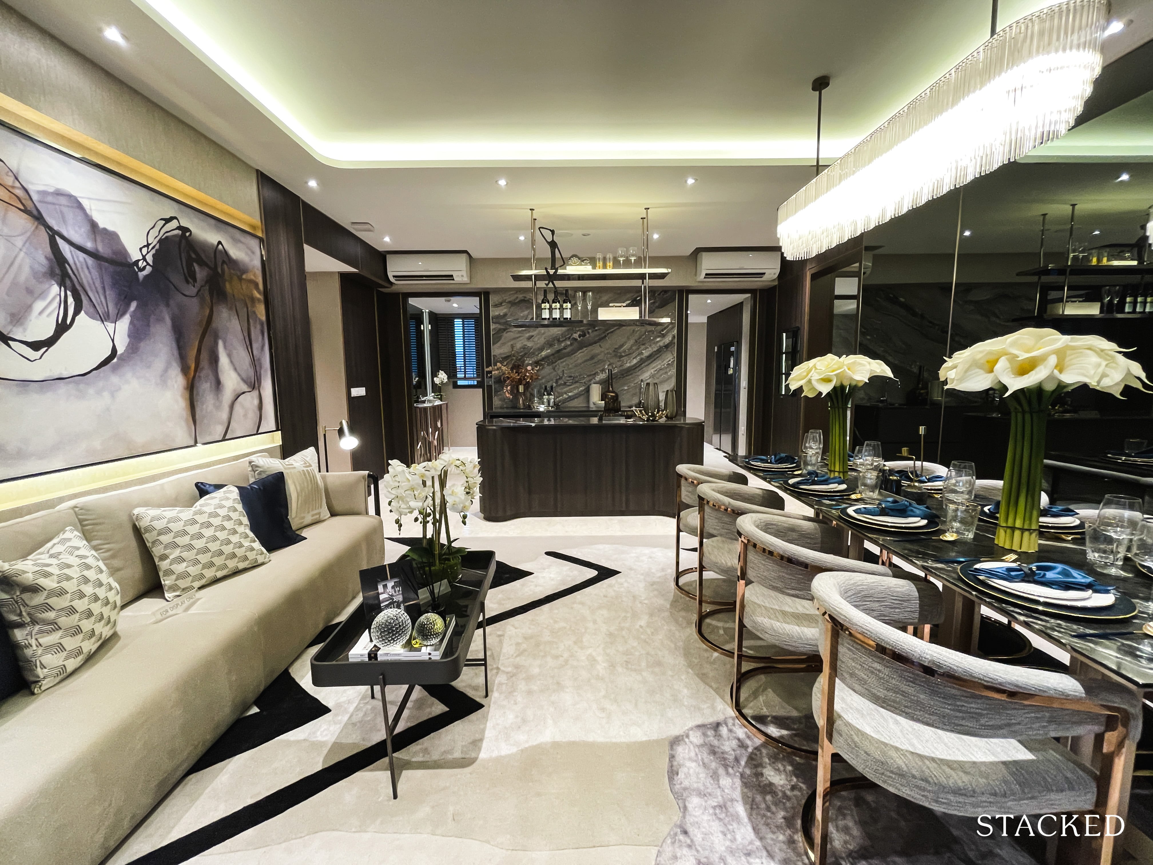
Perhaps if you aren’t one for communal areas this might not pose so much of an issue, but I would imagine for bigger families that like to have common spaces to hang out would find this to be a serious pitfall.
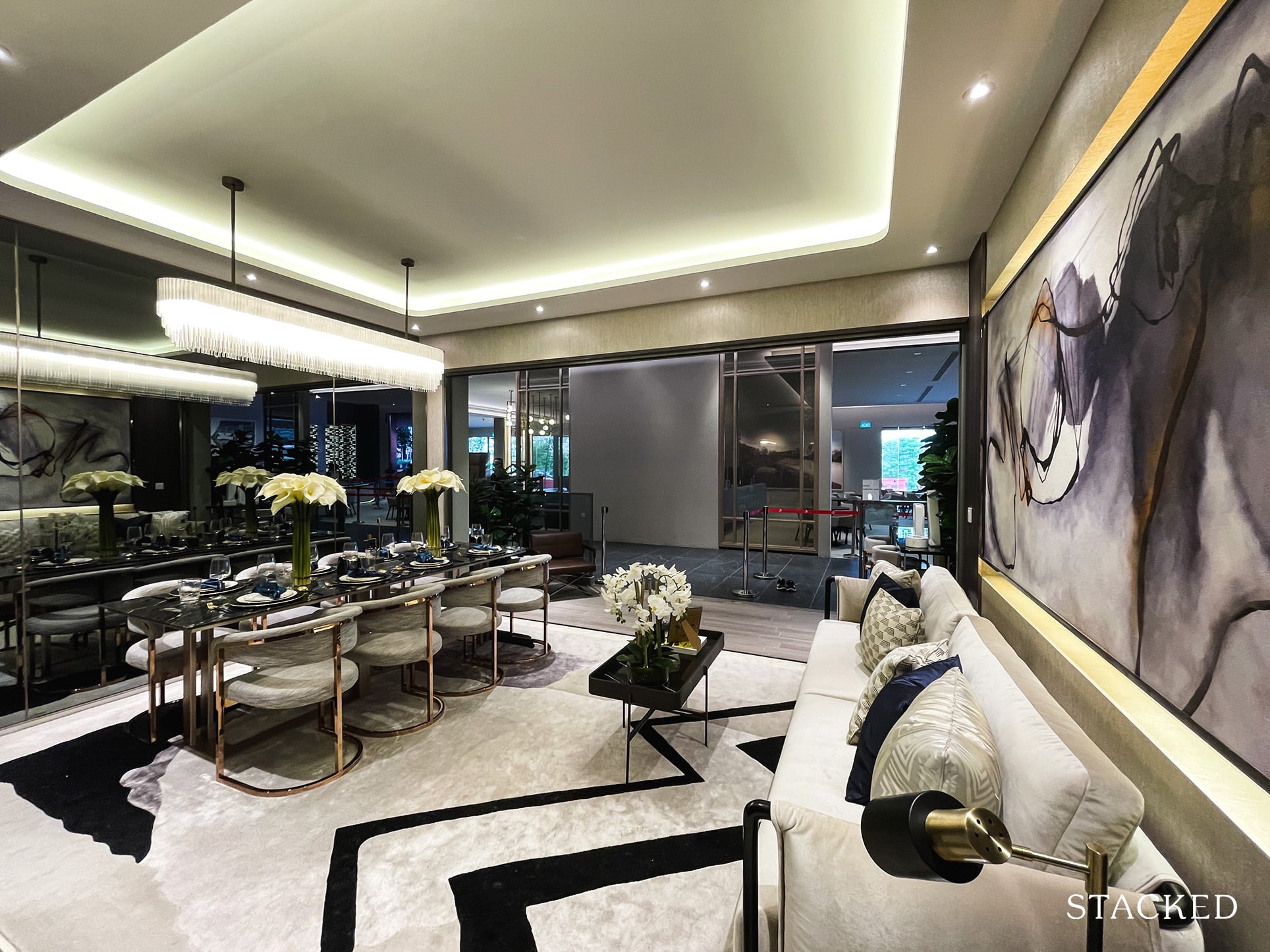
I know some people like the seamless look of the dining and living areas in one. And while it’s great for a large space, I do feel for a smaller one such as this, it exacerbates the flaws of the space even more.
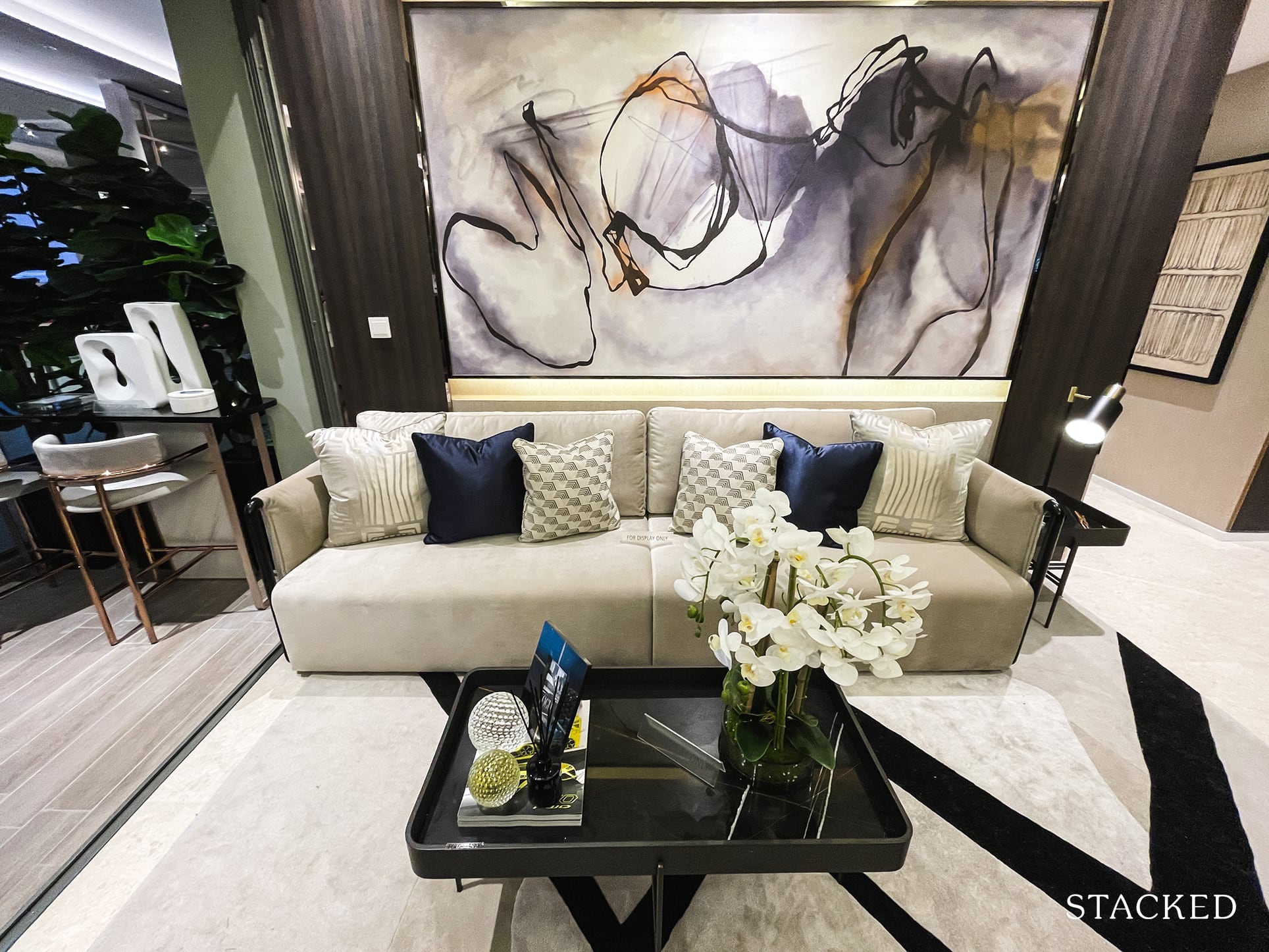
I think it’s quite clear to see that a sofa of this size isn’t going to cut it for those looking at a 5 bedroom unit. But with the current layout, it’s hard to see where there would be space to have additional seating included.
Let’s also not forget this current layout does not include a TV setup. There are obviously ways to workaround this, like installing a projector. Or, if your family size allows it, to have a cinema room instead.
That said no matter the workaround, it shouldn’t really have to even come to this.
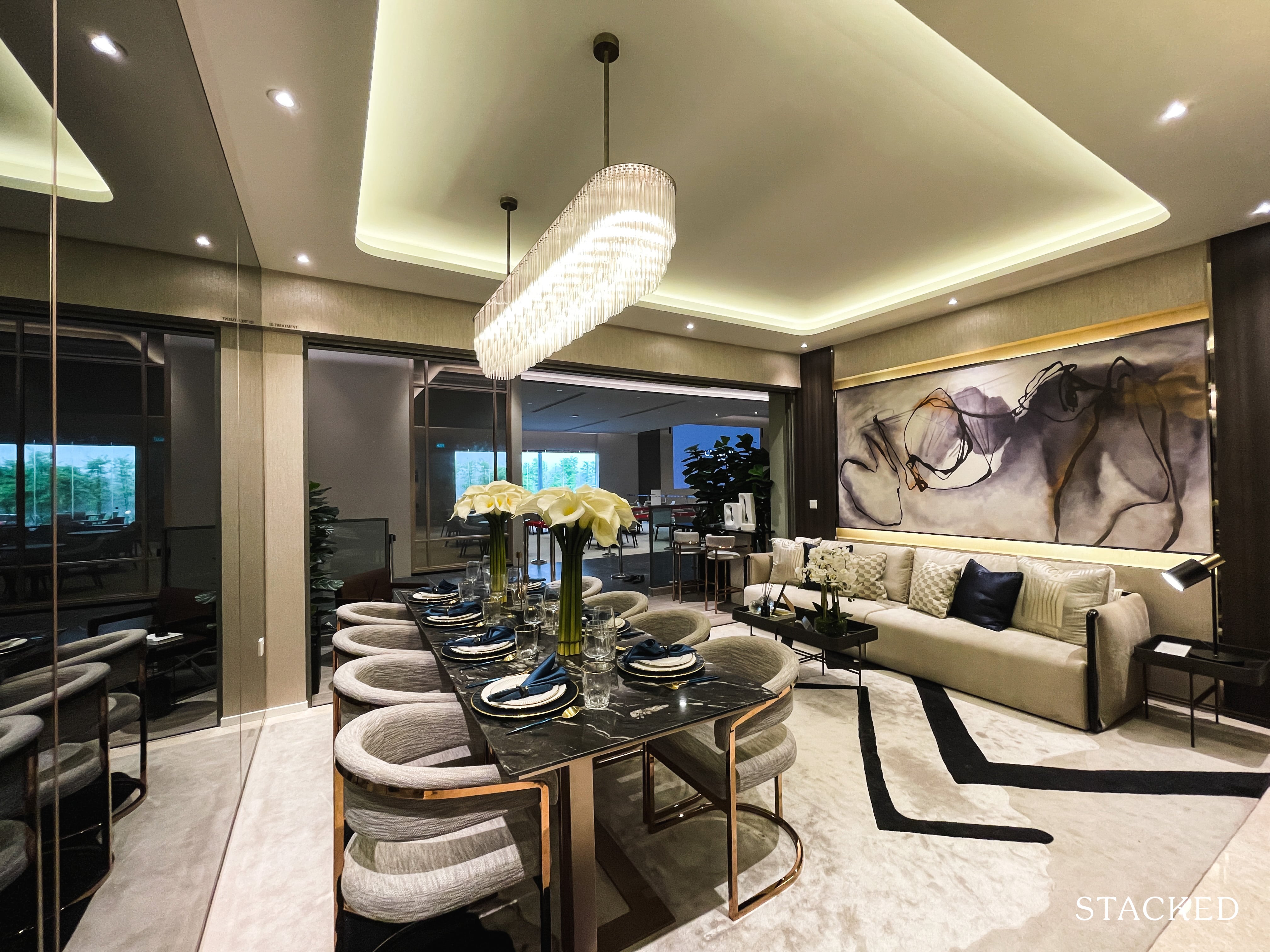
Same goes for the dining area. So while you can fit a 8 seater dining table length wise, it’s the width again that faces the same issues. When the dining table is fully occupied, the walkway to the balcony is likely to be tight – and this is with just the one sofa included!
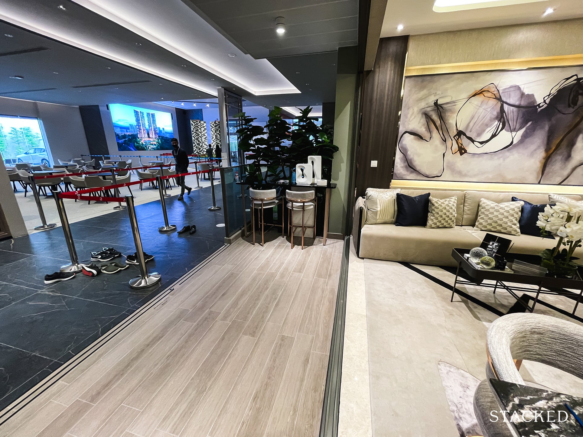
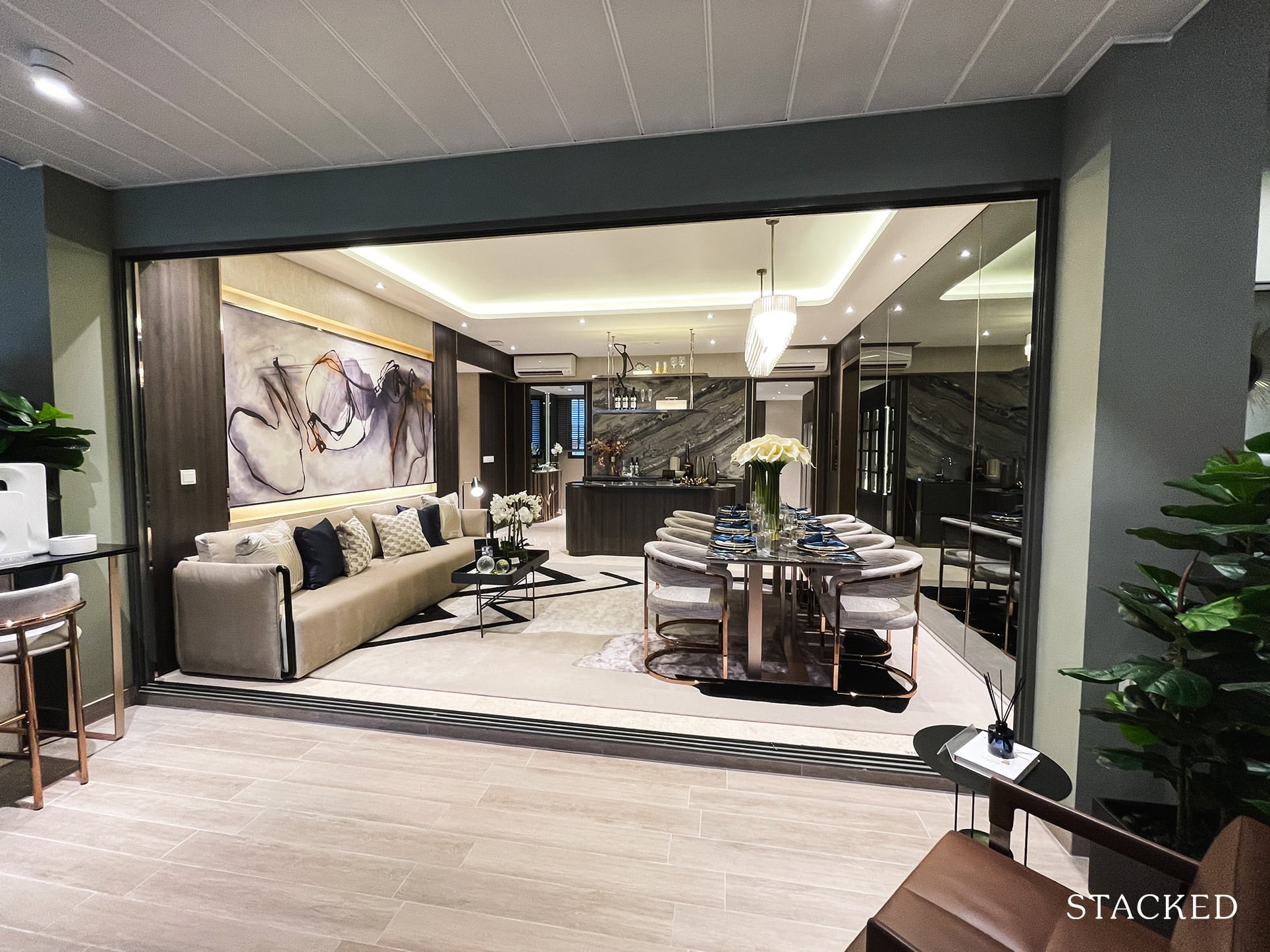
And while I’d usually advise to move the dining out to conserve on interior space, the balcony here isn’t the biggest – it’s hardly wide enough to adequately contain everyone comfortably.
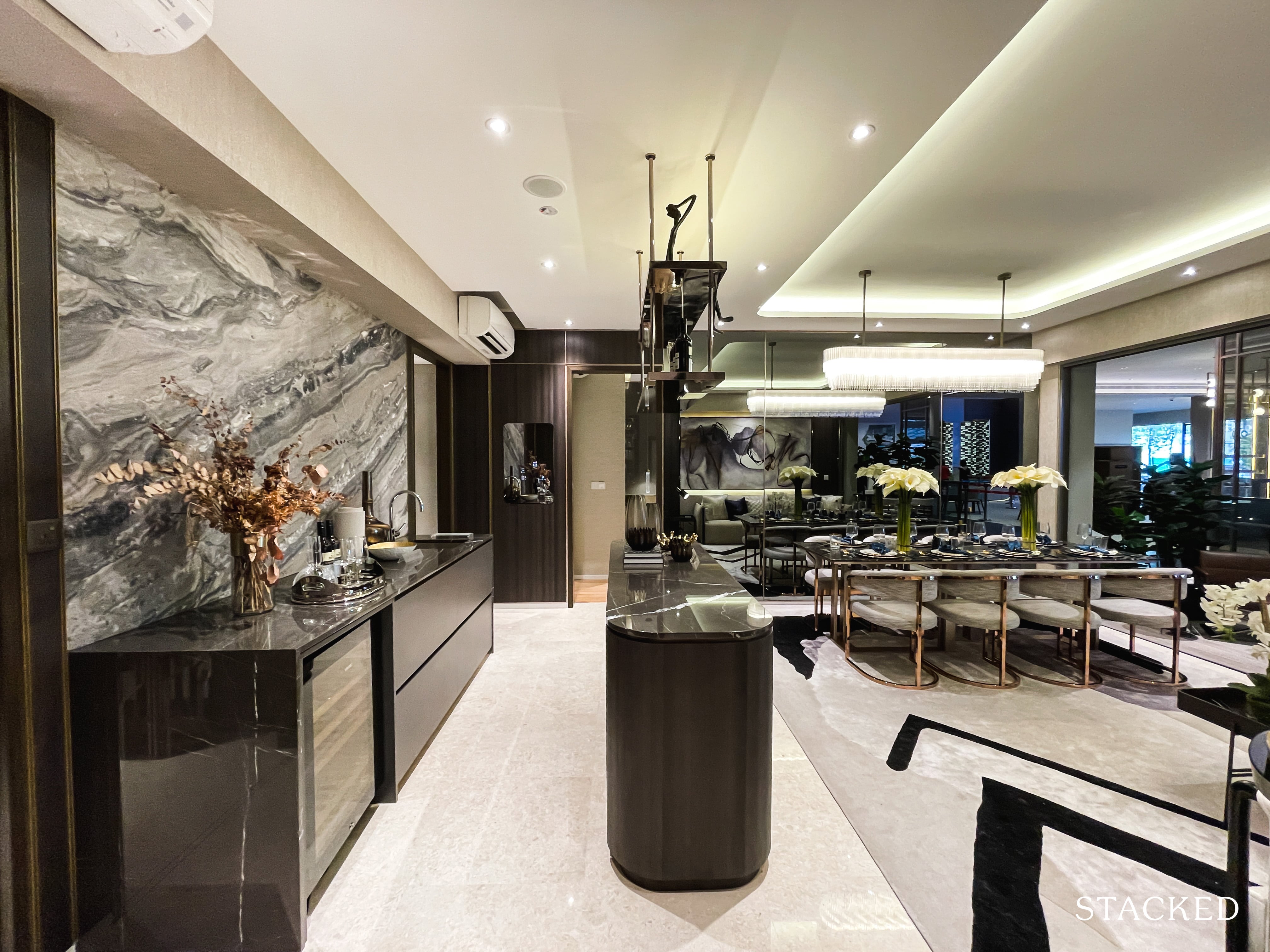
The saving grace does come in the form of the kitchen. While the kitchen island itself is quite a slim one, the space behind it is not too bad at all.
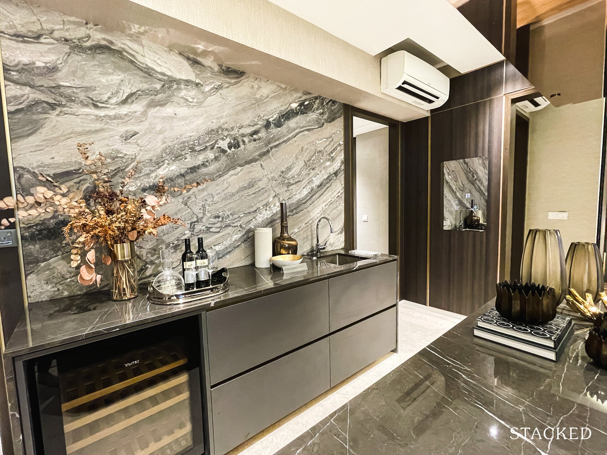
You do have a wine fridge (supplied by Vintec) behind it, along with a useful sink.
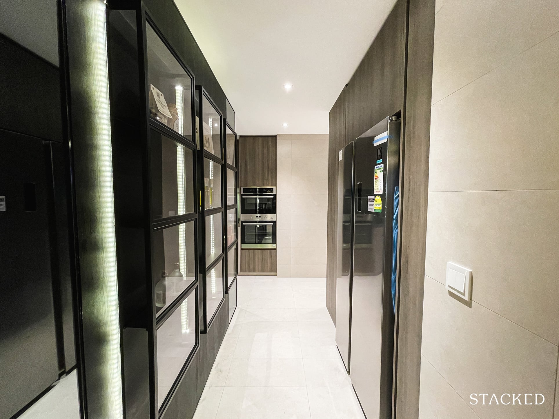
The wet kitchen is located on the right (if you’re facing the lift lobby). It’s a big space, and clearly, this is where some of that living/dining space has gone to.
I do like the inclusion of a well-sized fridge here.
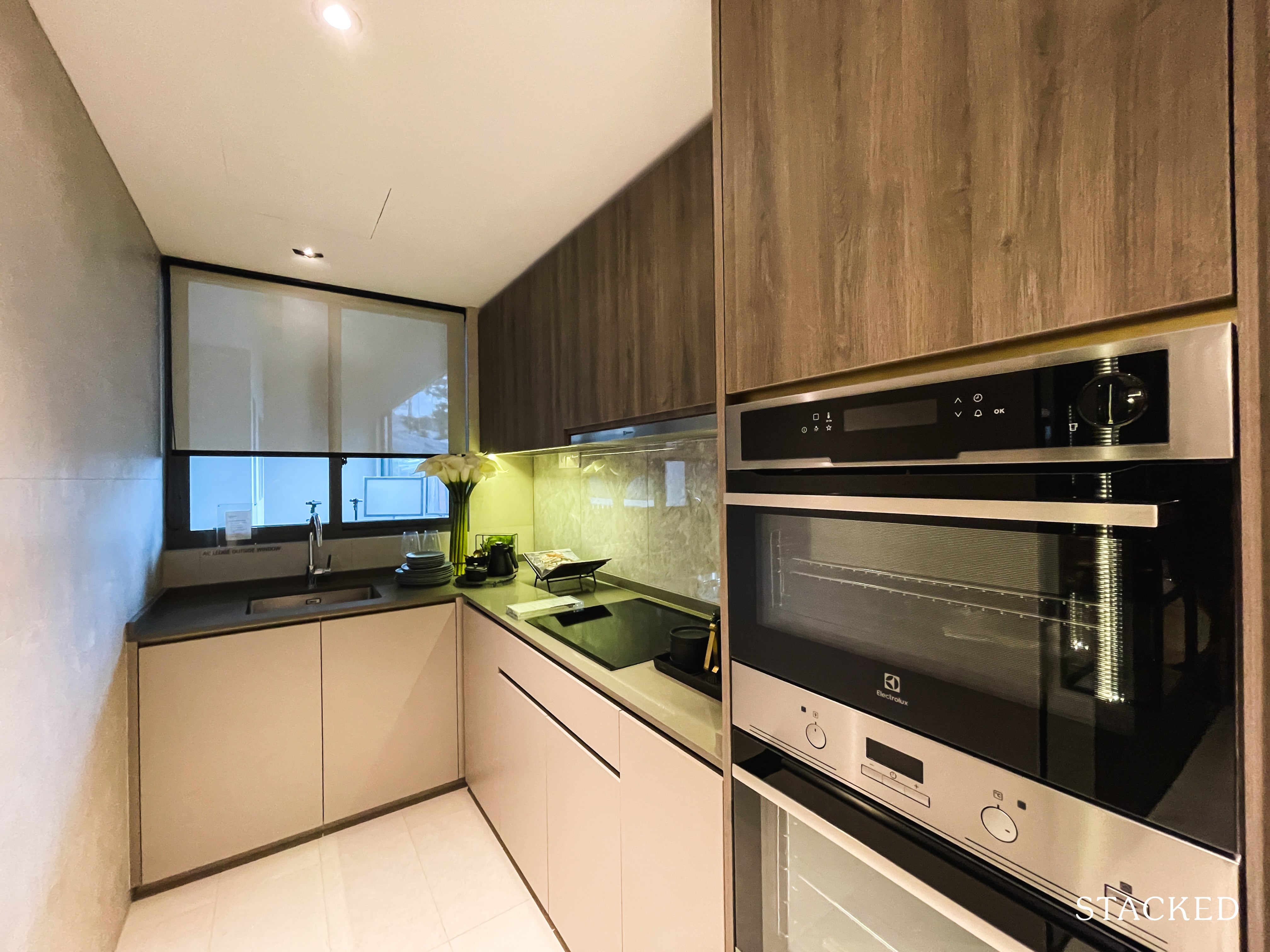
Surprisingly there are no gas hobs to be seen here, with the induction ones that you’ve seen in the other units so far (3 bedroom onwards get the 3 zone ones). You do get an additional steam oven along with the oven, with all the kitchen appliances supplied by Electrolux.
Somewhat disappointingly, there’s only one sink here – I would have liked to see a dual sink at the very least.
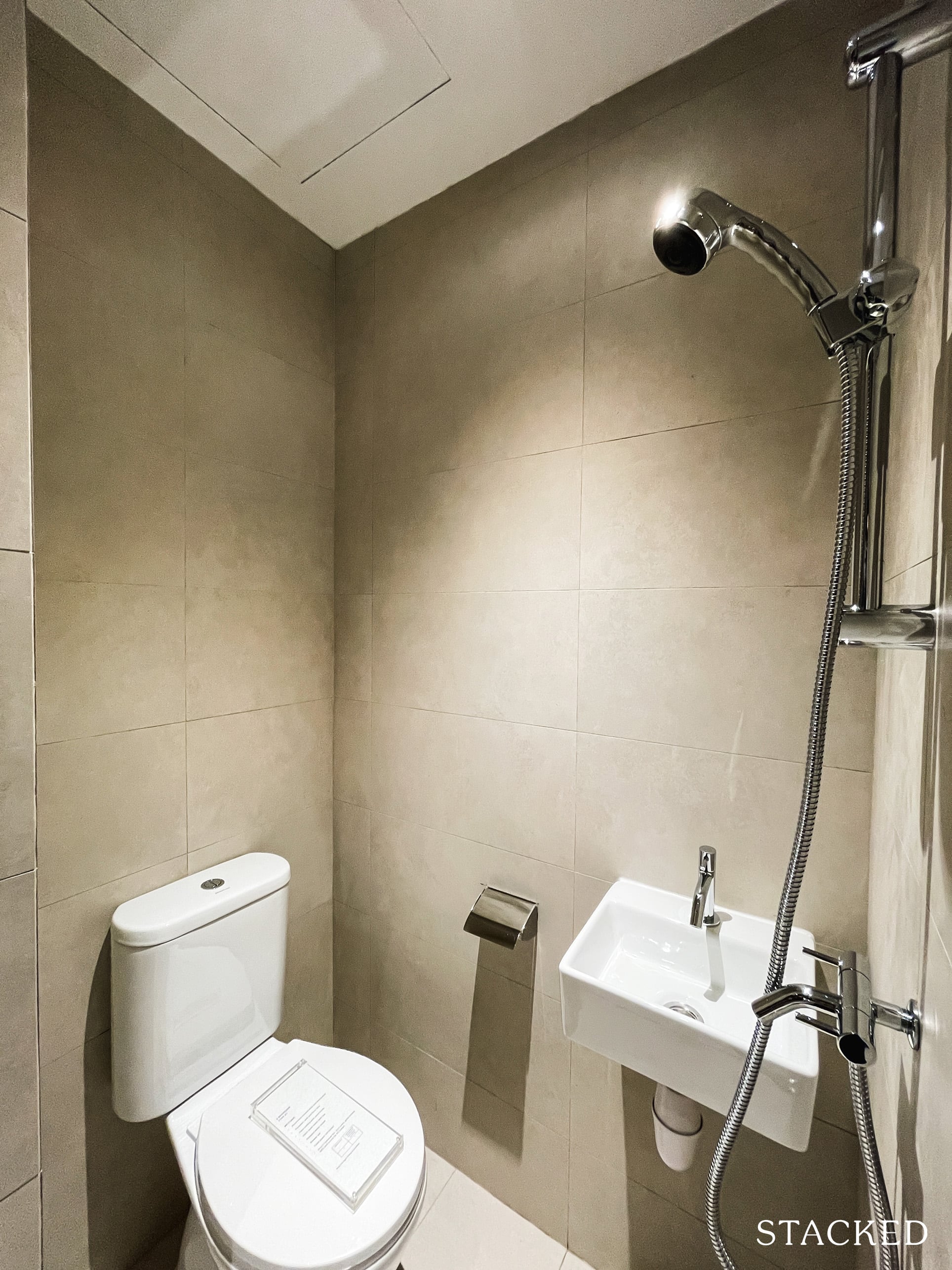
Rounding up the features at the back is the standard WC, along with a “yard” of sorts and the second entrance/exit that will lead you to the common lift lobby. Frankly speaking, the lack of a proper yard area could be a cause of concern for some families.
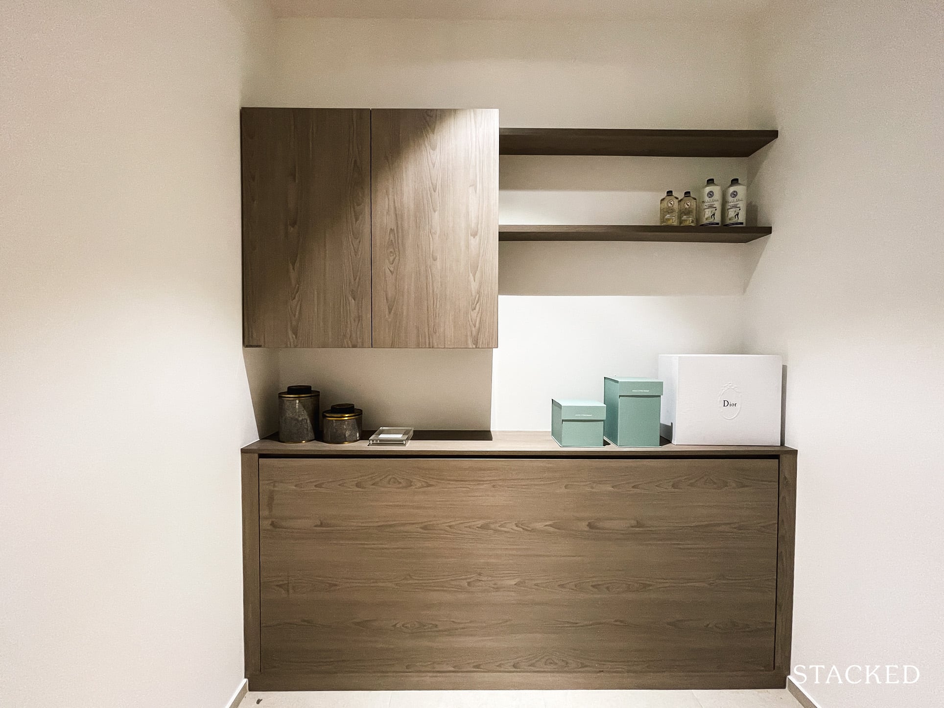
There is also a utility room at the back, which would most usually be used as a helpers room instead.
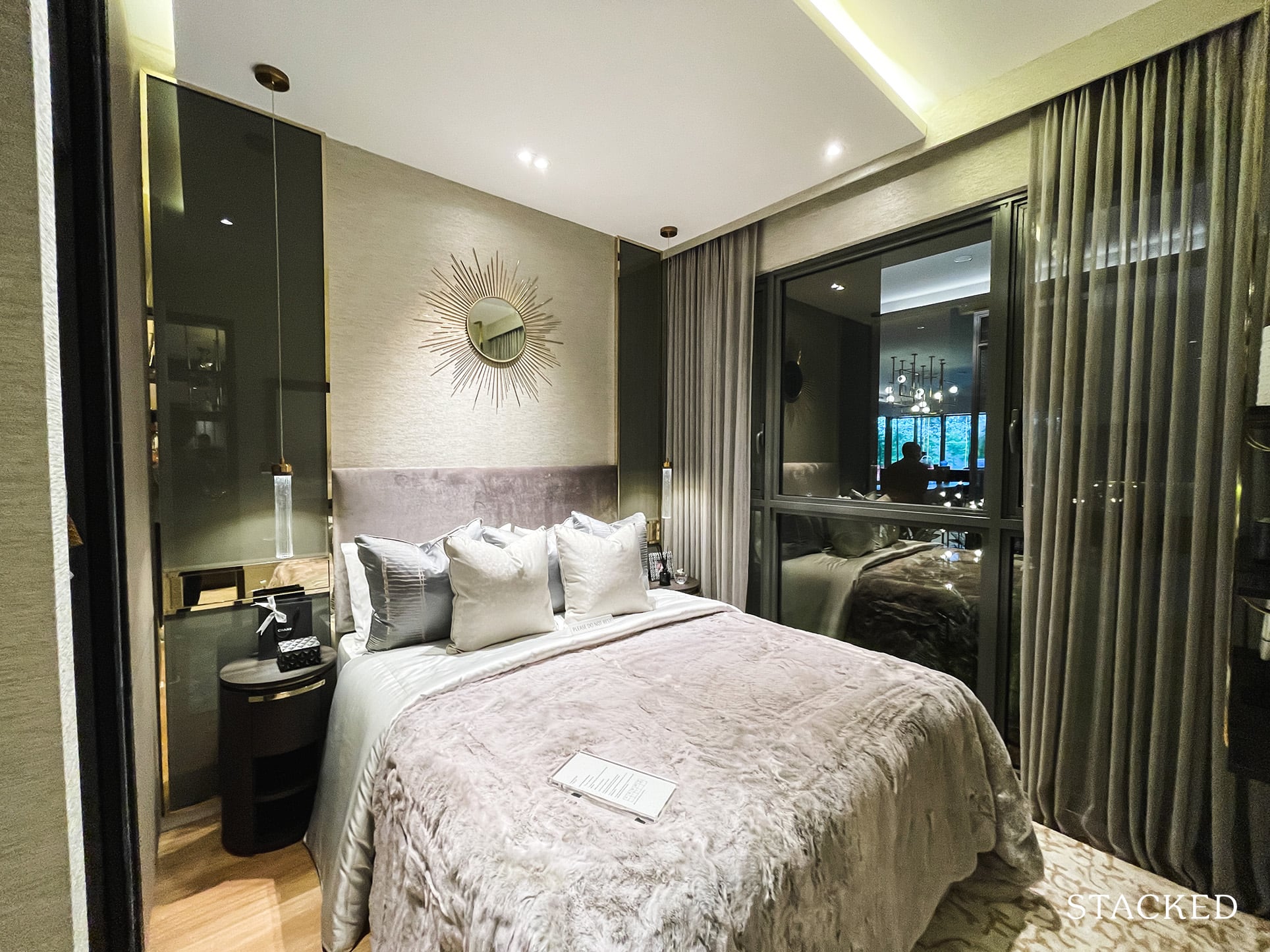
The junior master bedroom is located just outside the dining area. This means that it is set apart from the rest of the bedrooms, which does give it greater privacy.
So multi-generational families could see this as an additional plus point.
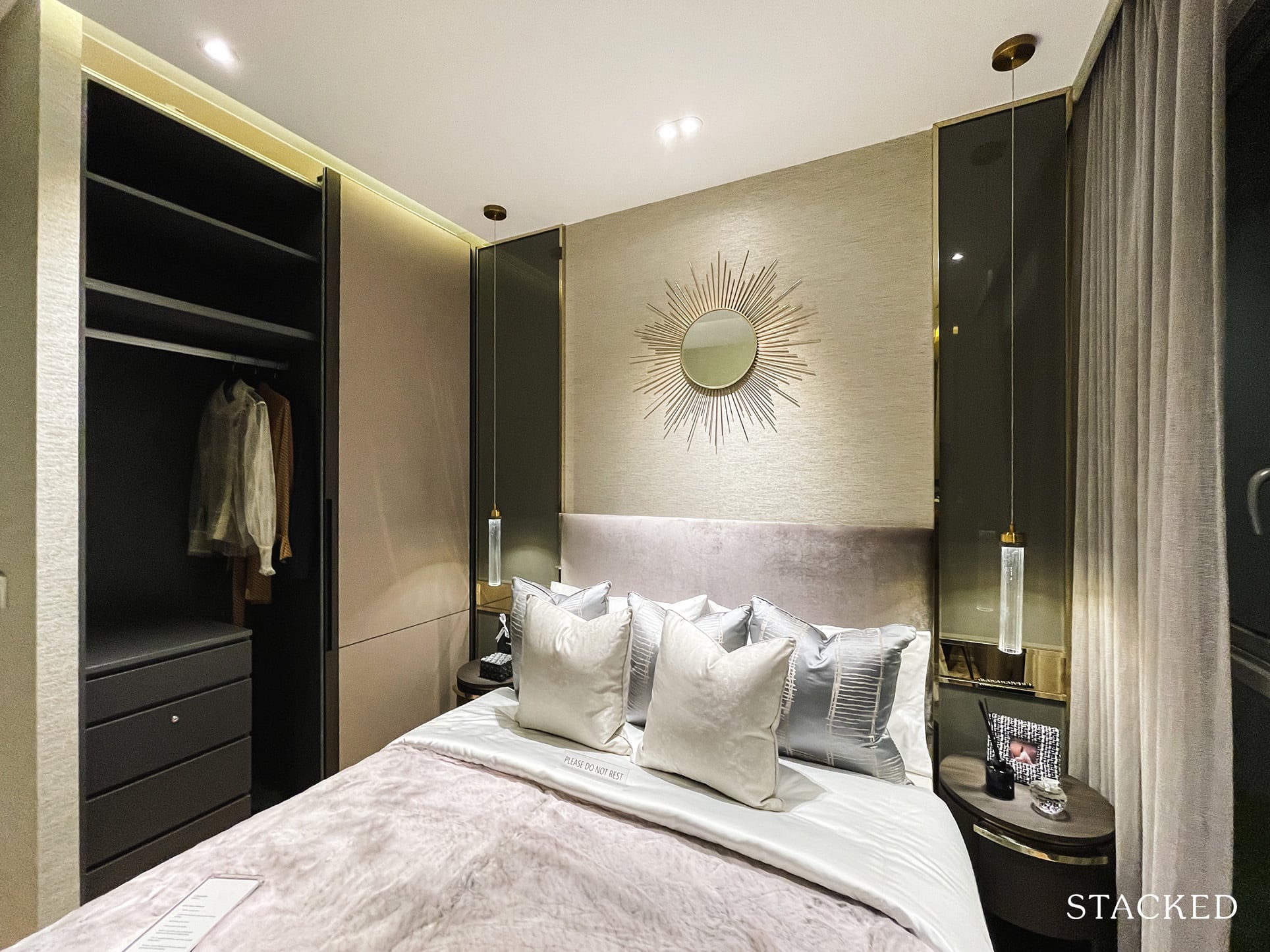
It isn’t a great size, however, as it is barely bigger than 2 of the other common bedrooms. Flooring in all the bedrooms would be timber.
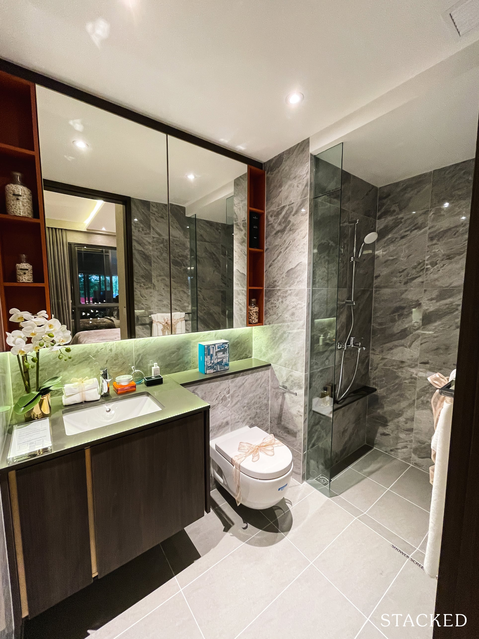
Because of its status as the junior master bedroom, it does come with an attached bathroom. It is a decent size, but it is surprising to see the exclusion of a rain shower here, given the more premium status of both the room and the unit.
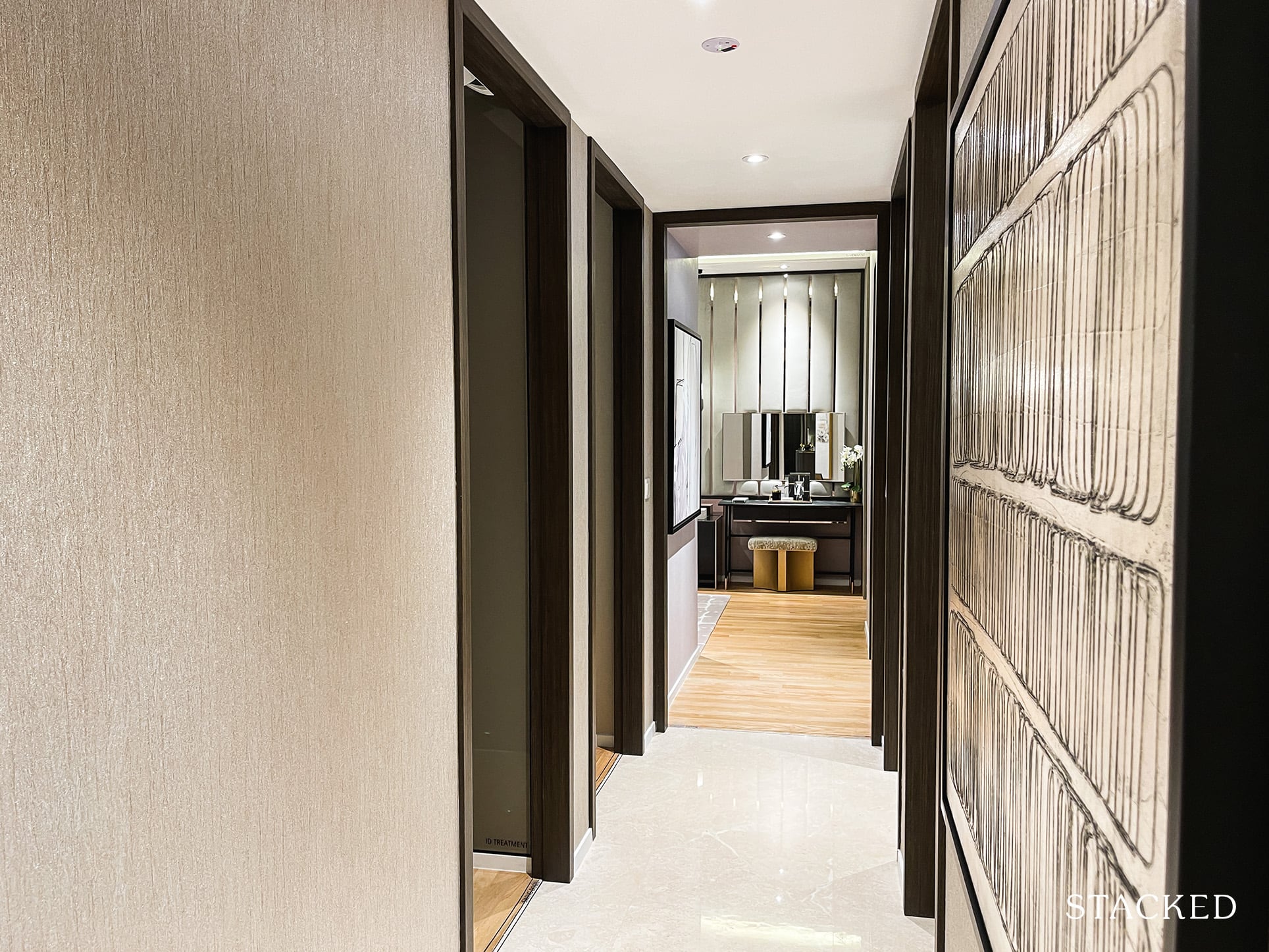
Now let’s move on to the other 4 bedrooms.
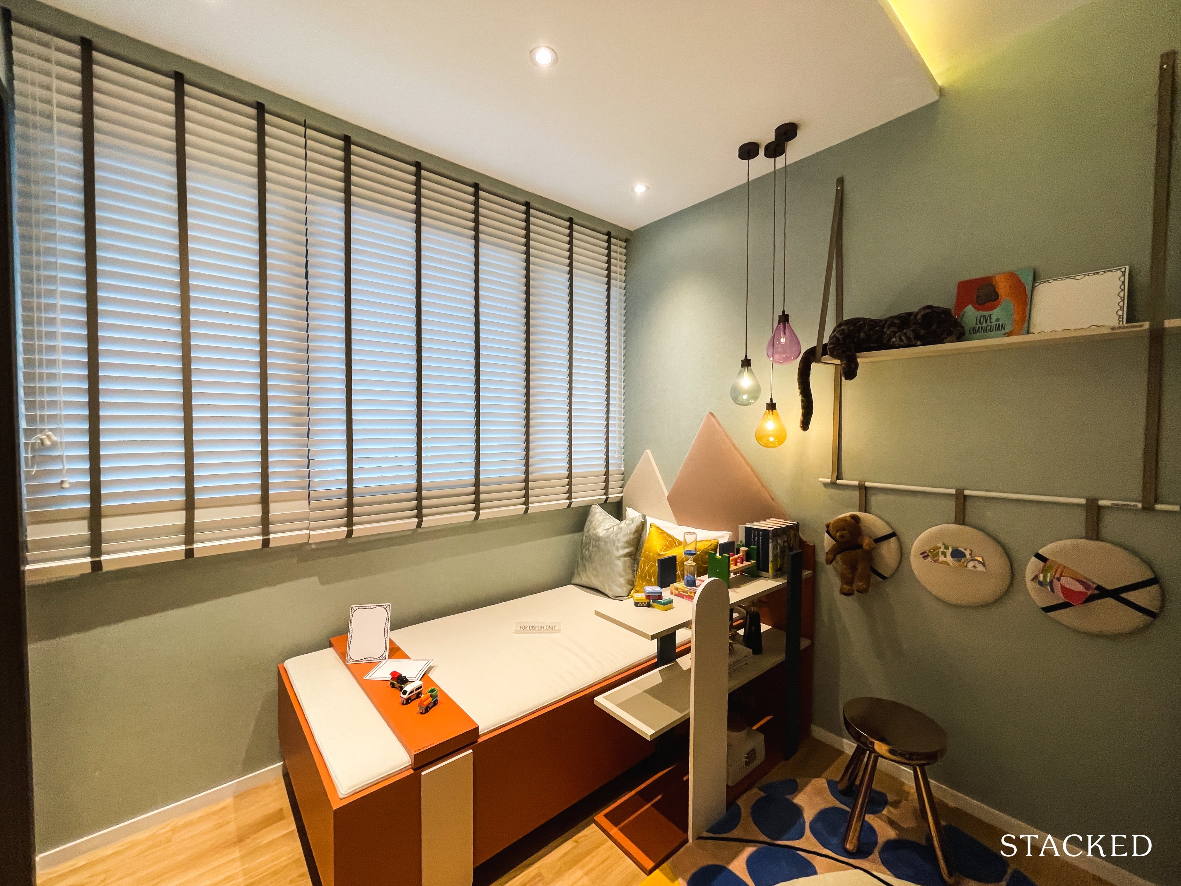
The first common bedroom is located on the right, and is the smallest of the lot. It also is the only one that doesn’t feature full length windows as the AC ledge is located on this side of the unit. Weirdly enough however, it does come with an attached bathroom that has quite an interesting layout.
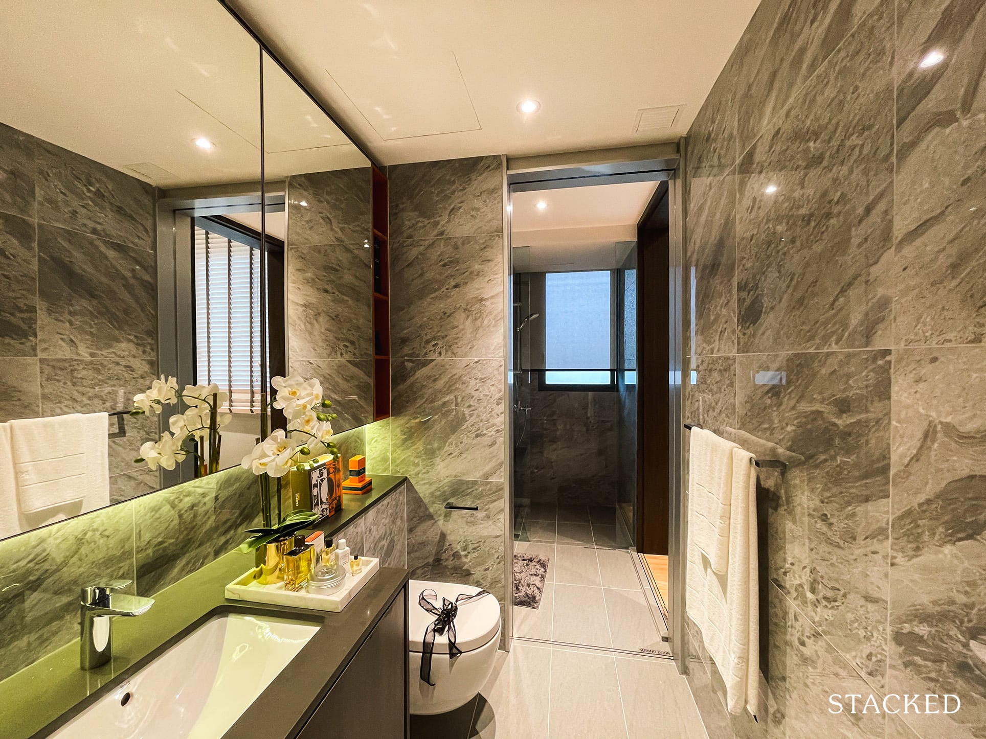
It is actually quite a long bathroom, but it does make sense as it would be shared among the 3 common bedrooms. Probably the most accurate description of it would be a jack and jill bathroom with a sliding door in the middle.
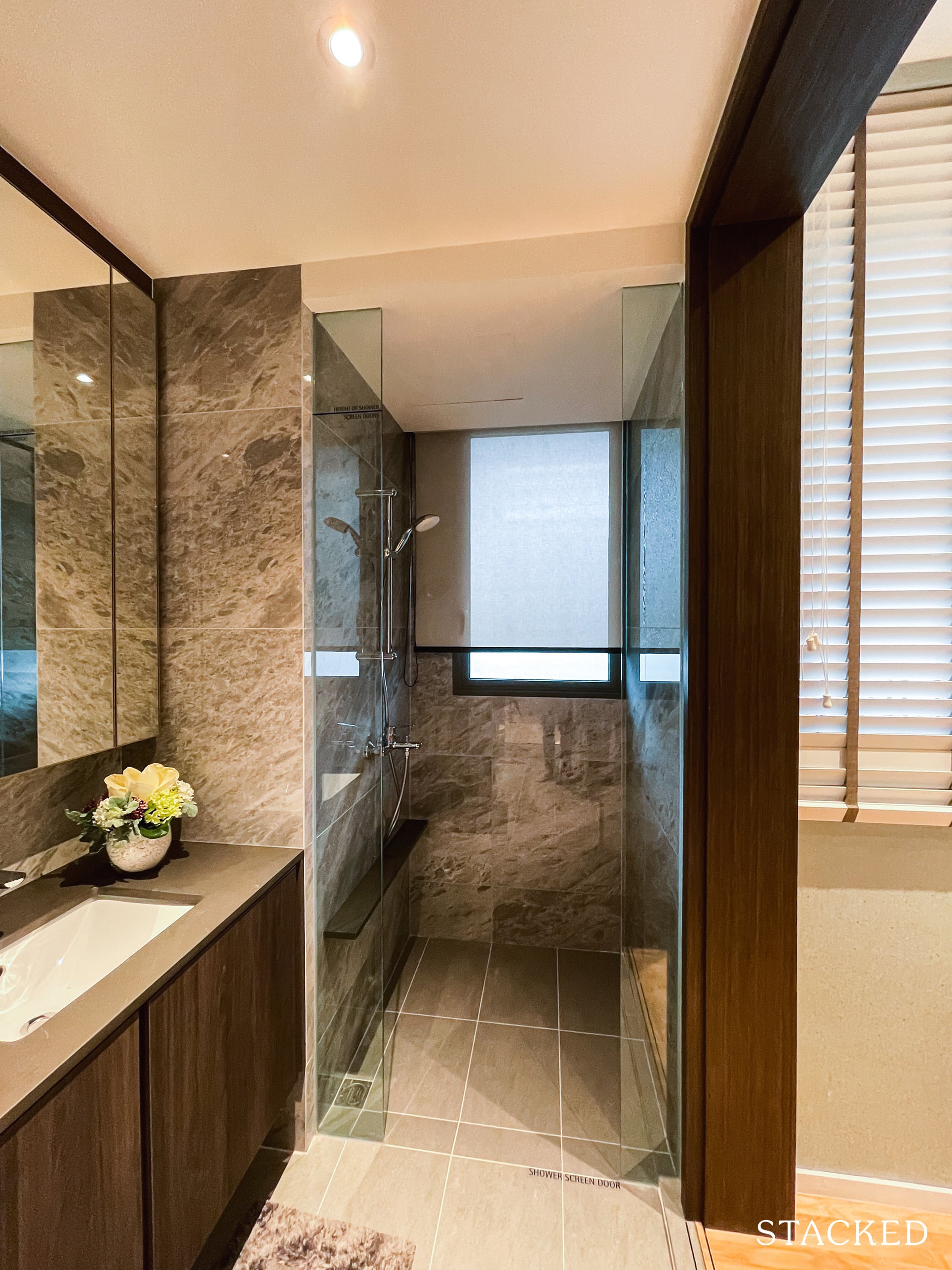
What this means is that you can access the bathroom from both the common bedroom as well as the hallway (common bedroom on the right).
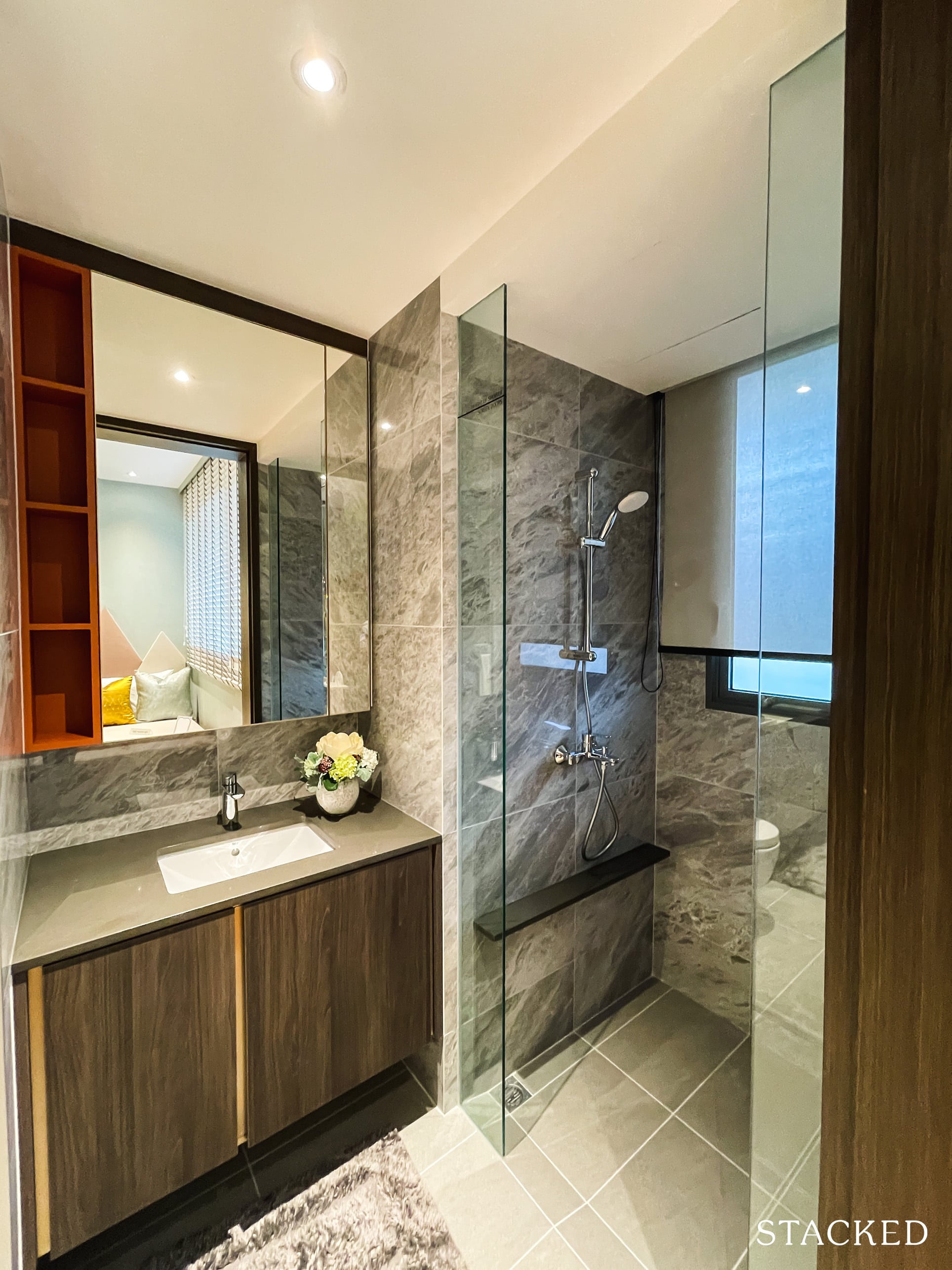
So because of the sliding door in the middle, the bathroom can be effectively partitioned into two segments so different people can use it at the same time depending on their needs. The one closer to the bedroom as a sink and a shower (with a window for ventilation too).
The one closer to the hallway has another sink too and the parts to do your number 1 and 2. While it still doesn’t quite beat having 2 bathrooms, it is quite a smart layout in my opinion.
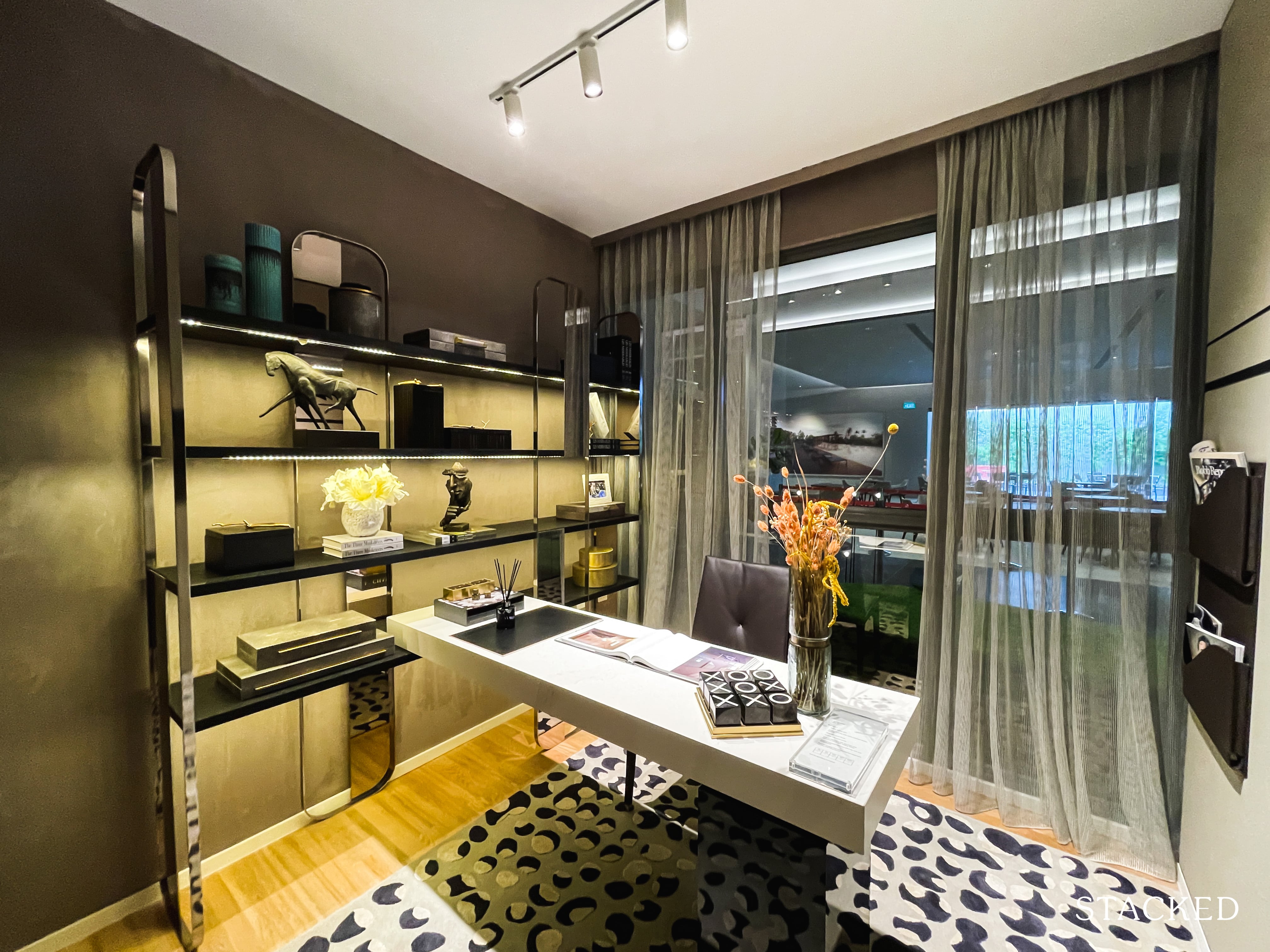
Both common bedrooms are of equal size and are quite decently sized.
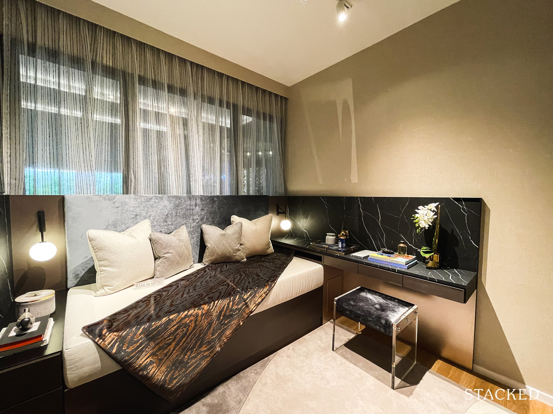
They both feature nearly full length windows and will have another space for the standard queen size bed along with side tables.
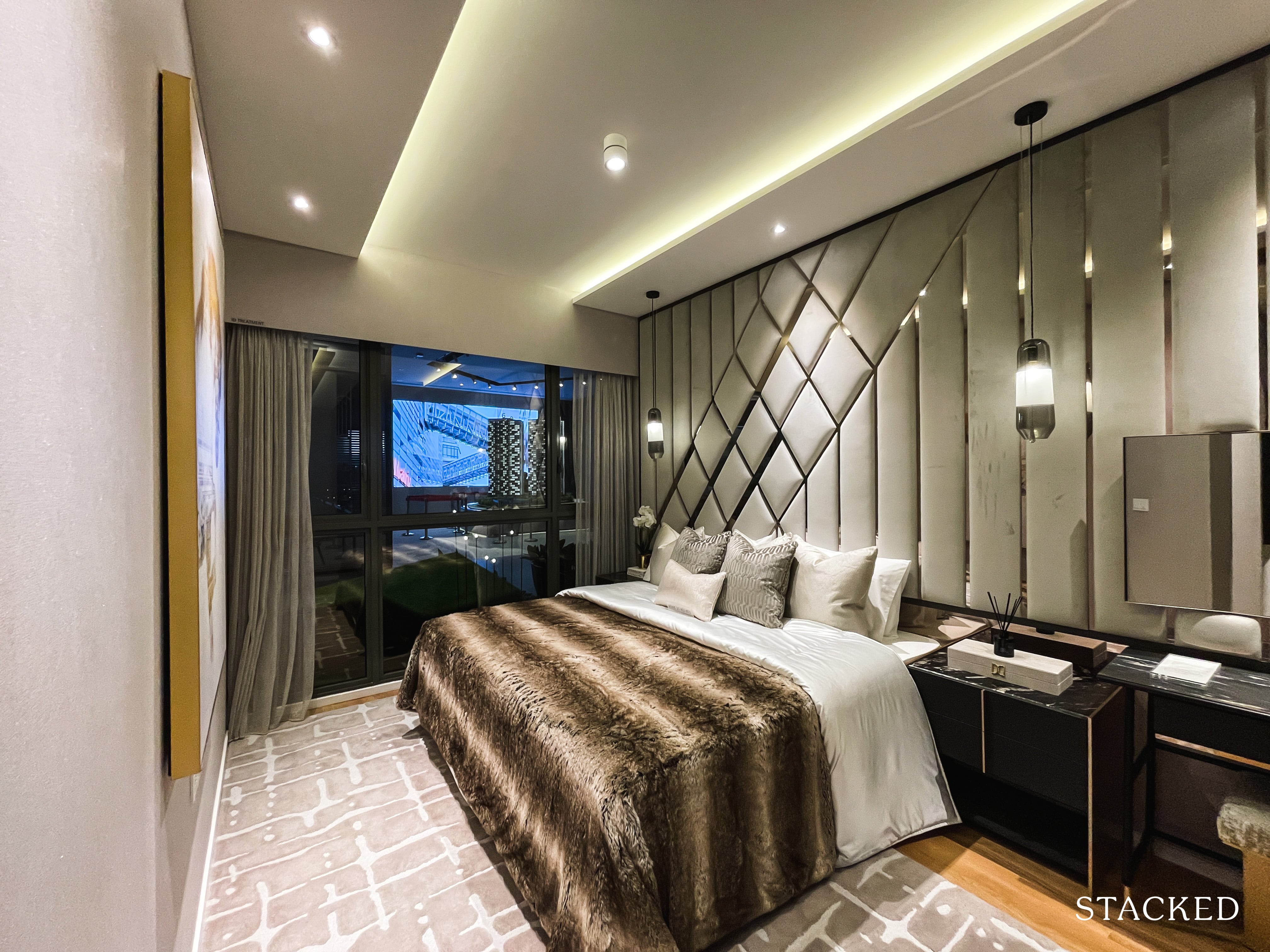
If you’ve been reading so far and still left wondering at where all that space has been taken up, well, quite a big portion has been dedicated to the master bedroom. For those that prioritise personal living space above all else, this would be right up your alley.
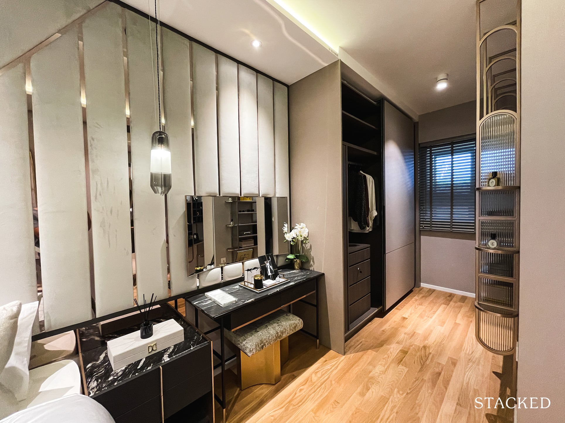
It’s long enough that it can fit in a king size bed with ample space to spare. And even then, you can still fit in a dresser or small study area – depending on your needs.
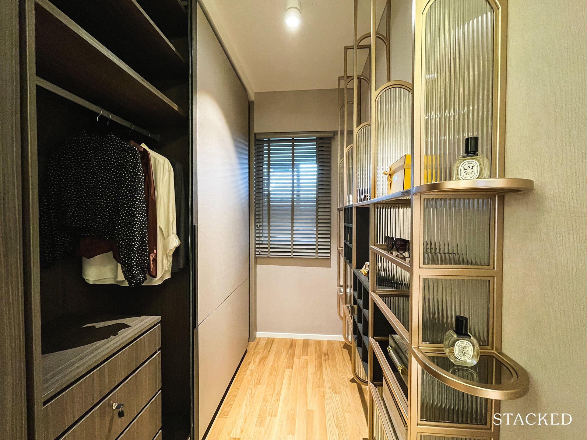
Along with that is a walk-in wardrobe space. While it is bigger than a regular wardrobe, you will have to install more cabinetry on the right should you need more space (the gold shelves you see here are ID treatment).
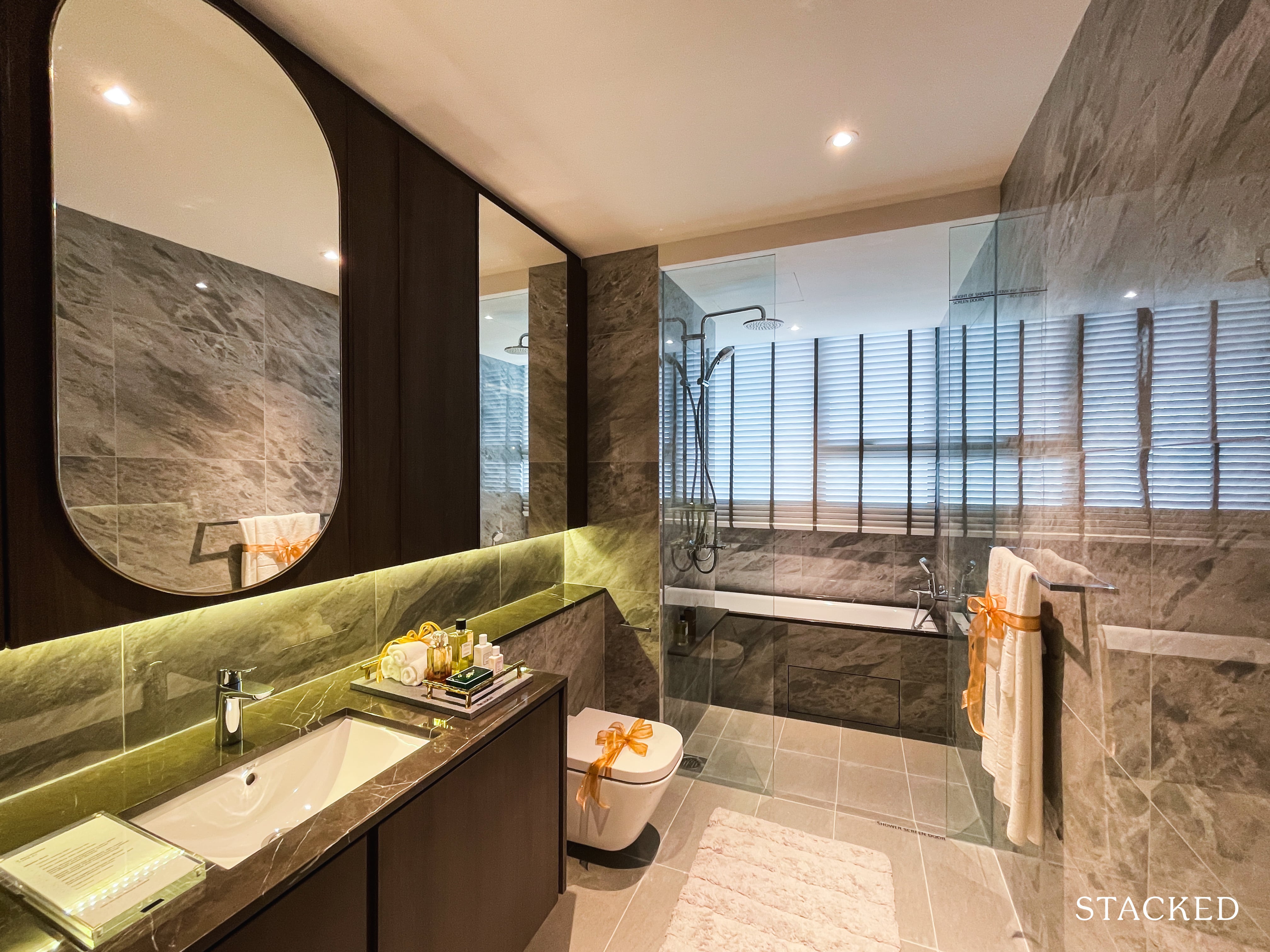
The master bathroom is suitably large, although fittings are the standard Grohe and Roca.
Sadly, no his and hers sinks to be seen here.
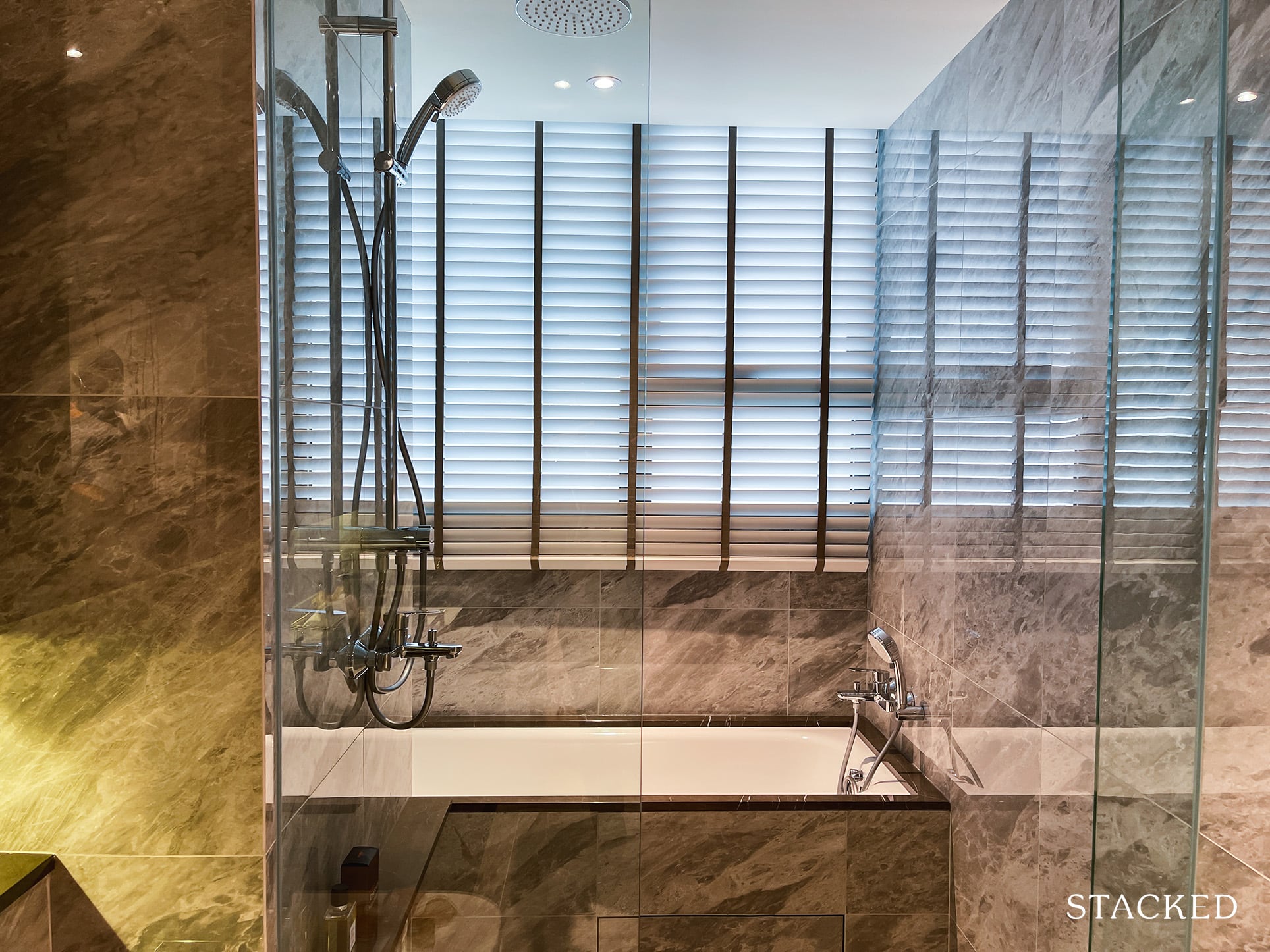
You do get a bathtub, which is fancy, but again the 3-in-1 rain shower is a bit of a letdown here.
Clavon Location Review
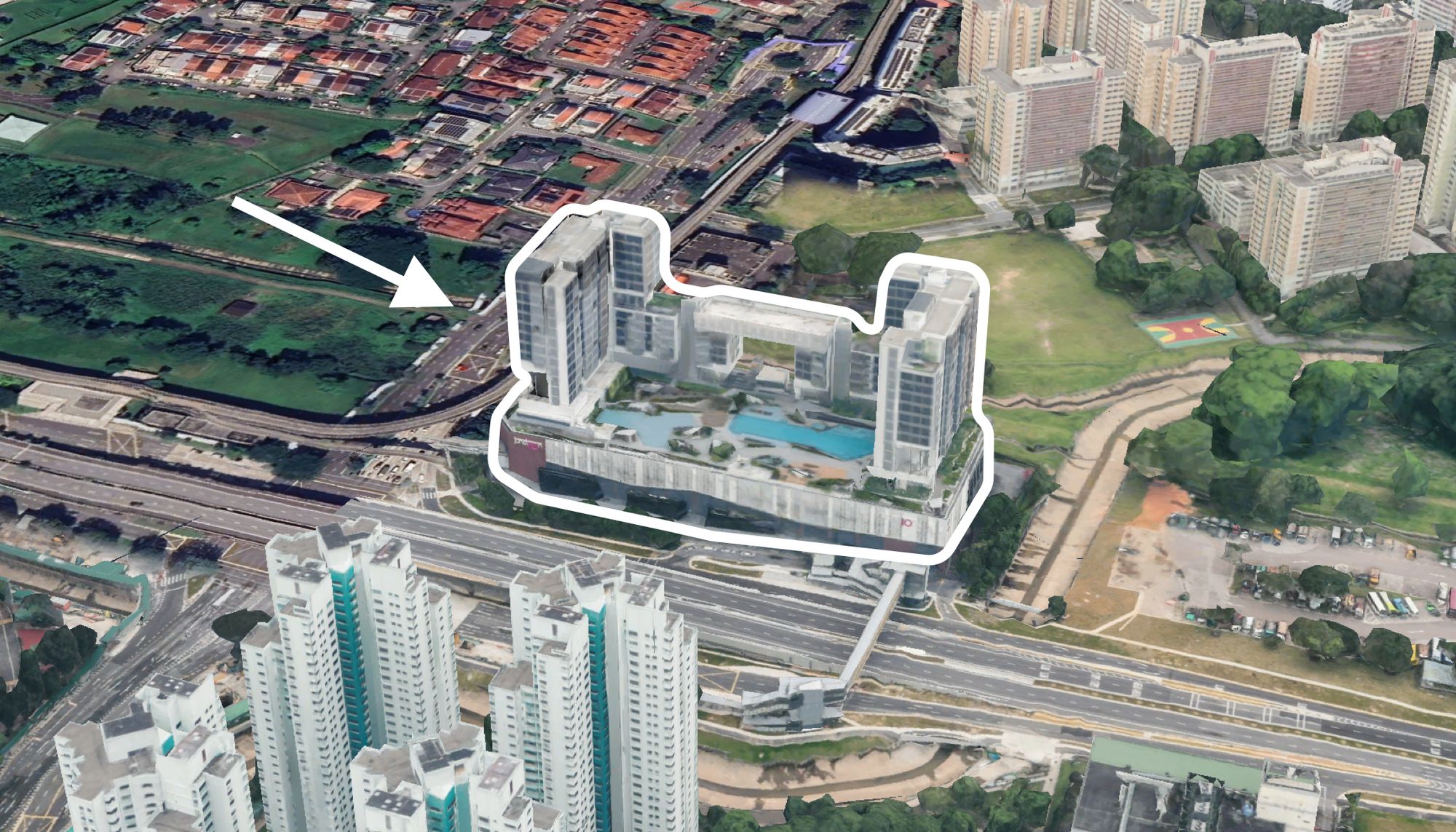
Clavon is located on the cusp of two highways – the Clementi Flyover and the AYE.
Its singular exit leads out to Clementi Avenue 1, a road that is shared by a number of other developments including a church, the prestigious Nan Hua High School (directly opposite) and NUS High School of Math and Science.
You also get some key residential projects utilising the road – stemming from Clement Canopy, the ‘soon-to-be’ BTO flats of Clementi Peaks and a number of other resale HDB flats in the area.
Across the Clementi Flyover, you have access to public fitness amenities courtesy of the Clementi ActiveSG Sports Centre/Fitness Complex – as well as a number of key shopping malls (think Clementi Mall etc.).
Finally, you do get a cluster of landed homes directly across the AYE-facing units, so it’s relatively unblocked views on that end, as well as the Clementi Woods park, West Coast Plaza and the West Coast Community Centre in that general area.
Amenities
Groceries
| Grocery Shops | Distance From Condo (& Est. Walk Time) |
| Cold Storage – West Coast Plaza | 1.8km, 5-min drive |
| Fairprice – Clementi Ave 2 | 1.3km, 5-min drive |
| Fairprice Finest – Clementi Mall | 1.2km, 4-min drive |
You get up to 5 Fairprice branches in the area – so convenient/affordable grocery shopping is up there on the list, provided that you drive/have access to a private vehicle.
Shopping Malls
| Shopping Mall Cluster | Distance From Condo (& Est. Walk Time) |
| 321 Clementi | 1km, 14-min walk |
| Clementi/Cityvibe/Gantral Mall | 1.4km, 18-min walk |
| West Coast Plaza | 1.1km, 14-min walk |
| Star Vista/Rochester Mall | 4.8km 8-min drive |
| JEM | 4.5km, 11-min drive |
| Queensway/Alexandra IKEA | 6.3km, 8-min drive |
Schools
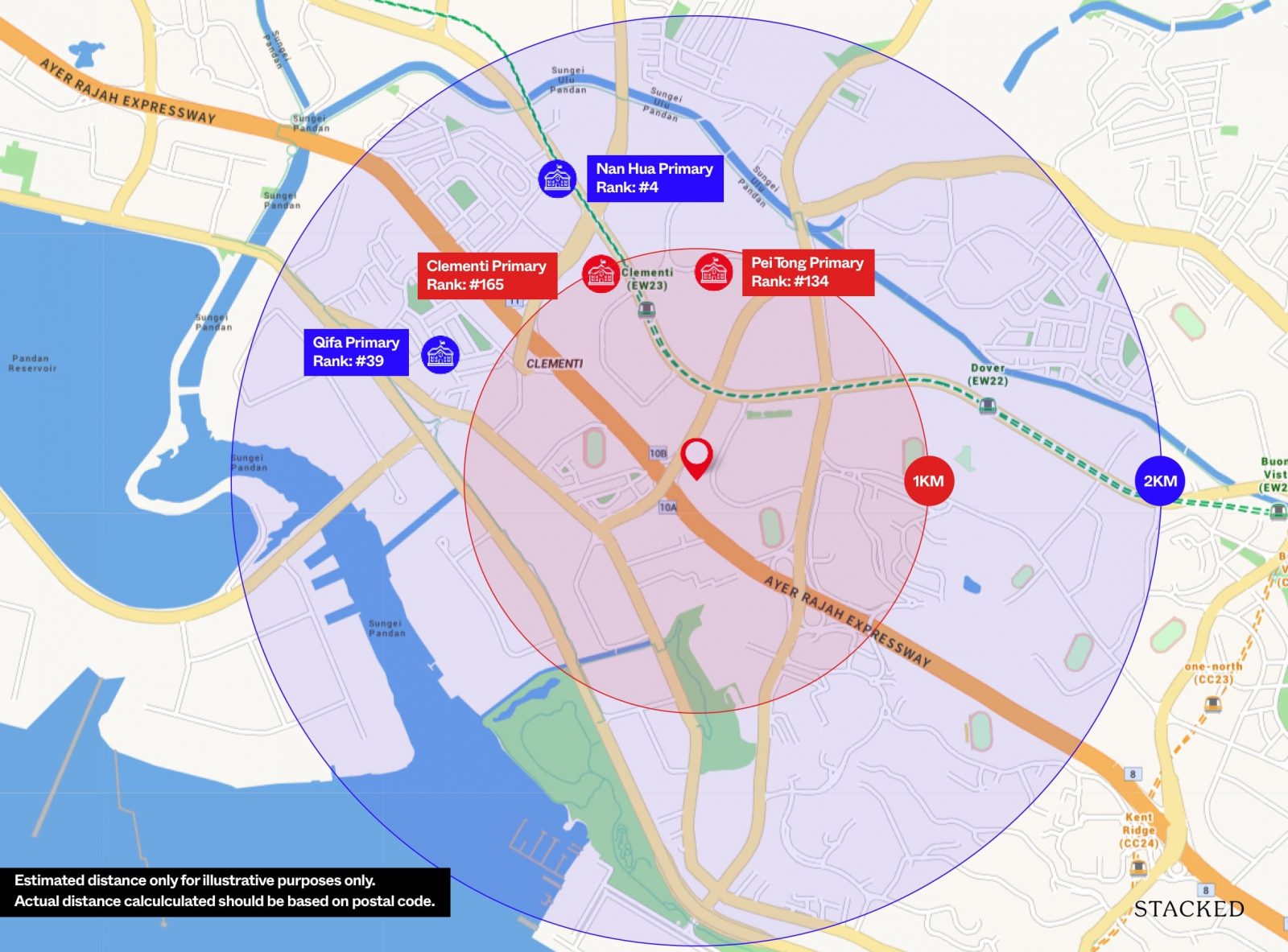
Primary schools within 1KM of Clavon includes Clementi Primary and Pei Tong Primary. Do note that this is just for illustrative purposes only. The actual distance is determined based on the postal code and distance from your block to the school.
| Educational Tier | Names of Institutes |
| Preschool (within 1km walk) | PCF Sparkletots Preschool Little Footprints Preschool (West Coast) Mindchamps Preschool (West Coast Plaza) |
| Primary (within 3km-drive) | Nan Hua Primary (Both Holding/Actual Site) Pei Tong Primary Clementi Primary Qifa Primary |
| Secondary (within 3km-drive) | Nan Hua High NUS High School of Math and Science New Town Secondary Clementi Town Secondary Tanglin Secondary Kent Ridge Secondary |
| Junior College (within 5km-drive) | ACS Junior College |
| University (within 5km-drive) | Singapore Institute of Technology National University of Singapore Singapore Institute of Management Singapore University of Social Sciences |
| Polytechnic (within 10km-drive) | Ngee Ann PolytechnicSingapore Polytechnic |
As mentioned earlier, some of the more immediate schools include Nan Hua High School and NUS High School of Math and Science, as well as the National University of Singapore.
Not forgetting the childcare in the development itself.
One big miss is Nan Hua Primary which isn’t within the 1 km radius unlike Parc Clematis, which might be a dealbreaker for some.
Public Transport
| Bus Station | Buses Serviced | Distance From Condo (& Est. Walking Time) |
| ‘Blk 410’ | 14, 52, 96, 96B, 105, 106, 147, 154, 165, 166, 183, 185, 667, NR5, NR8 | 500m, 6-min walk |
| ‘Aft NUS High Sch’ | 97, 97e, 197, 198, 963, 963R | 500m, 7-min walk |
Closest MRT: Clementi MRT – 1.4km, 19-min walk (officially)
Perhaps the biggest downside for Clavon is its distance to the MRT. That said, you do get to save on walking time (down to about 12-minutes) if you cut through the soon-to-be HDB BTOs at Clementi Peaks.
One bonus of living by the expressway is the bus stop that you find situated alongside (‘Aft NUS High Sch’). It gives direct access for those heading toward the CBD/Clarke Quay area with bus 197.
Granted, it does take over half an hour’s journey given the situation of Clavon in the west-end of Singapore, but it is at the bus stop that you have easy access to key industrial area like One-North/Buona Vista/International Business Park (10-minute ride), Mapletree Business District (15-minute ride) and the Harbourfront commercial areas (20-minute ride).
Those heading to Orchard can board bus 106 from the ‘Sch of Science & Tech’ bus stop. It requires an initial 12 min walk to the bus stop and a 24-min ride thereafter.
Private Transport
| Key Destinations | Distance From Condo (& Est. Peak Hour Drive Time) |
| CBD (Raffles Place) | 12.6km, 21-min drive |
| Orchard Road | 9.1km, 22-min drive |
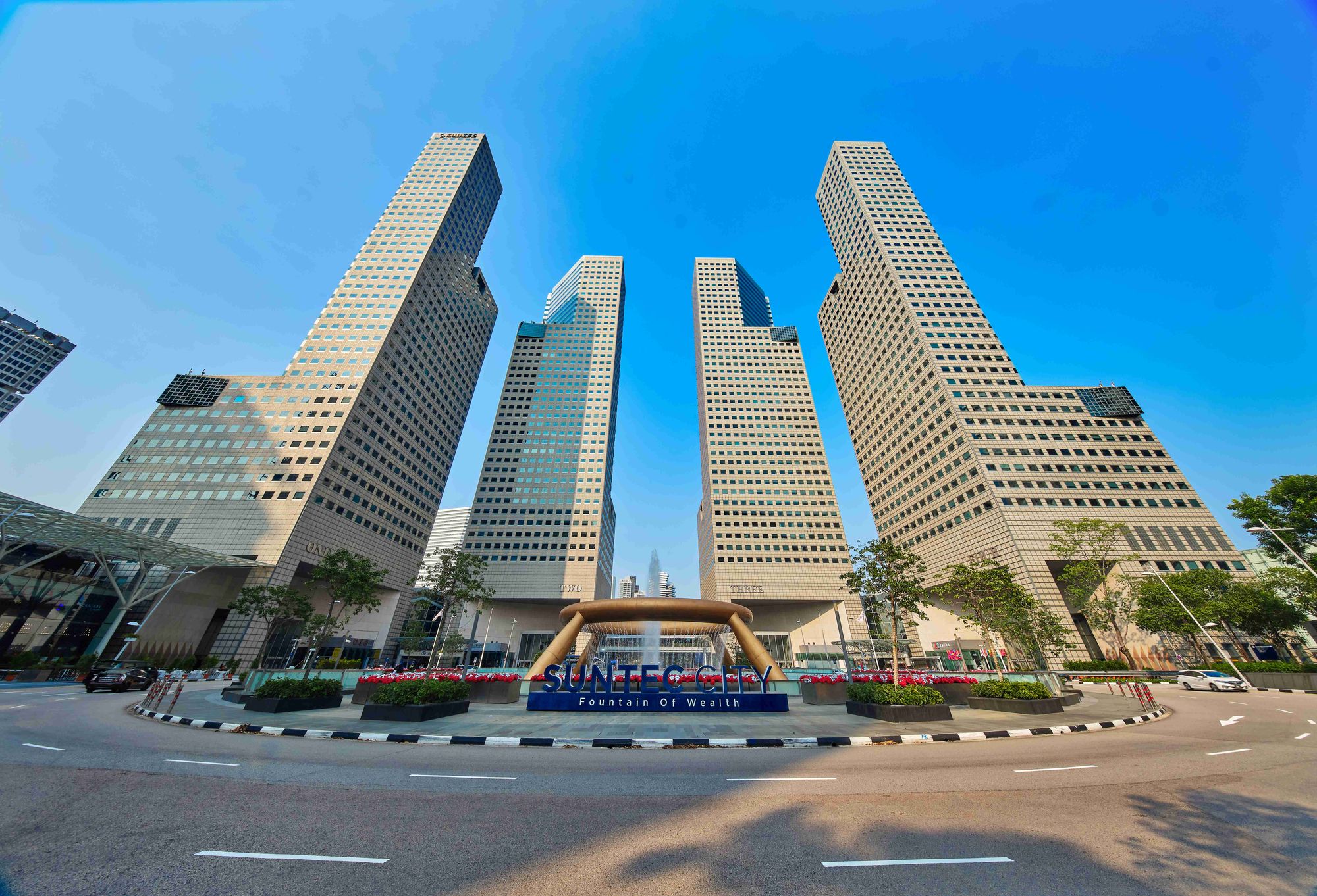
| Suntec City | 7.1km, 26-min drive |
| Changi Airport | 30.7km, 32-min drive |
| Tuas Port (By 2040) | 40km, 28-min drive |
| Paya Lebar Quarters/Airbase (By 2030) | 25.1km, 32-min drive |
| Mediapolis (and surroundings) | 5.6km, 11-min drive |
| Mapletree Business City | 8.1km, 18-min drive |
| Tuas Checkpoint | 17.8km, 34-min drive |
| Woodlands Checkpoint | 18.2km, 26-min drive |
| Jurong Cluster (JCube) | 4.9km, 15-min drive |
| Woodlands Cluster (Causeway Point) | 18.8km, 32-min drive |
| HarbourFront Cluster (Vivo City) | 10.4km, 19-min drive |
| Punggol Cluster (Waterway Point) | 30.6km, 34-min drive |
*Note that Drive Times are calculated during Peak Hours
Immediate Road Exit(s): 1 exit along Clementi Ave 1
The Developer Team
Developer
The project is a joint venture between UOL and UIC Homes with UOL owning 80% of the development’s shares and UIC the remaining 20%.
By now you must have heard about UOL’s portfolio of well-built properties from just about every source. For me, their prowess in past projects really lies in quality of finishings and design, as well as their attention to detail – which is always comforting for buyers looking to stay here for the long-haul.
It’s also no secret that they’ve consistently engineered great developments in the past – some of which include Principal Gardens, Thomson Three, Spottiswoode Residences and Botanique @ Bartley (amongst a number of others).
They also have four other condos set to TOP in the coming years including the highly anticipated Avenue South Residence, Tre Ver, Amber45 and Meyer house.
In fact, the neighbouring Clement Canopy was also developed by UOL – and with a 75% unit sell-out on launch day, combined with rave reviews upon the condo’s TOP from the public, it’s easy to see UOL’s appeal as a developer.
What’s more, having already constructed one project in the immediate area, the developers have undoubtedly got a taste for what buyers in the area would be looking at, and so you can be sure that they will alter the project specifications to fit these needs.
It’s not to say that UIC can be written off. They also have a part to play in the development, so let’s have a look at their past projects.
Unsurprisingly, this isn’t the first time that they’re joining arms with UOL, having done so with Tre Ver and Avenue South Residences in the past.
To date, they also have some well received projects in their portfolio including the SGX center, Mon Jervois and V on Shenton – amongst a number of other co-developed residential developments locally.
Globally, you’ll find UIC (United Industrial Corporation) to have a number of iconic retail, commercial and residential properties across Beijing, Tianjin and the rest of China.
Architect
In my previous review on 15 Holland Hill, I spoke about a singular concern that I had with P & T Consultants.
Despite their incredible portfolio spanning 70 countries and expansion rate of over 10 million square meters annually, they had yet to piece together a ultra lux low-rise residential in Singapore – something which I felt could have been useful cross-reference of sorts.
In the Clavon’s context however, you’ll realise that the project fits right in with just about every other high-rise residential project that P & T have/will be engineering here in Singapore (35 to date).
Granted quite a number of these projects are of luxury condos, so if we were to look at the past developments that lineate with the Clavon’s New Launch average psf of about $1.5-1.6k+, you’d be looking at projects like High Park Residences and the nearby Parc Clematis.
Not a bad list to begin with at all.
Also just to note that the landscape architects here are from Ecoplan Asia. They’ve been around for just over a decade, and in that time have managed to secure major landscaping contracts for projects like Jadescape, Parc Esta, Affinity, Kent Ridge Hill Residences and now Clavon.
They were awarded the best Landscape Architectural Design in Singapore for Bellewaters condo back in 2016.
Construction
United Tec Construction (UTC) was acquired by Lian Beng Construction back in 2018 as a majority shareholder.
UTC has only been around for over 2 years as an official company since April 2018, so I’ll turn the gaze over to Lian Beng Construction.
According to the Building and Construction Authority (BCA), Lian Beng ranks in the tail-end of the top 10 contractors in Singapore.
Let’s have a brief look at the IQUAS scores for their past projects (for those unfamiliar with the term, it’s a metric set by BCA to ascertain a contractor’s build quality).
| Project | Completion | Structural Score | Architectural Score | M/E Score | Avg Score |
| Skies Miltonia | 2017 | 96.6 | 86.4 | 97.9 | 90.6 |
| Hedges Park | 2015 | 99.2 | 86.5 | 97.6 | 90.8 |
| SpottisWoode Residences (Also by UOL) | 2014 | 98.7 | 89.4 | 96.4 | 92.4 |
| The Scala | 2014 | 100 | 91.1 | 98.8 | 94.1 |
Overall, great scores – though as always, the numbers seem to fall short on the Architectural end of things – ie. fittings and workmanship.
Something which UOL developments have been well-known for – so again, not too worried on that end.
Also important to note that this list contains dated projects so it certainly warrants deeper research into the other contractor subsidiaries that Lian Beng owns – and their subsequent (newer) project scores.
Unit Mix
| Unit Type | No. Of Units | Size of Units (sqft) | Est. Maintenance Fees |
| 1-Bedroom + Study | 72 | 527 sqft | $250 |
| 2-Bedroom | 70 | 678 sqft | $300 |
| 2-Bedroom Premium | 214 | 764 sqft | $300 |
| 3-Bedroom | 70 | 958 sqft | $300 |
| 3-Bedroom Premium | 71 | 1,130 sqft | $350 |
| 4-Bedroom | 71 | 1,281 – 1,356 sqft | $350 |
| 4-Bedroom Premium | 36 | 1,581 sqft | $350 |
| 5-Bedroom Premium | 36 | 1,690 sqft | $400 |
Compared to the neighbouring Clement Canopy, UOL have decided to include both 1-bedders and the elusive 5-bedders this time round.
As mentioned earlier, you will not be getting any penthouse units here – and on that thought, none of the units here have ceilings that exceed 3m.
That said, (and as you might have ascertained from the pictures earlier) Clavon is an elevated development with the units on the 2nd floor already starting at 8.5m above ground level.
With 56% of the development going to 1 and 2-bedders, it’s easy to anticipate the investor-attraction of this project given its favourable rentability – though do note that the 1-bedroom + study units are facing the facilities, and subsequently the AYE.
You get your standard furnishings here with Electrolux appliances throughout every unit tier without the option for gas cooking. The rain showers in your master bedroom are also of the 3-in-1 variation so not the most premium if we were to nitpick.
Regarding noise blockage, you unfortunately do not have double-glazed windows here, although the south-facing units come equipped with acoustic ceilings and Lami Glass windows.
Note that the 4 and 5-bedroom premium units also come with private lifts of their own, though they both lack a yard, which is quite puzzling as they’re likely meant for ownstay purposes.
Maintenance fees are right about what you might expect for a development of this size, so no real surprises there.
Unit Size
Overall, unit sizes feel average on paper, though the layouts seem quite decent at first glance. I’ve also been raring to compare some of these units with that of Clement Canopy, so let’s get started.
Smallest 2-Bedroom
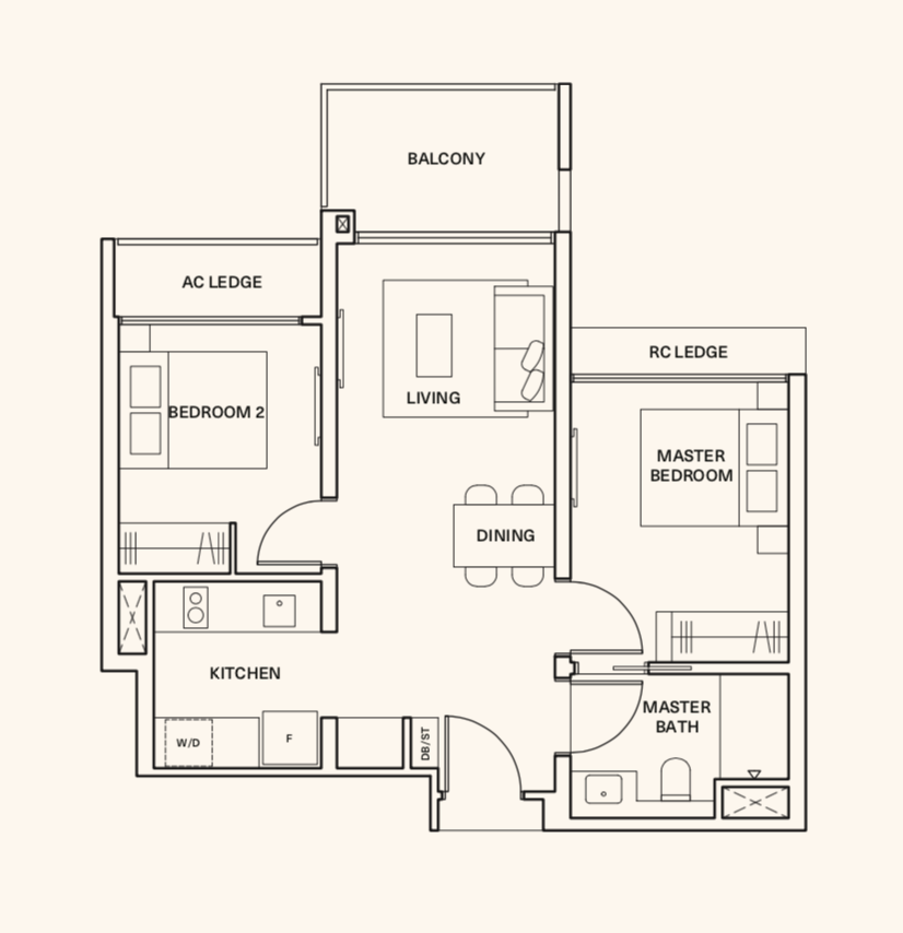
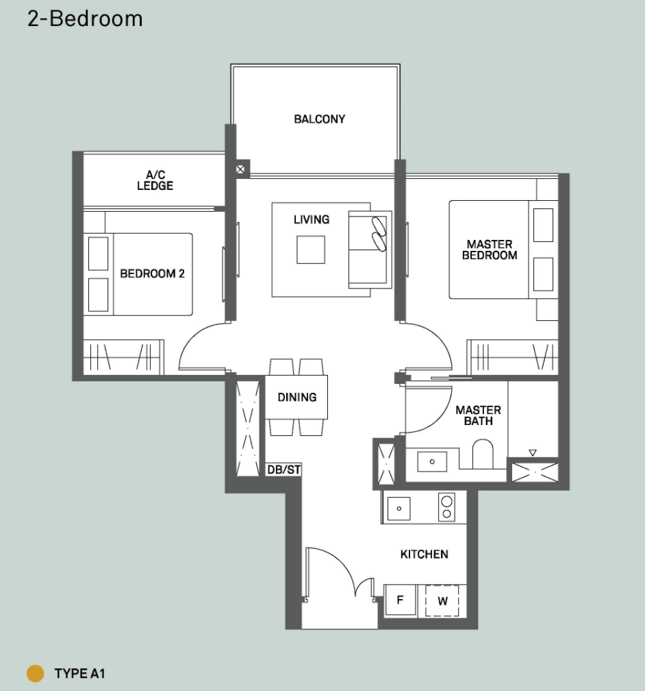
The extra space definitely shows in the 2-bedroom Clavon unit in what we could perhaps refer to as a larger kitchen cum dining space (than most new launch projects we’ve seen to date).
If you were to ask me, I definitely prefer the layout of Clavon to Clement Canopy 2-bedder based on this factor alone. The latter just feels a little too cramped for my liking – both in the kitchen and dining areas.
That said, I do know of some who would prefer the Clement Canopy layout as you generally get less debris from the kitchen spilling out onto your living areas thanks to the staggered entrances – assuming you constantly undertake heavy cooking.
The rest of the unit is pretty much similar with a Jack & Jill masterbath, AC Ledge by the common room, similar shelving/balcony space (let’s not forget that both projects are by the same developer).
Also note that the RC Ledge you see in the Clavon unit is purely for aesthetic purposes and does not eat into the total unit space.
Smallest 3-Bedroom
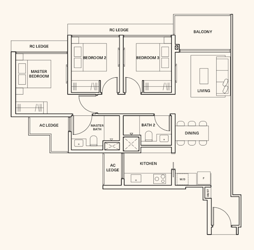
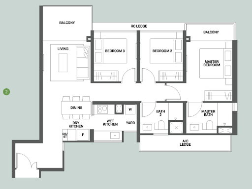
Through clever design, the developers were able to squeeze the kitchen adjacent to the common bath at the Clavon – unlike Clement Canopy, which eventually resulted in a much longer walkway for the latter.
That said, I do appreciate the additional balcony at Clement Canopy’s master bedroom as it gives more space for a couple to work with design/livability wise.
Of course, let’s not forget that the 3-bedder for Clement Canopy is bigger in size (990 vs 958 sqft).
The AC Ledges have also been well positioned for both units to ensure that the bedroom windows are not halved in any instance.
Personally however, I do find the living areas in both units to be a tad small – a factor that is further compounded by the long entranceways, although the 3-bedroom compact unit at Clavon does come with additional wardrobe space in the living area (adjacent to kitchen).
Were these units spread out like the previous 2-bedroom dumbbell layouts, I would definitely expect more interest from potential buyers/tenants here.
Stack Analysis
Development Site Plan
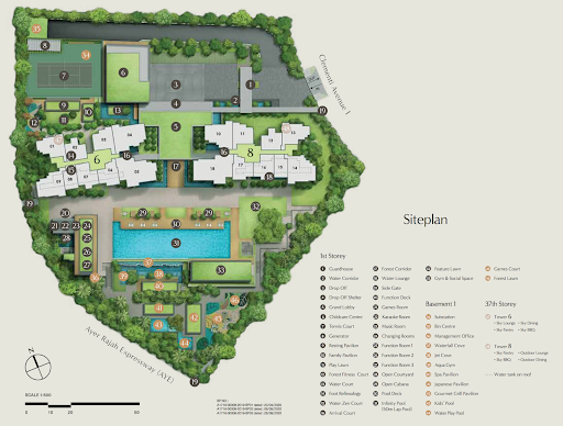
| Childcare Centre | Tennis Court | Lawn |
| Outdoor Fitness | Games Room | Karaoke Room |
| Music Room | Function Room | Cabanas |
| Pool Deck | 50m Infinity Pool | Gym |
| Aqua Gym | Japanese Pavilion | Spa Pavilion |
| Gourmet Grill Pavilion | Kids’ Pool | Water Play pool |
| Games Court | Sky Lounge | Sky Pantry |
| Sky Dining | Sky BBQ | Outdoor Lounge |
| Outdoor Dining |
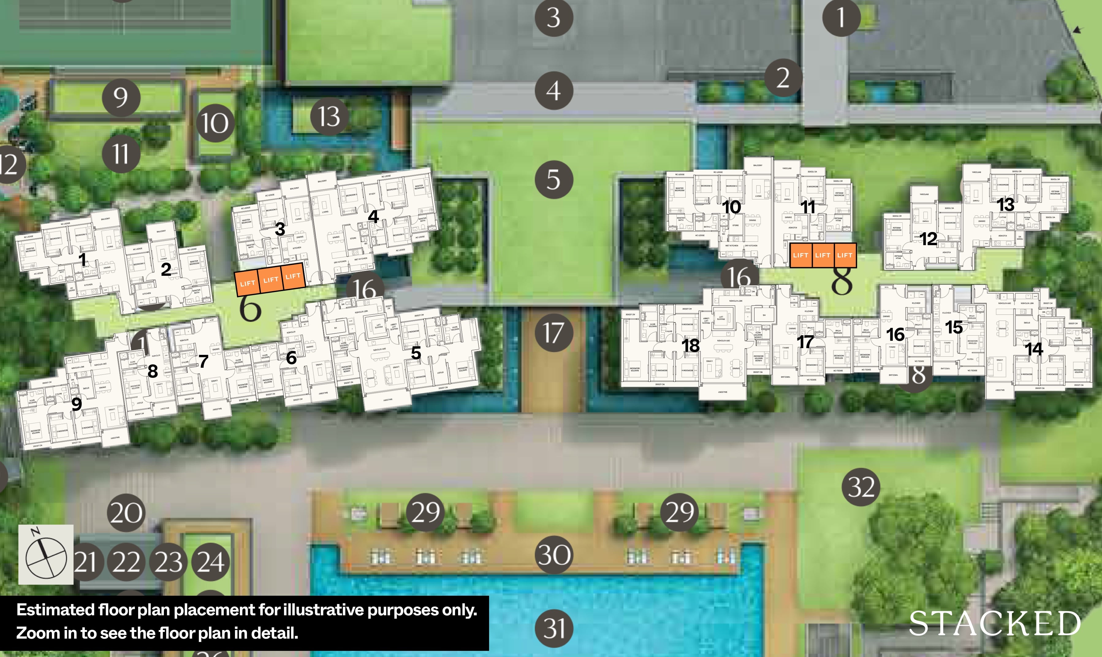
Zooming in to a slightly more micro level, we again see the attention to detail from UOL with the inclusion of a number of workpods throughout the development, equipped with charging points – as well as the inclusion of rental bikes in the condo for residents’ recreational use.
Now there are a number of things I appreciate about the layout of the facilities. First and foremost, the tennis court is situated behind the blocks so that you don’t get much fumes from the AYE during gametime.
Secondly, the 7m elevation of the pool above the highway, and the subsequent cascading pool (37) serves as a second barrier (from the foliage in front) to help absorb further noise and dust pollution from the highway.
In that vein, I could see the ground-floor units here to be quite inviting – especially given the PES unit inclusion, pool views and large walkways which helps to extend the space in the surrounding area.
Just for reference, the closest stack facing the highway is 50m away and the furthest is set 100m away.
Let’s not also not forget the rooftop facilities for both blocks on the 37th floor. There’s no doubting the incredible views and wind from up there during the evenings as the charming city lights come on amidst a good old BBQ/dining/chill-out sesh.
Finally, it’s clear that the children’s area has been nestled into the corner closest to the AYE. While I’m not the biggest fan of having child facilities by the roadside, I can see how this is an efficient management of noise volumes.
As I mentioned earlier, given that these facilities are set on a lower level, you do limit most of the noise to this area during the evenings/weekends/school holidays – not to mention that it might help combat the peak hour road noise to an extent, ie. fighting fire with fire.
Afternoon west sun analysis
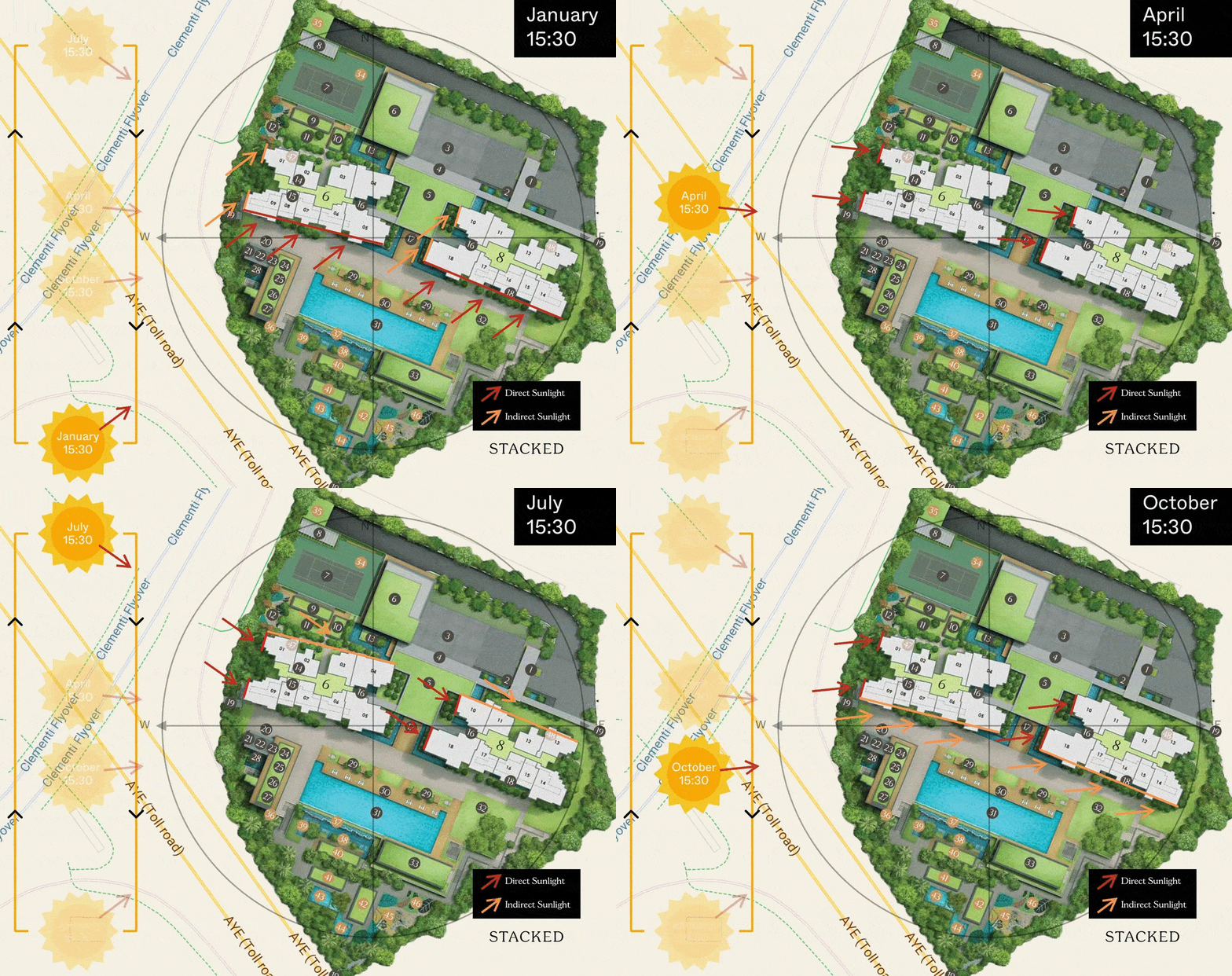
Both blocks have an almost north-south orientation, so the afternoon sun isn’t much of an issue here. For stacks 1, 9, 10 and 18, the side facing the west is walled up and protected from the sun.
During the end of the year/early part of the year, stacks 5 – 9 and 14 – 18 will receive indirect afternoon sun.
For a very short period of time in July, stacks 01 – 06 and 10 – 13 will receive very indirect afternoon sun too. Overall, we don’t think that the afternoon sun would be an issue for residents at Clavon.
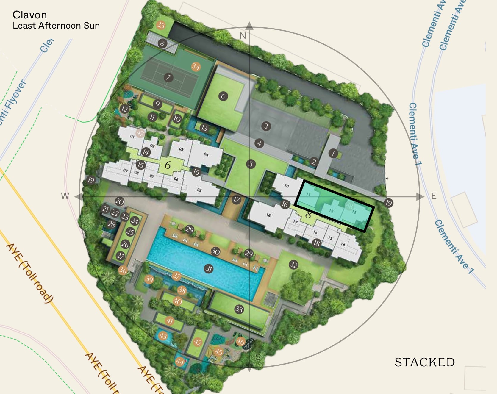
While most stacks are quite shielded from the afternoon sun, stacks 11 – 13 would have the least given its north-east facing. This is followed by stacks 02-04.
From the period of April to September, these stacks would also be able to enjoy direct sunrise from their balconies.
Surrounding Views
To give you a better idea, units facing the South will enjoy some form of sea views on the higher floors.
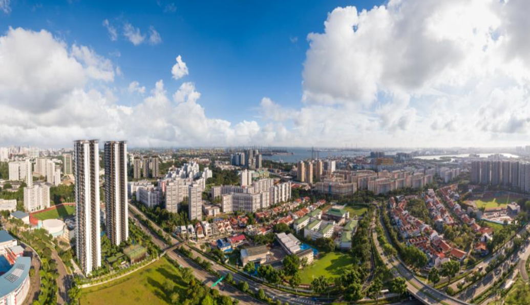
That said, you are facing the AYE directly so you could say it isn’t as appealing for the lower levels.
You could also be blocked in the future as between Clement Canopy and Clavon is another empty residential plot at the moment, with a similar plot ratio with the two current developments.

On the North facing, you will be facing the upcoming Clementi Peaks HDB.
Best Overall Stacks
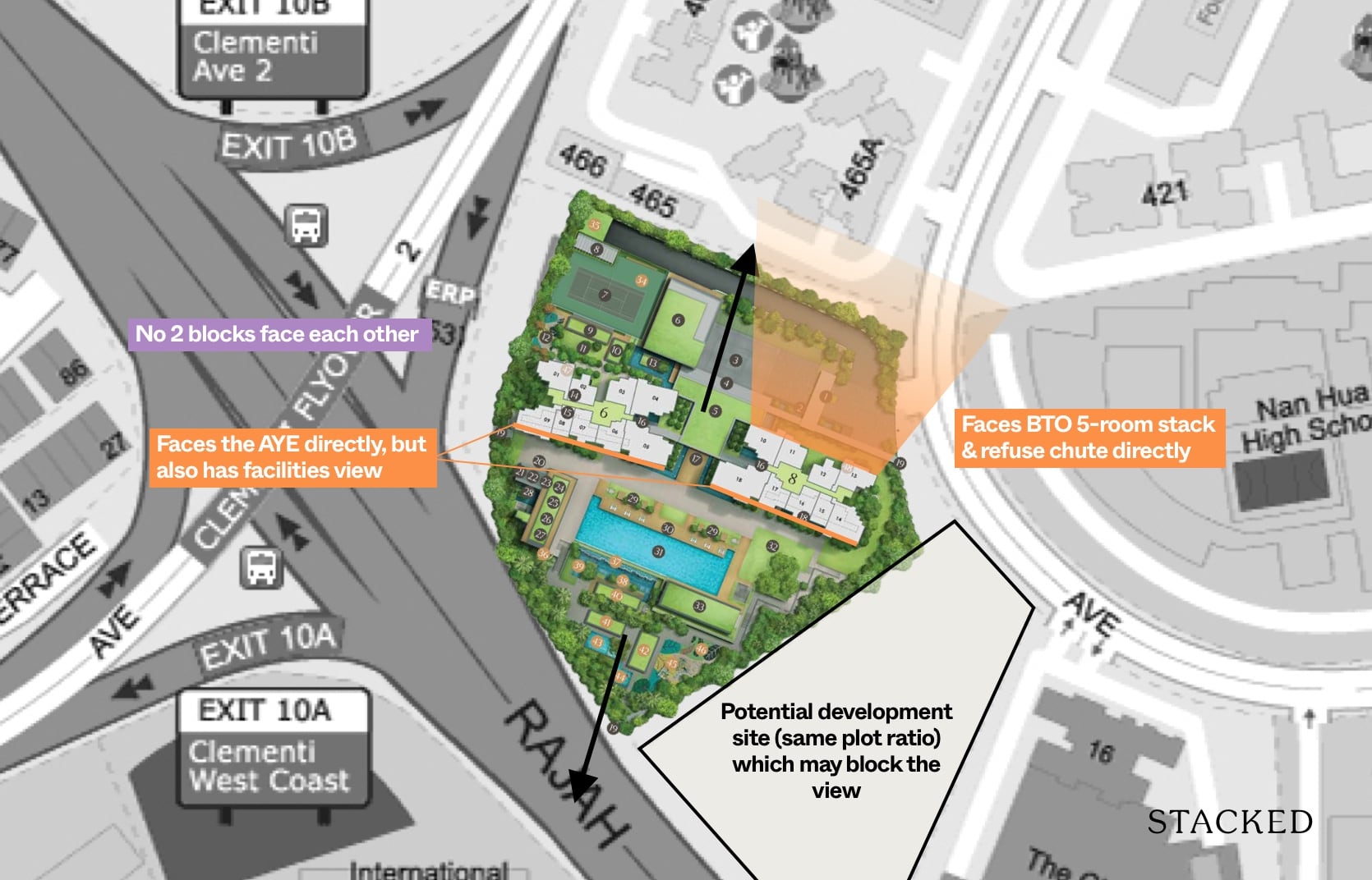
It’s quite a straightforward decision on the best stacks to choose from, depending on your priorities.
Normally as a yardstick to see which the developer has deemed to be the “best”, you’d just have to look at the most expensive unit to have an inkling. In this case, the 5 bedroom premium units are facing the South, but they do enjoy the furthest setback away from the highway, at approximately 85 metres.
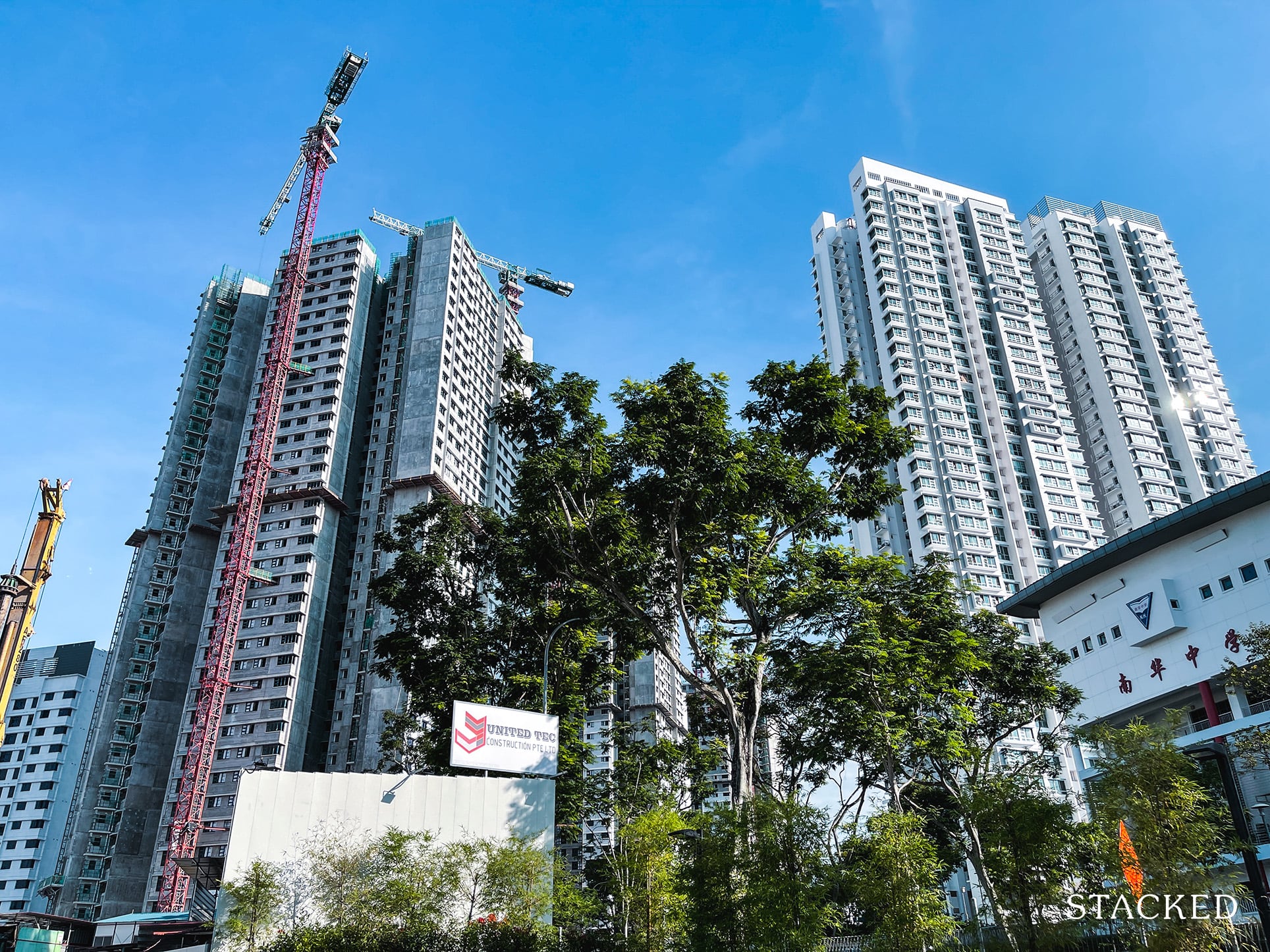
For those looking at the well laid out 2 bedroom units (764 square feet), I would go for the South facing units even though it does face the highway as the facilities view is more appealing, and even at the higher floors you do get pretty unblocked views (up till the new residential site gets announced and built).
For those facing the North, the bulk of the units will have a direct facing of the HDB blocks but will enjoy the quieter (those at Block 8) views as well.
Indicative Pricings
| Unit Tier | Lowest Indicative Pricing |
| 1-Bedroom + Study | $800k+ |
| 2-Bedroom | $1m+ |
| 3-Bedroom | $1.45m+ |
| 4-Bedroom | $1.9m+ |
| 5-Bedroom | $2.45m+ |
Individual Stack Pricings
Stack | Indicative Pricing |
| 01 | $1.45mil / $1,513 psf (3BR compact ) |
| 02 | $1.0mil |
| 03 | $1.1mil |
| 04 | $2.0mil |
| 05 | $2.3mil / $1,510psf (4br prem) |
| 06 | $1.2mil |
| 07 | $1.2mil |
| 08 | $800k |
| 09 | $1.7mil |
| 10 | $1.7mil |
| 11 | $1.1mil / $1,557psf (2b2b) |
| 12 | $1.0mil / $1,620psf (2b1b) |
| 13 | $1.5mil |
| 14 | $1.9mil |
| 15 | $800k $1,535psf (1+s) |
| 16 | $1.2mil |
| 17 | $1.2mil |
| 18 | $2.5mil / $1,532psf (5br) |
Some of the keen-eyed among us might notice how similar the psfs for the smaller units are, compared with the larger ones.
In many past developments, you’d often see large price variations with smaller 1-2 bedroom units for example, costing $200-300psf above the larger 4-5 bedroom units.
With these pricing similarities, it’s no doubt that the larger units here are going to cost much more, hence appealing mostly to the well-heeled. It also brings about a bigger question.
Could the ‘evening-out’ of psf values that we’re seeing for larger new launch units result in an all-round increase in future (resale) larger bedroom unit psf?
Or could this result in the unlikely event of these new launch larger bedroom units losing their psf values over the coming years as their quantum values adjust to market average or perhaps the 1-2 bedders jumping up in resale pricings?
It’s certainly an interesting debate that we’ll be looking to discuss in the very near future (I’ll link it here when the article is up).
That said, let’s now have a look at the current prices of the surrounding new/new launch projects.
Price Review
| Project Name | Tenure | TOP | Average Price (PSF) | Number of Units |
| Clavon | 99-Year Leasehold | 2025 | ~ $1,510 – $1,620 psf | 640 |
| Clement Canopy | 99-Year Leasehold | 2019 | $1,503 psf | 505 |
| Parc Clematis | 99-Year Leasehold | 2023 | $1,642 psf | 1,450 |
| Twin Vew | 99-Year Leasehold | 2021 | $1,480 psf | 520 |
| Parc Riviera | 99-Year Leasehold | 2019 | $1,373 psf | 752 |
| Whistler Grand | 99-Year Leasehold | 2021 | $1,533 psf | 712 |
While I won’t go too in-depth into discussing speculative figures (especially since there are bound to be pricing uncertainties across flooring range), it’s important to note that Clavon is slated for TOP in 2025 – giving it quite a bit of time for price points in the general region to increase with the impending JID/JLD implementations.
UOL is known for pricing their projects at a slightly more affordable rate when compared to the market at launch, so this isn’t a surprise to many – further considering that it secured a steal land price in 2019 post en bloc fever/cooling measures.
If these indicative prices are anything to go by, I would assume that Clavon poses a worthwhile consideration for those looking to live/invest in the general area.
For those curious about current pricings in the area, here are the past years’ unit transactions over at Clement Canopy for your perusal (do note that these sales are all of the 3-bedroom variety):
| Date | Unit Size | Sale PSF | Unit Quantum | Profit |
| 30 March 2020 | 1,109 sqft | $1,471 psf | $1.631m | $222,888 |
| 15 April 2020 | 1,346 sqft | $1,472 psf | $1.981m | $358,000 |
| 5 August 2020 | 1,346 sqft | $1,515 psf | $2.038m | $321,888 |
| 10 November 2020 | 1,346 sqft | $1,491 psf | $2.006m | $354,000 |
You can quite clearly see those who bought Clement Canopy have enjoyed sizeable returns with the average sale PSF hovering around the $1,503 mark currently.
So if the indicative prices are to be believed, the current resale transactions does support the train of thought that the asking prices for Clavon are relatively safe.
With the resale PSF between $1,472 to $1,515 it does mean that the larger units at Clavon has quite competitive prices considering Clavon will only TOP 4 years later.
Appreciation Analysis
Let’s have a quick look at the Masterplan.
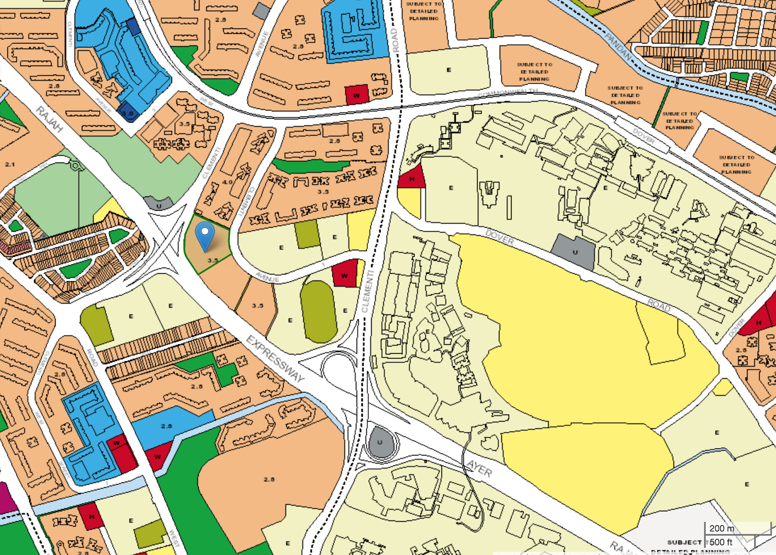
If you notice that residential plot of land located between Clavon and Clement Canopy, it’s actually where the current Clavon showflat is located.
According to multiple sources, the piece of land will likely make for another residential project once the showflat has been torn down.
While that will undoubtedly add to the supply and rental/resale competition of units in the immediate area, I would assume at face value that its subsequent launch would bump up the price ranges of surrounding condos once it launches in the future (assuming it has a good take up rate).
Another thing to note is the incredible amount of rental contracts we’re seeing from the next door Clement Canopy, just a year after its TOP.
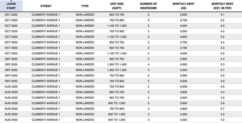
Notice how many of these contracts were actually weathered through the circuit breaker period?
All this even before the inclusion of the JID/JLD districts and the potential High Speed Rail between KL and Singapore (assuming it does go through) – and without factoring in the increasing amount of expats moving to heartland areas as a result of lowered pay packets.
Of course, things will likely be different in 3-4 years time when Clavon eventually TOPs as the global economic situation improves from the virus – but in general, I do see a bright future ahead of this project both rentability and capital gain-wise.
Our Take
What we like
- Fantastic 2 bedroom layout
- Near to amenities
- Sheltered walkway to bus stop
What we don’t like
- –Walk to MRT
- –Not the best facings
I can definitely foresee Clavon selling like hotcakes when it’s launched assuming that the prices don’t differ too high above the indicative prices we’ve been given.
The mettle of the developer team has been proven, and so has the attractiveness of the location (rentability-wise) thanks to the neighbouring Clement Canopy.
It also seems like a good homestay option for families given the adequate facilities and diverse areas of recreation and relaxation in the condo, and not to mention the nearby educational institutes.
That said, there are strong options within the area. Personally for me, Parc Clematis still takes the cake from an own-stay family option, with fantastic facilities and proximity to school and MRT.
It goes without saying, the biggest hurdles for potential buyers would be the road noise from the AYE as well as the longer walk to the MRT, so it really depends on the price point that you can enter at.
What this means for you
You might like Clavon if you:
-
• Believe in the JID/JLD and HSR Transformation:
Depending on how far reaching the tenant demand gets, Clavon is still within relative proximity to these areas which are bound to bring an influx of employment to the area.
-
• Enjoy Rooftop Facilities:
Having multi-facilities on the 37th floor of your condo is something that many will enjoy – especially if you are an owner of a closer-to-ground unit.
You might not like Clavon if you:
-
• Are Wary of Highway Pollution:
While the developers have set aside certain implementations to ease the highway noise/dust influx, there will still be traces of it through the project (more so for the South-facing stacks and facility areas).
-
• Prefer Exclusivity:
At 640 units spread across 178,000+ sqft of land, Clavon certainly isn’t the biggest development, but you’ll definitely get some competition for facilities during the weekends/holidays/evenings.
End of Review
At Stacked, we like to look beyond the headlines and surface-level numbers, and focus on how things play out in the real world.
If you’d like to discuss how this applies to your own circumstances, you can reach out for a one-to-one consultation here.
And if you simply have a question or want to share a thought, feel free to write to us at stories@stackedhomes.com — we read every message.
Frequently asked questions
What is the location and district of Clavon?
Clavon is located at 4 - 8 Clementi Avenue 1 in District 05, Singapore.
What are the key features of the Clavon development?
Clavon features 640 units on a 178,064 sqft site, with amenities including a 50m lap pool, function rooms, a gym, playground, and a childcare centre. It has a 99-year leasehold tenure and is expected to TOP in 2025.
How does the size of the 2-bedroom units at Clavon compare to current norms?
The 2-bedroom units at Clavon are 764 sqft, which is considered very decent compared to the current norm of around 600 sqft for similar units.
What are the advantages of the 2-bedroom premium units at Clavon?
The 2-bedroom premium units are efficient with no wasted space, featuring a spacious living/dining area, a proper kitchen with an island, and a ceiling height of 2.79 meters, offering a comfortable living environment.
What are the main views and noise considerations for Clavon’s facilities?
The swimming pool faces the expressway (AYE), so it may not be a quiet oasis, but the layout maximizes setbacks from traffic noise for the residential blocks.
Our Verdict
75%
Overall Rating
Join our Telegram group for instant notifications
Join Now












2 Comments
hot seller from what i been hearing. but the AYE noise will be quite something.
Agreed!