A 35-Year-Old HDB Gets A Dramatic Transformation Into A Minimalist Japanese/Korean Aesthetic Space
January 10, 2023
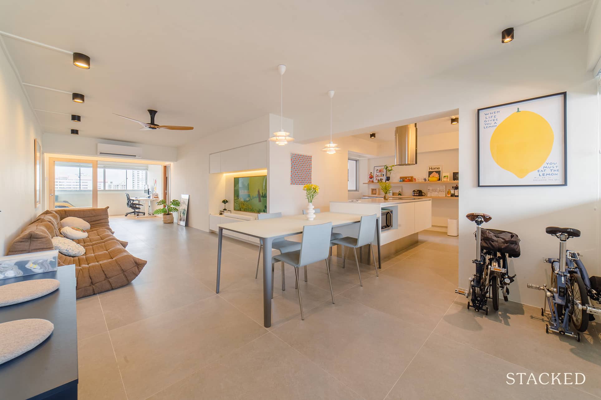
There are some homes that you view that are just love at first sight.
For others, well, you may need a certain eye to see past its flaws and visualise its full potential.
Take Mark and Emma’s (*not their real names for privacy reasons) place for example. There’s no crime in admitting that it would be extremely hard to look past the clutter and disarray the apartment was in, in its initial condition.
But the 35-year-old 4-room resale flat located on MacNair Road, in between Balestier and Boon Keng, proved to be quite hard to just pass by for the couple. “We took a liking to the location and the space, which is rare these days with the newer flats,” Emma said.
And there is a silver lining to such places in such condition – the price. Mark and Emma were able to purchase the place without having to pay any COV because of it.
They also liked the fact that there are only 4 units on their level, so there’s privacy, and it’s peaceful. Plus, the added bonus was that there are also unblocked views on both sides of the house.
Mark and Emma are both in the tech industry and have been working from home for the past 2 years, so they needed their place to accommodate not just their lifestyle but their work as well. Follow along to see the results of this major home transformation journey.
So many readers write in because they're unsure what to do next, and don't know who to trust.
If this sounds familiar, we offer structured 1-to-1 consultations where we walk through your finances, goals, and market options objectively.
No obligation. Just clarity.
Learn more here.
How The Renovation Journey Turned Out
Right from the start, they knew that the place needed a major overhaul which meant it would need to go through a lot of hacking.
“We set a budget of $80K initially but ended up being closer to $100K for the renovation,” Emma revealed. “In the end, the increased budget went towards the materials such as the quartz top in the kitchen as well as the engineered wood flooring.”
When it comes to the design and style of their renovation, the pair didn’t stick to any theme from the beginning. Their brief to their ID was to create a bright and airy environment with minimal built-in so that there’s more flexibility with the space over time. They also tried to avoid themes that were too mainstream, as they wanted the place to withstand trends.
In terms of inspiration, they said they got this from some of the Korean and Japanese homes on YouTube, where it is mainly white walls/fixtures with an emphasis on style and practicality.
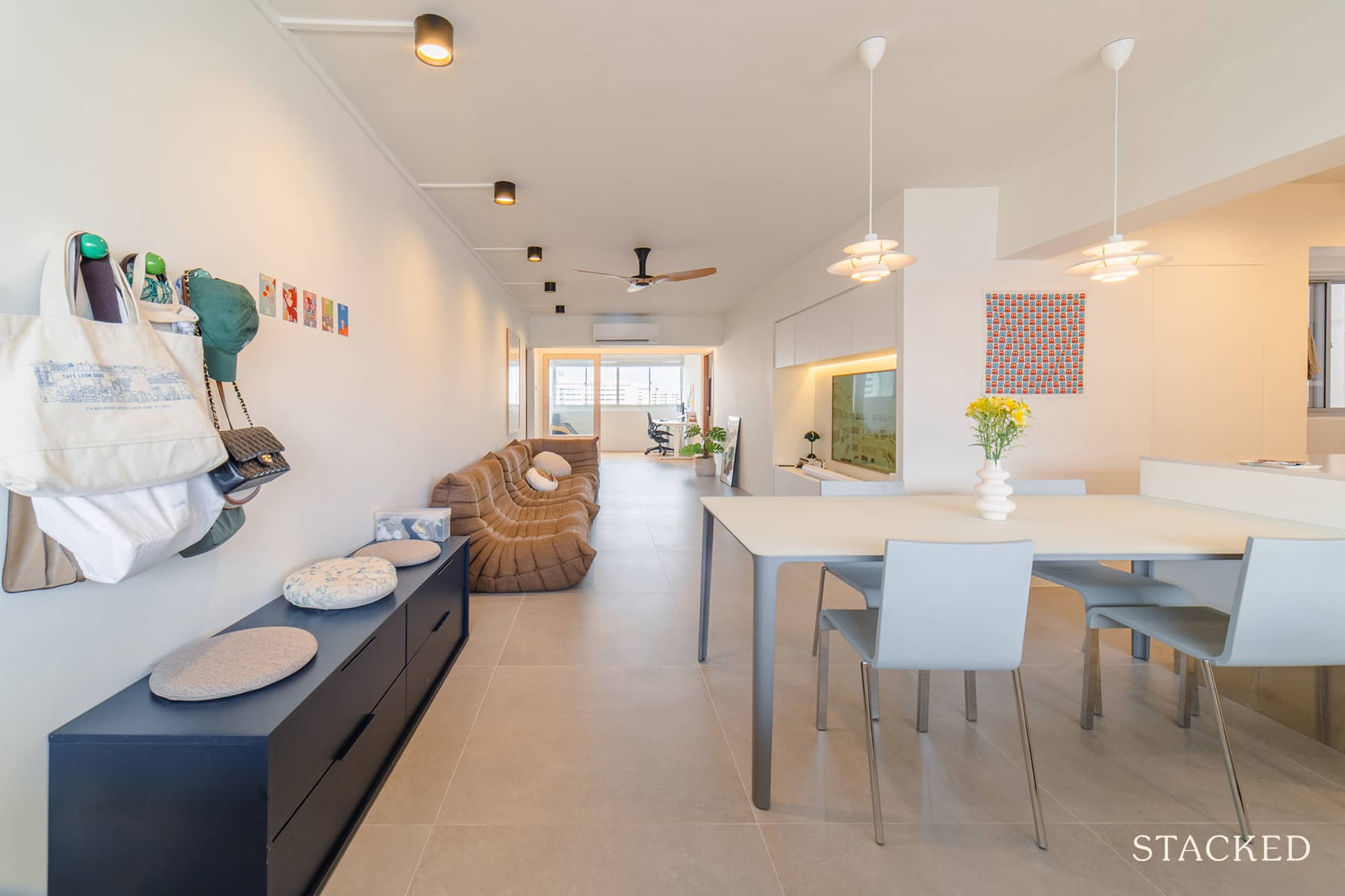
Having an almost all-white background meant the furnishings they would choose could stand out more. “We also went with large format tiles for the common areas to minimise the grout lines and give the entire space a sense of openness,” Mark added. He also said that for the rooms, they decided to go with engineered wood as they like how it feels when they walk on it, which gives their place an overall warm and relaxed vibe.
They made several major changes to the home’s layout so they could implement their design. Here is the original and current floor plan to help you better visualise the extent of the changes:
Original floor plan:
Current floor plan:
Living Room
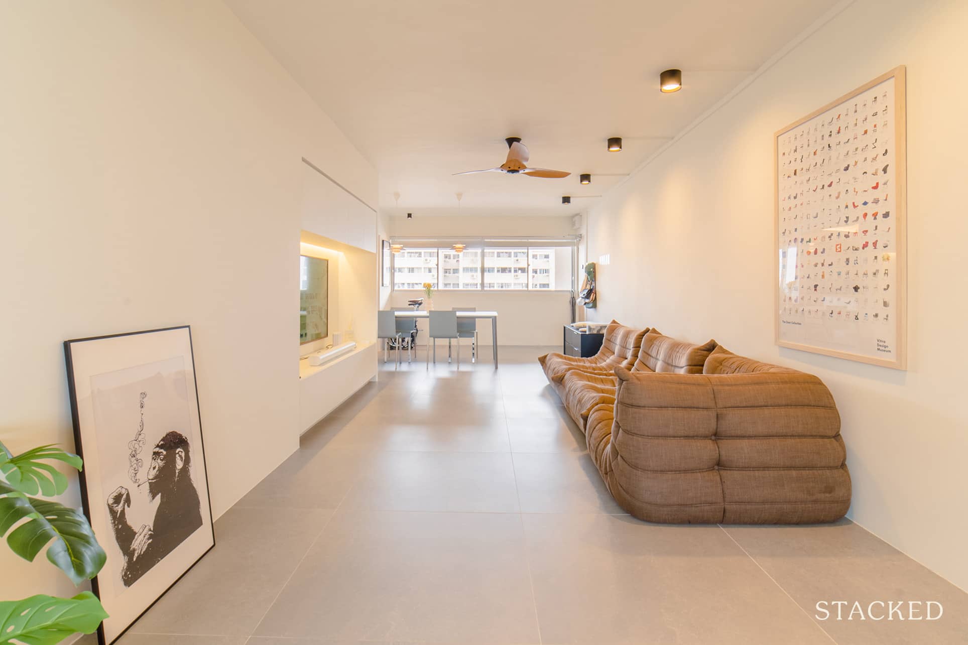
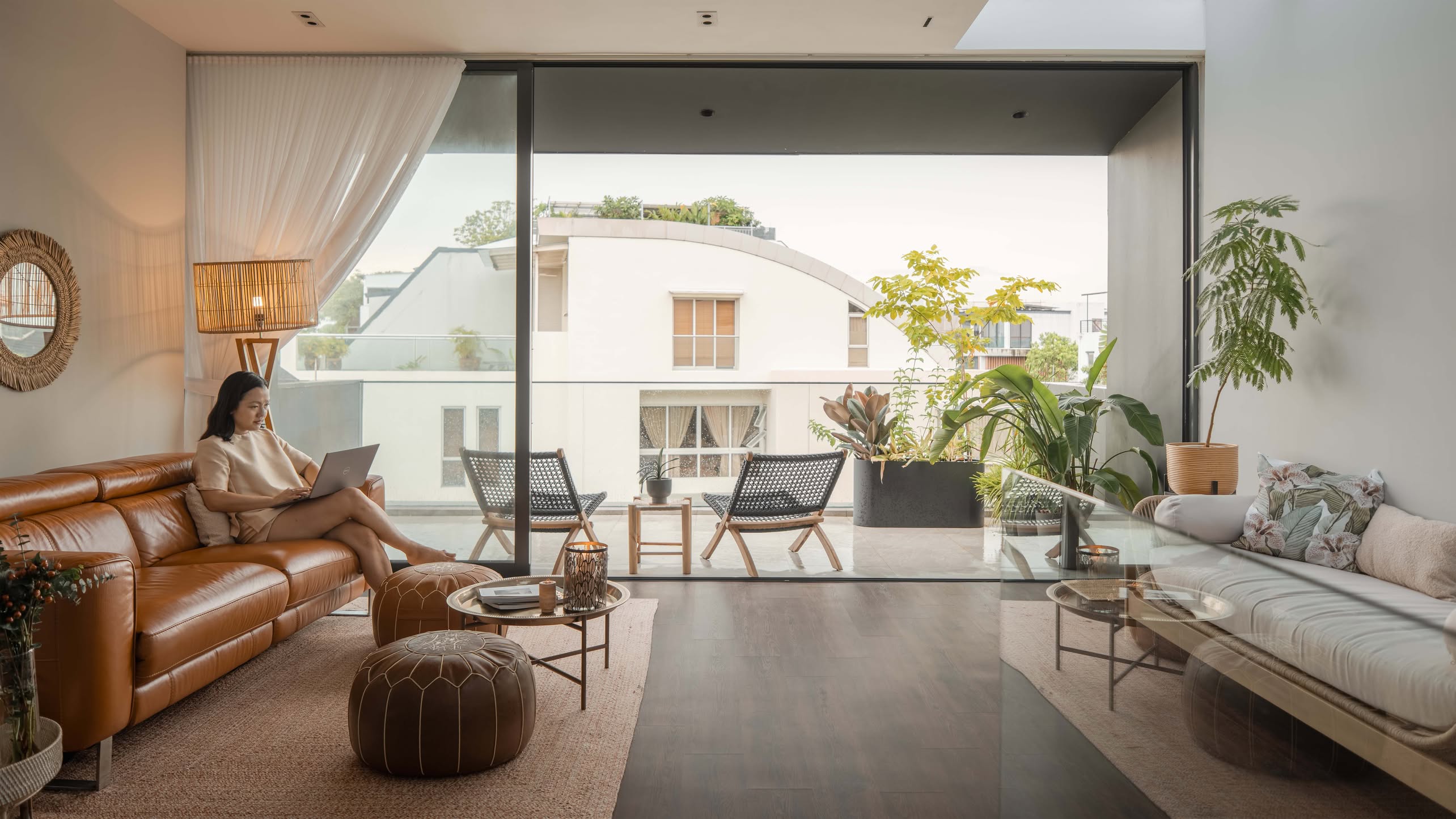
As soon as you enter their home and turn to the left, you’ll immediately see their clean and elegant living room, with natural light pouring in from the far end. They had to bring the storeroom wall out so that the entire space was kept flushed, creating more room in both the living room and the storage area.
It’s a far cry from the original state of the home, and is a picture-perfect example of how good design can really transform a space.
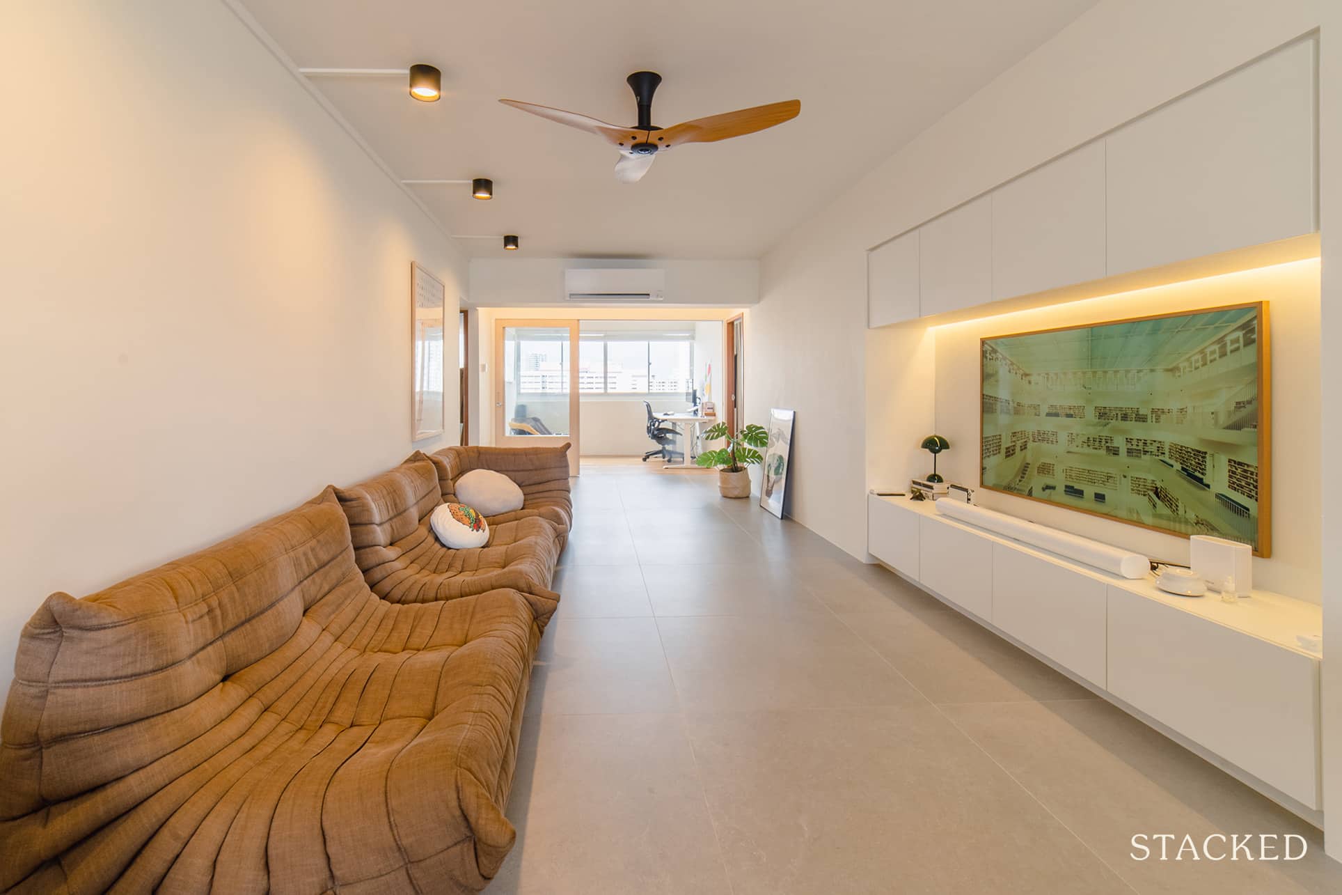
Here’s another angle from the opposite end, giving an unrestricted view of the place from both ends. With windows from either side of the living room, it’s easy to see how bright and airy the space is.
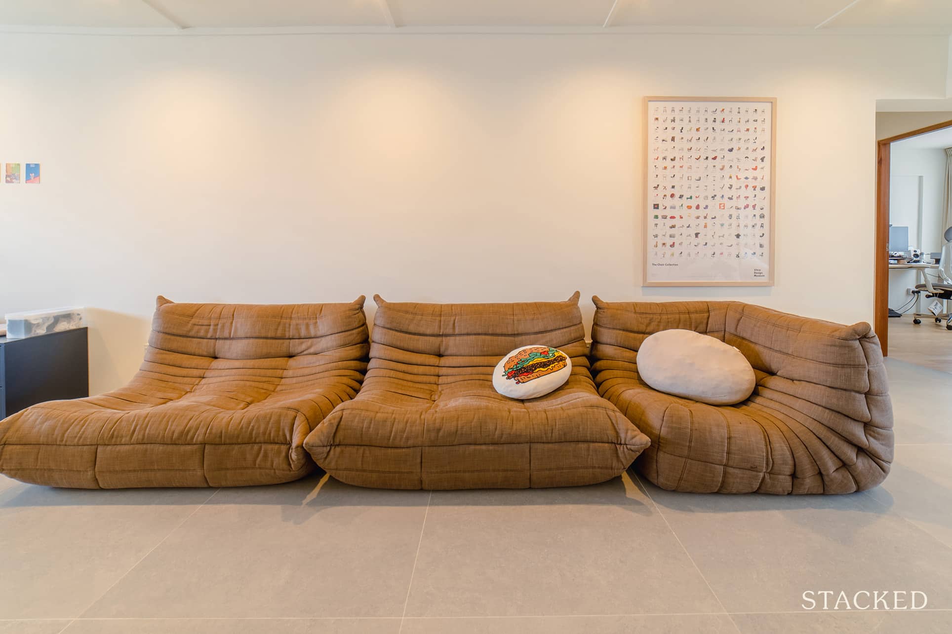
And of course, design aficionados will instantly spot the gorgeous Ligne Roset Togo sofa – of which they have 3 of it! (and the Vitra chair poster below).
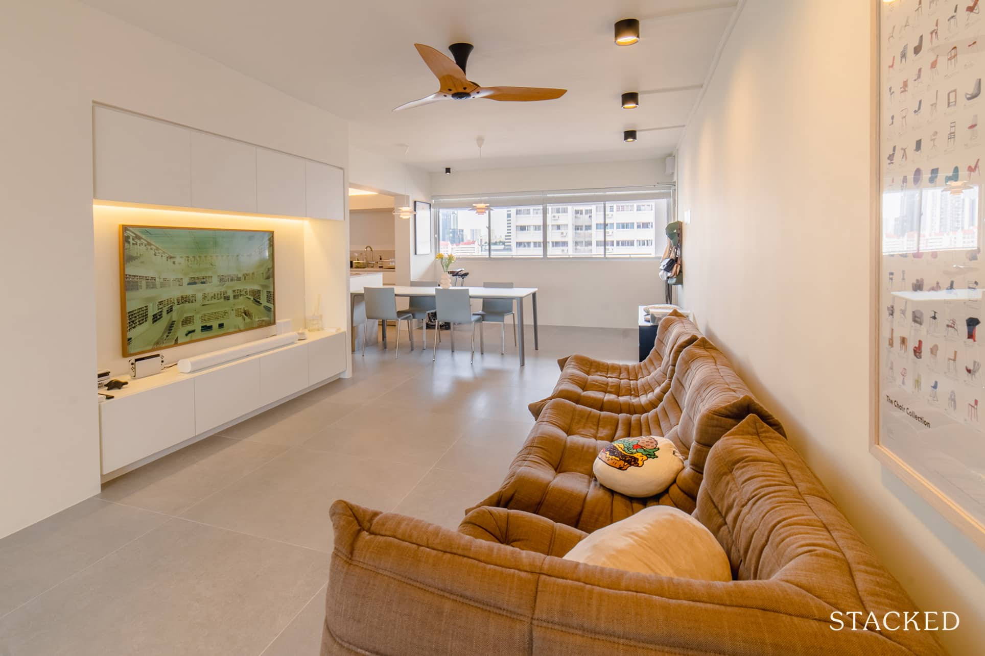
They wanted a nook for their TV, which their ID further improved by adding built-in storage, housing all the electronic manuals, board games, and router. They even have their water heater tucked in one of these storage spaces.
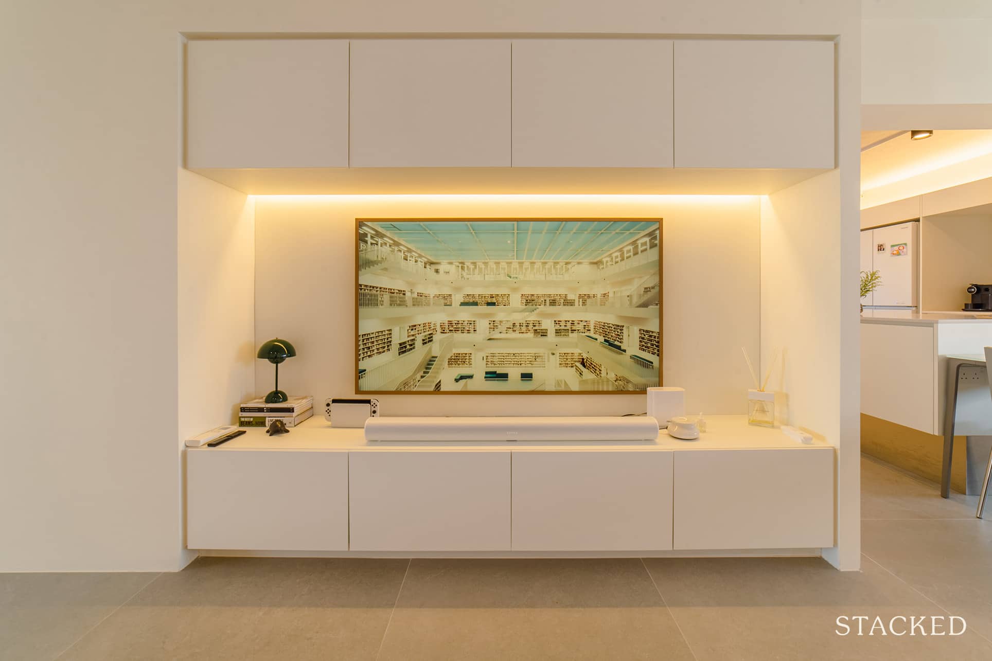
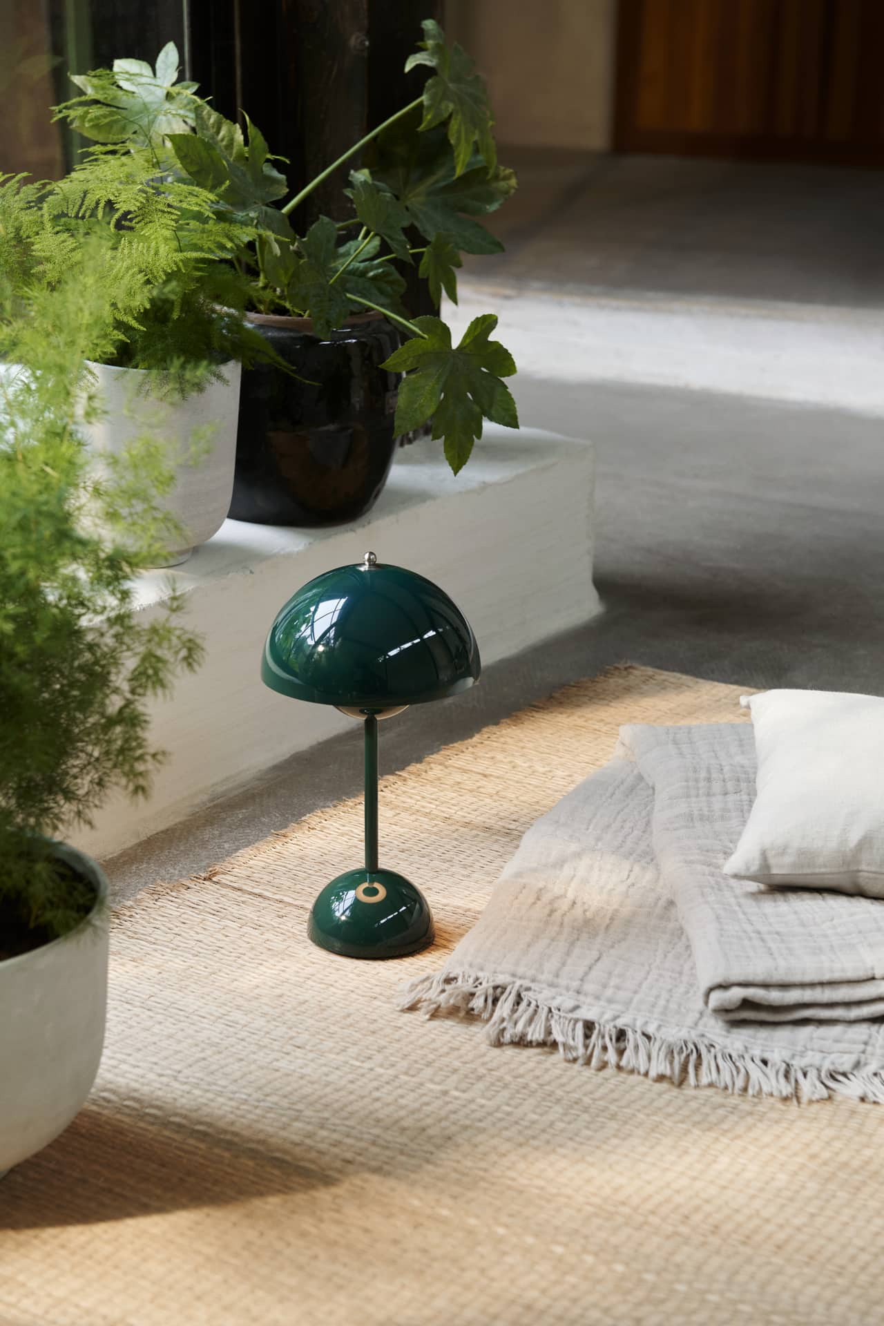
The Samsung Frame TV is a well-suited addition to the space, which goes well with the various artworks that are hung around the home. (And that lovely dark green &Tradition Flowerpot lamp adding a touch of colour).
Dining Room
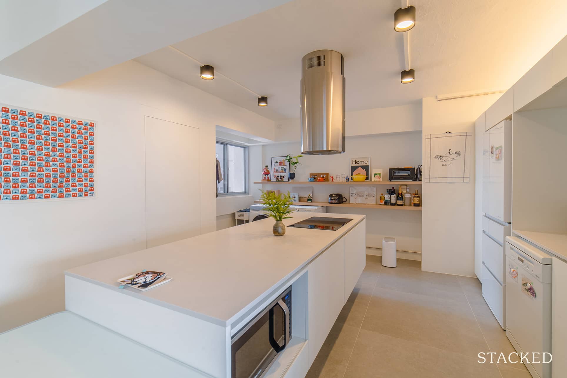
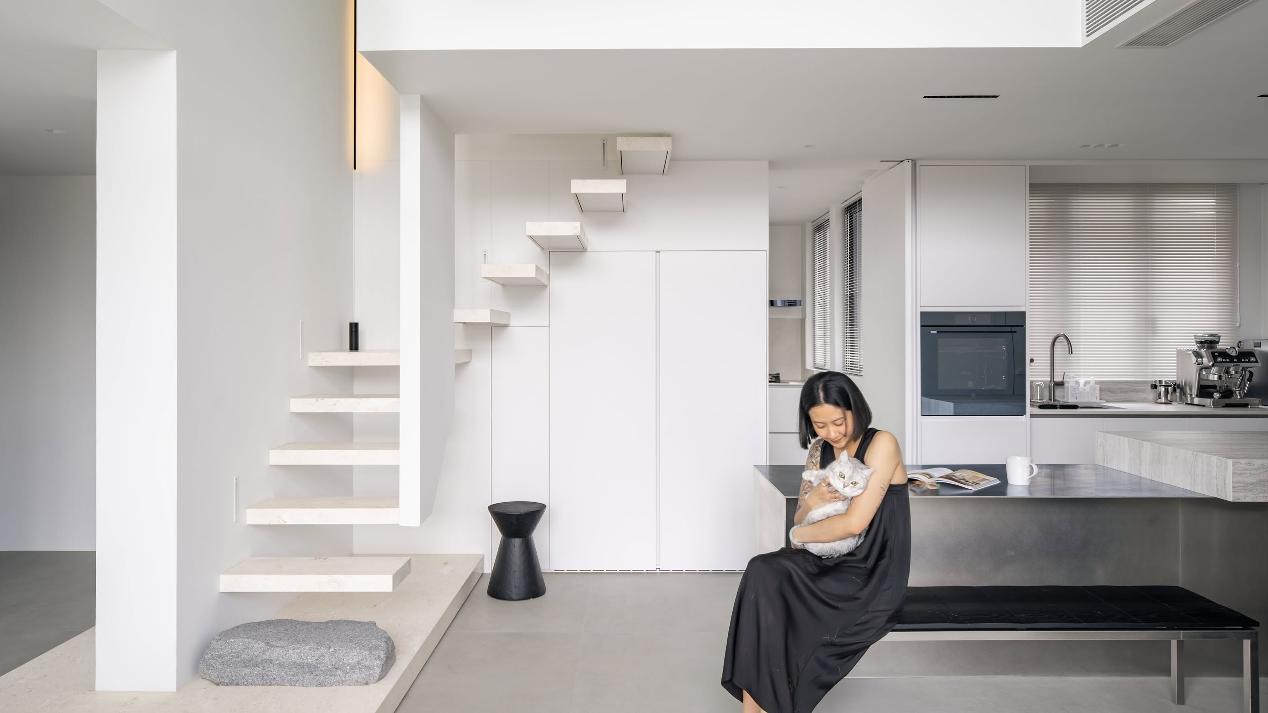
The couple had to hack away the kitchen wall and join their dining table with the kitchen island to create a long communal space.
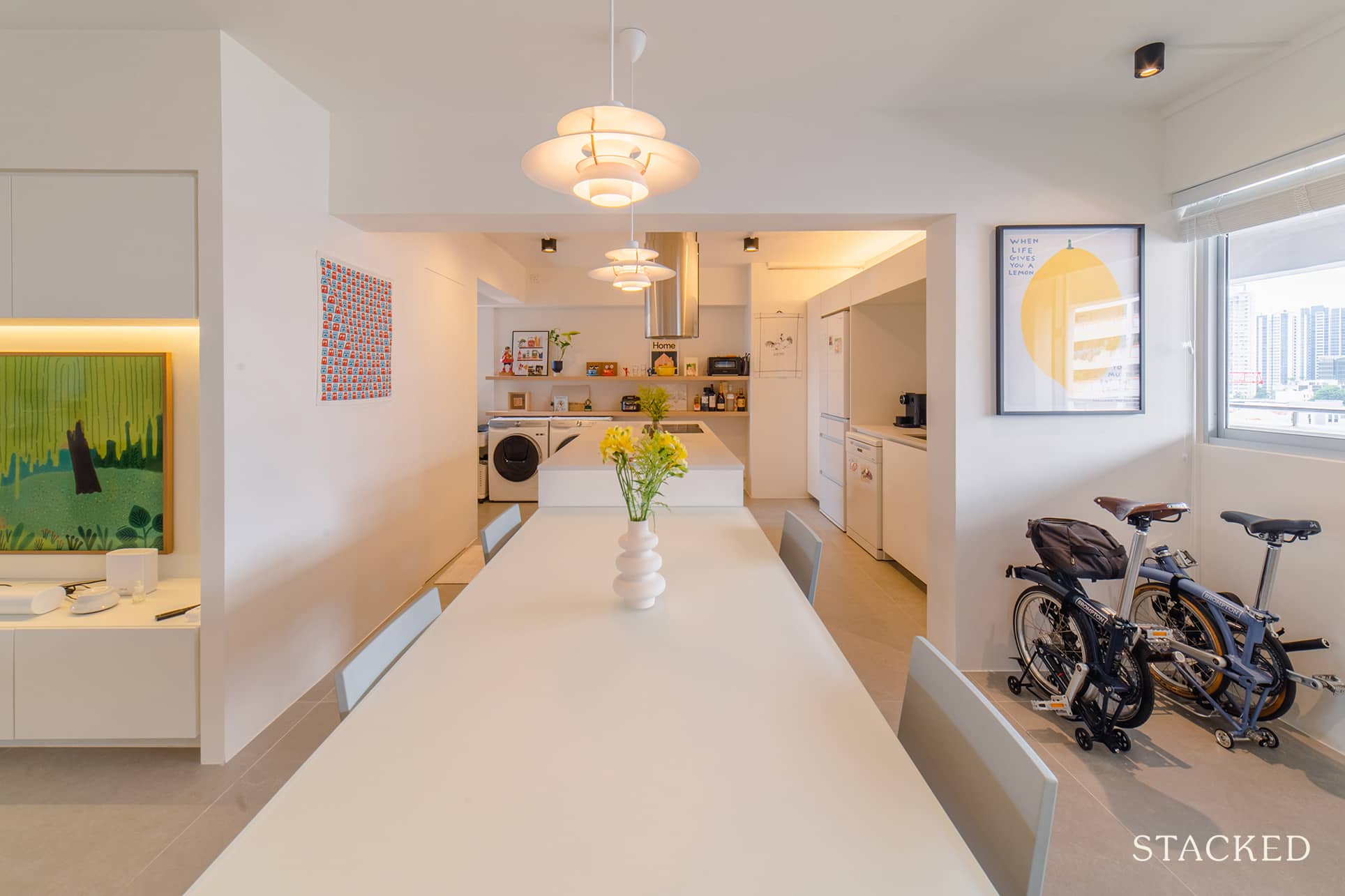
While it’s a very simple and clean look, the two iconic Louis Poulsen PH 5 pendant lamps double up as a wonderful decorative element even when it’s not lit.
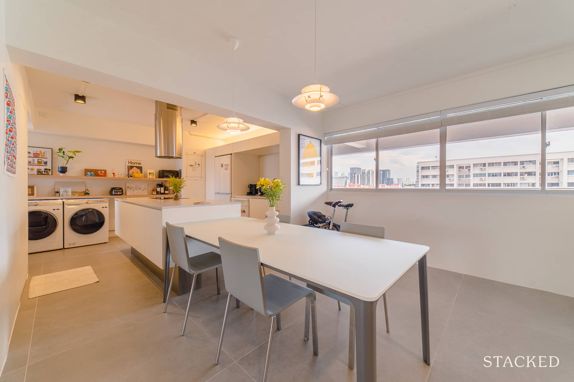
The couple are clearly fans of Vitra, with the plate dining table and stacking chair from Vitra as well.
Kitchen
While Emma admitted that they don’t cook often, they still decided to have an open kitchen because it made the area more spacious, allowing conversations to flow much easier when they’re hosting.
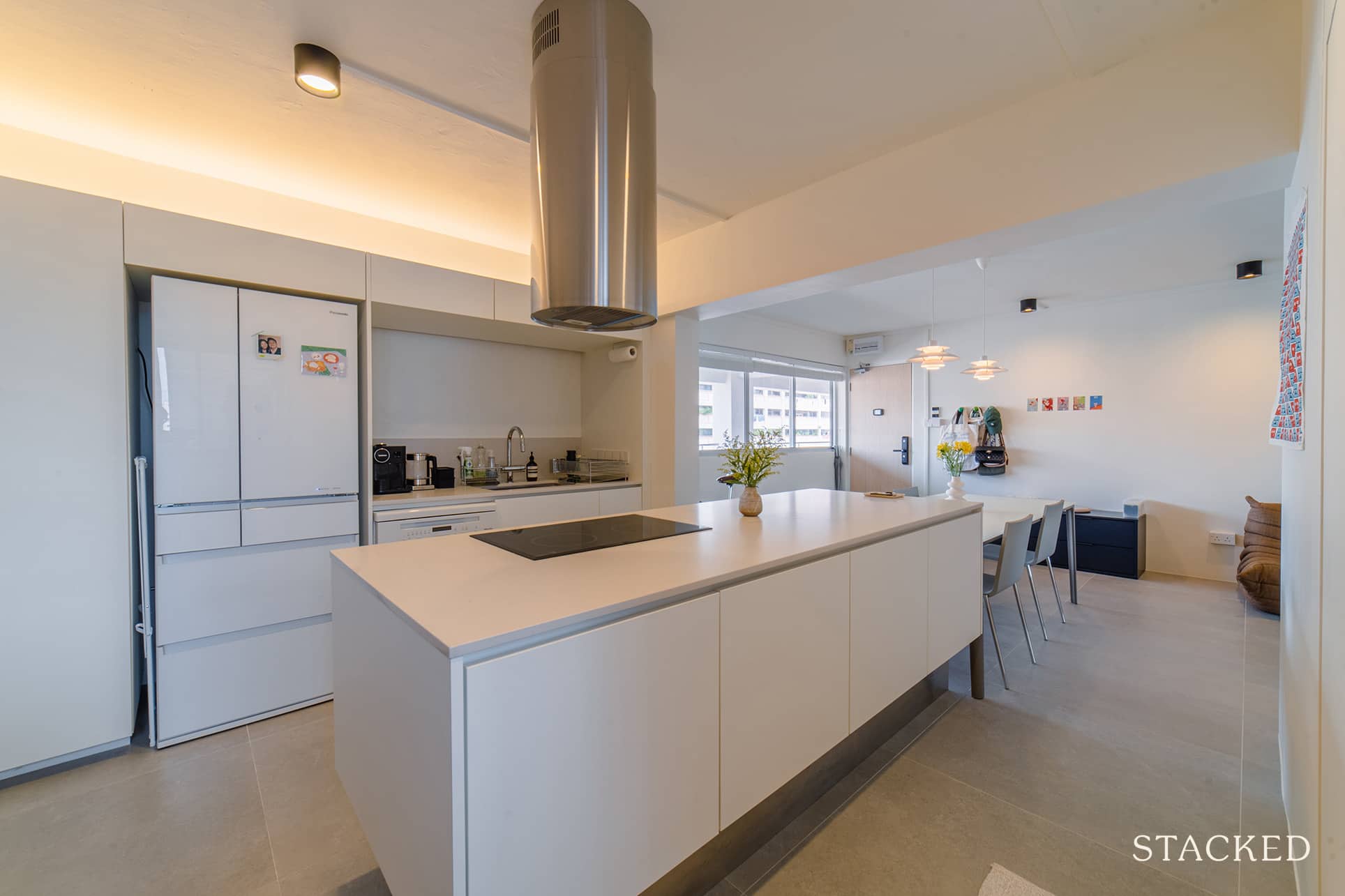
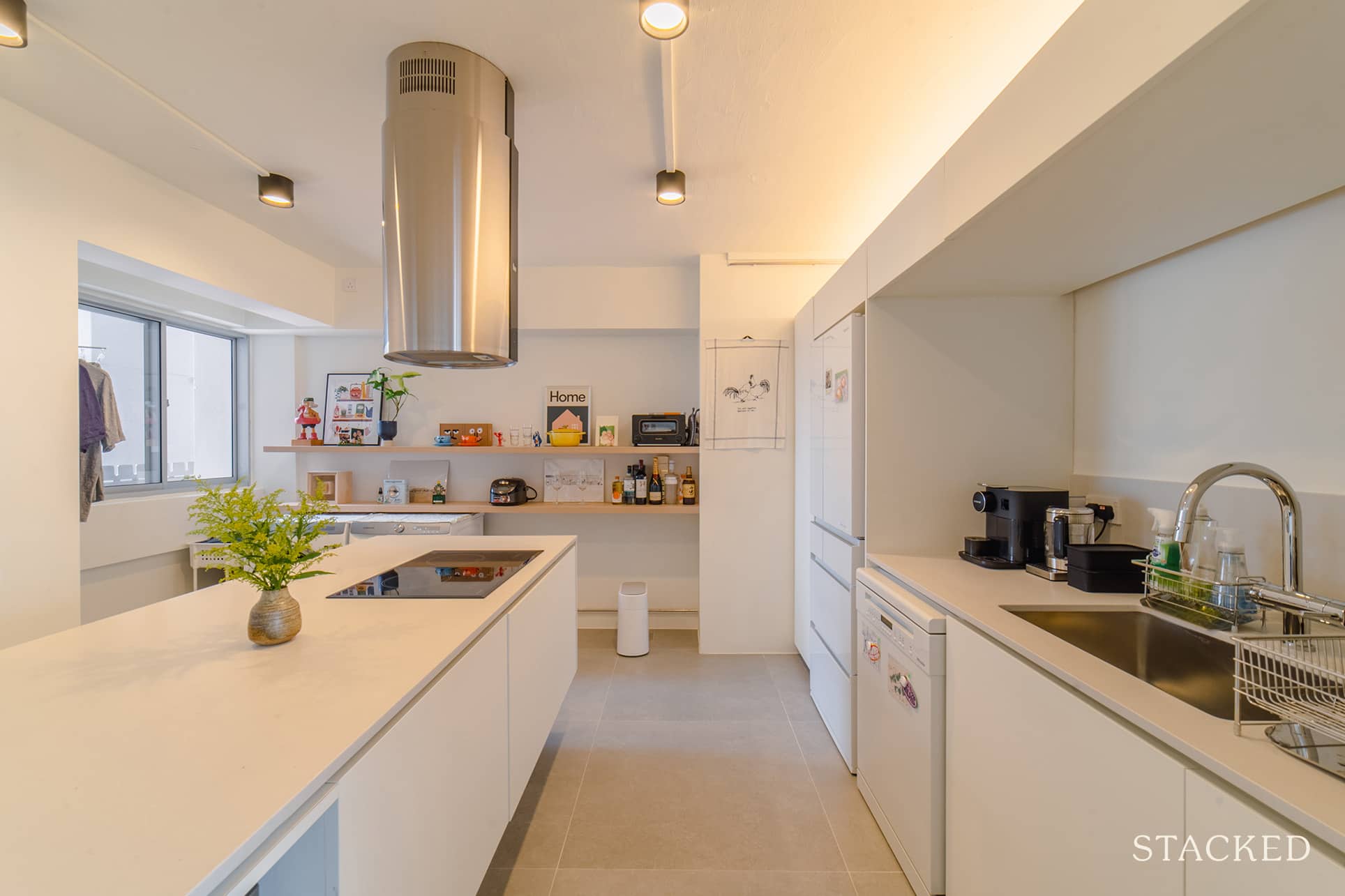
Mark and Emma were determined to create a functional kitchen space. They started by tearing down the walls that separated the kitchen from the rest of the space, and replacing the old cabinets with sleek, open shelving. To maximise functionality and storage, they also added a large 2.4-metre kitchen island. This new centerpiece not only featured an induction stove and island hood but also housed their robot vacuum cleaner and a pantry to store cooking essentials.
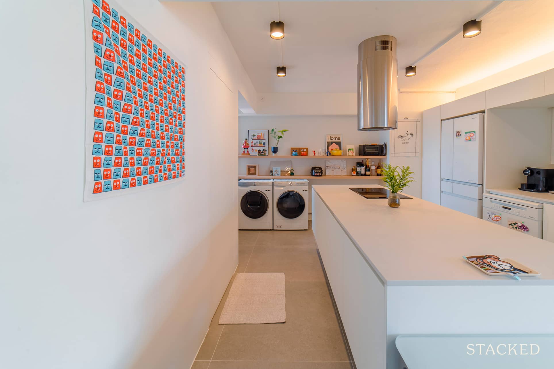
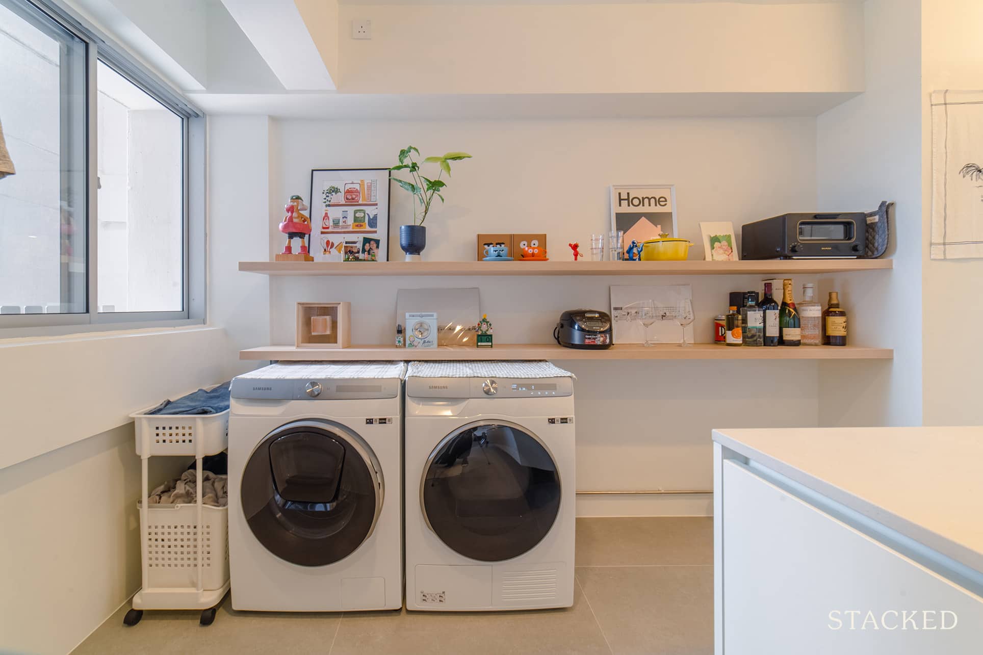
We love the open shelving at the far end that adds a ton of personality to the space. The cheeky nounou orange and blue cups are a particular standout!
Bedroom/s
They had to reduce the size of the bedroom adjacent to the master – not just to add more space to the latter but also to create a working space that could be an extension of the living room. We can’t help but spot the Yuwana Whale art piece, and the yellow Helinox chair being one that is particularly cosy and snuggly.
More from Stacked
DBS Thinks Singapore Property Prices Could Rise Another 55% by 2040 — And the Reasons Might Surprise You
Amidst migraine-inducing prices this year, a common refrain we’ve heard is “It’s unsustainable, the prices MUST come down eventually.” So…
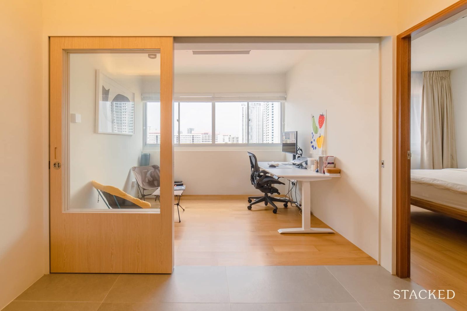
They repurposed the remaining bedroom on the opposite end of the master to be another area for productivity and relaxation as well.
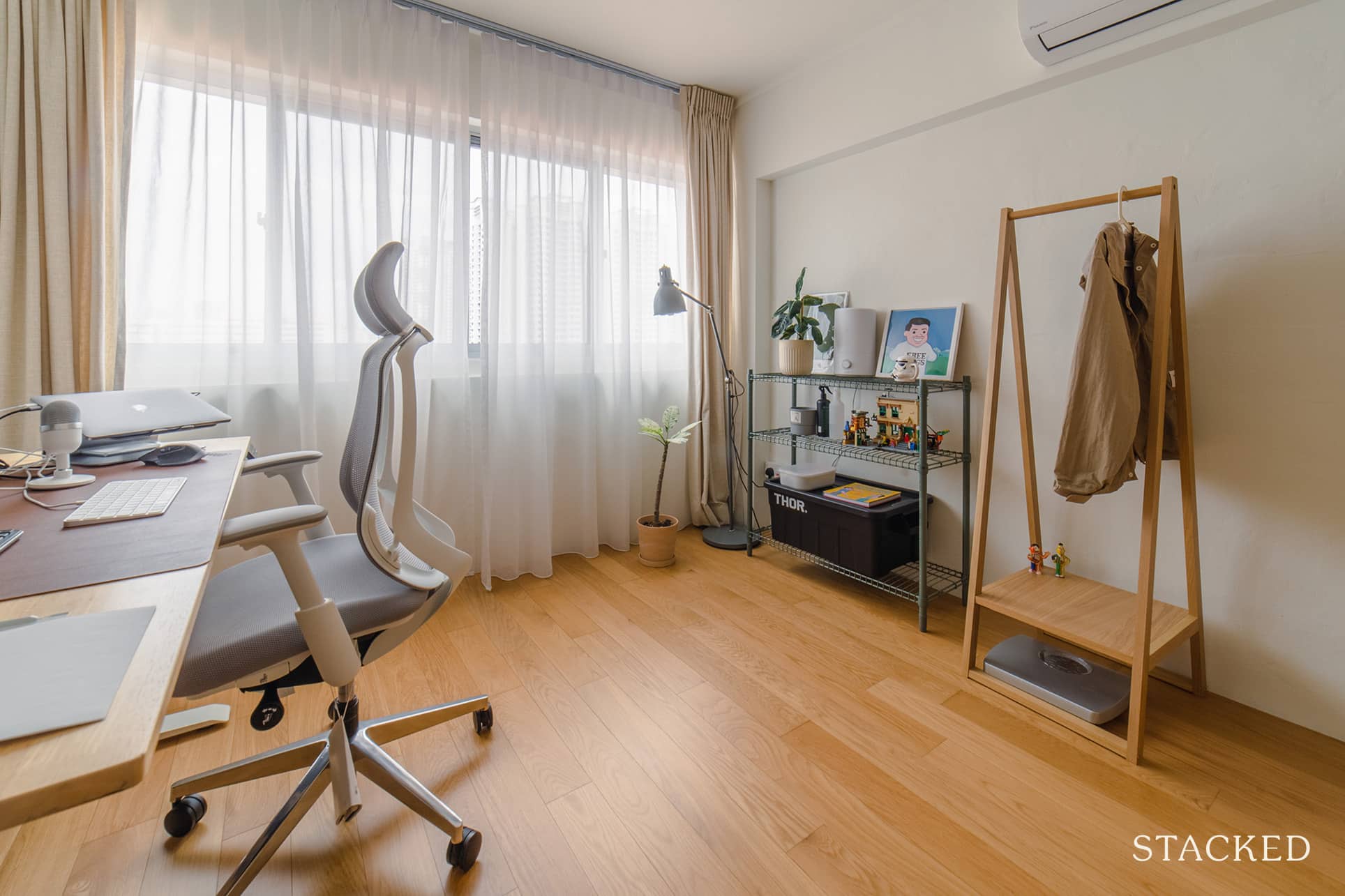
Study rooms can be a boring place, but the space is kept playful with the open display of toys, and plants, as well as the Joan Cornellà free hugs poster.
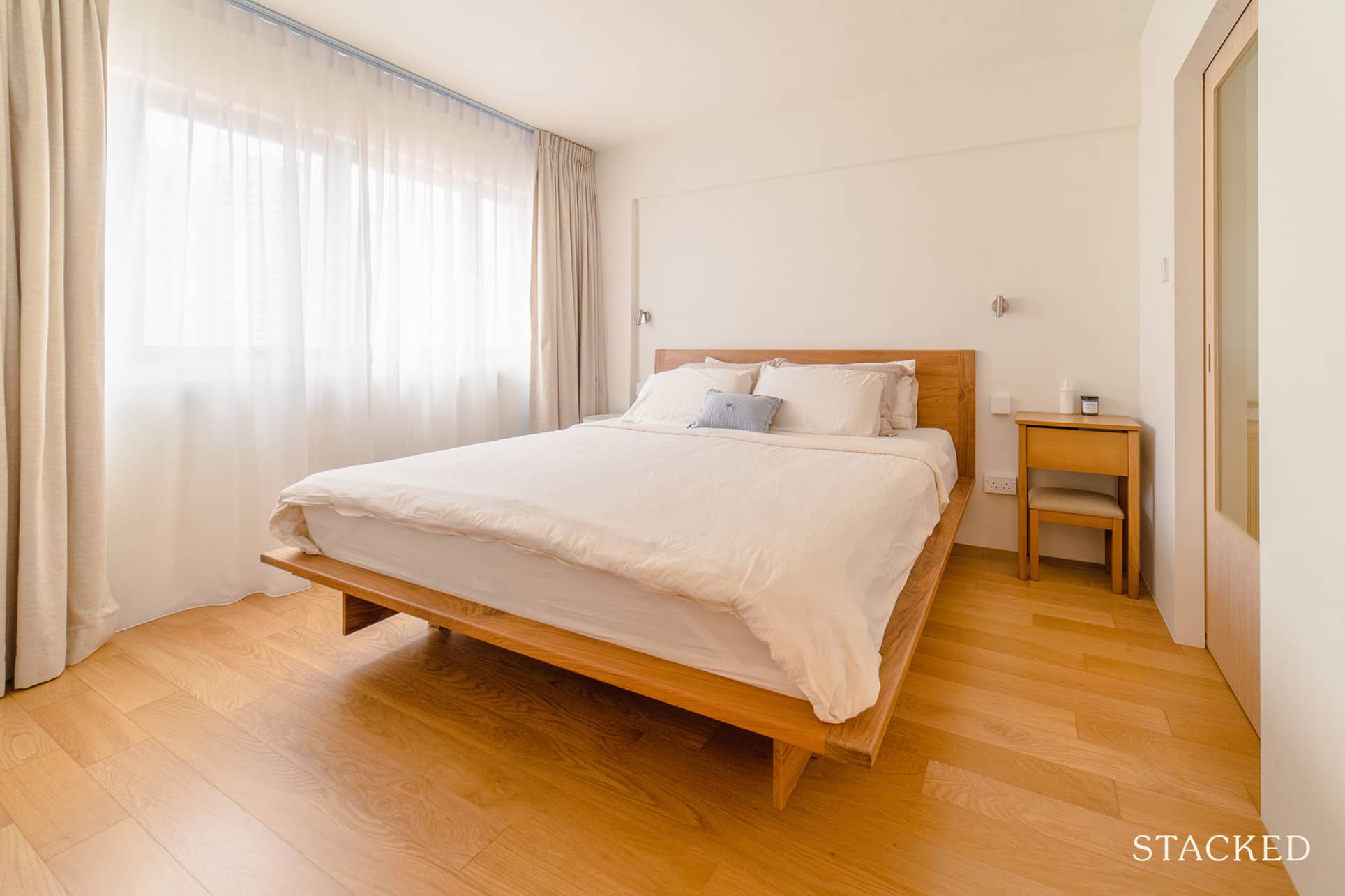
The entrance of the master bedroom was relocated to accommodate a walk-through wardrobe since the couple wanted this particular room to be a space just for resting – with minimal visual clutter, such as the wardrobes.
Bathroom/s
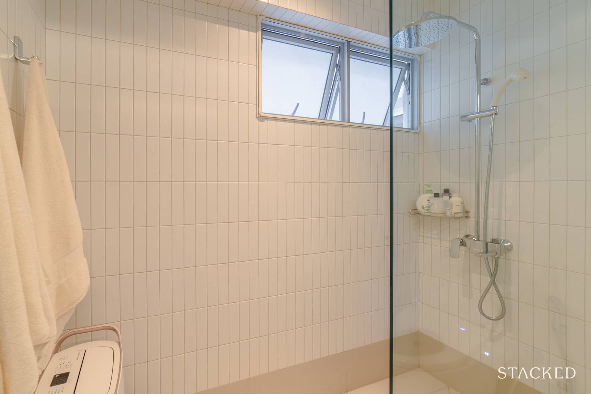
Apart from retiling the walls and flooring for the bathrooms, there were no additional major changes to the common bathroom other than the ventilation fan.
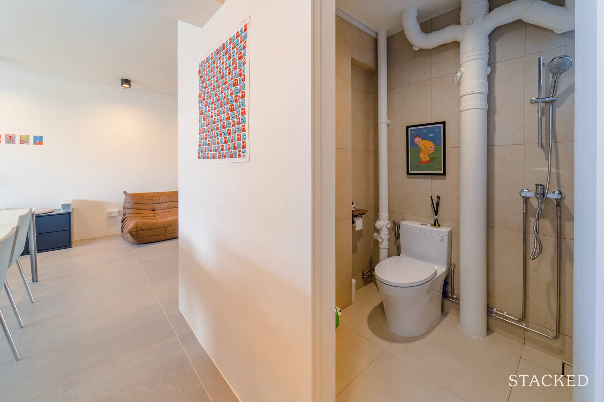
It’s here that you’d also spot the other iconic Joan Cornellà booty boop poster.
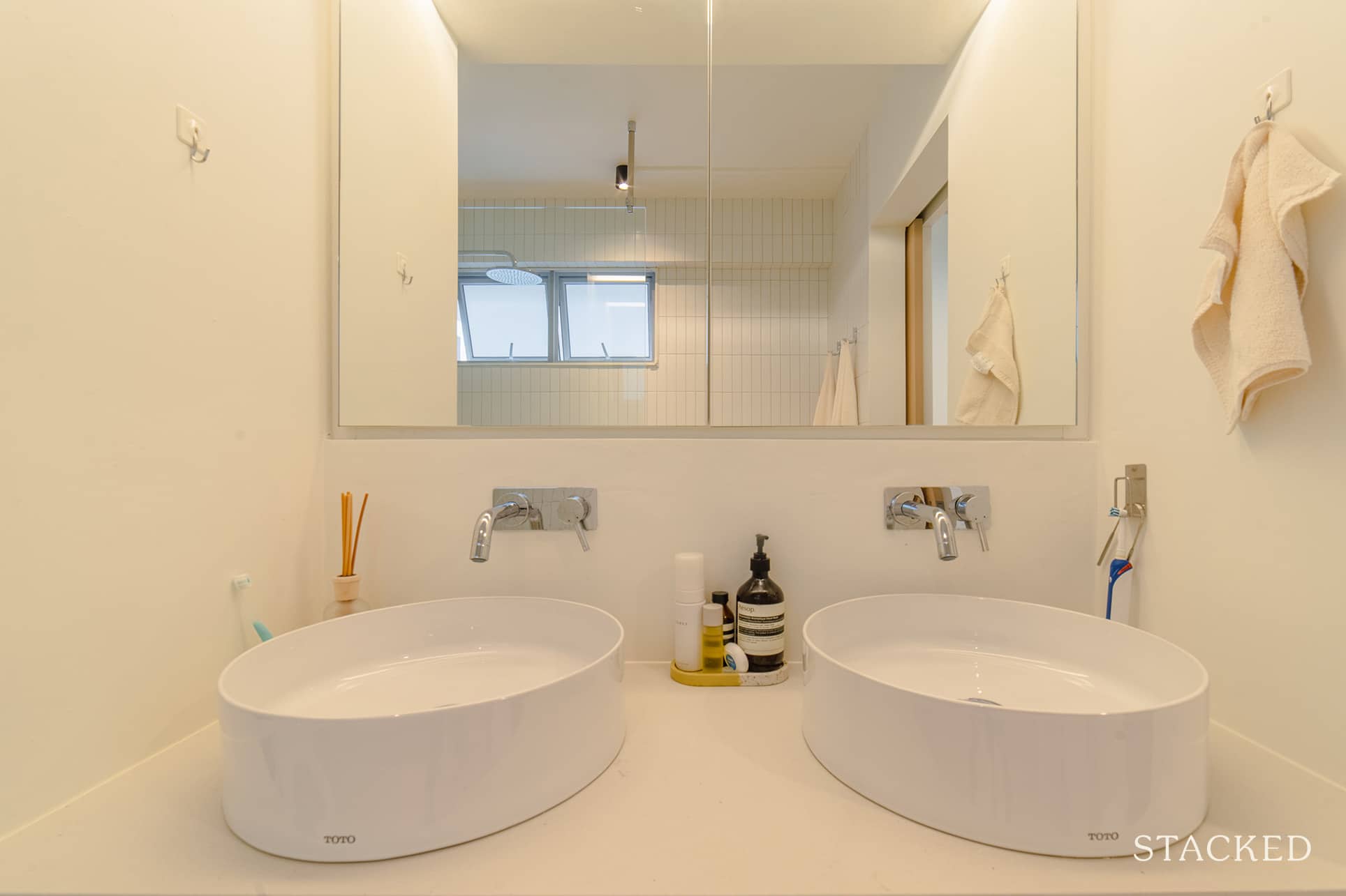
The master bathroom toilet is a different story, though, as they also added a double vanity and a glass shower screen. To accommodate a double vanity, they had to move the bathroom out towards the living room, which in turn helped to create the nook for their living room.
Bringing The Vision To Reality
Mark and Emma said that the final outcome was around 70% similar to what they initially envisioned. They admitted that the other 30% was due to them being quite fickle when it came to certain things like the layout of the flat. “We blame YouTube because we were constantly inspired by the different videos we have been watching during the process,” added Emma.
Their renovation contractor was Kean and Joy from WAFF – a husband and wife team. Emma said that one of the main reasons they decided to go with them was because they felt they could offer their perspective as a couple and mediate between them when they couldn’t come to a decision.
With Kean’s background in architecture, the couple believed that he had a keen eye for detail. “He places an emphasis on clean lines which shone throughout the place,” said Mark. “Getting measurements spot on was also very important in the renovation process.”
Emma shared that they started sourcing furniture 4 months before the renovation began.
“We needed to take into consideration the lead time as many things were delayed during COVID. That being said, we started creating a list of furniture we plan to bring from our rental place and things we needed.”
With the list on hand, they researched furniture stores in Singapore and made their weekly visits. She said that during the process, they might have even gone to Tan Boon Liat more than 20 times. As they didn’t have a specific theme, this meant that they were flexible about the types of furniture they chose.
The pair also took note of the end of the sales period and made sure to maximise their savings. For instance, they consolidated their purchases in Tangs and waited for members’ day for a 12% rebate.
We asked what their favourite part of the house was, and it was different for each of them.
For Mark, it would be the living room. “We spend most of our time there. The unblocked views from both ends of the house also meant that it is bright, windy, and there is cross ventilation.”
Emma, on the other hand, chose the kitchen area. “All the time spend on planning really paid off!” She elaborated further that “because we know we both dislike doing chores, we made sure the appliances and the flow in the kitchen are designed to suit our lifestyle.” Some of the appliances they find essential are a dishwasher, induction hob for easy maintenance, fridge with automatic ice maker, integrated filter tap, and dryer.
Lessons Learned From A Successful Reno Journey
The pair wanted to change the entrance of the common bathroom door as they did not want it to be so obvious from the main entrance. However, they said they couldn’t get approval from HDB as part of the wall was not allowed to be demolished or tampered with. As a result, this also delayed the entire process by 3 weeks because they had to go back and forth between them and the HDB.
“Kudos to our IDs, Kean and Joy, for understanding our intention, suggesting a concealed door for the entrance instead,” Emma pointed out.
Anyone who goes through a reno journey is bound to learn some lessons, and Mark shared one of these with us:
“There is a lot of home-related content on the internet and sometimes we get overwhelmed with ideas. Always start with space planning according to your lifestyle and design the space around it. A good design is not just about looking good but also about enhancing your overall live-in experience.”
Finally, they advised to minimise built-in furniture to only what’s necessary, giving more flexibility on the use of space over time.
They also emphasised that you shouldn’t try to get everything from day one. It’s better to start with more space and gradually fill it with things you love rather than having to declutter later.
Still, in line with the furnishings, they advised investing in furnishing that you love. They said you may opt for a cost-effective option now and sacrifice quality, but you might end up regretting not getting the ones you like in the first place.
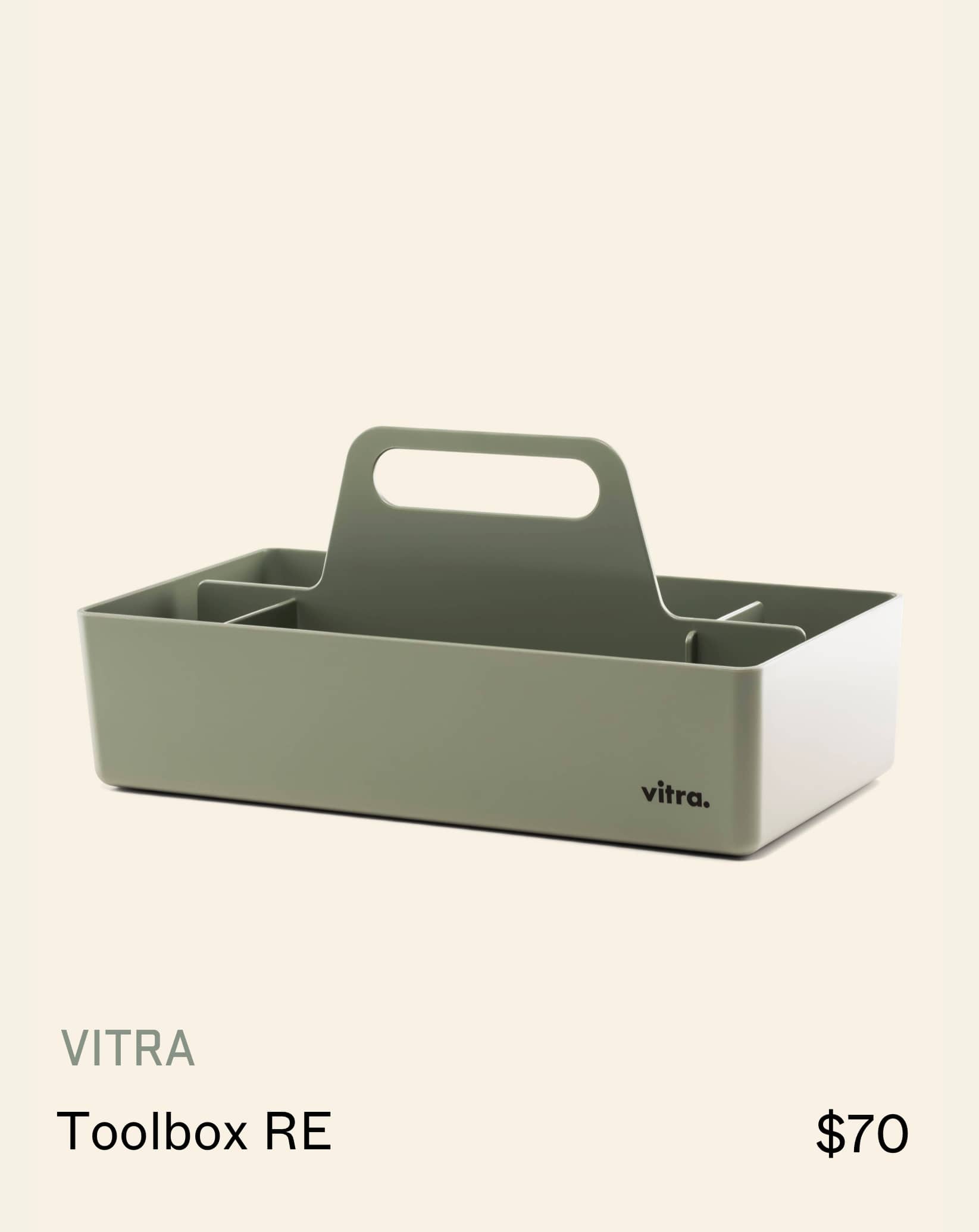
Shop the look
At Stacked, we like to look beyond the headlines and surface-level numbers, and focus on how things play out in the real world.
If you’d like to discuss how this applies to your own circumstances, you can reach out for a one-to-one consultation here.
And if you simply have a question or want to share a thought, feel free to write to us at stories@stackedhomes.com — we read every message.
Need help with a property decision?
Speak to our team →Read next from Homeowner Stories

Homeowner Stories We Could Walk Away With $460,000 In Cash From Our EC. Here’s Why We Didn’t Upgrade.

Homeowner Stories What I Only Learned After My First Year Of Homeownership In Singapore

Homeowner Stories I Gave My Parents My Condo and Moved Into Their HDB — Here’s Why It Made Sense.

Homeowner Stories “I Thought I Could Wait for a Better New Launch Condo” How One Buyer’s Fear Ended Up Costing Him $358K
Latest Posts

Singapore Property News 4-Room Flat at Bedok South Horizon Sets New Bedok Record at $1.17M

PRO Pro Where To Buy A Condo In Serangoon: Prices, Best Areas And Growth Trends In 2026

Property Advice Hundred Palms, Riverfront Residences Or Tampines Trilliant — Which Is The Better Buy For A Young Family Today?




















0 Comments