All reviews on Stacked are editorially independent. Developers can advertise with us, but
cannot
pay
for,
edit, or preview our reviews.


New Launch Condo Reviews
Verdale Condo Review: Set in Greenery + Creative Internal Storage Spaces
September 18, 2020 34 min read
Ideal for those who work in the west
Verdale’s locality is incredible for those working in the west. It’s also perfect for those who value lots of nature, with both greenery inside and outside the project.
| Project: | Verdale |
|---|---|
| District: | 21 |
| Address: | De Souza Avenue |
| Tenure: | 99-year leasehold |
| No. of Units: | 258 |
| Site Area: | 153,224 |
| Developer: | C&C (JJK) Pte. Ltd. |
| TOP: | Late 2023/24 |
‘Verde’ meaning green in Spanish, and ‘Dale’ alluding to a variety of surrounding naturesque amenities.
As if the sentiment couldn’t get any clearer, we observe Verdale’s developers proudly citing the age-old Japanese technique, Shinrin-yoku (or forest bathing) as the key inspiration behind this luxurious development.
Rather fittingly, the project is also a mere stone’s throw from the nearby Bukit Timah nature reserve. A great bonus for nature and fitness enthusiasts alike.
For those familiar with this 99-year leasehold project, you might have heard that its TOP was actually pushed back to late 2023/early 2024 as a result of the pandemic’s toll on the construction industry.
Nevertheless, with an approximate 258 units here ranging from 1 to 5-bedders, the Verdale is set to provide shelter to a wide range of resident demographics when it is eventually completed.
…And judging by the number of major revamps in the Beauty World neighbourhood set to take center stage in the coming months/years, as well as the plethora of key educational institutes in the area, it’s easy to see why more people are beginning to gaze in the direction of District 21.
We’ll get into the comparisons between Verdale and its new launch neighbours a little later on in this review, but for now, here’s our insider tour into the Verdale!
So many readers write in because they're unsure what to do next, and don't know who to trust.
If this sounds familiar, we offer structured 1-to-1 consultations where we walk through your finances, goals, and market options objectively.
No obligation. Just clarity.
Learn more here.
Verdale Condo Insider Tour
“You never get a second chance to make a first impression”
It may sound obvious to some, but I’m a firm believer in creating a good first impression.
So by that count, I would say that Verdale is off to a good start.
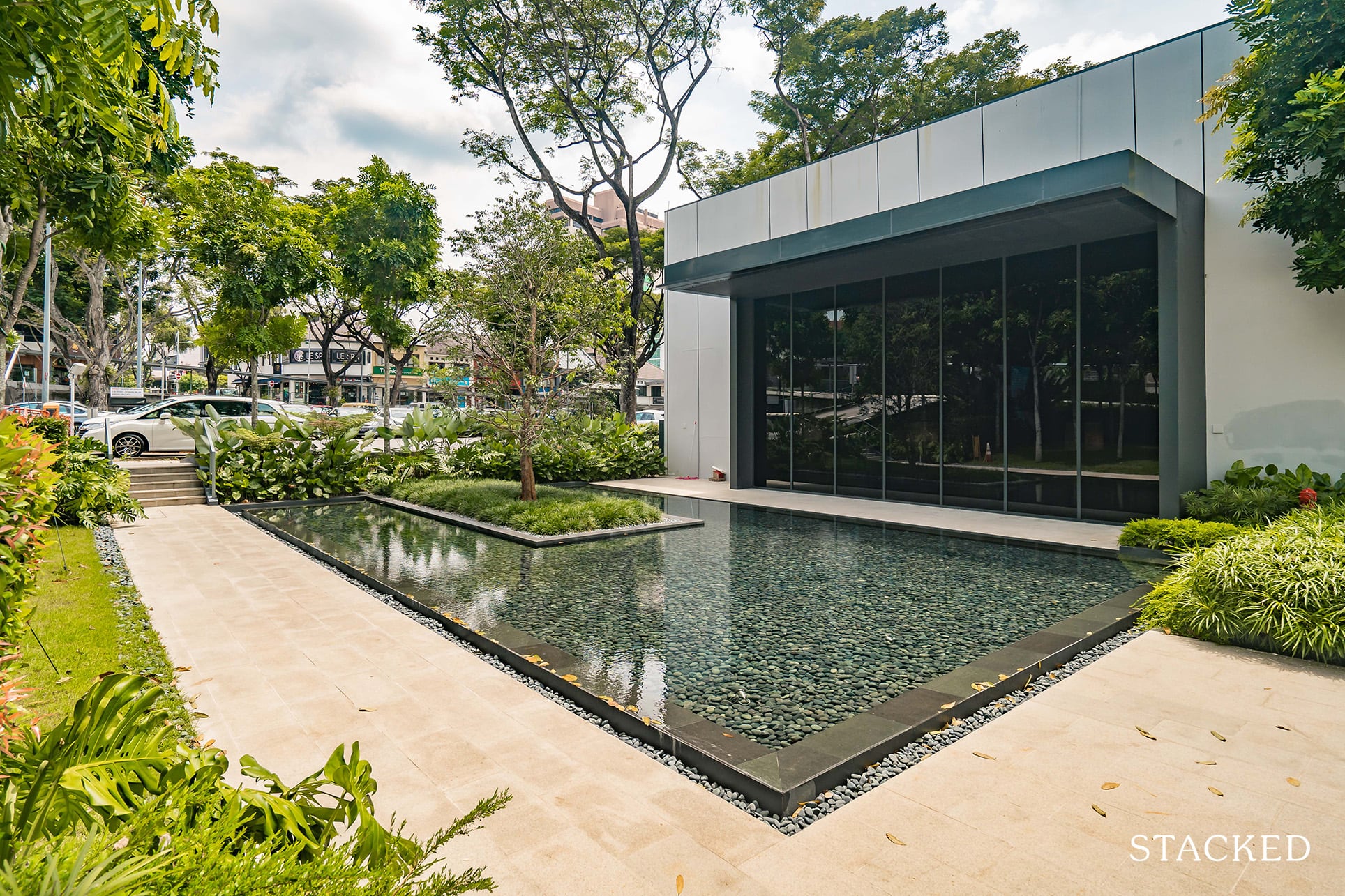
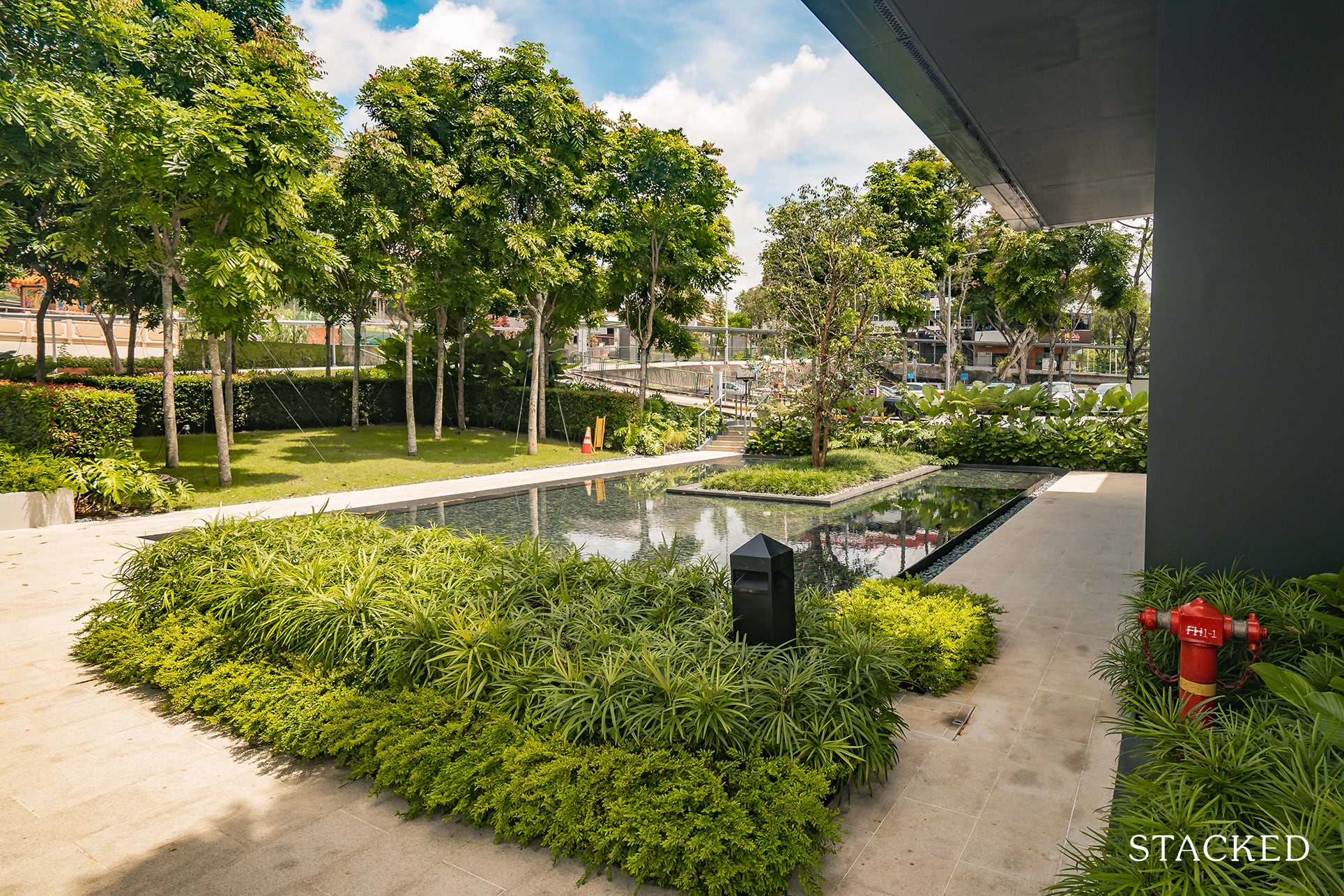
Set by the entrance, you’ll first see this lovely water feature contrasted by a solid amount of foliage, both in, and around its perimeters.
They could have gone with something generic, but the fact that effort was put in to showcase the landscaping that you’d expect when the actual development is built definitely shows their commitment to quality.
(Note that the actual location of Verdale is situated along De Souza Avenue – a 4-min drive from the showflat locale).
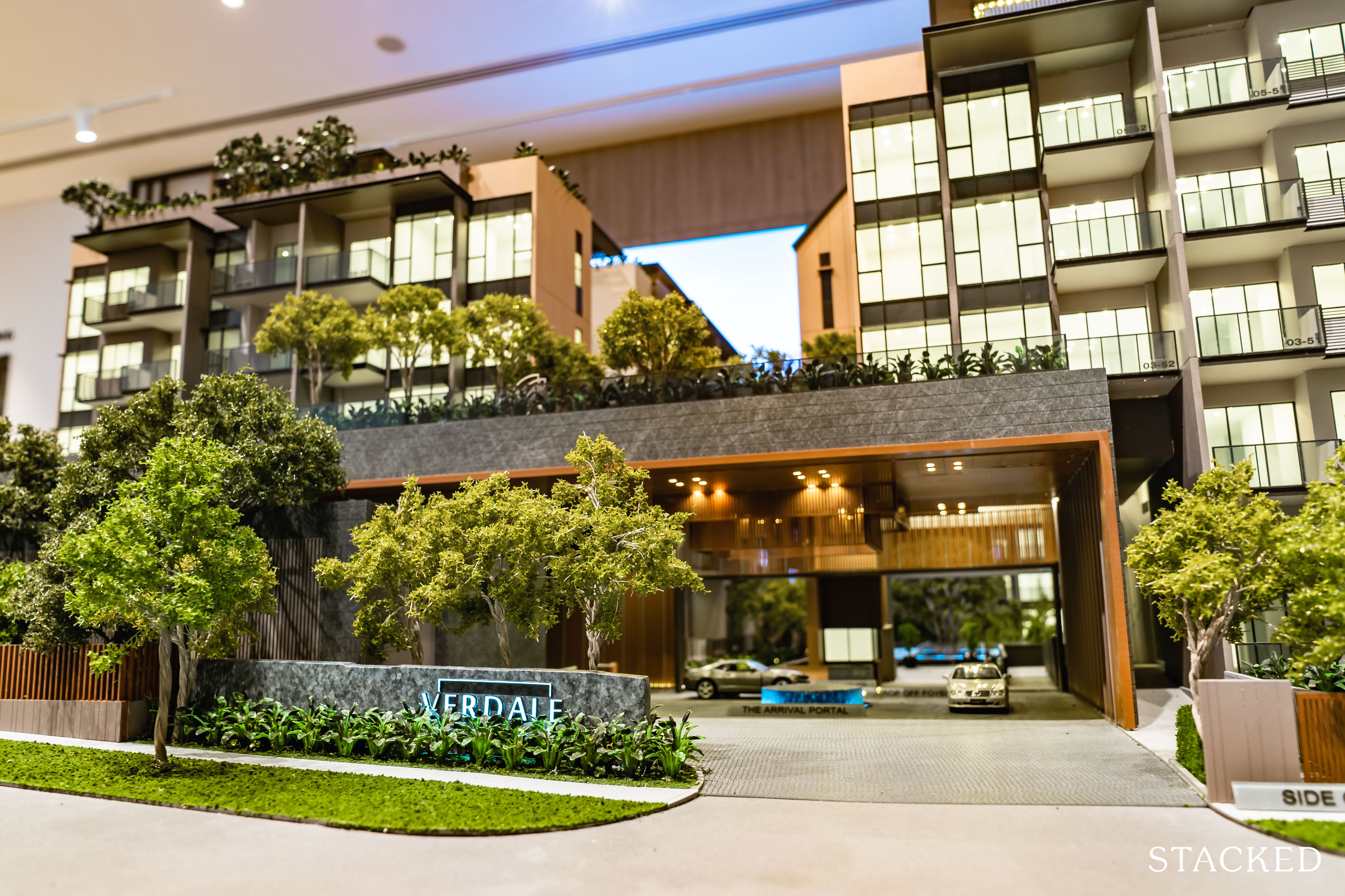
As for the actual entrance to the project, this is what you can expect.
In a similar vein, the replica delivers a perfect example of yet another warm/welcoming drop-off point coated with a tinge of quiet grandeur.
The carpark entrance is tucked just beyond that – maintaining both the space efficiency and aesthetical pleasantries of the area.
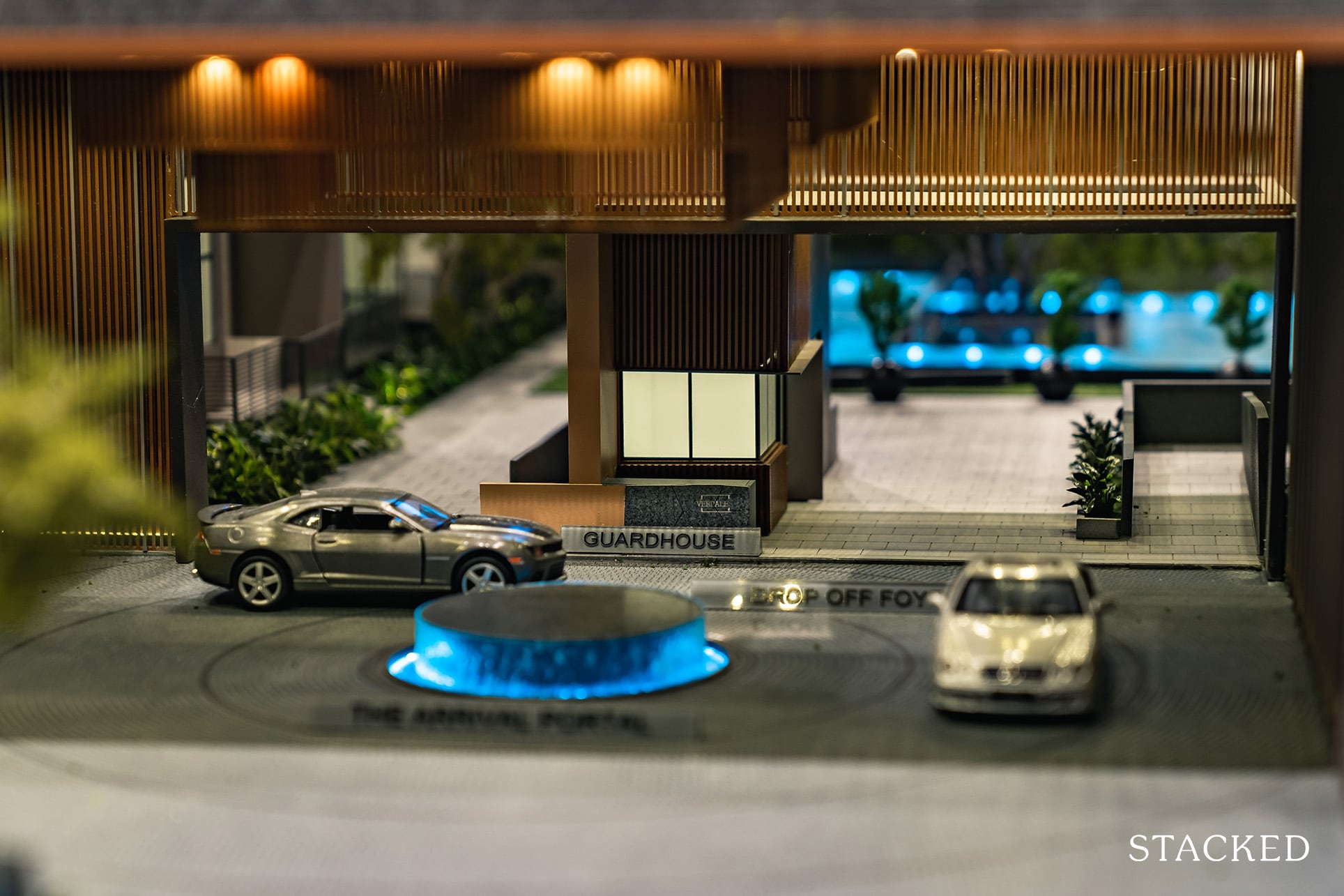
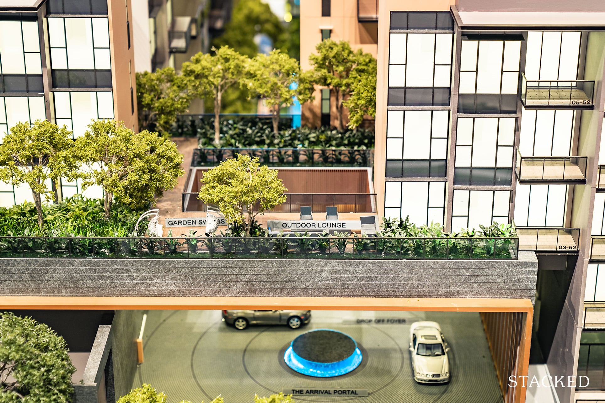
The arrival portal may sound mystical, but it’s really just a circular water feature tinged with blue lights.
That said, I do quite like the high ceiling sheltered drop off foyer – it isn’t a design as commonly seen, especially with that skylight above it that is all important to let the light in.
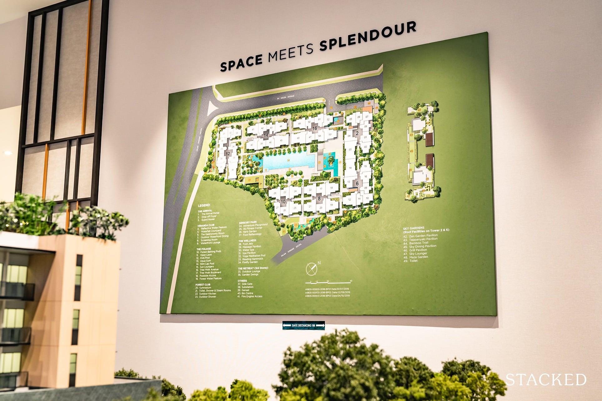
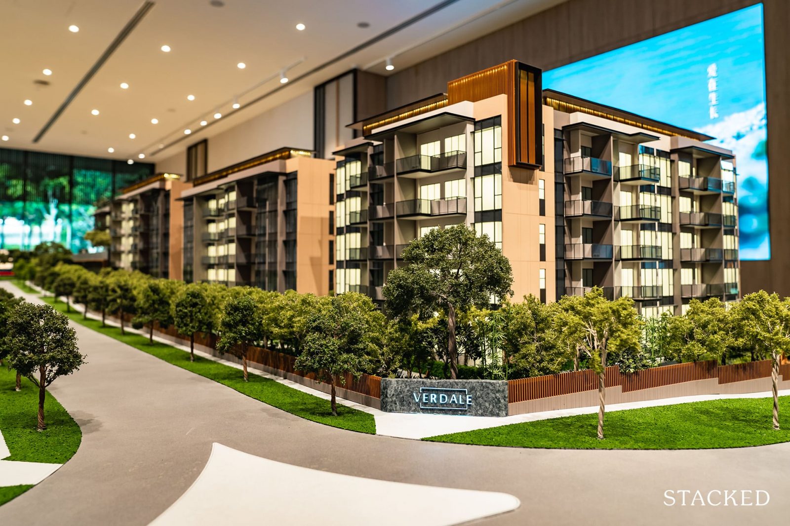
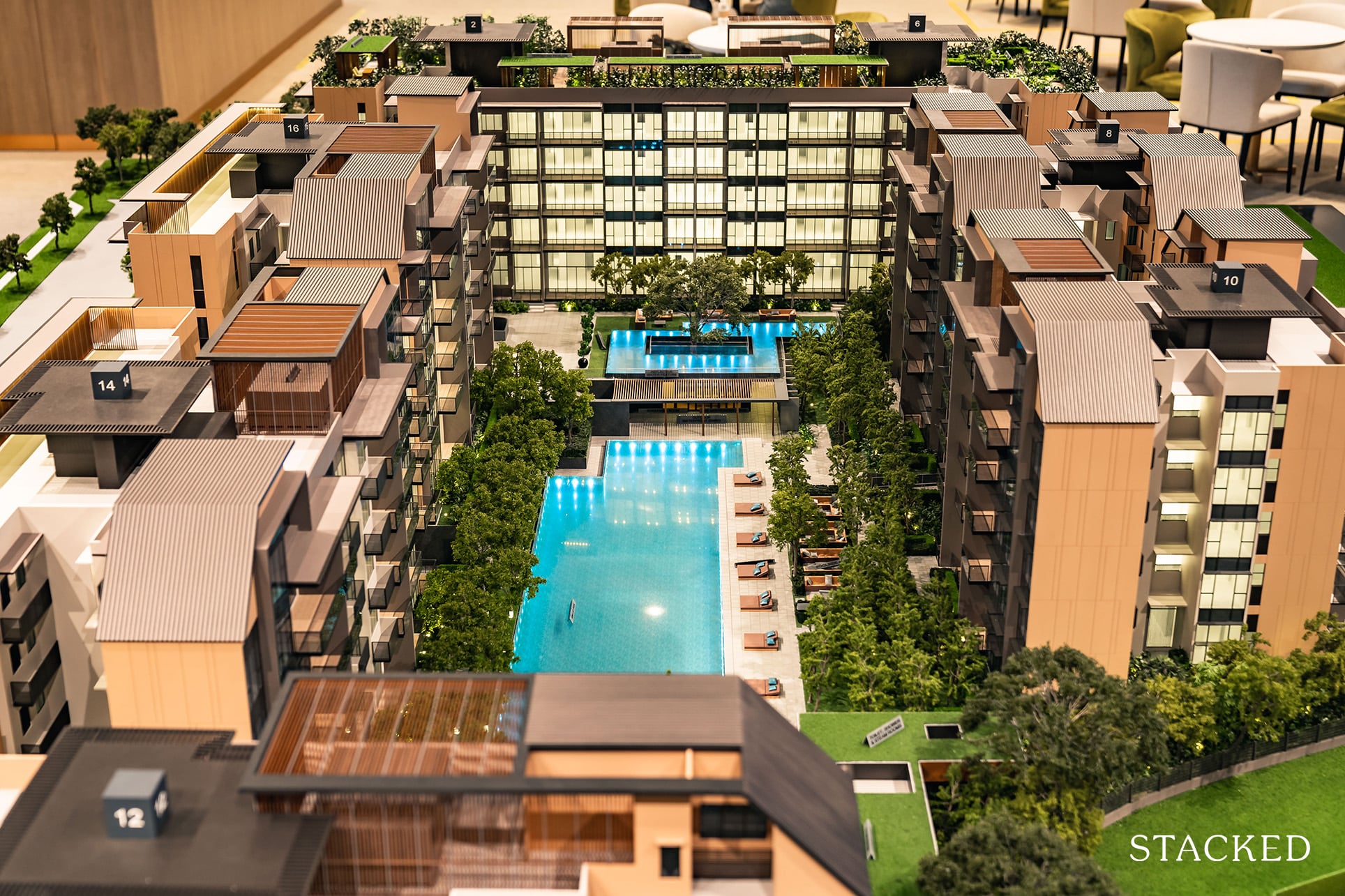
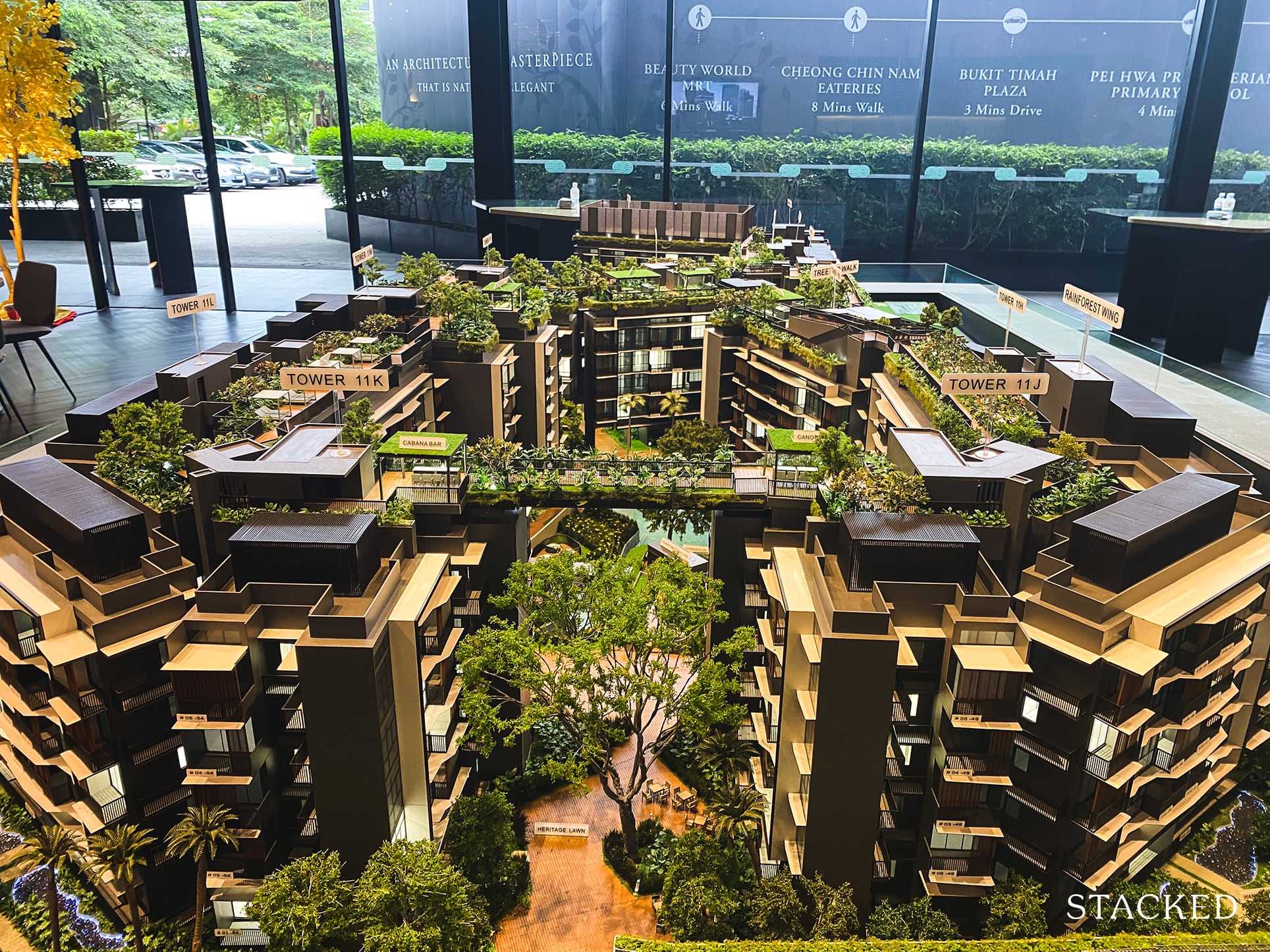
Zooming out to the development on a whole, it consists of 7 five-storey blocks encircling the inner sanctum – its boxed layout giving off an almost protective barrier to the facilities within.
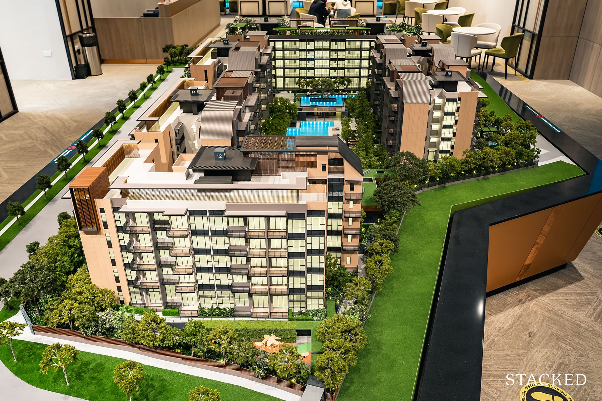
At just over 153,000 square feet containing just 258 units, the Verdale is considered to be quite a small development in today’s context, so you’ll find that there is a certain level of enhanced exclusivity here.

If anything, I would consider this to be one of the biggest attractive points of the Verdale – its exclusivity.
As always, to give you an idea of the space it affords, let’s compare it to some of its nearest competitors.
Forett (360,143/633) = 567 sqft per unit
Daintree Residence (201,510/327) = 616 sqft per unit
Verdale (153,224/258) = 594 sqft per unit
So while it fares better than the Forett on the space front, it does lose out to the bigger Daintree Residence (not by much).
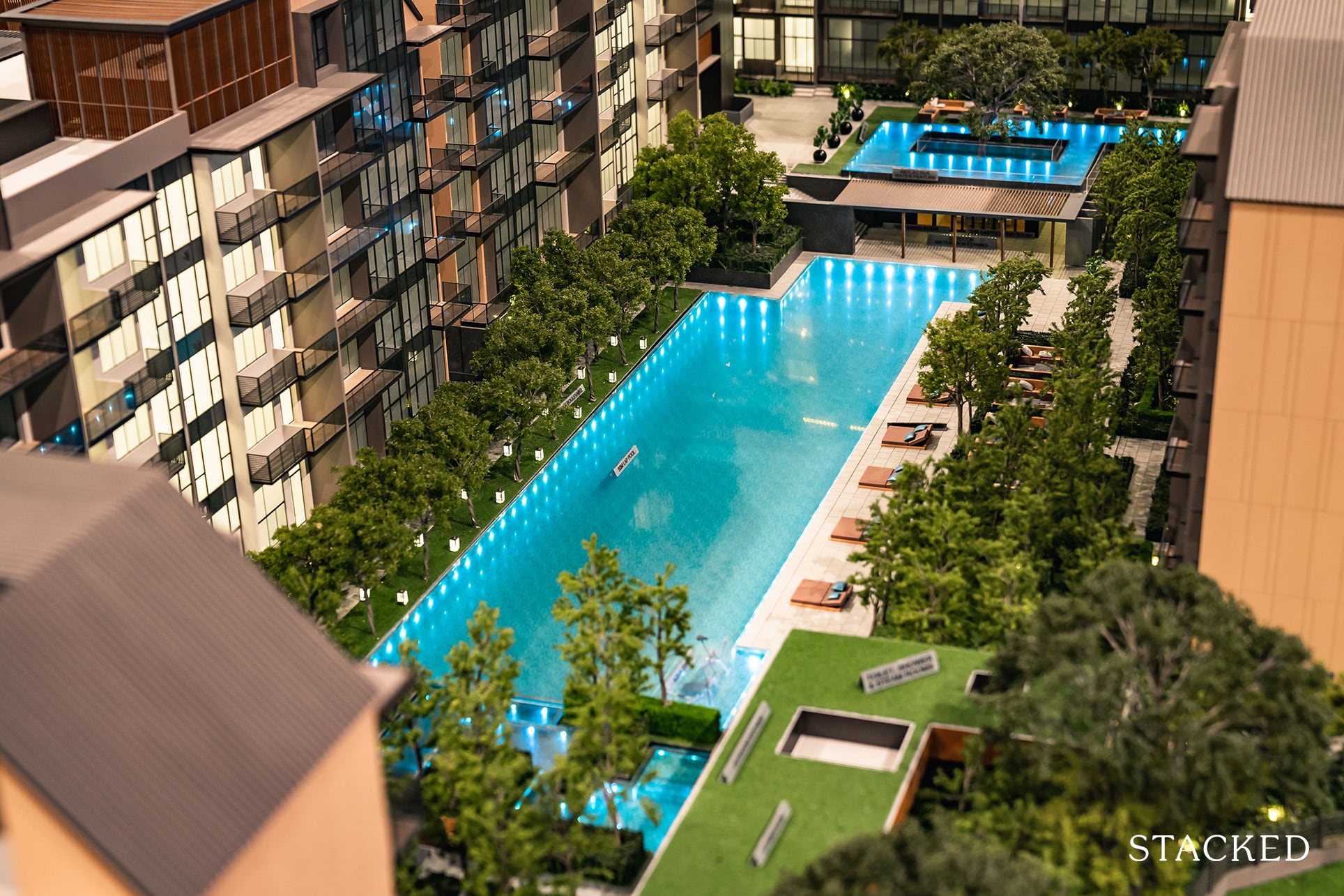
Whether you are an avid swimmer or not, the swimming pool will always be the main centre of attraction for any modern development. There’s just something remarkably calming just staring at a deep blue body of water.
So on that front, the Verdale has provisioned a 50 metre lap pool. It’s a good size, but then again, it is also the bare minimum most people would expect nowadays.
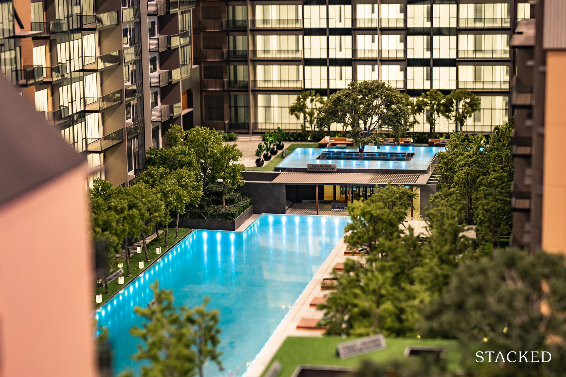
The problem sometimes with the courtyard layout is the lack of privacy for the common areas within. So it’s good to see here that the developers have quite clearly tried to mitigate that.
And I would say that they’ve succeeded in that regard.
For one, there is a good setback on 3 of the 4 sides of the pool (because of the deck, water courtyard, and forest water features). But on the side which is closest to the pool, a thick line of trees have been catered for. So not only does it provide more privacy, it does relate back to the forest theme that they are trying to encapsulate.
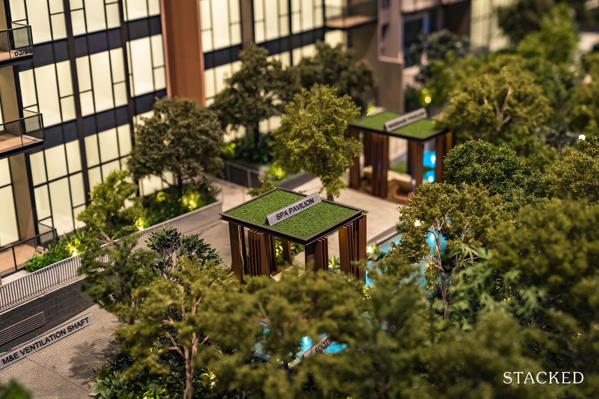
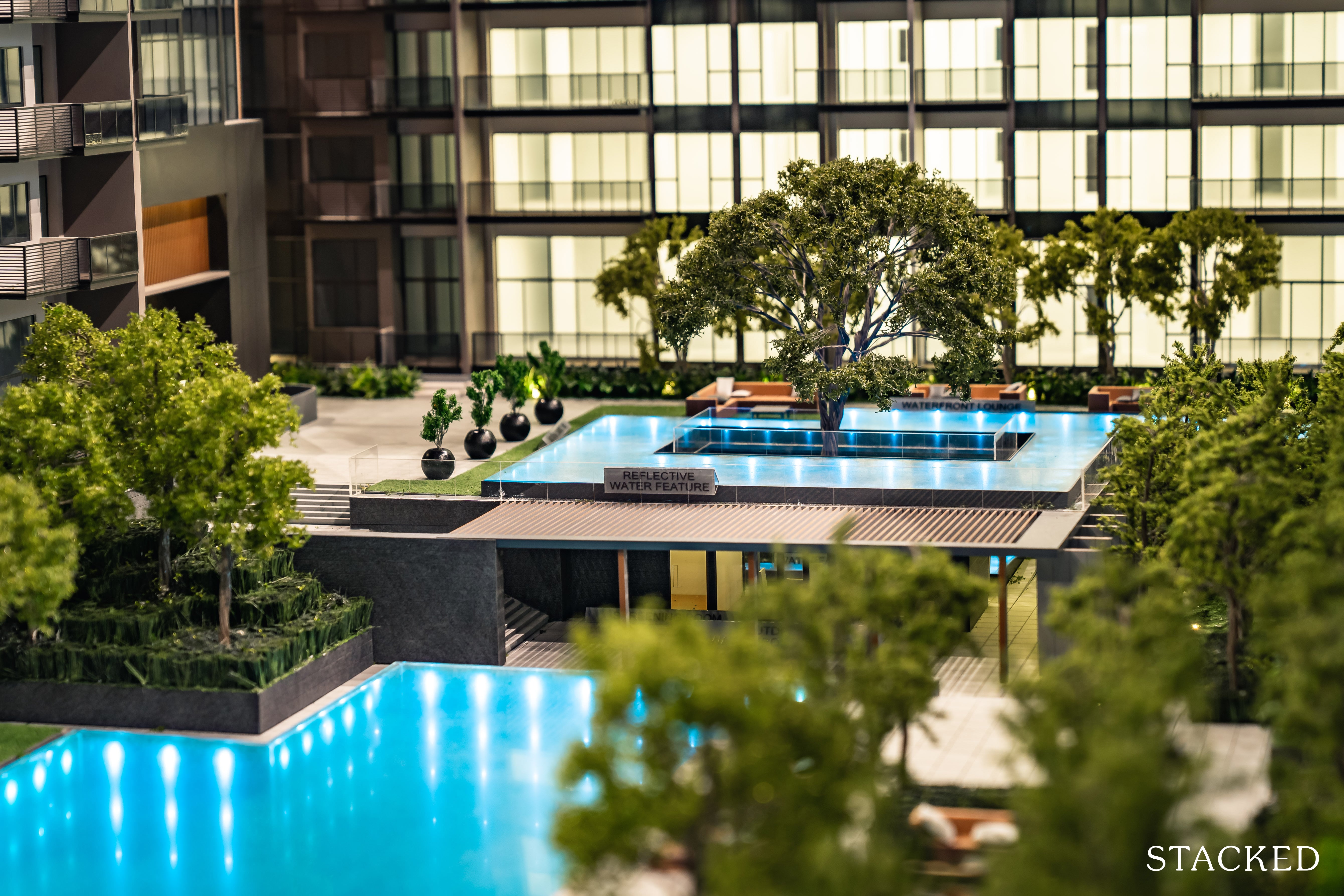
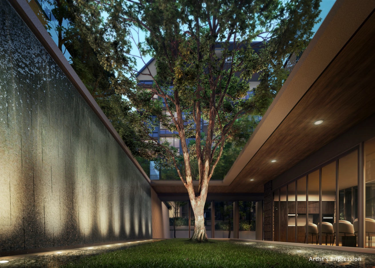
I particularly like the water courtyard feature as well. Even on the model itself, it does look to be a place of calm oasis.
This may be super subjective, but having aesthetic landscaped features like this does help in providing that sense of atmosphere.
It’s tough to describe in words, but if you’ve been to one of those luxury cliff resorts in Bali, I think you’ll get a better idea of what I mean – grand water features really do provide the right sense of occasion.
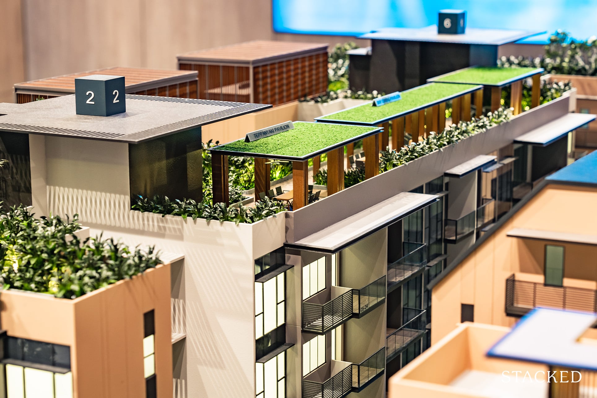
One of my favourite parts about Verdale has to be the inclusion of the roof-top amenities (very much like Daintree Residence and RoyalGreen).
Given that the development isn’t the biggest, it’s clear that the developers have done their best to maximise space usage without resulting in too much clutter.
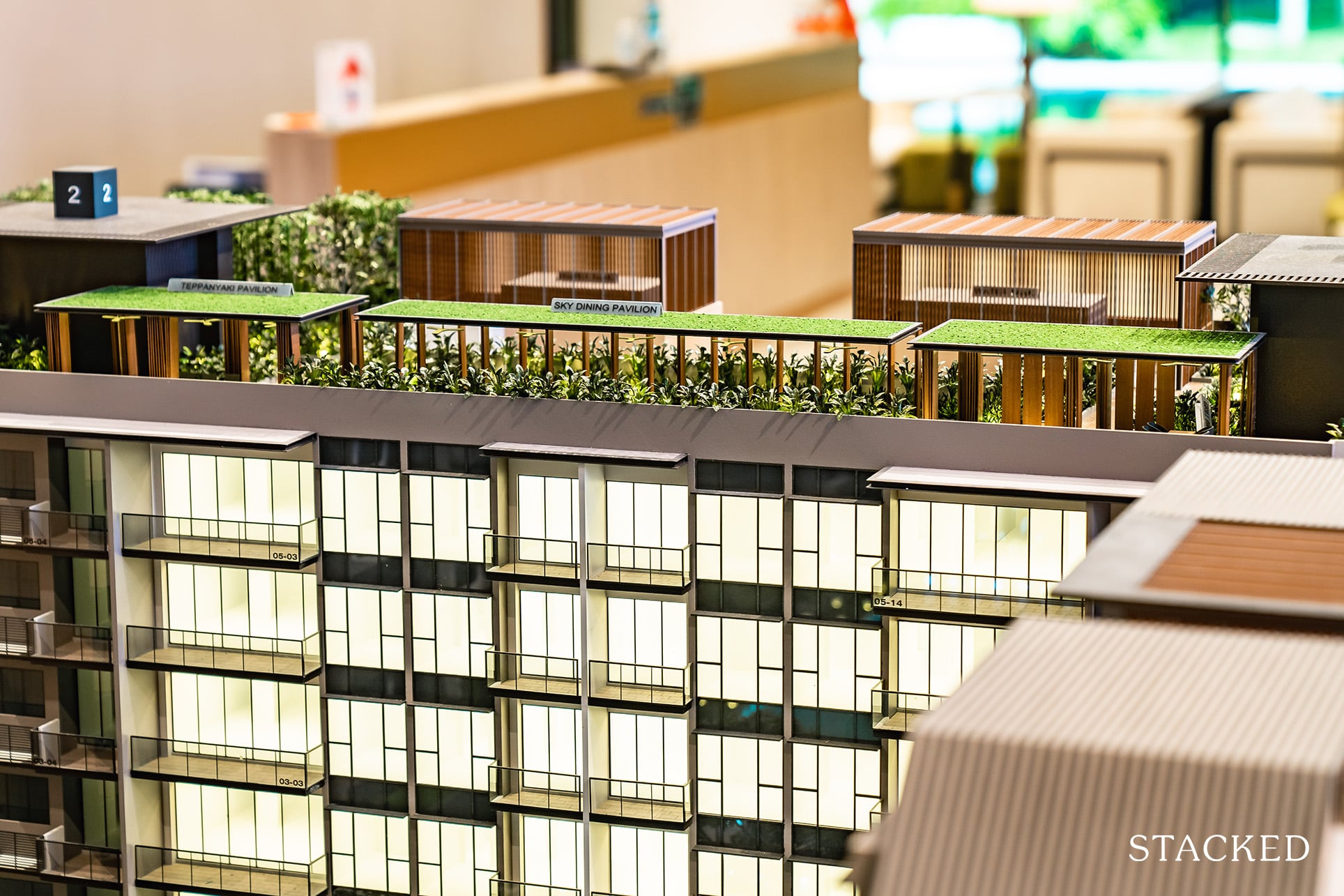
Set on two of the higher blocks (2 & 6), residents have an opportunity to gaze over the beautiful forest foliage just northward of the condo while privately entertaining their guests at the exclusive roof-top BBQ pits.
On the other hand, the usual downside about roof-top facilities would be the possible noise pollution to the units on the uppermost floor.
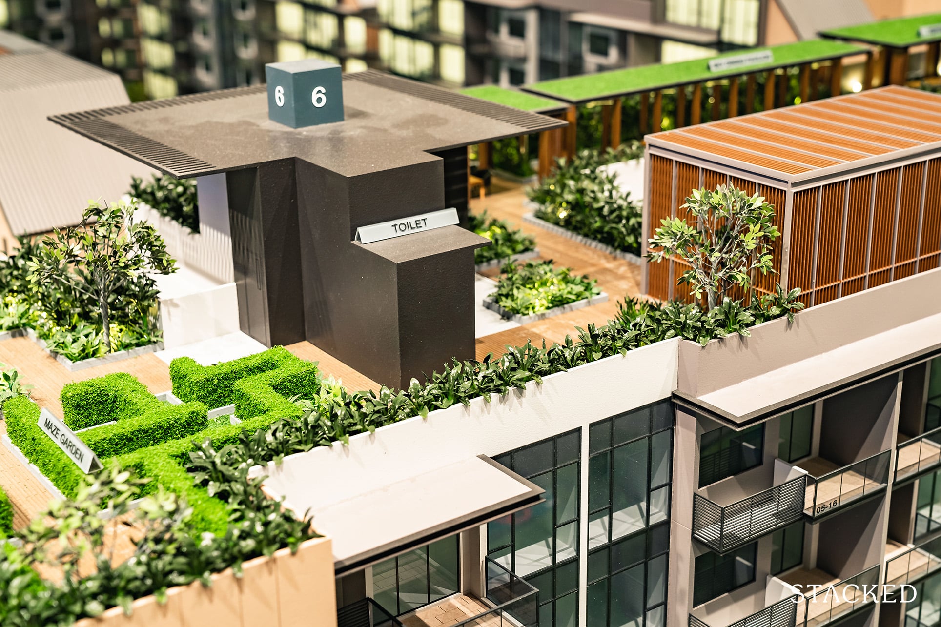
Other than the BBQ area, you do have a teppanyaki and zen garden pavilion as well. It’s not the rooftop extravaganza that exists at Amber Park, but it is certainly well-utilised and thought out.
I’ll talk a little more about the facilities in the development site review later on, but for now just note the lack of a tennis court here, as well as the somewhat dismal positioning of the playground by the roadside.
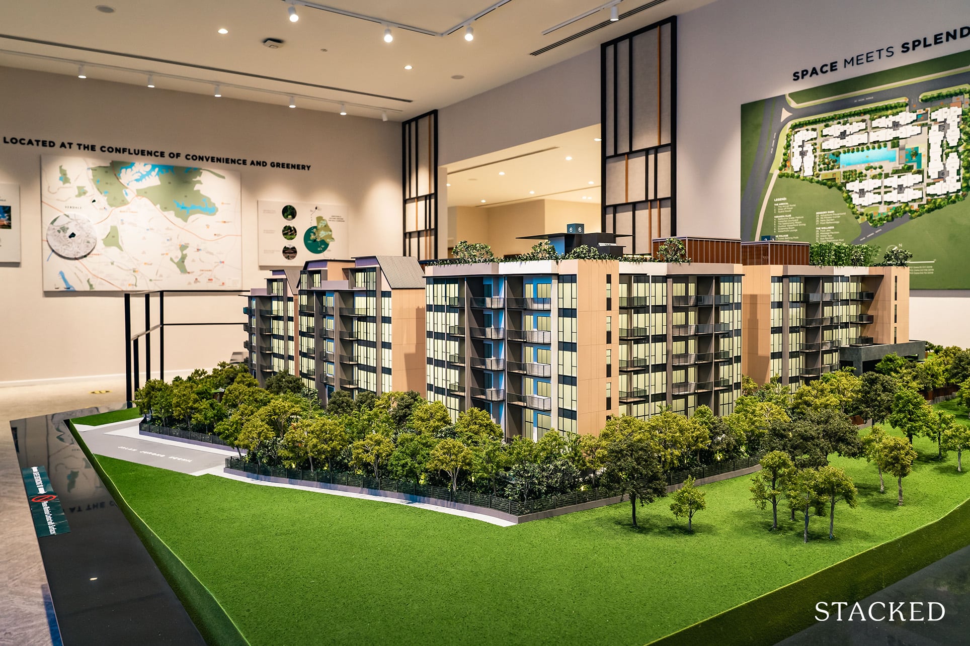
Another point worth mentioning is the lack of inward facing one-bedders.
In other words, all of the 23 one-bedders here are facing the roads, with the exception of an inward-facing 1-bedder + Study unit at Block 12.
Given Verdale’s status as a low-rise development, it is possible that those who are on the lookout for secluded 1-bedders might find this a tad of a let down.
That said, most of its surrounding is greenery for the moment – which you could argue might actually be a better spot to be in. There’s no telling when the newer projects will come up, but you should enjoy the relative peace and quiet for a couple of years at the very least.
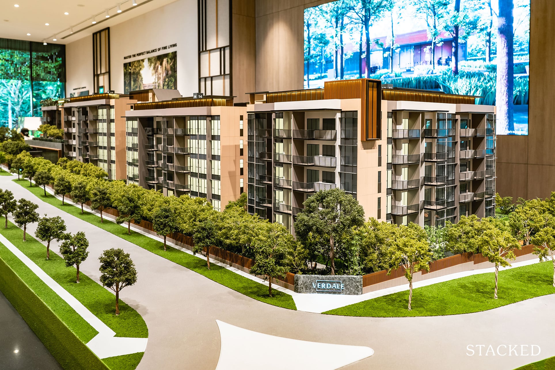
In terms of the exterior design, it isn’t the usual glassed filled sleek architecture – but that isn’t necessarily a bad thing. I think the design is safe, but it is in keeping with its nature filled surroundings, especially its rather cosy colour palette.
I would have expected more greenery to line the exterior rooftops though.
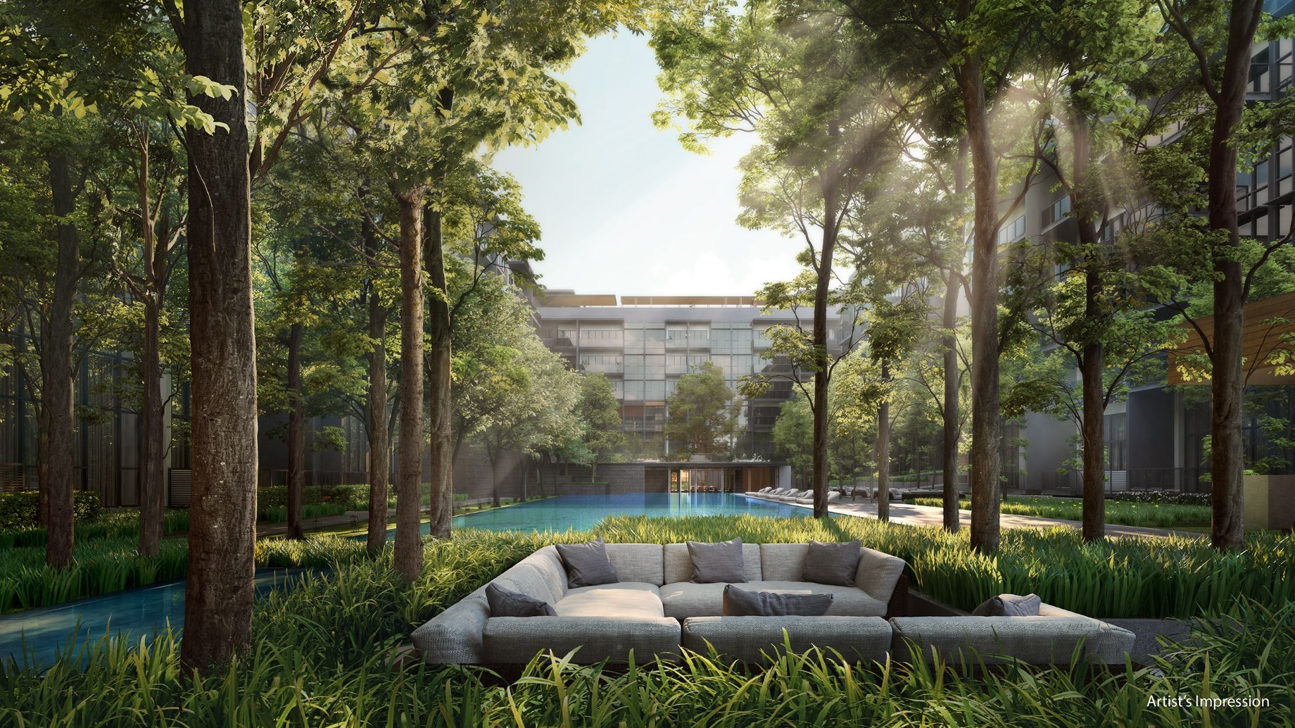
The final point I’ll draw your attention to before heading over to the actual unit showrooms is the emphasis that the developers have made to keep the condo’s theme simplistic and congruent.
As you’d understand by now, Verdale is very much a nature-themed condominium with its forest and water features. Given its size, I’m glad that they didn’t over-do the facility promotion.
Maybe it’s a pet-peeve of sorts, but in recent times, I’ve often had the feeling that developers have hyped up their facilities with alternating themes and ‘fancy-pansy’ names that aren’t always congruent with what you’d actually see on ground once the facilities have been built.
For that alone, Verdale scores well in my books.
Verdale is very much a nature-themed condominium with its forest and water features. Given its size, I’m glad that they didn’t over-do the facility promotion.
Reuben
Verdale 2 Bedroom Deluxe Review
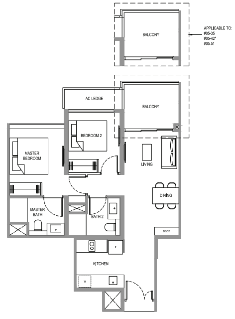
At 753 square feet, this 2 bedroom deluxe unit is slightly bigger than most regular 2 bedroom units. It is mostly efficient, save for the entranceway and mini-hallway.
You should know at this point that 2 bedroom units take up 57% of the total unit offerings (147 out of 258 units). It’s a significant figure, and with that, comes with a myriad of different layouts.
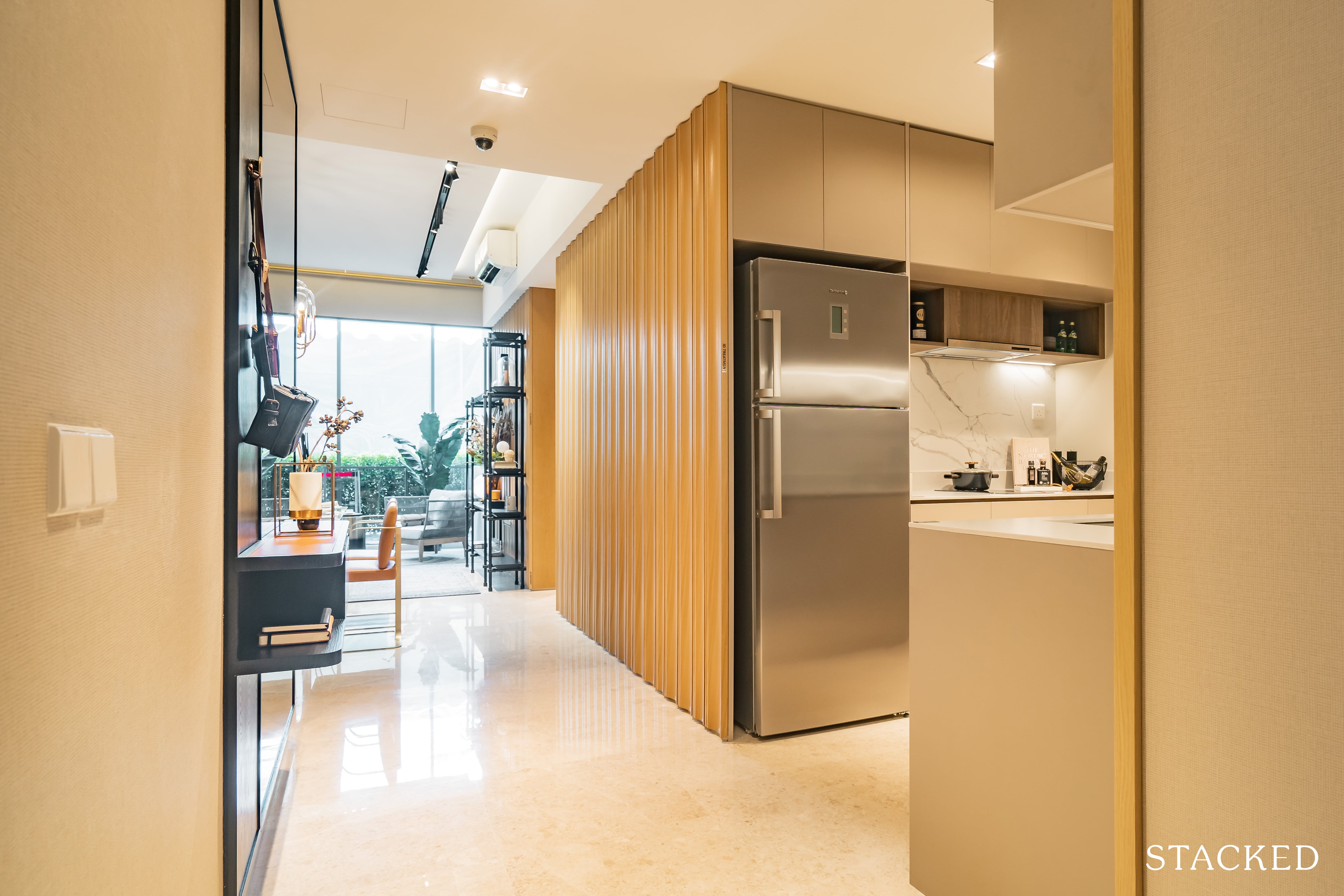
The first thing you’ll see as you enter the unit is the kitchen on the right.
Size wise it is relatively decent, with enough space for 2 people to work back to back without feeling too hot and bothered. You do have the option of keeping it enclosed too, but with no window for natural ventilation, it could pose some issues if you do cook quite a bit.
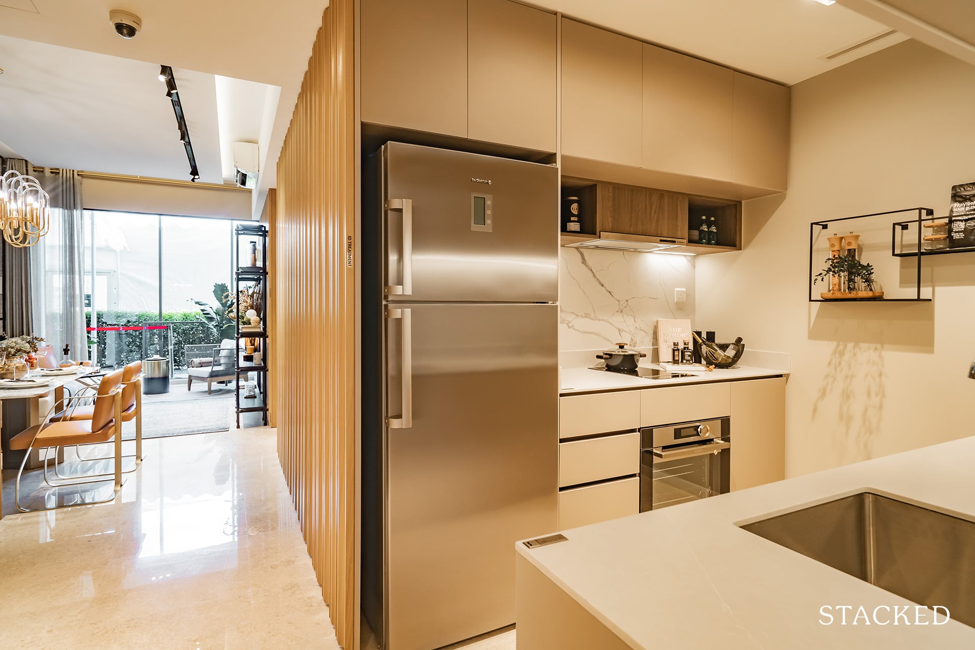
For the keen-eyed, you might notice that all the electrical appliances here are from De Dietrich – it’s premium and well-regarded.
This would include your electric cooker hob, cooker hood, oven, fridge and washer cum dryer – all neatly situated/fitted on one end of the kitchen (note that powerpoints for other external electrical appliances are situated at the far end of the kitchen).
Its here that you see the first glimpse of the developers being creative in creating extra storage spaces – which is very much welcome. In this case, it is additional shelving that pops up below the storage cabinets. That airspace is rarely even used anyway, so it’s a smart move in my opinion.
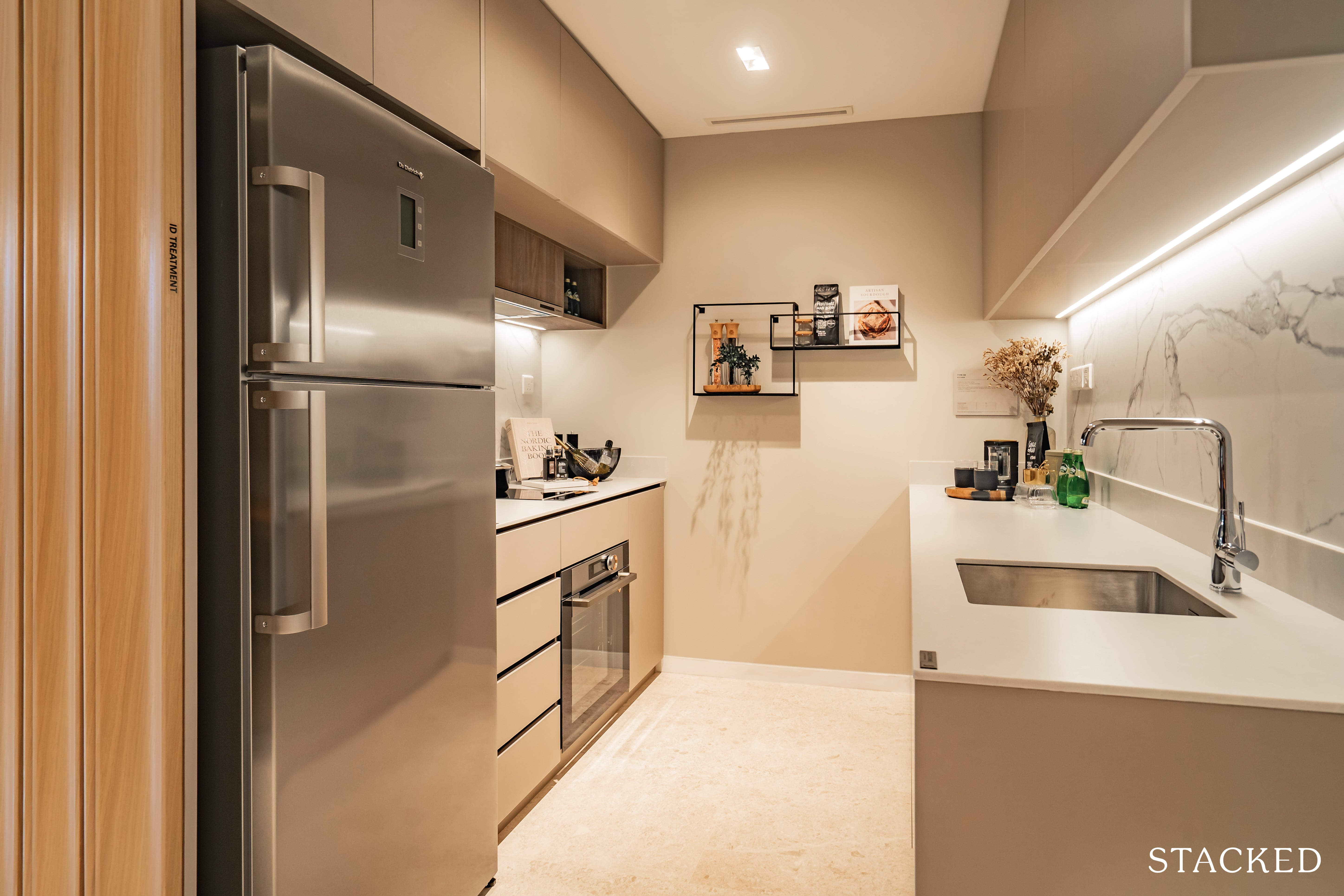
As for materials and finishings, you’ll find the kitchen countertop to be a lovely texture of compressed quartz, while the walls on two-ends are of a beautifully-designed tile finishing. It feels solid and well-made to the touch, which is reassuring.
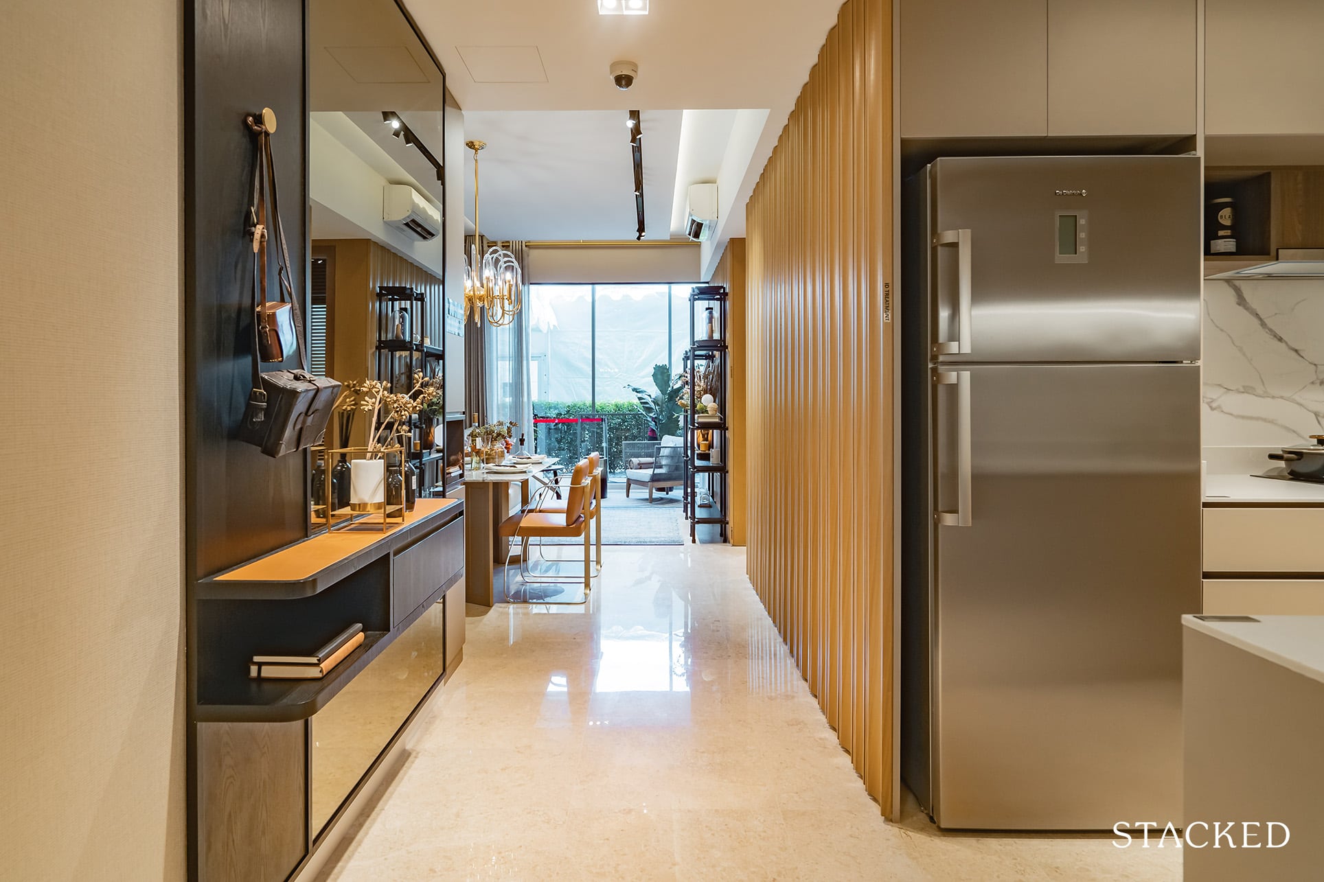
Moving on into the hall, you’ll observe a continued consistency in the flooring – marbled, with hints of timber skirtings.
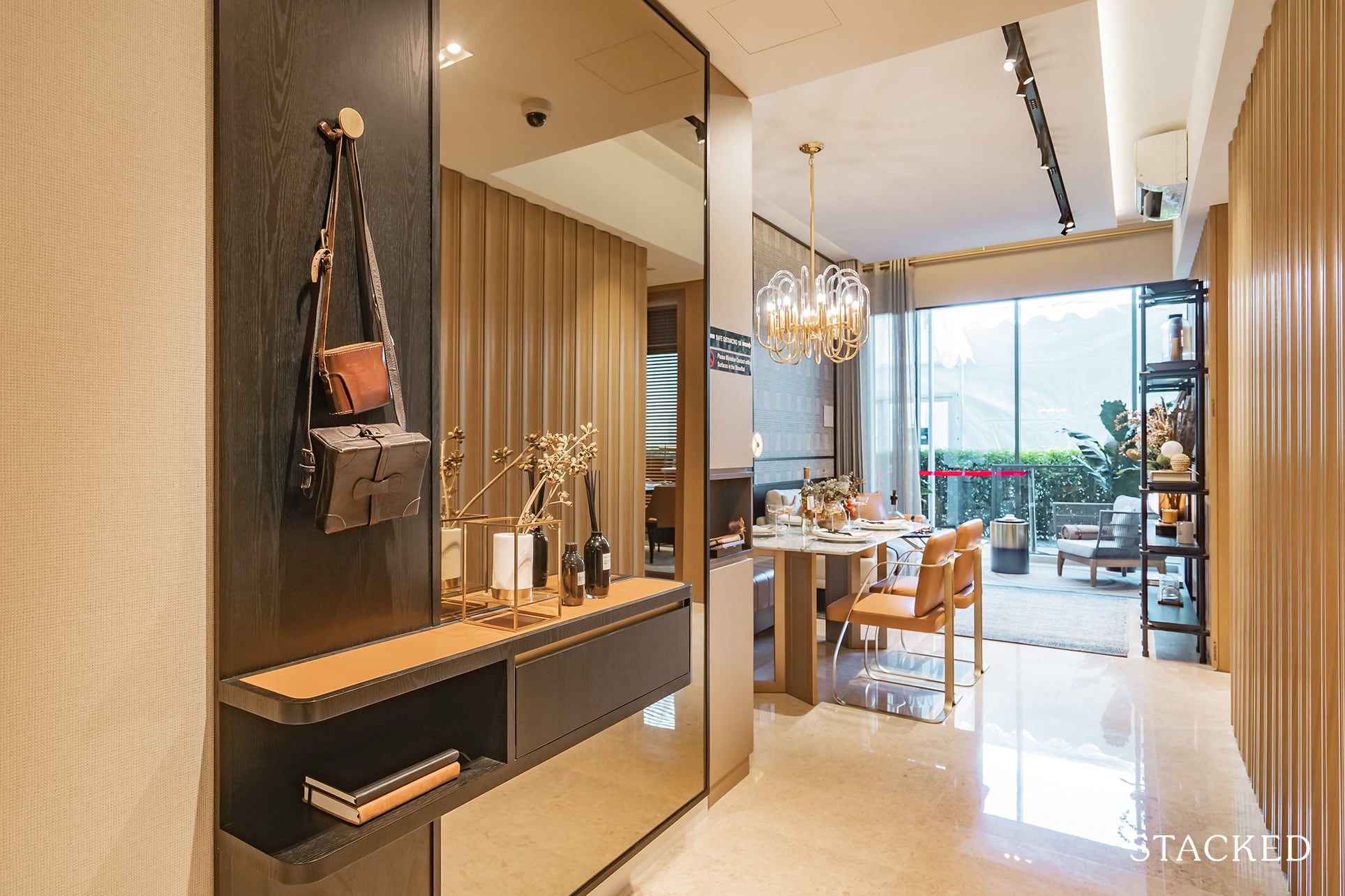
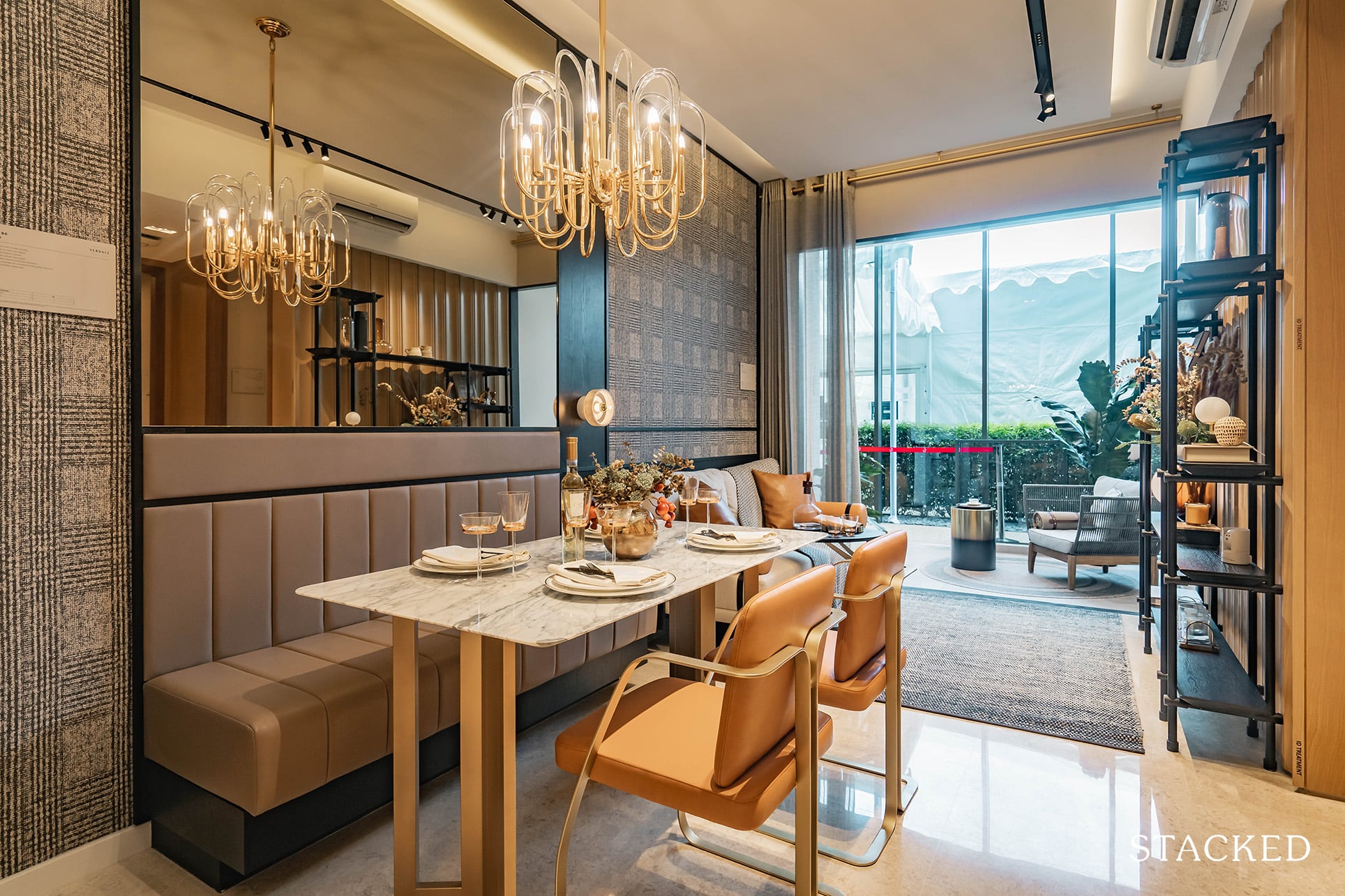
The dining is just okay. You’d definitely have to be mindful of the size and type of table as anything too big would eat into your hallway and corridor space.
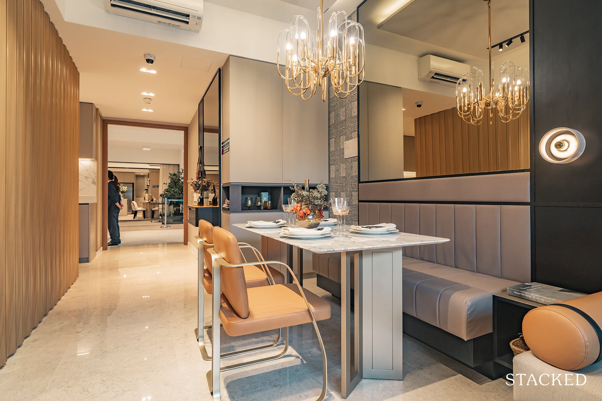
It is here though, that you’d get another example of the thought that has gone into devising extra well thought-out storage spaces.
Set in the corner is a 4-tiered storage area, cleverly hidden in plain sight.
Termed ‘The Alcove’, these extra storage points are something that have been sorely lacking in many of the units that I’ve visited over the years – so again, props to the developers for including these guys consistently in their units.
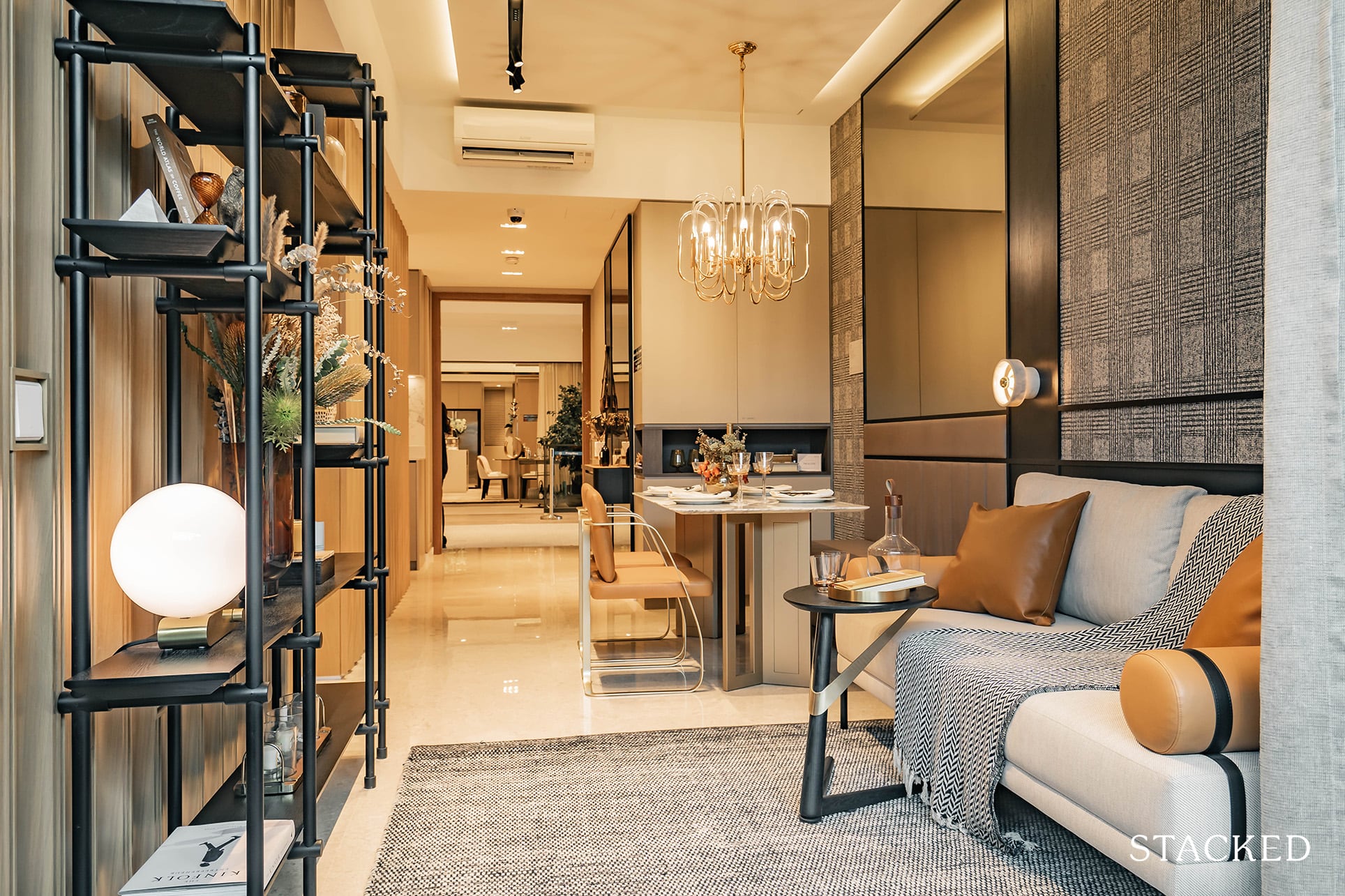
The living area isn’t too wide, so again, you will be limited by the choice of your furniture.
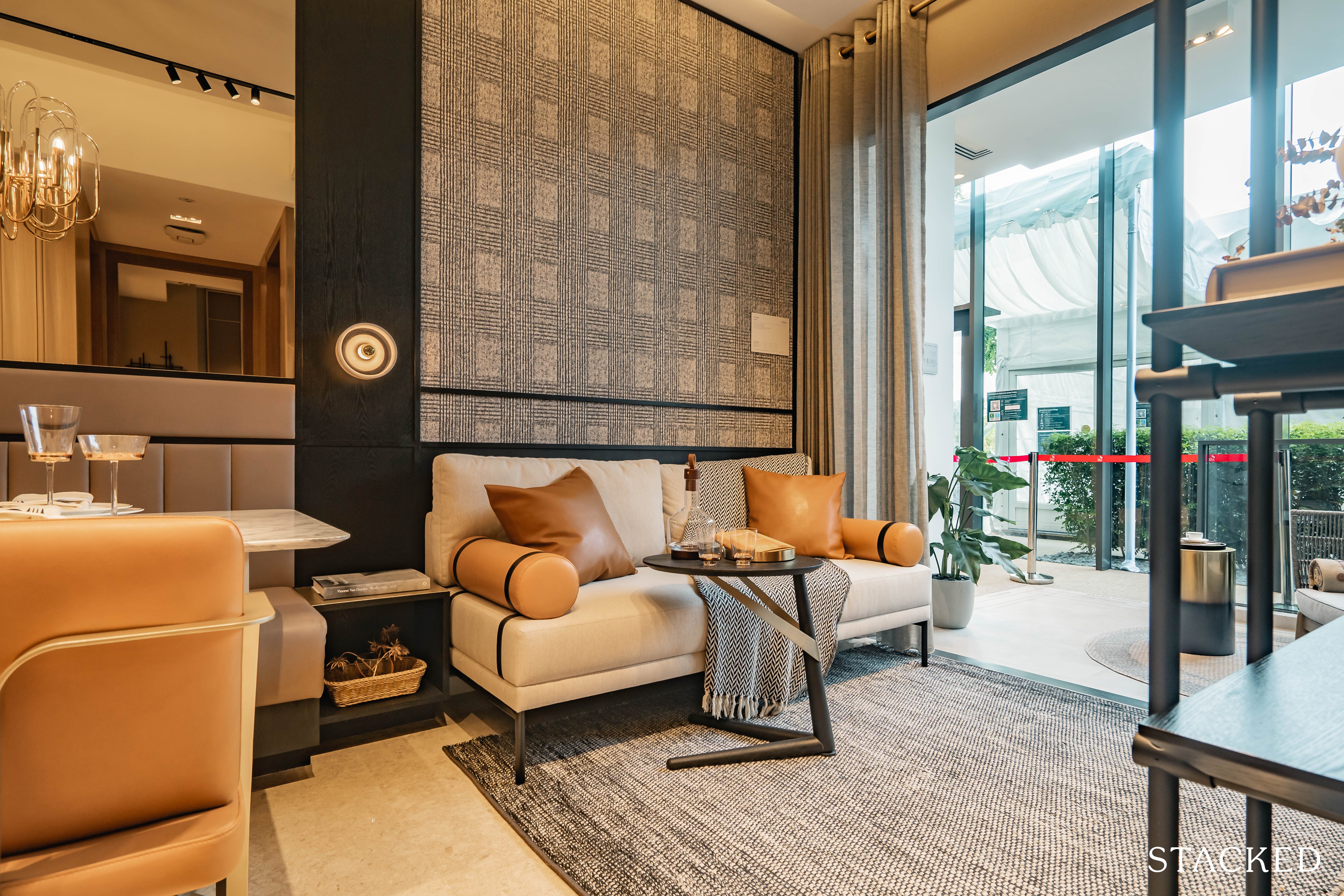
As you can see, even fitting in a 2 seater sofa will be a bit of a squeeze. Then again, I think you can’t be expecting too much from a 2 bedroom condo unit these days either.
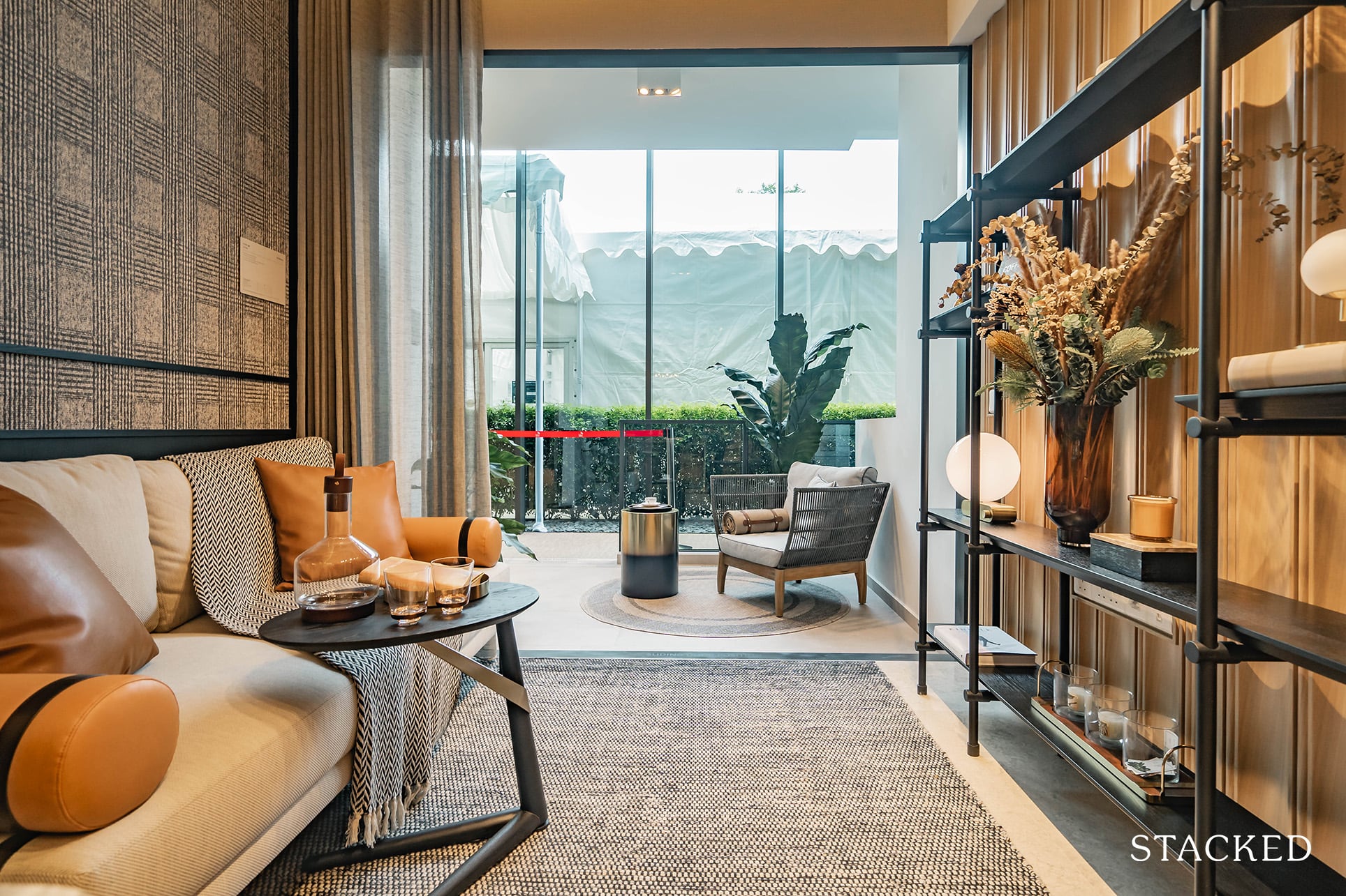
Moving on to the balcony, I find that it’s actually rather well-sized. Depending on your preference for liveable space versus variety, you’ll have to decide whether this is a go for you.
The sliding glass doors here are aluminium framed with the exterior balcony surface made from porcelain tiles to withstand weather-wear.
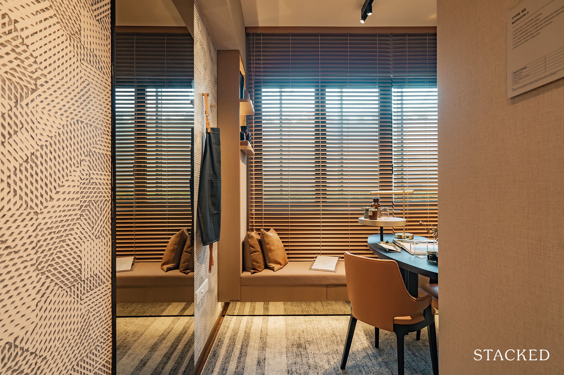
The common bedroom (or the room adjacent to the hall – ie. the ‘noisy’ room) feels a tad claustrophobic to me. Perhaps there was too much ID going on in here, but it does show how it would be like if you decided to convert this area into a ‘study’ of sorts.
Note that the ‘sofa-like’ structure at the end is ID-treated and does not come with the unit. In other words, you will have more space to maneuver in here.
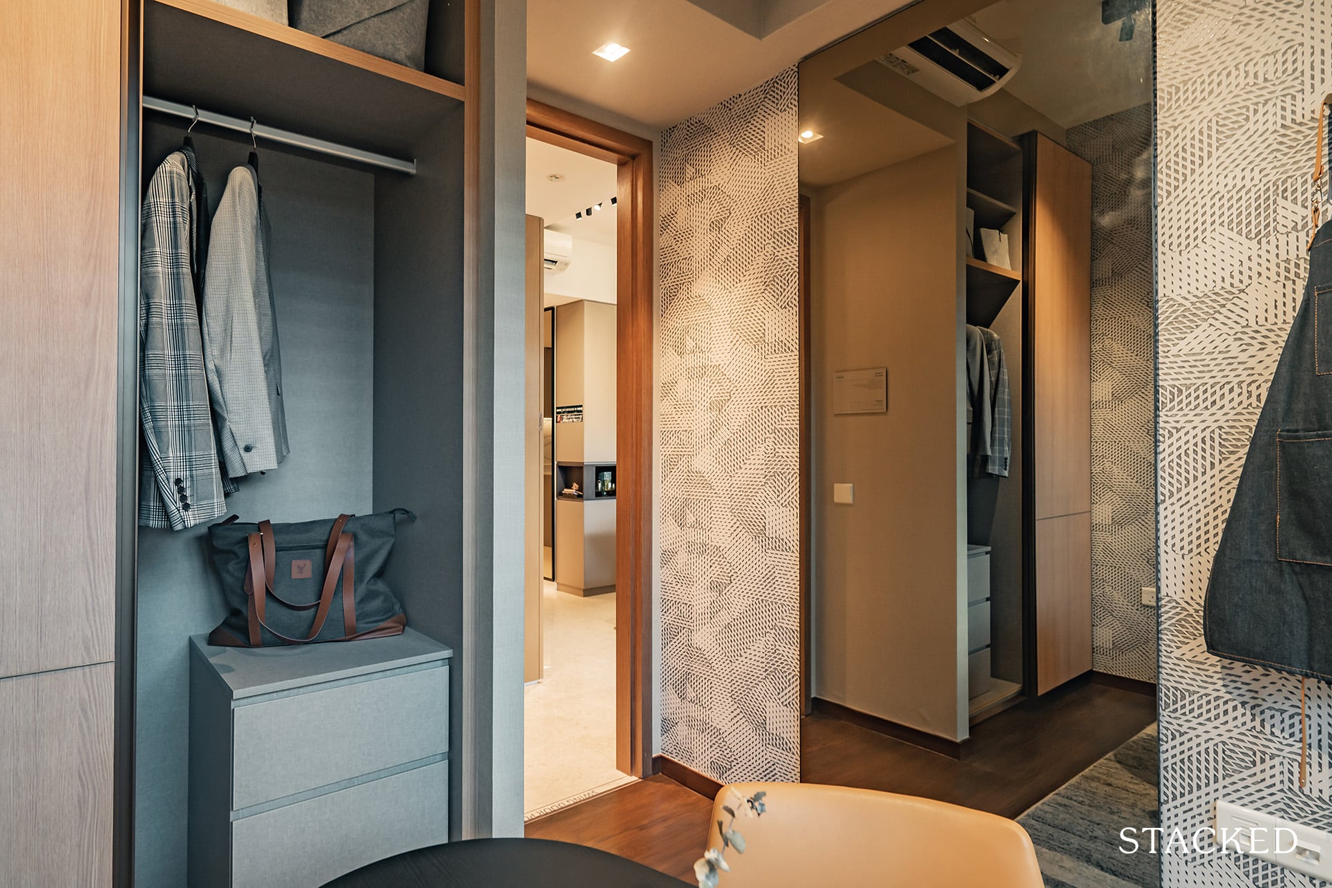
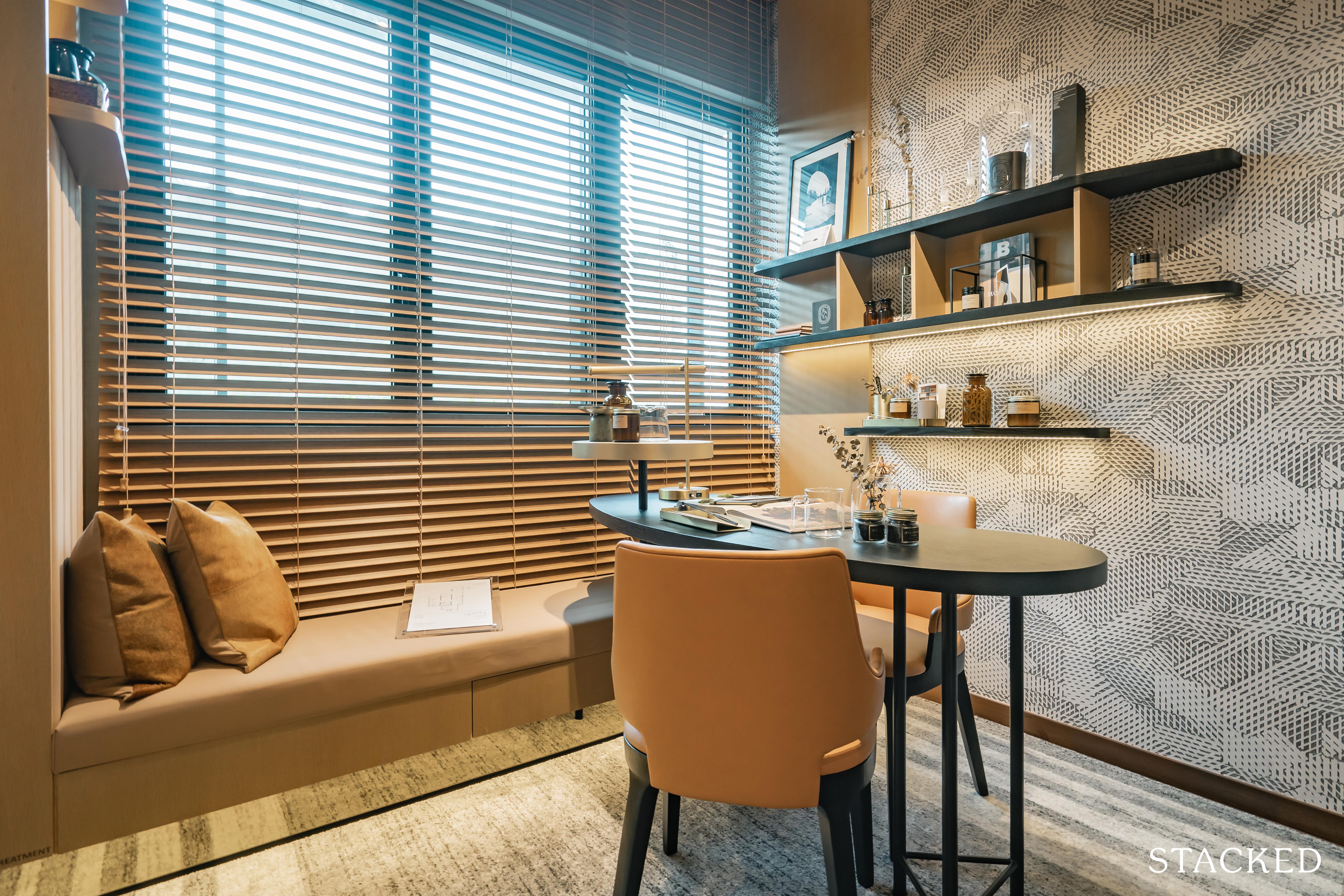
Just for reference, the grey carpet on the floor is the size of a queen-sized bed. You can fit it in, you just wouldn’t have much leftover space for much else.
Now one very important thing that buyers might miss when having a look at this room in person (and especially because the blinders are sometimes drawn shut) is that the (aluminium-framed) glass windows here are halved to accommodate the AC Ledge outside.
For those who prefer full windows (like me), look for the corner units. Those units have their AC Ledges located just behind the toilet so you don’t get the halved windows/obstructed views.
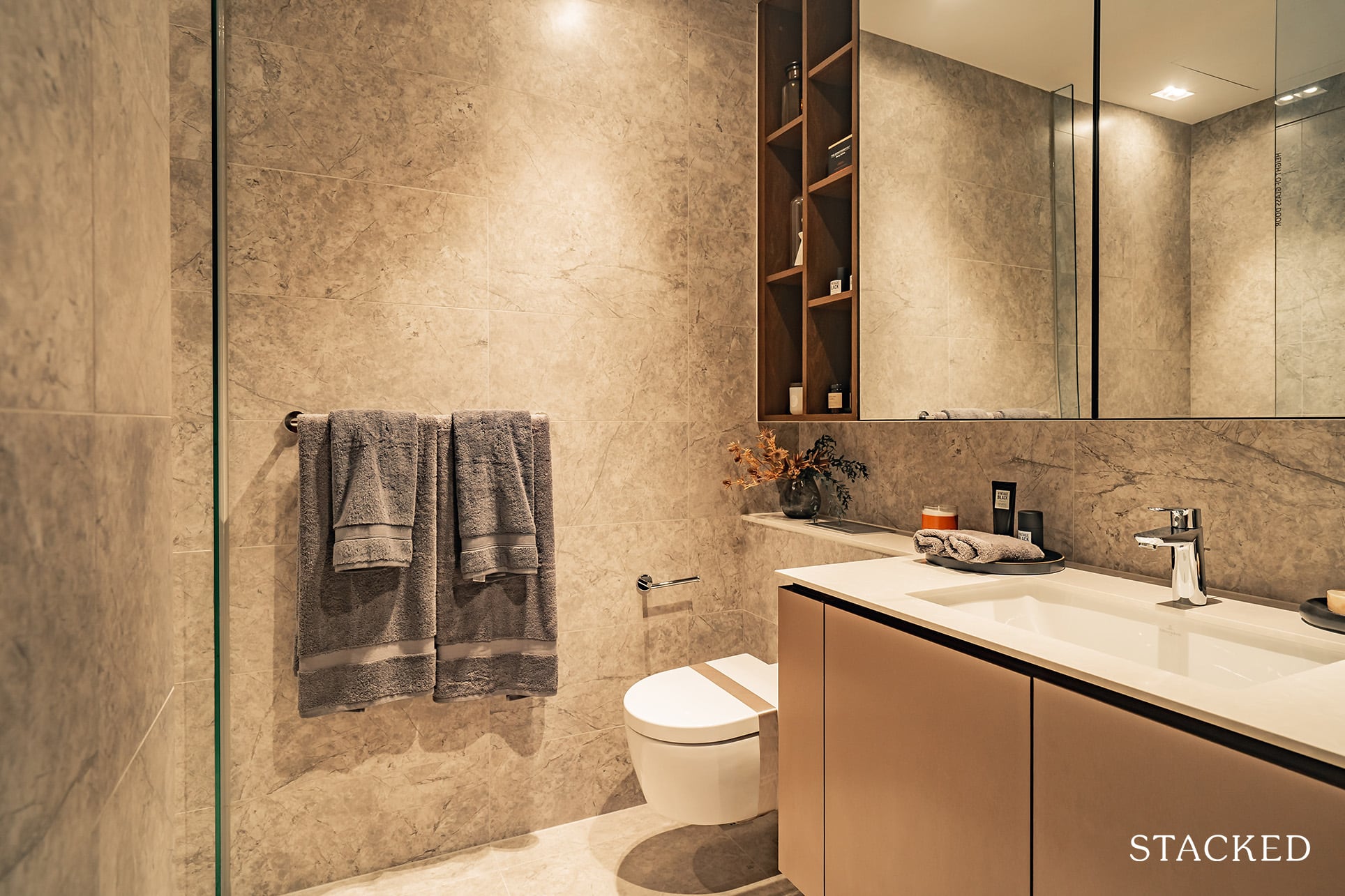
The common toilet is very elegantly designed, with a nice shade of porcelain-tiled floor and wall finishings. Again, we see the abundance of storage spaces, with the mirror cabinet and sink combo from German-manufacturer, Grohe.
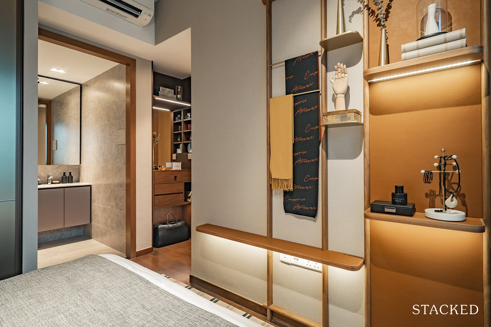
Moving on to the master bedroom, you will see a rather intriguing implementation just past the doorway. Some of us might just call this a fancy dresser of sorts, but in the words of the developers, it is referred as ‘The Armoire’.
While it is essentially just a number of neatly tucked drawers, aesthetically-pleasing (open) storage spaces and a half-body mirror to suit your beauty needs – it shows the thoughtfulness behind the scenes to improve and carve out that additional space.
This is in addition to the standard wardrobe space, so it is definitely a nifty value add to the room.
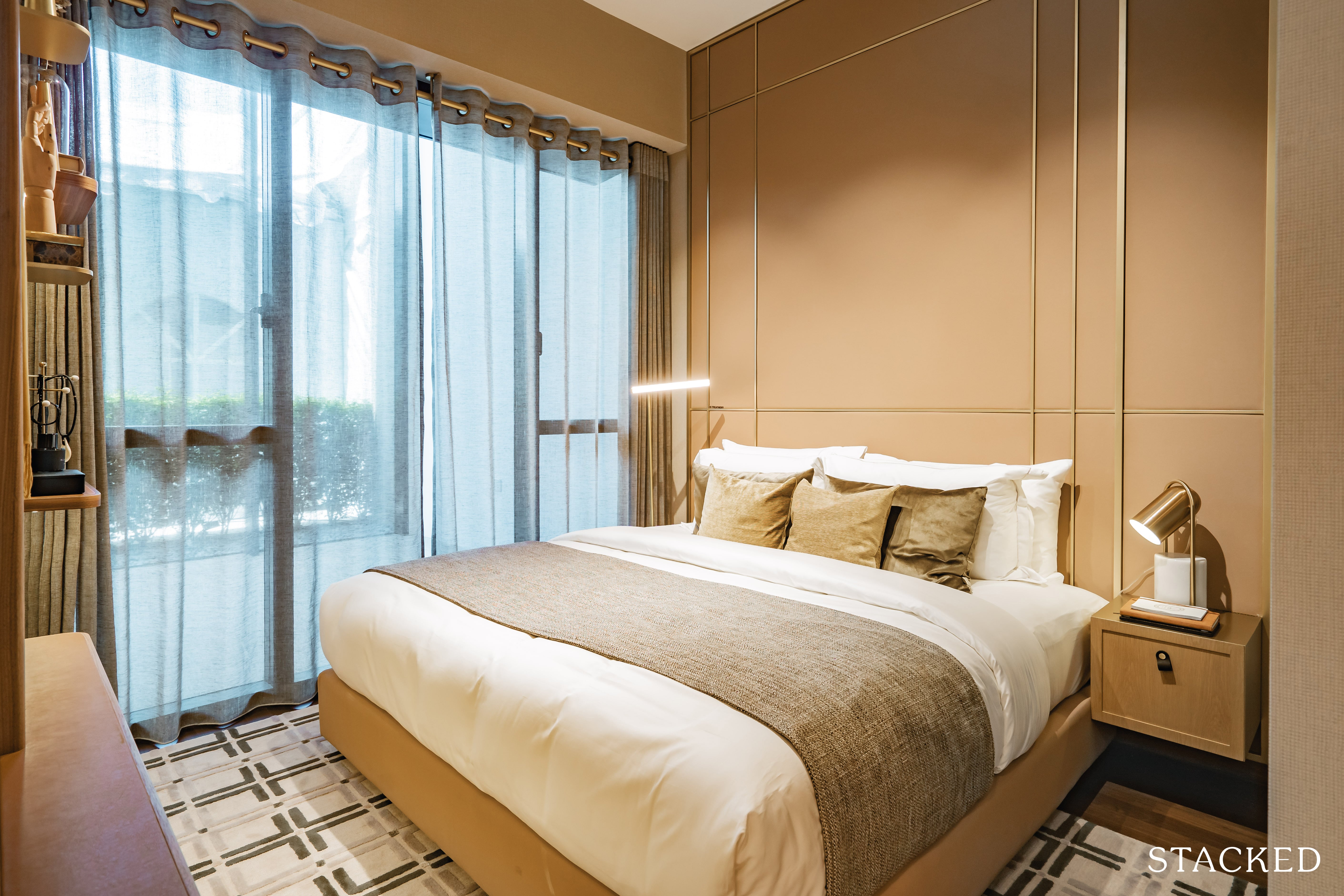
The floor here is of the timber variation – as was the case in the common bedroom earlier (skirting included).
Ceiling height also goes up to 2.97m here, so the installation of any false ceilings and subsequent lighting systems should not come with a sore compromise on head room.
As you can see, the windows here are top-to-toe which does allow for a lot more light to be let into the room.
Space-wise, you can fit an entire king bed in here with just a tad of wriggle room.
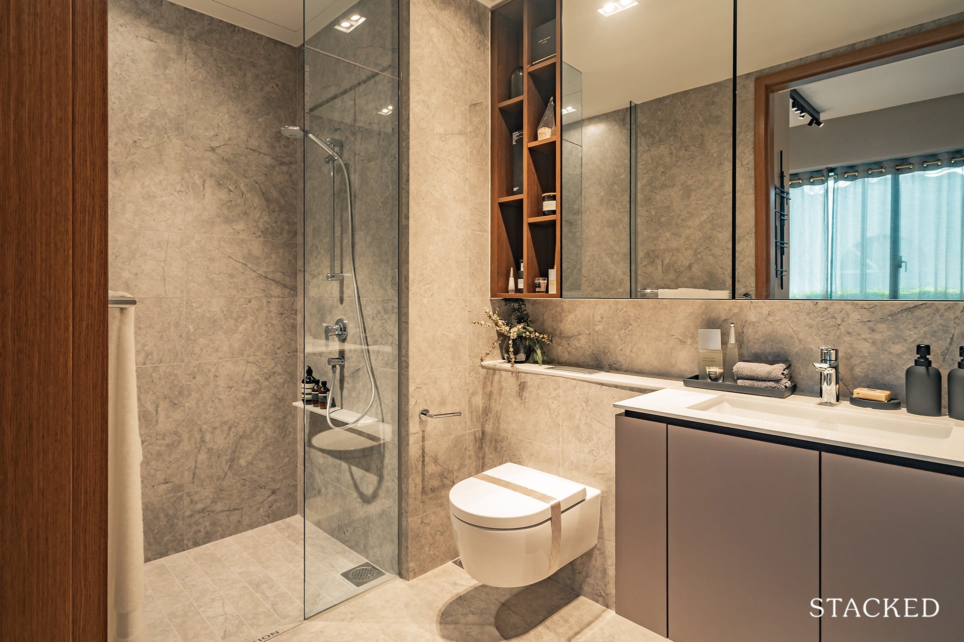
The master bathroom is relatively well-sized, with the same porcelain-tiled floor and wall finishes as well as a number of storage spaces for your sanitary needs.
For those wondering, the countertop is of the same material as we saw earlier with the kitchen countertop – compressed quartz.
The Verdale 3 Bedroom Deluxe Review
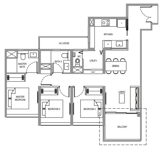
The 3-bedroom deluxe stands at 1,033 square feet, just a quarter-size over the previously reviewed 2-bedroom deluxe.
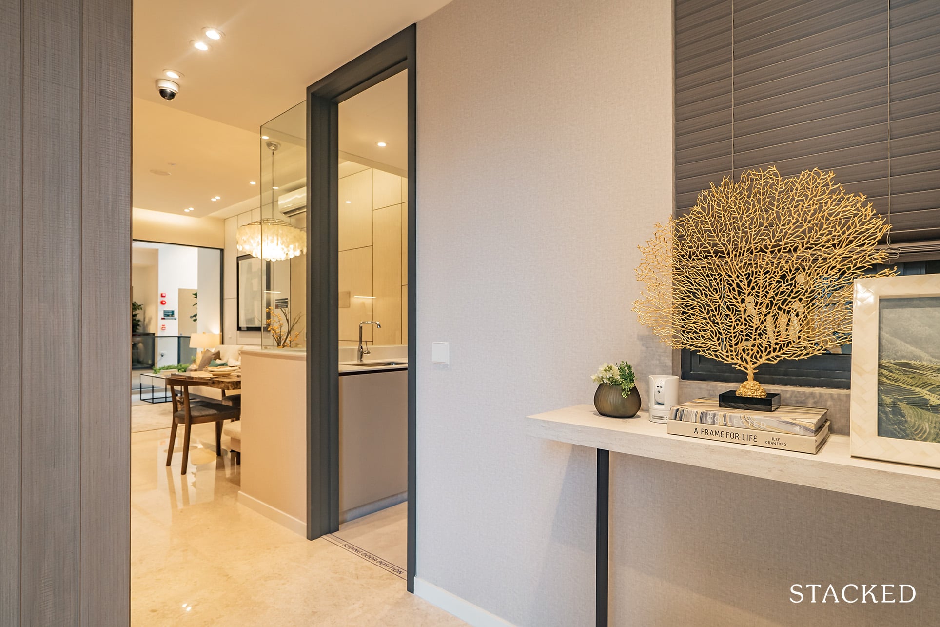
Personally, I’ve never been a fan of an entranceway when space is already at a premium, but I do understand the need for it (privacy) when it comes to family living.
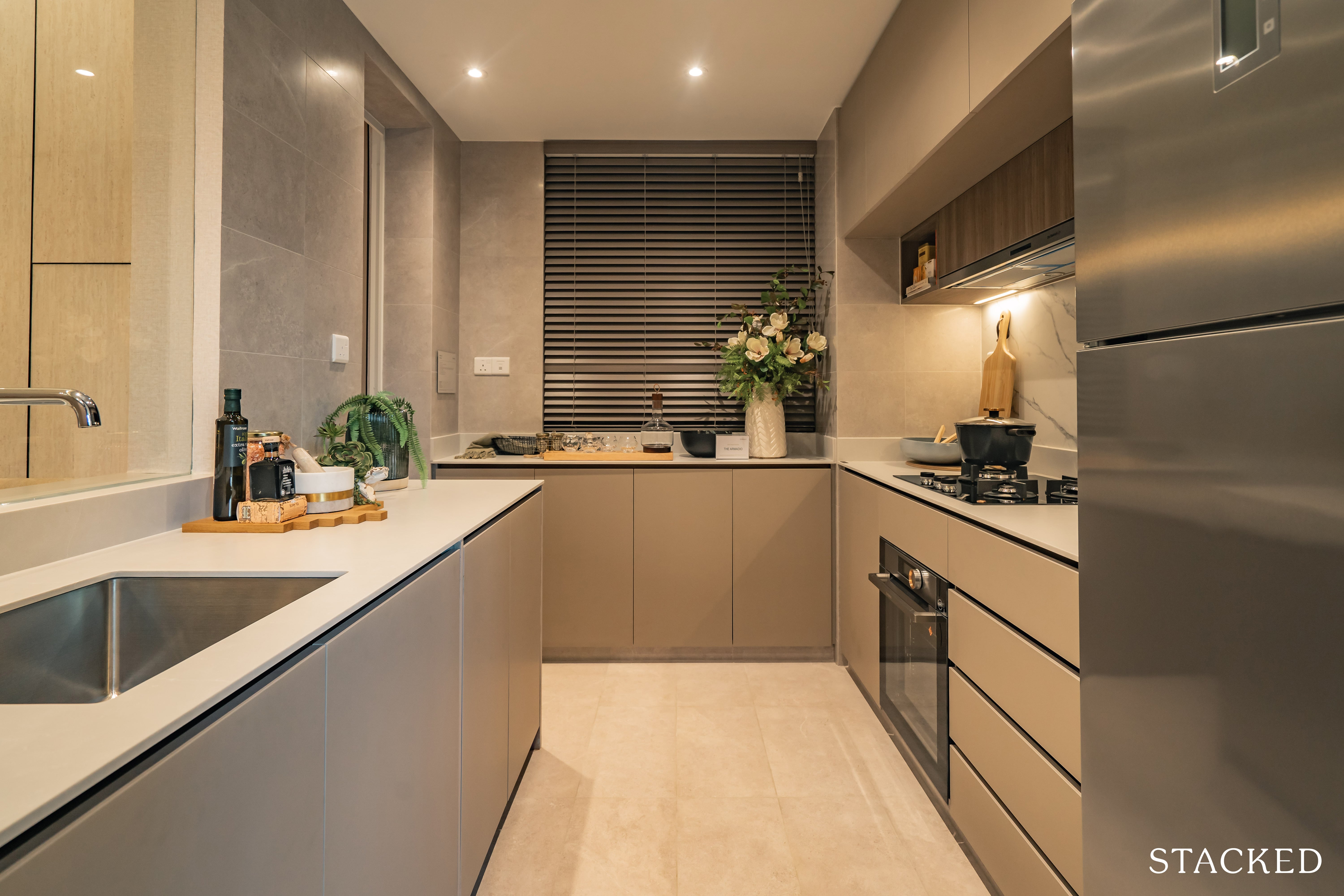
If you’ve been trooping in and out of show flats recently, you’ll definitely feel that something is amiss in this kitchen the moment you step in.
If you haven’t noticed it yet, well, it’s the lack of cabinets on the top left – which is a good move for two reasons.
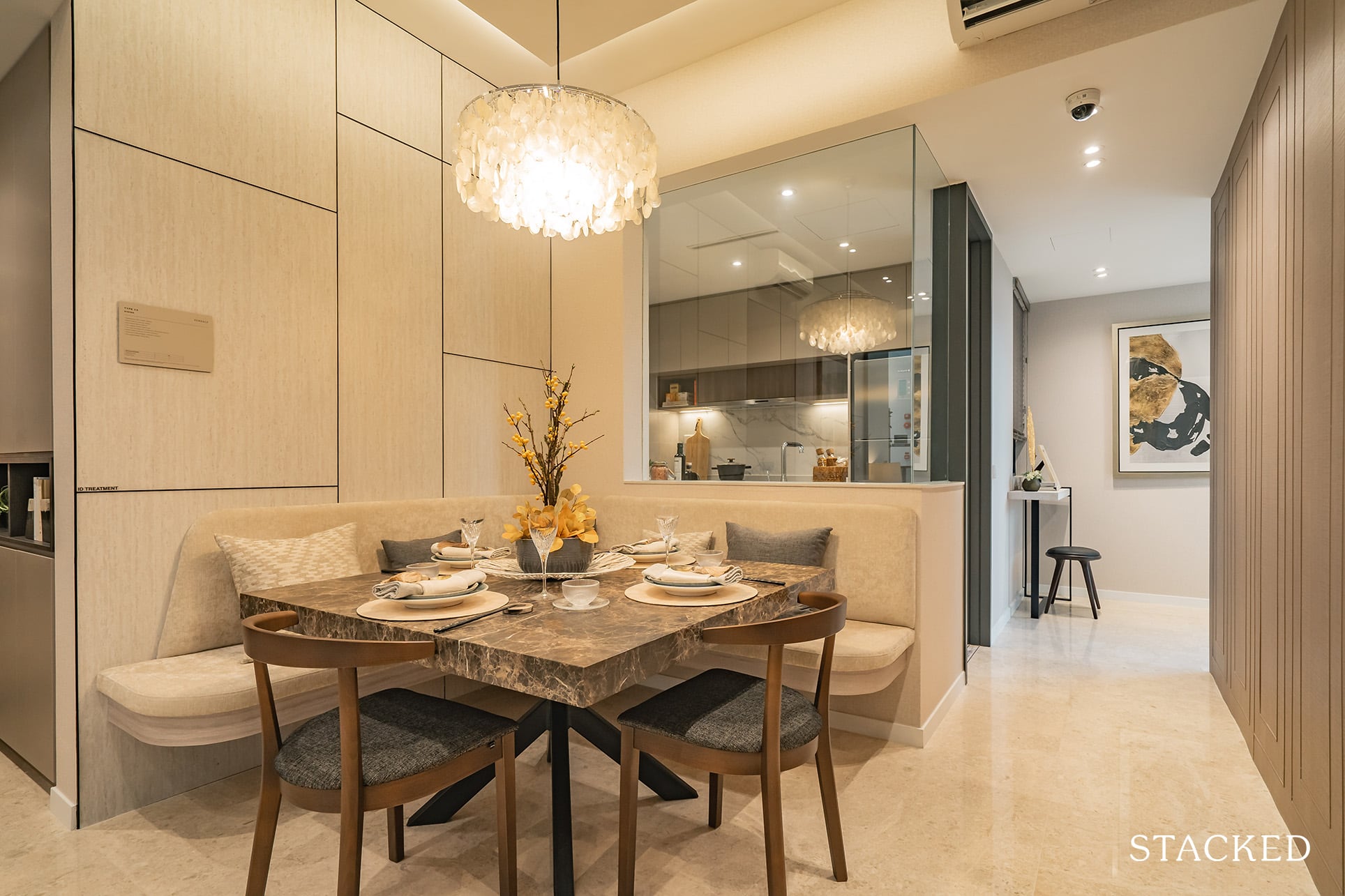
One, it allows for a huge glass cutaway, which lets a ton more light in. Two, it feels extra spacious and open – something those who tinker about in the kitchen a lot will definitely appreciate.
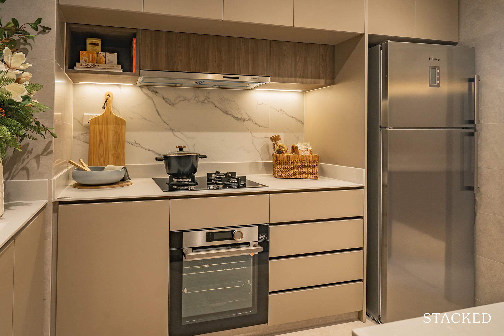
To make up for that missing top cabinet, you do get the creatively placed wooden shelving under the main cabinet on the other side (also where the hood is hidden).
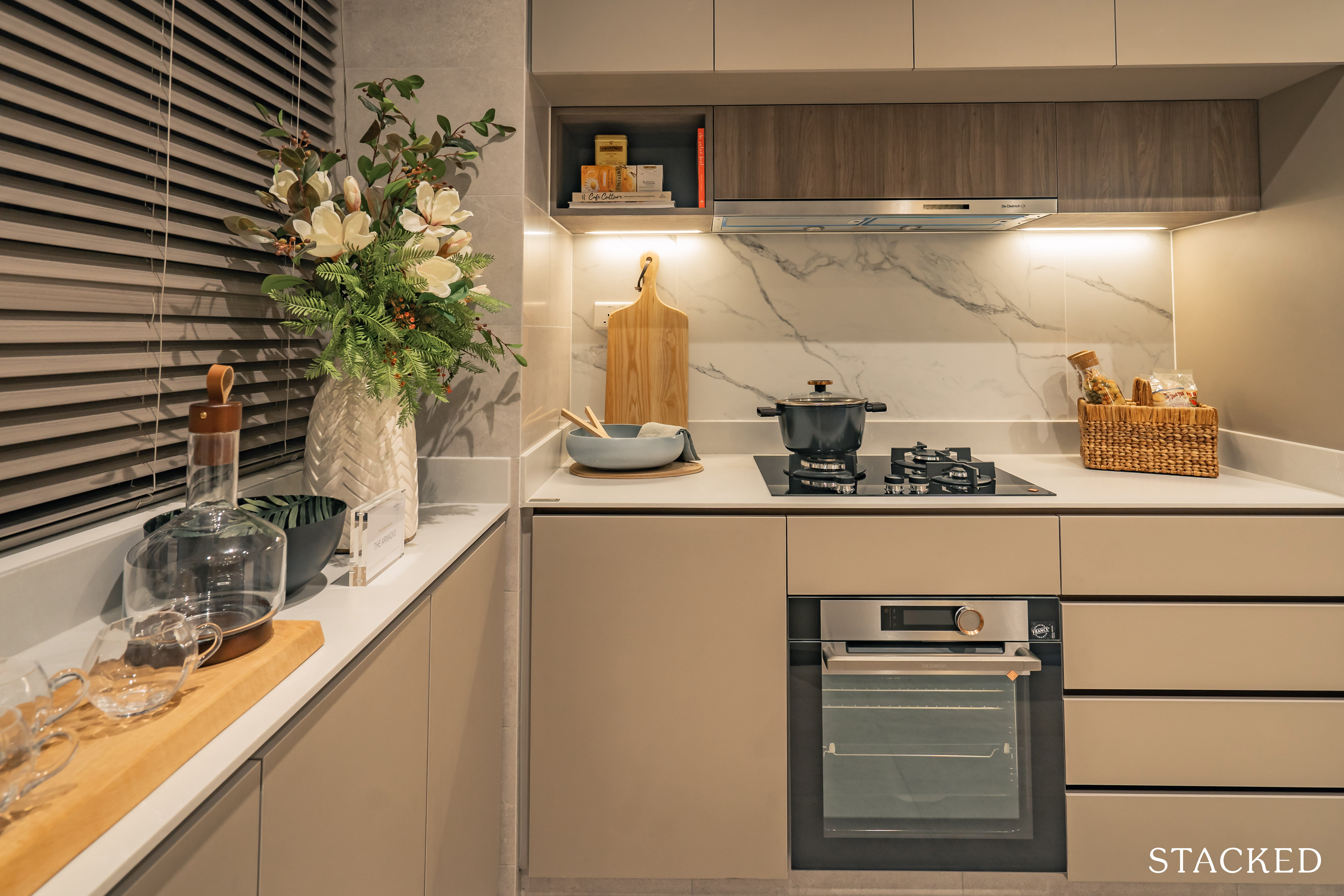
In addition, you do have what is termed as ‘The Armadio’ – a countertop that’s adjoint to your windowsill. Think of it as a mini kitchen bay-window of sorts.
To be honest, it isn’t very deep but it does provide some additional counter top space plus storage compartments below.
I can’t say for sure that overall you do have more storage than a regular kitchen, but I certainly welcome the move to make it brighter and more open.
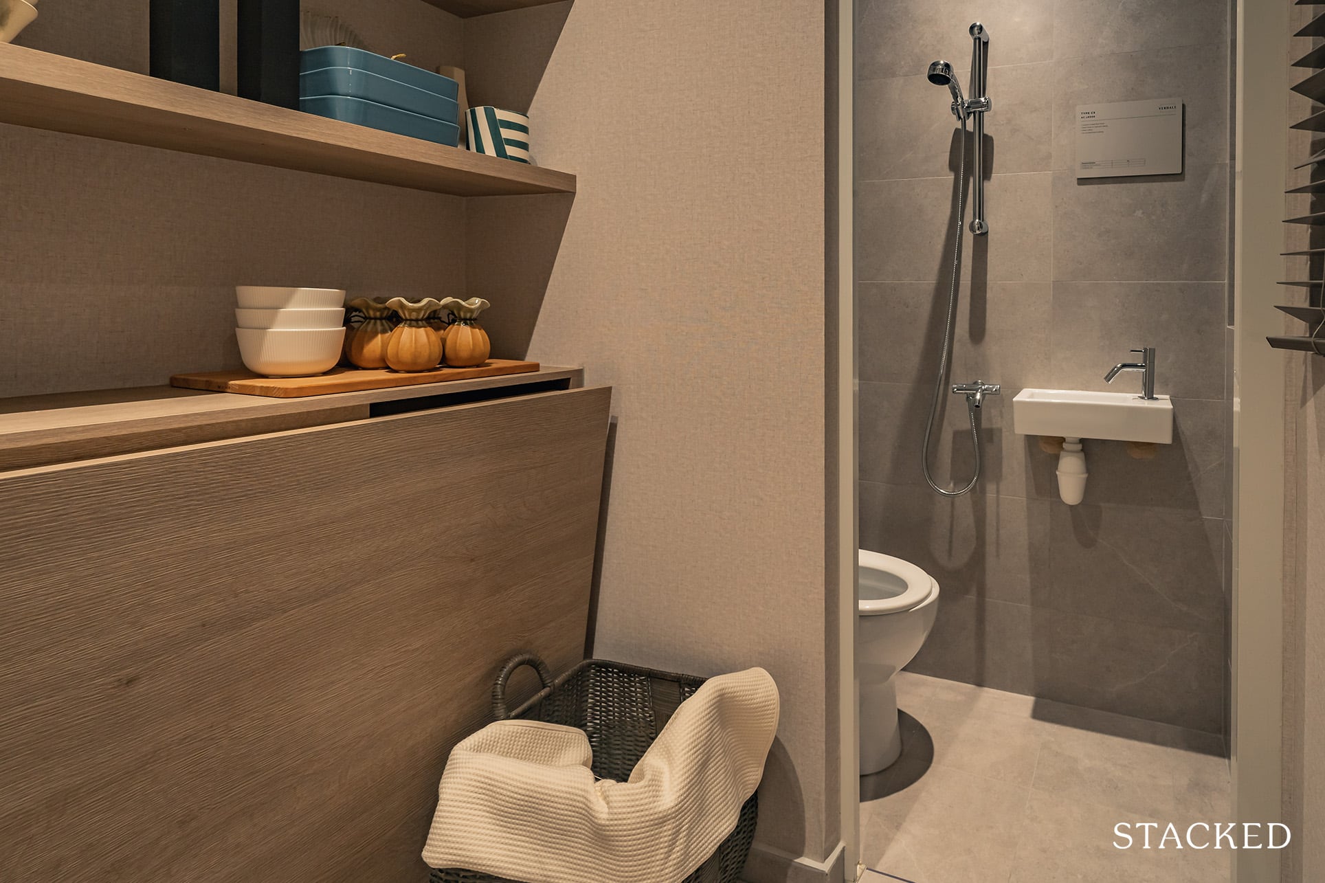
At the end of the kitchen you’ll find the utility room. Useful, no doubt, but what is not great here is the absence of a yard area.
Given the lack of space here, the developers have decided to include a ‘slide-and-fold PVC door’ as opposed to the general (hollow core timber) swing door you see in the rest of the rooms.
Admittedly, it’s still quite a tight squeeze, though the adjacent WC does make this suitable for a helper’s room if you’re able to manipulate the space well (with the foldaway bed shown here).
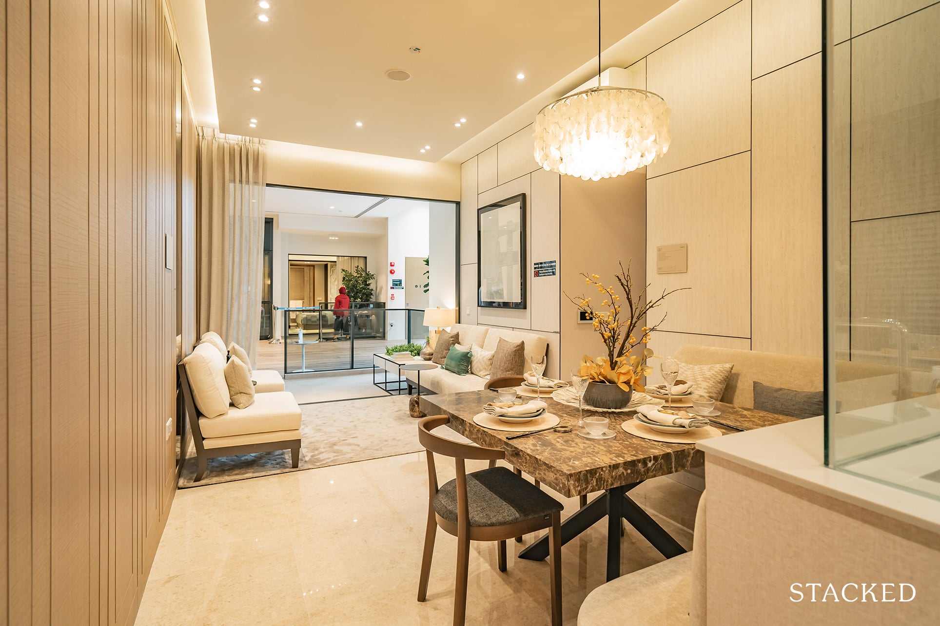
Moving on to the living and dining area, you do of course get marble flooring. But aside from that, you might remark how spacious the place looks – but that is mostly down to the ID fittings.
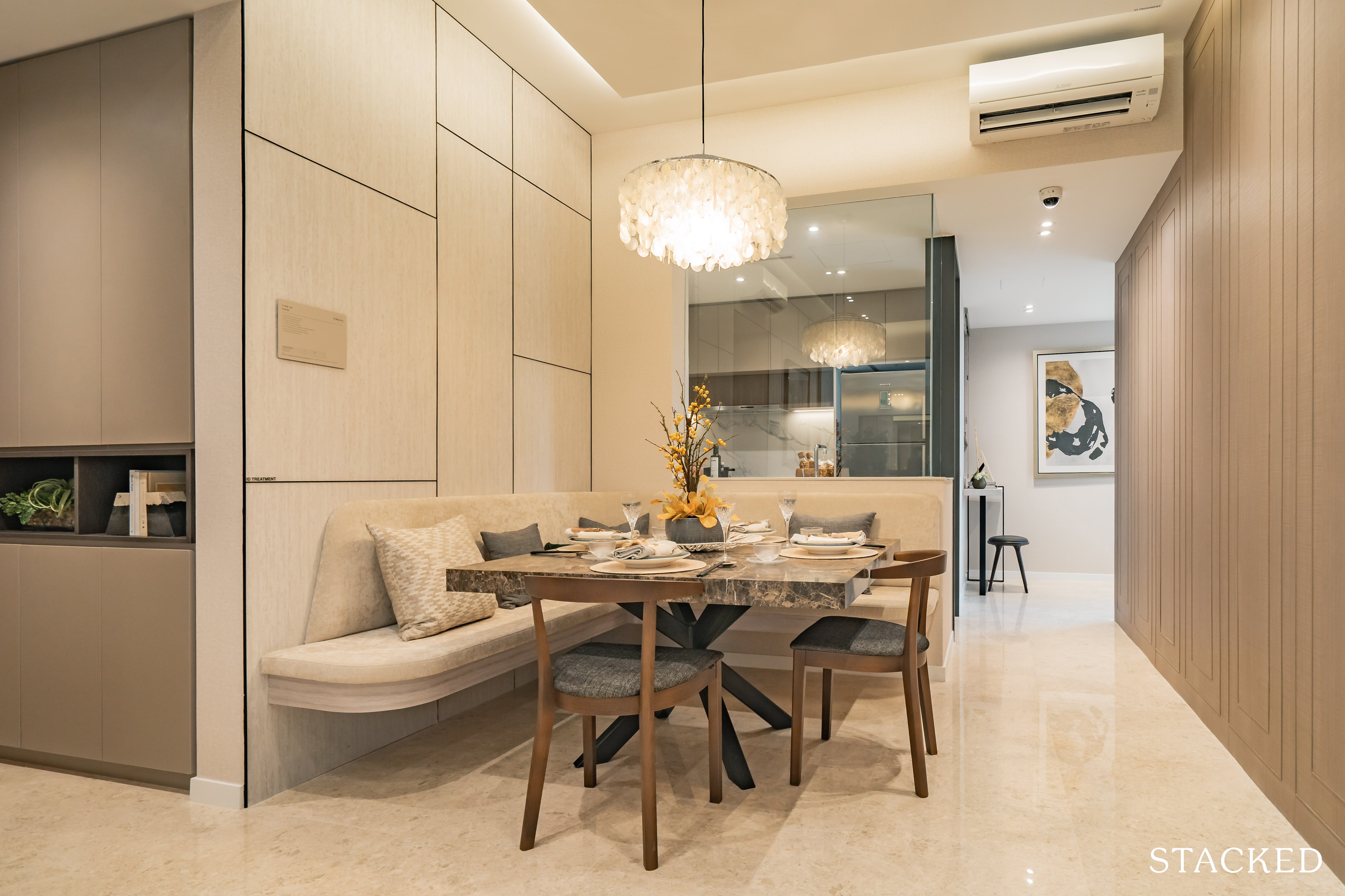
In what seems to be a pervasive design theme in new launches, one side of the dining table is always flushed along the walls. If you’re ever left wondering why – it is really just to preserve space.
It’s also precisely because anything bigger and you will be jutting out into the walkway spaces from the main door and to the hallway leading to the rooms.
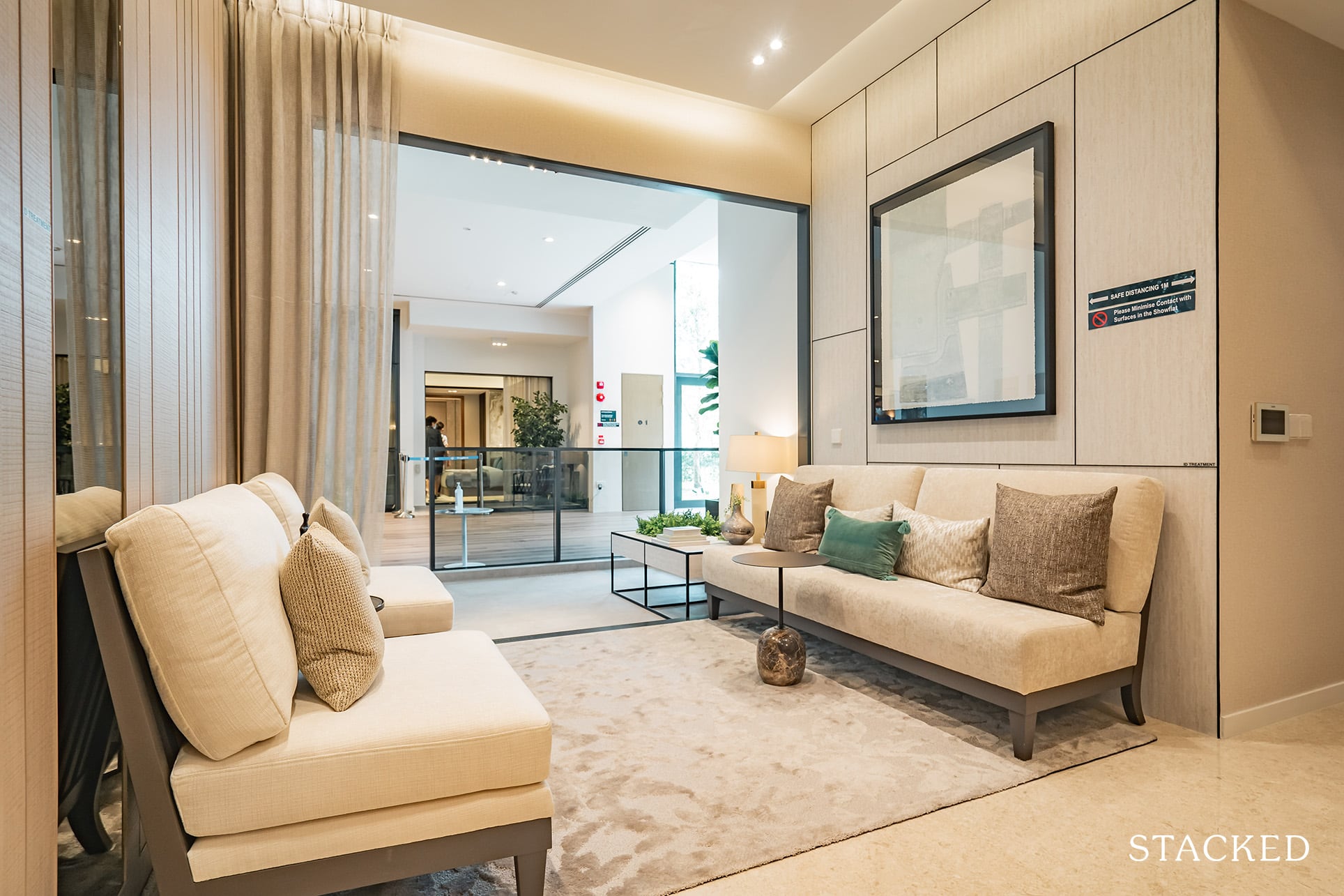
The living area is decent, its neither very wide not long so again, it’ll really boil down to your creativity when utilising/modifying this space.
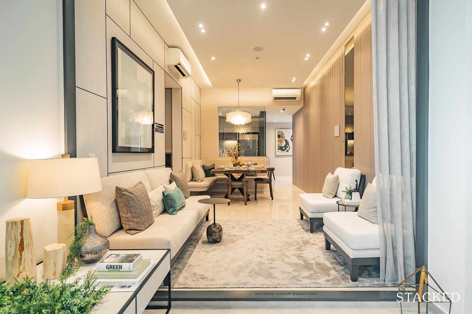
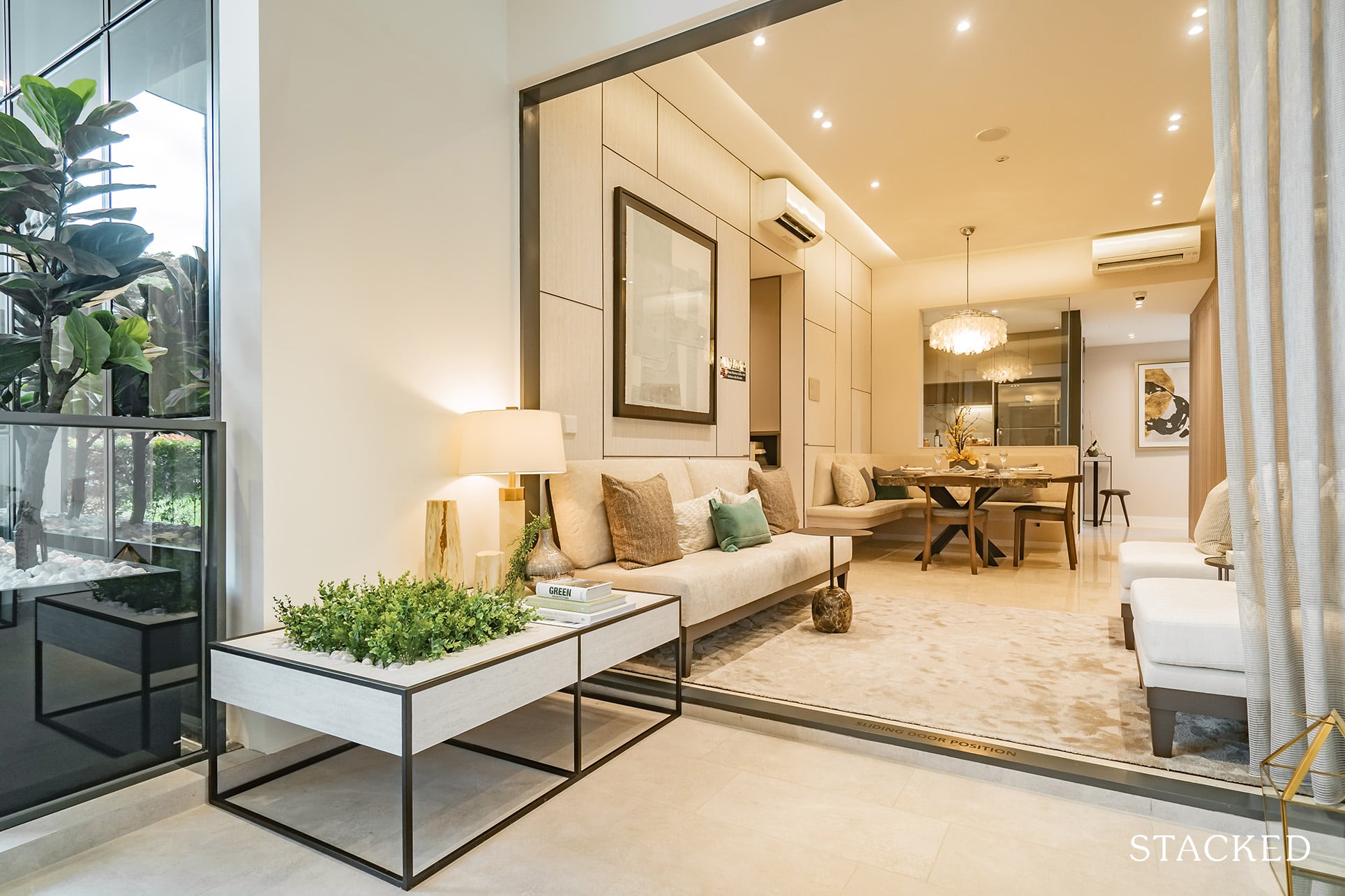
As for the balcony, it is kept to a minimum in respect to the overall size of the unit.
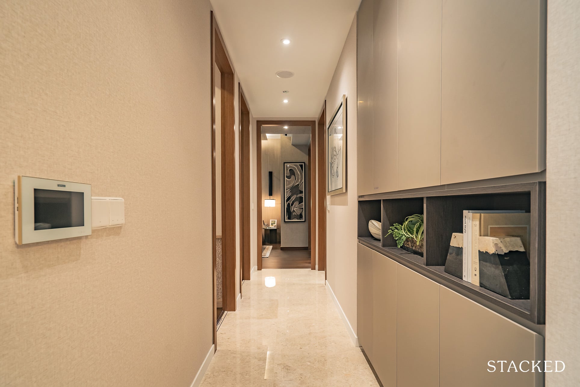
Funnily enough, this is probably the first time I’ve something interesting to point out about a hallway.
Instead of placing the aforementioned ‘Alcove’ (storage spaces) in the living room, they’ve opted to place them just at the start of the corridor.
What I really like about the Alcove design is that it isn’t just 8 variating cabinets plonked into the corner. Instead, the developers have implemented an open shelving dividing the upper and lower cabinets.
Not only does this add some aesthetic contrast to the monotoned cabinets, it also helps for easy access to homeowners and visitors alike in both the visual and tangible aspects.
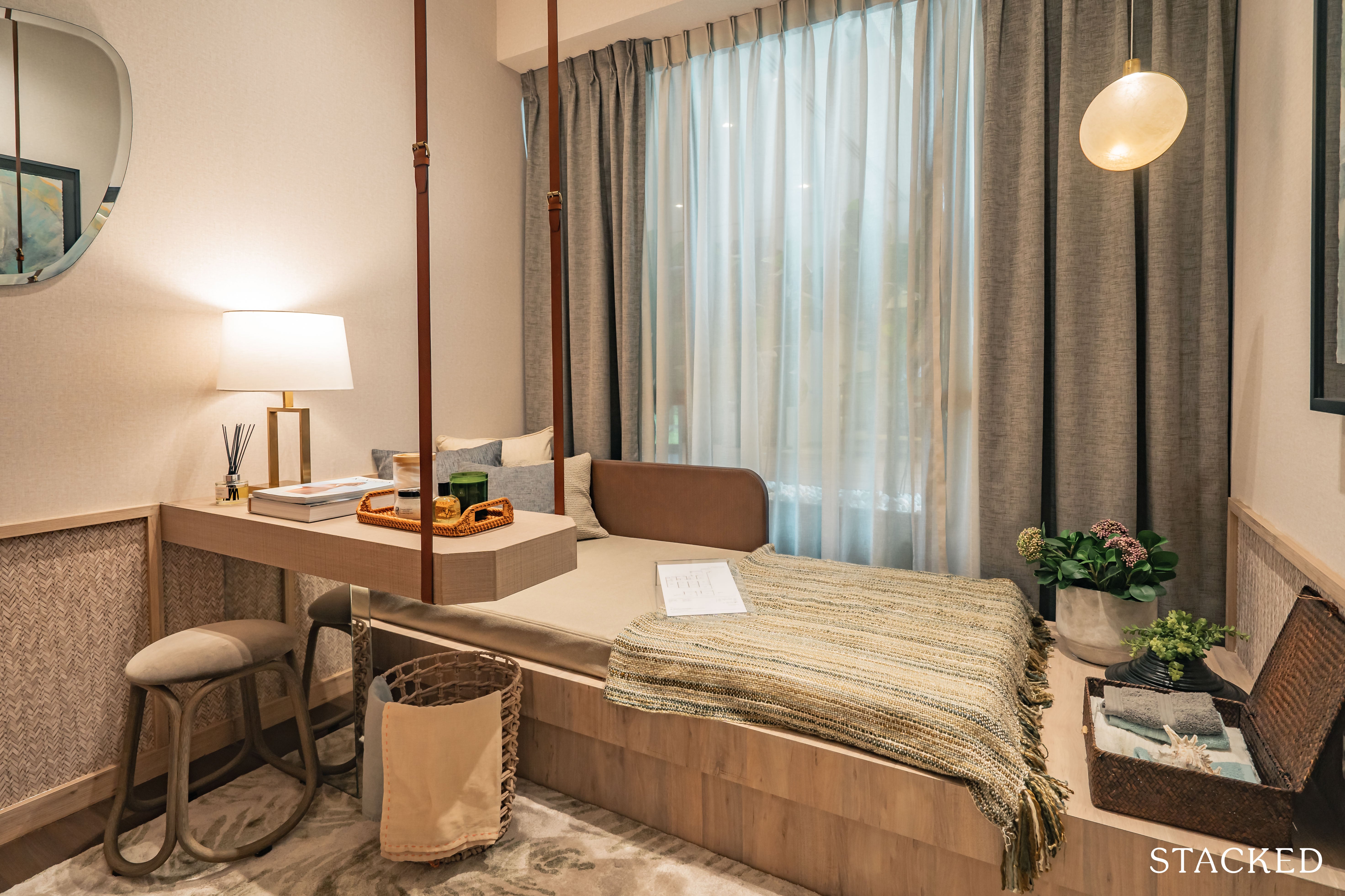
Both common bedrooms here are similarly sized, and likewise, with the same attributes.
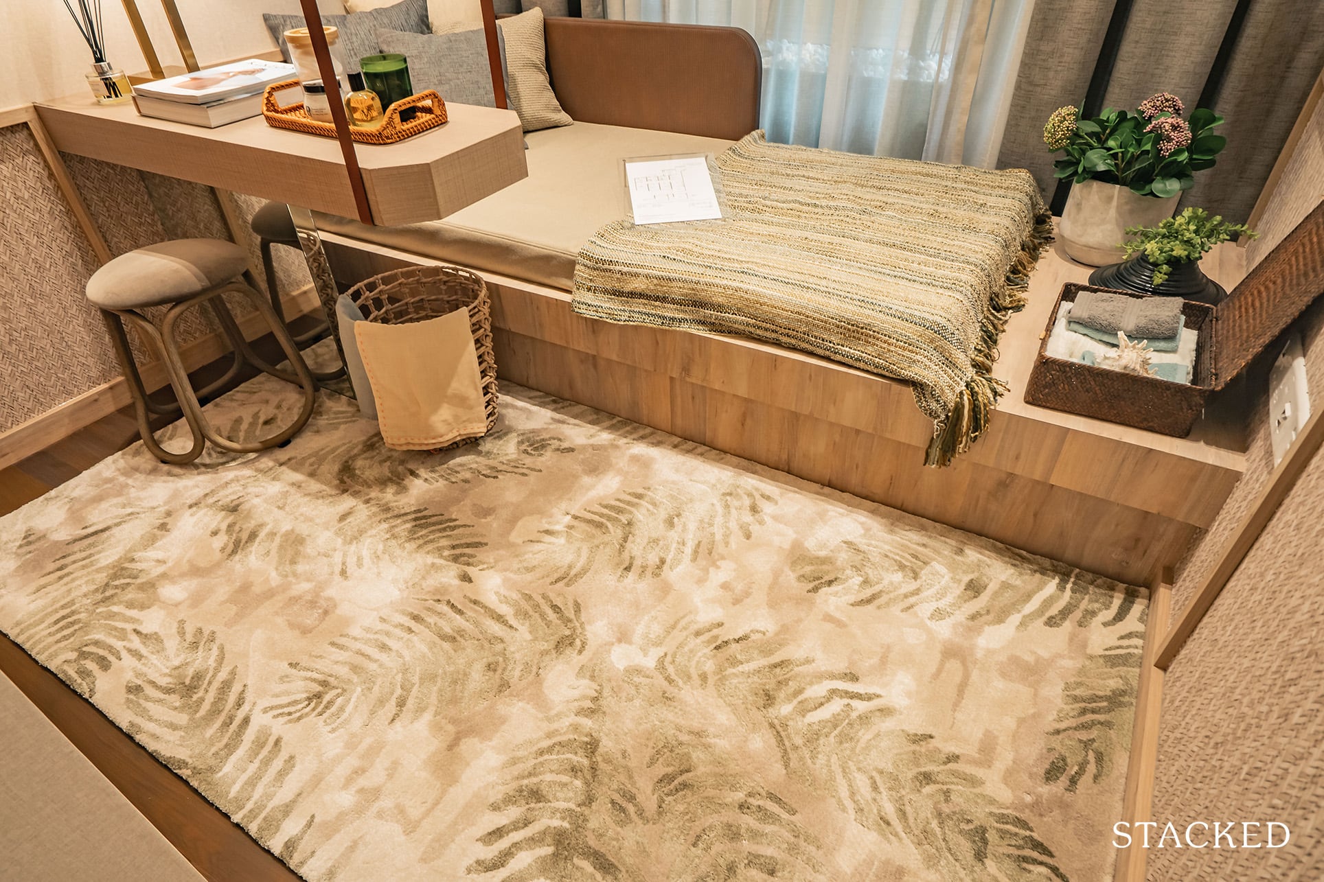
While you could fit in a queen sized bed, that’s probably about all the furniture you can squeeze into the room minus the wardrobe.
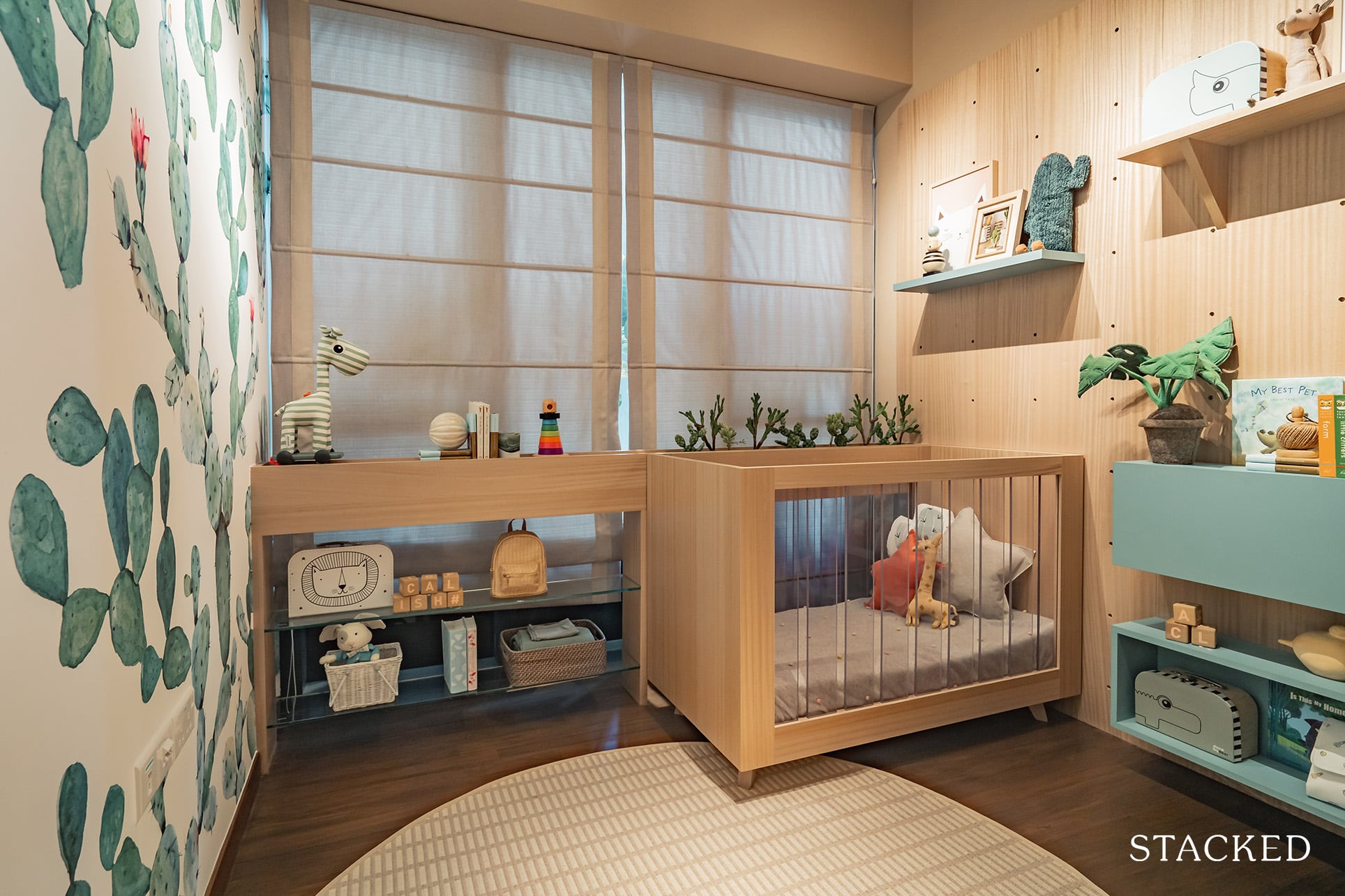
Both common bedrooms feature nearly full length widows too, which is always a positive thing.
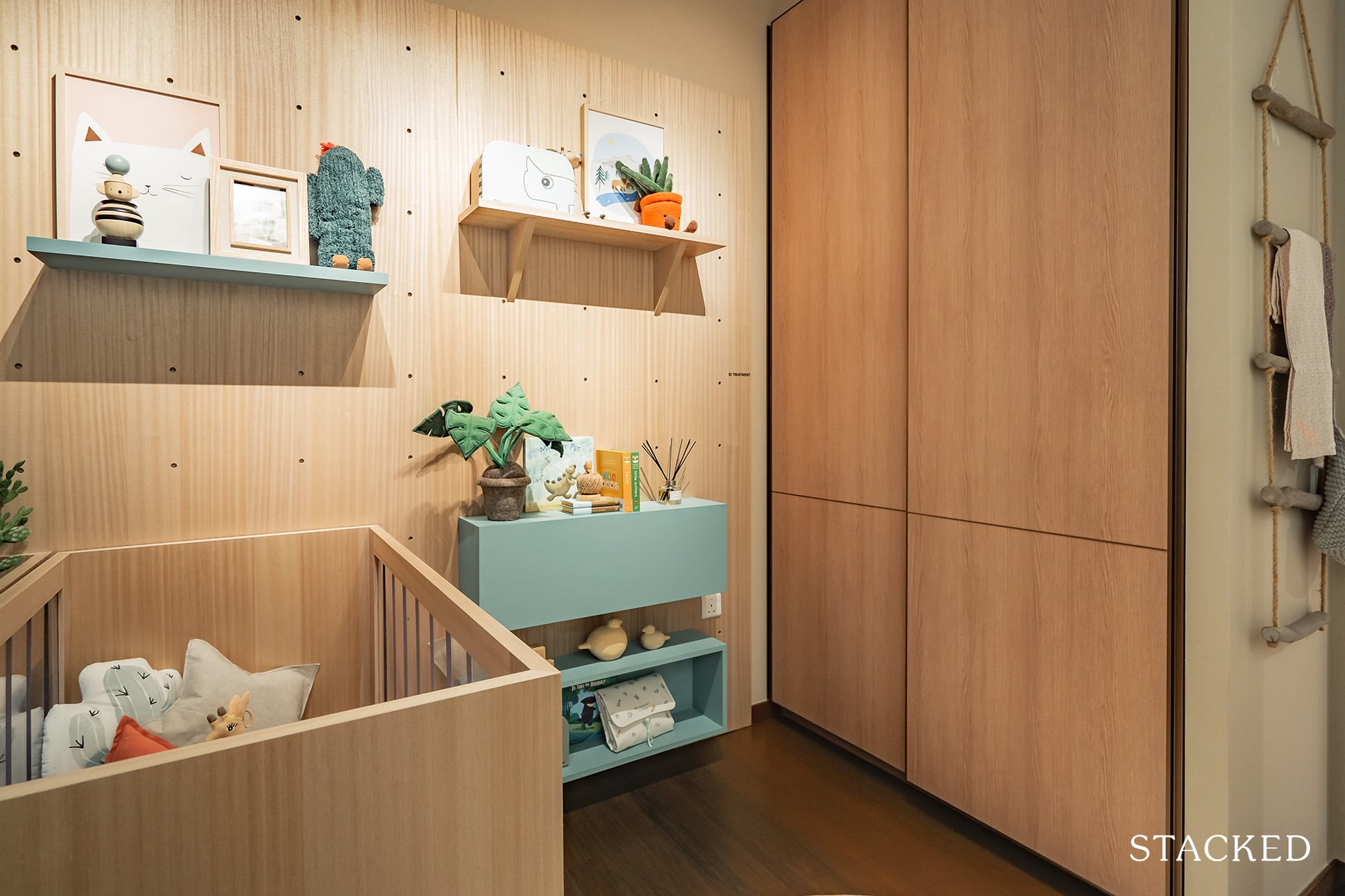
As with all the new launches today, the 2-panel wardrobe wouldn’t be sufficient for most people. It’s hard to fault the developer for that though, we aren’t living in a terribly big country.
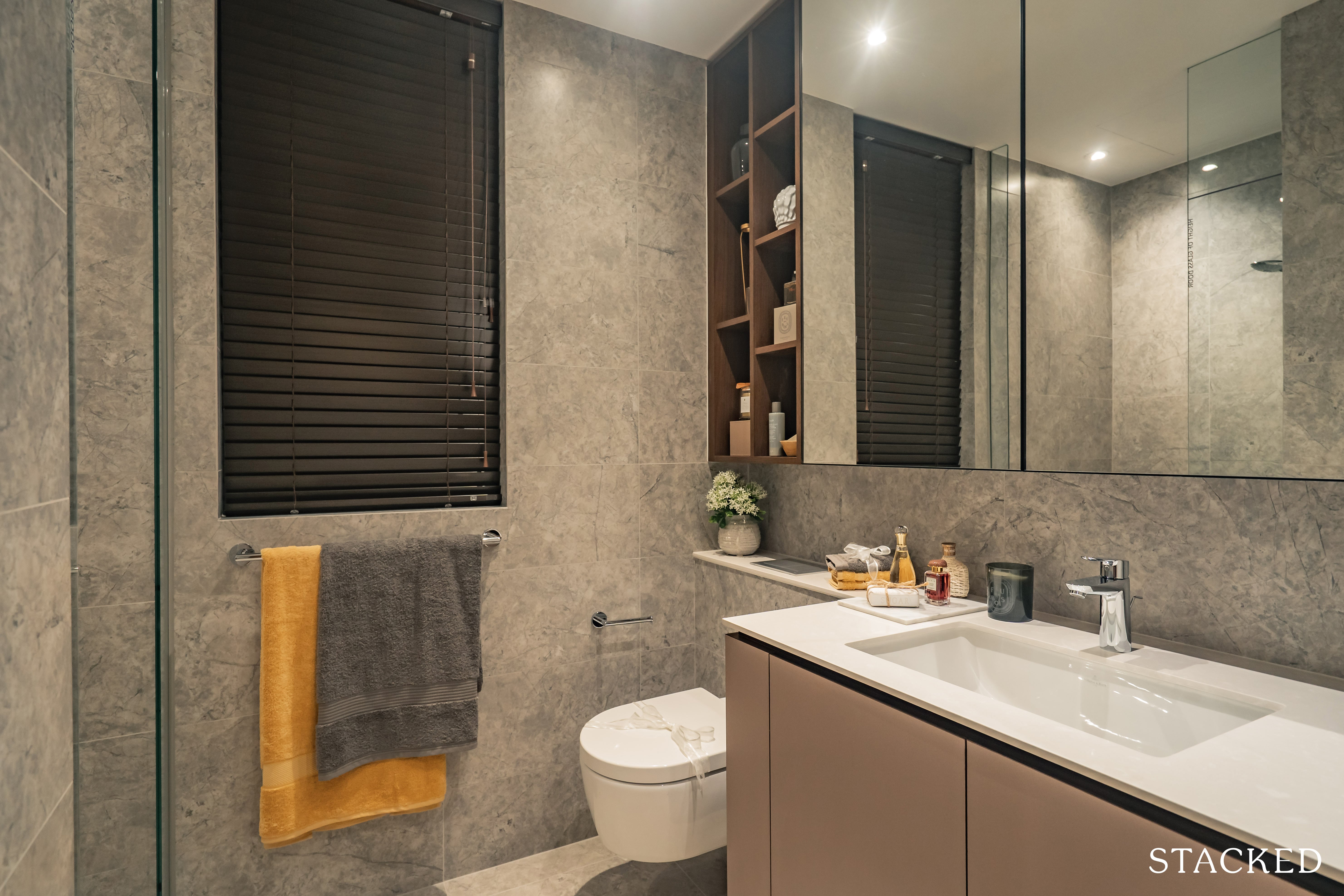
With a size just a hair past 1,000 square feet, neither of the common bedrooms are ensuite, so you’ll just have to make do with the shared common bathroom.
The common toilet parallels the previous one from the 2 bedroom deluxe in terms of furnishings and size, with fittings from the well-known Grohe.
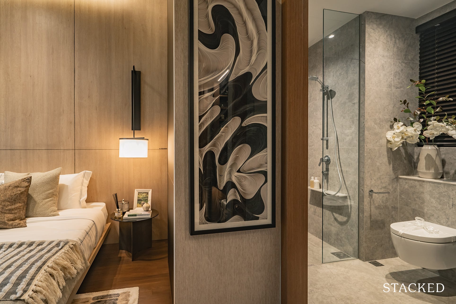
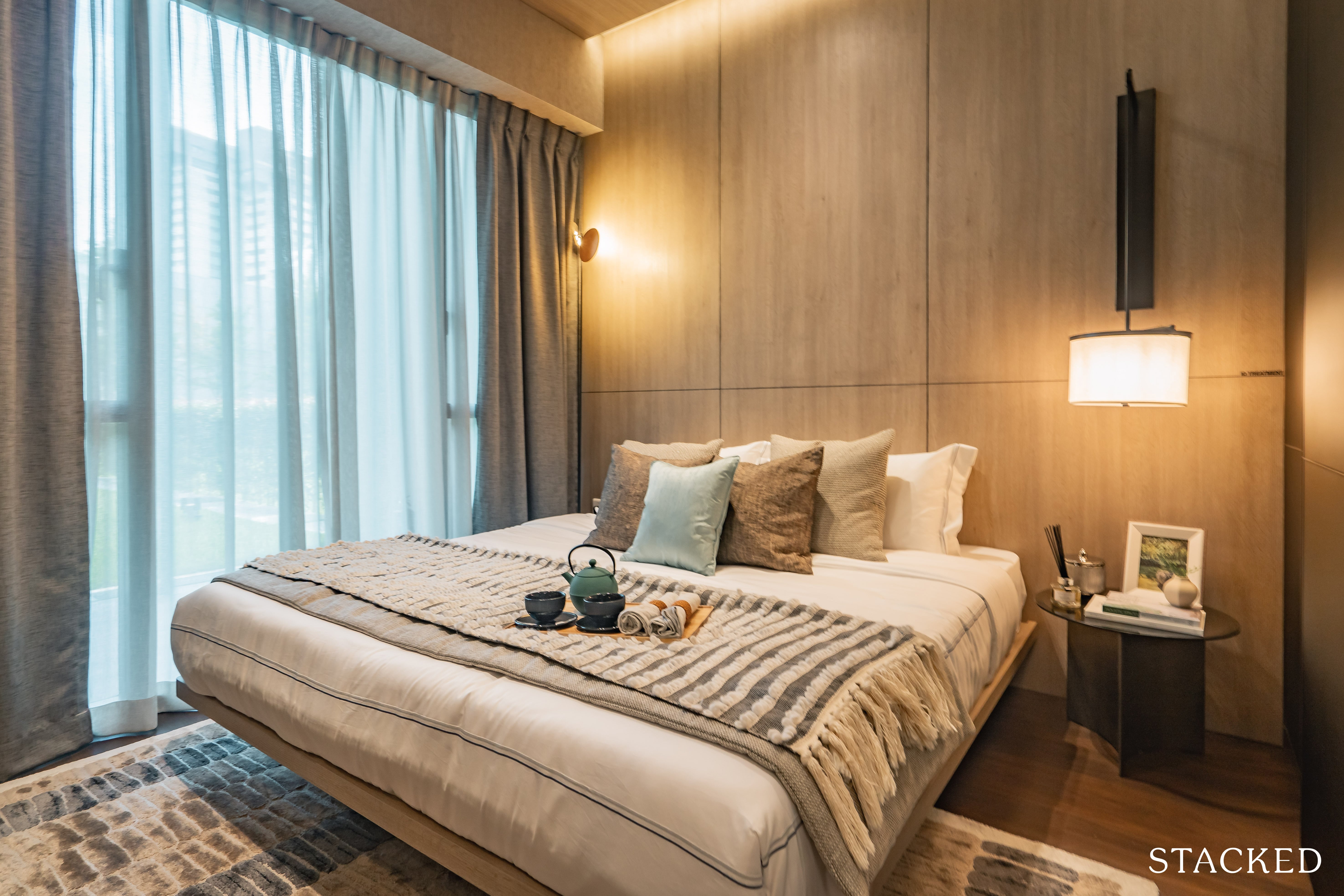
The master bedroom itself is fairly decently sized, you can fit in the prerequisite of a king sized bed with enough space down the right side to access the wardrobe.
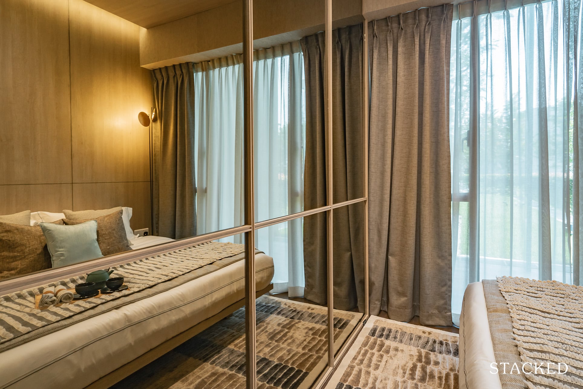
Of course, the mirrors here are just an ID treatment, and would not be coming with the actual unit itself.
While it does the job of making the room feel bigger, I’m not sure many people would enjoy staring at themselves every time they get into bed.
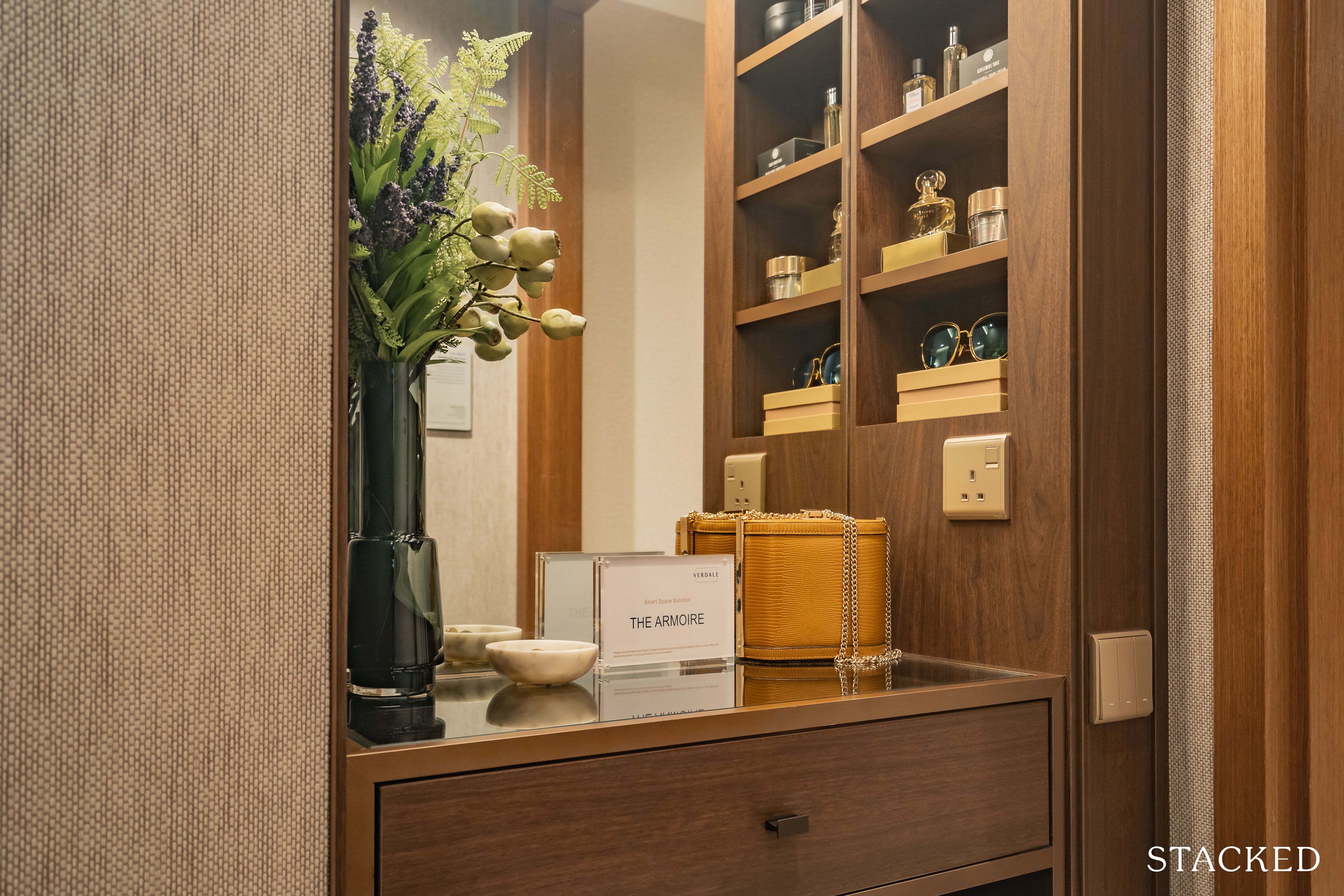
The Armoire smart space solution is present here too, in a convenient spot as it is by the entrance of the room. It is actually carved out from the common bathroom, but I would say it is well worth the effort for the additional storage spots.
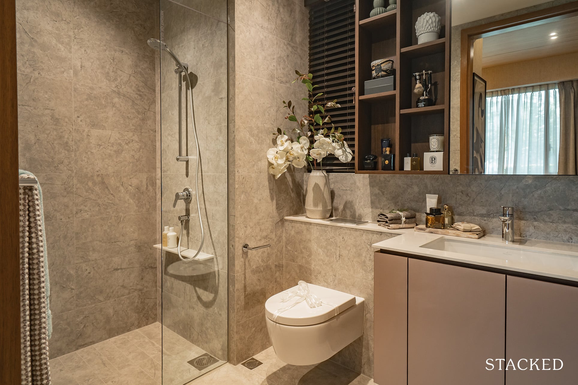
Given the focus on higher end materials and a somewhat luxurious vibe, I am surprised that a rain shower isn’t included in the master bathroom.
That said, I do find that the fit and finish is quite exemplary, with the usual fittings like the sink and wall-hung toilet bowl from Grohe.
Verdale 4 Bedroom Review
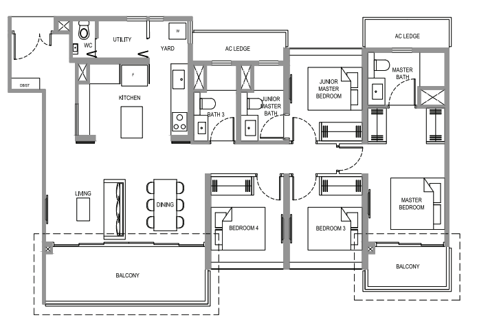
As far as unit sizes go, this one at the Verdale falls into the average category at 1,410 square feet.
Based on first impressions, I would say the layout is mostly functional save for a few nitpicks here and there. For one, I am glad to see that the AC ledges have been appropriately placed behind all the bathrooms instead.
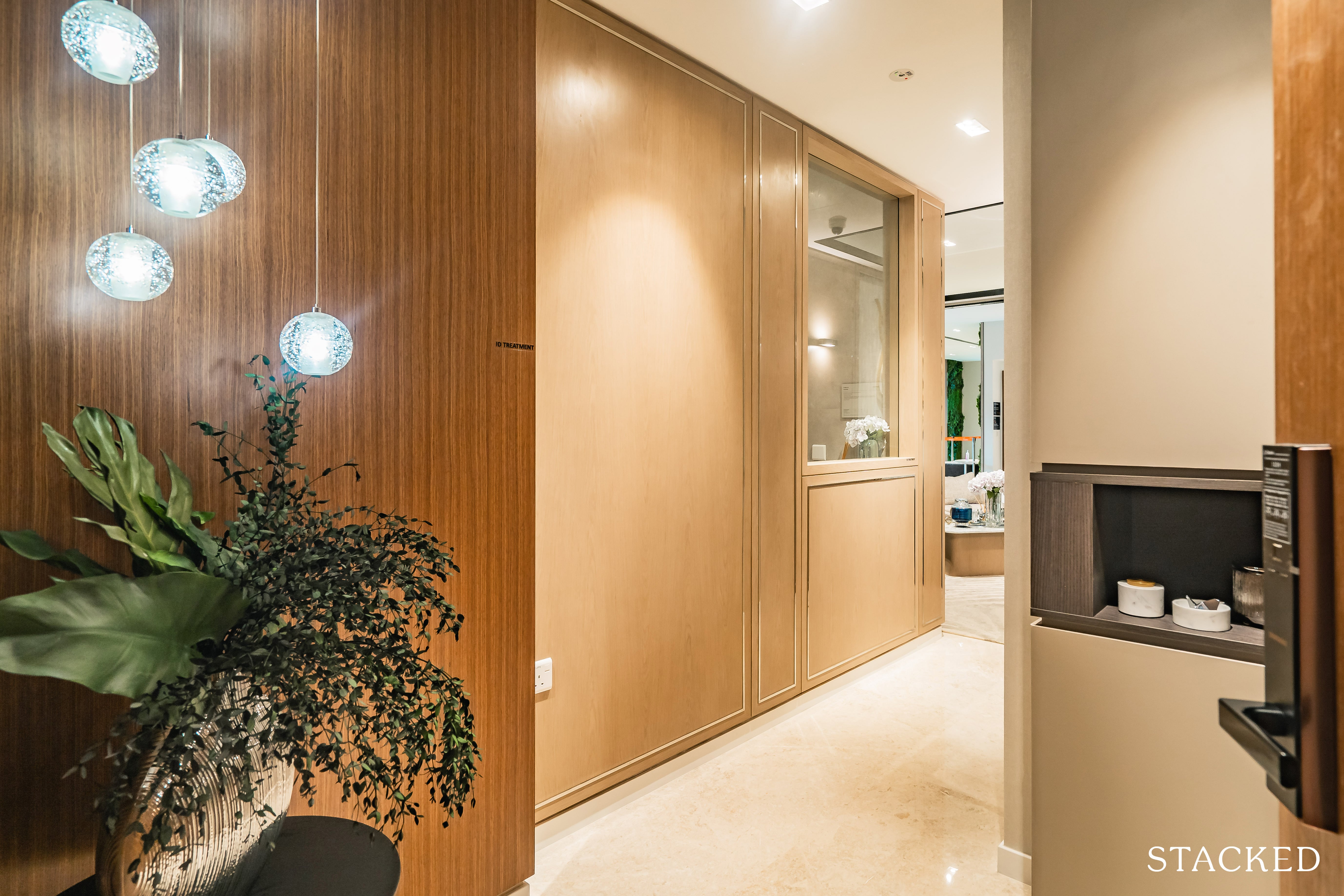
The foyer at the entrance is thankfully kept to a minimum, but it does its job of ensuring a certain level of privacy to your family as well as adding a bit of class to the space (if done up nicely).
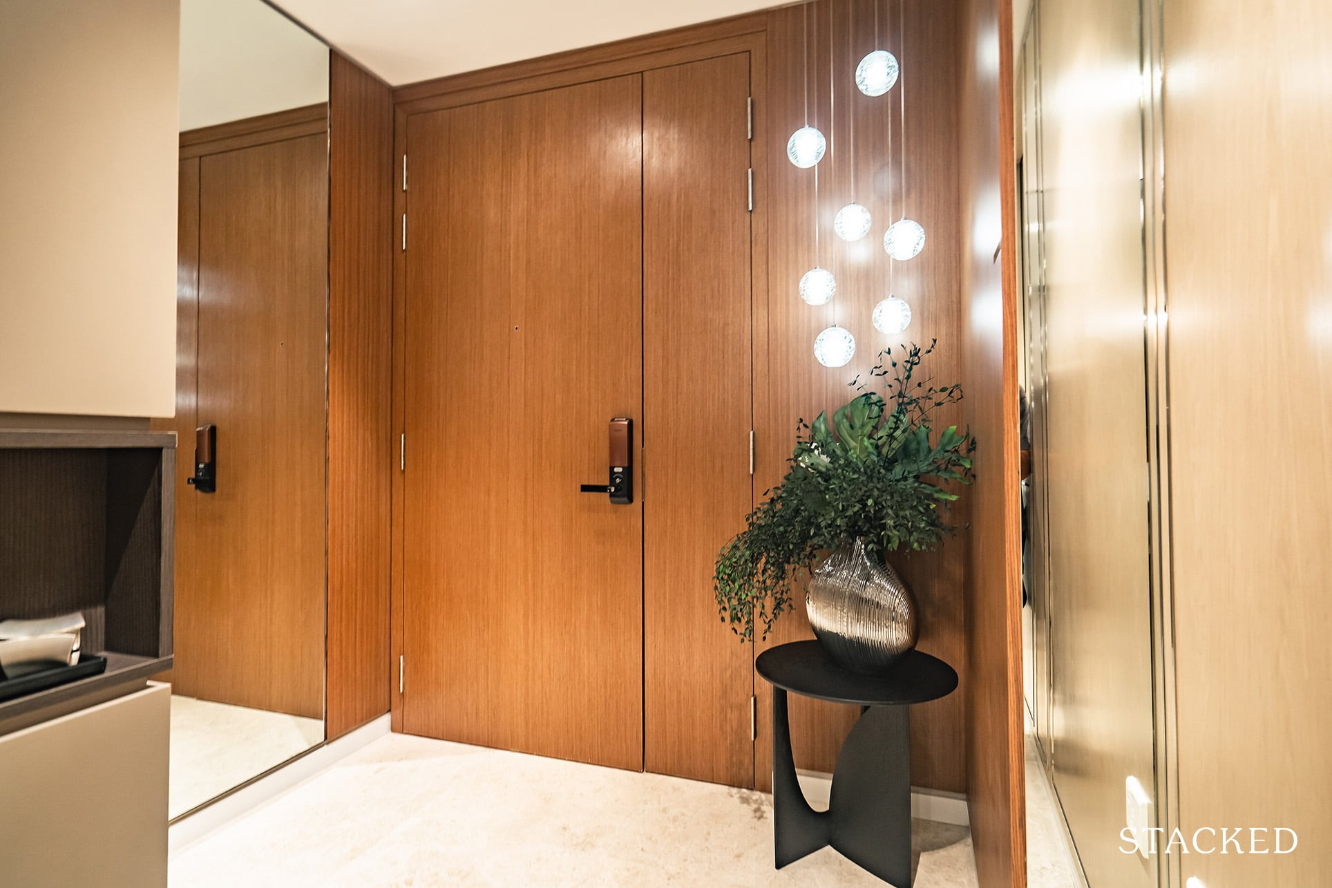
Again, materials are all similar throughout the unit (marble flooring etc), and for those wondering, the ACs in all the units are from Mitsubishi Electric, while the digital lockset on the main door is supplied by Samsung.
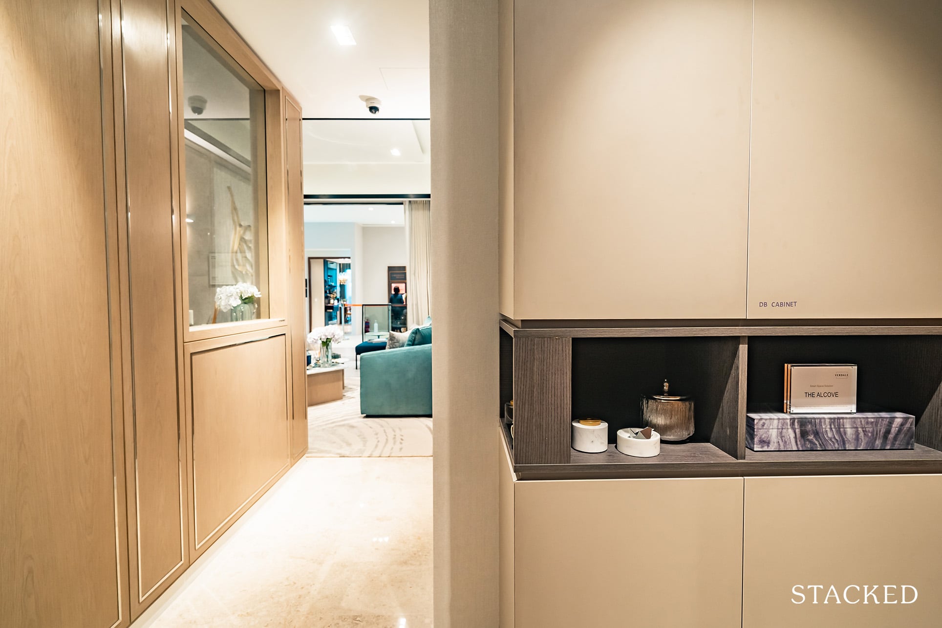
It is here that you are greeted by the Alcove, with its shelving and 4 cabinets. It’s great to see this space given more usability – don’t look down on the depth of the cabinetry here – any extra storage space is always welcome.
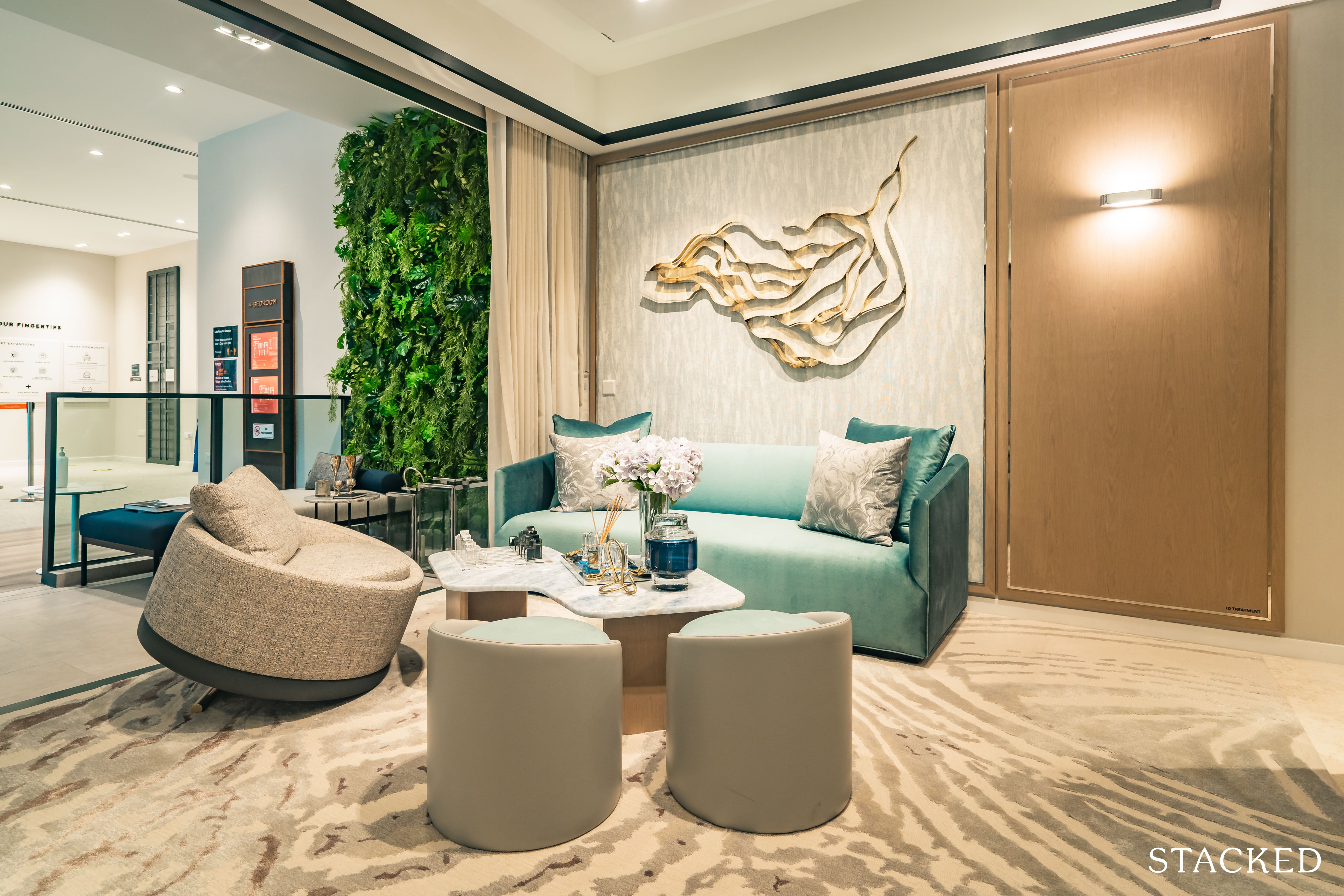
The living room is appropriately sized, with enough space for a 3 seater sofa and accompanying armchair.
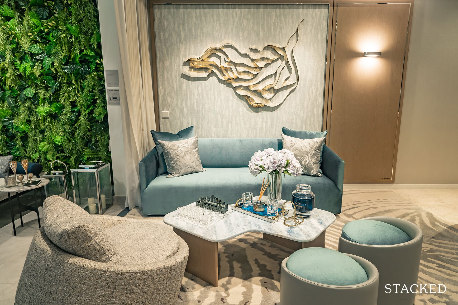
Do note that this is shown without a TV set, something which 99% of households will no doubt be placing in their homes.
Finding a good congruence between the dining area and the lounge area though could be a little bit of a design challenge as the area is essentially just one rectangular space.
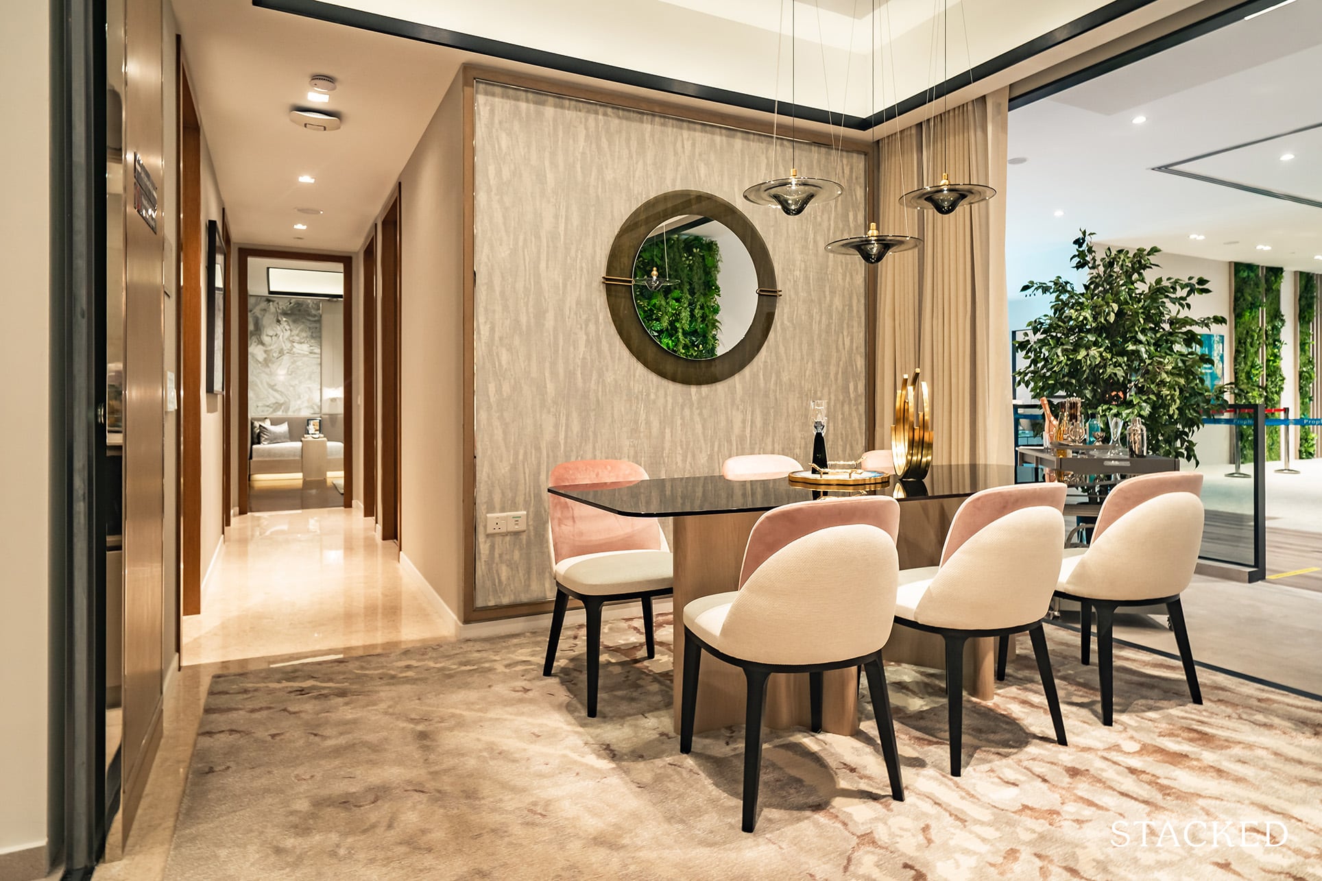
The dining area is big enough for a 6-seater dining set, which depending on household size could be a bit of a tight fit. You could definitely squeeze an 8-seater, but that would be at the expense of some walkway space into the hallway.
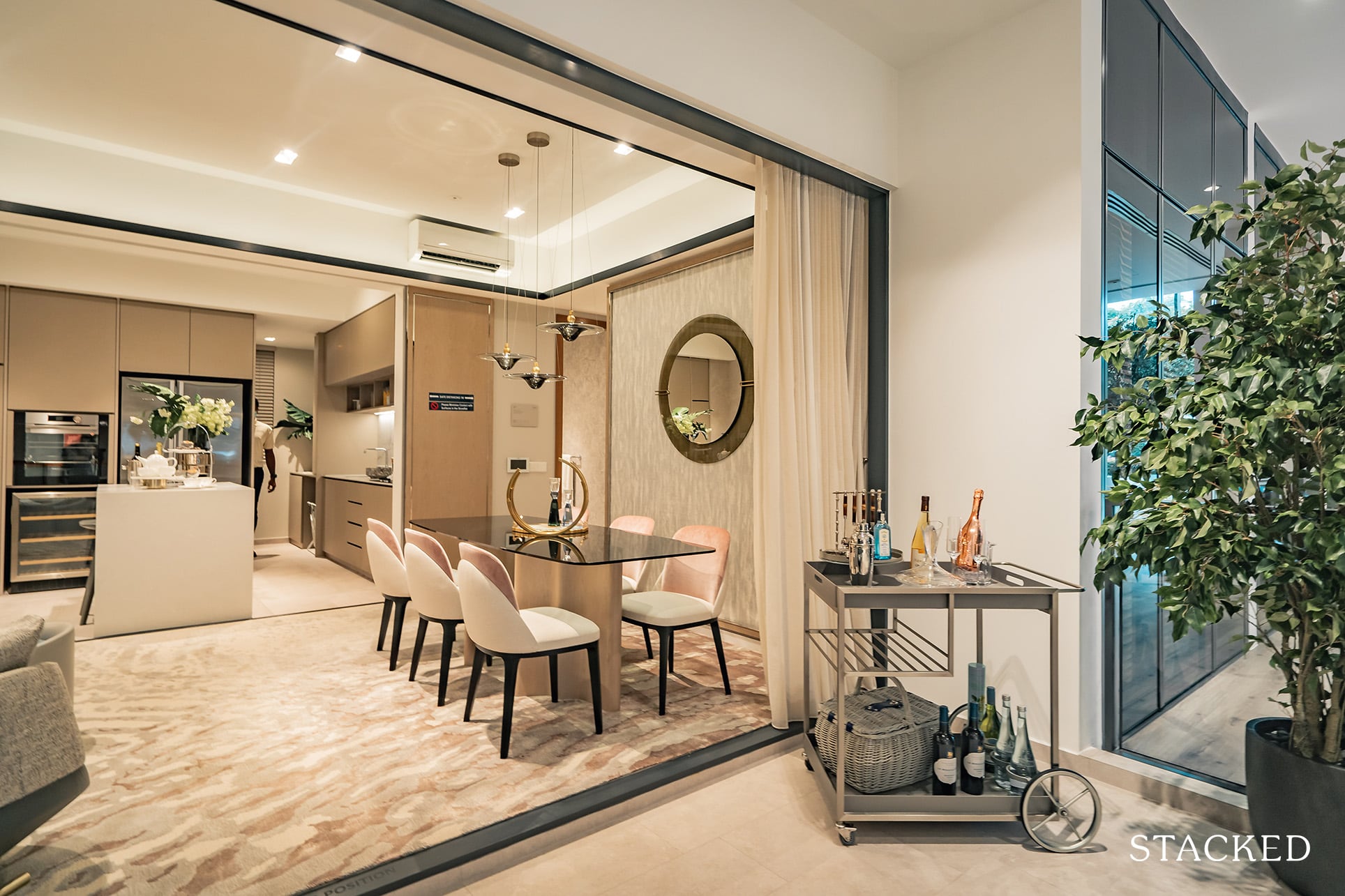
The space itself is quite long, so you could think about placing the dining set parallel to the balcony instead. While it might encroach into the living area, you’ll just have to weigh which area you tend to use more and prioritise that!
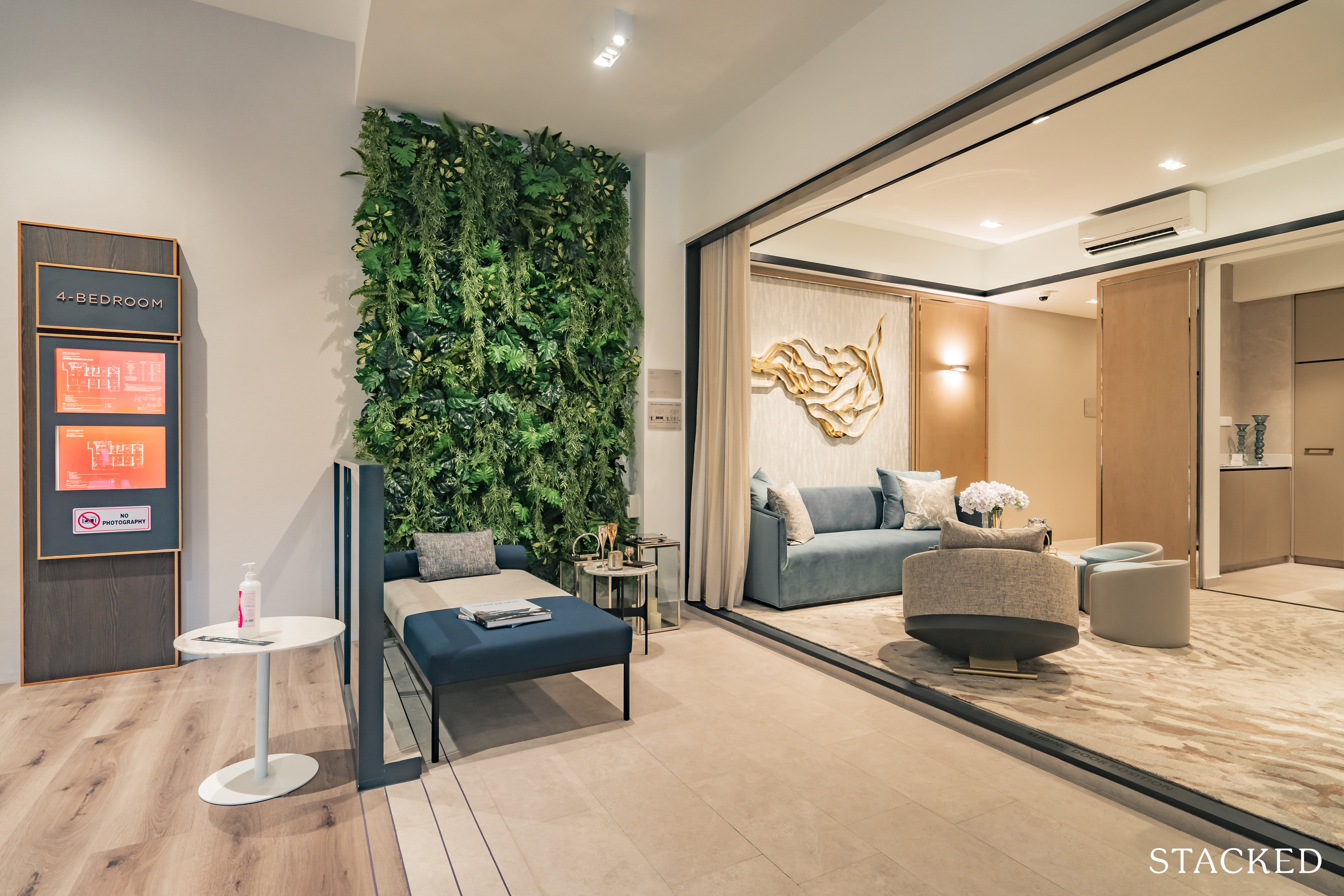
The balcony is quite a sizeable space, you could quite easily fit an outdoor dining set here to be your primary dining space instead – saving some prime indoor space for your living. Depending on your facing, I could see this as a real possibility given that the main target audience looking at the Verdale would probably because of its greenery aspects.
Do note that the living is on a slight step higher, so it isn’t exactly a seamless indoor/outdoor transition.
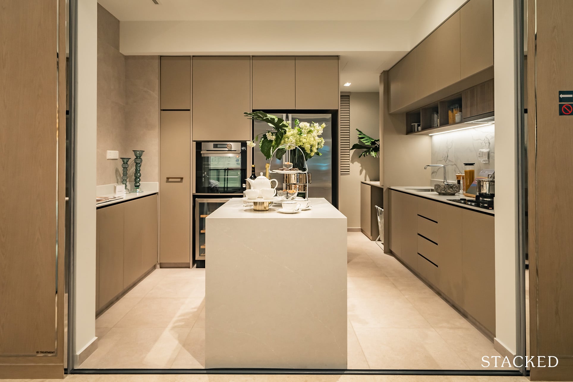
Heading back into the hallway and into the kitchen, you’d notice a little ‘island-like’ structure in the middle. The last of the ‘4 As’, this little guy is termed ‘The Atelier’.
To cut through the marketing speak, it is basically a functional space to prepare food, as a breakfast counter table, or even a casual spot to have a quick meal.
I may be biased here, but I do have a weak spot when I see a kitchen island – it just completes the kitchen for me.
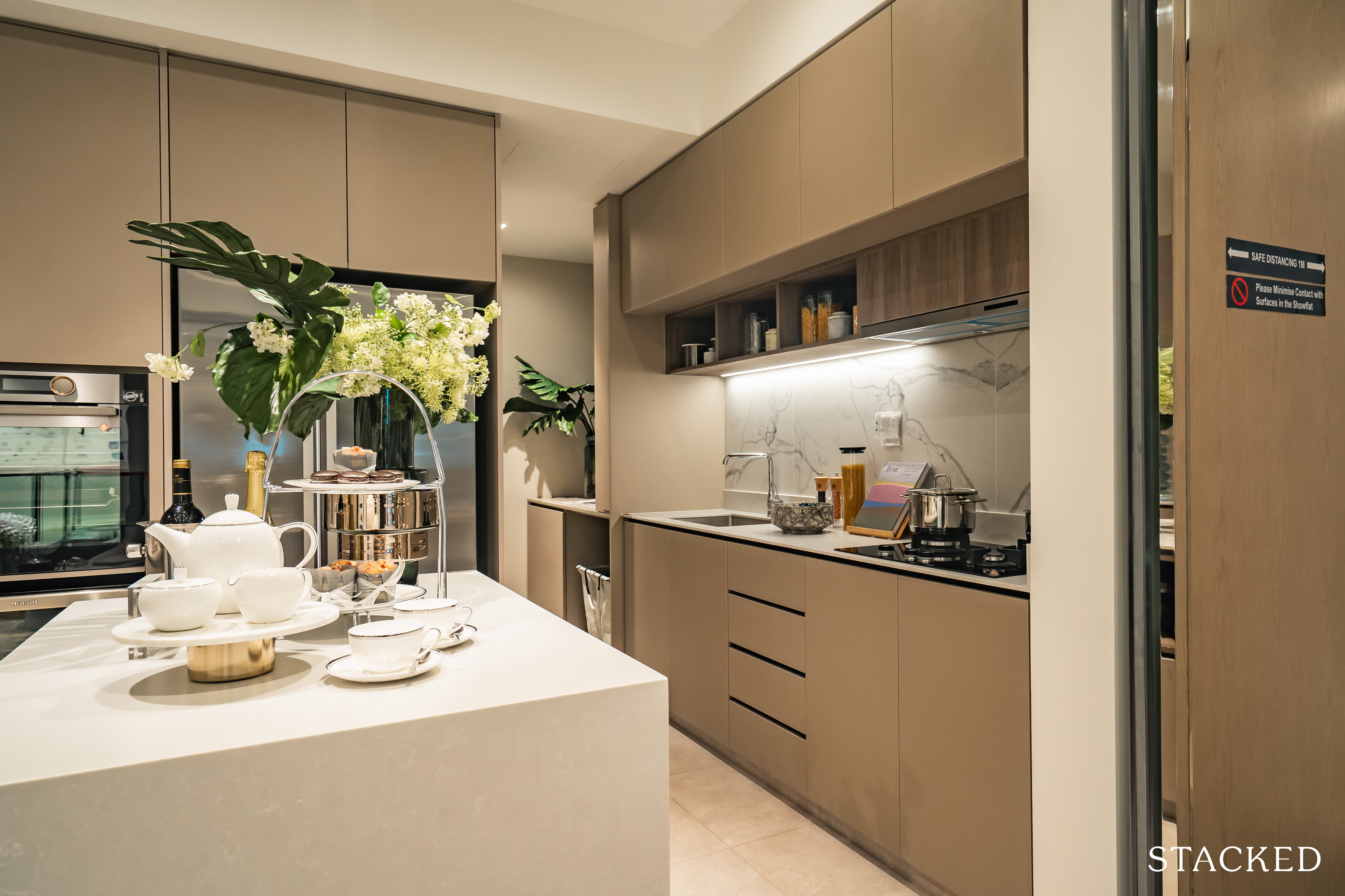
Some might have preferred the extra free space in the middle to manoeuvre with, but again, for those who don’t have all that time to work on their interior, this is a great implementation.
Let’s not forget that it also serves as an extra area to place your hot food items once out of the oven.
For the keen-eyed, you might have also noticed the extra inclusion of the Brandt Wine Chiller here, situated just below the oven.
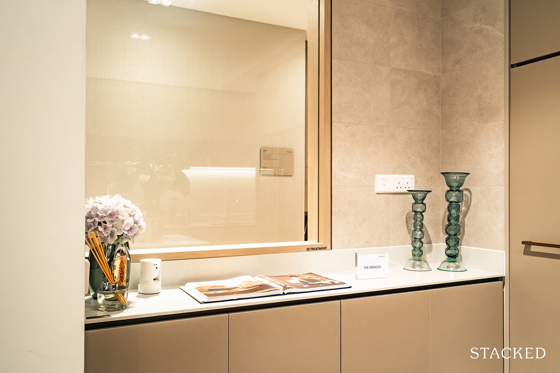
And that’s not the only nifty addition here, as there is also the Armadio to serve as extra functional space.
While the window here is really just an aesthetic implementation (you wouldn’t expect much sunlight coming through this piece alone), it’s good to know that the glass is situated on the opposite end of the wet kitchen – in other words, you shouldn’t have to deal with too much staining here.
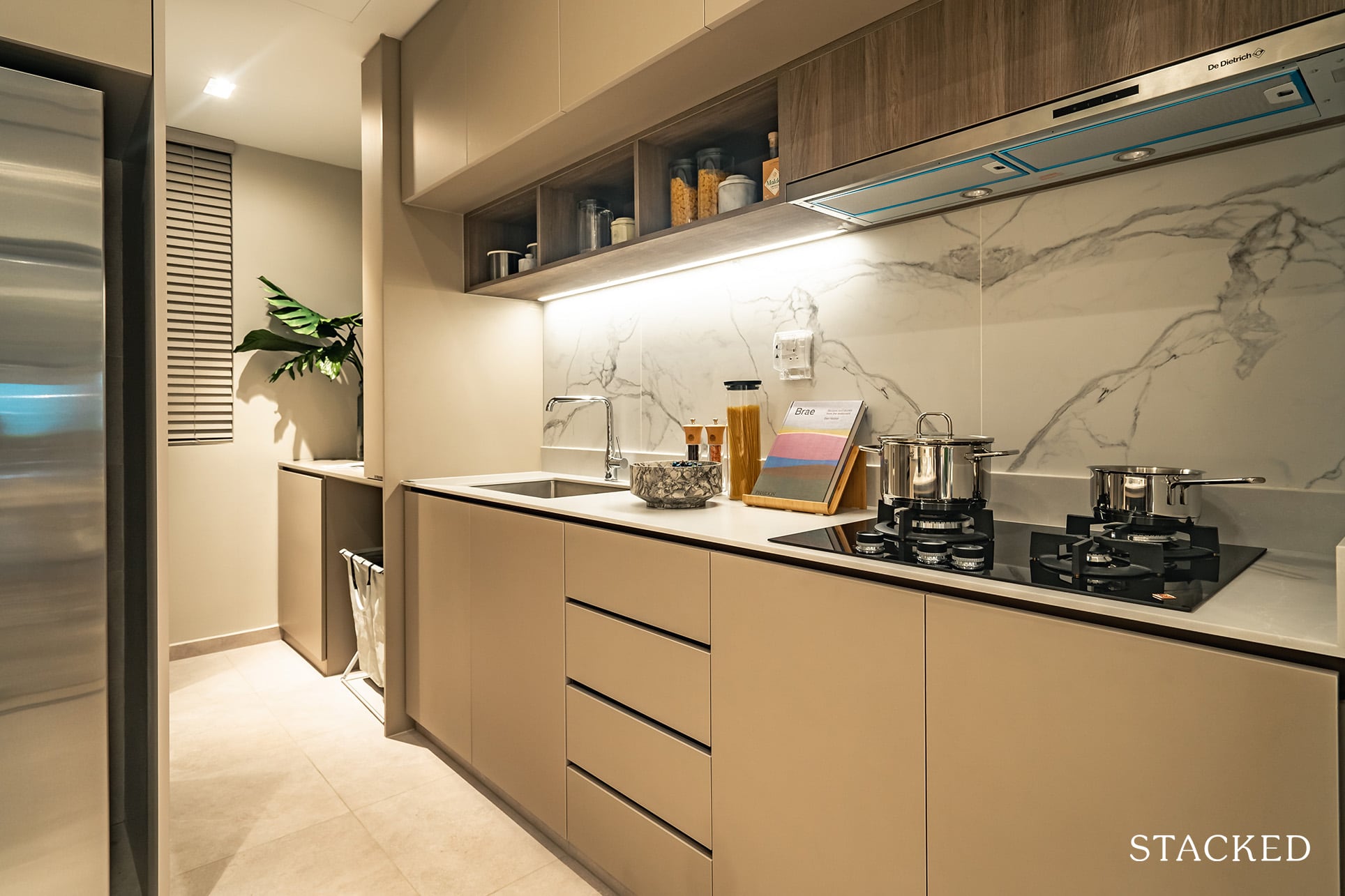
So with the inclusion of the kitchen island, countertop space is definitely generous here. Kitchen hoarders would also be happy to see the additional useful shelving here.
The yard is actually just beyond, and it frankly isn’t a very big space. The cabinetry you see there is currently ID works, which I would emulate as I find the additional shelves useful.
Note that it isn’t an outdoor space, so you’d still have to resort to the balcony if you need to dry your clothes.
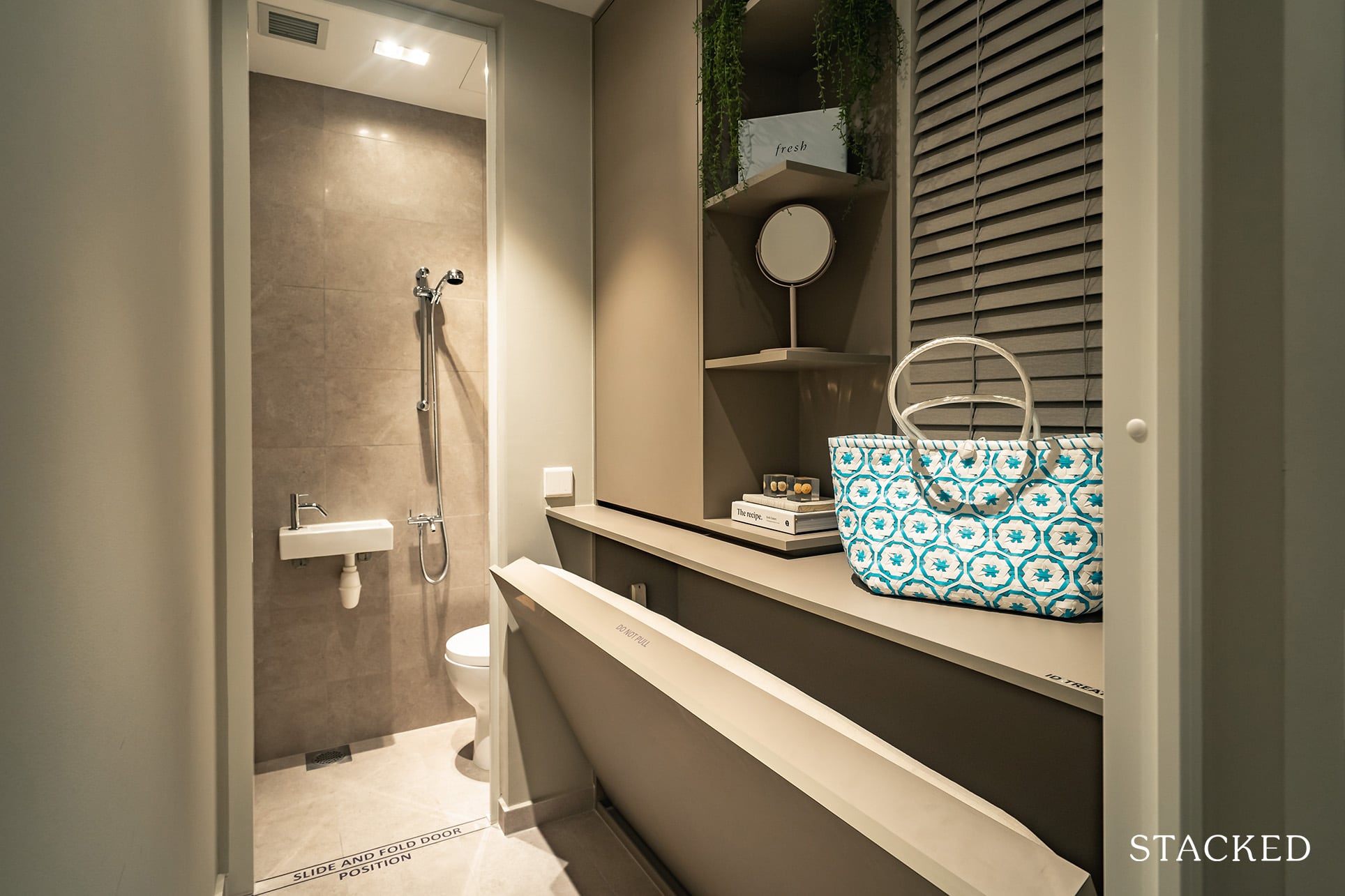
The unit also comes with a utility room (plus a WC), which I think in most cases would be used as a helper’s room. It does have a window here too, which is great for ventilation and additional light.
And finally for those who enjoy a bit of privacy with their cooking, the addition of the sliding glass kitchen door also goes a long way in reducing sounds, smells and oil leakovers into the main dining area.
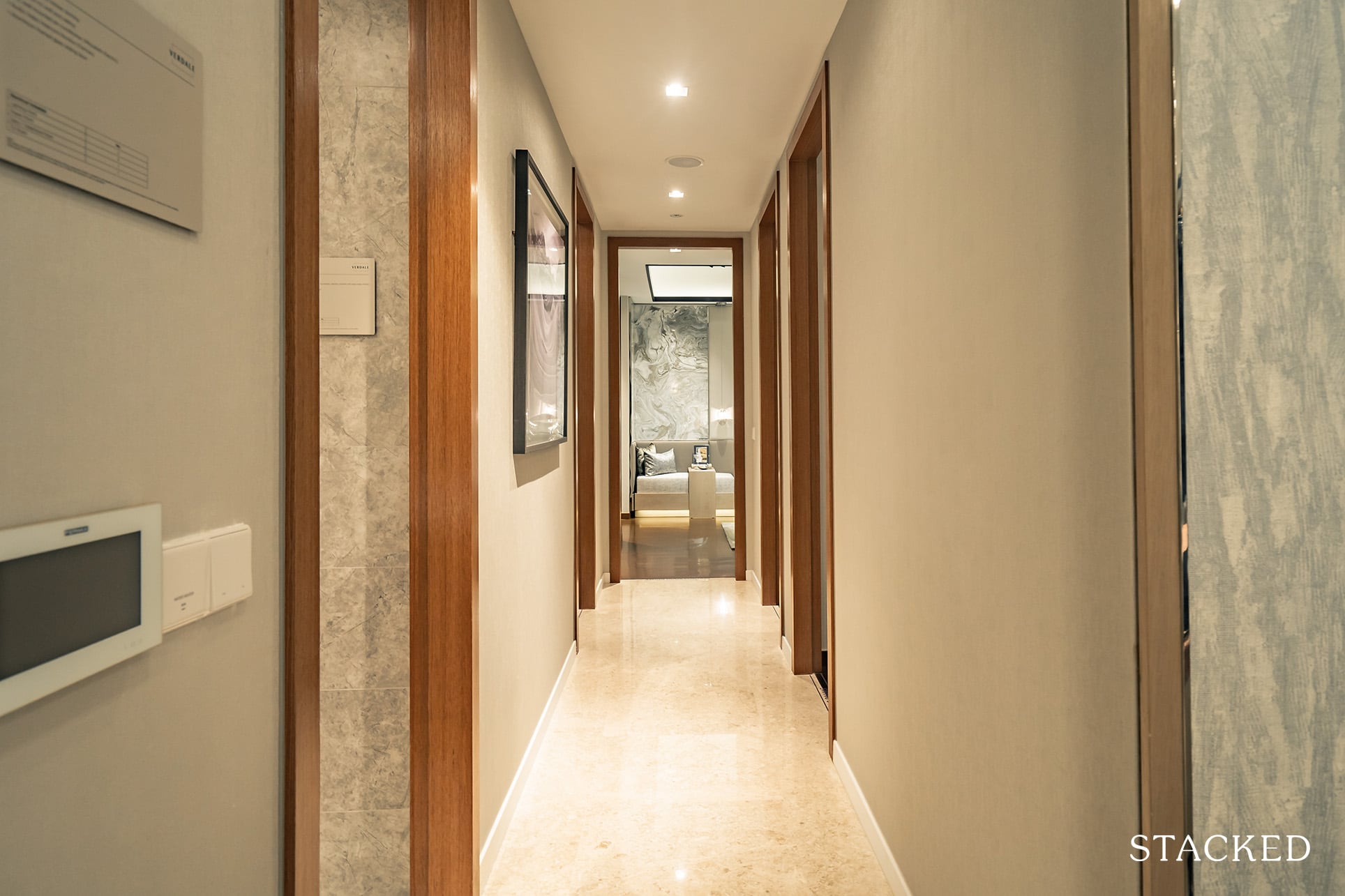
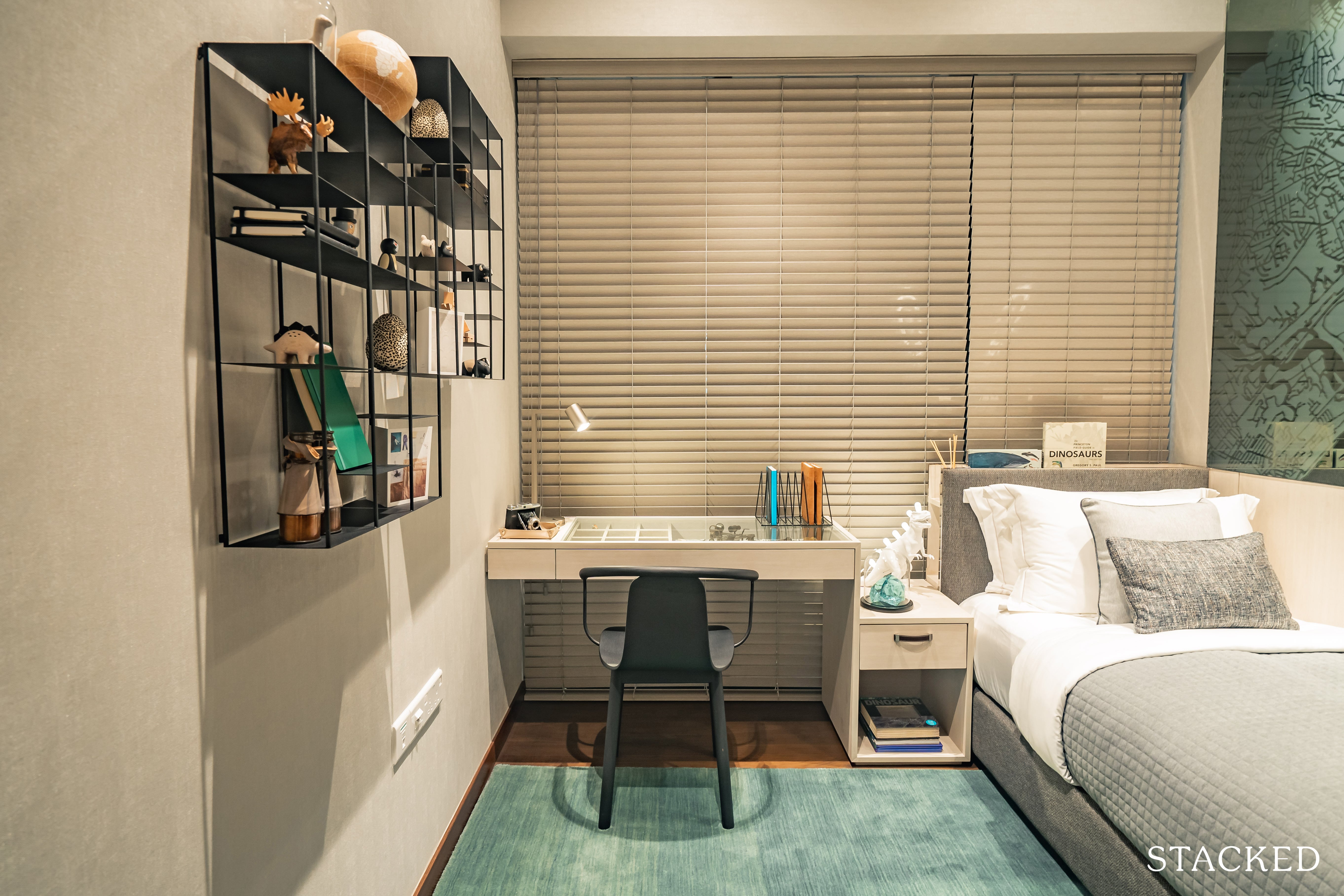
Both common bedrooms are of the same size. It’s quite standard fare here, but it does show off a good example of a possible layout if you were to include a single bed.
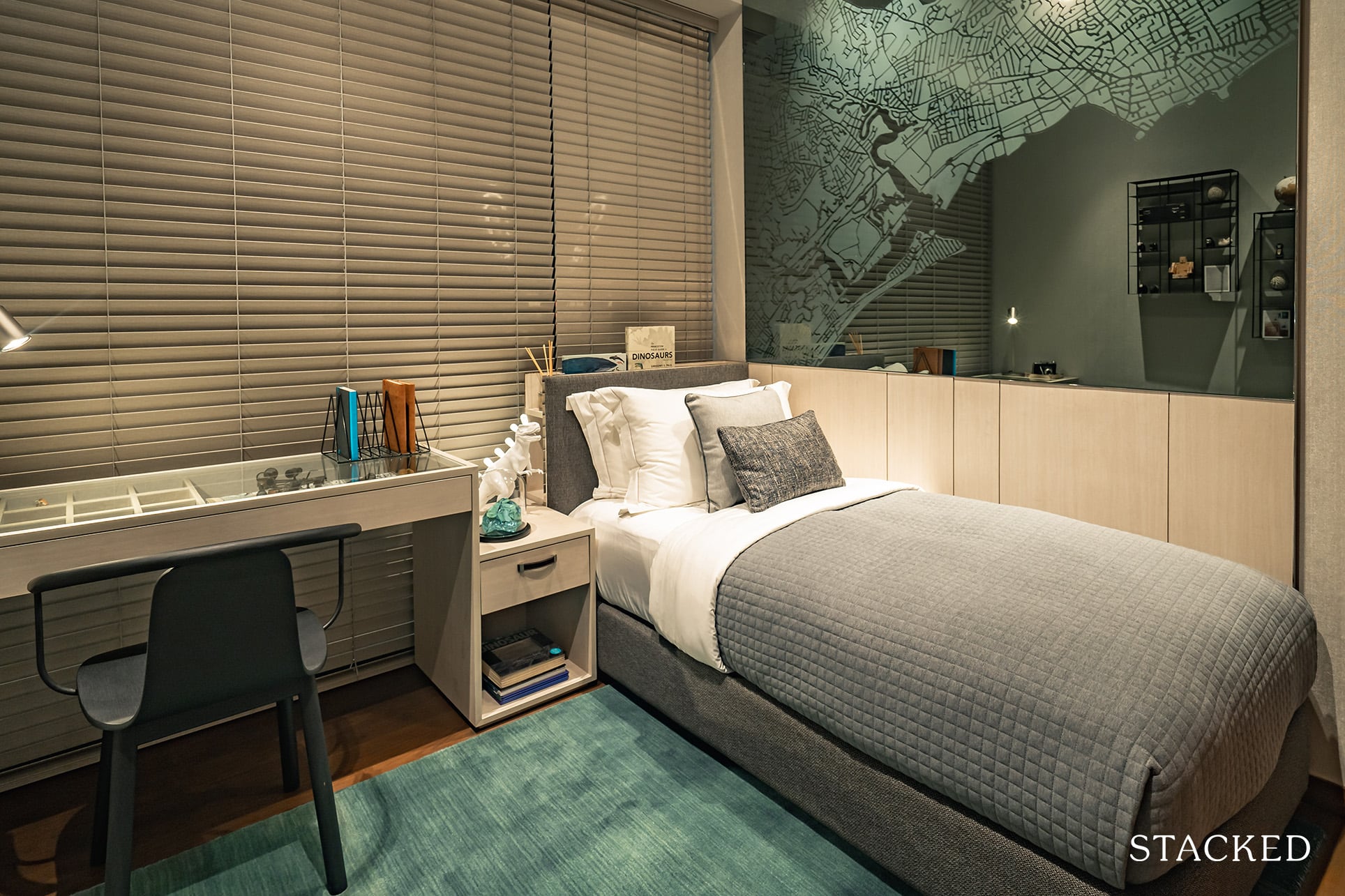
The lack of clutter, and the optimisation of the single bed such that it’s perpendicular and not parallel to the wardrobe works like a charm for me – and naturally, having that study table next to it just makes perfect sense.
Although some people might not like that it blocks off the full length windows here.
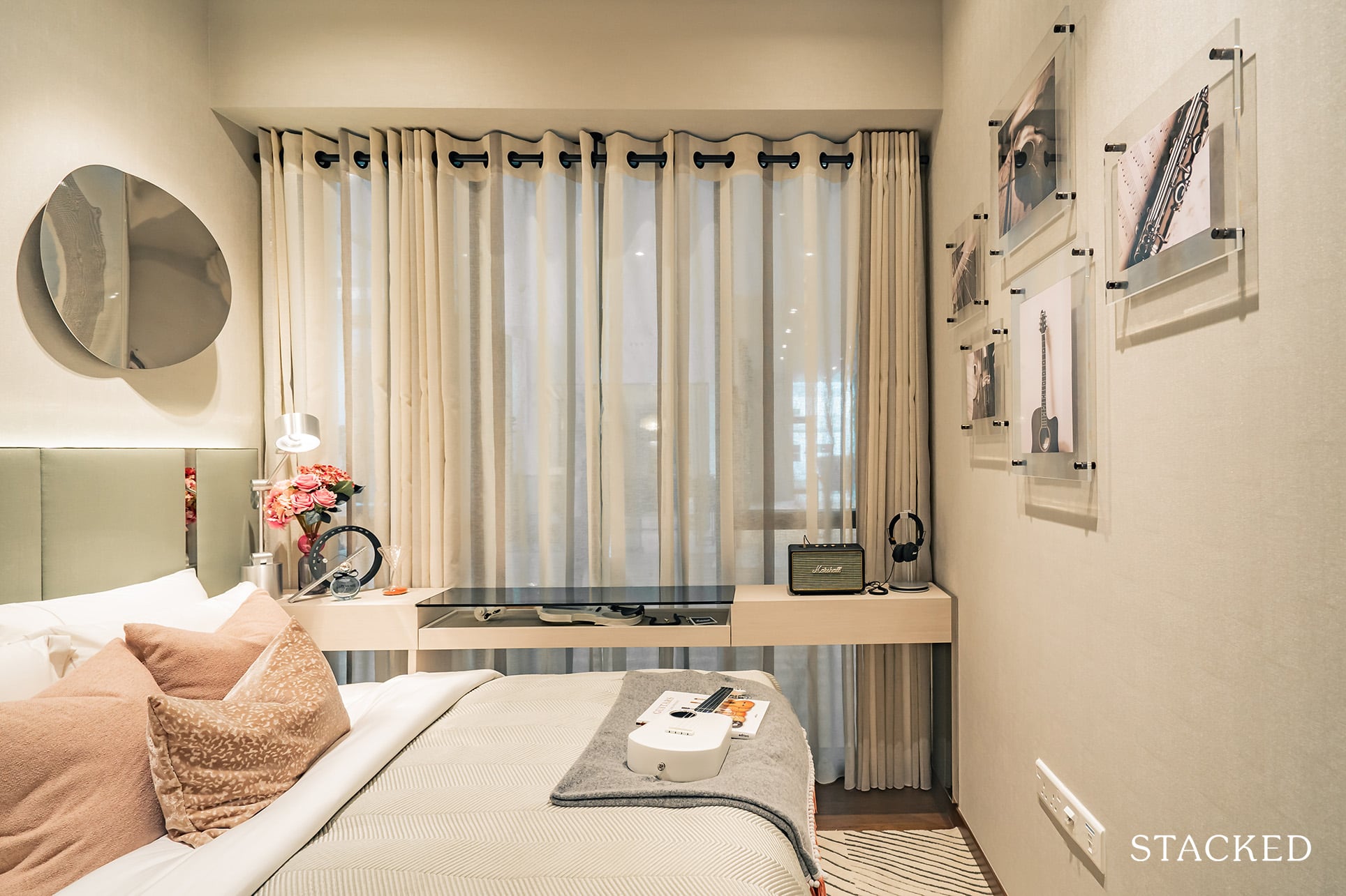
Moving on to the next common room, we see the alternate example if we were to include a queen-sized bed in here.
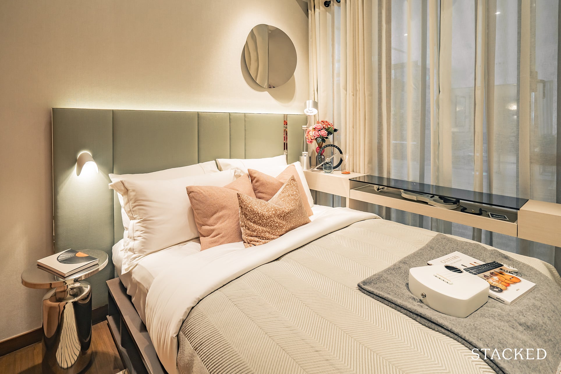
You do have some space for 2 bedside lamps/tables, but there really isn’t space for much else. Perhaps you could include a little study-sill area (as the IDs have done here), but it’s still quite a squeeze when you consider wardrobe accessibility on the other end.
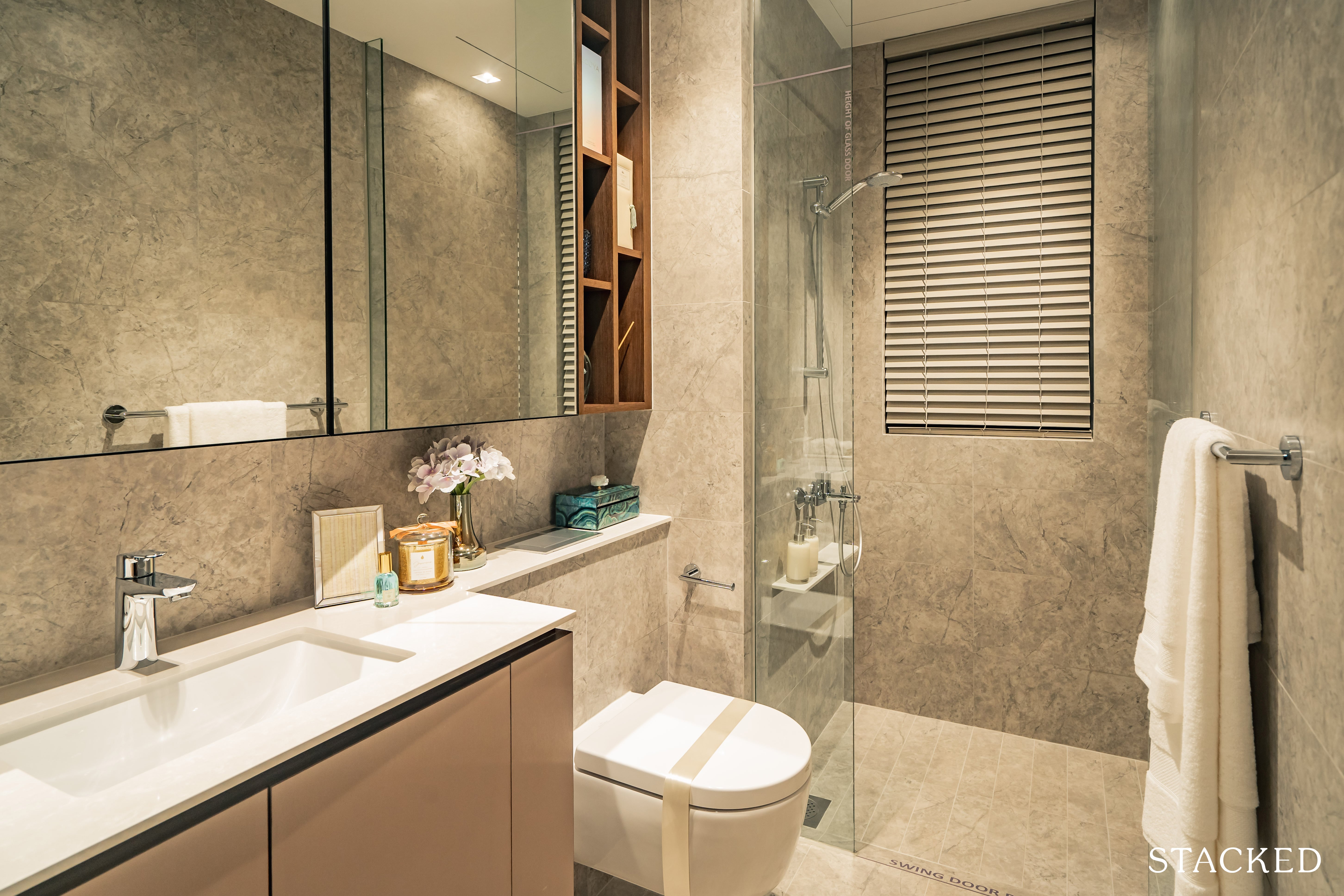
The common bathroom is a decent size, with the usual fittings from Grohe.
I would say that it isn’t the best placement for common bedroom 3, as it is a bit of a distance. Then again, some might say this is really just a first world problem.
The best layout for me usually would be the common bathroom placed between both common bedrooms in a jack-and-jill layout as this lets both bedrooms be an ensuite effectively.
But of course, that would mean that the junior master bathroom would have to adopt the same layout too – to allow for guests visiting to have a bathroom to use.
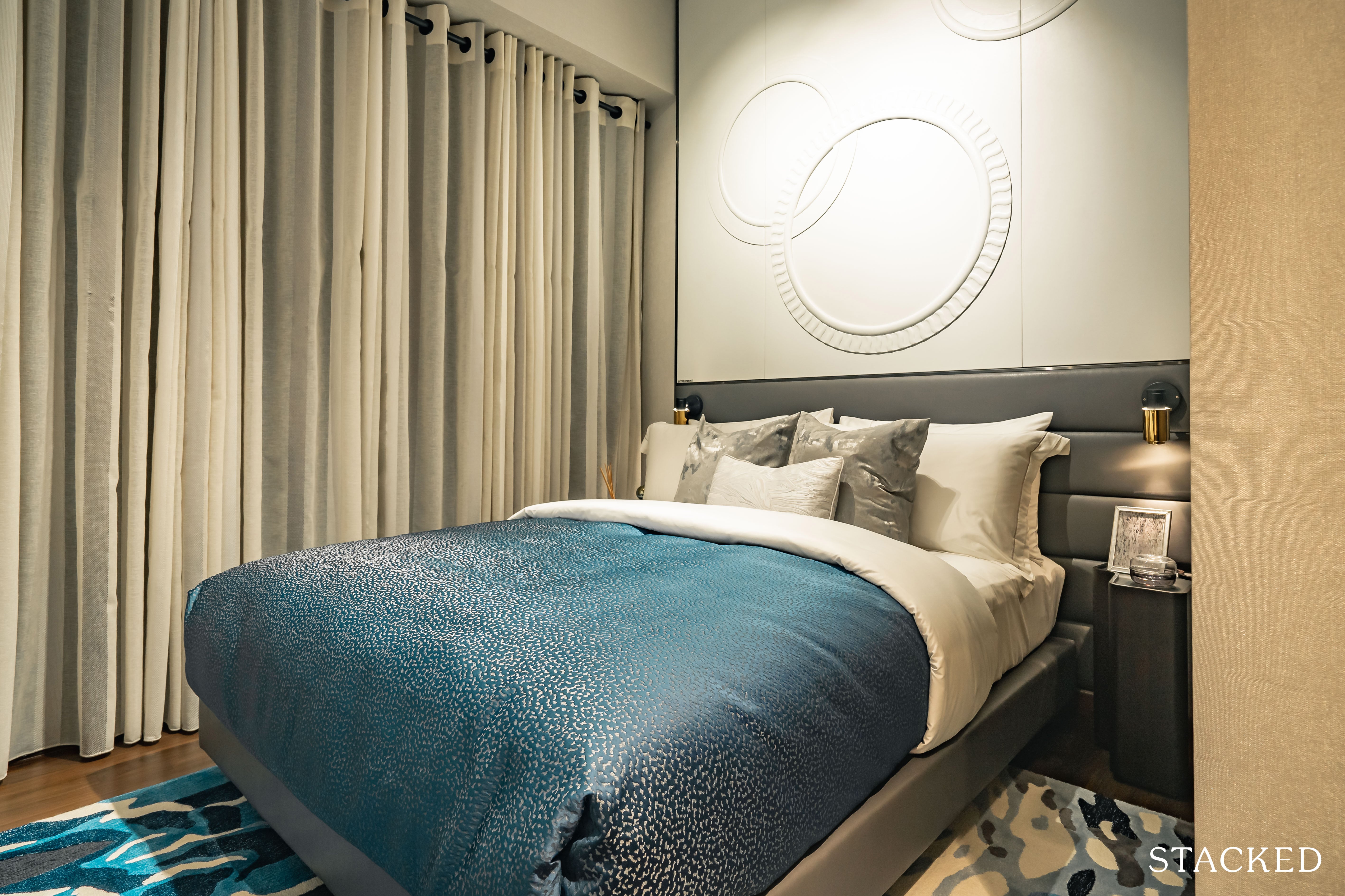
As for the junior master bedroom, it is a relatively similar size to the previous two rooms, with the ability to squeeze in a queen sized bed here and some small bedside amenities.
Storage is the usual 2-panel wardrobe so I won’t touch any more on that.
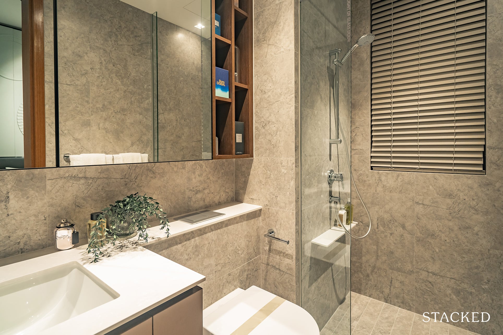
The junior master bathroom is the same size as the common bathroom and it also features the same compressed quartz shower ledge in the shower area for your usual cleanliness kits. In other words, you’ll be hard pressed to find any differences between the two.
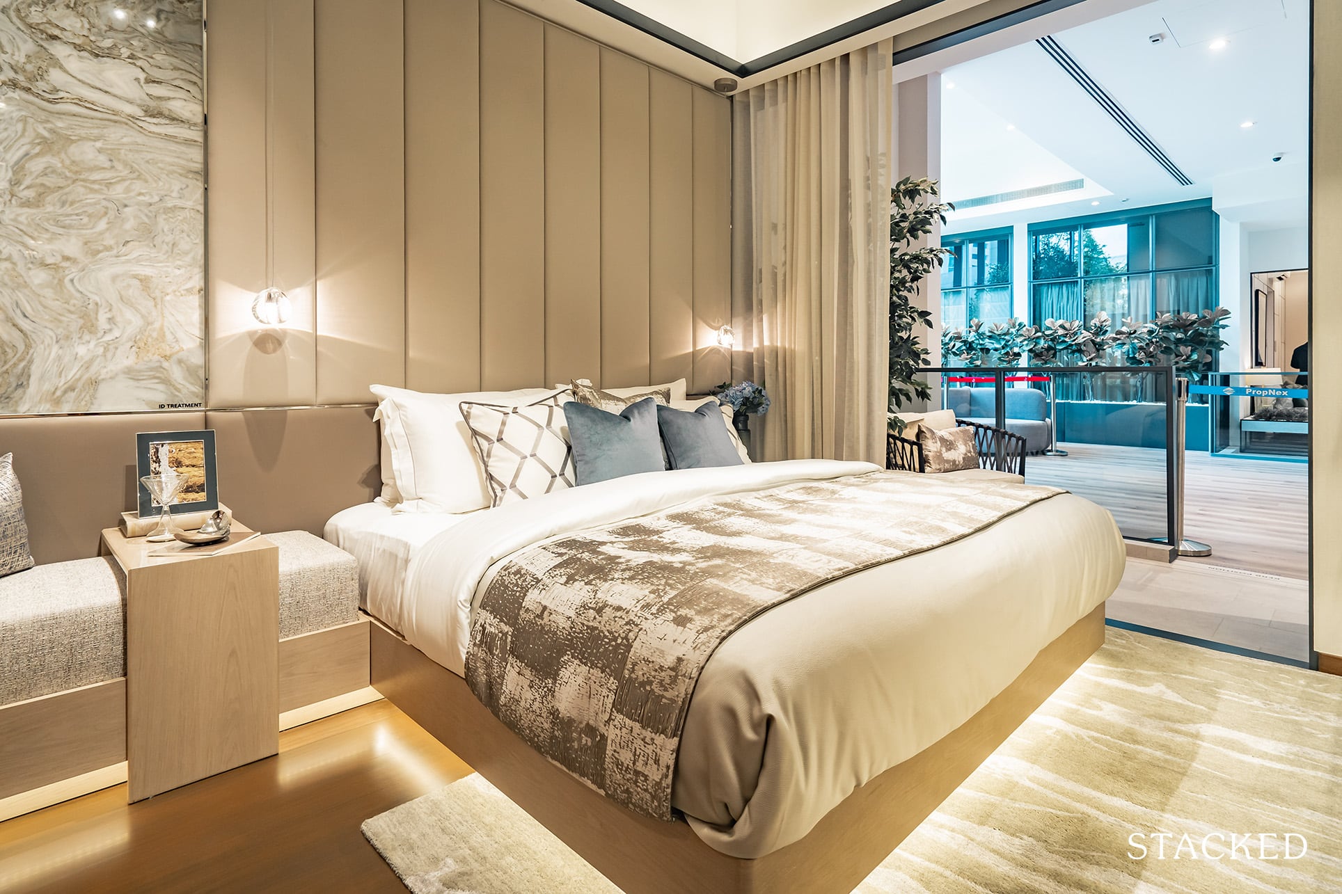
Our final room for today brings us to the 4-bedder’s master bedroom. From the get-go you can see that it’s quite well-sized with the IDs even finding a way to include a sitting area parallel to the king bed and its bedside tabletops.
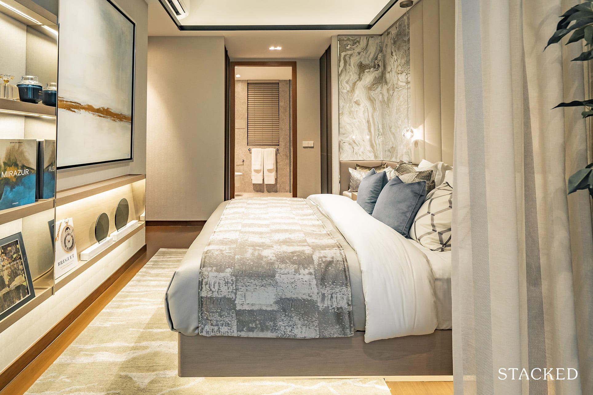
I like that there is also decent space to walk around the room.
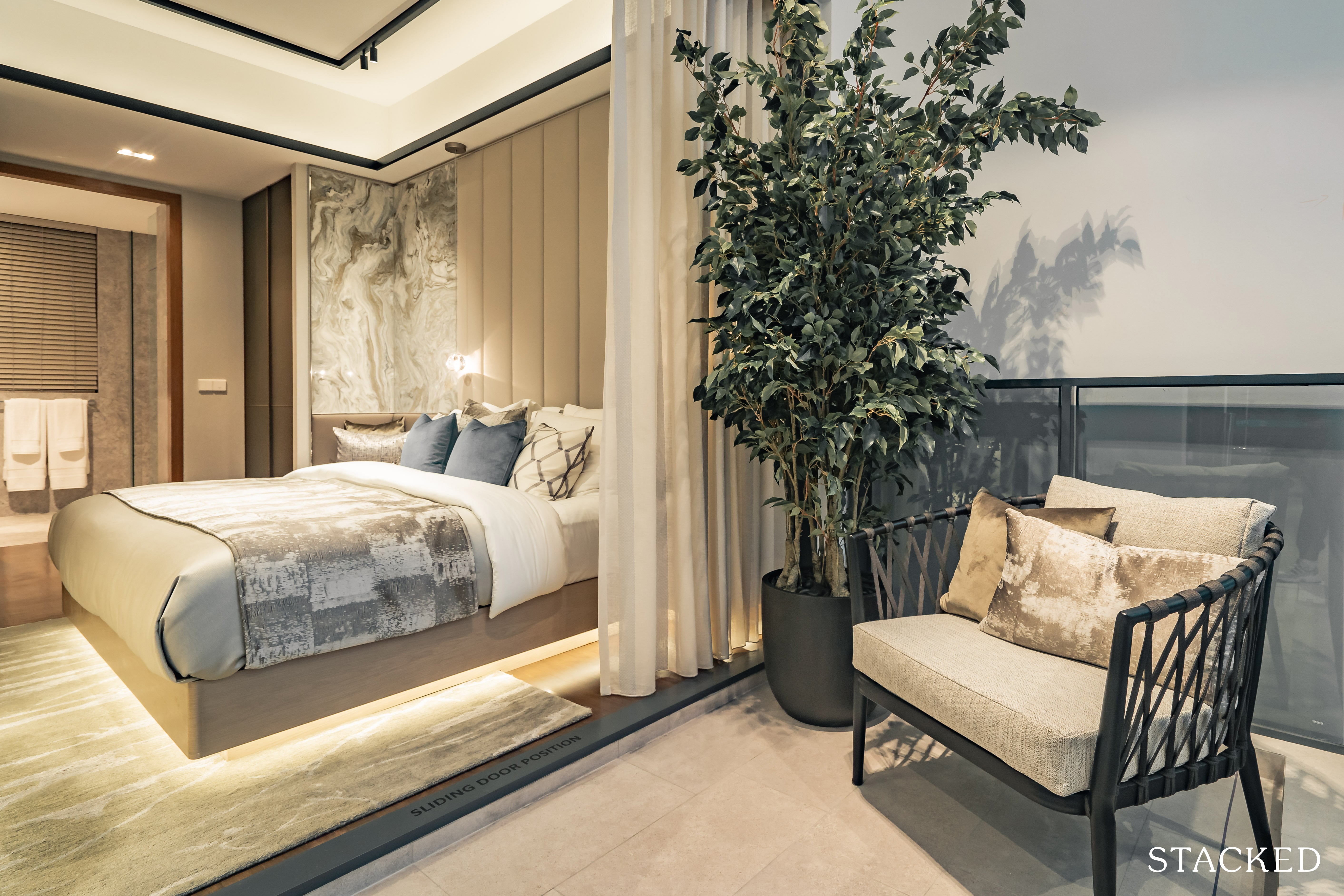
The master bedroom also comes with a balcony, which I do think is appropriate here given the current green surroundings around the Verdale.
It isn’t the biggest of spaces, but if you look at the ID here, you’ll notice that it’s big enough for a lounge chair or two, as well as a coffee table in between.
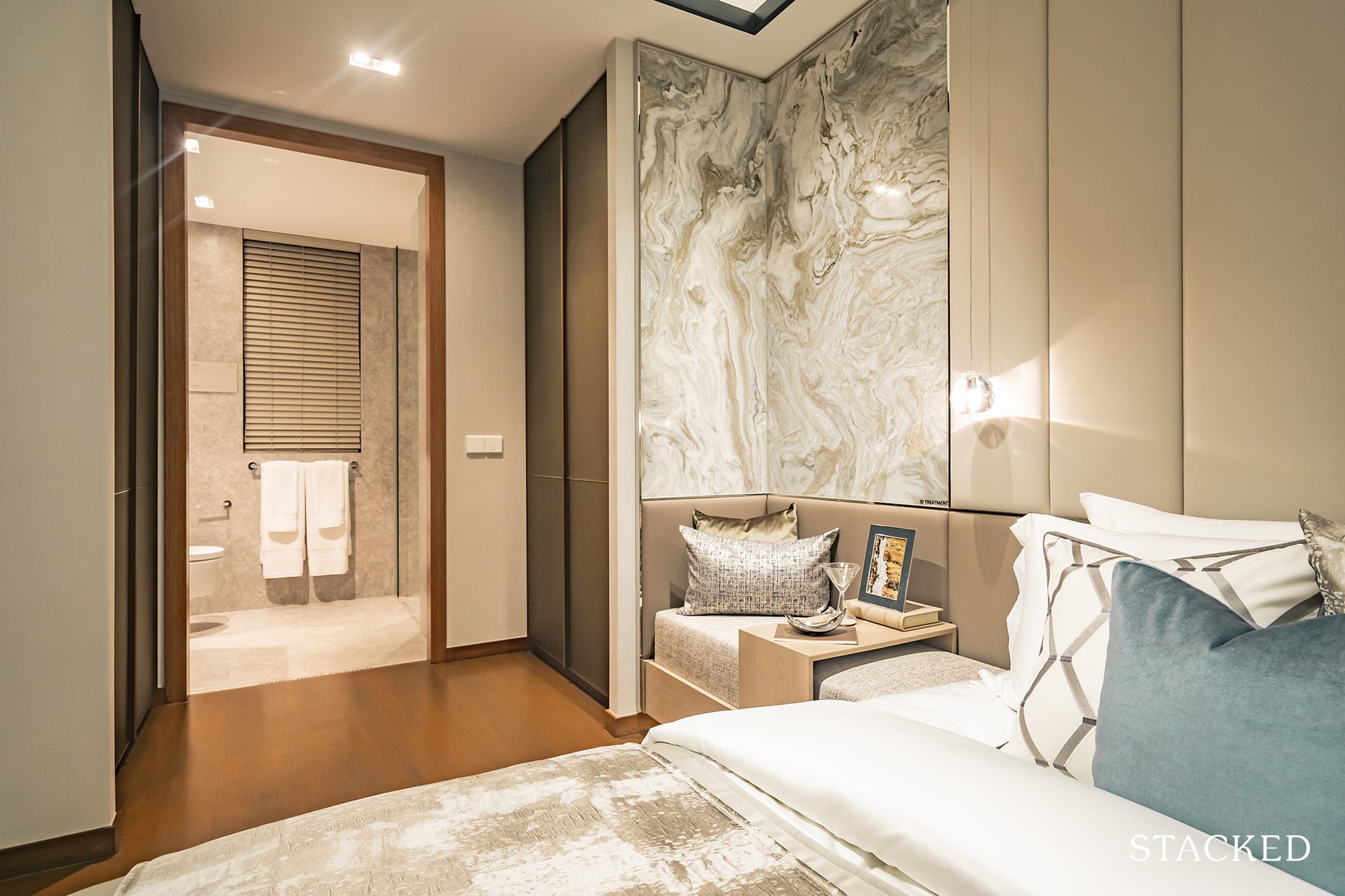
What is quite unique about the layout of the master bedroom is the wardrobe space – I guess you could almost describe it as a walk-in wardrobe.
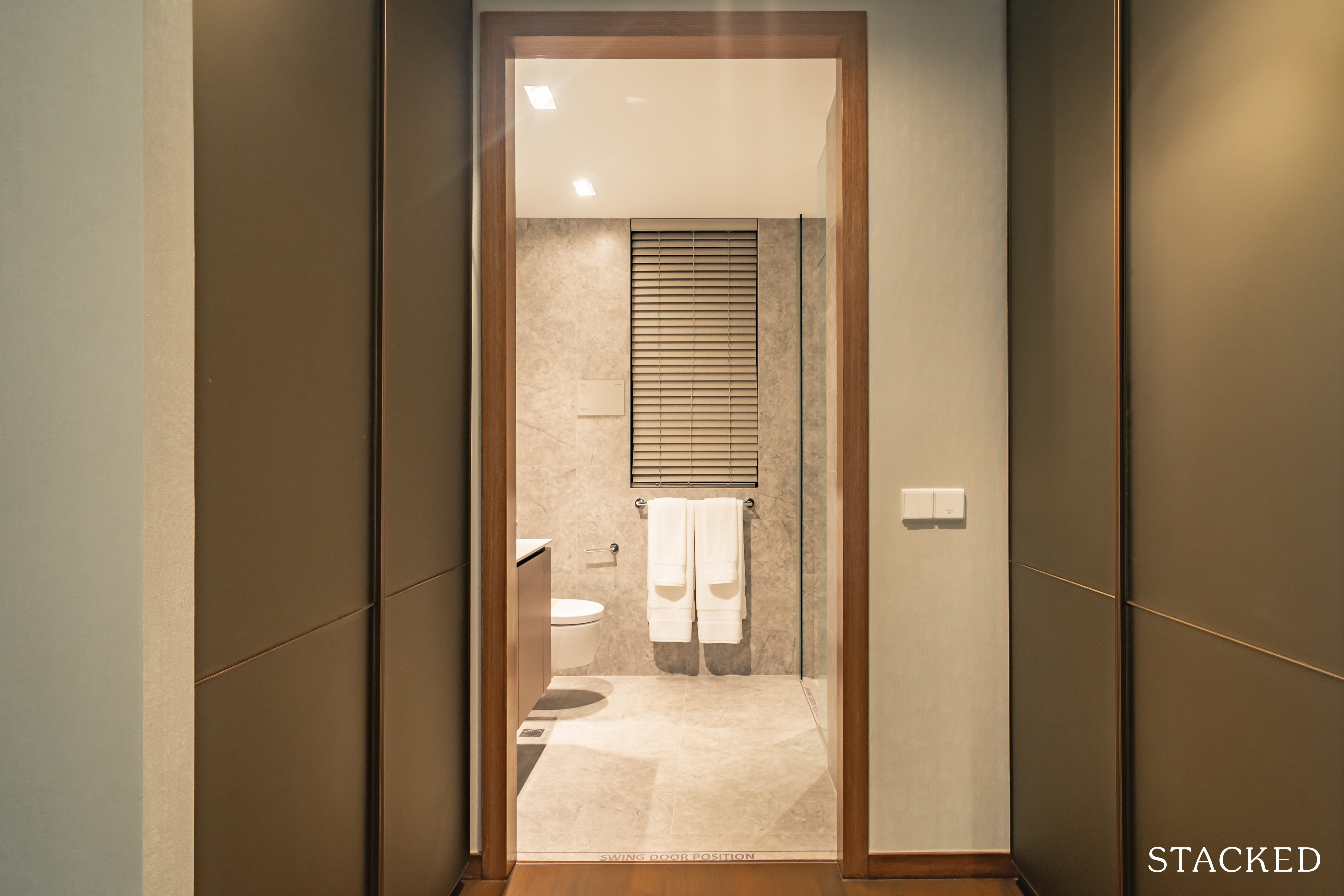
The additional space is nevertheless something that most people would appreciate. Plus, you could even look at it as a his and hers wardrobe layout, which would keep everything neatly segregated.
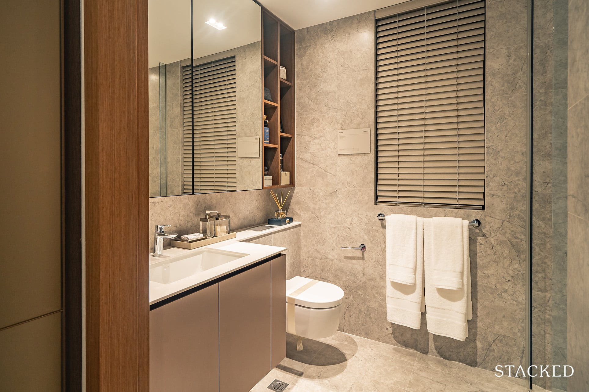
While the master bedroom has been a positive one so far, the master bathroom is a bit of a letdown.
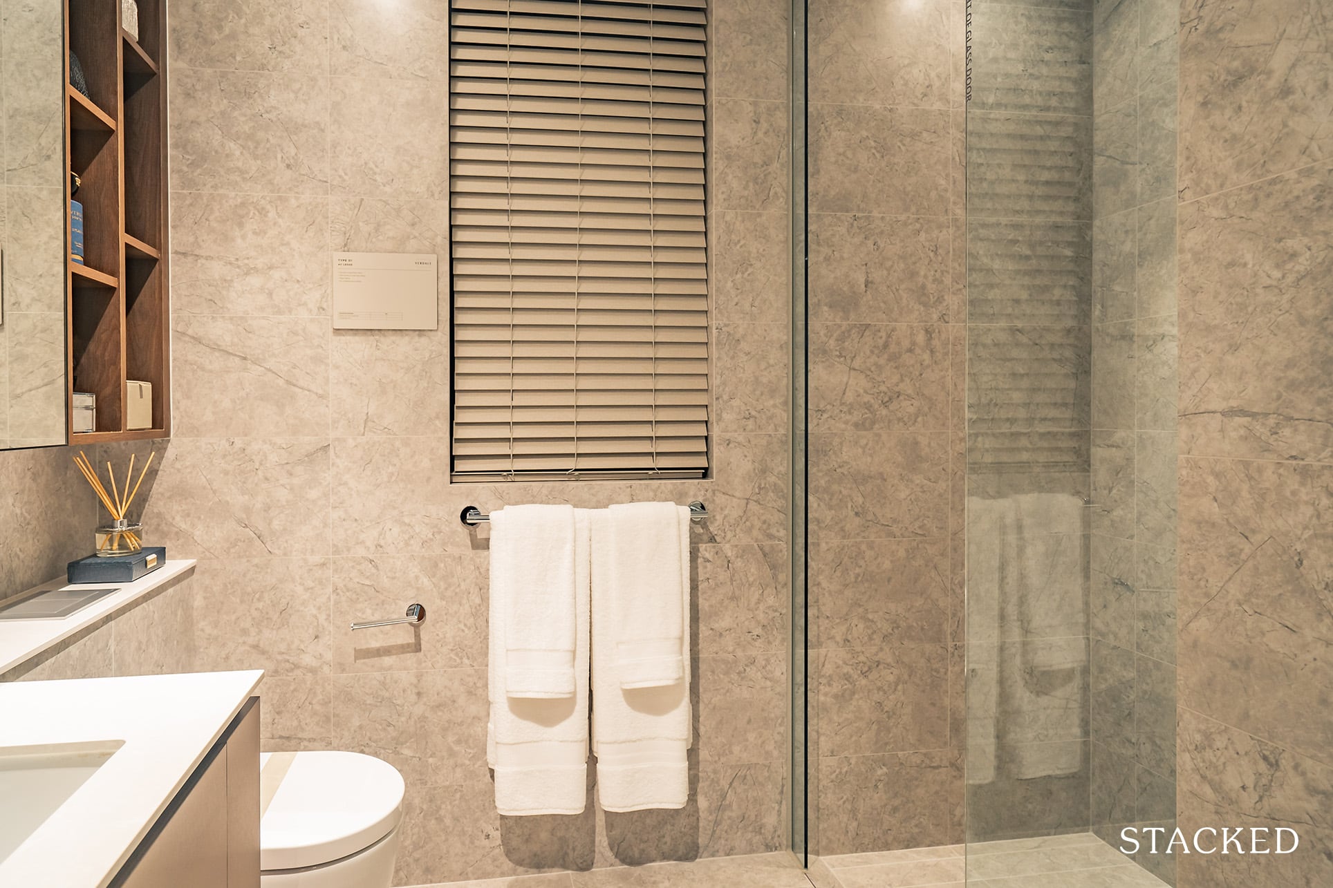
I mean, no one would be expecting to see a bathtub in here, but space wise it is on the small side. Plus there aren’t really any bells and whistles here to really set itself apart as the master bathroom.
Verdale Location Review
Herein lies the biggest obstacle for anyone looking at the Verdale – it doesn’t have a great immediate location.
Set along Jalan Jurong Kechil, the condo is admittedly a little way away from the Beauty World MRT station and its surrounding amenities.
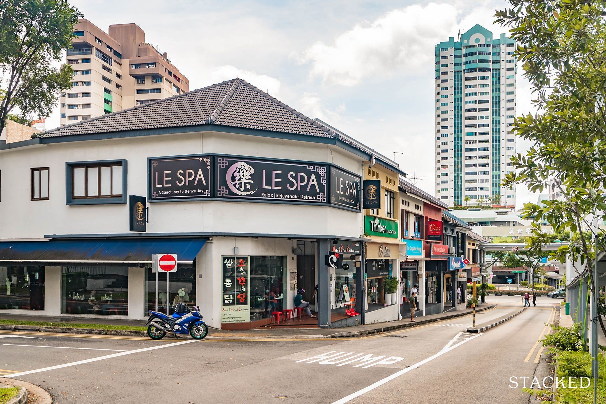
If you depend a lot on the MRT, I would definitely say that there are better more convenient options to pick from.
So where does that leave the appeal of its location? Well, it is in a quieter spot and for the current near future, besides the neighbouring Hillford, it is surrounded by unbuilt residential plots. Which does provide an open expanse living not commonly found elsewhere.
On a wider scale though, Verdale is located in a highly anticipated ‘revamp area’ (District 21) – so that’s always cause for cheer. We’ll cover that in greater detail a little later in the analysis.
Public Transport
| Bus Station | Buses Serviced | Distance From Condo (& Est. Walking Time) |
| ‘Aft Bt Batok East Ave 6’ | 61, 66, 66B, 157, 174, 970, 985 | 270m, 3-min walk |
| ‘Ppis Bt Batok’ | 178, 852 | 600m, 8-min walk |
| ‘Bt Regency’ (Along Upper Bukit Timah Road) | 67, 75, 170, 170A, 73, 184, 852, 961, 961M | 1km, 12-min walk |
Closest MRT: Beauty World MRT – 1.2km, 14-min walk
While we’re looking at the grander scheme of things, Verdale does have a rather serene immediate location – which is perfect for retirees or those who have a car.
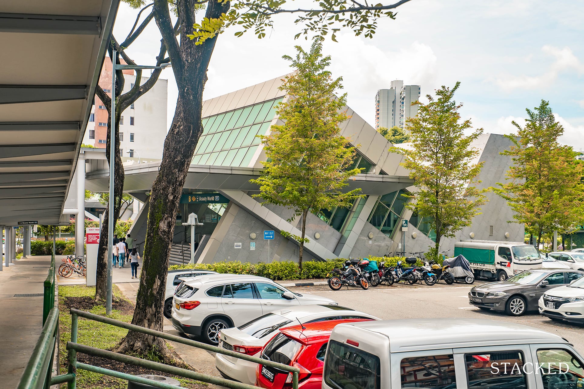
Unfortunately for those who have to go about their daily commutes, what that means is that the Beauty World MRT station is quite a distance from the condo by foot. Further considering a lack of sheltered pathways here, it makes more sense to hop onto one of the following 5 buses at the ‘Jln Jurong Kechil’ bus station. The good news? There will be a covered linkway to the bus stop.
These buses include 157, 174, 66, 970 and 985.
As for those heading into town (ie. Orchard), hop aboard the 174 at the same station. It’ll take you straight there in just over half an hour.
Finally, those heading into the CBD (Raffles Place) will find that it does take a while to get there. As of now, the fastest route is to take bus 157 at the same station to the Sixth Avenue MRT station (11mins, 10 stops) before boarding the train there to Raffles Place MRT (21 mins, 11 stops).
The total journey takes just under an hour.
Private Transport
| Key Destinations | Distance From Condo (& Est. Peak Hour Drive Time) |
| CBD (Raffles Place) | 17.9km, 28-min drive |
| Orchard Road | 12.2km, 22-min drive |
| Suntec City | 18.1km, 25-min drive |
| Changi Airport | 26.9km, 31-min drive |
| Tuas Port (By 2040) | 30.3km, 40-min drive |
| Paya Lebar Quarters/Airbase (By 2030) | 17.1km, 25-min drive |
| Mediapolis (and surroundings) | 11km, 20-min drive |
| Mapletree Business City | 12.7km, 25-min drive |
| Tuas Checkpoint | 20km, 25-min drive |
| Woodlands Checkpoint | 14.6km, 20-min drive |
| Jurong Cluster (JCube) | 5.7km, 15-min drive |
| Woodlands Cluster (Causeway Point) | 18.1km, 30-min drive |
| HarbourFront Cluster (Vivo City) | 15.7km, 25-min drive |
| Punggol Cluster (Waterway Point) | 25.7km, 33-min drive |
*Note that Drive Times are calculated during Peak Hours
Immediate Road Exit(s): Singular exit/entry at De Souza Avenue.
Summary: If you were to hop onto google street view, you’d notice that it’s literally a one laned road at this point so I’m sure that there could be plans to expand the road in the near future. It leads out to the duo-laned Jln Jurong Kechil, from which it takes about 6 minutes to reach Dunearn Road and the subsequent educational institutes that line the area.
Groceries
| Name of Grocery Shop | Distance From Condo (& Est. Walk Time) |
| FairPrice Xpress – 213 Upper Bukit Timah Estate | 1.6km, 5-min walk |
| FairPrice – Bukit Batok East | 2.3km, 7-min drive |
| Cold Storage – Sime Darby | 2.8km, 8-min drive |
Schools
| Educational Tier | Number of Institutes |
| Preschool (within 1km walk) | 2 |
| Primary (3km-drive) | 6 |
| Secondary (3km-drive) | 3 |
| International School (3km-drive) | 2 |
| Junior College (5km-drive) | 0 |
| University (5km-drive) | 2 |
| Polytechnic (10km-drive) | 2 |
Additional Pointers
- Greenery Abounds
Equipped with forest pods and a plethora of nature-themed facilities, The Verdale isn’t just a green project from the inside out.
One look at its surroundings and you’d notice how much greenery there truly is in the area. In fact, if you were to hop onto Google Earth, you’d notice a solid stretch of forest area right in the backyard of the condo.
As if that wasn’t enough, we also find that the Bukit Batok Nature Park (where the revered WWII Bukit Batok War Memorial is currently housed), the Bukit Timah Nature Reserve, as well as the entire rail corridor is just a stone’s throw away from the Verdale!
- Plenty of Leisure Opportunities
More than the occasional hiking/jogging nature routes, there are actually a ton of recreational activities to partake in this side of Singapore.
From visiting the Dairy Farm (bound to be a hit with the kids), to exploring Rail Mall (6-min drive from Verdale), to living it up at the Grandstand (think axe-throwing, futsal etc.), there are plenty of things to do in the area.
For those who love the putting greens, there are also a number of country clubs in the vicinity thanks to the luscious greens and abounding land in the region.
- Plenty of Opportunity for Redevelopment
Come to think of it, I could have saved this for the appreciation analysis portion, but I figured that since it’s such a prominent factor, I might as well talk about it here as well.
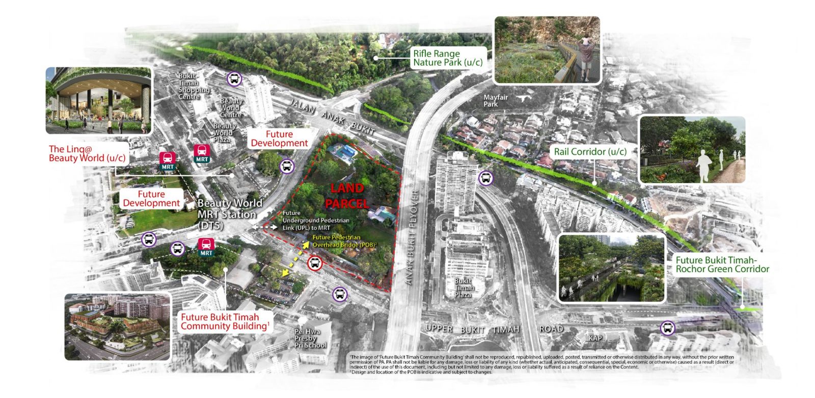
The ITH (Integrated Transport Hub) is definitely a major addition to the Beauty World area of District 21 in the coming years in tandem with the Bukit Timah Community Club/Building.
For those who are relatively new to the ITH term, it’s essentially a fully air-conditioned bus interchange with an all-in-one linkage between commercial shops as well as the MRT line.
More than that, you might have noticed a number of reserve sites in the area. There are plenty of areas here which are still underdeveloped and in that regard, there is still more potential here at D21 that is yet to be fulfilled.
Verdale Development Site Review
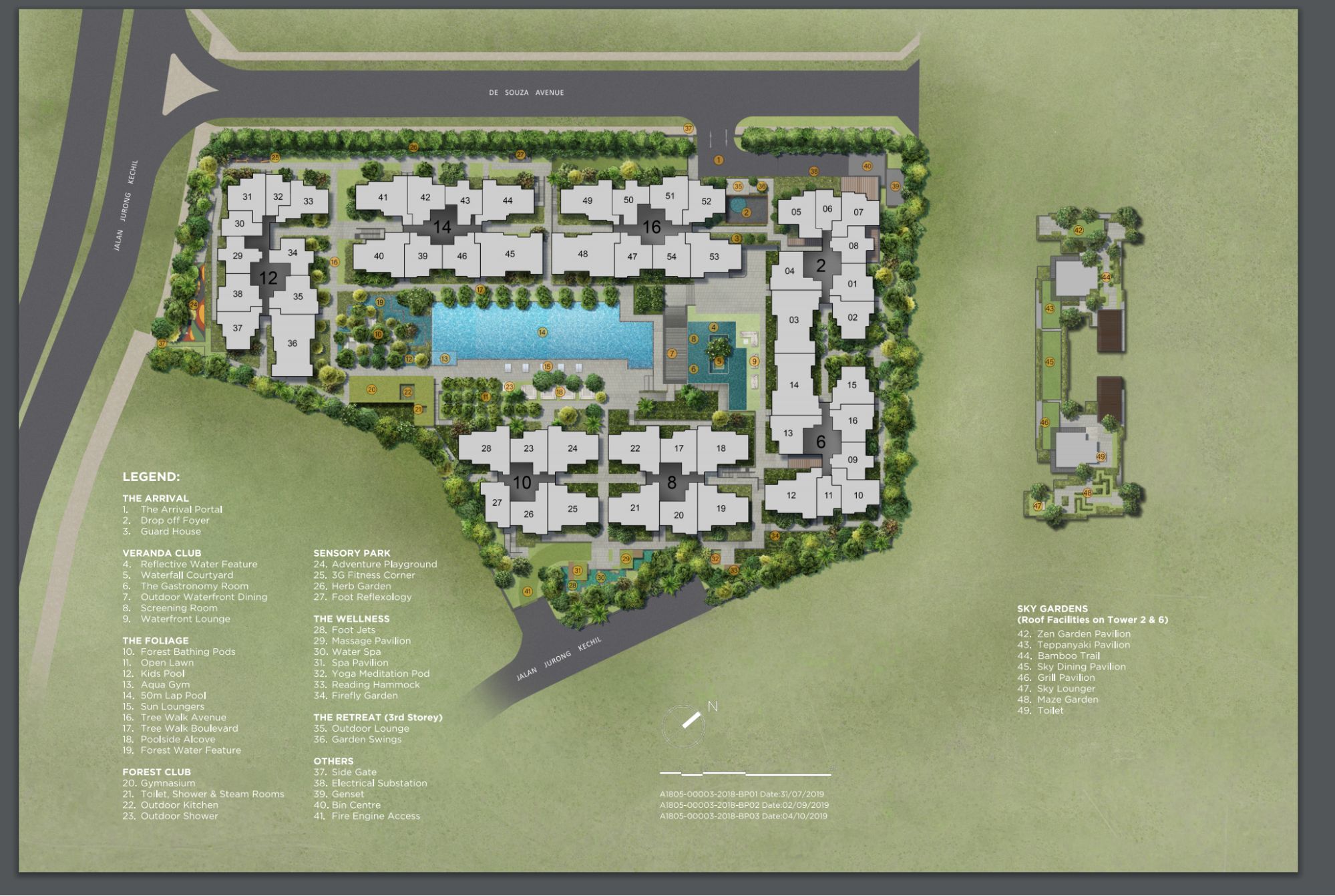
| 24/7 Security | Clubhouse | Screening Room |
| Outdoor Dining | Dining Room | Waterfront Lounge |
| Open Lawn | Kids Pool | Aqua Gym |
| 50M Lap Pool | Sun loungers | Gym |
| Shower Room | Steam Room | Outdoor Kitchen |
| Outdoor shower | Playground | Outdoor Fitness Corner |
| Garden | Water Spa | Reading hammock |
| Yoga Meditation Area | Outdoor Lounge | Swings |
As far as I’m concerned, I do think that the general layout is pretty well planned and thought out. And while it doesn’t have an extensive list of facilities (the tennis court is a notable exception), the facilities that it does offer is well executed.
The rooftop dining pavilions, outdoor waterfront dining and forest dining pods (along with the swimming pools) are all facilities that I feel people attracted to greenery and nature would be concerned about.
The inner courtyard layout would always have its fair share of supporters and detractors, but it does allow for some privacy from any outsiders peering in. Given the low lying nature of the surrounding areas as well, barring any major revision to the plot ratios around, you’d probably never have to face the issue of a taller neighbour peering into your compound.
Last but not least, the abundance of water and greenery-related amenities here does mean that a ton of maintenance (including the weekly fumigation) would be required to keep the place looking spick and span a number of years down the road.
Best Stacks
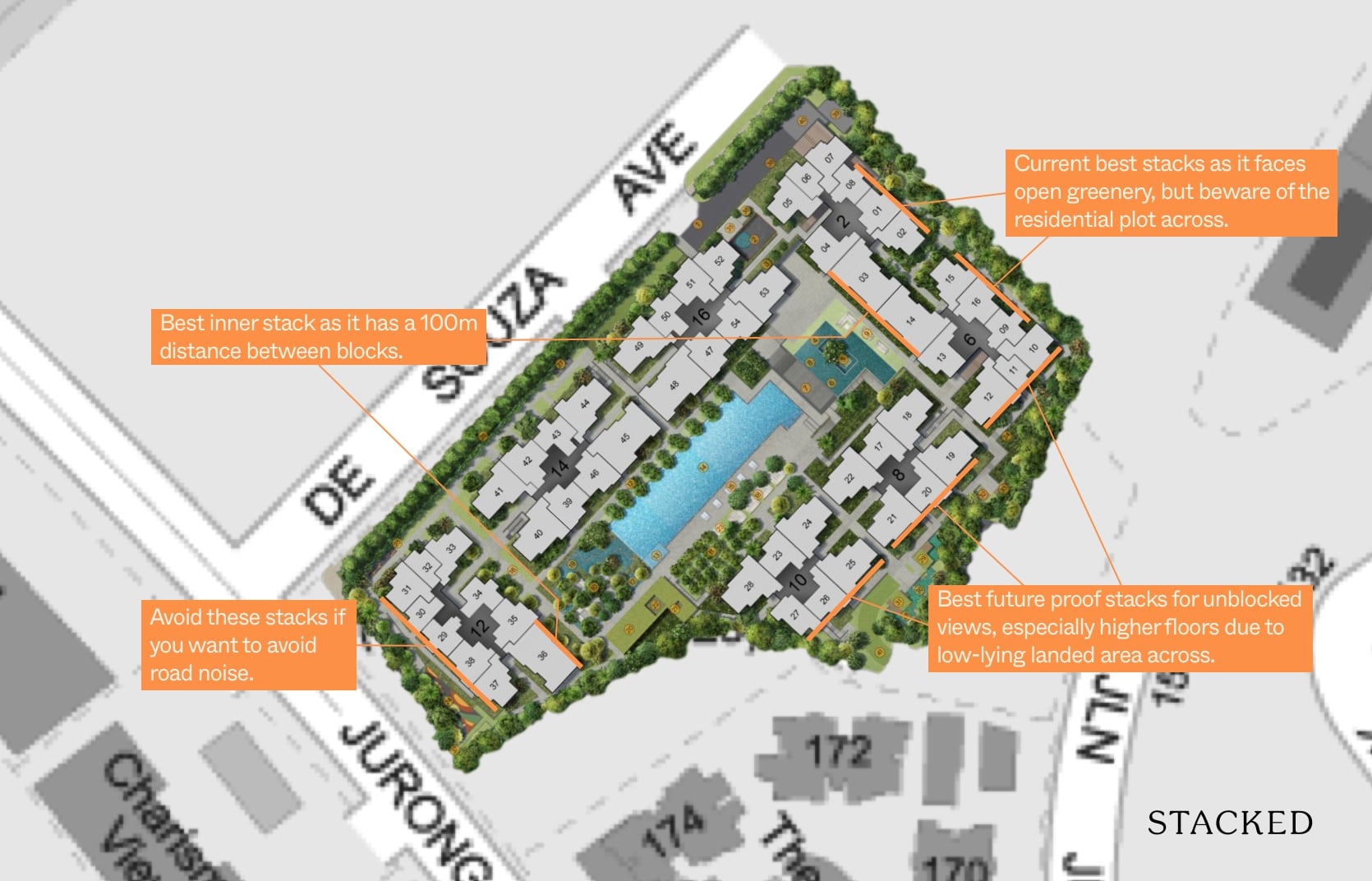
The good thing here is that there aren’t many blocks that are facing the main road. If you are sensitive to road noise, Stacks 31, 30, 29, 38, and 37 are the ones to avoid for sure.
That said, if you are planning to utilise the bus stop pretty often, these stacks could also be worth a consideration if just to save a bit of walking time.
In terms of current best stacks, 9, 16, 15, 2, 1, and 8 will be my pick of the bunch as these do face open greenery. Of course, these are slated as residential plots so there’s no telling how long you’d actually be able to enjoy the open view before being hampered by future developments.
To be safe, the best future-proof best stacks would probably be 10, 11, 12, 19, 20, 21, 25, 26, 27 as these all face landed properties and if you are purchasing a high enough floor you should be guaranteed an unblocked view towards the landed area.
Last but not least, Stacks 31, 32, 33, 41, 42, 43, 44, 49, 50, 51, 52, 5, 6, and 7 all have the direct NW sun so just be wary of that.
For inner facing stacks, naturally 36, 3, and 14 will be the obvious picks given the more than 100m distance between the blocks. Of course, these stacks are reserved for those looking at the bigger 4 bedroom units.
Afternoon sun movement analysis
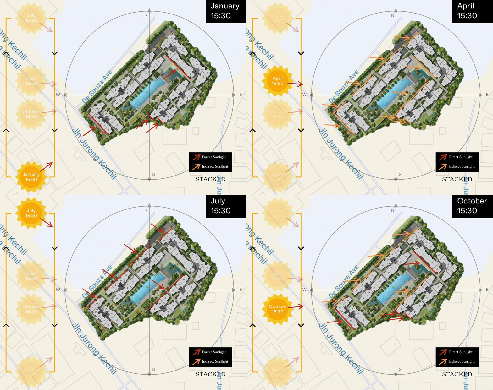
Stacks having the NW Orientation (31, 32, 33, 41, 32, 43, 44, 49, 50, 51, 52, 05, 06, 07) face the most afternoon sun in the year. Stacks 01, 02, 08, 15, 16, 09, 10, 11, 12, 19, 20, 21, 25 and 26 has no afternoon sun given their NW and ES direction. In fact, residents in these stacks can expect a good amount of morning sun given it is large unblocked.
Unit Mix
| Unit Type | No. Of Units | Size of Units (sqft) |
| 1-Bedroom | 18 | 463-474 |
| 1-Bedroom + Study | 5 | 560-570 |
| 2-Bedroom | 33 | 614 |
| 2-Bedroom Deluxe | 114 | 700-753 |
| 3-Bedroom | 15 | 947 |
| 3-Bedroom Deluxe | 39 | 1,001 – 1,033 |
| 4-Bedroom | 22 | 1,410 |
| 4-Bedroom + Family Duplex Penthouse | 9 | 1,518 – 1,528 |
| 5-Bedroom + Study Duplex Penthouse | 3 | 1,873 |
To date, I haven’t seen many condos which have fulfilled every single unit-tier, ranging from the 1-bedders to the 5-bedders. Certainly not many that are low-rise, exclusively-sized, and situated in the D21 area.
The thing that really piqued my interest though was the variation of unit-types here.
In other words, while potential residents here might seem like they are spoilt for choice, the truth is that they have to be quick about their purchase decisions mainly because the number units are spread so thin in each tier.
Price Review
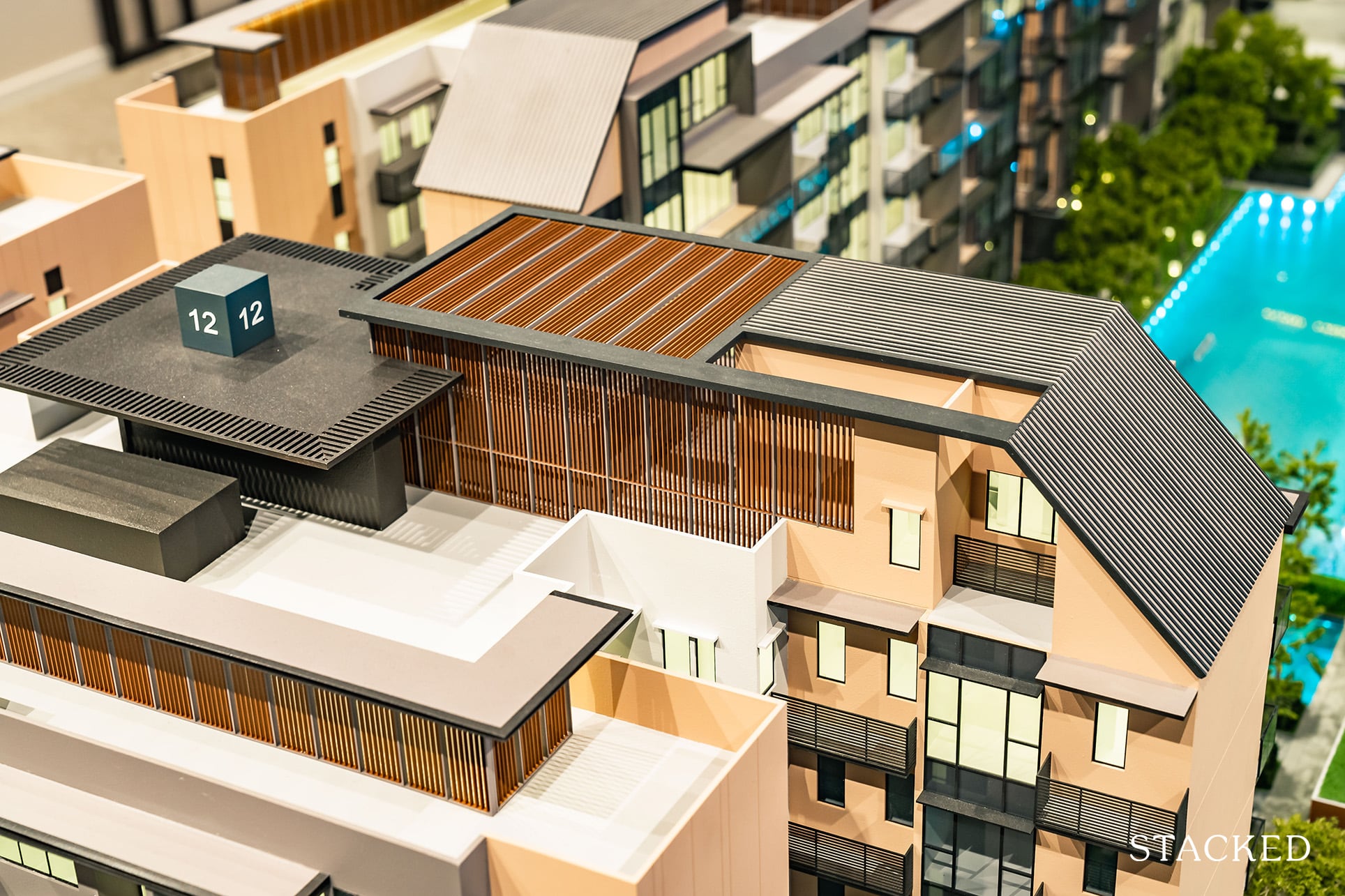
Given Verdale’s immediate location, as well as the 3 other New Launches that are rising up in the District, I’ve decidedly drawn up two tables.
The first, comparing it to its immediate resale neighbours, and the second, to the aforementioned 3 new launches.
| Project Name | Tenure | TOP | Average Price (PSF) |
| Verdale | 99-year leasehold | 2023/2024 | Min. $1,627 psf |
| Grand Chateau | Freehold | 1996 | $1,050 psf |
| Sherwood Condominium | Freehold | 1998 | $1,058 psf |
| Charisma View | Freehold | 2002 | $1,081 psf |
| The Hillford | 60-years from 2013 | 2016 | $1,133 psf |
If you were to look at the surrounding condos around Verdale, you’d notice that all of them are rather matured with the exception of The Hillford.
Interestingly enough, both The Hillford and Verdale are leasehold developments with relatively less spacious units when compared to the other older, freehold projects.
To give some context, I’m going to present some recent 2-bedroom unit sales in these developments:
A 2-bedroom unit at Sherwood Condominium (926 square feet) was recently sold at $1,091 psf, equating to just over $1m.
As for Charisma View, a 1,066 square foot, 2-bedroom unit was also recently sold at $1,159 psf, equating to a whopping $1.2m+.
Regarding The Hillford, we just saw a 506 square foot, 2-bedroom unit moving hands for $1,162 psf, equating to approx. $588,000.
And as for a 614 square foot, 2-bedroom unit at Verdale, it is currently going for approximately $998,000 – or in other words, $1,625psf.
(We left out Grand Chateau as we couldn’t find any recent 2-bedroom sales here).
Based on this, we see that the most affordable option is actually The Hillford. Though with its short lease, it might not be the most viable for investors.
The older developments do have a chance at en bloc down the road, so that’s another factor worth considering.
All in all, Verdale holds a more ‘affordable’ quantum when compared to its older, freehold neighbours – though that naturally comes with a compromise in unit space.
Another question surfaces as well. Will the Verdale be able to maintain its price points once the initial novelty of the place wears off? It’s a hard one.
Given the relatively dismal immediate location, it would bank very much on the end-quality, subsequent maintenance of the project and surrounding land redevelopments that we will discuss in greater detail in a bit.
| Project Name | Tenure | TOP | Average Price (PSF) |
| Verdale | 99-year leasehold | 2023/2024 | Min. $1,627 psf |
| Daintree | 99-year leasehold | 2022 | $1,684 psf |
| View @ Kismis | 99-year leasehold | 2023 | $1,700 psf |
| Forrett At Bukit Timah | Freehold | 2024 | $1,880 psf |
This is where things begin to get interesting.
For those with relatively deep pockets looking at moving into D21, you must be wondering, ‘which of these 4 New Launches are really worth their weight in gold?’
Afterall, we’ve seen how top-tiered developments have fallen in recent times.
Of course, it really depends on your preferences. Are you looking at it solely from an appreciation standpoint? Are you a homeowner that craves extreme convenience? Or perhaps a homeowner that requires extreme serenity?
The preferences are unending – but there are always a few main areas of analysis that fit most concerns.
Let’s zone in on the quantum values.
Matt recently gave us a really in depth look at pricings between Forrett at Bukit Timah versure Daintree and View @ Kismis. You can view that here.
As a result, I’m not going to go too in-depth into the figure analysis, but I’ll list the pricing table of the 1-bedders out for you here:
| 1-Bedder from: | Size (sqft) | Price (PSF) | Quantum (Starting from) |
| Verdale | 463 sqft | $1,708psf | $791,000 |
| Forett at Bukit Timah | 474 sqft | $1,790psf | $848,000 |
| Daintree Residence | 538 sqft | $1,704psf | $916,900 |
Clearly, Verdale is priced at the lowest but it is expected because of its location is the furthest away from amenities and transport.
And as there aren’t any 1-bedders at View at Kismis, here’s a comparison for the three bedders.
| 3-Bedder from: | Size (sqft) | Price (PSF) | Total Quantum | Distance to MRT Station | Tenure |
| Verdale | 947 sqft | $1,584psf | $1,500,000 | 1.2km, 14-min walk | 99-year leasehold |
| Daintree Residence | 1,001 sqft | $1,719psf | $1,720,450 | 600m, 7-min walk | 99-year leasehold |
| Forrett at Bukit Timah | 947 sqft | $1,783psf | $1,689,000 | 850m, 10-min walk | Freehold |
| View @ Kismis | 893 sqft | $1,611 | $1,439,000 | 1.1km, 13-min walk | 99-year leasehold |
If you are looking at 3 bedroom units, the price difference does get quite significant between its competitors. View @ Kismis does enjoy the lowest quantum, but at under 900 square feet it is quite a big size constraint for a 3 bedroom unit.
Prices for Verdale
Price Breakdown (1st Property)
| 1-Bedroom | 2-Bedroom | 2-Bedroom Deluxe | 3-Bedroom | 4-Bedroom | |
| Price | $791,000 | $998,000 | $1,100,000 | $1,500,000 | $2,400,000 |
| 25% Down Payment | $197,750 | $249,500 | $275,000 | $375,000 | $600,000 |
| Additional Costs | |||||
| Buyer Stamp Duty | $18,330 | $24,540 | $28,600 | $44,600 | $80,600 |
| Legal Fees | $2,500 | $2,500 | $2,500 | $2,500 | $2,500 |
| Valuation Fees | $300 | $300 | $300 | $300 | $300 |
| Stamping Fees | $500 | $500 | $500 | $500 | $500 |
| Total Price | $812,630 | $1,025,840 | $1,131,900 | $1,547,900 | $2,483,900 |
| Initial Investment Amount | $219,380 | $277,340 | $306,900 | $422,900 | $683,900 |
| Return on Investment | |||||
| Expected Rental Price | $2,133 | $2,763 | $3,195 | $4,262 | $6,345 |
| Rental Yield | 3.15% | 3.23% | 3.39% | 3.30% | 3.07% |
Price (2nd Property)
| 1-Bedroom | 2-Bedroom | 2-Bedroom Deluxe | 3-Bedroom | 4-Bedroom | |
| Cost Without ABSD | $812,630 | $1,025,840 | $1,131,900 | $1,547,900 | $2,483,900 |
| Plus: ABSD (12%) | $94,920 | $119,760 | $132,000 | $180,000 | $288,000 |
| Total Price After ABSD | $907,550 | $1,145,600 | $1,263,900 | $1,727,900 | $2,771,900 |
| Initial Investment Amount | $314,300 | $397,100 | $438,900 | $602,900 | $971,900 |
| Return on Investment | |||||
| Expected Rental Price | $2,133 | $2,763 | $3,195 | $4,262 | $6,345 |
| Rental Yield | 2.82% | 2.89% | 3.03% | 2.96% | 2.75% |
Appreciation Analysis
Sadly, this is the point that Verdale doesn’t seem (keyword: seem) to benefit as much as its Forett at Bukit Timah or Daintree Residence counterparts.
While it has incredible exclusivity/serenity, it just seems like it isn’t close enough to the ‘thick of the action’ where the entire 1 million sqft of mixed-use development revamp is happening (ie. at the Beauty World MRT and its immediate surroundings).
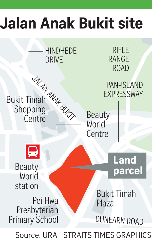
Yes, there will naturally be some ‘bleedover’ effects where we see the entire district prices elevated at some point when the transport hub and surrounding revamps eventually kick in, but to say that it would be an incredible impact, might be a little bit of a stretch.
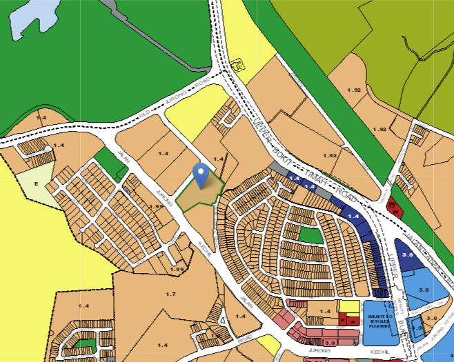
That said, you might have remembered me mentioning the reserved sites earlier on.
Notice their abundance of those guys in the region? Not to mention the plots of land surrounding Verdale (ie. the 1.4 plot ratio pieces) which, while zoned for residential planning, have yet to be released in GLS announcements to date.
Now we wouldn’t know for sure what will come of reserve sites, but the fact that there are already so many residentially-zoned plots in the area could potentially hint at some form of commercial developments coming up in the vicinity in the near future.
And while some might say that Verdale is overpriced from the get-go with the probability of the project depreciating in the years to come – I feel that its biggest potential really comes from all the potential plots of land surrounding the area.
When you further look at it as a whole, it may seem like there is a ton of residential plots available which could point to an oversupply of units in the area.
I do feel however, that there will be future plans to support all the residential units here. Simply put, the Government isn’t that short sighted to overload the area without rythme or reason.
Of course, this goes the same way for the developers as well – there has to be a reason why these plots were snapped up when there is seemingly nothing that major (okay, save for the transport hub) in the near future.
Naturally, this is all said in consideration of a long hold. If you are looking for something short term, it’s best to look elsewhere.
Yes, it might take some time, and yes, it is a 99-year leasehold after all – but, I sincerely believe that by the time the leasehold decay begins to set in, the surrounding plots of land would already have been put to work, and in doing so, presenting an exit opportunity to owners here at some point or another down the road.
(All this barring further governmental/economic/political impacts in the near future and subsequent timelines of course).

Our Take
What we like
- Well thought-out facilities
- Good finishings
- Additional storage space
What we don’t like
- –Long walk to the MRT
Personally, I feel that the Verdale is the most suitable for long-time homeowners looking for a calm and secluded project away from the hustle and bustle of city life.
As said earlier, if you do drive and place serenity and greenery high on your priority list, the Verdale has those qualities. The surroundings, the Bukit Batok nature park and reserve are definitely appealing to those who love nature.
But let’s talk about the elephant in the room – its location.
If you do take the MRT often, I would say that there are certainly better positioned projects out there.
However, here’s the silver lining to its less conducive location. From what we’ve seen today, it’s clear that the developers have put in extra effort to ensure a stand-out project.
From the experience of the contractor, to the well thought-out facilities, and the subsequent finishing quality plus provision of storage spaces, it’s clear that the Verdale is going to be a solid project upon completion.
Developer Notes:
Verdale is jointly developed by COHL Singapore and CSC Land Group.
CSC Land Group is actually a subsidiary of the South Pacific China Construction Co Pte Ltd – which is actually a regional branch of China State Construction Engineering Corporation (CSCEC).
For those wondering why the numerous branches, CSCEC is actually the 3rd largest in the world at just over 60 years old.
Known for their detailed planning, their emphasis on space awareness as well as an empathy to home-living functionality has allowed them the success that they’ve received regarding their previous project, Twin Vew at West Coast Vale.
At launch weekend, a whopping 85% or 442 out of 520 units were sold here, giving testament to the developer’s abilities to engineer a stand-out project.
In the same vein, COHL (or China Overseas Holdings Ltd) is the subsidiary of China State Construction Engineering Corporation. To date, the Corporation is ranked 18th in the Fortune Global 500.
Just like it counterpart, COHL’s mission is to ‘Envision delightful space and create infinite value’ – again, drawing to the the empathy and focus on residential livability.
To date, it has invested in the construction of more than 32 million square metres of social projects and over 1,600km of infrastructure.
It’s without a doubt, that the experienced parent company will take experienced steps to ensure a solid all-round project.
What this means for you
You might like Verdale if you:
-
• Work in the West:
While some might consider the Verdale’s distance from the CBD a bane, those who commute to the West for work/school daily might find the Verdale’s location to be incredible.
-
• Appreciate Flora:
With the incredible stretch of greenery both in and outside the condo, I would think that a majority of nature enthusiasts would enjoy the area.
You might not like Verdale if you:
-
• Crave Immediate Public Transport Convenience:
As we covered earlier, the nearest Beauty World MRT is a solid 14-min walk from the condo. It’s also not the most central station by far so getting anywhere central by train might be a little stretch.
-
• Prefer high-rise views:
The highest floors here belong to the 5th-floor penthouses and bigger units. Unfortunately (or fortunately, depending) that’s the highest view that residents here are going to receive from their units.
End of Review
At Stacked, we like to look beyond the headlines and surface-level numbers, and focus on how things play out in the real world.
If you’d like to discuss how this applies to your own circumstances, you can reach out for a one-to-one consultation here.
And if you simply have a question or want to share a thought, feel free to write to us at stories@stackedhomes.com — we read every message.
Frequently asked questions
What is the location and main features of Verdale condo?
Verdale is located along De Souza Avenue in District 21, near Bukit Timah nature reserve. It features greenery inside and outside, with 258 units on a 153,224 sq ft site, inspired by forest bathing, and offers amenities like a lap pool, rooftop dining, and water features.
What types of units are available at Verdale and what are their sizes?
Verdale offers units ranging from 1 to 5 bedrooms, with the 2-bedroom deluxe units around 753 sq ft. The development has 258 units, with most being 2-bedroom units, and includes some inward-facing units and a few with special features like a study.
What amenities and facilities does Verdale provide for residents?
Verdale includes a 50-meter lap pool, landscaped water courtyard, rooftop BBQ and dining pavilions, a teppanyaki area, zen garden, and lush greenery. It emphasizes a nature theme with water and forest features, but lacks a tennis court and has a playground located by the roadside.
How does Verdale compare to nearby developments in terms of space and exclusivity?
Verdale is relatively small with 258 units on a 153,224 sq ft site, offering about 594 sq ft per unit, which provides a sense of exclusivity. Compared to Forett and Daintree Residence, it has more space per unit than Forett but slightly less than Daintree Residence.
What is the design and architectural style of Verdale?
Verdale features a nature-themed design with a safe, cozy color palette. Its architecture is not glass-heavy or sleek but aligns with its greenery surroundings, emphasizing simplicity and congruence with its environment.
Our Verdict
72%
Overall Rating
Join our Telegram group for instant notifications
Join Now










0 Comments