There’s definitely a lot to love about living near Orchard, but then again, it’s not for everybody. “Orchard was not on our list of neighbourhoods we were considering for our first home,” Y and A (@myjibcode) shared.
She said they originally looked at neighbourhoods like Bukit Timah, Tiong Bahru, Bishan, Redhill, etc., but never entertained the idea of living in Orchard because she felt it’s too busy and commercial.
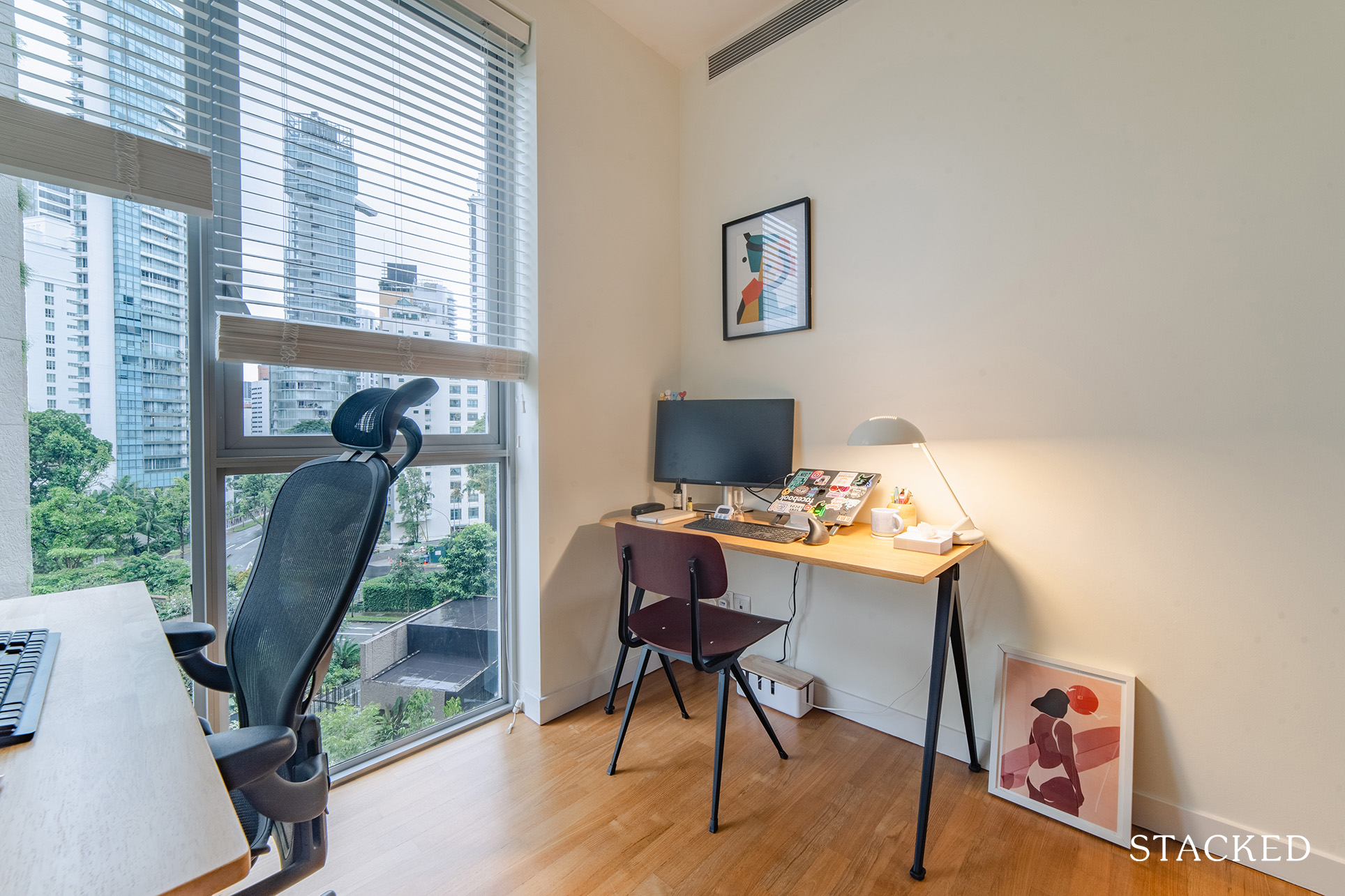
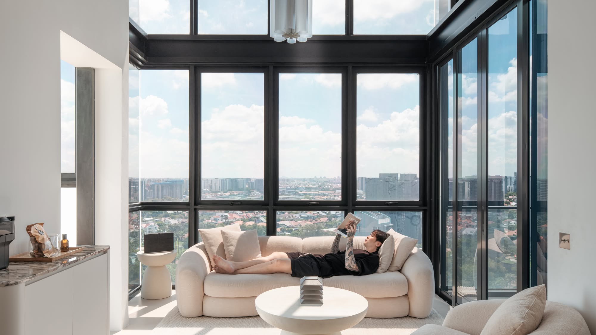
However, when they came across their current home on an online listing, they were immediately attracted to the floor-to-ceiling window view, which offered a treetops view from the apartment.
The couple’s home is a 2-bedroom unit in a development called Draycott Eight, which is right behind Tanglin Club and about a 7-minute walk from Shaw House. “It was love at first sight, so we decided to give it a visit even if we know it was slightly over our original budget.”
At the time of their purchase in 2021, there were still about 76 years left. However, Y said that as the condominium was only completed in 2006, the apartment felt newer than other condos that had the same remaining tenure.
There are several things that convinced them that this was indeed THE place. First of all, there’s the squarish layout with two rooms and a big living/dining space which is perfect for a couple.
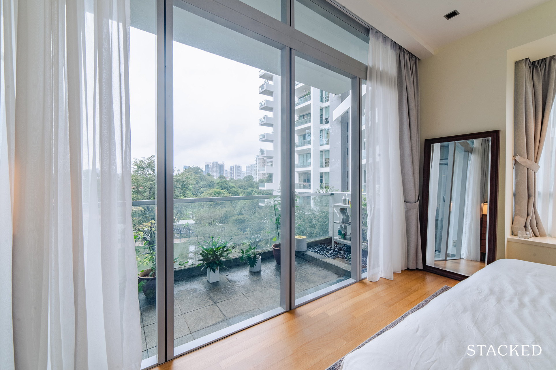
She said that a lot of the previous places they viewed had really small rooms, which they were not a fan of. The living/dining space can accommodate many different potential configurations, allowing them to be creative with how they want to arrange their furniture.
The second was the idyllic greenery visible from the full floor-to-ceiling windows, giving such a light and airy vibe to the place. Furthermore, every room, including both bathrooms, has windows. Third, the place is only a 7-minute walk away from the main Orchard shopping belt, but it is well hidden in the back. “So it is convenient yet away from the hustle and bustle,” Y added.
Currently, only the couple are staying at the unit with their plants. Let’s check out how their renovation journey for their first home went.
So many readers write in because they're unsure what to do next, and don't know who to trust.
If this sounds familiar, we offer structured 1-to-1 consultations where we walk through your finances, goals, and market options objectively.
No obligation. Just clarity.
Learn more here.
How The Renovation Journey Turned Out
Y and her husband, A, don’t believe in heavy renovations, so their initial budget for the home project was between $80K to $90K, including renovation and furniture.
Their plan was to split the budget at approximately $30K for the reno and around $50K for the furniture, with a $10K buffer.
“For us, having a highly customised or themed house is a blocker to sales if we’re planning to resell the apartment at one point,” she said. She recalled being unable to imagine herself at home in places that were heavily renovated and customised to the owners’ taste.
A heavily-renovated place also means a lot more reno cost because they’d have to hack all the previous installations. For similar reasons, the couple believed that investing in furniture made more sense because they would be able to move with them to their next home. Needless to say, they are also re-sellable in the second-hand market.
“We’d definitely invest (more) in renovation if it’s our final home that we plan to stay for a long period of time.” Fortunately, the unit they bought was in very good condition, so there was no need to do heavy renovation either.
In terms of the final cost vs budget, the couple spent $38K on renovation and $45K on furniture – so they were able to stick to their initial allocation.
While furnishing is still ongoing, $38K already covers the big-ticket items. “We managed to save on furniture because we kept all the original built-in appliances such as the fridge, dishwasher, washer/dryer, oven, etc.”
They had to increase their reno budget, though, since they had to hack the kitchen and redo it, contrary to their original plan to simply change the cabinet surfaces. “This was due to our Fengshui master suggesting to move the hob location, which was impossible to adhere to without tearing out the entire cabinet.”
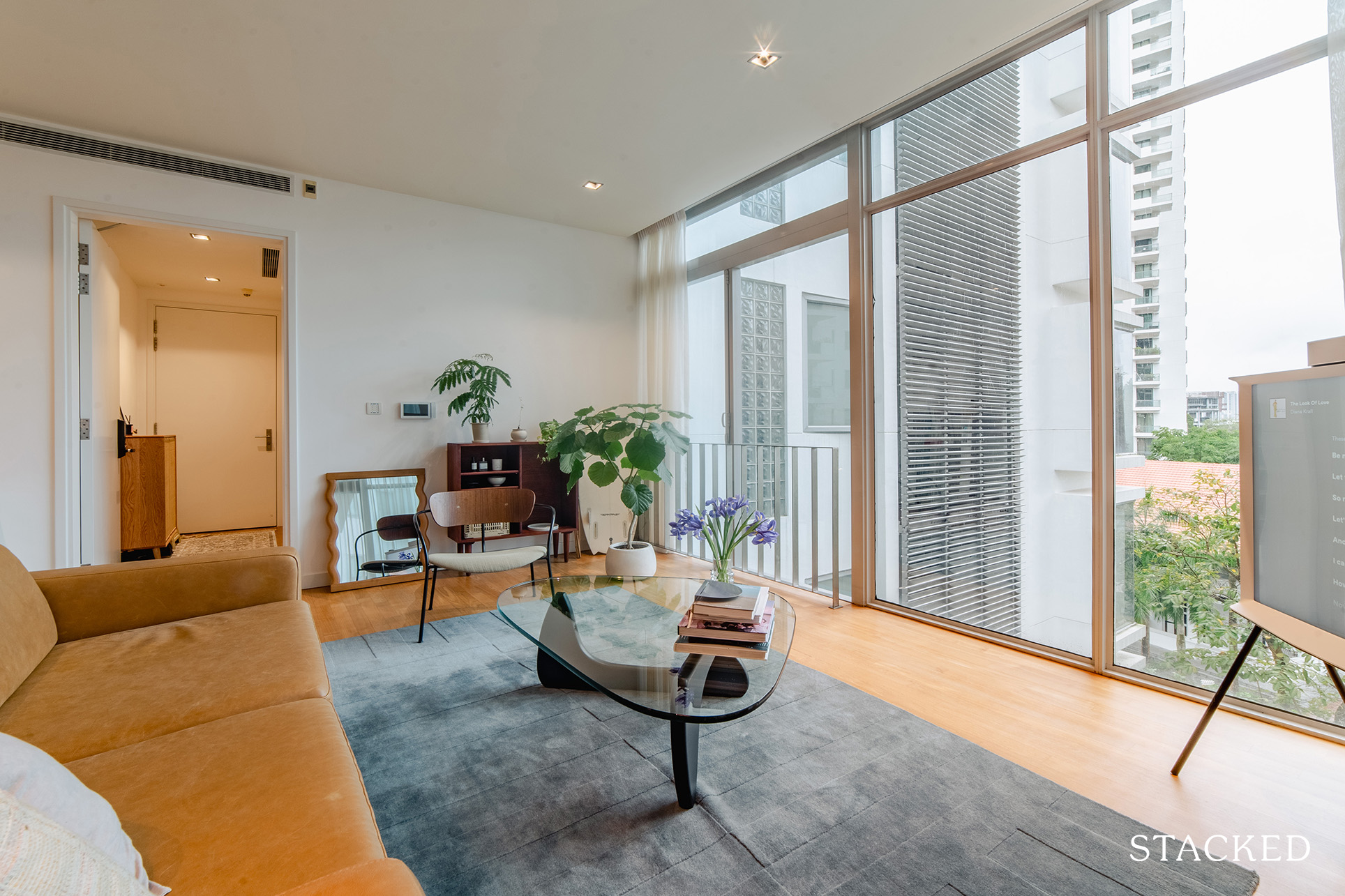
We asked Y what inspired the design and style of their renovation.
“I don’t think our place has a very strong theme, but I would say it hints at mid-century and cosy wooden vibes,” she replied and added that she personally doesn’t like grand, big spaces that give off a too modern or cool vibe.
For inspiration, they mostly looked at Instagram home furnishing accounts to create a mood board of their own. She said that what they found challenging is that most of these houses probably have a 10x higher budget than theirs, so they need to figure out how to make it realistic within their budget.
“That’s why we kept most of the existing design and furnishings of the original place while trying to add in our colour.
For example, for the bathrooms, we kept the overall layout and wall tiles but changed the floor tiles and cabinets to give it a refresh.”
Another example she gave was when they picked their kitchen cabinet colours, picking tones that would complement the existing rose-coloured wall and floor furnishings.
The previous owner did make some changes to the wardrobe placement beside the master bedroom, which the couple kept because it made sense to them as it brought the entrance to the bedroom closer to the living area.
Now, let’s take a tour of their home and the changes.
Living Room
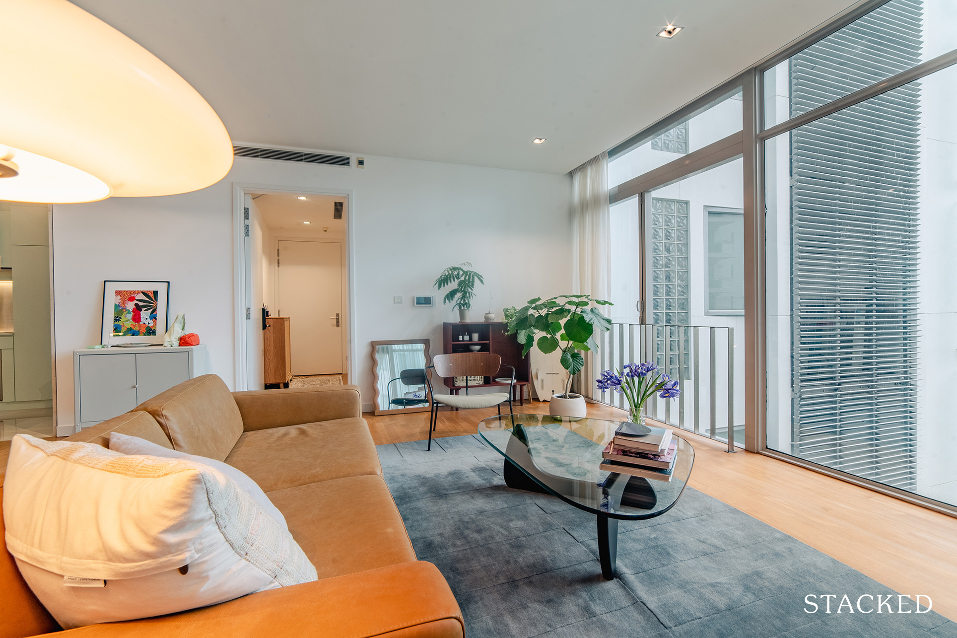
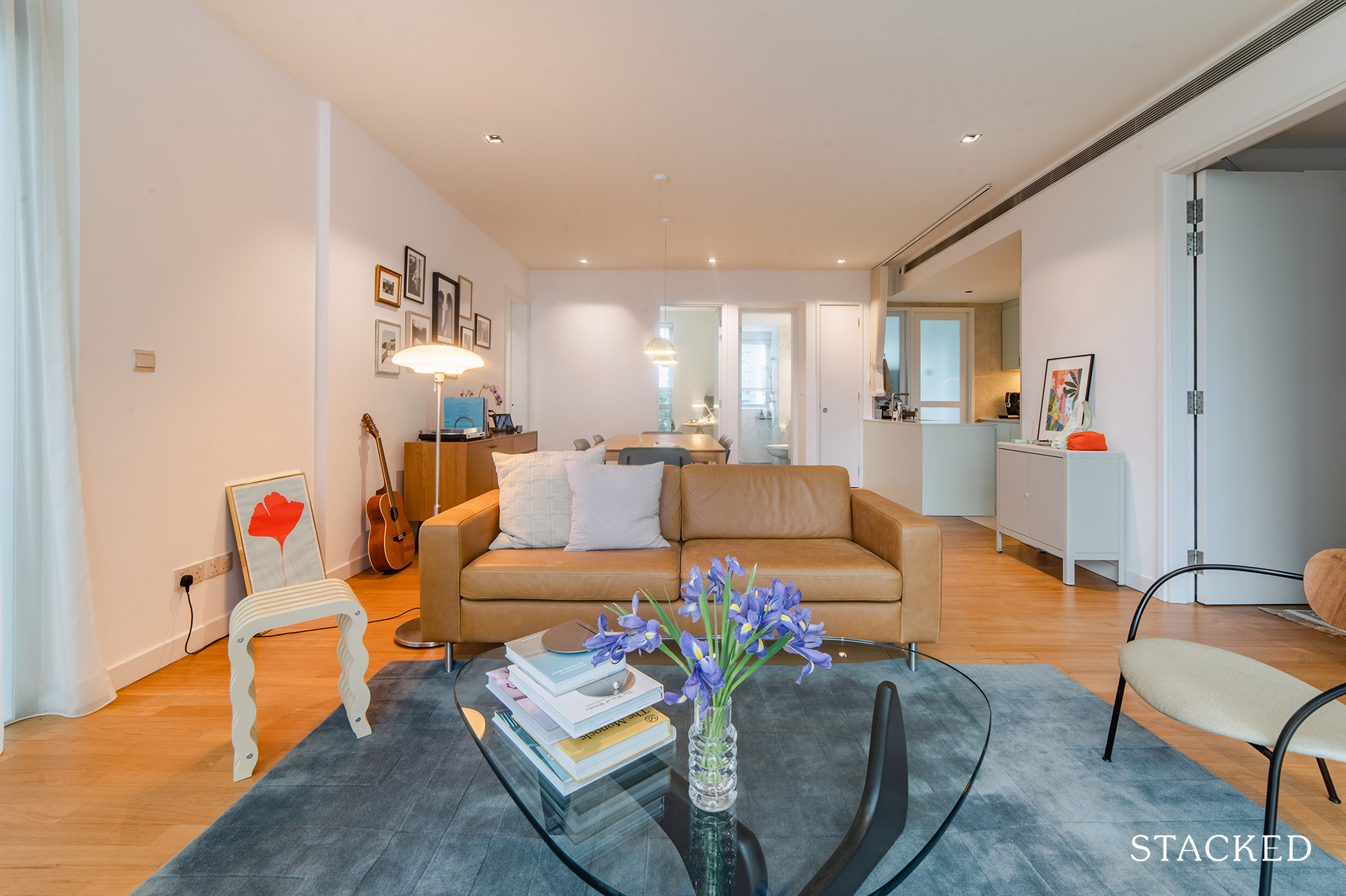
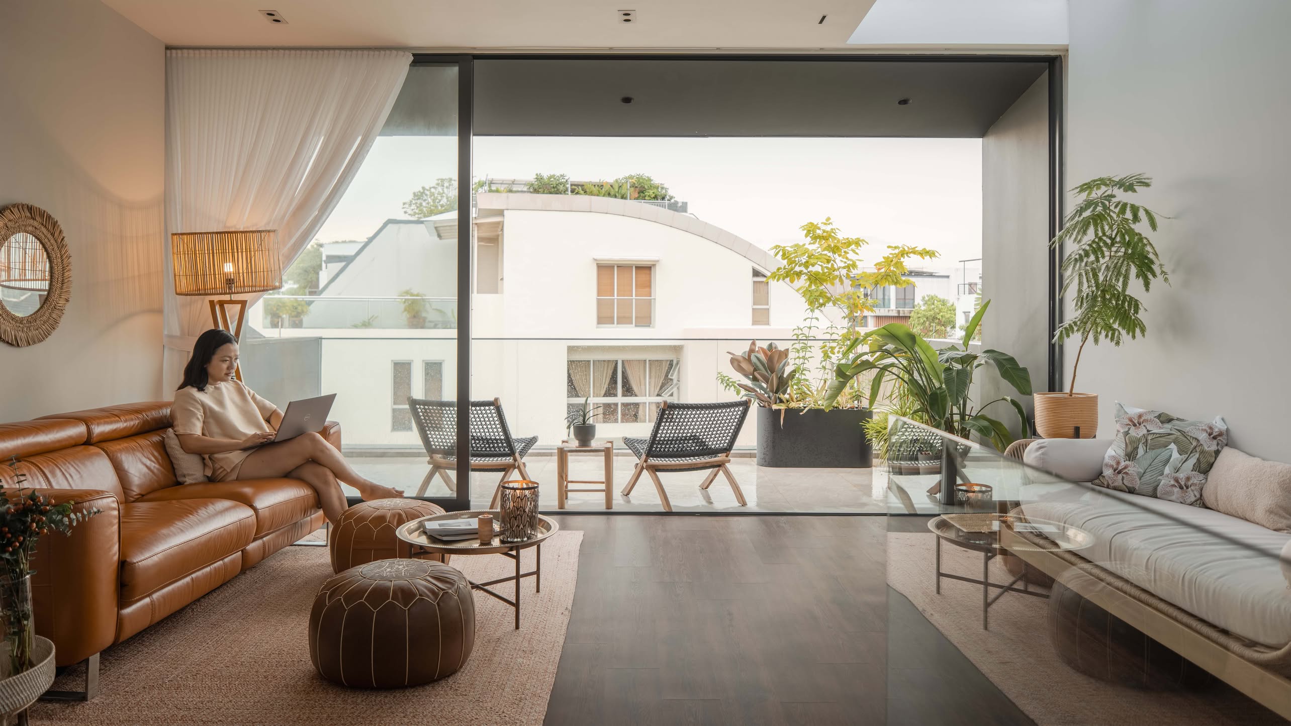
The living room was deliberately kept simple, with statement pieces of furniture (like that stunning Noguchi coffee table) mixed with classics like the IKEA TÄLLBYN floor lamp.
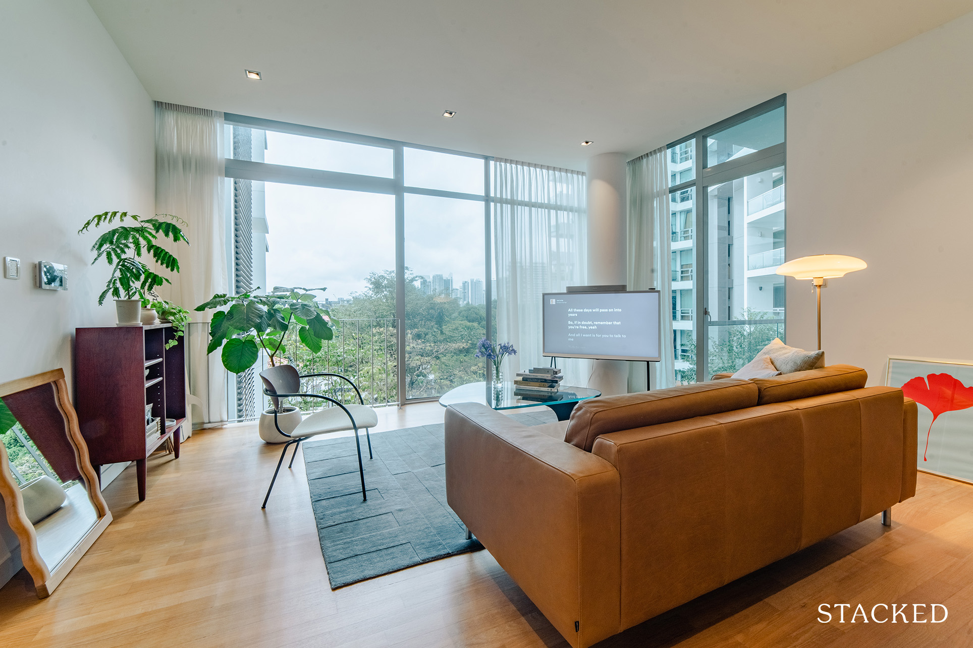
There was very minimal renovation work done in the living room other than grinding the floor and painting the walls. Y said that the TV placement allows for an efficient usage of the weight-bearing column at the corner of the living area.
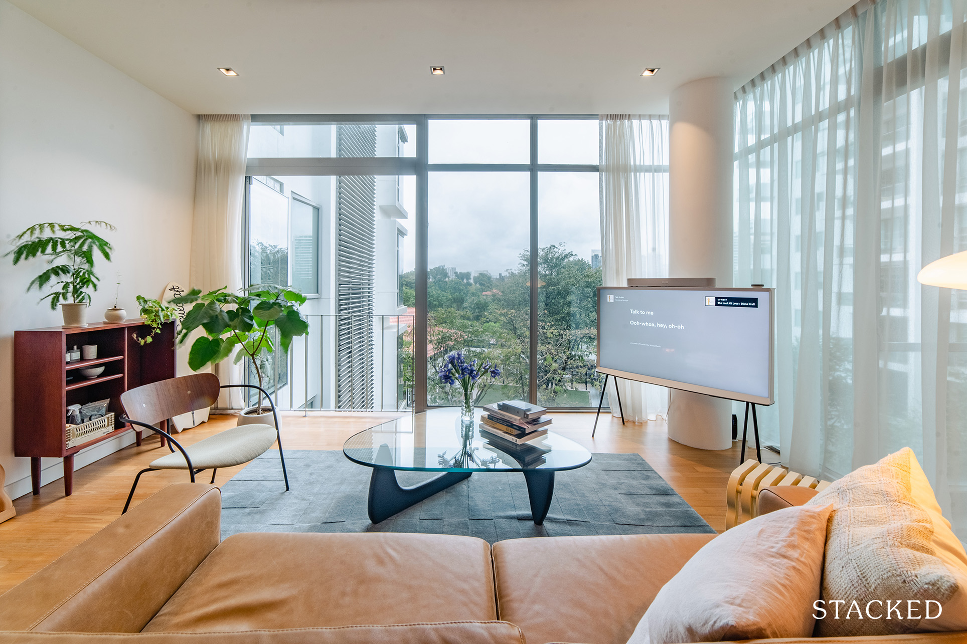
“It’s my morning routine to sit down on the sofa and stare out to the trees drinking my first cup of warm water,” she shared. “It sounds cringy, I know, but I’m reminded every day of how lucky we were to find this place.”
Dining Room
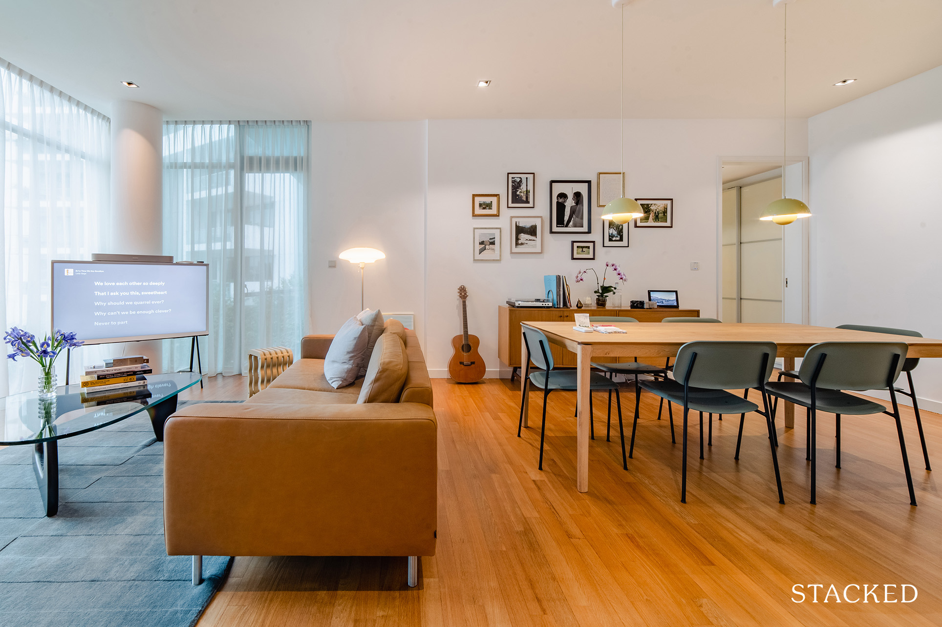
The dining room’s layout was not changed at all but was made new by painting the walls and floor. You can clearly see the continuity of the design choices as well as the colour scheme, making both living and dining rooms seamlessly connected.
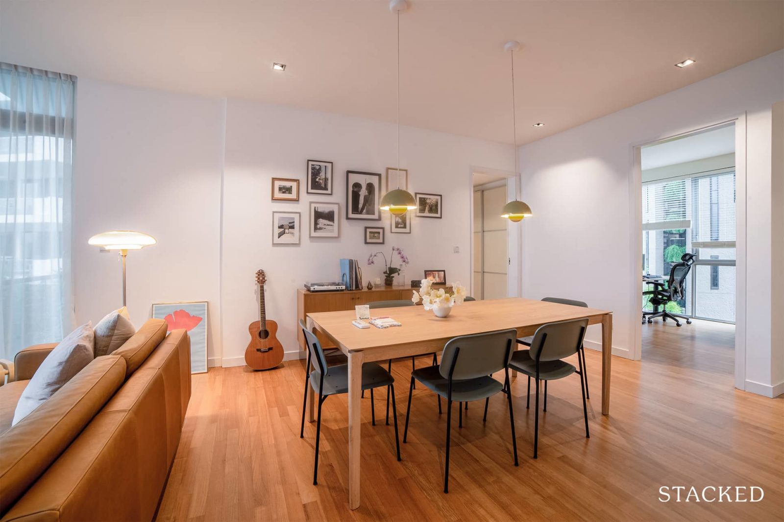
The feature wall and the gorgeous &Tradition flowerpot pendant lamps effectively add colour to the area, plus its photos make for a good conversation starter.
Kitchen
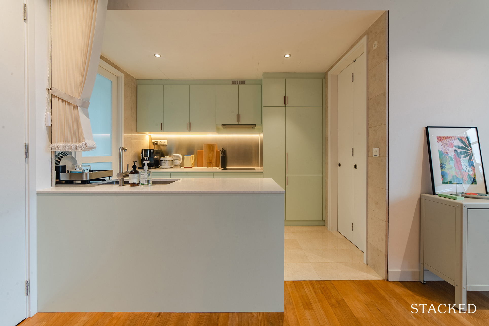
The highlight of the kitchen is the unique pistachio green cabinetry. It’s a really light colour tone that goes well with the rest of the home.
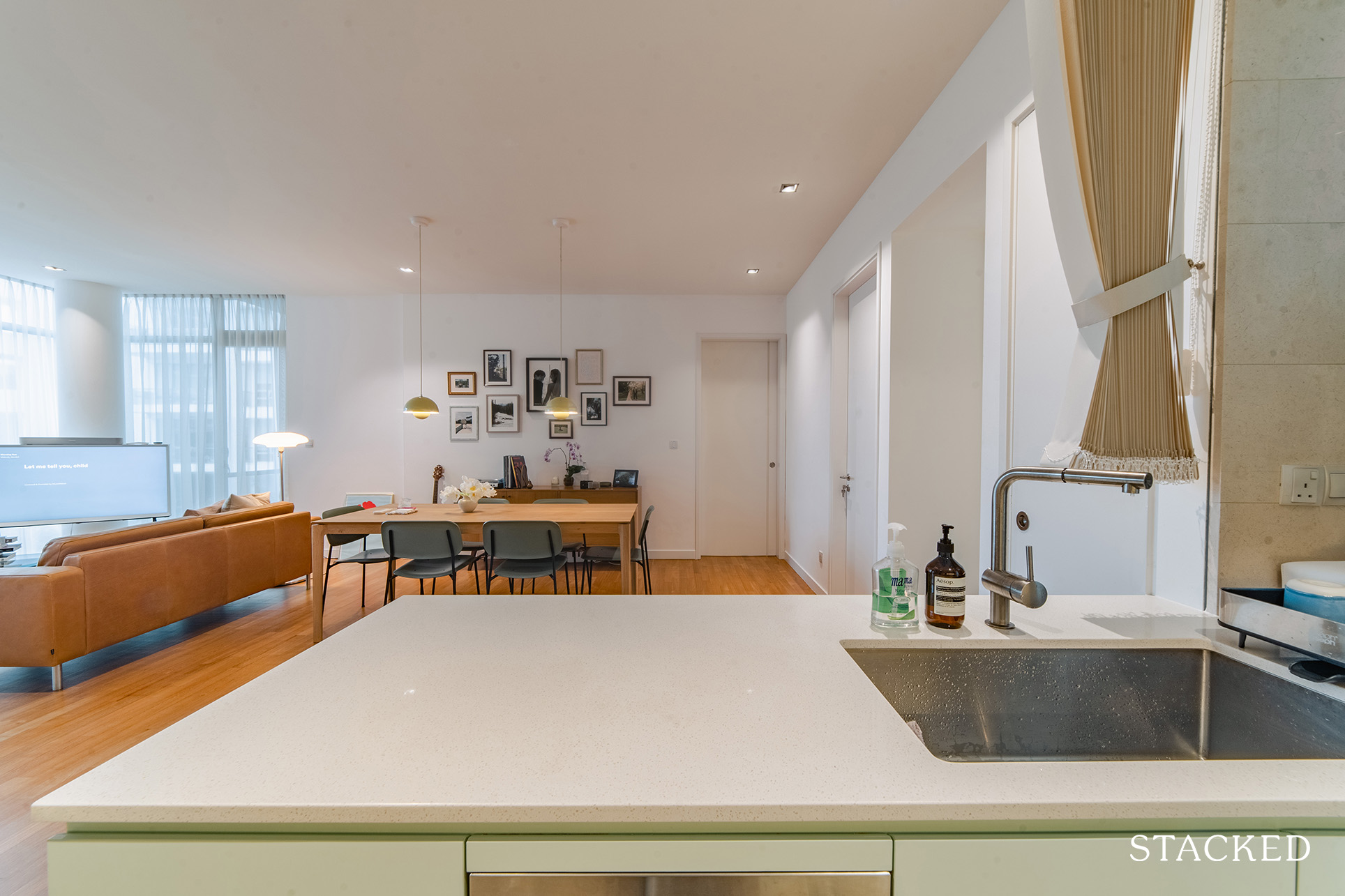
Y said that they maintained most of the kitchen’s layout but had to move the hob as advised by their Fengshui master.
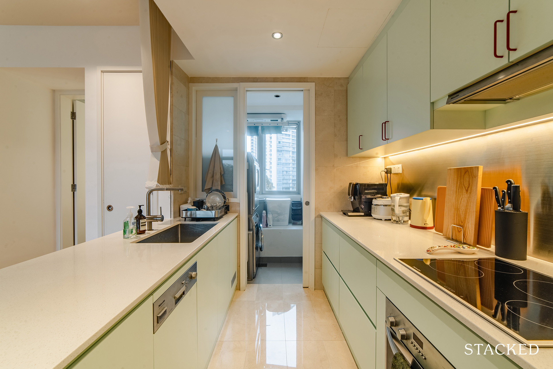
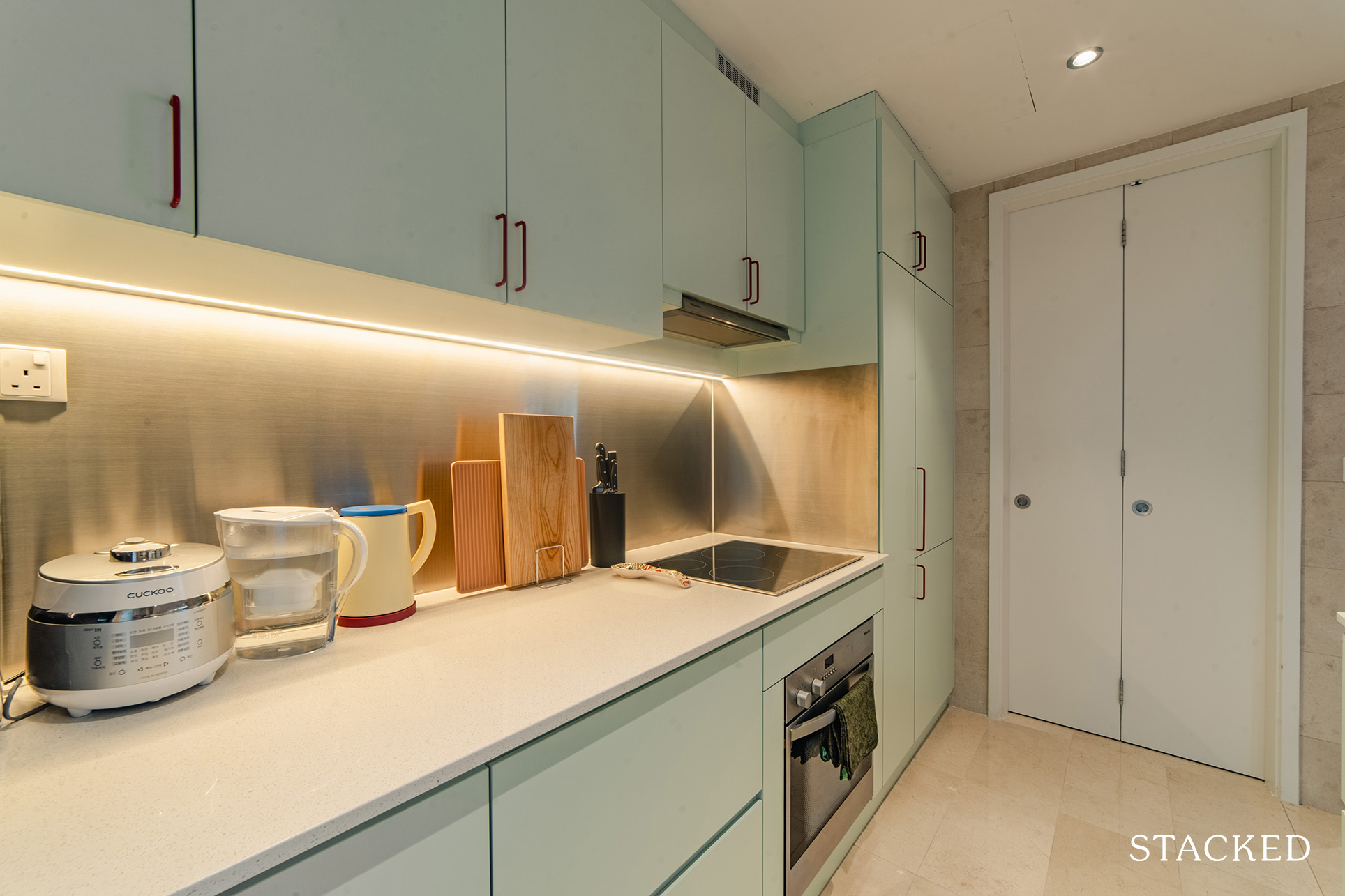
They also redid all the carpentry and countertop and added blinds while keeping the original walls and floor tiles.
Bedroom/s
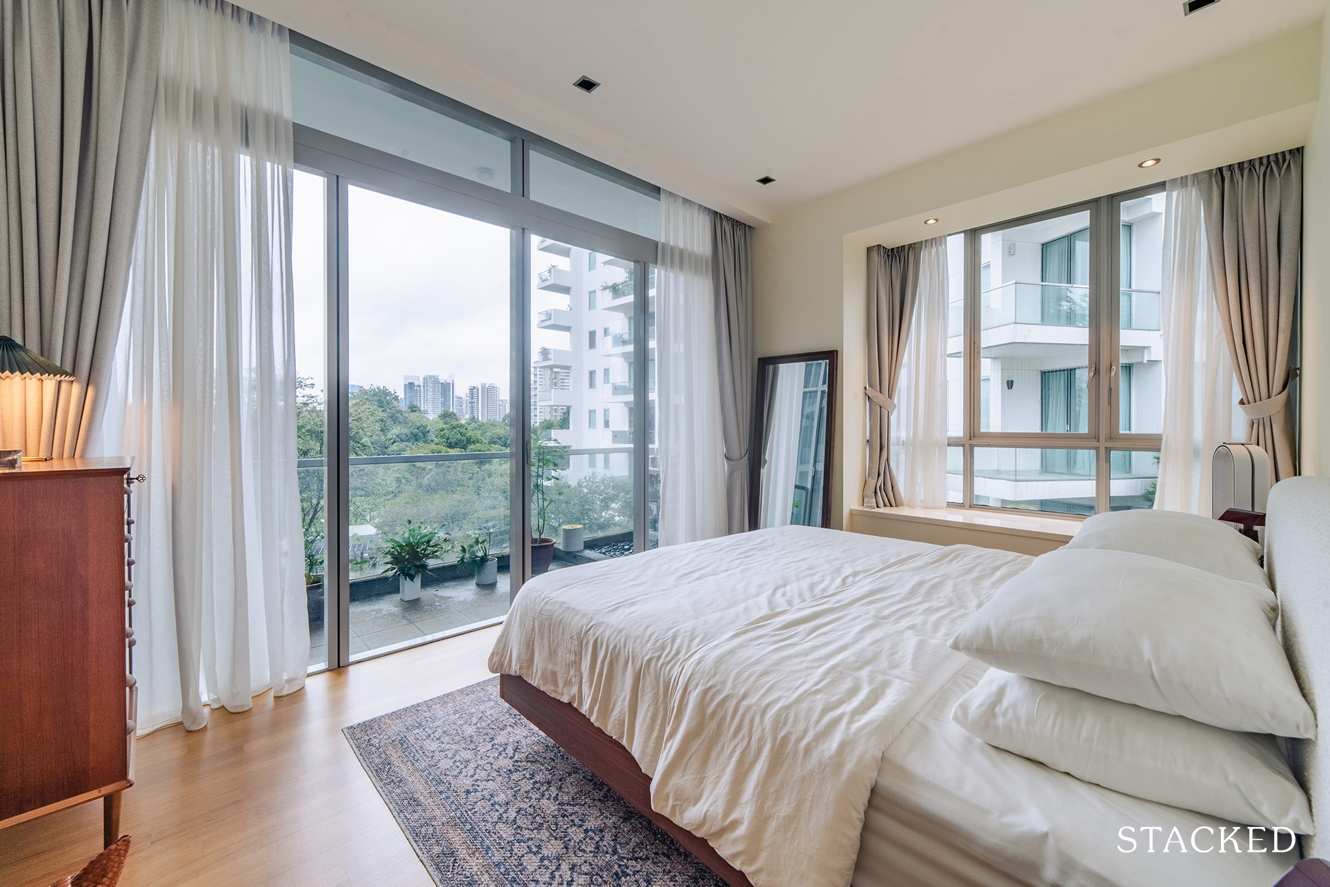
With the layout and the view already stunning as is, the couple decided just to paint the walls and revamp the floors.
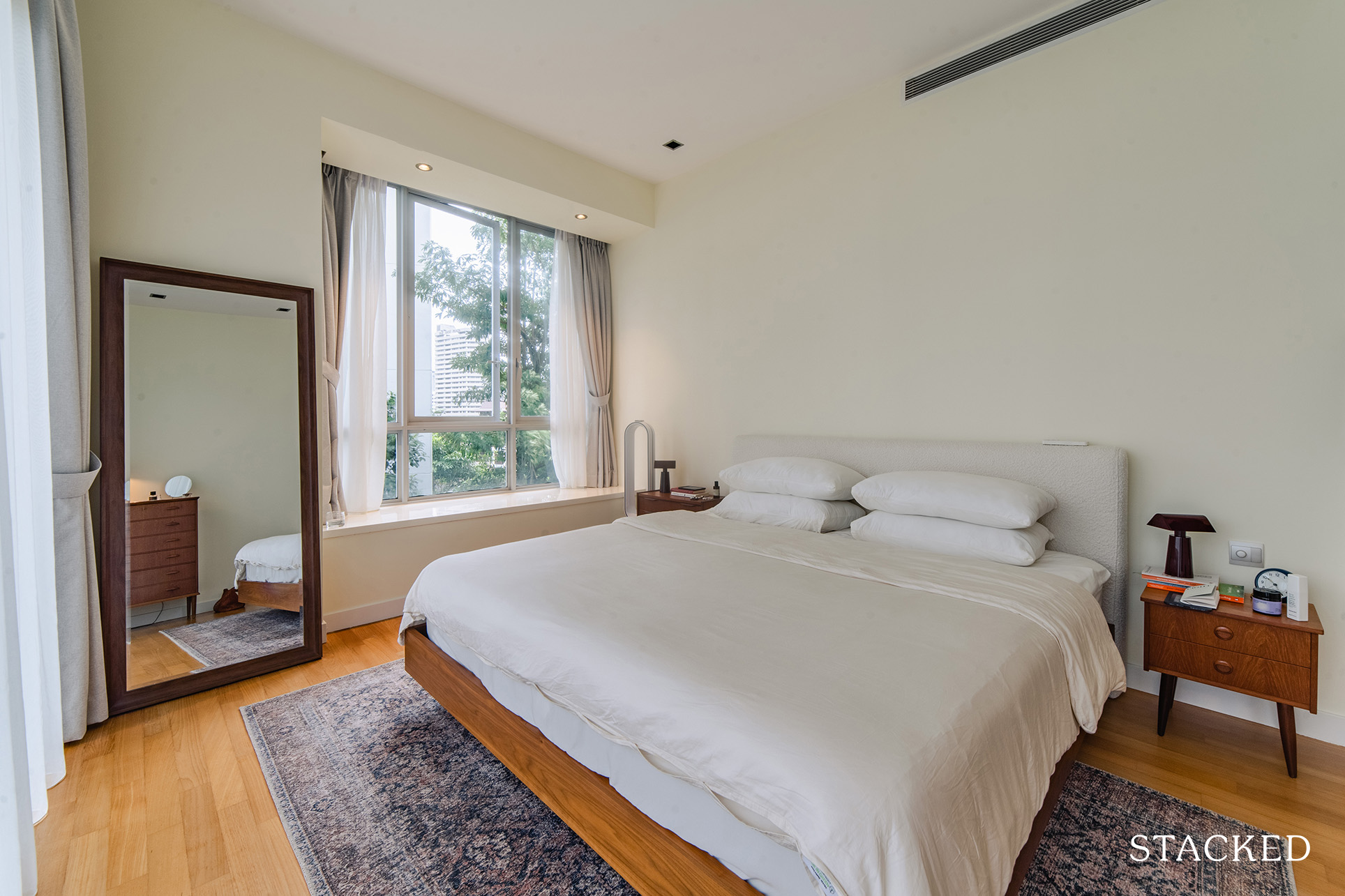
Like the living outside, the bedroom is accessorised by the texture of the carpet as well as the 2 &Tradition caret lamps in a lovely dark burgundy shade.
Bathroom/s
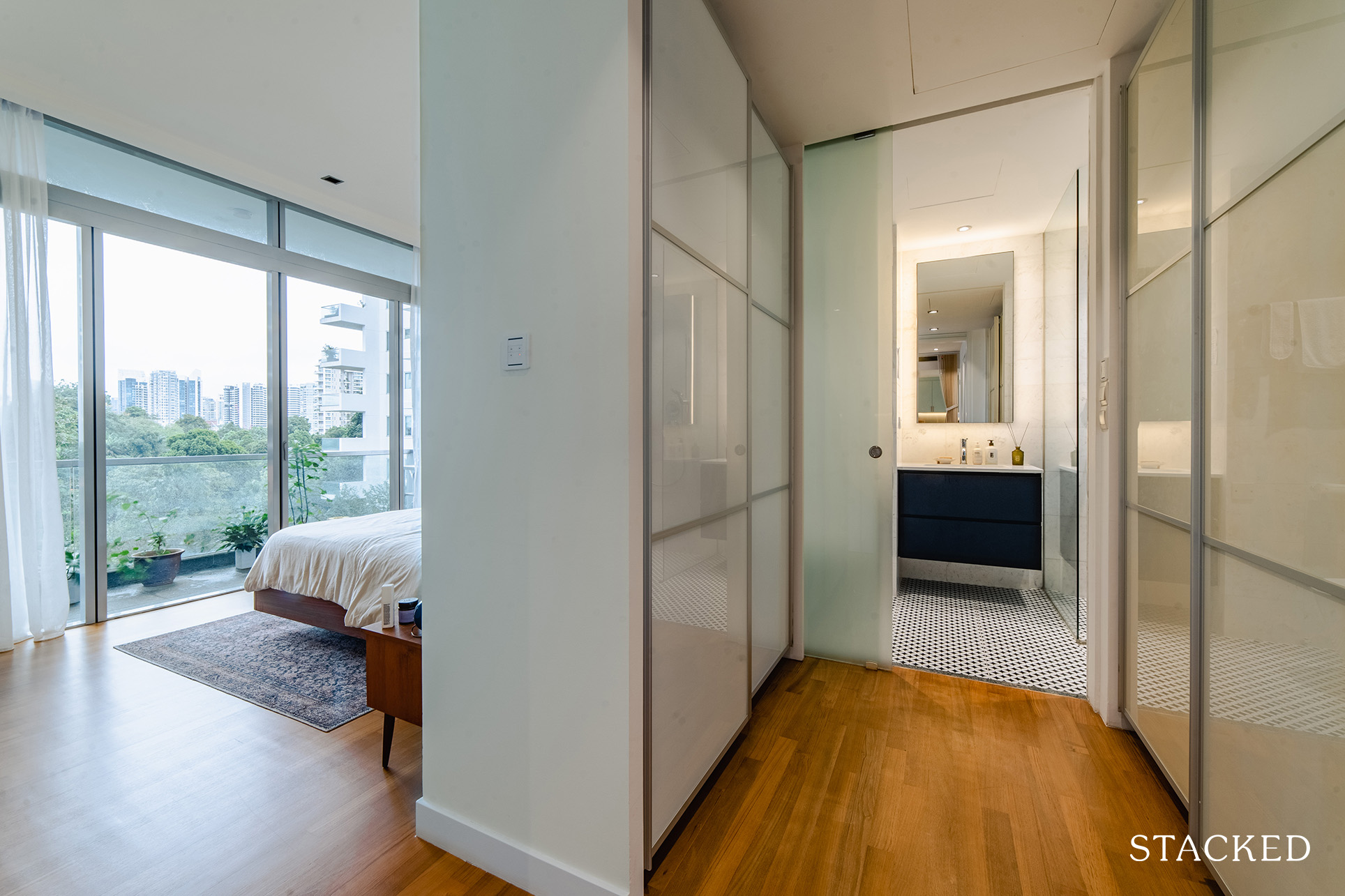
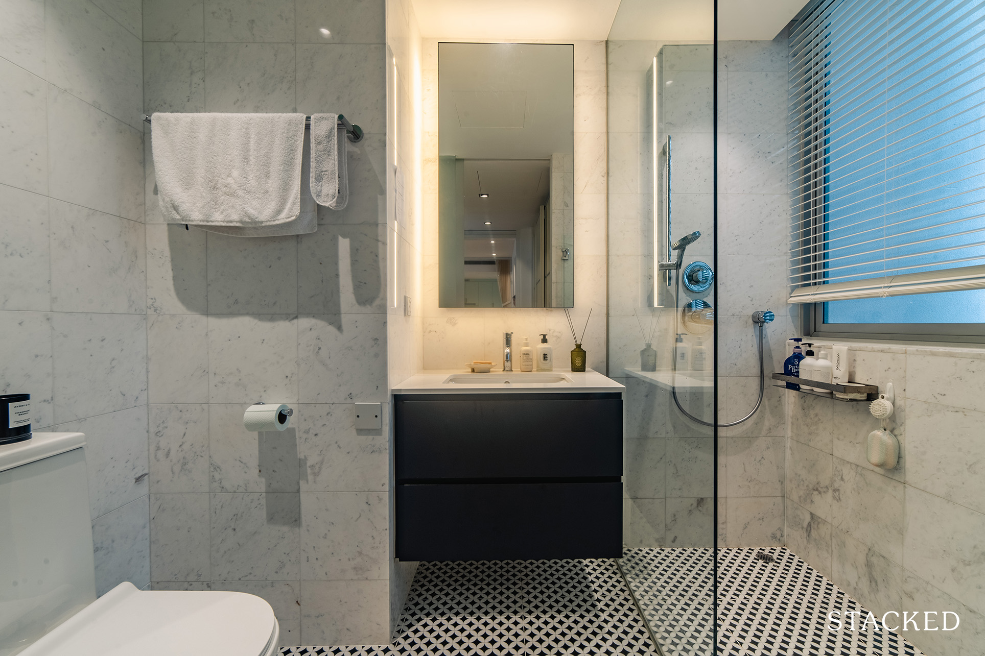
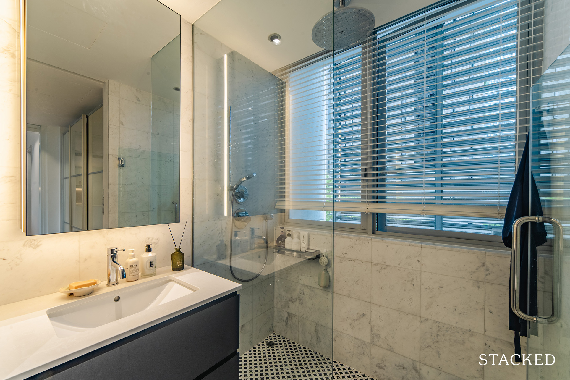
Both bathrooms didn’t undergo any layout changes, and the couple even decided to retain the wall tiles. For the master bathroom, though, they changed the mirror, carpentry, toilet bowl, and floor tiles while keeping the existing rainshower.
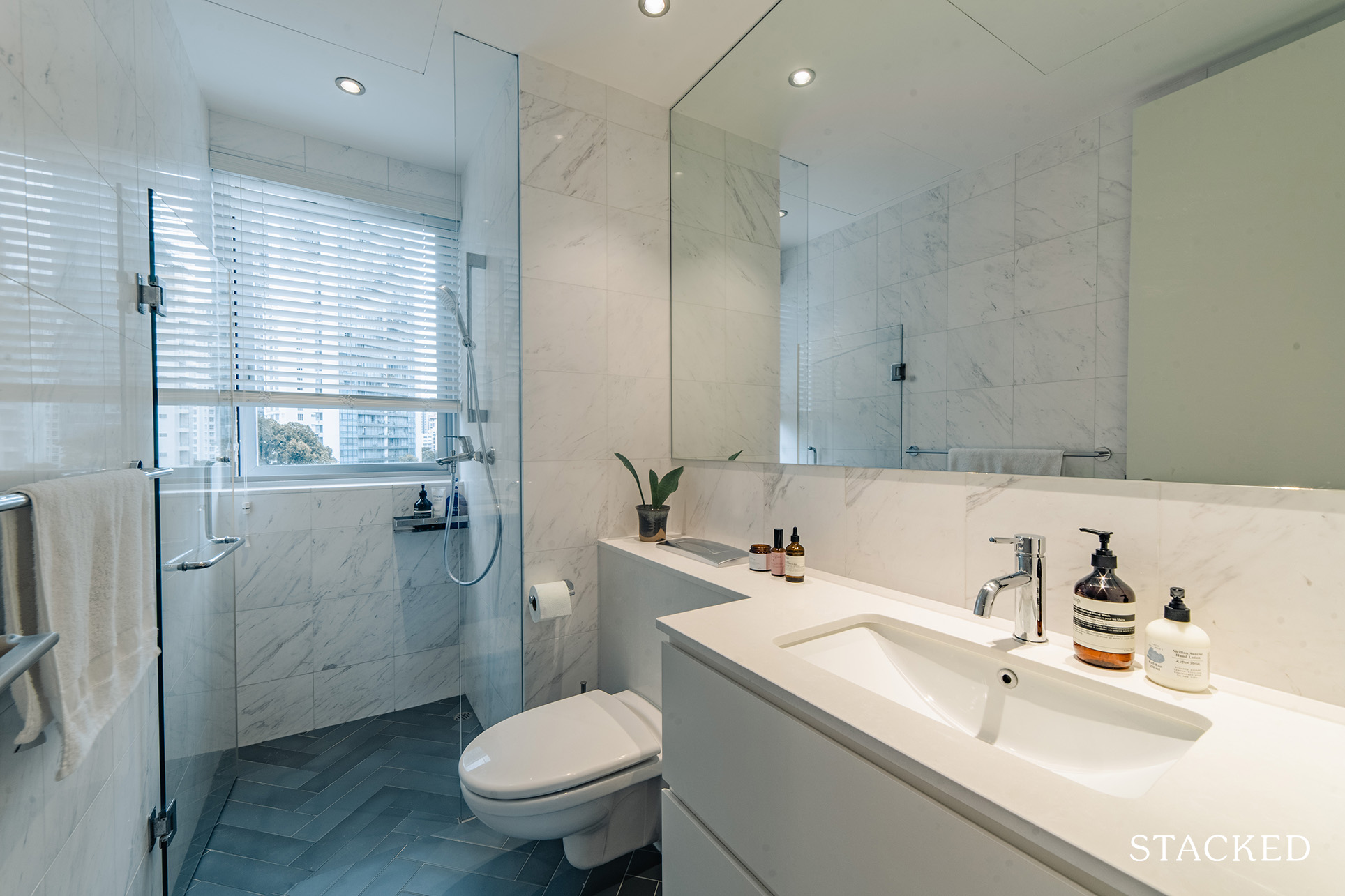
The common bathroom had very similar renovation changes, except that they kept the original toilet bowl.
Bringing The Vision To Reality
We asked Y if the final outcome was similar to what they envisioned before the reno started, and her answer was, “Yes! the master bathroom looks divine, I absolutely love it. I love the kitchen too, although I sometimes wonder if we should have gone with a bolder colour for our countertop.”
More from Stacked
18 Upcoming New Launch Condos In 2026 — Where They Are And The Ones To Watch
Despite the spectre of a possible economic crisis brought on by the US-Iran war, sentiment in Singapore’s new launch property…
If there’s one particular area she felt more ambivalent about, it would be the guest bathroom, but she said that is quite acceptable since they didn’t spend too much to change it.
The couple had a very selective pool of interior designer candidates as they wanted to make sure the designer could understand their style. Out of the candidates they talked to, Semiramis Studios was the most comfortable and accommodating.
“At the end of the day, you don’t want an interior designer who you can’t talk to or a designer that might enforce their desires or styles on you,” she advised.
Another important criterion they considered when choosing an ID was to make sure to do a background check. They’ve heard quite a few stories of their friends having challenges with interior designers they found online. Semiramis Interior is a friend of their close friend, so they knew they could trust her. “She’s amazing, and I consider her a friend too!” she added.
Their contractor was Kelvin of Eco Green Hub, recommended by Semiramis, as they have been working together on multiple projects over the last few years. They form a great partnership, and Kelvin is always on standby to answer any queries and provide regular updates.
“There was no slip-shod contracting work done and the price point is reasonable. Even to this day, Kelvin is always ready to help out with any minor repair works from wear and tear at low or no cost.”
The couple’s furniture sourcing process was very structured, following a process for budgeting, prospecting, shortlisting, and then purchasing.
They first created a list of all furniture items to purchase and tagged each item with an “acceptable” budget. Then, they listed all the online/offline furniture shops to check out and spent around 4 to 5 weekends just touring all of them. They even included furnishing shops regardless if it was above or around their budget, mainly to get inspiration and understand all the options available.
After their initial scan, the pair gradually shortlisted some brands and items that both fit their budget and taste. Once they had a shortlist of items, they consulted with their ID to see what made the most sense and then made the purchasing decisions.
“I would say the most important part would be understanding your budget and big-ticket items. For example, we were pretty sure we wanted to invest in a good sofa, armchair, and mattress, so we were okay going slightly over budget for those,” elaborated Y. “Then we would try to save on other low-priority items like shoe cabinets.”
They also prioritised urgent items. For instance, they’d rather have a bed before moving in than a bedside table from day 1. The couple took their time to fill in their furniture and purchased them only if they were confident about their choice. “In fact, we still have a lot of items on our list that still aren’t purchased! Our home furnishing journey is an ongoing process,” she happily said.
We asked Y what she sees as the best part of their home after renovation. While it didn’t do a ton of renovation, she decidedly answered that it would be their master bathroom. “I love those floor tiles. Every time I step in, I feel happy.”
Although they didn’t do any reno in their living area, it’s the next place that she loves. “We purposely chose the current layout so that the TV wouldn’t be the focal point of the area, but the view of the greenery would, and I love that.”
Lessons Learned From A Successful Reno Journey
For the most part, the couple’s renovation was pretty smooth without any hiccups, except for the kitchen.
“We originally planned to only change the cabinet door surfaces and the countertop. However, our Fengshui master requested us to have a closed kitchen as well as to move the hob location in order to maintain our relationship.”
In order for them to achieve this, they had to hack out the original cabinets, re-organise the appliances, and redo the cabinets, but the couple didn’t want a closed kitchen. And thus, the challenge for their kitchen was how to have a closed layout when they didn’t actually want a closed kitchen. Y shares this story on how they got the idea and the solution.
They were having dinner with friends when they came up with an idea to have a blind that can enable the kitchen to both open and closed, similar to the black and white roller blinds in cafés. When they’re cooking, they can have the blinds drawn so that it simulates a closed kitchen. Fortunately, their Fengshui master approved of this because the rule is to keep the heat within the kitchen space.
However, they were on to their next challenge – choosing the design for the blinds. It proved to be difficult due to the complexity of the kitchen island’s location and the air conditioner vent located above the island. The couple settled on a vertical blind that sits about 15 centimetres above the countertop. The resulting effect gives off a little bit of an izakaya vibe, where dishes can be delivered to the dining table with the blinds still closed.

Everyone who goes through a reno journey always learns something, and for Y and her husband, it’s about arriving at a wise decision.
“Generally, if you are debating whether to skimp on something, try to do a list of pros and cons and choose wisely,” she said. “For example, in our bathroom, we didn’t hack the floor tiles and simply overlaid the new tiles on top of the old ones to save cost and time.” However, doing so made the bathroom floor on the same level as the floor outside, which caused the water to sometimes seep out if showering for a long time.
They also have some regrets about not making the common bathroom mirror a storage mirror since they thought guests would mostly use it. In truth, though, Y said she uses the master, and her husband uses the common bathroom, which means the common bathroom countertop ended up cluttered with everyday toiletries. “We would have invested in a storage mirror if we’d known,” Y said retrospectively.
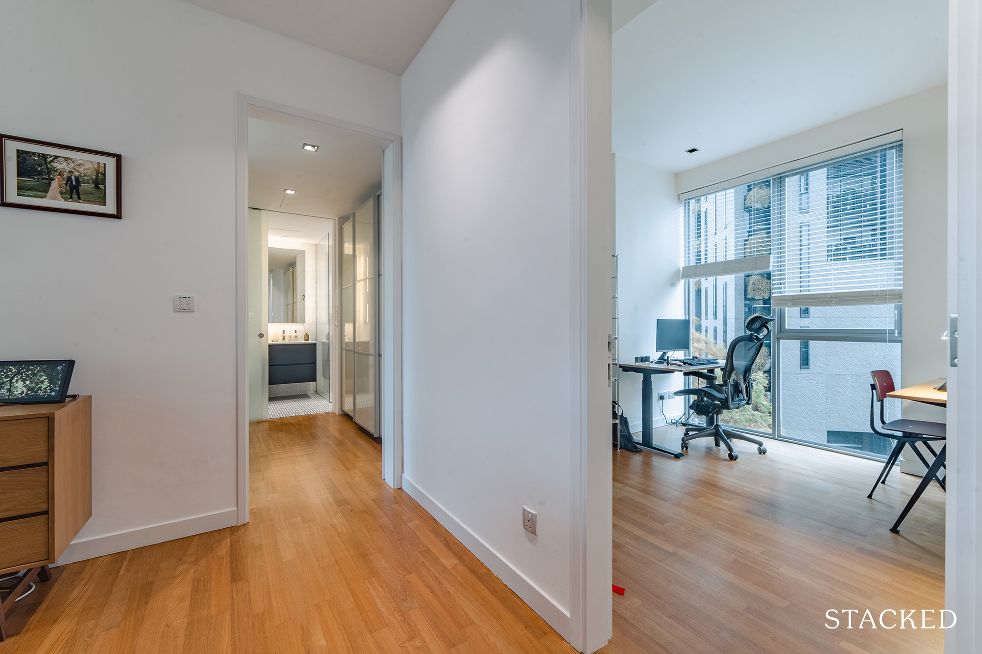
And then there’s the lighting, which they decided not to invest too much since the home had a complex lighting system, and changing them would have been expensive. However, if they had gone ahead and allocated a budget for this, it would have let them be more creative with lights. Y said that right now, they can’t install many hanging or wall lights, so they have to furnish the house with additional lamps instead.
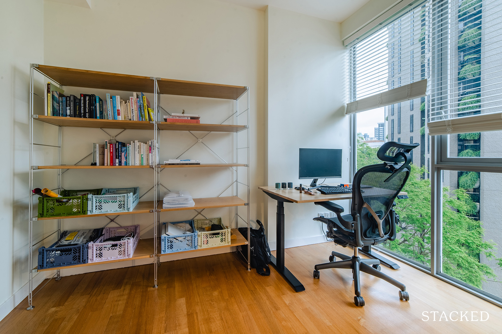
But overall, the couple said they would maintain their philosophy of not doing too much-customised renovation and keeping things flexible. “For example, our common room currently is our study,” she explained, “but if we were to have a bigger family we’d probably convert that space into a bedroom too.”
Last but not least, Y shares this advice with everyone who is planning to spruce up their home.
“It takes time to create a home. You’ll figure out much more while you’re living in it, so remember it’s a continuous process and don’t rush it.”
At Stacked, we like to look beyond the headlines and surface-level numbers, and focus on how things play out in the real world.
If you’d like to discuss how this applies to your own circumstances, you can reach out for a one-to-one consultation here.
And if you simply have a question or want to share a thought, feel free to write to us at stories@stackedhomes.com — we read every message.
Need help with a property decision?
Speak to our team →Read next from Homeowner Stories

Homeowner Stories We Could Walk Away With $460,000 In Cash From Our EC. Here’s Why We Didn’t Upgrade.

Homeowner Stories What I Only Learned After My First Year Of Homeownership In Singapore

Homeowner Stories I Gave My Parents My Condo and Moved Into Their HDB — Here’s Why It Made Sense.

Homeowner Stories “I Thought I Could Wait for a Better New Launch Condo” How One Buyer’s Fear Ended Up Costing Him $358K
Latest Posts
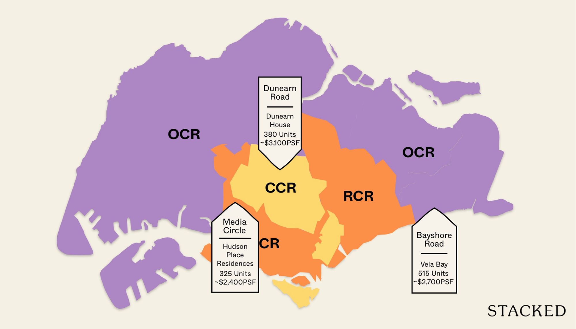
Property Market Commentary 18 Upcoming New Launch Condos In 2026 — Where They Are And The Ones To Watch

Property Advice Should We Sell Our Freehold Condo For A $2.2M Leasehold Landed Instead?

Singapore Property News Kallang Close GLS Site Sold For $610.8 Million: New Waterfront Condo Could Launch From $2,900 PSF




















0 Comments