How A Walk-Up Duplex Apartment In The East Was Transformed Into A Modern Stylish Home For A Young Couple
March 30, 2024
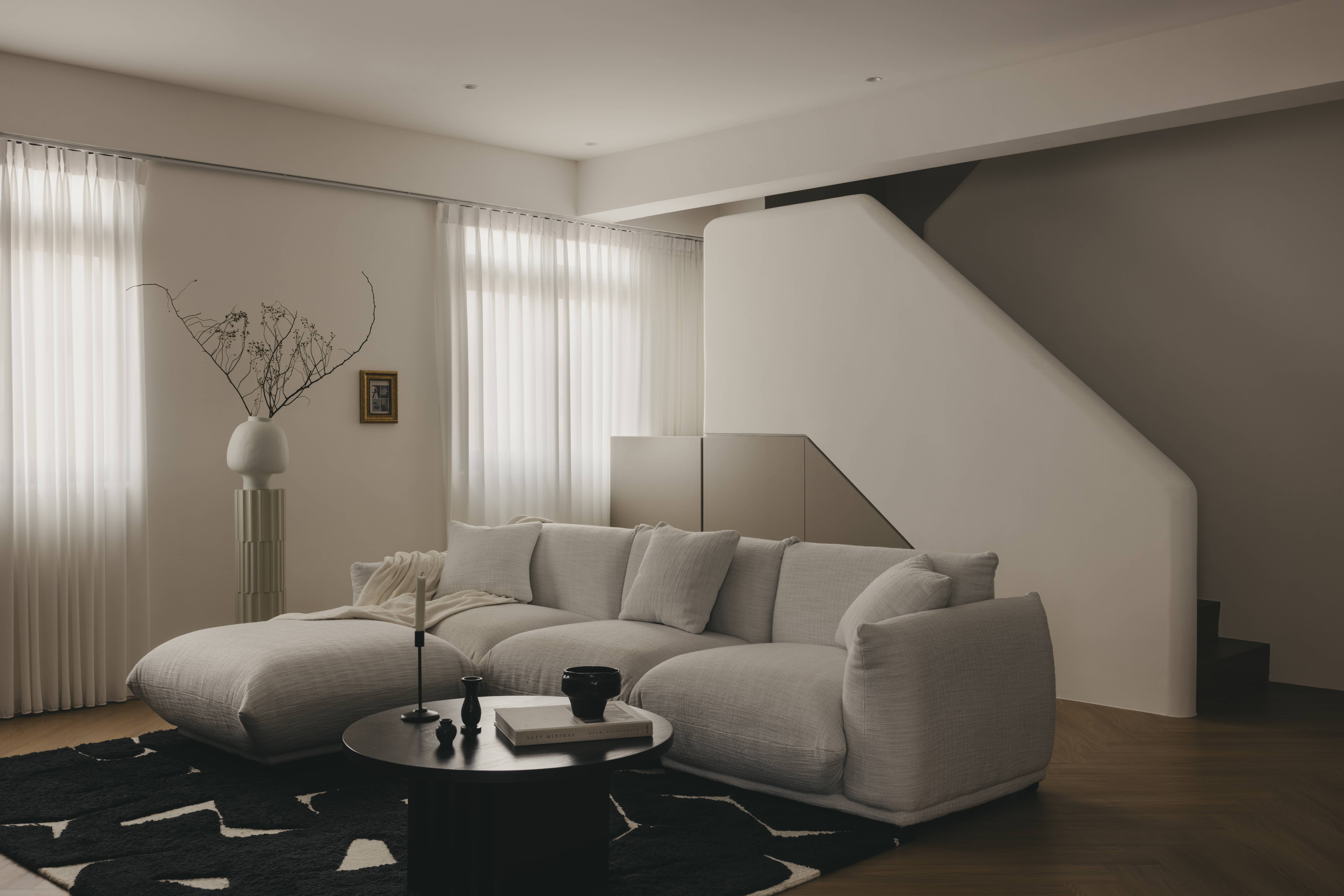
Old duplex homes offer a lot of space, but maintenance is always a worry – from outdated layouts to leaks, owners need an Interior Designer with the right combination of patience and vision.
In this particular home, Studio Metanoia managed to give more than a facelift to the inside of an ageing property. With the right materials and vision, the home exudes a combination of sophistry and warmth; and we spoke to them about how it all came together:
Many readers write in because they're unsure what to do next, and don't know who to trust.
If this sounds familiar, we offer structured 1-to-1 consultations where we walk through your finances, goals, and market options objectively.
No obligation. Just clarity.
Learn more here.
An initial vision for the home
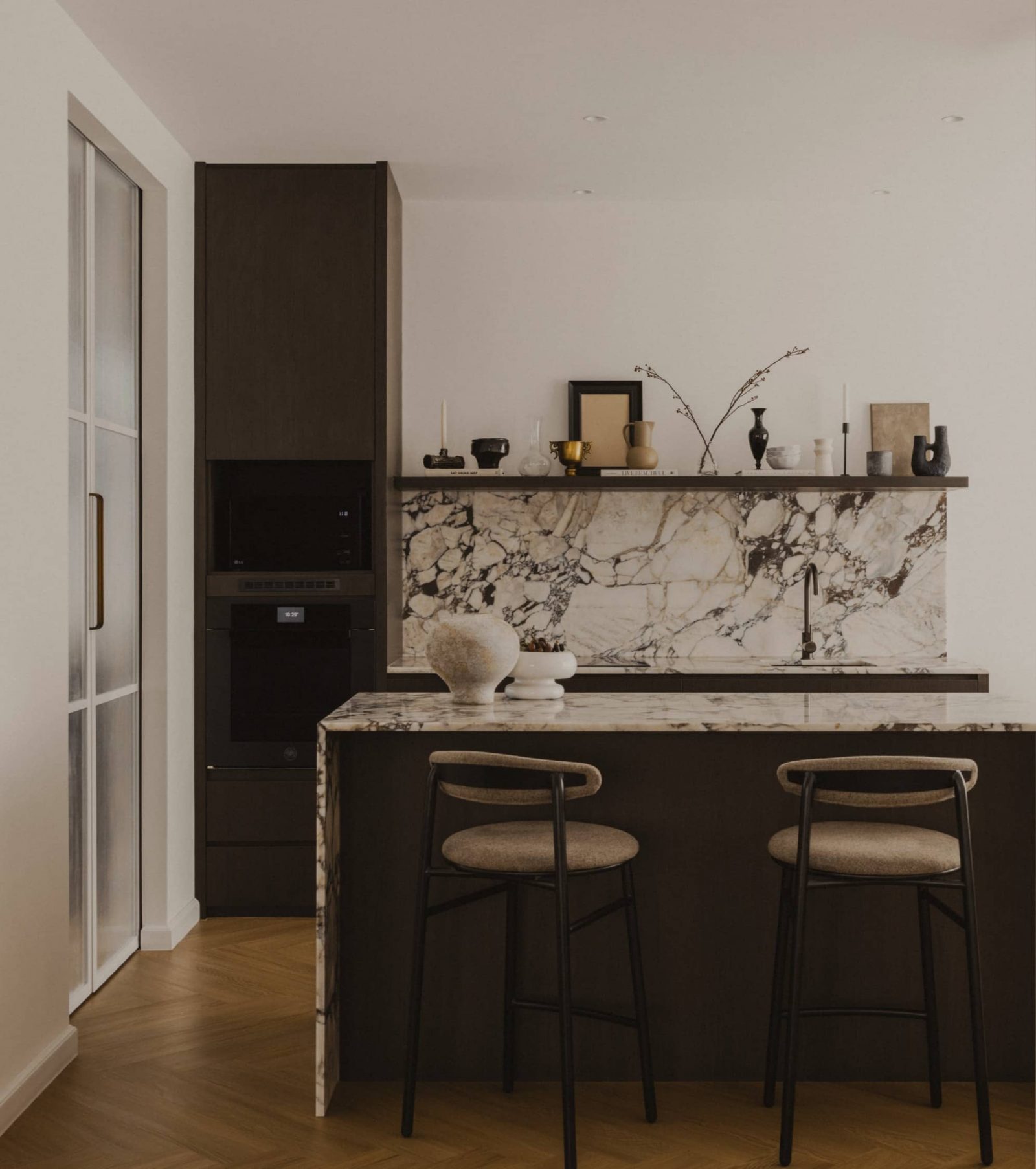
The designers said the homeowners were drawn by this previous project of theirs, and pointed out features like the use of Calacatta marble and herringbone oak flooring. Referencing the past project provided a general sense of theme and direction.
After further conversation though, the homeowners also agreed to some differences from the original inspiration. One difference was the choice to move from a cooler colour palette, to one with a warmer scheme – this was for “neutral tones with a quiet warmth, clean lines juxtaposing well-defined textures, patterns, and sculptural silhouettes”.
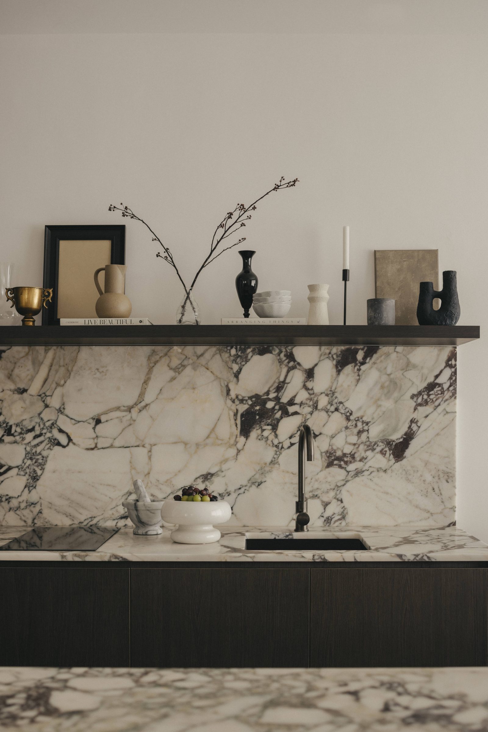
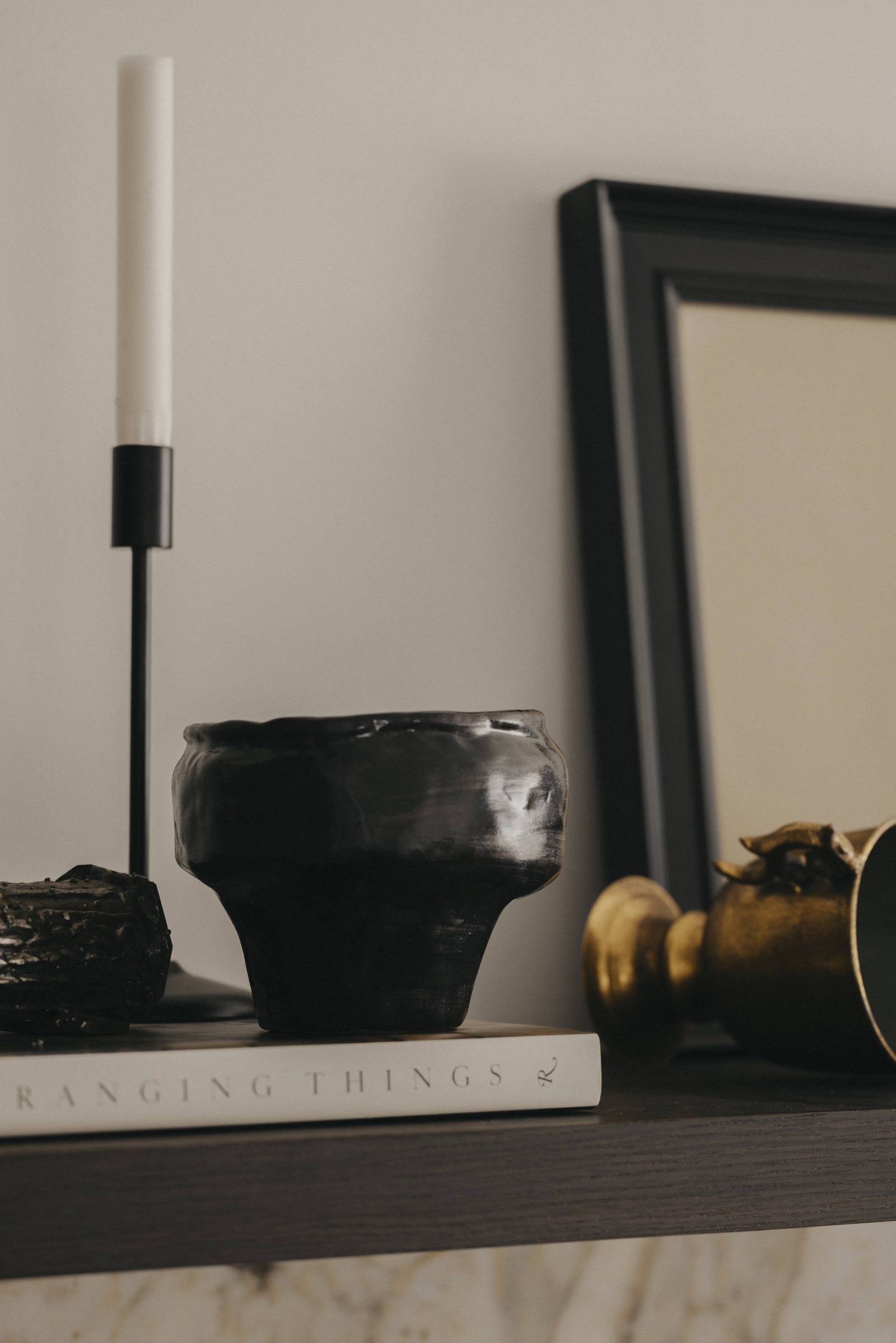
You can see this unifying theme in all of the images, and the designers also worked on the art and decorative elements to match it. This combined the sophistication they found in the earlier project, with the harmony and warmth appropriate to a family home.
Working with an older property
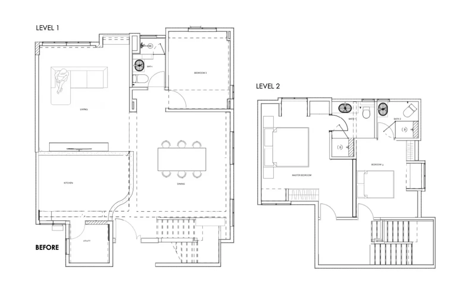
When the designers first got a look, the duplex had a rather outdated layout, which presented some design challenges. Even though the size was there, the inefficient layout didn’t make full use of the space; and the various rooms were also overly compartmentalized.
While there were different spaces for different functions (dining, kitchen, bedroom, etc.) there wasn’t any unifying theme or character to tie it all together.
A bigger issue was leakage from the building’s roof into the apartment. This is common with ageing walk-ups, but repair costs are significant (between $5,000 to as high as $15,000). Time was also a factor: the unit’s false ceiling had to be removed entirely to trace and manage the leak – a process that took around two months even before repairs could get started.
The renovation team had to proactively warn the homeowners about the potential fees, delays, and other issues. It was, however, an issue that the designers had encountered in previous projects, so they knew what to expect, and how to prepare the homeowners.
The inspiration behind the design
The lead designer of the studio cited New York-based Athena Calderone (Interior Designer and founder of Eyeswoon) as an inspiration, saying: “Our objective was to encapsulate her distinctive blend of modern sophistication and artisanal charm.”
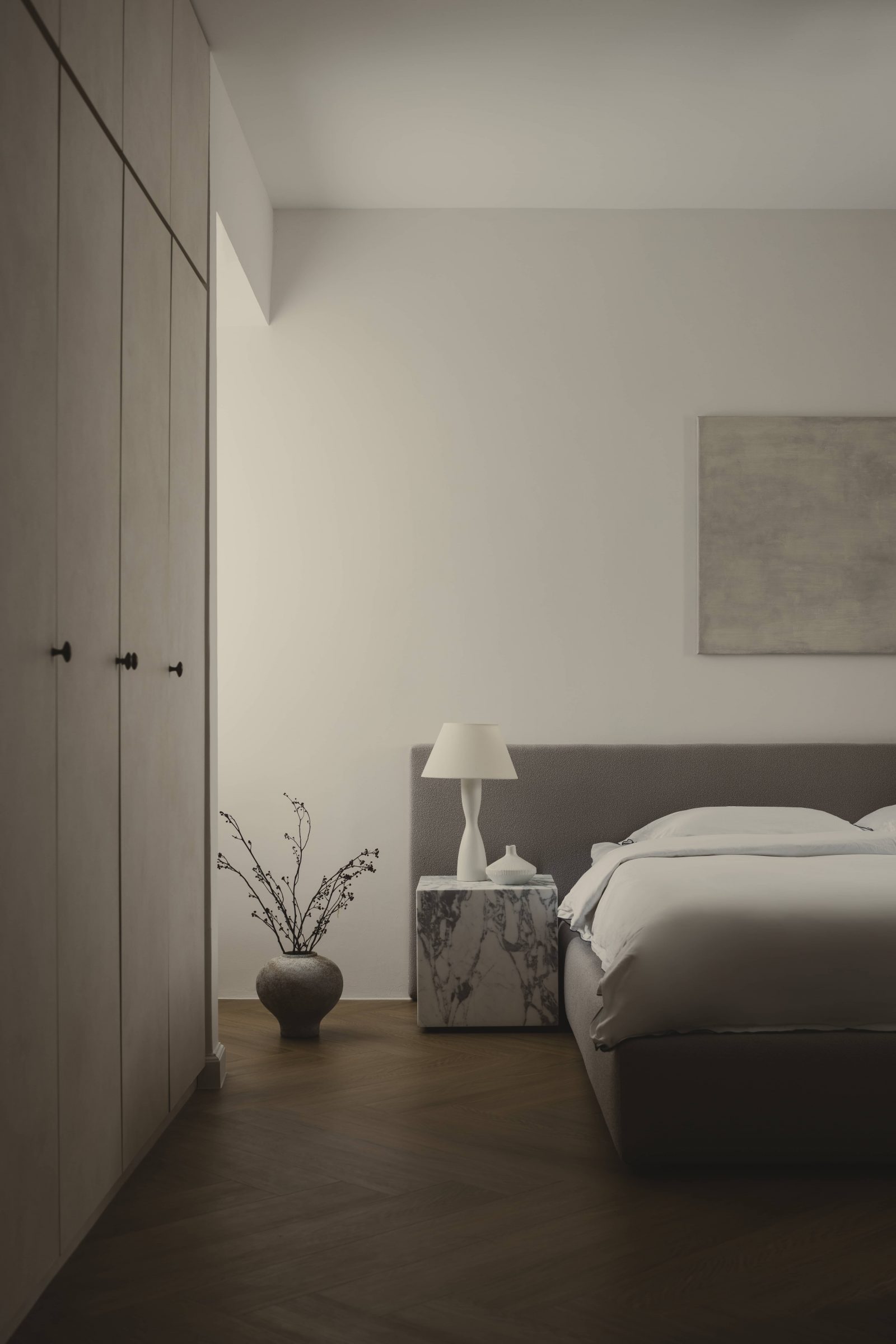
This meant the liberal use of natural materials, such as stone, wood, and ceramics, to inject warmth and character. It also meant a carefully picked selection of furnishings and decorations, aimed at a harmonious balance between classic and contemporary styles.
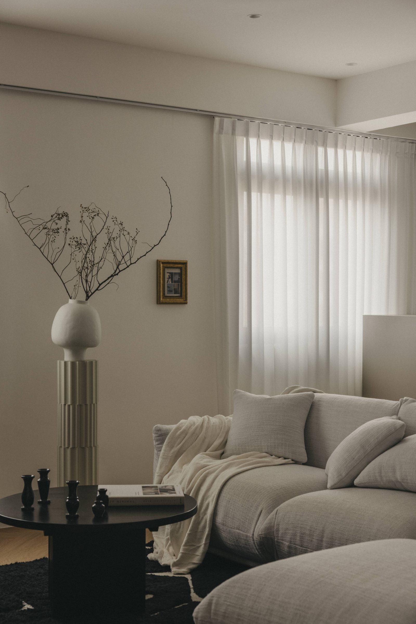
These pieces range from sculpture to botanical accents, which add elements of nature to create serene spaces.

Key changes to the layout
The first level saw the biggest changes, as designers sought to overhaul the dated and inefficient layout. The designers put in a supplementary open kitchen which includes a sink, hob, and oven, to complement the existing enclosed kitchen.
Along with the kitchen island, this creates a space for baking or hosting guests.
On the second floor, two bedrooms were reconfigured, with one now redesigned as a study room.
Changes were also made to the original second-floor stair landing, and the entrance to the bedroom now uses a flush-fitting door for a bit of contemporary elegance. The designers also shrank the second-floor stair landing, to provide more living space for the room.
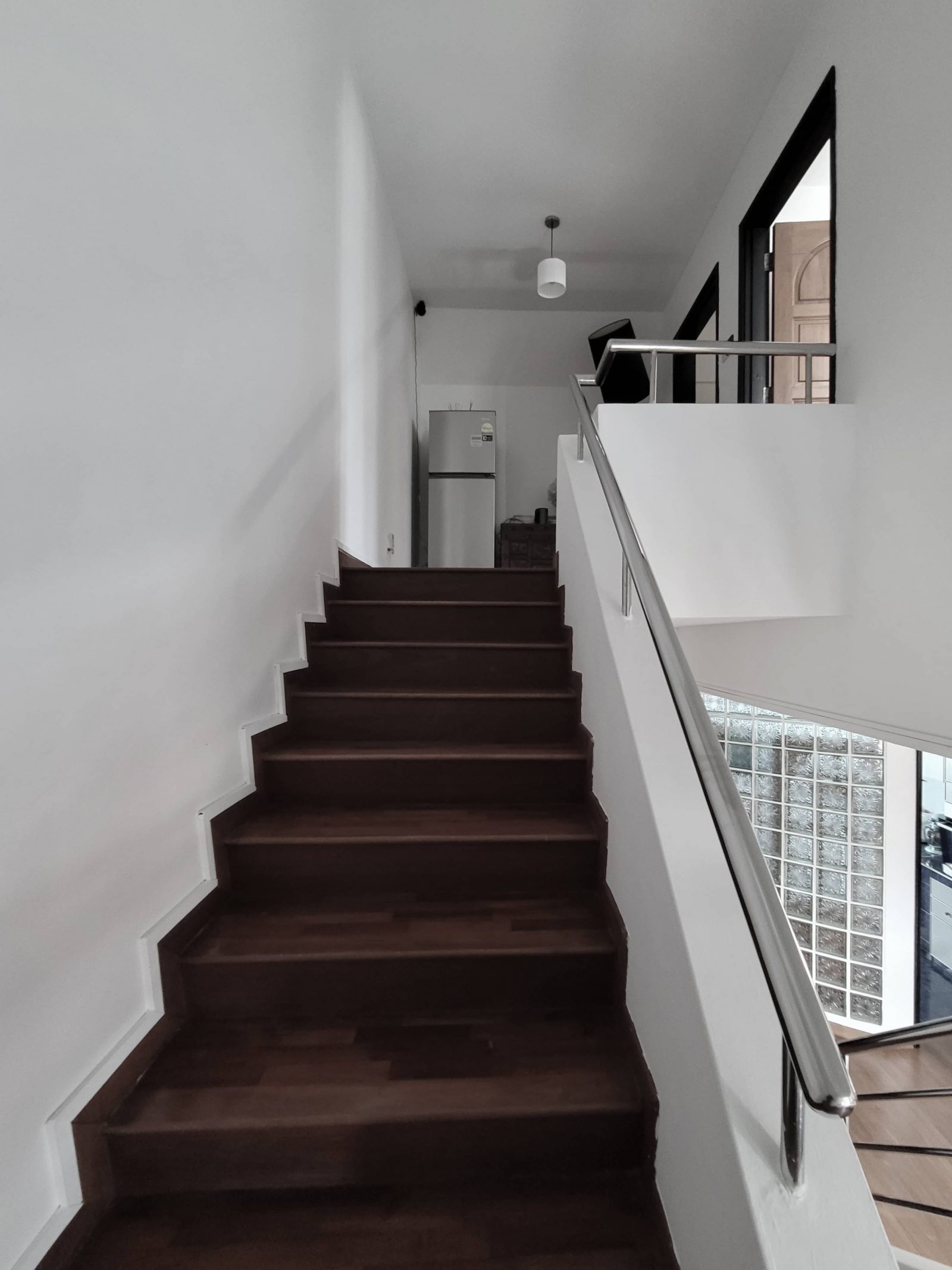
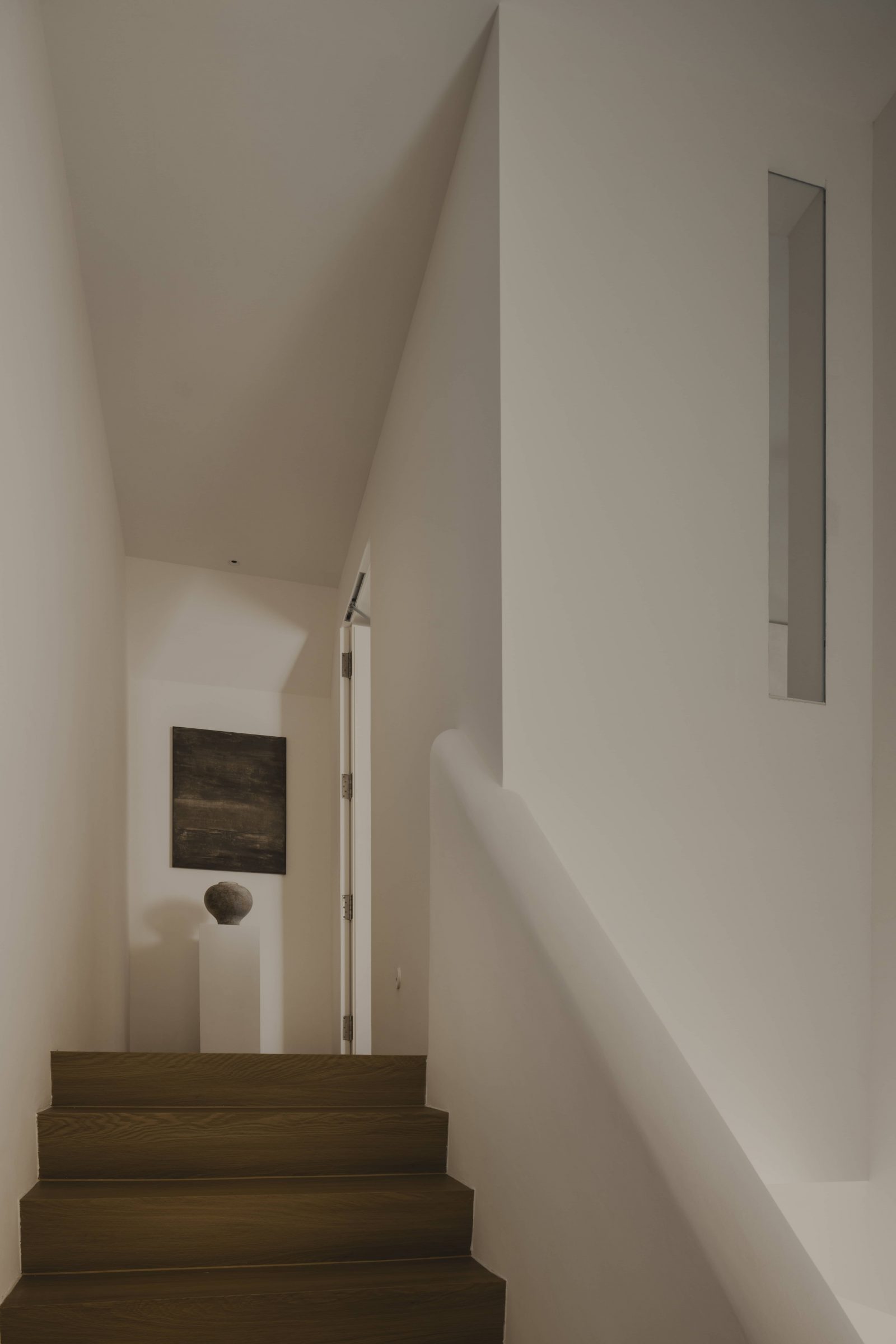
The standout feature, however, would be the stairs and ascent. Rather than replace the staircase railing, the designers covered the existing steel rails in hand-moulded concrete; this was also more economical than tearing out and replacing the original. Also note the use of the Tense Pendant Light (the cloud-like device), which is used to add an ethereal touch to the space.
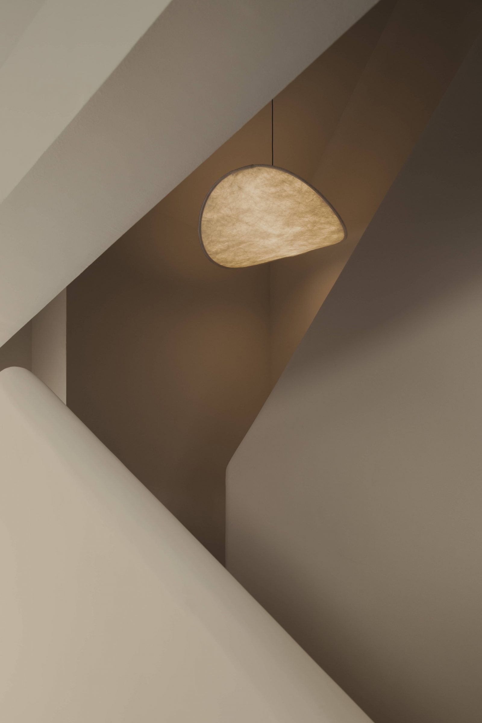
This was inspired by the more elaborate staircases and passageways in homes abroad, which typically have more room compared to smaller Singaporean homes.
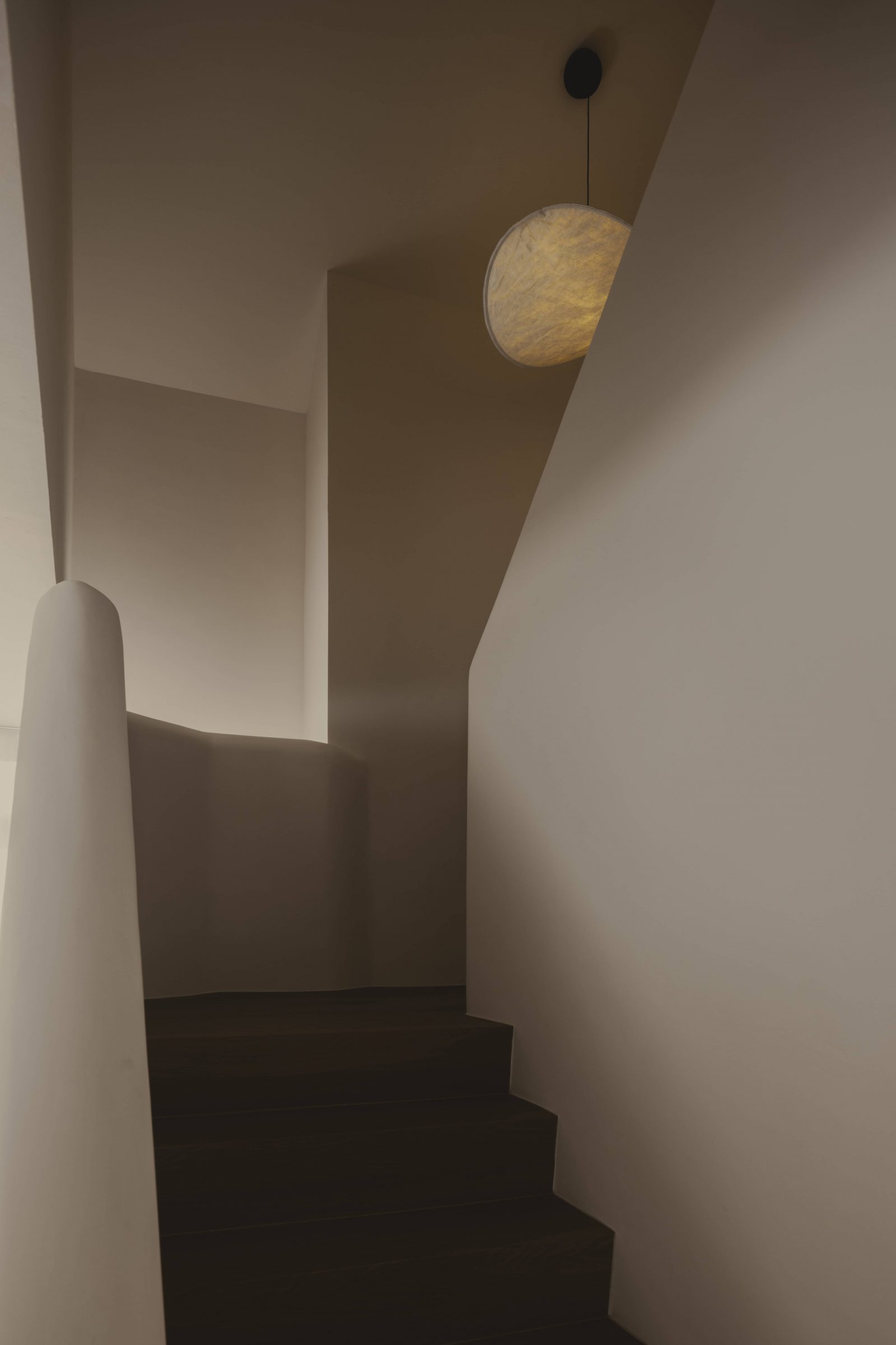
The lead designer also had an intuitive leap toward the final stages of the renovation, and added a glass panel to allow glimpses of the staircase from the private room and vice versa.
It happened “while reviewing a photo I had taken during the initial stages, capturing the staircase before the wall at level two was constructed. I realized that not everyone present during the work-in-progress would have the opportunity to witness such a unique and beautiful perspective. Hence, I was eager to share this rare viewpoint with the homeowners.”
Insights from a year-long renovation journey
The renovation of this unit took around a year (although some of that time can be attributed to the leak issue mentioned above). However, the designer noted that the clients prioritised quality over speed, which helped to deliver the end product.
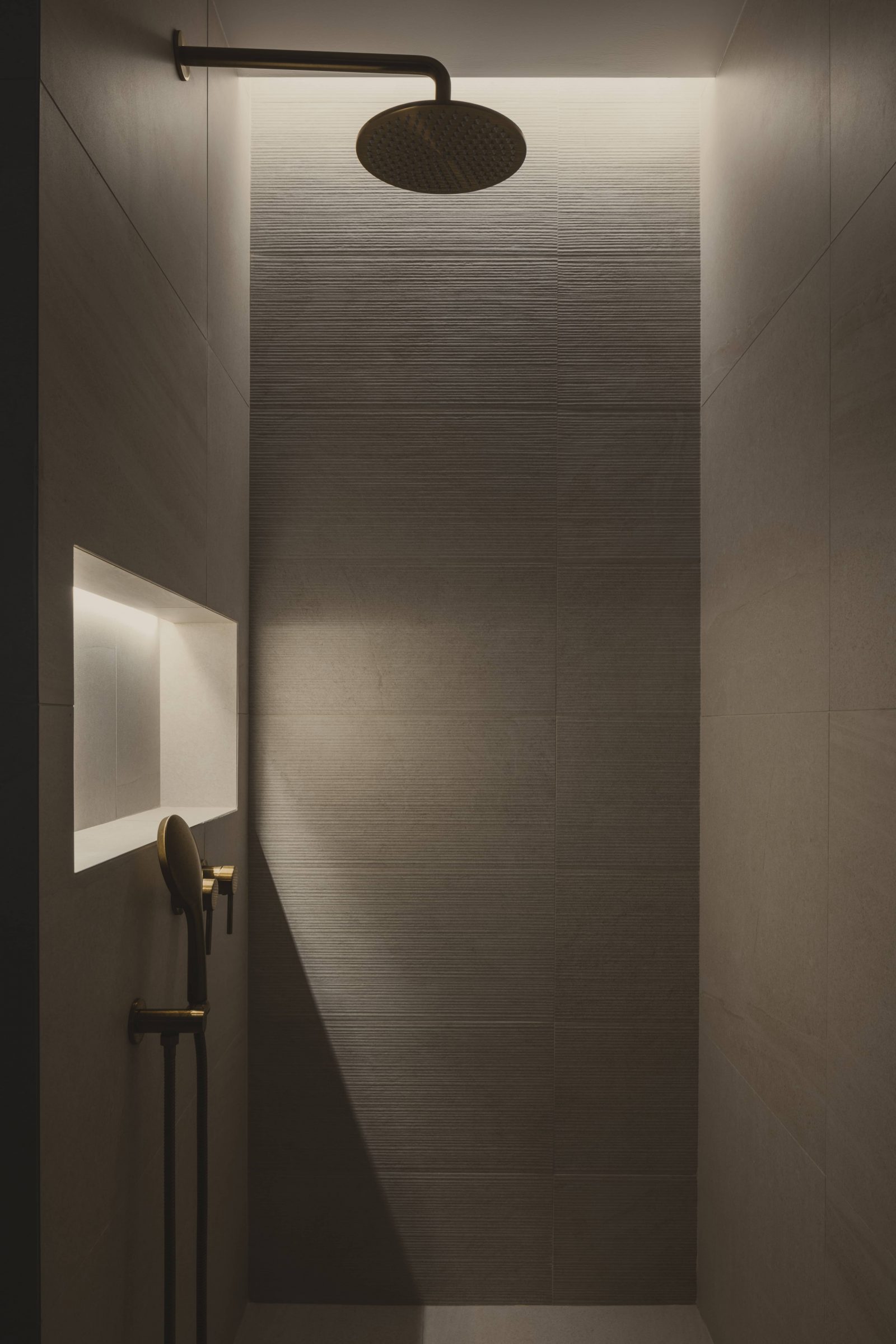
In fact, many months before the renovation were given over to in-depth planning of timelines, expected challenges, and various other costs; and upon developments like dismantling the false ceiling, or removing walls, the designers constantly raised new possibilities and adjustments. The clients were patient throughout the process, because of the constant communication and briefings.
This highlights the importance of “extensive research into associated fees, timeframes, and potential hurdles prior to property acquisition,” especially with older or heritage units.
For more homeowner experiences, as well as in-depth reviews of new and resale projects alike, follow us on Stacked.
At Stacked, we like to look beyond the headlines and surface-level numbers, and focus on how things play out in the real world.
If you’d like to discuss how this applies to your own circumstances, you can reach out for a one-to-one consultation here.
And if you simply have a question or want to share a thought, feel free to write to us at stories@stackedhomes.com — we read every message.
Ryan J. Ong
A seasoned content strategist with over 17 years in the real estate and financial journalism sectors, Ryan has built a reputation for transforming complex industry jargon into accessible knowledge. With a track record of writing and editing for leading financial platforms and publications, Ryan's expertise has been recognised across various media outlets. His role as a former content editor for 99.co and a co-host for CNA 938's Open House programme underscores his commitment to providing valuable insights into the property market.Need help with a property decision?
Speak to our team →Read next from Home Tours
Home Tours Inside A Minimalist’s Tiny Loft With A Stunning City View
Editor's Pick This Beautiful Japanese-Inspired 5-Room HDB Home Features an Indoor Gravel Garden
Home Tours A Family’s Monochrome Open-Concept Home with Colour Accents
Home Tours A Bright Minimalist Condo Apartment With A Loft
Latest Posts

Singapore Property News Why Some Singaporean Parents Are Considering Selling Their Flats — For Their Children’s Sake
Pro River Modern Starts From $1.548M For A Two-Bedder — How Its Pricing Compares In River Valley
New Launch Condo Reviews River Modern Condo Review: A River-facing New Launch with Direct Access to Great World MRT Station










0 Comments