An Old 1986 Executive Maisonette In Hougang Gets A Cosy Transformation Into A Modern Farmhouse Look
August 10, 2022
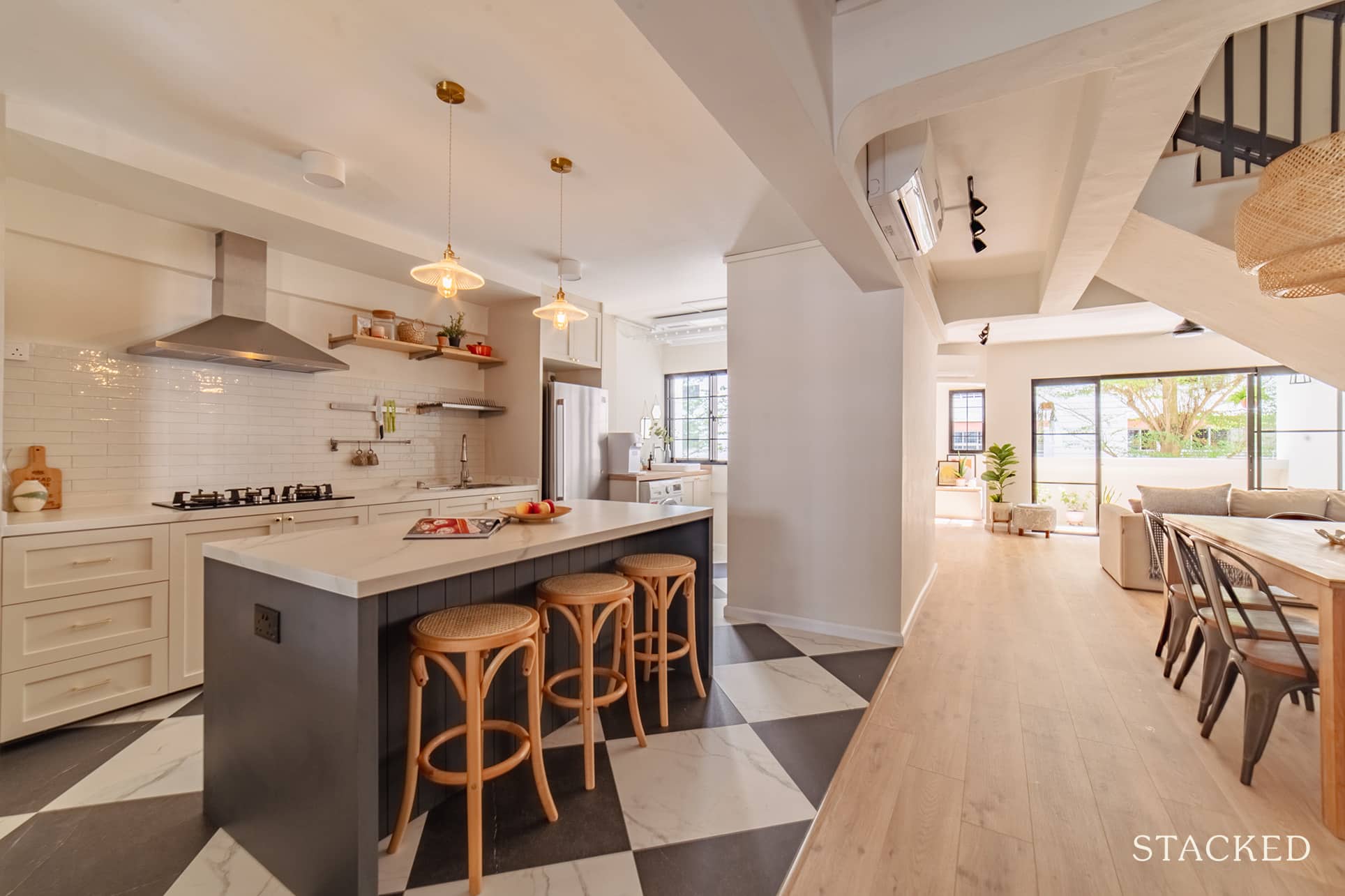
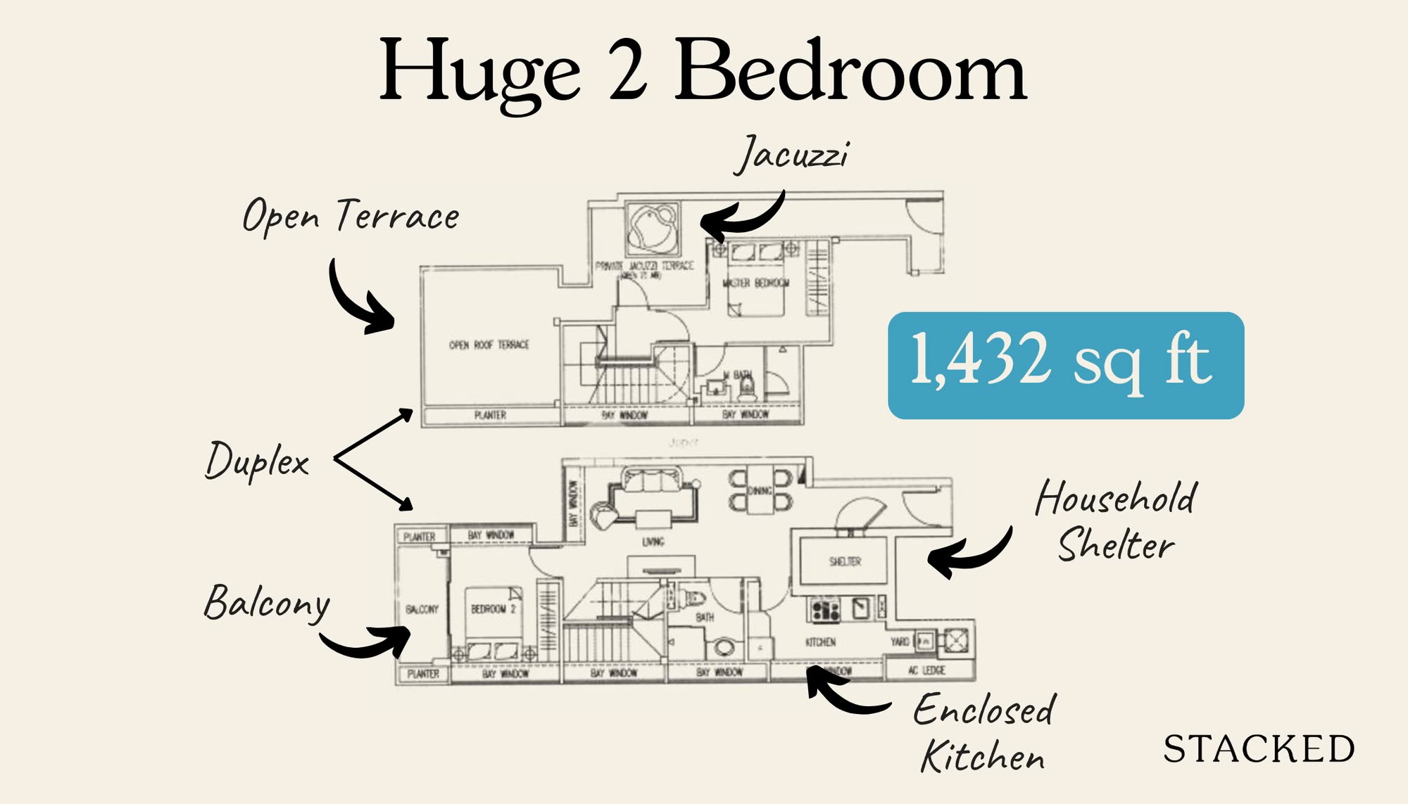
An executive maisonette is all the rage these past few Covid-19 years. The two-storey feature and unique layout are perhaps what makes it sought-after even today, almost three decades after it was discontinued.
With an incessantly rising demand and limited supply, it’s natural to get quite impulsive when the opportunity to purchase one comes up. And this is exactly what happened with Cara and Matt (*not their real name for privacy reasons, @maisonette.atlas). Fortunately, the property also ticked all checkboxes in their criteria.
“We’d been camping out PropertyGuru for about three months late last year when this EM in Lorong Ah Soo came up,” Cara said. “It was the first viewing we did and we put in an offer within two days.”
She admitted that it may seem like they pulled the trigger too fast. However, they knew that this type of listing doesn’t come by often. Plus, it meets their other considerations, such as size, location, and the serenity of the neighbourhood. “And most importantly, price,” she added.
Also, time was of the essence for the couple. Their family was starting to outgrow their marital home, which was a 5-room BTO in Sengkang. Then, both Cara and Matt also transitioned into WFH arrangements post-COVID. Their kids were also starting primary school, which is quite a distance away.
That’s why they needed to start looking for a bigger home in the Serangoon and Hougang area.
The maisonette they bought was 36 years old, and the first owners were still living there when they viewed it. Cara said everything was in its original HDB condition.
“There was no air con with hardly any built-ins other than the kitchen. The staircase was original and so was the open balcony and high ceiling round alcove.”
But she said it’s easy to tell that the home was loved and well maintained. It was clean, clutter-free, airy, and bright. The flat has just gone through HIP the year before, so the couple was assured that “the house also had good bones.”
Cara and Matt felt that they were very fortunate to get this EM since prices were already starting to go up at that time, and it was still within their budget.
Currently, there are six of them who are staying in the place; she and her husband, their three daughters aged two, six, and eight, and their helper.
Let’s go ahead and discover how they converted this old maisonette into a home that each of them loves.
So many readers write in because they're unsure what to do next, and don't know who to trust.
If this sounds familiar, we offer structured 1-to-1 consultations where we walk through your finances, goals, and market options objectively.
No obligation. Just clarity.
Learn more here.
How The Renovation Journey Turned Out
Cara said that their initial budget for the reno was $80K. However, they had to take out $9K from their furniture budget and add it to their reno allocation to top up other things. This includes longer vanities in the bathrooms, tile choices, and glass work for taller windows in the house.
We asked her why they went with a modern farmhouse style, and she quickly replied that she loves the warmth that it brings.
“I’m a huge fan of American designers like Studio McGee, Emily Henderson, and Chris Loves Julia,” she explained. “I wanted something cosy. Something that’s encompassing enough to accommodate all the sentimental knick-knacks, toys, and books that a family naturally accumulates over time.”
She also said she wanted a style that’s a bit more open to interpretation. “I cannot live minimalist style la!” she jovially added.
To implement their design goals, they had to change some of the layouts on the first floor and leave most of the second floor as is.
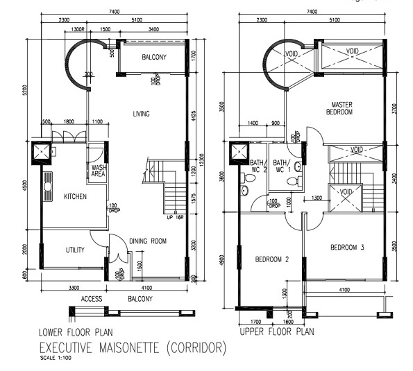
On the first level, they combined the utility room and the kitchen. Thus, hacking the wall that originally divides the two is essential, allowing them to create a larger and open kitchen. They also built a small guest room at the foot of the staircase where the original dining area was supposed to be.
Cara said that as they were praying about what their new home should look like, the word “welcoming” kept coming back to them. And so, they designed their EM to be open and hospitable. They made sure it had plenty of gathering spots, including around the island, the dining area, and the living room. This will allow them to host their friends and family well, as well as have their kids hang out with their friends when they get older.
For the second floor, they opted for loose furniture in the bedrooms so the house could grow and change with them.
Here’s how their home turned out after the reno journey, room by room.
Kitchen And Dining Area

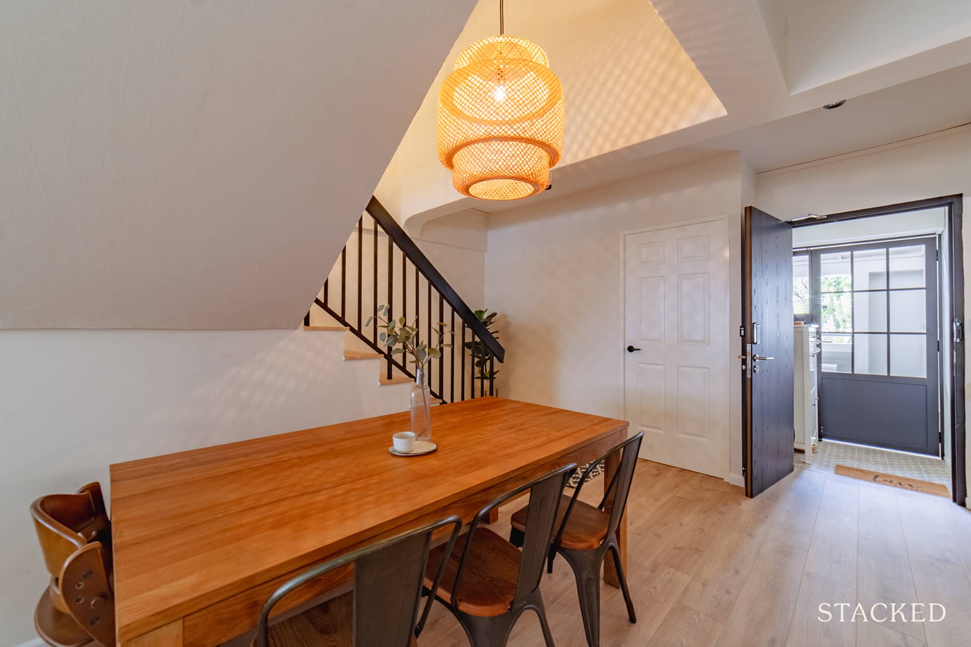
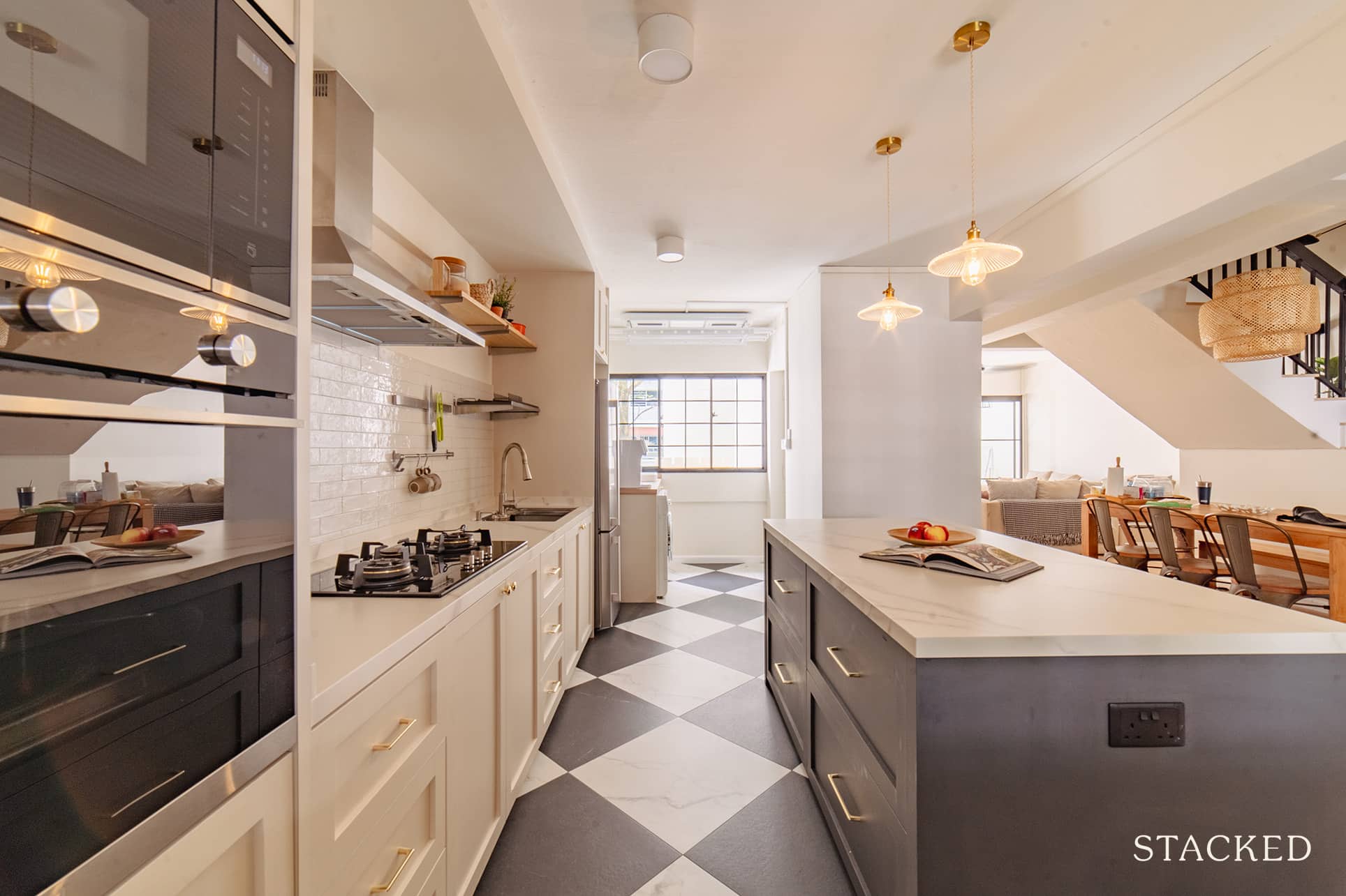
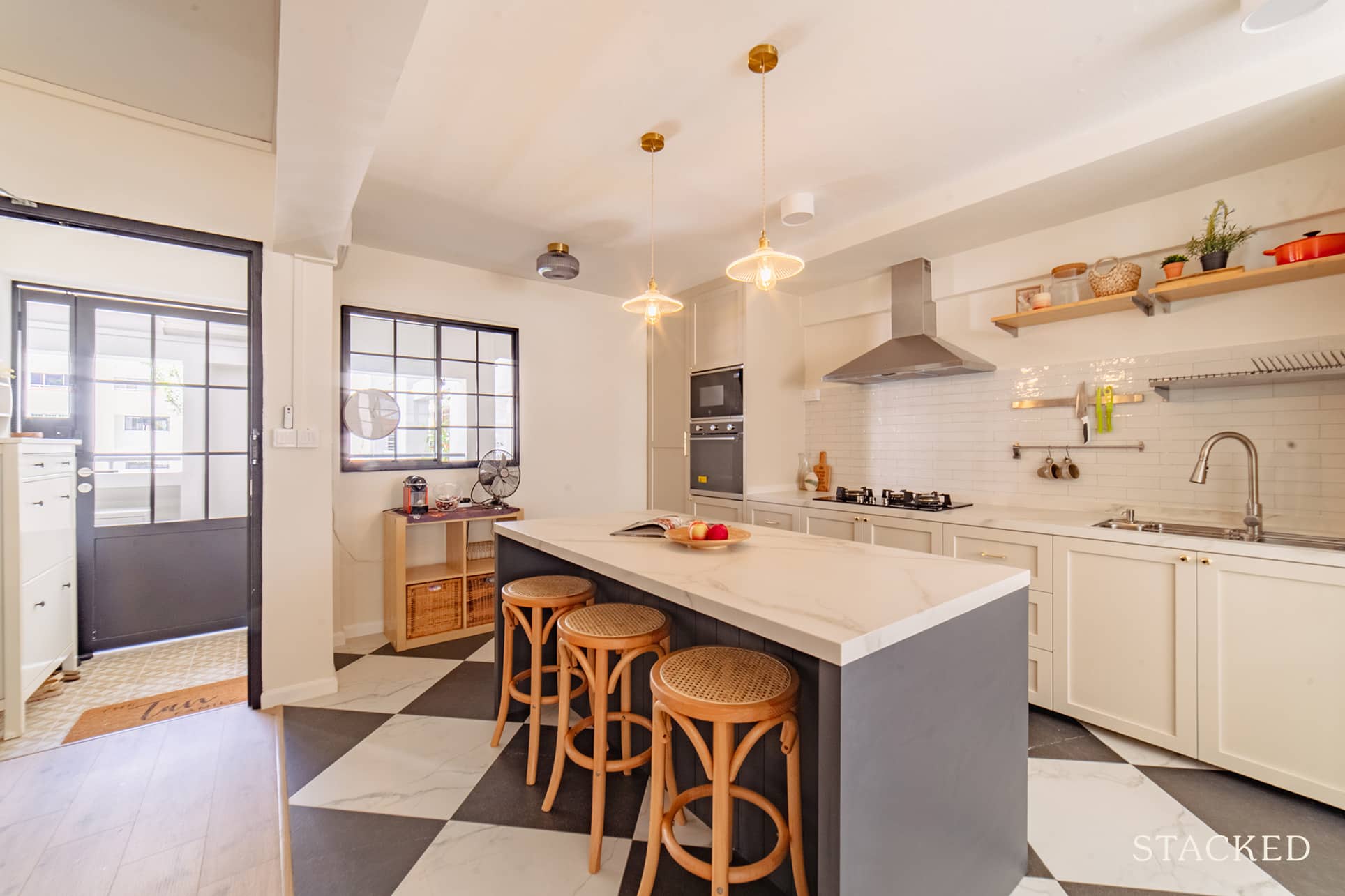
As soon as you enter their home, you’ll be greeted with an abundance of space. The couple’s decision to open up the kitchen and dining area made this possible, allowing them to entertain their guests even while prepping food.
In fact, Cara confessed that for most of the gatherings they hosted in their place, guests tend to naturally converge around the kitchen’s island.
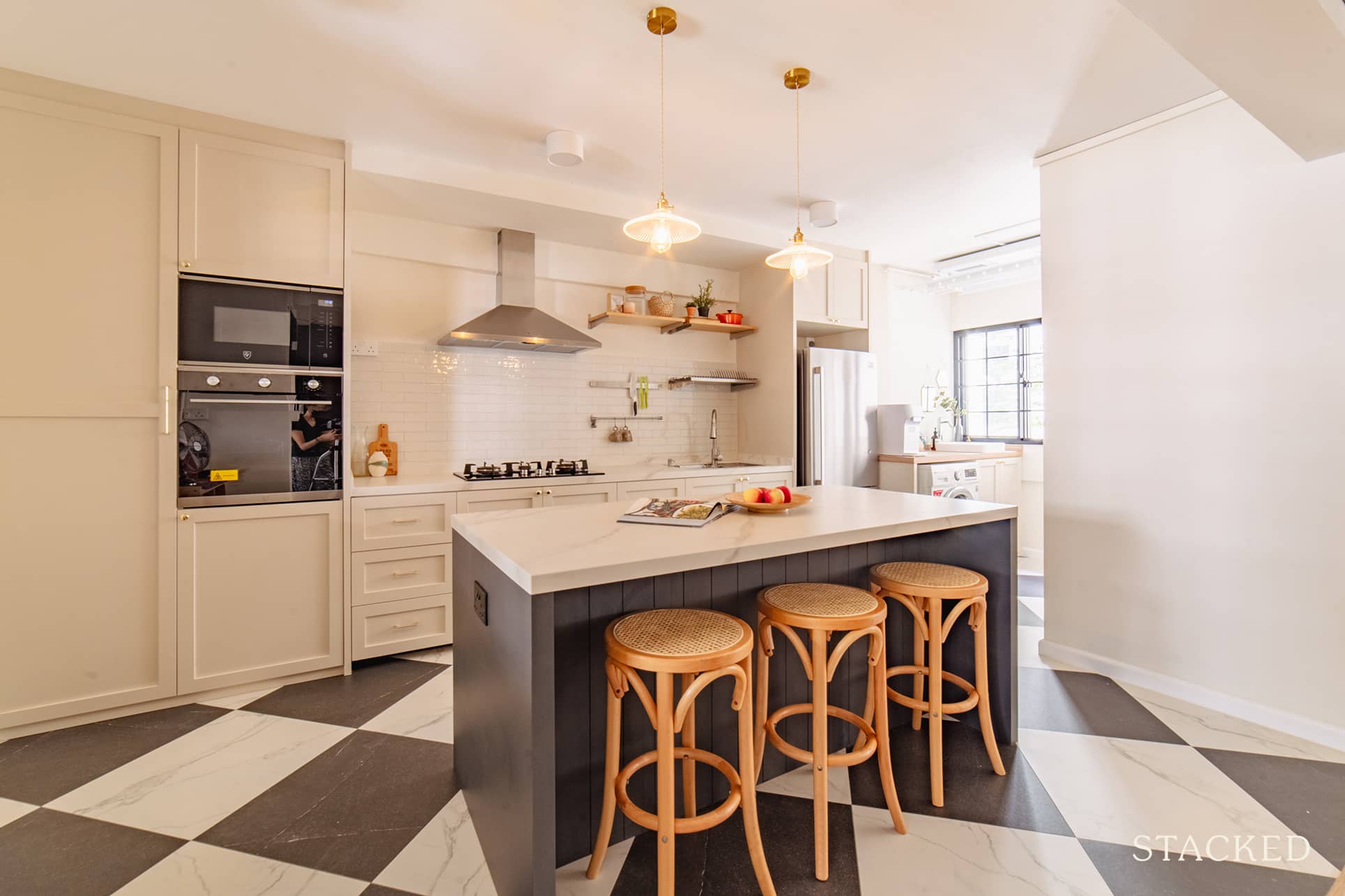
They also combined the utility room with the kitchen. It made the kitchen bright and airy and allowed lots of natural light to flow in from the utility’s window. The kitchen floor’s black and white checkered pattern was inspired by @chrislovesjulia’s old dining room.
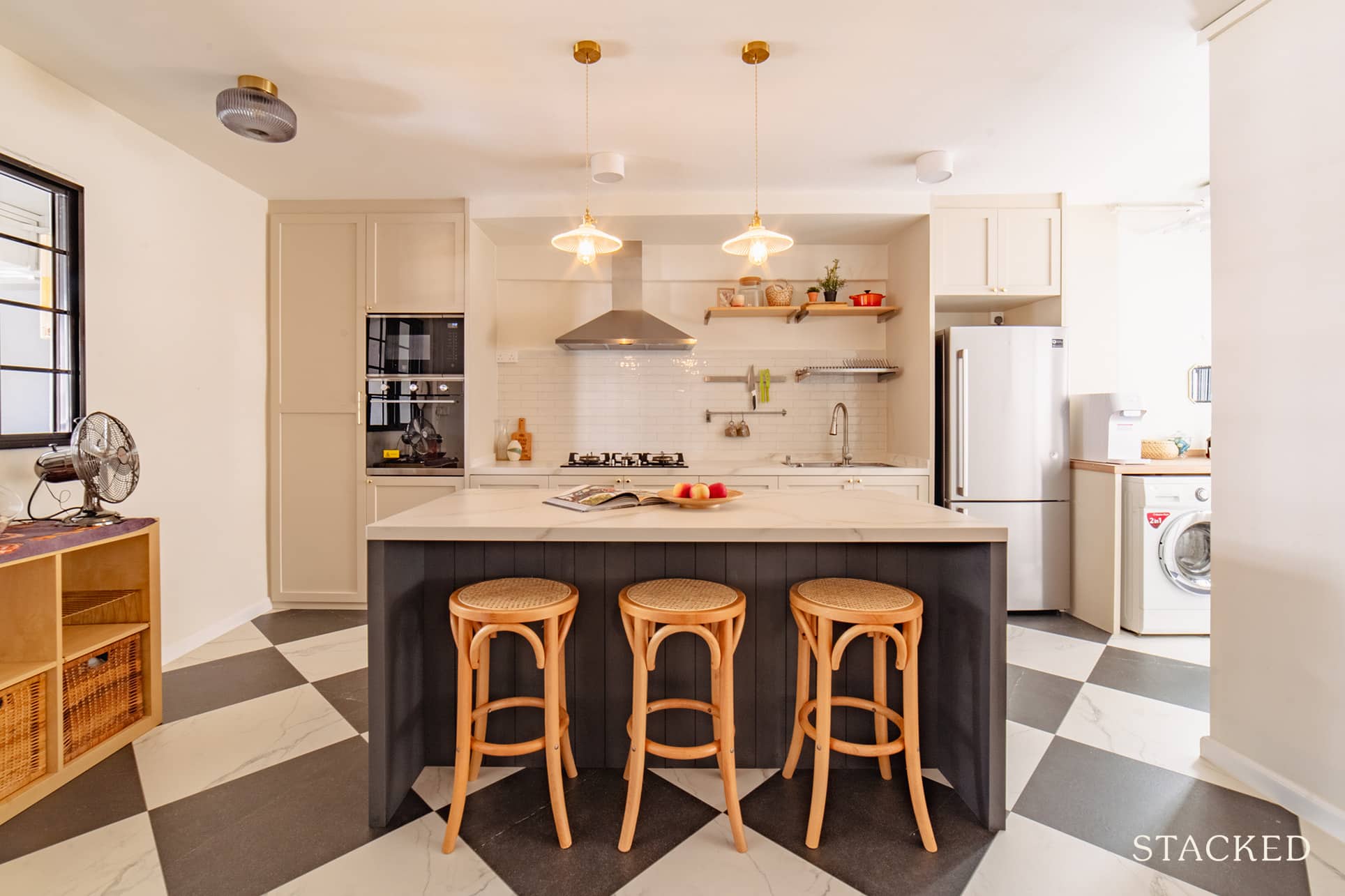
The cabinet carpentry is an unmistakably modern farmhouse design with its neutral colour, kitchen island with seating, and metal range hood.
Guest Room
So what happened to the old dining area, as seen from the original layout? Well, Cara and Matt had partition walls installed to convert it into a guest room.
Living Room
As you go further inside, the home opens up further to a living room that’s bright and clean. The neutral colours and smooth lines truly speak of a modern farmhouse interior. The L-shaped sofa looks to be an extremely comfortable one to just sink yourself into.
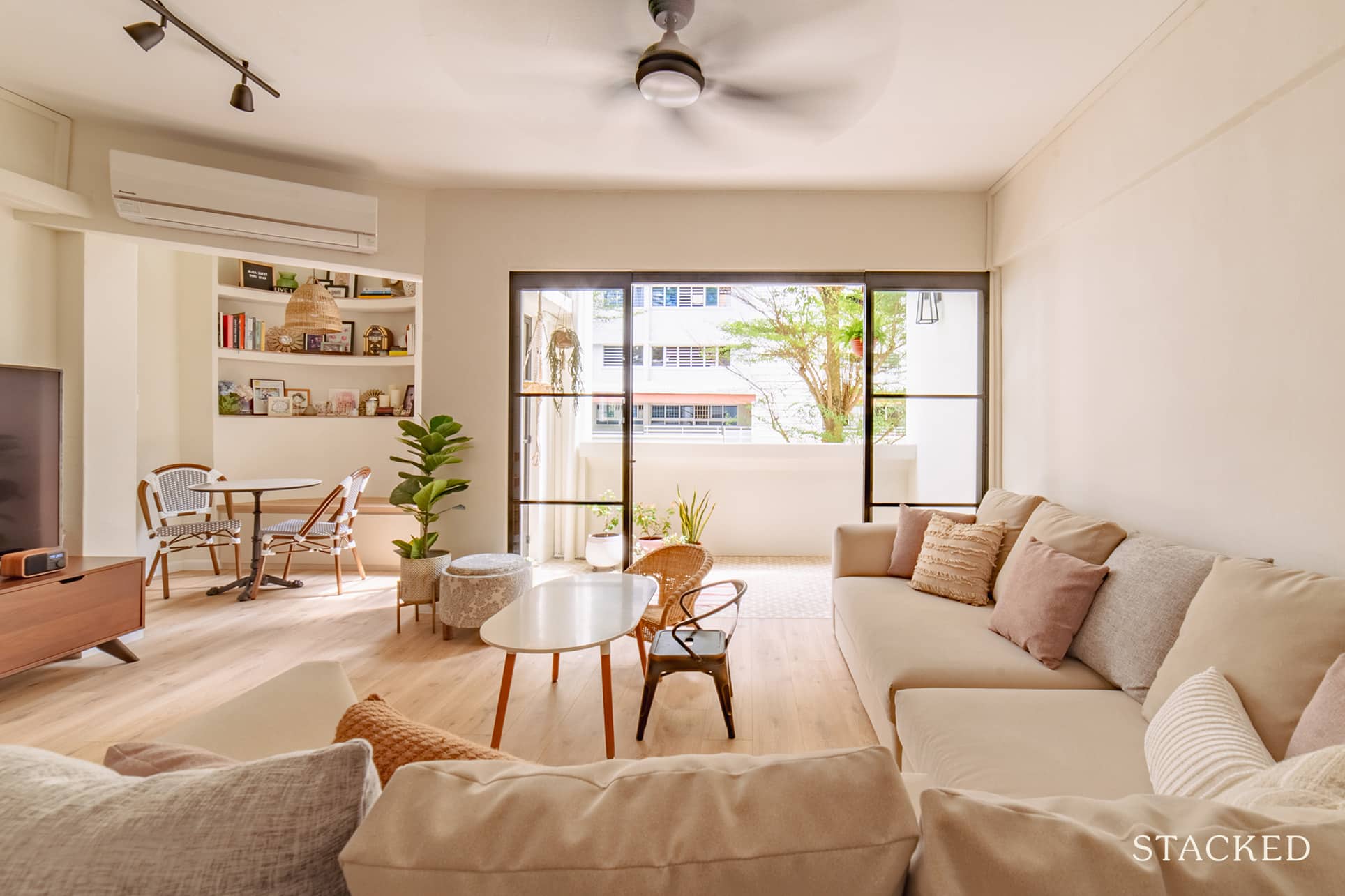
What’s really cute here too is the smaller than usual black metal and wicker chair specially catered for their kids.
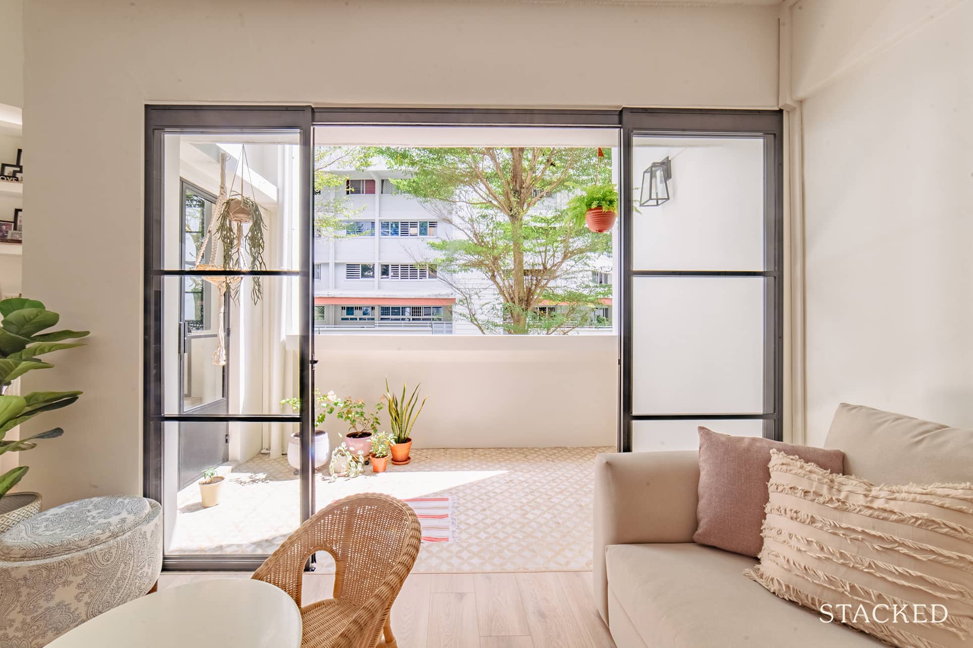
They installed new french doors as well as retiled the balcony. Cara said they were thinking about enclosing the balcony initially as they were close to the surrounding blocks so there wasn’t much of a view. But she decided to “keep the balcony as an outdoor space” and was happy they did so as it helped to keep the house airy and bright.
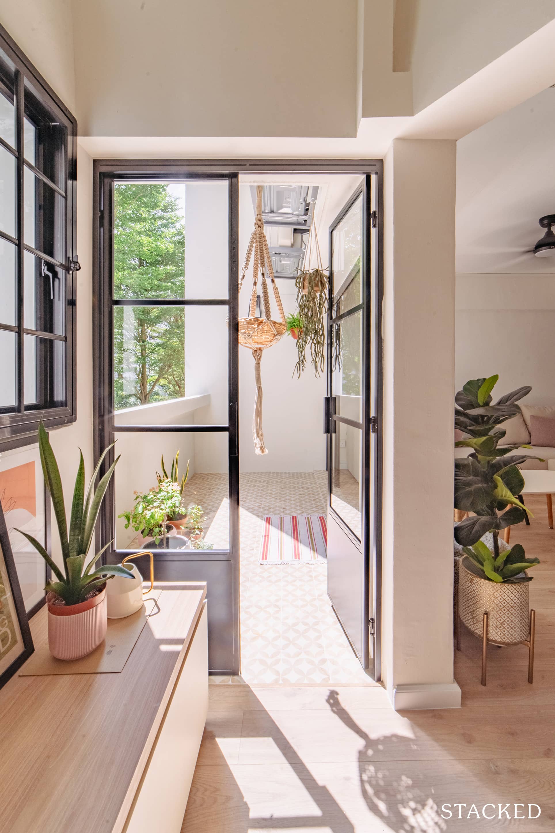
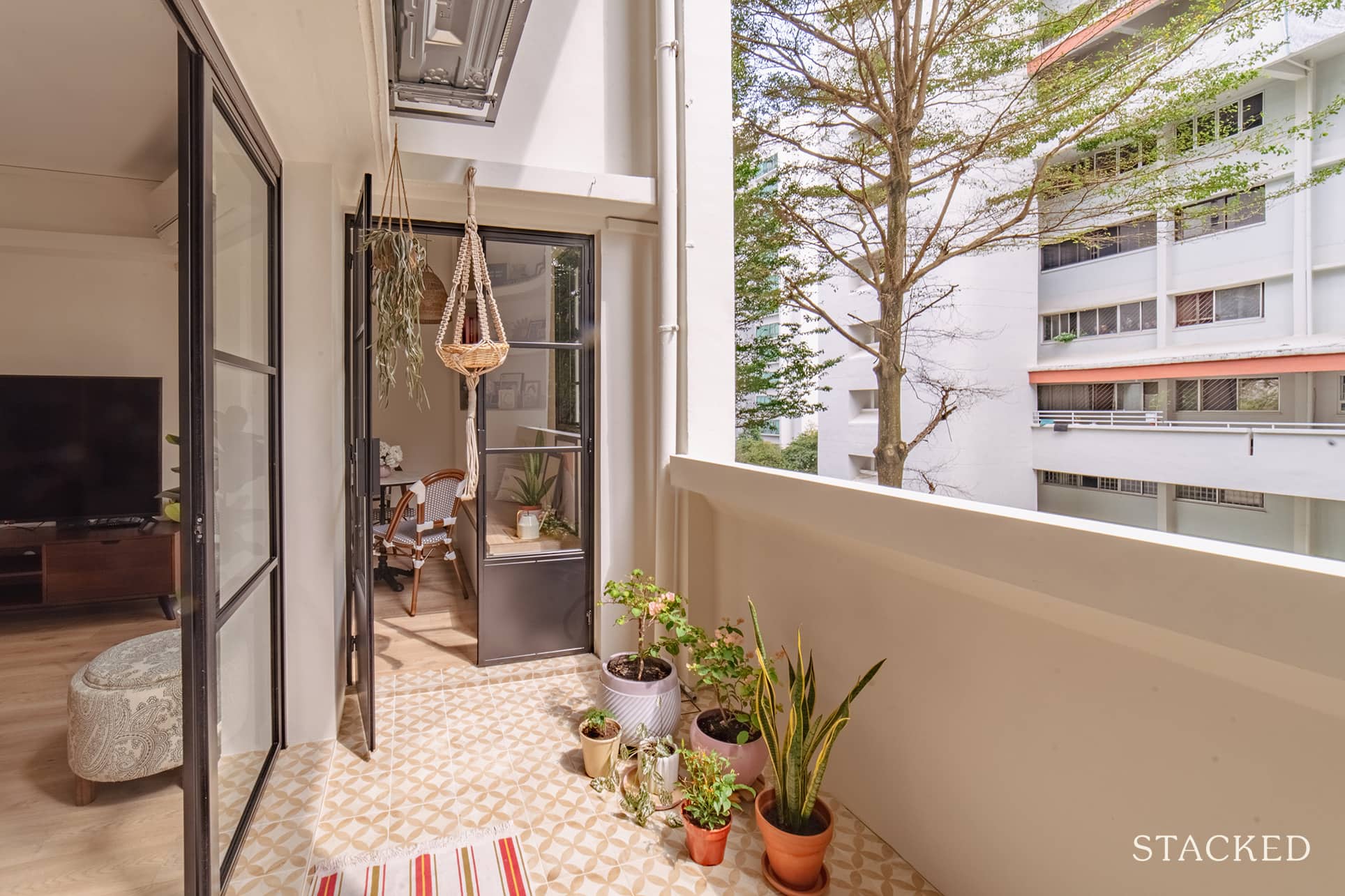
Mixing the new with the old is another hallmark of a modern farmhouse style, which allowed them to buy secondhand furniture like the garden set they have. As Cara puts it, “good for my wallet, good for the environment.”
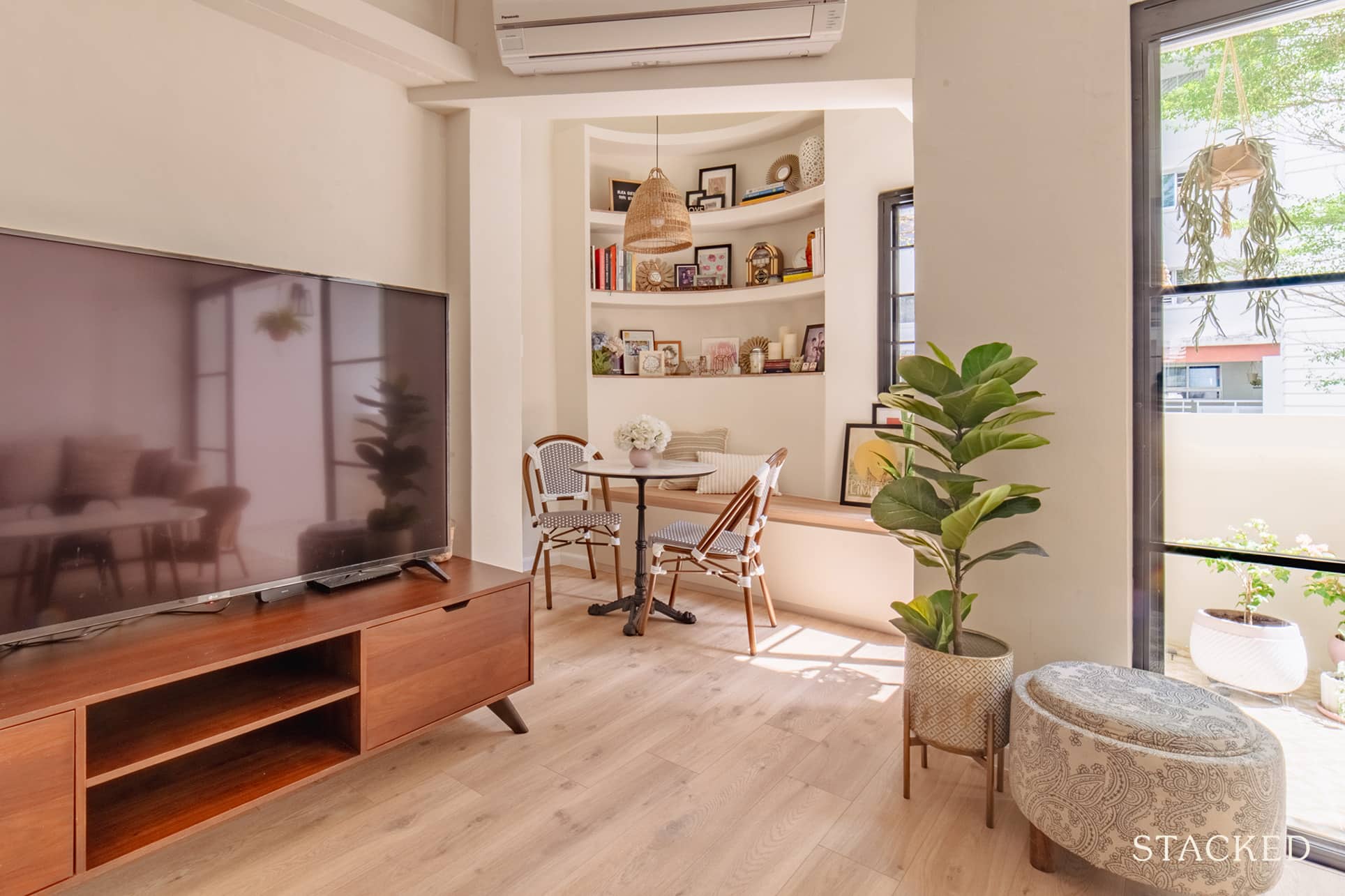
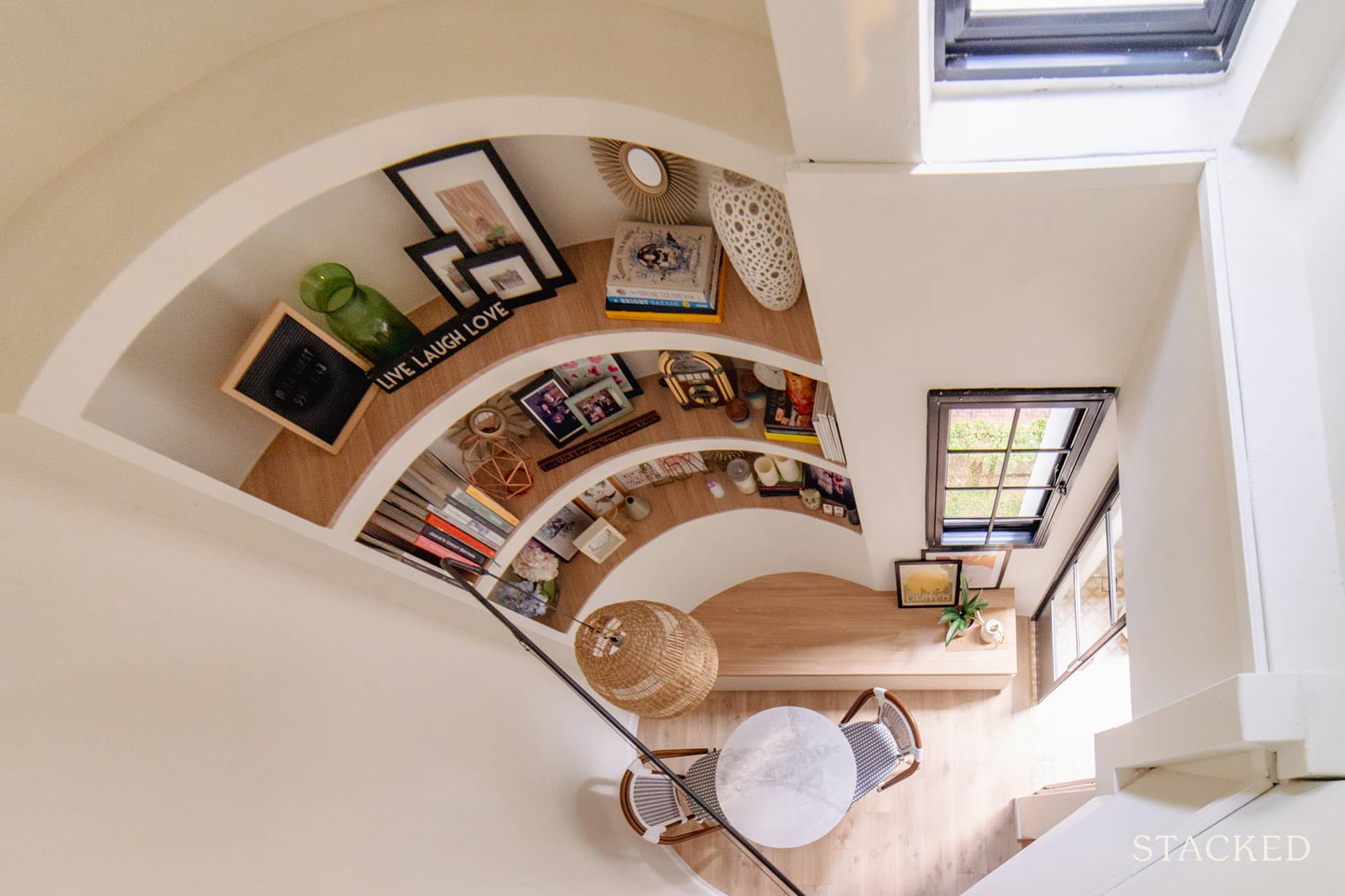
One of the most eye-catching spaces is definitely the alcove by the balcony. It’s a truly lovely spot, as the high ceilings travel all the way to the top of the unit (you can view it from the MBR window).
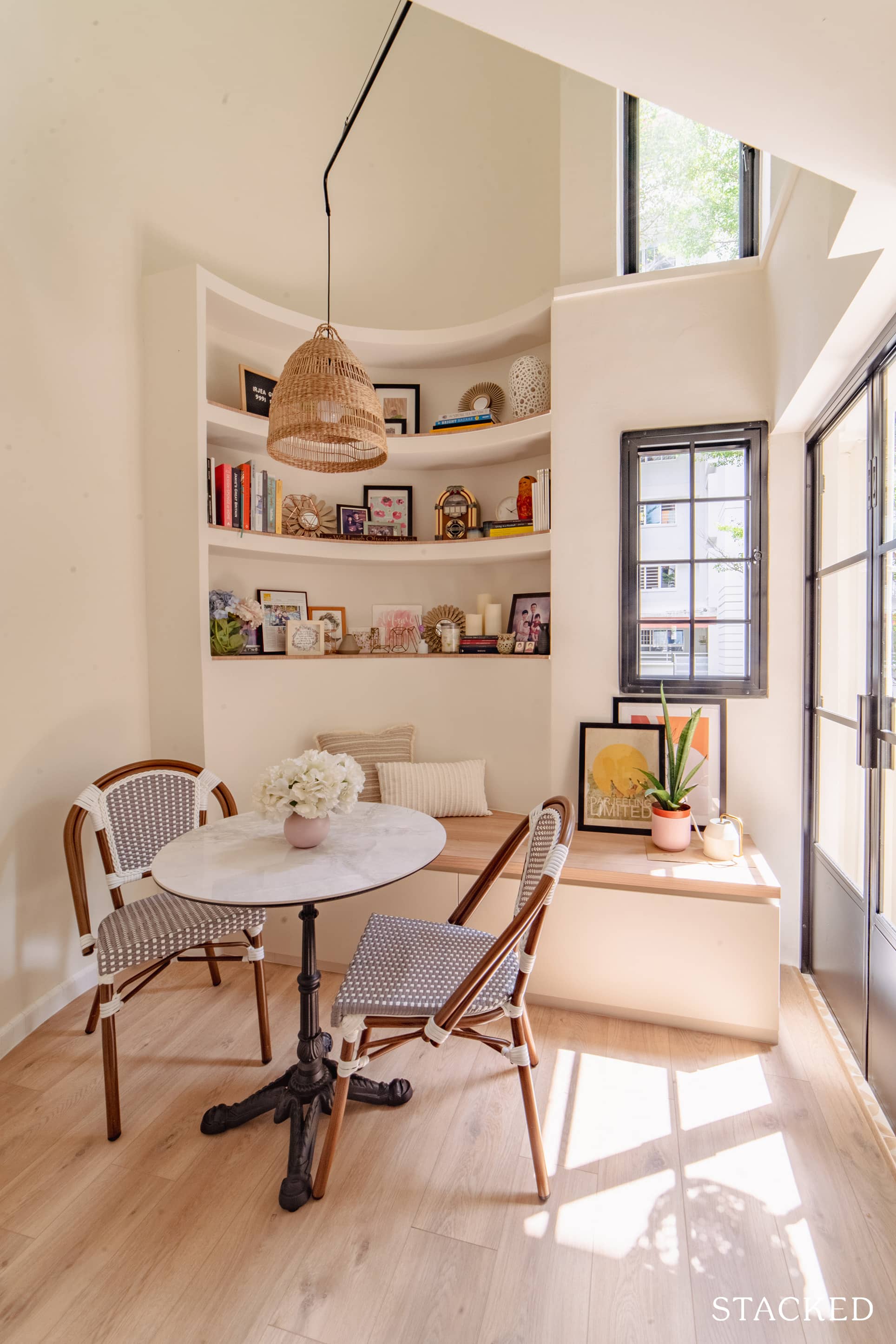
Very interestingly, the curved wall was already present, and was actually a unique architectural feature of the HDB flats during the 1980s and 90s.
Staircase
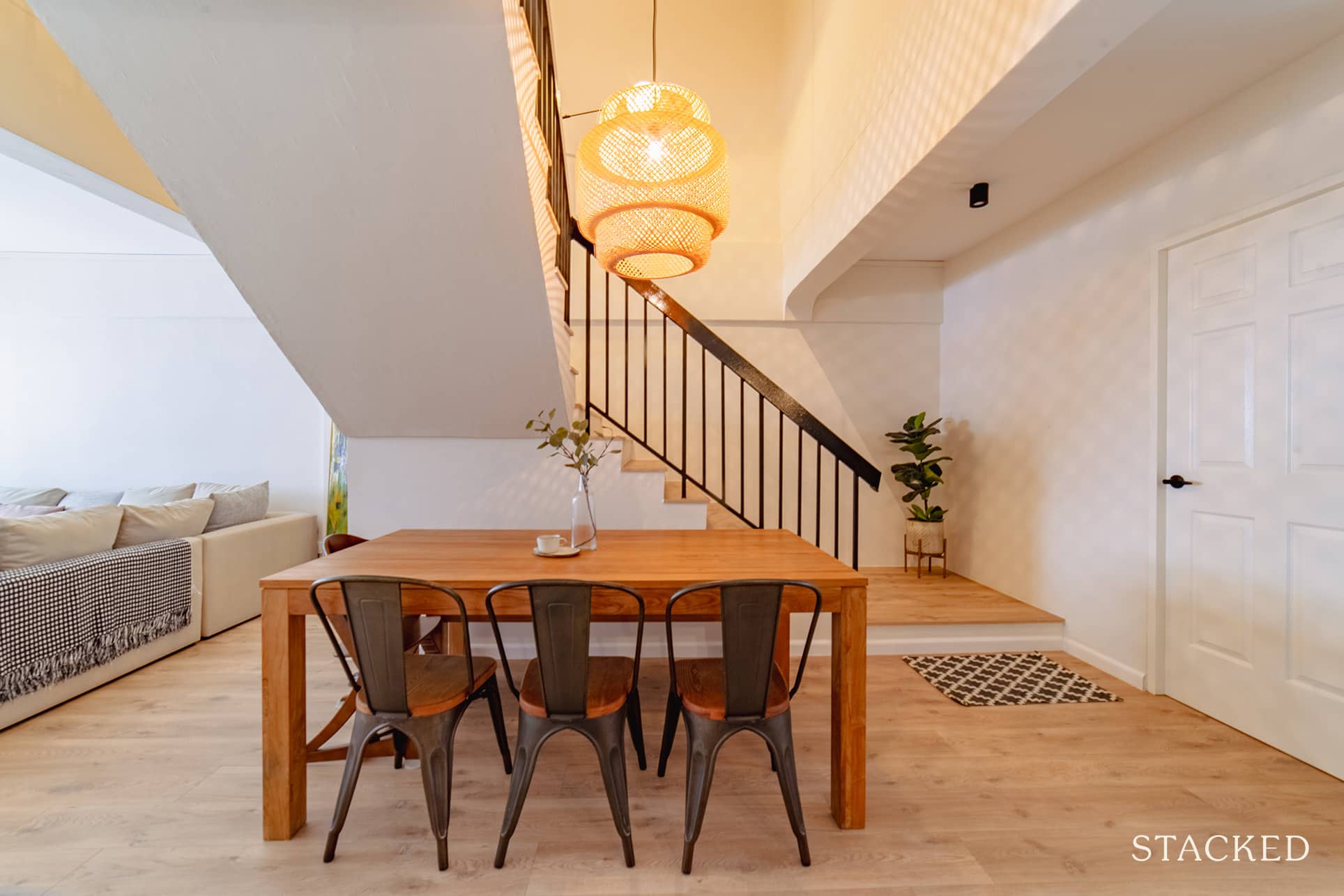
Before we head upstairs, let’s take some time to check their staircase. Underneath it, they partitioned a store room to help keep the clutter away.
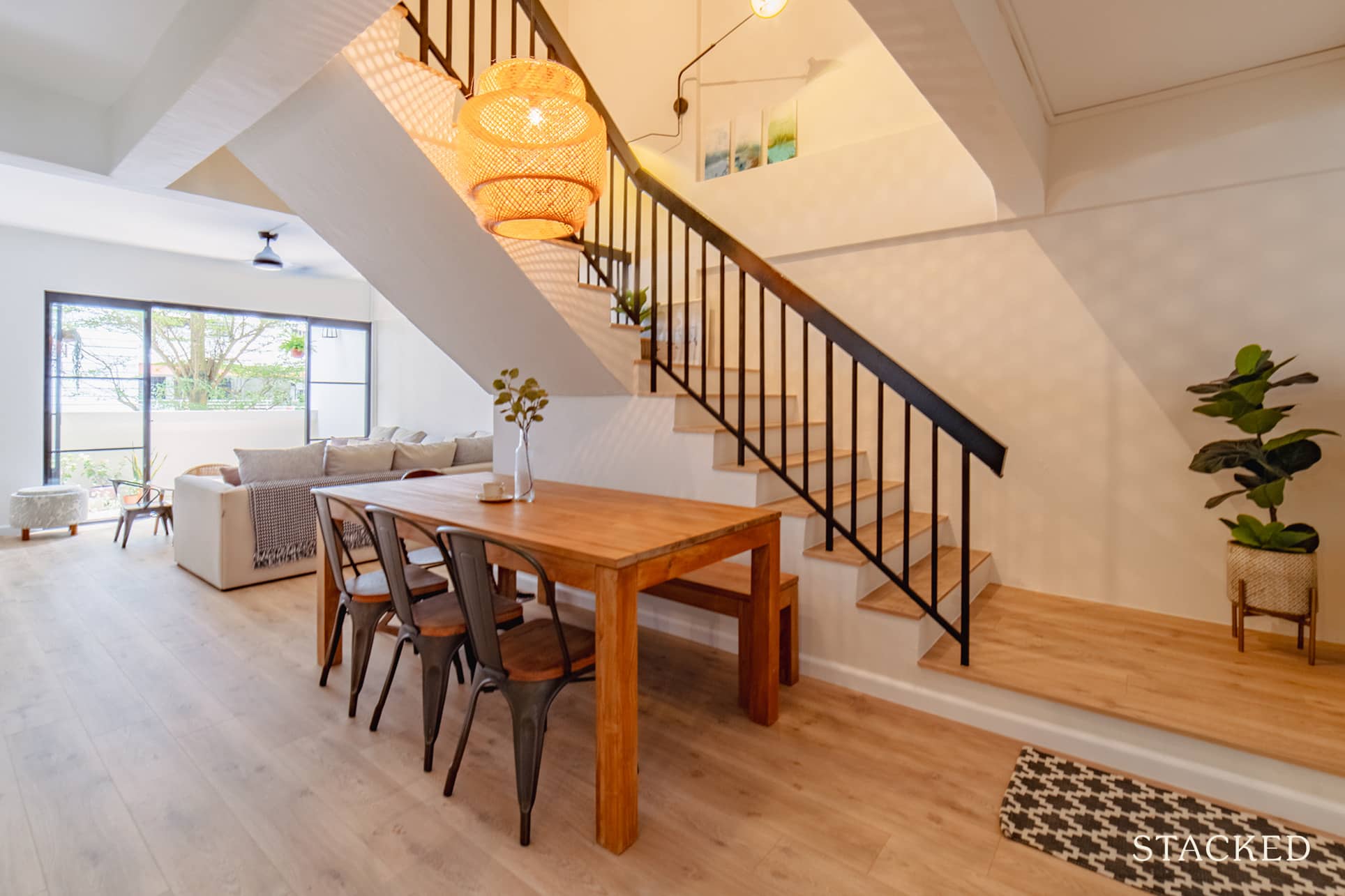
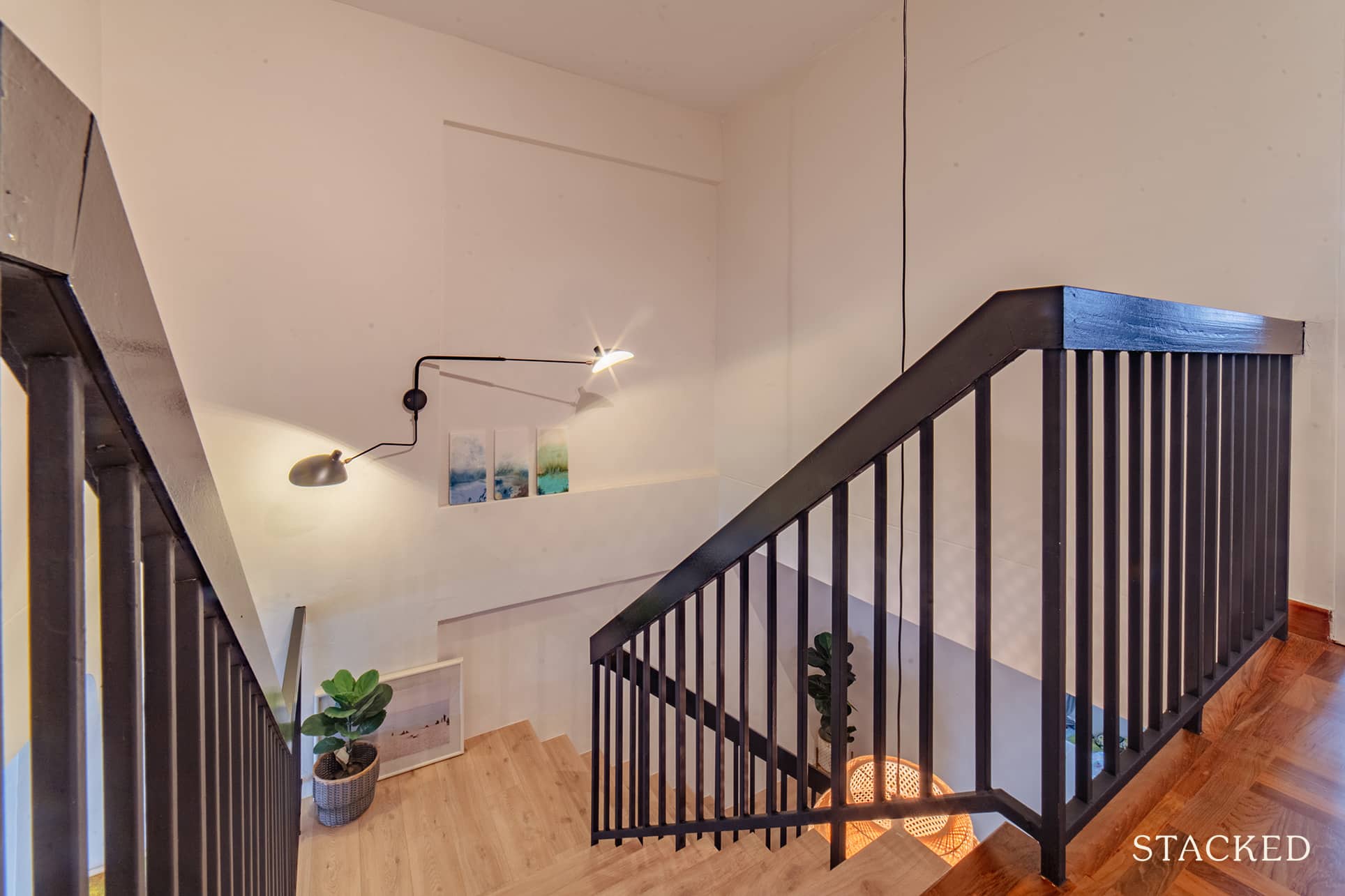
They also changed the stair treads to vinyl with a wooden look but maintained the original railings and repainted it black to keep a more minimalist but still visually interesting.
Bedrooms
With the exception of the master bedroom, they didn’t do any built-ins for the other two. They also chose to keep the original parquet floors on the second floor and just had them refinished in matte.
More from Stacked
7 Mega Condos That Are Far From the MRT, Yet Surprisingly Convenient
There are many appealing factors about a larger condo project (i.e., condos with 700 units or over). They tend to…
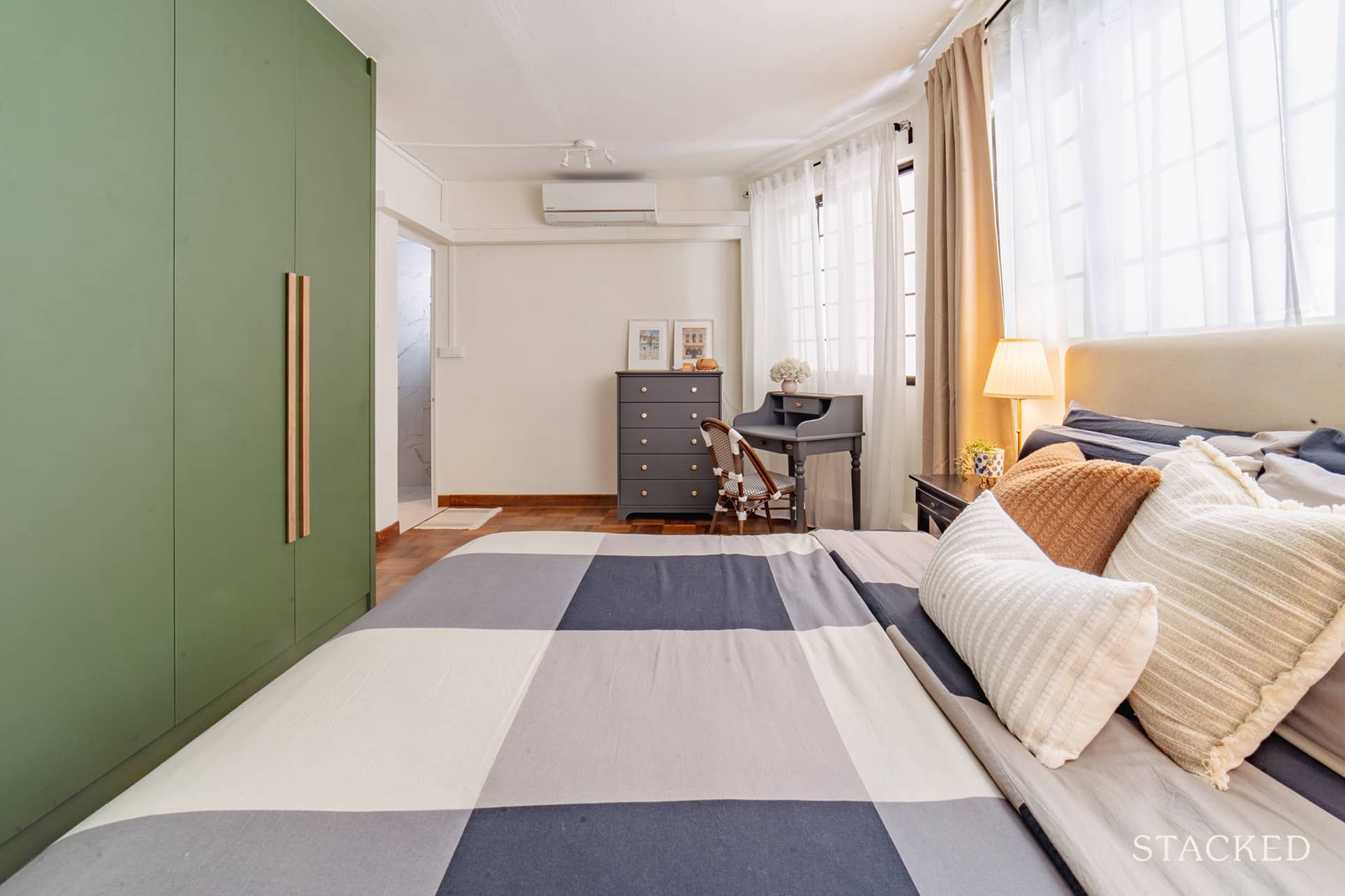
Even though it’s kept quite simple here, the wonderful shade of green goes really well with the chest of drawers and dressing table.
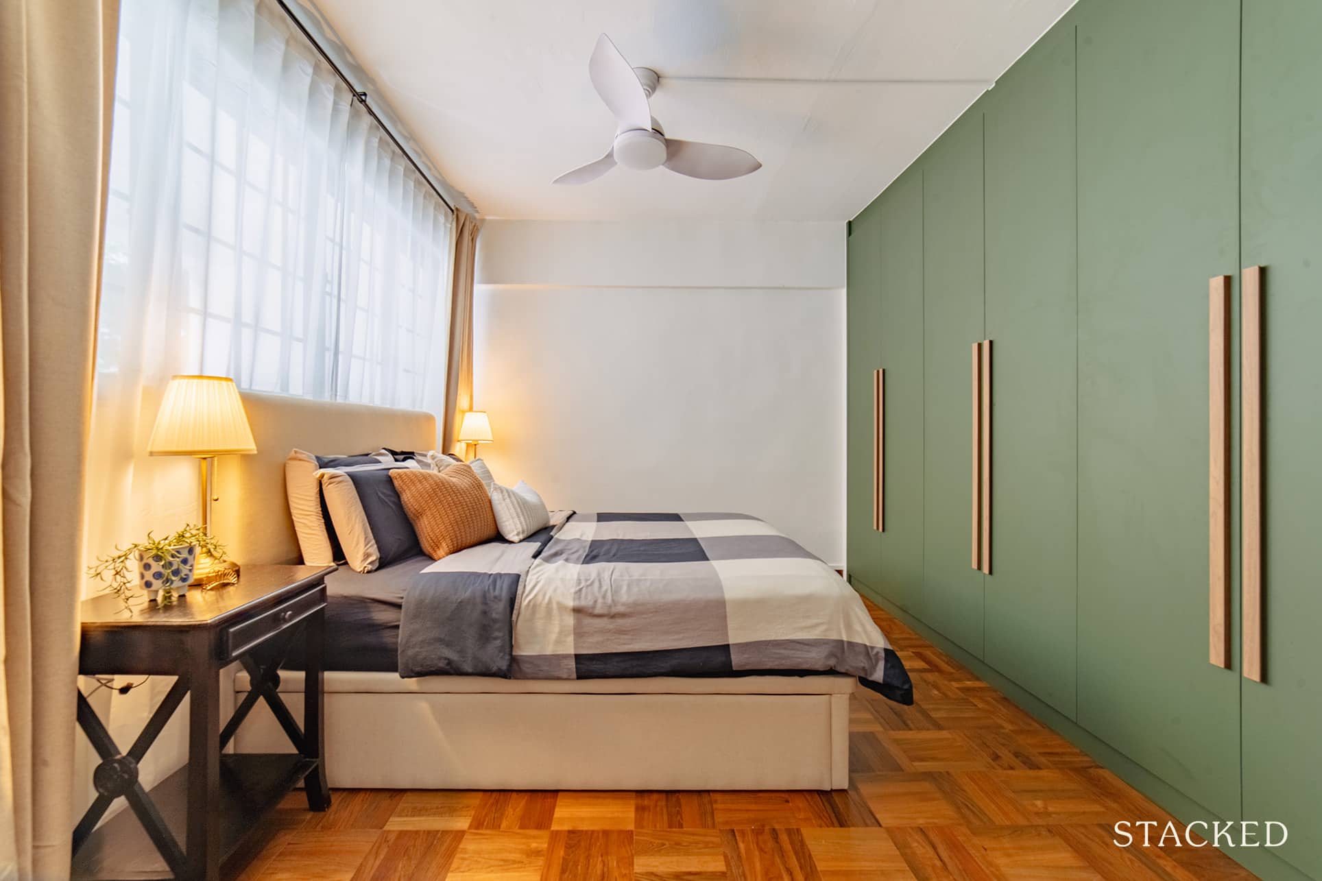
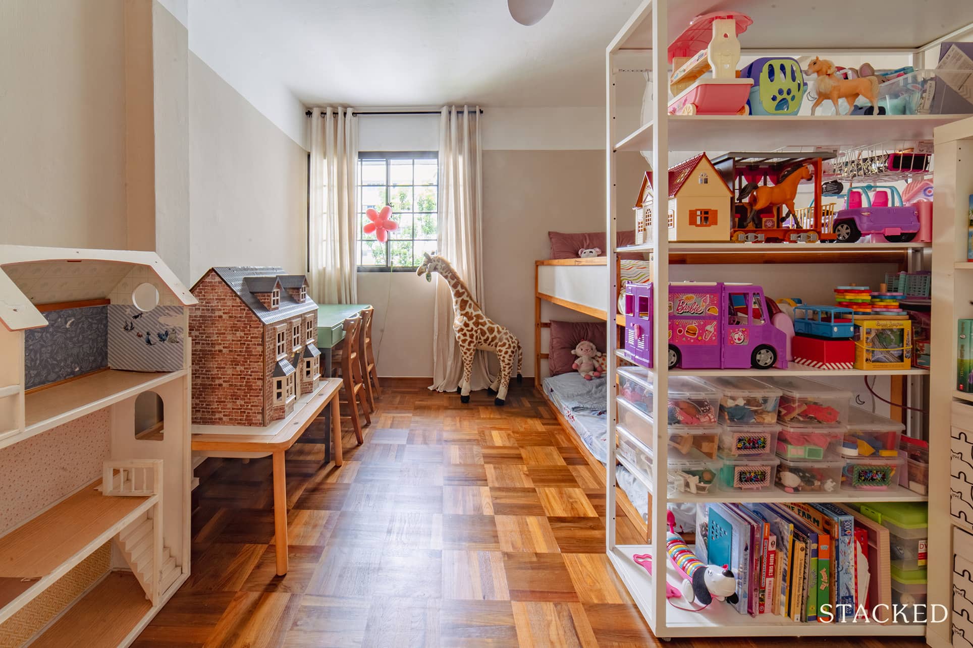
The kid’s room is filled with loose furniture and storage spaces. It’s especially smart as children grow up incredibly fast, and it can be quite a waste to build a certain style for them, only to have to change it again as they grow out of it.
With a setup such as this, it allows the family to keep the look of the space flexible.
Bathrooms
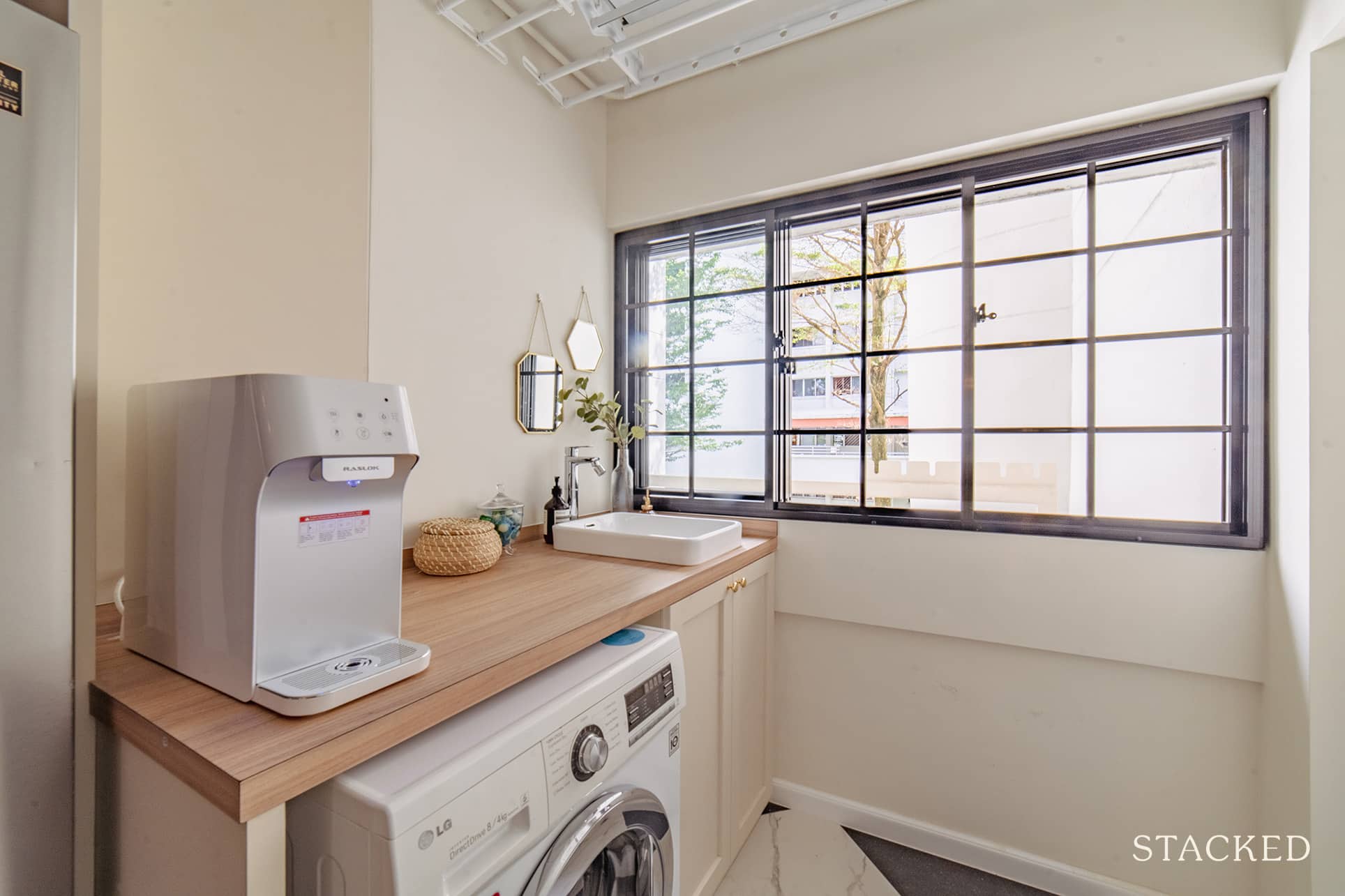
To help free up some space in the bathroom on the first floor, they shifted the sink out to double up as a laundry sink. Since their HDB is an old one, it didn’t come with a toilet on the first floor, but Cara said this designated wash area was upgraded during the HIP.
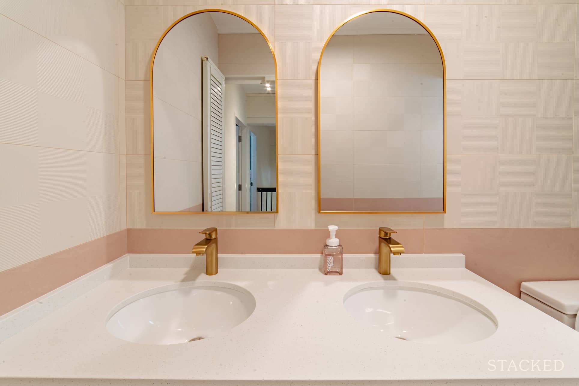
The common bathroom on the upper floor was also overlaid. Since they are a family of three girls, they had double sinks installed to minimise fighting over mirrors.
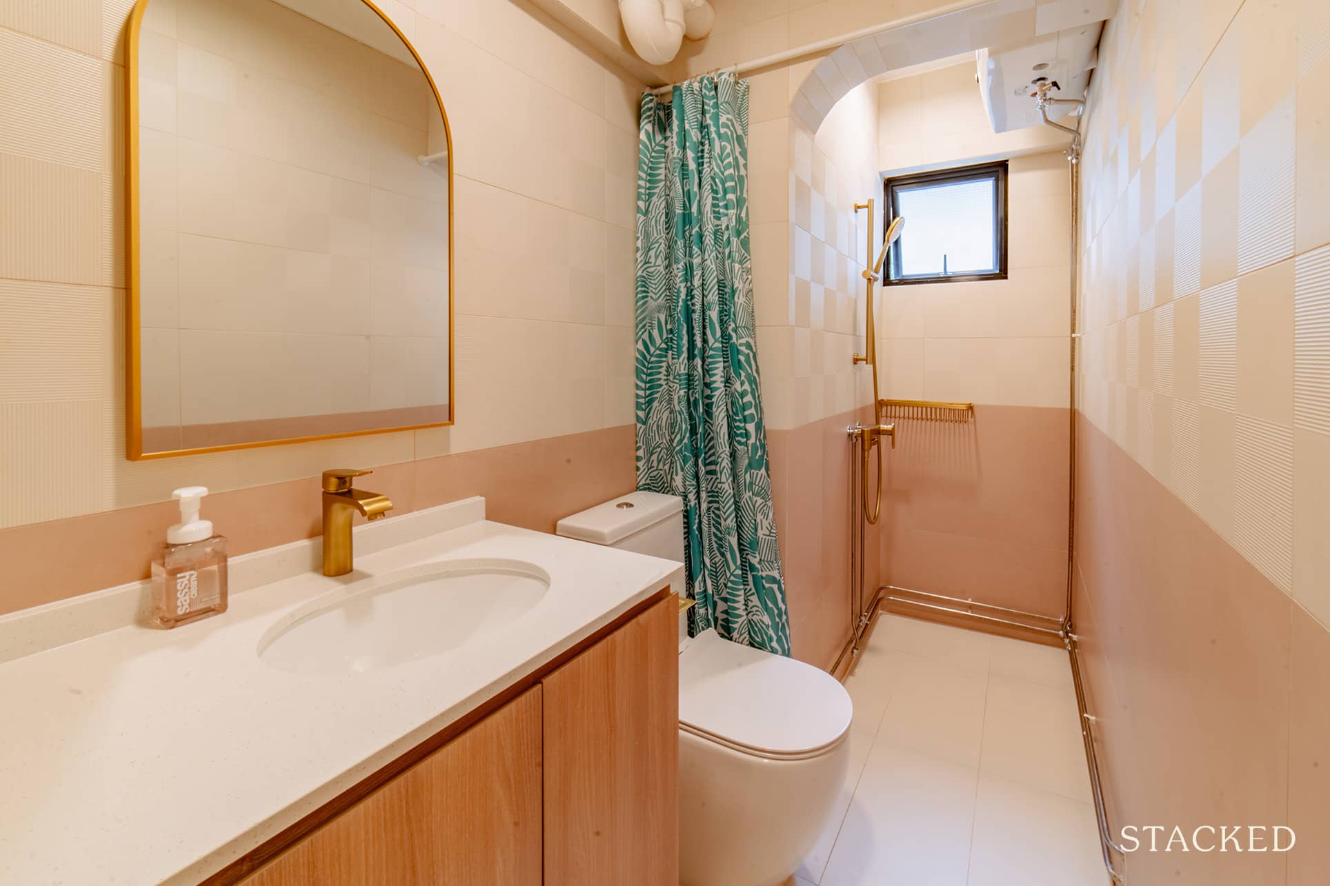
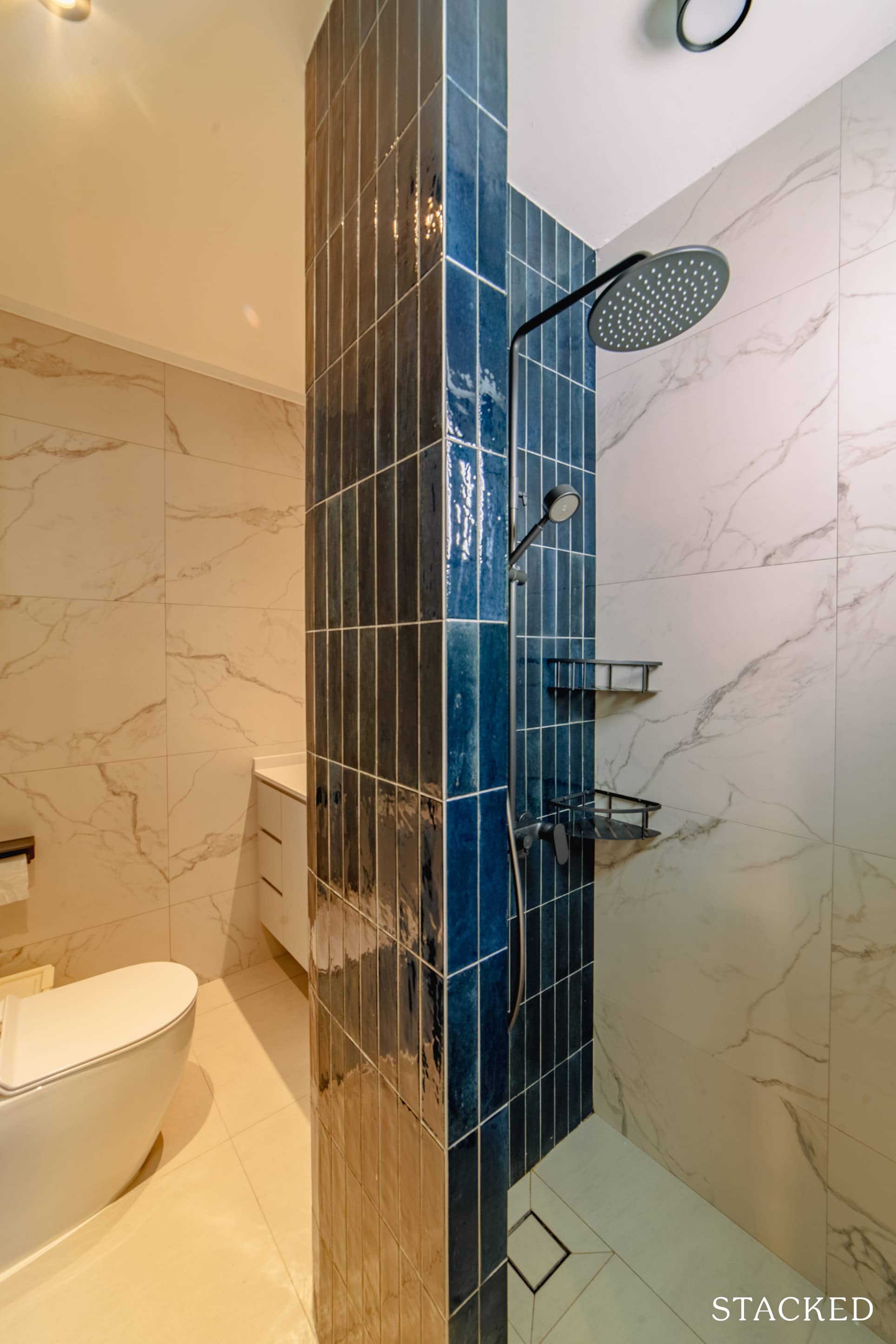
The bathroom in the master bedroom was hacked to reconfigure the sink and shower placement. It was a full wet toilet before, but Cara said their ID designed a curved wall in the middle of it to build an enclosed shower and vanity on the other side.
Bringing The Vision To Reality
When we asked Cara if the final outcome of the reno is similar to what they envisioned it to be and she quickly answered, “Yes, very much so.”
There are a number of factors that ensured they were able to bring their plan to fruition. One is the surety of knowing what they truly want as they had already gone through that once with their first home.
“We already knew our family’s needs, what we liked, and how we lived from our first BTO,” she said.
Even before the move, Cara loved looking at interior design and was constantly collecting inspiration on Instagram and Pinterest. She even made a mock-up using the FloorPlanner app. “I had a mood board ready for sourcing contractors,” she revealed.
Choosing the right reno contractor is another factor that helped them realise their plans.
The couple approached the reno process with a tight timeline and budget. When they asked around for these specifics when renovating a maisonette, it averaged to $100K in at least four months. “But we had less than 3 months before we had to move out,” she said, “and less than $100k, plus a nearly 40-year-old house on our hands.”
Fortunately, they already have a clear idea of what they want for the house. This immensely helped them in getting a range of quotes from both IDs and general contractors. Cara said that at the end of the day, the decision came down to finding a balance between the cost, time, and design.
They worked with Darren at ChengYi Interior Design. “We vibed well with Darren who appreciated the style I was going for.” He was also able to provide Cara and her husband with practical considerations and advice on bringing down the costs.
Cara said that she also liked the name of the company, Cheng Yi, which means sincerity and good faith in Chinese. On their first visit to their office, she noticed a framed calligraphy on the wall with these characters. “After reading so many renovation horror stories, I wanted to believe that there was a company that would pride themselves in good faith,” she recalled.
The couple brought most of their furniture and appliances over from their previous home, except for two centrepieces: the sofa and dining set.
She said they wanted these furniture pieces to accommodate more people.
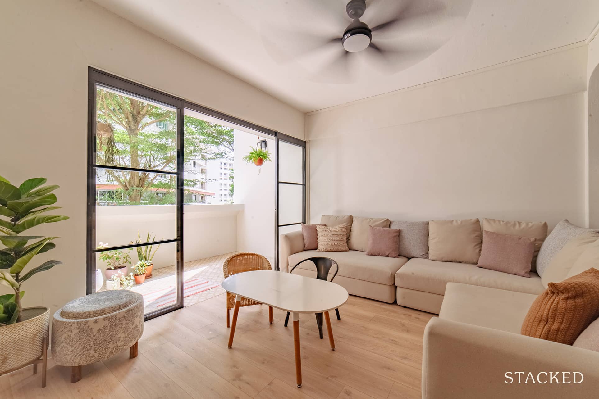
“The sofa was a splurge from Cellini. It’s a 3-metre long sectional with an easy-to-clean fabric.” The dining set, on the other hand, was from Carousell. The table and bench are made of real solid wood, which can sit eight to ten people. Another item she got from Carousell was the iconic large IKEA SINNERLIG rattan pendant.
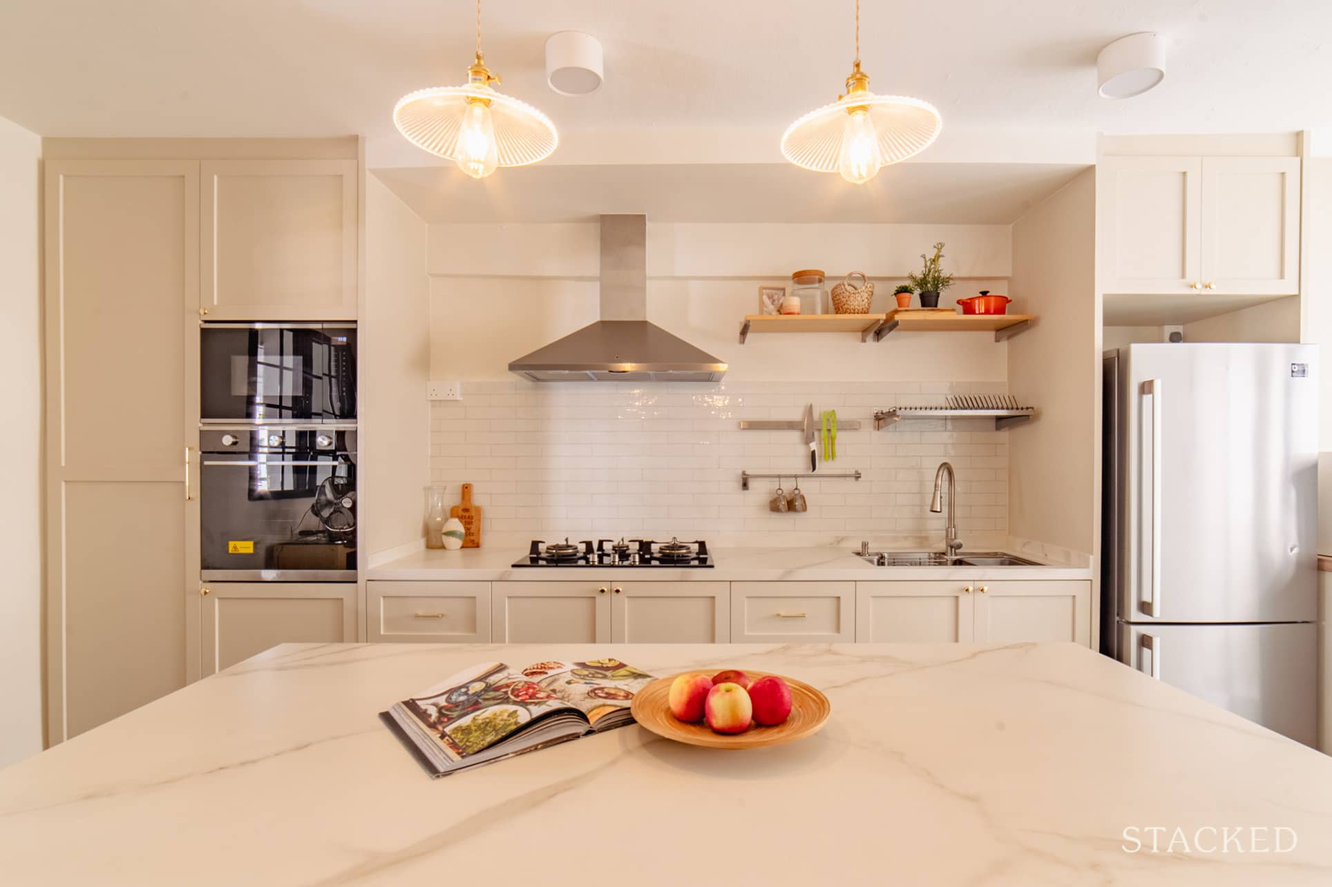
Most of their decorative lights and sanitary fittings, such as sinks, taps, and shower sets, are from Taobao. Their kitchen’s open shelving and dish rack – the KUNGSFORS system – is from IKEA, as well as their curtains and rods.
We asked Cara what she would consider the best parts of their home after renovation. Her reply was the kitchen, open balcony, and the unique high-ceiling round alcove. “These are my favourite areas of the home because the renovation just brought out what was already there.”
Lessons Learned From A Successful Reno Journey
If she was to name the greatest challenge she encountered during the course of the reno, Cara said that it would be decision fatigue. Deciding between marble grains that all look the same for tiles, shades of white for paint, and even the direction staircase landing planks should face can end up very tiring. “It’s like every choice at that moment feels as though a make or break,” she said. “It can get very exhausting to second-guess all your decisions.”
It’s a good thing, though, that Cara had a mood board to go back to and an ID she could trust.
Cara also learned that renovating an old resale flat is “a whole different ball game from BTOs.” They had to deal with slanted walls, recessed areas, uneven wall plastering, and exposed trunking almost everywhere. “We didn’t have to worry about these things with a new BTO flat back then,” she said, “and I’m honestly still learning to embrace the quirks.”
Aside from these aspects, she’s learning to assimilate. Cara also had to deal with her biggest reno regret. The common bathroom.
She said if she could re-do it, she would have opted to hack the bathroom instead of overlaying. The contractors discovered that the shower area in the common bathroom doesn’t have its own drainage. This means that water will have to flow out of the shower. In order to solve this issue, they would have to run a new drainage pipe which is only possible with hacking and floor re-levelling.
“It’s a small inconvenience that we live with now. But I wish it was flagged to me earlier so we could have factored in the time and cost of doing that bathroom properly.”
Finally, yet importantly, Cara shares the following advice for those who are about the start their reno journey.
“Don’t lose sight of the forest for the trees, and try to enjoy the whole process.” She elaborates that it’s so easy to get hung up on mistakes and imperfections, causing stress over all the details. Reno is only one half of the process, and the other half happens after the process.
“It’s only after the reno when you can add specific style and decor. And fill the house with the people and things you love that it becomes a home.”
At Stacked, we like to look beyond the headlines and surface-level numbers, and focus on how things play out in the real world.
If you’d like to discuss how this applies to your own circumstances, you can reach out for a one-to-one consultation here.
And if you simply have a question or want to share a thought, feel free to write to us at stories@stackedhomes.com — we read every message.
Need help with a property decision?
Speak to our team →Read next from Homeowner Stories

Homeowner Stories We Could Walk Away With $460,000 In Cash From Our EC. Here’s Why We Didn’t Upgrade.

Homeowner Stories What I Only Learned After My First Year Of Homeownership In Singapore

Homeowner Stories I Gave My Parents My Condo and Moved Into Their HDB — Here’s Why It Made Sense.

Homeowner Stories “I Thought I Could Wait for a Better New Launch Condo” How One Buyer’s Fear Ended Up Costing Him $358K
Latest Posts
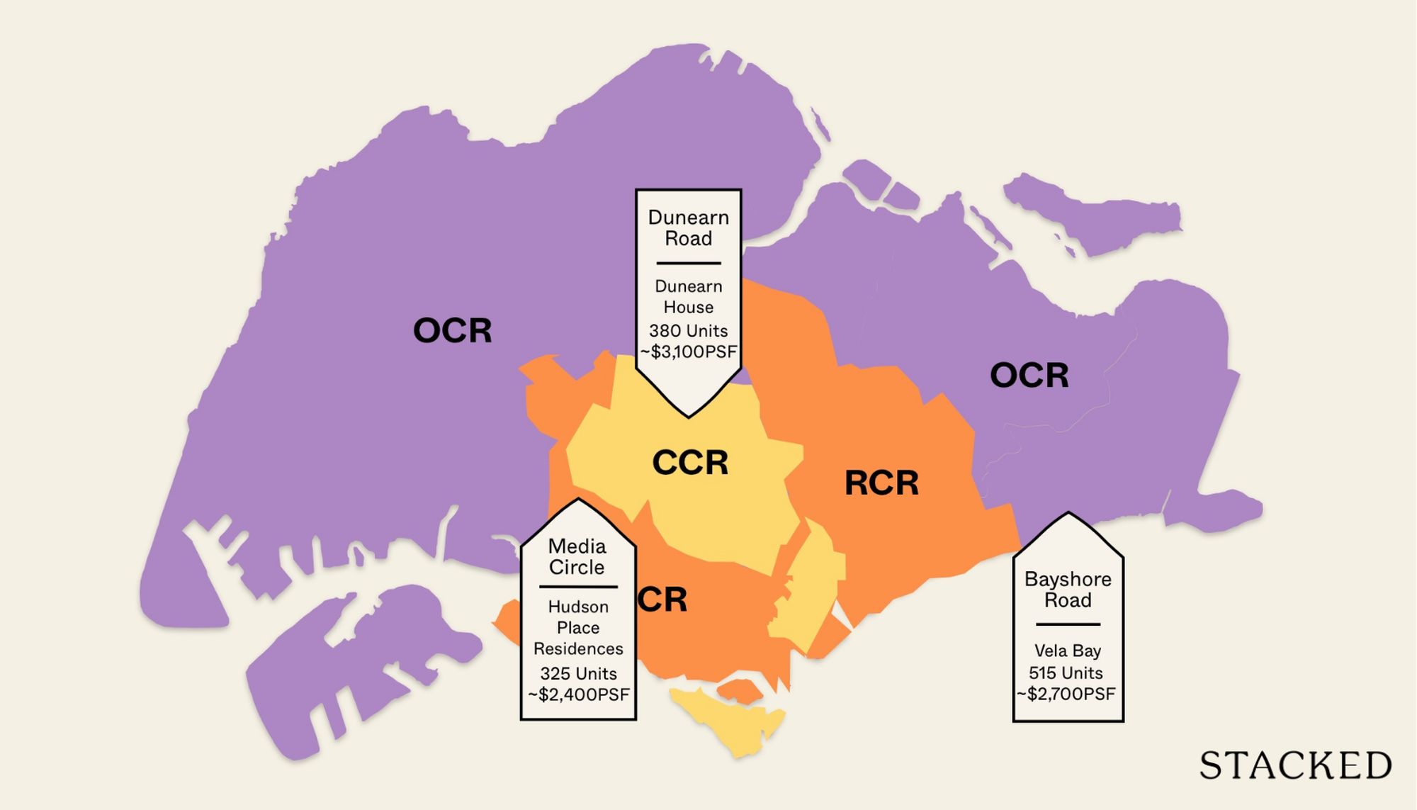
Property Market Commentary 18 Upcoming New Launch Condos In 2026 — Where They Are And The Ones To Watch
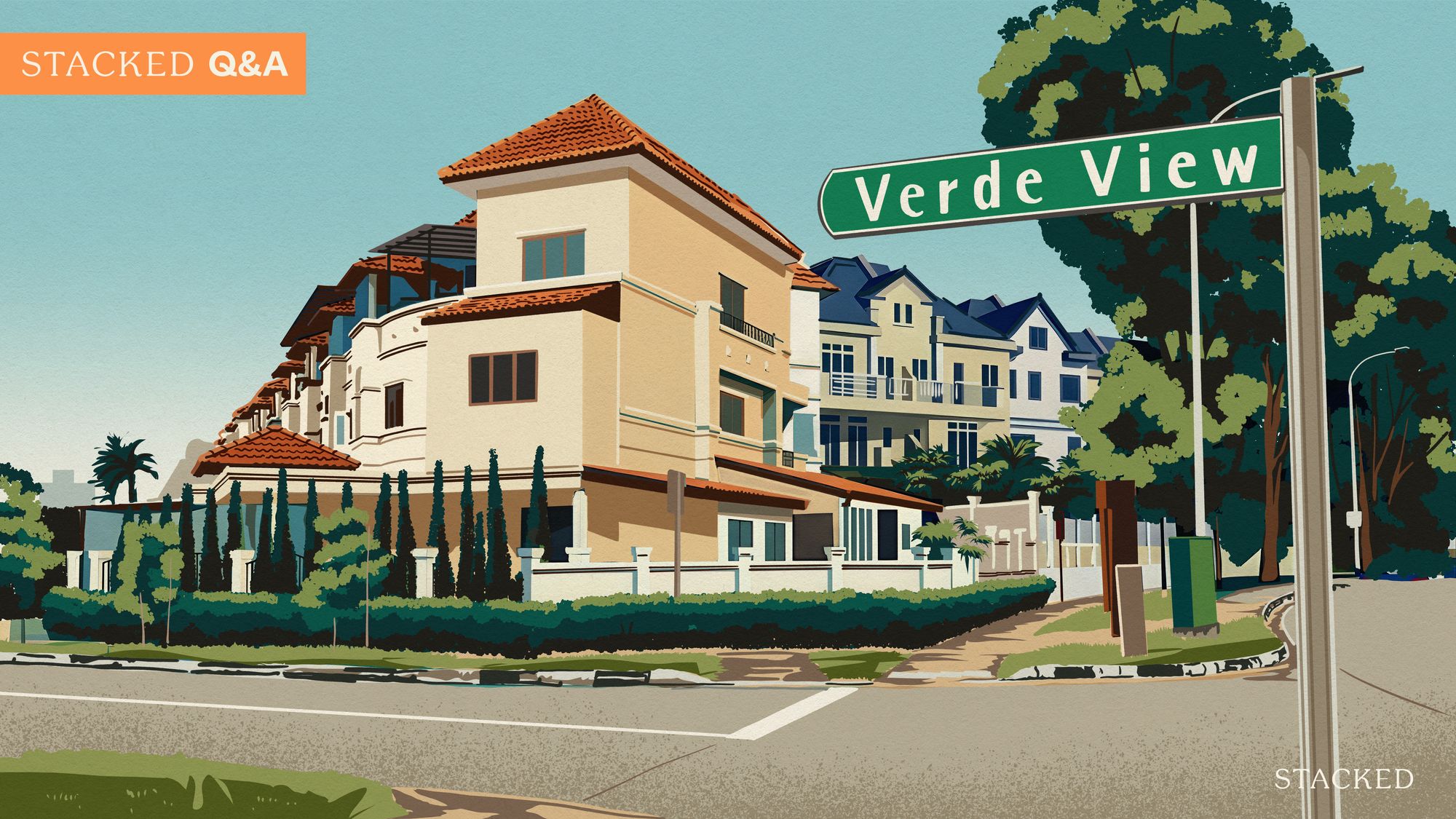
Property Advice Should We Sell Our Freehold Condo For A $2.2M Leasehold Landed Instead?

Singapore Property News Kallang Close GLS Site Sold For $610.8 Million: New Waterfront Condo Could Launch From $2,900 PSF









4 Comments
Dear Editor, I am exploring the possibility of installing a gate along the walkway. May I know if the common area outside the main door part of the floor plan? Is there an issue installing a gate if it is not part of the floorplan? Please advise.
Your article helped me a lot, is there any more related content? Thanks!