| Project: | Hougang Capeview |
|---|---|
| HDB Town | Hougang |
| Address: | 476A-C, 477A-C Upper Serangoon View |
| Lease Start Date: | March 2016 |
| No. of Units: | 781 |
Hougang Capeview was launched in the November 2011 BTO exercise.
Back then, some people were complaining about this launch being “so ulu” and “near a reservoir”.
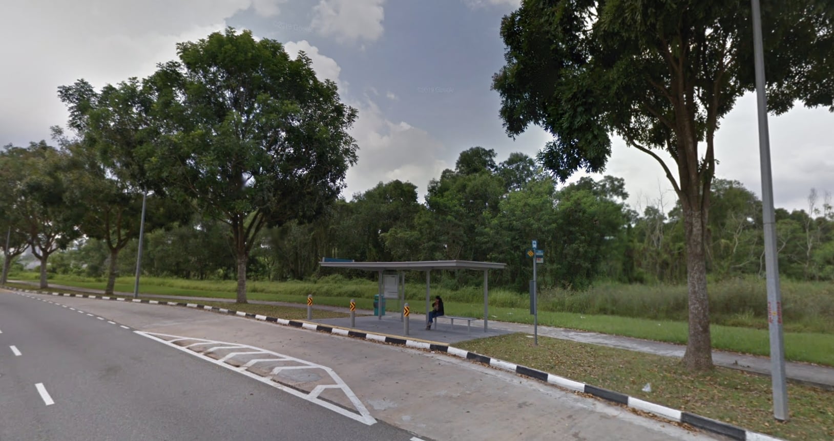
Fast forward 10 years and people can now see that the “near a reservoir” is really a strength with both the park connector next to it, as well as the river and greenery facing that many units here enjoy.
Prices of 5-room flats here currently average around $700,000, close to twice its initial launch prices, showing just how sought after some of the units here are.
The development was even the very first public housing to have achieved a Conquas Star rating – a standard of construction quality that the Building and Construction Authority uses.
Today though, the “so ulu” argument is still valid given the MRT is not within walking distance – quite an acceptable trait for any development fronting a river.
But should its lack of MRTs in the vicinity deter you from seriously considering a unit here?
Let’s find out in our customary HDB project tour.
So many readers write in because they're unsure what to do next, and don't know who to trust.
If this sounds familiar, we offer structured 1-to-1 consultations where we walk through your finances, goals, and market options objectively.
No obligation. Just clarity.
Learn more here.
Hougang Capeview Insider Tour
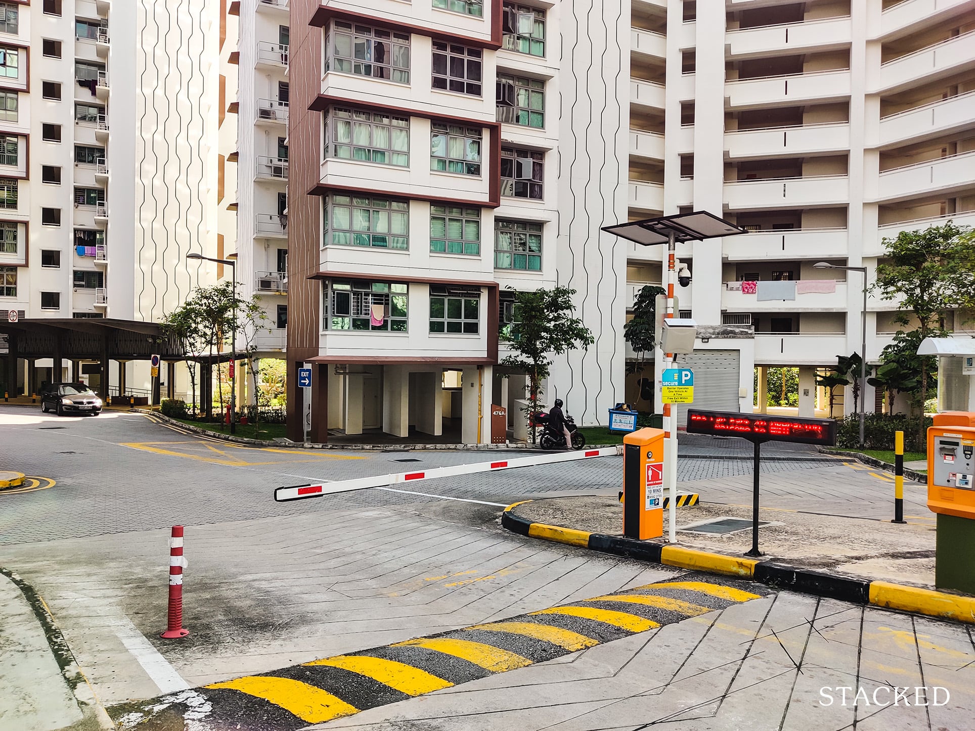
I’ll start off my tour at the only car entry point of Hougang Capeview which is located on the south side of the development along Upper Serangoon View.
Drivers would notice that there is only 1 entry and exit lane on each side.
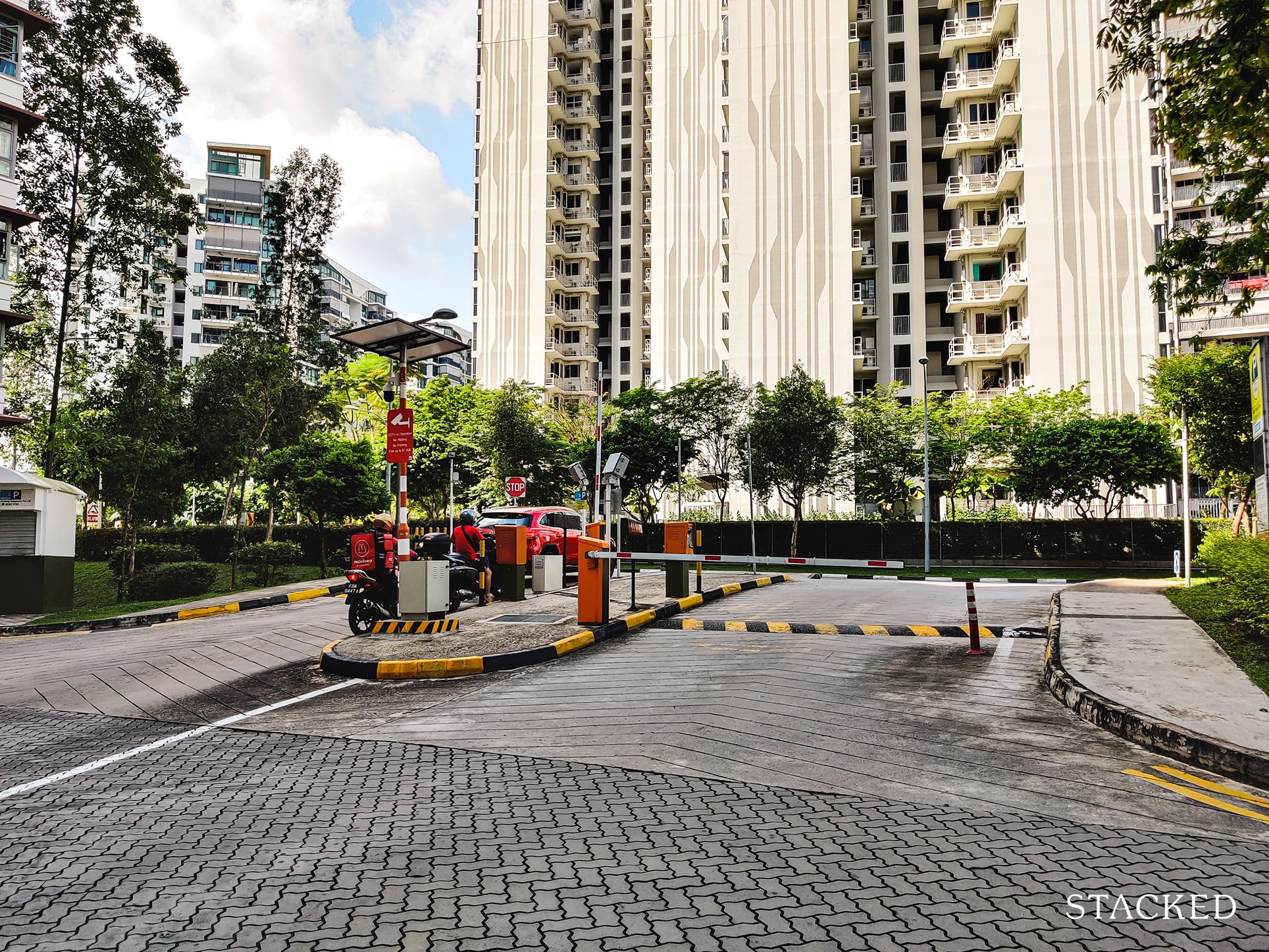
While it would be nice to have alternative exits, the development is situated along a 2-way road with an immediate U-turn spot, so residents exiting can also turn right towards Upper Serangoon Road rather than traveling round the entire Upper Serangoon View loop.
Upon entering, you are immediately greeted with a carpark entrance to the left which is really convenient for those who drive.
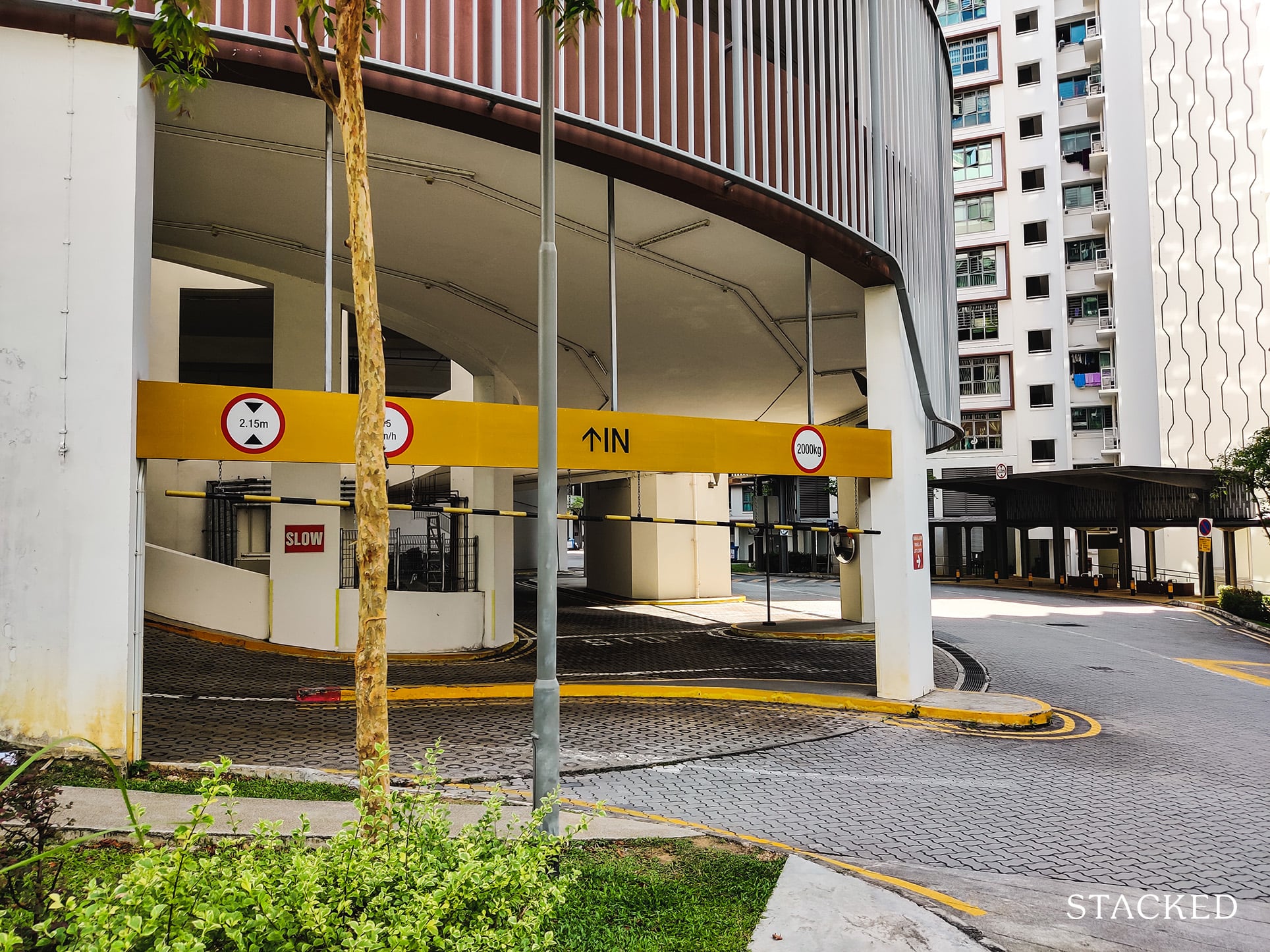
Another thing to note is that the layout of the carpark is a spiral one which makes it easy to go up several floors quickly, though drivers would need to be extra careful with oncoming traffic.
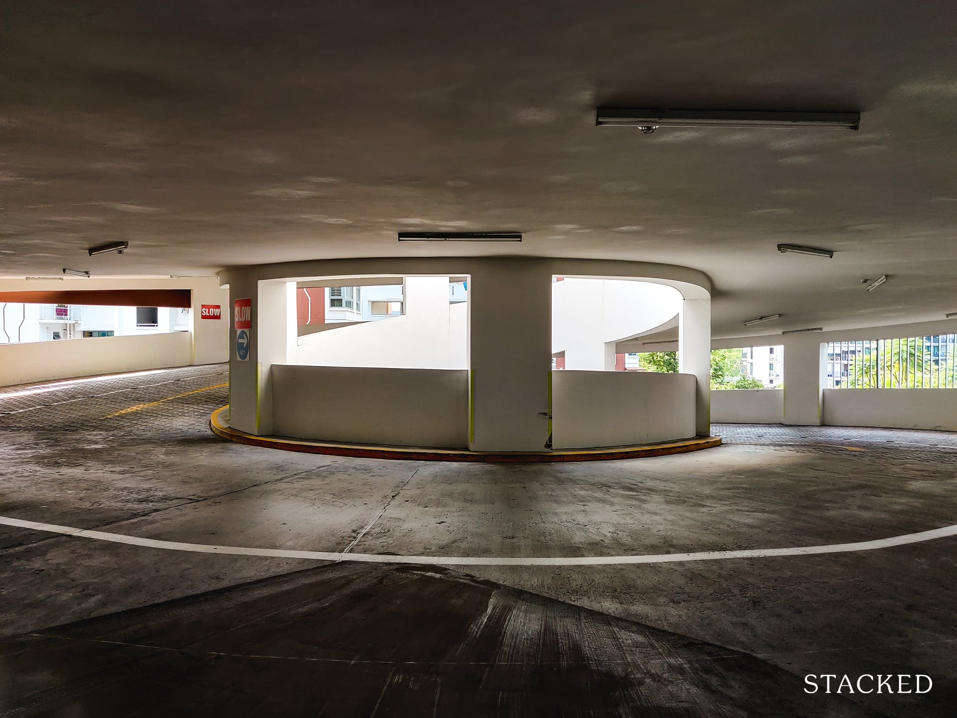
There are plenty of lots here, and the carpark is sufficiently bright and spacious.
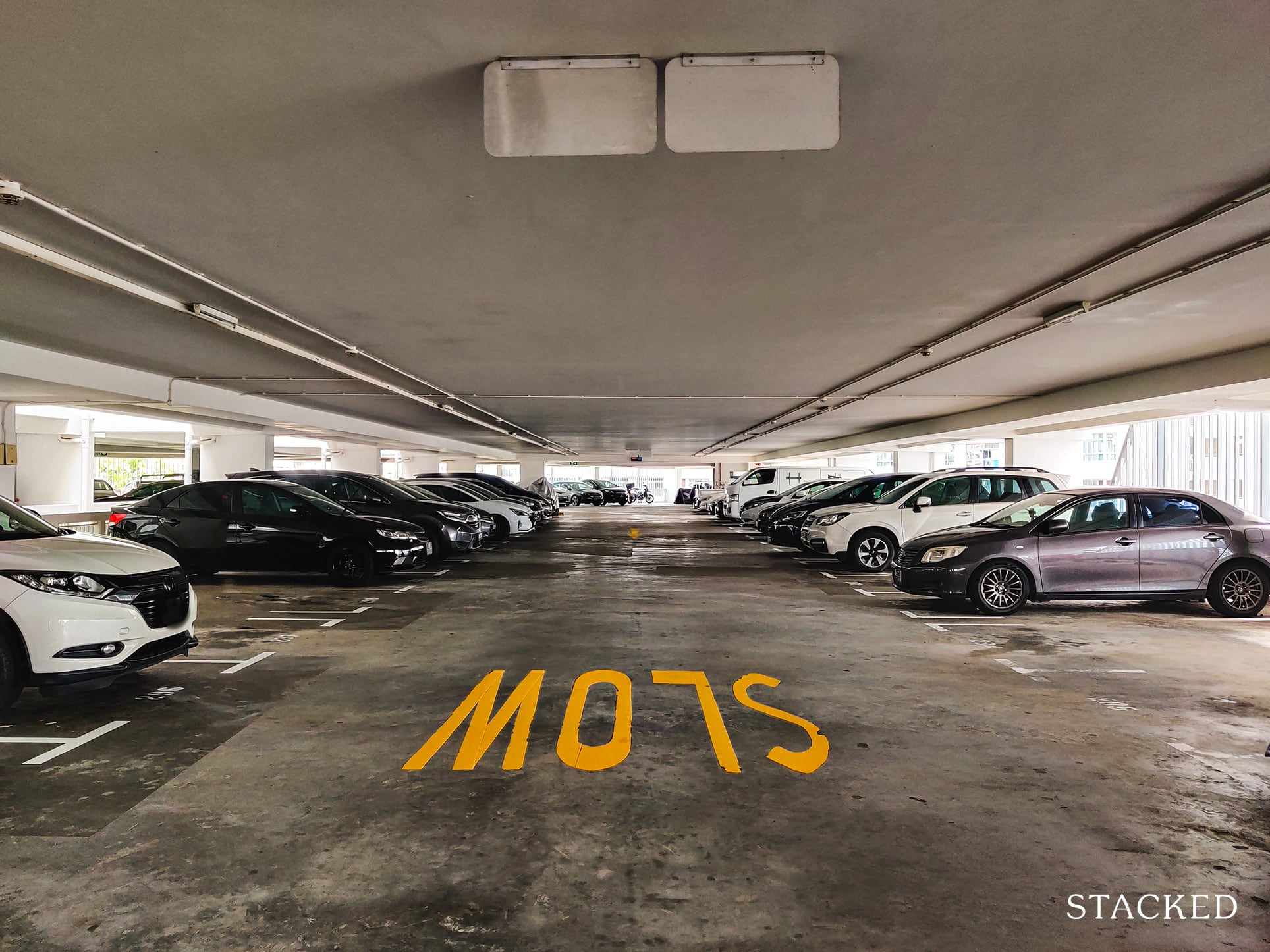
Unlike underground carparks, multi-storey carparks like this one are very well-ventilated all around, and it’s made brighter by the fact that there are certain airwells around the carpark too.
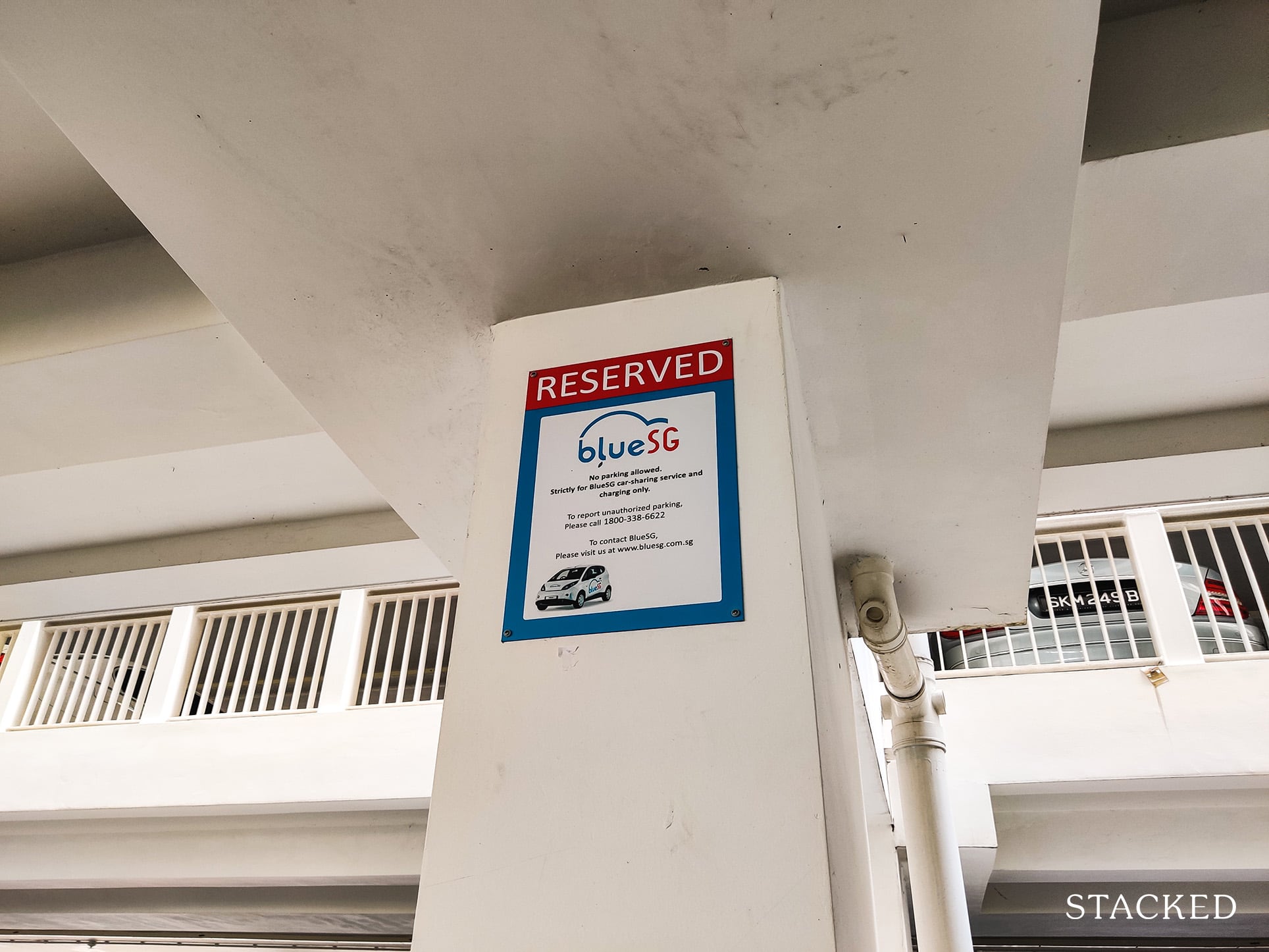
I was also quite impressed that there were electric vehicle charging points here too, until I found out that this was limited to blueSG cars only.
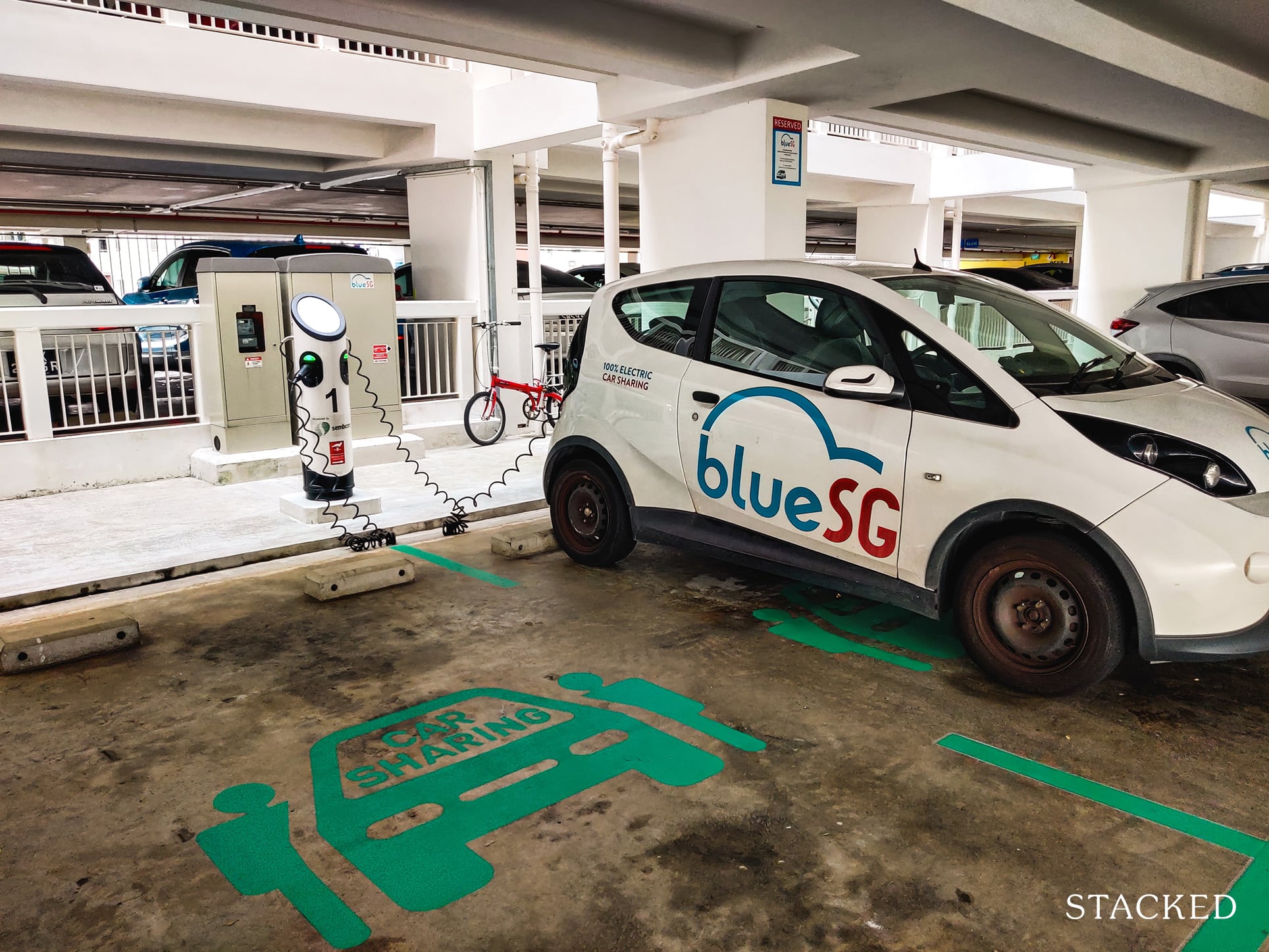
Certainly as a fan of electric cars, I do hope that more provision would be made in the future for more electric car charging points.
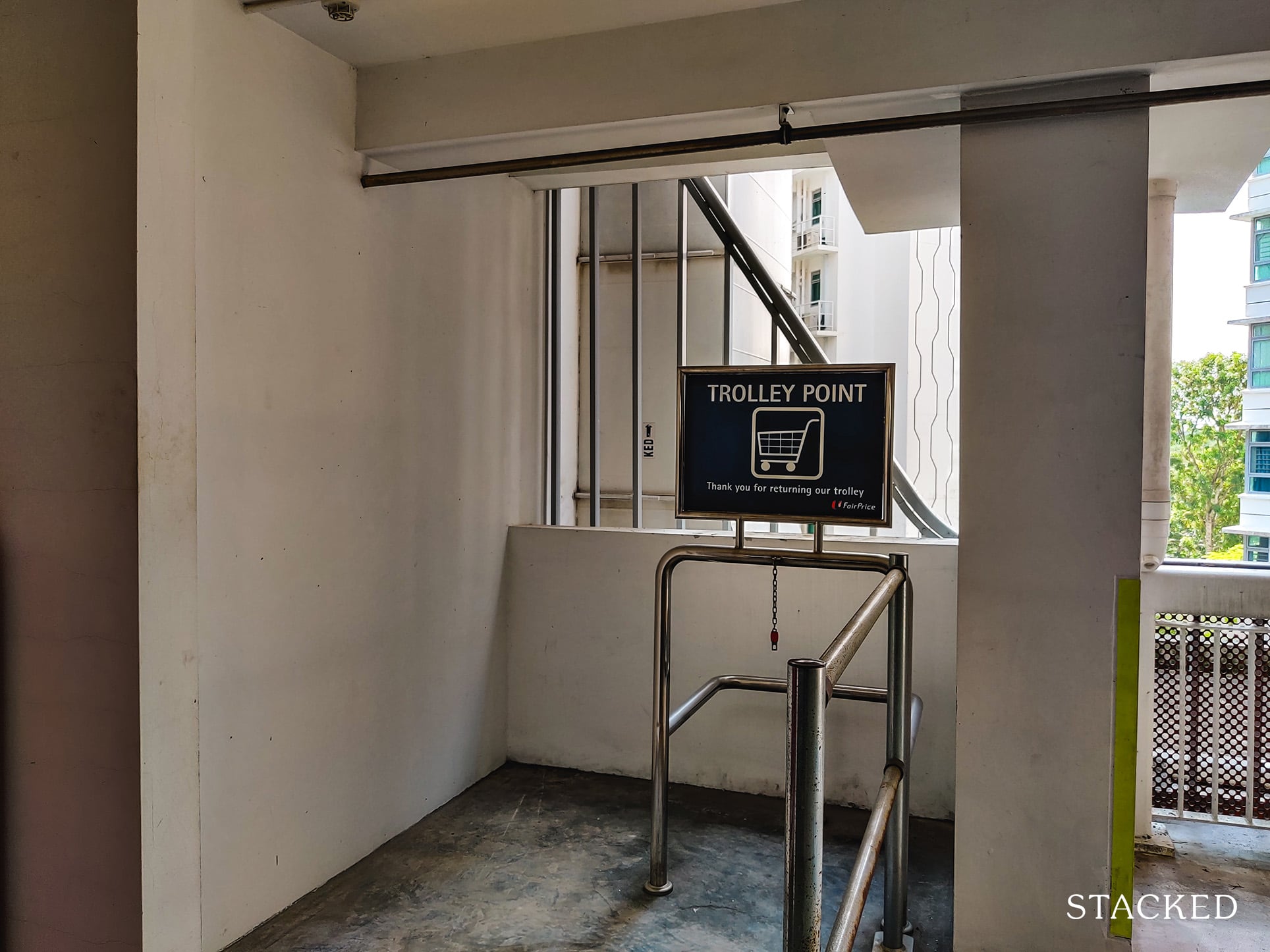
Given that there is an NTUC FairPrice just around the block, it’s nice to see some trolley return points here.
Now it’s from here that I’d like to highlight one of the issues with the lower-floor units at Hougang Capeview.
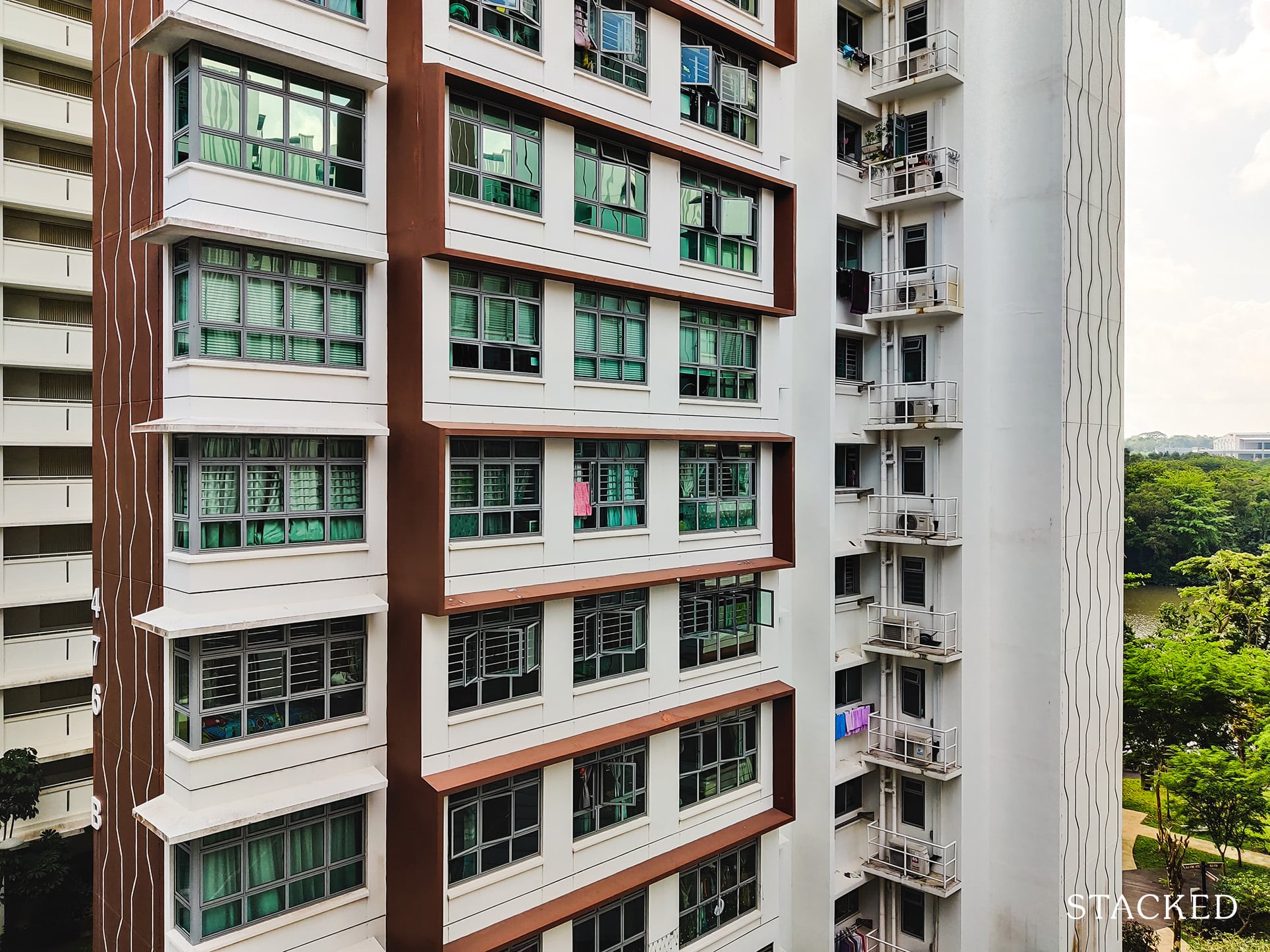
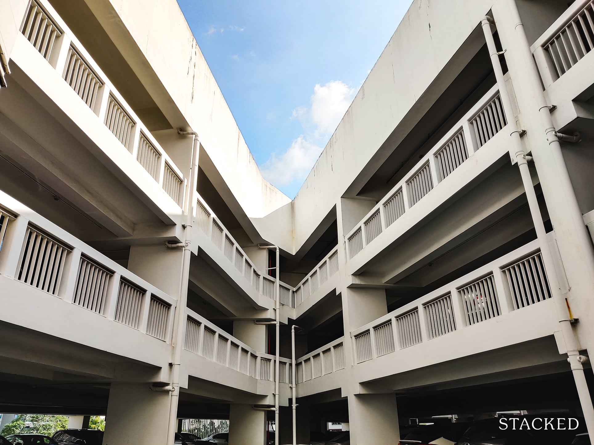
Given the nature of the multi-storey carpark (8-storeys high), blocks facing the carpark would inevitably face privacy issues.
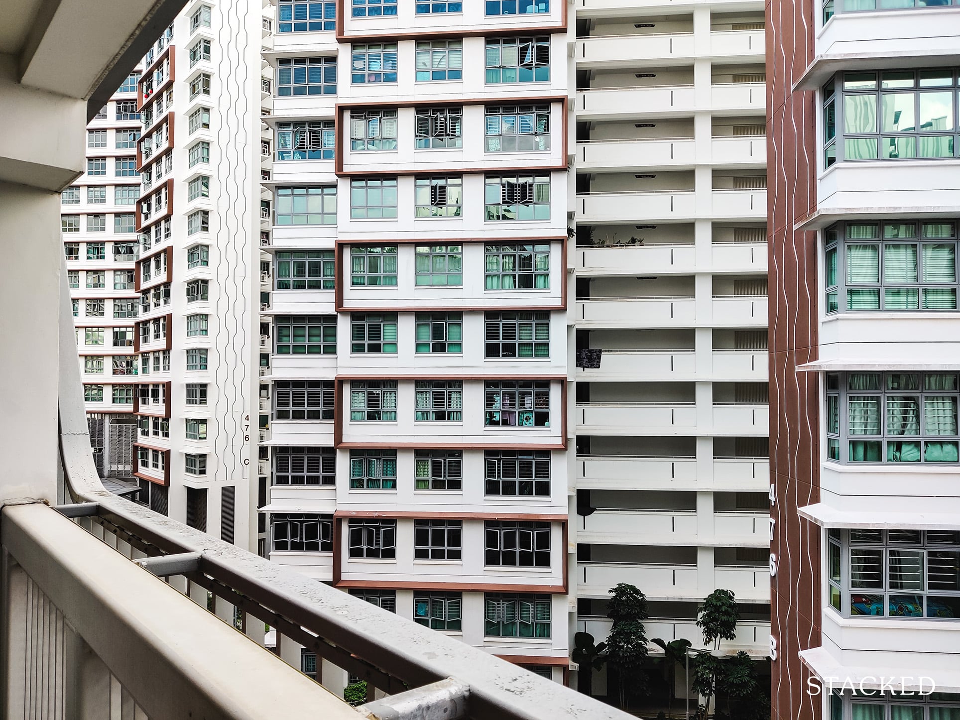
Considering also that the blocks here are only 17/19 stroreys high, this means that as many as about a quarter of units in a block adjacent to the carpark would face such an issue.
It probably isn’t really a dealbreaker for most – but one that potential buyers should take note.
Before taking the tour of the ground level facilities, let’s check out the rooftop garden.
Hougang Capeview’s rooftop garden is located above the carpark itself. Many of the newer HDBs feature some sort of facility. This is seen in developments like SkyVille and SkyTerrace.
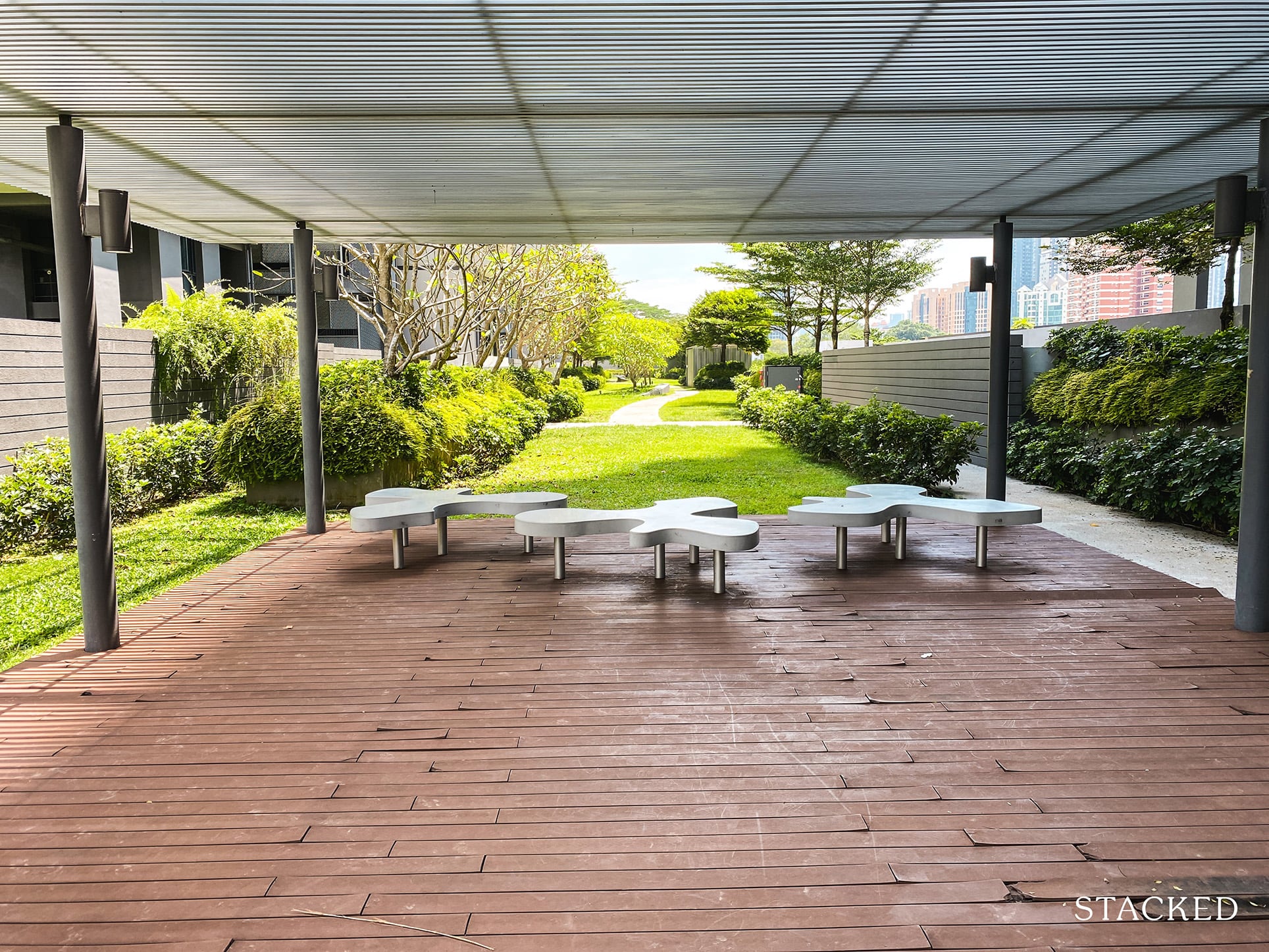
Getting to the rooftop is pretty easy, as there are 2 lifts that bring you straight up – one from each side.
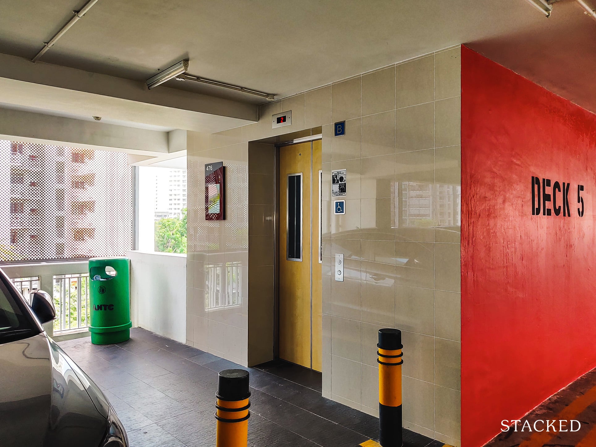
I must say, my first impressions of the rooftop garden was quite disappointing, particularly given the high standards from the recent few that I’ve reviewed.
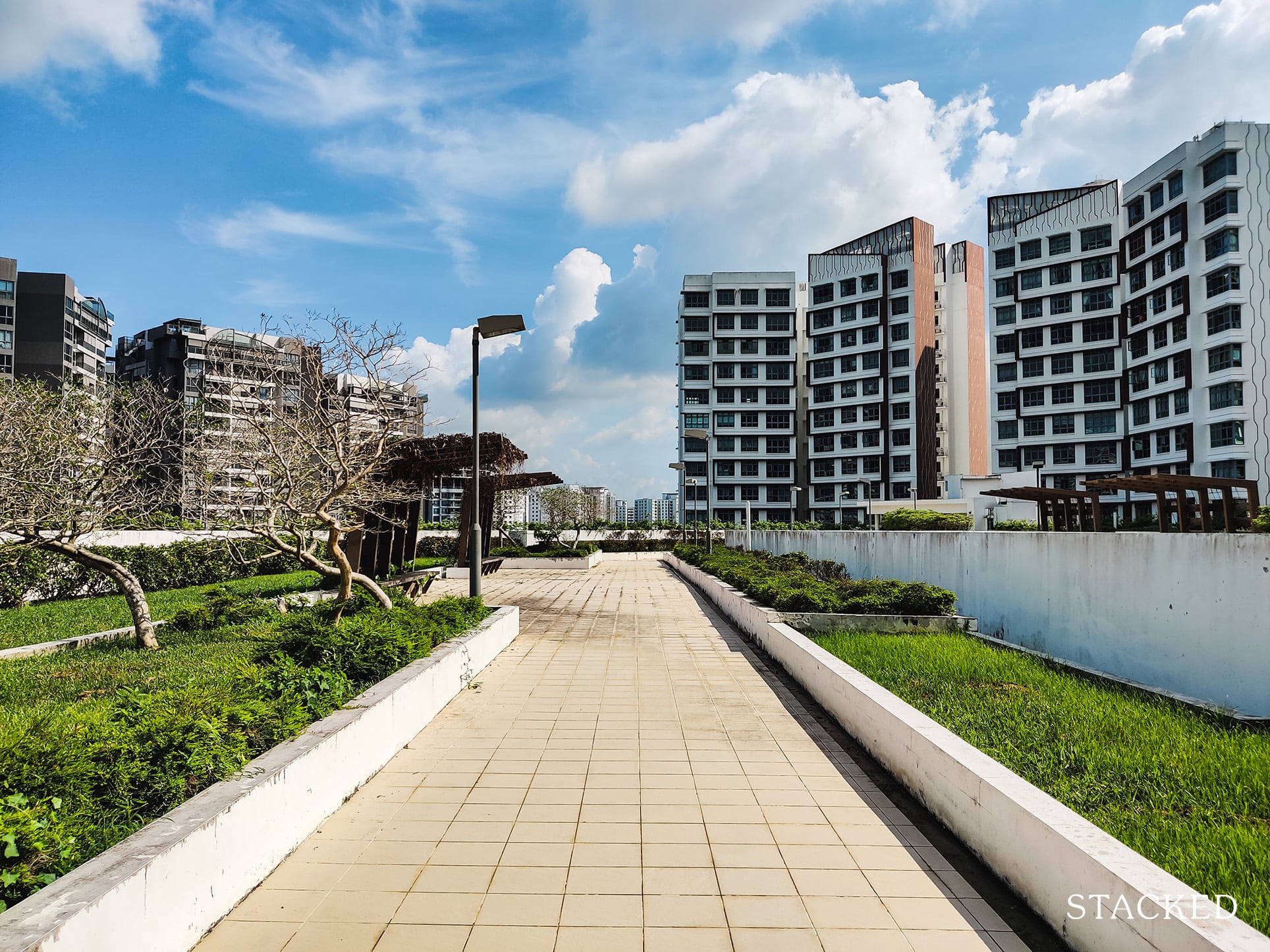
There is quite a fair bit of greenery here, and ample space to walk. On that note alone, it isn’t necessarily bad.
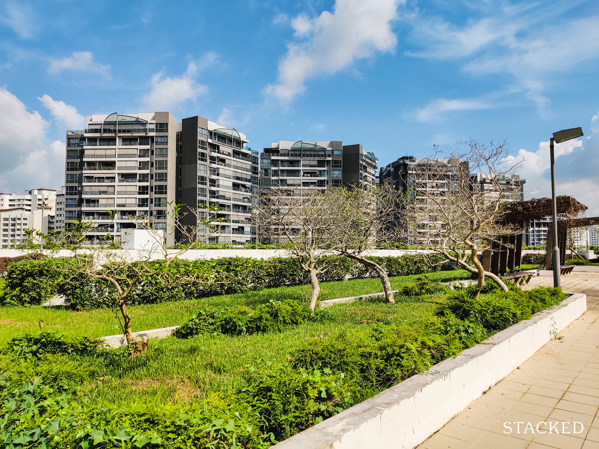
But somehow, it just doesn’t quite feel like a place I would necessarily want to take a walk in.
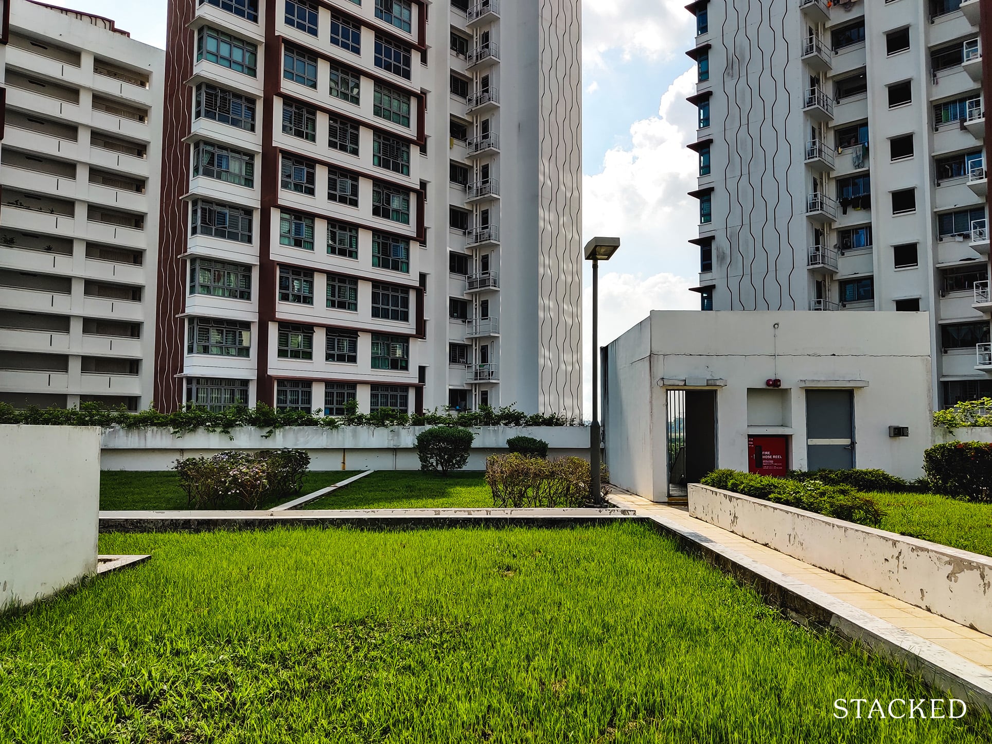
If I had to use a word to describe this place, it would be desolate.
And I can see why.
Firstly, the area may have a lot of greenery, but they seem to be slightly more than the bare minimum needed to call this a rooftop garden.
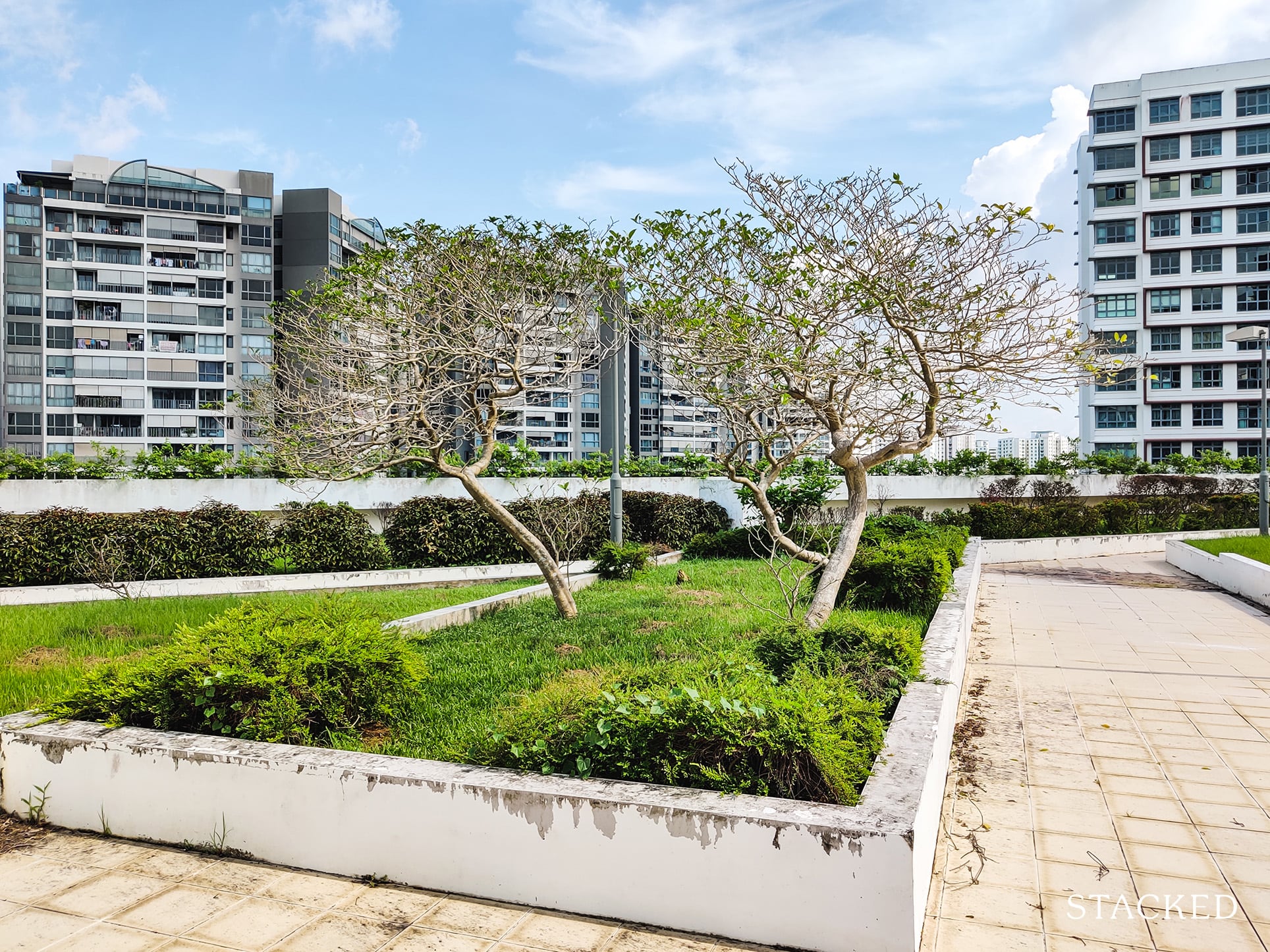
Secondly, there aren’t any facilities here. There’s not a lot of reason anyone would want to come up here given the facilities downstairs, and not to mention the park connector just below.
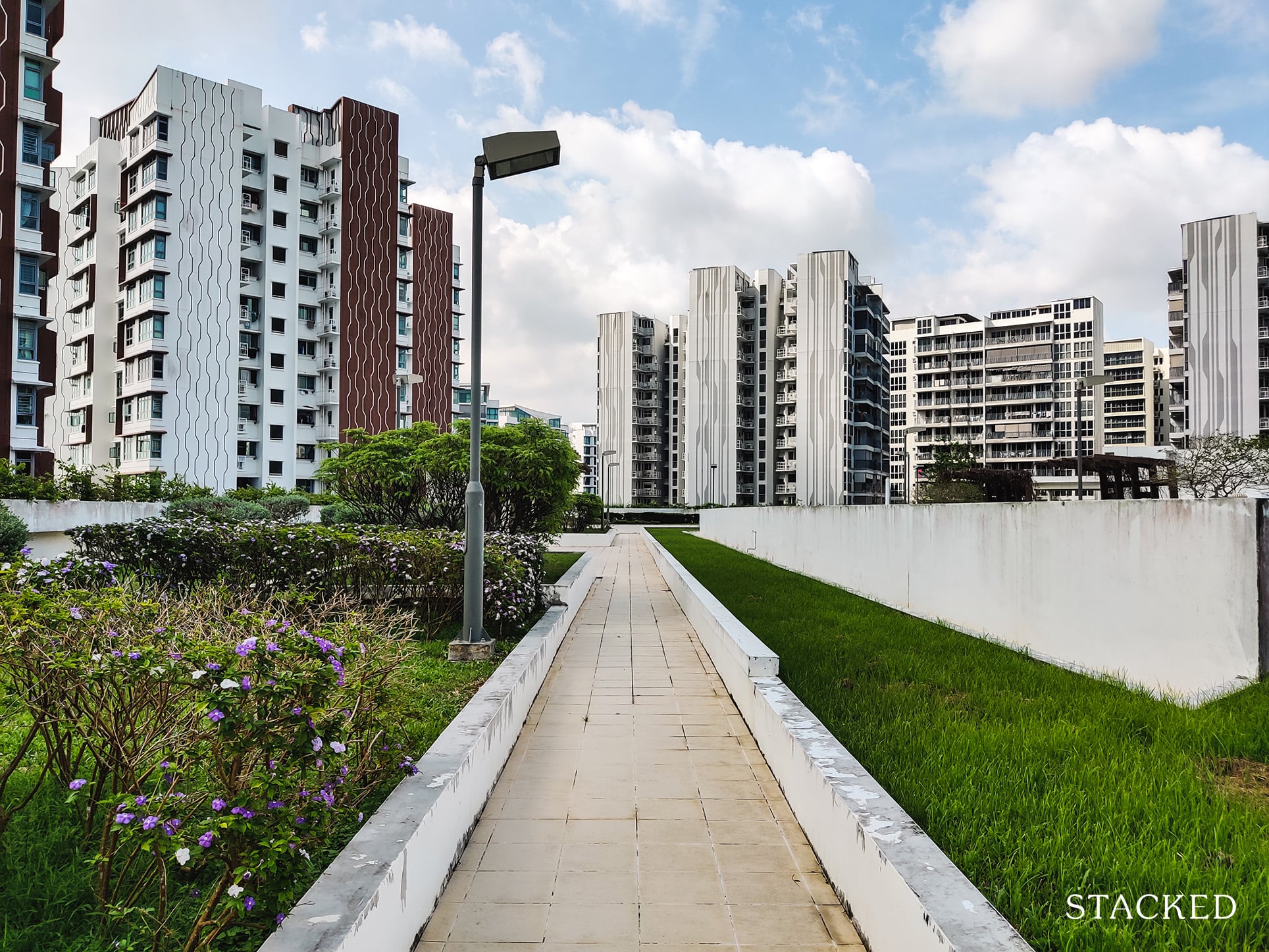
Thirdly, the towering blocks around doesn’t give this place a nice view – and that’s perfectly understandable because the best views should go to the residential blocks!
I cannot imagine anyone bringing their pets up here for a walk as well, and I don’t think anyone should either. There’s nowhere a pet can answer the call to nature here – just the tiles on the ground.
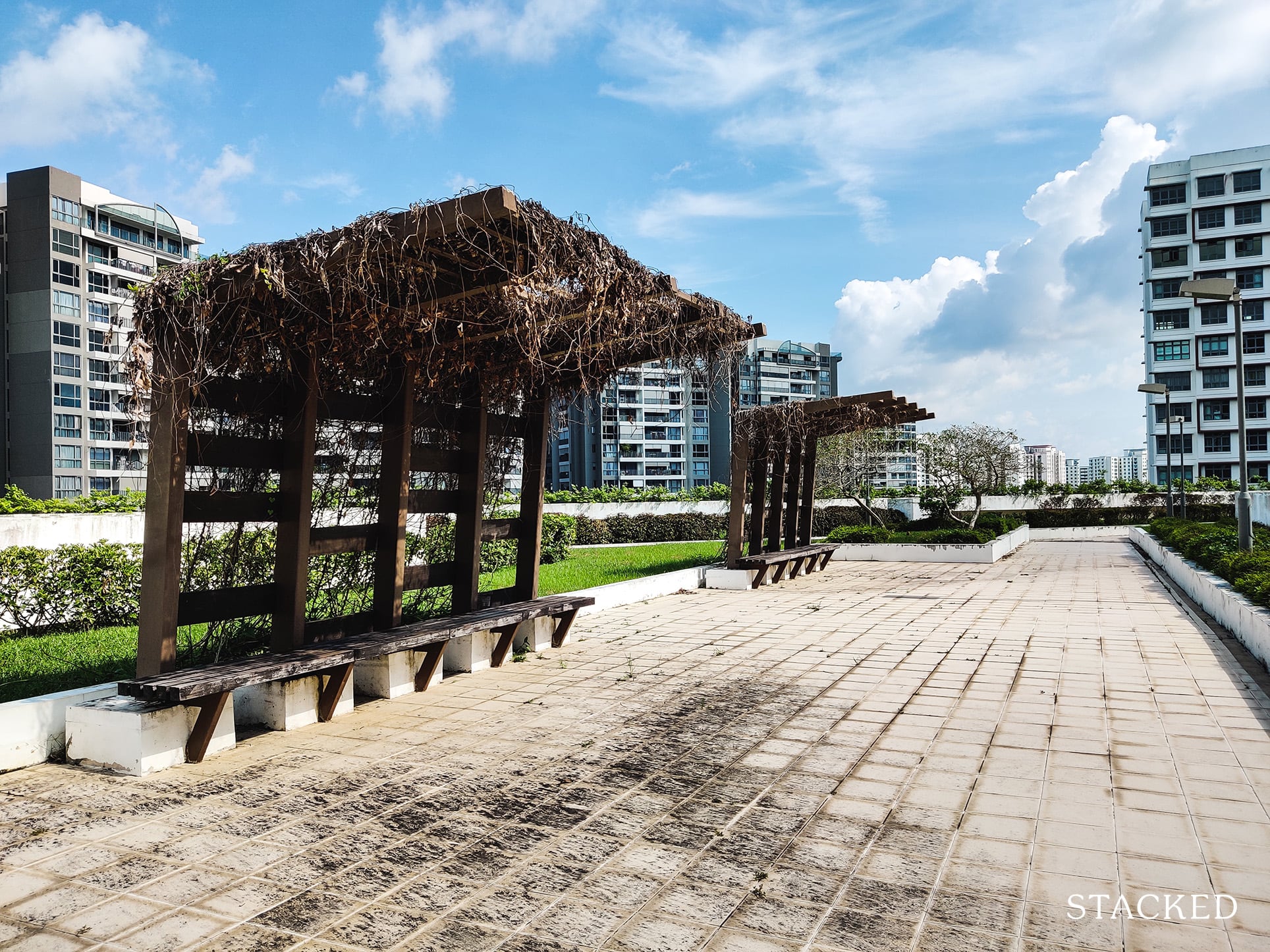
You will also find 2 standalone shelters here. Sadly, it was covered in what is probably plants that died so long ago from the lack of care that they can be used as dried plants for decoration. Perhaps this was part of the original design? If anyone knows do reach out to let me know.
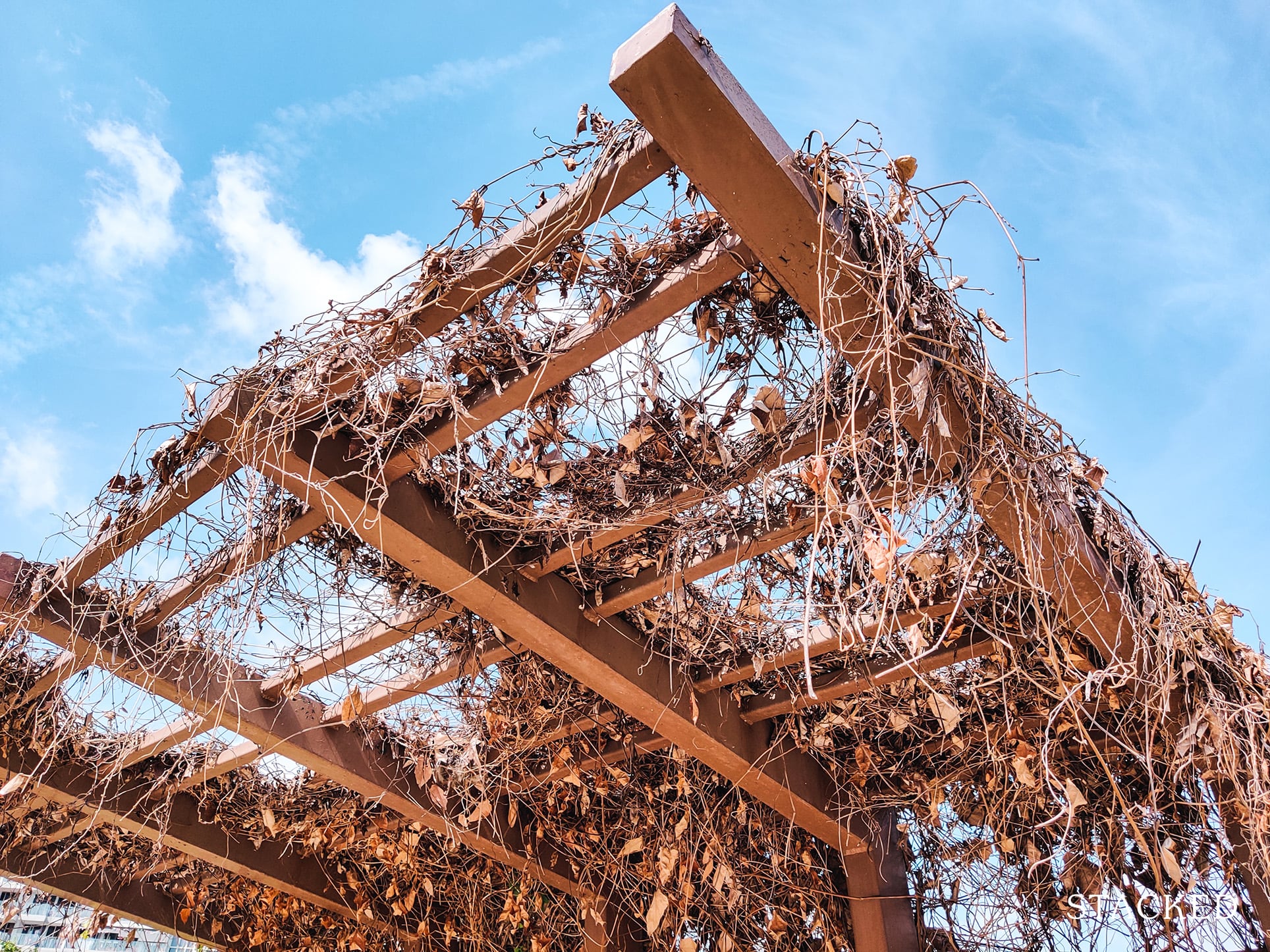
The area is also quite dirty, showing a lack of maintenance and attention to this place. On my first visit doing the Insider Tour, this large area of stain was here. Several weeks later, it still remained.
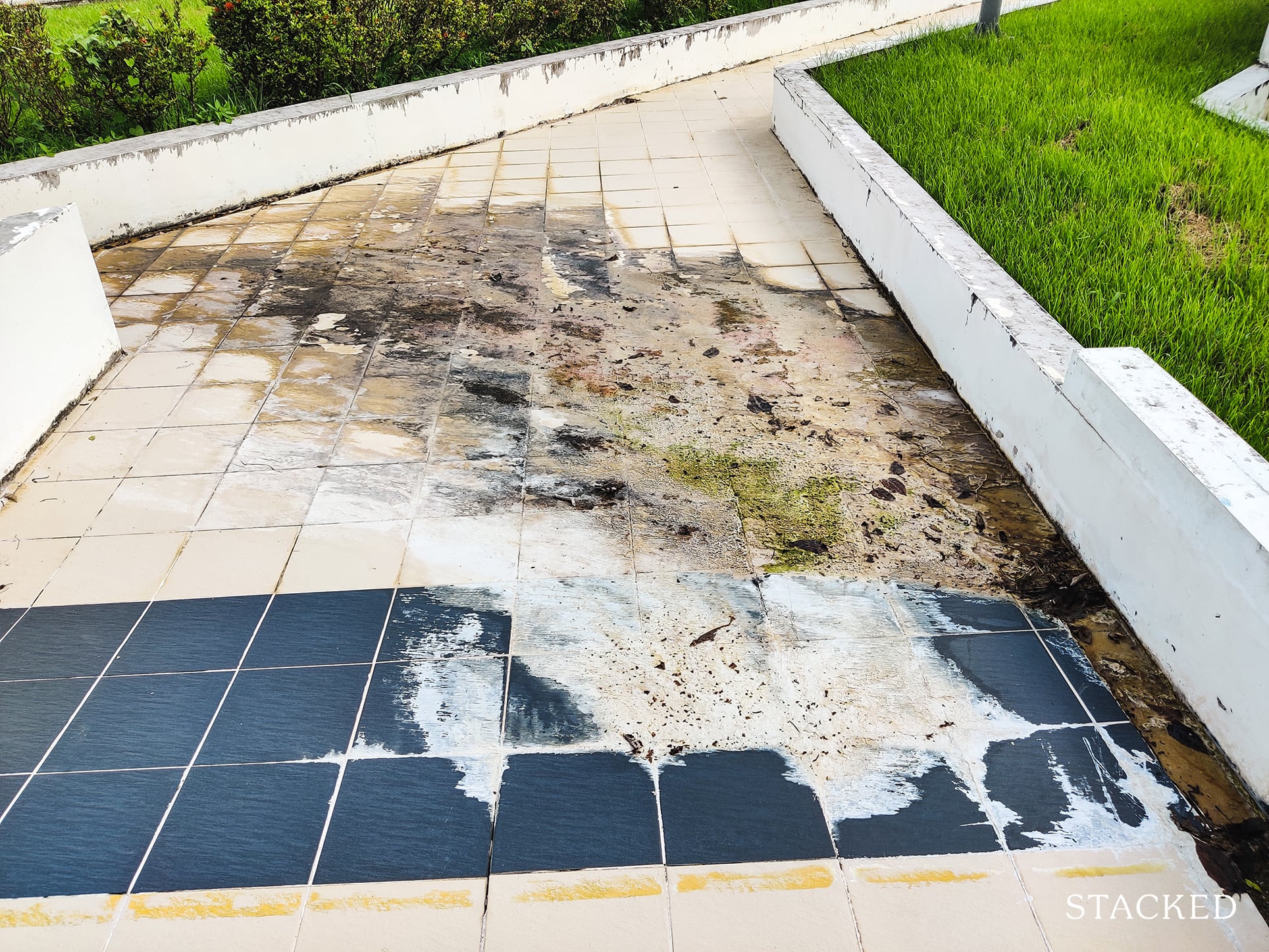
And if you haven’t already noticed, the paint off the concrete ledge has also peeled off quite considerably.
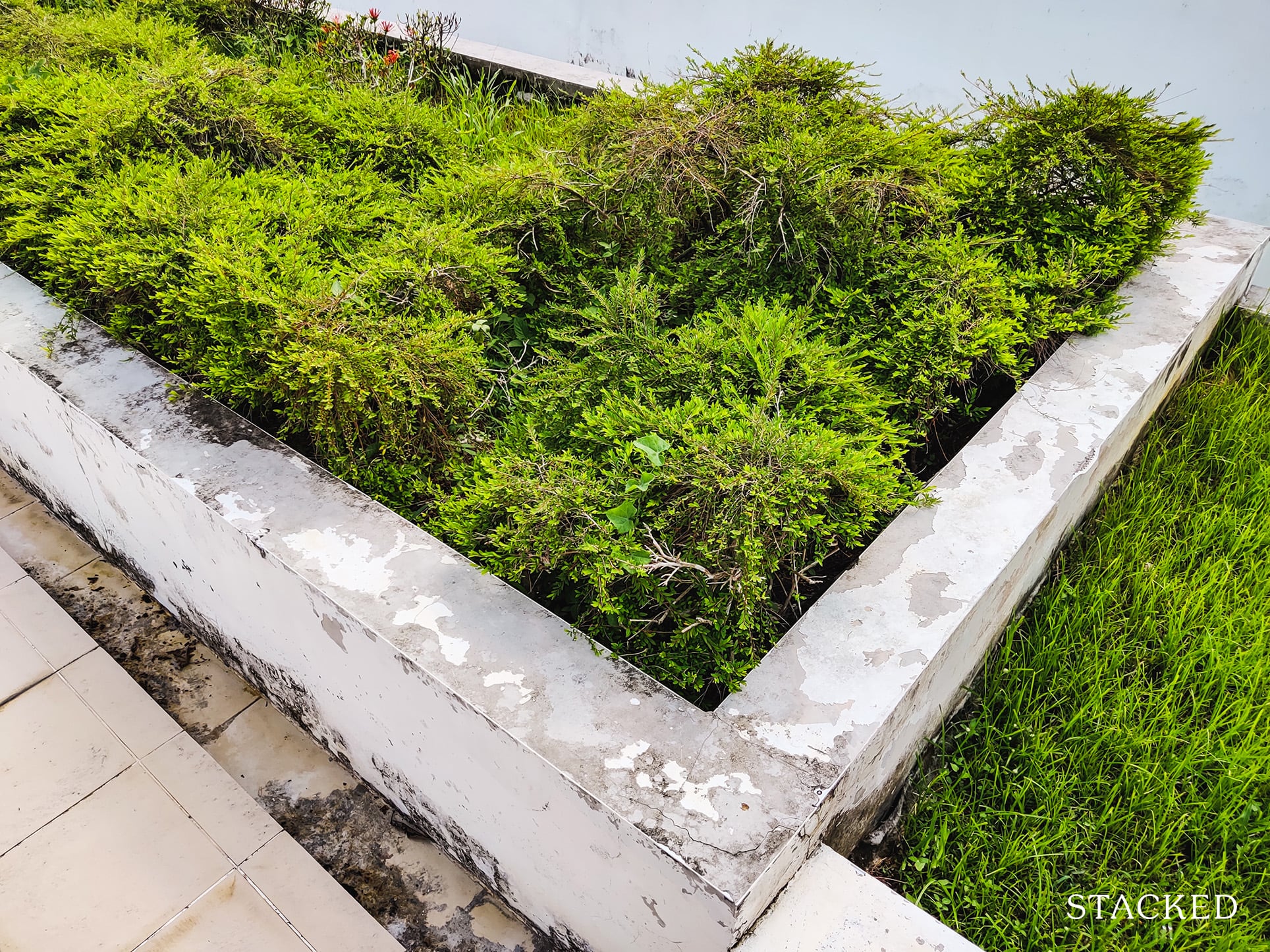
In fact, I’m actually surprised some plants here are growing well. This is probably the only respite.
All that said, you have to know that this area above the carpark isn’t touted as a facility at all. In fact, it isn’t even designated on the HDB site map alone.
Some might say this is producing a silver lining out of nothing, but on a very positive note – turning this spot into an area for residents to gather would reduce the privacy of the upper floors of the carpark facing blocks. So yes, residents living there can be thankful for that.
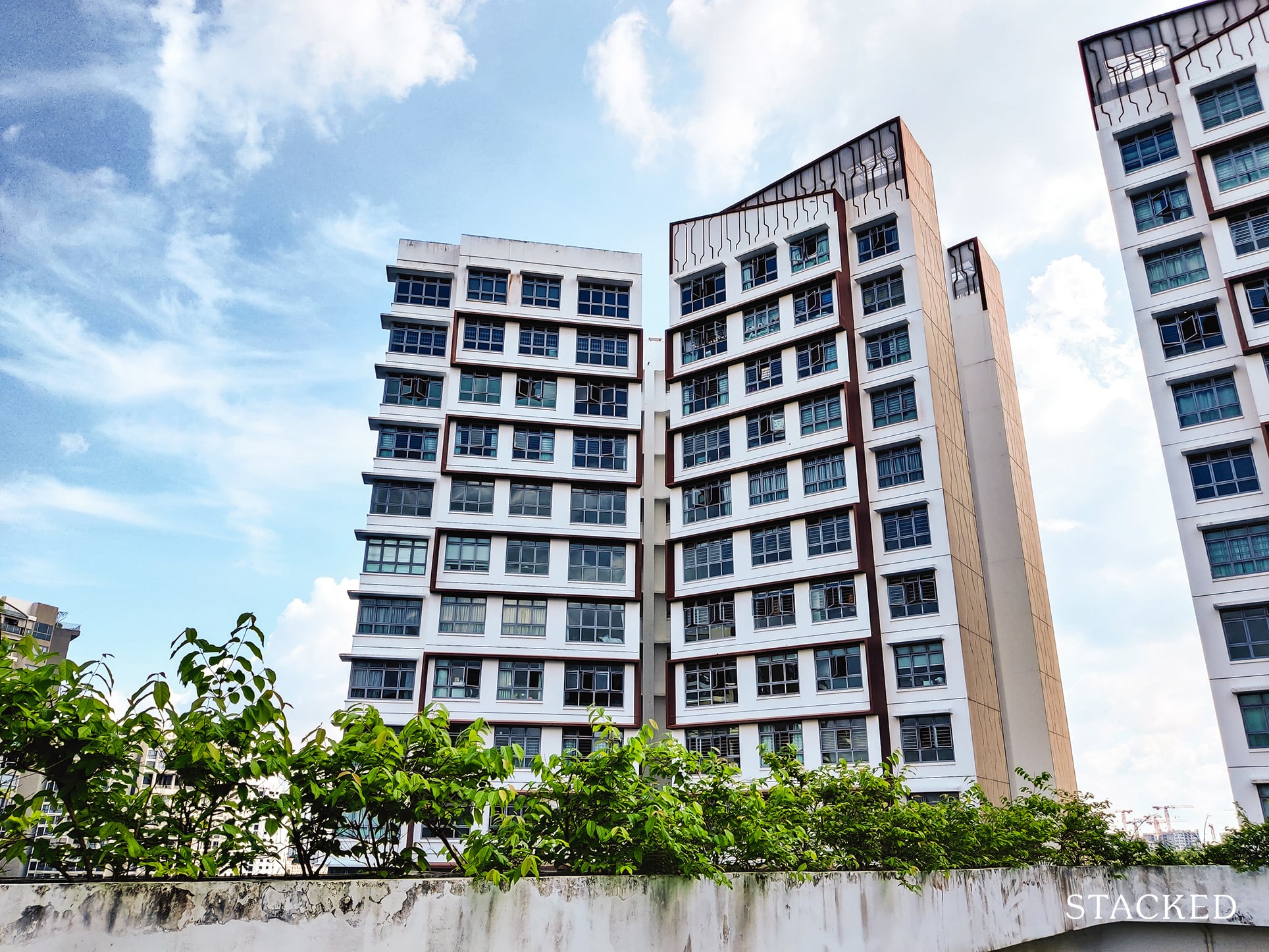
You have already seen the intrusion the lower level floors have on the blocks here, so a widely-used rooftop would only make it worse.
Having greenery at the roof does help alleviate the heat absorption from the concrete building, so I believe this was its intended purpose.
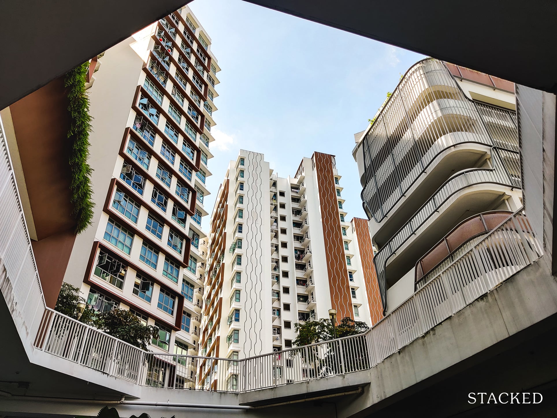
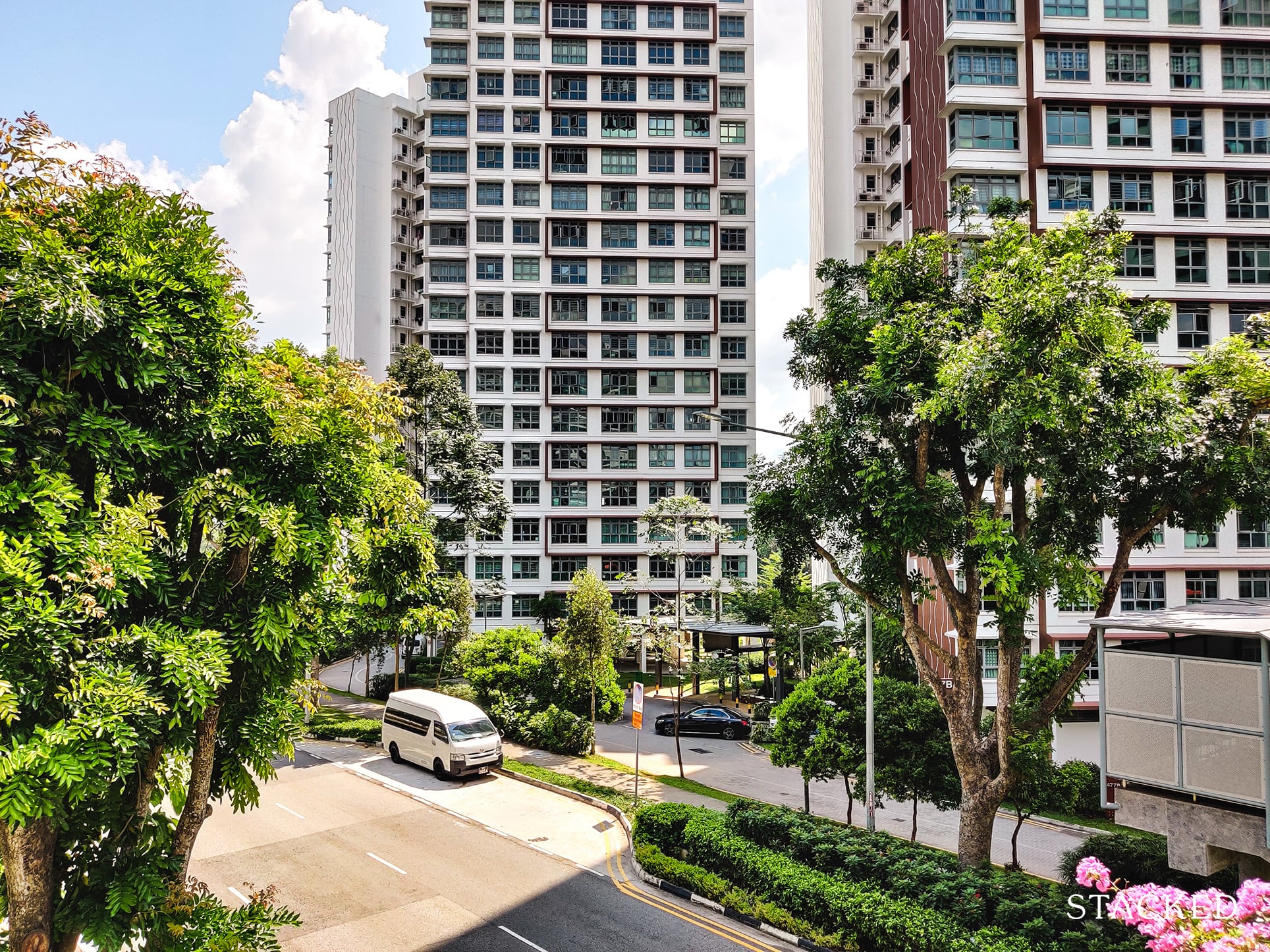
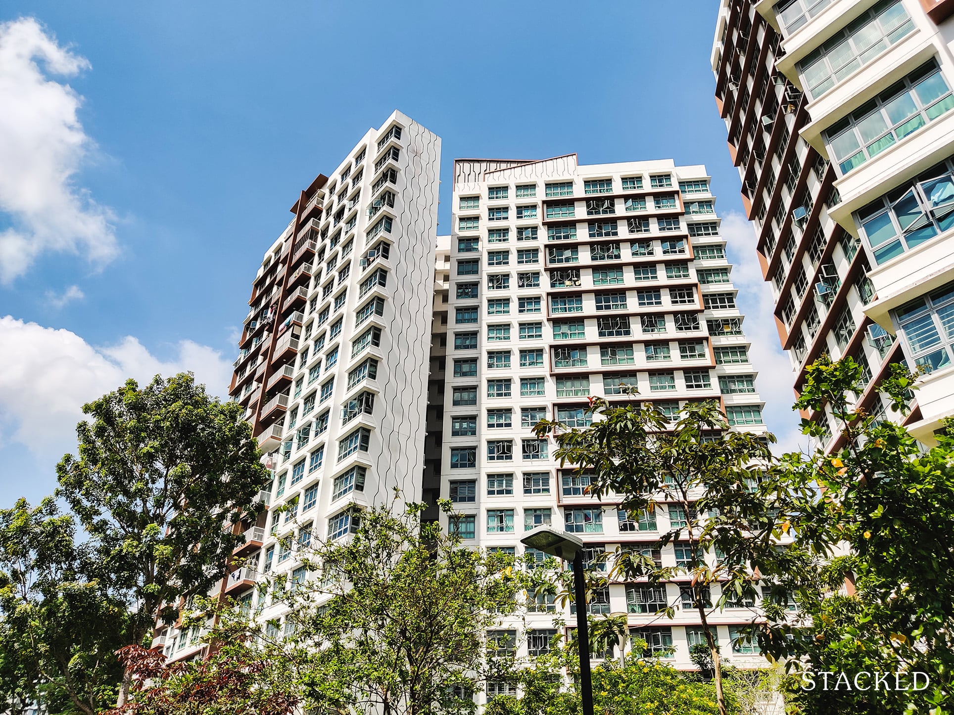
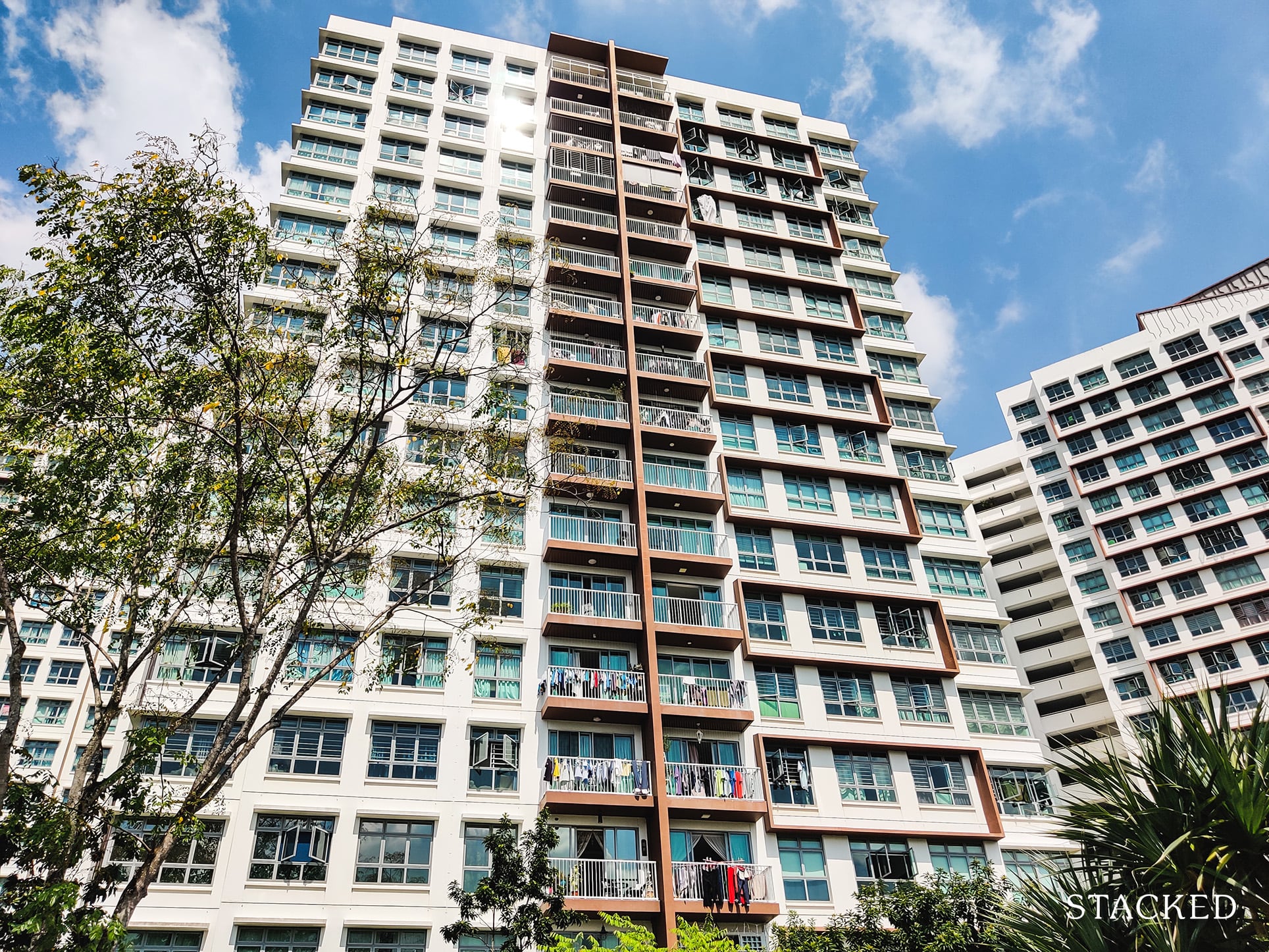
From here, you can also see that the architecture of Hougang Capeview is quite different from other HDBs.
Its slanted roof adds some character to the building – kind of like Waterway Woodcress.
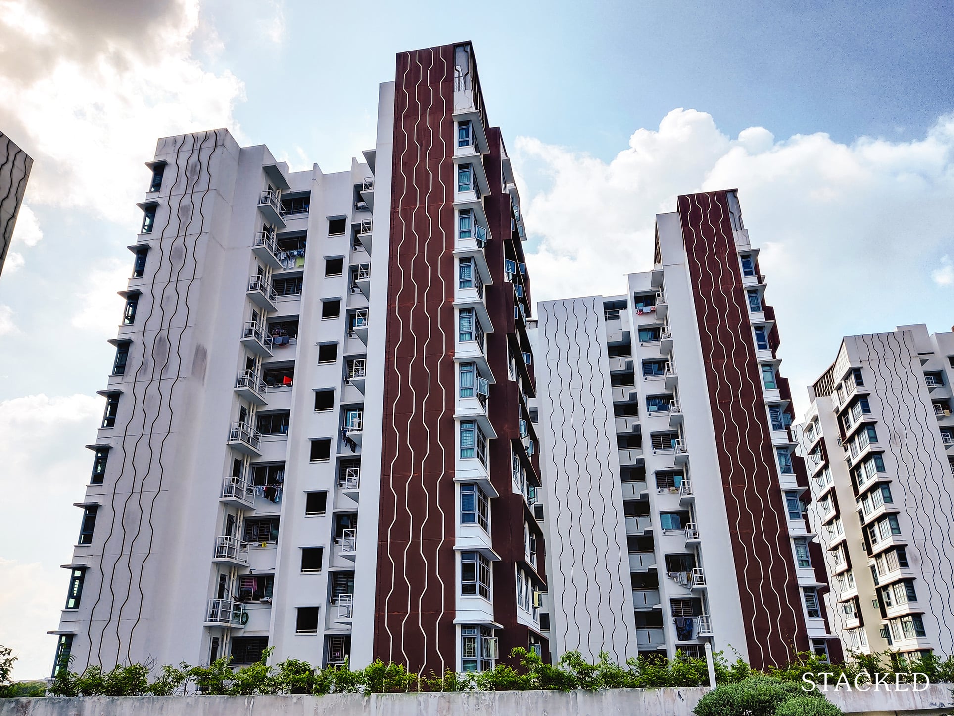
It also has a nice brown facade on its side with a line pattern that you’ll find more of in the common area later. The rectangular protrusions at various points also remind me of the designs at SkyTerrace@Dawson.
Overall it’s quite aesthetically pleasing and is a plus point in my books.
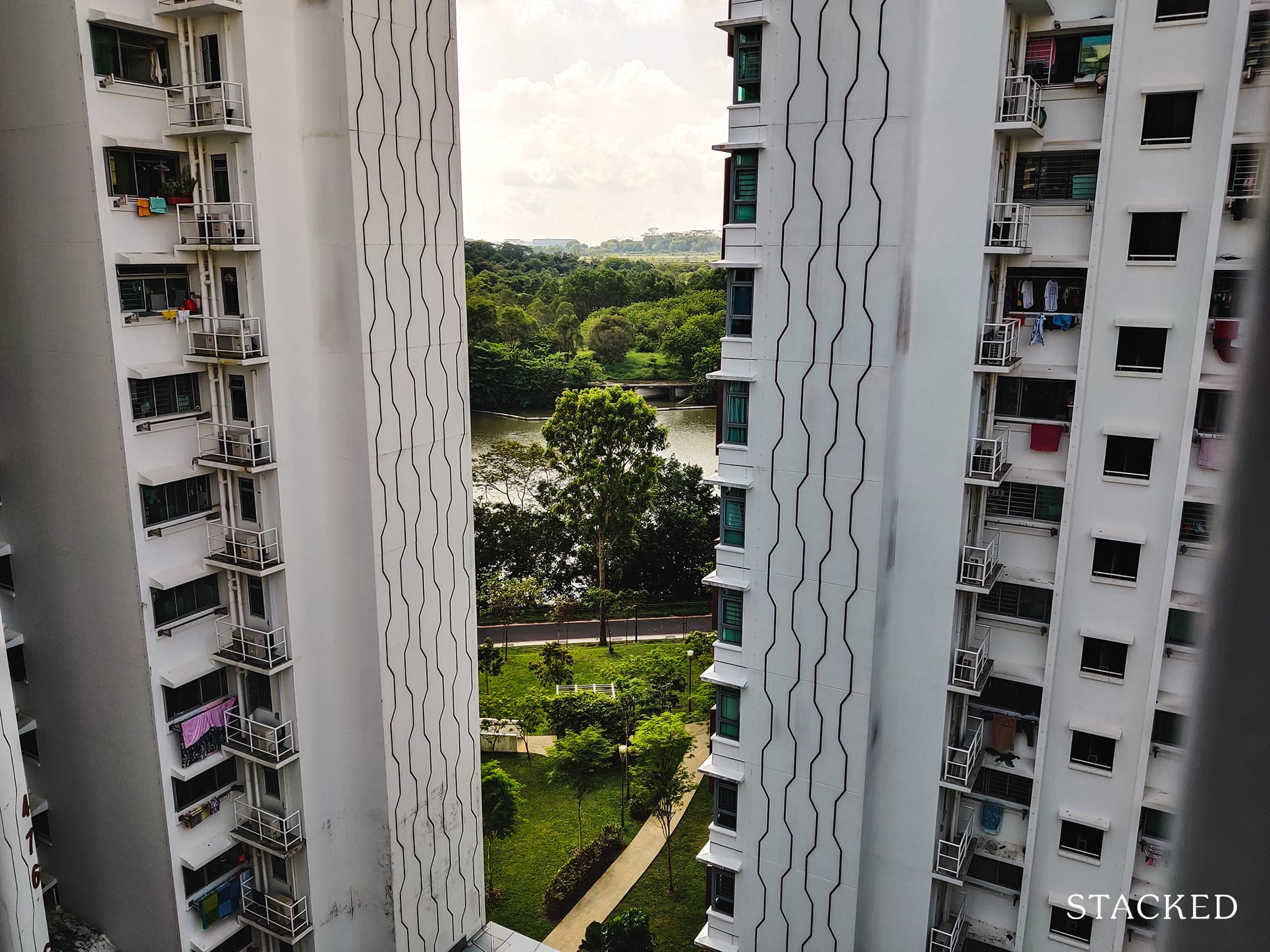
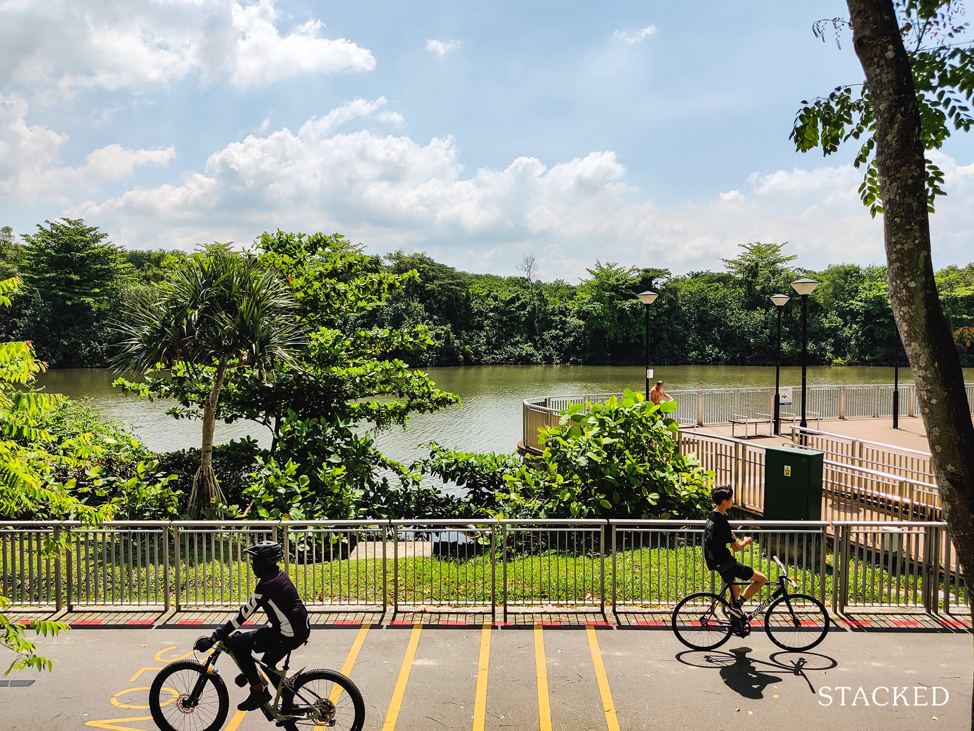
From here, you can also catch a glimpse of the river and park connector adjacent to the development. It is the biggest selling point of Hougang Capeview, and understandably so.
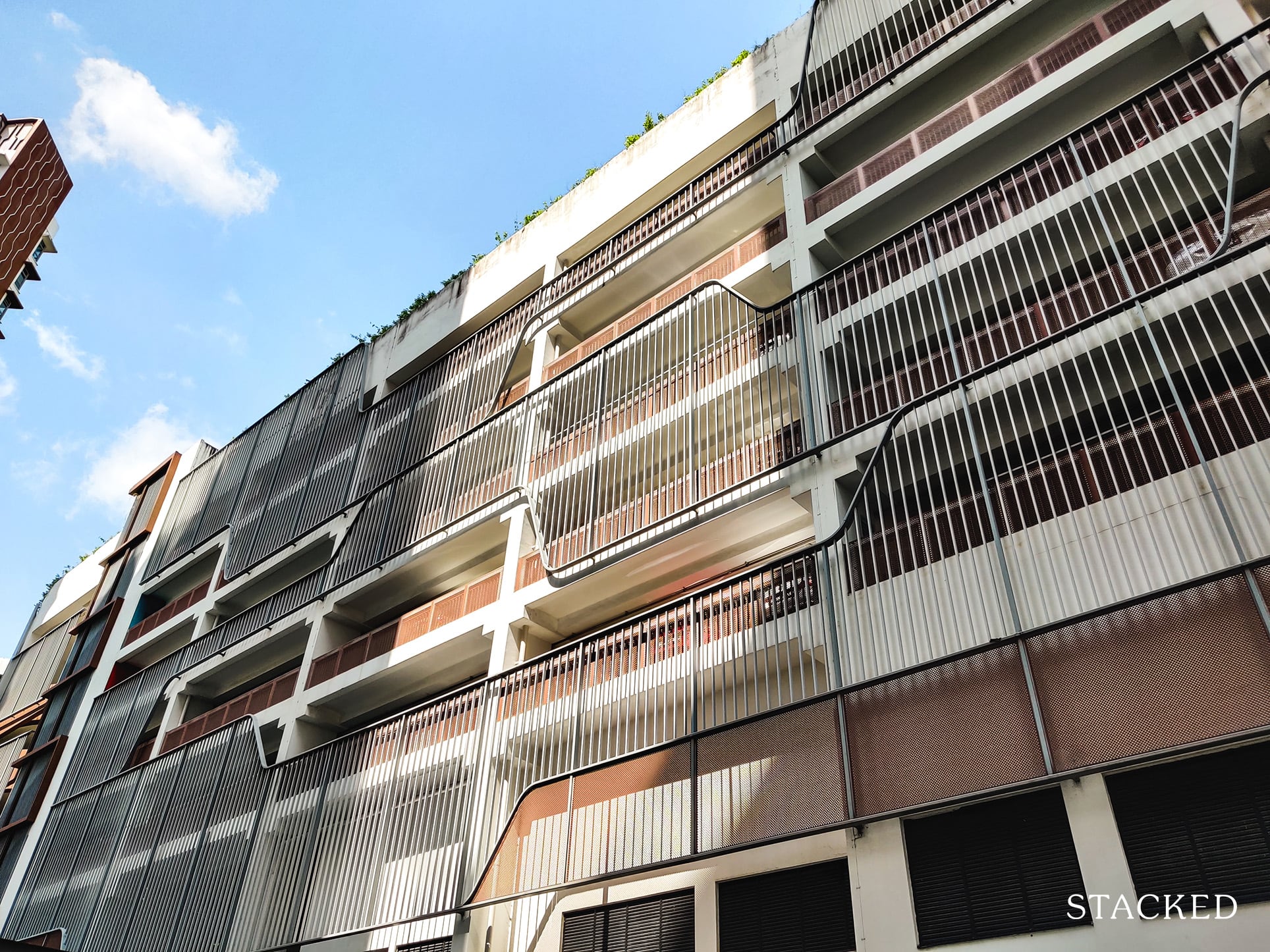
Now let’s head on down to the ground level.
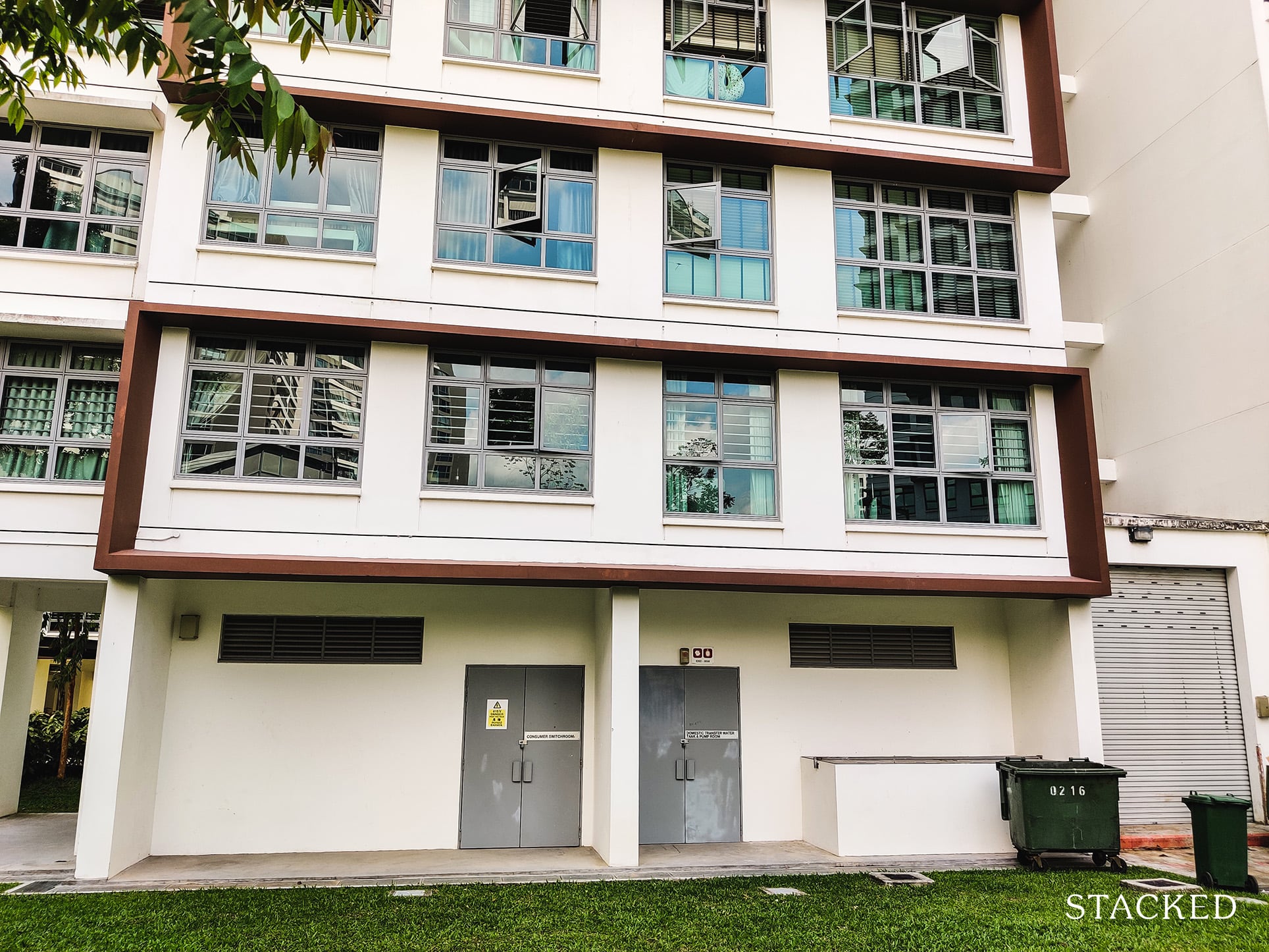
On the ground level, you’ll see that the multi-storey carpark doesn’t look like any typical HDB carpark.
HDB has bothered to put some decorative railings across the walls that provides a little bit more privacy for units across, and also gives the carpark some character.
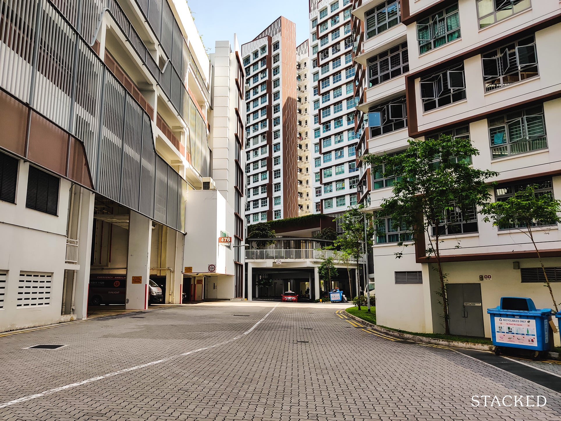
As mentioned, there’s only 1 entry and exit point to Hougang Capeview via Upper Serangoon View. Hence, this long road in will bring you past all the blocks here, and the only way out is to U-turn at the dropoff points.
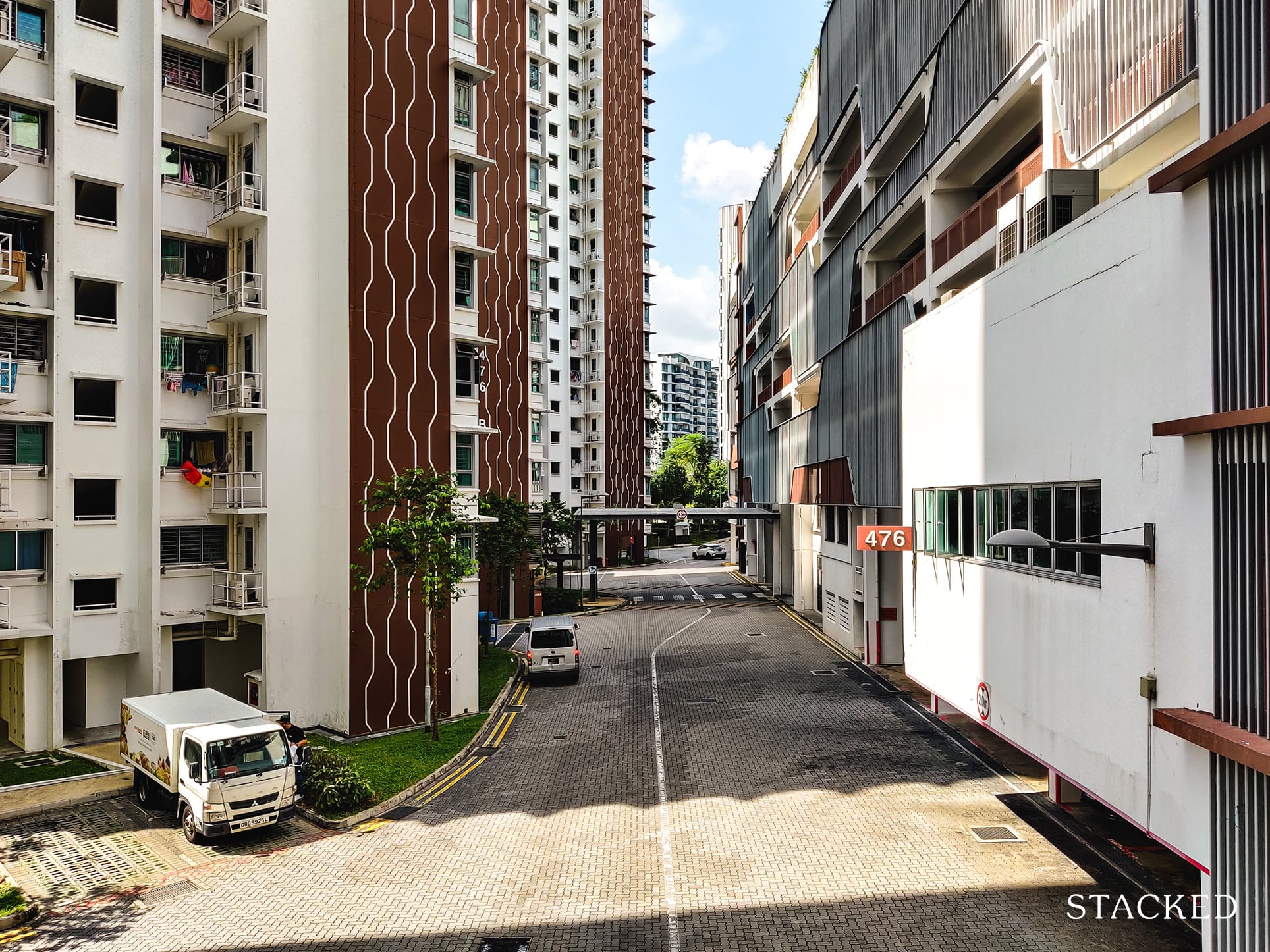
There are a total of 3 dropoff points here that would serve residents from all blocks.
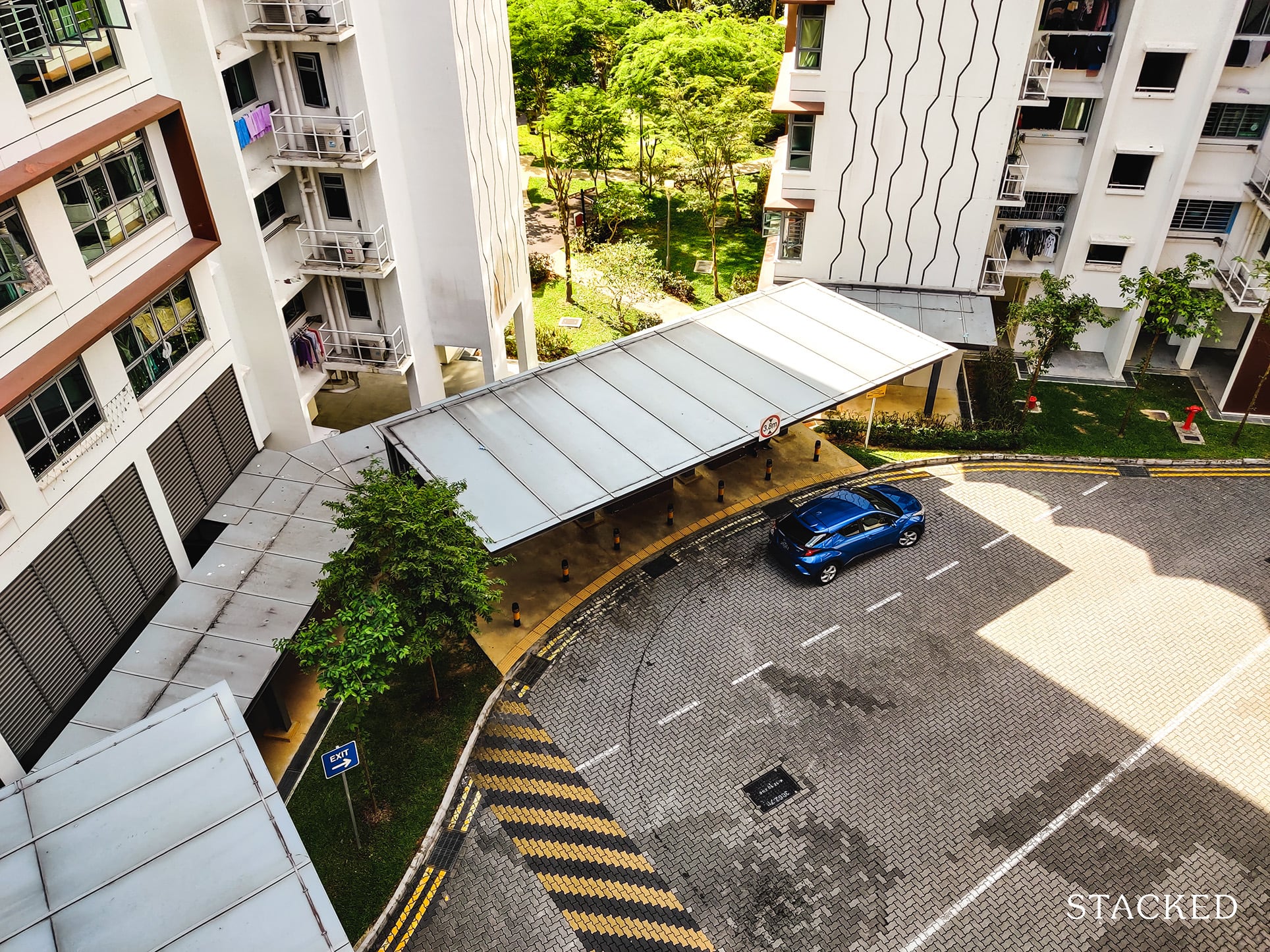
It’s sufficiently spacious and sheltered too, as it’s able to fit about 2 cars at a time.
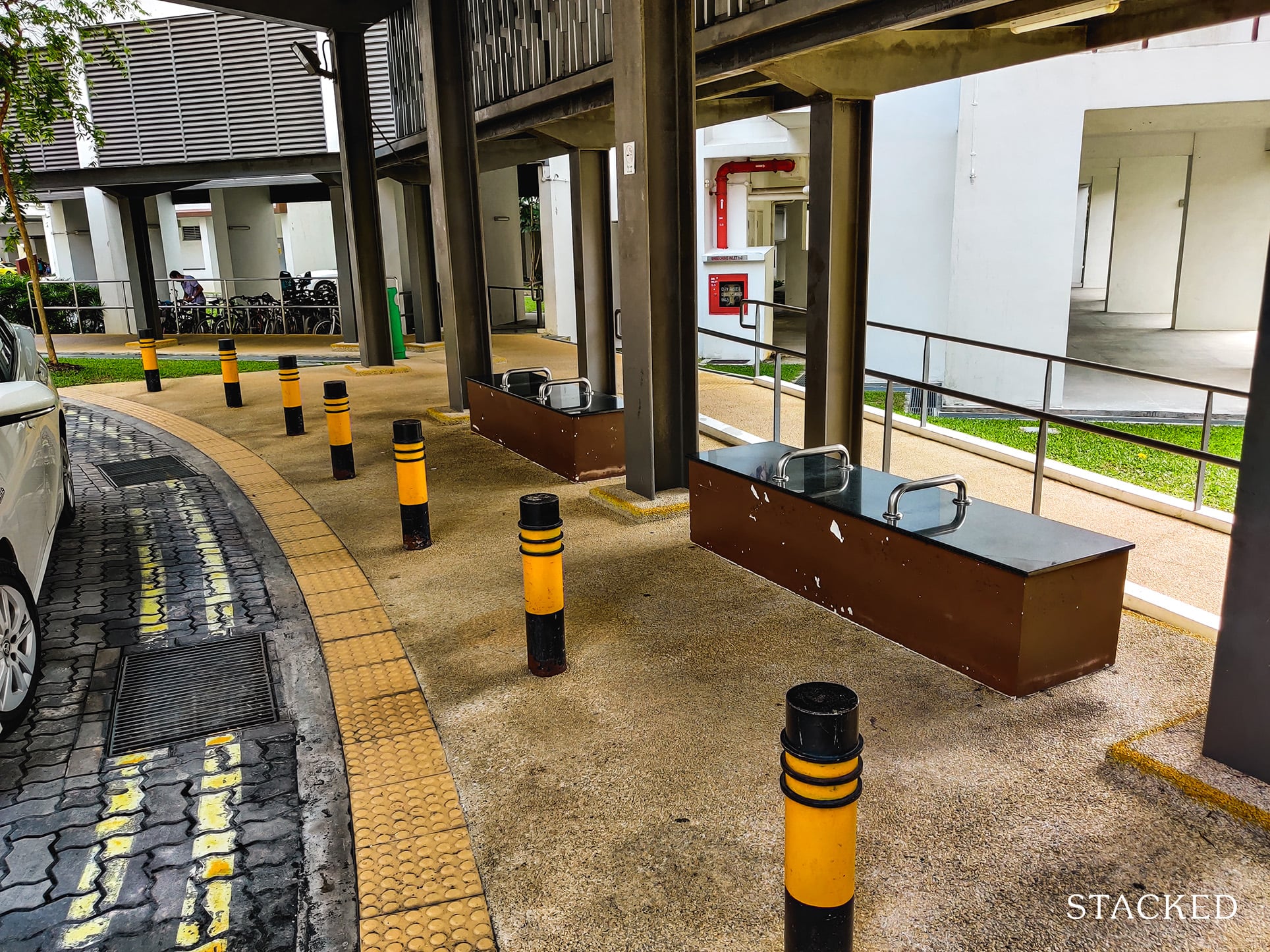
It also comes with an ample amount of seats (despite the hostile architecture at play here).
The main dropoff point, and probably the more impressive one, is in the center.
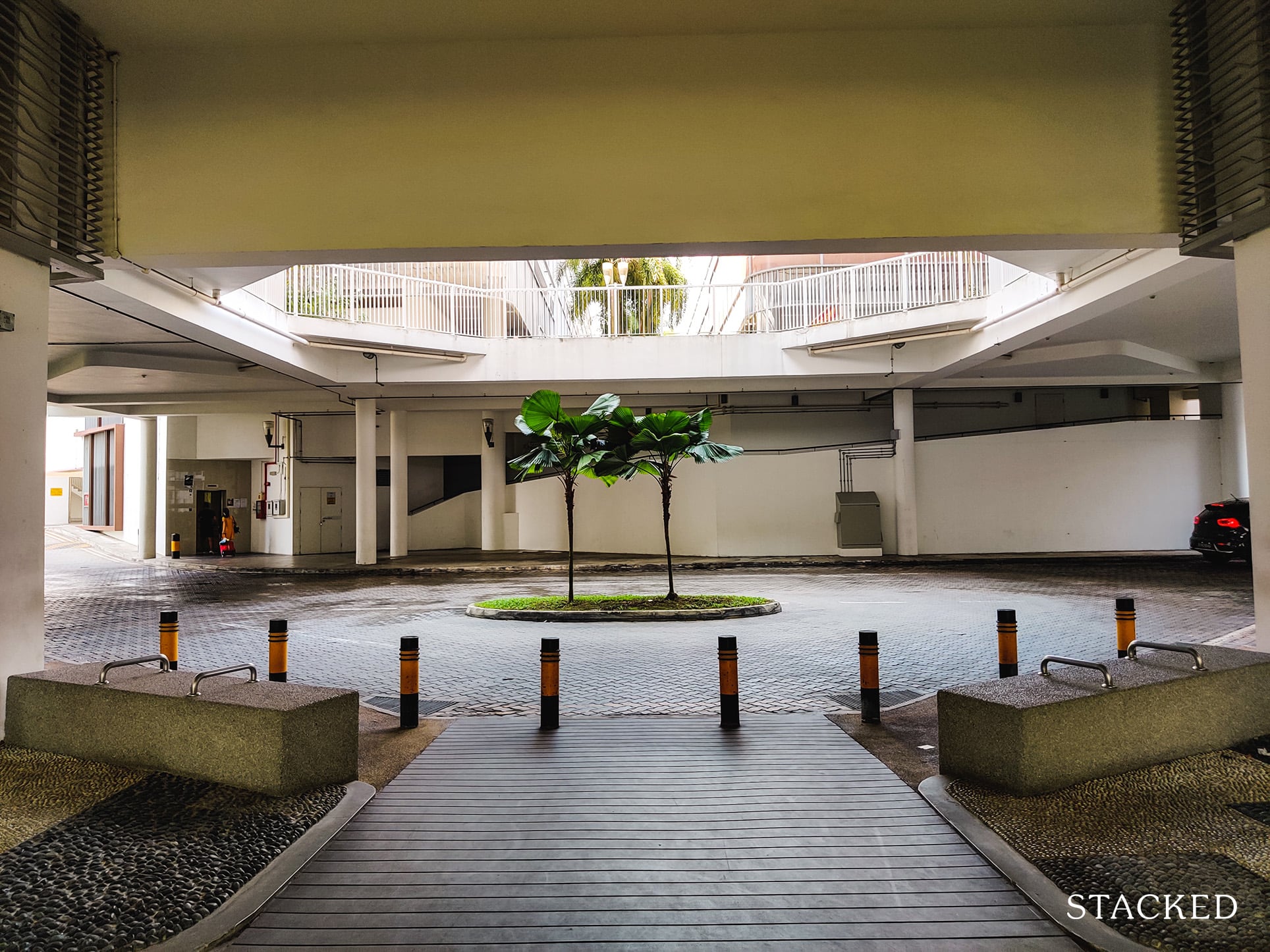
It has a nice green feature in the middle – though if you look at it as a whole, it does seem like a taller or more luscious variant would’ve been more appropriate (and better looking) here.
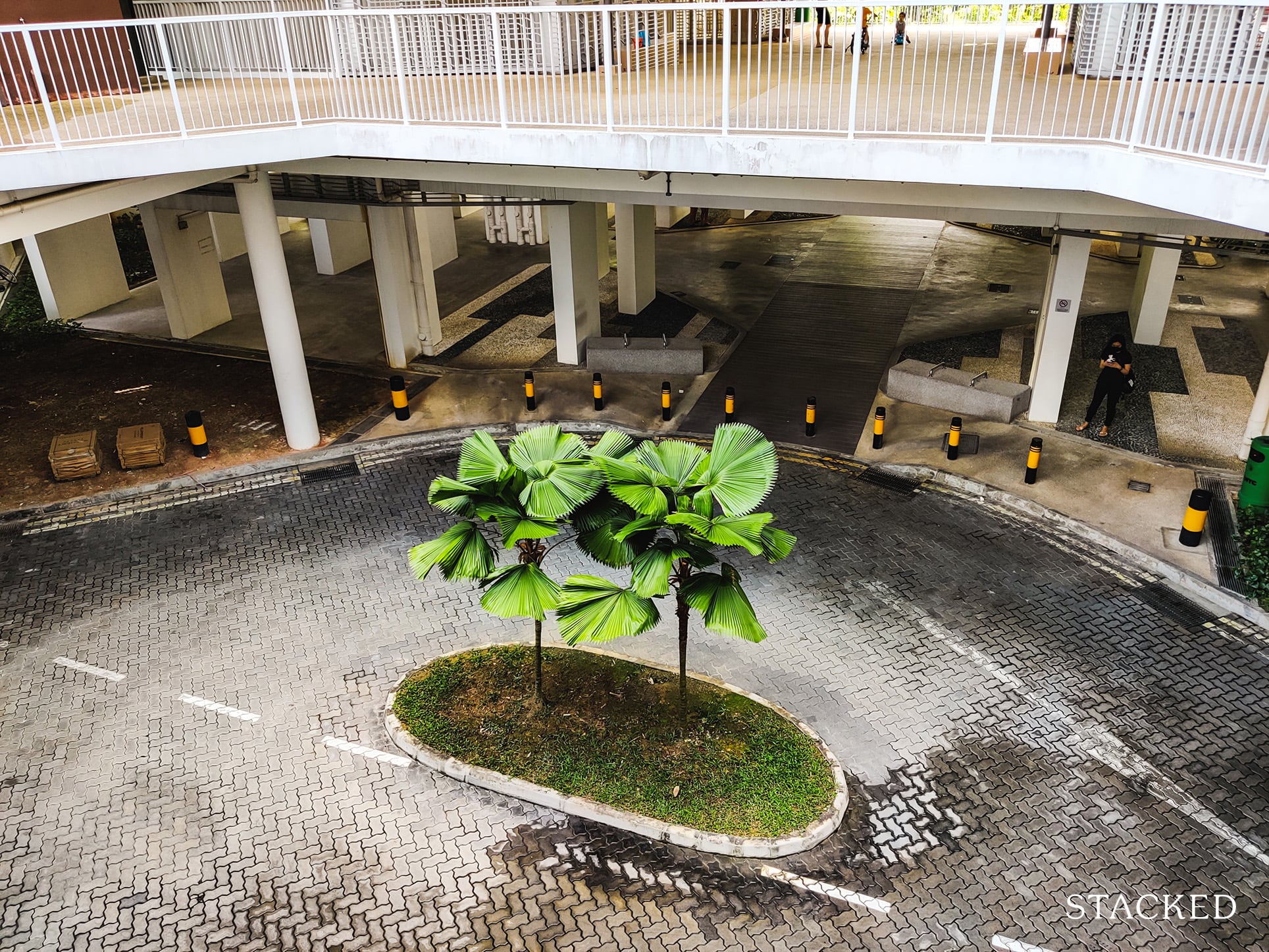
It’s actually directly below the plaza on the 2nd level which you’ll see later
You would also be greeted with this long path that leads you straight to an open and green area where the main facilities are located.
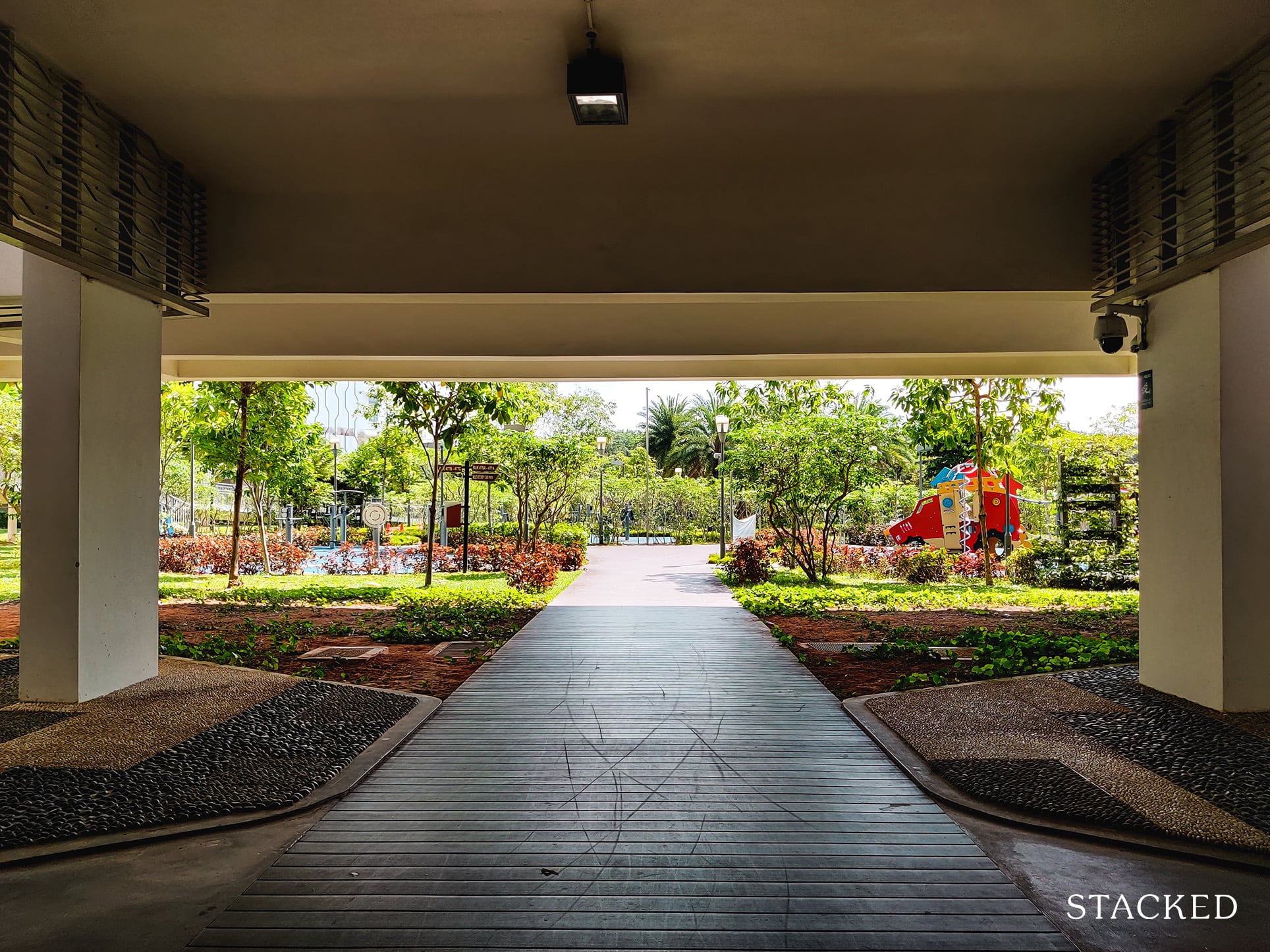
I must say that this part here is pretty well done. The path leading to the greenery gives off a slightly more exclusive vibe considering it’s further out from the road. Given you would be greeted by the wonderful river views at the end too is always nice to know.
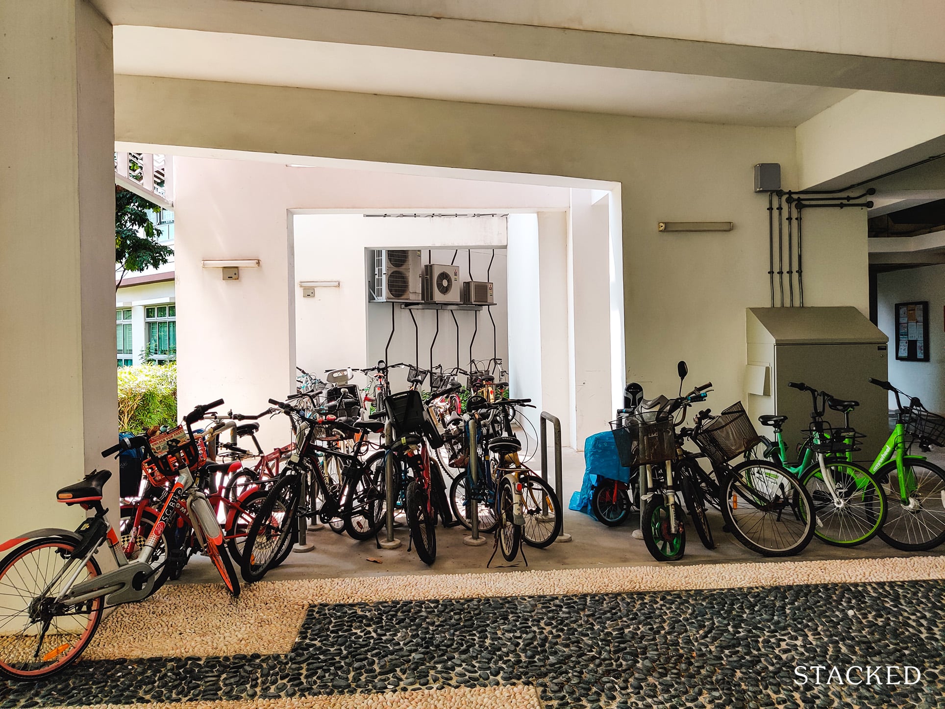
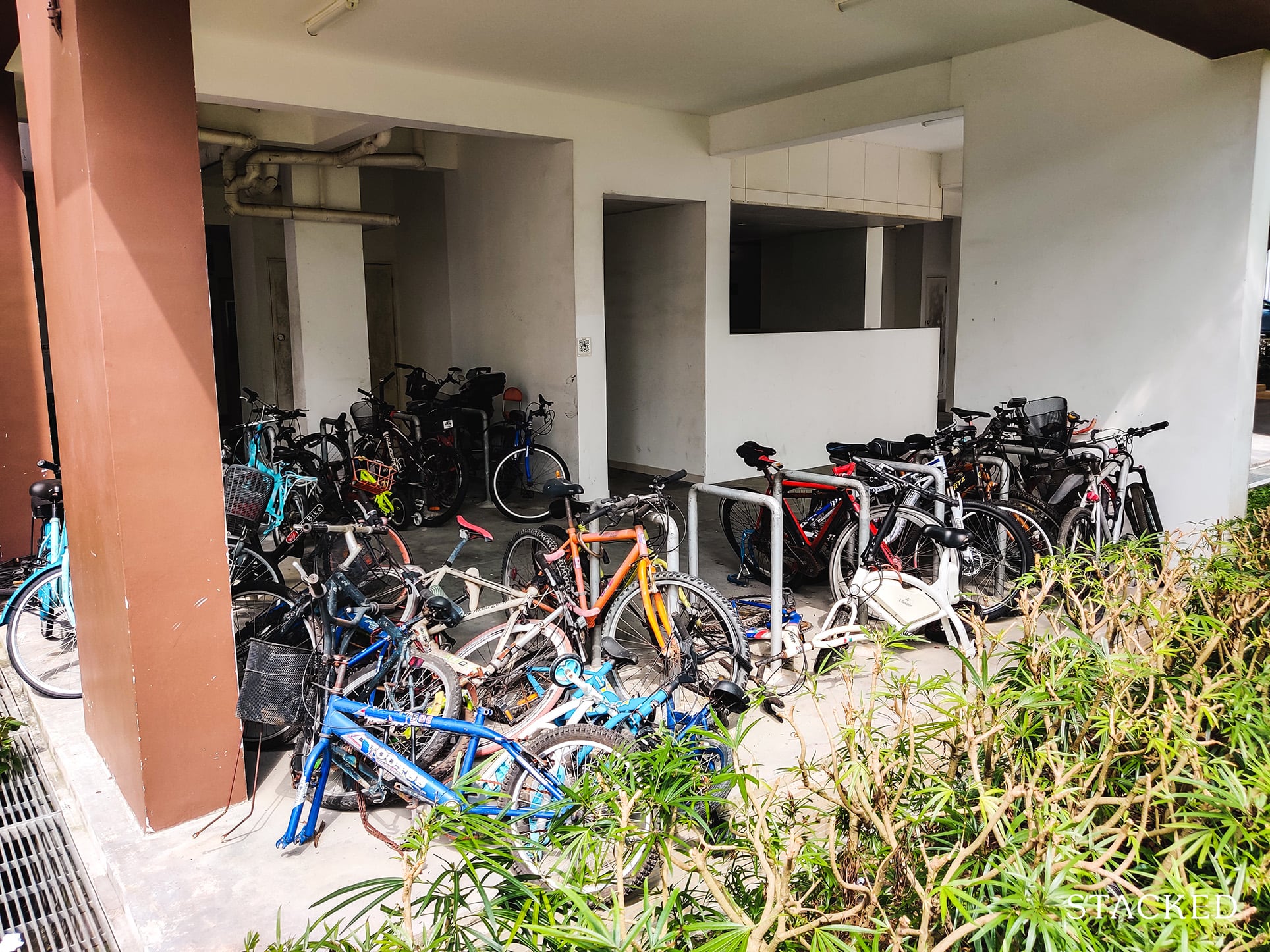
Along the way, there are some bicycle parking lots here. It’s quite an appropriate place given it’s next to a wide path that leads to the park connector, and it’s also close by the blocks.
Do note that there are also bicycle parking spots scattered around the development for residents’ convenience.
Moving further in, you’ll find a huge open space that contains the playground and fitness area of the development.
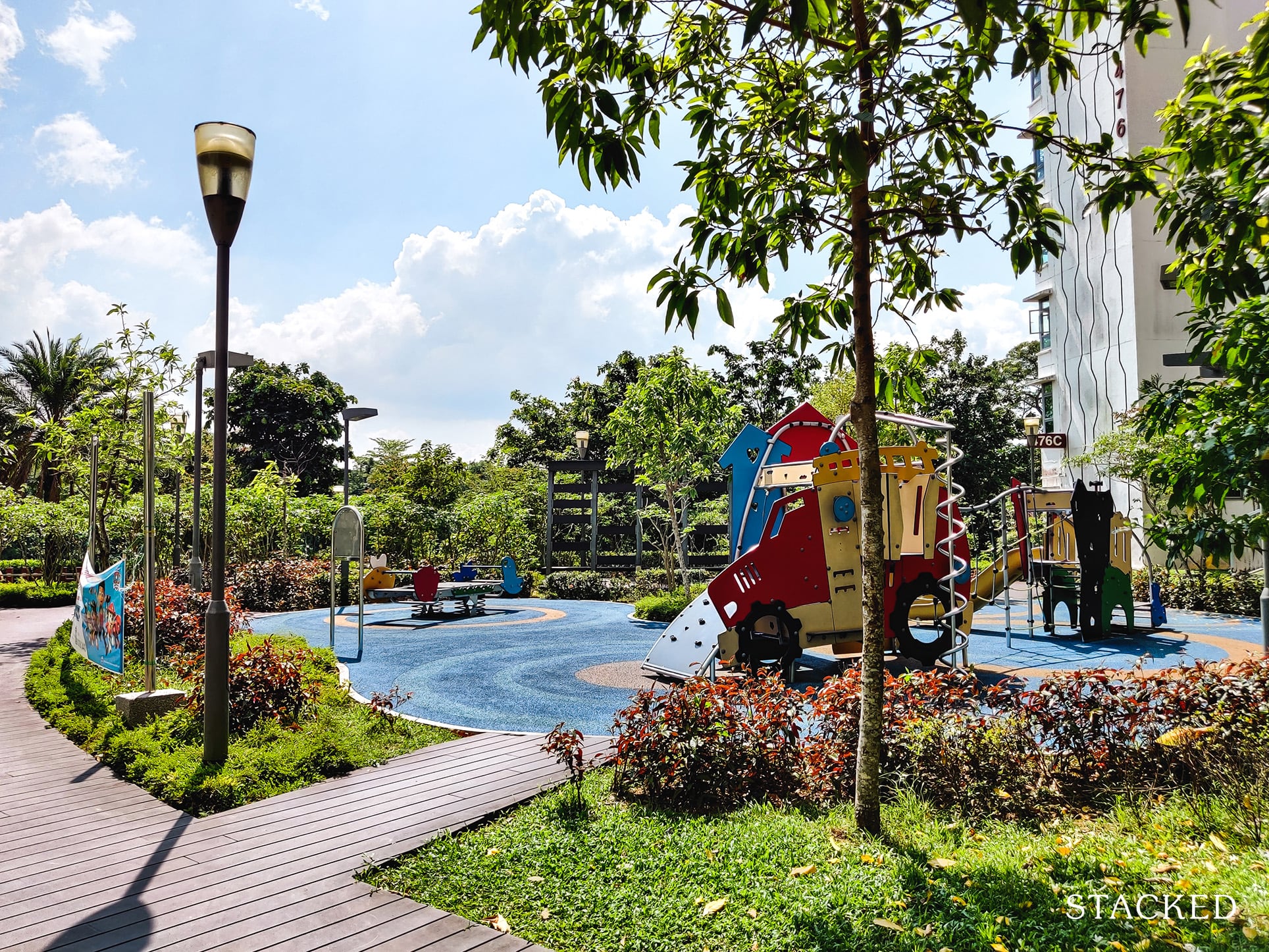
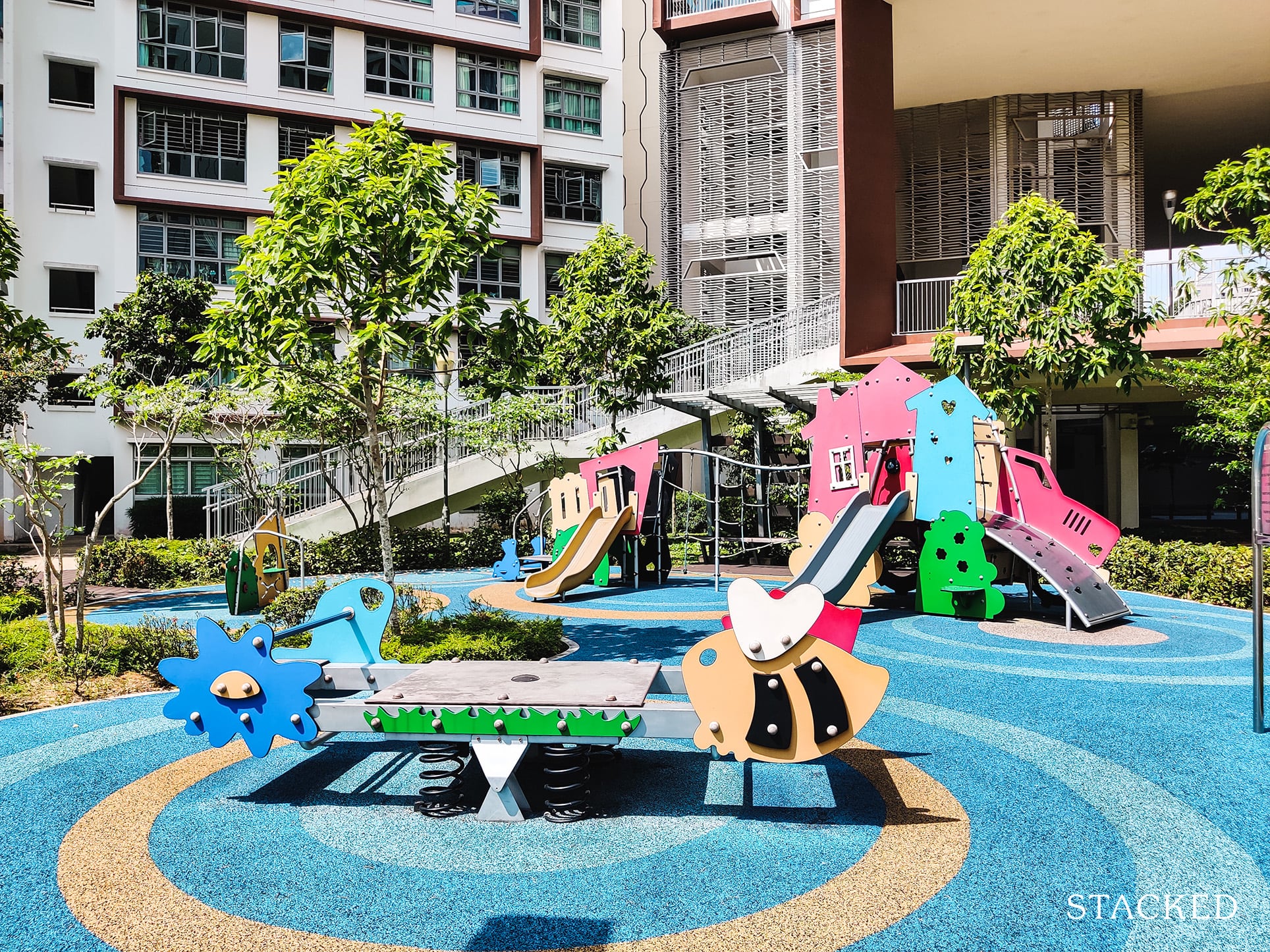
The children’s playground here is sufficiently spacious for a development with 781 units. It’s also quite a playful/colourful one at that! It’s vibrant and quite different from the other HDBs that I have reviewed so far.
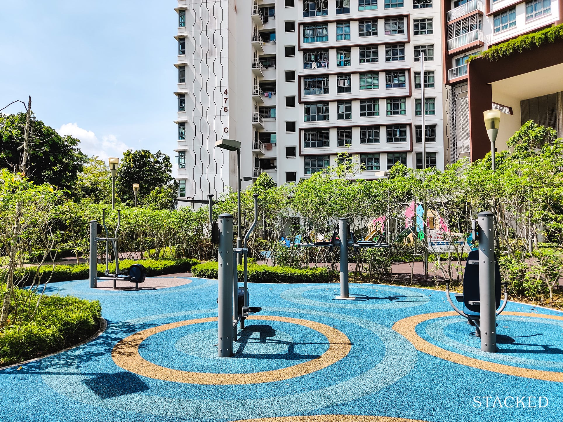
There are also 2 fitness stations here.
One for adults, and another for the elderly.
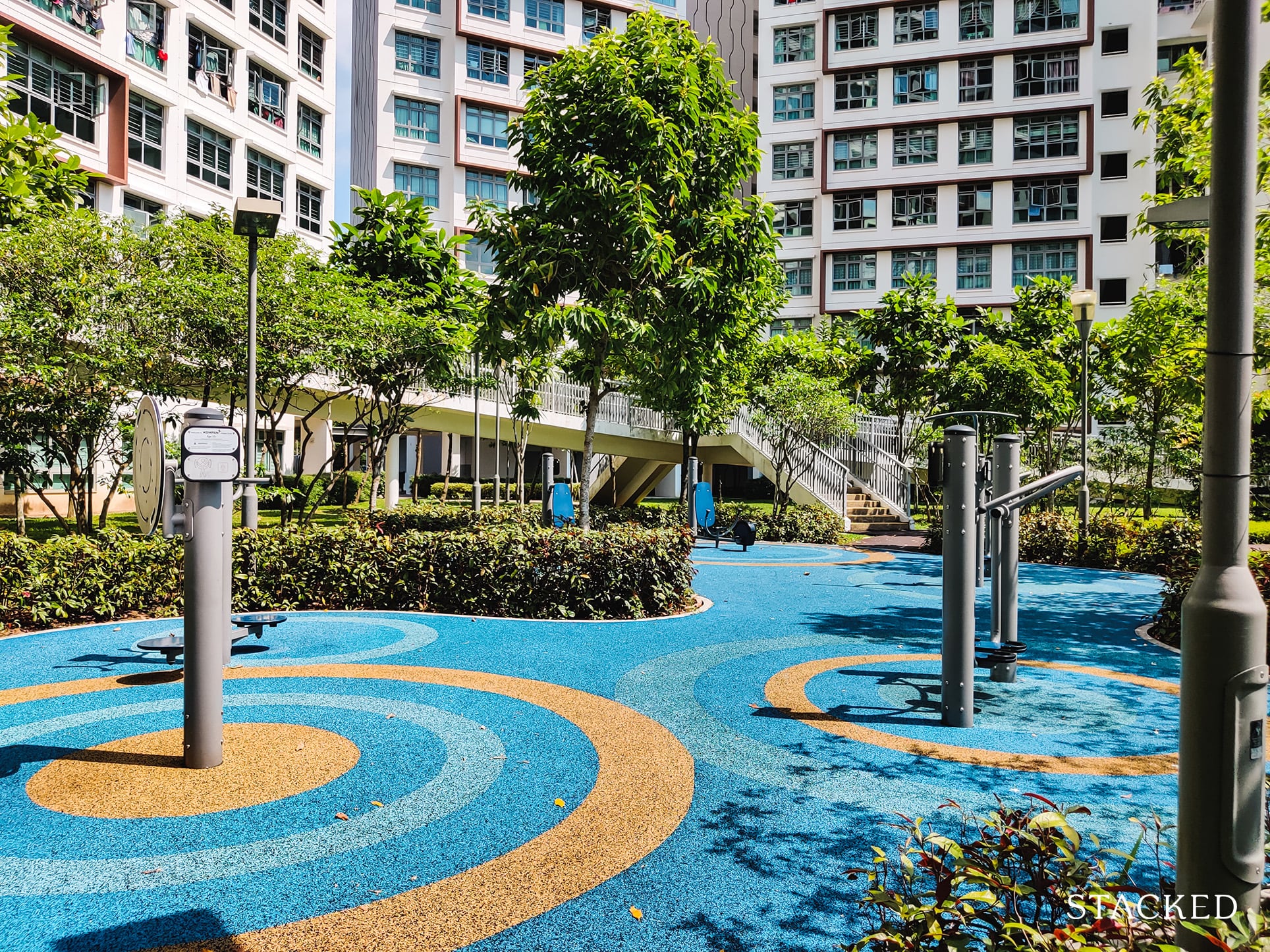
The overall area here feels quite spacious, even if it is surrounded by the residential blocks. Those river views certainly help a lot here too!
Some people may point out a lack of privacy to the area, but that is always going to be a common issue of public housing.
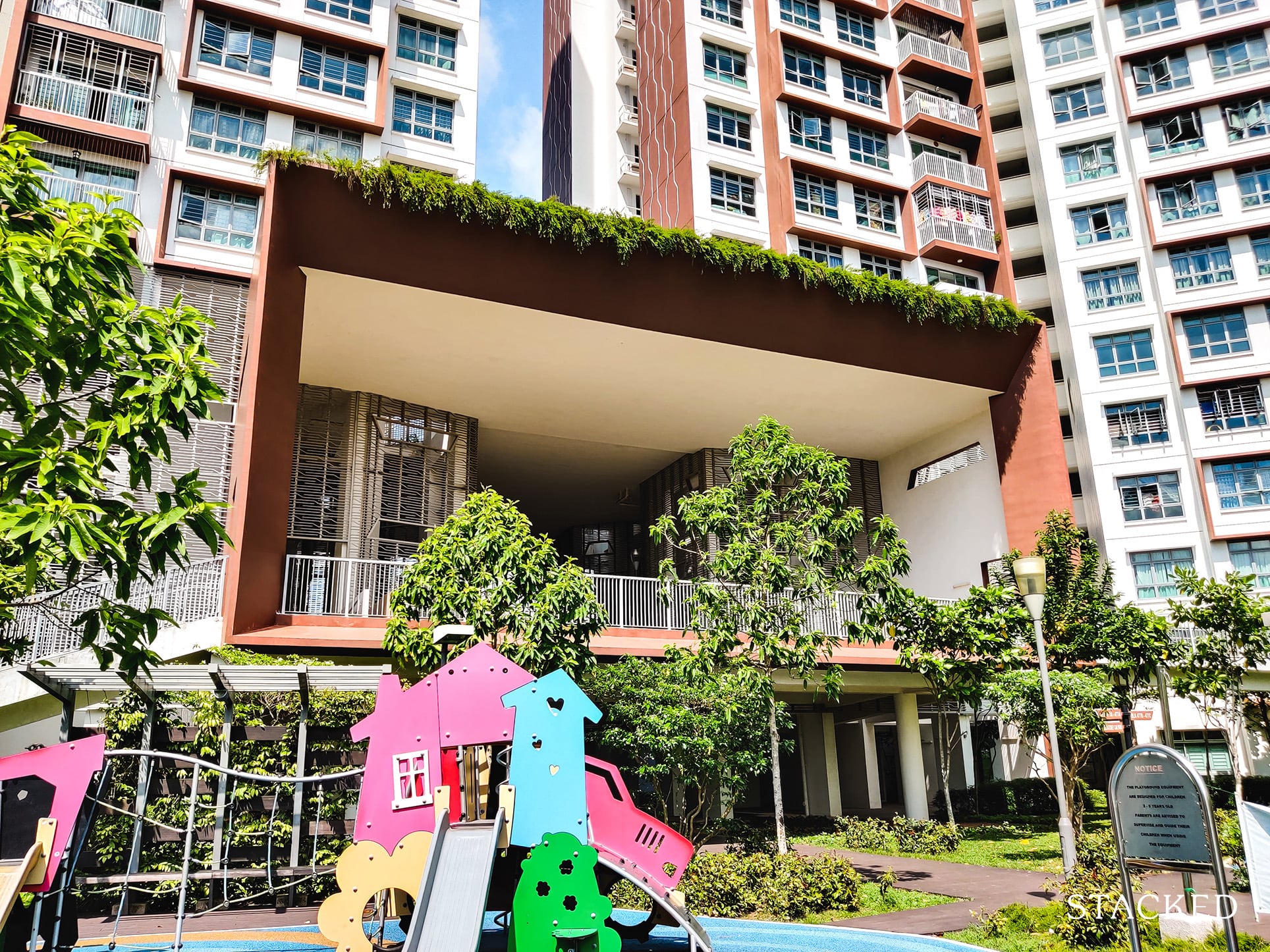
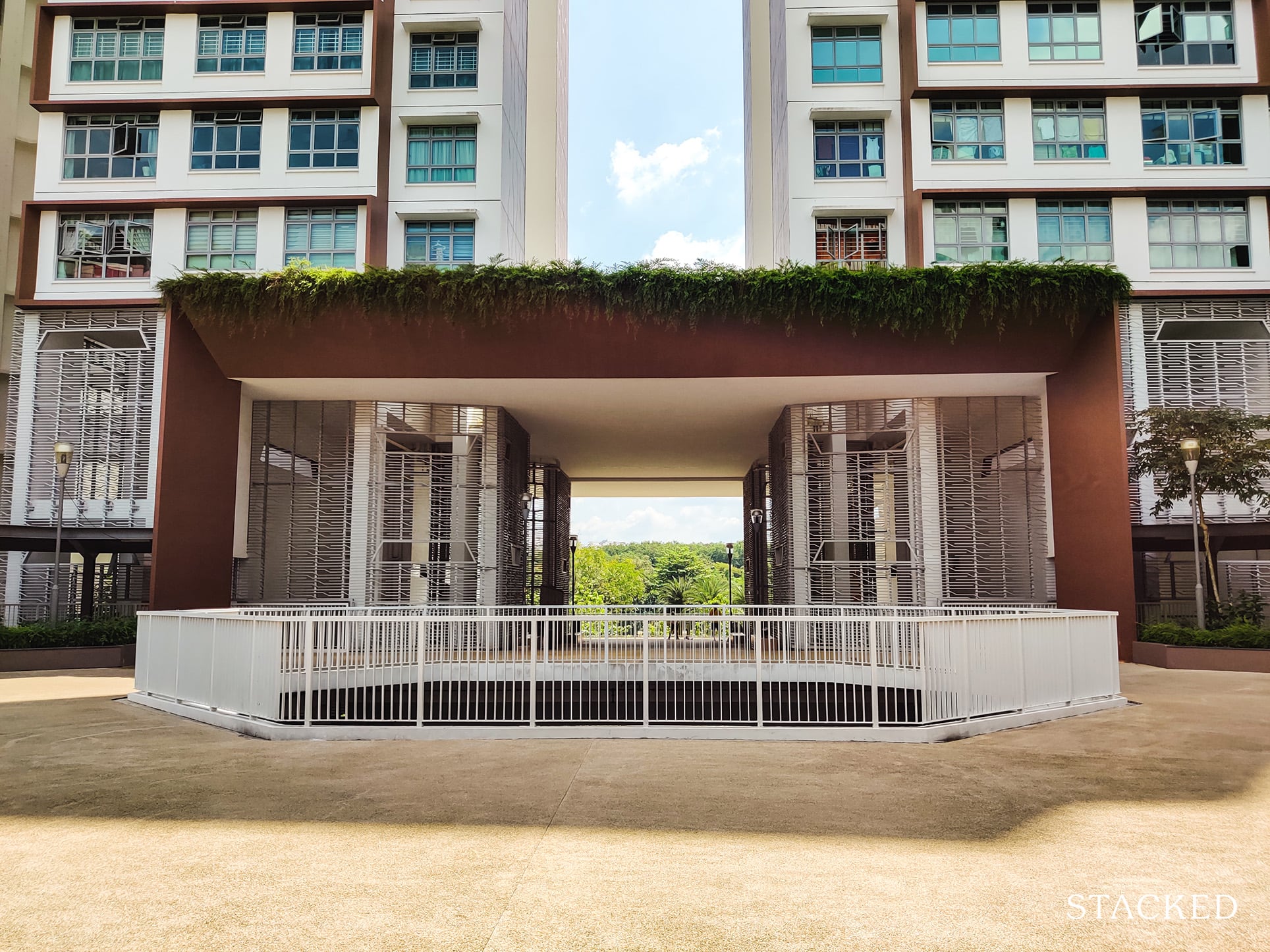
It’s from here that you see the iconic architectural point of the development – the viewing deck.
I simply love how the architecture of this viewing deck resonates with the rectangular blocks that you see on the facade of the residential blocks itself.
The inset and greenery flowing down from the top also gives this development a softer look – and in my opinion it is much needed to make the space feel more welcoming.
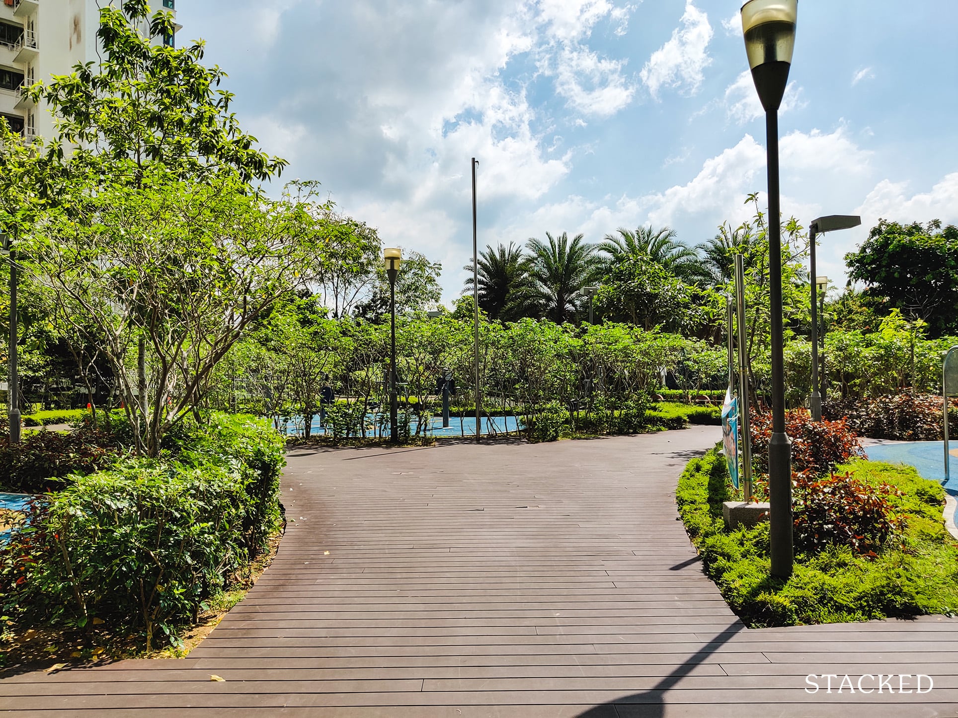
As you walk around this area, you’ll notice that the pathways around here are really wide, and the choice of material here is smart.
I understand that the development is only about 5 years old, but most of the courtyard area’s maintenance here is still pretty good (unlike the carpark rooftop).
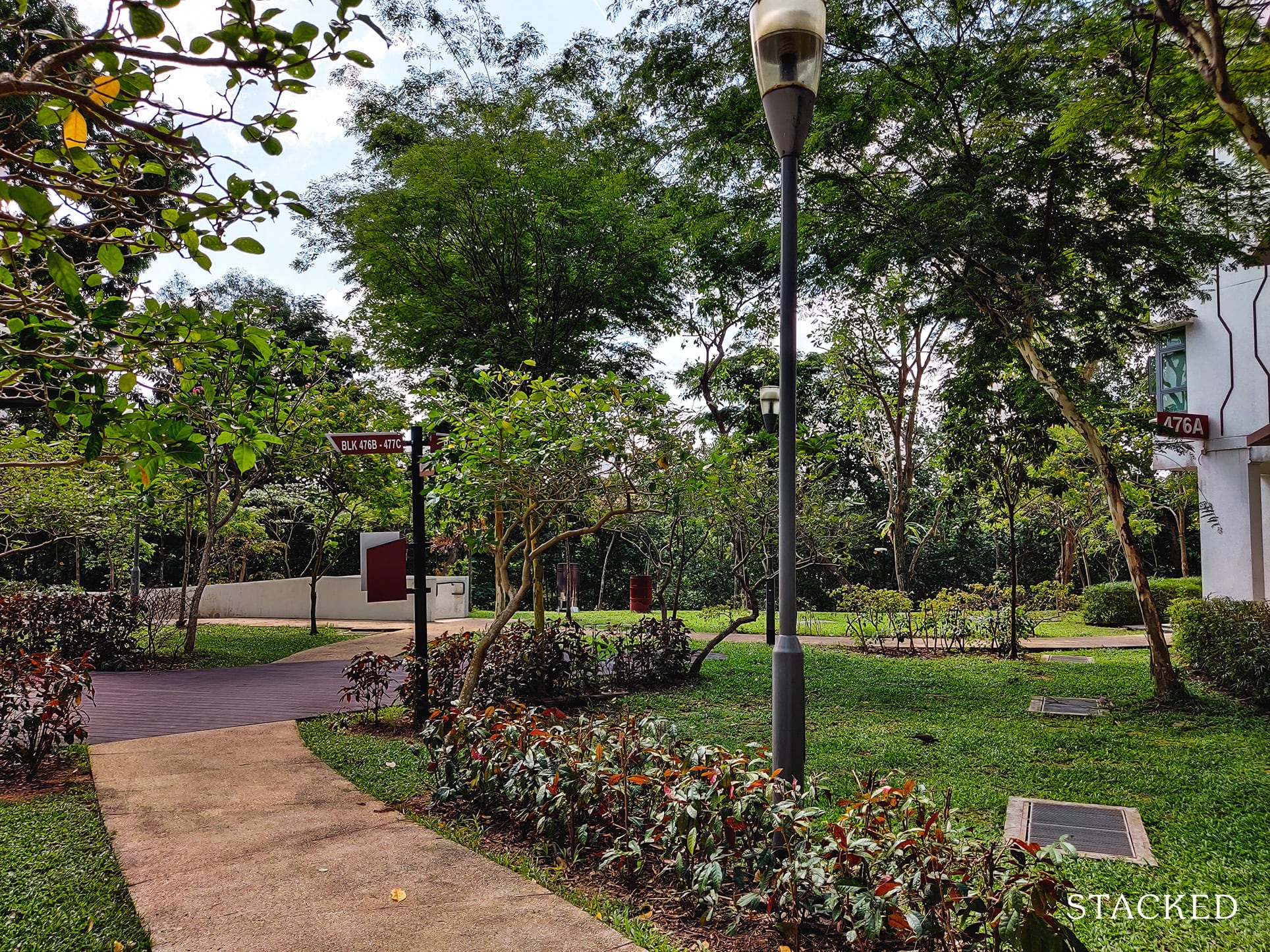
Another thing you should know is that because the area is flourishing with greenery, it really blends in with the park connector right next to it.
You can tell that this is a very deliberate design to create that seamless experience of coming home from the park connector without experiencing the stark contrast between nature and the city.
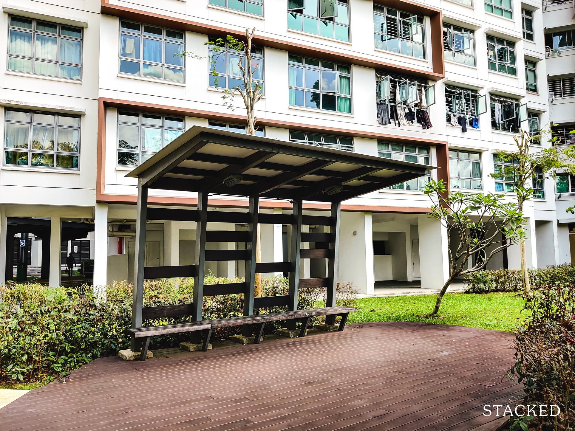
You’ll also find 3 shelters like the one above scattered around. Unlike the one at the rooftop, this one comes fully sheltered and actually looks pretty decent!
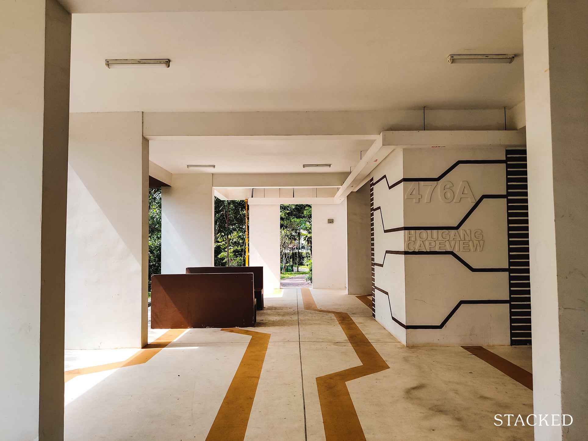
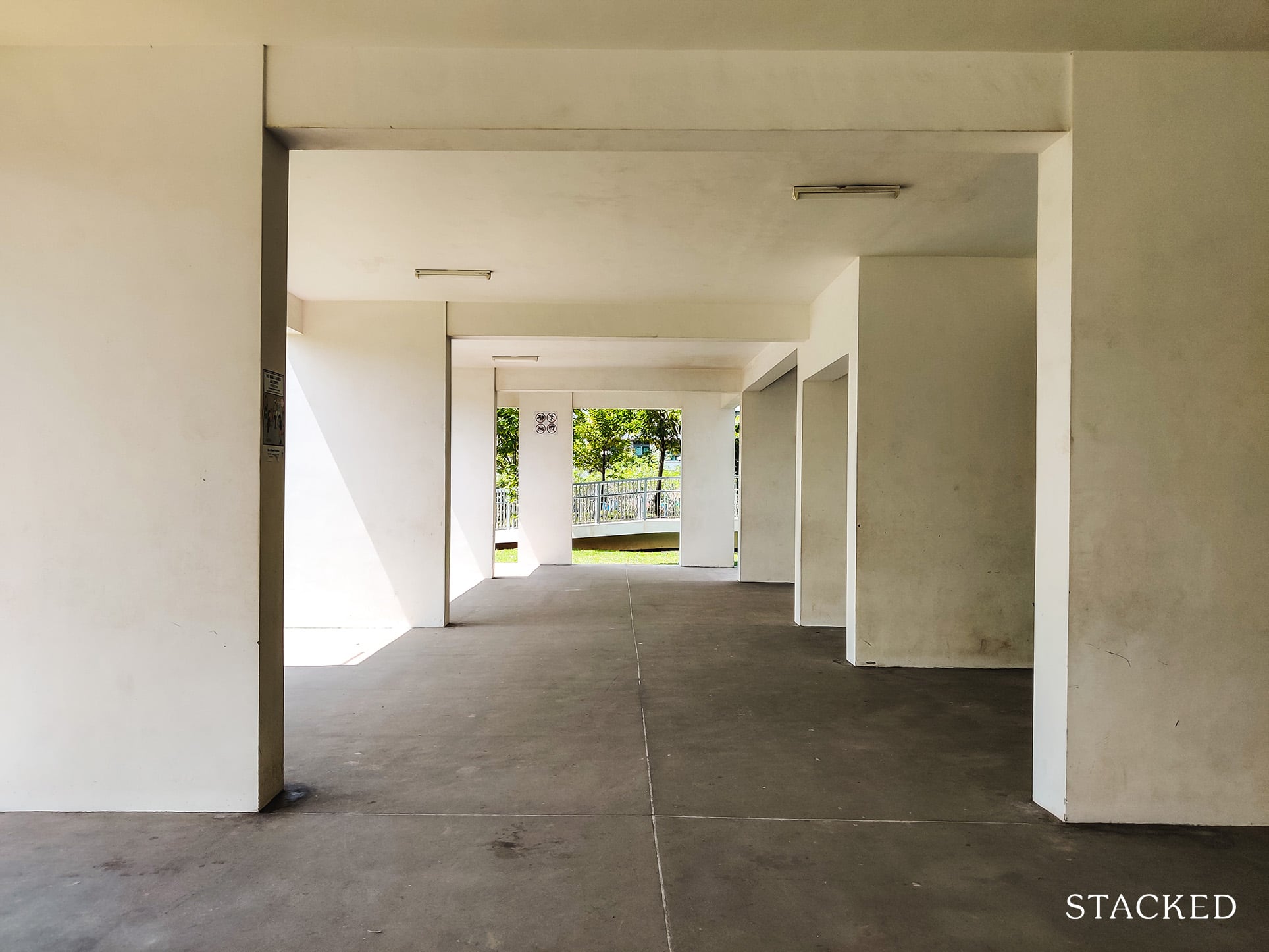
Underneath the block is the “void deck” of the HDB, but this one is quite different from the usual grey concrete ones you’ll find in other HDBs.
You can see that the line pattern that runs down the building is also present here on the floor and walls, so there’s some consistency in the design around the development too.
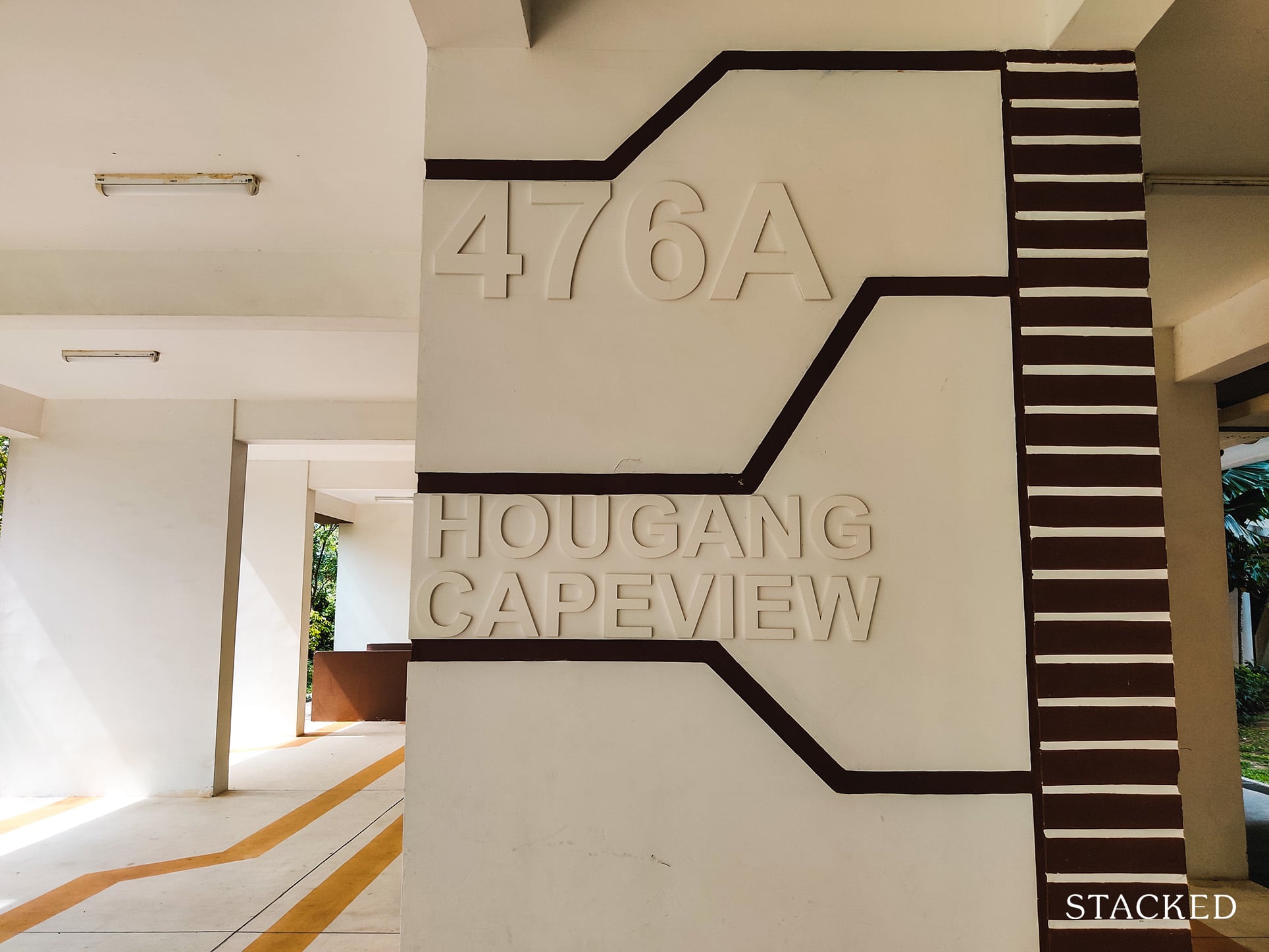
I also like that the name of the development is plastered on the wall in such a way, it does make it look suitably modern.
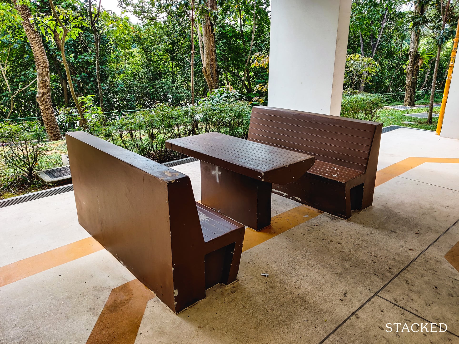
There’re also seating areas like this scattered around with a nice brown colour that blends in with the nature just beside it.
Of course, this wasn’t a consistent theme throughout the development, with several areas taking on a more plain look.
Taking the ramp down would lead you directly to the Serangoon Park Connector.
I love how there’s just so much greenery planted beside the walkway here. The connection from HDB to the park connector is really seamless here and it really does make it seem as if it is part of the development.
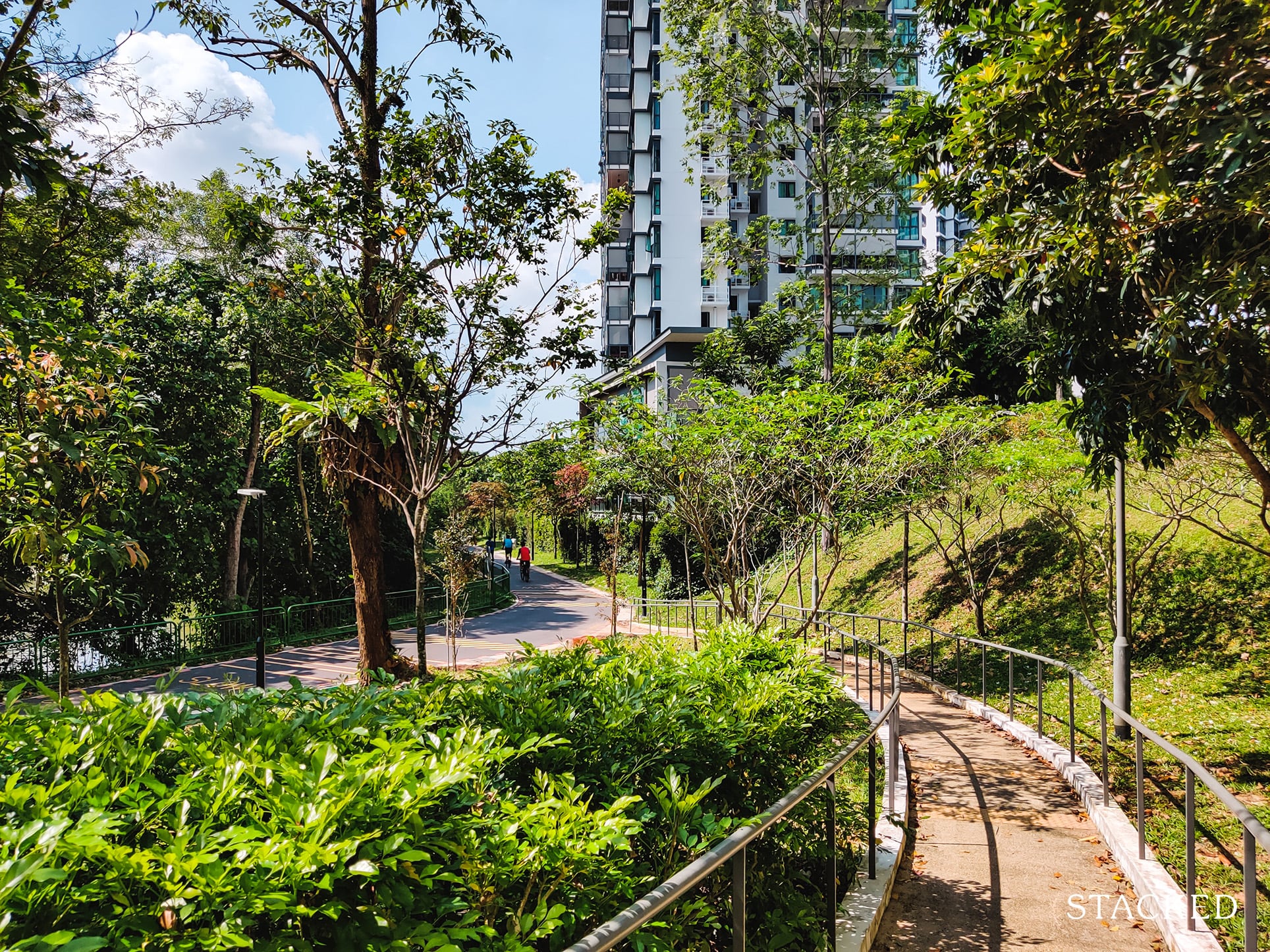
For me, this is probably the second best thing about living at Hougang Capeview.
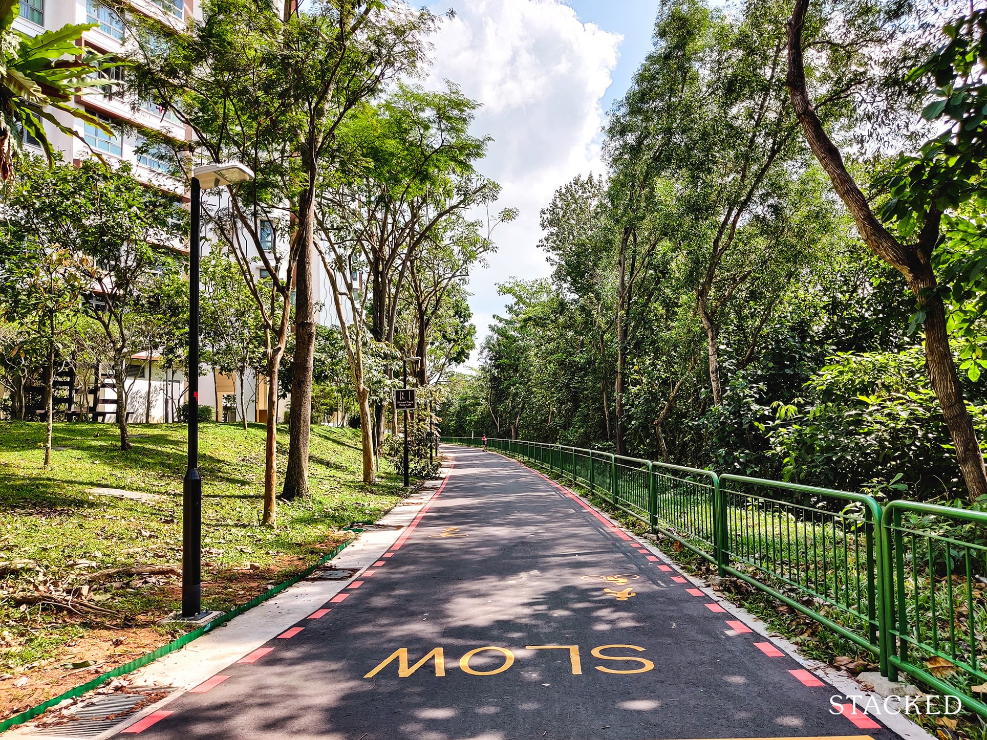
As usual, having an HDB beside a park connector is a very underrated amenity in my opinion. Unlike condos, HDBs lack facilities, so having a wide road carved out specifically for pedastrians/cyclists that with scenic routes goes a long way in providing healthy and fun activities.
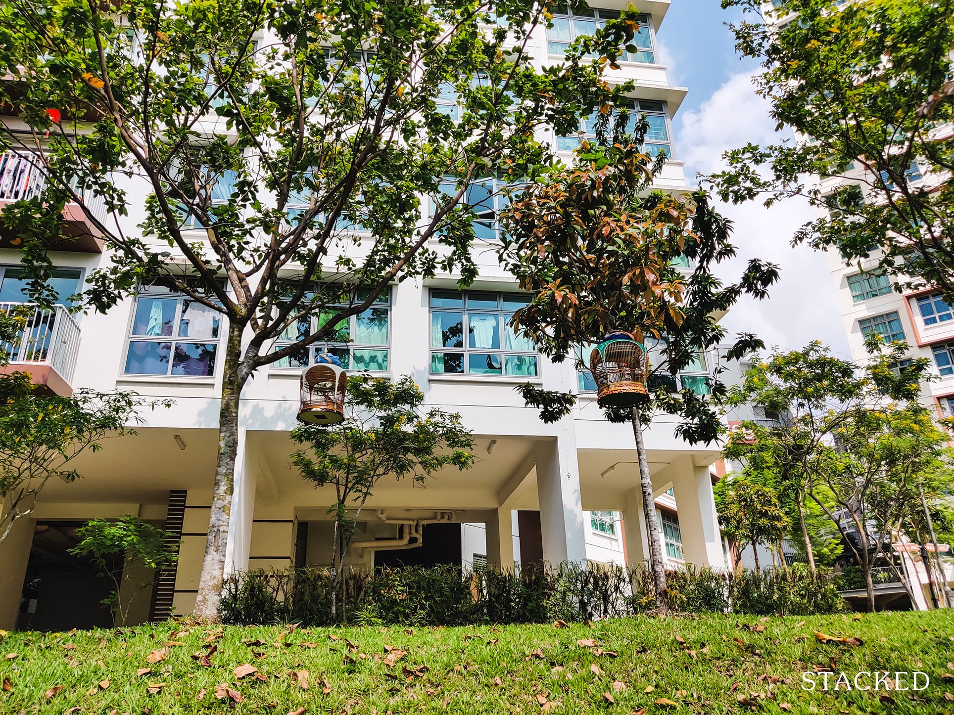
You’ll also notice that the Park Connector is slightly below the grounds of Hougang Capeview.
This elevation in height serves 2 purpose:
- Increased privacy for lower-floor units
- Better views for all units
This is more of a necessity than a want, however. The above shot was taken from the Park Connector, you can see how close the Park Connector is to the development. Having an elevated position improves on privacy considering it is a high-traffic area.
This is unlike what I saw at SkyTerrace where the Park Connector beside it is above the ground level of the development. That said, units there starts from level 2, so it is less of an issue.
In Hougang Capeview’s case, however, it starts from level 2 so this elevation goes a long way.
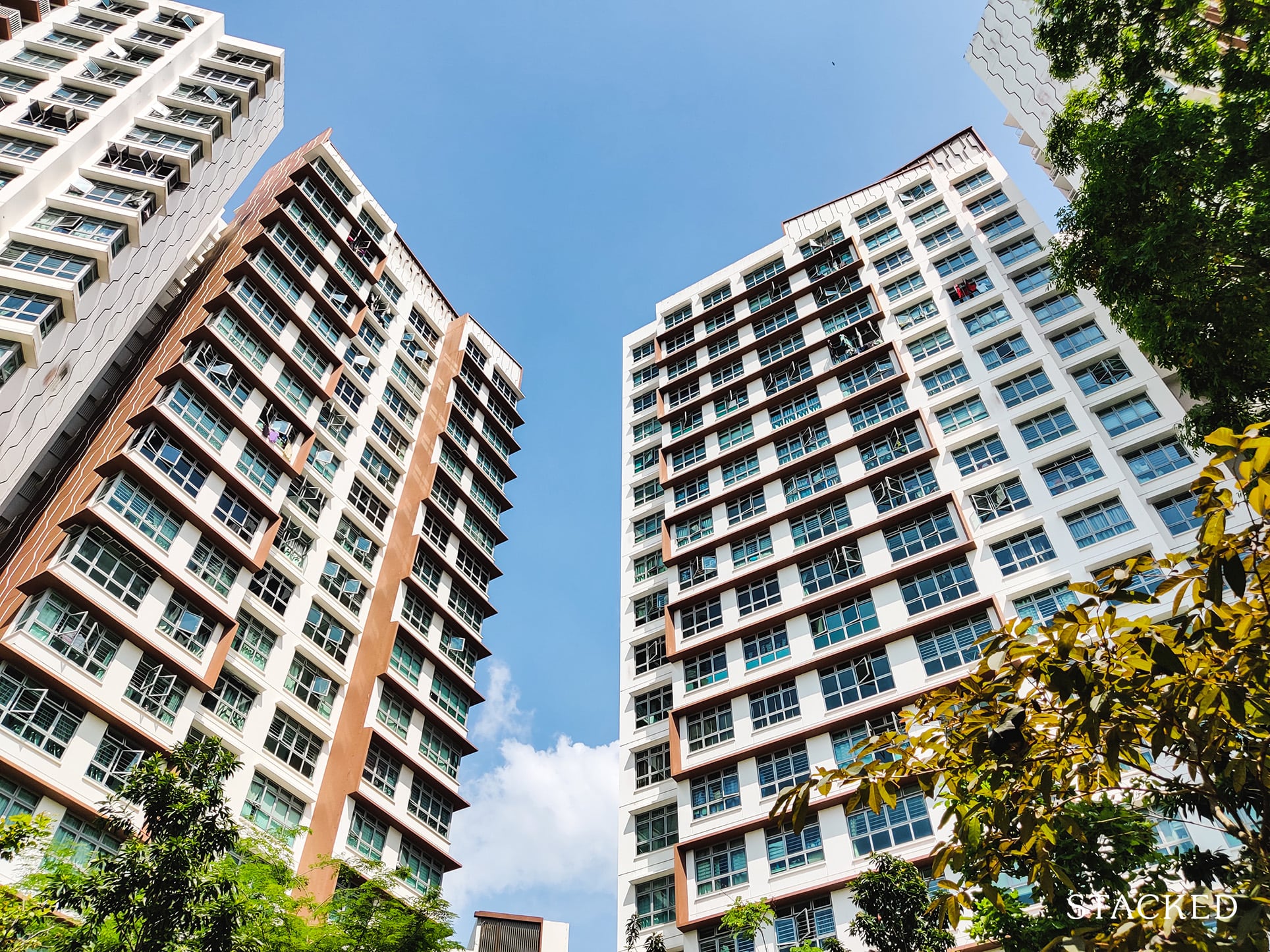
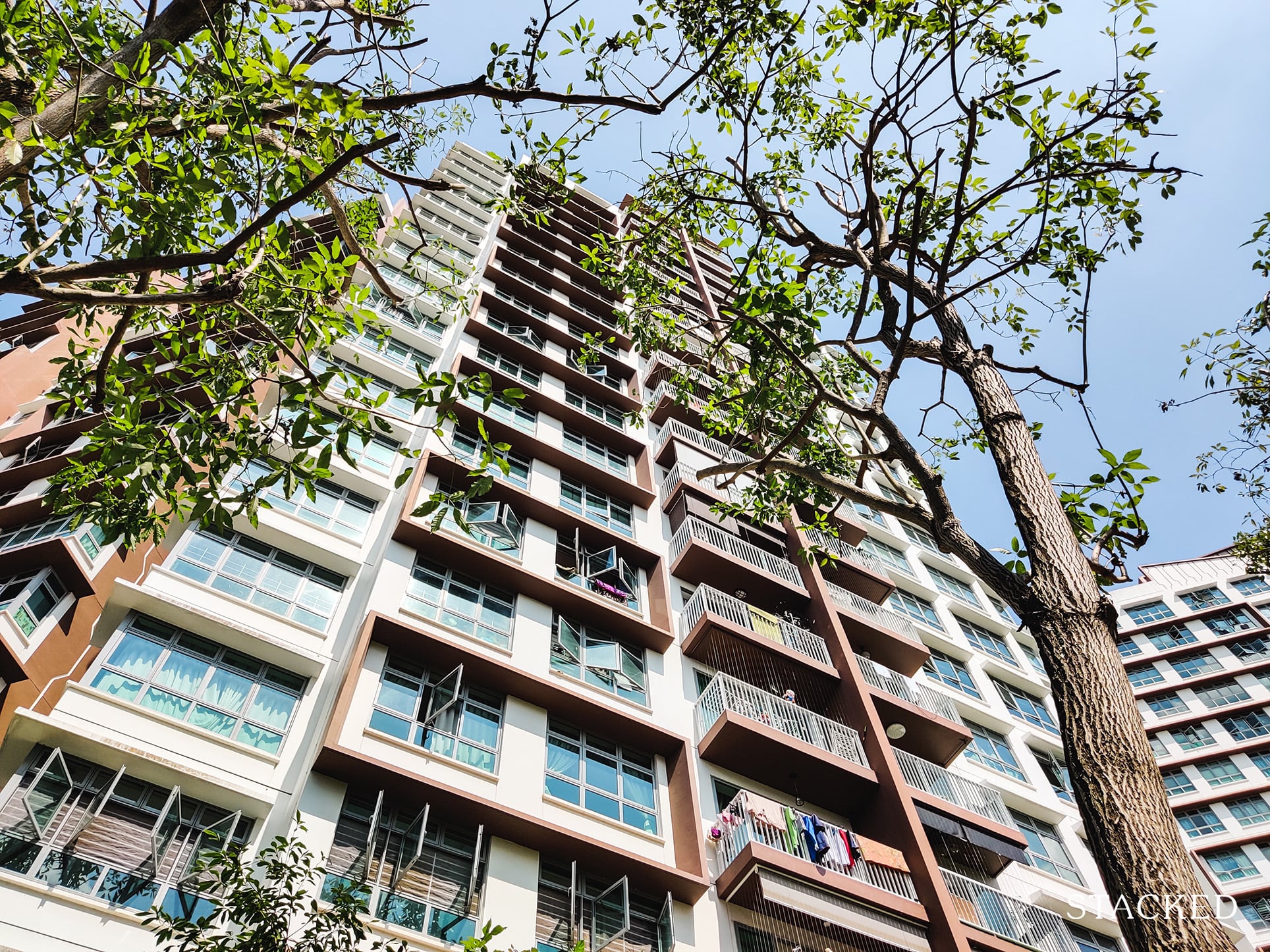
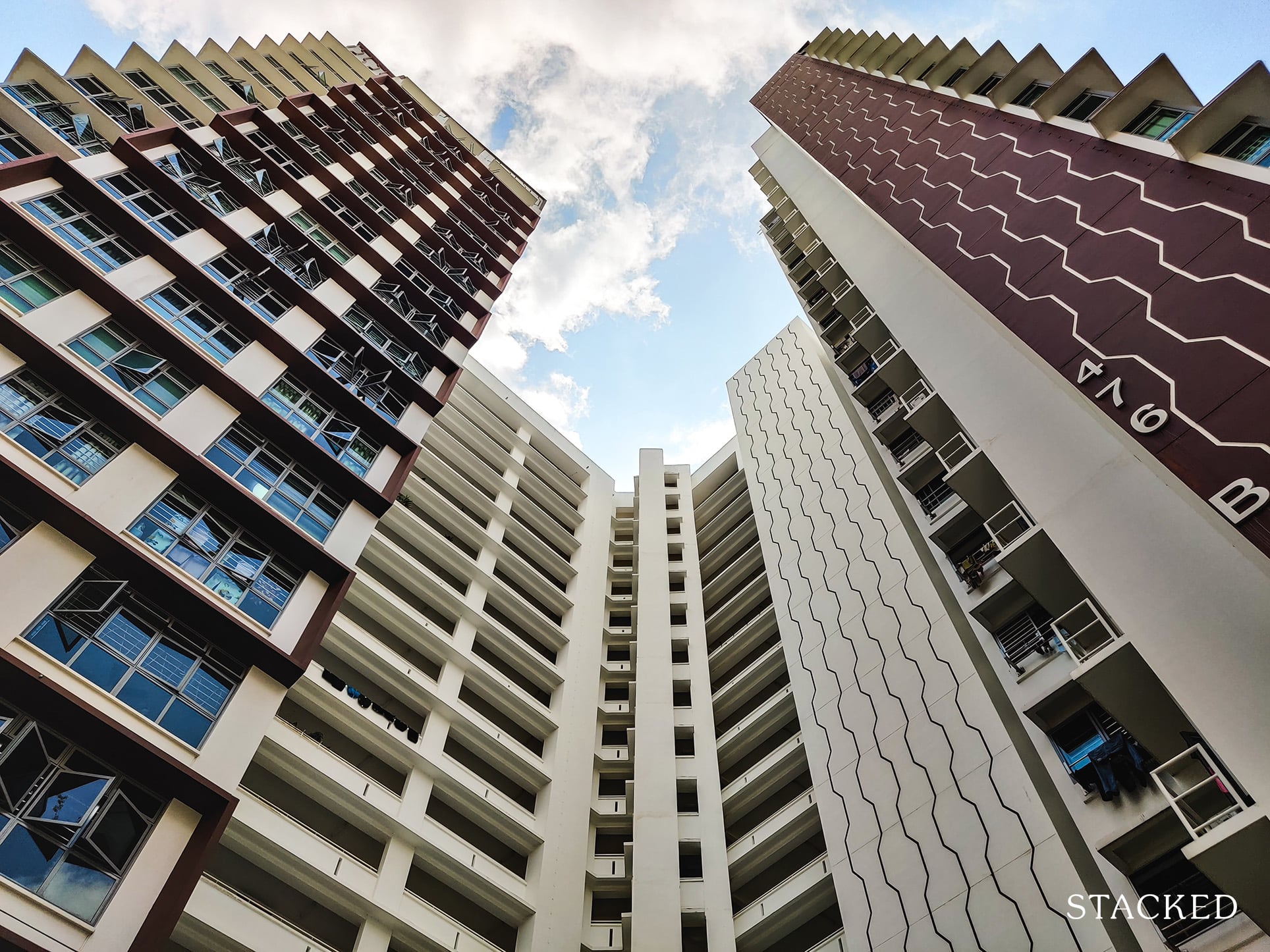
From here you’ll also notice how clean and white the facade of this development is. It almost looks brand new!
Walking within the corridors, it was also obvious how well-kept the building has been so far considering how the white-washed walls still remained pristine.
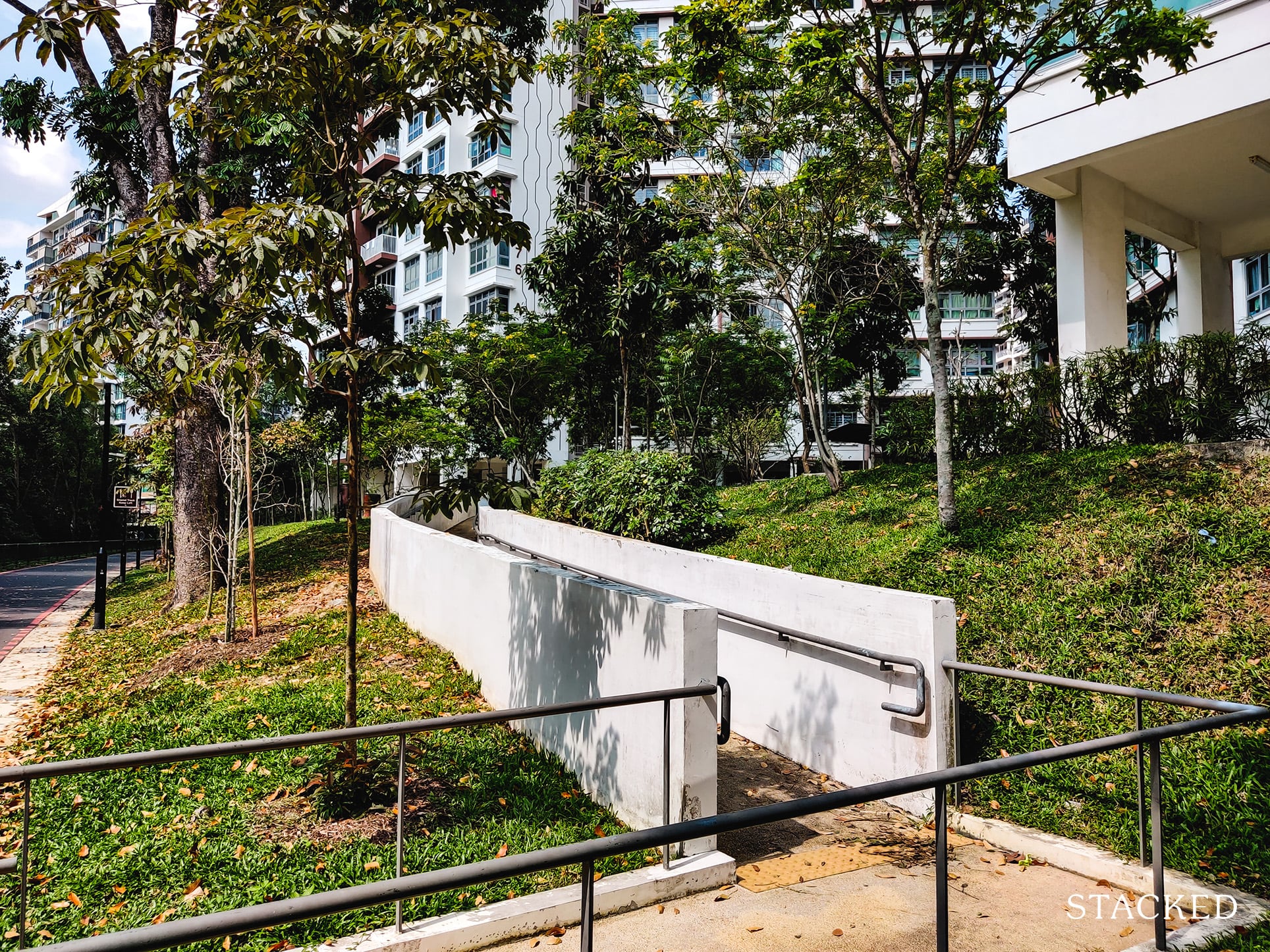
There are also wheelchair-friendly ramps at various points, making entry to your block more convenient.
And right at the front center of the development is the huge signage of Hougang Capeview, proudly sitting along the Park Connector to let passersby know the name of the development.
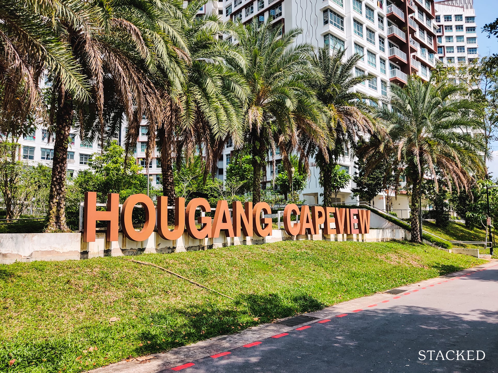
I must reiterate, this is really quite an impressive sight. Having the tall trees lined neatly behind the name with the HDB blocks clad in its brown facade just behind gives it a tropical resort feel.
It’s a strange thing to say about an HDB.
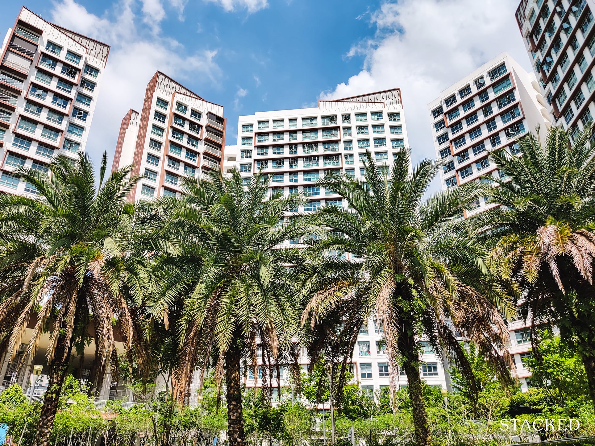
This is even more apparently when you take in the view it fronts.
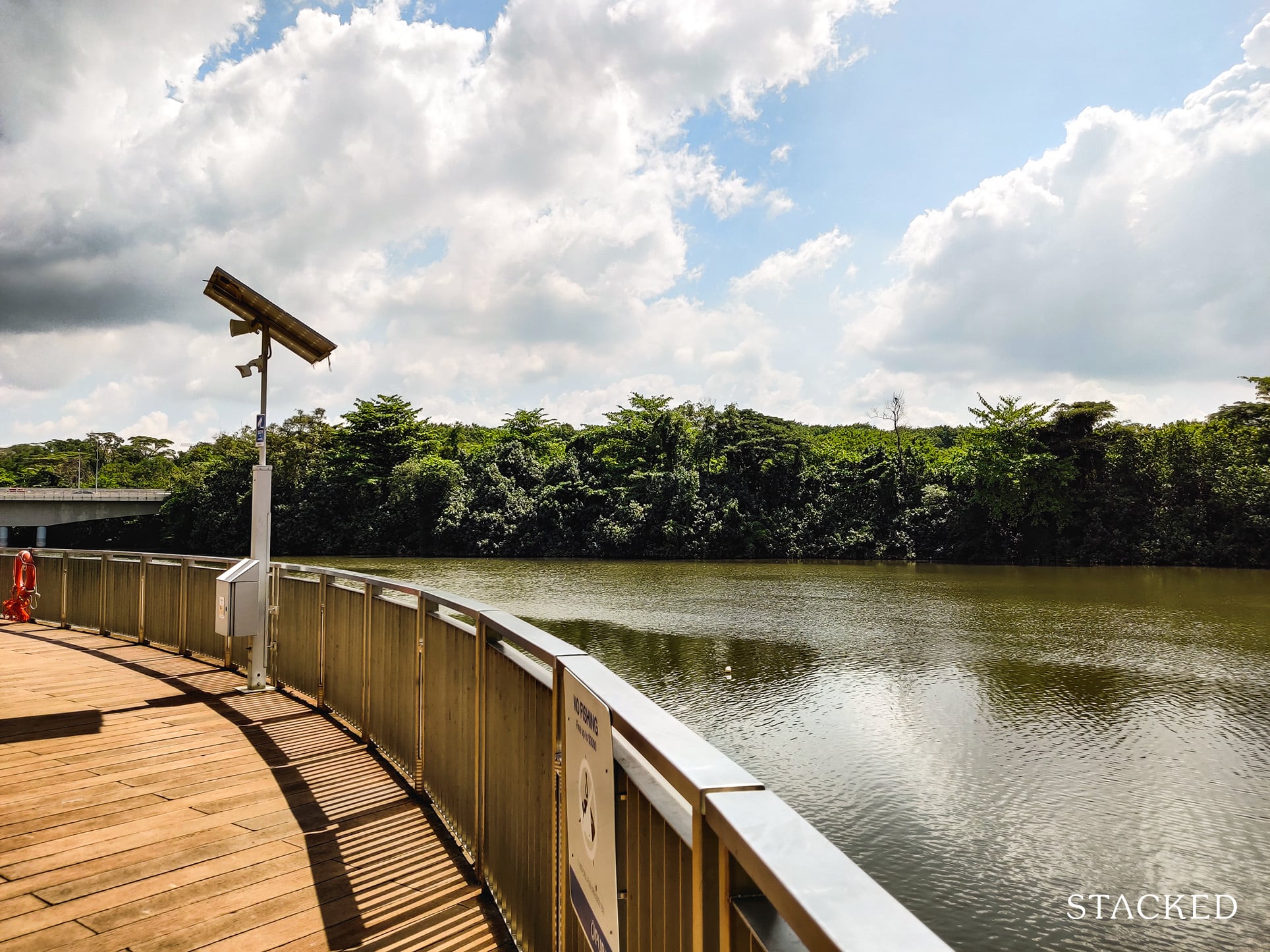
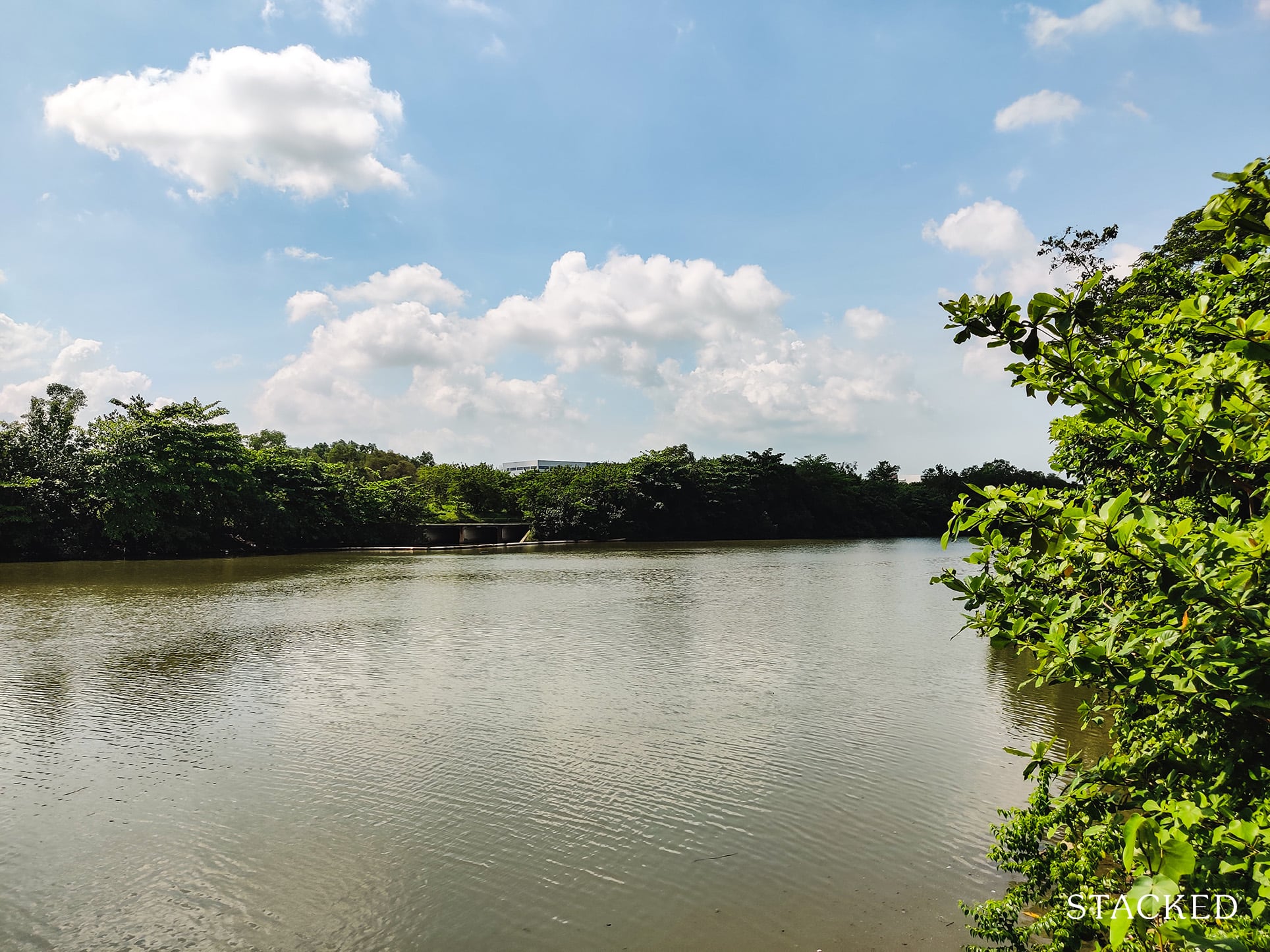
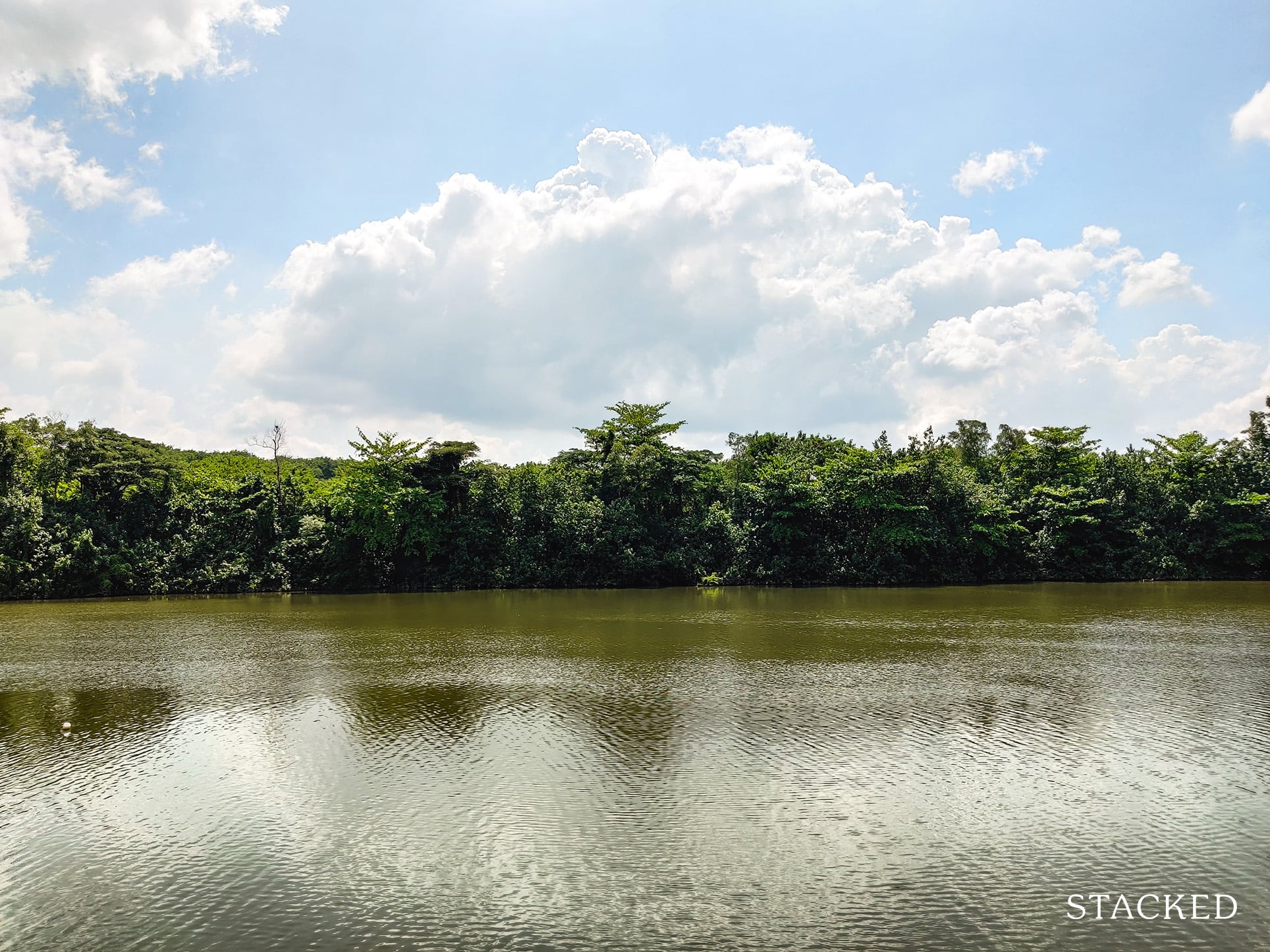
Undoubtedly, the best thing about Hougang Capeview is the Sungei Serangoon river that flows past the development.
Residents are able to conveniently soak in the views and tranquility this areas provides here at the viewing platform.
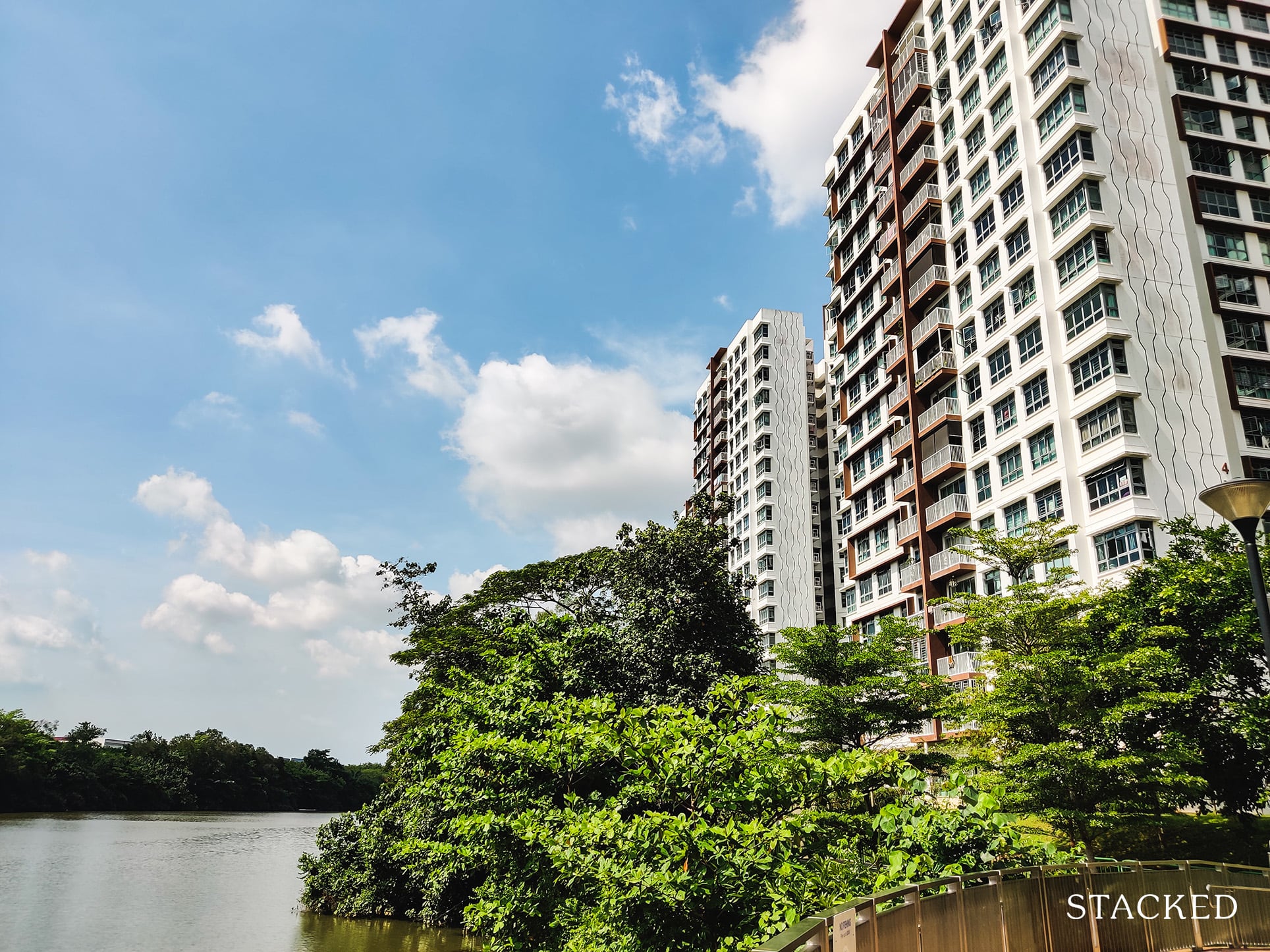
There are also numerous seating areas here. As you can see, it’s not very popular on a sunny day – probably due to the lack of shade around to enjoy the view.
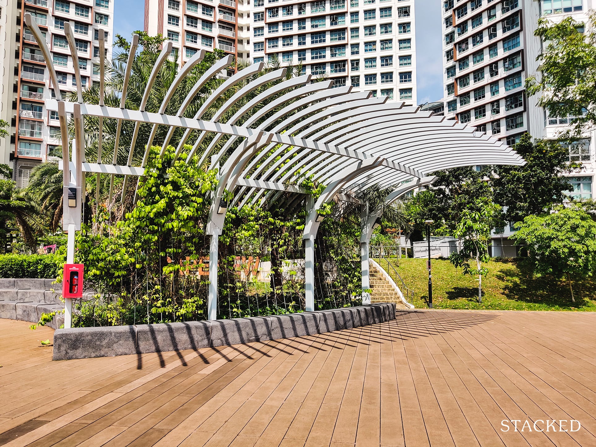
Regardless, I’m sure this viewing deck here is very popular during the evenings (and early mornings) when it’s a lot cooler.
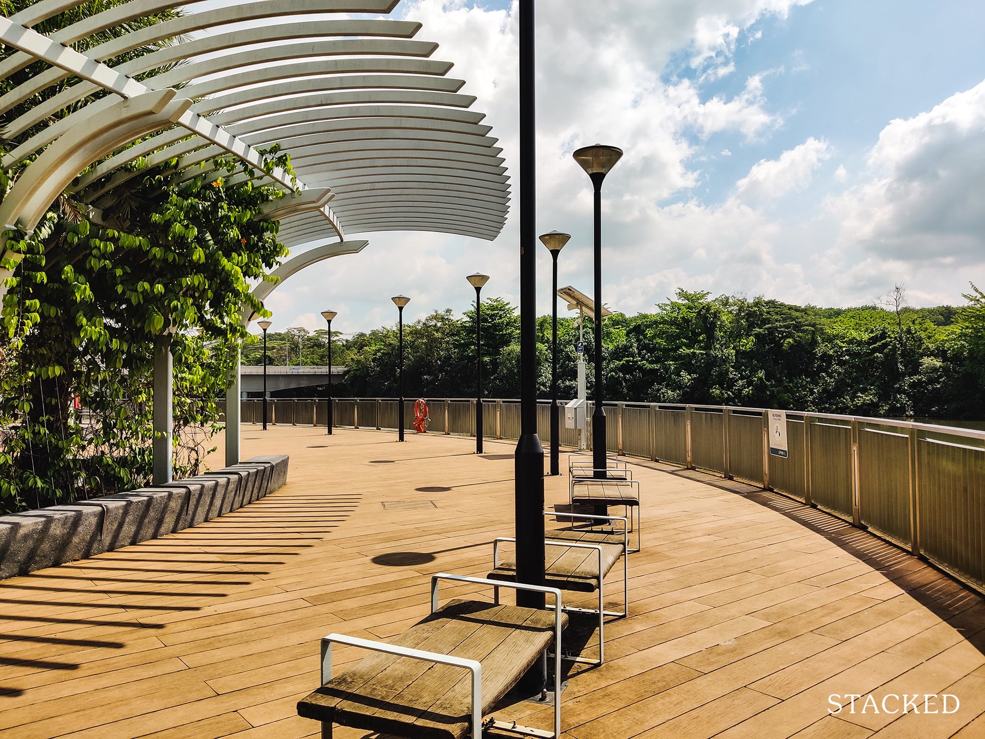
The area here is also very quiet with the exception of people on e-scooters playing loud music passing by the Park Connector, as well as the occassional plane noises.
Nearby, you’ll see the Buangkok Bridge. Some buyers might be concerned about the traffic noise here, but it was not apparent when I was there.
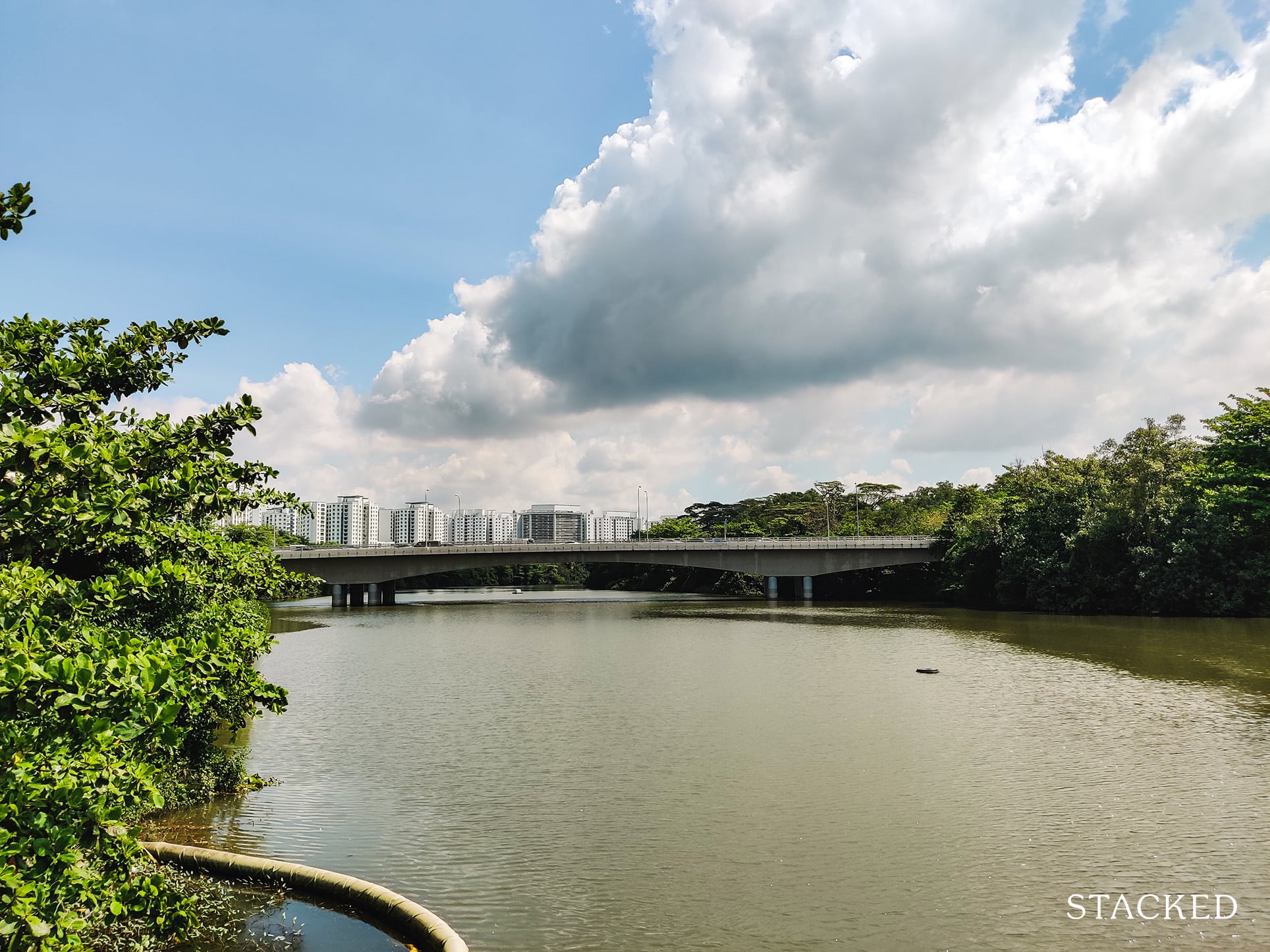
From this vantage point, you can see how this area could seem rather “exclusive” to residents at Hougang Capeview.
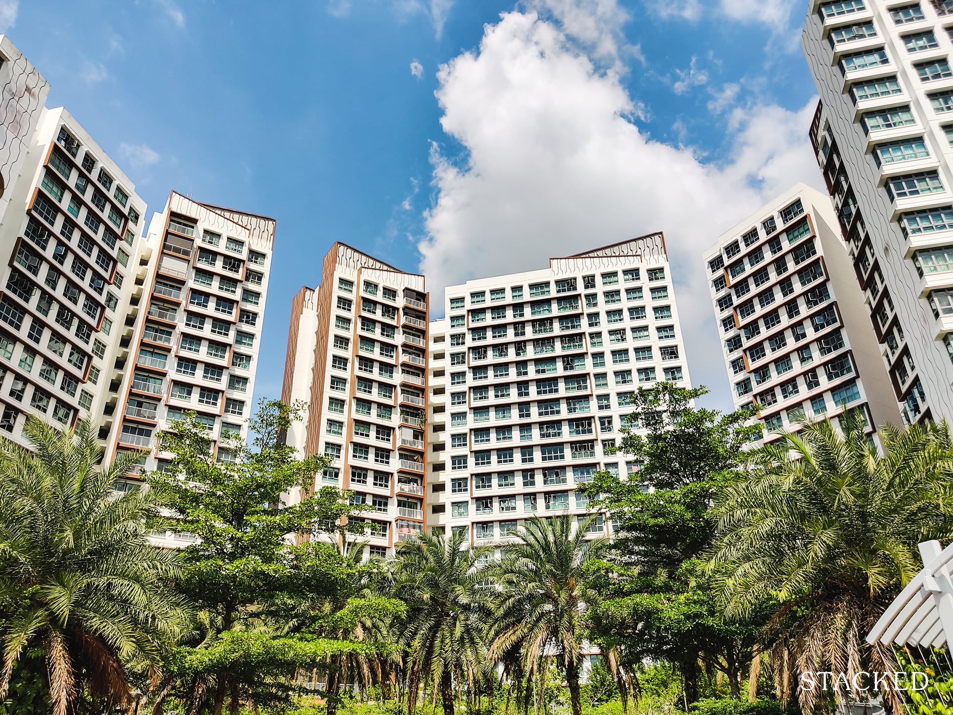
For one, there are no other residential blocks close by here. The blocks are also positioned in such a way that it “wraps around” the central courtyard area which gives it an even more exclusive feel.
Now let’s take a closer look at the blocks.
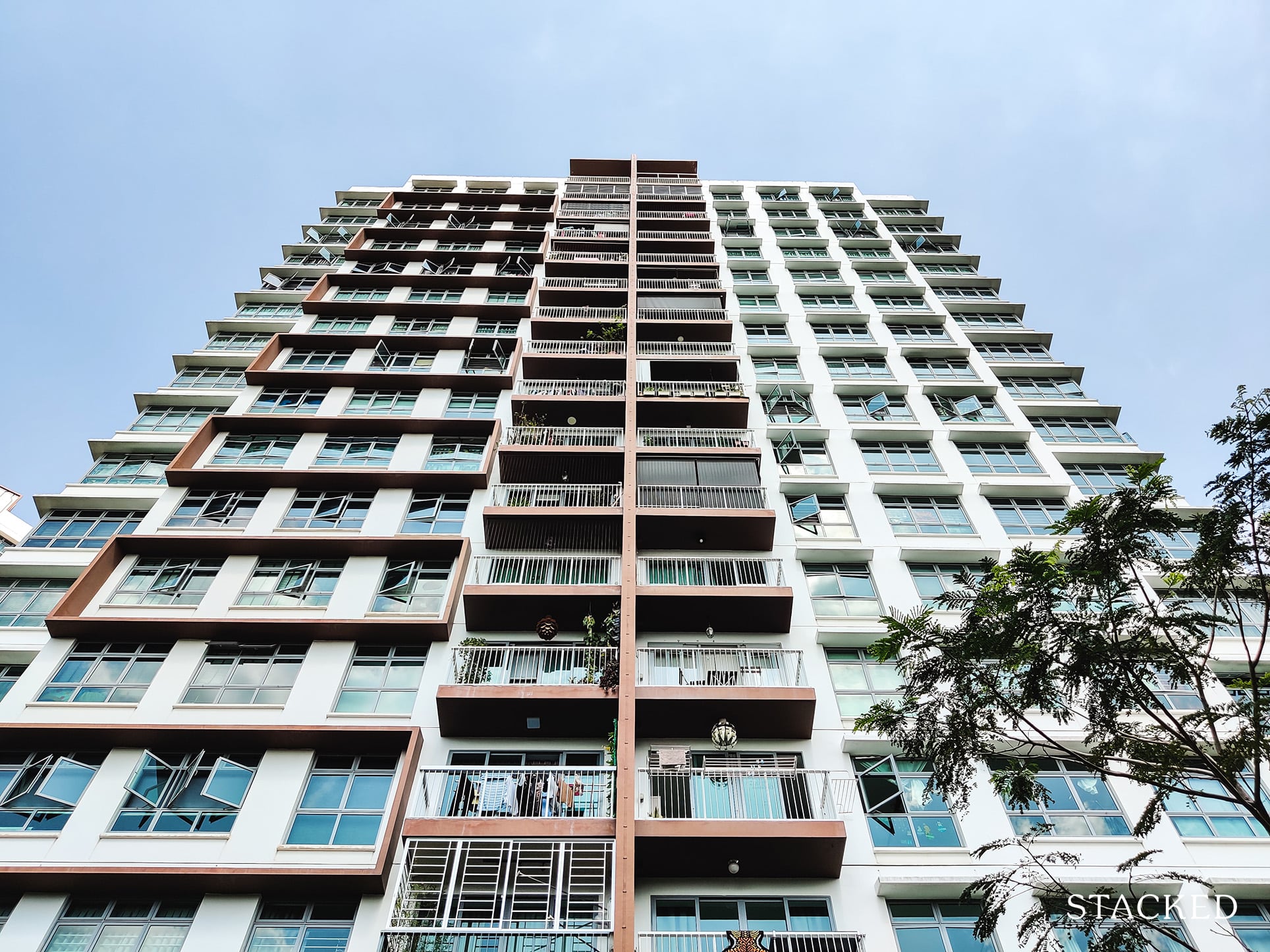
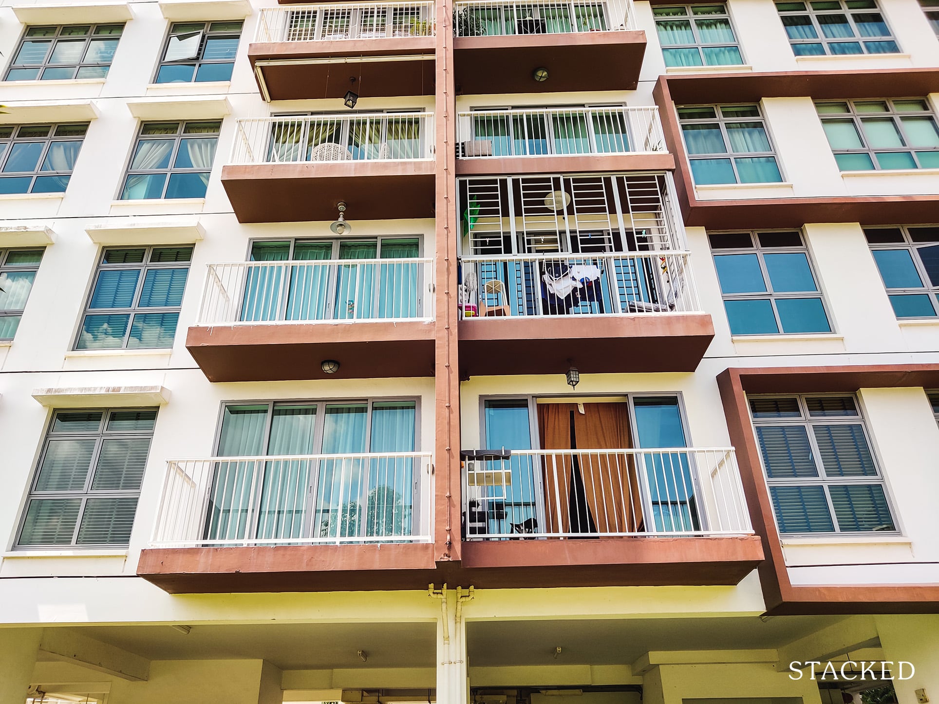
This block here shows two 5-room flats that front the river directly, and you’ll see that both of them have a balcony – a feature that some units here have.
You’ll also see that it has full height windows which I’d expect from any development with the word “view” inside.
It’s also an increasingly common design you would find in new HDBs.
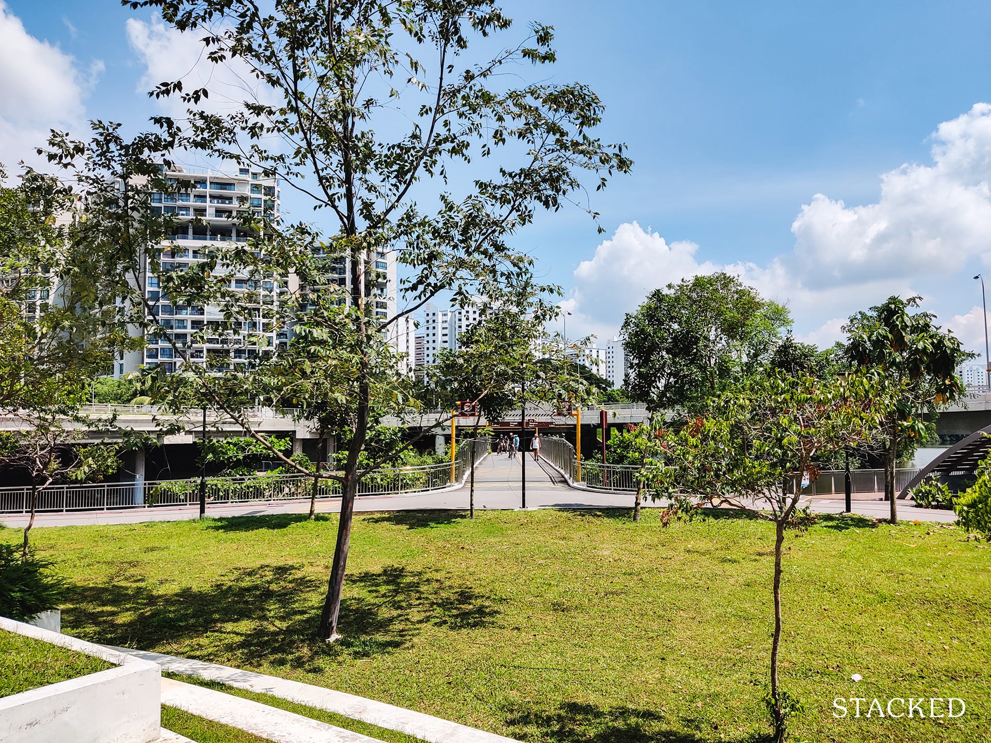
Moving further down north of the development, you’ll reach the bridge that crosses Sungei Pinang.
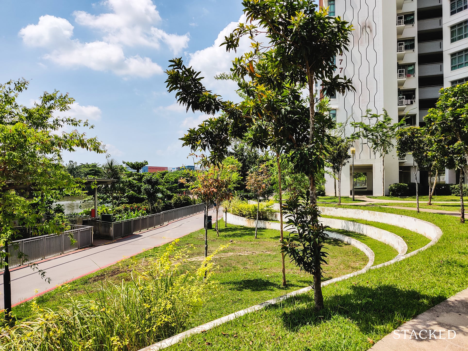
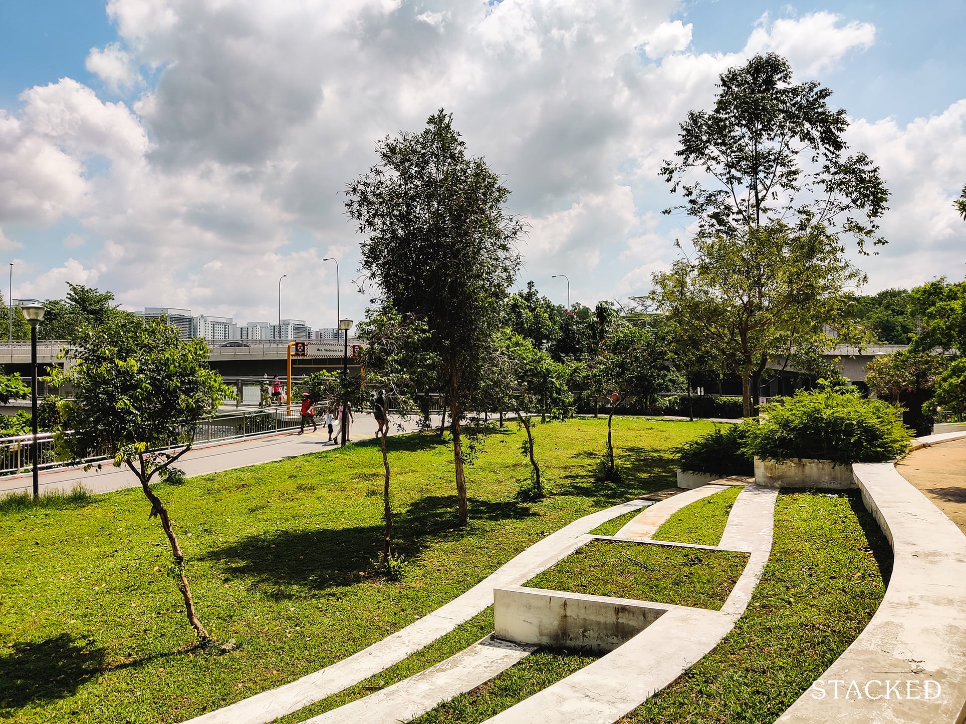
There are also these cantilevered steps up to the development – sort of like rice terraces with how it curves around. I can see this is a great place to just hand out with and enjoy a picnic with friends and family while enjoying the expanse of the river here.
You’ll also find these steps extending to the north of the development where the bridge running over Sungei Pinang is located.
Of course, I do not expect anyone to use this space here in the day considering how blazing hot it is.
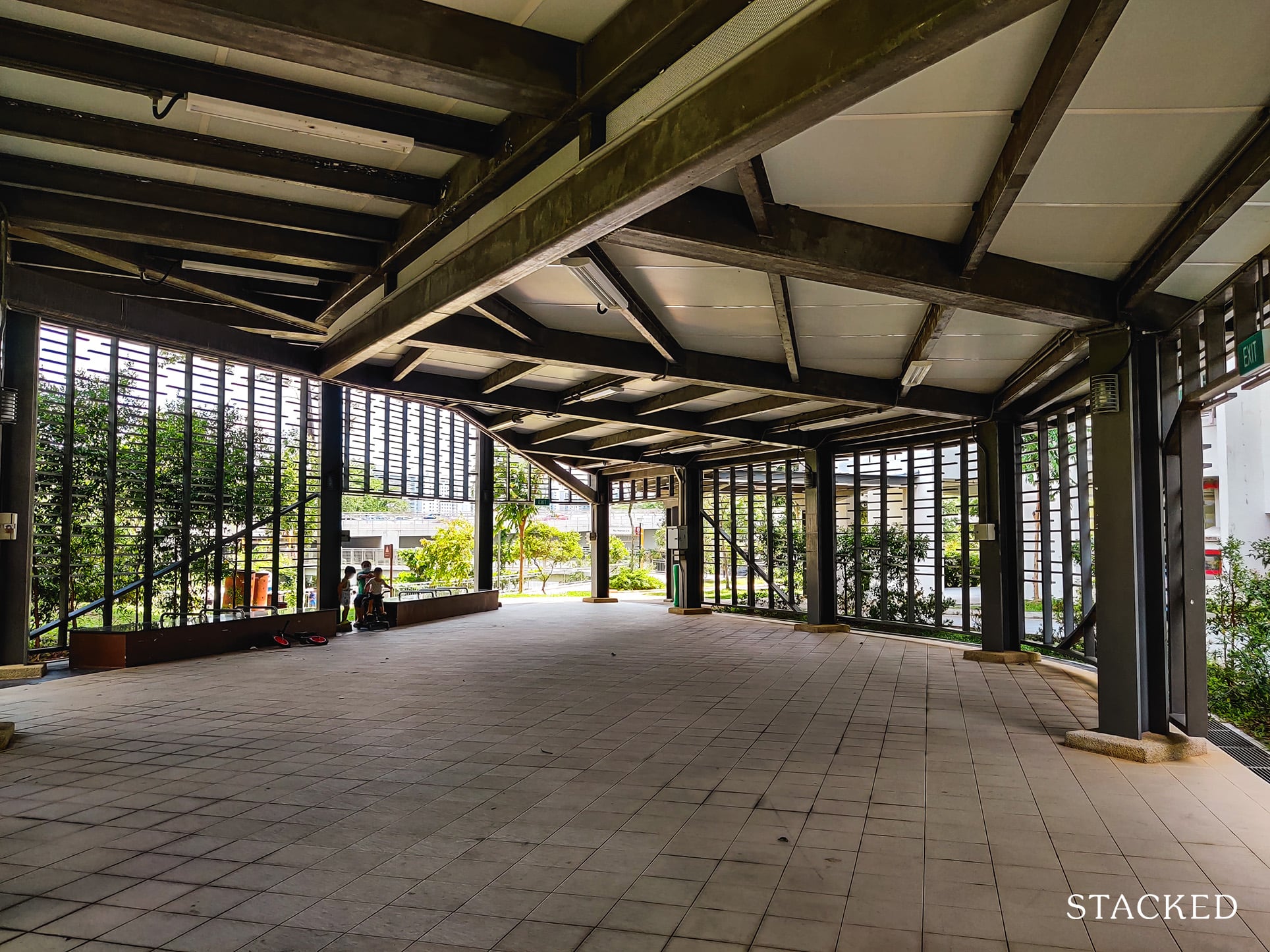
Just around the corner here is a sheltered pavilion/event space. This is where residents are able to hold events such as weddings or meet-the-people sessions and so on.
It’s really quite a sizeable space here, and I like that the facade around the space as well as the support structures at the ceiling is congruent with the overall theme of this HDB.
Now lets head back to the center of the development where the playground is.
Located at Block 476C is the development’s only childcare centre.
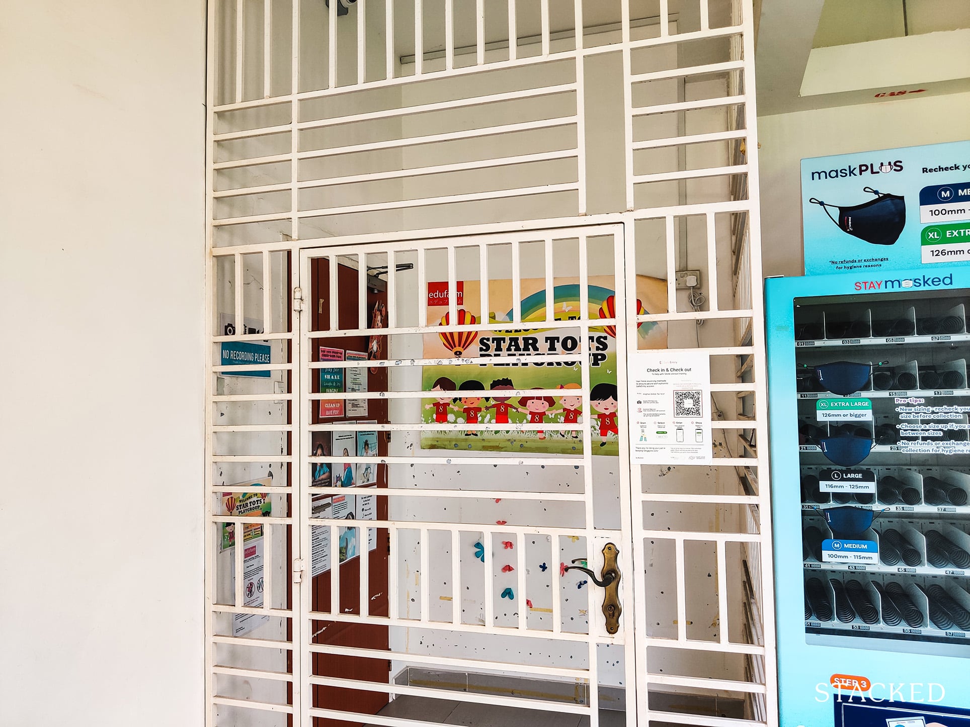
Like all the other HDBs I’ve reviewed, it’s strategically located right next to the playground.
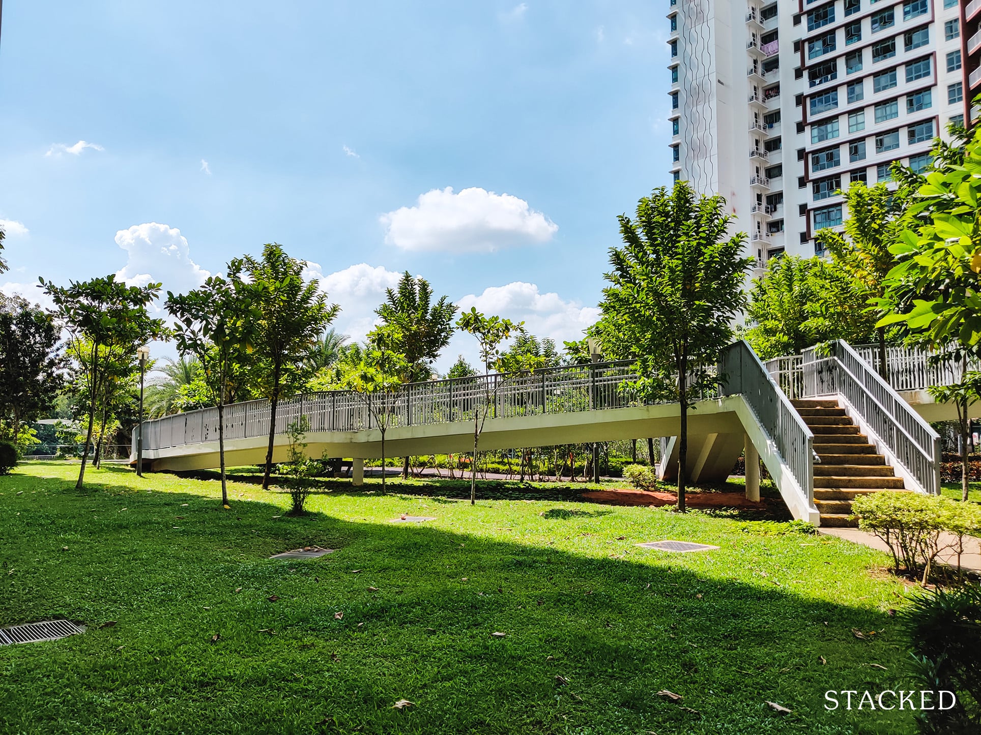
From within the common corridor on the ground level, you’ll find an access point to a curved bridge surrounded by lots of greenery. I really like the space, it’s vibrant, and because you are facing the currently unblocked river views – it almost doesn’t even feel like you are in Singapore.
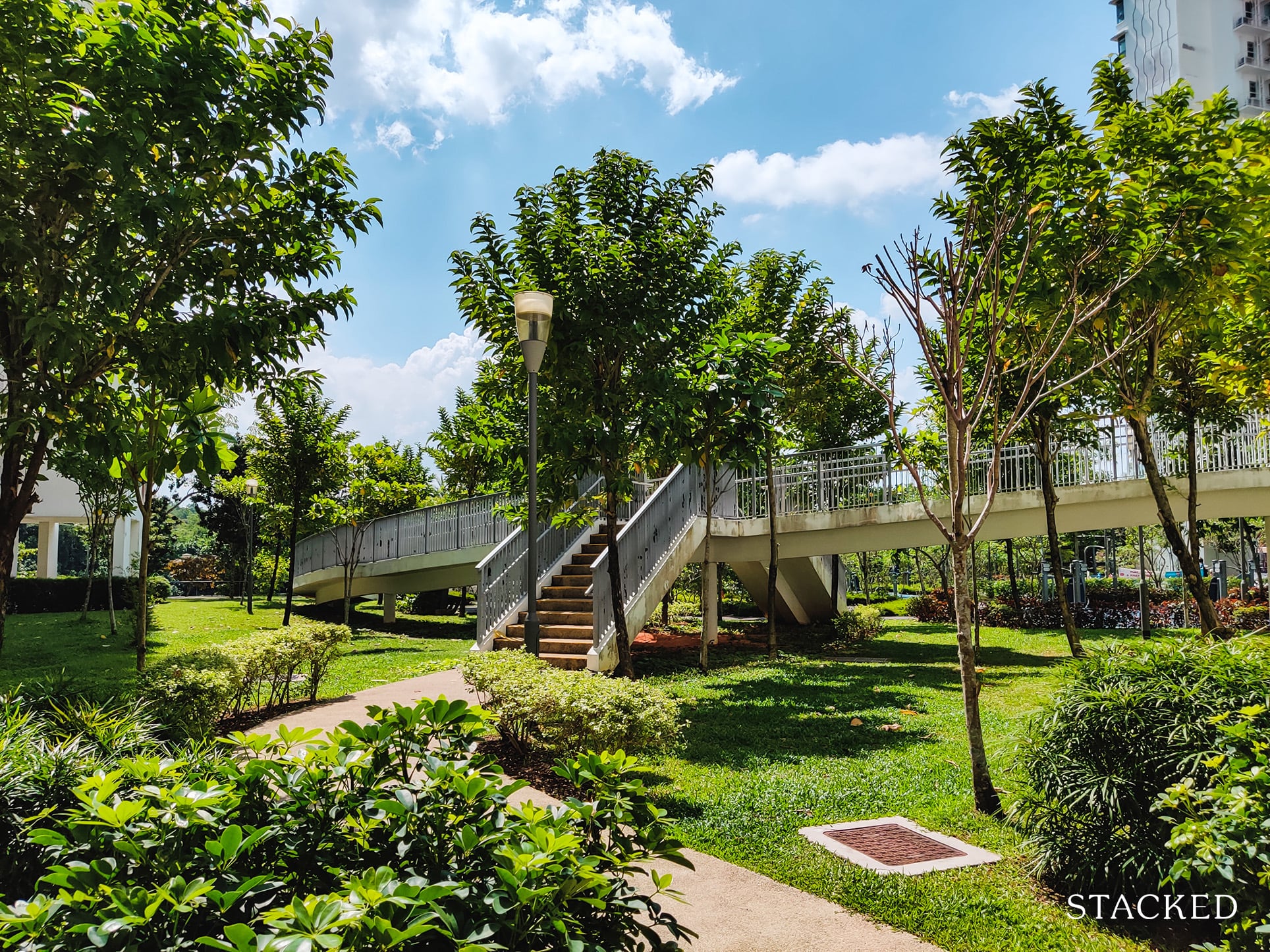
This bridge brings you up from the ground level to the 2nd level, also known as the Viewing Deck.
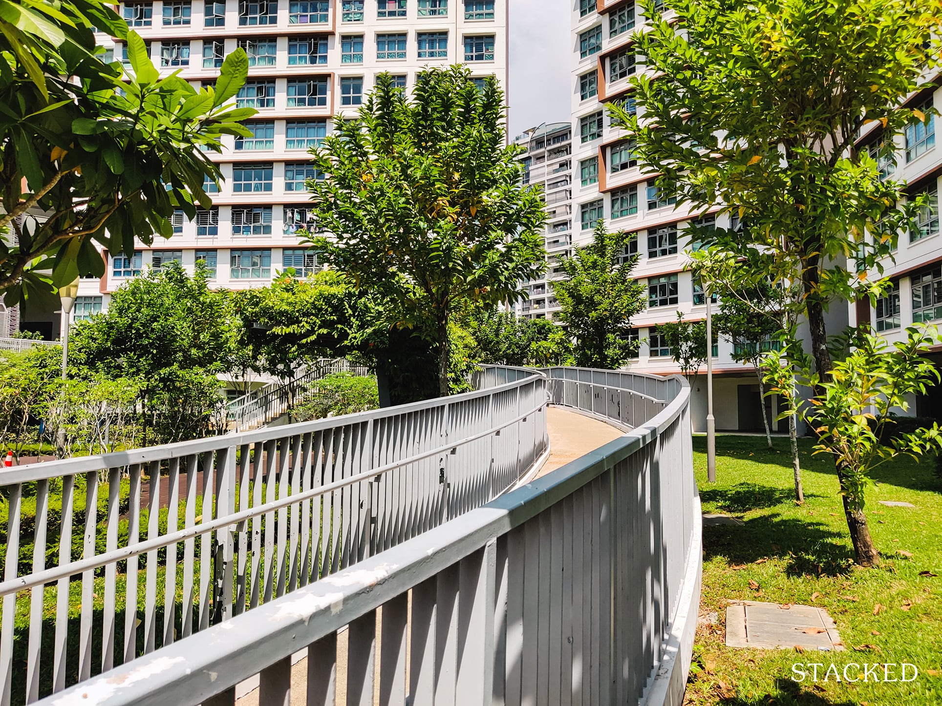
If you look carefully at the railings here, the paint has really started peeling off. If there’s anywhere that isn’t well-maintained in this development, this is it.
Walking up the bridge showcases the same privacy issues that plague the lower levels.
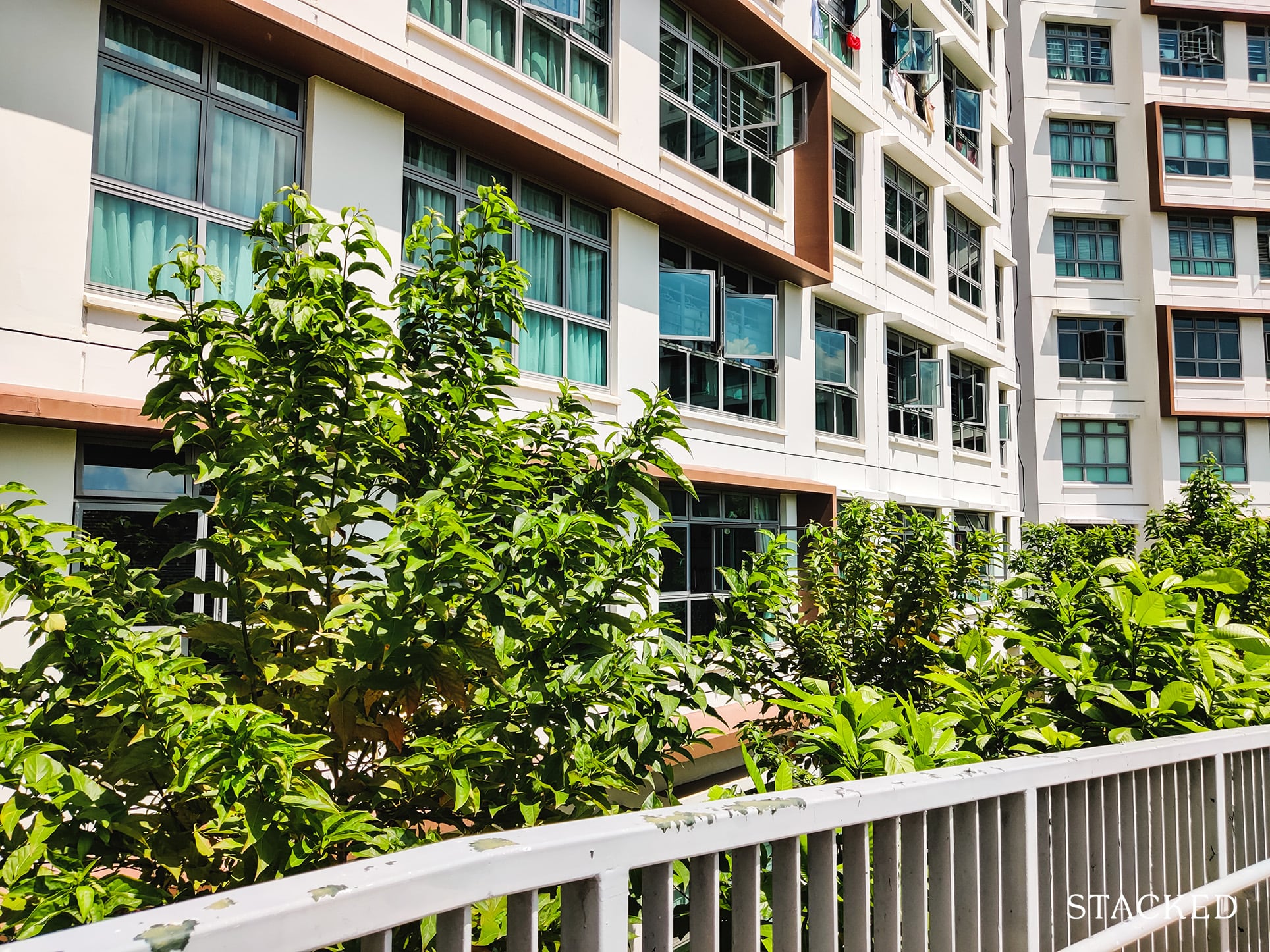
As mentioned, units here start from level 2, so such a bridge would only draw traffic directly outside some of the units here.
It doesn’t just plague the units here, but all the lower-level units around the development.
Reaching the 2nd level, you’ll see the Viewing Deck, which really is an open space for you to do things like Pilates, Yoga, and whatsoever outdoor sports you’re comfortable enough to do in public.
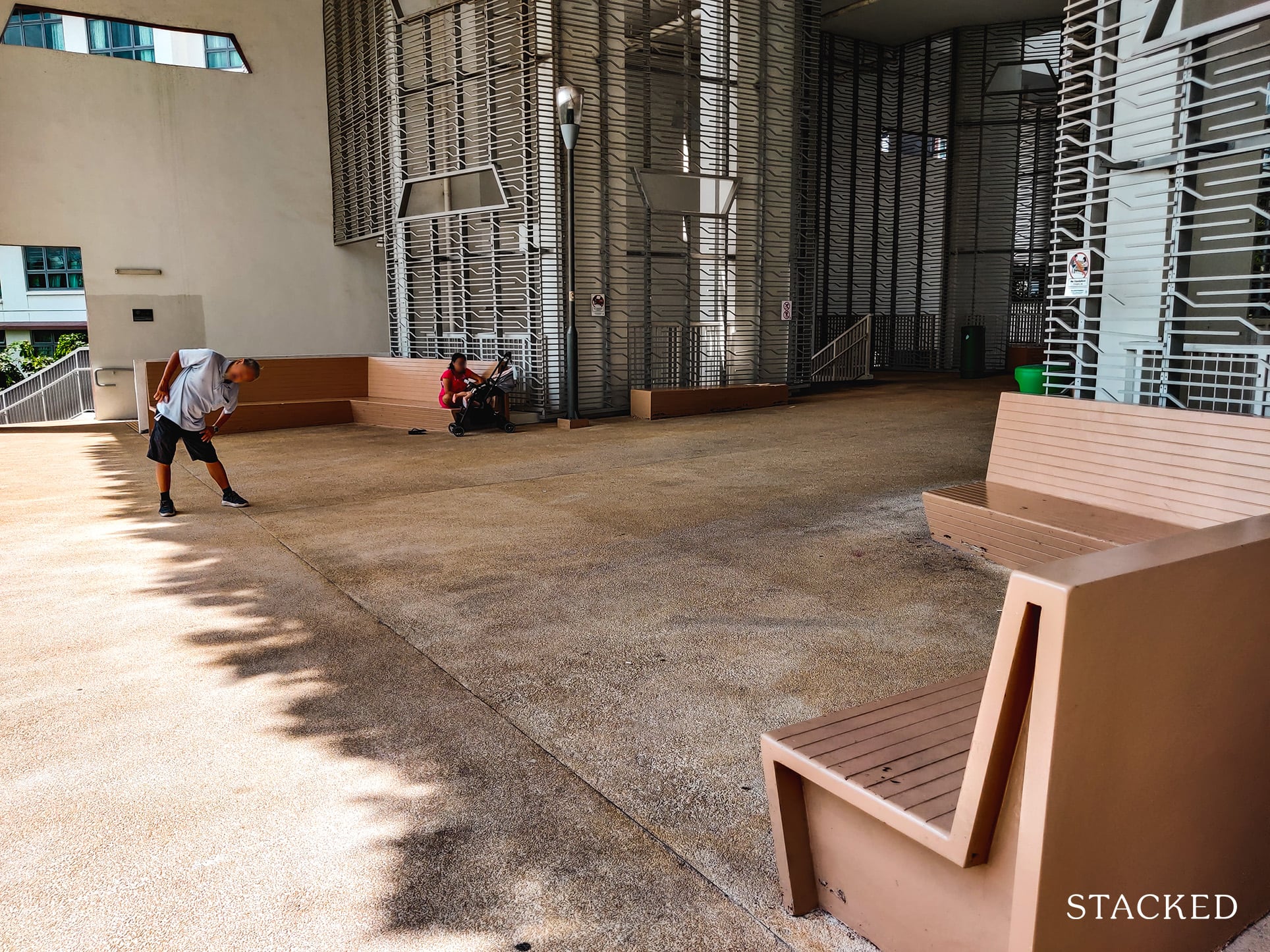
You’ll also see the metal claddings with line patterns that really adds to the diversity of design in this area too – a very nice touch!
But what matters here is not just the space and the seating area, but this awesome view you get with it.
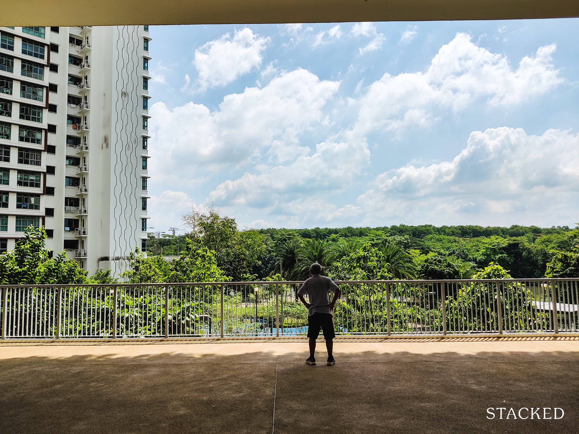
Being on the 2nd level, you’re able to admire the vast greenery beyond the river from here. On a clear blue-skied day, it is almost mesmerising.
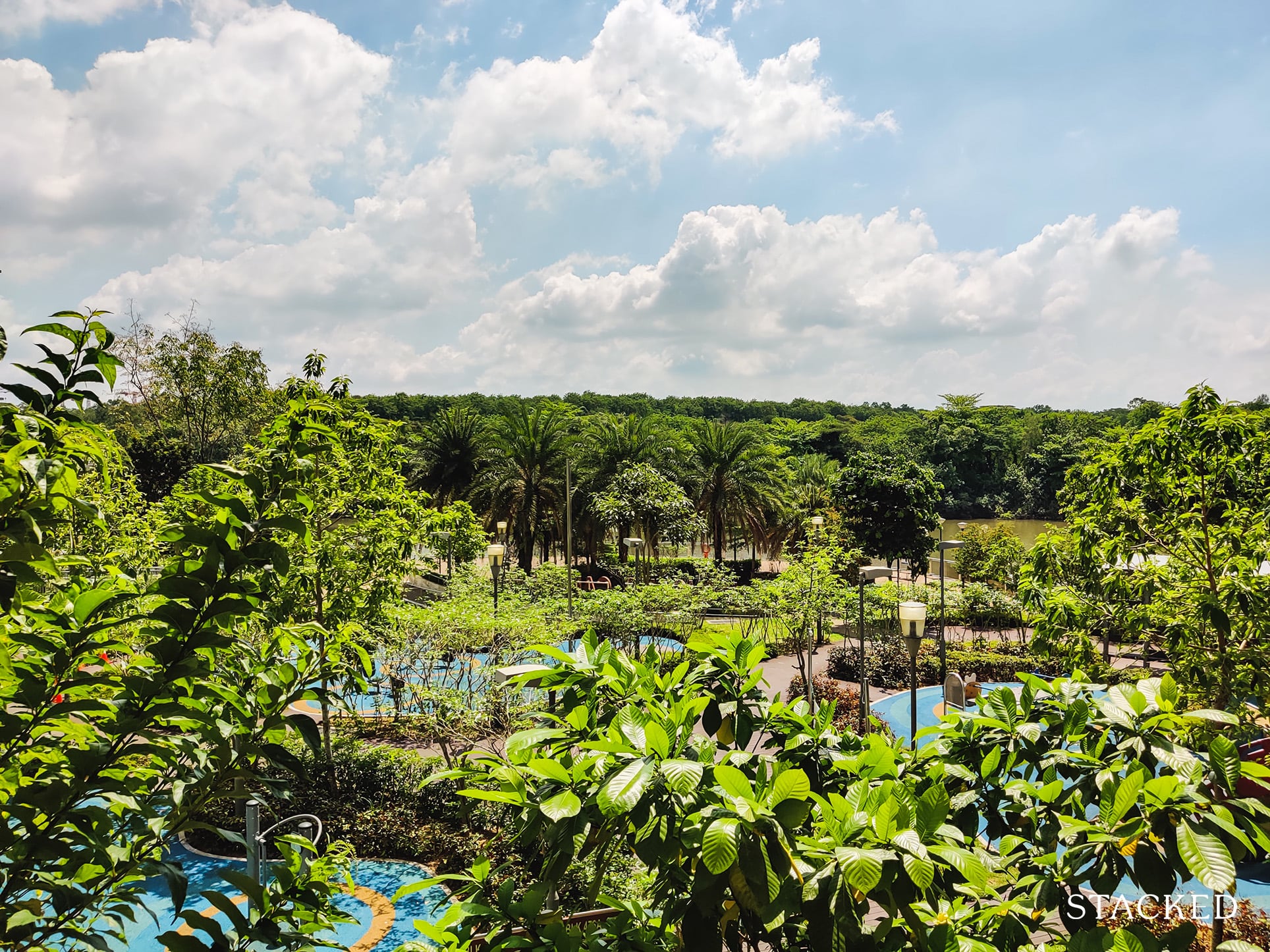
Even within the development alone, the sheer amount of greenery shown is impressive. Combined with the trees beyond the river, and you have what I would describe as a really nice view!
And connected to the viewing deck is the Plaza, which is really just an open area and transition point between the shops and the viewing deck.
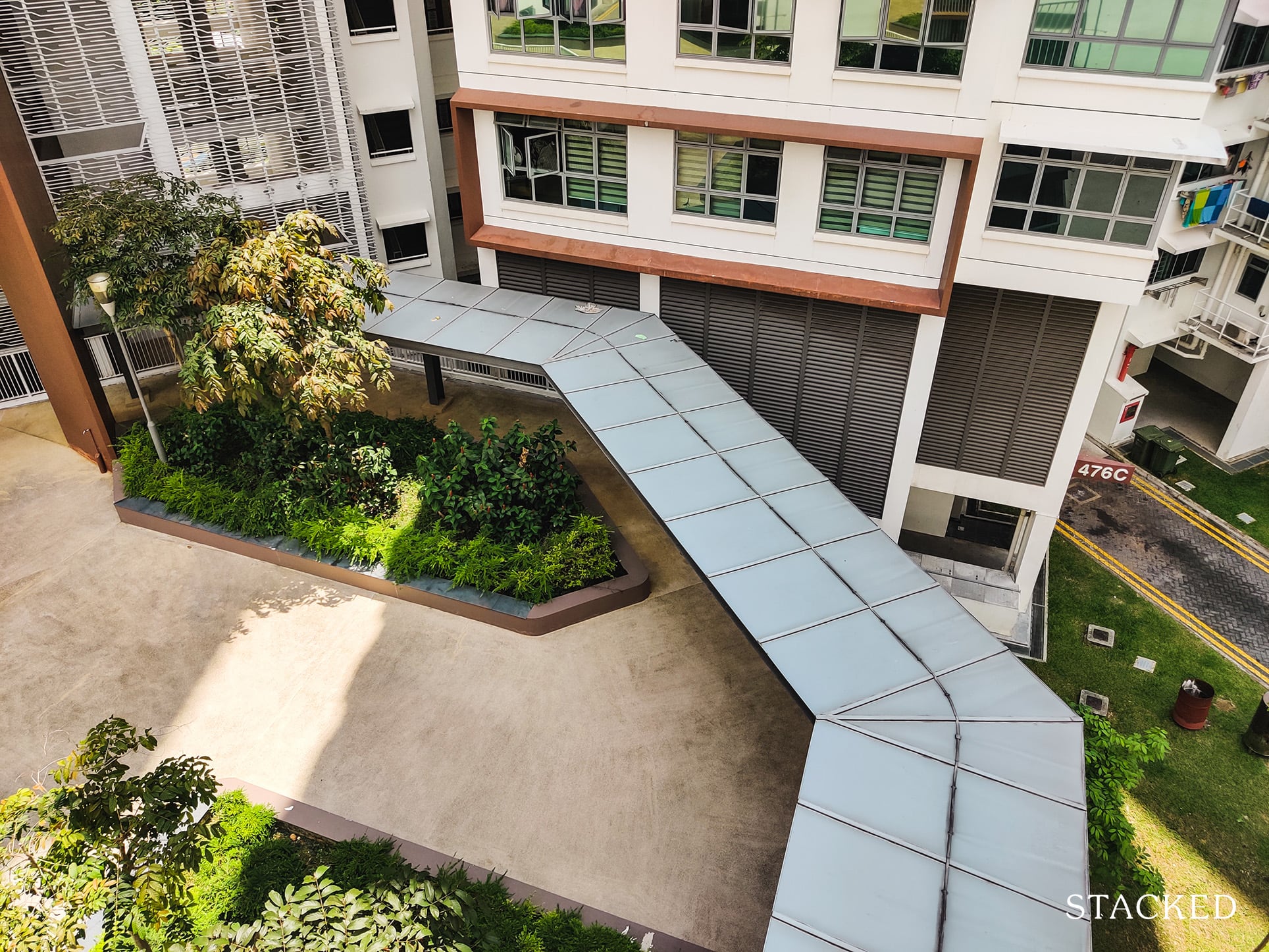
In the event of heavy rain, you can take the sheltered walkways that leads you from the shops to the viewing deck.
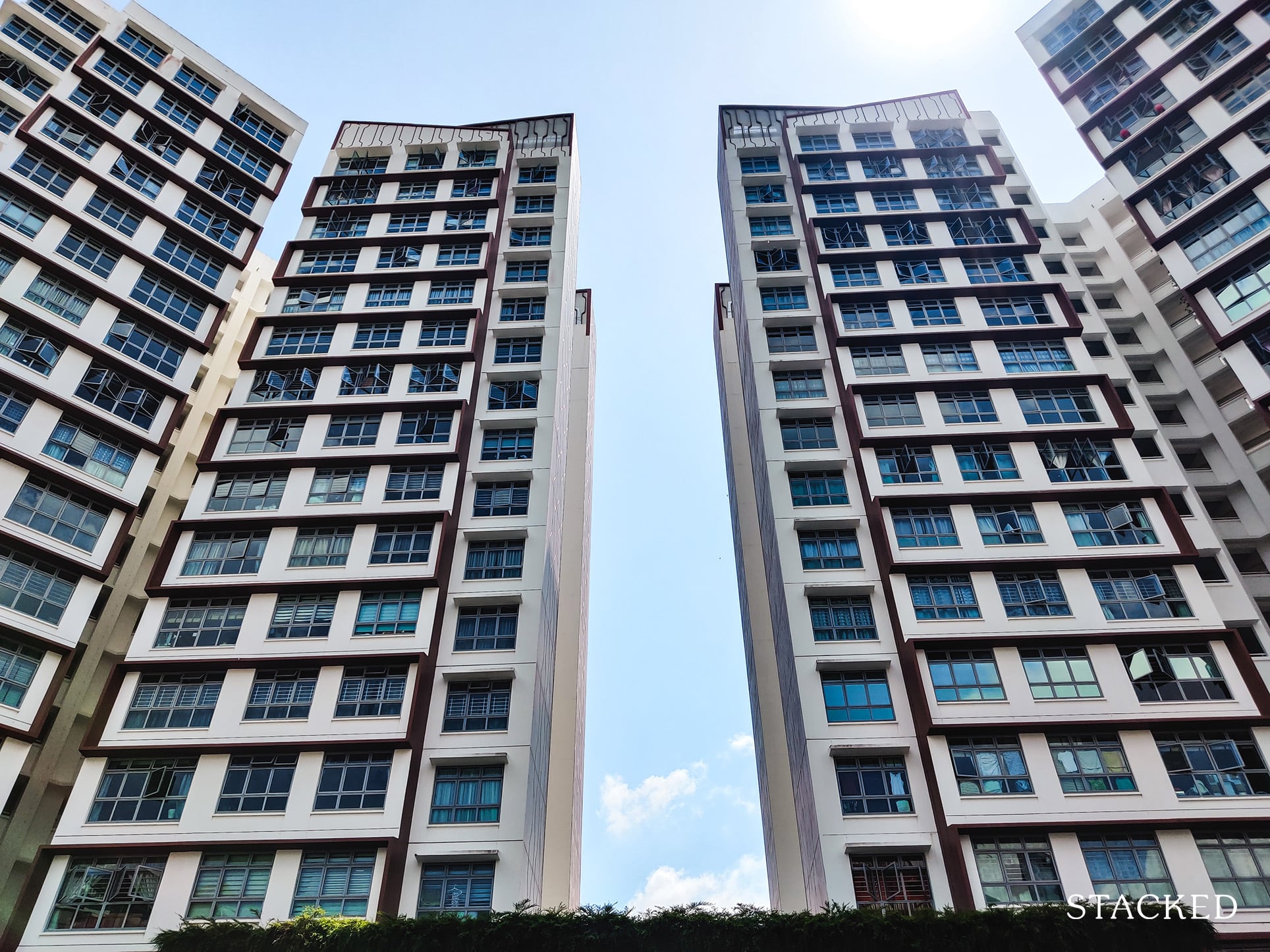
Beyond the blocks that tower this area, there isn’t really much else to see from here.
Now just behind the Plaza area is a sort of “street bazaar” with shops lined on both ends as well as seats running in the middle of this “street”.
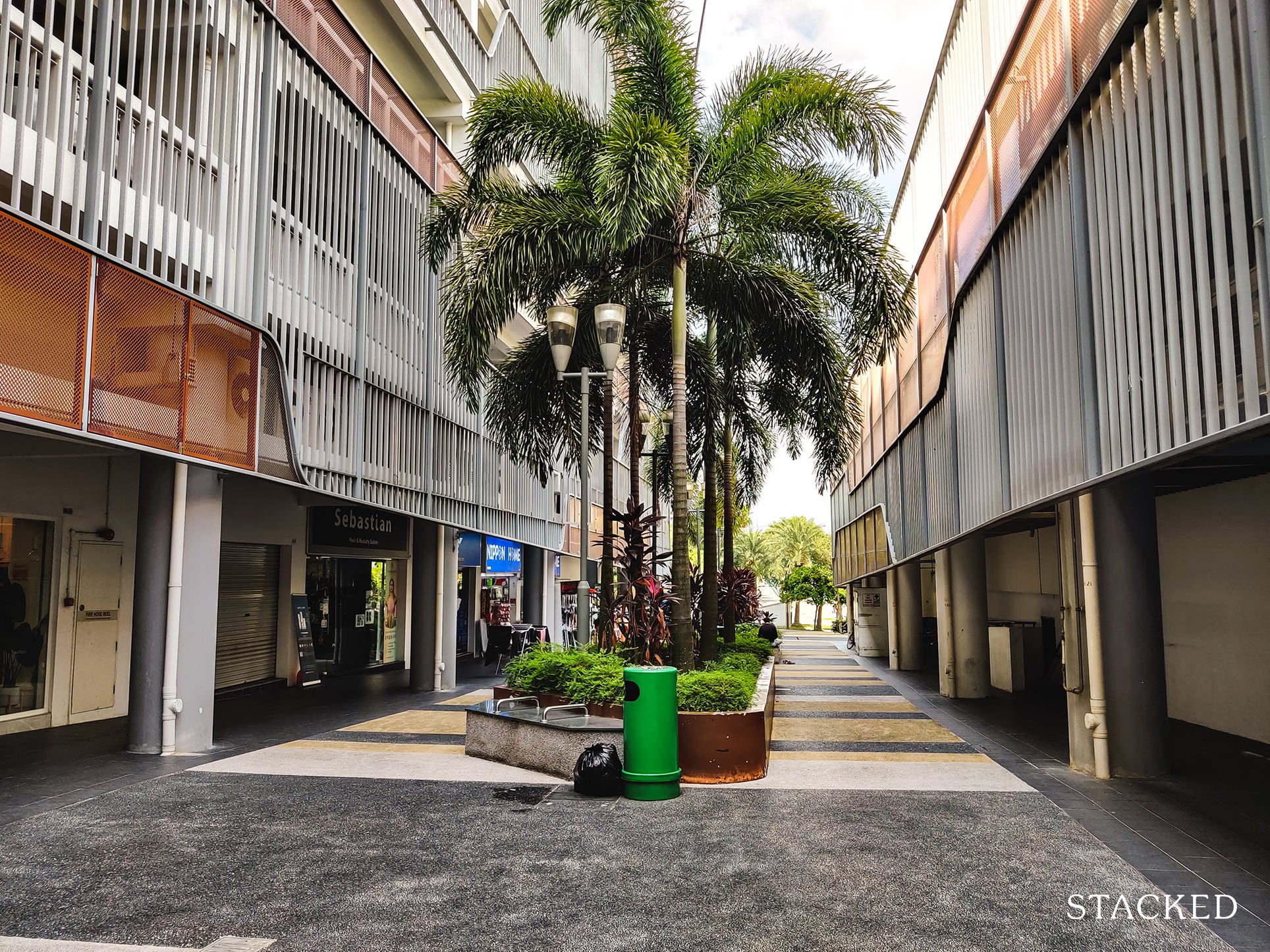
Of course, it’s not really bazaar as it was pretty quiet here, but you do get that sort of vibe.
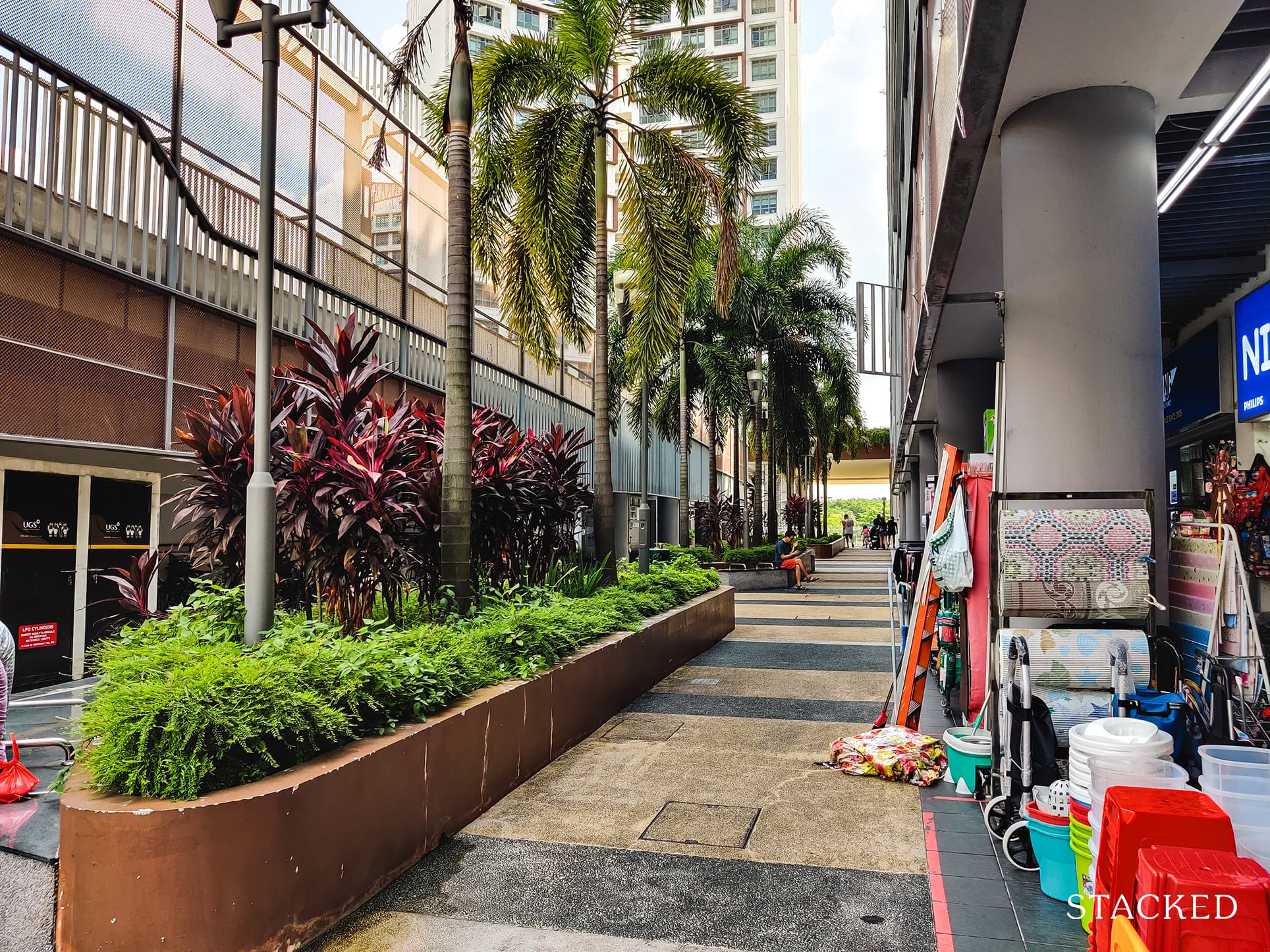
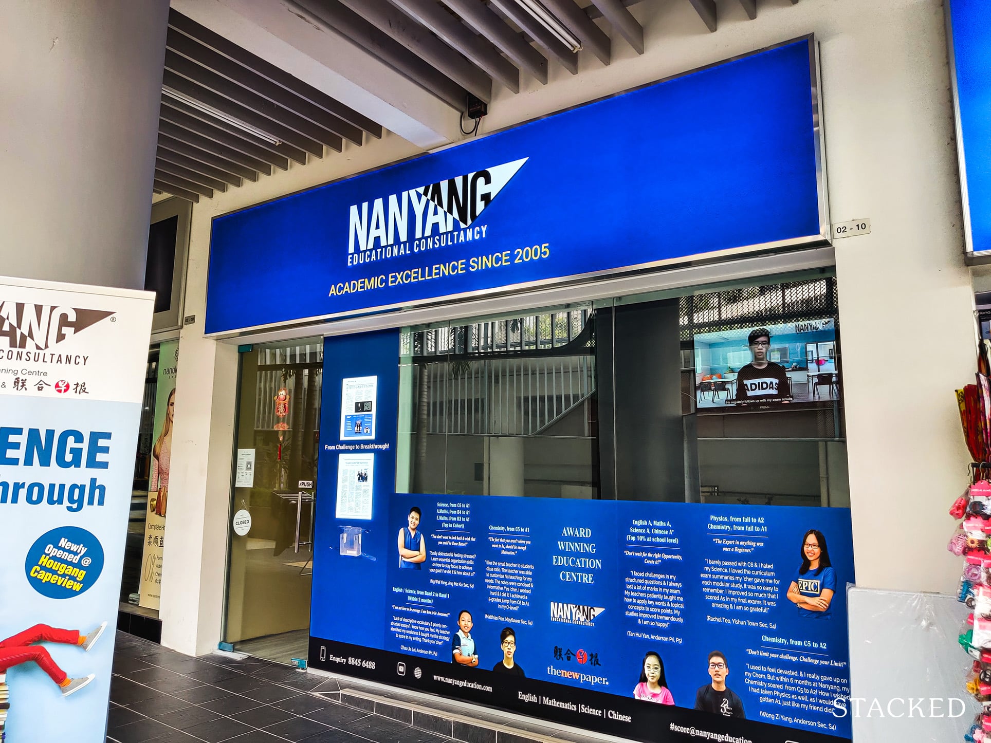
Here is where you’ll find a clinic as well as a tuition centre.
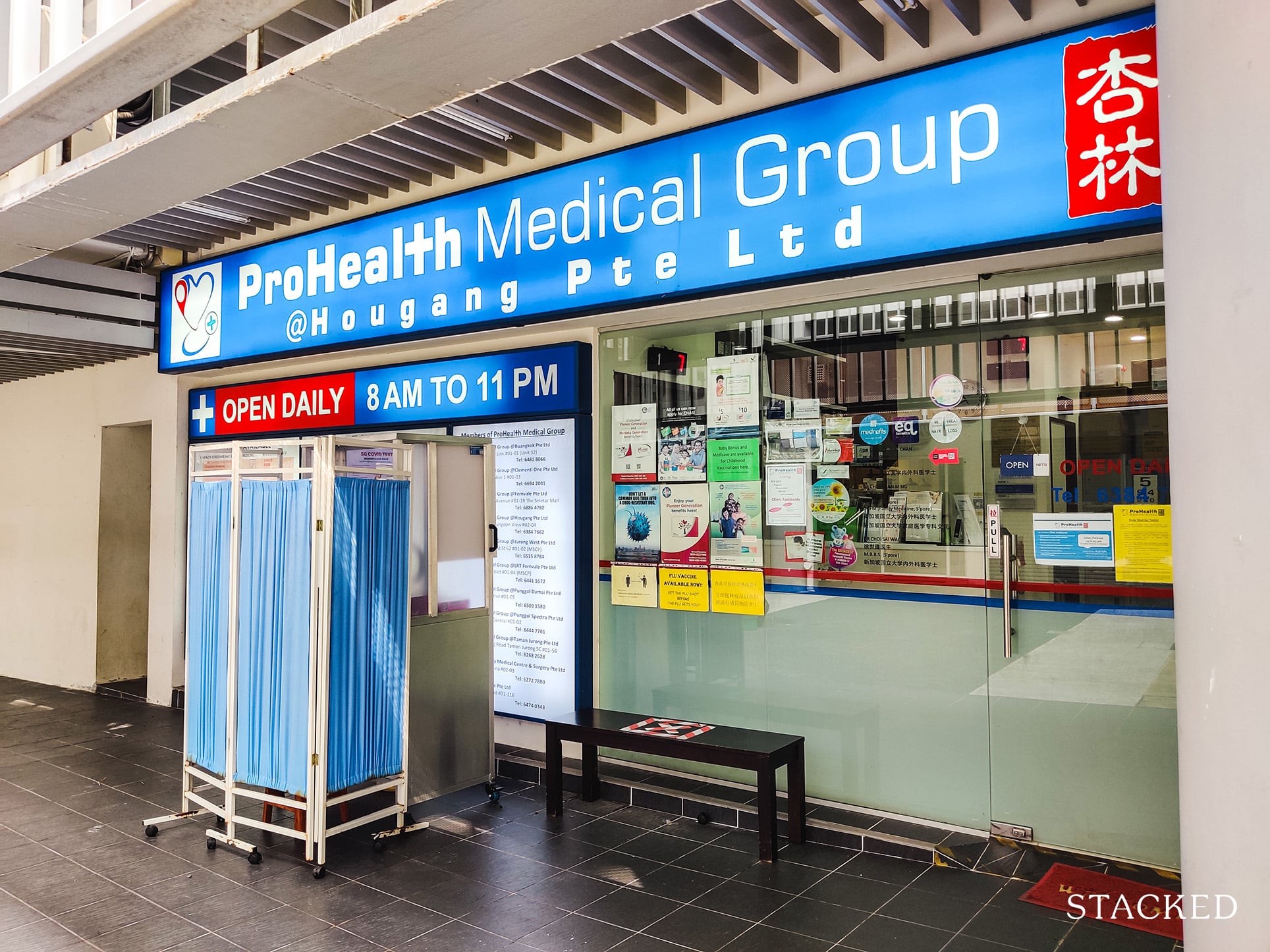
It’s almost a template that I see at every HDB development. Clinic + tuition centre.
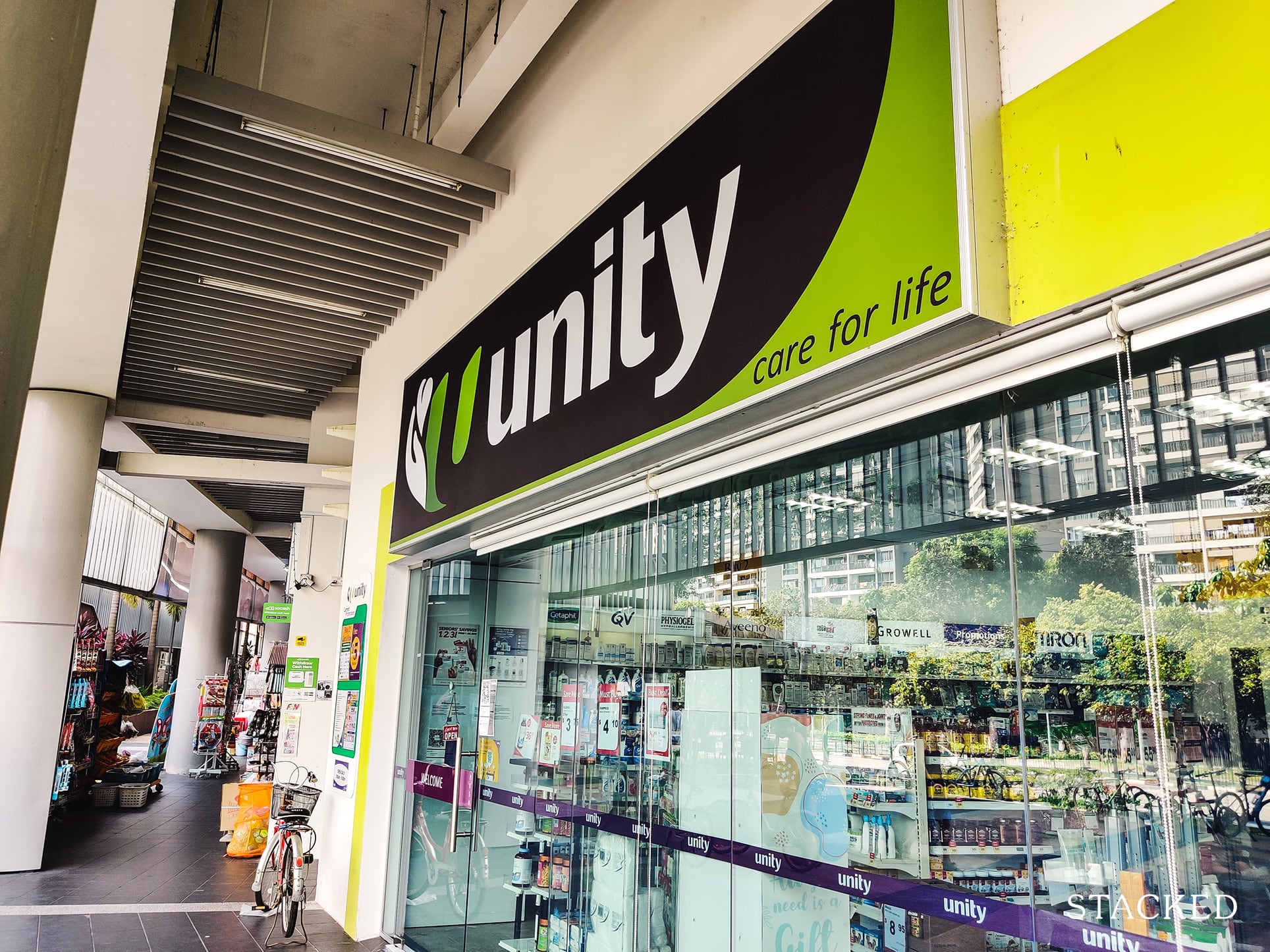
There’s also a personal care outlet for all your daily needs.
If you’re feeling hungry, there’s also a bakery and a local minimart located here. There’s also a barber for your hairdressing needs.
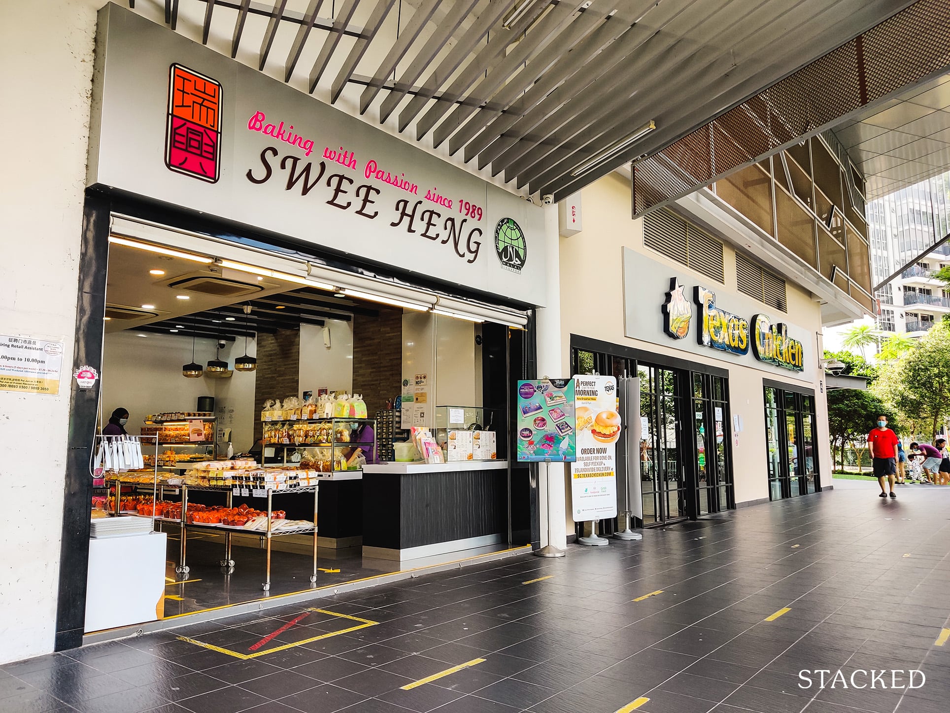
But what’s even more impressive are 2 strong amenities here that makes mitigates the inconvenience of this locale: a food court and an NTUC FairPrice.
More from Stacked
November 2022 BTO Launch Overview: 9,540 Units On Offer At Queenstown, Kallang/Whampoa, Bukit Batok, Tengah, Yishun
HDB has ramped up production as promised, and this upcoming launch is where we’re starting to see it. There are…
First, the food court. Not only does it have a diverse range of food options, it’s also open for 24 hours!
Imagine being hungry for prata at 3AM – you can no doubt get this here. It’s not great for those on a diet, but if you are the hungry at weird times sort – this is definitely a great selling point.
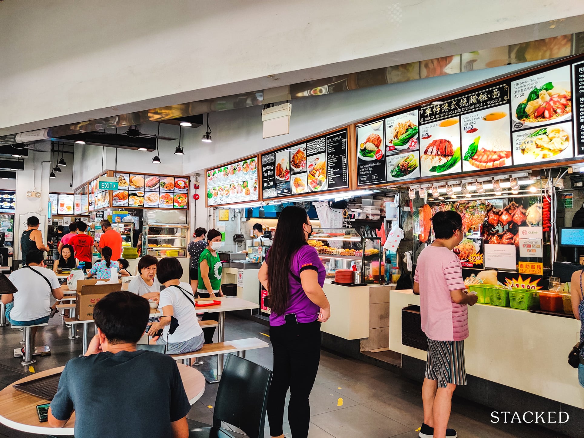
There also seems to be ample seating here (and if there isn’t, just do a takeaway!)
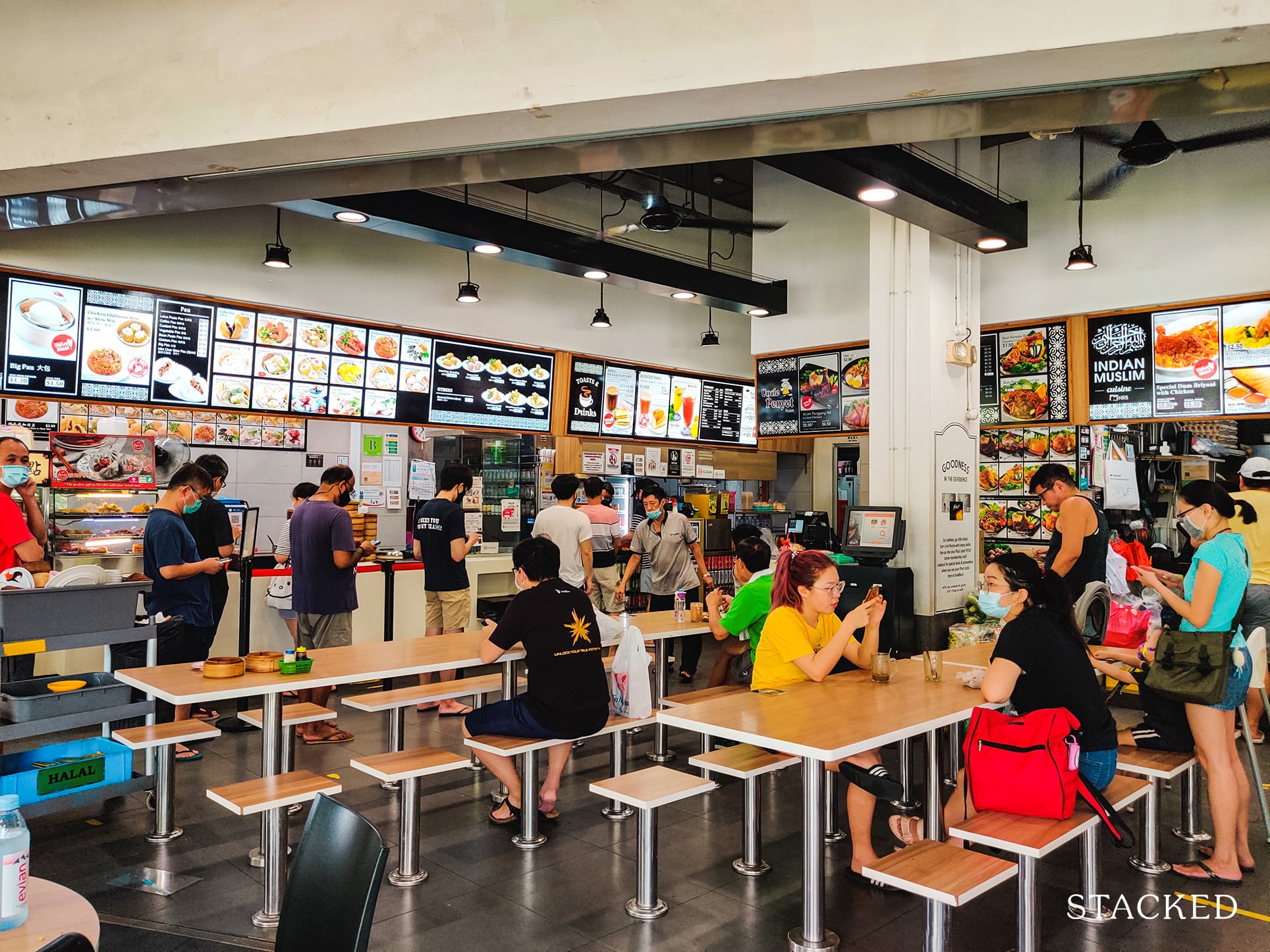
Close by is an NTUC FairPrice which makes it really convenient for residents to do grocery shopping literally at the foot of their development.
Even residents from surrounding developments come here for their grocery shopping, so this makes it really convenient for other residents too!
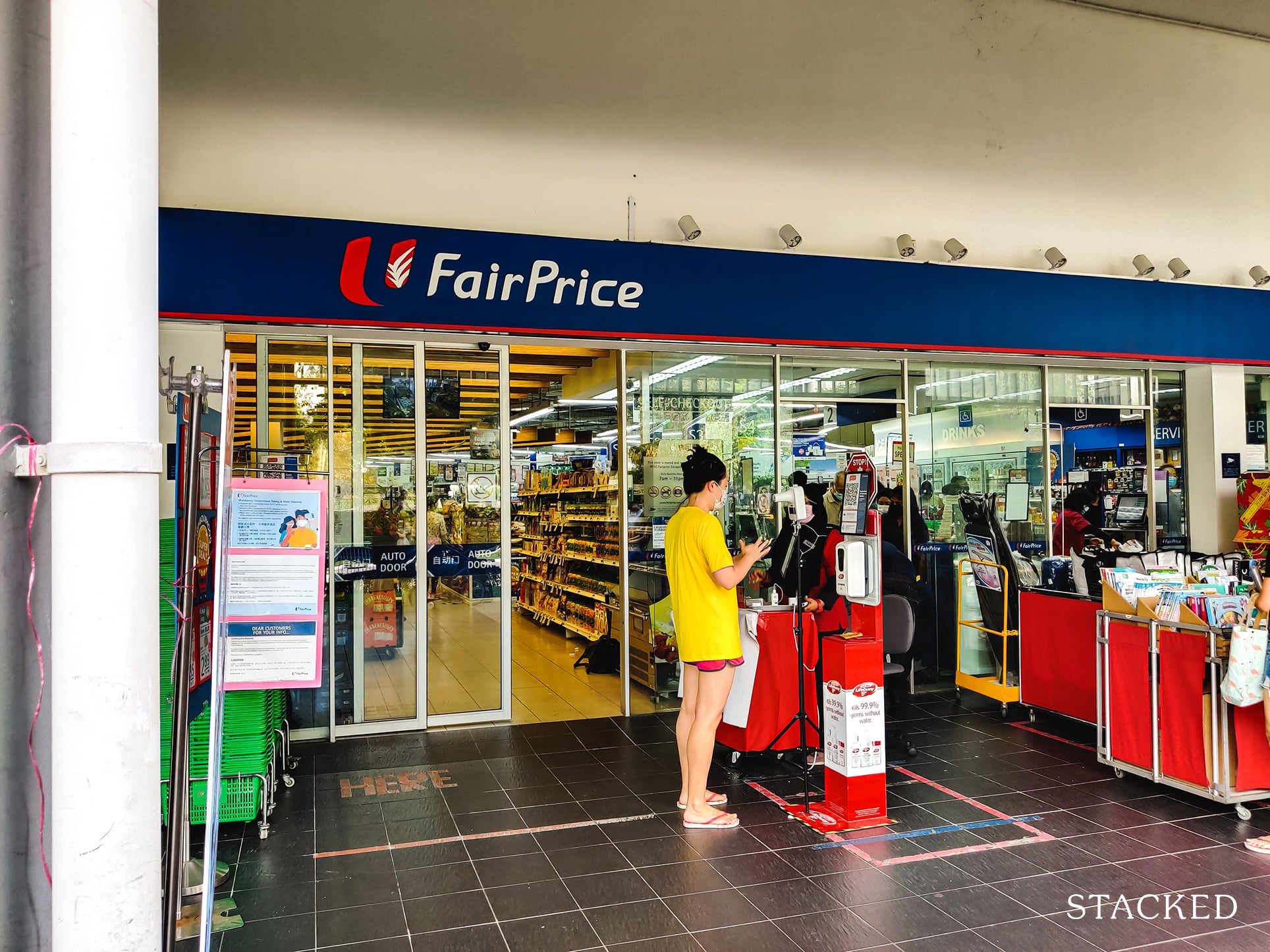
Opening hours are from 8AM to 930PM though, so it’s not as good as the 24-hour NTUC FairPrice at the Natura Loft DBSS in Bishan.
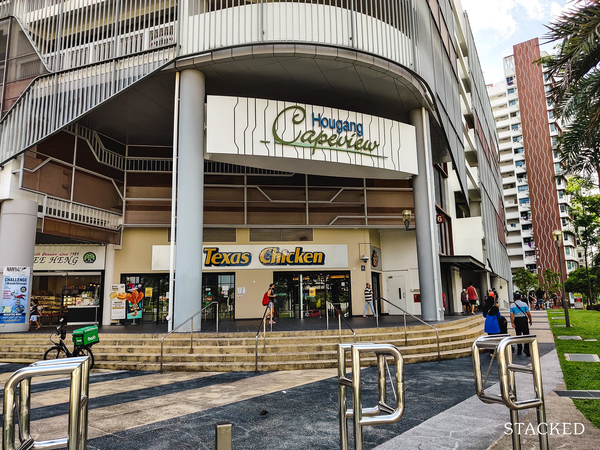
And right at the front of the development facing the main road is a Texas Chicken, the only restaurant in this entire stretch.
If I were a more health-conscious person, living here wouldn’t be the most ideal considering the only healthy food option here is grocery shopping from NTUC FairPrice and cooking food yourself.
Before ending the development tour, let’s check out what the common corridors on the residential levels look like.
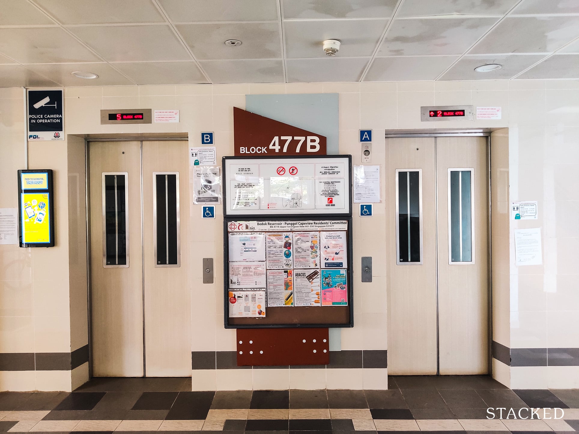
The lifts here are pretty standard fare with no noticeable design elements on them.
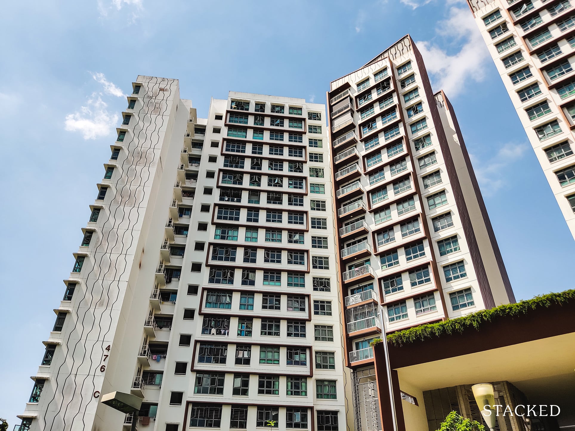
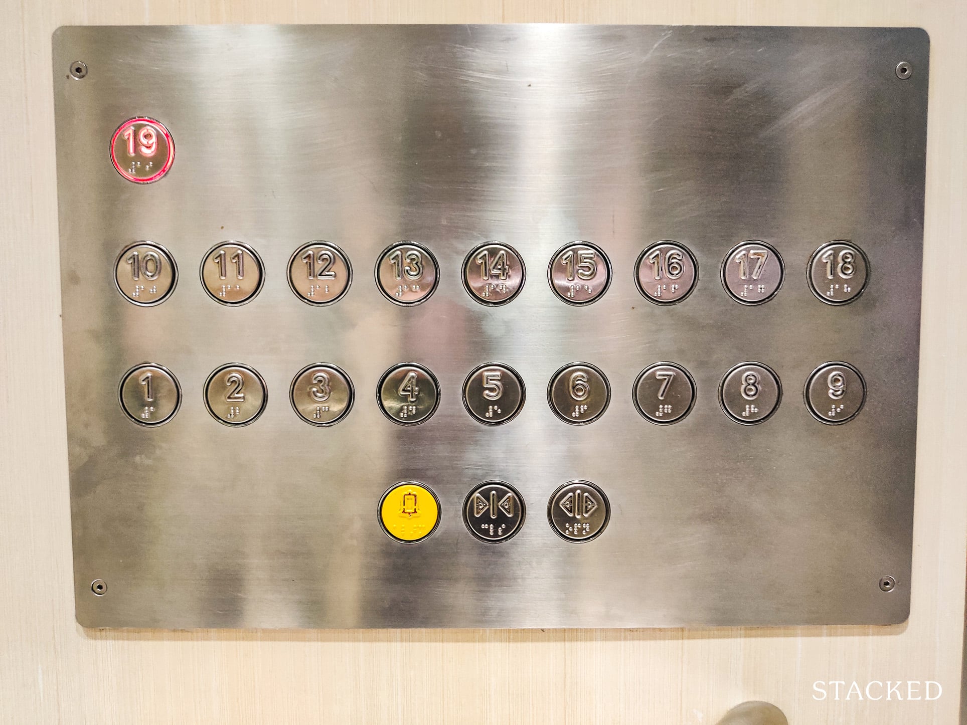
As mentioned earlier, blocks here are either 17 or 19 storeys high.
Once you step out, there are two sides to the block. On the left are 3 units, and on the right are another 3 units (5 on lower floors).
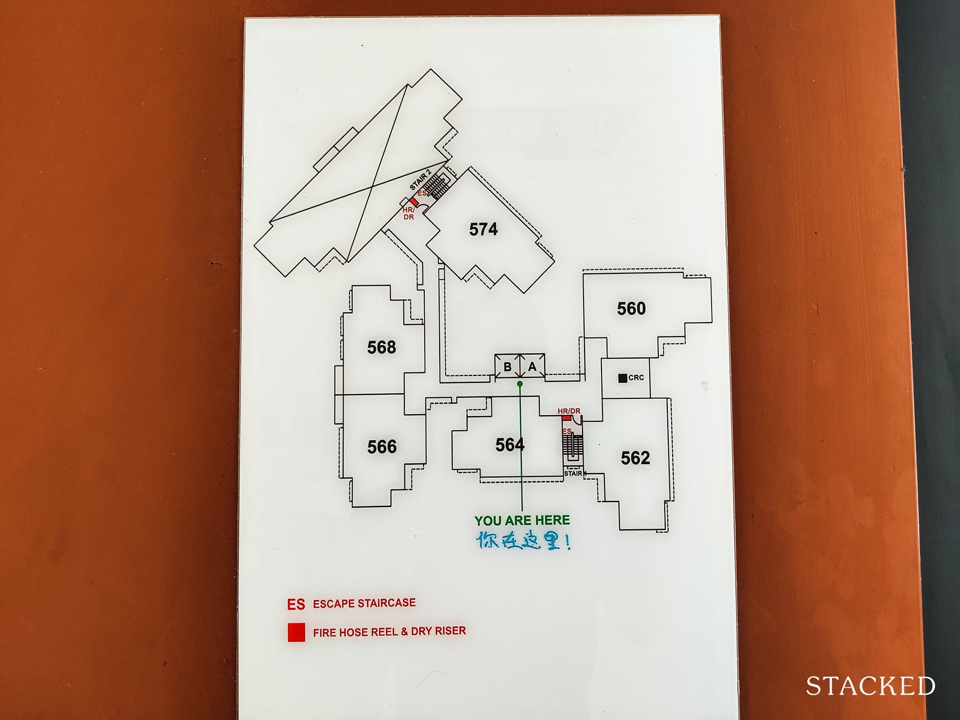
Do note that this is the top floor. On other floors, there would be 2 more units on the right side beside stack 574 (these are the river-facing stacks).
That said, not all the stacks here have the same amount of space though.
On the left side, there are 2 units that share quite a big common space.
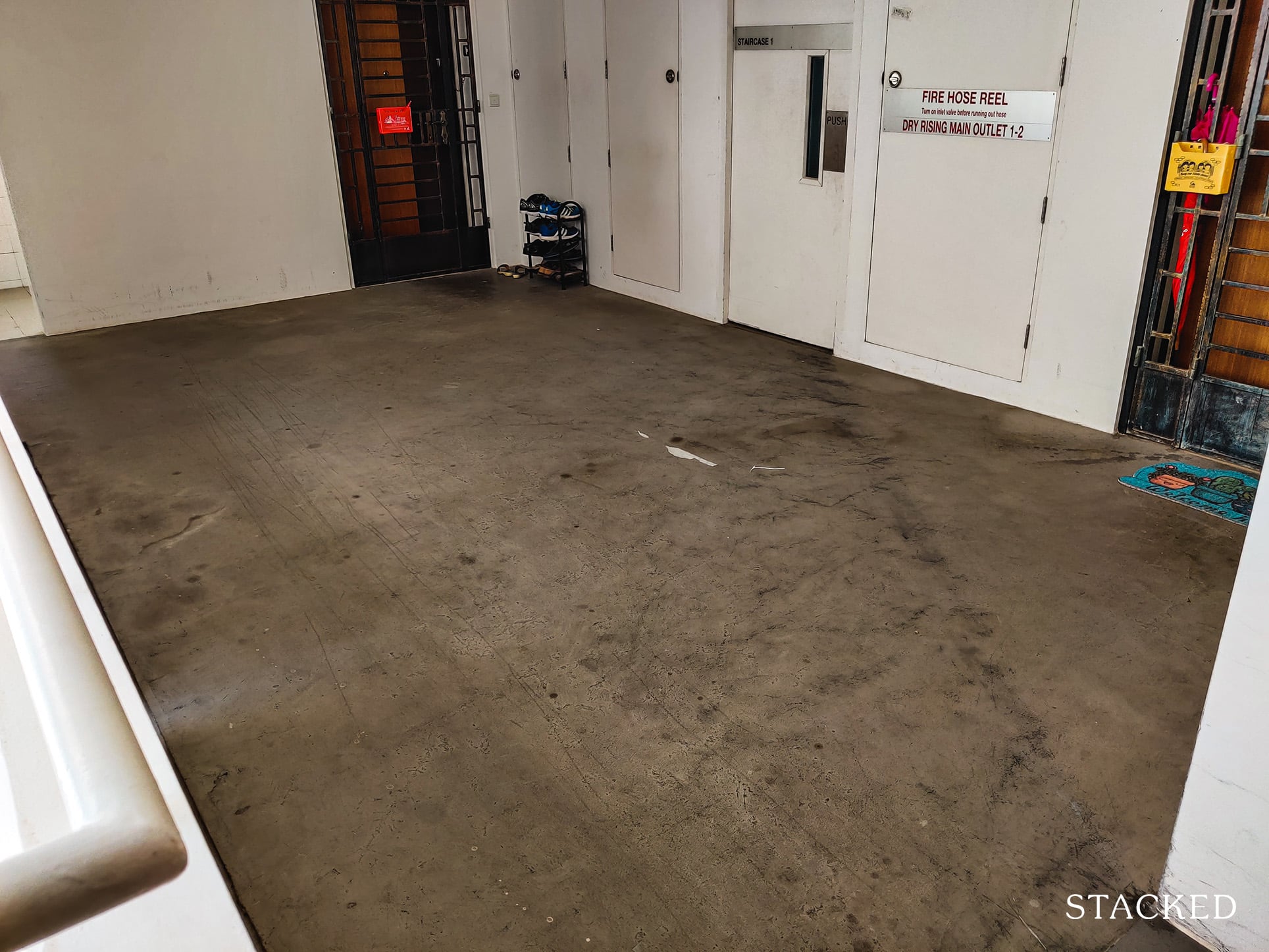
It may not be a big deal at first sight, but I do believe that buyers should consider the amount of space outside their home as a bonus when purchasing an HDB unit.
Having that space gives you that feeling that you’re not encroaching on someone else’s property, even though it’s technically a shared space. It also gives you the freedom to put things outside your home without feeling bad about it.
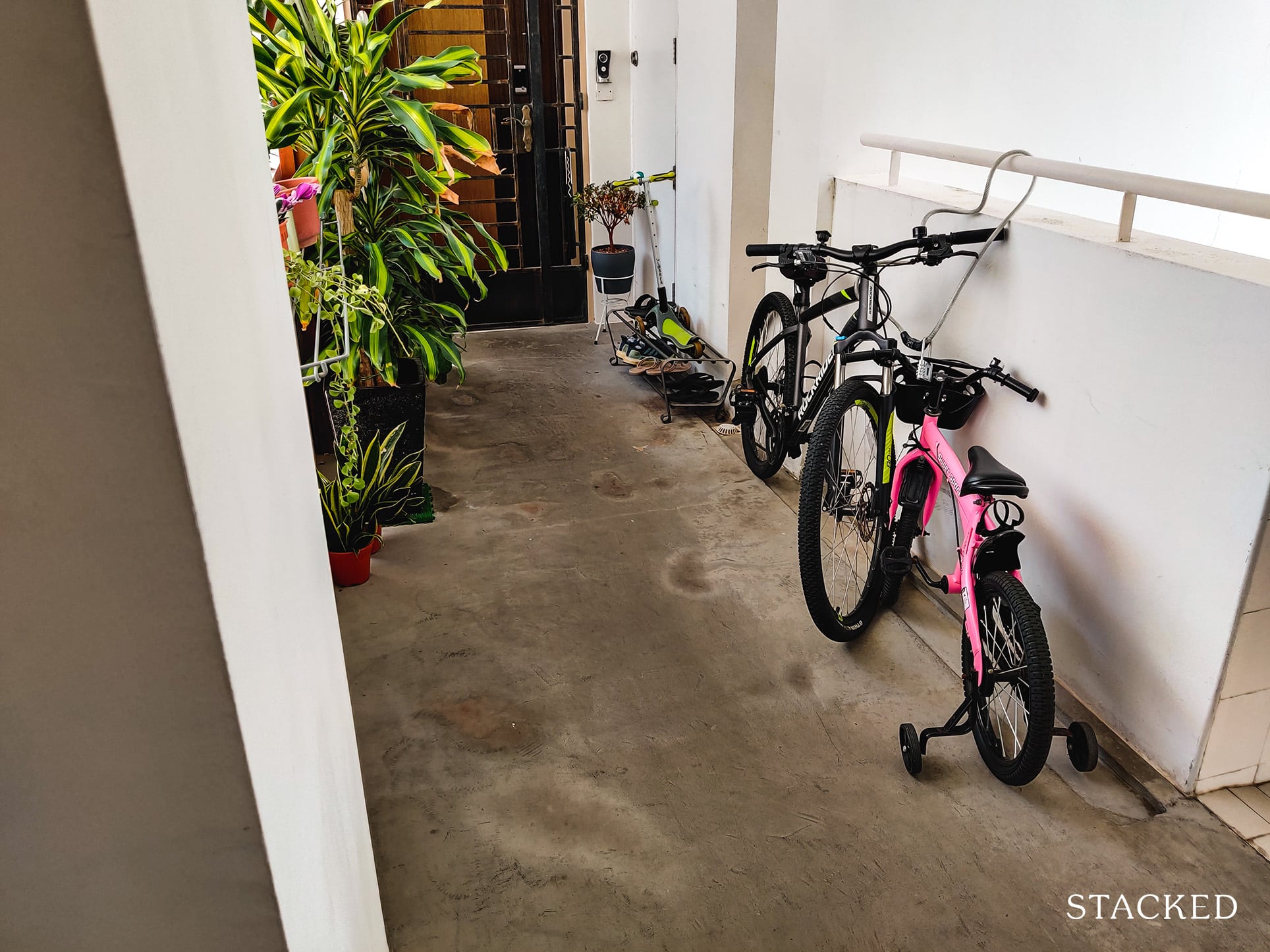
In front of these 2 units is a short passageway that leads to a corner unit. Buyers of such a unit can truly use the space here as they won’t be encroaching on anyone’s common space which is a huge plus.
As mentioned, there are 3 units on the right side as well. The first 2 share a smaller common area.
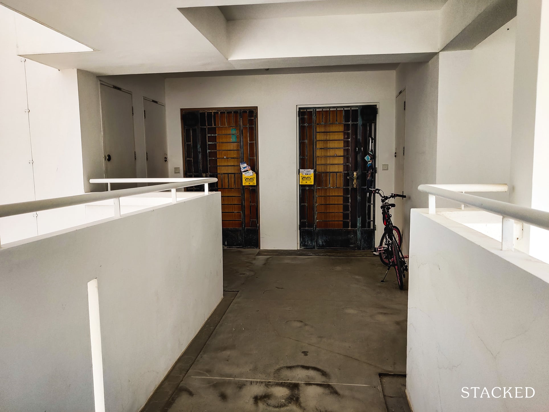
You can immediately see the benefits of the common area shared by the units on the left. Common space outside the unit is seriously underrated!
Given the outlets on the left and right side, it would be difficult to put things like a shoerack or your bicycle without obstructing access.
The next 3 units are on the other side of this long corridor.
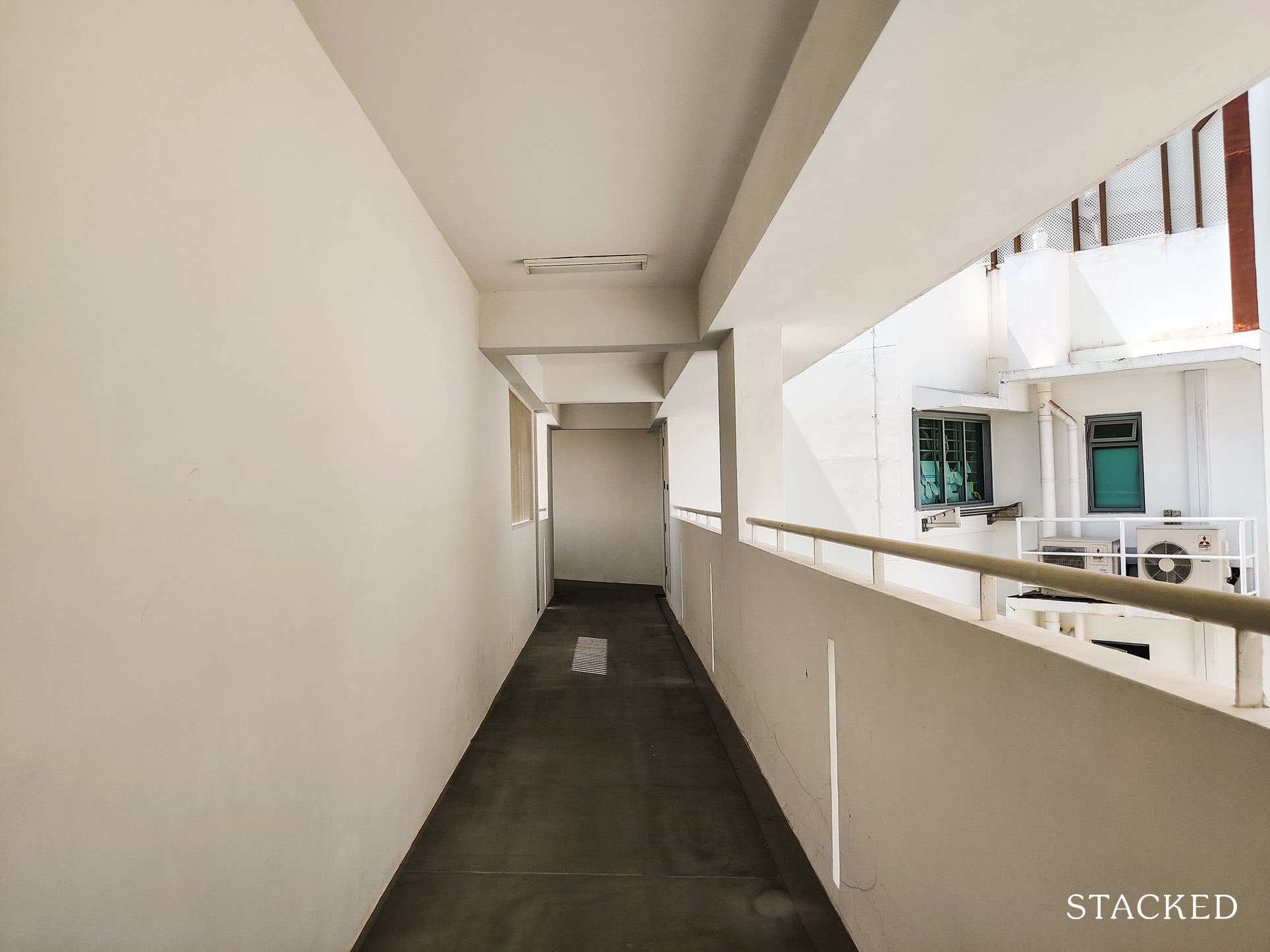
As this is the top floor (19th), you’ll only see 1 unit here (which frankly, is amazing considering how much common space this resident has!).
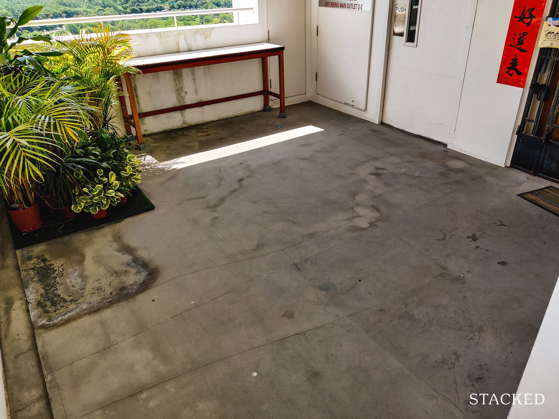
The common area is also of a squarish layout, with sufficient space to put things like plants (as the owner above has done).
The 18th floor also only has 1 unit at the end of this corridor, so owners on these 2 floors will be the only ones using the entire space from the long corridor onwards.
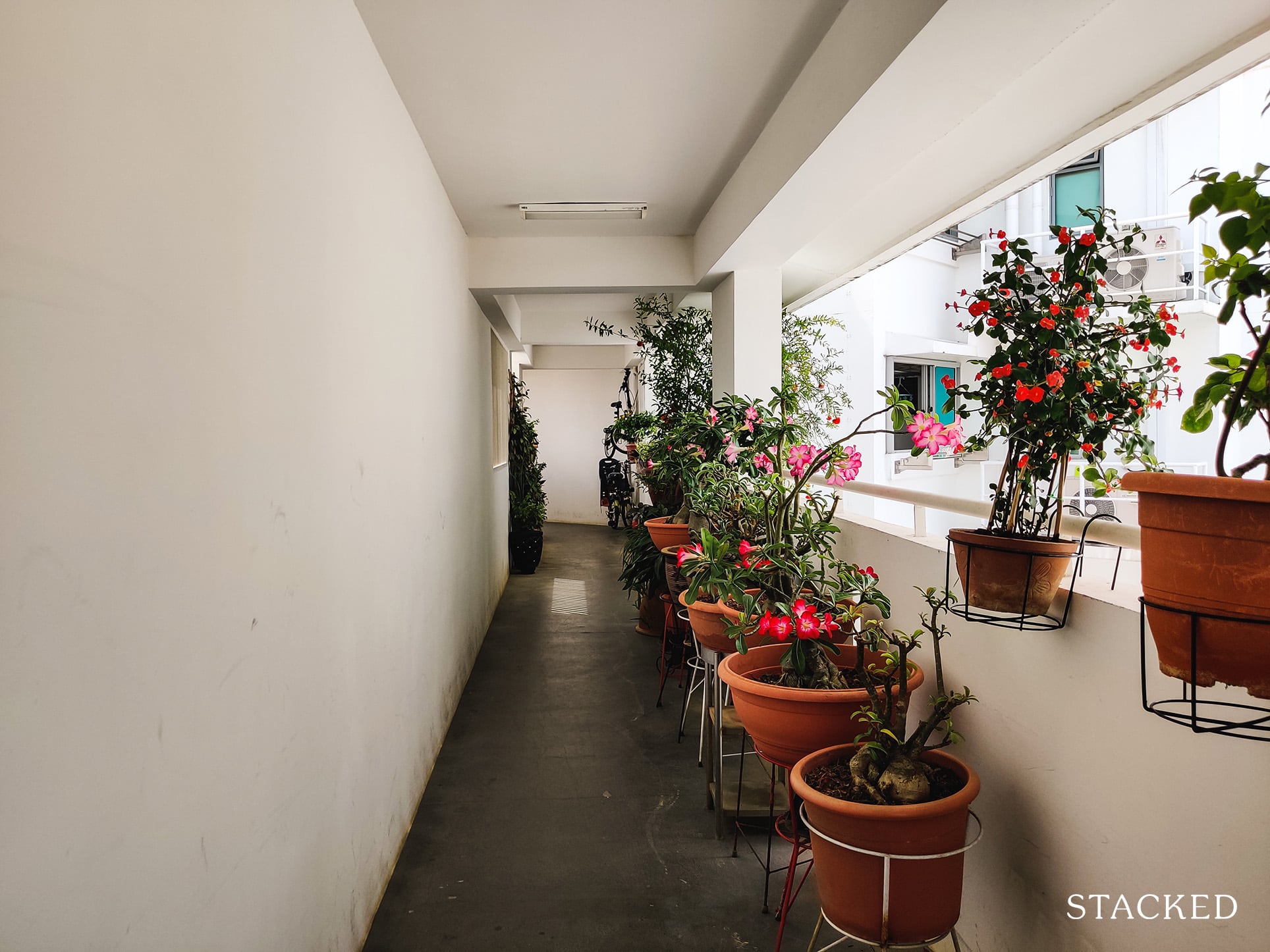
Some owners such as the one above even lined the corridor (since no one else really uses it) with plants that really sets up the mood coming home. Bear in mind though, that the width should still need to meet the minimum BCA requirements.
Do note that this is only possible for the upper 2 floors here. On the lower floors, there would be 3 units in that corner altogether, with 2 units facing east towards the river/greenery as shown below.
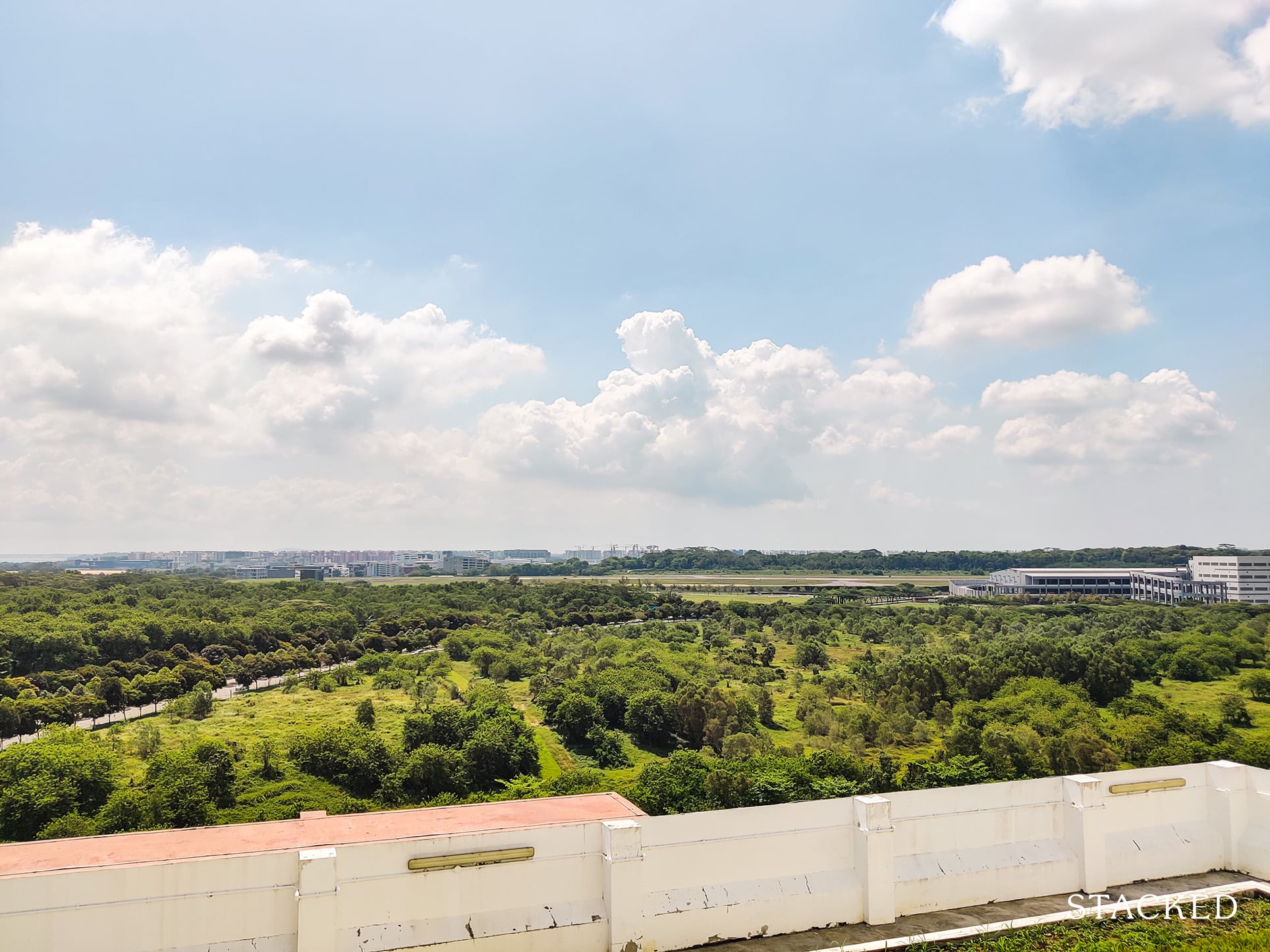
There aren’t that many HDBs that can boast such a view, so units that face the river is expected to command a high COV.
It’s actually also from here that you can see planes landing and taking off (accompanied by the noise too).
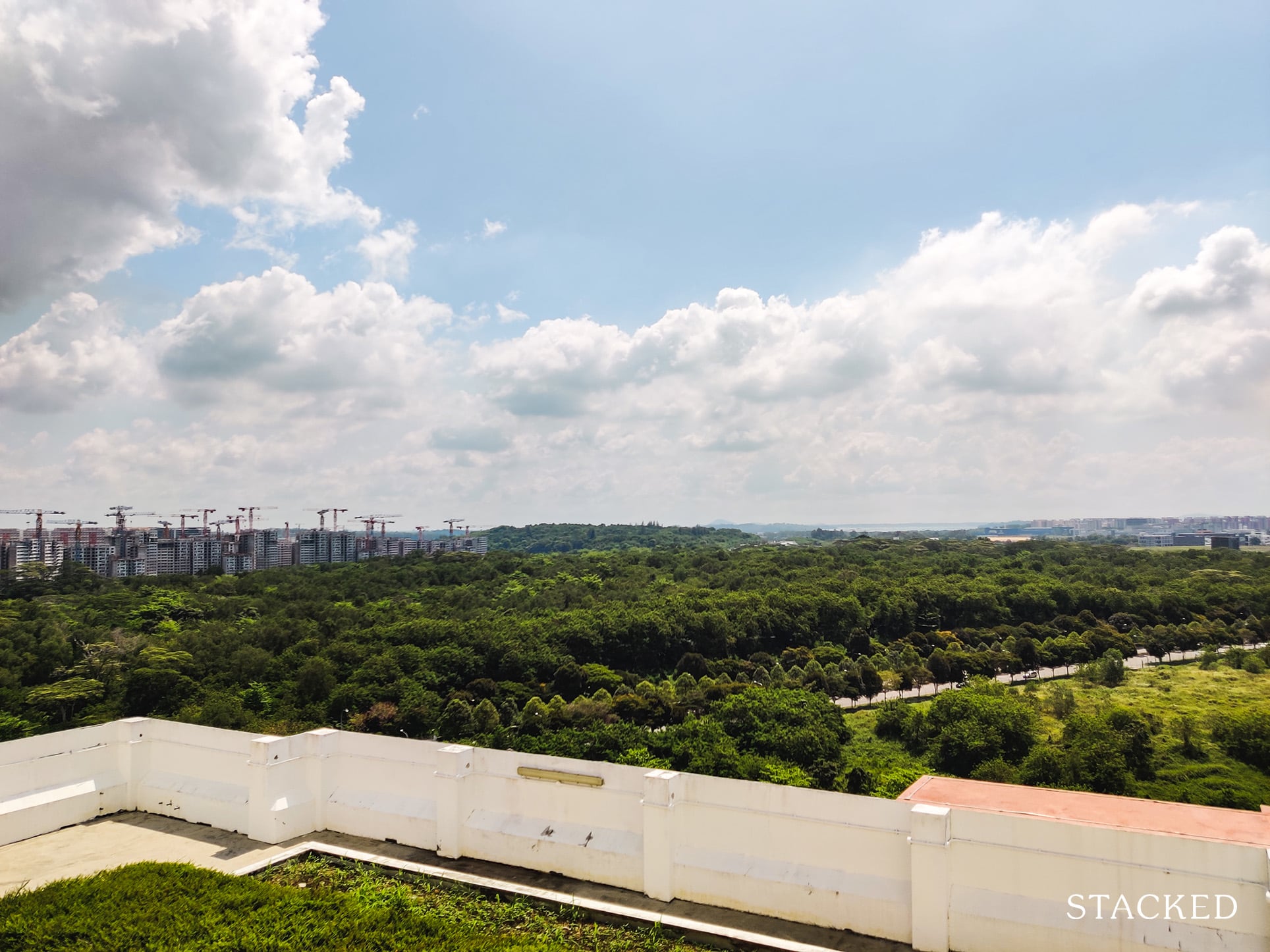
You’ll notice that there is a sort of grass area above the roof here. In case you are harbouring any wild thoughts, this isn’t an accessible space (although it must be said it would make for a really nice viewing gallery).
Hougang Capeview Location Review
The main highlight of Hougang Capeview is really the river as well as the park connector – both of which were already covered as part of the development tour given how integral they were. These are located on the east side of the development.
The west side, however, is the more undesirable part of the development.
Hougang Capeview is located at the junction between Upper Serangoon Road and Upper Serangoon View.
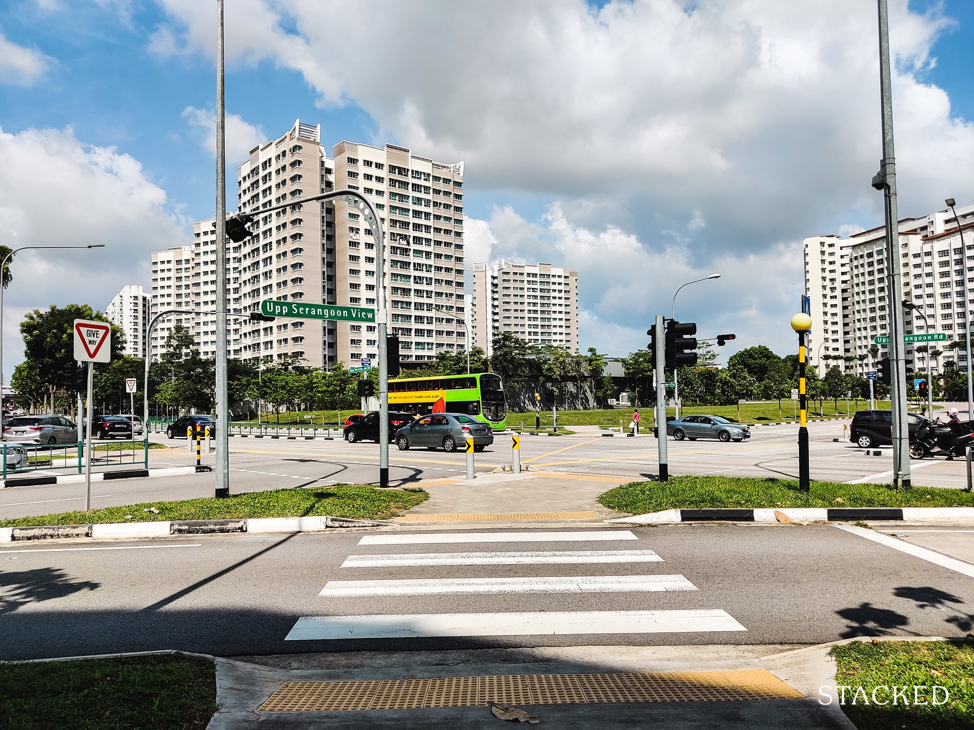
The traffic on this side (unlike at the river side) is noticeably noisy, so blocks that face the road not only get a worse-off view, but would face constant traffic noise here during the day too.
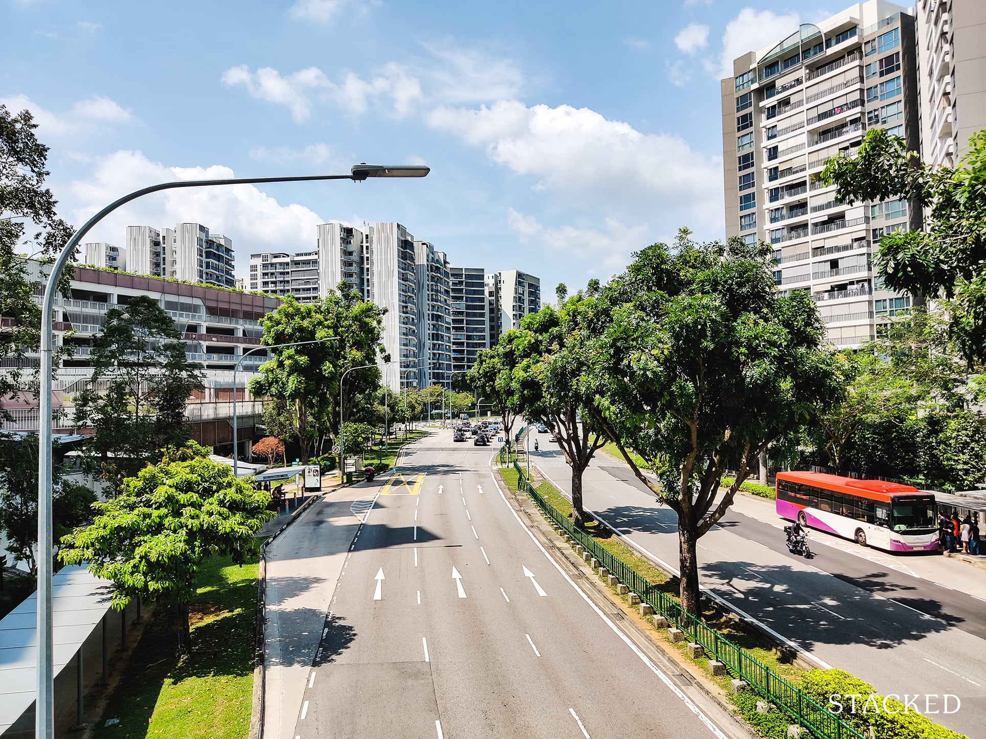
The blocks are also situated quite close by, so even units on the higher floor would some traffic ambient noises (to spin in off in a positive light).

Beyond this area, the only other amenity worth mentioning is the Punggol Park being just a 7-minute walk away, or even faster via bicycle.
Surrounding Hougang Capeview are other residential blocks, both condominiums as well as HDBs. There are no malls in the vicinity.
Public Transport
| Bus station | Buses Serviced | Distance From HDB (& Est. Walking Time) |
| ‘Opp Blk 477A’ | 102, 136, 6N, 62 | 50m (1 min walk) |
| ‘Blk 477A’ | 103, 136, 62, 62A | 100m (2 min walk) |
Closest MRT: Hougang MRT; 21-min walk
The closest bus stop to Hougang Capeview is just outside the development. While the MRT is quite a distance, bus 102 (shown below) would bring residents straight to the MRT just 4 stops away, a 5-minute ride.
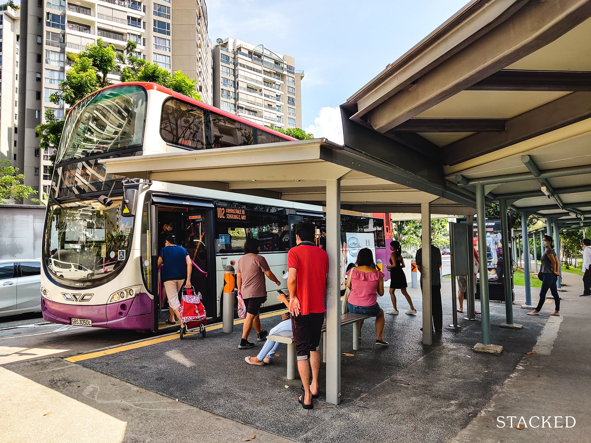
In my last review of Natura Loft, a resident would need to walk 4-5 minutes to reach the bus stop. But having a bus stop directly in front of the development is obviously much more convenient.
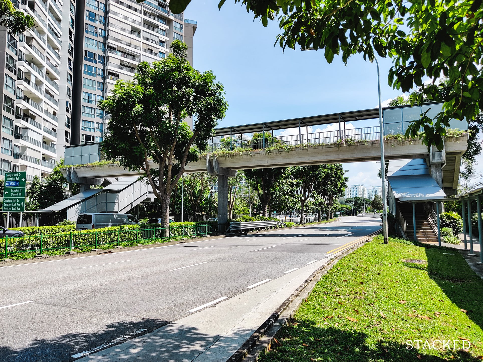
Residents coming home would also be glad to know that the bus stop opposite is linked via a sheltered overhead bridge, so the journey to the MRT is fully-sheltered – a big plus points in my books.
You may also wonder if the Cross Island Line would benefit residents staying here in the future.
While Hougang MRT would soon be an interchange (North-East Line + Cross Island Line) which would increase connectivity, the previous stop is actually at Defu – an even further distance from Hougang MRT.
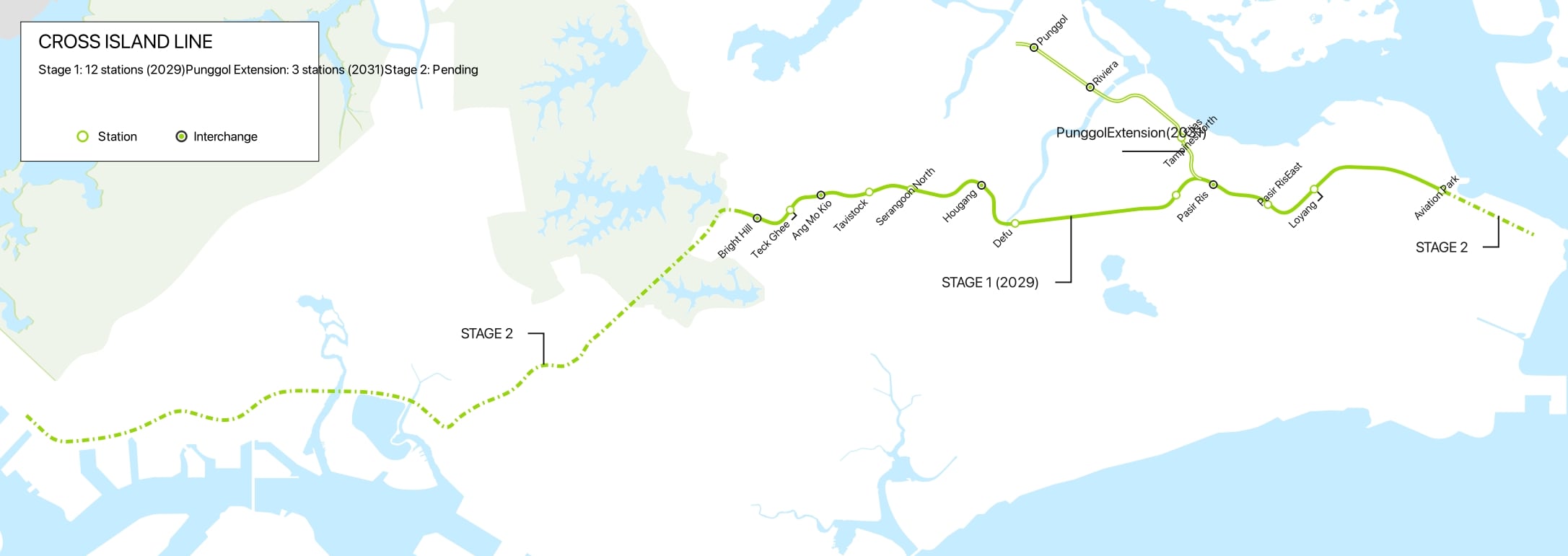
So in terms of connectivity, it looks like there’s not much improvement coming up here.
However, given how convenient it is to reach the bus stop, the location here is not as bad as it would seem.
Private Transport
| Key Destinations | Distance From HDB (& Est. Peak Hour Drive Time) |
| Raffles Place | 16.1 km (30 mins drive) |
| Orchard Road | 16.5 km (30 mins drive) |
| Suntec City | 13.2 km (20 mins drive) |
| Changi Airport | 12.3 km (22 mins drive) |
| Tuas Port | 52.6 km (1 hour 10 min drive) |
| Paya Lebar Quarter | 8.9 km (25 mins drive) |
| Mediapolis | 22.9 km (35 mins drive) |
| Mapletree Business City | 23.9 km (33 mins drive) |
| Tuas Checkpoint | 43.4 km (50 mins drive) |
| Woodlands Checkpoint | 23 km (30 mins drive) |
| Harbourfront Cluster | 21.1 km (33 mins drive) |
| Punggol Cluster | 3.7 km (12 mins drive) |
Immediate road exit:
Upper Serangoon View
Summary:
Those driving would find that Hougang Capeview is relatively easy to travel from and get to, especially with the KPE just around the corner, allowing quick access to the PIE and CTE down south, and the TPE up north.
Groceries
| Name of Grocery Shop | Distance from HDB (& Est Time) |
| NTUC FairPrice | 279 Bishan Street 24 (within the development) |
Thankfully for the residents living here, there is at least 1 grocery shop nearby, and that is an NTUC FairPrice. The next nearest supermarket is also an NTUC FairPrice located at Rivervale Plaza, which is about 10 minutes away by bus.
Schools
| Educational Tier | Distance |
| Preschool – 3 | |
| My World Preschool | Within Development |
| Agape Little Uni. @ Upper Serangoon | 250m (3-min walk) |
| Pcf Sparkletots Preschool @ Bedok Reservoir-Punggol Blk 470c (Cc) | 400m (5-min walk) |
| Primary Schools (1KM only) – 2 | |
| CHIJ Our Lady Of The Nativity | 1km (12-min walk) |
| Punggol Primary School | 1.3km (17-min walk) |
| Secondary Schools – 2 | |
| Serangoon Secondary | 280m (3-min walk) |
| North Vista Secondary | 1.1km (14-min walk) |
| Tertiary – 1 | |
| Tampines Meridian Junior College | 30-min by bus |
Young couples or families would be pleased to know that there are a varied number of pre-tertiary options here. However, tertiary options are quite lacking in the area.
Additional Pointers
1) Paya Lebar Airbase move
If the incessant plane noises in the estate doesn’t make it obvious enough, Hougang Capeview is located closeby an airbase: Paya Lebar Airbase (PLAB).
So why is this significant?
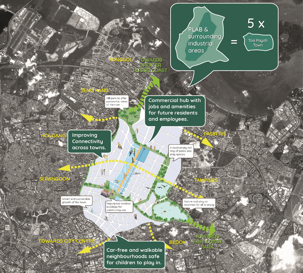
Right now, residents get to enjoy the greenery view right opposite the river. Once PLAB has been fully-relocated, we can expect plenty of construction works here to begin. This is estimated to be some time in the 2030s.
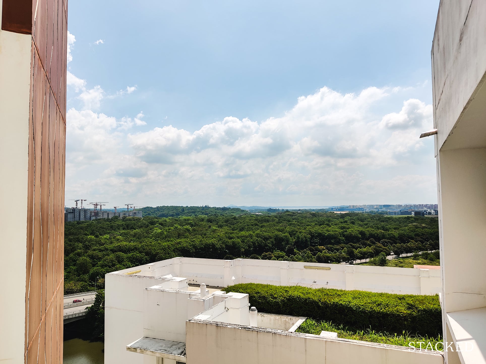
It may seem far from now (about a decade), but for those looking to buy a unit at Hougang Capeview to live out their retirement years, this is something you should be aware of.
The size of this plot of area is huge. By huge, I mean 5 times the size of Toa Payoh. Yes, this could even be a new HDB town altogether!
The real question is, would this significantly impact your quality of life?
First, there’s the views (probably what most are concerned with).
I think that in the next 8-10 years, you should still have your greenery views. Beyond that, however, I would expect the area to be cleared for construction.
Not all is so gloomy though. I would argue that the distance between Hougang Capview and what lies across the river is far enough to constitute an “unblocked view”.
Moreover, the river will always remain, and it’s quite an attractive offering on its own.
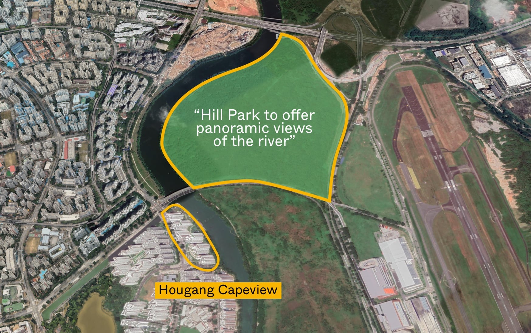
URAs future plans also indicates at area to the north showcasing a park that would be built (currently still zoned industrial). This would mean certain stacks facing the north-east direction would get some greenery views once the area is fully developed.
What would be of the rest of the area?
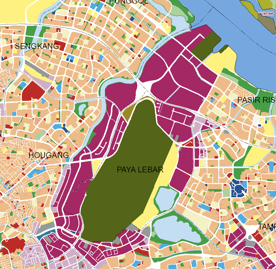
The Master Plan 2019 indicates that this is largely industrial. These plans undergo changes every 5 years, and sometimes an addition is made to the plan on an ad hoc basis.
In my opinion, the entire Paya Lebar area is still subject to much changes as URA has recently asked for ideas on how to best transform this area, so this industrial zoning would likely see changes in the future.
Which brings me to my next point on quality of life – this area could really be a new HDB town with a huge commercial hub in the center – one that would breathe more life in the surrounding HDB estates!
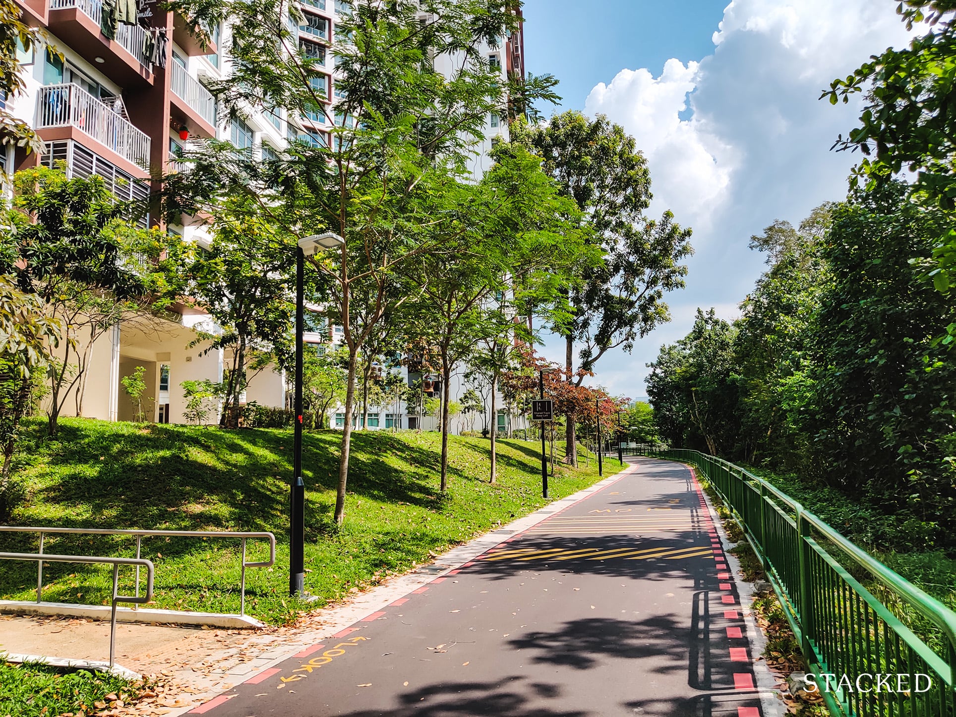
Given how close the Park Connector is there, it would also likely connect throughout this estate which brings even more excitement to families living here.
Moreover, the prospects of jobs being created there would enhance the value of properties in the vicinity, including Hougang Capeview.
I think that the PLAB move is a very underrated change to come. Understandably so since it seems a little far-fetched now given how far away it is. But with so much space and endless possibilities that you can do with it, Hougang Capeview would stand to directly benefit from it.
2) Top in construction quality
Most people are concerned about the aesthetics of buildings, and while Hougang Capeview looks decent, it actually made a name for itself in another area: construction quality.
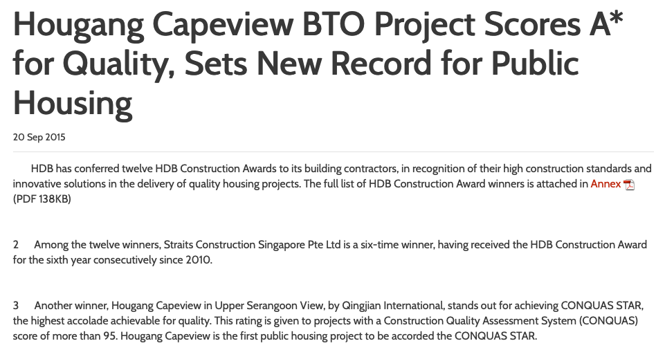
Hougang Capeview was the very first public housing project that achieved the Conquas Star rating, the highest possible accolade for construction quality and workmanship.
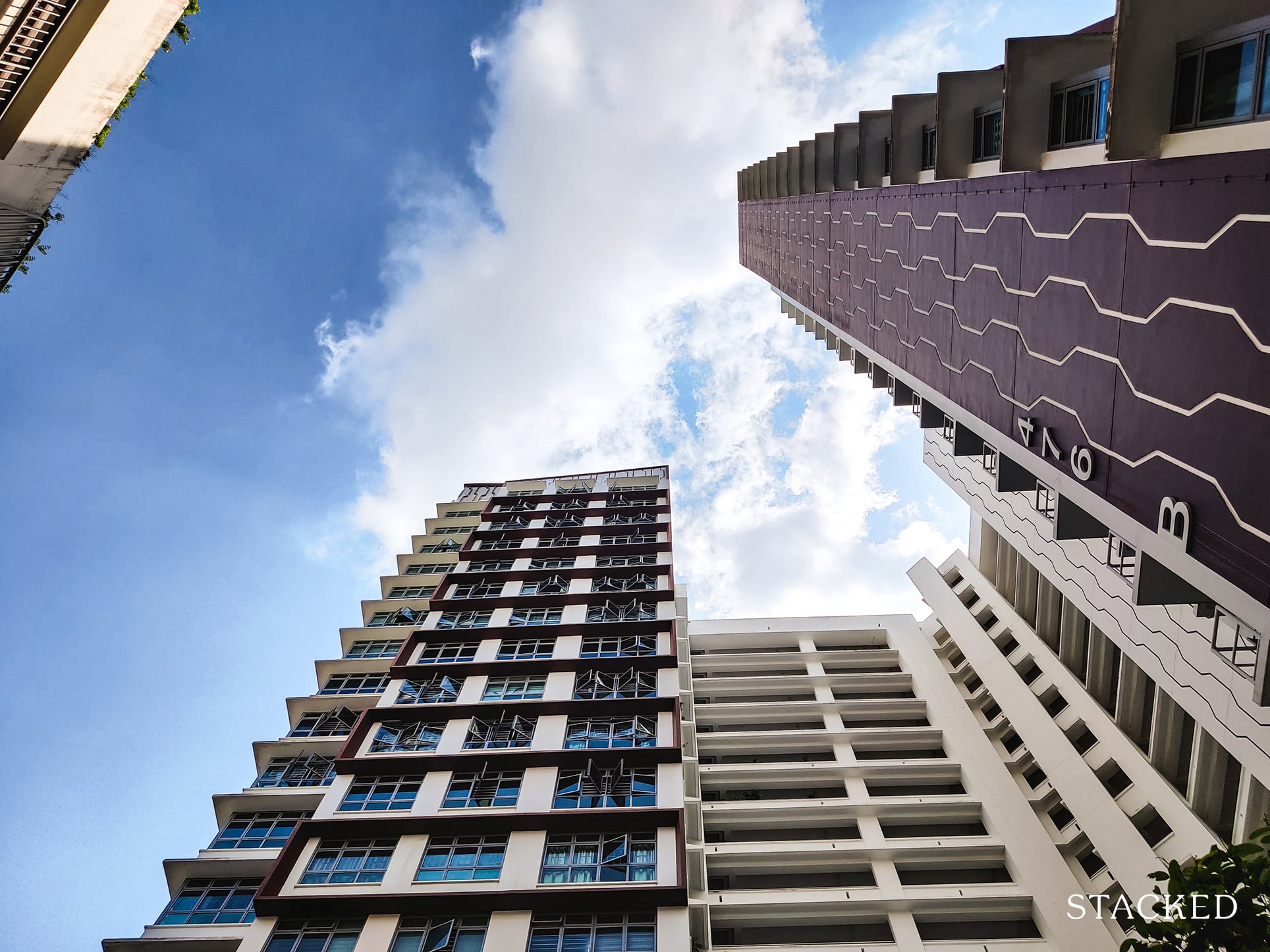
It was developed by Qingjian International, the developer responsible for new launches like JadeScape and Forett at Bukit Timah.
Residents who moved in here cited few quality issues, with developers quickly rectifying any workmanship issues that were reported after move-in.
Hence, buyers looking to stay here can come to expect few quality issues down the road.
Hougang Capeview Development Site Review
To be frank, the development itself is okay.
From my tour here, it felt like Hougang Capeview was divided into 2 parts. East and West, with the east side having all the goodness that Hougang Capeview brings.
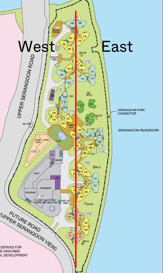
The east side of the development is where all the greenery, playground and open spaces are at. Not to mention it fronts the park connector and the river too.
The west side is really the “back” of the development where the service road is located.
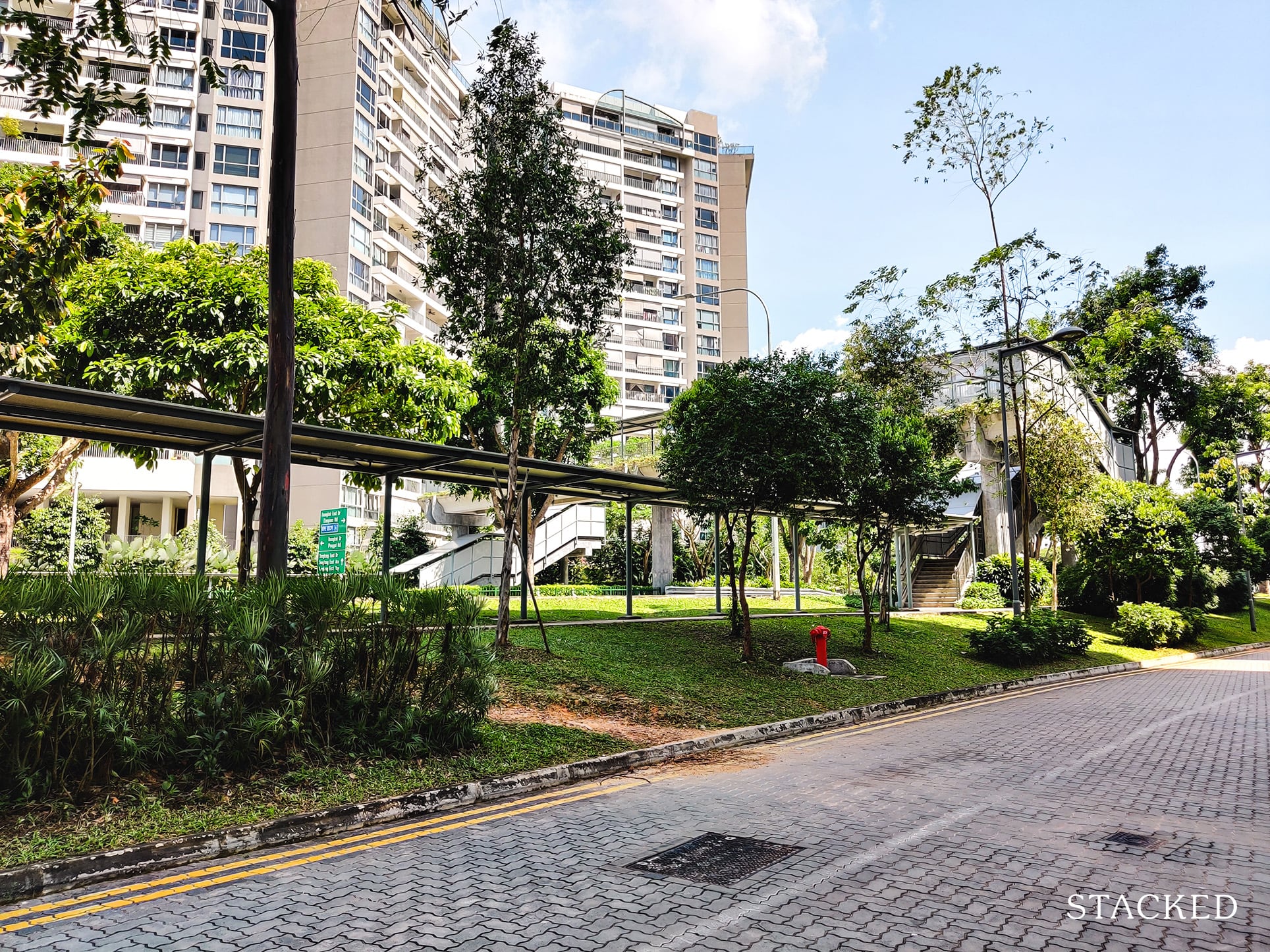
It is noticeably noisy on this side, so buyers should be okay with the noise if settling on the west side.
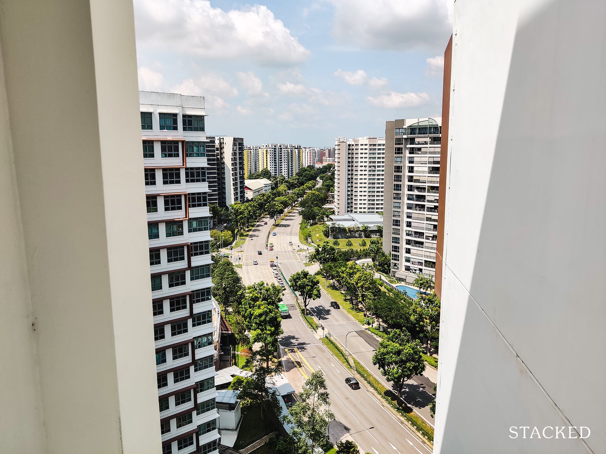
Overall, the development itself isn’t quite as impressive or spacious once you strip away the park connector and the river.
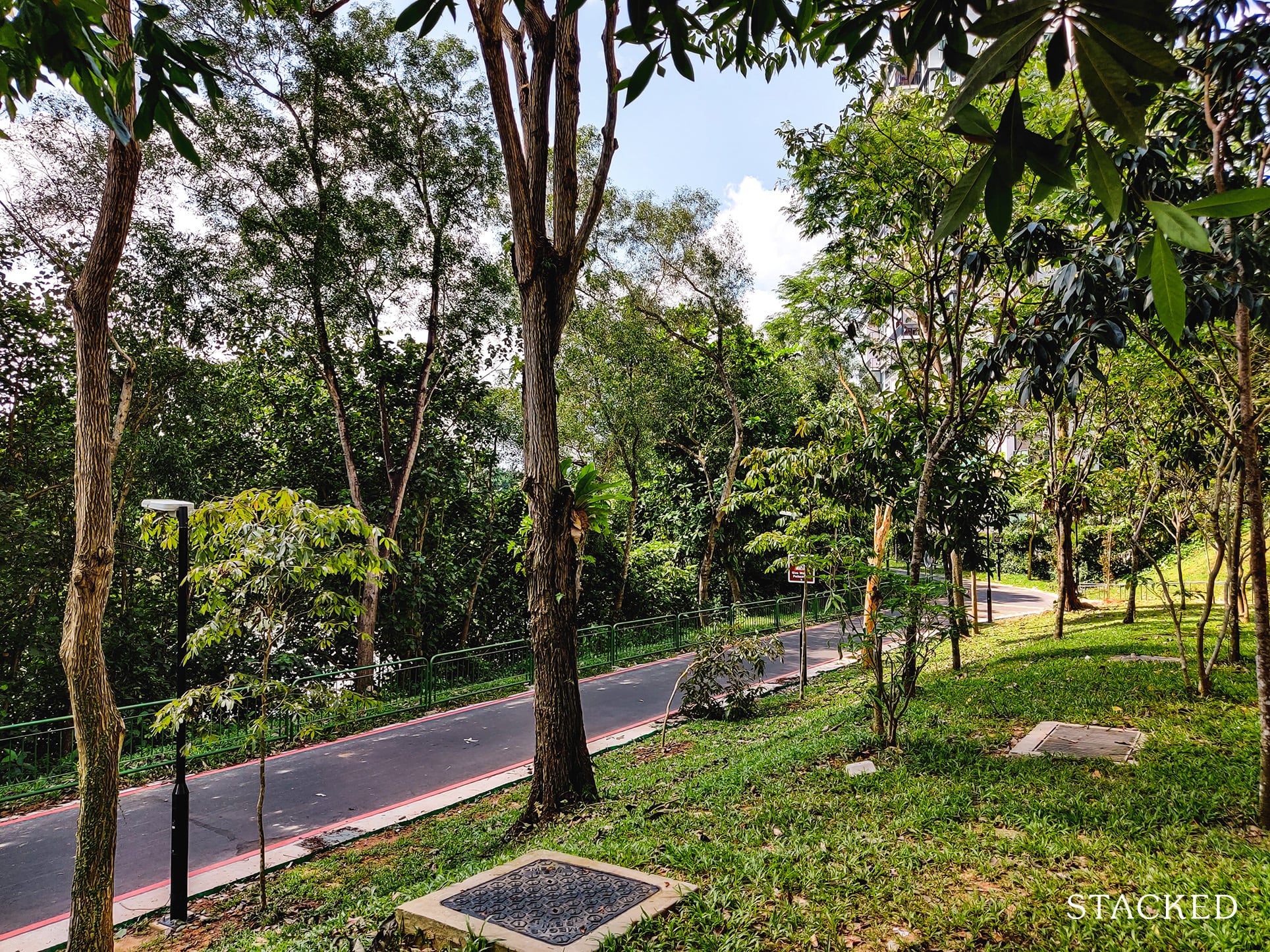
But these are indeed the defining factors of Hougang Capeview, so buying a unit here is really buying into the nature around it.
Unit Mix
| Block | Storeys | 3 Room | 4 Room | 5 Room | Total |
| 476A | 19 | 108 | 36 | 144 | |
| 476B | 19 | 107 | 36 | 143 | |
| 476C | 17/19 | 80 | 50 | 130 | |
| 477A | 19 | 62 | 36 | 98 | |
| 477B | 17/19 | 54 | 86 | 140 | |
| 477C | 19 | 90 | 36 | 126 | |
| Total | 108 | 429 | 244 | 781 |
Stack Analysis
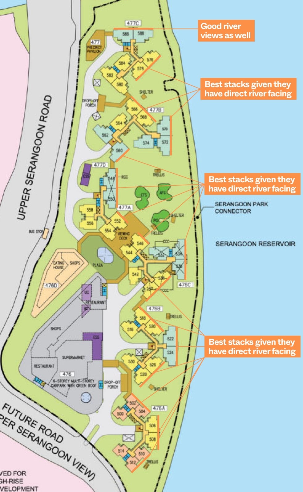
Like Waterway Woodcress, more than 50% of the units here actually enjoys a good view of the river. So forgive me for pointing out so many “best stacks”.
But for those that do not, the units are positioned quite poorly to the extent that there is very little selling point beyond a low price.
For those looking at 3-room flats, consider stacks 502, 504, 510 and 512 – the only 3-room flats that offers the river/greenery view.
On the other hand, stack 500 would get a gantry view, while stack 514 is very close to the Upper Serangoon View road, making it the least desirable 3-room stack in the development.
Because the buildings are tilted in a North-East and South-East orientation, most units on the east side would get a good river/greenery view.
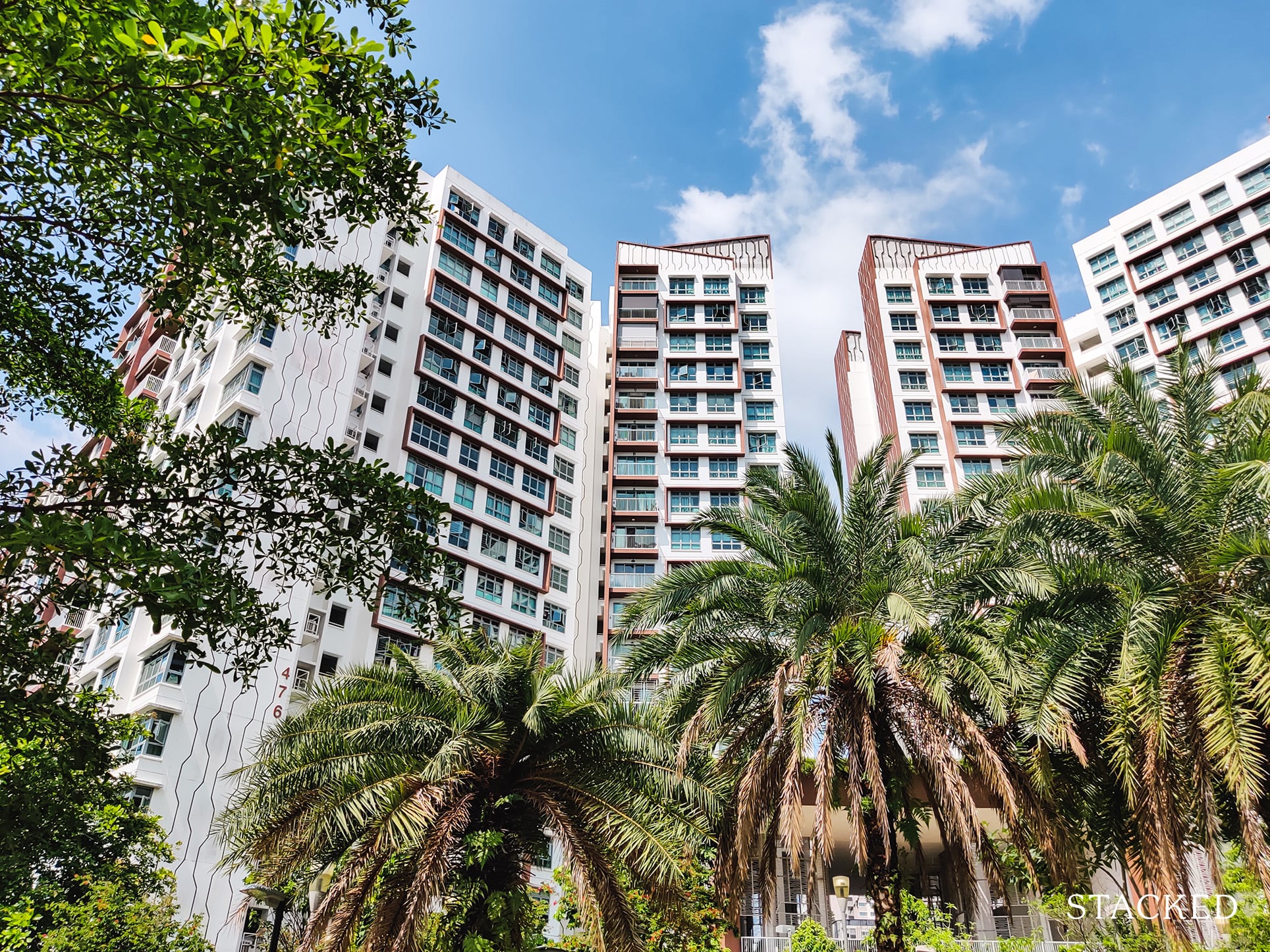
However, units on the west side will not only face the main road (which is noisier and probably dustier), but due to the 45-degree angling of the blocks, these units would also get direct west afternoon sun towards the middle and end of the year, depending on whether it’s a south-west or north-west facing.
If you are looking at a 5-room flat, do note that only 1 stack doesn’t get any river/greenery view – stack 562.
While stack 586 and 588 do not face the east side, the north orientation does offer a good unblocked view of the winding Serangoon River.
For the 4-room flats, only 11 out of 25 stacks do not have the river/greenery view.
Hougang Capeview Pricing Review
And so the golden question is, just how much damage would a river-facing unit cost to you?
As with Waterway Woodcress, I’ll isolate the blocks with river-facing views and those without given the HDB does not showcase the exact stacks in the transaction database.
Unfortunately for Hougang Capeview though, there were no clean comparisons between a block with a specific flat type having views, and one without at all.
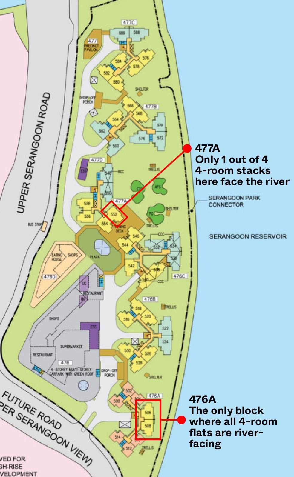
The closest I could get was block 476A, where all 4-room flats face the river, and block 477A where only 1 out of 4 stacks faces the river.
To investigate this, I would look at the minimum and maximum transacted prices of these blocks broken down by its storey range.
| Block 476A | Block 477A | |||||
| Storey | Min. Resale Price | Max Resale Price | No. Tnx | Min. Resale Price | Max Resale Price | No. Tnx |
| 01 TO 03 | $463,888 | $550,000 | 2 | |||
| 04 TO 06 | $578,888 | $578,888 | 1 | |||
| 07 TO 09 | $590,000 | $595,000 | 2 | $470,000 | $505,000 | 4 |
| 10 TO 12 | $580,000 | $580,000 | 1 | $520,000 | $550,000 | 4 |
| 13 TO 15 | $490,000 | $490,000 | 1 | |||
| 16 TO 18 | $580,000 | $612,000 | 2 | $625,000 | $625,000 | 1 |
| 19 TO 21 | $588,500 | $588,500 | 1 |
As with all data, do note that the low number of transactions here means that it may not be the best representation of the price here. But this is the best that I can work with at this point.
Block 476A is the river-facing block. Block 477A only has 1 river-facing stack. I will assume the lowest price in block 477A is a non-river facing unit.
I have also avoided looking at average prices in this regard, because the data wouldn’t point to much if I averaged 1 river facing transaction and 1 non-river facing transaction.
Now if you refer to the table above, you can see that on floors 7 to 9, the max price is $595K in block 476A (river-facing), while the minimum is $470K in 477A (probably non-river facing).
For storeys 10 to 12, the max is $580K (river-facing) while the minimum is $520K (probably non-river facing).
This implies a premium difference of around $60K to $125K. Other factors like floor difference and renovation comes into play here.
To me, this premium does sound about right. You get both the river/greenery view and the park connector as compared to the main road. Such a stark difference in facing justifies a stark difference in price.
In my opinion, the river-facing view that is more peaceful and quiet would mean that prices would be stickier in the longer-run. There is little to no differentiating point between the west-facing units and any other HDB block that doesn’t have this view in all other projects around this vicinity.
I am assuming the $625K on floor 16-18 is a river-facing unit for 477A. If it is not, then I believe this buyer paid too much, or the renovation must be really, really good.
So how do prices at Hougang Capeview fare compared to developments around it?
| Project | Lease Start Date | 3-Room | No. of Tnx | 4-Room | No. of Tnx | 5-Room | No. of Tnx |
| Hougang Capeview | Mar-16 | $376,000 ($519 psf) | 8 | $528,888 ($530 psf) | 63 | $708,000 ($582 psf) | 39 |
| Hougang Parkview | May-15 | $360,000 ($499 psf) | 13 | $458,000 ($461 psf) | 48 | $595,000 ($489 psf) | 27 |
| Parkland Residences (DBSS) | Oct-14 | $466,000 ($646 psf) | 18 | $623,000 ($629 psf) | 24 | $760,000 ($639 psf) | 29 |
Within Hougang Capeview’s vicinity are Hougang Parkview and Parkland Residences DBSS.
Hougang Parkview is clearly the more affordable HDB here given it has lesser amenities (no NTUC FairPrice at its doorstep, no Park Connector next door, no greenery-facing view).
Hougang Capeview is also about 1-year older, so it’s easy to see why it would cost more.
Buyers who really want to stay in the area but cannot afford the higher quantum that Capeview demands can look towards Parkview.
But there’s also a strong contender in the area – Parkland Residences.
This DBSS boasts an amazing greenery view too, with Punggol Park right next to it.
It is, however, significantly more expensive on all fronts (both quantum and $PSF).
Unless you are truly into outdoor spaces, it is hard to justify paying significantly more for the DBSS given how both are rather inconvenient. If it were up to me, I would go for a river-facing unit at Hougang Capeview compared to a park-facing view at Parkland Residences if that saves me $100,000.
But again, this would depend on personal preferences. You would have to visit both development’s units and see if this difference is price is something you would want to pay.
Our Take
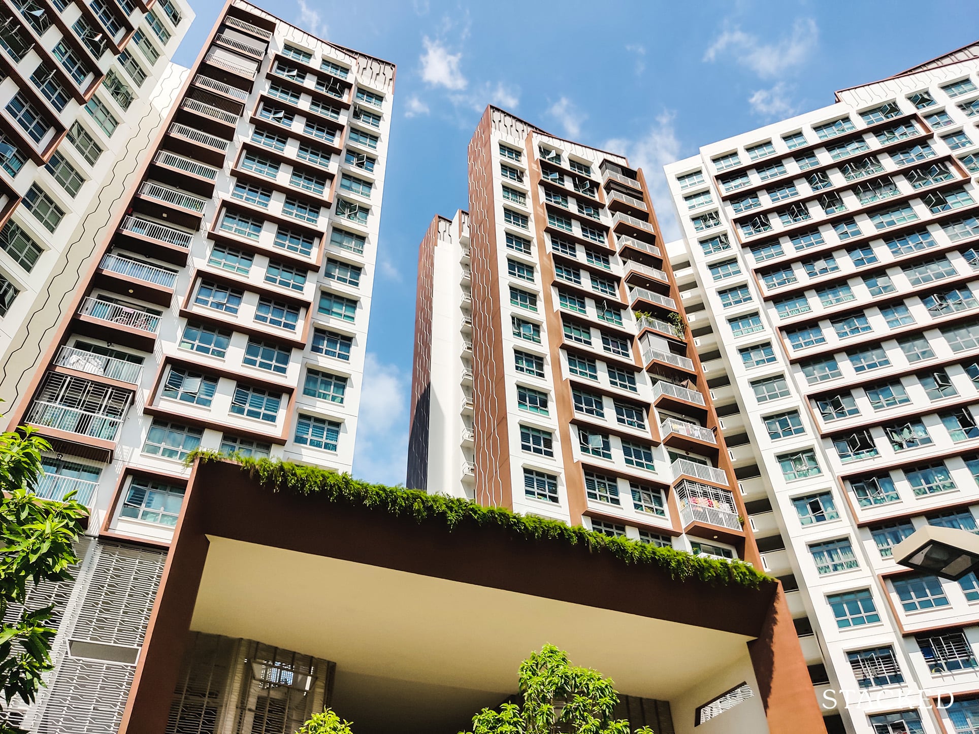
Overall, I believe Hougang Capeview’s river-facing units offers plenty to those looking for a tranquil place to live with just some slight inconvenience.
These units here promises views for a long time to come, and having a 24-hour food court at your doorstep goes a long way.
You would also be guaranteed a good sunrise view plus no afternoon sun to boot. With all these considerations, I can see why prices are as such.
While it is isn’t near the MRT, the bus stop is right outside the development. This means that with little effort, you can get to the MRT station within 8 to 10 minutes. The journey there is also fully-sheltered!
Those who aren’t particular about the views or tranquility can also consider the west side, but bear in mind that you would have plenty of other HDBs to choose from as well, so buyers of such units must find place this locale as a priority (e.g. close to parents).
Personally for me, the river-facing units are a strong contender and one I would seriously consider.
At Stacked, we like to look beyond the headlines and surface-level numbers, and focus on how things play out in the real world.
If you’d like to discuss how this applies to your own circumstances, you can reach out for a one-to-one consultation here.
And if you simply have a question or want to share a thought, feel free to write to us at stories@stackedhomes.com — we read every message.
Reuben Dhanaraj
Reuben is a digital nomad gone rogue. An avid traveler, photographer and public speaker, he now resides in Singapore where he has since found a new passion in generating creative and enriching content for Stacked. Outside of work, you’ll find him either relaxing in nature or retreated to his cozy man-cave in quiet contemplation.Need help with a property decision?
Speak to our team →Read next from HDB Reviews
Editor's Pick Clementi Towers Review: A Rare Integrated HDB That’s Incredibly Convenient (With Unblocked Views)
Editor's Pick Centrale 8 DBSS Review: Relatively Convenient HDB Living Close To MRT & Amenities
HDB Reviews Park Central @ AMK DBSS Review: Close To Mall, MRT And Amenities But Needs Better Maintenance
HDB Reviews Adora Green DBSS Review: Great Views, Amenities And Affordable Albeit Far From MRT
Latest Posts
PRO Pro HDB Lease Decay In Woodlands Is Accelerating — With One Flat Type Seeing Faster Declines
Singapore Property News Dover Dr GLS Sees Top Bid of $951M — Launch Prices Could Exceed $3,100 PSF
Singapore Property News A Rare Freehold Food Factory Is On Sale For $38M — What Else Is Selling In Kallang?






0 Comments