From 8 Failed BTO Attempts To A Resale HDB With A Dreamy View: A Singaporean Couple’s $75k Renovation Journey
July 10, 2023
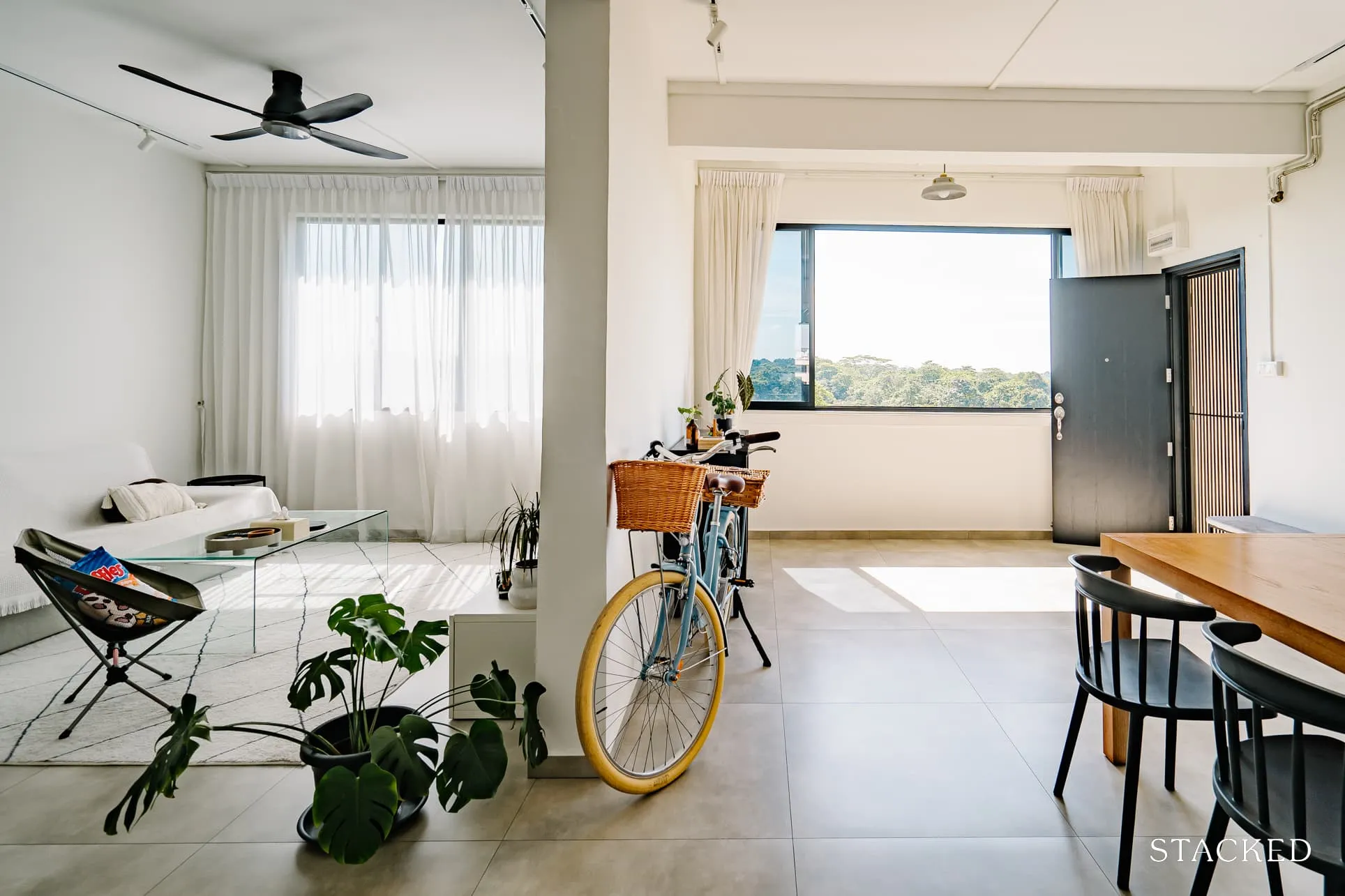
Like many Singaporean couples over the last few years, SX and JA (@122sqm) found it a challenge to find a BTO home.
“Despite trying BTO 8 times over the past years, our queue numbers were either out of the range or left with low-level units,” SX said.
However, their fortunes took a turn when they chanced upon a resale unit listed on PropertyGuru. Instantly smitten by the unit’s layout, prime location, and unobstructed view of the sprawling Bukit Timah Nature Reserve, it was a case of love at first sight for both of them.
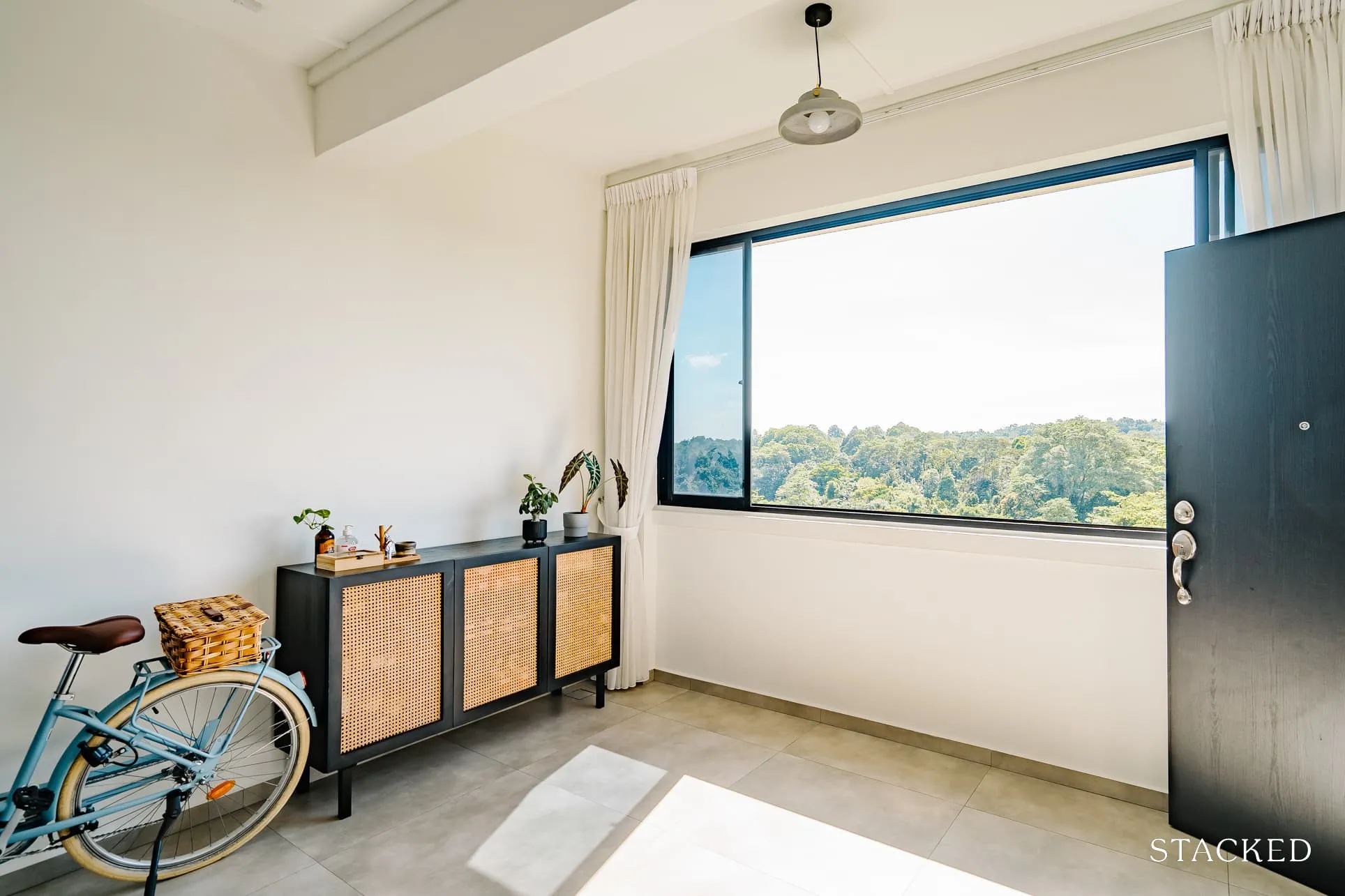
It was a 5-room HDB resale flat located at Bukit Panjang and is within walking distance of nearby amenities. There are also plenty of food and transport options available in the vicinity and in proximity to their parent’s place.
“We OTP within a week,” SX said.
But this is not the end of their story, as their reno journey started with conflicting views on the design and style of the house. One wanted something industrial, while the other preferred a Bohemian theme. This contrast helped each of them to think out of the box and create a home that’s uniquely their own – one that they both were comfortable with.
Let’s take a look at how they were able to achieve this, starting with the outcome of their renovation.
So many readers write in because they're unsure what to do next, and don't know who to trust.
If this sounds familiar, we offer structured 1-to-1 consultations where we walk through your finances, goals, and market options objectively.
No obligation. Just clarity.
Learn more here.
How The Renovation Journey Turned Out
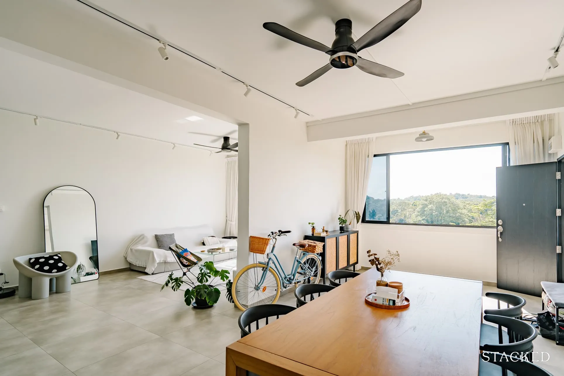
The couple started out with a $65k budget but had to allocate more due to unforeseen hiccups along their journey. Hacking, tiling works, brand new doors and door frames, and the windows took up most of the portion. “At the start of the renovation was the hacking works,” SX recalled. “We had to engage an external PE to get approval to hack our balcony wall partition.”
“We thought we could overlay the floor, but we had to hack away the granite floor as it was in bad condition. We used 800 x 800 cm floor tiles to make the space look larger, so there were additional costs due to the workmanship. Using small mosaic and pattern tiles at both kitchen and bathrooms definitely also added more costs to the overall quotation.”
They also outsourced their kitchen countertop from an external supplier as their project manager did not have contact with the stainless steel supplier. All in all, the cost of the renovation added up to $75K.
She said they couldn’t quite decide on an interior theme, and so they ended up with a classy and timeless look that both of them are comfortable with, a place where they can relax after work.
The minimalist look of the monochrome palette appealed to JA, so they used wood furnishings and plants to add some life to the space. “After all, we wanted something comfy and cosy where we can relax after work.”
They decided to keep the original layout as they had a rough sense of what they wanted, plus, having a straightforward, squarish layout definitely helped them out with space planning. Here’s what their home layout looks like before and after the renovation.
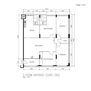
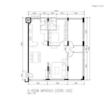
Unlike many other homes, their house first opens up to the dining room and kitchen before seamlessly connecting to the living room and the bedrooms. The dining room is also separated from the living room, which gives more space for hosting their family and friends.
Let’s take a tour of their place and visually experience the home they created.
Living Room
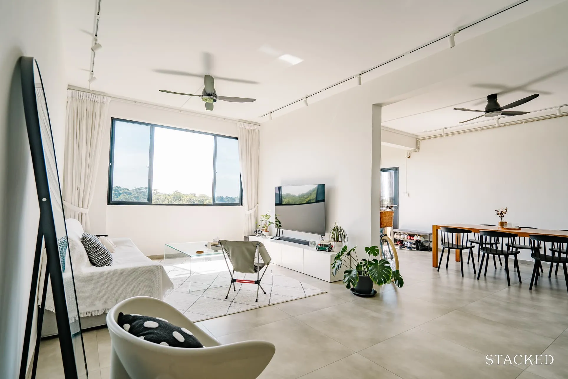
They wanted to hack away the wall between the dining and living area, but the PE didn’t approve of it, so they had to box up the wall to make it look flush and seamless.
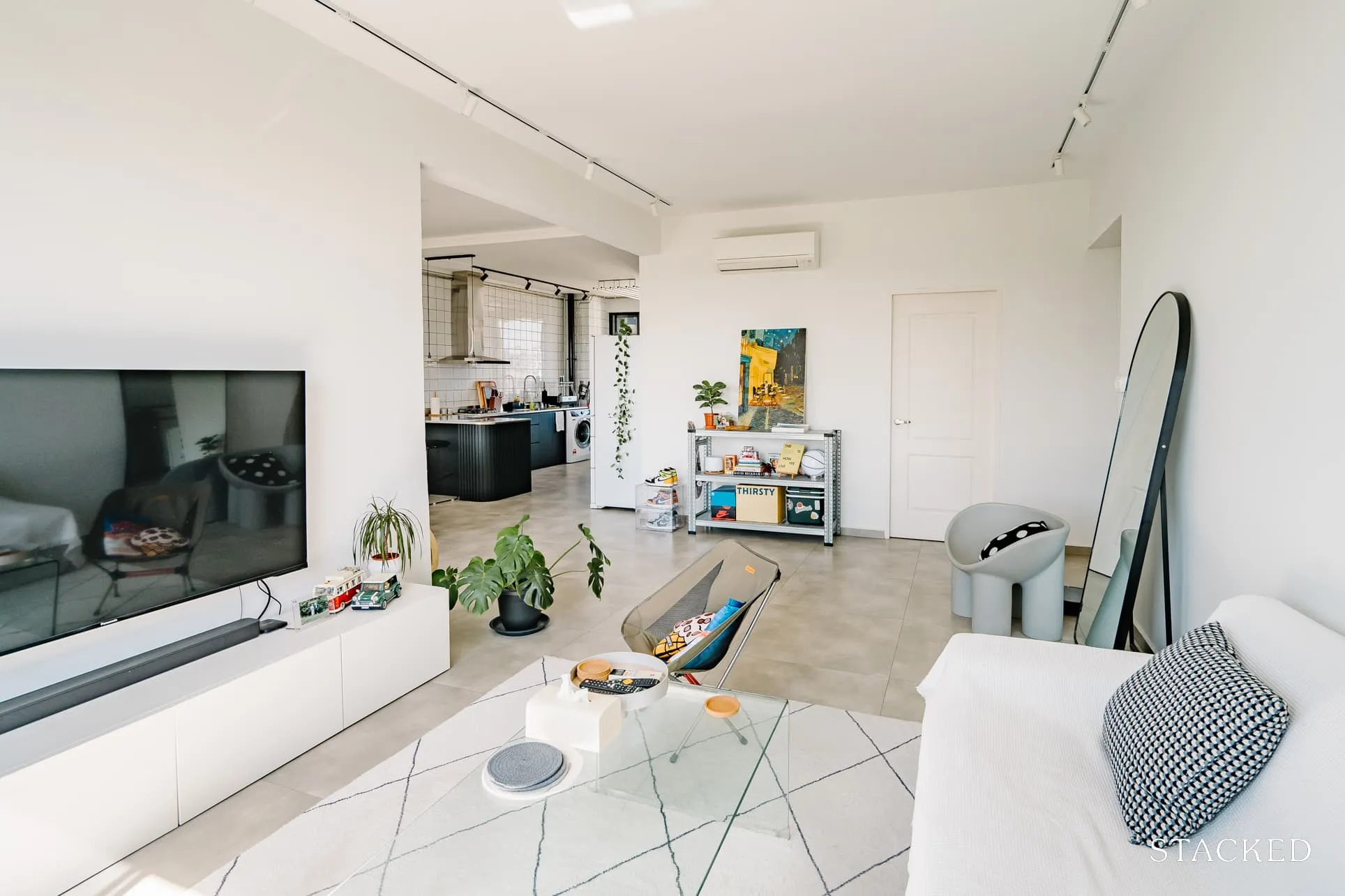
“We also placed the sofa diagonally towards the kitchen so that we could create conversations while one of us is cooking,” SX said.
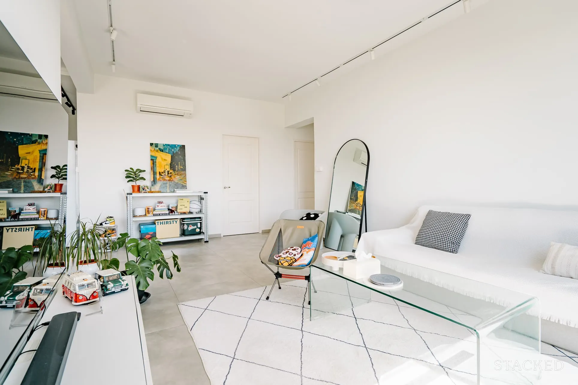
They chose white walls throughout the space to brighten up the flat and give the illusion of a bigger space. Plus, the use of sheer curtains from ceiling to floor helped to make the house look soft and airy, allowing plenty of light to enter.
Plants are also used to liven up the space a little. “We decided not to have any built-ins in the living so that we can have the flexibility to move things around if we ever get bored.”
Using a mix of pieces like the Driade Roly Poly and a camping chair, helped to keep the visual interest in the space.
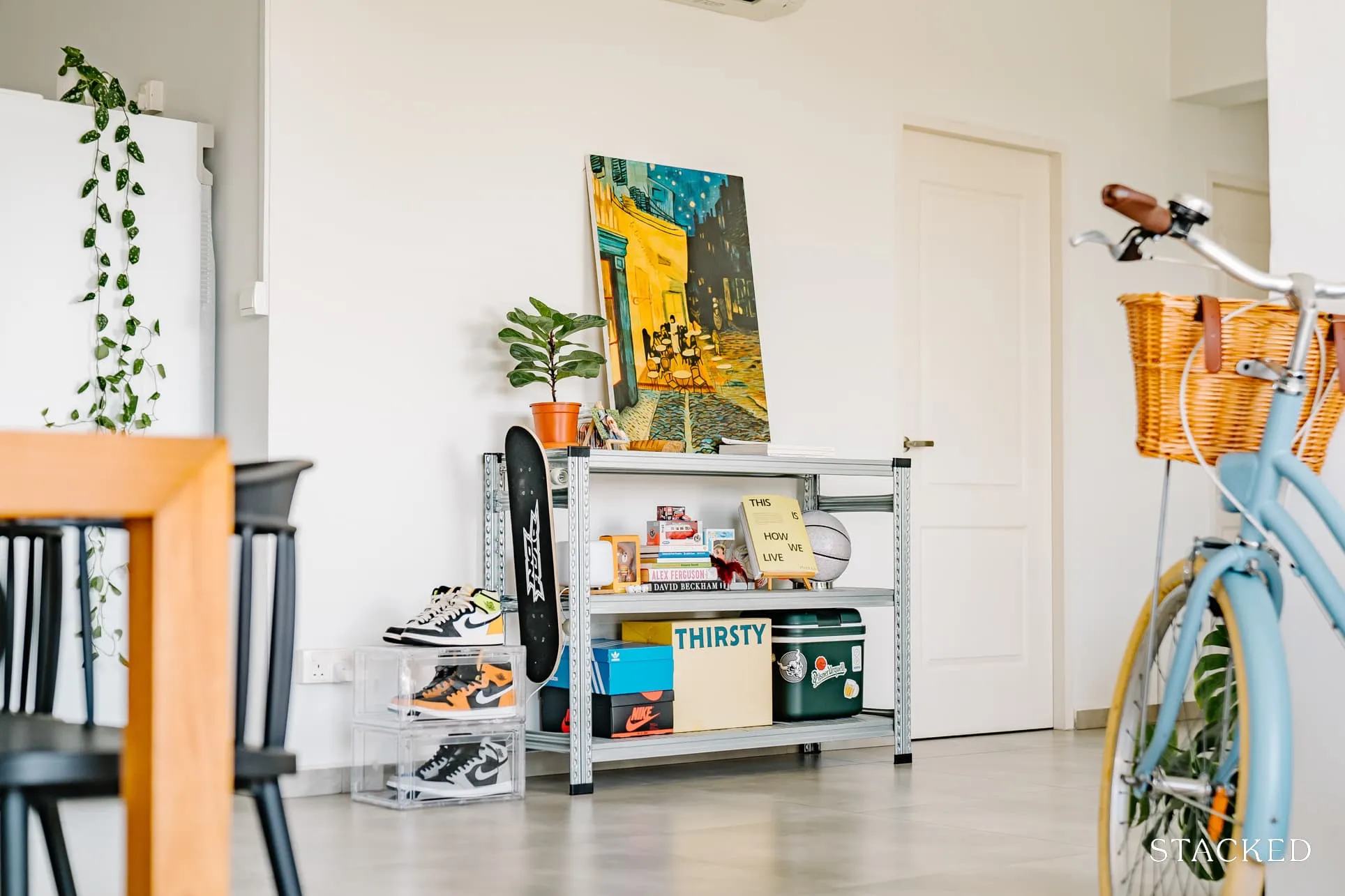
They also have a unique ‘memory’ corner where they put all their favourite items, such as books, souvenirs, and figurines that they collected over the years through their travels.
Dining Room
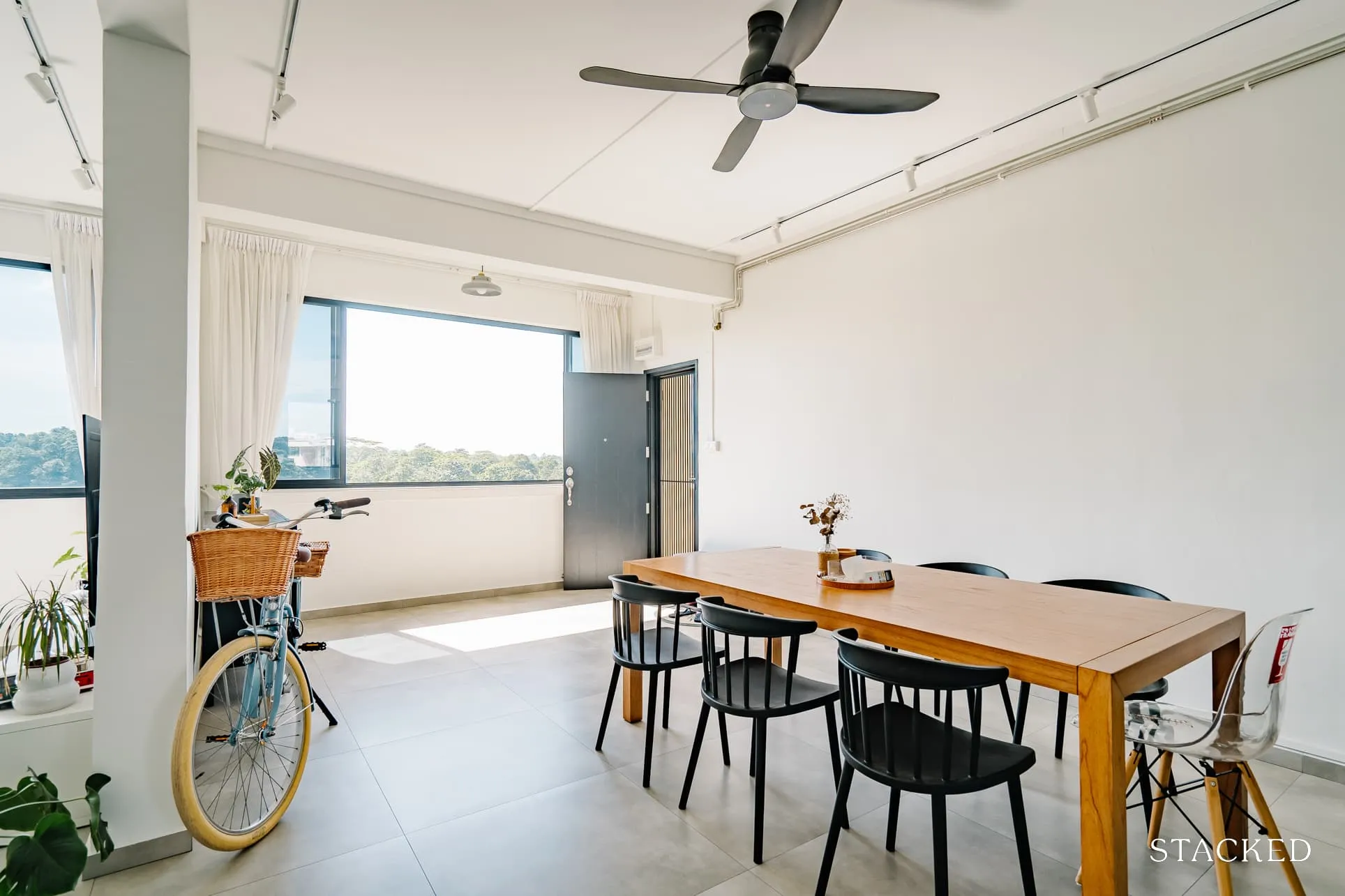
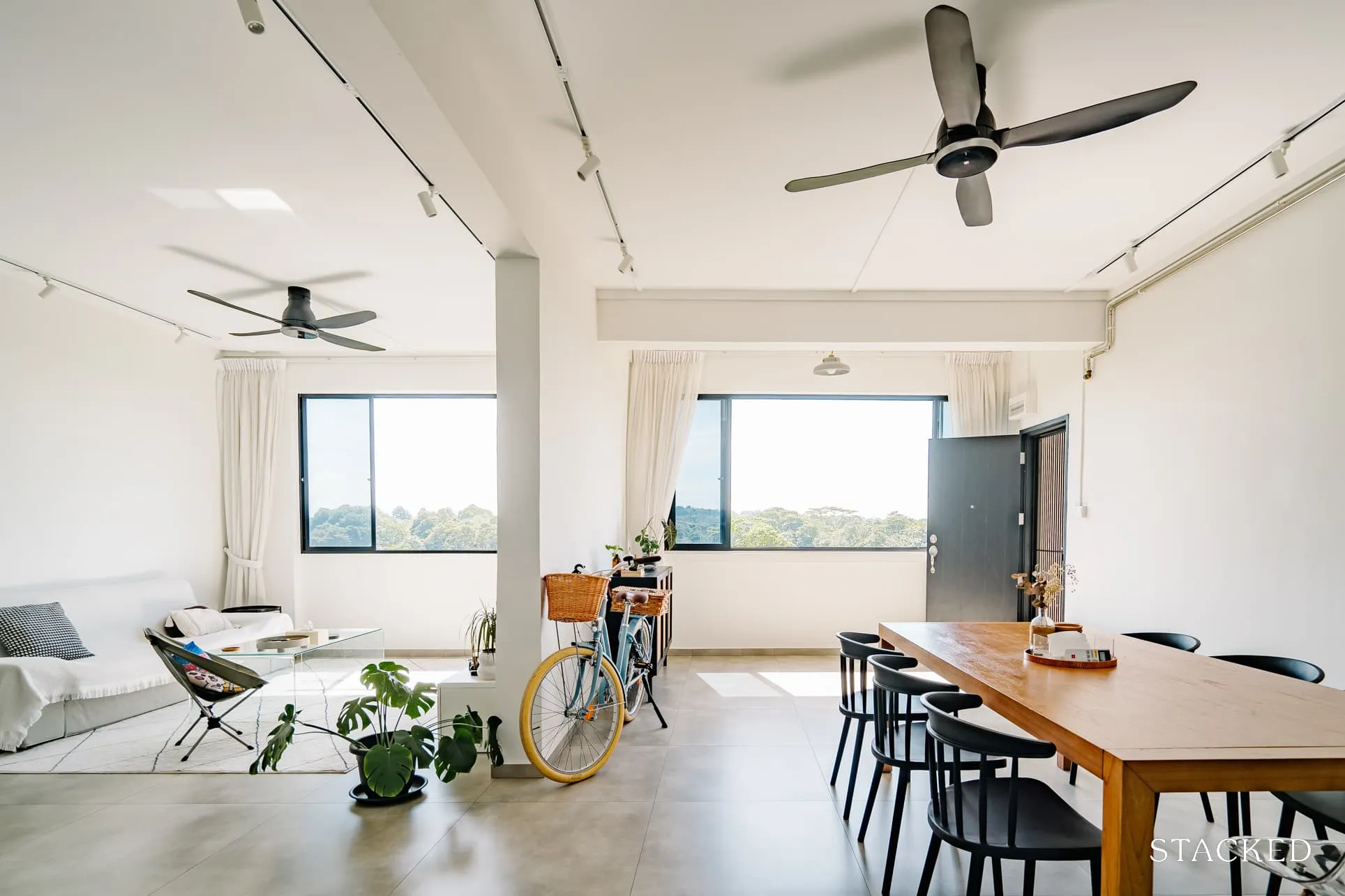
While they spend a lot of time in the living area, their guests love to hang out in the dining area. “We only have one air-con facing the living area – due to bad planning, luckily we installed the ceiling fan above the dining area, which really helps to regulate the airflow.”
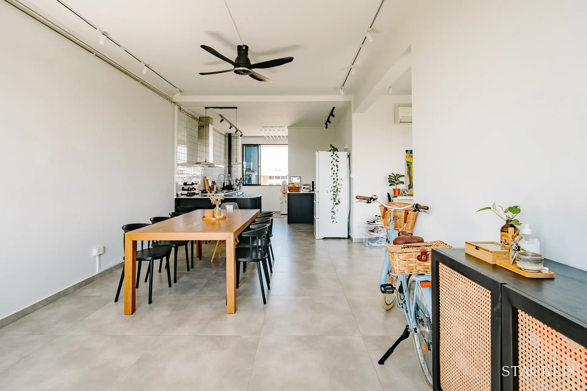
They wanted to have a big dining table to host family and friends over during special occasions, so they chose a 2.1m table.
The space was even spacious enough for them to hold their ROM, and they managed to have an intimate wedding in the comforts of their own home.
Kitchen
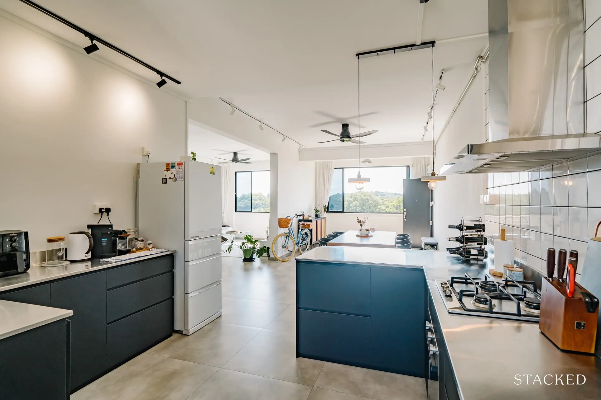
Compared to the original layout, they hacked down the existing wall and only installed bottom cabinets as having top cabinets would look heavy and less inviting.
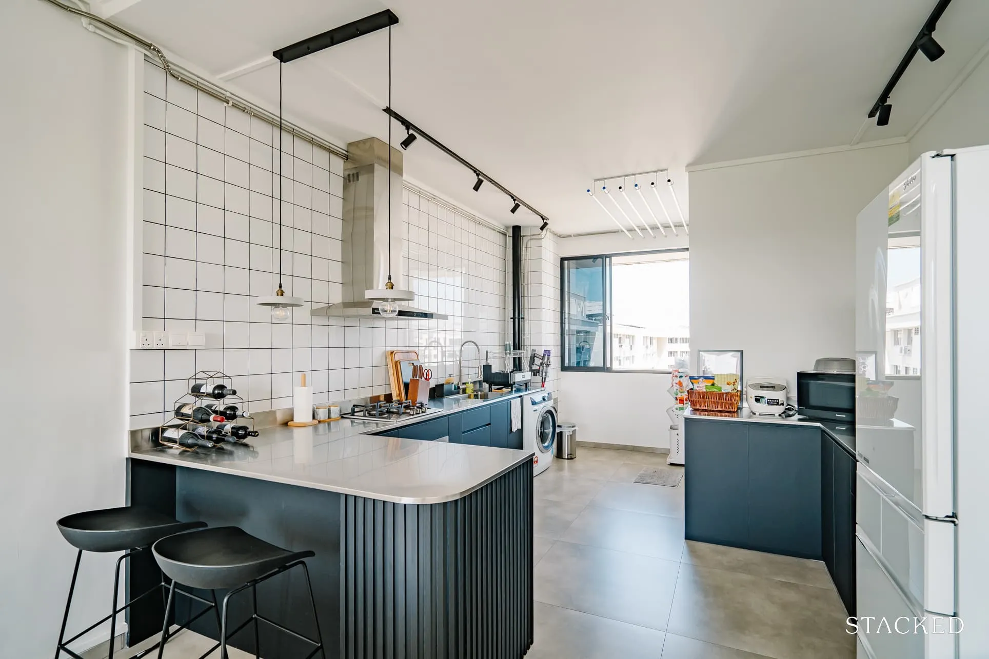
The open-concept kitchen also features an extended bar counter, along with a built-in pantry. They shared that they had initially contemplated a sliding door to compartmentalise the space and contain the cooking fumes. However, they really liked the visual of an open-concept kitchen.
More from Stacked
A 60-Storey HDB Is Coming To Pearl’s Hill — The First Public Housing Here In 40 Years
Singapore will soon see its tallest HDB project yet. Located on the site of the former Outram Park Complex, the…
“We also thought the kitchen window could help ventilate the cooking area, so we did away with the sliding door.”
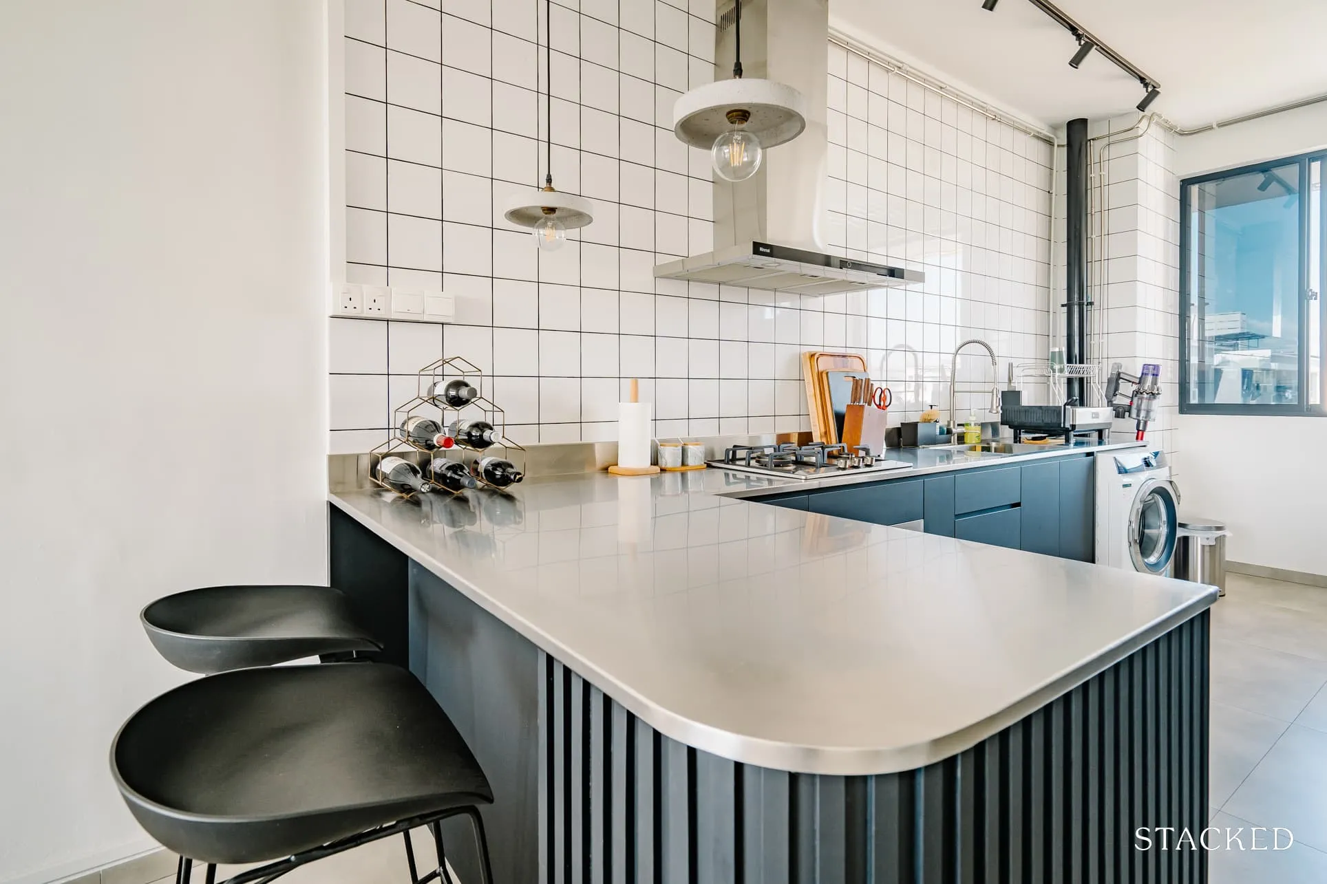
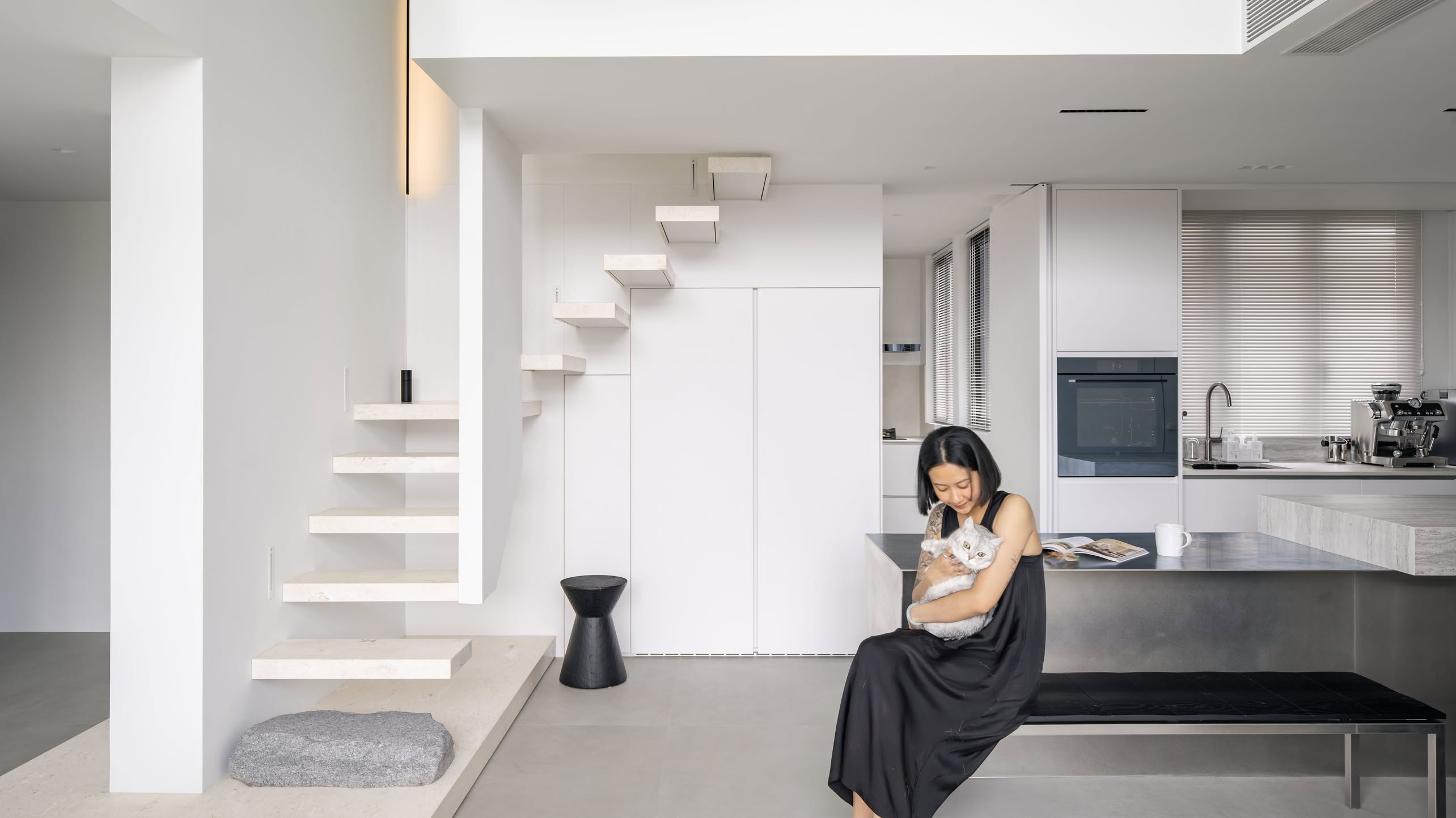
The kitchen, marked by a black-coated bar counter, immediately grabs attention with its distinctive design elements. The combination of its curved, fluted details and a backsplash wall of square white tiles set against black grout creates a contemporary yet timeless aesthetic.
The gleaming stainless steel countertop is another notable feature. It seamlessly integrates with the kitchen sink and enhances the grid-patterned tile backsplash.
Opting for this expansive countertop was “the best decision we made,” says SX. It has become an indispensable area for food preparation and serving. Moreover, it offers a perfect spot for post-dinner conversations, with a sweeping view of the dining and living areas.
Bedroom/s
The master bedroom was the smallest room among the rest of the common bedrooms as she said the toilet kind of eats into the bedroom space. The only change they did was to box up the hollow wall to make the space look balanced.
In contrast to the common living space, the master bedroom has a cosier ambiance. As they wanted a cosy environment that’s conducive to rest, they opted for a more Scandinavian-inspired design with warmer tones.
Bathroom/s
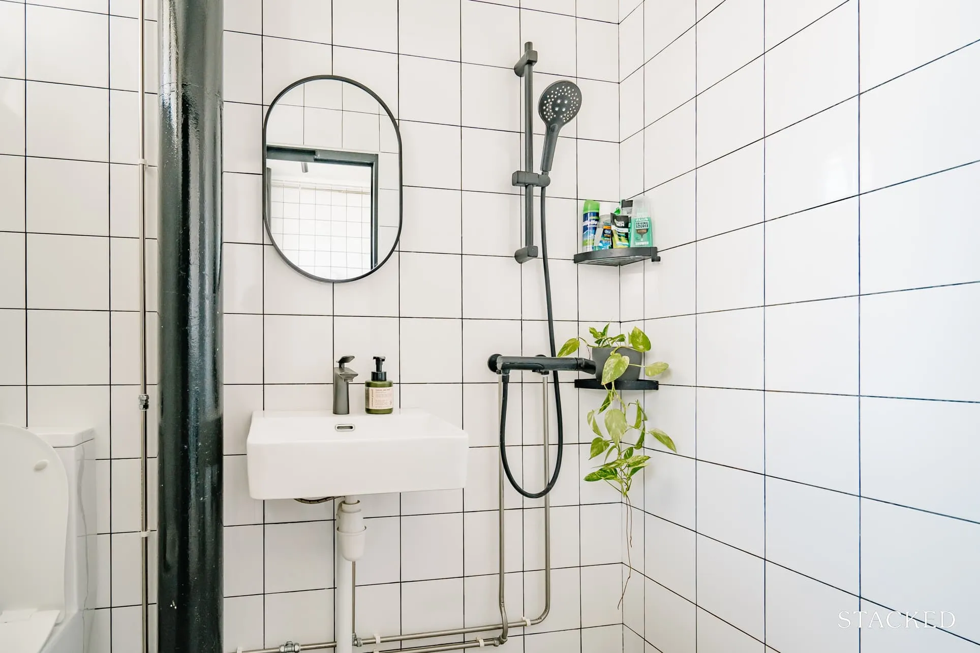
Continuing from the kitchen, the common toilet also features matching square wall tiles paired with patterned tile flooring.
As for the master bedroom toilet, they had wood tiles that act as a feature wall and blend in with the Scandi-boho vibes. The vanity set, which comes with a mirror, tap, and cabinet, was bought from Taobao.
“I was taking a risk by buying through Taobao but was glad that everything was still intact during the installation.”
Bringing The Vision To Reality
For the couple, they were happy that everything turned out well despite not engaging an ID, or having a specific theme in mind.
She revealed that they did most of their research through Pinterest and Instagram and flipping through interior design magazines. “It really helped in our thought process,” she added.
When they chose their renovation contractor, their top criteria were there should be clear communication and fast response. They picked a project manager that could communicate their ideas well to the sub-contractors, give them practical advice, as well as ensure quality workmanship.
SX said their furniture sourcing process was fuss-free as they knew exactly what they wanted after visiting showrooms and local furniture stores. “Small items like dining chairs, shoe cabinets, and coffee tables were then sourced in Taobao due to the wide varieties and styles and, of course, reasonable prices.”
We asked her what they believe is the best area of their home, and she said that they love spending most of their time in the living room. “Because of the unblocked view and greenery, it always gets very windy throughout the day, and it’s always the best area for nap time. It has kind of a hygge vibe.”
Lessons Learned From A Successful Reno Journey
Navigating the renovation process during a pandemic was an uphill task for the couple. Like many homeowners, they grappled with several challenges. These included a delay in material supplies and a shortage of manpower. “We were in the midst of renovation when we were informed that the floor tiles we wanted were unavailable due to supply issues.” SX recalls.
In response, they had to improvise, seeking a different option that bore a similar design. The renovation process spanned an entire seven months.
In hindsight, SX generously shares a few valuable lessons from their renovation journey, hoping to spare others the same complications.
Firstly, they discovered that larger tiles for the kitchen backsplash and bathrooms are a more practical choice over small mosaic tiles. “While it does achieve the aesthetic we want, we faced a lot of issues having uneven grout and holes in the grout not filled up,” she explains. The couple and their project manager ended up rectifying these issues personally during the renovation’s final stages.
Another unexpected snag was their choice of black toilet fixtures and accessories. While appealing to the eye, SX noticed that these black fixtures were more susceptible to wear and tear. Consequently, they demand a more careful cleaning routine.
Lastly, they had to remove the existing laundry pole due to recent HIP and instead replaced it with a retractable clothes rack, limiting the capacity and extending drying time. “We regretted not installing the electric laundry rack during the reno, so now we had a hard time drying our clothes indoors with the recent rainy season.”
Finally, they mentioned that “it’s important to be flexible and to keep an open mind. The renovation will bring about many unforeseen challenges – patience is definitely a must-have.” She also said to take time to find the pieces you really love, as it styling one’s house is always a work in progress. “Splurge on important things like lighting, electrical & kitchen appliances and while save on things like small furniture.”
At Stacked, we like to look beyond the headlines and surface-level numbers, and focus on how things play out in the real world.
If you’d like to discuss how this applies to your own circumstances, you can reach out for a one-to-one consultation here.
And if you simply have a question or want to share a thought, feel free to write to us at stories@stackedhomes.com — we read every message.
Need help with a property decision?
Speak to our team →Read next from Homeowner Stories

Homeowner Stories We Could Walk Away With $460,000 In Cash From Our EC. Here’s Why We Didn’t Upgrade.

Homeowner Stories What I Only Learned After My First Year Of Homeownership In Singapore

Homeowner Stories I Gave My Parents My Condo and Moved Into Their HDB — Here’s Why It Made Sense.

Homeowner Stories “I Thought I Could Wait for a Better New Launch Condo” How One Buyer’s Fear Ended Up Costing Him $358K
Latest Posts

Singapore Property News HDB Resale Prices Fell — But A Third Of Buyers Still Paid $800K+ Last Quarter. Here’s Why

Singapore Property News Three Strata Office Floors In Suntec Priced From $135M

Singapore Property News This Freehold Desker Road Shophouse Is Going For $10.5M















0 Comments