Are New Launch Condos In 2024 Really Shrinking In Size? The Surprising Truth About Efficient Layouts
November 15, 2024
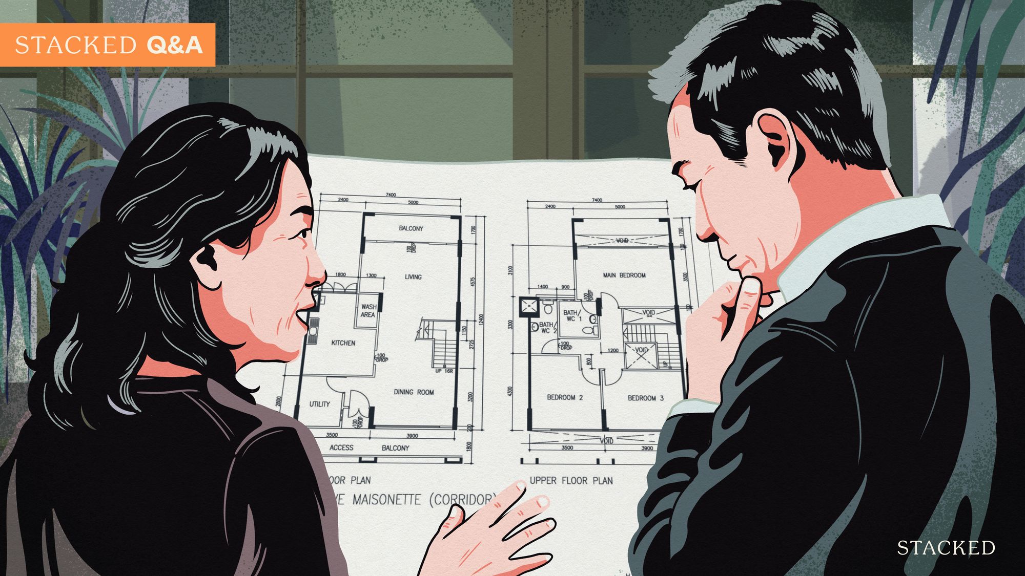
By now, it’s hard to dispute that condo units have shrunk in terms of square footage. Back in the ‘80s, even 700 sq. ft. could be considered a mere one-bedder; today, even 800 sq. ft. is sometimes marketed as a three-bedder. But a good layout is about more than raw square footage; in fact, it’s possible for a smaller unit to have fewer redundancies and more actual liveable space. Here’s a look at how things are changing, from the lens of three new launches since 2019:
So many readers write in because they're unsure what to do next, and don't know who to trust.
If this sounds familiar, we offer structured 1-to-1 consultations where we walk through your finances, goals, and market options objectively.
No obligation. Just clarity.
Learn more here.
First, a quick note on post-GFA harmonisation
Prior to GFA harmonisation rules in 2022, the square footage of a condo included even unliveable spaces. The air-con ledge, for instance, or the strata void space (the vertical space between the ground and a high ceiling) were included in the total size. This leads to the impression of some units being much bigger than they really are, and also translates to a lower price per square foot.
That aside, unit layouts have become more efficient, as developers adapt to market realities:
1. The Tapestry
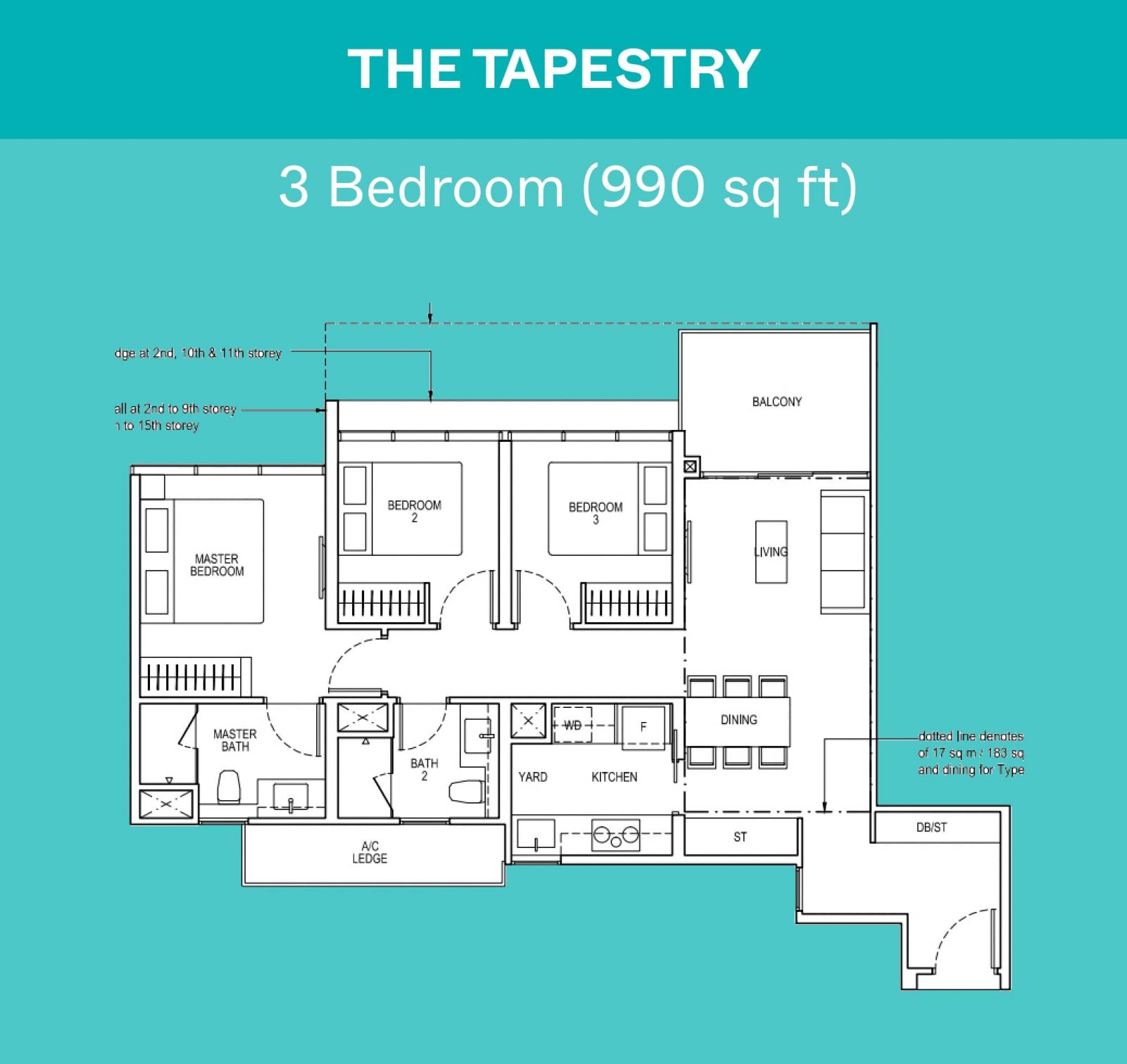
The Tapestry is one of the older layouts from the pre-GFA harmonisation days in 2021. At the time, developers were incentivised to build larger air-con ledges: these unusable areas were used to pad the total square footage of the unit, causing buyers to pay more. While the layout is quite flexible, note that it only packs three bedrooms into a 990 sq. ft. space.
Some might also point out that the long corridor space is inefficient, while the entryway is open to debate: on the one hand, it provides room for coat racks, shoe cabinets, etc. and doesn’t open directly into the living room for privacy. On the other hand, one could argue that the area is a waste, as it doesn’t do much else.
We can see how this is improved in the next newer development, which is Lentor Modern:
2. Lentor Modern
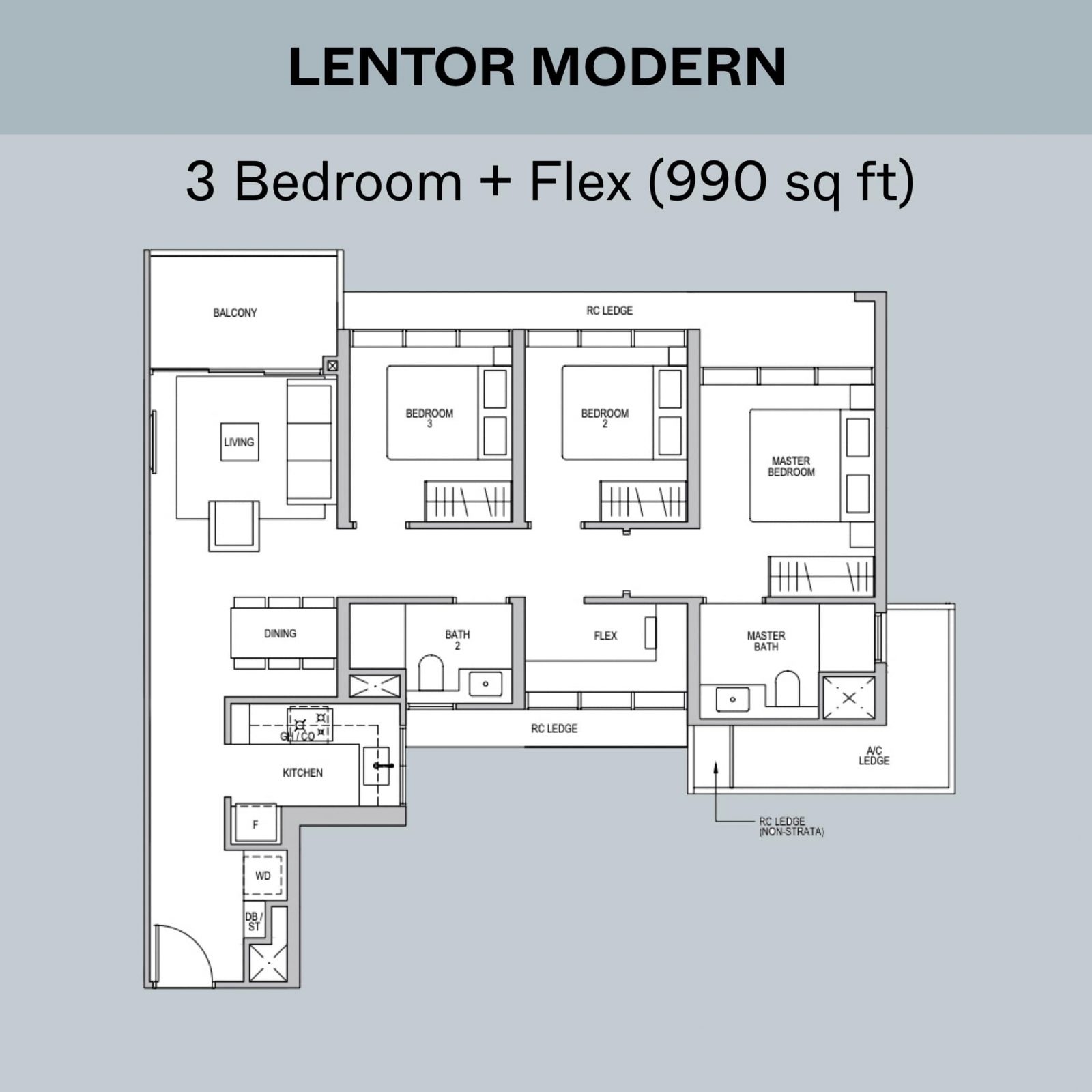
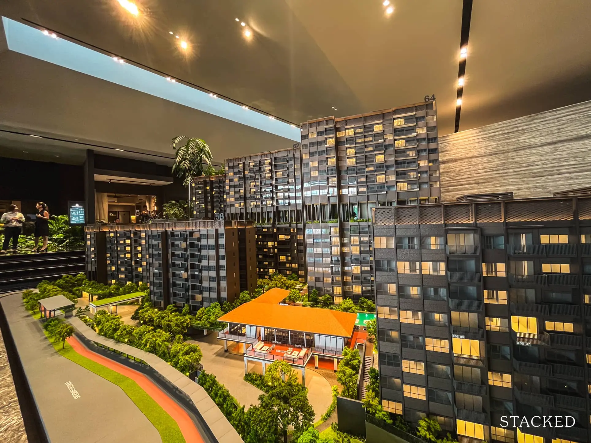
Lentor Modern is still under construction as we write this. This project was launched in 2022, just a while after The Tapestry. You’ll notice that Lentor Modern is also 990 sq. ft., like The Tapestry above. Despite being the same size however, Lentor Modern has three bedrooms and a plus one: a flexible space that can be another bedroom, a study, a home office, etc. This reflects just how much space can be chewed up by inefficiency: all those air-con ledges add up to a whole other extra room.
3. Emerald of Katong
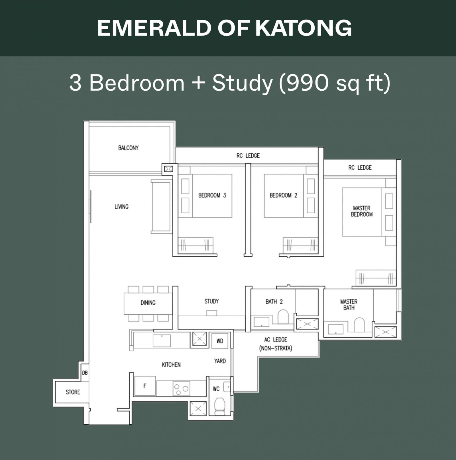
Emerald of Katong is the latest new launch on the list and is a good showcase of how efficient new launch layouts are today. The layout consists of nice squarish spaces, with both a wet and dry kitchen. Again, thanks to GFA harmonisation, we see the absence of space-wasting features like big ledges. Whilst also being the same 990 sq. ft., there’s still space for three bedrooms and a study.
The bedrooms aren’t small either: for Emerald, every one of the bedrooms can fit at least a Queen-sized bed; so you’re getting more spacious bedrooms on top of the added study. The kitchen is also quite spacious for this unit, whilst being easy to enclose (this may be a reversal of a previous trend when open kitchens were becoming the default).
Let’s look at a bigger example next:
Riviere versus The Continuum
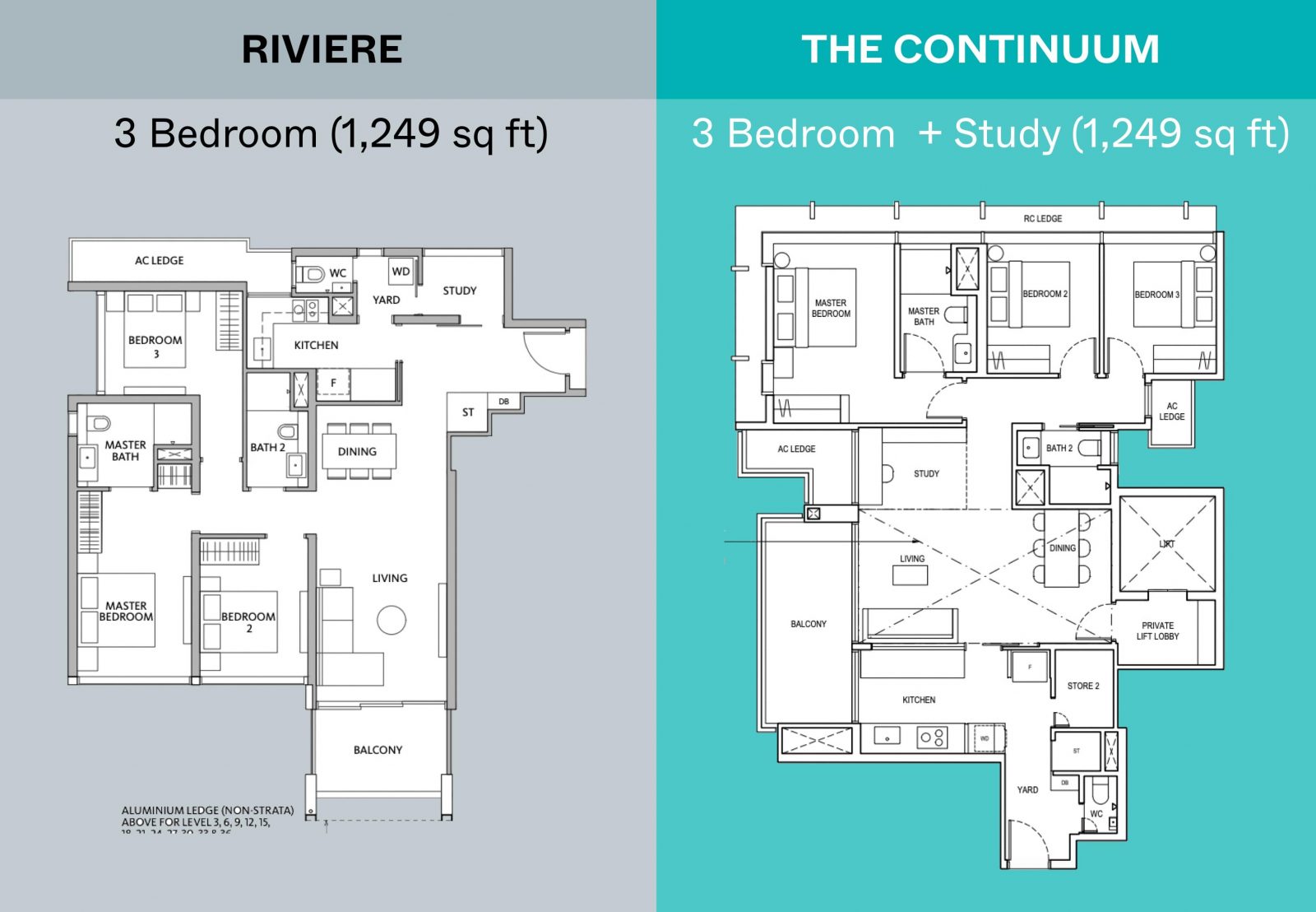
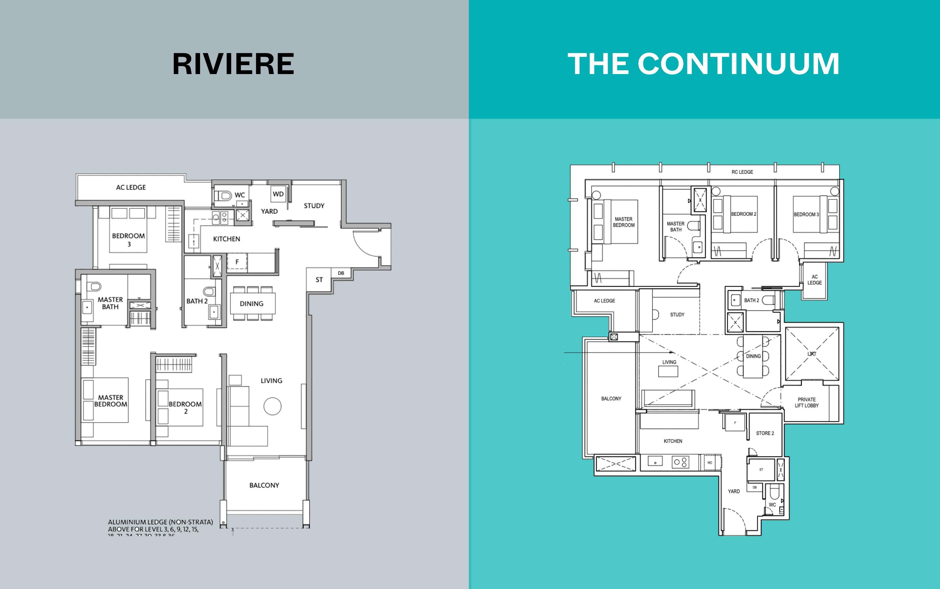
This is a larger, 1,249 sq. ft. three-bedder in Riviere that was completed in 2023; but note that it was launched before GFA harmonisation. Note the large AC ledge and balcony space, as well as the corridor leading into bedroom 3: there isn’t much you can do with this wasted space.
By contrast, The Continuum which was launched later in 2023 also has a 1,249 sq. ft. layout. Again we see that, by reducing wasted space and with a more efficient layout, Continuum can add a study into the same floor space. This is despite also having to fit a private lift lobby, and retaining a comparable kitchen and service yard.
Now in 2024, we can see the difference with a post GFA-harmonisation project – Emerald of Katong. While it isn’t exactly the same size (it’s just 10 square feet bigger), it can fit a whole other bedroom, along with the usual features such as a home shelter, store room, and yard.
We’re also seeing more versatility and fewer redundancies
While older condos may be bigger, they tend to have more in the way of corridor spaces, or oddities like wedge-shaped rooms (especially for ’80s-era condos with rounded architecture). You’ll also notice that newer condos are more likely to do away with beams or columns. It’s partly for Feng Shui reasons, but whether or not you believe, it does allow for a wider range of interior design themes.
Over the coming years, it’s likely that the emphasis won’t just be on square footage, but on how much of it is really usable. This may also stop people from using price per square foot as an overly important indicator: older condos may have a lower price per square foot while having less actual, liveable space.
At Stacked, we like to look beyond the headlines and surface-level numbers, and focus on how things play out in the real world.
If you’d like to discuss how this applies to your own circumstances, you can reach out for a one-to-one consultation here.
And if you simply have a question or want to share a thought, feel free to write to us at stories@stackedhomes.com — we read every message.
Ryan J. Ong
A seasoned content strategist with over 17 years in the real estate and financial journalism sectors, Ryan has built a reputation for transforming complex industry jargon into accessible knowledge. With a track record of writing and editing for leading financial platforms and publications, Ryan's expertise has been recognised across various media outlets. His role as a former content editor for 99.co and a co-host for CNA 938's Open House programme underscores his commitment to providing valuable insights into the property market.Need help with a property decision?
Speak to our team →Read next from Editor's Pick
Property Advice These Freehold Condos Near Orchard Haven’t Seen Much Price Growth — Here’s Why
Singapore Property News New Lentor Condo Could Start From $2,700 PSF After Record Land Bid
On The Market A Rare Freehold Conserved Terrace In Cairnhill Is Up For Sale At $16M
Property Investment Insights This 55-Acre English Estate Owned By A Rolling Stones Legend Is On Sale — For Less Than You Might Expect
Latest Posts
Property Market Commentary Yishun 10 Could Be Redeveloped Into Mixed-Use Housing Near Yishun MRT
Singapore Property News 30-Year-Old Singapore Investor Buys Ang Mo Kio HDB Coffeeshop After Owning 13 Properties
Singapore Property News Tropicana Metropark’s 80% Take-Up Signals Strong Demand for Integrated Living








0 Comments