There’s always a caveat to everything, isn’t there? There’s no question that everyone would want an Executive Apartment (if not for the lease decay). But for the buyer who doesn’t mind, it’s easy to see why these are in such demand.
Besides the larger space, the layouts are often pretty flexible too. This means that you can get quite creative with them. So whether you wish to create an ultimate bachelor’s pad or a home for a growing family of more than five people, the space affords you room to exercise your creativity.
In my previous piece, 5 layout ideas for a 4-room HDB, you’ll notice I have a strong inclination for the point block. Apart from not having any windows that open to the common corridor, there aren’t as many restrictions with regard to rearranging the layout.
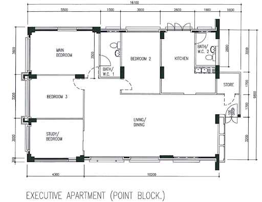
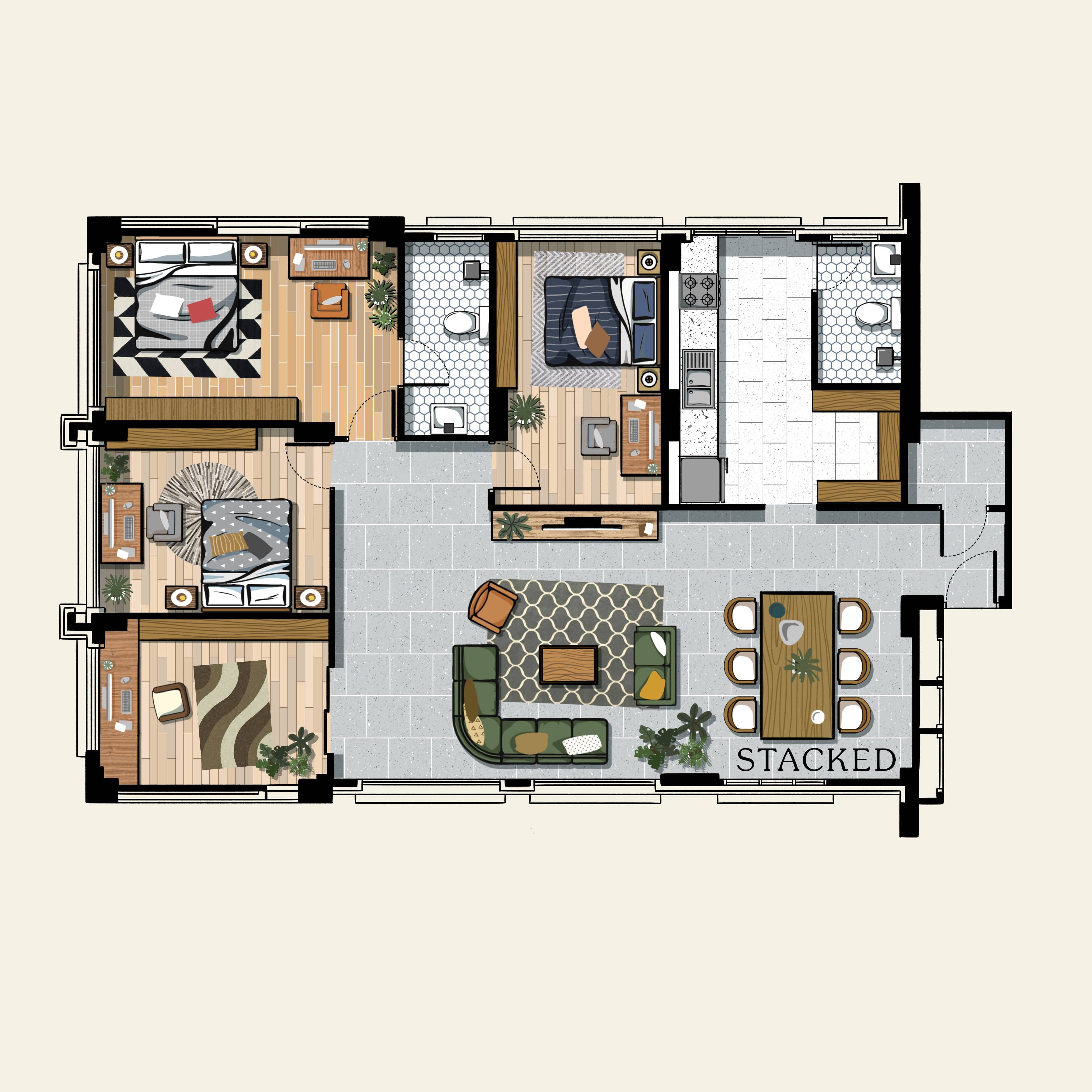
That said, there are some issues with this layout. For one, the location of the bathroom is rather inflexible. While the master bedroom enjoys an ensuite, the rest of the house will have to share a bathroom that’s located in the kitchen.
So while you do have plenty of space, the bathroom arrangements here can be quite iffy, and unfortunately, there’s not much else you can do about that. But here are a few more different ideas you can explore:
Table Of Contents
So many readers write in because they're unsure what to do next, and don't know who to trust.
If this sounds familiar, we offer structured 1-to-1 consultations where we walk through your finances, goals, and market options objectively.
No obligation. Just clarity.
Learn more here.
Option #1 – The Work-From-Home Setup
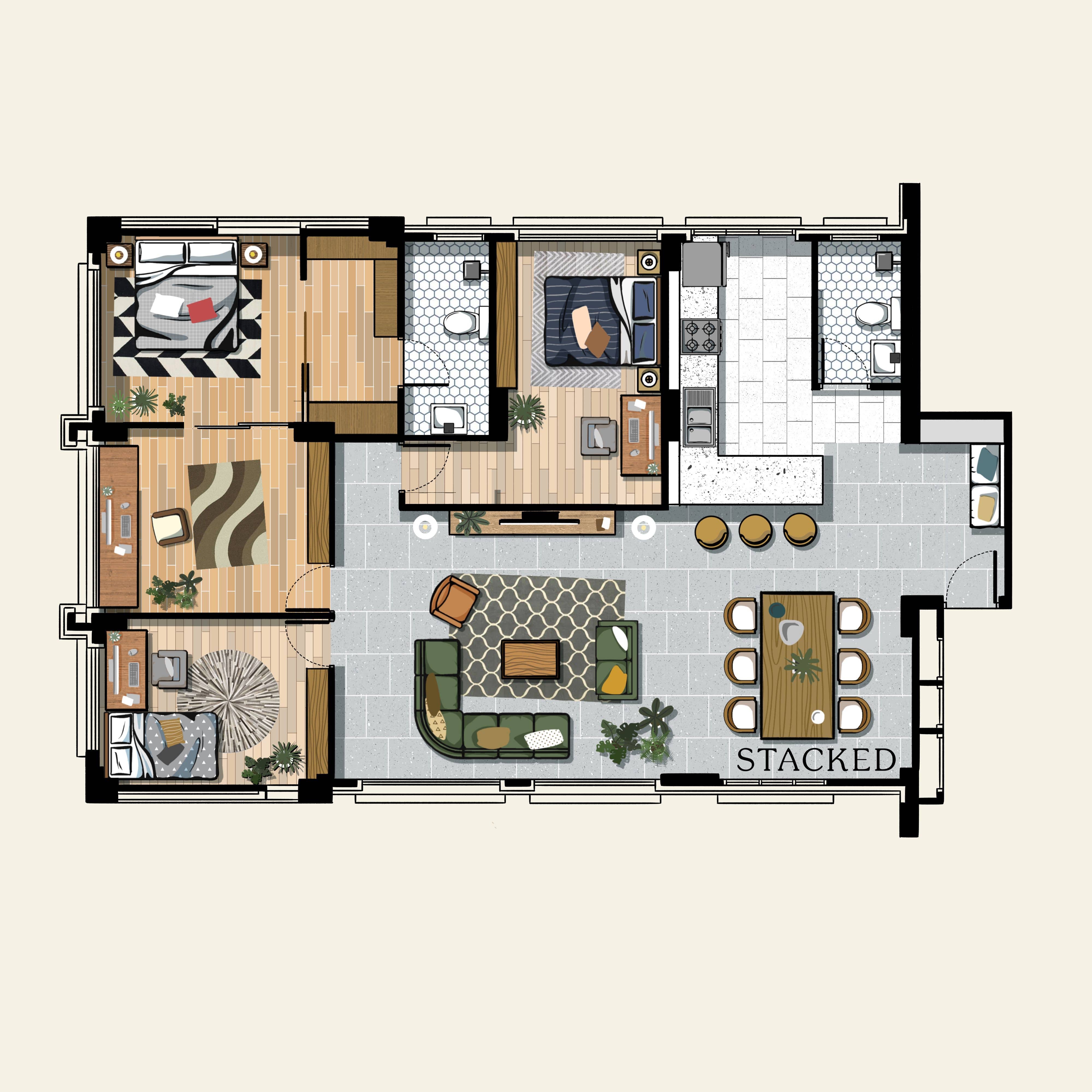
In this particular layout, the priority is to have enough space to accommodate a Work From Home (WFH) or study-from-home setup.
Since the wall and door for the storage area have been removed and replaced with a foyer, the entrance is no longer as constricting as before. With the wall separating the kitchen and dining room also hacked away, the area is now even brighter, due to light from the kitchen window.
Installing a breakfast counter ensures the kitchen remains separate from the dining area it also helps add another area for food prep or dining. I particularly love this part as it allows residents to entertain their guests, even if they’re prepping the food in the kitchen.
Each of the three bedrooms has its own space for productivity, with the master bedroom having its own separate room. This is a great option for a family with kids already in tertiary education. You can have your home office, while they have their own study area in their respective rooms.
The master bedroom has also been reconfigured to include a walk-in wardrobe, leading to the master bathroom. The home office, which was previously one of the bedrooms, is big enough to accommodate an office for two, great for the couple in the master bedroom.
The caveat with this layout is that extending one of the bedrooms has taken up valuable space in the living room. It might be an acceptable trade-off, for a family that spends most of its time working from home.
Option #2 – Entertainment-Centric
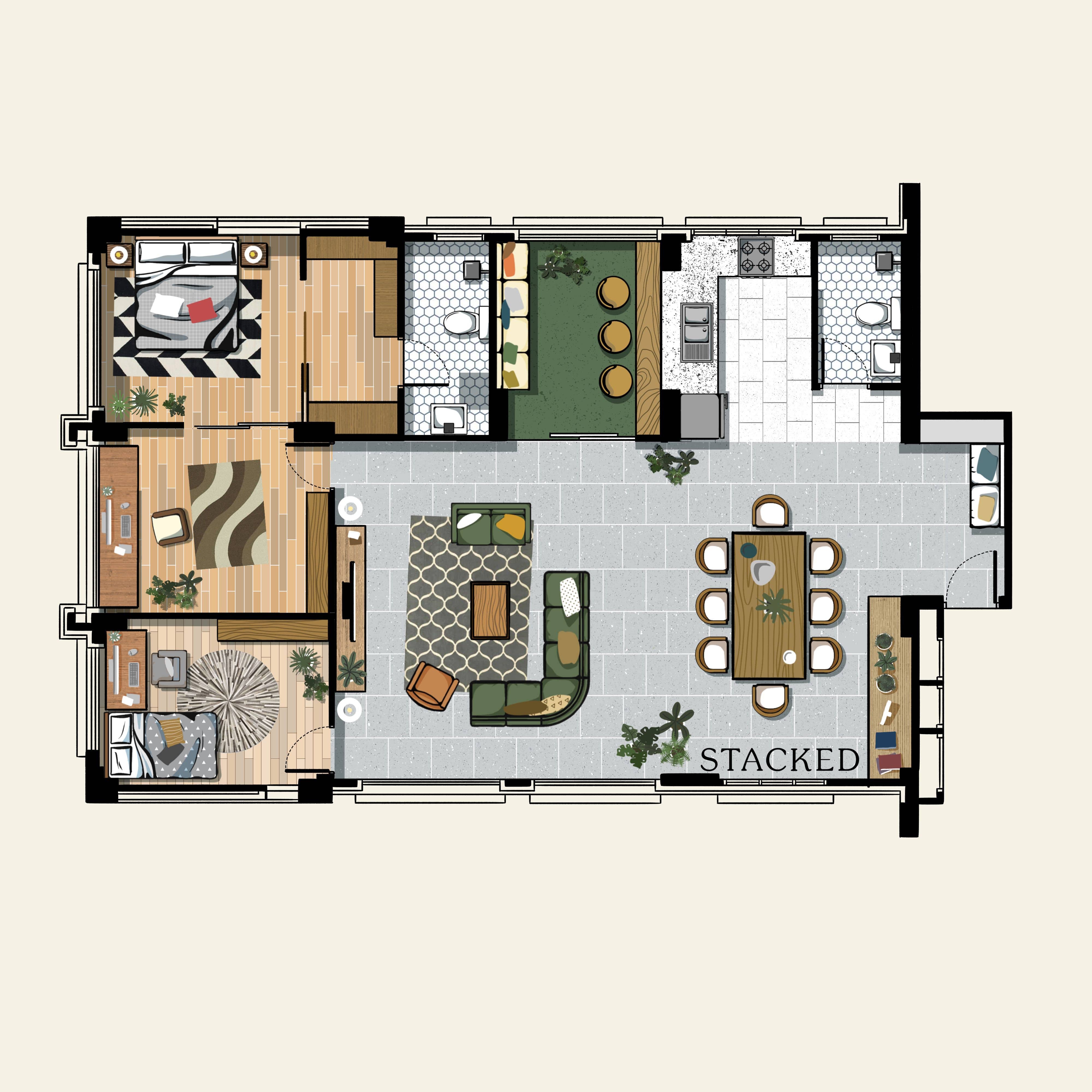
The entertainment-centric layout is focused on providing entertainment for guests and the host family alike.
It has the same open-concept kitchen as the previous design, but this time the breakfast counter has been removed to expand the dining space. A six-seater dining table can now fit in the space, and it still remains bright and airy.
The bedroom adjacent to the kitchen has been converted into a room to lounge and relax with guests. Compared to the previous layout, more emphasis is on the living room, which is expanded to accommodate more seating.
This floor plan also has a walk-in wardrobe that leads to the master bathroom, and a home office beside the master bedroom. One caveat with this design is that the number of bedrooms has been reduced, bringing it from the original three to just two. This may have some impact on resale, as most buyers prefer to have more rooms.
This layout is ideal for couples who will be staying in the unit alone as they can host parties and events while still having private areas. They can even convert the other bedroom into a pet playroom, if they choose to have a cat or a dog, or turn it into a fitness room.
Option #3 – Kitchen Maximiser
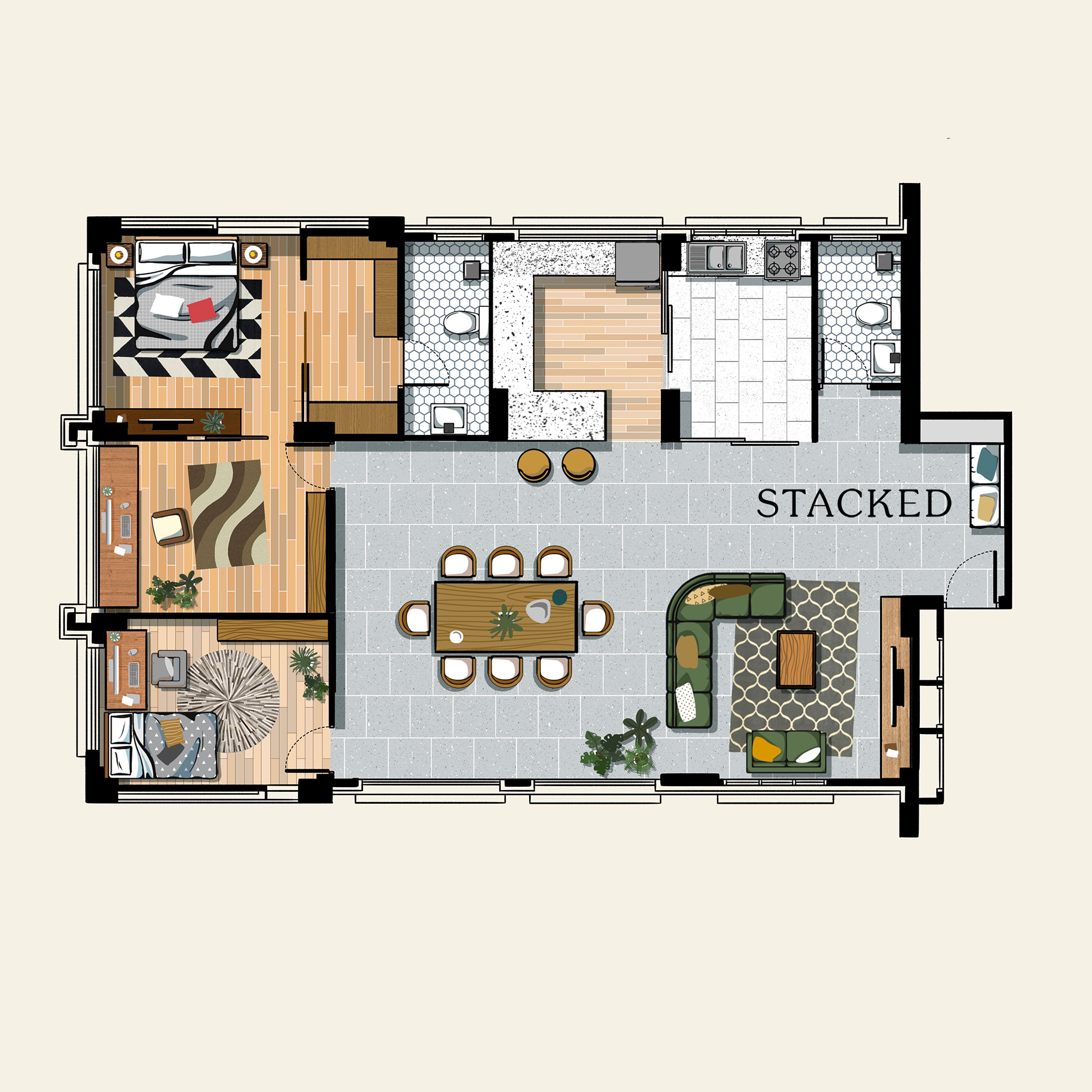
I dub this the kitchen maximiser, and it’s especially geared toward couples who love to cook and entertain guests – especially for those looking to go into private dining as a business.
One of the bedrooms adjacent to the original kitchen was removed so that the kitchen could be extended further. This setup allows the residents to have a dry and wet kitchen, with the latter enclosed by sliding glass panels. It effectively distributes the natural light all throughout while keeping odours inside the wet kitchen.
The dry kitchen is an area where guests can gather while the hosts prepare the food. If the guests are seated by the living area or the dining table, conversations can flow because of the open-concept design.
The downside of this layout is that the walk-in wardrobe takes up space in the home office, and it could be hard to walk in and out of the master bedroom if someone is currently sitting at the office desk.
If you’re planning to go with this layout, you might also convert the other bedroom into a full-fledged home office, or eliminate the cramped office space and replace it with a vanity. If you choose to go with the latter, you can convert the other bedroom into a fitness room, a guest room, or a room for future kids.
Option #4 – More Seating Capacity
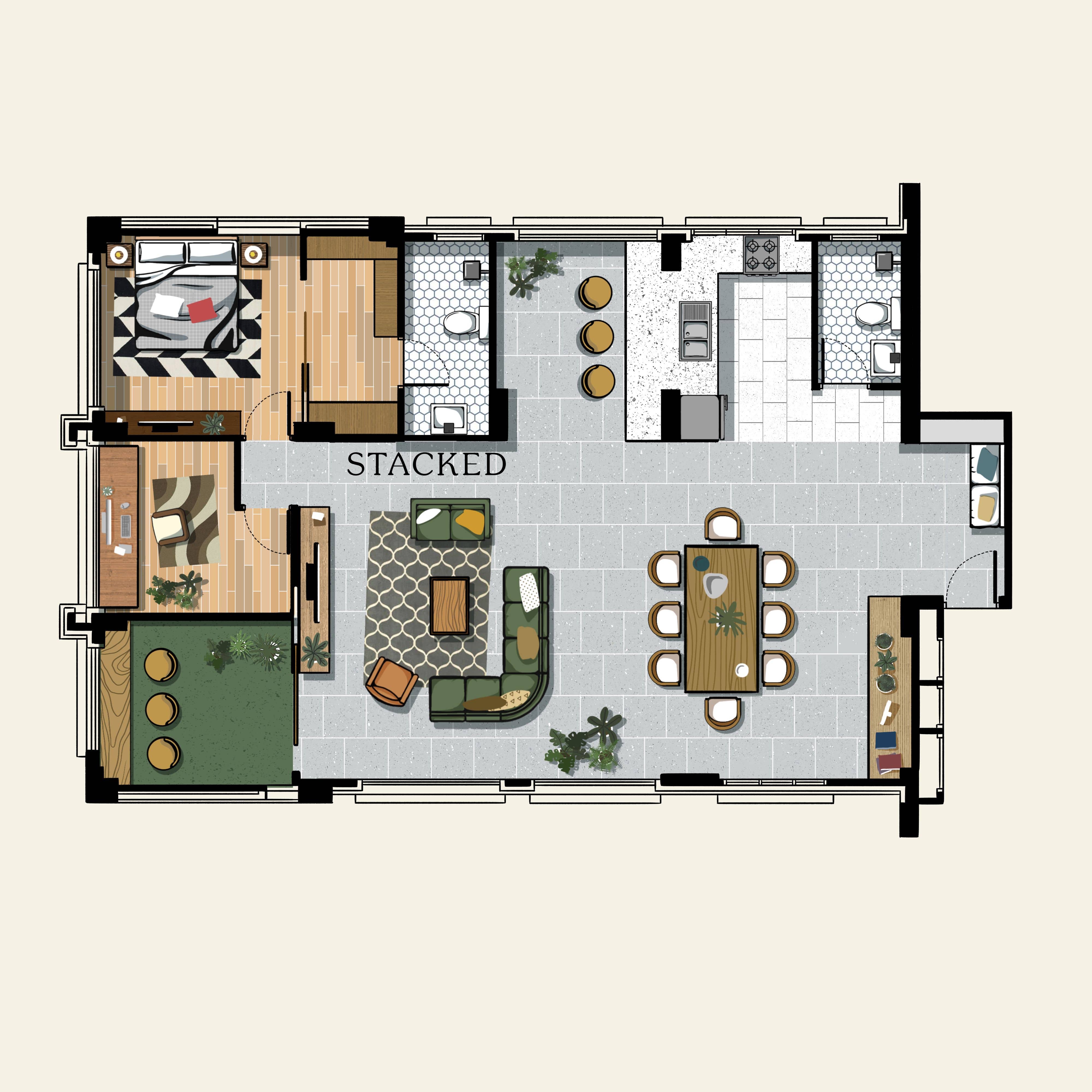
This may be a bit of an overkill, but I do know of several couples with no children that like to have friends and family over a lot. Cooking isn’t necessarily a priority as much as having more space for entertainment.
So if you do fall into this niche basket, you’ll find this layout useful. Aside from an eight-seater dining table, there are also three stools ready for seating in front of the breakfast counter. And if these are not enough, the living area can accommodate an L-shaped sofa and a loveseat.
The drawback of this layout is that it reduces the number of bedrooms to just one – the master bedroom. You can optionally have another bedroom by repurposing the lounge room.
Lastly, you can dedicate a room as a “balcony” space, or just a place to put all your plants.
Option #5 – WFH Setup Version 2
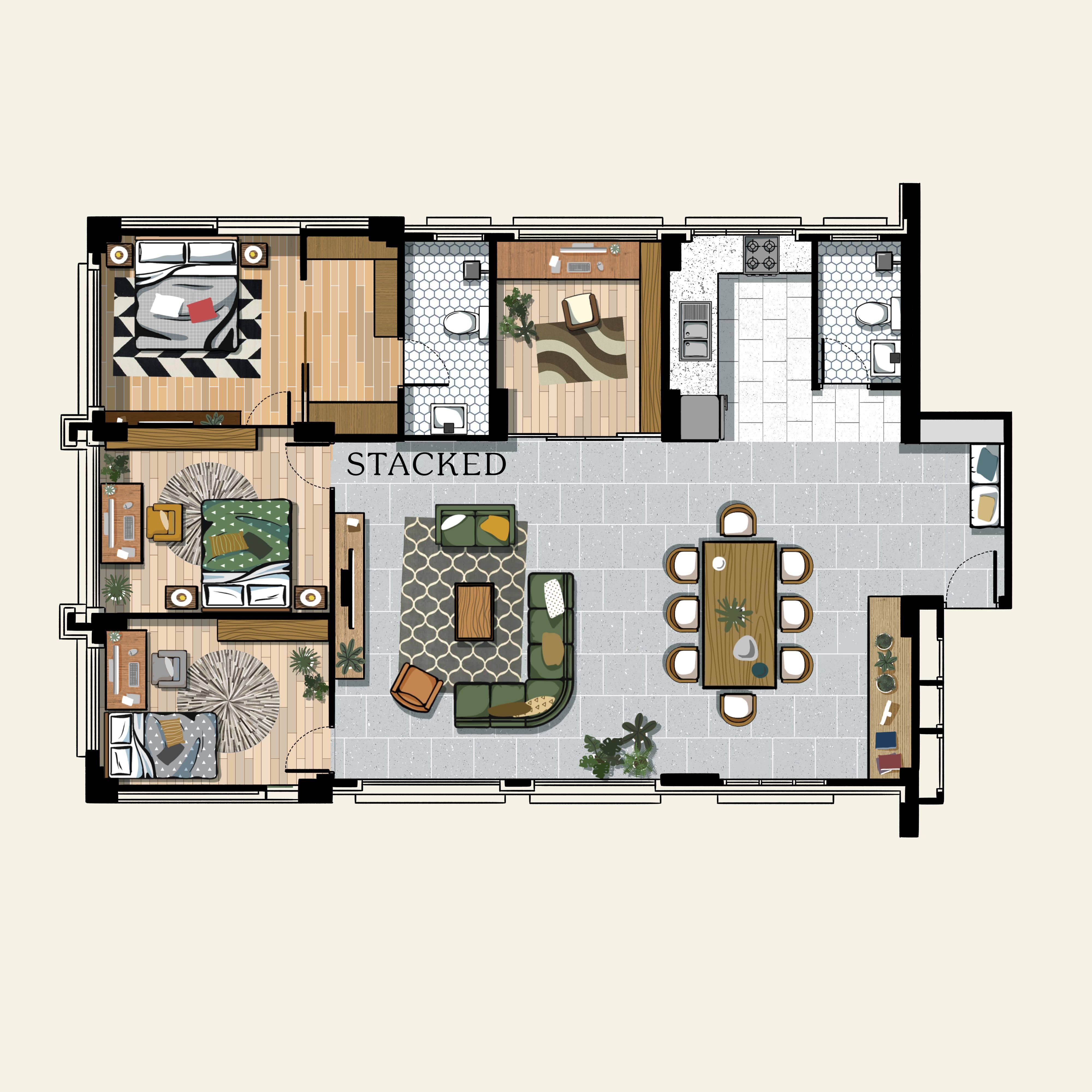
Similar to option #1 above, here is another variation of the WFH setup. The difference is that it has a larger space allocated for both the living and dining areas. Plus, the home office that used to be part of the large master bedroom has been moved.
The most efficient WFH setup will distinctly separate the workplace from other parts of the house. This prevents any distractions from home life, like interrupted Zoom meetings, or breaking your workflow to deal with any pets.
But something has to give for this layout to have a bigger living and dining area – and that would be the space of one of the other bedrooms. To enlarge the spaces, the bedroom that used to be where the home office is has to be moved to the far corner of the house.
The most obvious benefit of relocating the bedroom is that it would make the unit brighter since it has two sources of natural light. If these two rooms are primarily used as bedrooms for the children (who will be using their desks for study purposes), the clear separation between the work and play areas is not as crucial.
Option #6 – Fitness Minded Layout
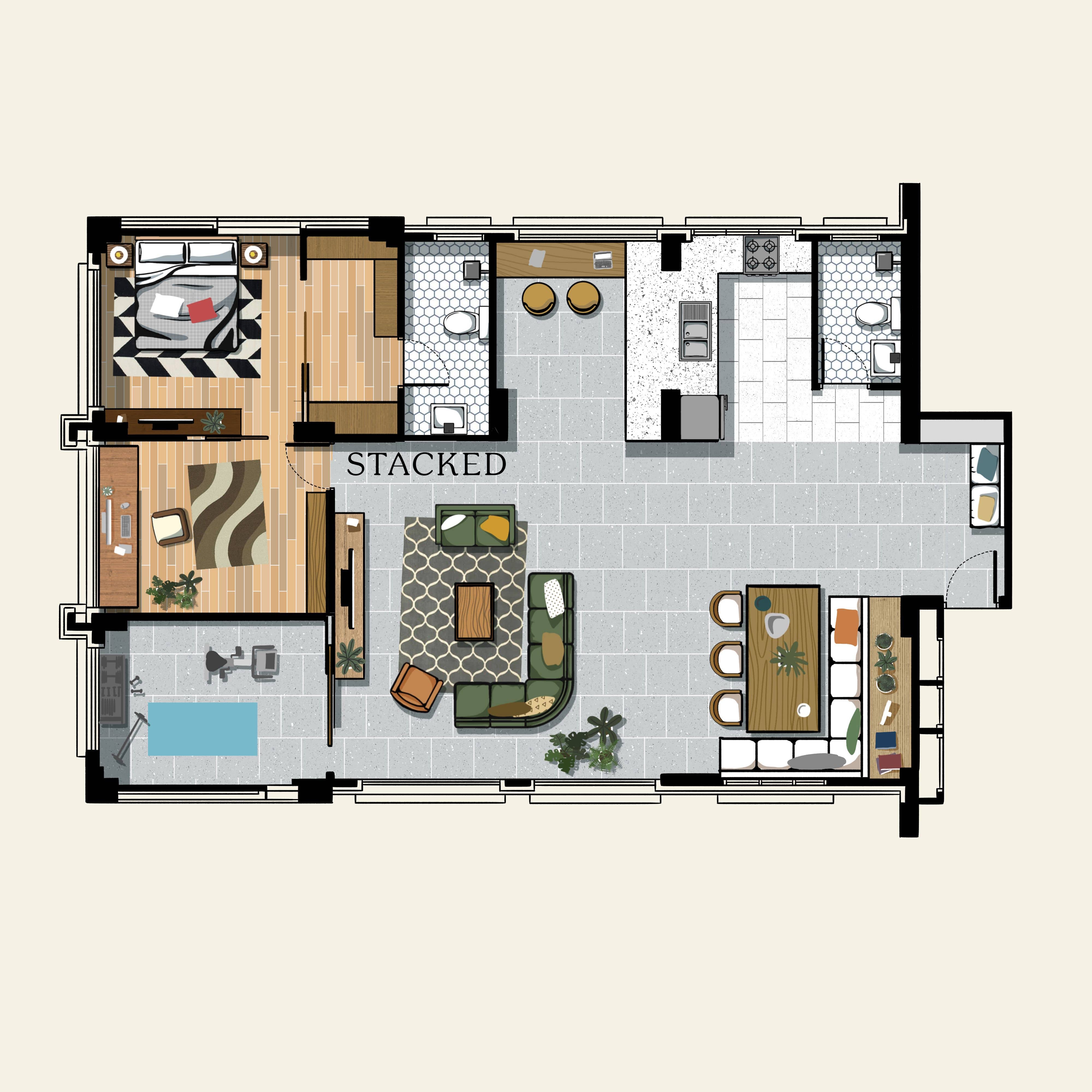
For those who are fitness junkies, here’s a layout specifically designed for this – striking a good balance between working and staying fit at home. This can also be a good layout for anyone who dislikes the shared space of a gym.
The layout outside of the fitness areas is versatile: There’s the open-concept kitchen, complete with a small nook, and then there’s the dining area with couch-style seating. The master bedroom comes with a walk-in wardrobe that leads to the master bathroom, while a large home office is attached to the same space. Finally, the fitness room is bright and airy, which is perfect for circulating the air as the residents are sweating it out.
There might be one less room to use as a study for the children though.
Option #7 – Living Area Maximiser
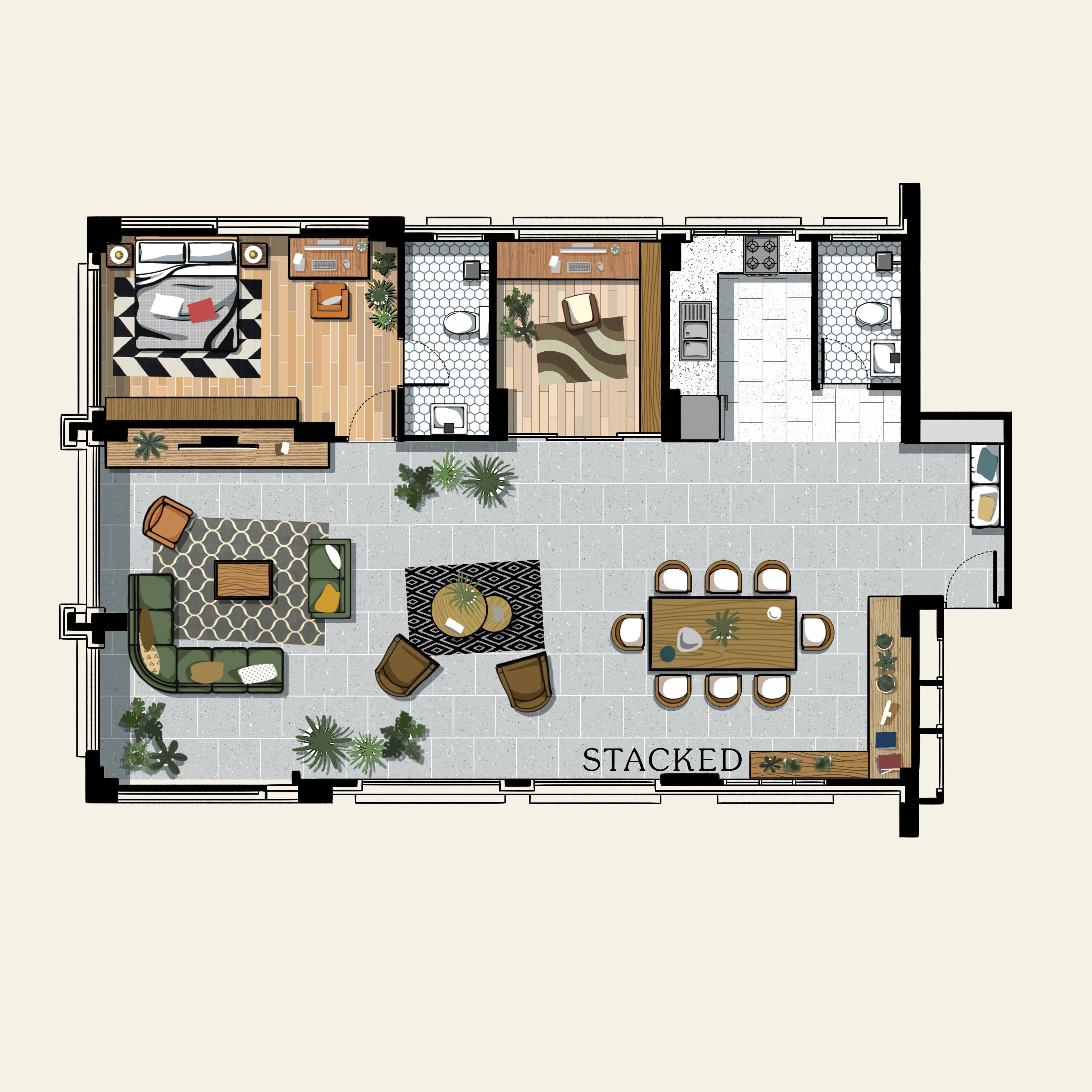
For those who want to make a grand first impression with their place, nothing makes it easier than having an open-concept floor plan. While most of the layouts I present have a similar implementation, this is the one most aimed at making a statement of how much space there is.
With this layout, there’s a clear line of sight from the dining to the far corner of the living room as soon as you enter the home. The open-concept kitchen is also immediately accessible next to the foyer.
The not-so-obvious effect of using this scheme is that guests in the living room are partially obscured from the kitchen and vice versa. Some cooks may mind, if they want to interact with guests while working in the kitchen.
As an option, you can eliminate the home office next to the kitchen and convert it into a breakfast nook, with stools in front of the counter.
Option #8 – Optimised Private Quarters
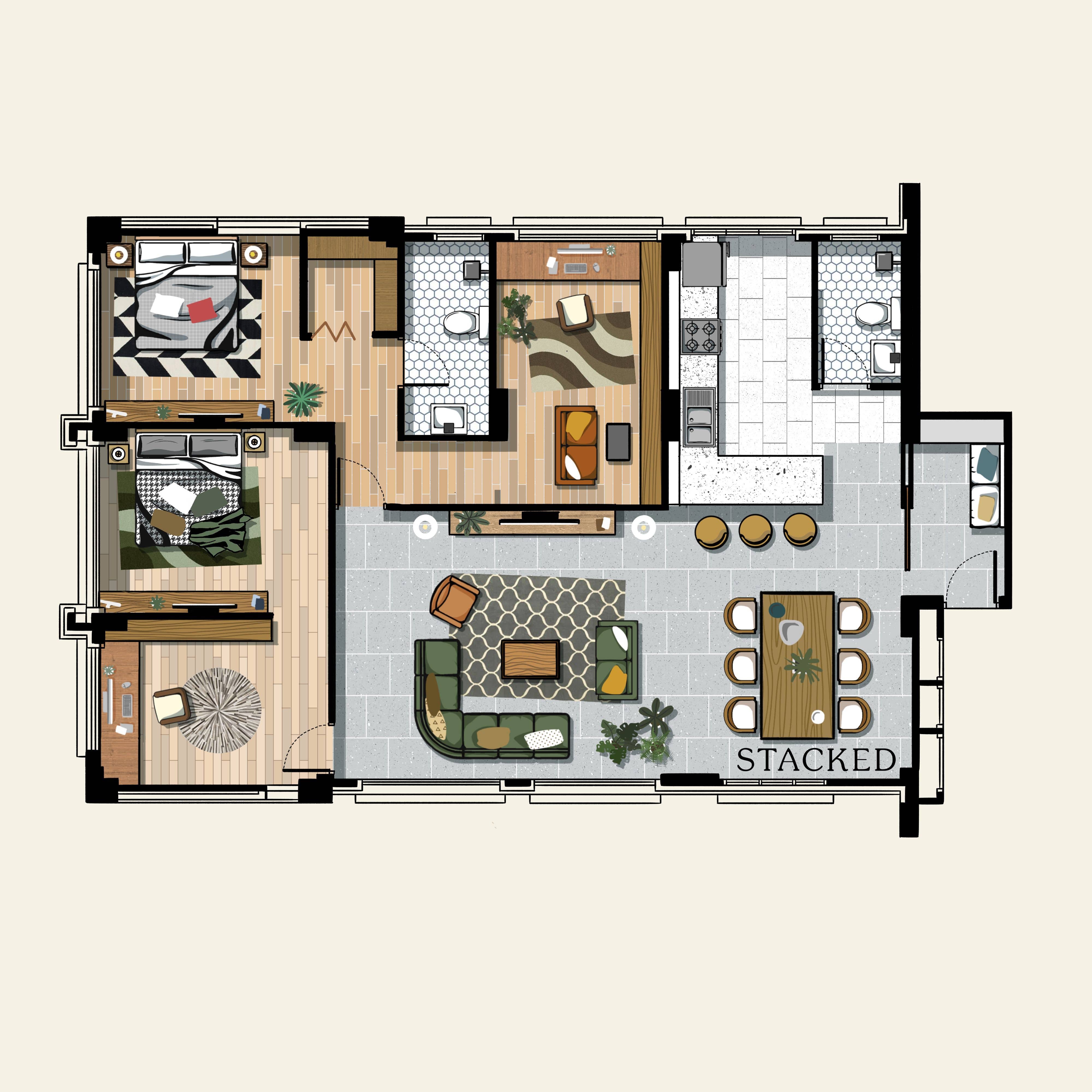
Here’s a layout that’s catered to both WFH and Study From Home arrangements; good if your children are facing important exams soon.
The home office space is connected to the master bedroom, giving easy access to the work area; but there’s still a partition to separate the spaces. Applying a similar concept to the child’s room, the adjacent bedrooms are combined by pushing the walls further toward the living area. This enlarges the space while keeping them connected. This allows the room to have its own separate study area – a perfect setup for their PSLE, O-levels, etc.
The drawback of this layout is that it eats into the living area. But unless you’re expecting to receive a lot of guests often, this shouldn’t be a problem as it can still accommodate a smaller family.
Do you have any other executive apartment layouts to share with other readers? Feel free to connect with us at stories@stackedhomes.com.
At Stacked, we like to look beyond the headlines and surface-level numbers, and focus on how things play out in the real world.
If you’d like to discuss how this applies to your own circumstances, you can reach out for a one-to-one consultation here.
And if you simply have a question or want to share a thought, feel free to write to us at stories@stackedhomes.com — we read every message.
Adriano Tawin
Adriano is an old school real estate guy. Prior to establishing his own architectural/engineering design firm in New York City, he’s worked for a Brooklyn-based developer developing multifamily residential projects across the 5-Boroughs. In Singapore, he has experience with managing hospitality projects and rehabilitation of conservation shophouses. In his free time, he enjoys photography.Need help with a property decision?
Speak to our team →Read next from Property Advice
Property Advice Should We Sell Our Freehold Condo For A $2.2M Leasehold Landed Instead?

Property Advice Should I Buy A Freehold Condo In A Landed Enclave — Or Look Elsewhere For Better Growth?

Property Advice We Own A 2-Bedder Condo In Our Early 30s: Should We Upgrade To A New Launch Or Resale With $2.2M?

Property Advice What A Family Of 5 Can Really Buy With $2 Million In Newton And Redhill
Latest Posts
Property Market Commentary 18 Upcoming New Launch Condos In 2026 — Where They Are And The Ones To Watch

Singapore Property News Kallang Close GLS Site Sold For $610.8 Million: New Waterfront Condo Could Launch From $2,900 PSF

PRO Pro Bishan Loft EC Price Review: Why This Older Executive Condominium Saw Strong Gains









0 Comments