


This is the second instalment of my BTO Showflat review; the first one covered my thoughts (and two cents) on the 4- and 5-room flats at the MyNiceHome Gallery. If nothing else, the takeaway was simple: there’s actually quite a bit you can do with your HDB flat. And if you’re on that same boat, welcome back.
Today, we’re looking at the smaller units, because yes, the 2- and 3-room flats deserve some love too.
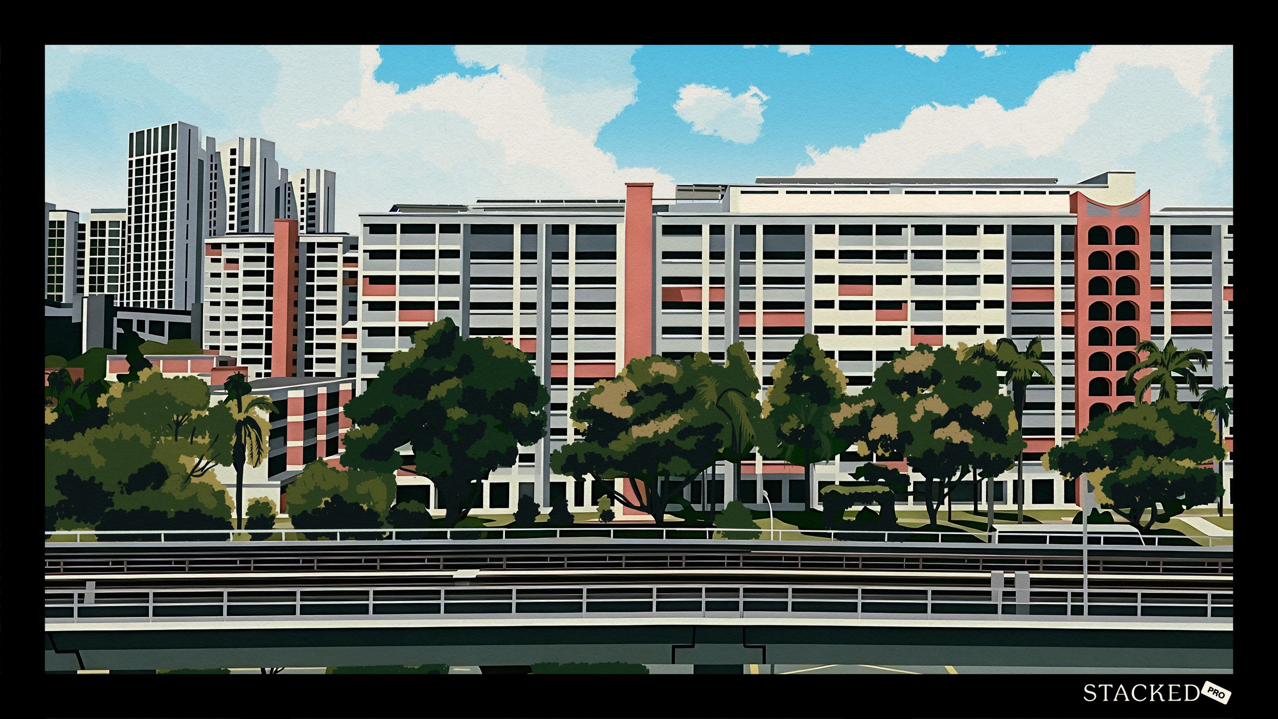
If you missed the previous edition, HDB recently refreshed the MyNiceHome gallery, so you’ll see new layouts, updated styling choices, and yes, the same bomb shelter still faithfully parked where it always is.
A small on-the-ground observation while I was there: the 2- and 3-room sections seemed especially popular with older couples, many of whom were carefully inspecting every nook and cranny. Possibly a reflection of shifting lifestyle needs, or simply who these flats are increasingly being designed for.
And one last reminder if you’re planning to visit: wear slippers (it’s a no shoes zone).
Now, let’s dive into the 3-room flat layout.
So many readers write in because they're unsure what to do next, and don't know who to trust.
If this sounds familiar, we offer structured 1-to-1 consultations where we walk through your finances, goals, and market options objectively.
No obligation. Just clarity.
Learn more here.
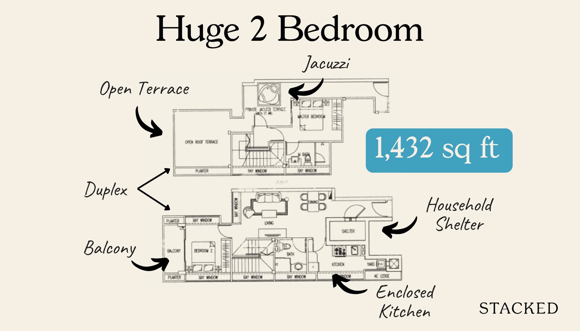
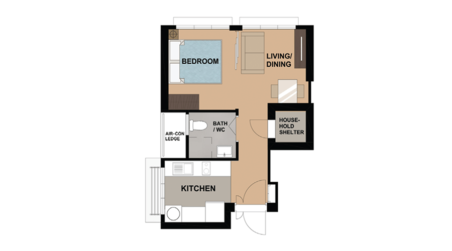
For those who want a no-frills home: The 3-room Flat (710 sq. ft.).
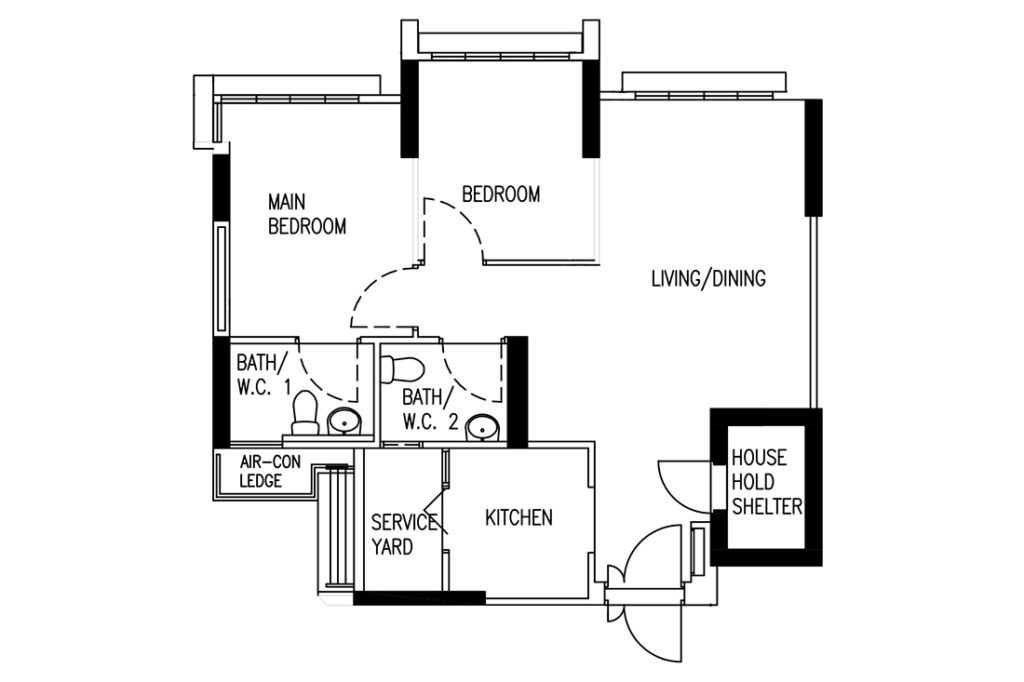
Like the other layouts, this one is clean and squarish, with minimal corridors — very much in line with what we’ve come to expect from today’s launches. It’s practical, compact, and efficient.
Both bedrooms fit a queen-sized bed comfortably. The main bedroom can stretch to accommodate a king, though at that point, you’re basically trading breathing room for mattress real estate. Bedside tables? Wardrobes? You’ll probably have to negotiate.
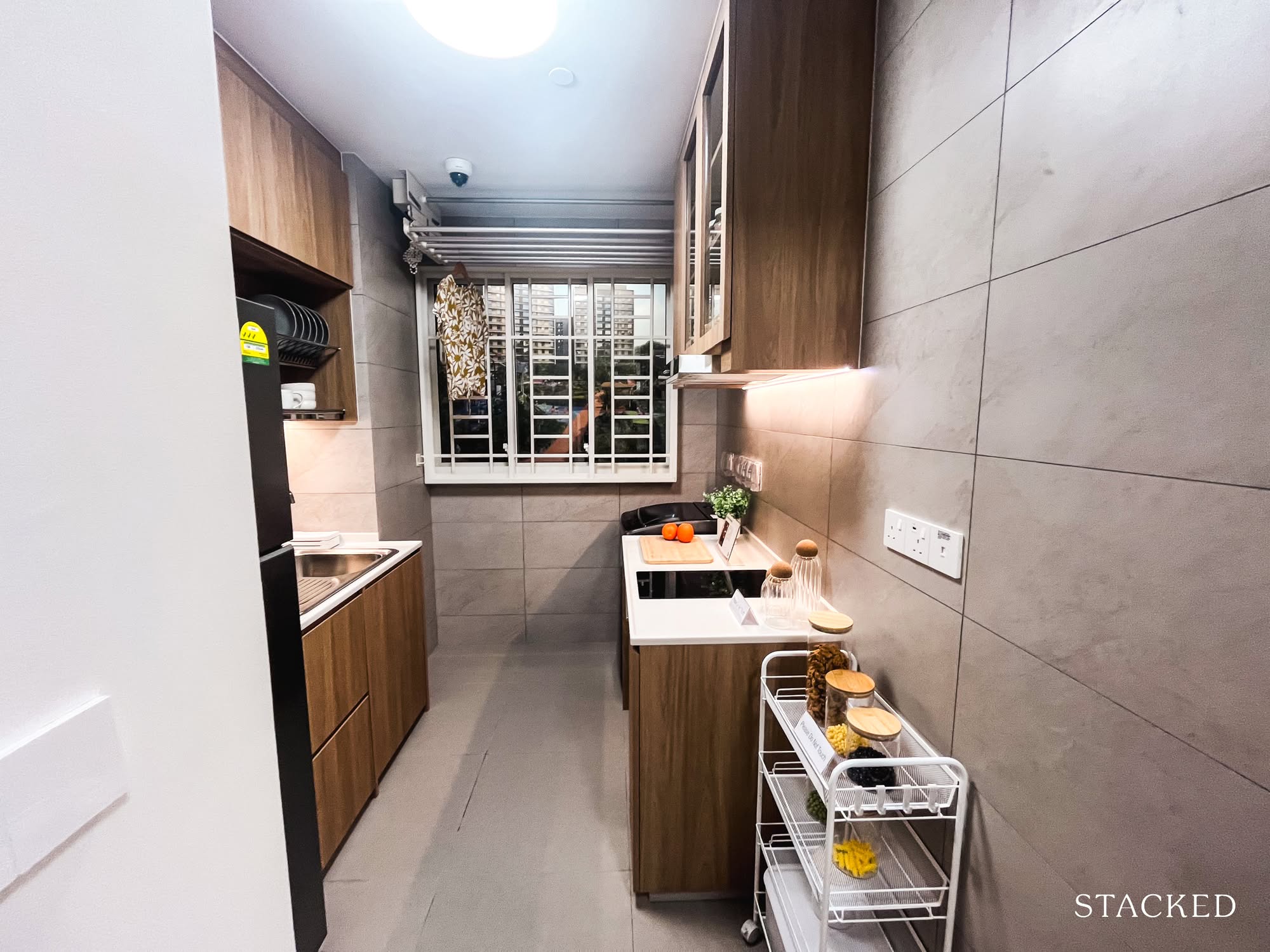
The kitchen isn’t huge, but it’s functional. It is squarish, straightforward, and opens up to a dedicated service yard (which is still a big yes for me).
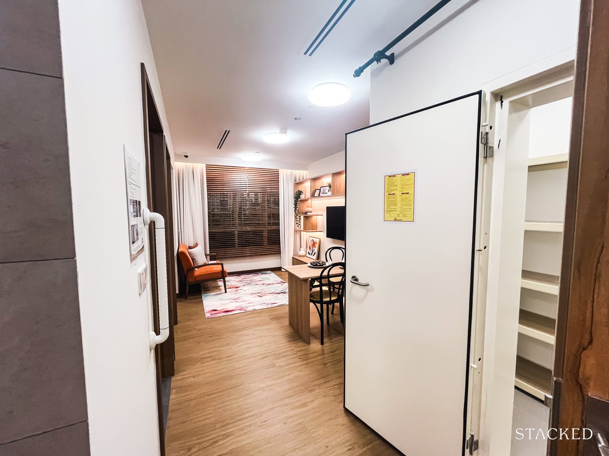
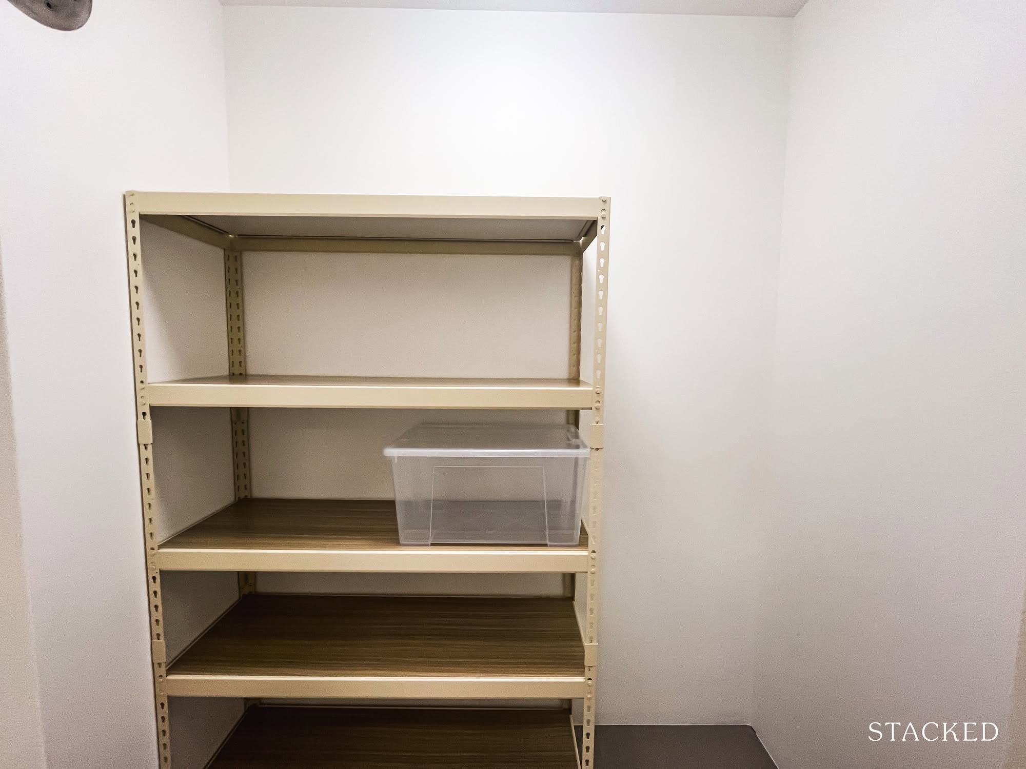
And while I’ve complained about the household shelter sitting awkwardly at the entrance in the 4- and 5-room flats, I actually think it works here. It creates a bit of a foyer (a much-needed buffer), and honestly, I appreciate any attempt at privacy in a compact flat.
Because of all this, I can see how this layout would make sense for right-sizers — enough rooms (which you can even combine, if you’re feeling bold), a decent living and dining area, and not too much wasted space. But for a younger couple buying their first place, it might feel a little tighter, especially under the Plus or Prime schemes, where you’re essentially committing to the space for a full decade.
A lot can happen in ten years. Or not. That’s kind of the point.
So as always, it depends on who (and what) you’re planning for.
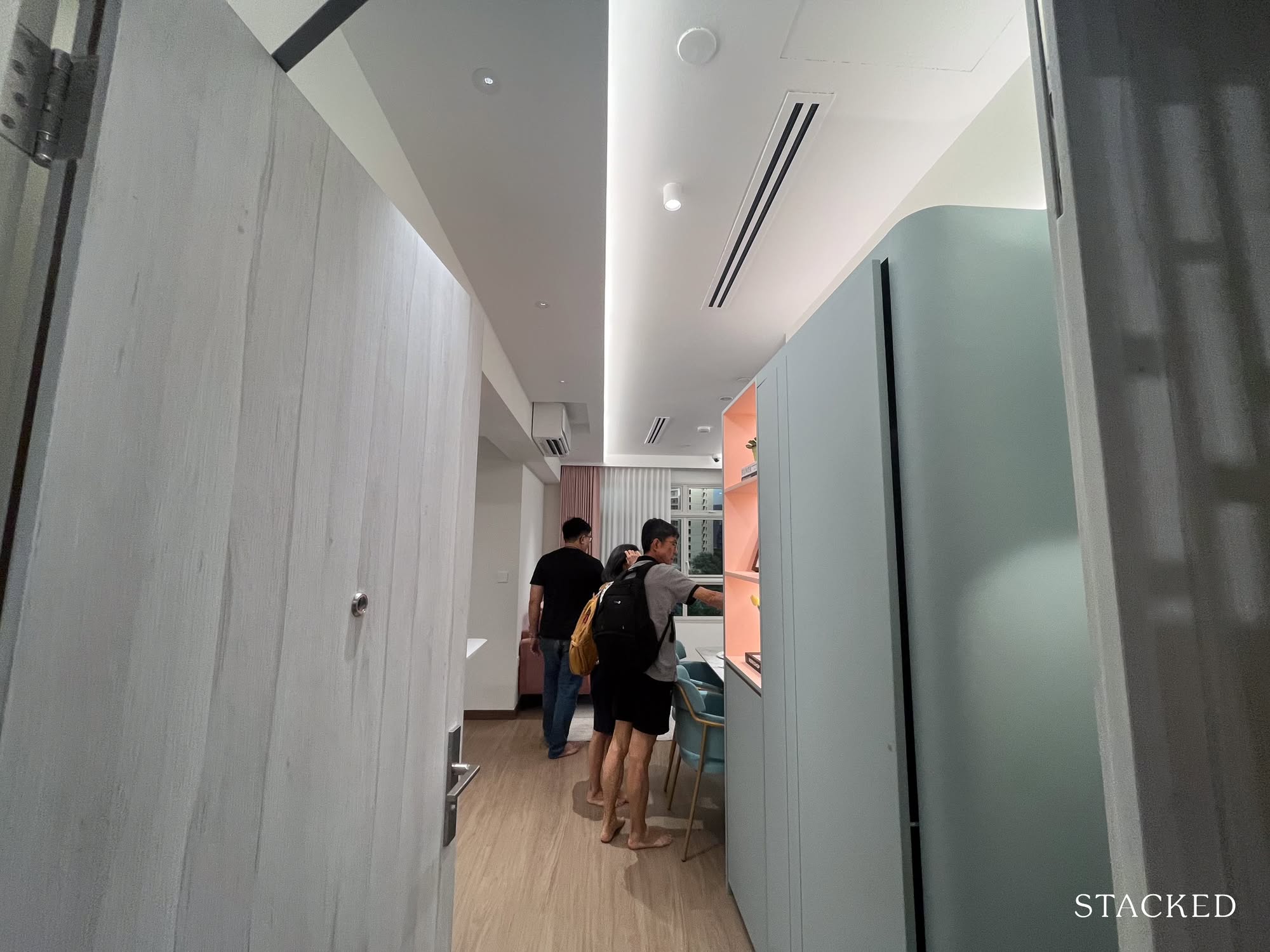
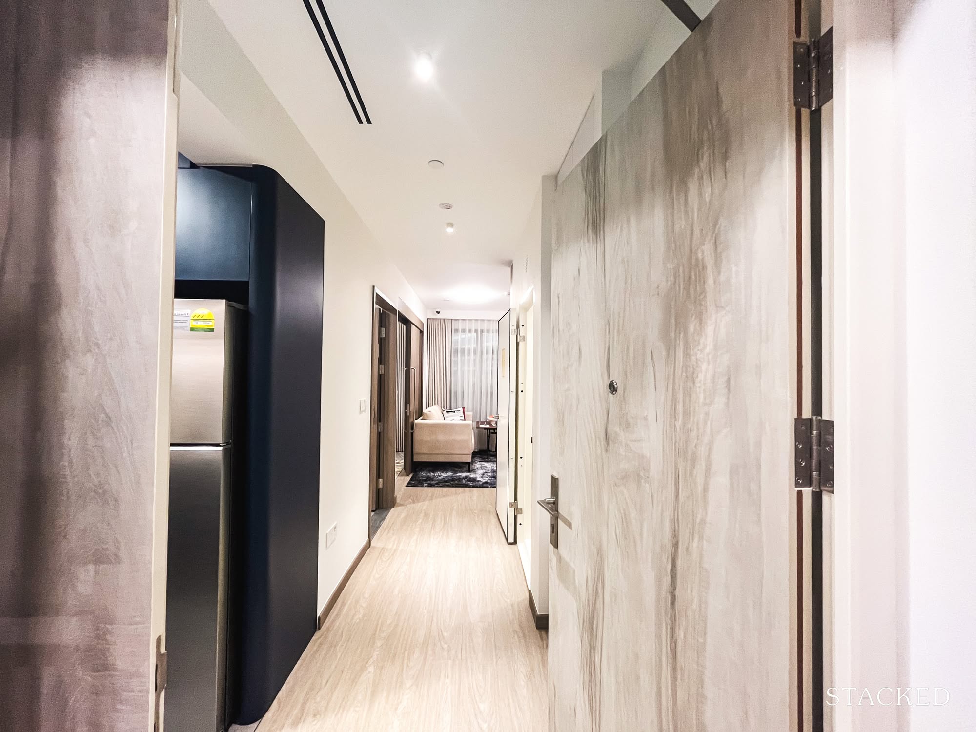
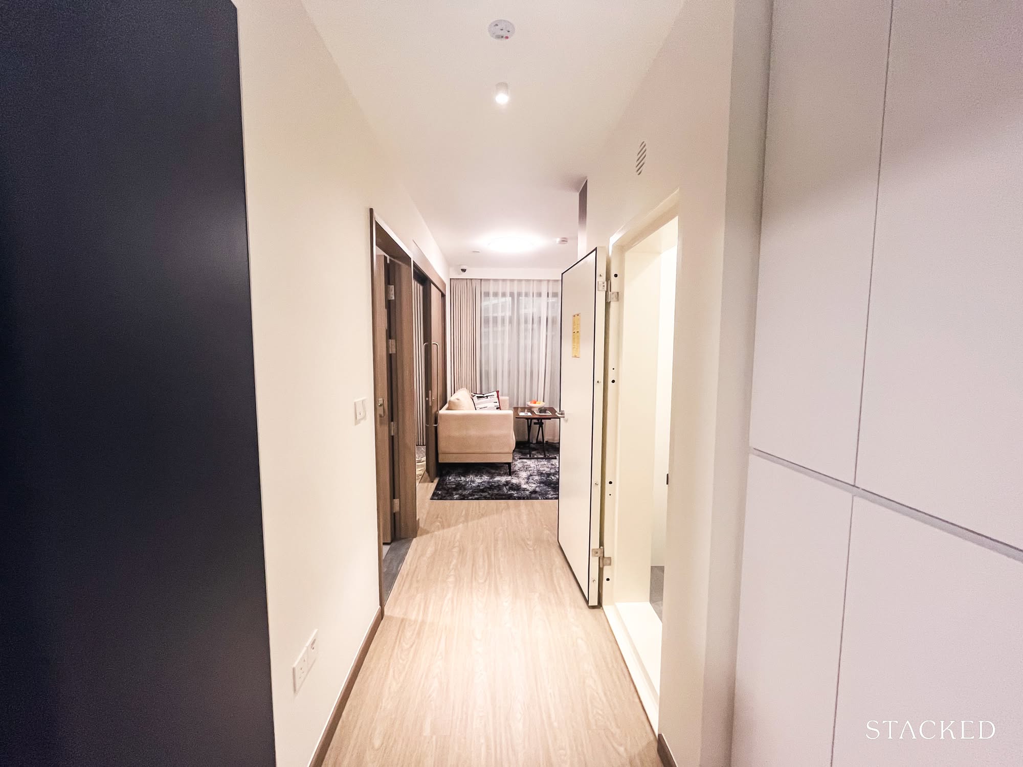
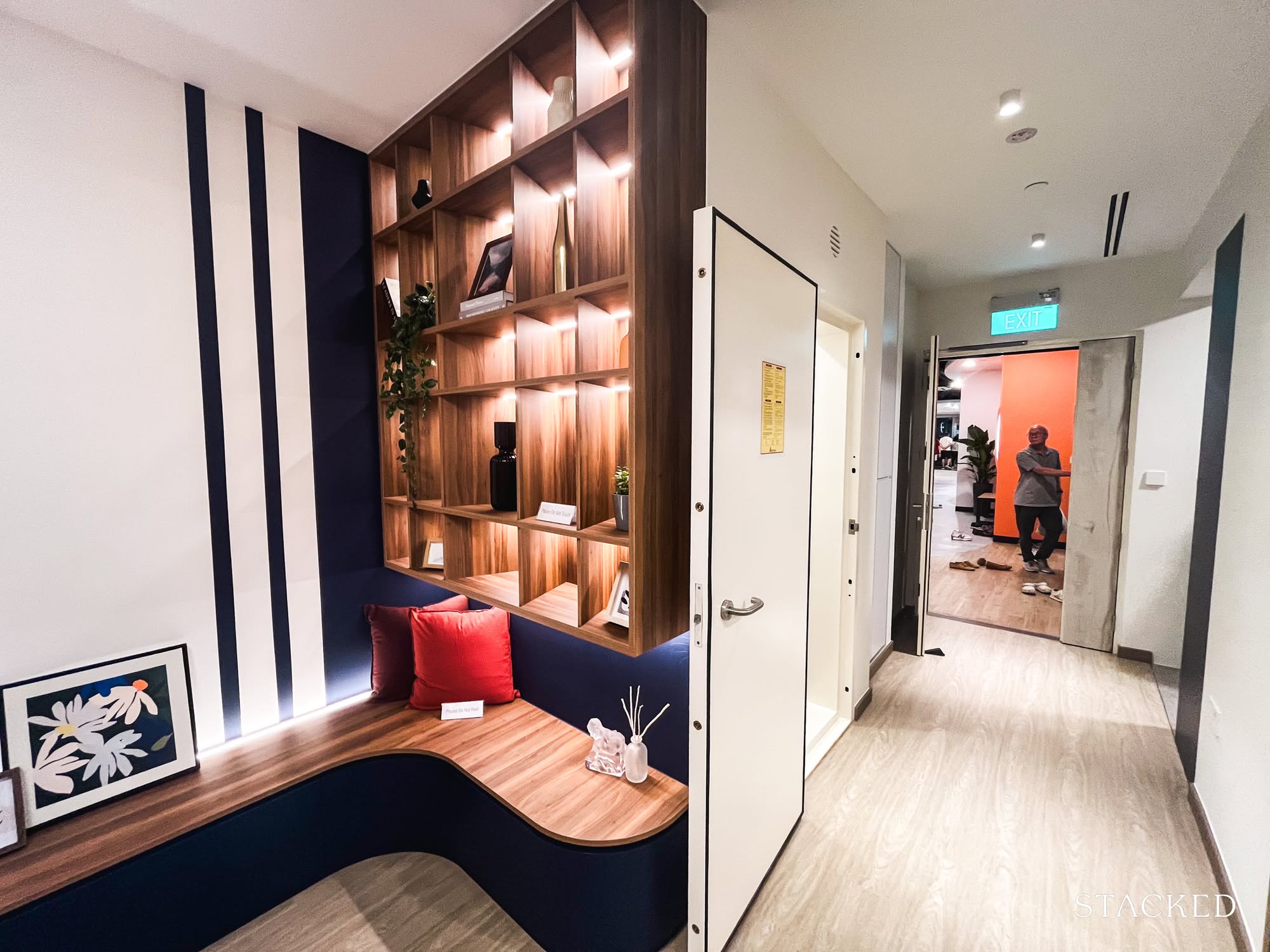
I wasn’t too surprised by how HDB chose to style the unit either: it opens into a small foyer-like space, with a feature wall hiding the household shelter right at the entrance. We’ve seen this approach in the 4- and 5-room flats, so at this point, it’s more or less expected.
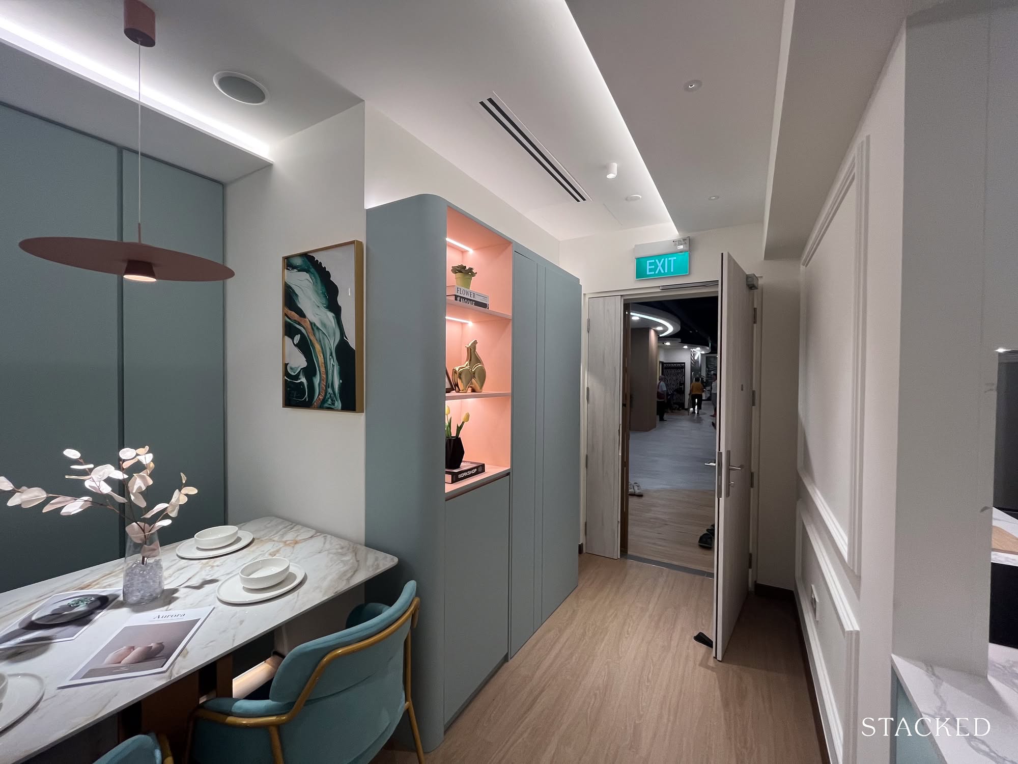
Still, it’s a smart move: not only does it disguise the raw metal door, but also adds a bit of shelving, and frankly, makes the area feel more finished.
As I mentioned earlier, the household shelter placement here makes sense. Without it, you’d open the door straight into your living room. For anyone who agrees, this feature wall is an easy idea to borrow.
And in case you were wondering, the ID theme here was Morandi, which I had to Google. It’s inspired by Giorgio Morandi, an Italian painter known for his muted, understated colour palettes. Hence the soft eggshell blues and powder pinks making their appearance here.
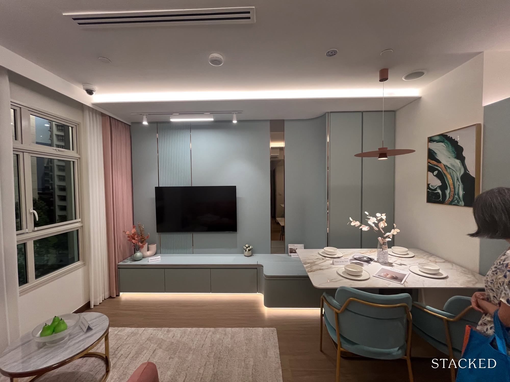
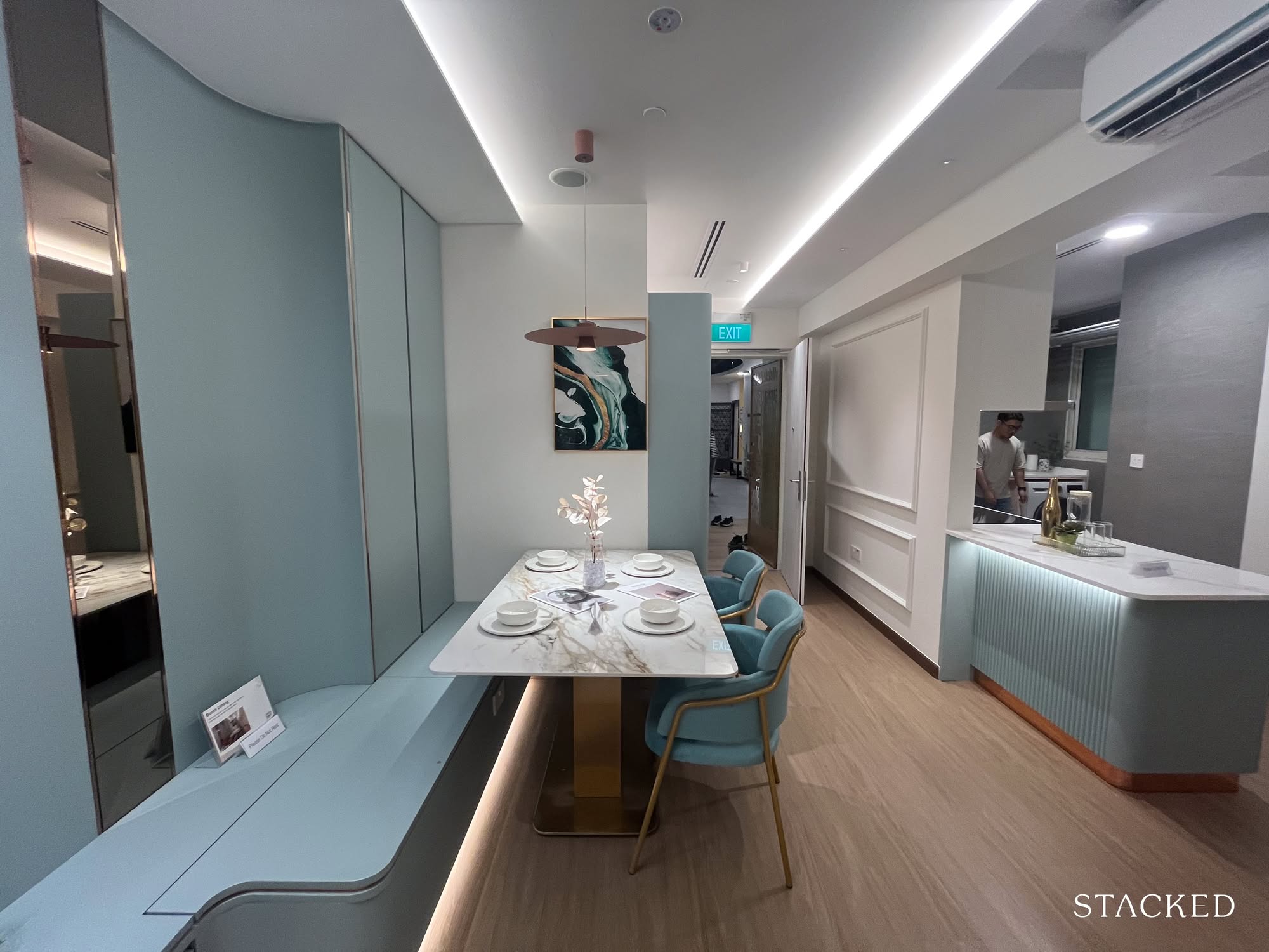
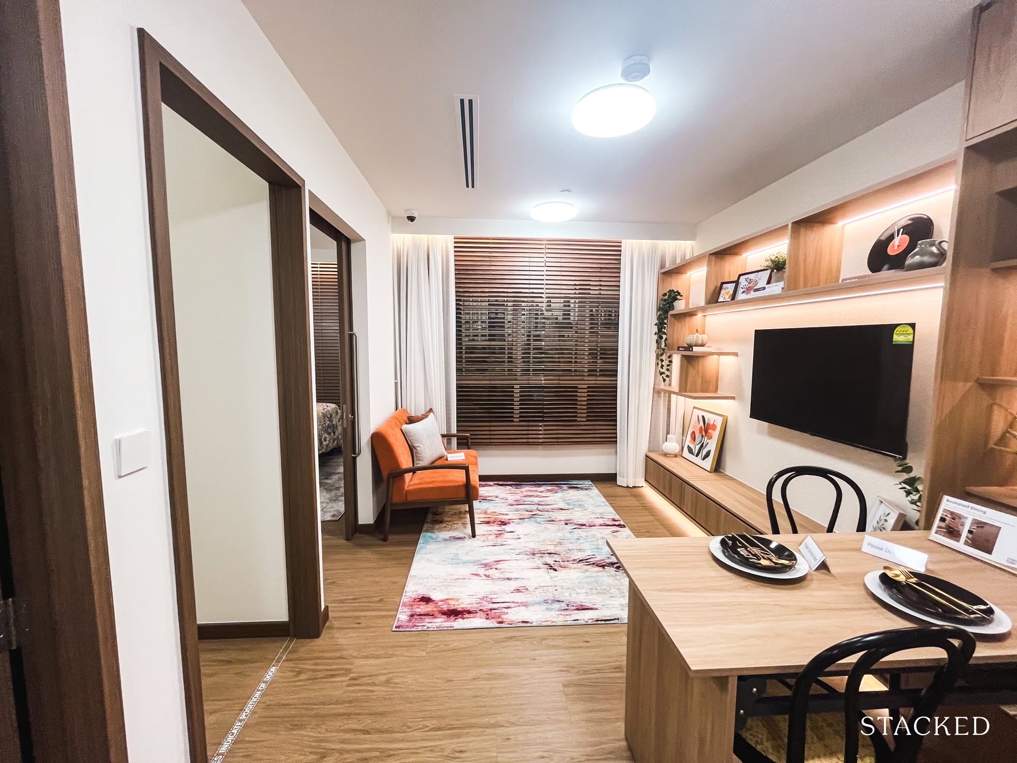
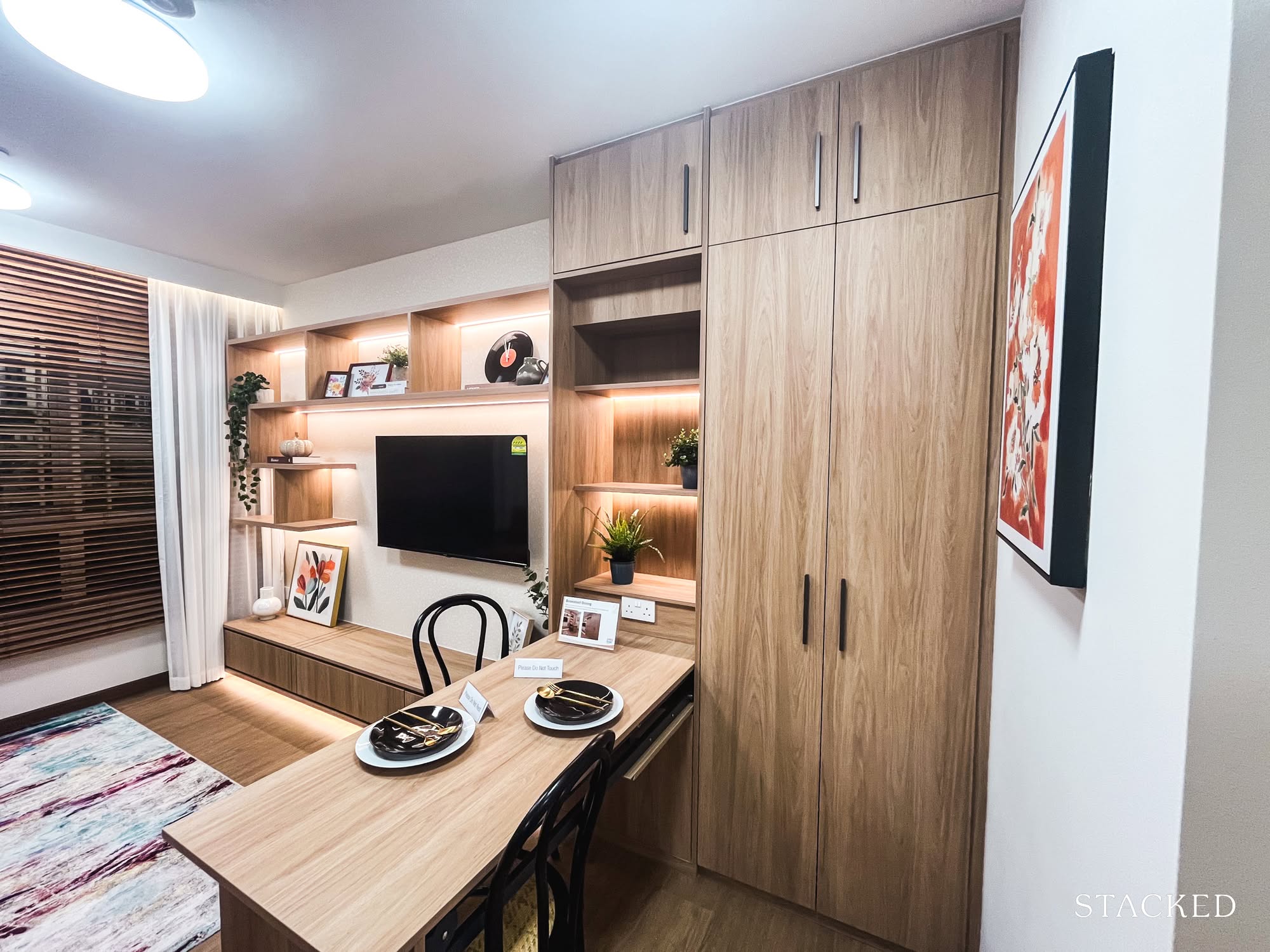
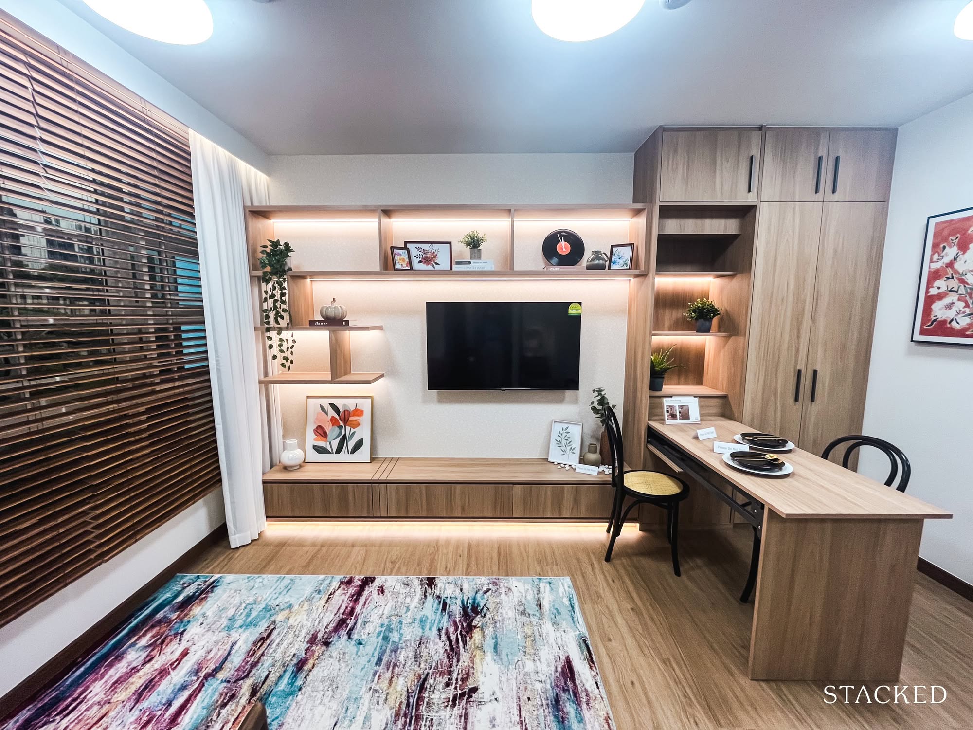
Now, on to the dining area. I have to say, the corner does feel a little tight, even with the booth seating tucked alongside the TV. It’s probably the most practical place to put the dining table, but not without trade-offs.
For one, no TV watching during meals, which, for someone who enjoys a little screen time with dinner, is a slight tragedy. And once the chairs are pulled out, the walkway gets pretty tight. For anyone who values a proper dining space, it might feel a bit compromised.
But given the layout, I can see why this arrangement landed where it did.
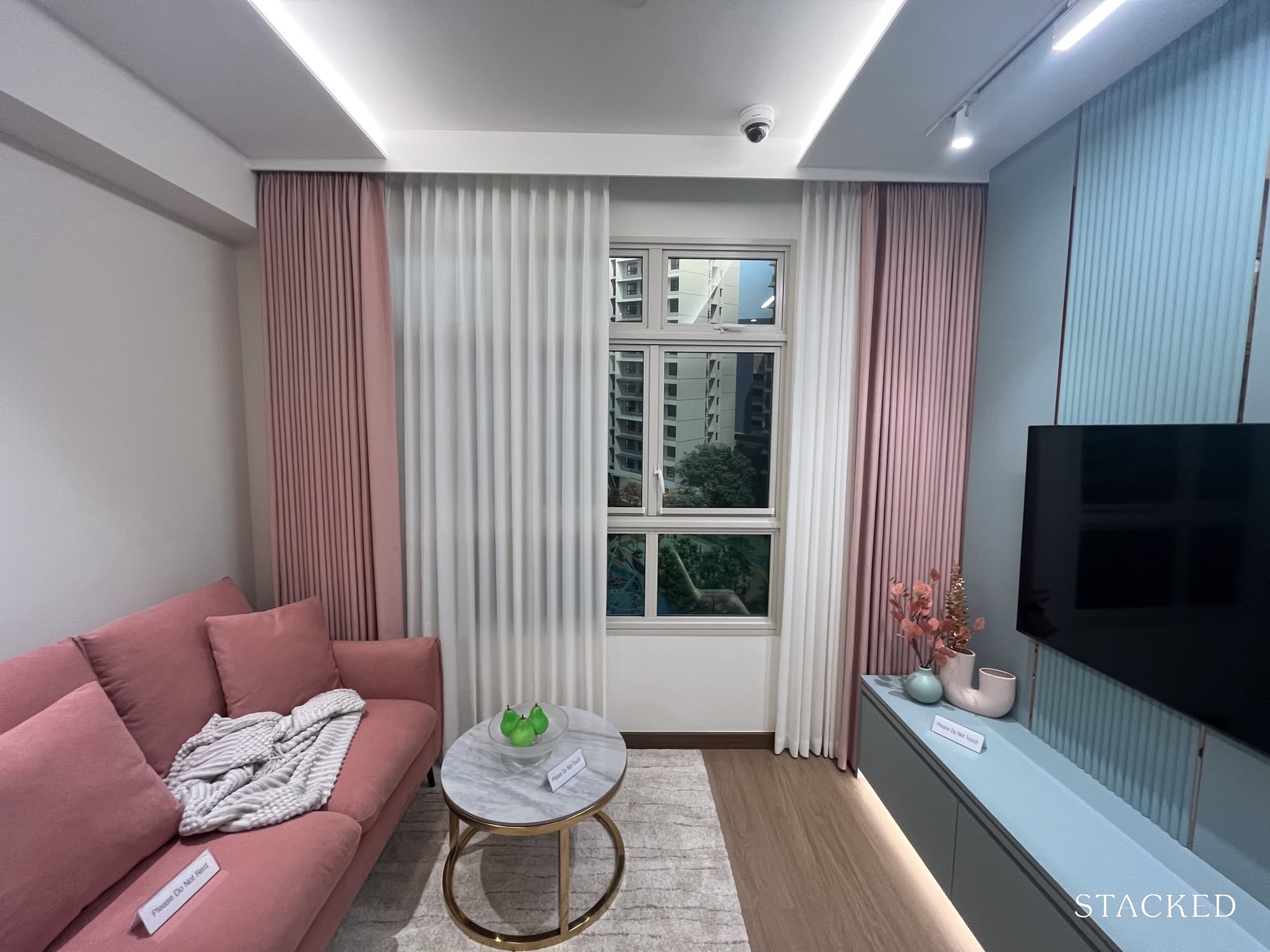
As for the living area itself, it comfortably fits a three-seater sofa and some compact living room furniture. The three-quarter windows are a thoughtful touch, especially if you happen to score a unit with a view.
That said, if you’ve just walked through the 4- or 5-room layouts, the difference in scale is immediately noticeable. It’s not a dealbreaker for smaller households, but it’s something you’ll feel the moment you step in.
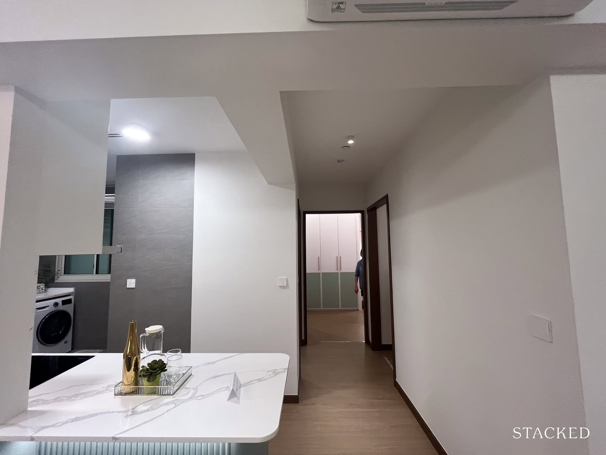
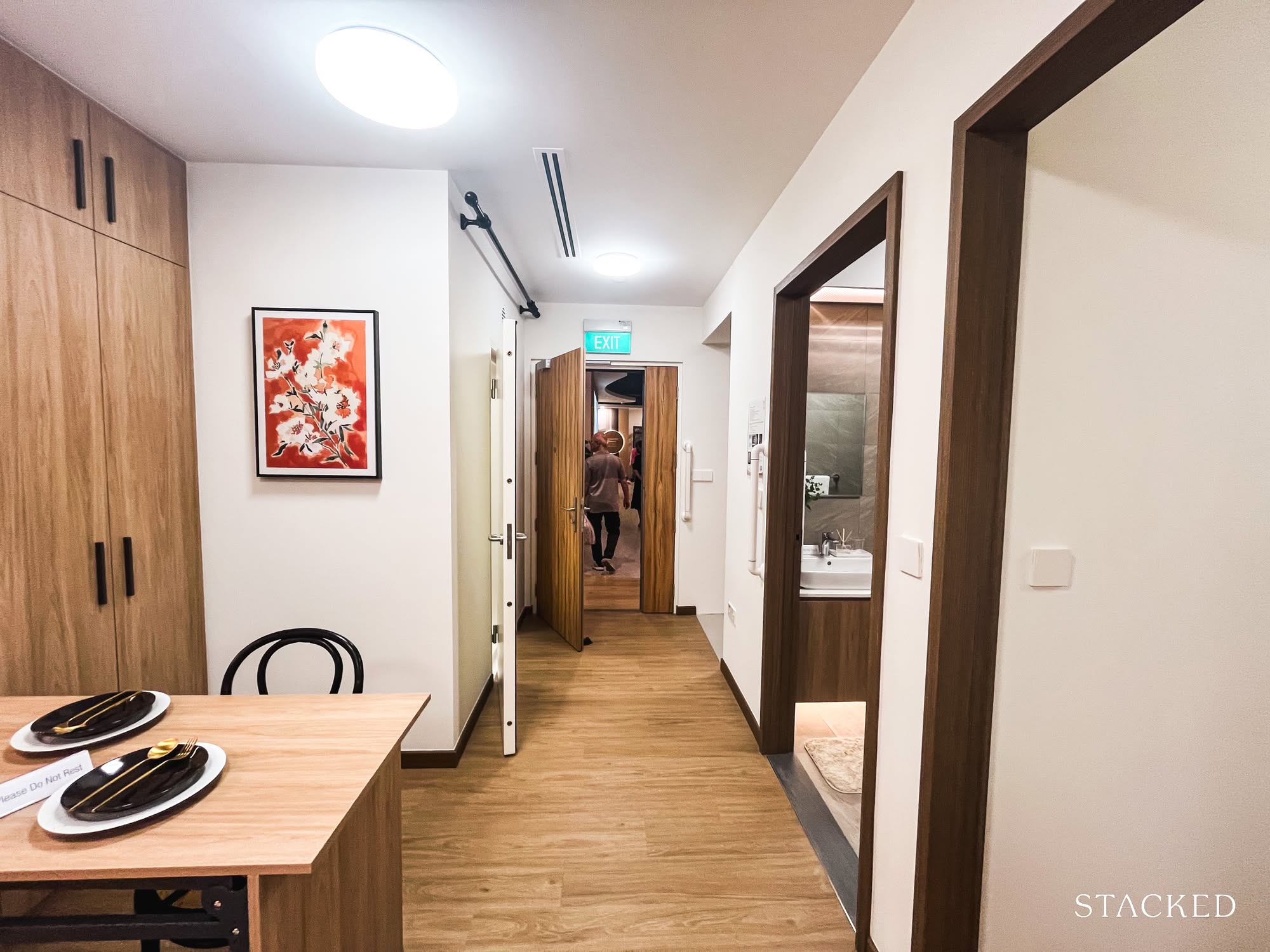
Before we move on to the kitchen, I wanted to quickly touch on the hallway. One common gripe among more functionally-minded homeowners is the amount of floor space “wasted” on corridors and is often seen as inefficient.
But in this 3-room layout, I actually think it’s been handled quite well.
The design feels tight and efficient, and I was even a little surprised by how close the kitchen is to the bedrooms. Personally, it doesn’t bother me, but if you’re someone who cooks often (especially with plans for an open-concept kitchen like this), then the proximity might be something to think about.
That said, there’s always the option to enclose the kitchen if needed.
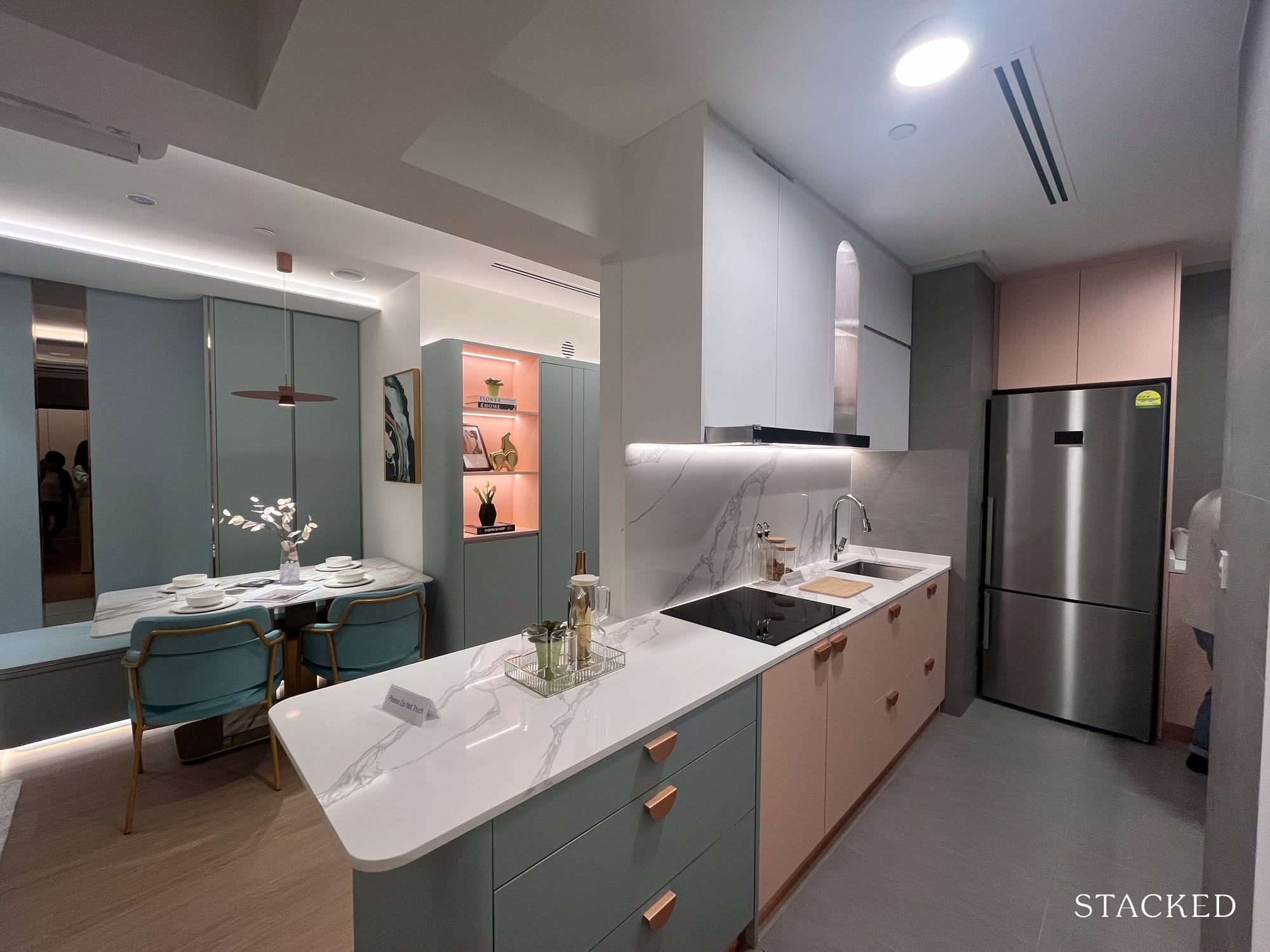
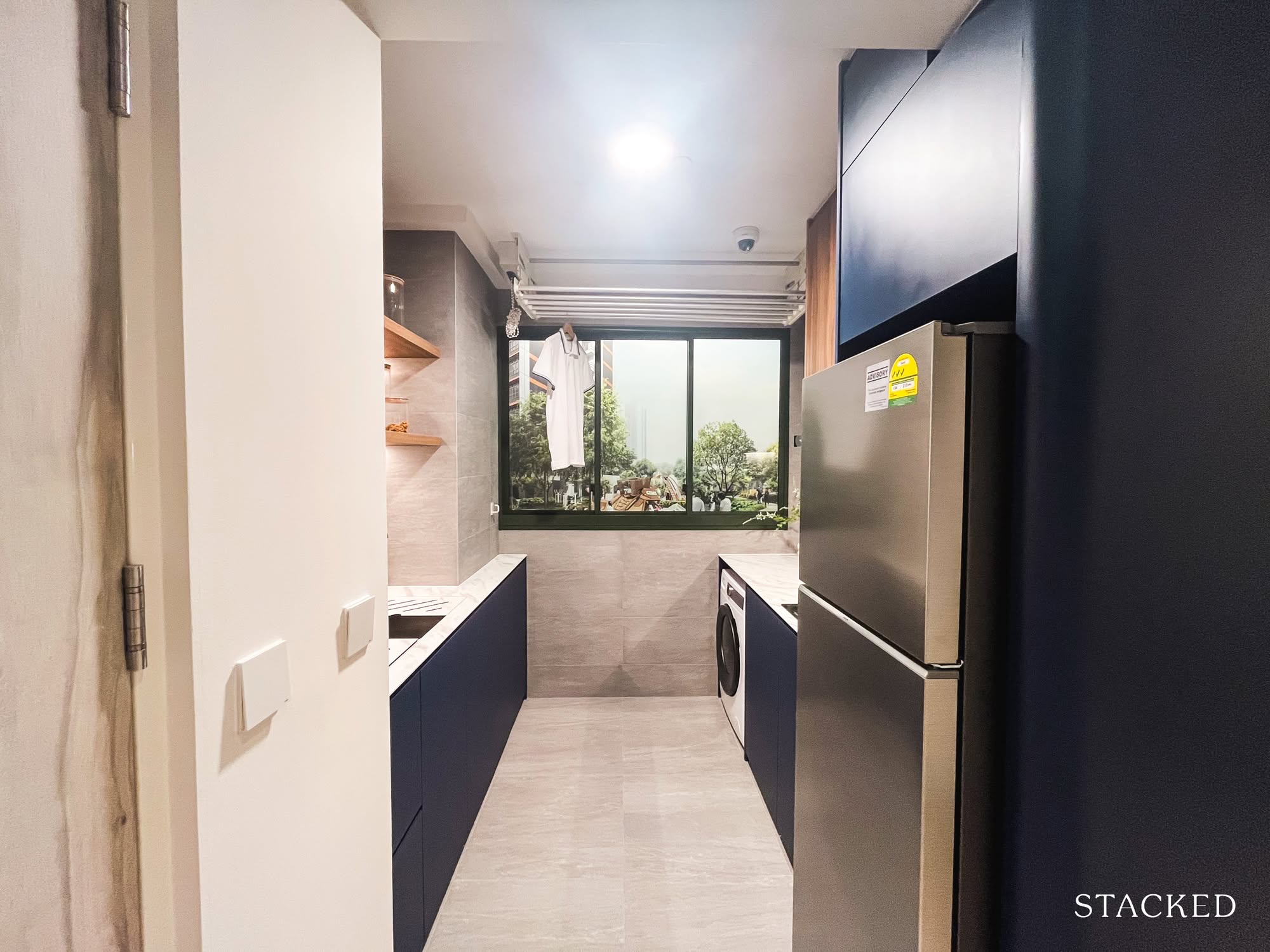
Here’s a look at the kitchen which, in this layout, sits right at the heart of the home.
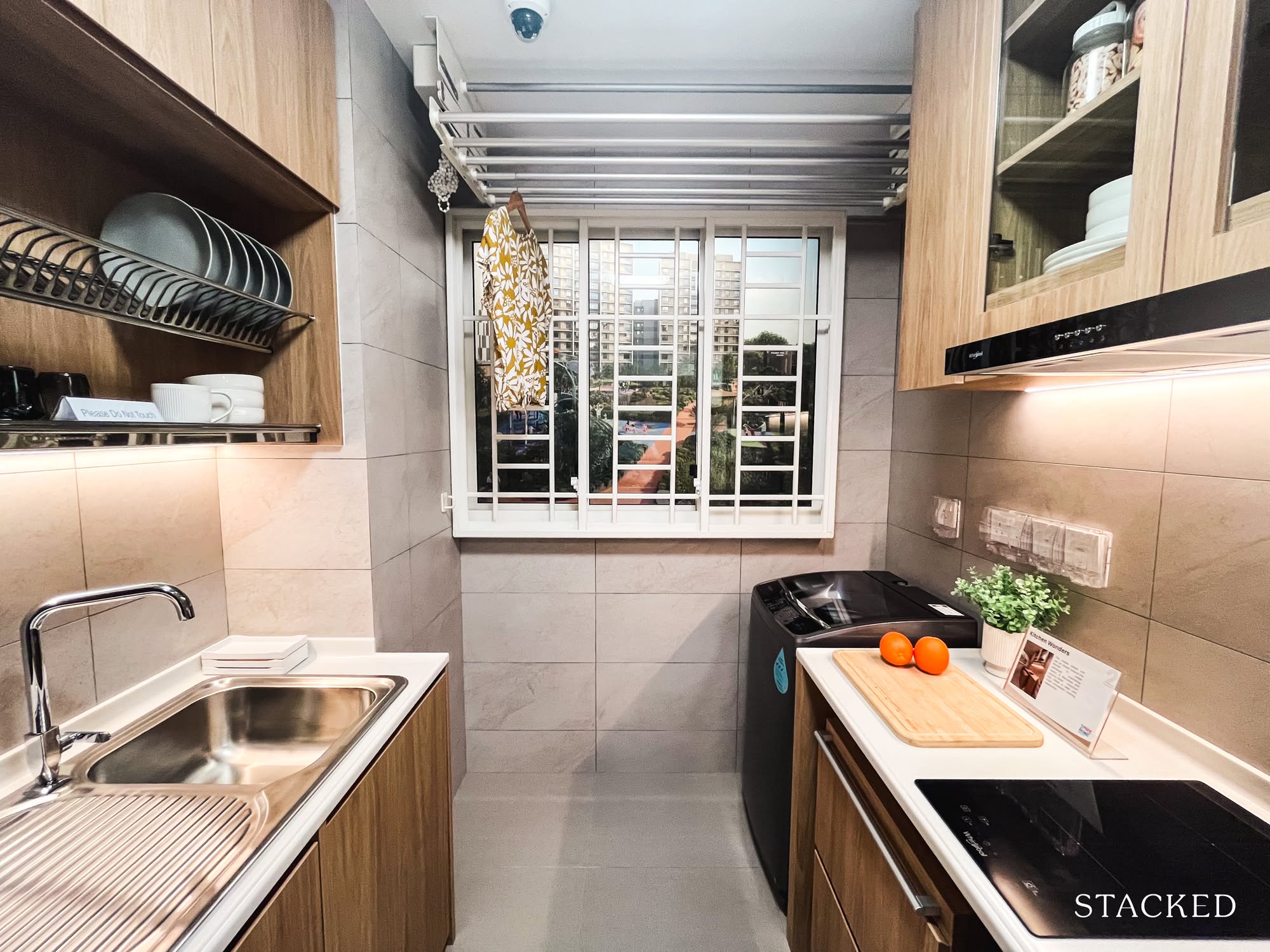
Now, this part requires a bit of imagination. In its bare-bones state, the unit comes with an enclosed kitchen. So that extra bit of countertop you see extending out? That wouldn’t be there. Instead, picture a wall enclosing the kitchen from that point onward.
I’ve always been vocal about my preference for open-concept kitchens, so I’d personally go with the configuration shown here. The trade-off, of course, is less storage space, and instead of an L-shaped countertop, you’ll have a straight-line layout like the one you see. Still, I like that the counter can double up as a prep area, a landing zone for groceries, or even a casual serving space when guests are over. It’s surprisingly versatile.
Both setups (enclosed or open) are functional in their own way. Just a quick note to manage expectations: what you see here is the ID-styled version, so finishes like these will largely depend on your renovation budget.
There’s also a neat little nook at the back for your fridge, which is always appreciated.
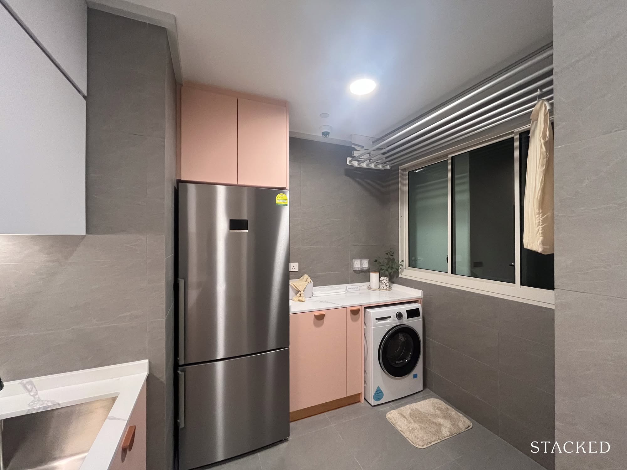
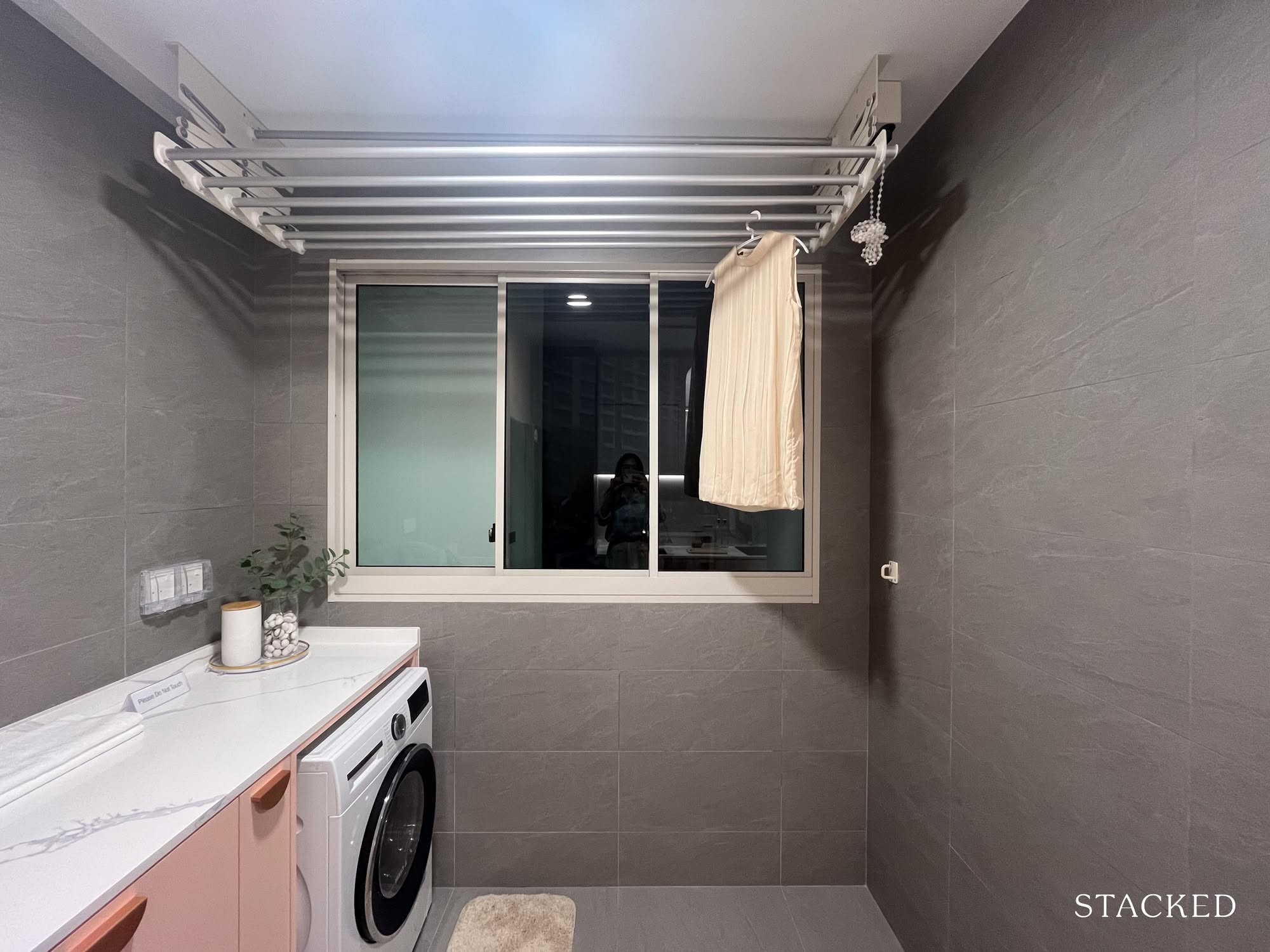
As for the yard, the original floor plan showed it as an enclosable space, so I was a little surprised to see how integrated it is with the kitchen in the show flat.
I’ve voiced my concerns before about garlic-scented laundry after a cooking session, so this is one open-concept idea I’d personally skip. Might work if your family rarely cooks at home, though.
That said, if you go by the floor plan, there’s the option to install a sliding door to properly separate the yard from the kitchen. It won’t be the most spacious, but at least your laundry has a fighting chance at smelling fresh.
On the same note, if you’re someone who regularly air-dries your clothes, the large window panels here might be a welcome touch.
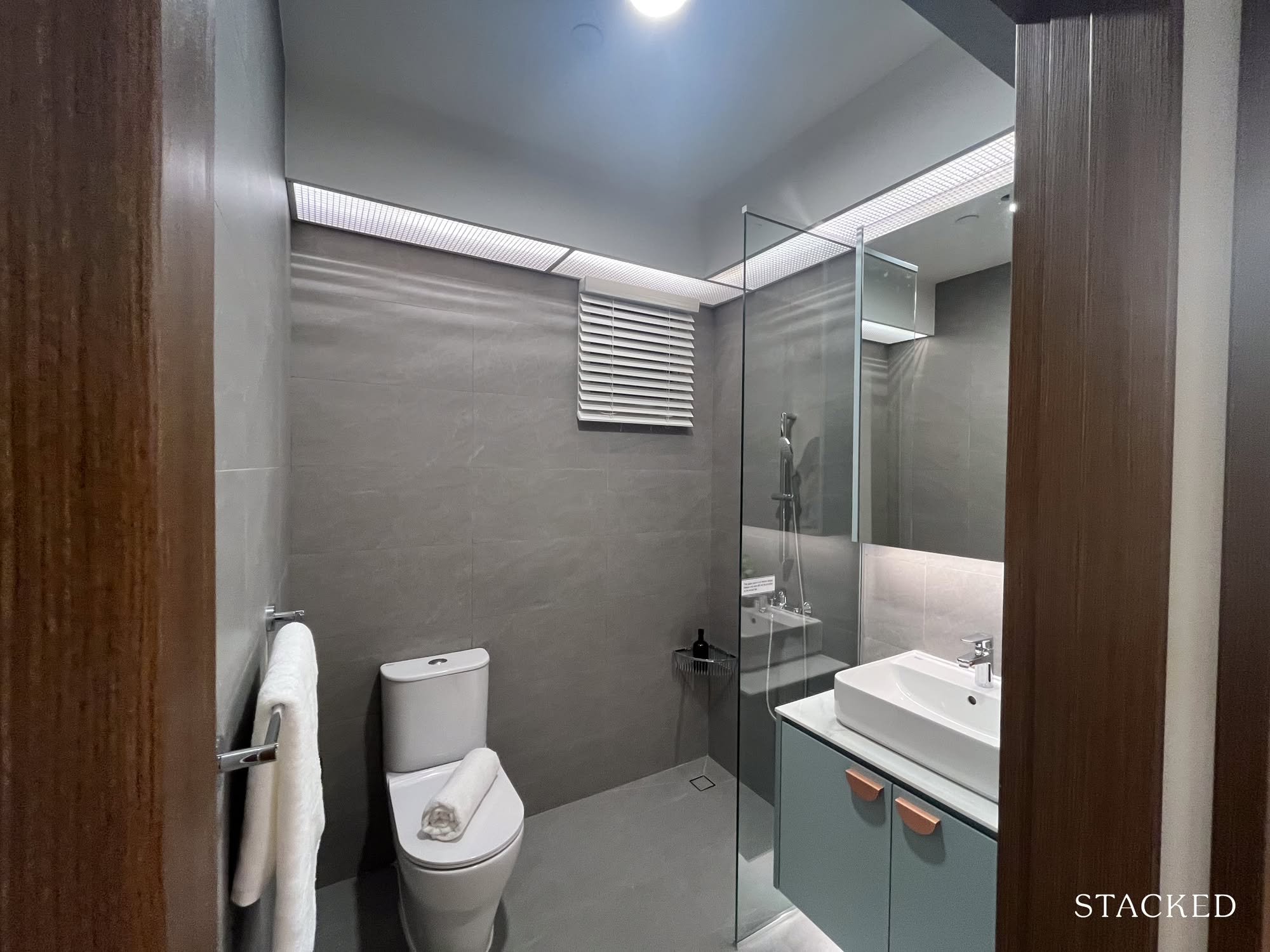
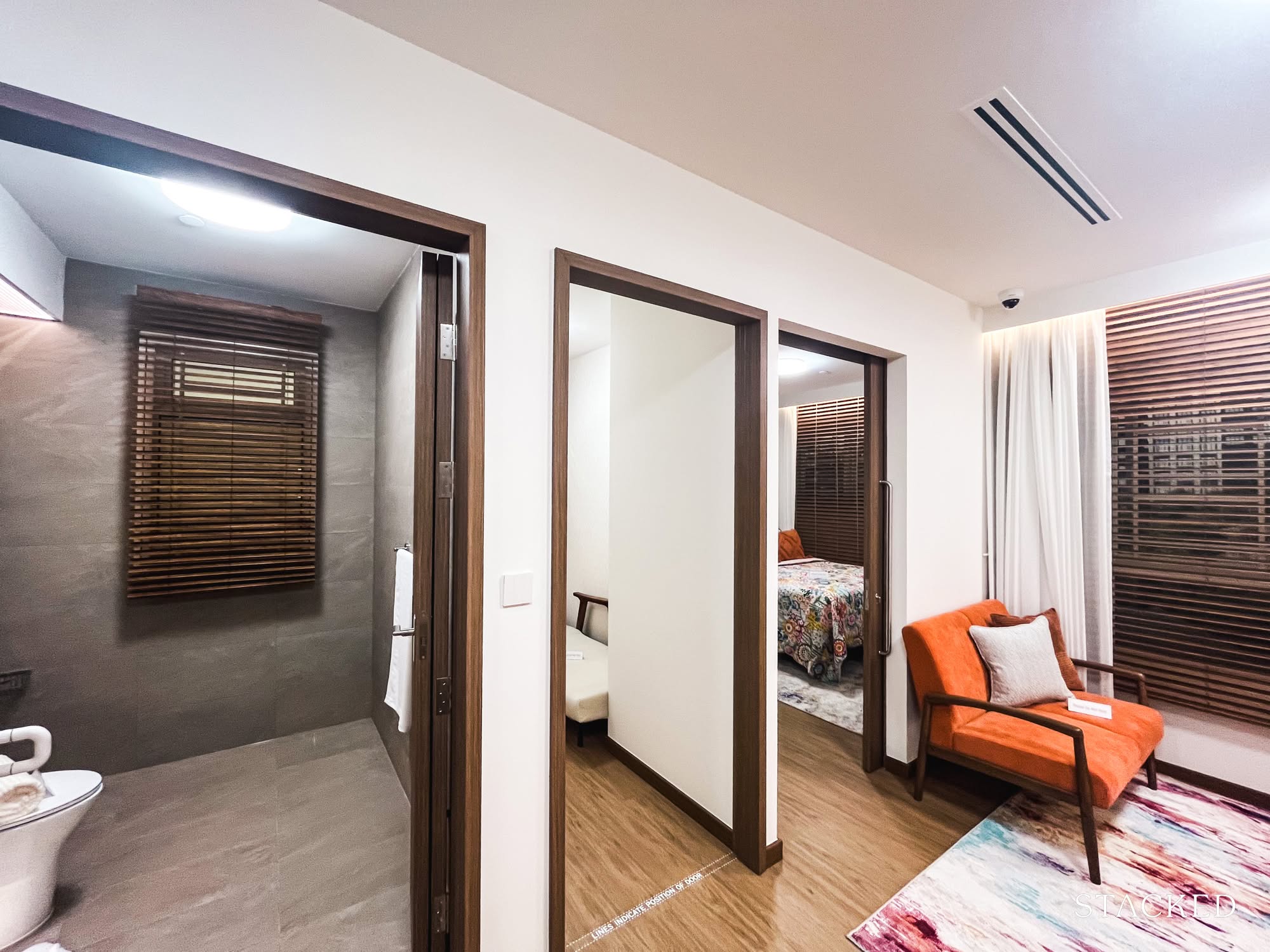
Next up, the common bathroom — and it checks most of my boxes. It’s squarish, there’s enough room to move around, and a small window provides much-needed ventilation. The ID even added a glass panel to help keep water from splashing onto the mirrors and cabinetry.
That said, my only gripe is with the shower placement. Since it faces the WC directly, the whole bathroom ends up getting wet after every shower, which isn’t the most pleasant experience for the next person using it. It’s been a pet peeve of mine (even in my own home), and it’s something that I’m surprised we don’t have a solution for (yet).
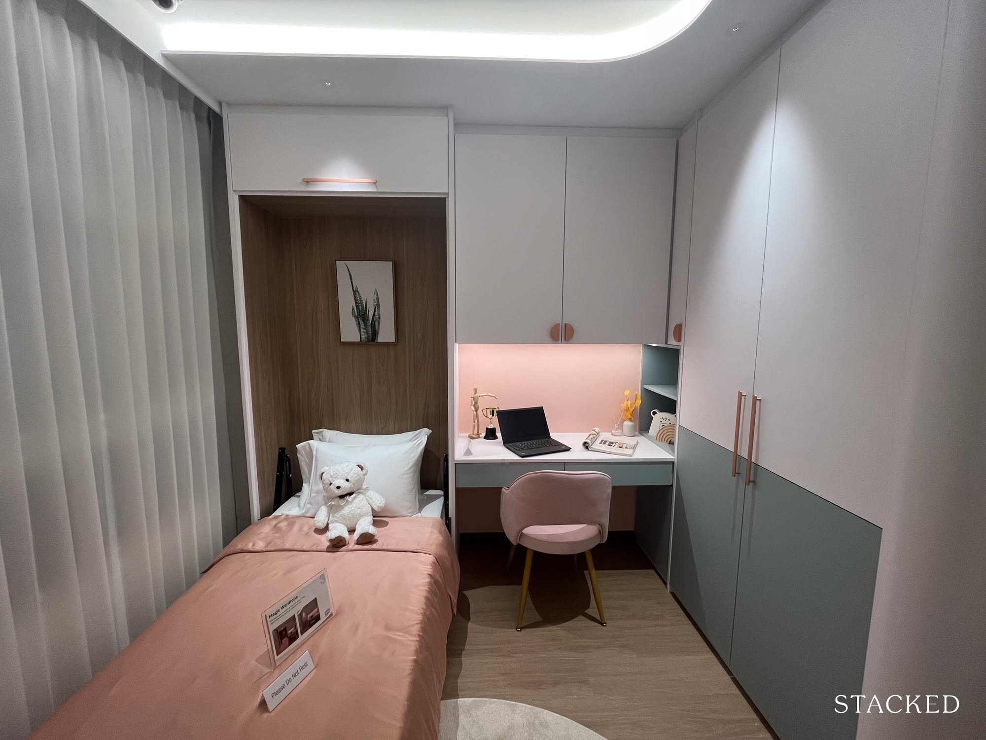
Now onto the common bedroom, styled here with a teenager in mind. It’s fitted with a single bed, a writing desk, and some built-in cabinetry. Most would agree that it’s functional and liveable, though of course, all that extra carpentry isn’t standard, so factor that into your reno plans.
That said, it gives you a pretty decent sense of how the space can work. In other show units, the same room has been dressed up as a nursery, and even shown with a queen bed, so if that’s more applicable to you, those are worth checking out too.
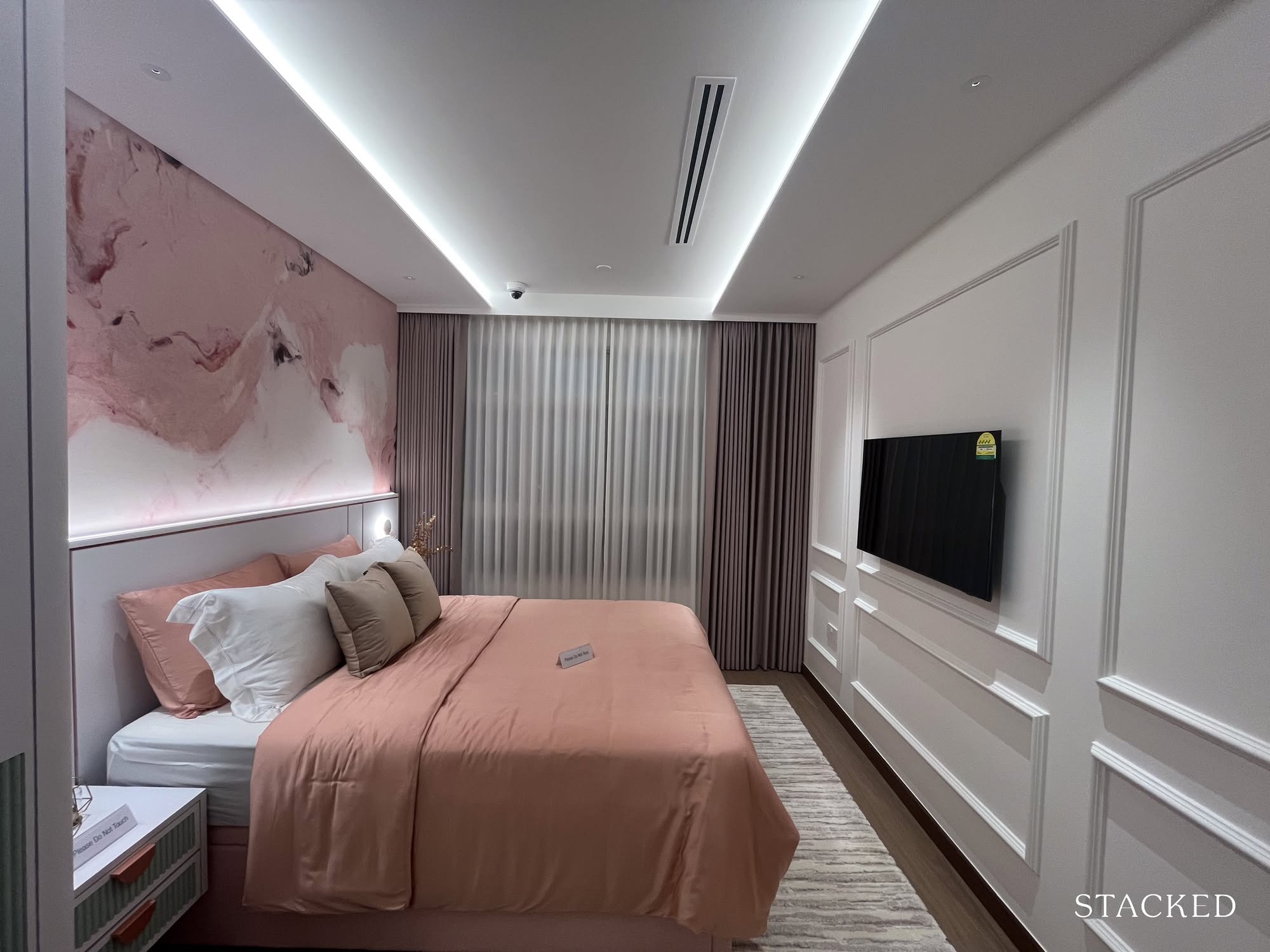
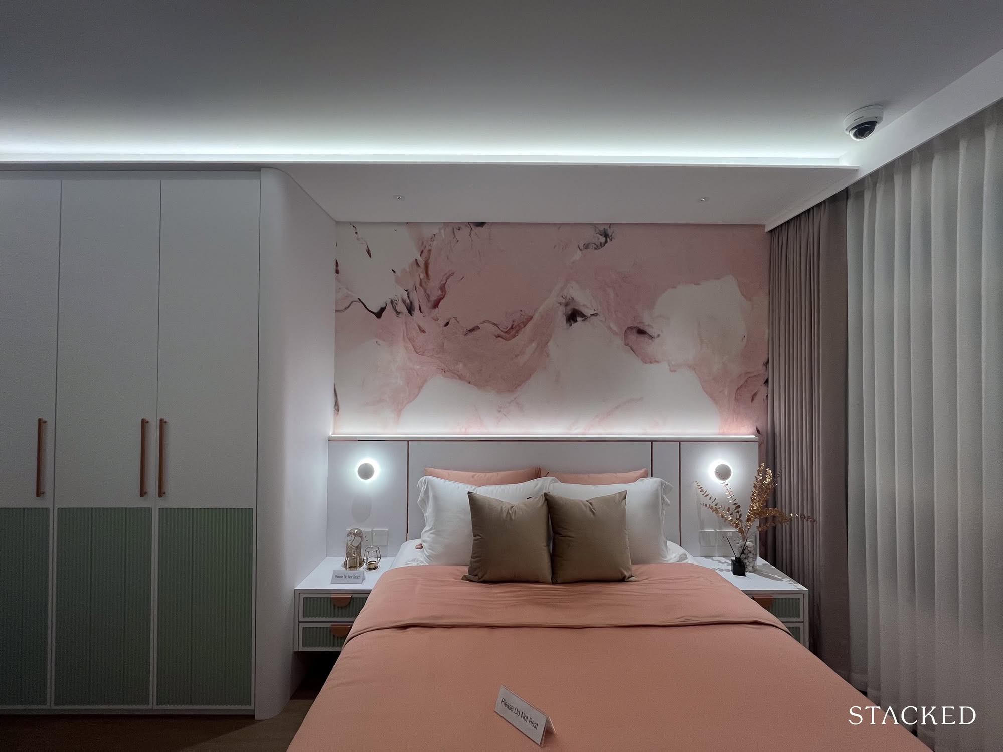
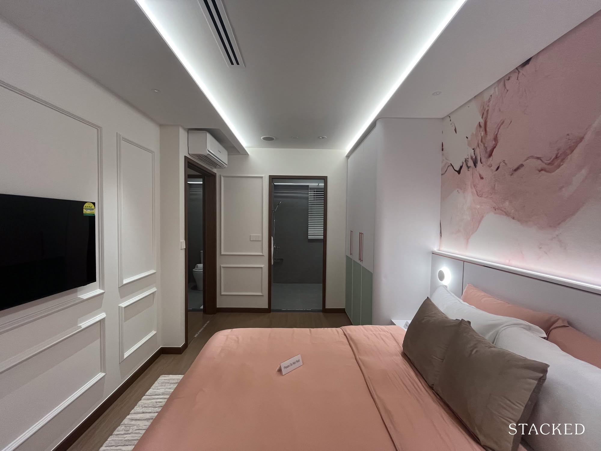
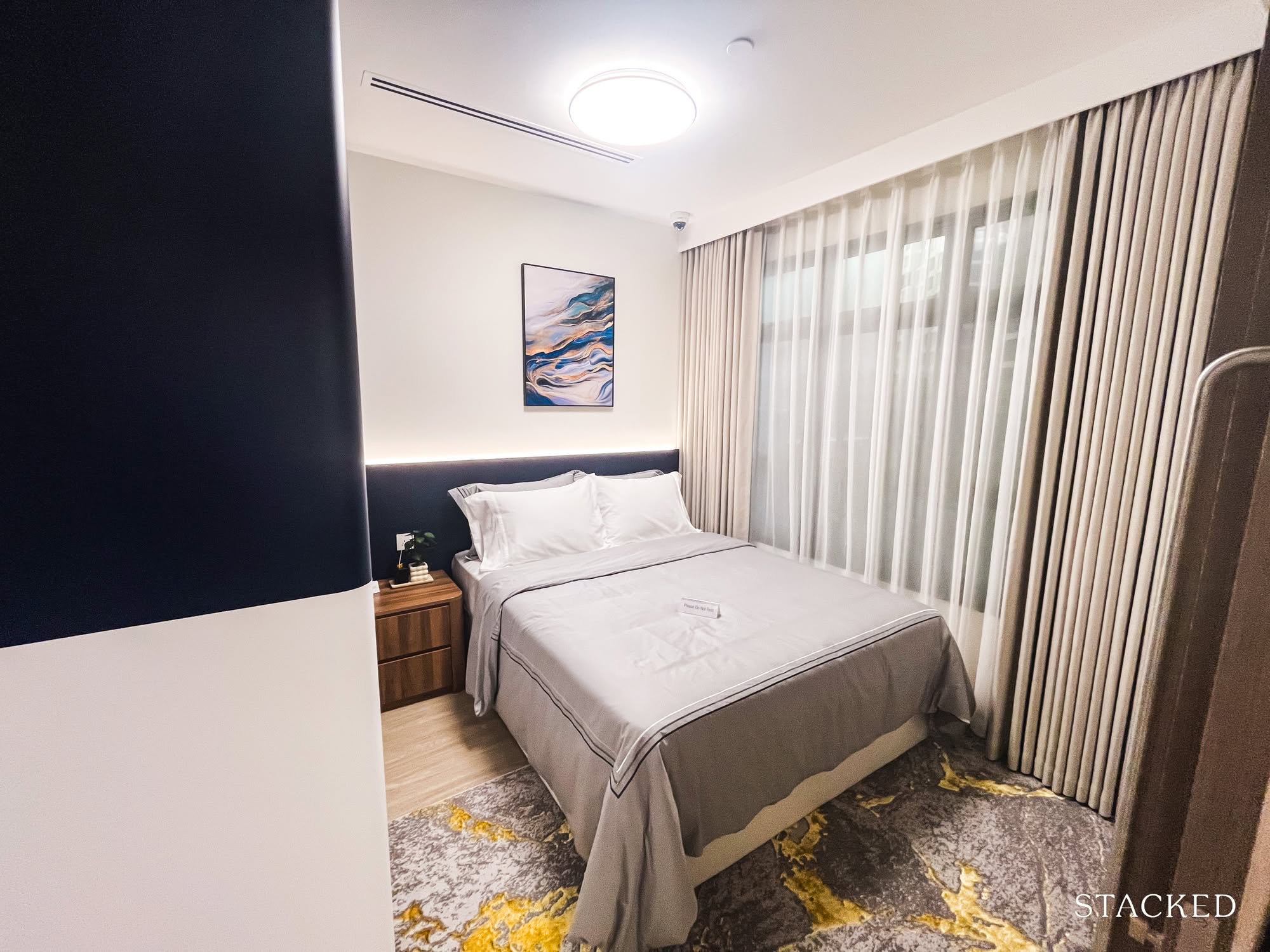
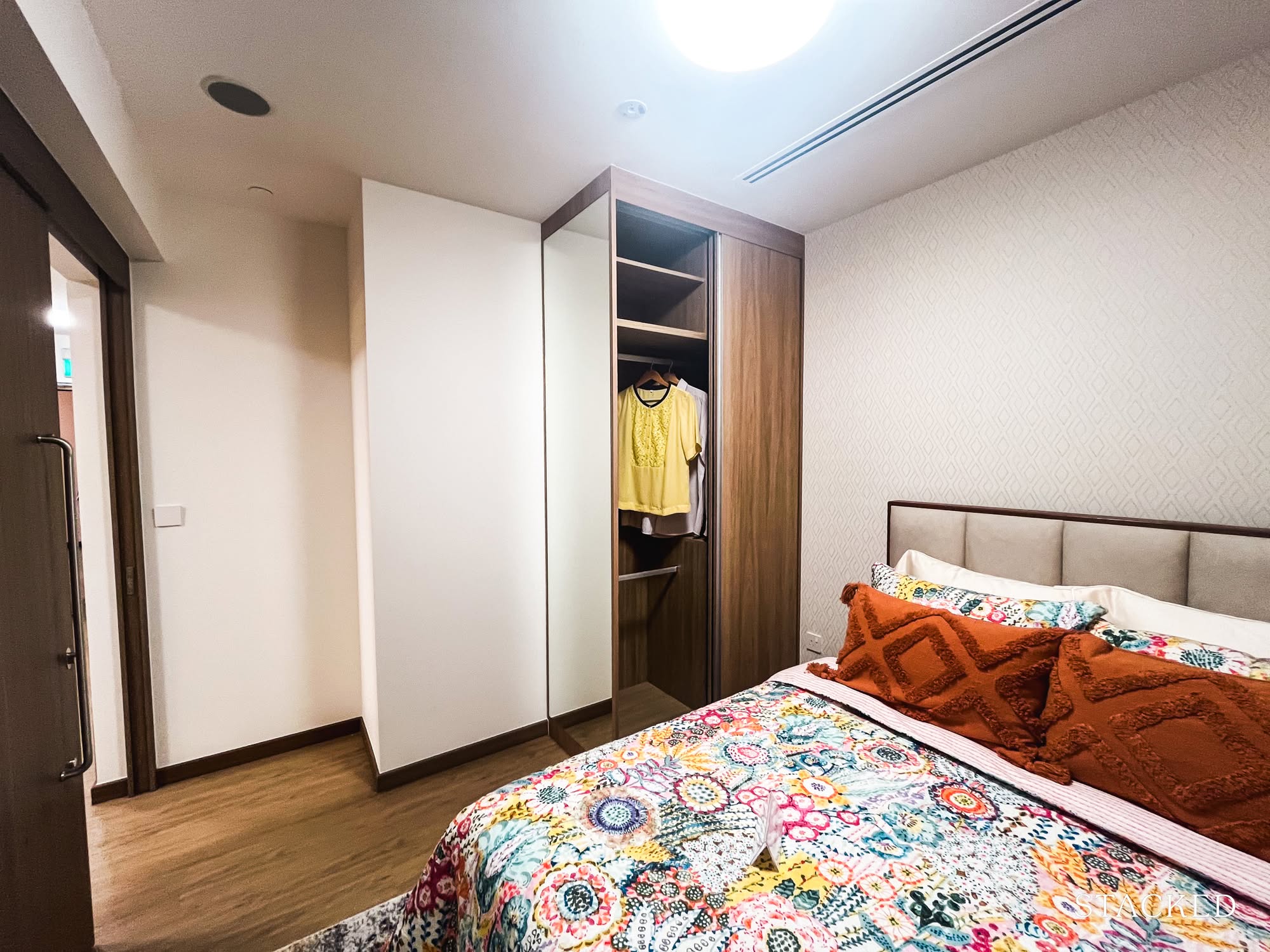
And finally, the master bedroom, which, judging by the crowd when I was there, caught more than a few people by surprise. I overheard several uncles and aunties comparing it to a condo showflat.
What seemed to impress most wasn’t just the styling, but the amount of space.
The room’s length definitely does the heavy lifting here. Even with a queen-sized bed, two side tables, and a full three-panel wardrobe spanning one side, the space still feels generous, roomy enough that one auntie cheerfully declared she could “do her morning stretches in front of the cabinet.”
The layout hits a sweet spot that works for a wide range of homeowners, regardless of age or lifestyle.
Personally, I’m still more partial to the master bedroom in the 4-room layout (mostly because it gives me the option to squeeze in a walk-in closet), but I appreciate how this layout shows what’s possible and how far things have come for our public housing!
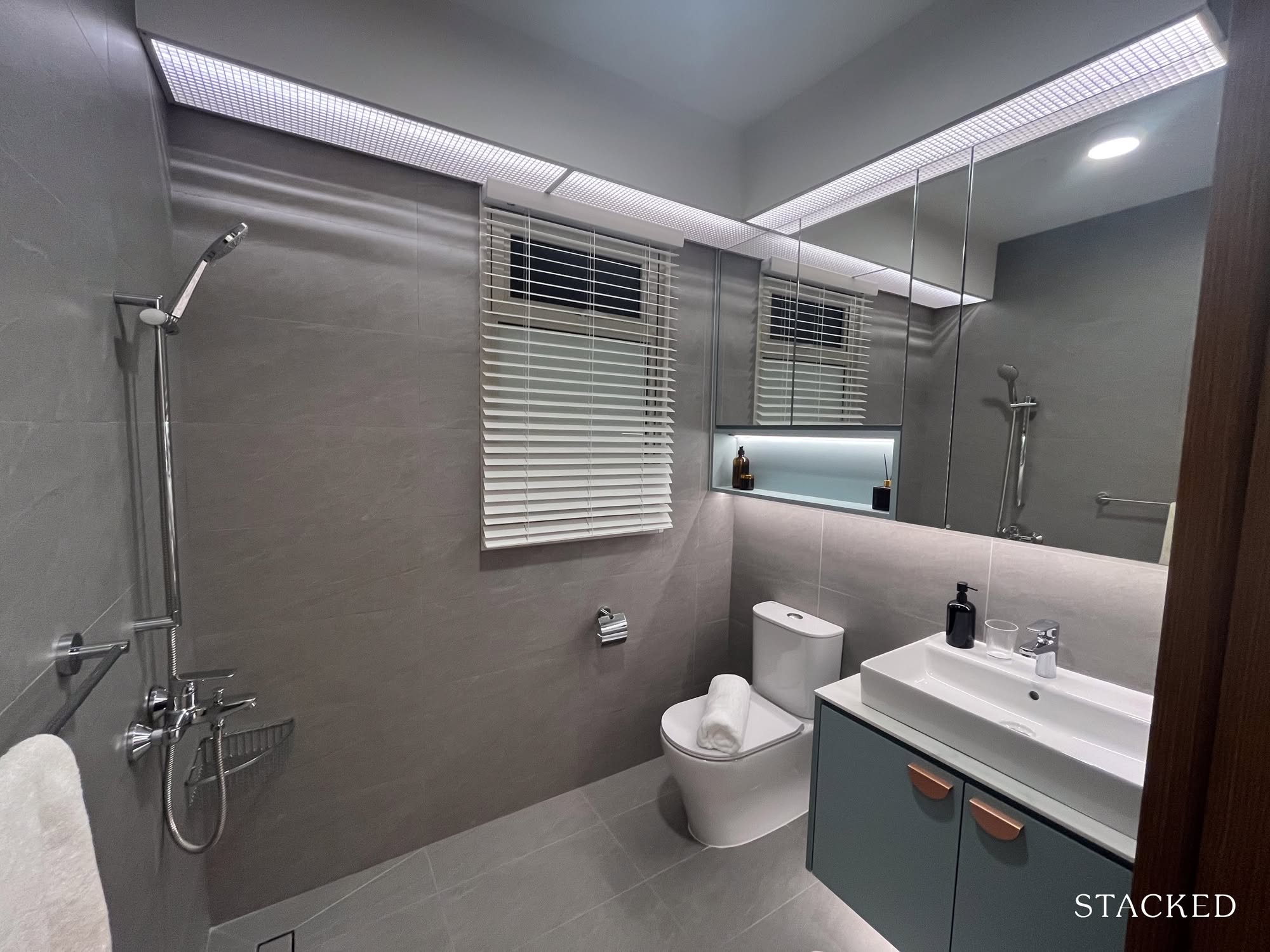
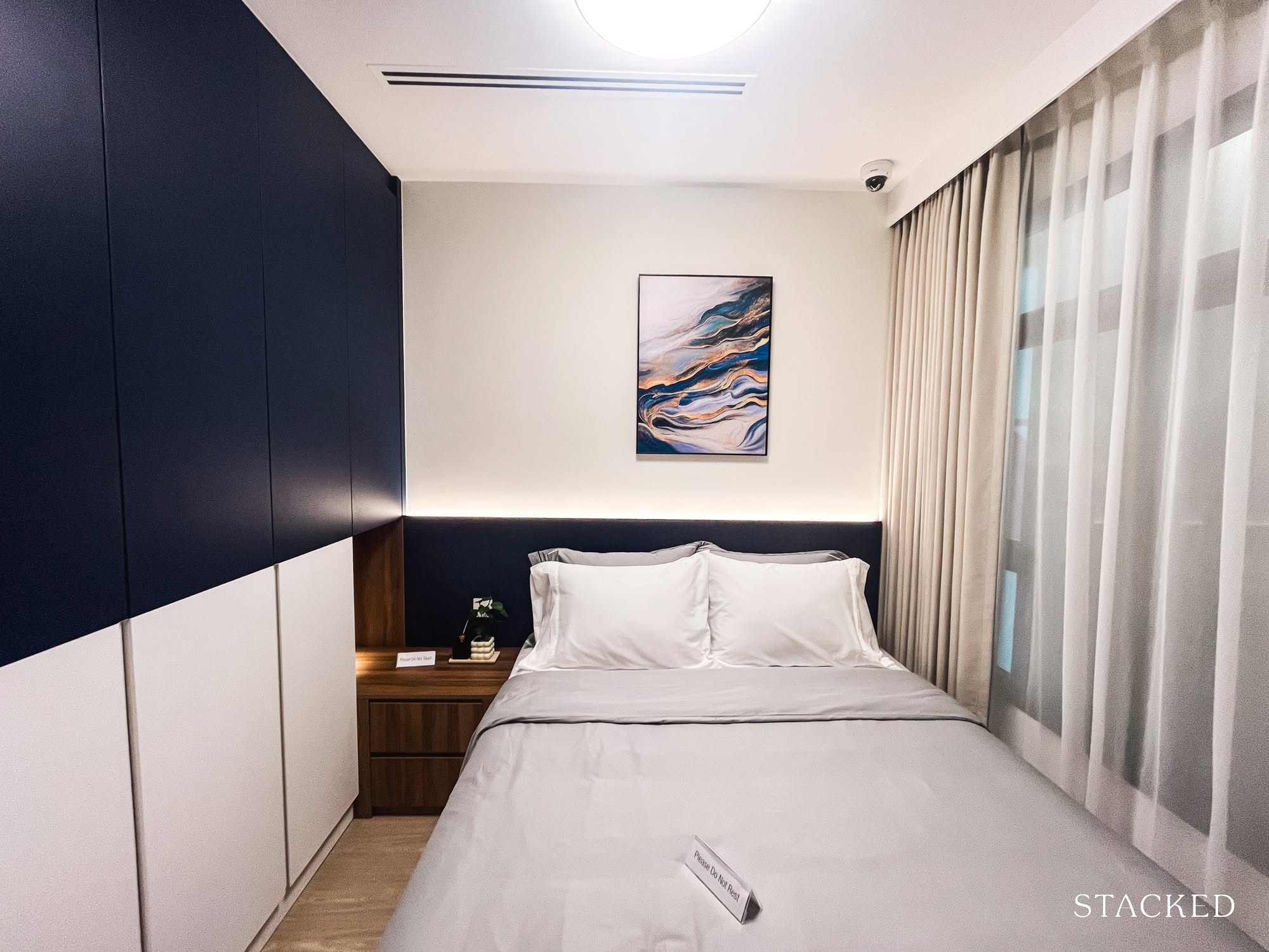
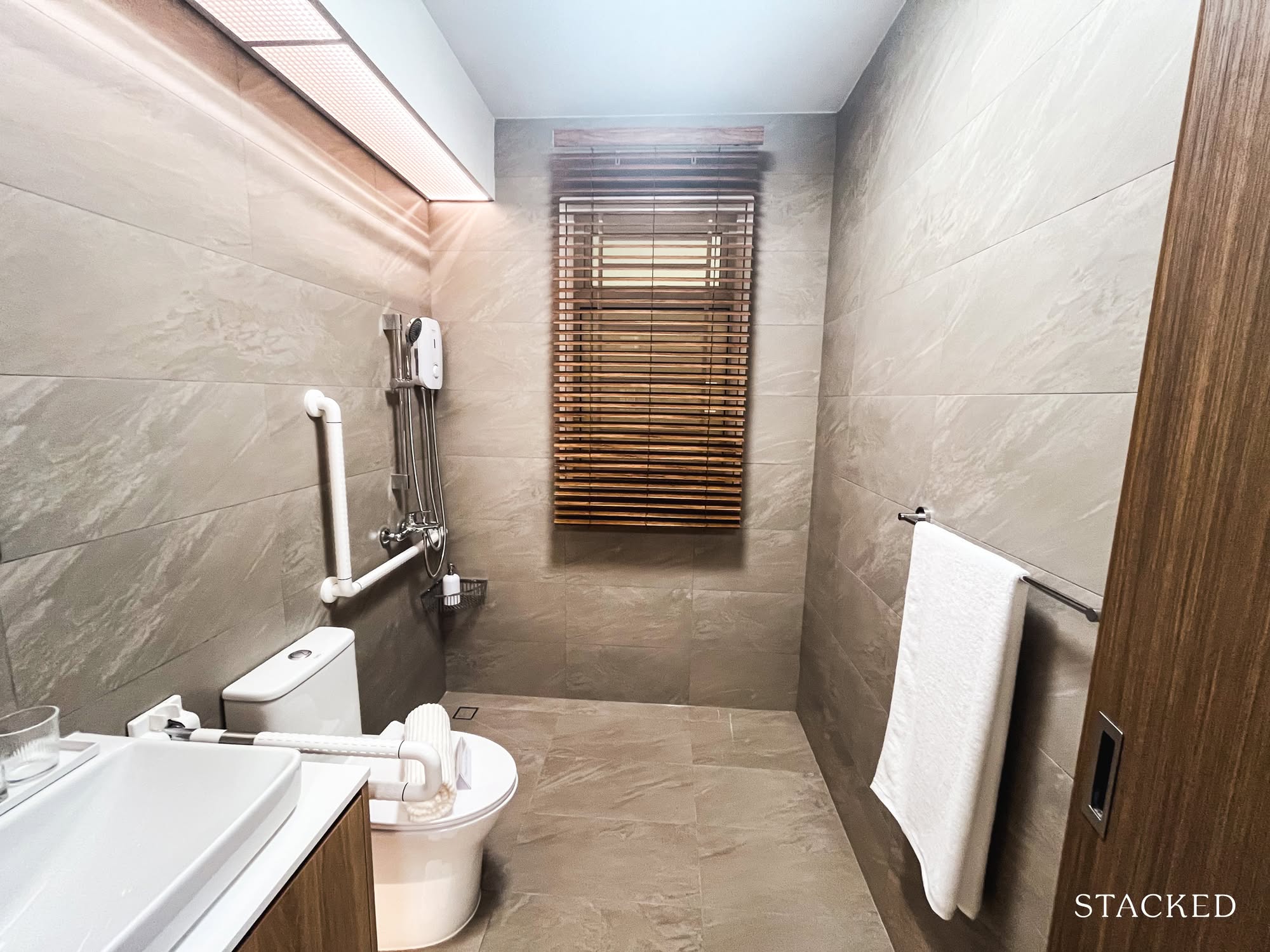
And finally, a look at the master bathroom. It’s pretty similar to the common one: squarish, straightforward, and this time with a slightly larger window (which means better ventilation, so I’m not complaining).
That said, my gripe here is the same: the shower is positioned right across from the cabinetry, with no glass panels in sight. I can already see the mirror desilvering in a few years, not to mention how the entire space will be soaked after every use; a personal pet peeve of mine. The shower placement also feels awkward, being so close to the entrance.
I’ve seen friends try a similar layout in their own homes and, without proper planning, ended up with water leaking out each time someone showered. This is one of those moments where a small tweak – say, a simple screen or better zoning – could go a long way. Neither HDB nor I have come up with a solution for this, it seems.
Next up, the two-bedders. HDB offers two versions of the 2-Room Flexi flat: one at a compact 409 sq. ft., the other slightly roomier at 495 sq. ft.
On paper, it doesn’t sound like a huge difference, but layout always has a way of making or breaking liveability. These units were designed with singles (35 and up), seniors, and smaller families in mind, which is a pretty big deal. Especially if you’re a single homeowner, getting to own a space of your own is no small win, so layout choices matter.
We’ll start with the smaller of the two: the 2-Room Flexi Type 1.
The 2 Room Flexi Type 1 – 409 sq. ft.
Here’s the layout, and my first reaction? That’s a lot of hallway for a 409 sq. ft. flat.
From the entrance to the main living area, and again towards the kitchen, the corridors do take up a noticeable chunk of space. It’s not the most “efficient” design at first glance, but given that the layout isn’t a neat square, this was probably the most practical way to shape the flow of the home.
What some might find interesting here is the absence of a solid wall between the bedroom and the living area. Instead, sliding doors are provided, so if you prefer the flexibility of keeping things open (or closed), that option is baked in.
Some might argue it feels more like a studio or suite, and honestly, I can see why they’d think that.
Still, the essentials are all here: a living space with enough room for a sofa and media console, a bedroom that fits a queen-sized bed, a compact household shelter that’s not hogging too much floor area, a sensible-sized bathroom, and (surprisingly) a very serviceable kitchen.
Let’s move on to the show flat.
As expected, walking into the unit, you’re greeted by a corridor leading you toward the main living space. Again, not the most space-efficient for a 409 sq. ft. home, but it does offer a bit of privacy, you’re not walking straight into the bedroom or kitchen, and that in itself is worth something.
Let’s talk about that kitchen.
For a unit this size, it’s surprisingly generous: countertops on both sides, a window for proper ventilation, and the option to fully enclose the space if you’d like. Honestly, some compact condos don’t even offer this kind of functionality, so that’s already a point in its favour on the liveability scale.
And while there’s no separate yard here (unlike the larger 3-room flats), the layout still holds up. A stacked washer-dryer would work just fine, and with the right ventilation, enclosing the space remains a solid option.
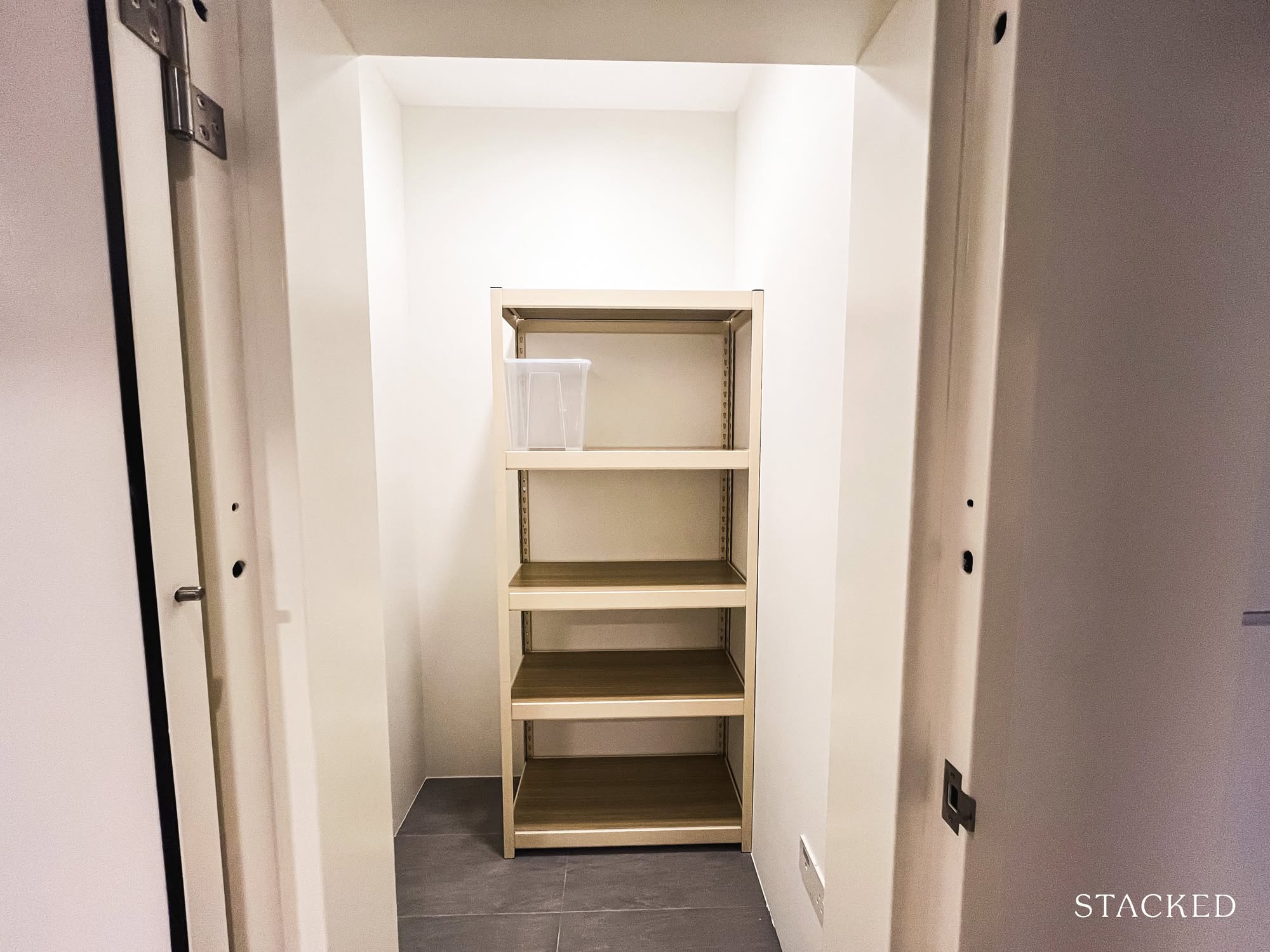
The household shelter is tucked along the hallway, just before you enter the main living area.
It’s noticeably more compact than those in larger units, which makes sense given the overall size of this layout. Still, the proportions feel well balanced for a unit of this scale. For a single occupant or a couple, it serves as a practical storage space without encroaching on the livable area.
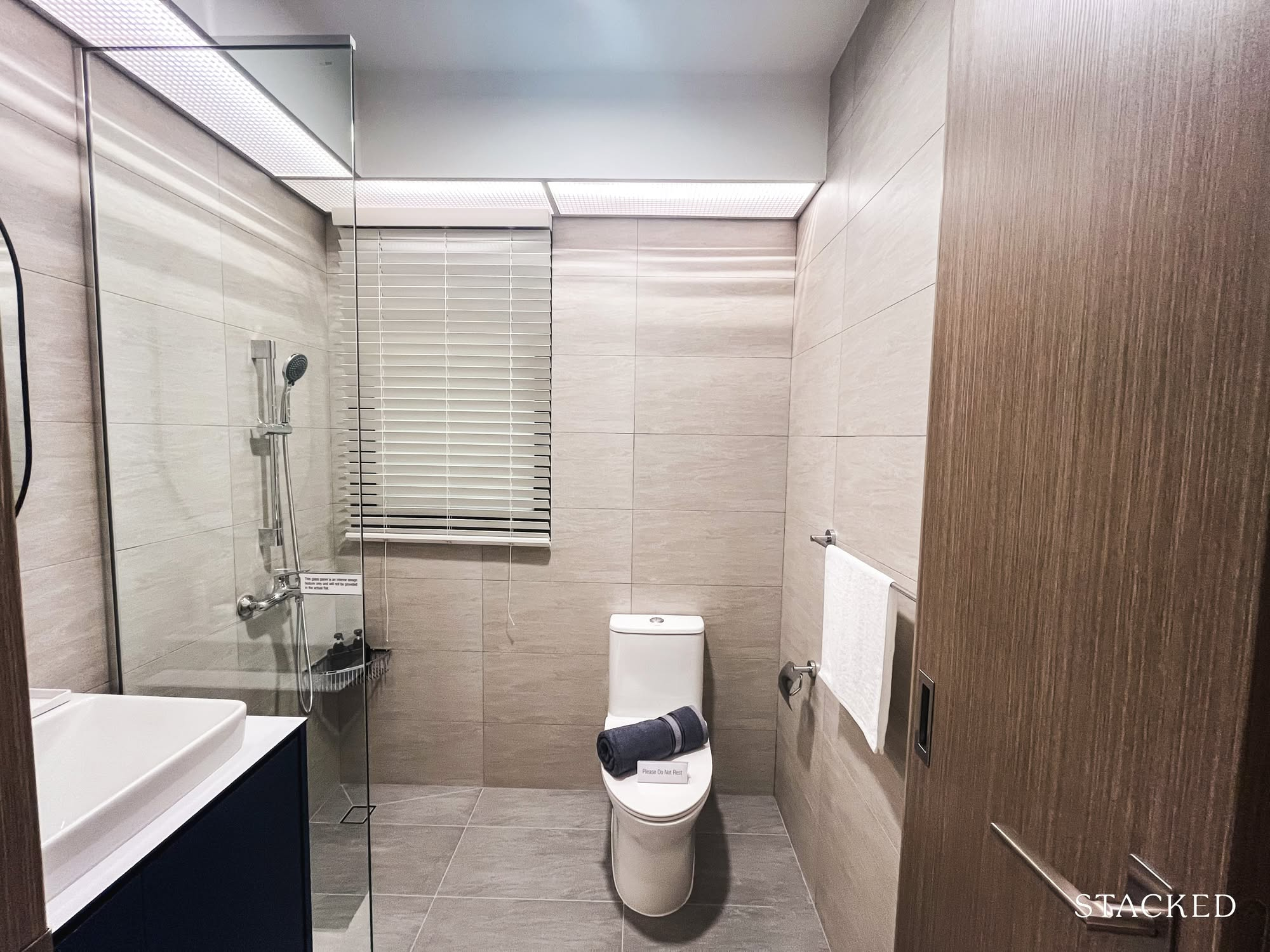
Here’s a look at the bathroom.
This layout has a single shared bathroom for both occupants and guests. It’s surprisingly well-sized, with a squarish layout that feels efficient and practical. It ticks the essentials in my book; enough room to move comfortably and a window for natural ventilation.
That said, the familiar gripe remains: the shower faces the WC. While a glass panel helps keep water from splashing onto the cabinetry and sink, the WC and floor still get wet every time someone showers. Unfortunately, this seems to be a common issue across all the unit types.
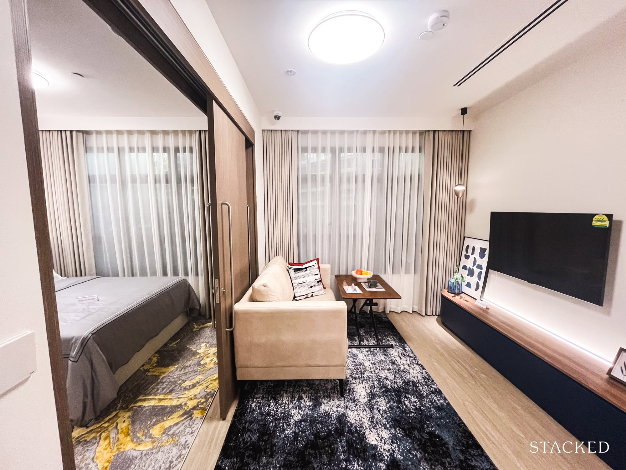
Next up, the main living area and bedroom with that sliding door making a cameo.
This setup might remind some folks of a hotel suite: the sliding door as the gentle boundary between living and sleeping.
I see the vision, but personally, I’d rather ditch the divider at this scale.
It doesn’t do much for noise or privacy (assuming I’m living there alone), and opening up the space lets you play around with the layout more freely, so there is no need to squeeze two separate spaces into one box.
But for those who like the original flow, here’s a peek at the living room.
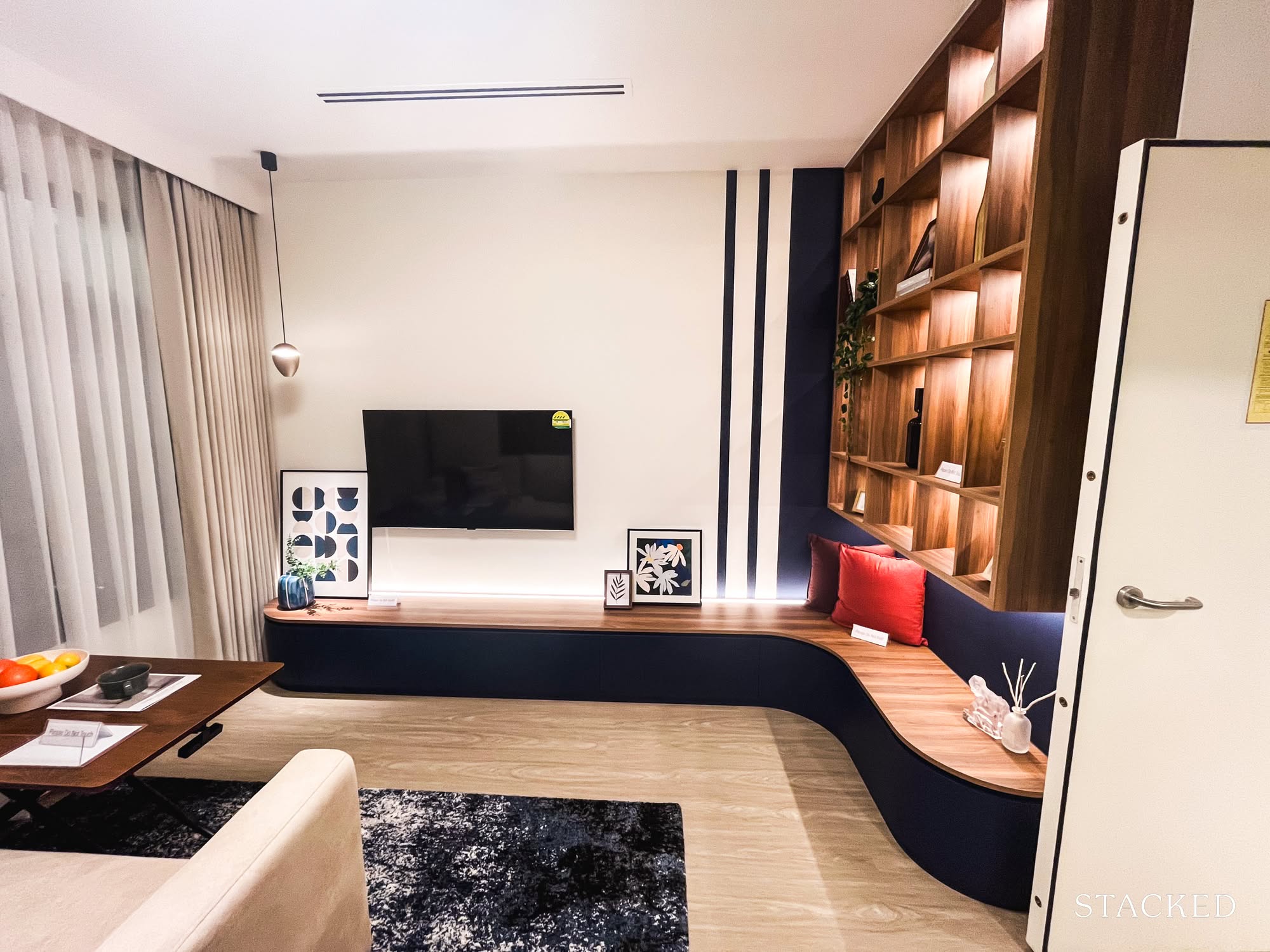
It’s surprisingly roomy; a credit to smart renovation choices (though the budget probably had a lot to do with this too). A compact sofa, coffee table, and TV console fit snugly without feeling cramped. The shelving along the side wall is a clever way to up your storage game; a detail worth borrowing if you ask me.
And finally, here’s the bedroom. It fits a queen-sized bed comfortably, with enough room for a bedside table and some built-in storage: a layout that should work well for most singles.
Given that this flat is designed with singles and right-sizers in mind, I’d say it holds up well for one person over the long term. For two, it might start to feel a little tight. Not impossible, but it could feel like a compromise.
Let’s take a look at the larger 2-Room Flexi next to see how it compares.
The slightly bigger option: The 2 Room Flexi Type 2 – 495 sq. ft.
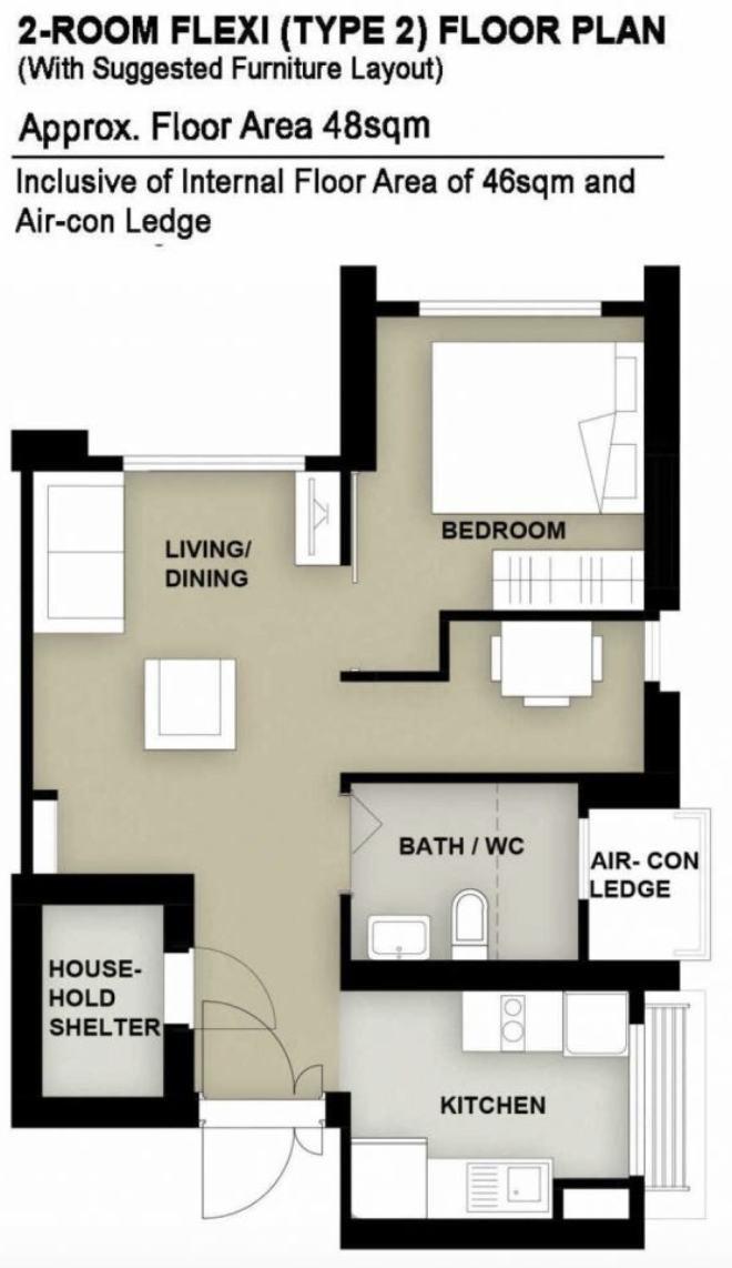
At first glance, the differences between Type 1 and Type 2 are immediately clear. The household shelter here is noticeably larger, almost comparable to those in 3-room flats and above, and positioned right at the entrance.
There’s also less wasted hallway space, which gives the layout a bump in overall efficiency. The living and dining areas feel more expansive too, with just enough room to accommodate a compact dining set.
But the standout feature is the additional flexi space by the bedroom. Whether it’s used as a study, a hobby nook, or a separate sleeping area for live-in help, this added zone introduces a level of flexibility that’s genuinely useful, especially for seniors or long-term singles who want a bit more versatility.
Some elements remain consistent: the sliding door is still part of the layout, but in this larger setting, enclosing the bedroom might actually make more sense. The bedroom still fits a queen-sized bed comfortably, and the kitchen (similar in size and layout to Type 1) remains enclosable, though it also doesn’t come with a separate yard.
Let’s take a look at how all this plays out in the actual unit.
Walk through the front door and you’ll immediately clock the layout: a peek into the living area straight ahead, household shelter to your right, kitchen to your left. Compared to the earlier 2-Room Flexi Type 1, this already feels like a space built for more than one.
That extra 90 square feet? I think that it really translates into breathing room, which matters more than you’d think when it comes to long-term comfort.
The household shelter is also upsized (thankfully), which makes sense if you’re living with someone else and both of you have, well, stuff.
The kitchen here mirrors what we saw in the Type 1 layout, which means I don’t have too much new to say, except that it’s probably even more worthwhile in this larger unit. You’re getting the same amount of countertop space and functionality, but now shared between more people. So yes, better value per square foot if you’re the practical type.
There’s plenty of prep space (legitimately more than some compact condos I’ve seen), and while I’m no Fengshui expert, I couldn’t help but notice the sink facing directly across from the hob. Not a dealbreaker by any means… just something my inner auntie flagged immediately.
There’s still no separate yard, but the kitchen is enclosable, which is always nice if you cook often or just prefer to keep the smells out of your sheets. All things considered, this setup feels efficient for two, and still workable for three.
Now onto the main living area. Compared to the Type 1 layout, this one feels noticeably more functional. There’s enough room for the usual suspects (a compact sofa, coffee table, TV console) and even a proper two-seater dining set. It’s not exactly the kind of space where the grandkids can do somersaults when they are over, but for two people living day-to-day, it hits the mark.
That said, a lot of what you see here likely comes down to renovation choices and a comfortable budget, so it’s worth managing expectations if you’re walking in with a blank canvas.
One detail I wasn’t entirely sold on at first: the cabinet placed right beside the dining table.
It’s not the most accessible if someone’s already seated, which feels like a small design mismatch. But on second thought, if you have a live-in helper or just need more storage, it’s probably the only logical spot left. Otherwise, I’d argue that space might be better used for a slightly larger, four-seater dining set; if that’s more your vibe.
Now, on to the last half of the apartment: the bathroom and rooms.
There’s only one bathroom in this layout, so it’ll need to serve both occupants and guests, but honestly, it holds its own pretty well.
For the practically minded (which, let’s face it, is most of us), it checks the right boxes: roomy enough to move around comfortably, even with the sink and WC in place, and a large window for proper ventilation – always a bonus.
That said, my usual gripe still stands. If you choose to live in it as it is, note that there’s no partition between the shower and the rest of the bathroom, so some water spillage is inevitable. Thankfully, this layout makes it easy to add a glass panel and keep wet and dry zones nicely separated.
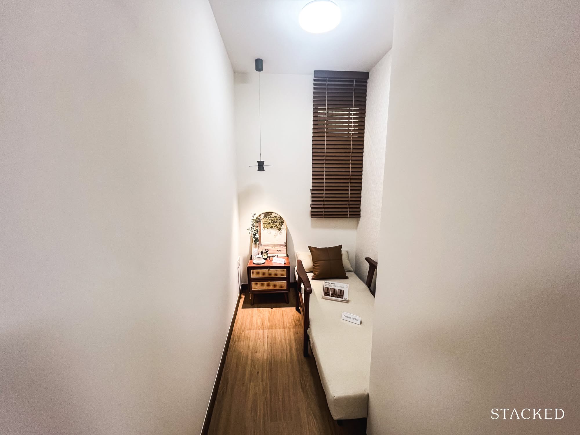
Here’s where it gets a little more interesting — the flexi room. When I first saw it in person, I genuinely thought it was set up for a therapy session (the bed looked like something straight out of a wellness clinic). And yes, it really is as narrow as it looks in the photo.
With the window, it could work as a compact study, but using it as a sleeping space — say, for a live-in helper — might be a squeeze if you’re planning on a regular bed. A Murphy bed could be a more space-efficient option, though I doubt you’d still have room for the bedside table shown here.
That said, based on the layout, it seems like the wall between this space and the main bedroom can be hacked. So if you don’t need the separation, combining both rooms for a larger master might actually be the more comfortable choice. Otherwise, this is what you’d get for this extra spot.
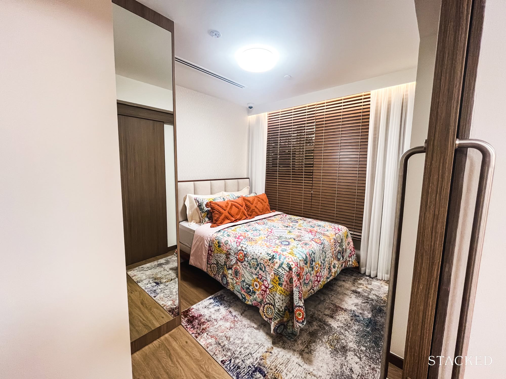
Finally, the master bedroom. It comes with sliding doors; probably a clever space-saving touch, to fully enclose the room and create a proper bedroom feel. While it’s not exactly sprawling, it comfortably fits a queen-sized bed alongside a modest two-panel sliding door wardrobe.
For those considering a 2-room flat as a right-sizing option, that extra 90 square feet here really makes a difference, especially if you’re moving in as a pair. The Type 1 unit could start to feel a little cramped over time.
Final Thoughts: Singapore’s Evolving Homes
Visiting the showflat is a quietly endearing experience, like catching a glimpse of an ongoing conversation between HDB and the people who live in these homes.
It’s a reminder that public housing is a communal effort, shaped by decades of feedback, changing lifestyles, and everyday realities. These layouts aren’t just functional drawings; they’re reflections of how we live, what we value, and how our needs continue to evolve.
At Stacked, we like to look beyond the headlines and surface-level numbers, and focus on how things play out in the real world.
If you’d like to discuss how this applies to your own circumstances, you can reach out for a one-to-one consultation here.
And if you simply have a question or want to share a thought, feel free to write to us at stories@stackedhomes.com — we read every message.

1 Comments
This makes no sense. I don’t think people who could afford only 2/3 room flats can afford that obscene amount of carpentry.