Twin VEW Review: Waterfront Views With Great Landscaping
October 9, 2021
| Project: | Twin VEW |
|---|---|
| District: | 05 |
| Address: | West Coast Vale |
| Tenure: | 99-year leasehold |
| No. of Units: | 520 |
| Site Area: | 176,293 sqft |
| Developer: | CSC Land Group |
| TOP: | 2021 |
So many readers write in because they're unsure what to do next, and don't know who to trust.
If this sounds familiar, we offer structured 1-to-1 consultations where we walk through your finances, goals, and market options objectively.
No obligation. Just clarity.
Learn more here.
Twin VEW Insider Tour
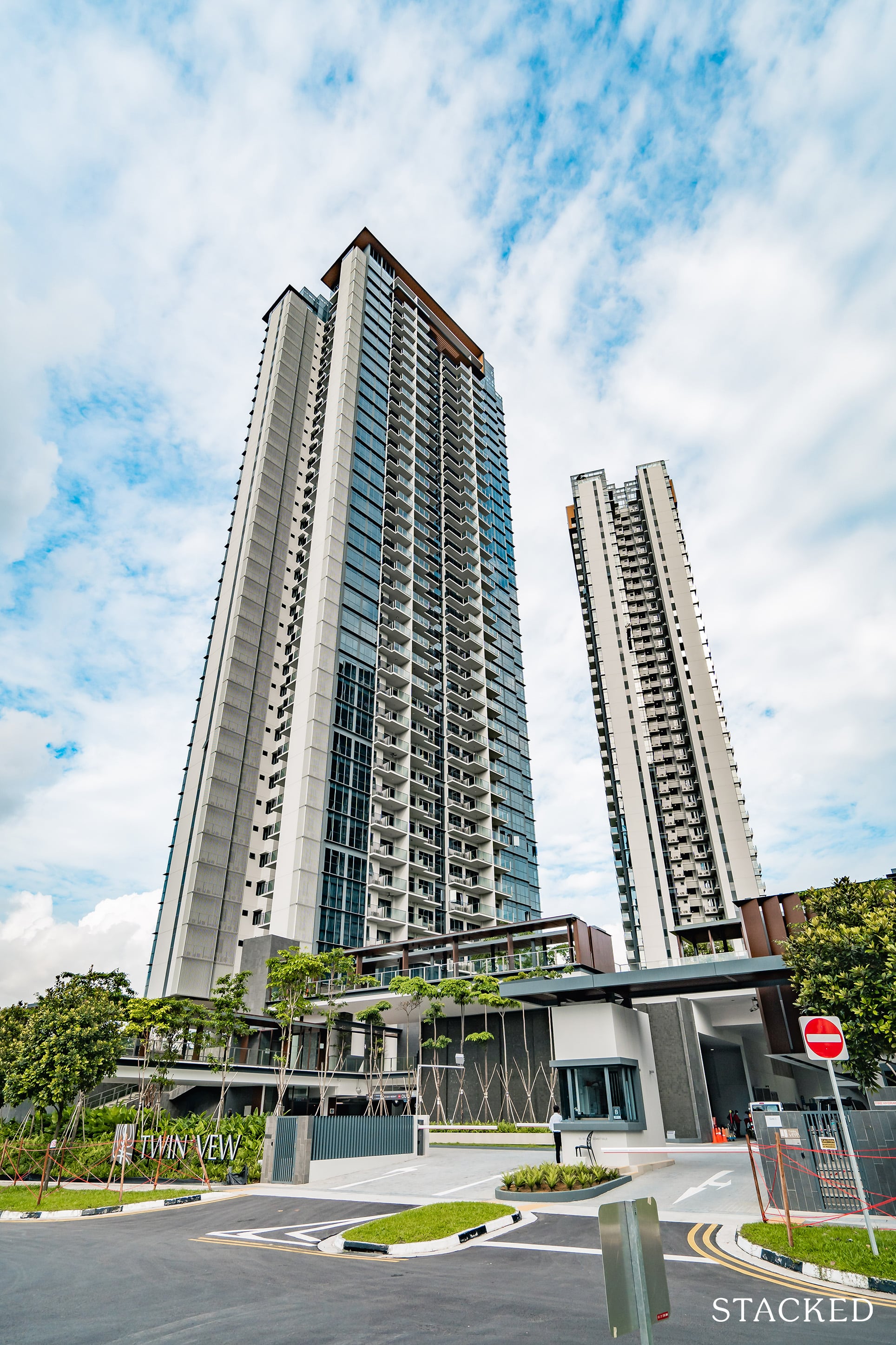
Today’s review is a pretty special one. It marks the first time that we’ve reviewed a new launch development at the show flat – and now that its built, to experience and compare to see how the vision for it has been realised. I’m pretty psyched to show off the space to you, so here goes!
When I first visited the Twin VEW show flat a year ago in Oct 2020, I was quite impressed. For a maiden project, I liked the vision that the developers (CSC Land) had created. The tiered landscaping, modern design, and lush facilities were attractive. While the lack of immediate amenities nearby was undoubtedly a drawback, the successful sales early on proved that they had a very appealing package on paper. So like most, I could see the potential, and was excited to see the project come to fruition.
Getting to Twin VEW is easy enough – as long as you drive or take a taxi. There are a number of condos in the area, but West Coast Vale itself only serves the 3 new kids on the block. The slightly older Parc Riviera, Twin VEW, and the upcoming Whistler Grand. So yes, depending on which side of the fence you are on, one might see the location as a negative. And on the other, if you already own a car and want to come home to something less busy – the space may just appeal to you.
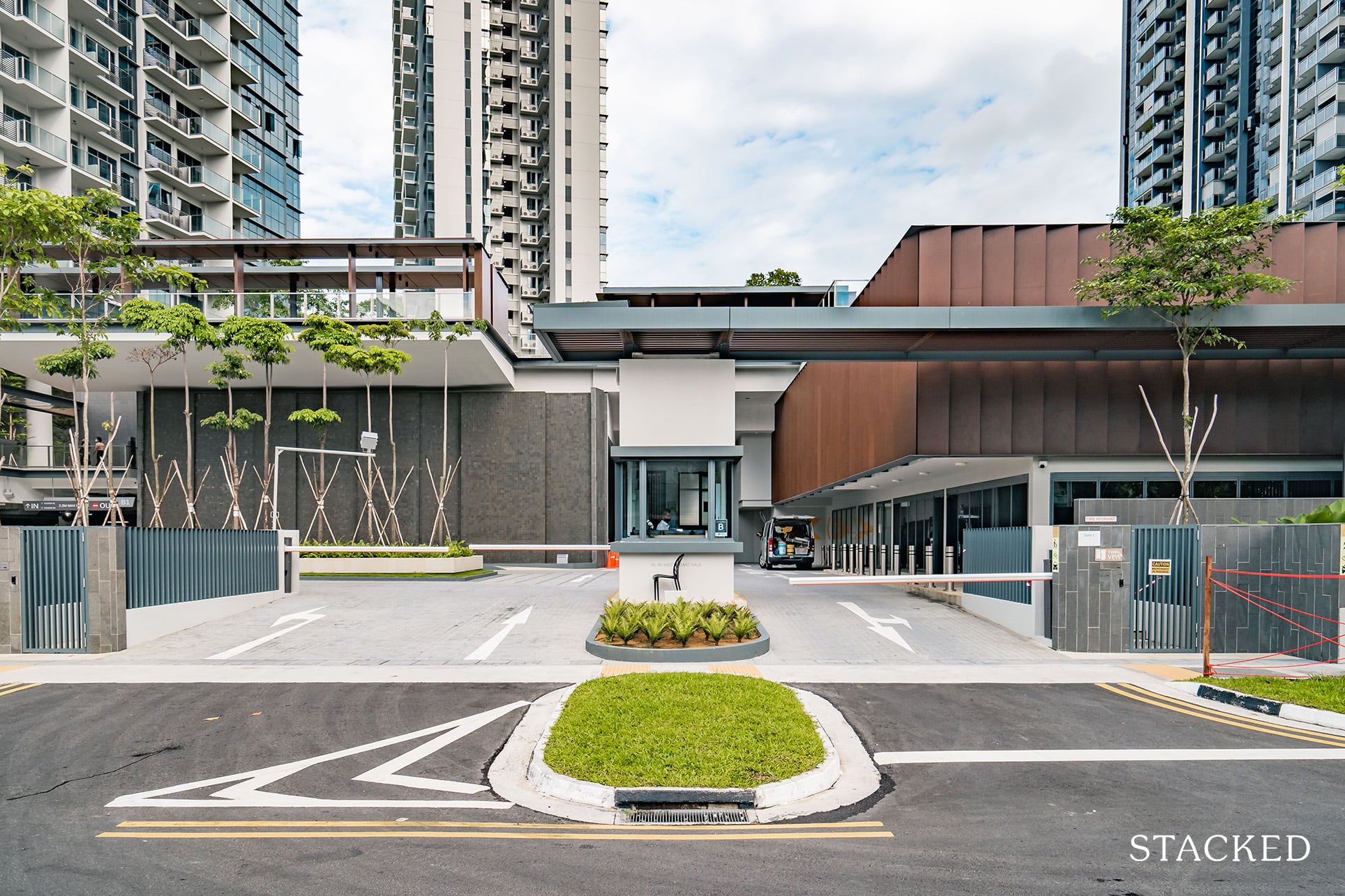
The first impressions of the space is definitely a positive one. I like the amount of space catered to the Foliage Drive (essentially the arrival area). The plants in the centre are definitely not as lush as depicted in the show flat, but it is still early days so I’m sure that these will grow out well in time to come. But by and large that open nature and clean aesthetic vibe is well communicated here.
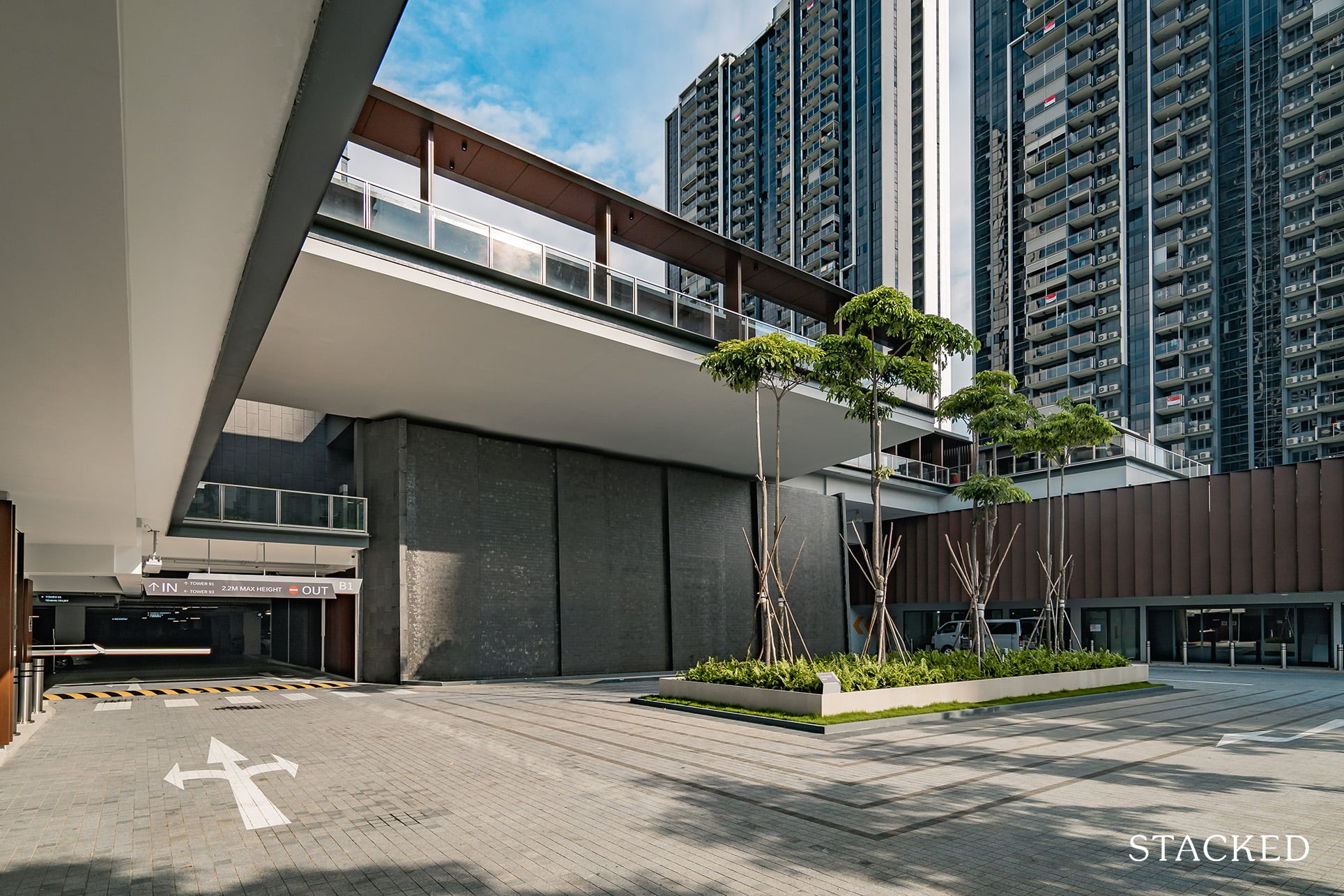
I would say though that the Cascading Waterfall here does have less of an effect that I would have thought – if I didn’t know about it prior I might not even have noticed it. Perhaps the monotone grey backdrop didn’t do it any favours.
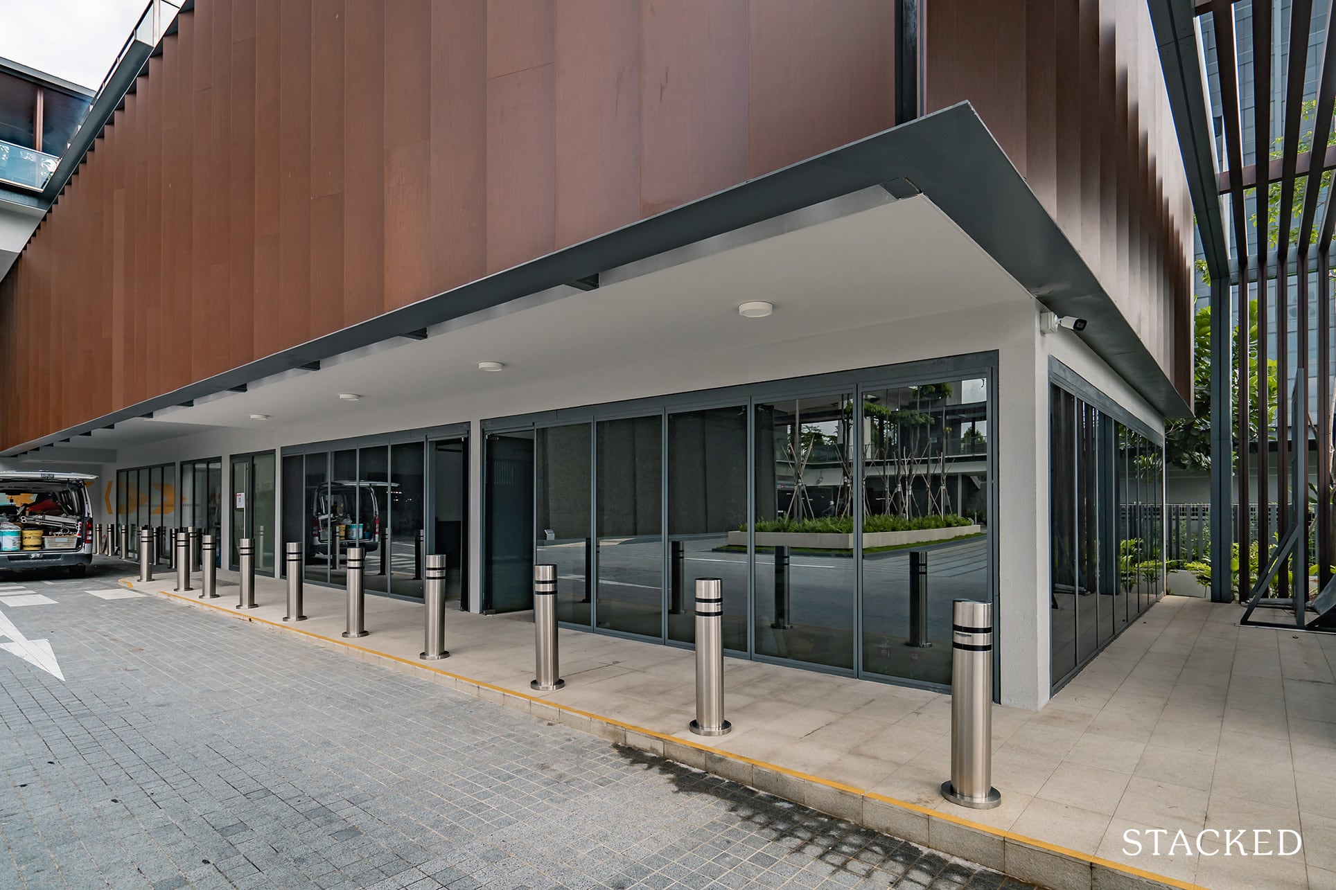
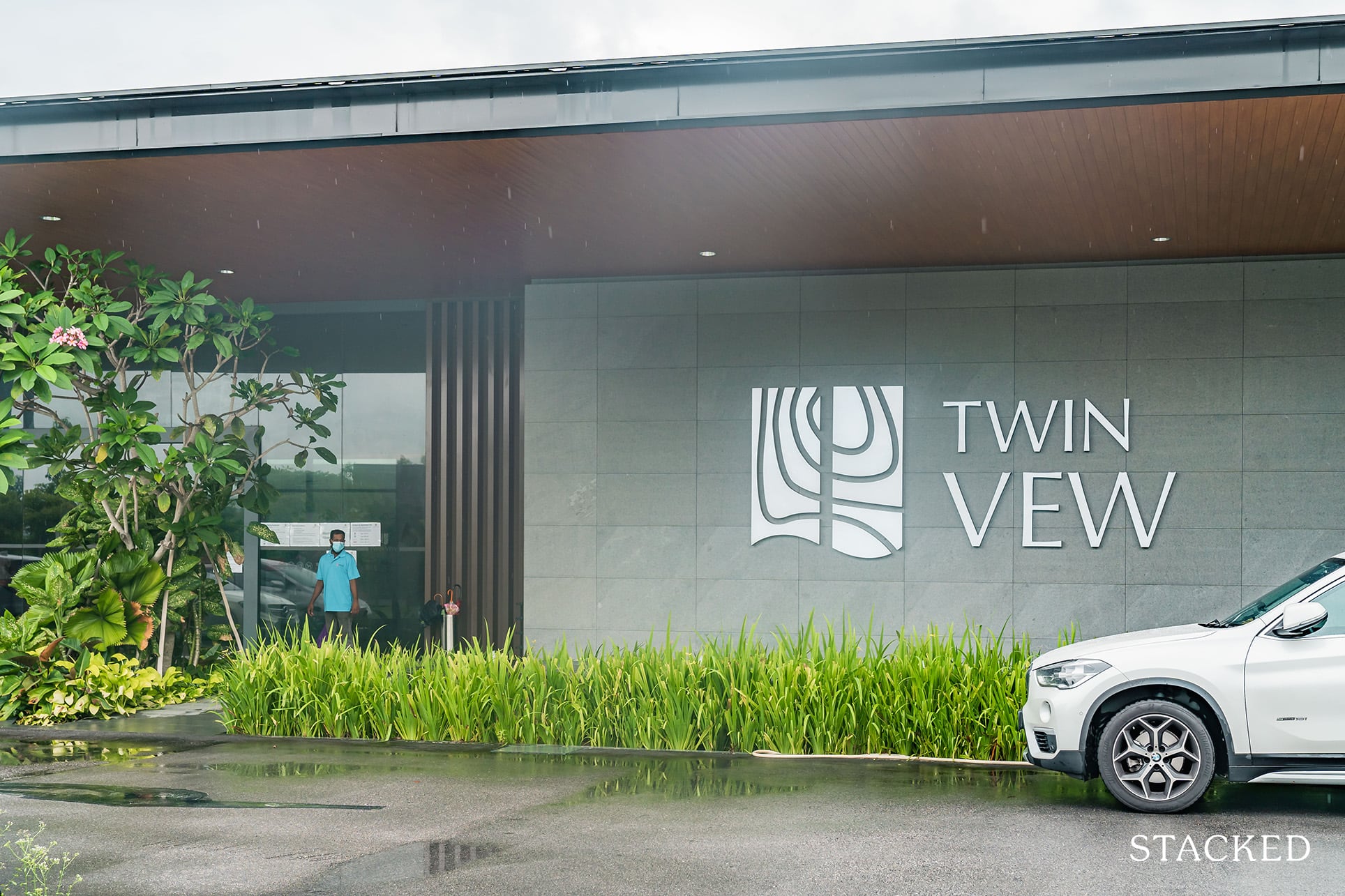
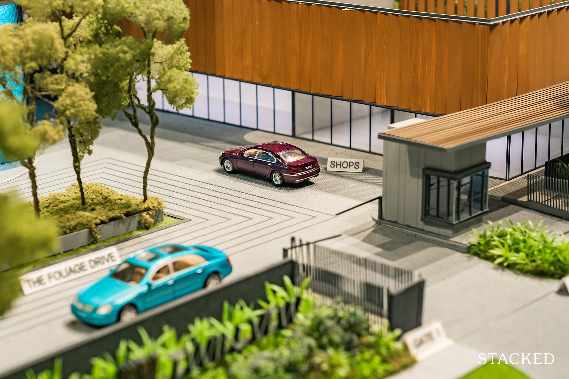
On the right of the guardhouse are the 2 commercial shops that are sized at 550 square feet each. Talks are ongoing for a minimart to be placed here (which will be mightily useful), and above this is the childcare centre. Like many of the newer developments that you might have seen, these are all conveniently placed at the entrance so that non-residents can access them as well without intruding into the private spaces within. Ultimately, you want these spaces to thrive so it makes total sense that the business can accept outsiders.
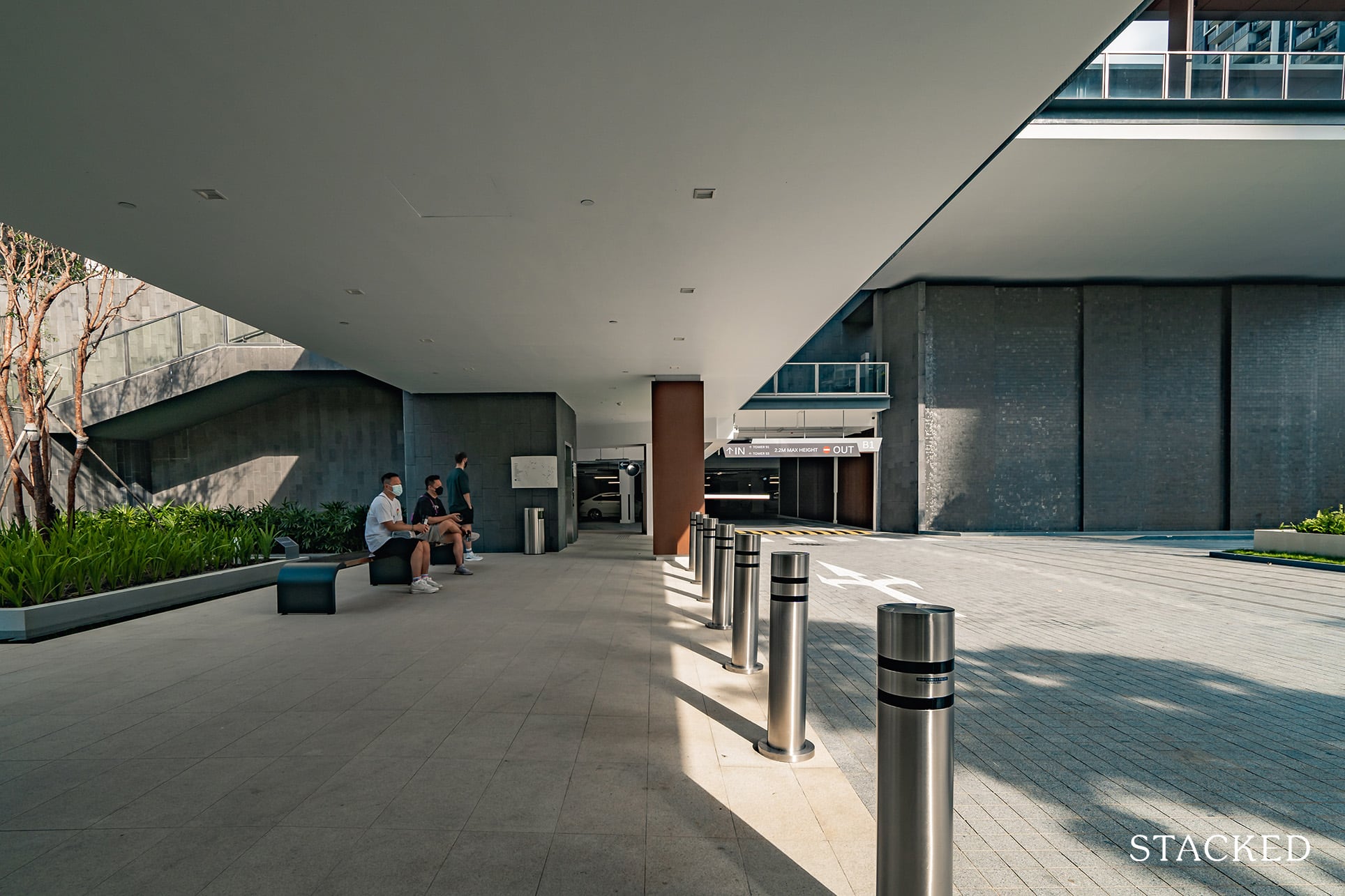
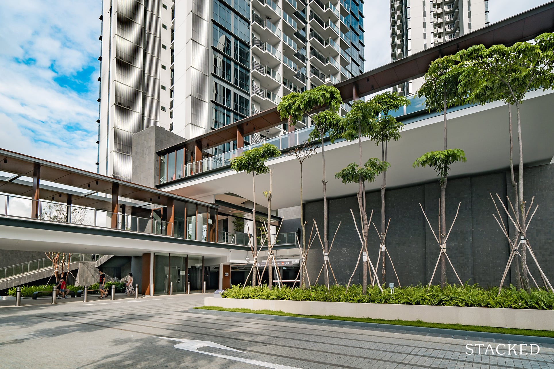
Moving back to the other side, the drop-off point is very spacious, and there’s bench seating provided as you wait for your ride to come.
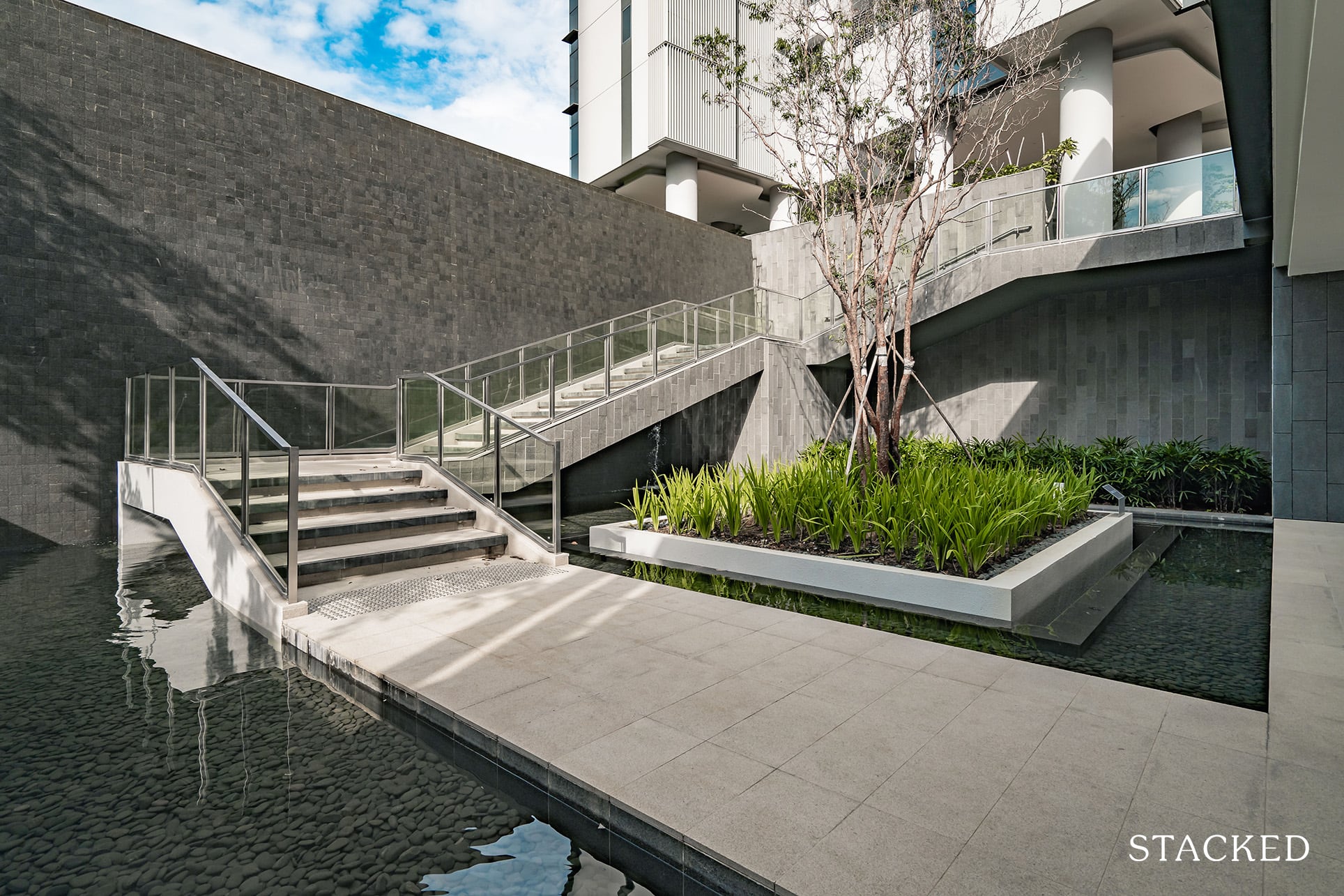
Behind the drop-off point is a courtyard featuring an extended staircase that leads you to the main areas of the development. It’s certainly an elaborate way of going up (I think most would take the lift), but it does give you the vibes of entering a resort in Bali. As far as first impressions go so far, it’s definitely very positive.
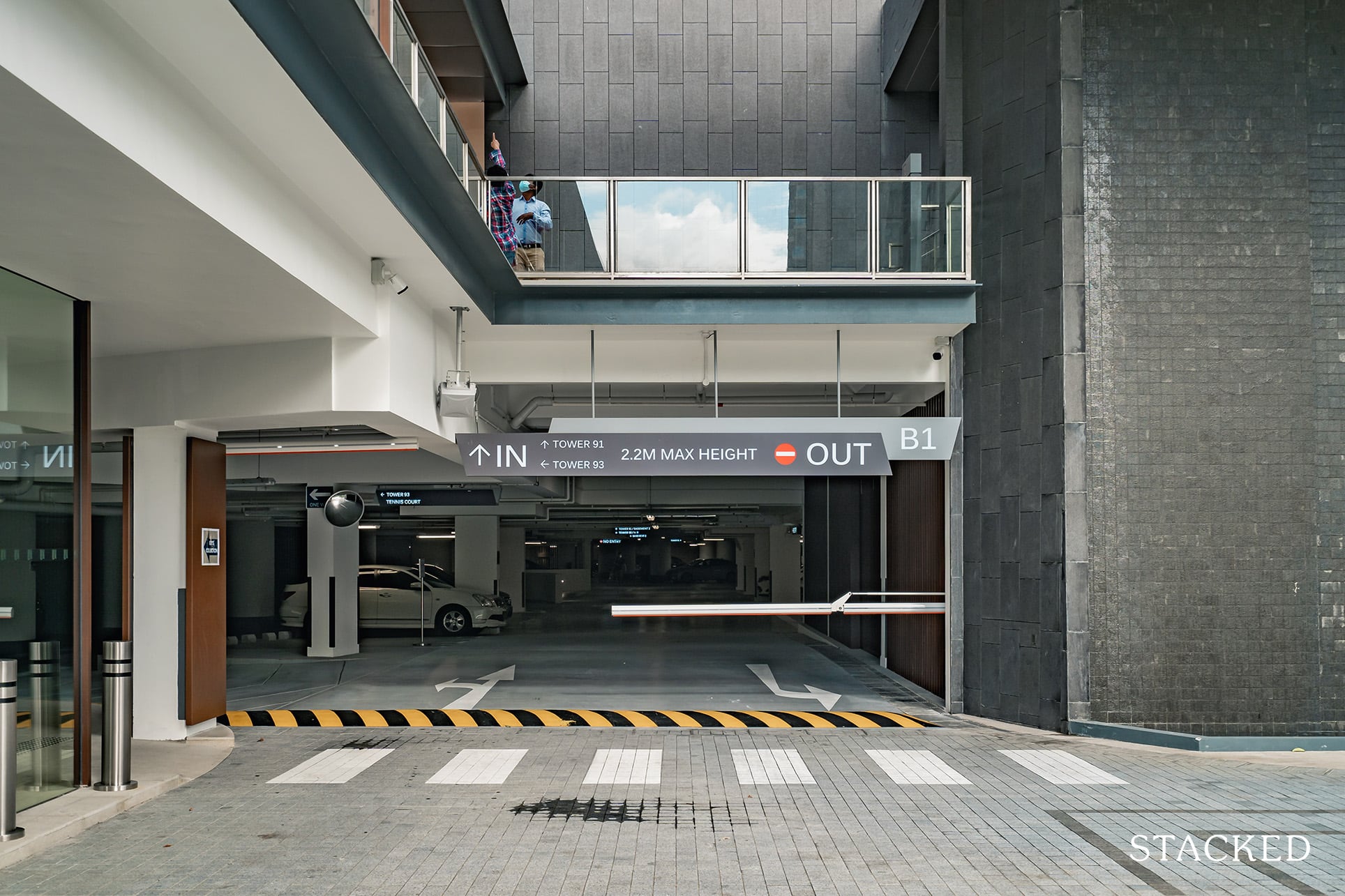
The car park at Twin VEW is just to the right and offers a 1:1 car park lot ratio – a very welcome move given the more outskirt location. The first level of the car park is on the ground level, while the second is underground.
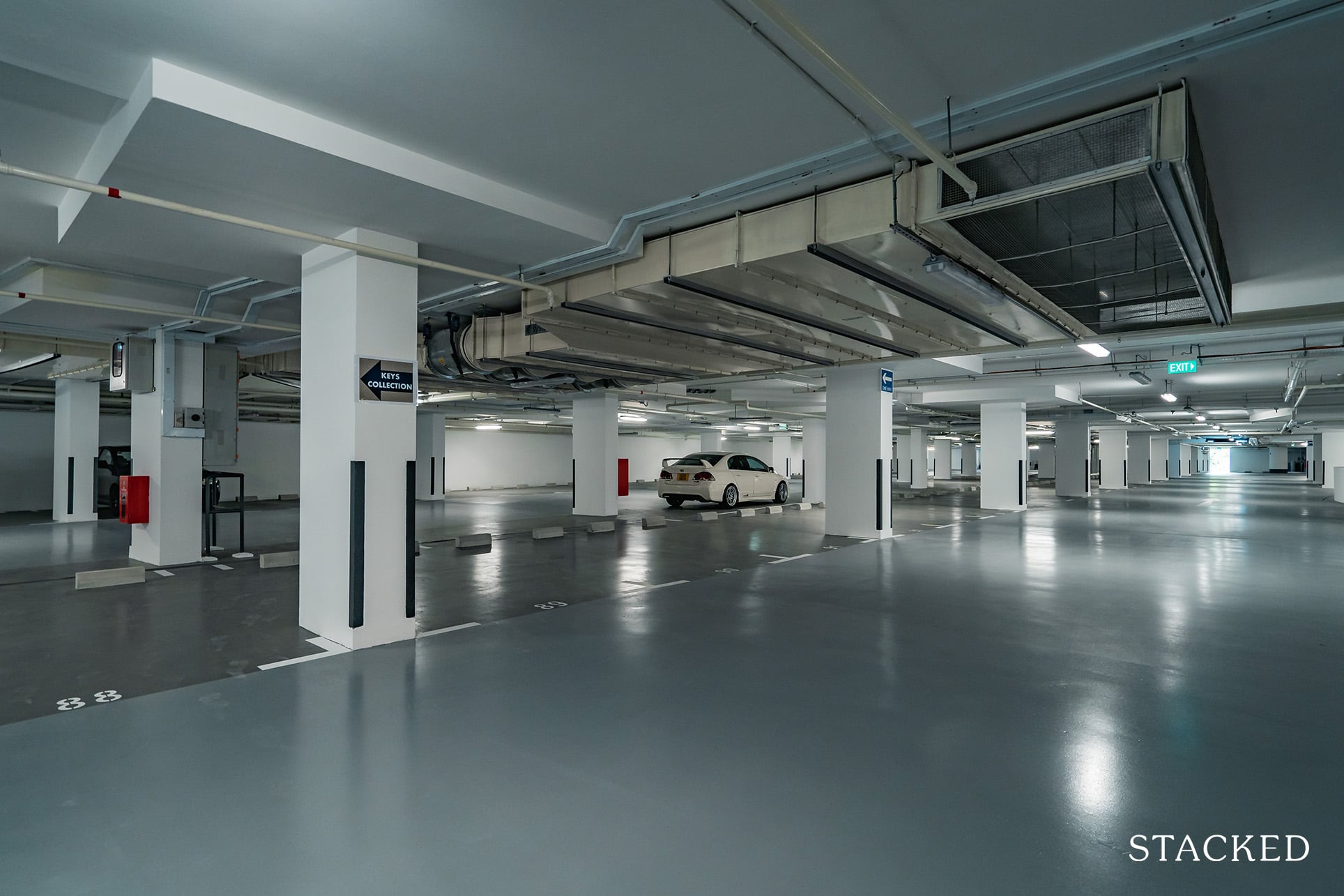
With the smooth epoxy flooring, the car park looks upscale enough. Most of the residents have not moved in yet, but the lanes were wide and easy to maneuver around. It’s brightly lighted up too, so you don’t get the gloomy feeling you sometimes associate with older car parks.
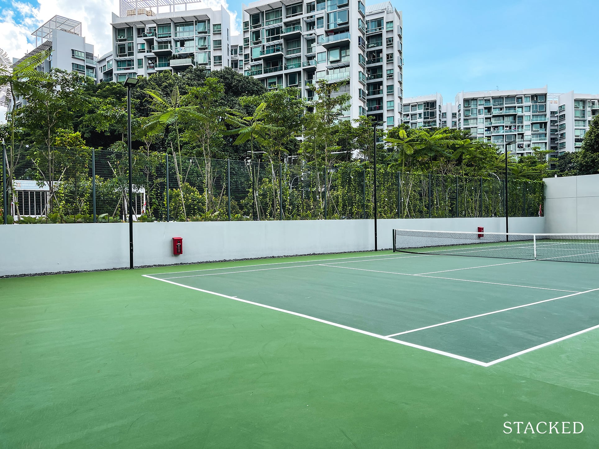
And this may seem like an odd interjection here, but the tennis court at Twin VEW is located right next to the car park. For a development with 520 units today, this is definitely very decent.
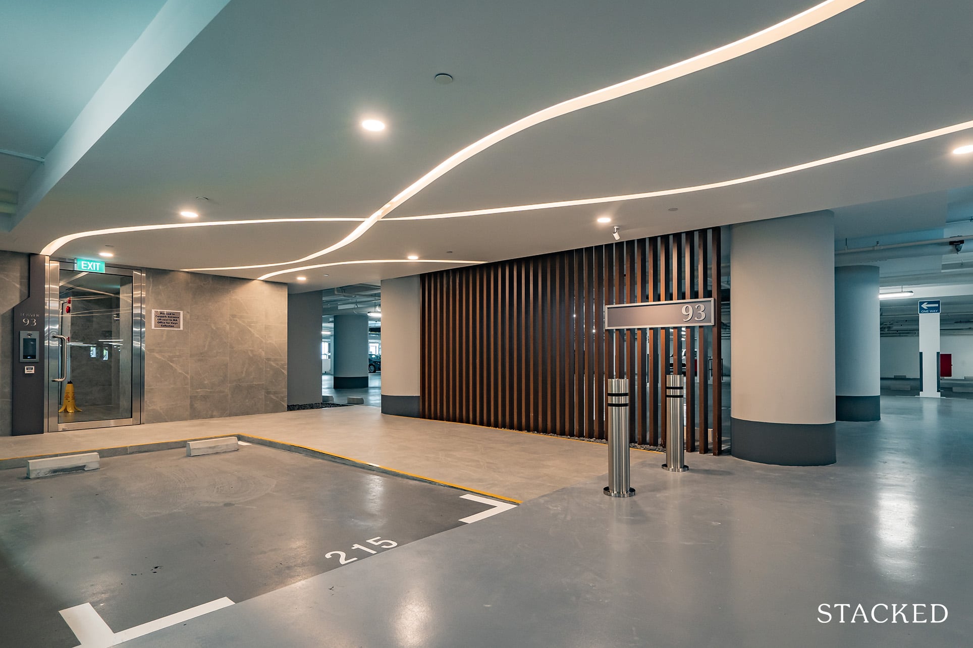
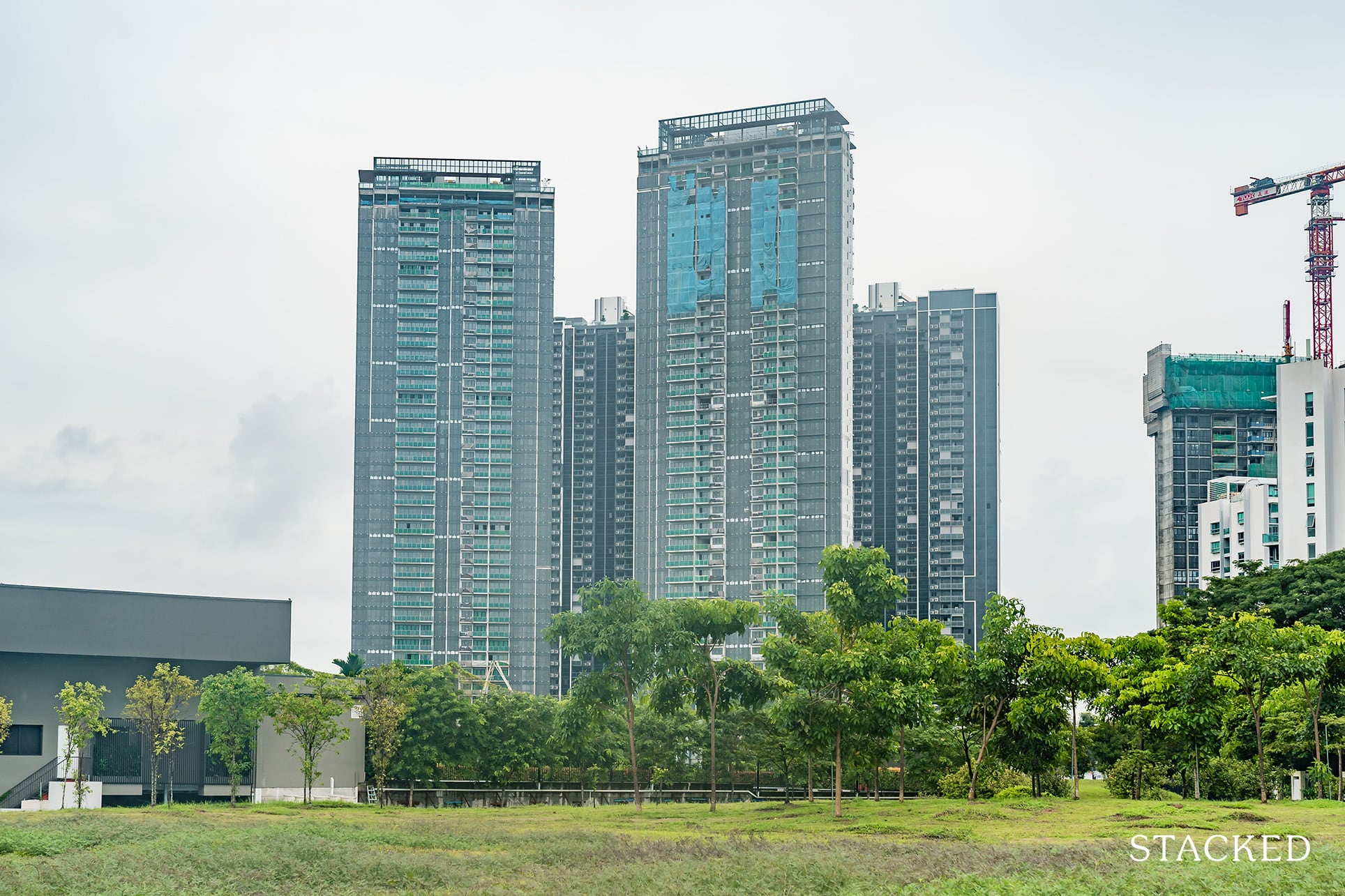
There are only 2 towers at Twin VEW, so there’s little chance you are going to get lost here. Nevertheless, each tower is brightly showcased.
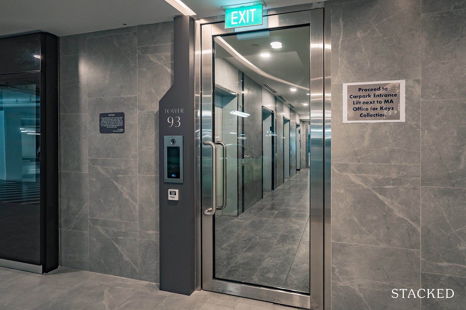
As you might expect, the lift lobby will require you to be dialled in by a resident to enter. The lobby is air-conditioned too, which is always a nice touch after a hot day out.
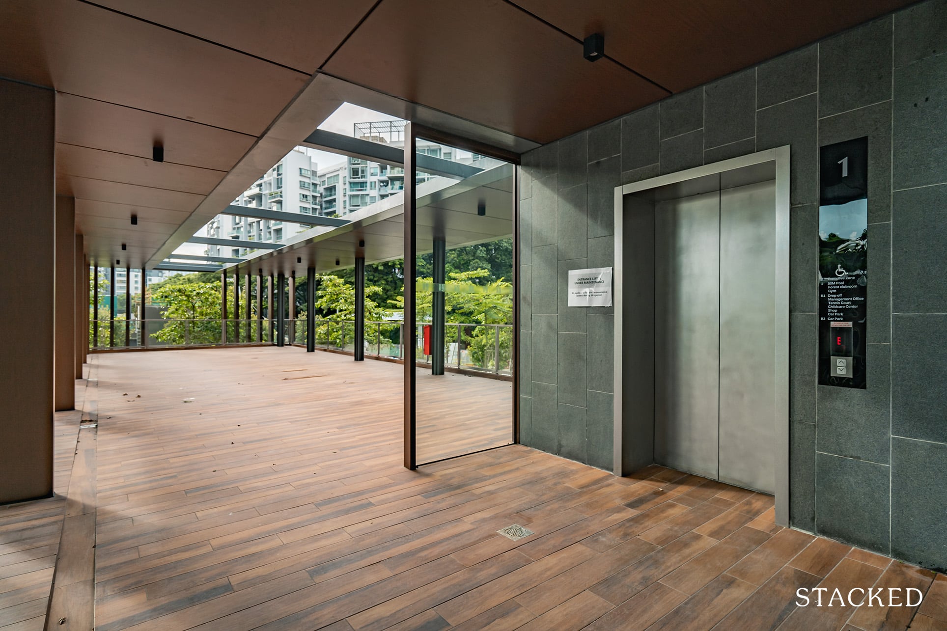
Heading back to the drop-off area, taking the lift instead of the stairs will lead you to this holding area. Presumably, there will be chairs placed here in due course so not to worry about its current blank slate. Either way, it does serve to show the luxury of common spaces that you get here.
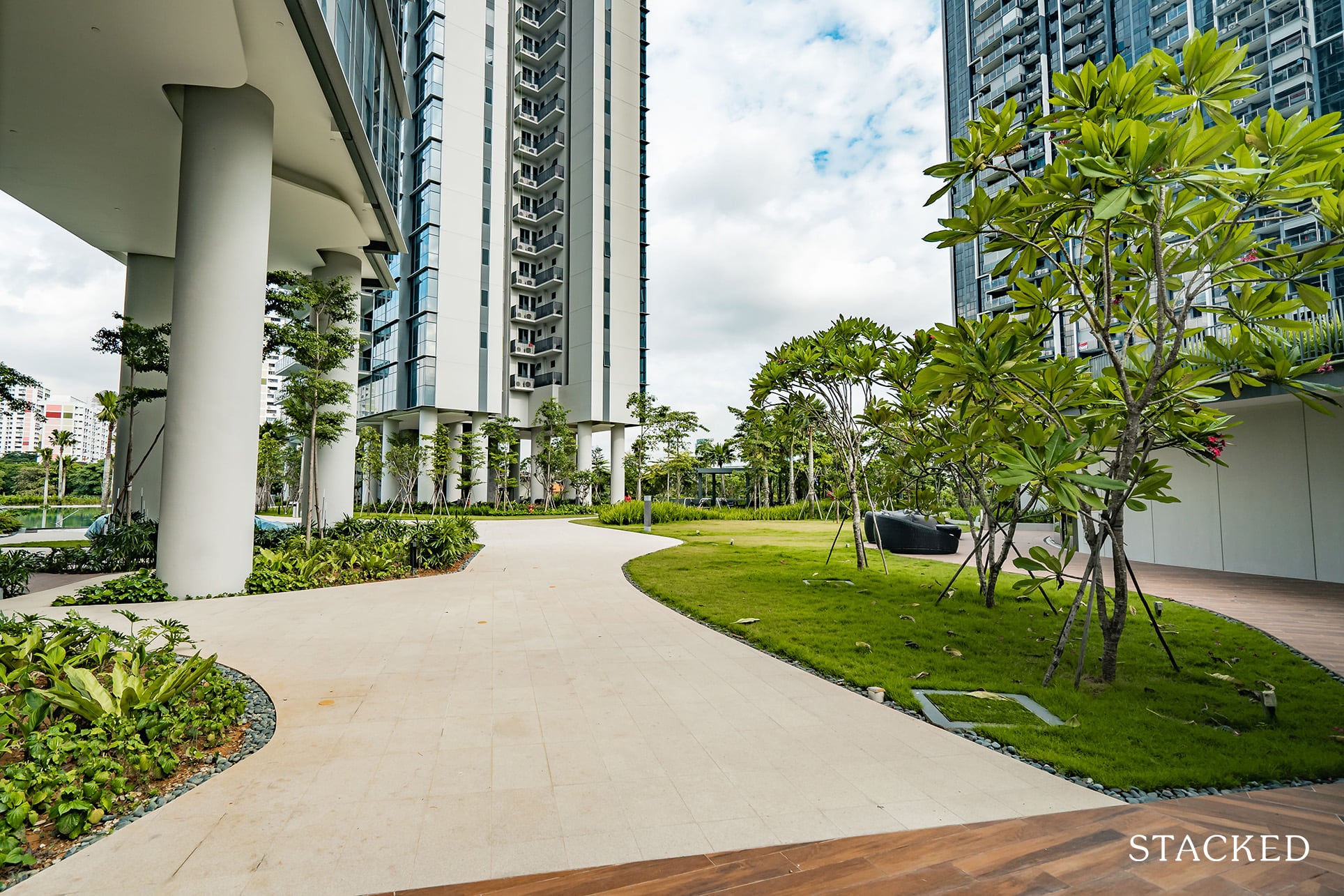
Whether you’ve chosen to put in the effort to shed some calories by taking the stairs or be a bum by taking the lift, the end result will be this vantage point. Perhaps it’s the time of the year, but the combination of a windy breeze that hits your face plus the openness really creates a very good first impression. I really like it.
I did mention in my earlier review that Twin VEW will be the smallest plot of the 3 (176,293 square feet vs 200,000 plus square feet respectively for both its neighbours) but the size perception that you get here is quite outstanding.
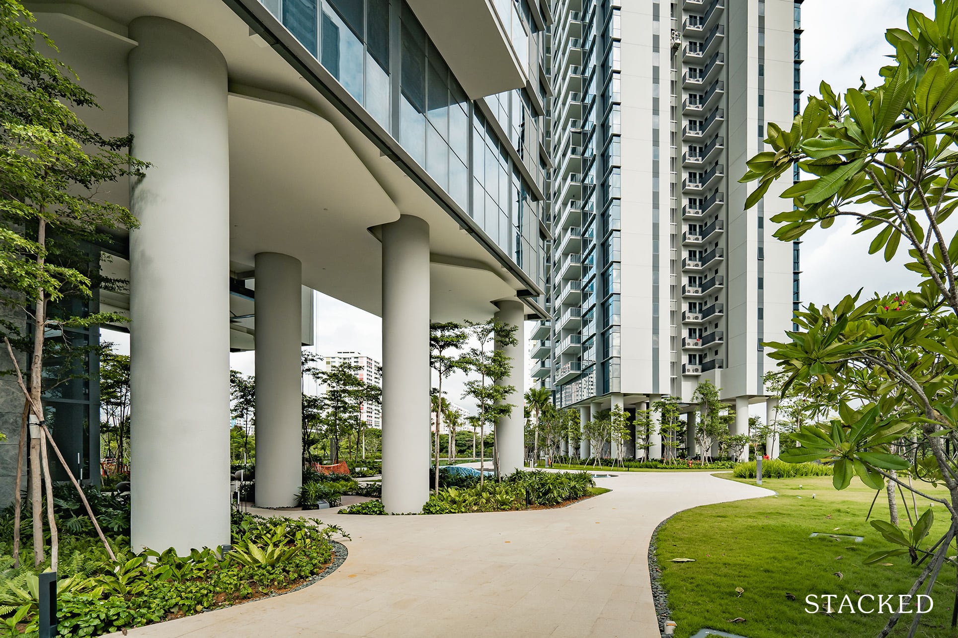
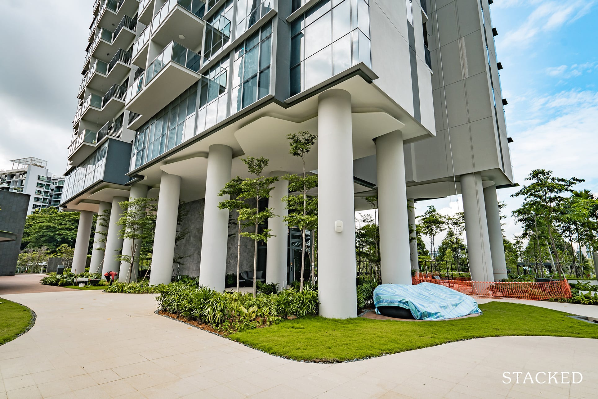
You could chalk it down too to the smart decision to elevate both towers instead of having ground floor units. To give you some context, level 2 actually starts at around level 5 of a typical condo (15 metres up). This means that you will get good wind flow throughout, and doing so does contribute to that open nature as well.
I’ll elaborate more on the ground lobby areas later on, but for now, let’s move towards the Clubhouse area on the right.
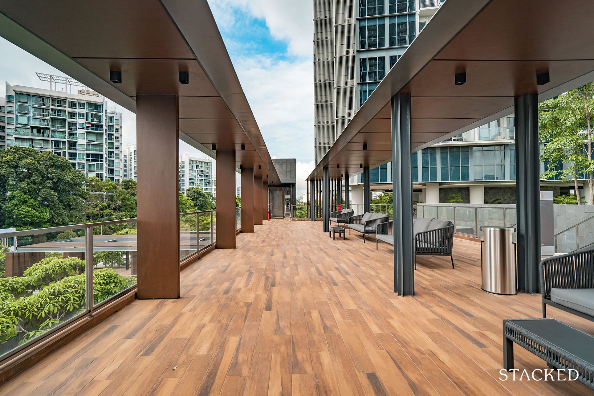
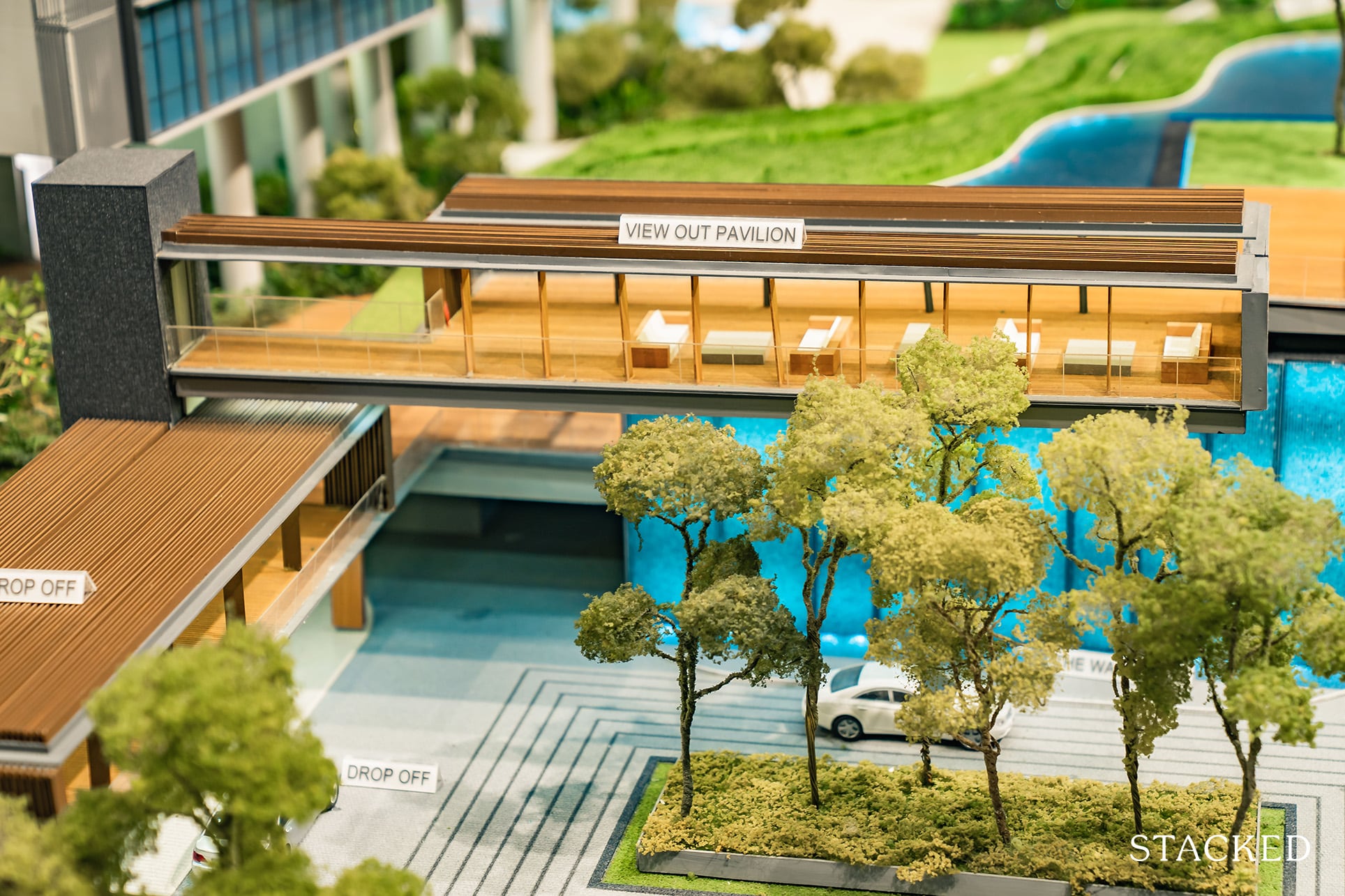
First up, the View Out Pavilion, which is located on the uppermost level and offers you a view of Whistler Grand and the arrival area. In other words, it isn’t much of a view. It does look a lot more impressive from the ground than it is truly useful, let’s be honest.
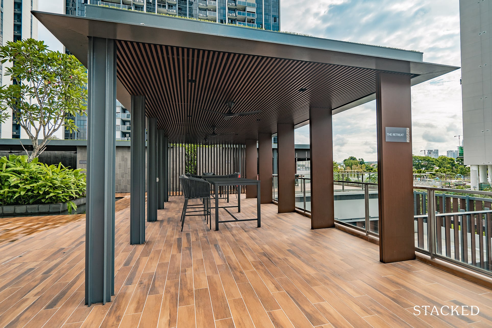
Beyond that, there are a number of open-concept pavilions here. This is the retreat, a hangout zone if you will. I like the overall design of each of the pavilions – the dark brown pillars and slated roofs look classy and sleek. And despite the good airflow in the area, they’ve even taken the trouble to install fans as well.
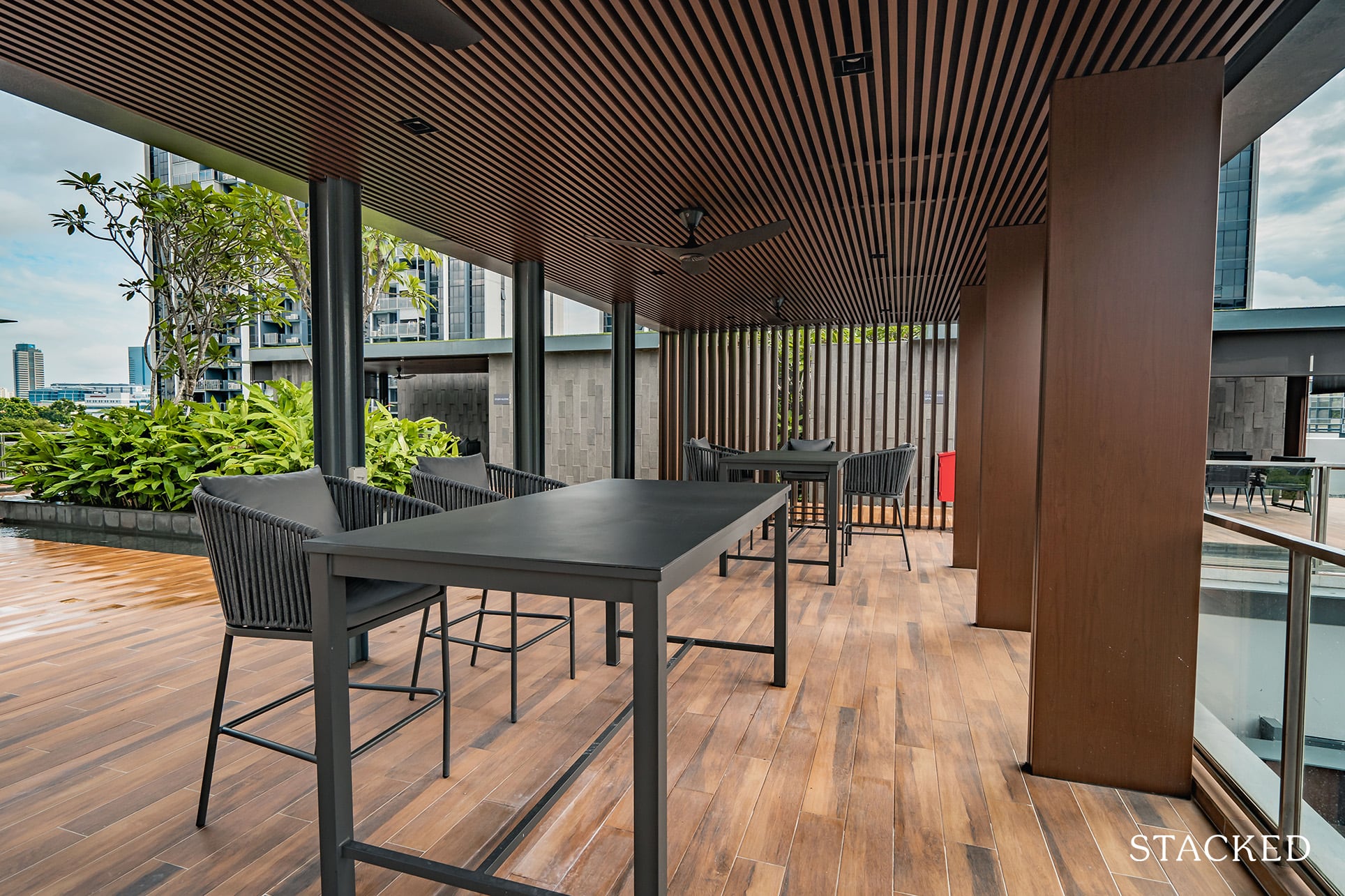
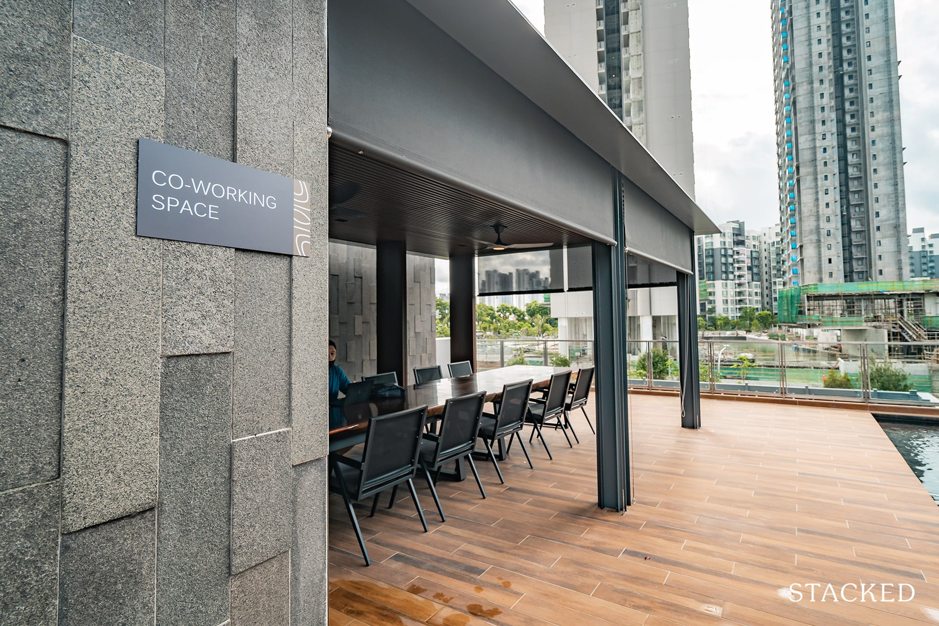
To the right is the Co-working area – an aptly named space that will come in handy in today’s WFH climate. It doesn’t have the best of views, but being located in the corner does afford it more privacy. It would have been nice if there was a study/work area facing the water though.
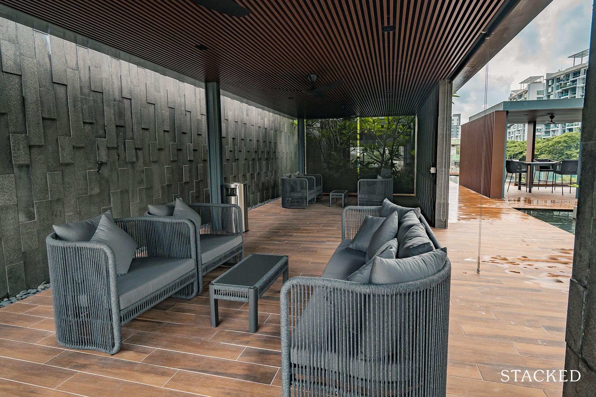
Next to the Co-working Space is the Study Alcove. The choice of furniture here isn’t really conducive for study though, it seems more like a reading or lounging space.
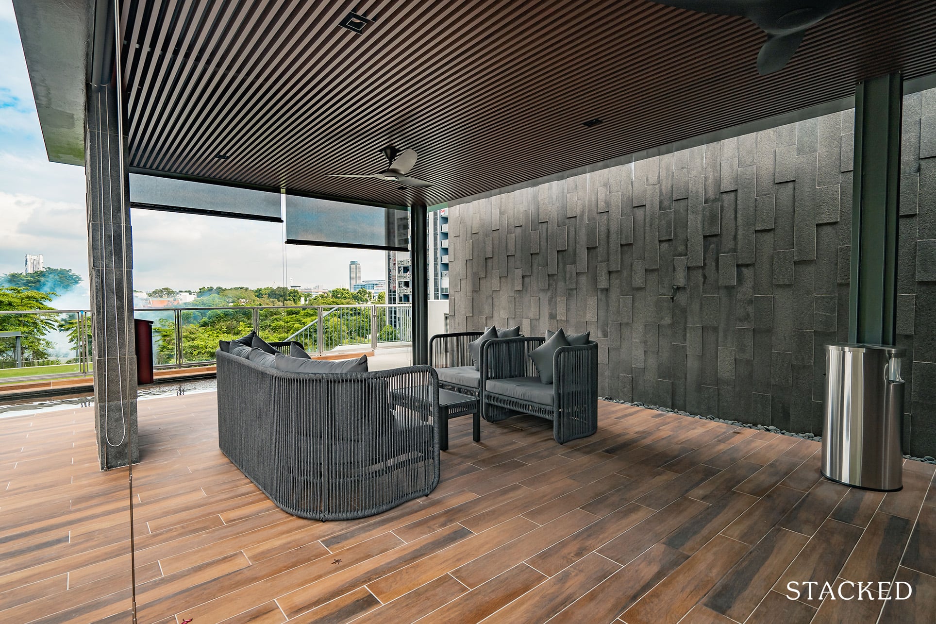
This part of the pavilions does offer a lot of a better view though, as it overlooks part of the landscaped estate of Twin VEW (and part of Parc Riviera).
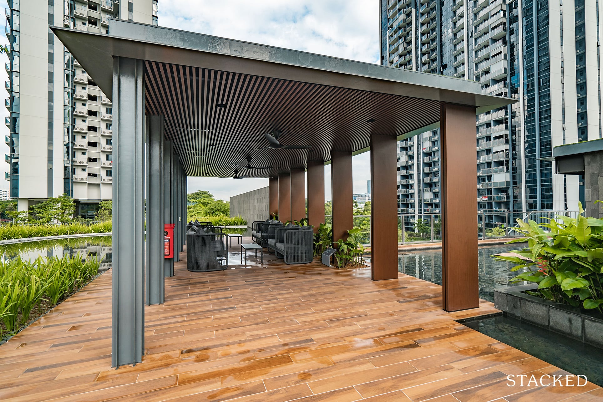
To round up the list of pavilions here is the Reading Lounge. As you can see, the choice of furniture here is similar to the Study Alcove – so it’s essentially the same offering apart from the name.
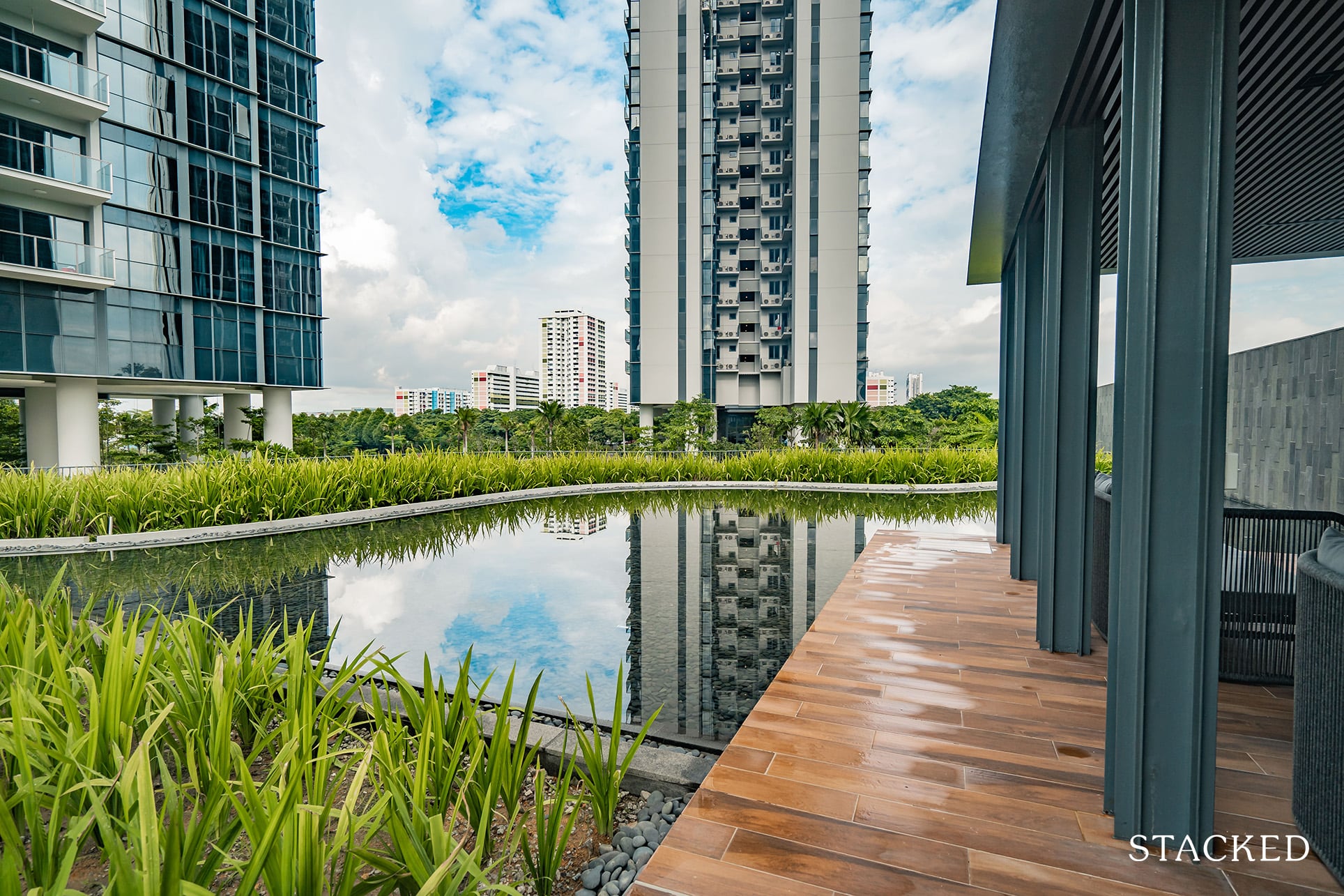
It does feature the arguably best views of the lot, however. As I mentioned earlier, it’s still early days so you can expect the surrounding plants to grow lusher over time. Couple that with the still waters here, and it does look very picturesque here indeed.
Also because the view looks towards the Sungei Pandan River and the subsequent HDB blocks opposite, you don’t get that tightly bunched up feeling you might otherwise feel in denser populated areas like Novena or Newton for example. The resulting open feeling is very fresh, and something that you’d definitely take note of as you move through the grounds of Twin VEW.
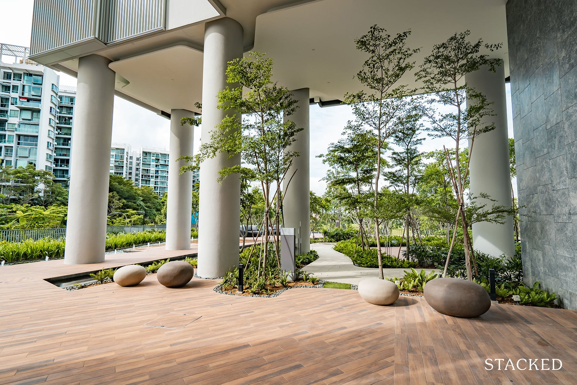
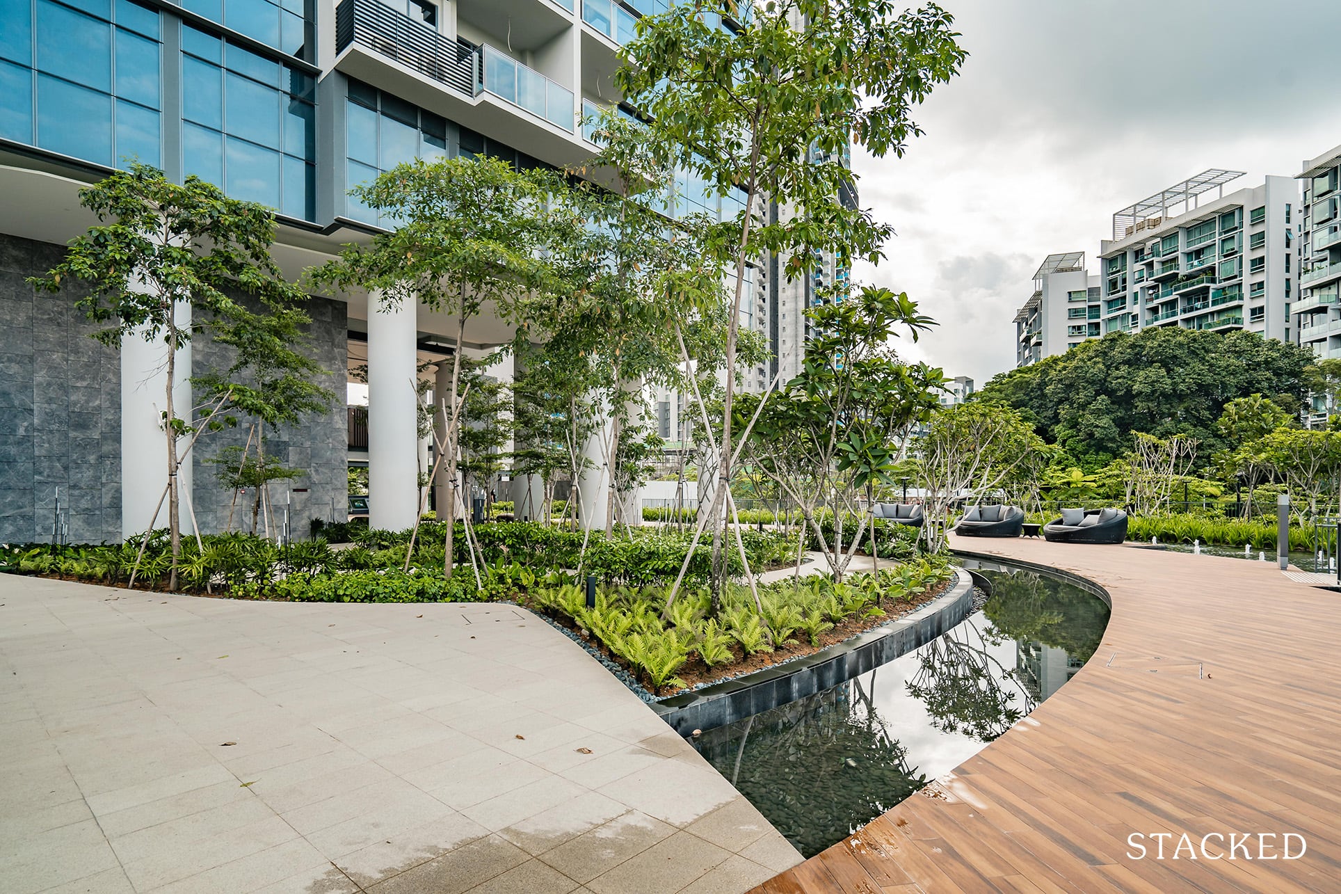
Now, let’s take a jaunt around the ground-level lobby area around the blocks. As you can see, the height of the pillars give off an imposing look, and further effort has been taken with the lighting during the night as well – with the light bouncing off the different textures to create a different vibe at dusk.
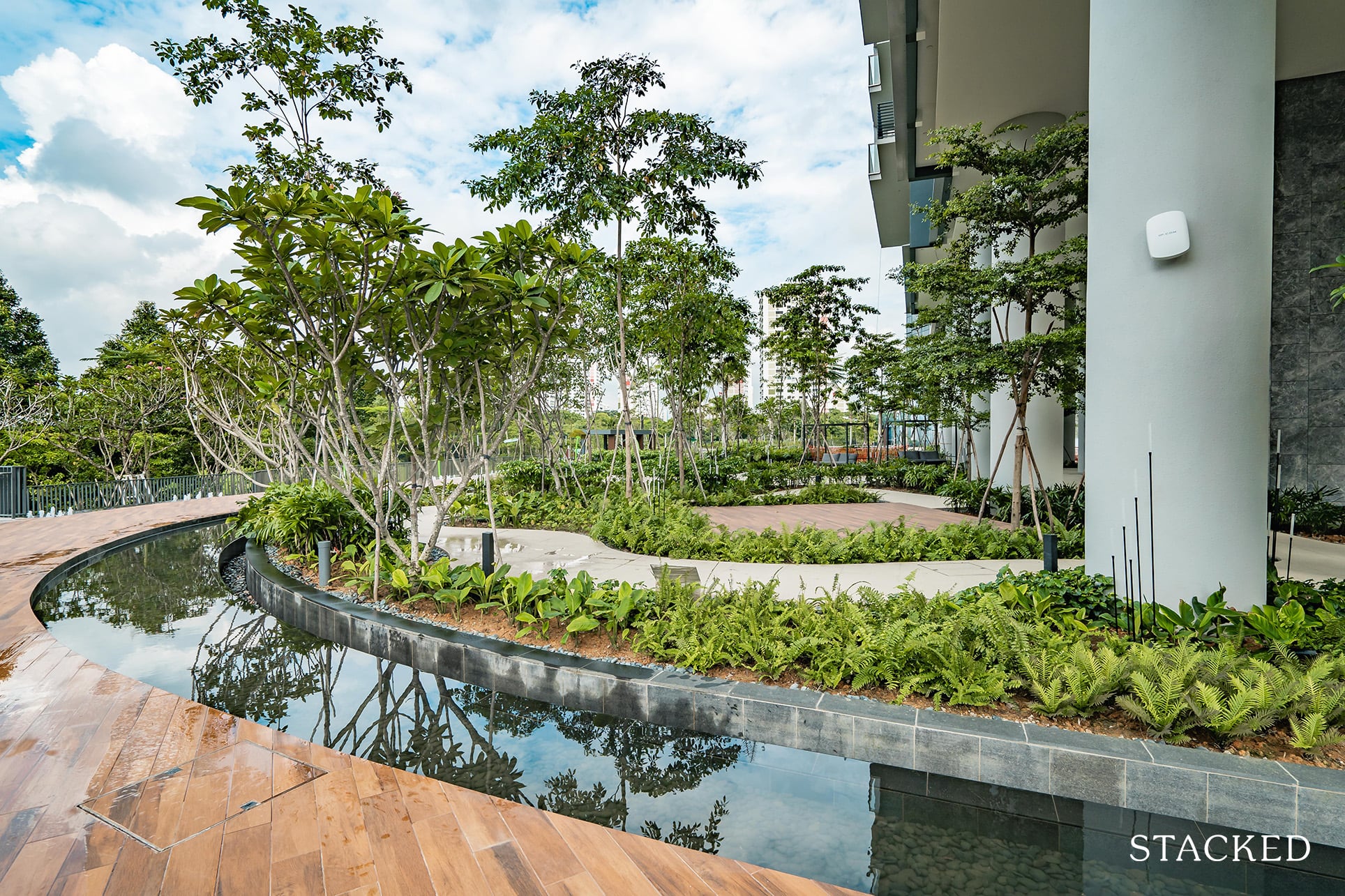
The various landscaping around the deck and different paths do play a role in making it feel varied, and it is very calming on the eyes.
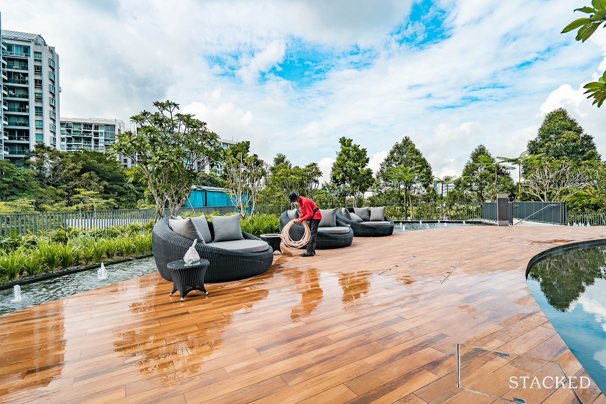
It’s been a common theme so far, but you do get an ample amount of seating in and around the estate. The best part? They all come in different shapes and forms so it’s not a boring look at all.
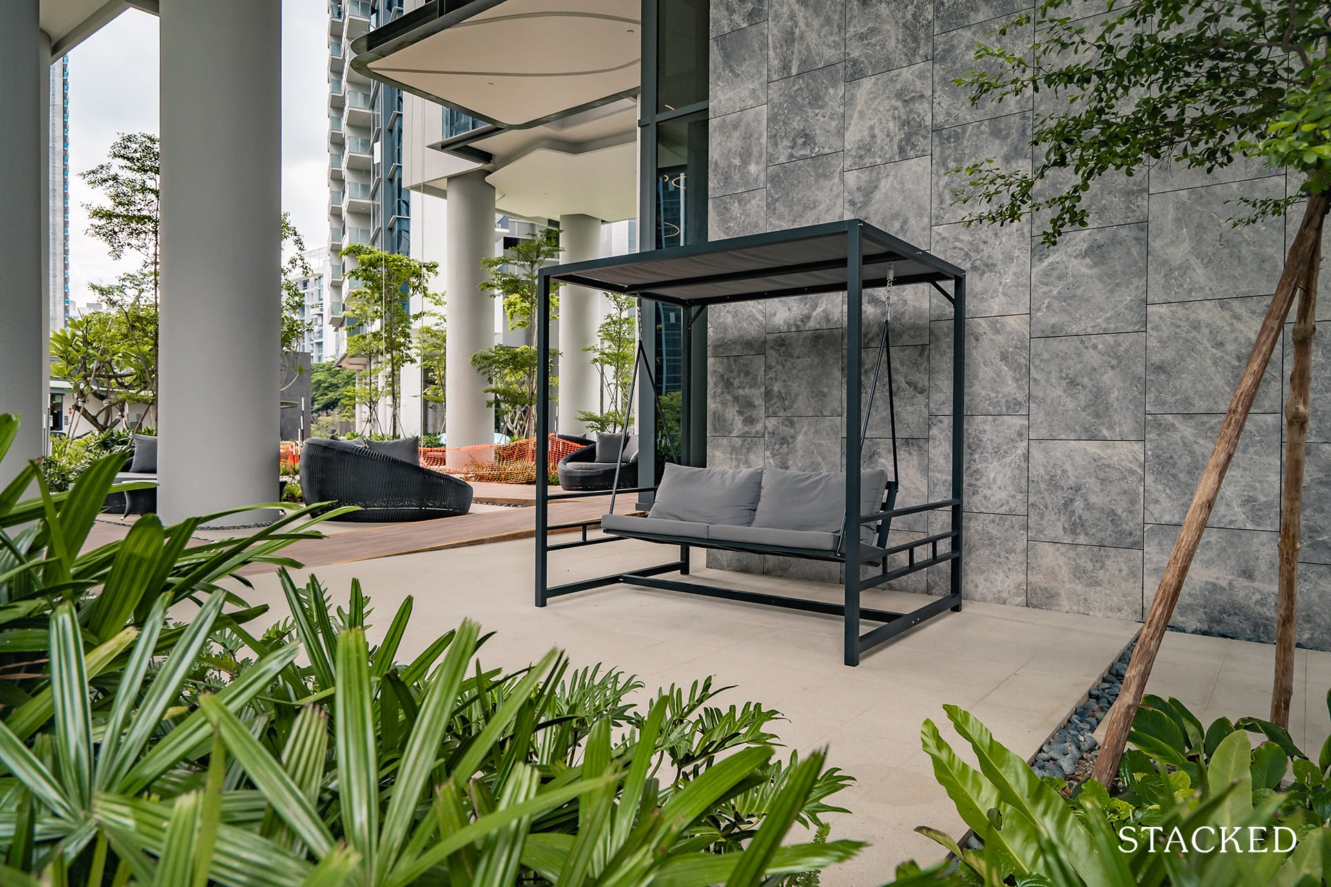
This is actually located at the other tower, but just to show you my favourite seat of all – the swing. The padded cushion makes it extra comfy, and who doesn’t like swinging to the breeze! Not to worry, you will have a few of these under each block.
Since we’re at it, let’s take a closer look at the ground floor lobby area of each tower.
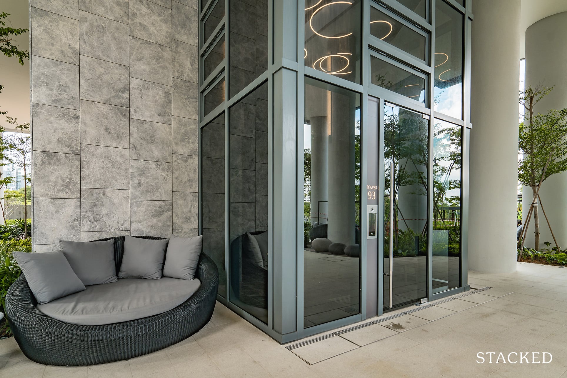
Like the basement car park lobby, you will need to dial up for access if you are a guest. As always, this is just for additional safety for residents. I really like the high ceilings and textured grey tiles on the outside, it just feels stylish all around.
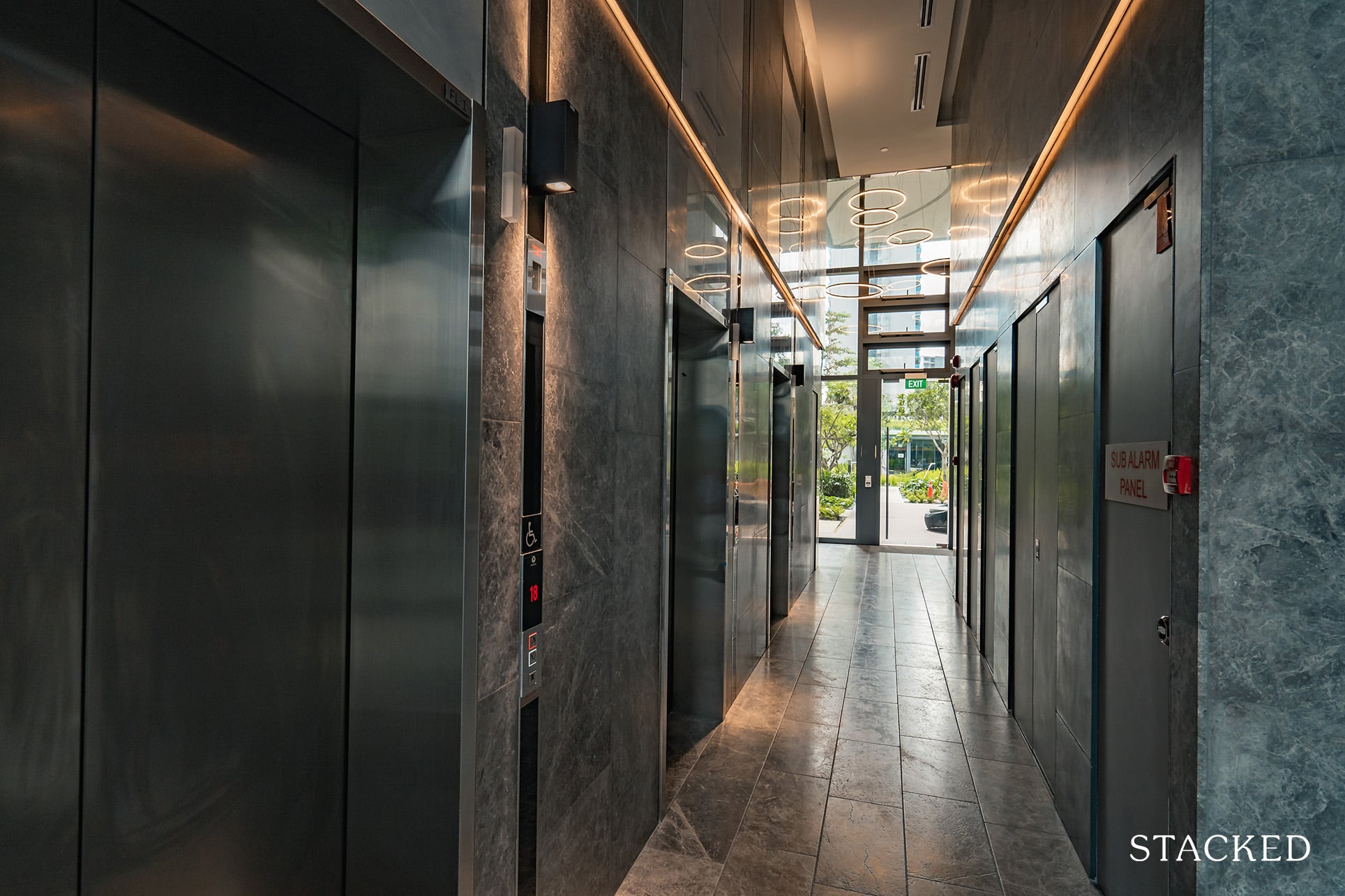
Once you get in, that upmarket feel continues with the suspended lighting as well as that textured grey finish continuing to make its mark on the inside as well. If I had to nitpick, it does feel a tad more squeezy inside here – and it is noticeable especially once you get used to the open nature on the outside.
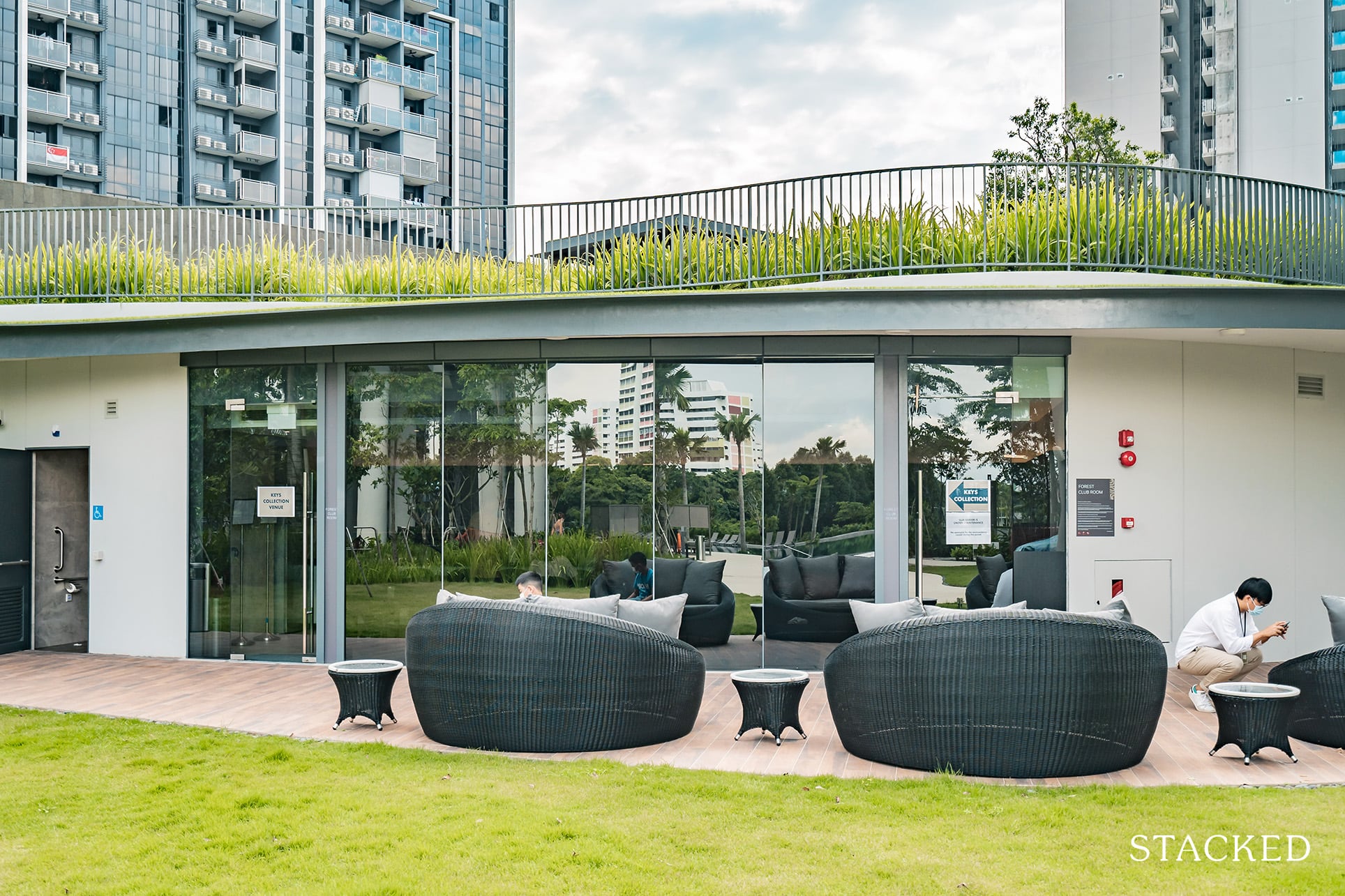
Just outside the first tower is the Clubhouse. It’s currently used as the key collection venue, but it is basically an indoor lounging area (sofa, TV, and the works), along with kitchenette facilities. If you are lost at this point, this is the section just below the range of pavilions at the entrance.
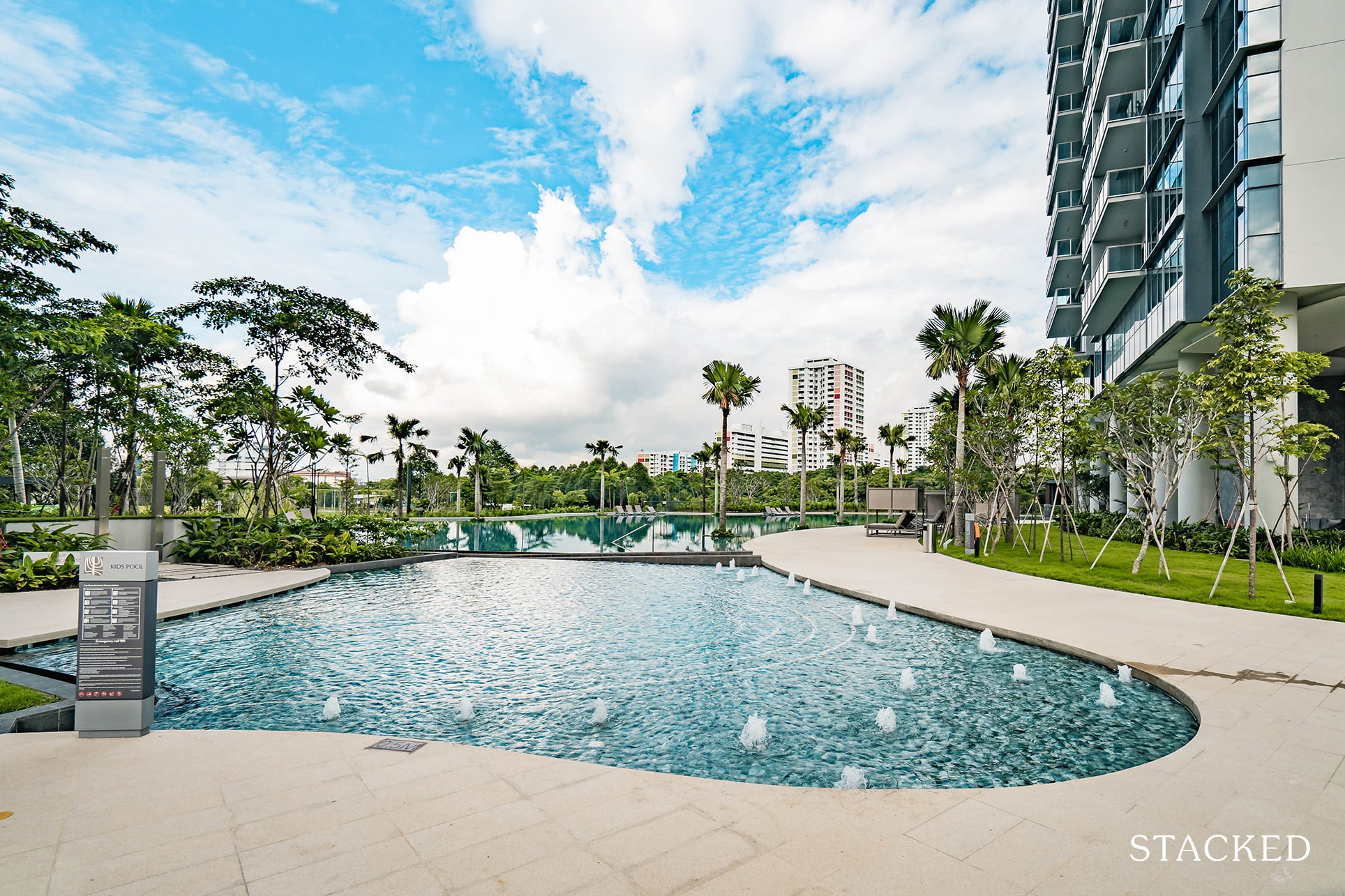
Next up, in what is probably the crowning jewel of Twin VEW (maybe, other than the magnificent view), is the swimming pool. But before we get there, here’s the kid’s pool. There are actually 2 water play areas for the kids, this one is larger with mini fountains for a slightly more exciting experience.
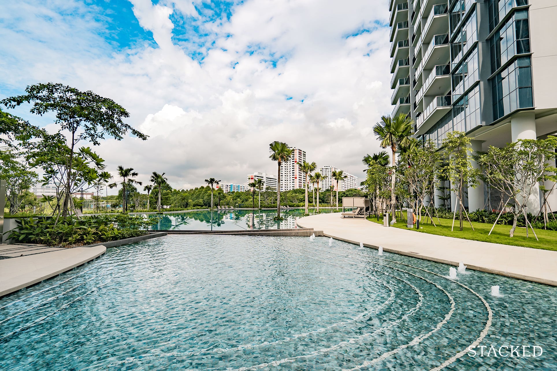
What’s great here is also the shallow cascading entry into the pool. It fits the steepled landscaping that was inspired by the rice paddies of Thailand (which you’d see later) and yet is useful for young kids as well.
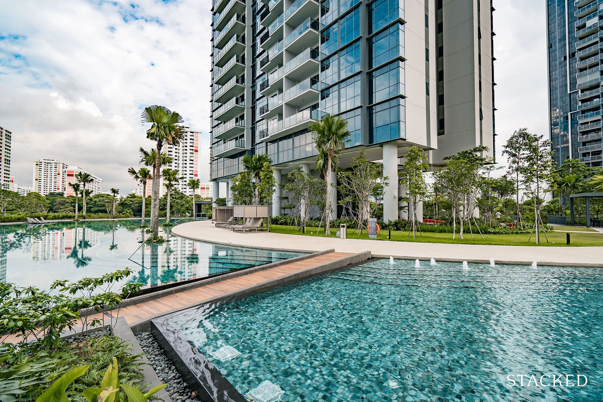
The kid’s pool and main swimming pool are separated by a pathway that will lead you to the further play areas.
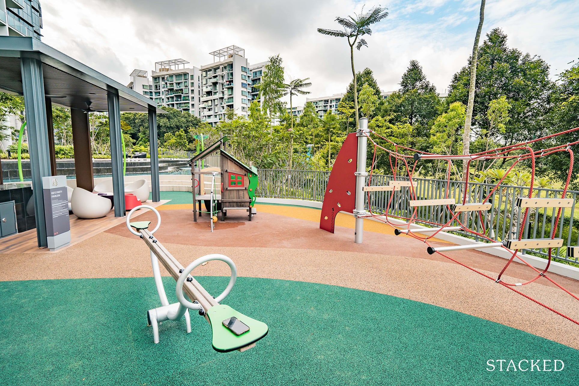
It’s not the biggest of playgrounds, but then again for 520 units, you really can’t complain too much. What’s special here though, is the kid’s party pavilion. It comes with the usual dining facilities, but the cool part is the kid-sized seating that comes in a range of colours. It’s certainly a useful concept as post Covid-19 I’m sure this would be a popular spot for kids’ birthdays!
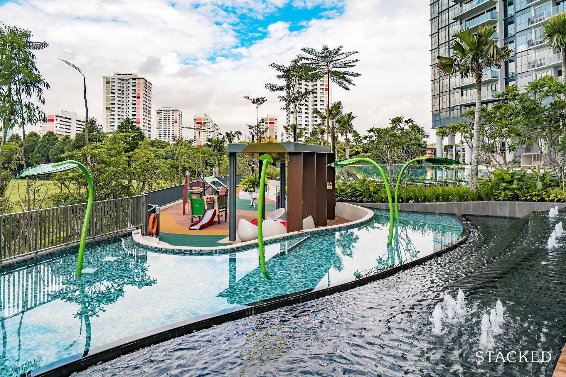
And just behind it is the water play area with coloured fountains sprouted up from the floor.
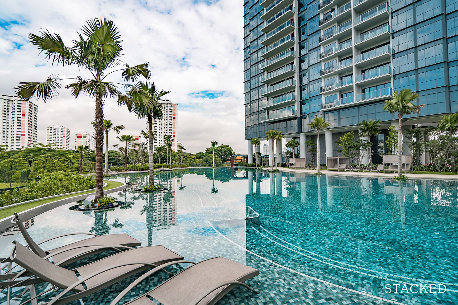
Finally, we get to the main 50-metre long swimming pool – and it is a glorious one. It may be harder to see here from the reflection, but that layered design makes its presence here too with curvy stairs surrounding the pool.
But the best part really is the view from the pool. That nearly open view (again, save for some sparsely located HDB buildings) is a real winner in my books – and truly makes full use of its more “obscure” location.
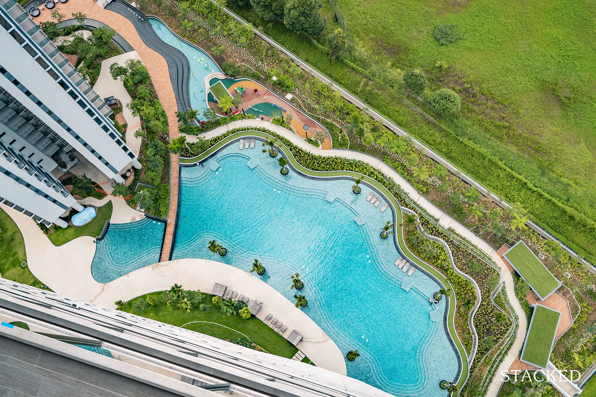
Here’s a shot from the top to show you what I mean. I really like the flowy wave-like pattern. It’s not like most swimming pools that you may come across, and it almost gives off the impression that you are swimming in a lake.
Plus, bonus points for the view that it provides from the top as well – with the different shades of blue. This was one of the features that stood out to me at the show flat and it’s great to see it come to fruition here.

I’ve always liked over water seating, so the deck chairs provided here is no exception. There are 3 sections in total that offer this, which should be adequate for most.
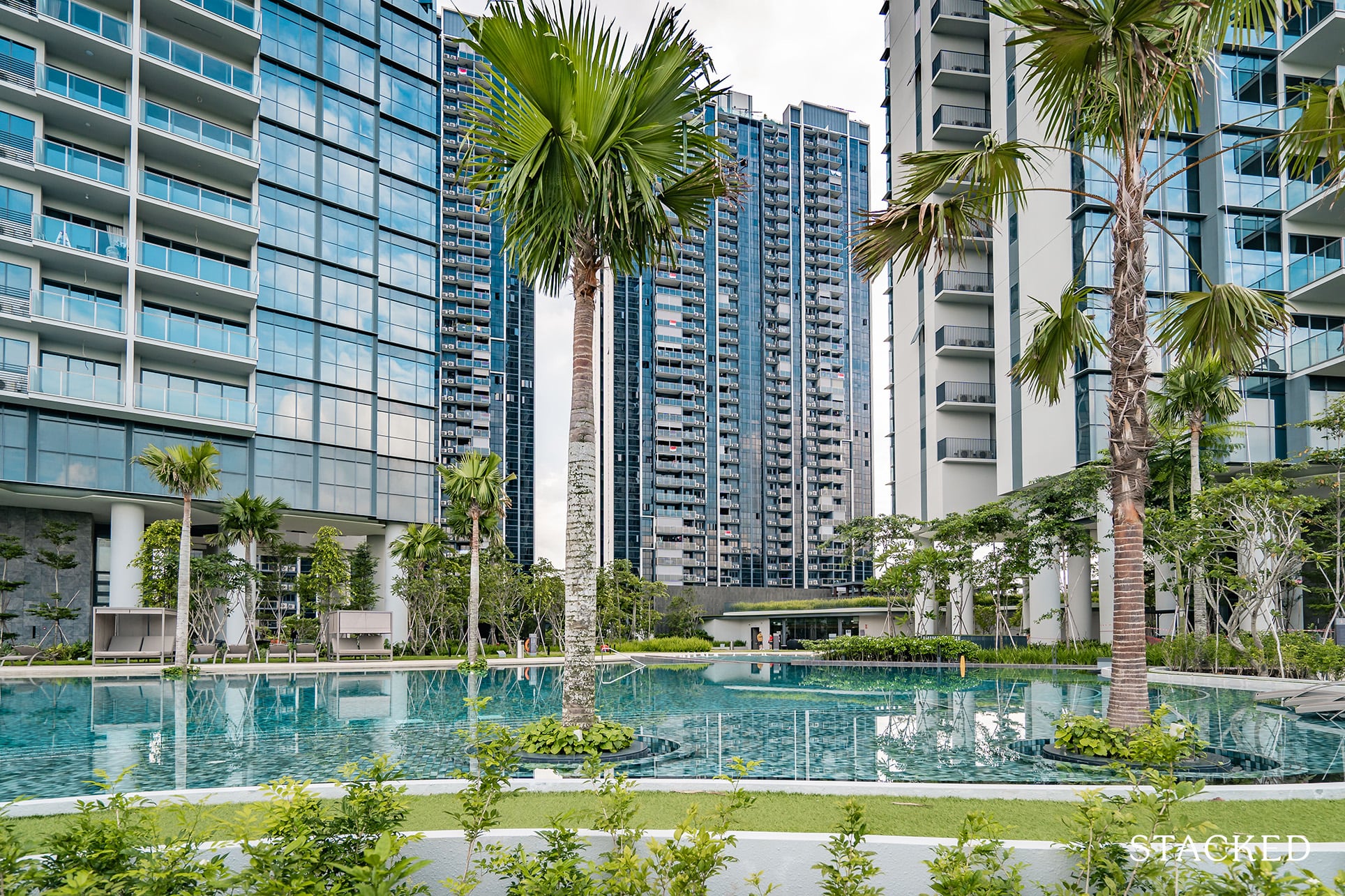
And well, it’s worth noting that the landscaping surrounding the pool is still not in its full glory yet. So once it is fully lush and thick I’m quite sure the vision of swimming in a paddy field-like ambience will be realised here.
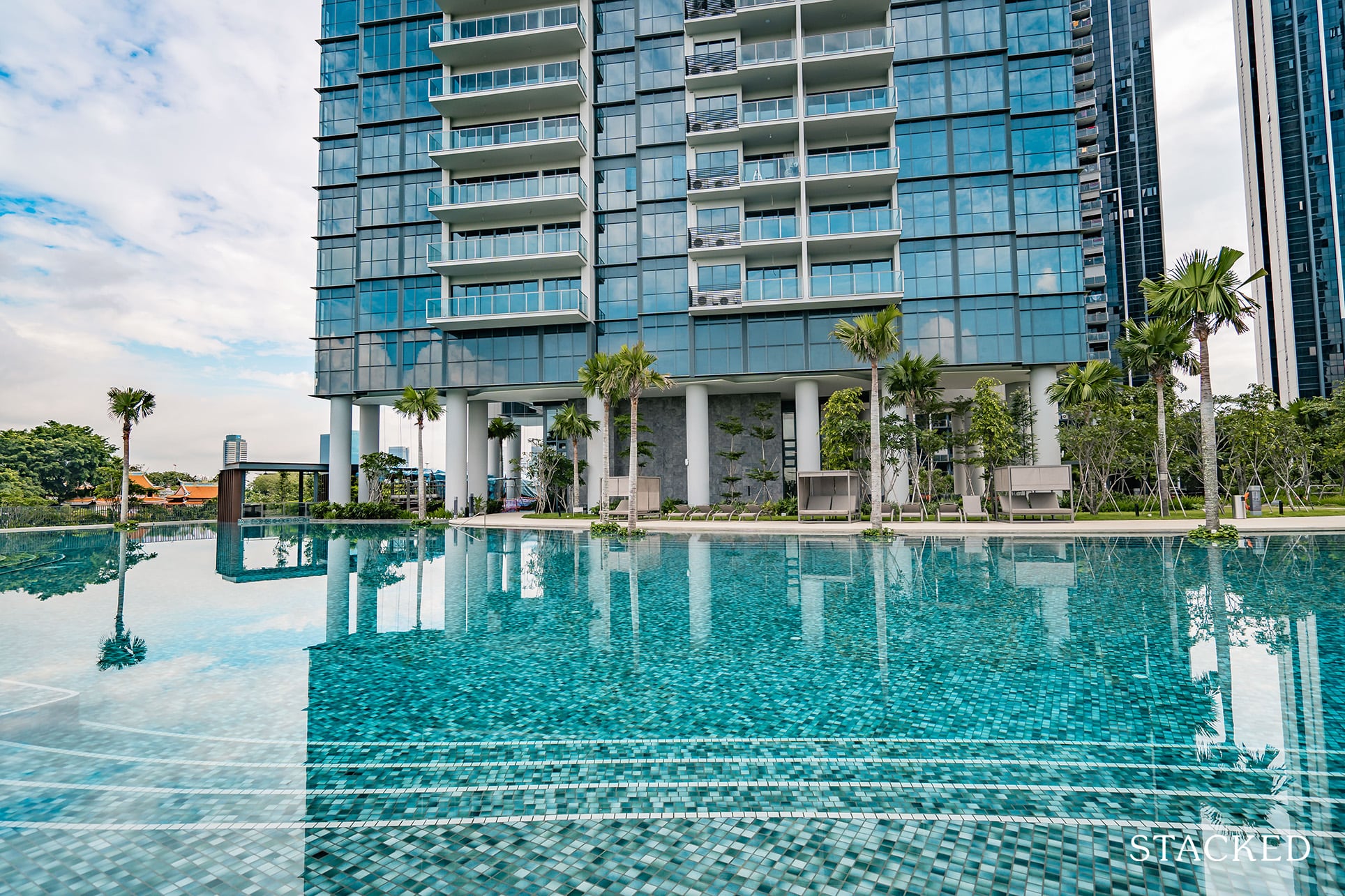
Let’s now head to the opposite end of the swimming pool to see what’s on offer.
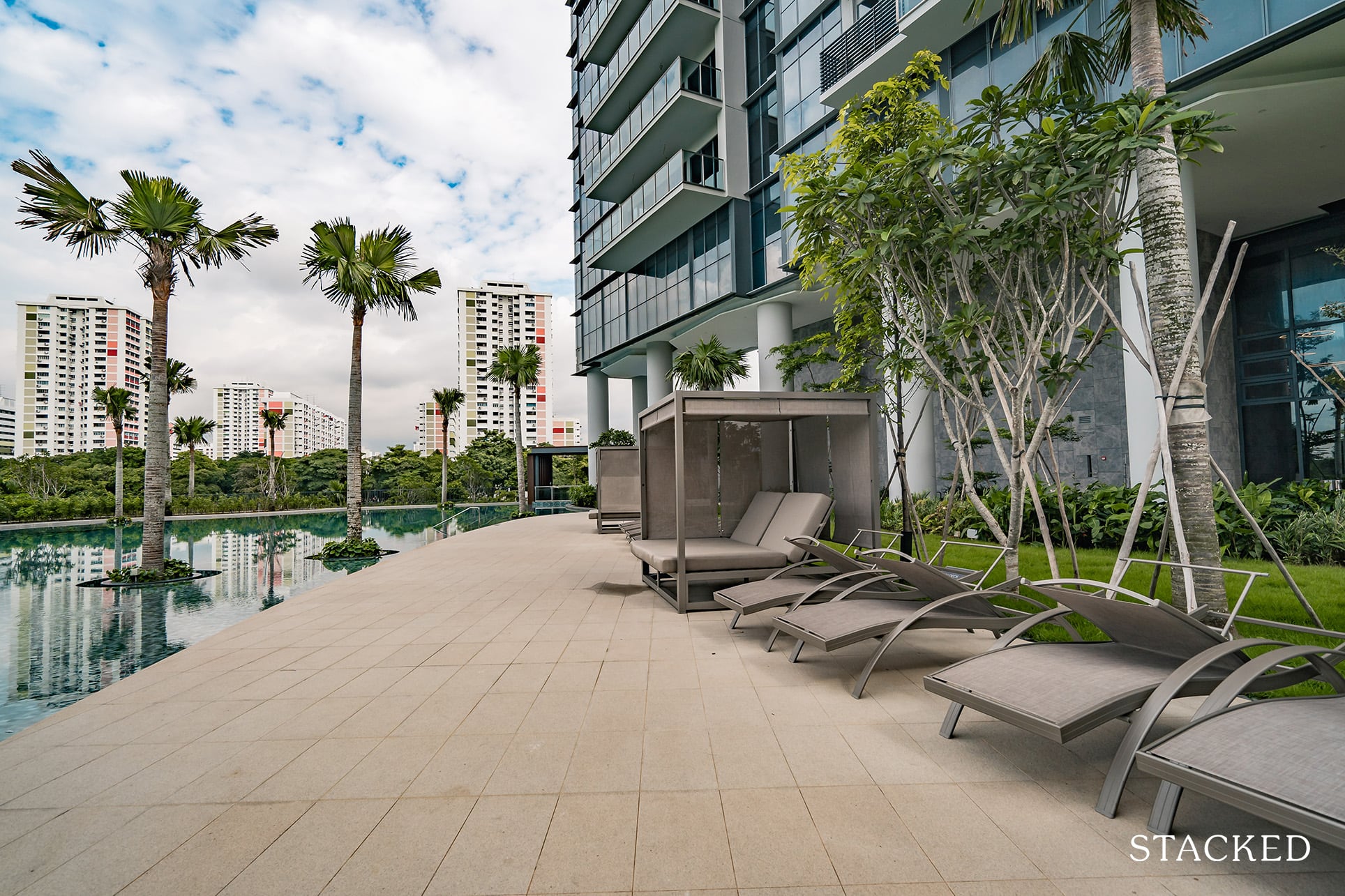
This side of the pool offers a selection of poolside seating – sheltered cabanas and deck chairs. These come in a shade of a minimalist greyish beige and does suit the look of the development as a whole.
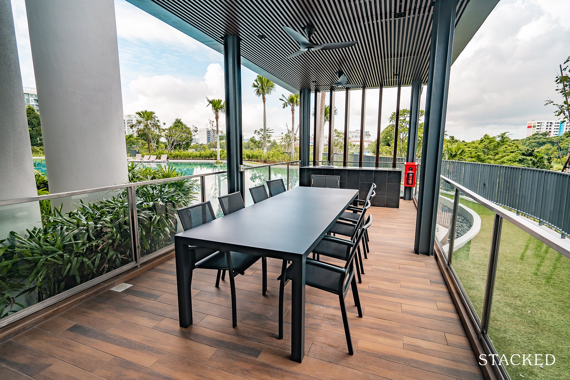
At the far end of the pool is where you’ll find another collection of pavilions. This one is the Dining Pavilion. Like what you’ve seen thus far, the design here is the same as the rest, with the exception being the view towards the Sungei Pandan.
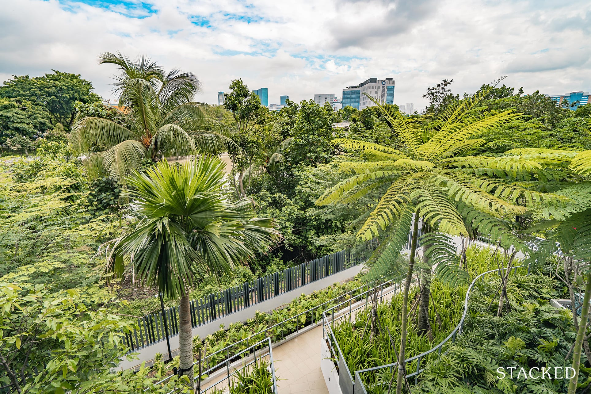
At some angles, it’s almost difficult to even see the water, given how thick the surrounding greenery has gotten.
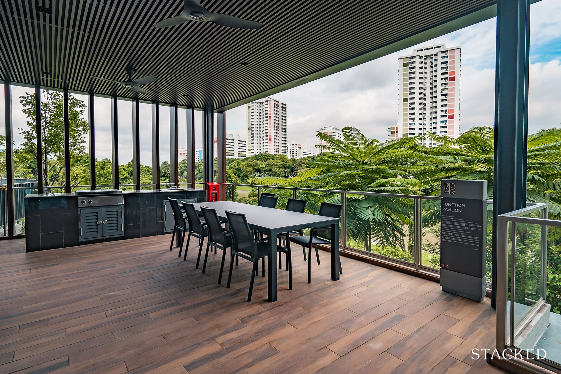
Next to it is the Function Pavilion. It’s a much wider space and offers a better view over the Sungei Pandan. Today isn’t actually the best audition for it, as it looks rather murky. To be frank, don’t expect the waterfront views here to be like those that you might see in Amsterdam.
Still, I’d rather face the water than concrete structures any day of the week!
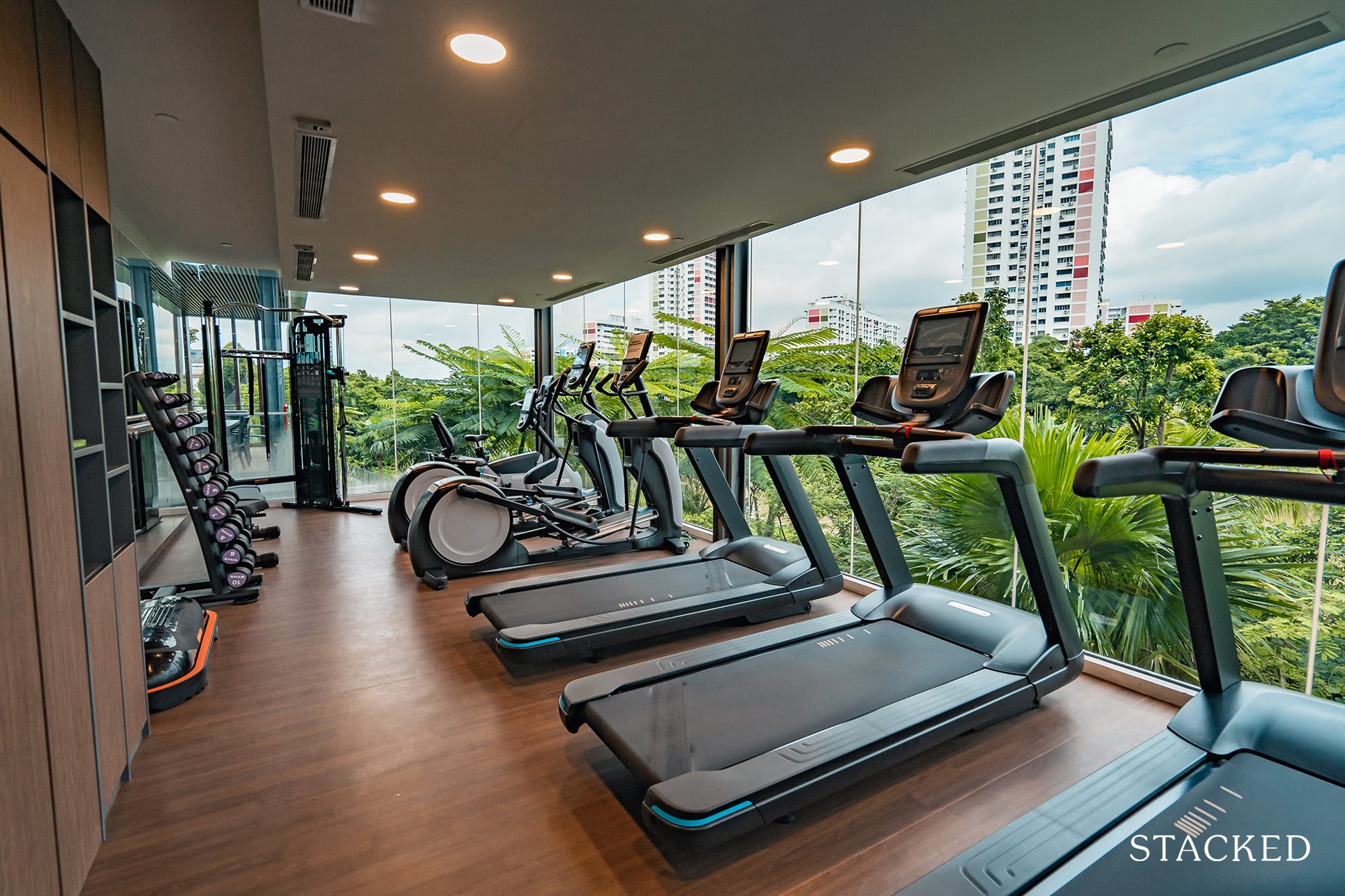
Moving further down, the next facility on tour is the River View Gymnasium. It’s not the biggest gym, but at the very least you do get a mix of cardio equipment and weights. I do suspect this could be quite popular during peak hours (even more so with the safe distancing regulations).
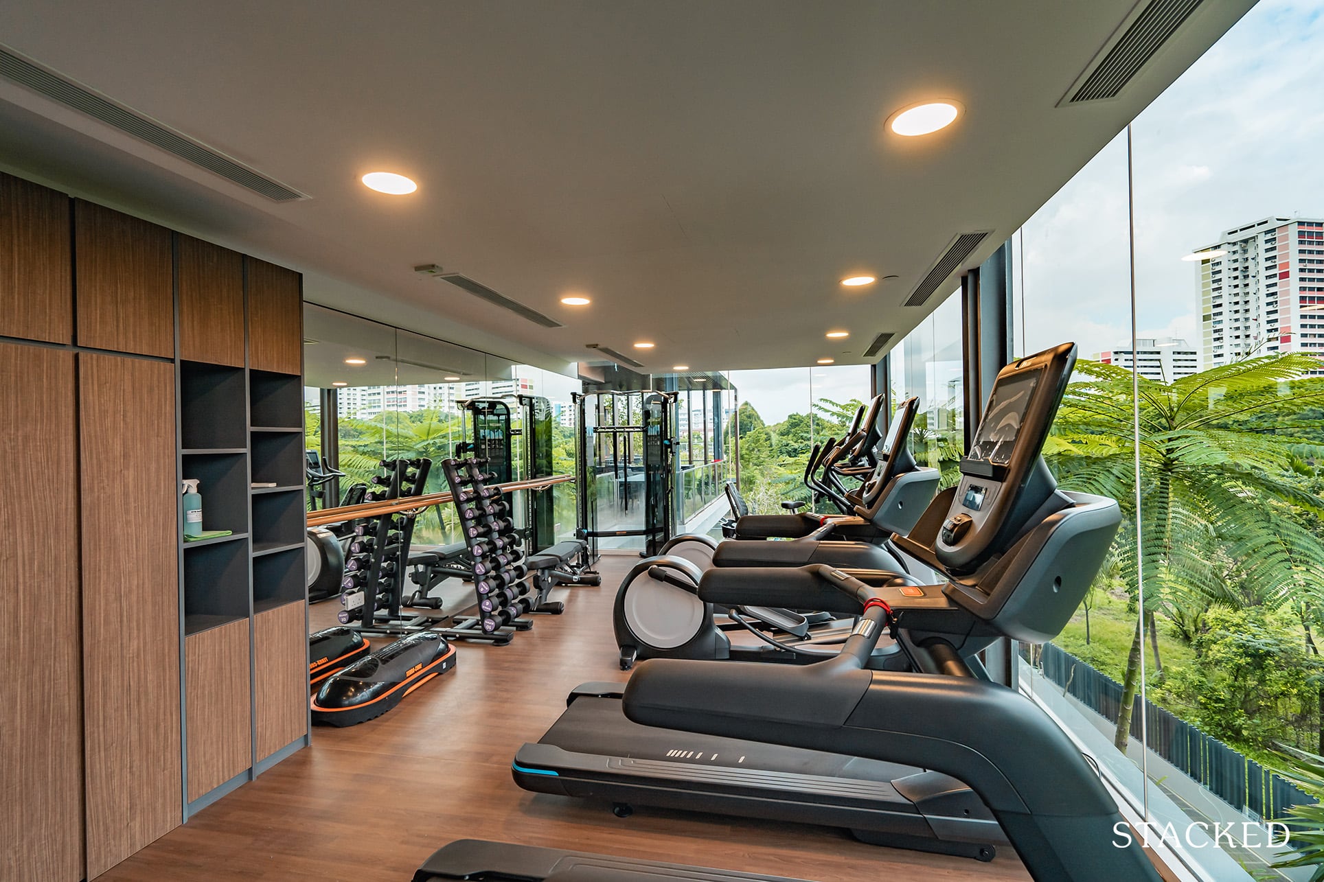
What’s commendable here are the floor-to-ceiling windows as this makes the space a lot brighter – and also allows you to get a good view of the river as you work out! Next to this is a viewing deck, which offers the same views (this is the highest vantage point you are going to get from the common facilities).
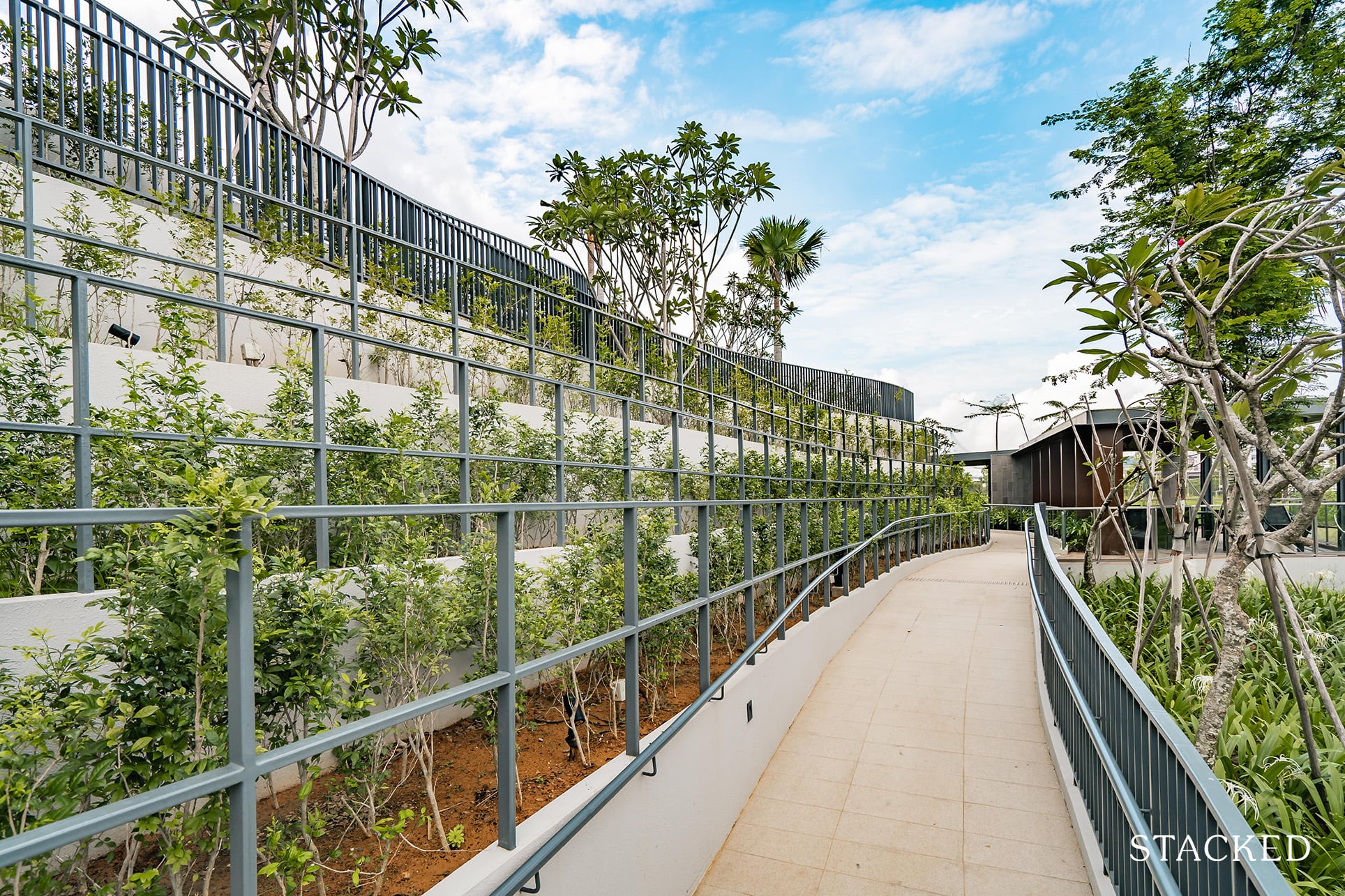
Let’s now head down to the lower levels of the estate. Walking through the trail, you can see the terraced landscaping that again is not yet in peak condition.
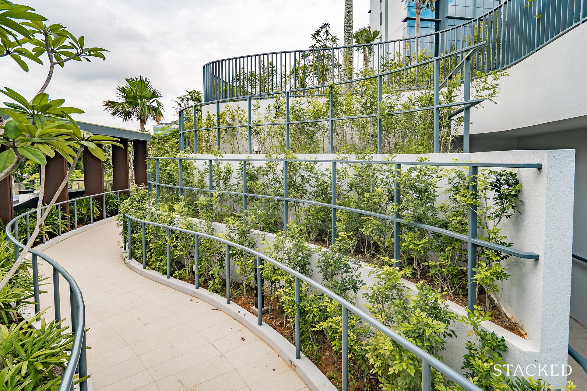
It does add a very different flavour to the space, and I would love to be back in a couple of months to see it in its top form.
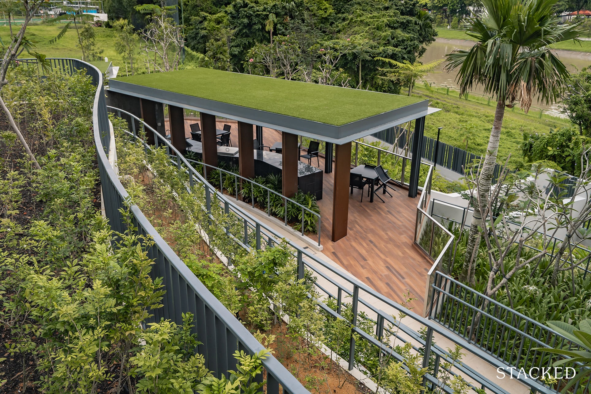
Right at the bottom, you’ll see two Riverfront BBQ pavilions. These are spacious and I like that they are located away from the main areas. This means you will get additional privacy, and you won’t have to worry too much about noise disturbing anyone else.
They share the same deck too, so you can easily book both to hold a bigger gathering (in the future).
There will also be side gates located here to access the park connector. But as the area hasn’t been cleaned up yet (it’s as wildly overgrown as below), unless you are a part-time explorer you aren’t going to want to be hiking around. There are plans to clean it up, so at least there’s something to look forward to.
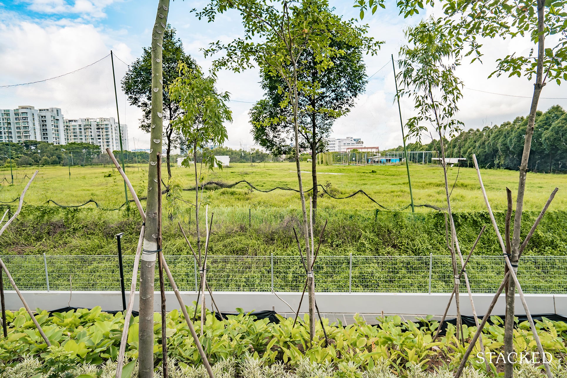
A part of the view here would be towards this wildly overgrown field which one might mistake for an abandoned soccer field. This space is actually zoned residential – which is great news as you will not get a towering residential building here that would obstruct the views.
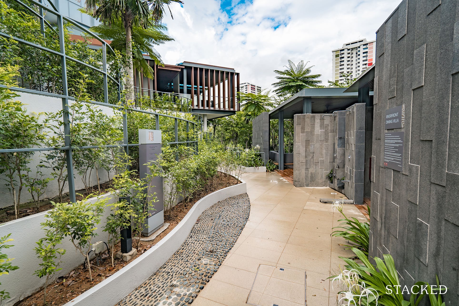
At the corner of the estate are the waterfront dining villas with a special trick up their sleeves.
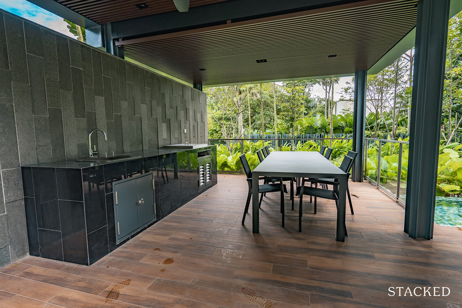
These will come with the usual cooking facilities, as well as a long table with chairs.
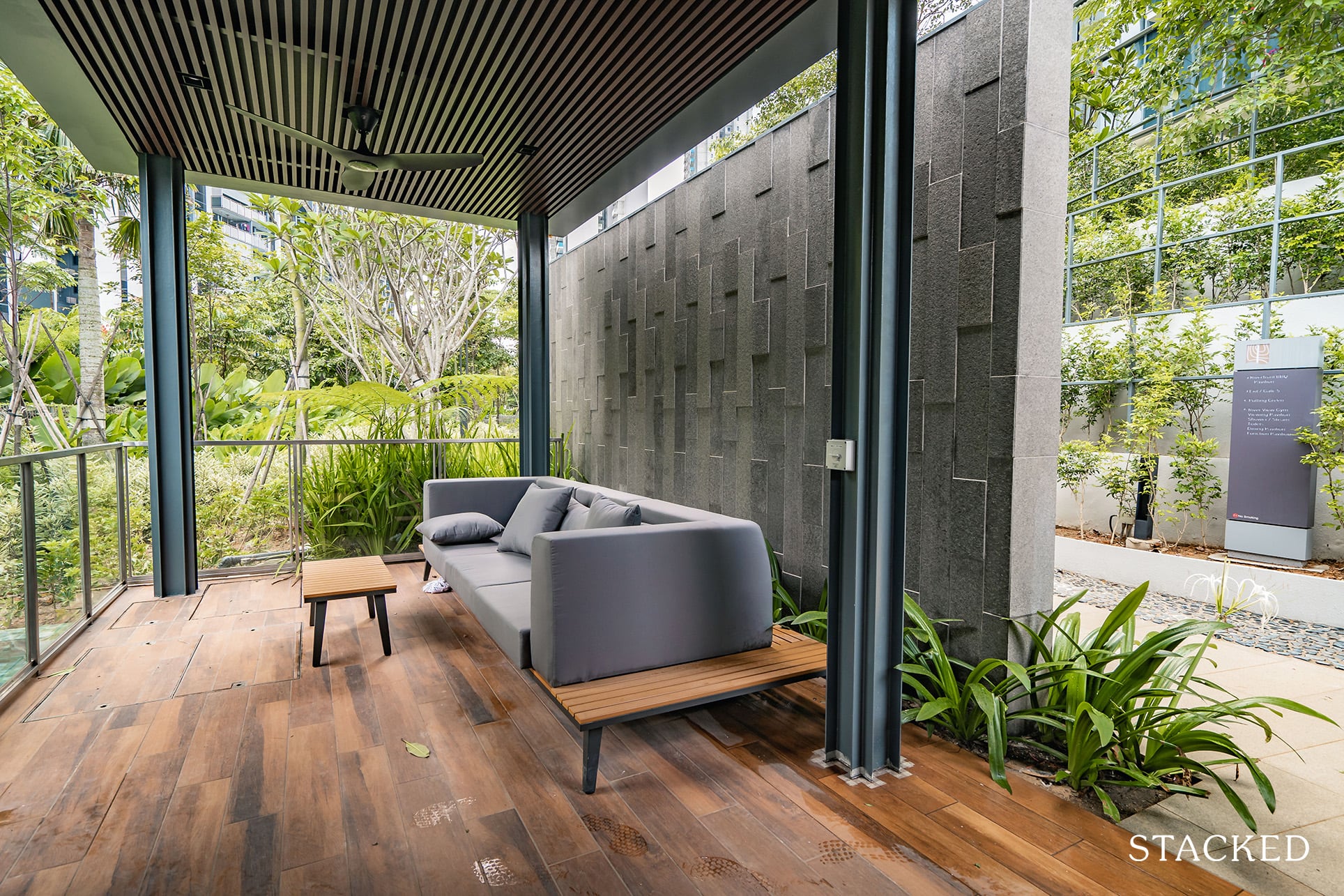
And a separate couch area for more comfortable lounging. As with what you’ve seen so far, ceiling fans are thoughtfully provided here as well.
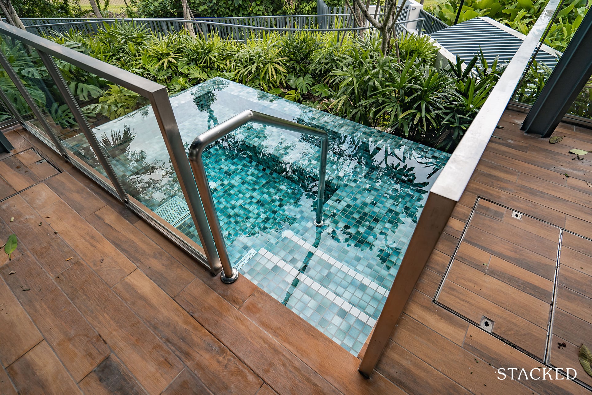
What’s unique here would be the small jet pools that overlook the water. Admittedly, it’s a small space, so it’s best left for a private affair for 2. With that in mind, I did wish that the entrance could be closed, or at the very least an option to note that the pavilions are being occupied.
I wouldn’t want to be accidentally disturbed by other residents if I was looking for some alone time here!
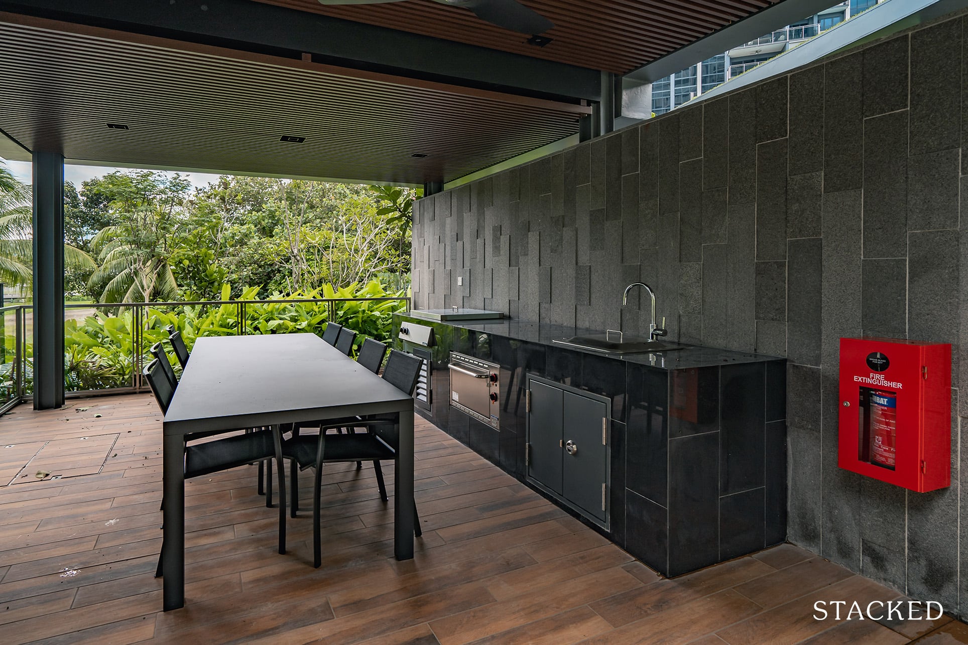
It’s the same layout for the other pavilion, so there’s not much more to report here.
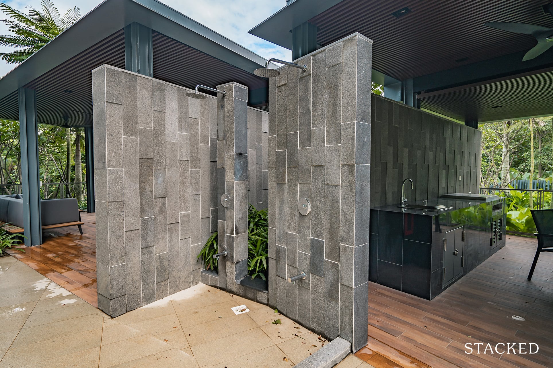
I am happy to see that a shower has been attentively provided here if you want to wash off after taking a soak in the jet pools.
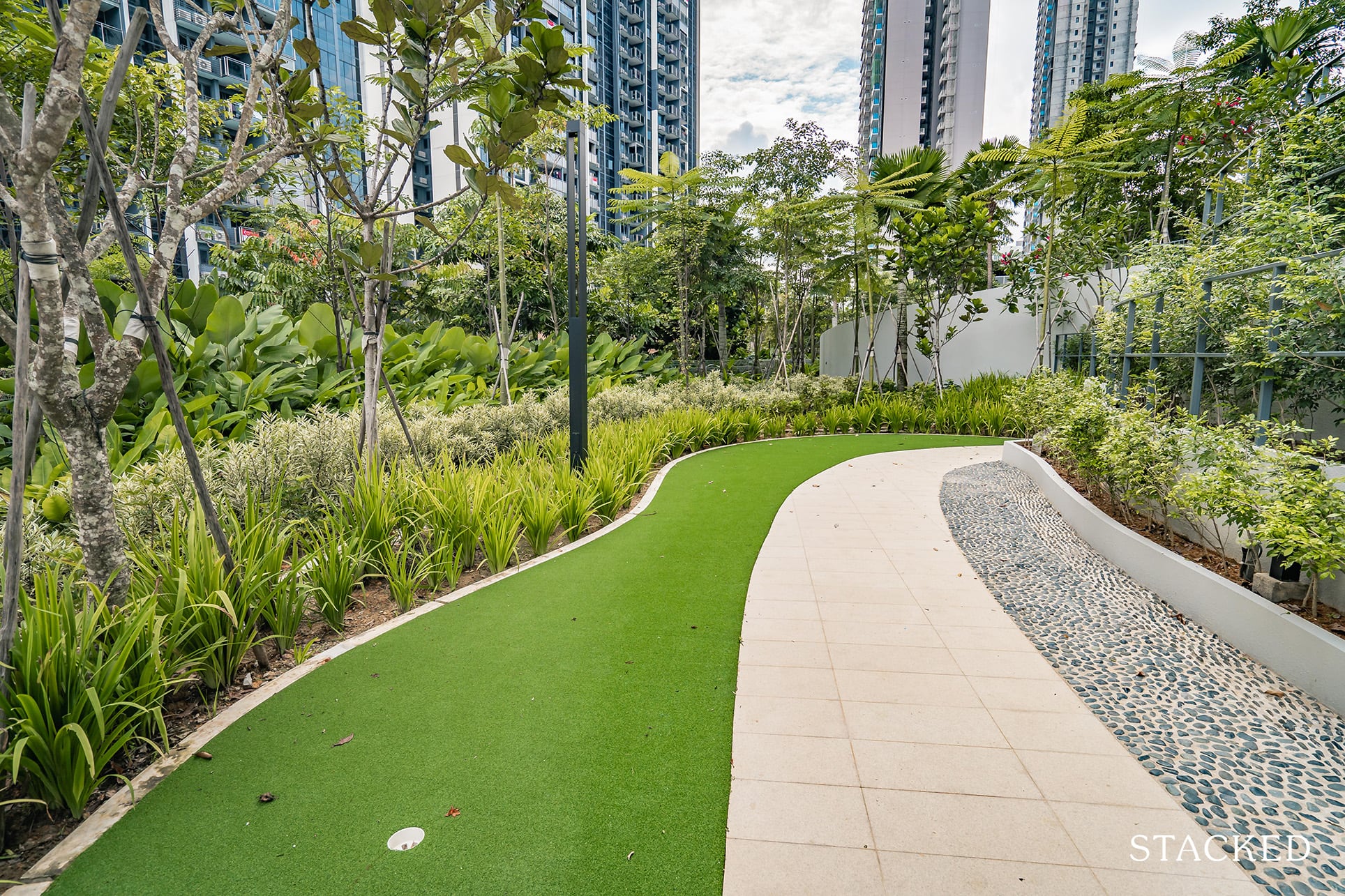
Rounding up the list of facilities on the lowest level is the putting green, which is set next to the trail. I can’t say this would be a wildly popular facility, and seems more like a by-the-way thing rather than a full-fledged feature.
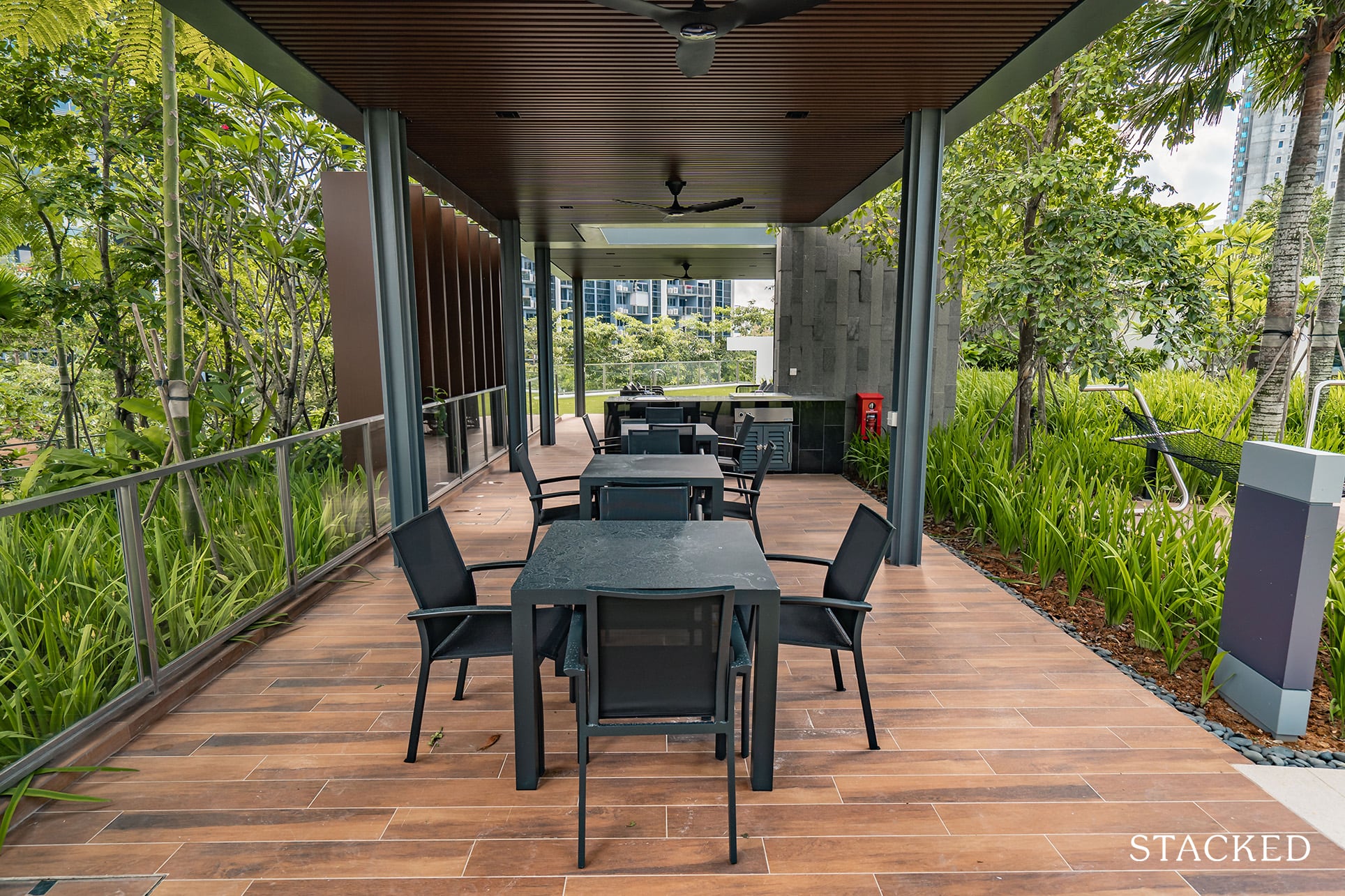
Circling back to the main area is the last dining pavilion (on the ground), the Tree House dining lounge. If there’s one thing that’s certain from this, it’s that you will have no shortage of dining pavilions here at Twin VEW. Especially if you own a smaller unit, the number of spaces for you to entertain guests is exemplary.
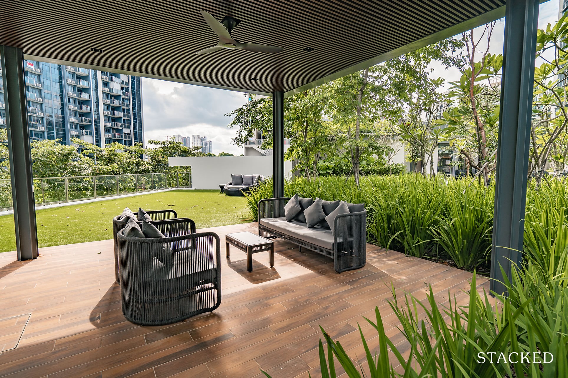
Having said that, while I understand that the open-air pavilions are really to take advantage of the breezy and open nature of the space, it would have been nice to have a touch more indoor pavilions as well.
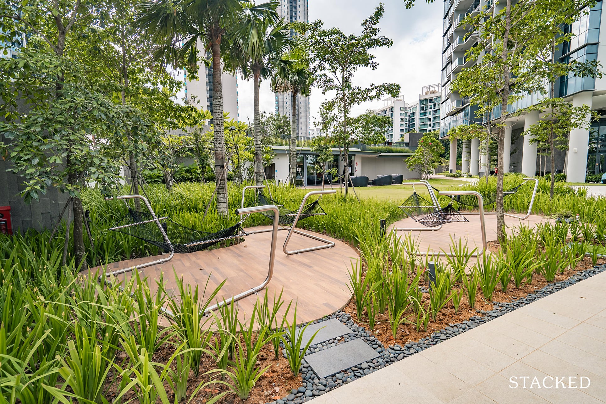
Finally, there’s a couple of hammocks located just nearby. See what I mean when I say there’s a whole lot of different types of lounging areas here?
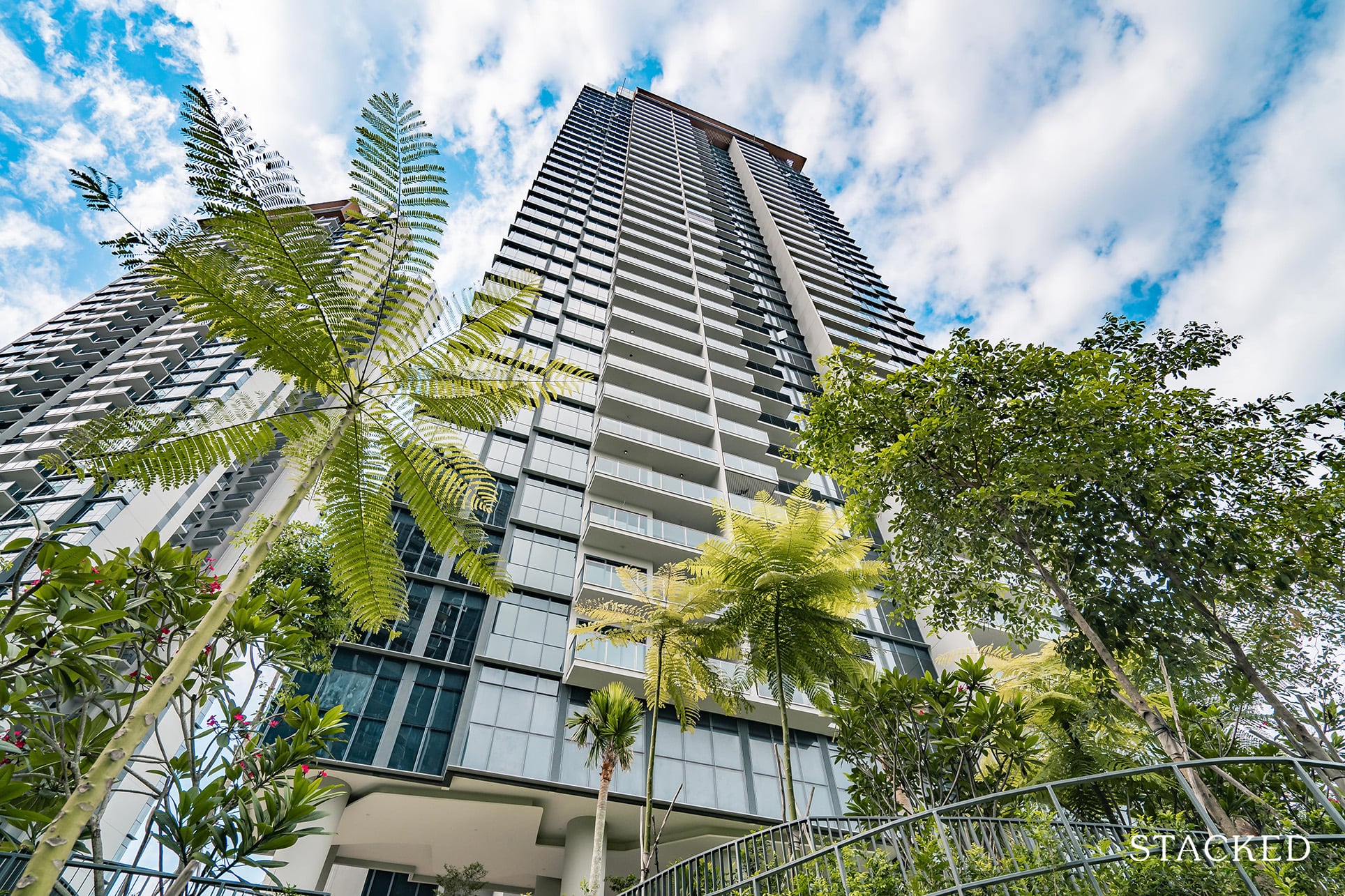
Now that we’ve covered the facilities on the ground, let’s head up to the top floor – where there are a couple more rooftop facilities to elaborate on.
Do note that only one lift serves the top floor, which could be quite a bit of a wait during peak hours. I would say it isn’t very obviously detailed out as well, so it would be easy to miss for first-time visitors to the Twin VEW.
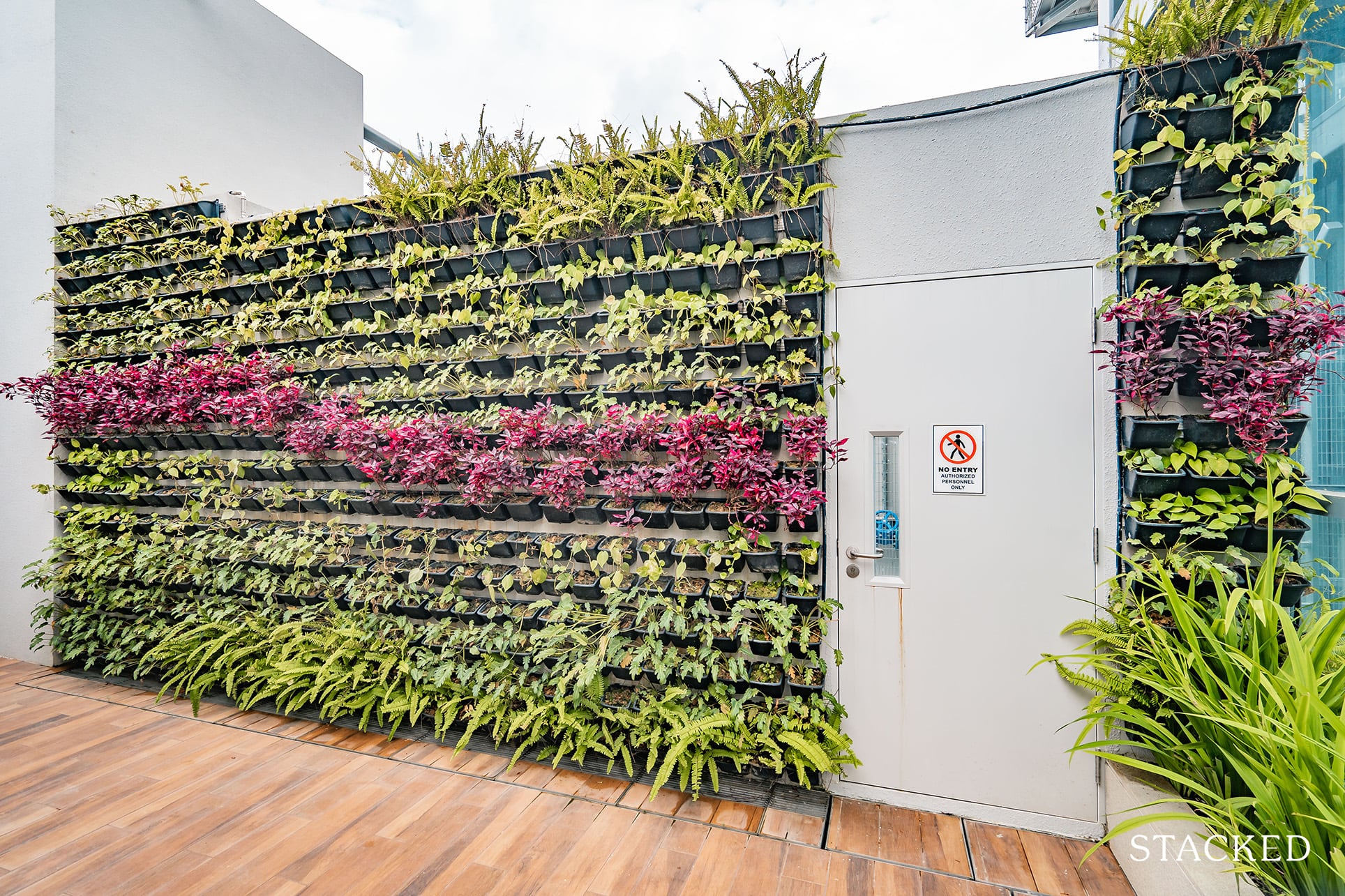
Upon arrival to both rooftops, you will be treated to a colourful display of hanging plants – it certainly adds more vibrancy to the space.
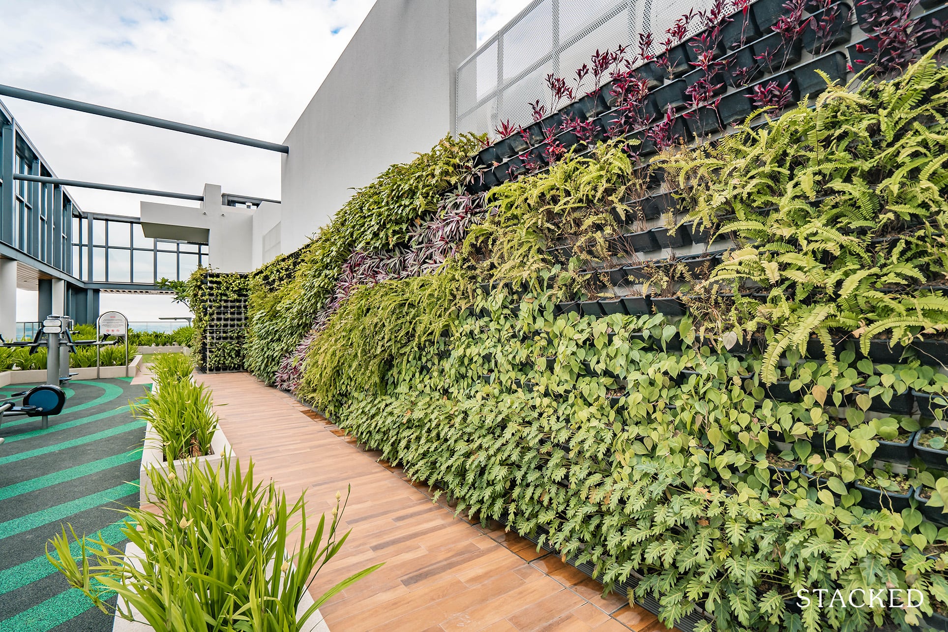
The landscaping carries all the way as you walk further on, which I do like the look of.
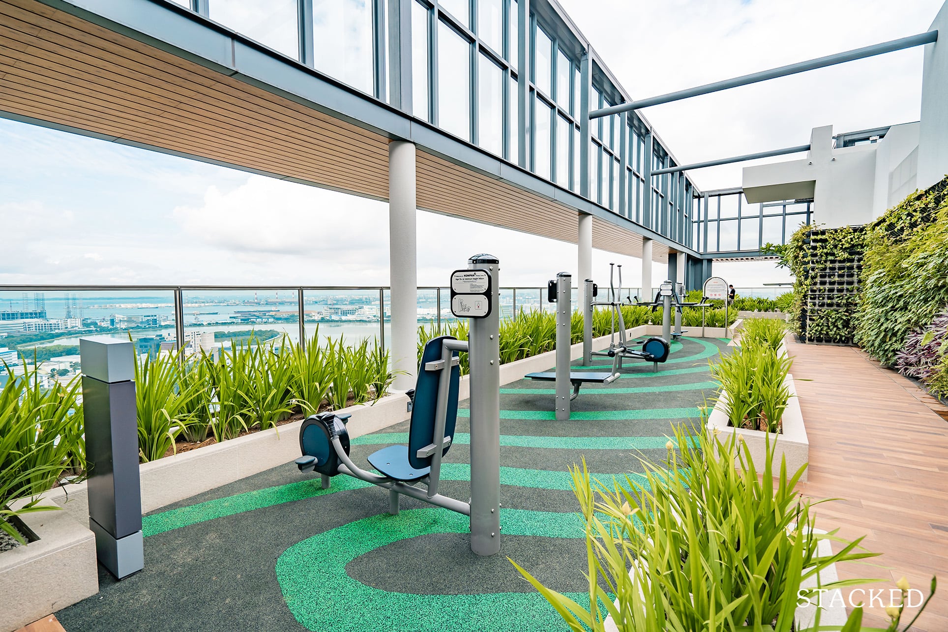
It’s worth noting here that each tower has its own unique set of features. This one has probably the best view of any outdoor fitness station in Singapore.
And while I am a fitness junkie myself, it does seem a bit of a waste to have such a big prime area dedicated just to an outdoor fitness station.
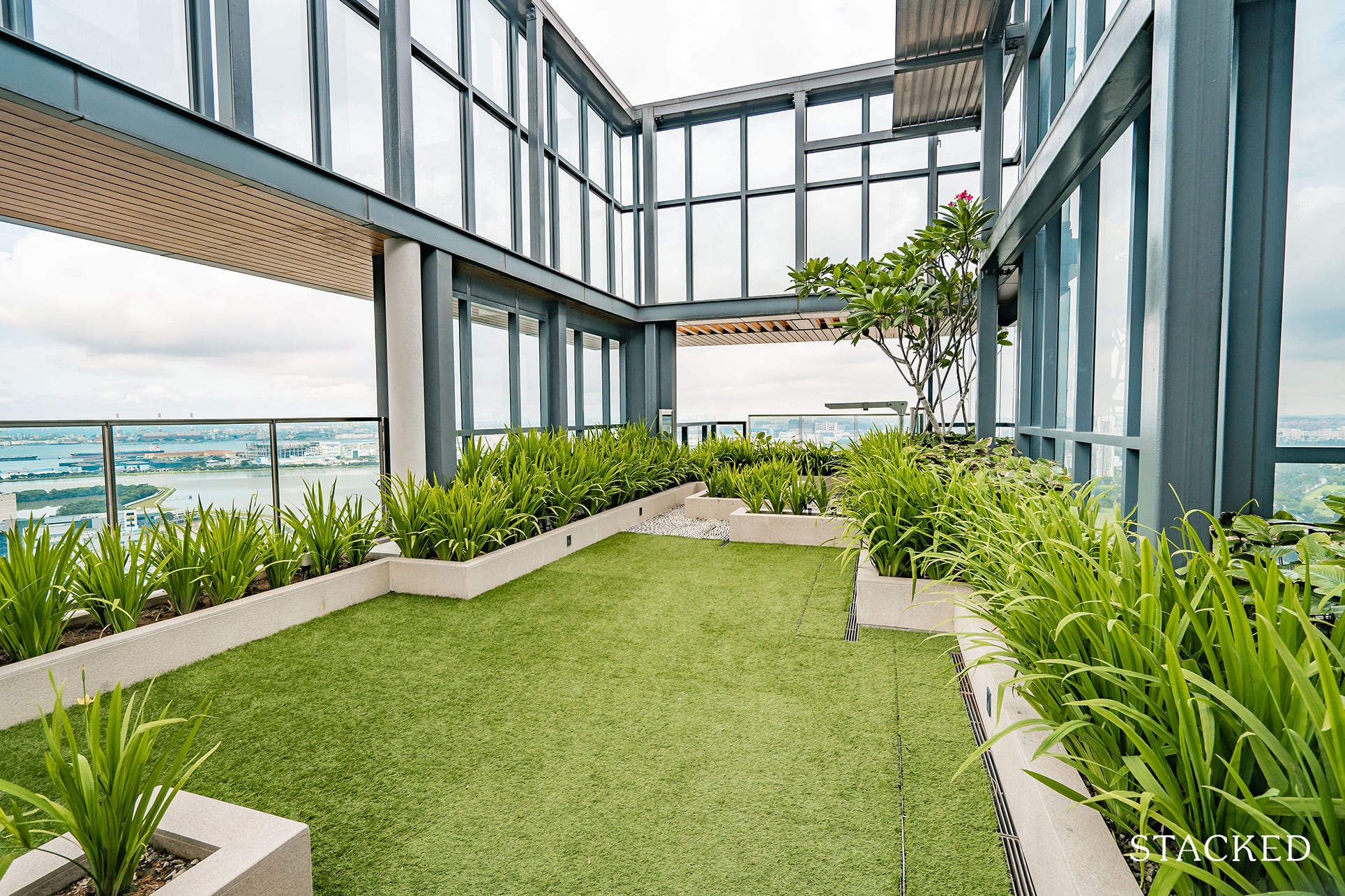
Towards the end is an open lawn here, but I can’t say this would offer too much use beyond taking in the sweeping views of the surrounding area.
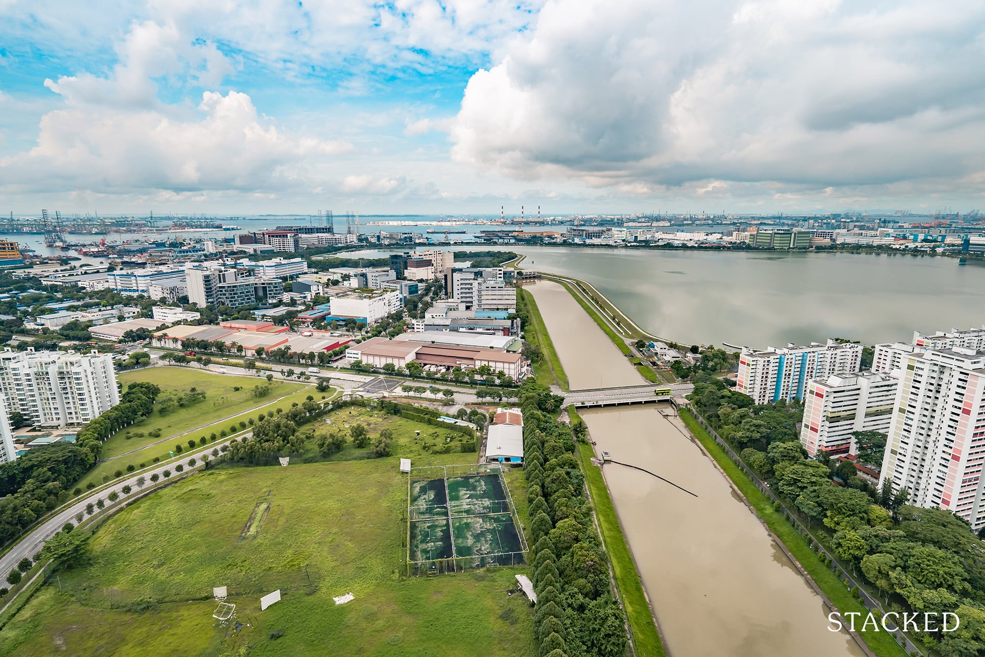
And what a view it is. At this height, you are way above everything else in a generally low-lying area. It’s quite wonderful to see and take in the sights of the vast Pandan Reservoir. It’s easy to see where the inspiration for the name came from, when you are standing at this point.
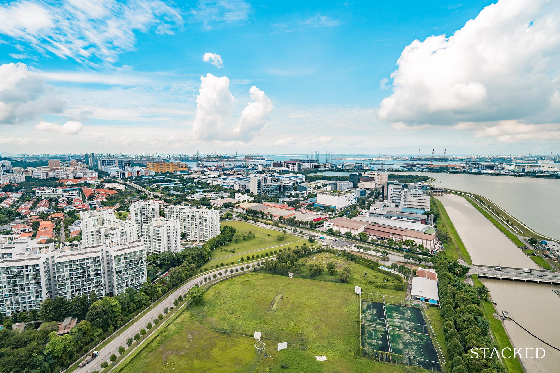
The other side is more of a city view, which is less pretty, in my opinion.
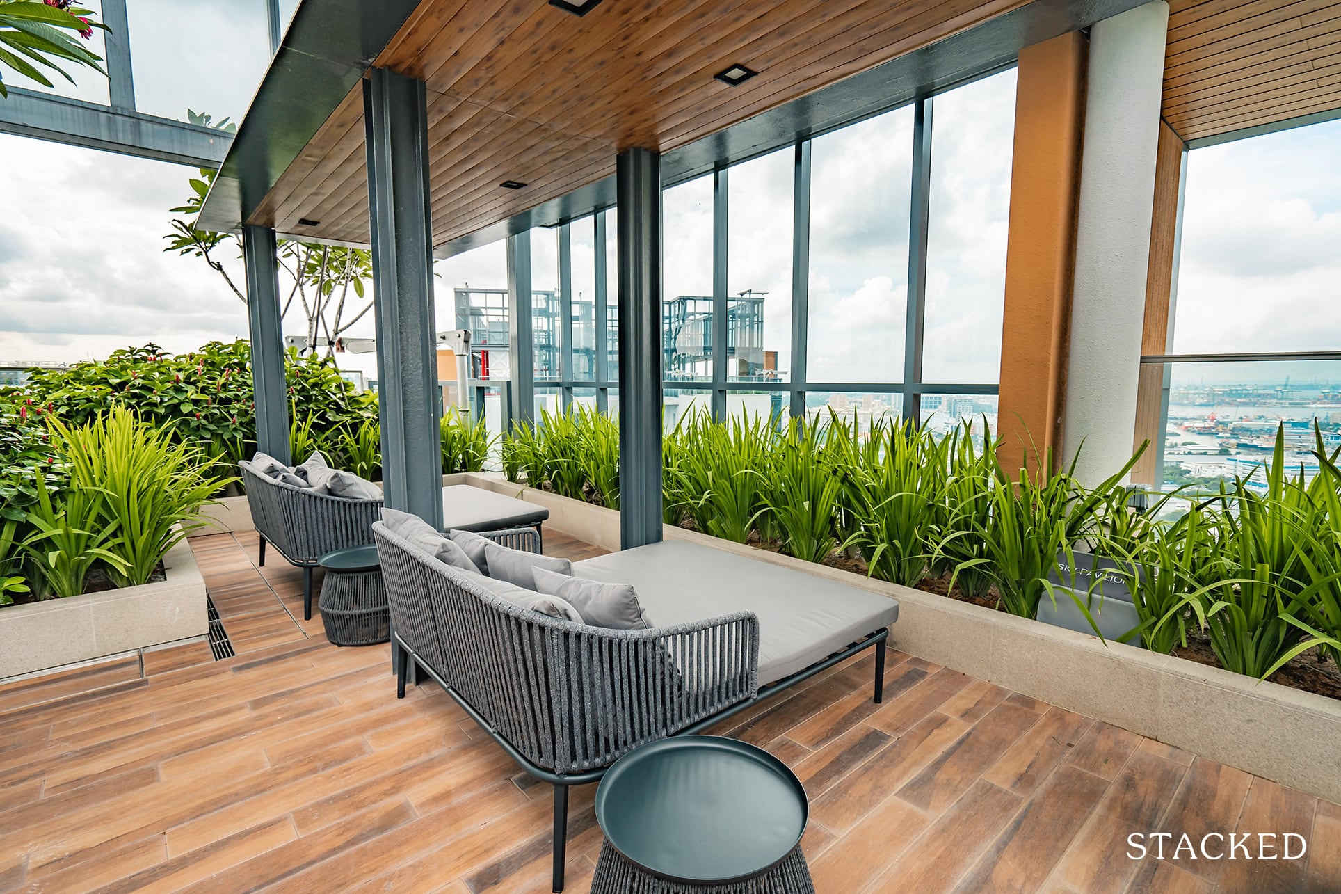
Last but not least is a lounge area, where you can sit comfortably – but lying down does mean your views are blocked – which defeats the entire purpose of lying there in the first place.
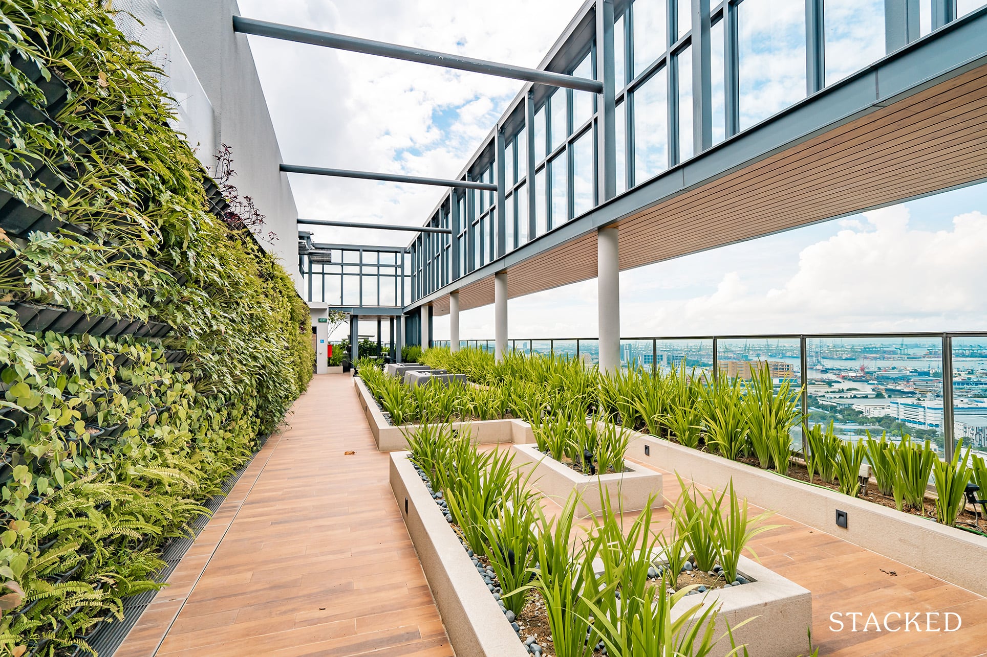
Now the second tower offers more utility for me. Here you have a lounging area, where you can use it during the day for a more interesting working space.
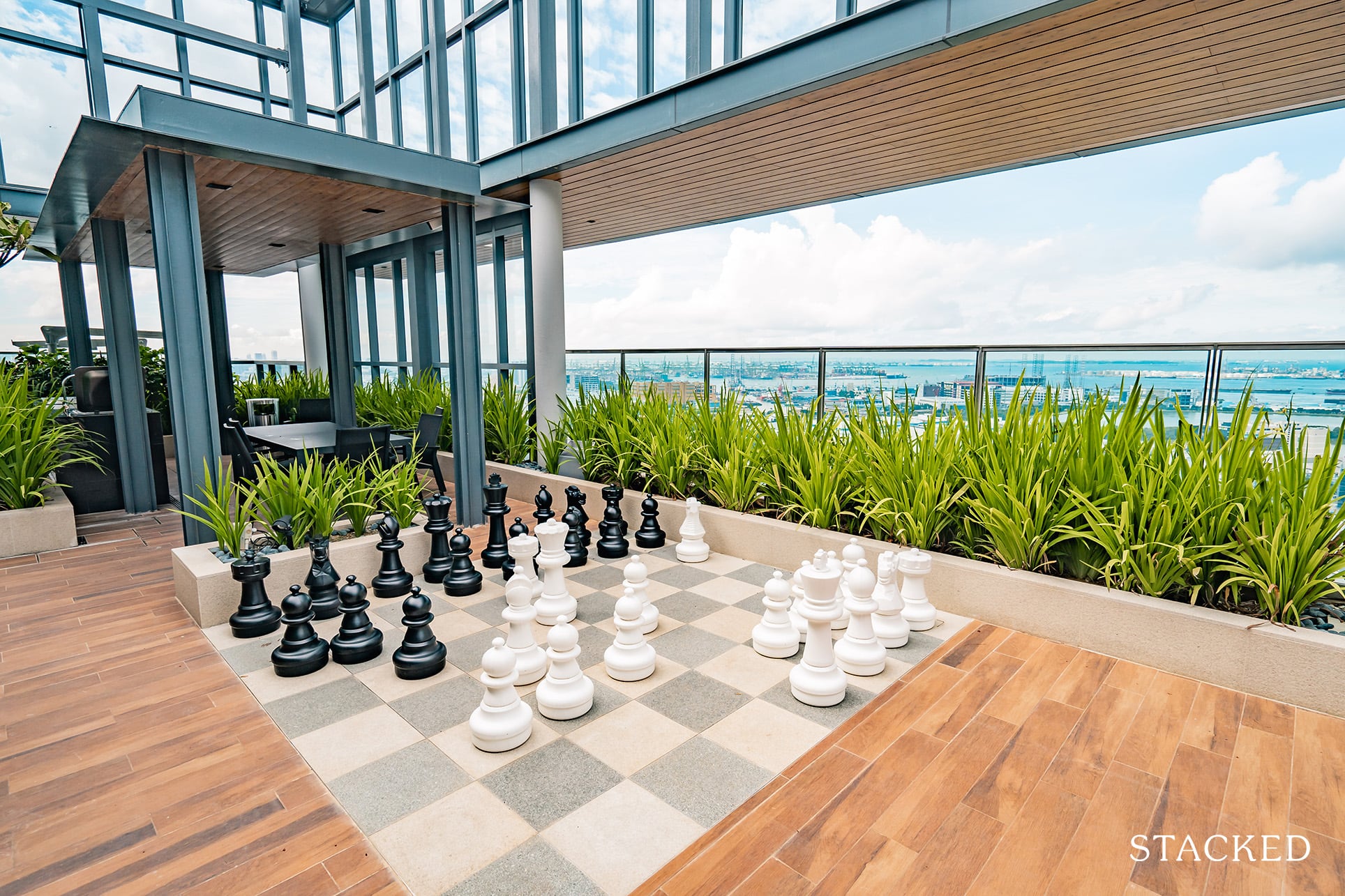
There’s a giant chess set here too, which is always more of a gimmick than anything to me. What’s great here is the location of the final dining pavilion. Obviously, this offers the best views and is arguably more private too.
So you could have your hands full trying to book this space during the popular slots of the year.
Twin VEW Location Review
The biggest downside to the Twin VEW is probably its immediate location – there really isn’t a ton of amenities in close walking distance. I would go so far as to say that having a car here would definitely almost be a need.
It is also surrounded by 2 neighbouring new launch condos in the form of Parc Riviera and Whistler Grand, but as I mentioned above, it arguably is situated in the best spot.
Ultimate convenience aside, what is probably a key feature is its relative proximity to the impeding Jurong Lake District – a 10-minute drive away.
There is also a plot of land adjacent to Twin VEW that has been set aside for an educational institute.
Public Transport
| Bus Station | Buses Serviced | Distance From Condo (& Est. Walking Time) |
| ‘The Infiniti’ | 97, 154, 197, 198, 201 | 300m, 4-min walk |
| ‘Opp Angliss Bldg’ | 30, 51, 143, 176, 655 | 550m, 7-min walk |
Closest MRT: Clementi MRT – 2.2km, 29-min walk
Transport convenience for RCR developments is always going to be an interesting topic.
For our property enthusiasts, you’d know that many RCR condos command a strong price premium solely because they have incredible public transport accessibility.
Sadly, the closest MRT station here is almost a half hour walk away – and the upcoming Pandan Reservoir MRT along the Jurong Region Line is still a distant away with completion slated for 2027. Still, it is at least a 15-minute walk, one which I wouldn’t quite classify as a nearby transport link.
What further compounds this worry is the fact that it takes over 40 minutes to head to either town or the CBD.
For those heading to Orchard, you’ll have to board 154 at the ‘Opp Infiniti’ bus stop, before switching over to 106 a couple of stops after. The journey takes almost 50 minutes on average.
As for those heading to the CBD, one of the faster ways would be to board either 154 or 201 at the aforementioned ‘Opp Infinit’ bus stop, before boarding the train at Clementi MRT toward Raffles Place MRT a couple of stops after.
The journey takes just above 40 minutes.
On the bright side, the Jurong Gateway Precinct is just a 15-minute bus ride away if you board the 97/197 at ‘The Infiniti’ bus stop.
Private Transport
| Key Destinations | Distance From Condo (& Est. Peak Hour Drive Time) |
| CBD (Raffles Place) | 15.1km, 25-min drive |
| Orchard Road | 11.7km, 30-min drive |
| Suntec City | 19.8km, 30-min drive |
| Changi Airport | 33.4km, 32-min drive |
| Tuas Port (By 2040) | 32km, 25.5-min drive |
| Paya Lebar Quarters/Airbase (By 2030) | 27.8km, 33-min drive |
| Mediapolis (and surroundings) | 9.6km, 19-min drive |
| Mapletree Business City | 8.3km, 17-min drive |
| Tuas Checkpoint | 15.3km, 21-min drive |
| Woodlands Checkpoint | 21km, 27-min drive |
| Jurong Cluster (JCube) | 3.4km, 12-min drive |
| Woodlands Cluster (Causeway Point) | 21.5km, 30-min drive |
| HarbourFront Cluster (Vivo City) | 11.4km, 22-min drive |
| Punggol Cluster (Waterway Point) | 34.6km, 42-min drive |
*Note that Drive Times are calculated during Peak Hours
Immediate Road Exit(s): One exit along West Coast Vale
Summary: One of the biggest ‘counters’ to adjacent highway noise is really the convenience that these highways bring to condo residents. Unfortunately, there isn’t an immediate vehicular exit point onto the AYE. You would have to undertake a 2km roundabout, starting from the initial West Coast Vale exit, before heading on to West Coast Road and West Coast Way, and then finally joining up with the AYE.
Groceries
| Name of Grocery Shop | Distance From Condo (& Est. Walk Time) |
| FairPrice – Teban Gardens | 1.9km, 6-min drive |
| Sheng Siong – Teban Gardens | 2.4km, 7-min drive |
Schools
| Educational Tier | Number of Institutes |
| Preschool (within 1km walk) | 2 |
| Primary (3km-drive) | 1 |
| Secondary (3km-drive) | 3 |
| International School (3km-drive) | 2 |
| Junior College (5km-drive) | 0 |
| University (5km-drive) | 2 |
| Polytechnic (10km-drive) | 2 |
Additional Pointers
- Lacking Amenities
I have to highlight that there really aren’t many immediate amenities for residents on the Twin VEW side of the Pandan River.
Of course, this should change in time, but for the initial moving-in phase, I do feel that a personal vehicle is quite a necessity for residents here.
On the other side of the Pandan River, you do get a number of coffee shops and eateries, as well as the Ayer Rajah Community Club for recreational purposes – though this is either a 4-min drive or 14-minute walk away.
A direct river connector would definitely make things a lot more convenient as opposed to the current detoured crossing to get here via West Coast Road.
The closest mall is the NEWest shopping mall along West Coast Drive. It hasn’t seen all that much consumer traffic as yet, but with these new developments popping out in the area, I can foresee a distinct increase in visitors. (It is located a 15-minute walk from the condo or a 5-min drive away).
Of course, if you do drive, the cluster of shopping malls (JEM, Westgate, JCube) will definitely be a frequent area for weekend haunts.
- Plenty of Nature Spaces
Apart from the massive influx of infrastructure and convenience set to hit the JLD area in the coming years, we do see a sizable chunk that’s been designated for greenery.
Touted to span over 90 hectares (9.6 million square feet), the Jurong Lake Gardens is set to be Singapore’s first national gardens in the heartland.
What’s more, there are also plans to revamp a new waterway/waterfront district that will include plenty of space for recreation (and gastronomy), as well as another 10 hectare Central Park set to rise up above the underground HSR terminus.
Even right now with the Pandan Reservoir Fitness Corner just opposite. Plus you could use the entire reservoir for a scenic run if you wanted to as the place does provide a unique opportunity if you wanted to indulge in nature.
Twin VEW Development Site Review
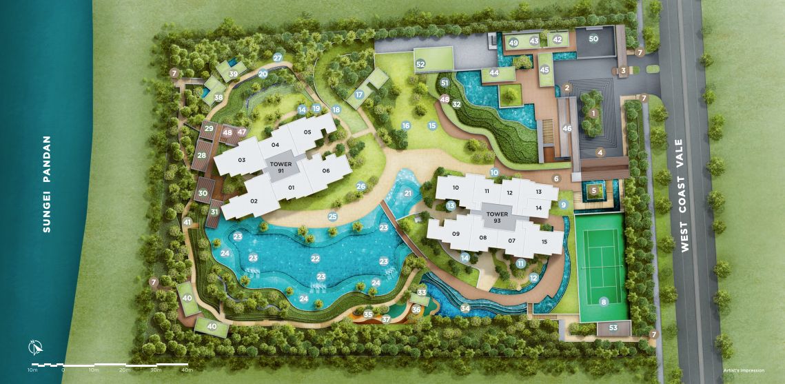
| Barbeque Area | Children’s Playground | Fun pool |
| Function room | Game room | Gymnasium room |
| Lounge | Multi-Storey Car Park | Pavillion |
| Playground | Reflexology Path | Roof Terrace |
| Sauna | 24 hours security | Sky Lounge |
| Steam bath | Tennis courts |
In my opinion, the developers have positioned the towers very tastefully.
You can see how they’ve been well-angled with sufficient space in between each block to ensure both privacy and good views for residents here.
For a 176,293 square foot development, it again feels like the developers have managed to squeeze a number of facilities into the project without making the space extremely cluttered.
Given the amount of implementations here (including exposure to the nearby waterbody), I do feel that the level of maintenance is going to be crucial in ensuring that these nature-etched amenities don’t go into disrepair just a couple of years down the road.
All in all, I personally really like the layout, the planning of the facilities and how it would be used in relation to its environment. It shows the thought and sensible planning behind it, which bodes well for future residents of the development.
Stack Analysis
Afternoon Sun Movement Analysis
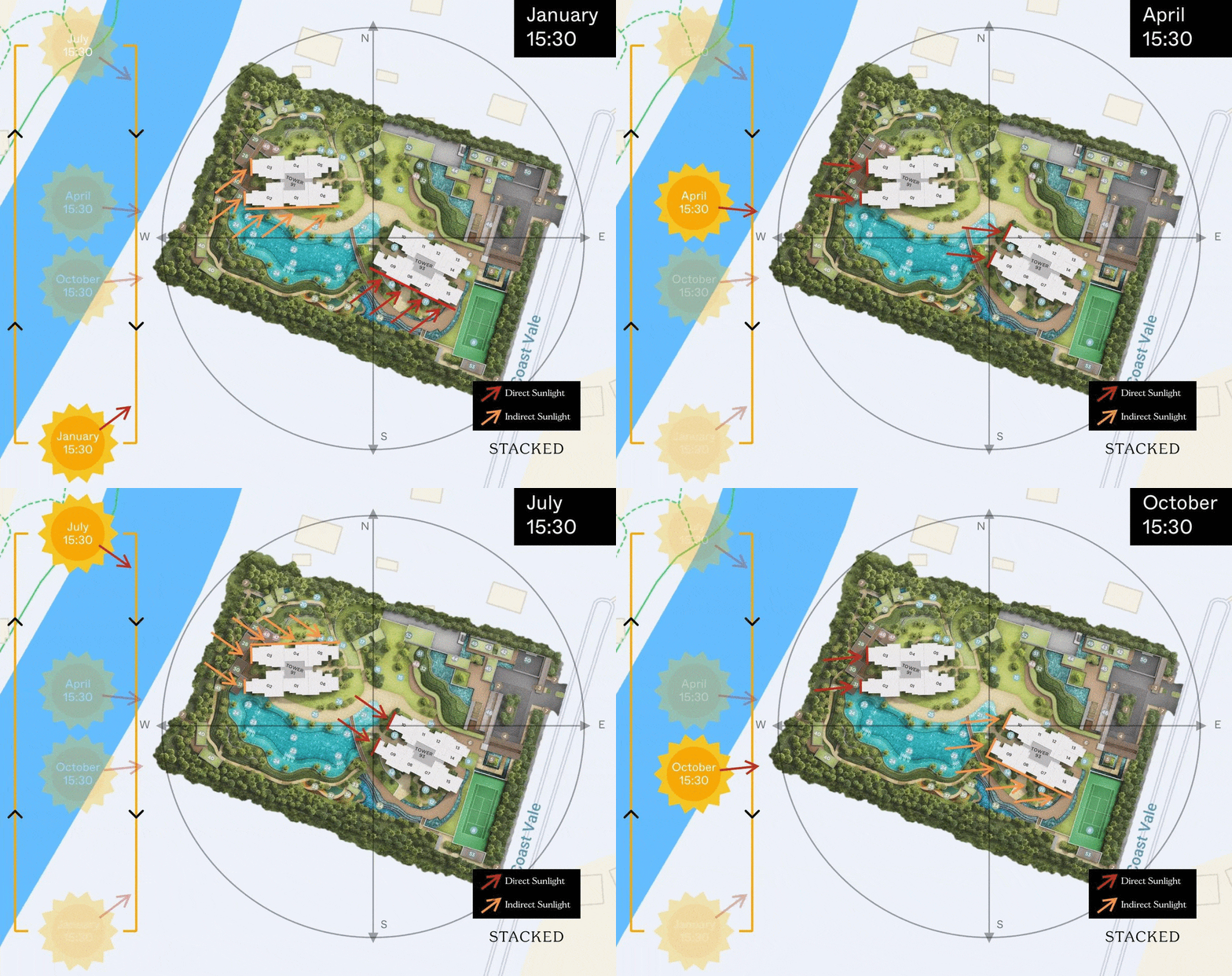
Stacks 02, 03 and 09 are the only stacks to have afternoon sun all year round, so do avoid these 3 stacks if the afternoon sun is a concern. Your utility bills will thank you.
The next stack to avoid is 10 which sees afternoon sun coming in for about 3 quarters of the year with the sun being blocked by stack 09 towards the end of the year.
Stacks with the least afternoon sun
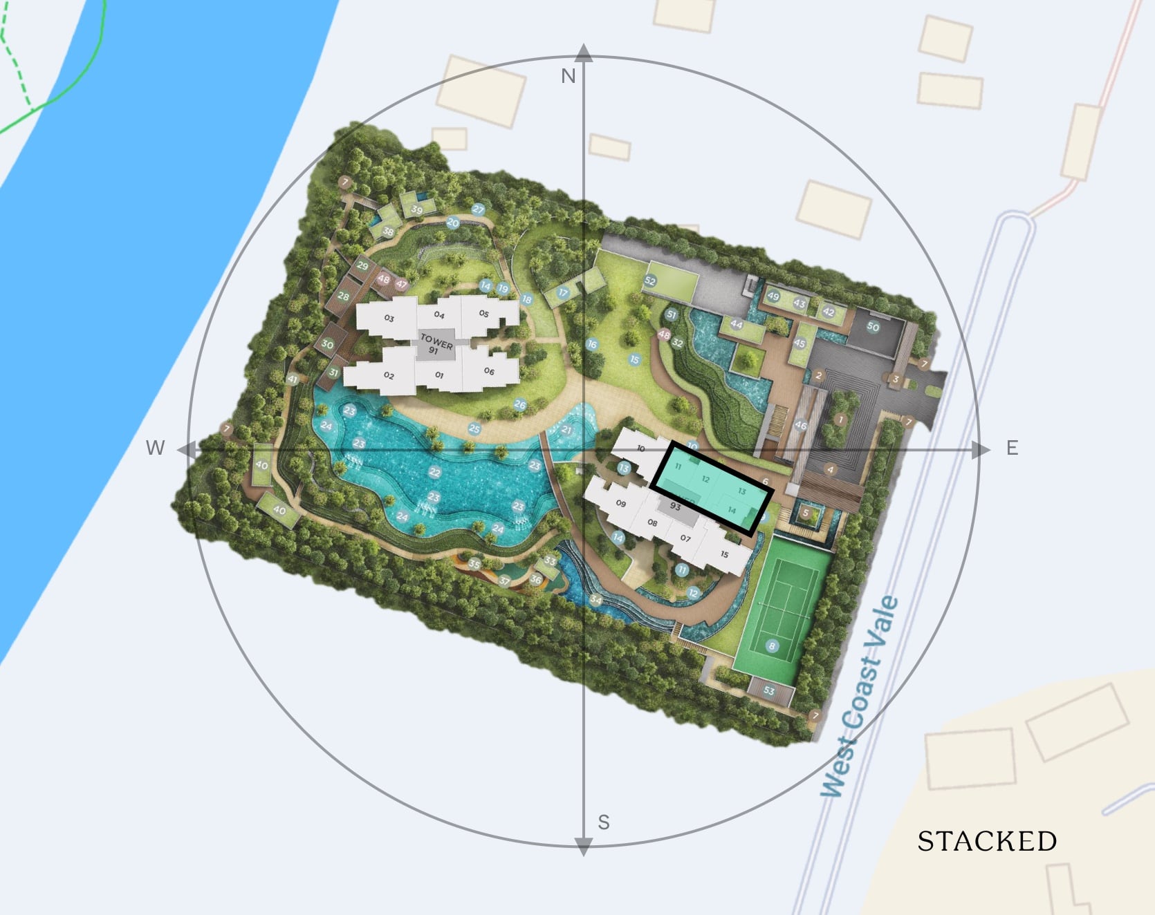
The best stack with absolutely no afternoon sun (direct or indirect) is stack 14. Shielded by stack 13 and 15, this south-east facing stack would benefit from the morning sun all-year round, with direct morning sun coming in between October to March, allowing you to dry your clothes naturally while enjoying a cool home.
Stacks 11, 12 and 13 manages to avoid the afternoon sun all-year round, with just a tad bit of sun coming in at the end of June when the sun is in its most north-west position. It gets to enjoy the morning sun between May to August too.
Unit Mix
| Unit Type | No. Of Units | Size of Units (sqft) |
| 1-Bedroom | 34 | 484 sqft |
| 1-Bedroom + Study | 35 | 570 sqft |
| 2-Bedroom | 137 | 710 – 743 sqft |
| 2-Bedroom + Study | 34 | 818 sqft |
| 3-Bedroom Executive | 34 | 904 sqft |
| 3-Bedroom Deluxe | 69 | 1,055 – 1,066 sqft |
| 3-Bedroom + Study | 68 | 1,141 – 1,184 sqft |
| 4-Bedroom Executive | 35 | 1,238 – 1,249 sqft |
| 4-Bedroom + Study | 34 | 1,378 sqft |
| 4-Bedroom Deluxe | 34 | 1,518 sqft |
| Penthouse | 6 | 1,442 – 2,088 sqft |
| Shops | 2 | 549 – 560 sqft |
Twin Vew offers a well-balanced unit mix that supplements both the homeowner and investor demographic.
It’s also not surprising how the 1 and 2-bedder units were quickly snapped up at launch in anticipation of increased rentability when the JLD eventually surfaces.
Twin Vew Maintenance Fees
| Unit Type | EST Maintenance Fees |
| 1 Bedroom | $250 |
| 1 Bedroom + Study | $300 |
| 2 Bedroom | $300 |
| 2 Bedroom + Study | $300 |
| 3 Bedroom | $300 |
| 3 Bedroom + Study | $350 |
| 4 Bedroom | $350 |
| Penthouse | $350 |
| Penthouse | $400 |
Maintenance fees are a little higher for the smaller units. But considering the facilities plus private lift for the 4 bedroom units you could say that those maintenance figures look quite reasonable for the bigger units.
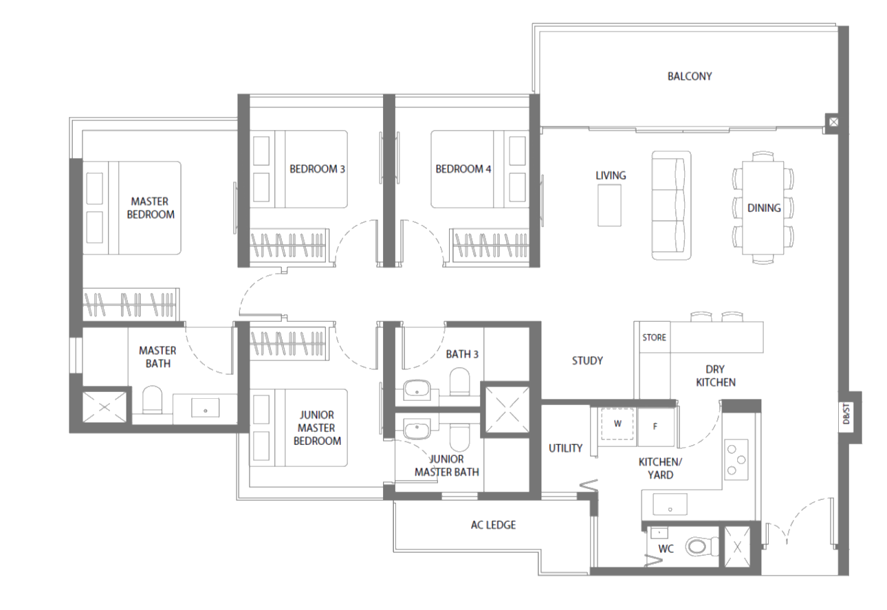
To give you more details, these 22 units range from #02-03 to #34-03 between $1.86m – $2.1m (or $1,353 – $1,529 psf).
They are all members of stack 3 in tower 91 (river-facing).
Comparing this to the sold out 4 bedroom stack, and it is easy to see why that was pretty much snapped up so quickly. That larger space, better view, plus private lift are quite major differentiators for those looking at units such as these. Not to forget, the price point it was launched at as well.
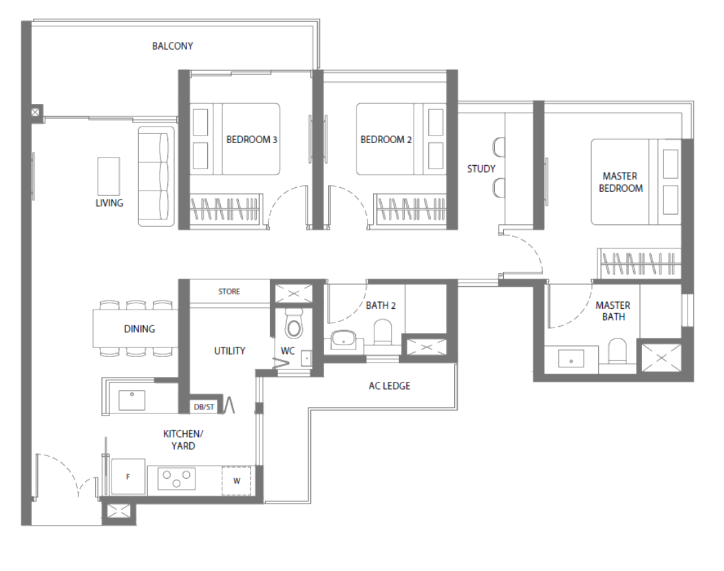
As for the 3-bedroom + study units, they are split into 3 C5s units in stack 5 of block 91 that range from #31-05 – #34-05 between $1.68 – $1.71m (or $1,473 – $1,502 psf)
To show you a price comparison
| Twin Vew | Parc Riviera | Whistler Grand | |
| Size | 1,141 | 1,152 | 1,066 |
| Price | $1.68m | $1.56m | $1.612m |
| PSF | $1,473 | $1,354 | $1,513 |
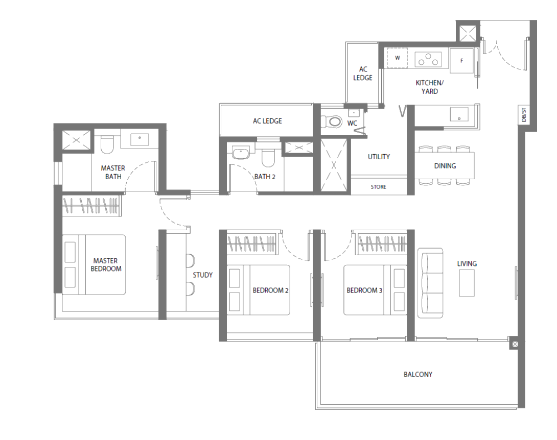
And 8 C4s units in stack 9 of block 93 that include #25-09, as well as #27-09 to #34-00, with prices ranging between $1.79 – $1.83m (or $1,469 – $1,551 psf).
Best Stacks
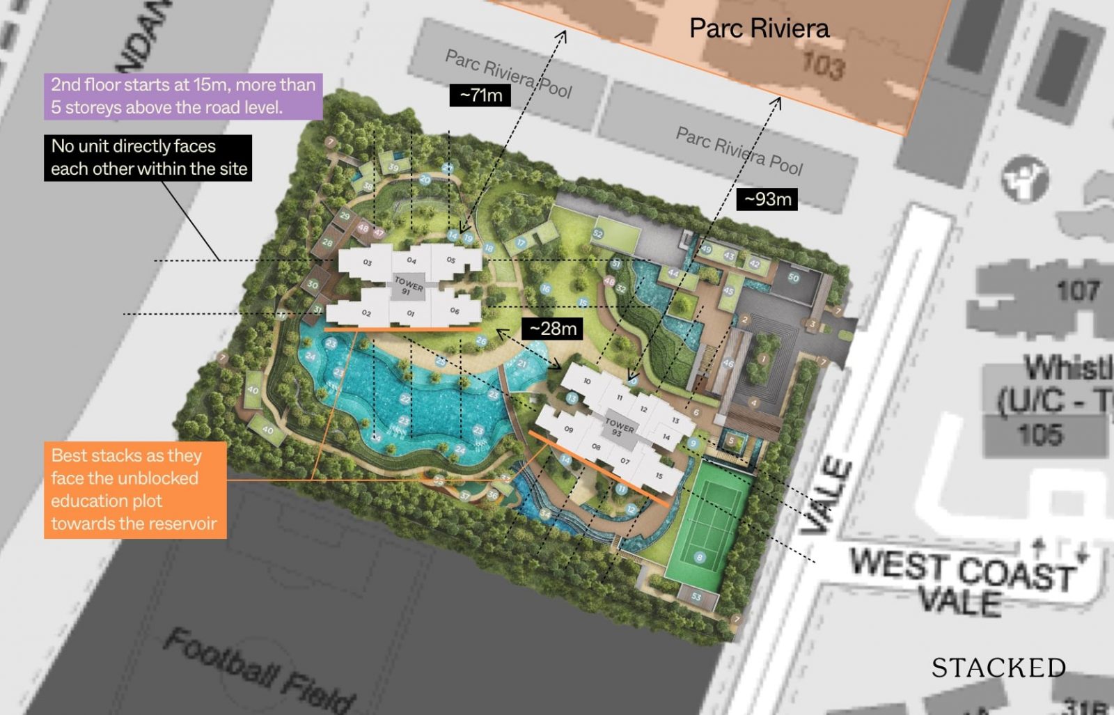
As mentioned in the tour section, the bottom most unit actually starts at 15 metres above ground (or 5 storeys). So even in lowest level unit at the Twin Vew does offer some semblance of views of its surroundings.
What’s great here though is that both blocks were positioned such that no unit directly faces another within the site – an issue that plagues many mass market developments.
Clearly, the best stacks here are the ones facing the unblocked education plot and towards the reservoir – mainly Stacks 2, 1, 6, 9, 8, 7, and 15.
Stacks 3, 4, and 5 offer a view towards the JLD, but some might find the view hampered by Parc Riviera. That said, the gap of 71 metres between them should be more than enough privacy wise. If you’d like a further gap, Stacks 10, 11, and 12 are at a 93 metre distance.
Twin VEW Updated Pricing Review
Here’s a look at the updated prices for Twin VEW compared to its surrounding resale condos.
| Project | Tenure | Built | 1 Bedroom | 2 Bedroom | 3 Bedroom | 4 Bedroom | 5 Bedroom |
| Twin VEW | 99 yrs from 15/05/2017 | 2021 | – | – | $1,685,167 ($1,561 psf) | $2,162,750 ($1,553 psf) | – |
| Botannia | 956 yrs from 27/05/1928 | 2009 | – | $1,245,000 ($1,329 psf) | $1,698,861 ($1,321 psf) | $2,160,667 ($1,366 psf) | – |
| Carabelle | 956 yrs from 27/05/1928 | 2009 | – | $1,270,000 ($1,439 psf) | $1,480,000 ($1,309 psf) | $1,936,888 ($1,384 psf) | $2,850,000 ($1,372 psf) |
| Hundred Trees | 956 yrs from 27/05/1928 | 2013 | $740,000 ($1,528 psf) | $1,151,600 ($1,376 psf) | $1,630,000 ($1,402 psf) | $2,221,500 ($1,507 psf) | – |
| Monterey Park Condominium | 999 yrs from 21/02/1885 | 2005 | – | – | $2,030,000 ($1,382 psf) | $2,200,000 ($1,354 psf) | – |
| NEWest | 956 yrs from 27/05/1928 | 2016 | – | – | – | $2,326,267 ($844 psf) | – |
| Parc Riviera | 99 yrs from 11/11/2015 | 2019 | $699,143 ($1,511 psf) | $926,500 ($1,406 psf) | $1,335,000 ($1,410 psf) | $1,590,385 ($1,363 psf) | – |
| The Infiniti | Freehold | 2008 | – | $1,209,722 ($1,266 psf) | $1,532,500 ($1,198 psf) | $1,760,000 ($1,176 psf) | – |
| Whistler Grand | 99 yrs from 07/05/2018 | Uncompleted | $889,244 ($1,716 psf) | $1,213,010 ($1,588 psf) | – | – | $1,998,000 ($1,385 psf) |
These are the transactions in the past 6 months for Twin VEW:
| Date | Transactions | Transaction Type | Size | $PSF | Price |
| 15 Sep 2021 | 93 WEST COAST VALE #24-XX | SUB SALE | 1,066 | $1,717 | $1,830,000 |
| 14 Sep 2021 | 91 WEST COAST VALE #08-XX | SUB SALE | 1,518 | $1,523 | $2,311,000 |
| 4 Sep 2021 | 91 WEST COAST VALE #24-XX | NEW SALE | 1,378 | $1,542 | $2,125,000 |
| 1 Sep 2021 | 93 WEST COAST VALE #09-XX | SUB SALE | 1,184 | $1,500 | $1,776,000 |
| 30 Aug 2021 | 91 WEST COAST VALE #07-XX | SUB SALE | 1,141 | $1,516 | $1,730,000 |
| 30 Aug 2021 | 91 WEST COAST VALE #12-XX | SUB SALE | 1,141 | $1,534 | $1,750,000 |
| 11 Aug 2021 | 91 WEST COAST VALE #31-XX | SUB SALE | 1,518 | $1,693 | $2,570,000 |
| 6 Aug 2021 | 91 WEST COAST VALE #23-XX | SUB SALE | 1,518 | $1,634 | $2,480,000 |
| 19 Jul 2021 | 93 WEST COAST VALE #25-XX | SUB SALE | 1,055 | $1,498 | $1,580,000 |
| 25 Jun 2021 | 91 WEST COAST VALE #16-XX | SUB SALE | 904 | $1,598 | $1,445,000 |
| 17 Jun 2021 | 91 WEST COAST VALE #17-XX | SUB SALE | 1,249 | $1,530 | $1,910,000 |
| 29 Apr 2021 | 91 WEST COAST VALE #33-XX | NEW SALE | 1,378 | $1,537 | $2,117,000 |
| 29 Apr 2021 | 91 WEST COAST VALE #34-XX | NEW SALE | 1,378 | $1,542 | $2,125,000 |
| 29 Apr 2021 | 91 WEST COAST VALE #29-XX | NEW SALE | 1,378 | $1,515 | $2,087,000 |
| 28 Apr 2021 | 91 WEST COAST VALE #31-XX | NEW SALE | 1,378 | $1,526 | $2,102,000 |
| 10 Apr 2021 | 91 WEST COAST VALE #27-XX | NEW SALE | 1,378 | $1,504 | $2,072,000 |
| 10 Apr 2021 | 91 WEST COAST VALE #28-XX | NEW SALE | 1,378 | $1,509 | $2,079,000 |
| 8 Apr 2021 | 91 WEST COAST VALE #34-XX | NEW SALE | 1,249 | $1,582 | $1,975,000 |
If you’ve noticed, Twin VEW is surrounded by quite a lot of freehold/900+ year developments. Generally, this does not bode well for the long-term pricing of Twin VEW since the freehold property land value is retained while Twin VEW’s land value would naturally depreciate.
| Project Name | Tenure | Median Unit Price ($ PSF) |
| One-North Eden | 99 yrs from 10/12/2019 | $1,874 |
| Normanton Park | 99 yrs from 22/07/2019 | $1,817 |
| Kent Ridge Hill Residences | 99 yrs from 10/11/2018 | $1,795 |
| Parc Clematis | 99 yrs from 08/08/2019 | $1,703 |
| Clavon | 99 yrs from 07/10/2019 | $1,631 |
| The Clement Canopy | 99 yrs from 09/03/2016 | $1,569 |
| Twin Vew | 99 yrs from 15/05/2017 | $1,534 |
| One-North Residences | 99 yrs from 15/09/2005 | $1,507 |
| Seahill | 99 yrs from 26/09/2011 | $1,451 |
| Waterfront @ Faber | 99 yrs from 17/09/2013 | $1,398 |
| The Rochester Residences | 99 yrs from 02/02/2005 | $1,394 |
| Whistler Grand | 99 yrs from 07/05/2018 | $1,371 |
| Parc Riviera | 99 yrs from 11/11/2015 | $1,363 |
| The Trilinq | 99 yrs from 16/04/2012 | $1,323 |
| The Vision | 99 yrs from 25/06/2008 | $1,287 |
| Heritage View | 99 yrs from 12/08/1996 | $1,255 |
| Dover Parkview | 99 yrs from 01/12/1993 | $1,241 |
| Varsity Park Condominium | 99 yrs from 03/05/2004 | $1,223 |
| Clementiwoods Condominium | 99 yrs from 07/02/2006 | $1,153 |
| Blue Horizon | 99 yrs from 14/08/2000 | $1,139 |
| Regent Park | 99 yrs from 01/12/1993 | $995 |
| Faber Crest | 99 yrs from 12/06/1996 | $969 |
| Westcove Condominium | 99 yrs from 01/03/1995 | $902 |
| West Bay Condominium | 99 yrs from 01/03/1991 | $874 |
Compared to other leasehold projects in district 05, Twin VEW ranks 7th highest which makes sense, considering how the higher ones are either situated closer to the Pasir Panjang/Clementi side.
Moreover, these are newer (later lease start date). Whistler Grand which is just next to Twin VEW does have a lower $PSF for a slightly lower overall price for its bigger units at 1,442 sqft (5-bedroom units). This could be explained by the willingness of home buyers willing to pay more for a new and completed project in an era where construction delays are very real.
This leads me to my next point: early buyers of Twin VEW are rewarded handsomely as they are likely selling to those in need of a home that TOPs soon (then). Here’s a look at the 1st home buyer’s profitability:
More from Stacked
TMW Maxwell Review: Unique Space-Saving Furniture & Vertical Landscaped Gardens In The CBD
Multi-hyphenates - this is the main word that hits you when you visit the TMW Maxwell show flat for the…
| SOLD | ADDRESS | UNIT AREA(SQFT) | SALE PRICE(S$ PSF) | BOUGHTON | PURCHASE PRICE(S$ PSF) | PROFIT(S$) | HOLDING PERIOD(DAYS) | ANNUALISED(%) |
| 15 Sep 2021 | 93 WEST COAST VALE #24-15 | 1,066 | 1,717 | 5 May 2018 | 1,396 | 342,000 | 1,229 | 6.3 |
| 14 Sep 2021 | 91 WEST COAST VALE #08-02 | 1,518 | 1,523 | 12 Jun 2018 | 1,246 | 420,000 | 1,190 | 6.3 |
| 4 Sep 2021 | 91 WEST COAST VALE #24-03 | 1,378 | 1,542 | 21 Mar 2021 | 1,487 | 76,000 | 167 | 8.3 |
| 1 Sep 2021 | 93 WEST COAST VALE #09-09 | 1,184 | 1,500 | 5 May 2018 | 1,292 | 246,000 | 1,215 | 4.6 |
| 30 Aug 2021 | 91 WEST COAST VALE #07-05 | 1,141 | 1,516 | 5 May 2018 | 1,234 | 322,000 | 1,213 | 6.4 |
| 30 Aug 2021 | 91 WEST COAST VALE #12-05 | 1,141 | 1,534 | 6 May 2018 | 1,289 | 279,000 | 1,212 | 5.4 |
| 11 Aug 2021 | 91 WEST COAST VALE #31-02 | 1,518 | 1,693 | 12 Jun 2018 | 1,405 | 437,000 | 1,156 | 6.1 |
| 6 Aug 2021 | 91 WEST COAST VALE #23-02 | 1,518 | 1,634 | 5 May 2018 | 1,329 | 463,000 | 1,189 | 6.5 |
| 19 Jul 2021 | 93 WEST COAST VALE #25-10 | 1,055 | 1,498 | 12 Jun 2018 | 1,333 | 174,000 | 1,133 | 3.8 |
| 25 Jun 2021 | 91 WEST COAST VALE #16-01 | 904 | 1,598 | 5 May 2018 | 1,398 | 181,000 | 1,147 | 4.4 |
| 17 Jun 2021 | 91 WEST COAST VALE #17-06 | 1,249 | 1,530 | 6 May 2018 | 1,361 | 211,000 | 1,138 | 3.8 |
Twin VEW has so far recorded 11 profitable transactions, and 0 unprofitable ones.
Those who purchased in 2018 would not have to pay the Seller’s Stamp Duty. Even if we account for the Buyer’s Stamp Duty, selling/legal fees and interest costs, the returns are still phenomenal for just a 3-year investment (notice how most annualised gains are >5%!). What’s astounding is that these purchases are likely taken through a loan, so most of the investment just came in the form of the initial down payment.
There’s no question that the earlier buyers of Twin VEW will be very happy with their decision.
Now let’s take a look at the rental transactions here:
| LEASE START | UNIT SIZE(SQFT) | NUMBER OF BEDROOMS | MONTHLY RENT(S$) |
| Aug 2021 | 900 TO 1,000 | 3 | 4,200 |
| Aug 2021 | 400 TO 500 | 1 | 2,500 |
| Aug 2021 | 700 TO 800 | 2 | 3,100 |
| Aug 2021 | 400 TO 500 | 1 | 2,500 |
| Aug 2021 | 400 TO 500 | 1 | 2,480 |
| Aug 2021 | 700 TO 800 | 2 | 3,400 |
| Aug 2021 | 500 TO 600 | 1+S | 2,600 |
| Aug 2021 | 700 TO 800 | 2 | 3,000 |
| Aug 2021 | 700 TO 800 | 2 | 3,200 |
| Aug 2021 | 1,000 TO 1,100 | 3 | 4,600 |
| Aug 2021 | 700 TO 800 | 2 | 3,500 |
| Aug 2021 | 700 TO 800 | 2 | 3,200 |
| Aug 2021 | 700 TO 800 | 2 | 3,300 |
| Aug 2021 | 800 TO 900 | 2+S | 3,450 |
| Aug 2021 | 400 TO 500 | 1 | 2,400 |
| Aug 2021 | 900 TO 1,000 | 3 | 4,300 |
| Aug 2021 | 900 TO 1,000 | 3 | 4,000 |
| Jul 2021 | 700 TO 800 | 2 | 3,500 |
| Jul 2021 | 700 TO 800 | 2 | 3,750 |
| NUMBER OF BEDROOMS | AVERAGE of MONTHLY RENT(S$) | Price | Rental Yield |
| 1 | $2,470 | – | – |
| 1+S | $2,600 | – | – |
| 2 | $3,328 | – | – |
| 2+S | $3,450 | – | – |
| 3 | $4,275 | $1,685,167 | 3.0% |
You can see that the 3-bedroom has a yield of 3.0%. This is very decent for a 3-bedroom unit of a leasehold project that is brand new. As we do not have transactions for smaller bedroom types over the last 6 months, we can’t make an accurate depiction of the rental yield yet, but 3% for the 3-bedroom unit sets a strong tone for the rental here at Twin VEW.
| PROJECT | TENURE | COMPLETION | DISTANCE(M) | LOWEST PRICE*(S$ PSF) | AVERAGE PRICE*(S$ PSF) | HIGHEST PRICE*(S$ PSF) | LOWEST RENTAL*(S$ PSF PM) | AVERAGE RENTAL*(S$ PSF PM) | HIGHEST RENTAL*(S$ PSF PM) | RENTAL YIELD(%) |
| TWIN VEW | 99 YEARS LEASEHOLD | 2021 | – | 1,498 | 1,554 | 1,717 | 4 | 4.64 | 5.56 | 3.6 |
| THE INFINITI | FREEHOLD | 2008 | 308 | 1,104 | 1,226 | 1,312 | 2 | 2.55 | 2.84 | 2.5 |
| WATERFRONT @ FABER | 99 YRS FROM 2013 | 2017 | 495 | 899 | 1,329 | 1,436 | 1.67 | 2.77 | 3.36 | 2.5 |
| BOTANNIA | 956 YRS FROM 1928 | 2009 | 238 | 1,233 | 1,350 | 1,496 | 2.26 | 2.89 | 4.06 | 2.6 |
| MONTEREY PARK CONDOMINIUM | 999 YRS FROM 1885 | 2005 | 330 | 1,250 | 1,372 | 1,513 | 2.26 | 2.77 | 3.07 | 2.4 |
| CARABELLE | 956 YRS FROM 1928 | 2009 | 486 | 1,309 | 1,376 | 1,439 | 2.39 | 2.97 | 3.59 | 2.6 |
| PARC RIVIERA | 99 YEARS LEASEHOLD | 2019 | 117 | 1,315 | 1,411 | 1,588 | 2.96 | 3.95 | 6 | 3.4 |
| WHISTLER GRAND | 99 YEARS LEASEHOLD | UNCOMPLETED | 117 | 1,293 | 1,538 | 1,766 | – | – | – | – |
If you go purely by the last 6 months average rental $PSF per month and average $PSF based on selling prices, you’ll find that Twin VEW’s rental yield tops out its surrounding competitors – even Parc Riviera with a lease start date that’s just 2 years younger.
Since price is a denominator of rental yield, the figures here do show that rental demand for units at Twin VEW is strong.
Overall, Twin VEW’s pricing and rental demand is likely explained by the strong demand for newly completed projects, considering the COVID-19 situation where construction delays are expected, and the need to move into a home is dire.
Appreciation Analysis
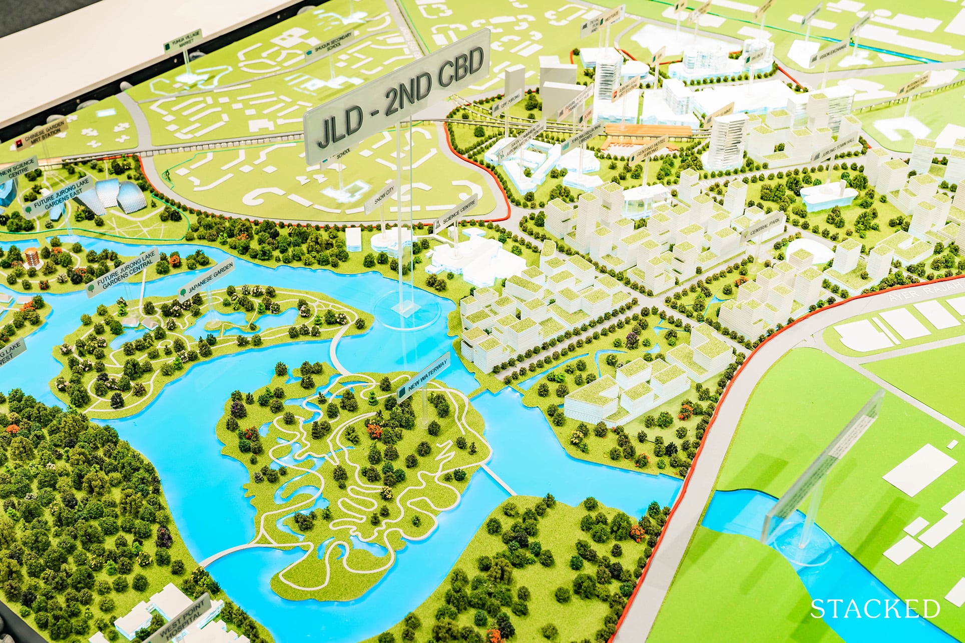
The area’s high appreciation potential is one of the biggest reasons why units in all these developments have been snapped up so quickly from launch.
At first glance, you see a relatively undeveloped surrounding, but if you look at its surroundings, you’ll observe the entire Jurong East community complete with over 250,000sqm of retail, entertainment and lifestyle options just 8-minutes drive from the condo.
What’s more, this will soon be the home of the massive Jurong Lake District – which is set to bring over 9million sqft of office space, and with it a ton of new jobs and homes in the area come 2026 and beyond.
And if that isn’t enough, you have the Jurong Innovation District set to hit completion in 2022.
It’s a 15-minute drive away and the area is set to combine ideas between researchers, students and tech industries in a one-stop tech/growth hub.
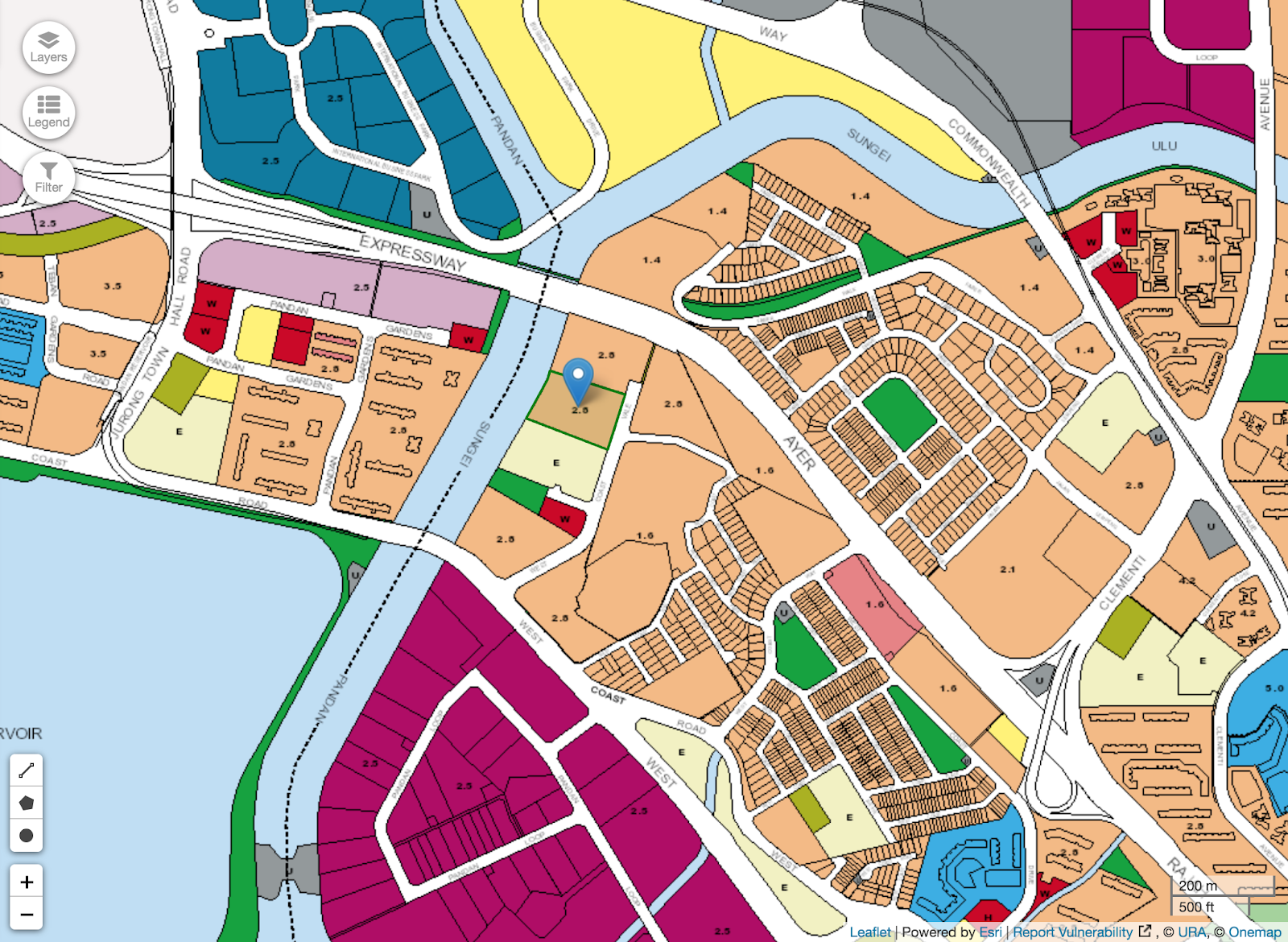
Let’s also not forget the entire business parks/districts to the north-west and south of Twin VEW where I feel the bulk of initial renters will come from before the JLD/JIH wave.
It also serves as a fallback just in case the HSR does not materialise by 2026.
What’s more, there are still two residential plots just behind Twin VEW that have yet to be snapped up.
Chances are, given their adjacency to the Sungei Pandan River and distance from the AYE (ie. no highway noise), we can expect winning land bids to cross $800 psf ppr here in the future – especially in light of the impending JLD, JIH and HSR.
When combined, these upcoming new launch prices are bound to exceed the prices of what we currently observe at Twin VEW.
Our Take
Personally, I like the idea of living next to a waterbody from a homeowner’s perspective.
The amount of work that has been put into creating an innovative condo environment should also not go unnoticed. For a maiden project, I think it is a rather impressive showing – great landscaping, solid facilities, and a well rounded offering (private lifts, marble floorings and good furnishings). Safe to say, it’s quite clear that there are others that see its potential, given the fantastic response so far.
What does detract from the general liveability for me though is the lack of any immediate amenities. Even though the development is geared towards own-stay family living, its current surroundings (industrial areas) aren’t best suited for it.
I’ve said it earlier, and I’ll say it again.
Due to the further lack of public transport in the area at this juncture, I wouldn’t recommend looking at this area if you rely heavily on public transport.
On the bright side, those working in the west will have relatively quick access to the JLD and JID sectors when they eventually come to fruition.
As for investment potential, it’s clear that rentability in the area will soar in the coming years, even if the initial periods after the condo TOPs in 2021 might not necessarily see rental demand booming as yet.
Important: The sections below were written before Twin VEW reached its TOP. We have left it here for your reference.
Twin VEW Insider Showflat Tour
What comes to your mind when you hear the words – ‘Waterfront Living’?
My first thoughts are of the glamorous Reflections at Keppel Bay, and perhaps even some of the D15 Amber/Meyer Road condos facing the East Coast bay area.
On the flipside, the phrase actually takes on a different connotation altogether for future residents at Twin VEW.
Isolation and tranquility are the two keywords here, with the project set to rise up alongside one of Singapore’s most sizeable, but least-known water bodies – the Sungei Pandan Reservoir.
It isn’t necessarily the most picturesque, but there’s definitely an undeniable charm to it.
Of course, that isn’t the only news about Twin VEW.
If you’ve followed the project since its launch, you would have heard of the massive take up rate on its opening weekend back in May 2018.
442 units (of 520). 85% to be exact.
For a foreign developer embarking on its first maiden project – it is quite frankly, very impressive results.
Why was this the case?
I’ll get into that (plus a whole ton more) a little later in the review. Before that, let’s have a look at the showroom!
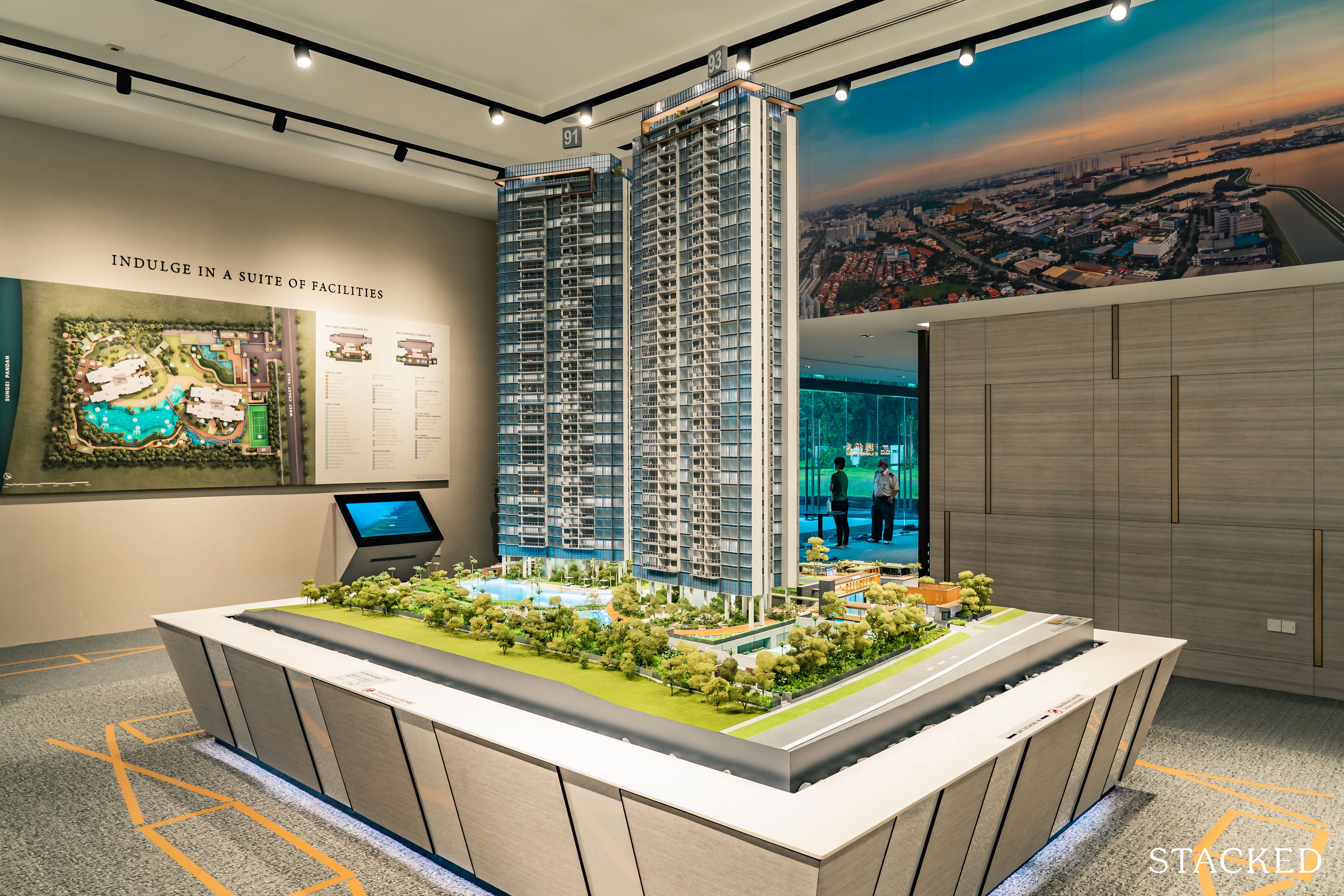
To date, Twin VEW has sold all but a handful of its 520 residential units since its launch in 2018 – right in the midst of the en bloc craze.
For those wondering about the remaining units, they are a mix and match of 3 and 4-bedders, including a single penthouse unit.
Seeing how Twin VEW has already sold 85% (or 442) of its units on weekend launch, I’d say you’re not likely to get a hefty discount for these unsold units considering that the developers still have a good length of time before the ABSD deadline hits (now extended a year further because of Covid-19).
In case you were wondering at this point, why Vew instead of View, it’s because Vew actually stands for: Variety, Earth and Water.
True to the word – and further given that it is CSC Land Group’s first project (followed subsequently by the recently launched Verdale), I can see the efforts that the developers have put into jazzing up the project.
Clearly, they have set out their stall to impress from the get go. I understand the apprehension of some people, given they don’t exactly have a track record in Singapore (save for the construction side of things).
But if it’s anything to go by, you can see this as an advantage – they’d certainly have to pull out all the stops if they intend on making their foray into Singapore a fruitful one.
Think of it as a first date – which is obviously the best chance to make a good first impression.
And it shows.
To me, the proposed landscaping here is very well put together. The facade of the buildings isn’t exactly standout (save for the initial pillars that elevate the lowest units 7-metres up, allowing for an integration of flora and common spaces in its place).
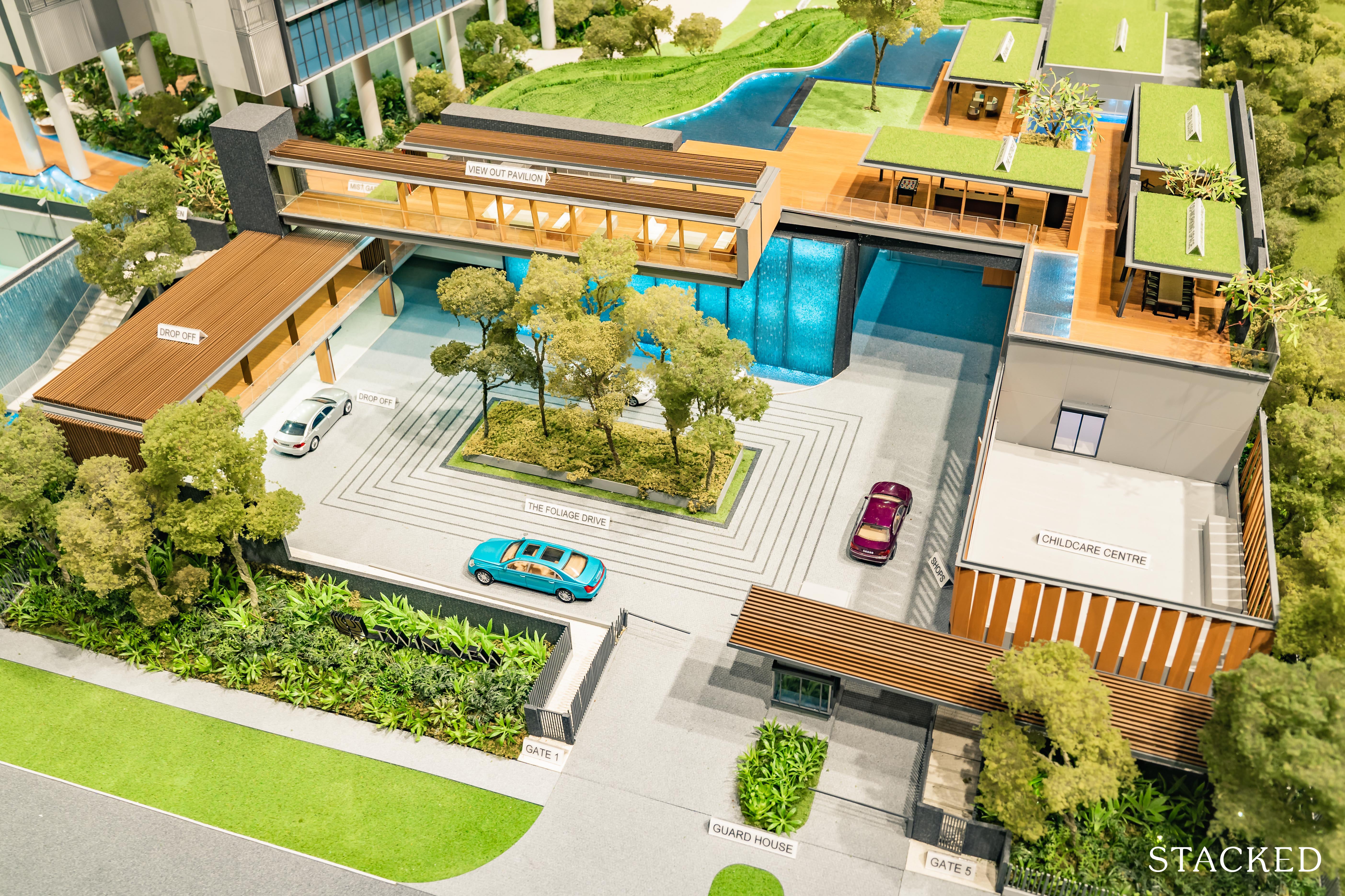
Let’s begin with the entrance.
Termed ‘Foliage Drive’, you might be tempted to chalk it down to marketing speak – but in truth, it is actually quite a nicely designed arrival area for a mass market development (especially with that cascading waterfall).
The car park lies just below, supplying 1:1 unit to carpark lot ratio as opposed to the occasional 80% allocation that has become increasingly common in many new launch condos.
Again, this is vital given the less convenient location of the condo and the number of ownstay units (ie. 3-bedders and above).
Perhaps the most interesting facility here however, is the addition of the childcare centre (with a private playground), alongside 2 currently un-tendered strata commercial shops spanning 550 sqft each.
Like the Penrose, this is smartly placed on the outside for privacy concerns, with an additional (separate) side gate here for non-residents to get in.
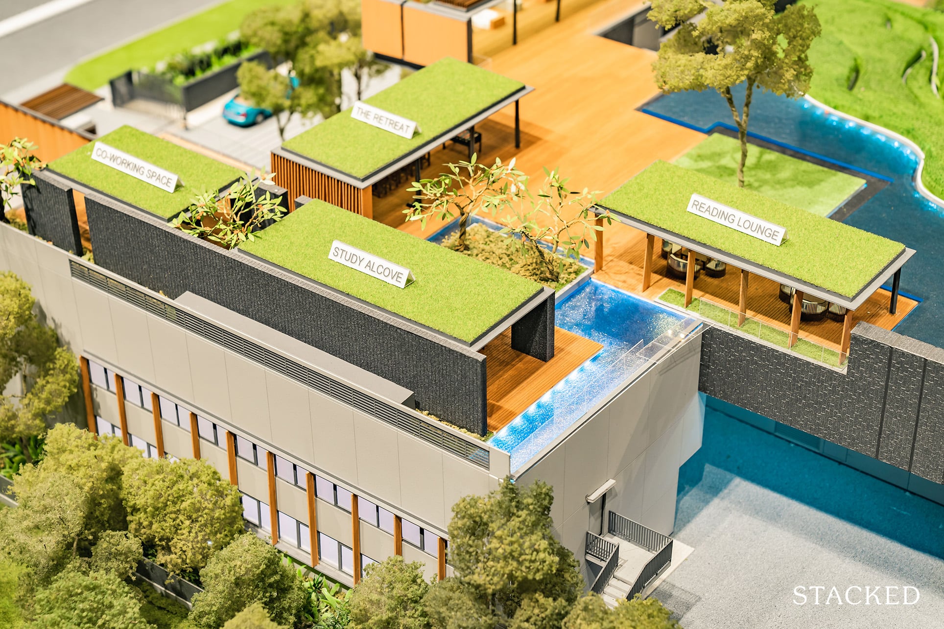
Amongst the facilities at the top deck is a reading lounge, study alcove, and co-working space.
Surely in this case it’s by accident and not by design, but the current work from home trend would certainly bode well for future residents here.
Tired of your working space at home? A jaunt down to a more vibrant workspace with a view would definitely be an attractive proposition.
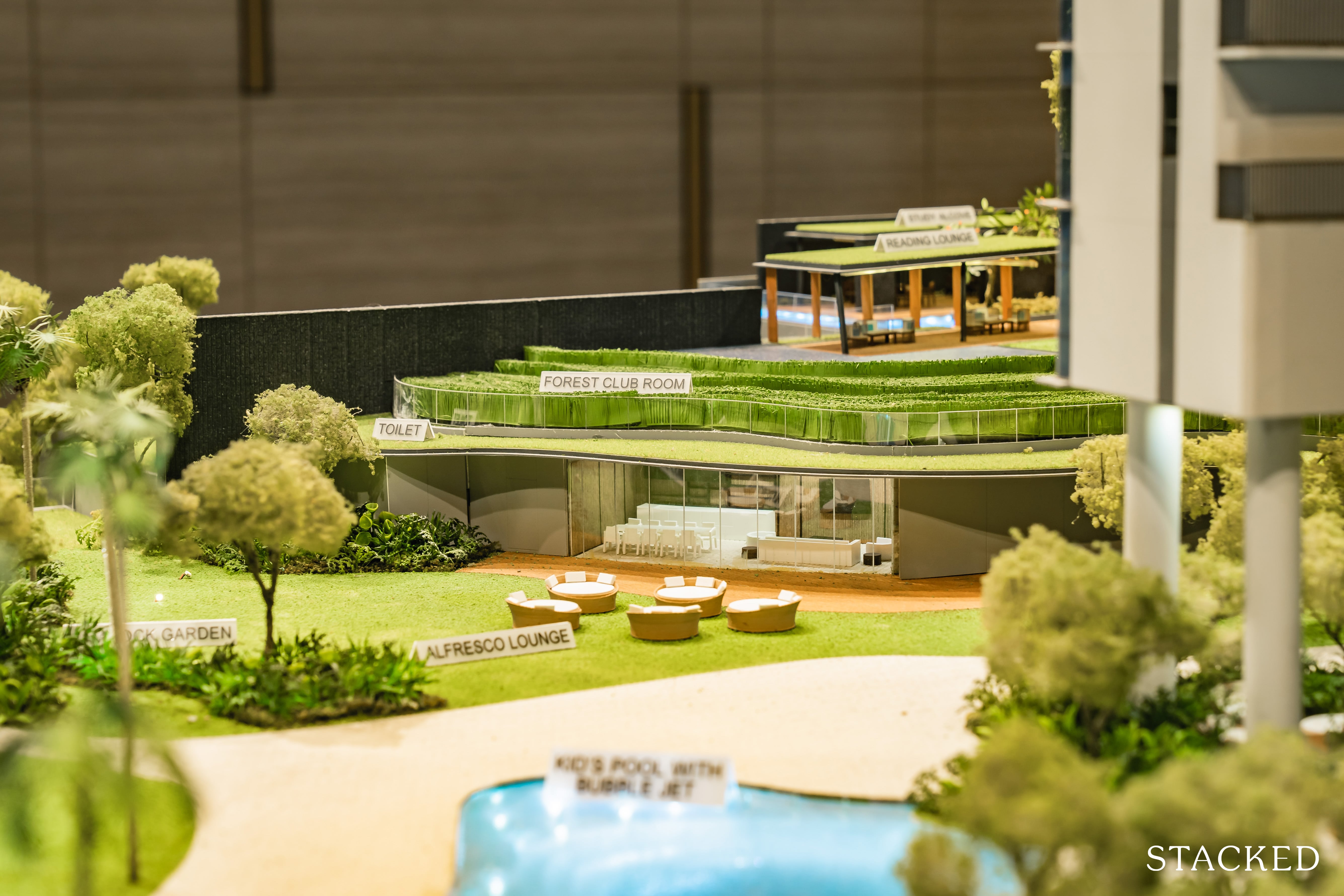
In place of the usual linear structures we see in many mass-market condos today, the developers of Twin VEW here worked closely with landscapers EcoPlan to harmonise both the land and subsequent Sungei Pandan River/Reservoir adjacent to the project.
The difference is evident from the numerous undulating curves and multi-leveled platforms that surround the outer perimeter of the buildings. In actuality, the steepled ‘landscaping’ you see here was actually inspired by the timeless rice paddies of Thailand.
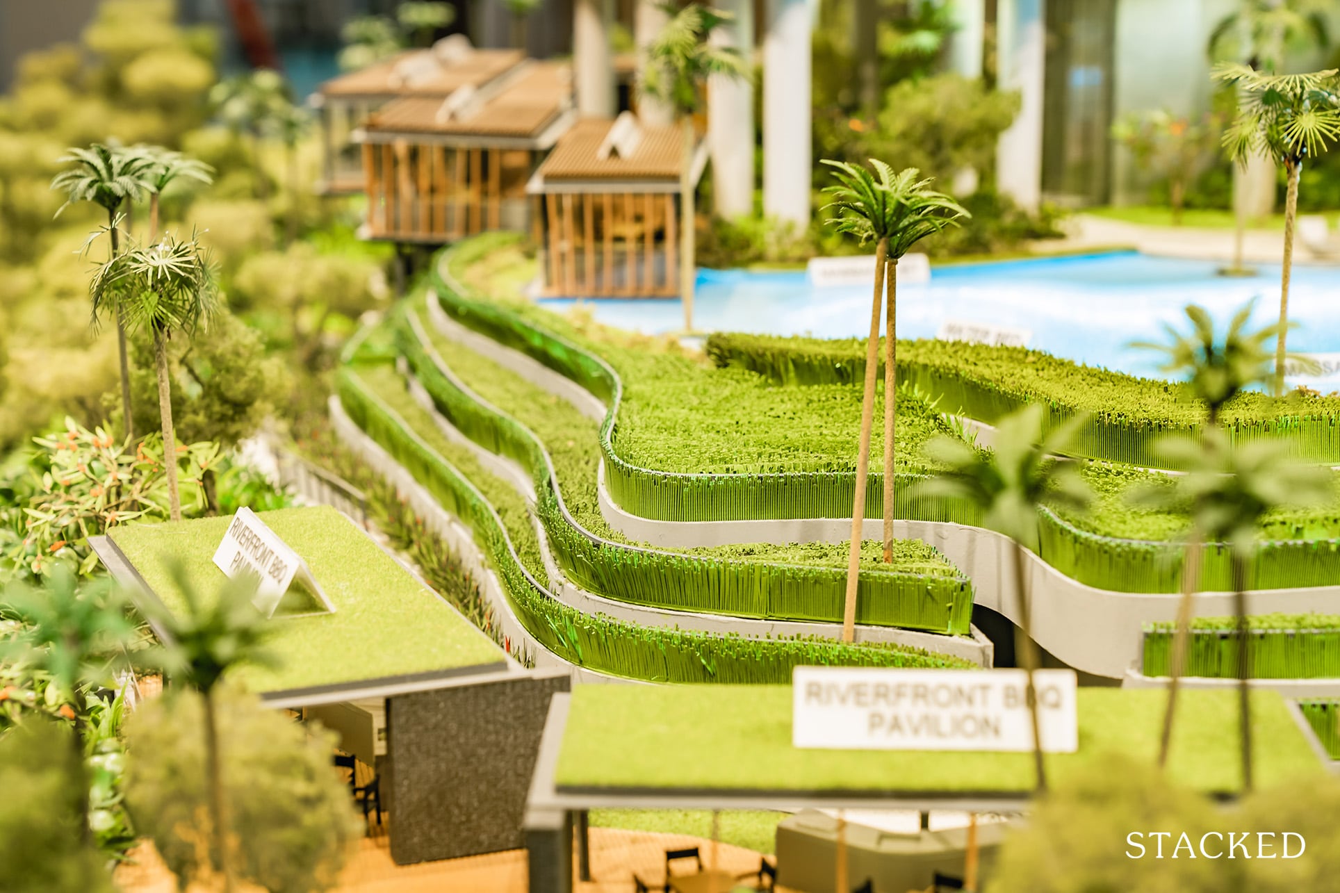
It’s not something that I would commonly associate with a condo – but I do get it. For some reason, it looks strangely comforting to look at, and that variance in layers really does provide something quite different from the norm.
As far as first impressions go, I’m quite sold – the landscaping here looks to be top notch.
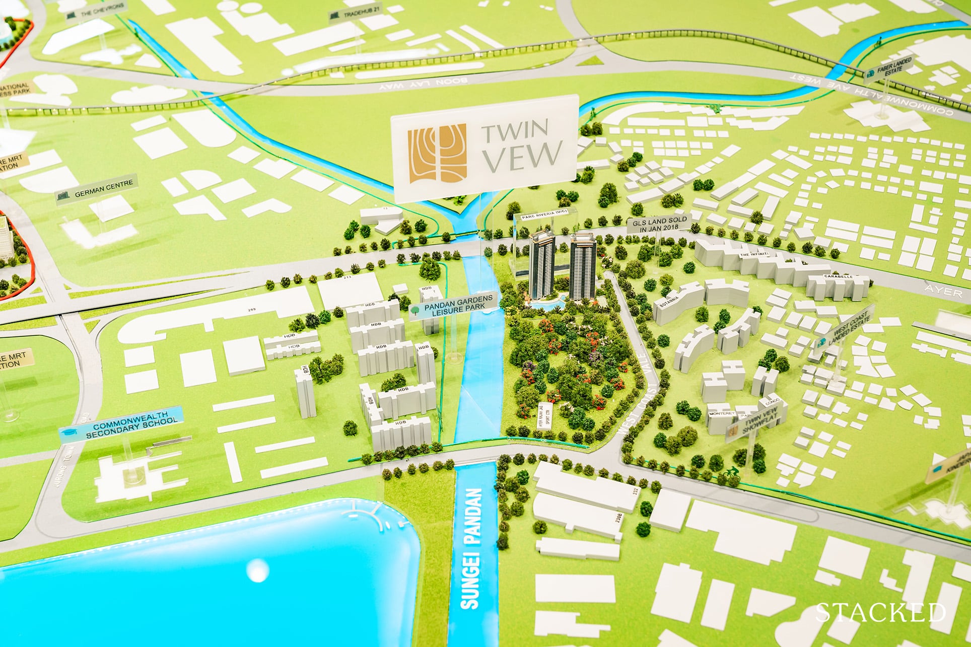
In actuality, the development itself spans just 176,293 square feet (that’s 339 sqft per unit), though from the model itself, it does feel a tad bigger.
Its closest two competitors Parc Riviera (203,533 sqft) and Whistler Grand (210,883 sqft) do boast bigger land sizes but the devil is really in the details here.
With 752 units, and 716 units respectively, the Twin VEW comes out on top here in terms of lesser unit density.
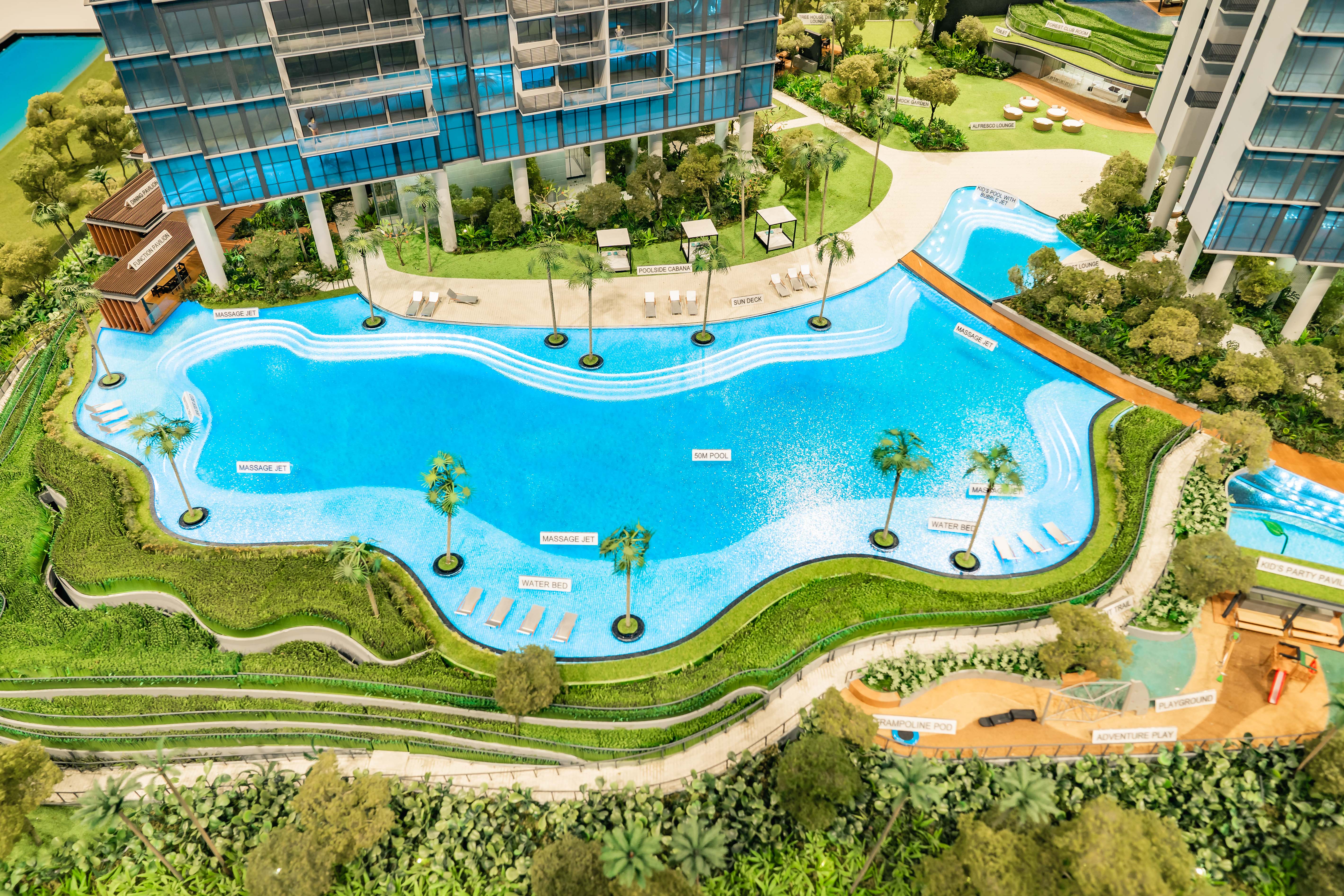
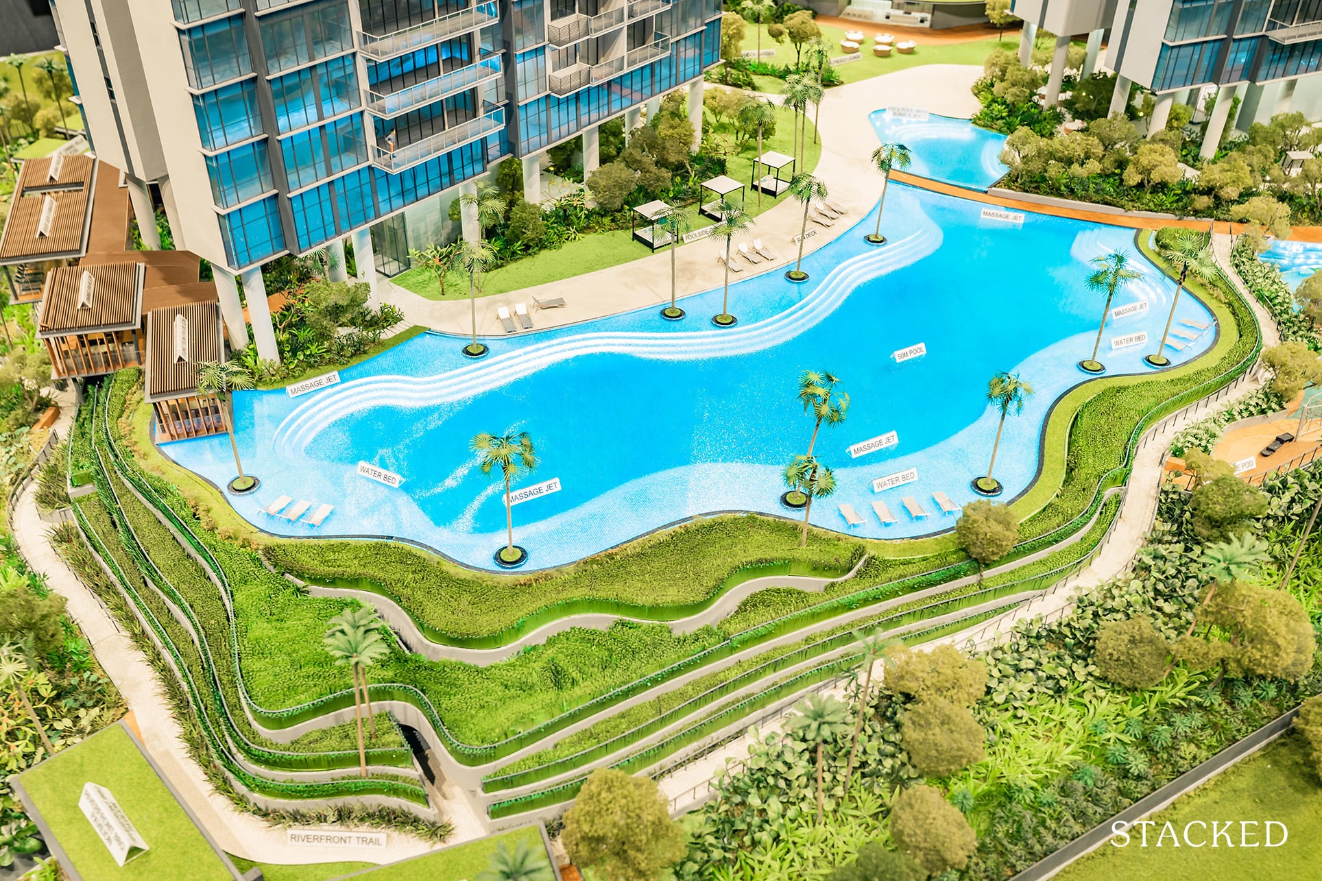
What I especially like is the shape of its 50m lap pool, or should I say – 50m lagoon. It is a breath of fresh air from the usual rectangular pool layouts that you’d see nowadays (although it still can’t hold a candle to the behemoth at Parc Clematis).
Either ways, I like the steepled nature of it (both on the outside and inside), and the different shades of blue due to the varying levels of depth should be a nice sight from the units above.
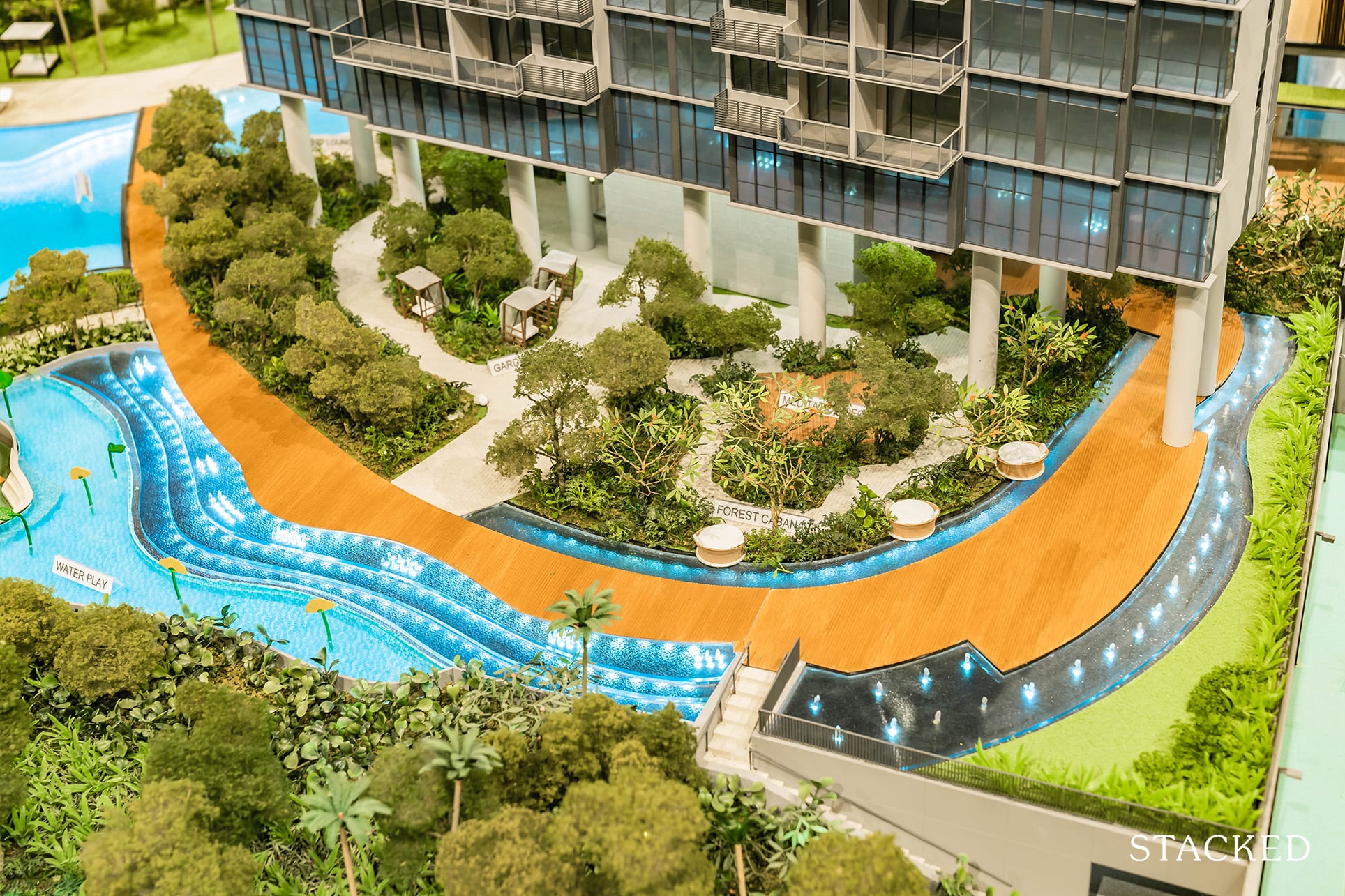
Let’s not forget the orientation of most of its facilities with a view towards the Pandan River.
Arguably, Twin VEW does feature the best location out of the 3 newest developments in the area. It will have unblocked views for the foreseeable future as the site in front of it is zoned as an education plot, plus the location of Parc Riviera does act as a barrier from the traffic noise from the expressway.
And since I’m on the topic of views, the towers are actually purposefully tilted away from Parc Riviera to allow residents views of the Jurong Lake District on one end, and the Mount Faber area on the other.
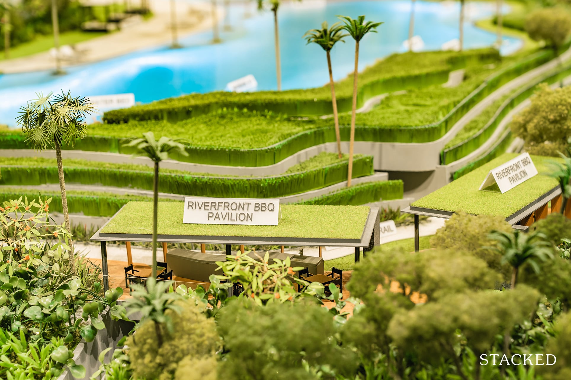
With that, the riverfront BBQ pavilions should offer one of the better views you’d find in Singapore (as far as BBQ pit views are concerned).
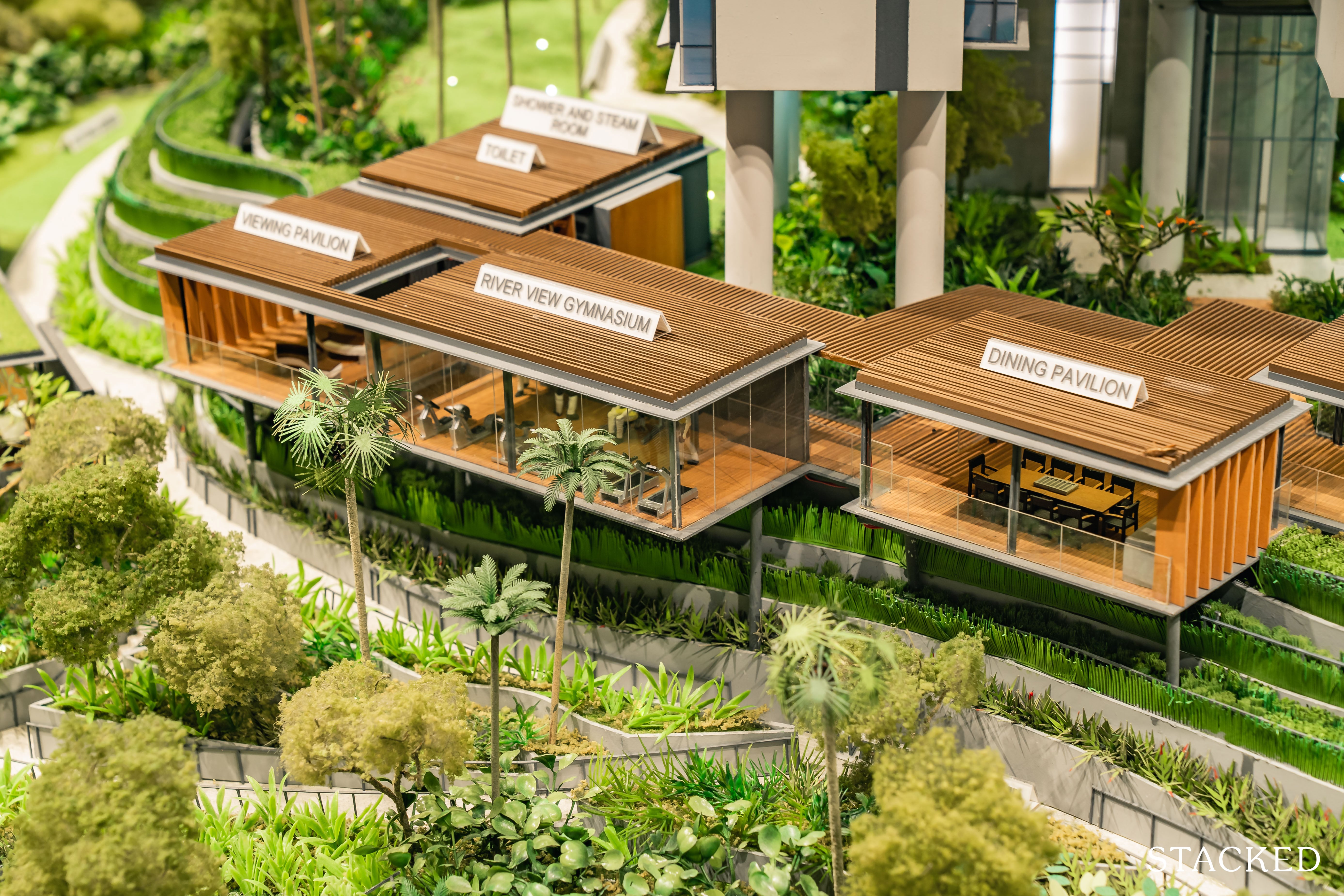
Same goes for the dining pavilion set on stilts above the “paddy fields”, which should offer better views over the water given its higher vantage point.
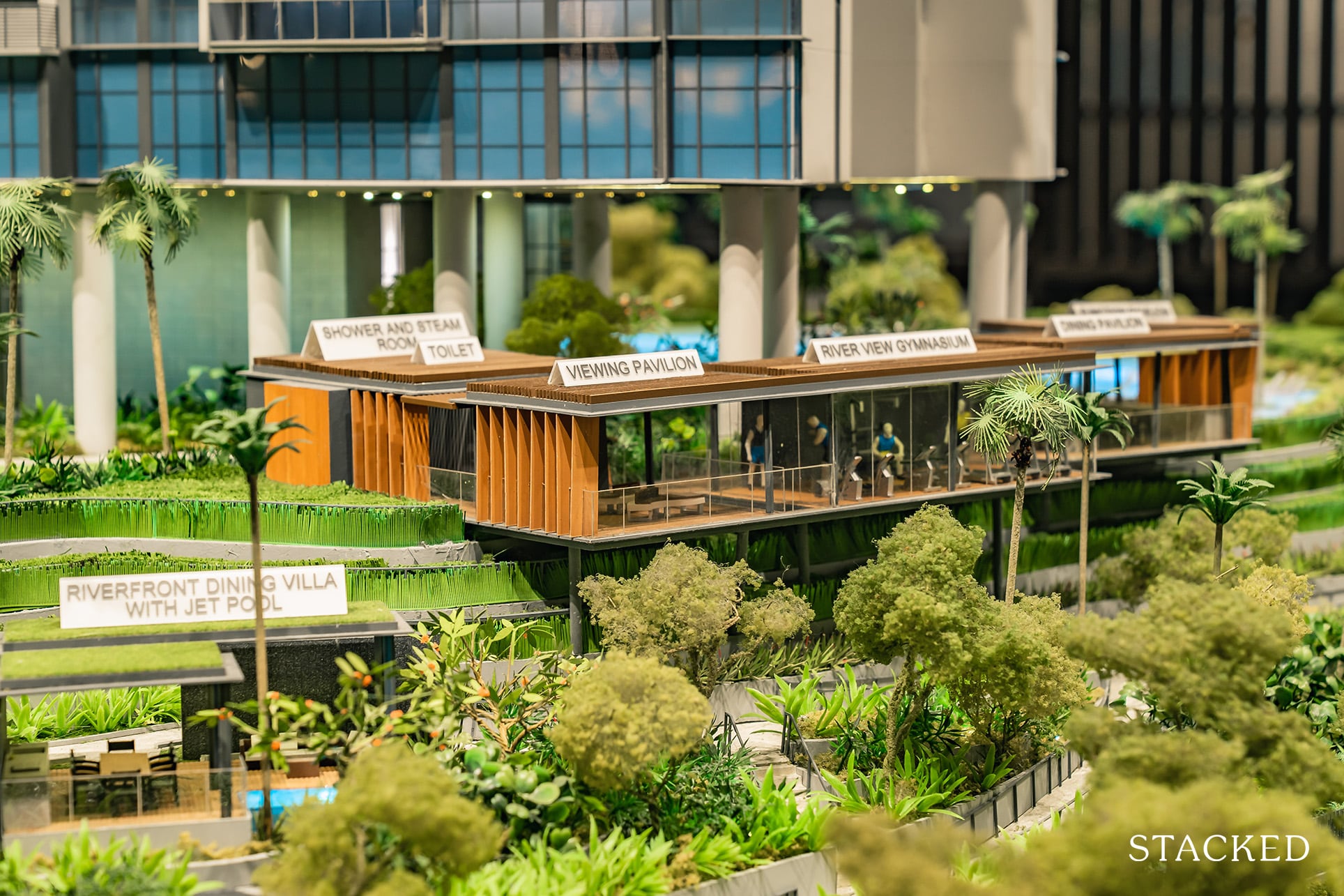
Likewise for the gym, which is smack in the middle of both pavilions. Like everything else, these are all angled towards the river views – it’s certainly a very sensible position to be at.
It’s from here that you can see the elevation of the units too. Level 2 actually starts at around level 5 of a typical condo (15 metres up).
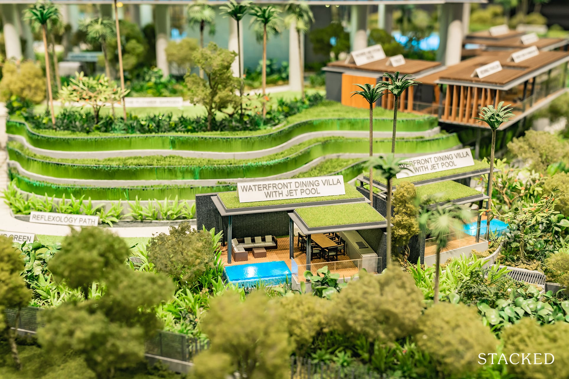
The last facility I’d like to highlight here is the waterfront dining villas. It offers a dining facility, couches and a private jet pool area.
Couple that with the views and privacy and this is definitely a great space to entertain friends and family. It’s not something that I’ve seen in many other developments (especially with that view), so colour me impressed.
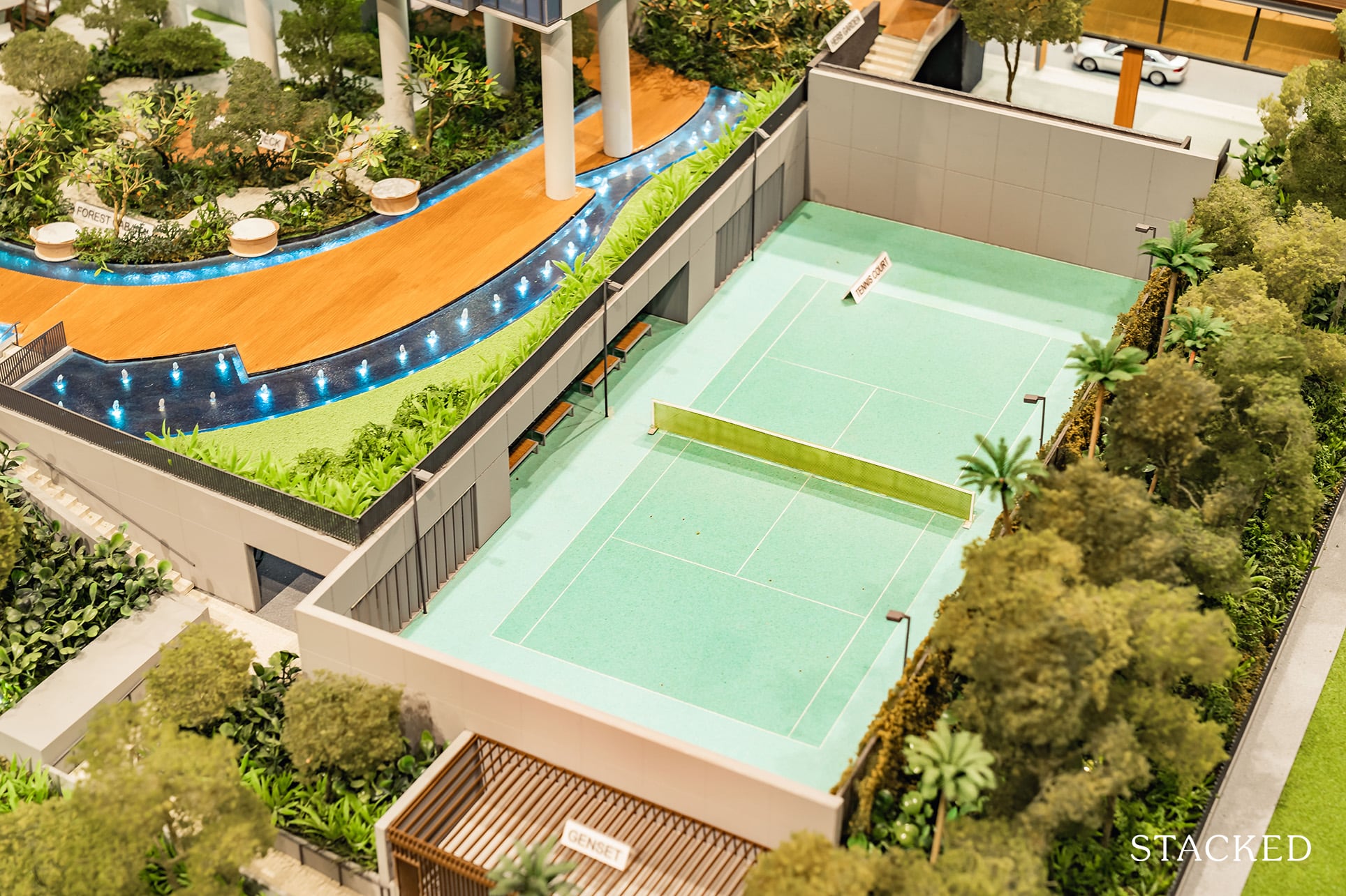
Of course, there is a tennis court as well – which is pretty much a prerequisite for bigger developments.
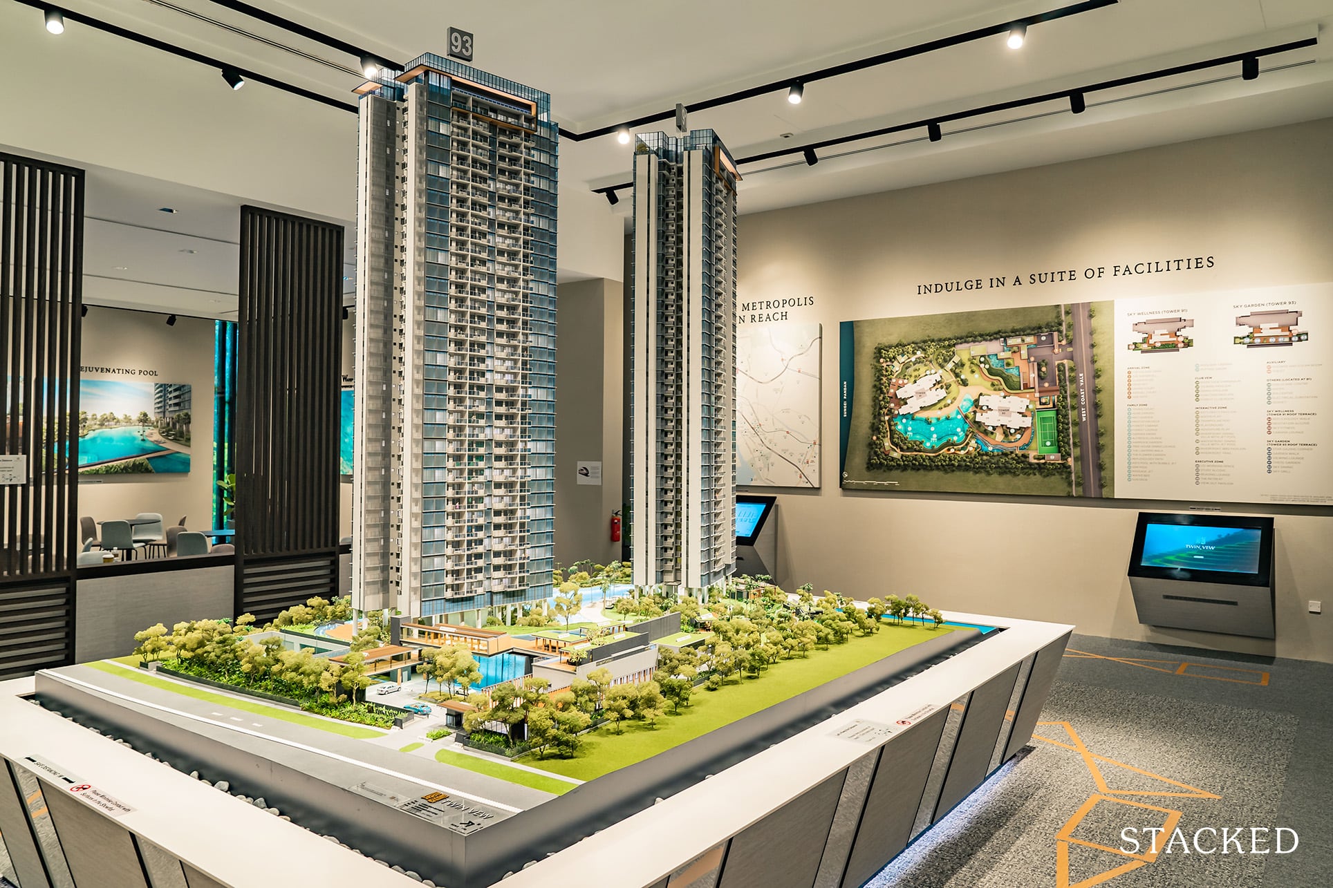
Last but not least, are the views from the top. You’ll also find rooftop facilities atop both Tower 91 and 93. Termed ‘Sky Wellness’ and ‘Sky Garden’ respectively, these areas are fitted with additional communal areas that come with spectacular views of the surrounding nature and subsequent cityscape.
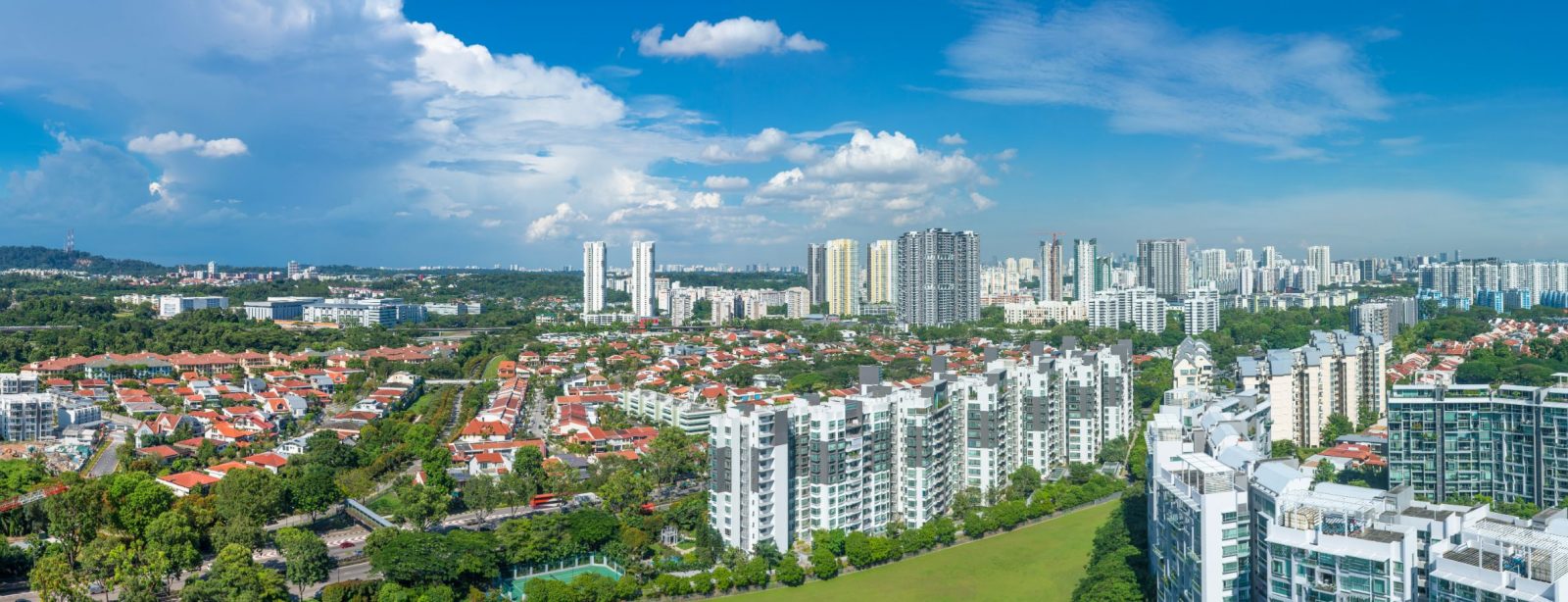
Based on the current level of construction, it is estimated that units on level 15 and above will be privy to these wide-arching views.
Twin VEW 2 Bedroom Review
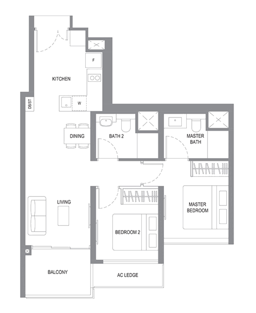
Coming in at 743 square feet for the 2 bedroom unit, one might describe that as generous in today’s new launch context. At time of writing, the 2 bedders are completely sold out, so you’d have to wait for the resale market should you want to get your hands on one.
If you ask me, I resonate most with the 2-bedder showflat unit here.
There are a number of reasons for this, but the biggest for me is really the pleasant, oriental-like ID that you get here.
Of course, we should never judge a potential unit based on the ID, but it doesn’t hurt to admire and bring some ID tips back home.
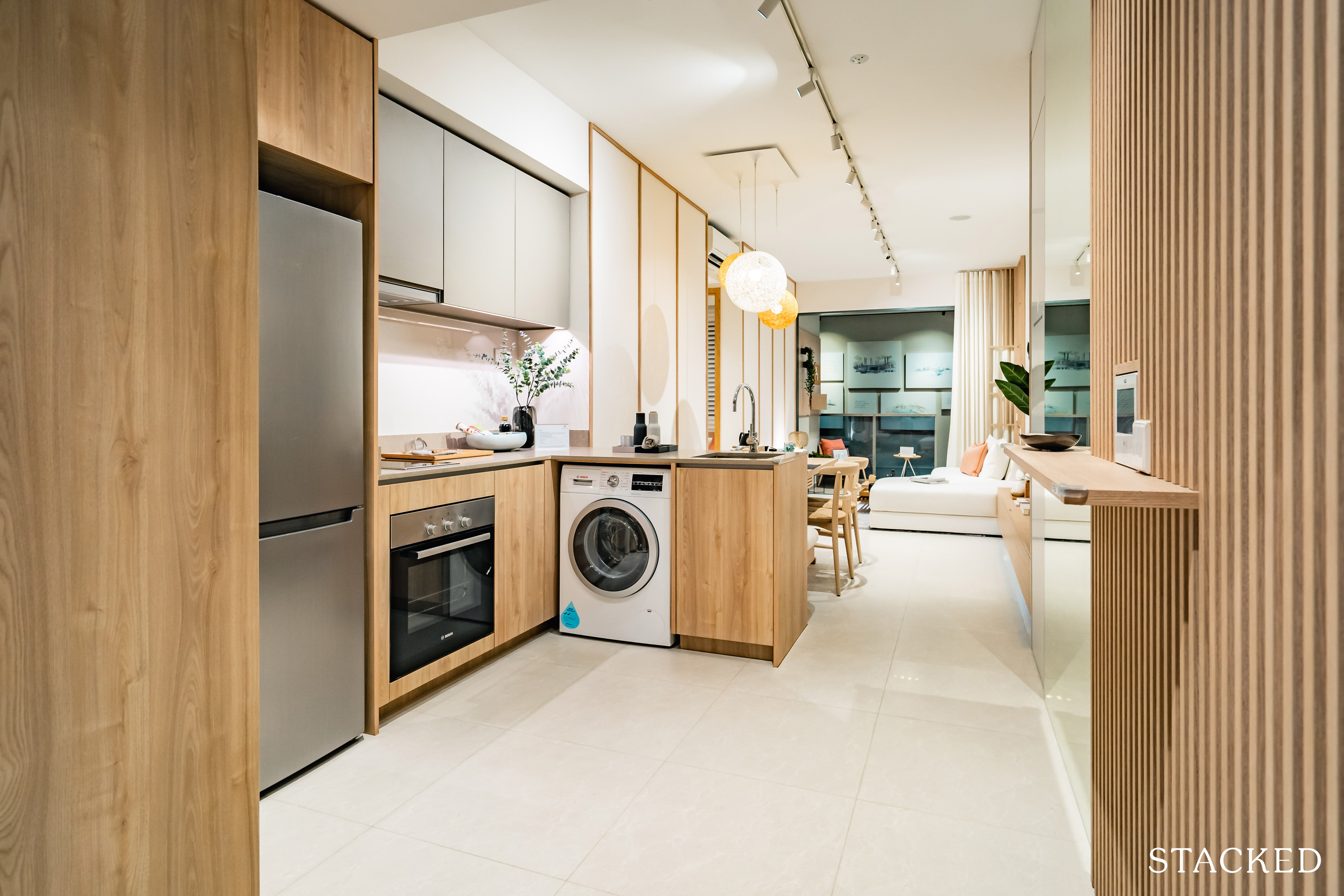
Heading into the unit, you’re greeted by an open-air kitchen, which immediately leads up to the living and dining areas.
I’ve also always been a fan of walk-in concepts (for smaller units) so it’s nice to see that the developers haven’t forced an entranceway/privacy barrier here.
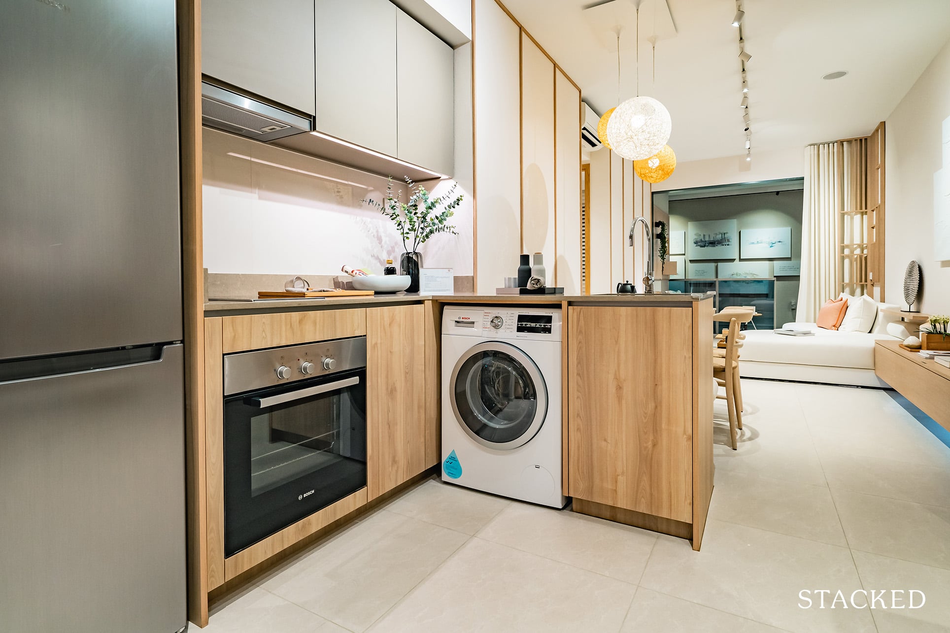
What’s clear is the fact that this kitchen isn’t meant for constant heavy cooking – although given the size of the apartment, I would have thought that an enclosed kitchen would be doable.
Nevertheless, if you are planning on doing a lot of cooking, you could still construct one if you have the funds for it.
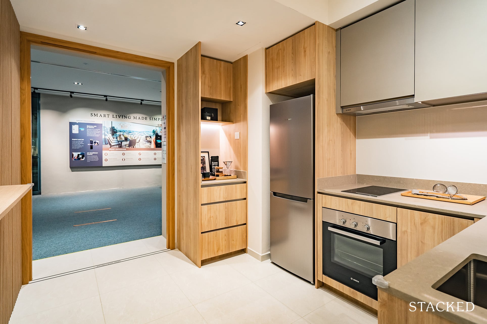
Because the kitchen is essentially meshed with the entranceway, you do get quite a sizeable space. So even if you have 2 people working here, it wouldn’t feel cramped at all.
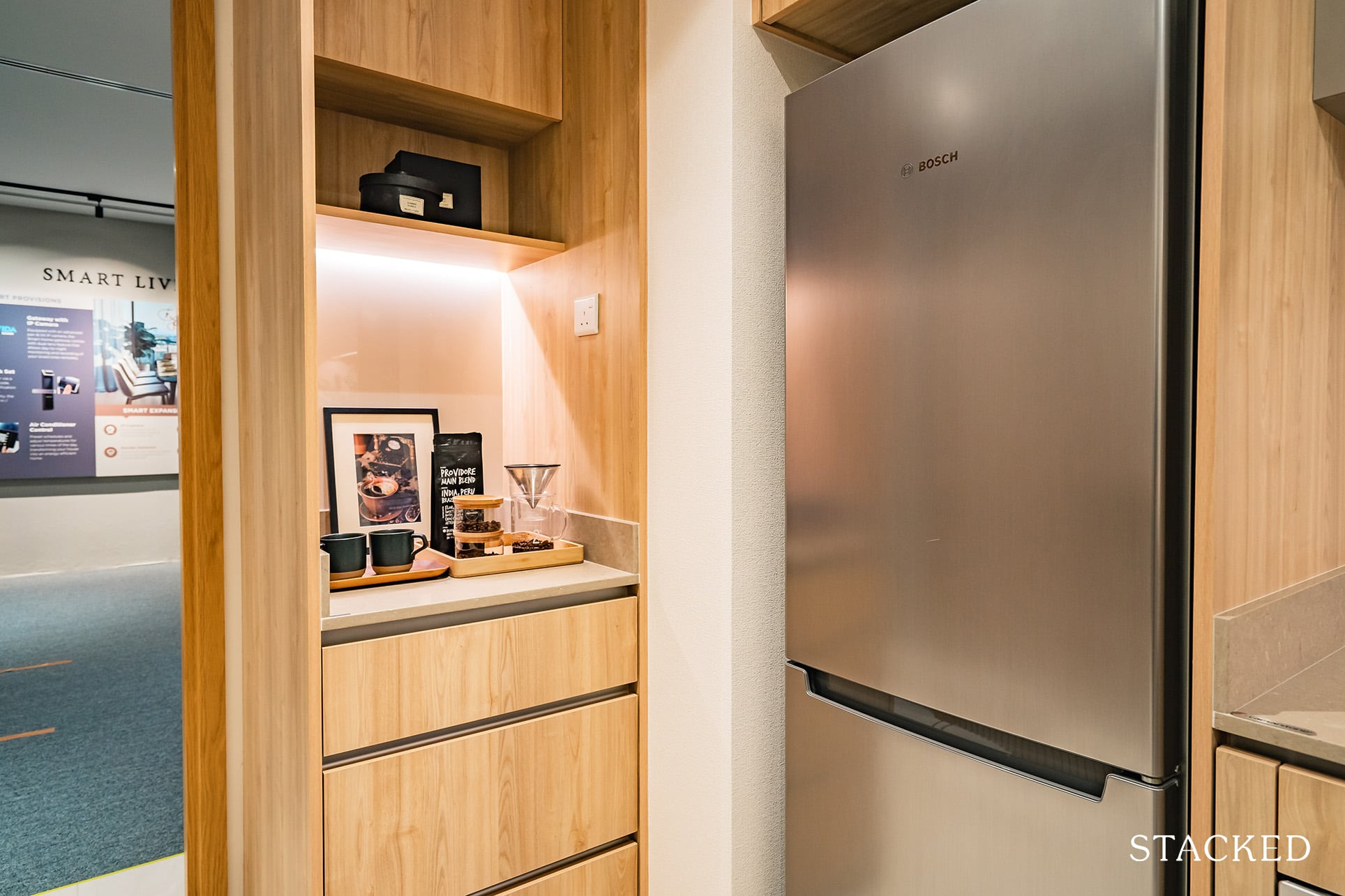
I do also like this little alcove snuggled into the corner of the entranceway.
I completely missed it when walking in for the first time – mainly because it was so well-hidden from the entrance, and that it didn’t feel like any major space had been taken away from the general area.
As we know, storage space is something that many of the newer condos often lack, so it’s heartening to see the inclusion of these additional storage spaces here.
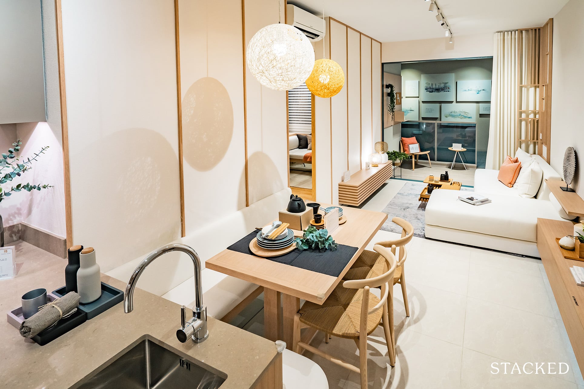
Proceeding to the dining area, you’d see that the small dining table/chair combo already takes up half of the walking width here, despite the table having been pushed deep into sofa territory.
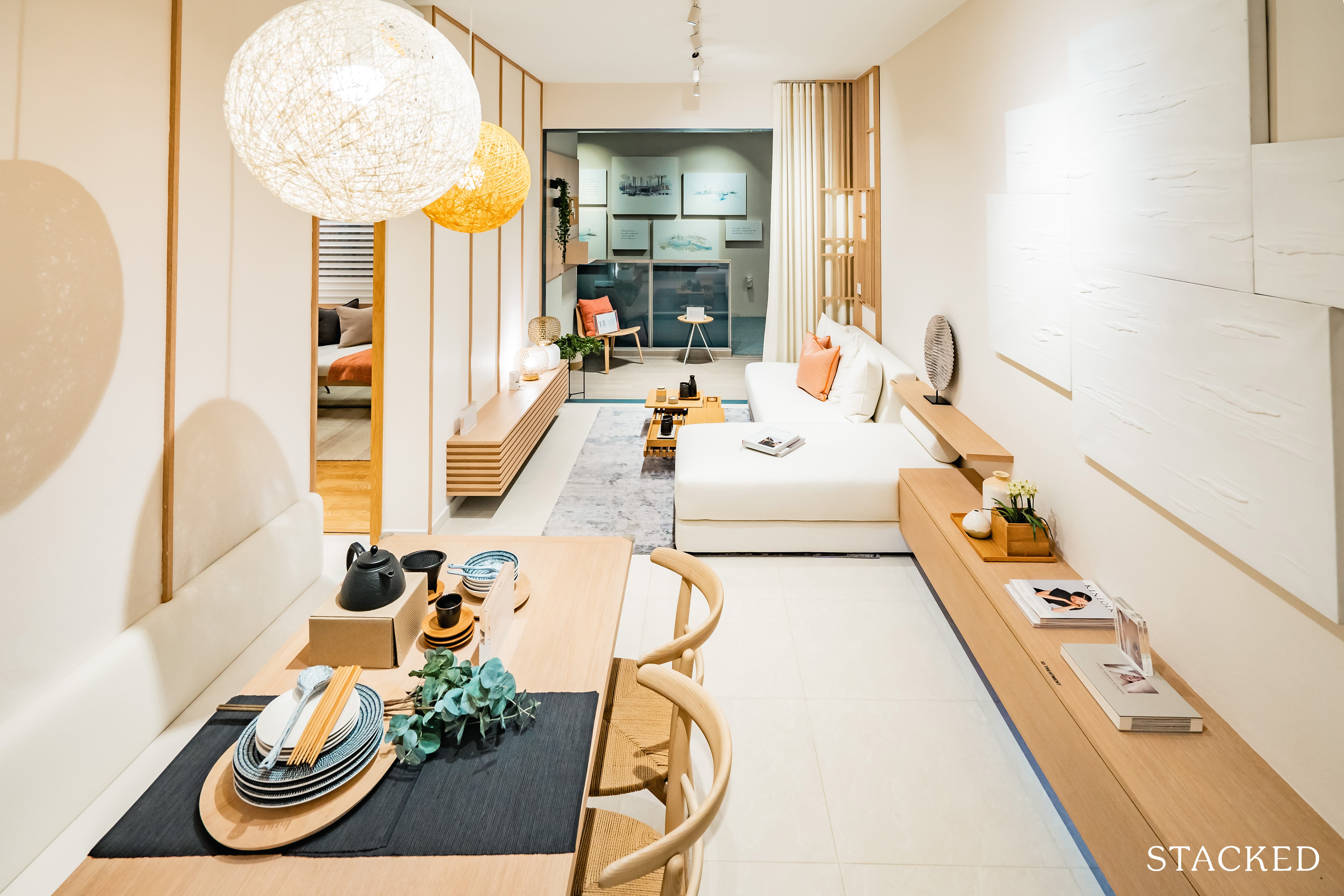
When I imagine a bigger table here, accompanied by (occupied) external chairs, it feels like there isn’t too much room for anyone heading out the entrance or to the kitchen to maneuver with.
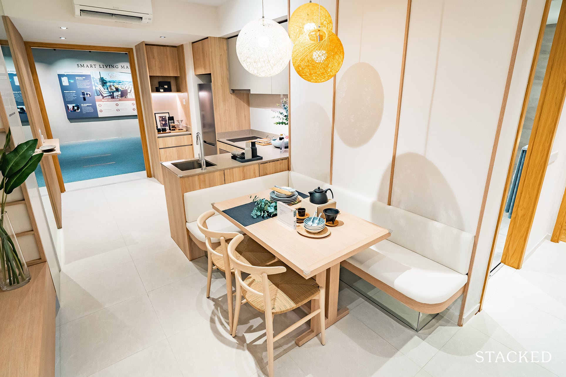
It definitely makes for an intimate experience, but not the most comfortable of dining points. Then again, unless you are going to have people over a lot, it should be adequate enough for most.
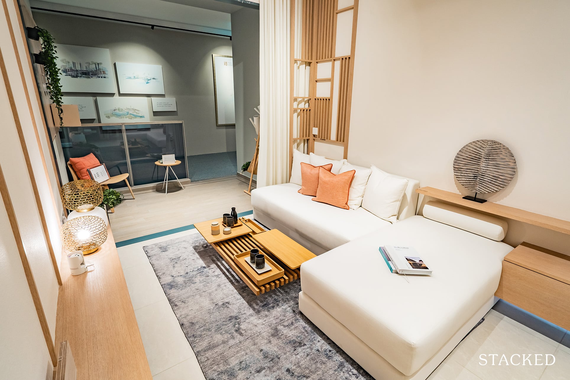
The living area isn’t the most spacious, but again, it’s enough for your usual sofa/table combination, without being seated too close to the TV (if you do choose to get one).
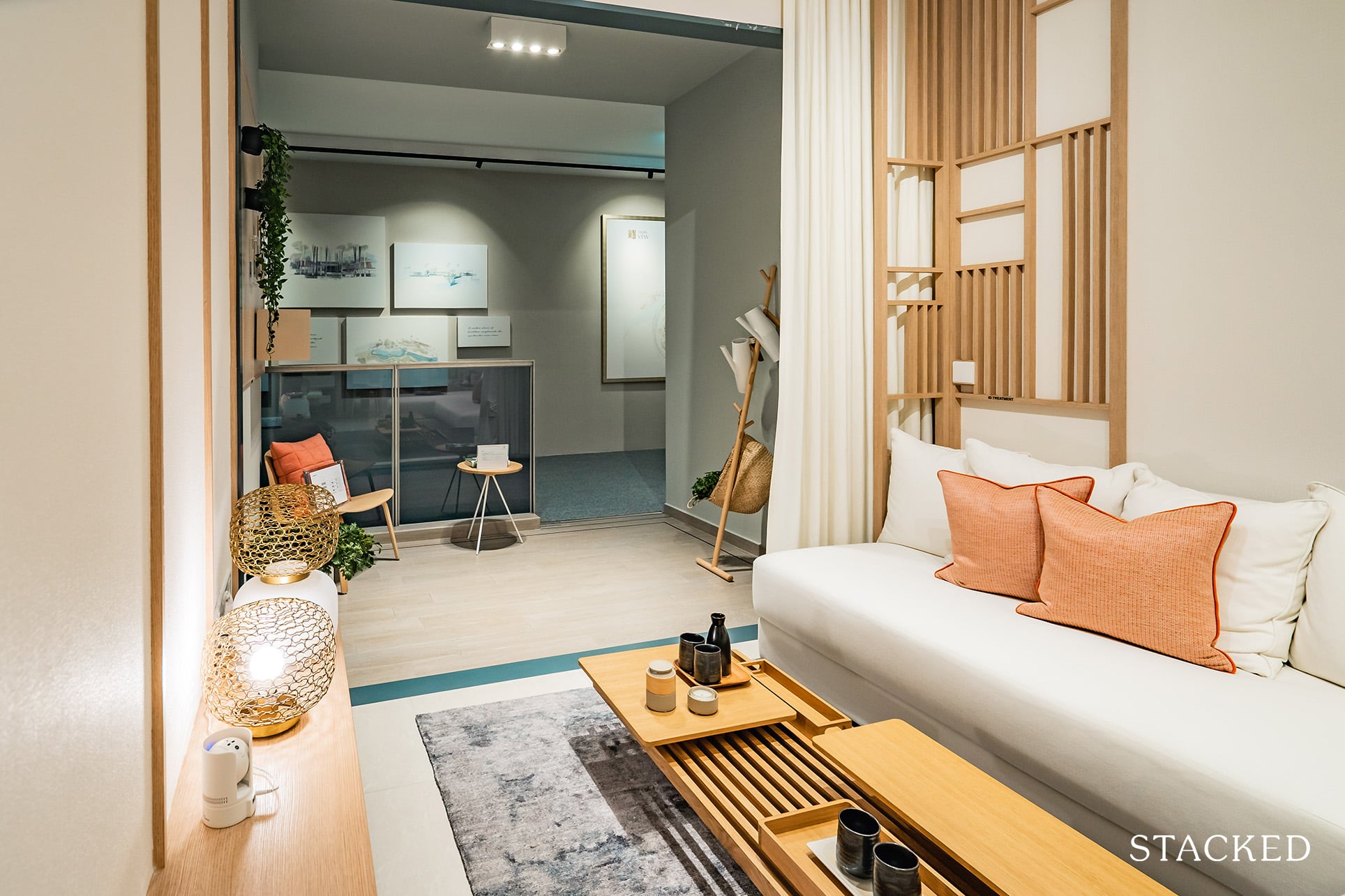
It’s also long enough to comfortably accommodate a 3-seater sofa lengthwise without obstructing the corridor. I’d say they were pretty brave to include an L-shaped sofa here (which you can clearly see does have an impact on the space).
Most developers would have placed a smaller (but less realistic) piece to play up more on the available space.
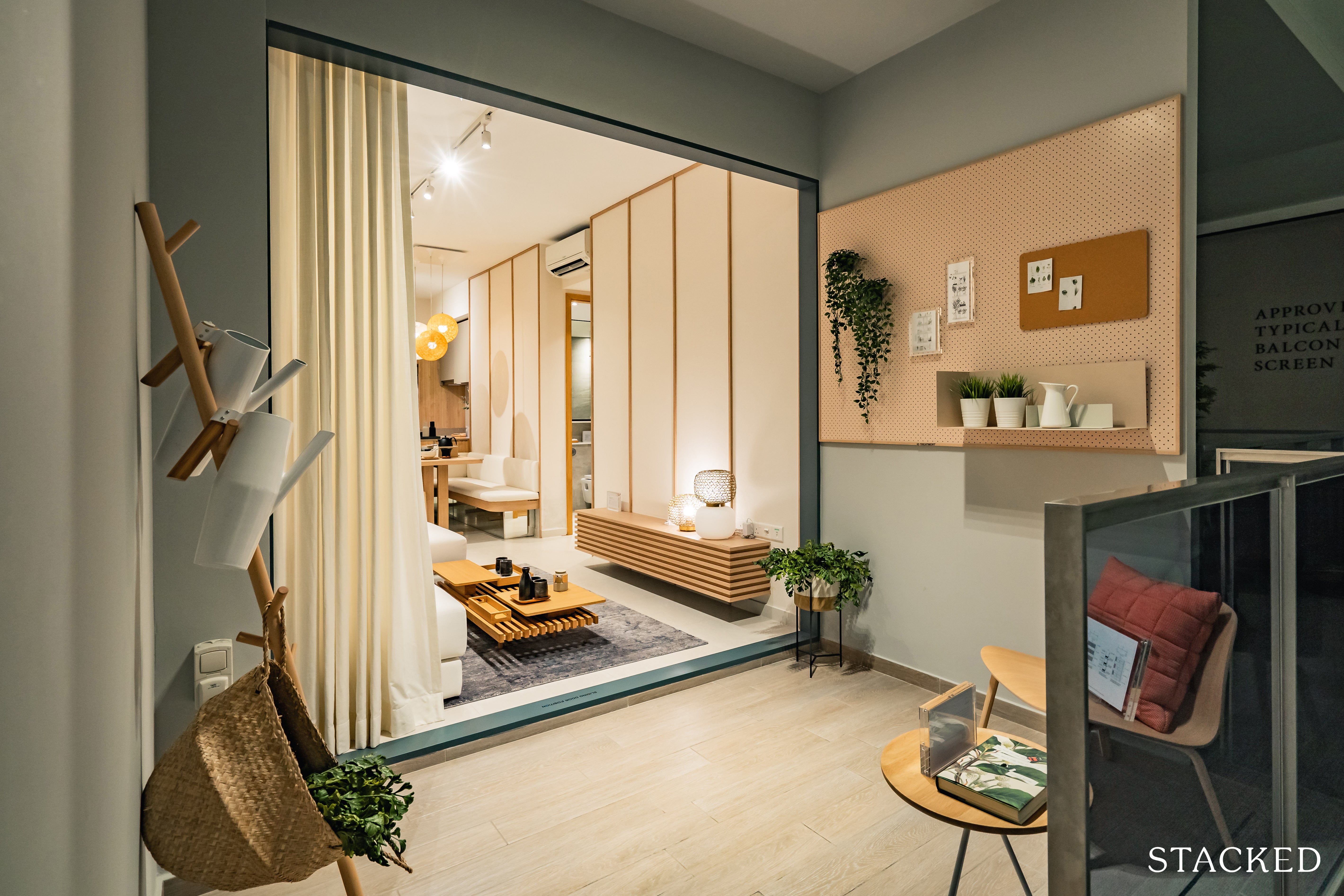
What surprised me about the unit was how big the balcony actually was. You could easily fit nicely sized seating and a coffee table here.
Of course, not everybody appreciates big balconies in smaller units. There’s no hiding the fact that it takes away from the living room space. As always, these are areas that you’ll be paying for, so it’s important to ask yourself if you’ll be consistently utilising this balcony space down the road.
It’s also worth noting here that the AC ledge is next to the balcony, which is never an ideal spot for it because of the noise while the air-conditioning is on.
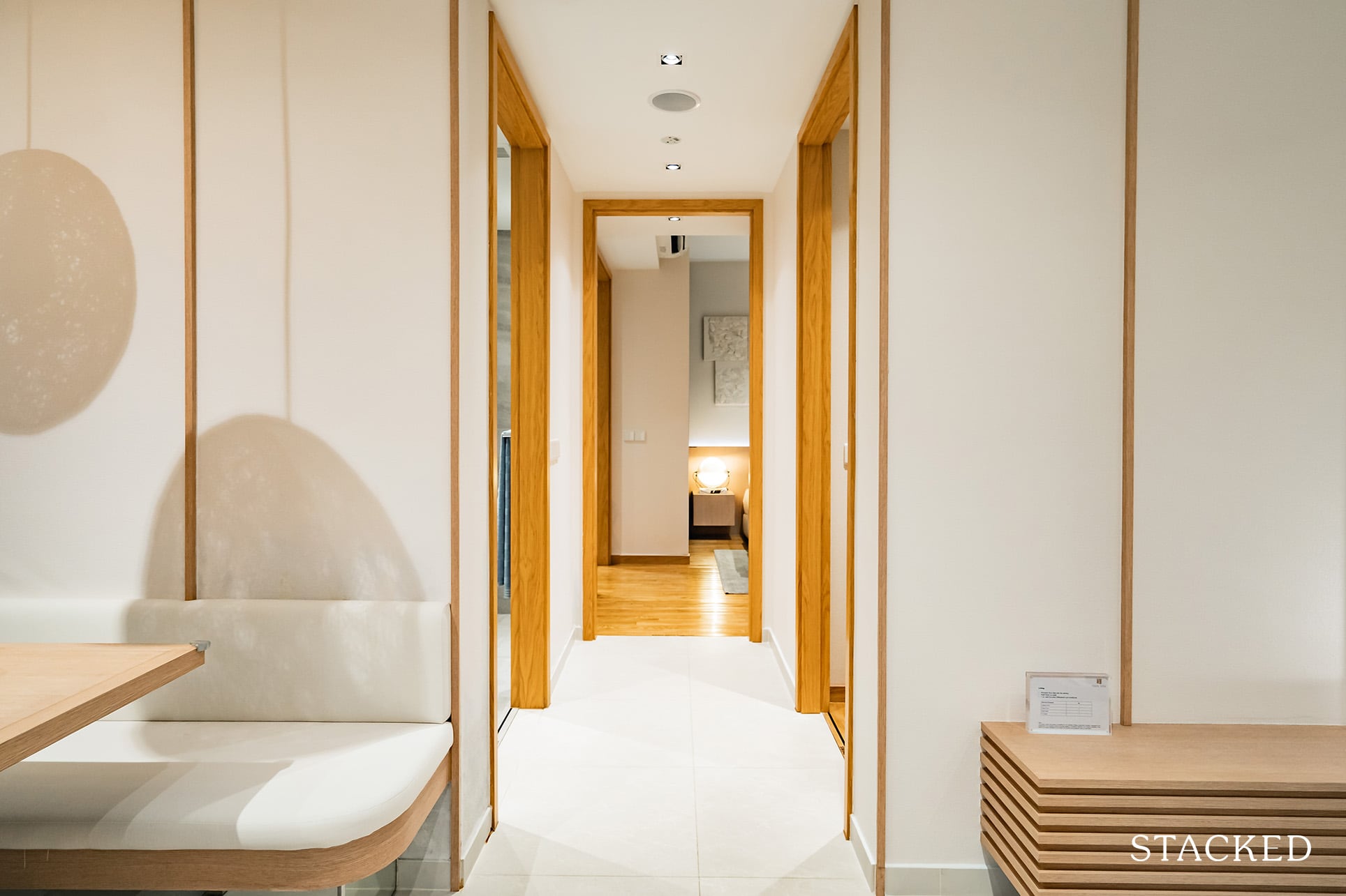
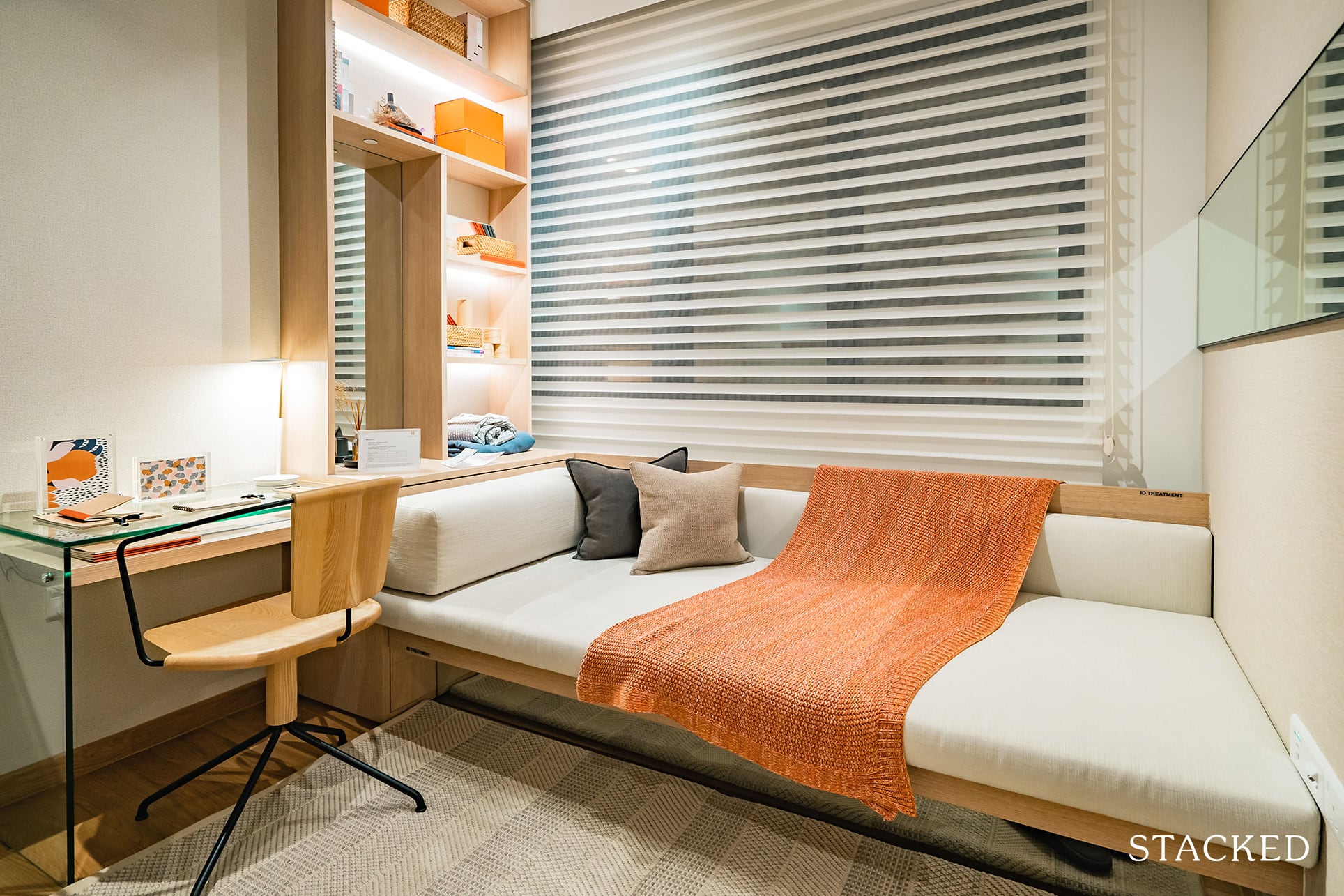
As per usual, fitting a single bed here allows for a cozy study-table area that is perfect for families with a single kid.
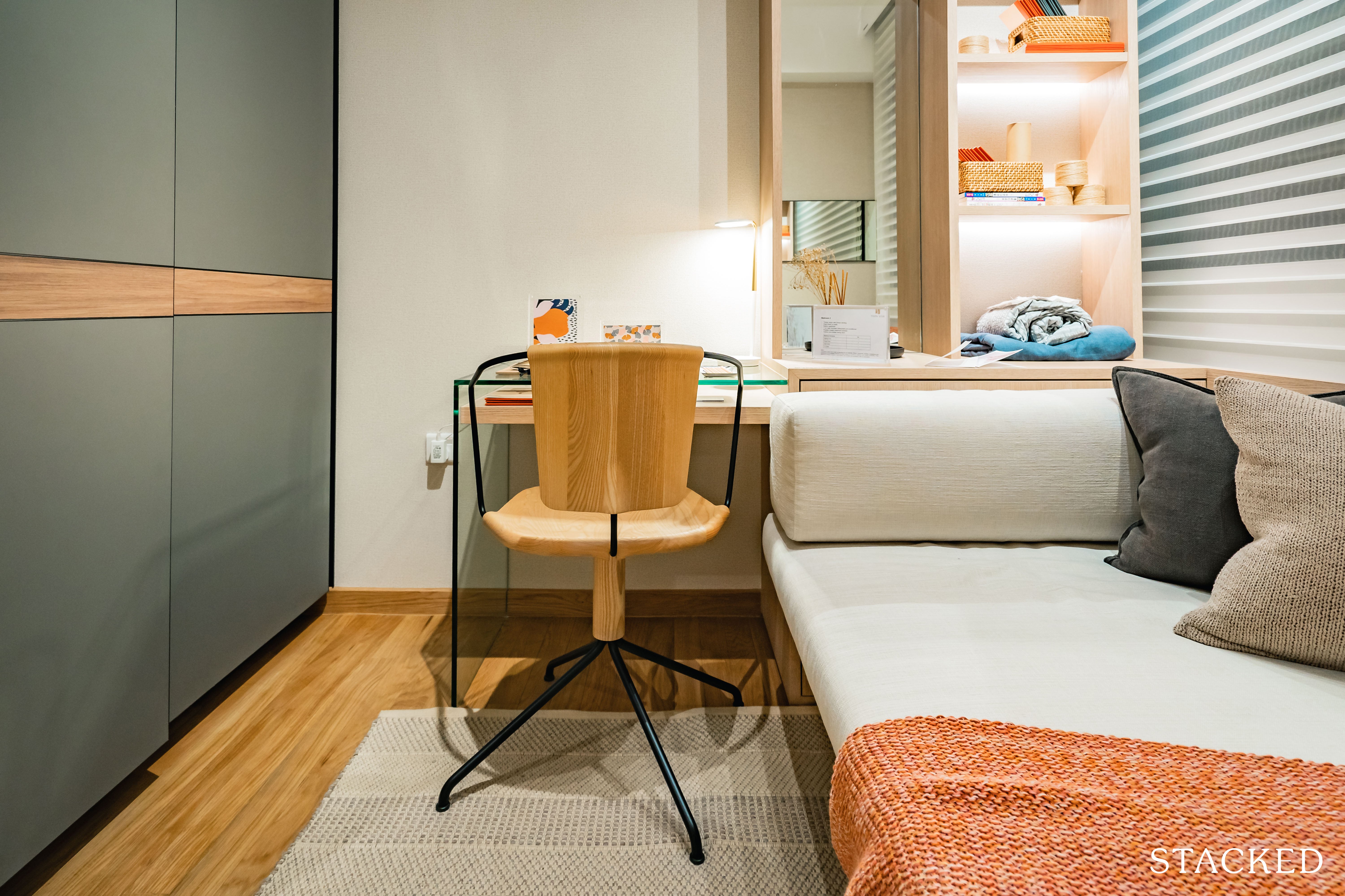
A queen-sized bed on the other hand, would, (in my humble opinion) make the space a tad squeezy – with perhaps just enough room for one to grab his/her clothes from the wardrobe minus any other installations.
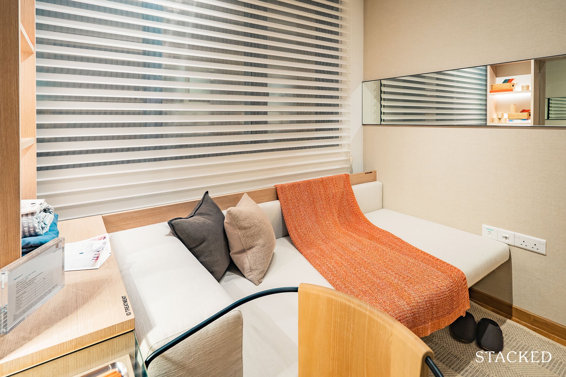
I’m not too fond that the AC Ledge is right outside this bedroom, as you don’t get the benefits of full-sized glass windows.
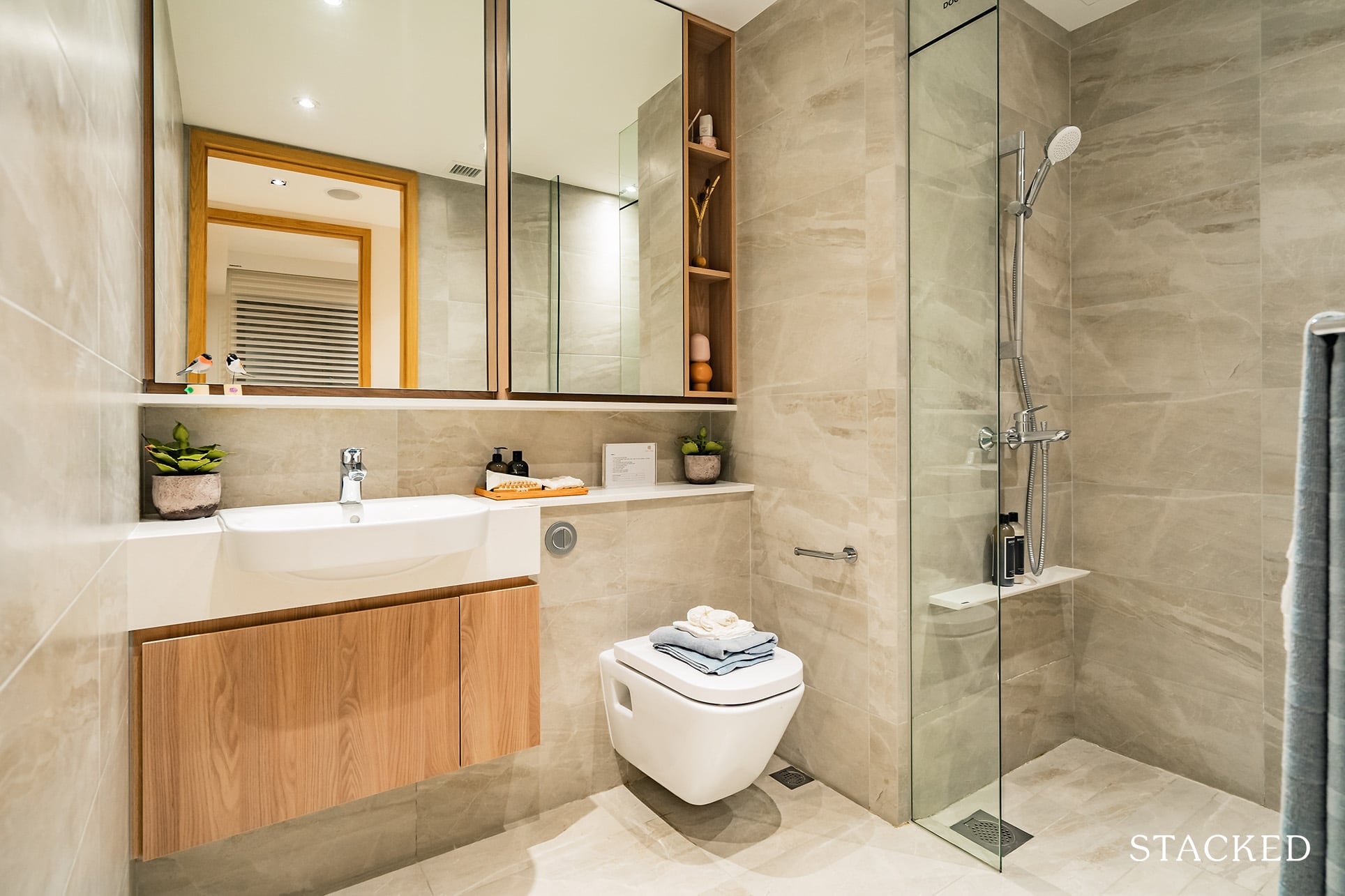
The common bathroom seems relatively spacious given that it’s a 2-bedroom unit after all. There are also a number of storage spaces for your needs, with a pleasant shade on the porcelain tile finishings which top off the walls.
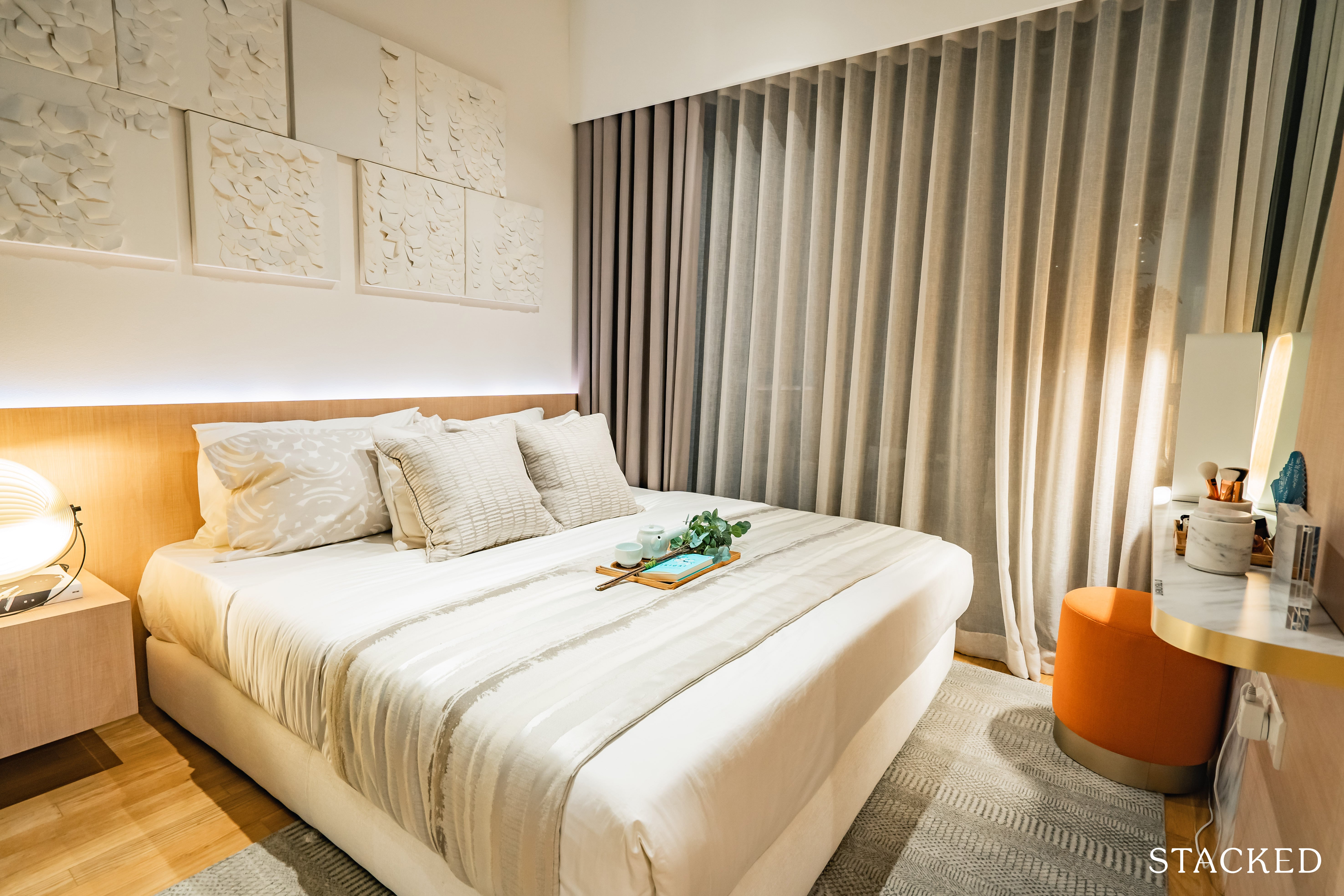
Heading into the master bedroom, you can fit a king-sized bed here, with just enough space for 2 bed-side tables. In here they show a possibility of a dresser with a stool, but I’d doubt its practicality given you’d have to shift the stool every time you want to walk to and fro.
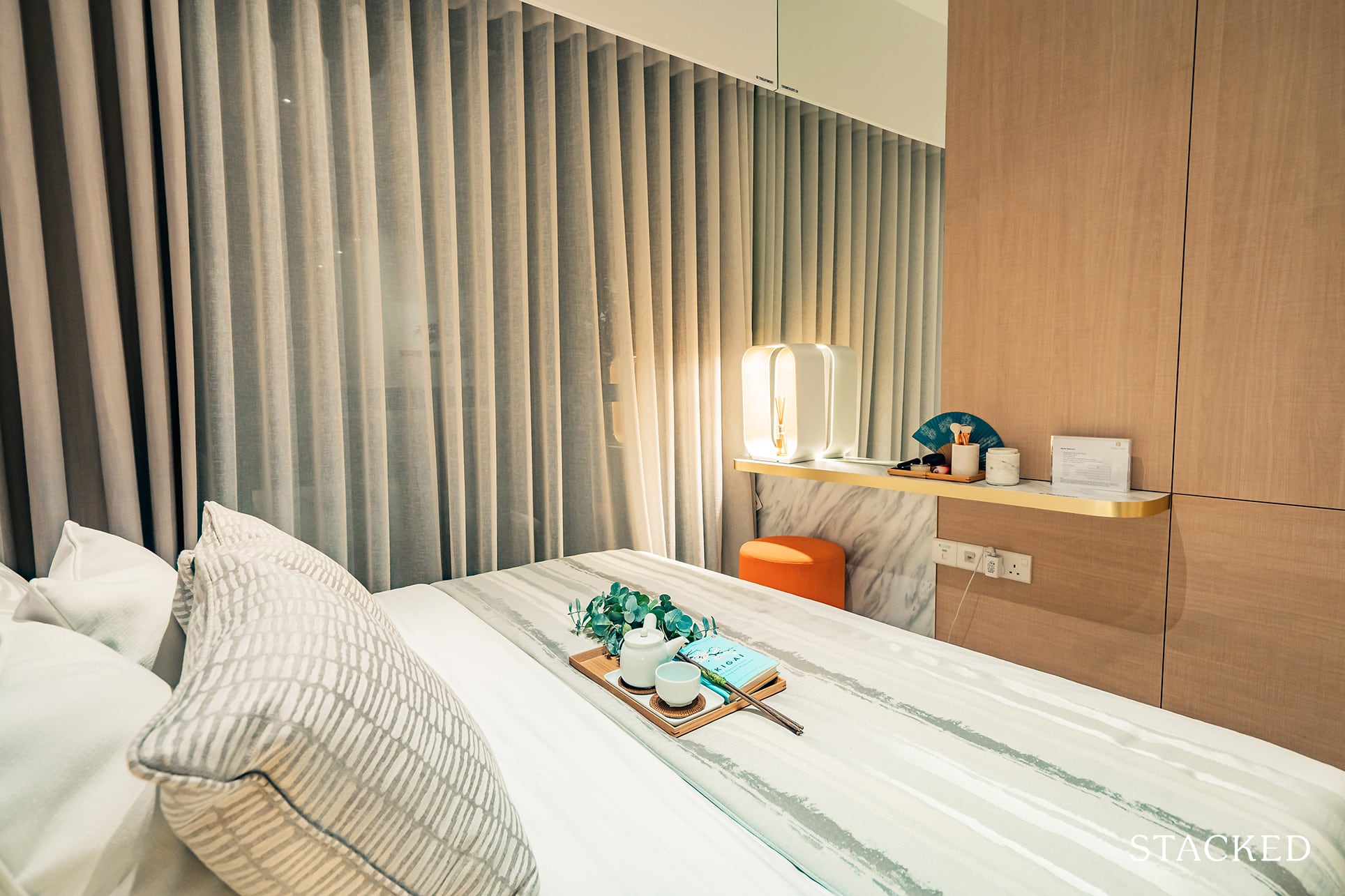
As with most modern new launches, the master bedroom comes with a regular 2 panel wardrobe – which is hardly ever adequate storage for most people.
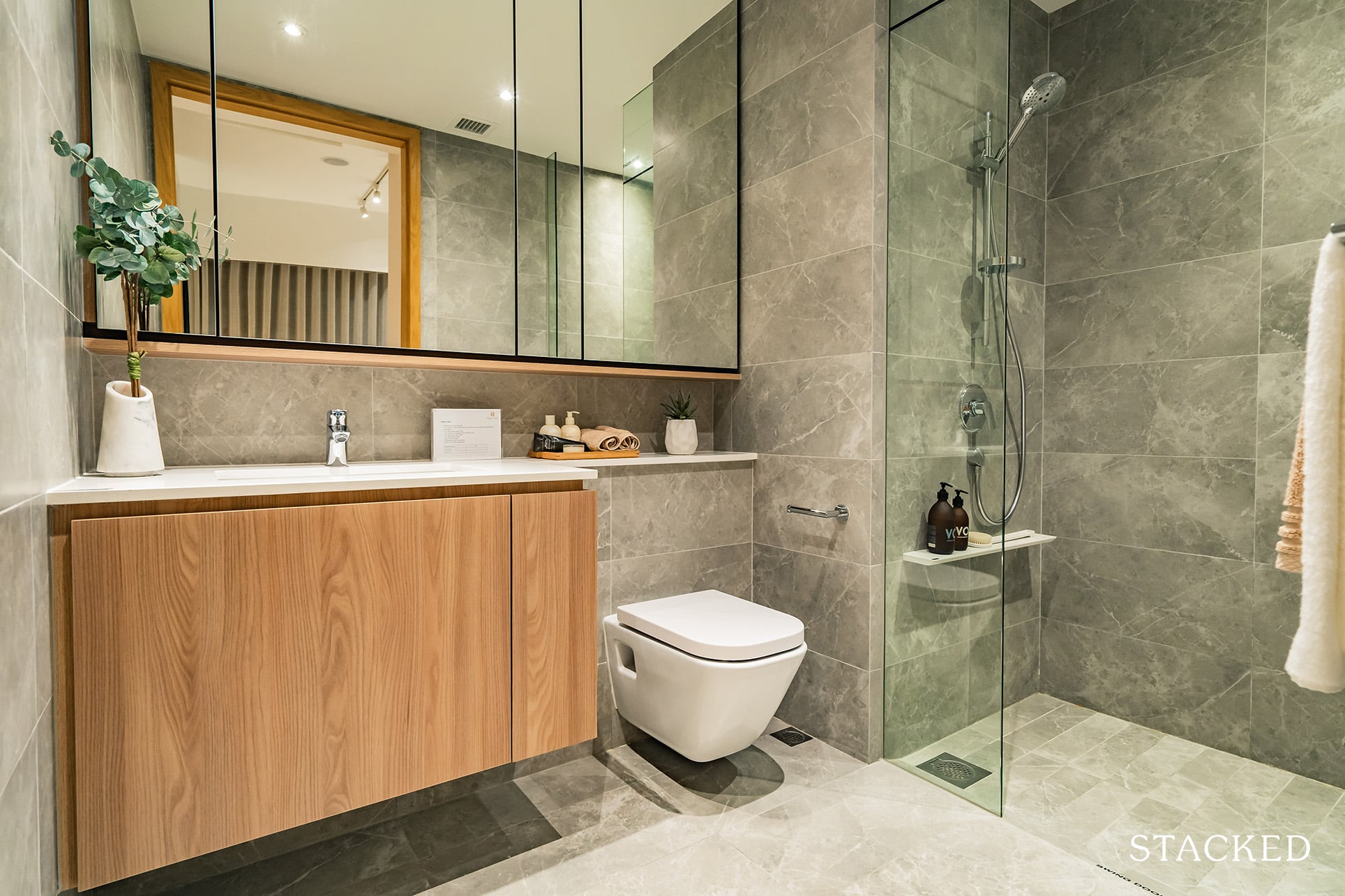
The master toilet parallels the layout of the common bathroom, with the exception of darker-tinged walls which naturally contributes to a more exclusive feel as opposed to the pleasant cream colour in the previous toilet.
Without the usual addition of a rain shower, there is hardly anything here to indicate that it is the master bathroom.
Twin VEW 3 Bedroom Review
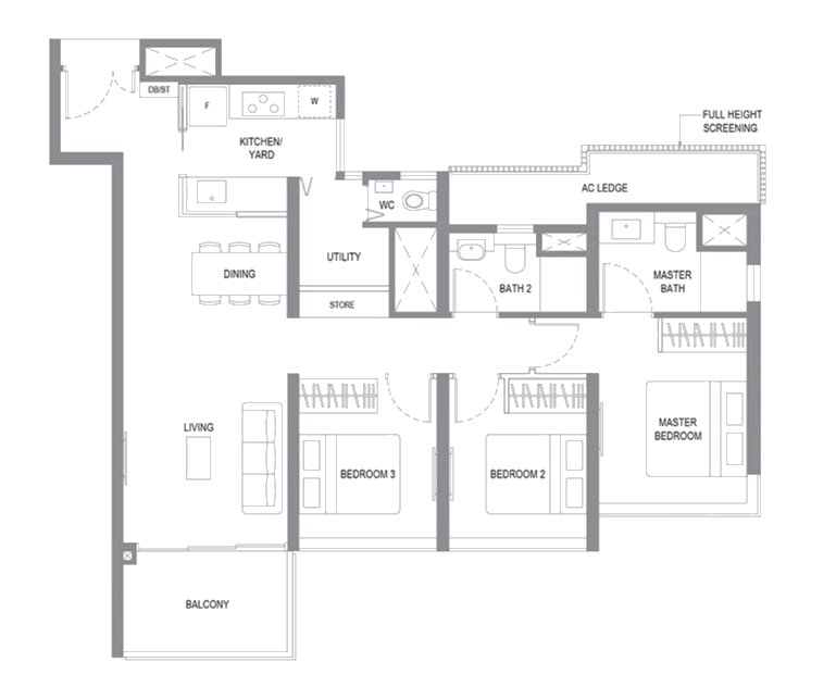
At 1,066 square feet, the 3-bedroom deluxe unit is of average size.
As usual, it comes equipped with a utility room that provides a few more perks as opposed to your 3-bedder compact units (more on that in a bit).
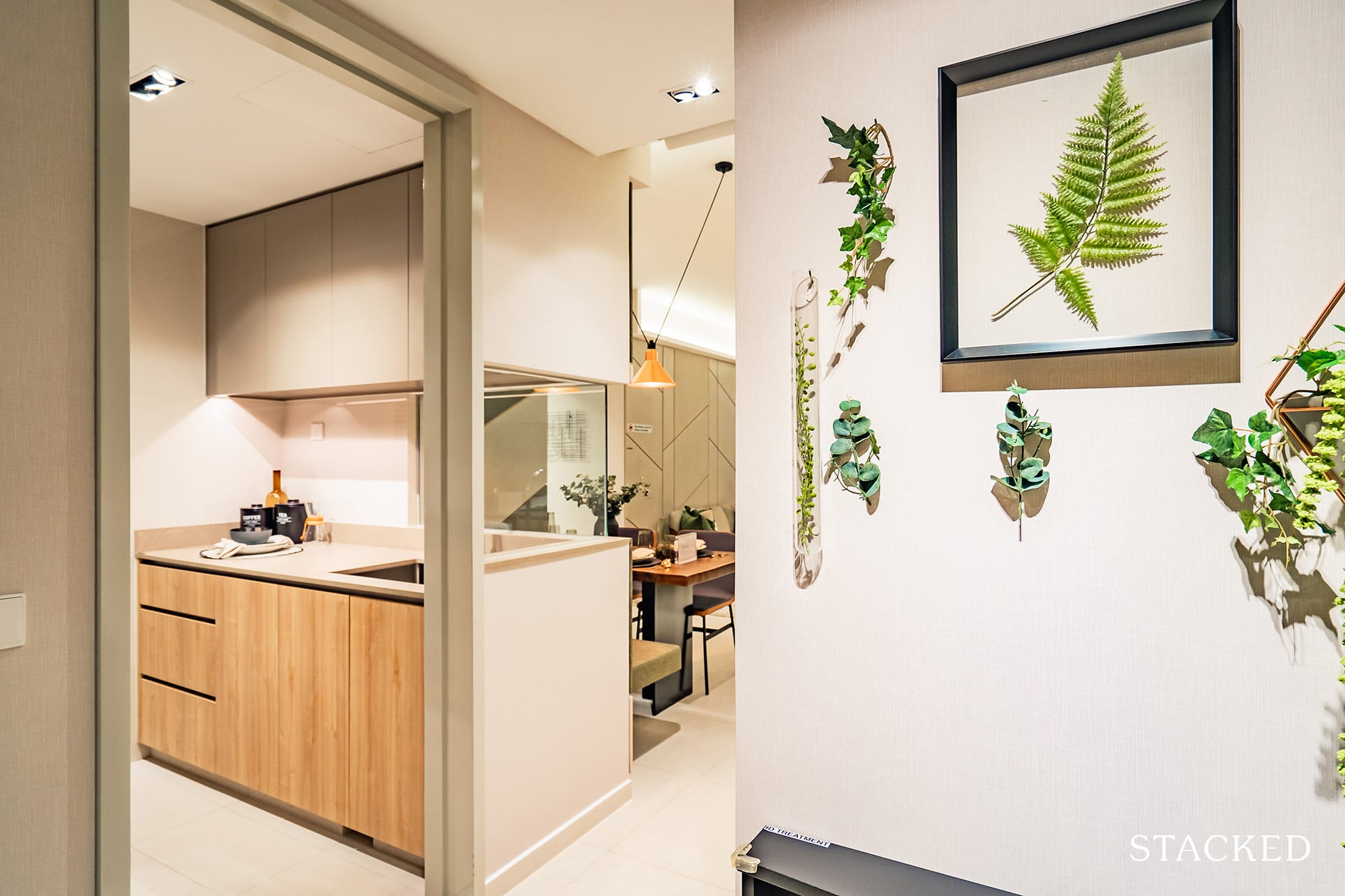
Entering the unit, you’re greeted by the usual entranceway which acts as your privacy barrier.
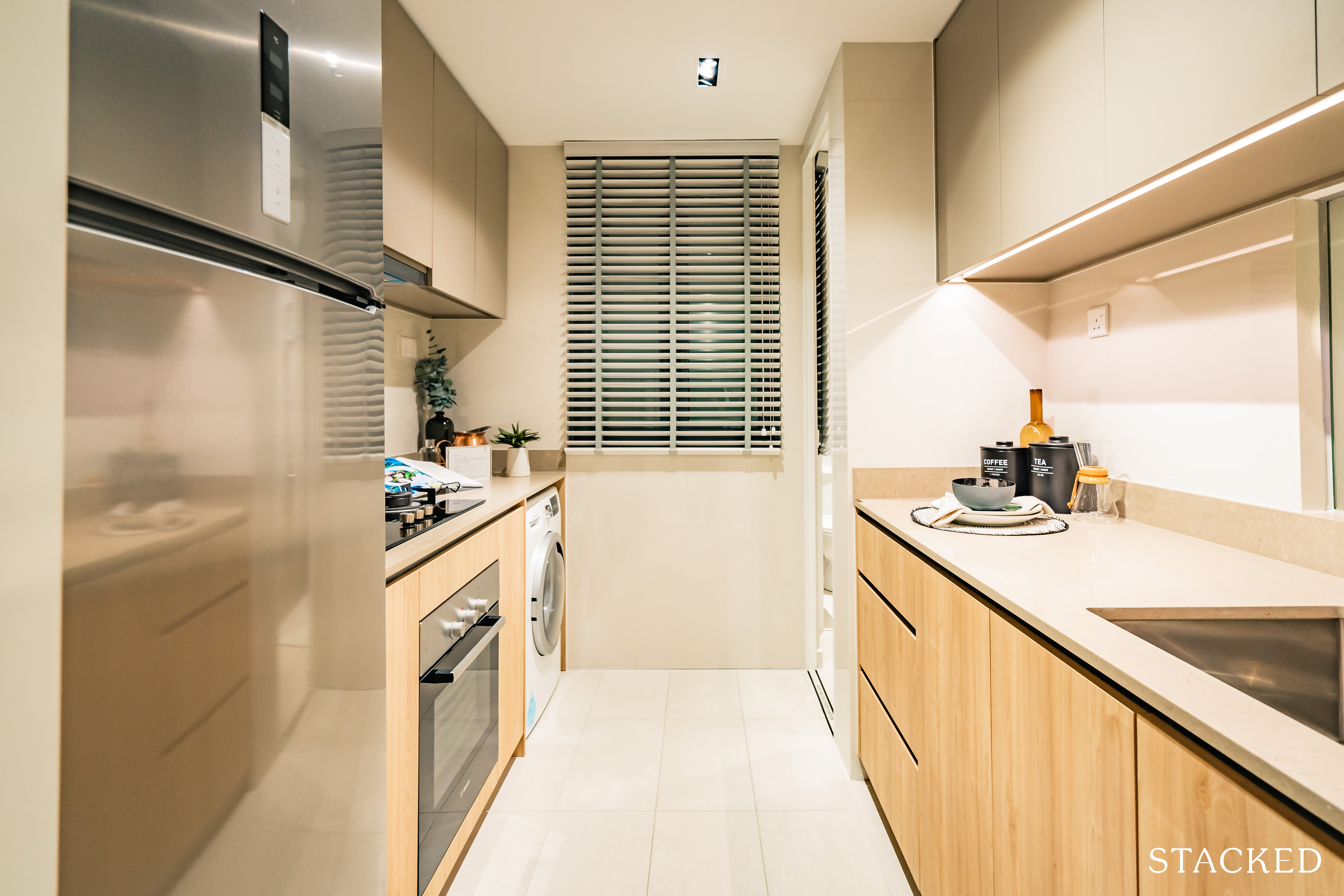
The kitchen is an enclosed one, which is pretty much indispensable for families looking at an own stay option.
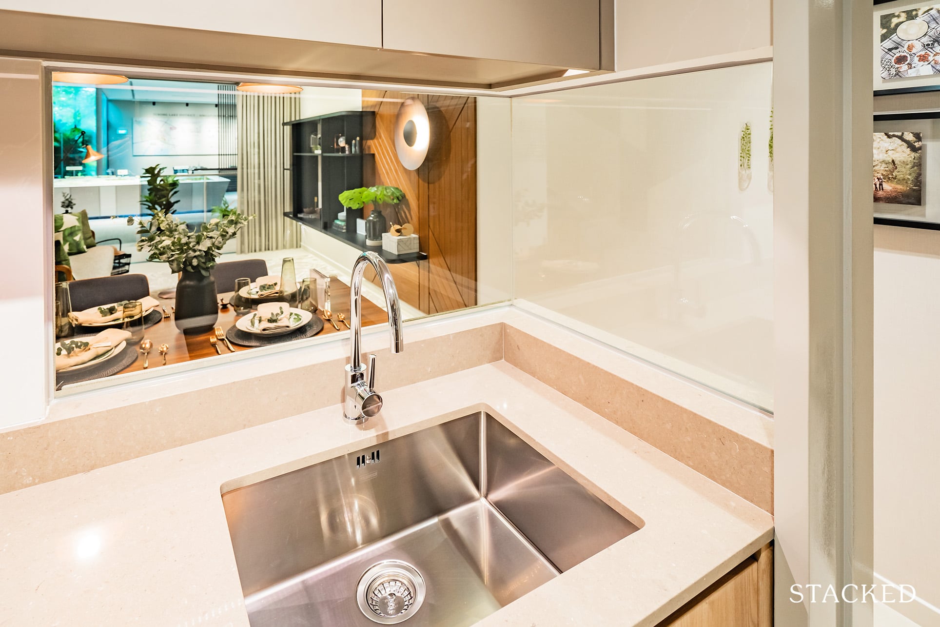
Included here is a cutaway look-out (or look-in) glass.
I really like the inclusion of this as it mitigates the constricting feeling you often get with enclosed kitchens (when they are of a smaller size).
Intriguingly enough, the look-out point is situated right where the sink is, so those who decide to leave out the dishwashers will be treated to a view when cleaning. That said, just the one sink isn’t too ideal – for those who’ve done the dishes before, you’d totally catch my drift.
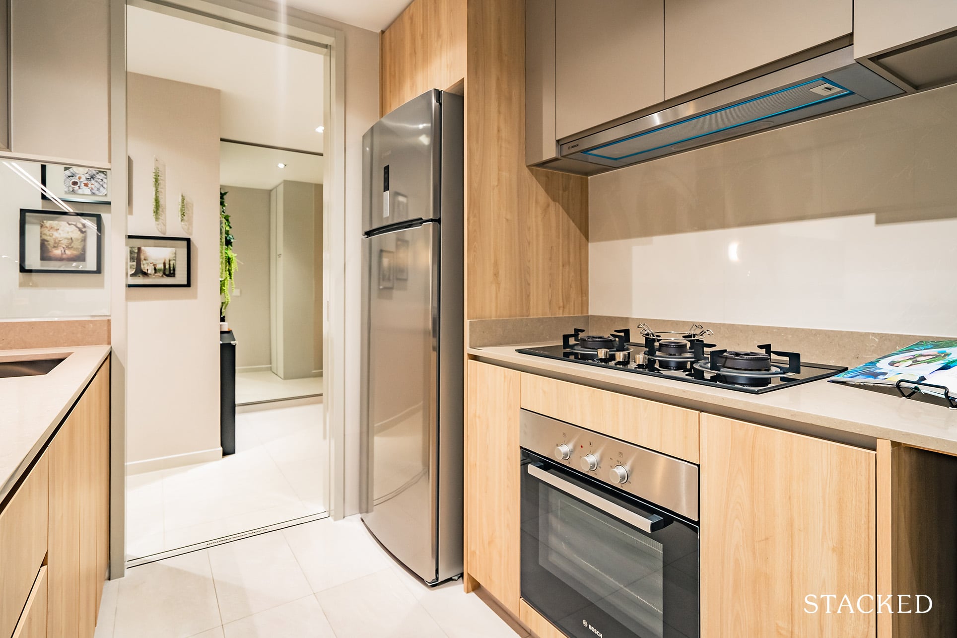
Appliances are by Bosch (which is great) and you also get a nice window that definitely helps with the ventilation.
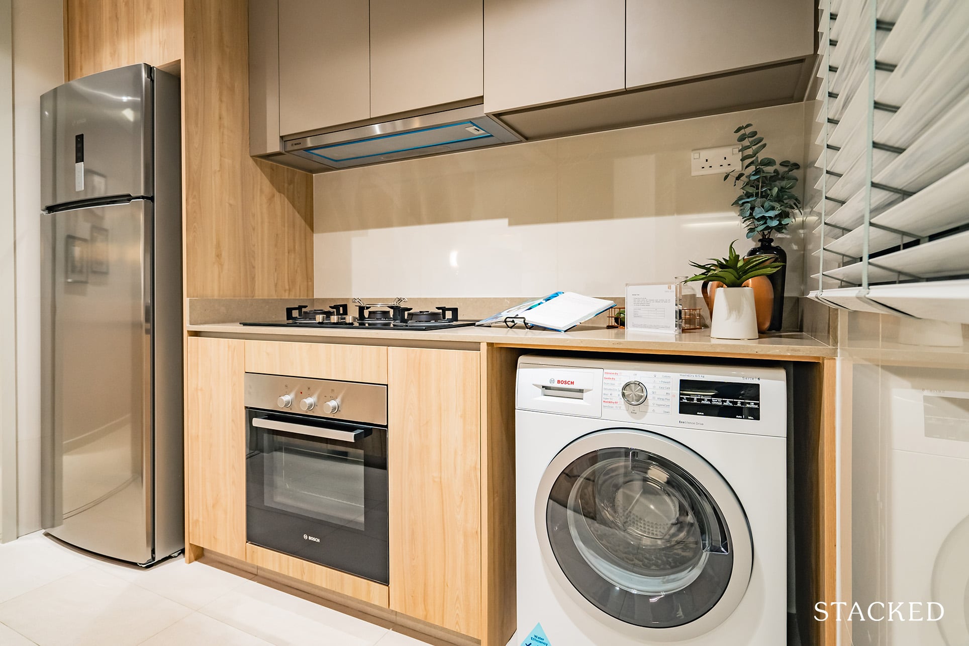
With the smaller 3 bedroom spaces, one of the first things to go is usually the yard – which is a pity for families that utilise it as part of their work flow. In this case, the washer/dryer had to be placed in the kitchen instead.
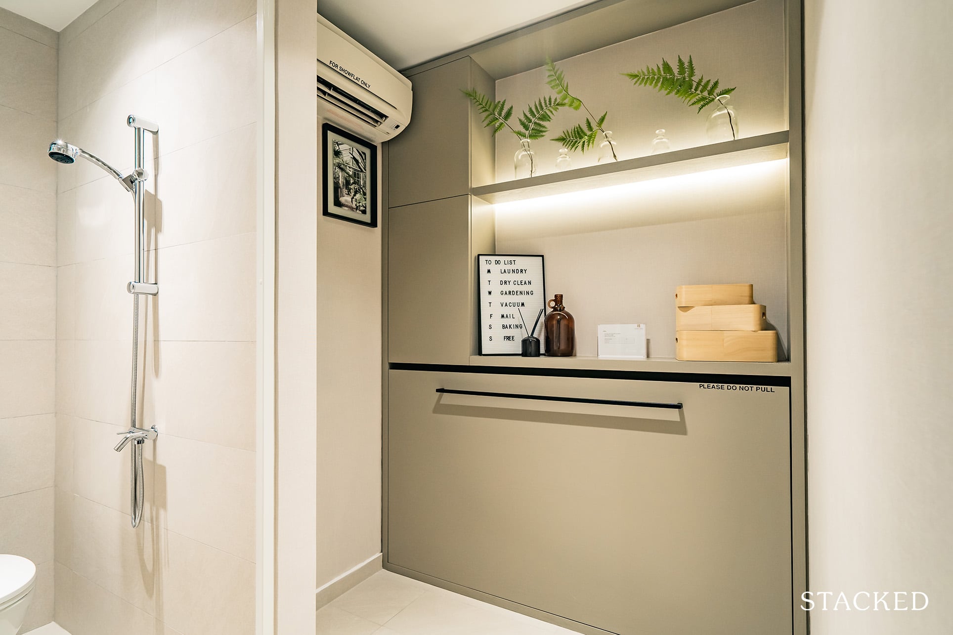
Head further down the kitchen, and you’d see a utility room. I have seen designs with a pullout bed placed over the washer/dryer so with a bit of functional design it could be a workaround solution for you.
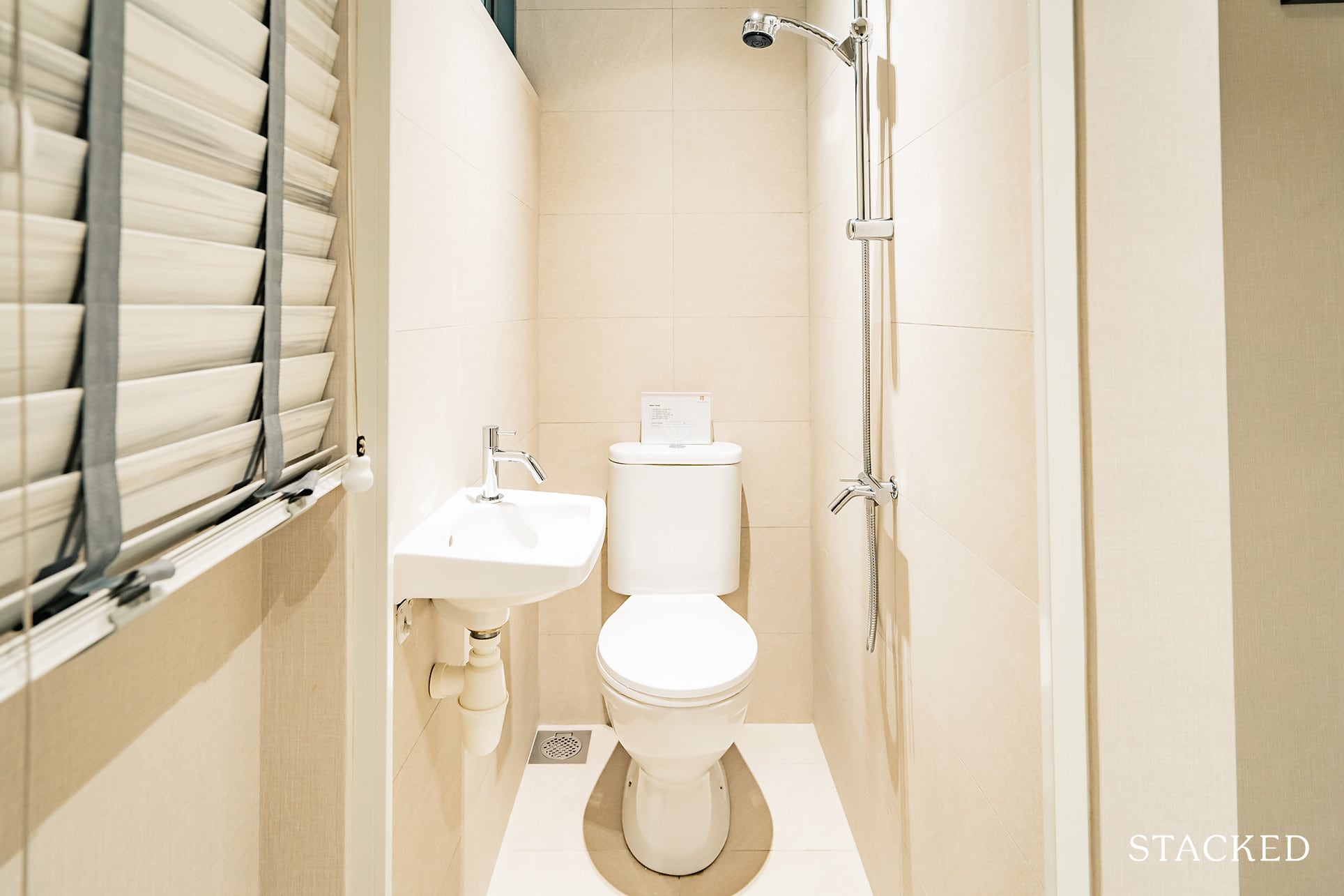
Along with that is the standard barebones WC.
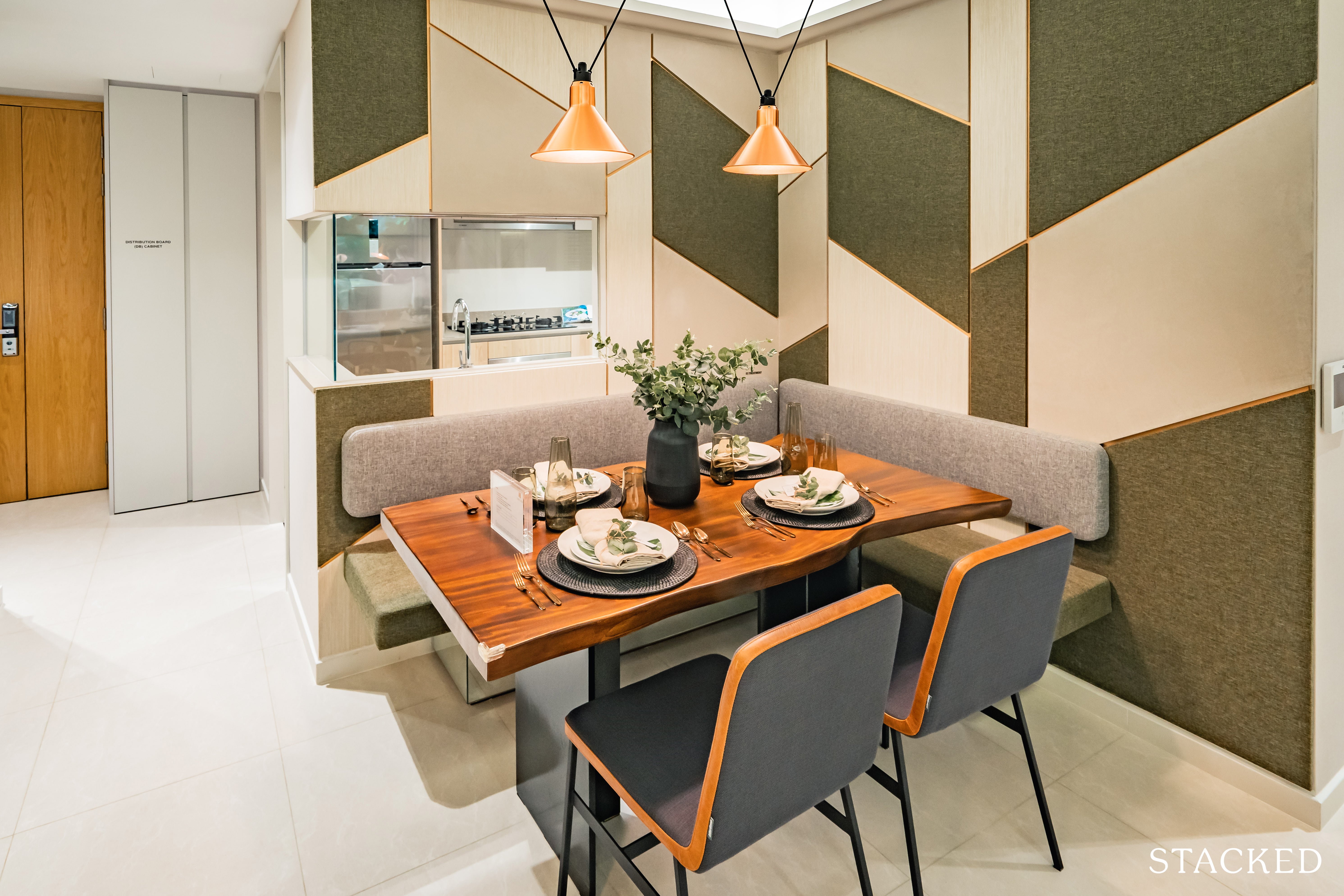
Moving onto the dining area. It’s quite a standard size, but a layout like this will always pose problems in terms of movability through the space.
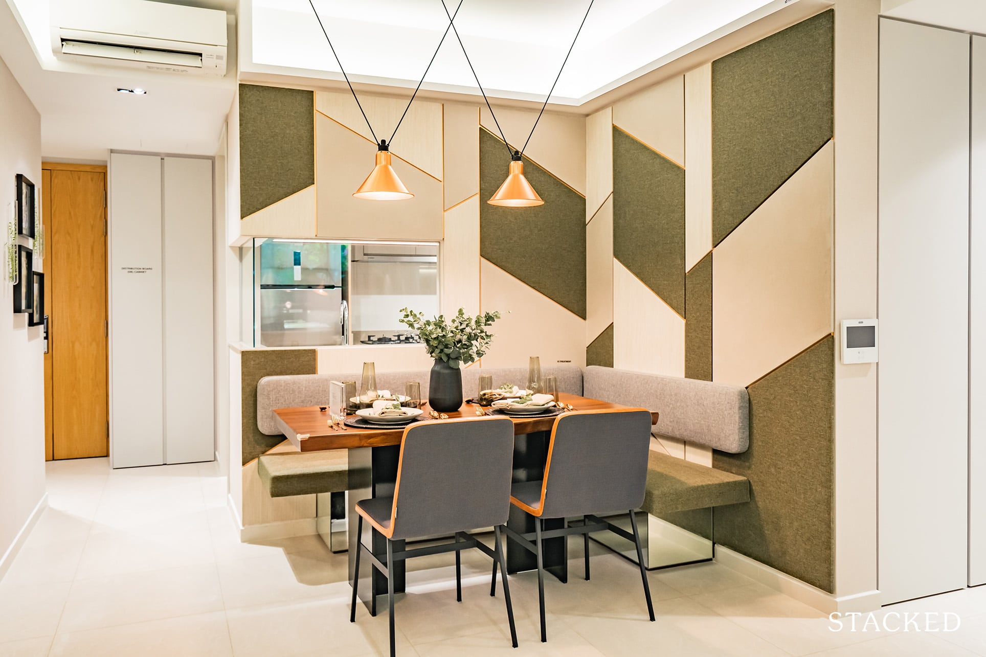
This is because it has to encompass the walkway into the living, as well as into the hallway – so you will be hampered by the size of furniture you can use here. Personally, this size is probably just right for a table of 4, but seeing as a 3 bedroom could also encompass 5 or even 6 members, you can see how this can be a bit of a squeeze.
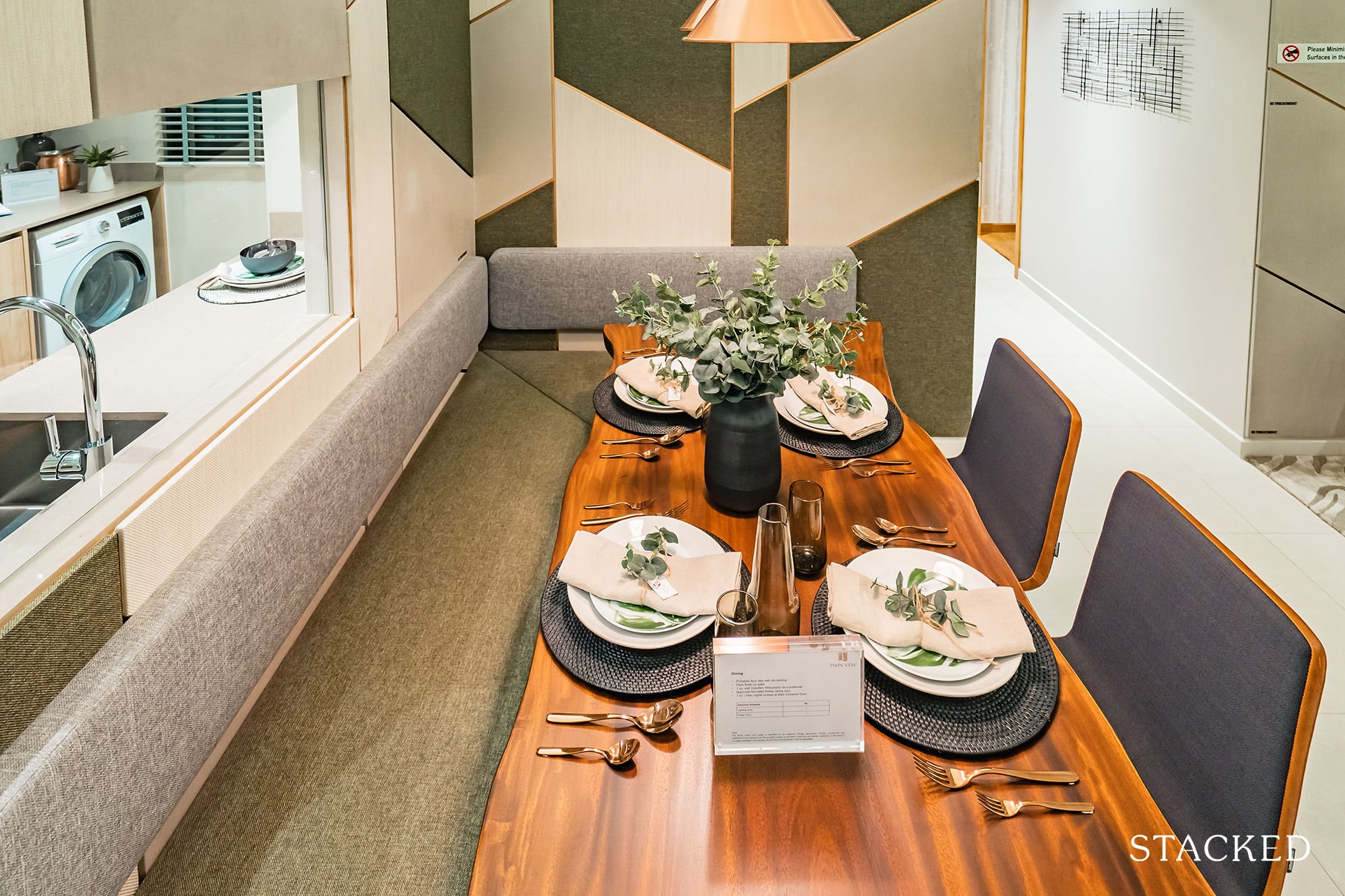
Do think about how functional the space would be for you. I do know of people who find bench seating way too rigid, so something like this would definitely be a no go for them.
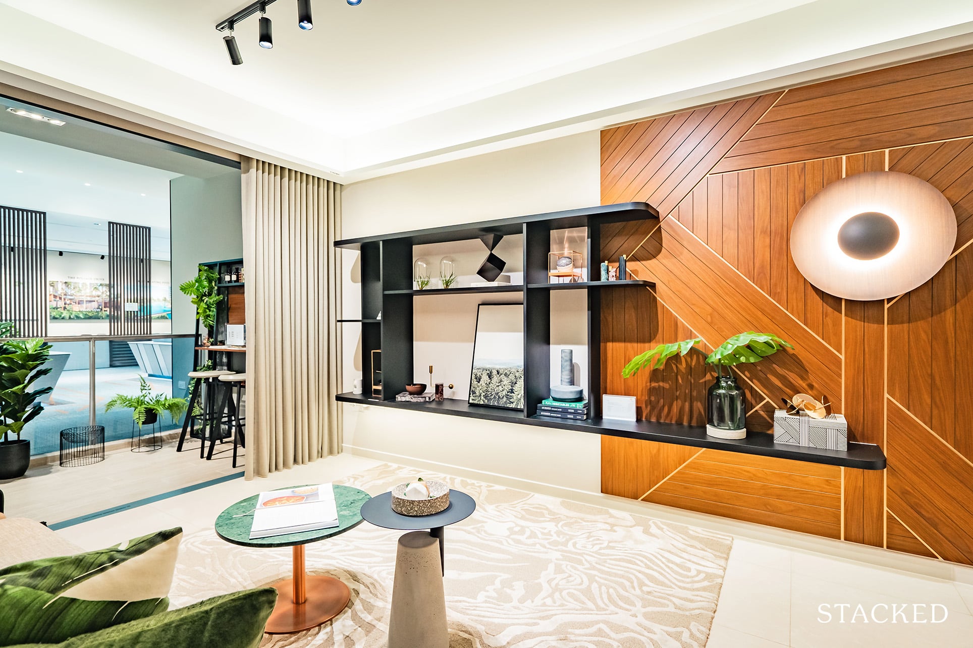
In contrast to the dining, the living area is pretty sizeable.
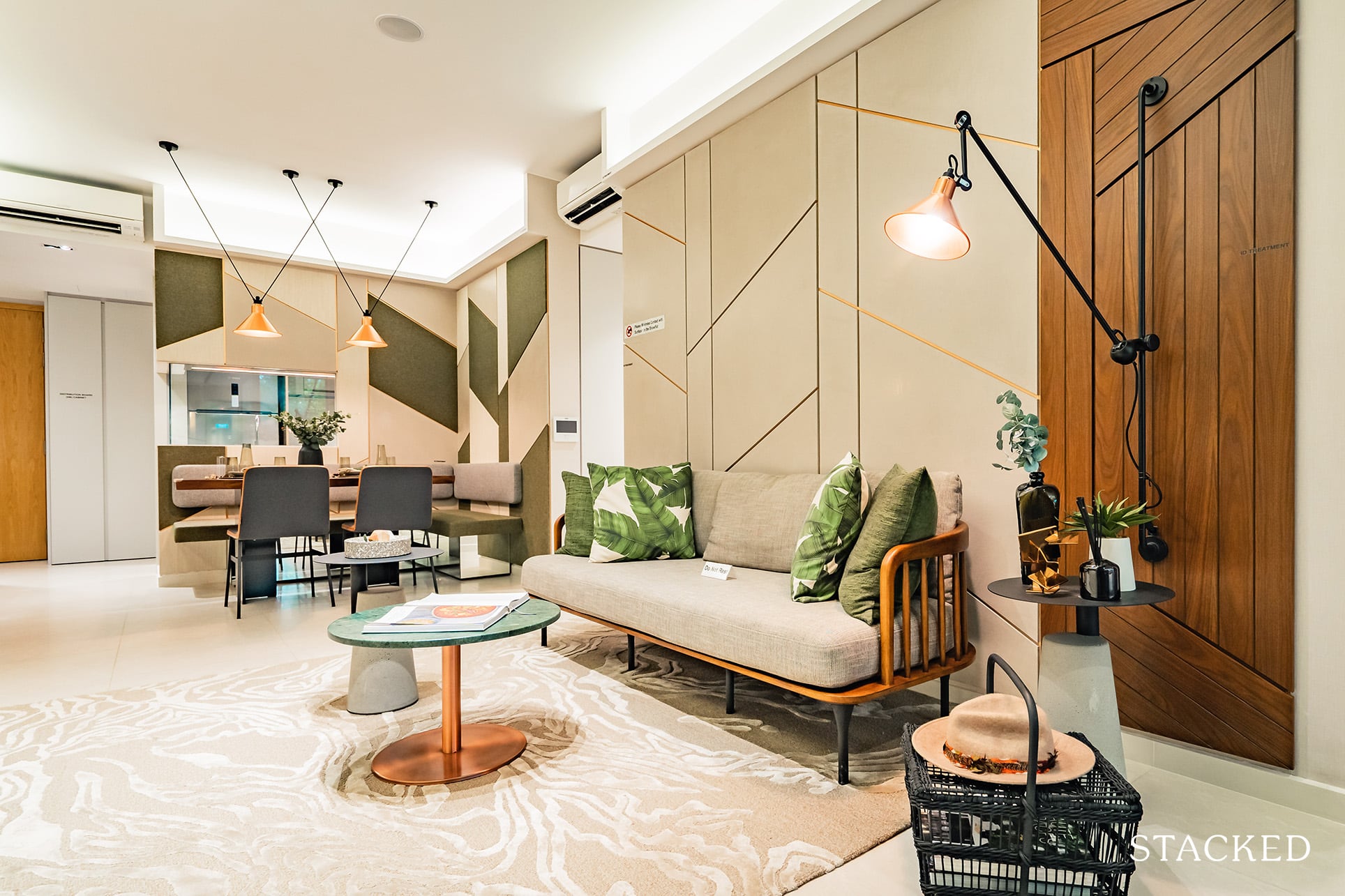
Note that the ID has gone with a relatively slim sofa chair and miniature coffee table – which, when replaced by your usual 2/3-seater sofas and full-sized coffee tables, will naturally make the space appear a lot smaller.
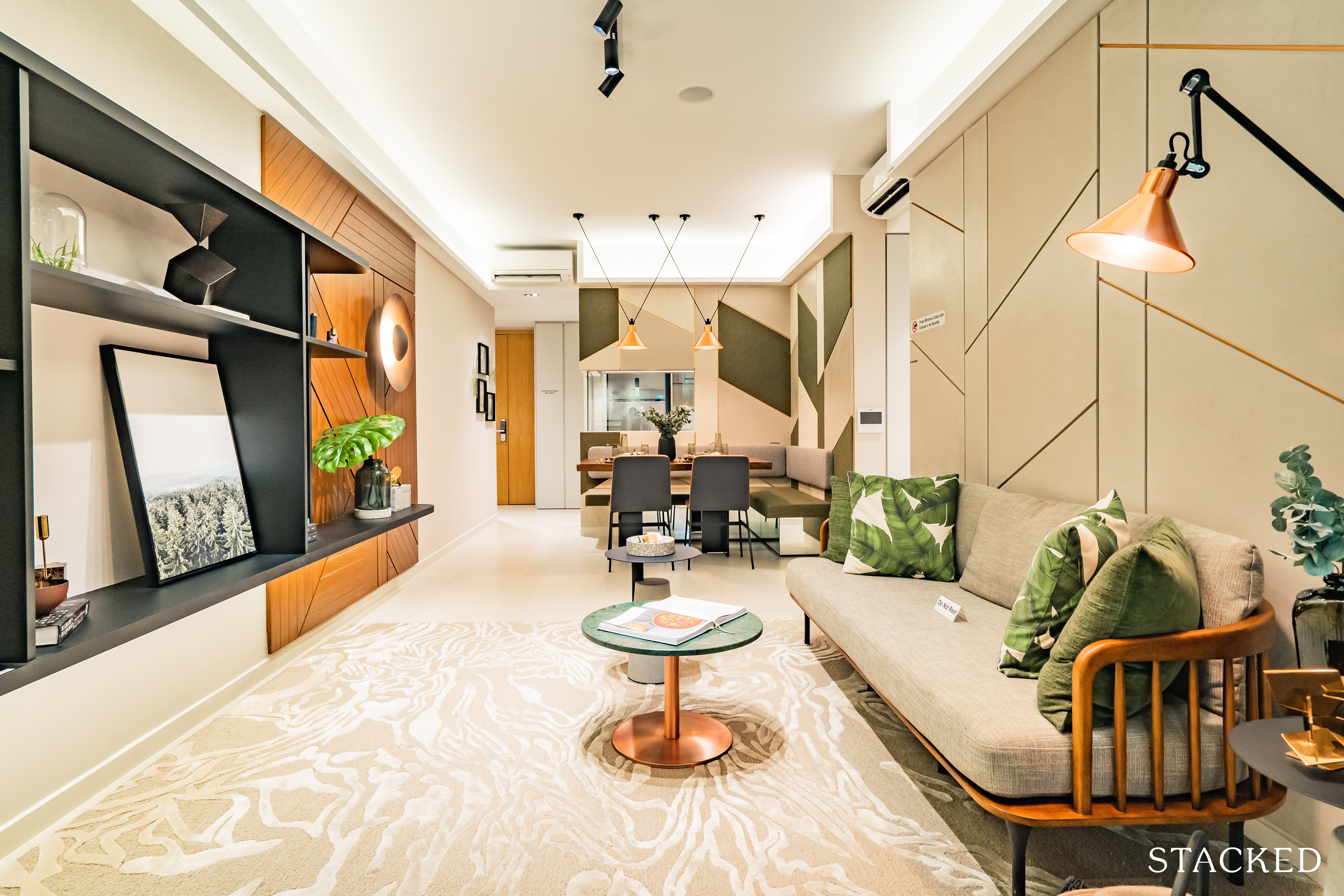
That being said, you still see quite a bit of room left lengthwise despite the presence of the sofa chair, so lengthwise you should be quite safe.
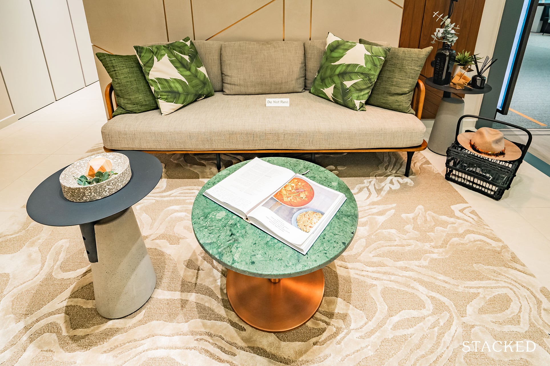
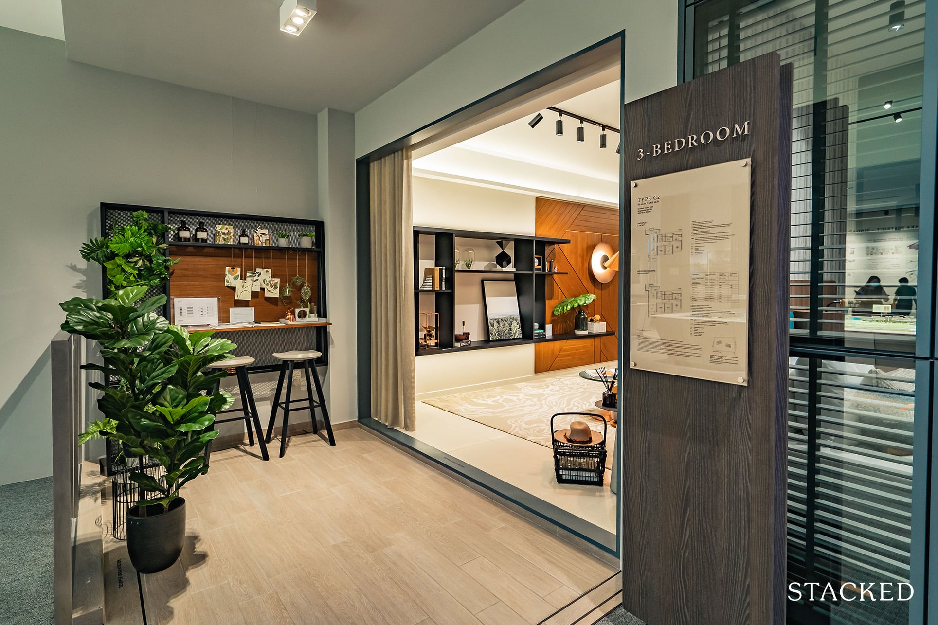
The balcony doesn’t seem all that big, especially when you scale it with the previous 2-bedder showflat unit.
It does serve its purpose however, and you can easily fit a number of chairs and a table for the occasional evening alfresco.
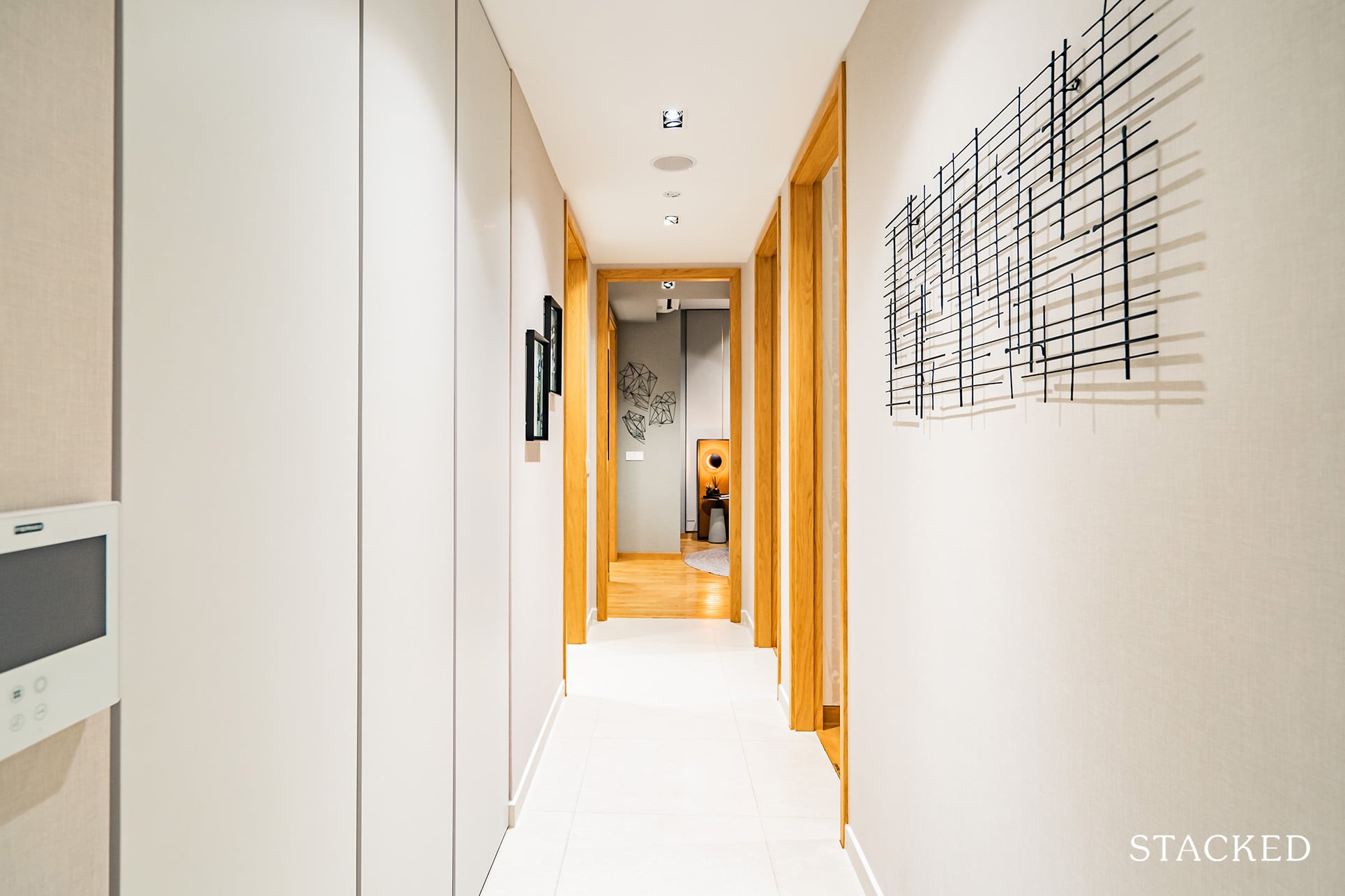
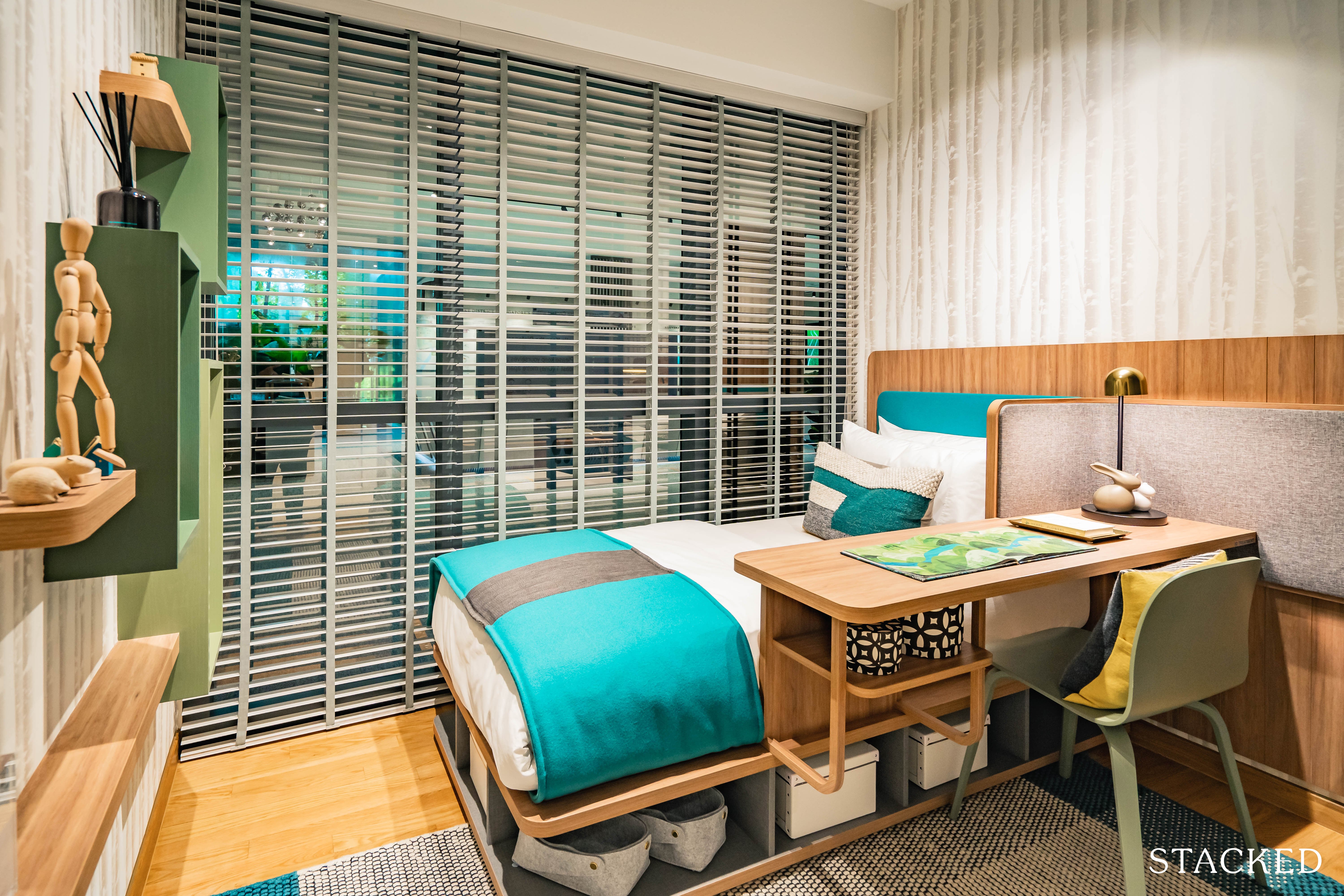
Let’s look at the first common bedroom, which has been equipped with a single bed and a study area.
There isn’t too much to comment on here save for the well thought-through ID and the full height glass windows that were otherwise absent in the previous unit.
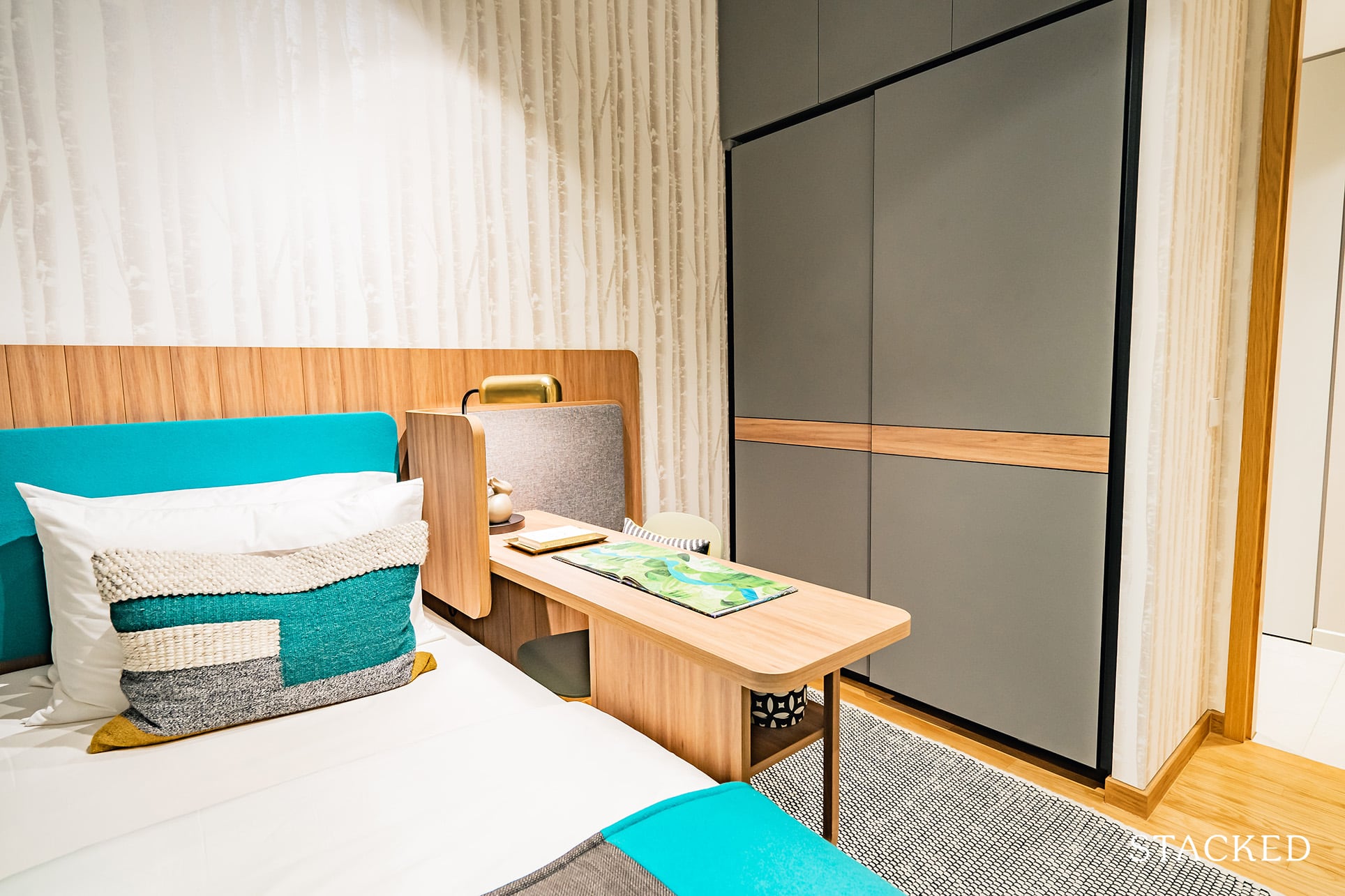
The storage space is the standard 2-panel wardrobe, something that buyers will just have to come to grips with given the size constraints.
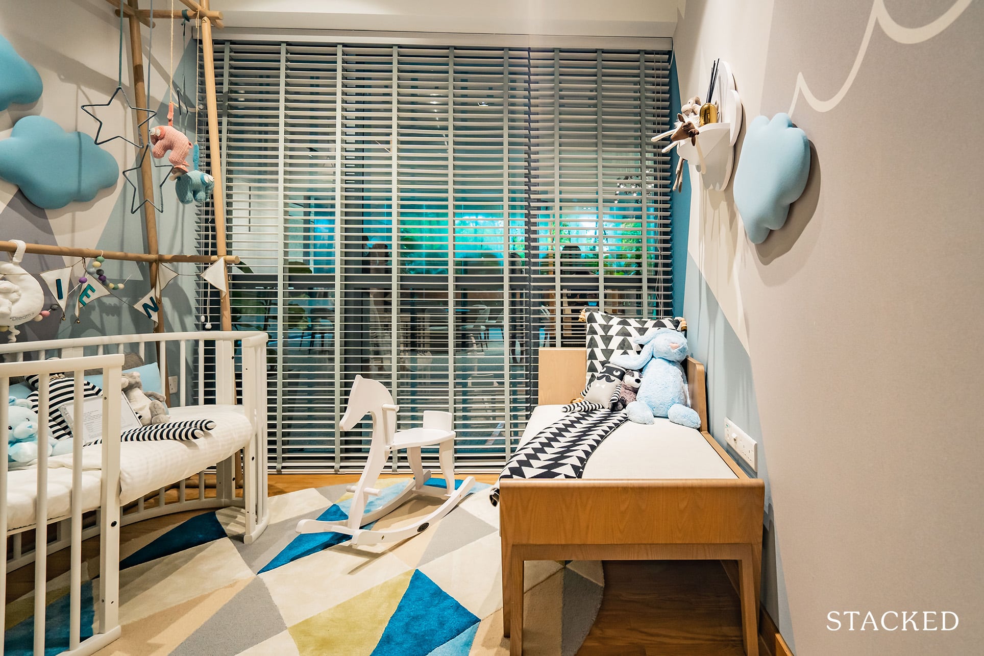
Moving on to the next bedroom, you can see that it’s been cleverly converted into a baby’s room equipped with the cot and some play toys.
While that’s a great way to spruce up the variety, it doesn’t really give you a full sense of how cramped the space would look like if one chose to include a bigger bed variation here.
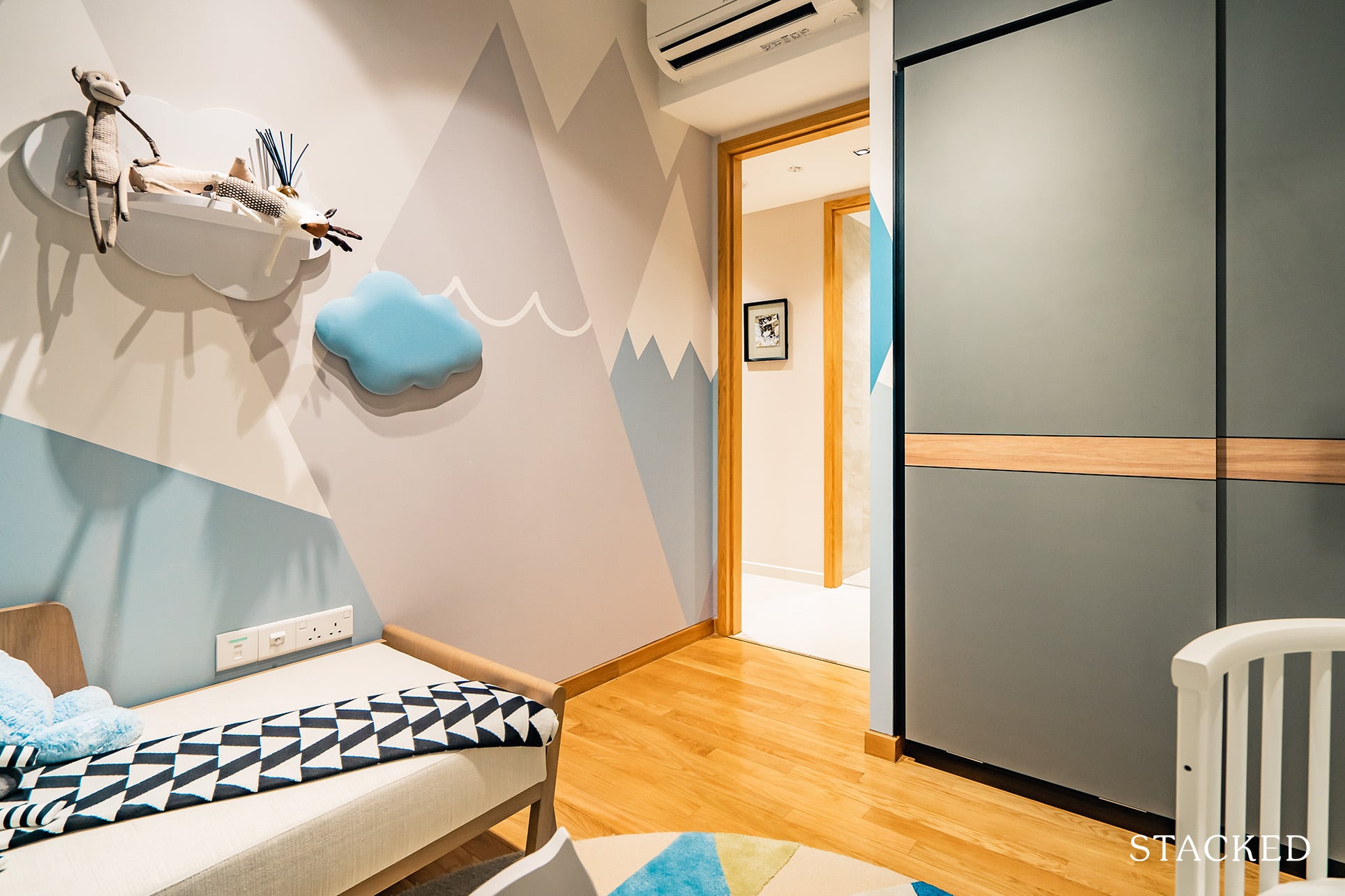
In my opinion, it would make things a lot easier for buyers if there was a demarcation of sorts as to how much space the queen sized bed would take up if one was to be implemented here.
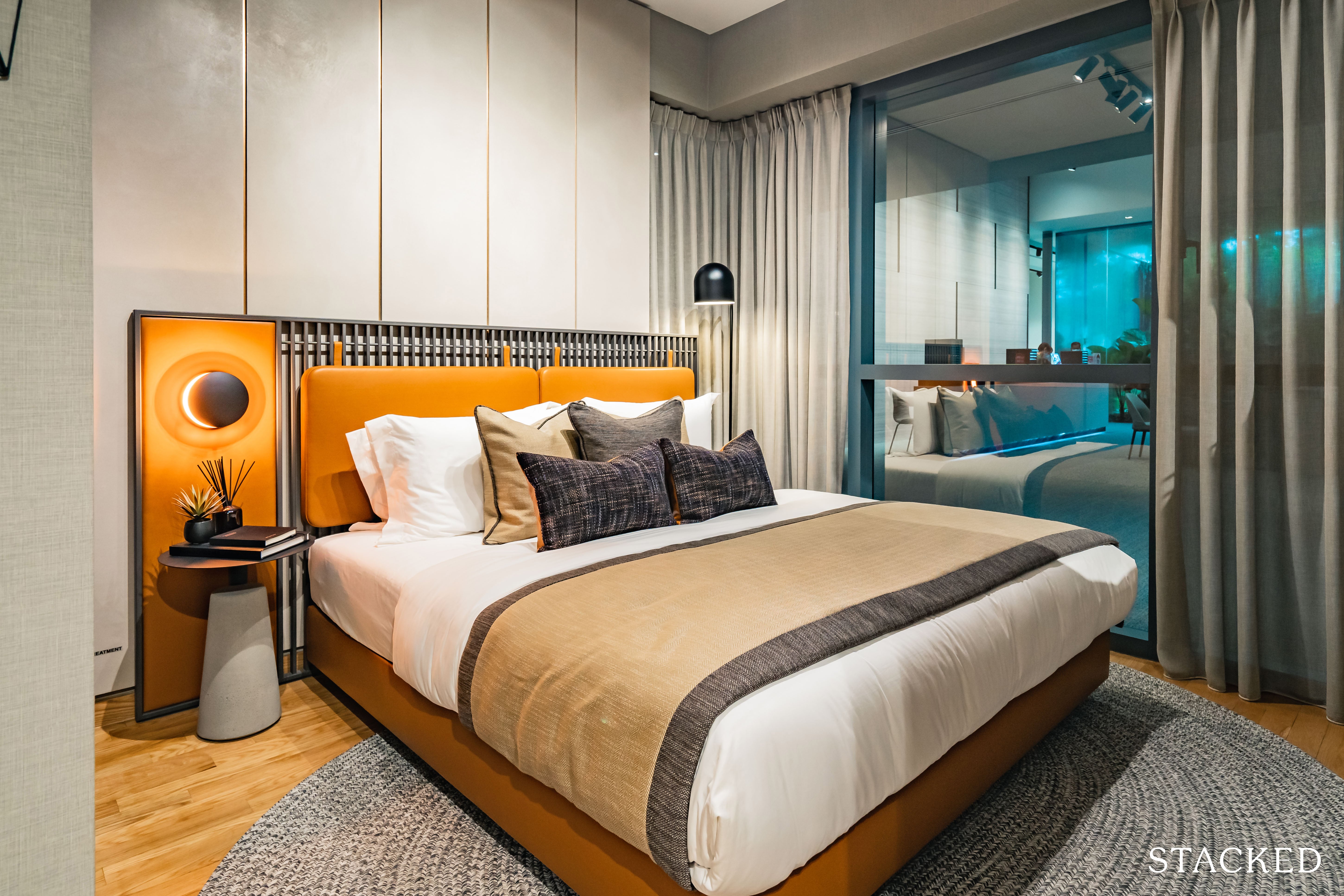
Moving into the master bedroom, it actually feels quite spacious, with plenty of legroom that could fit a dressing/work table of sorts if required.
What’s quite cool here is the right angled window at the corner. While it doesn’t really provide any functional benefit, it does make the view seem somewhat more immersive.
You also get enough space on either side of the bed for your bedside furniture.
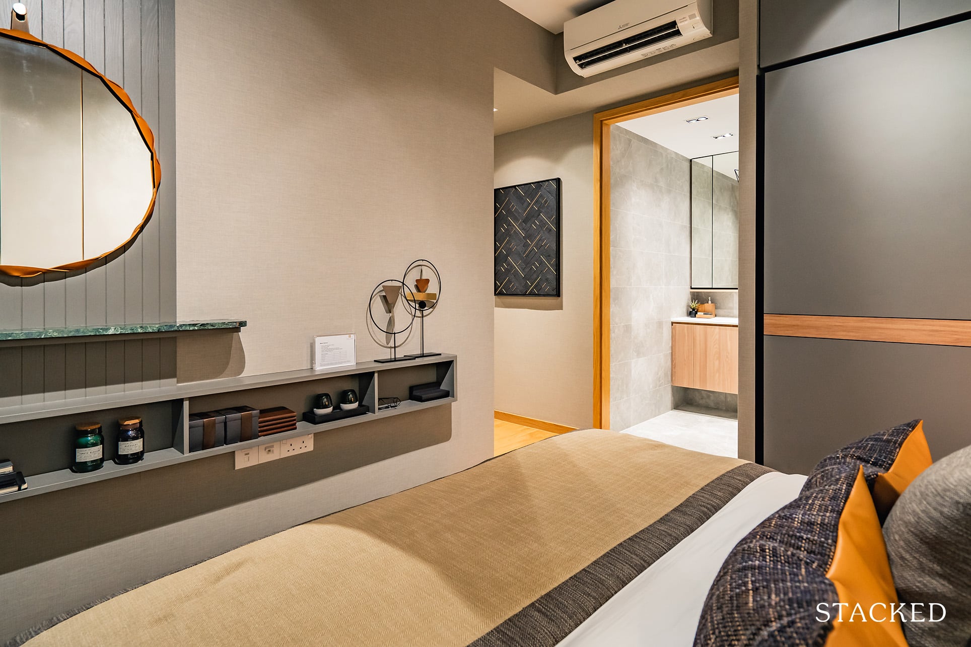
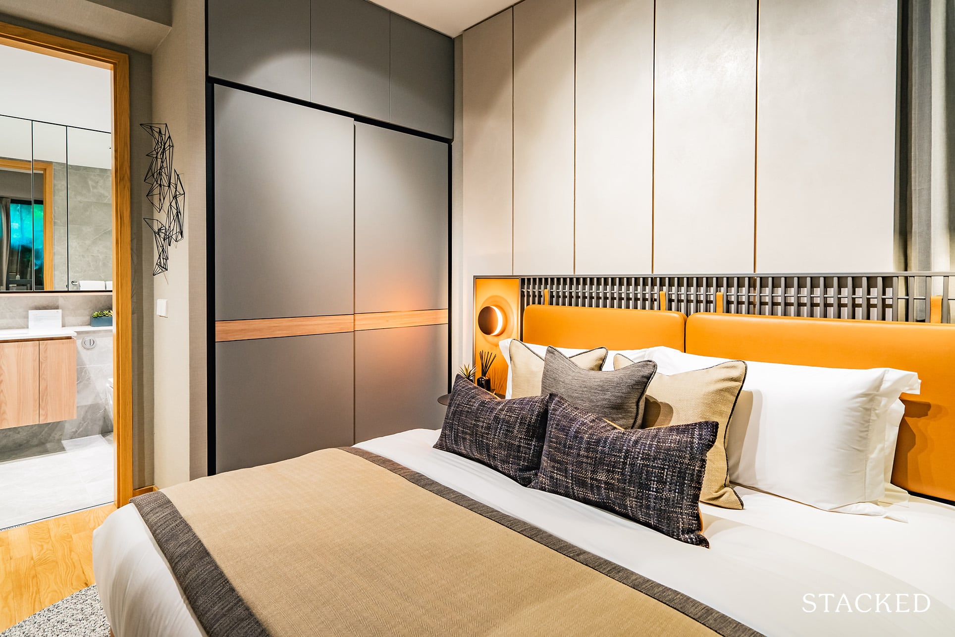
Again, the 2-panel wardrobe space is hardly sufficient for most couples – so I’d expect that you would need to invest in some creative storage solutions.
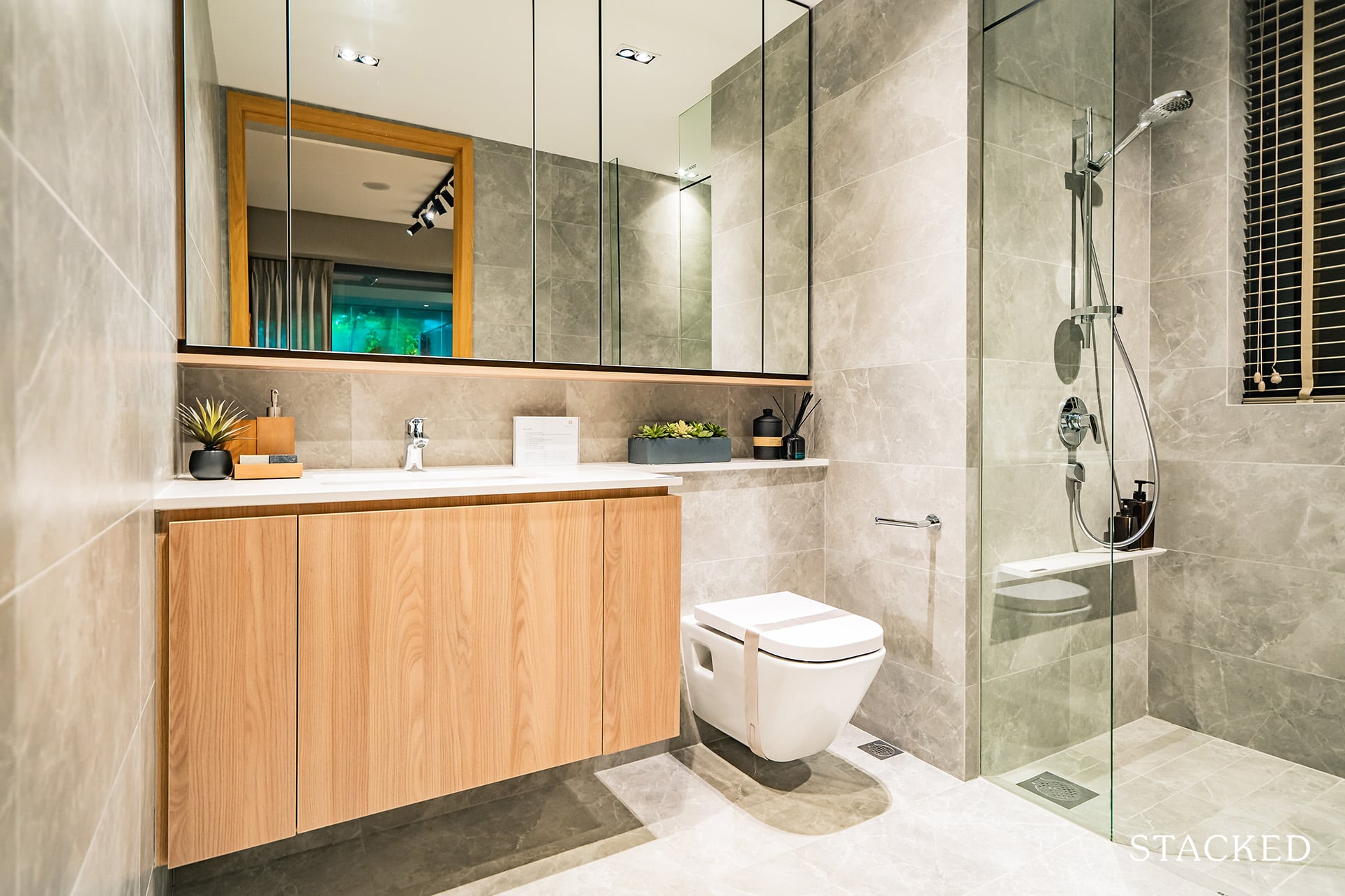
Finally, the master toilet doesn’t undergo too many variations as the previous ones. It comes with a half sized window that will come in handy for ventilation.
Twin VEW 4 Bedroom Review
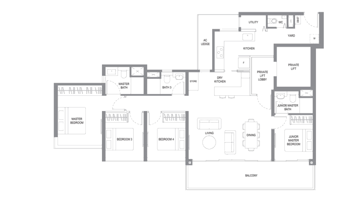
Our last and final room is quite a spectacle to look at based on the unit layout alone.
At 1,518 square feet large, it’s more than twice the size of the 2-bedder unit (which in itself is already above average in terms of space).
Note, there is only one stack of this 4 bedroom units (36 units) with a private lift – which are all sold out at time of writing. With the addition of the private lift coupled with the unblocked views, I can’t say it is too surprising these were all snapped up quickly.
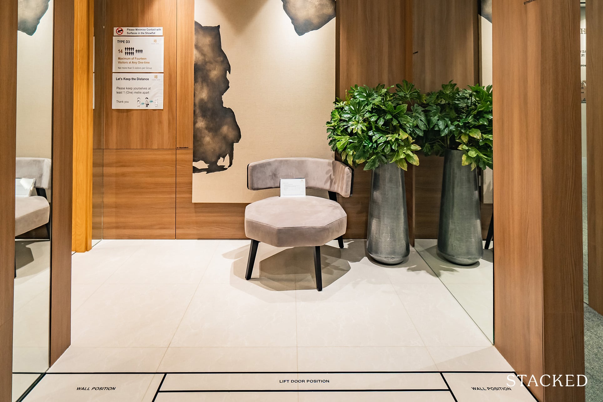
In a mass market development, having a private lift is definitely something special – so while it is great that they’ve provided it for this particular stack, I do wish this special treatment was extended to all the 4 bedroom units as well.
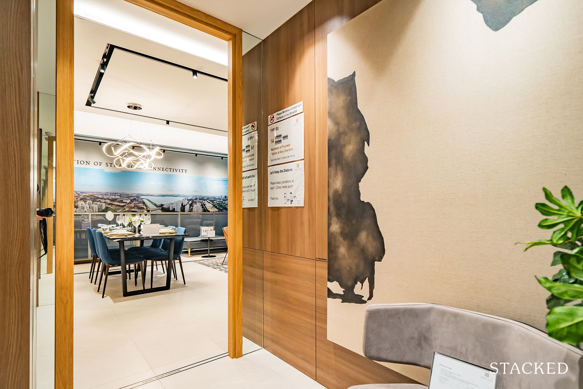
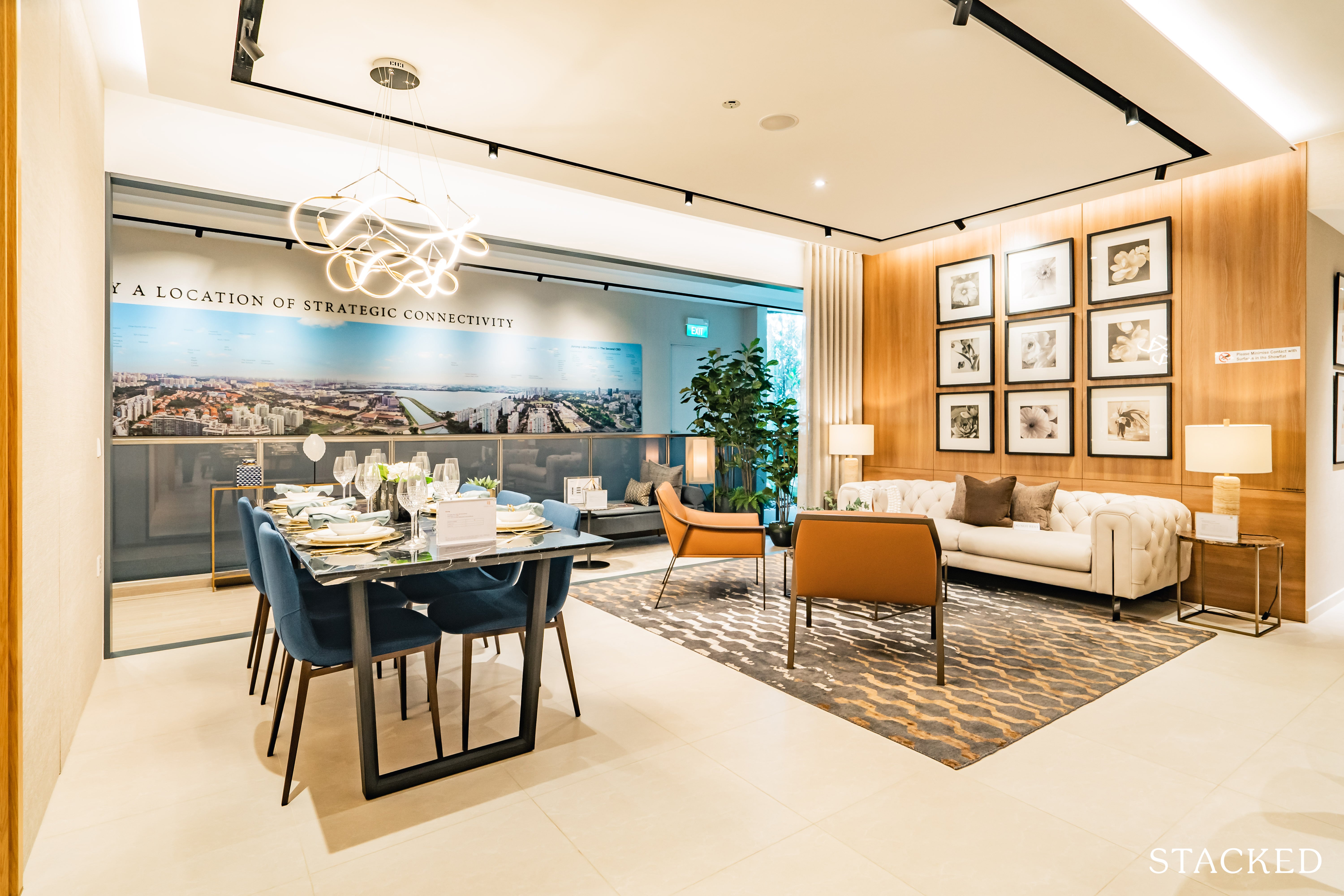
Once you step out into the interior space, the living and dining area does seem quite impressive on first sight. The first thing you’d probably notice is the full length balcony spanning the length of the space.
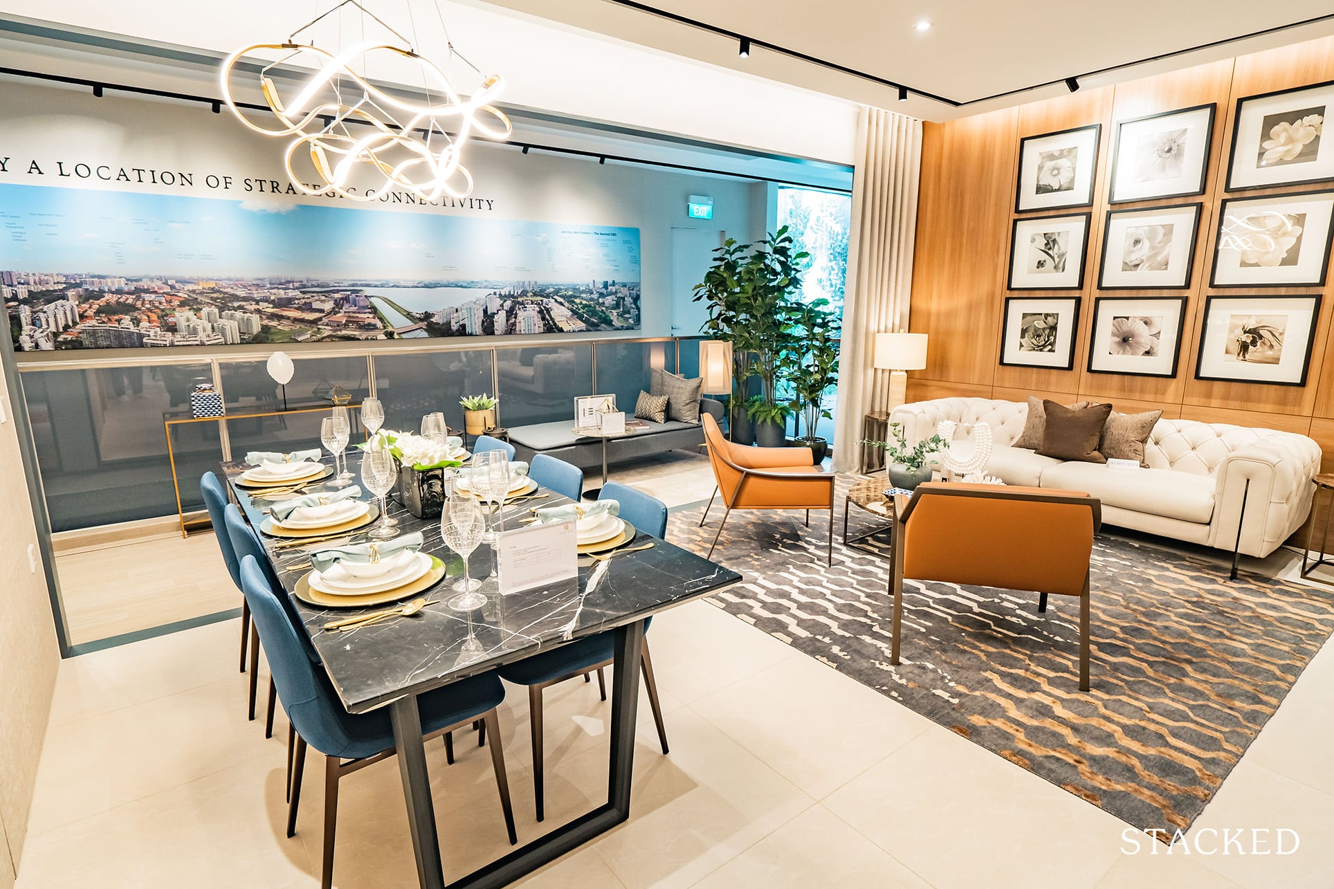
On a high enough floor (and a clear day), the views out must be pretty incredible. You can see from here quite easily why it was such a compelling point – and to that, why the entire stack is completely sold out.
Dining space wise, you can see that a 6 seater dining table can be easily fit into the space. Something longer like an 8 or even 10 would be doable too, but you do have to watch for the entrance of the junior master bedroom.
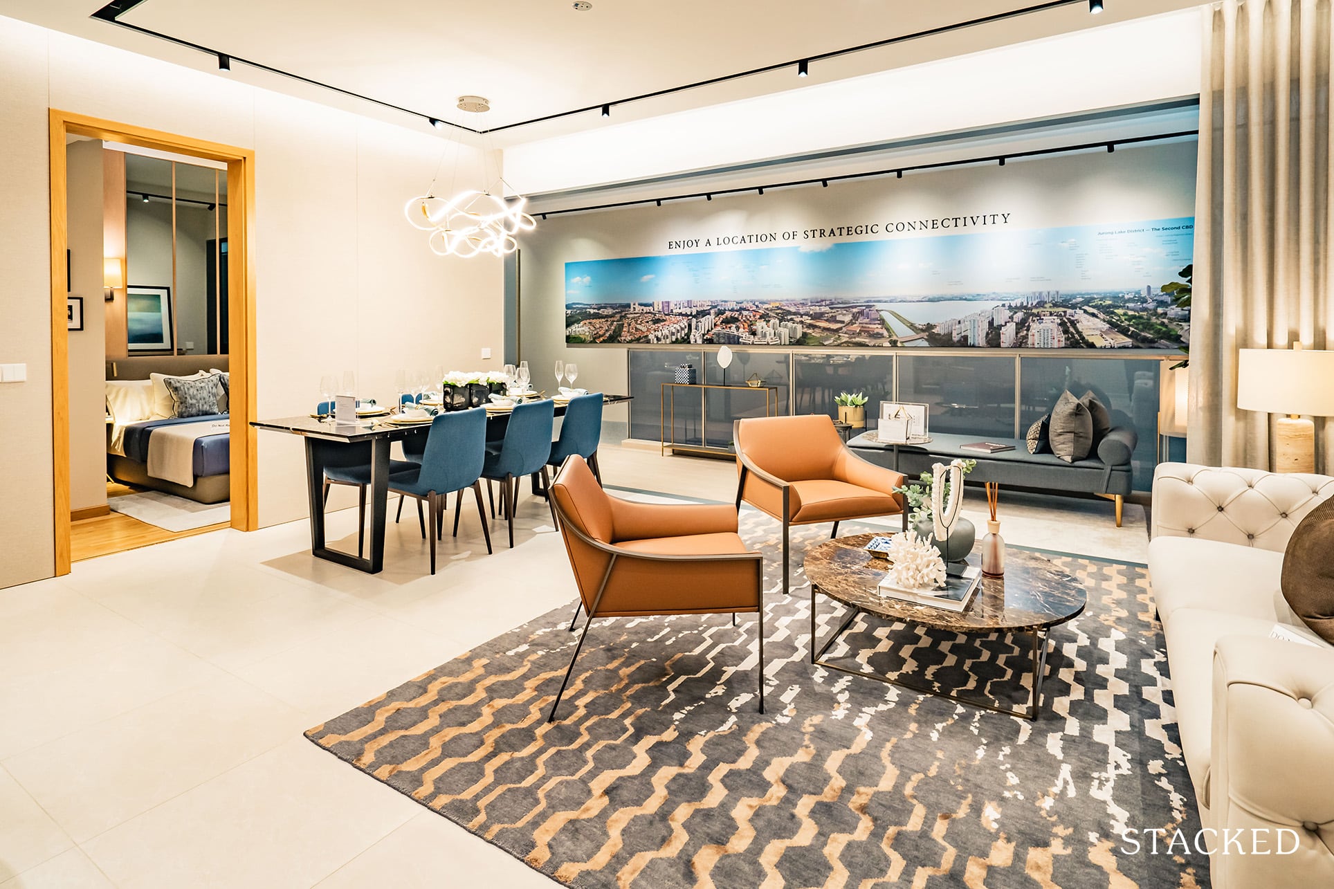
Something that can be seen better from this angle above.
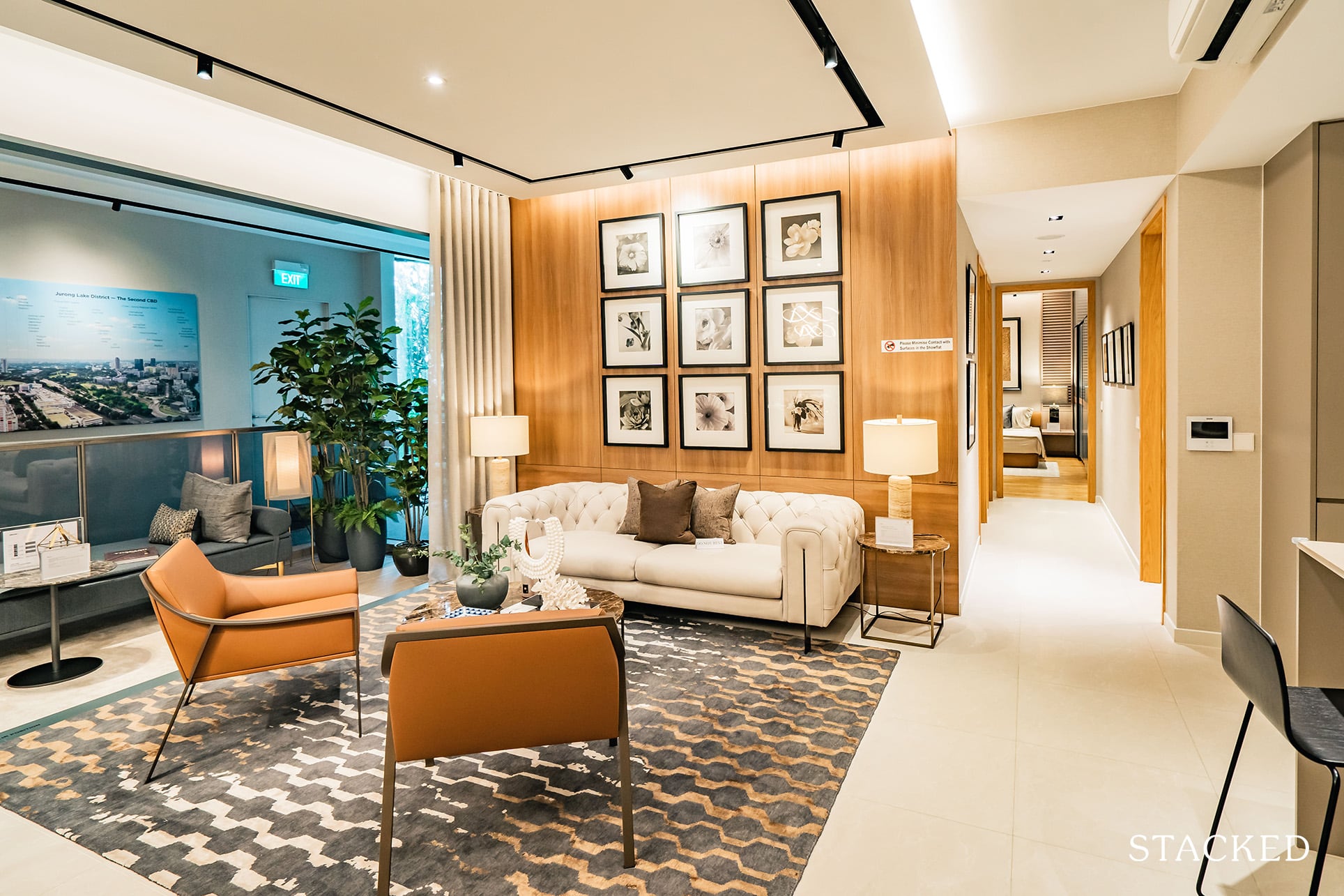
I wouldn’t say the living room set up is a good representative of what a typical 4 bedroom family would be looking at. First things first, the couch is definitely not an adequate size.
Secondly, although there is the inclusion of a day bed, I can’t imagine that most people would be placing it in this way on the balcony.
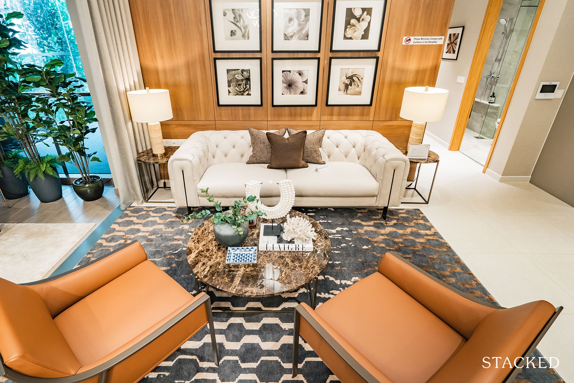
Let’s also not forget there isn’t the usual television set displayed here. Most people would probably place it on the wall, but that would mean the back of your sofa would be facing the dining table. Perhaps that’s just me, but I don’t find that placement particularly ideal.
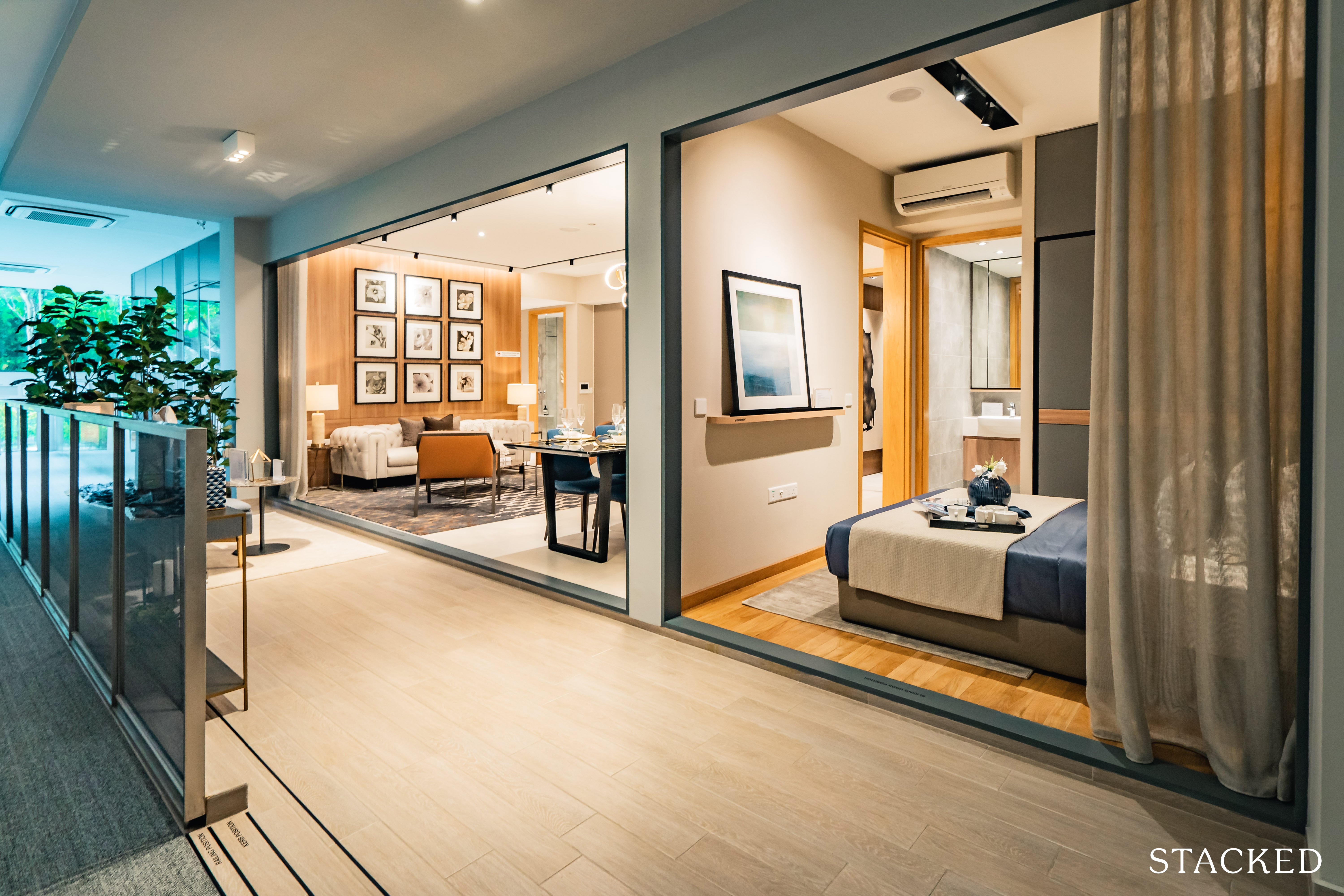
As you can see from here, the space afforded to the balcony is positively huge. It spans the entire length of the living room, and could easily be converted into an entire balcony garden complete with its own reading nook.
That’s just a singular idea of course. The possibilities are endless so I’ll leave that one to your imagination.
If it were up to me I’d move my dining table out to take advantage of the views.
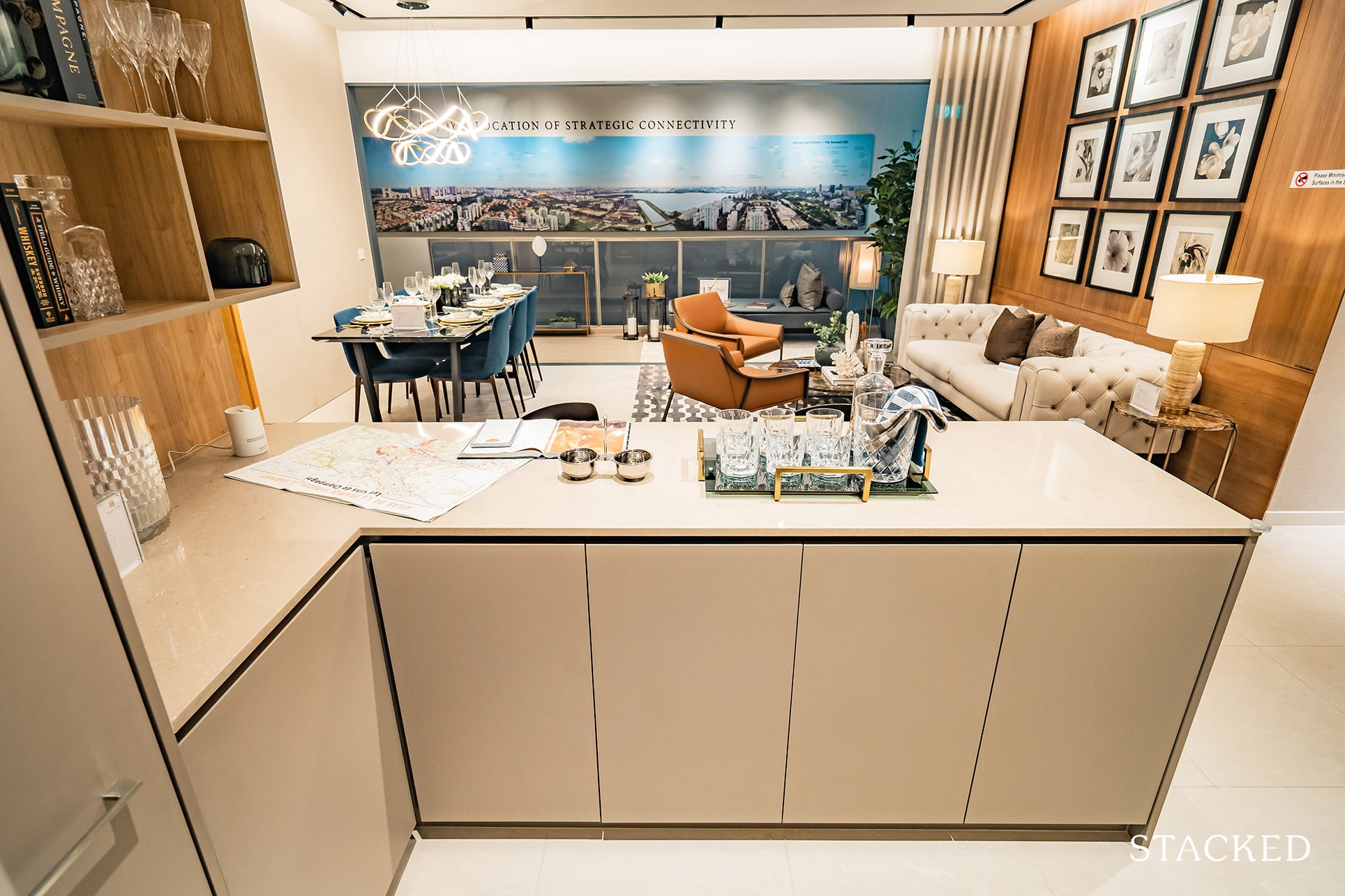
If you had a look at the unit layout earlier on you’ll know that the subsequent kitchen almost feels like a miniature unit of its own.
Firstly, it’s been split into both dry and wet areas.
On one end, you have your L-shaped counter/bar-top overlooking the living area. This means you get a ton more storage, but on the other hand, I wouldn’t consider it as a true dry kitchen as there isn’t a sink or a cooker here.
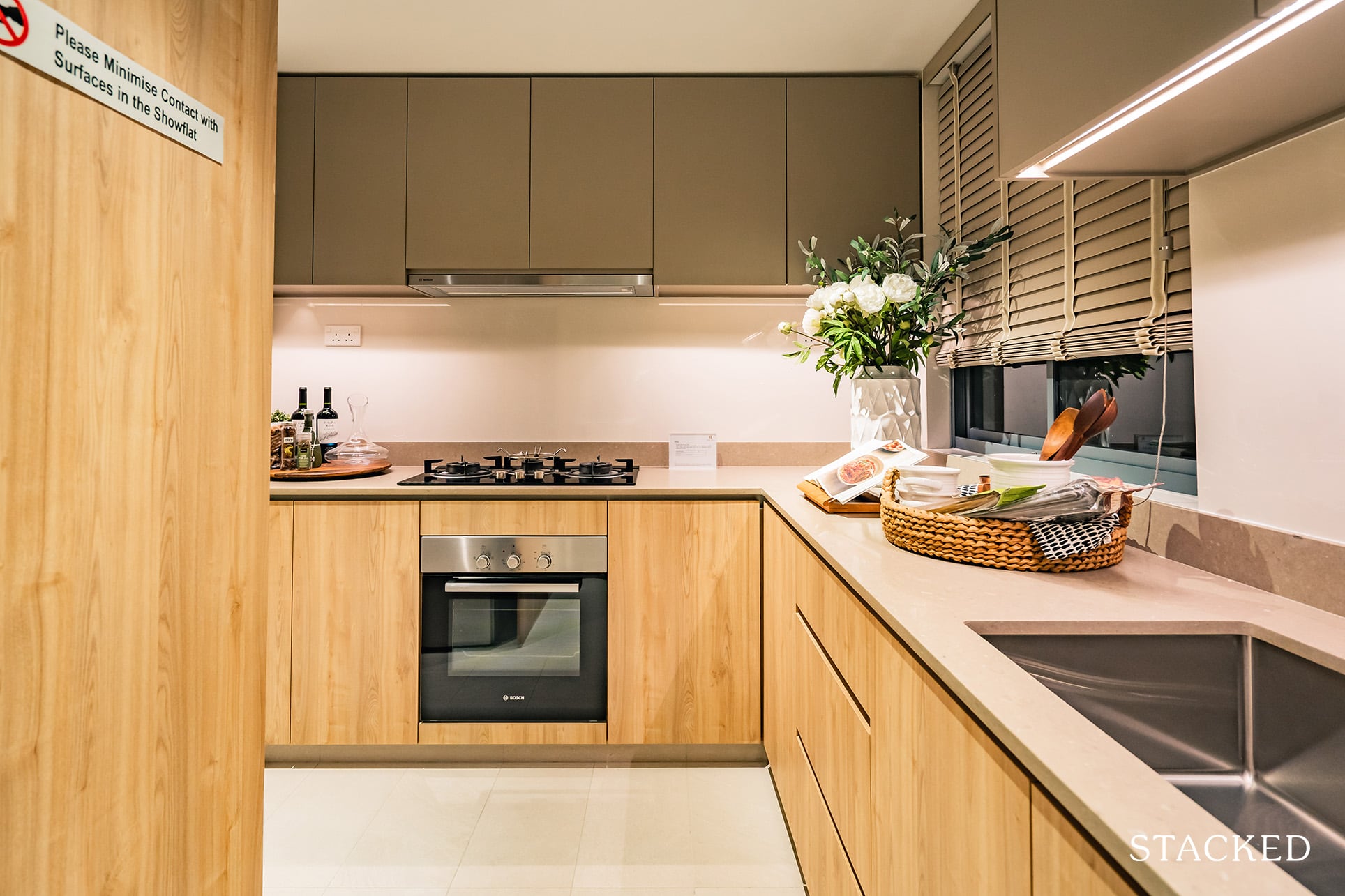
Go deeper in and you’ll arrive at the wet kitchen – which again, comes in a L-shaped countertop style with sink and hob on either end. Again, storage space here is rather plentiful as the countertop spaces are quite long.
Note the window here which is a key ventilation ingredient when it comes to the heavy-duty cooking.
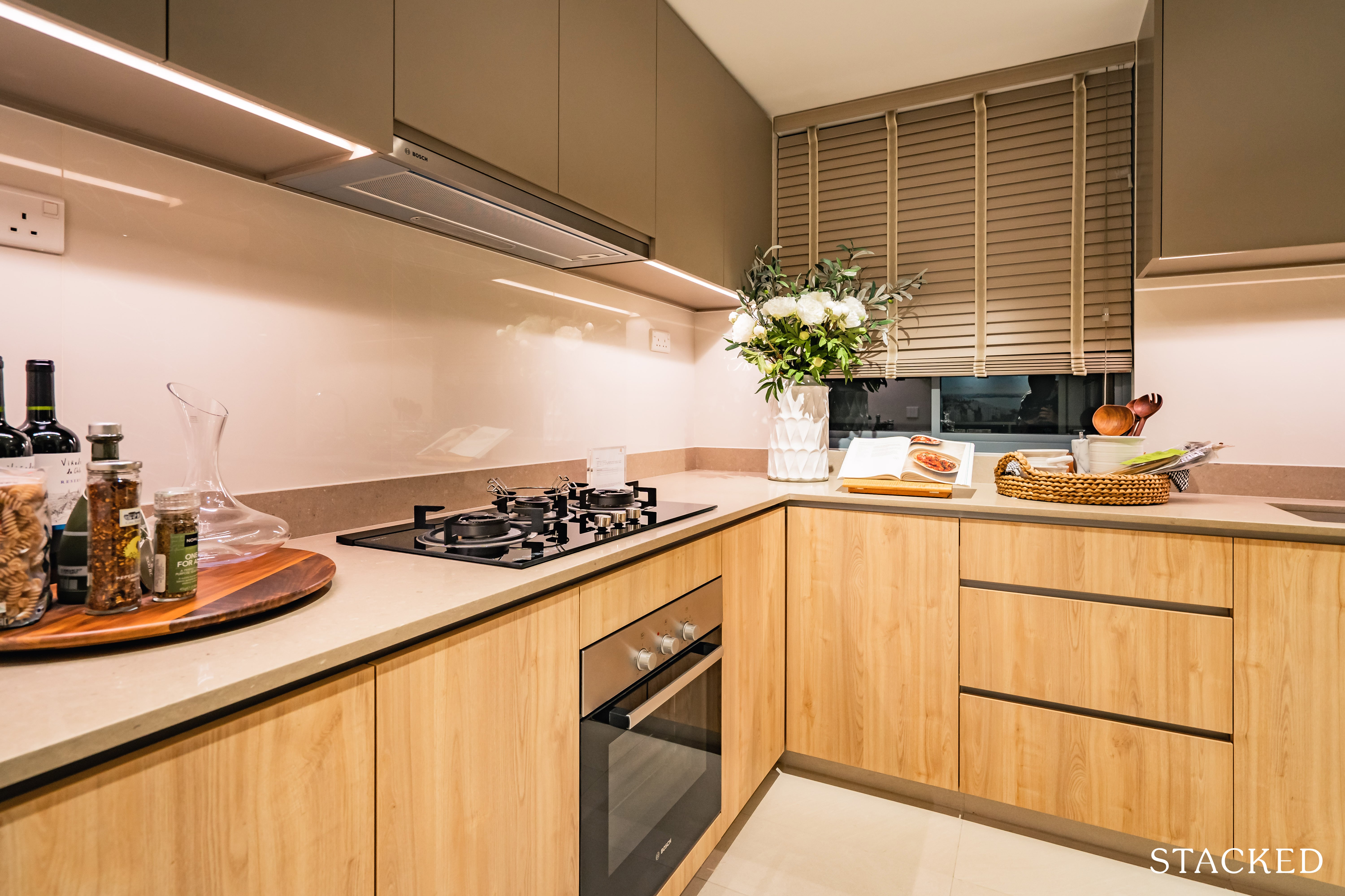
So while the elongated layout of the kitchen does mean you have enough space, it doesn’t actually feel especially spacious either.
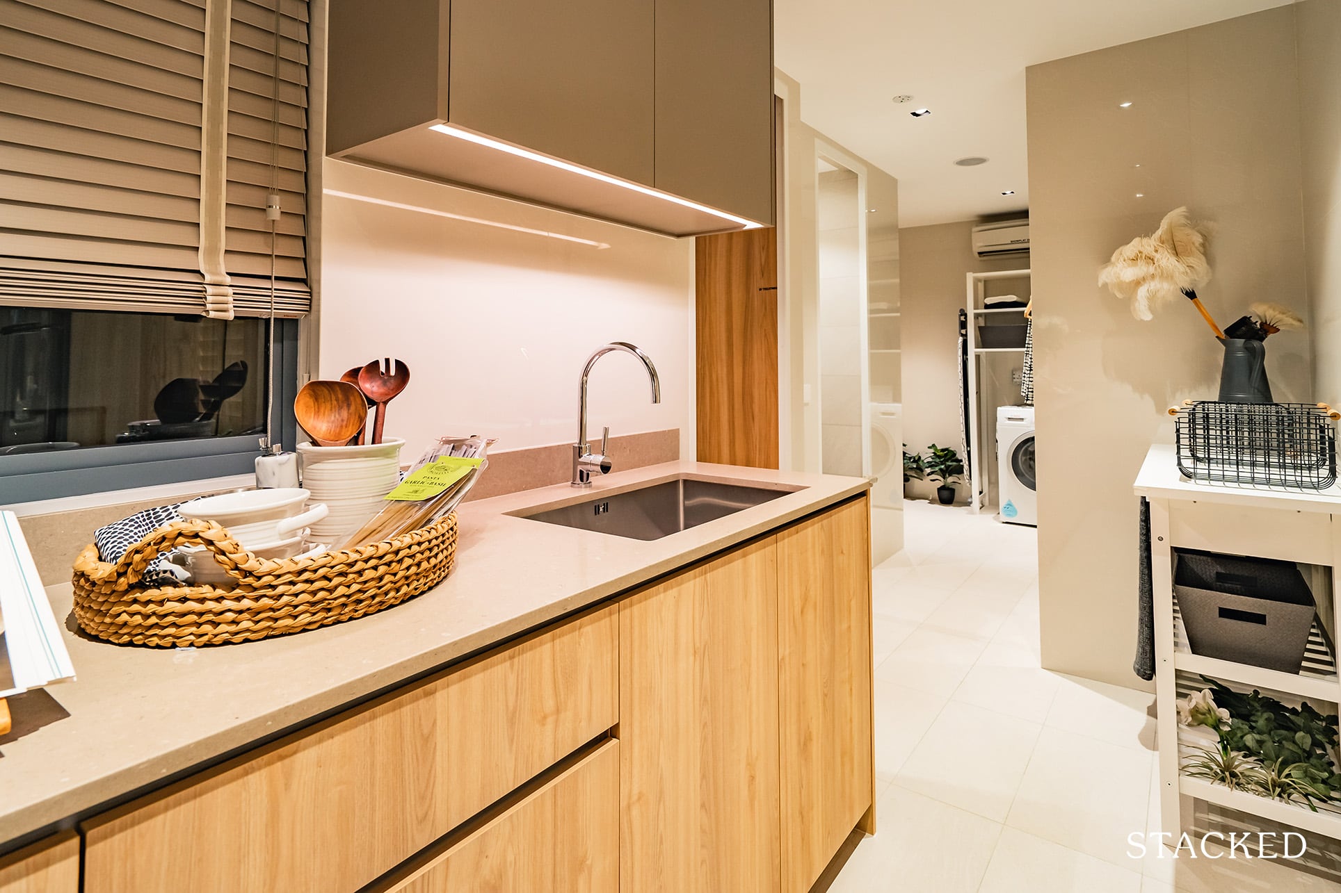
At the back of the kitchen, you’d find the second entrance (which is usually meant for deliveries), yard, and utility room.
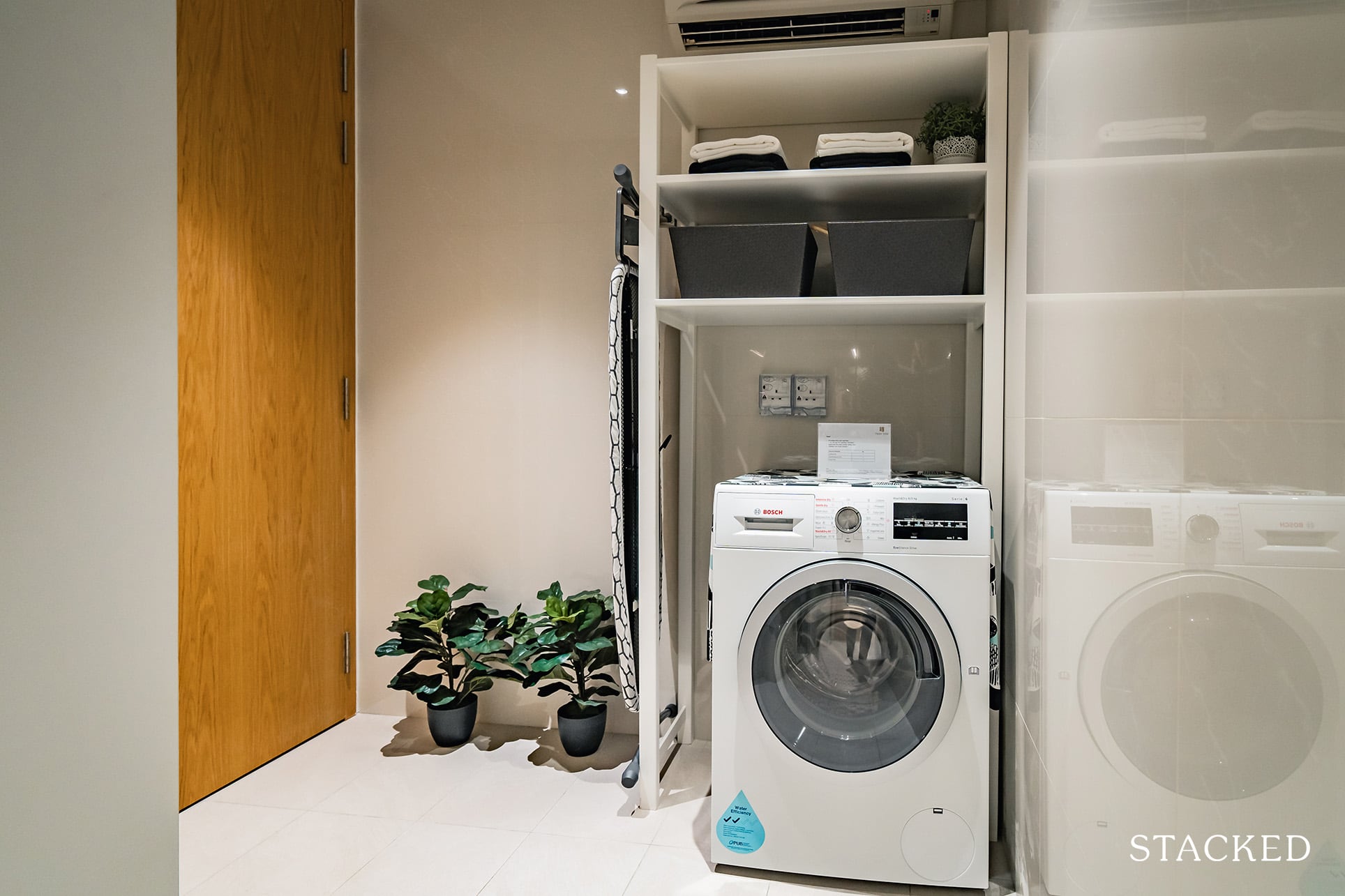
While on paper the area is described as a yard, I wouldn’t classify it as a proper yard space as it isn’t actually outdoor. So if you are used to hang drying your clothes, you might still have to resort to the balcony.
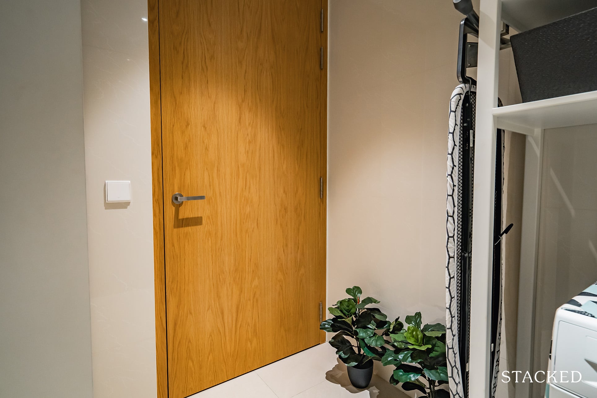
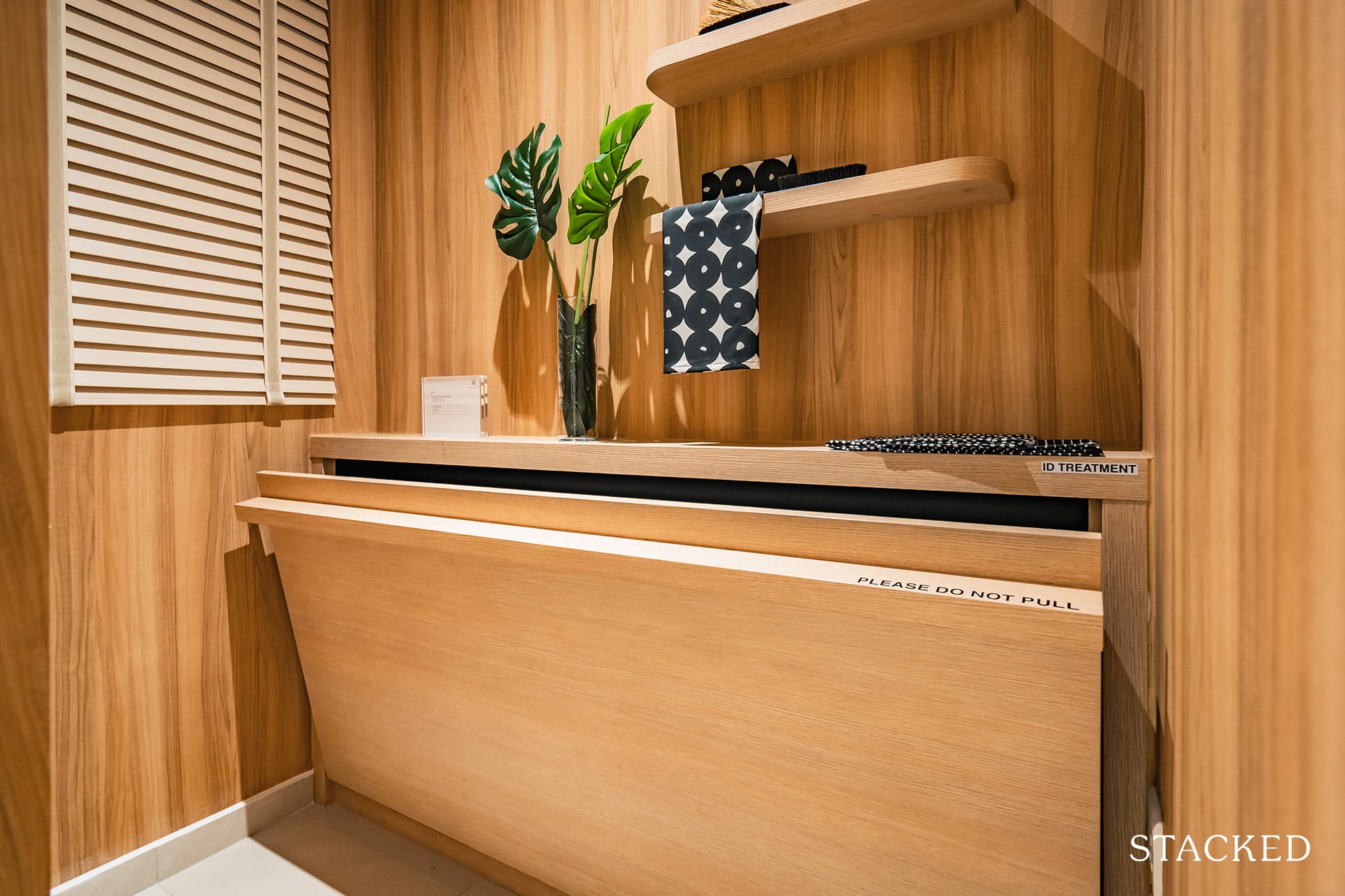
The utility room has a window, which is great ventilation wise. Given that this is a 4 bedroom unit, you can bet your dollar that this would be used as a helper’s room.
I know the ID fixtures isn’t included here, but I would certainly take notes here – it’s bright, cheery and looks to be a cosy space in this setup.
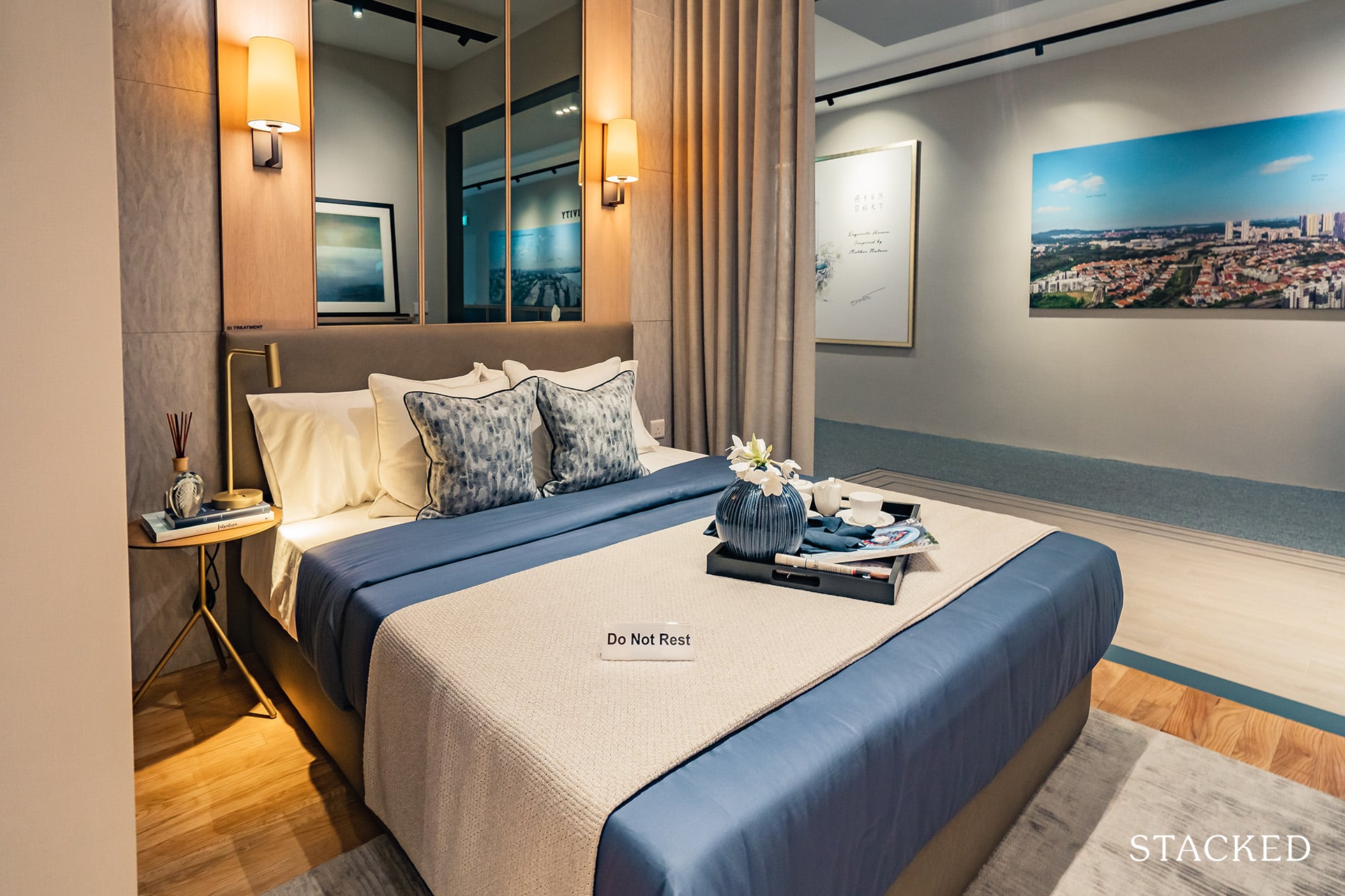
Perhaps the most accessible of rooms from the lift entrance, the room comes fully equipped with a toilet of its own and can easily fit a queen-sized bed with enough room on either end for bedside furnishings.
You’ll also notice the extended balcony here.
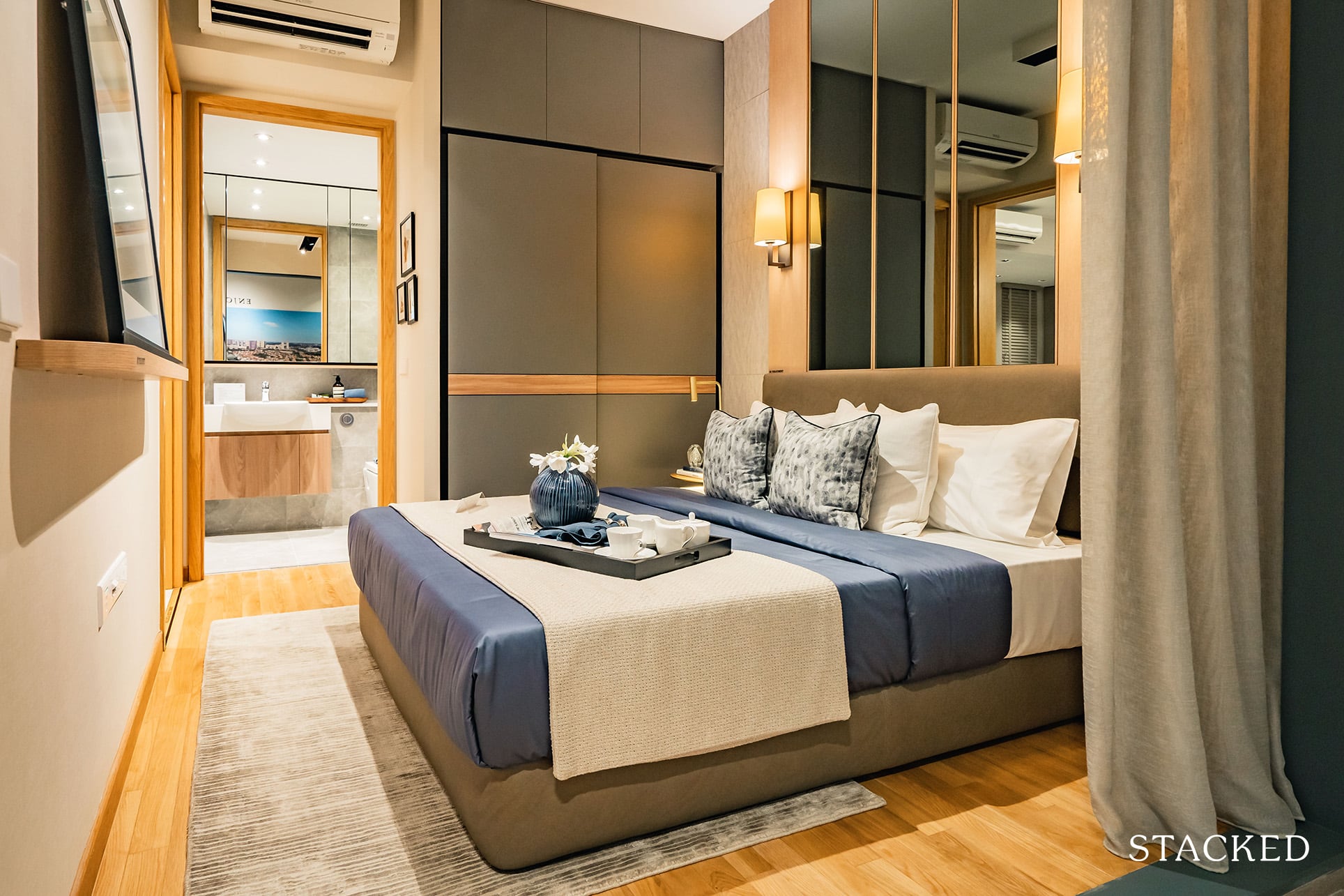
I do like that this bedroom is cordoned off from the rest. This gives the bedroom additional privacy and is great flexibility for those multi-generational families or even as a guest room for occasional visits.
I could see some people even considering as a master bedroom instead given the privacy plus access to the balcony.
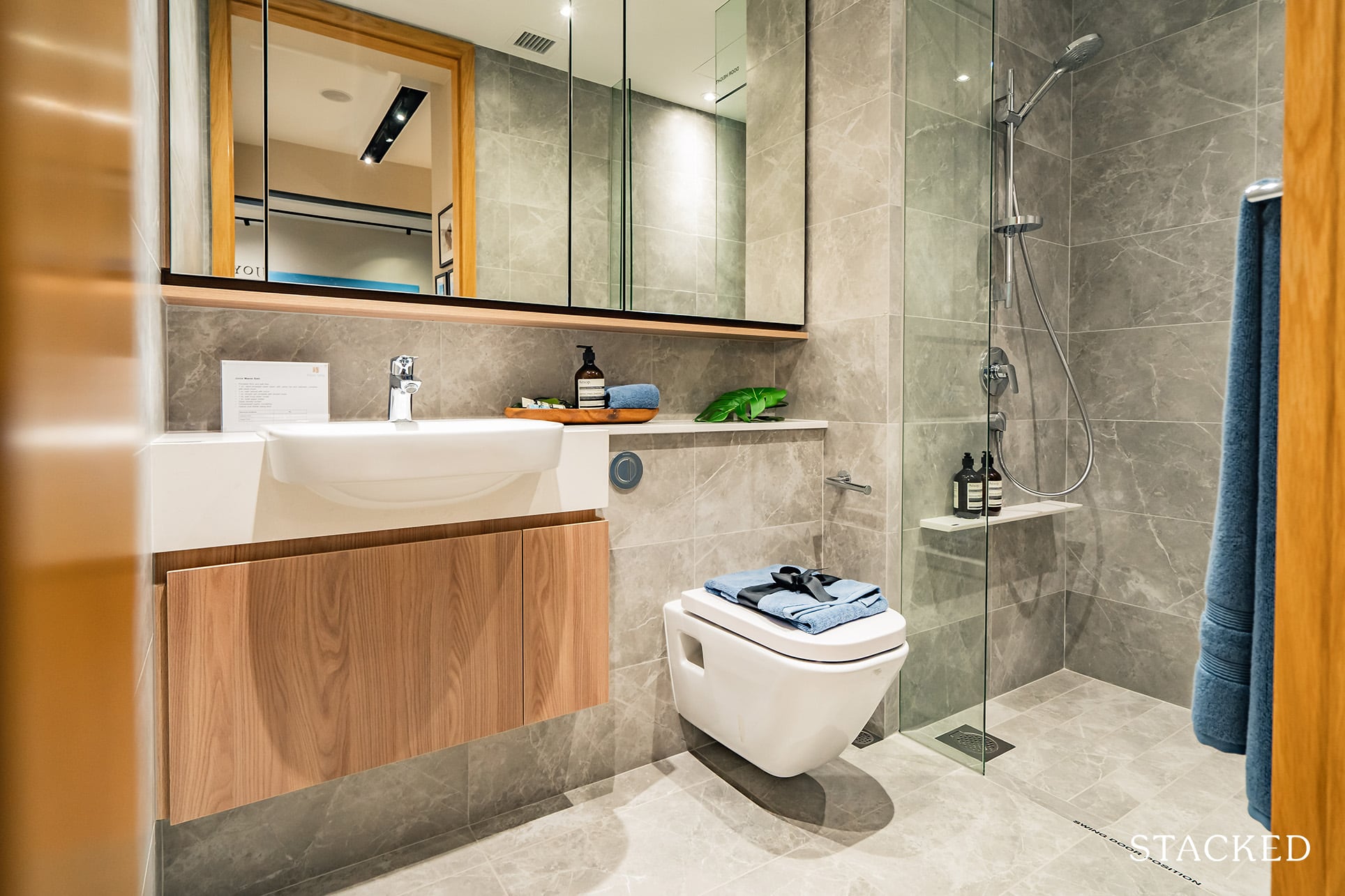
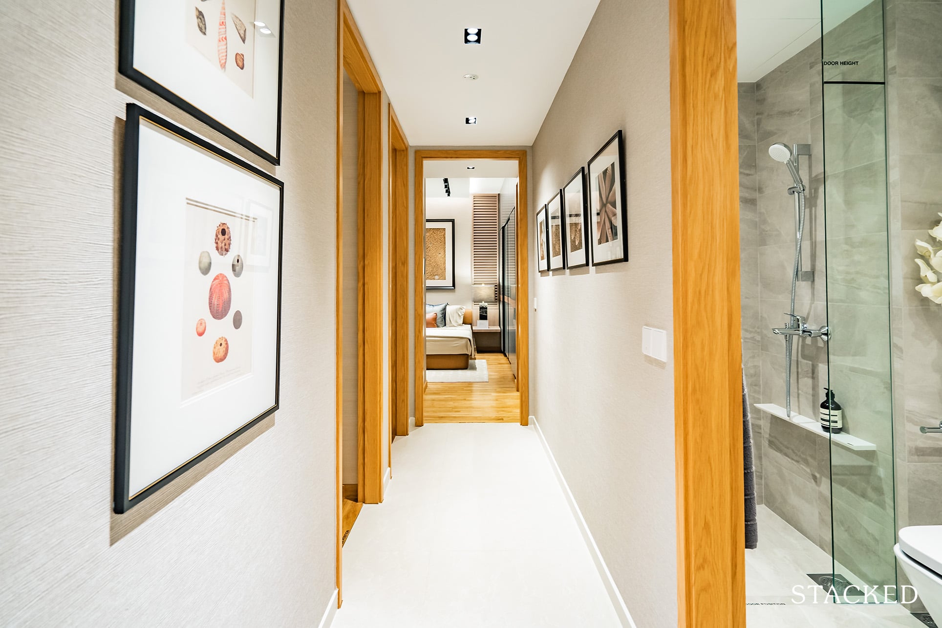
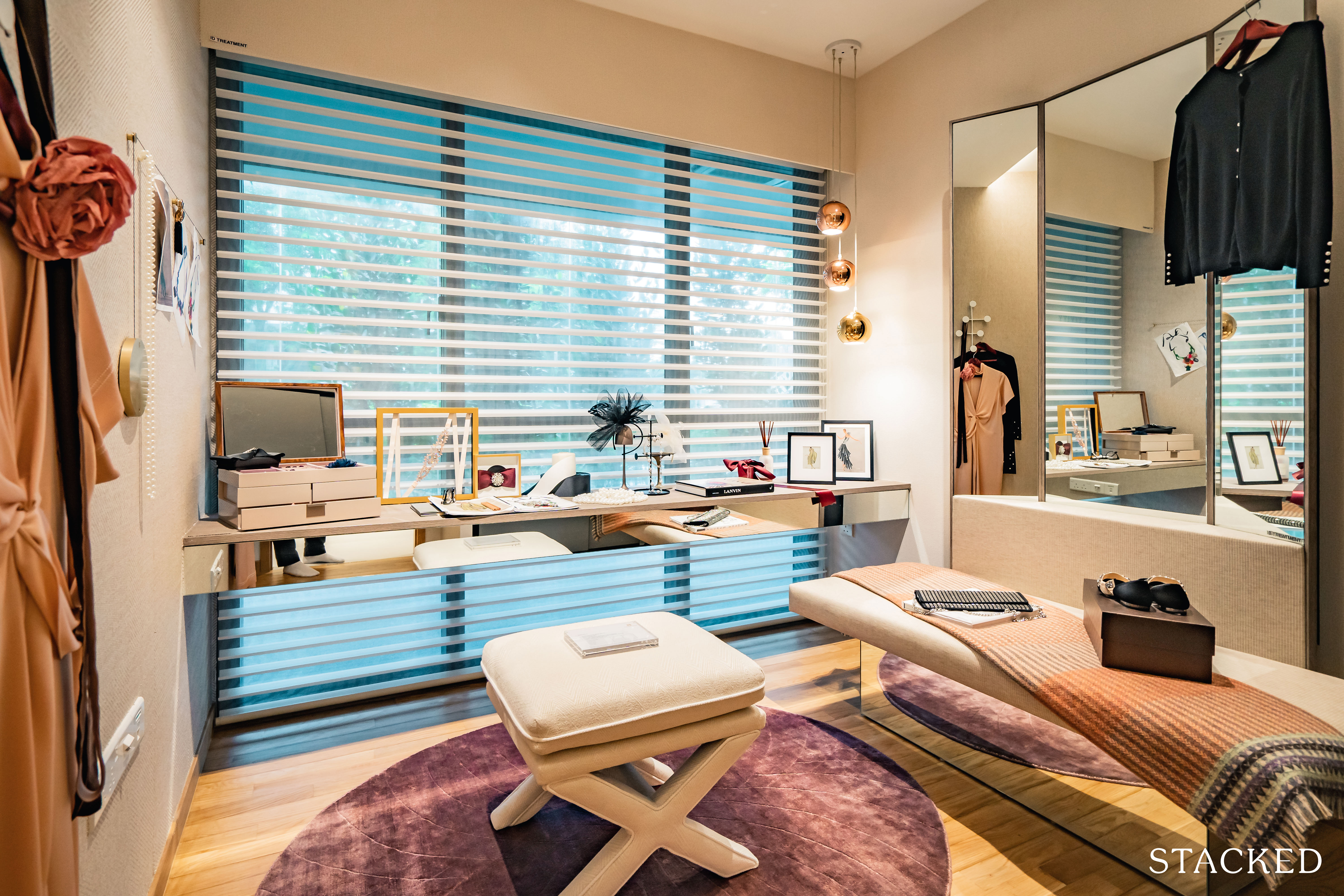
Both common bedrooms are of similar sizes. You do get full height windows for both as the AC ledge is positioned around the kitchen instead.
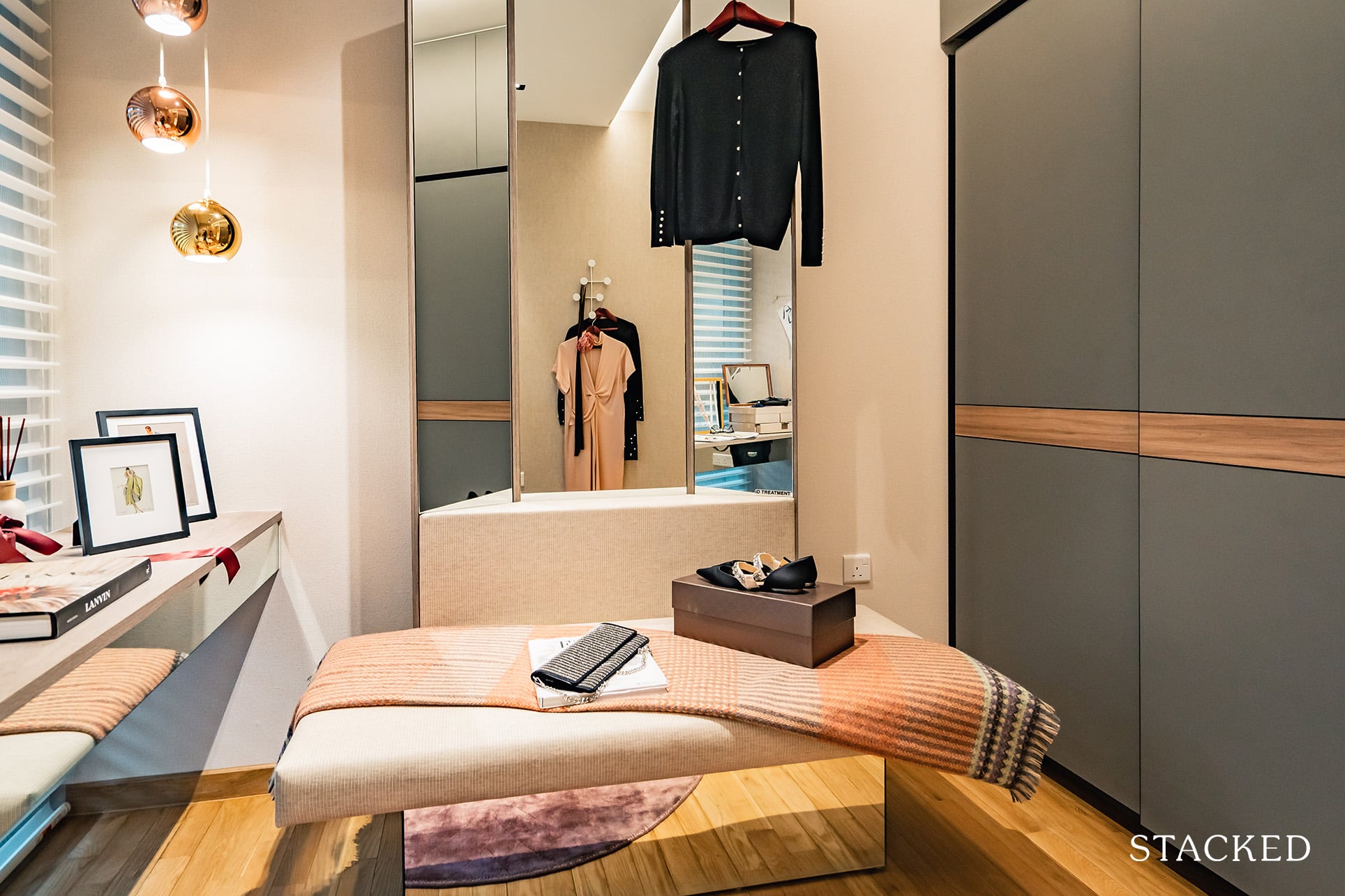
Frankly, I’m not too sure why they decided to showcase this as a dressing area – I sincerely doubt anyone would be using an entire bedroom for this.
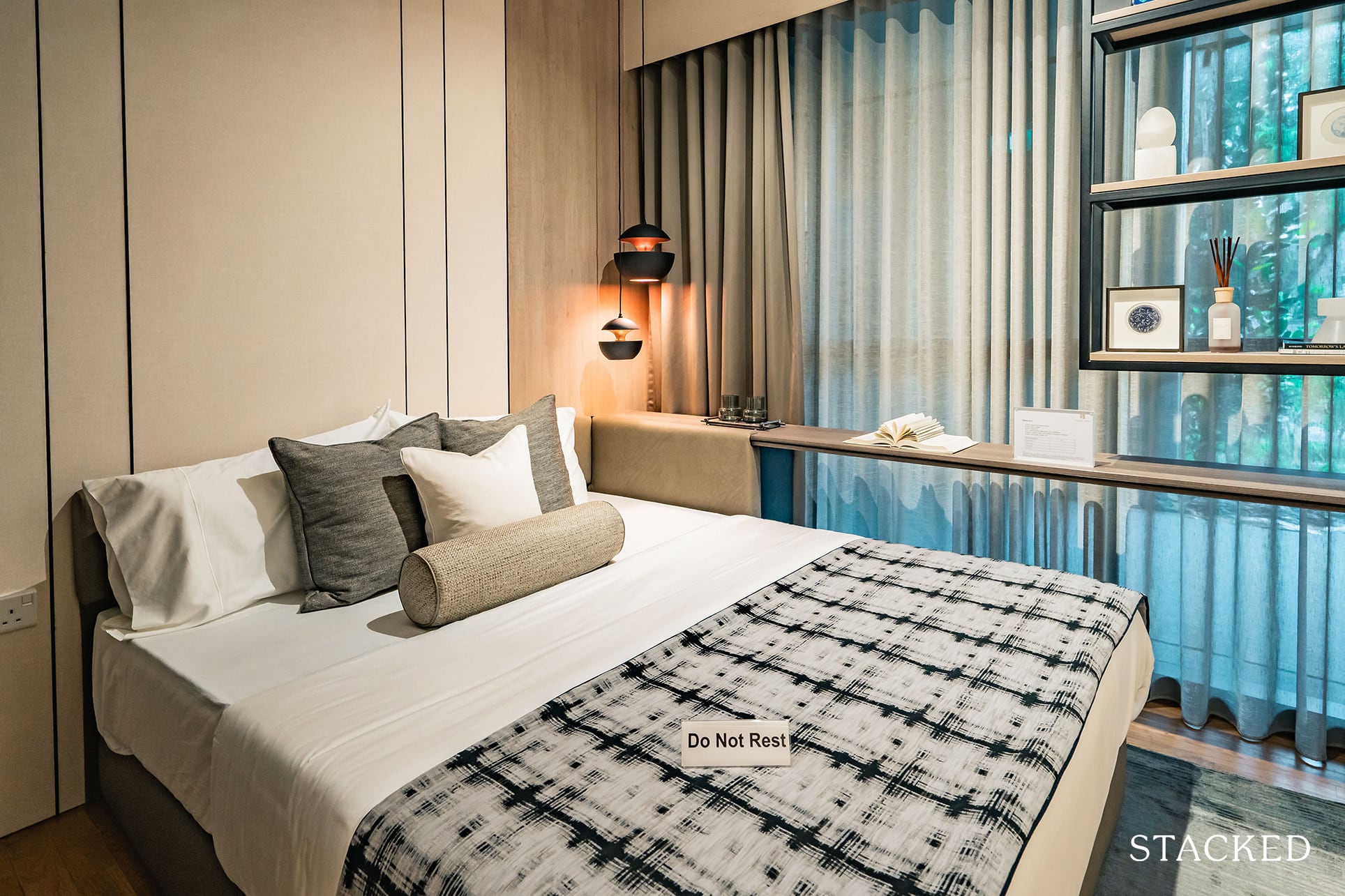
The second common bedroom is shown in its more traditional layout, with a queen sized bed to showcase the space available.
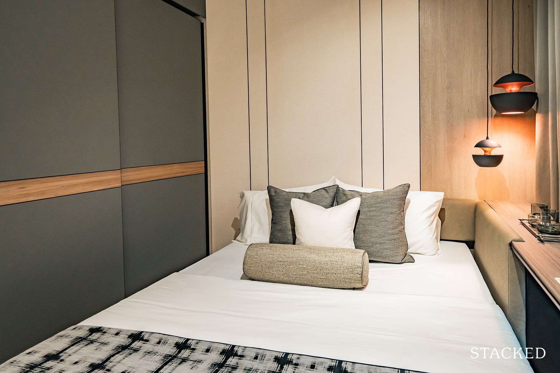
Clearly, space down the sides are a tad tight with a queen sized bed fitted in here.
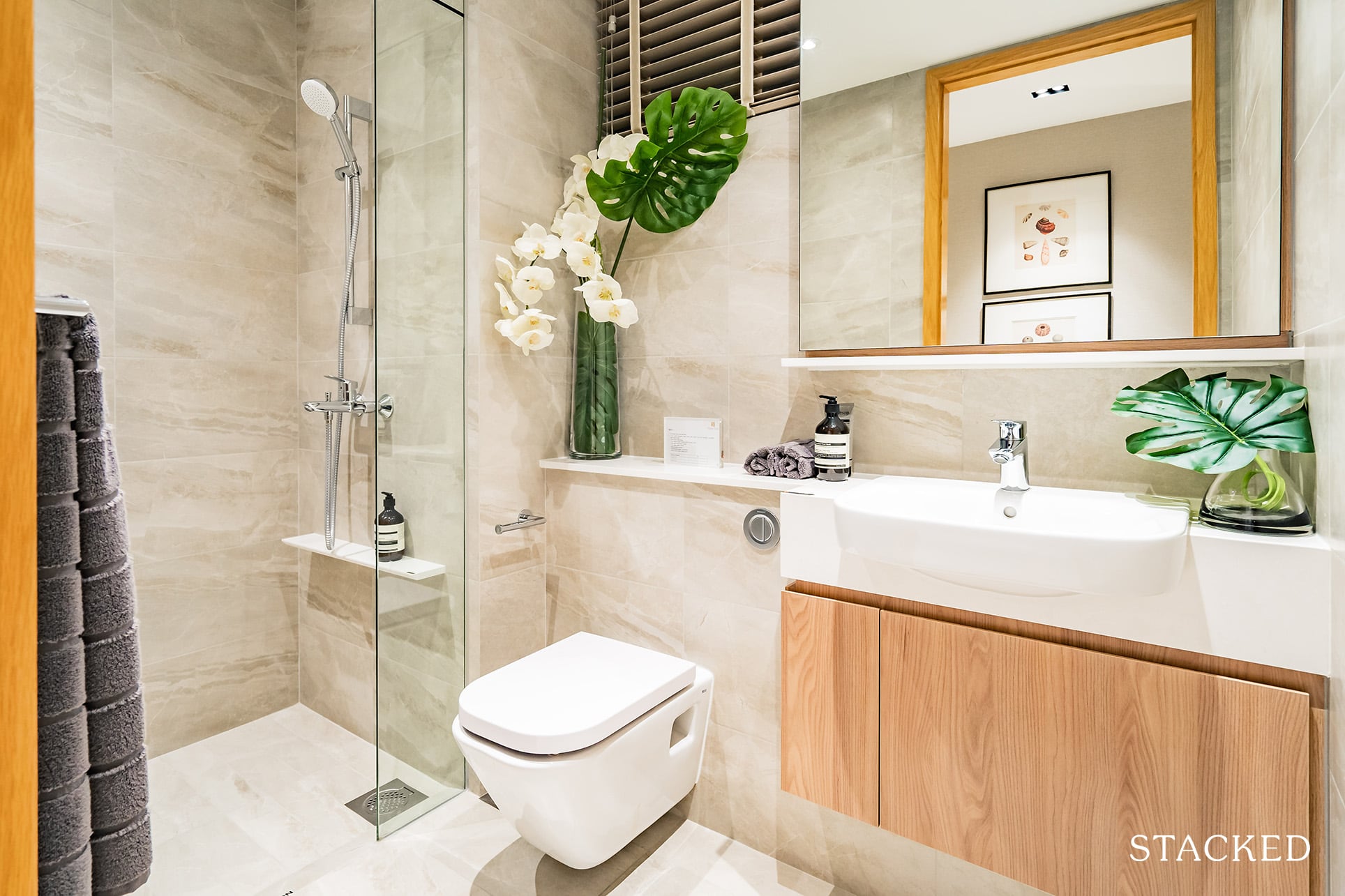
The common bathroom is pretty much standard fare. All you’d really need to know here is that it is shared between both common bedrooms, and will have to double up as the default bathroom of choice for guests.
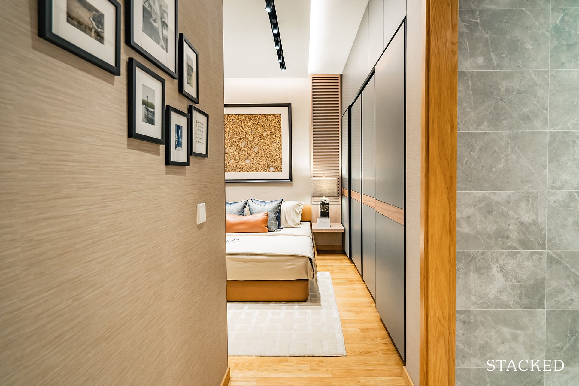
On to the last stop for the 4 bedroom unit – the illustrious master bedroom. Entering into this space, you again feel like you’re stepping into a whole new unit section of its own.
The extended mini corridor stretches past the door and opens firstly into the master bath.
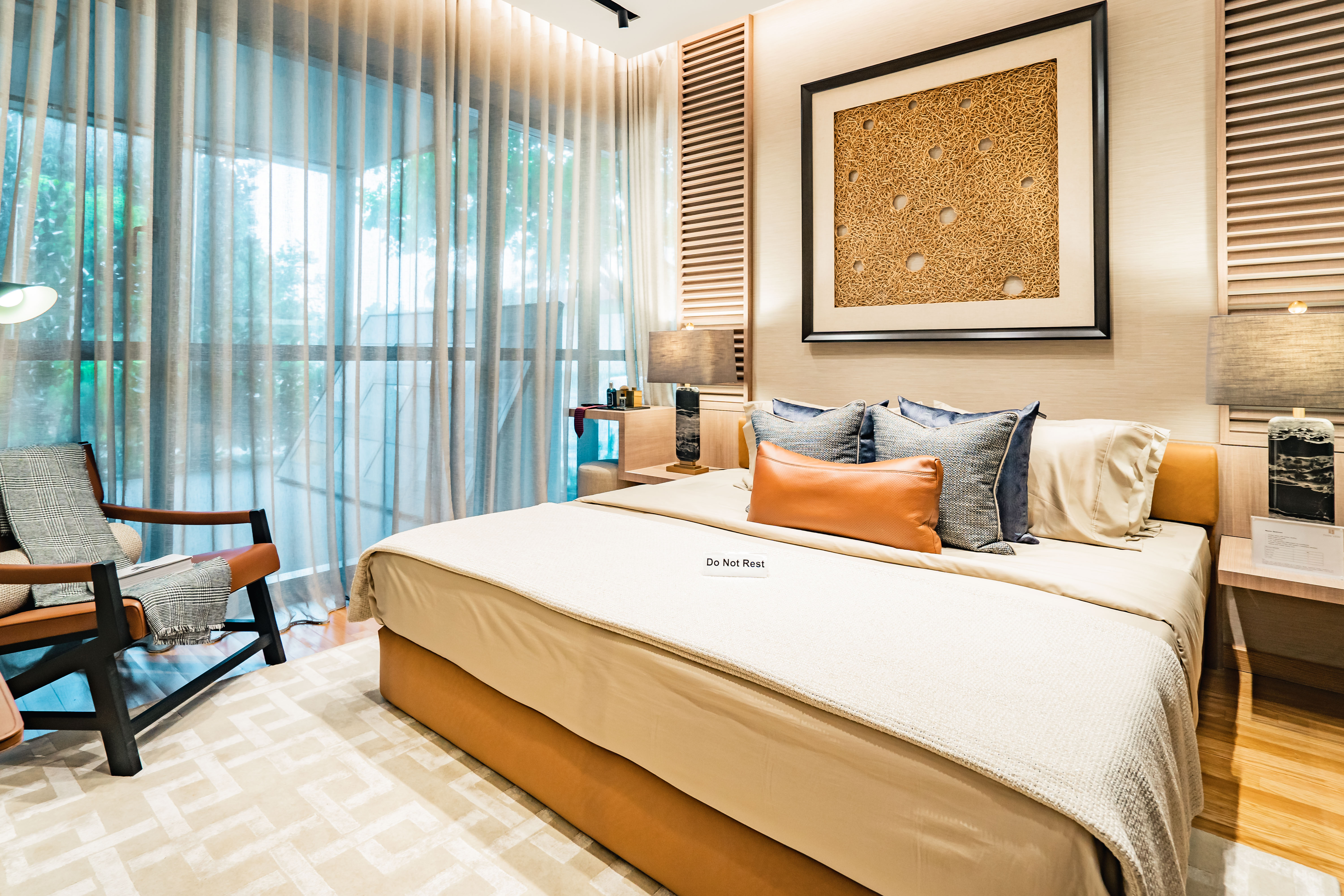
By all accounts, the master bedroom is definitely a spacious one. You have easily enough walk around space even with a king sized bed.
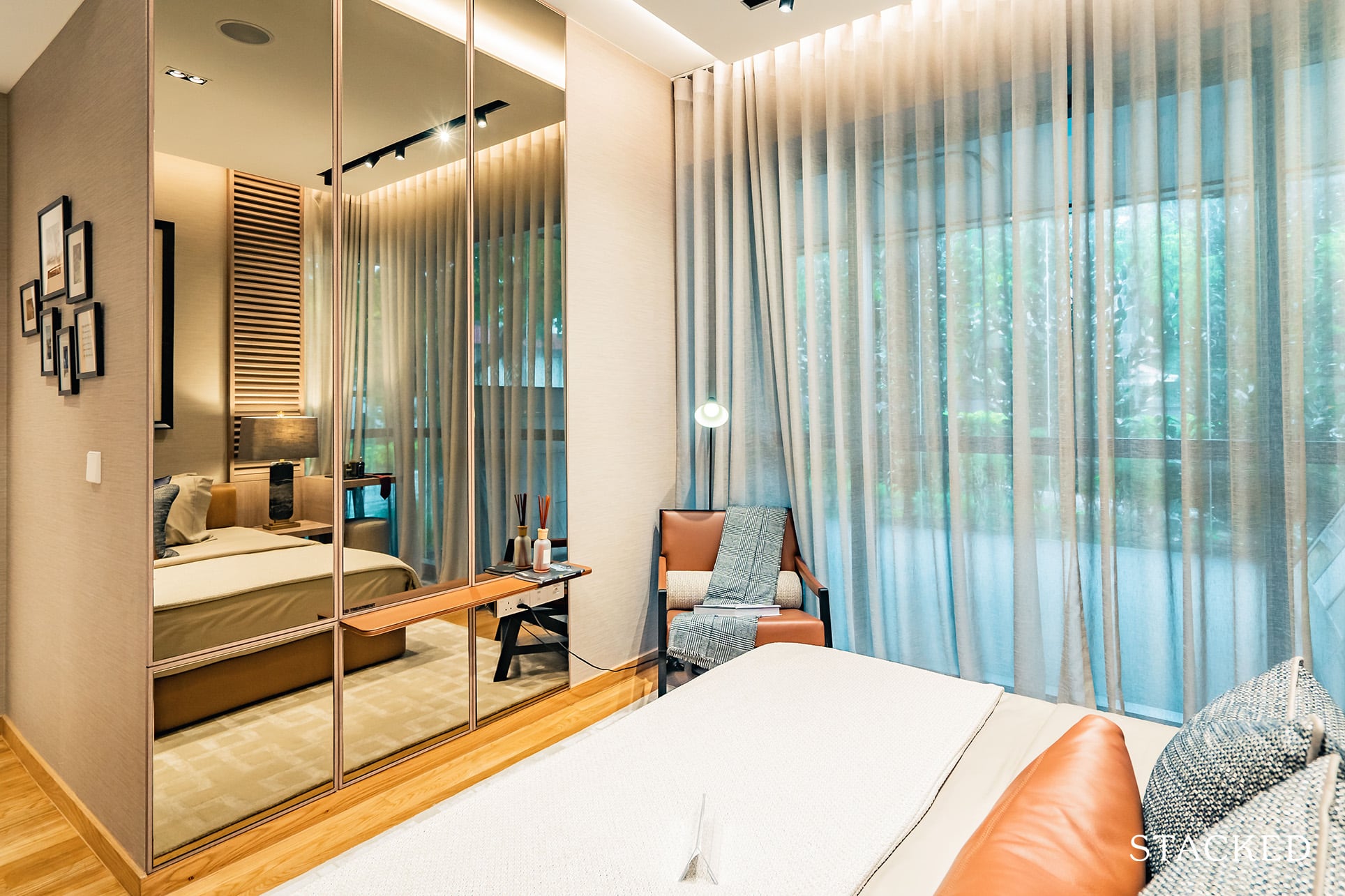
You could fit a small dresser or study table here as well, but that isn’t really the highlight of this room.
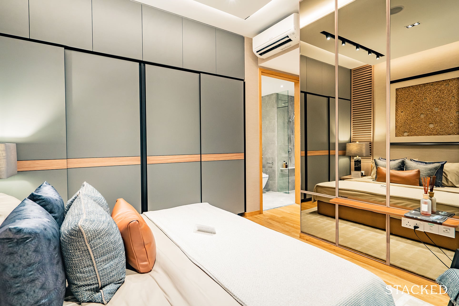
The real highlight are the dual wardrobe spaces that span nearly the entire length of the room. It’s been a common gripe of mine so far, so to see that they’ve made allowances to create proper storage spaces is a win in my books.
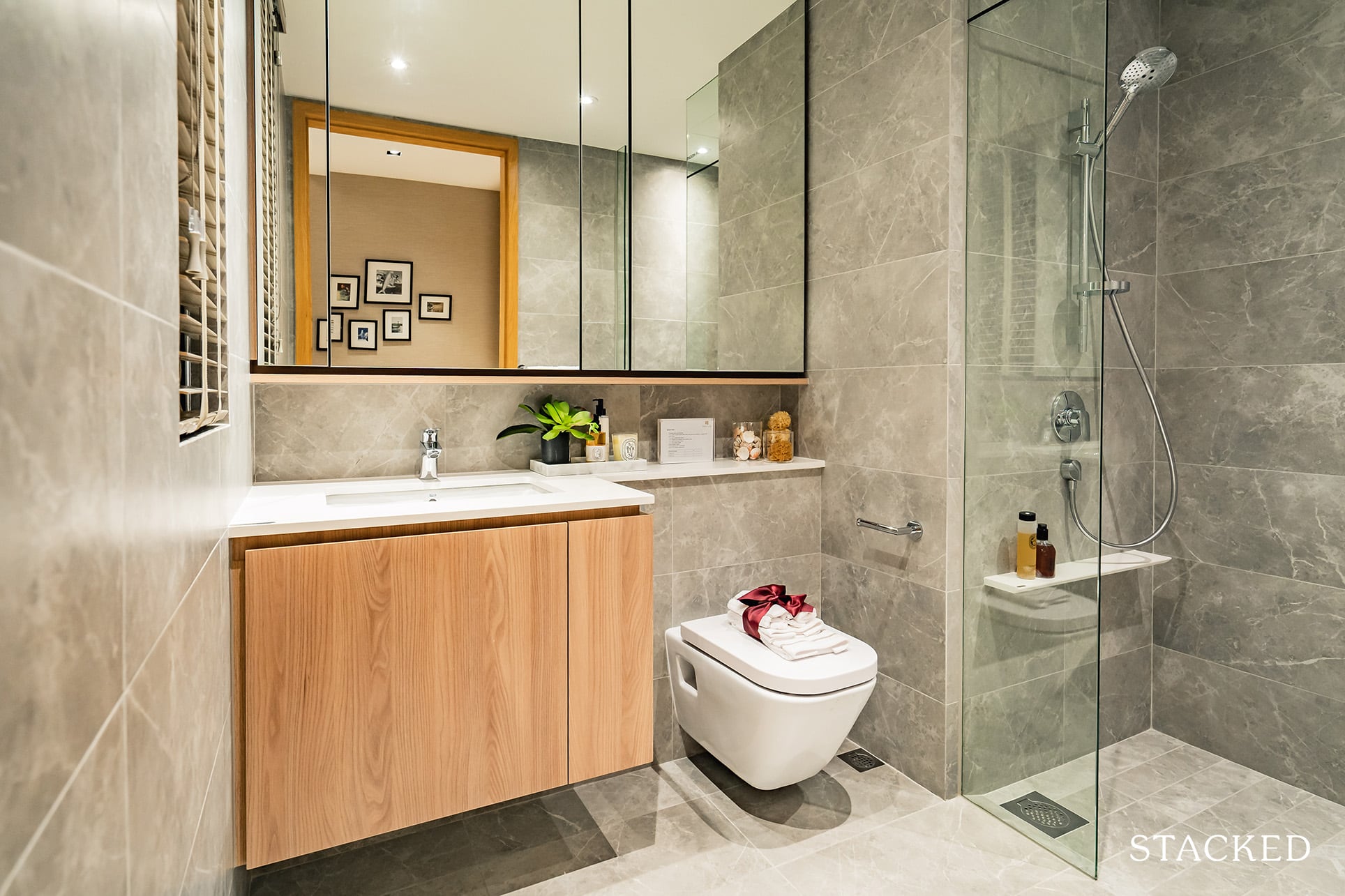
I can’t say I wasn’t disappointed to not see a more decked out master bathroom. His and hers sinks would have been a welcome addition, but I guess the size of the bathroom was a real constraint here.
Price Review (Old)
| Project Name | Tenure | TOP | Average Price (PSF) | Total Number of Units |
| Twin VEW | 99-year Leasehold | 2021 | $1,495psf | 520 |
| Parc Riviera | 99-year Leasehold | 2019 | $1,377psf | 752 |
| Whistler Grand | 99-year Leasehold | 2021 | $1,527psf | 716 |
To give you some context, these were the respective land bid prices for the above 3 projects.
Twin VEW: $592 psf ppr ($292m for 176,293 sqft)
Parc Riviera: $551 psf ppr ($314.3m for 203,351 sqft)
Whistler Grand: $800 psf ppr ($472.4m for 210,881 sqft)
We see how the land bid prices for the individual projects eventually translate to their average psf figures.
(Of course, unit pricings differ per tier, and purchase decisions are ultimately made on total quantum value as opposed to psf-values, so we will get into that later)
Parc Riviera was the most affordable of the lot, mostly due to the fact that it faces the AYE in its immediacy, with Twin VEW ‘sheltered’ to a degree behind it.
Another important point worth noting is that Whistler Grand was actually secured in early 2018, deep into the en bloc frenzy, whilst the land parcel for Twin VEW was secured a year before that just as the market was beginning to heat up.
That would explain the big price gap between the two.
Speaking of gaps, just to show you again the amount of condo space ‘allocated’ to each unit based on scale alone –
Twin VEW: 176,293 sqft / 520 units = 339 sqft
Parc Riviera: 203,351 sqft /752 units = 270 sqft
Whistler Grand: 210,881 sqft /716 units = 295 sqft
You’ll see how Twin VEW has lesser unit density in this trio based on face-value alone.
So while Twin VEW seems to come in between the 3 new developments in the area in terms of psf, it does also have bigger units on average, which means its final quantum will be higher as a comparison among the trio.
Layout Comparisons
Now that we understand a little more about the average land pricings, let’s dive into unit comparisons, starting off with the smallest 1-bedders:
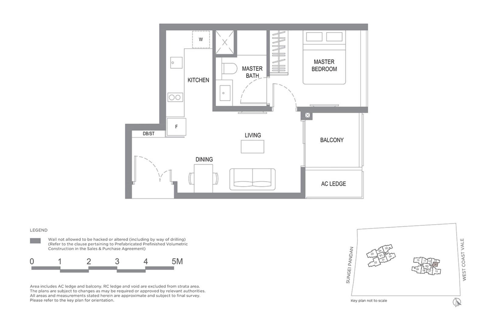
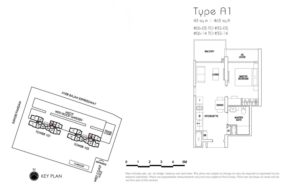
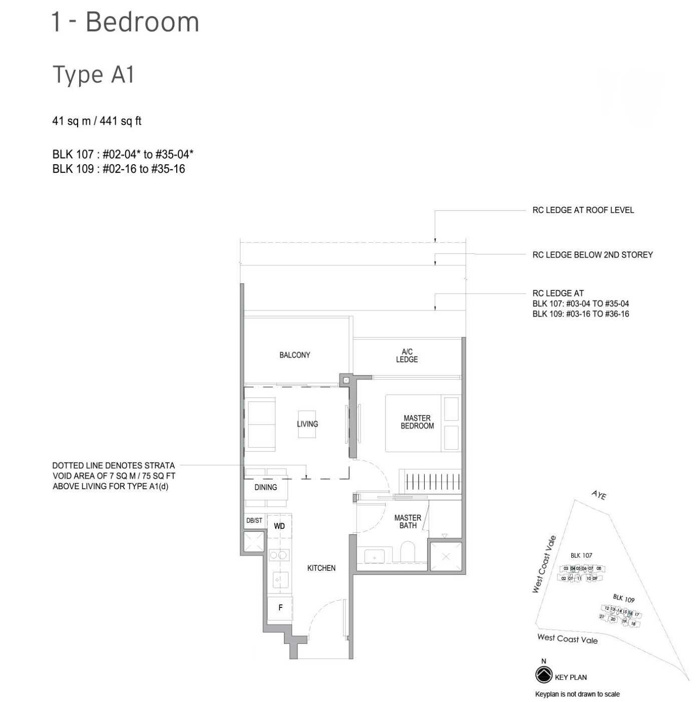
Again, we see the translation of land bid prices to the overall quantum for these 1-bedder units.
Thankfully for Twin VEW, it was launched at a point where Parc Riviera had successfully sold most of its units – because naturally if you had to compare both price points there was no competition there if you were price sensitive.
It’s also quite clear that Whistler Grand was sized to undercut the Twin VEW offerings, as such even though it was launched later the smaller size does mean the overall quantum is more attractive.
If we were to hone in on unit layouts however, we do observe a number of fixed differences between the three.
For one, we see that there are no entrance barriers in both the Parc Riviera and Whistler Grand units as opposed to the one at Twin VEW.
And if you were to look at the AC ledge, you observe how both AC ledges are outside the master bedroom for the former two projects, which would result in half-windows here – as opposed to the full windows you’d get with the 1-bedder at Twin VEW.
Finally, the kitchens in both Parc Riviera and Whistler Grand are in plain sight when you walk into the apartment, as opposed to the one at Twin VEW which is hidden away in a little alcove of its own.
This is especially useful when doing heavy-duty cooking, and the separate space could be cleverly sealed up to make it an enclosed kitchen.
Let’s move on to the 3-bedders:
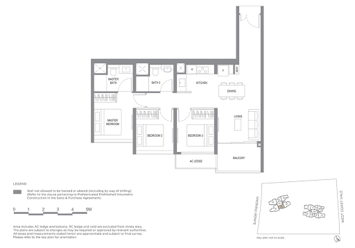
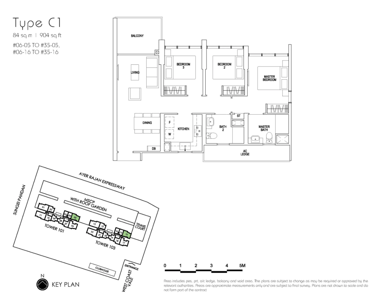
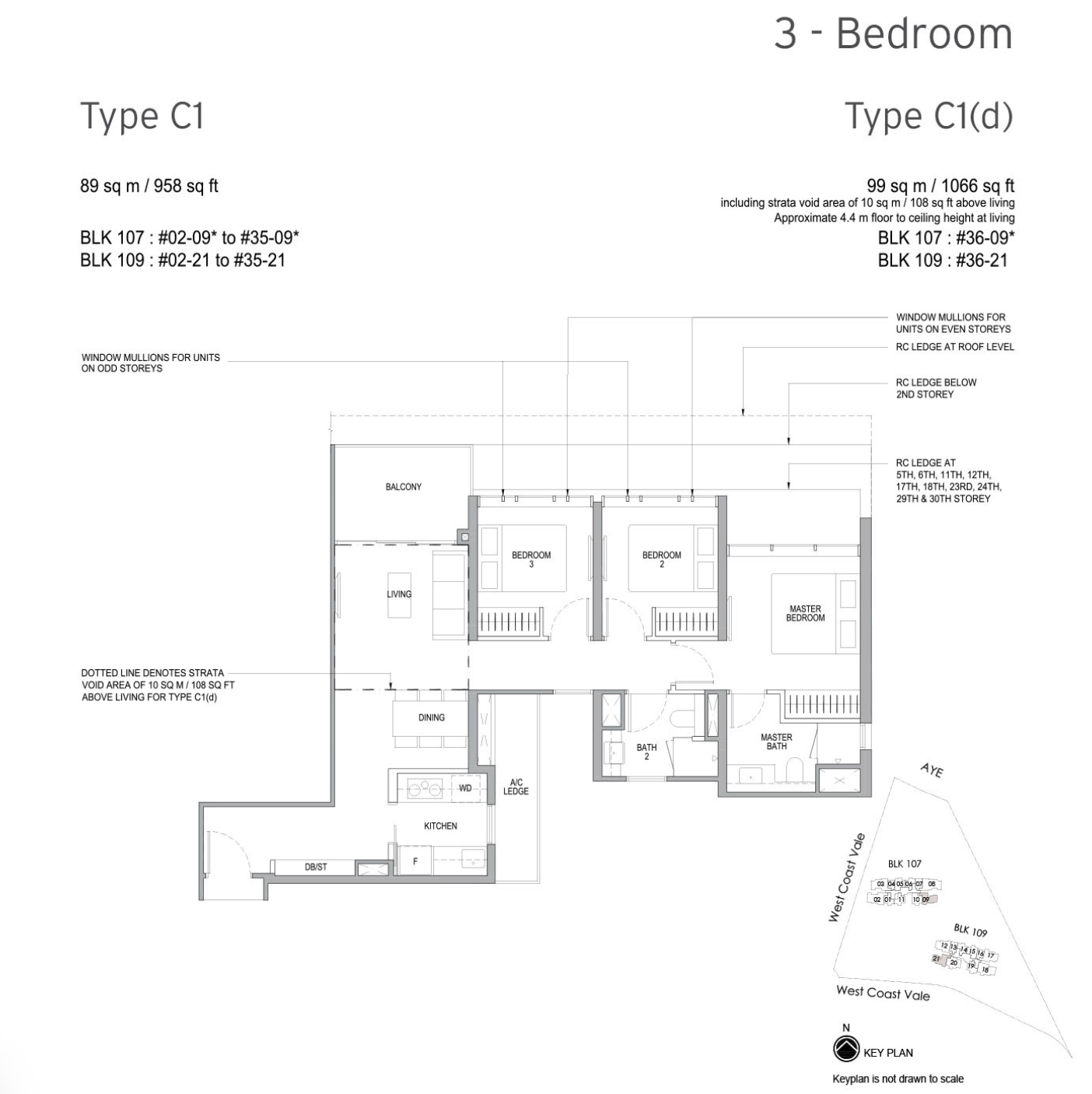
In a complete role reversal, AC ledges are now hidden behind the kitchen and the toilets for Whistler Grand and Parc Riviera respectively.
Unfortunately, the same cannot be said for executive 3-bedder at Twin View. The AC Ledge is located just behind one of the common bedrooms, so it’ll mean half-height windows here.
In terms of entrances, I think the executive 3-bedder at Parc Riviera has the best layout. It opens up immediately from the main door to the dining/living room area without wasting unnecessary space.
On the other hand, the executive 3-bedders at Twin VEW seem to have a very long entranceway corridor which isn’t very efficient in my opinion.
As for the executive 3-bedders at Whistler Grand, the initial entranceway does provide a bit of privacy that is lacking in the previous 2 units (which could be a boon/bane depending on how you look at it).
Regarding kitchens, we find them to be of the enclosed variation in both Whistler Grand and Parc Riviera as opposed to the open-kitchen concept of the 3-bedroom executive unit at Twin VEW.
Finally, let’s have a look at the other condos around.
| Project Name | Tenure | TOP | Average Price (PSF) | Total Number of Units |
| Twin VEW | 99-year Leasehold | 2021 | $1,495 psf | 520 |
| The Infiniti | Freehold | 2008 | $1,077 psf | 315 |
| Botannia | 956-year leasehold | 2009 | $1,176 psf | 493 |
| Monterey Park | 999-year leasehold | 2005 | $1,190 psf | 280 |
| Carabelle | 956-year leasehold | 2009 | $1,332 psf | 338 |
| Hundred Trees | 956-year leasehold | 2013 | $1,375 psf | 396 |
| Regent Park | 99-year leasehold | 1997 | $1,050 psf | 276 |
| Park Clematis | 99-year leasehold | 2023 | $1,632 psf | 1,450 |
I’ve provided a full list of the condos worth mentioning in the relative vicinity of Twin VEW.
To give some context location-wise, The Infiniti, Botannia and Monterey Park are the condos closest to Twin VEW.
Carabelle is just beyond that and is the closest condo in this list to the NEWest shopping mall.
Now the reason I’m using the shopping mall as a location benchmark is really due to the lack of amenities here, making it a prized asset in the general area (you can observe this through Carabelle’s higher average PSF value).
The above-mentioned 4 condos are essentially ‘freehold’ given their massive leases, so do take that into account when comparing them with the 99-year leasehold Twin VEW.
As for price comparisons, it is also important to note that these are older condos with bigger unit spaces on average.
As a result, total unit quantum prices of similar unit tiers at these older condos are naturally going to be higher than units at Twin VEW even though they have lower average PSF values on paper.
On the other end of the shopping mall, we have Hundred Trees, and just across the road from that, Park Clematis and subsequently Regent Park.
While the feedback at Hundred Trees has been great thus far, there is the concern about it being too close to the AYE.
From what we’ve garnered, the developers have invested in proper sound-proofing so once the windows are shut here you get barely any traces of noise from the highway.
Not to mention the fact that you get a massive 100m lap pool here.
It is also right next to the NEWest mall, so you get quite a bit of convenience here as well.
As for Park Clematis, it’s the other New Launch condo in the area which spans over 400,000 square feet of facilities with over 1,468 units to boot. It is technically across the highway from NEWest, so it does take a bit of effort to get there. (You can read the full review here).
Finally, Regent Park is just behind that.
Boasting 276 units across 161,228 square feet of land, it is the most affordable ‘older’ development in the area on paper average when looking at PSF value alone.
Of course, it’s an aging 99-year leasehold project, so be sure to bear that in mind when considering capital appreciation down the road.
At Stacked, we like to look beyond the headlines and surface-level numbers, and focus on how things play out in the real world.
If you’d like to discuss how this applies to your own circumstances, you can reach out for a one-to-one consultation here.
And if you simply have a question or want to share a thought, feel free to write to us at stories@stackedhomes.com — we read every message.
Reuben Dhanaraj
Reuben is a digital nomad gone rogue. An avid traveler, photographer and public speaker, he now resides in Singapore where he has since found a new passion in generating creative and enriching content for Stacked. Outside of work, you’ll find him either relaxing in nature or retreated to his cozy man-cave in quiet contemplation.Need help with a property decision?
Speak to our team →Read next from Condo Reviews
Condo Reviews I’ve Lived At Seastrand In Pasir Ris For 4 Months: Here’s My Review Of What It’s Like For A Couple
Condo Reviews I’ve Lived At The Esparis In Pasir Ris For 7 Years: Here’s My Review Of What It’s Like For a Multi-Gen Family
Condo Reviews I’ve Lived At Sky Everton For 4 Months: Here’s My Review Of What It’s Like To Live In A New Condo In The City
Condo Reviews I’ve Lived At Urban Vista In Tanah Merah For 6 Years: Here’s My Review Of What It’s Like To Live Next To An MRT
Latest Posts
Overseas Property Investing Why Some Singaporeans Are Considering A Second Home In Malaysia Without Leaving Singapore — Thanks To MM2H
Singapore Property News A Four-Room Flat in Bidadari Was Just Sold for a Record $1.368M — Here’s Why Prices There Are Setting Higher Records
Singapore Property News A Rare 17,000+ Sq Ft Freehold Plot Just Hit The Market In Opera Estate — And It Won’t Come Cheap


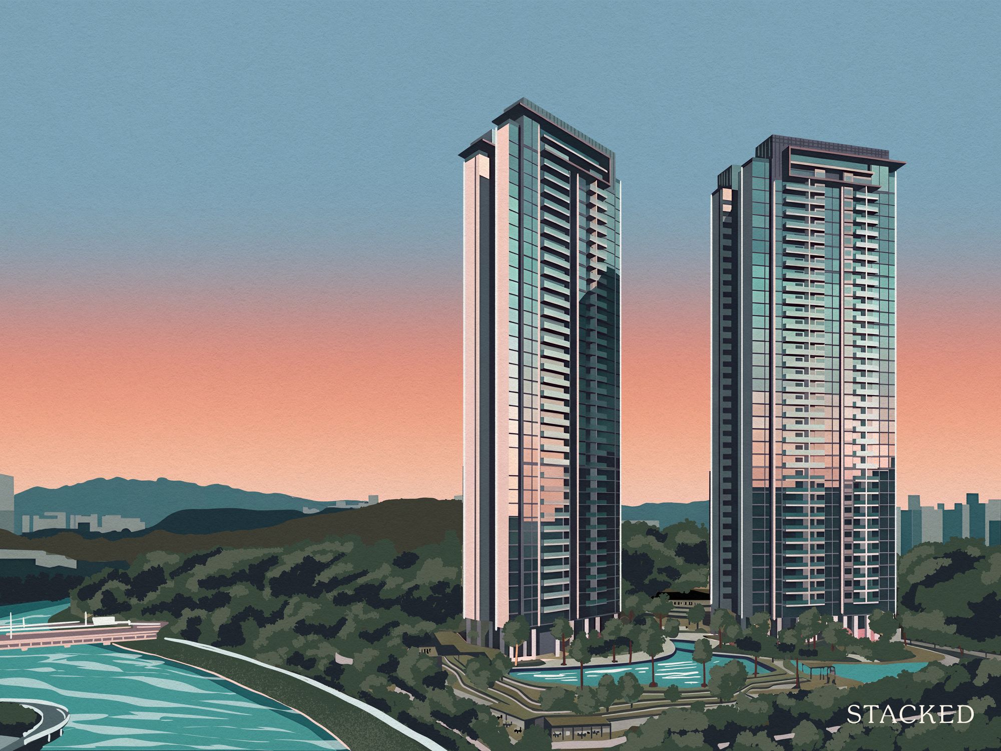
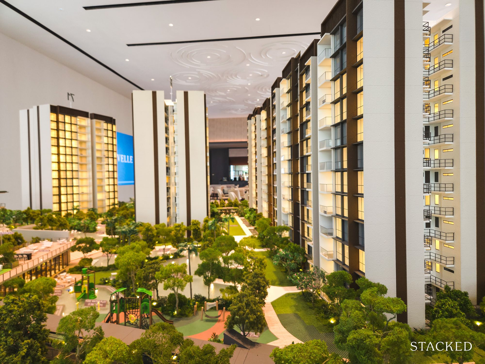
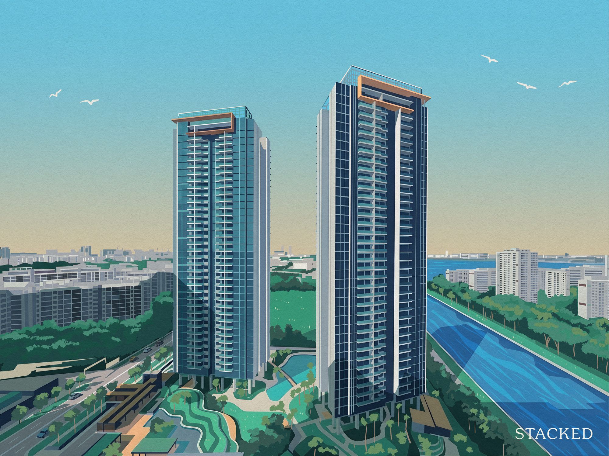
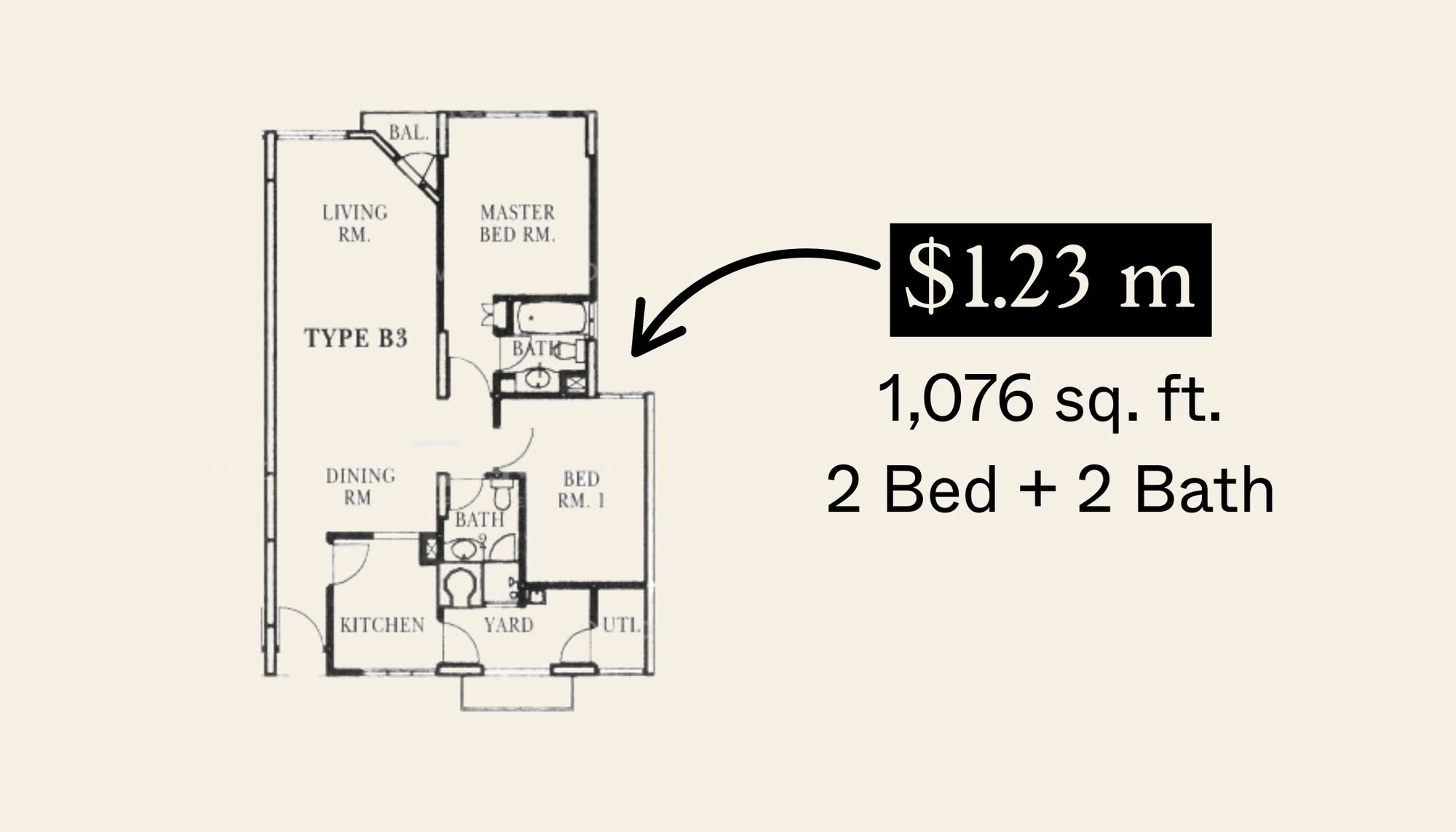
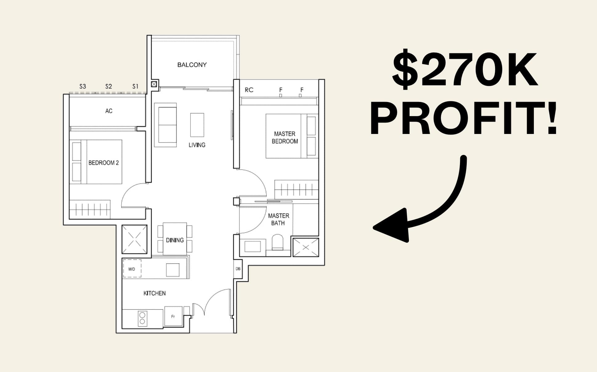
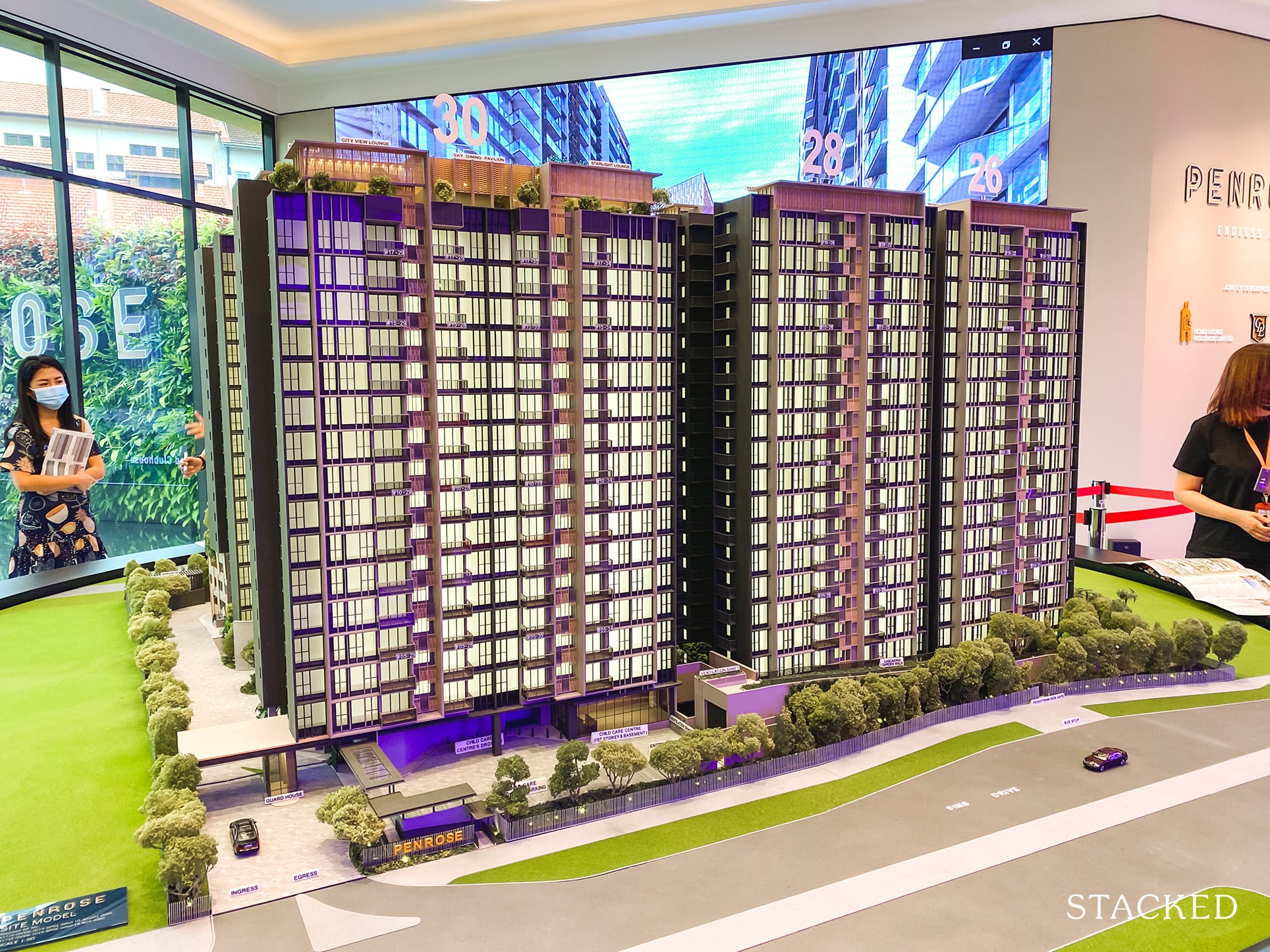
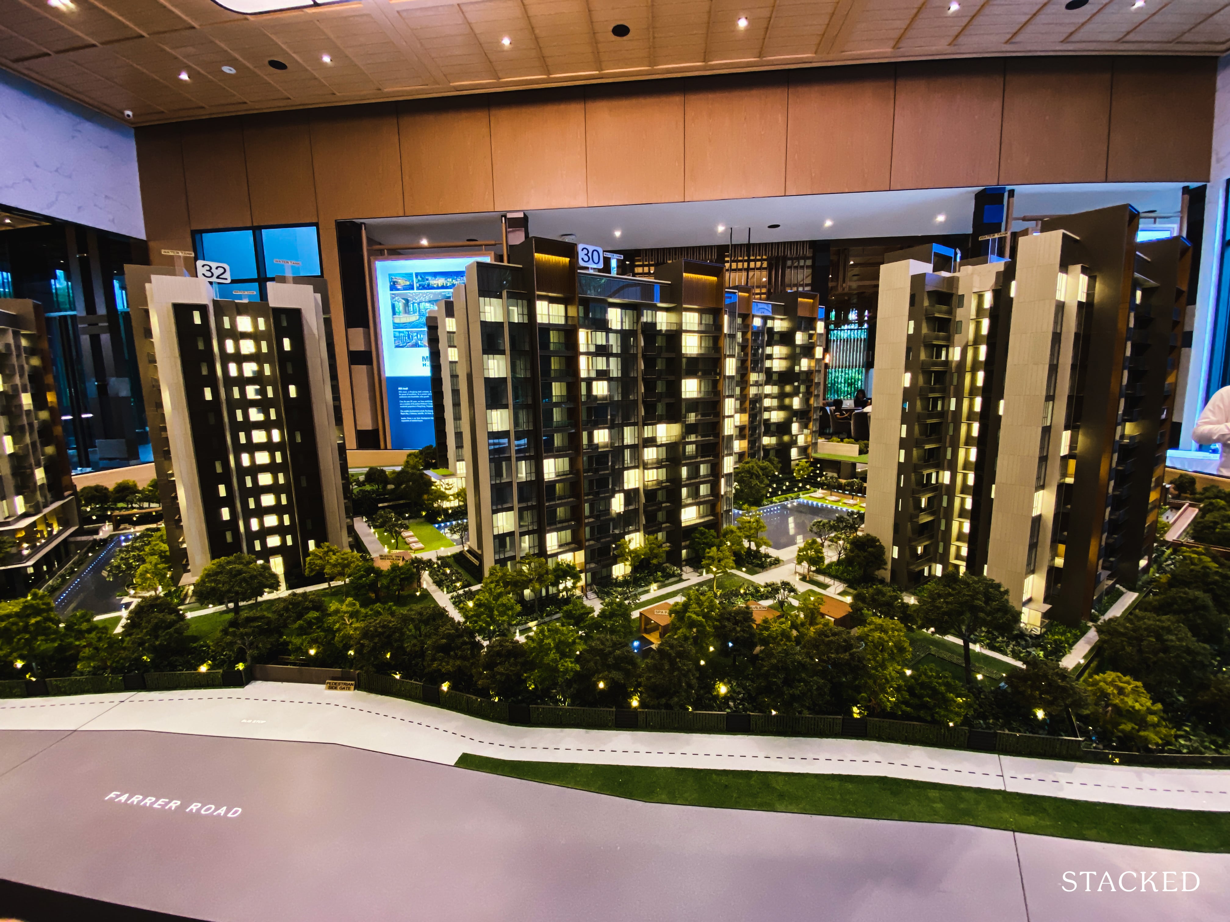
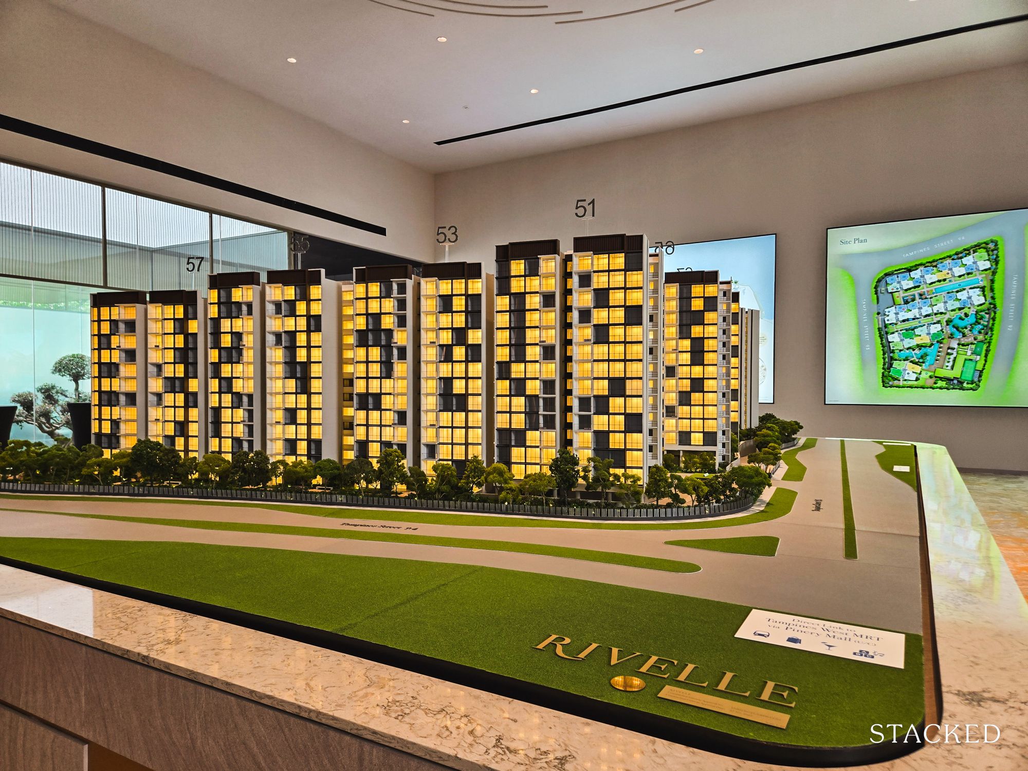
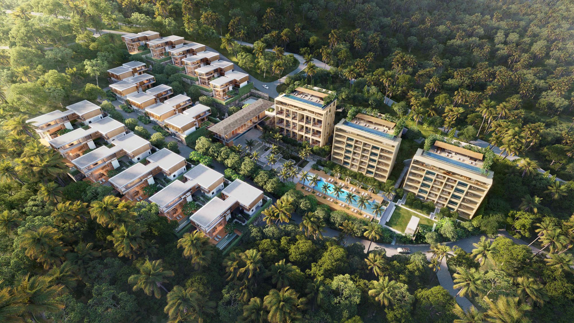
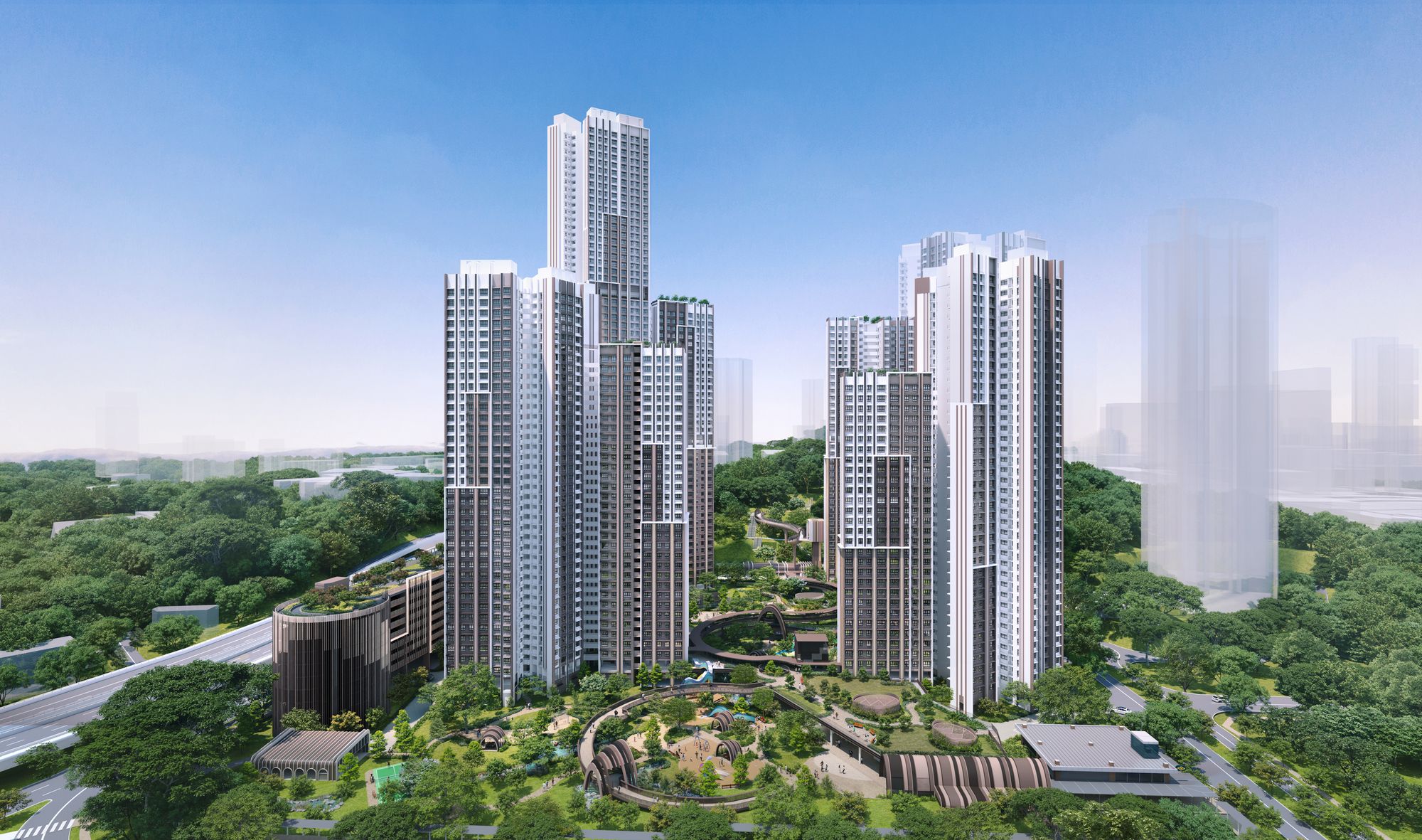
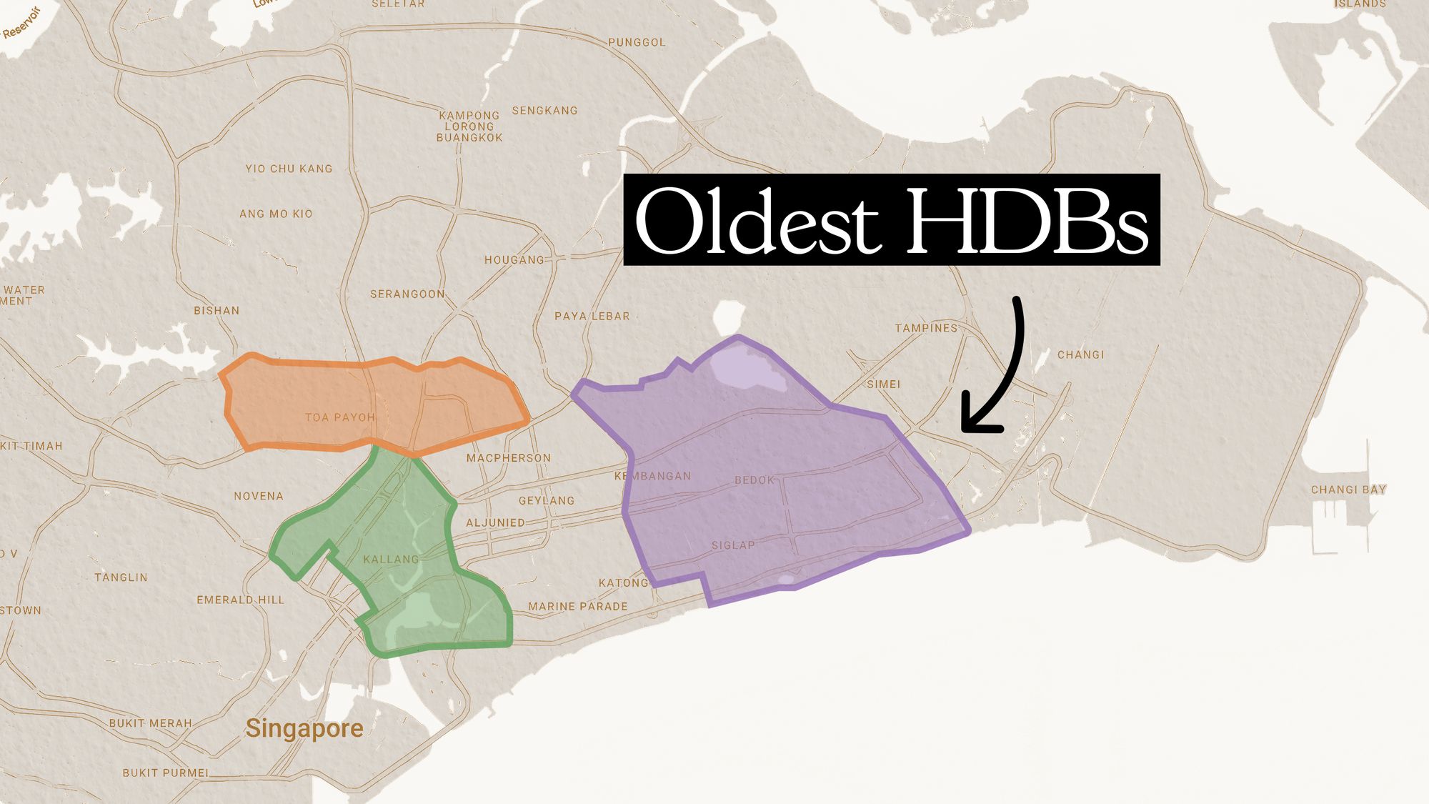
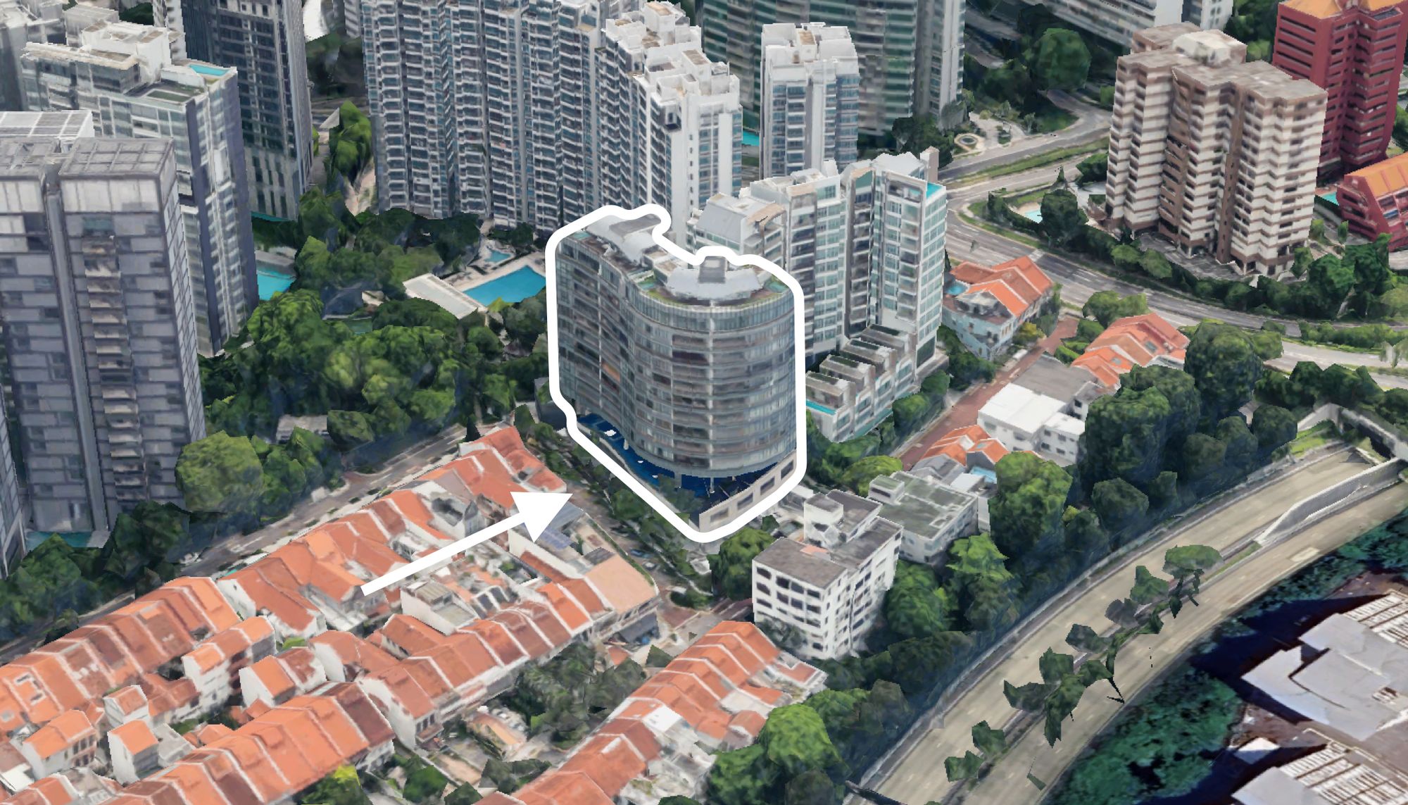

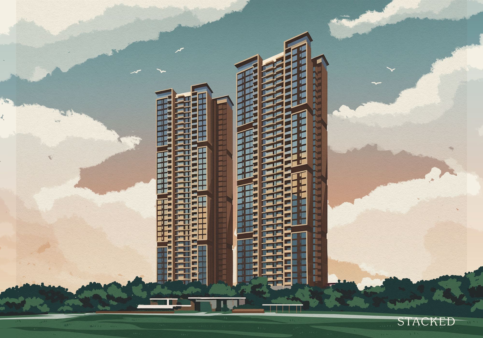





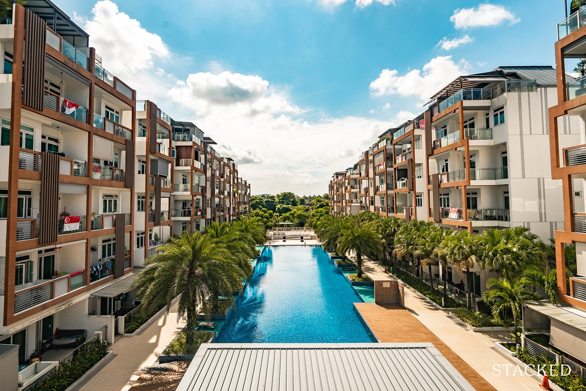
0 Comments