Touring A Designer’s Own Dark And Bold 5-Room HDB Home
April 13, 2023
Special thanks to Joseph for letting us tour his home! If you’d like to get connected to him for the design of your own home, you can reach out to him at this link. Successful projects get a $500 Stacked Store voucher!
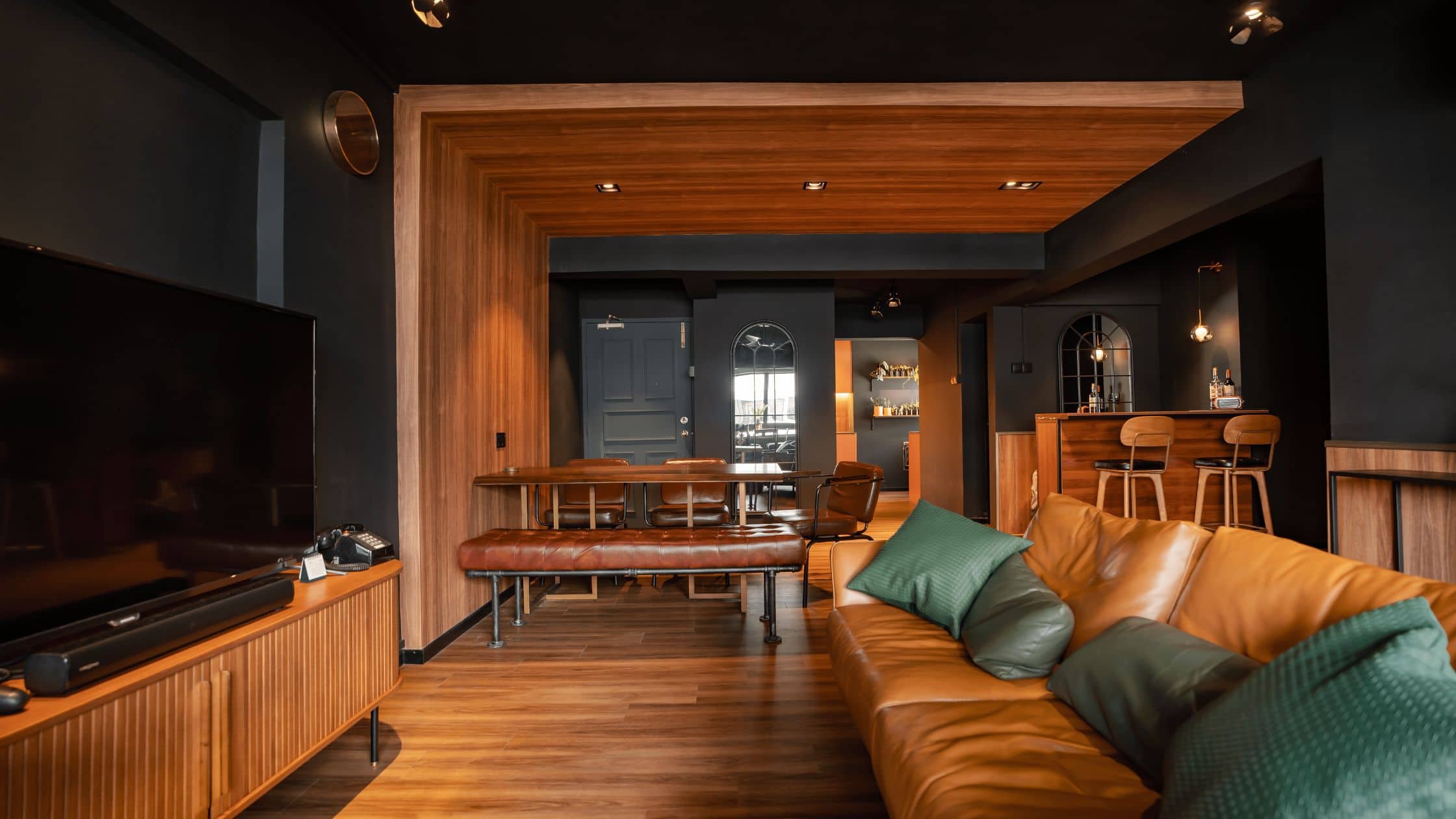
This week, we tour a beautiful self-designed HDB in Blangah View. It features a dark and bold theme with an emphasis on functional spaces. The homeowner is an experienced interior designer who managed to keep renovation costs to a minimum of $65,000 while completely changing the layout. His expertise in lighting is also evident throughout the home, with lighting and electrical points curated to perfection.
This five-room flat is 1,290 square feet and was purchased for $650,000 as a resale unit.
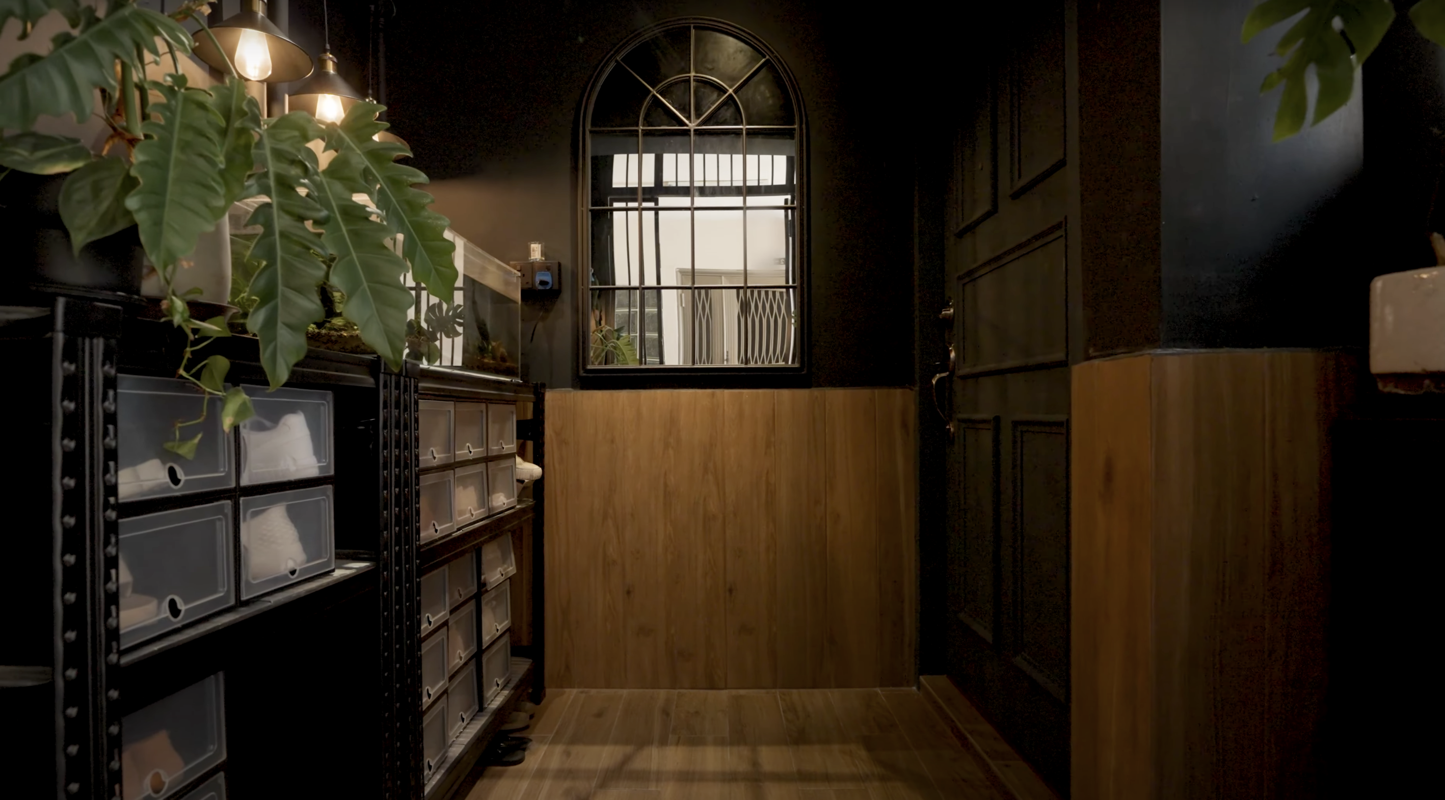
Upon entering the home, visitors are greeted with an open-concept welcome lobby. The previous owner purchased this area from HDB and it is currently tiled with wood-looking ceramic flooring and decorated with a lot of plants and a fish tank. The lobby leads to the dining area, where dark and woody tones make the space feel cozy and intimate.
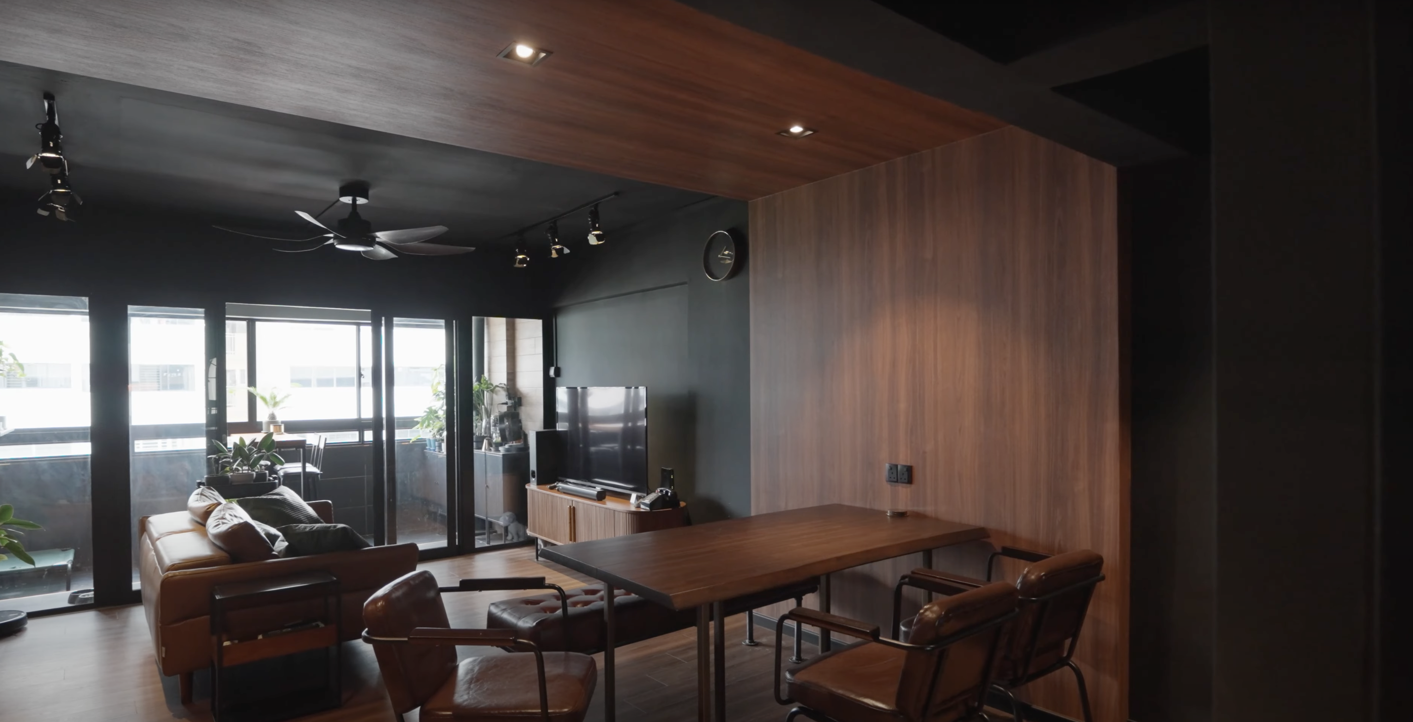
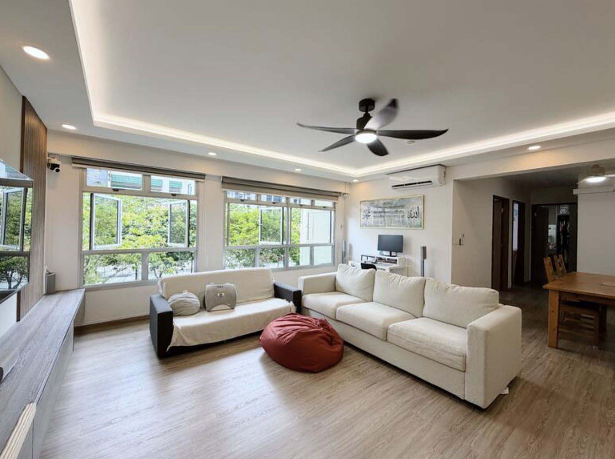
The living room features a comfy two-seater tan leather sofa that blends in nicely with the woody themes of the home. Opposite the sofa is a standalone TV console with a 55-inch standing TV setup, and a planter rack in the backdrop and to the side of the soda.
Heading out onto the balcony, we find more planters flanking both ends, with a nice 4 seater outdoor alfresco set in the middle.
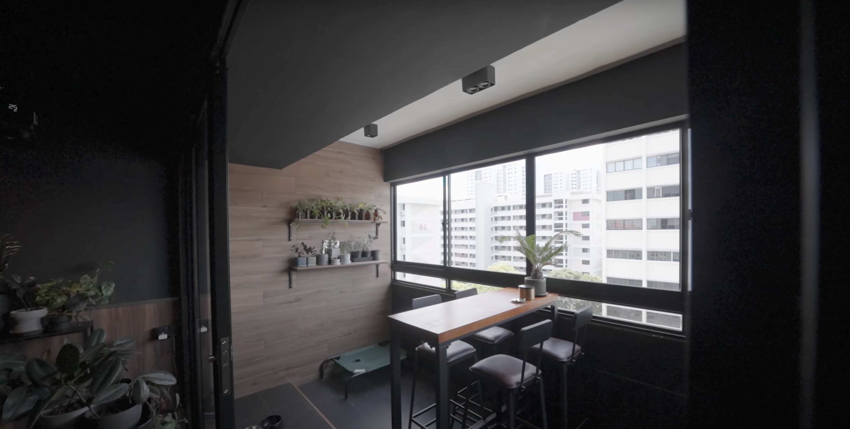
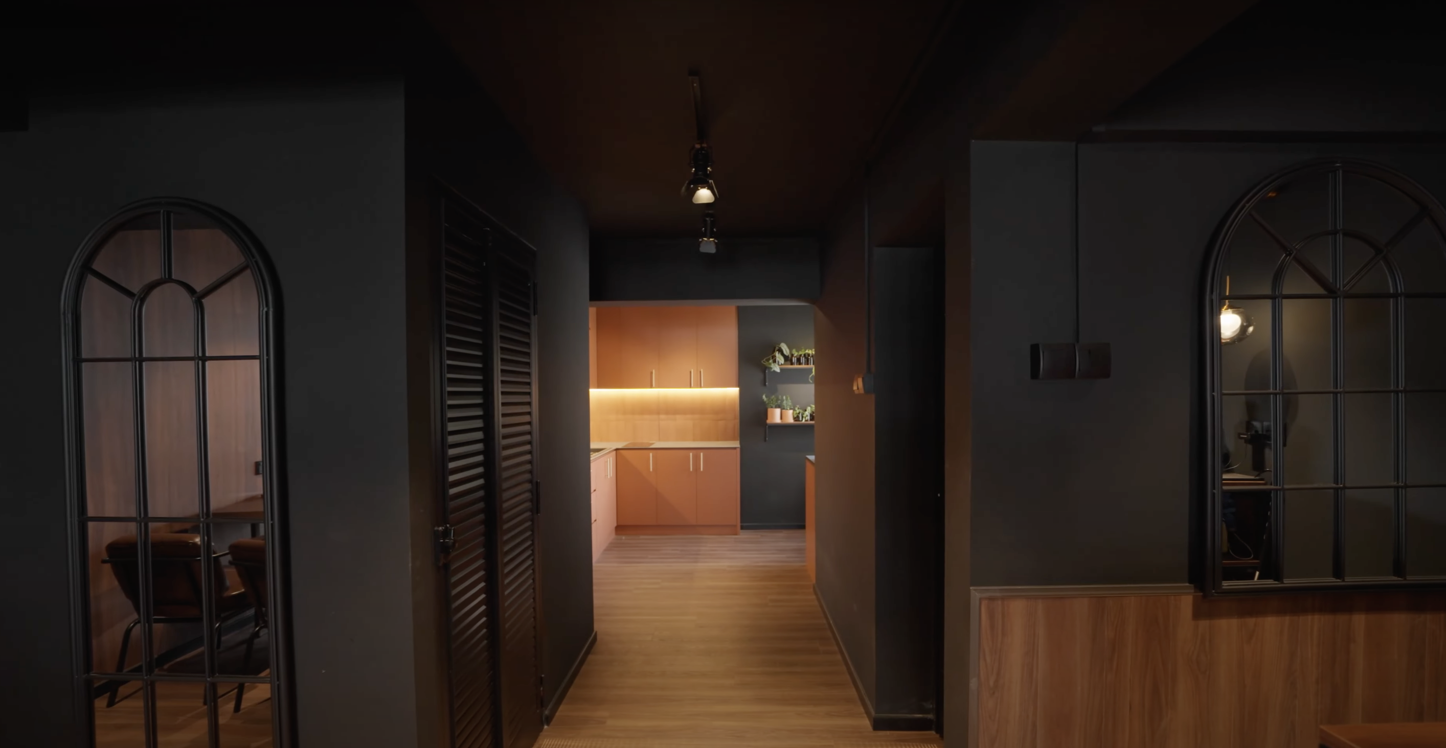
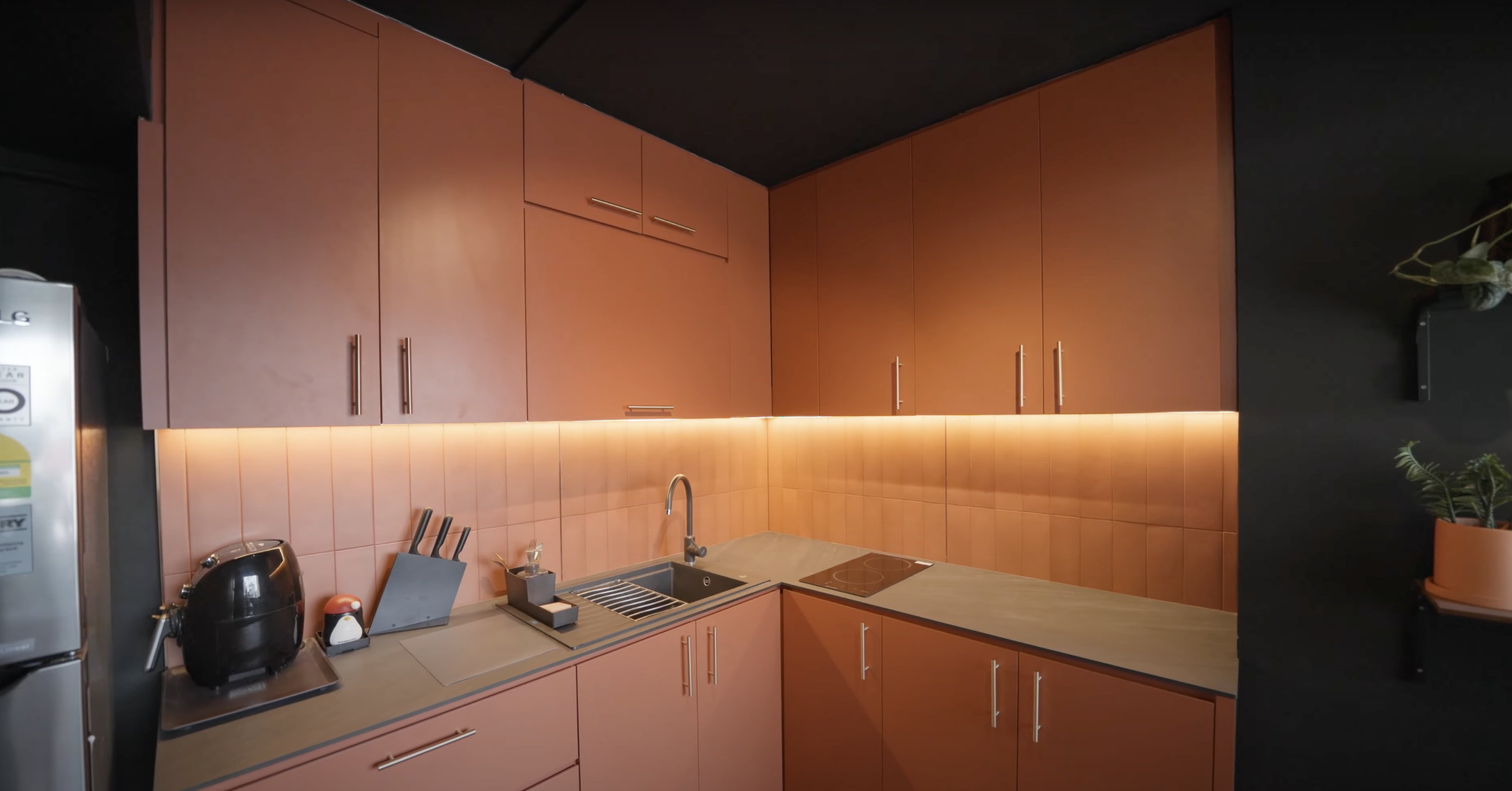
Moving on to the kitchen, we find that the homeowner has completely gutted the previous layout, and in place of it has fitted the area with terracotta cabinets and a ceramic backsplash that helps make it one of the more simple, yet aesthetically pleasing kitchens we’ve seen thus far.
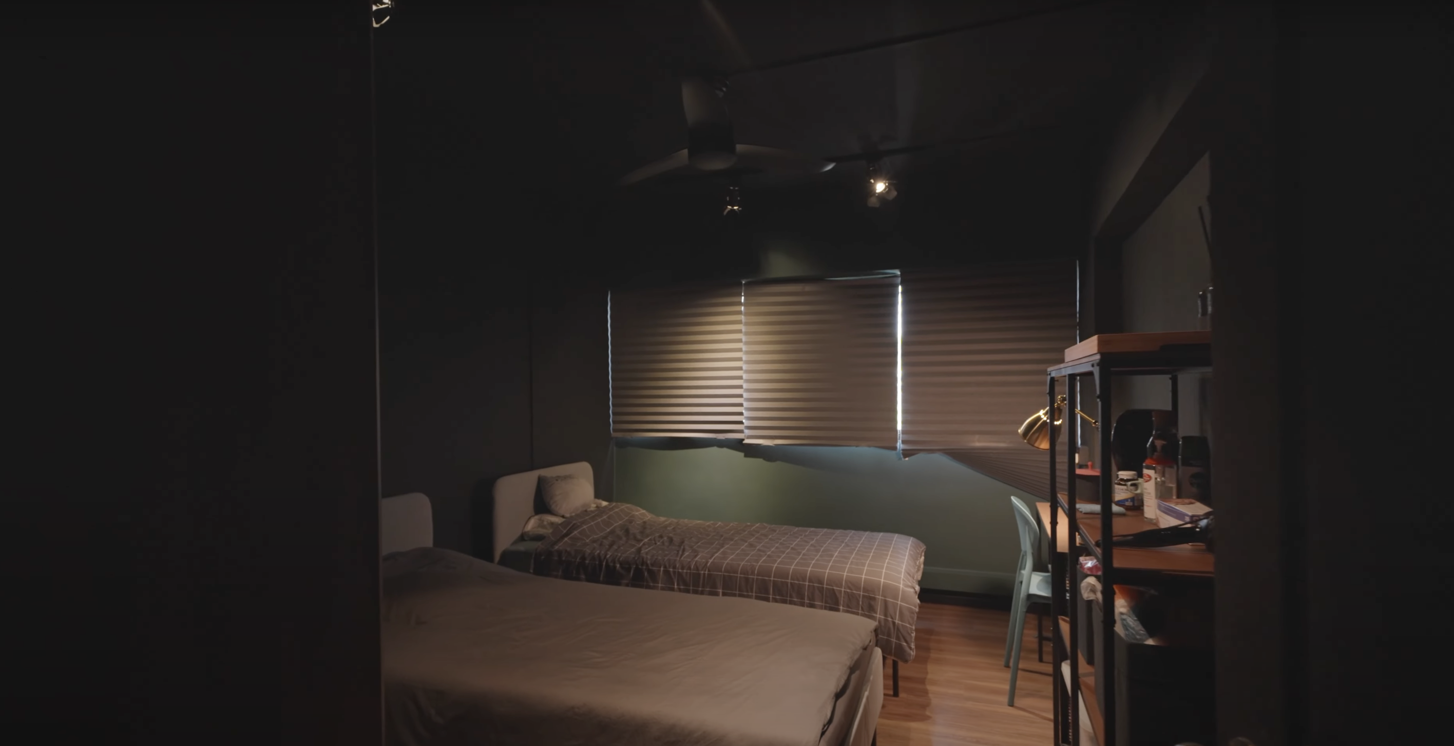
There are three bedrooms in the home, with the two adjacent bedrooms featuring identical layouts. Both are currently rented out and have enough space for a study desk and an open rack shelving. Blinds have been installed instead of curtains to maximize the amount of space in each room.
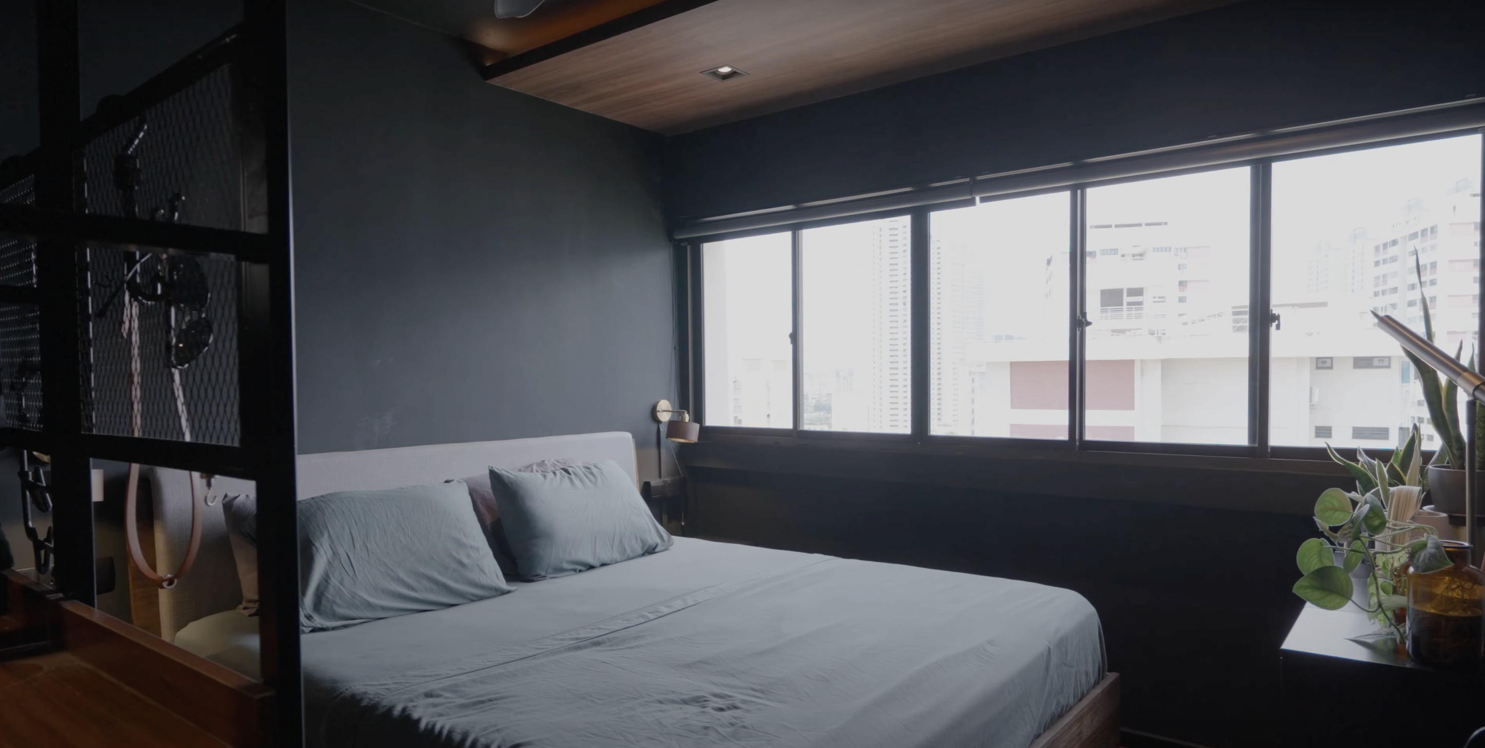
The most significant spatial extensions were carried out in the master bedroom. Part of the initial common transitional area leading to the bedrooms was walled off to create an extra private vanity area for the homowner. It is currently fitted with green fluted panels and wood paneling.
We also find that the end of that same corridor has been completely glassed-off for the homeowner’s study area. From the outside, it looks like a life-sized cyber terrarium, complete with LED lights on either end.
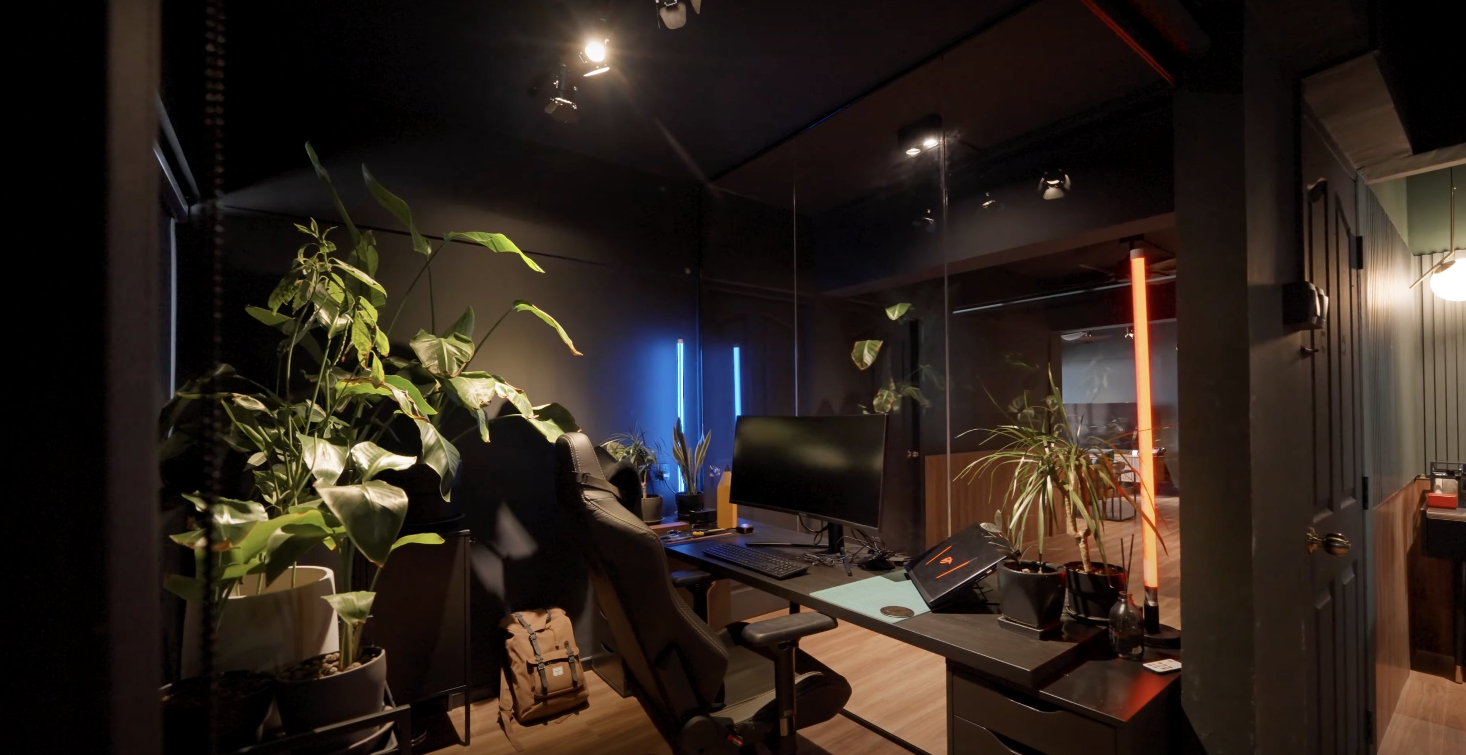
Special thanks to the homeowner for opening up their lovely unit to us!
At Stacked, we like to look beyond the headlines and surface-level numbers, and focus on how things play out in the real world.
If you’d like to discuss how this applies to your own circumstances, you can reach out for a one-to-one consultation here.
And if you simply have a question or want to share a thought, feel free to write to us at stories@stackedhomes.com — we read every message.
Need help with a property decision?
Speak to our team →Read next from Home Tours
Home Tours Inside A Minimalist’s Tiny Loft With A Stunning City View
Editor's Pick This Beautiful Japanese-Inspired 5-Room HDB Home Features an Indoor Gravel Garden
Home Tours A Family’s Monochrome Open-Concept Home with Colour Accents
Home Tours A Bright Minimalist Condo Apartment With A Loft
Latest Posts

Singapore Property News Why More Singaporeans Want Overseas Property — But Many Overlook What Comes After Buying
Singapore Property News Singapore Luxury Home Sales Strengthen In Q1 2026 — With Prices At A Two-Year High

Property Market Commentary Malaysia Property Market Outlook 2026: What Singapore Buyers Need To Know







0 Comments