How This Old 1950s Walkup In Joo Chiat Was Transformed Into A Gorgeous Light-Filled Home
January 18, 2024
A five-foot-way is one of the most iconic, yet also least common homes in Singapore. Many of these are among the oldest properties you’ll find; and in the past, many were considered more for their commercial aspects – or in some areas – as affordable rental homes for foreign workers. However, the value of such homes has risen as Singaporeans seek more spacious living, and a few homeowners have discovered the true potential of these properties. This week, we spoke to M (@5ftway), who has such a unit near the famed Everitt Road:
So many readers write in because they're unsure what to do next, and don't know who to trust.
If this sounds familiar, we offer structured 1-to-1 consultations where we walk through your finances, goals, and market options objectively.
No obligation. Just clarity.
Learn more here.
Restoring an old home
M’s home is located somewhere between Joo Chiat and Geylang Serai, about a five-minute walk to the Eunos MRT. This is near Everitt Road, but not near the famed feuding neighbours saga:
“If you google Everitt Road, you’re bound to find articles of the Everitt Road feuds between seven families that went on from 2002 to 2006,” says M, “Thankfully, we’re located further down, one of four double-storey flats along Everitt Road North.”
(Incidentally, most of those families have long since moved out)
At the beginning though, it was clear that the property would need some work. M says the property agent had insisted they watch a walkthrough video of the unit, before agreeing to a viewing. She says that:
“It had been on the market for a while – and understandably so, it used to be a rental with seven bedrooms, one bath with a toilet, and one urinal. It wasn’t the most attractive house, but the neighbourhood and unit space held so much potential.”
M didn’t make the decision on a whim either. She had viewed around 20 units, described as “a mix of old apartments and new-ish condos with fancy facilities, semi-detached terraces and walk-up units,” before determining her current unit had the right potential.
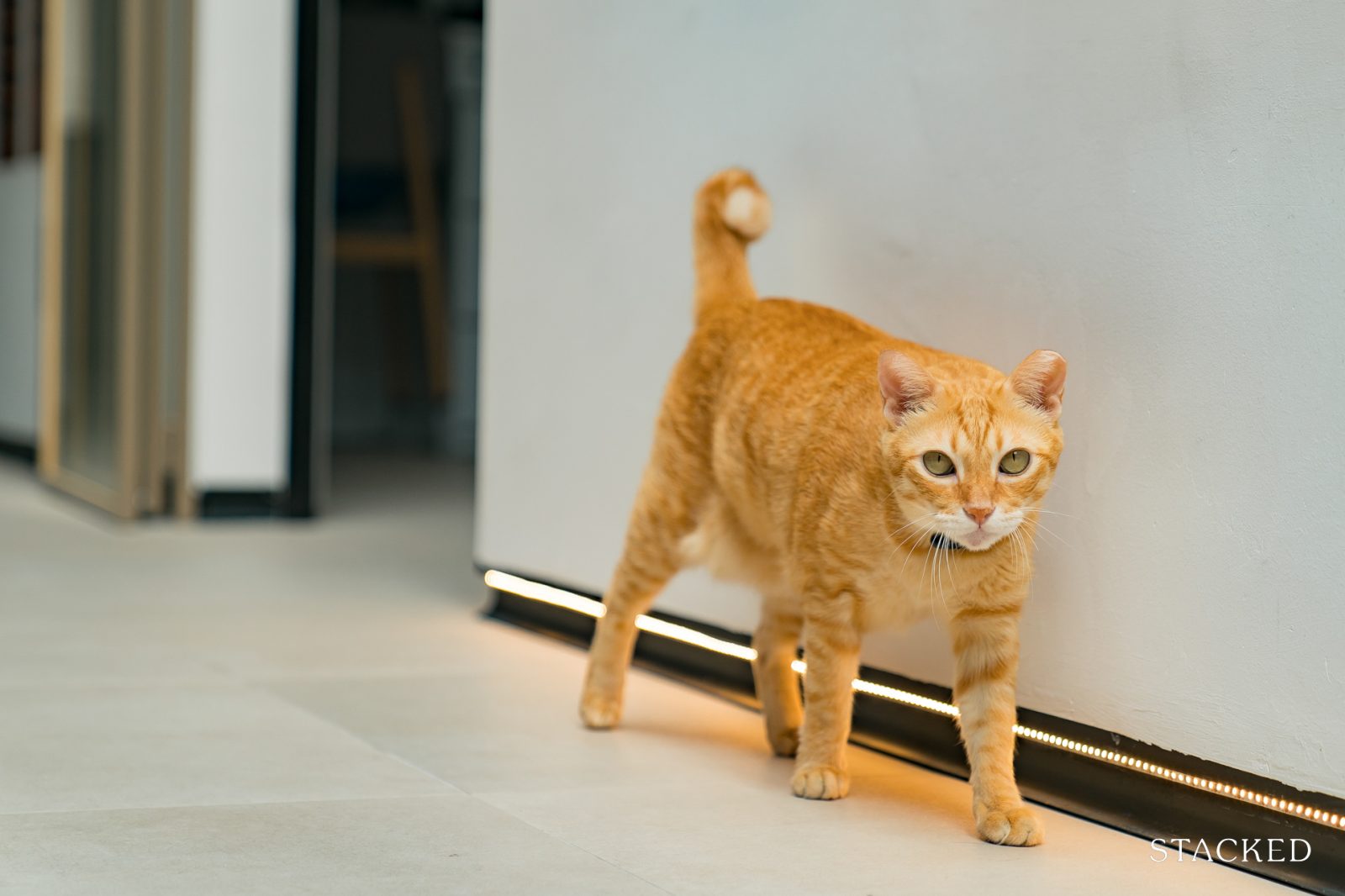
The unit is now renovated and refurbished, and is a home to five: three human family members and two cats.
Renovations were a major undertaking
Given the size and age of the unit, M knew what they were in for. It was going to require an extensive budget, as well as a professional ready to take on the challenge. M’s choice of Interior Designer was Young Tay of Met Interior, whom they met while looking for a designer for their previous place.
M has a good relationship with this designer, saying that “Three years of living in our first home, we’re still friends. I think that’s a testament to the friendship we’ve developed over the years, and the level of understanding we have between us.”
M also engaged architect Luke Shields, from HomeChapter. Luke had experience, having designed several houses in Australia; and M says “It was refreshing to hear and learn from someone who had personally built houses, before he became an architect.” What she sought in particular was his “blend of technical expertise as a builder, and creative vision as an architect.”
Altogether, M committed around $500,000 to the renovation and refurbishment of the property. However, “Given the scale of renovations we did, there were bound to be variations in every aspect. The truth is, till today, there are still minor fixes and add-ons we’re constantly thinking of.”
If you had a look at the original state of the house versus how it looks today, you’d understand the extent of work that’s been done. For a good portion of the renovation year, it was in a serious state of disrepair.”
One of the main challenges in the renovation was “Extending the plumbing all the way to the jack-and-jill ensuite. The original bath and toilet were right at the back of the house, and creating this new bathroom meant having to submit drawings to PUB, stopping all work while waiting 14 working days for their response, before we could start laying new sewage pipes.
Due to the distance from the main inspection chamber (I.C.), we also had to build a secondary I.C., which is now unabashedly located under our dining table…not that any one of our guests have noticed it yet.”
As for the wider house itself, there was a vast difference between visualising the outcome, compared to M’s former three-bedroom condo.
“With our previous condo, it was pretty straightforward,” M says, “We could immediately imagine how we’d utilise the different parts of the house. This time round, we had a 26 x 7 metres rectangular plot. Thankfully we had our architect space-plan our home, especially the social zones and circulation patterns.”
This resulted in an unusual situation where, throughout the renovation, M didn’t have a very specific sense of how things would turn out. “We were bogged down by various, consecutive foundational issues,” M says, “And whenever family and friends asked about the progress, our response would have been ‘it still looks like a war zone.’”
This is, incidentally, not uncommon for major renovations on landed properties. Unlike condos, there’s a higher risk of encountering unforeseen restrictions, so plans need to be adapted accordingly.
Nonetheless, the challenges were expected, and M says they had been prepared for the extent of the work from the moment they signed the OTP.
Unplanned Mid-Century Modern vibes
M says there was no dominant theme in mind from the start; rather, what they had was a sense of how certain rooms should look:
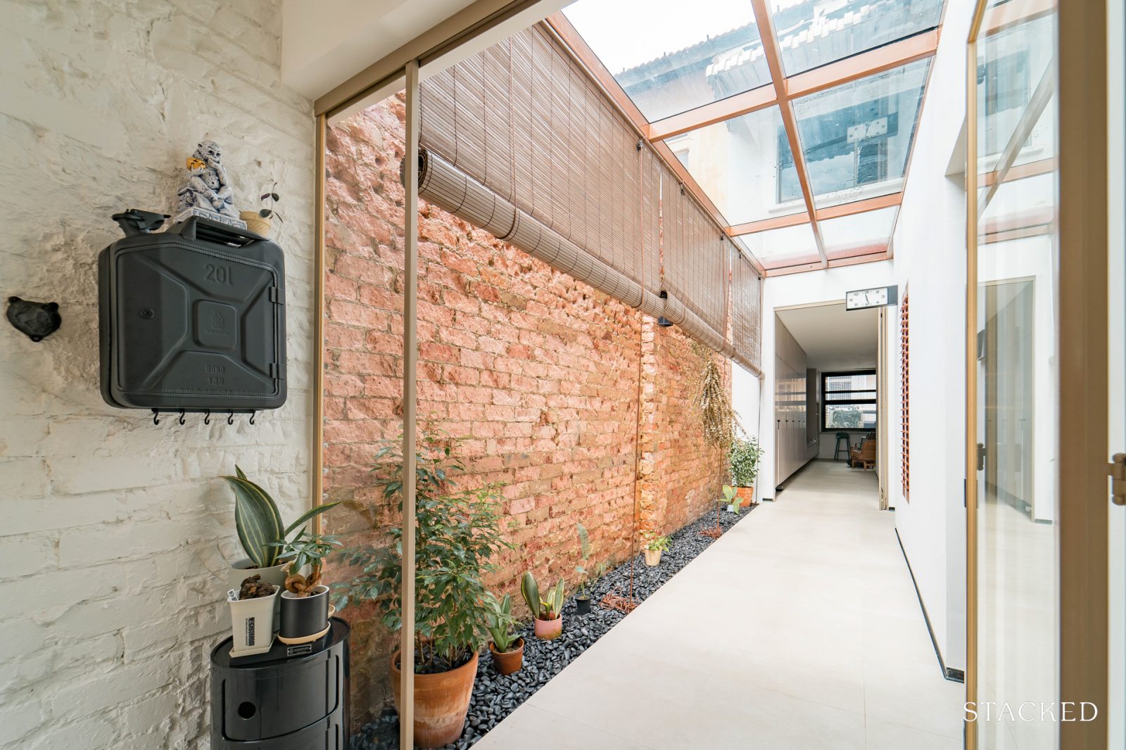
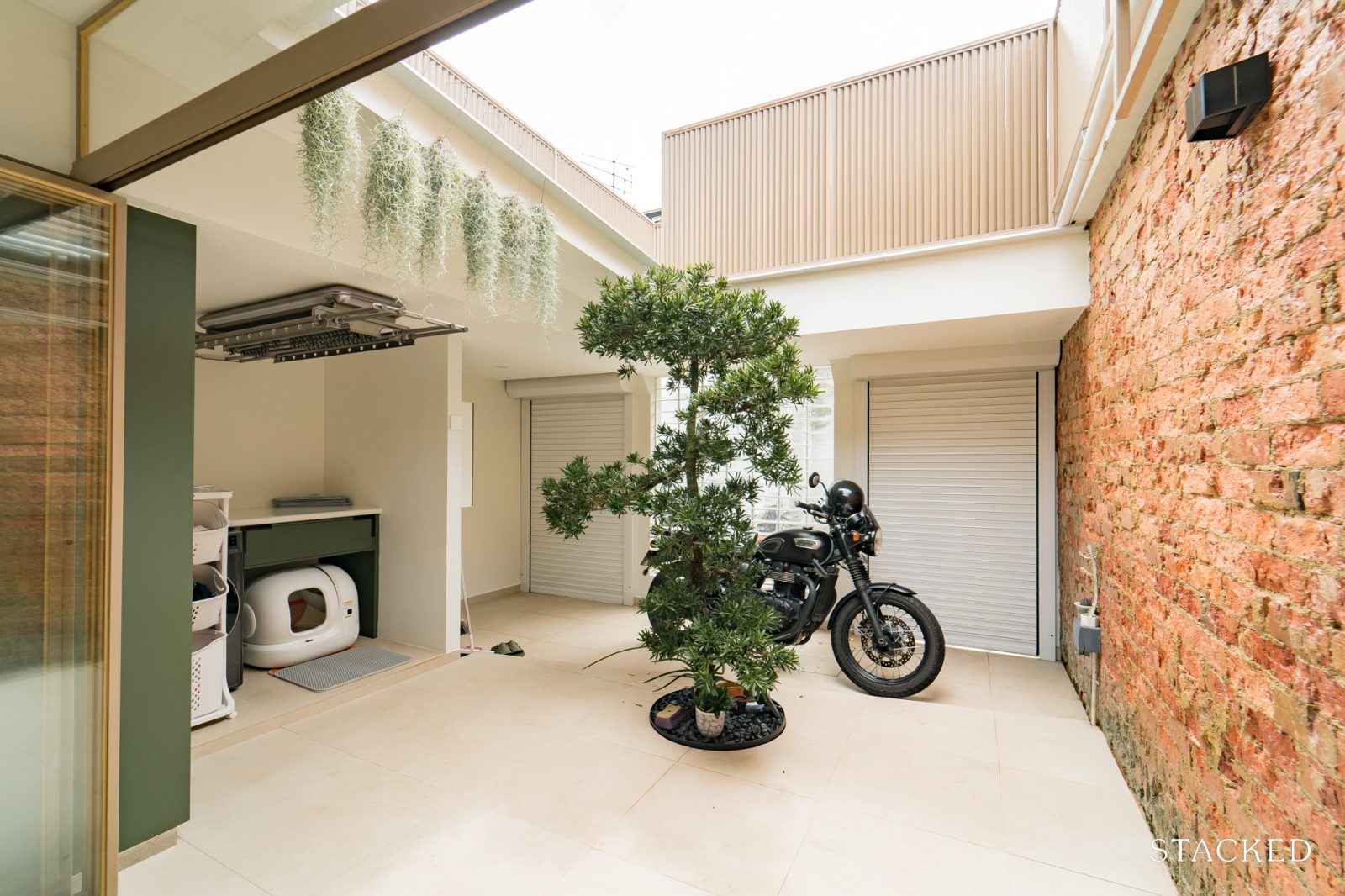
“The living room window that opens to our five foot way, sky lights in our bedrooms, a long air well along the hallway, and an open-aired courtyard with a singular tree. Along the way, these naturally came together to look something that you’d maybe call mid-century modern.”
We wouldn’t call the following just “changes” to the rooms, as much of the original layout (the seven bedrooms and old toilet) were all hacked away. Instead, these are what were built to replace the old layout:
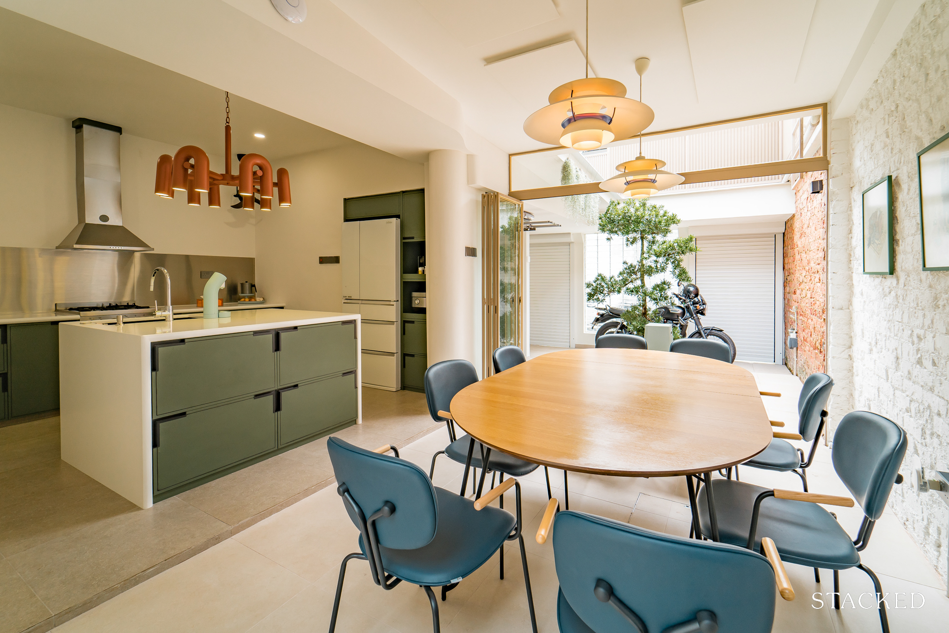
Dining room
In most Singapore homes, dining rooms are usually just extensions of the living room space. With the added square footage of a shophouse, however, it’s possible to set up a proper dining space, one that’s especially great for celebrations/events.
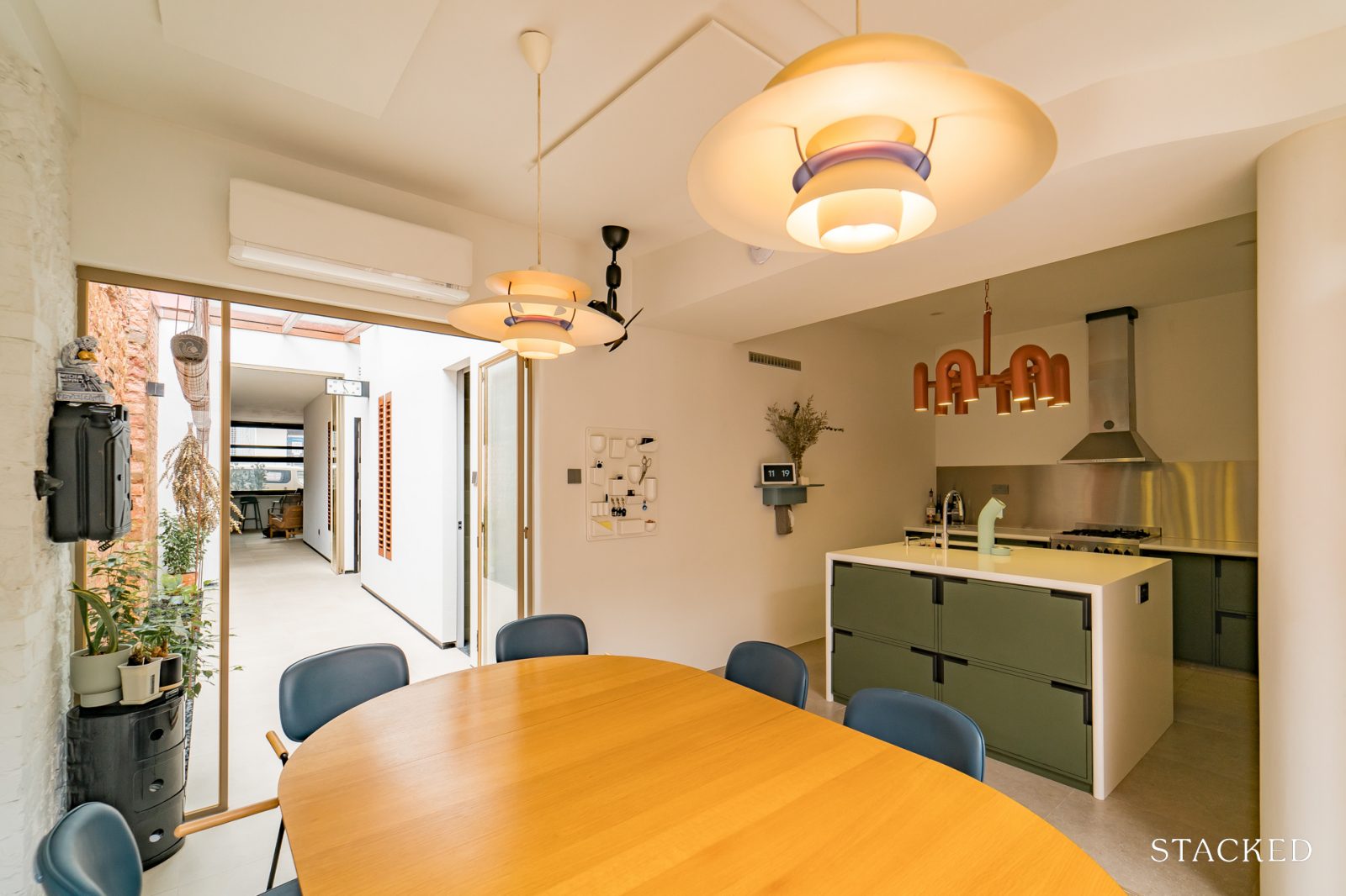
“We’ve learnt from our previous homes that we host our family and friends most around the dining table – whether over a meal or drinks that carry on through the night. I initially wanted a 10-seater table, until we realised it’d affect the traffic flow around the table. Instead, we have an extended oval table under our Louis Poulsen pendant lamps.
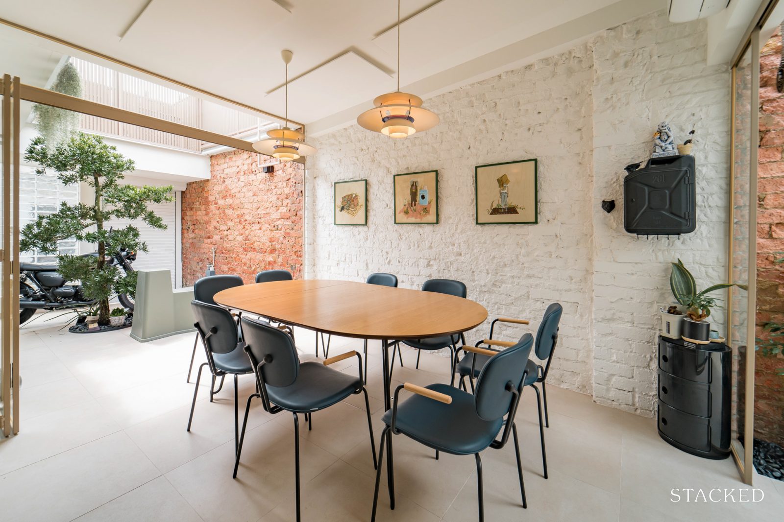
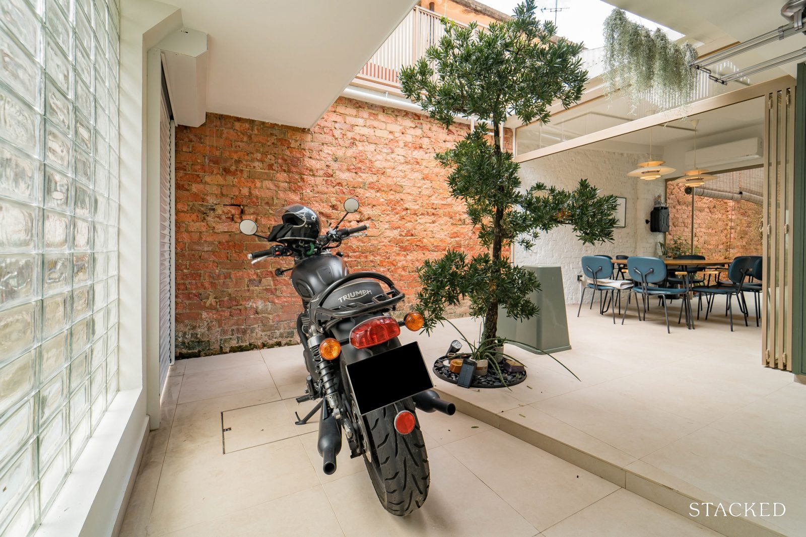
We kept the same ground level as the courtyard, rather than introducing a step-down to the open-air area. This allows us to open up additional seating for bigger gatherings during Christmas or the New Year. The extended space into the courtyard is also such a great spot for BBQs in the evening.”
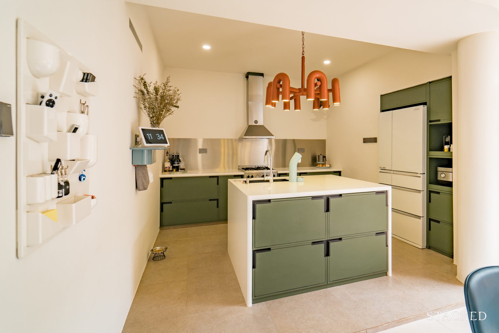
Kitchen
Kitchen islands are one of the most popular additions, as they can double as a dining space to host small gatherings; or even as a place for children to do homework. In this context, the kitchen island is a compact way to fit multiple utilities into the same space.
“We’re firm believers that top-hung cabinets in the kitchen simply lead to forgotten items left on higher shelves, so we’ve kept it simple with a streamlined counter. It was gratifying to be able to fit a square kitchen island, enabling us to fit a dishwasher, water filter and four deep drawers for cutlery.”
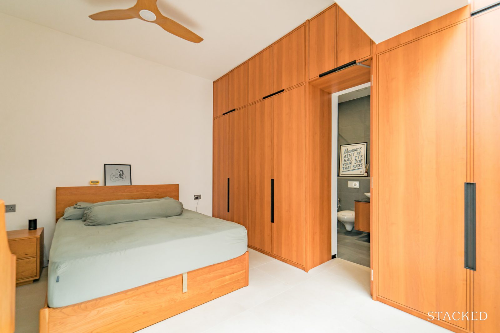
Bedroom/s
Bedrooms are getting simpler in recent years, and this particular project exemplifies that. Another reason the TV is left out these days is streaming services; many people find themselves looking at their tablet or phone while in the bedroom, instead of the TV.
“We intentionally kept the bedrooms simple; we knew it basically served the sole purpose of sleep. The master bedroom is also void of a TV, because as a family, we choose to spend our evenings at the dining table or catching up on a Netflix series together.”
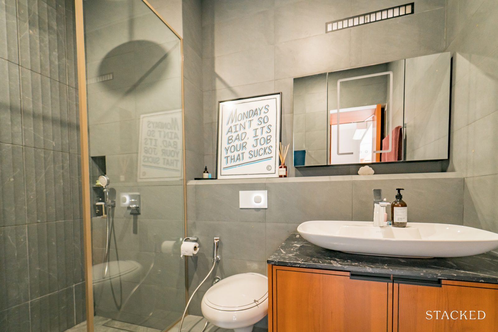
Bathroom/s
Most people think the living room is the best way to impress a guest. In reality, homes are equally judged for the state of their bathrooms; and this one has one of the most no-holds-barred bathroom budgets that we’ve seen.
“Both bathrooms feature vanity tops with unique marble counters – funnily enough, we actually shortlisted these stones months before we even started planning the home layout. The common jack-and-jill bath features antique marble from Turkey, while the master bath has a unique stone with embedded fossils.
In the master bath, we chose to have a cute step-down shower area – it was a ‘why not?’ moment since we get to enjoy a generous rain shower faucet height of 2.5 metres.”
Living room
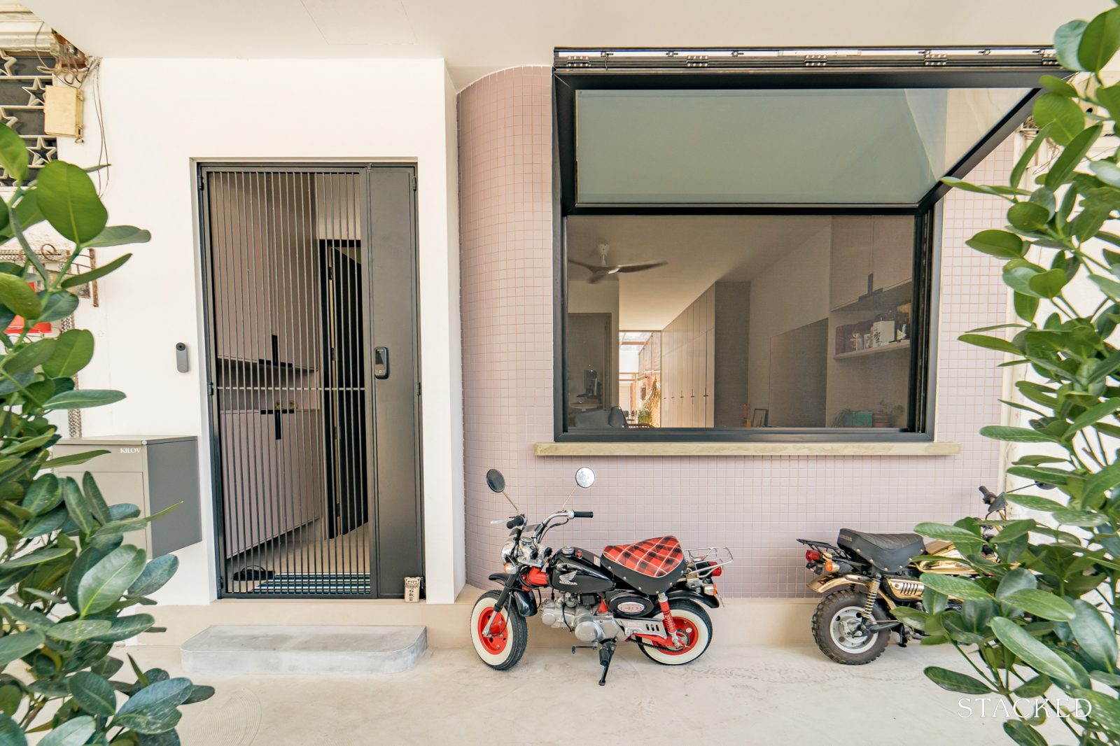
The centerpiece here is a custom designed window; it allows the living room to be semi-opened up to the exterior space. This isn’t something you can buy, but if you have the right designer or architect, you can get customised features like this.
“One of the drawbacks of living along a five foot way is figuring out whether to open or close the living room window. We chose the former, and created a 2 x 2 meter hydraulic bi-fold window. Its one-of-a-kind design means the motor was individually sourced, and the device assembled in China, before getting flown here. To the best of our knowledge, this is the only one in Singapore.
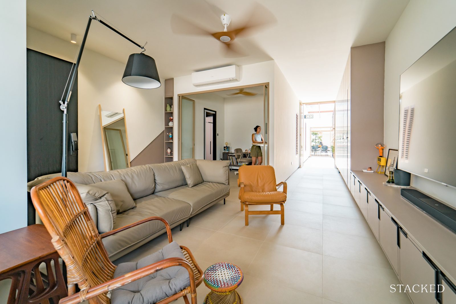
Having this lookout creates the opportunity for friends who are dropping by briefly to hang out along the five foot way, before they head off.
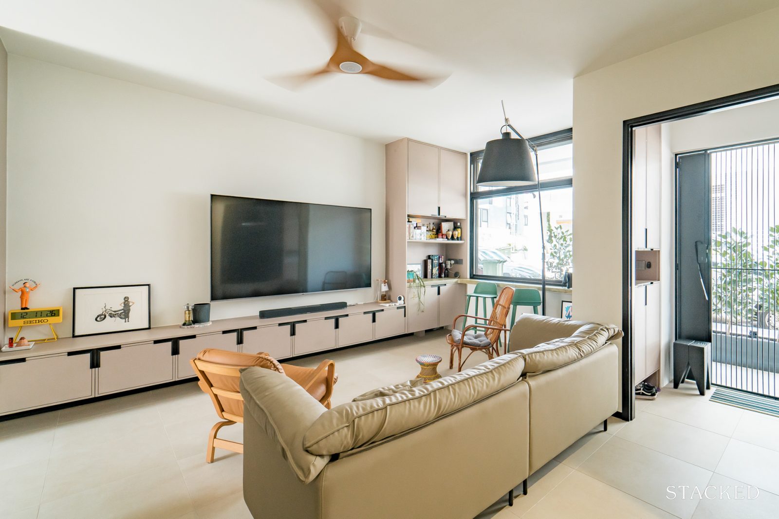
The living room is where the family spends the most time watching TV and it’s also the place where we have most of our storage. We knew from the get go that we will be void of a storeroom (not considering the space under our neighbour’s stairs) so it was really a challenge trying to space plan and yet keep it looking neat and clutter-free.”
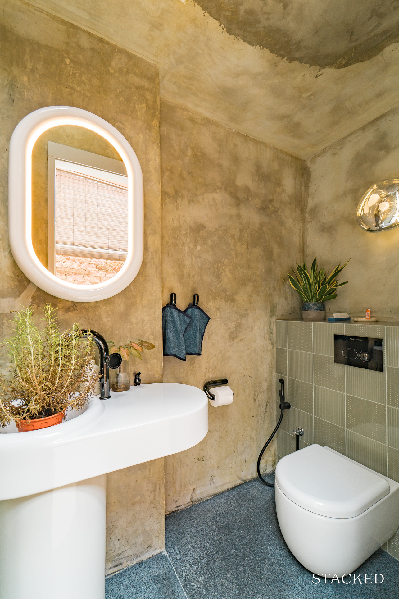
Powder Room
Powder rooms are a true rarity in space-scarce Singapore; and we seldom see it as most homeowners quickly turn it into storage. Outside of top-end commercial projects (e.g., hotels), we seldom see these in homes.
“We chose to reduce the space in our master bath, so that we could carve out this area for a powder room. Given that most of the visitors are likely to be hanging out in the dining area, it made most sense to provide a restroom right next to it.
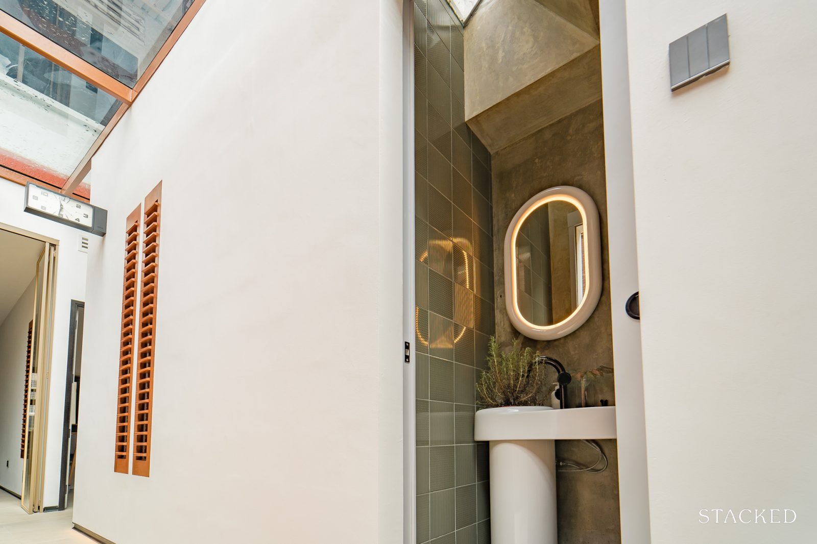
A hilarious thing to note – we selected these pieces from the Tom Dixon x Vitra collection, without ever viewing any samples in-person. We liked them the moment we saw the photos – wall tiles, mirror, sink, even the toilet roll holder. I think it’s safe to say we were probably the first home in Singapore to have this range fitted out.”
Favourite parts of the home
M says there are two spots in the home that commonly receive compliments: “The light-filled walkway along the airwell, and the open-air courtyard with the singular Buddhist Pine Bonsai Tree.
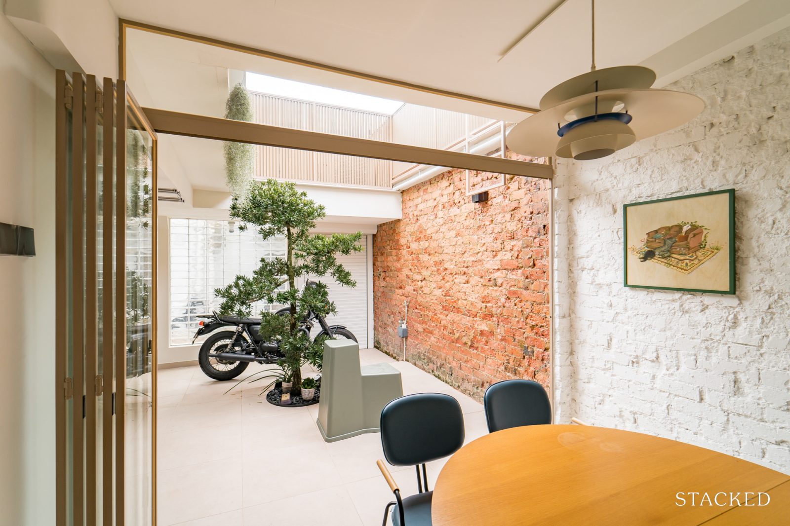
It’s a bit of an experience walking along the airwell – we have columns of handmade wooden louvers that open up to the bedrooms on your left, a strip filled with pebbles and plants on your right.
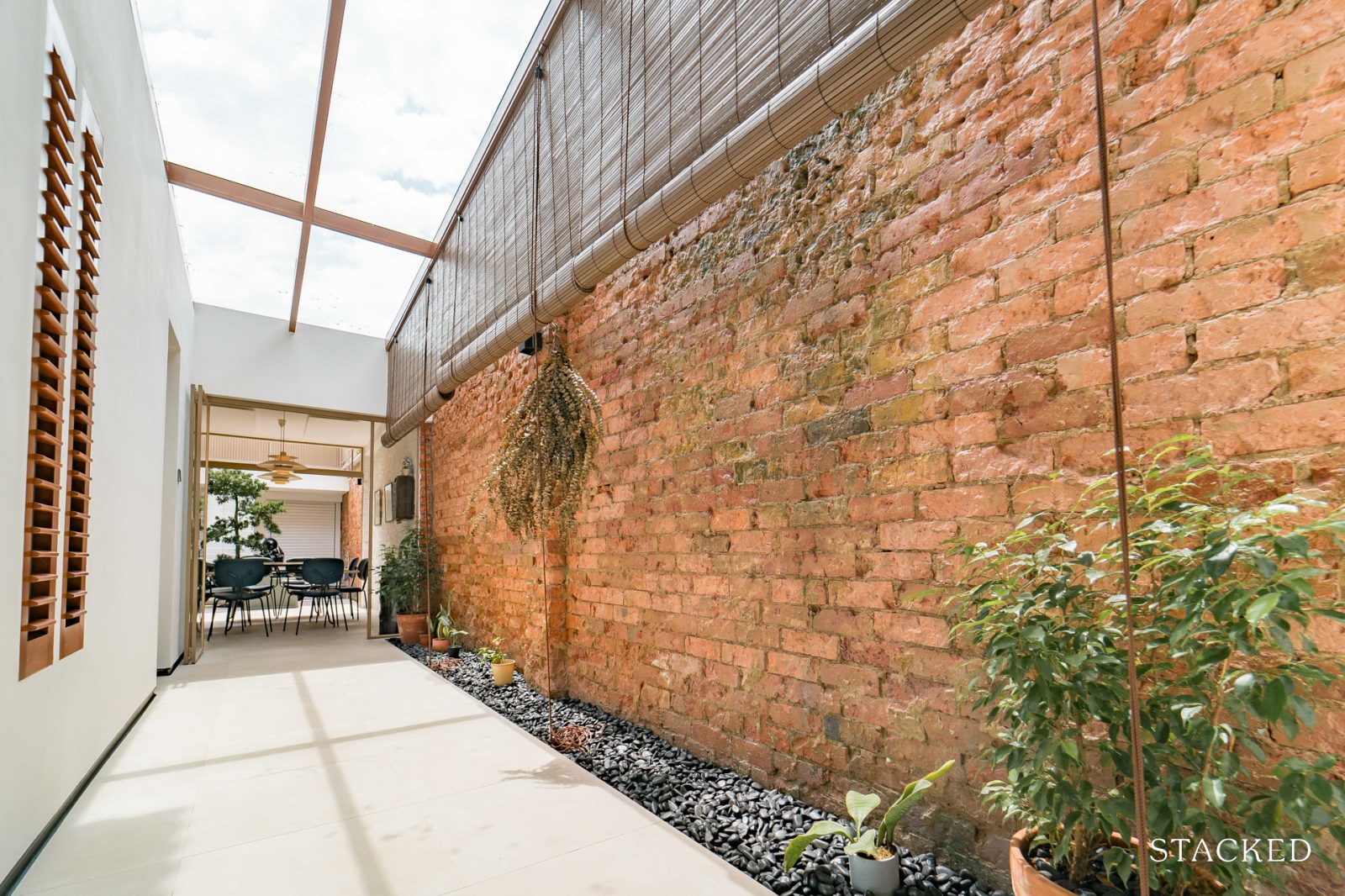
Whether it’s during the day or night, it’s such a treat to look up the glass roof and enjoy the clouds overhead. Having this flexible space next to the dining area offers us a multitude of uses, but the bonsai tree (no, it’s not a fake plant!) also provides a central focal point.”
For more interesting homes and interiors, or reviews of new and resale properties in Singapore, follow us on Stacked.
At Stacked, we like to look beyond the headlines and surface-level numbers, and focus on how things play out in the real world.
If you’d like to discuss how this applies to your own circumstances, you can reach out for a one-to-one consultation here.
And if you simply have a question or want to share a thought, feel free to write to us at stories@stackedhomes.com — we read every message.
Ryan J. Ong
A seasoned content strategist with over 17 years in the real estate and financial journalism sectors, Ryan has built a reputation for transforming complex industry jargon into accessible knowledge. With a track record of writing and editing for leading financial platforms and publications, Ryan's expertise has been recognised across various media outlets. His role as a former content editor for 99.co and a co-host for CNA 938's Open House programme underscores his commitment to providing valuable insights into the property market.Need help with a property decision?
Speak to our team →Read next from Home Tours
Home Tours Inside A Minimalist’s Tiny Loft With A Stunning City View
Editor's Pick This Beautiful Japanese-Inspired 5-Room HDB Home Features an Indoor Gravel Garden
Home Tours A Family’s Monochrome Open-Concept Home with Colour Accents
Home Tours A Bright Minimalist Condo Apartment With A Loft
Latest Posts

Singapore Property News HDB Resale Prices Fell — But A Third Of Buyers Still Paid $800K+ Last Quarter. Here’s Why
Singapore Property News Three Strata Office Floors In Suntec Priced From $135M
Singapore Property News This Freehold Desker Road Shophouse Is Going For $10.5M









0 Comments