The Hidden Factor Most Buyers Are Ignoring When Buying A Home: Here’s Why Layouts Are So Important
March 9, 2024
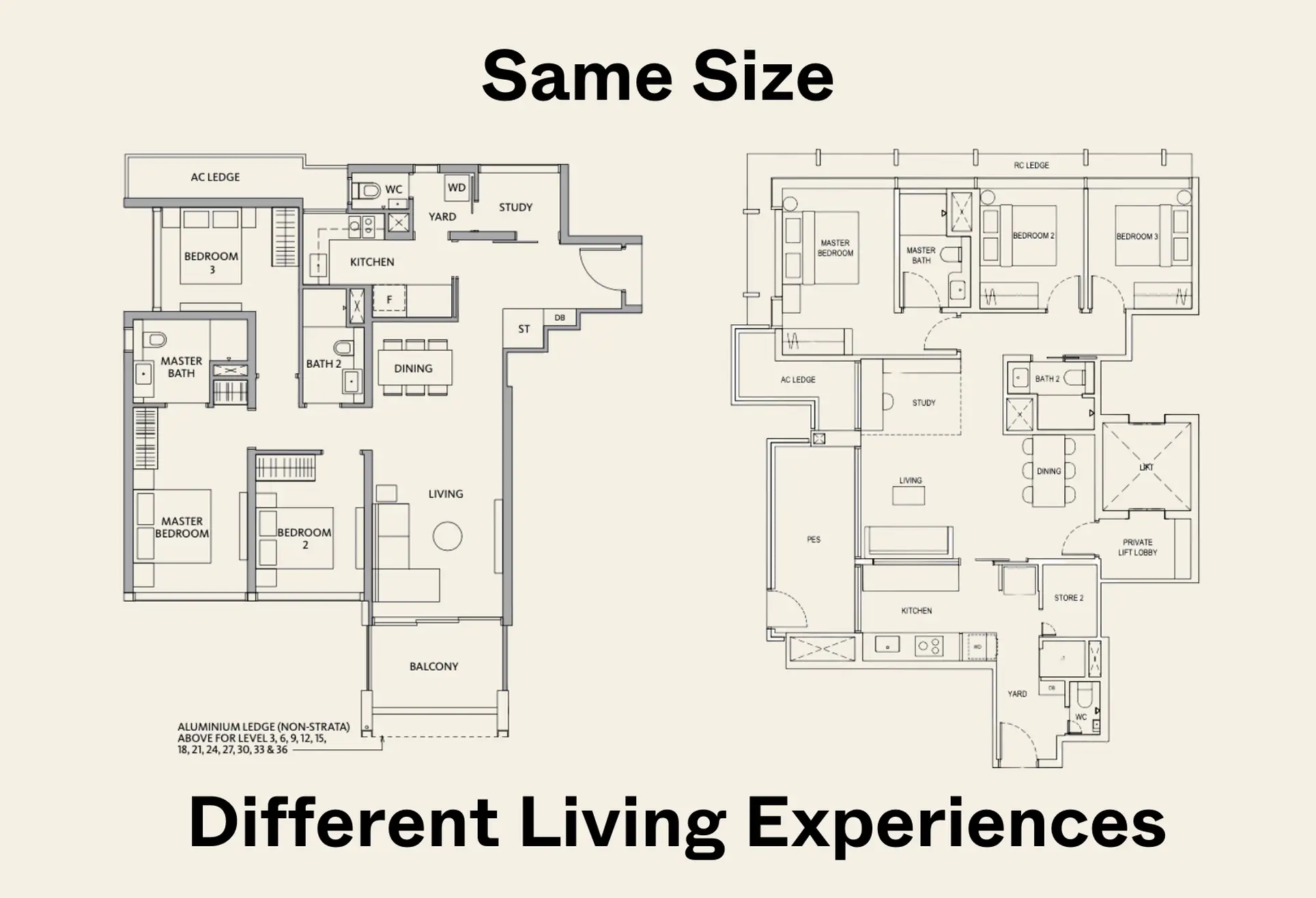
For anyone looking to buy a home, the focus often gravitates towards location, price, and size—key factors that undoubtedly influence the decision-making process. However, there’s another crucial aspect that deserves equal, if not more, attention but is frequently overlooked: the layout of the unit.
The design and configuration of a home’s interior can have a big impact on its liveability, functionality, and even its perceived value, making it a pivotal consideration for prospective buyers. This isn’t something new buyers often think about, as it is only apparent once you actually move into the home.
Through an exploration of three distinct examples, we will showcase how units of identical sizes can offer vastly different living experiences based on their layouts. We’ll delve into the nuances of spatial efficiency and how a well-thought-out floor plan can transform the same square footage into a more functional, enjoyable, and valuable living space.
Let’s get right to it!
So many readers write in because they're unsure what to do next, and don't know who to trust.
If this sounds familiar, we offer structured 1-to-1 consultations where we walk through your finances, goals, and market options objectively.
No obligation. Just clarity.
Learn more here.
Riviere vs The Continuum 3 Bedder
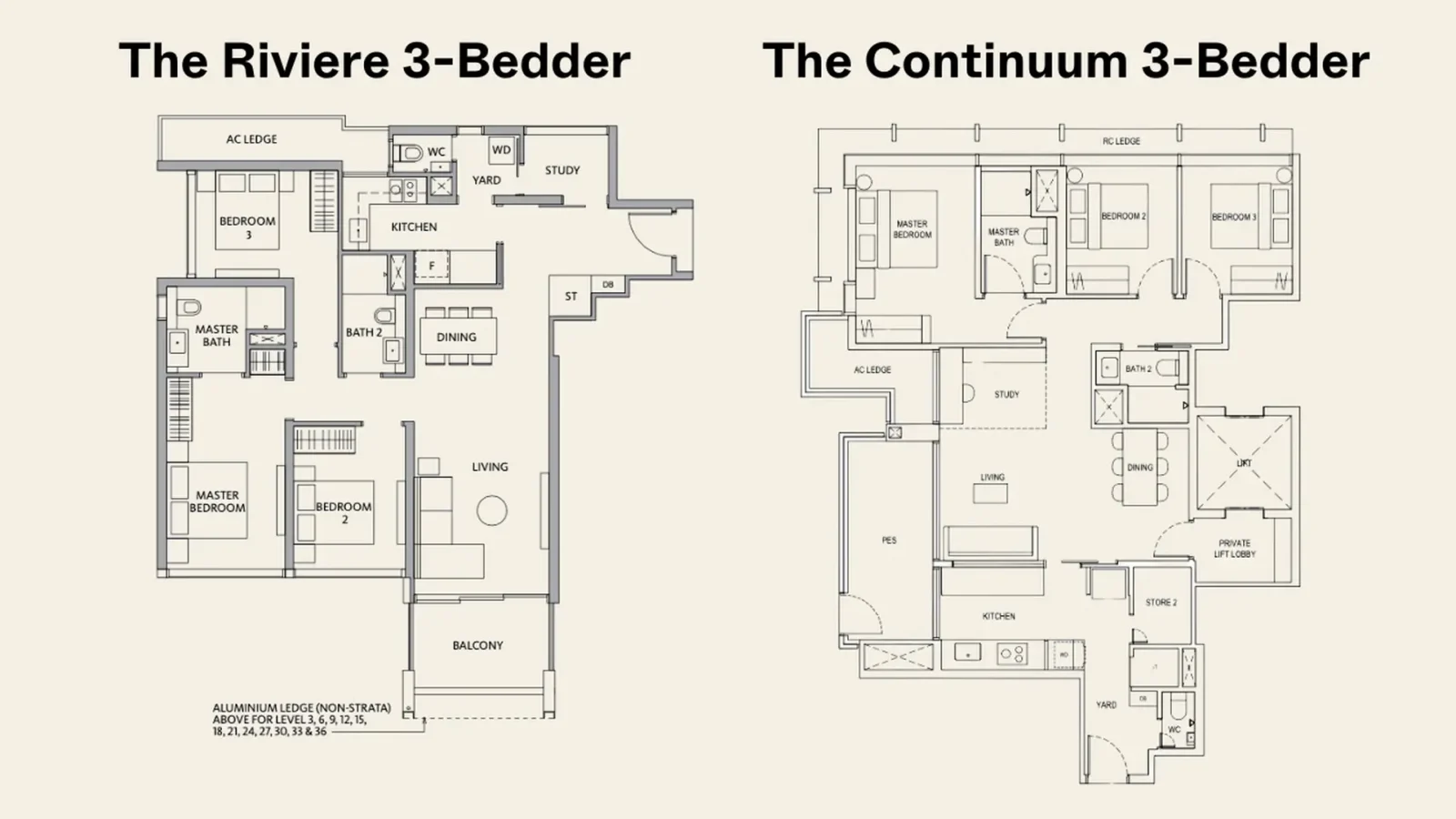
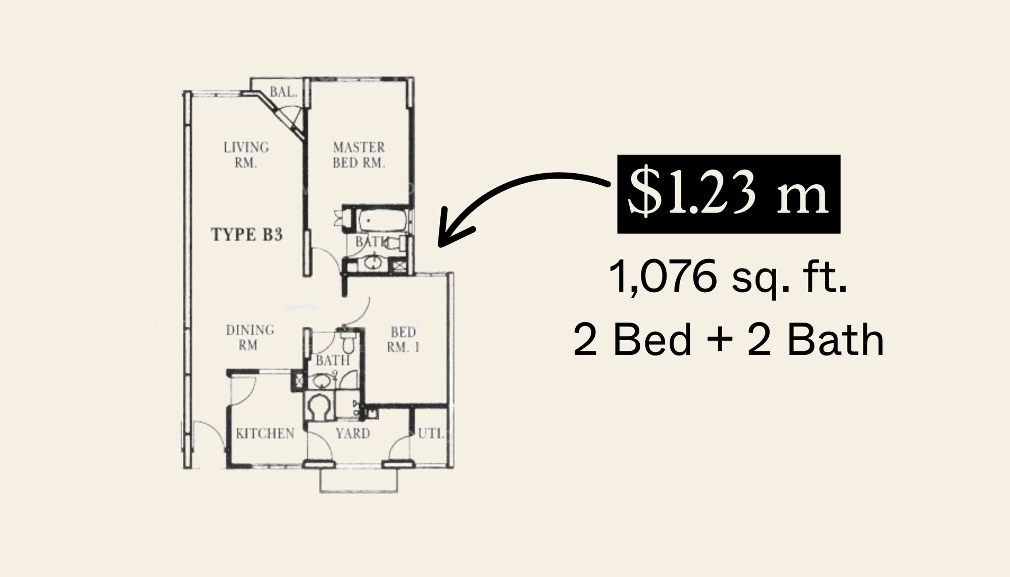
Both these 3-bedroom units are the exact same size, which makes this comparison all the more apparent. In today’s market, a 3-bedder of this size is considered to be bigger than average – but look how much more efficient the layout of The Continuum is compared to the unit at Riviere.
The long entryway at Riviere may be good from a privacy standpoint, but there is a lot of space there that could be used in other places. And one place that certainly needs more space is the kitchen as it is on the small side for a unit of this size.
Contrast this to The Continuum where the kitchen is larger and would feel considerably more spacious because of the window that overlooks the living and the opening to the balcony.
The Continuum is also able to fit a yard, utility and a small store room. For most buyers, this would be a better arrangement as compared to Riviere with a study (most family profiles would use this as a helper’s room), as there is additional storage. However, it must be said here that the yard area at Riviere is preferable due to the open window – which The Continuum lacks.
As for the living and dining areas, The Continuum allows for a more flexible layout due to its squarish nature. According to the floor plan, there is a section earmarked for the study, but most people would probably just use it for a bigger living area instead.
Finally, Riviere has a long corridor to the bedrooms, as well as a longer corridor to Bedroom 3. The Continuum again fares better here without much of a corridor to all the bedrooms, as well as both common bedrooms being the same size. One downside though is the small common bathroom at The Continuum.
LIV@MB vs Mattar Residences 1 Bedder
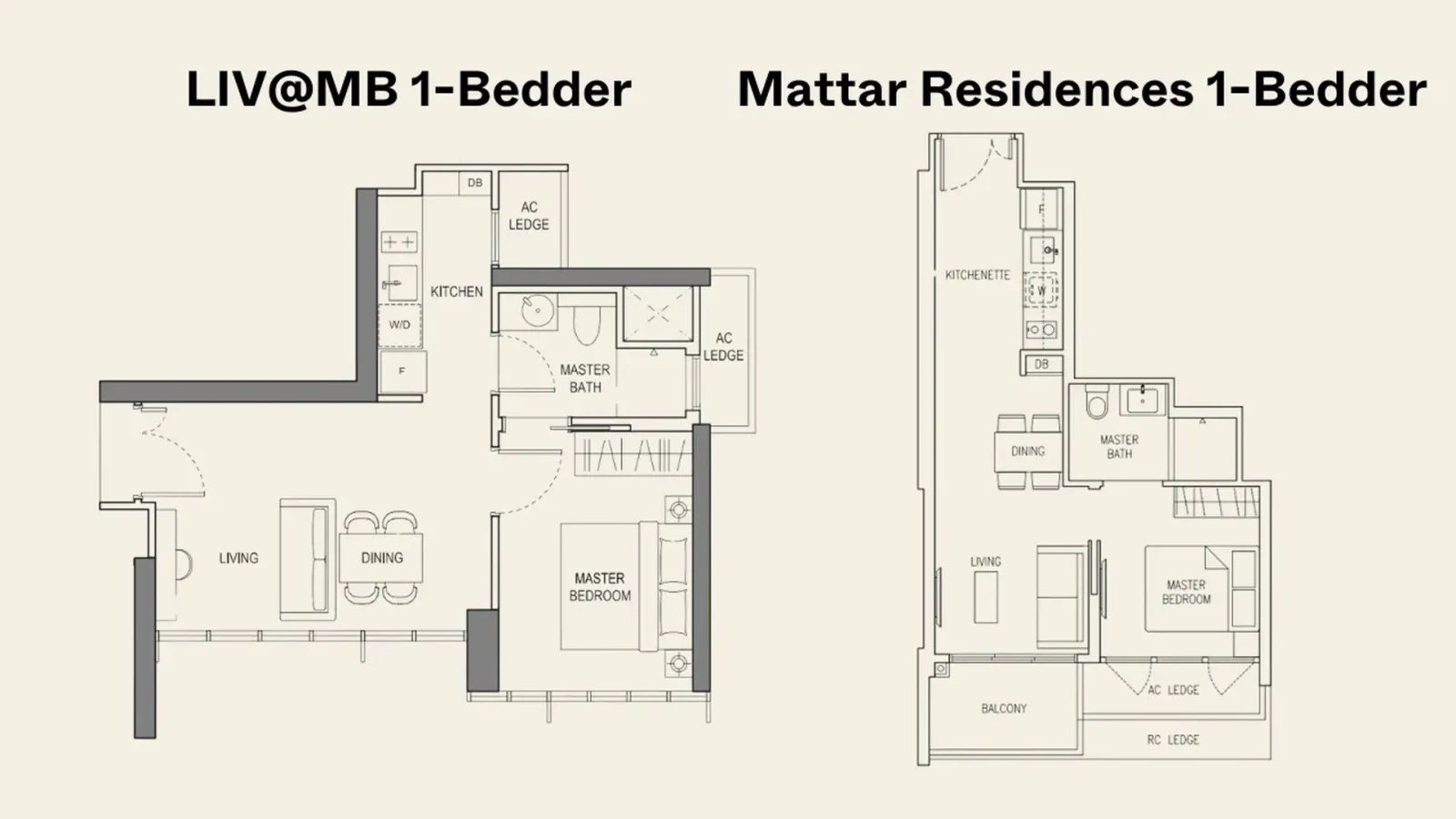
It is often thought that due to the size of 1-bedroom units, there isn’t much that can be done to improve efficiency or the liveability of the unit – but this comparison here certainly proves otherwise. 1-bedders are also neglected generally because the low quantum
Like the comparison above, both share the exact same size – but the liveability aspects between both could not be more different.
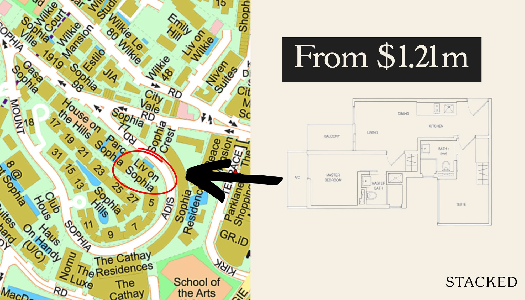
LIV@MB has one of the best 1-bedroom layouts on the market (at least, where new launches are concerned). You have the option of enclosing the kitchen – which is rare to find in a 1-bedder unit today. And that’s not all, the kitchen also has windows for ventilation – again, something very rare to come across.
Contrast this to Mattar Residences, where the kitchen is located along the entranceway, which is a typical scenario. To be sure, it’s not bad – but if you do cook a lot you’d surely appreciate the layout at LIV@MB a lot more.
Another advantage that the layout over at LIV@MB has is where the bathroom is concerned. This is a jack-and-jill layout, which allows visitors to use the bathroom without going into the master bedroom. This isn’t possible at Mattar Residences, as you’d have to go into the master bedroom to get to the bathroom. Let’s also not forget that the bathroom at LIV@MB has a ventilation window, which again is not easy to come by where 1-bedder units are concerned.
Finally, you have the much-preferred option of floor-to-ceiling windows from the living/dining all the way to the bedroom. This is possible because the AC ledge is located in sensible locations (outside the kitchen and bathroom), as compared to Mattar Residences where the AC ledge is at the bedroom – limiting it to the usual half window situation.
Terra Hill vs Amber Park 4 Bedder
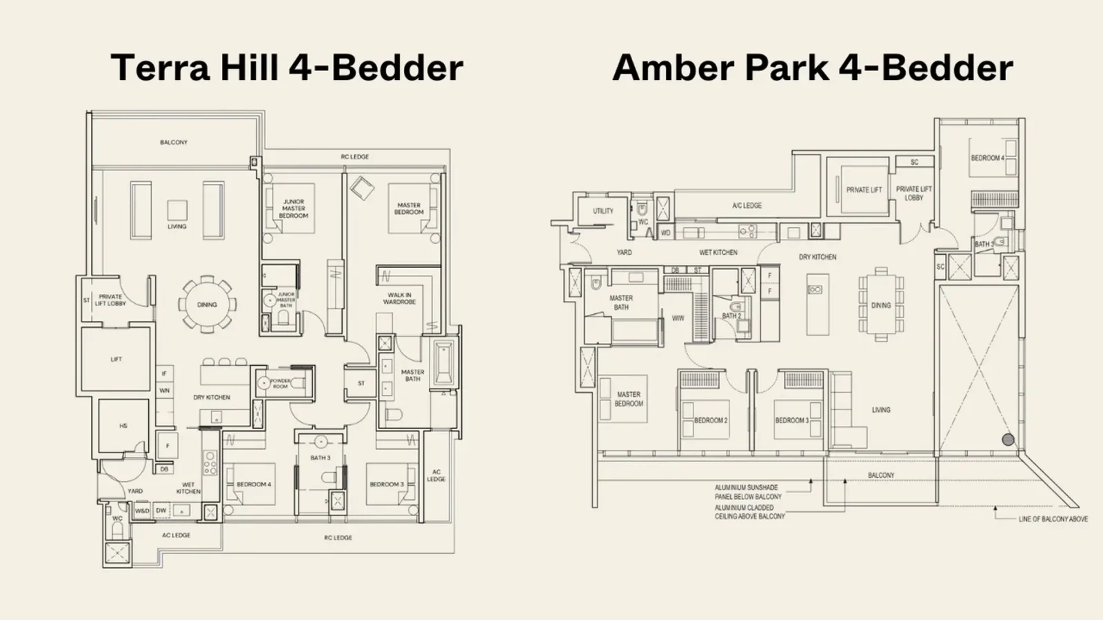
This was a harder one to find an exact comparison, but we have the 4-bedder units at Terra Hill and Amber Park that come in at 1,894 sq ft and 1,798 sq ft respectively. Now, when it comes to large units, the differences get milder due to the large space to play around with. Nevertheless, there are still some distinctions worth highlighting.
For Terra Hill, the layout is squarish and has fewer corridor spaces resulting in an overall more efficient layout. This has led to a better kitchen arrangement (rather than the long one at Amber Park), and even a powder room for guests plus a small store room.
Finally, the better layout at Terra Hill means that every bedroom has an attached bathroom (although 2 common bedrooms share a bathroom with a jack-and-jill layout). This is compared to Amber Park with both common bedrooms sharing the bathroom across the hall.
That said, Amber Park does have one advantage over Terra Hill – as bedroom 4 is located away from the rest of the rooms – which does give some added privacy for those looking for a multi-generation layout.
At Stacked, we like to look beyond the headlines and surface-level numbers, and focus on how things play out in the real world.
If you’d like to discuss how this applies to your own circumstances, you can reach out for a one-to-one consultation here.
And if you simply have a question or want to share a thought, feel free to write to us at stories@stackedhomes.com — we read every message.
Sean Goh
Sean has a writing experience of 3 years and is currently with Stacked Homes focused on general property research, helping to pen articles focused on condos. In his free time, he enjoys photography and coffee tasting.Need help with a property decision?
Speak to our team →Read next from Editor's Pick
Property Advice Should We Sell Our Freehold Condo For A $2.2M Leasehold Landed Instead?

Property Advice Should I Buy A Freehold Condo In A Landed Enclave — Or Look Elsewhere For Better Growth?

Property Advice We Own A 2-Bedder Condo In Our Early 30s: Should We Upgrade To A New Launch Or Resale With $2.2M?

Property Advice What A Family Of 5 Can Really Buy With $2 Million In Newton And Redhill
Latest Posts

Singapore Property News HDB Resale Prices Fell — But A Third Of Buyers Still Paid $800K+ Last Quarter. Here’s Why

Singapore Property News Three Strata Office Floors In Suntec Priced From $135M

Singapore Property News This Freehold Desker Road Shophouse Is Going For $10.5M





















0 Comments