How This Singaporean Homeowner Transformed A 1,818 Sqft Maisonette Condo
April 4, 2024
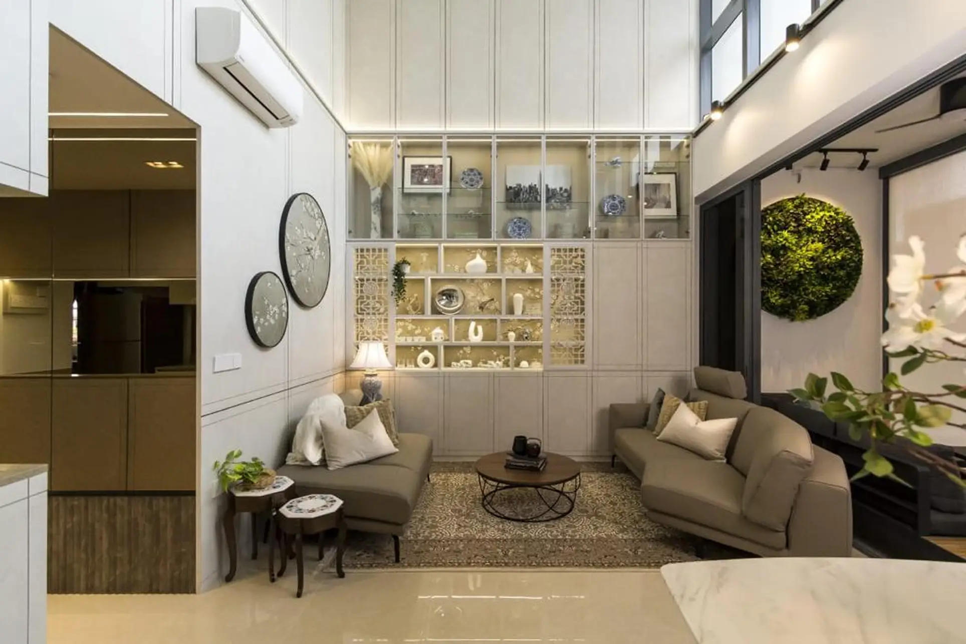
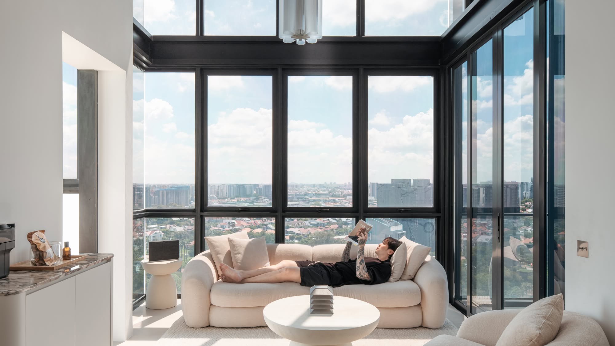
High-ceiling, double-volume units hold a fascination for many homeowners. It’s impressive, gives a sense of space, and has twice the impact in Singapore. Huge homes aren’t exactly the norm here, and going double volume is a major flex. But it also presents some design challenges, and this week we looked at how a homeowner with an unusual unit at The Gazania used it to good effect:
Many readers write in because they're unsure what to do next, and don't know who to trust.
If this sounds familiar, we offer structured 1-to-1 consultations where we walk through your finances, goals, and market options objectively.
No obligation. Just clarity.
Learn more here.
A rare double-volume maisonette
The unit is a rarity in the current age of shrinking units: a 1,818 sq. ft. maisonette with a double-volume living and dining area. This fifth-floor unit is at the top of the block, with three bedrooms on the first floor (one ensuite), and another on the second floor. There’s also a kitchen with a service yard and a small additional living space upstairs.
While the owners loved the sense of spaciousness from the double-volume layout, they were also aware of the accompanying challenges. Spaces such as these are ideal for a chandelier, for example; but there are practical difficulties in climbing up to maintain it. Within a double-volume unit, you run the risk of some things being higher than the typical ladder can reach.
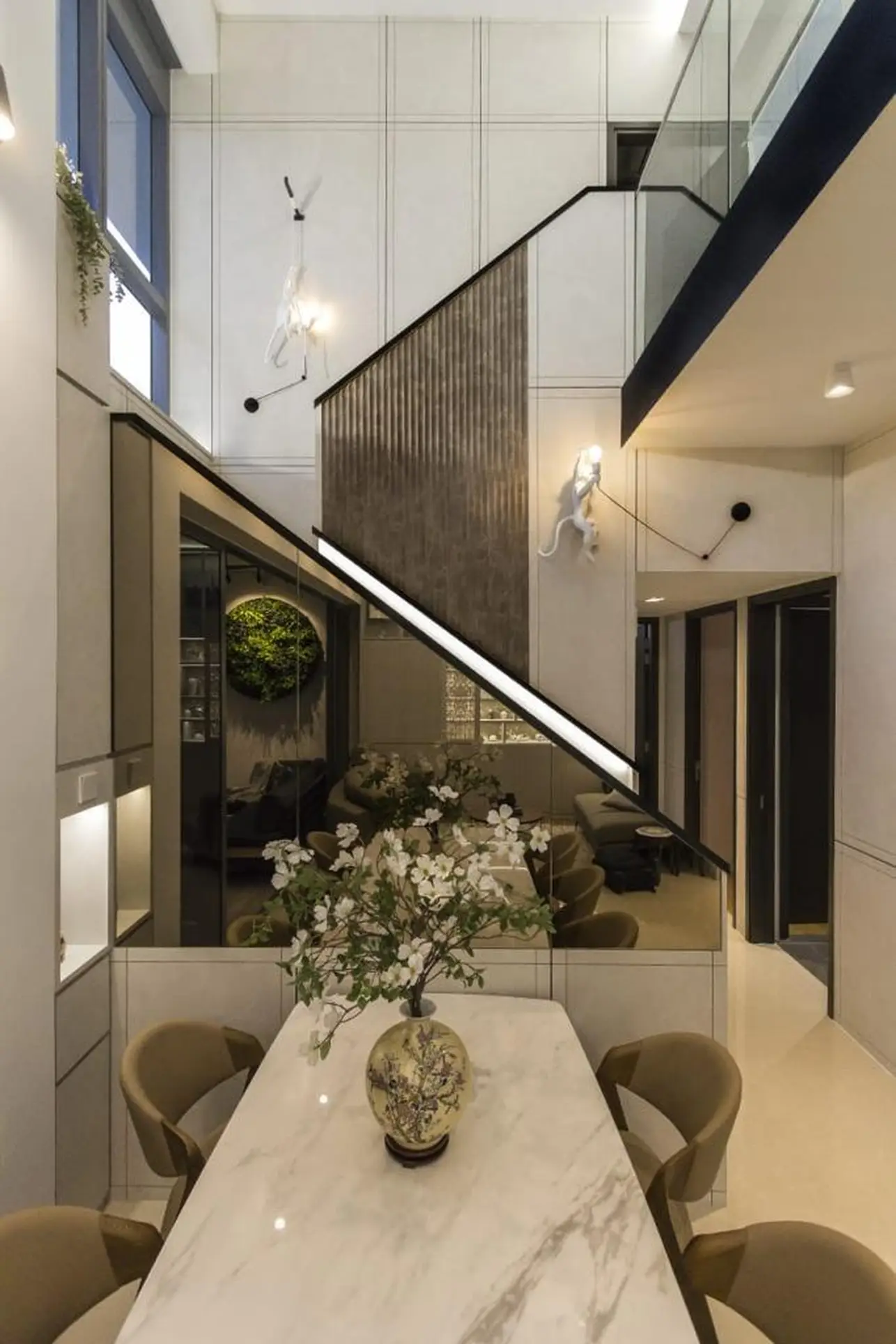
Typically, you’d need to call in a professional who can put up scaffolding to reach the lights, or electrical issues on the high ceiling; and that’s not something most people want to do for just a busted light bulb.
So working with the designer, the owners sought a balance: something simple enough to stay practical, but not so simplistic that it doesn’t take advantage of the apartment’s best features.
Chinese-influenced design themes
The owners describe the theme as Modern Chinoiserie. This isn’t Chinese in the traditional sense, but rather a European take on Chinese styles. The owners appreciate the delicate and detailed motifs – characteristic of Chinese furniture – combined with a more contemporary vibe.
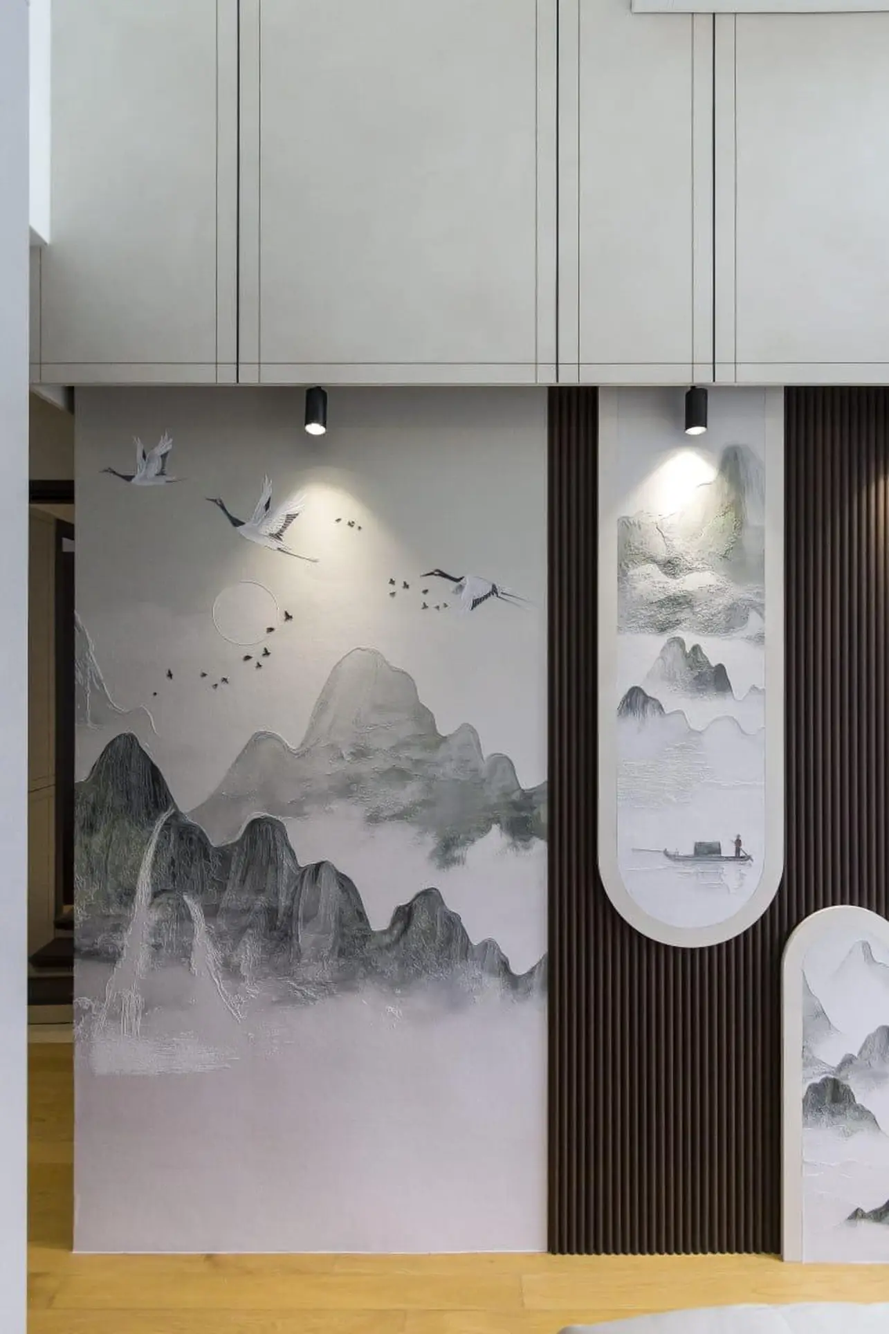
The theme is applied throughout the home; so while each room is given a character of its own, there’s still a sense of harmony in the overall design. The owners were influenced by hotels they had stayed in before, and their small collection of teapots fit the theme well (plus they even ordered some Chinese kitchenware to match).
When picking furnishings, a degree of careful curation was needed. There’s always a temptation to “overload” big, double-volume spaces with many centrepieces: chandeliers, large sculptures and paintings, imposing furniture, etc. But in this case, there was a realisation that having all these things together would create clutter, with each piece fighting to draw attention from the viewer. So it came down to filtering out some of the furnishings – however nice some of them seemed – instead of seeking out more. This helped to stay true to the overall design of the unit.
Furnishings in different rooms
The main entrance seemed a bit constrained to the owners, so a ¾ height mirror was included here to visually expand the space. The lower ¼ features fluted panels, which is a recurring theme throughout the unit.
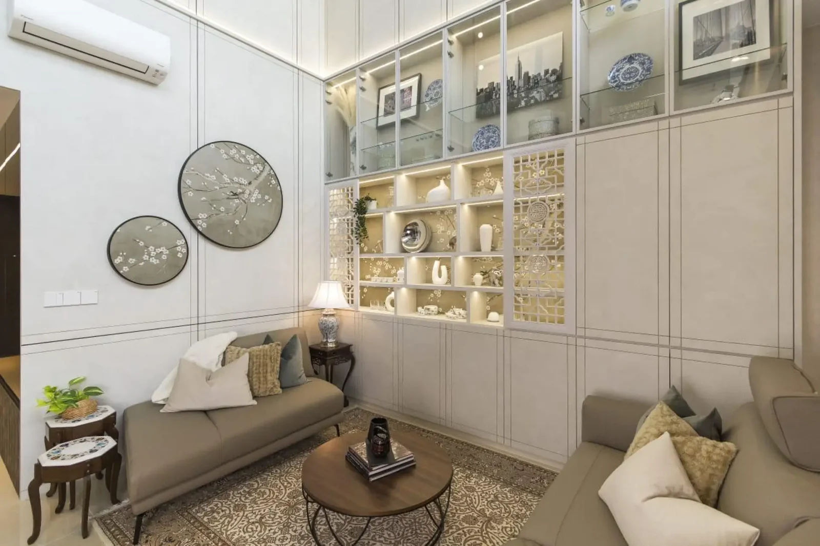
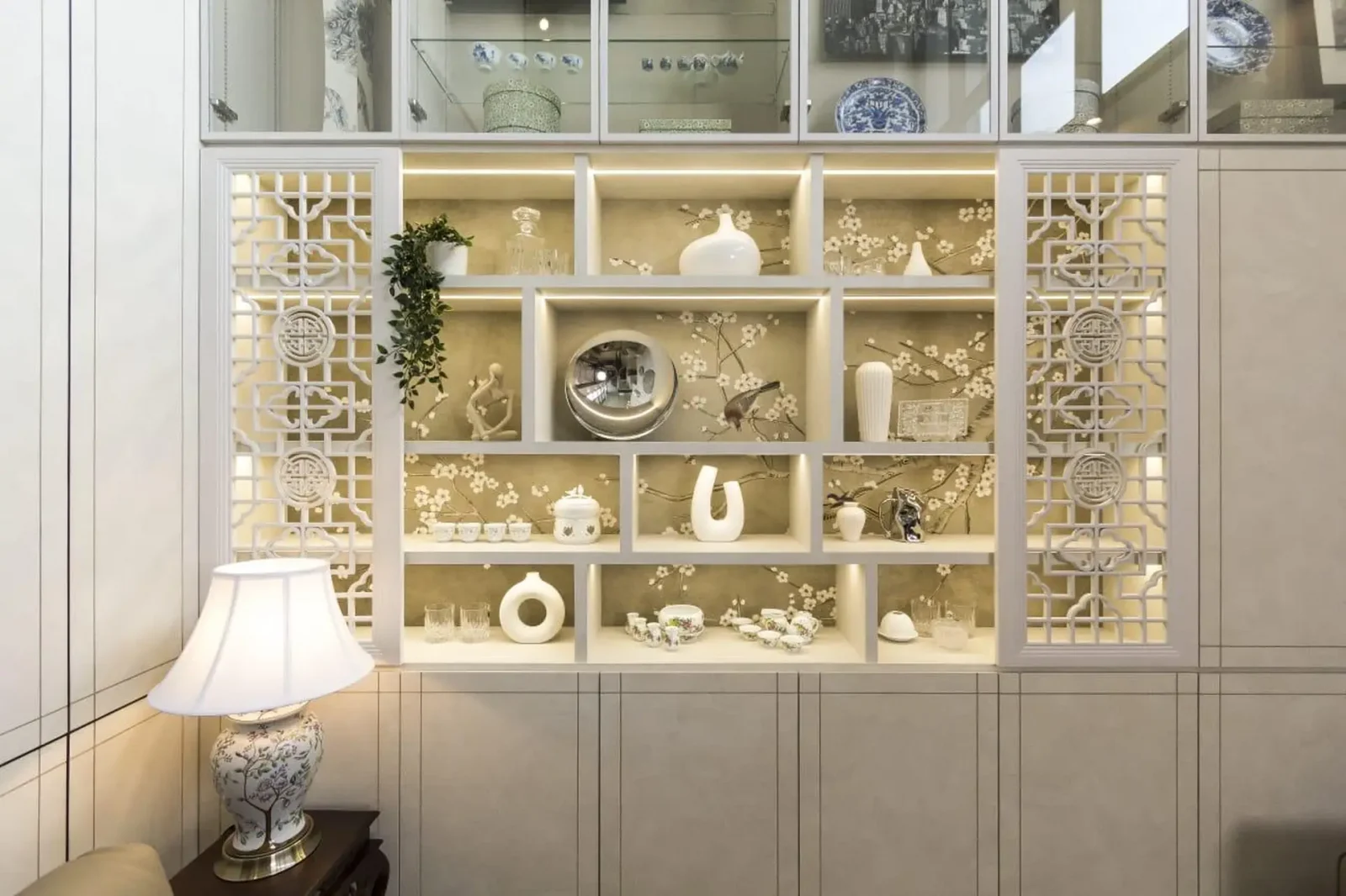
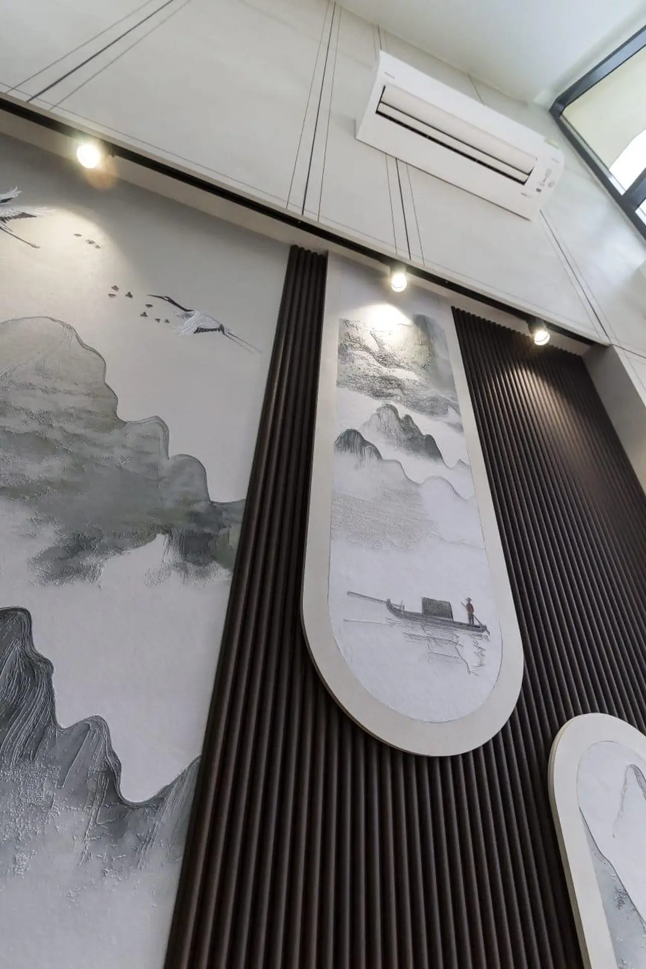
For the living and dining room, the wall panels span the full height of the double-volume space. The wall feature consists of Chinese panels with traditional motifs, and these were colour-matched with the wall panels to blend the two. The wall cladding – as well as the ones in the bedroom – is wallpaper encased inside a frame, which was custom work done for the owners.
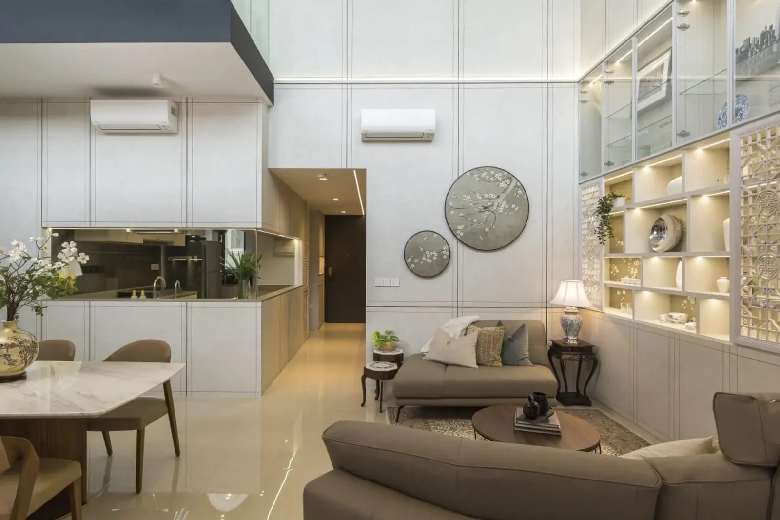
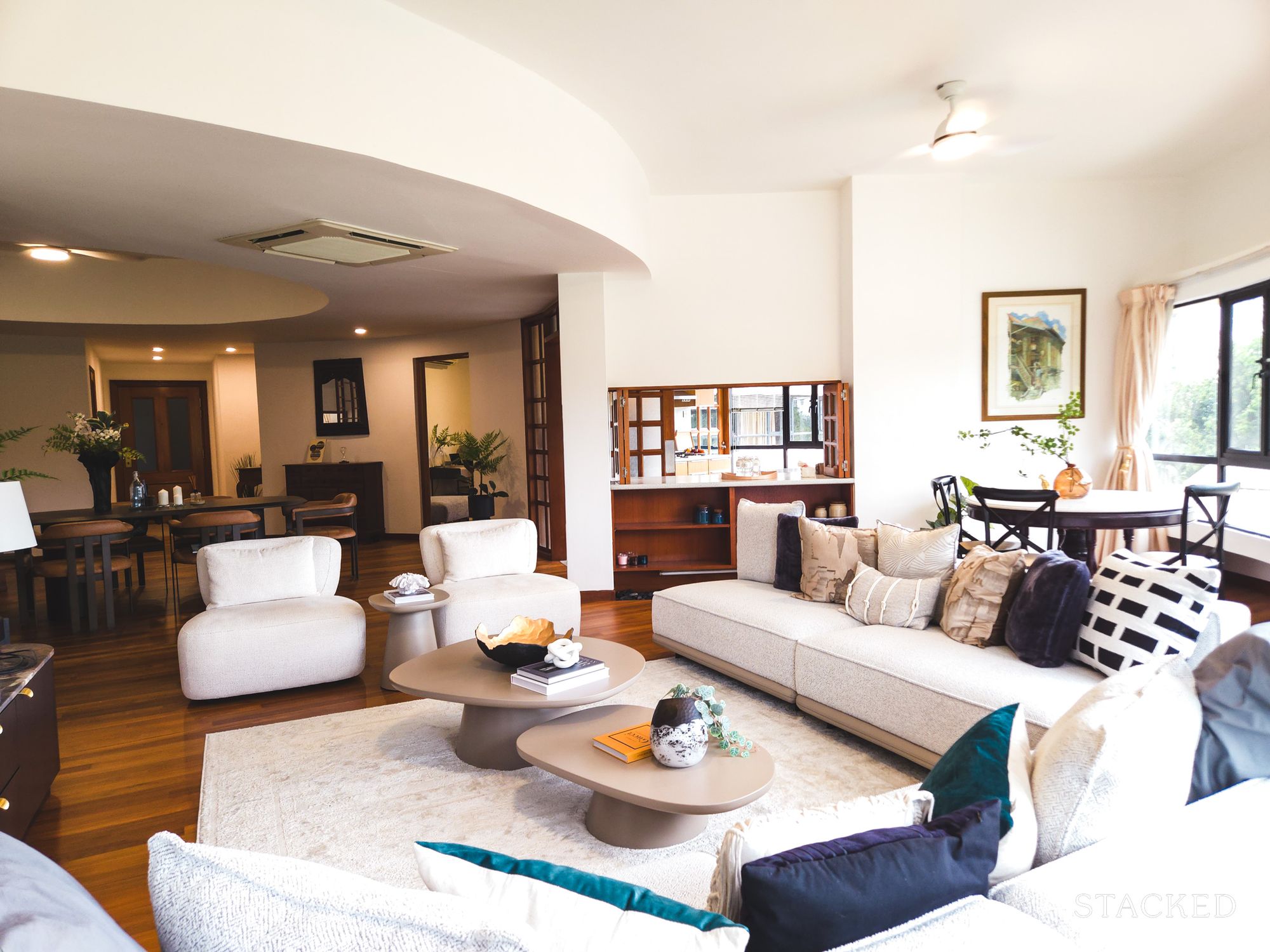
The living room also features a sofa from Nicoline – a unique curved, asymmetrical piece that is essentially a two-seater and three-seater unit. The owners enjoy hosting and wanted a cosy space for people to chat. The matching carpet under the soda is of Turkish origin and made of handmade cashmere.
More from Stacked
A $2 Million HDB Flat? Here’s When We May Possibly See The First One
I remember the first time we hit a million dollars for an HDB flat (this was an Executive HDB at…
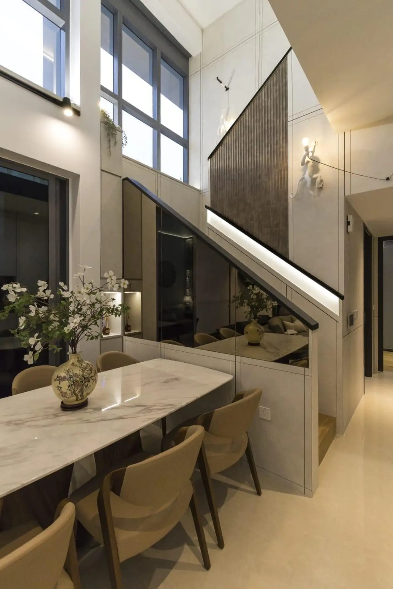
For the dining area, a large eight-seater table with fluted legs is the centrepiece. The tabletop is white marble, for better light reflection to brighten the place. Lights are positioned at a height of three metres, which ensures they’re reachable by ladder. Due to the height of the ceiling, it was decided not to hang anything from it, for ease of maintenance.
The balcony is spacious two metres by five metres, allowing for an outdoor lounger. A quartz six-seater table is good for drinks at night, and the unit has a pool view.
The first bedroom/study is a flexible room that’s large enough to serve as a bedroom, which can be used by the owners’ visiting parents. The work table and racks are all movable, to make space as needed. The second bedroom, which is attached to a common toilet, features wall panels that alternate between fluted panels and Chinese-style landscape paintings.
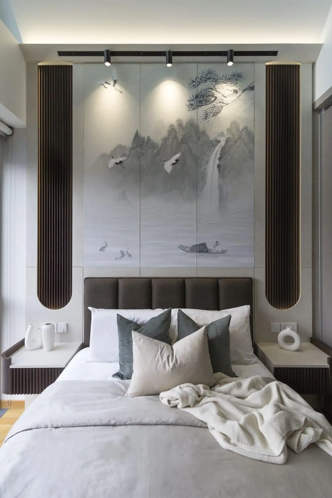
The Master Bedroom is described as “the most complex room,” and it’s fully wallpapered with Chinese landscape scenes. This is also a high-ceiling room, but as with the dining room, all the lights and fans are situated low enough to be accessed via a ladder.
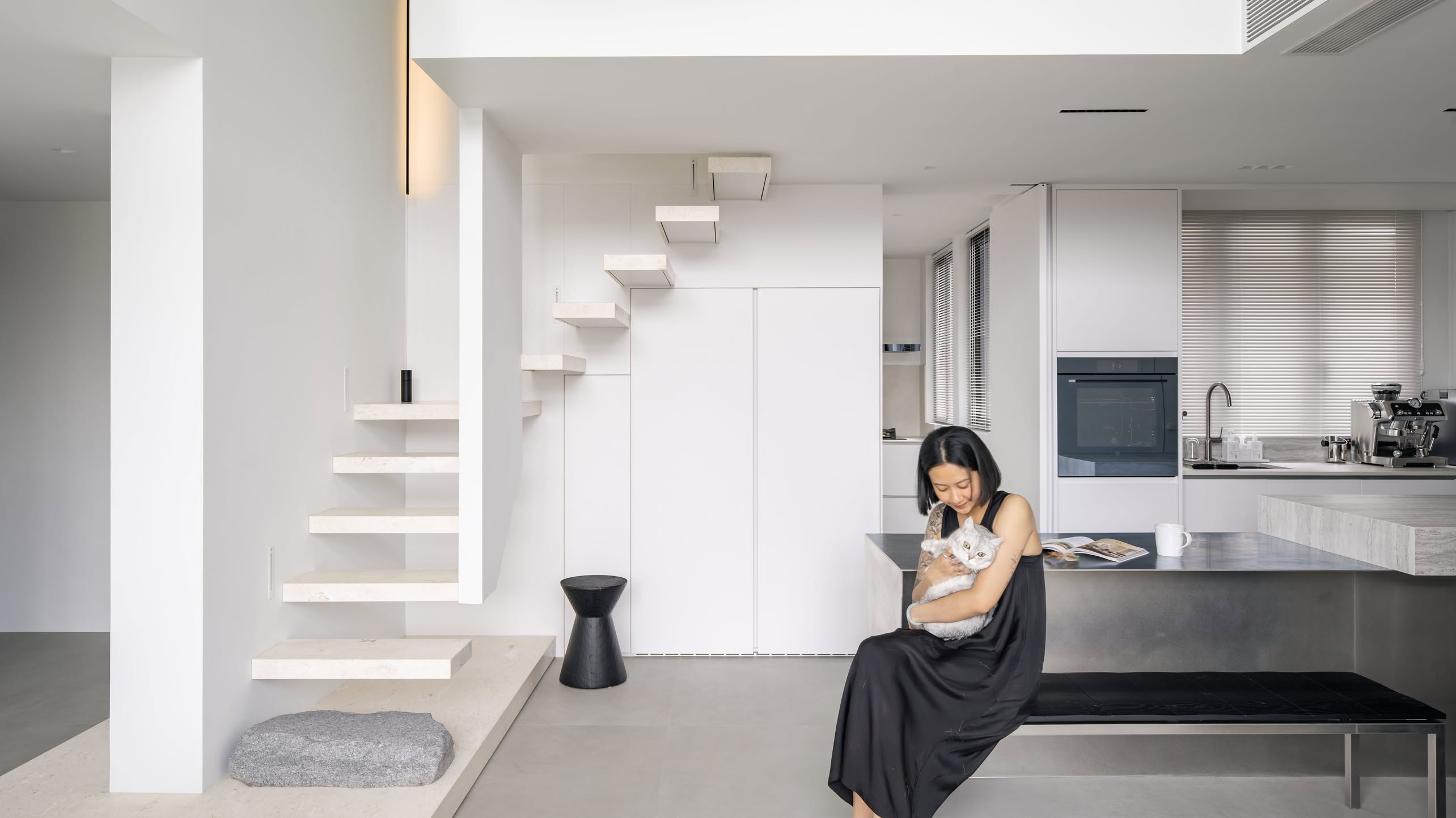
The stairs have custom-built lights along the railing, which allows the area to be illuminated without hanging light fixtures from the high ceiling. The owners handpicked monkey lights to give the area a more natural vibe, without clashing with the chinoiserie theme.
Over half a year of work
Given the size of the unit, it’s not surprising that the renovation and furnishing took a while. The owners said it took around a month to plan, but three months to find the various furnishings and refine the plan. Renovations only began afterwards, which took around four months.
However, the owners noted that the process was enjoyable, as their Interior Designer provided good creative input and could grasp the balance between aesthetics and functionality. He was also willing to make changes as and when something that looked better was found. So despite the fairly long process, the flexibility of the designer kept the owners interested.
Advice for other homeowners with high-ceiling units
The owner’s advice, if you also have a double volume unit, is to interview “as many Interior Designers as you can,” to get a feel for one who “gets” what you want. Ideally, you want someone on the same page as you, so you can have fun in the process.
It’s also best to set a theme and stick to it, and have your designer help hold you to it. You can find inspiration by looking online, in stores, hotels, etc. for similar themes in units with high ceilings; try to tag and revisit them daily, and cut out the ones you find you get tired of.
At Stacked, we like to look beyond the headlines and surface-level numbers, and focus on how things play out in the real world.
If you’d like to discuss how this applies to your own circumstances, you can reach out for a one-to-one consultation here.
And if you simply have a question or want to share a thought, feel free to write to us at stories@stackedhomes.com — we read every message.
Ryan J. Ong
A seasoned content strategist with over 17 years in the real estate and financial journalism sectors, Ryan has built a reputation for transforming complex industry jargon into accessible knowledge. With a track record of writing and editing for leading financial platforms and publications, Ryan's expertise has been recognised across various media outlets. His role as a former content editor for 99.co and a co-host for CNA 938's Open House programme underscores his commitment to providing valuable insights into the property market.Need help with a property decision?
Speak to our team →Read next from Homeowner Stories

Homeowner Stories We Could Walk Away With $460,000 In Cash From Our EC. Here’s Why We Didn’t Upgrade.
Homeowner Stories What I Only Learned After My First Year Of Homeownership In Singapore

Homeowner Stories I Gave My Parents My Condo and Moved Into Their HDB — Here’s Why It Made Sense.

Homeowner Stories “I Thought I Could Wait for a Better New Launch Condo” How One Buyer’s Fear Ended Up Costing Him $358K
Latest Posts
Singapore Property News Why Some Singaporean Parents Are Considering Selling Their Flats — For Their Children’s Sake
Pro River Modern Starts From $1.548M For A Two-Bedder — How Its Pricing Compares In River Valley
New Launch Condo Reviews River Modern Condo Review: A River-facing New Launch with Direct Access to Great World MRT Station






2 Comments
“…a sofa from Nicoline – a unique cursed, asymmetrical piece that is essentially a two-seater…”
LOL