From HDB To Landed Home: A Renovation Journey Of A 20-Year-Old House Into A Colonial Black And White Home
July 3, 2023

Moving from an HDB Executive Apartment to a larger inter-terrace landed home can be both exciting and a bit daunting. For C & H (@fiftysixvv), this challenge was a chance to make a dream home for their growing family in their preferred location.
“We thought we needed more space as we have 4 growing children; hence, we started looking for inter-terraces near our previous home in Bukit Panjang.
He said that the location of their home is perfect as his father lives in Choa Chu Kang, and his in-laws live in Bukit Panjang. After deciding on the home’s location, the couple turned their attention to the interior design.
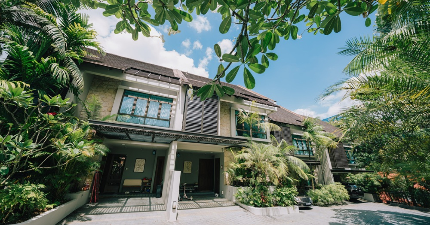
They wanted their new home, a 2-decades-old resale inter-terrace at Verde Avenue, to have the allure of shophouses and colonial black and white homes.
Presently, C, H, and their children, together with their helper, are staying in their place and enjoying the results of their renovation.
Let’s join them as they share what they went through in their reno journey.
So many readers write in because they're unsure what to do next, and don't know who to trust.
If this sounds familiar, we offer structured 1-to-1 consultations where we walk through your finances, goals, and market options objectively.
No obligation. Just clarity.
Learn more here.
How The Renovation Journey Turned Out
C confessed that they originally did not know how much to set aside for their renovation budget as they had not done any reno before this. “Our previous home was just renovated by the previous owner before we moved in, so we had no major changes.”
C & H initially underestimated their budget for renovating the 20-year-old resale inter-terrace. “We started out with a certain budget, but when we went to interior designers for quotations, we found most estimates were well above what we had planned for,” C said. As a result, they had to adjust their budget significantly, with the final spending being double their initial estimates.
The property, being two decades old, needed considerable refurbishment, particularly the first floor. “The dry kitchen was cramped, and the wet kitchen was even smaller,” he explained. The couple also saw potential in the backyard, which was primarily used for laundry. “The overall feel of the house was also quite dark and outdated, especially the bathrooms.”
To revamp the space, they decided to give the house a fresh, bright look and remodel the kitchen. “In any renovation project, the kitchen and bathrooms are typically the most expensive parts to remodel. It was no different for us,” C added.
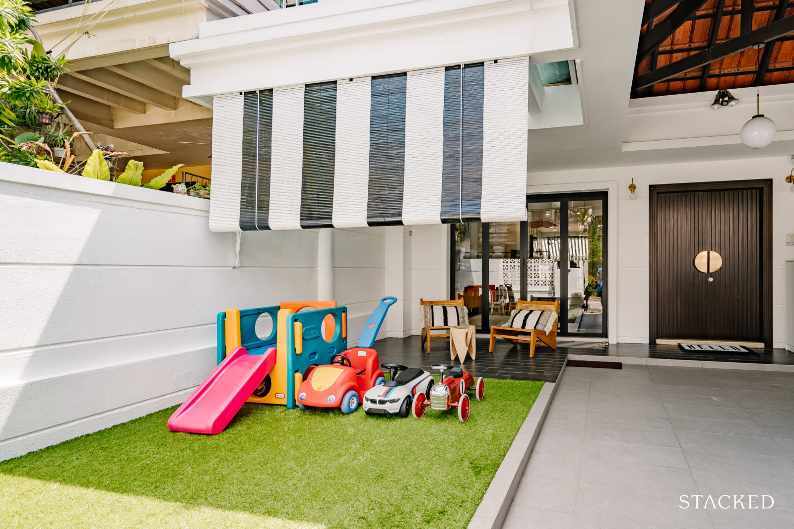
In addition to interior changes, their renovation process included significant work on the outdoor spaces. “We cleared the front yard garden, and even had to hire professionals to remove a large tree and a pond,” he recalled. They also had to cover the costs of exterior painting and waterproofing. All these factors led to an increase in their renovation costs.
The couple also did not realise that the cost of electrical work could be substantial for a large home until they received the final bill. “It was more than double than what was originally quoted by the electrical contractor as we added a few more requests along the way during the renovation process,” he said.
Property Advice8 Practical Things You Need To Know Before Starting Your Renovation In 2023
by Ryan J. OngAside from capturing the charm of shophouses and colonial black and white houses, C and H also aimed to incorporate a cosy mid-century modern Scandinavian/Farmhouse look while mixing other elements they love into their home’s design and style.
Let’s take a tour of their home and witness the result of their renovation process, starting with the living room.
Living Room
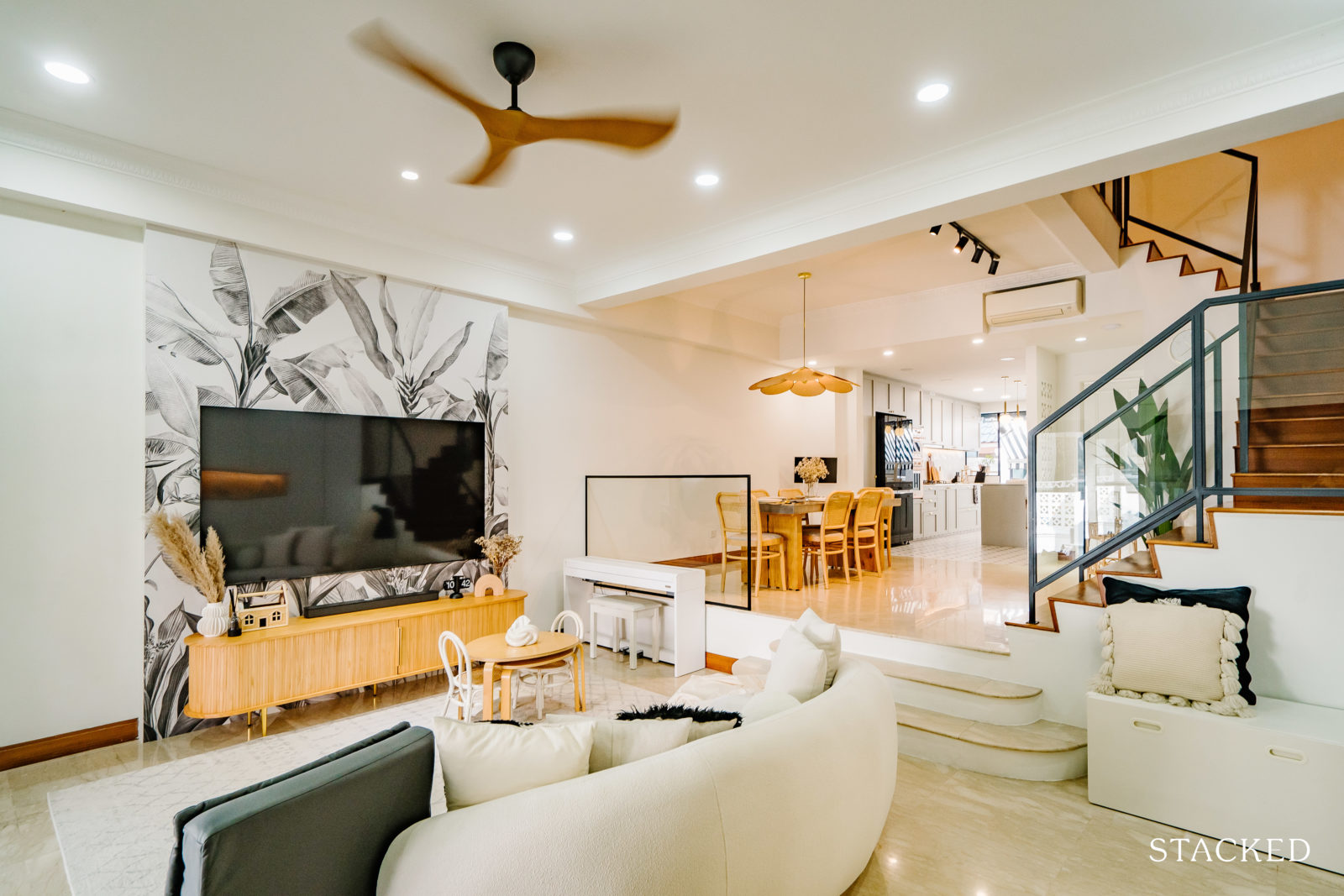
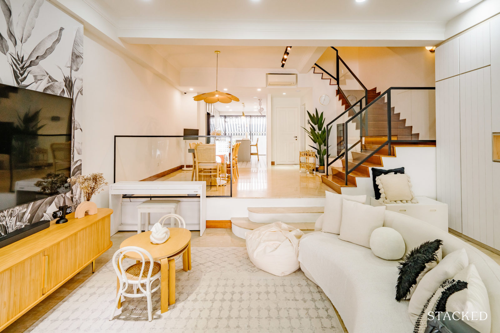
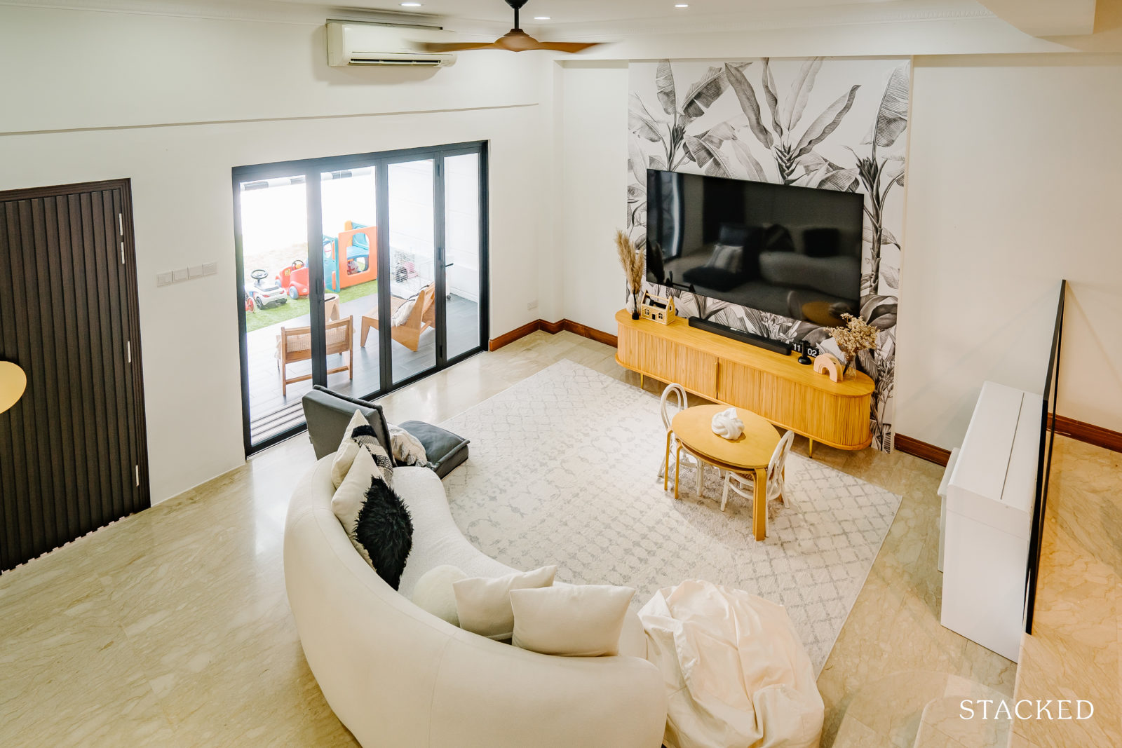
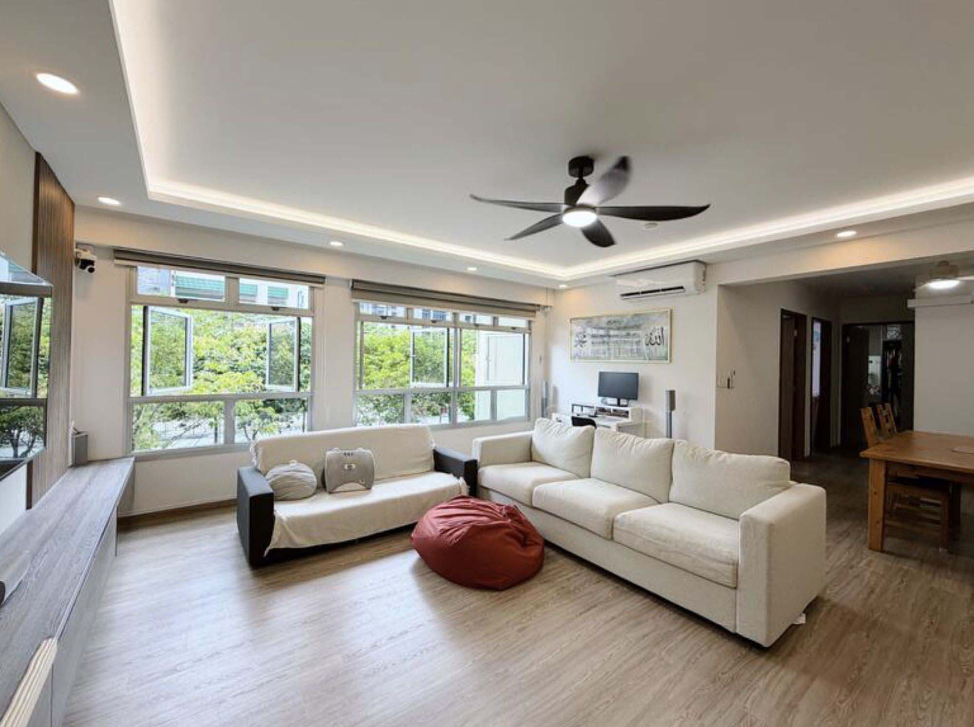
The living room was previously dark and had old cabinets and altar areas. The couple removed them and repainted the walls to a sail white tone to brighten up the space.
They replaced the outdated wrought iron staircase railing with modern glass with black railings, which is the same thing they did to the stairs that lead upstairs.
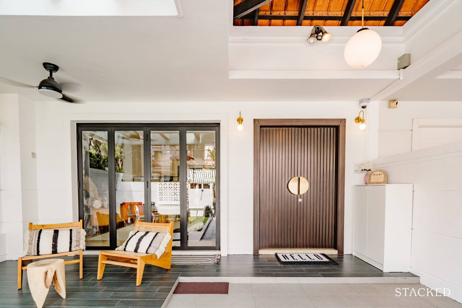
To open up the space completely for more light and ventilation, they replaced the old sliding gate – separating the front yard and living hall – with modern blacks framed with foldable doors.
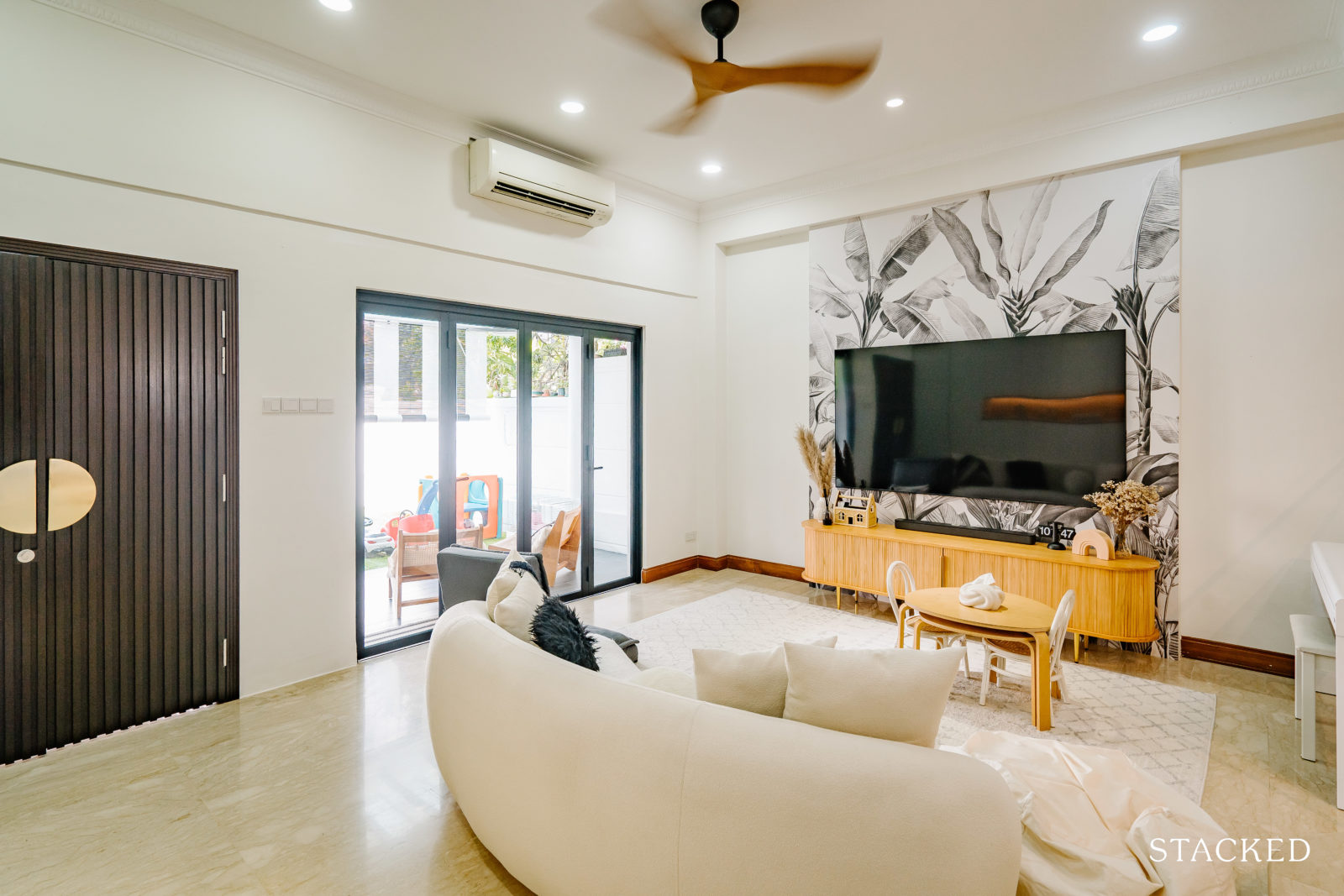
For the TV feature wall, they used a black and white tropical wall mural instead of one in colour, which C said goes well with the overall feel they wanted for their home.
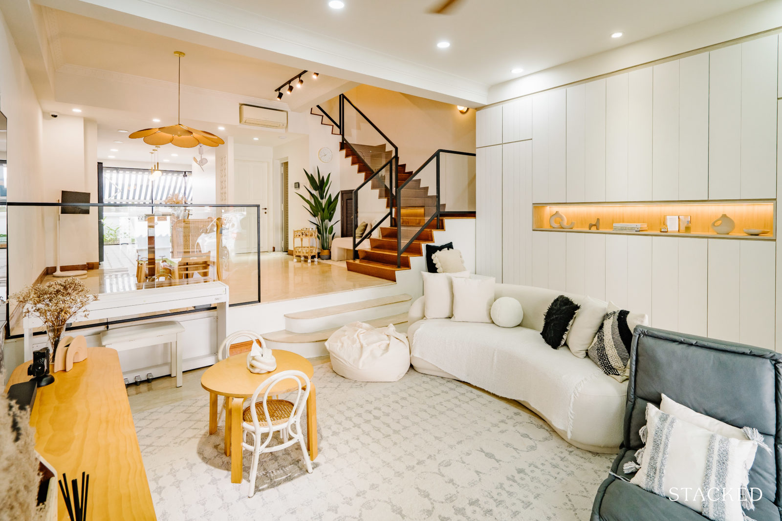
The furnishings and soft furnishings in the living room are also kept mostly in white, off-white, or wood to keep the overall colonial mid-century feel of the home.
“Our super huge storage cabinetry in the living room is also white and has grooved lines which remind us of shiplap and also have a farmhouse feel to it,” said C. “We included a display area for my Nordic vases. Initially, we wanted an arch here but scrapped the idea for a functional storage space.”
Dining Room
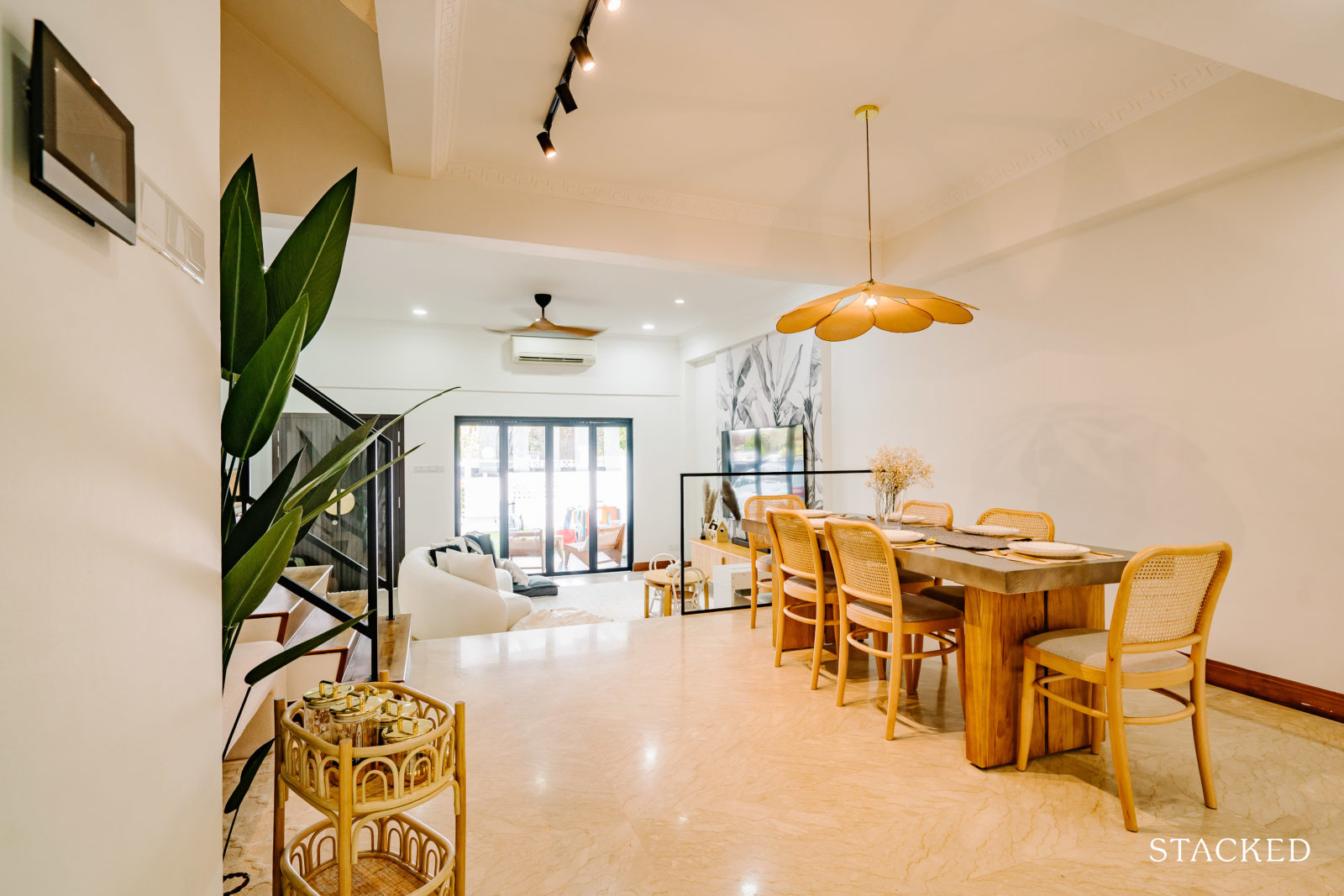
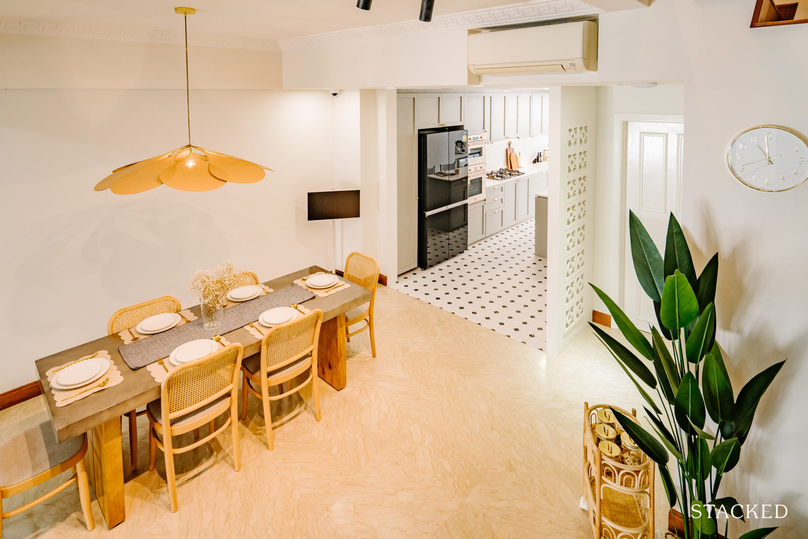
Their dining area boasts a show-stopping feature: a Georges Store Pale Petals Lamp. The gentle curves of the lamp’s petals introduce a touch of warmth and comfort to the space. C explained that they deliberately kept the rest of the dining area design simple to ensure the lamp remains the standout piece.
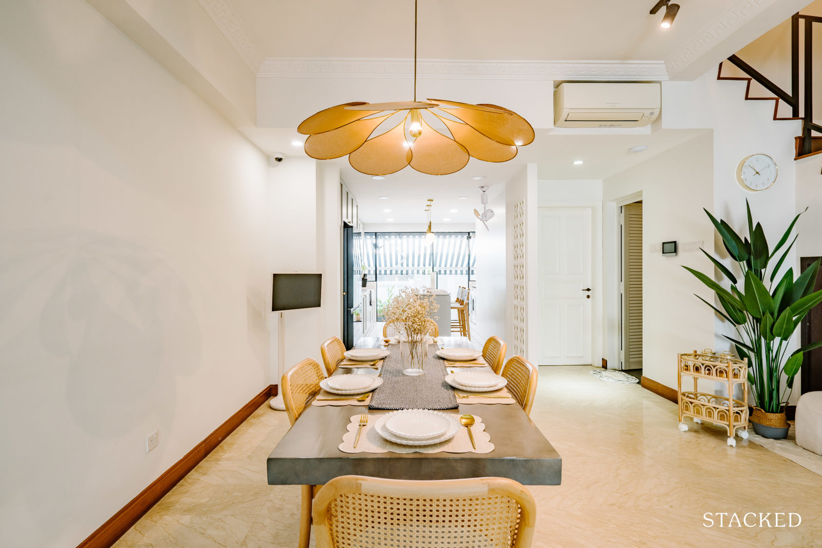
Just as they used for their front yard sitting chairs, they also used rattan in their dining area, which helps to add cosiness and a mid-century modern feel.
Kitchen
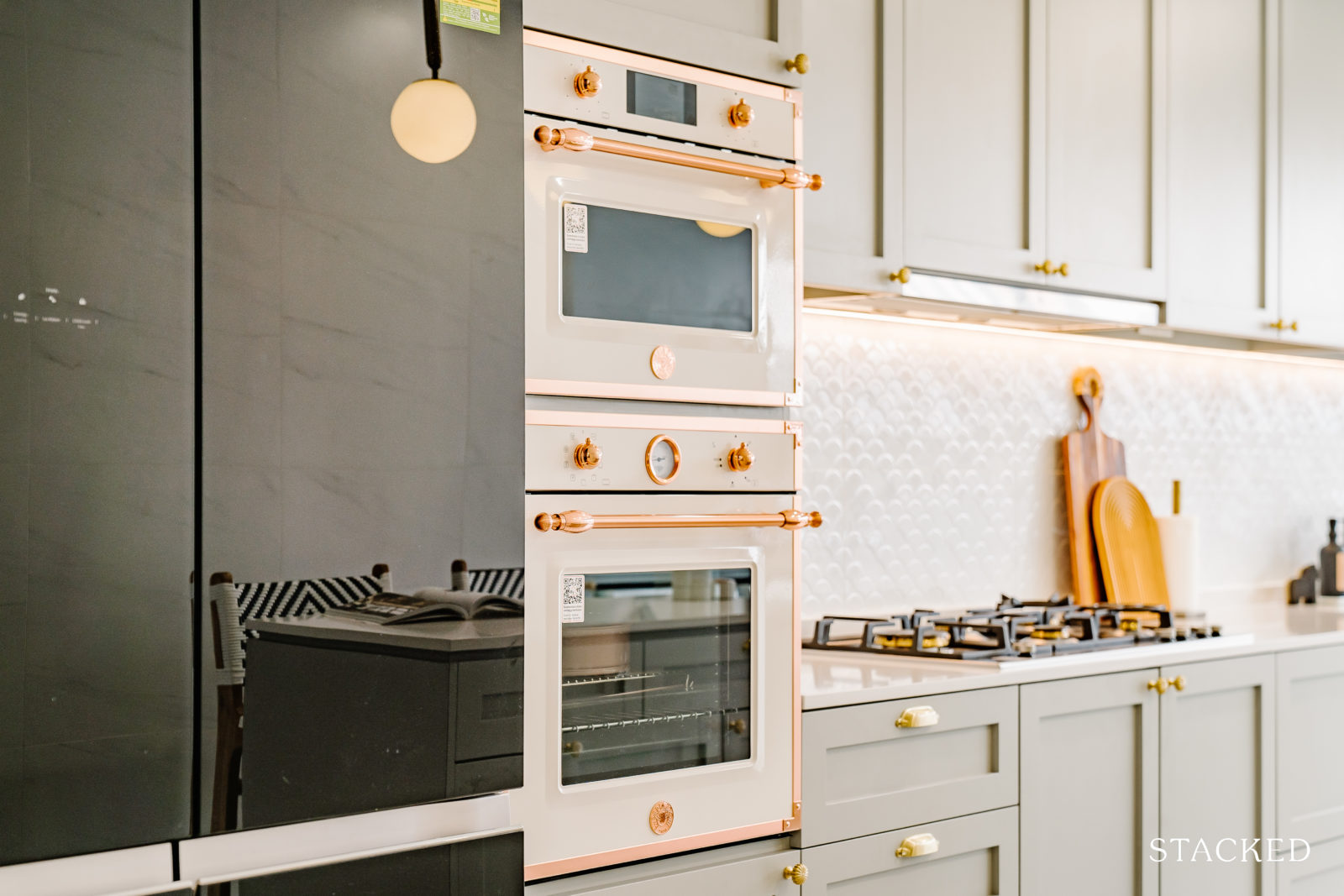
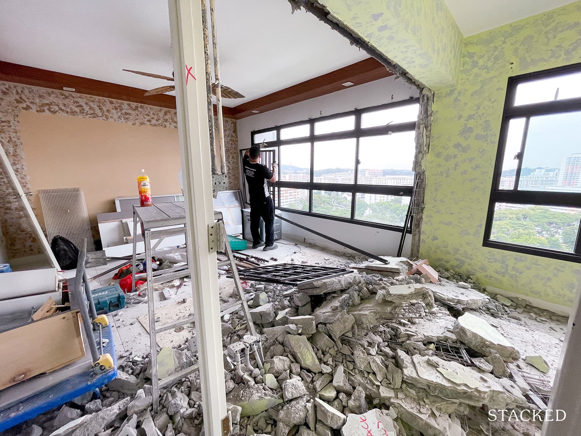
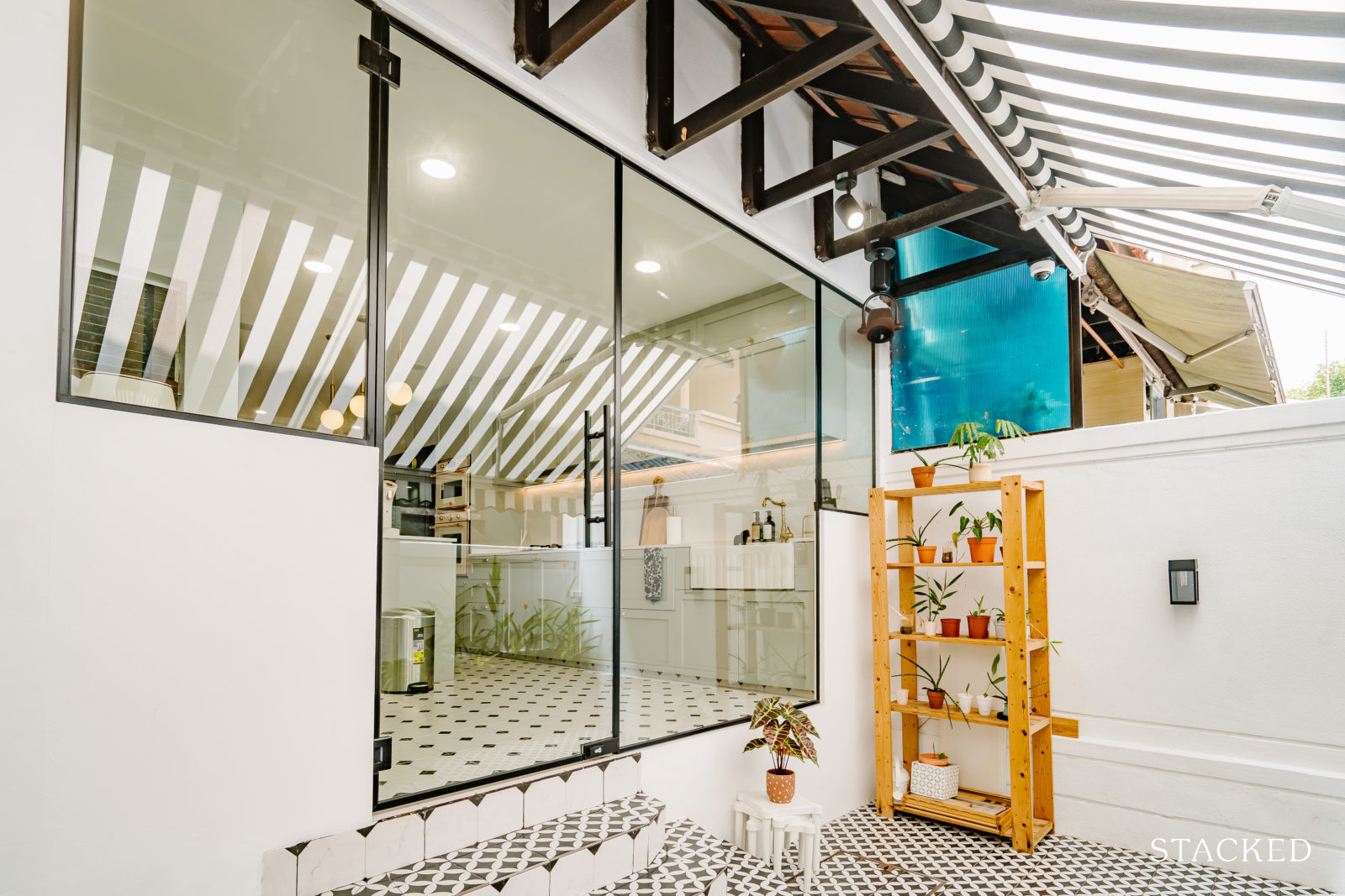
In order for them to achieve the home design that they wanted, the level 1 kitchen and the backyard had to undergo some major layout changes. They had to hack down a few walls that separated the original wet and dry kitchen as well as the dining to the kitchen area, plus they had to redo the plumbing and electrical works.
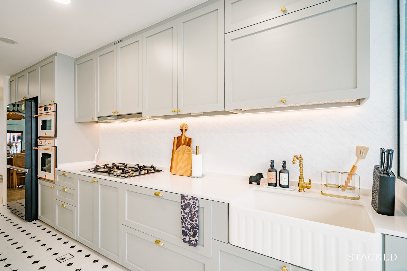
“We hacked and leveled the kitchen area and opted for an open-concept kitchen so that the kitchen appears big, bright, and airy. Our family does not do much heavy cooking hence an open-concept kitchen works for us,” C said.
They also changed the entrance to the courtyard and transformed the courtyard area entirely.
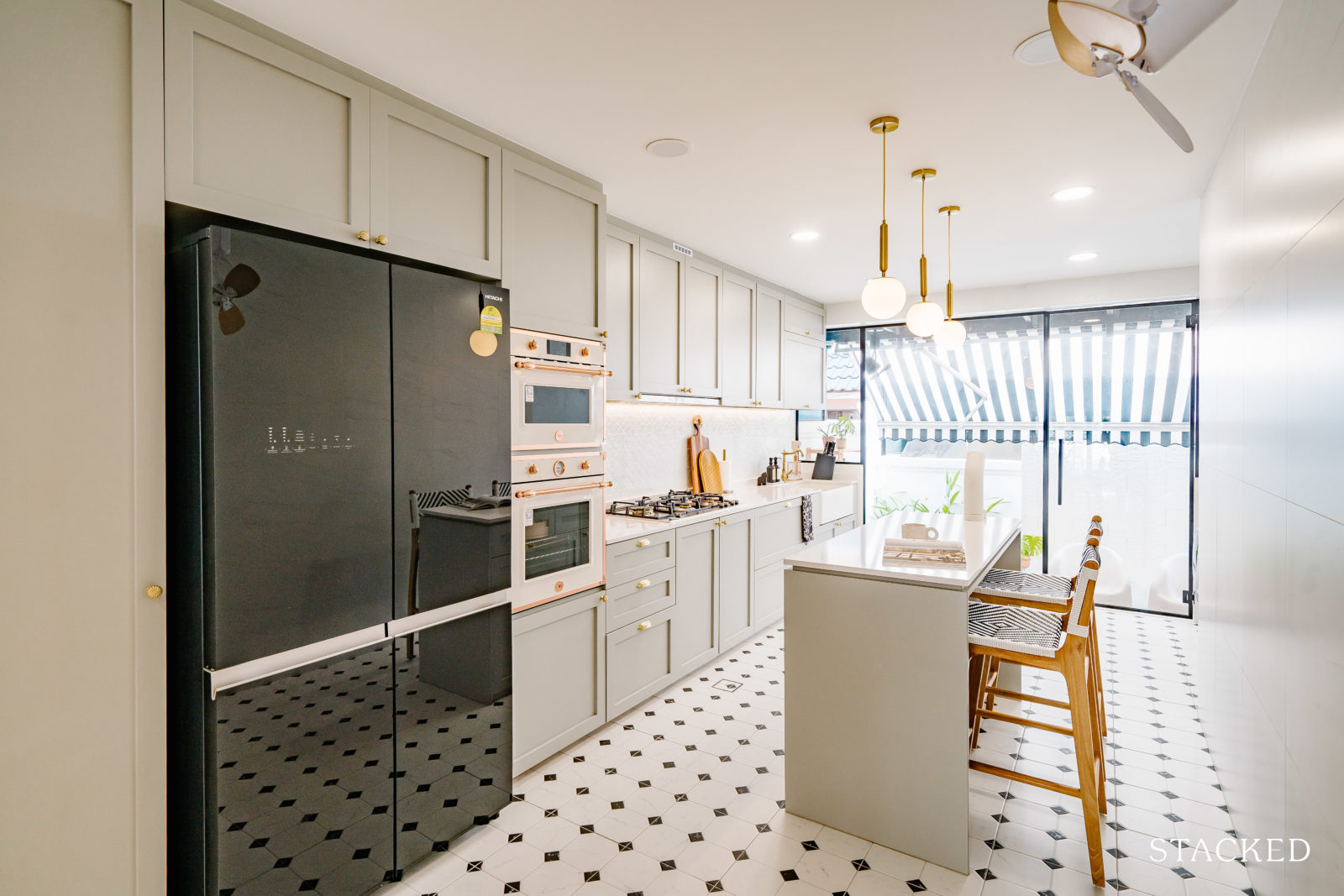
“I also like how cafes have alfresco areas segmented by glass doors, so we included that in our kitchen to backyard area,” he said. “I love that we can look out from the kitchen and have an additional indoor/outdoor area to chill, play and rest.”
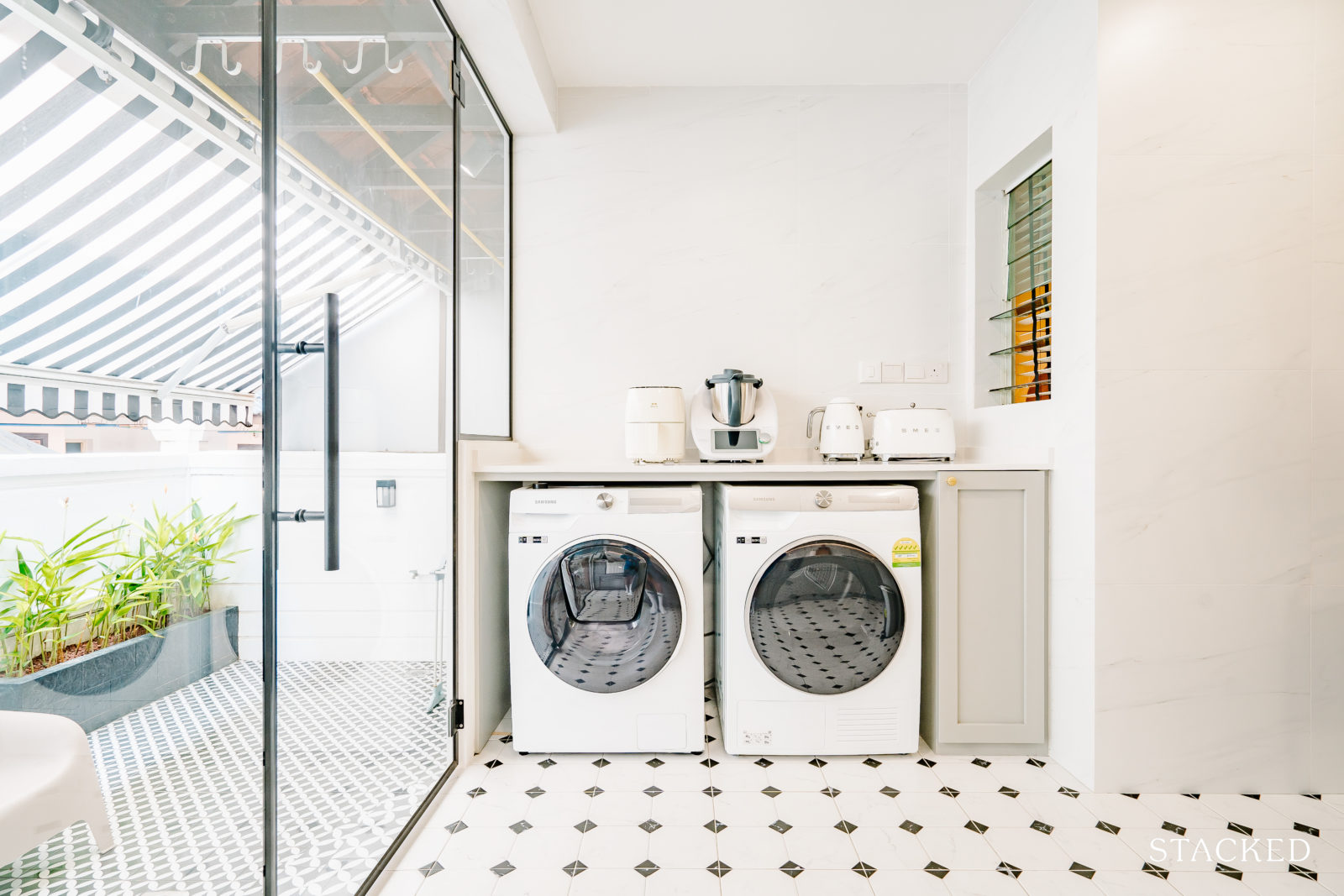
The kitchen, backyard, and powder and master floor toilet tiles are all in different black and white patterns. They were initially worried that there would be too many black/white patterns, but somehow it worked well.
“We are happy that they somehow complement each other! The kitchen and toilet hardware are mostly brass/gold or black as well, which complements the white, black colours.”
Bedroom/s
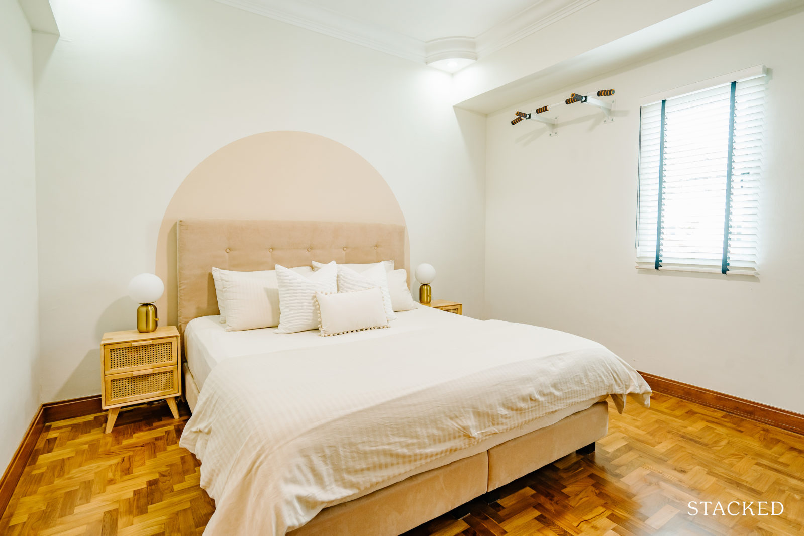
With the Master Bedroom already spacious as it is, they decided to add a partition to create a dedicated space for resting and working.
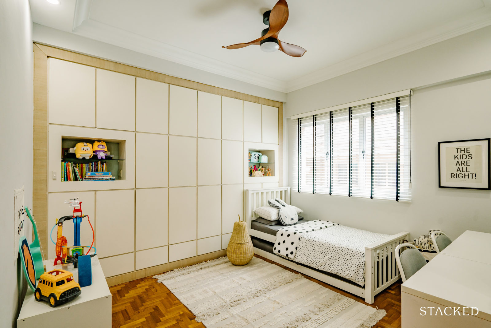
The common rooms are thematic in the way they are painted and decorated. The Boys’ room has a more industrial look, while the Girl’s room has a cute, feminine look to it.
“Our daughter’s room also has scallop elements painted on the walls in her favourite colour and rattan pieces.”
Bathroom/s
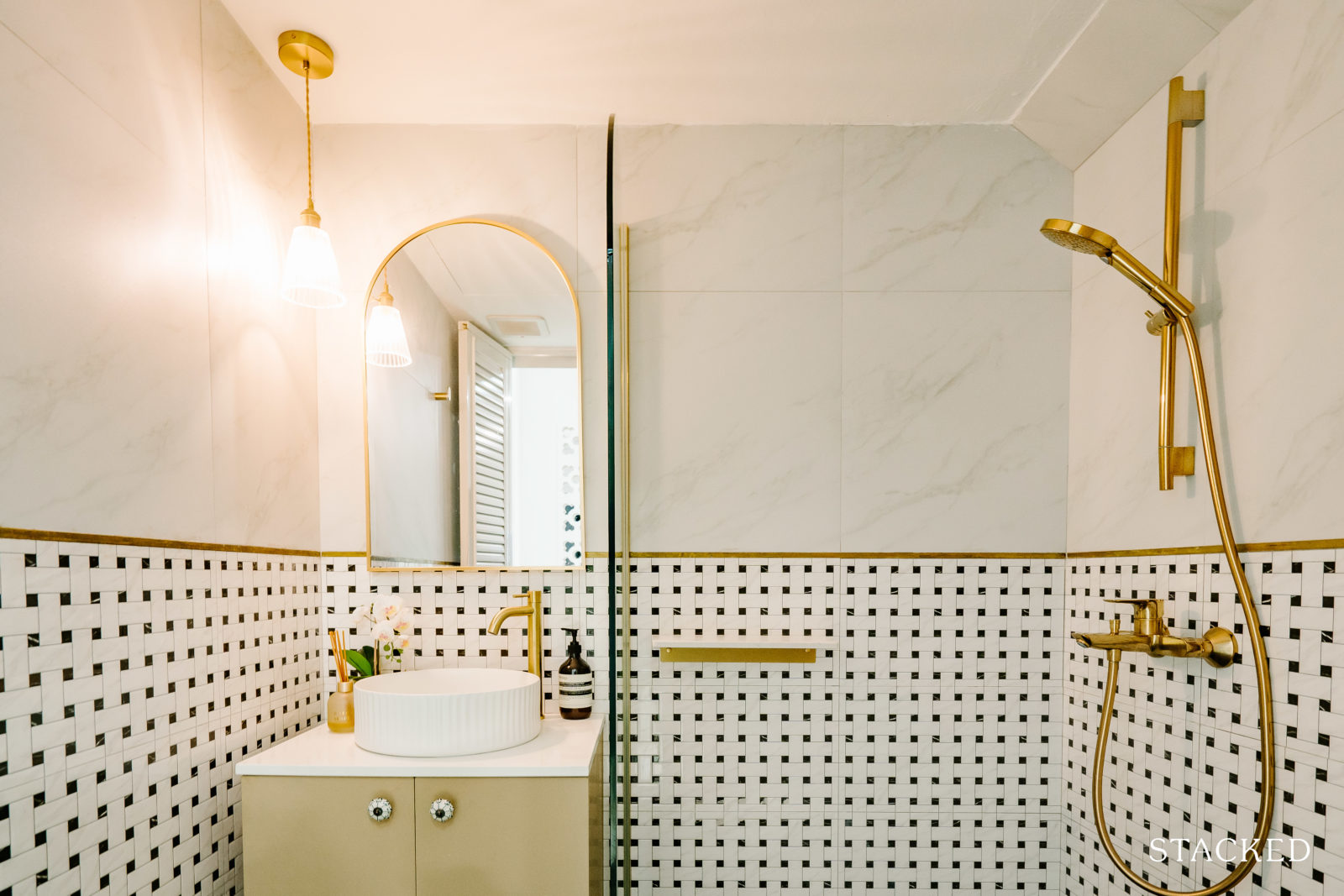
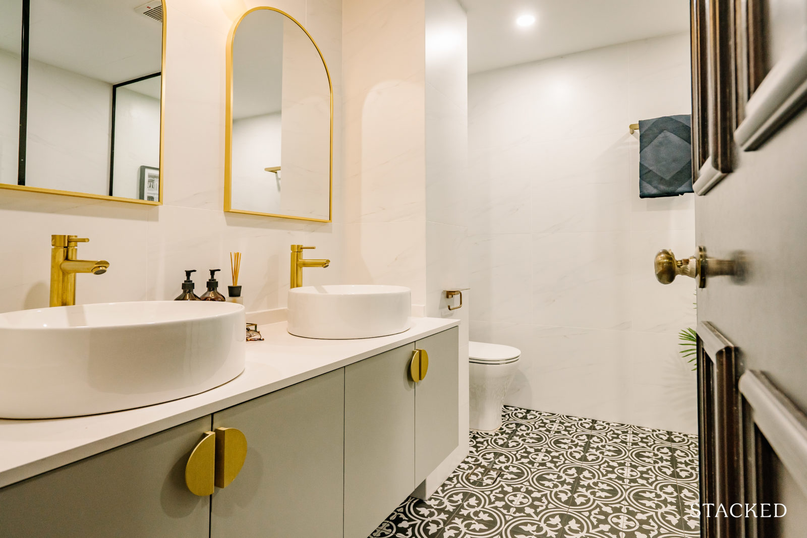
All the bathrooms went through a complete overhaul and were renovated to have their own individual look and style. The Master Bathroom has a modern colonial look to it, using Farmhouse/Peranakan black and white tiles.
Bringing The Vision To Reality
C said the final outcome is similar to what they envisioned before the renovation project started. He said H loves browsing interior design magazines, books, and reno IGs and shared them with their ID from Tidplus Design, who helped make them happen.
More from Stacked
Under $1 Million for a Landed Home? These Singapore Estates Make It Possible — But There’s a Catch
Most people assume landed homes are far beyond reach, the kind of property that only the ultra-rich can afford. And…
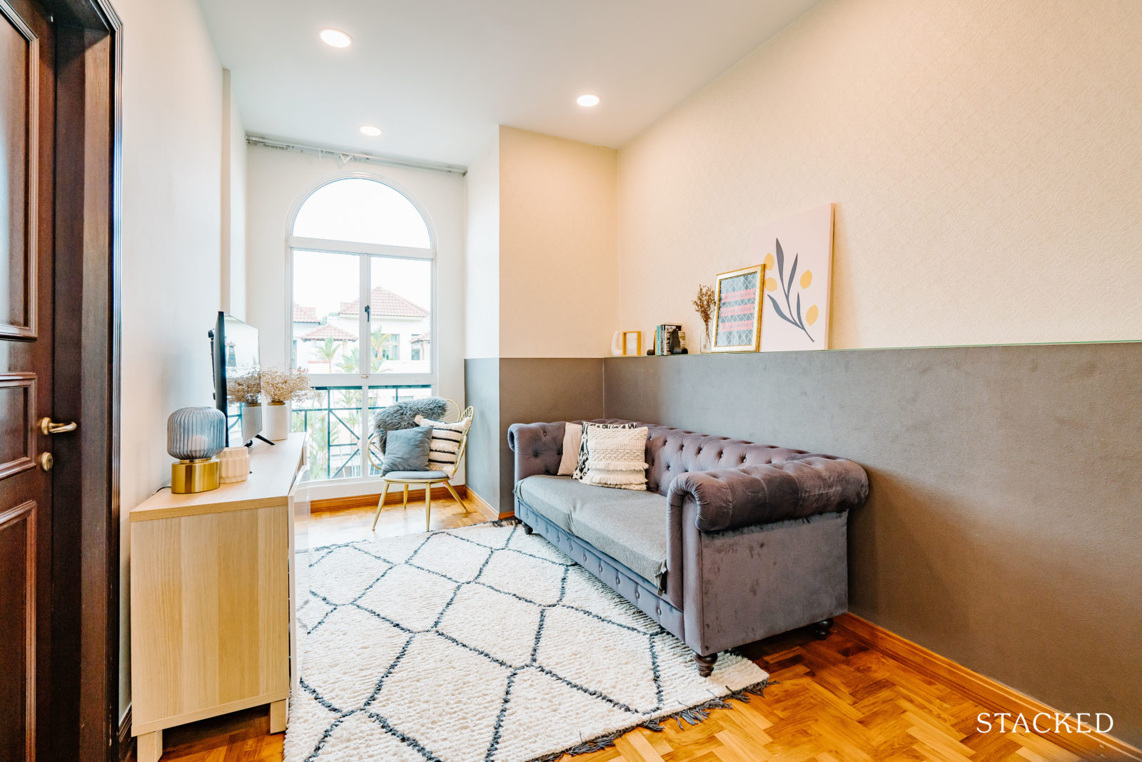
In able for them to bring their vision to reality, they spent a good deal of time narrowing down what they wanted to include in their interior. “We used similar elements throughout the home to create a seamless unity and flow in design.”
The couple decided to stick to mostly black, white, off-white, wood, and gold/brass hardware colours.
“The black and white blinds in the front garden porch and backyard awning is similar to what you might find in shophouses or colonial homes. This was a must-have for us! We also chose white and black for the exterior walls of the inter-terrace.”
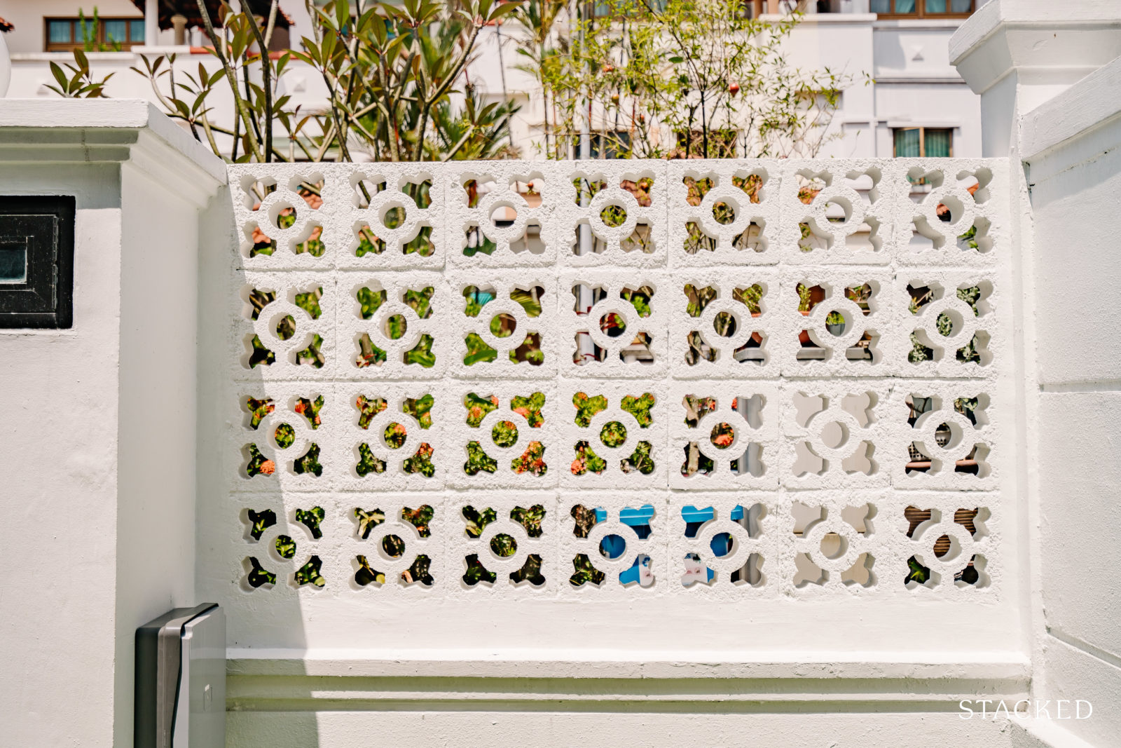
Their use of white ventilation blocks instead of a fence in the front yard adds an element of a shophouse Peranakan vibe which the couple admittedly loves. Plus, with the ventilation/breeze blocks in trend today, this approach is aesthetically pleasing too.
Beyond the appeal, these blocks are also functional as they facilitate the airflow into the house and front yard. They also used the same approach in their open-concept kitchen between the kitchen and the power/guest room.
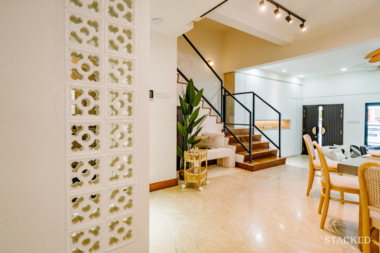
“We wanted to include these in the interior so that there is unity in the design elements and also because it works well in separating spaces within homes. I think some of our neighbours also shared that they love how unique the ventilation blocks are.”
Scallop designs, together with curved and fluted elements, are other styles you’ll consistently see in their home as well. “We used scallop tiles for the kitchen backsplash and the girl’s toilet.”
The curved/arch element can be seen on the other floors, especially on the level 3 courtyard, where they included an arch wall for the sitting area – their “getaway” place where they have tea or do a bit of reading. The tiles in this area of the home have curved designs as well, similar to a Moroccan villa. “This is very different from the rest of the black/white tiles we use in other areas as we wanted a bit more of a pop of colour here to differentiate the space.”
The fluted elements can be observed on their TV console and a bespoke main door, including half-moon door handles specifically imported from overseas. The couple also chose a fluted farmhouse sink in the kitchen and a fluted sink in the powder room.
“Our ID was very flexible with a lot of things, and this was probably the main reason why we chose him instead of the others we spoke to previously,” he said. “He was always patient and willing to listen to all our design ideas, and for most parts, if they can be done, he would make them happen.”
Their ID was also open to sharing his own views and ideas, especially for those that cannot be done in the way the couple had originally envisioned them to be.
For their furniture sourcing process, it was H who handled everything, and she admitted that she enjoyed the process. From the kitchen handles, mirrors, sofa, and chairs, and right down to the sanitary wares, her main consideration was to ensure that they complemented the overall design of the home.
“Basically, H loves looking at furniture pieces,” C shared. “She poured through interior design magazines and books and took inspiration from online home IG accounts as well as the ‘Dream Home Makeover’ show on Netflix.” He continued that they went to local furniture stores, such as Rooma, Island Living, Comfortdesign, and Gamar.
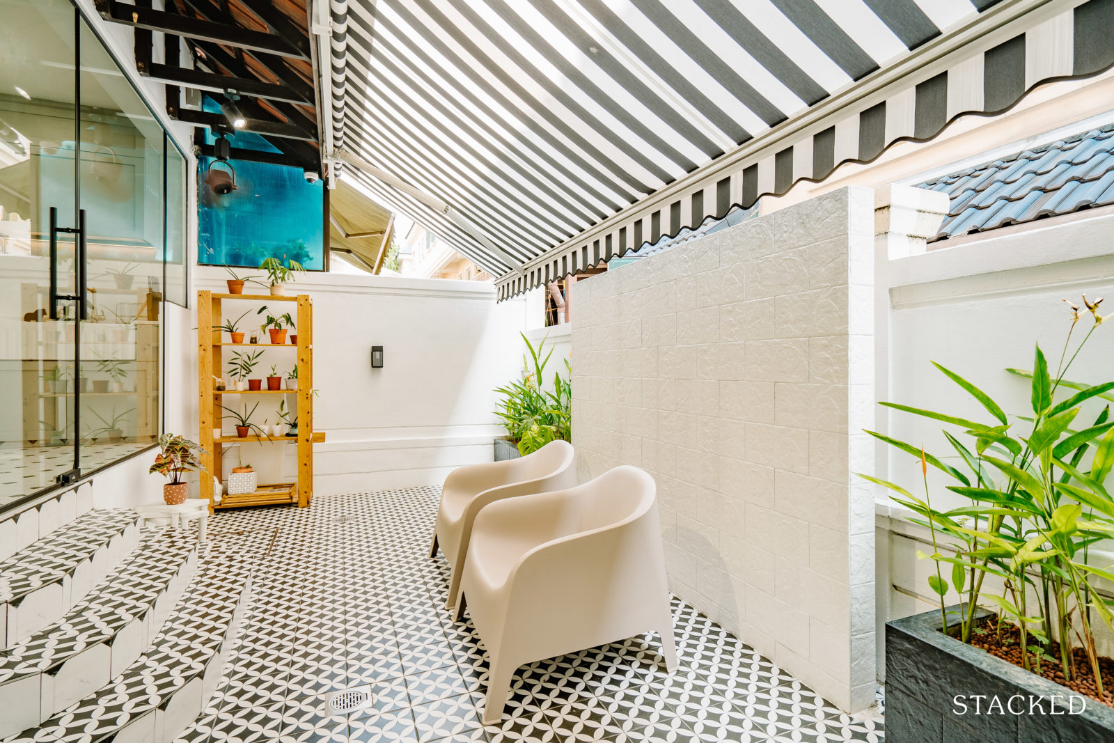
Their curved sofa, console, and arch mirror in the girl’s toilet are customised by HappyPlaceSG. They also incorporated pieces from Ong Shunmugam (courtyard chairs) and Studio Kallang (scallop table).
The lights at the entrance, staircase, and toilet are from a local lighting designer, @likelights. “I think it is good to support local furniture brands. There are actually a lot of good local furniture brands. I basically bought a lot of my wishlist items for the home. We also sourced some items online and mix them up with local store-bought pieces.”
Lessons Learned From A Successful Reno Journey
If they were the pick the greatest challenge they experienced in their reno journey, C said that would be keeping up with the tight schedule of 3.5 to 4 months.
Most renovation companies they approached were unable to commit to the tight timeline. It was all the more reason they went with Tidplus Design, as their ID assured them that most work could be done within the timeline.
“We were very involved throughout the renovation process, went over quite frequently to check on the progress and QC to ensure everything was on track,” C said. “We feel that it is also important to engage a reputable company as they have the resources to ensure that the renovation works get completed without disruptions.”
With so many moving parts in a renovation project, mistakes are bound to happen. Like most couples, C and H learned a couple of things from this experience which they gladly share with everyone.
“Ensure everything, every cost detail is given. We were initially given an estimated quote for the electrical works in the house, but we got shocked when we received the final bill, which was double the initial amount.
We think we speak for most people who have undergone renovation work before that the budget always goes upwards along the renovation process as we tend to add new items along the way,” C added. The lesson they took was to always be mindful of the cost of these newly-added items (to the original quotation), as people tend to overlook this as they are caught up in the excitement of the renovation process. They said it’s actually best to decide everything before the start of reno.
“For us, because we started pre-reno late, we had to add on more things along the way,” he admitted.
The couple overall love how their home turned out as per their design vision, and they would like to leave 3 essential pieces of advice to those who are planning to renovate their home as well.
“Start early, please! Important to know the look and concept that you are going for so that it is easier to have the discussion with your ID.”
Some of the things implied in this start-early point include checking the renovation company’s previous projects and choosing one which is aligned with your preferred look or concept. Also, having a mood board or photos beforehand is very helpful when you meet with ID companies.
C continued with the second piece of advice. “Plan a suitable budget and stick to it as much as you can. Account for all the items to be purchased and not just the reno work itself.”
And lastly, he said to get involved with the reno process as much as possible “so that you can QC the project yourself along the way.”
At Stacked, we like to look beyond the headlines and surface-level numbers, and focus on how things play out in the real world.
If you’d like to discuss how this applies to your own circumstances, you can reach out for a one-to-one consultation here.
And if you simply have a question or want to share a thought, feel free to write to us at stories@stackedhomes.com — we read every message.
Need help with a property decision?
Speak to our team →Read next from Homeowner Stories

Homeowner Stories We Could Walk Away With $460,000 In Cash From Our EC. Here’s Why We Didn’t Upgrade.

Homeowner Stories What I Only Learned After My First Year Of Homeownership In Singapore

Homeowner Stories I Gave My Parents My Condo and Moved Into Their HDB — Here’s Why It Made Sense.

Homeowner Stories “I Thought I Could Wait for a Better New Launch Condo” How One Buyer’s Fear Ended Up Costing Him $358K
Latest Posts

Singapore Property News These Colonial-era Bungalows In Tanglin Will House A New Lifestyle Hub – But The Awarded Bid Price Is Shocking
Investor Case Studies How A Clementi HDB Owner Upgraded To A $2.29M 3-Bedroom Condo At One-North Eden: Buyer Case Study

Property Market Commentary Singapore Retail Rental Market Outlook 2026: Prime Retail Rents May Rise Up To 4%


















0 Comments