Perhaps because of the increasing home renovation costs, or maybe it’s because of how easy it is to get interior inspiration online today. But there is definitely an increasing trend of homeowners who are more adventurous (and creative) to attempt to design their own homes.
While the last home we featured was a full-on DIY project, this renovation journey by Nat and her husband is probably one that more aspiring homeowners can reasonably attempt (for more on their reno journey, visit their IG account here).
The couple designed the entire home by themselves, using photoshop to put the different pieces together to better envision the space! Nat also had to coordinate the entire renovation process with the project manager from the contractor, as that would typically be the job if you hired an Interior Designer instead.
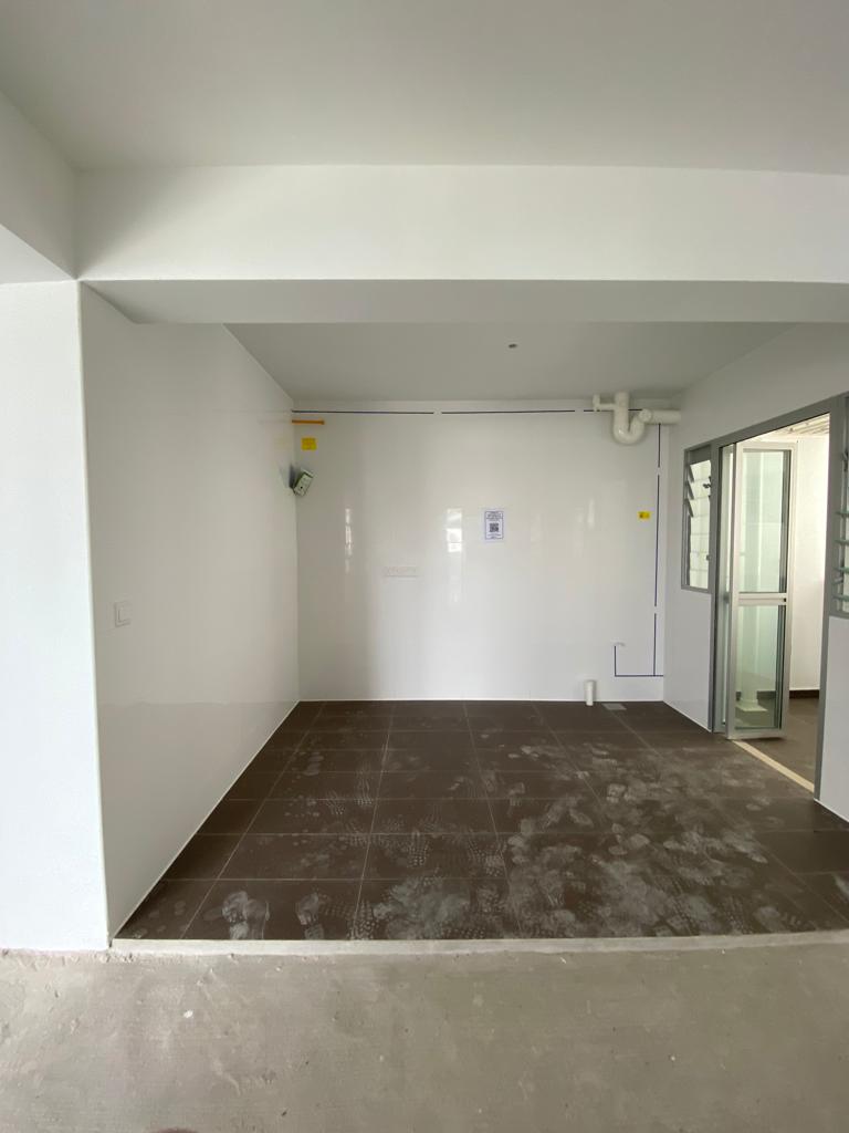
Their actual planned budget was just $30,000, but the final cost ended up being $36,000. When they first applied for the BTO, they opted out of the HDB tiles and overlay vinyl as they didn’t anticipate the cost of cement screeding. As such, they had to spend an additional $6k to get that done.

Let’s check how it all came to be in this yet another inspiring renovation journey.
So many readers write in because they're unsure what to do next, and don't know who to trust.
If this sounds familiar, we offer structured 1-to-1 consultations where we walk through your finances, goals, and market options objectively.
No obligation. Just clarity.
Learn more here.
Tearing Down Walls For a Better HDB Layout
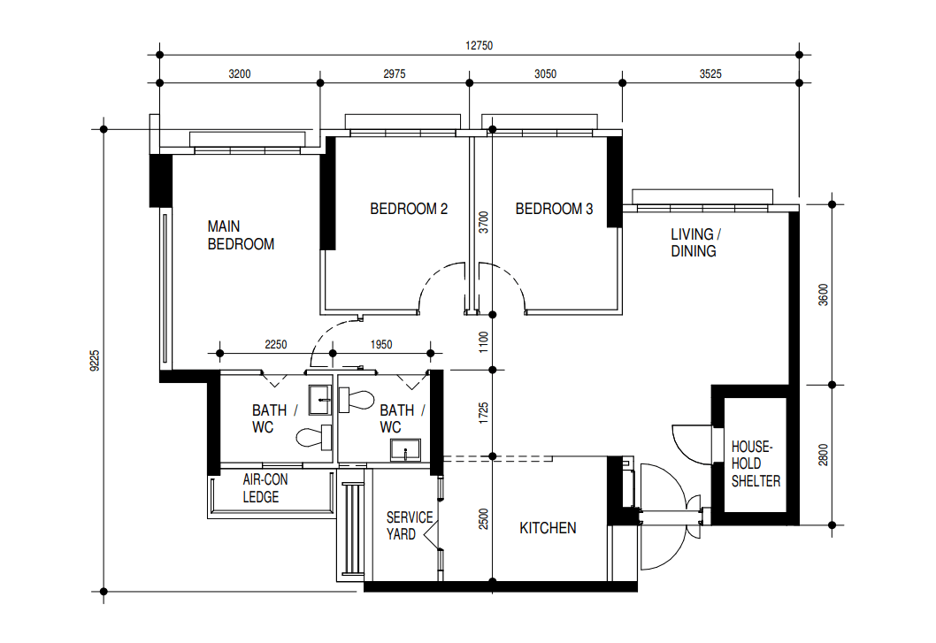
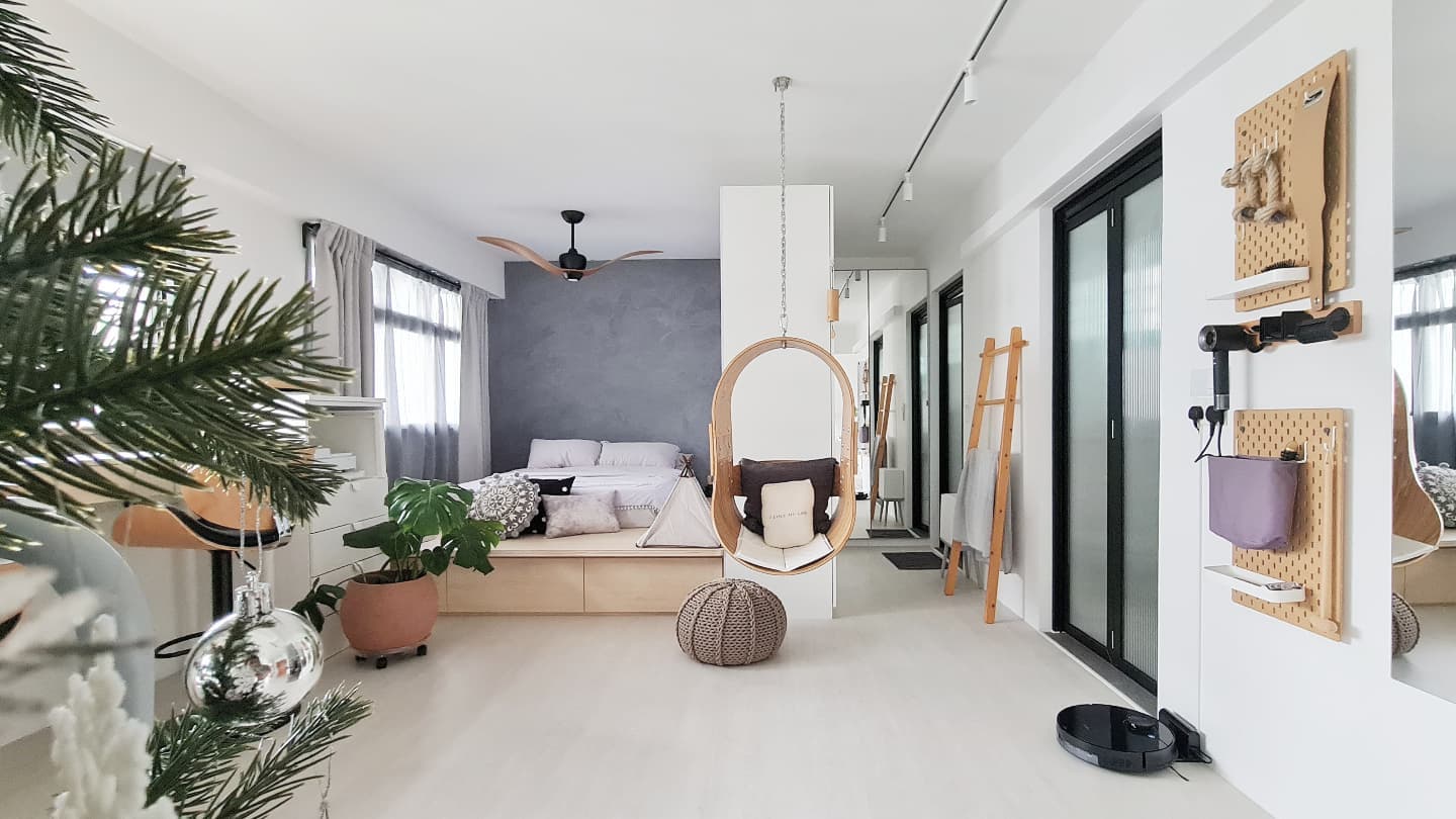
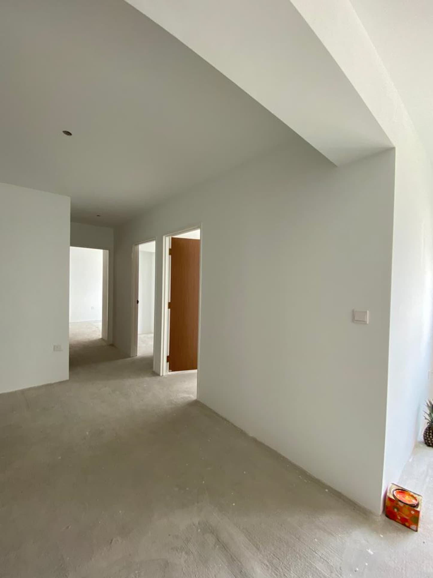
Going for an open-concept layout for both their living and dining room was a simple decision for the couple as they wanted a “very relaxing and chill space with an open concept”. And so the couple decided to have their contractor hack down some walls to open up the floor plan to achieve the design they wanted.
In order to achieve that open space they wanted, the walls they had to tear down were those in the bedroom immediately adjacent to the living room and the wall in the service yard.
When asked what inspired the style and design of their reno, Nat answered, “The core style of the house is Scandinavian Boho.”
A Scandinavian-Bohemian theme involves two seemingly contrasting home interior designs. While Scandinavian prioritises simplicity and functionality wrapped in minimalism, Bohemian is about enforcing a liberal approach to conveying moods and expressions.
It’s an interesting blend of a clean yet free-spirited design.
For the couple to accomplish this, they aimed for a minimalist approach and prioritised neutrals. As with typical Boho styles, they also opted for rattan furnishings to complete the look.
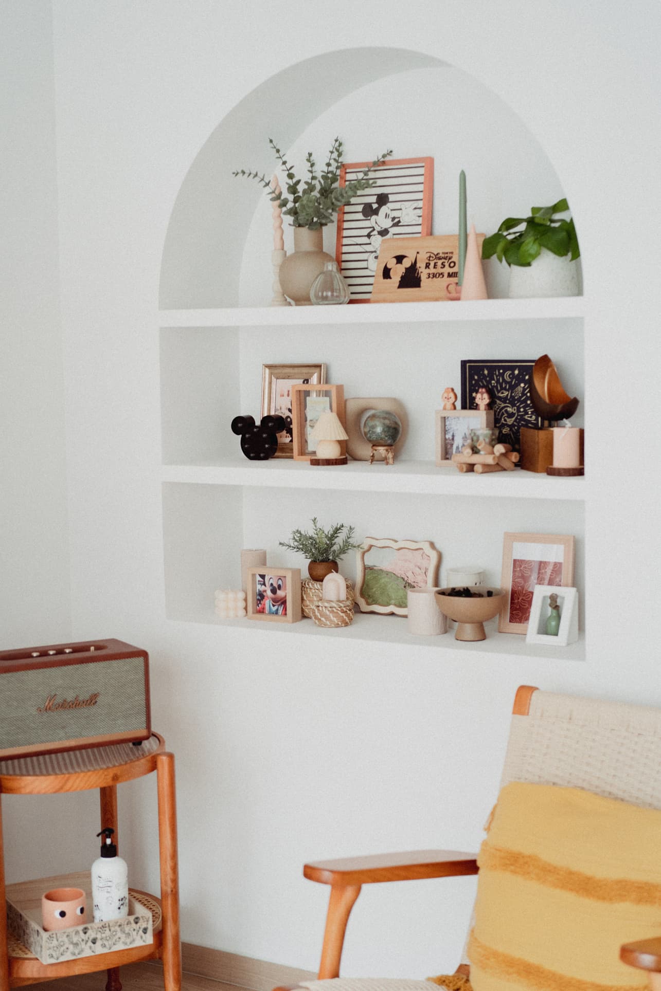
The couple didn’t want to strictly conform and restrict themselves to a single style though, but rather to be able to integrate things they love as much as possible. As Nat shared, they added a personal touch where they could. “For example, we have a Toy Story wardrobe room + office which made it more cheery, and we have a Peanuts-themed kitchen.”
“We are kids at heart and we love cutesy things,” Nat revealed, “so we incorporated some Disney and Peanuts elements in the house.” It’s a great accent to the overall Scandi-Boho design as it livens up their home.
The result is a calm and light-hearted vibe all throughout.
Living and Dining Room
As you enter the house, you’ll find a compact wooden rack to hang masks, recycling bags, etc. A convenient location to grab what they need before going out. An umbrella stand beside the rack helps keep the place tidy and dry, especially after getting home from a rainy adventure outdoors.
Leaving the bomb shelter door as is (without any modifications to conceal it) was one of the ways that helped them cut the reno cost.
Versatility is one of the main reasons the couple decided to knock down the adjacent bedroom wall. It was a great decision since it opened up the area to allow them to work, dine, and entertain guests.
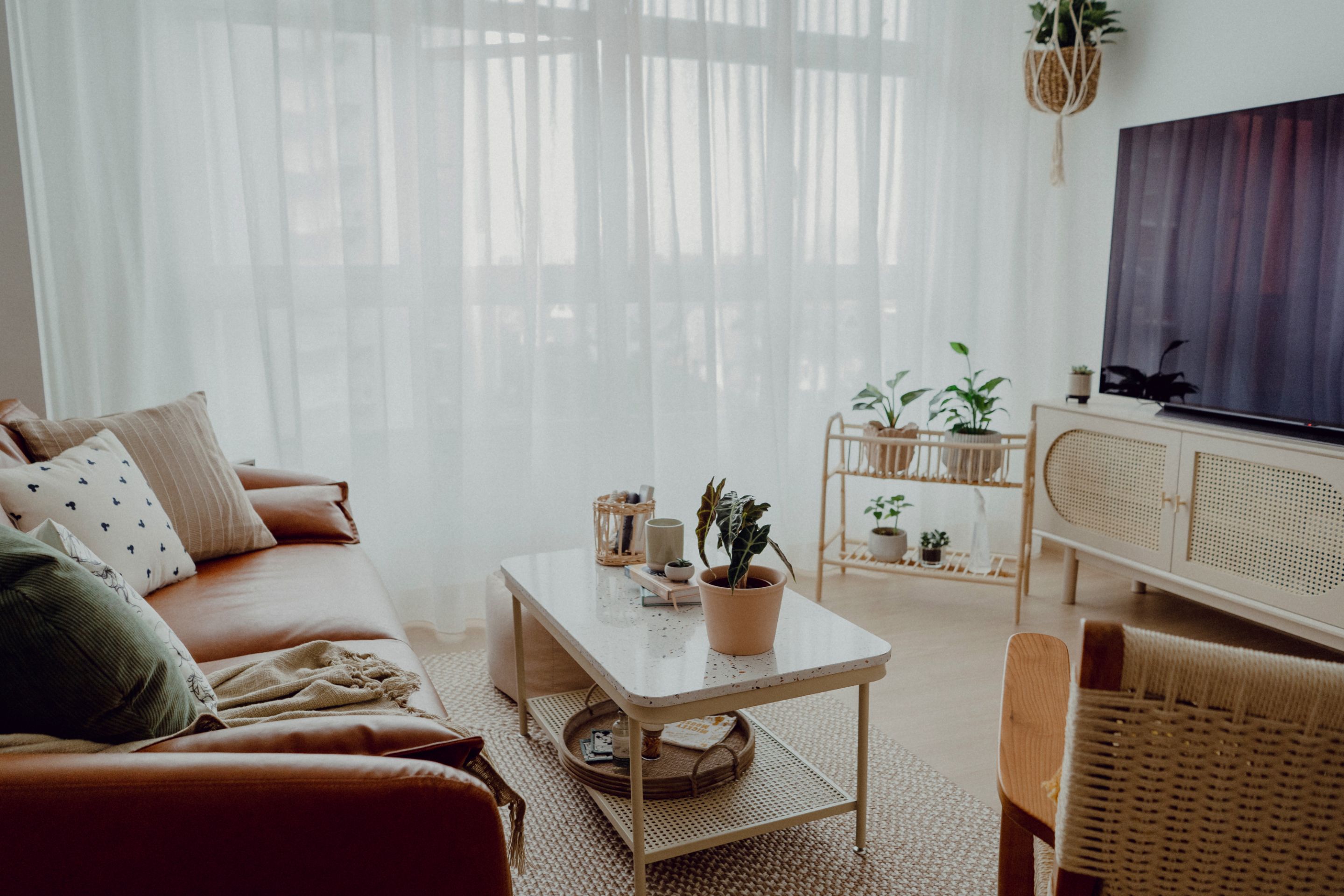
“We don’t regret this choice as we prefer open concepts and many guests commented that our living room has become huge because of the hacking,” Nat said. Still, the couple thought it would have been even better if they picked a five-room HDB instead of four. “We may not need to knock down a room due to the suggested study space,” Nat shared in retrospect.
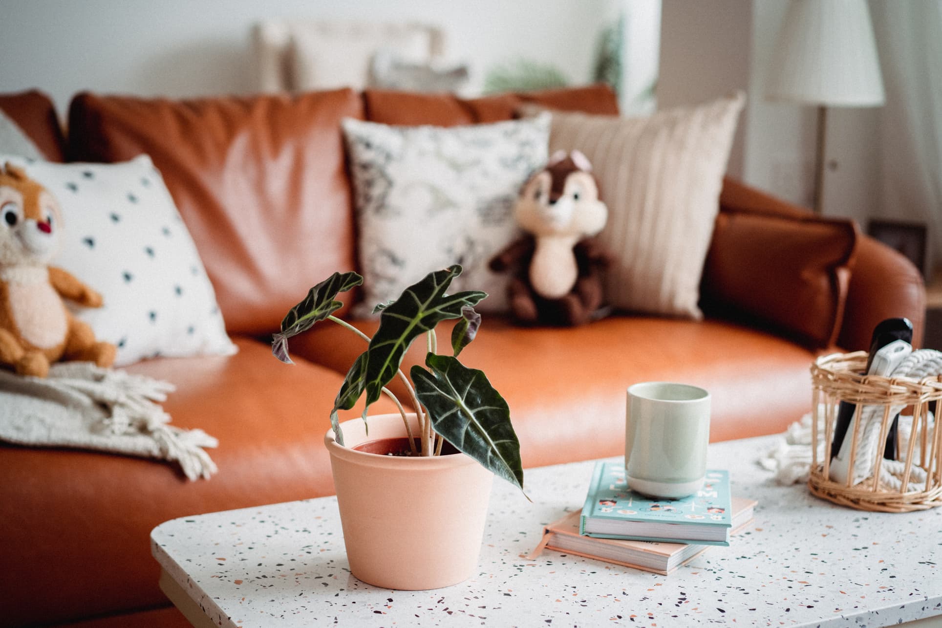
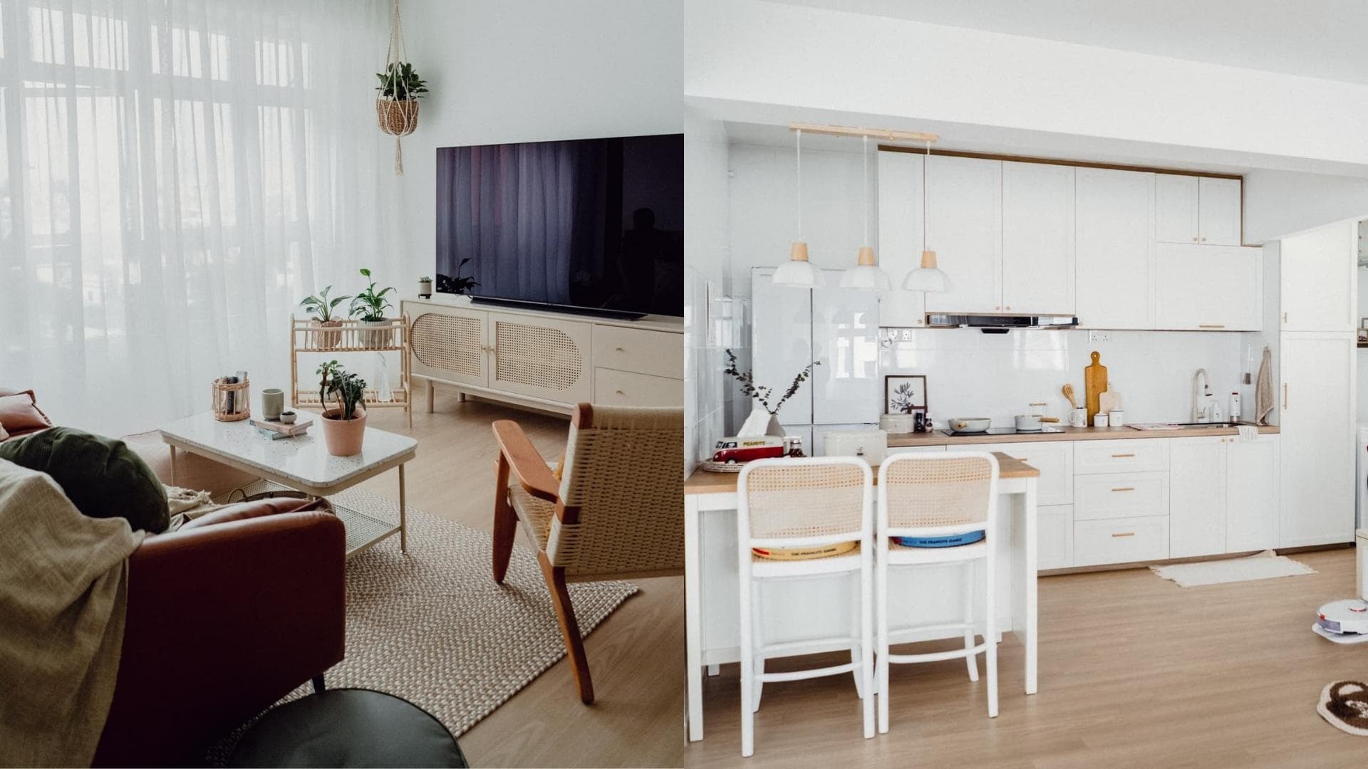
From here, the neutral colours of white, brown, and beige dominate the living room, creating a calm and soothing atmosphere. She also added small live indoor plants to emphasise the decor’s naturalness and also help keep the indoor air clean.
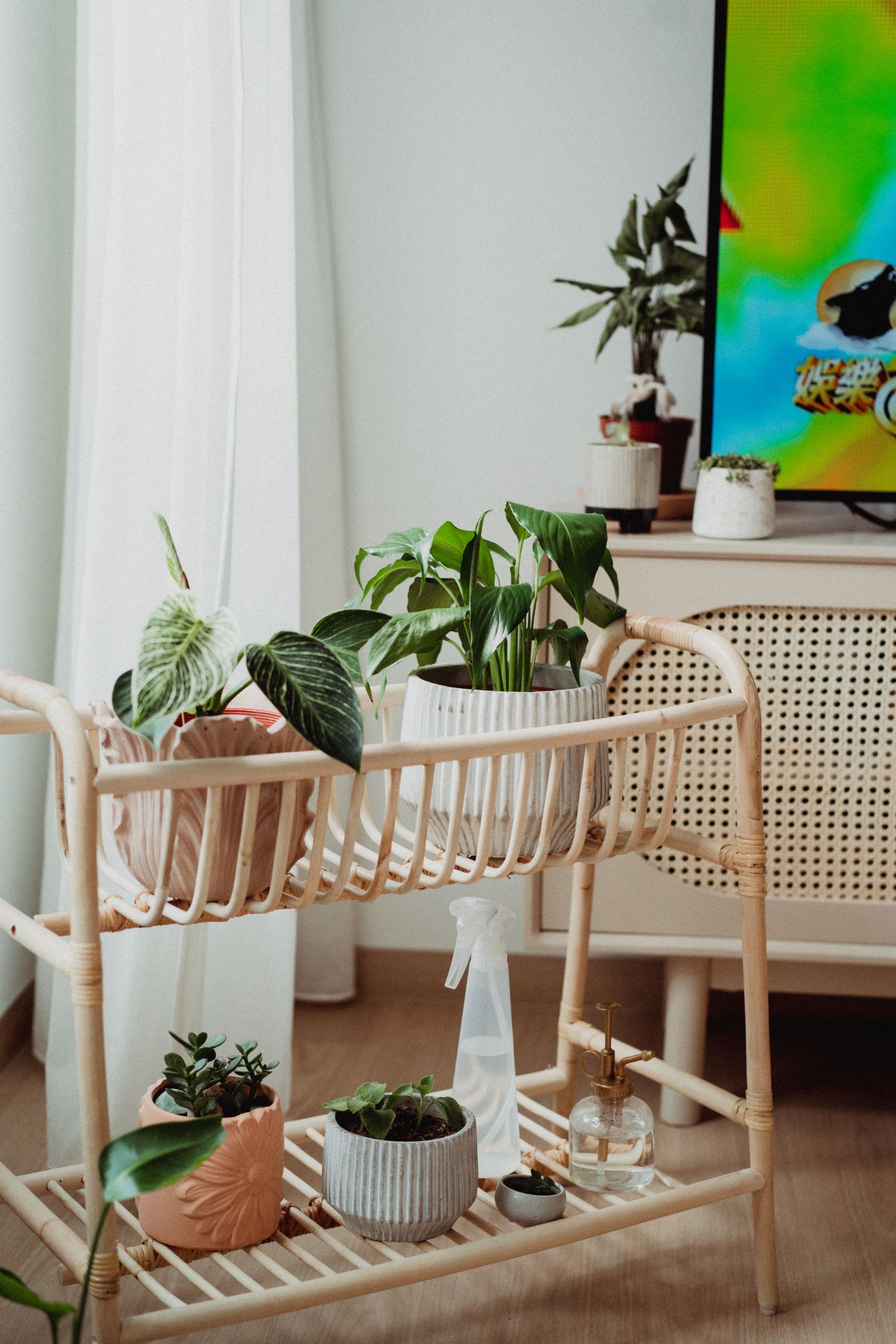
While the trend these days is to mount the TV on the wall, the couple decided against it because they wanted more flexibility. Not only does the TV console’s rattan doors provide a natural look, but they also offer good ventilation for the items inside.
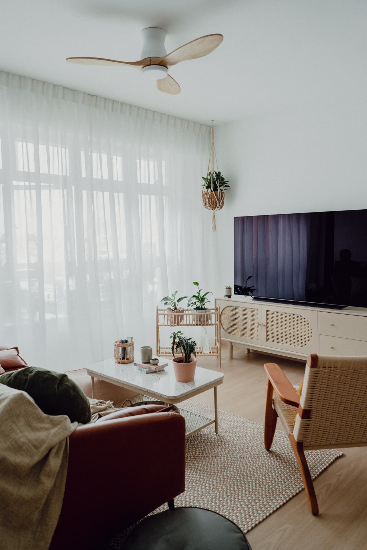
Nat also always wanted a brown leather sofa, and fortunately, she was able to get an affordable one from Taobao – the same shop where she also got the TV console (the couple was kind enough to share their entire Taobao list which we will share below).
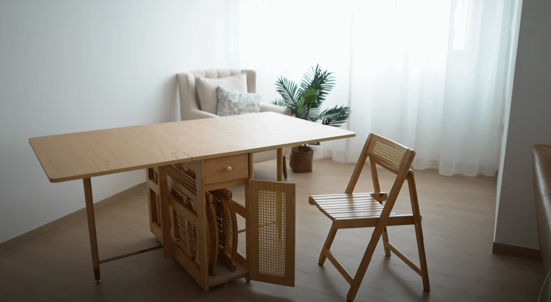
Behind the sofa is a multi-functional area where one of the bedrooms was supposed to be.
The dispersed natural light coming from the living room window and the window from the hacked bedroom helps to create good lighting. Whether Nat is working on her photoshoots, dining together with her husband, or entertaining guests, the extended living room is able to accommodate these activities well.
Kitchen and Home Cafe
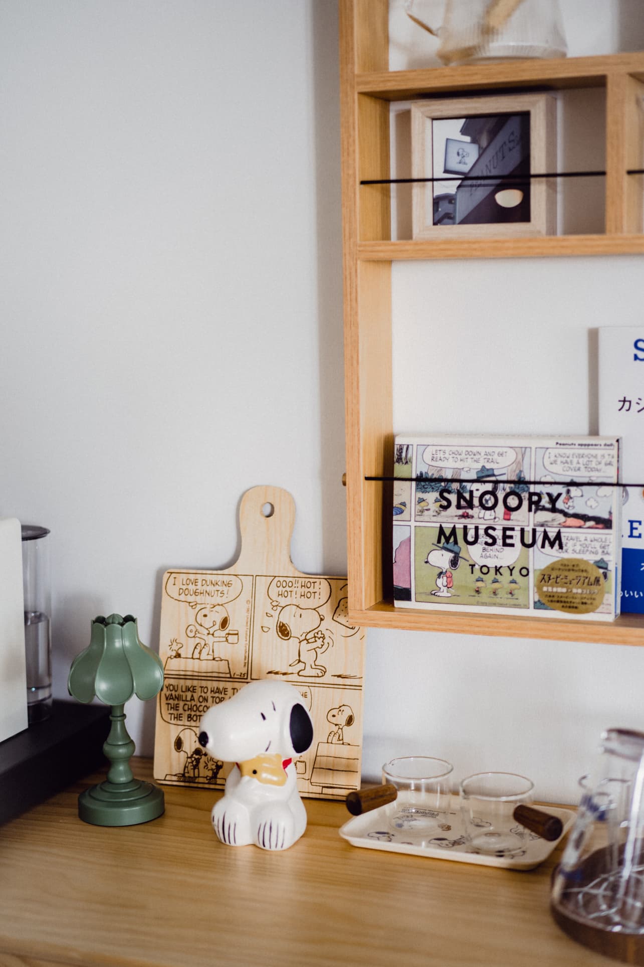
Their coffee and tea nook is one of the highlights of the dining and kitchen area, which they creatively dubbed the Peanuts Home Cafe.
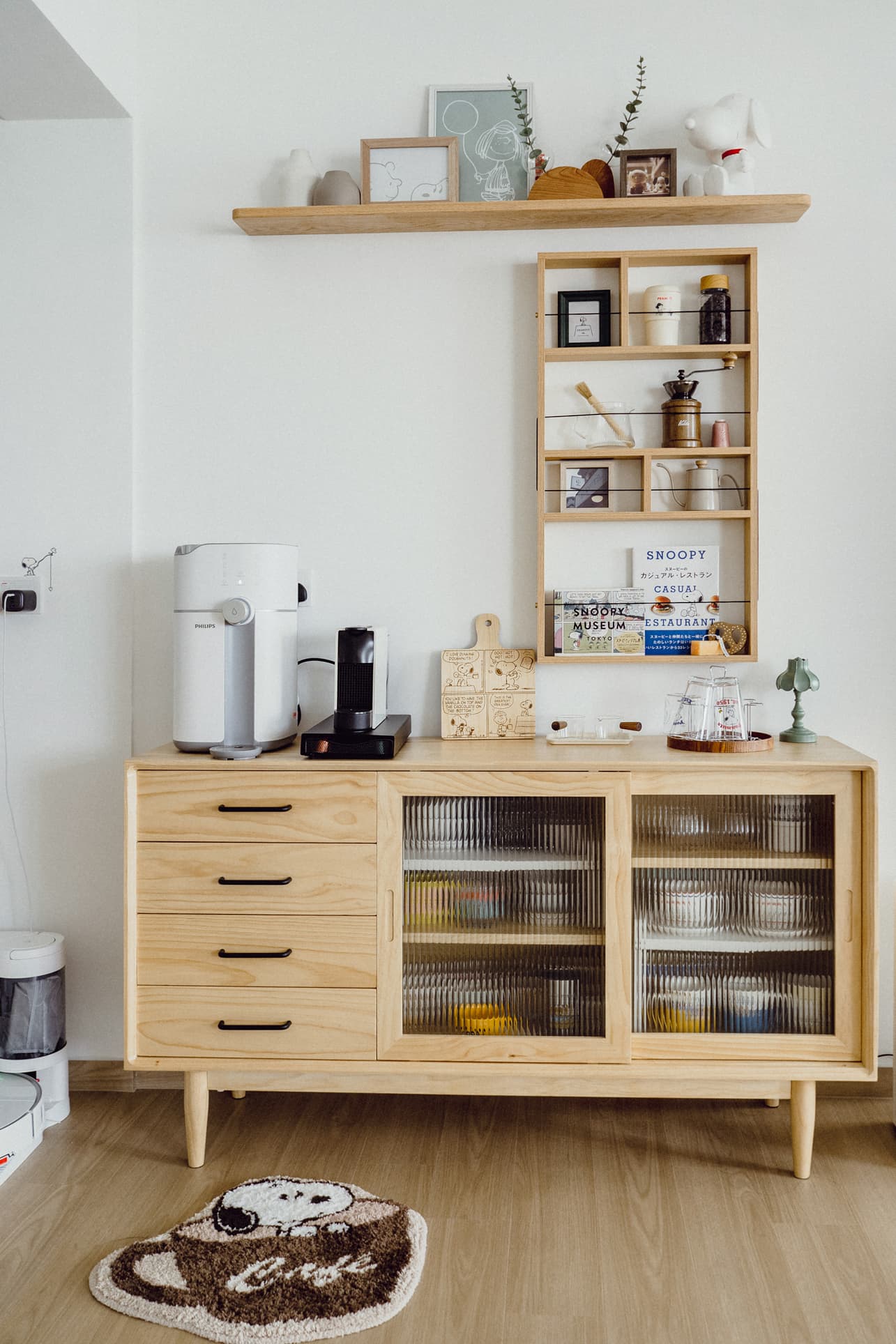
No prizes for guessing what the main theme is here! Yes, it’s all about Snoopy and Peanuts.
Nat loves collecting Peanuts-themed mugs and glasses – some of them she even imported from Japan before the pandemic. These were all conveniently stored under the coffee counter.
What Nat was trying to achieve was actually a Japaneseque cafe vibe, and her Peanuts Home Cafe certainly fit the style.
Now to the kitchen.
The couple initially wanted to have a custom-made island, but this would take a chunk out of their budget. Fortunately, they were able to source an island counter from IKEA, which synchronises well with their Scandi-Boho design.
They even used rattan-backed chairs for their counter to tie up the design further.
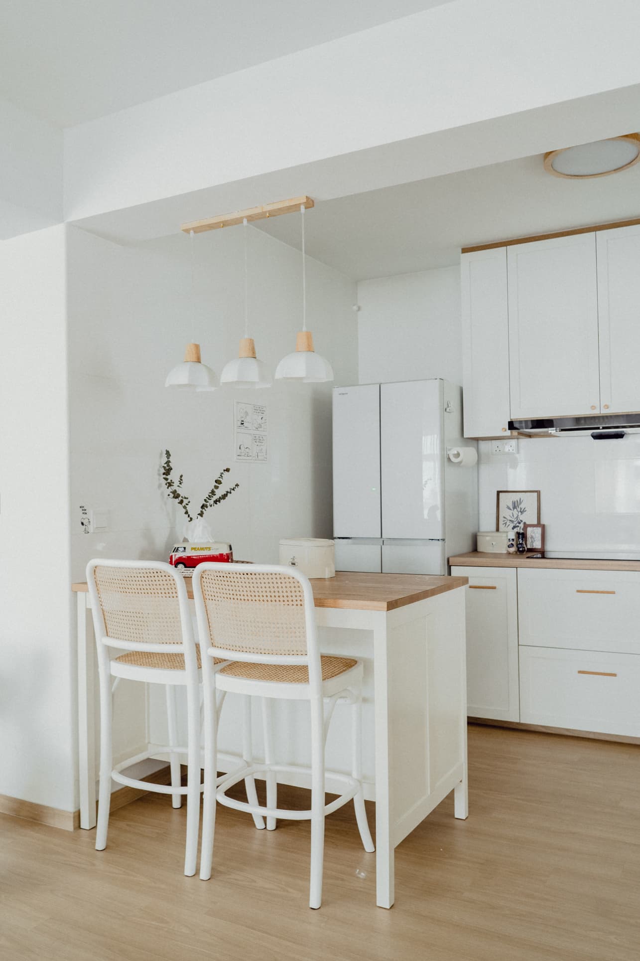
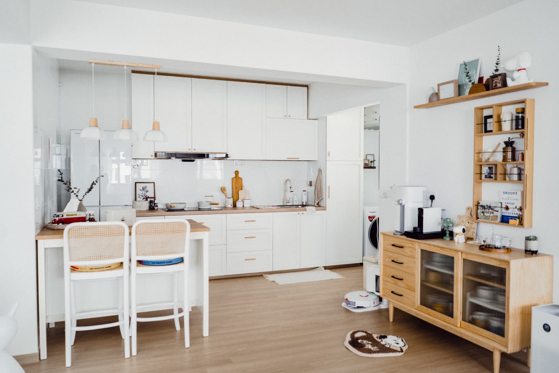
With no walls separating the kitchen from the dining room, the design should naturally match the rest of the area. As you can see, everything tied up nicely together (even their white multi-door fridge from Japan paired up well with their Japan-esque home cafe).
Nat got everything right down to the detail, including the wooden knobs for their kitchen cabinets. Even their water tap, which they also got from Taobao, matches the overall colour scheme.

Master’s Bedroom
The couple’s bedroom is surprisingly roomy. And here’s the secret. “We did not build any wardrobe so we can have a bigger resting place,” revealed Nat. They chose to forego the wardrobe in this room to make it more comfortable, as creating a claustrophobic bedroom will just be stressful.
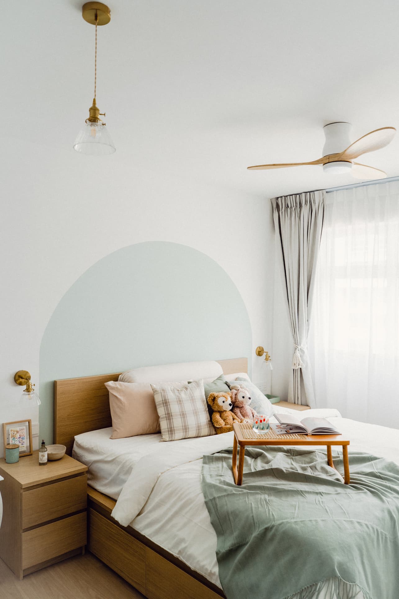
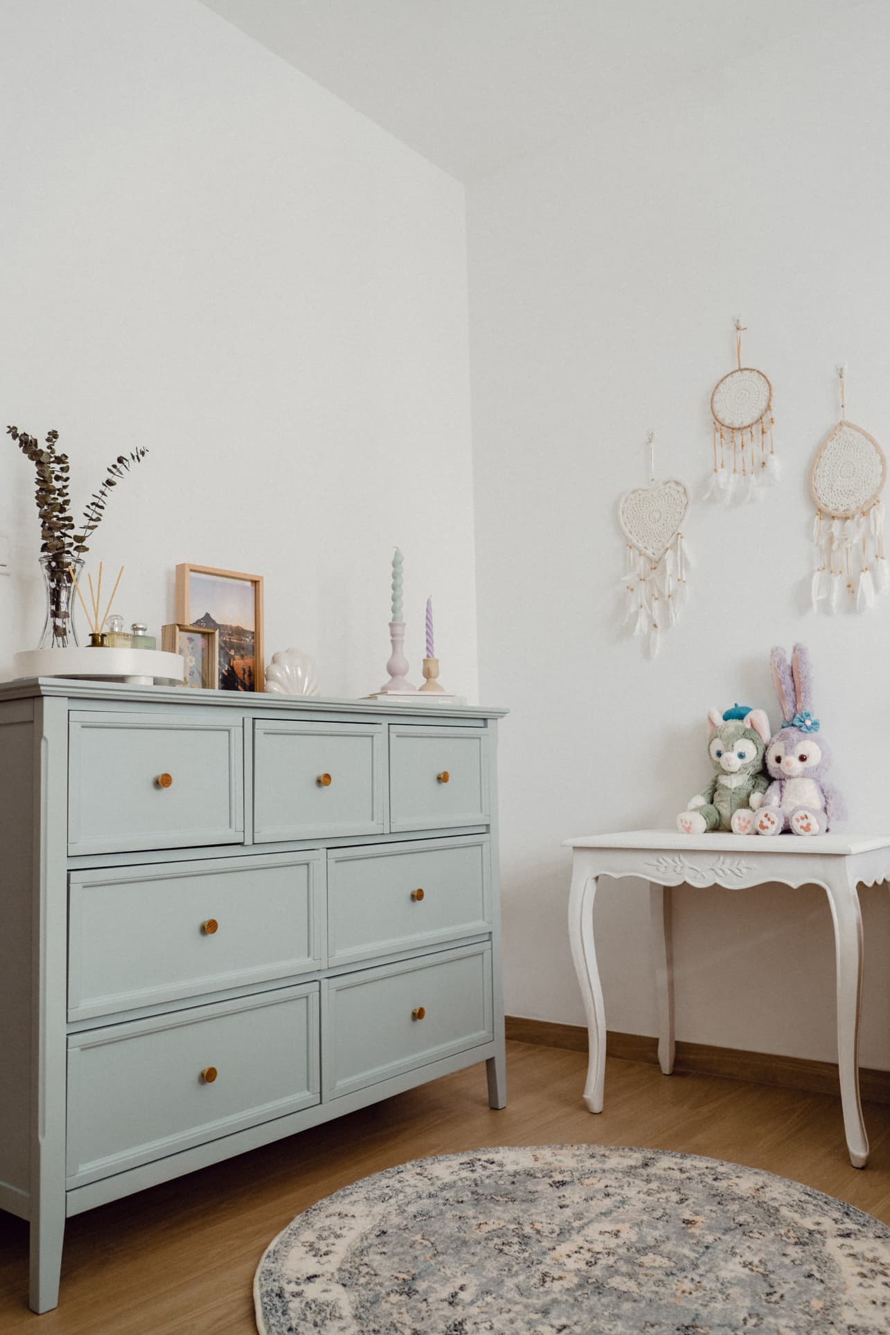
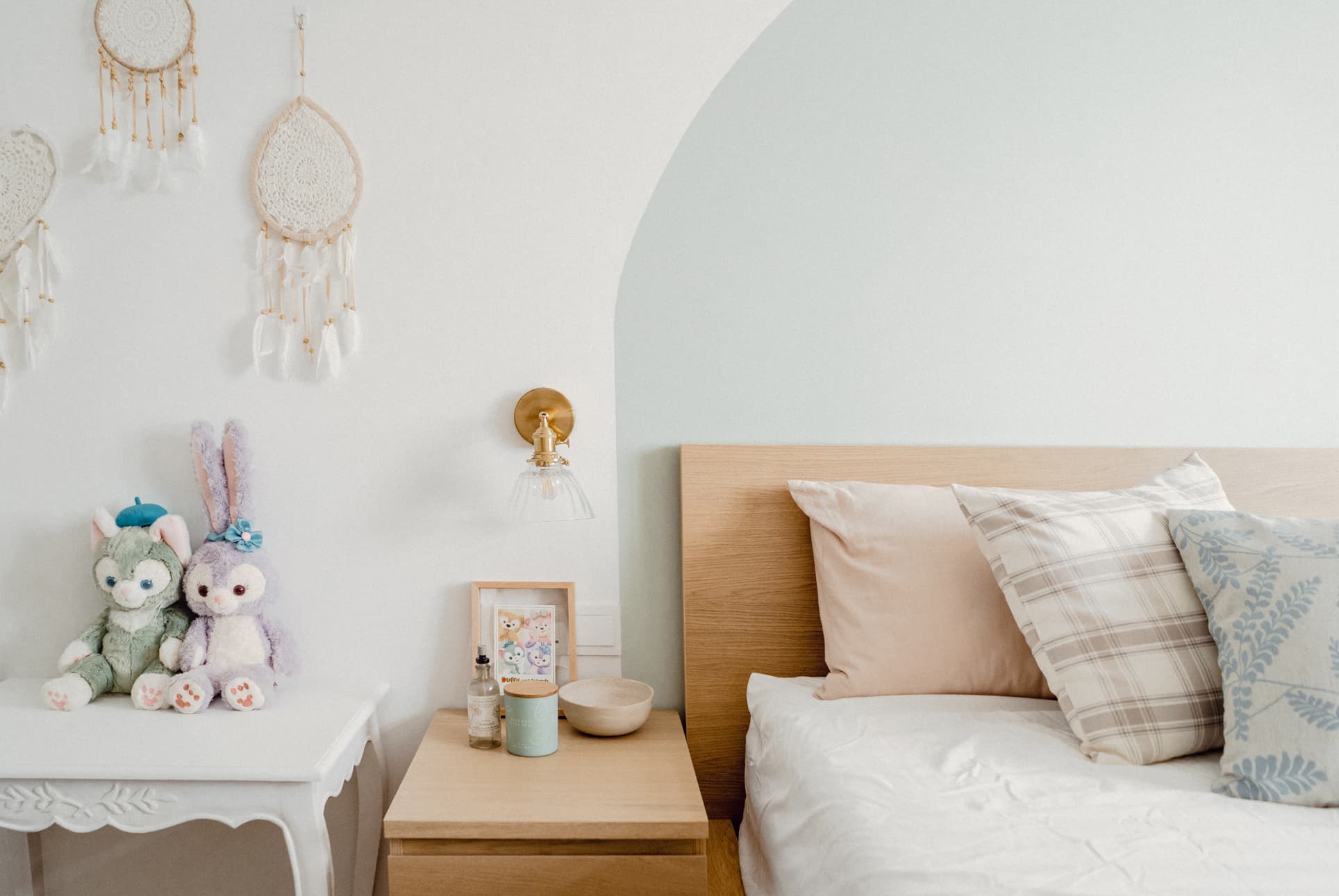
The Scandi-Boho design extends to this room, mixed in with more Disney and Duffy and Friends themes.
Here’s another money-saving decision they made. While they wanted an arch on the wall to accentuate the bed, they knew it would be pricey to have an arch built. So instead, the couple had the contractor paint one which still worked out really well!
Furthermore, they didn’t want to further confine the room with more cabinets, so they picked a bed with storage options underneath. Again, they turned to IKEA, with the MALM bed a perfect affordable fit.
Toilet and Bath
The home’s common toilet and bath create a striking contrast to the Scandi-Boho design in the other rooms. Here you’ll see a black and white motif. They even had the contractors install a glass door with black frames to complement the look.
More from Stacked
How the US–Iran War Could Affect Singapore Property Prices and Mortgage Rates
Since the US-Israel conflict with Iran started on February 28, global economic markets have faced a series of turbulence. While…
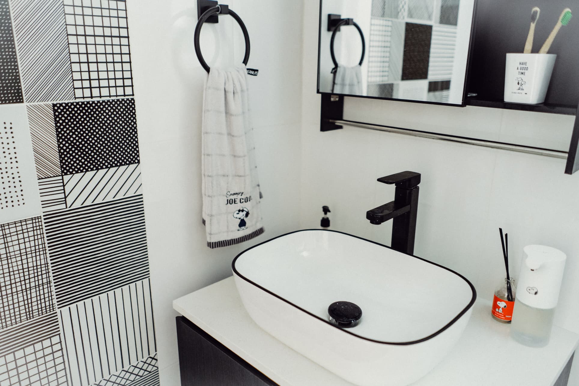
But it’s not totally out of place. The monochromatic black and white design are reminiscent of Snoopy’s colours – and if you think about it, it still adheres to the Bohemian design where Nat freely expresses her passion.
The cabinet under the sink was custom-built by their contractor. Apart from that, almost all fixtures and furnishings in the toilet and bath are from Taobao as well.
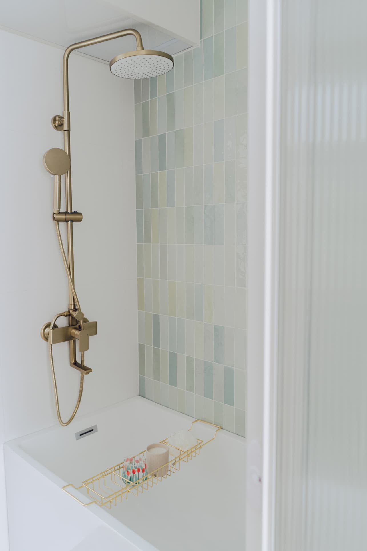
The master’s bathroom exudes a much different vibe, though. The theme used gold and wood to make it feel more luxurious – like they’re having a staycation in a boutique hotel. They had their contractor install the bathtub they purchased from Taobao, which looks good together with the bathroom’s green mosaic wall.
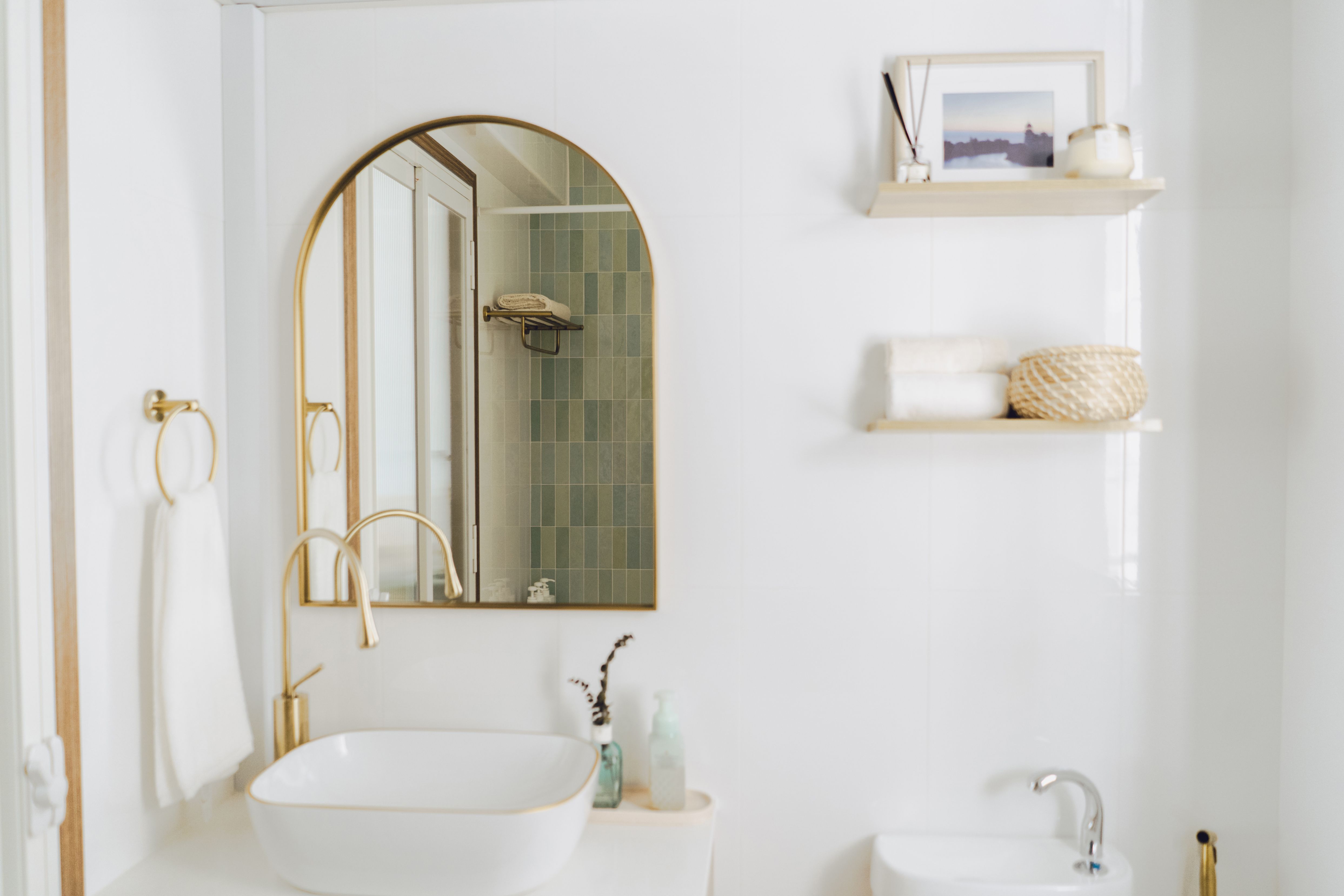
The couple cut down reno costs further by only overlaying tiles only on one wall for each toilet – black and white for the common and mosaic green for the master’s bedroom.
Home Office and Wardrobe
Both Nat and her husband loved Toy Story, so it’s only natural that they dedicate a room to match the movie’s atmosphere. Appropriately dubbed the Toy Story Room, the walls are two-toned, similar to Andy’s room. You’ll also find life-like sizes of Woody and Buzz standing proudly on an IKEA BILLY bookcase.
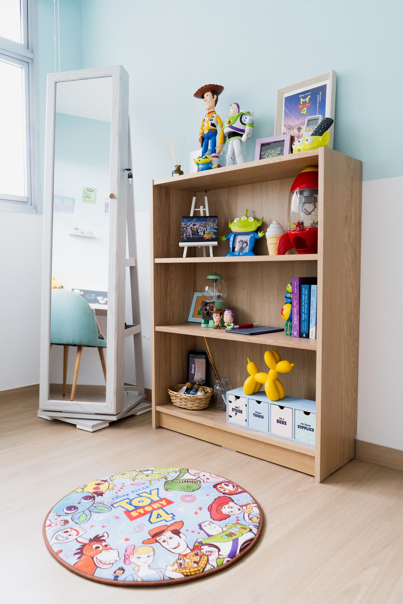
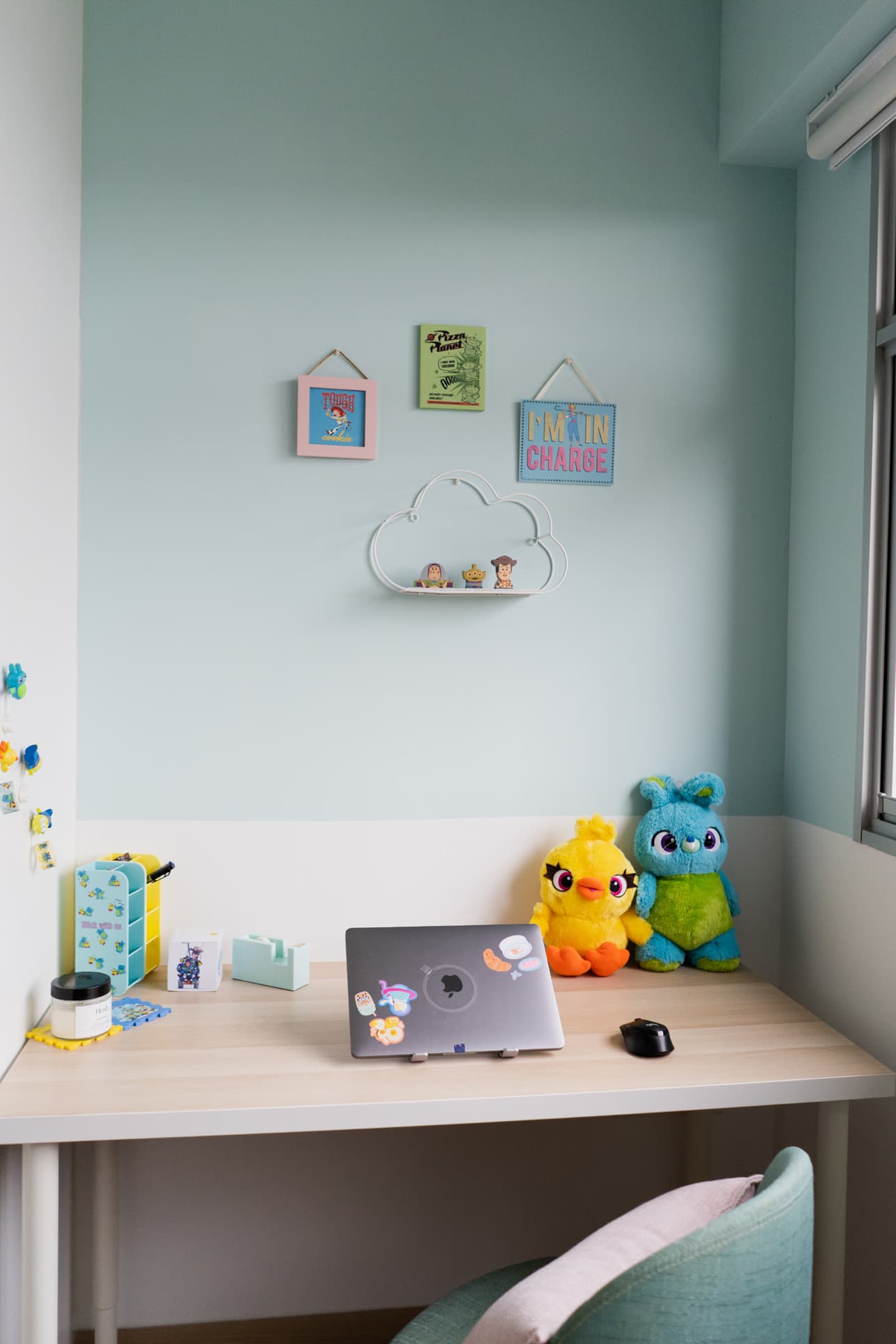
Nat’s preference for applying makeup while standing helped keep the room spacious. Instead of a dresser, she opted for a full-standing mirror from Taobao that doubles as cosmetics storage.
Aside from the good vibes this room gives to the couple, it also serves another purpose. This is where they have their L-shaped wardrobe built.
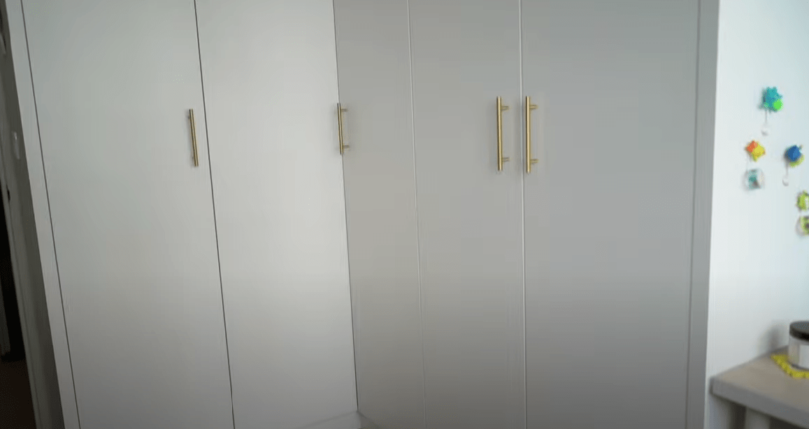
Nat wanted to have the wardrobe in shaker-style as well but had to forego this because of the budget. Still, their decision to make this their wardrobe room consequently made their master’s bedroom roomier.
Homeowner StoriesInside An Incredible $15K Renovation Of A Bidadari 3-Room BTO: How This Couple Did It On Their Own
by StackedBringing the Vision to Reality
For those looking to forgo having an ID, the contractor that you choose would be doubly important here to ensure a successful renovation project.
Nat found them in Comfort Home Design (formerly Comfort Home Reno). “When we met Paige and Kae from the company, I felt that the vibe and price were right, so we decided to go with them,” Nat said.
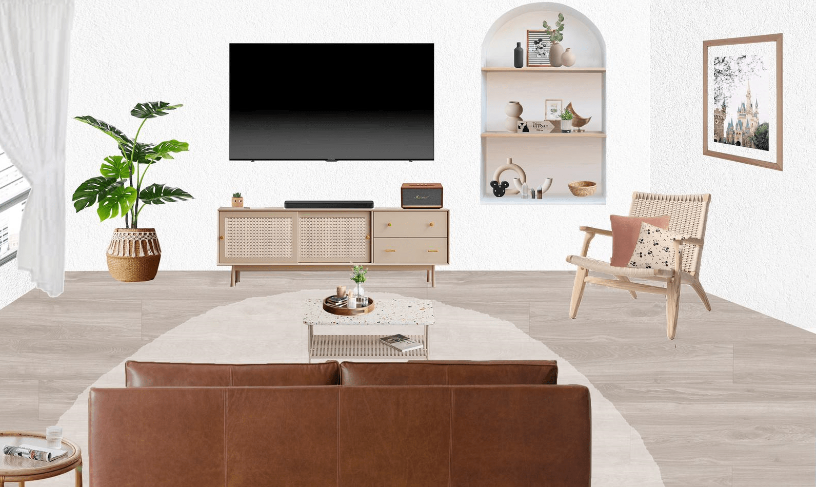
With the use of mood boards she designed using Photoshop, Nat was able to create a clear picture of what they wanted and shared it with their contractor. As you can see, the Photoshop images were very similar to the final outcome.
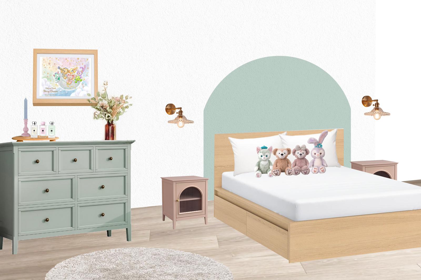
When it comes to sourcing furniture, the couple’s first move was to go through IKEA’s catalogue. Their island table, bed frame, and bedside tables were all bought from IKEA.
Nat tried to check what local companies had to offer. But as she said, the lovely pieces are all excessively pricey. So she and her hubby decided to source the rest of the furnishings from Taobao. Nat happily remarked that they agreed on it “not only because it’s cheaper but also because there is more variety.”
We asked her for some Taobao sourcing tips because of their recent extensive experience. Here’s what she shared:
- Explore 3rd Party forwarders: These forwarders may add up to the cost, but they can help ensure your items are in pristine condition when they arrive. As Nat said, “There’s no point saving on shipping costs if you will just receive damaged goods due to the lousy packaging and service.”
- Mentally prepare for delays: Going the Taobao route makes you more susceptible to delays or damaged goods, so you need to have the proper mindset. Nat went through this but did not stress over it. “My first batch of fittings was delayed by more than a month, delaying the renovation as well. But we weren’t in a rush, so it didn’t affect us much.”
- Perform deep searches: Taobao’s algorithm can usually keep showing you the same things. As such, it’s important to go in-depth with your searches by trying different search keywords.
- Diversify your shop choices: Nat didn’t have a single go-to shop for their furniture. “Most of my furniture pieces are from different sellers,” she said. Doing so helps open up your choices and sometimes allows you to find a better item than you previously planned.
The greatest challenge the couple had to overcome during the reno journey is something that affects most of us – indecisiveness. Choosing the materials for carpentry or to top up for more expensive tiles or not are just some of the decisions they had to go through.
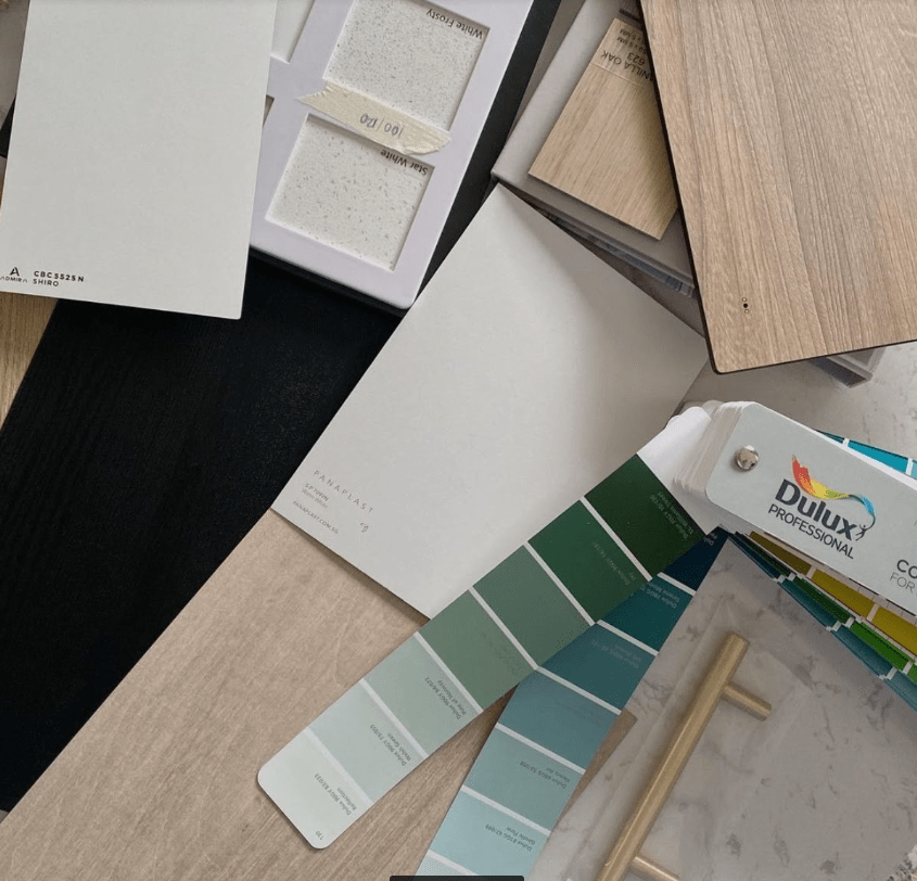
But this challenge in decision making is also what can also help us make sound choices in the end. As Nat shared, “I’m a pretty decisive person but my husband is more cautious. So communication can be frustrating but I’m glad we worked things out.”
At the end of the day, their home turned out to be very cosy and personalised. Nat’s favourite area is the living room and bedroom. “They are both exactly what I’ve envisioned,” she gleefully said, “It also feels great knowing that we put together a dream home by ourselves without getting very broke!”
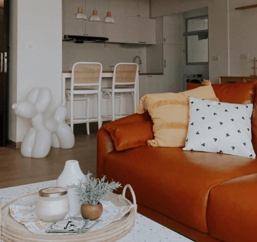
Lessons from a Successful Renovation Journey
Renovation tips are always welcome – especially if they’re coming from those who were able to turn their vision into reality. Some mistakes are irreconcilable but offer a great tip to those homeowners still beyond the planning phase. For instance, Nat has something to share about her regrets and mistakes made years before the reno started.
One tip that we’ve not heard yet: for those who have trouble bending down nowadays, Nat recommended spending more money to shift up more electrical points.
The couple is also a clear advocate of not sticking religiously to trends. “Instead of following trends, don’t be afraid to put in more of your own personalities in your home. Ultimately, it’s your own place, and it should make you happy instead of just being Pinterest-worthy! After all, trends only last for some time,” she said.
The differences between couples can become more pronounced when renovating. This healthy diversity can somehow create issues if conflicting preferences clash. “We are humans so we can adapt to the environment. So a little thing that doesn’t go your way won’t hurt,” Nat advised.
Finally, the introvert couple has something to say to other introverts. “Don’t be like us. Learn to voice out any concerns or ask for rectifications. If you are not good with face-to-face communication, you can go back and message your ID or contractor if you have any concerns.”
Credit to Natsuki Photography for the photos!
Relevant Taobao links
At Stacked, we like to look beyond the headlines and surface-level numbers, and focus on how things play out in the real world.
If you’d like to discuss how this applies to your own circumstances, you can reach out for a one-to-one consultation here.
And if you simply have a question or want to share a thought, feel free to write to us at stories@stackedhomes.com — we read every message.
Need help with a property decision?
Speak to our team →Read next from Homeowner Stories

Homeowner Stories We Could Walk Away With $460,000 In Cash From Our EC. Here’s Why We Didn’t Upgrade.

Homeowner Stories What I Only Learned After My First Year Of Homeownership In Singapore

Homeowner Stories I Gave My Parents My Condo and Moved Into Their HDB — Here’s Why It Made Sense.

Homeowner Stories “I Thought I Could Wait for a Better New Launch Condo” How One Buyer’s Fear Ended Up Costing Him $358K
Latest Posts

Singapore Property News Why More Singaporeans Want Overseas Property — But Many Overlook What Comes After Buying

Singapore Property News Singapore Luxury Home Sales Strengthen In Q1 2026 — With Prices At A Two-Year High

Property Market Commentary Malaysia Property Market Outlook 2026: What Singapore Buyers Need To Know











0 Comments