A 23-Year-Old HDB In Bukit Panjang Gets A Unique Makeover Into A Spanish Country Style Home
October 21, 2022
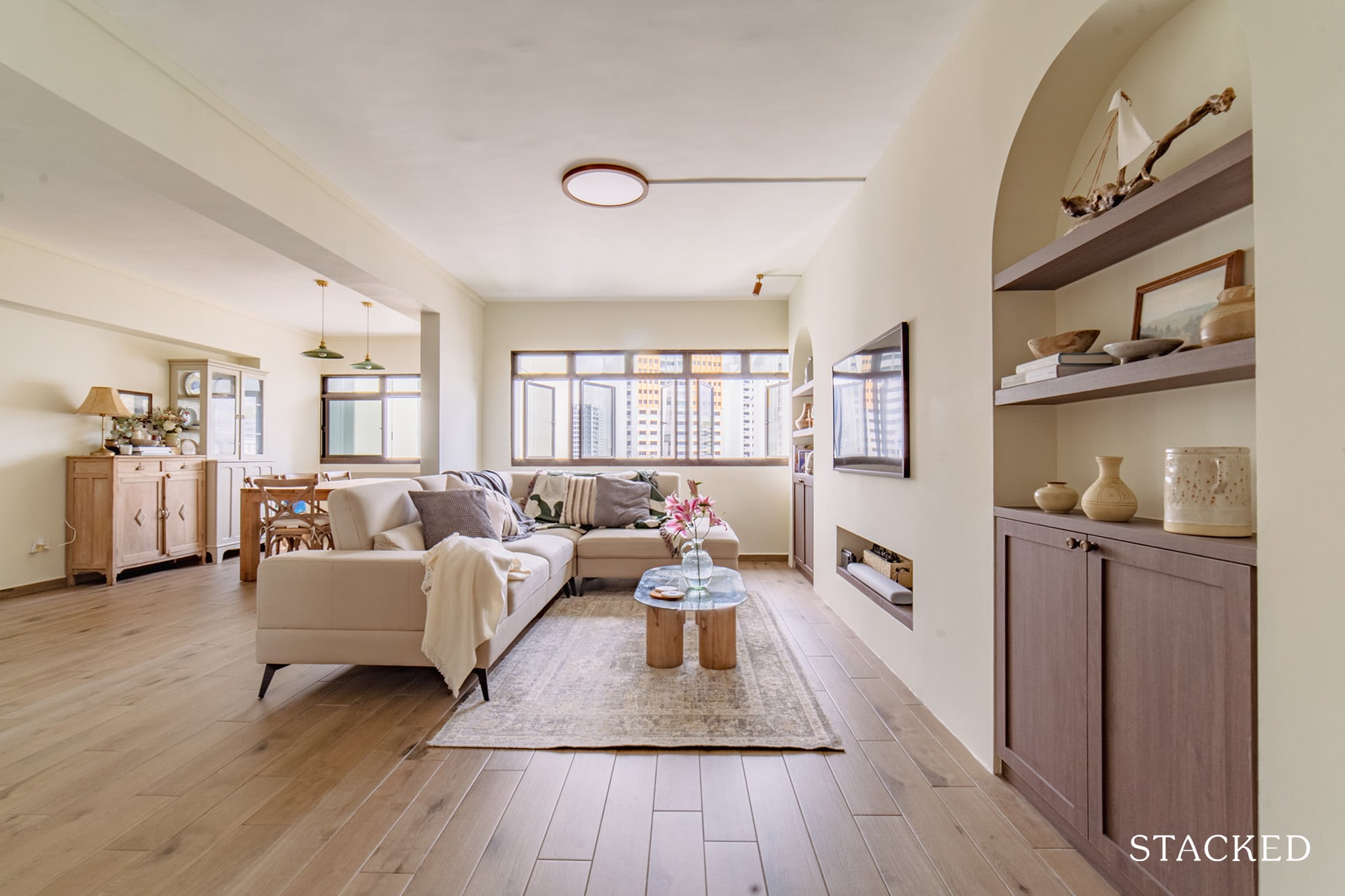
Rach and Sam (@casagangsa) are a newlywed couple who bought a 5-room resale flat in Bukit Panjang that’s already 23 years old. Like most homeowners who choose an older HDB, their reason for doing so was space.
“We knew we wanted to get a resale because both of us are attracted to a larger living space which older flats offer,” said Rach.
They were also not keen on waiting for a BTO and wanted to move in as soon as they could. In fact, they viewed only three other units before deciding on this flat. Talk about being decisive!
It did check out most of their requirements, the first of which is the relatively huge living space and master bedroom (all at a reasonable price). It was near the MRT, but away from busy roads. And it also helped that coffee shops and convenience stores were just a stone’s throw away.
But the icing on the cake? It was a point block, so there was better privacy.
Let’s discover more about how Rach and Sam went through their reno journey and see how it actually turned out.
So many readers write in because they're unsure what to do next, and don't know who to trust.
If this sounds familiar, we offer structured 1-to-1 consultations where we walk through your finances, goals, and market options objectively.
No obligation. Just clarity.
Learn more here.
How The Renovation Journey Turned Out
The couple initially allocated $68K for their reno budget but ended up spending slightly higher. As such, they had to adjust their plans and accept compromises to ensure they were able to stay within their budget.
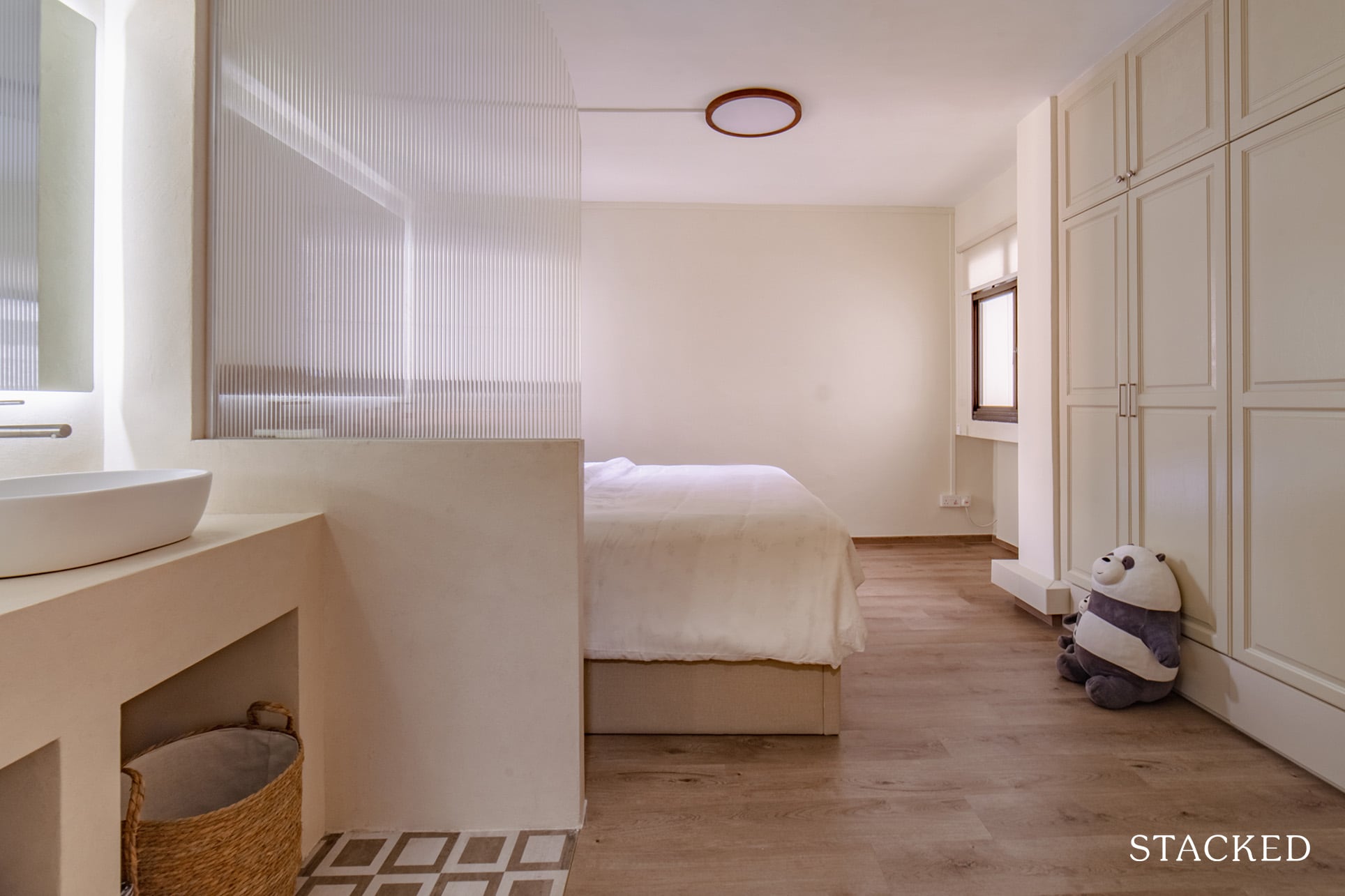
For instance, they initially wanted to retain the parquet floorings in all the bedrooms. However, after speaking with their friends and family members, the couple realised that it would be challenging to maintain these floors, especially with the vanity area in the master bedroom. There’s even a possibility of termite infestation. So Rach said they decided to hack them away and install new vinyl flooring in the bedrooms instead.
To meet their budget and save money, they then decided to retain almost all existing windows and doors, including the master bedroom wardrobe doors. “We simply love the nyatoh design, so we just added a new coat of paint on them and voila! It feels good as new,” she added.
When it comes to the inspiration for their design and style of renovation, Rach said it came from a multitude of sources.
“Our inspiration came from everything – from our travels, Airbnbs we have stayed in, magazines, books, and Pinterest.”
There’s one theme that would help bind all these creative sources together, though. Rach said they modelled their home after many Spanish country-style elements. They made use of dark wood, arches, and stucco. They also built a dining room centred around a hutch which houses all their dinner wares and potteries.
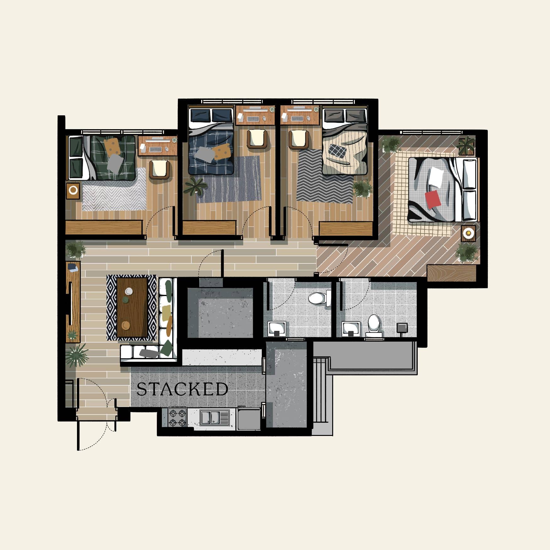
She said they didn’t change the layout much to accommodate their design. Below is a picture of the original layout, followed by a summary of what they modified.
To make room for their sideboard and display cabinet in their dining room, they had to hack away part of bedroom 3.
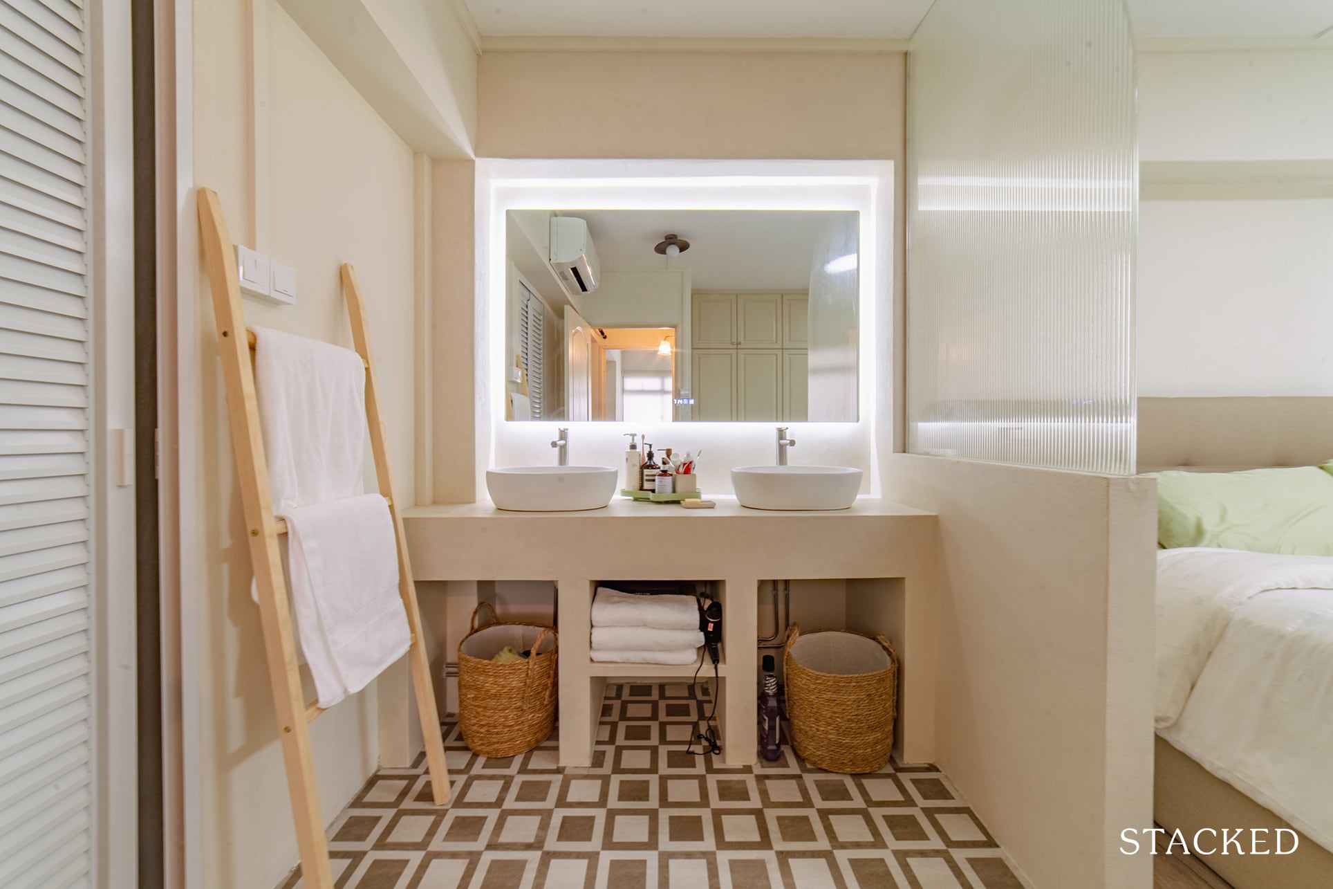
They also shifted the bathroom vanity in the master bedroom and created a double vanity with a stucco finish. The result is a clear separation between the wet and dry areas. Plus, Rach said it establishes a getting-ready space as well.
“But of course, this meant less space for wardrobes which we may or may not regret in the future,” she shared.
The couple also modified the entry for the common toilet to face the walkway instead of the kitchen.
Entryway
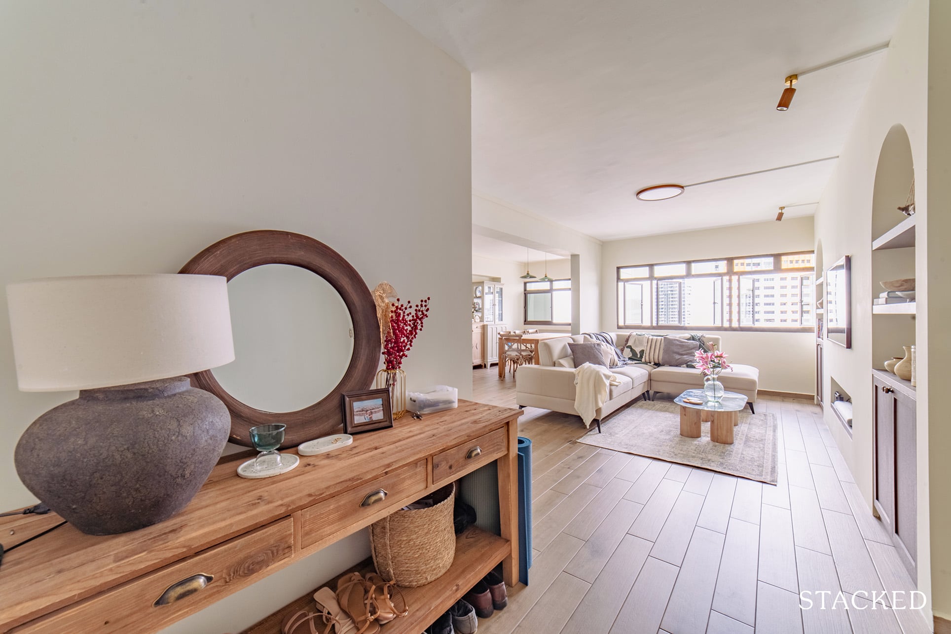
The original entryway was quite small, so they decided to hack away part of the existing storeroom. It allowed them not only to widen the entrance but also add a console table comfortably too.
Living Room
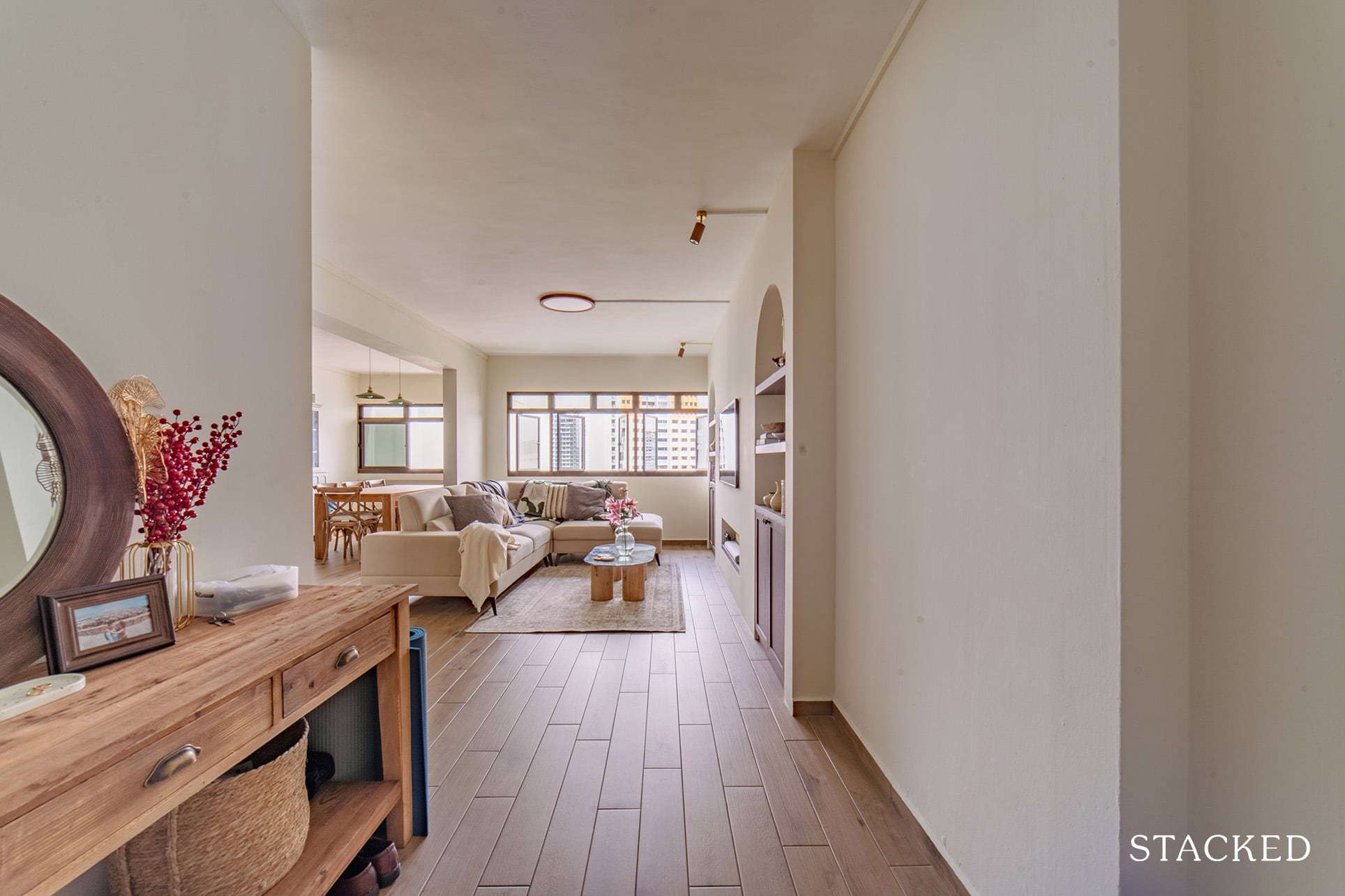
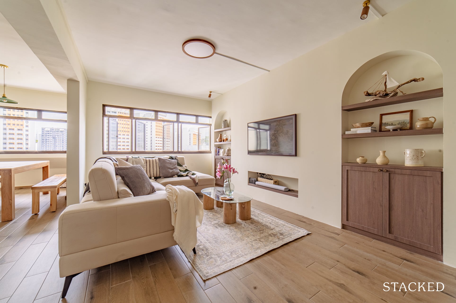
As soon as you enter, it would be hard not to take notice of their wood tiles. Replacing the previous flooring really helped to tie in their theme together.

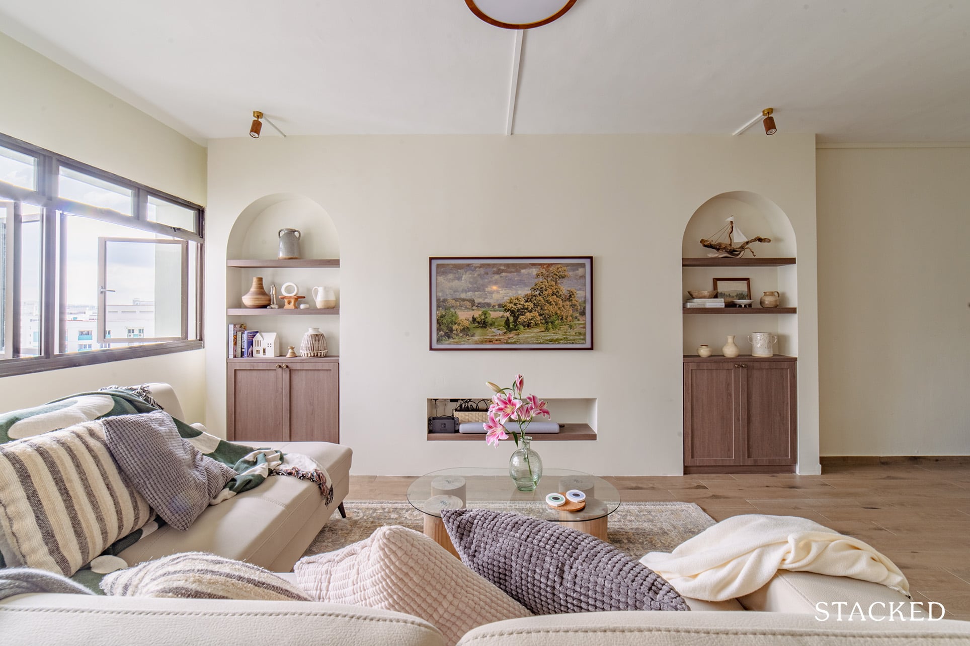
An interior with soft arches is one of the distinguishing features of a Spanish-styled home, and you can see that interspersed throughout the home. Two arch features with half-height storage cabinets stand out in the living room as part of their feature wall, and there’s also a partition nook for their TV. The Samsung Frame TV really works very well in this instance, to the casual viewer, it’s easy to mistake this for a vibrant piece of artwork!
Dining Room
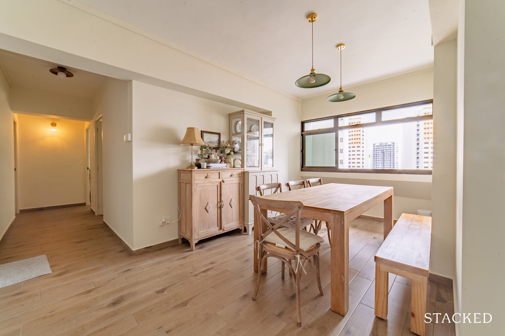
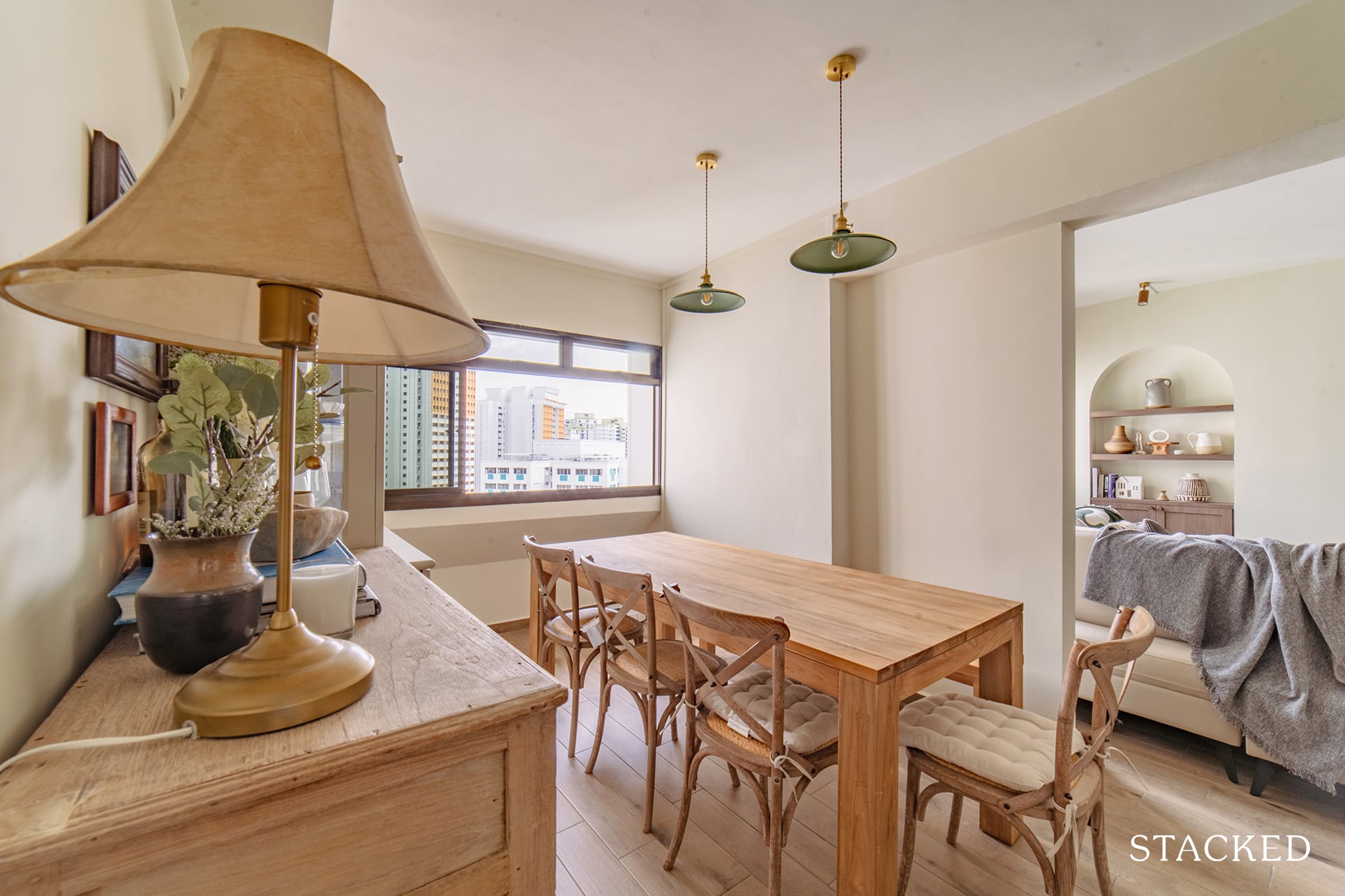
They wanted a more defined separation between the living and dining rooms without entirely closing both rooms. So they created two partition walls between them. Part of the bedroom adjacent to the dining was also made smaller to add more space to the dining area.
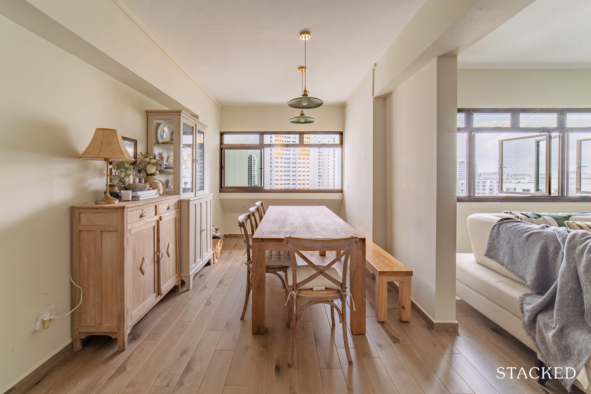
Hand-carved wooden furniture is one of the things that add character to a Spanish home. So Rach and Sam made it a point for their shaker-styled cabinets to be the highlight of their dining area.
Property Advice5 Interesting 4-Room HDB Layout Ideas To Utilise Your Space Better
by Adriano TawinKitchen
They installed sliding kitchen doors to separate the kitchen from the dining. This design helped create a cantina effect you typically find in Latin restaurants.
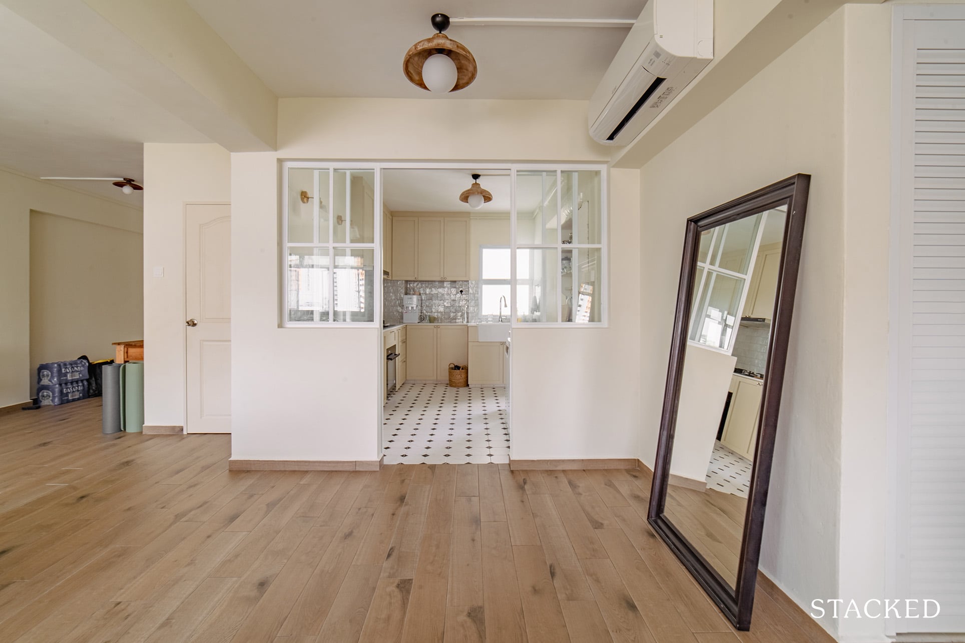
To create an extra space to accommodate their fridge, they had to seal the entry/doorway to the common toilet and move it along the walls of the opposite hallway.
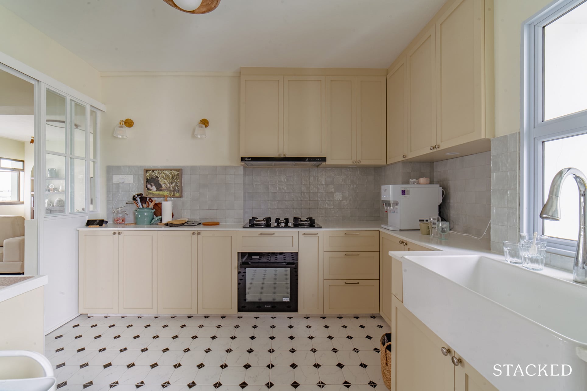
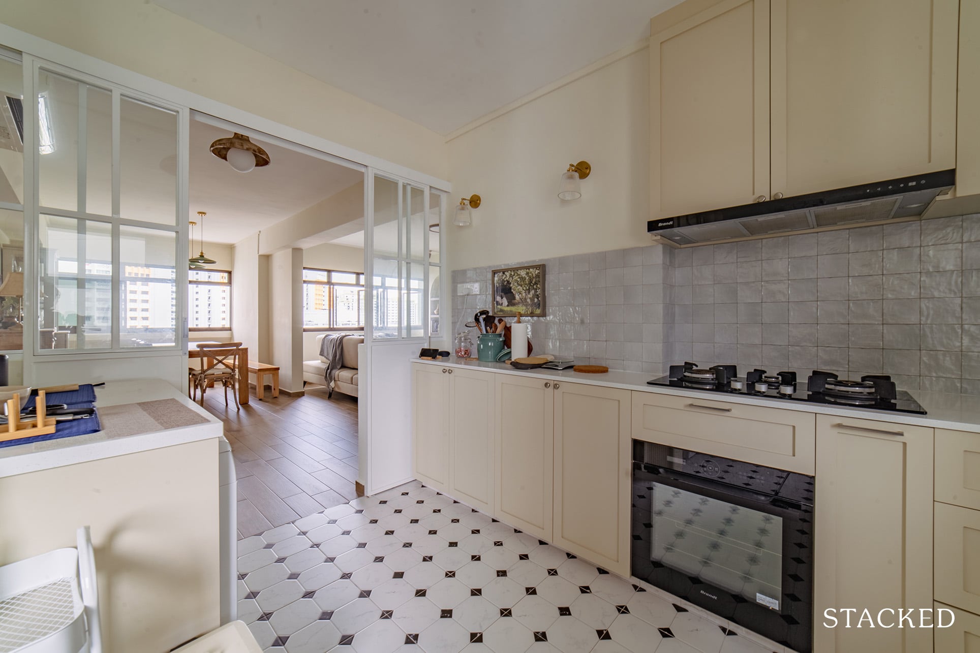
For the rest of the kitchen, they hacked away all flooring/backsplash tiles + cabinets and re-installed shaker-styled cabinets and new floor tiles.
Master Bedroom
They hacked away the previous parquet flooring and installed vinyl floors for the master bedroom. They also installed a double stucco vanity in their room. A tempered fluted glass arch on a half-height hollow block wall effectively separates the vanity from the bed.
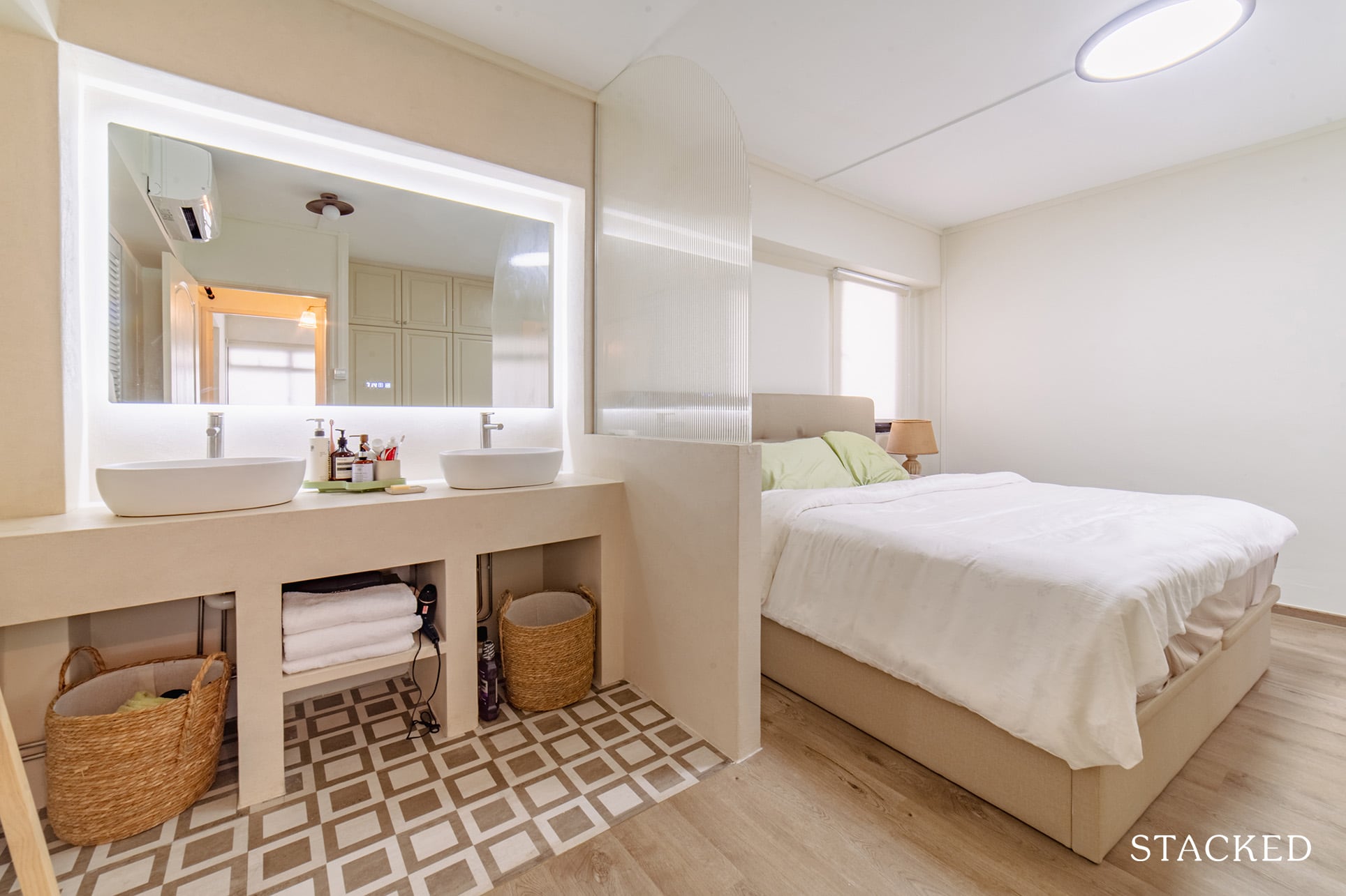
It’s certainly an interesting look, and the double vanity really adds a touch of luxury here.
The design of the existing wardrobe cabinet doors works well with their theme, so they decided to retain it and just give it a fresh coat of paint. However, Rach said they did hack away and reinstalled the shelves and casing.
More from Stacked
This HDB Town Sold the Most Flats in 2025 — Despite Not Being the Cheapest
If there’s one headline that dominated the HDB market through 2025, it was the steady rise of million-dollar flats. What…
Bathrooms
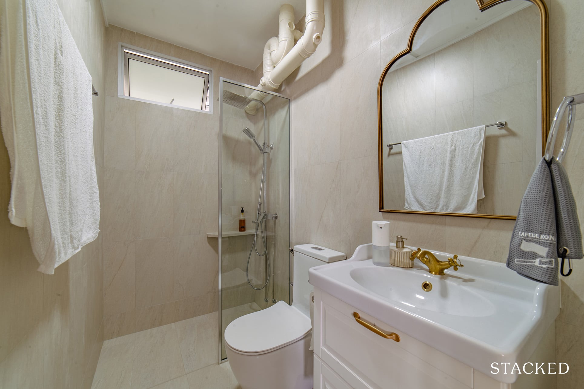
Below are some photos of the transformation that their bathroom went through. The brass accents and the farmhouse sink in the common bathroom add to the overall effect they wanted to achieve with their home.
Bringing The Vision To Reality
Witnessing how homeowners turn their visions into their dream home is always an exciting time. Rach said it was very similar to what they had envisioned, and they have their ID to thank for. “There are a few features we had to forego due to budget constraints, but we are generally very happy with the outcome.”
Their IDs were Levonne and G from Ethereall. They did consider and meet up with other designers since they already knew exactly what they wanted. Ethereall was able to build the connection they were looking for because the couple also wanted a third opinion on design – someone who had an eye for the style they were aiming for.
“We wanted someone who was familiar with doing a country-style home and Levonne had done a similar project, which we absolutely love,” she said.
Aside from being able to deliver the concept with even better modifications to some of the features they wanted, their IDs were also professional. “She was prompt and patient in her replies to our concerns and clear on the quotation so we trusted her,” Rach shared.
She said that although their quotation was not the cheapest, it was definitely fair. And ultimately, Rach and Sam were impressed by how smooth sailing the whole renovation process was.
For the furniture sourcing process, Rach was very happy to share that this was definitely their favourite part of their reno journey.
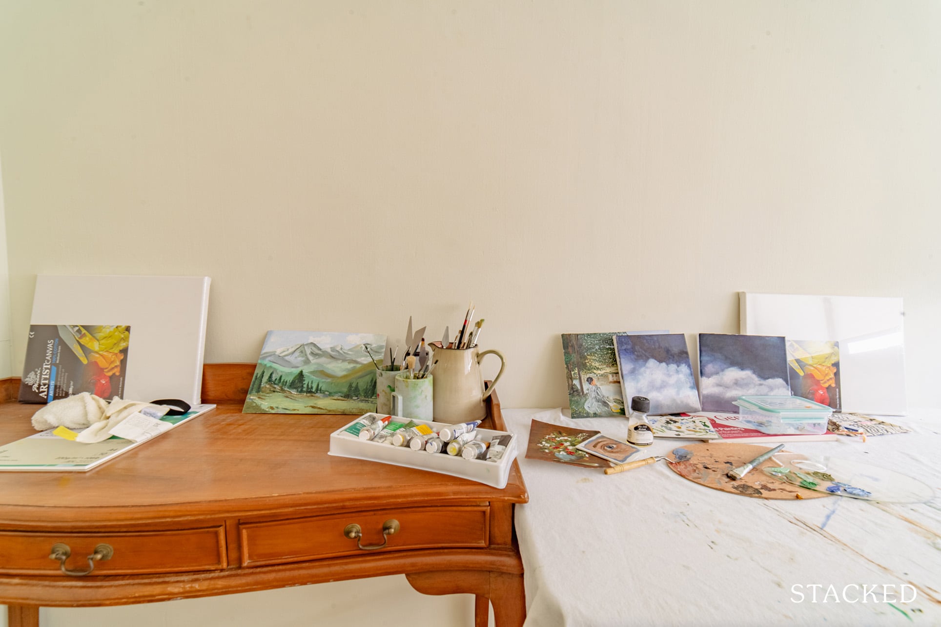
Some of their furniture pieces are from local stores, such as their custom-made dining table from Golden Teak. Their sofa came from Fullhouse, and the sideboard from Originals. Like many other resourceful homeowners, they also purchased a fair bit from Taobao, which includes lighting, a coffee table, bathroom fixtures, and a study table.
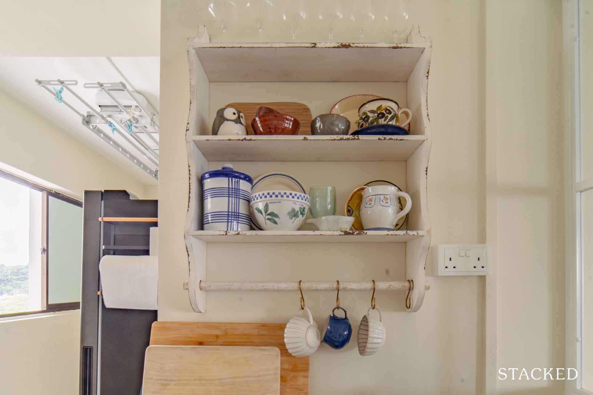
“I am also a sucker for potteries and dinner wares,” Rach admitted, “which we sourced from Etsy, Taobao, and antique markets abroad.” Most of their decorative items are mainly antiques that they bought from Etsy.
When we asked her about the best area of their home after the reno, the couple found it tough to answer because they love their home in its entirety.
“But if we really have to choose one, that would probably be the kitchen.”
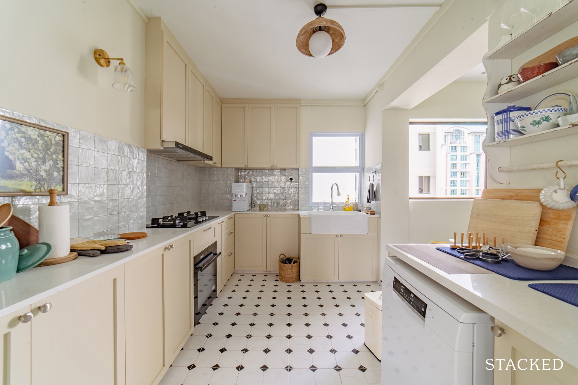
She shared that it used to be old and dingy prior to renovation. Now, it has brightened up significantly with the right tiles and cabinet colours. Other things that brought the space to life after they spruced up the kitchen include the right lighting, a farmhouse sink, artwork, and cute dinnerware on display shelves.
Their decision to shift the common bathroom entry from the kitchen to the walkway also allowed them to maximise the space in the kitchen and pantry.
Lessons Learned From A Successful Reno Journey
There’s no denying that a reno journey is an exciting endeavour. But most homeowners tend to forget that it could also be potentially stressful. It can be straining on relationships, as what Rach and Sam experienced when both of them are not on the same page.
“While I am design-oriented, Sam values functionality and practicality,” she said. “For example, Sam wanted a closed kitchen and I wanted an open concept one for a more cohesive design.”
At the end of the day, though, it all worked out. She said it’s all about compromise and setting mutual goals, including budgets. They also made sure to take breaks and go on dates amidst all the hectic planning and renovations.
“Thank God for Sam for keeping me grounded,” Rach added.
If there’s one thing that the couple regret about their design decision, however, it’s the sampling paint on their walls. She said their wall paint turned out much warmer or yellowish than they expected. “Well, we stuck to it and luckily, it has grown on us,” she contentedly said.
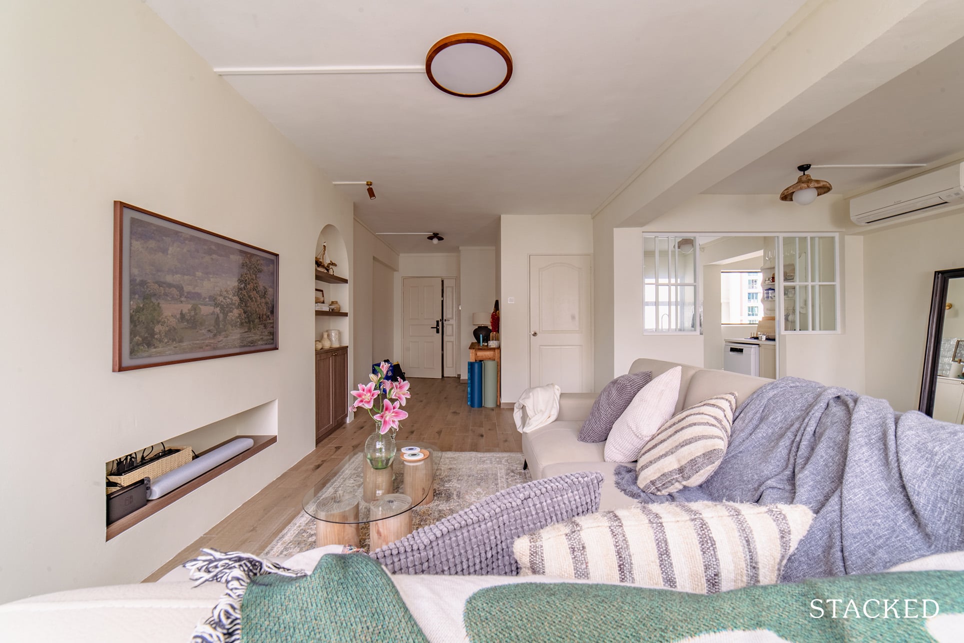
Lastly, Rach shares some advice for homeowners who are looking to renovate their homes, even if it’s just a matter of changing or adding decor. It all revolves around being budget-friendly and taking things slowly.
The couple, for instance, loves dressing up their walls with simple things such as hanging a mirror, shelves, or artwork. They even spruced up a few areas of their home with digital art, which they printed and framed themselves.
“Home is always a work in progress and the fun comes in picking up pieces you love along the way.”
Most new homeowners are guilty of buying and collecting a lot of different decorative items at one go so they can have the perfect setup quickly. However, the trick is to be patient and wait for the perfect piece rather than buying items haphazardly just to fill up the space.
If you ever feel uncomfortable with that empty space in your home, remember that it took months for Rach and Sam to decide on a coffee table. Then, it took about three months to arrive after they officially moved in.
And Rach laughingly added that nearly ten months in and they still have not bought a shoe rack.
At Stacked, we like to look beyond the headlines and surface-level numbers, and focus on how things play out in the real world.
If you’d like to discuss how this applies to your own circumstances, you can reach out for a one-to-one consultation here.
And if you simply have a question or want to share a thought, feel free to write to us at stories@stackedhomes.com — we read every message.
Need help with a property decision?
Speak to our team →Read next from Homeowner Stories

Homeowner Stories We Could Walk Away With $460,000 In Cash From Our EC. Here’s Why We Didn’t Upgrade.

Homeowner Stories What I Only Learned After My First Year Of Homeownership In Singapore

Homeowner Stories I Gave My Parents My Condo and Moved Into Their HDB — Here’s Why It Made Sense.

Homeowner Stories “I Thought I Could Wait for a Better New Launch Condo” How One Buyer’s Fear Ended Up Costing Him $358K
Latest Posts

PRO Pro Bishan Loft EC Price Review: Why This Older Executive Condominium Saw Strong Gains

Property Investment Insights Why Some Executive Condominiums Made More Money — And Whether That Still Applies Today

Singapore Property News This New 863-Unit Tengah Condo Will Launch From $980,000 — The First Private Condo in Singapore’s New Forest Town

















0 Comments