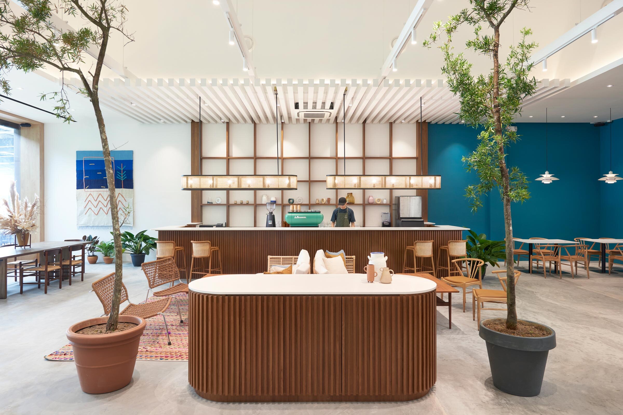
Who doesn’t like to enjoy a nice cup of coffee, while relaxing beneath a canopy of foliage and flora? It’s probably the number one guilty pleasure of many Singaporeans today – paying over the top for coffee in an aesthetic ambience when you can easily have it at home.
Today, there are many reasons why certain cafes are more popular than others. Some may say the food and drinks are the number one reason, but increasingly, having a pretty interior space seems to be the real draw more than everything else.
There has been an interesting convergence, however, where these commercial spaces have started to crossover to look more and more residential-like, giving you the feel of home away home from home. Likewise, homeowners have also yearned for that cafe-like ambience at home, with their living, dining, and kitchen areas often taking a leaf from the books of cafes that they’ve been inspired from locally or from travels.
And so for those looking to adopt some features from their favourite cafes, here are some design considerations that you can consider to elevate your home dining experience:
Table Of Contents
So many readers write in because they're unsure what to do next, and don't know who to trust.
If this sounds familiar, we offer structured 1-to-1 consultations where we walk through your finances, goals, and market options objectively.
No obligation. Just clarity.
Learn more here.
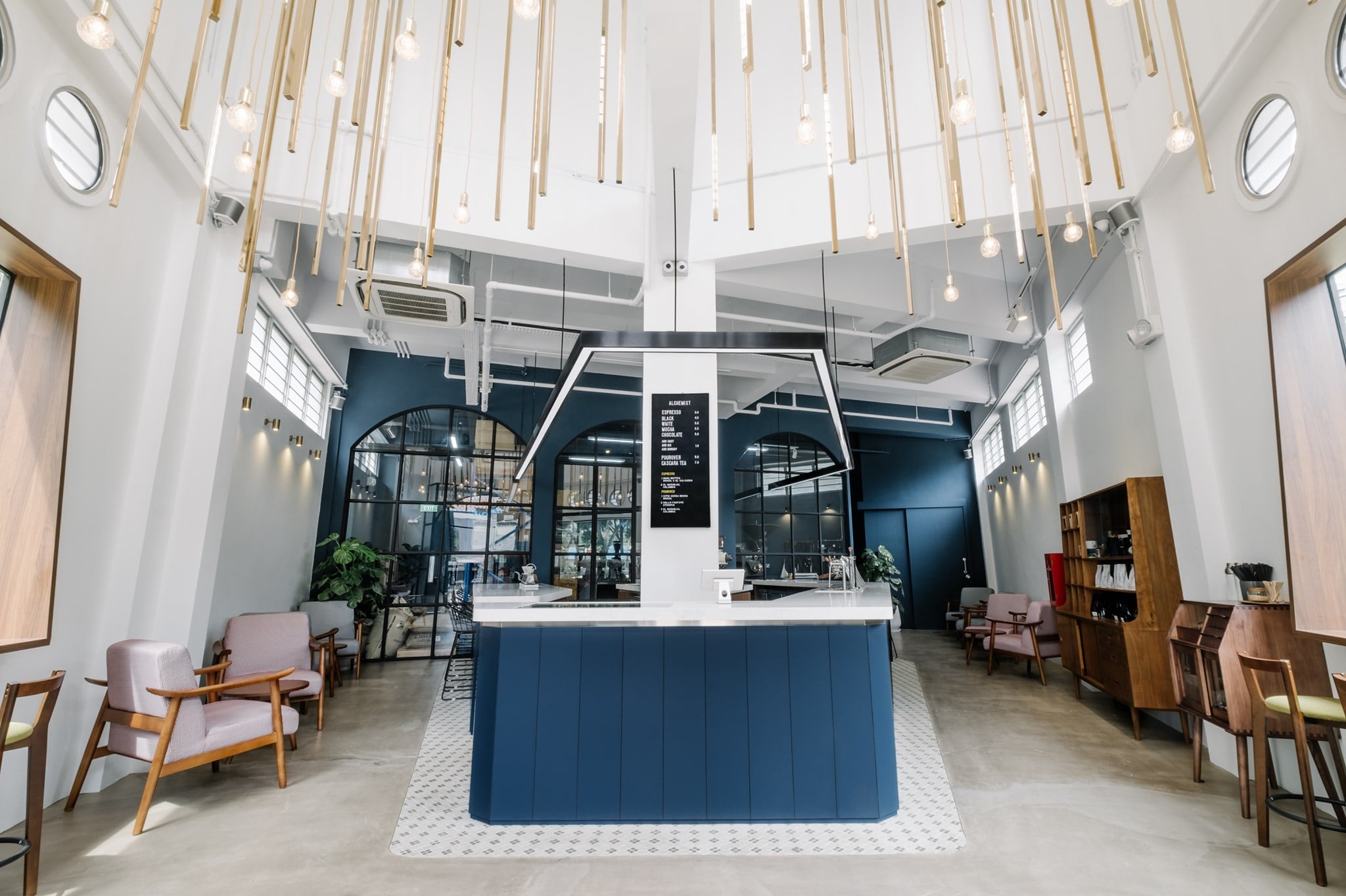
1. Spatial Connectivity (Alchemist)
Instead of fully segregating the kitchen from dining, ensure good spatial connectivity between the two areas by situating them close to one another with good traffic and visual flow. If you’ve heard of the phrase, “you eat with your eye”, visual appeal is probably just as important as the tasting experience of the food. The mere presence of food preparation can elevate the dining experience drastically as that is said to be half the dining experience in itself.
Such layout considerations encourage individuals to take part in their food experience from beginning to end. If you entertain a lot, having such a setup will definitely create an engaging dining experience for your guests. Naturally, you should also have the cooking skills to match!
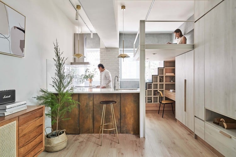
For apartments
Centrally positioned kitchens maintain viewability from most parts of the apartment. This gives individuals an opportunity to be part of the action even from where they are situated.
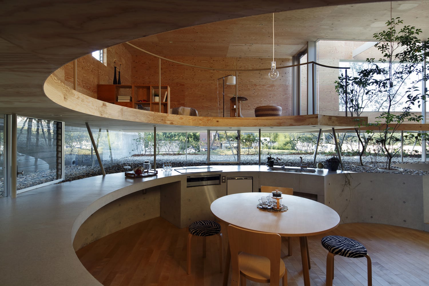
For landed homes
Given the opportunity, why not let the kitchen space be the heart and soul of the home? Your living spaces could be designed around your cooking habits – literally and figuratively.
2. Consistent/Overflowing Elements (Co-Exist)
Allow your dining elements to take a cue from the kitchen design for a consistent aesthetic language. You may even wish to intentionally overflow certain elements from one area to another to place emphasis on the design scheme. Having your dining and food preparation spaces share similar elements also provides a seamless experience, giving the impression of a unified space despite serving different functions.
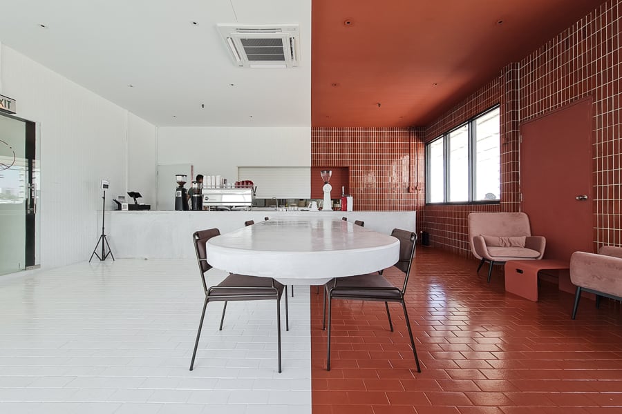
That said, overflowing tiles and paint jobs are not the only ways of combining spaces. The choice of cabinetry, kitchen tables, and their finishes is another great way to extend the intended visual aesthetic. Hence, if an elaborate spatial makeover is not feasible, look towards smaller, more manageable alternatives such as your furniture and fixture choice.
For apartments
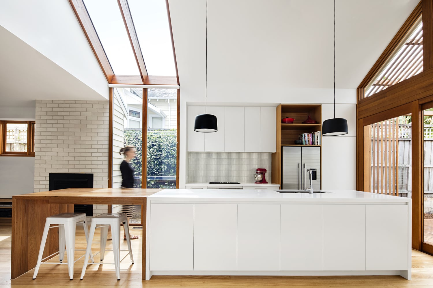
(left side) wooden elements flowing down to the wooden table/kitchen island extension
(right side) white theme from the ceiling to the cabinetry, to the kitchen island
3. Mix and Match (My Awesome Cafe)
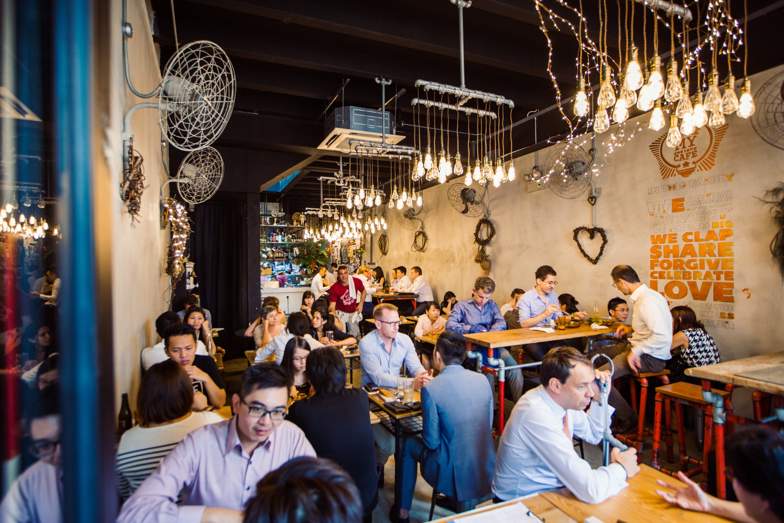
Can’t decide on a fixed design? Bring in various elements that have unique qualities and attempt to mix and match them. Loose ornamentations can also be very beneficial in that it allows you to switch it up from time to time as you please. This is perfect for seasonal festivities and events that you may wish to celebrate.
Starting with a relatively neutral base, add on different elements that build off of it and alternate between them for various occasions. Note that changing up every aspect of the space is not necessary and that having mainstay elements like chairs and tables is great for maintaining a sense of familiarity.
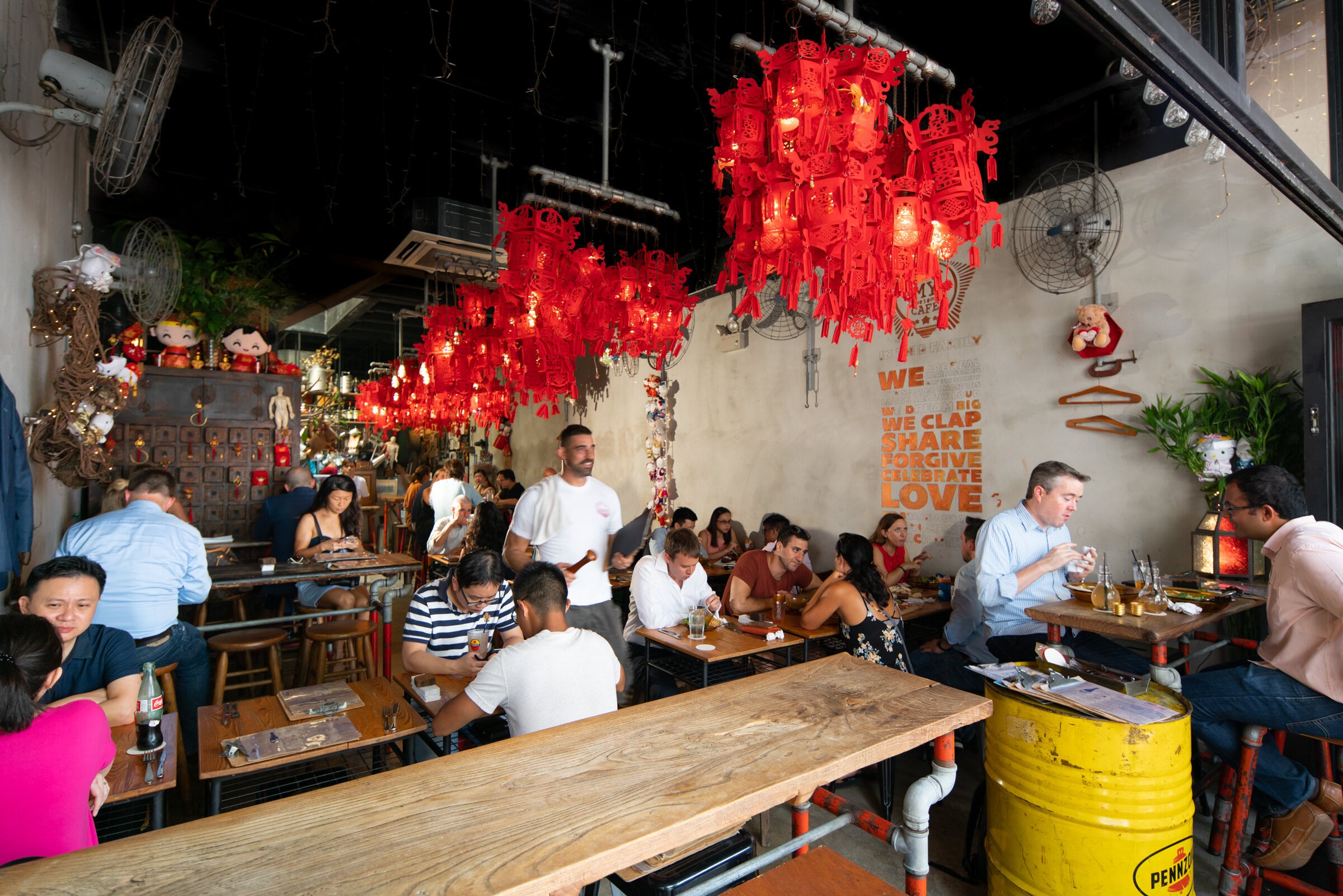
Like the example below, having a flexible setup allows for different dressing up depending on the occasion.
And during festive seasons like Chinese New Year, the lights can be used as makeshift lanterns.
4. Use fixtures to segregate spaces (Forty Hands)
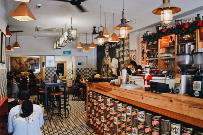
When looking to divide a space, we often only consider furniture as a means to do so. However, fixtures such as lighting are equally important and may even be more effective at dictating spaces. By intentionally using different lighting fixtures and positioning them appropriately, it subtly yet effectively breaks up a space into meaningful clusters. Be intentional with your choices and play with their installation heights according to the indented dining experience and degree of intimacy.
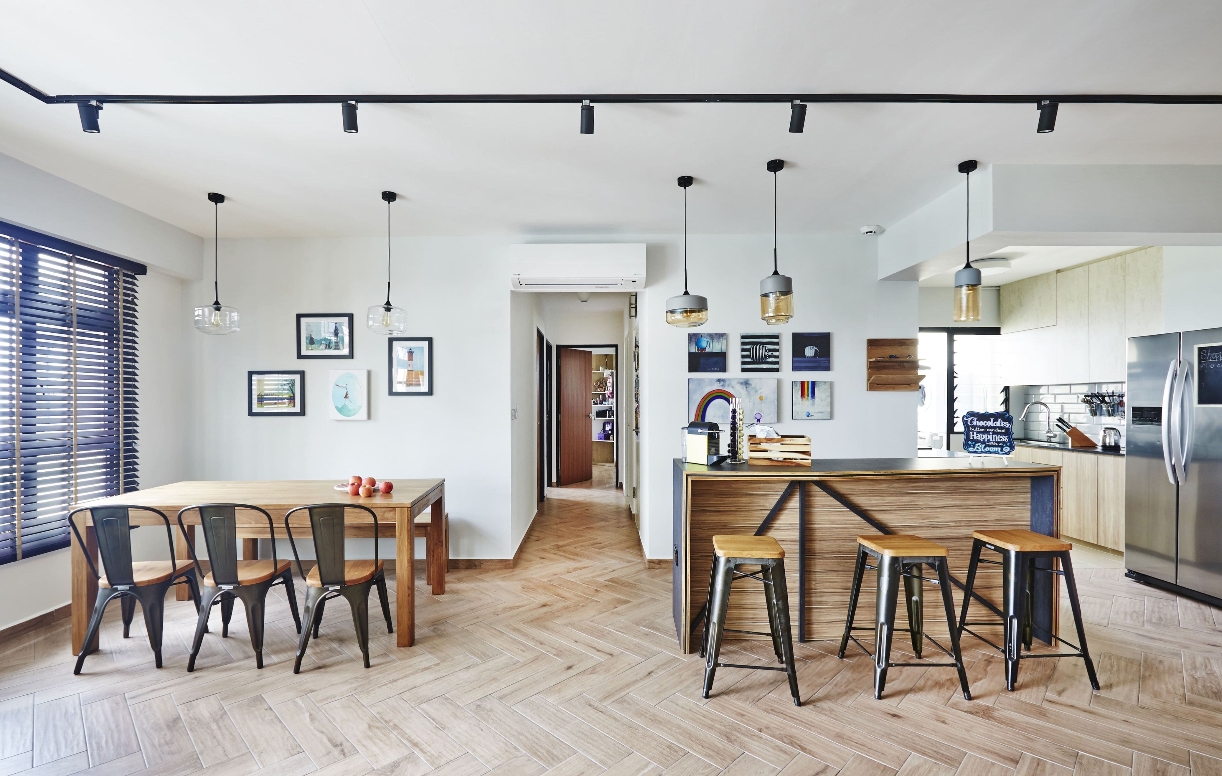
BTO 5 Room example
The one on the left is geared towards general purposes while the other is akin to a kitchen island cum bar top that is more intimate due to the shorter distance between the table and the lighting fixtures. The intimacy is further emphasised by the tinted glass that makes for warmer lighting when turned on.
Design5 Best Spots To Find Vintage Furniture In Singapore For Unique, One-In-A-Kind Pieces
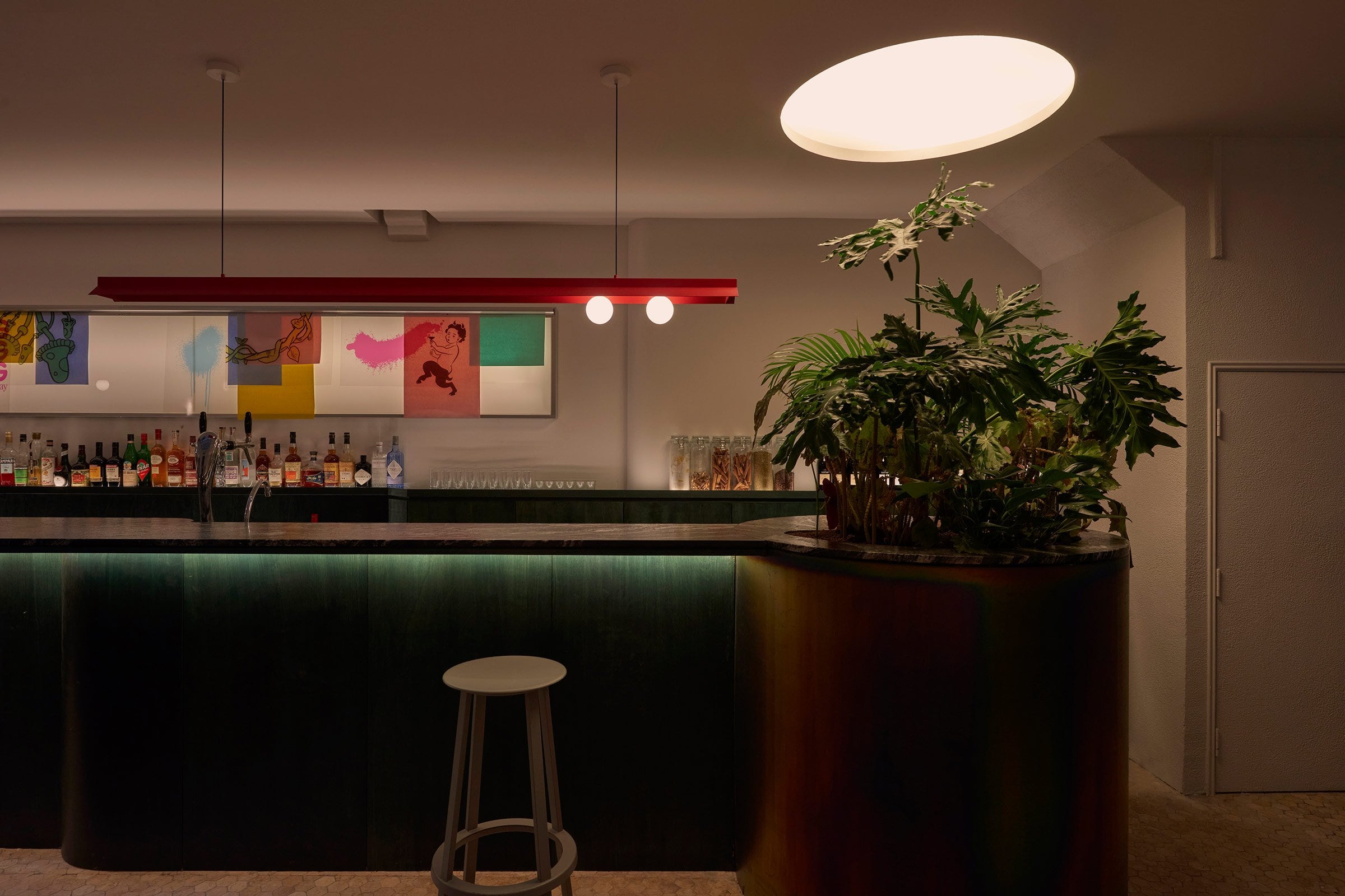
by Stacked5. Include a conversation piece (Nemesis Bar)
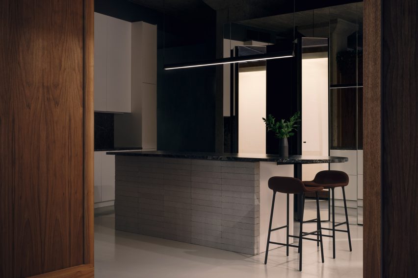
What better way to break the ice between people than a literal conversation piece over your meal? A piece of single unique furniture or fixture is capable of livening up a space significantly. These fixtures give people a focal point to rest their eyes on, making them a great point of reference for other elements of the space to play off from. Contrasting furniture and fixtures that use bold colours and unique geometry are often a great way to grab one’s attention. Consider targeting fixtures that can be centrally positioned without taking away from their functionality and intended use case. That said, do also take into account the overall theme when making a decision.
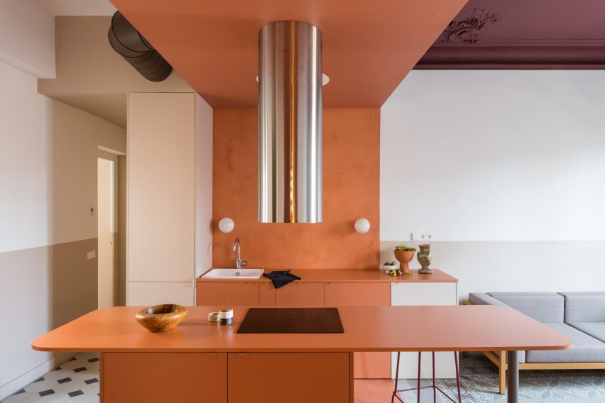
Exaggerated stainless-steel extractor for the fumes
Here’s an example of how to combine functionality with aesthetics.
If there is already a need to remove fumes from an open kitchen, why not go all out to make it a statement piece? Granted that such a dramatic implementation may not be for everyone, the concept of having a conversation piece still stands. Consider an impactful track light that provides a similar effect, while remaining palatable and practical.
6. Smart Fixtures (Nylon)
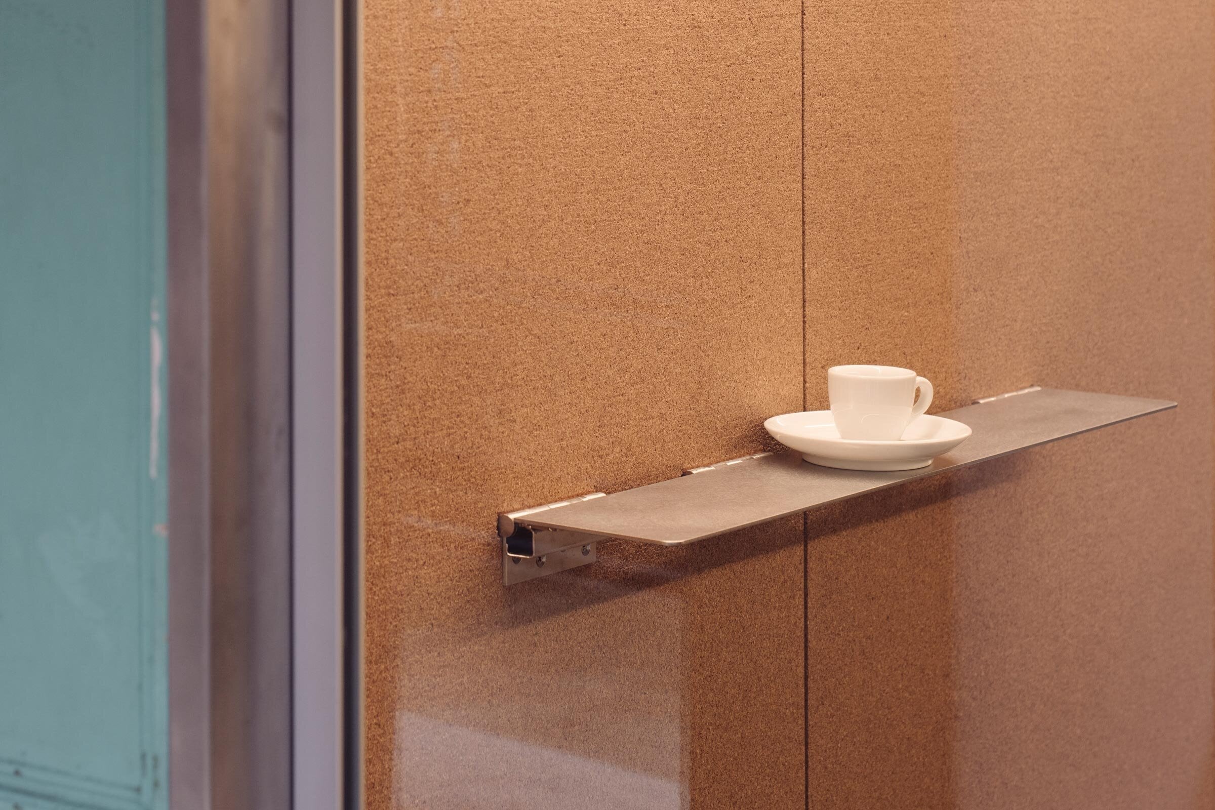
An interesting kitchen design doesn’t always have to be characteristically loud. Moreover, elements need not be included at the expense of functionality. With smaller dwelling units becoming increasingly common, the inclusion of smart space-saving features is more than welcome. Fixtures like a small wall-mounted foldable rack or table could work wonders in the kitchen for providing a temporary space that folds away neatly when no longer required. Such fixtures tend to be relatively inexpensive, with room for DIY alternatives as well. Before installing additional features, actively work with what you have and take note of your habits.
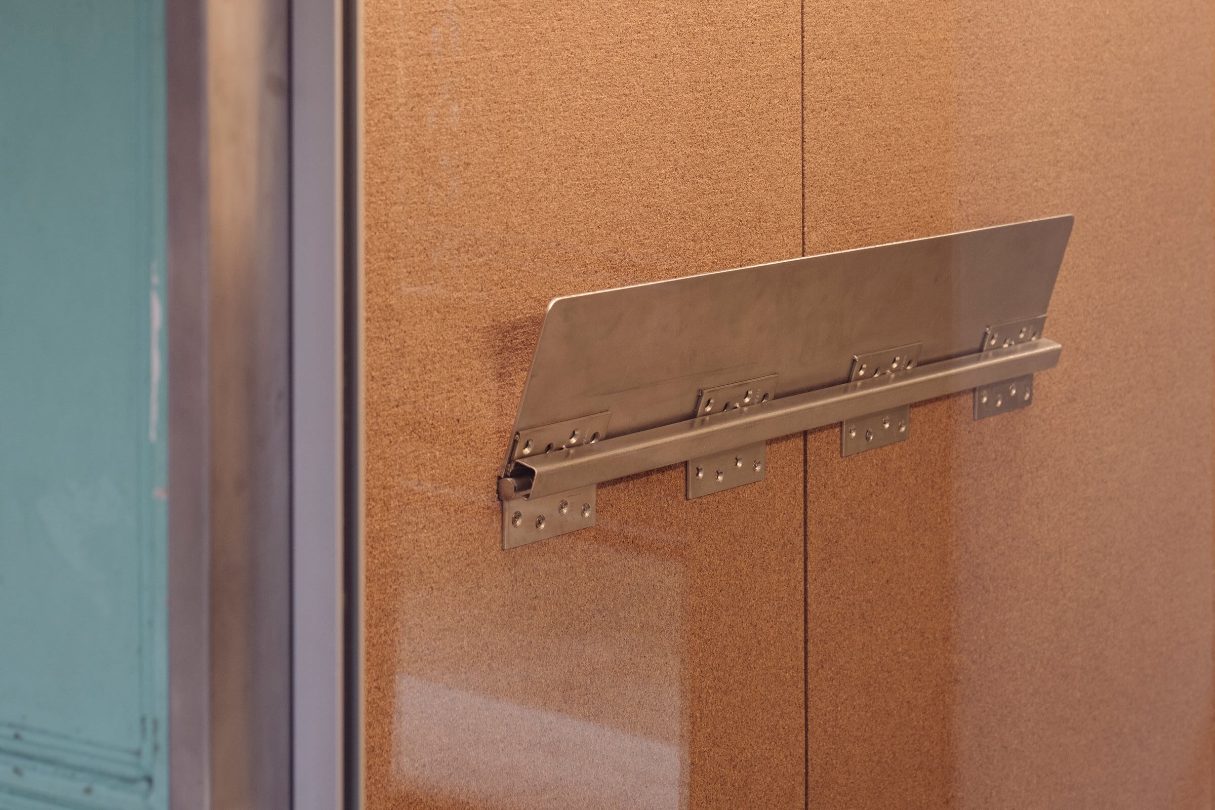
At Nylon Coffee Roasters, cleverly designed flip-down metal ledges on a wall allow for more intimate meetings and also a smart use of the additional space along the wall. This can also be folded away so as to not block the path if needed.
Likewise, having such a feature at home could make sense in the balcony area of your home instead of a proper coffee table. In this way, you can keep your balcony open and minimalist, but have a functional use for when you want to have your morning coffee.
Closing thoughts
It is evident that we Singaporeans desire to have a good time when it comes to food (it’s in our DNA). To some, this can simply mean a fuss-free experience, and to others, an elaborate one. Either way, these are all achievable with the right approach.
There is no need to reinvent the wheel or for anything extreme to be done to elevate your home dining experience. As you can see, interesting F&B concepts are sometimes simpler and more achievable than you might expect.
Cover photo credit: Jovian Lim
At Stacked, we like to look beyond the headlines and surface-level numbers, and focus on how things play out in the real world.
If you’d like to discuss how this applies to your own circumstances, you can reach out for a one-to-one consultation here.
And if you simply have a question or want to share a thought, feel free to write to us at stories@stackedhomes.com — we read every message.
Need help with a property decision?
Speak to our team →Read next from Decor Advice
Editor's Picks 6 Stylish Coffee Table (Bench) Alternatives If You Have A Small Home

Design 9 Most Unusual Candles To Decorate Your Home (Or Make A Great Gift)
Design The Coolest 6 Home Decor Releases You Need to Know About in 2023
Design 8 Creative Home Decor Ideas To Create A Unique Space
Latest Posts
Singapore Property News These Colonial-era Bungalows In Tanglin Will House A New Lifestyle Hub – But The Awarded Bid Price Is Shocking
Investor Case Studies How A Clementi HDB Owner Upgraded To A $2.29M 3-Bedroom Condo At One-North Eden: Buyer Case Study
Property Market Commentary Singapore Retail Rental Market Outlook 2026: Prime Retail Rents May Rise Up To 4%










0 Comments