5 Almost Perfect New Launch Condo Layouts (Smaller But More Efficient)
February 12, 2023
When was the last time that you went to a new launch show flat and found that you were actually impressed by the floor plan?
Given how new launches are getting increasingly smaller today, there definitely always seems to be something that you’d have to compromise. Whether it is storage, lack of ventilation, or enclosed kitchens, it hardly seems sensible that more isn’t invested to ensure that our living spaces are better designed.
So even though facilities in a new launch condo are definitely better today (and the landscaping is leaps and bounds over older condos), it’s one reason why some older condos are still in vogue (other than the bigger spaces).
That said, there are some new launch condo floor plans that have really impressed me. If you prefer something new, here are 5 of the best from the recent crop of new launch condos in Singapore.
*Good amenities and facilities are great – but with property, it’s what’s inside that counts the most. From being space efficient to being versatile, your unit interior sets the ceiling on how great your home can look; that’s why on the Stacked new launch portal we let you search by feature (e.g, high ceilings, enclosed kitchens, service yards).
Table Of Contents
So many readers write in because they're unsure what to do next, and don't know who to trust.
If this sounds familiar, we offer structured 1-to-1 consultations where we walk through your finances, goals, and market options objectively.
No obligation. Just clarity.
Learn more here.
1. Terra Hill, 4-bedroom 1,894 Sq ft
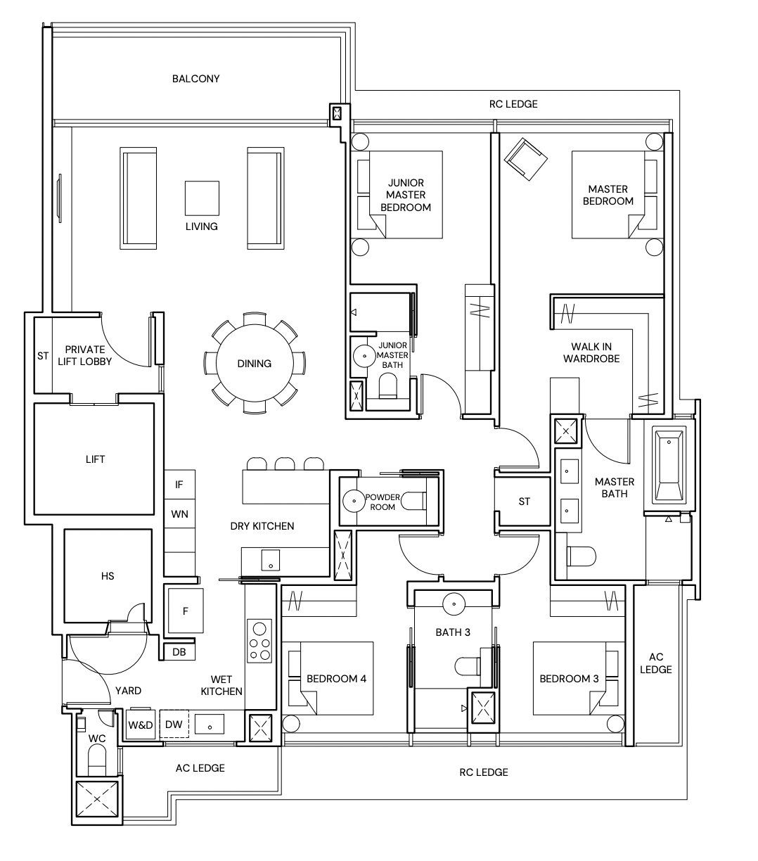
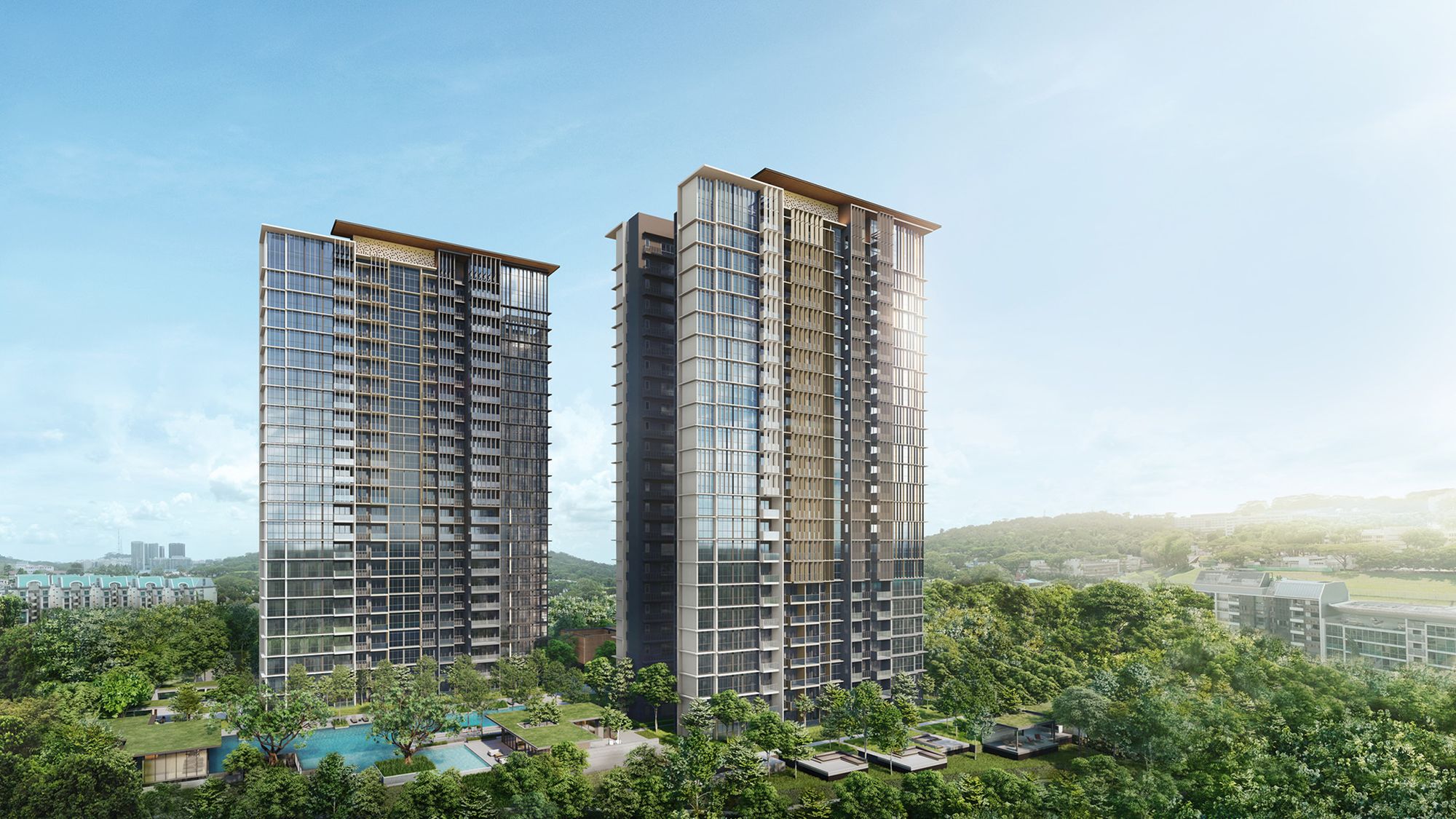
Terra Hill is the newest launch this weekend (look out for our review coming soon). It’s a freehold development with just 270 units in Pasir Panjang, that sits on the previous 72-unit Flynn Park condo (that went en bloc for $371 million).
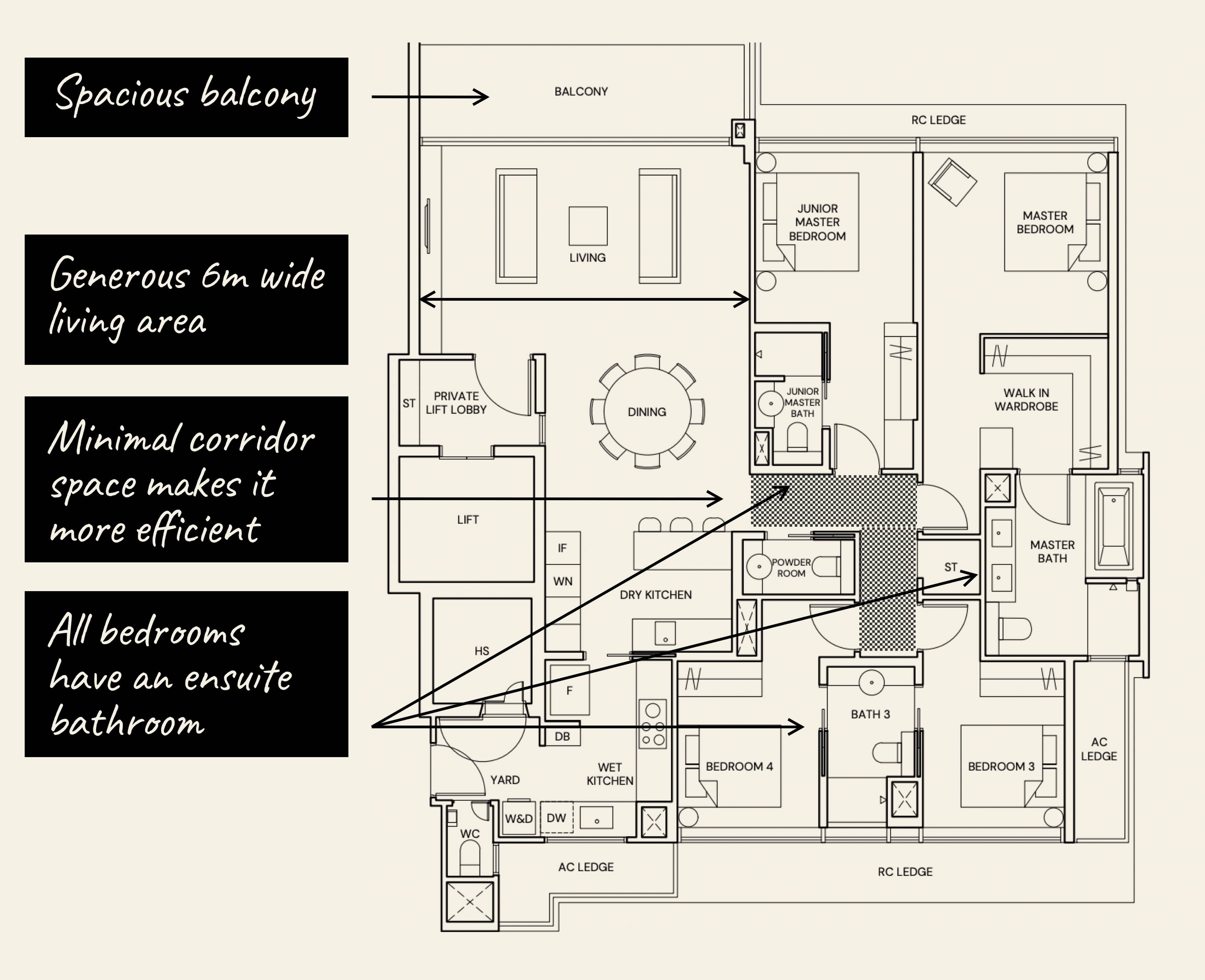
This sizeable, 1,894 sq. ft. unit features a spacious balcony, a rare (these days) powder room, and a built-in walk-in wardrobe for the master bedroom. This layout type is exclusive, limited to two units per floor, with private lift access.
There’s a generous six-metre span for the living area, which isn’t what you’d typically be able to get in a unit of this size as it would usually be combined with the dining area to achieve such an effect.
As for the bedrooms, most 4-bedroom units will see a long corridor, but this squarish layout means that wasted corridor space is kept to a minimum. And while there are three bathrooms, one of these is a jack-and-jill bathroom shared by the two common bedrooms. This clever arrangement effectively means that each bedroom gets an en-suite bathroom.
To wrap up, the layout is efficient, with only a small amount of square footage taken up by short corridors – and the ideal, squarish/rectangular shape of every room makes renovation easy.
2. Midtown Modern, 4-bedroom 1,808 Sq ft
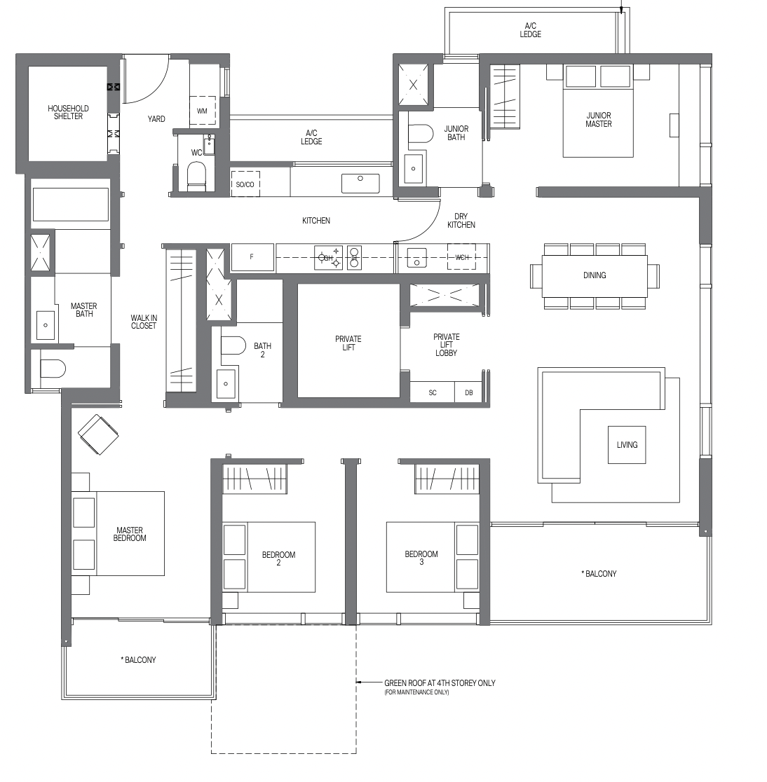
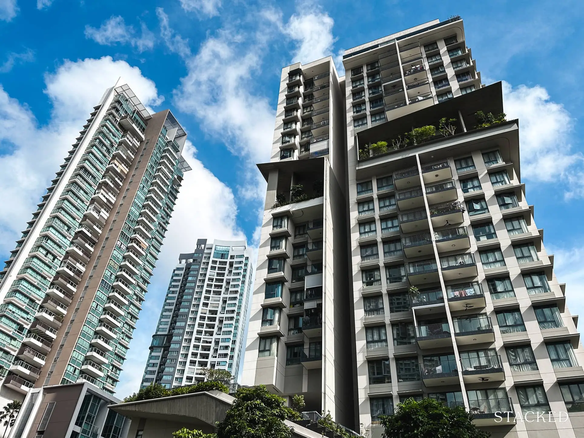
Like most units, the private lift means there’s no wasted space on antechambers or entrance walkways. So the private lift comes up in the middle of the unit, but with good reason. The window by the living/dining is deliberately designed to mimic a framed view, which is the first thing you’d see every time you stepped into your home.
The separated bedrooms offer good privacy, and the unit does offer a dry kitchen (although it’s on the small side). The balcony spaces are sizeable, so you can fully use them (e.g., set up a chair and lounge there) rather than just stand and look. Also, note that the unit has two separate balconies – the master bedroom has its own attached balcony (landlords who go for multiple unrelated tenants like this sort of configuration, as it helps to justify the higher rent for the master bedroom).
Nevertheless, given the urban city location that Midtown Modern is at, most owners would probably appreciate that private pocket of outdoor balcony space.
Just like the 4-bedroom unit at Terra Hill, you can see how a boxy/square layout makes sense to minimise wasted corridor space, and are easier to work with design-wise (from a practical standpoint).
3. Forett, 2-bedroom 732 Sq ft
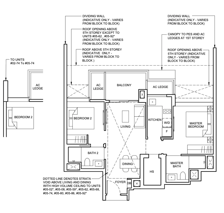
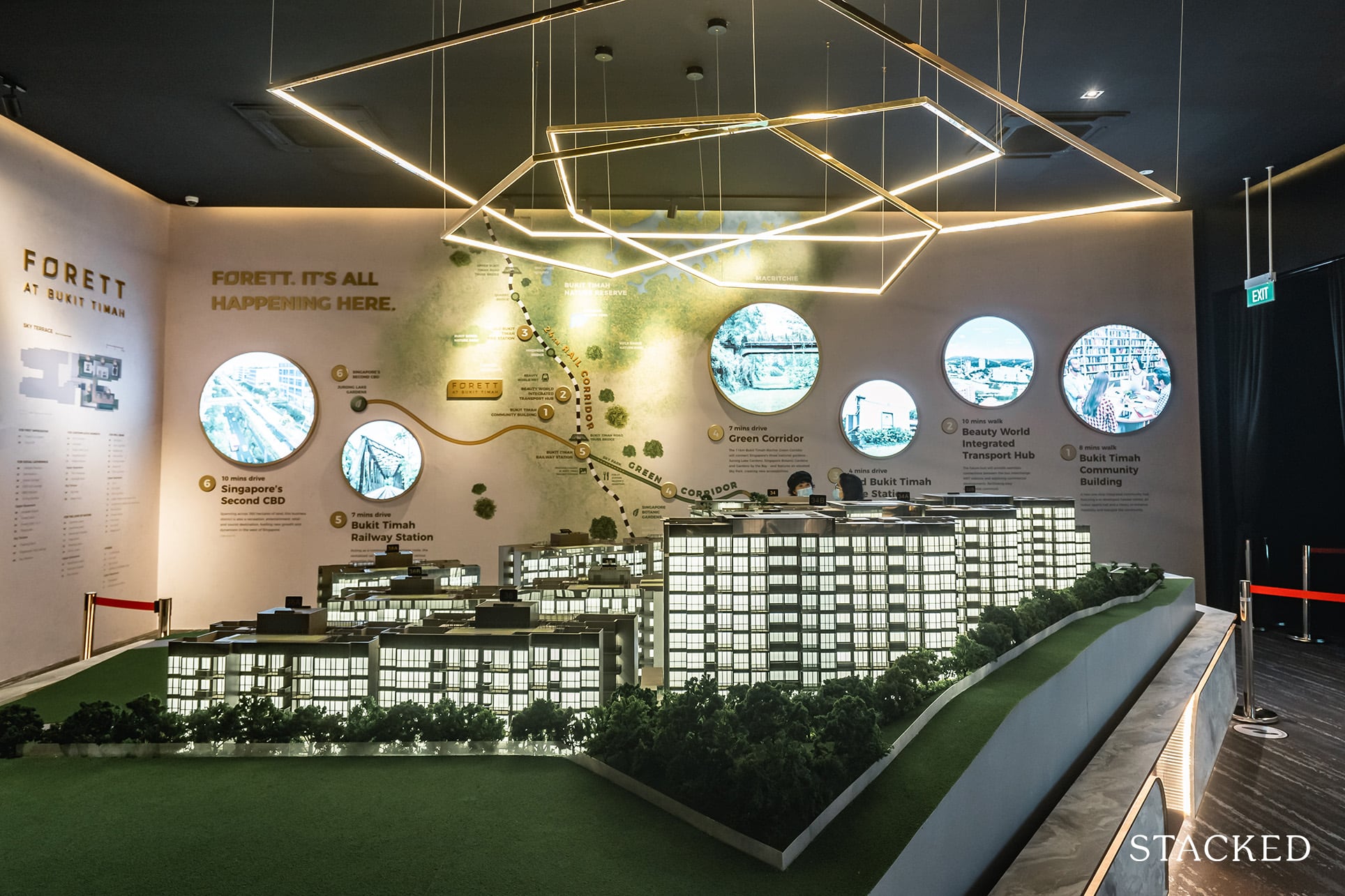
For 2-bedroom units, we’d usually prefer a dumbbell layout, and this one at Forett @ Bukit Timah is no exception. If you are new to the term, this means that it has a decent distance between the two bedrooms, allowing for a good degree of privacy – tenants with a roommate or unrelated second tenant will likely appreciate that. And while the foyer is small, it’s nice that they even included one, which you don’t often find in units this size. This is because you’d usually find that it opens straight up into the kitchen, which isn’t always the most welcoming view.
More from Stacked
5 Spacious 5-Room HDB Flats Under $600K You Can Still Buy Today
5-room HDB flats are great for bigger families, but they often come with higher price tags. If you’re working with…
This is where this unit at Forett is really unique, as the kitchen is placed by the master bedroom instead. If you’ve been shopping around for a new launch 2-bedroom unit, you’d know that it is rare to find a properly enclosed kitchen with good ventilation. Again, a useful feature for unrelated tenants; not everyone wants to smell what the roommate is cooking.
On the flip side, the bathrooms may be a bit cloistered, and they don’t have windows for natural ventilation.
There is even room for a bomb shelter which has also been configured to provide storage space.
New Launch Condo ReviewsForett at Bukit Timah Review: Freehold With A Palatable Quantum
by Matthew Kwan4. LIV@MB, 1-bedroom 495 Sq ft
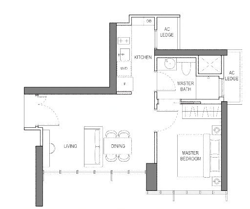
For a one-bedroom unit, this LIV@MB unit is probably the best that we’ve seen in recent years.
To start with, this one-bedder unit differs from many others, in that you enter through the living and dining space. Usually, for a one-bedder, the entrance goes through the kitchen to the living room. This means that you get a much better impression the moment you walk in, as rather than a kitchen view, it’s straight to the living.
Plus, it really helps that the living and dining rooms are laid out in parallel, and full-panel windows stretch across the length of the space. It’s a dramatic view and one that allows for a natural flow of air and light.
The cherry on top here is that the kitchen can be enclosed, as it comes with proper ventilation; and the jack-and-jill bathroom provides easy access from either bedroom. Again, this is very rare to find in new launch 1-bedroom units, which makes this particular layout really stand out.
Another outstanding detail is the full-length windows for the bedroom, which is again something that we don’t usually see in new launch one-bedders before.
These little details are vital for rental properties, as one-bedders are relatively abundant and tenants have a lot of choices.
5. Perfect Ten, 3-bedroom 1,281 Sq ft
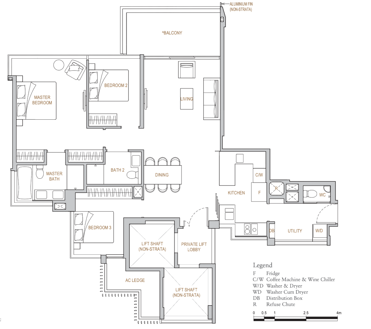
The overall layout here at Perfect Ten is a bit uncommon, but we like that there’s no wasted corridor space. The dining area is the weakest part of the layout, feeling almost like a barrier between the entrance (private lift) and the living room. It might be better if the dining table was centred and not flushed against the small wall segment, as the layout suggests.
Some might find the kitchen to be a little small too, but with sliding panels, you do have the option to keep it open if you don’t cook that much. There is also a helpful utility area, which comes with pretty big windows.
The master bedroom is the stand-out feature and has a lot more storage space than most other three-bedder counterparts. The attached master bathroom is equally lavish, with space for a small bathtub, and his-and-her sinks.
Even one of the common bedrooms is pretty impressive, as it has more storage than the typical new launch bedroom that you would find (a 3-panel wardrobe), and an L-shaped full-length window.
A final detail to note is the high ceiling – for these units, the standard ceiling height is 3.25 metres (the norm in Singapore is around 2.6 to 2.8 metres). One advantage of a high ceiling is that even quite packed rooms can maintain a sense of spaciousness.
A common trait of all the above layouts is versatility
None of them has unmovable, load-bearing malls intruding into the middle of rooms or in other highly visible spaces. This makes it easier for an interior designer to move the walls around, and accommodate a wider range of options.
The more leeway a designer or contractor has from the layout, the easier (and possibly cheaper) it becomes to renovate it to your liking.
For more on new launches and their interiors, check our detailed reviews on Stacked; we usually touch on each specific layout. You can also get your intended contractor or designer to look at the floor plan early on, to hear potential concerns.
At Stacked, we like to look beyond the headlines and surface-level numbers, and focus on how things play out in the real world.
If you’d like to discuss how this applies to your own circumstances, you can reach out for a one-to-one consultation here.
And if you simply have a question or want to share a thought, feel free to write to us at stories@stackedhomes.com — we read every message.
Frequently asked questions
What makes the layout of Terra Hill's 4-bedroom unit efficient?
How does Midtown Modern's 4-bedroom unit maximize space and privacy?
What are the key features of Forett's 2-bedroom layout?
Why is LIV@MB's 1-bedroom unit considered well-designed?
What makes the layout of Perfect Ten's 3-bedroom unit versatile?
Ryan J. Ong
A seasoned content strategist with over 17 years in the real estate and financial journalism sectors, Ryan has built a reputation for transforming complex industry jargon into accessible knowledge. With a track record of writing and editing for leading financial platforms and publications, Ryan's expertise has been recognised across various media outlets. His role as a former content editor for 99.co and a co-host for CNA 938's Open House programme underscores his commitment to providing valuable insights into the property market.Need help with a property decision?
Speak to our team →Read next from Property Picks
Property Picks Where to Find Singapore’s Oldest HDB Flats (And What They Cost In 2025)
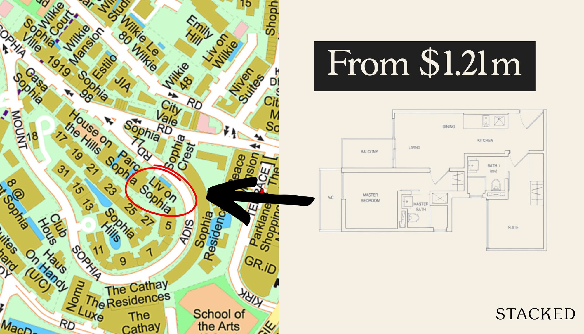
Property Picks Where To Find The Cheapest 2 Bedroom Resale Units In Central Singapore (From $1.2m)
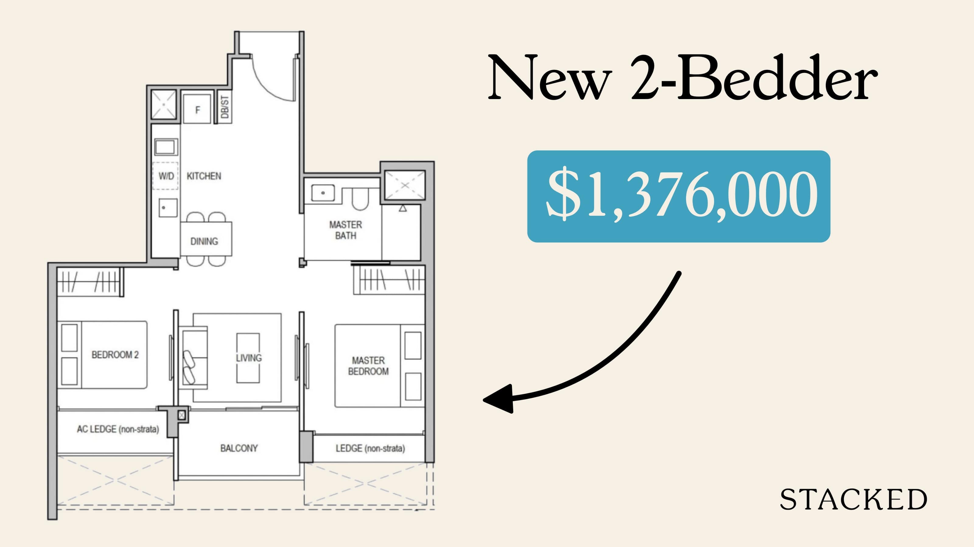
Property Picks 19 Cheaper New Launch Condos Priced At $1.5m Or Less. Here’s Where To Look
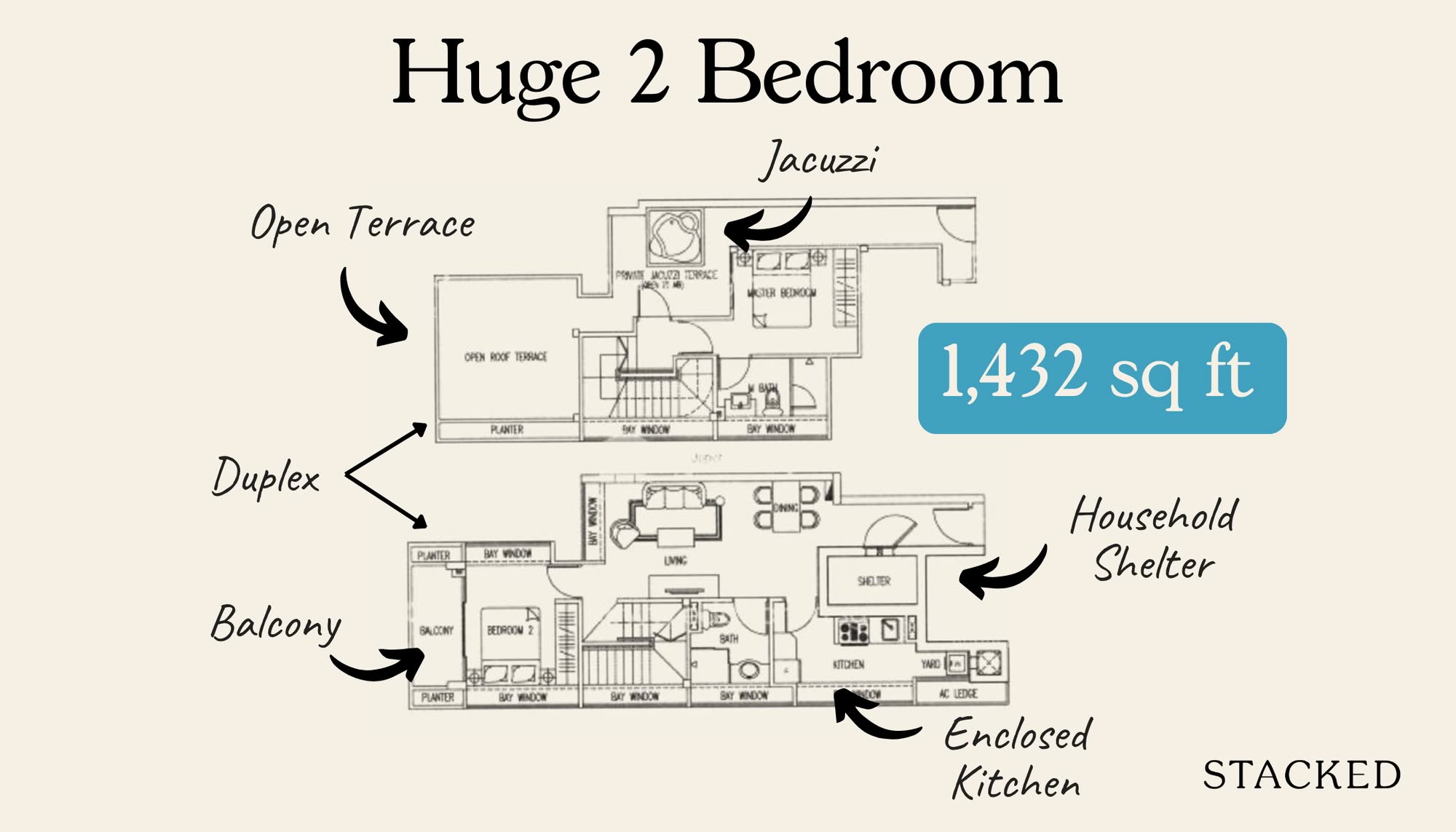
Property Picks Here’s Where You Can Find The Biggest Two-Bedder Condos Under $1.8 Million In 2025
Latest Posts

Singapore Property News HDB Resale Prices Fell — But A Third Of Buyers Still Paid $800K+ Last Quarter. Here’s Why
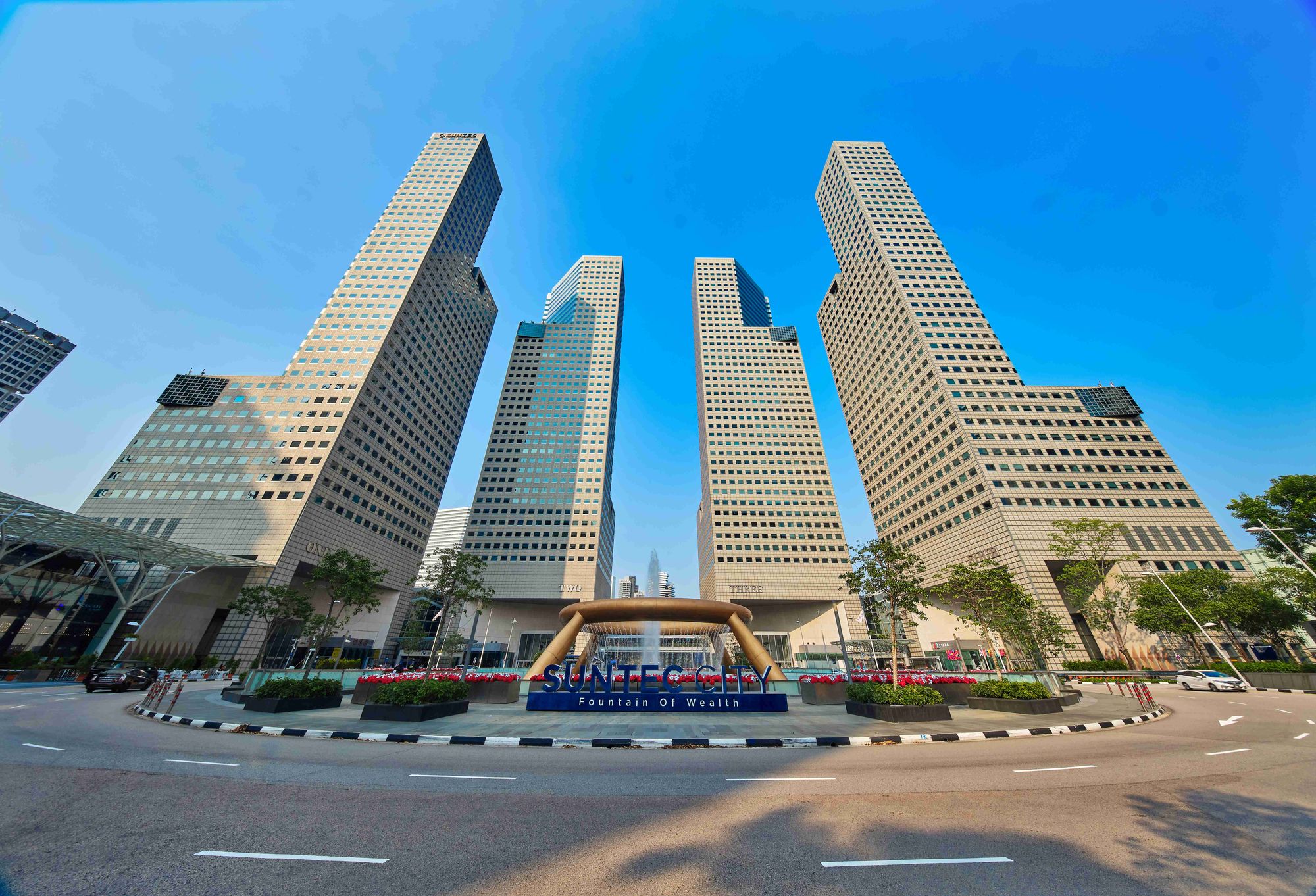
Singapore Property News Three Strata Office Floors In Suntec Priced From $135M
Singapore Property News This Freehold Desker Road Shophouse Is Going For $10.5M













1 Comments
What about the 1227sqft apartment at Perfect Ten? The slightly different layout avoids the stated issue about the dining table.