10 Decor Mistakes That Can Make Your Home Look “Cheap”
February 2, 2023
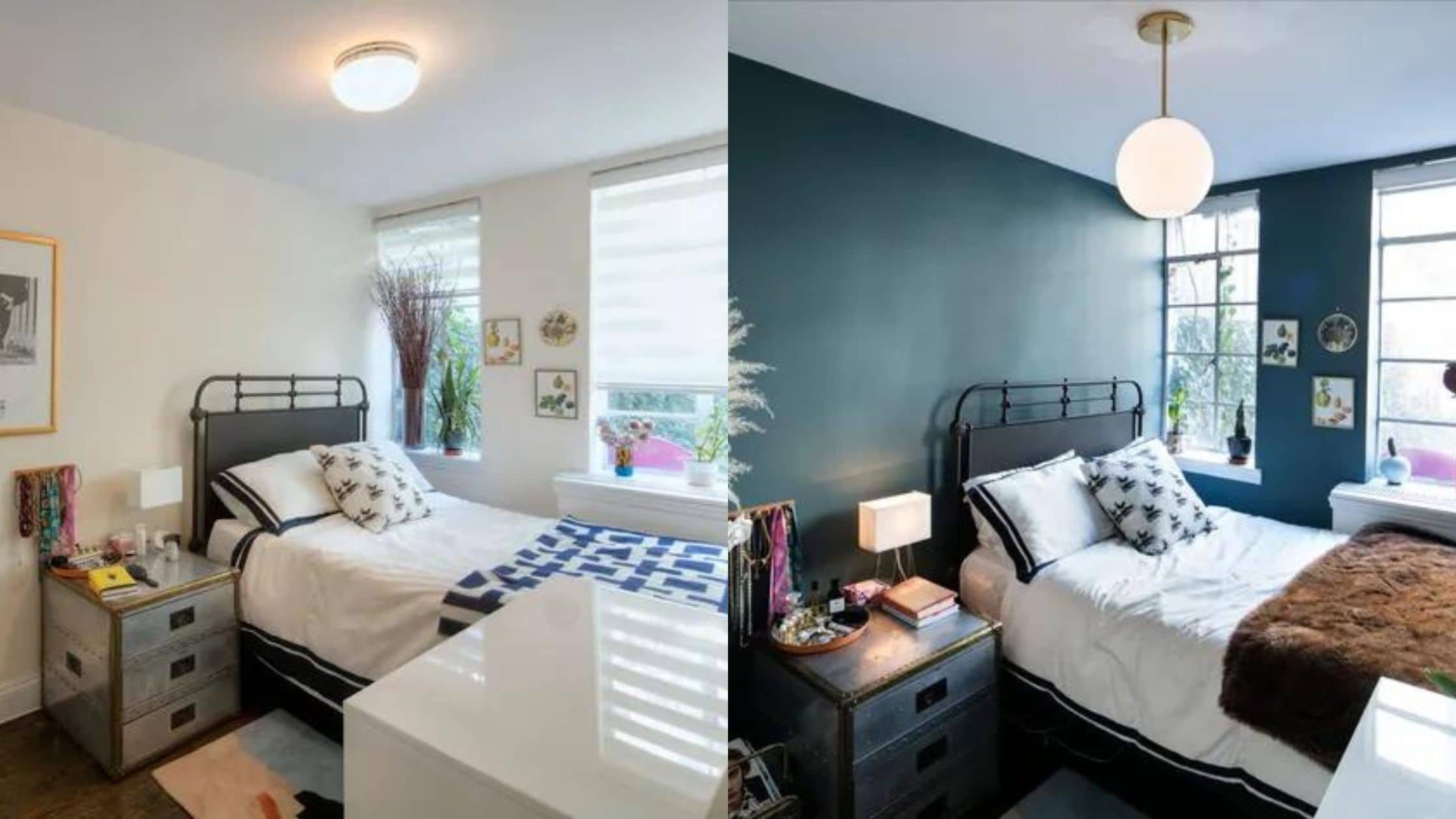
Whether you’re looking to sell or are just house-proud, one of the worst impressions to give is that your home is “cheap”. Over the years, we’ve seen how clever design choices can make a simple 4-room flat look as pricey as luxury condo units; and we’ve also seen how bad choices make a $50,000 renovation project look like a $10,000 rush job. Here are some of the ways to avoid the impression of a cheap and/or tacky unit:
So many readers write in because they're unsure what to do next, and don't know who to trust.
If this sounds familiar, we offer structured 1-to-1 consultations where we walk through your finances, goals, and market options objectively.
No obligation. Just clarity.
Learn more here.
1. “Template” deals from a single furnishing store
Some furnishing stores provide “templates” for new homes. These can be generic set-ups for rooms, such as kitchens or bedrooms, or even a standardised design template for the entire unit.
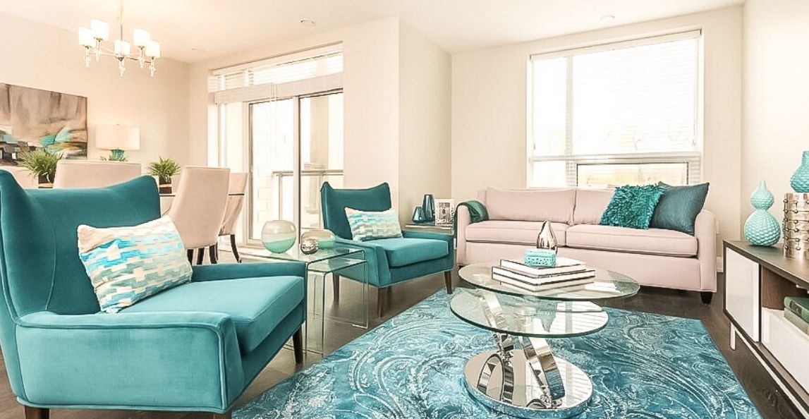
There are two drawbacks to this:
First, such templates are quite iconic and recognisable… for the store’s brand, not your home. The templates are keyed to the corporate “flavour” of the store – sometimes right down to the colour combination of the furnishings. So the initial impression of visitors won’t be of something unique and stylish; it’s more like they’ve walked into a familiar furniture outlet.
Second, template designs don’t really take advantage of the unique layout of your home. The whole point of templates is that they’re easy to replicate, and each project doesn’t have to be supervised by a designer working from scratch. This can make some layouts appear forced or awkward, if not downright inefficient (e.g., a kitchen with cabinetry along just one wall, when your layout would easily allow for cabinets on both walls – just because that’s what the template specifies).
The combination of monotonous and brand-specific furnishings, coupled with forced-fit designs, can make even a pricey condo unit look like a cheap furniture store showroom.
2. Use of weathered furniture and antiques, but without a unifying theme
There are industrial design themes that use “bare” floors and naked lightbulbs, or have pipes visibly showing from the ceiling – but this is a theme that requires consistency throughout. If you try mixing in other elements, such as traditional Chinese furniture or Victorian drapes, the other industrial elements just look like renovation disasters.
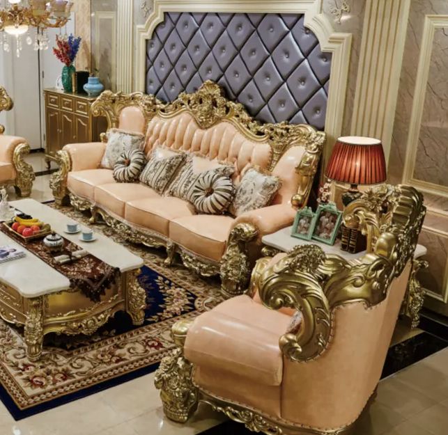
Likewise, styles like shabby chic use a lot of deliberately worn and weathered furniture; and vintage/antique items are often purposely left to look old. But these items still need to be united by a common theme, such as colour or era.
If you mix old and weathered items from too many different time periods or cultures (e.g., colonial-era antiques with art-deco lamps), the end result is just the shabby without the “chic”.
It’s quite possible to accumulate hundreds of thousands of dollars worth of genuine antiques, but still have a living room that looks run down and cheap because it appears to all be random odds and ends.
3. Too much copycat/knock-off furniture and features
We get it, designer furniture is crazy expensive – and from time to time, you may want to order a knock-off from Taobao or get your designer to make one.
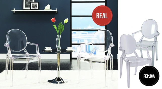
(In case you didn’t know, some interior designers have workshops that can duplicate the occasional piece of furniture in a catalogue or magazine; just ask!)
It’s best to apply limits here though. One or two imitation pieces may go unnoticed, and not spoil the look. But if the entire furniture set is a knock-off, all the little inconsistencies will add up, and people notice. Once the imitation is revealed, there’s also a tendency for viewers to regard the entire interior as cheap.
If you do want your designer to copy a certain feature or piece of furniture, you may want to take their advice on how low the budget should go. While the whole point is to be cheaper, bear in mind that, past a certain point, the low price will be reflected in the quality.
It’s like what goes on in fashion – a mix of high and affordable items can often turn out better than just everything being expensive at one go.
4. Ignoring the drapes, curtains, and blinds
One of the first things learned about staging a unit is to ensure curtains/drapes are clean, or properly hung – if they’re faded or a mess (especially where they’re tied away), it’s better to take them down altogether.
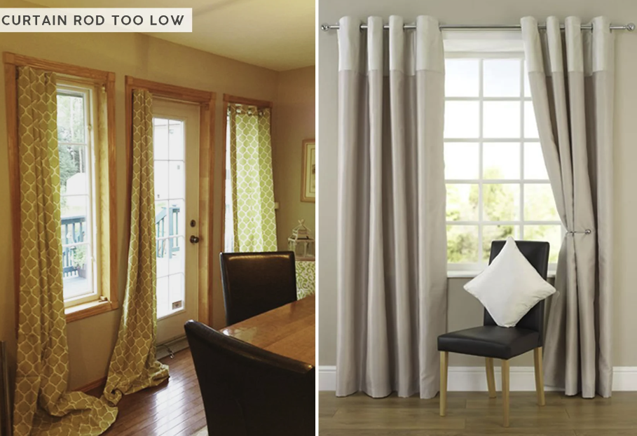
This is because curtains are large features that you can’t avoid noticing – and once you have bad curtains, they can detract from even a stunning feature wall, high-end furniture, or other pricier features. As such, it’s a mistake to have high-end renovations for a room, but cheap out on the curtains at the last minute.
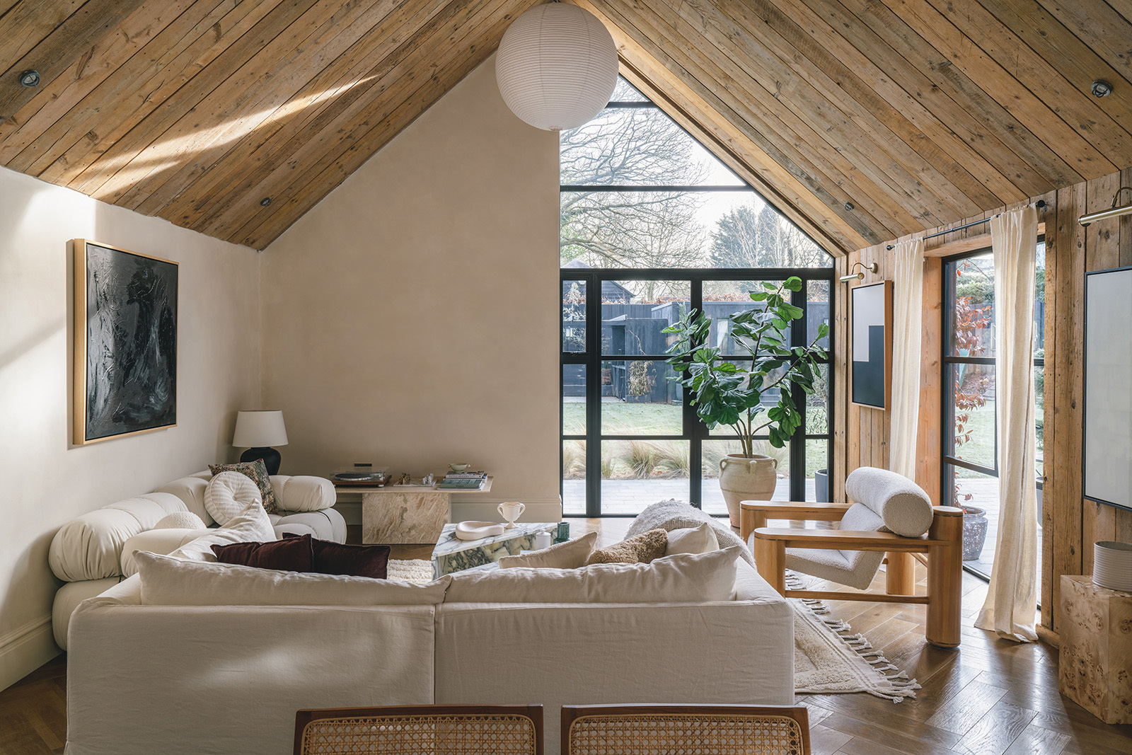
In most (not all) cases, if you have a budget for your curtains/blinds, note that cheap blinds are more likely to make a room look cheap than proper curtains. Many people still associate blinds with offices, or consider them less warm and grandiose than full curtains.
Property Advice8 Unique Sites To Find The Best Interior Design Inspiration
by Adriano Tawin5. Cheap one-way window decals
Quite common in many HDB units, these decals turn your windows into one-way views (so people outside can’t look in); and quite often they come with designs such as floral patterns.
When done well, these decals can add a classy touch. But pick a lousy brand that discolours, or peels in parts, and it will make the room look run-down or cheap in an instant. This is most apparent at noon – with strong light filtering through the windows, any defects, yellowing, etc. are almost impossible to miss.
6. Too many stick-on hooks and hangers
At some point, adding another suction-cup hook on the wall might be going too far. Few things cheapen the image of a bathroom, kitchen, or bedroom like a massive assortment of these hooks and hangers; as well as the marks they leave on doors and walls (the double-sided tape often damages painted surfaces over time if you don’t get a good one).
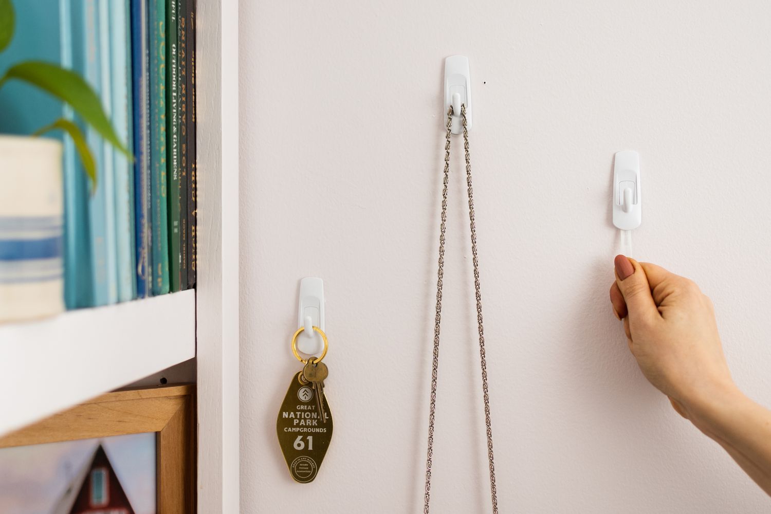
A few of these are certainly fine; but if you notice whole assortments of them are hanging off the walls, it’s time to pry them off and look for a more aesthetic alternative; floating shelves may be a good option.
7. Recyclables mixed with mismatched items
It can be quite charming to use an old wineglass as a vase, or an old boot as a hanging planter; and it’s ecologically friendly as well. But if you are going this route, it’s important to maintain some design consistency.
If you use recyclables in a garden, for instance, try to have a few rather than just one (e.g., a tray of jars growing your own tomatoes can look fancy – one jar alone next to the shoe rack looks like a messy afterthought).
Also, try to keep the theme going. It’s a bit odd if you have wine bottles for growing flowers, but occasionally have a designer vase or Victorian vase thrown into the mix; the incongruence makes it look messy rather than deliberate – and messy almost always looks cheap as well.
8. Too much mass-produced artwork
Bad motel room art, generic prints from furniture stores, and a “landscape” that you could swear you’ve seen in the doctor’s office all fall under this category.
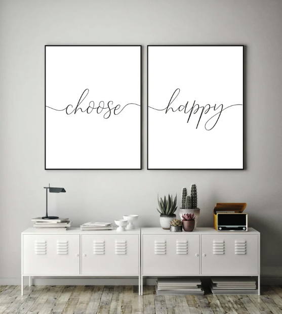
This sort of art is usually seen as a cheap, minimal-effort way to decorate the walls (as they in fact are, when it comes to budget hotels). If you want to decorate without using pricey art, use something sincere – such as a poster from a movie you love, or a photograph you took yourself.
A room with generic prints lacks personality; and that lack of personality gives off cheap, low-effort vibes.
9. Oversized furniture
If given the choice between a $5,000 Tom Ford suit that doesn’t fit you well, as compared to a $900 tailored suit, you are always going to look that much better in the latter.
This is exactly the same as the size of your furniture.
Perhaps in the 1950s, comically oversized desks and giant lazy boys gave an impression of power and wealth. Today, they tend to do the opposite.
As Wojciech Zielinski once said, ‘Whitespace is like air; it is necessary for design to breathe.”
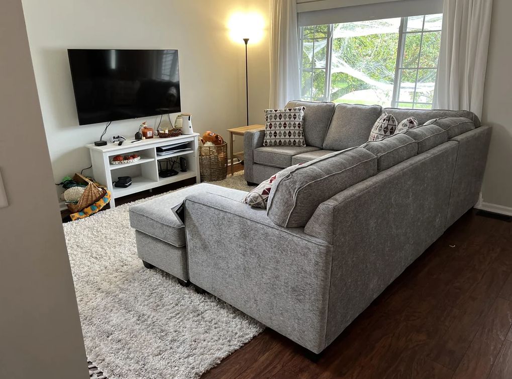
This is especially crucial given the trend of smaller homes today. Oversized furniture can suggest you didn’t measure out dimensions properly, or were forced to use whatever you could find on a low budget. It gets comical when visitors must sidle along sideways, to squeeze between an oversized chair and an oversized coffee table.
If you want to get that designer look, get proportionate furniture; and show that your interior is custom designed to maximise the floor plan.
10. Bad lighting or mismatched lighting fixtures
In general, the poorer the lighting, the cheaper and more run down a room will look. Keep in mind that colour is affected by the brightness of the lighting – under poor light, fresh white walls can look yellow (thus ruining the effect of a white-design, minimalist space).
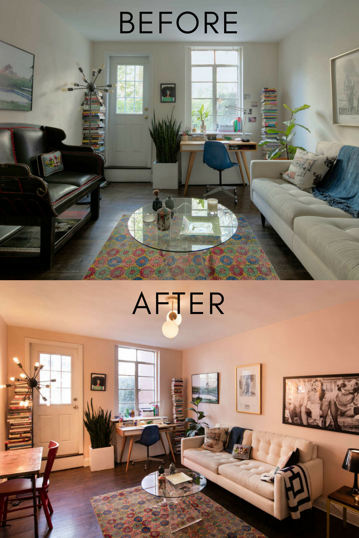
You may also notice that designer magazines like uplights (lighting which is projected toward the ceiling to create a characteristic “glow”). These may require certain unique floor lamps or track lights to pull off, but they can make your home look much pricier than harsh, generic downlights.
It’s also important to coordinate light fixtures – if you have sleek and ultramodern fixtures, mixing in vintage brass features or bare lightbulbs will probably cheapen the setup.
Conversely, if you are going for an old-school vintage look, you may not want to cheapen your elaborate brass fixtures with a plasticky ultra-modern lamp.
Finally, always minimise clutter in a room. The more stuff there is lying around (e.g., snaking cables, foot massagers, multiple folding chairs), the more hodgepodge and cheap the room will look. There is a tendency for us to associate cluttered areas with temporary or low-end accommodation.
You can also use these tips when staging your own unit for sale, or just before tenants arrive for a viewing. Many of them are not too expensive to do. For more help, you can also follow us on Stacked, and view some of the best renovations and furnishings on our YouTube tours.
At Stacked, we like to look beyond the headlines and surface-level numbers, and focus on how things play out in the real world.
If you’d like to discuss how this applies to your own circumstances, you can reach out for a one-to-one consultation here.
And if you simply have a question or want to share a thought, feel free to write to us at stories@stackedhomes.com — we read every message.
Ryan J. Ong
A seasoned content strategist with over 17 years in the real estate and financial journalism sectors, Ryan has built a reputation for transforming complex industry jargon into accessible knowledge. With a track record of writing and editing for leading financial platforms and publications, Ryan's expertise has been recognised across various media outlets. His role as a former content editor for 99.co and a co-host for CNA 938's Open House programme underscores his commitment to providing valuable insights into the property market.Need help with a property decision?
Speak to our team →Read next from Property Advice
Property Advice Hundred Palms, Riverfront Residences Or Tampines Trilliant — Which Is The Better Buy For A Young Family Today?

Property Advice Selling Our Holland Village HDB To Buy A Freehold Marine Parade Condo – Should We Wait?
Property Advice Should We Sell Our Freehold Condo For A $2.2M Leasehold Landed Instead?

Property Advice Should I Buy A Freehold Condo In A Landed Enclave — Or Look Elsewhere For Better Growth?
Latest Posts

Singapore Property News 4-Room Flat at Bedok South Horizon Sets New Bedok Record at $1.17M
PRO Pro Where To Buy A Condo In Serangoon: Prices, Best Areas And Growth Trends In 2026
New Launch Condo Reviews Vela Bay Review: 515-Unit Bayshore Condo Launch Next To Bayshore MRT That Starts From $1.2M















0 Comments