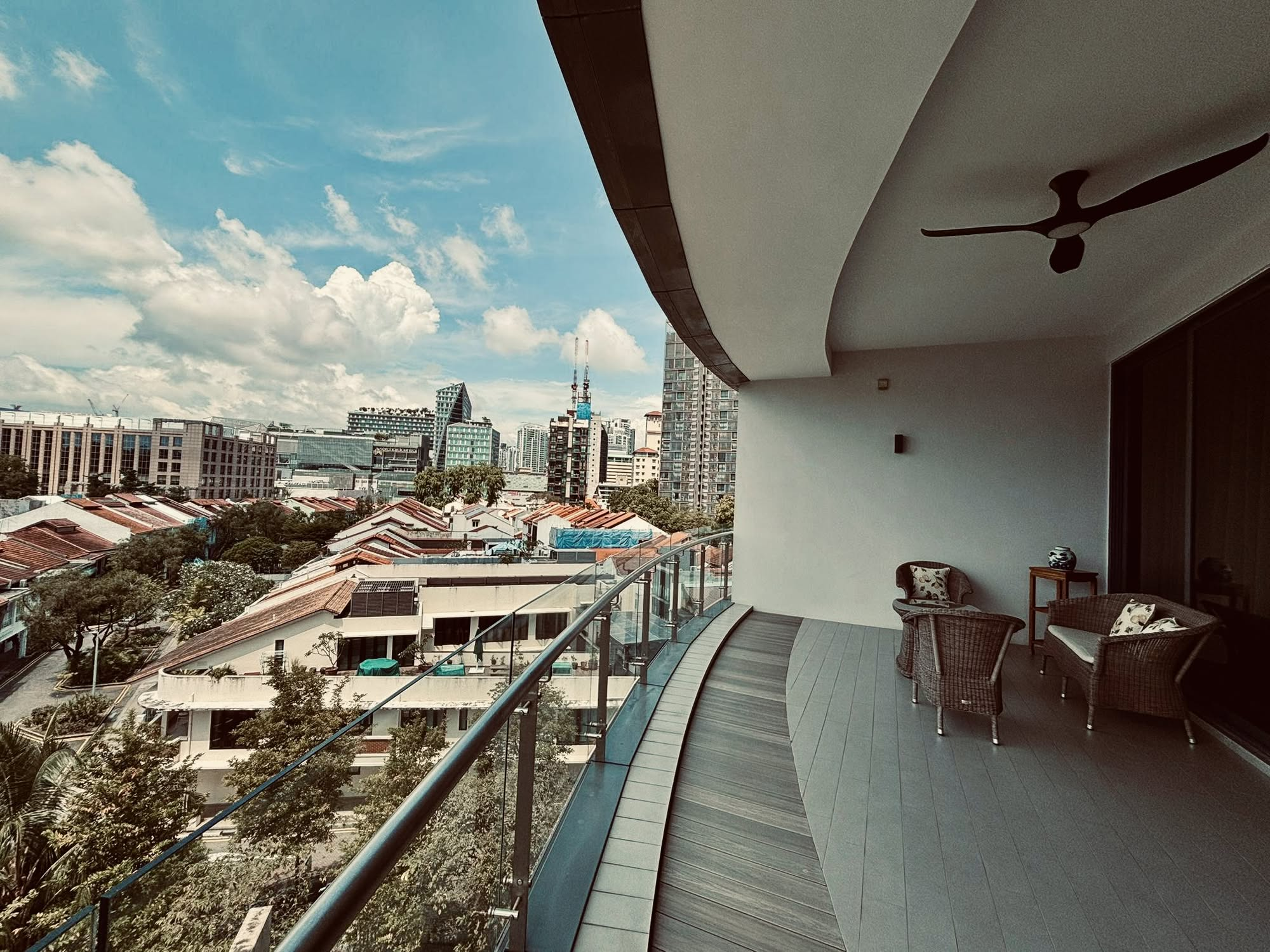
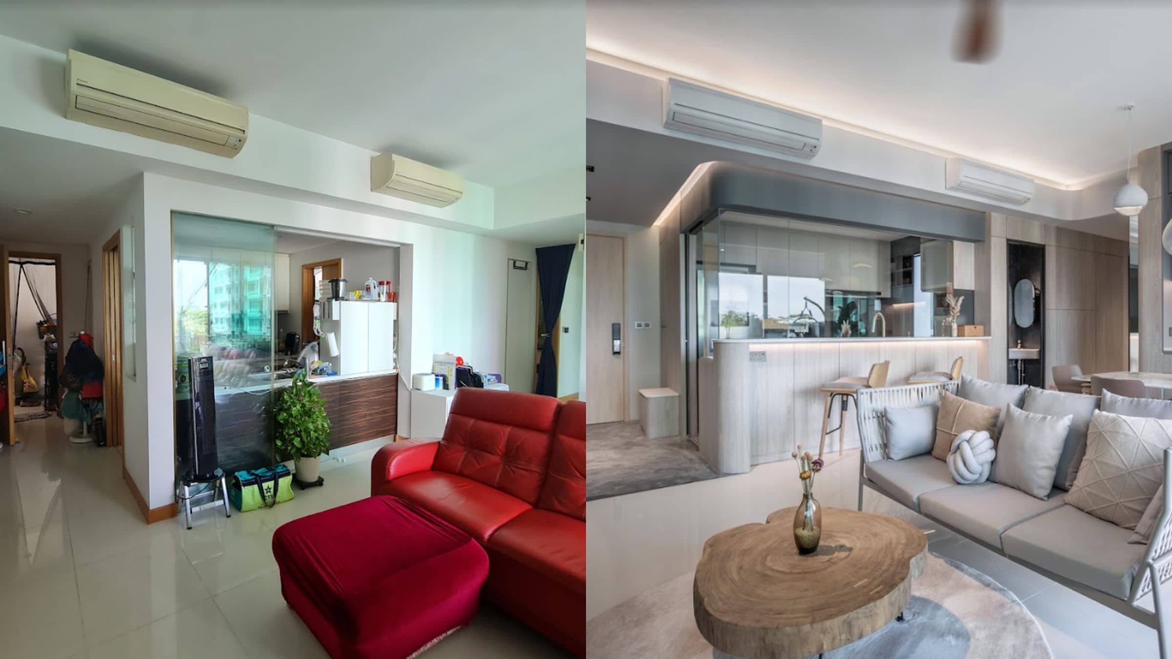
Tour A 1,227 Sqft Condo Transformation: How A Homeowner Used 3D Renders To Create A Seamless Indoor/Outdoor Home
Get The Property Insights Serious Buyers Read First: Join 50,000+ readers who rely on our weekly breakdowns of Singapore’s property market.
If you are a design-inclined or a hands-on person, designing your own home would naturally be something that you’d want to do.
But it’s not always just about the design, but being able to effectively communicate what you want to be done to a contractor. It’s the end product that ultimately matters the most.
And that’s where design software tools come in very handy today.
For Patrick, he was always going to design his own home, but he had an ace up his sleeve unlike most other homeowners – he was a creative visualiser (he used to visualise hotel interiors for brands like Hilton and Marriott).
As such, he of course had to create the visuals from scratch on his own.
“Our house was fully visualised in 3D before engaging our contractors,” Patrick said. “Other than the existing living room floor, most of the house was extensively renovated.”
It took them a year-long period of self-ideation, designing, and about 3 months of project management before they finally moved to their current home at Chestnut Avenue.
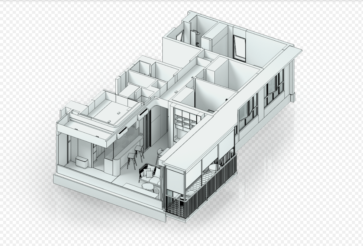
While they decided on the unit because of its proximity to nature and their kids’ school, they also wanted to make sure that their 1,227 square foot home would fit well with their preferences and thus the renovation.
Patrick said that everything actually went quite smoothly. “There were times when I wondered if tasks were being delayed for too long, but the renovation took 3 months, which was actually on target and acceptable in most cases.”
Currently, five family members are residing in their house, including their two children. This is a special one, so let’s see how the use of visualisation helped them enjoy a smoother-than-usual renovation process.
How The Renovation Journey Turned Out
$60,000 was their initial budget for their home project, however, they had to increase it to more than $75,000 due to the addition of features such as motorised blinds, extra stone slabs, and electrical work.
While they didn’t follow a particular school of style, their home’s proximity to nature played a major part in its design.
“With subtle nature-inspired cues, the interior was aimed to feel like an extension of the exterior architecture originally created by ADDP Architects,” said Patrick. Some notable changes you’ll find in their home today include rounded surfaces, a combination of grey tones, diagonal beams, nature-inspired outdoor furniture, and lush greenery.
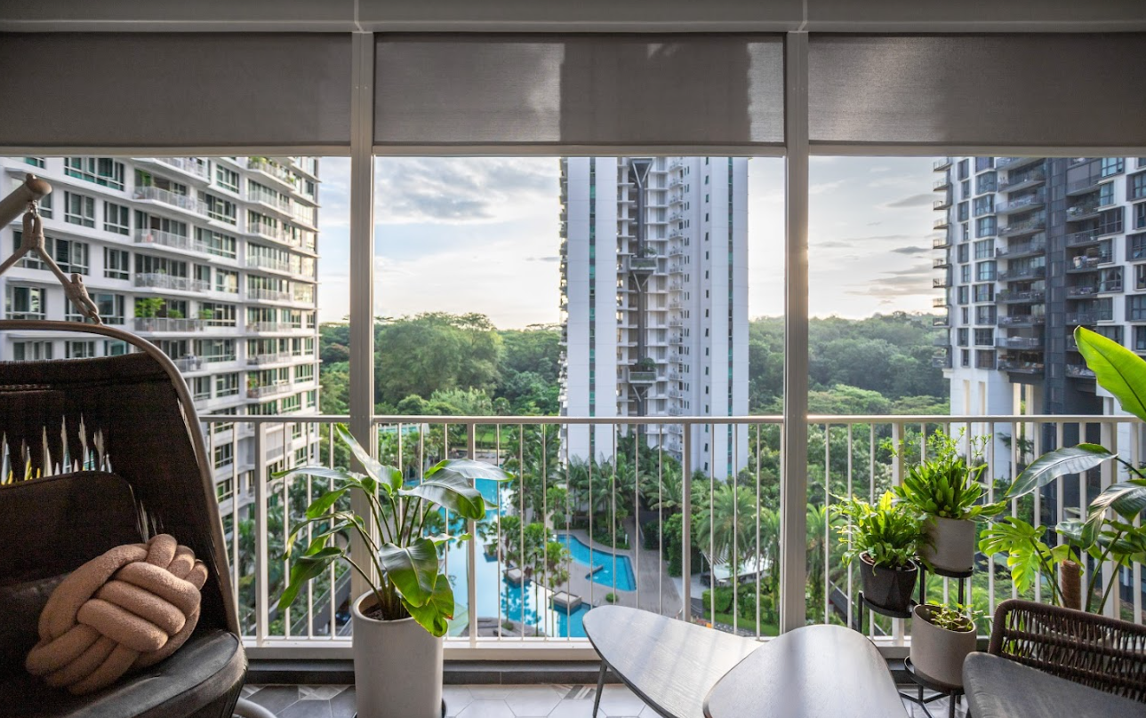
We asked Patrick what major changes they did for each room, and he replied that they generally kept the rooms simple.
“Other than our master bedroom, many of the bedrooms were on the smaller side so it was unrealistic for major changes to be done to those rooms.” He continued that they also laid vinyl flooring, replaced ceiling fans, and added window child-safety latches. They also repainted the bedrooms and added bunk beds to maximize the use of the ceiling height.
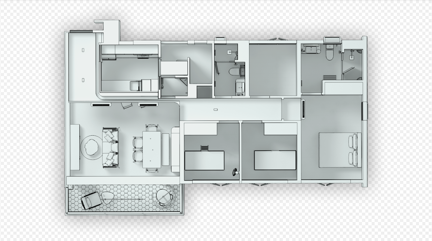
Let’s see how their home turned out.
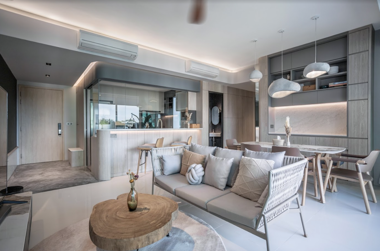
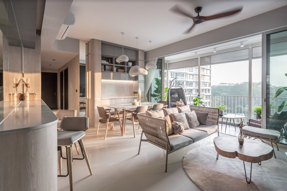
While there was no particular style, the natural light colour palette used helped to create a soothing atmosphere, which blended in well with the abundant greenery on the outside.
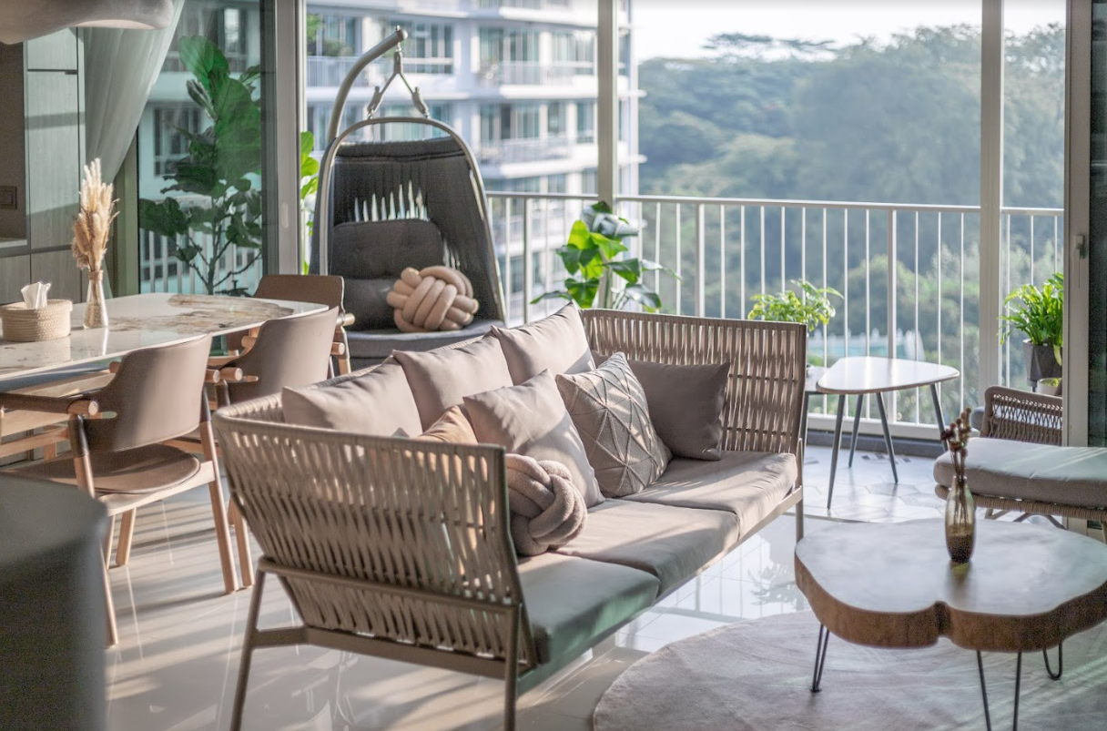
The choice of furniture used was also deliberate to communicate the seamless outdoor/indoor feel. For example, the sofa used here is what you might typically find as an outdoor set instead. There’s a certain level of wabi-sabi elements here too, with the irregularly shaped pendant lights set over the dining area.
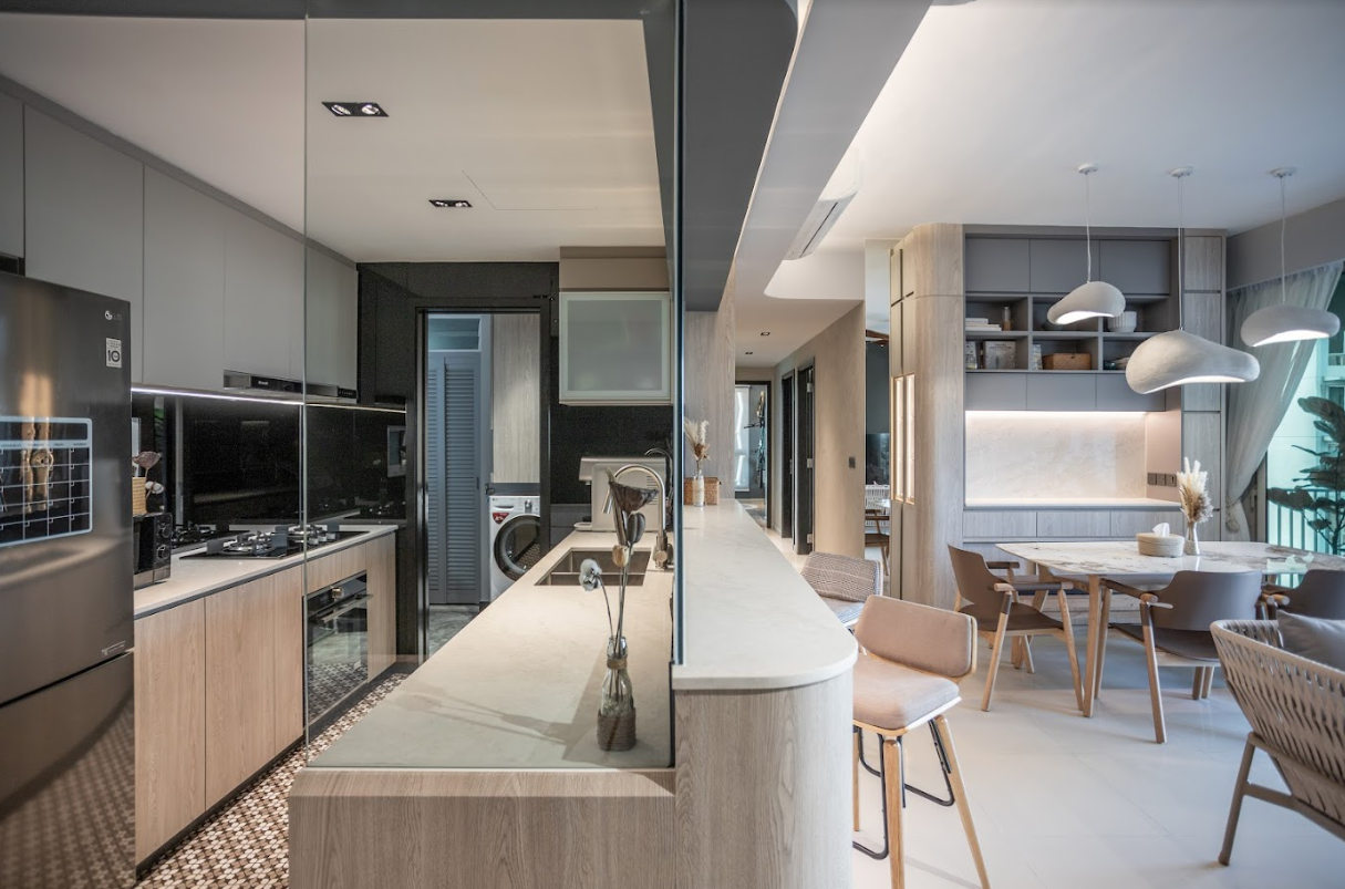
Patrick elaborated that all rounded edges in the living room serve their own functional purpose, as well as the rounded bar counter and dining vanity carpentry, which helped to ease movement at the entrance and dining area.
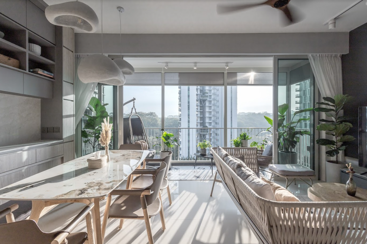
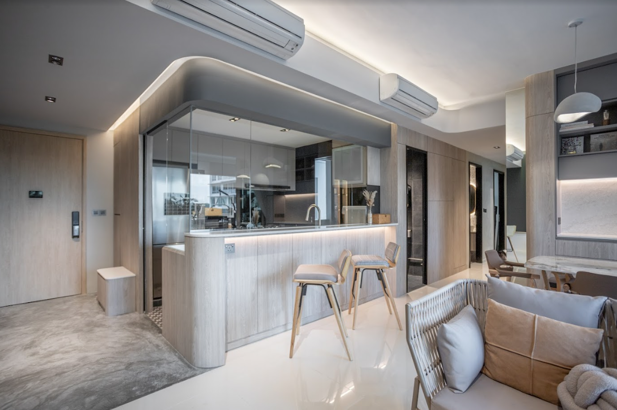
There are also horizontally-rounded ceiling structures that frame the social spaces in the main living area. Their cement screed floor at the entrance serves as an arrival area for easy entry and cleaning. “It’s quite useful given the apartment’s proximity to nature and mountain biking trails,” he added.
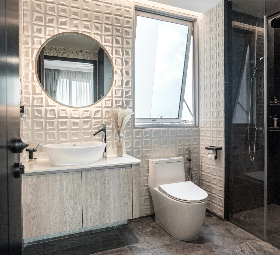
Storage mirrors were used in all bathrooms to help reduce clutter, while the dense terrazzo and distorted bevelled wall tiles introduced a visual break from the monotony.
Bringing The Vision To Reality
Like we mentioned at the beginning, being able to properly visualise your home before any construction begins can really help translate the design into the real thing.
“The 3D renders were incredibly helpful in visualizing the space and making informed decisions regarding layout, materials, furniture, and technical planning. One thing that this project may differ from other self-project-managed homes is that the visualisation process enabled us to fully develop carpentry and ceiling details down to exact measurements.”
More from Stacked
New Housing For Low-Income Singles: We Share What Some Older Singaporeans Think
We’ve had some time to think of HDB’s new pilot rental housing scheme: the Single Room Shared Facilities units. While…
There were other benefits too, such as being able to save on some material costs as things were visualised to the exact detail.
As Patrick explained below:
“I think it is common for many self-managed renovation projects to simplify ceiling and carpentry work but bring in rich details through furniture, materials, decor, and greenery. Also, we were able to purchase tiles with minimal wastage because of measurement tools for floor and wall area in 3D space.”
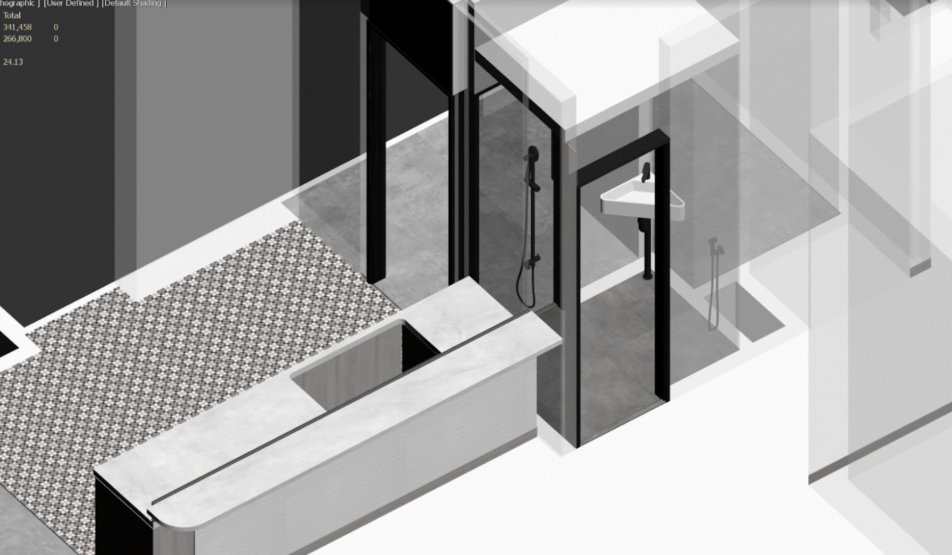
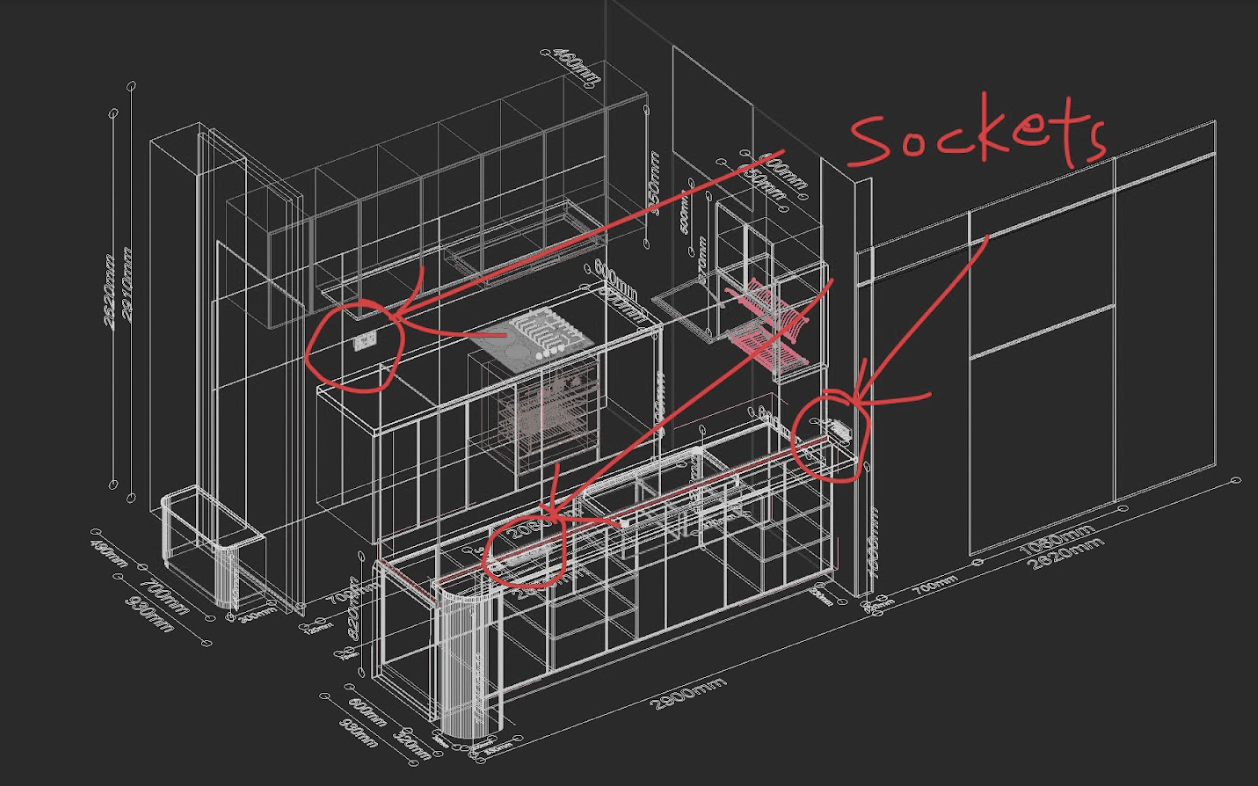
And so, he confidently declared that the final product turned out to be almost identical to what was in the 3D file.
Seeing how their 3D renders helped them a lot with their renovation project, we asked Patrick if he had some advice for those who are looking to use the same type of tools.
He said that one of their most commonly used free tools would be Sketchup, but he cautioned that a certain amount of learning is required. That said, there are also other free interior design phone apps available nowadays that can be very user-friendly for homeowners.
For example, with the rise of AI tools, there are sites like Interior AI that can generate interior renders nearly instantly with just a few clicks.
“Sometimes the renders do not actually have to look overly realistic,” he advised. “Even basic renders or screenshots can be printed out and sketched on, as their sole purpose is to facilitate communication between you and your contractors.”
Their home was visualised using 3ds Max and Vray, which Patrick regularly uses at work. While these tools have extensive features, they have a steep learning curve and are not recommended for typical homeowners.

When it comes to their furniture sourcing process, the couple selected furniture pieces that were not commonly used. “Apart from our balcony Touch Swing chair from Konopi as well as room TV console from Castlery, much of what we chose had to be from overseas suppliers to match our intent.”
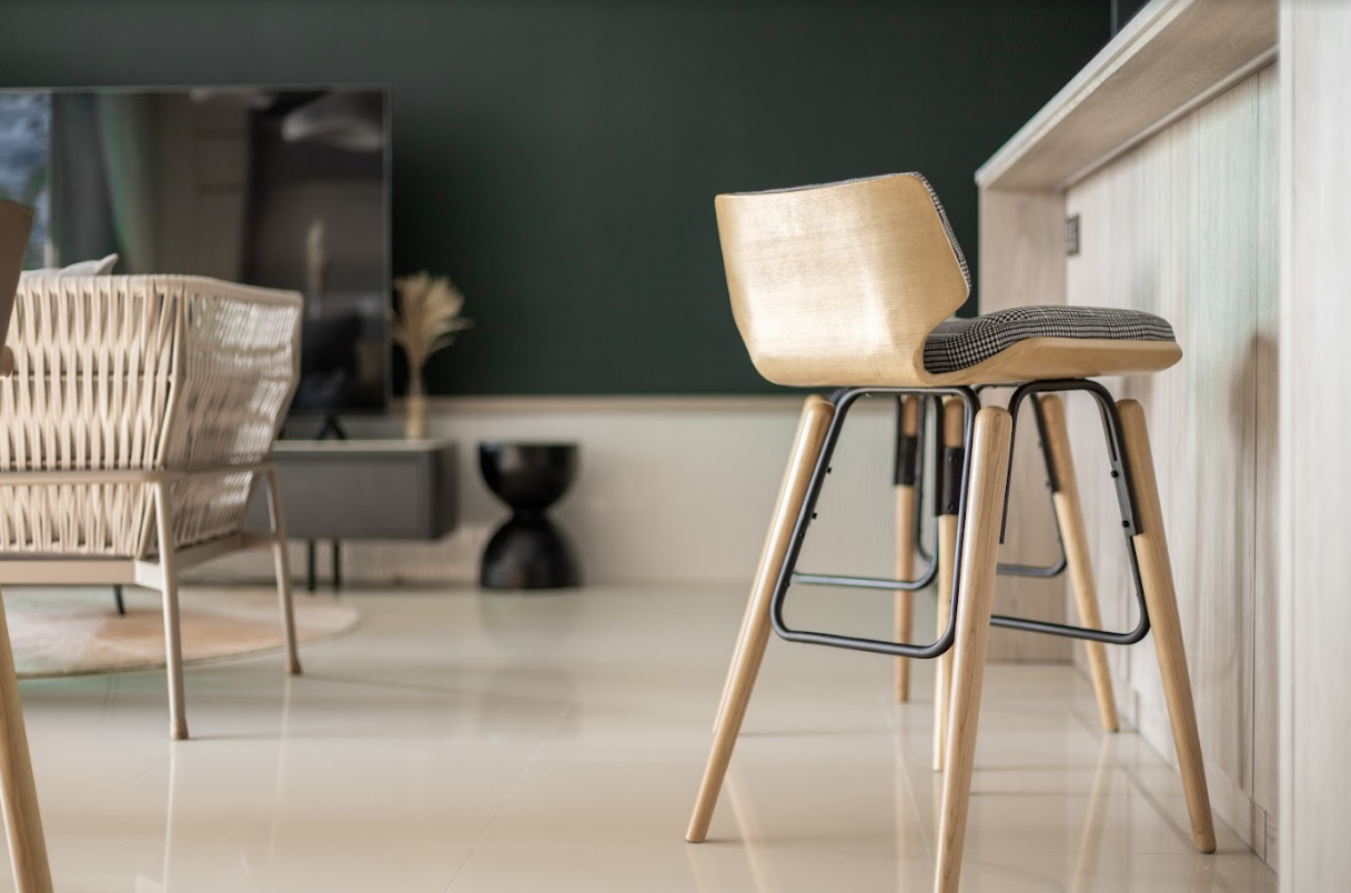
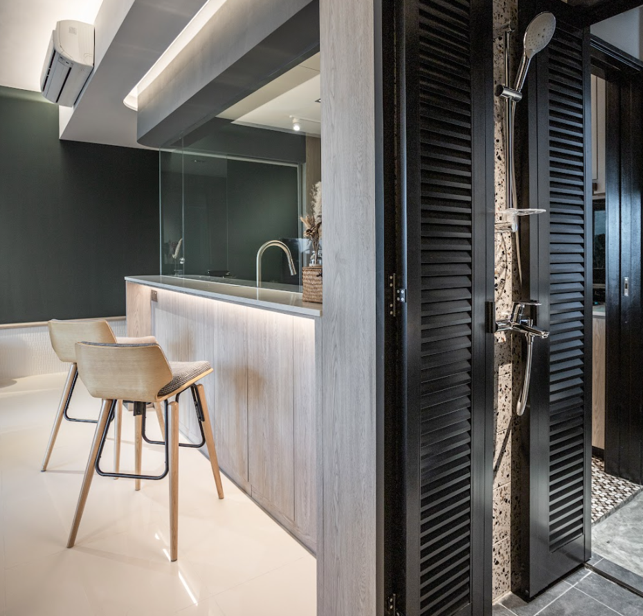
As for the best part of their home, Patrick said that the yard washroom was a particular favourite after the renovation. “Part of the yard washroom wall was removed while symmetrical black louvre doors were added to improve access to the yard storage area.”
They now use this part of the house as a shower/wash area, improving the ventilation for the entire unit as well.
Lessons Learned From A Successful Reno Journey
What they consider the greatest challenges in their reno journey were communication, as well as ceiling and carpentry measurements. “Having greater control over technical details also meant that we were fully responsible for ensuring everything fits.”
Fortunately, they were able to add leverage to the situation using their 3D file, which allowed them to picture and verify the processes before committing to their contractors and carpenters. Their renders gave them the confidence to carry out work because of the visual references they provided.
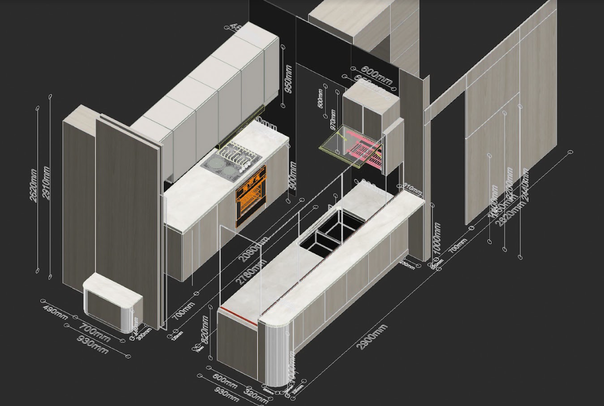
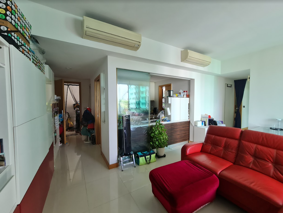
“At times, I animated components or hid layers so they knew what I had in mind. For example, we were able to correctly specify how much of our existing kitchen concrete base had to be extended to accommodate our new kitchen carpentry, kitchen table and bar top, which in turn got to be aligned to our kitchen glass partition and false ceiling.”
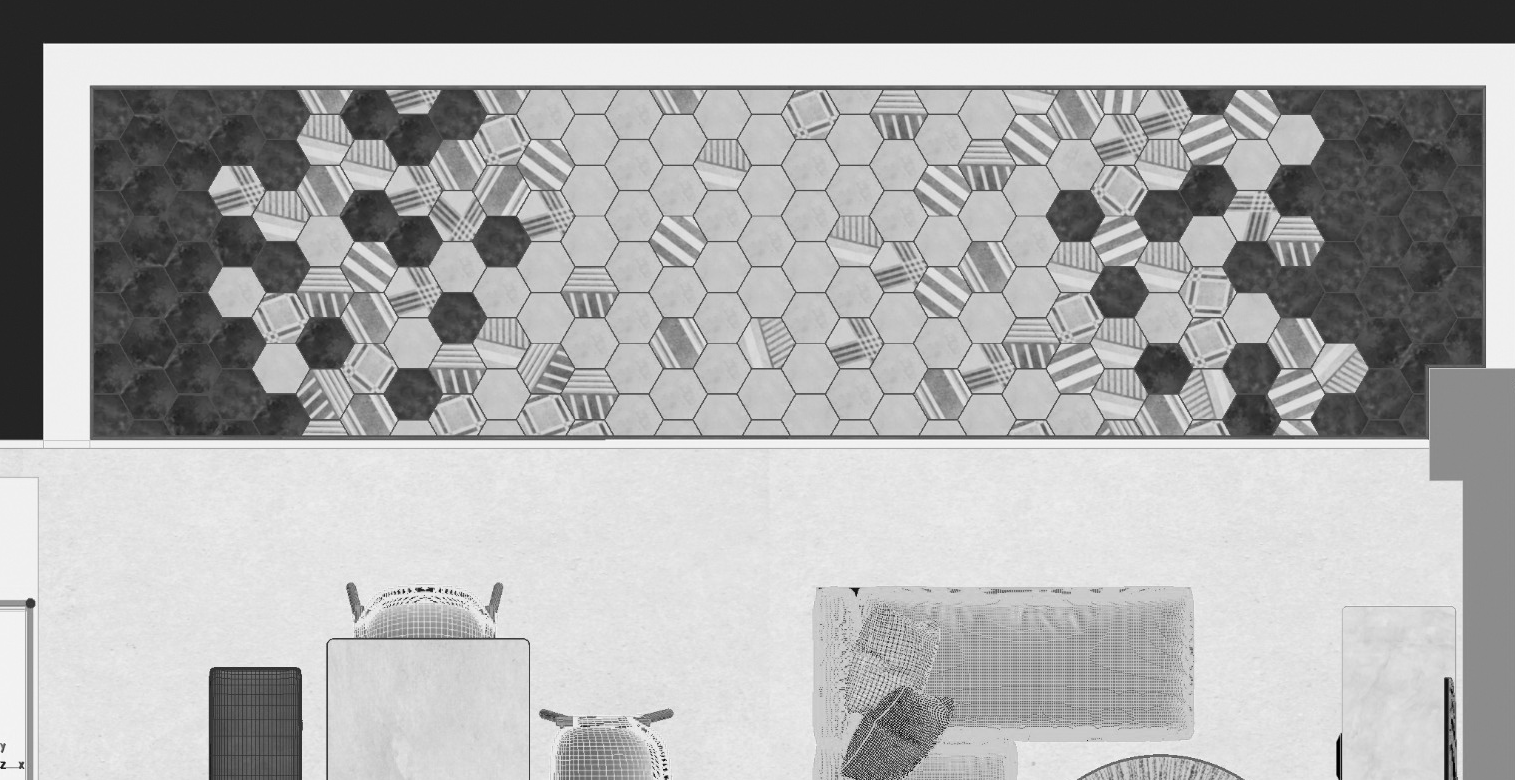
He also said that their hexagonal balcony tiles were actually laid out digitally beforehand, which proved to be a great help in communicating a clear idea of their intent to their tilers.
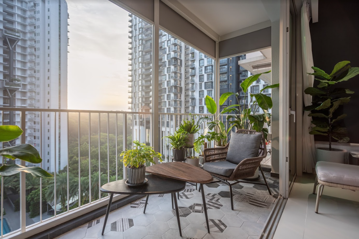
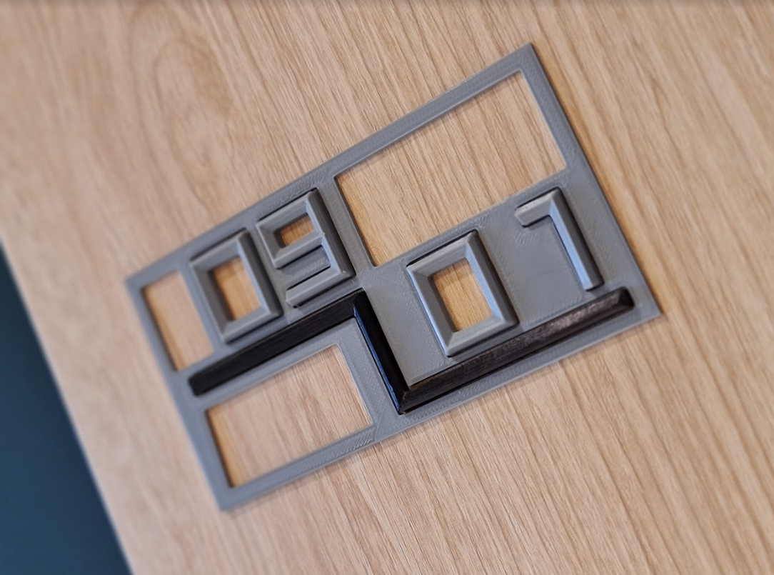
There were also custom 3D-printed parts used for items that would have been impossible to purchase off the shelves. For instance, they had missing unit numbers on their main door, and there was no way to purchase them, even when the MCST insisted on font consistency.
And so, what Patrick did was design and 3D print these numbers for their main door to overcome the issue. 3D printed brackets were also designed to ensure their ceiling cove light is mounted at a correct angle for optimal light distribution.
Finally, we asked him for some tips for those looking to renovate their homes.
He advised that it’s good to have a certain level of trust in your contractors, especially considering that they have been in this trade for decades already. Plus they will be the first to guide you on certain tasks if you have planned the construction sequence wrongly.
“But of course, always sound out immediately to them if you have specific requests or questions!” Patrick emphasised.
He also highly recommends handling the process yourself if you are mentally prepared. “It can be very stressful at times, but definitely rewarding.”
Shop the look
Read next from Homeowner Stories
Homeowner Stories I’ve Lived in Twin VEW for Four Years: What It’s Like Living Without an MRT Nearby

Homeowner Stories Does The “Sell One, Buy Two” Strategy Still Work In 2025? 3 Real Stories From Singapore Homeowners

Homeowner Stories “If We Sell, We’ll Never Have A Home This Big Again”: What Singaporean Parents Do After The Kids Move Out

Homeowner Stories I’ve Lived In Braddell View For 14 Years: What It’s Like To Live In Singapore’s Largest Residential Site
Latest Posts
On The Market 5 Spacious 3-Bedroom Condos That Cost Less Than You’d Expect (Under $2M)

Singapore Property News Is Your HDB or Condo at Risk of a Sinkhole? 5 Signs to Watch Out For
New Launch Condo Analysis Canberra Crescent Residences Pricing Breakdown: A Price Comparison With Nearby Condos

Property Market Commentary 10 Most Affordable New Launch Condos Under $1.5 Million—Some Are Surprisingly Central

Editor's Pick Why I Might Still Pay $1 Million For A 50-Year-Old HDB—Even If Everyone Says It’s A Bad Buy
Editor's Pick A New River Valley Condo From Just $1.2M? Here’s What You Need To Know About River Green’s Pricing

Property Market Commentary Singapore’s Most Expensive Neighbourhoods Are Changing—4 Buyer Trends That Prove It In 2025

Property Market Commentary URA 2025 Draft Master Plan: 6 Under The Radar Changes You May Have Missed

Singapore Property News This 3-Room Flat in Toa Payoh Just Sold for $920K — Here’s What The Seller Could Have Made

Editor's Pick We Found Freehold Landed Homes From $4 Million In The East—But Would You Live Here?
Singapore Property News Would You Still Pay More For A Private Condo, If The EC Next Door Looked The Same?

Overseas Property Investing Why I Bought 7 Properties in Johor Bahru, and Will Still Buy More
Editor's Pick River Green Condo Review: Attractive Entry Price To River Valley From $1.2m
On The Market 5 Spacious Cluster Landed Homes That Cost Less Than You’d Expect (From $2.79M)

Pro Why The Interlace Condo Underperformed—Despite Its Massive Land Size And Large Units
