I’ve Stayed In 40+ Airbnb Homes: 9 Design Pitfalls I’ve Learned To Avoid
Get The Property Insights Serious Buyers Read First: Join 50,000+ readers who rely on our weekly breakdowns of Singapore’s property market.
A seasoned content strategist with over 17 years in the real estate and financial journalism sectors, Ryan has built a reputation for transforming complex industry jargon into accessible knowledge. With a track record of writing and editing for leading financial platforms and publications, Ryan's expertise has been recognised across various media outlets. His role as a former content editor for 99.co and a co-host for CNA 938's Open House programme underscores his commitment to providing valuable insights into the property market.
One of the wonders of Airbnb is that, instead of seeing generic hotel rooms, you get to see the inside of actual homes (that is, assuming you rent a place that isn’t just designed for short-term tenants). After way too many of these (I’ve stayed in some 40+ Airbnb’s and counting in various cities) I’ve accumulated a number of interior design observations that I think can help landlords and homeowners alike. Here are a few observations:
Table Of Contents
- 1. Never set up TVs or computer desks with a window directly facing the screen
- 2. Large toilets with tiny shower cubicles are ridiculous
- 3. Rainfall showerheads aren’t all that great
- 4. Floating staircases are an accident waiting to happen
- 5. Too much open shelving turns your kitchen into a junkyard
- 6. Enough with the overlays and throw cushions
- 7. Cloister office spaces
- 8. Tiny tiles anywhere
- 9. Finally, a word on lighting
1. Never set up TVs or computer desks with a window directly facing the screen
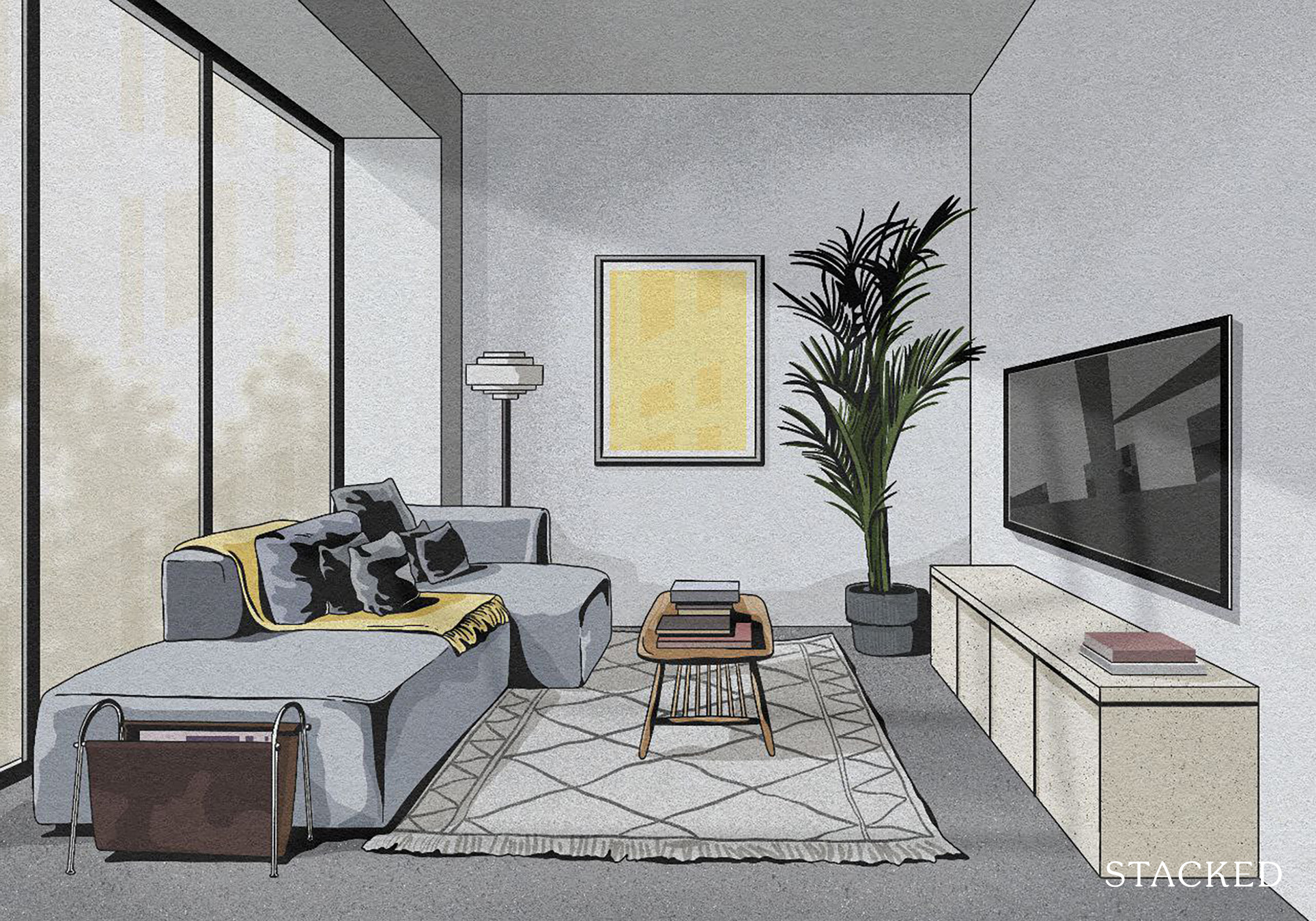
I understand it’s intuitive to place the light source behind the screen, but it’s only good when done at an angle.
When windows are positioned directly facing the screen (i.e. right behind the user), the glare makes it almost impossible to see the screen. This results in having to drag tables around the room to change screen angles.

As for TVs, it’s impossible to change the angle if it’s a wall mount. This leads to wasteful scenarios, like drawing the curtains and turning on the room lights in the daytime.
There’s also a privacy factor. Call me paranoid, but I always worry about neighbours in the opposite block being able to see my screen.
2. Large toilets with tiny shower cubicles are ridiculous
This is more common in European homes than in Singaporean ones, but I’ve seen it locally too:
Toilets that are huge and spacious, with room for multiple sinks, giant hampers, towel racks that could hold a small tent, etc. And then tucked into a small corner, a shower cubicle so small I worry about breaking the glass if I turn more than 90 degrees in it.
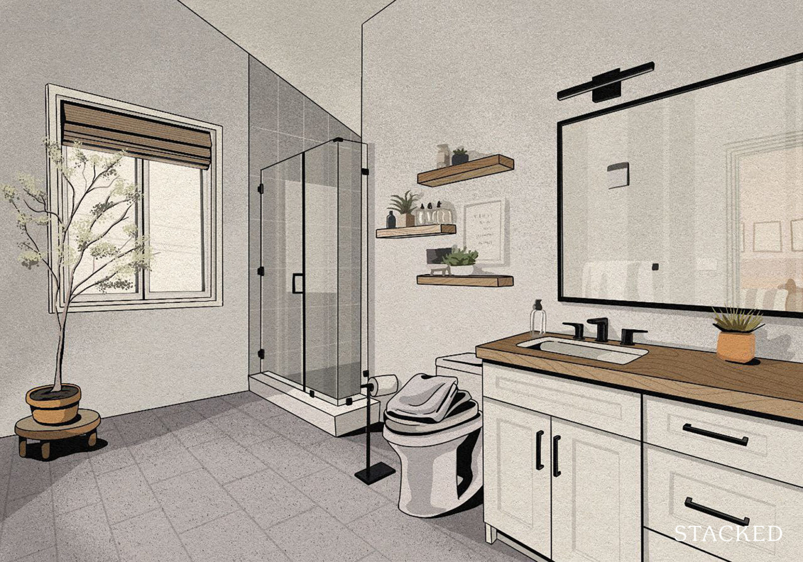
It’s uncomfortable and impractical. If someone had more room to towel off in the cubicle, they’re less likely to soak the mats or the floor.
3. Rainfall showerheads aren’t all that great
They’re terrible for scrubbing specific parts of your body – you need to stand under the water for much longer, and hope the low-pressure rainfall effect gradually cleans your bits. It’s wasteful.
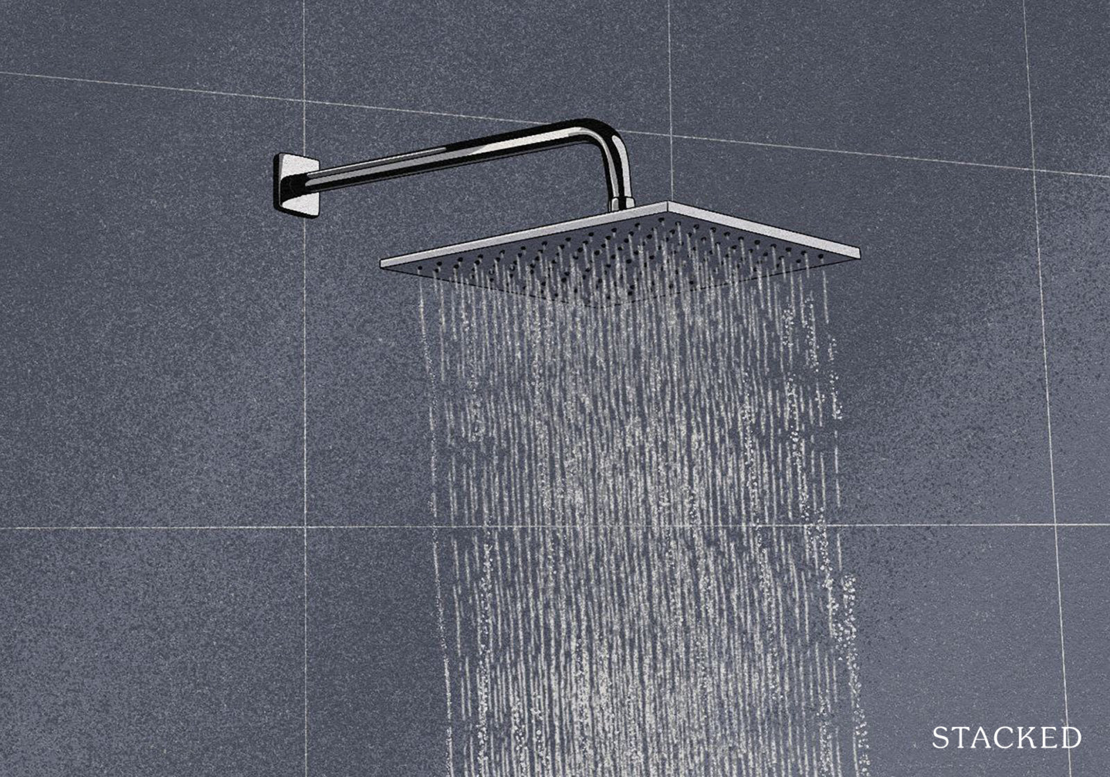
In an Airbnb, or a situation with multiple unrelated tenants (hello landlords), this causes individual users to take up the toilet for much longer, making everyone else an impatient grump.
Rainfall showerheads plus tiny shower cubicles (see above) are the most sadistic combination: you’re often hit with the water before you can reach the faucet controls, so this makes your first shower sensation either like diving face-first into ice cubes, or into molten lava.
At the very least, ensure that a conventional showerhead is available as an option.
As an aside, you may want to know that rainfall showerheads have more leak-related issues.
4. Floating staircases are an accident waiting to happen
Floating staircases do look good, but the features can be as lethal as they are aesthetic. Almost every one I’ve seen has had no handrails, or virtually worthless handrails; and whilst I appreciate their surreal beauty, I hope no one drinks too much at a house party there.
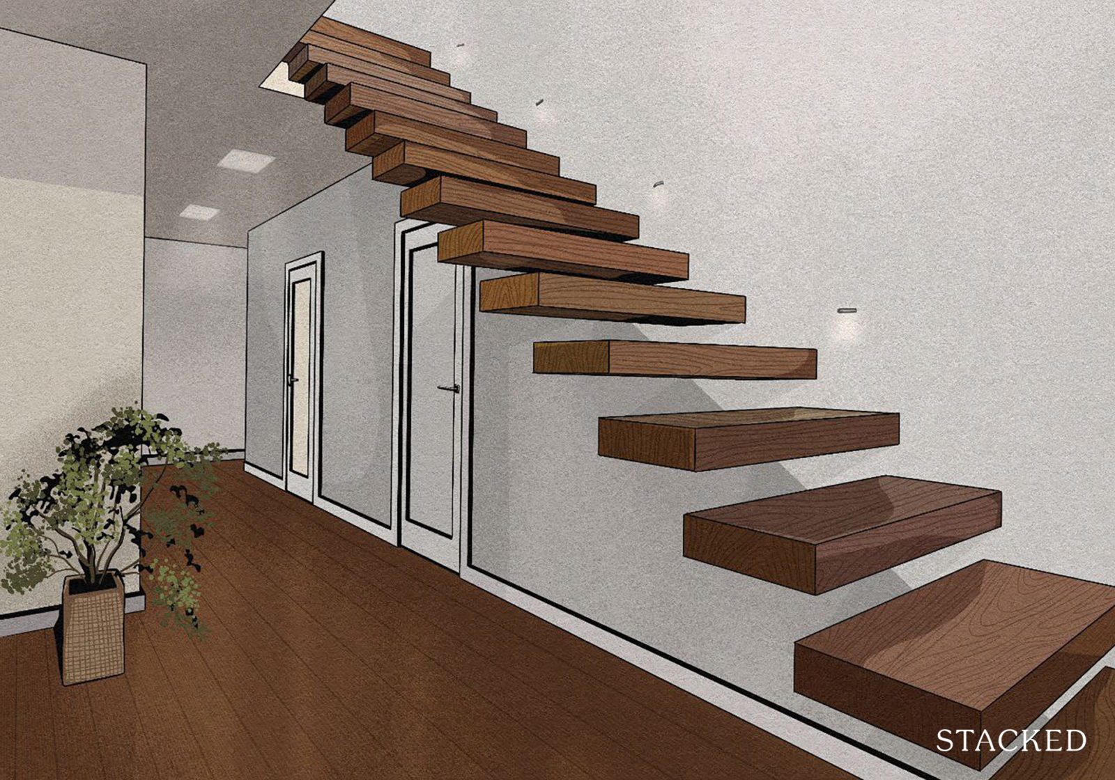
Besides the safety of the person using the stairs, there’s luggage to consider – or any heavy item you happen to be dragging up and down. Without a proper handrail, one bad slip could transform your Samsonite luggage into someone’s lifelong head injury. The same goes for a TV or chair you’re lugging upstairs.
5. Too much open shelving turns your kitchen into a junkyard
I suppose it might be cheaper than cabinets*, but there are limits.
Some kitchens have so much open shelving, all the pots, pans, mugs, etc. get piled onto shelves that resemble mounds of scrap metal. The result looks like a poorly-run rummage sale, and I dare not take one thing lest it leads to a cascade of falling metal.
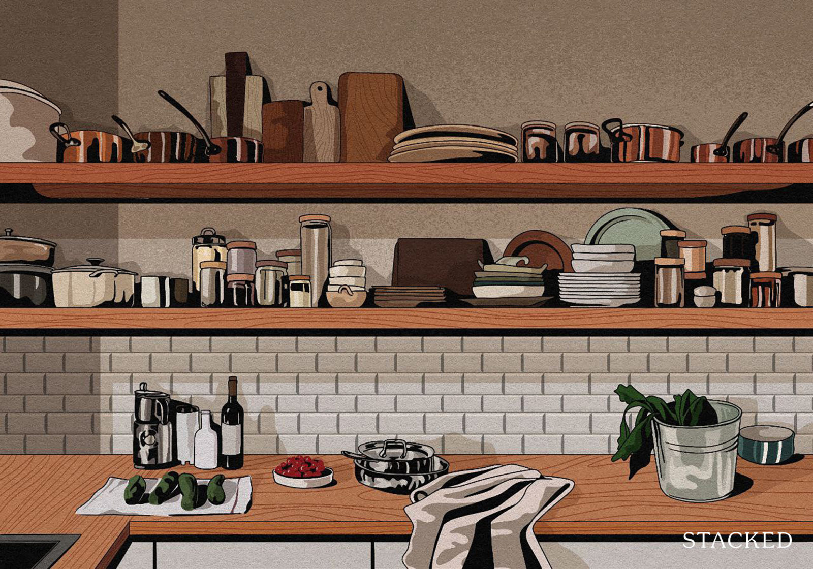
Besides looking disorganised, open shelving exposes every pot, cup, dish, etc. to what’s happening in the kitchen. I recall a very small kitchen that used only open shelving, in which cooking one meal left everything on the shelves with a film of grease.
(And it wasn’t just me, every other guest soon learned not to use anything beyond the microwave).
*Some carpenters have assured me the price difference, at least in Singapore, is insignificant.
6. Enough with the overlays and throw cushions
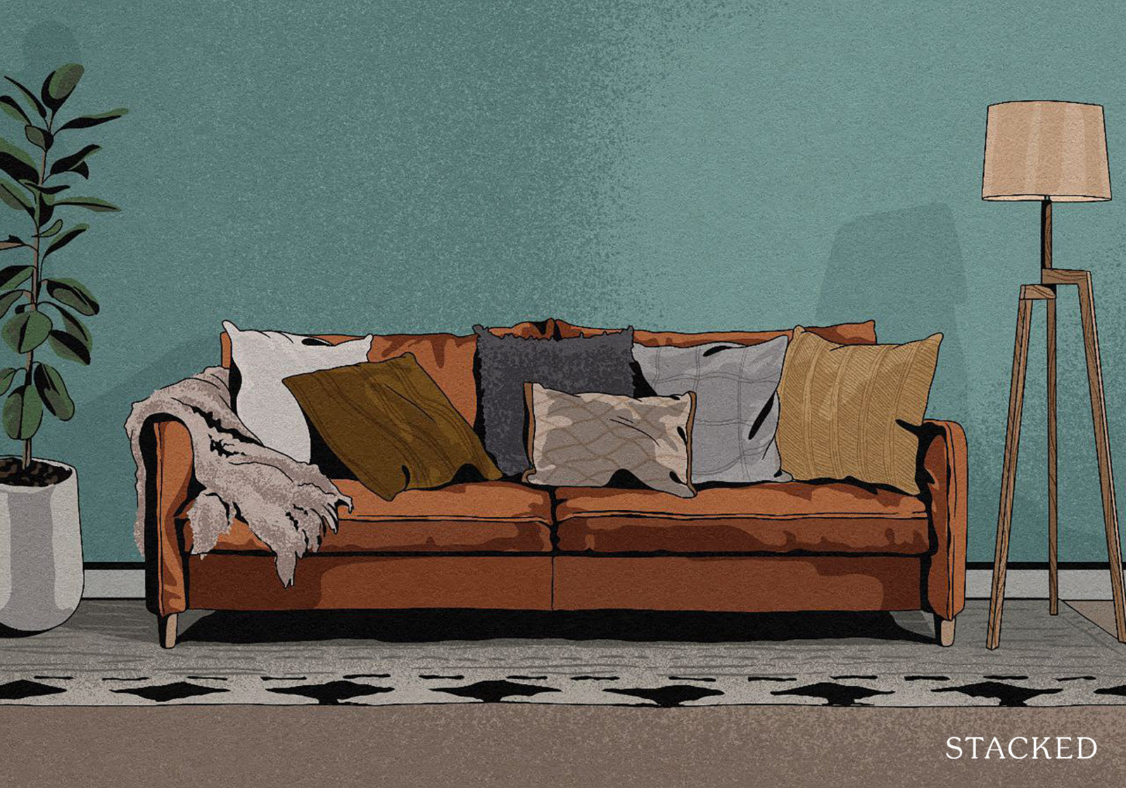
Beds with elaborate overlays, and sofas with half a million different throw cushions on them, belong in show flats. Not in actual units.
The multiple overlays just get chucked to one side, and require annoying amounts of effort to reset every morning. There’s also typically a hefty cleaning bill involved (I know Airbnb brings hefty cleaning bills regardless, but this would likely necessitate it).
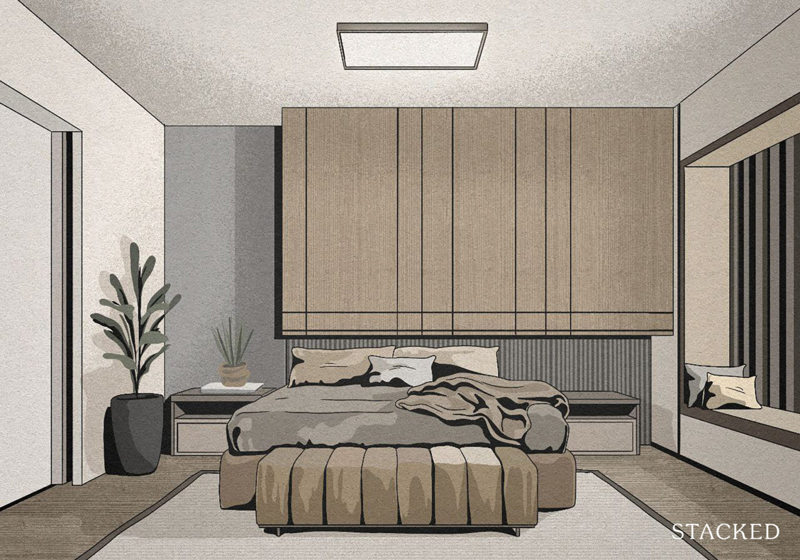
The same goes with the pillows – they’re uncomfortable and lumpy when in such numbers, and they dissuade people from sitting. I don’t want to spend 20 minutes rearranging half a furniture shop’s worth of pillows, just to sit on the couch to read.
Landlords, if you rent fully-furnished units, bother with overlays and throw cushions only if your tenants are rich enough to have a helper reset them. Otherwise, you’re wasting money: everyone just chucks them aside.
7. Cloister office spaces
This is when something that should properly be a wardrobe, or a large cabinet, gets turned into a home office space. A high shelf is put in, a chair is pushed in front of it, and ta-daaa…a cloister office.
It’s a novel idea, and usually a bad one. Cloister offices are wasted space, because they’re uncomfortable to work in; but the space would have been great for an extra wardrobe.
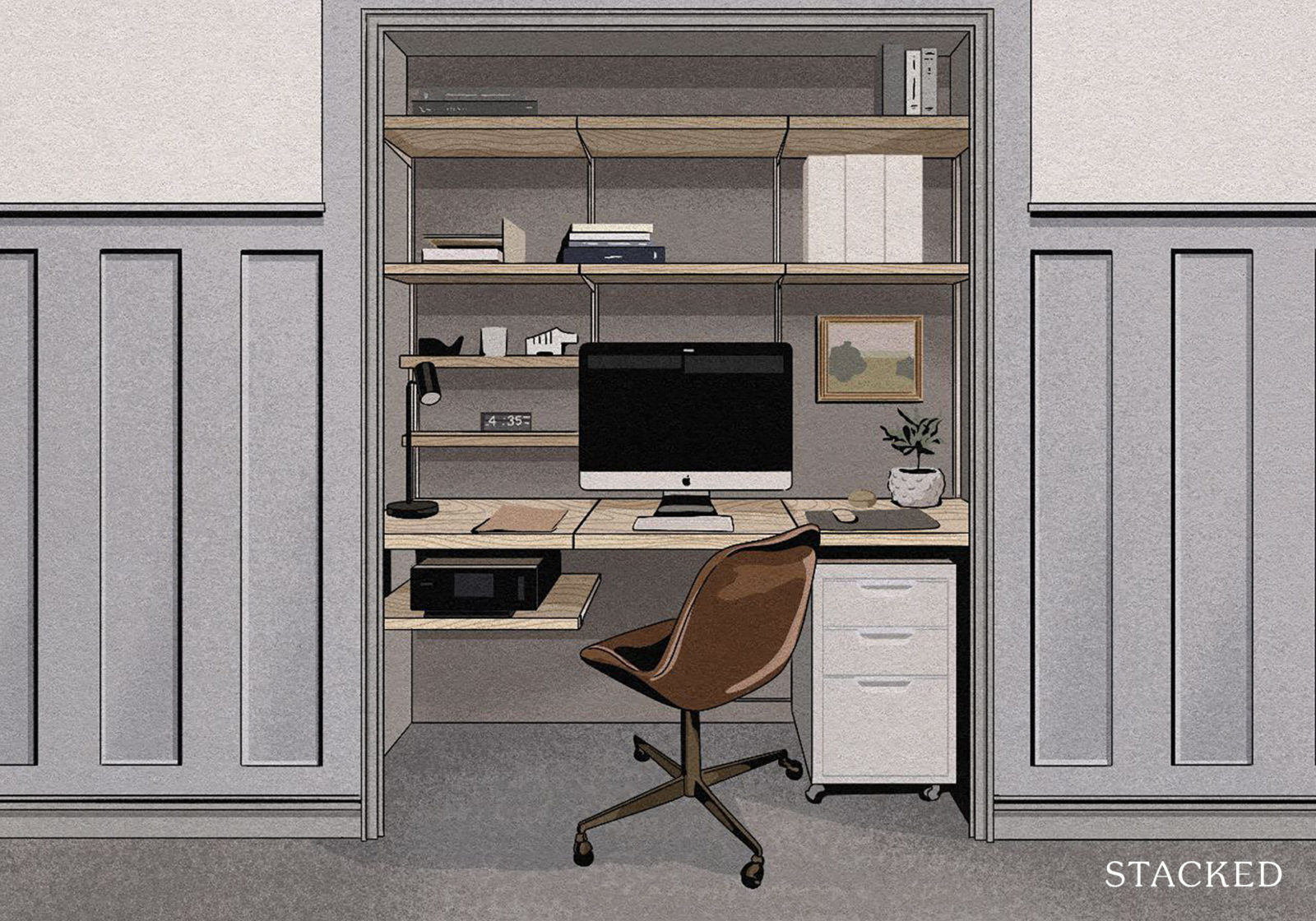
If you insist on making one of these, at least ensure there’s a power outlet near the space; don’t make the user have to drag an extension cord across the room.
8. Tiny tiles anywhere
Tiny tiles have a lot of grouting between them, and there’s a much higher likelihood of dirt or mould. Even if there isn’t, it usually looks like there is, because the small dents in the grouting look like filthy bits from afar.
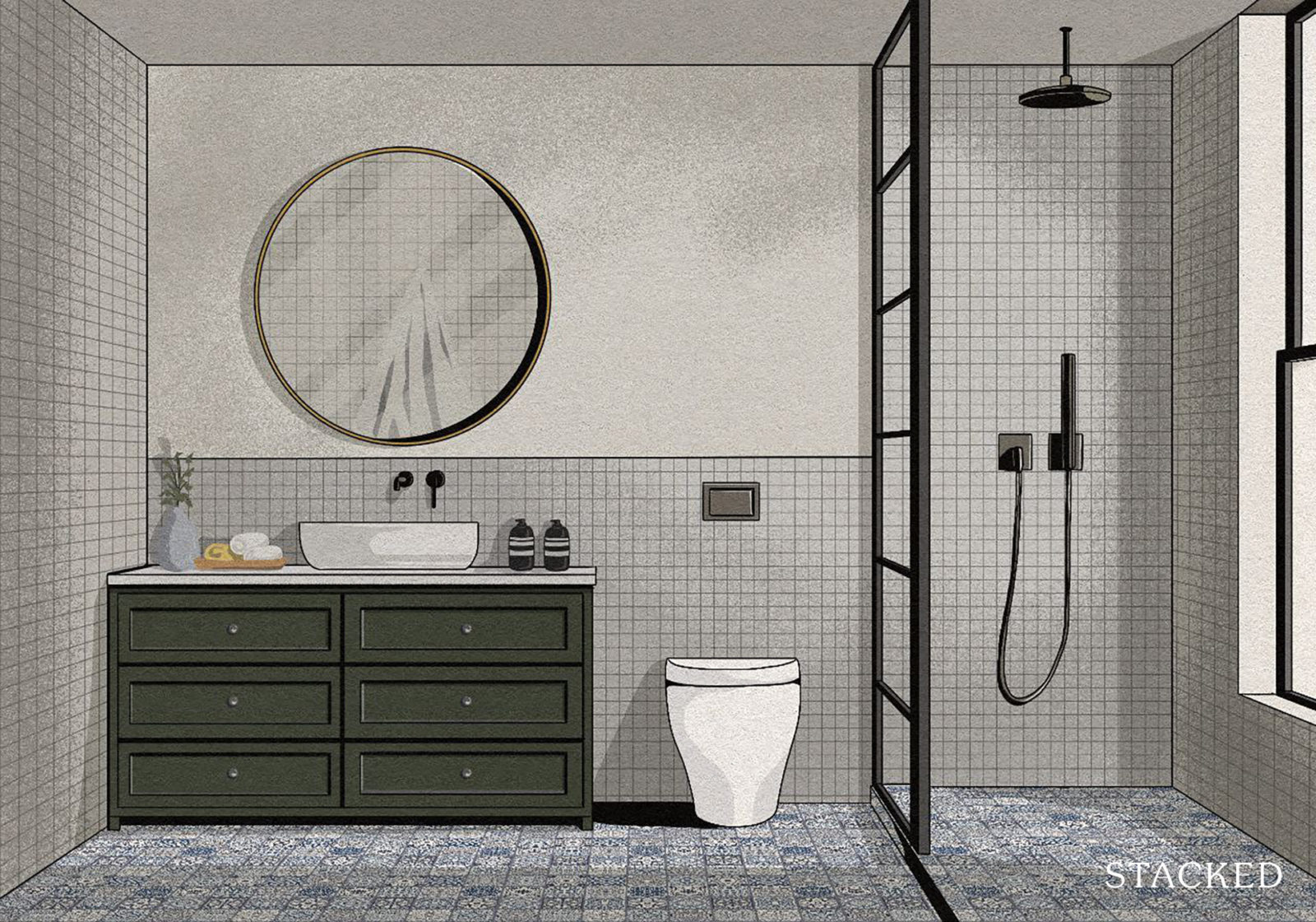
I’ve also had experienced where popped or chipped tiles cut up my feet; small broken tiles are less obvious than big ones (until their corners slice into you).
It’s one of the reasons I’ve sworn off small tiles anywhere, but I especially dread seeing them in bathrooms; and from the number of people who’ve had to clean these tiles, I know I’m not alone.
Go for nice big tiles, people. It’s quicker to lay your flooring too.
9. Finally, a word on lighting
It’s nice to have a mix of lighting options – perhaps a floor lamp as well as the usual downlights. One of the culprits in making a room seem ugly or impersonal is the use of only strong downlights, and nothing else.
I’m even willing to bet that, among the Airbnb (and hence also rental) units that people say are ugly, lack warmth, etc. the reason boils down to having only harsh downlights.
I do admit it’s practical and a cost-saving to use just one style of lighting for the whole place. But you where else they do that? The waiting area of the hospital’s A&E, or a passport office. It just feels dull and sterile.
For more interior design help, reach out to our experts at Stacked, or check out our store and related articles. We’ll help you pick and create the best home for your budget. If you’d like to get in touch for a more in-depth consultation, you can do so here.
Ryan J
A seasoned content strategist with over 17 years in the real estate and financial journalism sectors, Ryan has built a reputation for transforming complex industry jargon into accessible knowledge. With a track record of writing and editing for leading financial platforms and publications, Ryan's expertise has been recognised across various media outlets. His role as a former content editor for 99.co and a co-host for CNA 938's Open House programme underscores his commitment to providing valuable insights into the property market.Read next from Property Advice
Property Advice Condo Vs HDB Price Gap Analysis: Singapore Estates Where Resale HDBs Present A Clearer Value Case Than Condos
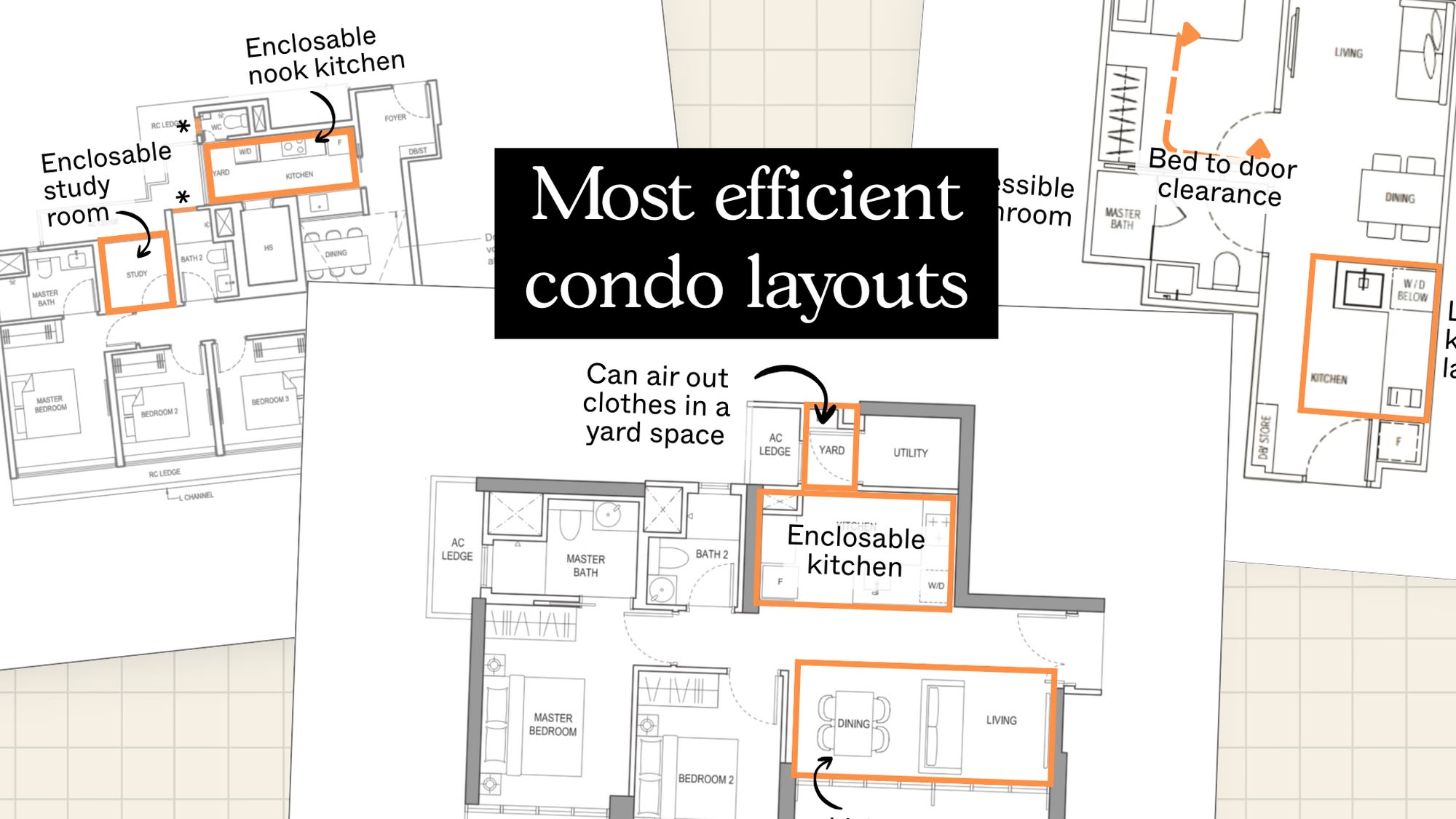
Property Advice The New Condos In Singapore With The Most Efficient Layouts In 2025 Revealed – And What To Look Out For

Property Advice The Hidden Costs of Hiring a “Cheaper” Agent In Singapore
Property Advice The Math Behind Why 30–35 Is The Sweet Spot To Upgrade From HDB To Condo
Latest Posts
New Launch Condo Analysis Queenstown’s First New Launch In 7 Years Comes With Full Facilities — Even With Just 462 Units
Landed Home Tours I Toured A Freehold Landed Estate by a Flyover Where Homes Still Sell for $6M+
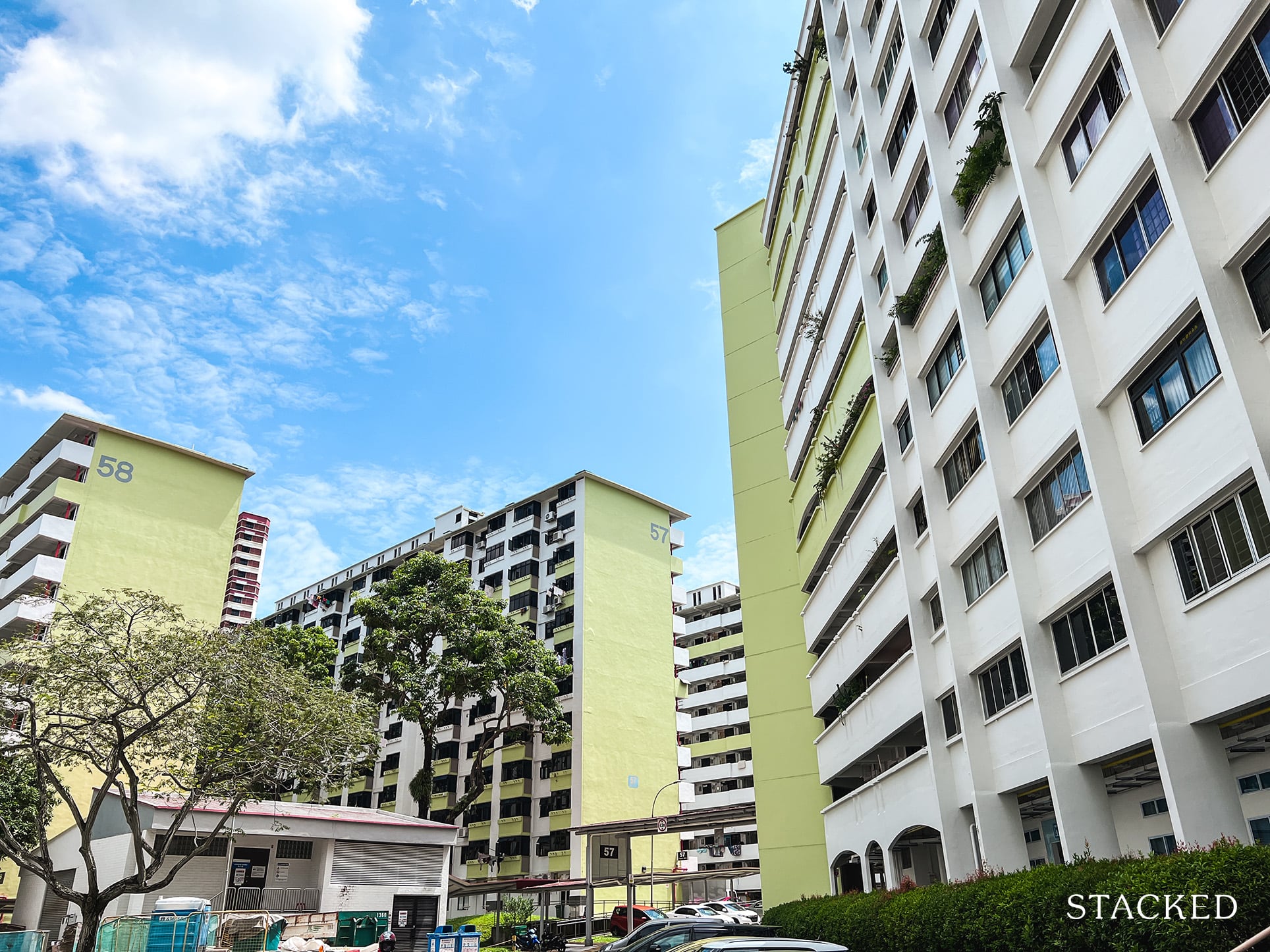
Singapore Property News The Harsh Math Of HDB Ownership After SERS
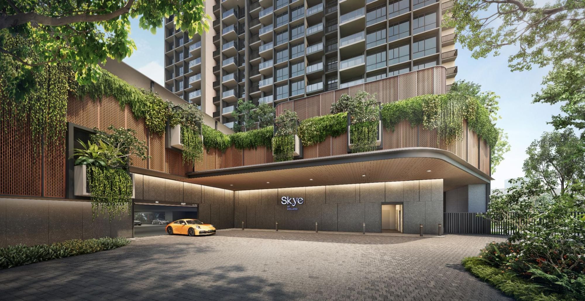
New Launch Condo Analysis This New Holland Village Condo Starts From $2,598 Psf: Here’s All You Need To Know
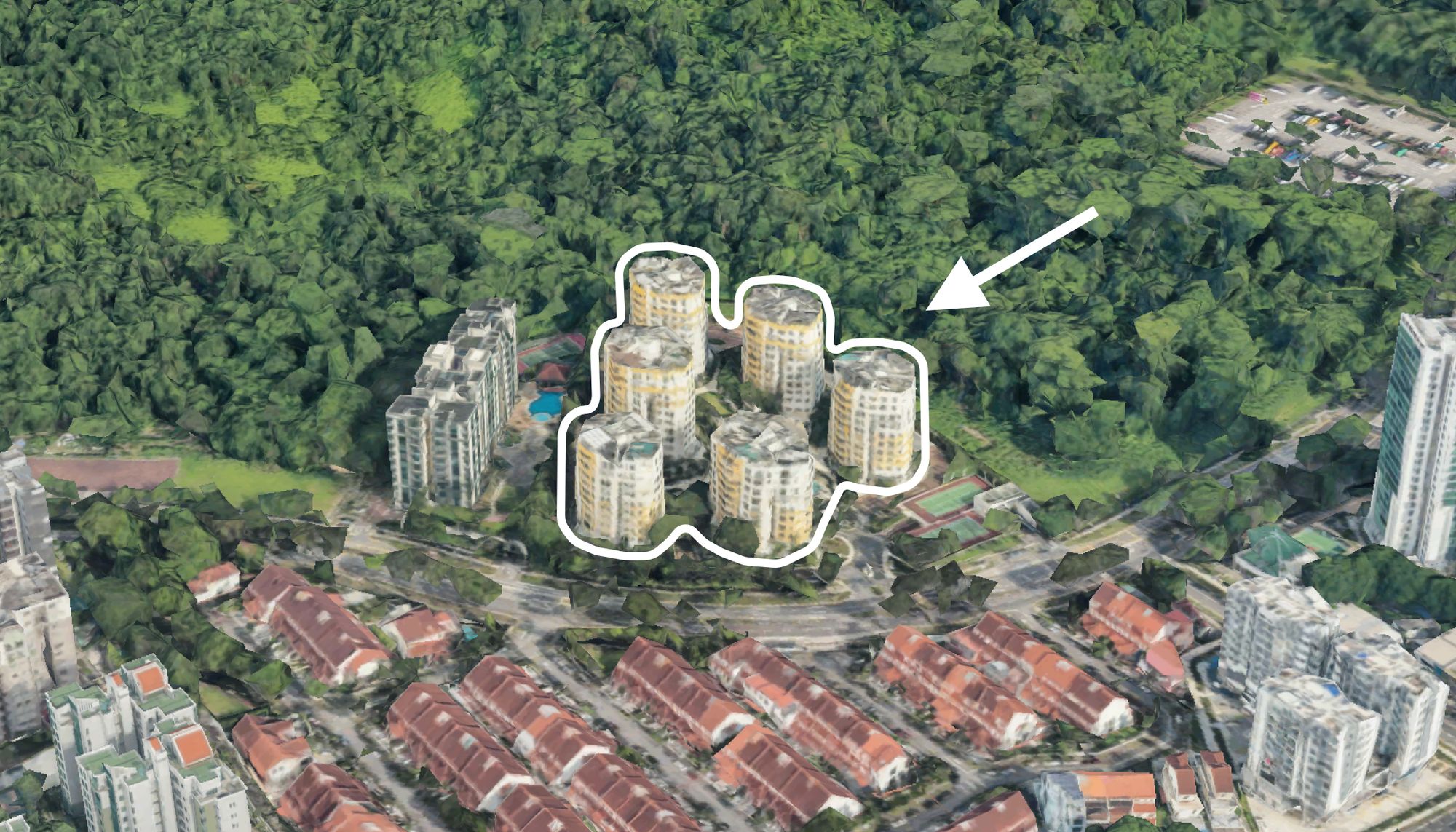
On The Market 5 Spacious Freehold Penthouse Listings Above 2,400 Sq Ft On The Market This Week
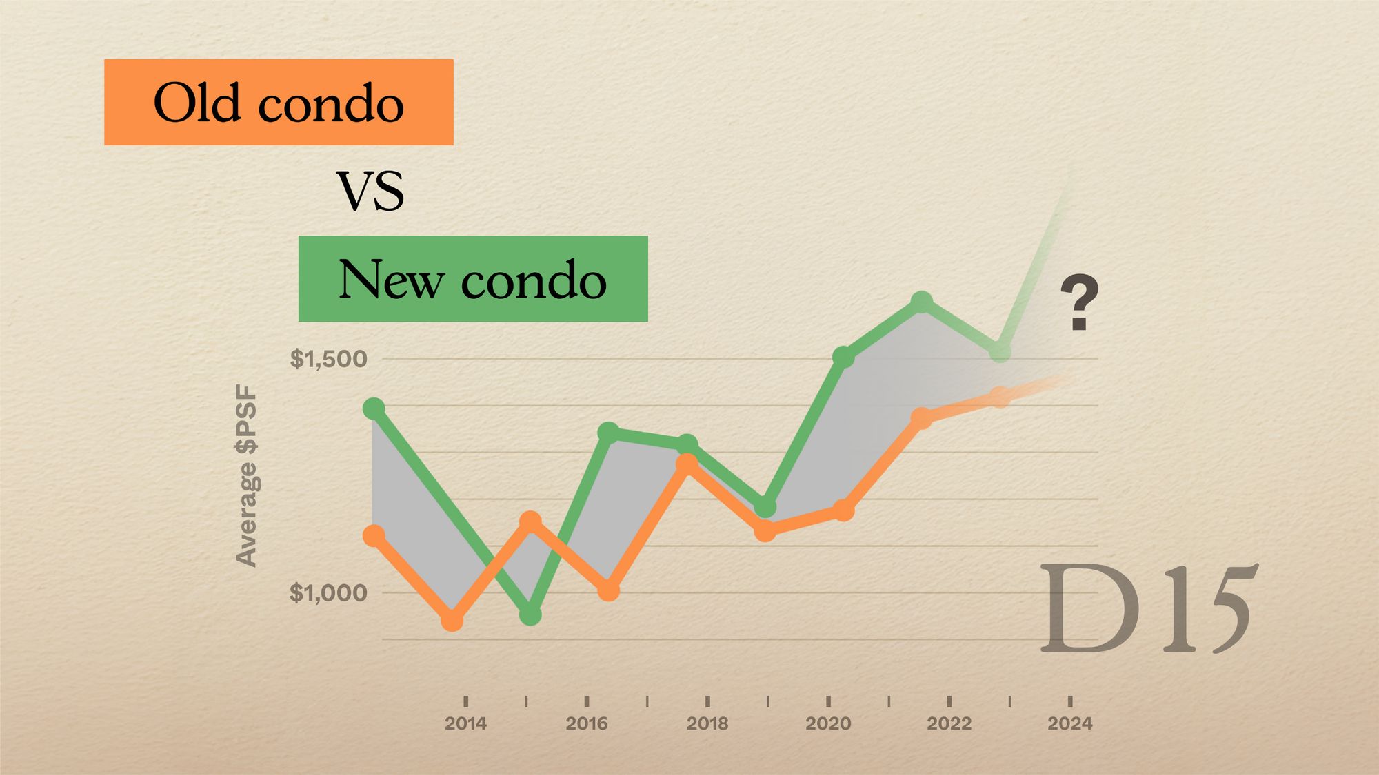
Pro Old vs New Condos In District 15: Which Offers Better Value In 2025?
Property Market Commentary Why Land Price Is the Single Biggest Factor Behind New Launch Condo Pricing
Homeowner Stories I Waited for Property Prices to Drop — and Ended Up Paying More
Editor's Pick We Review 10 Of The October 2025 BTO Launch Sites – Which Is The Best Option For You?
Singapore Property News 5-Room Tampines HDB With Large Balcony Sold For A Record $1,068,000
Property Market Commentary 5 Property Hotspots In Singapore You Did Not Know Were Built Over Graveyards
Editor's Pick We Toured A Convenient Freehold Landed Estate In The East From $4.1 Million
Singapore Property News What Really Drives HDB Resale Prices (And Why COV Matters More Than You Think)
Editor's Pick Where Should Singaporeans Buy Property In France? A Full Guide For Young Investors
Editor's Pick How A Waterfront Development With 4,000 Homes Is Going To Reshape Singapore’s Property Market
