


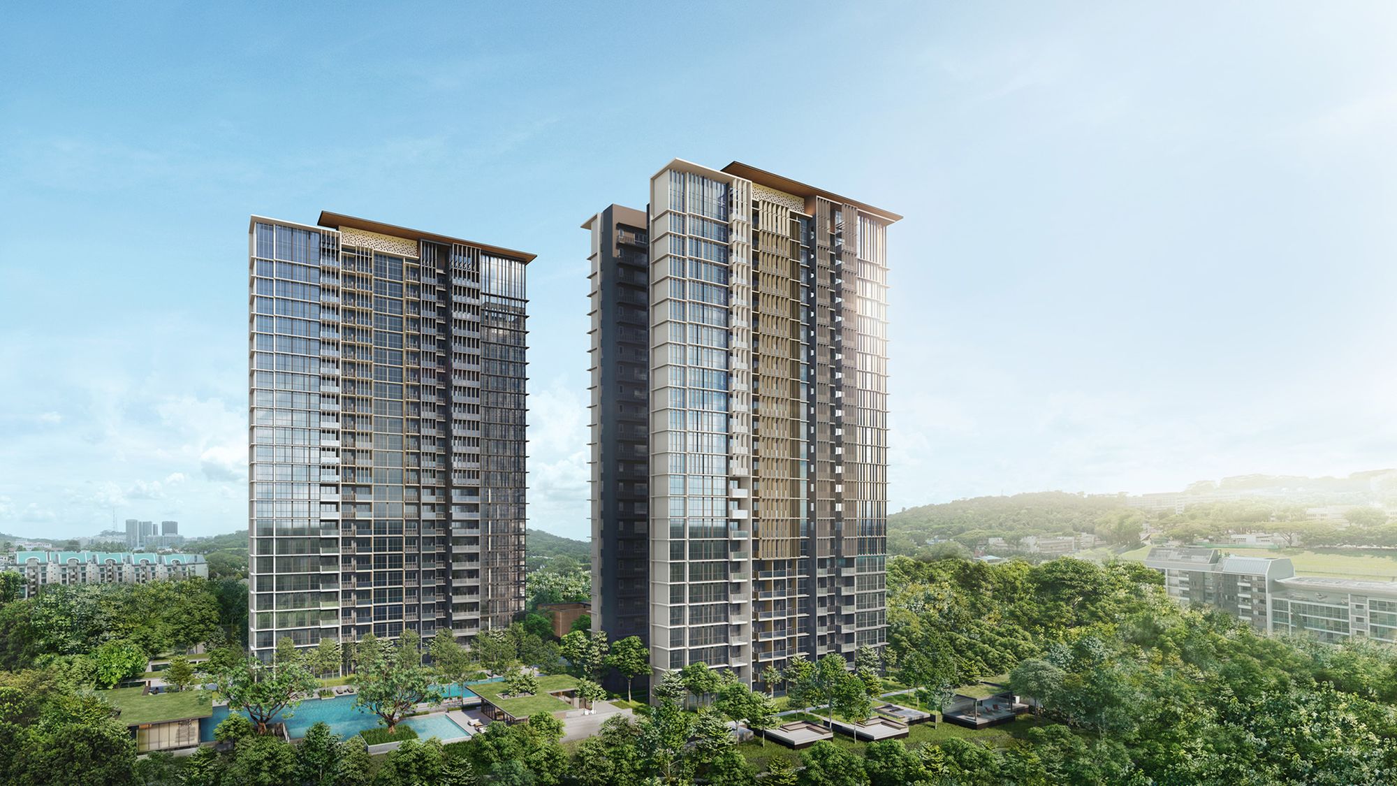


New Launch Condo Reviews
Bloomsbury Residences Review: Unblocked Views With 2-Bedders From $1.366m In One-North
March 29, 2025 47 min read
| Project: | Bloomsbury Residences |
|---|---|
| District: | 5 |
| Address: | 61, 63 and 65 Media Circle |
| Tenure: | 99 Years |
| No. of Units: | 358, 400 sqm of retail space |
| Site Area: | ~Est. 114,442 sqft |
| Developer: | JV between Qingjian Realty Group, Forsea Holdings Pte Ltd, ZACD & Jianan Capital |
| TOP: | Est. February 2029 |
One-North has always felt a little different from the rest of Singapore. It’s futuristic, hyper-planned, and largely shaped around the rhythms of innovation and industry. For many, it’s a place where you work—not where you live.
But that perception is slowly shifting.
In recent years, we’ve seen a quiet but steady wave of residential projects enter the scene—from One-North Eden to Blossoms by the Park—suggesting that a more liveable version of One-North may be taking shape. And while some may still find it hard to picture daily life here, buyer demand tells another story.
Normanton Park is long sold out. Blossoms by the Park is 93 per cent taken up, with only a few larger units left. The only current option for new buyers is The Hill @ One-North, which, at just 41 per cent sold, remains slower-moving—but that’s a boutique project with only 142 units on offer.
Now, enter Bloomsbury Residences.
Tucked away in the quieter Mediapolis precinct, it’s the first residential project in this part of One-North. Instead of the usual office park energy, it offers a more subdued, green-fringed environment—overlooking the black-and-white charm of Wessex estate. To some, it’s a surprising contrast—and perhaps, a much-needed one.
The site was secured at $395 million ($1,191 psf ppr)—just 2.6% above the second-highest bid. For context, this is the lowest land rate among recent launches in the area—even after accounting for its post-GFA harmonisation status:
- 4.4% lower than Blossoms by the Park ($1,246 psf ppr)
- 1.6% lower than The Hill @ One-North ($1,210 psf ppr)
So while Bloomsbury may not sit in the commercial heart of the action, it’s carving out its own identity on the fringe—offering something a little quieter, a little greener, and just a little different from the One-North most are familiar with.
As of writing, Qingjian and Forsea Holdings have doubled down on their presence in this emerging pocket by securing the neighbouring site at Media Circle Parcel A (though the tender for Parcel B remains up for grabs). How this plays out remains to be seen—but it’s clear they see long-term potential here.
With that in mind, let’s dive into the Insider Tour.
So many readers write in because they're unsure what to do next, and don't know who to trust.
If this sounds familiar, we offer structured 1-to-1 consultations where we walk through your finances, goals, and market options objectively.
No obligation. Just clarity.
Learn more here.
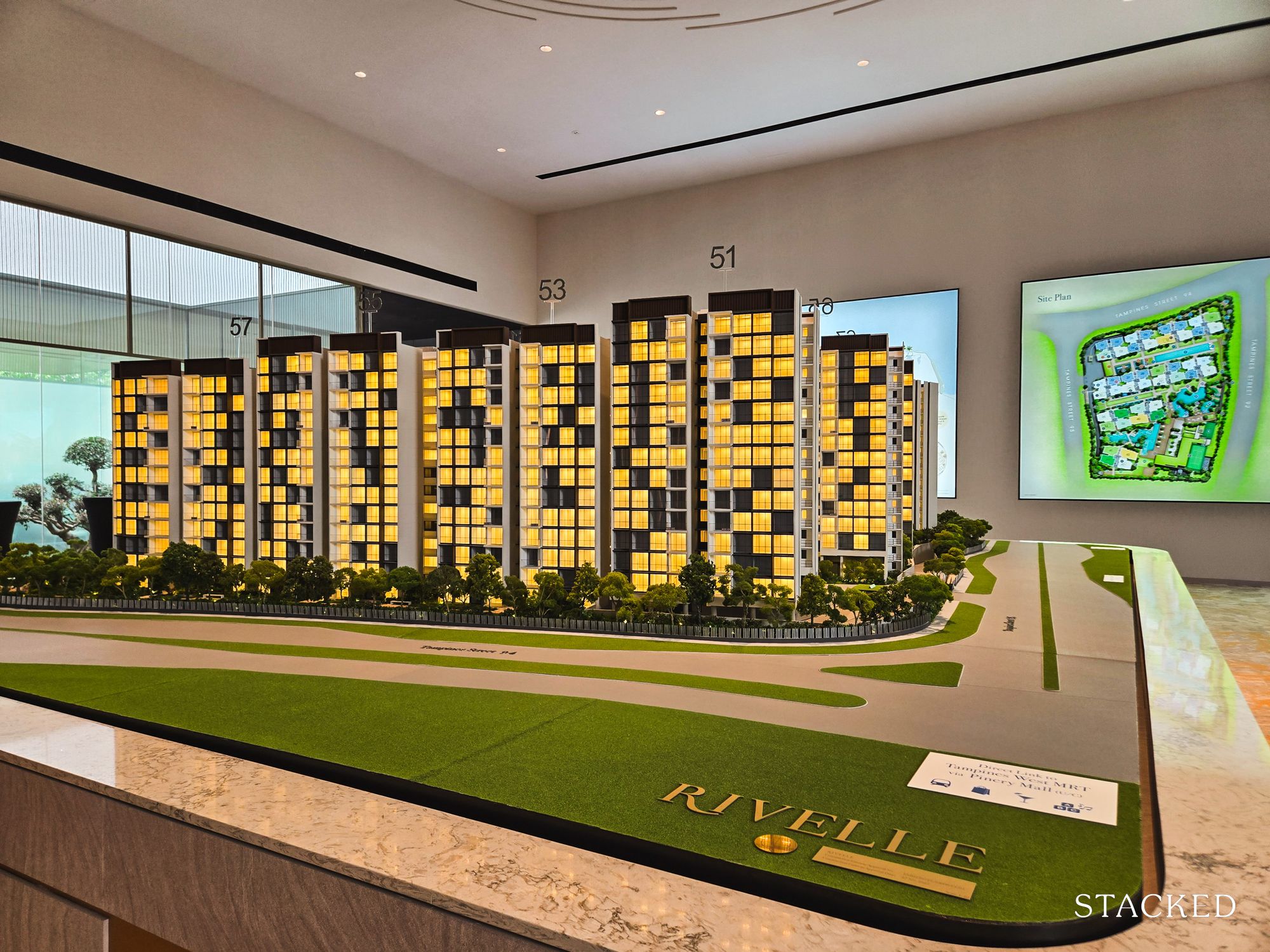
Bloomsbury Residences Insider Tour
As with most reviews, it’s worth starting with the name—especially when it ties into the project’s concept. Bloomsbury Residences takes its name from the Bloomsbury district in London, which from what we’re told, is long known for its academic institutions, medical research centres, and reputation for good schools.
In that sense, the reference isn’t entirely out of place.
One-North, after all, is home to some of Singapore’s top educational and research institutions, from NUS to A*STAR and INSEAD. The connection may be subtle, but it signals the developer’s intent.
The site itself sits on a gently elevated terrain, which the developers have used to their advantage (more on that when we get to landscaping).
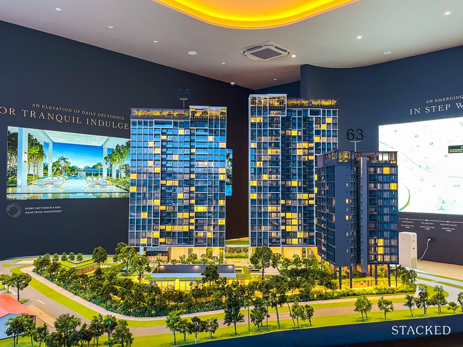
As the first residential project in the otherwise untouched Mediapolis precinct, Bloomsbury Residences also stands out as one of the tallest buildings in the area—aside from the Mediacorp campus nearby, which tops out at around 12 storeys.
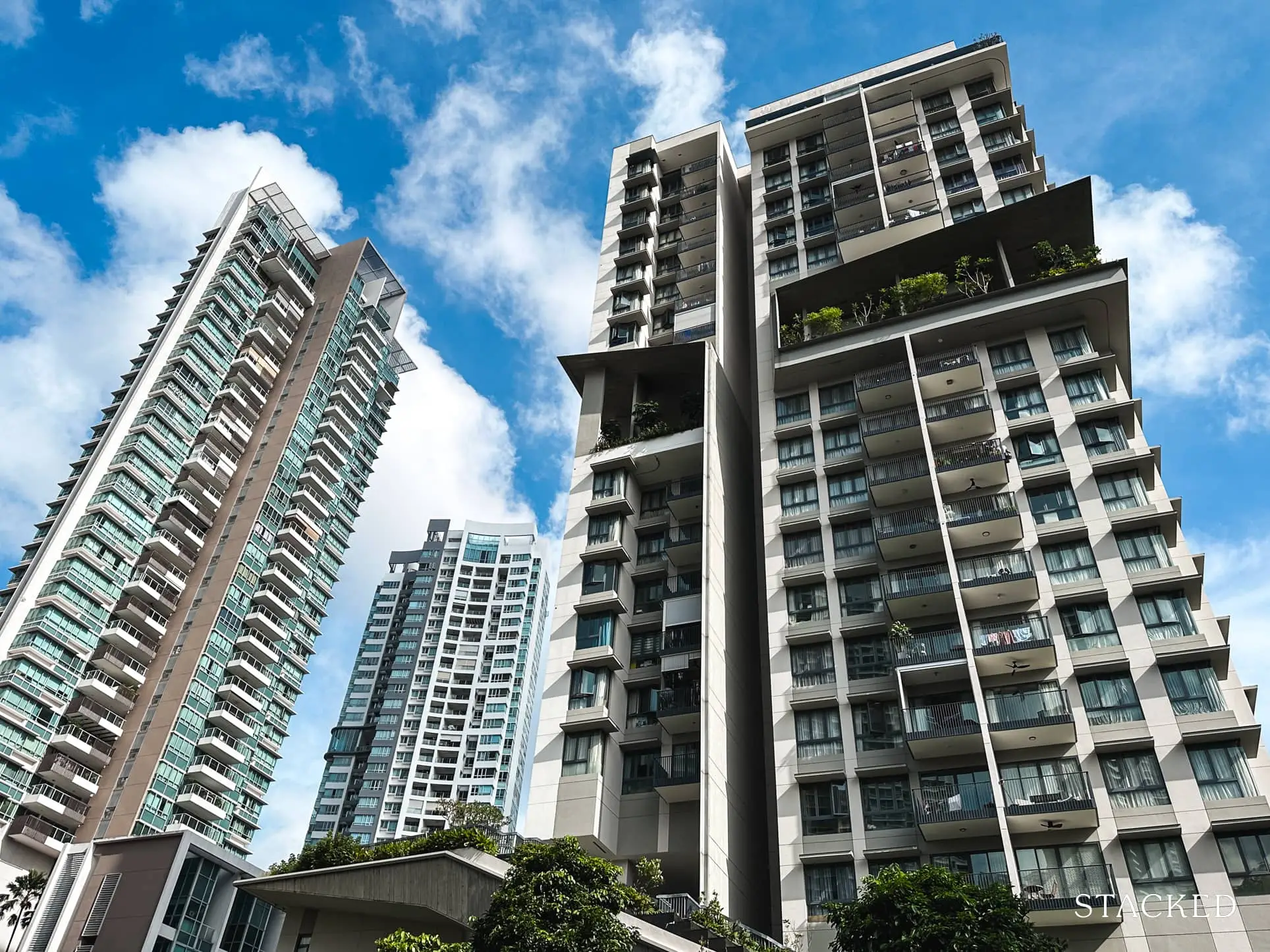
Here are some photos that we have of the neighbourhood as of time of writing.
The immediate surroundings are leafy, green, and tranquil for now—but that’s likely to change once Media Circle Parcels A and B are developed.
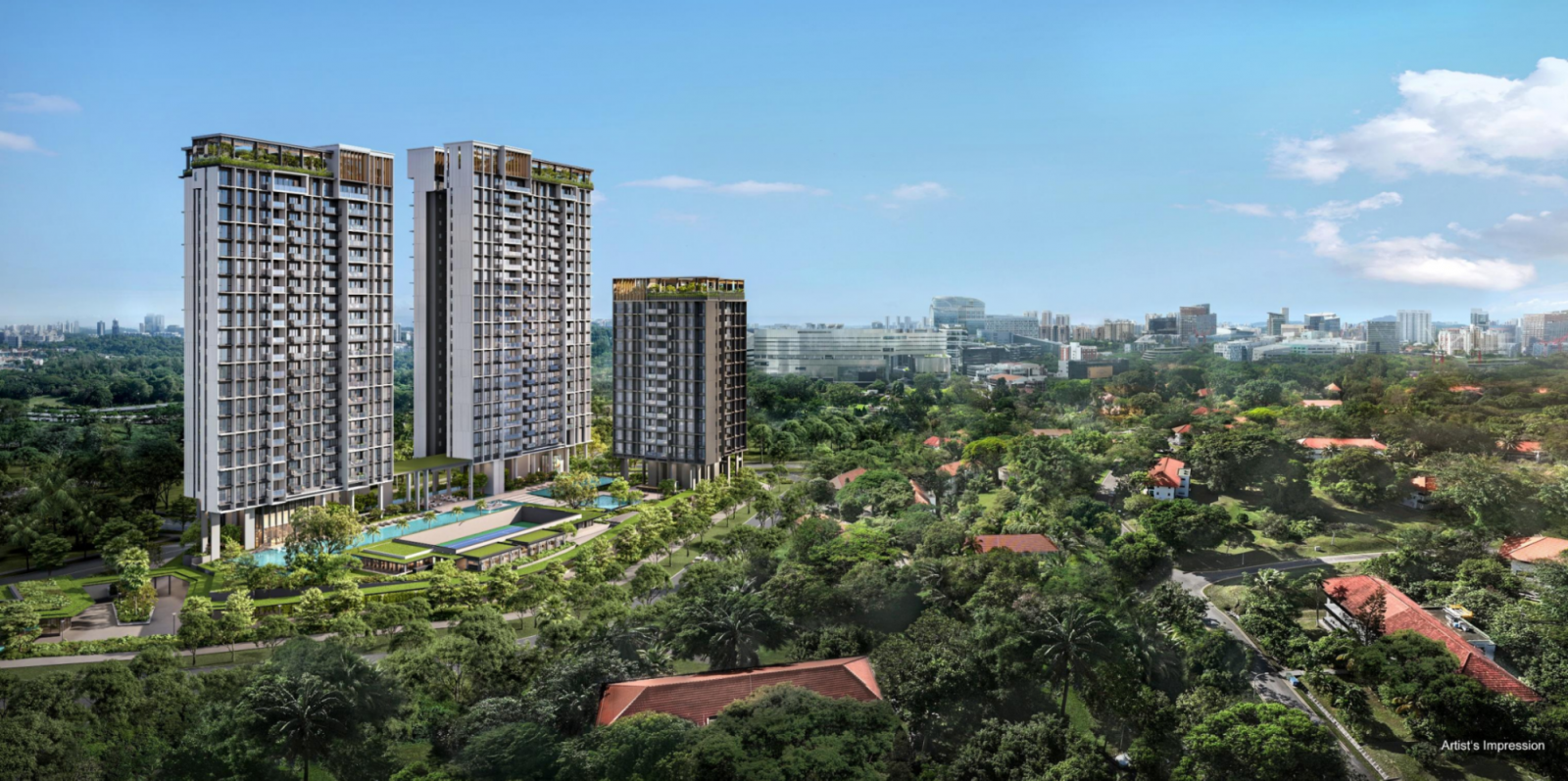
Still, Bloomsbury has one clear advantage: unblocked views of the Wessex estate.
This enclave of black-and-white bungalows gives the development a unique outlook, especially from higher floors. According to the developer, some higher floor units may even enjoy distant views of Dawson and Bukit Timah Hill on a clear day (though the clearance height is not confirmed).
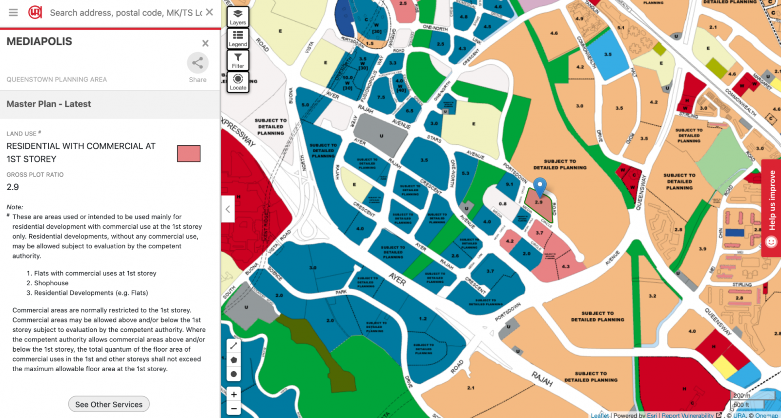
That said, the permanence of these views is not guaranteed. The 2019 Master Plan has earmarked some of these adjacent plots for future detailed planning—so as always, buyers should approach unblocked views as a “nice to have”, not a guarantee.
Design-wise, Bloomsbury Residences is helmed by ADDP Architects—a familiar name in Singapore’s condo scene. They’ve previously collaborated with Qingjian on Tenet EC and Altura EC, and are known for their clean, contemporary style.
At first glance, Bloomsbury’s architecture fits the mould of the modern condo aesthetic. But look closer, and you’ll spot subtle nods to its surroundings—most notably, design elements inspired by the colonial-era black-and-white homes nearby.

This comes through in the use of solid ledges, sleek fins, and the signature black-and-white palette. Some of the communal areas also feature louvred shutters, adding a soft colonial touch.
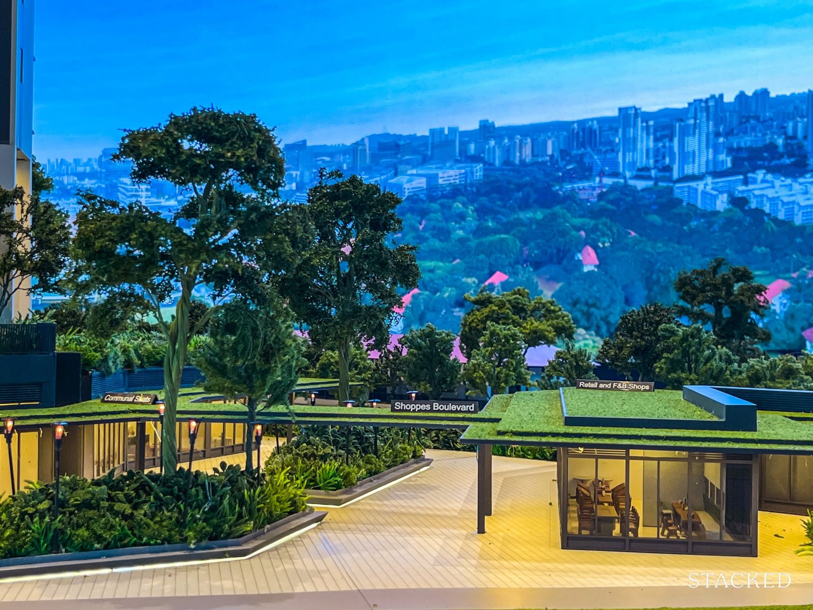
This thematic thread extends to the on-site commercial component—Bloomsbury Shoppes.
While the 400 sqm space is modest, it’s a much-needed addition in a neighbourhood still light on daily conveniences. And while tenants have yet to be confirmed, the developer will manage the mix—potentially allowing for a more curated experience.
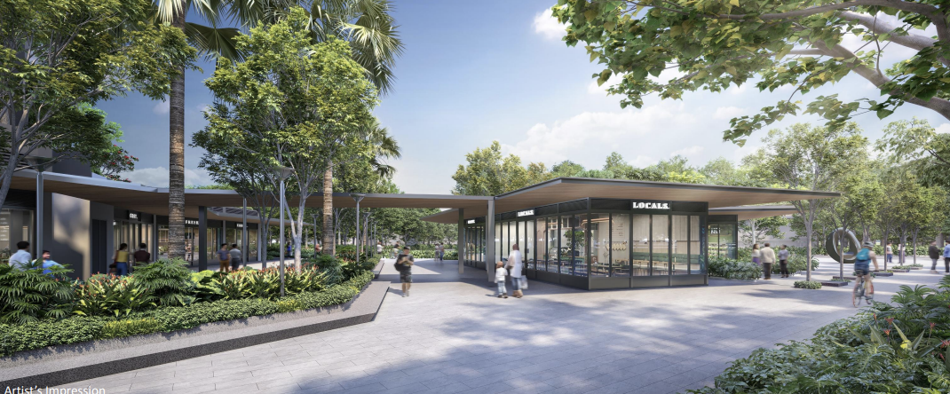
The facade here is inspired by traditional London shopfronts, so that’s a nice homage to the origins of its name.
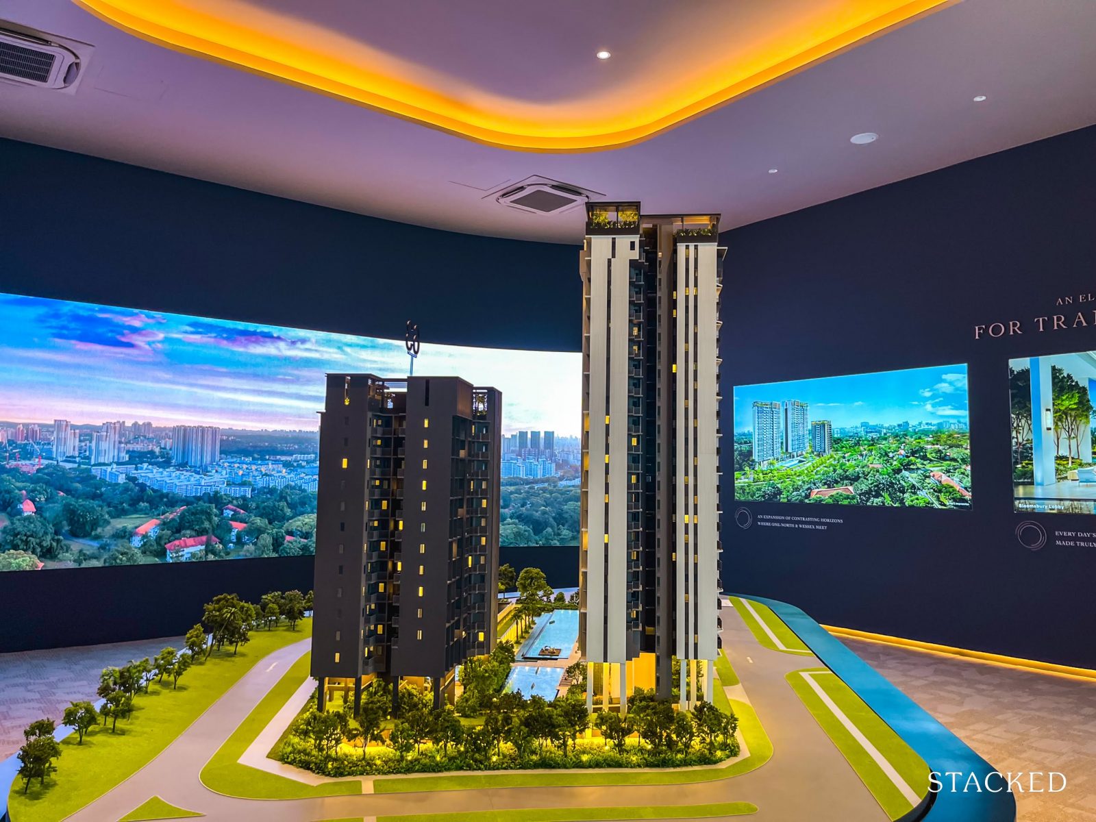
Another thoughtful aspect of the design lies in how the blocks have been oriented.
The architects have intentionally angled the three towers (ranging from 14 to 23 storeys) so that roughly 60 to 70 per cent of units enjoy outward-facing views toward the Wessex estate and beyond. No doubt that they would want to fully capitalise on this unique view in this pocket of the neighbourhood.
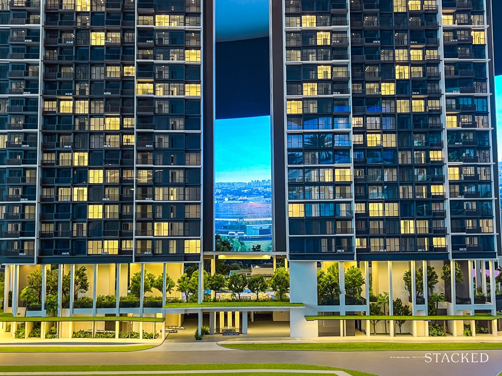
In response to the site’s natural hilly terrain—rather than flatten the site, the architects opted to elevate the towers on structural stilts, a solution also seen in projects like ELTA and Stirling Residences. This approach brings a few key benefits.
First, it raises the residential floors by about eight metres, meaning units begin from the third level up. That translates to better privacy, improved views (even from lower floors), and reduced street-level noise.
Second, it frees up the ground plane for landscaping and amenities—creating breezy, open common areas that feel more expansive and better ventilated. Some of the facilities (more on that later), can be sheltered too so residents can use it regardless of rain or shine.

This means that each unit, on average, will enjoy an estimated 320 sq.ft. of common space—comparable to Blossoms by the Park, which offers around 315 sq.ft. per unit, though it falls short of The Hill @ One-North, which provides approximately 450 sq.ft.
Looking more broadly across today’s new launches, ELTA offers about 289 sq.ft. of common space per unit, while Lentor Central Residences comes in at around 331 sq.ft. In that sense, Bloomsbury Residences sits comfortably within range.
With that, let’s move on to the project itself.
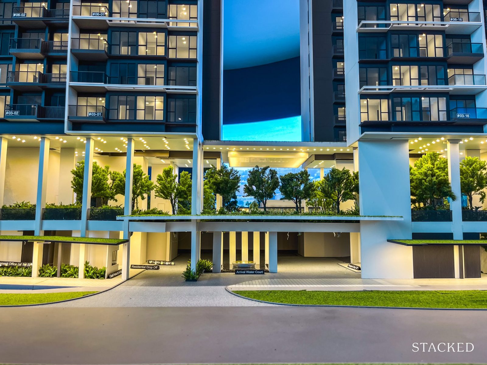
Located along Media Circle, Bloomsbury Residences has a single ingress and egress point. This isn’t a major thoroughfare—most would find the roads in the Mediapolis area to be fairly quiet. From here, drivers can connect to Portsdown Road, a calm cul-de-sac, or head towards Portsdown Avenue, which links out to Queensway and beyond.
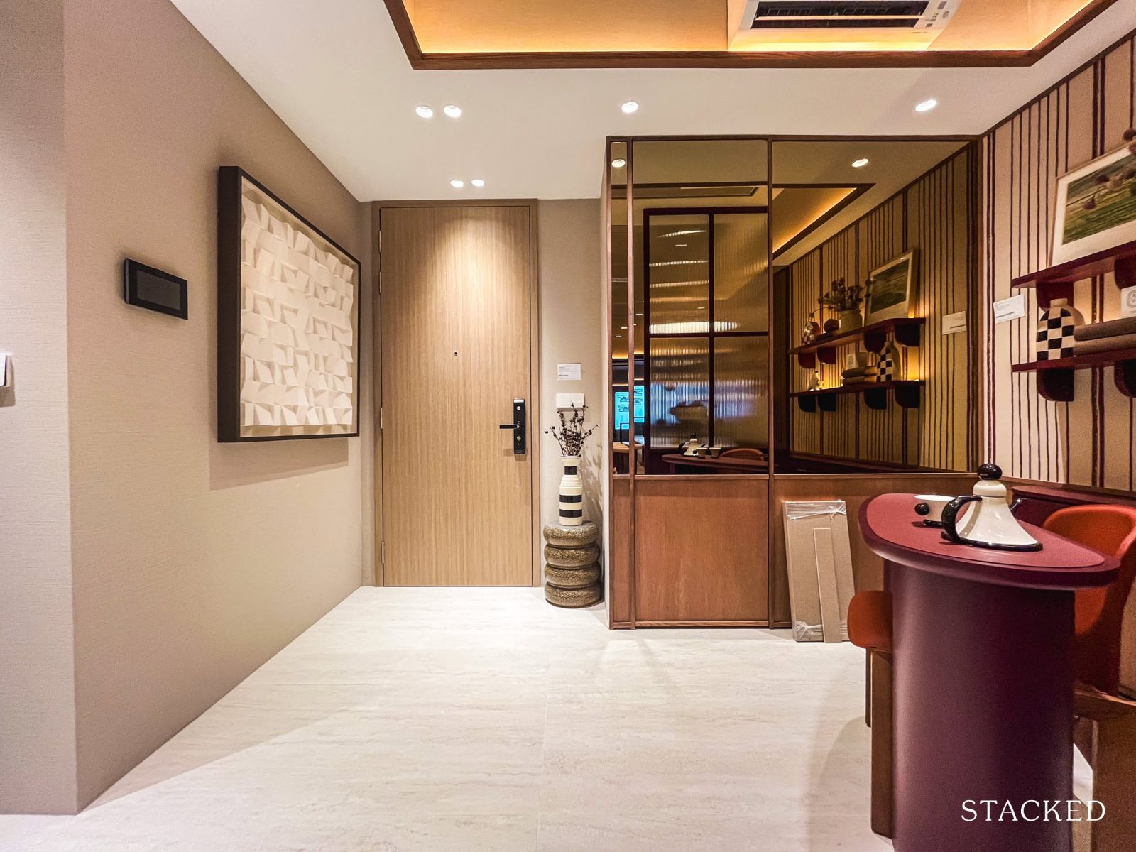
The entrance itself is kept simple and straightforward, functioning as the main access point for both vehicles and pedestrians.
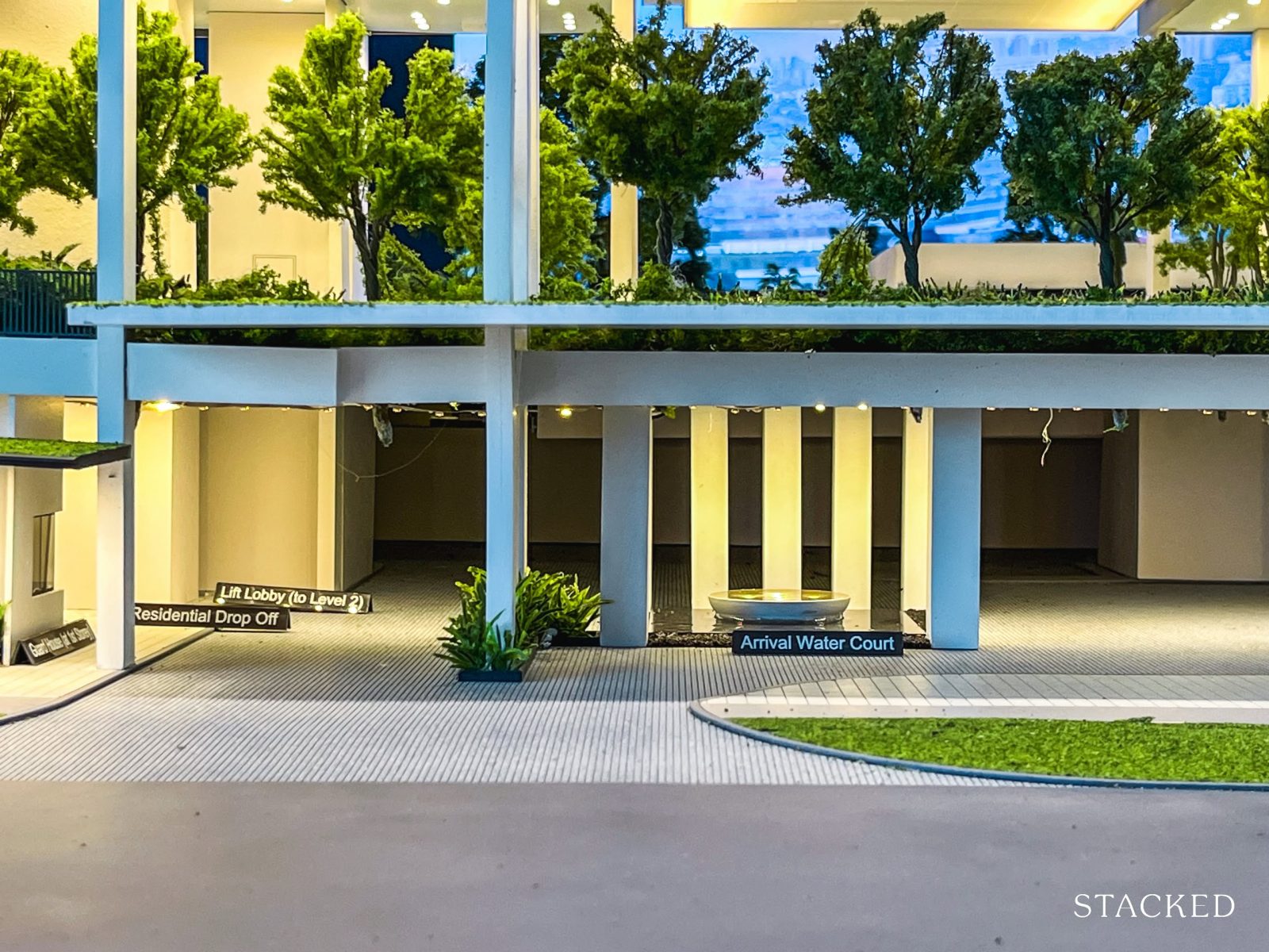
Unlike many recent launches that opt for grander entrances—think air-conditioned lounges, play areas, or study pods at the drop-off—Bloomsbury Residences takes a more understated approach.
The sheltered drop-off is modest, marked by a simple water feature that subtly signals arrival. Given the more compact site, it seems the developers have chosen to keep things pared down here, directing more attention and space toward the common facilities instead.
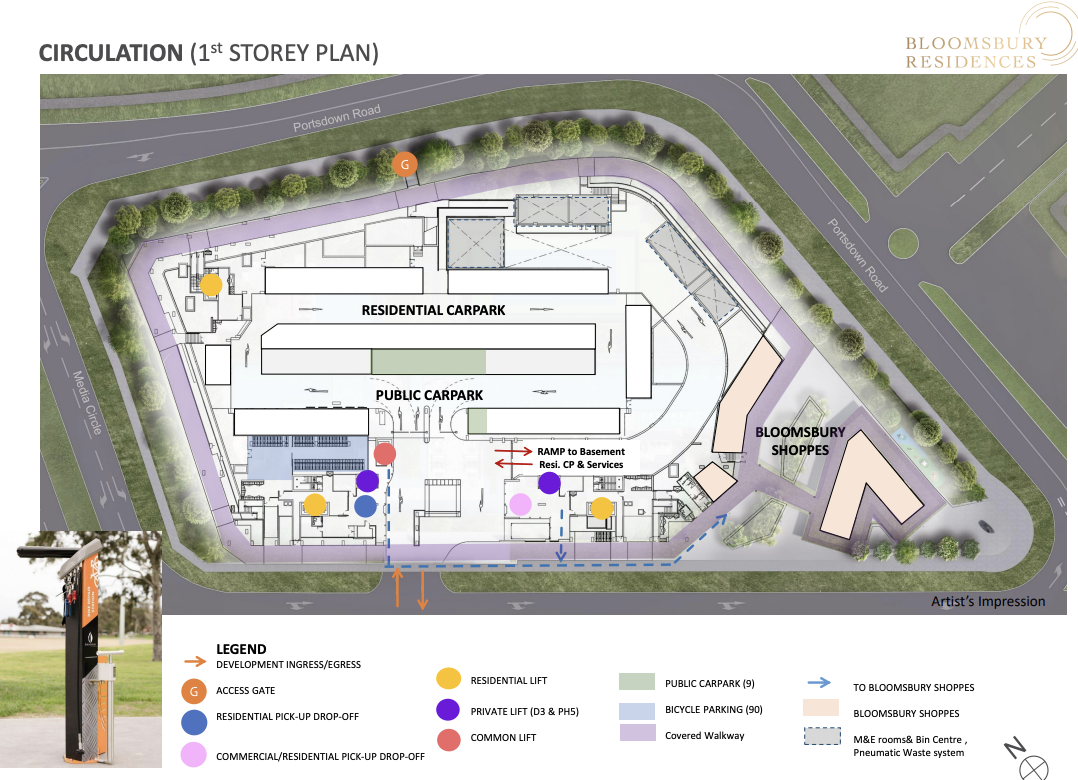
As for the car park arrangement, there will be both public lots (to serve patrons and staff of Bloomsbury Shoppes) and a dedicated residential car park. Specifically, there will be 143 residential car park lots, including five EV charging lots, along with five public lots.
In addition, the site will include three accessible lots and five lots allocated to the commercial component.
Excluding the commercial portion, the residential lot-to-unit ratio stands at about 40 per cent—which may raise concerns for some buyers. That said, One-North has been earmarked as a car-lite district, so this ratio is in line with other nearby developments, such as Blossoms by the Park.
Still, the concern isn’t unfounded—unlike the core of One-North, Mediapolis isn’t within walking distance of the nearest MRT station. Residents here will likely rely on bus services or private transport, which makes car park provision a more practical concern.
To address this, the developers have planned a shuttle bus service during the first year of operation, connecting residents to three destinations: the National University of Singapore (faculty unconfirmed), Buona Vista MRT (CCL, EWL), and One-North MRT Station (CCL).
Likely, residents would want this service to continue beyond the first year.
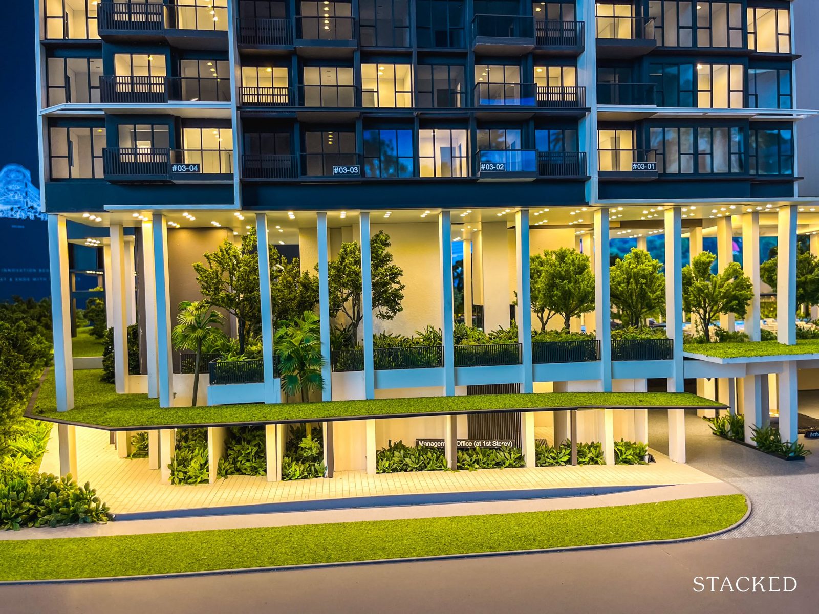
As previously mentioned, structural stilts are used to level out the terrain. But make no mistake—the architects and landscapers have made full use of the site’s layout, incorporating several facilities beneath these high-volume, sheltered spaces.
Before we dive into the specifics, it’s worth noting that most One-North projects are known for offering a more modest range of amenities. For those who place a premium on lifestyle, Bloomsbury Residences stands out—it will feature a full suite of standard condo facilities, which is a major plus for the more lifestyle-centric crowd.
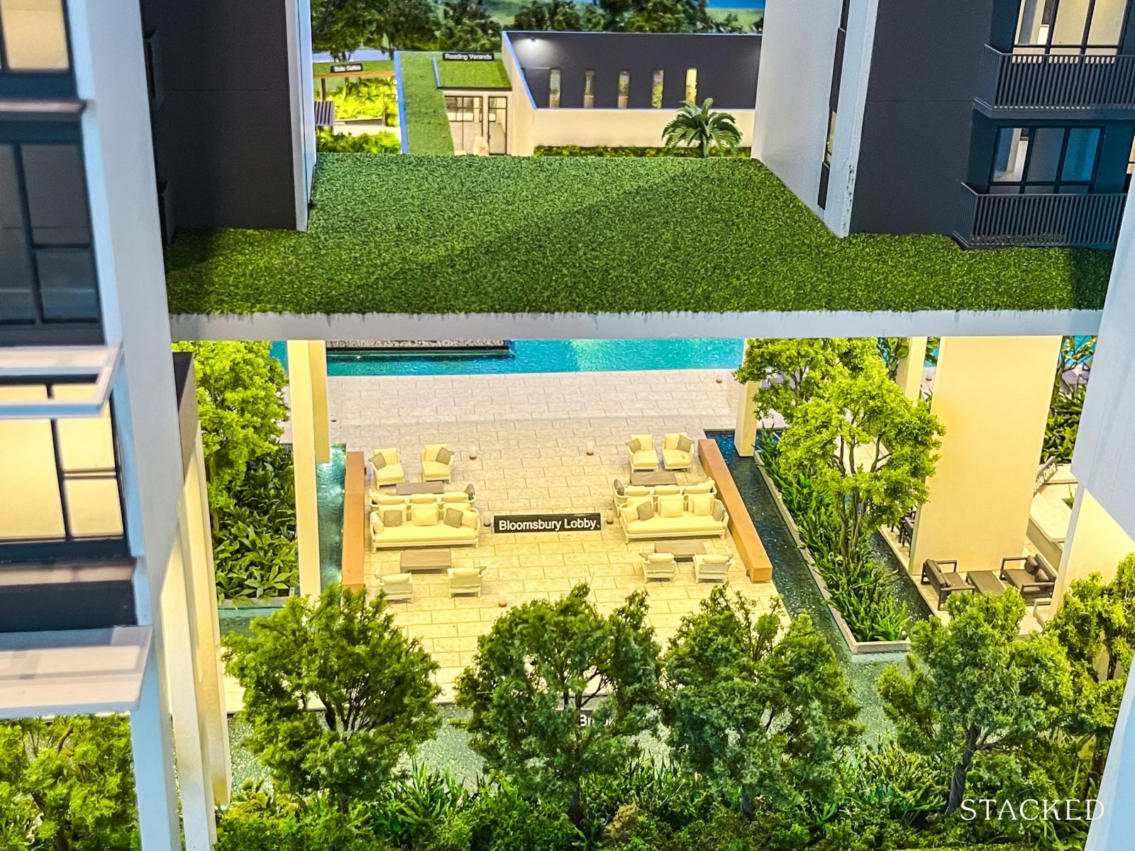
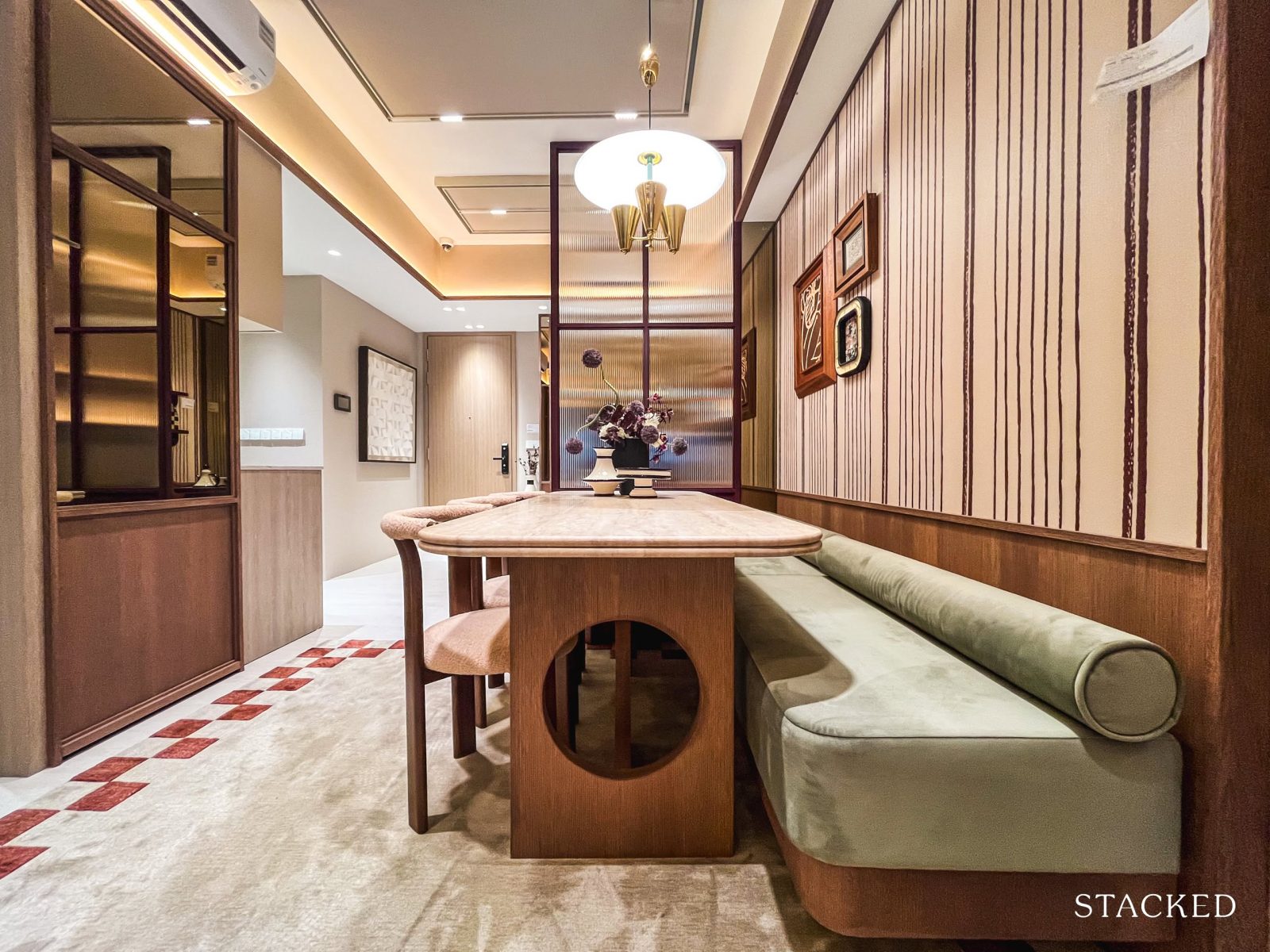
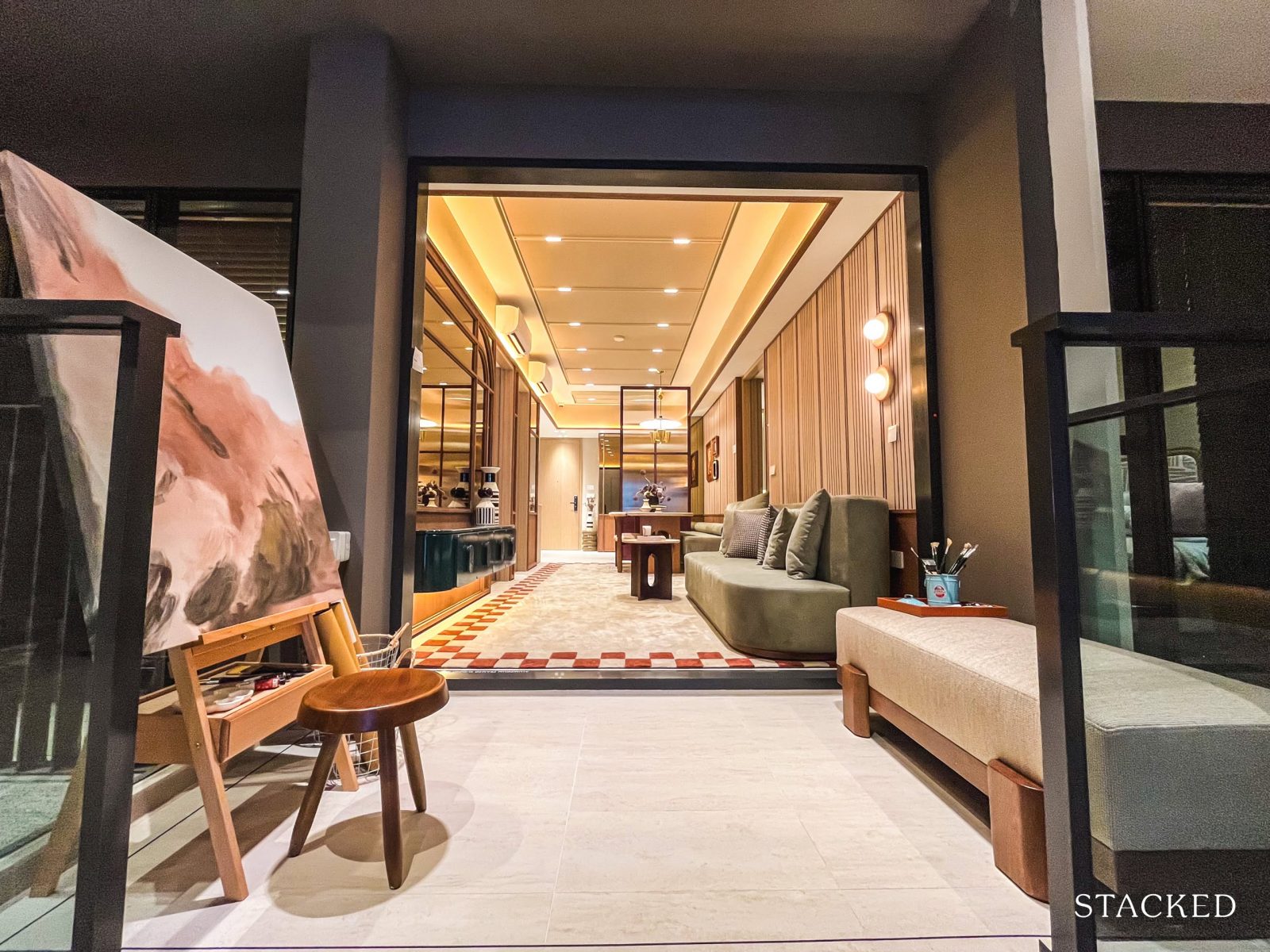
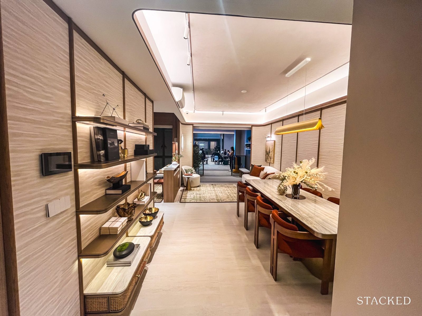
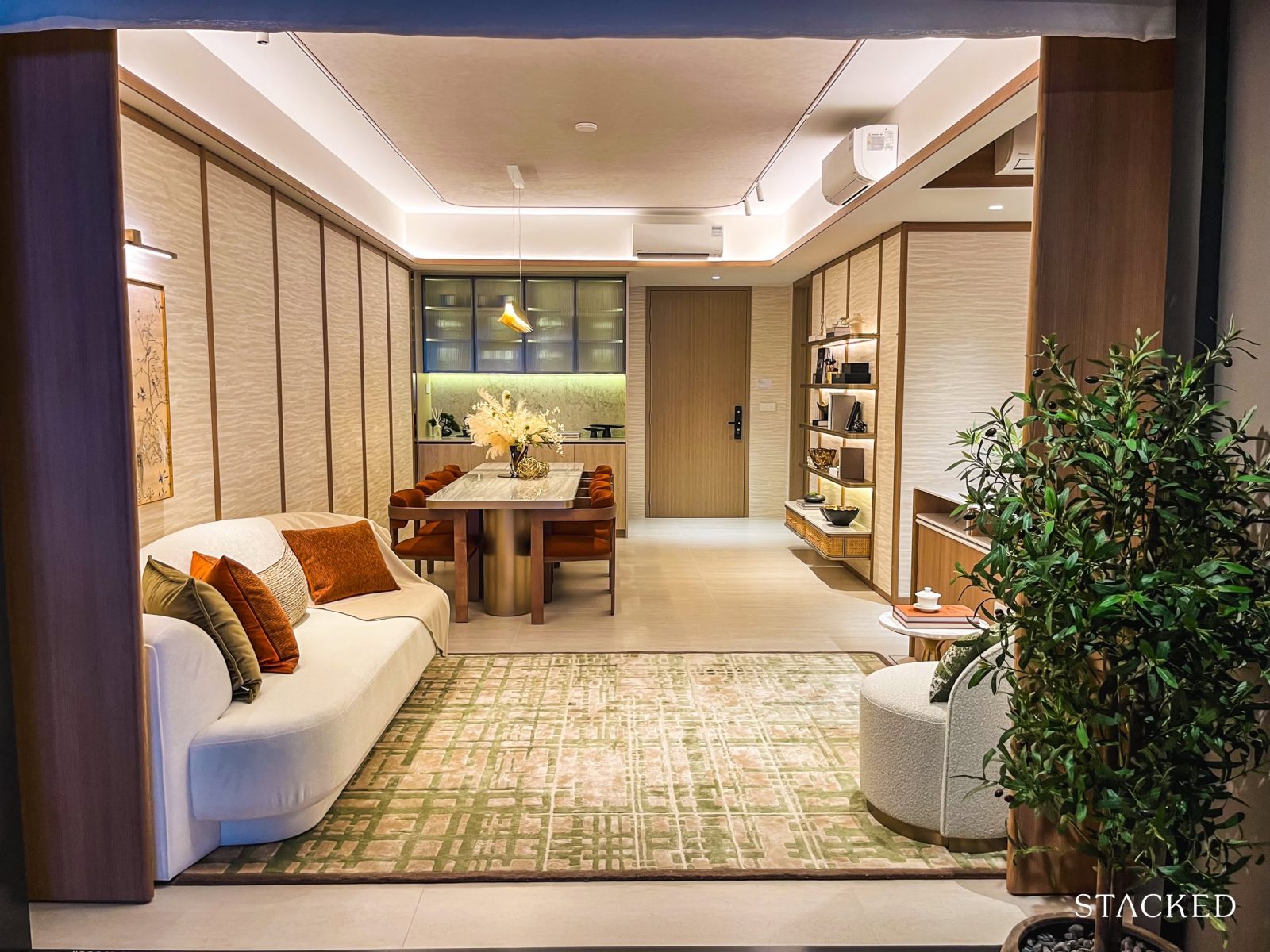
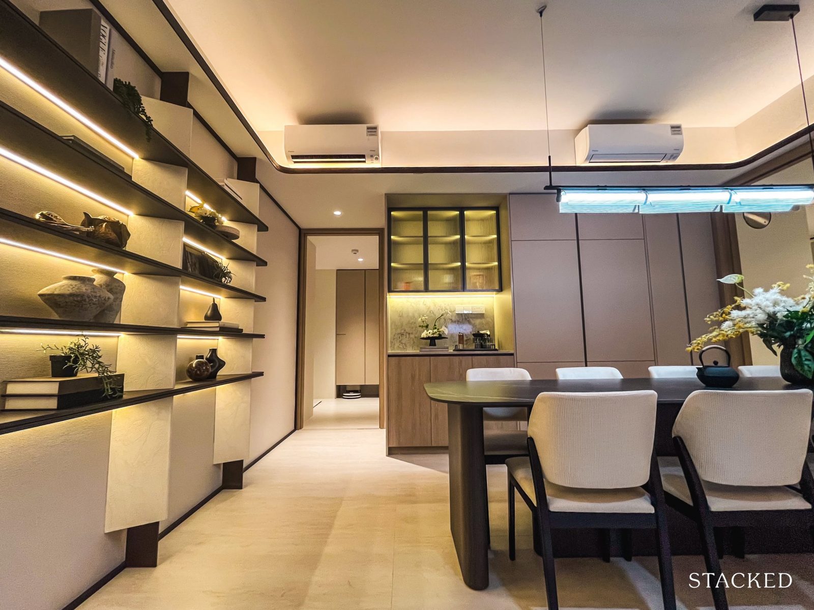
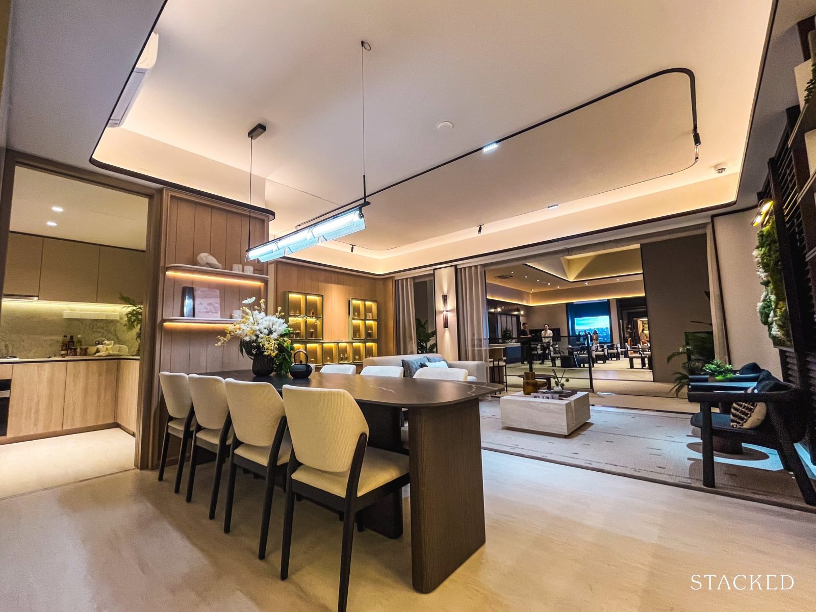
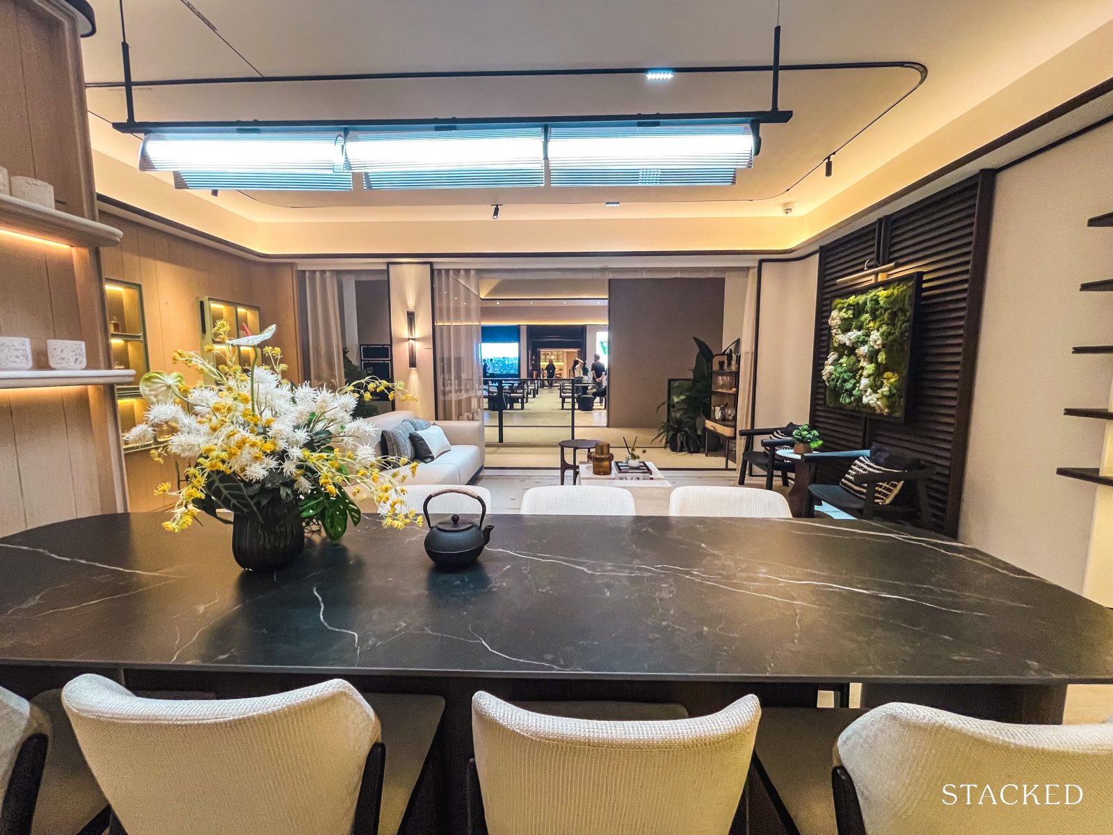
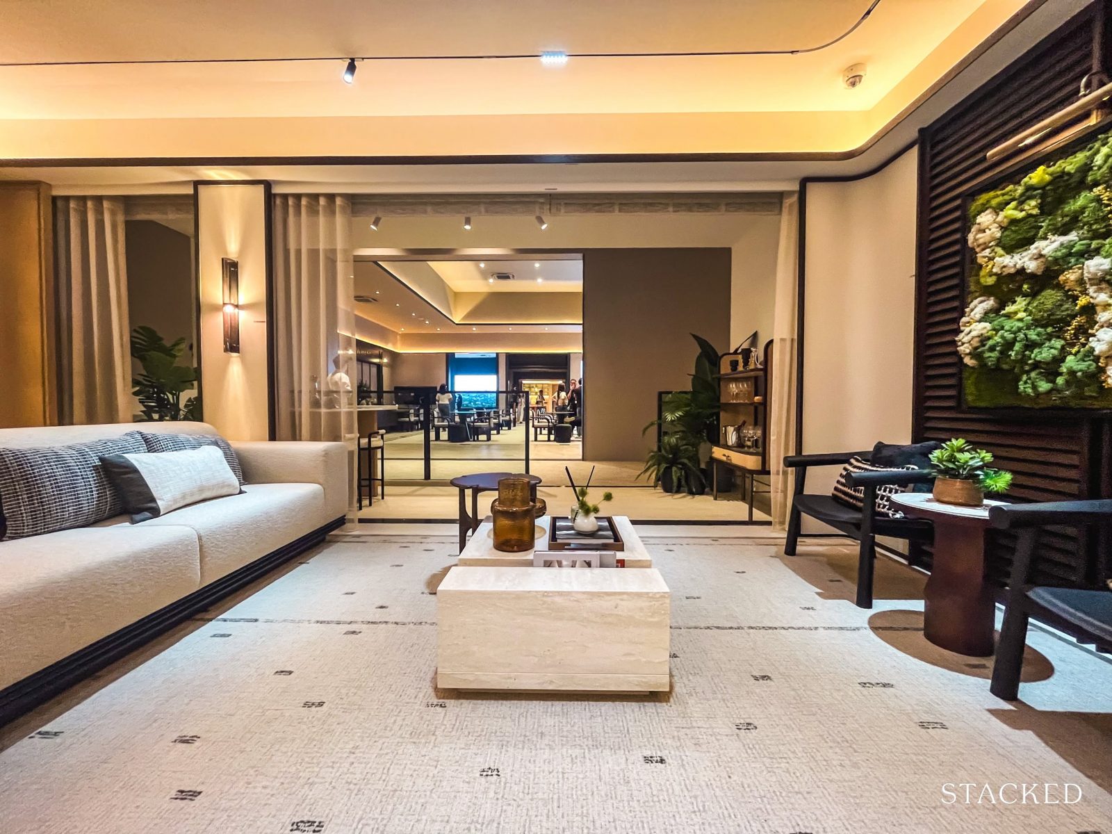
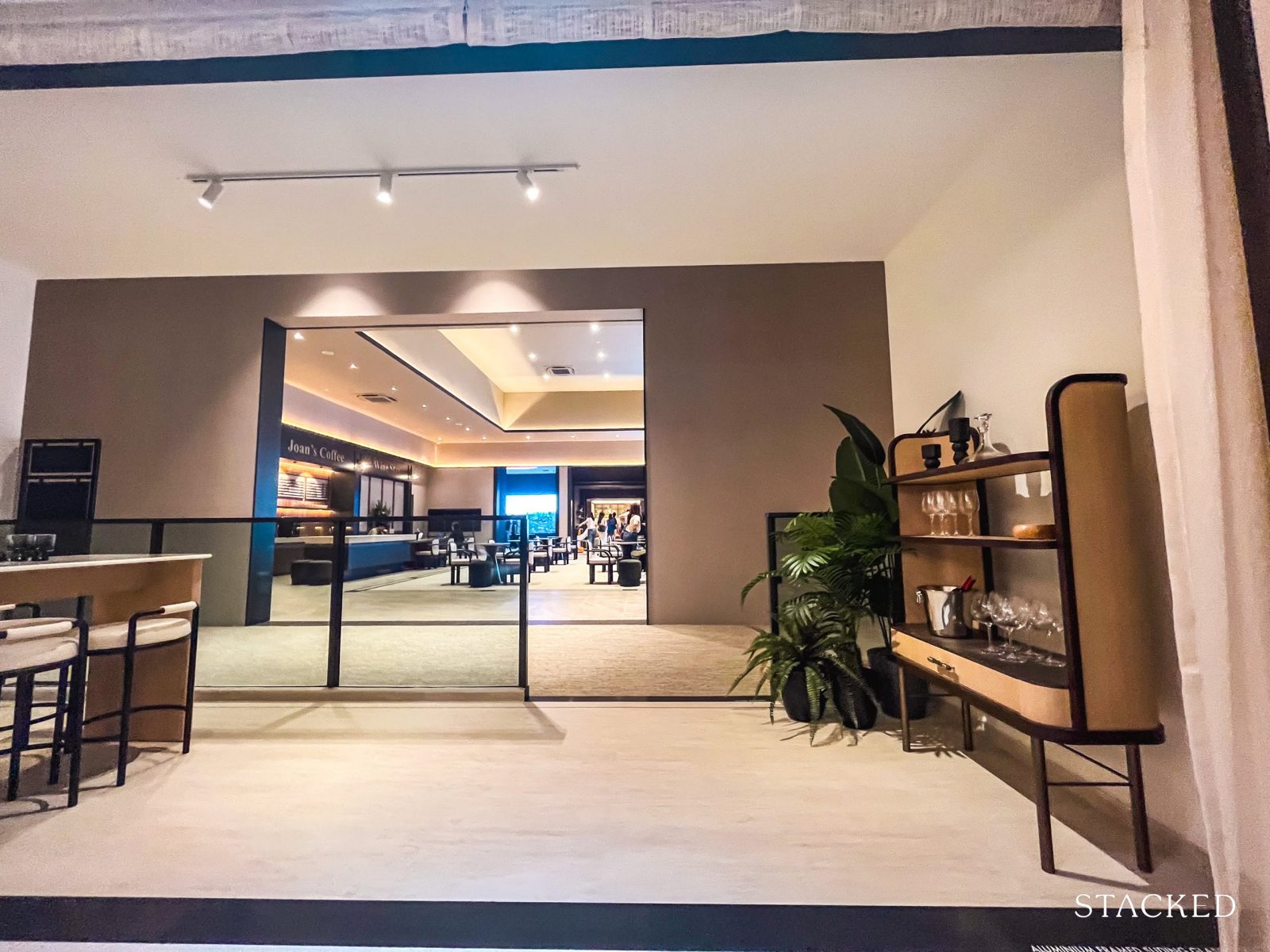
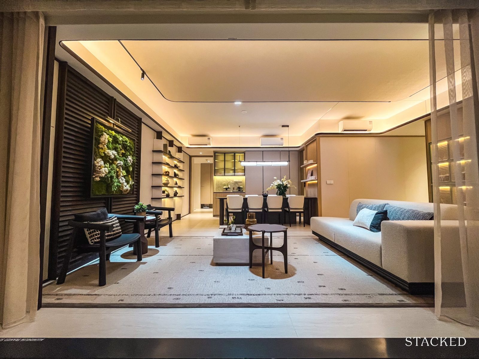
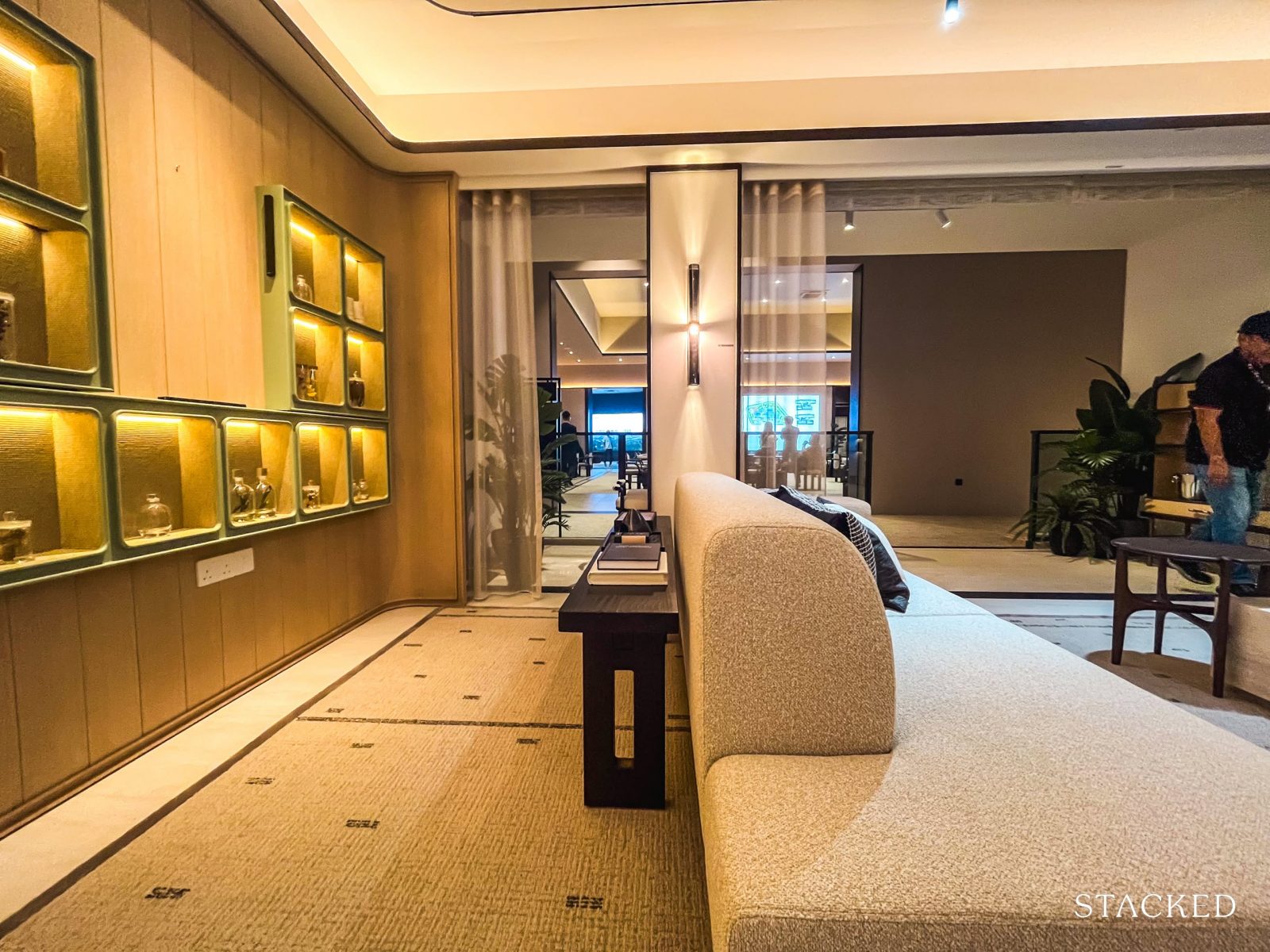
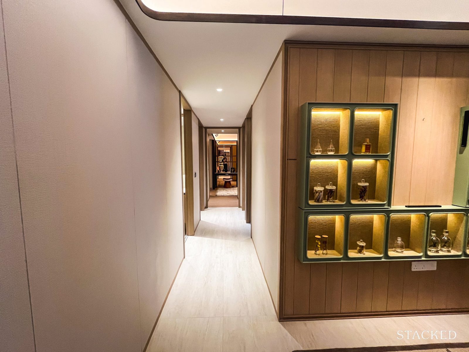
The Bloomsbury Lobby sits at the heart of the development—comprising a series of sheltered lounging areas that overlook the pool.
Personally, these sheltered common seating spaces make a lot of sense. Being protected from Singapore’s intense sun and unpredictable weather makes them far more usable, and the open layout encourages residents to linger and engage with the space.
While some might argue that these aren’t “true” amenities, these communal zones do enhance the overall sense of openness. It’s arguably a better use of space than squeezing in additional, underutilised features on an already compact site.
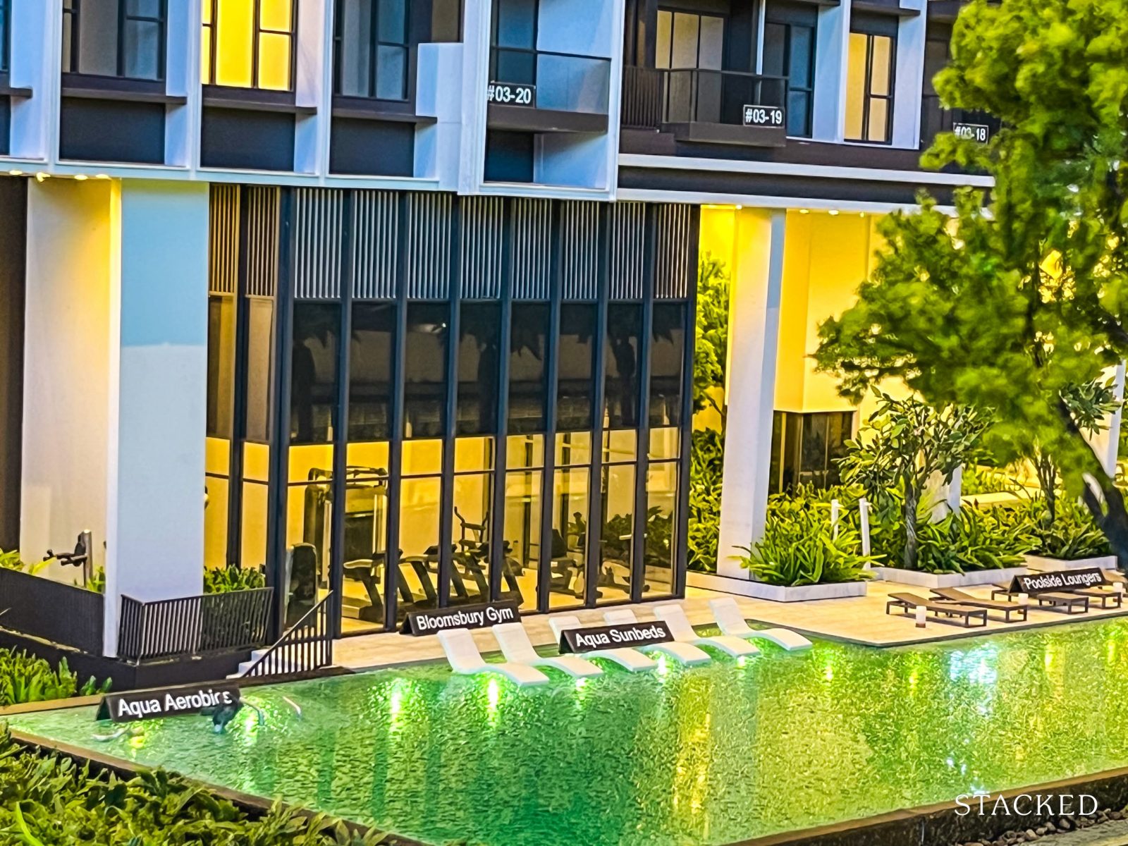
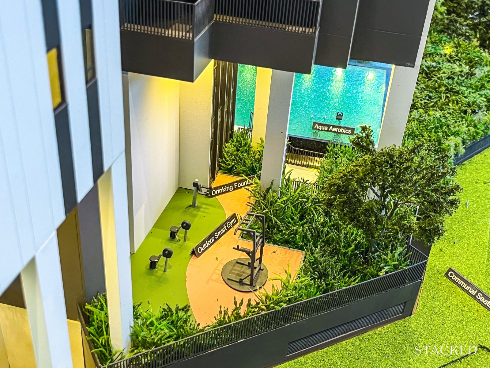
Other facilities found beneath these sheltered spaces include the Bloomsbury Gym and the Outdoor Smart Gym. Qingjian has been known to be quite innovative—pioneering smart home features in ECs and introducing the now widely adopted Cospace concept.
Here, they’ve leaned into the smart city ethos once again, equipping the gyms with smart features that subtly reinforce their commitment to innovation.
In the same vein, Bloomsbury Residences will also be the first condominium in Singapore to incorporate robotic systems aimed at improving everyday living.
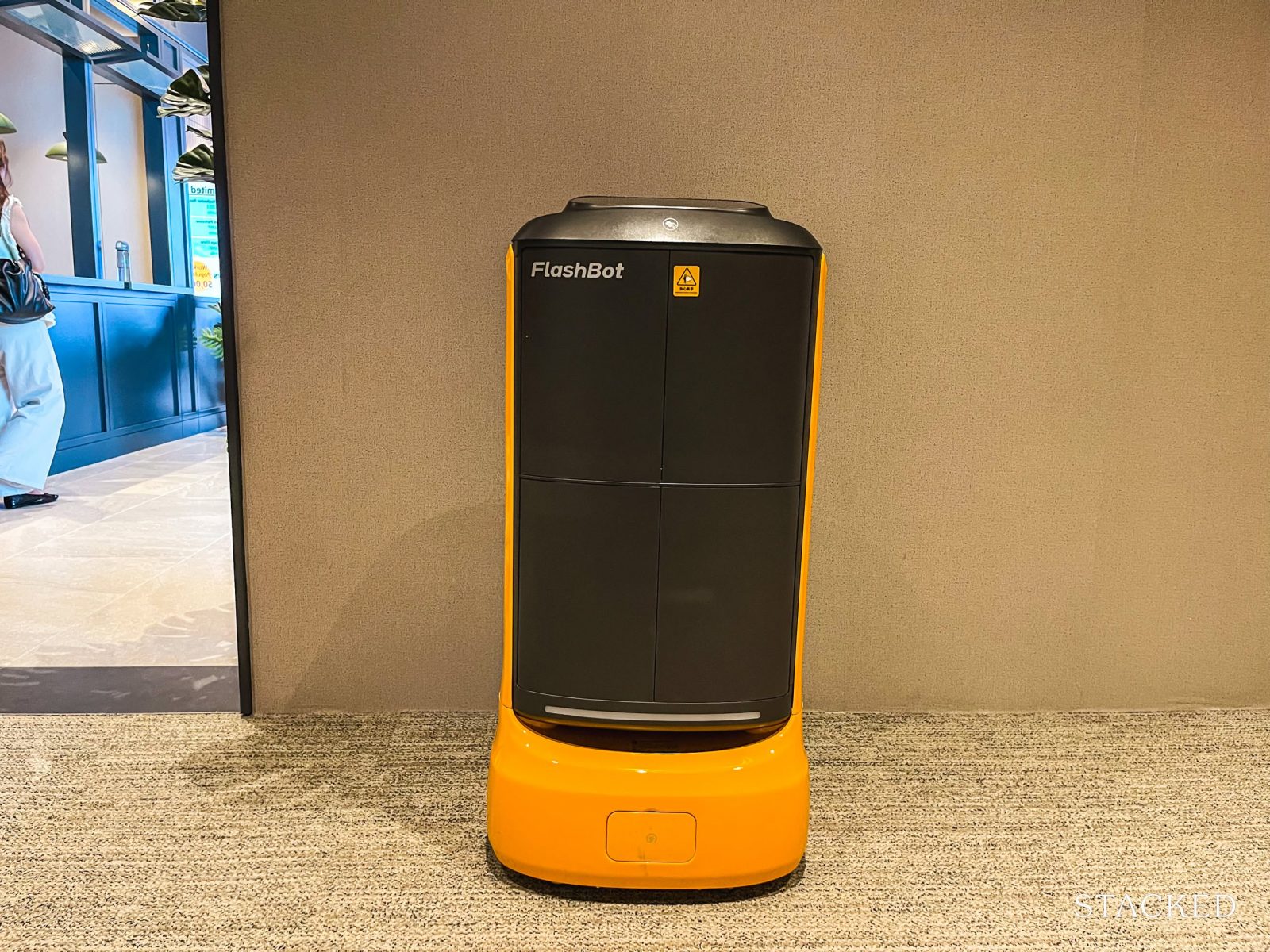
One of the proposed delivery robots on display at the Bloomsbury showflat
This includes cleaning robots and delivery robots designed to transport parcels directly to residents’ doorsteps—offering a more private and modern alternative to traditional collection points.
While it remains to be seen how much these features will impact daily convenience or long-term maintenance but if it gets implemented well, we will likely see more smaller developments adopt this soon.
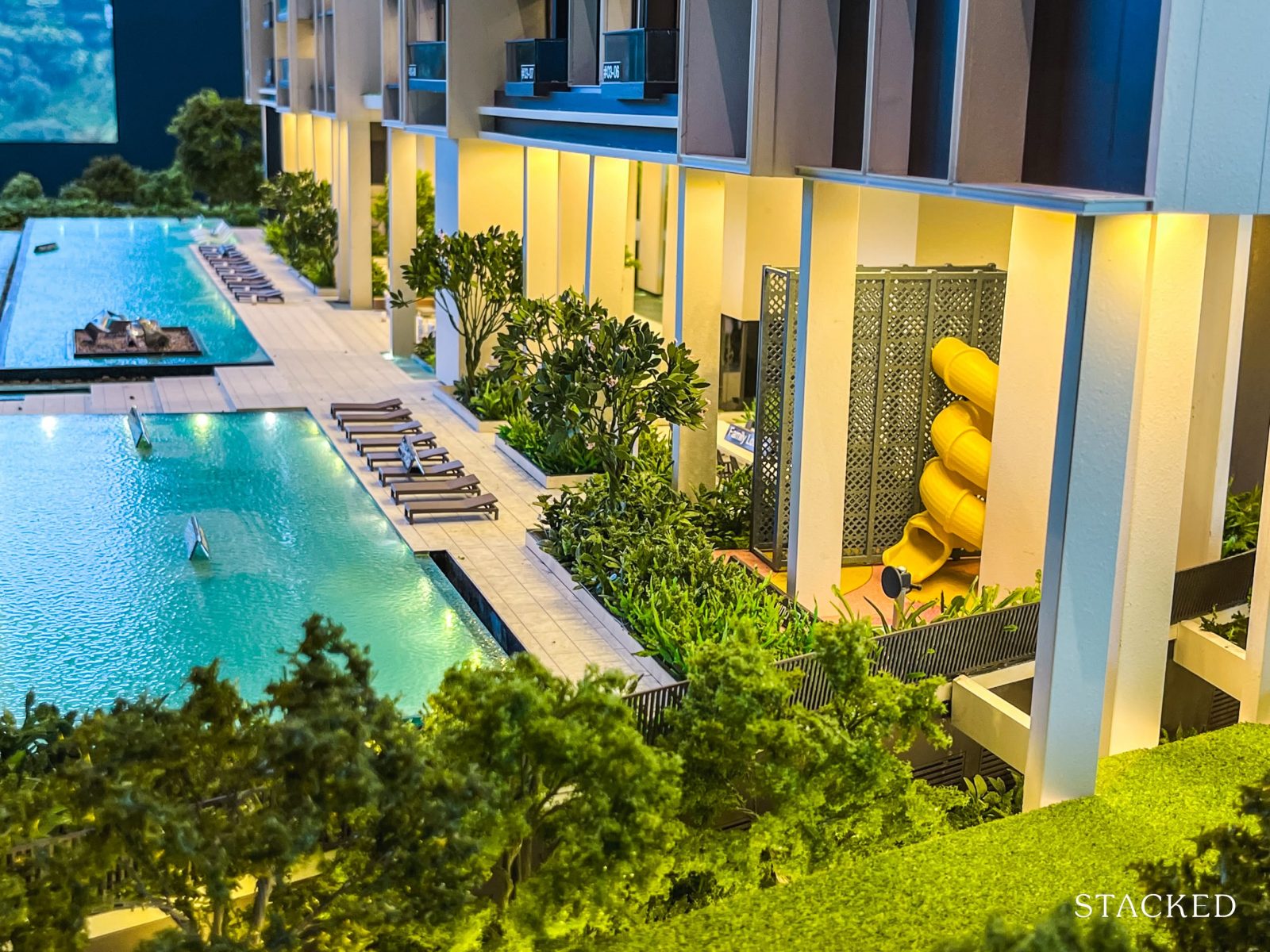
The kids’ play area may be simple, but its sheltered location is a thoughtful touch—especially for parents who want the option of outdoor play regardless of weather. It’s a small convenience that adds up over time.
There’s also a nearby family lounge, offering a comfortable spot for parents to rest while keeping an eye on their kids.
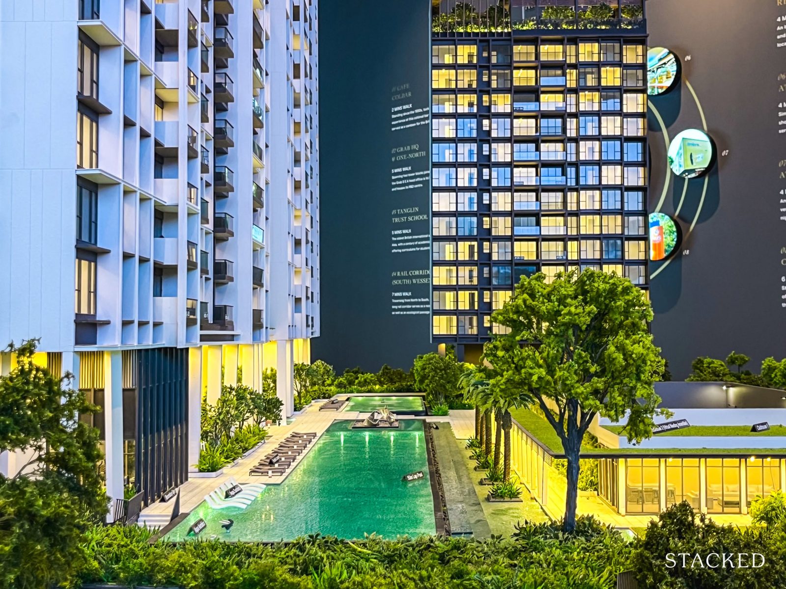
Moving on to the pools—visually, they act as the main separator between the taller residential blocks and the sole point block. Bloomsbury Residences offers three pools: a 50m lap pool, a kids’ pool, and a smaller social pool. For a 358-unit project, having three separate pools is generous by today’s standards.
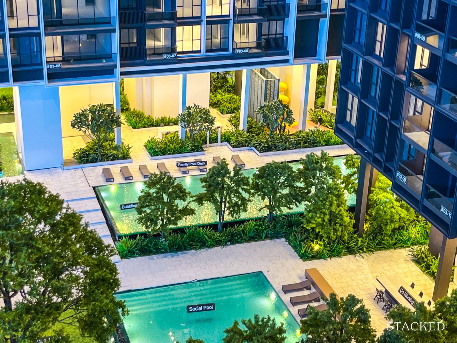
Serious swimmers can head to the lap pool, families can enjoy the kids’ pool, while those after a relaxing dip can unwind in the social pool.
The continuous landscaping around the pool area enhances the openness of the communal spaces. And because it’s positioned in such a visible part of the development, it also offers a pleasant view—whether you’re enjoying it from your unit’s balcony, the gym, or one of the lounge areas.
All three pools are flanked by rows of sun loungers on one side, with landscaping and trees running parallel on the other—balancing leisure and greenery.
As part of the development’s emphasis on open and flexible spaces, you’ll also find open-air co-working zones situated near the social pool.
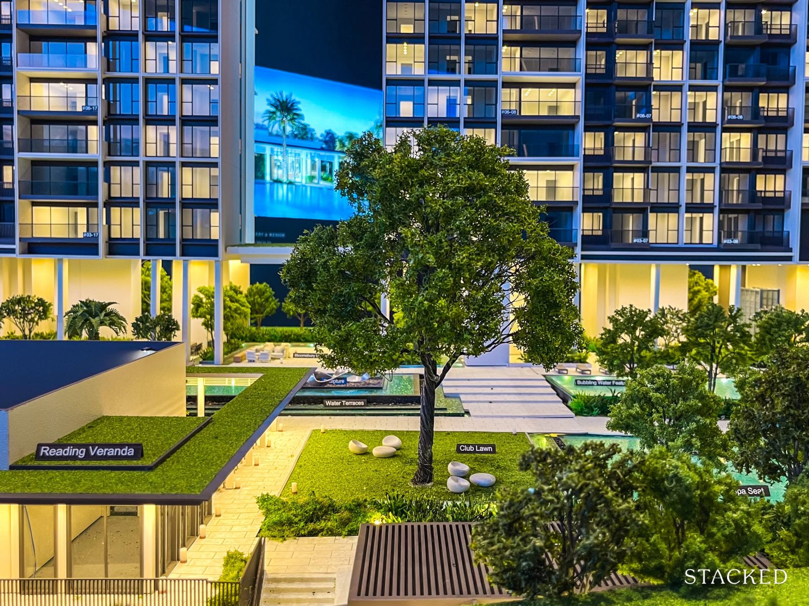
General landscaping in Bloomsbury Residences
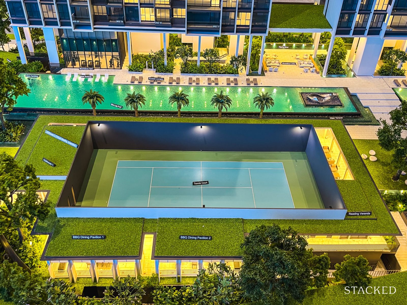
While a tennis court might seem standard fare to most, more observant buyers will realise that Bloomsbury Residences is actually the only development in the One-North area to feature one.
It’s positioned right beside the 50m lap pool, and at first glance, some might have assumed that it was a sunken court—but it’s simply enclosed within a perimeter fence.
Staying in line with the project’s smart-city theme, the court also comes with a ball-retrieving robot. So, the least enjoyable part of the game—chasing after stray balls—might soon be a thing of the past.
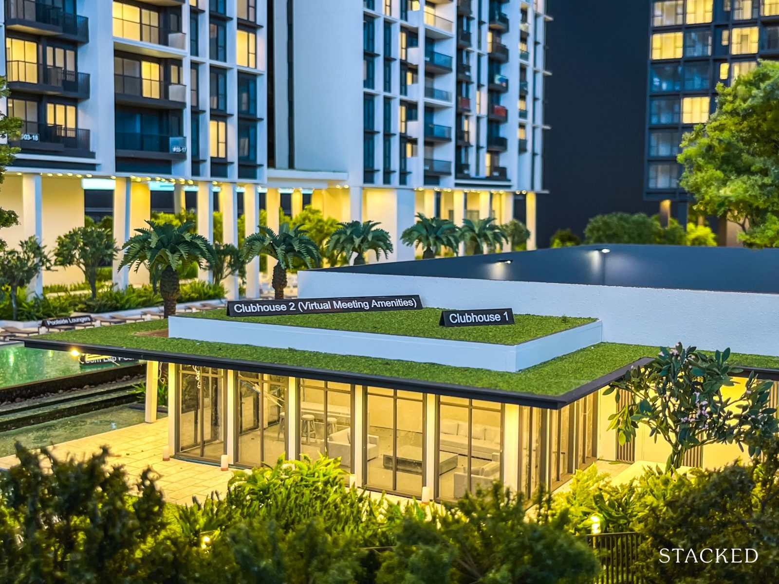
The enclosed design of the tennis court starts to make more sense when you realise it sits right next to two clubhouses—one of which has been purposefully designed to support virtual meetings. Very on-brand for a tech-focused, future-ready development.
Having two clubhouses in a project of this size is generous by today’s standards, especially when you consider that much larger developments—like the 777-unit The Orie—offer a similar count.
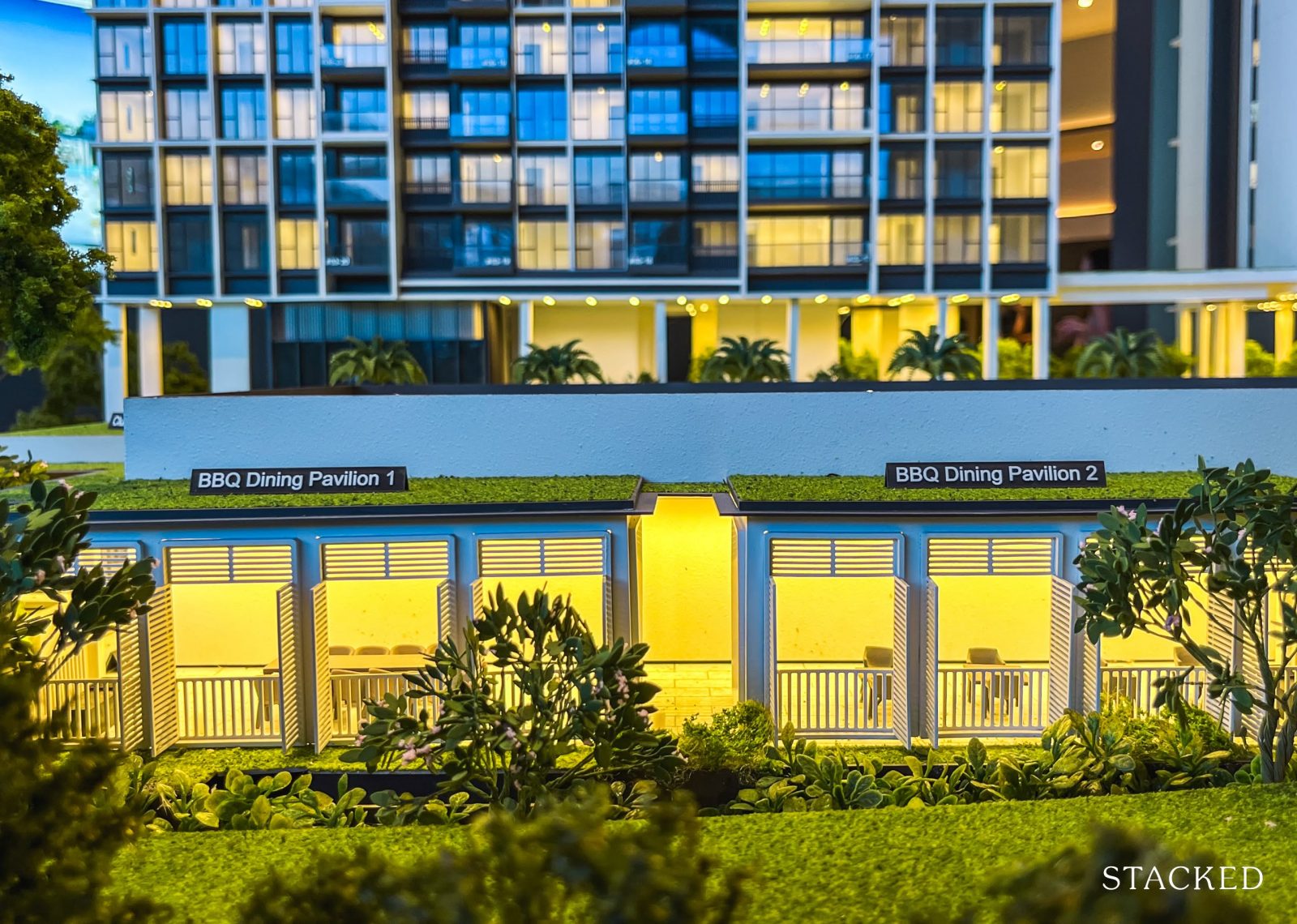
As the saying goes—good things come in pairs. Bloomsbury Residences offers two BBQ dining pavilions, which, like the clubhouses, is generous by today’s standards for a project of this size.
Here, you’ll also notice the use of louvred windows—a design element inspired by the nearby black-and-white bungalows of the Wessex estate. Given that the pavilions overlook Under der Linden café (a popular spot and entry point into the Wessex area), the architectural nod feels intentional and well-placed.
To fully capitalise on the unblocked views, Blocks 61 and 65 will feature rooftop facilities—an added bonus for residents on lower floors, who’ll still have access to the same panoramic outlook. It’s also worth noting that rooftop amenities typically come at an additional cost to the developer, which makes this inclusion a thoughtful gesture.
Although not shown specifically in the photos, the Roof Gardens will include communal features such as a Sky Lounge, Sky Dining area, and other understated additions designed to let residents make the most of the views.
Block 63, being the lower of the three, does not come with rooftop access.
You would also note that the highest floors of each block is catered to the penthouse units – which explains the higher ceilings.
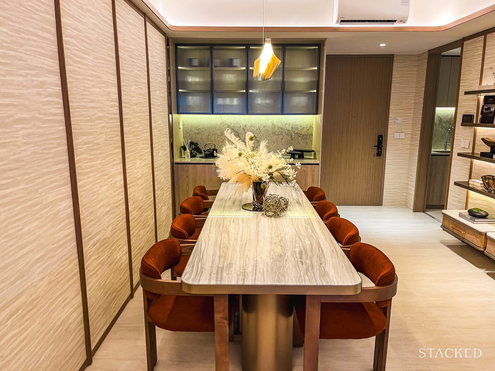
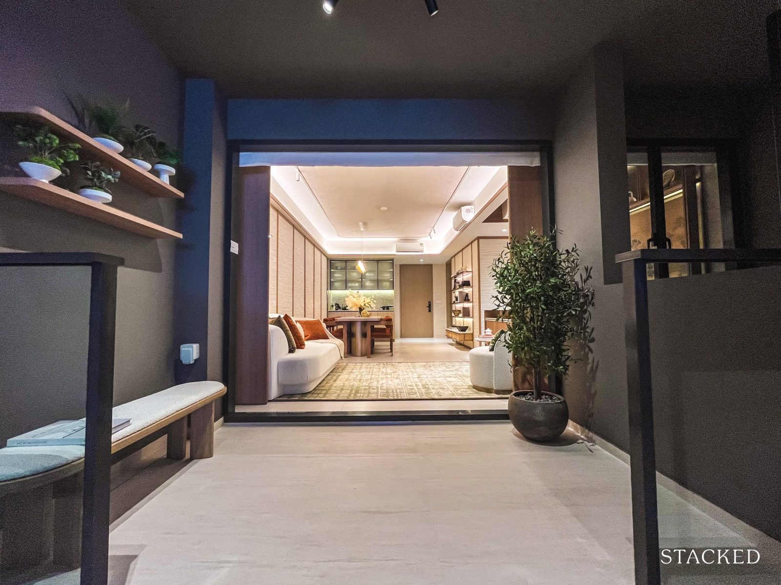
With that, let’s take a closer look at the showflat units.
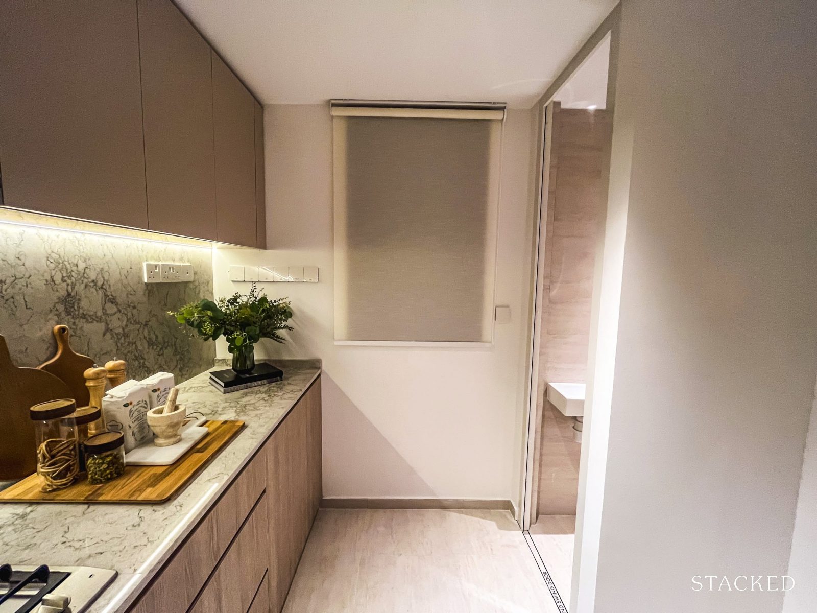
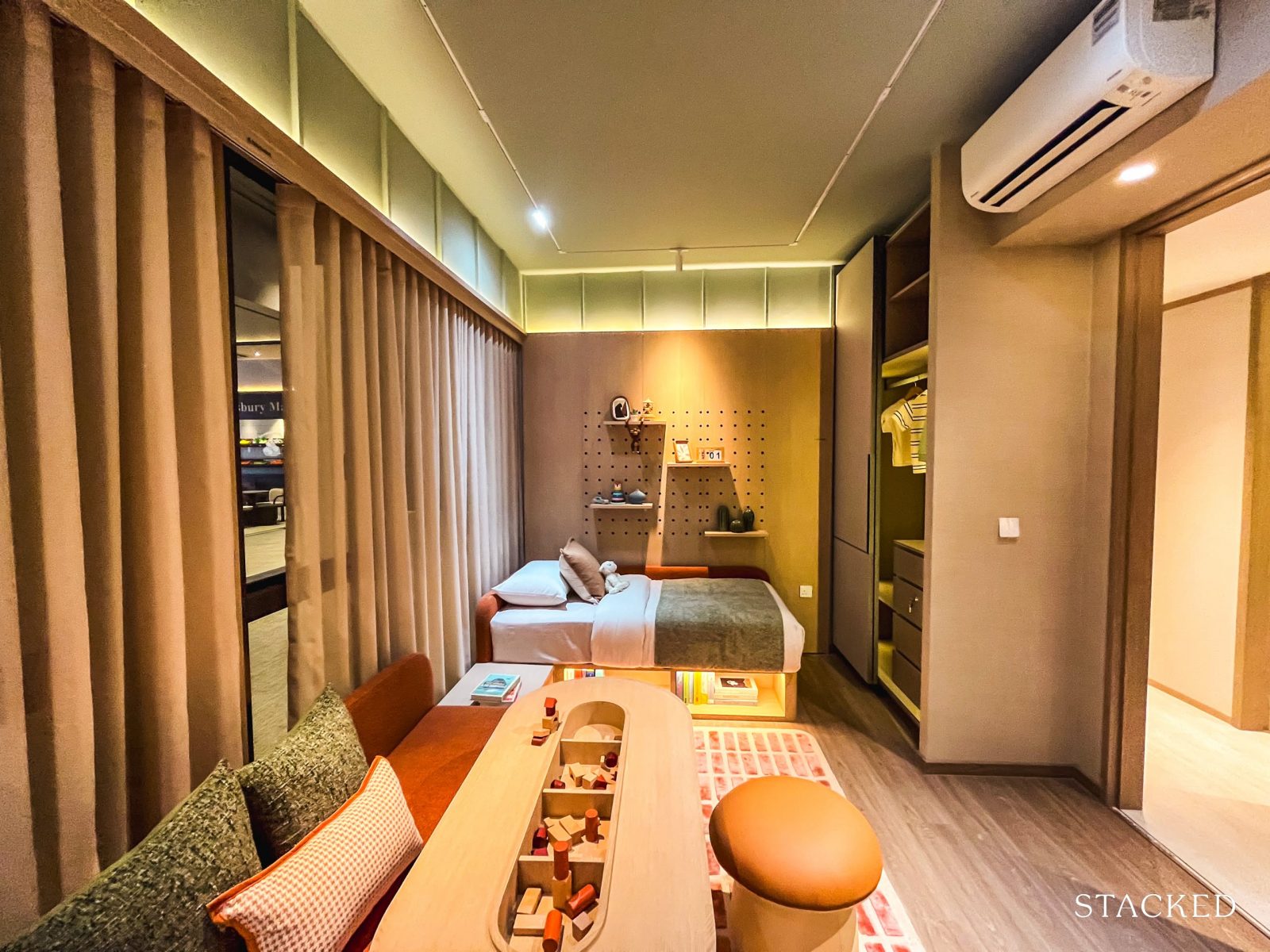
Bloomsbury Residences – 2 Bedroom Premium + Study Type B4 (64 sqm/ 689 sq ft) Review
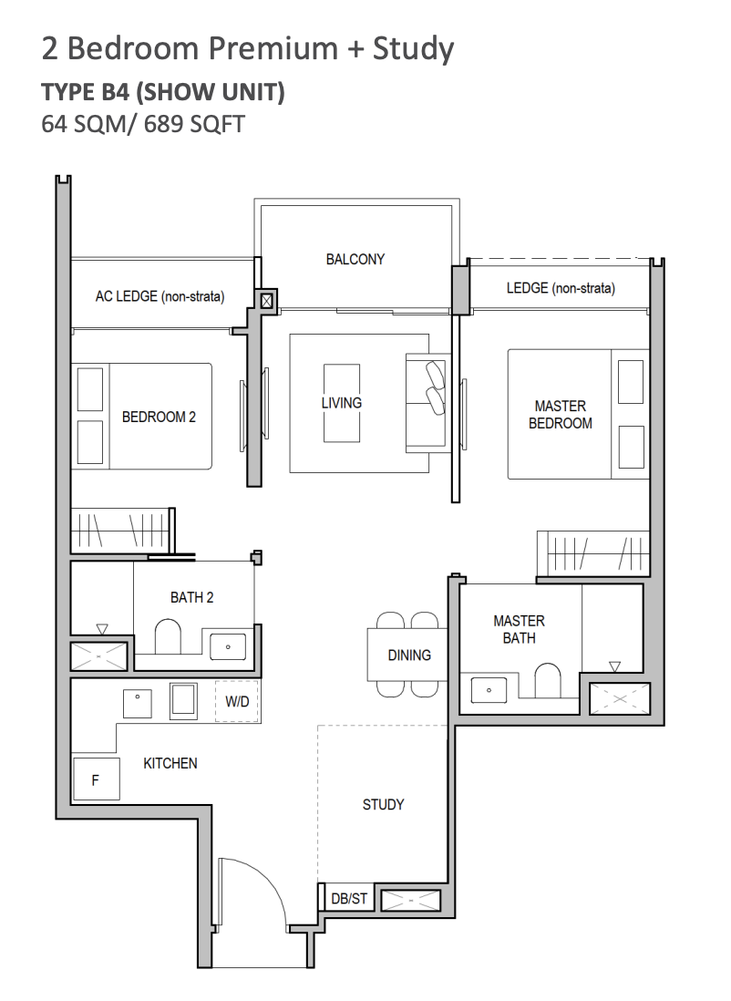
Bloomsbury Residences offers a total of 190 2-bedroom units, making up 53 per cent of the entire unit mix—clearly the most common configuration in the project.
At first glance, this might seem like a standard developer strategy to cater to investors and the rental market, which makes sense given the neighbourhood’s usage and demographics.
However, a closer look at the breakdown tells a slightly different story.
Out of the 2-bedders, only 20 per cent of the 2-bedders fall under the entry-level compact units (sized at 571sq ft). The majority are made up of the more spacious 2-Bedroom Premium (ranging from 635 to 678 sq ft) and 2-Bedroom Premium + Study (689 sq ft) types.
This suggests a wider target audience. With smaller families increasingly open to using 2-bedders as starter homes—especially as they’re often priced out of 3-bedroom options—it seems the developers have intentionally kept entry prices palatable for this group, rather than focusing solely on investors.
The showflat features a 689 sq ft 2-Bedroom Premium + Study unit, demonstrating how shifting layout trends have made such configurations more liveable than many might expect. For context, Blossoms by the Park’s entry-level 2-bedder starts at 678 sq ft, while The Hill @ One-North’s begins at 732 sq ft.
Given that Bloomsbury Residences is the only post-GFA harmonisation project among the three, this layout and size should feel noticeably more efficient.
We’re also told that the units here use an “Advanced Precast” construction method, and feature Qingjian’s signature Cospace design—known for its hackable walls and layout flexibility. In this particular unit, the hackable wall is the one separating the living area from the master bedroom, allowing for some degree of customisation.
As for ceiling height, details haven’t been finalised at the time of writing, but it’s expected to fall between 2.85m and 2.9m.
Considering the current standard for new launches hovers around 2.79m, this range is a definite plus. Qingjian, in particular, has a track record of being generous in this regard—with units at The Arden starting from 3.2m. For comparison, the nearby Blossoms by the Park offers a standard 2.8m ceiling.
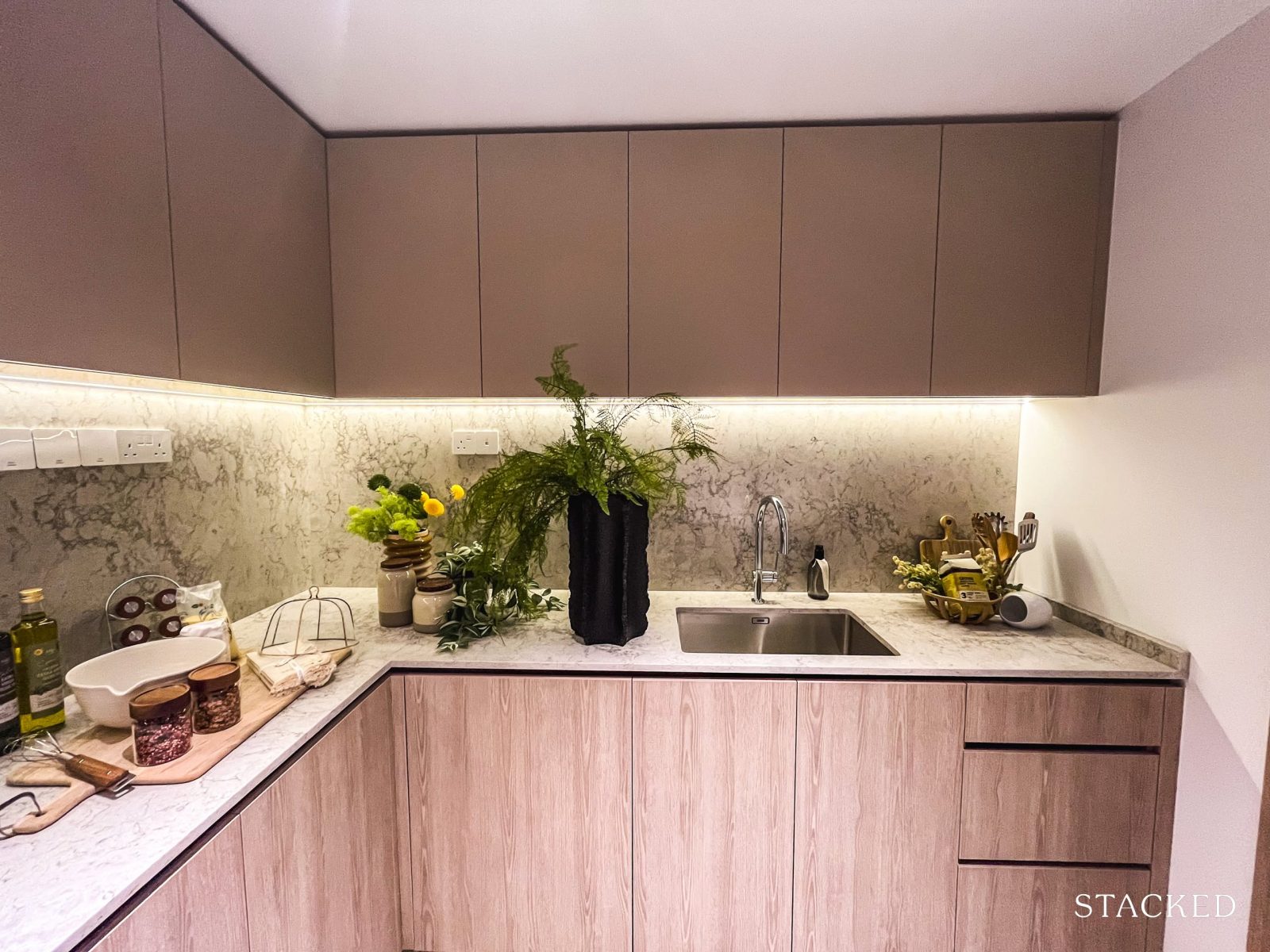
In terms of finishes, the bedrooms come with vinyl flooring, while the common areas are laid with porcelain tiles (though originally intended to mimic the look of travertine). Either way, these choices are consistent with what’s typically seen in new launches today.
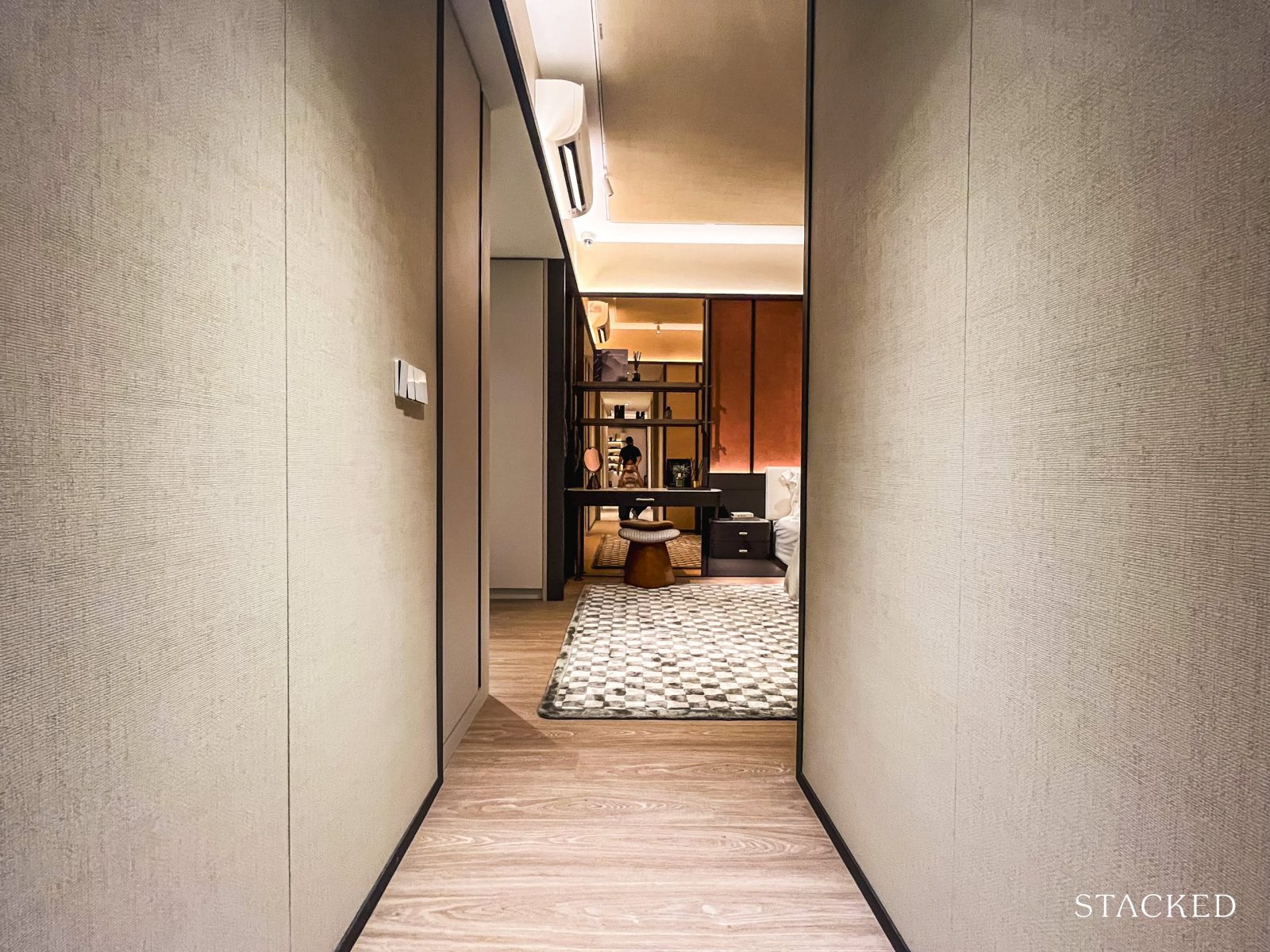
This dumbbell layout omits a foyer entirely—instead, the unit opens directly into a view of the study, kitchen, and main living areas.
While the dumbbell layout is generally well-liked for its space efficiency and functional separation of bedrooms, the presence (or absence) of a foyer tends to divide opinions.
On one hand, a foyer can offer a greater sense of privacy—shielding the living space from immediate view when the door is opened. But in more compact layouts, omitting it often makes better use of space.
Here, the lack of a foyer means you get a full view of the living area upon entry—a practical decision, though it may not be for everyone.
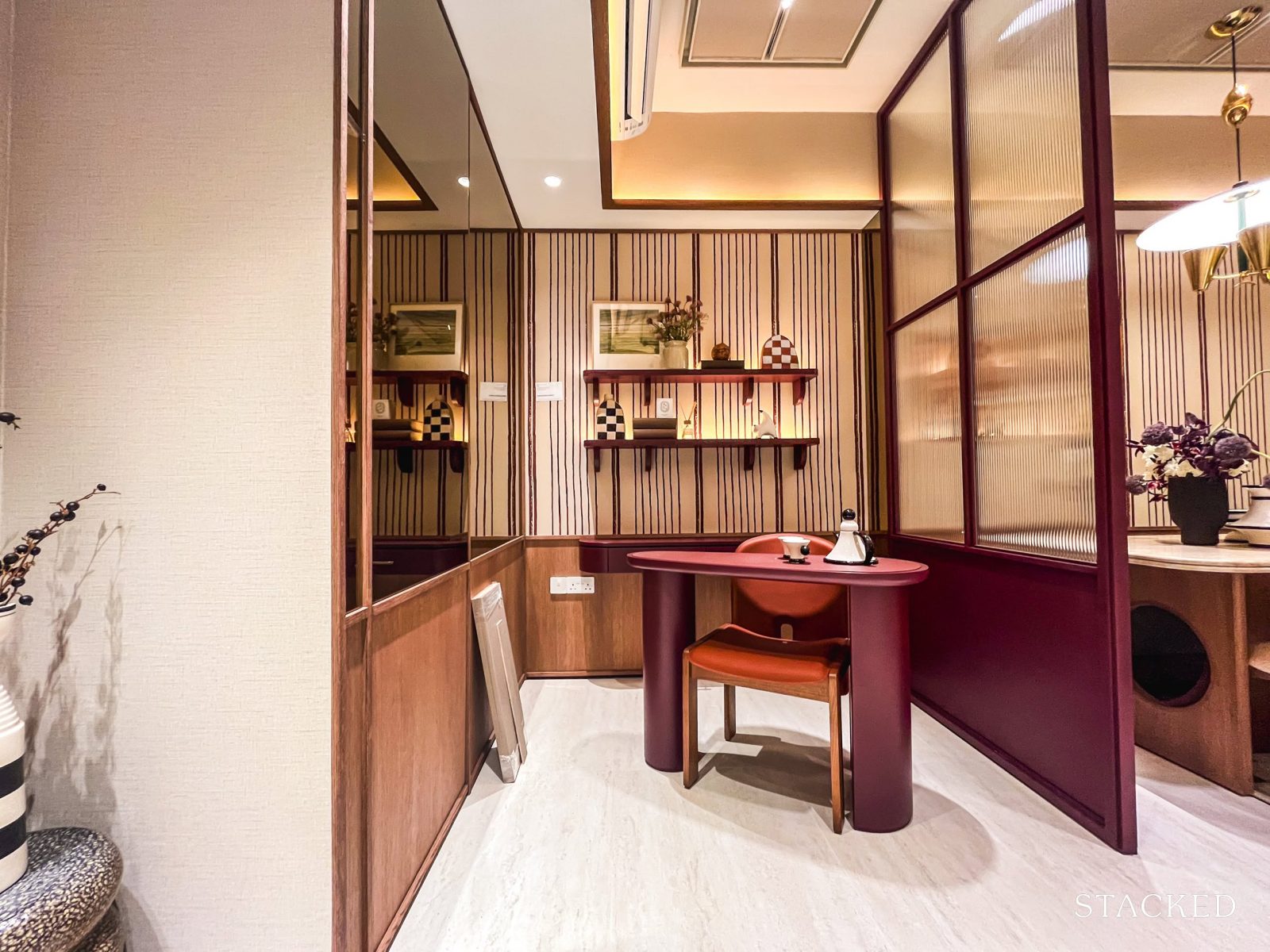
To the side, you’ll find the study area—which, by default, is part of an open space. In the showflat, it’s lightly sectioned off with a fluted glass screen, but that’s just an ID touch. The flexibility here is key: you could fully enclose it if you need privacy, or keep it open to flow with the living area. The latter works especially well if you value a more expansive feel in a compact unit.
Some might even appreciate the in-between solution shown here—a partial partition that gives the space some definition without making it feel boxed in.
It’s no secret that 2-bedders often get flak for having tight living areas. But with layouts like this, we can see how they’re becoming more liveable—especially for smaller families.
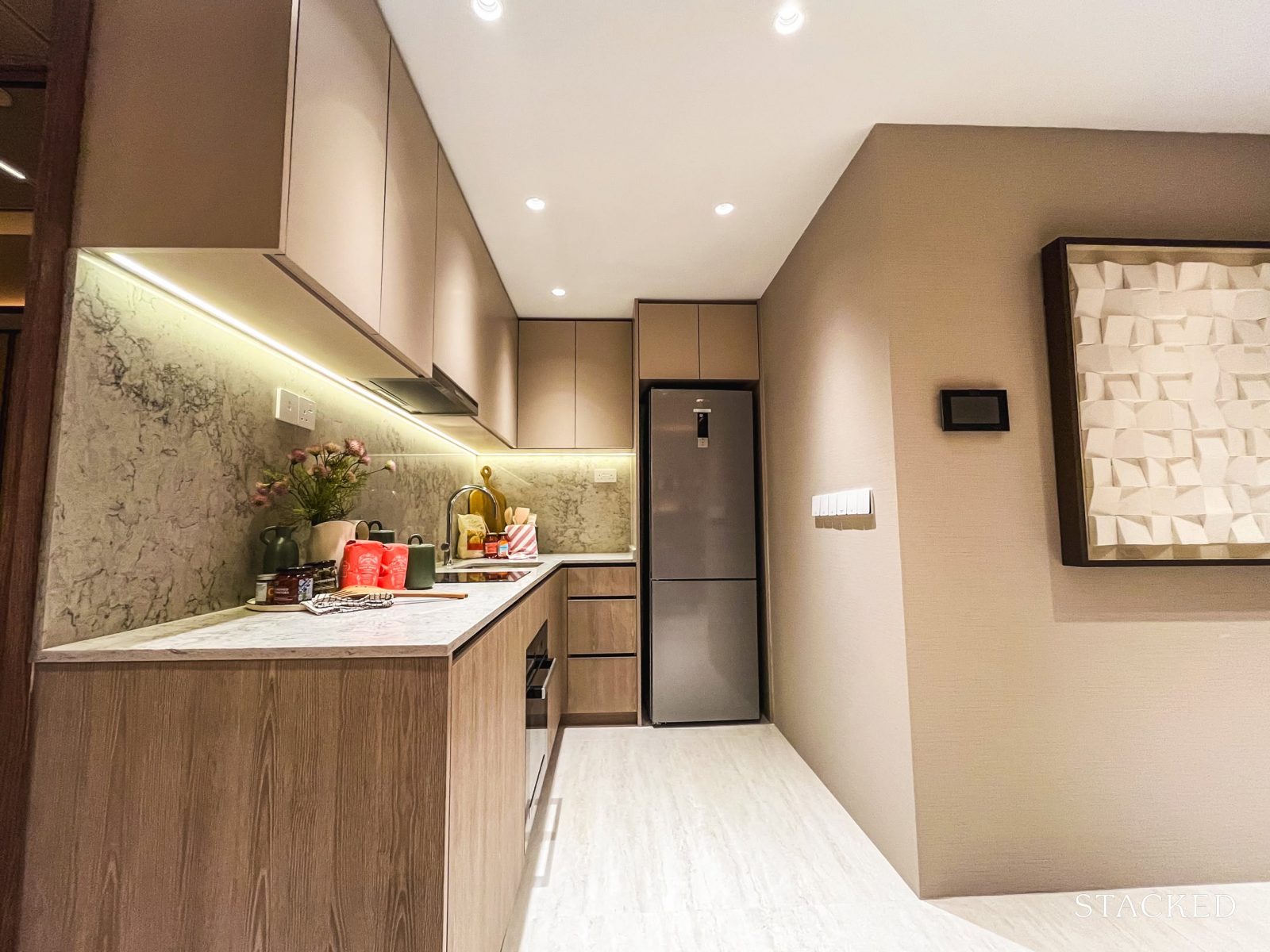
On the other side is the kitchen nook. In recent launches, we’ve seen a growing preference for U-shaped kitchens—largely because they offer more flexibility. They’re easier to enclose, provide additional wall space for storage, and are generally more efficient for day-to-day use.
From an own-stay perspective, as more families lean towards home-cooking, buyers are starting to move away from the typical open-concept kitchen layouts for these very reasons.
Here, the U-shaped layout checks those boxes—something that will likely appeal to buyers who prioritise a functional kitchen space.
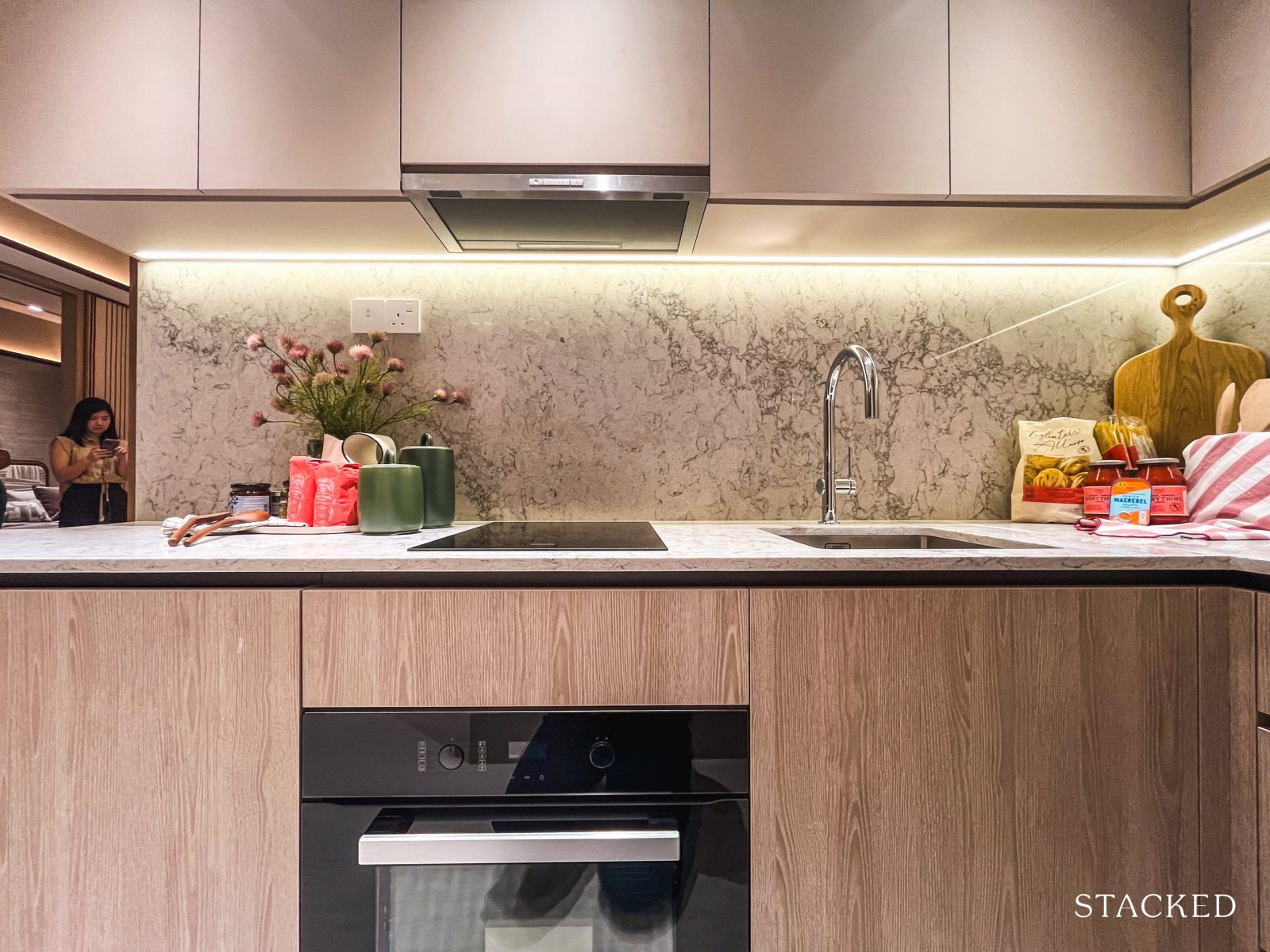
All 2-bedroom units come equipped with a 2-burner Miele induction hob, along with a built-in convection oven and cooker hood—also from Miele. It’s fairly standard for 2-bedders to exclude gas hobs, so this setup comes as no surprise.
The layout here is practical, with the sink and hob placed along one side, and ample counter space at the adjacent wing for food prep. Over in the corner, you’ll find a freestanding SMEG fridge, as well as a SMEG combi washer-dryer.
Given the choice of higher-end appliances, it’s clear the developers are targeting buyers who are planning to live in their units, not just rent them out.
For easy upkeep, the kitchen surfaces—including the countertop and backsplash—are finished in quartz. Storage is well catered for, with cabinetry, drawers, and under-cabinet lighting all provided.
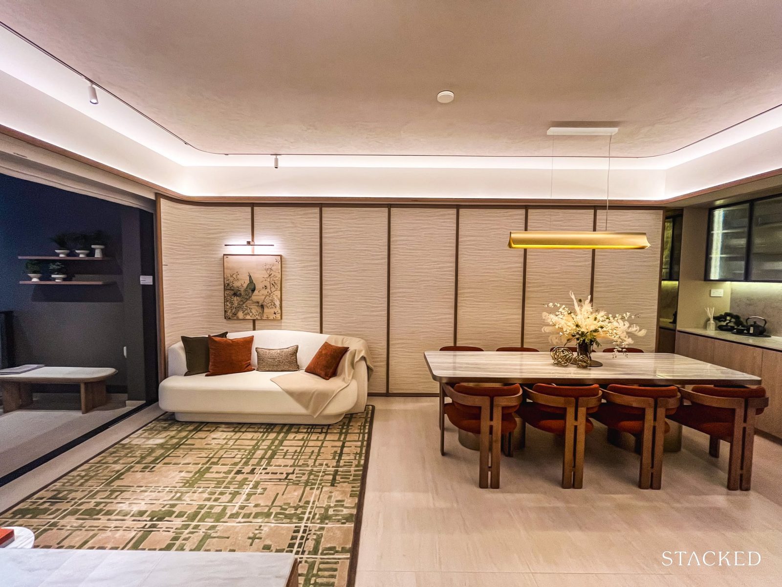
This was where the layout really surprised me—especially in terms of size and overall liveability.
In many 2-bedroom units across other projects, a common complaint among buyers is that the dining area barely fits a proper table, often feeling like an afterthought.
But in this case, the space comfortably accommodates a six-seater dining set (granted, with booth seating flushed against the wall for better space efficiency).
It’s a strong example of how post-GFA harmonisation can make a tangible difference. The layout feels noticeably more liveable than what we’re used to seeing in similar unit types.
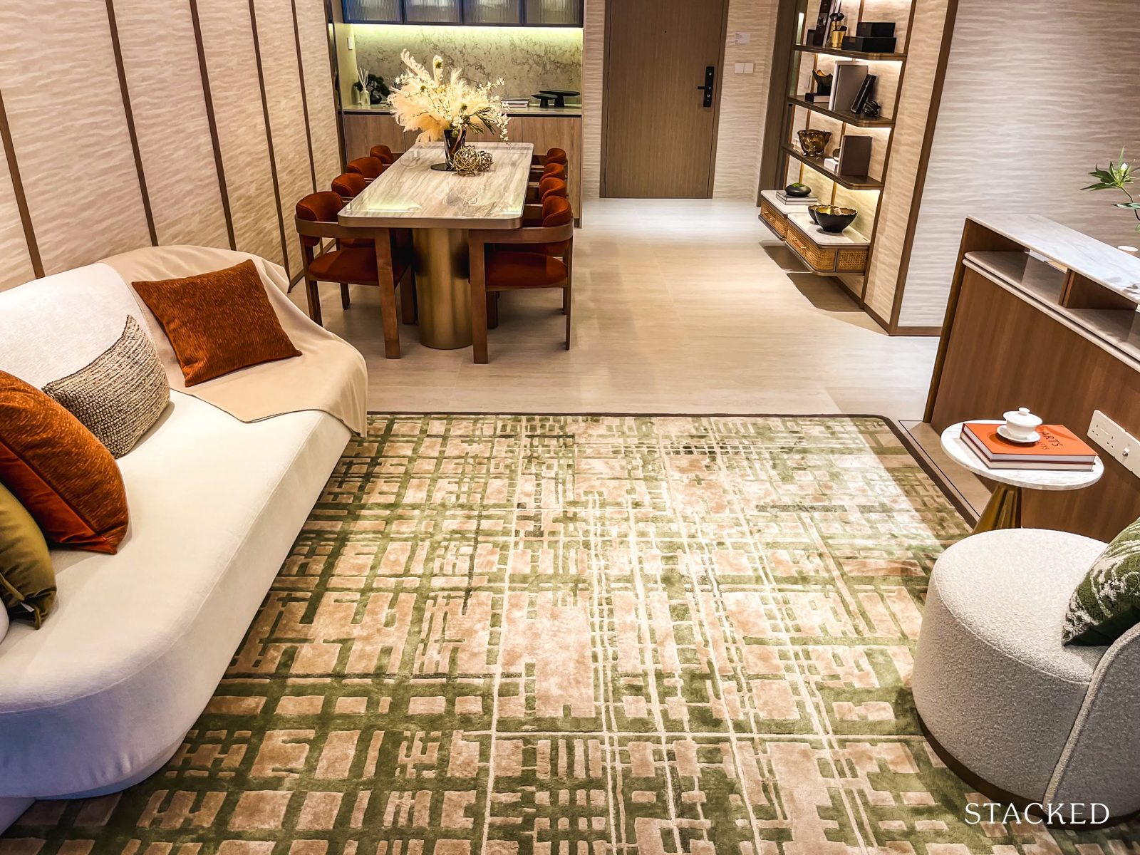
There’s still room to move around, and the living space doesn’t feel cramped. Now, let’s move on to have a look at the main living room.
Here, you can comfortably fit a three-seater sofa—or even a compact four-seater—along with a small coffee table, and still have room to move around. While the frontage of the living area isn’t the widest (which is expected for a 2-bedroom unit), the space has been efficiently planned.
There’s no TV console in the showflat setup, but a compact one would likely fit without issue.
Paired with the dining area, this layout makes a strong case for small families seeking a practical, no-frills, and liveable 2-bedroom home.
And for those curious about actual proportions, the combined living, dining, kitchen, study, and entrance areas add up to approximately 31 sqm.
The living area extends out to the balcony—which, if your unit overlooks the Wessex estate, offers a green and tranquil backdrop to the main living space.
At 4 sqm, the balcony isn’t particularly large, but that might be a plus for those who prefer more internal liveable space.
Still, it’s functional: you could fit a compact four-seater dining set if you’re after an alfresco setup, or leave it open as a breezy, versatile extension of the living room, as shown here.
Now, let’s move to take a look at the bedrooms.
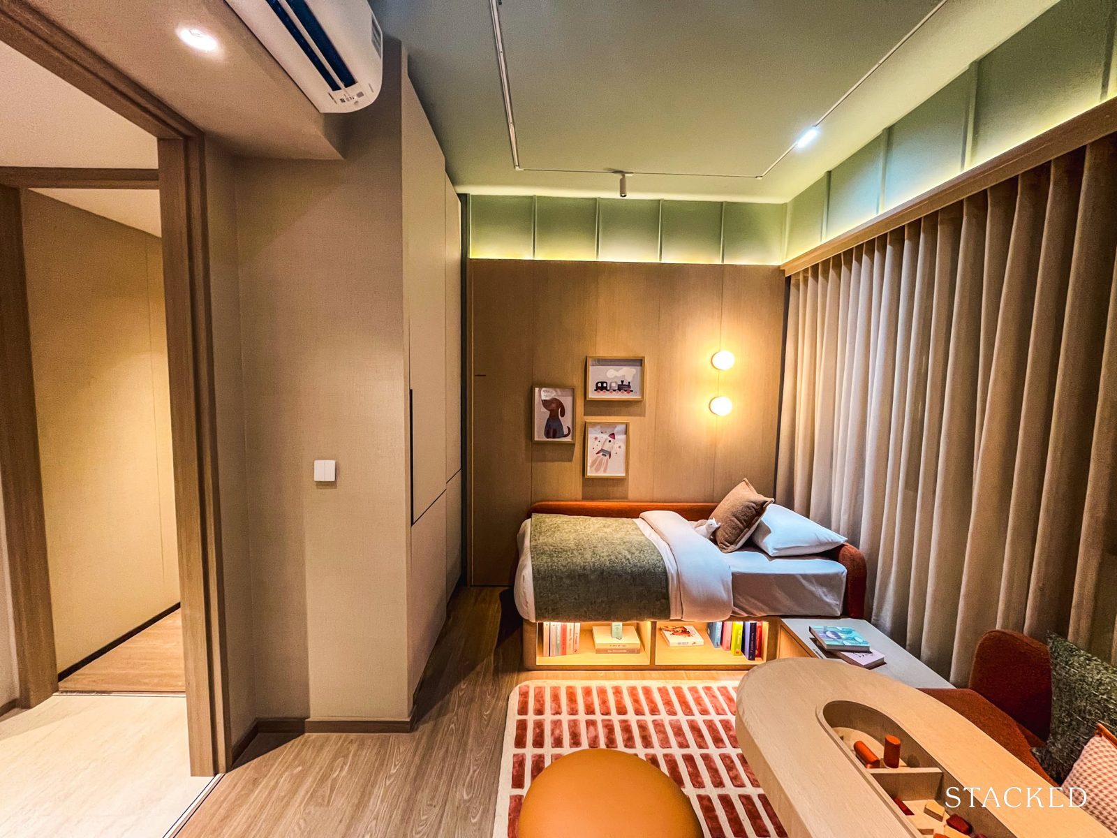
Starting with the common bedroom, it features a Jack-and-Jill setup with the common bathroom—a layout that’s become increasingly common in compact new launch units.
The upside? Both bedrooms effectively function as en-suites, which is a definite plus for flexibility.
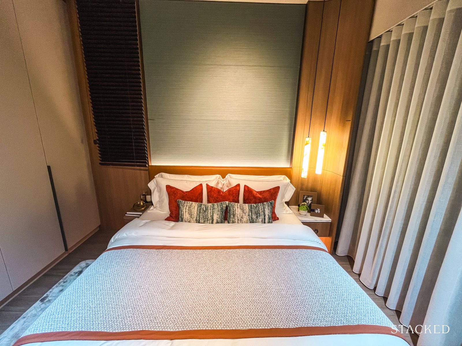
At 9 sqm, the common bedroom is on par with other new launches, and can fit a queen-sized bed, and if pushed all the way to the window, there’s room for a small bedside table alongside the built-in wardrobe.
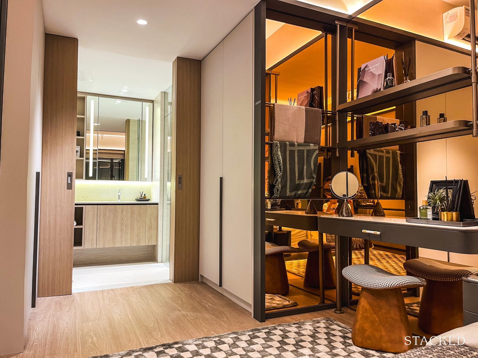
The wardrobe has a Poliform-inspired look—often associated with the luxury tier of fittings—which adds a nice aesthetic touch (even if it’s not the real thing).
However, do note that this bedroom comes with only a half-height window, as it faces the AC ledge (which, as a reminder, is not included in the unit’s square footage due to post-GFA harmonisation guidelines). It is a bit of a drawback in terms of natural light and view, especially if the unit overlooks Wessex.
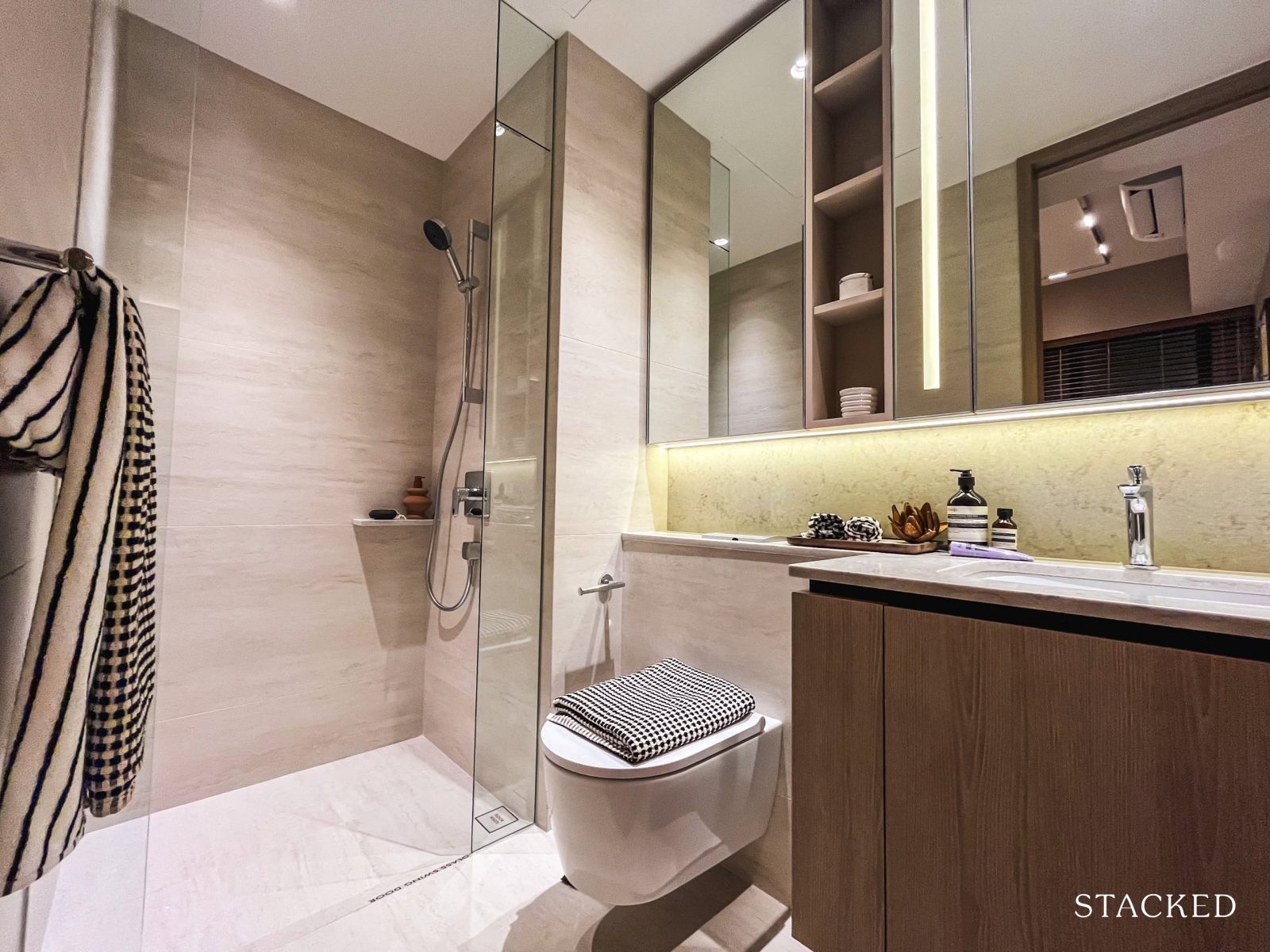
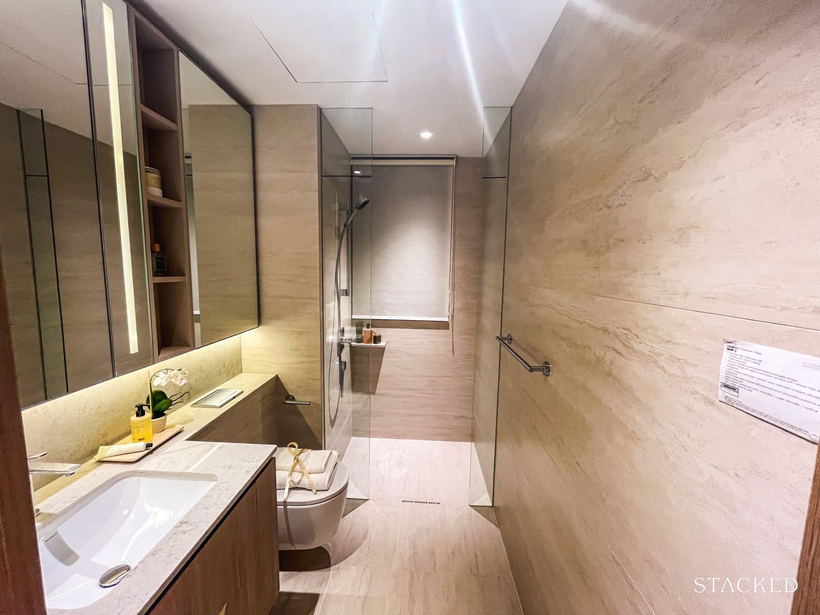
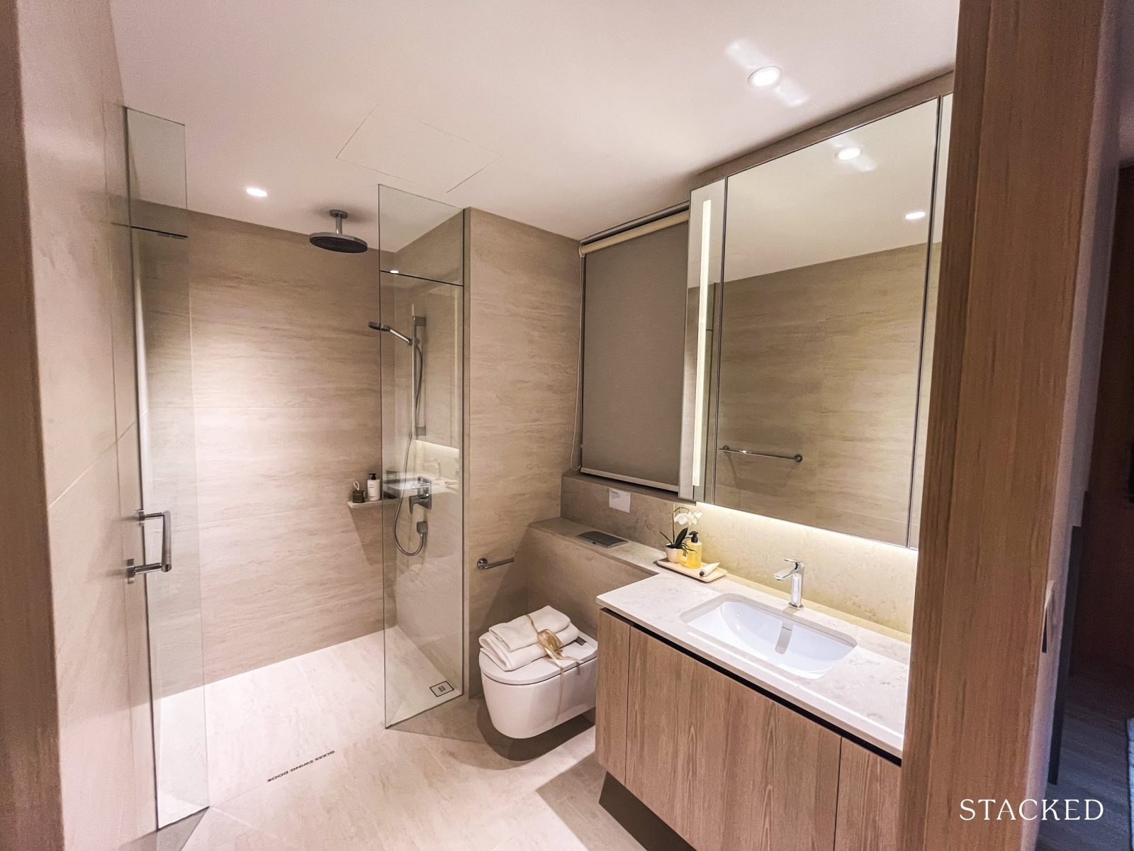
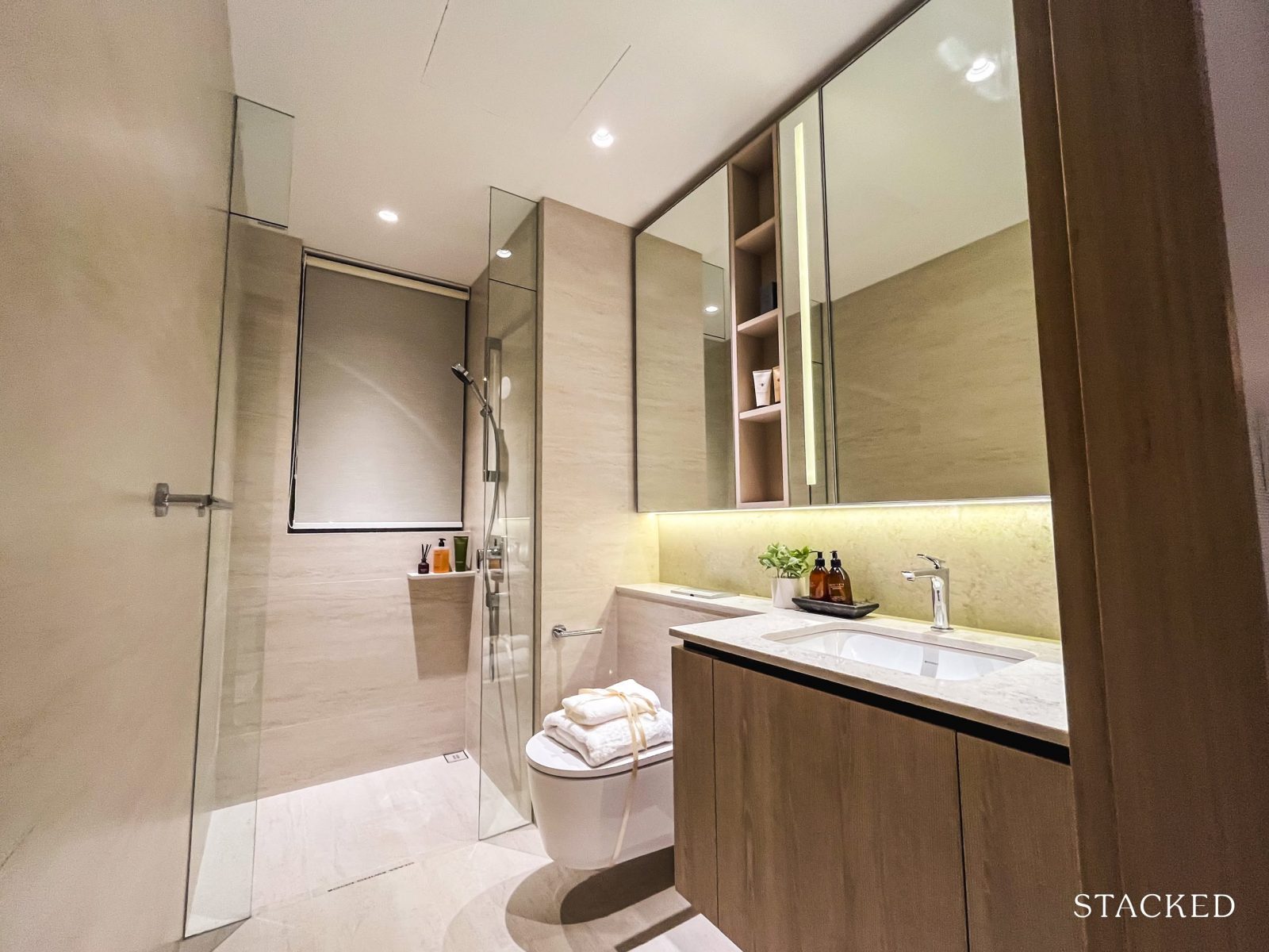
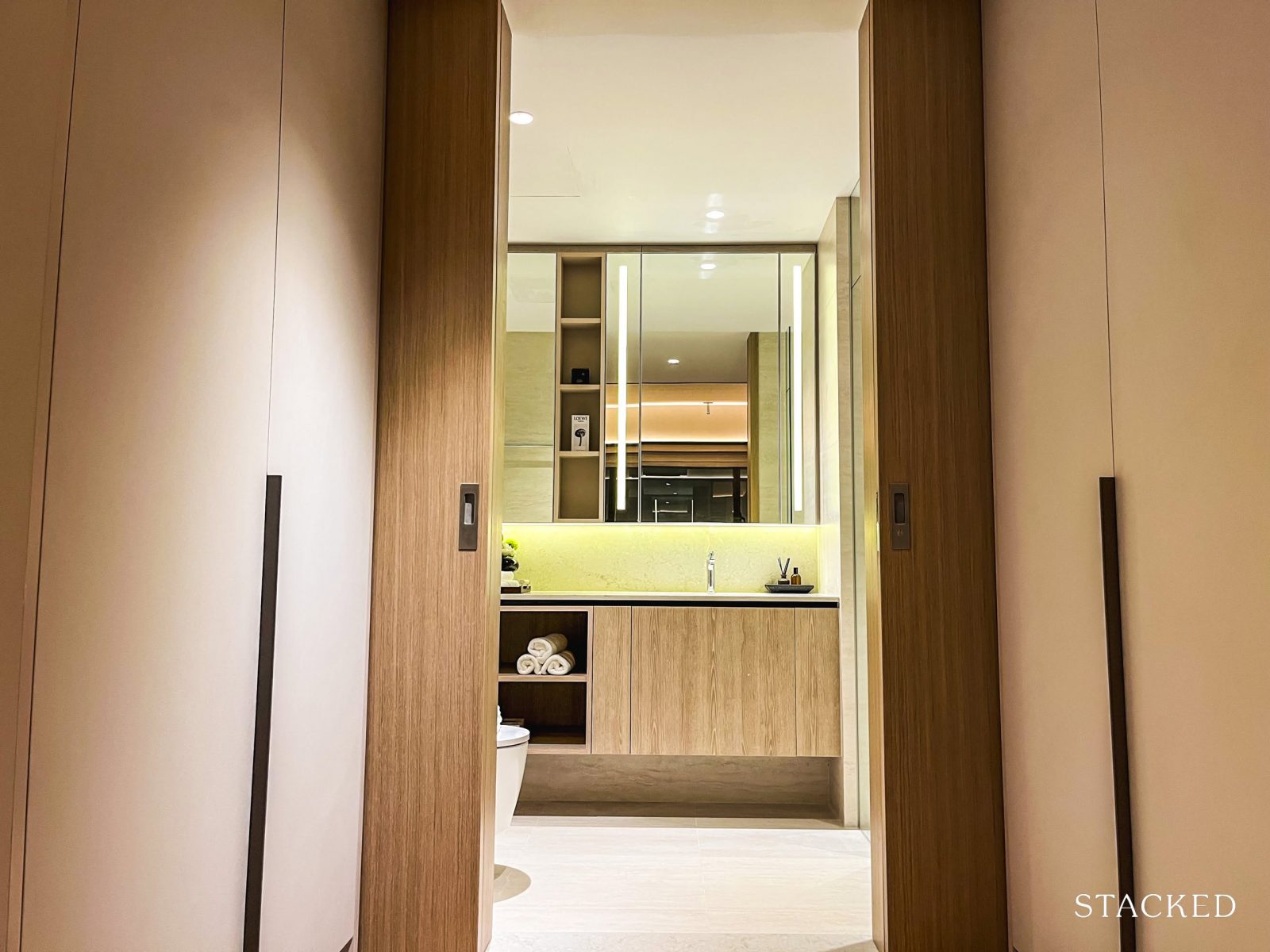
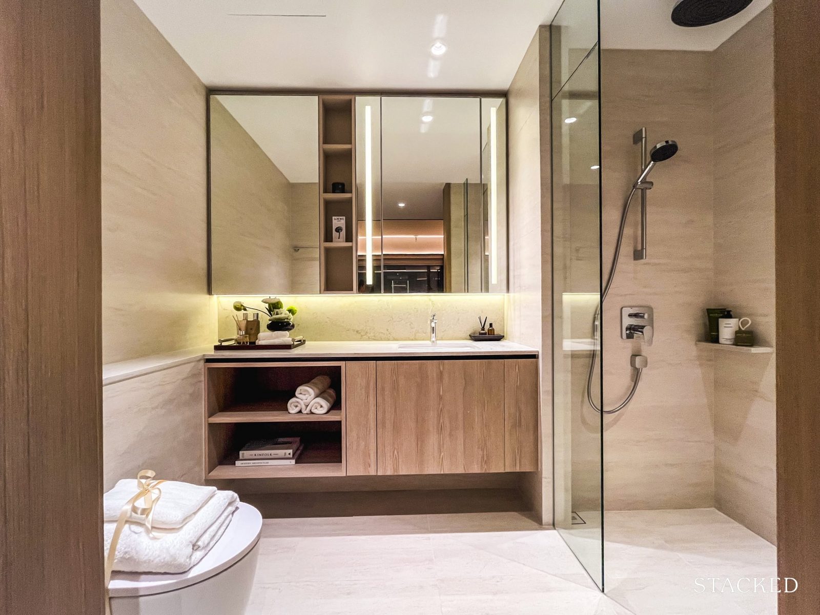
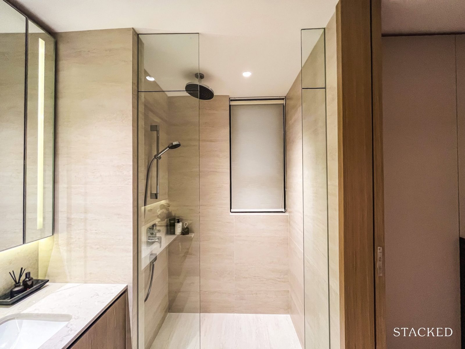
The common bathroom, at 4 sqm, is fairly typical in size for most new launches today. It comes fully fitted with storage cabinets, a basin, and a wall-hung WC from Geberit. The shower and sink mixers are from AXOR—a premium line under Hansgrohe—adding a subtle touch of luxury to the space.
Notably, there are no windows here, so the bathroom would have to rely on mechanical ventilation.
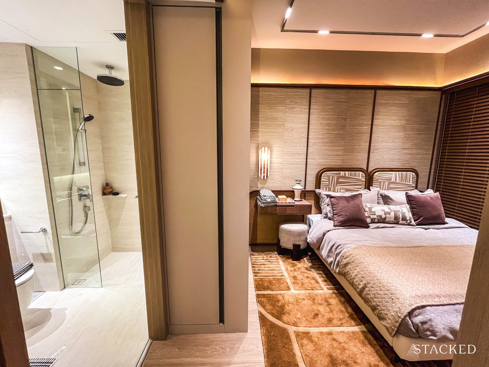
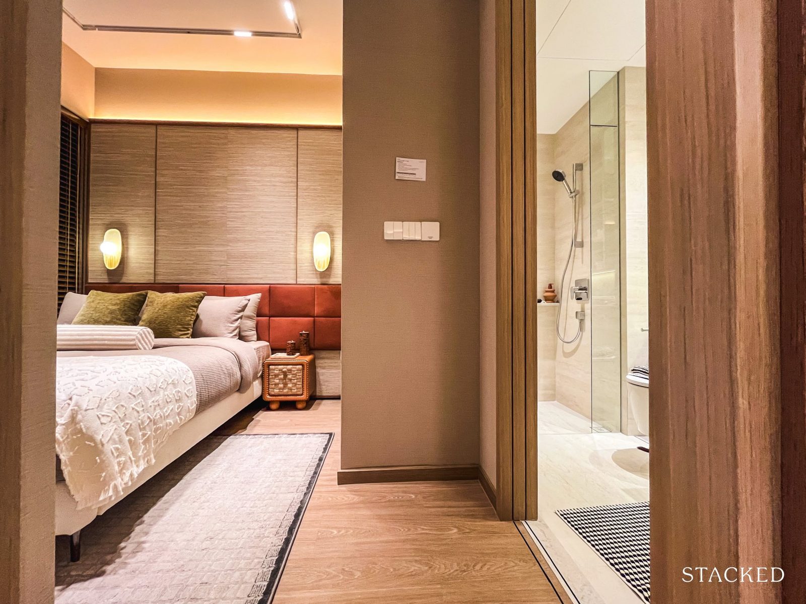
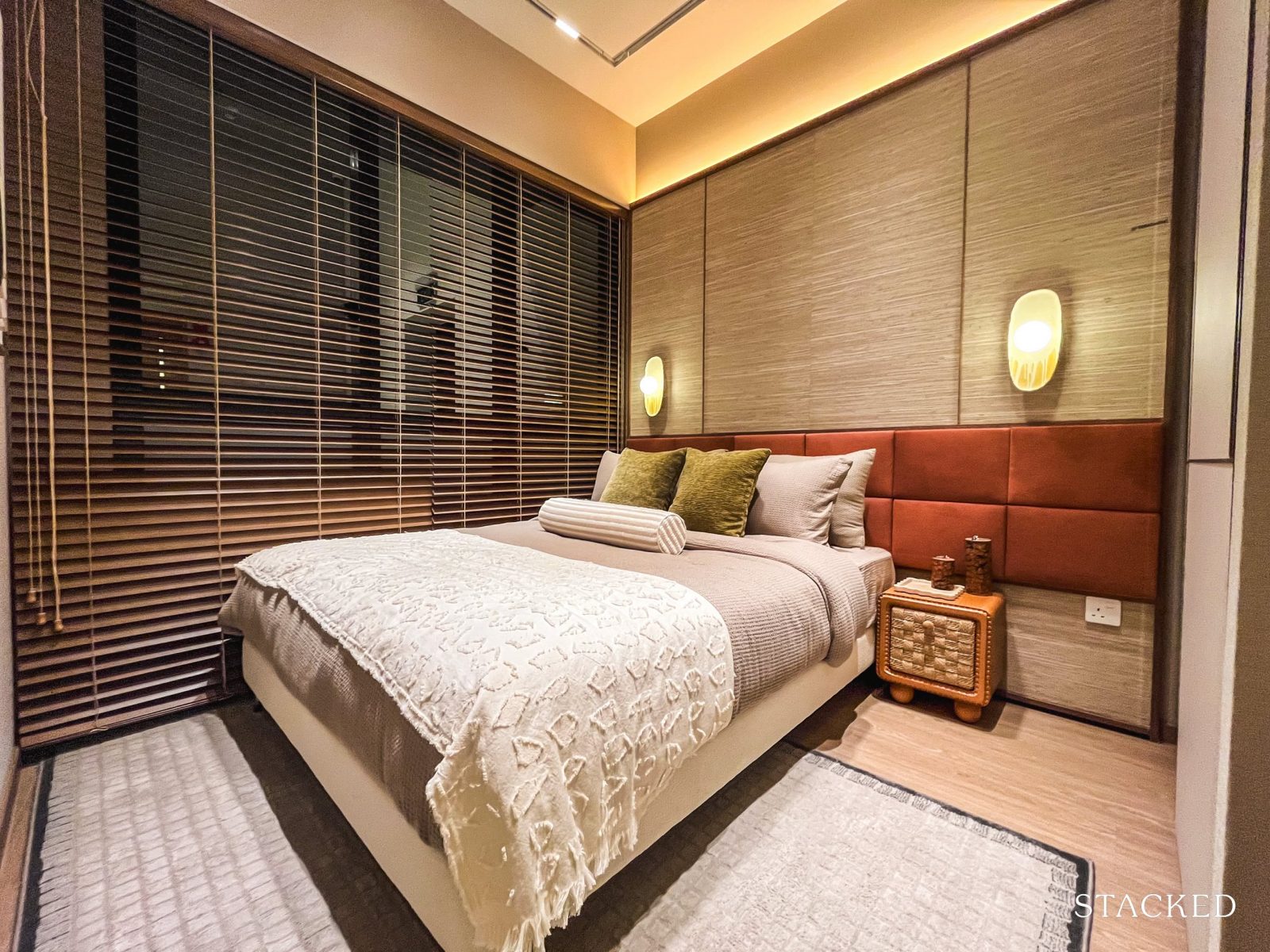
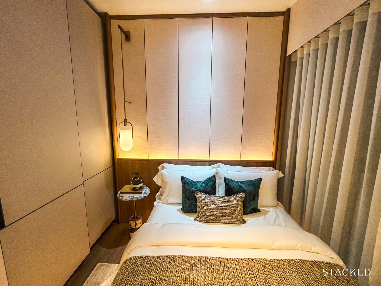
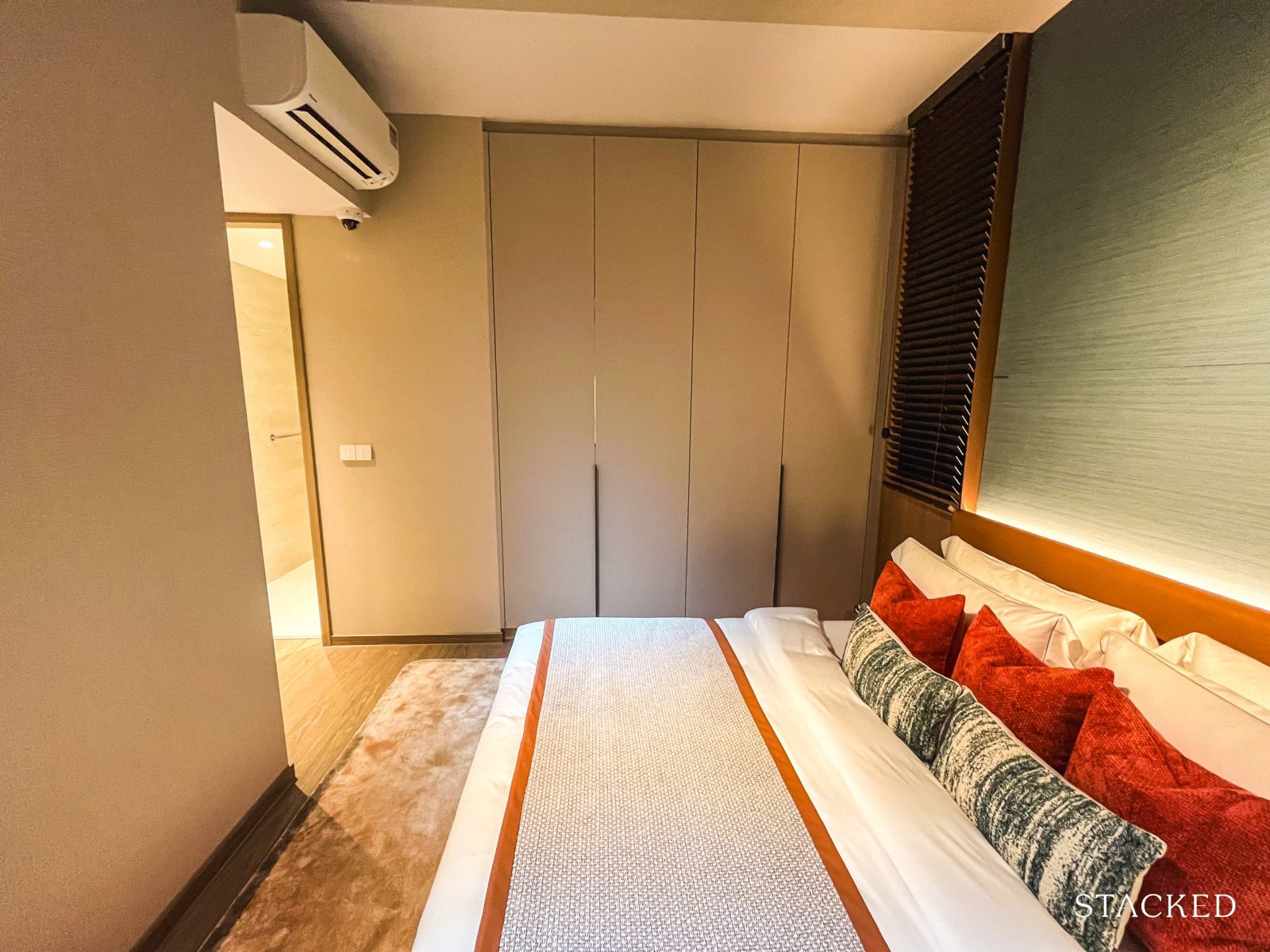
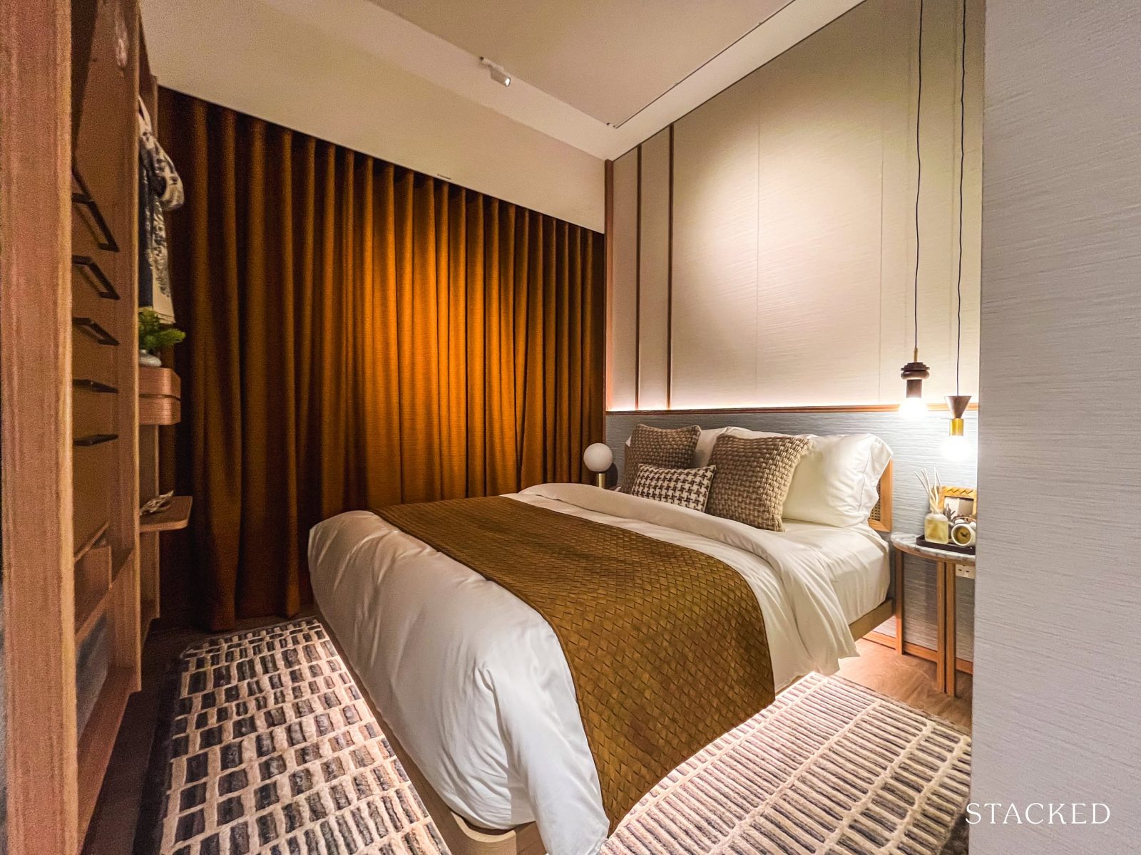
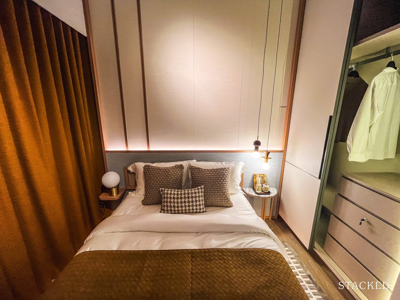
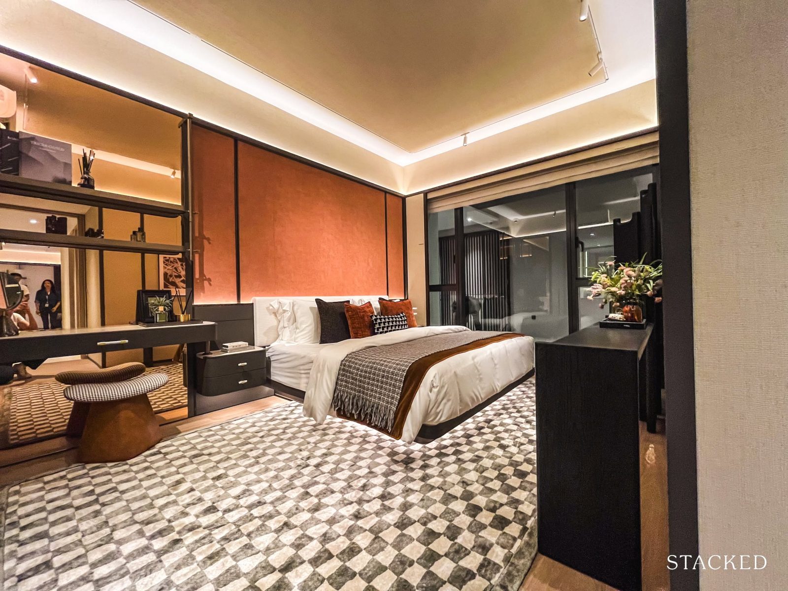
Let’s wrap up the 2-bedroom tour with the master bedroom.
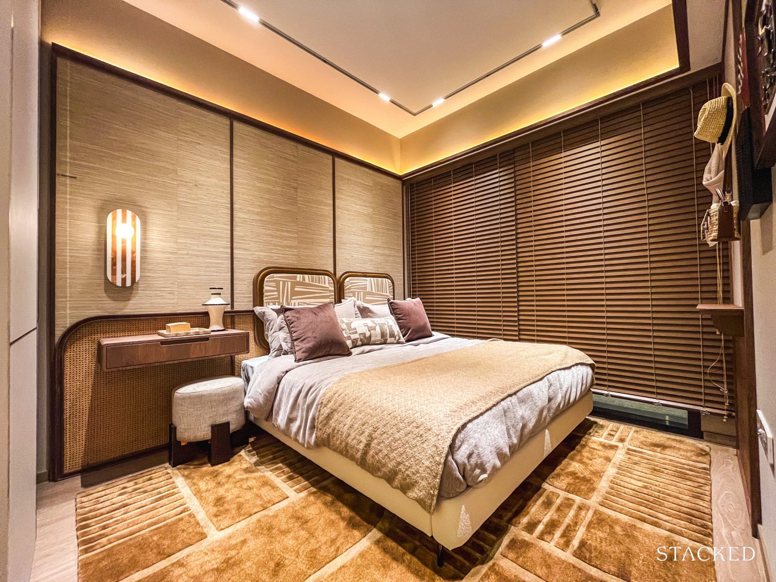
Sized at 11 sqm, the master bedroom is fairly typical for most new launch two-bedders on the market today.
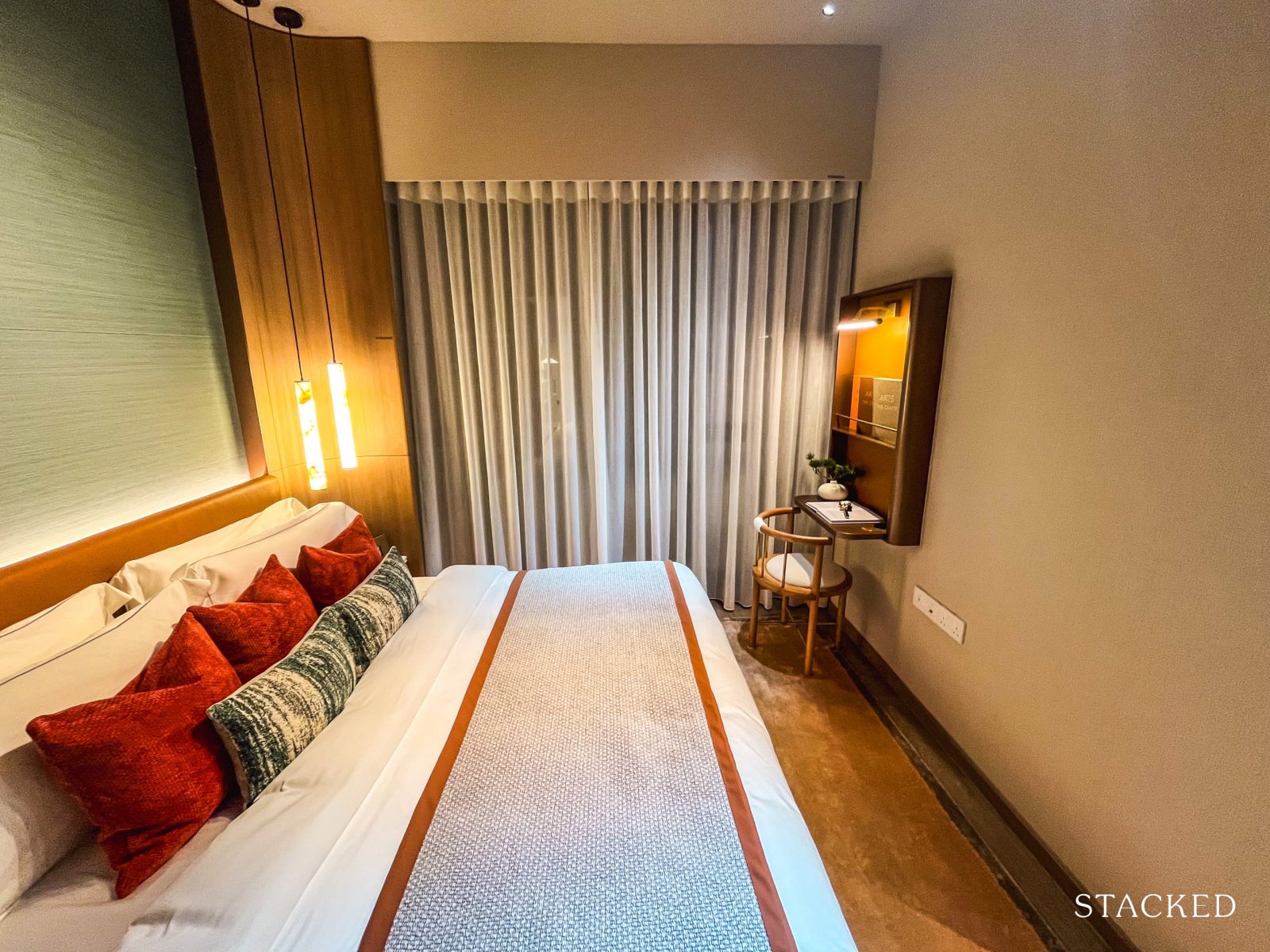
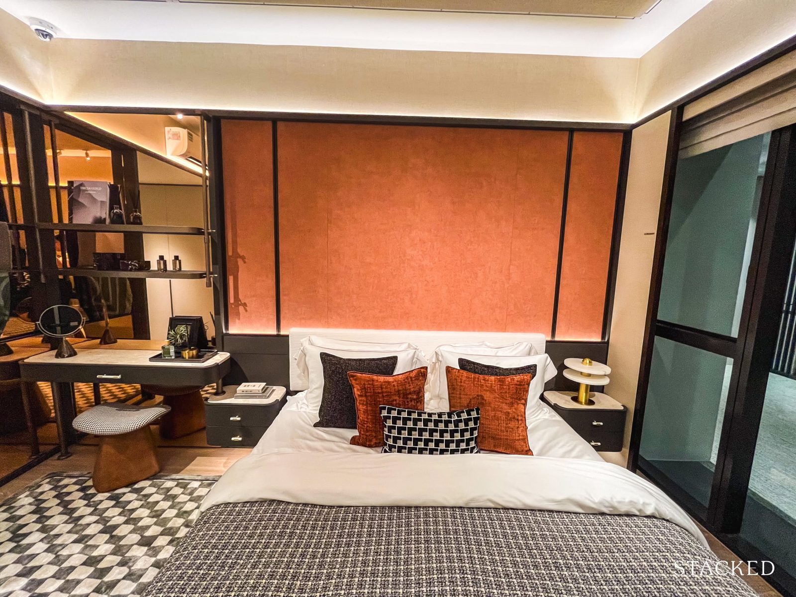
A king-sized bed fits comfortably, and when positioned flush against the window—as shown here—there’s enough space to accommodate either a small vanity or a bedside table without the room feeling too cramped.
The full-length windows are also a major plus. These aren’t your standard windows, but picture windows—with no ledges to obstruct the view—offering an uninterrupted outlook over the Wessex estate and the surrounding skyline (assuming your unit does face Wessex).
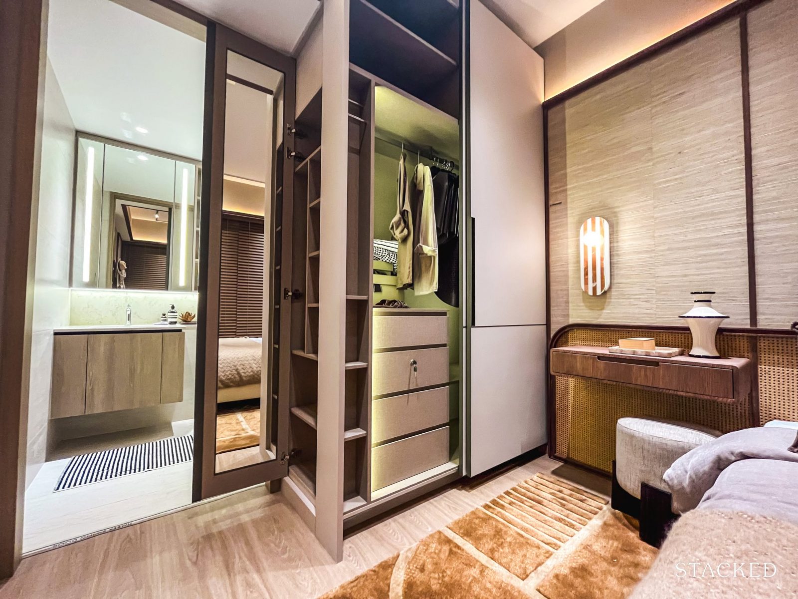
While the standard two-panel wardrobe may not be sufficient for two people’s belongings, it’s fairly typical for a 2-bedder.
That said, it does come with an added smart shelving compartment at the side—allowing space for a full-length mirror without encroaching on the room, along with mini shelves for quick-access items or simple display.
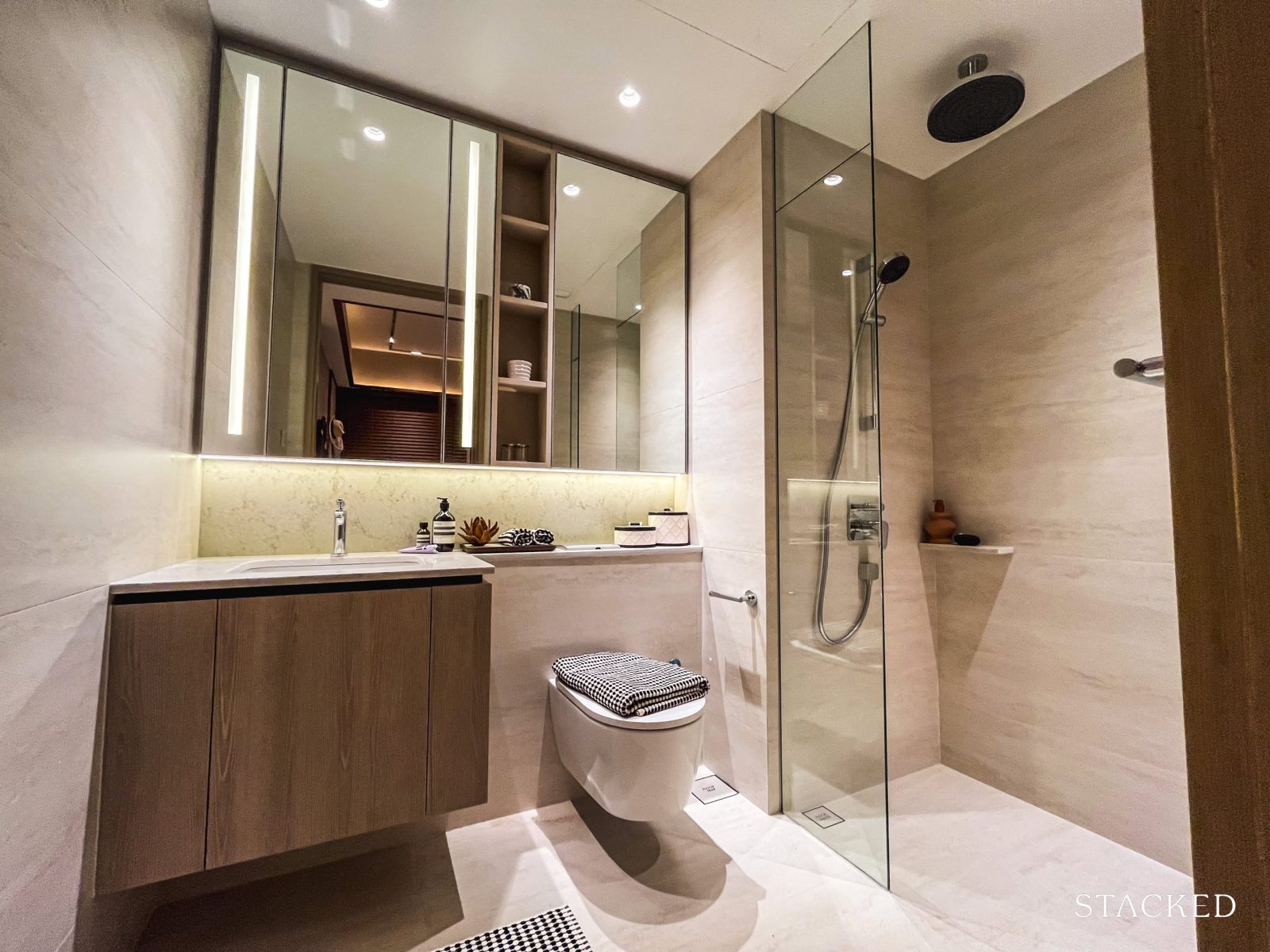
At 5 sqm, the master bathroom is just slightly larger than the common one. The use of large-format tiles and a light colour palette helps to brighten the space and make it feel more open—an effective design choice, given the compact size.
It comes with standard fittings: a wall-hung WC from Geberit, and shower and sink mixers from AXOR (a sub-brand of Hansgrohe). A rain shower is also included, which adds a subtle touch of luxury.
Cabinetry, shelving, and built-in lighting are all provided. One thing to note: there’s no window here, so the bathroom relies on mechanical ventilation.
With that, let’s now take a look at the 3-bedroom showflat.
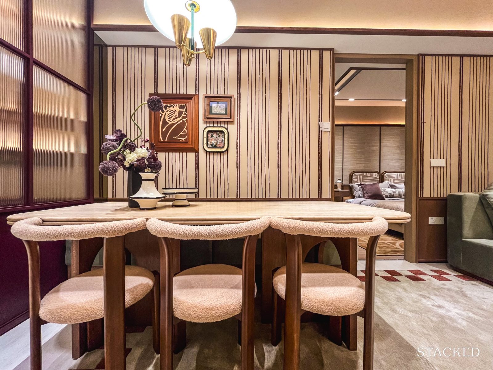
Bloomsbury Residences – 3 Bedroom Premium + Flexi Type C5 (102 sqm/ 1,098 sq ft) Review
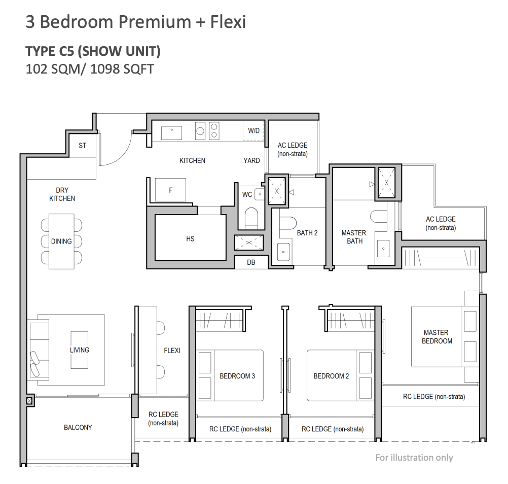
The 3-bedroom units form the next largest share of the unit mix at Bloomsbury Residences, accounting for 26 per cent (or 93 units), with four layout configurations available.
The showflat features the largest of the lot—the 3-Bedroom Premium + Flexi (Type C5), which comes in at 1,098 sq ft. Across the board, 3-bedroom sizes range from 904 to 1,098 sq ft, and all adopt a conventional hallway-style layout.
For context, Blossoms by the Park’s 3-bedders start from 1,044 sq ft, while The Hill @ One-North’s begin at 947 sq ft. As mentioned earlier for the 2-bedders, Bloomsbury Residences is the only project among the three that falls under the post-GFA harmonisation guidelines—so layouts here are expected to be more space-efficient overall.
If you’re wondering about the difference between the “+Study” and “+Flexi” layouts, here’s the distinction: the former includes a no-frills compact study nook along the hallway—while the Flexi space offers more versatility. You can leave it as-is, or knock down adjacent hackable walls to combine it into a larger living room.
The project adopts the “Advanced Precast” construction method and features Qingjian’s signature Cospace design, which allows for customisable layouts through hackable walls. In this particular layout, the two hackable walls include the Flexi space and the wall between the two common bedrooms—allowing owners to adapt the space to their needs over time.
Ceiling height has yet to be officially confirmed, but it’s expected to fall between 2.85m and 2.9m.
Given that the typical ceiling height for new launches today is around 2.79m, this is a modest but welcome upgrade. Qingjian also has a track record of being generous in this regard—units at The Arden, for example, start from 3.2m. For comparison, the nearby Blossoms by the Park offers a standard 2.8m ceiling.
As for finishes, the bedrooms come with vinyl flooring, while common areas are fitted with porcelain tiles—originally intended to mimic the look of travertine.
Both are standard picks and consistent with what we see across most new launches today.
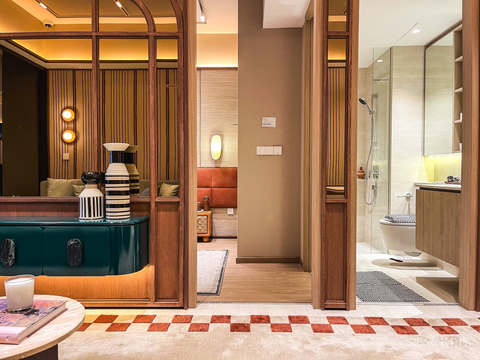
Upon entering the unit, you’re immediately greeted by a full view of the dining and living area—which, for some, might not be ideal. As mentioned in the 2-bedroom showflat tour, the presence (or absence) of a foyer is often a point of debate.
Without one, the layout is more space-efficient. But with one, you gain an added sense of privacy—especially for those concerned about passersby peering in. In this 3-bedroom unit, there’s arguably enough space to carve out a modest foyer.
That said, its absence likely won’t be a deal-breaker for most—especially for those who don’t leave their doors open for long.
To cater to smart living needs, the developers have also included a docking spot for robot vacuum cleaners—conveniently located in the DB box below. While this isn’t entirely new (we’ve seen it in previous launches), it feels almost essential for a project in One-North that is robot-themed.
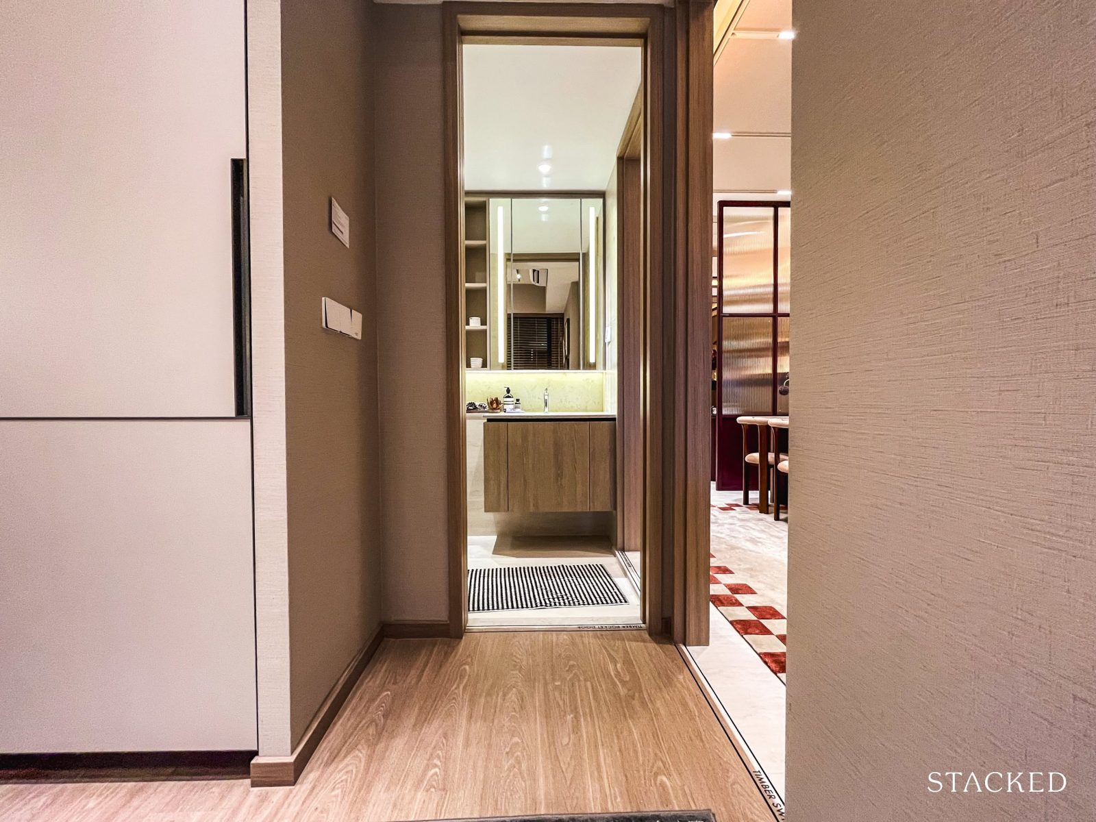
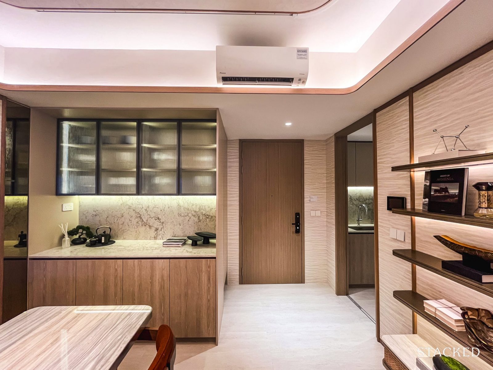
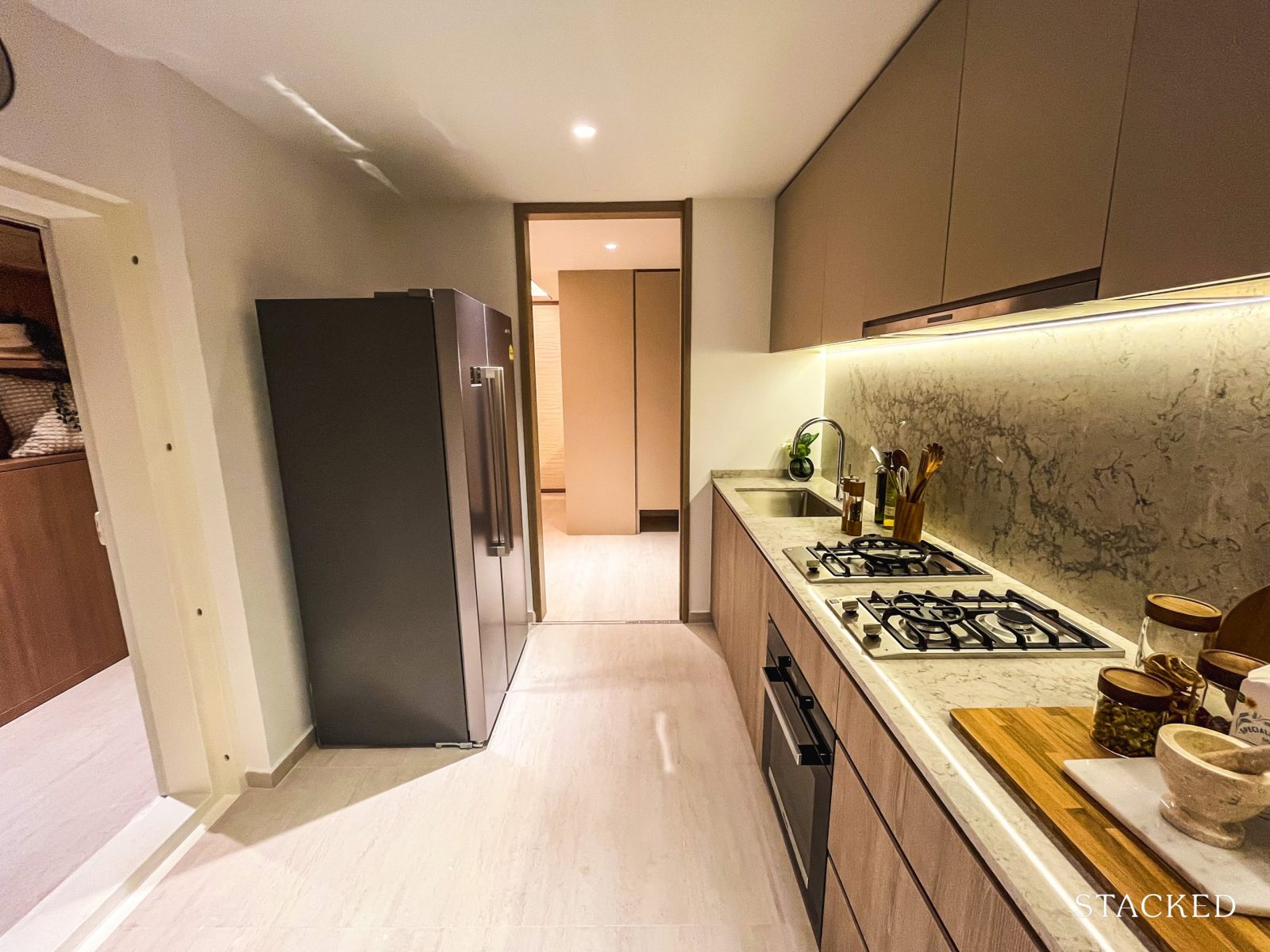
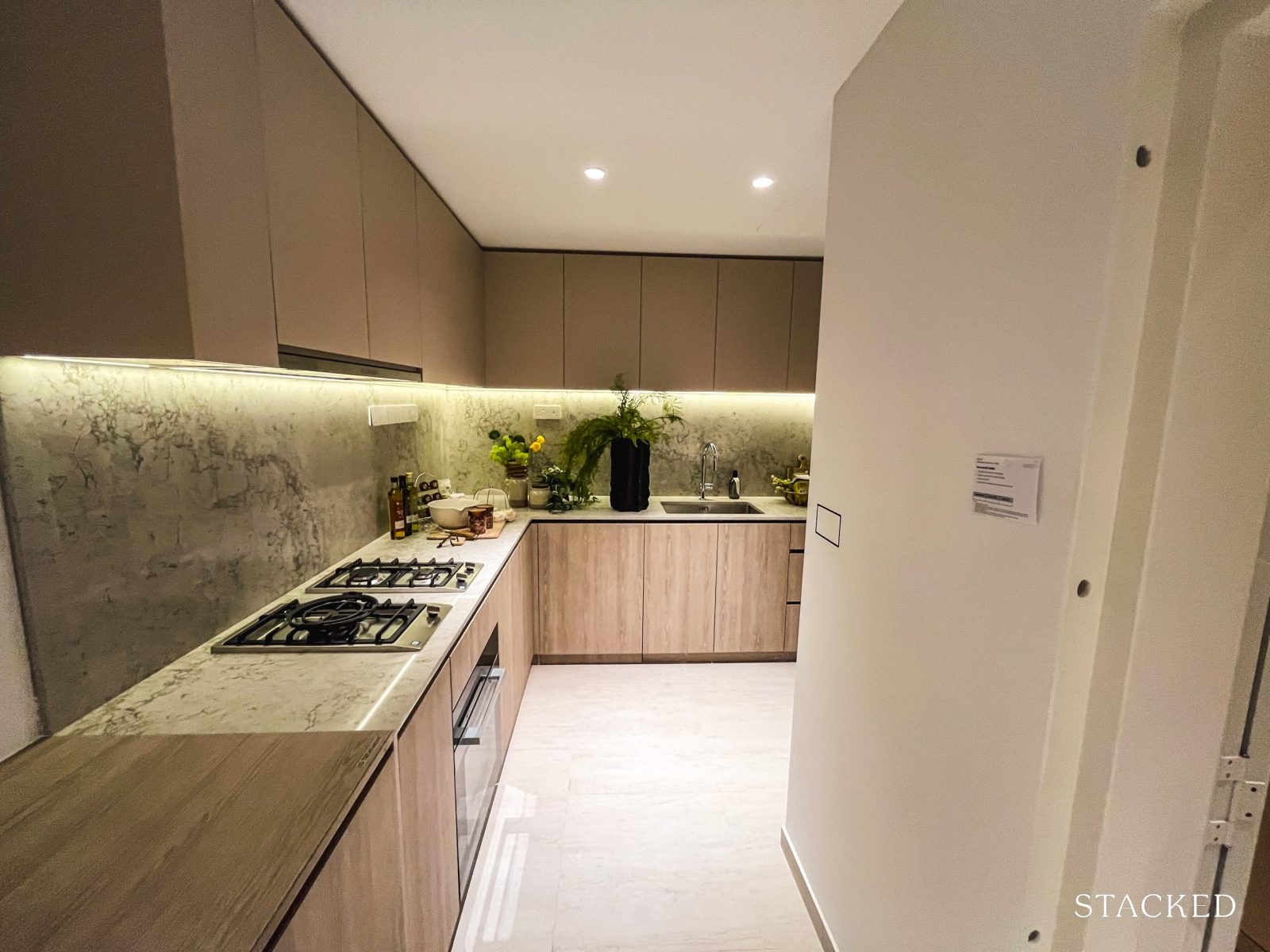
Before we explore the main living areas, let’s first take a look at the wet kitchen.
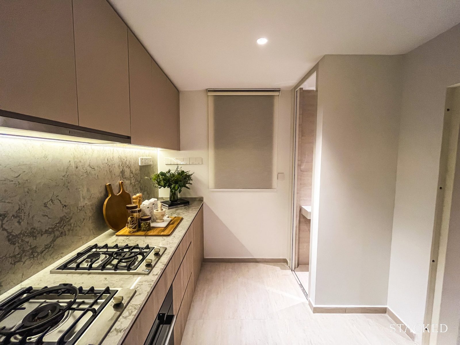
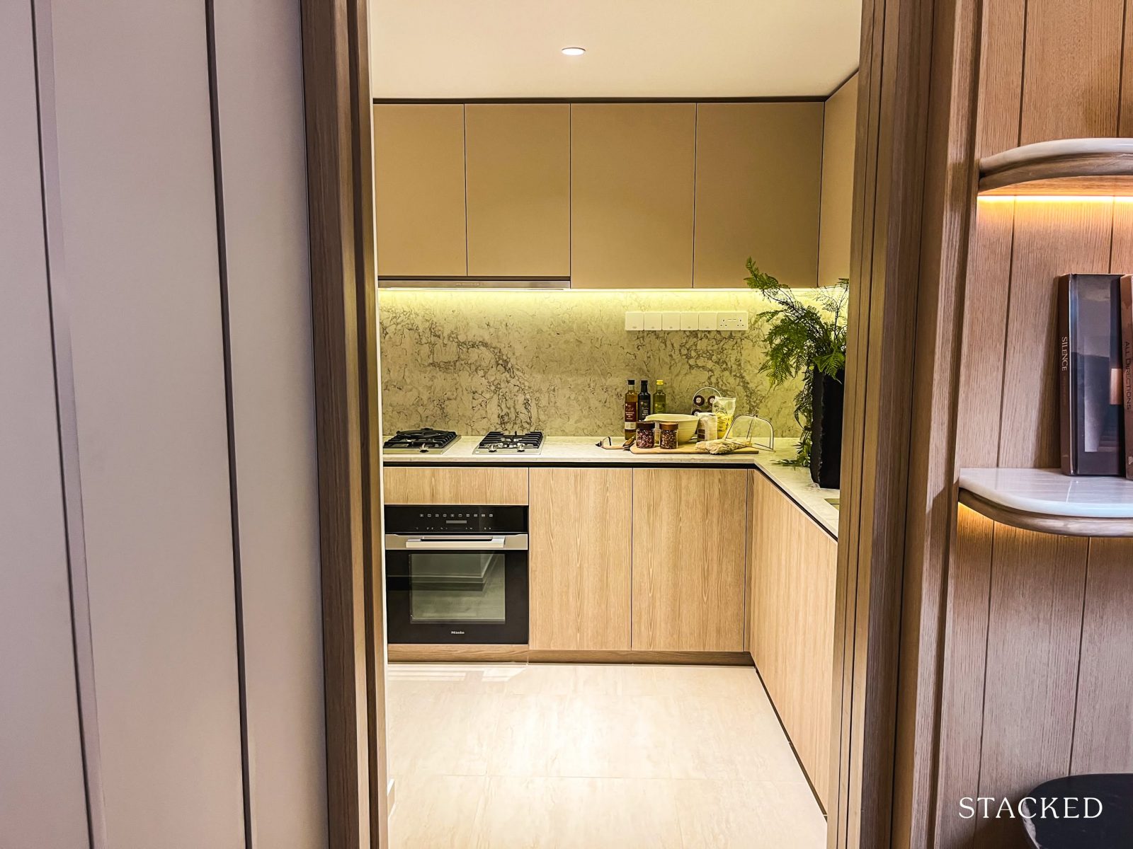
At 9 sqm, the kitchen is laid out in a typical fashion for larger units—with a linear flow that extends into the yard. Countertops run along one side, while the WC, household shelter, and fridge are tucked neatly at the far end.
A window at the back helps with ventilation, whether it’s for airing out cooking smells or drying clothes, making the space fully enclosable and functional.
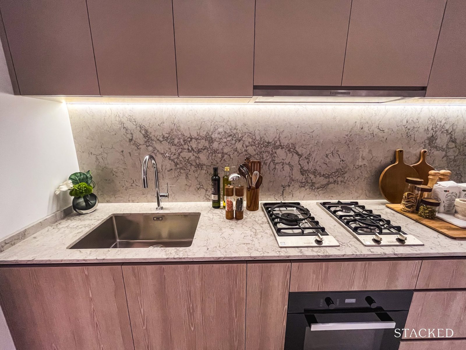
The kitchen comes fitted with a 3-burner gas hob, cooker hood, and built-in convection oven—all from Miele. Quartz is used for both the countertop and backsplash, which is a practical pick for durability and easy upkeep. And not shown here – a two-panelled free-standing fridge from Smeg will be provided, too.
There’s a decent stretch of counter space towards the yard, which gives you flexibility—whether it’s extra room for meal prep or sorting out laundry.
Storage-wise, there’s a good amount of cabinetry and drawers, so it should hold up well for day-to-day cooking needs.
The yard isn’t the biggest, but it gets the job done. There’s space to install a laundry rack if you prefer indoor drying, and the WC nearby adds practicality for general clean-ups.
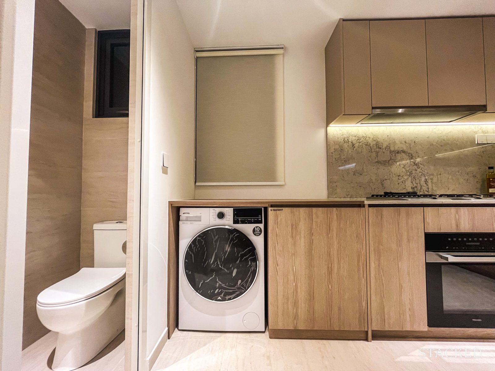
Additionally, a combi washer-dryer from SMEG is also provided as part of the standard fittings.
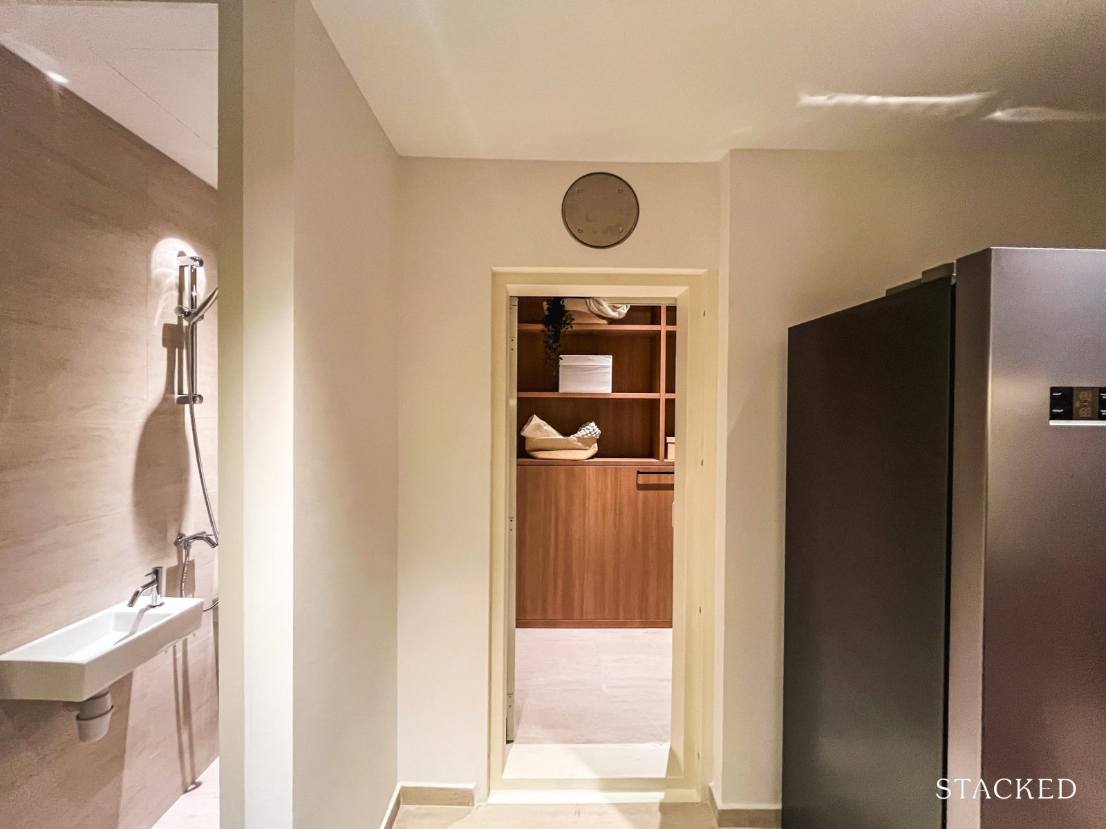
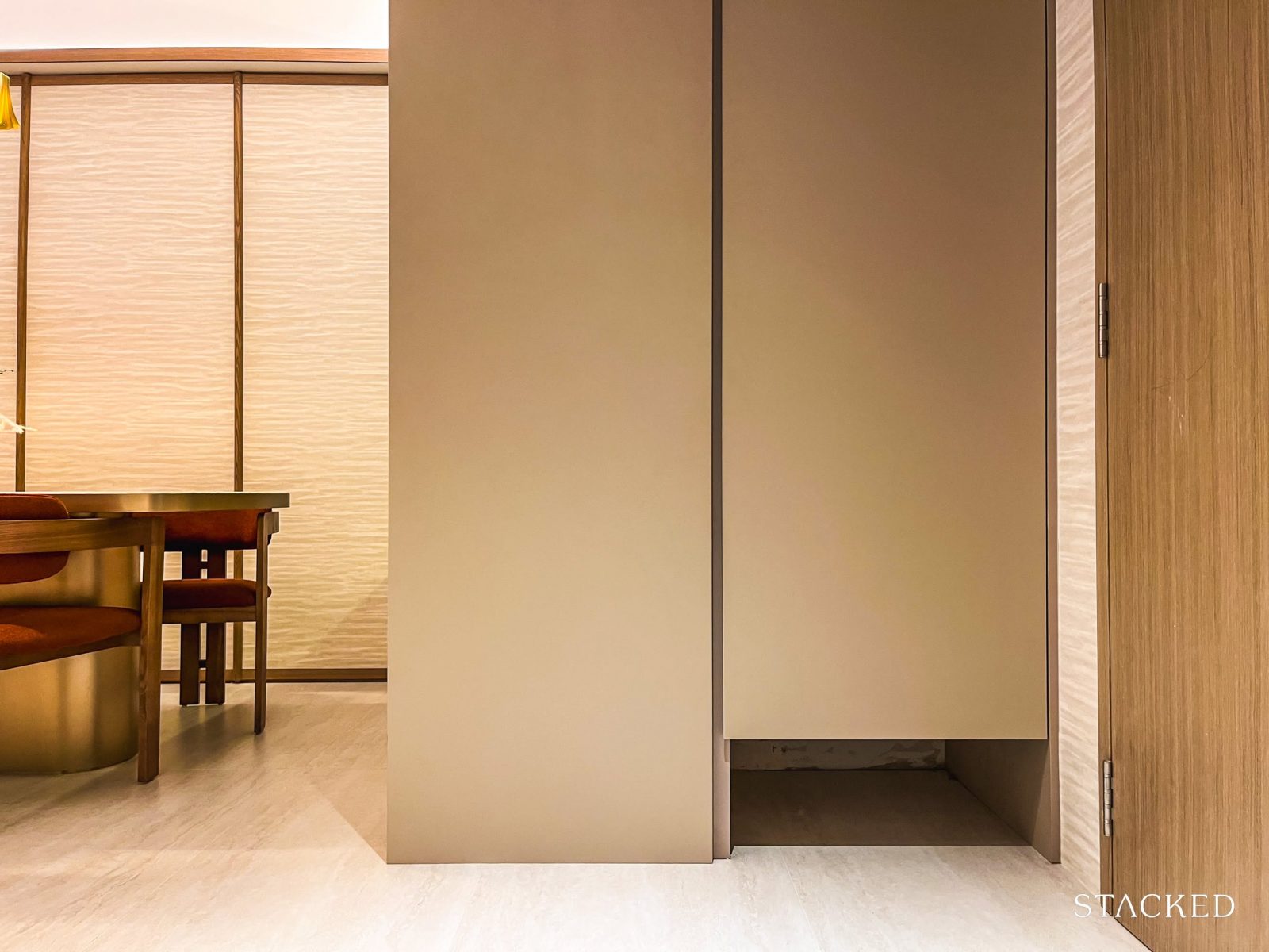
Directly across, you’ll find the home shelter (4 sqm) and WC (1 sqm).
This setup works well for families with live-in help, offering a private and practical space. Alternatively, it can serve as a useful storage area for households without.
Now, let’s head back out to the main living areas.
The dining area and dry kitchen here are surprisingly spacious—definitely a plus for families. An eight-seater dining set fits comfortably, with plenty of room to move around, which makes the space feel open and usable.
If you prefer a smaller dining setup, you’ll have the flexibility to extend the living area instead—handy if you’re the type to host or just want a bit more breathing room.
As for the dry kitchen, it serves primarily as an additional storage area, with extra counter space that can be easily repurposed to suit different needs.
But for those who enjoy hosting, this setup adds a practical layer—whether as a serving station, a cosy coffee corner, or simply a place to showcase your favourite appliances and décor pieces.
It’s not overly elaborate, but it adds versatility to the space, especially when paired with the good-sized dining area.
On that note, everything you see here—including the fluted glass cabinets, integrated lighting, and shelving—comes as part of the standard provision.
The living area here may not boast the widest frontage, but it still offers a comfortable amount of space for typical family use. A three-seater sofa fits well, and depending on your dining arrangement, there’s flexibility to go for a larger seating setup if preferred.
It faces the Flexi room—more on that in a bit—and the showflat design keeps things understated, with no coffee table or TV console in sight. Some may find this layout clean and open, while others might prefer to personalise it with more furniture. A projector could also be a practical alternative for those who prefer a more minimal setup.
Altogether, the living, dining, dry kitchen, entrance and hallway spaces span roughly 35 sqm.
Here’s a look at the balcony, which spans six sqm. While it leans more square than rectangular and doesn’t offer the widest frontage, its value lies in the view—this layout is exclusive to Block 63, facing the Wessex estate, so the outdoor space is well-positioned to take full advantage of the greenery.
Those who prefer alfresco dining could consider relocating their dining setup here, though realistically, it would comfortably fit a four-seater set before the space starts to feel a little tight.
Now, let’s take a look at the Flexi area—one of Qingjian’s signature Cospace features.
One thing to note: the Flexi space originally comes with a wall, though in this showflat, the IDs have removed it to create a more open, integrated layout. This does help the living and Flexi areas feel more expansive—but for buyers who opt to keep the original wall in place, it’s worth being mindful that both areas may feel more enclosed.
At 4 sqm, the Flexi space is decently sized and lends itself well to a range of uses—a study nook, hobby corner, or even a small reading lounge (though I doubt it’ll really fare well as a small bedroom).
The presence of a window is a thoughtful touch, allowing natural light in and making the space more practical for daily use.
If opened up, the space contributes to a wider frontage and a stronger connection to the rest of the unit—especially useful for those who prefer a more fluid, adaptable layout.
Now, let’s head on to have a look at the bedrooms.
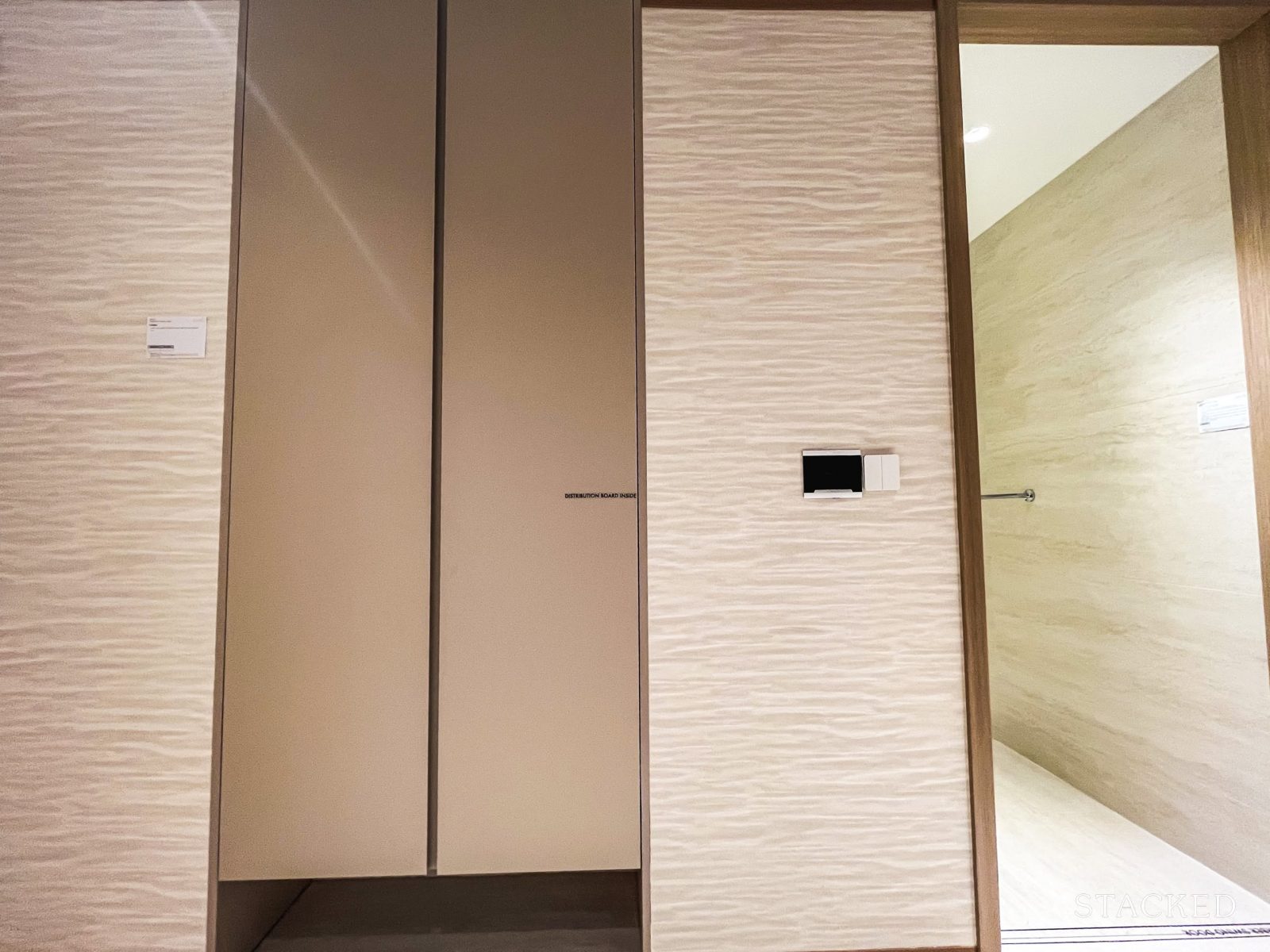
The hallway includes a built-in wardrobe component—a feature we’ve seen used in projects like The Orie. It adds a layer of functionality to what would otherwise be unused corridor space. Like the DB box at the entrance, this unit also comes with a designated nook that can serve as a docking station for a robot vacuum.
Given its proximity to the common bathroom, it could also serve as practical storage for household essentials—think extra toilet paper, fresh towels, and other bathroom supplies.
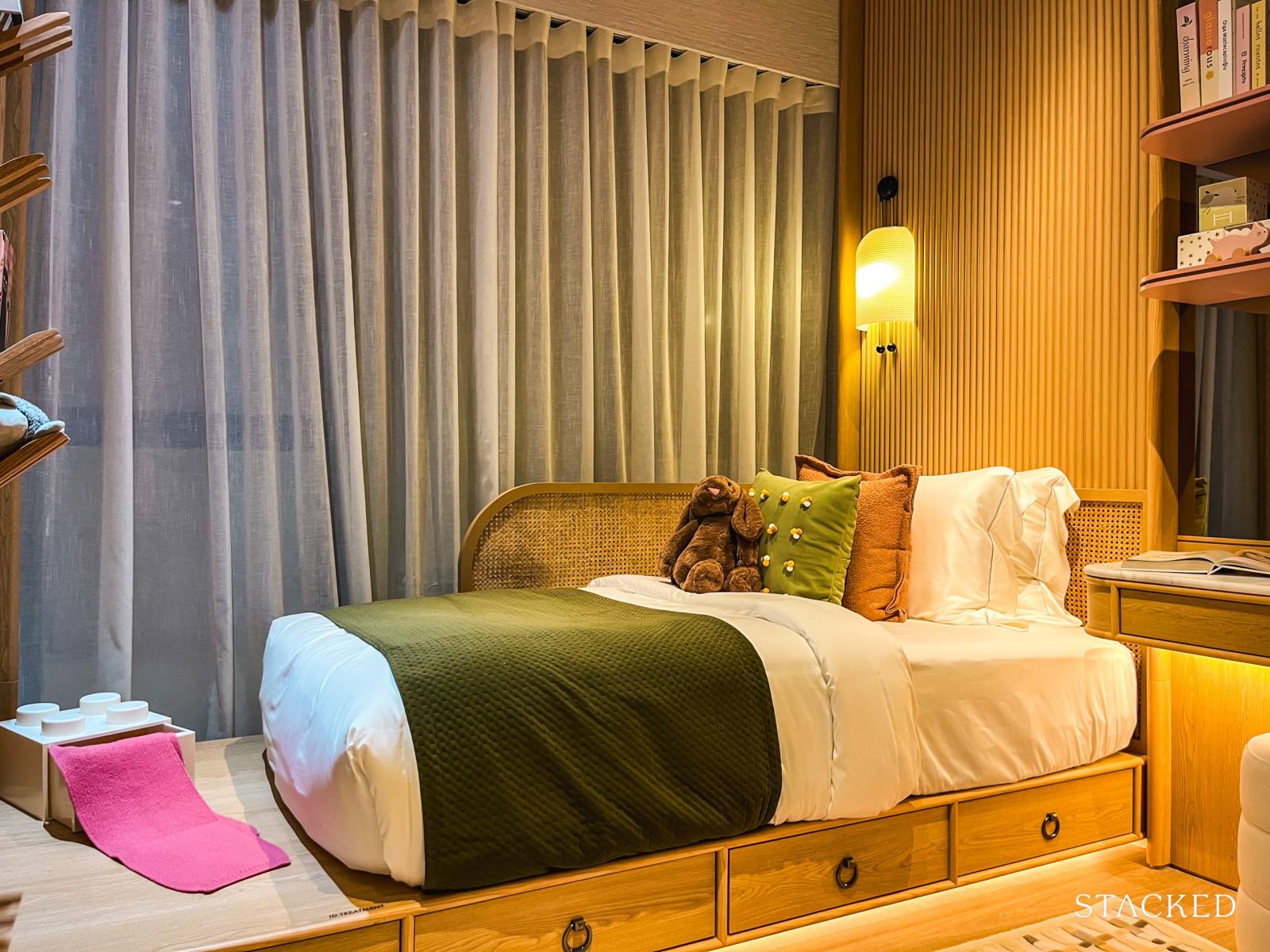
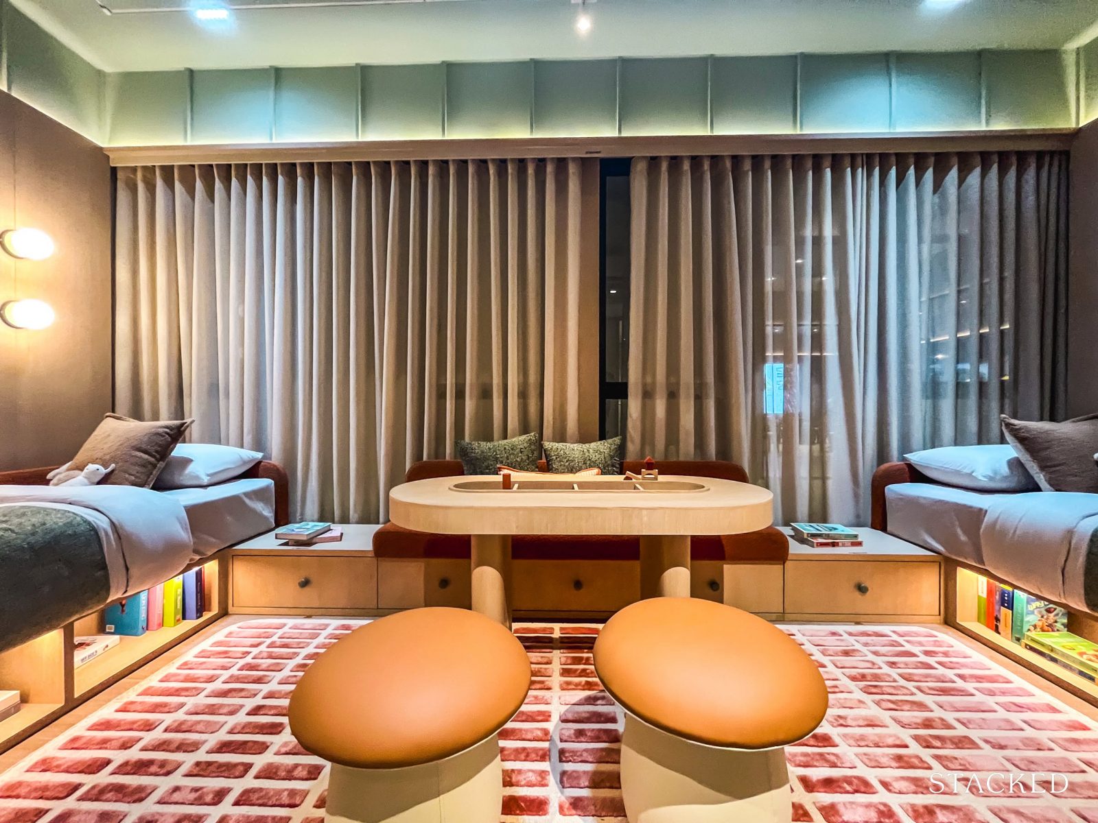
Here’s a look at Common Bedroom 3, which is sized at nine sqm. and has been styled as a child’s room by the IDs.
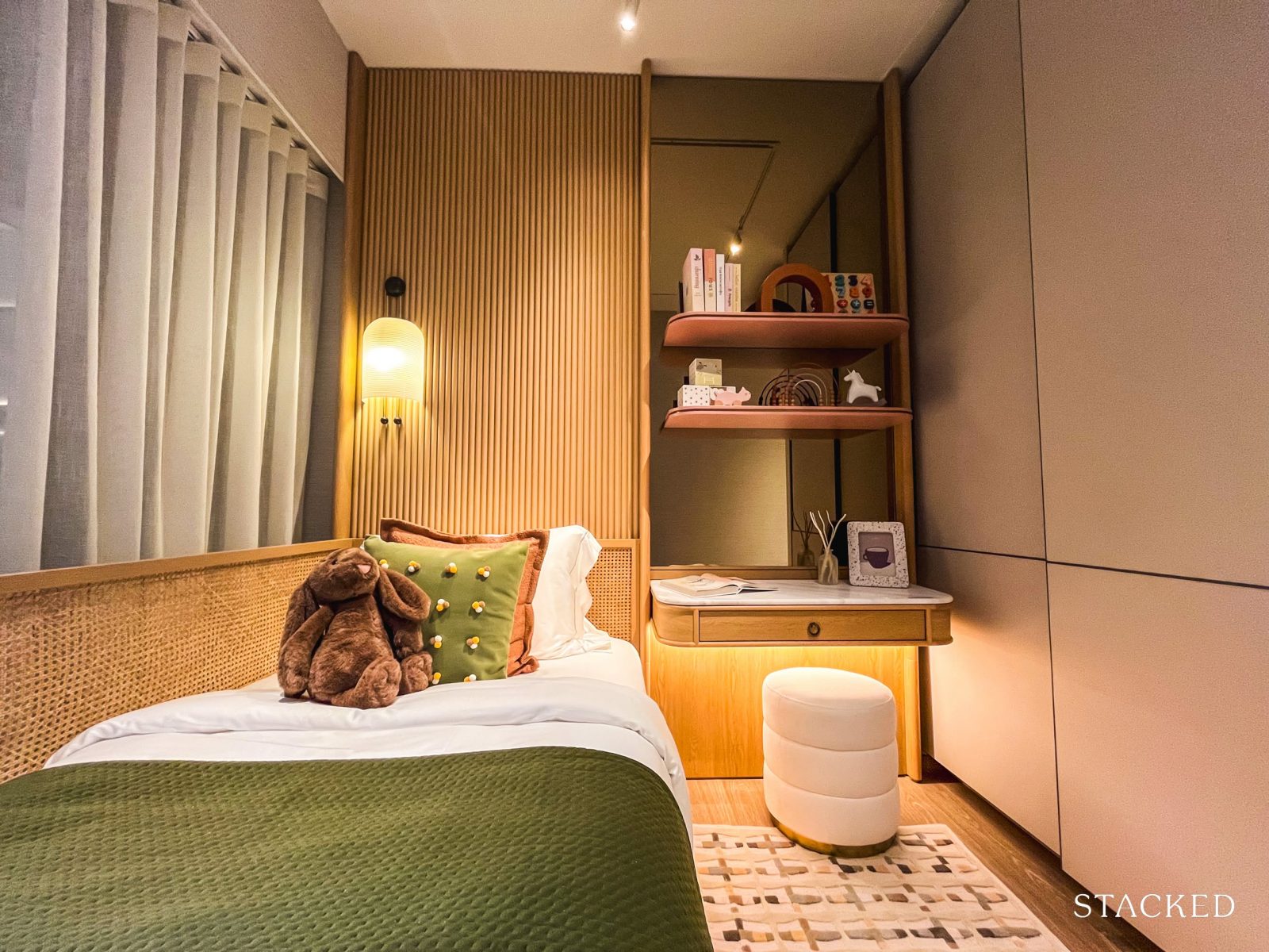
A small child’s bed has been added to better illustrate the sense of space, but the room can also accommodate a queen-sized bed (as we’ll see later in Bedroom 2).
There’s also enough space for a small writing desk, along with the built-in Poliform-inspired wardrobes—fairly standard and functional for most layouts.
What’s more noteworthy is the full-height picture window. It overlooks unblocked views of the Wessex estate and beyond to Dawson, and because it’s a picture window, there aren’t any ledges breaking up the view—just a clean, uninterrupted outlook, which is a nice touch.
Common Bedroom 2 is also sized at nine sqm.—identical to Bedroom 3—so there’s no need to argue over who gets the larger room. Unlike the child-themed setup next door, this one comes with a standard Queen-sized bed. If flushed to the window, there’s still enough room for a compact bedside table, along with the built-in Poliform-inspired wardrobe.
As with Bedroom 3, you’ll get full-height picture windows offering unblocked views of the estate—ensuring a clear, uninterrupted outlook.
It’s also worth noting that the wall between Bedrooms 2 and 3 is hackable, giving homeowners the flexibility to combine both rooms into one larger space, if desired.
That said, Bedrooms 2 and 3—as well as any guests—will share the common bathroom. At five sqm., it’s a standard size and comes fully fitted with a wall-hung WC from Geberit, along with shower and sink mixers from AXOR, a premium line under the Hansgrohe brand. Sinks, cabinetry, and lighting are all included as part of the standard fittings.
One added plus: the bathroom comes with a window for natural ventilation, which is always a welcome feature.

Finally, we look at the master bedroom and bathroom.
Sized at six sqm., the master bathroom is slightly larger than the common one but follows the same overall colour palette and design language. It comes fitted with a wall-hung WC from Geberit, and sink and shower mixers from AXOR. An added rain shower elevates the experience with a touch of luxury.
Standard provisions include a sink, cabinetry, and built-in lighting. Like the common bathroom, it also features a window for natural ventilation—a practical and appreciated detail.
The master bedroom spans 14 sqm., comfortably fitting a king-sized bed with space for two compact bedside tables, a small vanity alongside the built-in wardrobes (more on that in a bit).
What’s likely to stand out here are the full-height picture windows that frame unblocked views of the Wessex estate and, beyond that, the Dawson precinct. Like the common bedrooms, these are picture windows—free of ledges—designed to offer an uninterrupted sweep of greenery.
In place of the usual two-panel wardrobe found in the common bedrooms, the master bedroom is fitted with a four-panel configuration—definitely a more practical option for two. It’s also neatly integrated into the wall, which helps maintain a streamlined look and frees up circulation space.
Last but not least, note that there is a small window positioned here, just for a bit more natural light into the space.
Now, let’s take a look at the 4-bedroom showflat layout.
Bloomsbury Residences – 4 Bedroom Suite + Flexi Type D3 (132 sqm / 1,421 sq ft) Review
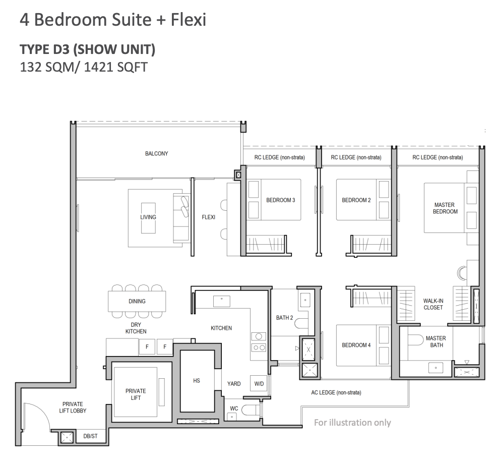
The 4-bedroom units make up just 19 per cent of the total unit mix (or 68 units, to be exact). They come in three layout variations, ranging from 1,173 to 1,421 sq.ft.—all adopting a conventional hallway-style layout.
The lower emphasis on larger units isn’t surprising, given that One-North isn’t traditionally known for family living. Still, the inclusion of these units suggests the developers are trying to shift that narrative.
The showflat on display is the largest of the lot—the 1,421 sq.ft. Type D3 unit—which, from what we hear, is also positioned in one of the development’s most premium stacks. If unblocked views are high on your list, this layout offers prime vantage points over the Wessex estate and beyond.
For context, 4-bedders at Blossoms by the Park and The Hill @ One-North start from 1,302 sq.ft. and 1,227 sq.ft., respectively.
The project uses the “Advanced Precast” construction method and incorporates Qingjian’s signature Cospace design—allowing for layout flexibility through hackable walls. In this unit, the two hackable walls are the one enclosing the Flexi space and the wall between the two common bedrooms, enabling owners to reconfigure the space based on their needs.
Ceiling height has yet to be officially confirmed, but it’s expected to range between 2.85m and 2.9m. Considering the current standard for new launches sits around 2.79m, this is a modest but welcome bump. Qingjian has also shown a history of being more generous in this aspect—The Arden, for instance, offers units starting from 3.2m. By comparison, Blossoms by the Park comes in at a more typical 2.8m.
In terms of finishes, the bedrooms feature vinyl flooring, while common areas are fitted with porcelain tiles—originally selected to resemble travertine. These are standard choices and align with what we typically see in today’s new launches.
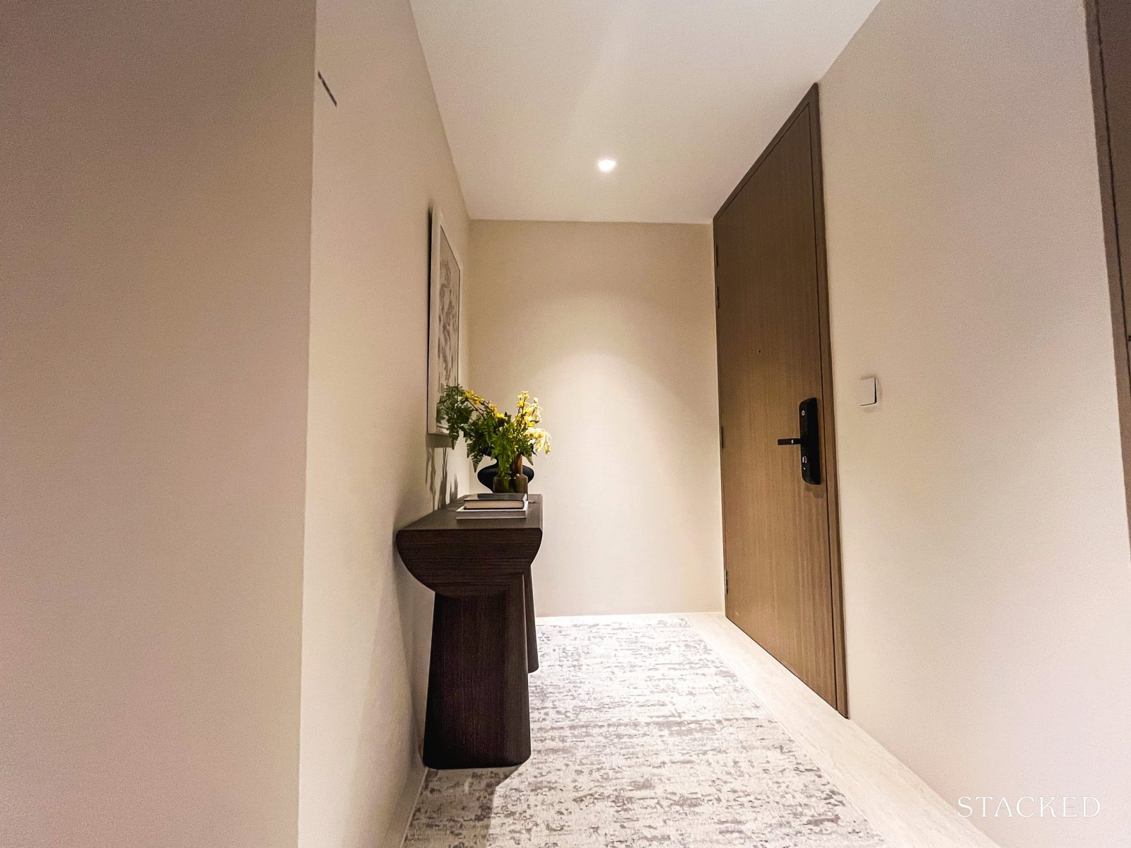
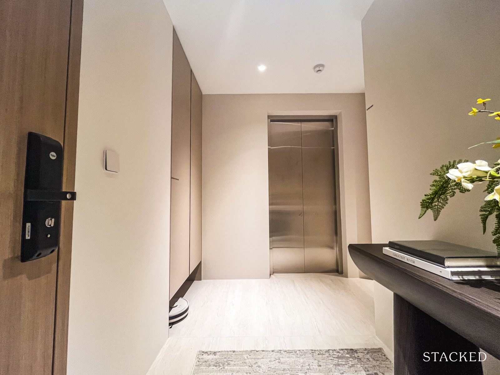
Stepping out of your private lift, you’re greeted by an exclusive seven sqm. lobby that acts as a buffer between the lift and your unit—offering both privacy and a sense of arrival.
There’s also a secondary door here leading to the service lift—a setup that’s fairly common in larger units. In older condos, this would typically open directly into the yard or kitchen.
There’s a decent amount of space here to add built-in cabinetry for extra storage, though the DB cabinet might already suffice for some. As with the other showflat units, the DB box includes a recessed nook at the bottom—a small but thoughtful touch to accommodate robot vacuums.
The lift lobby opens directly into the main living areas, where you’re greeted by the dry kitchen, dining, and living spaces, with the wet kitchen tucked further to the left.
This is where wide-frontage units really make an impression—enhancing the sense of openness upon entry. And considering this layout enjoys some of the most premium unblocked views of Wessex and beyond, the final experience is likely to be quite striking.
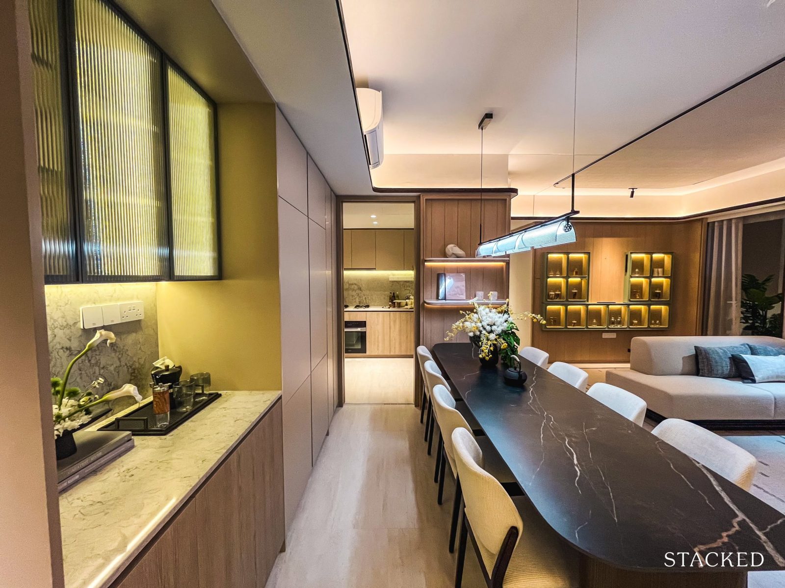
Let’s start with the dry kitchen and dining area. The dry kitchen here follows the same format as the 3-bedroom showflat—it’s less about heavy-duty prep and more about display and storage. With the fluted glass cabinetry and quartz countertop, it leans more decorative than functional. That said, the extra surface area can be handy for entertaining—whether it’s setting out drinks or serving food buffet-style.
What you see is what you get: the cabinets, shelving, quartz surfaces, and integrated lighting are all part of the standard offering.
Just past this is a run of cabinetry leading to the integrated four-door fridge by SMEG—a more premium touch that allows for better separation between cooked and raw food (or just more space for groceries).
The dining area fits an eight-seater comfortably and flows into the living space. Let’s have a look at the wet kitchen first.
The kitchen and yard follow an L-shaped configuration and are jointly sized at nine sqm. Let’s start with the main cooking area.
With counters running along two walls, there’s ample space for prep, washing, and cooking—without having to compete for elbow room. The layout also allows for more cabinetry, which goes a long way in making this a practical and functional kitchen.
White goods provided include a 3-burner gas hob, cooker hood, built-in convection oven, and a combi steam oven—all from Miele. The latter is exclusive to 4-bedroom premium units and above, and is a useful addition for those who cook often. A built-in dishwasher from SMEG is also included.
As with the other unit types, the countertops and backsplash are finished in quartz—a standard choice today for its durability and ease of maintenance. The kitchen is also fully enclosable and comes with a window, which is a plus for ventilation—especially for those who cook with open flames.
While the layout doesn’t include a separate yard area—a feature that’s often appreciated in larger units—this configuration isn’t uncommon among newer launches. That said, given that this is the 4-Bedroom Premium unit, its absence does feel like a slightly missed opportunity.
Still, the presence of a window makes it suitable for those who prefer to air-dry their laundry.
The home shelter (four sqm.) and WC (one sqm.) are located within this zone as well, which can make for a comfortable arrangement for families with live-in help.
Alternatively, the shelter can double up as a convenient storage space.
Now, let’s head back to the main living area.
Dining area, blending in with the living area.
The living area feels expansive at first glance, but it’s worth noting that this is largely due to the Flexi space being combined with the main living room.
It’s a logical move for those who don’t need a dedicated room, especially given the way the balcony runs the full six metres along both spaces. If you choose to keep the Flexi space enclosed, the view does become more segmented—which might be something to consider, especially for a layout designed to maximise outlook.
That said, even on its own, the living area is decently sized. A four-seater sofa, coffee table, and TV console fit comfortably without the space feeling overly tight.
Combined with the dining area, dry kitchen, entrance and hallway, you’re looking at about 37 sqm of space; and if you knock through the Flexi space, that extends to 42 sqm.
As for the balcony—at 12 sqm, it’s generously proportioned.
It’s about double the size of the one in the 3-bedroom showflat and three times that of the 2-bedder. Given that this layout faces the unblocked greenery of the Wessex estate, it’s easy to see how the outdoor area becomes a key part of the home. Whether you choose to shift your dining set here or leave it as a quiet lounging corner, it’s a space that makes the most of its outlook.
Here’s a look at the Flexi space, which spans five sqm. In this unit, it’s been opened up to extend the main living area—creating a more expansive feel and allowing the natural light to carry through.
Framed by full-height sliding glass doors, the space takes advantage of the view while keeping the layout bright and airy.
That said, it remains a flexible zone (hence its name); whether enclosed as a study, reading room, or kept open as part of the living space, the options here are fairly versatile.
With that, we take a look at the bedrooms.
We start with Common Bathroom 2, which will be shared by Bedrooms 2, 3, 4, as well as guests. At 4 sqm, it sits on the more compact end, but the use of large-format tiles and a light colour palette helps the space feel more open than it actually is.
Standard fittings include a wall-hung WC from Geberit, and sink and shower mixers from AXOR—a premium line under Hansgrohe. You’ll also find the usual inclusions: a sink, cabinetry, mirror, and integrated lighting. A window for natural ventilation is included here as well.
While Bedrooms 2 and 3 are separated on the floor plan, the IDs have chosen to combine them by hacking the adjoining wall—offering a glimpse into how the space can be reimagined. Each bedroom is nine sqm. (so there’s no need to fight over room size), and comes with a two-panel Poliform-inspired wardrobe as standard.
One of the highlights of this combined layout is the uninterrupted view of the Wessex estate. Both rooms feature picture windows, which means fewer ledges and a more seamless outlook—making the greenery outside feel like a natural extension of the space.
Here’s Bedroom 3, which the ID has styled with a child-sized bed. This leaves plenty of room to move around, but the smaller bed does slightly skew the sense of space— it’s worth noting that the bed is smaller than a standard single or queen. So, do factor in dimensions when planning your furniture.
An alternative would be to place the bed parallel to the wardrobe, which still allows for comfortable circulation space.
The same considerations apply to Bedroom 2, so instead of repeating the details, it’s worth highlighting the benefit of combining the two rooms.
Doing so opens up space for a shared study or play area—creating a flexible, family-friendly setup that’s both practical and spacious.
Bedroom 4 is also nine sqm., but will likely be seen as the least favourable of the lot.
As it backs the AC ledge, the room comes with half-height windows, and unlike the others, it doesn’t enjoy views of the Wessex estate due to its stack orientation.
The ID has opted for a queen-sized bed here to showcase the room’s versatility, though the addition of two bedside tables does make access to the built-in wardrobe feel a little tight.
That said, pushing the bed closer to the window would free up more space—something worth considering depending on your layout preferences.
Last but not least, the master bedroom opens with a short entrance corridor.
At first glance, most would agree that the master bedroom is spacious.
The master bedroom feels comfortably sized, even with a king bed, compact side tables, and a vanity tucked into the corner. What helps here is the sense of openness from the full-height picture windows, which look out toward the Wessex estate.
The walk-through wardrobe is a practical touch—tucked between the sleeping area and the bathroom, with the vanity conveniently positioned along the way. It’s a layout we’ve seen in other recent launches, and one that generally gets positive feedback for everyday functionality.
The his-and-hers configuration works well here too, and with the sliding doors to the bathroom, it does mimic some of the luxury hotels out in the market.
The master bathroom comes in at six sqm.—just slightly larger than the common bathroom, but it feels roomy thanks to its layout and finishes.
It’s fitted with all the expected provisions: a wall-hung WC from Geberit, sink and shower mixers from AXOR, and an added rain shower for a touch of luxury. The sink, cabinetry, and built-in lighting are also provided as standard.
There’s a window here for natural ventilation too, which is always a welcome feature.
And with that, we wrap up the tour.
Bloomsbury Residences Location Review
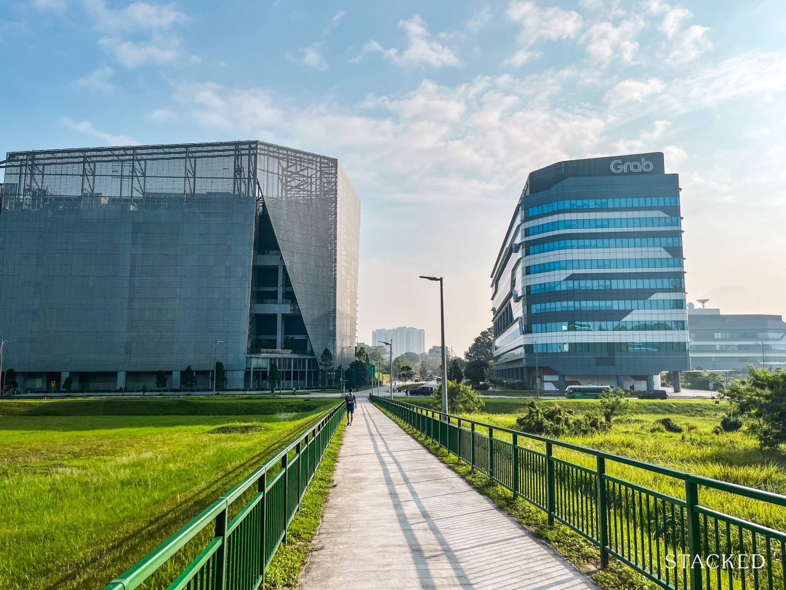
We’ve shared our thoughts on One-North before, but it bears repeating—this is Singapore’s go-to hub for R&D, start-ups, and the tech scene.
A quick drive through the area reveals a who’s who of industry giants, from Shopee and Ubisoft to P&G, A*STAR, Walt Disney, and Grab. Naturally, this shapes not only the working population, but also the residential demographic and the kind of amenities that grow around it.
Bloomsbury Residences, however, is located in a quieter pocket of the estate—Mediapolis.
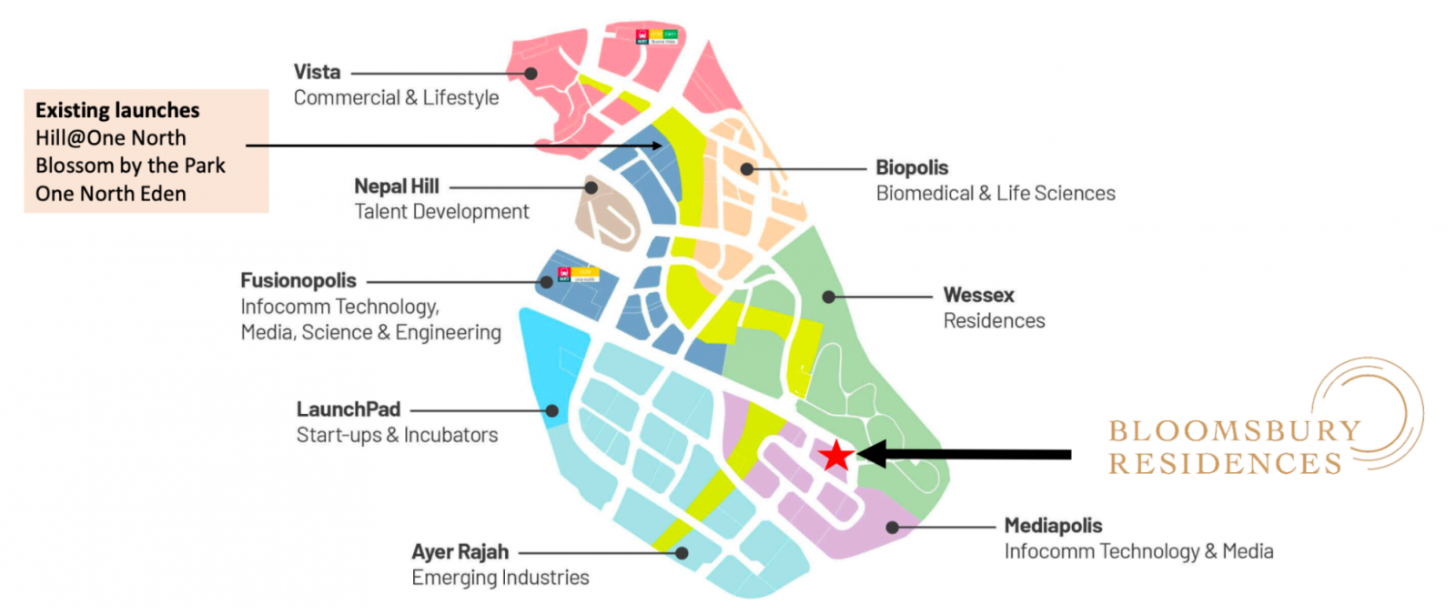
Compared to the more built-up parts of One-North, Mediapolis offers a calmer, greener setting, bordered by the heritage-rich black-and-white bungalows of Wessex. It’s also worth noting that Bloomsbury marks the first residential project to launch in this part of the estate, making it something of a trailblazer in the area.
Notable landmarks nearby include the Mediacorp headquarters—so if that’s what you’re into, you might just spot a local celebrity or two passing through. The development also sits near Portdown Avenue, a quiet cul-de-sac that further adds to the enclave-like feel of the location. Mediapolis is further buffered from the Queensway neighbourhood by Alexandra Forest and the Rail Corridor—an added bonus if you’re someone who values easy access to green spaces.
That sense of seclusion, however, comes with a few trade-offs.
While it’s still located within One-North, it’s not in the thick of the action. Daily conveniences and MRT access aren’t exactly at your doorstep—One-north MRT station is not within walking distance and will require a short drive or bus ride to reach.
For those who value walkability and quick access to amenities, this may be a sticking point.
But to be fair, connectivity isn’t entirely compromised.
A bus stop just across Science Park provides direct routes into the city, which helps ease the commute for those relying on public transport. It’s a bit like Normanton Park in that sense—where the initial impression suggests isolation, but in practice, residents find it more accessible than expected. The walk to the bus stop here is a little longer, but still manageable (writer’s input: in my experience, it took me around a seven-minute walk – I have long legs).
On a more novel note, bus service 191—which serves this part of Mediapolis—is set to become Singapore’s first fully autonomous bus route by 2026. It adds a subtle layer of appeal for those who enjoy being part of a forward-looking, innovation-driven neighbourhood.
To supplement connectivity, the developer will be offering a shuttle bus service during the first year to One-North MRT, Buona Vista MRT, and the National University of Singapore (NUS) (though which faculty it stops at remains unclear). Beyond that, future arrangements will depend on the MCST.
Unsurprisingly, the lifestyle here reflects the estate’s business park roots.
Being a JTC-planned district, it lacks the typical heartland amenities you’d find in more mature estates—don’t expect wet markets or hawker centres at your doorstep. Instead, the F&B scene skews more towards cafés, restaurants, and office crowd staples. For daily essentials, Fusionopolis and The Star Vista are the nearest options for supermarkets and retail.
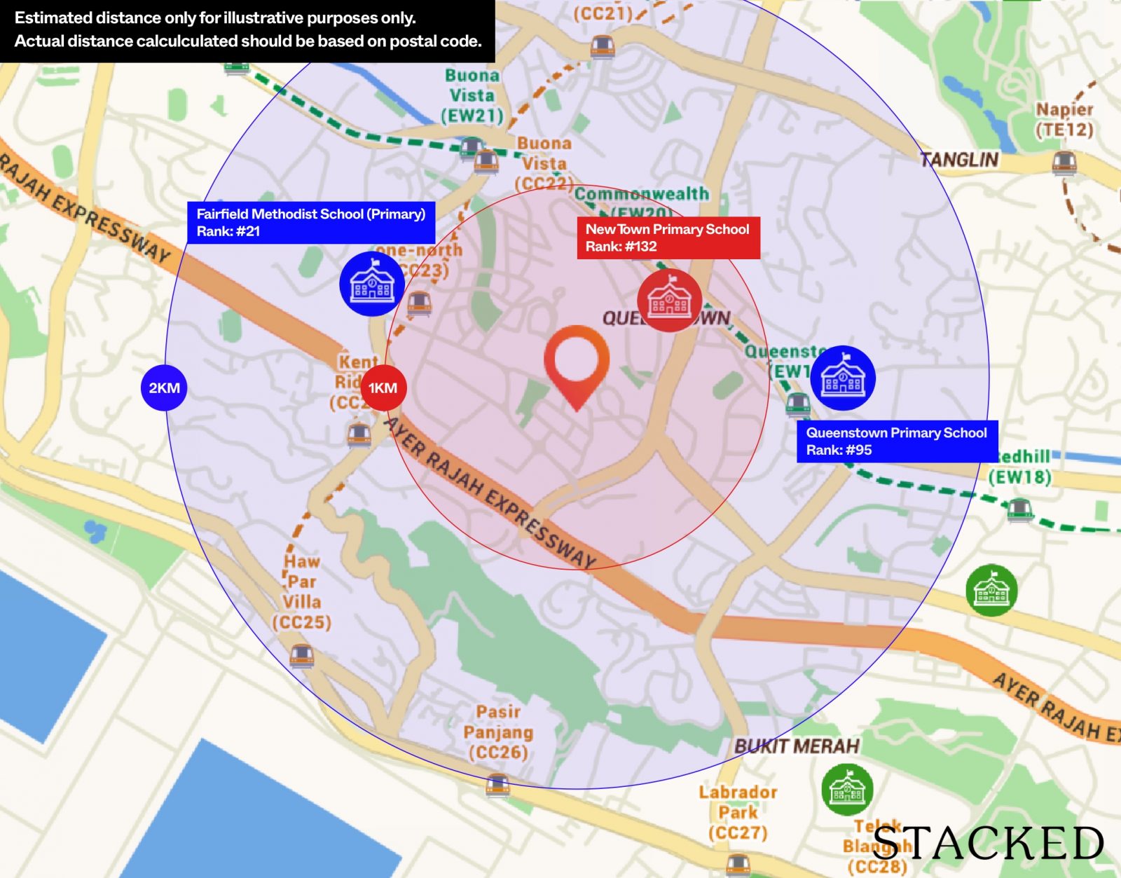
On the upside, One-North’s proximity to reputable schools makes it a strong contender for families with older children.
Tanglin Trust School is just a walk away, and institutions like NUS, Ngee Ann Polytechnic, ACS (Independent), and ACJC are all within easy reach. The catch, however, is at the primary level—there are currently no primary schools within a 1-km radius. Fairfield Methodist Primary is estimated to fall within 1–2km, which still places it outside the priority admission zone.
And that, perhaps, is emblematic of One-North itself.
As Ryan previously pointed out, it remains one of the more curious neighbourhoods in Singapore. Always on the cusp of transformation, brimming with potential, but rarely seen as a destination in its own right. It’s a place that feels like it’s constantly evolving, but never quite finished.
And for some, that in-between quality might just be part of its charm.
Nearest MRT: One-North MRT Station (CCL), 1.2km, 14-min walk
Public Transport
| Bus Station | Buses Serviced | Distance From Condo (Est. Walking Time) |
| BEF WHITCHURCH RDID: 18191 | 191 | 107m, 2-min walk |
| AFT WHITCHURCH RDID: 18199 | 191 | 145m, 2-min walk |
| MEDIAPOLIS CAMPUSID: 18201 | 191 | 198m, 3-min walk |
| OPP SCIENCE PK ID: 18049 | 14, 33, 33A, 97, 97e, 166, 197 | ~800m, 8-min walk |
Schools
| School | Distance From Condo |
| Tanglin Trust School | 600m, 8-min walk |
| Fairfield Methodist Primary School | < 2km, 6-min drive |
| Anglo Chinese School (Independent) | <2km, 6-min drive |
| Anglo Chinese Junior College | <2km, 6-min drive |
| INSEAD Asia Campus | <2km, 6-min drive |
| National University of Singapore | 2km, 7-min drive |
| UWC Dover Campus | 2.4km, 7-min drive |
| Ngee Ann Polytechnic | 6.7km, 16-min drive |
Shopping Malls
| Destination | Distance From Condo (Est. Driving Time) |
| Fusionopolis | 850m, 3-min drive |
| Galaxis | 1.1km, 4-min drive |
| Rochester Mall | 2.2km, 7-min drive |
| The Star Vista | 2.5km, 8-min drive |
Private Transport
| Key Destination | Distance From Condo (Fastest Time at Peak Hour [8.30am] Drive Time) |
| Mediapolis (and surroundings) | 550m, 2-min drive |
| Mapletree Business City | 4.3km, 8-min drive |
| HarbourFront Cluster (Vivo City) | 5.7km, 10-min drive |
| CBD (Raffles Place) | 8.8km, 12-min drive |
| Orchard Road | 8.9km, 10-min drive |
| Jurong Cluster (JEM) | 9.3km, 12-min drive |
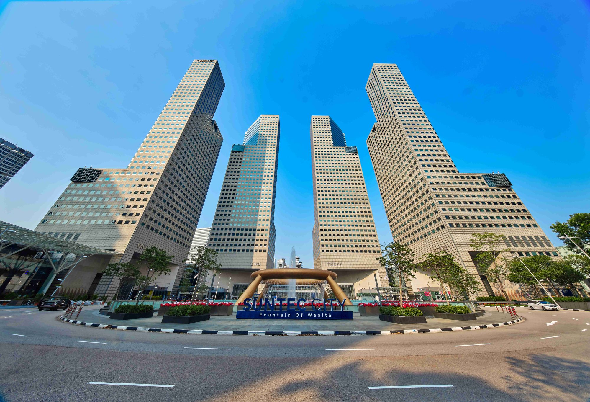
| Suntec City | 13km, 14-min drive |
| Paya Lebar Quarter | 18.8km, 20-min drive |
| Woodlands Checkpoint | 20.7km, 18-min drive |
| Tuas Checkpoint | 21.3km, 20-min drive |
| Woodlands Cluster (Causeway Point) | 22km, 22-min drive |
| Changi Airport | 26.6km, 22-min drive |
| Punggol Cluster (Waterway Point) | 26.8km, 24-min drive |
| Tuas Port (by 2040) | 31.7km, 35-min drive |
Immediate Road Exits: Exit onto Media Walk, turn left onto Media Circle, which takes you to Portsdown Avenue in two minutes and AYE in four minutes.
Bloomsbury Residences Developer Review
Developer Notes
Qingjian Realty is the Singaporean arm of Qingjian Group, a Chinese real estate company with close to 60 years of history. Beyond China, the group also has a presence in markets like Macau, Hong Kong, and Indonesia.
Their first foray into Singapore’s private residential market began with the now-defunct DBSS scheme, followed by executive condo (EC) projects in Punggol in 2011. However, early efforts weren’t without hiccups—most notably, infrastructure issues at RiverParc Residence—and coupled with the cautious sentiment toward Chinese developers at the time, it was a challenging start.
Still, Qingjian has come a long way since. Through a mix of trial and error, they’ve grown into a recognised name in Singapore’s property scene.
They’re perhaps best known for championing smart-home features and aren’t afraid to experiment with bold ideas—evident in Bloomsbury’s robot-themed amenities, the first of its kind in Singapore.
Notable past projects under their belt include The Arden, Tenet EC, JadeScape, Altura EC, and Forett @ Bukit Timah.
Architect Notes
ADDP Architects is a familiar name in Singapore’s new launch landscape, having designed some of the more recognisable projects in recent years. Think Avenue South Residence, SORA, Martin Modern, Whistler Grand, and closer to the area—Nexus @ One-North and Blossoms by the Park.
Their design language leans toward clean, modern lines—an aesthetic that’s come to define many of Singapore’s contemporary condominiums.
They’ve also collaborated with Qingjian Realty on several occasions, most notably on Tenet EC and Altura EC.
For Bloomsbury Residences, the design draws inspiration from the nearby Wessex estate, incorporating subtle colonial-style touches. The team also worked closely with landscapers to frame and maximise views of the unblocked skyline—an intentional move to make the most of the site’s elevated position.
Unit Mix
| Unit Type | Size (sq ft) | Total Units | Unit Breakdown |
| 2 Bedroom | 571 | 38 | 53% |
| 2 Bedroom Premium | 635 / 678 | 76 | |
| 2 Bedroom Premium + Study | 689 | 76 | |
| 3 Bedroom + Study | 904 | 38 | 26% |
| 3 Bedroom Premium + Study | 980 / 990 | 23 | |
| 3 Bedroom Premium + Flexi | 1,098 | 12 | |
| 4 Bedroom Premium + Study | 1,173 / 1,206 | 30 | 19% |
| 4 Bedroom Premium + Flexi | 1,420 | 38 | |
| Penthouse 4 Bedroom | 1,346 | 2 | 2% |
| Penthouse 5 Bedroom | 1,668 / 1,711 / 1,916 | 4 | |
| Penthouse 6 Bedroom + Flexi | 2,131 | 2 | |
| 358 | 100% | ||
With 358 residential units, Bloomsbury Residences falls into what many would consider a mid-sized development.
It offers a range of 2- to 6-bedroom penthouse units, with 2-bedders making up the bulk of the mix at 53 per cent, while 3-bedders and larger units account for the remaining 47 per cent. On paper, this suggests an attempt to strike a balance between catering to investors and own-stay buyers.
While this split might seem fairly typical for new launches, it’s a slightly unconventional approach for a project in One-North—a precinct where rental demand is strong and compact units, particularly 1-bedders, tend to be investor favourites.
Instead of chasing that formula, Bloomsbury has gone the other way. The inclusion of 5- and 6-bedroom penthouses—an unusual sight in this area—signals a stronger emphasis on buyers prioritising space, flexibility, and long-term liveability.
It’s also a reflection of shifting buyer behaviour. In a post-ABSD market, many are approaching property purchases with a one-shot mindset—making versatility and long-term practicality more important than ever. The 2- and 3-bedders here hit that sweet spot, offering enough flexibility for both investors and younger families.
And with rising acceptance of 2-bedroom units as family homes, it’s not surprising that developers are placing more weight on this configuration.
The compact sizes here—from 571 sq.ft.—help keep entry prices more manageable, which could appeal to both younger couples and investors seeking lower quantums.
The overall unit mix shares some similarities with projects like Blossoms by the Park, The Hill @ One-North, and One-North Eden.
But here’s what sets Bloomsbury apart—it’s currently the only one of the lot built under the new GFA harmonisation guidelines.
With aircon ledges no longer counted toward total square footage, buyers can expect more efficient layouts compared to earlier launches. That’s a welcome change in a neighbourhood where compact units have often felt, well, a little too compact.
Bloomsbury Residences Stack Analysis
Site Plan
Afternoon Sun
Best Stacks
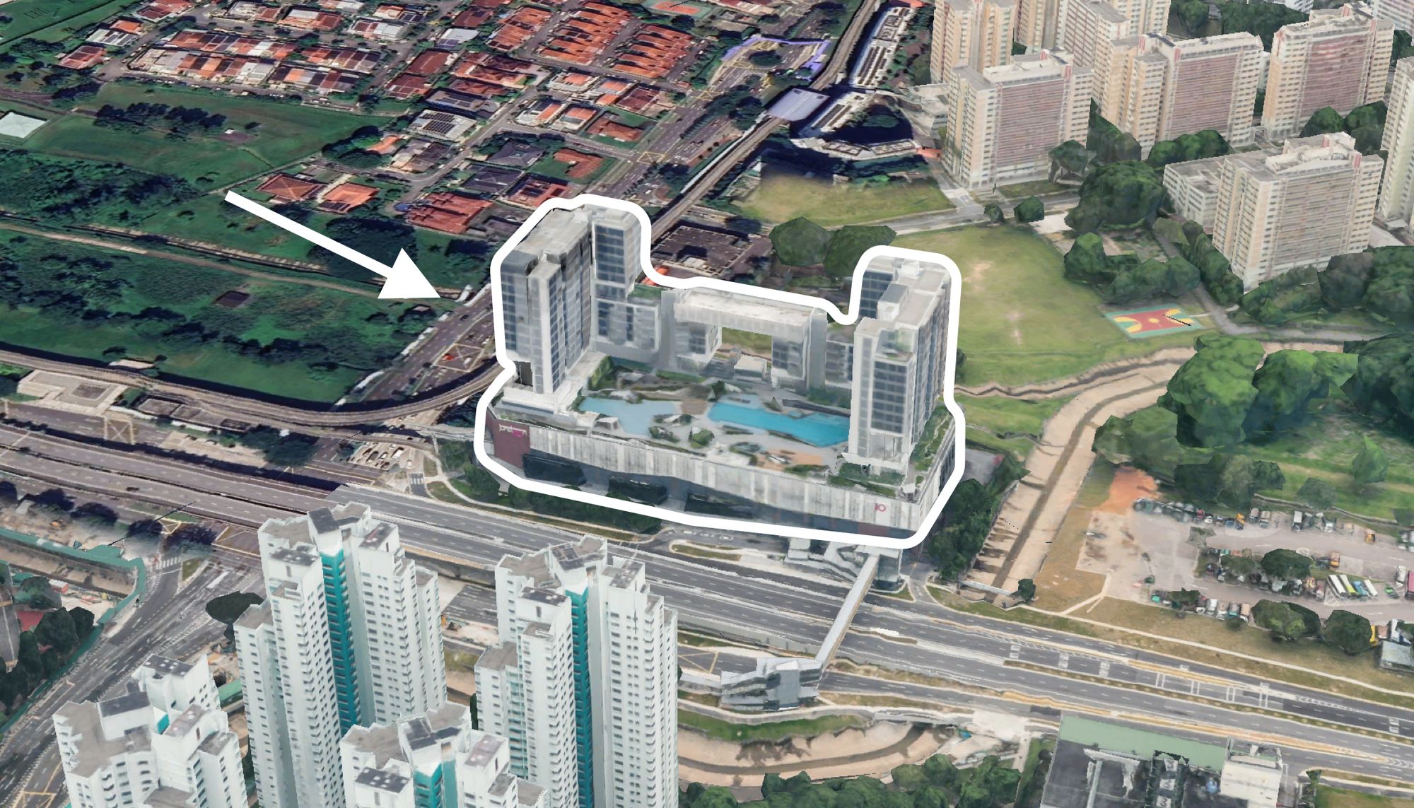
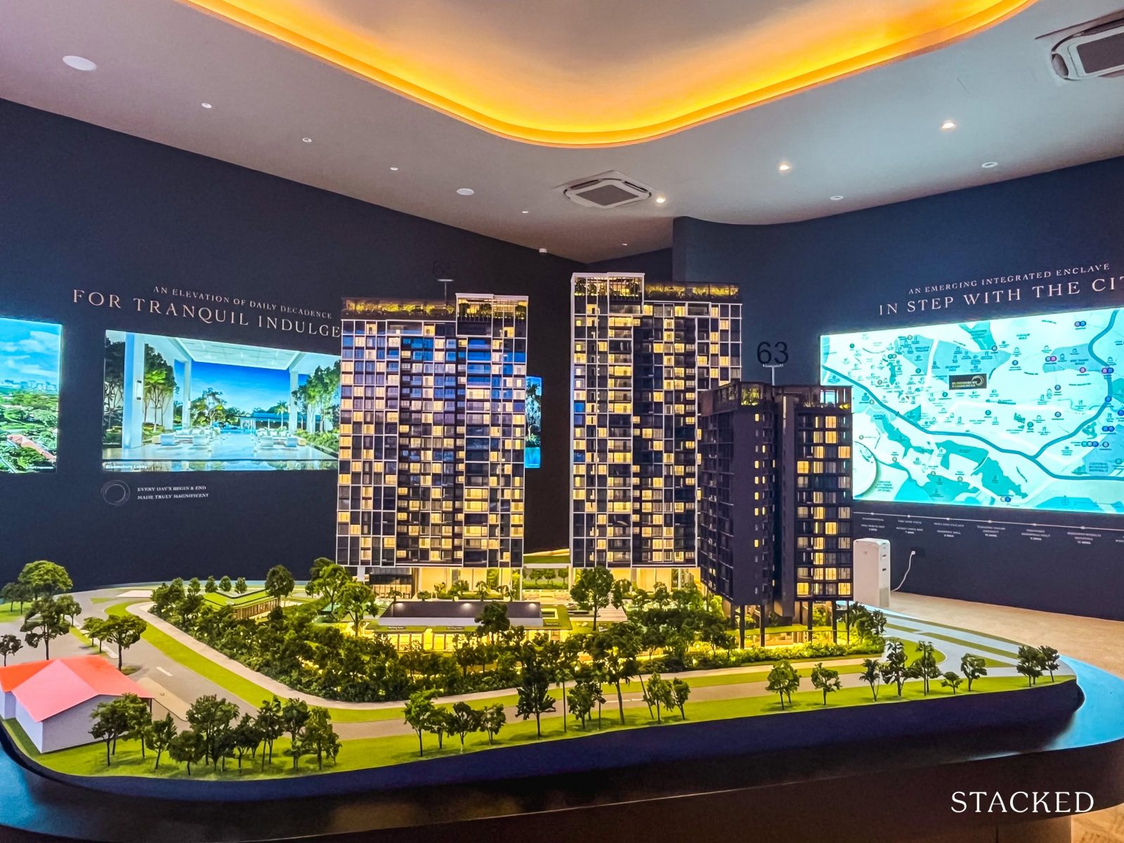
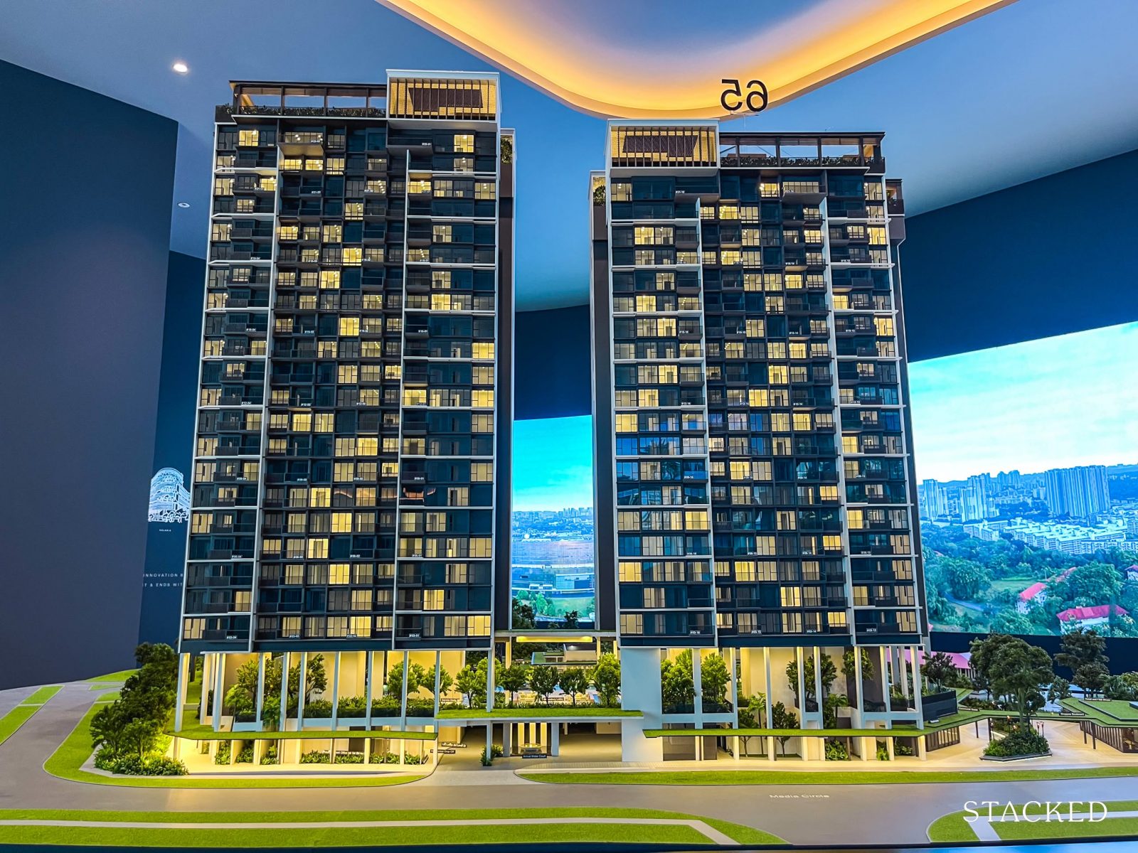
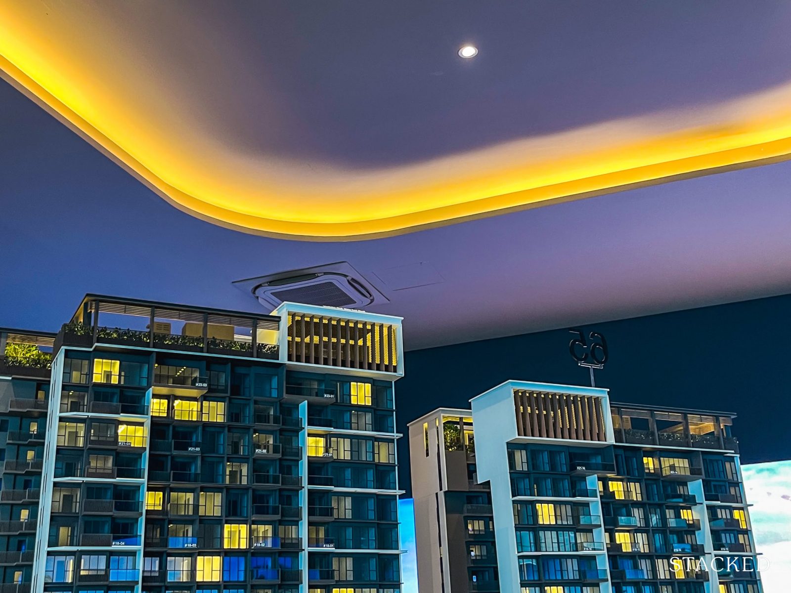
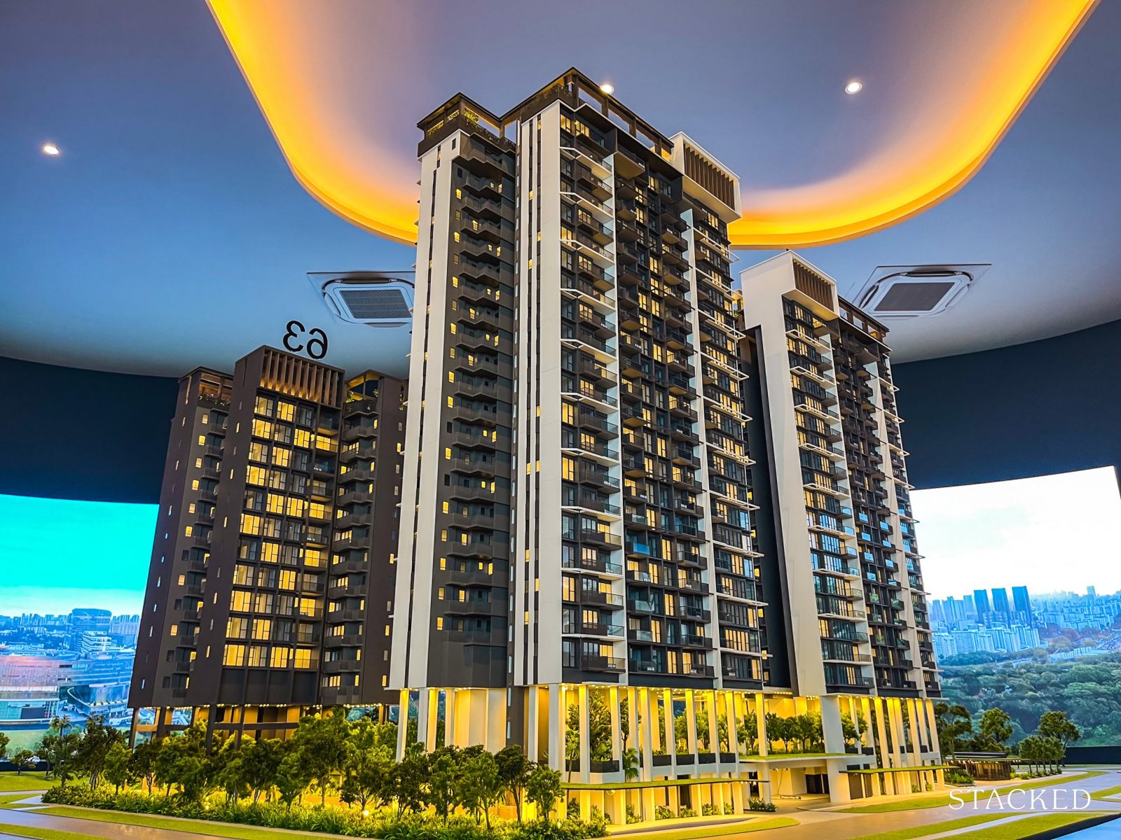
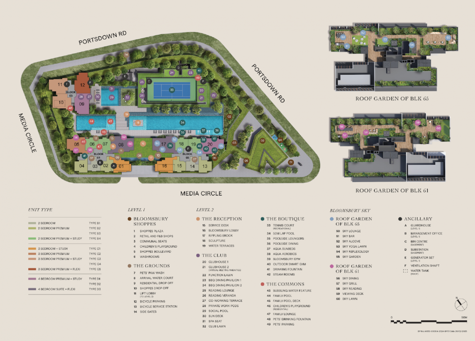
While the original URA plan called for four blocks on the site, Bloomsbury Residences has been finalised as a three-block development comprising 358 units. The blocks—numbered 61, 63, and 65—stand at varying heights between 14 and 23 storeys.
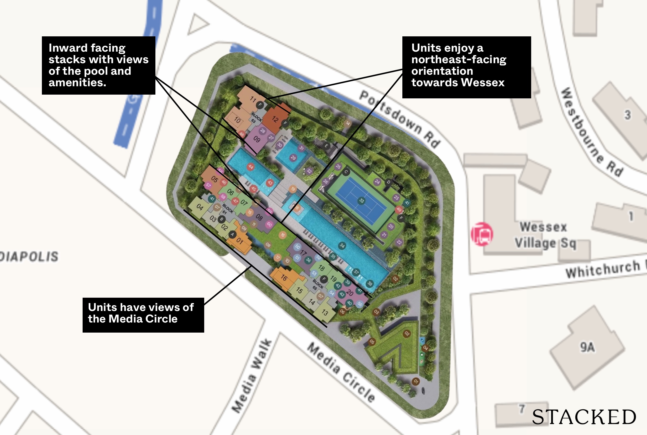
Before we dive into the blocks themselves, it’s worth highlighting one of the key design considerations: the developers have deliberately positioned the site layout and building orientation to capitalise on the unblocked views of the Wessex estate across Portsdown Road.
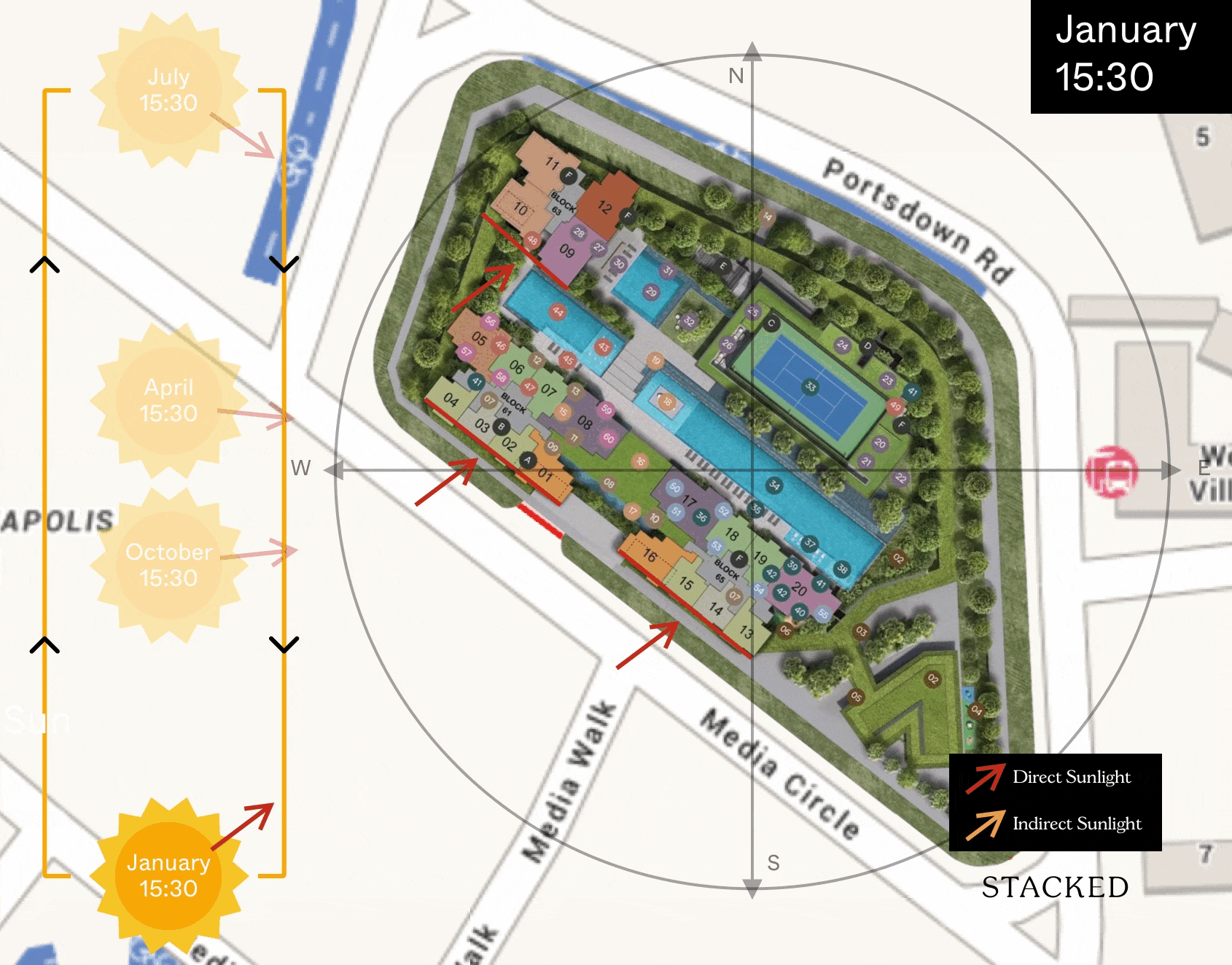
According to the developer, around 60 to 70 per cent of the units are angled to maximise these panoramic views—an uncommon offering in the One-North area. Blocks 61 (23 storeys) and 65 (21 storeys) enjoy a northeast-facing orientation towards Wessex, while units facing the opposite direction towards Media Circle are southwest-facing.
Naturally, the former is the more coveted view—not just for the lush, low-rise outlook over Wessex and beyond to Dawson and Bukit Timah Hill, but also for the minimal exposure to the afternoon sun.
That said, units facing Media Circle still enjoy unblocked views for now, given the current low-rise surroundings. However, this may be short-lived, with Parcels A and B in Media Circle yet to be developed. Once completed, they’re likely to obstruct some of the existing views in that direction.
From what we hear, Stacks 8 and 17 are considered the most premium—offering the best vantage points towards Wessex. It’s also where the larger and more premium units have been placed. However, the minimum floor height required to fully clear surrounding obstructions hasn’t been confirmed at the time of writing. So, if views are a priority, this is definitely something to clarify before committing.
Blocks 61 and 65 feature eight units per floor—a comfortable density by most standards. Each floor is served by two lifts, though it’s worth noting that two of the eight units come with private lift access for added exclusivity.
In contrast, Block 63 is a 14-storey point block with just four units per floor, offering a more private and exclusive living experience. With two lifts shared among only four units, it’s as exclusive as it gets.
Units here are either southeast- or northwest-facing. The southeast-facing units are the more favourable, thanks to their unblocked views towards the Dawson estate and reduced exposure to the afternoon sun. The northwest-facing units currently offer open skyline views, but as with Media Circle, these could change as the area continues to develop—and they do get a stronger hit from the afternoon sun.
As with many small to mid-sized developments, each floor plan is tied to a specific stack. So once you’ve settled on a preferred layout, your choices are largely limited to the available floors within that stack. For instance, buyers eyeing the Type D3 layout will only be choosing between Stack 8 or 17—and then deciding on the floor level.
On another note, the site also benefits from a slightly elevated terrain, which the developers have cleverly incorporated into the design.
All residential units begin from Level 3, offering an approximate 8-metre elevation from street level. The first two floors have been reserved for landscaping and communal facilities, which not only enhances privacy but also improves noise control and gives even the lowest-floor units better views.
Bloomsbury Residences Pricing Analysis Review
If you’re considering Bloomsbury Residences, you’re likely comparing it with nearby launches—and rightly so. Here’s a quick overview of how it stacks up, with a deeper pricing review to follow soon.
Indicative launch prices:
- 2-Bedroom (571 sq ft): From $1.37M (~$2,396 psf)
- 3-Bedroom + Study (904 sq ft): From $2.17M (~$2,396 psf)
- 4-Bedroom + Study (1,173 sq ft): From $2.87M (~$2,443 psf)
Interestingly, the larger units here command a slightly higher psf than the smaller ones—bucking the usual trend where larger layouts tend to come at a discount on a per-square-foot basis.
Taking an average across the three unit types, Bloomsbury sits at around $2,412 psf—a figure that’s not out of place in today’s new launch market.
For comparison, here are the average $PSF performance of recent new launches:
- The Orie: $2,704 psf
- Chuan Park: $2,579 psf
- Emerald of Katong: $2,621 psf
- ELTA: $2,537 psf
- Lentor Central Residences: $2,200 psf
- Parktown Residences (integrated development): $2,360 psf
Against that backdrop, Bloomsbury’s pricing doesn’t feel out of place. If anything, it appears to strike a middle ground between premium city-fringe launches and more accessibly priced OCR projects.
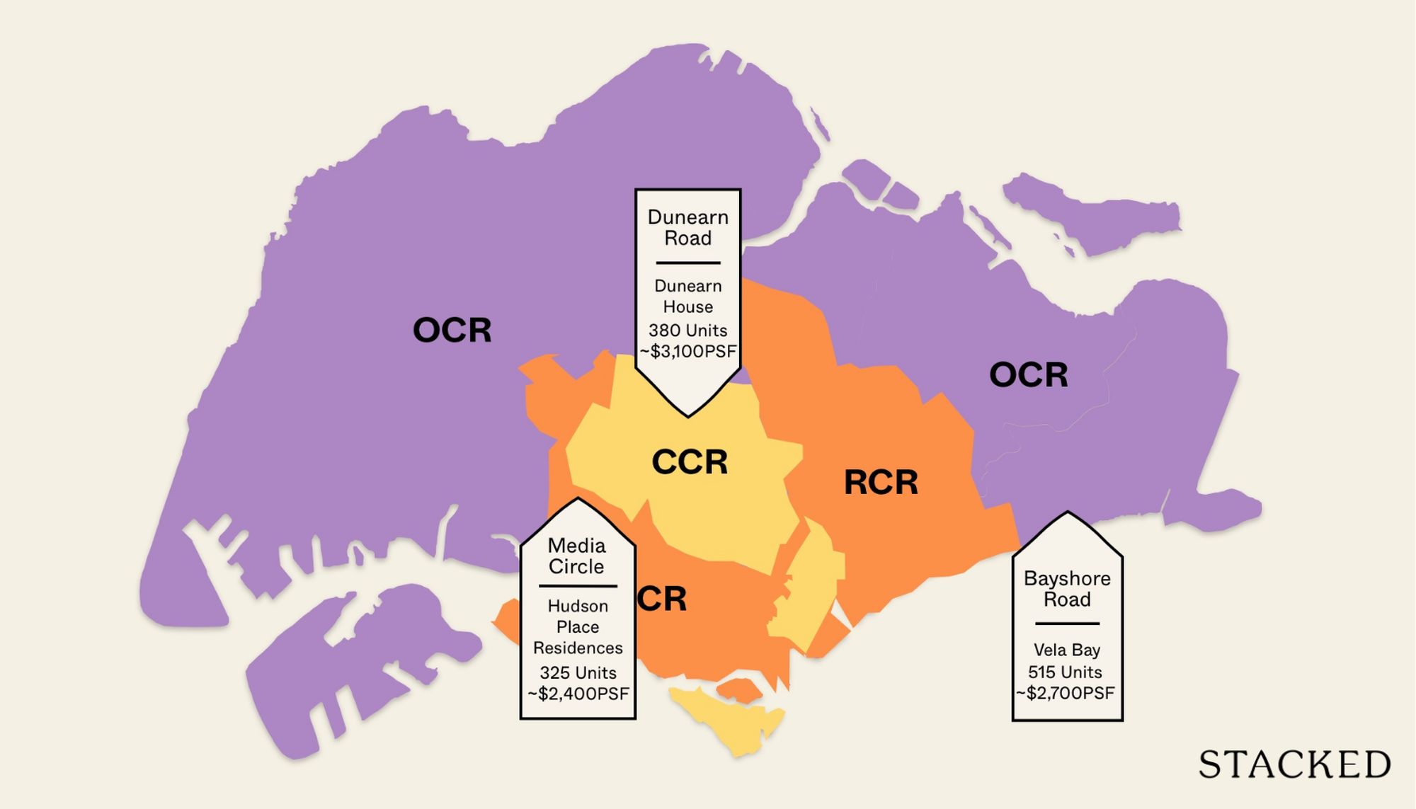
Now, let’s take a closer look at how it compares to surrounding developments in the One-North and Queenstown precincts.
| Development | Units | Average $PSF | TOP | Tenure | Price Gap |
| Bloomsbury Residences | 358 | $2,412 | 2029 | 99-year Leasehold | – |
| One Holland Village Residences | 296 | $3,781 | 2024 | 99-year Leasehold | -56.8% |
| Blossoms by the Park | 275 | $2,473 | 2026 | 99-year Leasehold | -2.5% |
| The Hill @ One North | 142 | $2,532 | 2026 | 99-year Leasehold | -5% |
| One-North Eden | 165 | $2,360 | 2025 | 99-year Leasehold | 2.2% |
| Kent Ridge Hill Residences | 548 | $1,945 | 2024 | 99-year Leasehold | 19.4% |
| Normanton Park | 1,840 | $1,817 | 2023 | 99-year Leasehold | 24.7% |
| The Rochester Residences | 334 | $1,543 | 2011 | 99-year Leasehold | 36% |
| One-North Residences | 405 | $1,650 | 2009 | 99-year Leasehold | 31.6% |
| Treasure Place | 54 | $1,540 | 2006 | Freehold | 36.1% |
| Heritage View | 618 | $1,610 | 2000 | 99-year Leasehold | 33.2% |
| Dover Parkview | 686 | $1,397 | 1997 | 99-year Leasehold | 42.1% |
As a pre-cursor, keep in mind that Bloomsbury Residences is the only project in One-North developed under the post-GFA harmonisation guidelines.
This typically results in a higher $PSF, but a comparable overall quantum when stacked against older launches—thanks to more efficient use of internal space. It’s also the first and only project located in the Mediapolis precinct; the rest are clustered closer to Buona Vista and the commercial core of One-North.
Even so, Bloomsbury Residence’s pricing sits within a range that the market seems to accept for this area. From the recent transactions, it at a slightly lower $PSF than Blossoms by the Park and The Hill @ One-North, despite being a newer project. That said, those projects enjoy closer proximity to MRT stations and key amenities, which likely explains the premium.
Normanton Park is another development often brought into comparison, given its proximity. However, it’s technically outside One-North and functions more as a mega-development with very different positioning. Still, the 24.7 per cent price gap may appear stark to some buyers.
Older projects in the area—such as Dover Parkview, Heritage View, and One-North Residences—tend to hover in the $1,500 to $1,600 psf range, highlighting the price uplift seen in newer launches.
One Holland Village Residences is also worth a mention.
While it sits within the Core Central Region (CCR) and belongs to a different precinct altogether, its proximity to One-North makes it a relevant comparison. For buyers priced out of Holland V, One-North offers a potentially more accessible alternative.
Lastly, Qingjian and Forsea Holdings have secured the neighbouring Parcel A site at a land price roughly 13 per cent lower than Bloomsbury Residences.
The difference, according to the developer, lies in the management of the commercial component—Bloomsbury retains and manages its retail spaces, while Parcel A’s will fall under MCST control. However, given their shared stake in the precinct’s future, it’s unlikely the two projects will compete directly on pricing, which should give buyers of Bloomsbury Residences a confidence boost.
Bloomsbury Residences Appreciation Analysis
- More homes planned in Media Circle to support housing demand
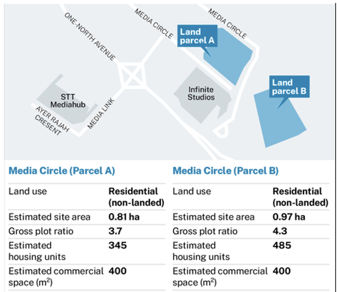
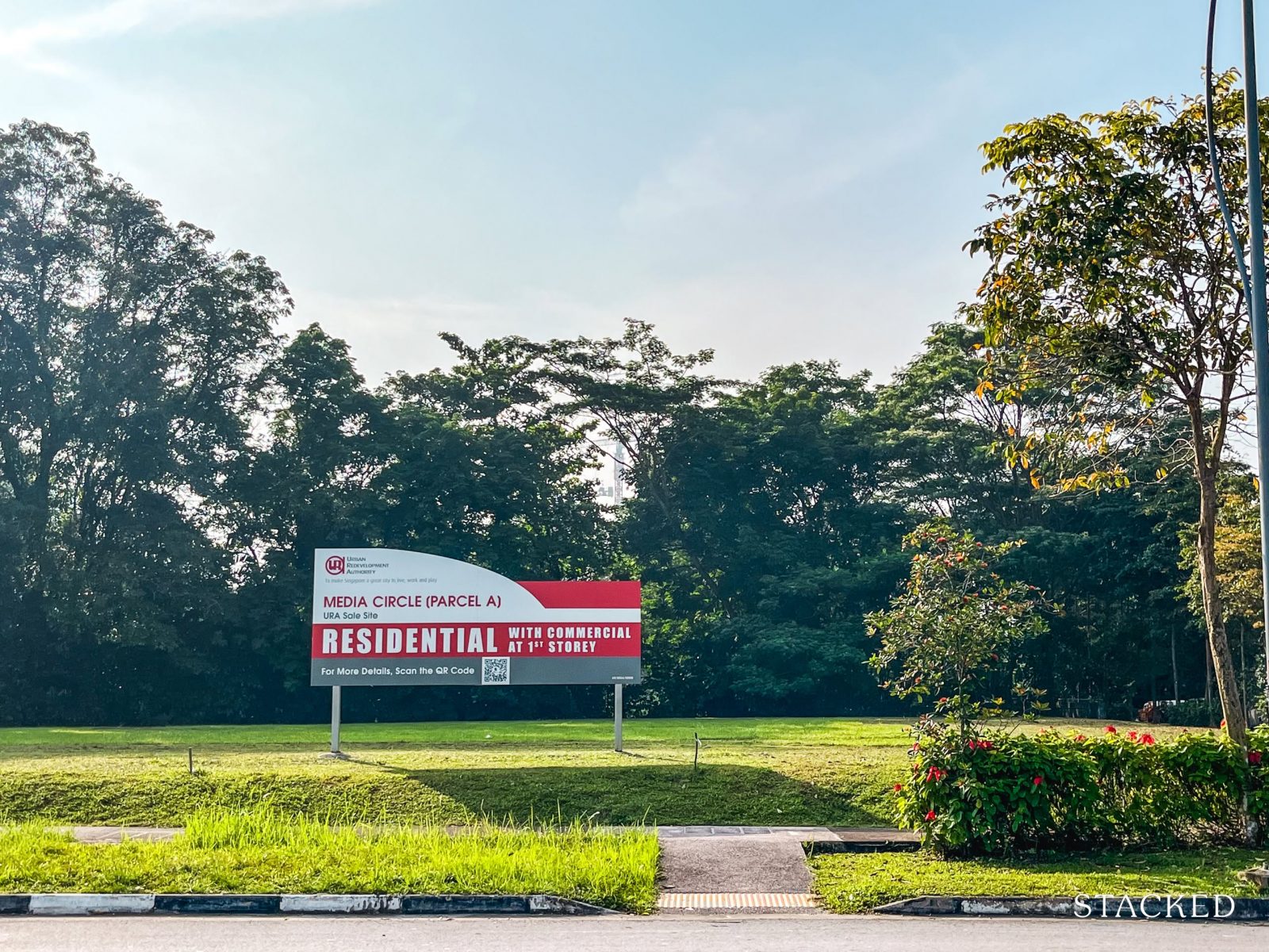
Notably, the site that Bloomsbury Residences sits on was previously zoned for business park use.
In a move to inject more housing into the Science Park area, URA has since rezoned parts of Mediapolis for residential development. Aside from Bloomsbury, two other plots—Media Circle Parcel A and Parcel B—have also been earmarked for future homes.
So far, Qingjian and Forsea Holdings have once again emerged as the top bidders for Parcel A, reinforcing their growing presence in this corner of One-North. Meanwhile, the tender for Parcel B is still ongoing and is set to close on 29 April—so there’s more to watch on that front. That said, it’s likely the Qingjian and Forsea Holdings would want to strategise their pricing for both of these projects to work to their benefit.
Both upcoming projects are expected to carry the same zoning as Bloomsbury Residences, with a commercial component on the ground floor. Combined, Parcels A and B are estimated to yield over 800 residential units, which will further shape the future residential fabric of this emerging enclave.
What’s particularly noteworthy is that the winning bid for Parcel A came in about 13 per cent lower than what the developers paid for the Bloomsbury Residences site.
While this might raise some eyebrows at first glance, the difference boils down to how the commercial component is being managed. At Bloomsbury, the developers will retain and manage the retail space—giving them control (and rental returns) from those units. In contrast, Parcel A’s commercial component will fall under the MCST, meaning the developer won’t earn from its rental revenue. The land price, in this case, reflects that difference in valuation.
- URA rejects bid for Media Circle’s Long-Stay Serviced Apartment
Another point worth noting is the adjacent plot zoned for long-stay serviced apartments. Frasers Property was the sole bidder for the 62,046 sq ft site, submitting an offer of $120.09 million. However, URA ultimately rejected the bid, citing the offer as being too low.
The site, which comes with a 60-year lease, was earmarked for a new housing typology with a minimum stay duration of three months—essentially targeting longer-term serviced living. For now, the future of this plot remains uncertain and up for grabs.
- Proximity to Greater Southern Waterfront and Jurong Lake District
Some of Singapore’s most anticipated transformation areas—the Greater Southern Waterfront (GSW) and Jurong Lake District (JLD)—are set to significantly boost the appeal of the West.
The GSW envisions a seamless waterfront experience, with more green spaces and enhanced connectivity along the southern coastline. Meanwhile, the JLD is poised to become Singapore’s second CBD—a self-sufficient district where businesses, residents, and leisure spaces converge, all centred around a lush lakefront setting.
That said, considering that Bloomsbury Residences is within a 15 to 20-minute drive to these emerging spots, it’s well-positioned to benefit from the ripple effects of both transformations.
- Queensway Node: New Community Areas for Rail Corridor
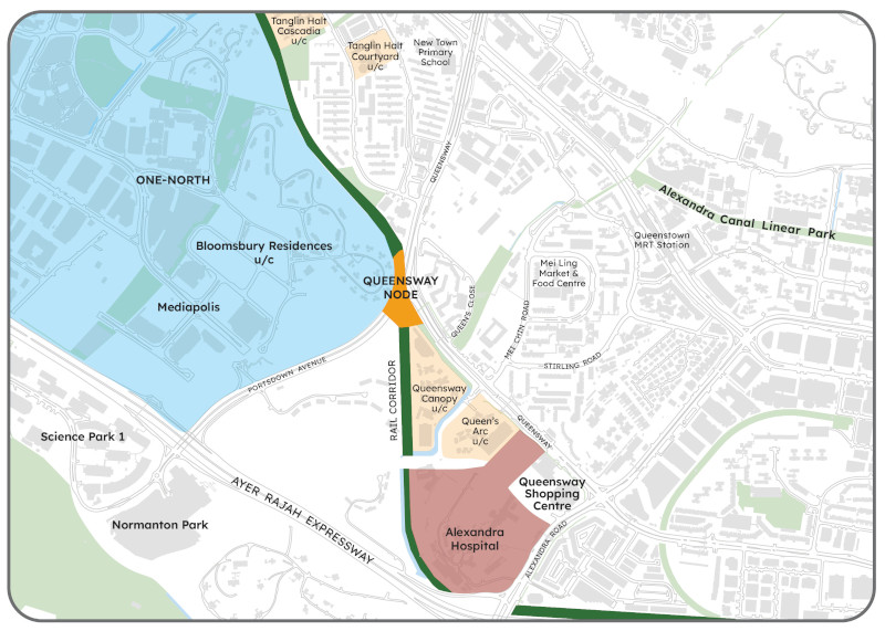
The upcoming Queensway Node—located just across the Alexandra Forest from Bloomsbury Residences—aims to revitalise the area with new public spaces, green linkages, and community activity beneath the Queensway Flyover.
With the Rail Corridor running through it, this new node could enhance walkability and connectivity for Bloomsbury residents, while injecting more vibrancy into the wider Queenstown–One-North fringe. That said, it remains very much a work-in-progress, with URA still in the early stages of planning and feasibility studies.
- Possible extension of Singapore’s MRT Line
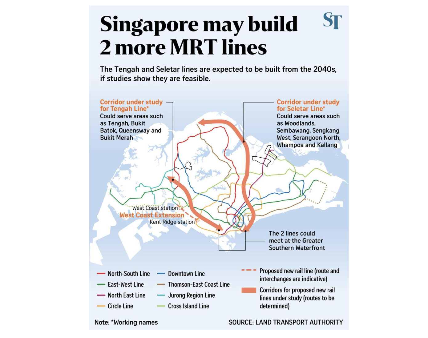
This one’s still in the feasibility study phase, but word on the ground is that Singapore may see two new MRT lines added to its already extensive network. One of the more notable proposals is the West Coast Line, which could run through Kent Ridge Station—relatively close to Bloomsbury Residences.
That said, these plans are only expected to materialise around 2040, so it’s still some way off. And even then, it’ll take time before the effects are truly felt on the ground.
What we like
- Unblocked views overlooking the Wessex estate
- Close proximity to some of Singapore’s most sought-after schools across all levels (e.g. NUS, Ngee Ann Polytechnic, Tanglin Trust)
- Full suite of condo facilities
- On-site commercial offerings for added convenience
- High-quality white goods included
- Generally efficient and well-planned layouts
What we don’t like
- –Not within walking distance of an MRT station
- –The neighbourhood tends to be quiet—almost deserted—on weekends
- –No primary schools within a 1km radius
- –Lack of established amenities in the immediate area (e.g. coffee shops, supermarkets)
- –Daily conveniences are limited, with offerings skewed more towards worker-centric needs
Our Take
I’ll start my conclusion by addressing the elephant(s) in the room: Bloomsbury Residences may not tick all the conventional boxes of what buyers typically look for. There’s no MRT at your doorstep, no primary school within a 1-km radius, and the surrounding amenities are still sparse, skewed more toward weekday office crowds than everyday family life.
But for some, that’s also what makes this project worth a closer look.
Bloomsbury Residences doesn’t try to imitate the buzzier pockets of One-North. Instead, it offers a quieter alternative—a rare combination of elevated greenery, unblocked views of the Wessex estate, and architecture that gestures to the area’s colonial past. It’s also the only One-North project so far built under the post-GFA harmonisation guidelines, which means layouts are likely to feel more space-efficient than earlier launches.
And while it may seem tucked away now, this may not be the case for long.
Two more residential sites are slated to rise nearby, a new MRT line is under feasibility studies, and the Queensway Node is set to bring more public life and walkability to the area. On a macro level, its position between the Greater Southern Waterfront and Jurong Lake District gives it adjacency to some of Singapore’s most significant future transformations.
What’s more telling is the developer’s intent.
With Qingjian and Forsea securing the adjacent parcel, they’re clearly playing the long game in Mediapolis—mirroring placemaking strategies we’ve seen in other evolving districts like Lentor and Bugis. For buyers, that signals confidence—and a potential first-mover advantage.
At the end of the day, Bloomsbury Residences isn’t for everyone. But for those who believe in the value of getting in early, and are comfortable with a few trade-offs in exchange for longer-term gains, it offers something quietly compelling.
Not quite the One-North you thought you knew—but perhaps, a glimpse of what it’s becoming.
What this means for you
You might like Bloomsbury Residences if you:
-
Believe in a new township concept
While this isn’t the first launch in One-North, Bloomsbury Residences is the first to debut in the Mediapolis precinct—an area set to see two more upcoming projects. There’s a lot in store for this part of One-North, and if you believe in the long-term potential of a new township concept, this could be one to watch.
Have older schooling children and want convenient optionsOne of the key draws of living in the One-North area is its proximity to some of Singapore’s most established educational institutions—including Ngee Ann Polytechnic and Anglo-Chinese Junior College. Bloomsbury Residences will also offer shuttle bus services to NUS (though it’s not yet clear which faculty it will serve), signalling the developer’s intent to tap into the existing demand from the student and academic community.
Like living near your workplaceFor those working in the One-North or Buona Vista estates, Bloomsbury Residences offers a convenient location with easy access to both hubs. Unlike living right in the heart of One-North, it provides a quieter, more laid-back alternative—while still keeping you close to the action.
Value unblocked views and a tranquil environmentOne of Bloomsbury Residences’ key selling points is its unblocked views of the Wessex estate—something the developers have clearly capitalised on, with most units oriented to take full advantage of the scenery. As a result, the overall atmosphere here leans toward the more tranquil and laid-back side (for now).
You may not like Bloomsbury Residences if you:
-
Prefer to be within walking distance to daily amenities and MRT Station
If you prioritise being within walking distance of daily amenities and an MRT station, Bloomsbury Residences may fall short. It’s not located near any MRT station, and the surrounding area lacks a wide range of established conveniences—so those who value doorstep accessibility might find this location less than ideal. To address this issue, the developers will be arranging shuttle bus services to Buona Vista MRT Station, One-North MRT Station and NUS.
Need to be within 1-km radius of a primary school
While the area shines in terms of access to tertiary institutions, the lack of a primary school within a 1-km radius is a notable drawback for families with young children. Fairfield Methodist Primary School is located within 2km, but that still falls outside the coveted 1-km priority admission zone.
Prefer living in a neighbourhood with local flairIf you prefer living in a neighbourhood with a more local, lived-in feel, One-North may not quite hit the mark. Unlike more established heartland areas like Pasir Ris or Clementi, most amenities here are geared towards the working crowd. As a JTC-planned estate, the urban planning takes a more business-centric approach—something that inevitably shapes the lifestyle and overall liveability of the area.
End of Review
At Stacked, we like to look beyond the headlines and surface-level numbers, and focus on how things play out in the real world.
If you’d like to discuss how this applies to your own circumstances, you can reach out for a one-to-one consultation here.
And if you simply have a question or want to share a thought, feel free to write to us at stories@stackedhomes.com — we read every message.
Frequently asked questions
What is the price range for 2-bedroom units at Bloomsbury Residences?
The article mentions that 2-bedroom units start from $1.366 million.
Where is Bloomsbury Residences located and what makes its environment unique?
It is located in the Mediapolis precinct of One-North, offering a quieter, green environment with unblocked views of Wessex estate, contrasting with the usual office park atmosphere.
What amenities and facilities are available at Bloomsbury Residences?
The development features a lobby, sheltered communal spaces, a gym with smart features, delivery robots, kids’ play area, family lounge, three pools, open-air co-working zones, and a tennis court.
How are the units designed to maximize views and privacy?
Units are angled to face outward towards Wessex estate and beyond, with towers elevated on stilts to improve views, privacy, and reduce street noise.
What is the land cost for Bloomsbury Residences and how does it compare to nearby projects?
The land was secured at $395 million ($1,191 psf ppr), which is the lowest among recent launches in the area, and slightly lower than nearby projects like Blossoms by the Park and The Hill @ One-North.
Our Verdict
76%
Overall Rating
With 358 units, Bloomsbury Residences stands as the largest launch in One-North so far.
Unlike earlier developments situated in the precinct’s commercial core, this project is located in the quieter Mediapolis area—marking the first residential entry into this part of the estate. Instead of the typical high-rise surroundings, it faces the Wessex estate, offering unblocked greenery and a more subdued environment.
That said, it isn’t within walking distance to an MRT station, and nearby amenities mainly serve the office crowd. Two more sites nearby are expected to launch, adding to the area's gradual evolution.
Join our Telegram group for instant notifications
Join Now
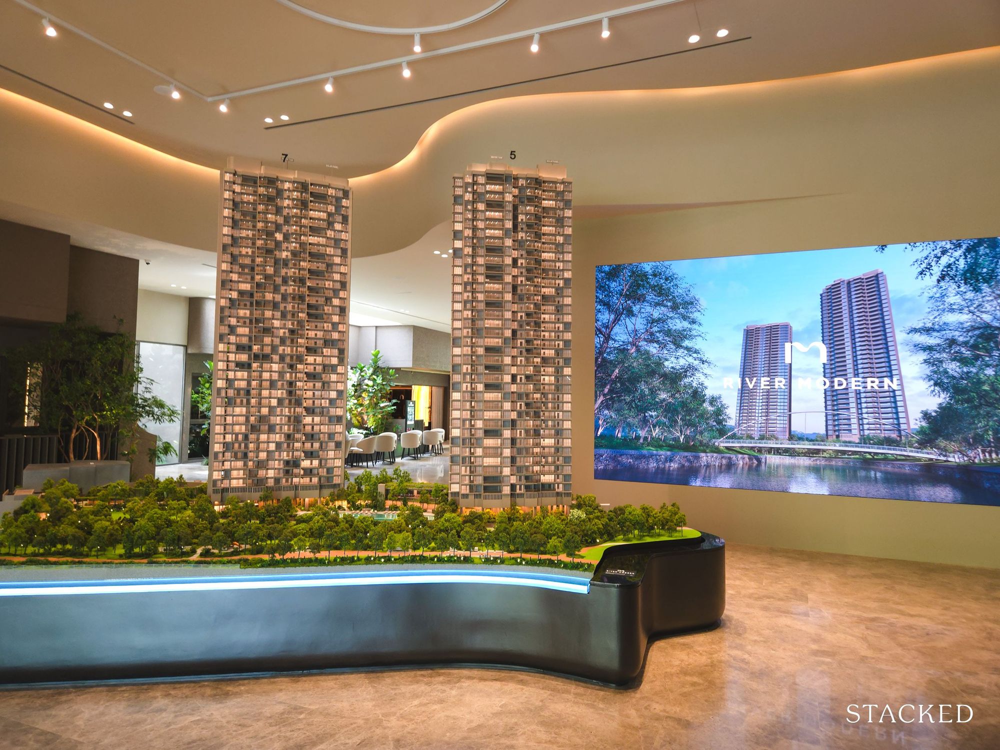
0 Comments