Apart from the unanimous chant of “lower prices,” or “more storage” that is. Considering how high new launch prices have gone, buyers have every right to be more discerning and demanding. Certain trends from before – such as boasting a sheer number of facilities, are falling by the wayside.
So while the general the new launches today have definitely evolved a whole lot from the older condos, here’s what modern homebuyers today are looking more for as of 2023:
Table Of Contents
So many readers write in because they're unsure what to do next, and don't know who to trust.
If this sounds familiar, we offer structured 1-to-1 consultations where we walk through your finances, goals, and market options objectively.
No obligation. Just clarity.
Learn more here.
1. Better facilities, instead of just more facilities
We blame this on the previous two or three years when it was in vogue for mega-developments to claim things like “128 facilities!”
When you take a closer look, you realise the developers labelled every tiny detail a “facility.” A pebbled path? Foot reflexology facility! A landscaped area with a Japanese vibe? Japanese garden facility! A jogging track running past the playground? Sports facility!
At this point, buyers have started to roll their eyes at the sheer number of such “facilities”. The concern is no longer about having 20 or 30 or 128 facilities, but about the quality of each particular facility.
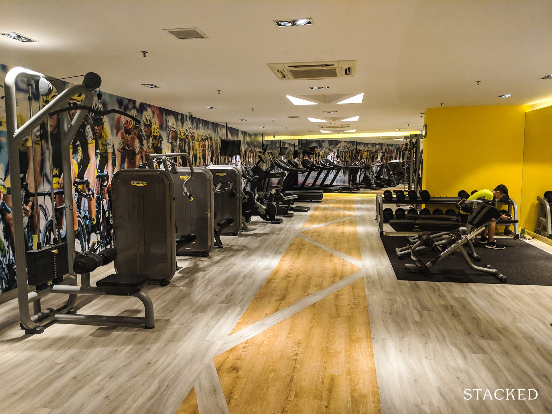
And with consumers today trending towards leading healthier lifestyles, it is clear that there is demand for fitness-focused facilities. So instead of just a gym with basic equipment, what about one with proper weights and equipment that can rival the paid gyms out there? For fitness enthusiasts, this could be a significant pull.
The same goes for playgrounds – which need to be more than one lonely-looking seesaw and some monkey bars. One major difference can come from having indoor playgrounds, especially in Singapore’s wet weather – observe that during the rainy season in the latter half of our year, playgrounds are devoid of anything but mosquito larvae.
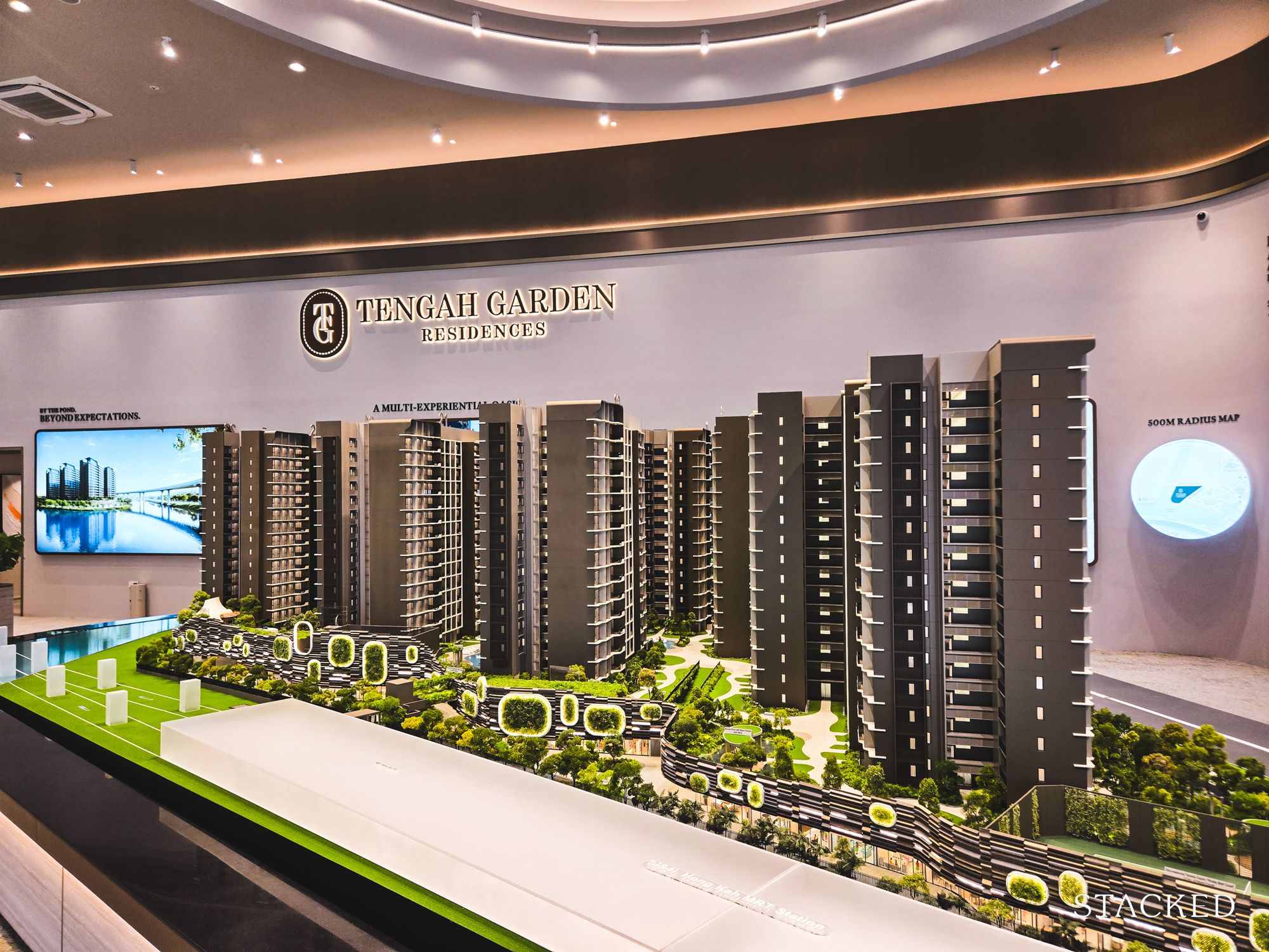
Developers can stand out by having really solid facilities executed well, rather than 100+ scattered and inconsequential ones. A great example is swimming pools today, which are often done to a high standard as it is used as a major selling point.
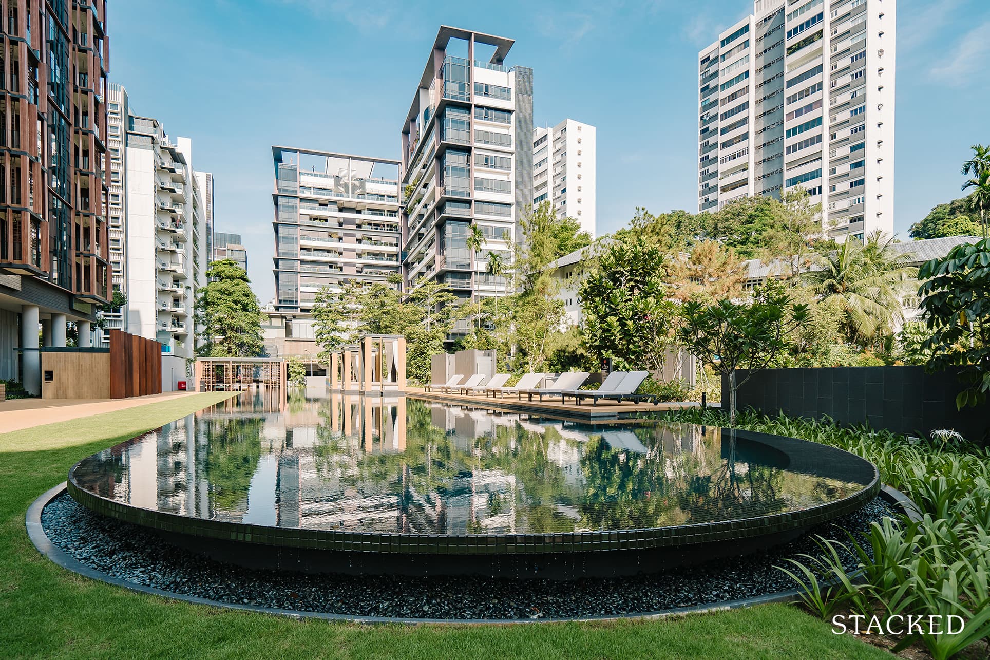
The other issue is really the added cost of maintenance of these facilities. What we’ve found after visiting many developments is that it is also quite clear how some of them are really under-utilised. The usual suspects would be facilities like a chess garden or an aqua gym, where it’s a vicious cycle of under-utilisation plus lack of maintenance (because it’s less used).
Buyers today are more conscious of the long-term cost of maintenance fees; so it’s better to have two or three facilities everyone truly appreciates, rather than to have a huge number – and hence a more expensive mix – of weak facilities to upkeep.
2. Facilities that are scaled to match the number of units
As part of the quality facilities in point 1, developers should ensure the facilities aren’t overly packed. Take gyms, for instance – what really works for buyers is not having to queue up behind two or three people for a warm-up, because the tiny gym only has space for two walkers.
Perhaps even a 24-hour gym (Treasure at Tampines has one), versus one that closes too early, is also vital for residents who work late hours. It could also be a better solution for a small gym, as residents are able to work around peak hours better.
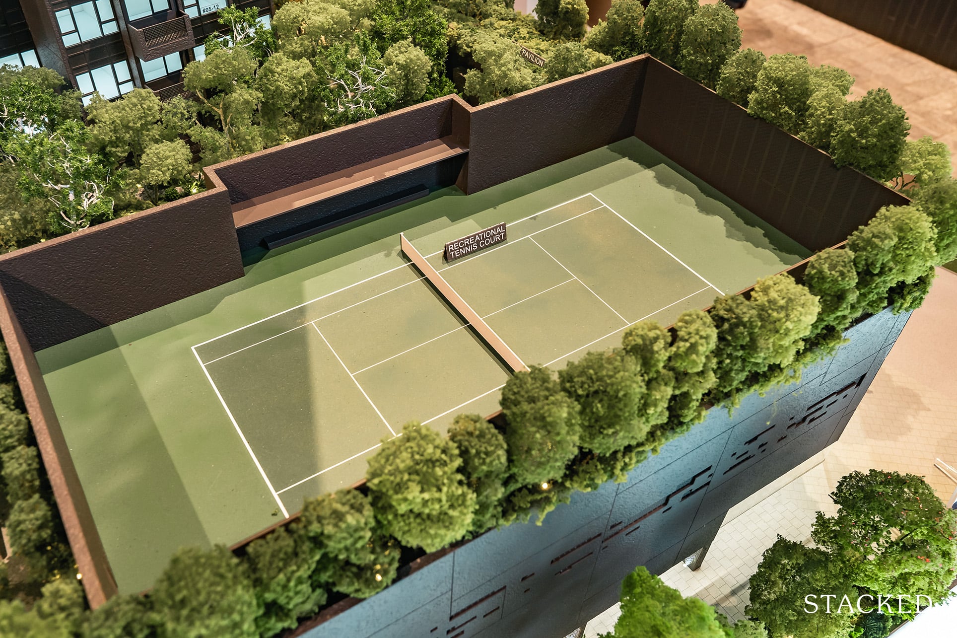
Without pointing fingers, we note that some new launches have only a single tennis court for more than 1,000+ units; and some have a tiny number of BBQ pits or pavilions, in relation to unit count. Even if these facilities are good, there’s no point when residents find them constantly overbooked.
3. Better mix of unit sizes and layouts
For most new launches out there today, the layouts are getting quite predictable. But perhaps there should be greater differentiation, especially among the bigger mass market launches to cater to different buyer profiles.
For example, not all family types are the same. Young couples, old couples without children, extended families, and lifelong singles all prefer different layouts. Not everyone needs a two-bedder with two bathrooms, and not everyone wants to give up living space for a pricier dual-key layout.
Some people also prefer bigger communal spaces over bigger bedrooms and vice versa. It’s fair game today to say that most new launches have similar-sized bedrooms, but there are buyers out there who prefer smaller communal spaces and bigger bedrooms. Likewise, we do know of parents who want the master bedroom to be further from the common bedrooms (for more privacy), but the typical layout is one in which all bedrooms are located along a long corridor.
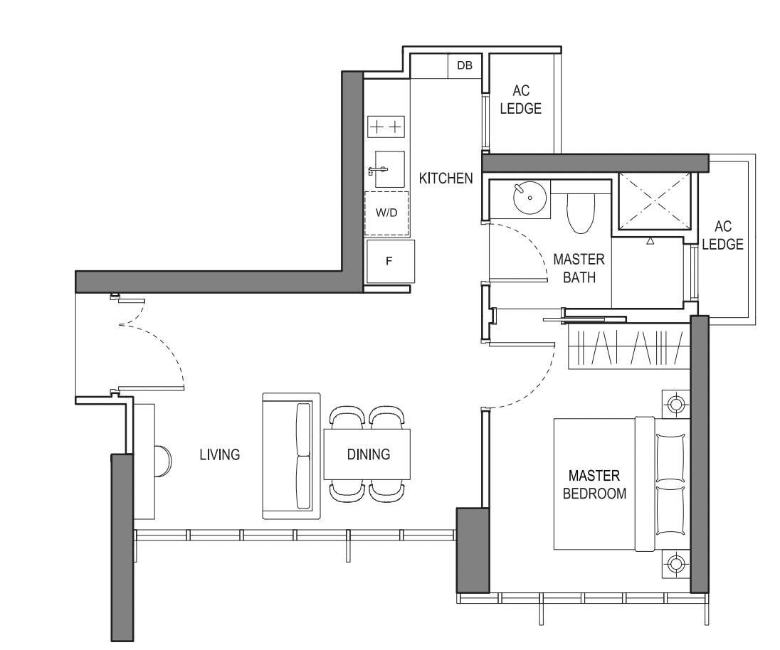
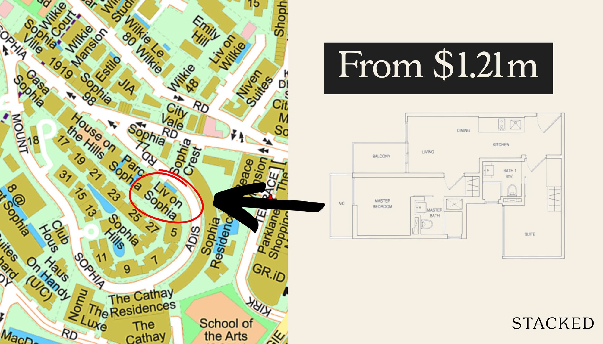
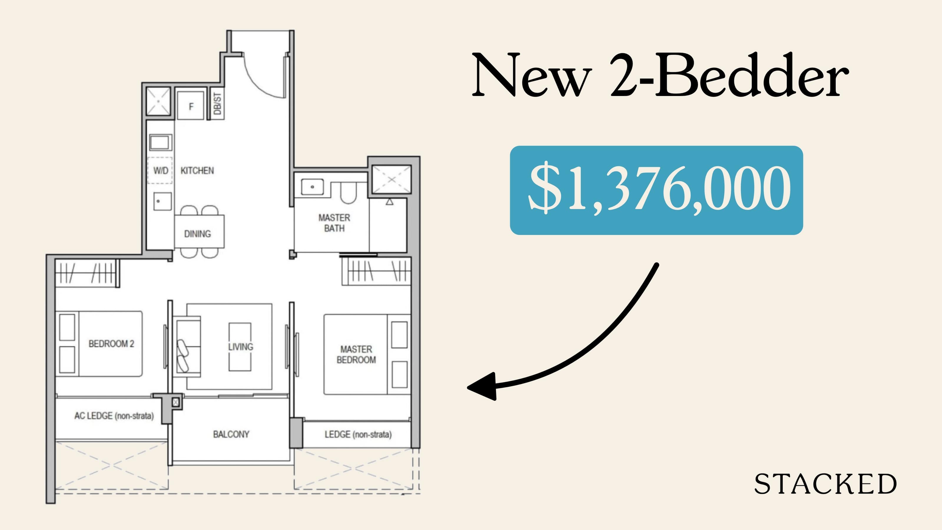
So could there be more innovation in terms of layouts for new launches? We’ve seen one of the best so far last year from the 1 bedroom layouts at LIV@MB, which is probably as good as it gets for units of such sizes.
4. Reno-friendly interior spaces
Not everyone likes the theme the developer has picked. This is where versatile interior spaces matter. We’ve seen some signs of this to date, such as with flexi-room layouts; but we can go further.
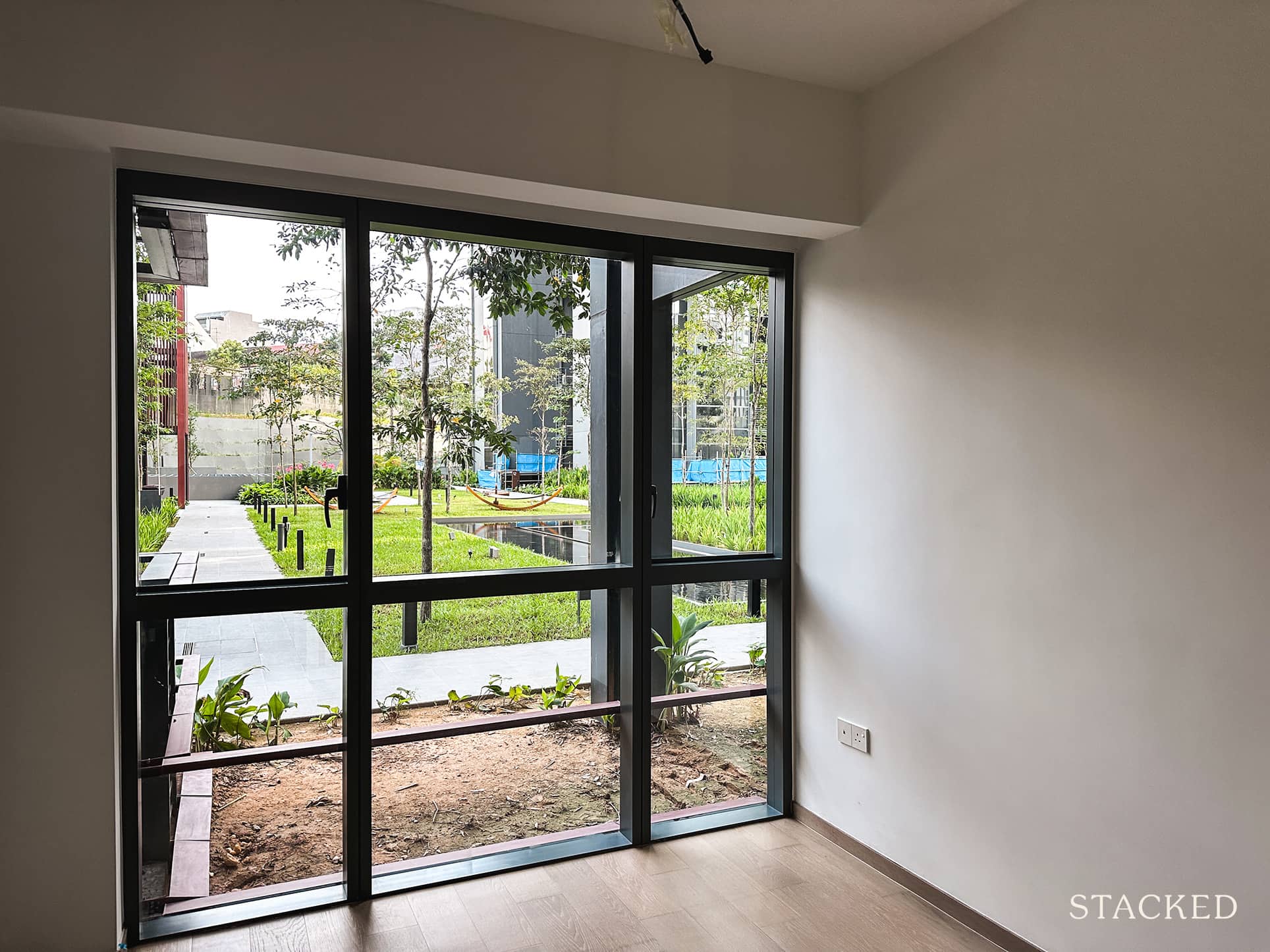
For example, how about units without the kitchen cabinetry or flooring done up, for buyers who are going to do a full renovation anyway? It will save them time and money (and it’s ecologically wasteful to hack up brand-new materials). Not everyone likes the flooring or cabinetry to be dictated by the developer. These units could be sold at slightly lower prices too, to account for the fewer provisions.
Likewise, some homeowners may want to enclose the kitchen or may want rooms reserved for specialised purposes (e.g., photographers, musicians, model kit makers). Space for further partitions should be considered, as well as the position of load-bearing walls to maximise flexibility.
5. Space-saving furniture
Also, as units are getting smaller, some developers have made some forays into space-saving furniture, but the implementations are tame at best. These are usually in the form of a simple extendable dining table or a pull-out mirror. But for developments that are particularly short on space, one great way to stand out is the implementation of space-saving or multi-use furniture.
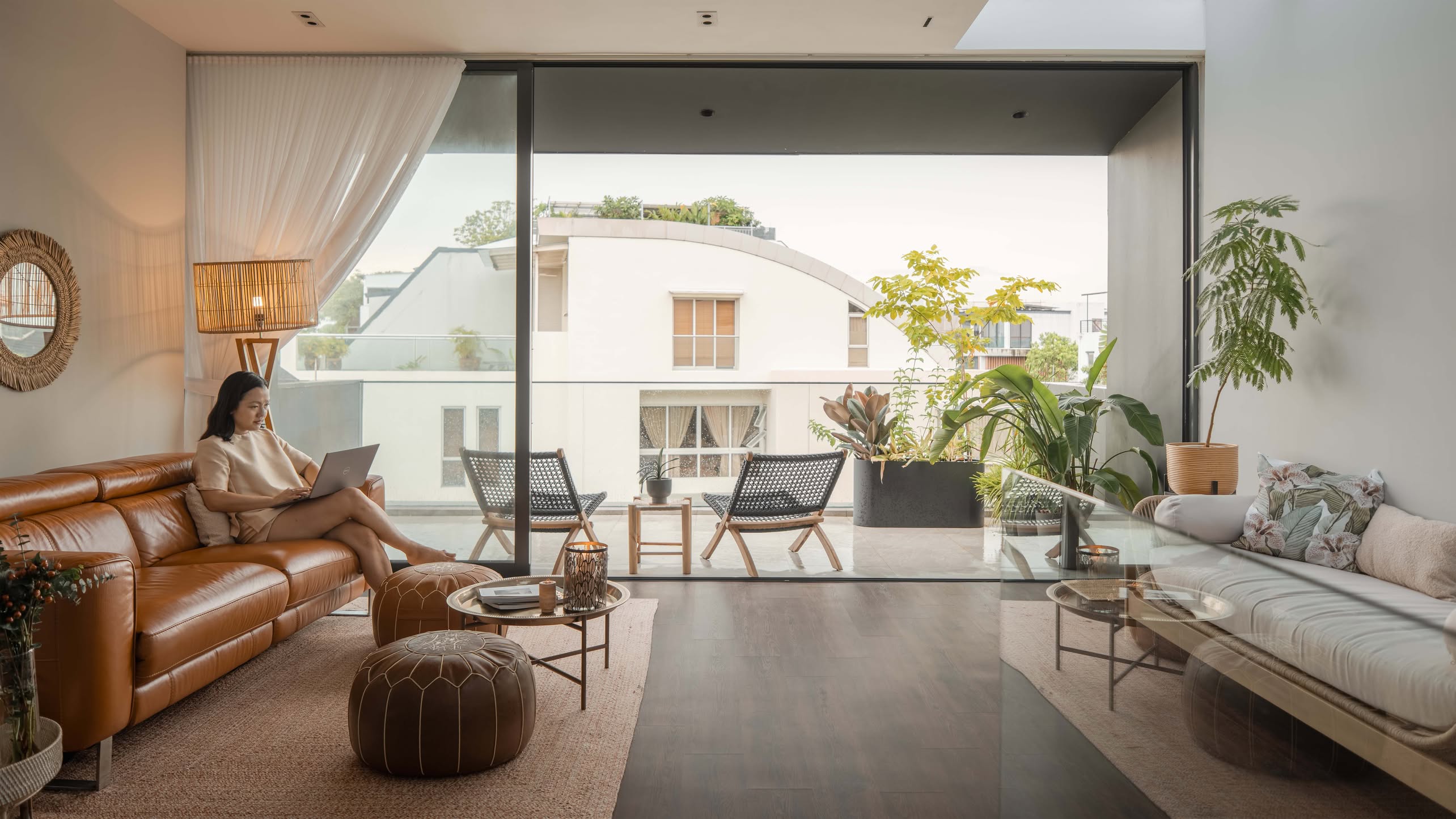
For example, take a look at this balcony, which provides small spaces with the flexibility of a balcony when needed.
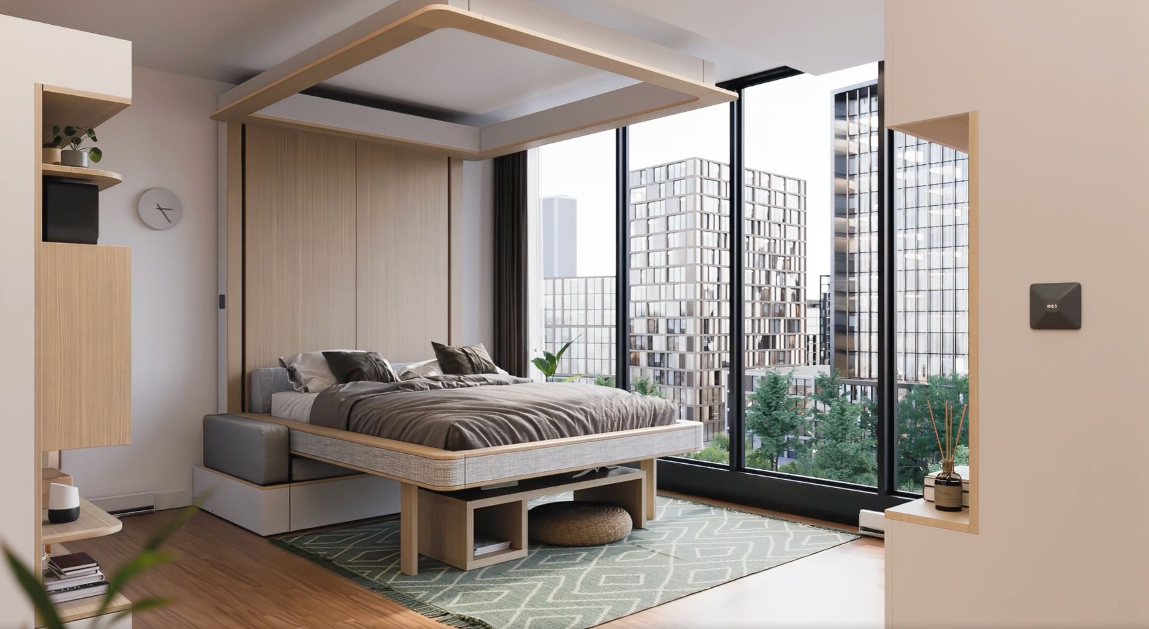
You can also see this micro apartment, where the bed and storage spaces drop down from the ceiling (controlled by an app).
Besides the cool “cloud bed”, there are also various other solutions that can be provided to micro apartments. Take this example from Ori Living, which shows how clever space-saving solutions can result in a maximised use of even a very small space.
For more on changing preferences and condo details, follow us on Stacked. We’ll also keep you updated on new and resale condo details alike, in our in-depth condo reviews.
At Stacked, we like to look beyond the headlines and surface-level numbers, and focus on how things play out in the real world.
If you’d like to discuss how this applies to your own circumstances, you can reach out for a one-to-one consultation here.
And if you simply have a question or want to share a thought, feel free to write to us at stories@stackedhomes.com — we read every message.
Ryan J. Ong
A seasoned content strategist with over 17 years in the real estate and financial journalism sectors, Ryan has built a reputation for transforming complex industry jargon into accessible knowledge. With a track record of writing and editing for leading financial platforms and publications, Ryan's expertise has been recognised across various media outlets. His role as a former content editor for 99.co and a co-host for CNA 938's Open House programme underscores his commitment to providing valuable insights into the property market.Need help with a property decision?
Speak to our team →Read next from Property Advice
Property Advice Hundred Palms, Riverfront Residences Or Tampines Trilliant — Which Is The Better Buy For A Young Family Today?

Property Advice Selling Our Holland Village HDB To Buy A Freehold Marine Parade Condo – Should We Wait?
Property Advice Should We Sell Our Freehold Condo For A $2.2M Leasehold Landed Instead?

Property Advice Should I Buy A Freehold Condo In A Landed Enclave — Or Look Elsewhere For Better Growth?
Latest Posts

Singapore Property News Singapore Property Market 1Q2026: Latest Housing Stats, Condo Prices, Supply And Demand
Singapore Property News 4-Room Flat at Bedok South Horizon Sets New Bedok Record at $1.17M

PRO Pro Where To Buy A Condo In Serangoon: Prices, Best Areas And Growth Trends In 2026










0 Comments