


Singaporean home buyers have an innate trust for graphs, charts, and anything that suggests “serious hard data”. But while it’s unlikely that any seller will outright lie to you, some will use selective presentation of data to mislead you. They might also interpret the data in a skewed way – sometimes without even intending to (even we’ve been guilty of that at times).
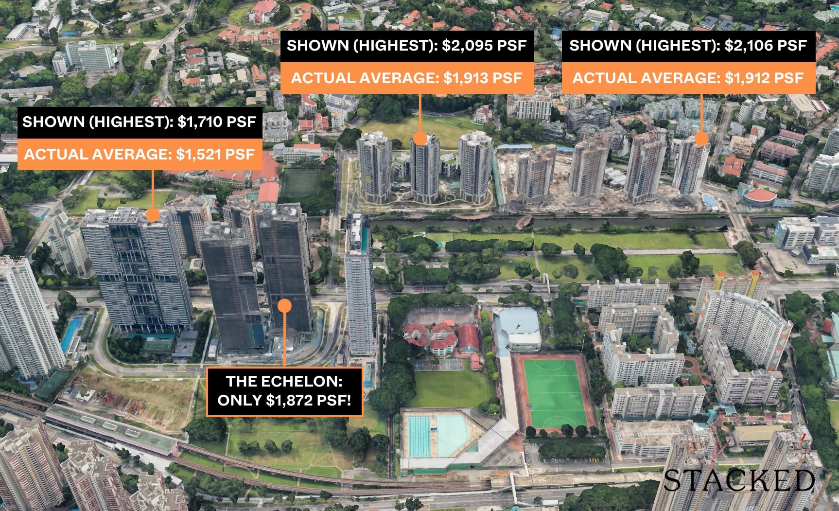
We’ve also seen presentation slides with figures that are cherry-picked to show a certain narrative. Take this illustration below as an example:
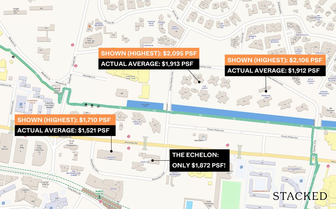
Shown this way, it may seem like the highlighted property is reasonably priced. But dig a little deeper, and you’d find that the surrounding properties actually show the highest prices – while the highlighted property is showing the average prices. Not a very fair comparison, is it?
Nevertheless, here are some of the other dangers to look out for:
Table Of Contents
- 1. Using the average (mean) price when there has been a recent outlier
- 2. Percentages in the rate of change
- 3. Manipulating the X-Y Axis on a graph to create visual impact
- 4. The floor of the unit is ignored, for purposes of comparison
- 5. The data is accurate, but the wider context is glossed over
- 6. Ignoring low transaction volumes
- 7. Using different starting and ending dates
So many readers write in because they're unsure what to do next, and don't know who to trust.
If this sounds familiar, we offer structured 1-to-1 consultations where we walk through your finances, goals, and market options objectively.
No obligation. Just clarity.
Learn more here.
1. Using the average (mean) price when there has been a recent outlier
When we compare property prices, we typically examine the past six to 12 months (anything later could give a distorted view). However, it may happen that during this time period, there was a significant outlier – a unit that transacted way above or below value.
When this happens, we usually exclude the outlier, or rely on the median rather than the average. Here’s why:
Say there were a fictional 10 transactions in a given block, of which nine units sold for $1.5 million. One unit sold for an unusually low price (perhaps an urgent sale), of just $1.2 million.
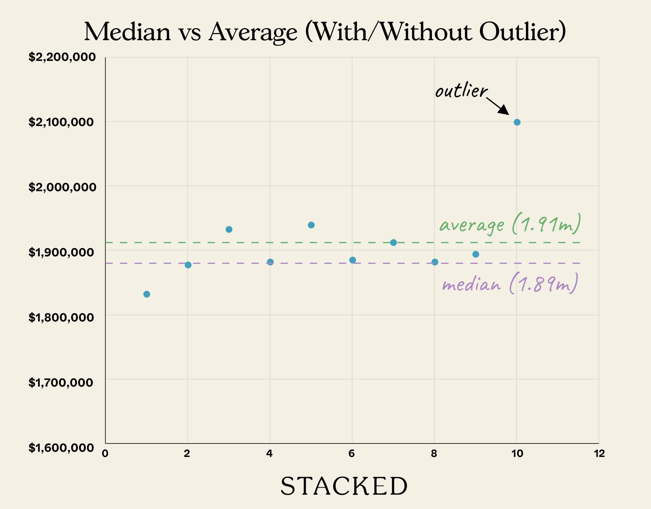
The average of the 10 transactions would then be $1.47 million, lower than the transaction price of 90 per cent of the units.
The same can happen with the reverse, where a single unusually high transaction skews the average. To avoid this, it helps to quickly scan through the transactions to make sure there isn’t a radical outlier; or perhaps just ask for the median.
(Note: Property agents may not be doing this on purpose. They sometimes use automated systems, such as those provided by property sites, which compute the averages for them).
2. Percentages in the rate of change
The reason for using percentages, instead of just giving you the absolute number, is that the pick-up can seem more significant.
For example, if we were to tell you that a new launch condo had only two sales last month, and then had four sales this month, you probably wouldn’t be impressed. But you might be if we told you there was a 100% increase in transaction volume over one month, which is true (2 + 100% = 4).
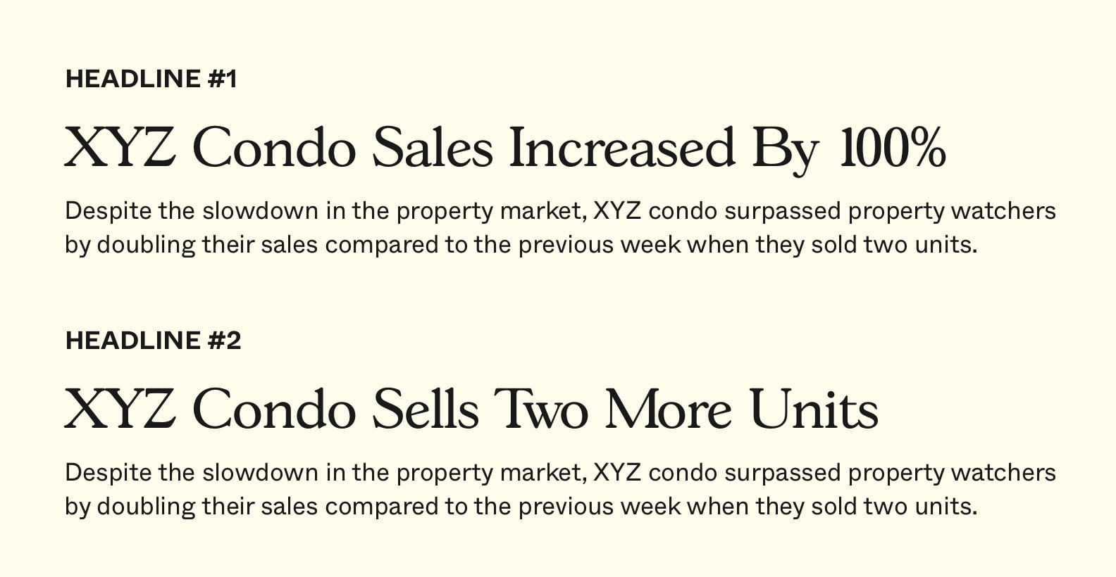
So when you see reports of rapid take-up rates, or news that “buyers of property type X increased by 70 per cent,” you may want to check the actual number. Coming from a slow month, percentages can make something seem like a huge trend, even if it’s just a handful of buyers or sellers involved.
3. Manipulating the X-Y Axis on a graph to create visual impact
This is not unique to the property market; it’s a trick devised by marketing firms for many other products. However, that does mean you can see it happen in sales brochures of fancy “quarterly reports” as well.
Most people look at the visual element (lines) on a graph, but don’t check the X and Y axis numbers. By manipulating the numbers along the axis (the increments), the seller can create the visual impression of bigger change.
For example, say we have a change in price between $1,600 psf to $1,700 psf, over a 10-year period. The price is on the Y-Axis, while the 10 years are on the X-axis.
A $100 change isn’t much. However, if we alter the Y-axis to rise in $20 increments, instead of $100 increments, it looks more dramatic:
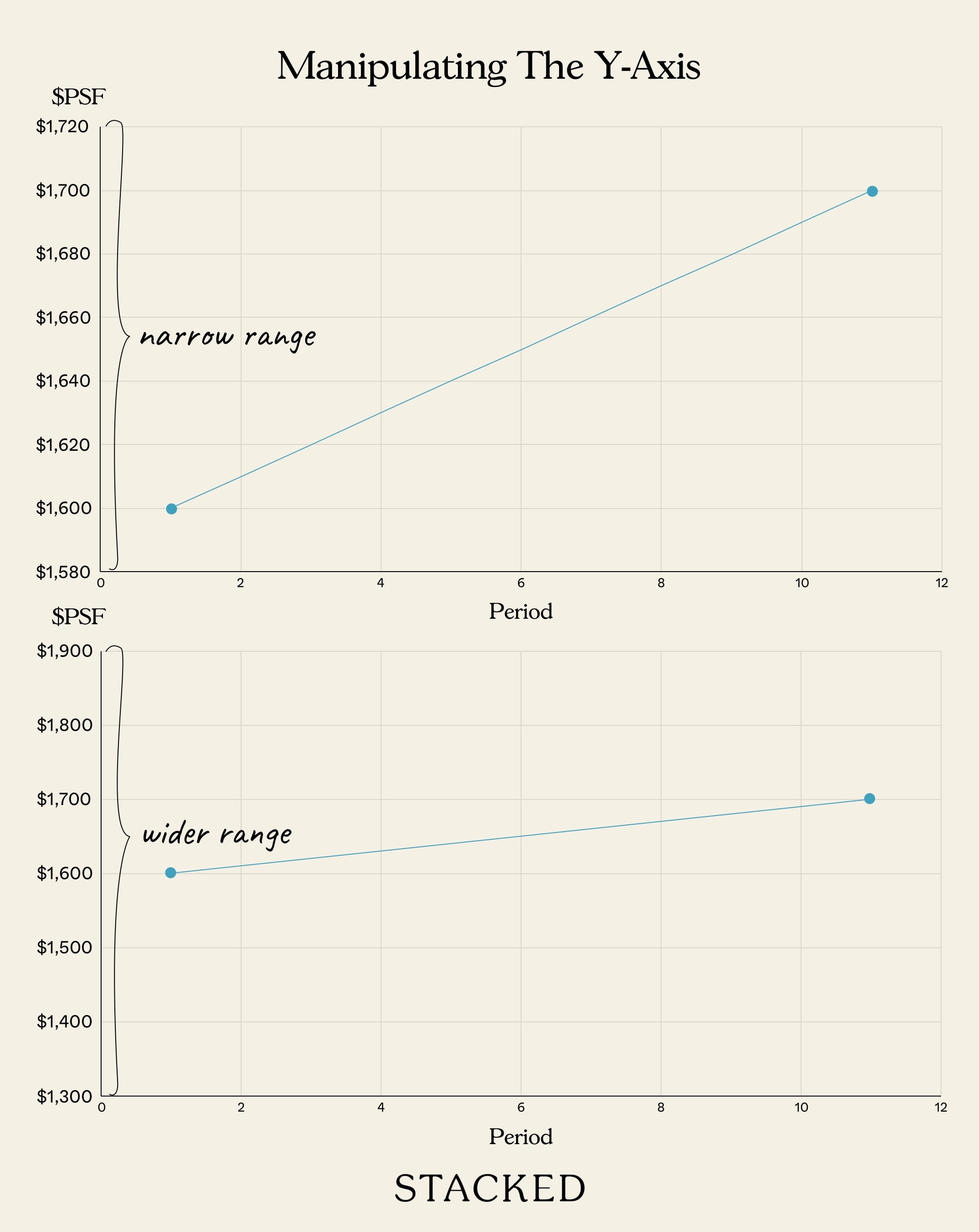
If you pay attention to the actual numbers on the X and Y Axis it’s quite easy to see through this; but as most people only spare a cursory glance, it’s a good (visual) marketing trick. Do note that this can also be achieved by narrowing the range. By setting a minimum and maximum value closer to the data, you can create a more pronounced visual effect as well.
4. The floor of the unit is ignored, for purposes of comparison
A high-floor unit will almost always cost more (although there are some exceptions, such as launch deals where all floors were priced the same).
When presenting transaction data, however, some sellers may omit the fact that they’re only showing you higher-floor units – even when the unit they’re selling is on the bottom 10 floors.

Once you’re done haggling the price down, you may end up at just the average price for your floor – you only feel you’ve gotten a bargain.
The same trick is sometimes used on sellers, to convince them their unit is worth a bit less than they expect (the transactions for lower floor units are presented instead).
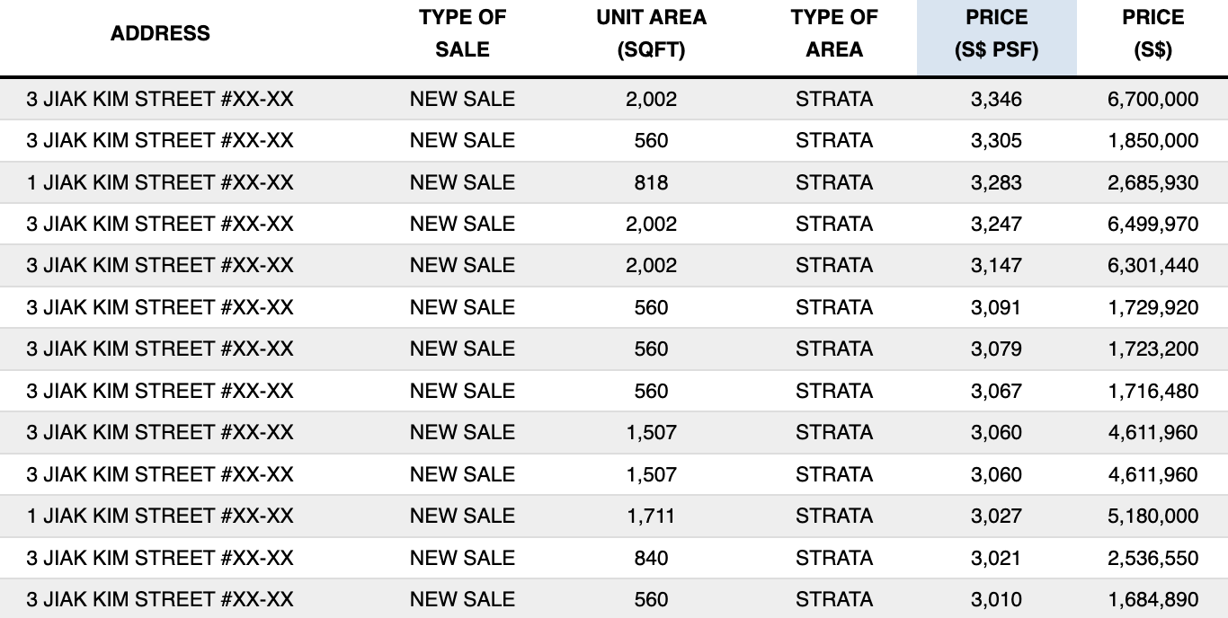
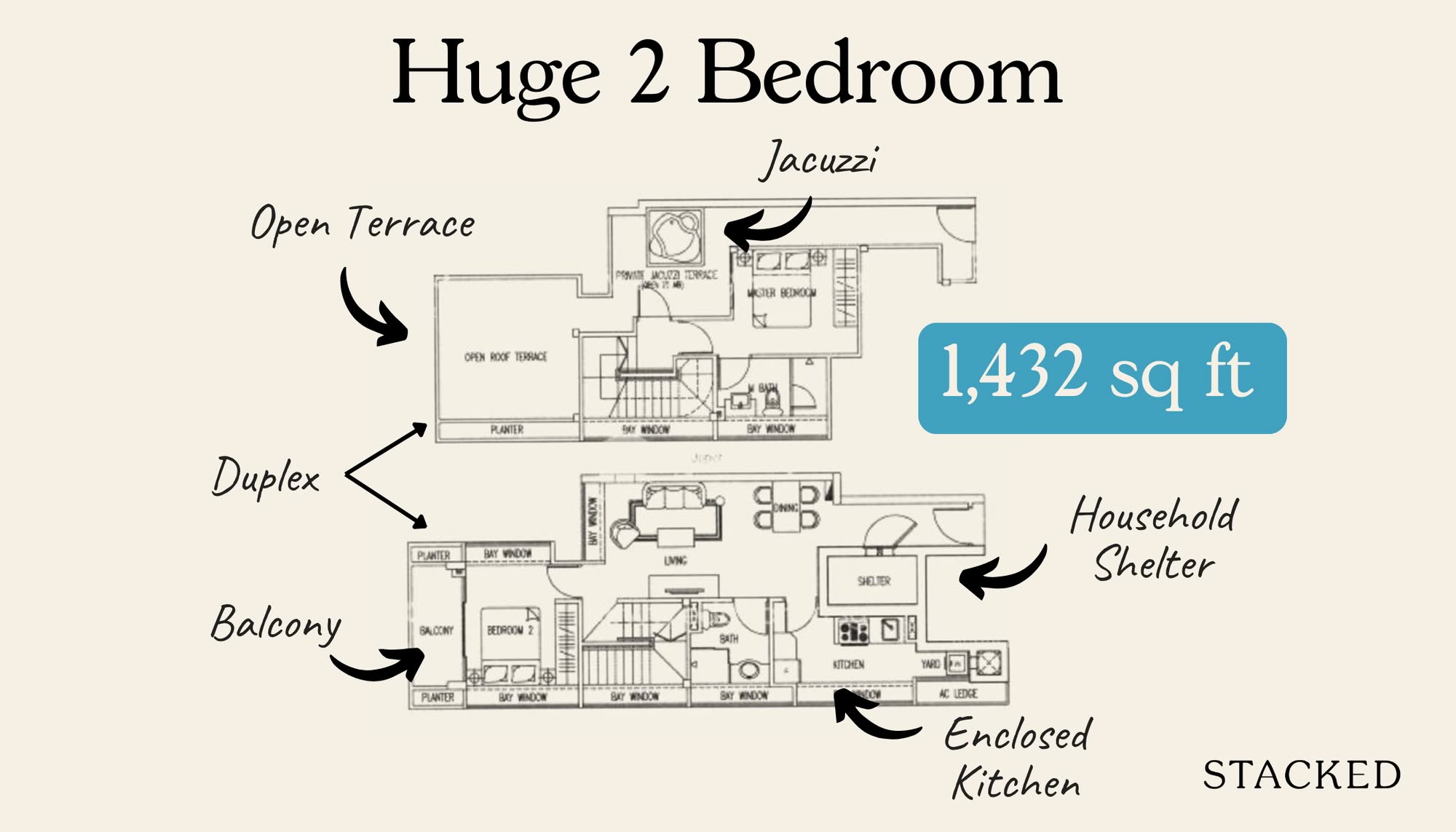
And so taken out of context, prices at Riviere may seem to be high at above $3,000 psf.
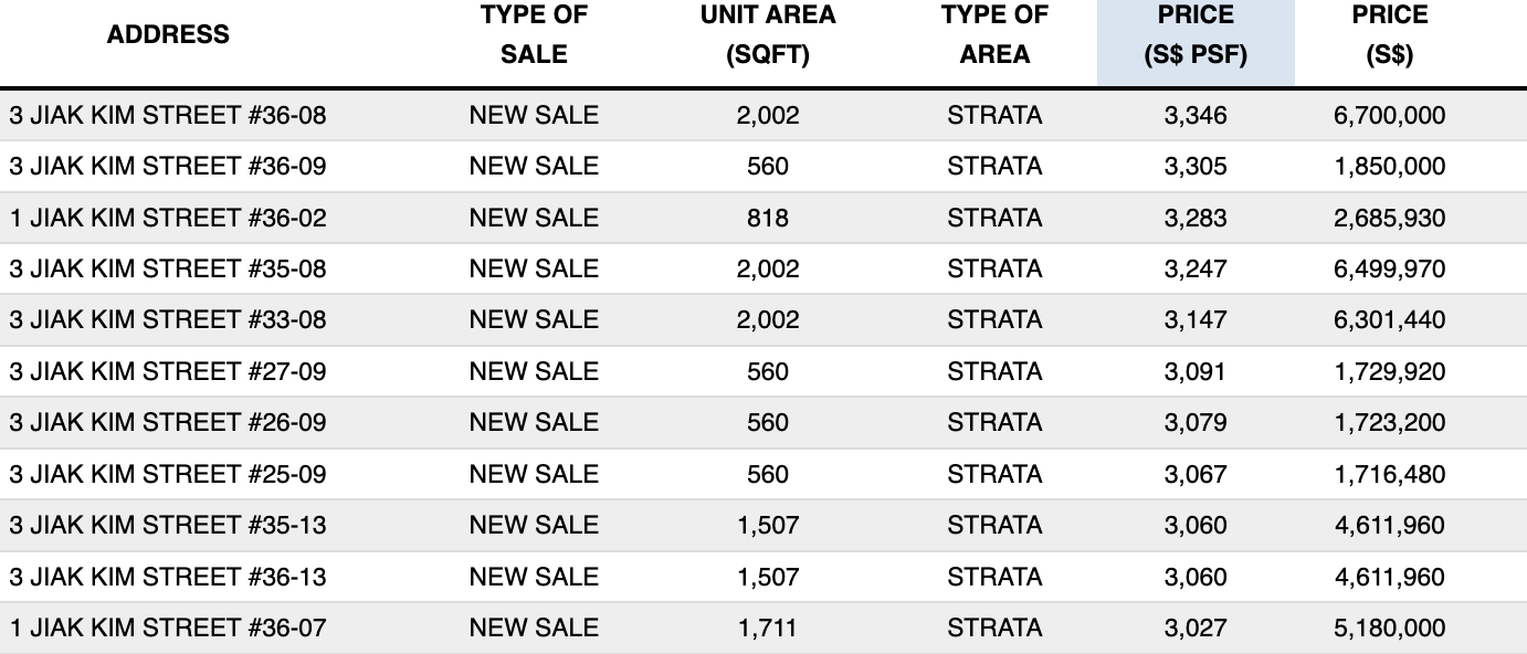
But when viewed with the unit numbers, you can see that all of these are high floor units.
5. The data is accurate, but the wider context is glossed over
By now, most veteran property buyers know to ignore “big increases in transaction volume” around March.
They already know the context: most people hold off on property purchases around Chinese New Year, so the numbers in the month of March can look like a huge uptick compared to January or February.
New home buyers, who don’t know the market well, may not be aware of the significance of dates like 2013 (Mortgage Servicing Ratio implemented for HDB properties), or December 2021 (cooling measures enhanced).
These periods can result in unusually low or high-volume transactions and prices; such as when the market is in a “wait and see” mode after cooling measures.
If you don’t understand the wider context, however, it’s easy to fall for whatever explanation a seller gives – such as claims that a certain property type is no longer popular (all property segments may have been equally affected), or that prices are “bottoming out”.
6. Ignoring low transaction volumes
When the number of transactions is small, prices can become quite volatile. For example:
This might suggest that the average price of a unit at Bleu @ East Coast is around $990 psf (this was the given median for March 2022).
But here are the actual asking prices:
| Date | Unit Size | Approx. Price PSF |
| 4 Dec 2021 | 2,077 sq. ft. | $1,396 |
| 30 Nov 2021 | 2,949 sq. ft. | $1,204 |
| 12 Nov 2021 | 1,012 sq. ft. | $1,542 |
| 31 Oct 2021 | 1,066 sq. ft. | $1,482 |
| 29 Oct 2021 | 2,551 sq. ft. | $1,243 |
The reason for the discrepancy is the very small number of units. Bleu has only 62 units – and if you look at the transaction history, you’ll see transactions can be as few as one or two per year. It’s possible that the very last sale, which was the only one of its kind, was an outlier.
With so few units and such infrequent sales, it becomes much harder to estimate how much you’re really going to pay.
(This is why we include footnotes to warn you when transaction volumes are low, in Stacked articles).
Always be a bit skeptical, when you see surprisingly low prices for boutique developments.
7. Using different starting and ending dates
We’ve covered this before in a freehold vs leasehold debate, but in short, changing the starting and ending dates can really influence a narrative.
Here’s the example:
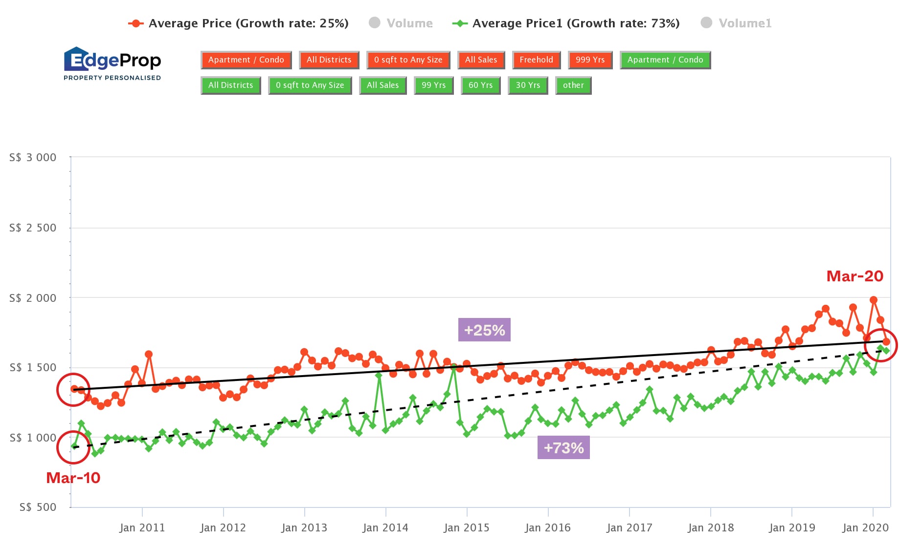
If it’s too hard to see, the green line signifies leasehold condos, and the red line showcases freehold condos, from a 10-year period between March 2010 and March 2020.
Going by this graph, the simple conclusion would be that leasehold condos appreciate better. 73% as compared to 25%.
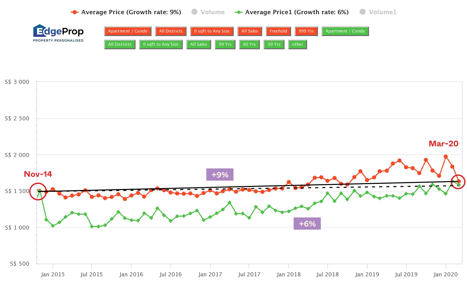
But if we change the starting dates from November 2014 instead (keeping the same end dates of March 2020), look how the narrative would change. As such, if we were to look at this graph in isolation, the conclusion would be that freehold condos appreciate better than leasehold condos (albeit marginally).
Remember, while numbers don’t lie, they can be manipulated to mislead with half-truths. Most buyers know not to take a sales pitch at face value, which is a healthy attitude. But don’t be lulled by visually appealing data presentations, which can be every bit a marketing tool as well. For a more direct approach to comparing properties, talk to one of our vetted experts at Stacked. You can also check out our in-depth reviews of new and resale properties alike.
At Stacked, we like to look beyond the headlines and surface-level numbers, and focus on how things play out in the real world.
If you’d like to discuss how this applies to your own circumstances, you can reach out for a one-to-one consultation here.
And if you simply have a question or want to share a thought, feel free to write to us at stories@stackedhomes.com — we read every message.

0 Comments